
Submitted:
29 November 2025
Posted:
01 December 2025
You are already at the latest version
Abstract
Enhancing public transport accessibility (PTA) is an effective strategy for creating sustainable and liveable urban environments. However, calculating the access index from predefined values for walking and waiting times requires further investigation to assess whether available public transport services sufficiently meet traveller needs. This study evaluates PTA to examine additional walking times from home, work, and other locations to various transport modes (bus, train, underground, and tram), and waiting times during different peak periods (morning, inter, evening, and night) as a case study in London. The findings reveal that walking times from home locations exceed PTAL thresholds, with median values surpassing 8 minutes at bus stops and 12 minutes at rail stations, while evening peaks result in higher waiting times than morning periods used in PTAL calculations. The data-driven access index from mobile app data, with reference data from TFL, is further examined for spatial patterns of over- and underestimation areas and to demonstrate how incorporating dynamic spatial and temporal attributes into PTAL offers valuable insights for improving public transport accessibility in urban environments.
Keywords:
public transport accessibility
; waiting time
; walking time
; access index
; mobile app data
; data-driven approach
1. Introduction
Public transport accessibility, transit accessibility, is defined as a metric which represents the degree of access from opportunities (origin) to access points (destinations/transport hubs/stations) to understand areas that are particularly underserved or over-served within cities (Geurs and van Wee, 2004; Saif, Zefreh and Torok, 2018). As a measure, transit accessibility decreases the congestion in cities (Owen and Levinson, 2015), enhances urban mobility (Batty, Palacin and González-Gil, 2015), and improves the quality of the daily commute for various travel purposes such as employment (Zhu and Shi, 2022), education (Moreno-Monroy, Lovelace and Ramos, 2018), and healthcare (Sharma and Patil, 2021). Lacking transit accessibility, on the other hand, leads to social exclusion for vulnerable groups, specifically for the elderly population (Guo et al., 2019) and individuals with disabilities (Bocarejo S. and Oviedo H., 2012). Thus, there is a need for further investigation into public transport accessibility, which will benefit not only users but also transport and urban planners in cities (Saif, Zefreh and Torok, 2018).
There are three types of transit accessibility: (i) System accessibility calculates physical access to the public transport network by assessing proximity to transit stops in terms of walking distance or time, emphasising the “first mile” of transit. While this approach is commonly adopted due to its simplicity and computational efficiency, it disregards the level of available service and route network connectivity from the transit stop (Geurs and Van Wee, 2004; Malekzadeh and Chung, 2020). (ii) System-facilitated accessibility extends the system accessibility approach by incorporating both travel time and travel cost (impedance factors) for reaching a single destination without illustrating the overall accessibility from a specific area to various nearby opportunities. (iii) Access to destinations approach provides the most comprehensive assessment by covering the first mile of travel, travel cost and time, including the last mile of travel for various destination points, which estimates overall access associated with a number of possible destinations (Malekzadeh and Chung, 2020). Even though the model presents the full picture, this approach is typically not straightforward to utilise in actual networks due to its computational complexity and extensive data requirements from transit agencies. These implementation challenges limit its widespread adoption in real-world planning applications.
Despite methodological refinements over recent decades, all transit accessibility models rely on walking distance and waiting time and share fundamental limitations regarding their spatial and temporal variation. For instance, conventional planning practice has employed rule-of-thumb distances of 400 meters for bus stops and 800 meters for rail stations (El-Geneidy et al., 2014). Implemented methodologies demonstrate considerable variation. Operational PTAL implementations vary across cities: London and Greater Manchester apply 640 meters for bus stops and 960 meters for rail stations (Transport for Greater Manchester, 2025), while Indian cities such as Ahmedabad and Surat use 993 meters and 900 meters, respectively (Adhvaryu, 2019). Empirical evidence challenges these assumptions, with Brisbane data showing median walking distances of 510 meters to/from transit stops (Burke and L. Brown, 2007), while other studies have employed alternative thresholds ranging from 300 to 500 meters (Chapleau and Morency, 2005). In addition, studies have calculated the waiting time predominantly for specific departure times, particularly morning peak hours when service frequency is the highest (Guthrie, Fan and Das, 2017; Widener et al., 2017), thereby overlooking accessibility variations during off-peak periods (Wang et al., 2018; Stępniak et al., 2019). Waiting time calculations similarly rely on oversimplified assumptions—fixed 10-minute periods (Adhvaryu, 2019) or half-headway assumptions (Ansari Esfeh et al., 2021). These limitations highlight the need for additional data sources that capture spatial and temporal dynamics across all service periods (Stępniak et al., 2019; Haamer, Aasa and Poom, 2025).
Advanced human mobility data sources such as smart card records (Bantis and Haworth, 2020; Zhang et al., 2020; Zhang, Cheng and Sari Aslam, 2019), taxi trajectory data (Wang et al., 2018b) and mobile phone data present a promising avenue for improving accessibility measurements (Saif, Zefreh and Torok, 2018; Malekzadeh and Chung, 2020; Nie et al., 2024; Haamer, Aasa and Poom, 2025). The utilisation of mobile application data to assess public transport accessibility and human mobility has recently gained significance in urban transport planning due to the high spatiotemporal resolution, extensive coverage, and large sample sizes. Some studies have utilised mobile app data to analyse accessibility of urban parks for the elderly population using mobile phone data (Guo et al., 2019), and the spatial gaps of urban public transportation services for job accessibility (Zhu and Shi, 2022), including GPS data (Haamer, Aasa and Poom, 2025). However, there is a lack of studies comparing walking time, waiting time, and access index across PTALs from different data sources for transport planners in urban settings.
This study employs PTAL’s methodology, utilising mobile app data, to identify spatial and temporal differences in the indicators and provide valuable insights for transport and urban planners. First, PTAL indicators across various dimensions are investigated, including walking times from residential (home), occupational (work), and other locations to bus, train, underground, and tram stations. Second, the waiting time indicator is not only from morning-peak - high-frequency service periods but also from inter-peak, evening, and night-time peak hours across various modes of transport. Subsequently, the access index is calculated based on the output areas of the spatial unit, and the findings are presented in London as a case study. Furthermore, the study discusses strategies to enhance public transit planning within the Greater London Authority (GLA).
The next section of the paper provides the details of the study area and data. Section 3 presents the PTAL methods for mobile data with additional attributes, such as home, work, and others, followed by the results of a case study in London. Finally, the discussion and conclusions are covered in sections 5 and 6, respectively.
2. Study Area and Data
2.1. Study Area and Data
The study area focuses on Greater London, UK, a region with an estimated population of approximately 9 million people within a 1,572 km² boundary (ONS, 2024), served by an extensive public transport network comprising over 19,000 bus stops and 272 Underground stations across 11 Underground lines (Transport for London, 2023). Four types of data are used for the study: mobile app data as mobility data, Point of Interest Data (POIs), geographic boundaries based on spatial units such as Output Areas (OA) and reference/benchmark data from Transport for London (TfL) to evaluate the method’s findings in this study.
Mobile app data, as mobility data, is from November 2021 in Greater London as input. The dataset includes 742,275 users, with attributes such as anonymised user identifiers (device ID), start and end times of activity, latitude and longitude of activity locations, activity types (e.g., home, work, others), and activity duration. Activity extractions (Sari Aslam, Zhong and Wang, 2024) and activity labelling methodologies, including mobile app data are available online (Zhong et al., 2025). Second, public transport data are extracted from transport sub-categories such as bus, trains, underground, light rail services and tram stations using Point of Interest (POIs) (https://digimap.edina.ac.uk/) in the study area. The last, the PTAL data, reference/benchmark data (https://data.london.gov.uk/dataset/public-transport-accessibility-levels) includes the total access index value based on transport types, which reflects the total public transport access level in the study area.
2.2. Data Processing
Data processing is started using the mobile app data and POIs to extract Transit Activities (TAs), which are nearby transit locations. Figure 1 shows that the process by looping over all users () until no users are left in the dataset. For each iteration, a user () is selected, and their activities () are sorted by date and time. The loop then processes each activity () for the selected user based on the following rules. First, if the activity () is identified as not a home activity (HA) or a work activity (WA), the algorithm first checks activity duration based on T-threshold. Waiting duration for transport is calculated based on one hour under the headway terminology (Ansari Esfeh et al., 2021), while excluding short-term activities (less than 5 min) (Fang et al., 2018). If the condition is exceeded, the distance is calculated between the activity and the transport locations. If both the duration and distance checks are within the thresholds, the activity is marked as a transport activity (TA). Once all activities for the have been processed, the loop checks if there are any other users to process, repeating the steps until no users remain.
Various distances and activity counts are illustrated in Figure 2A. The curve demonstrates a rapid initial increase, with approximately 95% of all transit activities occurring within 200 meters of their origin transport points. Beyond this threshold, the curve plateaus, indicating that extending the search radius yields diminishing returns in terms of capturing activities.
The distribution of transit activities (TAs) from mobile app data is compared to the distribution of transport stations for the Greater London area in Table 1. 96% of transport stops are part of the bus network, highlighting the reliance on buses for traveller accessibility, which demonstrates the representativeness of mobile app data in relation to transit stops. Notably, the majority of TAs (94.1%) were linked to bus stops, which is closely aligned with the proportion of bus stops (96.5%). Activities related to trains (including Rail and London Underground) constituted 5.3% of the extracted activities, corresponding to 3.1% of the Rail and LUL. Tram and DLR activities were the least represented, comprising 0.6% of TAs and 0.5% of the transport hubs. Overall, the mobile app data extracted effectively mirrors the transport network’s structure, particularly emphasising the predominance of bus services throughout Greater London.
3. Methods
The steps for the methodology start by providing information regarding the public transport access level. Then, the calculation of PTAL indicators, such as walking distance and waiting time, including access index from mobile app data, was finalised by comparing the results from reference data in a London case study.
3.1. Public Transport Access Level
Public Transport Accessibility Level (PTAL) is a well-established model that measures access to public transport using proximity to public transport stops, waiting times, service frequency, reliability, and the availability of different modes of public transport (Transport for London, 2015). The PTAL calculation adopted for London is summarised below:
(i) Calculating the walking distance from the centre of the spatial units to the closest transport locations/stops, such as bus, rail, London Underground, DLR, and trams. Transport locations are referred to as service access points (SAPs) and only considered within a specific distance, i.e., 640 meters for bus stops and 960 meters for rail stations. These distances correspond to walking times of 8 and 12 minutes, respectively, assuming a walking speed of 80 meters per minute.
Walking time is given in equation (1), where k refers to the type of transport, d and v refer to distance and speed, respectively. A walking speed of 4.8 kph, which is 80 meters per minute, is used in equation (1) for PTAL in Greater London (Transport for London, 2015).
(ii) Calculating average waiting time in PTAL, as illustrated in equation (2). This represents half the interval between services (i.e., headway), which is calculated as 60 divided by the service frequency (the number of services on the route). In addition, refers to the reliability factor, adding an extra 2 min for buses and 0.75 min for the rest of the transport services.
The morning peak (8:15 – 9:15 am) is only used for each route serving in an SAP where the highest frequency exists in both directions of a route.
(iii) Calculating the equivalent doorstep frequency (EDF) is based on total access time (TAT) for each route, by adding walking time and average waiting time, as presented in equation (3)
The equivalent doorstep frequency (EDF) in Equation (4) incorporates the walk time to the stop and converts it into a frequency value. This represents the hypothetical service frequency at the ‘doorstep’ without any walk time
(iv) Calculating Access Index (AI) is based on multiplying EDF by the weight factor for each route and adding all possible values for the routes to determine the total accessibility index.
where represents the access index for public transportation across different modes, such as bus, rail, tube and tram, and serves as the coefficients for the mode with the highest EDF and for all other modes, respectively. These coefficients assign a weight of one to the mode with the highest EDF () and a weight of half to the other modes (). This method assumes that the route from the nearest stop is the most appropriate and is preferred by the individual.
(v) The accessibility index (AI) is then translated into a PTAL score ranging from 0 (indicating very poor access) to 6b (indicating excellent access) to present the access level for public transport. For example, an AI score between 0.00 and 5.00 corresponds to PTAL grade 1, while a score of 5.01 to 10.00 corresponds to PTAL grade 2, and so on. PTAL grade 6 is assigned to scores of 25 and above (Transport for London, 2015).
3.2. Calculating PTAL’s Indicators from Mobile App Data
To establish individual activity patterns, three anchor locations (home, work, and others) are used from the mobile app data. From these anchors, walking distances to the nearest SAPs are computed with a defined threshold distance ( = 2000m) to eliminate the possibility of personal transport usage, such as cars or scooters. In other words, walking distance is only investigated if the distance is less than 2000m, for the first and last mile of the episode. and as walking distances are divided based on an assumed walking speed of 80 meters per minute to calculate walking time from home (WTH), and work (WTW). If neither condition is met, distances to the rest of the activities are kept for buses and the other transport modes, at 640m and 960m, respectively.
(7)
The reason for keeping distance from other activities is the same as the current assumption: other activities vary across locations, such as shopping, eating, and education, and generate confusion about spatial patterns. Thus, the study mainly focused on walking distance and time from home and work locations in this study.
The calculation of average waiting time is based on the principle, which is half of the headway (Ansari Esfeh et al., 2021). For instance, if a bus arrives every 15 minutes at a given location (equivalent to 4 buses per hour), the average waiting time is 7.5 minutes. Additionally, a reliability factor of 2 minutes for buses and 0.75 minutes for other transport services is added to the average waiting time by transport agencies in PTAL methodology. However, TAs at transport hubs reflect actual observed waiting times from mobile app data rather than theoretical estimates. Therefore, no reliability factor is added in Equation (4), and the activity durations are used directly.
As equivalent doorstep frequency is calculated with and in Equation (9).
Then the access index is computed based on transport mode (k) using the highest EDF value. For instance, if the highest EDF value captured from the bus, weighted as 1 and all other EDF values are weighted as half, as shown in equation 10.
A total AI for all types of transport is updated and converted to PTAL using the bands specified by transport agencies, for further evaluation.
3.3. Comparative Analysis of Accessibility Disparities
To enable meaningful comparison between PTAL’s reference data and mobile app data, this study standardises the access indices using a z-score transformation. For any given value with mean (μ) and standard deviation (σ) across spatial units, the transformation is expressed as:
A difference analysis was conducted by calculating the absolute difference between the standardised access indices:
Spatial discrepancies based on OA units were then quantified at each location. The observed differences were classified using Jenks’ natural breaks optimisation, which minimises within-class variance while maximising between-class differences.
4. Results: London as a Case Study
Transit accessibility indicators, such as walking distance/time and waiting time, with additional attributes, are investigated in this section, using the PTAL methodology from mobile app data. The analyses are applied to London as a case study using mobile app data, and the results are compared with TfL benchmark/reference data to discuss the findings.
4.1. Investigating Walking Distance Using Mobile App Data
The distribution of walking distances from key anchor locations, such as home and work, to various transport hubs, including bus, train (tube and rail), and tram (DLR and tram), is investigated using violin plots. Then the results are compared against Transport for London’s walking time thresholds (indicated by the red line). Additionally, three quartiles are displayed as Q1, Q2 (median), and Q3 in each data presentation. Note that PTAL’s thresholds for London are 640 meters (approximately 8 minutes) for bus stops and 960 meters (approximately 12 minutes) for rail stations within the study area.
For bus services, the distribution of walking time between home and bus stops (Bus-WTH) shows that the median (Q2) is above the 8-minute threshold (the red line), indicating that more than half of the people walk over 640 meters to access a bus stop from home (Figure 3). In addition, there is a widespread trend, with a notable portion of people walking between 10 and 20 minutes and a tail extending further, suggesting that actual walking distances to bus stops are longer than PTAL parameters.
For rail services, walking time distributions from home to train stations, such as rail/underground (Train-WTH) and DLR/tram stops (Tram-DLR-WTH), exhibit similar patterns, with median values exceeding the 12-minute threshold. The wider distribution shapes for rail modes compared to bus indicate greater variability in access distances, reflecting the sparser spatial distribution of rail infrastructure compared to bus stops. Both rail distributions demonstrate that walking times exceed PTAL’s thresholds, revealing a consistent gap in mobility patterns (Figure 3).
Walking time distributions between bus stops and work locations (Bus-WTW) show a median of around 10 minutes, exceeding PTAL’s 8-minute threshold. The distribution displays moderate spread with a right-skewed pattern, indicating that most work locations have bus stops within 10 minutes, though a notable portion requires walking times between 10-20 minutes. The violin shape reveals less spatial variability, reflecting the denser distribution of bus stops across the network (Figure 4).
Walking time distributions between rail stops and work locations show different patterns across modes. Train stations (Train-WTW) exhibit median walking times around 10 minutes, approaching PTAL’s 12-minute threshold, with a notably wide distribution extending beyond 20 minutes. Tram/DLR stops (Tram DLR-WTW) display median values around 11 minutes, remaining below the 12-minute threshold, with a more compact distribution. Both rail-based modes show substantially wider distributions than bus services, reflecting the sparser spatial distribution of rail infrastructure and greater variability in walking distances from work locations to the nearest rail stations (Figure 4).
Overall, analysis of walking distance distributions reveals that PTAL assumptions better reflect work locations in city centres than home locations in peripheral areas. Bus walking times from both home and work consistently exceed PTAL’s 8-minute threshold, while rail services align more closely with the 12-minute threshold. The right-skewed distributions indicate that while most users experience reasonable walking times, a significant subset faces considerably longer access distances, revealing spatial inequities. These findings demonstrate that PTAL’s thresholds require recalibration based on mobility data, particularly for bus accessibility.
4.2. Investigating Waiting Time Using Mobile App Data
Waiting time for public transport is a crucial component of the PTAL methodology, particularly for daily commuters. Various studies have focused on analysing waiting times within transport networks to enhance public transport efficiency (Shelat, Cats and Van Lint, 2021). Within the PTAL methodology specifically, the average waiting time is calculated during the morning peak (08:00-09:59)(Transport for London, 2023). This study extends this temporal scope by presenting activity counts by hour of the day and day of the week based on aggregated mobile application data, revealing how transit waiting patterns vary across different time periods beyond the conventional morning peak assumption.
Figure 5 presents the temporal distribution of these waiting activities across London’s transport network. While PTAL calculates accessibility based solely on morning peak hours (08:00-09:59), the actual data show that afternoon peak periods (around 16:00) generate higher waiting activity counts, indicated by the heatmap. Activity drops sharply during late-night and early-morning hours, reflecting reduced transport demand outside regular working hours.
A particularly high waiting activity was observed during the afternoon peak periods on weekdays, prompting further analysis to determine which transport modes were responsible for this pattern. To explore these patterns more comprehensively, waiting activities were analysed across four distinct peak periods — morning (06:00–09:59), inter-peak (10:00–14:59), evening (15:00–18:59), and night (19:00–05:59) — organised by day of the week and transport mode.
Figure 6 illustrates the number of waiting activities for different public transport modes based on mobile application data, revealing consistent weekday commuter patterns. Disaggregating by mode and day of the week shows that bus services exhibit the highest waiting activity during the PM peak, particularly between 15:00 and 16:00, while rail (Train + LU) waiting times intensify slightly later, around 16:00–17:00, during the weekdays. This suggests that afternoon congestion from the heatmap is more pronounced for bus users, likely due to increased service demand and road traffic delays during the post-work period. Conversely, the AM peak in waiting activity is primarily driven by rail users, consistent with concentrated morning commuting flows into central areas.
These results confirm that the heatmap’s AM and PM peaks reveal real modal differences in waiting behaviour, with buses dominating the evening peak and rail services driving the morning peak, aligning with established weekday commuter dynamics. These findings highlight the importance of considering temporal and modal variability when designing accessibility measures and evaluating public transport performance beyond the PTAL framework.
4.3. Evaluating the Methods for Disparities in the Study Area
In this section, the PTAL reference data and mobile app data were used to generate the Access Index in each OA to visualise accessibility patterns across Greater London. To enable meaningful comparison, both datasets were standardised using z-score transformation, as described in Section 3.3, ensuring comparability across different scales. The map shows the difference between the two standardised indices, with extreme values clipped to the range -10 to +60 to enhance interpretability. Positive differences (red zones) indicate areas where reference data yields higher scores than mobile app data, suggesting potential overestimation in the original PTAL methodology. Conversely, negative values (dark blue zones) indicate underestimation, where mobile app data present higher values than the reference data.
The comparison shown in Figure 7 reveals that the most pronounced differences appear in Central London, parts of East London (notably Hackney and Dalston), and corridors such as Harrow and Croydon in the Northwest and South. These areas exhibit high positive differences, indicating that Central London locations have dense concentrations of transport stops and low average waiting times during the morning peak. In contrast, the dark blue zones, particularly around the Heathrow area in West London, indicate locations where mobile app data suggest higher accessibility than PTAL due to international transit–related waiting times. Overall, the theory-based PTAL approach may overrepresent accessibility, particularly in areas with dense transport provision. In contrast, a data-driven approach using mobile app data provides evidence that actual waiting times throughout the day are often much higher than PTAL’s morning-peak assumptions, which drives the differences in the study area.
5. Discussions
The Public Transport Access Level (PTAL) methodology offers significant value for urban planning and transport policy development. The methodology provides a standardised approach for comparing accessibility across different geographical areas, enabling consistent evaluation of transport services, facilitating clearer communication about accessibility issues. However, the current PTAL approach has several limitations. First, the methodology of calculating walking distance relies on assumptions. In the real world, people might walk more than these assumptions based on the purpose of the activity (Burke and A. L. Brown, 2007; Sari Aslam et al., 2021). Second, the calculation of the waiting time is based on the highest-frequency route and is calculated for the most frequent morning peaks, resulting in shorter waiting times. Waiting time may vary at different times of the day in complex cities.
Mobile data has emerged as a valuable resource for analysing public transport accessibility (Haamer, Aasa and Poom, 2025). This significance stems from its unprecedented spatiotemporal resolution, extensive coverage across diverse geographic contexts, and substantially larger sample sizes. In addition, the nature of data collection via mobile applications enables researchers to observe actual travel behaviours rather than stated preferences, potentially revealing discrepancies between planned and realised journeys. Despite these advantages, mobile app data also presents limitations. The data often suffers from demographic biases, typically overrepresenting younger populations and underrepresenting older populations (Burke and Brown, 2007; Sari Aslam, Zhu, et al., 2021). However, such limitations are beyond the scope of this study, as is the case with the existing PTAL methodology.
This study suggests that such limitations in the PTAL methodology could be enhanced by additional data sources, such as extracting necessary thresholds to improve the reliability of the current approach. Mobile phone data, from a methodological perspective, provides evidence for possible improvements rather than changing the whole PTAL methodology, which might be time- and resource-consuming. For instance, existing walking thresholds in the methodology can be used for calibration based on trip purposes/activities, so that the public transport network becomes more accessible to people who need it most. In addition, place-based methodology can reveal further dynamics across different times of day, days of the week, and modes of transport, using real data sources. Integrating additional attributes will provide further insights into public transport usage and inform the right passengers at the right time, e.g., at school ending hours. These methodological improvements, from a practical policy perspective, enable a more accurate assessment of accessibility inequalities and inform targeted interventions for residents who work non-standard hours or whose actual walking distances exceed assumed thresholds.
6. Conclusions
This study advances public transport accessibility evaluation by integrating human mobility patterns from mobile app data with the established PTAL methodology. Through empirical analysis of the large volume of mobile app data, the research challenges fundamental assumptions underlying current accessibility measures and demonstrates the value of data-driven approaches for public transport planning. TAs are derived from mobile app data around transport stations using Points of Interest (POIs). The attributes of TAs are utilised in the existing PTAL methodology. Walking and waiting time attributes are further compared with the current thresholds from transport agencies in the study area based on additional dimensions, such as home and work for transport types and waiting time across different periods. The calculated data-driven access index and TfL reference data are used to highlight over- and underrepresented areas in London as a case study.
Walking distance and time from home, work, and other locations to transport hubs such as buses and rail (train, underground, DLR, and tram) are extracted from mobile app data. The results are compared with the current walking distance thresholds set by transport agencies. The findings suggest that bus walking times from both home and work exceed PTAL’s 8-minute threshold, while rail services align more closely with the 12-minute threshold. In addition, the waiting time for various peak periods, such as morning, inter, evening, and night, is examined from mobile app data, which shows that the PM peak generated higher waiting time than the morning periods used in PTAL calculations. Hence, a data-driven approach can help theory-based/place-based methodology to calibrate PTAL’s existing thresholds
Lastly, the difference in the access index between PTAL’s reference data and mobile app data is plotted in the study area. OA results highlight that the dynamic access index provides valuable insights for users, transport and city planners. Future research will explore how the PTAL methodology can be enhanced using additional data sources such as household surveys (Sari Aslam et al., 2025) to investigate various trip purposes—including shopping, education, leisure, and healthcare—for specific population groups, such as working-age and elderly populations, who experience distinct mobility constraints and temporal travel patterns, to address urban inequalities.
Acknowledgments
This work was supported by the European Research Council (ERC) under the European Union’s Horizon 2020 research and innovation programme (No. 949670), and it has been approved by the University College London Research Ethics Committee (project id: 21949/001).
Conflicts of Interest
The authors declare that they have no conflicts of interest.
References
- Adhvaryu, B. (2019) ‘Mapping public transport accessibility levels (PTAL) in India and its applications_ A case study of Surat’, Case Studies on Transport Policy [Preprint]. Available at: . [CrossRef]
- Ansari Esfeh, M. et al. (2021) ‘Waiting time and headway modelling for urban transit systems – a critical review and proposed approach’, Transport Reviews, 41(2), pp. 141–163. Available at: . [CrossRef]
- Bantis, T. and Haworth, J. (2020) ‘Assessing transport related social exclusion using a capabilities approach to accessibility framework: A dynamic Bayesian network approach’, Journal of Transport Geography, 84, p. 102673. Available at: . [CrossRef]
- Batty, P., Palacin, R. and González-Gil, A. (2015) ‘Challenges and opportunities in developing urban modal shift’, Travel Behaviour and Society, 2(2), pp. 109–123. Available at: . [CrossRef]
- Bocarejo S., J.P. and Oviedo H., D.R. (2012) ‘Transport accessibility and social inequities: a tool for identification of mobility needs and evaluation of transport investments’, Journal of Transport Geography, 24, pp. 142–154. Available at: . [CrossRef]
- Burke, M. and Brown, A.L. (2007) ‘Active Transport in Brisbane: How Much is Happening and What are Its Characteristics?’, in Griffith University. Proceedings of State of Australian Cities National Conference, Adelaide, Australia. Available at: https://research-repository.griffith.edu.au/items/d8a8d925-a846-5a74-a872-60c95ce02d57.
- Burke, M. and Brown, L. (2007) ‘Active Transport in Brisbane: how much is happening and what are its characteristics?’, in Proceedings of State of Australian Cities National Conference. Available at: https://research-repository.griffith.edu.au/server/api/core/bitstreams/126071a1-b60d-5ccf-b32f-618587d99ea2/content.
- Chapleau, R. and Morency, C. (2005) ‘Dynamic Spatial Analysis of Urban Travel Survey Data using GIS’, in Dynamic spatial analysis of urban travel survey data using GIS. ESRI International User Conference Proceedings. Available at: https://proceedings.esri.com/library/userconf/proc05/papers/pap1232.pdf.
- El-Geneidy, A. et al. (2014) ‘New evidence on walking distances to transit stops: identifying redundancies and gaps using variable service areas’, Transportation, 41(1), pp. 193–210. Available at: . [CrossRef]
- Fang, Z. et al. (2018) ‘Identifying activities and trips with GPS data’, IET Intelligent Transport Systems, 12(8), pp. 884–890. Available at: . [CrossRef]
- Geurs, K.T. and Van Wee, B. (2004) ‘Accessibility evaluation of land-use and transport strategies: review and research directions’, Journal of Transport Geography, 12(2), pp. 127–140. Available at: . [CrossRef]
- Geurs, K.T. and van Wee, B. (2004) ‘Accessibility evaluation of land-use and transport strategies: review and research directions’, Journal of Transport Geography [Preprint].
- Guo, S. et al. (2019) ‘Accessibility to urban parks for elderly residents: Perspectives from mobile phone data’, Landscape and Urban Planning, 191, p. 103642. Available at: . [CrossRef]
- Guthrie, A., Fan, Y. and Das, K.V. (2017) ‘Accessibility Scenario Analysis of a Hypothetical Future Transit Network: Social Equity Implications of a General Transit Feed Specification–Based Sketch Planning Tool’, Transportation Research Record: Journal of the Transportation Research Board, 2671(1), pp. 1–9. Available at: . [CrossRef]
- Haamer, M., Aasa, A. and Poom, A. (2025) ‘Assessing public transport accessibility using GPS data’, European Transport Research Review, 17(1), p. 36. Available at: . [CrossRef]
- Harrison, G., Grant-Muller, S.M. and Hodgson, F.C. (2020) ‘New and emerging data forms in transportation planning and policy: Opportunities and challenges for “Track and Trace” data’, Transportation Research Part C: Emerging Technologies, 117, p. 102672. Available at: . [CrossRef]
- Malekzadeh, A. and Chung, E. (2020) ‘A review of transit accessibility models: Challenges in developing transit accessibility models’, International Journal of Sustainable Transportation, 14(10), pp. 733–748. Available at: . [CrossRef]
- Mavoa, S. et al. (2012) ‘GIS based destination accessibility via public transit and walking in Auckland, New Zealand’, Journal of Transport Geography, 20(1), pp. 15–22. Available at: . [CrossRef]
- Moreno-Monroy, A.I., Lovelace, R. and Ramos, F.R. (2018) ‘Public transport and school location impacts on educational inequalities: Insights from São Paulo’, Journal of Transport Geography, 67, pp. 110–118. Available at: . [CrossRef]
- Nie, Y. et al. (2024) ‘Disparities in public transport accessibility in London from 2011 to 2021’, Computers, Environment and Urban Systems, 113, p. 102169. Available at: . [CrossRef]
- ONS (2024) Population estimates, Office for National Statistics. Available at: https://www.ons.gov.uk/peoplepopulationandcommunity/populationandmigration/populationestimates.
- Owen, A. and Levinson, D.M. (2015) ‘Modeling the commute mode share of transit using continuous accessibility to jobs’, Transportation Research Part A: Policy and Practice, 74, pp. 110–122. Available at: . [CrossRef]
- Saif, M.A., Zefreh, M.M. and Torok, A. (2018) ‘Public Transport Accessibility: A Literature Review’, Periodica Polytechnica Transportation Engineering, 47(1), pp. 36–43. Available at: . [CrossRef]
- Sari Aslam, N. et al. (2021) ‘ActivityNET: Neural networks to predict public transport trip purposes from individual smart card data and POIs’, Geo-spatial Information Science, 24(4), pp. 711–721. Available at: . [CrossRef]
- Sari Aslam, N. et al. (2025) ‘East London Survey Data’, in CUPUM 2025. Proceedings of the 19th International Conference on Computational Urban Planning & Urban Management, London. Available at: . [CrossRef]
- Sari Aslam, N., Zhong, C. and Wang, Y. (2024) ‘Managing Variability: A sensitivity analysis approach applied to mobile app data’, in Proceedings of the 32nd Annual GIS Research UK Conference. GISRUK, Leeds. Available at: . [CrossRef]
- Sharma, G. and Patil, G.R. (2021) ‘Public transit accessibility approach to understand the equity for public healthcare services: A case study of Greater Mumbai’, Journal of Transport Geography, 94, p. 103123. Available at: . [CrossRef]
- Shelat, S., Cats, O. and Van Lint, J.W.C. (2021) ‘Quantifying travellers’ evaluation of waiting time uncertainty in public transport networks’, Travel Behaviour and Society, 25, pp. 209–222. Available at: . [CrossRef]
- Stępniak, M. et al. (2019) ‘The impact of temporal resolution on public transport accessibility measurement: Review and case study in Poland’, Journal of Transport Geography, 75, pp. 8–24. Available at: . [CrossRef]
- Transport for Greater Manchester (2025) ‘Transport for Greater Manchester’. Available at: https://www.data.gov.uk/dataset/d9dfbf0a-3cd7-4b12-a39f-0ec717423ee4/gm-accessibility-levels (Accessed: 8 November 2025).
- Transport for London (2015) Assessing transport connectivity in London. Available at: https://airdrive-secure.s3-eu-west-1.amazonaws.com/london/dataset/public-transport-accessibility-levels/2017-01-12T15%3A59%3A45/connectivity-assessment-guide.pdf.
- Transport for London (2023) What we do, Transport for London. Available at: https://tfl.gov.uk/corporate/about-tfl/what-we-do (Accessed: 9 November 2025).
- Transport Planning Consultant, India et al. (2016) ‘Public Transport Accessibility Levels for Ahmedabad, India’, Journal of Public Transportation, 19(3), pp. 19–35. Available at: . [CrossRef]
- Wang, Y. et al. (2018a) ‘Measuring temporal variation of location-based accessibility using space-time utility perspective’, Journal of Transport Geography, 73, pp. 13–24. Available at: . [CrossRef]
- Wang, Y. et al. (2018b) ‘Measuring temporal variation of location-based accessibility using space-time utility perspective’, Journal of Transport Geography, 73, pp. 13–24. Available at: . [CrossRef]
- Widener, M.J. et al. (2017) ‘How do changes in the daily food and transportation environments affect grocery store accessibility?’, Applied Geography, 83, pp. 46–62. Available at: . [CrossRef]
- Zhang, Y. et al. (2020) ‘You are how you travel: A multi-task learning framework for Geodemographic inference using transit smart card data’, Computers, Environment and Urban Systems, 83, p. 101517. Available at: . [CrossRef]
- Zhang, Y., Cheng, T. and Sari Aslam, N. (2019) ‘Deep Learning for Demographic Prediction based on Smart Card Data and Household Survey’, in. Proceedings of Geographic Information Science Research UK (GISRUK) 2019., Newcastle, UK.
- Zhong, C. et al. (2024) ‘Anonymised Human Location Data for Urban Mobility Research’, CASA Working Paper, University College London, p. 22. Available at: . [CrossRef]
- Zhong, C. et al. (2025) ‘Anonymised human location data in England for urban mobility research’, Scientific Data [Preprint]. Available at: . [CrossRef]
- Zhu, L. and Shi, F. (2022) ‘Spatial and social inequalities of job accessibility in Kunshan city, China: Application of the Amap API and mobile phone signaling data’, Journal of Transport Geography, 104, p. 103451. Available at: . [CrossRef]
Figure 1.
Extracting transit activities from mobile app data.
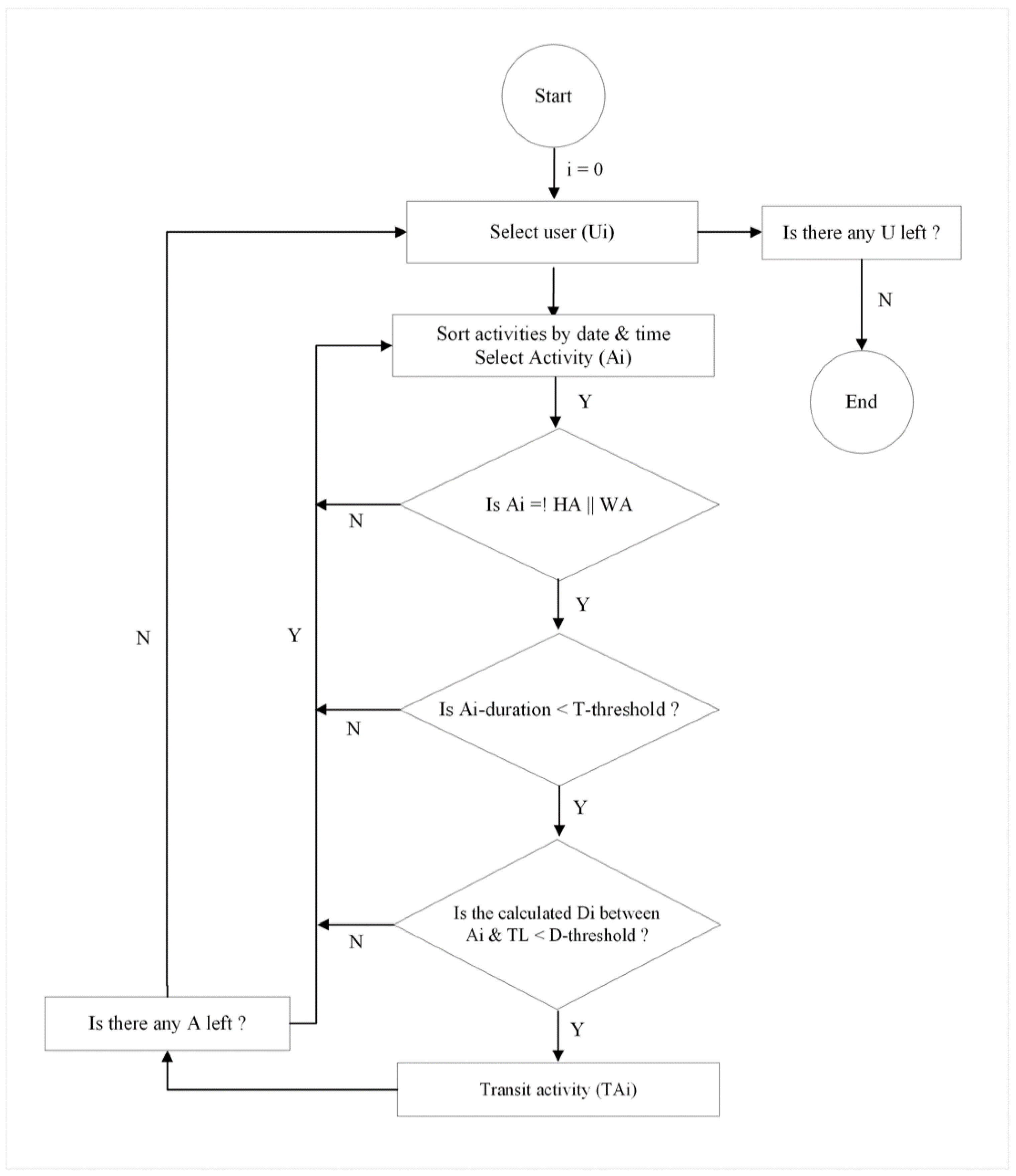
Figure 2.
Determining optimal distance threshold for TAs.
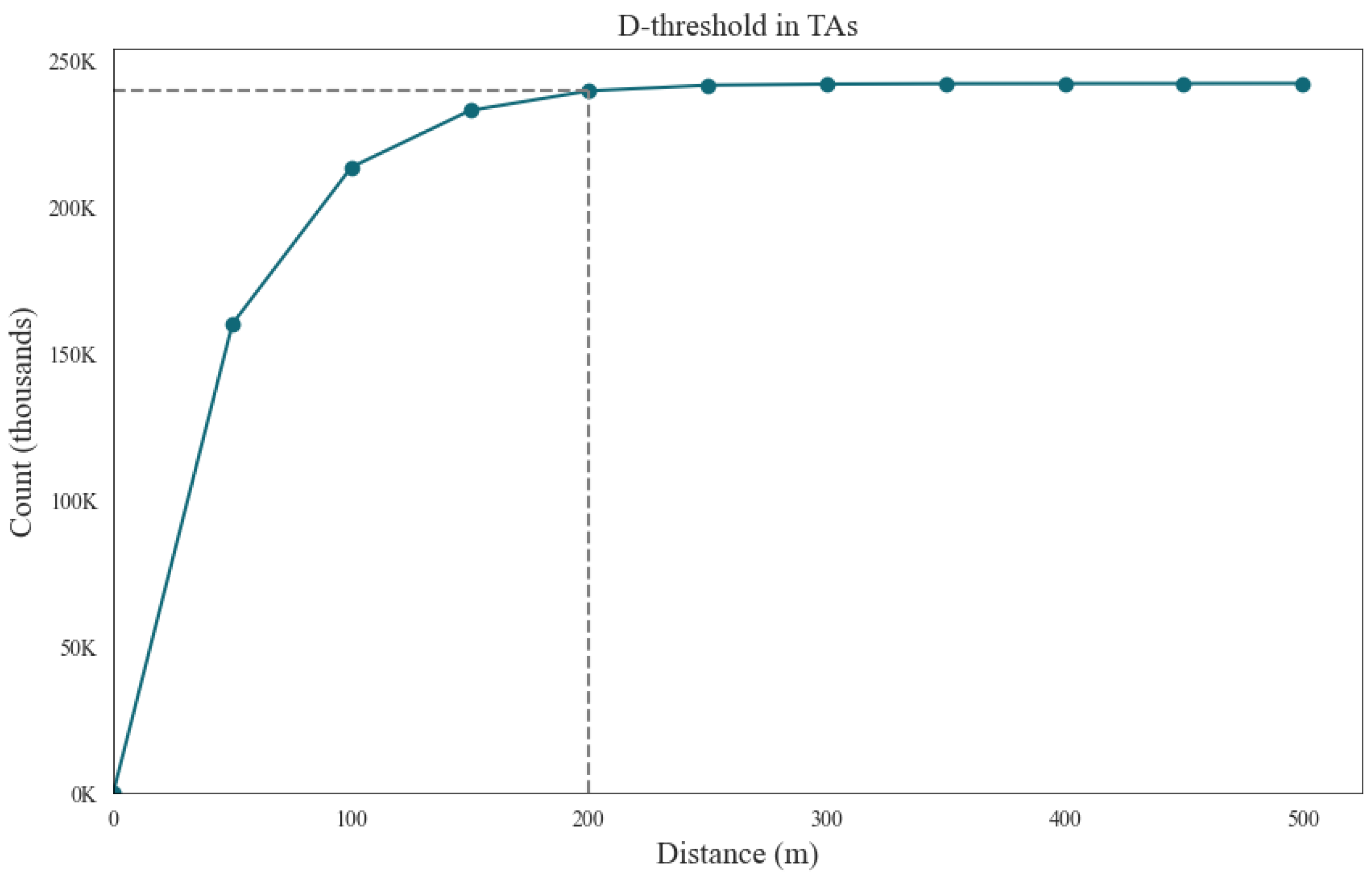
Figure 3.
Walking time for home based on different transit stops. The red line illustrates the current walking time assumption used in PTAL for Greater London.
Figure 3.
Walking time for home based on different transit stops. The red line illustrates the current walking time assumption used in PTAL for Greater London.
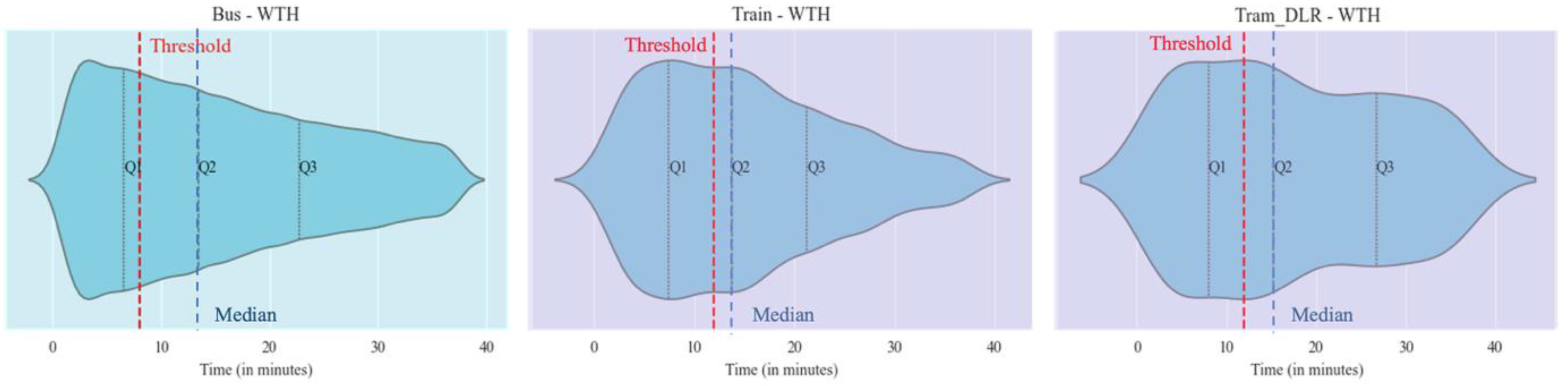
Figure 4.
Walking time for work based on different transit stops. The red line illustrates the current walking time assumption used in PTAL for Greater London.
Figure 4.
Walking time for work based on different transit stops. The red line illustrates the current walking time assumption used in PTAL for Greater London.
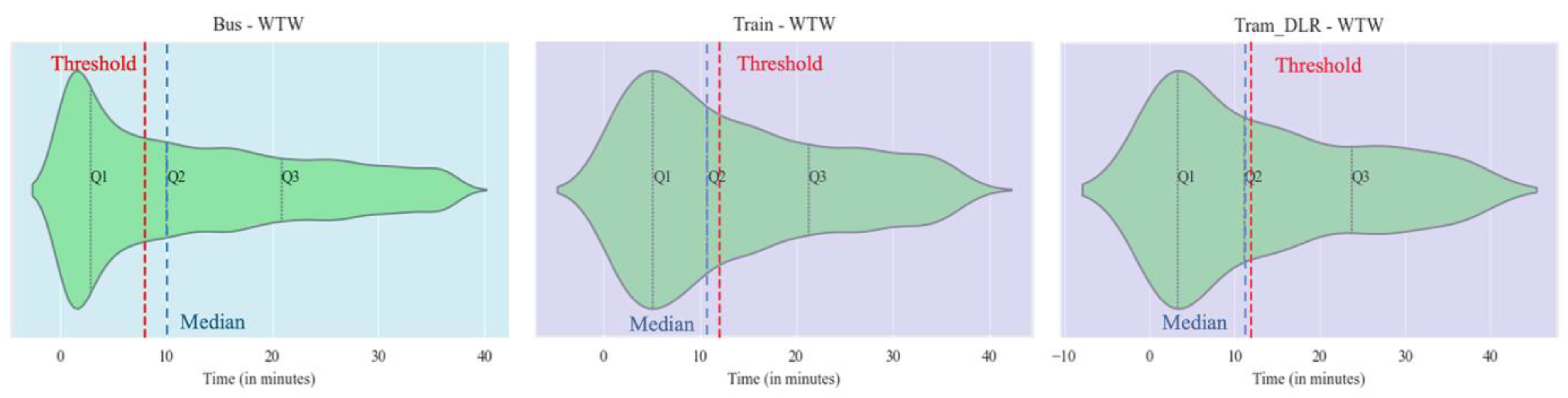
Figure 5.
Distribution of the number of activities by hour of the day and day of the week. The red rectangle indicates the time period used by the PTAL methodology to calculate waiting time in Greater London.
Figure 5.
Distribution of the number of activities by hour of the day and day of the week. The red rectangle indicates the time period used by the PTAL methodology to calculate waiting time in Greater London.
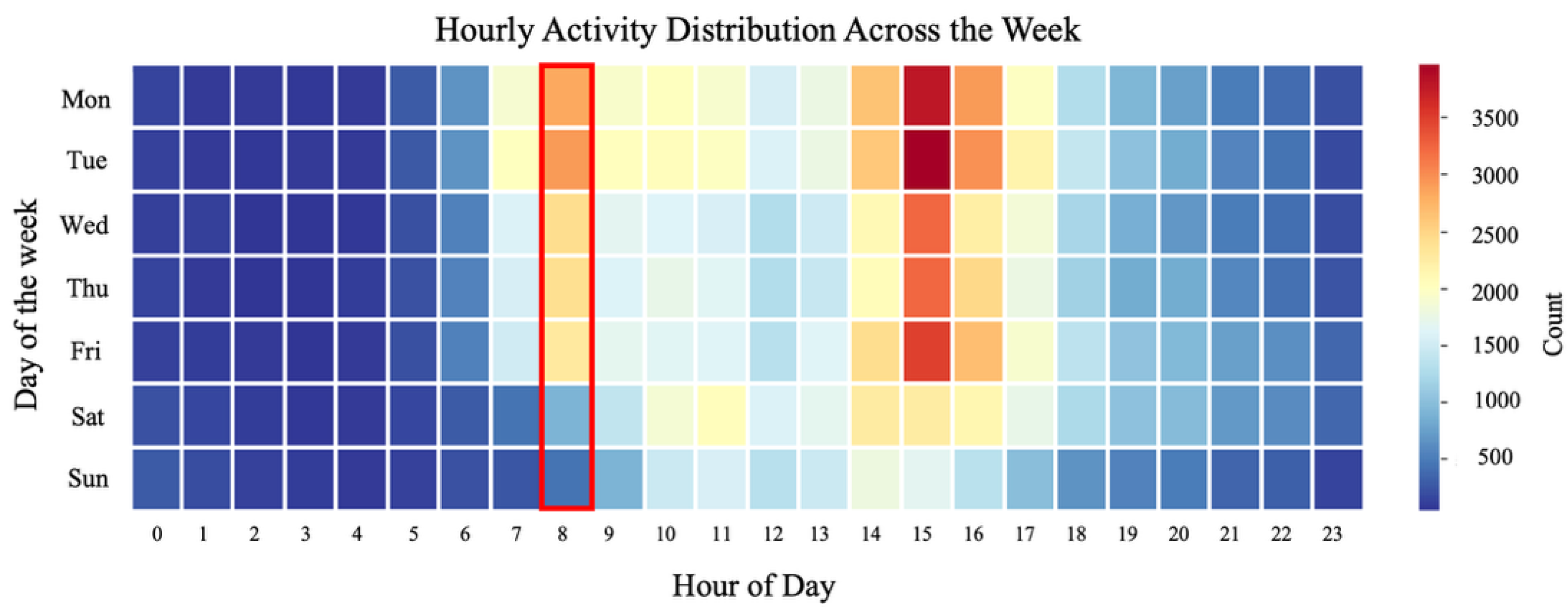
Figure 6.
The count of waiting activities from mobile app data in different peak times for various types of transport.
Figure 6.
The count of waiting activities from mobile app data in different peak times for various types of transport.

Figure 7.
Comparison of the Access Index in Greater London using reference data versus mobile app data.
Figure 7.
Comparison of the Access Index in Greater London using reference data versus mobile app data.
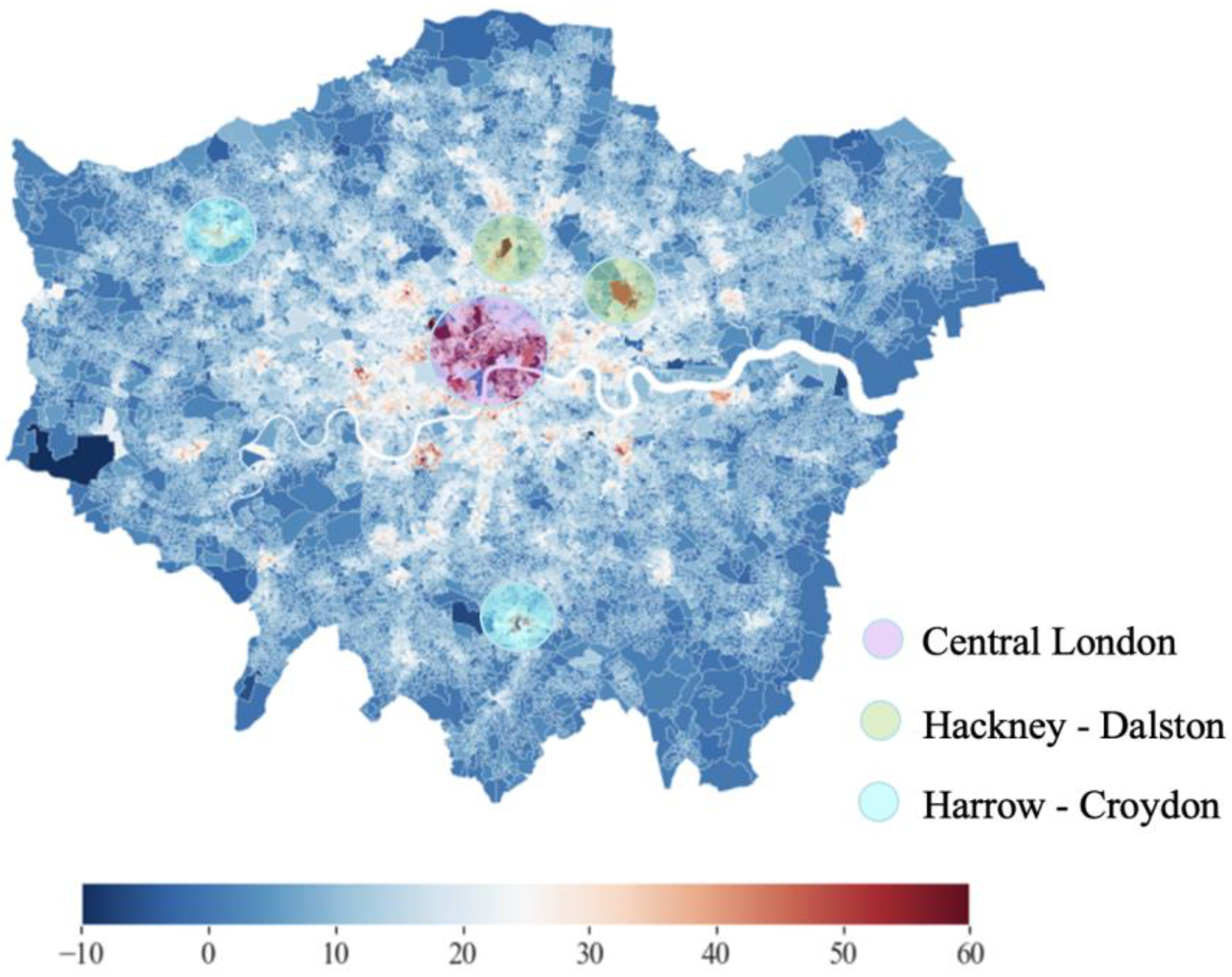

Table 1.
The mobile data representativeness as compared to transport stops in the study area.
| Type of transit (k) | The number of TA | POIs | ||
| Bus | 112201 | 0.941 | 18865 | 0.965 |
| Train (Rail + LU) | 6352 | 0.053 | 600 | 0.031 |
| Tram + DLR | 741 | 0.006 | 89 | 0.005 |
Disclaimer/Publisher’s Note: The statements, opinions and data contained in all publications are solely those of the individual author(s) and contributor(s) and not of MDPI and/or the editor(s). MDPI and/or the editor(s) disclaim responsibility for any injury to people or property resulting from any ideas, methods, instructions or products referred to in the content. |
© 2025 by the authors. Licensee MDPI, Basel, Switzerland. This article is an open access article distributed under the terms and conditions of the Creative Commons Attribution (CC BY) license (http://creativecommons.org/licenses/by/4.0/).
Copyright: This open access article is published under a Creative Commons CC BY 4.0 license, which permit the free download, distribution, and reuse, provided that the author and preprint are cited in any reuse.


