
Submitted:
19 February 2025
Posted:
20 February 2025
You are already at the latest version
Abstract
We apply data analytics to the publicly available and recently updated Chicago 2007-2024 Mosquito Database. In this database, 195 traps have been deployed in Chicago, Illinois, USA, from 2007 to 2024. Every year, from late May to early October, public health workers in Chicago set up mosquito traps scattered across the city. These traps collect mosquitoes, which are then partitioned into batches of fifty specimens. Each batch has been assessed using Polymerase Chain Reaction (PCR) for the presence of West Nile virus before the end of each week. The database records include the number of mosquitoes, the mosquito species, geographical information, and whether West Nile virus is present in each cohort. In its first part, this work explores the application of mosquito data analytics to the manually collected data, focusing on the potential to identify trends, find the outbreaks, and localize hotspots to support vector control strategies. In its second part, we investigate at what extent a virus-positive batch can be predicted using the rest of the variables recorded in the database, showing that an AUC score of approximately 81% can be achieved on a 2-year held out subset without including weather data.
Keywords:
mosquitoes
; data analytics
; machine learning
; west Nile virus
; prediction
1. Introduction
Mosquito-borne diseases continue to pose a significant threat to public health globally, with over one million people dying from these diseases each year (World Health Organization, 2023) [1]. The ability to effectively monitor and predict the spread of mosquito populations is therefore critical in mitigating the risks associated with diseases such as West Nile Virus (WNV) [2,3,4], malaria, Zika and dengue among others [5,6,7]. This has led to the emergence of mosquito monitoring programs as an essential tool in public health planning, vector control, and disease prevention efforts [8,9,10,11,12,13,14,15].
The application of data analytics to mosquito surveillance data allows for the identification of spatial and temporal trends in mosquito activity, providing insights into the drivers [8] and dynamics [9] of disease transmission. By integrating data from multiple sources, including mosquito traps, weather stations, and population health records, predictive models can be developed to estimate disease risk in different areas. For instance, predictive modeling has been used successfully in [8] to estimate WNV occurrences based on mosquito population data and environmental variables such as temperature and precipitation. Recent advances in machine learning and spatial analysis have further enhanced the capabilities of mosquito data analytics (see [9,10,11] for statistical challenges). Spatial analysis tools such as geographic information systems (GIS) have enabled researchers to map high-risk areas and understand how environmental factors contribute to mosquito breeding and disease spread [12,13].
The use of statistics is particularly important to understand mosquito surveillance Data in Arizona [14] and elsewhere, where recent studies have utilized detailed mosquito trapping and WNV occurrence data to identify outbreaks and guide targeted interventions [15]. Data analytics and machine learning has been applied on mosquito-related datasets in various contexts [16,17,18,19]. Research in [20] models the distribution of invasive mosquito species using several machine learning techniques on tabular datasets. In [21], the authors use climate data to predict malaria incidence, which is linked to mosquito populations. In [22], researchers explore the use of tabular data to forecast mosquito vector abundance. In [23], machine learning models are applied to mosquito occurrence data, analyzing mosquito habitat based on regional climate data. In [24,25], data mining and machine learning techniques are used to understand relationships among vectors, hosts, and pathogens. The established procedure for identifying mosquitoes with a virus load is to subject them to PCR testing.
PCR is a molecular biology technique used to detect the presence of specific pathogens or viruses in mosquito samples. It works by amplifying small segments of DNA or RNA, allowing researchers to identify and confirm the presence of disease-causing agents, such as West Nile Virus, Dengue Virus, or Malaria Plasmodium in mosquitoes. While PCR is highly effective for detecting pathogens, it has several practical disadvantages: (a) PCR requires specialized reagents (such as enzymes, primers, and nucleotides) and consumables (e.g., tubes and plates). The cost per test can add up significantly, making it expensive for large-scale mosquito surveillance programs. (b) PCR requires skilled personnel and sophisticated laboratory equipment, such as thermal cyclers, which are costly to purchase and maintain, especially in under-resourced regions. (c) PCR is not a real-time monitoring tool; the process involves collection, transportation to a lab, sample preparation, and testing, which introduces delays. It may take days or weeks to process and analyze samples from the field, leading to a lag between data collection and actionable results. Near-infrared (NIR) spectrometry has been suggested as an alternative approach for virus detection in mosquitoes. Although it relaxes some of the strict requirements of PCR, such as reagent use, it still requires specialized personnel and costly equipment [26,27,28,29,30]. NIR spectrometry is faster than PCR but not instantaneous, and it requires careful placement of the sensing probe on a mosquito specimen, making it unsuitable for automated analysis of large numbers of mosquitoes.
Although it is a strong statement, we argue that traditional mosquito surveillance practices are time-consuming, expensive, and lack scalability [31]. In this work, we are mainly interested in investigating whether we can predict the probability of an infected WNV batch in mosquito traps based on other variables such as the date, location, number of batches per trap, and number of mosquitoes per batch given historical data with manually verified virus presence. Machine learning models have been employed to predict mosquito populations and disease outbreaks with high accuracy, often outperforming traditional statistical approaches.
This work seeks to explore the role of mosquito data analytics and machine learning on the publicly available tabular dataset of Chicago Mosquito records (2007-2024). We analyze this database and offer a code suit to quickly address questions related to public health challenges posed by mosquito-borne diseases. Regarding classification, while our findings indicate that the probability attributed to each batch of being infected is not as accurate as PCR, it is a cost-effective and instantaneous approach embeddable in electronic versions of traps.
We open-source the Python code used to analyze the public data and classify the Chicago mosquito (2007-2024) database, making it applicable to any mosquito database with a similar structure (see Appendix).
2. Materials & Methods
2.1. The Chicago Database (2007-2024)
The Chicago West Nile Virus (WNV) Mosquito Database last updated October 4, 2024, is a publicly available dataset focused on mosquito surveillance in the city of Chicago, Illinois, for monitoring the spread of the WNV [32]. The dataset is primarily used by public health agencies, researchers, and data scientists to study mosquito population trends, virus prevalence, and the effectiveness of vector control strategies. The database reflects the city’s mosquito control and disease surveillance efforts. The data is collected weekly during mosquito season, typically between late-May to early-October when mosquitoes are most active. The mosquitoes are grouped in batches of up to fifty specimens and each batch is tested for the presence of WNV before the end of the week. The test results include the number of mosquitoes in the batch, the mosquito’s species, and whether WNV is present in the cohort.
2.2. The Location of Deployed Traps
The database is centered around the Chicago area and includes community areas, trap addresses, and environmental factors like latitude and longitude coordinates for the mosquito traps. The location of the traps is described by the block number and street name.
2.3. The Trap Types
In mosquito surveillance and control, various types of traps are employed to monitor mosquito populations, detect disease presence, and assist in vector management. Each trap type targets mosquitoes at different stages or conditions, using specific attractants or designs [33]. In the Chicago database, four mosquito trap types are mentioned:
1. GRAVID Traps: Gravid traps are designed to attract and capture female mosquitoes that are ready to lay eggs (gravid mosquitoes). These traps typically use organic matter-infused water, mimicking the stagnant water sites where females prefer to lay their eggs. Gravid traps are particularly effective for collecting mosquitoes from the Culex genus, known vectors of the WNV. By targeting gravid mosquitoes, which have already fed on blood and are potentially infectious, these traps are critical for disease surveillance.
2. CDC Light Traps: The CDC (Centers for Disease Control and Prevention) light traps are among the most widely used tools for mosquito surveillance. These traps utilize light as an attractant, usually a small incandescent or LED bulb, combined with a fan to capture flying mosquitoes. In many cases, CO2 is also used as an additional lure to mimic the presence of a warm-blooded host. CDC traps are effective in capturing a wide variety of mosquito species, including Anopheles, Aedes, and Culex, making them versatile in mosquito population monitoring.
3. OVI Traps (Oviposition Traps): Oviposition traps, or OVI traps, are designed to attract female mosquitoes looking for a site to lay eggs. These traps often consist of dark containers filled with water and a rough surface for mosquitoes to deposit their eggs. Oviposition traps are useful for detecting mosquito species like Aedes aegypti and Aedes albopictus, which are known carriers of diseases such as dengue, Zika, and chikungunya. By collecting eggs rather than adults, these traps provide early indications of mosquito activity and help in monitoring invasive species.
4. SENTINEL Traps: Sentinel traps are used primarily for long-term mosquito monitoring and disease surveillance. These traps are often baited with animal hosts (e.g., live birds) or attractants such as CO2 or pheromones. The primary function of sentinel traps is to capture mosquitoes that are actively seeking blood meals. They are instrumental in tracking potential disease outbreaks, particularly in areas with a high risk of vector-borne diseases. Their design allows for continuous operation, making them valuable in both research and public health monitoring programs.
Each of these traps serves a specific purpose in mosquito surveillance, with different characteristics tailored to the behavioral ecology of the target mosquito species.
These four trap types are mentioned in the Chicago database though OVI is practically not employed. Another trap-type called ‘Magnetic’ is mentioned but with no valid measurements.
2.4. The Database’s Fields
The database is tabular, and it is important to note that each row corresponds to a batch of mosquitoes and several rows can belong to the same trap visit as the catches are partitioned in groups of fifty specimens. The database is highly unbalanced as less than 10% of the batches have a WNV positive label. The mosquito occurrences dataset contains the following columns:
SEASON YEAR: The year of data collection.
WEEK: The week of the year that has been assessed with PCR.
TEST ID: Unique identifier.
BLOCK: General location of the mosquito trap.
TRAP: Trap ID.
TRAP_TYPE: Type of trap used (GRAVID, CDC, OVI, SENTINEL).
TEST DATE: Date and time the test was performed.
NUMBER OF MOSQUITOES: Number of mosquitoes in each batch.
RESULT: Outcome of the test (positive or negative for the presence of WNV). A positive case means that the batch has been subjected to PCR and has been found positive due to an unknown number of infected mosquitoes in the batch.
SPECIES: Mosquito species identified.
COMMUNITY AREA NUMBER: Number identifying the community area.
COMMUNITY AREA NAME: Name of the community area.
LATITUDE: Latitude of the trap location.
LONGITUDE: Longitude of the trap location.
2.5. The machine Learning Techniques
Both Bayesian statistics and tree-based classifiers are data-driven approaches, but their effectiveness depends on the underlying data distribution and problem structure. Bayesian techniques rely on fitting probability density functions and perform well when the problem naturally aligns with probabilistic modeling assumptions. In the Results section, we show that the distribution of WNV-positive and WNV-negative cases over dates—centered around August 1st—with respect to the logarithm of insect captures is well approximated by a 2D Gaussian. This structure makes Bayesian methods particularly suitable, as they require fewer tunable parameters compared to tree-based classifiers. However, as the amount of available data decreases, tree-based approaches tend to suffer from overfitting due to their reliance on recursive partitioning, whereas Bayesian methods, grounded in probabilistic inference, remain more robust and generalizable.
The provided code in [35] allows for easy manipulation of the training and test data, enabling users to observe these effects firsthand.
Tree-based classifiers are particularly effective for structured/tabular data due to their ability to compare features and handle mixed data types, manage non-linear relationships, and deal with missing values. The benefit is that one allows the model to discover the data instead of assuming a probabilistic description fitted on features of the dataset. In this work we used the following:
GradientBoostingClassifier is an ensemble machine learning technique that builds a sequence of weak learners (typically decision trees), each correcting the errors made by the previous one. By combining these weak learners, Gradient Boosting can produce a much better predictive model, often achieving high accuracy for both regression and classification tasks. This method iteratively minimizes a loss function (AUC score in our case), making it effective at capturing complex relationships in the data.
XGBClassifier (XGBoost) is a specific implementation of the Gradient Boosting approach. It introduces features like regularization, which helps reduce overfitting. XGBoost is widely applied for its performance in data science competitions due to its accuracy and flexibility in handling a wide range of data types and problems, including those with high dimensionality and class imbalance (like the Chicago database).
ExtraTreesClassifier (Extremely Randomized Trees) is an ensemble method that builds multiple decision trees using random splits of the dataset and random feature selections. Unlike Random Forests, Extra Trees make splits using random thresholds, which introduces more randomness. This often helps improve generalization and reduces overfitting. ExtraTreesClassifier is particularly effective in reducing variance and improving prediction performance, especially in datasets with a high number of features.
HistGradientBoostingClassifier is a variant of Gradient Boosting that employs histogram-based techniques to optimize decision trees. Instead of processing each data point individually, it bins continuous features into discrete intervals, significantly improving training speed, especially on large datasets. All tree-based classifiers have been adjusted for class imbalance.
Evaluation Using ROC Curve and AUC
In the Results section we evaluate classification results using the Receiver Operating Characteristic (ROC) metric and the area under this curve (AUC). ROC curves are widely used in classification problems to evaluate the performance of a binary classifier. ROC curves plot the True Positive Rate (TPR) (sensitivity) against the False Positive Rate (FPR) at various classification thresholds, providing a comprehensive view of how a model’s performance changes across different decision thresholds. Unlike metrics like accuracy, precision, or recall, which depend on a specific threshold, the ROC curve provides an aggregate measure of performance across all possible thresholds. This is particularly important in applications where there is no natural or predefined threshold. ROC curves are less affected by class imbalance compared to metrics like accuracy. In a highly imbalanced dataset, accuracy can be misleading, as the classifier might simply predict the majority class. The Chicago database is imbalanced because the WNV-positive cases are rare compared to the negative cases (<10% of the batches). ROC curves provide a way to visualize the trade-off between correctly identifying positives and mistakenly classifying negatives as positives. The Area Under the ROC Curve (AUC) is often used as a summary statistic for model performance. A perfect classifier has an AUC of 1.0, while a random classifier has an AUC of 0.5. Higher AUC values indicate better performance, capturing how well the model discriminates between positive and negative classes over all thresholds. In practical applications, choosing an appropriate threshold—also called an operational point—depends on the specific requirements of the use case and the cost of the different erroneous decisions. A ROC curve figure helps to select the best operational point by visualizing the trade-off between True Positive Rate and False Positive Rate.
3. Results
3.1. Data Preprocessing
3.1.1. Traps and Trap-Types
Traps listed in the “Trap” column of the database—T240, T240B, and T143—have missing data. For T240 and T240B, we have identified the address as 24 Lincoln Park with latitude 41.9187 and longitude -87.6715. The address for T143 is Norwood Park, with approximate GPS coordinates of 41.995 (latitude) and -87.799 (longitude). We have imputed these values for these traps only.
Some traps in the Chicago database are “satellite traps”. These are traps that are set up near (usually within 6 blocks) an established trap to enhance surveillance efforts. Satellite traps are postfixed with letters. For example, T220A is a satellite trap to T220 [32].
This dataset is organized in such a way that when the number of mosquitoes found in the catch bug/backet exceed fifty, they are split into another record (another row in the dataset), such that the number of mosquitos is capped at fifty. Therefore, the maximum number of mosquitoes per batch is fifty with only 2 exceptions in the records in 2014 and 2022 with 77 and 61 mosquitoes respectively (probably outliers).
Regarding trap types, in this dataset the OVI trap exists only in a single valid record in 2007 and, therefore, has no influence on the statistics. There are other entries as well, but the crucial parameter of the infection status is missing and for that reason these records are dropped. There are 195 trap ids in the dataset (see Table 1). 169 are GRAVID traps, 28 CDC, 12 SENTINEL and 1 OVI. These numbers add up to 210 because some IDs appear with two different trap types. Discrepancy arises because some traps appear under multiple TRAP_TYPE categories (e.g., Trap 009). When one sums these counts, it treats each instance of a trap across different TRAP_TYPE categories as unique, leading to an inflated total. This is either a data entry mistake or TRAP ids are reserved for a location, but the type of trap can change during the monitoring period.
3.1.2. Missing Values
After we impute traps: T240, T240B, T143, we drop all records that do not have data entry (NaN value) in the column of RESULTS (infection status) as this is the most crucial variable, it is rare, and we refrain from imputing it. We end up with a database of 36233 rows and we keep 14 relevant columns (variables): ’SEASON YEAR’, ’WEEK’, ’TEST ID’, ’BLOCK’, ’TRAP’, ’TRAP_TYPE’, ’TEST DATE’, ’NUMBER OF MOSQUITOES’, ’RESULT’, ’SPECIES’, ’COMMUNITY AREA NUMBER’, ’COMMUNITY AREA NAME’, ’LATITUDE’, ’LONGITUDE’.
3.2. Data Analytics
In this section we proceed to pose useful questions of practical value. These are the questions that would affect policy decisions, would be used to improve public awareness and to evaluate intervention strategies. The code is provided in the appendix and would be applicable to any other infection and mosquito database with corresponding structure.
3.2.1. The Distribution of WNV Positive Cases by Year
In Figure 1 we meant to visualize the distribution of the West Nile Virus presence by year to see if there is a potential trend in this pattern. Each bar represents the number of occurrences where the virus was detected in that specific year. By doing so, the histogram helps to identify which years had a higher or lower incidence of West Nile Virus presence and the trend. We see that the number of incidents in Chicago, based on this particular database, has been relatively stable over the years. This picture can be used to assess the impact of an intervention policy. While we are not aware of the specific intervention policies currently in place, Figure 1 does not show a steady decline in the phenomenon.
The mosquito species distribution of the whole database is gathered in Table 2. This Table shows all the species that are included in the database. The Culex pipiens/restuans categorization is the most prevalent, followed by Culex restuans and Culex pipiens. The term Culex pipiens/restuans is sometimes used when the differentiation between the two species is not clear, especially in mixed pools of collected mosquitoes. Because of their similarities in appearance and overlapping habitats, many mosquito surveillance programs use the combined term Culex pipiens/restuans when distinguishing between the two is difficult, especially without genetic testing. Therefore, Culex pipiens and Culex restuans are distinct species but are often grouped together due to their similarity. This vagueness in class attribution imposes an additional difficulty in the classification experiments. What this data definitely suggests is that the majority of the captured mosquitoes belong to the Culex genus, known for their role in transmitting diseases like West Nile Virus.
3.2.2. Mosquito Species Composition in Catches of Mosquito Traps over Time
Figure 2 provides an overview of mosquito trends in Chicago, focusing on variations in mosquito species and the prevalence of WNV over time. The analysis reveals the evolving population of different species, which may indicate changes in environmental factors, mosquito control measures, or virus prevalence.
The Culex pipiens (orange line in Figure 2) shows an initial peak in 2007, reaching the highest count among all species at that time. After 2007, the population rapidly declines in 2008, and remained consistently low from 2009 onwards, with only minor fluctuations in 2013 and 2014. The Culex pipiens/restuans (green line in Figure 2) is the dominant case throughout most of the time period (mind though that this is not a species but a collective characterization). Peaks can be observed in 2007, 2012, 2015, 2021, and 2023. The population shows a cyclical pattern, with significant rises and falls. Notably, there is a sharp decline in 2024 for the attribution to the mixed class Culex pipiens/restuans indicating either potential classification errors or some advancement in discerning these species.
The Culex restuans (red line) initially had a low population but begins a steady increase from around 2013 to 2015. There are some year-to-year fluctuations but generally stay moderate from 2015 onwards. Notable peaks occur in 2015 and 2023, with a general trend of maintaining a steady presence.
Culex erraticus (blue line) demonstrates very low numbers throughout the entire period. This species shows no significant spikes, suggesting either low prevalence or limited environmental suitability in the study area.
Culex salinarius, Culex tarsalis, Culex territans, Unspecified Culex (purple, yellow, grey lines) consistently have nearly zero to low populations throughout the time period.
This suggests that these species are either not as prevalent in the area or may be more challenging to trap using the specific trap types.
3.2.3. Most Probable Date to Detect WNV Infection in Batches of Traps’ Catches
Figure 3 is, in our view, the most significant figure in this work as it highlights the peak and distribution of WNV occurrences over time, providing insight into the seasonal pattern of outbreaks. It illustrates WNV-positive batches in relation to the weeks and months in which the virus was detected, across all years and species. This visualization is especially valuable for identifying potential seasonal trends, such as spikes in virus presence during specific months. It allows us to pinpoint periods of heightened activity, which can inform vector control strategies and public health responses. Notably, peak activity is observed between the last week of August and the first week of September.
3.2.4. Effectiveness of Trap Types in Catching Mosquitoes and WNV-Infected Mosquito Batches, Species Composition
To compare the effectiveness of each trap type fairly, we need to account for the unequal distribution of traps among trap types (see again Table 1). Since each TRAP_TYPE has a different number of traps, directly comparing the total mosquito counts would be biased. Normalizing by the number of traps within each TRAP_TYPE allows us to account for this imbalance, providing a fairer comparison of each trap type’s effectiveness. Figure 4 visualizes the effectiveness of different trap types in catching mosquitoes, broken down by species. The data is grouped by the TRAP_TYPE and SPECIES variables of the database, aggregating the normalized number of mosquitoes caught (variable NUMBER OF MOSQUITOES) for each species by each trap type. Since each bar in the bar-plot of Figure 4 represents a specific trap type and species combination, we can see which traps are more successful at capturing certain species. This insight can guide the deployment of different trap types to target specific mosquito populations more effectively, focusing on species that are major vectors of diseases like WNV. It is also helpful in optimizing trapping strategies by selecting the most effective trap types based on the target species in an area. The outcome of this analysis is that the GRAVID trap type is found to be the most effective trap in Culex catches followed by CDC. Note the difference in species caught by each trap type. The SENTINEL trap does not perform very well with Culex. We get almost the same picture when the y-axis holds the WNV positive cases normalized by the number of traps in each trap type (not presented here to avoid redundancy but can be found in the provided code).
3.2.5. Best Traps for Mosquito Catches and WNV Infected Mosquito Batches
There are 195 unique mosquito Trap Numbers that the public health workers in Chicago set up and scattered across the city. In Figure 5, we identify the top-performing mosquito traps based on two key metrics: West Nile Virus presence (variable RESULT in the left y-axis) and the total number of mosquitoes caught (in the right y-axis). If a trap has high mosquito counts but low WNV detections, it may indicate that the mosquitoes caught are not the primary carriers of the virus, suggesting a lower risk. Conversely, a high number of WNV detections, even with a moderate number of mosquitoes, points to a high concentration of infected mosquitoes, indicating that the location has a heightened risk of virus transmission.
Once we have the best performing trap names, we proceed into composing a table of their Address in Table 3.
Trap T009 is located at 91XX W HIGGINS RD and appears with two different trap types—CDC and GRAVID. This is either a data entry mistake or they have the same physical trap location reused over time, but the trap type is changed during different trapping periods.
3.2.6. Locations in the City as Hotspots for WNV Positive Batches
We identify the geographic locations of traps associated with a high presence of WNV-positive cases. However, these locations do not necessarily correspond to true hotspots in the field, as the trap network only samples the mosquito population and is neither densely populated nor evenly distributed. The first approach is to find the community areas (variable COMMUNITY AREA NAME) associated with virus-positive cases and sort them by value. Then we derive heatmaps of the trap locations with the highest numbers of WNV-positive cases. The histogram in Figure 6 visualizes the distribution of WNV detections across different areas of the town. Figure 6 helps in identifying high-risk locations, to guide public health efforts for targeted vector control and preventing the spread of WNV. This information can help in prioritizing vector control efforts, such as targeting these high-risk areas for increased spraying, public awareness campaigns, or other preventive measures. Understanding which traps consistently detect the virus can help in allocating resources efficiently. Health authorities can use this information to optimize monitoring locations, ensuring that the most significant risk areas are continuously observed to prevent outbreaks. Figure 6 allows you to see which geographic blocks have higher instances of WNV presence, indicating potential hotspot areas like O’Hare airport.
Figure 7a and 7b depict two types of geospatial visualizations that can be used to analyze the spatial distribution of WNV presence in the region covered by the dataset. The heatmap displays the intensity of WNV occurrences geographically. Each point on the map represents a location with the attributes of latitude and longitude, with the color intensity indicating the presence of the virus. Note that the points correspond to traps’ locations.
The heatmap helps in identifying hotspot regions where the density of infected mosquitoes is highest. Areas with darker colors indicate higher virus activity, suggesting areas of greater risk. Health officials can use this information to focus vector control efforts like pesticide spraying or mosquito breeding habitat elimination in the most affected regions.
The convex hull can be used to define the boundary of the region that needs to be monitored or controlled for WNV. It gives an idea of the geographical limits of areas where traps have detected the virus. By looking at how the traps are distributed within the convex hull, authorities can assess the spatial spread and identify areas where traps may be missing (i.e., identifying gaps in monitoring). Regions within the hull but with fewer traps could need additional monitoring.
Both figures are useful for effective resource allocation, monitoring coverage, public health interventions, and communicating risk to stakeholders and the public. They can be used in public health campaigns to inform communities of areas with a high risk of WNV transmission and encourage protective behaviors, such as avoiding outdoor activities at peak mosquito times or using insect repellent.
3.2.7. Identification of Outbreaks
To identify outbreaks of West Nile Virus (WNV), we can look for clusters of positive cases within a certain time period and/or geographic area. But how do we define an outbreak? In [34], the authors argue that any temporal anomaly from the expected number of cases is classified as an outbreak. This definition raises two problems: a) there are many ways to define an anomaly in the data and, b) the data on which an anomaly is to be detected are imperfectly sampled by health systems. In this work, we derive the outbreaks of the dataset from 2009-2024, using 4 different ways and we gather them in Table 4.
Identifying outbreaks can be approached using various definitions, each providing different insights into the data. Alternative definitions of an outbreak result in different catalogues of events. The first approach, which is common in anomaly detection in general, an outbreak occurs when the weekly count of WNV in batches exceeds the historical average by a certain number of standard deviations (one std for two weeks for all traps pooled together in Table 4). This method accounts for natural fluctuations in the data and identifies unusually high counts.
The second approach tracks week-over-week growth. An outbreak is detected when there’s a significant increase (e.g., doubling of counts) in WNV positive batches compared to the previous week. Rapid increases may indicate the onset of an outbreak.
The third approach involves using cumulative counts over a specific period. An outbreak is defined when the cumulative sum of WNV-positive cases within a given timeframe (e.g., a month) exceeds a predetermined threshold, capturing sustained periods of heightened activity.
Finally, the moving average threshold identifies an outbreak when the moving average of seven days exceeds a predefined threshold. It smooths out short-term fluctuations and highlights longer-term trends.
Different definitions may capture different aspects of the data. The statistical threshold method is useful for identifying unusually high activity compared to historical averages, while the rate of increase method is sensitive to rapid changes, even if the absolute numbers are low. The moving average allows to have time-varying thresholds instead of mean and standard deviations derived from all data.
The results in Table 4 and in Figure 8 indicate that the different methods do not consistently coincide. The various approaches yield different outbreak periods, suggesting significant differences in the detection criteria or underlying methodologies they use. Therefore, it needs some attention when people refer to an ‘outbreak’.
By identifying periods of outbreaks with different criteria, public health authorities can peak the one that fits their need plan and execute targeted interventions such as mosquito control, spraying campaigns, and public awareness initiatives. Knowing the precise periods when outbreaks tend to occur helps in taking proactive measures rather than reactive responses, thereby reducing the spread of WNV. By analyzing the timing of outbreaks over multiple years, authorities can understand whether they follow a predictable seasonal pattern or are influenced by certain environmental or climatic conditions. This information can be used to forecast future outbreaks, thereby allowing for preparedness and mitigation planning can evaluate the effectiveness of previous public health interventions and mosquito control efforts. If the frequency or intensity of outbreaks decreases over time, it may indicate that current strategies are effective.
3.2.8. The Distribution of WNV Positive Cases over Mosquito Batch Size
In the Chicago database, 9.15% of the mosquito batches are classified as infected with WNV, meaning some mosquitoes in those batches tested positive for the virus. In Figure 9, we examine the batch sizes when they were found to be WNV-positive. The histogram displays the distribution of the number of mosquitoes in each batch where the virus was detected. This visualization helps reveal the relationship between batch size and WNV presence, offering insights into the data distribution. As expected, larger batches of fifty mosquitoes were more likely to test positive, but positive cases were also observed in smaller batches.
3.3. Prediction of WNV Positive Batches
A prediction model in the context of this work would infer which batches are going to be found infested based on the rest of the variables. Note that such an approach relies on reliable, historical data from a network of traps on the same locations. This information can guide public health officials on when to implement interventions such as pesticide spraying, public awareness campaigns including alerting, and vector control measures. By understanding the probability of WNV occurrence over a time span, resources can be optimized, instead of evenly distributing resources in time and locations. This helps in efficient allocation of resources, for example, more frequent mosquito trapping and testing during peak times, reducing resource use during periods with low risk. For instance, if the peak occurrence falls around mid-August, health authorities can plan proactive measures just before this peak, focusing around geographic locations (hotspots) to minimize mosquito populations and, consequently, the transmission of WNV.
In this work we are interested only in the accuracy of a single model implementing a core idea, and we do not examine approaches like stacking or voting of a group of classifiers. We also focus only on the data of the Chicago database, and we do not integrate environmental factors such as spraying records, temperature, precipitation, and humidity, which are not part of this database, but it is known to greatly affect mosquito activity each year.
We introduce a new approach based on a bivariate Normal fitting with trap significance assessment (see Appendix for code and mathematical derivation). b) We introduce local regression, and we upload the dataset and the associated code so that different approaches can be tested for different splits of training and testing years of the Chicago database.
We make a base predictor by fitting a bivariate Normal jointly on the variables of the train dataset: The variable ‘Dates’ has been re-indexed from 1st of August and ‘Number of mosquitoes’ (the log of it) for the WNV positive class and WNV negative class. This can be seen in Figure 10 and Figure 11 (see also Appendix for code and mathematical derivation). In both figures, the pdfs are partly disjoint. The bivariate fit is applied on the training set, and it is assumed to characterize also the test set. Using the dates and the corresponding number of mosquitoes of the test set we can predict the probability of the infested batches of the test set. Note also that the peak of positive cases comes after about two weeks after the peak in mosquito catches.
Using basic Bayesian statistics, we can derive the probability of an infested batch given the test date and test ’NumMosquitos’ variables that are observables assuming that the same bivariate fit holds for the test set. The suggested approach alone will give an AUC of almost 80% without using any other variable or processing on the database. This is a result of interest to our point of view as it returns an accuracy very close to more complex classification methods but still is embeddable in microprocessors with few lines of code (see Appendix). In Figure 11 we see that the bivariate Gaussian fits on Days and log(Number of Mosquitoes) for WNV positive and negative classes of the train set are partly disjoint. This will allow us to extract some information on the probability of a batch being infected as the histograms of virus-negative mosquito catches and positive cases to be better separated. Note also in Figure 12 that the peak of WNV positive cases comes a bit after the peak in mosquito catches and is more concentrated in this 2-D feature space. In Figure 11 we can easily see gross decision boundaries: a) before August, it is unlikely to have WNV positive batches especially in batches with small number of catches, b) between the last week of August and the first week of September, in batches with high number of mosquitoes, the probability of an infested batch is at its peak.
3.3.1. The Trap Biases
We suggest an approach that combines statistical hypothesis testing with predictive modeling to enhance the detection of WNV presence based on mosquito trap data. By statistically validating traps and adjusting predictions accordingly, the model accounts for spatial variations in WNV activity, leading to more accurate and reliable predictions. The model incorporates several statistical techniques, including hypothesis testing, multivariate normal modeling, and adjustments for multiple comparisons.
We focus on validating whether certain mosquito traps have a significantly higher occurrence of WNV-positive cases than would be expected by chance. This is achieved through the hypergeometric test. Let N represent the total number of trials in the population (training dataset) and K the total number of “successes” (WNV-positive cases) in the population. The hypergeometric test assesses whether the number of WNV-positive cases observed in a specific trap is significantly higher than expected under the null hypothesis (i.e., the trap has the same positive rate as the overall population). We tried to adjust the p-values to account for multiple hypothesis testing using the Bonferroni correction, but it was a very conservative approach, and we removed it. A p-value less than 0.05 is considered significant. We then determine if a trap has a statistically significantly higher rate of WNV-positive cases compared to the overall population.
The weight is the ratio of the trap’s positive proportion to the overall positive proportion. This amplifies the influence of traps with higher-than-expected positive rates. If a trap is deemed non-significant, we assign a weight of 1.0, indicating no adjustment. If a trap has a significantly higher positive rate, its weight increases the predicted probability and modifies the predicted probabilities based on the trap weights determined from the hypergeometric test. The key statistical technique used for validating the traps is the hypergeometric test, which assesses whether the observed number of WNV-positive cases in each trap is significantly higher than expected under the null hypothesis. This test is appropriate because each mosquito trap’s data represents a sample without replacement from the overall population. The total number of observations and successes are known and finite. By performing the hypergeometric test for each trap, we identify traps that have a statistically significantly higher occurrence of WNV-positive cases. Adjusting the predicted probabilities using the weights derived from this test enhances the model’s ability to account for spatial heterogeneity in WNV prevalence. We have tried other tests such as t-tests, but all returned inferior results in terms of ROC accuracy.
3.3.2. Kernel-Weighted Regression by Applying Distances in Time and Locations
The core idea revolves around a Bayesian classification approach augmented with a form of local regression to adjust predictions based on nearby mosquito counts. We suggest a kernel-weighted regression approach to estimate the expected mosquito count for each observation, considering neighboring data points in time and space. Kernel-weighted regression is a type of ‘local regression’ where data points closer to a given input point are given more weight in estimating the probability of that batch being infected. The code estimates the number of mosquitoes per row based on the count of mosquitoes from similar rows. The “similarity” is defined by temporal proximity, spatial proximity, and optionally species or trap type. Since the distances in the Chicago area are small, we did not employ geodesic distance calculation, and the distance was just the Euclidean distance in GPS coordinates and the temporal distance is the absolute value of days from First of August. The final estimate is computed as a weighted average, where weights are determined by a distance function that considers both the inverse of temporal and spatial distances. The statistical significance of each nearby row’s contribution is adjusted by the count of mosquitoes and more weight is given to data rows in time and geographic location. This approach helps in providing a more robust estimate of mosquito counts, particularly when the original data may be sparse or inconsistent across different spatial and temporal dimensions. All these biases and their influence on the AUC score of the test set are gathered in Table 4 (see also Appendix).
We partitioned the data into a training set containing all years from 2007 to 2022 and held out the years 2023 and 2024 as a test set. This presents a challenging scenario, as we need to predict two consecutive years based on training data that also includes years from the distant past. The results are gathered in Table 5.
3.3.3. Other Classifiers
The Chicago Database is a tabular one, and this kind of data structure is typically treated with tree-based classifiers.
The following variables have been converted to categorical: ’TRAP_TYPE’, ’Species’, ’Trap’, ’Address’, ’COMMUNITY AREA NAME’]). The columns used are [’Block’, ’Species’, ’TRAP_TYPE’, ’Trap’, ’Latitude’, ’Longitude’, ’month’, ’week’, ’NumMosquitos’, ’Address’, ’COMMUNITY AREA NAME’]. The results are gathered in Table 6.
The ROC curve rises above the diagonal (gray dashed line), indicating that the model is better than random chance in distinguishing between positive and negative classes (see Figure 12).
The area under the curve (AUC) is 0.81, which suggests that the model has a reasonably good ability to discriminate between the two classes. An AUC closer to 1 would indicate a very strong classifier, while an AUC of 0.5 would represent a classifier that performs no better than random guessing. In Figure 13 the operational point is marked with a red dot. Based on its position: True Positive Rate (TPR) ≈ 0.78 and False Positive Rate (FPR) ≈ 0.28. This means that the model correctly identifies 78% of actual positive cases (i.e., it captures 78% of true cases as positives and 28% of actual negative cases are mistakenly classified as positive (i.e., false alarms).
3.3.4. Additional Parameters
Spraying records and weather conditions can significantly influence indirectly the probability of a mosquito batch testing positive for WNV. Spraying—a common mosquito control measure—can directly reduce mosquito populations, particularly those carrying WNV, thereby lowering the likelihood of WNV-positive batches. Weather factors such as temperature, humidity, and rainfall also play a crucial role; warmer temperatures and increased rainfall create favorable conditions for mosquito breeding, potentially raising WNV transmission risk. Therefore, integrating spraying records and weather data into predictive models could enhance accuracy by accounting for these critical environmental factors.
4. Discussion
The key findings of this paper reveal that maintaining detailed historical data from a widespread network of mosquito traps, including counts of WNV incidents, enables the prediction of future WNV-infected batches. We show that a probabilistic approach is quite effective but is on par with other data-driven, tree-based techniques. This predictive capability is rooted in the analysis of hotspots, species composition, geographic location, and spatiotemporal correlations of outbreaks. While predictions based solely on variables like location, species composition, and mosquito counts do not match the accuracy of PCR-based methods, they significantly outperform random guessing. The accuracy can increase with the incorporation of weather and spraying data and reliably resolving the Culex pipiens/restuans ambiguity.
Another important finding is that detailed records of mosquito catches from a distributed network of traps allow for the rapid identification of hotspots, community names, and specific trap locations responsible for the highest number of infected batches. This information enables swift identification of problematic areas. Rising trends may signal the need for more aggressive control measures, while declining trends could indicate the effectiveness of current practices, providing a reference point for future efforts.
AI and data analytics are now integral to all research areas where variables of interest can be quantified, helping to answer practical questions such as when and where a problem arises, how severe it is, and how it is likely to evolve.
5. Conclusions
We envision a connected world where extensive, permanently installed networks of automated mosquito traps are seamlessly integrated with the internet via terrestrial and satellite communication. These networks would enable continuous, real-time monitoring of key parameters such as mosquito counts, capture timestamps, and the sex, species, and genus of trapped mosquitoes. This data stream, enriched with infection probabilities and weather information, can be processed using AI techniques, including large language models, to assess risks and prioritize responses.
By leveraging real-time data, historical trends, and advanced analytics, these traps could send targeted alerts directly to individuals’ mobile phones in urban and suburban hotspot areas. Based on mosquito species and their known circadian activity, these warnings could help vulnerable populations, such as the elderly, minimize outdoor exposure during peak mosquito activity. Additionally, digital signage could display alerts only during critical periods, reducing alert fatigue while reminding people to wear protective clothing and avoid high-risk areas when necessary.
Data analytics can estimate infection probabilities in captured mosquito batches without requiring PCR testing, provided historical data are available. While these predictions are less precise than PCR-based testing, they offer instantaneous results at no additional cost. Despite their lower accuracy, such estimates are reliable enough for issuing early warnings, optimizing resource allocation for prevention and intervention efforts, and securing necessary funding for mosquito control—an ongoing priority for policymakers.
Author Contributions
Conceptualization, I.P.; methodology, I.P.; software, I.P.; writing, I.P.; The author has read and agreed to the published version of the manuscript.
Funding
This research received no external funding.
Data Availability Statement
Data derived from public domain resources. Public dataset [Chicago Database (2009-2024)] [https://data.cityofchicago.org/Health-Human-Services/West-Nile-Virus-WNV-Mosquito-Test-Results/jqe8-8r6s/about_data]. A slightly processed dataset, primarily involving variable renaming and the removal of incomplete records, is available in [35].
Conflicts of Interest
The author declares no conflicts of interest.
Appendix
Code
The Chicago database can be found [32] and in [35] we include a slightly preprocessed version. We also provide python code for reproducing all figures, calculating the bivariate predictions and running the classification tasks. In [36] one can find more on the theoretical background needed to derive the probability estimation of infected batches.
Mathematical Derivation of the Probability of Infected Batches Based on Historical Data
We aim to predict the probability of West Nile Virus (WNV) presence (WNV=1) in the test set using two features of the database:
x1: DaysSinceAug1: Number of days since August 1, and
x2: log(NumMosquitos+1): Number of mosquitoes captured (log scale)
for the two classes c, (WNV=0, WNV=1).
Our approach involves:
- a)
- Modeling the joint distribution of features (x1, x2) for each class (WNV = 0 and WNV = 1) independently using a bivariate Gaussian distribution fitted on (x1, x2) for each class separately. We fit on the training set, and we assume that the test set follows the same distribution.
- b)
- Computing the likelihoods of the observed data under each class’s distribution.
- c)
- Applying Bayes’ Theorem to compute the posterior probability that WnvPresent = 1 given the observed features (x1, x2) of the test set.
Steps (a-c) in mathematical terms are presented below.
We assume that the features (x1, x2) follow a bivariate Normal pdf within each class c.
The bivariate Gaussian distribution models the joint probability of two continuous random variables (x1, x2). The probability density function (PDF) is:
where the joint feature vector is . The mean of x in (1) is The covariance matrix in (2) is:
The determinant of the covariance matrix is The means of each class c are calculated from the features (x1, x2) of the training set as in (3):
The covariance of each class is calculated from the features of the training set as in (4):
The likelihood of each class c (i.e., WNV=0 vs WNV=1) is in (5)
The priors of each class c are derived from the training set as in (6):
The evidence P(x) is calculated in (7) and requires the priors in (6):
The likelihood of each class needed in (7) is calculated in (8):
The exponent can be calculated in terms of the so called Mahalanobis distance in (9):
So (8) is rewritten as in (10) for each class c and plugged into (7).
Finally using Bayes theorem, we calculate the probability of an infested batch as in (11), using (10), and (6):
References
- World Health Organization (2023). Mosquito-borne diseases. WHO. https://www.who.int/news-room/fact-sheets/detail/vector-borne-diseases.
- Uelmen, J.A., Lamcyzk, B., Irwin, P. et al. Human biting mosquitoes and implications for West Nile virus transmission. Parasites Vectors 16, 2 (2023). [CrossRef]
- DeFelice, N., Little, E., Campbell, S. et al. Ensemble forecast of human West Nile virus cases and mosquito infection rates. Nat Commun 8, 14592 (2017). [CrossRef]
- DeFelice NB, Birger R, DeFelice N, et al. Modeling and Surveillance of Reporting Delays of Mosquitoes and Humans Infected with West Nile Virus and Associations With Accuracy of West Nile Virus Forecasts. JAMA Netw Open. 2019;2(4):e193175. [CrossRef]
- Villena, O.C., McClure, K.M., Camp, R.J. et al. Environmental and geographical factors influence the occurrence and abundance of the southern house mosquito, Culex quinquefasciatus, in Hawai‘i. Sci Rep 14, 604 (2024). [CrossRef]
- Petruff, T.A., McMillan, J.R., Shepard, J.J. et al. Increased mosquito abundance and species richness in Connecticut, United States 2001–2019. Sci Rep 10, 19287 (2020). [CrossRef]
- Haddawy P, Wettayakorn P, Nonthaleerak B, Su Yin M, Wiratsudakul A, Schöning J, et al. (2019) Large scale detailed mapping of dengue vector breeding sites using street view images. PLoS Negl Trop Dis 13(7): e0007555. [CrossRef]
- Karki S, Brown WM, Uelmen J, Ruiz MO, Smith RL (2020) The drivers of West Nile virus human illness in the Chicago, Illinois, USA area: Fine scale dynamic effects of weather, mosquito infection, social, and biological conditions. PLoS ONE 15(5): e0227160. [CrossRef]
- Smith DL, Battle KE, Hay SI, Barker CM, Scott TW, McKenzie FE (2012) Ross, Macdonald, and a Theory for the Dynamics and Control of Mosquito-Transmitted Pathogens. PLoS Pathog 8(4): e1002588. [CrossRef]
- Monaghan AJ, et al.,. On the Seasonal Occurrence and Abundance of the Zika Virus Vector Mosquito Aedes Aegypti in the Contiguous United States. PLoS Curr. 2016 Mar 16;8. [CrossRef]
- Bowman LR, Runge-Ranzinger S, McCall PJ (2014) Assessing the Relationship between Vector Indices and Dengue Transmission: A Systematic Review of the Evidence. PLoS Negl Trop Dis 8(5): e2848. [CrossRef]
- Dale PE, Ritchie SA, Territo BM, Morris CD, Muhar A, Kay BH. An overview of remote sensing and GIS for surveillance of mosquito vector habitats and risk assessment. J Vector Ecol. 1998 Jun;23(1):54-61. [PubMed]
- Xu J., and Wang X.Y., and Zhou Y.L., 2024, Applications of geographic information systems in mosquito monitoring, Journal of Mosquito Research, 14(3): 161-171. [CrossRef]
- Brown HE, Sedda L, Sumner C, Stefanakos E, Ruberto I, Roach M. Understanding Mosquito Surveillance Data for Analytic Efforts: A Case Study. J Med Entomol. 2021 Jul 16;58(4):1619-1625. [CrossRef] [PubMed] [PubMed Central]
- Moutinho, S.; Rocha, J.; Gomes, A.; Gomes, B.; Ribeiro, A.I. Spatial Analysis of Mosquito-Borne Diseases in Europe: A Scoping Review. Sustainability 2022, 14, 8975. [Google Scholar] [CrossRef]
- Sheard Julie Koch, et al., 2024. Emerging technologies in citizen science and potential for insect monitoring. Phil. Trans. R. Soc. B37920230106. [CrossRef]
- Ananya Joshi, Clayton Miller, Review of machine learning techniques for mosquito control in urban environments, Ecological Informatics, Volume 61, 2021, 101241, ISSN 1574-9541. [CrossRef]
- Lee, DS., Lee, DY. & Park, YS. Interpretable machine learning approach to analyze the effects of landscape and meteorological factors on mosquito occurrences in Seoul, South Korea. Environ Sci Pollut Res 30, 532–546 (2023). [CrossRef]
- Chevalier V, Tran A, Durand B. Predictive modeling of West Nile virus transmission risk in the Mediterranean Basin: how far from landing? Int J Environ Res Public Health. 2013 Dec 20;11(1):67-90. [CrossRef]
- Linus Früh, Helge Kampen, Antje Kerkow, Günter A. Schaub, Doreen Walther, Ralf Wieland, Modelling the potential distribution of an invasive mosquito species: comparative evaluation of four machine learning methods and their combinations, Ecological Modelling, Volume 388, 2018, Pages 136-144, ISSN 0304-3800. [CrossRef]
- Odu Nkiruka, Rajesh Prasad, Onime Clement, Prediction of malaria incidence using climate variability and machine learning, Informatics in Medicine Unlocked, Volume 22, 2021, 100508, ISSN 2352-9148. [CrossRef]
- Ana Ceia-Hasse, Carla A. Sousa, Bruna R. Gouveia, César Capinha, Forecasting the abundance of disease vectors with deep learning, Ecological Informatics, Volume 78, 2023, 102272, ISSN 1574-9541. [CrossRef]
- Ralf Wieland, Katrin Kuhls, Hartmut H.K. Lentz, Franz Conraths, Helge Kampen, Doreen Werner, Combined climate and regional mosquito habitat model based on machine learning, Ecological Modelling, Volume 452, 2021, 109594, ISSN 0304-3800. [CrossRef]
- Md. Siddikur Rahman, Chamsai Pientong, Sumaira Zafar, Tipaya Ekalaksananan, Richard E. Paul, Ubydul Haque, Joacim Rocklöv, Hans J. Overgaard, Mapping the spatial distribution of the dengue vector Aedes aegypti and predicting its abundance in northeastern Thailand using machine-learning approach, One Health, Volume 13, 2021, 100358, ISSN 2352-7714. [CrossRef]
- Diing D.M. Agany, Jose E. Pietri, Etienne Z. Gnimpieba, Assessment of vector-host-pathogen relationships using data mining and machine learning, Computational and Structural Biotechnology Journal, Volume 18, 2020, Pages 1704-1721, ISSN 2001-0370. [CrossRef]
- Santos LMB, et al., High throughput estimates of Wolbachia, Zika and chikungunya infection in Aedes aegypti by near-infrared spectroscopy to improve arbovirus surveillance. Commun Biol. 2021 Jan 15;4(1):67. [CrossRef]
- Sikulu-Lord MT, Milali MP, Henry M, Wirtz RA, Hugo LE, Dowell FE, et al. (2016) Near-Infrared Spectroscopy, a Rapid Method for Predicting the Age of Male and Female Wild-Type and Wolbachia Infected Aedes aegypti. PLoS Negl Trop Dis 10(10): e0005040. [CrossRef]
- Goh B, Ching K, Soares Magalhães RJ, Ciocchetta S, Edstein MD, Maciel-de-Freitas R, et al. (2021) The application of spectroscopy techniques for diagnosis of malaria parasites and arboviruses and surveillance of mosquito vectors: A systematic review and critical appraisal of evidence. PLoS Negl Trop Dis 15(4): e0009218. [CrossRef]
- Fernandes, J. N.; et al. Rapid, noninvasive detection of Zika virus in Aedes aegypti mosquitoes by near-infrared spectroscopy. Sci. Adv. 4, eaat0496 (2018).
- Sikulu-Lord, M. T.; et al. Rapid and non-destructive detection and identification of two strains of Wolbachia in Aedes aegypti by near-infrared spectroscopy. PLoS Negl. Trop. Dis. 10, e0004759 (2016).
- Uelmen, J.A., Clark, A., Palmer, J. et al. Global mosquito observations dashboard (GMOD): creating a user-friendly web interface fueled by citizen science to monitor invasive and vector mosquitoes. Int J Health Geogr 22, 28 (2023). [CrossRef]
- https://data.cityofchicago.org/Health-Human-Services/West-Nile-Virus-WNV-Mosquito-Test-Results/jqe8-8r6s/about_data (accessed at 6/2/2025).
- Gorsich, E.E., Beechler, B.R., van Bodegom, P.M. et al. A comparative assessment of adult mosquito trapping methods to estimate spatial patterns of abundance and community composition in southern Africa. Parasites Vectors 12, 462 (2019). [CrossRef]
- Oliver J. Brady, David L. Smith, Thomas W. Scott, Simon I. Hay, Dengue disease outbreak definitions are implicitly variable, Epidemics, Volume 11, 2015, Pages 92-102, ISSN 1755-4365. [CrossRef]
- https://zenodo.org/records/14824909 (accessed on 6/2/2025).
- van de Schoot, R., Depaoli, S., King, R. et al. Bayesian statistics and modelling. Nat Rev Methods Primers 1, 1 (2021). [CrossRef]
Figure 1.
WNV positive cases out of all traps with respect to the year. The y-axis holds the number of batches that have been found positive for WNV.
Figure 1.
WNV positive cases out of all traps with respect to the year. The y-axis holds the number of batches that have been found positive for WNV.
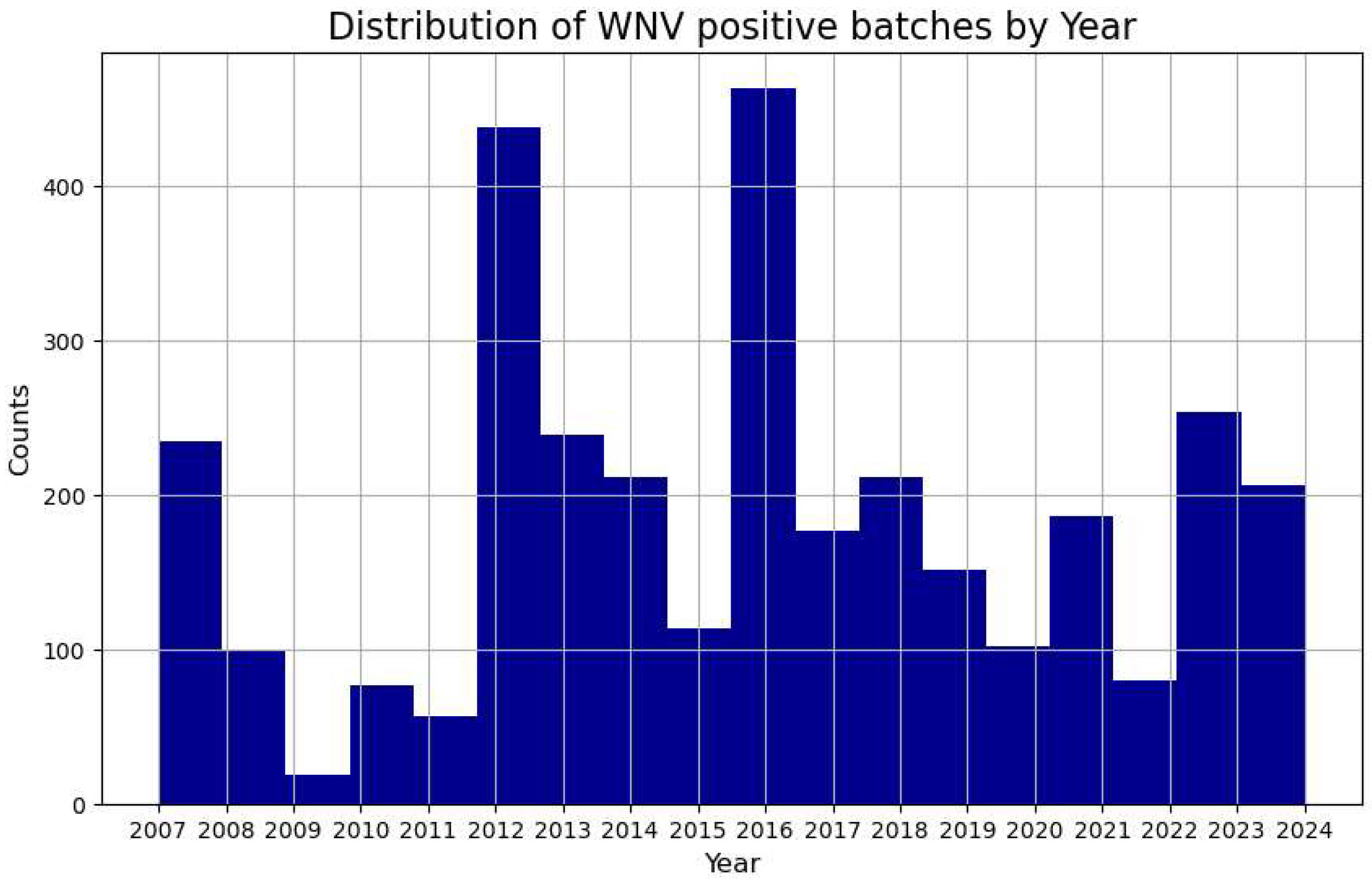
Figure 2.
Mosquito species composition trends over the years in the Chicago WNV database. The y-axis holds the counted number of mosquitoes in trap catches.
Figure 2.
Mosquito species composition trends over the years in the Chicago WNV database. The y-axis holds the counted number of mosquitoes in trap catches.
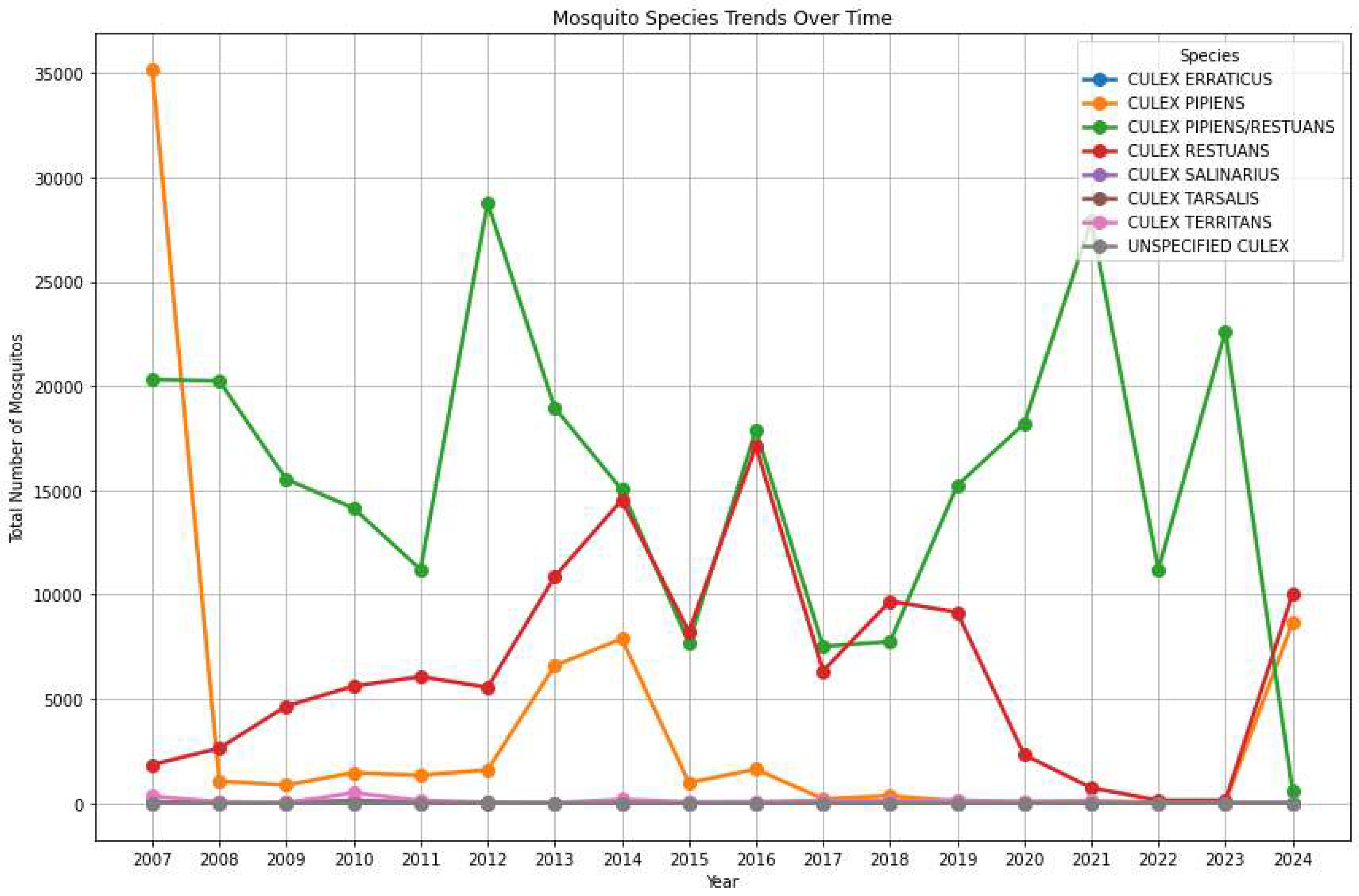
Figure 3.
WNV positive batches (y-axis) with respect to the week and month they have been identified. The main x-axis shows the week numbers (from 1 to 52), while a secondary x-axis on-top displays the months. Between the last week of August and the first week of September we have peak activity from data pooled from 2007 to 2024.
Figure 3.
WNV positive batches (y-axis) with respect to the week and month they have been identified. The main x-axis shows the week numbers (from 1 to 52), while a secondary x-axis on-top displays the months. Between the last week of August and the first week of September we have peak activity from data pooled from 2007 to 2024.
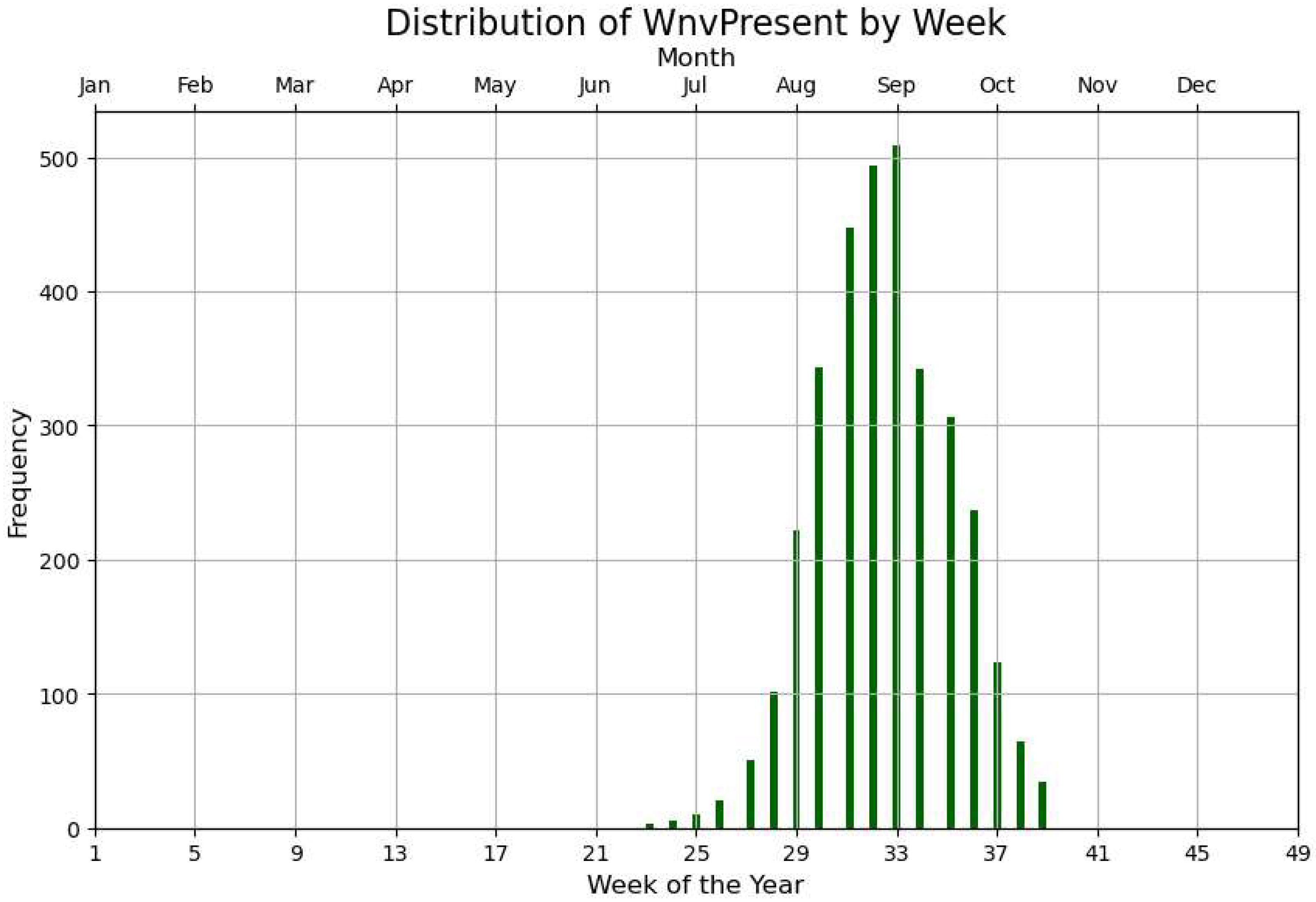
Figure 4.
The visualization shows how effective different trap types are in catching various mosquito species. Y-axis is normalized. It answers the question: Which trap types are best suited for capturing high numbers of mosquitoes overall.
Figure 4.
The visualization shows how effective different trap types are in catching various mosquito species. Y-axis is normalized. It answers the question: Which trap types are best suited for capturing high numbers of mosquitoes overall.
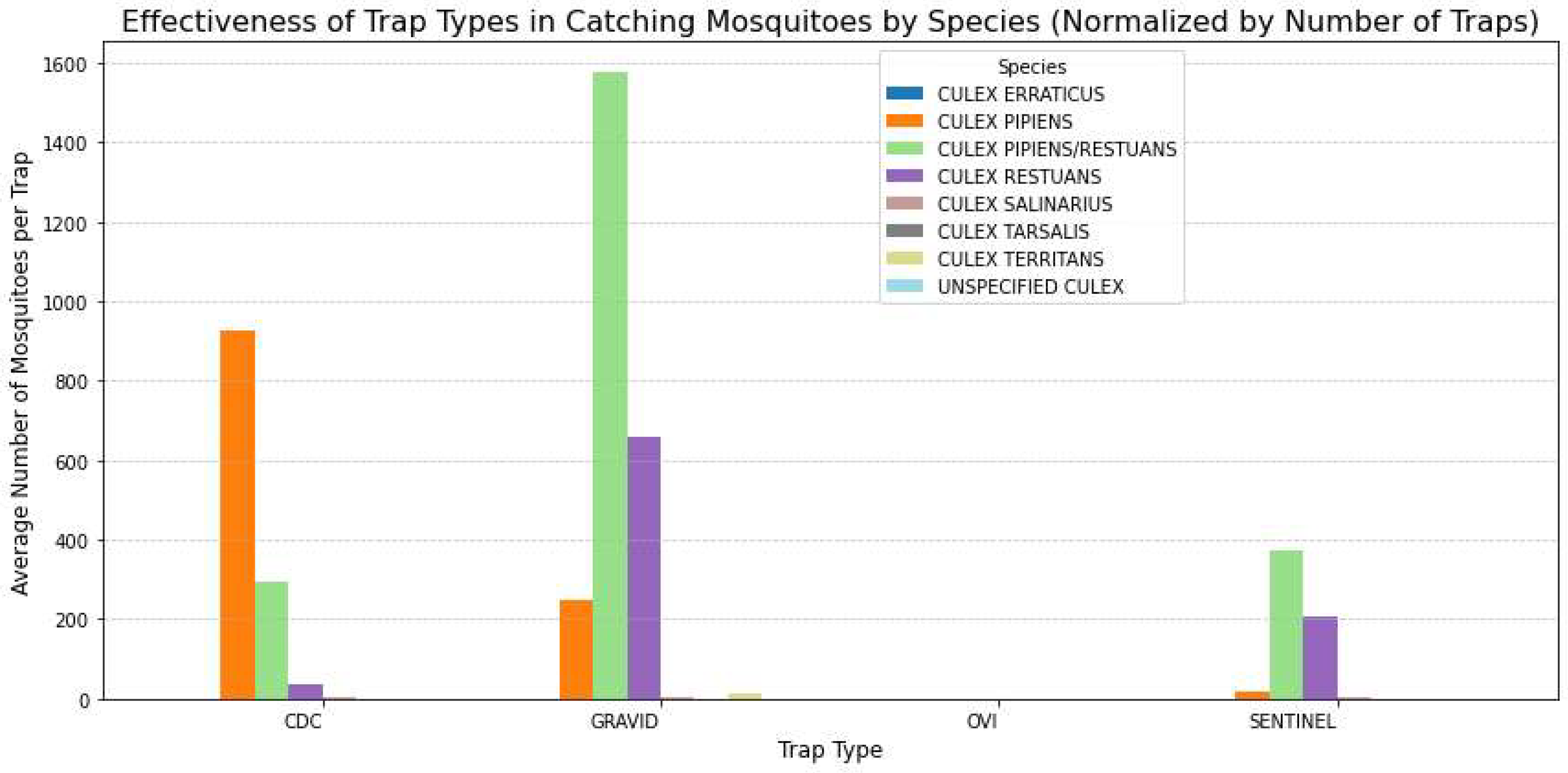
Figure 5.
The top 10 traps ranked based on WNV-positive batches and the number of mosquitoes per batch.
Figure 5.
The top 10 traps ranked based on WNV-positive batches and the number of mosquitoes per batch.
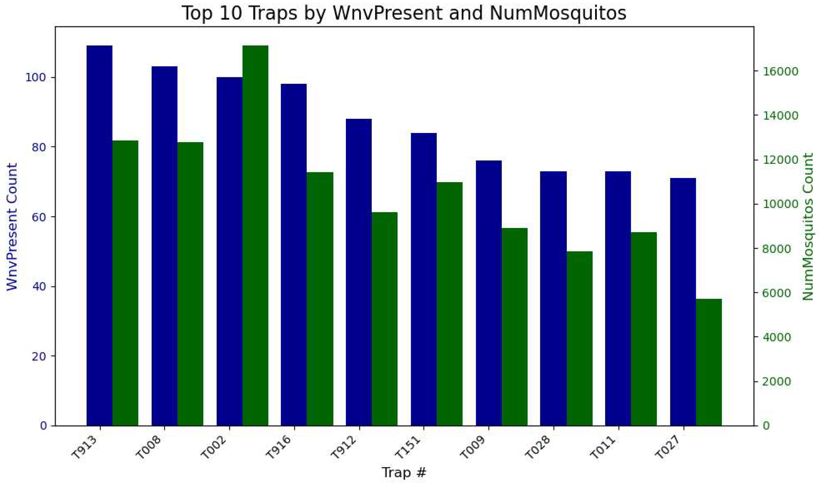
Figure 6.
We mark the address where most incidents of WNV positive occurred. The address that stands out corresponds to the station at the Community area Name O’ Hare International Airport.
Figure 6.
We mark the address where most incidents of WNV positive occurred. The address that stands out corresponds to the station at the Community area Name O’ Hare International Airport.
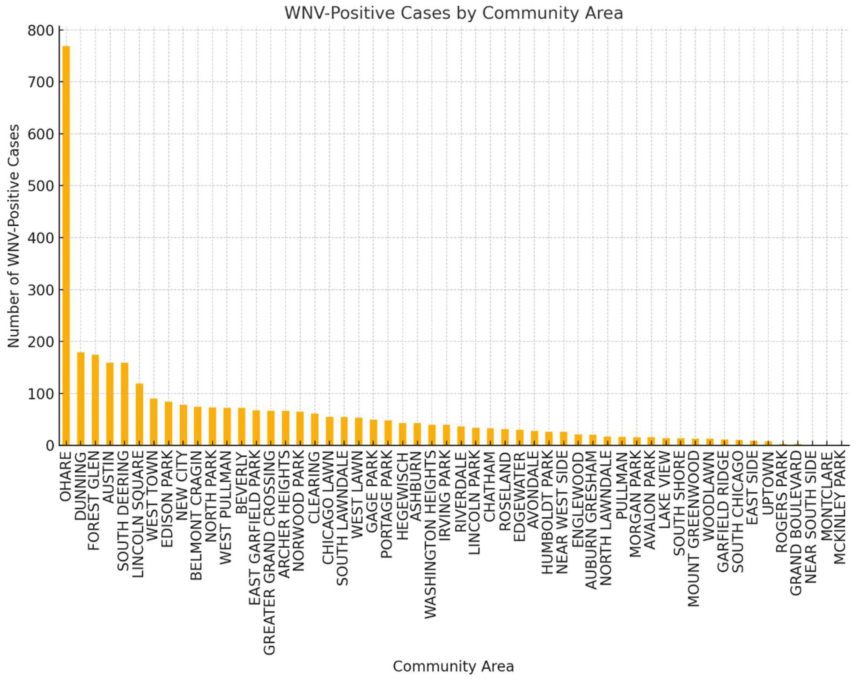
Figure 7.
a) Heatmap of WNV positive traps in Chicago b) The convex hull is a mathematical boundary that encapsulates all the points representing trap locations (i.e., latitude and longitude of each trap). Larger size of spots for WNV, default size otherwise.
Figure 7.
a) Heatmap of WNV positive traps in Chicago b) The convex hull is a mathematical boundary that encapsulates all the points representing trap locations (i.e., latitude and longitude of each trap). Larger size of spots for WNV, default size otherwise.
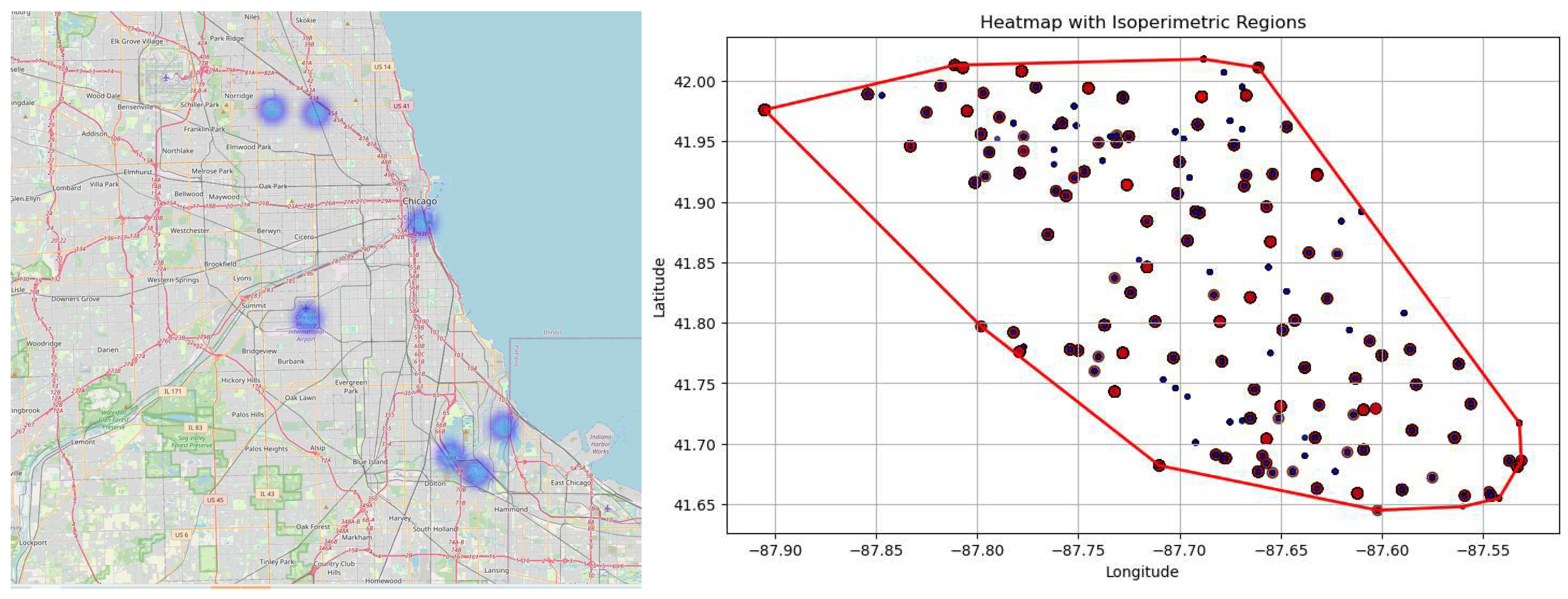
Figure 8.
Identifying West Nile Virus Outbreaks Over Time: Highlighted periods indicate consecutive weeks of heightened WNV activity. The WNV cases are pooled together from all traps. a) 1st (mean exceeding one standard deviation), b) 2nd (week-over-week growth by 100%), c) 3d (cumulative counts over a month), d) 4th (moving average threshold of seven days).
Figure 8.
Identifying West Nile Virus Outbreaks Over Time: Highlighted periods indicate consecutive weeks of heightened WNV activity. The WNV cases are pooled together from all traps. a) 1st (mean exceeding one standard deviation), b) 2nd (week-over-week growth by 100%), c) 3d (cumulative counts over a month), d) 4th (moving average threshold of seven days).
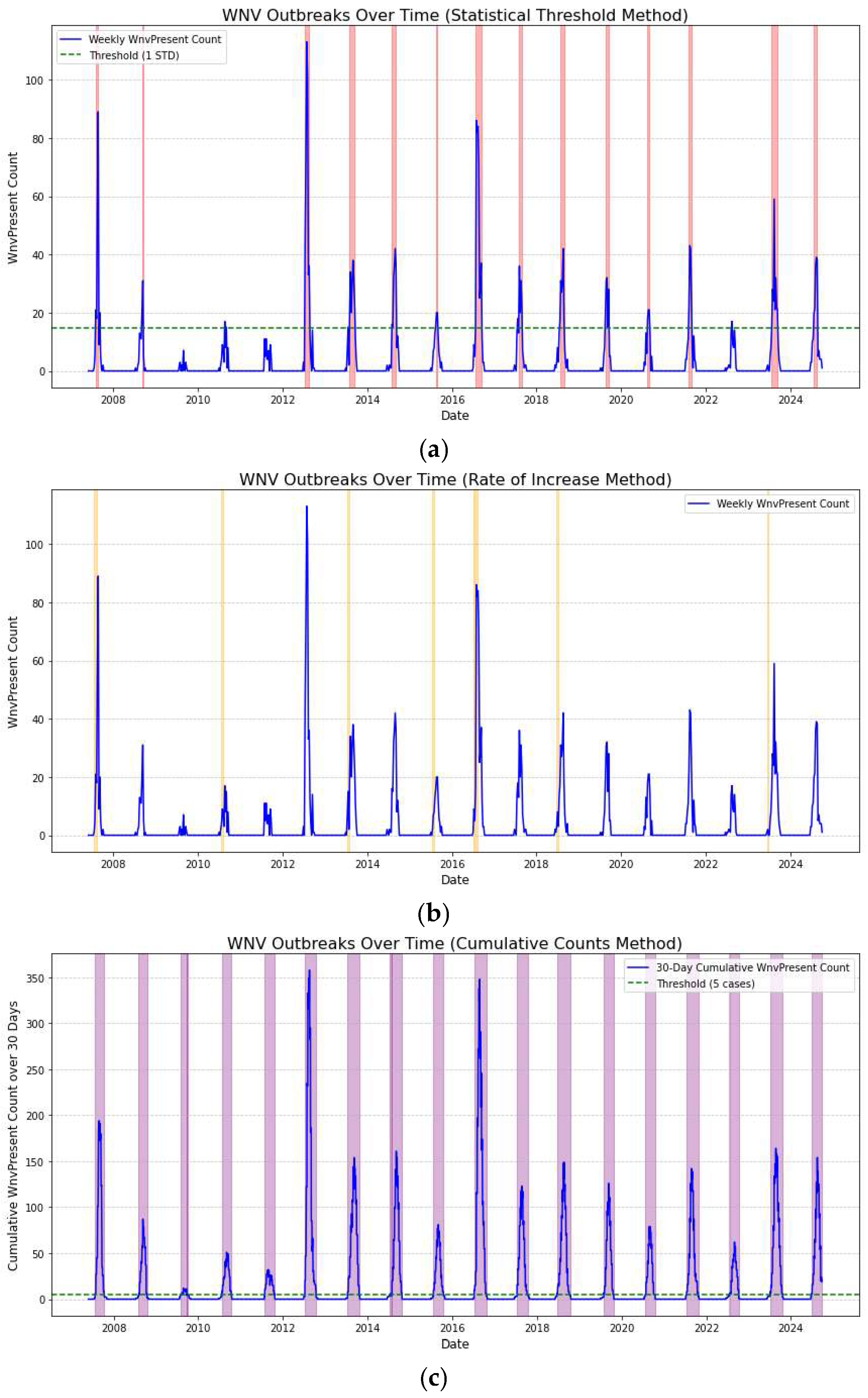
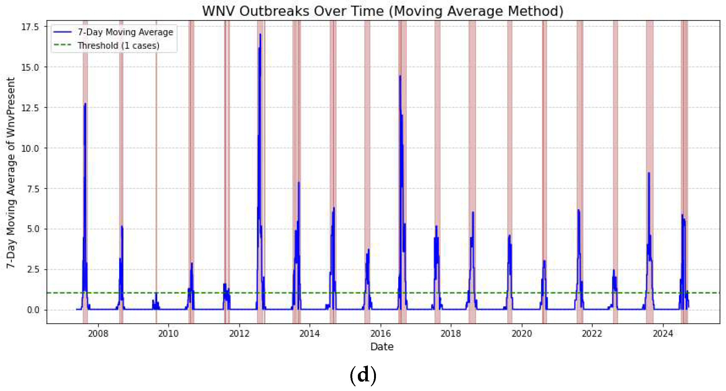
Figure 9.
WNV positive cases with respect to the size of the batch in mosquito captures (1-50 specimens).
Figure 9.
WNV positive cases with respect to the size of the batch in mosquito captures (1-50 specimens).
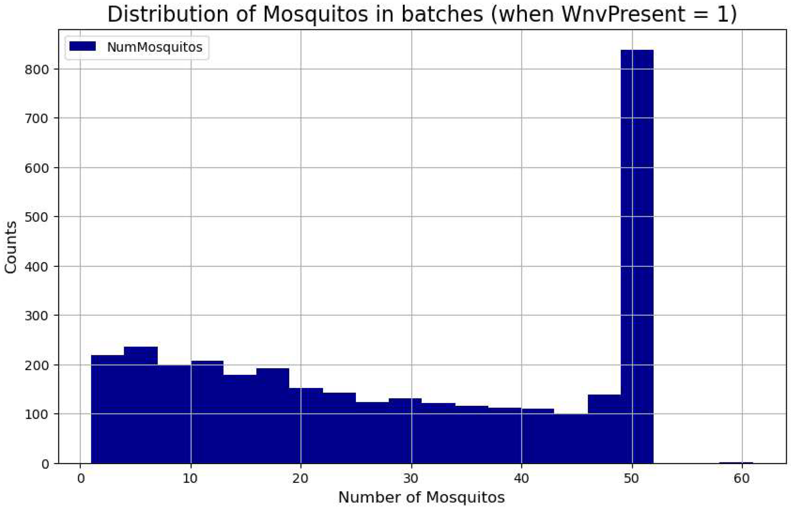
Figure 10.
A bivariate Gaussian fits on Days and Number of Mosquitoes in log scale for WNV positive and negative classes of the train set.
Figure 10.
A bivariate Gaussian fits on Days and Number of Mosquitoes in log scale for WNV positive and negative classes of the train set.
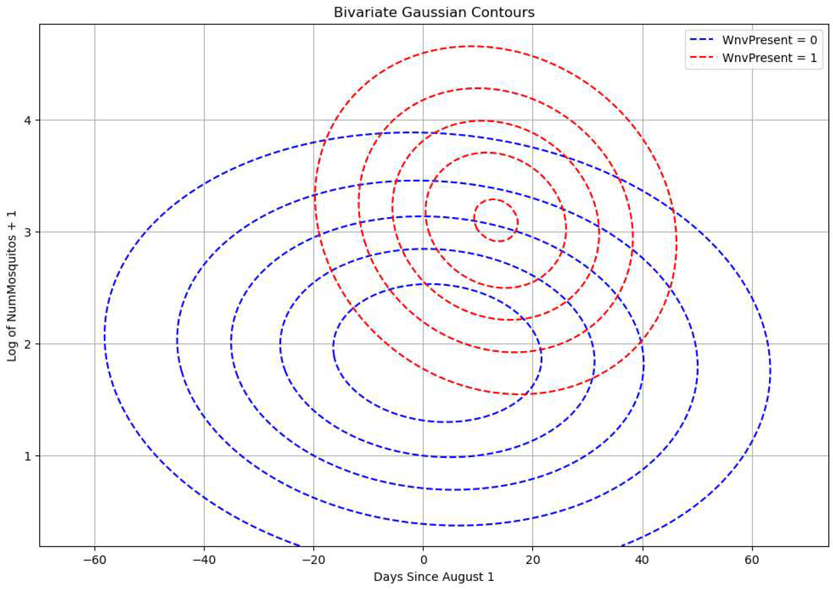
Figure 11.
A maximum likelihood plot of the difference between the probability density functions of WNV positive and of negative classes. We can identify regions where one decision is more likely than the other (i.e., identify “decision boundaries,” which help distinguish between two classes).
Figure 11.
A maximum likelihood plot of the difference between the probability density functions of WNV positive and of negative classes. We can identify regions where one decision is more likely than the other (i.e., identify “decision boundaries,” which help distinguish between two classes).
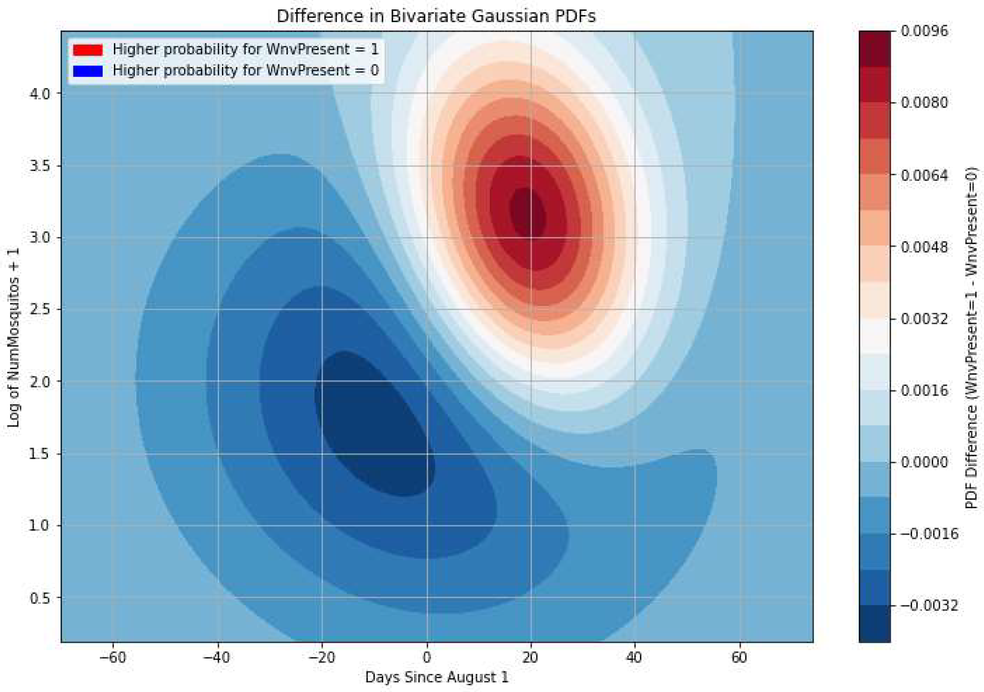
Figure 12.
ROC curves of classification approaches. The probabilistic approach and tree-based classification return equal results.
Figure 12.
ROC curves of classification approaches. The probabilistic approach and tree-based classification return equal results.
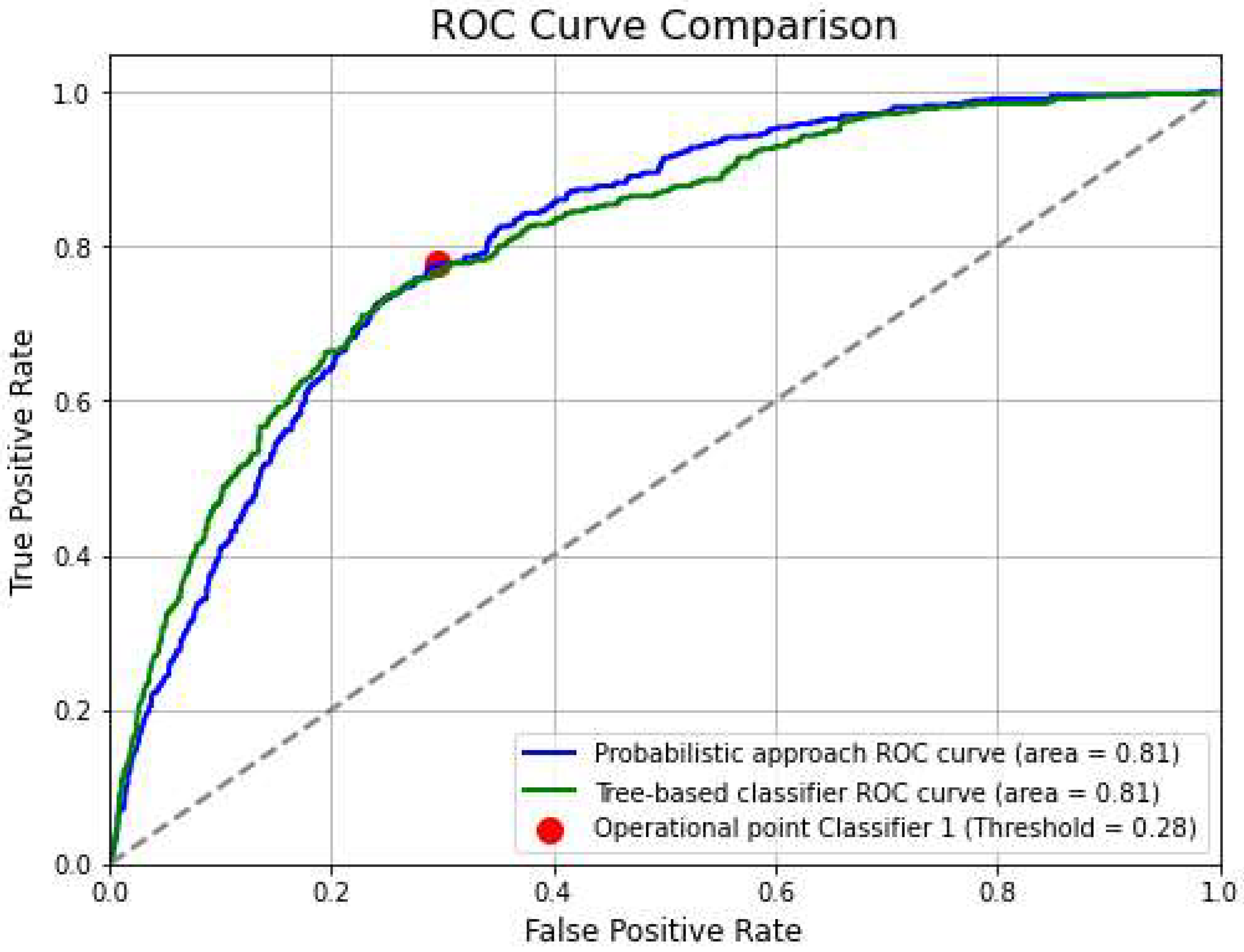

Table 1.
Trap types, multirow counts (i.e., number of catches that break into many rows of caps of 50 specimens) and different traps based on their ID.
Table 1.
Trap types, multirow counts (i.e., number of catches that break into many rows of caps of 50 specimens) and different traps based on their ID.
| TRAP TYPE | Multirow counts | Traps |
|---|---|---|
| GRAVID | 34573 | 169 |
| CDC | 1256 | 28 |
| SENTINEL | 319 | 12 |
| OVI | 1 | 1 |
Table 2.
The Table holds the Species composition, the total # of mosquitoes and the positive batches that correspond to them. Culex pipiens and Culex restuans have been the main carriers of WNV virus in the Chicago database.
Table 2.
The Table holds the Species composition, the total # of mosquitoes and the positive batches that correspond to them. Culex pipiens and Culex restuans have been the main carriers of WNV virus in the Chicago database.
| Species | # of mosquitoes | # batches with WNV present |
|---|---|---|
| CULEX PIPIENS/RESTUANS | 280858 | 2038 |
| CULEX RESTUANS | 115613 | 780 |
| CULEX PIPIENS | 68122 | 489 |
| CULEX TERRITANS | 1967 | 4 |
| CULEX SALINARIUS | 492 | 3 |
| CULEX TARSALIS | 97 | 0 |
| UNSPECIFIED CULEX | 52 | 0 |
| CULEX ERRATICUS | 46 | 0 |
Table 3.
Addresses and Trap type of the best performing trap IDs. Note that many traps with different trap-types can be installed in the same location.
Table 3.
Addresses and Trap type of the best performing trap IDs. Note that many traps with different trap-types can be installed in the same location.
| Trap ID | Location | Trap type |
|---|---|---|
| T913 | 100XX W OHARE AIRPORT | GRAVID |
| T008 | 70XX N MOSELLE AVE | GRAVID |
| T002 | 41XX N OAK PARK AVE | GRAVID |
| T916 | 100XX W OHARE AIRPORT | GRAVID |
| T912 | 100XX W OHARE AIRPORT | GRAVID |
| T151 | 70XX W ARMITAGE AVE | GRAVID |
| T009 | 91XX W HIGGINS RD | CDC |
| T009 | 91XX W HIGGINS RD | GRAVID |
| T028 | 58XX N WESTERN AVE | GRAVID |
| T011 | 36XX N PITTSBURGH AVE | GRAVID |
Table 4.
The years 2007-2024 of the Chicago Dataset are analyzed to register the outbreaks using 4 different approaches. The WNV cases are pooled together from all traps. 1st (mean exceeding one standard deviation), 2nd (week-over-week growth by 100%), 3d (cumulative counts over a month), 4th (moving average threshold of seven days).
Table 4.
The years 2007-2024 of the Chicago Dataset are analyzed to register the outbreaks using 4 different approaches. The WNV cases are pooled together from all traps. 1st (mean exceeding one standard deviation), 2nd (week-over-week growth by 100%), 3d (cumulative counts over a month), 4th (moving average threshold of seven days).
| 1st approach | 2nd approach | 3d approach | 4th approach | |||||
|---|---|---|---|---|---|---|---|---|
| Start Date | End Date | Start Date | End Date | Start Date | End Date | Start Date | End Date | |
| 1 | 2007-08-05 | 2007-08-26 | 2007-07-22 | 2007-08-12 | 2007-07-25 | 2007-10-12 | 2007-08-01 | 2007-09-13 |
| 2 | 2008-09-07 | 2008-09-14 | 2010-07-18 | 2010-08-08 | 2008-08-05 | 2008-10-15 | 2008-08-13 | 2008-09-01 |
| 3 | 2012-07-15 | 2012-08-19 | 2013-07-14 | 2013-07-28 | 2009-07-31 | 2009-09-24 | 2008-09-02 | 2008-09-16 |
| 4 | 2013-08-04 | 2013-09-15 | 2015-07-19 | 2015-08-02 | 2009-09-25 | 2009-10-03 | 2009-08-25 | 2009-09-01 |
| 5 | 2014-08-03 | 2014-09-07 | 2016-07-03 | 2016-07-17 | 2010-07-23 | 2010-10-13 | 2010-07-29 | 2010-08-12 |
| 6 | 2015-08-16 | 2015-08-30 | 2016-07-24 | 2016-08-07 | 2011-07-29 | 2011-10-23 | 2010-08-19 | 2010-09-09 |
| 7 | 2016-07-24 | 2016-09-11 | 2018-06-24 | 2018-07-08 | 2012-07-09 | 2012-10-13 | 2010-09-17 | 2010-09-20 |
| 8 | 2017-08-06 | 2017-08-27 | 2023-06-11 | 2023-06-25 | 2013-07-12 | 2013-10-19 | 2011-07-29 | 2011-08-05 |
| 9 | 2018-07-22 | 2018-08-26 | 2014-07-10 | 2014-07-19 | 2011-08-12 | 2011-08-19 | ||
| 10 | 2019-08-18 | 2019-09-15 | 2014-07-24 | 2014-07-26 | 2011-09-01 | 2011-09-08 | ||
| 11 | 2020-08-16 | 2020-08-30 | 2014-07-31 | 2014-10-25 | 2011-09-16 | 2011-09-19 | ||
| 12 | 2021-08-08 | 2021-08-29 | 2015-07-23 | 2015-10-17 | 2012-07-09 | 2012-08-31 | ||
| 13 | 2023-07-23 | 2023-09-10 | 2016-07-08 | 2016-10-22 | 2012-09-13 | 2012-09-20 | ||
| 14 | 2024-07-21 | 2024-08-18 | 2017-07-14 | 2017-10-14 | 2013-07-12 | 2013-07-26 | ||
| 15 | 2018-06-21 | 2018-10-13 | 2013-08-01 | 2013-09-05 | ||||
| 16 | 2019-08-01 | 2019-10-26 | 2013-09-06 | 2013-09-26 | ||||
| 17 | 2020-07-23 | 2020-10-17 | 2014-07-31 | 2014-09-04 | ||||
| 18 | 2021-07-15 | 2021-10-23 | 2014-09-05 | 2014-10-02 | ||||
| 19 | 2022-07-14 | 2022-07-17 | 2015-07-23 | 2015-09-09 | ||||
| 20 | 2022-07-21 | 2022-10-08 | 2016-07-08 | 2016-07-15 | ||||
| 21 | 2023-07-06 | 2023-10-21 | 2016-07-21 | 2016-08-03 | ||||
| 22 | 2024-06-27 | 2024-09-26 | 2016-08-04 | 2016-09-22 | ||||
| 22 | 2024-06-27 | 2024-09-26 | 2017-07-14 | 2017-09-07 | ||||
| 23 | 2018-06-28 | 2018-07-05 | ||||||
| 24 | 2018-07-12 | 2018-09-06 | ||||||
| 25 | 2019-08-08 | 2019-09-19 | ||||||
| 26 | 2020-07-30 | 2020-08-06 | ||||||
| 27 | 2020-08-13 | 2020-09-10 | ||||||
| 28 | 2021-07-22 | 2021-09-09 | ||||||
| 29 | 2021-09-16 | 2021-09-23 | ||||||
| 30 | 2022-08-04 | 2022-09-15 | ||||||
| 31 | 2023-07-13 | 2023-09-21 | ||||||
| 32 | 2024-07-03 | 2024-07-10 | ||||||
| 33 | 2024-07-11 | 2024-07-31 | ||||||
| 34 | 2024-08-01 | 2024-08-22 | ||||||
| 35 | 2024-08-29 | 2024-09-05 | ||||||
| 36 | 2024-09-12 | 2024-09-13 | ||||||
Table 5.
Base predictor refers to fitting Dates and the number of mosquitoes (log scale) with a bivariate Gaussian. ‘Trap biases’ refer to correcting the base predictor using a statistical significance test on captures. ‘Local regression’ refers to applying biases to the probabilities using kernel-weighted regression on time and GPS coordinates. The training set includes the years 2007-2022 and the test set the last two remaining years, 2023 and 2024. AUC score.
Table 5.
Base predictor refers to fitting Dates and the number of mosquitoes (log scale) with a bivariate Gaussian. ‘Trap biases’ refer to correcting the base predictor using a statistical significance test on captures. ‘Local regression’ refers to applying biases to the probabilities using kernel-weighted regression on time and GPS coordinates. The training set includes the years 2007-2022 and the test set the last two remaining years, 2023 and 2024. AUC score.
| Approach | AUC | COMMENT |
|---|---|---|
| 1_Base predictor | 0.7959 | Apply a bivariate Gaussian on Dates and #mosquitoes |
| 2_Base predictor + trap biases | 0.7971 | Base predictor and statistical significance on traps |
| 3_ Base predictor + local regression | 0.8008 | Base predictor and local regression |
| 4_all biases applied | 0.8013 | Base predictor and local regression and significance test on traps |
Table 6.
Tree-based classifiers as applied to the (2007-2024) Chicago database. The training set includes the years 2007-2022 and the test set the last two remaining years, 2023 and 2024. AUC score.
Table 6.
Tree-based classifiers as applied to the (2007-2024) Chicago database. The training set includes the years 2007-2022 and the test set the last two remaining years, 2023 and 2024. AUC score.
| Model | AUC score |
|---|---|
| GradientBoostingClassifier | 0.80 |
| XGBClassifier | 0.81 |
| ExtraTreesClassifier | 0.80 |
| HistGradientBoostingClassifier | 0.81 |
Disclaimer/Publisher’s Note: The statements, opinions and data contained in all publications are solely those of the individual author(s) and contributor(s) and not of MDPI and/or the editor(s). MDPI and/or the editor(s) disclaim responsibility for any injury to people or property resulting from any ideas, methods, instructions or products referred to in the content. |
© 2025 by the authors. Licensee MDPI, Basel, Switzerland. This article is an open access article distributed under the terms and conditions of the Creative Commons Attribution (CC BY) license (http://creativecommons.org/licenses/by/4.0/).
Copyright: This open access article is published under a Creative Commons CC BY 4.0 license, which permit the free download, distribution, and reuse, provided that the author and preprint are cited in any reuse.


