Submitted:
17 December 2025
Posted:
17 December 2025
Read the latest preprint version here
Abstract
In this field, several erroneous theories had long been accepted as fundamental laws and formulas. Recent corrections to these misconceptions were made possible through the application of Exploratory Data Analysis (EDA). This article outlines how EDA contributed to these breakthroughs and offers a brief guide for those wishing to begin using it themselves.
Keywords:
EDA
; R
; statistics
; data‐driven analysis
Introduction
We gaze into black holes, debate the origins of the universe, and track interstellar objects from deep space—yet we remain startlingly unaware of what unfolds beneath our very feet, despite mountains of data. I suspect this paradox stems from the pervasive authoritarianism within the field. Working independently, I have authored five papers this past year: revising a law believed for nearly a century (Konishi, 2025a), correcting a formula held for over a century (Konishi, 2025b), updating plate location data near Japan, refuting the likelihood of a feared major earthquake, and enabling earthquake prediction once deemed impossible (Konishi, 2025c, d, e). At the very least, I have clarified the precursors of earthquakes that should have been predicted. This may sound revolutionary, but I have no desire to send anyone to the guillotine. Rather, I hope many researchers will join this revolution—for it is one that advances science. Here, I introduce the method: the simple yet powerful principle of analysing one’s own data, independently.
Magnitude Distribution
The long-held belief in the Gutenberg–Richter (GR) law (Gutenberg and Richter, 1944) is fundamentally mistaken. The correct distribution is, in fact, a normal distribution (Konishi, 2025a). When the logarithm of frequency is plotted in a histogram, a linear segment appears—this is the essence of the GR law. However, it is merely a graphical artefact, devoid of mathematical or physical significance. Consequently, all attempts to infer earthquake mechanisms from the GR law are fundamentally flawed.
Magnitude is a logarithmic representation of earthquake energy. A normal distribution of magnitude therefore implies that energy follows a log-normal distribution—a form that naturally arises when multiple factors interact synergistically to determine an outcome. This, I propose, is the true essence of earthquakes.
About R
Effective data analysis requires a basic understanding of statistics and access to appropriate computational tools. While Excel is widely used, it is not well-suited for statistical analysis. Fortunately, many statistical packages are available. I recommend R, a free and open-source environment supported by a vibrant and helpful community. The latest version can always be downloaded from the CRAN website (Team, 2025).
Using R does require some programming, but I encourage learning it in parallel with statistics—this is how I teach my students. Statistical study often involves tedious calculations, which R can handle efficiently, allowing learners to focus on interpretation rather than arithmetic. And if you get stuck, just ask online—someone will almost certainly help. That’s the power of a supportive community.
That said, Excel remains convenient for data handling. You can prepare your dataset in Excel, then export it as a text-based file and import it into R using:
data <- read.table(file = "xxx.txt", sep = "\t", header = TRUE)
This command stores the file contents in an object called data. In R, assignment is typically indicated with <- or ->, although the equals sign (=) is also accepted. To treat the data as a matrix, simply apply:
data <- as.matrix(data)
On Exploratory Data Analysis (EDA)
Here, I recommend EDA as a statistical approach (Methods, 2012). This is an endeavour to understand the origin of data by examining its properties without preconceptions, making it a branch of statistics that aligns very well with science (Methods, 2012; Tukey, 1977). In EDA, one first acknowledges having no prior knowledge about the data's properties. One explores suitable analytical methods for the data while remaining sceptical of any mathematical model. Consequently, how the data is distributed becomes the primary concern. There exists a mathematical theorem known as the Central Limit Theorem. This states that the sum of multiple random numbers follows a normal distribution. Such phenomena are extremely common. Therefore, those employing EDA first investigate whether the data is normally distributed. R provides a remarkably straightforward solution for this purpose.
qqnorm(data)
Just this one line. If you set this data to magnitude data, the result will surely be a straight line (Figure 1A). This is the simplest way to realise a QQplot (Konishi, 2025d; Tukey, 1977).
To do this a little more carefully,
ideal <- qnorm(ppoints(length(data)))
This means: prepare probability points (ppoints) equal to the length of the data, find the corresponding quantiles from the normal distribution (qnorm), and store them in an object called ideal. By comparing this with the sorted data and plotting it, we can compare the quantiles of the data with those of the normal distribution.
plot(ideal, sort(data))
Adding
z<- line(sort(data)~ideal)
abline(coef(z))
draws a line of best fit (abline). Using coef(z) to extract the coefficients gives the slope as an estimate of the data's standard deviation σ, and the intercept as an estimate of the mean μ. If you forget R functions, execute `?line`. A tutorial will appear immediately. By leveraging the normally distributed nature of the data, one can construct a grid with one-degree intervals in both latitude and longitude, and compute the standard deviation within each cell to identify locations exhibiting anomalous behavior (Figure 1B) (Konishi, 2025e).
This alone reveals how magnitude is distributed. Try it yourself. Which do you believe: GR's law or this? My resolve to undertake research in this field crystallised precisely when I executed `qqnorm(data)`.
Data Manipulation
Whenever I submit a paper, reviewers invariably ask the same question: “You haven’t described how the data was filtered—how was it actually done?” In response, I now explicitly state in the Methods section that not a single data point was discarded.
This, I believe, highlights a deeply abnormal situation. In sound scientific practice, data should not be selectively filtered for the analyst’s convenience. Doing so constitutes cherry-picking, a form of data falsification. Yet this practice appears to persist—perhaps because the Gutenberg–Richter law cannot be sustained without discarding lower-magnitude data.
No scientific law should require such extreme measures to be upheld. I urge those who continue this practice to reflect on its implications and to abandon it. Science advances not by defending dogma, but by confronting data—all of it.
Number of Aftershocks
The decay of aftershock frequency over time has long been described by Omori’s formula, later modified by Utsu (Omori, 1895; Utsu, 1957). These models propose an inverse proportionality to time. However, this assumption does not hold up under scrutiny.
You can verify this yourself. Simply plot the number of aftershocks at each time point t using:
plot(t, number, log = "y")
This generates a semi-log plot. If the data follows a linear relationship, the result should be a straight line. Originally, knowing that earthquake frequency tends to follow a log-normal distribution, I plotted the data on a semi-log scale—and observed a clear linear decline (Figure 2A). Introducing an inverse proportionality term, as in Omori–Utsu, causes the plot to deviate from linearity (Konishi, 2025b).
A linear decrease on a semi-log plot suggests a first-order reaction with a characteristic half-life. This is typical of systems where the rate of change is proportional to the remaining quantity—such as radioactive decay or spring oscillation. Earthquakes, too, appear to settle in this manner. When statistical properties are clarified, the underlying mechanism begins to emerge. This, in turn, allows for the construction of a parsimonious model—the very goal of analysis in Exploratory Data Analysis (EDA) (Tukey, 1977).
Immediately after an earthquake, the location parameter of the Q-Q plot shown in Figure 1A increases (Figue 2B). This increase also decays over time, following a half-life pattern. Notably, the duration of this half-life is substantially shorter than that observed for the decay in earthquake frequency.
Location of the Interface
Although focal depths are routinely measured, the Japan Meteorological Agency (JMA) has continued to rely on outdated models of the tectonic plates surrounding Japan, based on submissions from years past (Barnes, 2003; JMA, 2025b). This persistence highlights a lack of understanding of the current three-dimensional tectonic configuration.
Fortunately, this issue can be addressed with relative ease using R. While R’s core functionality supports many types of analysis, it also offers a rich ecosystem of specialized packages—known as libraries—for more advanced tasks. One particularly useful package for 3D visualization is rgl (Murdoch et al., 2025). To install it, simply run:
install.packages("rgl")
This downloads the package from a CRAN mirror and integrates it into your R environment—a testament to the community’s generosity, as maintaining such packages requires significant effort. Once installed, load the library with:
library(rgl)
To visualize three-dimensional data (e.g., a matrix with three column vectors representing x, y, and z coordinates), use:
plot3d(data)
This displays a 3D plot in the R console. To export it as an interactive HTML widget:
rglwidget()
This allows you to save and share the visualization with others.
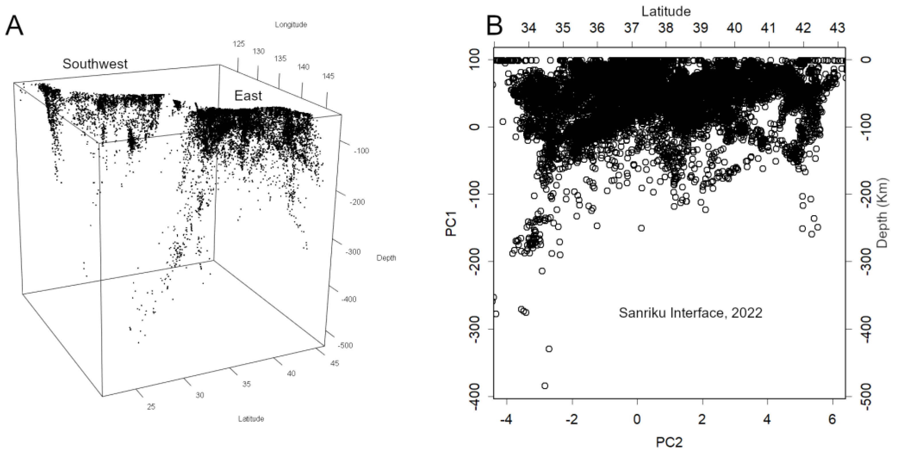
Using this approach, I was able to visualise the distribution of earthquake epicentres, revealing the actual position of the plate interface—a structure that had long been misrepresented (Konishi, 2025b).
A Single Interface as a Tilted Plane
The plate interface can be represented as a single tilted plane in three-dimensional space—naturally described by the standard equation of a plane. Earthquake epicentres located on this surface can also be visualised.
To achieve this, I employed Principal Component Analysis (PCA) (Jolliffe, 2002; Konishi, 2015). PCA is a multivariate analysis technique commonly used for dimensionality reduction. Its strength lies in its objectivity—it yields consistent results regardless of the analyst—making it particularly well-suited for scientific applications.
In Conclusion
I am a chemist before I am an informatician—a somewhat old-fashioned type of scientist. As such, I find myself aligned with Popper’s philosophy of science (Thornton, 2023), and I am deeply grateful to Tukey for introducing Exploratory Data Analysis (EDA) (Tukey, 1977). Are these not authorities themselves? Perhaps. But if so, then let us prepare a new framework. At the very least, I hope the field of geophysics will recognise that it suffers from chronic issues—akin to a lingering illness—and take steps to move beyond them. Blind faith in authority is the graveyard of intellect. It is the antithesis of scientific thinking. Do not most scientists, deep down, resist authority? They respect the second law of thermodynamics, yet would amend it if necessary—and likely wish to be the ones to do so. Scientists are, by nature, ambivalent beings. I know I am.
What I have described above is routine practice for data analysts in other fields—bioinformatics, for instance. For reasons unclear, such perspectives have long been absent from this domain. Hence, this revolution. Why not try it yourself? Leaving a theory unchallenged for a hundred years suggests not only blind reverence, but also a failure to examine the data seriously. In such a state, predicting earthquakes or understanding their mechanisms is simply impossible. From now on, examine your own data. That is where science begins.
References
- Barnes, G. L. Origins of the Japanese Islands: The New "Big Picture": Japan Review. 2003, no. 15, 3–50. Available online: http://www.jstor.org/stable/25791268.
- Gutenberg, *!!! REPLACE !!!*. B., and C. F. Richter, Frequency of Earthquakes in California. Bulletin of the Seismological Society of America 1944, 34(no. 4), 185–188. [Google Scholar] [CrossRef]
- JMA. Summary of seismic activity for each month. 2025a. Available online: https://www.data.jma.go.jp/eqev/data/gaikyo/.
- JMA, 2025b, Nankai Trough Earthquake. Available online: https://www.jma.go.jp/jma/kishou/know/jishin/nteq/index.html.
- Jolliffe, I. T. Principal Component Analysis; Springer Series in Statistics (SSS): Springer, 2002. [Google Scholar]
- Konishi, T. Principal component analysis for designed experiments. BMC Bioinformatics 2015, 16(no. 18), S7. [Google Scholar] [CrossRef] [PubMed]
- Konishi, T. Seismic pattern changes before the 2011 Tohoku earthquake revealed by exploratory data analysis: Interpretation. 2025a, T725–T735. [Google Scholar] [CrossRef]
- Konishi, T. Visualising Earthquakes: Plate Interfaces and Seismic Decay: Preprints. 2025b, 189197. [Google Scholar] [CrossRef]
- Konishi, T. Earthquake Swarm Activity in the Tokara Islands (2025): Statistical Analysis Indicates Low Probability of Major Seismic Event: GeoHazards. 2025c, 6(no. 3), 52. Available online: https://www.mdpi.com/2624-795X/6/3/52.
- Konishi, T. Exploratory Statistical Analysis of Precursors to Moderate Earthquakes in Japan: GeoHazards. 2025d, geohazards–4009190. [Google Scholar] [CrossRef]
- Konishi, T. Identifying Seismic Anomalies through Latitude-Longitude Mesh Analysis. Preprints 2025e. [Google Scholar] [CrossRef]
- NIST/SEMATECH. 2012, e-Handbook of Statistical Methods. Available online: http://www.itl.nist.gov/div898/handbook.
- Murdoch, D., D. Adler, O. Nenadic, S. Urbanek, M. Chen, A. Gebhardt, B. Bolker, G. Csardi, A. Strzelecki, A. Senger, T. R. C. Tea, D. Eddelbuettel, T. a. o. Shiny, T. a. o. knitr, J. Ooms, Y. Demont, J. Ulrich, X. F. i. Marin, G. Helffrich, I. Krylov, M. Sumner, M. Stein, J. Love, and M. team, 2025, rgl: 3D Visualization Using OpenGL. 2025. Available online: https://cran.r-project.org/web/packages/rgl/index.html.
- Omori, F. 1895, On the After-shocks of Earthquakes, The journal of the College of Science, Imperial University, Japan. Available online: https://repository.dl.itc.u-tokyo.ac.jp/records/37571 (accessed on 15 December 2025).
- R Core Team. R: A language and environment for statistical computing: R Foundation for Statistical Computing. 2025. [Google Scholar]
- Karl Popper. Edited by E. N. Zalta, and U. Nodelman, The Stanford Encyclopedia of Philosophy: Metaphysics Research Lab, Stanford University; Thornton, S., Zalta, E. N., Nodelman, U., Eds.; 2023. [Google Scholar]
- Tukey, J. W. Exploratory data analysis; Behavioral Sciences: Quantitative Methods: Addison-Wesley Pub. Co, 1977. [Google Scholar]
- Utsu, T. Magnitude of earthquakes and occurance of their aftershocks: Journal of the Seismological Society of Japan, 2nd ser. ed; 1957; Volume 10, no. 1, pp. 35–45. [Google Scholar] [CrossRef]
Figure 1.
A. Example of a Normal Q-Q plot. Data from January 2023. This relationship bends around the time of any major earthquake. B. A graph like panel A was created for each 1° latitude and longitude grid point, and the scale was examined. This reveals where anomalies occurred. Data from the Japan Meteorological Agency (JMA) was used (JMA, 2025a).
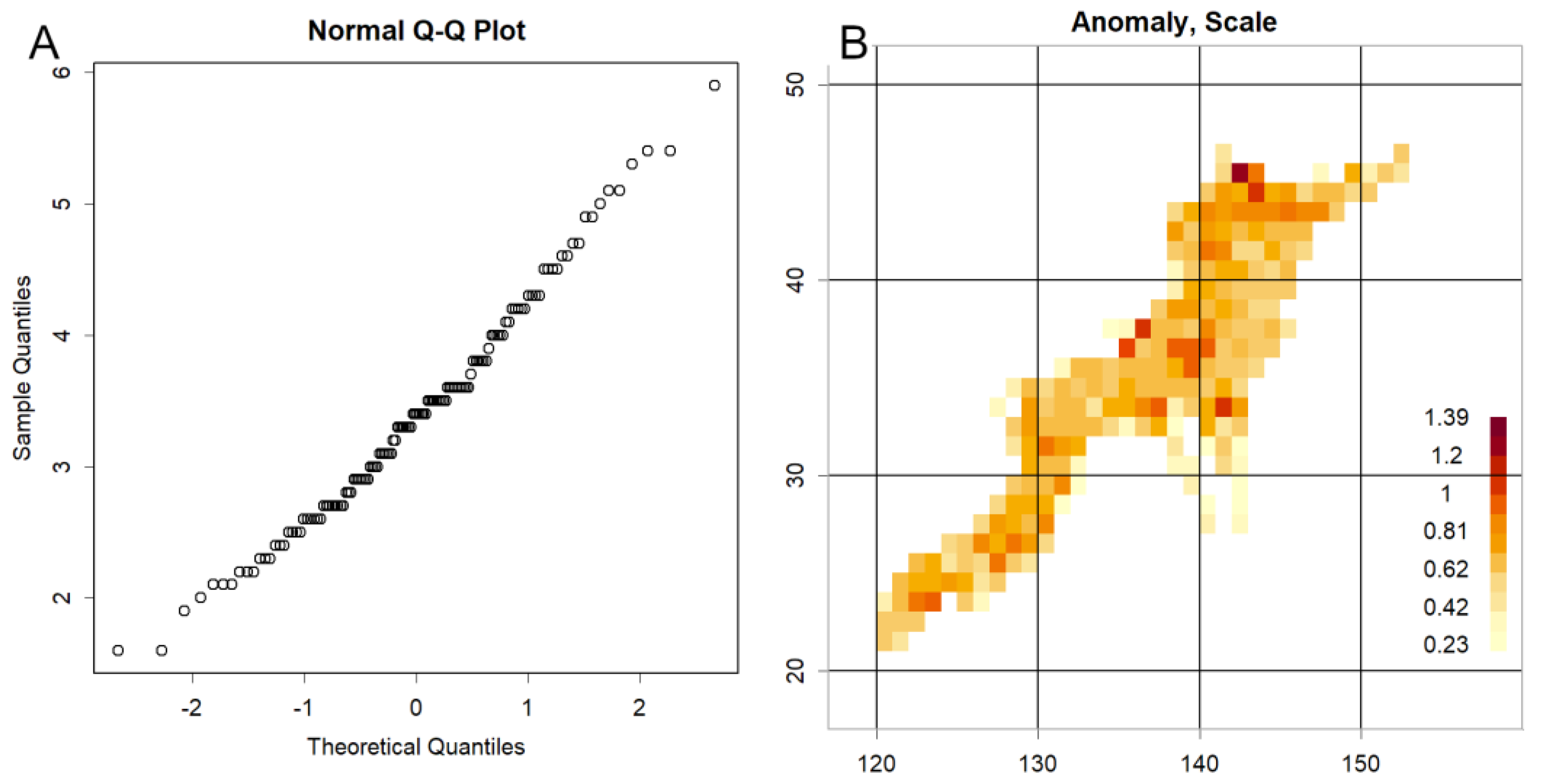
Figure 2.
Decay patterns characterized by half-life dynamics, based on data from the 2025 earthquake off the coast of Iwate Prefecture, analyzed at one-degree latitude × longitude grid intervals. A. Temporal change in the number of earthquakes. B. Temporal change in the parameters of the normal distribution of magnitudes. The y-axes are logarithmic in both panels; thus, the linear trends indicate first-order decay processes with distinct half-lives.
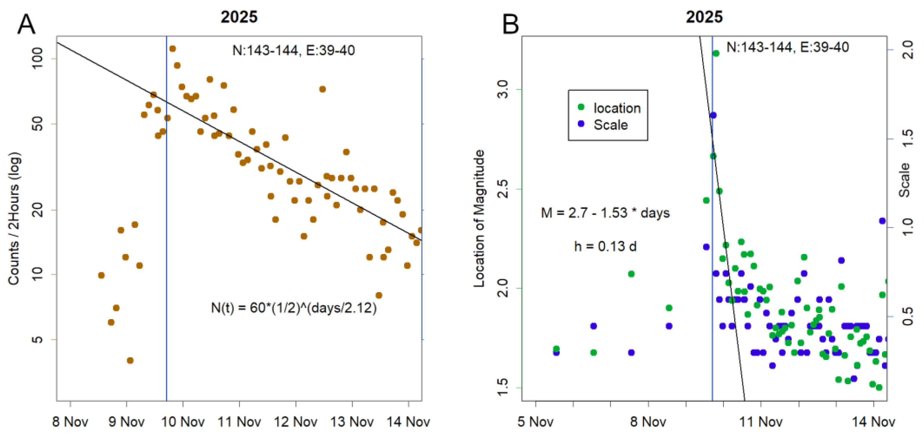
Figure 3.
Visualization of earthquake epicentres with depth information. A. Plate interface configuration. Japan is bounded by major plate interfaces to the east and southwest, connected by shallow Seto interfaces. These appear as a single, continuous structure in the 3D visualization (plot3D). The figure can be interactively rotated and zoomed using the mouse. The R code used to generate this plot is available in the corresponding publications for reproducibility. B. Sanriku interface, forming the central portion of the eastern boundary, extracted using principal component analysis (PC1 and PC2). Approximate latitude is shown along the top axis, and depth is indicated on the left. Prior to major seismic events, an increase in deeper epicentres is observed.
Disclaimer/Publisher’s Note: The statements, opinions and data contained in all publications are solely those of the individual author(s) and contributor(s) and not of MDPI and/or the editor(s). MDPI and/or the editor(s) disclaim responsibility for any injury to people or property resulting from any ideas, methods, instructions or products referred to in the content. |
© 2025 by the authors. Licensee MDPI, Basel, Switzerland. This article is an open access article distributed under the terms and conditions of the Creative Commons Attribution (CC BY) license (http://creativecommons.org/licenses/by/4.0/).
Copyright: This open access article is published under a Creative Commons CC BY 4.0 license, which permit the free download, distribution, and reuse, provided that the author and preprint are cited in any reuse.


