
Submitted:
28 August 2025
Posted:
29 August 2025
You are already at the latest version
Abstract
We show that the UK compares unfavourably with other countries and that the long-established pattern of increasing life expectancy since the 1950s has run out of steam. We investigate why years of improvement after 2010 have come to a halt, and what would have happened if austerity and the COVID pandemic had not occurred. We compare life expectancy with health expectancy and show that the gap between them is greatest between ages 50 and 70. We find an 11-year difference in life expectancy between the most and least deprived areas and that a one-year decline in life expectancy is associated with a 2.5-year decline in health expectancy - giving a maximum gap of 21 years in the most deprived areas. A widening gap increases the demand for health care and, therefore, longer waiting lists for treatment. It also reduces economic activity. If there were no long-term sickness the ‘economically active’ rate would jump from 78.1% to 84.1%; while a 5-year improvement in health expectancy would increase the economic activity rate by 5.5%. The increased revenue from an expanded tax base and welfare savings could potentially fund, for example, a postponement in further increases in the state pension age. Achieving such a transformation will require large policy changes to improve population health, and some possible options are touched on.
Keywords:
life expectancy
; economic inactivity
; health care
; prevention
1. Introduction
Many have commented on the stalled life expectancy in the UK and rightly asked why this has occurred and who and what is responsible (e.g. Raleigh, 2024; Alexiou et al, 2021; Marshall et al, 2019). Recent changes come after six decades of almost continuous improvement in life expectancy, with the UK worse affected than most comparable countries.
Why is this important? Life expectancy has been subject to shocks since 2010 which have been blamed for the decline, most recently the COVID-19 pandemic which arrived in the UK in January 2020. The possible role of the period of financial austerity after the financial crisis of 2008 is hotly debated. This coincided with cuts in social programmes and public services failing to keep pace with demand (e.g. see Stuckler et al, 2017; Walsh et al, 2022).
The deeper question is why decades of improvement have come to a halt, and what would have happened if austerity and COVID had not occurred. If stalling life expectancy is more than just a temporary blip, to what extent is it threatening people’s health and livelihoods and the economy in general (Mayhew and Burrows, 2023)? Would, for example, fewer have died in the pandemic had the UK been healthier, as the BMA (BMA (2022) The impact of the pandemic on population health and health inequalities. https://www.bma.org.uk/media/bzxla0fv/bma-covid-review-report-5-september-2024.pdfo) has argued?
It is important therefore to examine how health varies with life expectancy. Intuitively a longer life is correlated with longer years in good health, but the correlation is not set in concrete. People can live long lives but spend many years in poor health prior to death, suggesting that health care systems prolong life more effectively than they prolong health with the result that when life expectancy suffers health suffers more.
If this is the case, the effect of additional years spent in ill health will impact adversely on the ability to work, depending on the individual and quite often long before a person reaches state pension age. It will further affect public and intergenerational transfers between households and individuals in the form of higher taxes and health care and welfare costs - leading to declines in living standards.
Such differences are socially patterned - with richer, more educated people doing better; this in turn manifests in spatial inequalities depending on where they live. Exposure to factors responsible for poor health accrue over the life cycle, but the negative health effects of adverse lifestyles appear before middle age (Green et al, 2021). It does not help that the population is also ageing rapidly.
Life expectancy among earlier cohorts benefited from factors such as the decline of manufacturing and hazardous occupations such as coal mining, improvement in air quality in urban areas and better nutrition. It is likely though that in post-industrial society the beneficial effects of those changes may, in part at least, have run their course – leading to another change in trajectory.
Adverse lifestyles, including exposure to smoking, poor diet, excessive drinking or lack of physical exercise, are now arguably the main problem. Smoking, although in decline, is still a health risk to ex-smokers, combined with the failure to stamp out smoking among younger generations. The prevalence of unhealthy diets in the UK – a major cause of obesity – is only just behind the US, according to the Food and Agricultural Organisation (FAO).
The first part of the paper considers in detail how life expectancy has stalled - especially among the over 50s, where outcomes between individuals start to diverge. We show that the UK compares unfavourably with other countries and that the long-established pattern of increasing life expectancy since the 1950s which has been taken for granted appears to have run out of steam.
As evidence, we use the technique of partial life expectancy to understand which sub-age groups among the over 50s are contributing most to the problem, and the trends within each age interval. This allows us to investigate changes in life expectancy at different stages of life and compare whether the UK is better or worse than other countries.
Within the UK we compare the association between partial life expectancy and health. Using Office for National Statistics (ONS) data, we show that the variation in health expectancy is greater than variation in life expectancy. Specifically, people in the most deprived areas spend longer and a greater proportion of lives in ill health compared with those living in more affluent areas.
Areas in poorest health have the higher levels of economic inactivity due to long term illness. They have higher age-related expenditure on health and care costs, longer queues for NHS treatment and higher welfare payments. Whilst the years spent in poor health shortens lives, the effect is asymmetric. Among local authorities we find a one-year decline in life expectancy equates to an average of 2.37 years loss in health expectancy.
In what follows, we suggest what could be done to slow or reverse this pattern which, while partly driven by population ageing, is exacerbated by income and geographic inequalities. We then review the wider consequences - whether to do with the economy, welfare spending or immigration. But first, we explain how partial life expectancy works before comparing our results with those for other countries with which the UK is often compared.
2. UK Demographic Trends and Partial Life Expectancy
The number of people over 50 in the UK rose by 18%, from 21.6m to 25.5m, in the decade from 2010. People over 50 now make up 38% of the population and changes to their health and longevity have an impact on the whole economy. This latest analysis considers the changing life expectancy of UK adults over 50, the scale and range of the economic impact and what should happen next.
Under age fifty the mortality experience of younger adults has remained broadly similar. Most deaths occur in middle and older age, so the focus of our attention is those aged 50 and older. As they age, their mortality experience starts to diverge. It means that changes to longevity in this crucial age group matter to the whole economy.
Many in this age group are in poor health - limiting their ability to work, with 34% suffering from long term illness or disability. These are not temporary changes but part of the longer-term effects of population ageing, which includes declining health and potentially economic stagnation – the impact of which could be lessened with a comprehensive public health strategy.
One way to monitor change is to divide the population into equal age blocks and treat each separately. For example, a partial life expectancy of 8 years means you are only expected to live eight of the next ten years. We extend this analysis to cover people aged 50, 60, 70, 80, 90 and 100 and compare trends at each age in partial life expectancy since 1950.
Mayhew and Smith (2015) show that partial life expectancy is additive, meaning that the accumulated gain equates to the expectation of remaining life by aggregating across the decades. This property means we can examine trends within each decade of life to pinpoint in which age intervals future increases in life expectancy are more likely to occur.
Any statistical trend fitted to the data needs to be a non-decreasing function (if we are modelling western economies where we have got used to life expectancy increasing with time). We also need to reflect that there are natural limits to life expectancy meaning that we do not project infinite life spans, in particular recognising you cannot live longer than 10 years in the next 10-year age interval.
The method of curve fitting used is set out in Mayhew and Smith (2015). By allowing the data to impose the trend, we showed that forecasts were more informative than using other methods in terms of the level and rate of improvement. However, we could also see our predictions starting to become unlikely post 2030 as the trend rate of modelled life expectancy accelerated faster than the data indicated.
By dividing lives into a set of ten-year blocks, we are not forcing the data to fit an arbitrary upper limit. Rather it is a natural limit based on the design of our model. We are then able to chain-link expectations of life together to get an aggregate life expectancy projection built on the component parts at different stages of life.
Because of its convenient properties, and the ease with which the parameters can be estimated, the most useful function we tested is a form of the logistic function which can be written as follows:
Where is a polynomial equation of order n which generally takes the value of one or two. That is:
where , and are parameters to be estimated, t is calendar year, and y is life expectancy in age interval i. is a constant defined by the user taking all age intervals to be equal and in this case is set to 10 years.
Re-arranging yields:
In these equations, , and are estimated using multiple linear regression. Note that higher order polynomials (n>2) could also be considered depending on the patterns observed in practice. In low mortality countries, such as those considered here, we found that second order polynomial equations generally performed best in each age group ranging from 30-40 to 100+.
2.1. Results
This was the case in England and Wales where we used second order polynomials to estimate the relationship between partial life expectancy and time starting in 1950 and concluding in 2010.
The results are shown in Table 1 for each of the parameters, , and which measures how well the model fits the data. This ranges in value from 0 to 1, a perfect fit. They strongly indicate that increases in life expectancy have occurred in a predictable wave-like fashion as people age - as opposed to a process in which each age interval has contributed equally.
This can be seen in Figure 1 which shows predicted and observed values of partial life expectancy from age 50 to 60 upwards. It is not necessary to show in the same chart younger ages from 30-40 and 40-50 since partial life expectancy is very close to its maximum value of 10 years throughout these stages of adult life.
The chart uses data from the Human Mortality database (HMD. Human Mortality Database. https://www.mortality.org/) from 1950 to 2010 combining both men and women. The dotted extensions are trend lines based on the procedure outlined above and show what is projected to happen were those trends to continue.
The result is a shift in survival at higher ages improve their position relative to previous years and in relation to younger ages. If projected each survival curve would converge to its 10-year limit. Clearly whilst this has already happened at younger ages, it is still far off at the oldest ages – so for example in the 80 to 90 age group survival is still less than 5 years out of the next ten.
If the trend did continue in predicted fashion, then the survival curve would become more rectangular in shape, a process which is known as the compression of mortality. We do not address this question here (see for example, Mayhew and Smith, 2011), but our focus instead is on the recent past and near future, concentrating on short term changes only.
Other significant points arising from the chart in Figure 1 are that between 1950 and 2010, UK life expectancy at age 50 increased by 7.9 yrs. to 32.3yrs. Table 2 shows that the biggest improvements were at ages 70 and 80 where partial life expectancy increased by 2.6years and 2.9 years. At age 60 it improved 1.2 years but at 50, 90 and 100 it was by less than one year.
The next step of the analysis is to compare the life expectancy data post 2010 with what would have happened if the long-established trend had continued. This is shown in Figure 2. Here, the dotted black lines show the long-term trend in life expectancy of UK 50-year-olds. Thicker hatched lines in Figure 2 show the deviation from trend in actual life expectancy from 2010.
A slowdown in improvement is seen from around 2010 onwards - long before COVID arrived - but there is also a marked COVID effect in 2020. Deviations from the long-term trend in life expectancy are shown by age group in Table 3. Declines initially affected 60, 70 and 80-year-olds from 2013 based on row one; 80 to 90-year-olds were next in line.
By 2018 life expectancy among all those aged 50+ was not only 1.0 year lower than trend but lower in absolute terms. When the pandemic struck, 70-80 and 80-90-year-olds suffered most, resulting in a combined fall in life expectancy of 2.3 years over the period in all age groups (bottom right corner of Table 3). Closer examination also shows that life expectancy began noticeably to stall in 2013; declines initially affected 60, 70 and 80-year-olds; 80 to 90-year-olds were next in line.
2.2. UK Compared with Similar Countries
We can compare the UK with similar countries elsewhere. In overall terms, during the period from 1950 to 2010 that UK life expectancy at 50 rose by 7.8 years, Japan saw a rise of 13.5 years, while the USA recorded the lowest increase of comparator countries, adding 5.9 years. In this period the UK was consistently among the bottom ranked countries - with the US being the lowest ranked.
Drilling down, we find the UK is one of only five major countries with stalled life expectancy since the start of the second decade of the new millennium. Out of 17 comparators, 12 increased life expectancy at age 50 between 2010 and 2020. Norway (+1.8 years) was most improved, followed by. Finland (+1.5years) and Australia (+1.5 years). Least improved but still positive were France and Netherlands. Those in the 'stalled' category were Switzerland (-0.6 years), US (-0.2 years), Italy (-0.2 years), Spain (-0.1 years), and the UK (-0.1 years).
Declines in life expectancy are a warning sign of shortened working lives – which will have dire implications on the UK labour market and the economy as we speculate in later sections. We do not know if the decline we observe is a temporary blip or a transition to a new norm. Even if it is a blip, it is likely to take years to get back to trend.
Table 4 and Figure 3 show the extra years out of the next ten a person can expect to live by ten-year age interval and country. It shows inequalities in life span typically worse when the UK is compared with competitor economies (in this case seven). An exception is the US but countries such as Australia, France, Italy, Japan, Sweden, and Switzerland all do better than the UK.
The largest gap in partial life expectancy occurs is at ages 70 and 80, ranging from 0.8 to 1.5 years of the next ten years if the UK is compared with Japan. The most telling statistic is that a 50-year-old Japanese person can expect to live 3.8 more of their remaining years than someone from the UK. If we want people to live longer and more healthily – and to work longer - these differences need to be reduced.
3. Health Expectancy by Age and Deprivation
Changes in life expectancy are linked to health changes which can have a wide impact on the health and care economy in general. On the face of it, one might expect to find health and life expectancy to move in lockstep, but this paper shows the relationship is more complex and varies by age and local area.
The ONS defines healthy life expectancy as the number of years an individual is expected to live in self-assessed good or very good health (Health Expectancies at Birth and at Age 65 in the United Kingdom: 2008 to 2010. https://www.ons.gov.uk/peoplepopulationandcommunity/healthandsocialcare/healthandlifeexpectancies/bulletins/healthexpectanciesatbirthandatage65intheunitedkingdom/2012-08-29). Estimates of health expectancy are based on data using the Annual Population Survey (Annual population survey (APS). https://www.ons.gov.uk/employmentandlabourmarket/peopleinwork/employmentandemployeetypes/methodologies/annualpopulationsurveyapsqmi) - which is an annual cross-sectional survey of some 320,000 households covering people aged 16 to 95.
To show this, we use the Index of Multiple Deprivation (IMD) to divide the country into deprivation deciles - with decile one being the most deprived and decile ten the least deprived. The IMD is a measure of relative deprivation in England in which small areas are ranked on different components of deprivation including employment, education, health and disability, and housing (Department for Communities and Local Government (DCLG) (2015 and 2019). The English Indices of Deprivation. https://www.gov.uk/government/statistics/english-indices-of-deprivation-2015 (2019). There are seven domains altogether).
Using ONS data on health expectancy by deprivation decile, we calculated the number of years out of the next 5 years a male adult could expect to live in good health by age (Health state life expectancies by national deprivation deciles, England: 2018 to 2020. https://www.ons.gov.uk/peoplepopulationandcommunity/healthandsocialcare/healthinequalities/bulletins/healthstatelifeexpectanciesbyindexofmultipledeprivationimd/2018to2020). Figure 4 splits the data into 5-year age ranging from 30 to 34 to 85-89 with health expectancy on the vertical axis.
The calculation is applied to each deprivation decile so there are ten curves altogether. The results show wide dispersion in health with the least deprived deciles showing higher levels of health at every age. A vertical line drawn at any age is the difference in healthy years between the most and least deprived areas.
As is seen, the health gap is widest between ages 60 and 64. In decile 1, 1.8 years are spent in good health; in decile 10 it is 3.6 years (A to B) creating a gap of 1.8 years in this age bracket. We also see that a male aged 60 to 64 in decile 10 has the same expectation of good health as a man aged 35 to 39 in decile 1 as denoted by the dotted line (A to C).
As Table 5 shows, either side of 60-64 the gaps are narrower suggesting deprivation has a smaller effect at younger ages whilst a narrowing of the gap from ages 66-69 upward is a selection effect due to the earlier dying out of less healthy people. We also find similar variability occurring with women, but it is less extreme.
Interestingly the pattern of inequalities is comparable to data from 2011 to 2013, suggesting the pattern is locked in - at least for the time being. The persistence of these patterns underlines how difficult it is to achieve improvements in health at a macro scale– and that much of the challenge is down to lifestyle differences at least as much as health care funding.
3.1. Health Expectancy Compared with Life Expectancy
How does this compare with life expectancy by deprivation decile? Here we find life expectancy is lower in deprived areas, but the dispersion compared with health expectancy is less. To see this, Figure 5 and Table 6 show the extra years out of the next 5 a man can expect to live by age and deprivation decile which is a much more bunched pattern.
We also see that the gap in life expectancy is consistently less than the gap in health. For example, it falls to 3.2 years at age 70-74 compared with 4.1 years in the least deprived decile, a gap of 0.9 years. This compares with only 1.4 years in health expectancy compared with 3 years in the least deprived decile a gap of 1.6 years; the gap is highest at between ages 75 to 79 (PQ).
3.2. Geographical Variation in Health Expectancy
We have seen how inequalities in life expectancy are fewer than inequalities in health span by deprivation decile. Both men and women from deprived deciles spend more years in ill health per 5-year age interval over the life course as well as die sooner. There is a characteristic spatial footprint seen in Figure 6 take from Mayhew et al (2024) with northern areas of England doing significantly worse than the south with some exceptions in more rural areas.
We find similarly to our previous decile analysis that the range of variation in life expectancy is less than the variation in health giving rise to much larger gaps in areas in poor health. This can be seen in Figure 7. On the horizontal axis is health expectancy at birth for upper tier local authorities in England (Upper tier authorities include county councils, unitary authorities, and London boroughs and Metropolitan areas) based on 150 observations in 2016-2018.
Alongside health expectancy on the vertical axis is plotted life expectancy with each symbol representing a different local authority. Actual values of life expectancy range from 74.5 to 83.9 years in the longest-lived area and 53.3 to 71.9 years in health expectancy. A regression line of life expectancy on health expectancy shows that they are highly correlated (R2 = 0.70) as might be expected.
However, the vertical gap between healthy life expectancy and life expectancy is 21 years in the least healthy district and in the healthiest 12 years, a 9-year difference based on the fitted lines. The district with the highest health expectancy is Rutland at 74.7 years followed by Richmond-upon-Thames in London at 70.3 years with Blackpool the lowest at 53.5 years.
Regression analysis using local authority level data finds that a one-year decline in life span reduces health span by 2.37 years. This asymmetry has significant consequences for public spending and for the incomes of individuals. People in the unhealthiest areas spend more of their life in ill health and consume more health care, are less likely to work and, when they do, are more likely to take time off work, which has a measurable impact on labour markets.
For example, the level of economic inactivity in Blackpool is 31.1% compared with 21.6% for the whole of Britain. By contrast, Surrey in southern England has a health expectancy of 68.6 years and an inactivity rate of 17%. For each one-year increase in health expectancy economic activity is estimated to increase by 1.1% so a 5-year improvement would see a 5.5% increase.
In most local authority areas, we also observe that health expectancy is below the previous State Pension age of 65 (State pension age increased to 66 years in 2020 and is due to transition to 68 years in 2026-27). In 108 of the 150 top-tier local authorities in England considered, health expectancies for men are below state pension age which equates to roughly 1.9m men of working age in poor health. For women the situation is slightly better with 99 districts below state pension age and 51 above.
If we apply the data to the current state pension age of 66 years, we find that 124 districts have health expectancies below state pension age and 26 above; for females it is 111 below and 39 above. How to close this gap is of strategic importance - especially as the country ages and more people succumb to age-related illness. These findings also create a dilemma for setting the state pension age which the government reviews periodically (DWP, 2023).
4. Discussion of Economic Repercussions of Stalled Life Expectancy and Health
Life expectancy in the UK has stalled after decades of improvement. This paper has shown that the problem predates the onset of the pandemic by at least six years. Life expectancy is in a moment of crisis as the UK struggles to regain lost years since the pandemic and before. The challenge is aggravated by pre-existing differences in life expectancy in the most and least deprived areas.
Mortality rates from the most common diseases at every age are higher in deprived areas than in affluent ones. Among adults, deaths from respiratory diseases, ischaemic heart disease, and lung and digestive cancers among working ages, and dementias in older ages, are the chief causes. According to Bennett et al (2018) these have widened inequalities. The net effect is that people are likely to need significant – and costly – health interventions earlier.
Blame for the crisis has been laid at the door of the previous government – with critics citing the lack of preparedness for the COVID pandemic, and lower NHS and public health funding during the austerity years. There is also contested evidence, which is reasonably persuasive, that local government funding reductions and increase in the numbers on welfare benefits are associated with falls in life expectancy in deprived areas (Barr et al,2021; Seaman 2023).
Without significant change, it is anticipated that the pattern of inequalities will continue (Raymond et al, 2024) – a finding that is underscored by the lack of meaningful progress to reduce inequalities since 2010. That picture is aggravated by a forecast rise in the median age of the population from 38 in 2020 to 41 by 2040. With current policies and approaches, we will have an ageing population in which inequalities and the overall health of the nation will both worsen
How many are economically inactive because they cannot get treatment on the NHS is an interesting question. An ONS survey (https://www.ons.gov.uk/peoplepopulationandcommunity/healthandsocialcare/healthcaresystem/datasets/nhswaitingtimes16januaryto15february2024) found that 20% of the population in England were waiting for treatment. At 9.8m, this is higher than the official number of 7.5m for definitional reasons. However, there are data gaps on the ages of those waiting and the reasons (LCP, 2023)
The types of interventions with the longest waiting lists vary, with treatment requiring surgical procedures having the longest waits. It is unknown how many on waiting lists are off work due to ill-health, a situation that has been exacerbated by COVID. The official number awaiting NHS treatment in England increased from 2.5m in 2010 to 7.5m today, for which COVID is partly to blame.
Another substantial group are those waiting for mental health treatments; here the Health Foundation (Unemployment and mental health: The health Foundation. https://www.health.org.uk/publications/long-reads/unemployment-and-mental-health?gad_source=1&gclid=CjwKCAiA3Na5BhAZEiwAzrfagLbO9RAHYe2cEHX0cqhwQ8S3kmYFBThXKUvjM6C6jBUaK0DP6FZ4GhoCCZMQAvD_BwE) notes that causation between health and employment is bi-directional. For example, there is a steep rise in people with multiple health conditions, suggesting that inactivity itself is a risk factor (ONS. Rising ill-health and economic inactivity because of long-term sickness, UK: 2019 to 2023). The fact that this group includes younger adults is another worrying trend.
As stated earlier, these findings have obvious implications - not just for population health but for labour supply and wider economic growth. Alarmingly, the trends are also still moving in the wrong direction. Currently there are 9.2m economically inactive people in the UK compared with 8.7 million in 2019; of these 2.8m are long-term sick compared with 2.1m in 2019 and a similar number in 2010.
The cost of inactivity is reflected in the bill for working-age health-related welfare benefits; these have surged from £36bn before the pandemic to £48bn in the last financial year after accounting for forecast inflation. The Office for Budget Responsibility forecast the annual figure will reach £63bn in the next four years – with part of the rise due to worsening health.
According to the Institute for Fiscal Studies (IFS (2024) https://ifs.org.uk/news/health-related-benefit-claims-have-risen-substantially-across-every-part-england-and-wales) claimant numbers for similar benefits in comparable countries including Australia, Austria, Canada, Germany, Ireland, the Netherlands, Sweden and the US have slightly fallen since 2019. France, Norway and Denmark saw modest increases, but in the UK health-related benefit claimants are up 30% - rising most in areas of poorest health.
The UK state pension is a pay as you go (PAYG) system which is paid for out of taxes is also not immune. A rise in activity rates would increase the tax base and ease pressure to further increase the state pension age (SPA). If long term sickness rates somehow fell to zero, economic activity rates would increase from 78% to 84% - sufficient to fund a one-year reduction in the announced change to SPA, from 67 to 66 (Mayhew, 2021).
Economic inactivity is also linkable to higher immigration although not entirely because of long-term sickness. If the demand for labour is broadly fixed in the short term and the labour market is tight, employers will turn to skilled workers from overseas. It is tantalising to note that the recent upsurge in inactivity from the onset of COVID is correlated with large rises in UK net migration. Crudely, a fall in economic activity rates of one percent from any cause suggests a predicted rise in net migration of between 200k and 400k on a year-on-year basis.
What would be needed to level up health? As we have seen, the causes of ill health are predominantly life-style related and rooted in the cultures of different socio-economic groups. These include lack of physical exercise, smoking, excessive drinking, drug abuse, mental illness and obesity (Marmot, 2010; Fone et al, 2013; Ford et al, 2021). As risk factors are interconnected, a reduction in any one of those could reduce the prevalence of others (e.g. see Fat et al, 2017; Birch et al., 2018).
As cancer is the second most common cause of death, it is instructive to look at its occurrence. US research (Islami et al., 2017) found that 47.9% of deaths from cancer were attributable to avoidable risk factors including cigarettes (33.1%), excess body weight (5.7%), alcohol (4.3%) and other factors such as low physical exercise and diet (4.8%). Smoking is also paired with other risk factors such as heavy drinking – and therefore deaths from other causes such as heart disease (Murphy and Di Cesare, 2012).
Each year about 78,000 people in the UK die from smoking related diseases alone. It has been estimated that the direct costs to health and social care is £3.1 billion (https://www.adph.org.uk/2024/05/cost-of-smoking-in-england-21-8-billion/#:~:text=New%20figures%20published%20by%20ASH,1.9%20bn%20to%20the%20NHS). The cost from lost economic output adds another £20 billion, bringing the total to £23 billion (ILC, 2021). Any policy that reduces or eliminates smoking is bound to reduce the human and financial toll, but it is important to act decisively by banning the sale of tobacco as the Government is now planning.
Mayhew et al (2024) found that the difference in health life expectancy between a never smoker and a current or ex-smoker is 6 years. Because smoking prevalence has been falling for decades, they estimate the achievable gain would be only 2.5 years. This would still be transformative but will take decades to achieve. Similar arguments can be levelled at other risk factors such as obesity, but smoking provides a good template for analysing timelines and is blessed with good data.
For example, most smoking related deaths are preceded by years in poor health. If all smoking ceased, it is calculated that areas in poorest health would eventually gain up to 4.6 years in health life expectancy compared with 0.2 years in the healthiest with lowest smoking prevalence. Life expectancy would increase by almost two years, which would bring the UK into line with more competitor countries but still not enough to level up health gaps entirely.
The general point is that health benefits of prevention can take decades to materialise and require large behavioural changes. Benefits accrue only marginally in the lifetime of a typical parliament and so actions that would improve health tend to be shelved because they would affect business and be unpopular among voters. The proposed ban on selling tobacco to selling to anyone born after 2008 is a step forward but will make little noticeable difference for a couple of decades.
5. Conclusion
Although it was widely known that UK life expectancy had stalled and even fallen, this paper suggests that the problem is worse than previously thought. We have shown that it is now 2.3 years below where it would be if long established trends had continued. We also confirm that the decline set in before the onset of the COVID pandemic in late 2019 - the effect of which was aggravated by the unpreparedness of the NHS and years of austerity of public services.
Although the pandemic was global in its reach, we found that the UK was more affected than comparable countries where life expectancy had either stalled or increased slightly (see Appendix A). There are significant inequalities in life expectancy but inequalities in health expectancy are even greater. Death is usually preceded by a decline in heath, but in areas with the lowest life expectancy the health gap was greatest.
Overall, the UK is “sicker” than comparator countries, and the problem is encroaching into health, social, medical and economic spheres – and constraining growth. It is likely that poor health is driving income inequalities rather than the other way round. We found that in over 70% of local authorities, healthy life expectancy is below state pension age and any improvement in health is projected to be modest at best. Lynch et al and Jagger et al, 2022.
It seemed clear that the COVID pandemic has exposed pre-existing health frailties and that opportunities have been missed to reverse rising levels of sickness and exposure to common risk factors. The large increase in waiting lists is the result of three different effects – austerity, unhealthy lifestyles and the pandemic. Not enough is known about the composition of the waiting list in terms of how many people are economically inactive as a result. We do know many are waiting for elective surgery, but others have multiple conditions and may have been diagnosed since becoming economically inactive e.g. mental health conditions.
The causes of ill health are well understood but the same cannot be said for the policies needed to change behaviours - i.e. what works and is cost effective (e.g. see Ford et al, 2021). This is perhaps the most contested area of policy, especially policies around banning processed foods and dietary behaviours. It seems contradictory that for solutions to the obesity crisis the NHS is turning to the mass use weight loss drugs and appetite suppressants.
There is a need to understand both the economics of ill health and prevention. We need a comprehensive approach to assessing – and responding to – the full cost of ill-health over the life course, including on NHS and social care budgets and in the labour market. That is particularly important in an ageing society in which medical advances have made it easier to extend lives than extend health. As things stand the problem is set to worsen (Raymond et al, 2024).
Putting a value on health has been discussed elsewhere. Mayhew (2023), for example, found that a five-year improvement in health expectancy would increase life expectancy by around two years, working lives by just under one year. By freeing up resources and putting more people into work Mayhew (2023) suggested it could reduce taxes by up to 2.4%. Expressing the benefits of good health in this way fills a gap and opens the way to create new metrics to show the economic benefits of good health.
What does good look like? Policy interventions aimed at reducing or managing risk must be well-calibrated and evidenced. Too much research is good at identifying the effects at a population level but not so good at measuring the benefits in economic terms or the impacts on health and life expectancy. Those latter two measures should be the main benchmarks for assessing the benefit to society.
In conclusion, we know that health declines as we grow older but the speed at which it does so varies hugely. The root cause of many health problems starts at a young age. The pandemic affected the whole world in a broadly similar way, but it has hit Britain harder than peer countries. Governments have shied away from bold actions which would make a material improvement to healthy lives, but as things stand the problems will worsen.
Population level approaches to smoking, physical exercise, excessive drinking, and diet will help, but the relationship between deprivation and health inequalities is key and the time scale for meaningful change is long. To its credit the new government’s focus on the health service will plug some of the holes like long waiting lists and its new housing strategy, which also has significant health benefits, will also help.
This will help to cover the cracks in due course but ultimately much greater action on prevention is essential, especially starting at an early age. Inactivity itself is a risk factor which is correlated with poor mental health and helping people in work to stay healthier for longer is also important. Greater recognition of the time lags involved in making improvements is crucial. Meanwhile the clock is ticking.
Appendix A

Table A1.
Summary of countries which experienced stalled or falling levels of life expectancy since 2010.
Table A1.
Summary of countries which experienced stalled or falling levels of life expectancy since 2010.
| Country | 2010 | 50 | 60 | 70 | 80 | 90 | 100 | 2020 | Change |
| Australia | 33.8 | 0 | 0.1 | 0.3 | 0.6 | 0.5 | 0 | 35.3 | up |
| Canada | 33.3 | 0 | 0 | 0.1 | 0.3 | 0.2 | 0 | 33.9 | up |
| Finland | 32 | 0.1 | 0.2 | 0.4 | 0.6 | 0.3 | 0 | 33.5 | up |
| France | 33.4 | 0 | 0.1 | 0.1 | 0.2 | 0.1 | 0 | 33.9 | up |
| Iceland | 33.3 | 0 | 0 | 0.2 | 0.5 | 0.3 | 0 | 34.3 | up |
| Ireland | 32.4 | 0 | 0.1 | 0.4 | 0.4 | 0.3 | 0 | 33.7 | up |
| Italy | 33.5 | 0 | 0 | 0 | 0 | -0.1 | 0 | 33.4 | stalled |
| Japan | 33 | 0 | 0.1 | 0.3 | 0.6 | 0.4 | 0.1 | 34.5 | up |
| Netherlands | 32.3 | 0 | 0.1 | 0.2 | 0.2 | 0 | 0 | 32.8 | up |
| Norway | 32.6 | 0 | 0.2 | 0.5 | 0.7 | 0.4 | 0 | 34.4 | up |
| NZ | 33.1 | 0 | 0.1 | 0.3 | 0.5 | 0.4 | 0 | 34.4 | up |
| Portugal | 32.1 | 0 | 0 | 0.2 | 0.4 | 0.2 | 0 | 32.9 | up |
| Spain | 33.5 | 0 | 0 | 0 | 0 | -0.1 | 0 | 33.4 | stalled |
| Sweden | 32.9 | 0 | 0.1 | 0.2 | 0.3 | 0.1 | 0 | 33.7 | up |
| Switzerland | 33.7 | 0 | 0.1 | 0.2 | 0.2 | 0 | 0 | 34.3 | stalled |
| UK | 32.3 | 0 | 0 | 0 | 0 | -0.1 | 0 | 32.2 | stalled |
| USA | 31.4 | 0 | 0.1 | 0 | -0.2 | -0.1 | 0 | 31.2 | stalled |
References
- Alexiou, A.; et al. Local government funding and life expectancy in England: a longitudinal ecological study. The Lancet Public Health, 2021, 6, e641–e647. [Google Scholar] [CrossRef]
- Bennett, J.E.; Pearson-Stuttard, J.; Kontis, V.; Capewell, S.; Wolfe, I.; Ezzati, M. Contributions of diseases and injuries to widening life expectancy inequalities in England from 2001 to 2016: a population-based analysis of vital registration data. The Lancet 2018, 3, PE589–E567. [Google Scholar] [CrossRef]
- Birch, J.; Petty, R.; Hooper, L.; Bauld, L.; Rosenberg, G.; Vohra, J. Clustering of behavioural risk factors for health in UK adults in 2016: a cross-sectional survey. Journal of Public Health 2018, 41, e226–e236. [Google Scholar] [CrossRef]
- DWP (2023). State Pension age review 2023. https://assets.publishing.service.gov.uk/media/6425324d3d885d000fdadea6/state-pension-age-review-2023.pdf.
- Fat, L.N.; Scholes, S.; Jivraj, S. The Relationship Between Drinking Pattern, Social Capital, and Area-Deprivation: Findings from the Health Survey for England. Journal of Studies on Alcohol and Drugs 2017, 78, 20–29. [Google Scholar] [CrossRef]
- Fone, D.L.; Farewell, D.M.; White, J.; Lyons, R.A.; Dunstan, F.D. Socioeconomic patterning of excess alcohol consumption and binge drinking: a cross-sectional study of multilevel associations with neighbourhood deprivation. BMJ Open 2013, 3, 1–10. [Google Scholar] [CrossRef] [PubMed]
- Ford, J.; Ekeke, N.; Lahiri, A.K. (2021). Making the case for prevention. Cambridge. https://www.cph.cam.ac.uk/sites/www.cph.cam.ac.uk/files/making_the_case_for_prevention.pdf.
- Fries, J.F. Aging, natural death, and the compression of morbidity. The New England Journal of Medicine 1980, 303, 130–135. [Google Scholar] [CrossRef]
- Green, D.; Filkin, G.; Woods, T. Our unhealthy nation. The Lancet Healthy Longevity 2021, 2, e8–e9. [Google Scholar] [CrossRef] [PubMed]
- HMD. Human Mortality Database. Max Planck Institute for Demographic Research (Germany), University of California, Berkeley (USA), and French Institute for Demographic Studies (France). Available at www.mortality.org (downloaded in 2023).
- Islami, F.; Sauer, A.G.; Miller, K.D.; Siegel, R.L.; Fedewa, S.A.; Jacobs, E.J.; McCullough, M.L.; Patel, A.V.; Ma, J.; Soerjomataram, I.; et al. Proportion and number of cancer cases and deaths attributable to potentially modifiable risk facts and the United States. CAA Cancer Journal for Clinicians 2017, 68, 31–34. [Google Scholar]
- Kannisto, V. Measuring the compression of mortality. Demogr Res. 2000, 3, 6. [Google Scholar] [CrossRef] [PubMed]
- LCP (2023) The Great Retirement or the Great Sickness? Understanding the rise in economic inactivity. https://www.lcp.com/media/2yxmoql4/the-great-retirement-or-the-great-sickness-understanding-the-rise-in-economic-inactivity.pdf.
- Lynch, M.; Bucknall, M.; Jagger, C.; et al. Demographic, health, physical activity, and workplace factors are associated with lower healthy working life expectancy and life expectancy at age 50. Sci Rep 2024, 14, 5936. [Google Scholar] [CrossRef]
- Marmot, M.; Goldblatt, P.; Allen, J. (2010). Fair Society, Healthy Lives: the Marmot Review: strategic review of health inequalities in England post-2010. London.
- Marshall, L.; D. Finch, L. Cairncross and J. Bibby (2019) Mortality and life expectancy trends in the UK: stalling progress. The Health Foundation, file:///C:/Users/lesma/Downloads/HL04_Mortality-trends-in-the-UK.pdf.
- Mayhew, L.; Smith, D. On the decomposition of life expectancy and limits to life. Population Studies 2015, 69, 73–89. [Google Scholar] [CrossRef] [PubMed]
- Mayhew, L.D. On the Postponement of Increases in State Pension Age through Health Improvement and Active Ageing. Appl. Spatial Analysis 2021, 14, 315–336. [Google Scholar] [CrossRef]
- Mayhew, L. Counting the cost of inequality. Journal of Demographic Economics 2023, 89, 395–418. [Google Scholar] [CrossRef]
- Mayhew, L.; Chan, M.S.; Cairns, A.J.G. The great health challenge: levelling up the U.K.. Geneva Pap Risk Insur Issues Pract. 2024, 49, 270–294. [Google Scholar] [CrossRef]
- Mayhew, L.; Burrows, V. (2023) Is the Labour market still working? International Longevity Centre. https://ilcuk.org.uk/with-nearly-two-in-five-adults-economically-inactive-is-work-no-longer-working/.
- Mayhew, L.; Smith, D. Human Survival at Older Ages and the Implications for Longevity Bond Pricing. North American Actuarial Journal 2011, 15, 248–265. [Google Scholar] [CrossRef]
- Murphy, M.; Di Cesare, M. Use of an age-period-cohort model to reveal the impact of cigarette smoking on trends in Twentieth-century adult cohort mortality in England and Wales. Population Studies 2012, 66, 259–277. [Google Scholar] [CrossRef]
- Raleigh, V. (2024) What is happening to life expectancy in England? https://www.kingsfund.org.uk/insight-and-analysis/long-reads/whats-happening-life-expectancy-england.
- Raymond, A.; Watt, T.; Rachet-Jacquet, L.; et al. OP121 Projecting future patterns of health inequalities in the population of England to 2040: a microsimulation study. J Epidemiology Community Health 2024, 78, A44. [Google Scholar]
- Sasson, I. Trends in Life Expectancy and Lifespan Variation by Educational Attainment: United States, 1990–2010. Demography 2016, 53, 269–293. [Google Scholar] [CrossRef] [PubMed]
- Stuckler, D.; Reeves, A.; Loopstra, R.; Karanikolos, M.; McKee, M. McKee Austerity and health: the impact in the UK and Europe. European Journal of Public Health 2017, 27, 18–21. [Google Scholar] [CrossRef]
- Walsh, D.; Dundas, R.; McCartney, G.; et al. Bearing the burden of austerity: how do changing mortality rates in the UK compare between men and women? J Epidemiol Community Health 2022, 76, 1027–1033. [Google Scholar] [CrossRef]
- Wilmoth, J.R.; Horiuchi, S. Rectangularization Revisited: Variability of Age at Death within Human Populations. Demography 1999, 36, 475–495. [Google Scholar] [CrossRef] [PubMed]
Figure 1.
Change in partial life expectancy in UK males and females from 1950 to 2010 from age 50 onwards (data source, HMD).
Figure 1.
Change in partial life expectancy in UK males and females from 1950 to 2010 from age 50 onwards (data source, HMD).
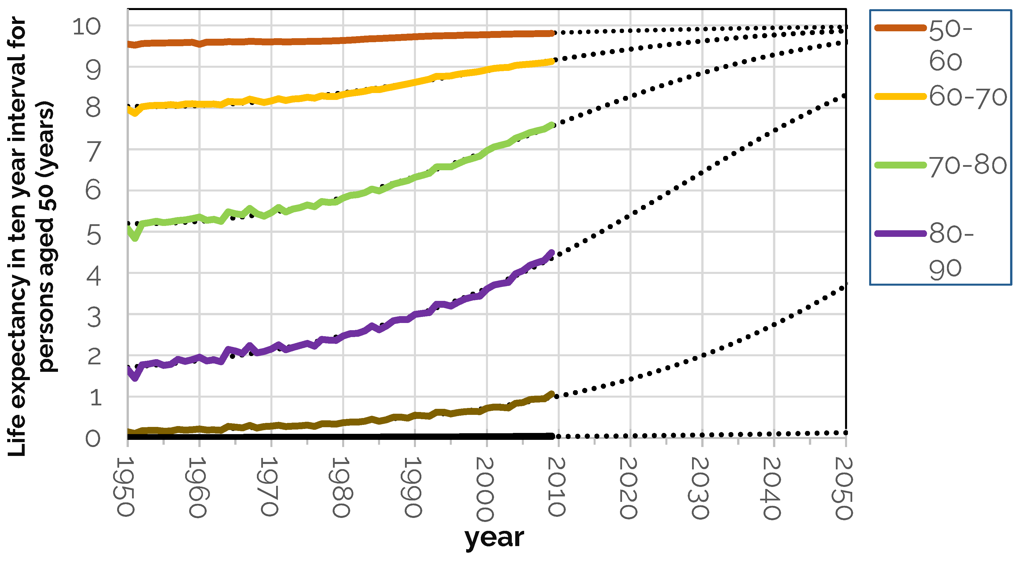
Figure 2.
Change in partial life expectancy in UK males and females from 1950 to 2020 from age 50 onwards in which hatched lines denote changes from 2010 to 2020 and alongside the dotted long-term trend (data source, HMD).
Figure 2.
Change in partial life expectancy in UK males and females from 1950 to 2020 from age 50 onwards in which hatched lines denote changes from 2010 to 2020 and alongside the dotted long-term trend (data source, HMD).
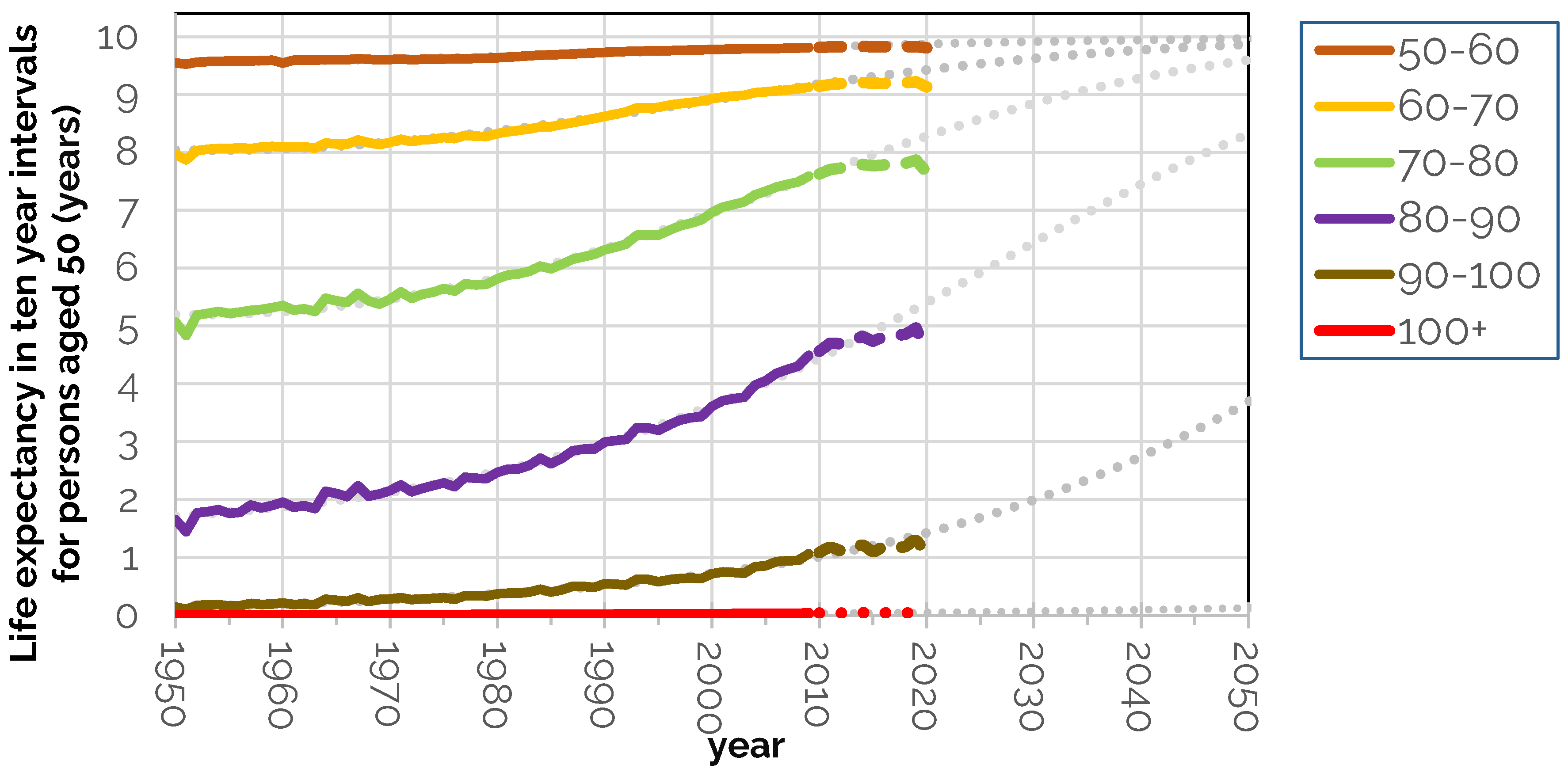
Figure 3.
Chart showing partial life expectancy in ten-year intervals in 2020 by country.
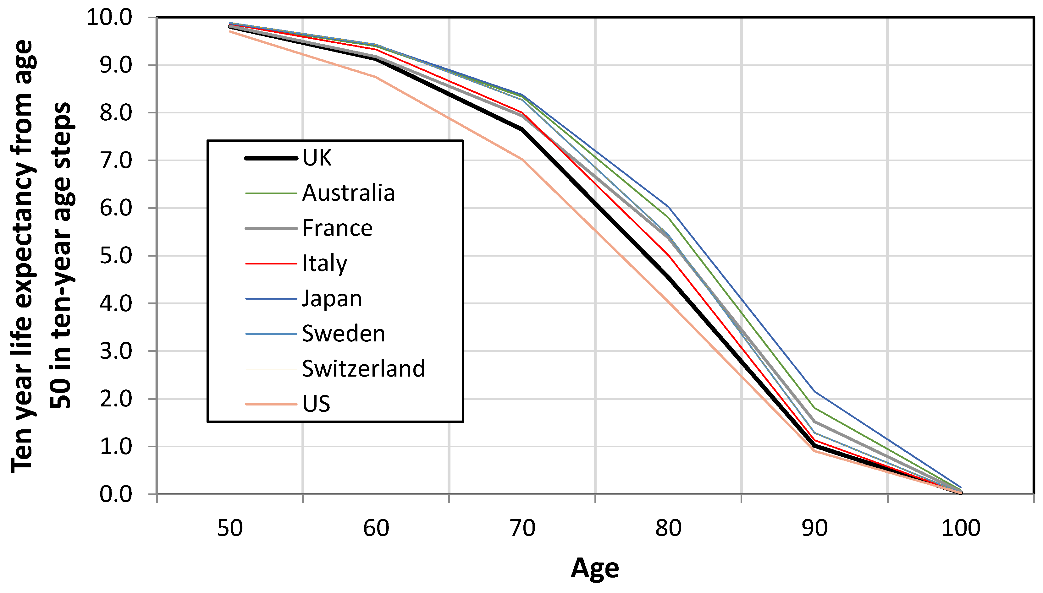
Figure 4.
Number of years out of the next five expected to be spent in good health (England Males) by deprivation decile.
Figure 4.
Number of years out of the next five expected to be spent in good health (England Males) by deprivation decile.
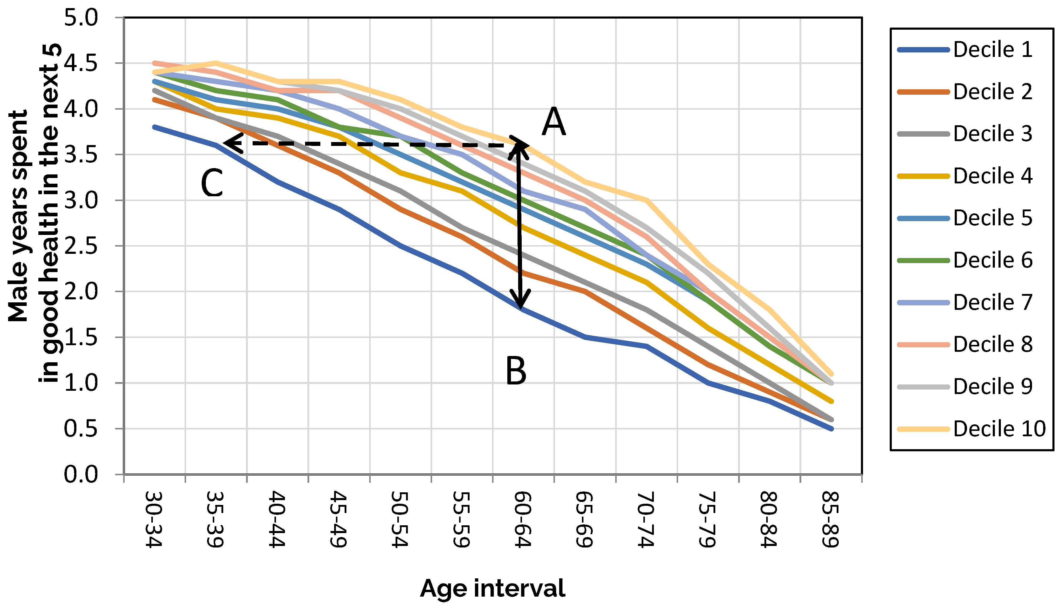
Figure 5.
Life expectancy by age and deprivations decile.
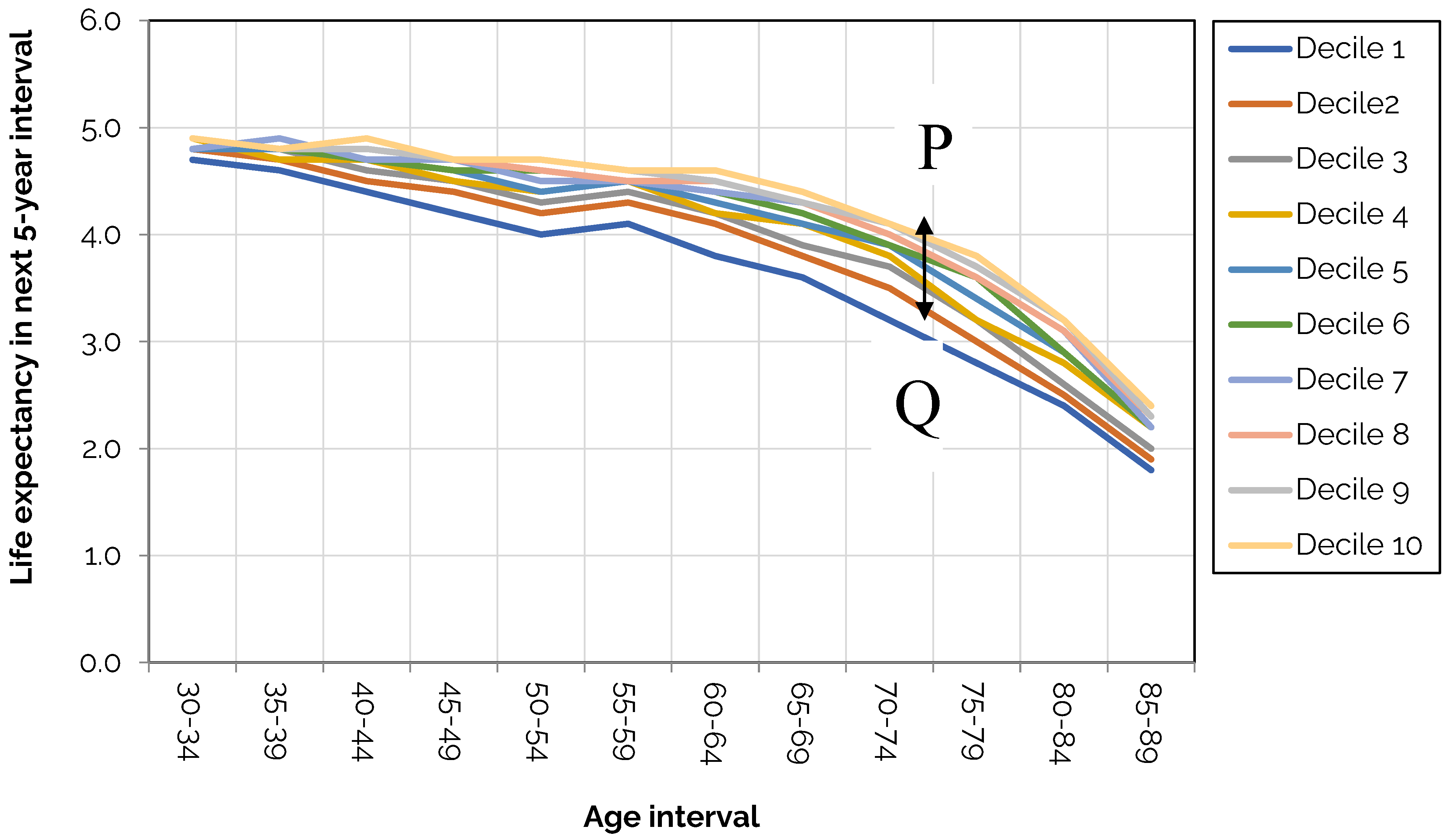
Figure 6.
Healthy life expectancy by English district (from Mayhew, Cairns and Chan, 2024).
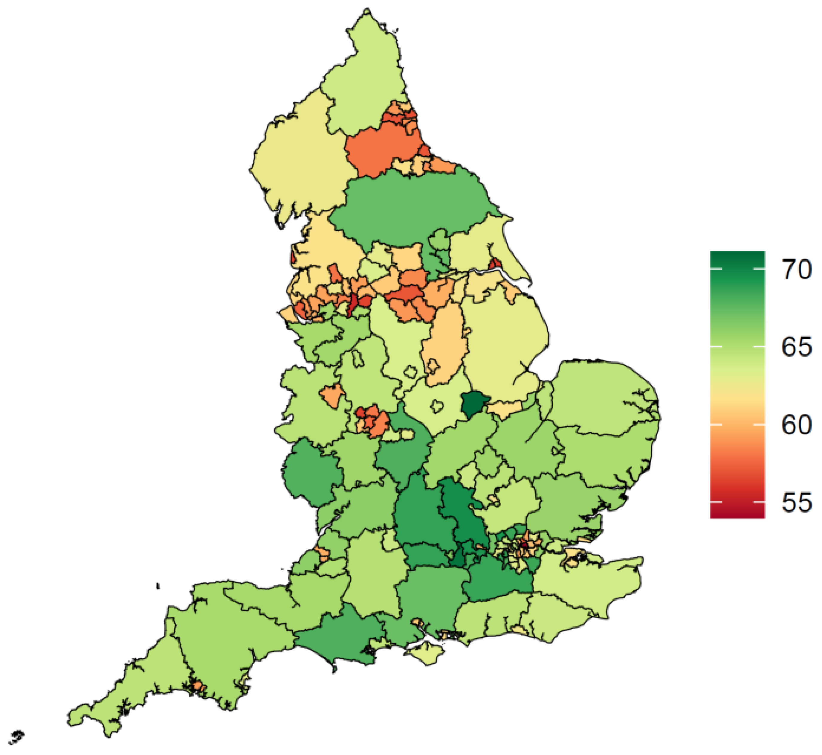
Figure 7.
Life and health expectancy at birth for males by Upper Tier Local Authority in England (2016-2018).
Figure 7.
Life and health expectancy at birth for males by Upper Tier Local Authority in England (2016-2018).
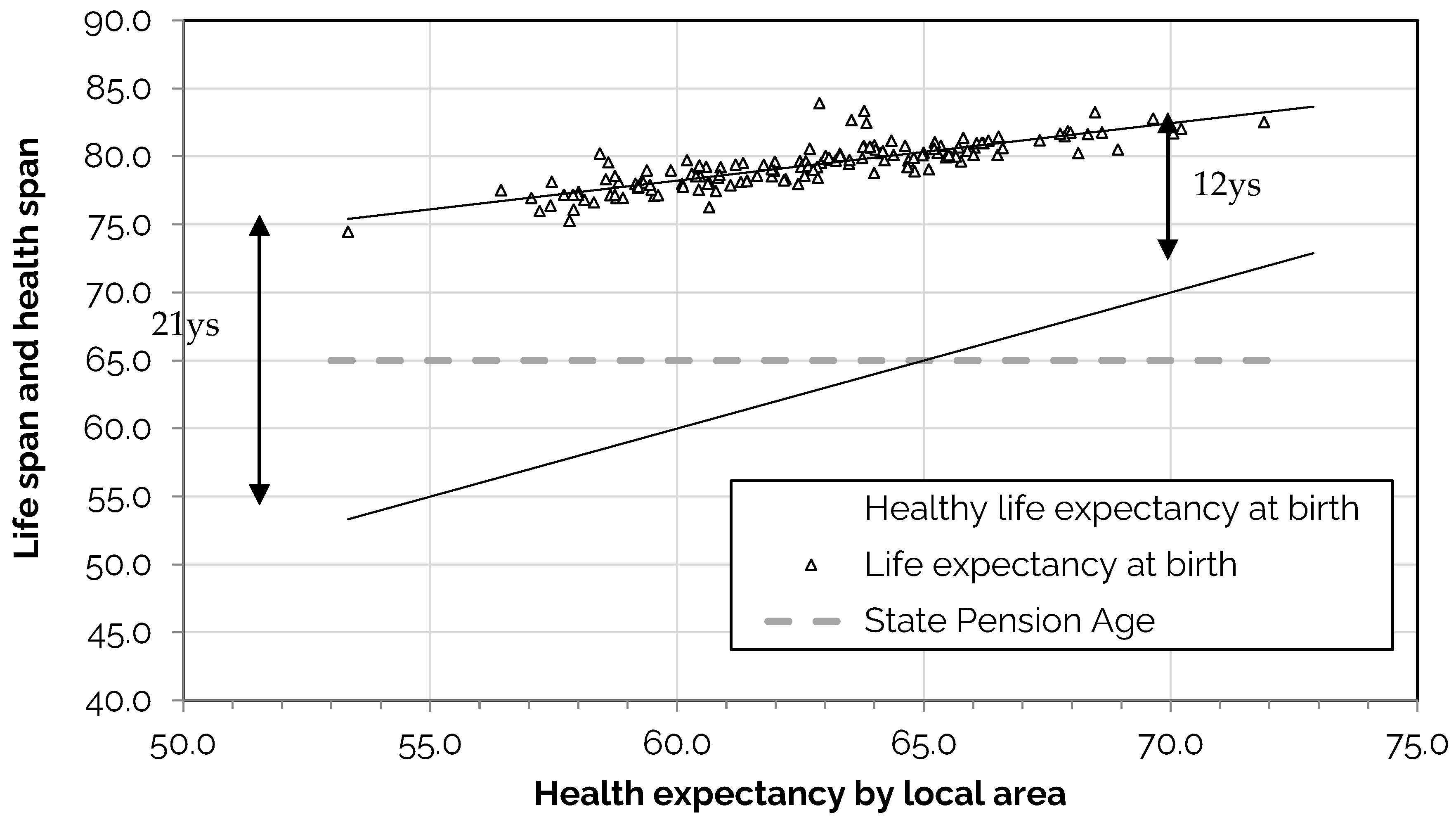
Table 1.
Fitted parameter values for the projection model applied to data for England and Wales for men and women combined.
Table 1.
Fitted parameter values for the projection model applied to data for England and Wales for men and women combined.
| Age band | a | b | c | R-squared |
| 30-40 | 0.0005 | 0.0000000 | 9.0 | 0.63 |
| 40-50 | 0.0105 | 0.0000000 | -17.1 | 0.94 |
| 50-60 | -0.9201 | 0.0000000 | 898.4 | 0.98 |
| 60-70 | -1.2025 | 0.0003079 | 1175.5 | 0.99 |
| 70-80 | -1.2446 | 0.0003189 | 1214.6 | 0.99 |
| 80-90 | -0.8862 | 0.0002295 | 853.9 | 0.99 |
| 90-100 | -0.2678 | 0.0000761 | 228.6 | 0.98 |
| 100+ | 0.7634 | -0.0001798 | -813.7 | 0.95 |
Table 2.
Changes in UK partial life expectancy between 2050 and 2010 in ten years steps from age 50.
Table 2.
Changes in UK partial life expectancy between 2050 and 2010 in ten years steps from age 50.
| Age | 1950 | 2010 | difference |
| 50 | 9.5 | 9.8 | 0.3 |
| 60 | 8.0 | 9.1 | 1.2 |
| 70 | 5.1 | 7.6 | 2.6 |
| 80 | 1.7 | 4.6 | 2.9 |
| 90 | 0.1 | 1.1 | 0.9 |
| 100 | 0.0 | 0.0 | 0.0 |
| All | 24.39 | 32.3 | 7.9 |
Table 3.
Summary table showing the years of departure from trend from 2013 to 2020 by age group and year.
Table 3.
Summary table showing the years of departure from trend from 2013 to 2020 by age group and year.
| Age/year | 50-60 | 60-70 | 70-80 | 80-90 | 90-100 | 100+ | Total Gain (+)/ |
| Loss (-) | |||||||
| 2013 | 0 | -0.1 | -0.1 | 0 | 0 | 0 | -0.1 |
| 2014 | 0 | -0.1 | -0.1 | 0 | 0.1 | 0 | -0.1 |
| 2015 | 0 | -0.1 | -0.2 | -0.2 | -0.1 | 0 | -0.6 |
| 2016 | 0 | -0.1 | -0.2 | -0.2 | -0.1 | 0 | -0.7 |
| 2017 | 0 | -0.1 | -0.3 | -0.3 | -0.1 | 0 | -0.8 |
| 2018 | 0 | -0.2 | -0.3 | -0.3 | -0.1 | 0 | -1 |
| 2019 | 0 | -0.2 | -0.3 | -0.3 | -0.1 | 0 | -1 |
| 2020 | -0.1 | -0.3 | -0.6 | -0.8 | -0.4 | 0 | -2.3 |
Table 4.
Partial life expectancy in ten-year intervals in 2020 by country.
| Age |
2020 UK |
Australia | France | Italy | Japan | Sweden | Switzerland | US |
| 50 | 9.8 | 9.9 | 9.8 | 9.9 | 9.9 | 9.9 | 9.9 | 9.7 |
| 60 | 9.1 | 9.4 | 9.2 | 9.3 | 9.4 | 9.4 | 9.4 | 8.7 |
| 70 | 7.6 | 8.3 | 7.9 | 8.0 | 8.4 | 8.1 | 8.3 | 7.0 |
| 80 | 4.5 | 5.8 | 5.4 | 5.0 | 6.0 | 5.1 | 5.4 | 4.0 |
| 90 | 1.0 | 1.8 | 1.5 | 1.1 | 2.2 | 1.2 | 1.3 | 0.9 |
| 100 | 0.0 | 0.1 | 0.1 | 0.0 | 0.1 | 0.0 | 0.0 | 0.0 |
| Total | 32.2 | 35.3 | 33.9 | 33.4 | 36.0 | 33.7 | 34.3 | 30.4 |
Table 5.
The number of years out of the next five England males are expected to remain healthy by age group and deprivation decile.
Table 5.
The number of years out of the next five England males are expected to remain healthy by age group and deprivation decile.
| Deprivation decile | ||||||||||
| Male age | 1 | 2 | 3 | 4 | 5 | 6 | 7 | 8 | 9 | 10 |
| 30-34 | 3.8 | 4.1 | 4.2 | 4.3 | 4.3 | 4.4 | 4.4 | 4.5 | 4.4 | 4.4 |
| 35-39 | 3.6 | 3.9 | 3.9 | 4.0 | 4.1 | 4.2 | 4.3 | 4.4 | 4.5 | 4.5 |
| 40-44 | 3.2 | 3.6 | 3.7 | 3.9 | 4.0 | 4.1 | 4.2 | 4.2 | 4.3 | 4.3 |
| 45-49 | 2.9 | 3.3 | 3.4 | 3.7 | 3.8 | 3.8 | 4.0 | 4.2 | 4.2 | 4.3 |
| 50-54 | 2.5 | 2.9 | 3.1 | 3.3 | 3.5 | 3.7 | 3.7 | 3.9 | 4.0 | 4.1 |
| 55-59 | 2.2 | 2.6 | 2.7 | 3.1 | 3.2 | 3.3 | 3.5 | 3.6 | 3.7 | 3.8 |
| 60-64 | 1.8 | 2.2 | 2.4 | 2.7 | 2.9 | 3.0 | 3.1 | 3.3 | 3.4 | 3.6 |
| 65-69 | 1.5 | 2.0 | 2.1 | 2.4 | 2.6 | 2.7 | 2.9 | 3.0 | 3.1 | 3.2 |
| 70-74 | 1.4 | 1.6 | 1.8 | 2.1 | 2.3 | 2.4 | 2.4 | 2.6 | 2.7 | 3.0 |
| 75-79 | 1.0 | 1.2 | 1.4 | 1.6 | 1.9 | 1.9 | 2.0 | 2.0 | 2.2 | 2.3 |
| 80-84 | 0.8 | 0.9 | 1.0 | 1.2 | 1.4 | 1.4 | 1.5 | 1.5 | 1.6 | 1.8 |
| 85-89 | 0.5 | 0.6 | 0.6 | 0.8 | 1.0 | 1.0 | 1.0 | 1.0 | 1.0 | 1.1 |
Table 6.
This is a tabular version of the chart in Figure 5 with age bracket on the rows and deprivation decile in the columns.
Table 6.
This is a tabular version of the chart in Figure 5 with age bracket on the rows and deprivation decile in the columns.
| Deprivation decile | ||||||||||
| Male age | 1 | 2 | 3 | 4 | 5 | 6 | 7 | 8 | 9 | 10 |
| 30-34 | 4.7 | 4.8 | 4.8 | 4.9 | 4.8 | 4.9 | 4.8 | 4.9 | 4.9 | 4.9 |
| 35-39 | 4.6 | 4.7 | 4.8 | 4.7 | 4.8 | 4.8 | 4.9 | 4.8 | 4.8 | 4.8 |
| 40-44 | 4.4 | 4.5 | 4.6 | 4.7 | 4.7 | 4.7 | 4.7 | 4.8 | 4.8 | 4.9 |
| 45-49 | 4.2 | 4.4 | 4.5 | 4.5 | 4.6 | 4.6 | 4.7 | 4.7 | 4.7 | 4.7 |
| 50-54 | 4.0 | 4.2 | 4.3 | 4.4 | 4.4 | 4.6 | 4.5 | 4.6 | 4.7 | 4.7 |
| 55-59 | 4.1 | 4.3 | 4.4 | 4.5 | 4.5 | 4.5 | 4.5 | 4.5 | 4.6 | 4.6 |
| 60-64 | 3.8 | 4.1 | 4.2 | 4.2 | 4.3 | 4.4 | 4.4 | 4.5 | 4.5 | 4.6 |
| 65-69 | 3.6 | 3.8 | 3.9 | 4.1 | 4.1 | 4.2 | 4.3 | 4.3 | 4.3 | 4.4 |
| 70-74 | 3.2 | 3.5 | 3.7 | 3.8 | 3.9 | 3.9 | 4.0 | 4.0 | 4.1 | 4.1 |
| 75-79 | 2.8 | 3.0 | 3.2 | 3.2 | 3.4 | 3.6 | 3.6 | 3.6 | 3.7 | 3.8 |
| 80-84 | 2.4 | 2.5 | 2.6 | 2.8 | 2.9 | 2.9 | 3.1 | 3.1 | 3.2 | 3.2 |
| 85-89 | 1.8 | 1.9 | 2.0 | 2.2 | 2.2 | 2.2 | 2.2 | 2.3 | 2.3 | 2.4 |
Disclaimer/Publisher’s Note: The statements, opinions and data contained in all publications are solely those of the individual author(s) and contributor(s) and not of MDPI and/or the editor(s). MDPI and/or the editor(s) disclaim responsibility for any injury to people or property resulting from any ideas, methods, instructions or products referred to in the content. |
© 2025 by the authors. Licensee MDPI, Basel, Switzerland. This article is an open access article distributed under the terms and conditions of the Creative Commons Attribution (CC BY) license (http://creativecommons.org/licenses/by/4.0/).
Copyright: This open access article is published under a Creative Commons CC BY 4.0 license, which permit the free download, distribution, and reuse, provided that the author and preprint are cited in any reuse.


