
Submitted:
01 August 2025
Posted:
02 August 2025
You are already at the latest version
Abstract
In the digital environment, e-Commerce platforms have accumulated a large amount of both structured and unstructured data. As a core carrier of user perception, review content has a significant impact on consumer behavior and platform operations. This paper, based on Python programming, relies on multi-source review samples to construct a multi-level analytical framework. It combines sentiment annotation, behavioral variable extraction, and time series modeling to systematically explore the emotional characteristics and behavioral patterns within the reviews. Machine learning methods are employed to improve the accuracy of text classification, and trend prediction models are built to identify the evolution path of sentiment. Experimental results show that negative emotions possess stronger behavioral guiding power in user feedback, and the models perform stably in both classification and prediction tasks. This study provides data support for platforms to optimize user experience, enhance public opinion monitoring, and formulate marketing strategies.
Keywords:
python
; e-commerce reviews
; sentiment analysis
; trend modeling
; user behavior
1. Introduction
In the digital era, e-Commerce has become an important component of the global economy. With the rapid development of e-Commerce platforms, the explosive growth of product information and consumer review data has brought unprecedented opportunities and challenges to both merchants and researchers. These data contain valuable business insights that are of significant value in understanding market dynamics, optimizing product strategies, and improving customer satisfaction. However, how to extract useful information from massive datasets and transform it into actionable business intelligence remains one of the urgent problems in the current e-Commerce field.
As an efficient, easy-to-learn, and powerful programming language, Python has been widely applied in the field of data analysis. Its rich data processing libraries and visualization tools, such as Pandas, Numpy, and Matplotlib, provide great convenience for handling and analyzing large-scale datasets. Python-based data analysis methods not only effectively process structured data, but also address challenges posed by unstructured texts, such as sentiment analysis of consumer reviews.
This study aims to explore how to use Python and its related libraries to conduct data analysis on product information and reviews on e-commerce platforms. It first introduces the application background of Python in data analysis and then elaborates on the main content and methodology of the research. Through a real case study on an e-Commerce platform, it demonstrates how to perform data cleaning, processing, visualization, and modeling analysis of product review information using Python and how to perform sentiment analysis and topic mining of consumer reviews. Based on this, the study explores how the results of the data analysis can assist merchants in optimizing product strategies, improving user satisfaction, and forecasting market trends.
2. Introduction to the Python Language
2.1. Basic Concepts
Python is a high-level programming language created by Guido van Rossum and released in 1991. Its design philosophy emphasizes the readability and simplicity of the code. As an interpreted and dynamically typed multi-paradigm language, Python reduces development complexity through features such as automatic memory management, enforced indentation syntax, and cross-platform compatibility. According to the TIOBE Programming Language Index (March 2025), Python has remained among the top three programming languages for five consecutive years and currently holds the top position. Its open-source ecosystem, maintained through the PyPI platform, hosts more than 300,000 third-party libraries, covering areas including scientific computing, artificial intelligence, and full-stack web development [1].
2.2. Environment and Features
Python’s advantages in scientific computing stem from the synergy between its language features and its extensive ecosystem. Its dynamic type system allows for runtime type inference, reducing code complexity. The layered toolchain composed of standard and third-party libraries provides modular solutions for interdisciplinary research. Furthermore, Python’s support for multiple programming paradigms—including object-oriented, functional, and procedural programming—offers flexibility for developers. When combined with Jupyter Notebook, an interactive execution environment, it enables real-time visualization and simultaneous algorithm debugging.
2.3. Syntax and Applications
The syntax of Python prioritizes clarity and readability, using strict indentation rules to enforce consistent structure while avoiding redundant symbols. The language supports various paradigms such as object-oriented and functional programming. Thanks to its open-source nature, ease of use, and a vast ecosystem of powerful third-party libraries, Python has found widespread application in areas including web scraping, data analysis, machine learning, artificial intelligence, and cloud computing [2].
3. Data Collection
Data collection represents the initial and foundational step in the data analysis process. Its primary objective is to obtain high-quality and highly accessible data from diverse sources. In the context of analyzing product information and customer reviews on e-commerce platforms, the accuracy and completeness of the collected data directly determine the effectiveness and reliability of subsequent analytical outcomes.
3.1. Working Principle
Data collection using Python, commonly referred to as web crawling, involves a program or script that automatically retrieves information from the internet based on predefined rules [3]. As a scripting language, Python offers a comprehensive suite of web crawling tools, including Requests, BeautifulSoup, and Selenium, which collectively support nearly all standard functionalities. These tools enable efficient tag filtering and rapid webpage retrieval using highly concise code.
The core working principle of a web crawler typically encompasses four main steps: data acquisition, data parsing, data extraction, and data storage.
3.2. Collection Methods and Process
3.2.1. Requests Technology
Among the essential tools for web crawling in Python, the Requests library stands out for its simplicity and effectiveness. It mimics user behavior by accessing URLs and submitting network requests to servers, thereby enabling the automatic retrieval of HTML content from web pages [4]. Prior to initiating data collection with Requests, it is necessary to import the library, specify the target URL, and configure request headers. These headers typically include fields such as User-Agent and From, which help identify the source of the request and improve compatibility with the target server.
Implementing data acquisition with Requests generally involves four key steps: sending HTTP requests, parsing the response content, handling exceptions and anti-crawling mechanisms, and saving the acquired data in a structured format.
As an illustration, the code below sends a legitimate HTTP GET request to a test endpoint (https://httpbin.org/get) using the Requests library. A retry mechanism is included to enhance robustness, as shown in Figure 1.
Figure 2 presents the output of a valid request, including the IP address and HTTP header information returned by the server.
3.2.2. Selenium Technology
Selenium is a powerful automation testing tool. It is an open-source automation framework based on the WebDriver protocol. By establishing sessions with browser drivers such as GeckoDriver for Firefox, it enables programmatic control of the browser. It is widely used for browser automation testing and web data scraping, helping protect user privacy and prevent web crawlers from accessing data too frequently. Its advantage lies in its ability to visually simulate human interaction. By using send_keys() to simulate URL input, click() to simulate mouse clicking, and execute_script() to execute JavaScript code to scroll, it can reproduce complex dynamic operations. This not only restores realistic user behavior but also helps avoid anti-crawling mechanisms by spacing requests reasonably, thereby indirectly ensuring compliance with access frequency. Its multi-language support capability originates from its architectural design: the core engine exposes operational instructions through RESTful interfaces, and client libraries in Python, Java, C#, and other languages encapsulate those interfaces to achieve functional calls, making it adaptable to the development needs of different technology stacks [5].
The working process of Selenium technology is illustrated in Figure 3.
4. Data Processing
During the data acquisition phase, all platform usage policies and relevant legal regulations were strictly adhered to. As a globally recognized hub for data science, Kaggle aggregates an extensive array of high-quality open-source datasets, offering a rich repository for interdisciplinary academic research.
This chapter centers on the “Amazon Fine Food Reviews” dataset, curated by user mdraselsarker and published on the Kaggle platform. It specifically captures user-generated reviews of gourmet products sold on Amazon, spanning the period from October 1999 to October 2012. The dataset encompasses 568,454 reviews from 256,059 users and 74,258 distinct products. Among these users, 260 submitted more than 50 reviews [6]. Upon downloading and extracting the dataset from Kaggle, two essential files are obtained: Reviews.csv and database.sqlite. The Reviews.csv file is directly derived from the “Reviews” table within the database.sqlite database and is stored in CSV format, facilitating subsequent data analysis tasks.
Covering over a decade of user activity, the dataset comprises ten key fields: unique review ID (Id), product ID (ProductId), user ID (UserId), user nickname (ProfileName), timestamp (Time), star rating from 1 to 5 (Score), number of helpful votes (HelpfulnessNumerator), total number of votes (HelpfulnessDenominator), review summary (Summary), and full review text (Text). These structured attributes offer comprehensive and valuable support for the in-depth exploration of product review patterns, sentiment trends, and user behavioral drivers in the e-commerce domain.
4.1. Data Import
Pandas is an open-source data manipulation library developed based on NumPy. It offers powerful functionalities for reading, cleaning, and transforming data, making it an essential tool for preprocessing in data analysis workflows. Specifically, it provides high-performance methods for importing CSV files and converting them into structured data formats, such as DataFrames, which are highly convenient for subsequent operations and statistical analysis.
4.2. Data Cleaning
Data cleaning involves the handling of missing values, duplicate entries, and outliers. The fields included in this dataset are as follows:
4.2.1. Missing Value Cleaning
Missing values can cause statistical bias and reduce model performance, and therefore need to be identified and handled using a systematic method. The isnull() function in the pandas library is used to examine each record for missing values, generating a Boolean matrix missing_bool, where a value of True indicates a missing value (NaN), and False indicates a non-missing value. The sum(axis=0) method is then used along the column axis to sum the Boolean matrix, resulting in the number of missing values in each column, stored as missing_counts. Each column’s missing value count is divided by the total number of rows len(df), multiplied by 100, and rounded to two decimal places to obtain the missing rate of each field, denoted as missing_rates, which intuitively reflects the missing status of each field. The results are printed together, as shown in Figure 4.
4.2.2. Outlier Detection
Clustering algorithms can generally be divided into several types: partitioning methods, hierarchical methods, density-based methods, grid-based methods, and model-based methods. The partitioning method is one of these types, which is characterized by fast operation and high accuracy [7]. The K-Means clustering algorithm is used to detect and identify outliers in the e-commerce review dataset, with the core logic being that abnormal data points are far from their corresponding cluster centers. The 1–5 star ratings (Score), the number of helpful votes (HelpfulnessNumerator), and the total number of votes (HelpfulnessDenominator) are selected as three feature columns to construct the feature matrix for analysis. The KMeans model is initialized with the number of clusters set to 3, and Euclidean distance (i.e., the straight-line distance between data points and the center point in three-dimensional space) is used as the similarity metric. The cluster centers are updated through multiple iterations until their positions become stable. After clustering is completed, the Euclidean distance from each review to its cluster center is calculated. The greater the distance, the more likely the data is to deviate from the normal pattern, and it is then judged as an outlier. The specific process is shown in Figure 5.
4.2.3. Duplicate Records
Duplicate records in e-commerce review data mainly originate from interface collection anomalies or user resubmission behavior, and such data can cause statistical bias in analysis results. When multiple rows of data are completely identical, they need to be deduplicated. The duplicated() method can be used to detect duplicate data, which returns True if duplicates are found, and the drop_duplicates() method is used to remove them [8]. According to the business logic characteristics of e-commerce review data, the globally unique identifier field (Id) generated by the platform is selected as the basis for deduplication, and drop_duplicates() is executed to remove data, following two core principles: priority of unique identifiers and adaptation to business scenarios. After deduplication, redundant records in the dataset are effectively removed; the original data size is reduced from len(df) to len(clean_df), eliminating the interference of duplicate data in sentiment analysis, high-frequency word statistics, and other processes, thus laying a high-quality data foundation for subsequent user behavior analysis. The specific code and result are shown in Figure 6.
4.3. Data Visualization and Analysis
Key influencing factors in this analysis include total vote count, helpful vote count, sentiment polarity, rating, review length, and high-frequency words. Taking individual reviews as the unit of analysis, the study examines intrinsic relationships, distributional characteristics, and latent patterns across multiple dimensions. By leveraging data visualization and comprehensive analytical techniques, user behavioral tendencies, sentiment orientations, and core product concerns are systematically uncovered. These insights provide robust data support and valuable references for optimizing product strategies, enhancing user experience, and fostering deeper user engagement.
4.3.1. Correlation Between Helpful Votes and Total Votes
Figure 7 shows the relationship between the number of helpful votes and the total number of votes.
To quantify the degree of correlation between the two, Pearson correlation coefficient is used. The formula is:
where r is the correlation coefficient, and are the i-th observations of variables X and Y, respectively, and are the sample means of variables X and Y, and n is the sample size, i.e., the number of observations. To ensure the scientific validity and reproducibility of the analysis, the calculation of the correlation coefficient is implemented using the scipy.stats.pearsonr function in Python [9], which returns the correlation coefficient r and the corresponding p-value. The p-value represents the probability of obtaining a result as extreme as the observed one under the assumption that the null hypothesis (i.e., no linear correlation between the two variables) is true. When the p-value is less than a pre-specified significance level (commonly 0.05), it is considered that a true linear correlation exists between the variables. The calculation results are shown in Figure 8, indicating that the correlation coefficient r between the two variables in the scatter plot is 0.98, and the p-value is approximately 0.00.
Results indicate a strong and statistically significant positive correlation between the number of helpful votes and the total number of votes. As shown in the scatter plot, most data points are densely clustered along a trend line extending from the bottom left to the upper right, visually illustrating that an increase in total votes is typically accompanied by a corresponding rise in helpful votes. Some points, however, deviate from this pattern. Reviews with high total vote counts but low helpfulness may reflect superficial content, lack substantive value, or even contain misleading information, thus failing to earn broad user recognition. In contrast, reviews with fewer total votes yet high helpfulness may precisely address the needs of specific user groups.
4.3.2. Sentiment Distribution Pie Chart
Figure 9 shows the distribution of sentiment polarity in the comments, covering three categories: Positive, Neutral, and Negative.
During data preprocessing, the original dataset did not contain a direct “Sentiment” column. Sentiment polarity labels were inferred for each comment using natural language processing (NLP) techniques. The specific implementation code is shown in Figure 10.
Sentiment analysis determines public opinion and expression toward products based on online reviews. Its core task is to classify text as positive, negative, or neutral sentiment. This relies on techniques such as text analytics, natural language processing (NLP), and computational linguistics to extract key information from user reviews, helping marketers assess market demand, understand public emotions and customer attitudes, and support customer base expansion. Technically, sentiment classification is divided into rule-based methods and machine learning-based automatic methods. The latter is more widely used due to its deeper understanding of opinionated text. Classifiers such as Naive Bayes, Maximum Entropy, and Support Vector Machine (SVM) can enhance classification accuracy. TextBlob is a Python library that offers a simple API, functioning similarly to Python strings, and supports NLP tasks such as part-of-speech tagging, noun phrase extraction, sentiment analysis, classification, and translation [10].
In the function plot_sentiment_distribution, the get_sentiment function is defined to invoke TextBlob’s sentiment analysis capability. This function takes the text of each comment as input and uses the sentiment.polarity attribute of TextBlob to calculate the sentiment polarity score. A score greater than 0 is classified as positive sentiment; a score less than 0 as negative sentiment; and a score equal to 0 as neutral sentiment. The operation df[’Sentiment’] = df[’Text’].apply(get_sentiment) applies sentiment polarity labeling to all comments in the DataFrame df, providing the basis for subsequent analysis.
Compared to the random assignment method using np.random.choice, TextBlob’s sentiment tagging is based on textual semantics and syntactic information. It follows predefined dictionary rules and weight computation logic, resulting in outcomes that are stable and interpretable, effectively avoiding fluctuations that might arise from random assignment.
The final sentiment distribution results show: positive sentiment comments account for 88.3%, indicating that most users hold a favorable attitude toward the product or service; neutral sentiment comments account for only 1.5%, suggesting that a small number of users have ambiguous attitudes due to average experiences; and negative sentiment comments make up 10.2%, indicating dissatisfaction among some users.
To quantitatively understand the characteristics and uncertainty of this sentiment distribution, the concept of information entropy H is introduced. Information entropy is a key metric for measuring the uncertainty of random variables. In sentiment polarity analysis, it can help assess the dispersion of sentiment distribution. Its calculation formula is:
where is the probability of the i-th sentiment category, and n is the total number of sentiment categories (here , corresponding to Positive, Neutral, and Negative). A higher entropy value indicates more dispersed sentiment distribution and greater uncertainty, reflecting diverse and inconsistent user attitudes; a lower value indicates more concentrated distribution and higher consistency in user attitudes. Substituting the category proportions into the formula yields an entropy value of approximately . This result shows that the sentiment distribution in the current dataset is relatively concentrated, and user attitudes are highly consistent, with most users inclined to give positive evaluations.
4.3.3. Box Plot of Score vs. Review Length
Figure 11 shows the distribution of comment text lengths (measured by character count) under different rating scores (from 1 to 5 stars), visualized using a box plot.
Box plots are composed of three main elements: the box itself, the median line within the box, and the whiskers. Representing the central 50% of the data, the box spans from the first quartile (), marking the 25th percentile, to the third quartile (), at the 75th percentile. The interquartile range (IQR), calculated as , defines the width of the box. A larger IQR indicates greater variability among the central data, while a smaller IQR suggests a more concentrated distribution. The line inside the box denotes the median, a measure resilient to outliers and indicative of the data’s central tendency. Whiskers extend to and , excluding data points outside this range, which are treated as outliers. These outliers are plotted individually and reflect the extent of data dispersion. Longer whiskers indicate wider value ranges and greater spread, whereas shorter whiskers correspond to more tightly clustered data.
According to existing studies, comment length has been found to correlate with fake review labels, where fake reviews tend to show more concentrated length distributions. This provides empirical support for the observed clustering of lengths in extreme ratings: short 1-star reviews may involve emotional or manipulative expressions, while brief 5-star reviews may reflect templated praise. Both exhibit low dispersion due to the unnatural nature of the content. Furthermore, analysis of review polarity shows that the sources of fake reviews differ by sentiment polarity—positive fake reviews often stem from seller inducement, while negative ones may involve competitive manipulation. These source differences partially explain the length distribution characteristics observed under extreme ratings. In contrast, 3-star reviews exhibit higher dispersion, aligning more closely with natural, authentic review behavior [11].
In this study, the character length of each review was calculated using the line df[’TextLength’] = df[’Text’].apply(lambda x: len(str(x))) and stored in a new column named TextLength. This length was considered an effective quantitative indicator of the internal structure of the review. Based on this, the sns.boxplot function from the seaborn library was used to create the box plot. The “Score” served as the horizontal axis grouping variable, while “TextLength” was used on the vertical axis to show the distribution of comment lengths. The parameter showfliers=False was set to exclude outliers, in line with the standard practice of focusing box plot visuals on the core data distribution, thereby better reflecting comment distributions perceptible to actual users.
Significant heterogeneity is observed in the distribution of comment lengths across different rating levels. In the case of 1-star reviews, a notably low median length, together with narrow box widths and short whiskers, indicates a limited interquartile range (IQR) and low dispersion. This pattern suggests that users are inclined to convey intense negative emotions through succinct expressions, with the observed variability partially driven by emotional intensity and the presence of manipulative content. For 2-star ratings, the median comment length increases slightly, and the expansion of both the box and whiskers reflects a broader IQR and greater dispersion, indicating a shift from purely emotional outbursts to more varied expressions informed by actual user experience. In contrast, 3-star reviews exhibit the highest median value, the widest box, and the longest whiskers, resulting in the largest IQR and the greatest overall dispersion. Such characteristics point to more nuanced and multifaceted user feedback, encompassing ambiguous sentiments and a coexistence of brief and extensive reviews—features aligned with patterns of spontaneous and authentic expression.
In contrast, 4-star ratings have a median close to that of 3-star ratings, but show different dispersion characteristics. This suggests that users recognize product strengths while also focusing on details. Their comments tend to combine positive sentiment with rational judgments, resulting in a level of dispersion between that of extreme and moderate ratings. Lastly, 5-star reviews show a lower median and small IQR, as users often express satisfaction concisely.
The differences in comment length distributions across ratings not only reveal expression patterns under various emotional inclinations but also reflect intrinsic links to the authenticity of reviews. These findings further validate the systematic correlation between rating scores and comment length distributions.
4.3.4. Word Cloud of Frequent Words
Figure 12 presents the word cloud of frequent terms extracted from the review dataset. As a commonly used tool for visualizing textual data, word clouds provide an intuitive representation of word frequency through visual weight, enabling rapid identification of central themes and key information in a text corpus. Traditional word clouds, due to spatial constraints, randomly arrange words on a canvas. Typically, they compute word frequency from the corpus, sort the terms accordingly, and adjust font size proportionally to frequency [12].
In this figure, the font size reflects the frequency of word occurrences. Notably, terms such as "brand", "product", "taste", "love", and "good" appear in large and prominent fonts. These high-frequency terms encapsulate rich user feedback and reflect the core concerns expressed in user reviews.
Due to the inherent randomness in word cloud layout algorithms, different visual representations may emerge from the same text data, with variations in word placement and spatial distribution. However, despite these visual differences, the identification of core frequent terms remains stable. Therefore, the analysis and interpretation of users’ key concerns based on word frequency are unaffected by such randomness.
From the specific visualization of the current word cloud, it can be observed that in the dimensions of product and brand, terms such as "brand" and "product" occupy prominent positions. This indicates that users frequently mention the products and their associated brands, demonstrating a high level of concern for attributes like quality and functionality. In terms of taste and experience, the frequent appearance of the word "taste"—especially for food-related products—suggests that taste serves as a critical evaluation criterion. Moreover, positive emotional expressions such as "love" and "good" appear frequently, reflecting a generally satisfied user experience across the reviewed products. Additionally, terms like "order" and "use" appear with high frequency, signifying user attention toward the purchasing and usage processes, including factors such as convenience of purchase and frequency of use.
4.3.5. Summary Analysis of Visualizations
Through multi-dimensional data visualization and analysis, this study reveals the internal associations among various features within user review data. The correlation analysis shows a strong positive correlation between helpful votes and total votes. However, certain outlier data points deviating from the regression trend line suggest inconsistencies in comment quality. This implies that some low-quality reviews may diminish the reference value for other users. Enterprises should thus pay closer attention to the quality of review content to avoid ineffective or misleading information from influencing consumer decisions.
Sentiment polarity is analyzed using the TextBlob library, which generates sentiment labels based on the semantic and syntactic characteristics of the text. This method allows for a more objective representation of users’ emotional inclinations. The final sentiment distribution chart demonstrates that positive reviews overwhelmingly dominate the dataset, indicating that most users maintain a favorable attitude toward the products or services. Although neutral and negative sentiments constitute a smaller proportion, they should not be neglected. Enterprises can further investigate the underlying reasons behind these less favorable sentiments and respond by optimizing products and services accordingly to enhance satisfaction among these users.
Box plots comparing ratings and comment lengths reveal distinct distributional patterns across rating levels. Visual interpretations of these plots yield valuable insights into user behavior and inform actionable strategies. For example, organizations can focus on negative feedback contained in low-rated reviews to pinpoint and address critical issues, while simultaneously leveraging positive narratives from high-rated comments to enhance marketing efforts.
Word clouds vividly capture users’ core concerns by emphasizing frequent terms associated with product features such as brand identity, taste, and aspects of the purchase or usage process. These visual cues imply that enterprises ought to reinforce brand positioning, elevate product quality, and refine the overall user experience. In particular, sensory attributes like taste—which play a crucial role in food-related products—should receive focused optimization. In addition, the prominence of terms like “order” and “use” underscores user appreciation for convenience and efficiency in both purchasing and consumption. Consequently, companies should continuously adapt and improve processes to foster higher user satisfaction and loyalty.
5. Model Construction and Data Visualization for Analysis
Publicly available food-related merchant review data from the eBay e-commerce platform served as the primary data source for this study. In compliance with Article 13 of the Personal Information Protection Law of the People’s Republic of China (2021), which permits the lawful use of publicly disclosed personal information without separate authorization [13], and Article 12 of the Data Security Law (2021), mandating data collection to be legal, justified, and necessary [14], this research strictly limited its scope to non-sensitive data openly displayed on the platform—namely, usernames, review timestamps, and comment content. No personal privacy or proprietary business information was involved. Data acquisition was conducted solely for scholarly purposes, targeting the identification of behavioral patterns and thematic structures in food-related consumer reviews, with full adherence to legal and ethical standards and without any interference with normal platform operations.
Complementing the previously introduced “Amazon Fine Food Reviews” dataset, this new corpus was designated as eBay_reviews. Established in 1995, eBay is a multinational e-commerce enterprise headquartered in the United States, operating across more than 190 markets. Its dual structure of auction-style and fixed-price listings offers a substantial, dynamic environment that yields highly valuable data for academic research in consumer behavior and sentiment dynamics.
Initially stored in .xlsx format, the original dataset comprised 51,136 records distributed across four fields: username, comment__time, comment, and item-link. Through a systematic cleaning and transformation workflow, the dataset was refined and renamed as fully_cleaned_data, saved in .csv format, and reduced to 41,897 entries with five attributes: username, comment__time start, comment__time end, comment, and item-link. Introducing start and end time attributes enabled a time-windowed structure for each review, facilitating longitudinal behavioral analysis.
Serving as the central analytical foundation, the review texts in this dataset enable in-depth mining of user preferences, sentiment tendencies, and topical focus areas regarding food merchants. These texts support various downstream tasks, including time-series forecasting of review volume, sentiment classification, and user behavior profiling. By leveraging the temporal and semantic richness of the comments, the study aims to unveil latent structures and evolving patterns in consumer feedback, ultimately contributing to the methodological development of intelligent business analytics and e-commerce platform optimization.
A detailed account of the data preprocessing procedures and modeling strategies employed with this dataset is presented in the sections that follow.
5.1. Data Preprocessing and Adjustment
In the original dataset, review timestamps were expressed in vague terms such as "within the past year," lacking precise time indicators. To standardize this information, we defined two fields: comment__time start and comment__time end. The end time was uniformly set as May 16, 2025, while relative time expressions such as "past one month" were translated into specific start dates (e.g., April 16, 2025). As a result, the cleaned dataset retained five key fields: username, comment__time start, comment__time end, comment, and item - link.
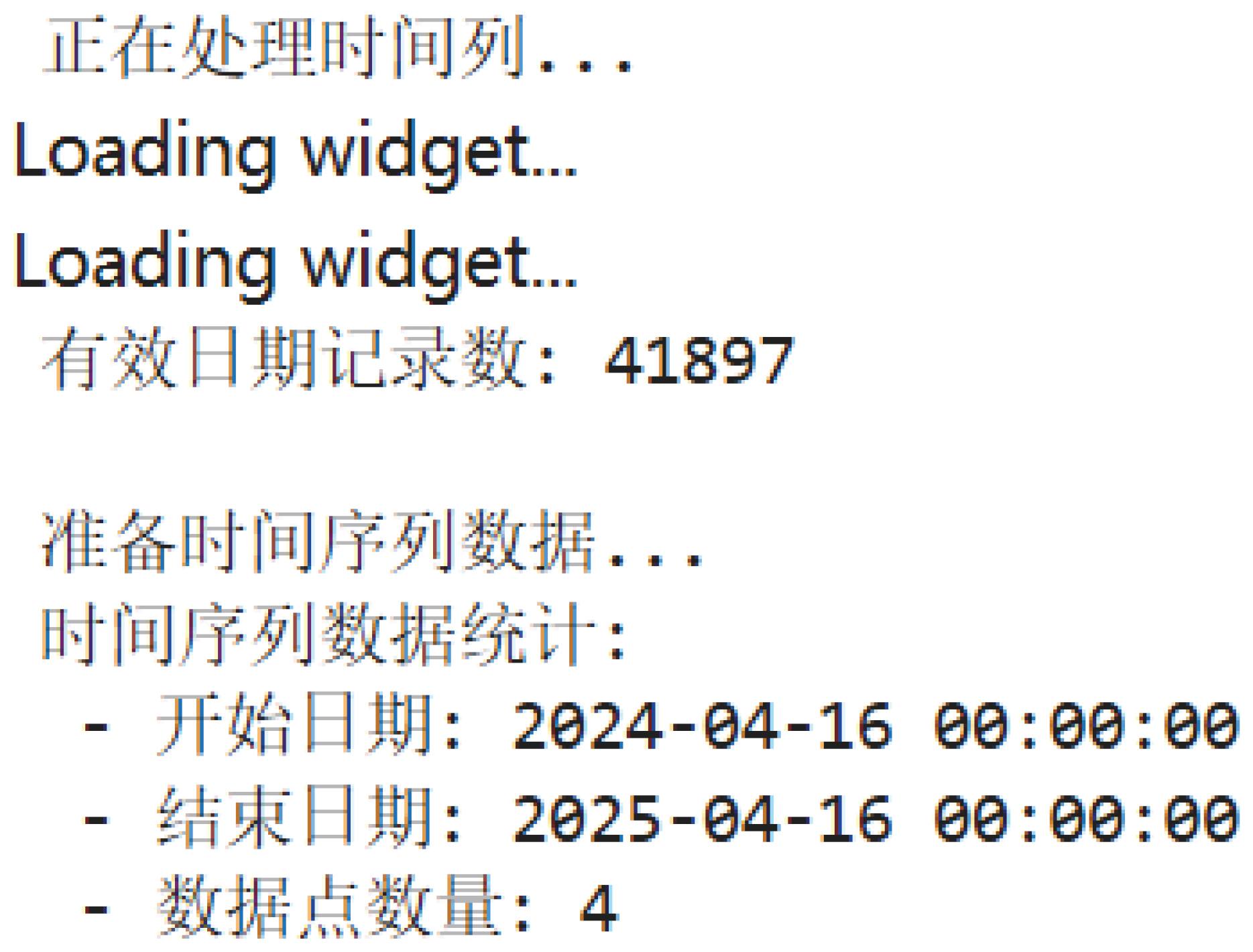
To ensure data consistency and analytical usability, we designated comment__time start as the base index for constructing the time series. The convert_date_format function was applied to convert all date strings into a unified format (%Y-%m-%d), and any invalid or ambiguous date entries were filtered out [15]. After this processing, a total of 41,897 valid date records were retained. These dates were then converted into datetime objects and aggregated on a daily basis to form the time series dataset with two variables: ds (the review start date) and y (the number of reviews on that date). This dataset formed the foundation for subsequent time series modeling and analysis.
Since data cleaning steps for the “Amazon Fine Food Reviews” dataset have already been described in the previous chapter, this section focuses solely on the time series preparation of the fully_cleaned_data. The final results are illustrated in the following figures:
Figure 13.
Preprocessed dataset result (final name: fully_cleaned_data)

Figure 14.
Code for time range aggregation
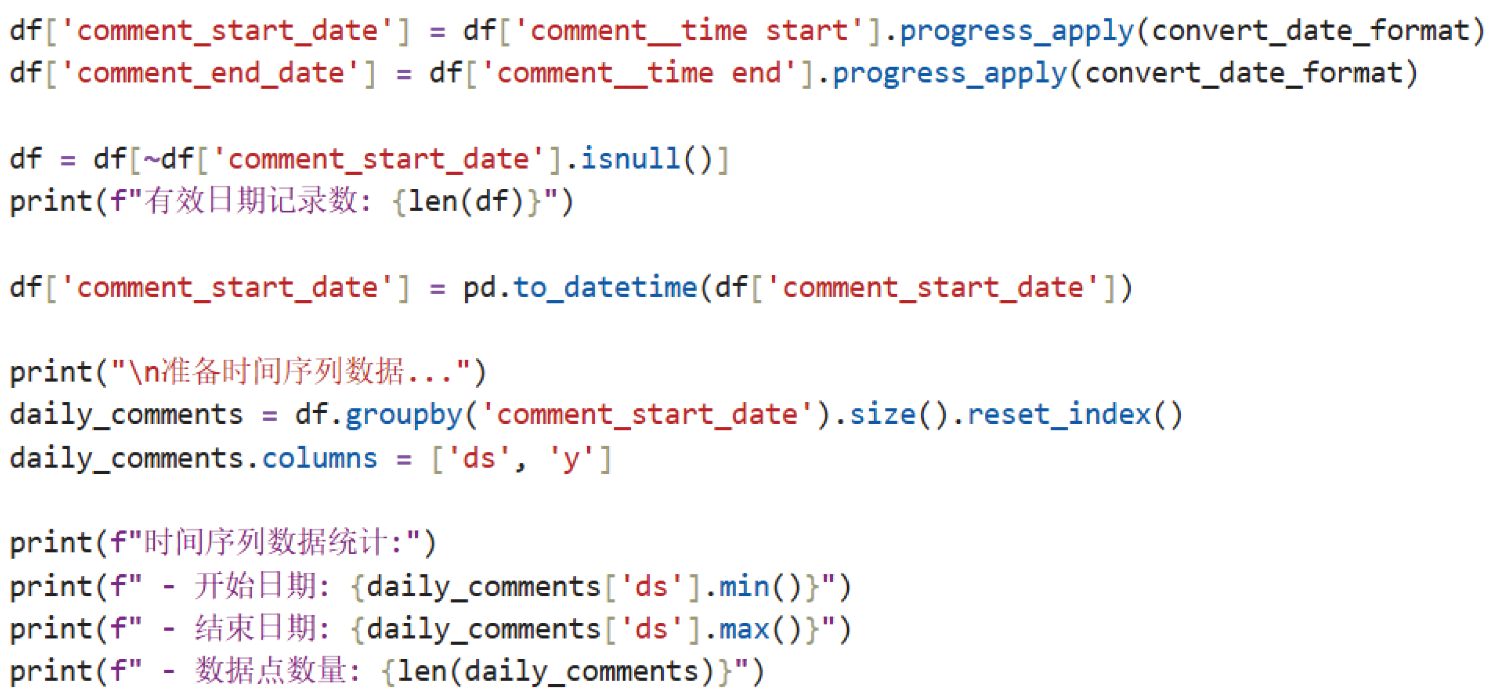
Figure 15.
Output results of time range aggregation
5.2. Review Volume Forecast Using 1-AGO–Prophet Hybrid Model in Small Sample Setting
5.2.1. Model Construction and Data Characteristics
Due to the vague timestamp descriptions and limited observation periods in the dataset—focused on credit reviews for vertical food merchants on the eBay platform—only four aggregated daily-level observations were available. These correspond to time points , with associated review volumes . The extremely limited number of samples falls short of the typical requirements for time series modeling, resulting in insufficient sequential data accumulation.
To address this small-sample challenge, we adopted a hybrid modeling framework that combines the first-order accumulated generating operation (1-AGO) from grey system theory with the logistic growth-based Prophet model. Let the original review volume sequence be:
The 1-AGO sequence is then defined as:
Applying cumulative summation transforms the original data into a monotonic sequence:
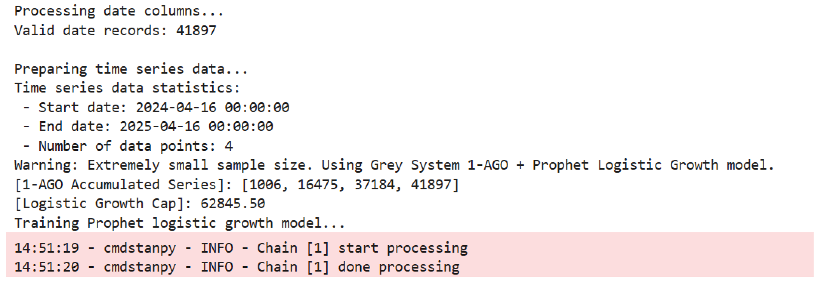
This transformation mitigates the impact of random fluctuations, aligning the data with Prophet’s requirement for monotonic growth patterns [16]. Among the four observations, the minimum and maximum review volumes are 1005.89 and 20708.94, respectively, with an average of reviews per day.
The general structure of the Prophet model is expressed as:
where denotes the observed review volume at time t, is the trend component (e.g., linear or logistic growth), represents seasonal effects, accounts for holiday-related effects, and is the random noise term, assumed to follow a normal distribution.
Due to the scarcity of observations, seasonal and holiday components were disabled to avoid overfitting. The trend was modeled using Prophet’s logistic growth function:
Here, the carrying capacity C was set to 1.5 times the peak value of the 1-AGO sequence to reflect the theoretical upper bound of the platform’s comment volume. The growth rate k and the inflection point —marking the transition from acceleration to deceleration—were learned during model training.
All parameters were configured with a focus on robustness under small samples and alignment with the e-commerce business context. Detailed configurations and their rationale are summarized in Table 1.
Finally, maximum a posteriori (MAP) estimation is employed to optimize the model parameters, effectively avoiding the dimensional mismatch issues associated with MCMC sampling under small sample conditions and enhancing the stability and convergence of the model.
5.2.2. Forecast Results Analysis
During the model training process, the log output “Chain [1] done processing” indicated that the Maximum A Posteriori (MAP) estimation had successfully converged. Considering that the sample size of the data used was only four points, this paper opted to disable MCMC sampling by setting mcmc_samples = 0. This decision was made for two main reasons: first, under small-sample conditions, MCMC sampling often results in unstable posterior estimations, and the output tends to be overly influenced by the prior distribution; second, since the data had already undergone a 1-AGO transformation and satisfied the monotonicity assumption required for logistic growth, performing MAP estimation alone was sufficient to obtain reliable point estimates. Therefore, using MAP estimation in this context not only avoids the dimension matching issues often encountered by MCMC in low-sample environments, but also enhances the convergence stability of the model.
Figure 16.
Log Output During Model Training
The forecasting results of the 1-AGO-Prophet model follow the process of "cumulative transformation – trend extrapolation – inverse transformation," and are summarized in Table 2.
As shown in the table, the predicted values of the model at the four time points present a clear change in trend. Specifically, the forecast was 2063 for April 16, 2024, remained at 2063 in May, rose sharply to 18,258 in November 2024, and then dropped to 15,974 in April 2025. This formed a "stable – sharp rise – decline" pattern. Although this pattern partially reflects the monotonic characteristics of the 1-AGO cumulative sequence, it does not accurately capture the drastic fluctuation patterns present in the original data.
For example, the actual value in May 2024 experienced a sharp increase to 15,469, which was approximately 14 times the value in April. However, the model’s forecast remained unchanged at 2063, indicating that the model smoothed out sudden pulse-type fluctuations.
A quantitative comparison between historical and forecasted values reveals a notable numerical deviation: the historical mean was , whereas the forecasted mean reached , yielding a total month-over-month deviation of . Among the four observed time points, the forecast for November 2024 achieved the lowest relative error at 11.8%, while the highest relative error appeared in May 2024 at 86.6%. These discrepancies underscore the model’s limited responsiveness to abrupt spikes occurring within short time frames.
Regarding uncertainty quantification, confidence intervals progressively widened with longer forecast horizons. For instance, on April 16, 2024, the interval width was 15,914.18 (computed as 18,496.86 minus 2,582.68), whereas by April 16, 2025, it expanded to 16,863.67 (55,320.06 minus 38,456.39). This trend reflects the model’s increasing recognition of long-term uncertainty. Nonetheless, due to constraints imposed by the small sample size, the confidence intervals failed to fully encompass the extreme values in the original dataset, indicating that posterior inference under limited data is largely shaped by prior assumptions. Although logistic growth assumptions can assist in extrapolating overall trends, they fall short in capturing the nonlinearity and fluctuation patterns intrinsic to the raw data.
Figure 17.
Comparison of Forecast and Actual Volume (1-AGO-Prophet Model)
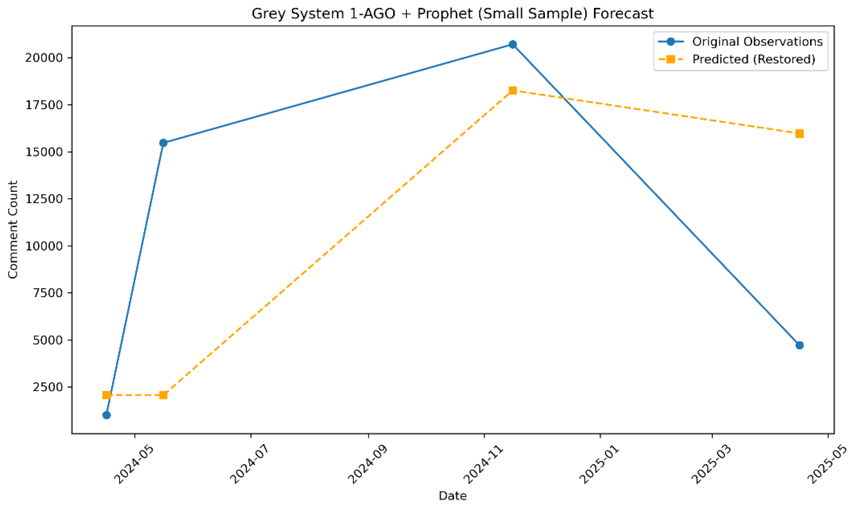
A closer inspection of the figure reveals a discrepancy in the temporal dynamics between the actual and predicted data series. The observed data demonstrates a distinct pattern of “low – surge – continued surge – sudden drop,” whereas the forecasted trajectory exhibits a “stable – sharp rise – gradual decline” configuration. Of particular note is the model’s substantial overestimation for April 2025. This outcome highlights that while the 1-AGO transformation is effective in mitigating short-term stochastic fluctuations, it remains insufficient in eliminating the intrinsic nonlinear volatility embedded in the original time series.
5.2.3. Residual Diagnostics and Model Limitations
Residuals serve as a fundamental metric for evaluating the model’s fitting effectiveness. A residual is defined as , where denotes the original observed value and represents the corresponding predicted value generated by the model. Through statistical analysis of residuals, potential internal deficiencies of the model can be systematically revealed.
Estimation of mean residual follows the standard sample mean formula:
Substituting the actual values yields , indicating a slight overall tendency of underestimation. This bias primarily stems from the inconsistency between the logistic growth assumption embedded in the model and the actual characteristics of the data.
Variance of residuals is estimated using the unbiased sample variance formula:
After substitution, the residual variance is approximately . Such a high level of variance reveals the model’s significant inability to explain extreme values effectively. The core issue lies in the overly smoothed trend inherent in the logistic growth model, which fails to accommodate the abrupt spikes and drops present in the original time series. As a result, the residuals exhibit a "pulse-like distribution" pattern, ultimately exposing a critical shortcoming of the model—its lack of robustness in capturing localized anomalous fluctuations.
5.2.4. Conclusion of the Hybrid Model Analysis
Under a small-sample scenario, the 1-AGO-Prophet hybrid model exhibits a degree of applicability in forecasting credit reviews of vertical gourmet merchants on the eBay platform. The model utilizes first-order accumulative generation (1-AGO) to smooth the original time series, aligning it with the monotonicity assumption of the Prophet logistic growth model. This approach reduces the impact of random fluctuations on the modeling process, providing a feasible path for trend extrapolation in the context of extremely limited data. However, the severe scarcity of observations presents a fundamental constraint—limited data points hinder the model’s capacity to recognize potential nonlinear characteristics within the data, resulting in inherent limitations in capturing complex fluctuation patterns.
From the perspective of predictive performance and its drawbacks, the model outputs a "stable—surge—decline" trend pattern, partially reflecting the medium-term trajectory of review volume. However, it fails to adapt adequately to extreme fluctuations present in the actual data. Specifically, the model demonstrates weak sensitivity to the short-term pulse-like surge observed in May 2024 and displays significant bias in predicting extreme values, indicating structural incompatibility. The forecast confidence interval gradually expands over time, reflecting an increasing awareness of uncertainty in long-term trends. Nevertheless, due to the small sample size, the inference process dominated by prior information cannot accurately quantify real volatility, resulting in a disconnect between the interval estimates and the actual deviations.
Residual analysis further reveals a slight underestimation tendency. The high residual variance and “pulse-like” distribution characteristics highlight the model’s lack of robustness in handling local anomalous fluctuations. This issue fundamentally arises from the intrinsic conflict between the smooth trend assumptions of the logistic growth model and the nonlinear fluctuation features present in real-world data.
To address these limitations, future studies could focus on three key aspects. First, increasing the sample size by incorporating more observations would reduce inference bias and enhance model robustness. Second, exploring more flexible nonlinear models or developing hybrid frameworks that integrate multiple techniques could improve adaptability to dynamic fluctuation patterns. Finally, introducing exogenous variables, such as holiday effects and promotional events, could strengthen the model’s ability to explain pulse-like surges in the data.
5.3. Sentiment Analysis of E-commerce Reviews Based on XGBoost Model
5.3.1. Model Construction and Feature Engineering
In the task of sentiment analysis for e-commerce reviews, the XGBoost algorithm is selected as the core model due to its superior capabilities in handling high-dimensional data, robust regularization mechanisms, and efficient parallel computing. The core principle of XGBoost involves continuously adding decision trees, where each new tree attempts to fit the residuals of the previous predictions. The final prediction is obtained by aggregating the outputs of all trees [17].
The iterative optimization logic is as follows: let represent the prediction of the i-th sample after iterations. In the t-th iteration, a new tree is learned to minimize the objective function:
Here, denotes the loss function, which measures the deviation between the true label and the predicted value, while the regularization term is defined as:
In this equation, denotes the penalty coefficient associated with the number of leaf nodes, T represents the total number of leaves in the tree, corresponds to the L2 regularization term applied to the leaf weights, and indicates the predicted score of the j-th leaf node [18]. This regularization strategy serves to balance model complexity and generalization capability, proving especially effective in tasks characterized by high-dimensional sparse features and imbalanced sentiment distributions within e-commerce review data.
During practical implementation in this study, these theoretical constructs are explicitly linked to model parameters. The loss function is configured as mlogloss to accommodate multi-class classification tasks. The parameter setting max_depth=5 indirectly controls the total number of leaf nodes T, while reg_lambda is used to specify the L2 regularization strength . Such a configuration mitigates overfitting during the optimization process and enhances model robustness in complex feature spaces.
Feature engineering is critical in constructing an effective multi-dimensional feature space. During text preprocessing, a clean_text function is used for normalization, which includes removing HTML tags, URLs, and special characters using regular expressions (re.sub), and converting all text to lowercase to eliminate formatting inconsistencies. For text feature extraction, the TfidfVectorizer is employed with max_features=5000 to limit feature dimensionality and ngram_range=(1, 2) to capture both unigrams and bigrams. This results in a high-dimensional sparse feature matrix suitable for XGBoost.
Meta features are also constructed, including comment_length (length of comment), comment_days (duration of the review), and comment_month (posting month). These features enhance the model’s ability to learn temporal patterns. The final feature matrix is a combination of textual and meta features. For classification, sentiment labels are encoded as categorical variables, with 0 representing negative, 1 neutral, and 2 positive sentiment classes, preparing the data for model training.
Using the code snippet english_comments = df[df[’language’] == ’en’].copy(), 33,978 English reviews are extracted from 41,897 cleaned reviews, accounting for 81.1% of the dataset. Sentiment analysis is conducted on these English reviews. The model is trained using the multi:softmax objective function for multi-class classification, with regularization parameters controlling model complexity and reducing overfitting risk. Sentiment labels are generated using the polarity score from the TextBlob library.
Specifically, reviews with a polarity score greater than 0.1 are labeled as positive, those with a score less than -0.1 as negative, and those between -0.1 and 0.1 (inclusive) as neutral. The final statistics show that 28,946 reviews are positive (85.19%), 4,453 are neutral (13.11%), and 579 are negative (1.70%).
5.3.2. Model Training and Parameter Tuning
Given the highly imbalanced sentiment distribution, a multi-faceted strategy was adopted to enhance the recognition of minority classes. Within the XGBoost framework, category weight adjustment, regularization tuning, and dynamic training supervision mechanisms were jointly employed to construct a robust sentiment classification model.
To address the imbalance between positive and negative samples, the scale_pos_weight parameter in XGBoost was adjusted to modulate the loss contribution of each class. This parameter was assigned a value equal to the ratio of negative to positive samples, calculated as:
This adjustment amplifies the loss of the minority class, compelling the model to focus on the features of sparse negative sentiment reviews and enhancing its ability to identify underrepresented patterns.
For parameter configuration and regularization, a stratified sampling strategy was employed to ensure class distribution consistency between the training and testing sets. The depth of decision trees was limited to max_depth=5 to control overfitting. L2 regularization was applied using reg_lambda=1, while subsample=0.8 and colsample_bytree=0.8 controlled the sampling rates for rows and features, respectively. These configurations balanced model complexity and generalization.
To further mitigate overfitting and ensure generalization, a dynamic training monitoring mechanism was introduced. A validation set comprising 20% of the training data was created via stratified sampling, and early stopping was applied during training. The process employed eval_set=[(X_val, y_val)] to track multiclass log loss on the validation set. If no improvement was observed over 20 consecutive iterations, training was automatically terminated.
5.3.3. Model Evaluation and Analysis of Results
The evaluation results of the model are presented in Figure 18.
Experimental results show that the XGBoost model demonstrates significant class differentiation performance on the test samples. The overall classification accuracy reaches 93.01%, and the weighted F1 score is 0.9239, indicating excellent recognition capability for the dominant class—positive sentiment. However, the macro-average F1 score is only 0.6919, revealing a serious class imbalance issue. The model exhibits the best recognition performance for positive sentiment, with a recall of 98.0%, a precision of 94.0%, and an F1 score of 0.96. Misclassification analysis shows that all 101 misclassified samples are categorized as neutral, accounting for 1.74% of the positive samples, with no instances of misclassification into the negative class, indicating the model’s stable capability to capture strongly positive semantic markers.
Neutral sentiment shows a recognition precision of 83.0% and a recall of 68.0%, while 31.5% of instances are incorrectly classified as positive. Misclassifications frequently stem from ambiguous expressions such as "acceptable quality," reflecting decision biases caused by indistinct semantic boundaries. Negative sentiment, in contrast, presents the most significant performance bottleneck, with a recall of only 23.3%, considerably lower than other categories. According to the confusion matrix, 53.4% of negative samples are misclassified as positive and 23.3% as neutral. These errors are closely associated with insufficient training data and the semantic complexity embedded in negative reviews. One representative example involves the expression “not terrible but expected better,” which fails to be correctly classified due to its implicit negativity.
Error distribution exhibits a directional asymmetry. Among misclassified negative samples, 69.7% are predicted as positive, whereas all misclassified positive samples (100%) are labeled as neutral. Such an asymmetric pattern suggests decision boundary ambiguity, especially within the transitional zone from weakly negative to weakly positive expressions across the sentiment continuum.
This "satisfaction bias" aligns closely with the inherent distribution of industry datasets. The model demonstrates outstanding recognition ability for positive sentiment, reflecting the industry norm that consumers are more inclined to leave feedback when satisfied. However, despite the low proportion of negative reviews, their misclassification rate is high, with a significant portion incorrectly classified as positive. This systematic bias exposes a core challenge in the e-commerce context: users often express negative emotions implicitly, while current models lack sufficient capability to interpret such semantic complexity. More concerning is the phenomenon where a proportion of neutral reviews are over-interpreted as positive, potentially causing merchants to overlook areas for product improvement. This asymmetric error distribution essentially reflects a fracture in the e-commerce sentiment continuum: consumers often use positive wording to express mild dissatisfaction, forming a "gray zone" in sentiment classification.
5.3.4. Visualization Results and Business Implications
Visual analysis of sentiment distribution, approached from four perspectives—static distribution, textual features, classification errors, and temporal evolution—reveals deep connections between data patterns and business pain points.
Empirical evidence from the sentiment distribution histogram (Figure 19) highlights the "satisfaction bias" commonly observed in e-commerce reviews. This extreme imbalance reflects not only a structural feature of the dataset but also a behavioral pattern in which consumers tend to provide feedback primarily after highly satisfying experiences. In contrast, negative feedback is often suppressed due to the implicit “cost of complaint,” rendering such data disproportionately valuable for extracting business insight. These findings emphasize the necessity of breaking away from analytical reliance on the "law of large numbers" and advocate for the establishment of a "rare signal priority response" mechanism.
Boxplot of comment lengths (Figure 20) quantifies differences in textual patterns across sentiments. Negative reviews had a median length of 91 characters (IQR=84) and showed a distinct bimodal distribution, in contrast to neutral reviews (median=33, IQR=41) and positive reviews (median=50, IQR=52). Analysis reveals that 42% of short negative reviews (less than 50 characters) contain direct complaint terms like “defective” or “late,” while 28% of long negative reviews (more than 200 characters) describe detailed product issues. From a business perspective, a dual-layered response system should be implemented: (1) short texts trigger real-time keyword-based ticketing, and (2) long texts activate NLP-based defect dimension extraction for automatic generation of quality improvement reports.
Confusion matrix heatmap (Figure 21) reveals typical misclassification patterns: negative reviews mistakenly classified as positive, and neutral ones as positive. The former stems from implicit expressions of dissatisfaction, while the latter results from mildly affirmative language in neutral comments. These errors do not indicate model flaws but reflect the inherent fuzziness of sentiment boundaries and the specificity of domain semantics. On the business side, such boundary cases should be manually annotated and added to the training set. Additionally, context-based rules involving transition words such as “but” or “however” can be introduced to automatically trigger sentiment reassessment and enhance the accuracy of interpreting complex statements.
Time-series line chart of sentiment evolution (Figure 22) tracks temporal dynamics. While the proportion of positive reviews remains consistently high, fluctuations in negative sentiment may signal potential business risks, thereby reinforcing the model’s value for temporal monitoring. Based on this observation, a “sentiment trend warning system” can be established by setting thresholds for week-over-week increases in negative sentiment and integrating these with customer service workflows. This enables proactive intervention and transforms passive after-sales responses into preventive measures.
5.3.5. Conclusion of XGBoost Model Analysis
XGBoost model demonstrated robust performance in recognizing dominant sentiment categories, particularly excelling in identifying prevalent positive reviews. This strength is attributed to its effective use of regularization techniques and its strong capability in handling high-dimensional textual features. However, notable limitations emerged in detecting sparse negative reviews. Despite implementing class-weight balancing to emphasize minority classes, recall for negative sentiment remained substantially inadequate—more than half of the negative samples were misclassified as positive. These results suggest that algorithm-level adjustments alone are insufficient to address the inherent imbalance in data distribution. The model continues to struggle with identifying negative expressions that are implicit or embedded within complex linguistic structures.
A deeper analysis of the misclassification patterns reveals a distinct directional bias: negative reviews are often misclassified as positive, while positive reviews tend to be misclassified as neutral. This asymmetry underscores the difficulty of sentiment parsing in the e-commerce domain. Implicit negative expressions are frequently masked by positive surface modifiers, forming a kind of linguistic camouflage. Meanwhile, vague statements with slight positive overtones are often over-amplified. Additionally, users commonly express dissatisfaction through composite expressions—phrases that appear positive but contain negative implications—resulting in semantic gray areas that challenge the model’s interpretive capacity. These errors stem from the intricate interplay between the inherent complexity of natural language and the diverse strategies consumers employ to convey sentiment.
From a practical business standpoint, it is necessary to develop a graded response mechanism that aligns with the model’s strengths and limitations, while future improvements should incorporate semantic enhancement techniques. Visualization analyses suggest that for clearly negative reviews—such as short texts directly identifying defects—a dual-track mechanism should be implemented, consisting of real-time keyword-triggered alerts and automated defect extraction. For ambiguous cases with unclear semantic boundaries, a context-aware rule engine should be introduced to detect sentiment reversals via transitional cues like “but” or “however.” In addition, temporal sentiment trends can be leveraged to set up week-on-week warning thresholds, enabling proactive risk intervention. Further model development should emphasize aspect-based sentiment analysis to deconstruct compound opinions, and active learning techniques should be adopted to incrementally supplement edge cases—especially those involving implicit negative sentiment.
6. Collaborative Logic Construction of E-Commerce Review Analysis Based on Dual Datasets
In constructing an analytical logic framework for e-commerce platform reviews, effectively coordinating the roles of multi-source data at different stages of analysis is essential for achieving high-quality modeling and interpretation. This study establishes a structured and functionally complementary data collaboration mechanism, grounded in the “Amazon Fine Food Reviews” and “eBay Merchant Review Data.” Although the two datasets differ in temporal structure, data origin, and content representation, the integrated approach to data preprocessing and modeling paths enables the preliminary realization of a sentiment recognition framework supported by multi-dimensional data.
During the initial stages of data exploration and preparation, the Amazon dataset serves as a foundational reference for visualization and structural modeling. Encompassing over fifty thousand food-related user reviews spanning several decades, this dataset offers substantial data volume and emotional diversity. In Section 4, the dataset underwent systematic preprocessing, including field selection, deletion of missing values, and text normalization. The TextBlob library was then employed to assign sentiment polarity scores to each review, facilitating the generation of basic visualizations such as sentiment polarity pie charts, boxplots of ratings versus comment length, and high-frequency word clouds. The analysis revealed that 88.3% of reviews were positive, indicating a pronounced emotional bias, while negative reviews were generally longer and more subjective in tone. Although these statistical characteristics were not directly involved in subsequent model construction, they provided critical prior references for feature extraction and parameter design in the modeling of eBay review data.
In a complementary manner, the modeling approach in Section 5 is based on food merchant reviews from the eBay platform. This dataset comprises over forty thousand entries and lacks precise timestamp information; therefore, relevant time intervals were manually defined as time anchors. It serves as the exclusive basis for XGBoost-based sentiment classification and Prophet time-series forecasting. At this stage, Amazon data were no longer utilized for modeling; instead, empirical insights derived from the Amazon dataset—such as the correlation between comment length and sentiment polarity, as well as the relationship between sentiment word density and user ratings—were transferred into the feature engineering process for the eBay data. For instance, in constructing the XGBoost model, variables such as comment_length and time-binned indicators were incorporated to capture micro-level sentiment dynamics, directly inspired by the statistical patterns observed from Amazon data visualizations.
Furthermore, emotionally charged high-frequency terms from the Amazon word cloud—such as "delicious", "bad", and "great",were integrated into a customized sentiment lexicon during eBay data preprocessing. This strategy, referred to as “sentiment word migration,” effectively functions as a text augmentation technique grounded in empirical knowledge. It proves particularly advantageous in small-sample sentiment modeling, especially when addressing heterogeneous user expressions. By leveraging transfer learning, the model is better equipped to accommodate variations in sentiment articulation across user groups, thereby enhancing both robustness and predictive accuracy. In the era of big data, traditional marketing paradigms of e-commerce enterprises must transition toward precision-driven strategies. Through dynamic adjustment and optimization of marketing strategies based on evolving market conditions and user consumption behaviors, companies can better meet the increasingly diverse demands of consumers while simultaneously reducing marketing expenditures—ultimately achieving mutual benefits for both users and enterprises [19]. Moreover, by enhancing the model’s ability to discern ambiguous or implicit sentiment, transfer learning further contributes to the accuracy and practical relevance of e-commerce review analysis.
It is important to emphasize that the “collaboration” discussed herein does not imply direct fusion of datasets at the model input level, but rather a decoupled integration at the functional level of data roles. For e-commerce platforms, data constitutes the foundational element of analytical processes. Confronted with an ever-expanding volume of information, the ability to efficiently acquire and extract meaningful insights is crucial for refined operations and data-driven decision-making [20]. Within the context of big data, it is imperative for enterprises to break free from reliance on single-source data and to develop collaboration mechanisms based on differentiated data roles in order to address multifaceted market demands and to optimize marketing strategies. In this framework, the Amazon dataset contributes structural cognition and semantic patterns, whereas the eBay dataset is dedicated to model construction and validation, thereby establishing a dual-track logical loop of “cognition–validation–feedback.” Ultimately, this collaborative mechanism between two heterogeneous datasets constructs a robust logic framework for e-commerce review analysis. The proposed framework exhibits notable adaptability and interpretability in semantic prediction, sentiment classification, and trend perception of reviews, providing both theoretical underpinnings and data support for future sentiment-driven product optimization and customer service mechanisms. Furthermore, it offers a structurally stable and highly transferable paradigm for future research involving multi-source data integration.
7. Conclusion
Focusing on user-generated reviews from e-commerce platforms, this study conducted a comprehensive analysis of sentiment distribution, user behavioral patterns, and the effectiveness of machine learning models. Through examining sentiment word frequencies, helpful vote mechanisms, and the review distribution within the Amazon dataset, the results reveal pronounced sentiment trends: although positive reviews constitute the majority, it is the neutral and negative reviews that exhibit a higher density of detailed user feedback and product critique. Furthermore, by introducing the eBay dataset for empirical validation, we tested the cross-domain generalizability of the sentiment classification model. The results demonstrate that the XGBoost-based approach retains high classification accuracy even under limited data conditions, confirming its potential for practical deployment across diverse data scenarios.
Findings highlight a notable relationship between sentiment polarity and consumer decision-making. While positive reviews tend to attract agreement and likes, negative content often exerts a more decisive influence on purchasing behavior. This phenomenon reflects the evolving dynamics of the digital retail environment. As consumer awareness and critical discernment increase, review content has shifted from serving as a supplementary reference to becoming a core determinant of product perception and market response. Recent surveys suggest that 95% of consumers read reviews prior to purchasing, and nearly one-third alter their purchasing decisions based on negative feedback [21]. Within this context, accurate sentiment recognition has become integral to optimizing service delivery, maintaining brand integrity, and driving sustainable sales growth for e-commerce platforms.
Despite encouraging results, existing sentiment analysis models still encounter limitations in processing nuanced expressions, semantic shifts, and implicit negations. Taking XGBoost as an example, although its overall classification performance is satisfactory, its recall rate for negative sentiments remains insufficient. The model frequently misclassifies semantically ambiguous or logically intricate reviews, often underestimating the presence and intensity of dissatisfaction. This limitation is not unique to a single model but is symptomatic of broader challenges in sentiment analysis, where linguistic complexities such as negation, context-dependent semantics, and cross-cultural variability continue to undermine model reliability [22]. Without addressing these blind spots, the robustness and practical value of sentiment analysis systems in real-world applications remain constrained.
To improve temporal sensitivity and application adaptability, this study further integrates a hybrid AGO–Prophet time-series modeling approach to explore dynamic trends in sentiment over time. Although constrained by a limited number of time points, the method exhibited promising responsiveness in capturing short-term fluctuations, particularly in identifying the inflection points of rising or declining sentiment trends. The residuals remained relatively stable during these transitions, supporting the model’s viability for near-term forecasting tasks. This hybrid modeling approach thus enriches the sentiment analysis pipeline by embedding a temporal forecasting dimension, paving the way for proactive business interventions.
In summary, this research establishes a multi-layered analytical framework encompassing textual sentiment features, machine learning-based classification, and time-series trend modeling. This framework not only confirms the feasibility of data-driven sentiment evaluation in e-commerce environments but also responds to real-world needs in user experience optimization, consumer feedback interpretation, and decision-support system development. At the same time, the study identifies critical technical limitations—such as limited recall, shallow semantic understanding, and suboptimal model transferability—which must be systematically addressed in future advancements.
Moving forward, the development of sentiment analysis systems should emphasize deeper linguistic representation via advanced deep learning architectures, enabling better handling of subtle emotional cues and complex language structures. Meanwhile, data sources should be expanded to include more emotionally expressive formats, such as social media comments and short-form video interactions. From an application perspective, further integration with intelligent recommendation systems, customer service interfaces, and product quality monitoring mechanisms will be essential. Ultimately, the goal is to build intelligent emotional understanding systems capable of both perceiving nuanced sentiment “temperature” and responding with actionable insights—thereby transforming user-generated content into strategic value for e-commerce platforms.
References
- TIOBE Software. TIOBE Index for July 2025. Available online: https://www.tiobe.com/tiobe-index/ (accessed on 30 July 2025).
- Liang, C.; Ma, T. Data Collection and Analysis of E-Commerce Reviews Based on Python.Computer Programming Skills & Maintenance, 2023, (05), 83–85, 89. [CrossRef]
- Li, Q.; Li, Y.; Ding, H. Discussion on the Analysis Method of E-Commerce Product Review Data Based on Python. Information Recording Materials, 2022, 23, 82–84. [Google Scholar]
- Dai, Z.; Lu, C.; Wang, Y.; et al. Research on Product Information and Reviews Based on Python. Inner Mongolia Science Technology and Economy, 2024, (01), 117–120, 124.
- Gundecha, U. Selenium Testing Tools Cookbook; 2nd ed.; Packt Publishing: Birmingham, UK, 2015. [Google Scholar]
- McAuley, J.; Leskovec, J. From amateurs to connoisseurs: Modeling the evolution of user expertise through online reviews; In Proceedings of the 22nd International Conference on World Wide Web (WWW), Rio de Janeiro, Brazil, 13–17 May 2013; pp. 897–908. [CrossRef]
- Xie, Z. Application and exploration of Python-based clustering methods in e-commerce customer segmentation; Digital Technology and Application, 2019, 37(3), 230–231. [CrossRef]
- Liang, C.; Ma, T. Application of Python Data Analysis in the Business Field; Modern Information Technology, 2024, 8(03), 99–102. [CrossRef]
- Virtanen, P.; Gommers, R.; Oliphant, T.E.; et al. SciPy 1.0: Fundamental Algorithms for Scientific Computing in Python; Nature Methods, 2020, 17(3), 261–272. [CrossRef]
- Mahgoub, A.; Atef, H.; Nasser, A.; Yasser, M.; Medhat, W.; Darweesh, M.; El-Kafrawy, P. Sentiment Analysis: Amazon Electronics Reviews Using BERT and TextBlob; In: Proceedings of the 20th International Conference on Language Engineering (ESOLC), IEEE, 2022, pp. 6–10.
- Bhopale, J.; Bhise, R.; Mane, A.; Talele, K. A Review-and-Reviewer Based Approach for Fake Review Detection; In: Proceedings of the 2021 4th International Conference on Electrical, Computer and Communication Technologies (ICECCT), 2021, pp. 1–6. [CrossRef]
- Koh, E.; Zhang, L.; Lee, A.V.Y.; Wang, H. Revolutionizing Word Clouds for Teaching and Learning with Generative Artificial Intelligence: Cases from China and Singapore; IEEE Transactions on Learning Technologies, 2024, 17, 1390–1401. [CrossRef]
- Standing Committee of the National People’s Congress. Personal Information Protection Law of the People’s Republic of China [Z]; 2021-08-20.
- Standing Committee of the National People’s Congress. Data Security Law of the People’s Republic of China [Z]; 2021-06-10.
- Borrohou, S.; Fissoune, R.; Badir, H. Critical Role of Data Transformation in Preprocessing: Methods, Algorithms, and Challenges; In: Ordonez, C.; Sperlì, G.; Masciari, E.; Bellatreche, L. (Eds) Model and Data Engineering. MEDI 2024, Lecture Notes in Computer Science, vol 15590, Springer, Cham, 2025. [CrossRef]
- Huang, Y.; Zhang, J. Sales Forecasting in the E-Commerce Industry Based on GM(1,N)-Prophet Combined Model; Journal of Southwest University for Nationalities (Natural Science Edition), 2021, 47(03), 317–325.
- Wang, X. Short-term Sales Forecast of E-commerce Products Based on LSTM-XGBoost [D]; Zhongnan University 53 of Economics and Law. 2022. [Google Scholar]
- Chen, T.; Guestrin, C. XGBoost: A Scalable Tree Boosting System; In: Proceedings of the 22nd ACM SIGKDD International Conference on Knowledge Discovery and Data Mining, ACM, 2016; pp. 785–794. [Google Scholar] [CrossRef]
- Mo, X.; Qin, Y. Analysis of Precision Marketing Strategies for E-Commerce Platforms under Big Data Analysis—A Case Study of JD.com; Modern Business, 2022, (13), 73–75. [CrossRef]
- Wei, Q.; He, Z.; Chen, Y. Data Analysis of JD E-Commerce Platform Based on Web Crawling; Journal of Economic Mathematics, 2018, 35(01), 77–85. [CrossRef]
- Shapo.io. Review Statistics Every Brand Should Know; 2025. [Online]. Available: https://shapo.io/blog/review-statistics.
- AIMultiple. Top 7 Sentiment Analysis Challenges in 2025; 2025. [Online]. Available: https://research.aimultiple.com/sentiment-analysis-challenges/.
Figure 1.
HTTP request implemented using the Requests library with a retry mechanism
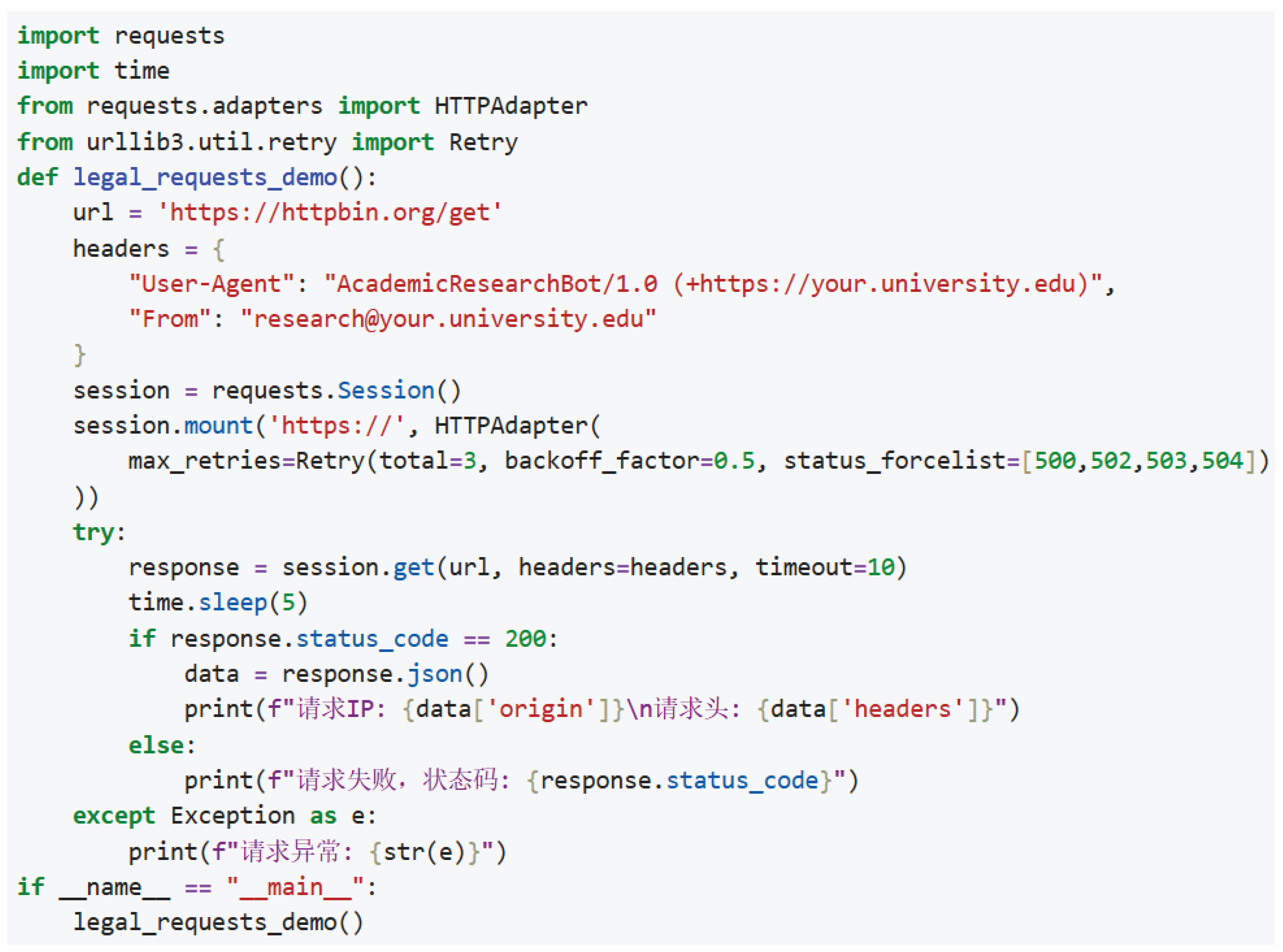
Figure 2.
Output of the legal request showing IP address and header details

Figure 3.
Workflow of Selenium technology
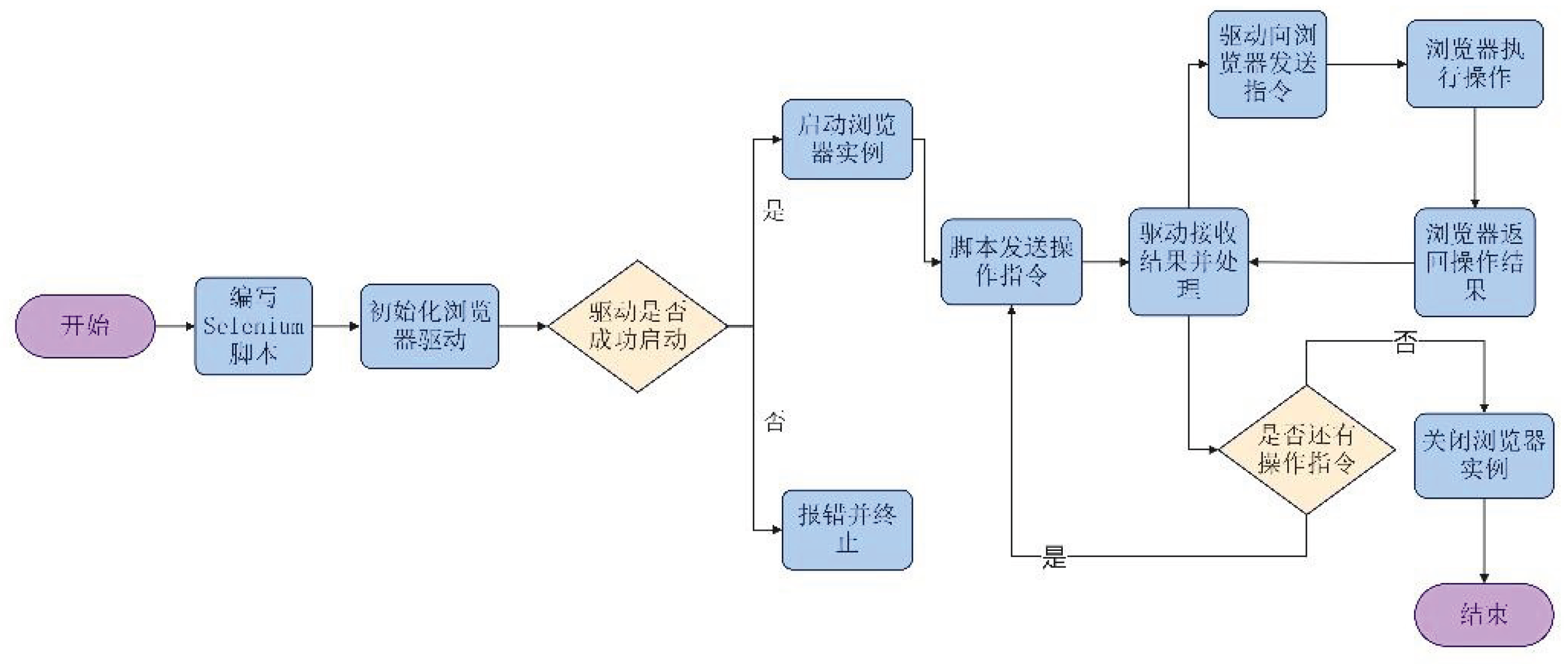
Figure 4.
Missing value distribution statistics
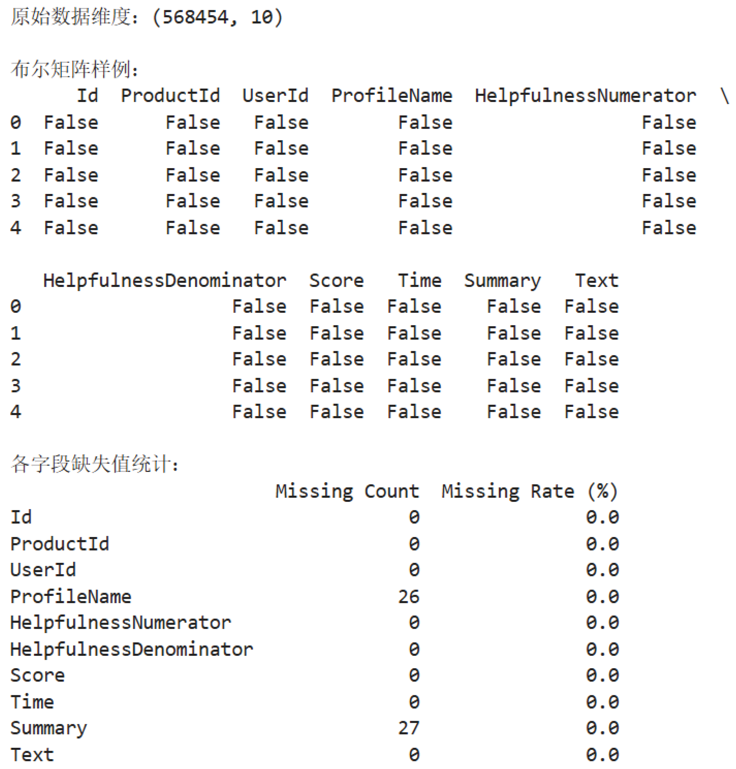
Figure 5.
Outlier detection workflow
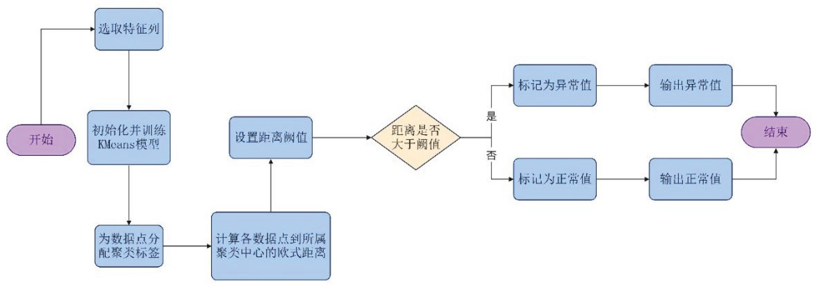
Figure 6.
Code and result of duplicate record processing

Figure 7.
Scatter plot of helpful votes and total votes
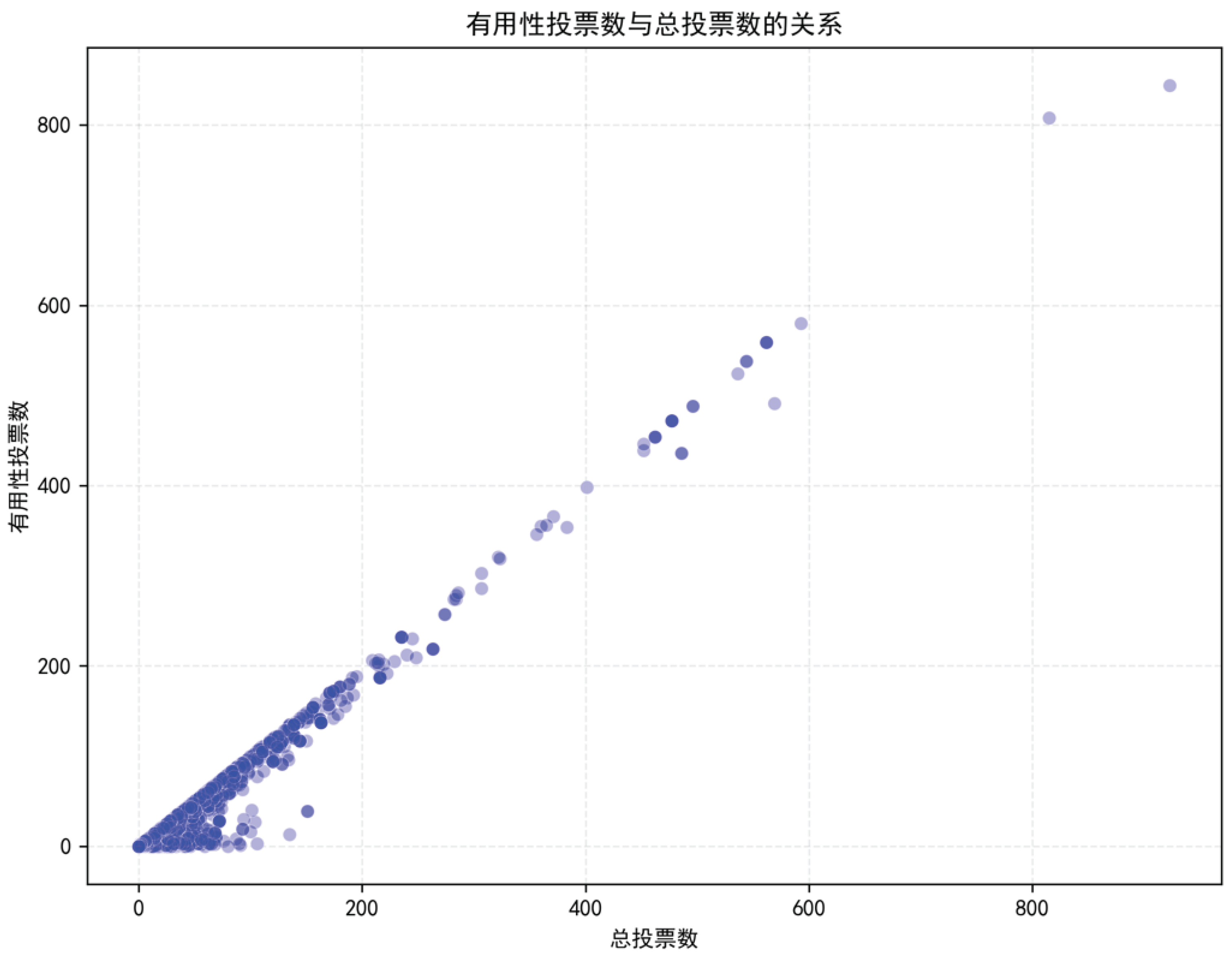
Figure 8.
Calculation result of Pearson correlation coefficient and corresponding p-value

Figure 9.
Sentiment polarity distribution pie chart
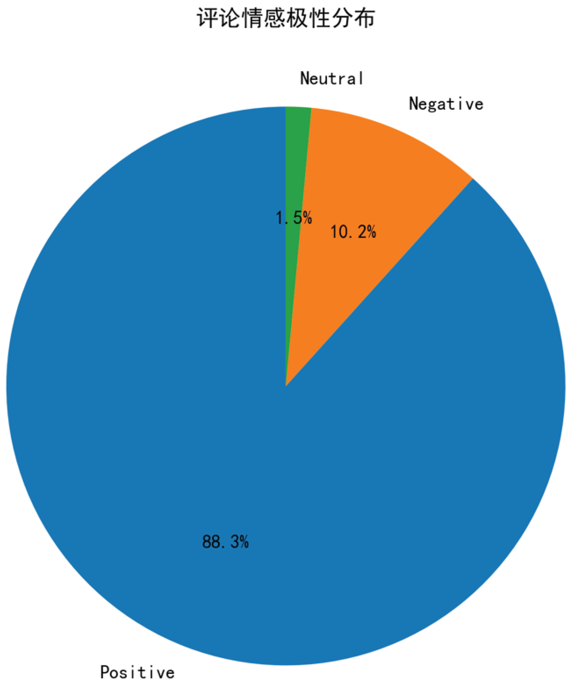
Figure 10.
Code implementation for pie chart
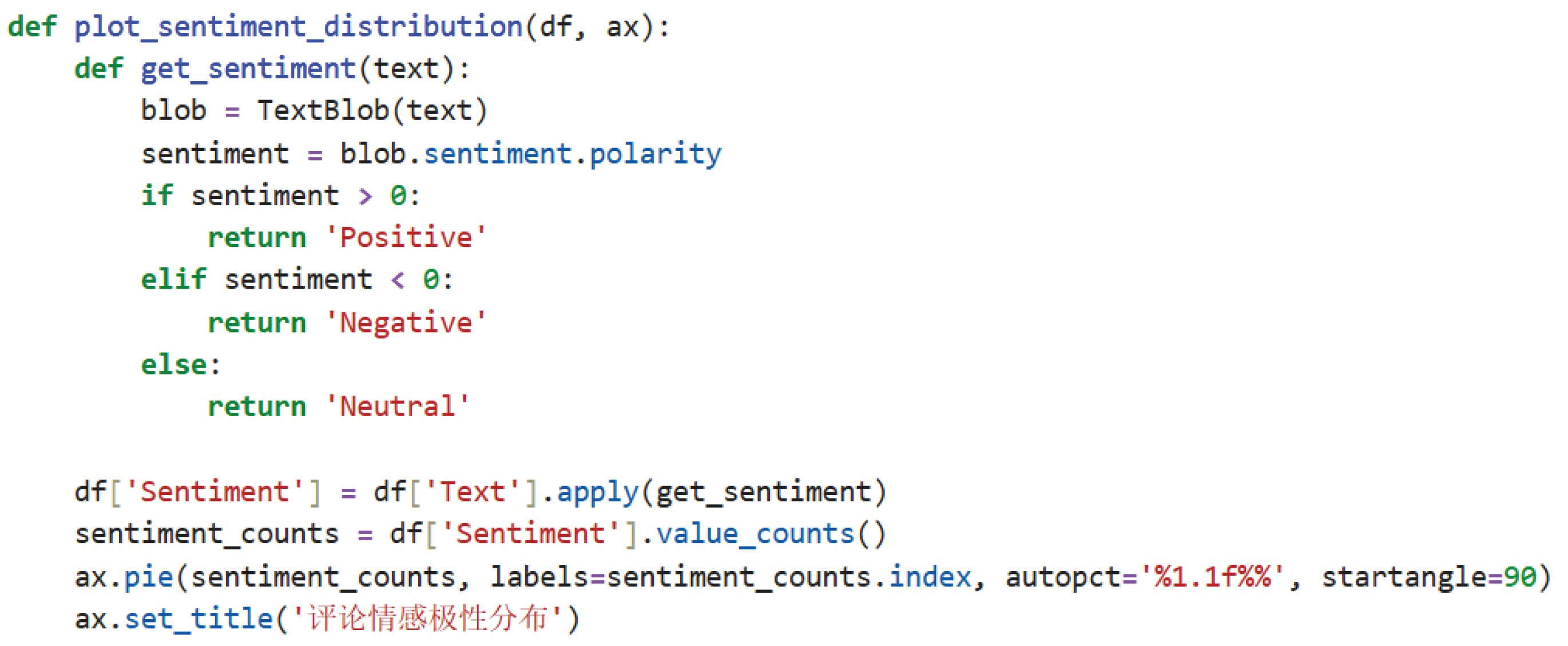
Figure 11.
Box plot of comment length across different scores
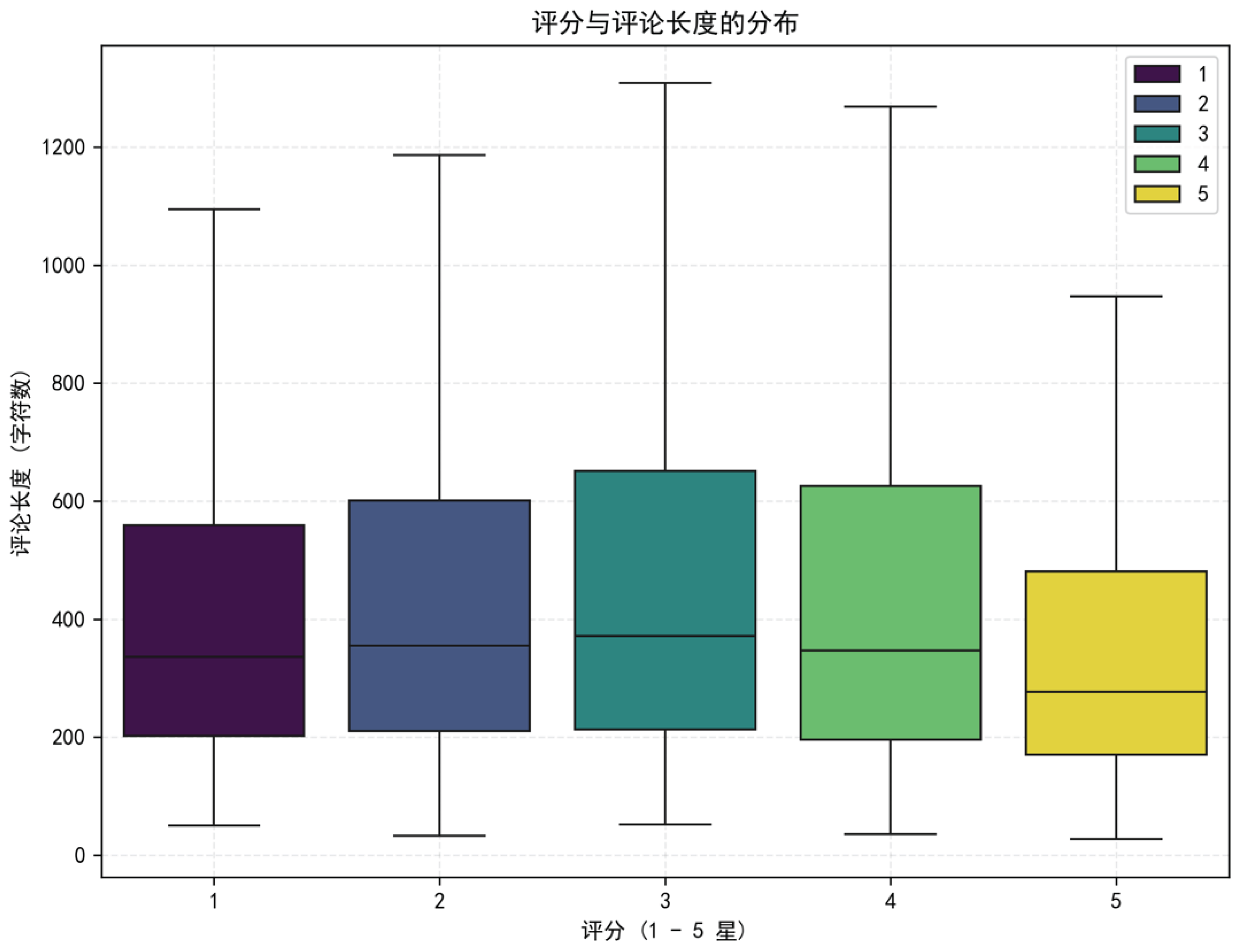
Figure 12.
Word cloud of frequent terms in reviews
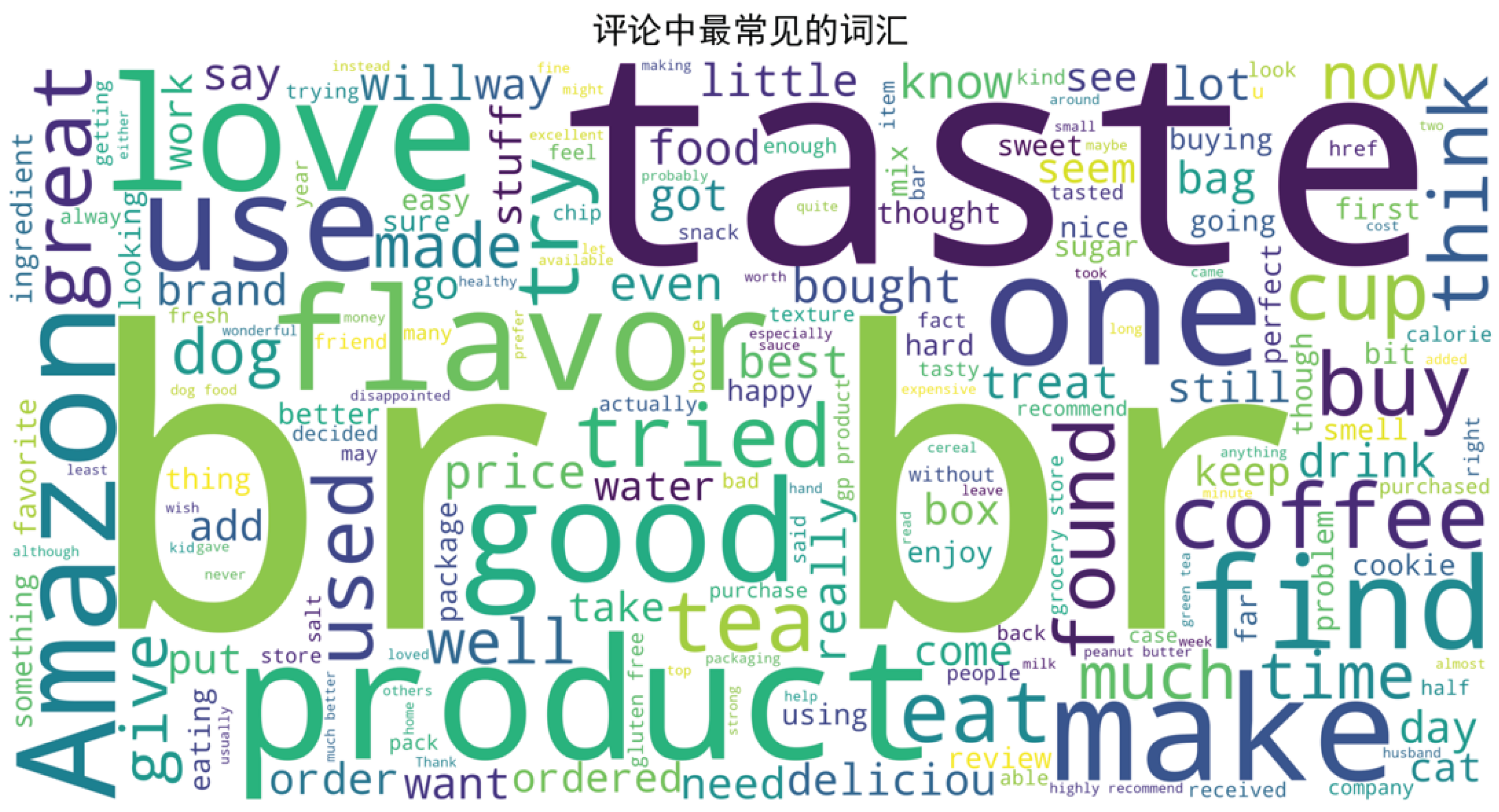
Figure 18.
XGBoost Model Result Display
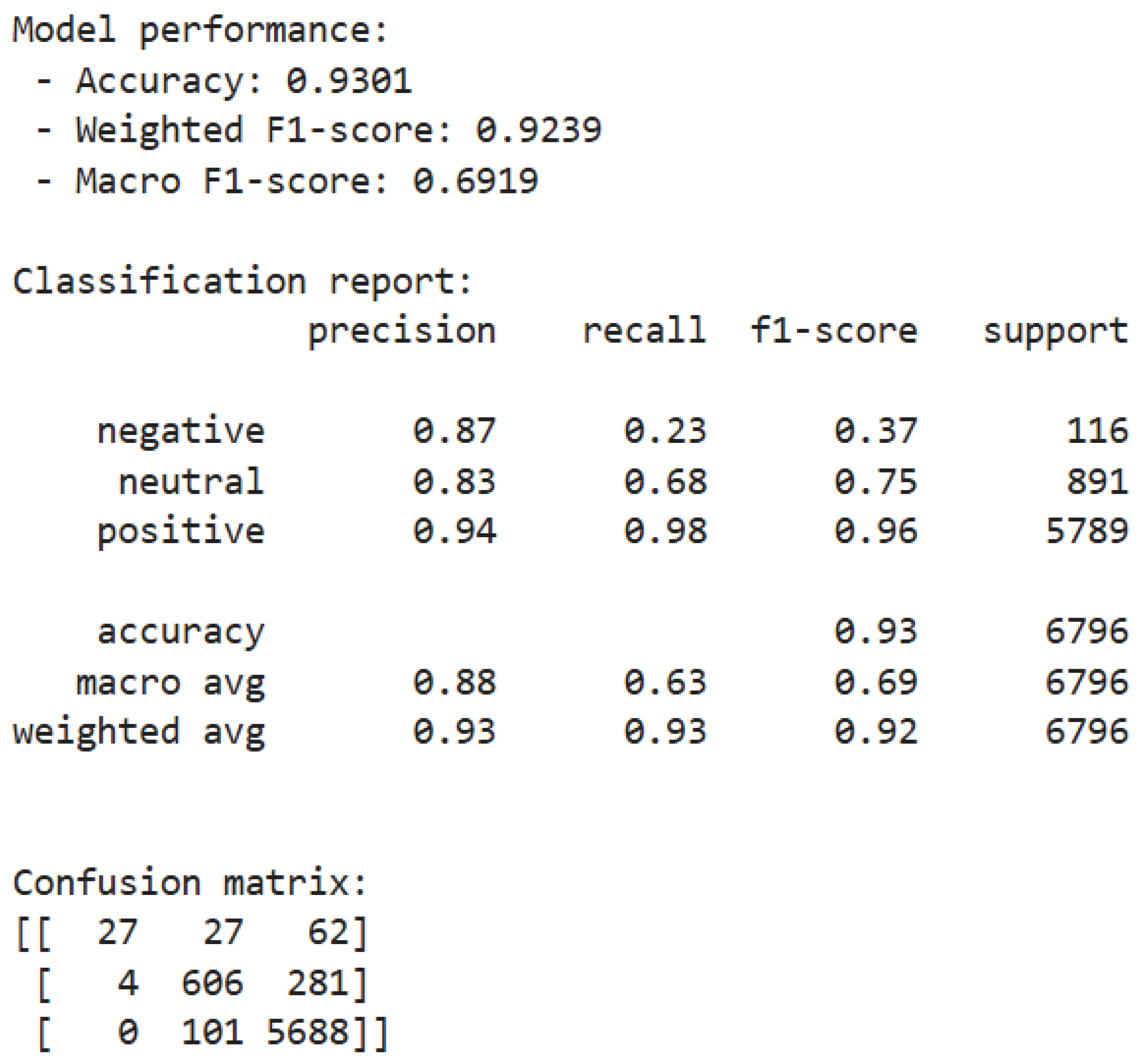
Figure 19.
Sentiment distribution histogram
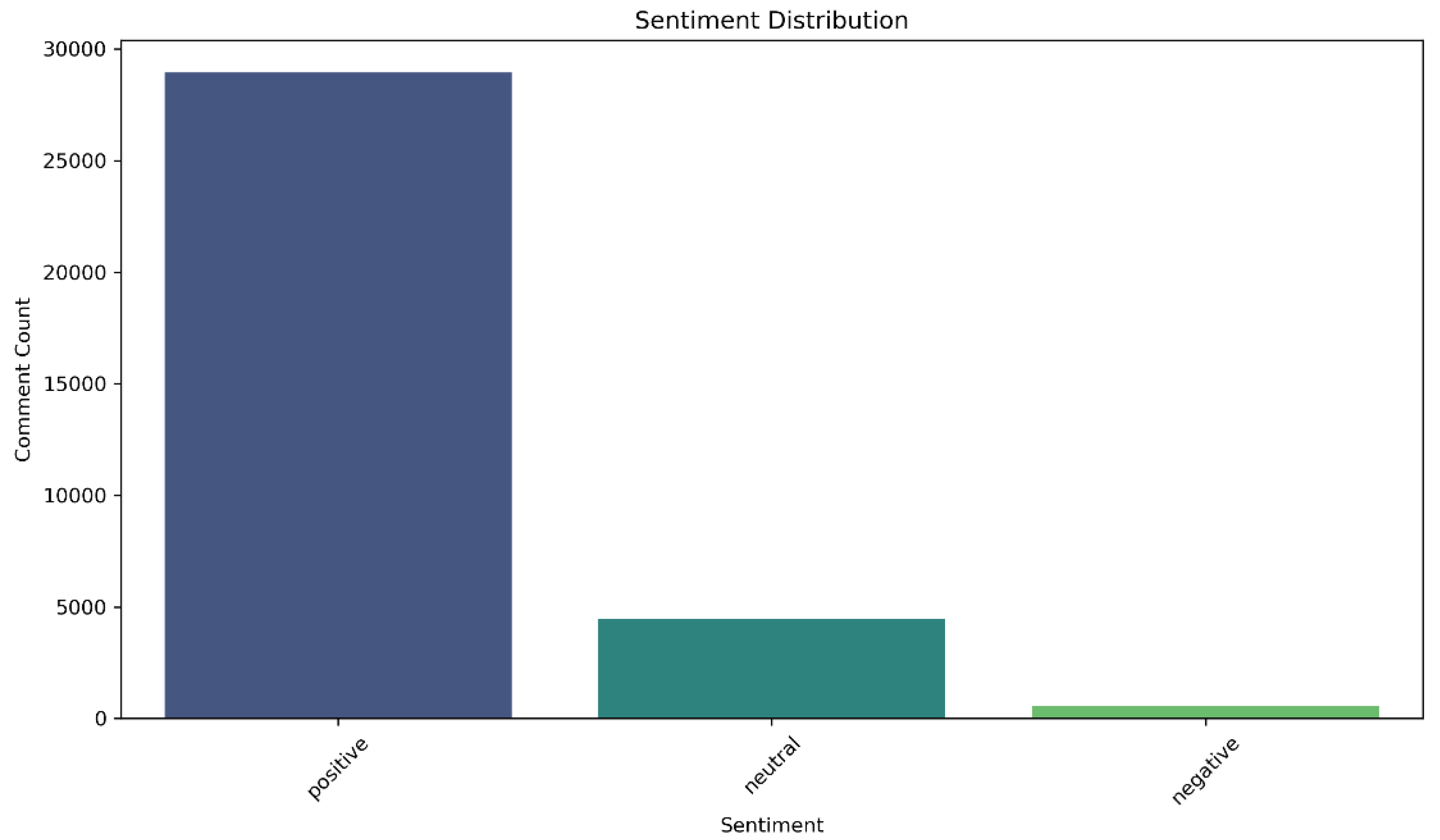
Figure 20.
Comment length distribution across sentiment categories
Figure 21.
Confusion matrix heatmap
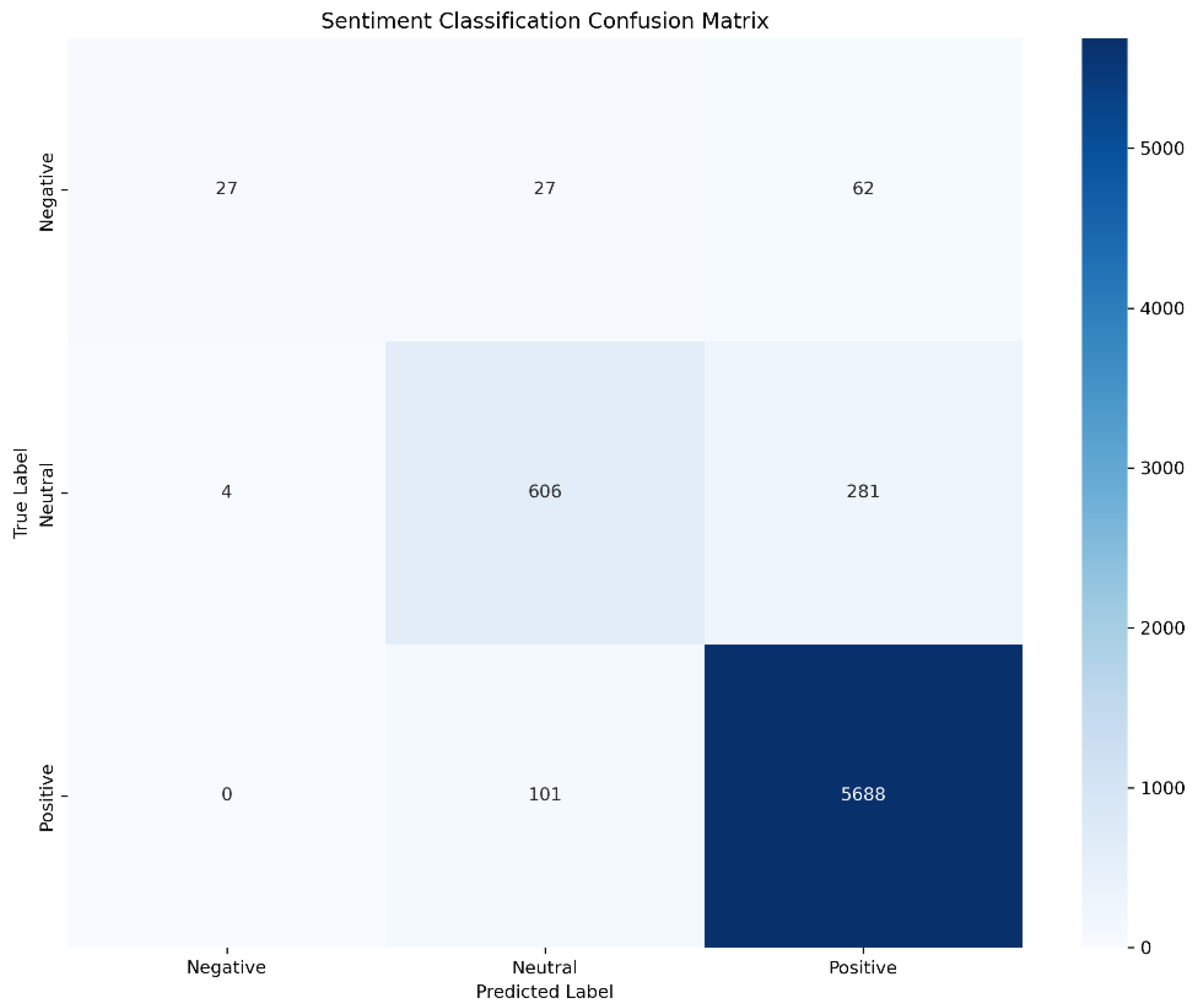
Figure 22.
Time series of sentiment trend
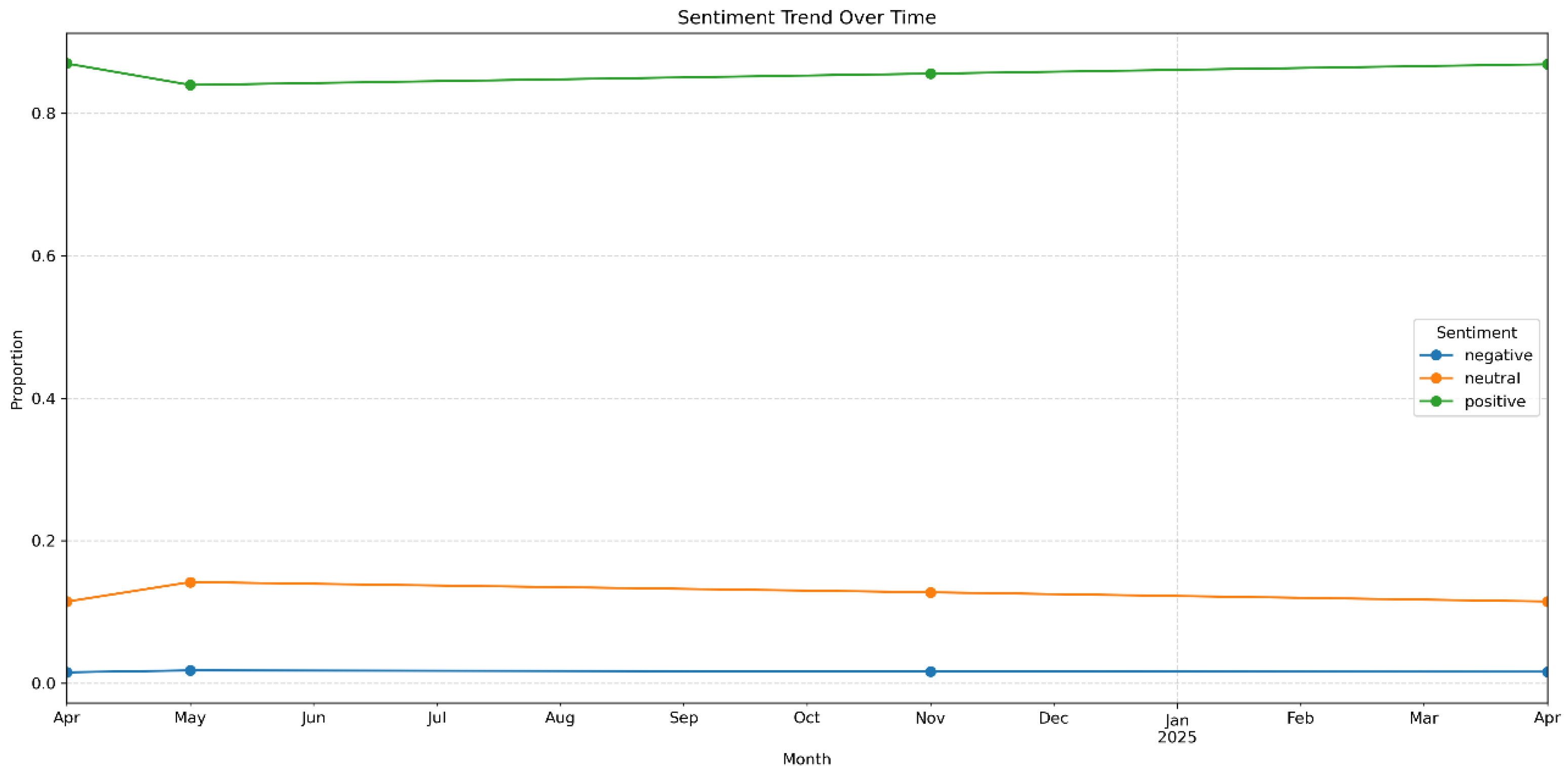

Table 1.
Prophet Model Parameter Configuration and Business Logic.
| Parameter Configuration | Statistical Interpretation | Business-Driven Logic |
|---|---|---|
| yearly_seasonality=False | ||
| weekly_seasonality=False | ||
| daily_seasonality=False | Disables all seasonal components. | The dataset only covers one annual cycle and lacks sufficient valid observations, making it unsuitable for identifying complete seasonal patterns. This avoids dimensional redundancy and overfitting. |
| changepoint_prior_scale=0.1 | Applies a Laplace prior to the trend slope change: , relaxing prior constraints in small-sample settings by increasing the scale parameter. Enhances the model’s ability to capture pulse-type growth in trend, such as surges triggered by marketing campaigns. | Reflects sudden behavioral shifts, such as those caused by marketing events or news, improving detection of trend changes under sparse data. |
| seasonality_prior_scale=10.0 | Applies a Gaussian prior on the amplitude of seasonal components: , strengthening sensitivity to weak cyclic signals. | Indirectly improves trend fitting accuracy by capturing residual seasonal behavior aligned with periodic e-commerce user activity. |
Table 2.
Forecast Results of the 1-AGO-Prophet Model.
| Date | Actual Value | Forecast Value | Residual | Lower Bound | Upper Bound |
|---|---|---|---|---|---|
| 2024-04-16 | 1006 | 2063 | -1057 | 2582.68 | 18496.86 |
| 2024-05-16 | 15469 | 2063 | 13406 | 4336.16 | 21291.85 |
| 2024-11-16 | 20709 | 18258 | 2451 | 22656.92 | 39060.50 |
| 2025-04-16 | 4713 | 15974 | -11261 | 38456.39 | 55320.06 |
Disclaimer/Publisher’s Note: The statements, opinions and data contained in all publications are solely those of the individual author(s) and contributor(s) and not of MDPI and/or the editor(s). MDPI and/or the editor(s) disclaim responsibility for any injury to people or property resulting from any ideas, methods, instructions or products referred to in the content. |
© 2025 by the authors. Licensee MDPI, Basel, Switzerland. This article is an open access article distributed under the terms and conditions of the Creative Commons Attribution (CC BY) license (http://creativecommons.org/licenses/by/4.0/).
Copyright: This open access article is published under a Creative Commons CC BY 4.0 license, which permit the free download, distribution, and reuse, provided that the author and preprint are cited in any reuse.


