

Submitted:
16 September 2025
Posted:
17 September 2025
You are already at the latest version
Abstract
As road users and means of transport in Germany become more diverse, we must better understand the causes and influencing factors of serious accidents. The aim of this work is to develop an AI-supported analysis approach that identifies and clearly visualizes the causes of accidents and their impact on accident severity in the urban area of the city of Mainz. The machine learning models predict accident severity and use Shapley values as explainability methods to make the underlying patterns understandable for urban planners, safety personnel, and other stakeholders. A particular challenge lies in presenting these complex relationships in a user-friendly way through visualizations and interactive maps.
Keywords:
accident data
; XGBoost
; classification
; shapley-values
; geovisualization
1. Introduction
With the growing diversity of road users and transport systems in Germany, it is becoming increasingly important to better understand the causes and influencing factors of accidents (Lord & Mannering, 2010). Although traffic is becoming increasingly complex, the number of fatal road accidents in Germany has been falling for several years. According to the German Federal Statistical Office (Statistisches Bundesamt, 2025), this is due to the introduction of new regulations and improved vehicle technology. Nevertheless, further analysis of the factors influencing accidents is necessary to improve road safety. This applies not only to fatal accidents, but also to minor accidents. Identifying the influencing factors can provide very useful information for infrastructure planners.
Since each accident is highly dependent on individual external factors, it is necessary to work out these influences for each accident individually. Due to the interdependence of these influences and their mutual impact, it is crucial to develop new methodologies to isolate these interdependencies. Only then is a large-scale and empirical analysis possible.
There are a number of factors in the event of an accident, that contribute to its complexity. Among these are weather conditions, road conditions, traffic congestion, and the individuals involved. Due to the complexity of accident data, patterns and correlations are not immediately apparent. Even small changes, such as the time of day or the types of people and vehicles involved, can determine whether an accident at the same location results in minor or serious injuries. For some years now, machine learning (ML) approaches have been used to classify the severity of accidents (Abdulhafedh, A. (2017), Satu et al. (2018), Parsa et al. (2020) Shaik et al., (2021), Pourroostaei Ardakani et al. (2023)). The aim is to automatically learn and map the correlations between the details of a real accident and the severity of the accident. This approach offers the significant advantage of requiring minimal assumptions in advance to effectively classify a wide variety of data. This ensures a high degree of flexibility, especially with more complex ML models, with respect to a wide variety of accidents and their outcomes. This approach is widely used in accident research to extract influences from large amounts of data.
However, this approach has some limitations: decision rules derived from simple ML models such as decision trees or random forests are capable of identifying correlations between individual factors. However, a major limitation of these decision rules is that they are unable to identify local factors associated with specific accidents. Even the widely used feature importance metrics are not suitable for analyzing individual accidents, as they cannot identify local effects and do not indicate whether the effects are negative or positive.
While complex ML models, such as neural networks, have demonstrated efficacy in predicting the severity of accidents based on available data, it is considerably more challenging to derive and interpret the influencing factors. Researchers increasingly use explainable AI (XAI) methods to reveal how these ‘black box’ models make decisions.
Besides understanding how an ML model makes decisions, it is equally important to consider the geospatial characteristics of the data. There is a large research gap in this area, especially when analyzing accident data. At present, the number of studies that apply geospatial explainable artificial intelligence is limited (Roussel 2023). In geospatial XAI, integrating geospatial information into the analysis and communication of ML results is essential.
The objective of this study is to demonstrate the efficacy of geospatial XAI in determining the factors that influence accident severity. An additional challenge is the interpretation and visualization of these complex results. Therefore, another goal of this study is to develop a concept that uses geospatial areas at different scales to enable the study of global accident factors, influencing factors in a geospatial region and local influencing factors. Roussel (2025) developed a related approach termed ‘Geo-Glocal XAI’. From this, we define the following research questions:
- How can geospatial XAI and glocal explanations help reveal the factors influencing an ML model’s classification of accident severity?
- How can visualization of global, glocal, and local influencing factors with maps and plots simplify and improve interpretability?
The structure of the study is as follows: In Chapter 2, we present a comprehensive overview of the current approaches in research to determine accident severity using ML models. We present the missing explanatory approaches in research and introduce geospatial XAI. In Chapter 3, we present the newly developed method to derive and map complex influencing factors together with the ML quality. In Chapter 4, we apply the developed concept to our selected use case of accident analysis in Germany. We present and discuss the results in Chapter 5. In Chapter 6, we conclude the results of the study and point out future directions.
2. State of the Art
In this chapter, we present current research using ML approaches to predict accident severity. Specifically, we will show studies in this research area that use some XAI approaches. We also provide general information on the research field of geospatial XAI.
Accident severity classification using ML has become increasingly important in recent years. Numerous studies have looked at databased prediction of accident severity using different data sources, models and analysis methods. In the past, the focus has been on identifying the best ML model for such classification tasks.
The study of Pradhan and Sameen (2020) highlights the advantages of using complex ML models such as neural networks (NNs) over linear models. They confirm that the relationships between features and outputs in accident severity prediction are non-linear, and therefore best represented by a NN. The study of Abdulhafedh (2017) also proves that the use of a NN is promising for predicting accident severity. However, these studies also point to the risk that increasing complexity can reduce the comprehensibility of the model, without presenting solutions to make the model transparent. Shaik et al. (2021), which presents an extensive list of databased analysis approaches for accident severity, also highlight this research gap in the review. This study also focuses on the performance of each ML model: F1 score, recall, precision or accuracy are often used to compare the efficiency of a model. The study highlights the difficulties in predicting accident severity with ML approaches, as well as possible solutions to achieve better results. One challenge that often arises in this use case is that the accident data is often very unbalanced. There are many more accidents of minor severity compared to fatal accidents, which poses a challenge for ML models. The study presents possible sampling methods to overcome this challenge and increase the accuracy of the models. It also discusses feature selection and preprocessing to improve the quality of the training data. While these methods can improve performance, they can also make the predictability of the prediction more difficult. For example, encoding features can potentially complicate interpretation. The diversity of features is also essential for the quality of ML predictions. Studies such as Abdulhafedh (2017) have demonstrated a correlation between road characteristics (e.g., road class, number of lanes, and speed limit) and accident severity, suggesting that a broad range of accident-related features can improve predictive performance.
Further Abdulhafedh (2017) emphasizes selecting the model according to the database, but that NNs offer the greatest variety of applications due to their great adaptability. Tambouratzis (2010) shows that the performance and accuracy of accident data classification improves by combining NNs and decision trees. However, it is also important that the decisions made by ML models are transparent and fully disclosed so that people can understand the influences on the model, especially for sensitive predictions such as accident severity. Tambouratzis (2010) identifies two benefits of transparency: First, identifying model biases due to missing and biased data. Second, increasing confidence in the prediction by communicating the rationale for the decision in a human-readable way.
The work of Zeng & Huang (2014) also demonstrates the strength of an NN based on a practical dataset. They used 53,732 accidents from Florida in 2006, each with 17 descriptive features and 4 accident classes. They achieved an accuracy of 54.84% for the test dataset, which is comparable to other studies. In addition, they performed sensitivity tests on the trained ML model to make the decision making more comprehensible. Approaches such as these are the first step in analyzing the factors influencing predicted accident severity. However, this approach can only identify influences globally. The Correlations and effects of individual characteristics are not covered.
In order to gain a deeper understanding of the decision-making process of an ML model, some studies have focused on utilizing decision trees, random forests, or other combinations as an alternative to an NN. The strength of these models is that they can cover non-linear problems and are explainable with little effort (Abellán et al. 2013). The quickest way to do this is to derive so-called decision rules. These can provide a meaningful insight into the decision making of the ML model, as they base entirely on the trained model. The model expresses its decisions directly in the form of rules. However, to obtain a comprehensive statement about the influences, it may be necessary to train many trees. To obtain an unbiased and comprehensive picture of the most influential attributes, the individual decision rules of each tree need to be combined and normalized (Satu et al., 2018). However, the work of Satu et al. (2018) proves that the explanatory power of the decision rules is not sufficient to determine the factors influencing the decision of accident severity. They called these influencing factors ‘risk combinations’. Working with decision rules also presents several challenges. Normalized influences are only available globally, and the derived rules only apply to part of the trained model. It is not possible to output the influences for individual instances. Moreover, it is possible to specify only a feature’s importance, without indicating whether its value had a positive or negative effect on the decision. Furthermore, a large number of decision trees are required to cover the influences of all factors.
Roussel and Böhm (2023) emphasize that XAI techniques improve ML models in geospatial use cases more often than they serve as interpretable domain information for domain experts. As illustrated in the research by Amorim et al. (2023). They predict the severity of traffic accidents on Brazilian highways. To reduce the complexity of the data, they use the XAI technique local interpretable model-agnostic explanations (LIME) to identify the features that have the least influence on the prediction. They then remove them from the entire data set for a new model training. This improved the prediction quality of the model. However, this study again shows that the potential of the influencing factors is greatly underestimated and remains unused for deeper knowledge transfer or further data analysis. Especially for geospatial use cases, XAI techniques can add significant value and provide new insights for decision-making. According to Roussel and Böhm (2023), the most common models used in conjunction with XAI are boosting algorithms such as extreme gradient boosting (XGBoost). It should be emphasized that the lower the model accuracy, the lower the explanatory power of a model explanation; XAI can only reveal the results of an ML model, but cannot evaluate or modify them (Roussel, 2024).
By far the most widely used XAI technique is the SHAP method (Lundberg & Lee, 2017). SHAP is model agnostic and can be applied to any ML model to reveal the decision-making process of a classification. A key advantage of SHAP is its ability to provide both global and local explanations. By aggregating local SHAP values over the entire dataset, global explanations reveal which features most influence the model predictions. Different types of plots can present these global results to visualize the average contributions of all features. Local explanations, on the other hand, show how individual features influence specific predictions and are often visualized in waterfall plots, which show the contribution of individual features to a specific prediction gradually.
In addition to the traditional visualization of SHAP values, the work of Roussel (2024) deals with the geovisualization of these values. The paper highlights SHAP as a useful tool for identifying influencing factors in ML models, while noting that the geospatial representation of these factors remains often underexplored. He presented two approaches to visualize these factors using geographic maps. A point visualization and an area visualization of the SHAP values. In the punctual visualization, the influencing factors represented by color and the characteristic values by size on a map with an exact spatial coordinate. Roussel showed that this reveals spatial patterns, which familiar plots fail to visualize. The area-wide visualization displays the SHAP values or the features with the highest SHAP values using a Voronoi diagram. After intersecting with the road network, this method visualizes actual geospatial areas of influence across the entire region.
When analyzing accident data, previous research has used ML models to predict accident severity as best as possible. Only a few studies have used a trained ML model to evaluate factors influencing the prediction. So far, researchers have mainly used decision rules or feature combinations to identify the so-called risk factors of serious accidents. The interpretation of influencing factors is not widely used in accident analysis but has great potential. The calculated influencing factors can not only make the decision processes of ML models transparent and thus provide important information for subsequent investigations. Influencing factors also help improve ML models and enhance their robustness. Furthermore, there is still a lack of modern visualization approaches to display accident data. Accident data can be geospatially localized, providing the opportunity to perform geospatial analysis, which can help to identify patterns in the data.
The study by Roussel (2025) provides the first outlines of a global-local explainability approach, which is a scalable explanatory approach for geospatial use cases. In this study, we also apply the glocal XAI method to identify influencing factors and derive the related geospatial information. The next chapter presents a concept that performs a geospatial scaling of the SHAP values in order to present ML predictions.
3. Concept
This chapter introduces a developed concept that can calculate the influencing factors of an ML classification not only locally for individual datasets or globally for all predictions but also scaled and taking the predicted classes into account. The concept of semi-global influence factors aims to represent extensive influencing variables in a generalized way without distorting them. No one has yet investigated how to combine these two requirements; the present concept addresses this research gap.
To achieve this, we employ two types of data segmentation: First, we spatially segment the data points, and then assign them to the cells of the confusion matrix. The first segmentation classifies geographical areas, while the second segmentation enables a detailed analysis of the ML models decision-making process based on the target and predicted classes. We can then aggregate the influencing factors of this twofold-segmented data to assess the effect of individual features on specific cells of the confusion matrix within spatial areas.
The first step is spatial segmentation. With geographic data in particular, it is essential to recognize and analyze spatial patterns and relationships. The challenge lies in structuring the data in a meaningful way to make semi-global statements, especially when data points distribute irregularly in space. Therefore, the data set is first divided into clearly definable geographical areas. These areas can be administrative boundaries, such as federal states, counties, or city districts. Alternatively, sub-areas based on social, infrastructural, or climatic criteria, such as forest, urban, and rural areas, are also possible. The choice of segmentation depends on the available data and the respective use case.
The larger the selected areas, the more generalized the subsequent statement about the influencing factors will be. Conversely, smaller segments enable a more precise derivation of spatial patterns. The presented concept uses scalable analysis to examine both small-scale structures with low point density and large-scale areas with aggregated influencing factors. Thus, it is possible to conduct an area-related analysis of the influencing variables at different spatial scales. This segmentation also allows us to localize the predictions generated by the ML model semi-globally.
The ML model calculates a probability for each target class, so the sum of all the probabilities is always 100%. XAI methods, such as SHAP, allow us to analyze these probabilities in detail to determine the influence of individual features. The resulting local influencing factors depend on the instance and target class under consideration.
A common mistake when deriving global influencing factors is aggregating all local influences on a target class. Problems arise if the calculation proceeds without considering whether the model correctly predicted the target class. This procedure can lead to distortions because it includes incorrect predictions. To avoid this, we perform a second classification of the data based on the initial classification after spatial segmentation. We then assign the predictions to cells of a confusion matrix that compares the actual classes with the model’s predicted classes.
Figure 1.
Novel concept for the derivation of semi-global influencing factors.
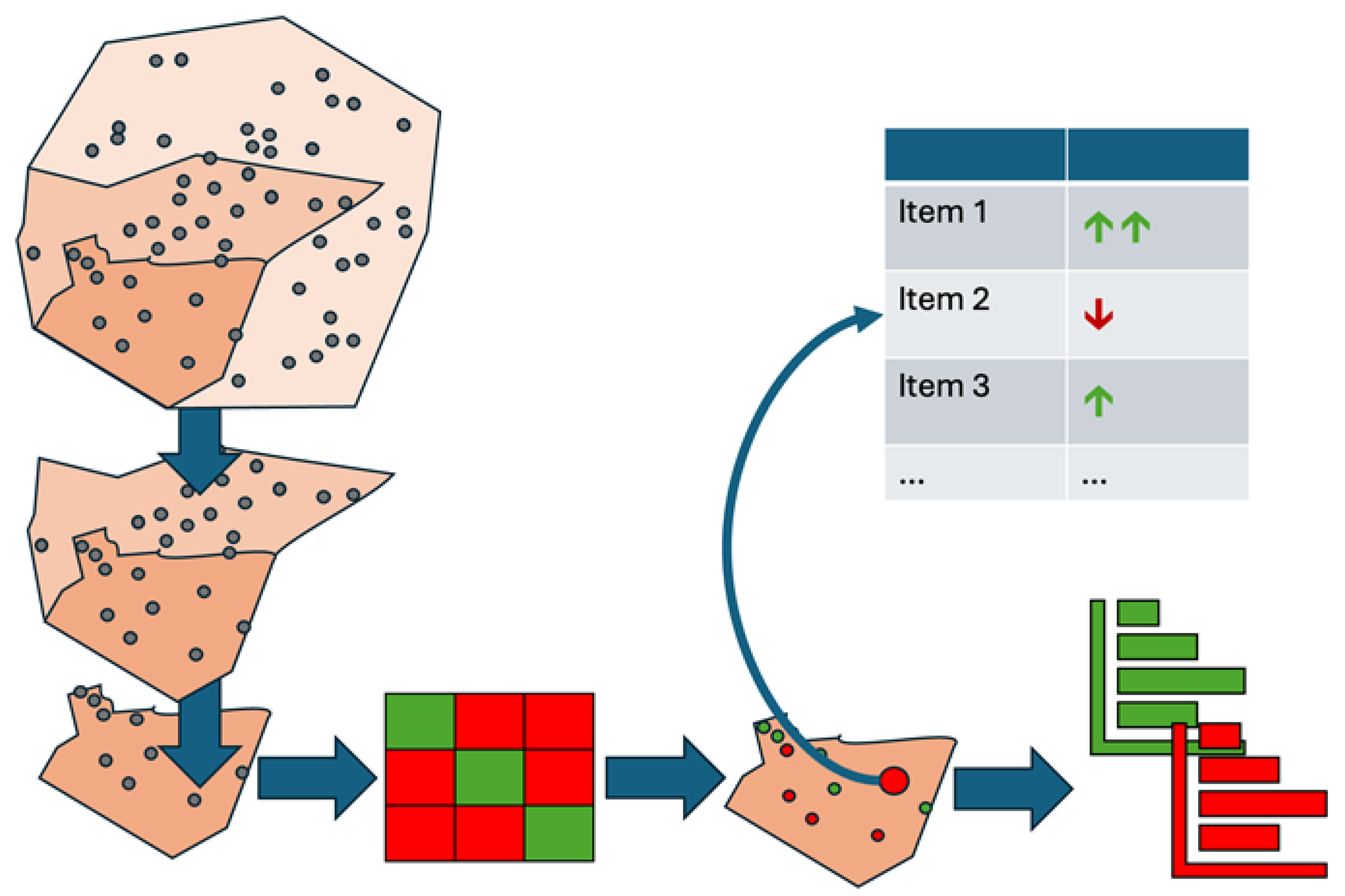
By dividing the data this way, we enable dynamic analysis of predictions based on spatial units. An interactive dashboard presents the results and facilitates user-friendly, straightforward exploration of complex influencing factors.
The confusion matrix also facilitates targeted aggregationWe calculate influencing factors per target class exclusively from instances that the model correctly classified. This avoids distortions due to misclassification. Additionally, the analysis of incorrect predictions allows identification of the responsible features. Classifying the data as true positives (TP), true negatives (TN), false positives (FP), and false negatives (FN) enables a structured and cumulative representation of the influencing factors. This approach provides a robust basis for analyzing model decisions, especially wrong ones.
Combining spatial and classification-based segmentation provides a more detailed view of the classification results. This approach is particularly effective when using XAI methods, such as SHAP. It goes beyond classic SHAP diagrams, such as beeswarm or summary plots, by offering alternative, visually prepared display options.
The visualization uses simplified symbols to depict individual feature flows without altering the underlying numerical values. For each target class, it is clear which features have increased or decreased the prediction probability. Displaying the intensity of influence symbolically helps a diverse user group understand the semi-global influencing factors.
Additionally, the interactive dashboard lets users dynamically select the target class, revealing different influences. This allows for a targeted analysis of the features that led to the inclusion or exclusion of certain classes. Even when the model misclassifies, users can quickly identify the features that led to the incorrect prediction. The dashboard offers a transparent and comprehensible representation of the factors influencing the model prediction thanks to the dynamic visualization of local SHAP values using waterfall and decision plots. The combination of interactive analysis options, user-centered design, and a comparative presentation of all target classes strengthens understanding of the model’s internal decision-making processes. This creates a sound basis for further interdisciplinary analyses.
This concept is suitable for any use case involving the classification of highly spatially distributed data with a trained ML model, followed by analysis using XAI methods.
4. Implementation
This chapter describes how to implement the concept presented in Section 3. This process systematically derives factors influencing accident severity from accident data using XAI methods. The study uses the city of Mainz as an example area.
Data
First, we present the data set used. The accident data used in this study comes from the ‘Unfallatlas’ or Accident Atlas of the state and federal statistical offices Germany. The publicly accessible dataset includes all traffic accidents involving personal injury on German roads, as recorded by the police. Although the data has an annual publication cycle, some federal states delay its release. For example, data from Mecklenburg-Western Pomerania is only included starting in 2021. Each recorded accident includes geographical coordinates, enabling spatial representation and analysis.
The study period spans from 2016 to 2022. During this period, authorities recorded 1,396,570 accidents in Germany and published them in the Accident Atlas. Of these, 80% (1,118,604 cases) were accidents involving minor injuries, 19% (263,664 cases) were accidents involving serious injuries, and 1% (14,316 cases) were accidents involving fatalities. Pourroostaei Ardakani et al. (2023) and Pradhan & Ibrahim Sameen (2020) have already demonstrated that accident datasets are highly imbalanced.
The statistical offices of the federal states and the federal government compile and summarize accident data from the individual states. For each accident are thirteen features recorded. Table 1 lists the features that provide spatial, temporal, atmospheric, and situational information. Compared to similar study datasets, these features are less extensive. The descriptions of these features come from the dataset description ‘Unfallatlas’ (Statistisches Bundesamt und Statistische Ämter des Bundes und der Länder, 2021) and the explanation of basic terms in traffic accident statistics (Statistisches Bundesamt, 2022).
As part of the data processing, the statistical offices georeferenced the traffic accidents by matching each accident’s exact location to the nearest road axis. However, the dataset only contains spatial coordinates, not information on the characteristics of the road. To enrich the accident data with additional road information, a scalable approach is necessary.
Free data from OpenStreetMap (OSM)1 serves as the basis for attaching the respective road’s additional properties to an accident. For example, the data enrichment consists only of the road class as an additional attribute because information on road width, number of lanes, and maximum speed is missing. Additionally, the selection is limited to OSM roads on which traffic accidents can occur.
Data Engineering
An examination of the feature data types in Table 1 reveals that they are manly categorical. The federal and state statistical offices specify a value from a defined list for each feature. The categorical type of the values often prevents direct comparison or sorting. Transformations and encoding convert these values into a model-readable structure, enabling a model-agnostic evaluation of accident severity. Additionally, sampling methods compensate for unequal accident frequencies to ensure a balanced data set for evaluating accident severity.
Time data, such as hours and months, are cyclical; therefore, a purely numerical representation distorts neighboring values, such as 23:00 and 01:00.
Mahajan et al. (2021) used sine and cosine transformations to capture this cyclical nature. Roussel & Böhm (2025) confirmed this practice, which is also used for transforming the accident times in this work. The two new continuous values are stored as features.
The categorical, nominally scaled features—accident type, light conditions, road condition, and road class—are data with no natural sequence that are not directly comparable. One-hot encoding ensures the ML model considers the individual feature classes independently. While one-hot encoding allows for model-agnostic processing of categorical data, it also increases the number of features, resulting in the “curse of dimensionality” (Bellman, 1961). In this case, the number of features increased from 13 to 52 due to the transformations, requiring higher model complexity and more training data.
We used a self-developed sampling approach to train an ML model that can classify accident severity based on features. We subsequently used the test dataset to evaluate the model’s quality and visualize the semi-global influencing factors. To train a meaningful ML model, a large amount of uniformly distributed, heterogeneous accident data is required. We compile the training data independently of specific geographical regions to avoid distortions and maximize the model’s performance with training data as variable as possible. However, the distributions of individual accident severities in the enriched dataset are still imbalanced. Amorim et al. (2023) also highlighted this issue in their work. They compared trained ML models with balanced and unbalanced data sets. They found that correlations between input features and target variables were only present in balanced datasets. Finding the right class in an imbalanced dataset was difficult, and classification quality based on error measures was over 10% worse (NN, decision trees, SVM, and Naive Bayes were examined). The use of undersampling or oversampling is essential. One disadvantage of undersampling is that the ML model cannot see and adapt important information contained in randomly deleted instances. Researchers frequently apply oversampling for this reason. In particular, the Synthetic Minority Over-sampling TEchnique (SMOTE) is widely used. Rather than simply copying instances of the underrepresented class until the class distribution is equal, SMOTE creates synthetic instances. Copying the data would lead to overfitting because the same instances would always form the basis of the data. SMOTE creates new instances by generating feature values based on neighboring instances, resulting in unique values. Overfitting can also occur when there are extensive new generations and little initial data. Amorim et al. (2023) and Parsa et al. (2020) used SMOTE to adjust inherently imbalanced accident data. The new sampling approach also uses this proven sampling method.
When SMOTE was applied to the German accident data, the subsequent overrepresentation of previously underrepresented accident severity classes was evident. Since undersampling and SMOTE did not produce satisfactory results, we combined the strengths of the two methods to create our own approach. First, SMOTE increased the number of fatal accidents to 160,000, a tenfold increase. Then, we reduced the number of accidents with minor and serious outcomes to the number of fatal accidents. This sampling approach prevents overfitting, which would result from including too much synthetically generated data, as well as a loss of information, which would result from pure undersampling. For later evaluation, we removed accidents from Mainz from the training dataset and used them as test data. The test data remained unbalanced to reflect real-world conditions.
Classification
The prepared accident data serves as the basis for model training. The model predicts accident severity based on individual features. This involves performing a multi-class classification. Chapter 2 focuses on tree structures, such as XGBoost, decision trees, and random forest, as well as neural networks, such as MLP and PNN. This study compares the widely used MLP and XGBoost models. The focus is not on determining the most suitable model but on proving the concept in practice. The two models differ fundamentally in terms of their structure and training approaches. Using the derived accuracies afterwards enables independent confirmation of the training process.
We performed the initial training of the XGBoost and MLP-NN classifiers using summarized accident data from Germany. In this case, we did not sample the data. Then, we repeated the training with the adjusted accident severity classes. For the third model training, we used the balanced accident data and considered the road class for the two ML approaches. However, this data augmentation only improved the XGBoost model. Table 2 presents the multi-class classification results.
Looking at the confusion matrix of the XGBoost classifier’s classification results with unbalanced training data reveals that the model classifies all accidents as minor (see Figure 2). This accident severity is so prevalent that the model does not have enough data from the underrepresented classes to identify them. This confirms the necessity of the sampling method used in preprocessing.
After adjusting the class frequencies in the training data, most error measures improved because the model could correctly classify more serious and fatal accidents (see Figure 3). The recall values for these classes are 75% and 38%, respectively. However, the model now predicts more minor accidents than fatal accidents in the test dataset. This is evident in the low precision value of 3% for this accident class and the decrease in recall value to 70% for the minor accident class. These results may indicate overfitting of the models and require further investigation. The classification accuracy is also decreasing. It decreased by 20%, falling to 65%. The model now more often predicts the previously overrepresented minor accidents as other accident severities. However, the 26% increase in the overall recall value shows that the model assigns accident severity more accurately, particularly for underrepresented classes. The XGBoost model correctly classified three out of four actual fatal accidents. However, it incorrectly predicted 26 serious and 89 minor accidents as fatal, resulting in an overall precision value of 38.7%.
The two models examined, XGBoost and MLP-NN, have similar error values. This confirms the classification by these two independent, different ML models qualitatively. Similar to the XGBoost classifier, the MLP-NN only predicts serious and fatal accidents after adjusting the class frequencies. However, this leads to possible overfitting of the model due to the incorrectly classified minor accidents. Nevertheless, the MLP-NN shows slightly better results in all error measures (1%-3%) because this model correctly predicted more minor accidents.
Adding another feature, the road class, makes the data set more complex. This requires a model that can correctly map the increased complexity. Only the XGBoost algorithm increased the quality of the classification results (see Figure 4). The MLP-NN performed worse in all error measures. It misclassified accidents with minor injuries as accidents with serious or fatal injuries. This is evident in the class’s recall value of 34%. Additionally, the model identified fewer actual accidents with fatal severity. After enriching the data with the road class, the model incorrectly predicted more accidents than serious accidents.
We will use the XGBoost classifier as the primary model for further processing because it maps nonlinear issues well and delivers strong performance. Various acceleration mechanisms allow XAI methods such as SHAP to be calculated more efficiently with tree structures like XGBoost. This is a significant advantage over MLP-NN.
We then used cross-validation for hyperparameter tuning to identify the optimal parameters for the model. We configured the model for a multiclass classification problem using a softmax objective function. It consists of 500 decision trees with a maximum depth of four levels. To reduce overfitting, we used only 80% of the training data and 60% of the features to construct each tree. We employed L1 and L2 regularization to limit model complexity. We deliberately chose a low learning rate of 0.015 to promote stable and gradual convergence. Additional fine-tuning improved all error measures by 2%.
XAI
To represent transparently the semi-global influencing factors of the XGBoost model, we apply Explainable AI (XAI). We use SHAP for model diagnostics and its ability to provide both local and global interpretations of model decisions simultaneously (Lundberg et al., 2020). Unlike alternative approaches, such as LIME, which primarily provide local explanations, SHAP allows for a more consistent assessment of influencing factors across many instances. For the XGBoost model, we use a specially adapted TreeExplainer that calculates SHAP values efficiently within the model. This enables high-performance analysis of large data sets2.
Our goal is to use SHAP values to explain all accidents in the Mainz test data. These consist of 878 instances, for which the algorithm calculates one SHAP value per feature and per target class — i.e., 52 features across three classes — resulting in 136,968 individual SHAP values in total.
Using a waterfall plot, for example, we can visualize the influencing factors for each target class locally for each instance, as shown in Figure 5, Figure 6 and Figure 7.
In addition to SHAP values, the algorithm calculates a base value, E [f(x)], for each class. This expresses the basic probability of an individual class in the case of an unbalanced dataset. In other words, this probability describes the occurrence of a class regardless of the individual features of an instance. If all target classes occur equally, the base value is the same for each class.
To analyze the influencing factors using SHAP values on unbalanced test data, we input the trained ML model and the class ratios in the test dataset to the tree explorer. This enables us to apply accident severity predictions and their influencing factors to new unbalanced data sets. The calculated base probabilities of the classes in the test dataset reflect the frequencies of different accident severities, with minor injuries being the most common. These base values serve as a reference point for calculating the SHAP values and account for the class imbalance in the dataset.
The library outputs the SHAP values in logit space, which we then convert into probabilities using the softmax function for interpretation:
The softmax function (1) is a common method for converting logits to probabilities in classification tasks (Goodfellow et al., 2016).
The SHAP values of the categorical features required post-processing because pre-processing with one-hot encoding split them into several binary variables (e.g., accident type and Lighting condition). One original feature consists of several feature classes (see Figure 8). This makes explanations more difficult because there are now several influencing factors for each original feature.
To improve comprehensibility, we grouped feature classes based on how the one-hot encoding split divided the features and summed their SHAP values for each original feature. This step is mathematically permissible due to the additivity property of SHAP values. We assigned the groups based on the coding structure and order of the feature matrix. As a result, each original categorical feature of an instance received a single influence value per target class again (see Figure 9).
This aggregation leaves the total sum of the SHAP values unchanged and still corresponds to the predicted probability. However, it is important that the resulting SHAP value of a feature reflects the interaction of all associated categories — both their presence and the absence of others.
Another way to visualize the influencing factors using the SHAP library is with a beeswarm plot. Unlike the previous illustrations, this provides a global view of the influences. Figure 10, Figure 11 and Figure 12 show beeswarm plots for each of the three accident severity classes. Notably, ‘Accident with Other Vehicle’ is the most important feature for predicting fatal accidents. When this feature has a value of one, i.e., when the vehicle type is involved, the probability of this class increases. The same is true for pedestrian involvement. The road class ‘Residential road’ and the accident type feature value of 2 (‘Collision with preceding/waiting vehicle’) lower the probability of this class.
The probability of an accident being predicted as serious is influenced by the feature values of accident type 6 (‘accident in longitudinal traffic’) and accidents involving vehicles. Unlike fatal accidents, the absence of these features increases the probability of this class. In other words, if no car was involved in an accident, the model increases the predicted probability of a serious accident. The vehicles involved primarily influence the predicted probability of accidents with minor outcomes. The involvement of a bicycle, pedestrian, motorcycle, or other vehicle negatively affects the prediction probability, as does the road class ‘highway’. Accident type 2 (‘collision with preceding /waiting vehicle’) reduces the probability of a fatal accident. For predicting accidents with minor injuries, this feature has the greatest positive influence on the ML model.
Therefore, the beeswarm plot is a good way to map the influencing factors in an ML model. In addition to showing the absolute influence, it indicates whether a feature has increased or decreased the probability. It also takes into account the respective value of the feature, which illustrates the advantage of a beeswarm plot over a classic bar plot. While the latter only shows the importance of individual features for the model, the beeswarm plot shows the influence of each value and class-dependent influences.
However, the beeswarm plot in Figure 13 shows that we did not merge the categorical features. Summing up the SHAP values of the individual feature classes generalizes the analysis, so we have not performed this step yet. Some feature classes increase the prediction probability, while others reduce it. Additionally, the feature classes have nominal scales, meaning they have no natural order. A higher accident type class does not necessarily have a higher or lower influence on the prediction. Summarizing the SHAP values of features with multiple classes means that their influences can no longer be interpreted using a Beeswarm plot.
We used a boxplot to visualize how feature classes influence a specific accident class (See Figure 14). For example, we use the boxplot to show the individual accident type categories and their average influence on the probability of an accident being classified as fatal. This representation allows one to compare the influencing factors of the classes of an individual feature. However, it is important to note that all instances are considered — including those, the model does not predict as fatal accidents. We based our approach to handling and visualizing categorical features on the work of O’Sullivan (2022).
Since a beeswarm plot becomes meaningless after SHAP values are merged, a bar plot is used instead (see Figure 15). This plot clearly shows the average absolute SHAP values per feature and accident category. This representation is less detailed but easier to understand.
In the next chapter, we present an approach to visualizing semi-global influencing factors, including the use of bar plots. We subdivide the dataset to create bar plots for specific predictions. This enables us to address user inquiries such as ‘on average, which feature has the greatest influence on the ML model when identifying minor accidents as fatal accidents?’ It also enables us to evaluate classification results and misclassifications based on many instances.
5. Results and Discussion
We developed this concept to address the research questions posed in Chapter 1. The goal is to present a solution for calculating semi-global influencing factors and, subsequently, communicate them in an accessible manner. There is a research gap in communicating spatial influencing factors. We designed the prototypical dashboard implementation to present a possible solution to this issue. In the use case, we dynamically summarize accident data, ML results, and influencing factors to enable in-depth analysis. This allows specialist users, such as road planners, accident researchers, ML experts, and road users, to explore the large number of individual ML predictions or evaluate the quality of the ML model. Geo-referencing accidents makes it possible to show spatial patterns. We developed this prototype for German analysts, so the upcoming screenshots show only the German version.
We sorted the Mainz accident data by spatial location, as shown in the concept. Using the districts of Mainz as an example, we demonstrate this approach. Other administrative units or socio-spatial boundaries can also serve as subdivisions. However, we have not examined these spatial units in depth, so we cannot identify small-scale influences, such as dangerous traffic junctions. We can now visualize the subdivided point data on a map using areal representations (see Figure 16). Additionally, other visualization concepts can highlight differences between districts. In the study, we visualized the number of accidents per district and the model’s prediction quality using color-coding and error measures for each district. Depending on the specific influencing factors, other colorations could also be conceivable to achieve even better spatial comparisons with the aid of maps. When comparing city districts, it is clear that areas in the city center have a much higher accident rate, primarily due to higher traffic volume rather than an increased risk of accidents. Accident frequency should be included as an additional target variable in an ML model to specify accident frequency in addition to accident severity. Therefore, we can only compare the districts to a limited extent based on their numbers. Additionally, the influencing factors vary by district. Using a single ML model does not account for district-specific characteristics.
Clicking on a district reveals a dynamic, interactive confusion matrix for the ML predictions of accident severity in that district. This matrix compares the predicted and actual accident severity in the selected district. This makes it easy for users to understand how error measures are calculated. This will also allow users to identify potential classification errors in the model. Figure 17 shows a district overview from the web dashboard.
Clicking on a cell in the confusion matrix generates a bar plot showing the average absolute SHAP values for this accident severity. One disadvantage of the bar plot from the SHAP library is that it generalizes the data too much. When a bar plot was generated for an accident severity class, the algorithm calculated the average SHAP value of a feature from all instances, even when the classifier predicted the investigated class as the least likely for an instance. Furthermore, it was not possible to consider correctly or incorrectly classified instances separately. Therefore, the presentation of the results in the bar plot was distorted. It was not possible to conduct a differentiated analysis of which features had the greatest influence on incorrect classifications. However, by dynamically calculating the average absolute influencing factors depending on the actual and predicted accident severity in the web dashboard, users can now access the influencing factors specifically (see Figure 18). Thus, we eliminated the limitations of the global bar plot to gain a clearer understanding of the ML prediction and its influencing factors. However, the average absolute SHAP values represented by the bar plot do not indicate whether a feature increased or decreased the probability of predicting accident severity. Therefore, the bar plot expresses the importance of a feature in the ML prediction rather than providing information on how a feature value influences the prediction of individual accident severity. Additionally, very large or very small SHAP values can distort the average data in individual cases.
We also integrated a beeswarm plot to enable users to take a closer look at the composition of the average absolute SHAP values shown in the bar plot and to gain a deeper understanding of the influencing factors and their interrelationships. This plot shows the individual SHAP values of the instances. We create an axis for each feature and mark the SHAP values as points on each axis. Interacting with the points displays the respective SHAP value and the decisive feature value. This allows users to understand the direction of importance and composition of the SHAP values. As with a typical Beeswarm plot, we color-code the points according to their feature values. However, the markings do not show a continuous color gradient because we did not sort the nominally scaled features. Nevertheless, this highlighting allows users to recognize possible correlations between feature and SHAP values. Figure 19 shows an example. This diagram illustrates the factors that influenced the misclassification of minor accidents as serious accidents in a neighborhood. Looking at the feature and SHAP values together makes it possible to identify the patterns that caused the ML model to misclassify these accidents. As can be seen here, the involvement of a motorcycle in an accident increases the probability of serious accident severity. The lack of motorcycle involvement minimally reduced the predicted probability of accident severity. However, the bar plot does not show this correlation. Moreover, it was not possible to determine whether indicating motorcycle involvement lowered or increased the probability (see Figure 18). Therefore, the visualization of individual SHAP values using the beeswarm plot indicates that motorcycle involvement increases the predicted probability of a serious accident in this district Users can derive similar correlations and influences from the confusion matrix diagrams.
The developed concept enables targeted analysis of accident patterns at the district level, reduces the amount of displayed data, and combines interactive visualizations with differentiated model evaluation. Separating correctly and incorrectly classified accidents and using common slide types supports transparent and low-threshold interpretation of the influencing factors.
In addition to displaying accident severity and its influencing factors at the district level, the dashboard allows users to examine individual accidents freely. This encourages users to explore individual accidents. When examining local influencing factors, the dashboard primarily serves as a visualization and navigation tool to display the results of individual calculations rather than offering analysis options.
The developed process sequence can provide non-case-dependent statements on the formation probability of an ML model. Each accident contains unique information, yet all accidents share the same structure. To this end, we color-code accidents on an overview map of a city district. Roussel et al. (2024) investigated the possibilities of map-based mediation of influencing factors. In addition to the accident class, additional information, such as the most influential feature in the decision-making process, a comparison of actual and predicted accident severity, or prediction uncertainty, could increase the map’s informational content. Interacting with a marker displays the details of an individual accident. Accident severity is the most important information and the main inspection feature. The information window displays the probabilities of the individual accident classes, as determined by the classifier. We present the prediction probability alongside a comparison with the actual accident severity class and indicate the uncertainty of the prediction. We display this extensive information in table form for the clicked marker to avoid overloading the map with complex visualizations. Nevertheless, we enable users to view the map and accident-related information simultaneously. The information window lists the classification features and their respective values. This gives the user an easy overview of the accident. Details from the database enable reconstruction of the accident. Meaningful descriptions replace coded values in the database, allowing users unfamiliar with statistical office accident statistics to understand the information describing the accident.
Another difficulty was the low-threshold communication of the influences of this accident information. We developed a concept to address the following user question: How did the lighting conditions at the time of the accident affect the likelihood of serious injuries?
Influencing factors describe how individual features influence the probability of a class in the classification. Depending on whether they have increased or decreased the probability of accident severity for the model, these influencing factors can be positive or negative. The number of influencing factors determines how much a feature influences the prediction. To help users understand these factors easily, we indicate them with symbols in the list of accident information next to each feature. Rather than indicating the influence as a percentage, arrows were used to visualize the direction of influence (downward arrows “↓” express a negative influence on the prediction, and upward arrows “ ↑” express a positive influence). This relative indication of influences simplifies traceability in an ML classification. In addition, features with the largest SHAP values (i.e., the features with the greatest influence) are marked with a double arrow. This allows users to identify the most influential features without examining the exact SHAP values.
The dynamic dashboard enables users to select and analyze class-specific local SHAP values. Selecting a different accident class automatically updates the symbols and diagrams. Thus, the dashboard allows users to directly read and compare the composition of the model’s influencing factors. Figure 20 shows a screenshot of the dashboard.
Users gradually receive increasingly detailed and comprehensive information on local ML decisions, culminating in the full display of waterfall and decision plots (see Figure 21 and Figure 22). Here, experts can view all values simultaneously. However, potential users often lack prior knowledge of ML classifications and therefore cannot interpret the specified class probabilities and SHAP values. In extreme cases, this could lead the user to interpret the specified influencing factors as the importance of a feature for accident severity in the real world. The dashboard does not clearly communicate that the calculated influencing factors affect only the ML prediction and not the actual causes of the accident.
The work primarily focused on creating a concept for calculating and visualizing the semi-global influencing factors of spatial data sets. We confirmed this concept through practical application. This concept made it easy to identify misclassifications and their respective semi-global influencing factors. The dashboard enabled analysis of how the ML model makes its decisions. This allows for many subsequent investigations, such as those of accident data provided by federal and state statistical offices. As we discussed in Chapter 2, relevant characteristics must describe accidents. During publication, information such as the exact date and details about the individuals involved (e.g., age, gender, and driving experience) or possible drug or alcohol influences was removed. The state and federal statistical offices even generalized or summarized other details, such as weather conditions, the number of people involved, speeds, and road data. The absence of these proven relevant influencing factors can lead to a simpler, and therefore less meaningful, model. We were not able to consider important accident characteristics when training the ML model. This has caused incorrect correlations between the accident data or created information gaps in the accident description. These issues become apparent when analyzing the model using SHAP. For example, misclassified accidents in which the severity of the accident was incorrectly stated as fatal instead of minor disproportionately influenced the feature ‘Accident with Other Vehicle’ (e.g., truck, bus, or streetcar) since motor vehicles were predominantly involved in fatal accidents (see Figure 10). We trained the model using German accident data, so it can only predict accident severity based on the 13 accident features. This resulted in information gaps in the data. Consequently, accidents involving serious injuries were classified the same as those involving minor injuries. Due to the small number of features, the model could not assign accidents to the correct severity level. The high misclassification rate of the trained ML model demonstrates this. In this context, the use of freely available OpenStreetMap (OSM) data also requires critical consideration. Because OpenStreetMap (OSM) depends on voluntary user contributions, the data may lack completeness or timeliness. This primarily refers to the completeness of a road’s properties, rather than the road network. It is necessary to investigate whether additional information could further improve quality. Besides additional road characteristics, the most important additions are weather data and details about the individuals involved in the accidents. Developing efficient approaches to data enrichment and identifying new sources of information is essential. Additionally, we must check whether an ML model can handle greater data complexity. We found that adding road class, as a feature did not improve the MLP-NN’s predictions. Further investigation of more complex ML models may be necessary to assess their suitability for predicting accident severity.
The use of unbalanced accident data quickly made a sampling approach necessary. Unlike other studies, we employed a combination of undersampling and oversampling. While this was the only way to distinguish between the individual accident classes, the combination of the few categorical features and the unbalanced distribution resulted in poorer outcomes than those of other studies, such as Satu et al. (2018) and Pourroostaei Ardakani et al. (2023). This could be related to the conservative “macro averaging” assumed for the calculation.
Thanks to the dashboard, it is possible to conduct deeper investigations into the factors that influence ML decisions. The spatial and thematic breakdowns of the data enabled a thorough investigation of the accident data and the classifier.
6. Conclusions and Future Work
This chapter summarizes the results of the work and offers a glimpse into future projects based on them.
Conclusion
The paper introduces a concept that offers deeper insights into spatial influencing factors. Semi-global influencing factors reveal the decision-making processes of ML models in a simple way. This concept makes spatial data analyzable using Geo-Glocal XAI techniques.
We applied the concept to a practical use case. This involved the databased analysis of accident data. The goal was to identify factors that affect the severity of traffic accidents. Accident data is highly interdependent and complex. It is difficult to derive correlations between accident data and accident severity. This data set was ideal for applying the concept.
We trained an XGBoost classifier using accident data to predict accident severity. ML models recognize databased patterns that human analysis may have missed. We used the XAI approach SHAP to make the complex relationships between these ML decisions comprehensible. The semi-global influencing factors derived from this approach made it possible to identify spatial patterns. An interactive confusion matrix helped avoid the typical shortcomings of global SHAP visualizations. These detailed influencing factors will serve as a foundation for future analyses and model improvements by accident researchers, urban and transportation planners, and ML experts. A dashboard with intuitive visualizations and map integration presents the results in a user-friendly way, allowing transparent navigation through the influencing factors.
Future Work
The work dealt with the spatial visualization of the semi-global influencing factors in the form of diagrams. A dynamic map in combination with an interactive confusion matrix enabled the analysis. This work lays the foundation for implementing extended visualization options of the influencing factors for complex predictions such as accident severity with the help of maps. It is necessary to identify the advantages of map-based visualization and to develop concepts for visualization. This is the only way to present the extensive data in a comprehensive and easily understandable way using maps. For example, the local SHAP values of a feature or the features with the greatest influence on an ML prediction relate to a road network. This coded road network enables further analyses by providing a basis for identifying spatial distributions of influencing factors. We could spatially represent not only the distribution but also the regional influences of individual features. This would allow more in-depth analyses: ‘In which parts of the city is the probability of a serious accident increased by bicycle involvement, and in which is it reduced?’ However, the transferability of these approaches to the severity of accidents in Mainz was only possible to a limited extent in this study. The greatest difficulty was the spatial distribution of accidents in Mainz. Areas in the city center experience strong influence from many accidents, whereas accidents in the outer city areas exhibit a much larger radius of influence.
Author Contributions
Conceptualization, methodology, software, validation, formal analysis, investigation, resources, data curation, Johannes Frank; writing—original draft preparation, Johannes Frank; writing—review and editing, Cédric Roussel and Klaus Böhm; visualization, Johannes Frank; supervision, Cédric Roussel.; project administration, Klaus Böhm; funding acquisition, Cédric Roussel and Klaus Böhm. All authors have read and agreed to the published version of the manuscript.
Funding
The Carl Zeiss Foundation funded this research, grant number P2021-02-014.
Institutional Review Board Statement
Not applicable.
Informed Consent Statement
Not applicable.
Data Availability Statement
The original data presented in the study are openly available at https://unfallatlas.statistikportal.de/.
Acknowledgments
The research for this paper is part of the AI-Lab at Mainz University of Applied Sciences, which is part of the project “Trading off Non-Functional Properties of Machine Learning” at the Johannes-Gutenberg-University Mainz. The Carl Zeiss Foundation funds it.
Conflicts of Interest
The authors declare no conflict of interest.
References
- Abdulhafedh, A. (2017). Road Crash Prediction Models: Different Statistical Modeling Approaches. Journal of Transportation Technologies, 7, 190–205. [CrossRef]
- Abellán, J., López, G., & de Oña, J. (2013). Analysis of traffic accident severity using Decision Rules via Decision Trees. Expert Systems with Applications, 40(15), 6047–6054. [CrossRef]
- Amorim, B. D. , Firmino, A. A., Baptista, C. D., Júnior, G. B., Paiva, A. C., & Júnior, F. E. (2023). A Machine Learning Approach for Classifying Road Accident Hotspots. ISPRS International Journal of Geo-Information, 12(6). [CrossRef]
- Bellman, R. E. (1961). Adaptive Control Processes. Princeton University Press. [CrossRef]
- Goodfellow, I. , Bengio, Y., & Courville, A. (2016). Deep Learning. MIT Press. https://www.deeplearningbook.org/.
- Lord, D. , & Mannering, F. (2010). The statistical analysis of crash-frequency data: A review and assessment of methodological alternatives. Transportation Research Part A: Policy and Practice, 44(5), 291–305. [CrossRef]
- Lundberg, S. M., Erion, G., Chen, H., DeGrave, A., Prutkin, J. M., Nair, B., Katz, R., Himmelfarb, J., Bansal, N., & Lee, S.-I. (2020). From local explanations to global understanding with explainable AI for trees. Nature Machine Intelligence, 2(1), 56–67. [CrossRef]
- Mahajan, T., Singh, G., & Bruns, G. (2021). An experimental assessment of treatments for cyclical data. 6, 1–6. https://scholarworks.calstate.edu/downloads/pv63g5147.
- O’Sullivan, C. (2022, June 21). SHAP for Categorical Features. Towardsdatascience.Com. https://towardsdatascience.com/shap-for-categorical-features-7c63e6a554ea.
- Parsa, A. B. , Movahedi, A., Taghipour, H., Derrible, S., & Mohammadian, A. (Kouros). (2020). Toward safer highways, application of XGBoost and SHAP for real-time accident detection and feature analysis. Accident Analysis & Prevention, 136, 105405. [CrossRef]
- Pourroostaei Ardakani, S. , Liang, X., Mengistu, K. T., So, R. S., Wei, X., He, B., & Cheshmehzangi, A. (2023). Road Car Accident Prediction Using a Machine-Learning-Enabled Data Analysis. Sustainability, 15(7). [CrossRef]
- Pradhan, B. , & Sameen, M. I. (2020). Review of Traffic Accident Predictions with Neural Networks. In B. Pradhan & M. Ibrahim Sameen (Eds.), Laser Scanning Systems in Highway and Safety Assessment: Analysis of Highway Geometry and Safety Using LiDAR (pp. 97–109). Springer International Publishing. [CrossRef]
- Roussel, C. (2024). Visualization of explainable artificial intelligence for GeoAI. Frontiers in Computer Science, Volume 6-2024. [CrossRef]
- Roussel, C. , & Böhm, K. (2023). Geospatial XAI: A Review. ISPRS International Journal of Geo-Information, 12(9). [CrossRef]
- Roussel, C. , & Böhm, K. (2025). Introducing Geo-Glocal Explainable Artificial Intelligence. IEEE Access, 13, 30952–30964. [CrossRef]
- Satu, M. , Ahamed, S., Hossain, F., Akter, T., & Farid, D. (2018). Mining Traffific Accident Data of N5 National Highway in Bangladesh Employing Decision Trees. [CrossRef]
- Shaik, Md. E., Islam, Md. M., & Hossain, Q. S. (2021). A review on neural network techniques for the prediction of road traffic accident severity. Asian Transport Studies, 7, 100040. [CrossRef]
- Statistische Ämter des Bundes und der Länder. (2021, June 21). Gesellschaft und Umwelt—Verkehrsunfälle. Opengeodata.Nrw.De. https://www.destatis.de/DE/Themen/Gesellschaft-Umwelt/Verkehrsunfaelle/_inhalt.html#238550.
- Statistisches Bundesamt. (2022). Verkehrsunfälle Grundbegriffe der Verkehrsunfallstatistik. Destatis.De. https://www.destatis.de/DE/Themen/Gesellschaft-Umwelt/Verkehrsunfaelle/_inhalt.html#238550.
- Statistisches Bundesamt. (2025). Gesellschaft und Umwelt—Verkehrsunfälle. Destatis.De. https://www.destatis.de/DE/Themen/Gesellschaft-Umwelt/Verkehrsunfaelle/_inhalt.html#238550.
- Tambouratzis, T., Souliou, D., Chalikias, M., & Gregoriades, A. (2010). Combining probabilistic neural networks and decision trees for maximally accurate and efficient accident prediction. In Proceedings of the International Joint Conference on Neural Networks (p. 8). [CrossRef]
- Zeng, Q. , & Huang, H. (2014). A stable and optimized neural network model for crash injury severity prediction. Accident Analysis & Prevention, 73, 351–358. [CrossRef]
Figure 2.
The confusion matrix presents the classification results of XGBoost using the German data as training input, without accounting for class distribution or road classes.
Figure 2.
The confusion matrix presents the classification results of XGBoost using the German data as training input, without accounting for class distribution or road classes.
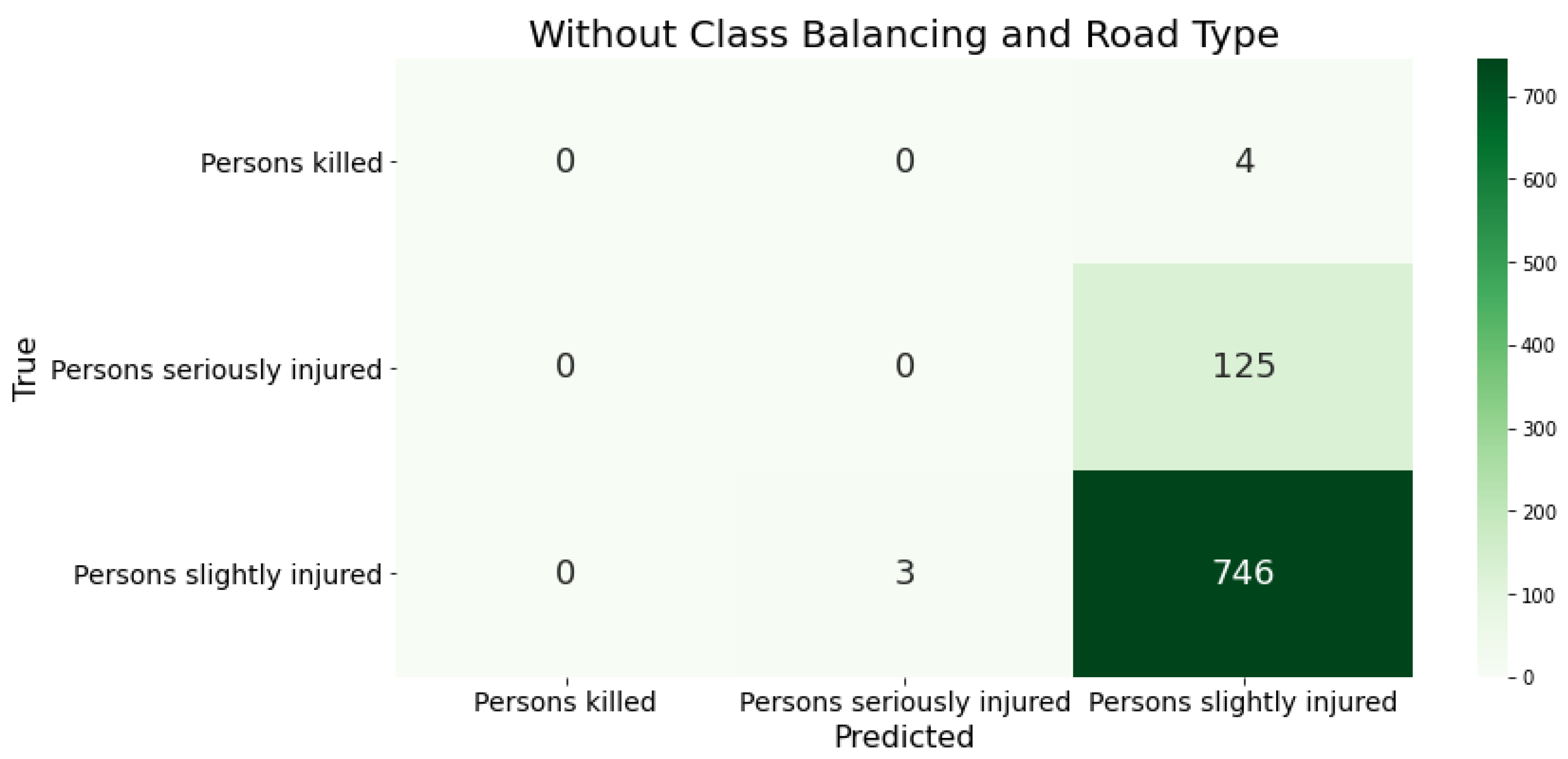
Figure 3.
The confusion matrix presents the classification results of XGBoost using the German data as training input after adjusting the class distribution in the training data. (Without road class.).
Figure 3.
The confusion matrix presents the classification results of XGBoost using the German data as training input after adjusting the class distribution in the training data. (Without road class.).
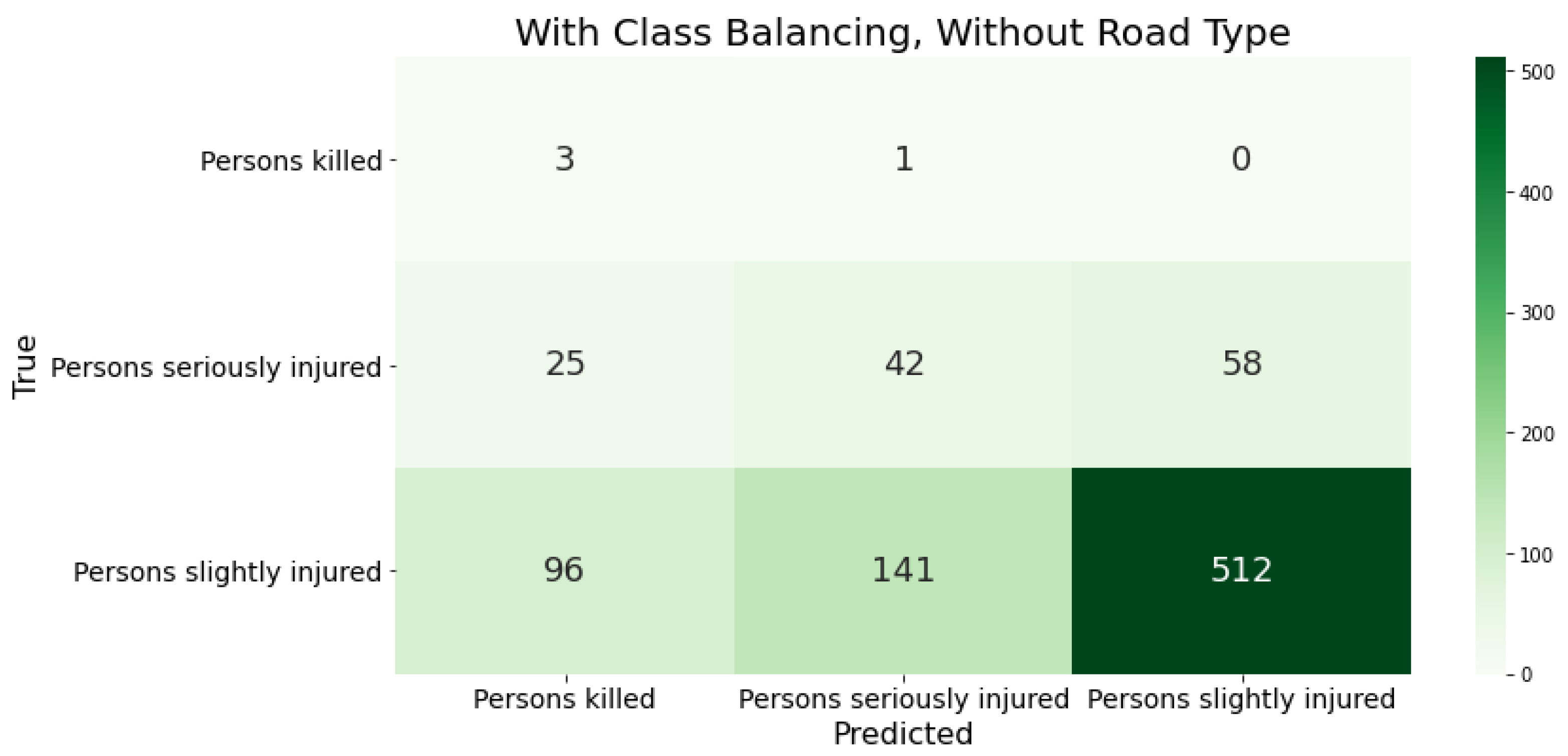
Figure 4.
The confusion matrices show the classification results of XGBoost trained on the German data after adjusting the class distribution in the training set. We also enriched the data with road class information.
Figure 4.
The confusion matrices show the classification results of XGBoost trained on the German data after adjusting the class distribution in the training set. We also enriched the data with road class information.
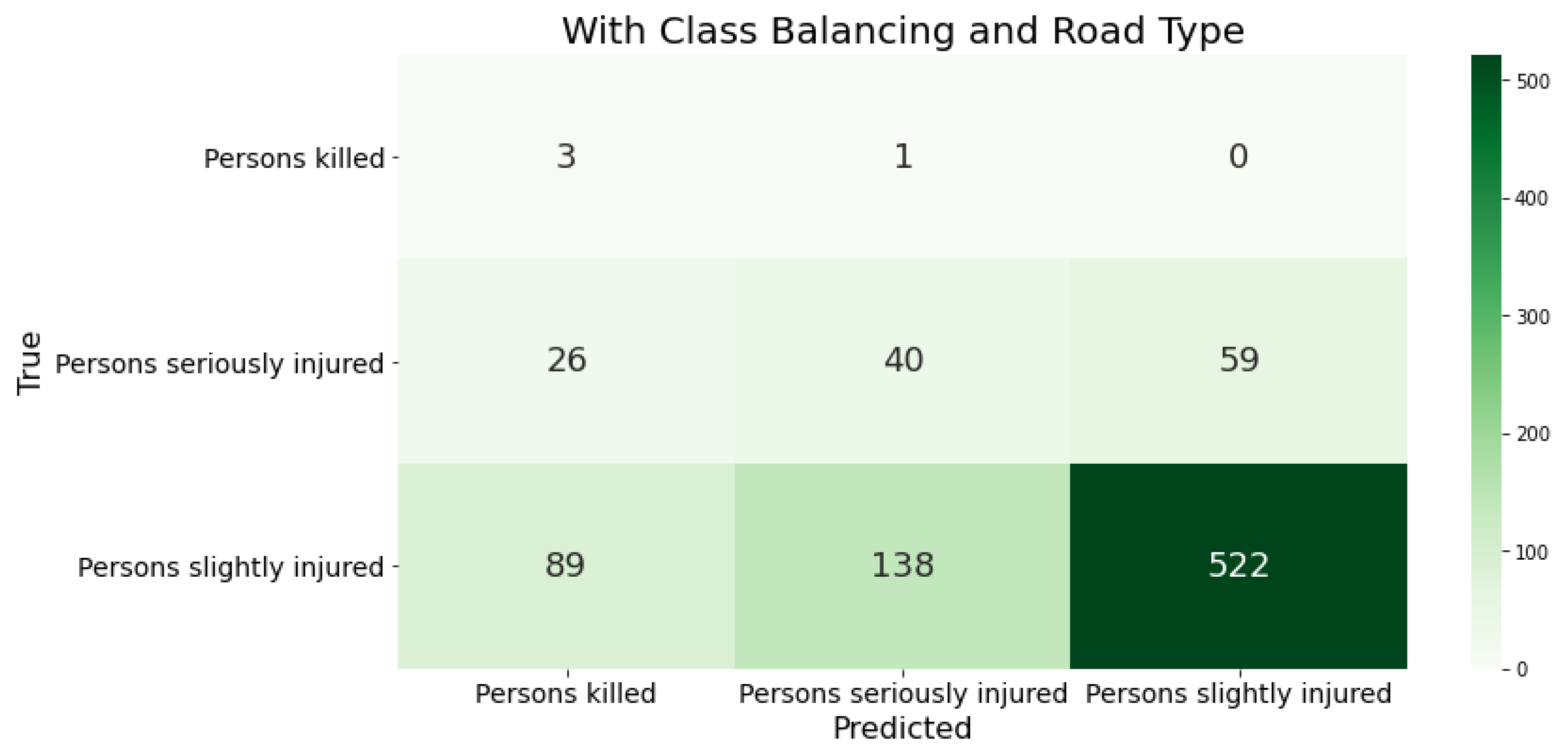
Figure 5.
The factors influencing an ML prediction are visualized using waterfall plots of the three accident severities (e.g., ‘Persons killed’).
Figure 5.
The factors influencing an ML prediction are visualized using waterfall plots of the three accident severities (e.g., ‘Persons killed’).
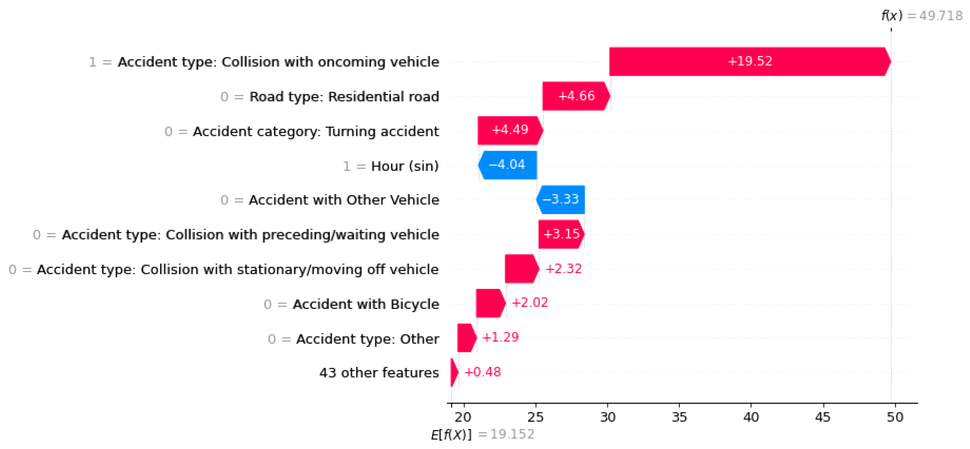
Figure 6.
The factors influencing an ML prediction are visualized using waterfall plots of the three accident severities (e.g., ‘Persons seriously injured’).
Figure 6.
The factors influencing an ML prediction are visualized using waterfall plots of the three accident severities (e.g., ‘Persons seriously injured’).
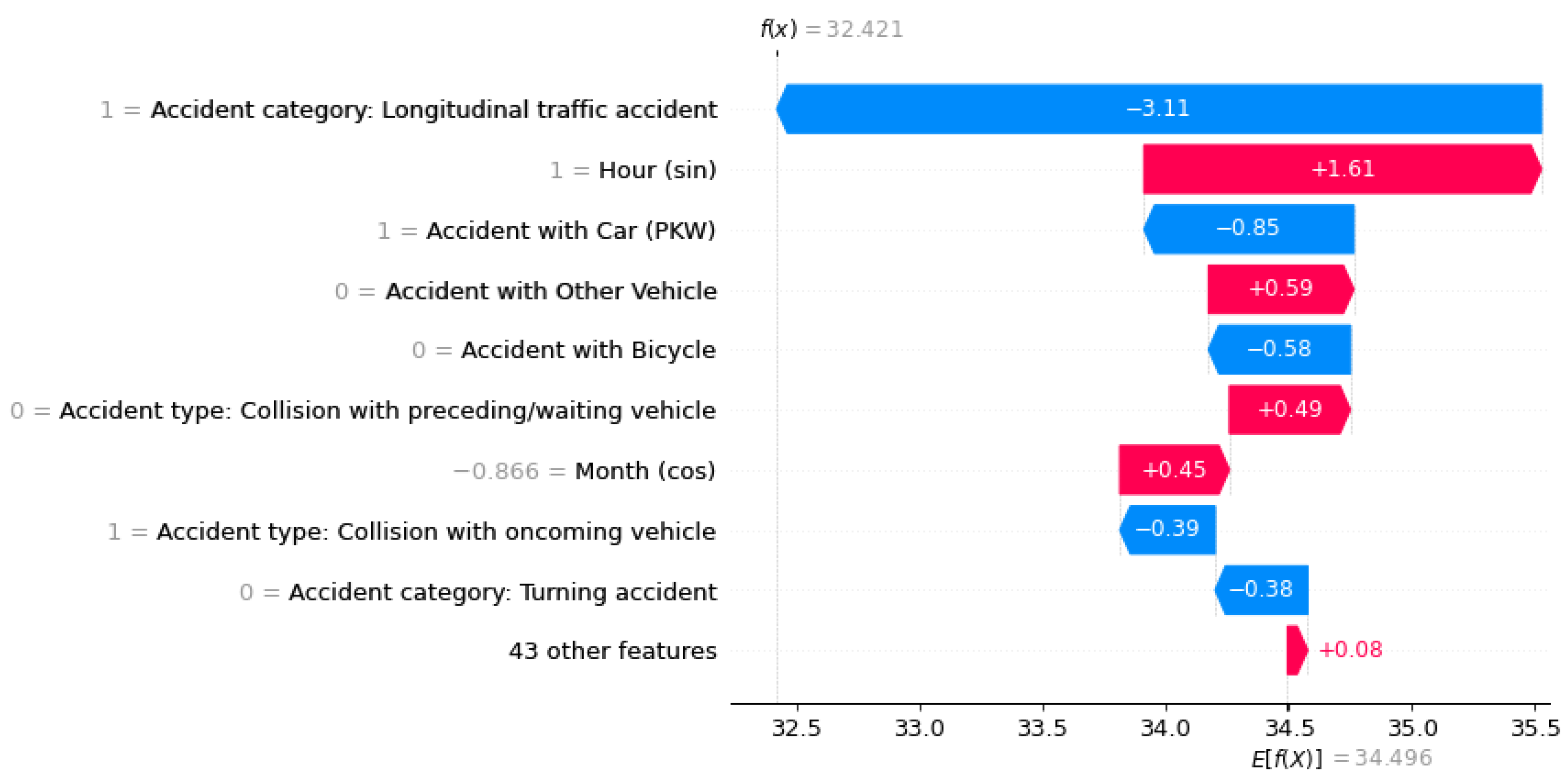
Figure 7.
The factors influencing an ML prediction are visualized using waterfall plots of the three accident severities (e.g., ‘Persons slightly injured’).
Figure 7.
The factors influencing an ML prediction are visualized using waterfall plots of the three accident severities (e.g., ‘Persons slightly injured’).
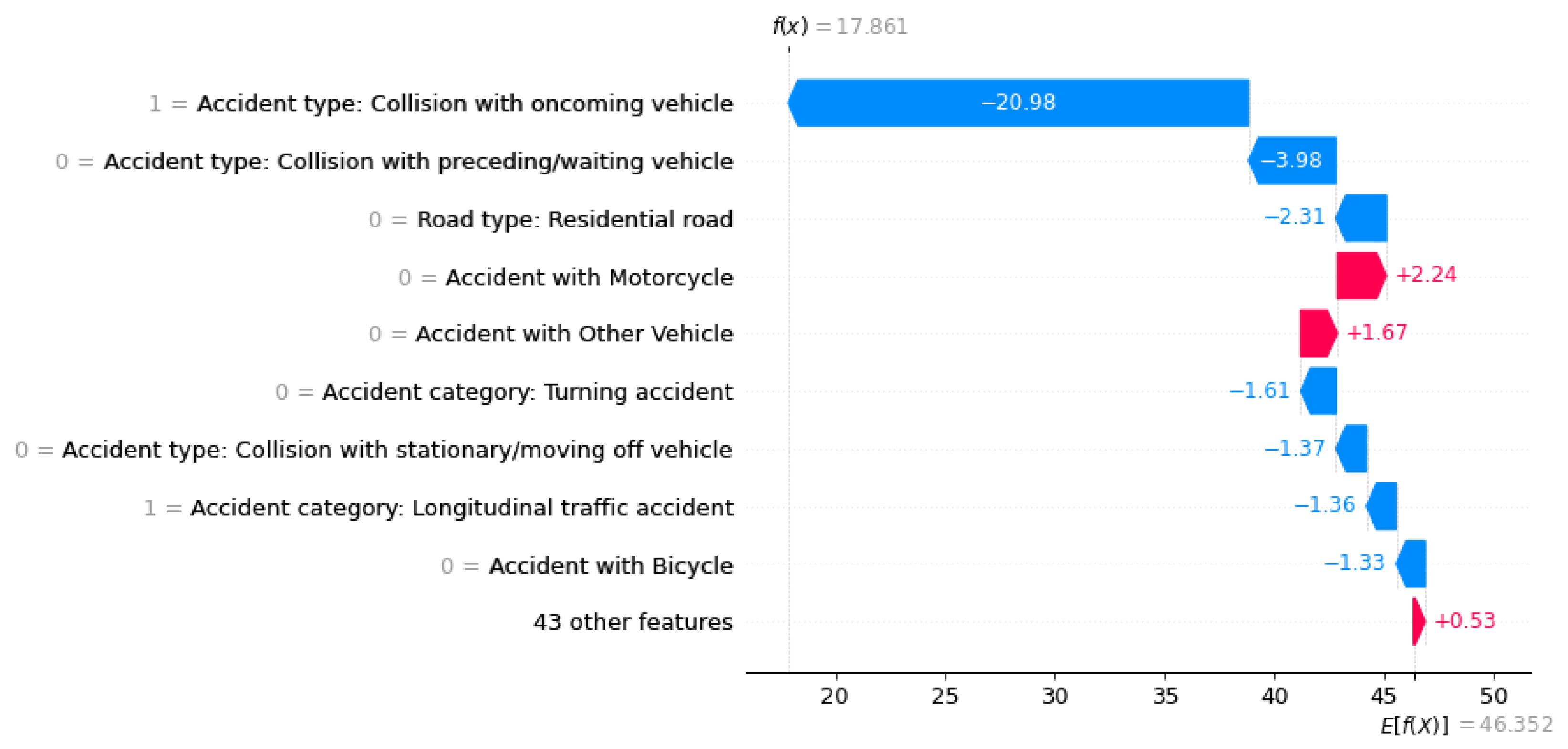
Figure 8.
Waterfall plot with logit values. This is before the processing step of adding the categorical features.
Figure 8.
Waterfall plot with logit values. This is before the processing step of adding the categorical features.
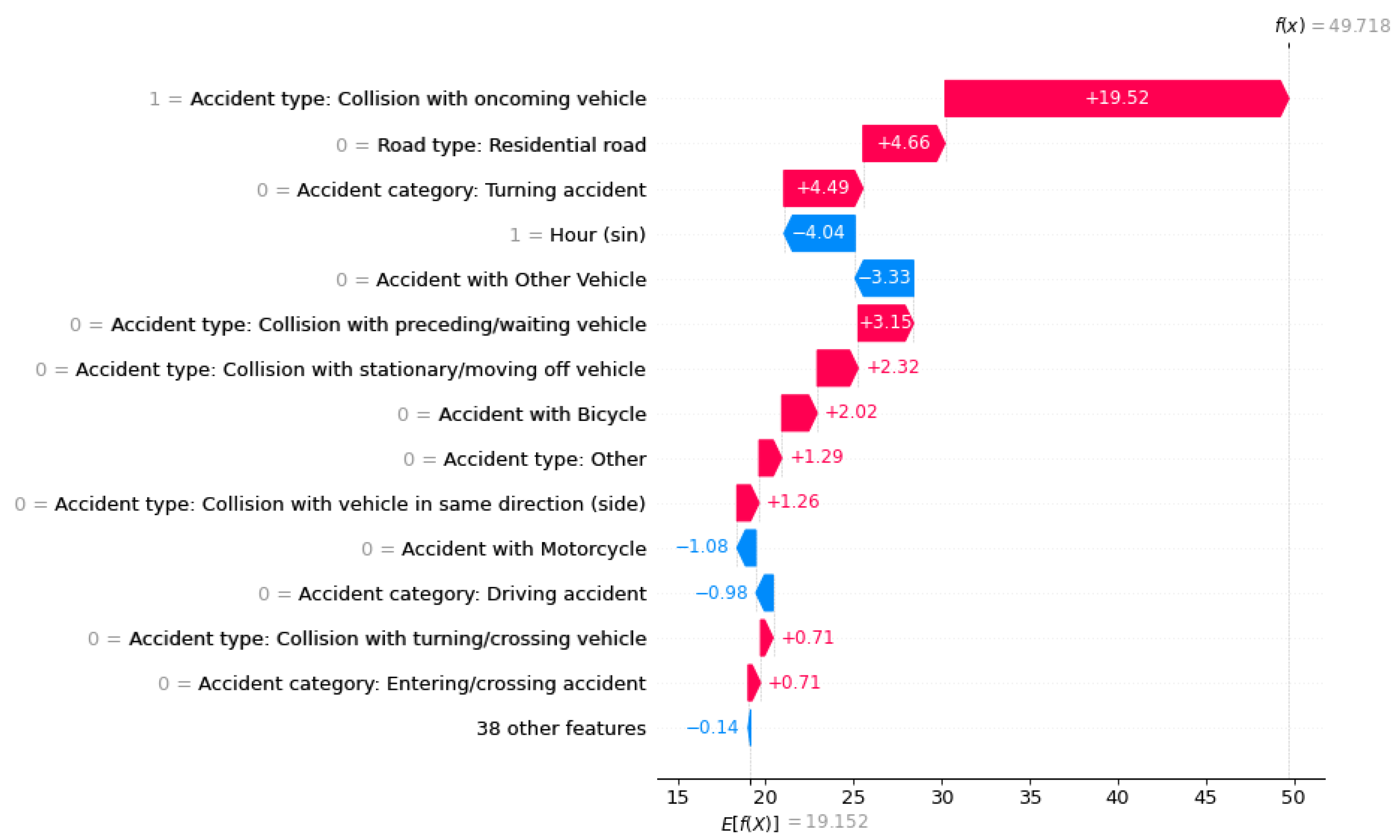
Figure 9.
Waterfall plot with logit values. This is after the processing step of adding the categorical features.
Figure 9.
Waterfall plot with logit values. This is after the processing step of adding the categorical features.
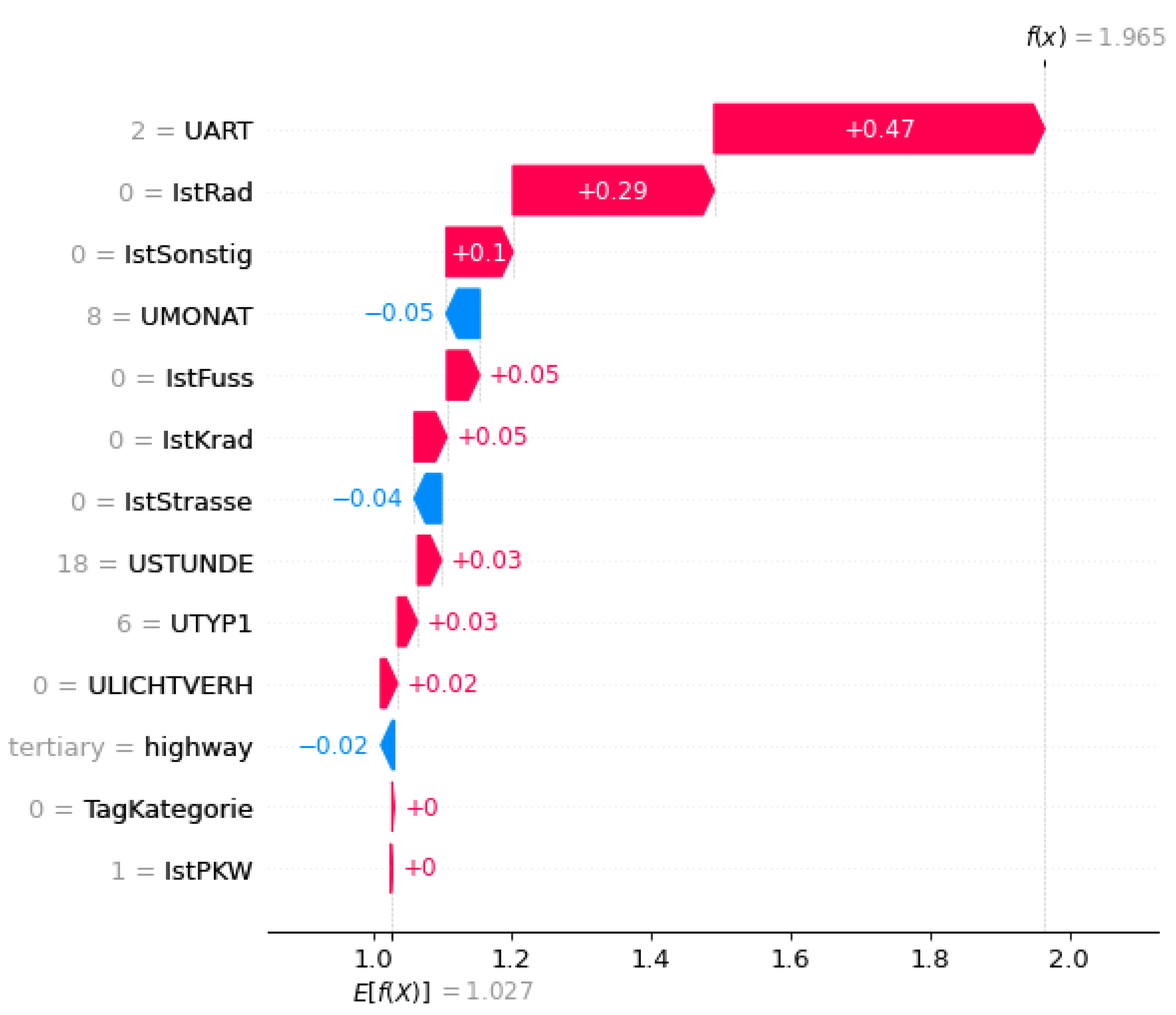
Figure 10.
The beeswarm plot considers factors that influence the prediction globally. ‘Persons killed’.
Figure 10.
The beeswarm plot considers factors that influence the prediction globally. ‘Persons killed’.
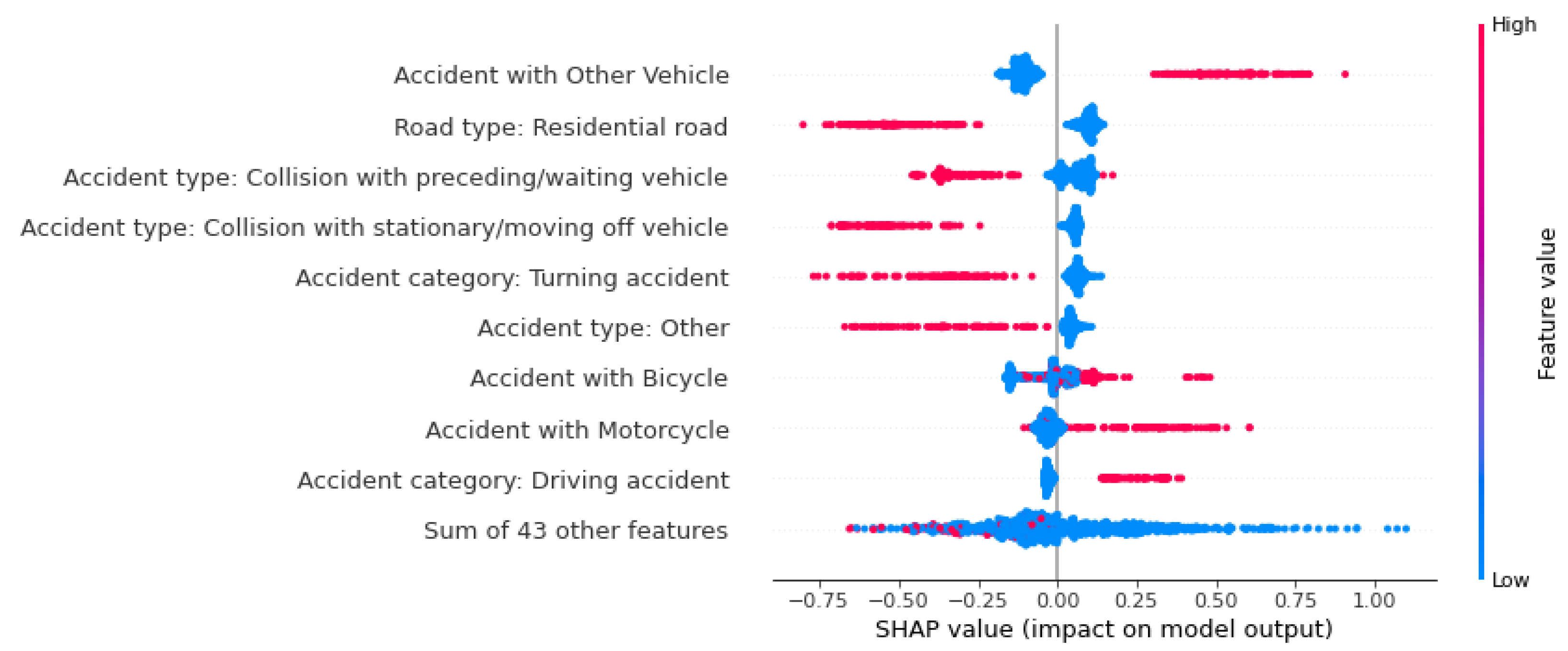
Figure 11.
The beeswarm plot considers factors that influence the prediction globally. ‘Persons seriously injured’.
Figure 11.
The beeswarm plot considers factors that influence the prediction globally. ‘Persons seriously injured’.
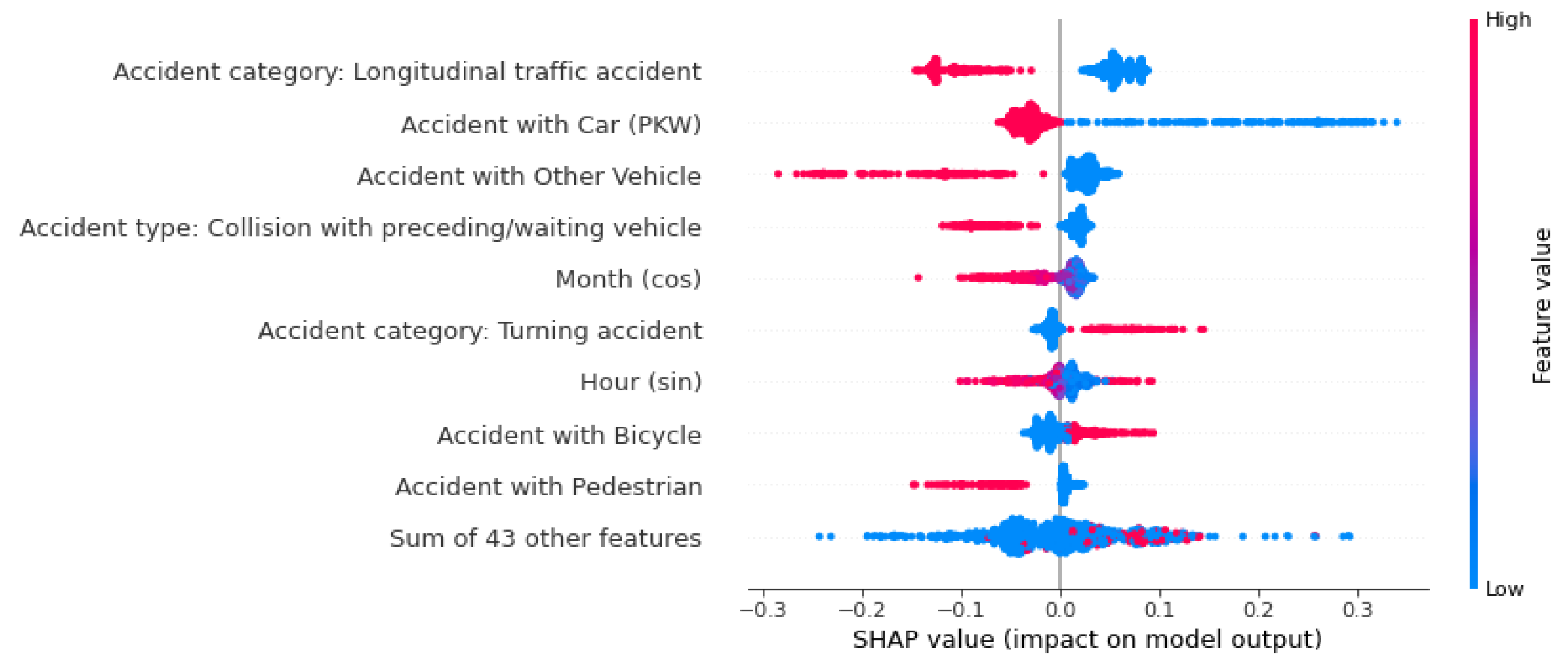
Figure 12.
The beeswarm plot considers factors that influence the prediction globally. ‘Persons slightly injured’.
Figure 12.
The beeswarm plot considers factors that influence the prediction globally. ‘Persons slightly injured’.
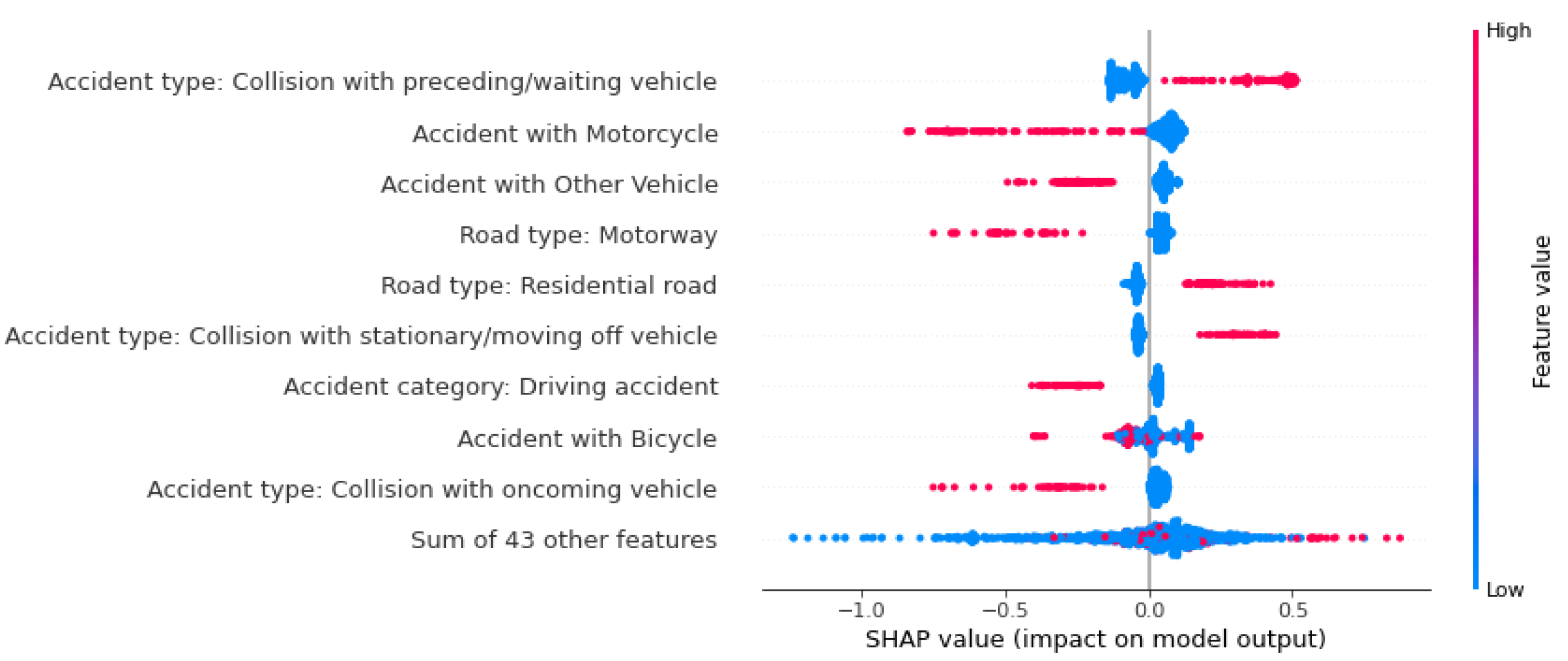
Figure 13.
We encountered difficulties in interpreting the influences on fatal accident prediction from a beeswarm plot after aggregating some features’ SHAP values.
Figure 13.
We encountered difficulties in interpreting the influences on fatal accident prediction from a beeswarm plot after aggregating some features’ SHAP values.
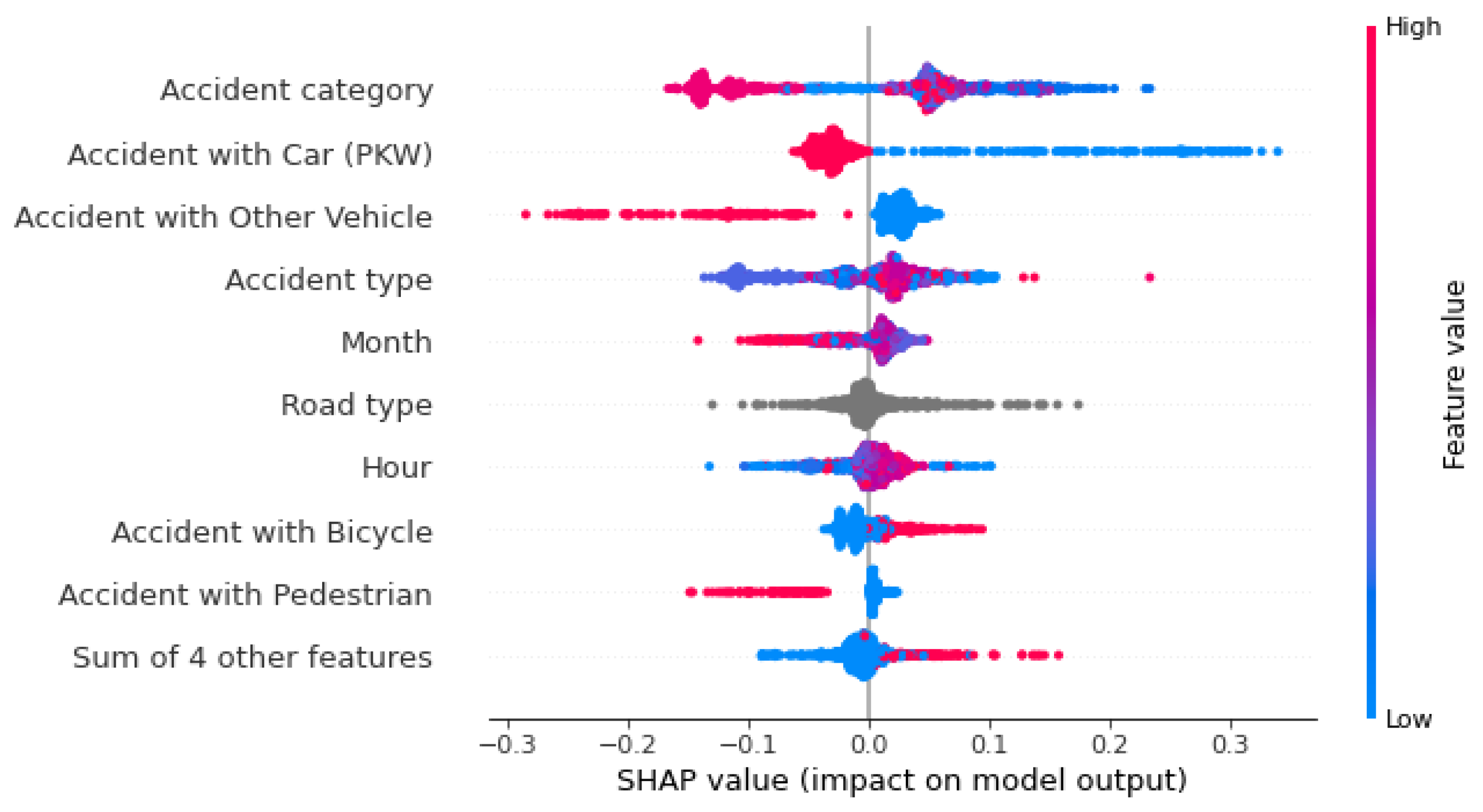
Figure 14.
A comparison of how the categories of the feature accident type influence the prediction probability of fatal accidents.
Figure 14.
A comparison of how the categories of the feature accident type influence the prediction probability of fatal accidents.
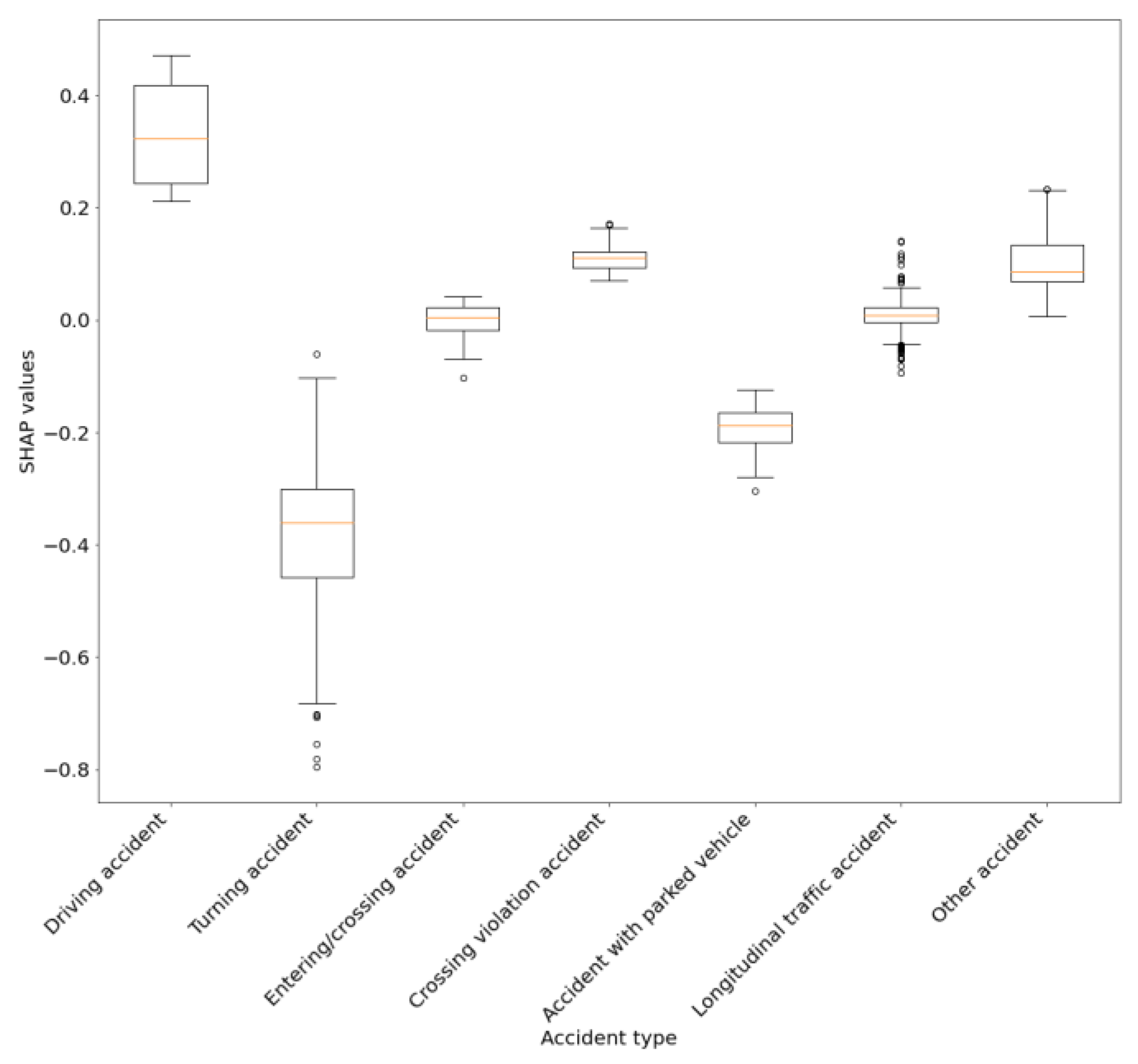
Figure 15.
Bar chart providing a simplified overview of the feature importance for accident severity prediction.
Figure 15.
Bar chart providing a simplified overview of the feature importance for accident severity prediction.
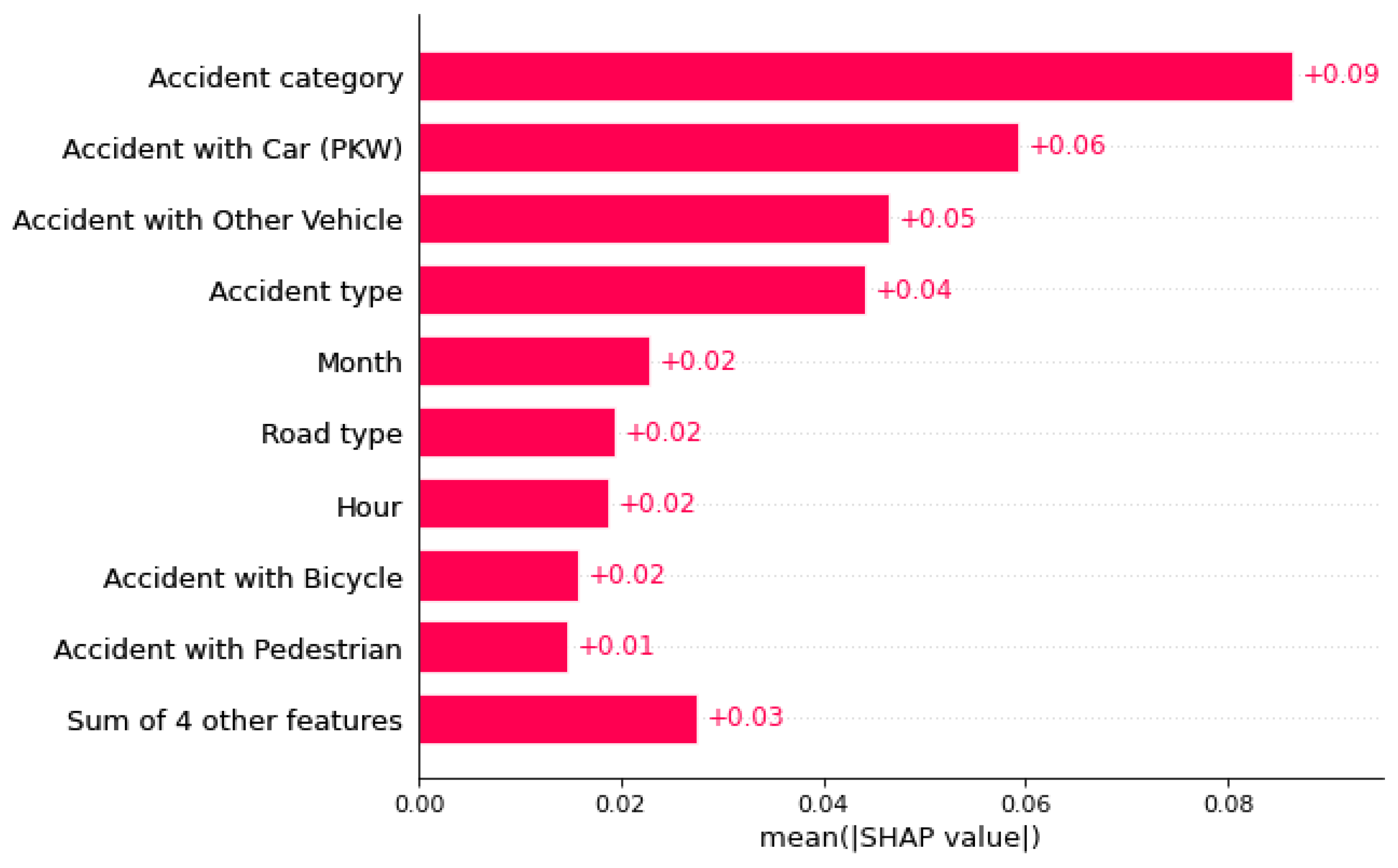
Figure 16.
Overview map in the web dashboard. Initially, the map shows the districts of Mainz. A collapsible menu enables users to filter the data.
Figure 16.
Overview map in the web dashboard. Initially, the map shows the districts of Mainz. A collapsible menu enables users to filter the data.
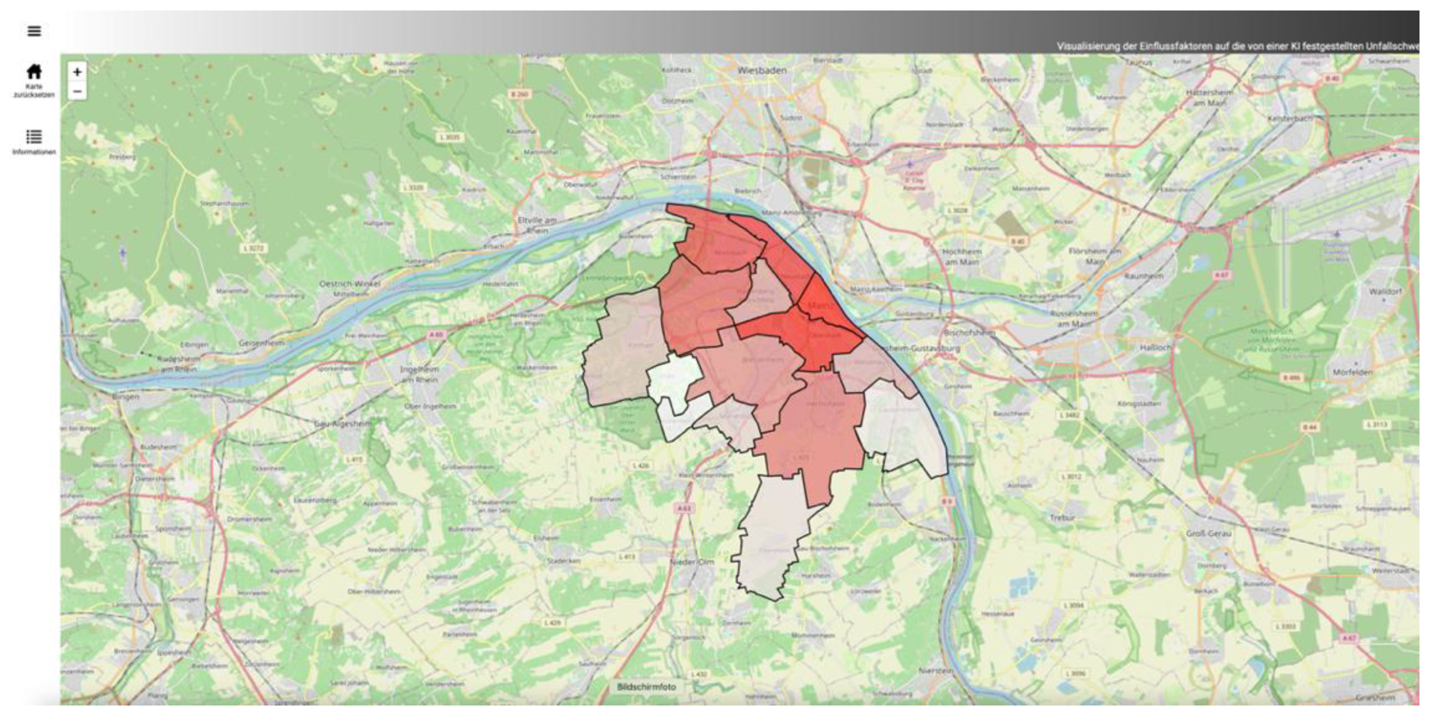
Figure 17.
The district overview summarizes all accidents in an area. In this case, it is the district ‘Neustadt’. In addition to the spatial distribution, you can view the error measures of the accidents in the district. Further navigation is possible using the interactive confusion matrix.
Figure 17.
The district overview summarizes all accidents in an area. In this case, it is the district ‘Neustadt’. In addition to the spatial distribution, you can view the error measures of the accidents in the district. Further navigation is possible using the interactive confusion matrix.
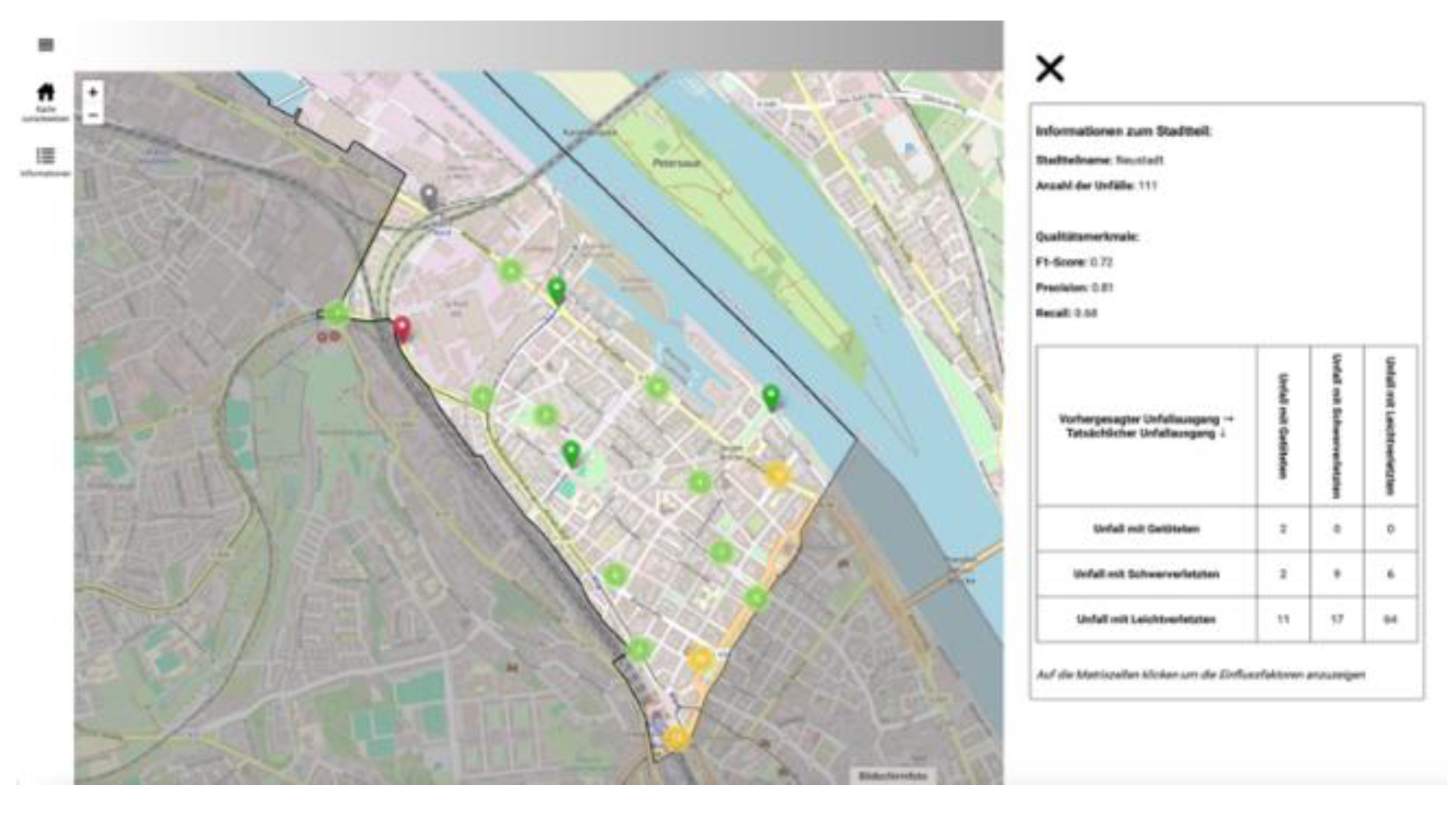
Figure 18.
This bar plot shows the influencing factors in the district ‘Neustadt’ that led the model to misclassify minor injury accidents as serious injury accidents.
Figure 18.
This bar plot shows the influencing factors in the district ‘Neustadt’ that led the model to misclassify minor injury accidents as serious injury accidents.
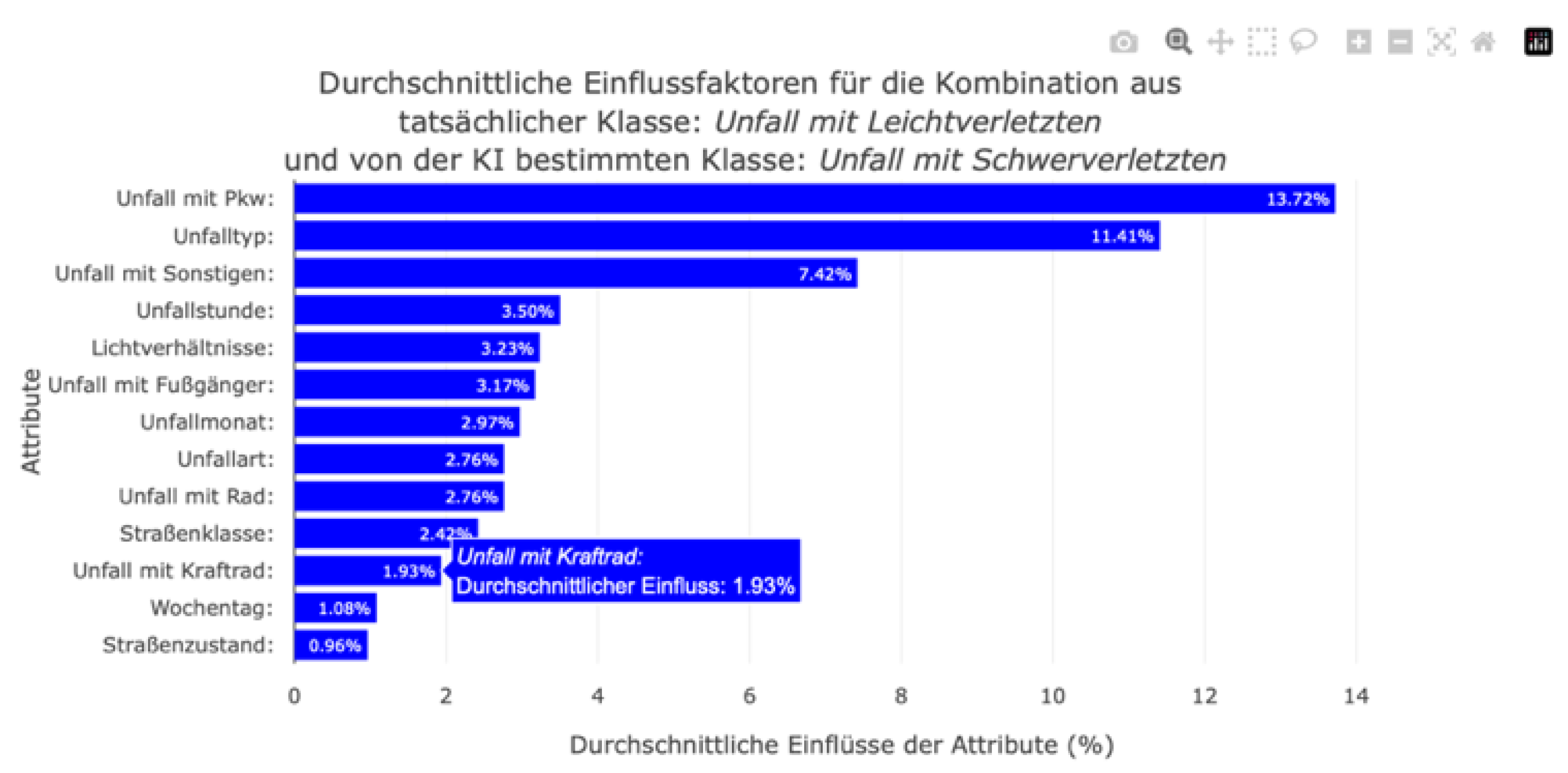
Figure 19.
A beeswarm plot visualizes the individual influencing factors in the district ‘Neustadt’, taking into account both the actual and predicted classes.
Figure 19.
A beeswarm plot visualizes the individual influencing factors in the district ‘Neustadt’, taking into account both the actual and predicted classes.
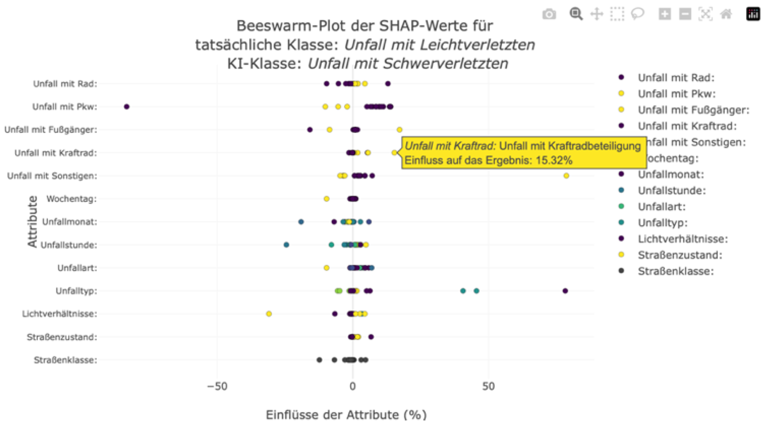
Figure 20.
Visualization of an accident using a map and an information window in the web dashboard.

Figure 21.
Waterfall plot in the web dashboard to visualize the local factors influencing the forecast: Persons seriously injured.
Figure 21.
Waterfall plot in the web dashboard to visualize the local factors influencing the forecast: Persons seriously injured.
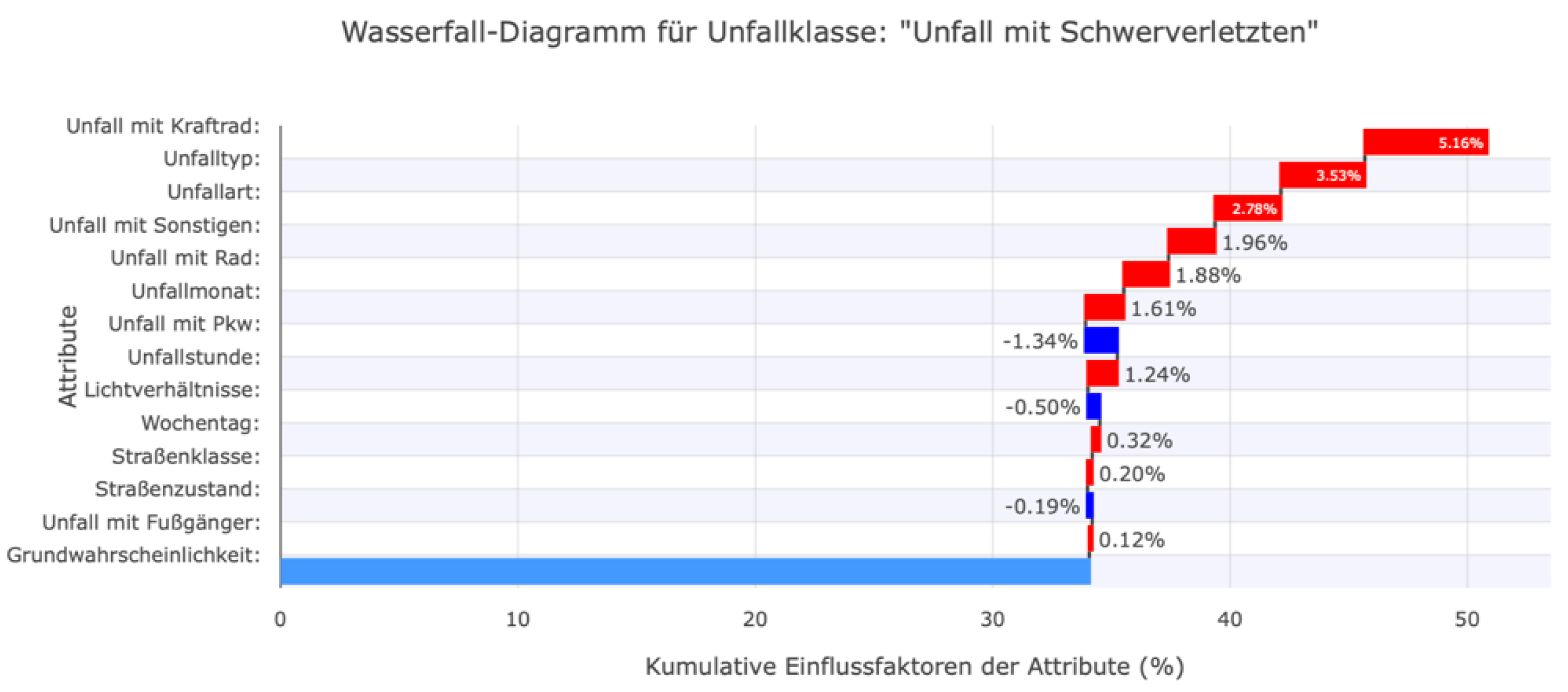
Figure 22.
Decision plot in the web dashboard to compare the factors influencing the accident classes.
Figure 22.
Decision plot in the web dashboard to compare the factors influencing the accident classes.

Table 1.
A list of features in a standardized format for accident data, as provided by statistical offices.
Table 1.
A list of features in a standardized format for accident data, as provided by statistical offices.
| Feature Name | Data type |
| Servity | categorical feature (1-3) |
| Accident with Bicycle | binary feature |
| Accident with Car (PKW) | binary feature |
| Accident with Pedestrian | binary feature |
| Accident with Motorcycle | binary feature |
| Accident with Other Vehicle | binary feature |
| Day of Week | categorical feature (1-7) |
| Month | categorical feature (1-12) |
| Hour | categorical feature (0-23) |
| Accident type | categorical feature (0-9) |
| Accident category | categorical feature (1-7) |
| Lighting condition | categorical feature (0-2) |
| Road condition | categorical feature (0-2) |
| Road type | categorical feature (1-11) |
Table 2.
Error measures of the MLP-NN and XGBoost models, with and without consideration of the sampling approach and additional road class.
Table 2.
Error measures of the MLP-NN and XGBoost models, with and without consideration of the sampling approach and additional road class.
| Classificator | Balanced data? | Include road class? | Accuracy | F1-Score | Recall | Precision |
| XGBoost | no | no | 85% | 30.6% | 33.2% | 28.4% |
| MLP-NN | no | no | 85% | 30.6% | 33.3% | 28.4% |
| XGBoost | yes | no | 63% | 36.4% | 58.9% | 38.3% |
| MLP-NN | yes | no | 64% | 37.5% | 59.9% | 39.7% |
| XGBoost | yes | yes | 65% | 37.2% | 59.6% | 38.7% |
| MLP-NN | yes | yes | 59% | 35.3% | 51.9% | 38.5% |
| 1 | https://www.openstreetmap.org (Last access: 10.05.2025) |
| 2 | https://github.com/shap/shap (last access: 10.05.2025) |
Disclaimer/Publisher’s Note: The statements, opinions and data contained in all publications are solely those of the individual author(s) and contributor(s) and not of MDPI and/or the editor(s). MDPI and/or the editor(s) disclaim responsibility for any injury to people or property resulting from any ideas, methods, instructions or products referred to in the content. |
© 2025 by the authors. Licensee MDPI, Basel, Switzerland. This article is an open access article distributed under the terms and conditions of the Creative Commons Attribution (CC BY) license (http://creativecommons.org/licenses/by/4.0/).
Copyright: This open access article is published under a Creative Commons CC BY 4.0 license, which permit the free download, distribution, and reuse, provided that the author and preprint are cited in any reuse.


