
Submitted:
21 April 2025
Posted:
23 April 2025
You are already at the latest version
Abstract
Purpose:
Color blindness can create challenges in recognizing visual cues, potentially affecting players' performance, emotional involvement, and overall gaming experience. This study examines the impact of color blindness on player engagement and emotional experience in digital games. The research aims to analyze how color-blind individuals engage with and emotionally respond to games, offering insights for more inclusive and accessible game design.
Methodology/Approach:
An experiment-based study was conducted using a between-group design with 8 color-blind and 8 non-color-blind participants (ages 18-30). The sample was carefully selected to ensure participants had similar levels of digital gaming experience and familiarity with digital games, reducing potential biases related to skill or prior exposure. A custom-designed game, "Color Quest," was developed to assess engagement and emotional response. Emotional responses were measured through Emotion AI analysis, video recordings, and self-reported feedback forms. Participants were also asked to rate their engagement and emotional experience on a 1-to-5 scale, with additional qualitative feedback collected for deeper insights.
Findings:
The results indicate that color-blind players generally reported lower engagement levels compared to non-color-blind players. Although quantitative data did not reveal a direct correlation between color blindness and visual experience, self-reported feedback suggests that color-related design choices negatively impact emotional involvement and player immersion. Furthermore, in the survey responses directed to participants, color-blind individuals rated their experiences lower compared to individuals with normal vision. Participants emphasized that certain visual elements created difficulties in gameplay, and alternative sensory cues, such as audio feedback, helped mitigate these challenges.
Originality/Value:
This study provides a rigorous experimental evaluation of color blindness in gaming, emphasizing the role of sensory adaptation in improving player engagement and emotional experience. The findings contribute to game accessibility research by offering concrete design recommendations for developers to create more inclusive and engaging gaming experiences for color-blind individuals.
Keywords:
color blindness
; digital games
; emotional experience
; game accessibility
; player engagement
1. Introduction
The way our brains process colors and visual stimuli in the environment plays a crucial role in shaping perception, behavior, and emotional responses. Research shows that emotional arousal enhances visual processing and memory, underlining the strong connection between color perception and cognitive-emotional functioning [1]. However, this process is not consistent across all individuals. Color vision deficiency (CVD), commonly known as color blindness (CB), affects how certain people perceive and interpret visual information, particularly in digital contexts. Predominantly affecting males, CB results in a limited ability to distinguish specific color ranges, often leading to visual misunderstandings. This can significantly impact experiences in color-dependent interfaces, such as digital games, where color is frequently used to convey critical information—e.g., identifying enemies, allies, or interactive targets. For individuals with CB, such design choices can reduce playability, cause confusion, and ultimately diminish engagement and enjoyment.
In competitive or multiplayer games, players with color blindness (CB) often face disadvantages that can affect both performance and overall engagement. Difficulties in interpreting color-coded elements—such as team indicators, status effects, or interactive objects—can hinder real-time decision-making and reduce the effectiveness of communication and collaboration in cooperative modes [2]. These limitations not only lead to gameplay challenges but may also result in emotional responses such as frustration or exclusion. Beyond functional aspects, color is frequently employed by game designers to evoke specific moods or reinforce artistic themes. When players with CB are unable to fully perceive these visual elements, their emotional connection to the game’s narrative and aesthetic intent may be diminished. Moreover, limited access to shared visual experiences can impede participation in community discussions about game environments and design, potentially fostering a sense of social isolation. These multifaceted challenges underline the importance of examining the intersection of color blindness and digital gaming experiences.
Although accessibility in digital games has received growing attention, the intersection between color blindness (CB) and digital gaming remains underexplored. A review of the existing literature reveals four dominant research strands: (1) the development of assistive technologies, (2) the formulation of design guidelines to enhance accessibility, (3) diagnostic or alternative detection tools for CB, and (4) performance-based assessments of user interaction. However, studies that holistically examine the gaming experience—particularly in terms of emotional and physical responses to CB-related visual limitations—are notably absent. Furthermore, while most research situates games as objects requiring increased accessibility, some have also explored their potential as platforms for testing and training users with visual impairments. A growing body of work considers the role of games in addressing accessibility challenges through inclusive design strategies. Yet, substantial gaps remain in understanding how CB specifically affects users’ affective engagement with game visuals. For instance, no research has systematically compared the emotional experiences of color-blind players with those of individuals with typical color vision when interacting with game environments.
To address the gaps identified in the literature, this study aims to explore how color blindness shapes the player engagement and emotional experience of individuals within digital gaming environments. Thus, the research investigates the emotional responses and the types of bonds that individuals with color blindness establish with digital games. A custom-designed game environment was developed to evaluate these dynamics through a controlled group study. The study is guided by the following research questions:
• How does color blindness influence the emotional experience of players in digital games?
• Does color blindness affect player engagement compared to individuals with normal vision?
Since color-blind individuals cannot perceive colors in the same way as people with normal vision, their engagement and overall experience with games may be diminished. This visual discrepancy is possibly weakening their connection to the gaming world, potentially reducing enjoyment and competitiveness. Thus, the hypothesis of this study is to examine the argument as follows:
“Color-blind individuals face significant disadvantages in the context of digital games compared to those with normal vision in terms of (1) engaging with the game world and (2) emotional experience.”
A group experiment was conducted to address the research questions and test the proposed hypothesis. In this experiment, participants included individuals with typical color vision and those with color blindness. Their emotional responses during gameplay were examined through facial expression analysis. In addition to emotional data, player performance was assessed using predefined in-game metrics. To complement the quantitative findings, a post-play feedback form was used to collect participants’ verbal reflections. This multi-method approach aimed to provide a holistic understanding of how color blindness influences emotional engagement and interaction within digital game environments.
The following section provides a comprehensive overview of color blindness and common methods used to assess it, offering essential background and context for the topics explored in the literature review. Next, an in-depth review and synthesis of existing studies on the relationship between color blindness and game experience is presented, with key findings and implications summarized. The third section outlines the research methodology, followed by the presentation and discussion of empirical results. The final section reflects on the overall findings and proposes directions for future research.
2. Background on Color Blindness in the Digital Gaming Landscape
2.1. Conceptual Background
Color vision deficiency, commonly referred to as color blindness, describes a condition in which individuals perceive colors differently from those with typical color vision. Human color perception is based on the activity of three types of cone photoreceptors in the retina—each sensitive to different wavelengths of light: long (L, red), medium (M, green), and short (S, blue). The brain interprets color based on the relative stimulation of these cones. The specific type of affected cone determines the nature of the color vision deficiency. Studies such as Sabesan et al. [3] have demonstrated how variations in cone responses contribute to the overall perception of color.
Color blindness can be classified into three main categories, each defined by the number and functionality of cone photoreceptors. The classification and associated prevalence data are drawn from the work of Futagbi et al. [4] and Meng et al. [5].
• Monochromatism: This rare condition is characterized by the absence of all cone types or the presence of only one type. Individuals with monochromatism perceive the world in shades of gray. (Estimated prevalence: 0.00003)
• Dichromatism: In this condition, only two types of cones are functional, while the third is entirely missing. Dichromatism includes:
- ◦
- Protanopia (absence of red cones) — 1.01% among males; 0.02% among females
- ◦
- Deuteranopia (absence of green cones) — 1.27% among males; 0.01% among females
- ◦
- Tritanopia (absence of blue cones) — approximately 0.0001% in the general population
• Anomalous Trichromatism: All three types of cones are present, but one has an altered spectral sensitivity. This results in a narrower or distorted perception of the color spectrum. Subtypes include:
- ◦
- Protanomaly — 1.08% among males; 0.03% among females
- ◦
- Deuteranomaly — 4.63% among males; 0.36% among females
- ◦
- Tritanomaly — approximately 0.0002% in the general population
Among these, red-green color blindness—encompassing protan and deutan types—is the most common, affecting approximately 1 in 12 males and 1 in 200 females. Although the term “red-green color deficiency” is widely used, it does not fully capture the nature of color blindness. All types of color vision deficiency impact the entire color spectrum to varying degrees, not just specific color pairs. A common misconception is that color blindness individuals see certain colors as gray or are entirely unable to perceive them. In reality, the condition is characterized by difficulty in distinguishing specific hues [6].
Video games have become a central component of contemporary digital culture, particularly with the growing accessibility of mobile platforms. In this context, ensuring accessibility for all players is crucial. However, color blindness individuals continue to face challenges in digital games, particularly due to color-dependent interfaces and feedback mechanisms [7]. These limitations can lead to increased perceived difficulty, reduced enjoyment, and structural accessibility barriers. While some developers have begun to implement accessibility features, more comprehensive design strategies are still needed to ensure inclusive gameplay experiences for color blindness individuals. Several key issues have been identified in the literature:
- Perceived Difficulty and Performance Limitations: Color-blind individuals often perceive gameplay as more challenging and feel that their performance is compromised, even when their actual in-game performance does not significantly differ from that of players with typical vision. This perception negatively affects engagement and overall enjoyment [8].
- Accessibility Barriers: Many games rely heavily on color for critical gameplay elements such as navigation, team indicators, or feedback. This dependence can create serious obstacles for color-blind players, preventing full participation [9].
- Inadequate Accessibility Features: A number of popular games still lack effective accessibility settings for color-blind players. For instance, Rust offers no accessibility features at all, while games like Valorant and League of Legends provide only partial support. These limitations can lead to confusion, misinterpretation of visual information, and gameplay errors [10].
- Challenges in Game Design: Designing games that are chromatically accessible remains a challenge due to the limited availability of color-blind test users and the lack of early-stage evaluation tools in the design process. As a result, many games are released without adequate consideration for the needs of color blindness individuals [11].
2.2. Previous Studies at the Intersection of Color Blindness and Game Design and Gaps Filled by This Study
A comprehensive literature search was conducted to investigate the connection between color blindness and visual experiences in digital games. The initial review revealed a notable gap in studies specifically addressing game visualization for color blindness individuals. To expand the search scope, additional keywords such as digital visualization and user experience were incorporated. This iterative process helped refine the keyword set, eventually including terms such as color vision deficiency, visual impairments, game interactions, accessibility in games, gaming experience, and game art/visualization. Searches were conducted across major academic databases including Scopus, Web of Science, and ACM Digital Library. Approximately one hundred relevant texts were reviewed. Following an initial screening process, many studies were excluded due to their focus on unrelated domains such as health care or education. Ultimately, fifteen highly relevant sources were selected for detailed analysis. Four of these were subsequently excluded due to their technical orientation toward engineering and numerical simulations, which did not directly contribute to user experience in digital games.
The remaining eleven studies were carefully examined based on their research focus, methodological approach, and key findings. Given the limited number of publications directly addressing the intersection of color blindness and game visualization, the review did not restrict itself to a specific subtype of color blindness. Instead, it considered a diverse body of literature offering insight into how color perception challenges affect visual interaction in gaming environments. These selected works provide a valuable foundation for advancing accessibility and design inclusivity in game development. The reviewed literature reveals four dominant research strands addressing the intersection of color blindness and digital gaming:
- Diagnostic Tools and Detection Methods: Several studies have focused on developing diagnostic systems or alternative methods for detecting color blindness, particularly in digital contexts. For instance, Nguyen et al. [12], develop a game, called as Dodo, to be used as a practical tool for screening color vision in children. Its user-friendly approach makes it a preferred option for early detection of color blindness.
- Assistive Technologies for Accessibility: Research aimed at creating or enhancing technological tools to support color blindness individuals in overcoming accessibility challenges in digital environments [13]. For example, Hauge et al.[14] focused on improving accessibility in educational games within STEM fields, especially for players with visual impairments. Molina-Lopez and Medina-Medina [15] proposed 12 interaction design proto-patterns to address the difficulties faced by color-blind individuals, offering practical recommendations for inclusive game interaction.
- Evaluation of Existing Technologies and Games: Some studies have evaluated the accessibility and effectiveness of technologies or digital games specifically designed or adapted for color-blind users[16]. Plothe [17] analyzed the development of the game Hue, offering a framework for accessible game design based on universal design principles. Similarly, Paiva et al. [18] assessed the usability of the color blindness filter in Windows 10, focusing on its impact on user experience.
- Studies for Awareness and Empathy-Oriented Designs: A smaller but growing body of work explores how digital games can foster awareness and empathy regarding color blindness through immersive experiences [19]. For instance, Reinaldo et al. [20] introduced Color in Life, an educational game designed for players with dichromatic vision, which was shown to increase knowledge and awareness of color blindness. Yu [21] also employed interactive storytelling and digital game art to promote understanding and inclusivity. Both studies highlight the potential of games as powerful tools for raising awareness about color-blindness.
Despite the diversity of approaches, no existing study was found to address whether color blindness leads to measurable differences in emotional or physical responses during gameplay when compared to individuals with typical color vision. Given this gap, the present study was designed to explore these aspects through an experimental setup involving participants with varying vision abilities. By analyzing facial expressions (e.g., neutral, happiness) and verbal feedback after game interaction, this research aims to capture emotional dimensions of the gameplay experience for color blindness individuals.
3. Methodology
This study employed a multi-phase research design to investigate how color blindness influences emotional experience and player engagement in digital games (Figure 1). The methodological framework was structured in three sequential stages:
(1) a literature review to identify conceptual gaps in the field and formulate research questions focused on perceptual accessibility and affective engagement;
(2) conducting the experiment, which involved the recruitment of participants and the development of a custom digital game environment ("Color Quest") designed to isolate the influence of color vision on emotional and behavioral responses;
(3) a mixed-method data analysis, combining Emotion AI, structured surveys, and gameplay screen recordings to examine player emotions, attention levels, and in-game behaviors such as error frequency, completion time, and island preference.
This integrative methodology enabled both quantitative and qualitative insights, and allowed for triangulation across emotional, attentional, and behavioral dimensions—offering a robust understanding of how color vision shapes gameplay engagement and affective response.
The following subsections detail each methodological stage.
3.1. Literature Review
A state-of-the-art critical review was performed to examine the intersection between color blindness and digital gaming experiences. The findings revealed a significant gap in the literature, particularly in assessing the impact of color blindness on player engagement and emotional experience in digital games (See Section 2.2).
3.2. Conducting the Experiment
To address this gap, an experimental study was conducted to evaluate the impact of color blindness on player engagement and emotional experience in digital games. The study involved 16 participants: eight with color blindness (CB), forming the experimental group, and eight with normal vision (NV), forming the control group.
3.2.1. Participant Profile and Sampling Strategy
Participants were selected using a snowball sampling method due to the difficulty of accessing individuals with specific types of color vision deficiency who also met the selection criteria. As a result, the sample size remained limited, but care was taken to ensure group comparability. All participants were adults aged 18–33, with at least undergraduate-level education and moderate digital literacy. Selection criteria included shared characteristics such as familiarity with digital technologies, comparable gaming experience, and similar weekly gameplay habits. Participants’ gaming preferences—such as frequently played genres and preferred platforms—were reviewed to ensure consistency between the groups and to reduce the influence of external variables.
3.2.2. Experimental Setup: Designing the Game-Based Environment
To further minimize potential bias and strengthen data reliability, a custom-designed game was developed with simplified and repetitive mechanics. This structure aimed to reduce the impact of prior gaming skills and isolate the role of color perception in shaping emotional and behavioral responses during gameplay.
To assess the visual game experiences of colorblind individuals, a digital game titled Color Quest was developed for this study. The main objective was to isolate the impact of color vision on gameplay performance, emotional engagement, and user interaction, while controlling for all other variables. The game design process followed a three-stage structure. In the first stage, the target participant profile was analyzed, and design principles—along with core game mechanics—were defined accordingly. In the second stage, the game mechanics were implemented and iteratively adapted to align with the needs and abilities of the identified player profile. In the final stage, the game was tested through pilot sessions to identify potential bugs and design inconsistencies. Based on these findings, necessary revisions were made to ensure a smooth and consistent gameplay experience for all participants (Figure 2).
To ensure that the effects observed in this study stemmed primarily from color perception rather than differences in player skill or gameplay familiarity, Color Quest was carefully structured around a standardized and repetitive format. The game was built on three islands, each designed to evoke distinct emotional responses through carefully selected color palettes and visual cues. The “Scary Shadow” island featured deep reds and dark tones to elicit feelings of tension and fear; the “Joyful Prism” island used vibrant pink and purple hues to communicate excitement and playfulness; and the “Calming Spectrum” island employed soft greens to induce a sense of relaxation and tranquility (Figure 3).
This emotional design strategy aligns with previous research showing that chromatic intensity, brightness, and saturation can significantly shape players’ emotional perception during gameplay [22]. While the islands varied thematically, the game mechanics remained consistent—each included three levels (puzzle, runner, and object-catching), and standardized visual elements and object types were used to ensure comparability. Character design was also unified across islands to support clarity and accessibility for all players.
The game mechanics were deliberately simplified to reduce the influence of prior gaming experience. To improve accessibility, visual assistive features such as shape-based cues, contrast enhancements, and patterned overlays were integrated. The color palette followed accessibility guidelines to support various types of color vision deficiency while maintaining visual appeal (Figure 4).
To incorporate player agency, optional paths and flexible progression routes were included. This allowed players to explore islands in varying sequences, offering valuable data on color-based preferences and visual decision-making. The storyline centers around a toy rabbit left behind after its owner grows older. Seeking purpose, the rabbit journeys through three magical islands to find and return misplaced creatures. In the final act, the rabbit reunites them with their original homes.
To strengthen emotional engagement, narrative elements were reinforced with real-time feedback mechanisms, including animations and sound effects. These features aimed to deepen immersion and create an emotionally rich gaming experience.
3.3. Data Analysis
A mixed-method data analysis strategy was adopted to examine how color blindness affects players’ emotional experience and engagement in digital games. This approach combined three complementary sources of data:
(1) Emotion AI analysis of facial expressions captured during gameplay;
(2) Post-game surveys designed to collect both quantitative and qualitative reflections on player experience;
(3) Screen recordings used to extract behavioral engagement metrics such as task completion time, error frequency, and level selection order.
This multi-modal design enabled a comprehensive evaluation of how colorblind and non-colorblind players interact with visual game content—both affectively and behaviorally—across varied gameplay conditions.
3.3.1. Emotion AI Analysis
Participants’ facial expressions were recorded during gameplay and analyzed using MorphCast Emotion AI, a browser-based tool that detects real-time emotional states using facial landmarks and machine learning (Figure 5). Each level-specific video was trimmed and uploaded to the system, allowing second-by-second tracking of emotional changes and engagement.
The exported data (CSV format) was organized and visualized using Power BI. These graphs form the empirical basis for the findings presented in the next section.
3.3.2. Survey
After playing the game, participants were asked to complete a structured feedback form designed to capture a range of experiential data. Emotional responses to each level were assessed using a 1–5 Likert scale across ten predefined emotions such as happiness, nervousness, and fear. In addition to these quantitative items, the form included open-ended sections in which participants were encouraged to describe specific episodes or moments from the game using keywords or short sentences. Finally, participants were asked to reflect on the overall role of color and visual elements in shaping their gameplay experience, including how significant these aspects were to their sense of engagement.
3.3.3. Screen Recording
To support the analysis of player engagement, this subsection incorporates behavioral data extracted from gameplay screen recordings. The metrics include:
Task Completion Time: How long participants took to complete each game level
Error Frequency: The number of incorrect interactions (e.g., misclicks or failed attempts)
Level Preference Patterns: The sequence in which players chose to explore the three game islands.
These indicators were not collected to evaluate performance per se, as performance assessment is not the central focus of this study. Rather, they were included to enrich the understanding of player engagement, particularly in terms of how players interact with game elements under varying visual conditions. For example, prolonged completion times or elevated error counts may suggest hesitation or visual uncertainty, while consistent level selection patterns may reflect player preference or perceptual ease. Thus, these behavioral metrics offer a complementary perspective to the player engagement measures presented in earlier sections.
4. Results
This section presents the empirical findings of the study and discusses their implications with respect to the research questions. Using a multimethod approach, the analysis integrates facial emotion recognition data (Emotion AI), structured post-game survey responses, and behavioral performance metrics obtained from screen recordings. Results are organized thematically around two primary dimensions: emotional experience and player engagement, both of which are examined through the lens of color vision differences between colorblind (CB) and normal vision (NV) players.
4.1. Facial Emotion Recognition Results
4.1.1. Emotion Distribution
Player emotion responses were analyzed using data obtained from the MorphCast Emotion AI application. Six core emotions were measured—angry, disgust, fear, happy, sad, and surprise—on a scale from 0 to 100. Bar charts were generated to present average emotion scores for each game level: Calming Spectrum, Joyful Prism, and Scary Shadow (Figure 6). The results showed that NV (normal vision) players exhibited higher emotional response in Calming Spectrum, while CB (colorblind) players were more reactive in Joyful Prism and Scary Shadow.
In addition to these emotions, the MorphCast tool also calculated neutral states—moments when players showed no strong emotional expression. Figure 7 compares the average neutral and non-neutral scores of NV and CB groups across the three game levels. In Calming Spectrum, NV players showed a higher degree of neutrality, whereas CB players had more emotionally expressive gameplay. A similar pattern was observed in Joyful Prism and Scary Shadow, with CB participants displaying lower neutrality and greater emotional variability compared to NV players.
To further assess emotional engagement, the ratio of non-neutral responses to neutral states was calculated (Figure 8). In all three levels, CB players consistently demonstrated higher non-neutral response rates than NV players. This indicates that colorblind individuals, despite their visual limitations, engaged emotionally with the game content to a greater extent than their counterparts with normal vision.
Variance analysis was also conducted to evaluate the consistency of emotional responses (Figure 9). The CB group showed higher variance across all emotions, suggesting a wider range of emotional reactions during gameplay. In contrast, NV players exhibited more consistent and predictable responses. These findings imply that colorblind players may experience gameplay in a more emotionally dynamic way, possibly due to increased sensitivity to non-visual elements or compensatory cognitive mechanisms.
Finally, individual emotion scores were compared between groups. CB players scored higher on anger and happiness, while NV players showed relatively stronger responses in disgust and sadness (Figure 10). These patterns suggest that color vision status can influence the intensity and nature of emotional experiences in gameplay, highlighting the importance of inclusive game design strategies that consider diverse perceptual profiles.
To evaluate whether emotional responses differed significantly between colorblind (CB) and normal vision (NV) participants, an independent-samples t-test was conducted. The test yielded a t-value of 0.013 and a p-value of 0.9897, which is well above the conventional significance threshold of 0.05. These results indicate that there is no statistically significant difference in emotional response distributions between the two groups. (Table 1).
Although CB players showed slightly higher non-neutral response ratios and greater emotional variance in descriptive analyses, these differences were not statistically supported. In other words, the average emotional intensity levels and emotional reaction types remained comparable between CB and NV players across all game scenarios.
4.1.2. Wish over Time
The “Wish” metric, derived from Emotion AI, captures the player’s level of desire and emotional engagement throughout the game. It is tracked over time based on facial expression dynamics and subtle mood variations, enabling real-time observation of affective engagement (Figure 11).
In Calming Spectrum, CB participants exhibited higher average Wish scores than NV participants, suggesting stronger emotional involvement in peaceful and visually soft environments. A similar trend was observed in Joyful Prism, where CB players again scored higher. These patterns indicate that visual limitations did not hinder emotional responsiveness for colorblind players in calm or vibrant contexts. Conversely, in Scary Shadow, NV players recorded slightly higher Wish scores than CB participants (Figure 12). This may reflect greater sensitivity to fear-inducing visual elements—such as contrast, shadow, and color sharpness—among players with normal vision.
Overall, these findings suggest that color perception differences shape not only visual accessibility but also the emotional resonance of game environments. CB participants appeared more emotionally responsive to narrative and environmental qualities in non-threatening contexts, while NV players were more reactive in high-arousal scenarios. These insights underline the need for affect-aware and perceptually inclusive game design, particularly in multimodal settings where visual and emotional accessibility must be balanced.
4.1.3. Engagement over Time
Player engagement over time was analyzed based on two key Emotion AI metrics: Attention and Positivity. Attention, represented by the cyan line in the visualizations, indicates the level of player focus on the game content, while Positivity, shown as a yellow line, tracks the degree of positive emotional response (Figure 13). These metrics were continuously recorded throughout gameplay to evaluate how players responded to different environments. The vertical axis in the visualization represents the percentage of active emotional response (0–100%), while the horizontal axis shows the timeline of gameplay.
For the Attention metric, NV (normal vision) participants consistently scored higher across all game sections. This suggests that the visual design elements—particularly the use of vibrant and high-contrast colors—were more effective in maintaining focus for players with full color perception. The enhanced visual clarity and richness of the color palette likely helped sustain NV players’ engagement.
However, a notable exception was observed in the Joyful Prism section, where CB (colorblind) participants achieved their highest attention scores (Figure 14). This section features dominant pink and purple tones, which are typically more distinguishable for individuals with color vision deficiencies. This indicates that certain color choices can significantly improve visual accessibility and attention levels for colorblind players, reinforcing the need to consider perceptual diversity in color schemes.
Regarding the Positivity metric, both groups responded strongly to joyful and immersive content, but the patterns varied (Figure 15). NV participants showed their highest positivity in Joyful Prism, as expected, due to its vibrant and emotionally uplifting atmosphere. Meanwhile, CB participants exhibited peak positivity in the Scary Shadow level. One possible explanation is that darker, high-arousal scenes may appear less visually intense or threatening for colorblind individuals, resulting in more neutral or even positively coded emotional responses. These observations point to the complex and sometimes counterintuitive ways color perception can shape affective engagement.
Together, these findings emphasize the importance of perceptually inclusive design. By optimizing color schemes and narrative intensity for different user groups, developers can foster more sustained and emotionally resonant engagement across diverse player profiles.
4.2. Survey Results
To complement the Emotion AI findings, participants were asked to evaluate their gameplay experiences through structured survey responses. Each game section was rated separately on a 1–5 Likert scale, and average scores were calculated by player type (Figure 16). Players with normal vision (NV) reported higher levels of emotional intensity overall, with an average rating of 3.09 out of 5. In contrast, colorblind (CB) participants provided more neutral ratings, indicating lower emotional engagement (2.64 out of 5) with the game content. These findings are consistent with previous attention and wish metrics, emphasizing how visual design directly impacts emotional experience and engagement.
The t value obtained as a result of the t-test is -3.01. This indicates that the mean scores between groups are different. The p-value is 0.00278, which is less than the significance level (usually α = 0.05). Therefore, the null hypothesis is rejected and a statistically significant difference between groups is considered. This shows that the colorblind group scored lower on average compared to the group with normal vision (Table 2). The 95% confidence interval is between (-0.74, -0.16). This indicates that the mean score of the colorblind group was statistically significantly lower than that of the group with normal vision.
Section-specific scores echoed these trends (Figure 17). NV participants consistently gave higher ratings across Calming Spectrum, Joyful Prism, and Scary Shadow levels, supporting the view that color access plays a significant role in shaping emotional responses and maintaining engagement.
A categorical analysis of satisfaction levels also revealed clear differences between the groups. Among participants with normal vision (NV), 50% described themselves as “very engaged,” 25% selected “connected,” and the remaining 25% reported a “neutral” experience. In contrast, 62.5% of colorblind (CB) participants indicated neutral satisfaction. Notably, none of the CB participants selected “very engaged,” and only one participant (12.5%) described their experience as “engaged.” These results suggest that colorblind players may encounter difficulties in emotionally engaging with the game, likely due to challenges in interpreting color-dependent visual elements.
Participants also rated ten core emotions after each game section. In Calming Spectrum, CB players reported higher levels of disgust and nervousness than NV participants (Figure 18), suggesting that the intended calming effect may not have translated effectively for colorblind players. In Joyful Prism, CB participants experienced heightened curiosity and nervousness, possibly due to visually stimulating but perceptually ambiguous color use. In Scary Shadow, CB participants again showed higher disgust, which may reflect emotional discomfort stemming from difficulties in interpreting high-contrast visual scenes.
Overall, these results underscore how emotional experience and engagement are shaped not just by narrative or mechanics, but also by how visual elements are perceived. Inclusive game design must consider the emotional impact of visual accessibility to ensure a consistent and engaging experience for all player types.
4.3. Screen Recording: Player Engagement-Oriented Performance Indicators
To complement the findings regarding player engagement, this section analyzes behavioral indicators that reflect players' level of engagement during gameplay. These include task completion time, error frequency, and level preference patterns. While not direct measures of emotional experience, these metrics provide insight into how players interact with and respond to game mechanics over time.
4.3.1. Completion Time
Completion time was examined as a behavioral marker of sustained engagement and task fluency. Participants with normal vision (NV) completed the game more quickly on average (248 seconds) than colorblind (CB) participants (275 seconds) (Figure 19). This difference suggests that NV players more efficiently processed visual cues and navigated tasks, supporting smoother engagement flow. Although completion time alone does not fully define engagement, longer durations may indicate increased cognitive load and attentional fragmentation, particularly for players facing visual accessibility challenges.
4.3.2. >Number of Mistakes
Mistake frequency was analyzed as another engagement-related metric. On average, CB participants made more errors (9.4) compared to NV participants (7.6) (Figure 20). These higher error rates may reflect difficulties in recognizing color-dependent visual elements, potentially disrupting attention and diminishing interaction fluency. While mistakes do not necessarily indicate lower engagement, they may point to elevated cognitive effort and decreased task confidence—factors that can detract from an immersive gameplay experience.
4.3.3. Round Preference
To assess voluntary engagement behavior, players were allowed to choose the order in which they played the three levels. Comparison of round-by-round choices revealed distinct trends between CB and NV groups (Figure 21). In the first round, NV players predominantly selected Calming Spectrum (62.5%), suggesting a clear initial preference for visually accessible and emotionally neutral environments. CB players’ preferences were more evenly distributed, indicating less certainty or immediate visual comfort in their initial selection.
In the second round, both groups shifted toward Scary Shadow, though this was more pronounced among CB players (62.5%), possibly reflecting delayed curiosity or increased attentional engagement. By the third round, both groups gravitated toward Joyful Prism, with CB participants showing the highest preference (62.5%). This progression suggests that while NV players exhibited more stable engagement from the outset, CB players’ involvement developed more gradually, influenced by their visual interaction with the environment.
Together, these behavioral indicators reinforce prior findings and emphasize that visual accessibility plays a critical role in shaping how players engage with digital game environments. Performance-based data adds depth to the understanding of player engagement, revealing not only what players feel—but also how they act.
5. Discussion
This section discusses the key findings of the study in relation to the research questions set out in the introduction section: (1) How does color blindness influence the emotional experience of players in digital games? and (2) Does color blindness affect player engagement compared to individuals with normal vision? Drawing on multimodal data—including Emotion AI, survey results, and screen-based behavioral metrics—this section interprets the results to reveal how color perception differences impact emotional and attentional processes in gameplay.
5.1. Emotional Experience
The emotional experience of players with color blindness (CB) diverged in nuanced ways from that of players with normal vision (NV). Emotion AI results indicated that CB participants exhibited more frequent non-neutral expressions and greater emotional variance across game levels. Although t-tests showed no statistically significant difference in overall emotion intensity scores, the descriptive data revealed that CB players experienced emotions such as happiness and anger more frequently, particularly in emotionally charged scenes like "Scary Shadow" and "Joyful Prism." In contrast, NV players exhibited more consistent patterns, often dominated by emotions like sadness and disgust.
These findings were reinforced by survey results. NV players rated their emotional experiences more intensely across all levels, with a statistically significant difference in average scores (see Table 2). CB participants provided more neutral ratings and reported lower emotional resonance, potentially due to limitations in interpreting visual cues designed around normative color vision. These results suggest that color perception directly impacts not only the recognition of visual stimuli but also the depth of emotional response they evoke.
Interestingly, the "Wish" metric—representing players' ongoing emotional desire and engagement—showed higher average scores for CB players in non-threatening levels like "Calming Spectrum" and "Joyful Prism," while NV players peaked in "Scary Shadow." This contrast suggests that CB players may feel more emotionally connected to environments where visual ambiguity does not trigger uncertainty or stress. Altogether, the data indicate that while color blindness may not universally diminish emotional response, it reshapes its intensity and distribution across different emotional contexts.
5.2. Player Engagement
The study also found perceptible differences in player engagement between CB and NV groups. Emotion AI’s Attention scores showed that NV players consistently exhibited higher attentional focus across all levels, supporting the argument that high-contrast and diverse color use can sustain visual engagement more effectively for individuals with full-spectrum color perception. However, the notable exception in "Joyful Prism," where CB players recorded their highest Attention scores, emphasizes that certain color palettes (e.g., pink and purple) may be more accessible and engaging for colorblind users.
Survey responses further supported these insights: while 50% of NV participants reported feeling "very engaged," only 12.5% of CB players described their experience as "engaged," with the majority indicating a neutral level of involvement. These differences underscore how limitations in color perception may reduce the sense of immersion or connectedness players feel during gameplay.
Behavioral metrics derived from screen recordings added depth to these observations. CB participants took longer to complete levels (275s vs. 248s), made more mistakes (9.4 vs. 7.6), and showed greater variability in level selection order. These patterns suggest elevated cognitive load, reduced task fluency, and a more cautious exploration strategy—factors that likely stem from difficulty in processing color-dependent game mechanics.
In summary, the results reveal that color blindness subtly, but significantly, influences how players experience and engage with digital games. While not all emotional or behavioral differences reached statistical significance, the converging evidence from multiple data sources emphasizes the importance of perceptually inclusive design. For game developers and design researchers, these findings underscore the need to move beyond static accessibility settings and toward more dynamically adaptive environments that account for emotional and perceptual diversity.
6. Conclusion
This study investigated how color blindness affects player engagement and emotional experience in digital games by comparing the responses of colorblind (CB) and normal vision (NV) players through a multimethod approach. The integration of Emotion AI, behavioral performance metrics, and post-game surveys enabled a detailed analysis of perceptual differences and their impact on gameplay.
The findings revealed that CB players exhibited distinct emotional reactions compared to NV participants, particularly in emotionally themed levels. While NV players more frequently expressed emotions such as sadness and disgust, CB players showed higher rates of anger and happiness. Survey results supported these differences, with CB players generally rating their emotional experiences lower than NV players—a gap reinforced by statistically significant score disparities. These patterns suggest that limitations in color perception may diminish emotional intensity and affective engagement in visual game environments.
Attentional engagement was also found to be lower among CB players. NV participants recorded higher attention scores across all levels and reported greater overall satisfaction. In contrast, CB players frequently described their experiences as neutral, and their level preferences showed more variation. Performance metrics further supported these findings: CB players took longer to complete levels and made more mistakes, especially in scenes dominated by red and green tones.
The observed performance and preference differences between CB and NV players—such as longer completion times, higher error rates, and shifts in level selection—suggest that color perception shapes how players engage with and respond to game environments. In particular, challenges in distinguishing specific hues were reflected in both objective metrics and subjective evaluations. These findings highlight the role of visual accessibility in shaping player interaction, fluency, and satisfaction.
While this study offers valuable insights, it is limited by the small number of participants and the remote nature of data collection. Future research should consider more diverse and larger samples, controlled environments, and additional physiological metrics to capture the nuances of engagement and emotional response. Expanding the scope to include other forms of visual impairment may also contribute to broader accessibility standards in game design.
In summary, color blindness significantly influences how players experience, interpret, and engage with visual elements in digital games. These findings emphasize the need for perceptually inclusive design strategies that support equitable, immersive experiences for all players. Game developers and design researchers may benefit from considering how color perception influences both player engagement and emotional experience during gameplay.
Author Contributions
Conceptualization, M.T and A.G.; methodology, M.T and A.G.; validation, M.T and A.G.; formal analysis, M.T and A.G.; investigation, M.T and A.G.; resources, M.T and A.G.; data curation, M.T and A.G.; writing—original draft preparation, M.T and A.G.; writing—review and editing, M.T and A.G.; visualization, M.T.; supervision, A.G. All authors have read and agreed to the published version of the manuscript.
Funding
This research received no external funding.
Institutional Review Board Statement
The study was conducted in accordance with the Declaration of Helsinki and was approved by the Scientific Research and Publication Ethics Committee for Social and Human Sciences of Istanbul Technical University (Approval No. 520, dated 30 April 2024). Prior to participation, all participants signed an informed consent form after being fully informed about the nature and purpose of the study.
Informed Consent Statement
Informed consent was obtained from all subjects involved in the study.
Data Availability Statement
The data supporting the findings of this study were generated by the authors during the experimental process. Due to privacy and ethical restrictions, including facial video recordings and behavioral data, the datasets are not publicly available.
Acknowledgments
The authors would like to thank all participants who generously volunteered their time and contributed to the experimental sessions of this study. Their engagement and feedback were invaluable to the development and analysis of the research.
Conflicts of Interest
The authors declare no conflicts of interest.
References
- Chai, M. T., Amin, H. U., Izhar, L. I., Saad, M. N. M., Abdul Rahman, M., Malik, A. S., & Tang, T. B. (2019). Exploring EEG effective connectivity network in estimating influence of color on emotion and memory. Frontiers in neuroinformatics, 13, 66.
- Kerac, J., Keresteš, N., & Dedijer, S. (2022). An overview of the user experience in online video game players with colour vision deficiency. Proceedings - The Eleventh International Symposium GRID 2022. [CrossRef]
- Sabesan, R., Schmidt, B., Tuten, W., & Roorda, A. (2016). The elementary representation of spatial and color vision in the human retina. Science Advances, 2. [CrossRef]
- Futagbi, G., Miensah, E., & Eshun, N. A. (2011). Red-green colour deficiencies and the study of science, computer usage and internet browsing. Journal of the Ghana Science Association, 13, 185-190.
- Meng, C., Ismail, F. S., & Ya’akup, A. (2015). Development of color vision deficiency assistive system. Jurnal Teknologi, 72(2). [CrossRef]
- Tanuwidjaja, E., Huynh, D., Koa, K., Nguyen, C., Shao, C., Torbett, P., Emmenegger, C. & Weibel, N. (2014). Chroma: A wearable augmented-reality solution for color blindness. In Proceedings of the 2014 ACM International Joint Conference on Pervasive and Ubiquitous Computing (UbiComp '14). Association for Computing Machinery, 799–810. [CrossRef]
- Pinheiro, M., Viana, W., & Darin, T. (2023). Why should red and green never be seen? Exploring color blindness simulations as tools to create chromatically accessible games. Proceedings of the ACM on Human-Computer Interaction, 7, 165 - 196. [CrossRef]
- Napoli, D., & Chiasson, S. (2018). Exploring the Impact of Colour-Blindness on Computer Game Performance. Extended Abstracts of the 2018 CHI Conference on Human Factors in Computing Systems. [CrossRef]
- López, J., & Medina-Medina, N. (2019). Design proto-patterns to improve the interaction in video games of people with color blindness. Proceedings of the XX International Conference on Human Computer Interaction. [CrossRef]
- Kerac et al. (2022).
- Pinheiro, M., Viana, W., Andrade, R., & Darin, T. (2021). Flying colors: Using color blindness simulations in the development of accessible mobile games. Proceedings of the XX Brazilian Symposium on Human Factors in Computing Systems. Pinheiro et al. (2023) . [CrossRef]
- Nguyen, L. C., Do, E. Y. L., Chia, A., Wang, Y., & Duh, H. B. L. (2014, April). DoDo game, a color vision deficiency screening test for young children. In Proceedings of the SIGCHI Conference on Human Factors in Computing Systems (pp. 2289-2292).
- Baalsrud Hauge, J., Judd, N., Stefan, I. A., & Stefan, A. (2018). Perspectives on accessibility in digital games. In Entertainment Computing–ICEC 2018: 17th IFIP TC 14 International Conference, Held at the 24th IFIP World Computer Congress, WCC 2018, Poznan, Poland, September 17–20, 2018, Proceedings 17 (pp. 402-406). Springer International Publishing;
- Pinheiro et al., 2021; Tanuwidjaja et al., 2014; Molina-Lopez & Medina-Medina, 2019;
- Wu, F. G., Tseng, C. Y., & Cheng, C. M. (2019). The composition of visual texture design on surface for color vision deficiency (CVD). Computers in Human Behavior, 91, 84-96.
- Hauge et al. (2018).
- 2019; 17. Molina-Lopez and Medina-Medina (2019).
- Plothe, T. (2018). “The Whose View of Hue?: Disability adaptability for color blindness in the digital game Hue. G| A| M| E Games as Art, Media, Entertainment, 1(7);
- Paiva, I. M., Siqueira, S., & Ferreira, S. B. L. (2021). The Windows 10's Color Filter Feature as an Aid for Color Blind People in the Use of Websites. In Proceedings of the XX Brazilian Symposium on Human Factors in Computing Systems (pp. 1-11).
- Plothe (2018).
- Paiva et al. (2021).
- Napoli & Chiasson, 2018;
- Yu, D. (2015). See a Different World: Interactive Storytelling for Children to Raise Awareness of Color Blindness. Rochester Institute of Technology;
- Reinaldo, I., Pulungan, N. S., & Darmadi, H. (2021). Prototyping" Color in Life" eduGame for dichromatic color blind awareness. Procedia Computer Science, 179, 773-780.
- Reinaldo et al. (2021).
- Yu (2015).
- Geslin, E., Jégou, L., & Beaudoin, D. (2016). How color properties can be used to elicit emotions in video games. International Journal of Computer Games Technology, 2016(1). [CrossRef]
- Url-1: morphcast.com.
Figure 1.
Framework of the research methodology.
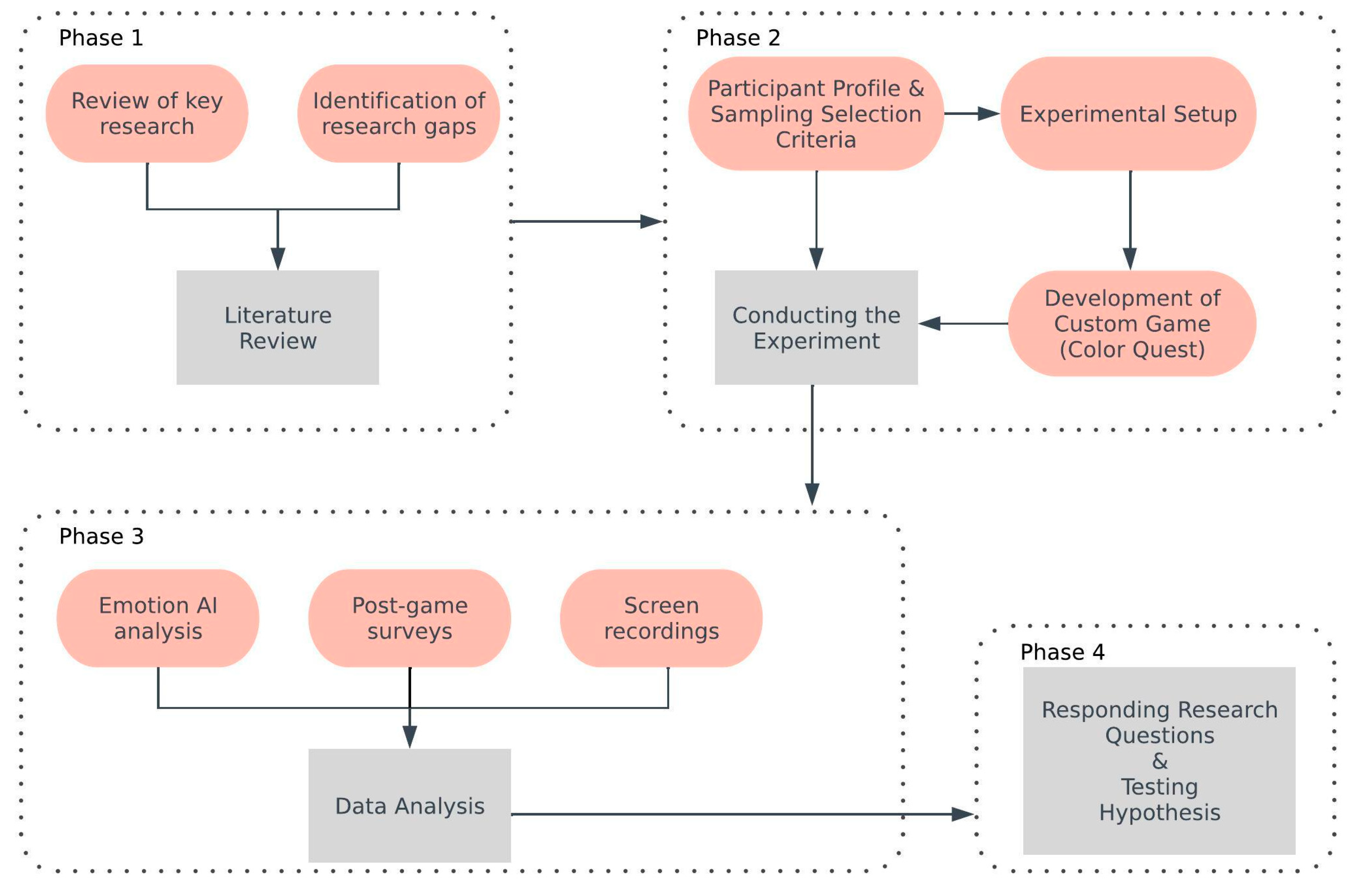
Figure 2.
Game design process.
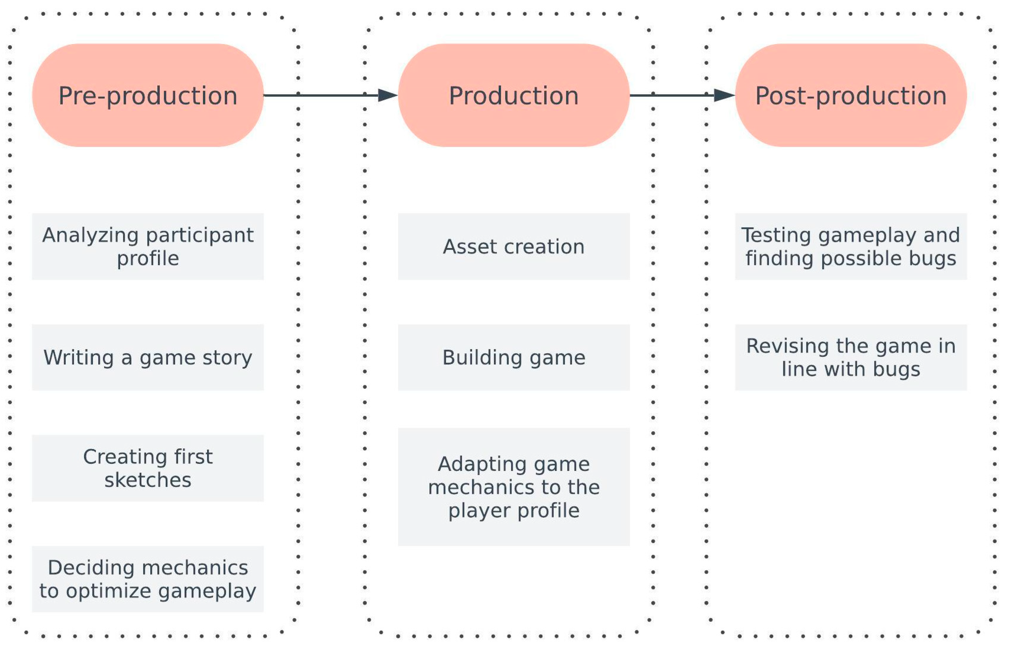
Figure 3.
Visual representations of the island designs in Color Quest: (a) Calming Spectrum, (b) Scary Shadow, (c) Joyful Prism.
Figure 3.
Visual representations of the island designs in Color Quest: (a) Calming Spectrum, (b) Scary Shadow, (c) Joyful Prism.

Figure 4.
User interface sample scene.

Figure 5.
MorphCast- Emotion AI video analyzer interface [23].
Figure 5.
MorphCast- Emotion AI video analyzer interface [23].

Figure 6.
The distribution of emotion scores by game except neutral.
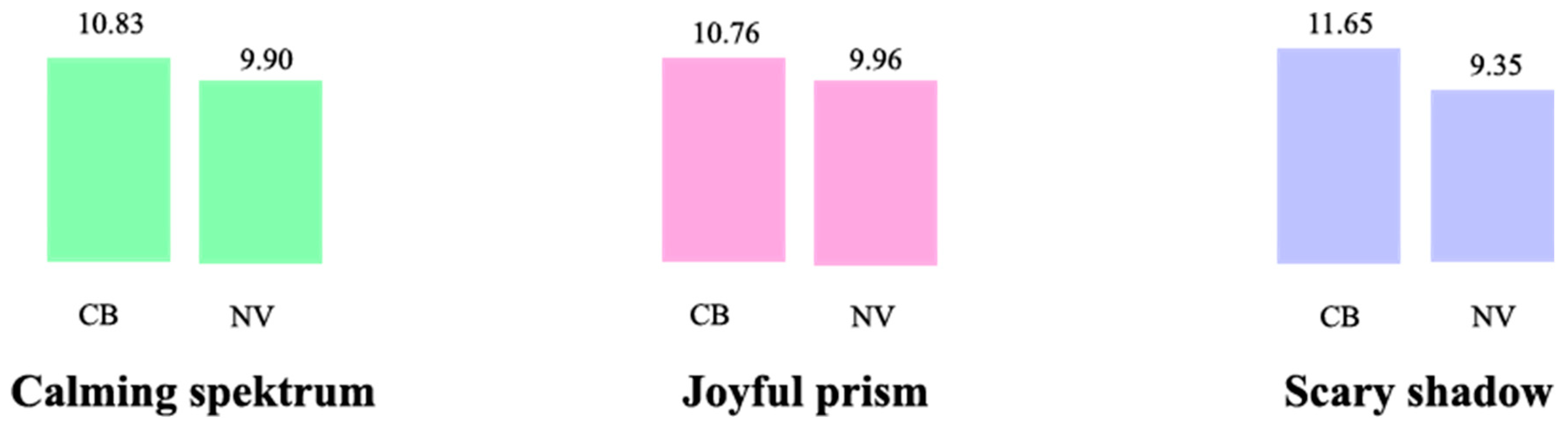
Figure 7.
Emotion scores excluding neutral vs nonneutral (calming, joyful, scary).
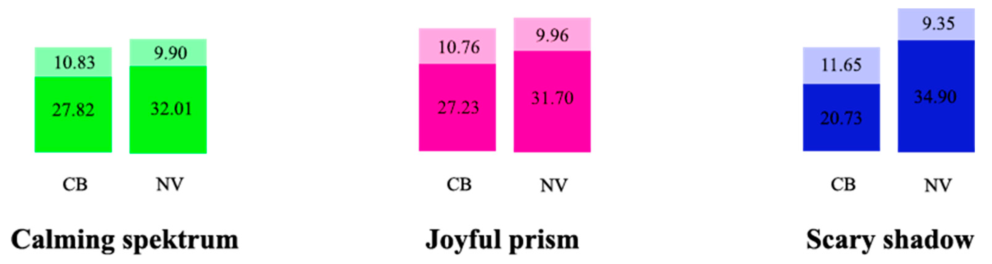
Figure 8.
The disstribution of neutral vs nonneutral emotion ratio by player type.
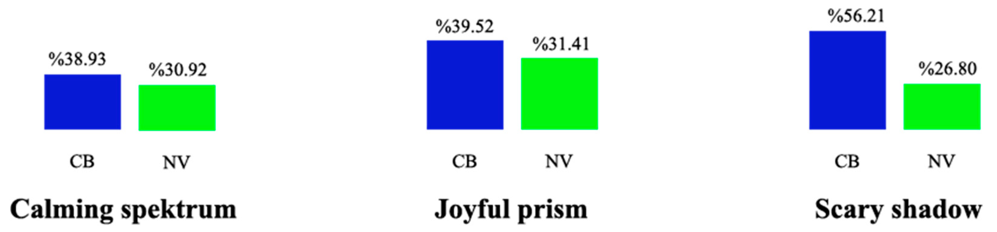
Figure 9.
Emotion variance analysis (except neutral).

Figure 10.
The distribution of scores by emotion type.
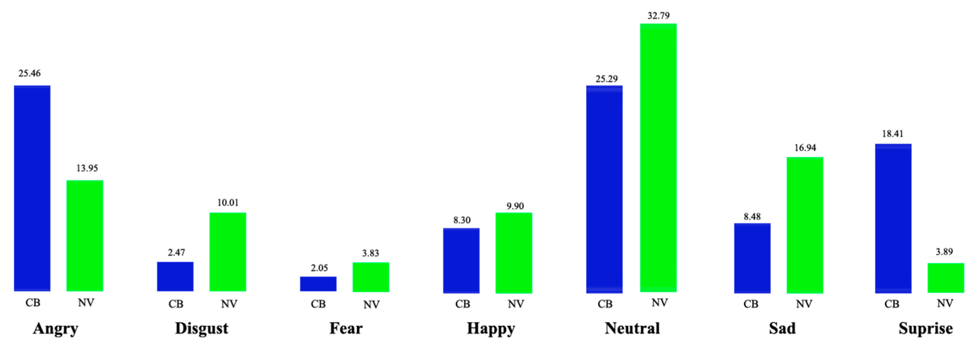
Figure 11.
Example regarding “Wish Over Time” graph created by Emotion AI.
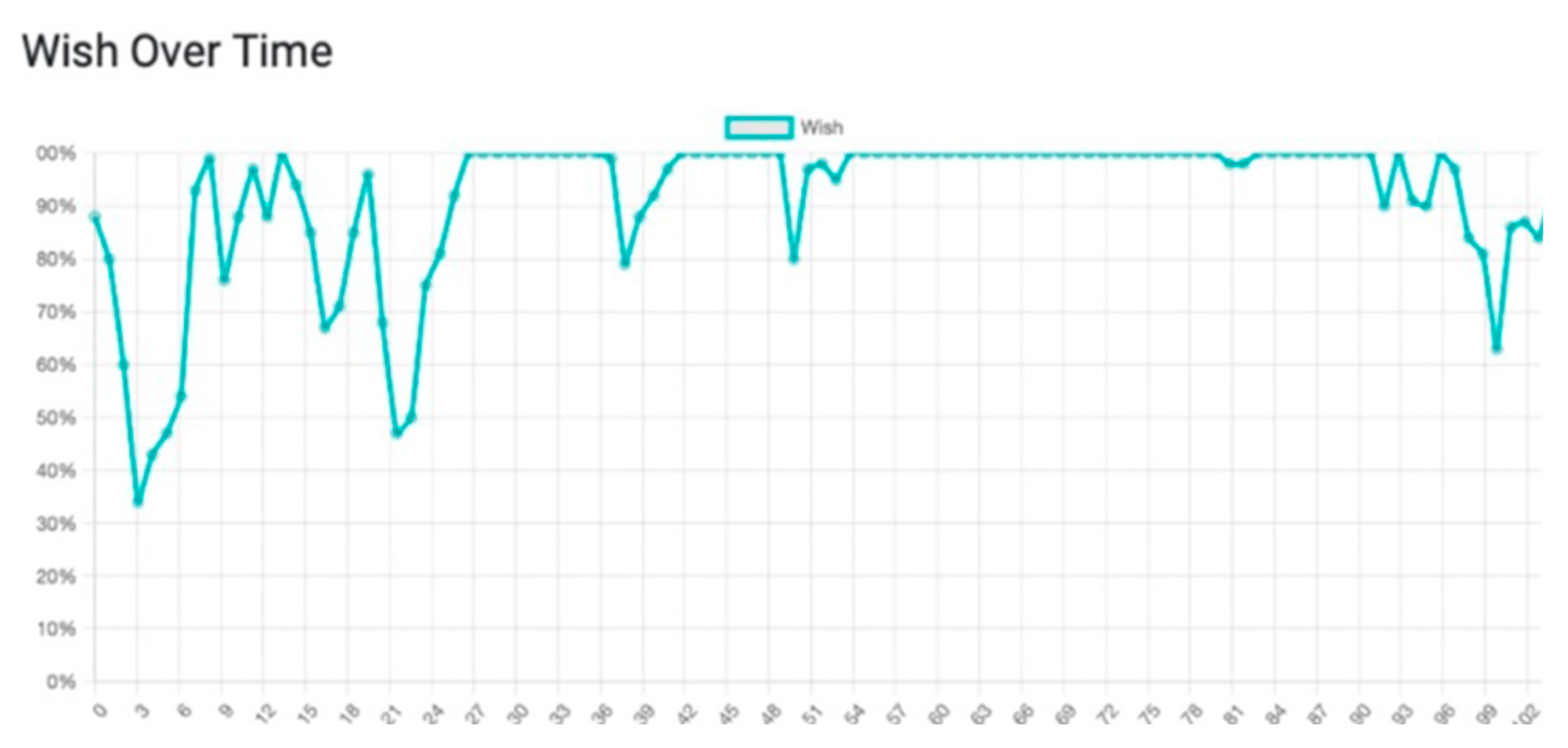
Figure 12.
Average wish scores.
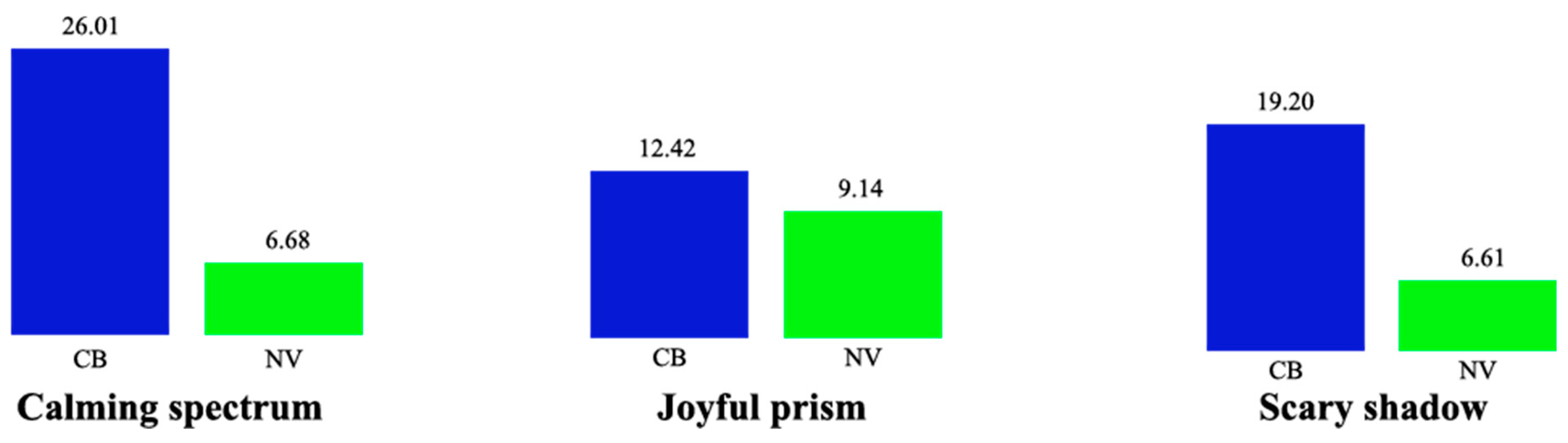
Figure 13.
Average engagement scores sample for one person.
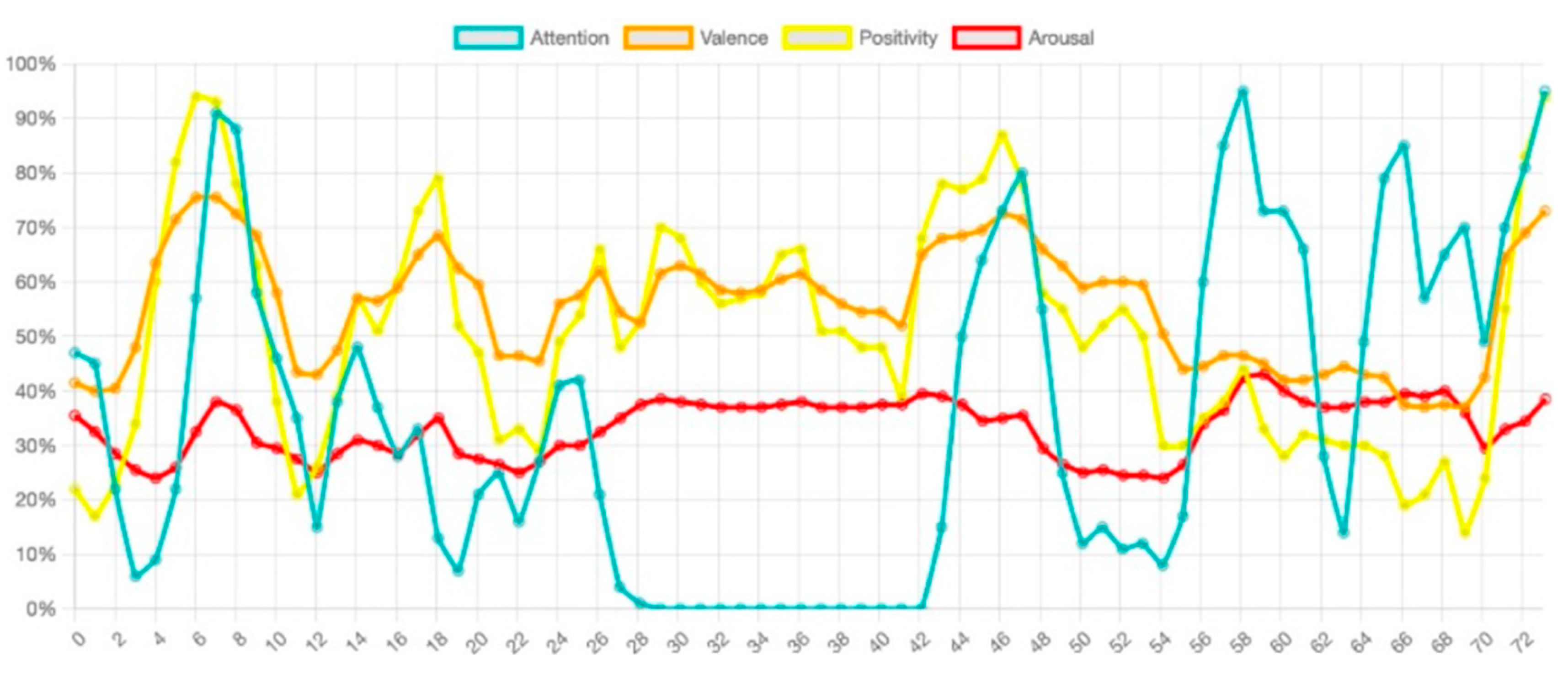
Figure 14.
Average engagement scores (attention).

Figure 15.
Average engagement scores (positivity).
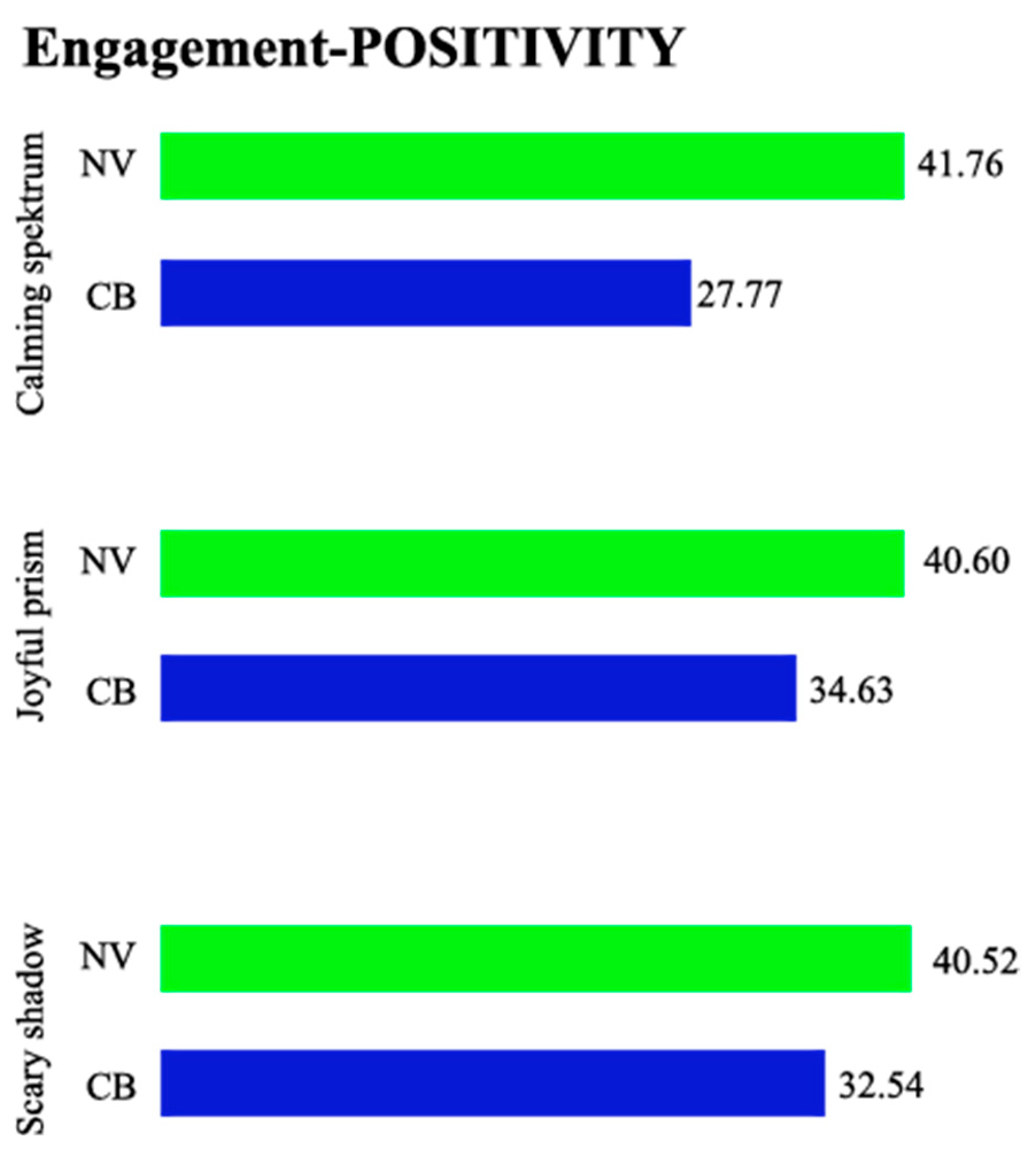
Figure 16.
Average score distribution specific to player group.
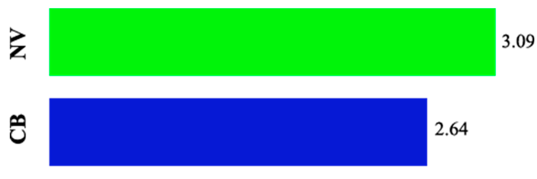
Figure 17.
Average score distribution specific to game type (blue color: CB; green color; NV).
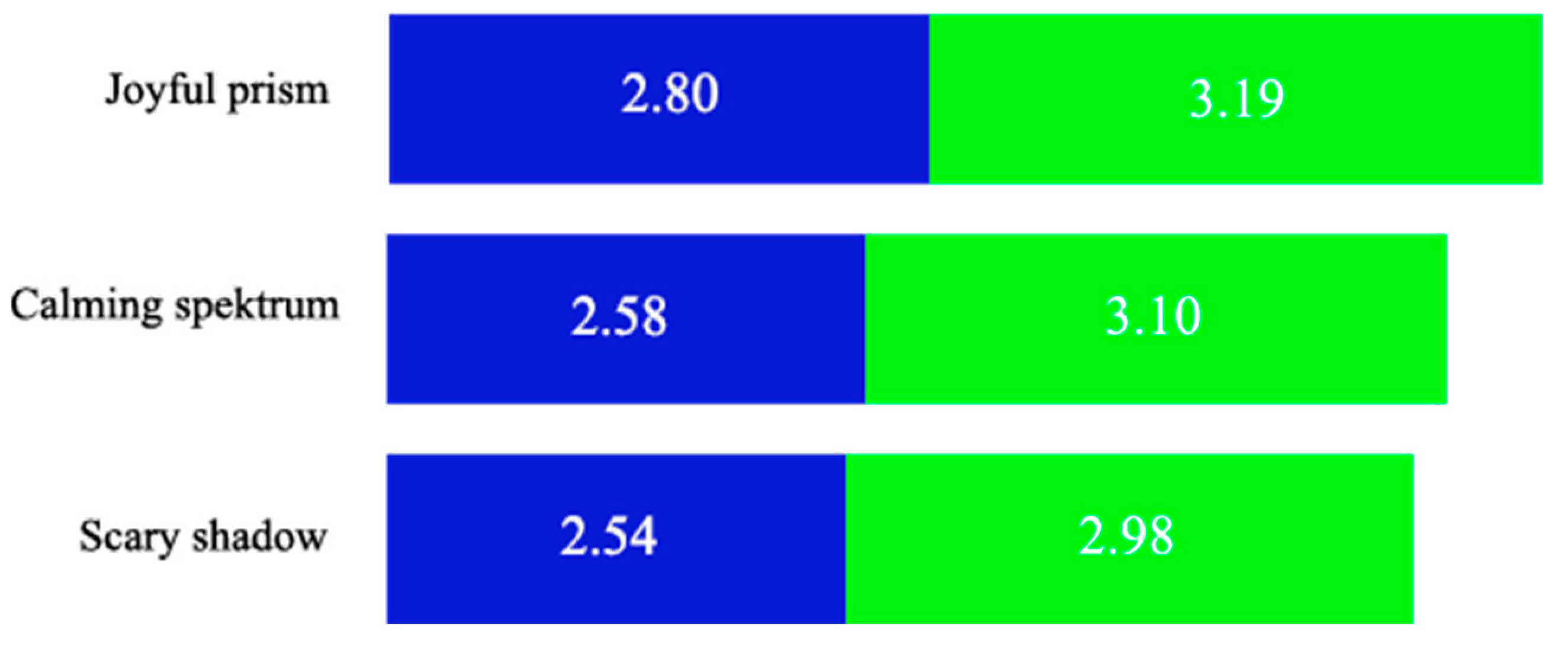
Figure 18.
Average emotion scores received by all player groups.

Figure 19.
Average game completion time by player group.
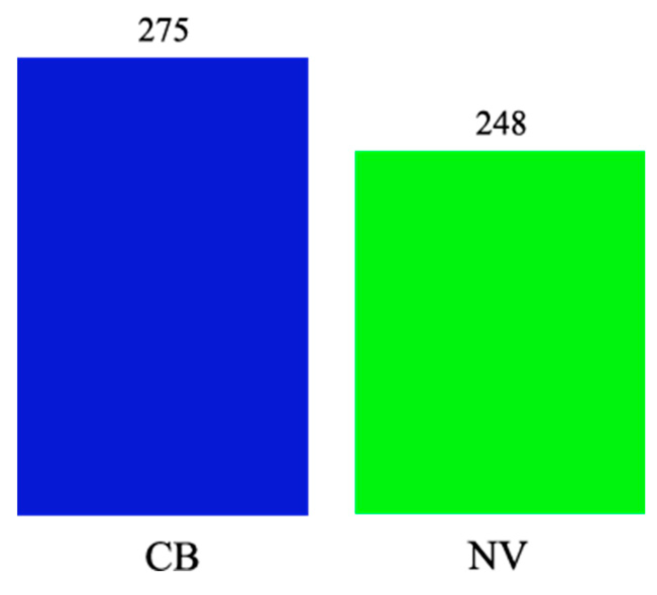
Figure 20.
Comparison of the total number of mistakes between groups.
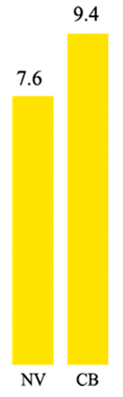
Figure 21.
Players' level choices.
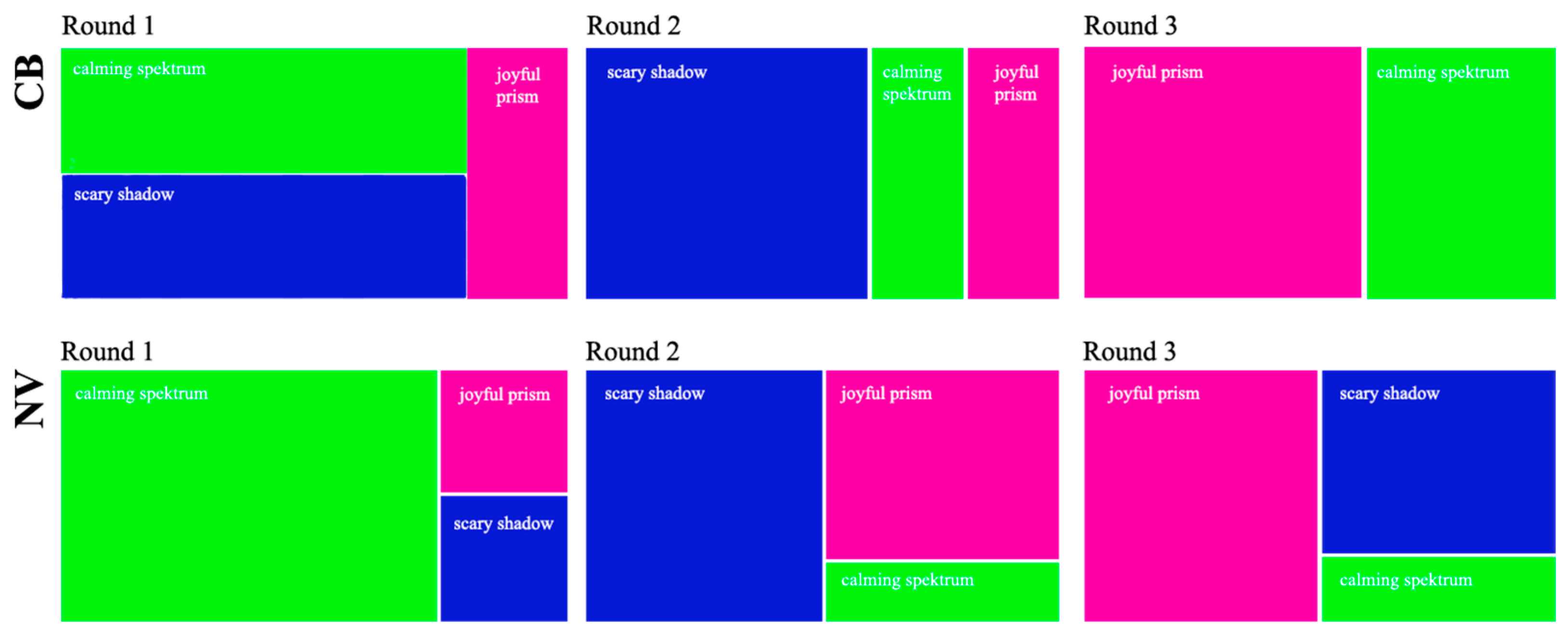

Table 1.
T-Test results emotion distribution (CB-NV).
| Statistic | Value | df | Sig.2(2-tailed) | Mean difference |
| t-test | 0,012924524 | 64,11436488 | 0,989728143 | -0,040535714 |
Table 2.
T-Test results for survey results (CB-NV).
| Statistic | Value | df | Sig.2 (2-tailed) | Mean difference | 95% CI Lower | 95% CI Upper | Levene's Test | Levene's Sig. |
| t | -3,012411 | 344,576726 | 0,002783 | -0,4475 | -0,74 | -0,16 | 1,903219 | 0,168513 |
Disclaimer/Publisher’s Note: The statements, opinions and data contained in all publications are solely those of the individual author(s) and contributor(s) and not of MDPI and/or the editor(s). MDPI and/or the editor(s) disclaim responsibility for any injury to people or property resulting from any ideas, methods, instructions or products referred to in the content. |
© 2025 by the authors. Licensee MDPI, Basel, Switzerland. This article is an open access article distributed under the terms and conditions of the Creative Commons Attribution (CC BY) license (https://creativecommons.org/licenses/by/4.0/).
Copyright: This open access article is published under a Creative Commons CC BY 4.0 license, which permit the free download, distribution, and reuse, provided that the author and preprint are cited in any reuse.


