
Submitted:
24 December 2024
Posted:
26 December 2024
You are already at the latest version
Preprints on COVID-19 and SARS-CoV-2
Abstract
This article presents an overview of vaccine effects and analyses a case study of the COVID-19 outbreaks and the effectiveness of vaccinations in Bangladesh. We have conceptually and numerically explored the model. We determined the reproduction number (R0) using the next-generation matrix methodology. We have evaluated the model's local stability for disease-free and endemic equilibria, determined by the basic reproduction number. We calculated sensitivity indices to examine the parameters' impact on the reproduction number. We present an SVIR model to simulate the impact of the vaccination process, solve it using the fourth-order Runge-Kutta technique, and validate our findings using fourth-order polynomial regression. The results suggest that the COVID-19 situation will improve if a significant proportion of individuals in Bangladesh are vaccinated (2 doses of the available vaccine). In the end, the numerical simulation provides a clear picture of the rising and falling tendency of this disease's spread in parallel with vaccination, as shown by the parameters in the mathematical model. From the perspective of Bangladesh, this study highlights the effect of the COVID-19 vaccine.
Keywords:
Covid-19
; Mathematical Biology
; Dynamical System
; Bifurcations
; Numerical Methods
1. Introduction
In 2019, the 2019 human coronavirus (COVID-19) was originally detected in Wuhan, China, and has expanded globally, becoming the fifth recorded epidemic since the 1918 influenza pandemic. In September 2021 [1], approximately two years after the initial detection of COVID-19, there were over 200 million confirmed cases and over 4.6 million fatalities. Here, we examine the history of COVID-19, from the first recorded case to the current efforts to prevent the disease’s global spread through vaccine campaigns. On December 31, 2019, the World Health Organization (WHO) reported cases of pneumonia with no known etiology in Wuhan, China. These were the first confirmed cases of COVID-19 [1]. On January 7, Chinese officials identified a novel coronavirus, temporarily dubbed 2019-nCoV, as the cause of these infections [28]. In the early months of COVID-19, global health professionals, government organizations, and the public were uncertain about the disease’s spread and impact on daily life. The United Nations released $15 billion on March 1, 2020, to fund the worldwide response to COVID-19. On March 7, one week later, 100,000 cases of COVID-19 were reported [1]. A few days later, on March 11, the WHO designated COVID-19 a pandemic. In China, COVID-19 became a global health emergency in less than one night, assuming the appearance of a pandemic [1].
1.1. Overview
The vaccination program in Bangladesh began on March 8, 2021. With the arrival of Bangladesh at the end of 2021, COVID-19 has risen dramatically. The government has taken measures such as quarantine and vaccination programs to control COVID cases. Despite vaccines’ proven efficacy in preventing disease and eradicating epidemics, many people still choose not to get immunized for a wide range of reasons (e.g., vaccine backlash, spiritual traditions, previous history, inner preferences of supervision, society constraint, etc.
A modified SIR model is used in a case study of the 2019 human coronavirus (COVID-19) epidemic in Bangladesh to examine the impact of vaccination and vaccines on the frequency of sickness in a community. In our modified version of the SIR model based on Bangladesh, we will analyze the consequences of COVID-19 vaccination. We will also need to compute the basic reproduction number for the model formulation, for which we did use the technique of the matrix of the next generation. The next section will demonstrate all this information and computations in detail.
1.2. Vaccine Classification
Vaccines are classified into various kinds [2], each intended to boost the body’s immune system to identify and combat certain illnesses. The following are some of the most prevalent vaccination types:
1. Inactivated or killed vaccines include germs that have been destroyed or inactivated, rendering them incapable of causing illness. Polio vaccination, the hepatitis A vaccine, and the flu vaccine are examples of inactivated vaccines.
2. Live attenuated vaccines include pathogen strains that cannot infect healthy people. Live-attenuated vaccinations include measles, mumps, and rubella.
3. Subunit, recombinant, or conjugate vaccines: Instead of the whole pathogen, these vaccines include a portion or component, such as a protein or sugar molecule. Human papillomavirus (HPV) and pneumococcal conjugate vaccines are examples of subunit, recombinant, or conjugate vaccines.
4. mRNA vaccines: These vaccines are a novel form of vaccination that employ messenger RNA (mRNA) to educate immune-stimulating protein-producing cells in the body. Pfizer-BioNTech and Moderna’s COVID-19 vaccines are examples of mRNA vaccines.
5. Vector vaccines: These vaccines transmit pathogen genetic material to cells through a modified virus or another vector, inducing an immune response. Vector vaccinations include Ebola and Johnson & Johnson COVID-19. [2]
Each type of vaccine has advantages and disadvantages. The specific type of vaccine used depends on factors such as the targeted pathogen, the age and health of the individual receiving the vaccine, and the availability of resources and technology.
1.3. Effect of Vaccine
Vaccines boost the immune system to fight germs to prevent infectious diseases [6]. Vaccines inject a harmless pathogen component such as a protein or sugar molecule. The immune system [3] produces antibodies and other immune cells to identify and kill the disease if it enters the body.
The effectiveness of a vaccine depends on several factors, including the type of vaccine, the targeted pathogen, and the individual’s age and overall health. Some vaccines are highly effective and can provide long-term protection against disease, while others may require booster shots to maintain immunity. If a vaccinated person becomes sick, the vaccination will lessen the intensity of their symptoms and the possibility of serious complications.
Vaccines have played a crucial role in preventing and eventually eradicating several infectious illnesses. Vaccines are important for reducing the transmission of infectious illnesses in communities and preventing sickness in individuals [5,7]. When enough individuals are vaccinated against a disease, it becomes more difficult for the infection to transmit from person to person, perhaps leading to the elimination of the illness.
1.4. Relation Between Immunizations and the Body’s Immune System
Immunizations help the immune system produce antibodies. The immune system recognizes and responds to a harmless pathogen component in a vaccination, such as a protein or sugar molecule.
The immune system [3] fights infectious diseases. The cells, tissues, and organs detect and kill infections. The immune system produces antibodies and other immune cells to detect and eliminate pathogens after vaccination.
Over time, the immune system can develop a memory of the pathogen, allowing it to mount a rapid and effective response if the individual is exposed to the actual pathogen in the future. That is why vaccination is such an important tool for preventing infectious diseases. By exposing the body to a harmless version of the pathogen, vaccines can help the immune system build immunity to the actual disease-causing pathogen [2,3].
2. Model Formation
2.1. Overview
Numerical models have been developed to anticipate the spread of contagious illnesses and illustrate potential results under certain conditions. One of the most widely recognized models is the SIR model, which examines the number of individuals in three distinct groups (susceptible (S), infected (I), and recovered (R)) over time. In this section, we will discuss and examine a modified version of the SIR model that has been suggested, utilizing the latest information [24]. Collecting data from different sources allows us to estimate and make assumptions based on the situation. In our model, time is represented by ’t.’ Therefore, based on our modified SIR model, we can conclude. Therefore, from our modified SIR model,
N(t) = S(t)+V(t) + Ir(t) + Iw(t) + R(t)
Figure 1 shows how the model is described using a series of compartments. The following characteristics of the model persist:
In this system, we have five individual classes, and those classes are,
- i.
- Susceptible (S)
- ii.
- Vaccination (V)
- iii.
- Infected with vaccination ()
- iv.
- Infected without vaccination ()
- v.
- Recovered (R)
Here, S(t) represents the susceptible class that is uninfected, V(t) represents the vaccinated population, (t) represents the proportion of infected individuals who have received the vaccination, (t) represents those who have contracted the disease without receiving the vaccination, and R(t) represents those who have recovered and been cured of the illness. The total population at time t is represented by N (t).
Let us examine the following graphic to see how these classes are interrelated.
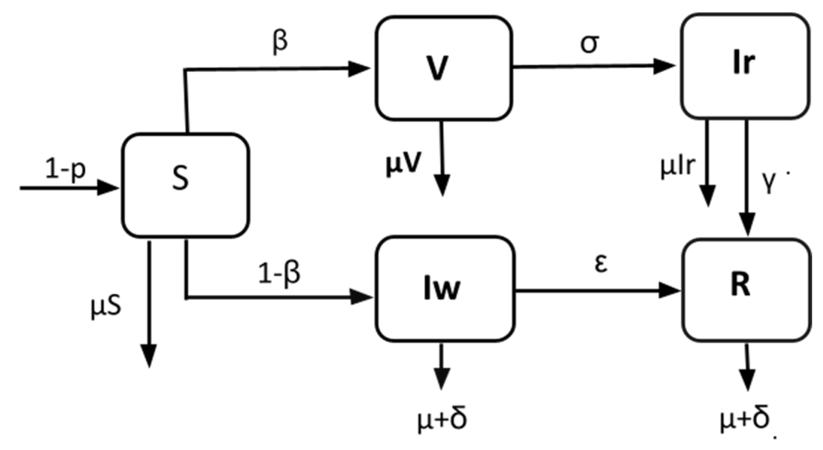
Figure 1.
Schematic diagram of the modified SIR model.
Therefore, in this diagram, there are five distinct classes, and the arrows between the classes indicate the daily rate at which people are transferred from one class to another. In fact, in this model, this rate influences everything. In our study, we will utilize current data to establish these rates, which serve as parameters, and then use the parameters to predict the COVID-19 scenario in Bangladesh [4].
2.2. Equations for Modified SIR Model
We suggest the following differential equations for a modified SIR model [9]: The diagram below illustrates how these assumptions may be used to define the model’s compartmental structure and flow directions.
Here,
2.3. Parameter Description

Table 1.
Parameter description.
| Parameter | Description |
|---|---|
| p | Vaccinated at birth. |
| β | The rate of vaccinated (1/day). |
| σ | The rate of infected people with vaccination (1/day). |
| γ and ε | The recovery rate with and without vaccination (1/day). |
| μ and δ | The natural death rate and infectious death (1/day). |
3. Theoretical Analysis of the Model
A theoretical analysis of a model involves an examination of its underlying assumptions, mathematical equations, and predictions. Such analysis aims to understand how the model works and assess its usefulness in explaining real-world phenomena. Theoretical analyses [25] can also help identify areas of the model that may require further refinement or testing.
We will examine the system’s theoretical analysis in the parts of system (1)
3.1. Equilibria
The system’s left-hand side (LHS) in equation (1) will be zero at equilibrium [9].
We know that the equilibrium points without infection are called disease-free equilibria [14,15]. Therefore, system (1) has a disease-free equilibrium at E°=(S,0,0,0,0,0,0) = (1,0,0,0,0), and the equilibrium point with an infection is called endemic equilibrium. Therefore, the endemic equilibrium point from system (1) is given by:
3.2. Basic Reproduction Number:
In epidemiology, the basic reproduction number (also referred to as the “basic reproductive rate” or “basic reproductive ratio” and abbreviated R0, r zero) of an illness is the average number of cases that a particular case creates throughout its infectious period.
This statistic is important for determining if an infectious illness may spread over a community. The underlying reproduction notion may be traced back to the work of Alfred J. Lotka, Ronald Ross, and others. Nevertheless, its first contemporary application in epidemiology was developed in 1952 by George MacDonald, who created population models of the spread of malaria. When,
• <1, the disease-free equilibrium is stable, indicating that the disease is prevalent among the general population. However, if
• >1, then endemic equilibrium exists, which indicates that sickness persists in the population.
The greater the value of Ro, the more difficult it is to control the outbreak. For basic models, 1-1/Ro is the percentage of the population that must be vaccinated to prevent the sustained spread of the virus. The basic reproduction [17] rate is controlled by various variables, including the length of infectivity of infected patients, the infectiousness of the organism, and the number of susceptible individuals with whom infected patients interact. Now, using the next-generation matrix [4], we obtain the reproduction number [16,18,19]. Let . Then, from system (1):
The disease-free equilibrium point of system (1) has coordinates. . The derivatives of and are at [4].,
The next generation matrix [26] for system (1) is
The eigenvalues of the matrix are and . Hence, R0 is the maximum (dominant) of the eigenvalues of .
Thus, we have which is the system’s required basic reproduction number (1) [4].
3.3. Stability Analysis
To check the stability of the system, we must prove two theorems. However, we check the local stability of system (1).
Theorem 1:
The disease-free equilibrium is locally asymptotically stable.
if R0 <1.
Proof:
The Jacobian matrix at point E° is
Let the eigenvalues of the matrix be denoted by λ1,λ2,λ3,λ4 and λ5. Therefore, the characteristic equation of this matrix is,
Solving the characteristic equation, we obtain
All the eigenvalues must be negative for the system to be locally asymptotically stable [14,16]. We have already obtained and <0. Therefore, we require . Therefore, the disease-free equilibrium is locally asymptotically stable if <1, which completes the proof [20,21,22].
Theorem 2:
When , the endemic equilibrium is E* locally asymptotically stable.
Proof:
The Jacobian matrix of system (1) at
is
The eigenvalues are,
The system’s endemic equilibrium [14] (1) has a negative real part. Thus, we conclude that the endemic equilibrium of system (1) is locally asymptotically stable, so . Hence, that completes the proof.
4. Data Collection and Methodologies:
4.1. Data Source
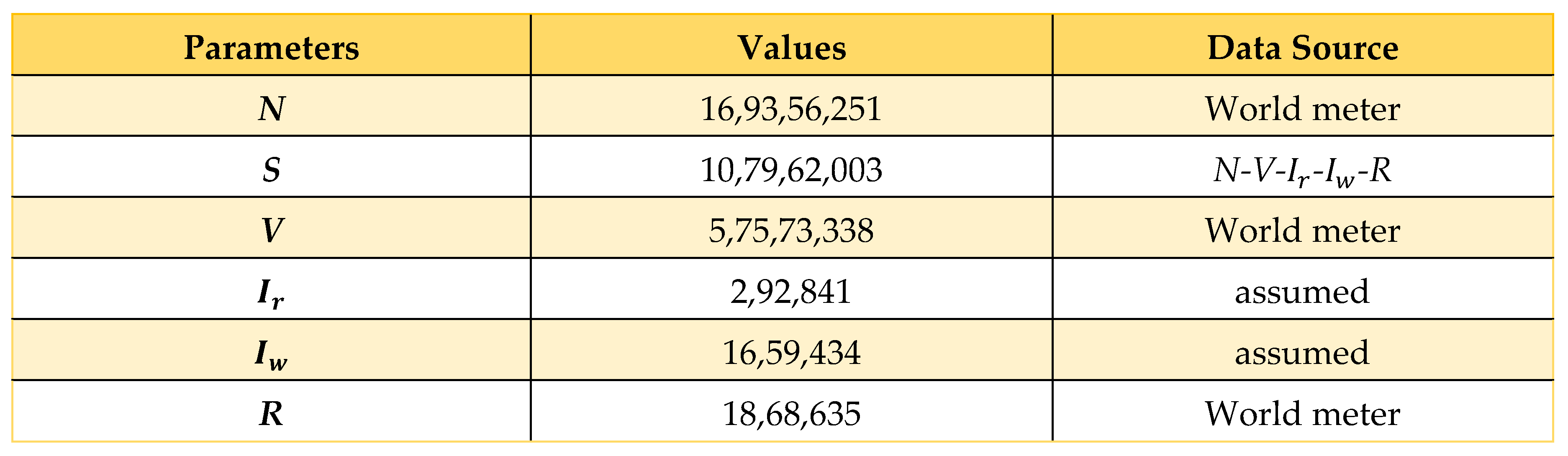
We have collected data from a wide variety of sources, such as World Meter [27] and JHU CSSE [28], among others [10], and we have computed information from a broad range of sources utilizing Microsoft Excel to determine parameters. The information we obtained can be seen in the table that can be found below, and it spans the time from March 8, 2020, to April 16, 2022.
4.2. Data Estimation and Assumption
Now here, we consider ; i = 1,2,3, where and are the representatives of the fully vaccinated people who are vaccinated for COVID-19 today and yesterday, respectively. Similarly, and infectious people who recovered from COVID-19 today and yesterday, respectively. Finally, and are the infectious people who died due to COVID-19 today and yesterday, respectively. All these values are denoted as . Using these equations, we calculated , and some infectiousness rates and are taken from the WHO or other credible sources [23].
Table 3.
Parameter estimation and assumption.
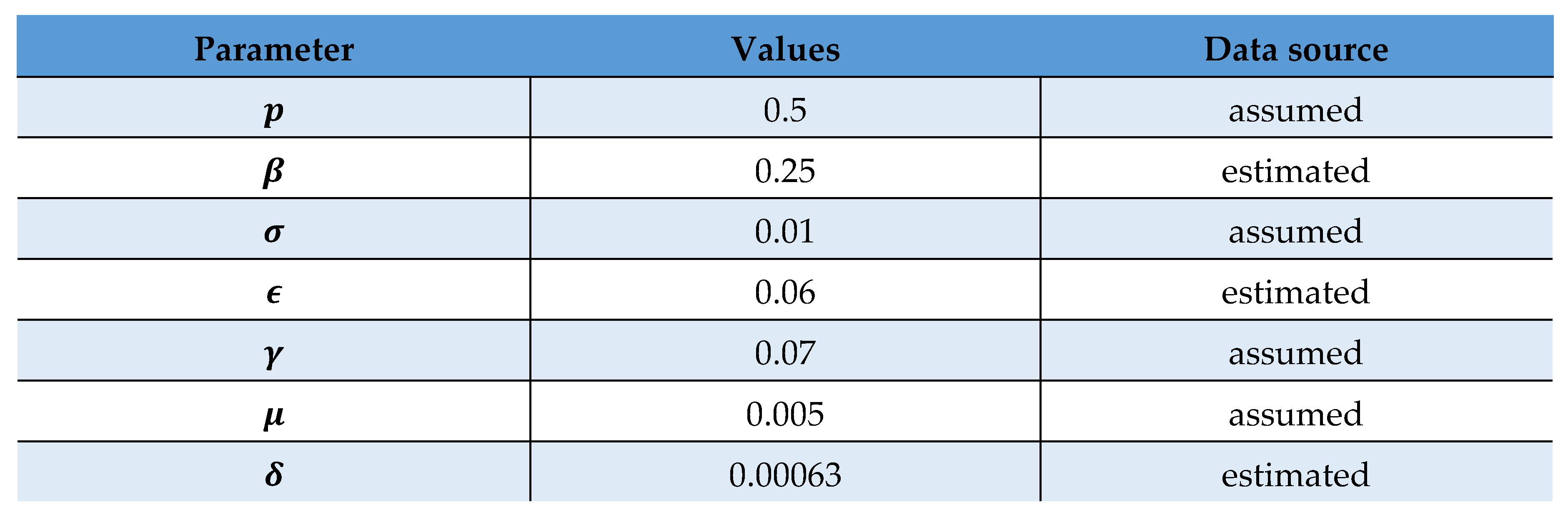 |
Using these values, we can activate the system to obtain a prognosis of the COVID scenario in Bangladesh.
4.3. Sensitivity Analysis
In the proposed SVIR model, we can gain our basic reproduction number by using the formula below:
By using this formula above, we achieve 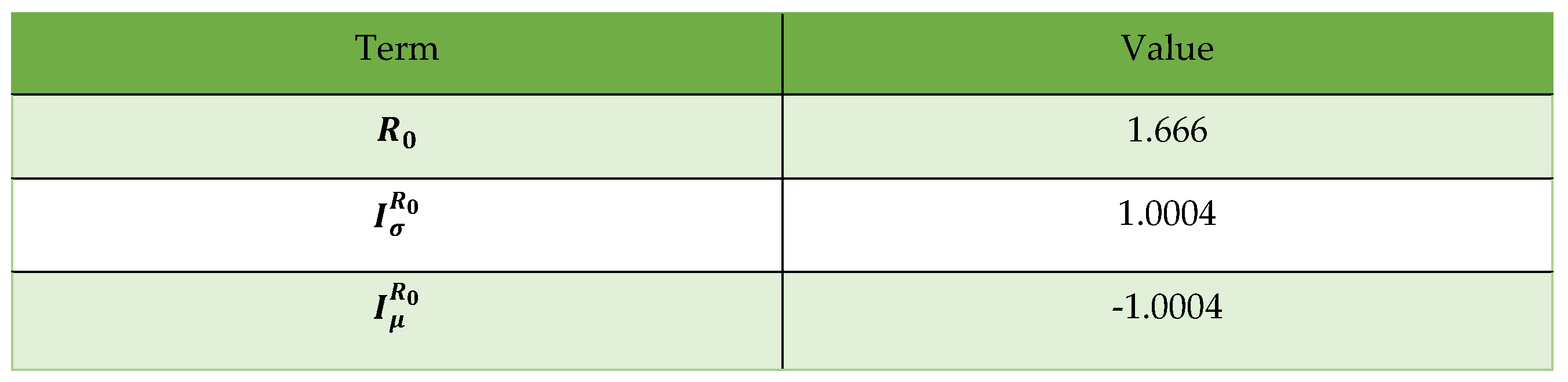
The following are the outcomes of the analysis of the indices:
A. From I (R 0), we may conclude that if we increase by 10%, R 0 grows by 10% |1.0004| = 0.10004, and if we reduce by 10%, R 0 lowers by 10% |1.0004| = 0.10004; hence, the value of plays a significant influence in lowering the value of R 0. Therefore, if the vaccine does not work properly and people cannot be immunized, they will have to fight COVID-19, the pandemic outbreak. We should ensure that the vaccine restricts the spread of infection and that an awareness program is in place to get fully vaccinated.
B. is negative. Hence, we may conclude that growing (decreasing) by 10% reduces (increases) by 10% × ω|1.0004| = 010004. Therefore, the reproduction number will decrease if people do not die from COVID-19 infection.
In Figure 5, the vaccination rate will slow down in May 2022, and the value will approach 0.3650. Altering the starting value by adding 0.01 mV causes the perturb line to have a peak value of 0.3550, whereas the real line surpasses the perturb line.
Figure 6 shows that the unvaccinated infection rate is decreasing toward zero by day 60 (July 2022). This means that the illness in Bangladesh is expected to be stable. Figure 7 depicts the infection rate with vaccination, which peaks at day 20 and has a value of approximately 0.035. However, the highest value of the perturbation is just 0.03. Thus, the infection rate among those who have received vaccination is decreasing, and the deviation is 0.005 on day 20 if the starting value is changed by adding 0.01 to the initial value (May 2022).
Based on what we see in Figure 8, the real recovery rate is upward after 60 days (July 2022). A similar increasing trend in the recovery rate (approximately 0.62, as shown by the perturb line) is also seen throughout the recovery process. The recovery rate is improving, and the deviation is 0.02 on day 60 if the original value is modified by adding 0.01. (July 2022).
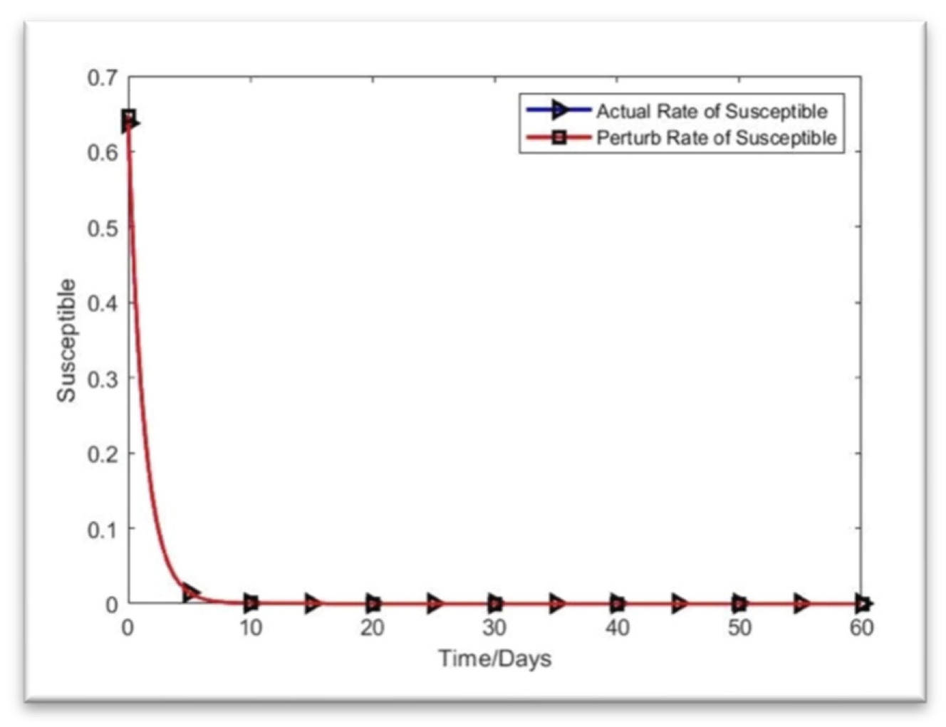
As shown in Figure 9, the infective individuals returned to their original compartments, while the vulnerable individuals gradually recovered from sickness. The rate of improvement accelerates when 0.01 is added to the starting values. It takes a little while for everyone to return to where they started. By the 60th day, the true line between the susceptibility rate and the perturb line is near. Ultimately, the deviation value is almost zero on day 60 (August 2022).
4.4. Methodologies
This section will describe two methods we used in the projects and the instruments or software we used.
- I.
-
Next-generation matrixThe basic reproduction number and compartment model for transmitting infectious illnesses are found in epidemiology using the next-generation matrix. Calculating the fundamental reproduction rate of formal human models involves population variables. The same numbers are also utilized in many different types of branching models. [10]
- II.
-
MATLAB OnlineThe fourth-order Runge‒Kutta (RK4) method, which we implemented in MATLAB, was utilized to simulate this model. Fourth-order polynomial regression was then used to validate the results (John Hopkins Hospital (JHH), 2020). MATLAB is a software program for effective math, visualization, and editing. It provides an interactive environment with programming, graphics, and animation features on hundreds of built-in computers. Matrix Laboratory is referred to as MATLAB.
5. Numerical Simulations
This section will review the results of system (1)’s numerical simulations. Using the fourth-order Runge‒Kutta method in the MATLAB environment, we were able to solve the issue [41,42,43,44,45,46,47,48]. The epidemiologic data were obtained from the World Meter’s open-source repository. Table 2 and Table 3 above display the initial variables and parameters utilized to implement the model. We considered Bangladesh’s data from March 8, 2020, to April 16, 2022. The first system has ten parameters. We used fictitious data because it was impossible to obtain the needed value given the epidemic circumstances. On the other hand, we have utilized several parameters from which estimates were derived.
Here is the MATLAB output for the figures of sensitivity analysis of the proposed modified SIR model,
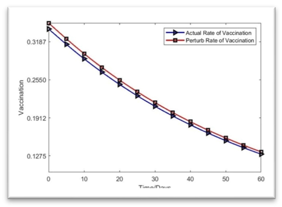
Figure 2.
Rate of vaccination.
Now, the infection rate without vaccination is,
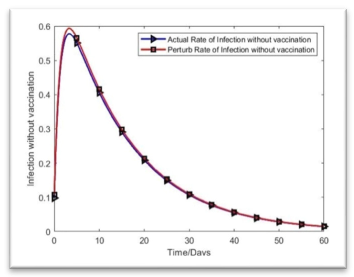
Figure 3.
Infection rate without vaccination.
The rate of infection with vaccination is,
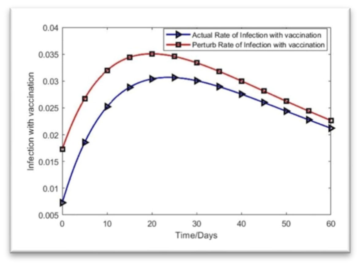
Figure 4.
Rate of infection with vaccination.
Here is the rate of recovery for the SVIR model based on the present data:
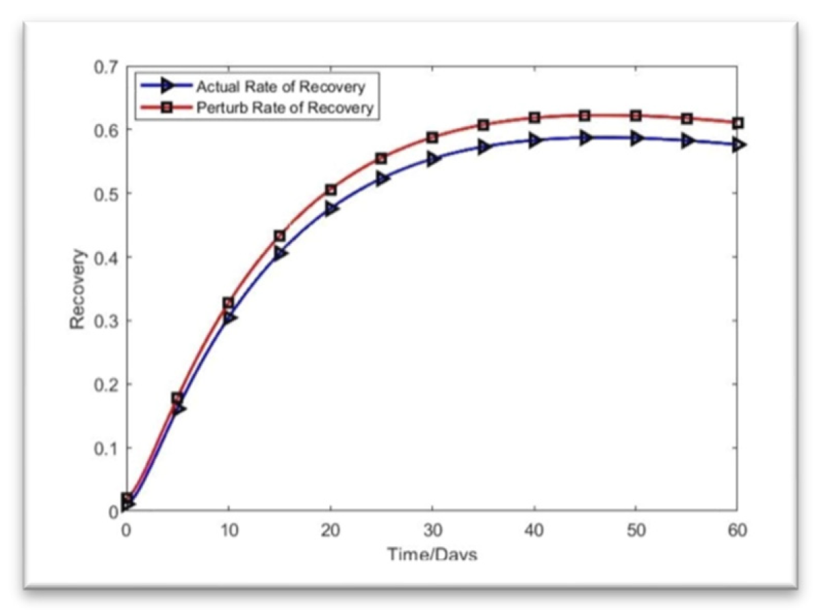
Figure 5.
Rate of Recovery.
Let us now determine the MATLAB system’s solution. We solved the proposed SVIR model to anticipate the COVID-19 scenario in the following month, starting in April 2022 in Bangladesh, using the data from Table 2 and Table 3. Here is the MATLAB solution for the suggested SVIR model. [4],
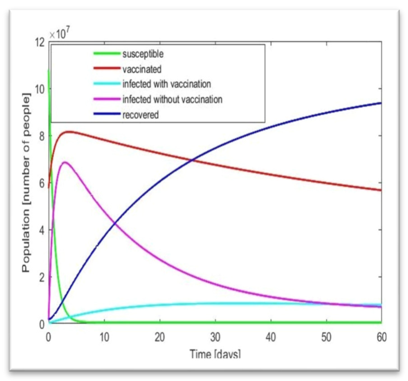
Figure 7.
Solution of the model by MATLAB.
Here, we utilize Table 2 and Table 3 with the fourth-order RK method and fourth-order polynomial regression. Using Microsoft Excel, we created a fourth-order polynomial regression. The regression is shown below.
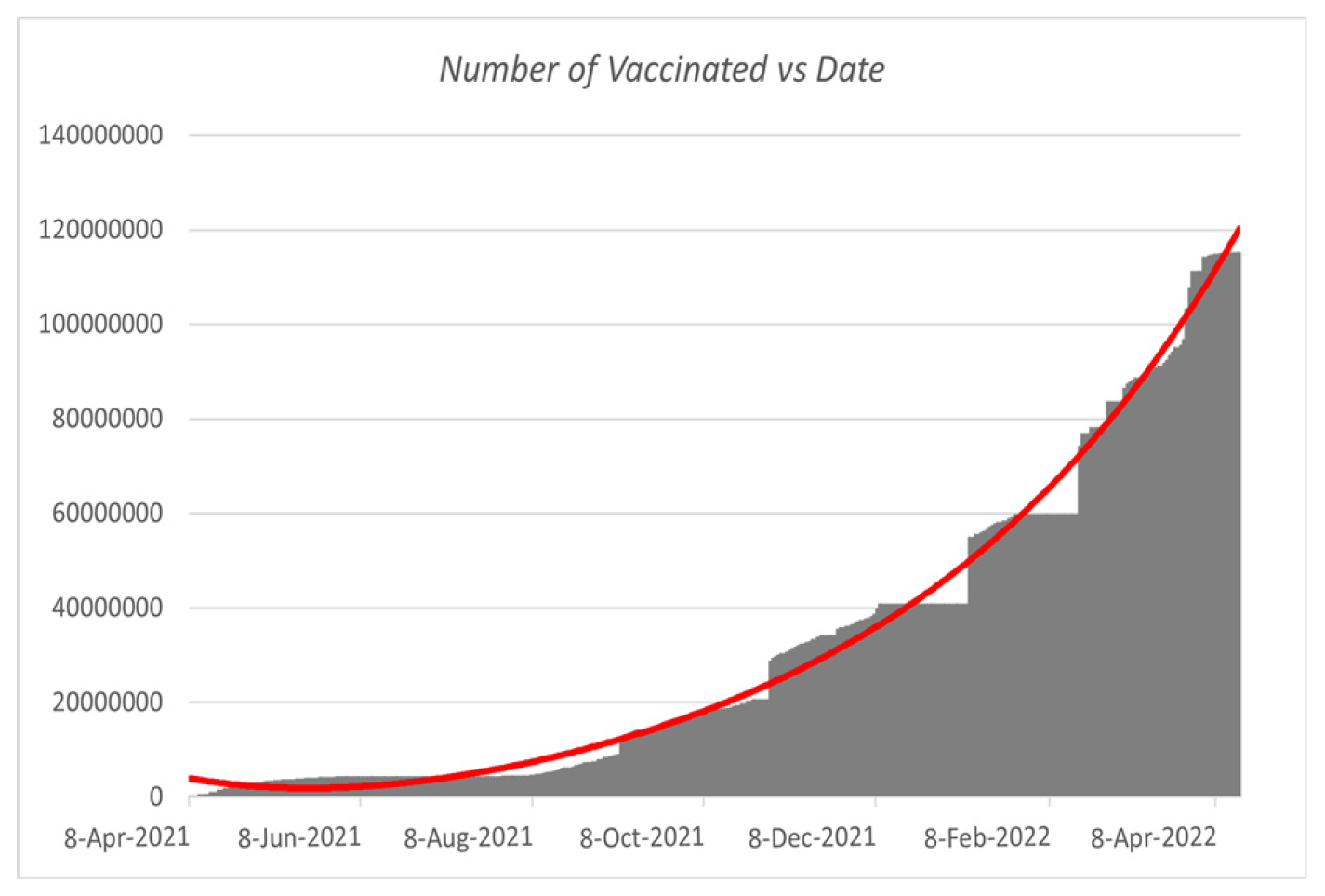
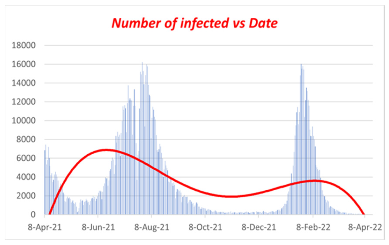
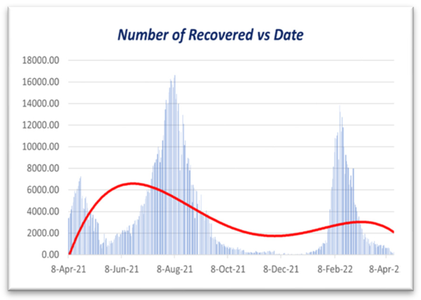
Figure 8.
Polynomial regression for Vaccinated vs. Date.
Figure 9.
Polynomial regression for Infected vs. Date.
Figure 10.
Polynomial regression for Recovered vs. Date.
Figure 10 illustrates that the impact of vaccination [5] on the infection rate is surely decreased when the vaccination campaign begins. Here, we can observe that the rate is rising quickly and that people started becoming fully immunized in the first week of April 2021. On the other hand, the infection rate peaked during the first week of August 2021 and began declining. We can also notice that the infection rate among vaccinated people remains consistent, as indicated in Figure 10. Because so many people received their full vaccinations, the number of unvaccinated infectious individuals also fell. The first week of August 2021 will have the highest infection rates for the complete immunization program (counting from March 8, 2021). Then, from the first week of September 2021 to the first week of February 2022, we can observe that the number of sick people stayed essentially constant. However, in the second week of February 2022, there would be another COVID-19 wave. Within a few days, the infection rate drastically dropped. On the other hand, vaccination rates rose quickly. Data from Bangladesh from March 8, 2020, to April 16, 2022, were used in this study. Figure 10 shows that the disease’s infection rate gradually falls after 60 days, or in July 2022. On the other hand, persons who have received vaccinations will only become infected by the disease slightly before the fully implemented vaccination program begins (i.e., April 8, 2021).
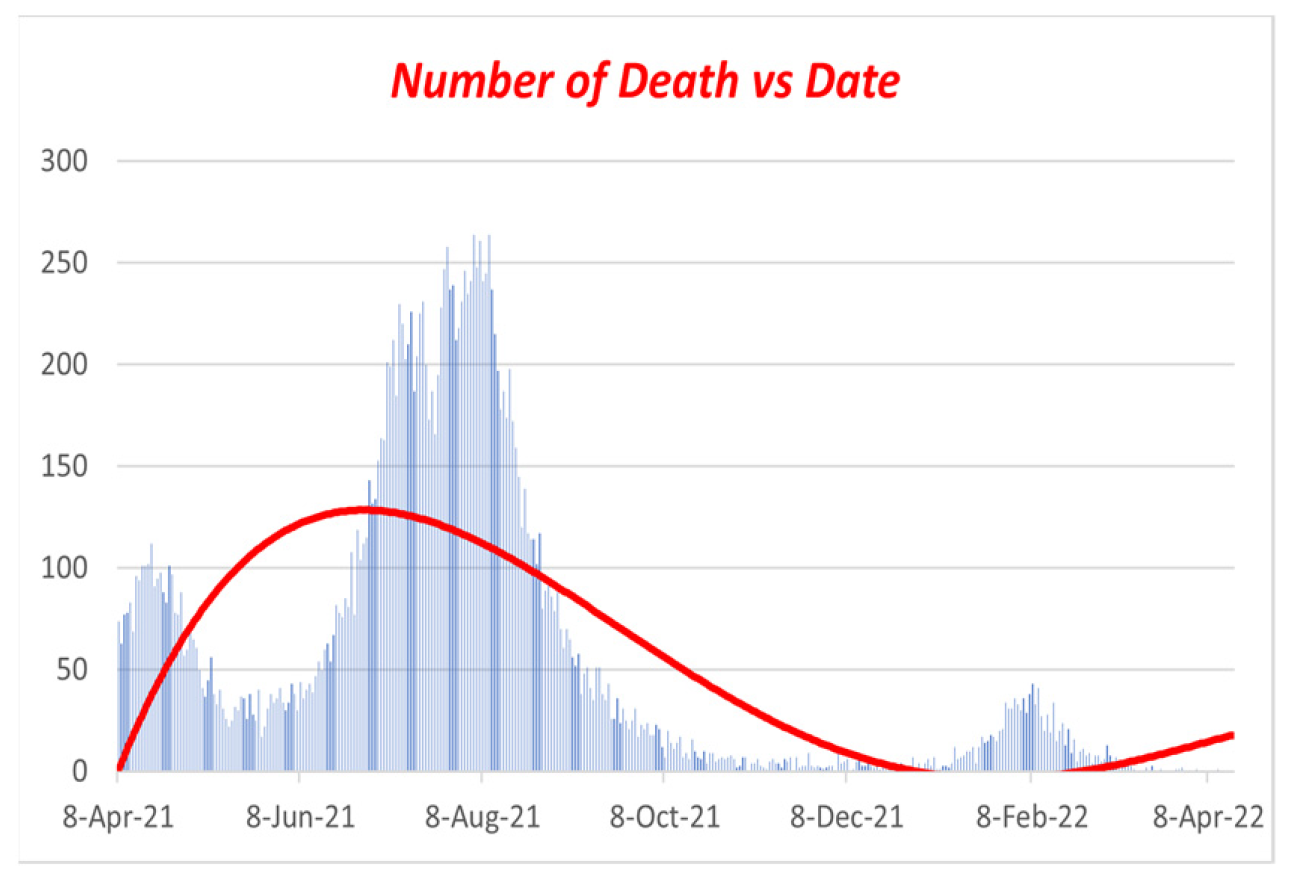
Figure 11.
Polynomial regression for Dead vs. Date.
We discovered the following: Figure 2, Figure 3, Figure 4, Figure 5, Figure 6, Figure 7, Figure 8, Figure 9, Figure 10 and Figure 11 using values from Table 2 and Table 3, the fourth-order RK technique, and fourth-order polynomial regression. Figures 8 through 11 display the present trends in the incidence of infections, vaccinations, recovered cases, and fatalities as a red line. We could locate the trendline using fourth-order polynomial regression, which indicates how quickly the infection rate dropped after widespread vaccination [6]. Hence, if we increase our immunization efforts, we can fight COVID-19. If sick people do not get better every day, people will die. On day 60, the infection rate declines to approximately 0.5, as depicted in Figure 7. (July 2022)
6. Statistical Analysis:
6.1. Overview
Statistical analysis involves collecting, analyzing, and presenting substantial amounts of data to reveal hidden patterns and trends. We used the COVID-19 data that the government of Bangladesh provided for our work; now, we must evaluate the data to determine the accuracy of Figure 7. We will now examine the information in Table 2. Using these techniques, we will now utilize Microsoft Excel to extract the necessary data tables and figures from Table 2’s data.
- Descriptive statistics
- Histogram
The following section will describe our work with these two methods using Excel.
6.2. Descriptive Statistics
According to sources [11], descriptive statistics are brief coefficients that provide an overview of a given set of data, which may represent the entire population or only a sample of it. The two major descriptive statistics measures are central tendency and variability. Descriptive statistics describe the characteristics of the given data and provide essential information to understand the fundamental behavior of the data (or spread). Descriptive statistics define or summarize sample or data collection characteristics, such as the variance definition, standard deviation, or frequency. We can better grasp the characteristics of sample data pieces by using inferential statistics. Understanding sample meanings, variations, and variable distributions can make it much easier to understand data and determine whether our work in this paper is valid. Two uses for descriptive statistics include the following:
To offer basic knowledge regarding variables within a dataset and to identify possible correlations between variables.
The three most prevalent descriptive statistics that may represent graphically or visually are measurements of
• Graphical/Pictorial Techniques
• Central Tendency Measurements
• Dispersion Measurements
• Association Measurements
Now that we have taken the data from December 1, 2021, to January 31, 2022, to continue our work on COVID-19 in Bangladesh, we can apply descriptive statistics to the above data in Table 2 and find all the necessary fields in Excel below.
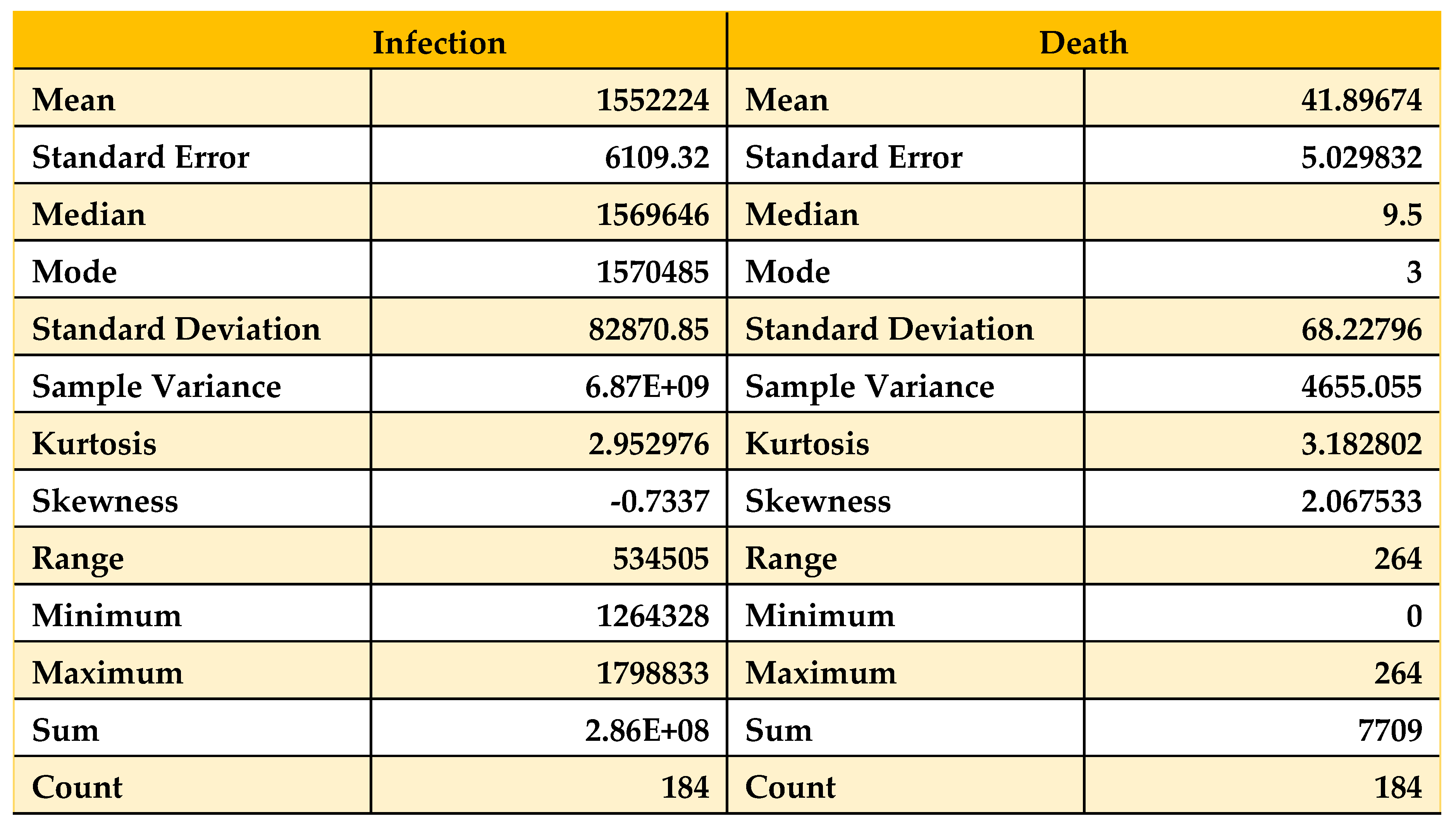
Table 5.
Descriptive statistics on data from 01/12/21 to 31/01/22.
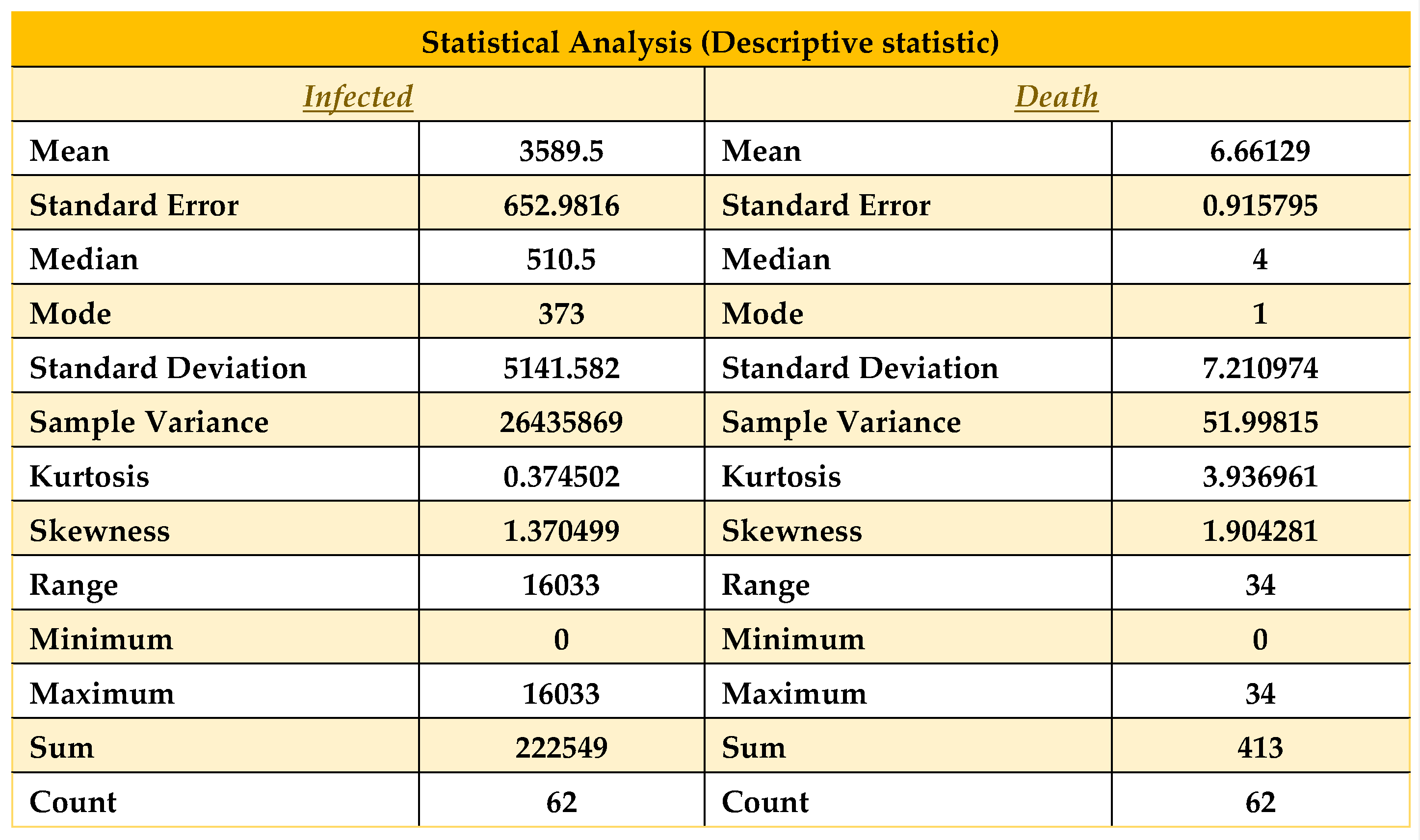 |
As we see in Table 5, all statistical properties are normal for the death column. Nevertheless, the recovered and infected columns show a significantly high magnitude, where the number of recovered columns is good for us. Nevertheless, at the same time, the number of infected people is the problem here, which shows the number of infected.
People are increasing, which is quite similar to our result in Figure 7. Now here, the mode of infected people is 373, and the mean and median are 3589.5 and 510.5, respectively, so we can say that mean > median > mode, which shows that the graph will be positively skewed. On the other hand, in the death column, as it shows mean > median > mode, this graph will also be positively skewed. Therefore, in terms of our figure, we find similar patterns with our statistical analysis. Now, we will discuss these in brief. Here, another property called skewness also matters. As we know, few conditions exist in statistics for skewness, which are [12]
• The distribution is significantly skewed if skewness is less than -1 or larger than 1.
• The distribution is substantially skewed if skewness falls between -1 and -0.5 or 0.5 and 1.
• The distribution is nearly symmetric if the skewness is between -0.5 and 0.5.
In our case, the skewness for death and infection are 1.90 and 1.374, respectively, so by satisfying the above conditions, we can say that the death and infection curves are highly skewed. From the relation of Mean and Median, the data skewed right. Now let us look at the data from October 1, 2021, to January 31, 2022, and we find the following:
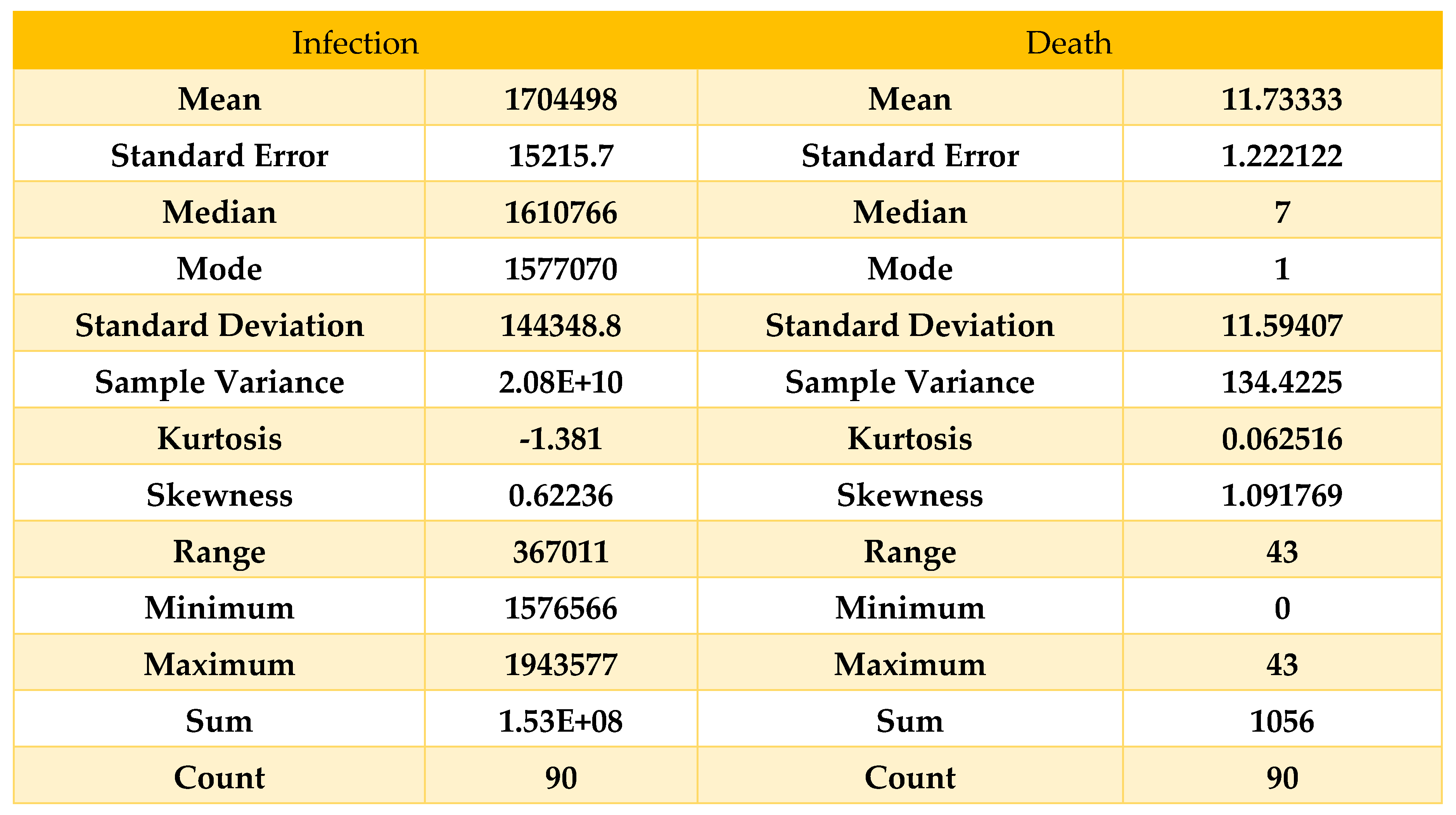
Table 6.
Descriptive statistics on Data from 01/10/21 to 31/01/22.
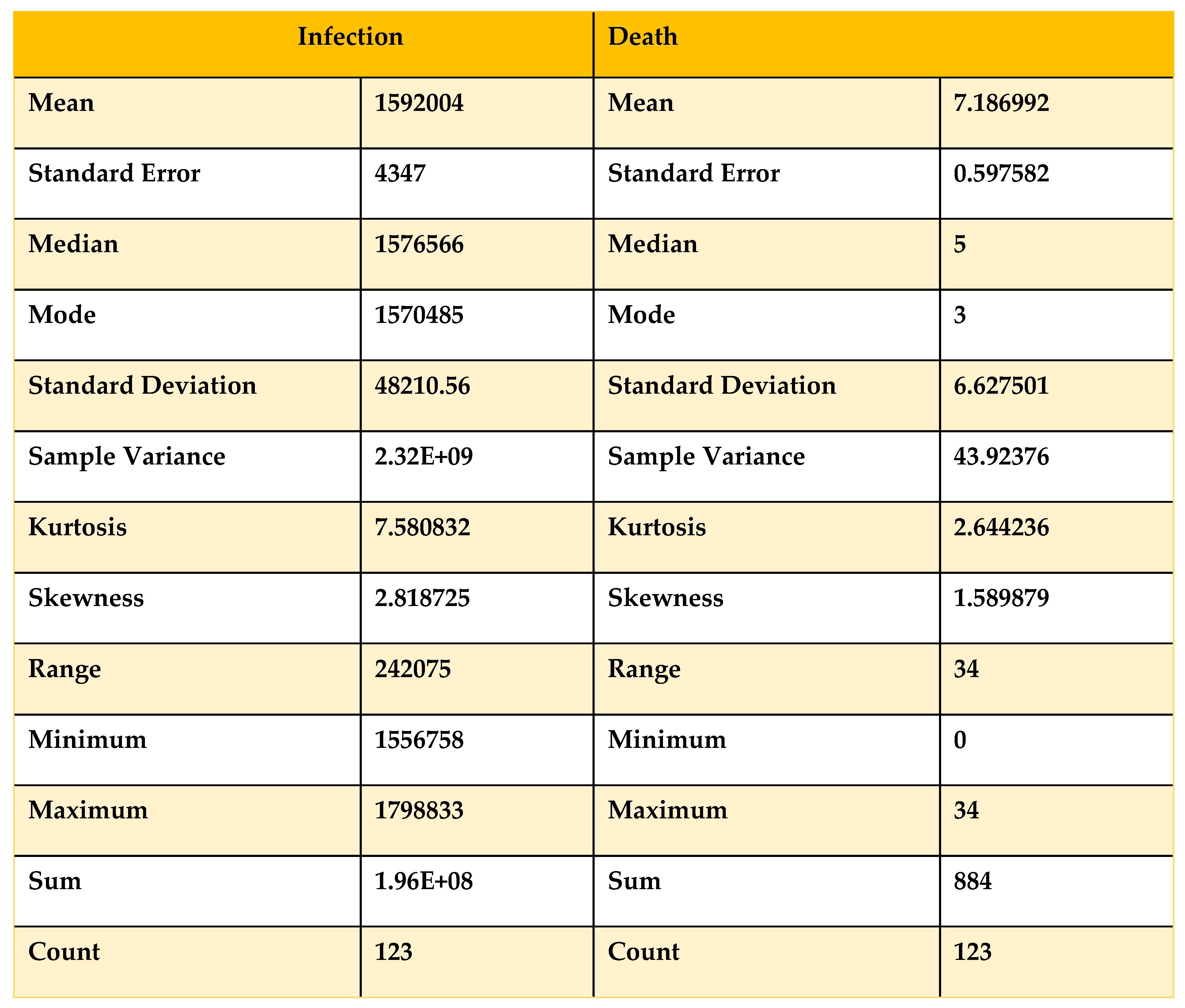 |
Now, if we compare Table 5 and Table 6 with the condition, we can see that the skewness for the death curve has increased from 1.58 to 1.90, which denotes that it is shifting from highly skewed to approximately symmetrical. On the other hand, the skewness of the infected has decreased from 2.8 to 1.37, showing that with time, the infected curve is skewed approximately symmetrically and remains right skewed. For more validity, we take data from August 1, 2021, to January 31, 2022, to obtain a clear view.
Table 7.
Descriptive statistics on Data from 01/08/21 to 31/01/22.
 |
Now, if we compare Table 5, Table 6 and Table 7 with the condition, we can see that the skewness for the death curve has decreased from 2.06 to 1.90, which denotes that it is shifting downward. Then, after October 1, 2021, it changes from highly skewed to approximately symmetrical. On the other hand, the skewness of the infected population has increased from -0.73 to 1.37, which shows that with time, the infected population’s curve becomes highly skewed rapidly and remains left skewed. Now, we analyze Table 5 with our work and find that with time, the death curve has become asymmetric, so we can say that the death curve became and will remain stable, but for the curve of infected people, the curve is skewed. If we take the month of February 2022, we will see that the curve of infected people will be skewed higher, which will be a sign of the next wave of COVID-19. Now we will take data from December 1, 2021, to February 28, 2022, and apply statistical analysis to that data to find the validity of our results.
Table 8.
Descriptive statistics on data from 01/12/21 to 28/02/22.
 |
Here, we can see that the skewness for the death curve has fallen compared to Table 8 and been converted to approximately symmetric; on the other hand, the skewness for the infected curve has decreased from 1.37 to 0.62, which shows the deflection of our curve within February, which means our result from Figure 7 is accurate because comparing Table 5 and Table 8, we can say that the curve of infection rose until February 2022, and then it started decreasing, which states our result to be accurate.
Now, if we look at Figure 7, we will find that our curve is also showing the same behavior, as we find that after people are fully vaccinated, the curve of the infected is skewed high. Therefore, in Figure 7, the curve is highly skewed and left-skewed. If we take any random example of a highly skewed curve, we can see some similarity with Figure 7, as there is a basic example of a highly right-skewed graph.
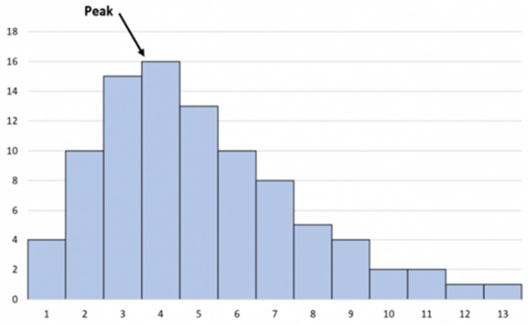
Figure 12.
Highly skewed graph skewed right.
6.3. Histogram
In general, a histogram is a visual representation that groups a set of data points into user-defined ranges. Our paper focuses on infection rates; thus, we picked the histogram because technical trading analysts employ the MACD histogram.
Using this characteristic of the histogram, we can discover variations in infection rates in our data from Table 2 that analysts use to suggest changes in momentum. Now that we have attempted to determine the number of sick individuals in various ranges, we discover,
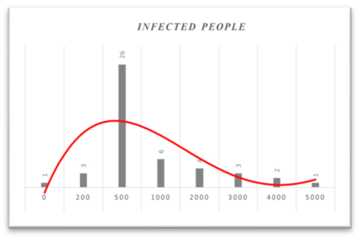
Table 9.
Frequency table from 01/12/21 to 31/01/22.
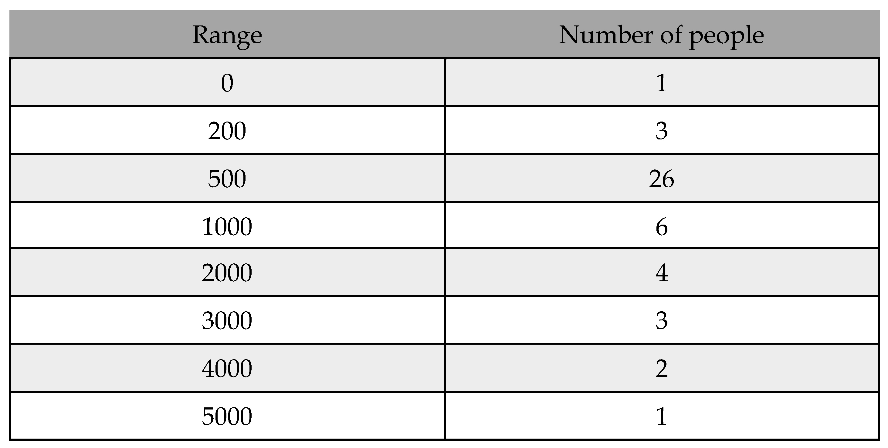 |
Figure 13.
Histogram based on infected people from 01/12/21 to 31/01/22.
In Figure 13, as the histogram shows, until January 31, 2022, almost 50% of daily infected people will be between 200 and 1000. Based on the histogram, in mid-December, people were much more infected. However, as the vaccination program simultaneously continued and more people were fully vaccinated, the number of infected people decreased. Additionally, if we look at the histogram from December 1, 2021, to February 28, 2022, we obtain,
Table 10.
Frequency table from 01/12/21 to 28/02/22.
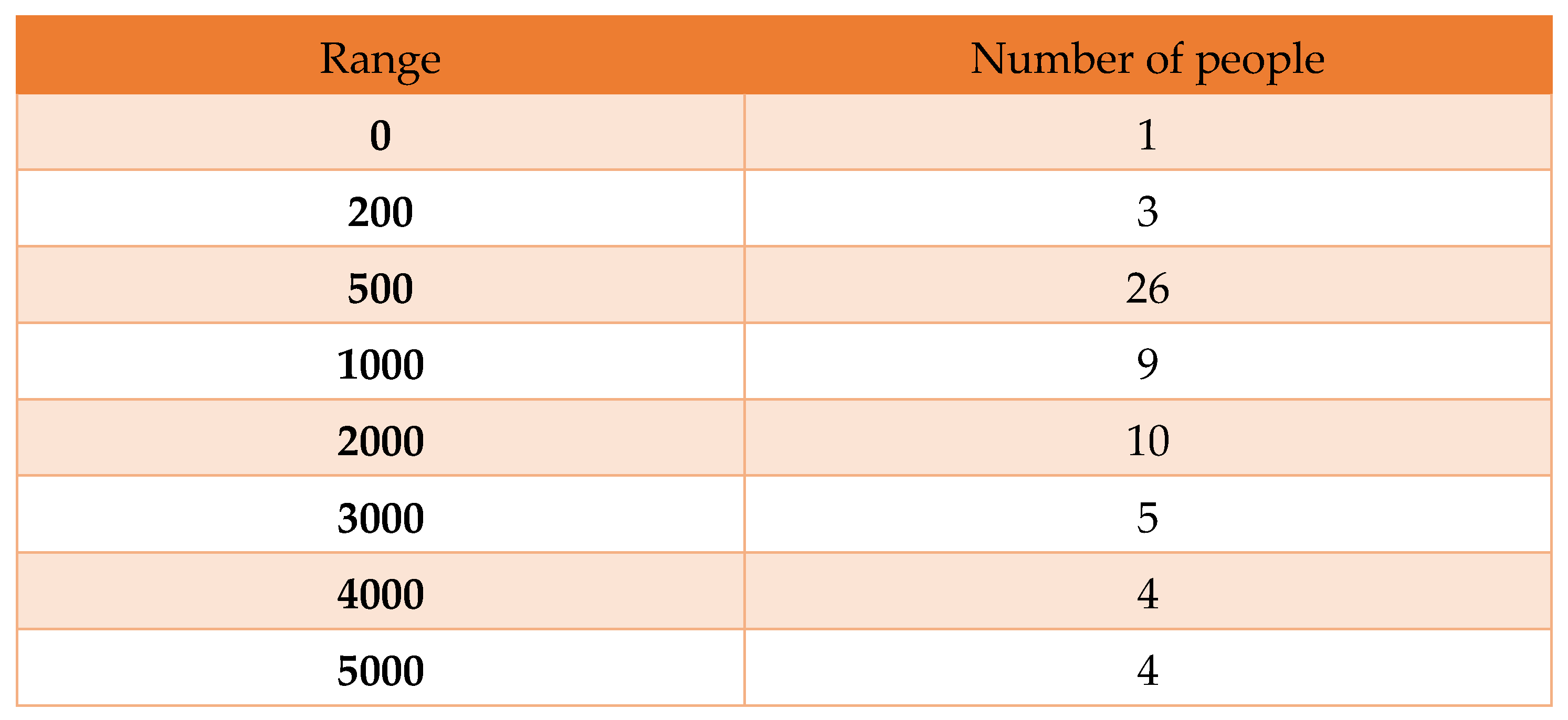 |
Here, we find a histogram that contains 10, 5, and 4 infected people whose daily numbers are greater than one thousand, as shown below:
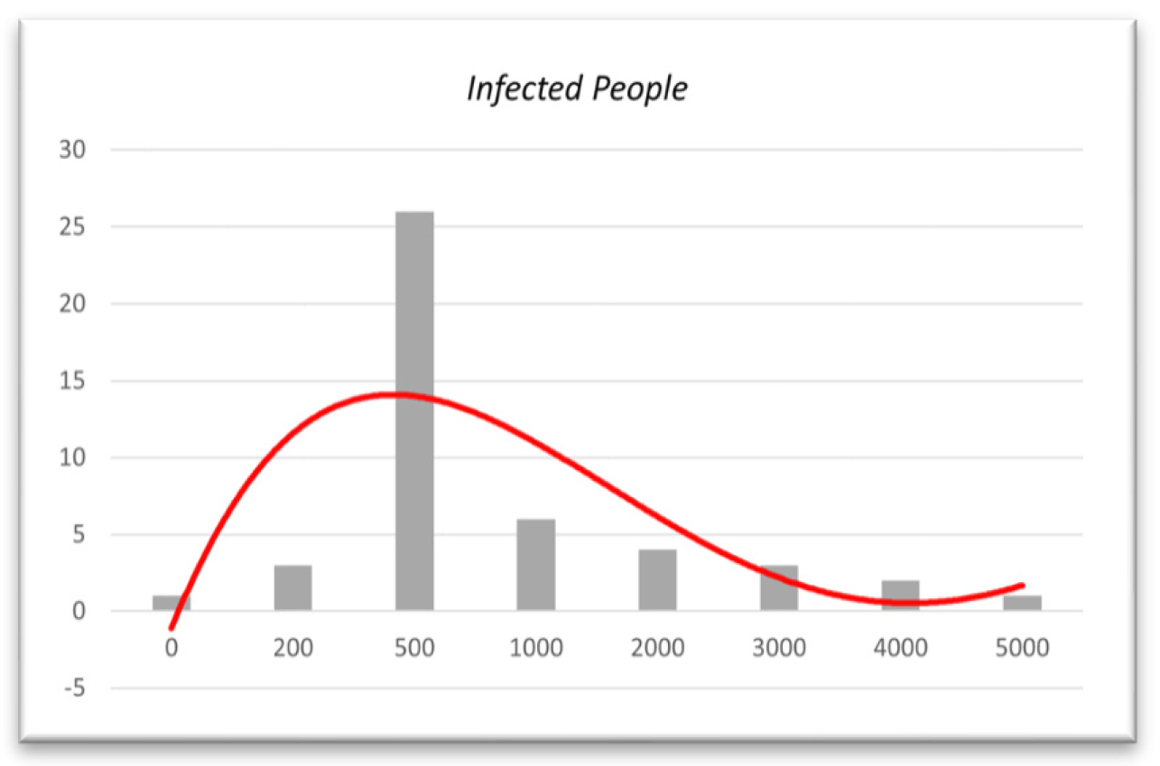
Figure 14.
Histogram based on infected people from 01/12/21 to 28/02/22.
Here, we can see that the curve goes higher for the daily infected people of 1000 or more in mid-December. In January, the number of infected people decreased by 1000+. Therefore, this histogram also shows the decrease in the infection rate in one month from January 31, 2022, which makes our model more valid.
6.4. Polynomial Regression for Validation
We will observe the actual scenario built using polynomial regression to validate our data further. We will attempt to identify that the number of people infected with COVID-19 is decreasing using data from December 1, 2021, to April 16, 2022. If infection decreases after a certain period is discovered, our model will be valid.
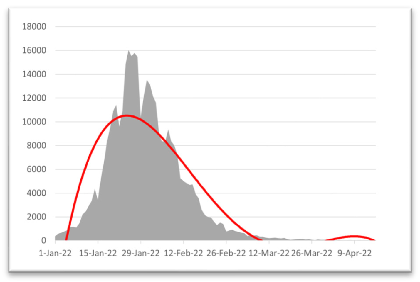
Figure 15.
Regression from 01/01/22 to 28/02/22.
Ure.Here, we can see that the COVID-19 daily infected graph has risen significantly since mid-January 2022 and peaked at the start of February. After the 1st week of February 2022, the number of infected people decreased, which makes our model more accurate. We have seen that our model provides results as we obtain the effect of vaccination for COVID-19 at the beginning of February 2022.
Now that the real scenario shows the actual reflection of our result and obtains the same result in our model formulation, our model provides approximately accurate results.
7. Discussion and Conclusion:
7.1. Result and Accuracy
We discovered from Figure 7 that the disease slowly spreads throughout Bangladesh, and the number of sick people will decline. In May 2022, the number of COVID-19-infected people will decrease rapidly because of vaccination [30,31,32,33,34,35,36,37,38,39,40]. In Chapter 2, we have already shown the model’s accuracy (2.2). Now, we discuss the prediction accuracy we have achieved from our data in Figure 7.
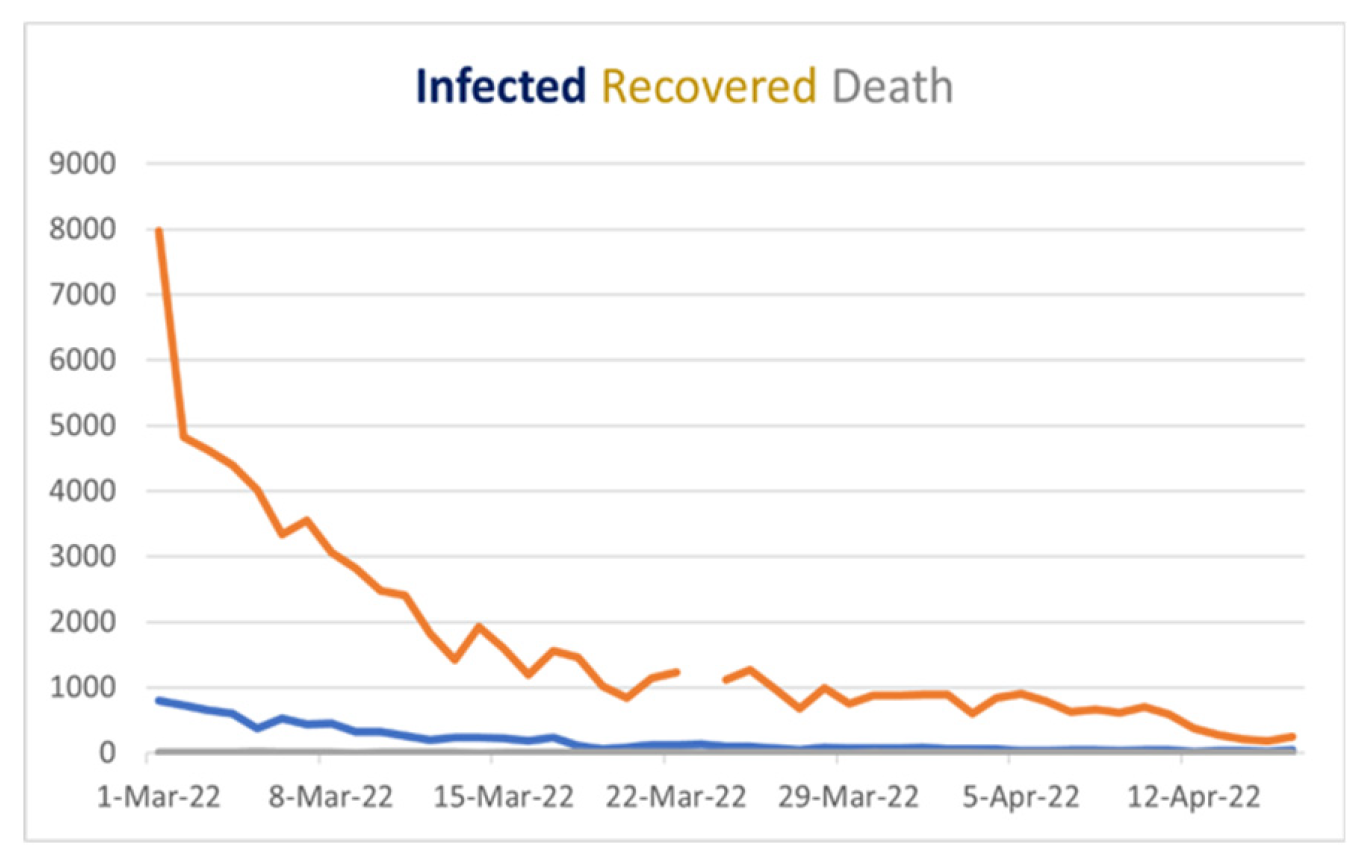
Figure 16.
Covid 19 Stat Bangladesh from March 1, 2022, to April 16, 2022.
If we look at Figure 16, we will see the blue line’s behavior, which shows the daily cases, and it is downward after March 1, 2022, which gives us a vibe that when we cover the vast number of people vaccinated, the COVID situation in Bangladesh will be under control in May 2022. Although in Figure 7. The “green curve,” which is the recovery curve, remains constant because of vaccination, and the number of infected people is decreasing, which is good news for us. Additionally, the red curve defining death in Bangladesh will be minimal and stable after mid-April 2022. Now here, we can find similarities in Figure 7 and Figure 16, and if our prediction is right, we can minimize COVID-19 spreading and save people from being affected by this virus. After comparing our result with the real scenario available to us until now, we find the same behavior in both cases, so we can conclude that our prediction is likely accurate in determining the vaccination effect.
7.2. Limitations
Many of the model’s initial assumptions, such as its fundamental parameters, are now based on data from reliable sources such as World Meter [7] and JHU’s CSSE [8]. However, there are situations in which we cannot directly observe the target variable and must instead make assumptions about the target variable’s parameters based on other relevant fields or data; this is a limitation because the assumption may lead to a slight reduction in the prediction’s accuracy. The suggested modified SIR model would produce a more precise forecast if the necessary information could be presented precisely or if it is contained in the sources provided by the government.
7.3. Conclusion
The simulation indicates that the disease is spreading slowly in Bangladesh and that the infection rate will soon decline. Additionally, as Bangladesh’s condition is deteriorating, the criteria for infection become apparent to us. This simulation allows us to estimate what would happen if everyone had received their vaccinations. In Figure 15, we also depict the actual scenario, which indicates that the peak of COVID-19 occurred in the middle of January 2022. Our model also produced the same outcome [13].
After calculating the skewness for various date ranges, we discovered that the skewness of daily infections decreased after February 2022, which is the outcome of our model. Now that we have also evaluated the validity and nature of our result, we discovered in 6.3 that the curve is positively skewed [49,50]. As both our model and statistical analysis show the same nature and behavior of the curve of the infected individual, we can say with more than 90% accuracy that our model is valid for the current situation in Bangladesh.
These simulations are depicted in Figure 7 as alternative vaccination rates [29], infection rates with and without vaccinations, and recovery rates over time. The degree of vaccination significantly impacts the population affected by the virus. The graph shows that the infected without vaccination section will drop in areas with a high vaccination rate. Additionally, we forecast that after April 2022, the infection rate will decline, and the COVID-19 situation in Bangladesh will stabilize. To manage the rate of infection, which also includes controlling the spread of the disease, a system of monitoring and public education on vaccination is needed.
The last line of this job should be separated. According to the SVIR model, vaccination in Bangladesh will result in a decrease in infection rates and an increase in recovery rates by July 2022. Moreover, those receiving all recommended vaccinations have substantially lower infection rates than those not, so the graph is stable. This time, we have a potentially accurate model, making it simple to use to anticipate the vaccine’s impact on stopping the spread of COVID-19 and enhancing the vaccination campaign.
Appendix
JHU CSSE - Center for Systems Science and Engineering (CSSE) at Johns Hopkins University (JHU)
SVIR - Susceptible–vaccinated–Infected–Recovered
MATLAB - MATtrix LABoratory
RK4 - fourth-order Runge‒Kutta method
Multiparadigm - Using or conforming to more than one paradigm.
Perturb graph - compares the effects of all the factors at a particular point in the design space.
Schematic diagram - Representation of the elements of a system using an abstract
graphic symbols rather than realistic pictures.
2019-nCoV - Coronavirus disease
DGHS - Directorate General of Health Services
References
- History of COVID-19. Available online: https://www.news-medical.net/health/History-of-COVID-19 (accessed on 8 March 2023).
- “Different Types of Vaccines | History of Vaccines.” Available online:. Available online: https://historyofvaccines.org/vaccines-101/what-do-vaccines-do/different -types-vaccines (accessed on 8 March 2023).
- “The Immune System Lecture Outline Overview: Reconnaissance, Recognition, and Response.
- Shahrear, P.; Rahman, S.M.S.; Nahid, M.M.H. Prediction and mathematical analysis of the outbreak of coronavirus (COVID-19) in Bangladesh. Results in Applied Mathematics 2021, 10, 100145. [Google Scholar] [CrossRef] [PubMed]
- Tuteja, G.S. Stability and Numerical Investigation of modified SEIR model with Vaccination and Life-long Immunity. European Journal of Molecular and Clinical Medicine 2020, 7, 3034–3044. [Google Scholar]
- Mondal, S.; Mukherjee, S.; Bagchi, B. Mathematical modelling and cellular automata simulation of infectious disease dynamics: Applications to the understanding of herd immunity. The Journal of chemical physics 2020, 153, 114119. [Google Scholar] [CrossRef] [PubMed]
- Ehrhardt, M.; Gašper, J.; Kilianová, S. SIR-based mathematical modeling of infectious diseases with vaccination and waning immunity. Journal of Computational Science 2019, 37, 101027. [Google Scholar] [CrossRef]
- COVID 19 - La France au Bangladesh - Ambassade de France à Dacca. Available online: https://bd.ambafrance.org/-COVID-19-376 (accessed on 8 March 2023).
- Zainizam, N.A.M.; Safuan, H.M. An SIR Model Assumption for the Spread of COVID-19 with the Effects of Vaccination. Enhanced Knowledge in Sciences and Technology 2022, 2, 231–240. [Google Scholar]
- Bangladesh COVID-19 Corona Tracker. Available online: https://www. coronatracker.com/ country/bangladesh/ (accessed on 8 March 2023).
- Descriptive Statistics: Definition, Overview, Types, Example. Available online: www.investopedia.com/terms/d/descriptive_statistics.asp (accessed on 8 March 2023).
- Normality Testing - Skewness and Kurtosis | The GoodData Community. Available online: https://community.gooddata.com/metrics-and-maql-kb-articles-43/normality-testing-skewness-and-kurtosis-241#:~:text=As a general rule of, the distribution is approximately symmetric (accessed on 8 March 2023).
- WHO – COVID19 Vaccine Tracker. Available online: https://covid19.track vaccines.org/agency/who/ (accessed on 8 March 2023).
- Khan, M.A.; Ali, Z.; Dennis, L.C.C.; Khan, I.; Islam, S.; Ullah, M.; Gul, T. Stability analysis of an SVIR epidemic model with nonlinear saturated incidence rate. Applied Mathematical Sciences 2015, 9, 1145–1158. [Google Scholar] [CrossRef]
- Shahrear, P.; Chakraborty, A.K.; Islam, M.A.; Habiba, U. Analysis of computer virus propagation based on compartmental model. Applied and Computational Mathematics 2018, 7, 12–21. [Google Scholar]
- Van den Driessche, P.; Watmough, J. Reproduction numbers and sub-threshold endemic equilibria for compartmental models of disease transmission. Mathematical Biosciences 2002, 180, 29–48. [Google Scholar] [CrossRef] [PubMed]
- Allen, L.J.; Brauer, F.; Van den Driessche, P.; Wu, J. Mathematical Epidemiology; Springer: Berlin, 2008; Vol. 1945. [Google Scholar]
- Van den Driessche, P. Reproduction numbers of infectious disease models. Infectious Diseases Modelling 2017, 2, 288–303. [Google Scholar] [CrossRef]
- Mekonen, K.G.; Habtemicheal TGBalcha, S.F. Modeling the effect of contaminated objects for the transmission dynamics of COVID-19 with self-protection behavior changes. Results in Applied Mathematics 2020, 9, 100134. [Google Scholar] [CrossRef]
- Cai, L.; Li, X.; Ghosh, M.; Guo, B. Stability analysis of an HIV/AIDS epidemic model with treatment. Journal of Computational Applied Mathematics 2009, 229, 313–323. [Google Scholar] [CrossRef]
- Hurwitz, A. On the Conditions under Which an Equation Has Only Roots with Negative Real Parts. Selected Papers on Mathematical. Trends in Control Theory 1964, 65, 273–284. [Google Scholar]
- DeJesus, E.X.; Kaufman, C. Routh–Hurwitz criterion in the examination of eigenvalues of a system of nonlinear ordinary differential equations. Physical Review A 1987, 35, 5288. [Google Scholar] [CrossRef] [PubMed]
- Institute of Epidemiology DC and, R. COVID-19. (2020). 24 October. Available online: https://www.iedcr.gov.bd/index.php/component/content/article/73-ncov-2019 (accessed on 24 October 2020).
- Kermack, W.O.; McKendrick, A.G. A contribution to the mathematical theory of epidemics. Proceedings of the Royal Society 1927, 115, 700–721. [Google Scholar]
- Shahrear, P.; Glass, L.; Edwards, R. Chaotic dynamics, and diffusion in a piecewise linear equation. Chaos: An Interdisciplinary Journal of Nonlinear Science 2015, 25, 033103. [Google Scholar] [CrossRef]
- Kar, T.K.; Batabyal, A. Stability analysis and optimal control of an SIR epidemic model with vaccination. Biosystems 2011, 104, 127–135. [Google Scholar] [CrossRef] [PubMed]
- Bangladesh COVID - Coronavirus Statistics - Worldometer. (2022). Available online: https://www.worldometers.info/ coronavirus/country/bangladesh (accessed on 14 January 2022).
- John Hopkins Hospital (JHH). Coronavirus COVID-19 Global Cases by the Center for Systems Science and Engineering (CSSE) At Johns Hopkins. 2020. Available online: https://www.arcgis.com/apps/opsdashboard/index.html#/bda7594740fd4029942 3467b48e9ecf (accessed on 14 March 2020).
- Turkyilmazoglu, M. , An extended epidemic model with vaccination: Weak-immune SIRVI. Physica A: Statistical Mechanics and its Appli-cations 2022, 598, 127429. [Google Scholar] [CrossRef] [PubMed]
- Das, K.; Srinivas, M.N.; Shahrear, P.; Rahman, S.M.S.; Nahid, M.M.H.; Murthy, B.S.N. Transmission Dynamics and Control of COVID-19: A Mathematical Modelling Study. Journal of Applied Nonlinear Dynamics 2023, 12, 405–425. [Google Scholar] [CrossRef]
- Islam, M.S. ; Pabel Shahrear, Goutam Saha, Md Ataullha, and M. Shahidur Rahman. “Mathematical analysis and prediction of future outbreak of dengue on time-varying contact rate using machine learning approach.” Computers in biology and medicine 2024, 178, 108707. [Google Scholar]
- Shahrear, P.; Chakraborty, A.K.; Islam, M.A.; Habiba, U. “Analysis of computer virus propagation based on compartmental model.” Applied and Computational Mathematics 2018, 7, 12–21.
- Islam, M.A.; Sakib, M.A.; Shahrear, P.; Rahman, S.M.S. The dynamics of poverty, drug addiction and snatching in sylhet, bangladesh. Journal of Mathematics 2017, 13, 78–89. [Google Scholar] [CrossRef]
- Sakib, M.; Islam, M.; Shahrear, P.; Habiba, U. Dynamics of poverty and drug addiction in sylhet, bangladesh. Journal of Multidisciplinary Engineering Science and Technology 2017, 4, 6562–6569. [Google Scholar]
- Chakraborty, A.K.; Shahrear, P.; Islam, M.A. Analysis of epidemic model by differential transform method. Journal of Multidisciplinary Engineering Science and Technology 2017, 4, 6574–6581. [Google Scholar]
- Rahman, S.M.S.; Islam, M.A.; Shahrear, P.; Islam, M.S. Mathematical model on branch canker disease in Sylhet, Bangladesh. Journal of Mathematics 2017, 13, 80–87. [Google Scholar]
- Saha, A.K.; Saha, G.; Shahrear, P. Dynamics of SEPAIVRD model for COVID-19 in Bangladesh. 2024. [Google Scholar] [CrossRef]
- Shahrear, P.; Habiba, U.; Karim, S.; Shahrear, R. “A Generalization of Gene Network Representation on the Hypercube. ” Engineered Science 2024, 29, 1152. [Google Scholar] [CrossRef]
- Shahrear, P.; Habiba, U.; Rezwan, S. The Role of the Poincaré Map is Indicating a New Direction in the Analysis of the Genetic Network’’. International Review on Modelling and Simulations (I.RE.MO.S.) 2022, 15, 351–358. [Google Scholar] [CrossRef]
- Shahrear, P.; Glass, L.; Edwards, R. Collapsing chaos. Texts in iomathematics 2018, 35–43. [Google Scholar] [CrossRef]
- Shahrear, P.; Glass, L.; Nicoletta, D.B. Analysis of piecewise linear equations with bizarre dynamics. PhD diss., Ph. D. Thesis, Universita Degli Studio di Bari ALDO MORO, Italy, 2015. [Google Scholar]
- Shahrear, P.; Glass, L.; Wilds, R.; Edwards, R. “Dynamics in piecewise linear and continuous models of complex switching networks.” Mathematics and Computers in Simulation 2015, 110, 33–39.
- Shahrear, P.; Glass, L.; Wilds, R.; Edwards, R. “Dynamics in piecewise linear and continuous models of complex switching networks. ” Mathematics and Computers in Simulation 2015, 110, 33–39. [Google Scholar] [CrossRef]
- Junaid, M.; Saha, G.; Shahrear, P.; Saha, S.C. “Phase change material performance in chamfered dual enclosures: Exploring the roles of geometry, inclination angles and heat flux. ” International Journal of Thermofluids 2024, 24, 100919. [Google Scholar] [CrossRef]
- Faiyaz, C.A.; Shahrear, P.; Shamim, R.A.; Strauss, T.; Khan, T. “Comparison of Different Radial Basis Function Networks for the Electrical Impedance Tomography (EIT) Inverse Problem.” Algorithms 2023, 16, 461.
- Ahamad, R.; Karim, M.S.; Rahman, M.M.; Shahrear, P. “Finite element formulation employing higher order elements and software for one dimensional engineering problems. ” Space 2019, 1, 1. [Google Scholar]
- Hussain, F.; Ahamad, R.; Karim, M.S.; Shahrear, P.; Rahman, M.M. Evaluation of Triangular Domain Integrals by use of Gaussian Quadrature for Square Domain Integrals. Sust Studies 2010, 12, 15–20. [Google Scholar]
- Karim, M.S.; Shahrear, P.; Rahman, M.D.; Ahamad, R. “Generating formulae for the existing and non-existing numerical integration schemes. ” Journal of Mathematics and Mathematical Sciences 2005, 21, 91–104. [Google Scholar]
- Faruque, S.B.; Shahrear, P. “On the gravitomagnetic clock effect. ” Fizika B: a journal of experimental and theoretical physics 2008, 17, 429–434. [Google Scholar]
- Shahrear, P.; Faruque, S.B. Shift Of The Isco And Gravitomagnetic Clock Effect Due To Gravitational Spin–Orbit Coupling. International Journal of Modern Physics D 2007, 16, 1863–1869. [Google Scholar] [CrossRef]
Disclaimer/Publisher’s Note: The statements, opinions and data contained in all publications are solely those of the individual author(s) and contributor(s) and not of MDPI and/or the editor(s). MDPI and/or the editor(s) disclaim responsibility for any injury to people or property resulting from any ideas, methods, instructions or products referred to in the content. |
© 2024 by the authors. Licensee MDPI, Basel, Switzerland. This article is an open access article distributed under the terms and conditions of the Creative Commons Attribution (CC BY) license (http://creativecommons.org/licenses/by/4.0/).
Copyright: This open access article is published under a Creative Commons CC BY 4.0 license, which permit the free download, distribution, and reuse, provided that the author and preprint are cited in any reuse.


