1. Introduction
Certain dynamical systems have been known since Poincaré to be chaotic [
1,
2], i.e. they are highly sensitive to initial conditions and parameters. Classical models of deterministic chaos include the Lorenz system modeling weather [
3] and the logistic map modeling population growth [
4]. Dynamical systems can also display synchronization, when two or more different systems exhibit similar dynamics, either behaving identically as a limiting example, or more broadly possessing similarities in some key aspects, such as sharing the same frequencies or a constant phase lag [
5]. Remarkably, though chaotic systems exhibit completely different behaviors with only slightly different initial conditions, adding a small amount of coupling can cause them to be synchronized, since periodicity is not required for synchronization [
6]. More broadly, chaos synchronization occurs when two (or many) chaotic systems (either equivalent or nonequivalent) adjust a given property of their motion to a common behavior due to a coupling or to a forcing (periodical or noisy) [
7]. Chaos synchronization has found applications in a wide variety of fields such as electrical circuits [
8,
9,
10,
11], power systems [
12,
13,
14], medicine [
15,
16], and chemical reactors [
17,
18].
Historically, chaos synchronization has been classified into different categories including complete synchronization, practical synchronization, and phase synchronization[
19]. Such categorization, however, only provides qualitative classification of chaos synchronization, so research in quantitative complexity measurement of chaos synchronization started to develop over the last two decades. Classic methods of complexity measurement include phase portraits, bifurcation diagram [
20], and Lyapunov exponent [
21] which require access to the dynamical equations. A growing body of work uses broader and more abstract techniques relying on entropy analysis such using Kolmogorov entropy to quantify the level of unpredictability in a chaotic system over time [
22], spectral entropy to diagnose multi-stable fractional-order chaotic systems [
23], and entanglement and relative entropy to investigate the chaotic behaviors in quantum systems [
24]. One advantage of these entropy-based analyses is that it can often be applied to systems where only the dynamical data is available, in the absence of the actual equations, such as in experimental situations, and the results are typically robust to the presence of noise in the data or the dynamics.
In this paper we explore the applicability of entropy to quantify chaos synchronization broadly. As we discuss below, our method uses `peak-to-peak’ dynamics which is present in almost all basic models of chaos, including the Lorenz system, the Duffing oscillator, the Chua cirsuit, and the Rössler attractor [
25]. Specifically, we use the paradigmatic model of the basic coupled Lorenz systems, applying entropy analysis on ordinal patterns extracted from peak dynamics. We show that this entropy-based analysis in quantifying chaos synchronization not only captures overall similarities between two synchronized systems but also reveals a diversity of possible synchronization, non-monotonic changes in behavior with respect to linear change in parameters during transition from one regime to another, and complicated boundaries between different synchronization regimes.
Below, in
Section 2, coupled identical Lorenz systems with dissimilar initial conditions are introduced, as well as coupled dissimilar Lorenz systems with identical initial conditions, the synchronization effects of which vary with the change in coupling parameters.
Section 3 describes the specific methodology of the new synchronization diagnostic, focusing on converting the raw time-series information into ordinal patterns about the peak-to-peak dynamics before computing the Shannon entropy of the ordinal pattern populations obtained from the processed data. Results and findings about the coupled Lorenz systems after applying the new diagnostic are presented in
Section 4 and are compared with the conventional methods, showing values of our new synchronization diagnostic. Finally, discussions and conclusions are presented in
Section 5, revealing findings on other interesting behaviors and pointing out directions of further research.
3. Methods: Quantifying Synchronization
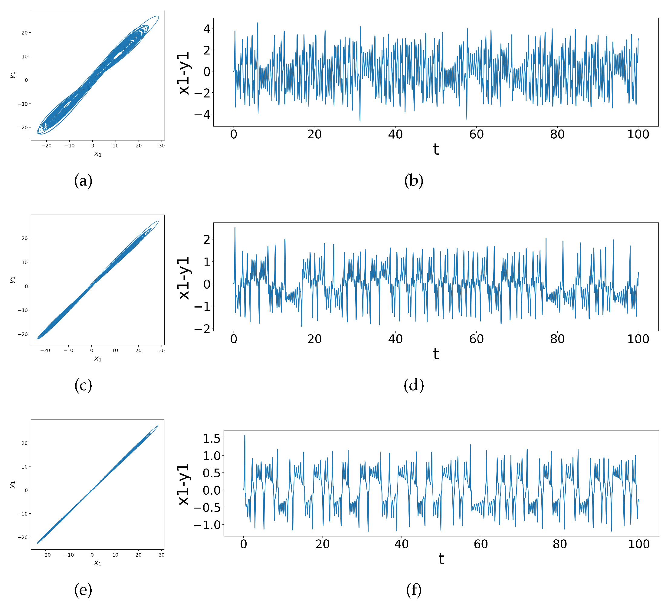
Across the various types of synchronization shown in
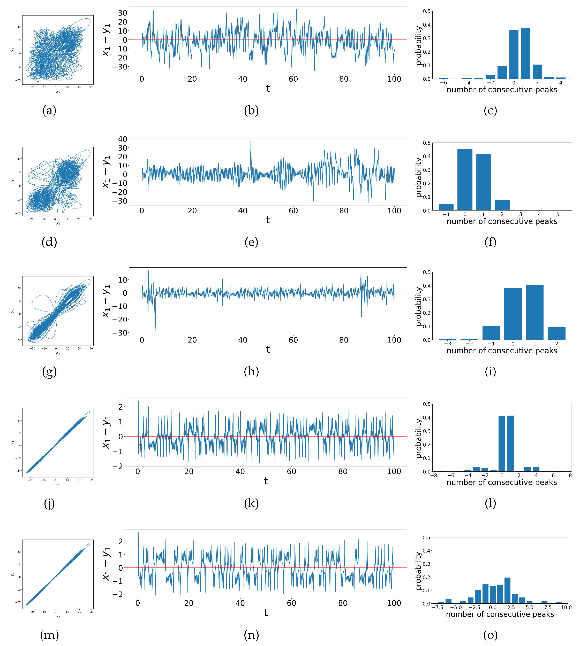
Figure 3, although the variety of time series patterns are quite different, they all have the common element that the difference between
and
is centered around 0, i.e. the time series is centered on the horizontal axis
. We focus on behavior relative to this horizontal axis, specifically considering the behavior of the ringing patterns previously discussed in the context of the difference time series for
: We count the number of peaks between zero-crossings in the difference time series noting either the number of peaks or its negative depending on if
between two zero-crossings or if
respectively. This compresses the time series data into a list of the observed populations of number of consecutive peaks between zero-crossings in the original difference time series. This can be visualized as the bar chart shown in the third column of
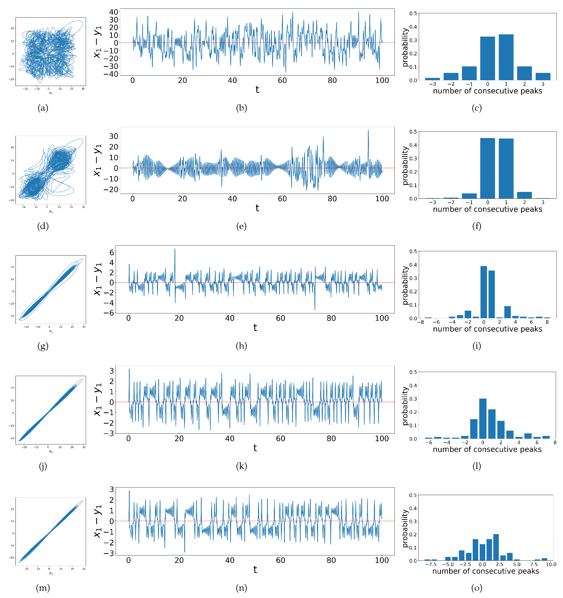
Figure 4, where the
x-axis denotes the elements in the peaks list (i.e. the positive or negative number of peaks) and the
y-axis denotes the frequency. We now present all this information in
Figure 4 which adds bar charts for the peaks as described to the previous figure where again, as we look down the rows the coupling strength
increases while
stays unchanged, and the phase portraits become more linear.
These bar charts also indicate that there are various transitional behaviors in chaos synchronization. When the system is not synchronized, there are no ringing patterns but only single spikes, so there are usually very few instances of more than one consecutive peak, as shown in
Figure 4c. As the transition begins, the range of possible values for numbers of consecutive peaks increases, whence the bar charts show a corresponding wide range of values on the
x-axis. At the early stage of such transition, single peaks are still the majority, as shown in
Figure 4f. We find that here the ringing pattern that exist often cross the horizontal axis such that only the last peak in a ringing pattern counts as a single `peak’ by our algorithm. Then, as the system get more synchronized with the increase in coupling strengths, the ringing patterns diverge from the horizontal axis, so the continuous peaks of all lengths are distributed more evenly, as shown in
Figure 4o. All of these observations motivate us to compute the Shannon entropy of the distribution of peak populations, thus developing the Difference Time Series Peak Complexity (DTSPC) metric
to quantify the level of synchronization. Our investigations below show that
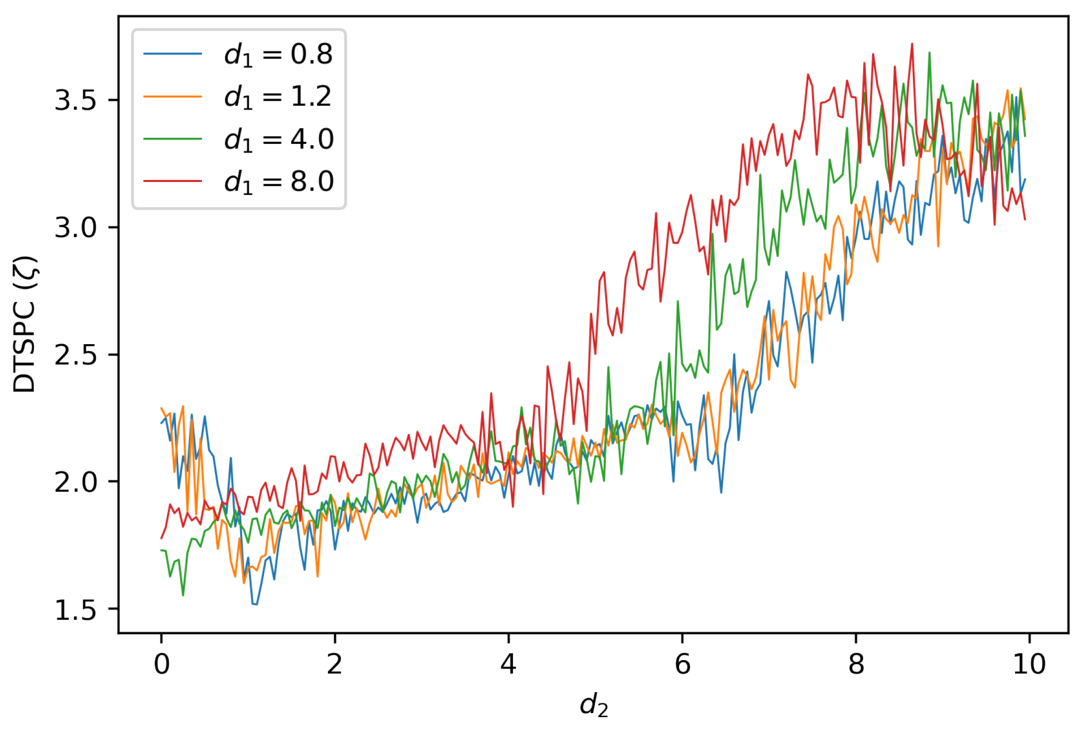
(DTSPC) indeed captures the variety in levels of synchronization of coupled dissimilar Lorenz systems, as shown in
Figure 5 where we keep
constant while varying
. Examining these line-graphs reveals that the level of synchronization varies with the change in coupling strength
, and comparing across different line graphs with different values for
shows that the level of synchronization also changes with respect to
. Hence, we now turn to describing how
behaves for our two systems, with both
and
as changing parameters.
4. Results
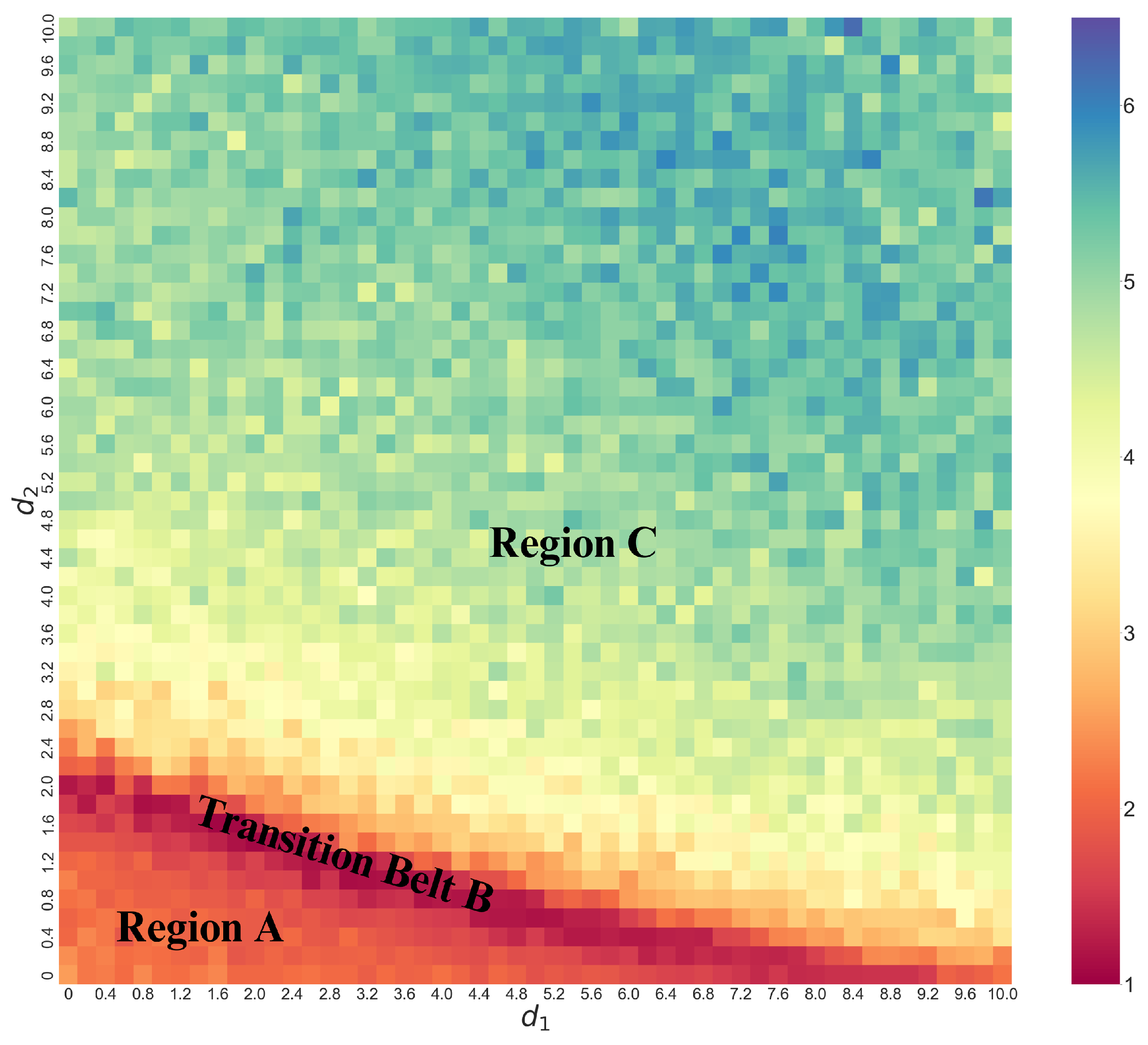
To summarize the results of applying the DTSPC diagnostic on coupled identical and dissimilar Lorenz systems, we present in both cases a heat map of , i.e. displaying the DTSPC as a function of coupling strength parameters. We find distinct regimes of different levels and types of synchronization via this heat map. The color coding for ranges from warmer (dark red) to the colder (dark blue) where the warmer the color represents a smaller and hence a less complex set of data from the synchronization dynamics.
Consider
Figure 6 which shows a wide variety of
values thus indicating a wide variety of synchronization behaviors with changes in coupling parameters. In particular, we can identify regions or families across the map based on the change in color patterns in the heat map. Specifically, moving diagonally starting from the bottom left corner, we label the dominantly orange-red region as Region
A; this is followed by distinct thin ridge of dark red we label as Transition Belt
B. Beyond this Transition Belt
B is Region
C, where the color steadily changes from yellow to bluish-green. We note immediately that we can visually identify a speckle pattern suggesting that the transition need not be smooth as a function of coupling. We also see visually that these transitions are less sensitive to coupling (are slower) in Region
A and
C while they are more rapid in Transition Belt
B.
While it is important to emphasize that we can construct this sort of heat-map given just the peak data without access to either the differential equations or the time-series themselves, to calibrate our ideas about what these various regimes represent, in
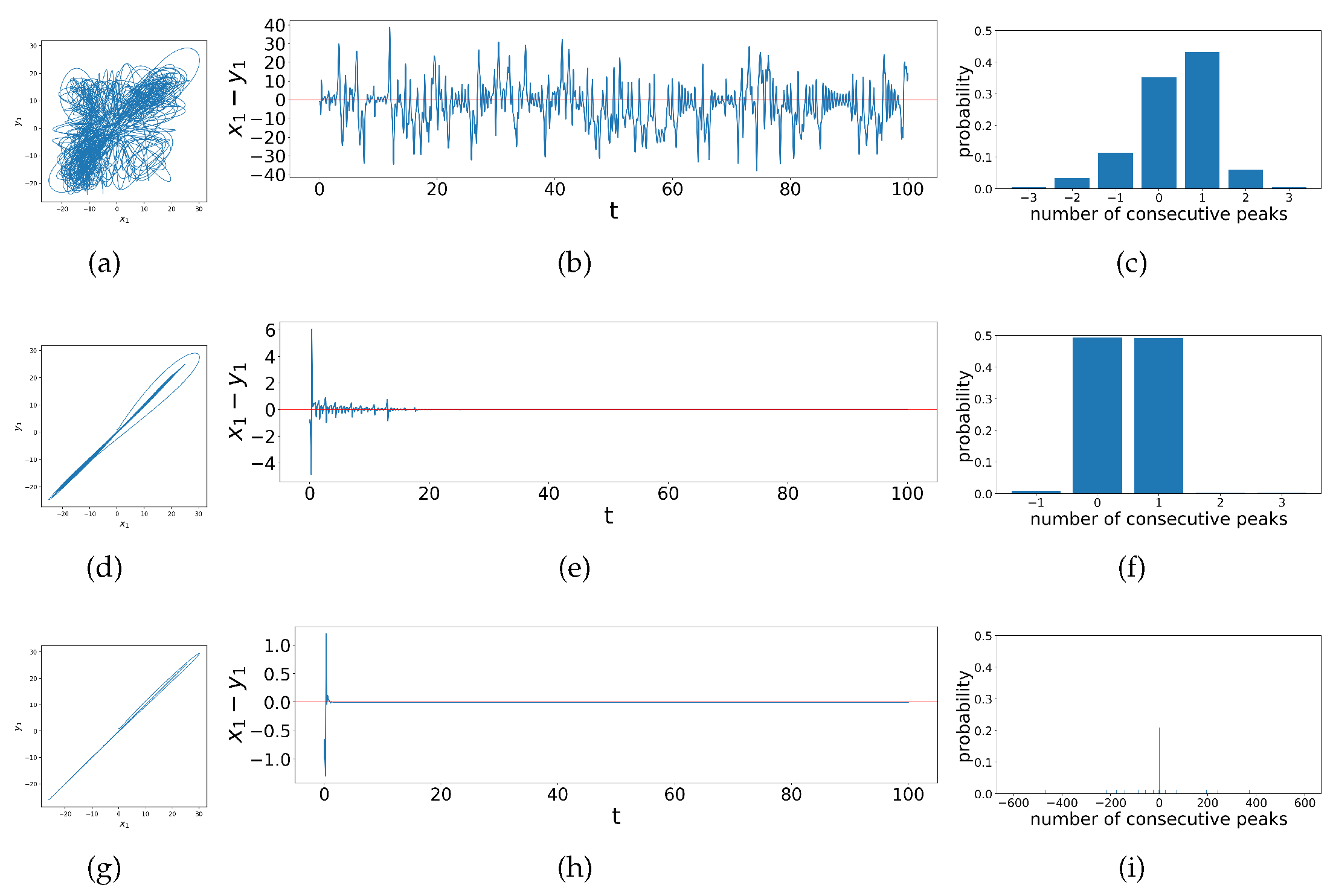
Figure 7 we explore details of these different synchronization behaviors, showing examples from each region of the heat map. The first example is when
in Region
A, shown in
Figure 7a-c. Region
A represents unsynchronized chaos, where
and
follow completely random relationship as shown in the phase portrait (
Figure 7b). Similarly, in the time series (
Figure 7b) the difference between
and
appear to be random and chaotic. This results in its constant crossing of zeros, with few segments of the time series showing larger numbers of consecutive peaks. Thus, there are mainly 0 or 1 consecutive peaks according to our criterion, indeed as shown in
Figure 7c which leads to the low
value. In Transition Belt
B dynamics change can change quickly with parameters, as shown in
Figure 7 d-f when
. The phase portrait (
Figure 7d) shows that the relationship between
and
becomes mainly linear, and in time series (
Figure 7e), accordingly, the difference between
and
gradually quiets down to zero, where there remains some bursts at the beginning in the first 20 time steps. This time series frequently crosses the horizontal axes such that the count for consecutive peaks remains even more concentrated at 0 or 1 than in Region
A, such that the DTSPC
for systems in the Transition Belt
B is even lower. The third example with
is chosen from Region
C and represents complete synchronization. In the phase portrait (
Figure 7g) the relationship between
and
is more strictly linear, and the difference time series (
Figure 7h) dies down to zero abruptly almost right after the two Lorenz systems get coupled. However, there could be nuanced and extremely frequent ringing patterns above or below the zero line (red horizontal line), as the number of consecutive peaks can range from
to 600 as show in
Figure 7i. Hence, this analysis reveals overall that as a function of coupling parameters, the dynamical synchronization as quantified by
starts low, and then with the increase in coupling strengths it experiences first a decrease then an increase, which matches the general trend of the heat map (
Figure 6). In summary we see that coupling in general increases synchronization however, the transition can be abrupt and non-monotonic in this case, and that the DSTPC captures this appropriately.
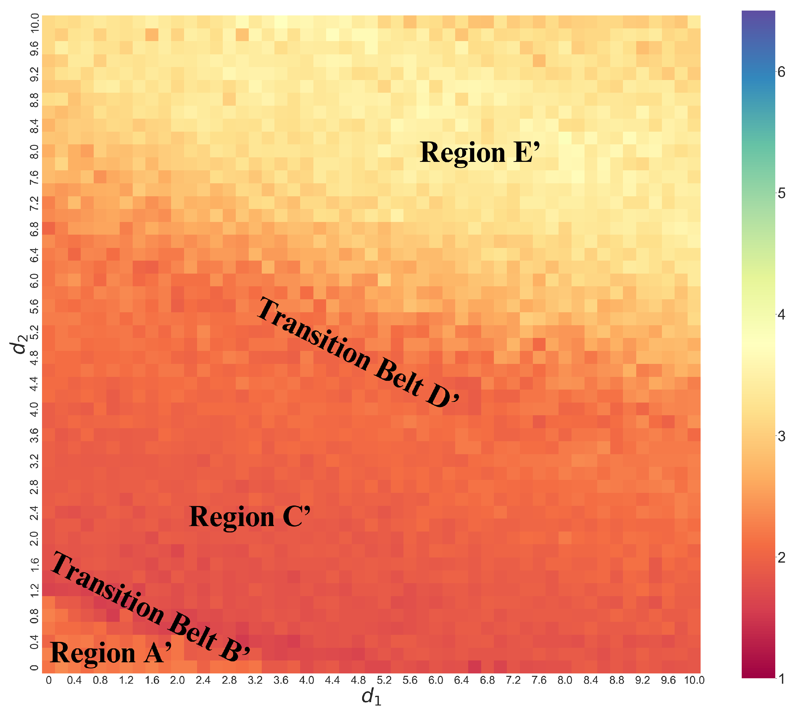
In
Figure 8 we show a heat map for the coupled dissimilar Lorenz systems. This heat map is over the same range of coupling strengths as in
Figure 6 above for coupled identical Lorenz systems but shows only one region of warm coloring in this one, indicating that the information complexity of the peaks distribution is in general less than the identical case above. In this case, we see that the heat map also starts from orange in the bottom-left corner indicated as Region
, transitions through the dark red Belt
, beyond which is Region
, where the entropy changes gradually. Beyond this Region
is the orange-yellow Transition Belt
separating it from Region
above, which is bright yellow.
As before, we calibrate our understanding of this peak data information in
Figure 9 where we see an example from each of the five regions in the heat map. As in the identical systems, Region
represents chaotic dynamics for any measure of difference between the two systems, and we can see this for example in
Figure 9b displaying the
phase-space trajectories which wander chaotically between
. Because of this chaos, the observable time series frequently crossing zero and observations of number of consecutive peaks between zero-crossings are therefore mainly centered at 0 and 1, as shown in
Figure 9c resulting in a low
. In Transition Belt
signals a rapid onset of synchronization as a function of coupling. In the phase-portrait (
Figure 9d) we see that the in-phase component of the trajectories – that is, trajectory lines being traced from the bottom-left to top-right diagonal – increases, while the out-of-phase component – that is, trajectory lines being traced from the bottom-right to top-left – decreases. This also means that
and
are more directly correlated, and in general, becoming more linear. We see this in the difference time series (
Figure 9e) which abruptly decreases to lie between
most of the time, with the observable more symmetric around zero. This leads to the data in the bar chart (
Figure 9f) becoming even more centered at 0 and 1 consecutive peaks, resulting in a decrease in
.
In Region
the differences continue to decrease, with the in-phase component of the phase portrait (
Figure 9g) continuing to become sharper and linear. In the difference time series (
Figure 9h) there start to appear some ringing patterns above and below the horizontal axis, though not yet very obvious. The difference between
and
further decrease to roughly between
. Transition Belt
is where practical synchronization becomes rather apparent. As shown clearly in the phase portrait (
Figure 9j),
and
follow a linear relationship. Accordingly, the time series for the difference between these two observables (
Figure 9k) reduces to between
, and clear ringing patterns start to appear that lie strictly above and below the
x-axis. However before this clear separation above and below the
x-axis we also see some small-scale dynamics in this difference variable which presents as `signal fuzziness’ and a `stickiness’ when this difference crosses zero resulting from the slight entanglement of the two oscillators’ trajectories when they are exchanging positions in phase space during synchronization, and often resulting in a small single peak for our criterion. This results in many 0 and 1 consecutive peaks (
Figure 9l), so the
remains low. Finally, Region
is where the two systems are more synchronized, as the ringing patterns appear further apart from each other, shown in
Figure 9n, with fewer crossings at zero. This indicates that there is less stagnation during a phase change, so the number of 0 and 1 consecutive peaks reduces. Thus, the data is more spread out in the bar chart, as shown in
Figure 9o and
consequently experiences a significant increase. Thus, to summarize,
starting off low in Region
then decreases and increases with the increase in coupling strengths as before for identical systems. However, the transition to synchronization now carries more regions of distinct dynamical regimes: Transition Belt
, Region
, and Transition Belt
. Within them,
first decreases a little, then increases, and slightly decreases again, each part corresponding to different dynamics of the system as we have just seen. This shows again the value of using
to quantitatively identify and classify synchronization behaviors.
We also note that both heat maps (as shown in
Figure 6 and
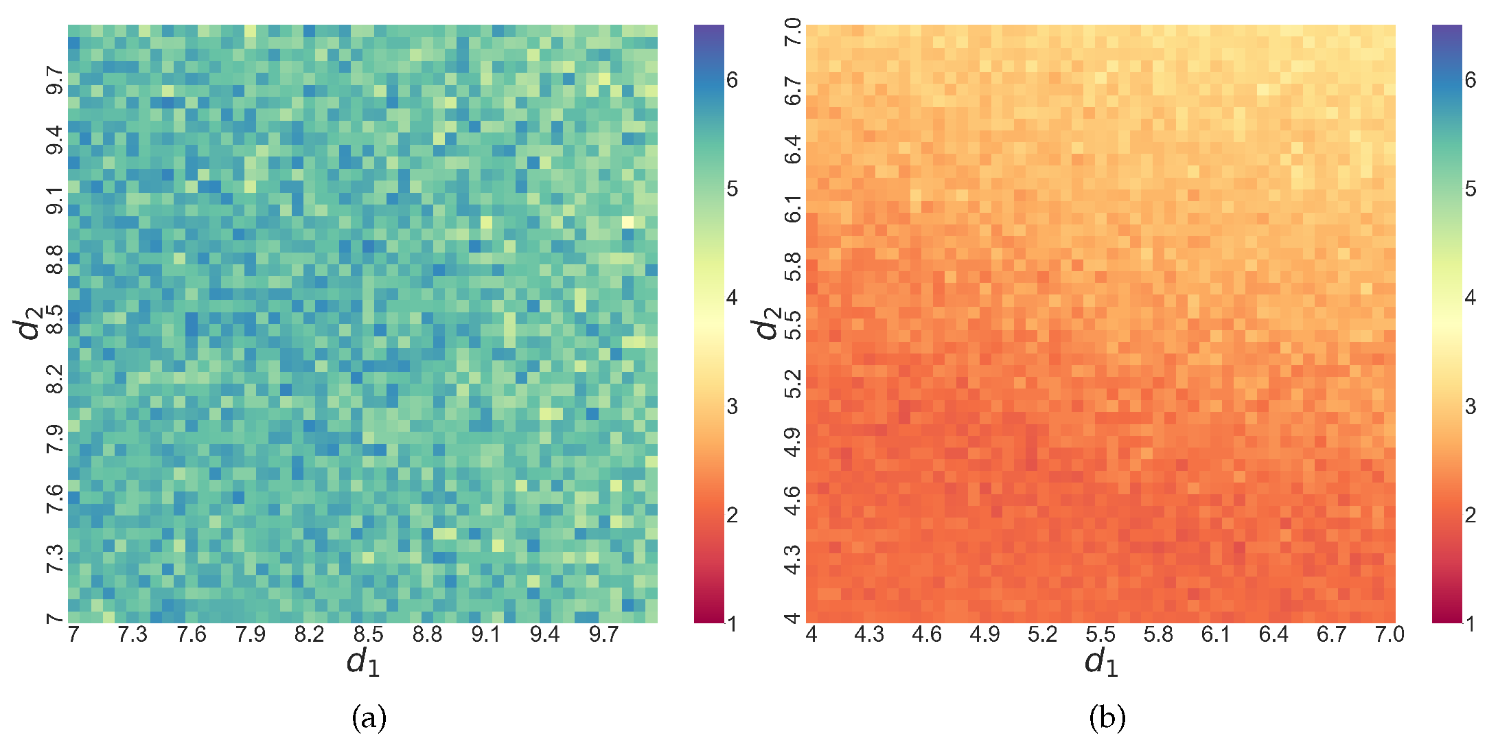
Figure 8) show that the synchronization is not locally smooth as a function of coupling strength, given the speckle pattern or occasional grids visibly brighter or darker than their surroundings. Even when we zoom in to some of these areas, such nuanced patterns still exist, as shown in
Figure 10 below. While this sensitive dependence on the parameter of the dynamical complexity of the synchronization is perhaps not surprising, it is useful to see how our DTSPC technique based on Shannon entropy can capture this sensitivity.
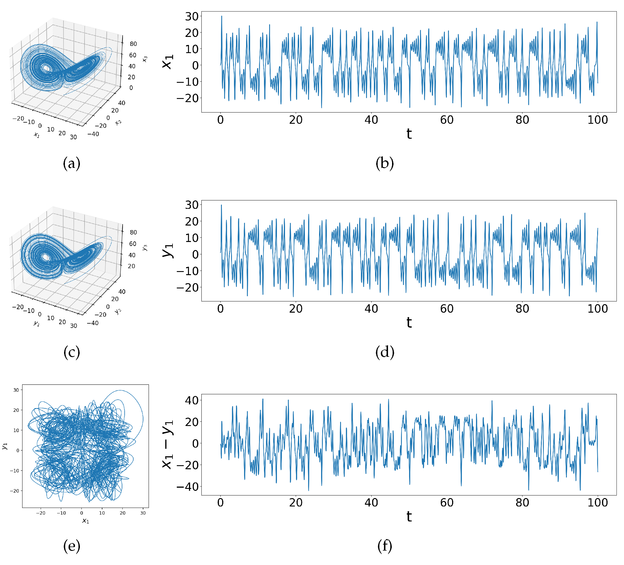
Figure 1.
Phase space and time series of uncoupled identical Lorenz systems with initial conditions (a)&(b) and (c)&(d) , the phase portrait of vs and difference () time series, showing a variety of chaotic behaviors given initial conditions of slightest difference.
Figure 1.
Phase space and time series of uncoupled identical Lorenz systems with initial conditions (a)&(b) and (c)&(d) , the phase portrait of vs and difference () time series, showing a variety of chaotic behaviors given initial conditions of slightest difference.
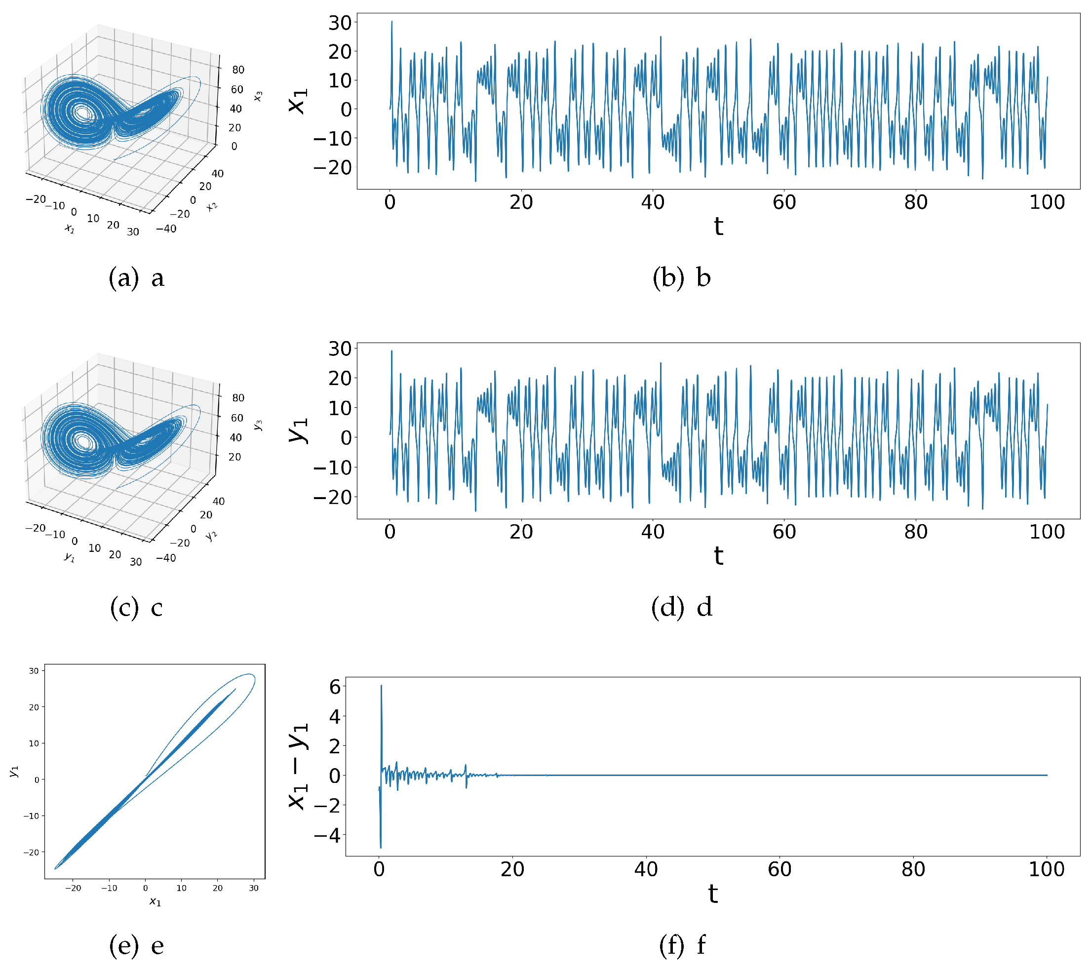
Figure 2.
Phase space and time series of coupled identical Lorenz systems with initial conditions (a)&(b) , (c)&(d) and coupling strengths , the phase portrait of vs and difference () time series, showing complete synchronization shortly after coupling.
Figure 2.
Phase space and time series of coupled identical Lorenz systems with initial conditions (a)&(b) , (c)&(d) and coupling strengths , the phase portrait of vs and difference () time series, showing complete synchronization shortly after coupling.
Figure 3.
Coupled dissimilar Lorenz systems with coupling strengths (a)&(b) , (c)&(d) , (e)&(f) , showing practical synchronization after coupling.
Figure 3.
Coupled dissimilar Lorenz systems with coupling strengths (a)&(b) , (c)&(d) , (e)&(f) , showing practical synchronization after coupling.
Figure 4.
Phase portraits, difference time series graphs and peaks composition bar charts for coupled dissimilar Lorenz systems with coupling strengths and (a)-(c) , (d)-(f) , (g)-(i) , (j)-(l) , and (m)-(o) , showing correlations between phase space behaviors, time series and peaks composition.
Figure 4.
Phase portraits, difference time series graphs and peaks composition bar charts for coupled dissimilar Lorenz systems with coupling strengths and (a)-(c) , (d)-(f) , (g)-(i) , (j)-(l) , and (m)-(o) , showing correlations between phase space behaviors, time series and peaks composition.
Figure 5.
Change in (DTSPC) as a function of coupling for dissimilar Lorenz systems, each with a fixed value for coupling .
Figure 5.
Change in (DTSPC) as a function of coupling for dissimilar Lorenz systems, each with a fixed value for coupling .
Figure 6.
Heat map of (DTSPC) with changing coupling strengths in coupled identical Lorenz systems, showing unsynchronized chaos in Region A, transition to synchronization in Transition Belt B, and complete synchronization in Region C.
Figure 6.
Heat map of (DTSPC) with changing coupling strengths in coupled identical Lorenz systems, showing unsynchronized chaos in Region A, transition to synchronization in Transition Belt B, and complete synchronization in Region C.
Figure 7.
Phase portraits, difference time series graphs and peaks composition bar charts for different regimes of coupled identical Lorenz systems, (
a)-(
c) correspond to a case in Region A in
Figure 6 when
; (
d)-(
f) correspond to Transition Belt B in
Figure 6 when
; (
g)-(
i) correspond to Region C in
Figure 6 when
.
Figure 8.
Heat map of (DTSPC) with changing coupling strengths in coupled dissimilar Lorenz systems. Region : unsynchronized chaos; Transition Belt and Region : abrupt and then gradual decrease in different between and , increase synchronization; Transition Belt and Region : emergence and enhancement of separated ringing patterns, practical synchronization
Figure 9.
Phase portraits, difference time series graphs and peaks composition bar charts for different regimes of coupled dissimilar Lorenz systems. (
a)-(
c) correspond to a case in Region A’ in
Figure 8 when
; (
d)-(
f) correspond to Transition Belt B’
Figure 8 when
; (
g)-(
i) correspond to Region C’
Figure 8 when
; (
j)-(
l) correspond to Transition Belt D’
Figure 8 when
; (
m)-(
o) correspond to Region E’
Figure 8 when
.
Figure 10.
Zoomed-in heat maps of (DTSPC) vs changing coupling strengths in (a) coupled identical where and (b) dissimilar coupled Lorenz systems where , speckled patterns showing complex parameter-dependent instability during synchronization.
Figure 10.
Zoomed-in heat maps of (DTSPC) vs changing coupling strengths in (a) coupled identical where and (b) dissimilar coupled Lorenz systems where , speckled patterns showing complex parameter-dependent instability during synchronization.
