

Submitted:
26 December 2023
Posted:
27 December 2023
You are already at the latest version
Abstract
Keywords: Demographics, Diversity, Gender, Race, Age, Professionals, Built Environment, Construction Industry, South Africa
Keywords:
Demographics
; Diversity
; Gender
; Race
; Age
; Professionals
; Built Environment
; Construction Industry
; South Africa
1. Introduction
In many countries, professionalization is a key driver of quality and excellence within various fields [1,2]. It protects the interests of practitioners and the public by ensuring that those who provide services possess the necessary knowledge, skills, and ethical standards. However, in South Africa, professionalization faces unique and significant challenges, primarily driven by demographics [3,4]. Demographic-based impediments within the South African built environment are pervasive, affecting individuals from historically marginalized groups, particularly concerning race, gender, and socioeconomic status. These impediments create structural barriers that obstruct the full realization of a professional and inclusive built environment sector. The consequences of these barriers are far-reaching, as they limit access to the sector, stifle diversity, and perpetuate inequalities. The South African built environment remains largely a bastion of privilege, where opportunities and outcomes disproportionately favour a select few at the expense of the many [5,6].
The South African built environment encompasses various professions, ranging from architecture and engineering to urban planning and construction management. Within this sector, the concept of professionalization assumes a pivotal role. Professionalization refers to developing and recognising specific standards, qualifications, and ethical norms that guide individuals in their respective fields. It also entails the establishment of formalized pathways for individuals to enter, progress, and excel within their chosen professions [7,8].
This study seeks to unpack and analyze these demographic-based impediments and their implications for professionalization within the South African built environment. It aspires to shine a light on the factors that contribute to this predicament, to understand the historical context that gave rise to these challenges, and to propose potential solutions and policy changes to address them. By doing so, it aims to contribute to a broader conversation on diversity, inclusion, and professionalization in the South African context, offering insights that may have implications for policy, practice, and future research. The importance of this study is underscored by the critical role that the built environment plays in shaping the physical and social landscapes of South Africa. Infrastructure development, urban planning, and architectural design have far-reaching implications for South Africa's diverse population's well-being, livelihoods, and quality of life. Therefore, ensuring that the built environment sector is accessible, representative, and responsive to the needs of all South Africans is not just a matter of professional interest but a matter of national significance.
2. Materials and Methods
A mixed review of scientific articles and document analysis of professionals’ registration in South Africa was carried out to answer the questions posed by the study. The mixed review offered a global perspective on trends and critical discussion areas of topical research. The guidelines of PRISMA were followed to retrieve articles from the Scopus database as done in extant studies [9,10]. The Scopus database is widely recognized for its extensive coverage. It is commonly regarded as the premier academic database for conducting literature reviews, primarily due to the high quality of papers it encompasses[11,12]. For this review, the keywords used include Demographics, Impediments, professionals, Construction Industry, and built environment. Using exclusion criteria in systematic and scientometric reviews is a customary technique to enhance the probability of generating dependable and replicable outcomes while minimizing the inclusion of irrelevant studies. This methodology has been widely embraced in prior research endeavours [13,14]. The scope of the materials was restricted to scholarly articles published in the English language and about the field of construction management. The review considered journal articles and conference papers related to the built environment of the last ten years and focused on the identified objectives. In addition, snowball sampling of articles was done manually based on references to identify other relevant articles [15,16].
The retrieved articles were analyzed systematically and with the use of bibliometric analysis. This was considered to answer the questions posed by the study. Document analysis of professional registration in the quantity surveying profession in South Africa was also analyzed. The professional body provided the document. This was adopted as a case study to illustrate the issues discussed in the study. The questions considered for the study were RQ1. What are the thematic areas and clusters in Demographics-Based Impediments to Professionalism in the built environment? RQ2. What are the collaborative trends in advancing understanding of the issues in Demographics Based Impediments to Professionalism in the built environment? RQ3. How are professionals distributed demographically? RQ4. What are the challenges and solutions to eliminating Demographics-Based Impediments to Professionalism in the built environment?
Figure 1 presents the workflow of the systematic review from which 33 documents were obtained, and reference information was extracted to realize this article. The document assessment checklist is shown in Table 1.
The scientometric analysis involved extracting metric data from the studied papers to examine the progression of themes within the topic area. In addition, the bibliometric analysis was conducted in order to generate document co-citation and co-occurring keywords [4,17,18]. The co-occurring keyword network refers to the interconnectedness of keywords in texts, indicating the underlying themes in research publications. This analysis unveiled the correlation among the emerging research themes across the years. The document co-citation network refers to the network of cited references found within the documents studied. This network provides insights into the common study themes and often cited related works in existing studies [19].
3. Results
Three approaches were adopted in answering the key questions posed by the study. First, a bibliometric analysis of the evolution of research on demographics-based impediments to professionalism in order to uncover the thematic areas and clusters. Also, an author citation map to outline key collaborative efforts in the topic area. A presentation of the document analysis followed these results on professionals’ registration amongst quantity surveyors in South Africa. This was used as a case to illustrate the issues identified. A systematic review of the documents used for the bibliometric review was then conducted to connect the issues identified with previous findings and suggest practical insights and solutions.
Evolution of Research on Demographics-Based Impediments to Professionalism
Thematic Areas and Clusters
To examine the state of the art of studies in this area, co-occurrence of keywords was examined based on all keywords [20,21,22]. Using VOSViewer, a co-occurrence network map was generated to highlight the prolific extant areas examined, future areas proposed, and the extent of work covered. This gave insight into the key themes to examine in the document analysis of the study [23]. The various colours represent clusters of closely related terms or frequently appear together. For instance, terms related to racial and ethnic categories like "race difference," "ethnicity," "ethnic group," and "minority group" are clustered together in green. Its appearance confirms the themes is a critical research examination area. Central terms like "human," "male," "female," and "demographics" indicate that these terms are pivotal in the dataset and have strong connections to various other terms [24]. Their positioning suggests they are foundational concepts for this dataset. The blue cluster encompasses terms related to psychological well-being and mental states like "depression," "burnout," and "suicidal ideation." Terms here like "discrimination," "racism," and "workplace" suggest themes of social dynamics and discrimination. Moreover, methodologies and survey tools, as evidenced by terms like "questionnaire" and "surveys and questionnaires were also indicated. The lines connecting terms indicate relationships or co-occurrences [25]. The thicker a line, the stronger the relationship, meaning those terms often appear together. The networks are visualized and presented in figure 2 below.

Table 2.
Thematic focus and emerging areas.
| Examined Demographic Areas | Consequences of this Phenomenon Examined | Potential Future Research Focus |
|---|---|---|
| Race | depression | Relationship between race issues and workplace depression |
| Equity | burnout | Relationship between Equity issues and workplace burnout/performance |
| Sex | suicidal ideation | Relationship between sex/gender issues and wellbeing |
| Ethnic Group/ Ethnicity | Workplace discrimination | Relationship between ethnicity and workplace discrimination |
Given the prominence of terms like "race," "gender," "discrimination," "depression," and "workplace," the underlying dataset or research might be exploring the relationships between demographics, psychological well-being, and social issues [26,27,28].
Author Citation Network Map
Collaborative patterns or co-authorship networks generated using VOSViewer reveal the depth of ideation between authors in furthering this area of research. This reveals critical insight into the level of Urgency and importance assigned to this issue in the built Environment [10,29]. Each node (circle) represents an author or group of authors. The size of the node might indicate the prominence or frequency with which these authors appear in the dataset (e.g., the number of publications or collaborations they have) [30]. The links or lines connecting different authors suggest co-authorship or collaboration between them. If two authors are connected, it likely means they have co-authored a paper or multiple papers together.
The different colours can indicate clusters or groups of authors who frequently collaborate. Each colour grouping represents a collaborative community within the dataset: For instance, the green-coloured authors might be a group that frequently collaborates on similar topics or within a particular domain. The same applies to orange, blue, and purple clusters [31,32,33]. The spatial proximity between nodes can suggest the strength of collaboration. Authors placed closer together might have stronger collaborative ties compared to those further apart. This group centred around "cals i.," "wright s.," "jasri.," "dowey l.," and others indicate a dense collaboration pattern, with many authors frequently working together (red cluster). Anchored by "dodge p." and "drybye l.n.," this cluster represents another collaborative community (blue cluster). "dade l." and "day l." seem to be the focal points of this cluster, possibly indicating their prominent role in this community (Green cluster). "alk e.a." and "wang x." represents a less dense collaboration pattern, perhaps indicating a more specialized or distinct research area compared to the others. (Orange cluster). Authors such as "Schmidt s.w." are relatively isolated from the central clusters, suggesting they have fewer collaborations within this specific dataset. Their positioning on the outskirts might indicate peripheral collaboration with the main clusters. This is shown in Figure 3 below.
Distribution of professionally registered quantity surveyors (PrQs) in South Africa based on race.
The highest proportion of PrQs identifies as White, accounting for just over 50% of the total. This is significant, especially when considering the broader demographic distribution of South Africa. The second largest group is the African demographic, though its representation is notably less than half of the White group. Both the Indian and Colored demographics have considerably lower representations, with the Indian group slightly ahead of the Colored group. The dominance of White PrQs might be rooted in historical privileges associated with apartheid, where educational and professional opportunities were skewed in favour of the White population[6,34]. The relatively lower representation of African, Indian, and coloured professionals could suggest the existence of barriers – either educational, socioeconomic, or systemic within the profession. Given South Africa's emphasis on transformation and diversity in the post-apartheid era, this chart might raise questions about the effectiveness of diversity initiatives within the quantity surveying profession[35,36,37]. This is shown in Figure 4.
Crosstabulation (or crosstab) of the age group distribution against the racial backgrounds of professionally registered quantity surveyors (PrQs) in South Africa.
There's a notably high percentage of White professionals in the 65+ age category (19.9%). This suggests that a significant portion of the older generation of PrQs in South Africa is White.
| Age Group * Race Crosstabulation | |||||||
|---|---|---|---|---|---|---|---|
| Race | Total | ||||||
| African | White | Indian | Coloured | ||||
| Age Group | 20-25 | Count | 1 | 0 | 1 | 0 | 2 |
| % within Race | 0.1% | 0.0% | 0.4% | 0.0% | 0.1% | ||
| 26-29 | Count | 32 | 66 | 8 | 2 | 108 | |
| % within Race | 4.8% | 4.3% | 3.2% | 3.1% | 4.3% | ||
| 30-34 | Count | 129 | 253 | 74 | 20 | 476 | |
| % within Race | 19.2% | 16.6% | 30.0% | 31.3% | 19.0% | ||
| 35-39 | Count | 161 | 223 | 49 | 8 | 441 | |
| % within Race | 24.0% | 14.6% | 19.8% | 12.5% | 17.6% | ||
| 40-44 | Count | 140 | 146 | 27 | 12 | 325 | |
| % within Race | 20.9% | 9.6% | 10.9% | 18.8% | 13.0% | ||
| 45-49 | Count | 94 | 126 | 28 | 8 | 256 | |
| % within Race | 14.0% | 8.3% | 11.3% | 12.5% | 10.2% | ||
| 50-54 | Count | 40 | 146 | 30 | 5 | 221 | |
| % within Race | 6.0% | 9.6% | 12.1% | 7.8% | 8.8% | ||
| 55-59 | Count | 33 | 139 | 12 | 5 | 189 | |
| % within Race | 4.9% | 9.1% | 4.9% | 7.8% | 7.5% | ||
| 60-64 | Count | 22 | 123 | 8 | 1 | 154 | |
| % within Race | 3.3% | 8.1% | 3.2% | 1.6% | 6.1% | ||
| 65+ | Count | 19 | 303 | 10 | 3 | 335 | |
| % within Race | 2.8% | 19.9% | 4.0% | 4.7% | 13.4% | ||
| Total | Count | 671 | 1525 | 247 | 64 | 2507 | |
| % within Race | 100.0% | 100.0% | 100.0% | 100.0% | 100.0% | ||
African professionals appear to be younger on average, with their highest representation in the 35-39 age category (24.0%). This might indicate a more recent influx of young African professionals into the profession. The largest proportion of Indian PrQs falls in the 30-34 age category (30.0%). This suggests that many Indian professionals are currently in their prime working years. The coloured demographic displays relatively balanced representation across the 30-34, 40-44, and 45-49 age groups, with 31.3%, 18.8%, and 12.5% respectively.
The 30-34 age group has the highest overall representation across all races (19.0% of the total). The least represented age group across all races is the 20-25 category, indicating that few professionals register at such an early age. The 65+ age group is notably significant, especially for White professionals, which can reflect either long-term career commitment or possible delays in retirement [5,38].
- Distribution of professionally registered quantity surveyors (PrQs) in South Africa based on race and gender.
The chart shown in Figure 5 represents the distribution of professionally registered quantity surveyors in South Africa, which suggests a measure of those in the profession who have reached a certain level of recognition or qualification. South Africa has a unique racial and socio-political history, which may have implications for professional representation across different racial groups. The significantly high number of white male registered quantity surveyors suggests they are the most represented demographic in the profession. This could be attributed to various reasons, including historical advantages in education and professional opportunities.
The "Coloured" category appears to be the least represented. Understanding the reasons behind this underrepresentation would require further investigation. This alludes to underrepresentation. In terms of gender disparity, across all racial categories, there is a higher representation of men compared to women.
Distribution of professionally registered quantity surveyors (PrQs) in South Africa based on Race and Age Group
This section, as shown in Figure 6. illustrates "PrQs by Race and Age Group" for professionally registered quantity surveyors in South Africa. It presents a breakdown of these professionals by race and then further subdivides each racial group by age. The age groups are divided into eight categories, ranging from "20-25" to "65+". Most of the professionally registered quantity surveyors across all racial groups are within the "30-34" to "50-54" age brackets. Younger professionals ("20-25" and "26-29") are less represented across all racial categories, which might be expected given the time it takes to complete education and gain professional recognition. The "65+" age group, representing senior professionals, is also smaller in representation.
Racial breakdown revealed that a substantial representation in the "30-34" and "35-39" age groups, with a decline in the older age groups are African. For whites, There is a notable peak in the "45-49" age group. The representation remains relatively high from "30-34" to "55-59" but sees a decline in the younger and older age brackets. With regards to Indians, the largest representation is in the "35-39" age group, with a significant drop for both younger and older professionals. For coloured, The representation is relatively low across all age groups, with slight peaks in "30-34" and "40-44".
Distribution of professionally registered quantity surveyors (PrQs) in South Africa based on Gender and Age Group.
Overall gender distribution reveals that there is a pronounced difference in the number of registered Male PrQs compared to Female PrQs across all age groups. This shows that the profession has a higher male dominance. With young professionals, there's a significant representation in the "20-25" age group, which then sees a notable decline in the "26-29" age bracket amongst the female groups. Meanwhile, in the male group, The representation starts relatively lower in the "20-25" age group compared to females but then sees a continuous increase, peaking at "40-44". This is shown in figure 7
On female mid-career professionals, there is a gradual increase from the "26-29" age group, peaking at "35-39". After this peak, there's a consistent decline. Compared to their male counterpart, the representation is highest from "30-34" to "50-54", with a particularly pronounced peak at "40-44". For senior professionals, the representation diminishes considerably from the "55-59" age group onward for females. In the male group, there's a decrease post the "50-54" age group, but the representation remains relatively higher than females, even in the "65+" bracket.
4. Discussion
Demographics-Based Impediments to Professionalism in the South African Built Environment
In exploring the relationship between race, gender and their social impact, Erica [27] indicates that when professionals perceive unequal disparities in membership spread in professional bodies, the perceptions undermine their confidence in the effectiveness of regulating and professional bodies. This ripples out to affect how other engagements, activities and capacity development programs are perceived. Also, this leads to cause maladaptive. Cognitive, emotional and attitudinal states are compounded by the projection of negative behaviours exhibited towards work and peers[39]. It becomes essential to study this as it demonstrates how past policies and socioeconomic factors continue to influence professional opportunities and representation. Are there equal opportunities for all racial groups to receive the education and training required to become a quantity surveyor? While the answer is yes, the study in support of the previous shows that their attainment of professionalization is relatively poor [40]. The breakdown by age and race reveals that high representation in the middle age groups, particularly among White and African professionals, may suggest that a significant portion of the current professionals will approach retirement in the next two decades. This could mean a potential generational transition in the profession. It is unclear how these generation will transfer knowledge to upcoming ones without being in the professional spectrum. This has critical implications for the future of the profession.
The relatively lower representation in the younger age groups might be an area of focus. It's crucial to determine if this indicates a declining interest in the profession or if it's a natural pattern given the time required for education and professional establishment. While racial diversity in the profession is essential, age diversity ensures a mix of fresh perspectives with experienced insights. The current chart indicates some age groups might be underrepresented in specific racial categories. The presence of senior professionals (e.g., "55-59" and "60-64") across racial groups indicates an opportunity for mentorship programs, helping younger professionals navigate the field. The distribution, especially the prominence of the White professionals in the "45-49" age bracket, might reflect the historical advantages that this group had in education and professional opportunities during their early career stages in South Africa [34,40].
When the PrQS gender disparity was analysed, it revealed that there is a significant drop for females after the "20-25" age group, which might indicate challenges faced by young female professionals in the industry, potentially leading to career changes or interruptions. Men appear to sustain their presence in the profession from their early to late career, whereas women seem to experience a drop, especially post-mid-career. While several programs are currently available to encourage females to participate in professional training and development programs. This study reveals that much has not been realised from such approaches [5,40]. The pronounced decline for females after the "35-39" age bracket suggests potential barriers that may exist. These could range from work-life balance challenges, professional development opportunities, or workplace dynamics that might not be as accommodating or conducive. The higher representation of senior male professionals indicates potential for mentorship programs. However, given the gender disparity, there might be a need to ensure that mentorship programs are inclusive and address the unique challenges faced by female professionals [41]. When viewed in the broader socio-cultural context of South Africa, the study's findings raise questions about gender dynamics in the profession. It leads to discussions about the need for initiatives or policies to achieve gender parity.
Interplay of Age, Professionalization and Skills Transfer
The breakdown by age and race highlights a concentration of professionals, particularly among White and African individuals, in the middle age groups. This demographic distribution implies an imminent generational transition within the profession, posing challenges in knowledge transfer to upcoming generations. Addressing this issue is pivotal for the profession's future, necessitating a focus on the relatively lower representation in younger age groups [35]. The causative factors warrant careful examination, whether a decline in interest or a natural progression given the time required for education and professional establishment. While racial diversity is crucial, the study underscores the importance of age diversity to ensure a blend of fresh perspectives with experienced insights. The observed underrepresentation of certain age groups in specific racial categories suggests an opportunity for mentorship programs, particularly among senior professionals in the "55-59" and "60-64" age brackets. The prominence of White professionals in the "45-49" age bracket raises questions about historical advantages during their early career stages, emphasizing the need for equitable opportunities throughout the professional journey [42]. Shifting the focus to gender dynamics, the analysis reveals a significant drop for females after the "20-25" age group, indicating challenges young female professionals face. While various programs aim to encourage female participation in training and development, the study suggests that more needs to be done to address the pronounced decline after the "35-39" age bracket. Barriers such as work-life balance challenges, limited professional development opportunities, and workplace dynamics need targeted attention.
The gap in representation suggests a potential need for more outreach and educational programs aimed at racial groups that are underrepresented in the profession. This could ensure that more individuals from diverse backgrounds consider and pursue quantity surveying as a career. The result could also lead to discussions about workplace dynamics and whether they are inclusive and accommodating for professionals from all racial backgrounds. In the broader socio-cultural context of South Africa, the findings raise questions not only about gender dynamics but also about racial dynamics within the profession. Initiatives or policies aimed at achieving gender parity take on added significance, necessitating a comprehensive approach to address the interconnected challenges. The observed gap in representation among racial groups signals a need for outreach and educational programs to ensure diversity in the quantity surveying profession. This involves attracting individuals from underrepresented racial backgrounds and necessitates discussions about inclusive workplace dynamics accommodating professionals from all racial backgrounds. The concentration of professionals, particularly among specific racial groups in the middle age, raises concerns about transferring skills to the upcoming generation. As a substantial portion of the current workforce approaches retirement, the potential generational transition within the profession becomes critical. The lack of representation in younger age groups suggests a risk of skills and knowledge gaps [43,44,45].
The gender and racial disparities identified in the study have implications for social equity within the profession. The historical advantages that certain racial groups, particularly white professionals, may have experienced during their early career stages highlight the need for a more equitable distribution of opportunities throughout the professional journey [46]. Achieving social equity requires dismantling barriers to entry and progression, ensuring that individuals from all racial backgrounds have equal access to education, training, and career advancement opportunities. the pronounced decline in female representation after the "20-25" age group raises concerns about inclusivity in the profession. The challenges young female professionals face, potentially leading to career changes or interruptions, highlight the need to address workplace dynamics that may not be accommodating or conducive [34,36]. Inclusivity involves creating an environment that supports diverse perspectives, experiences, and career trajectories. Mentorship programs tailored to the unique challenges faced by female professionals are crucial for fostering inclusivity and ensuring that gender disparities do not impede career progression.
Influence of Demographics Based impediments to Professionalization on Project Delivery and Quality of Infrastructure
The issues of race and gender dynamics in the quantity surveying profession in the South African built environment can significantly impact project delivery and the quality of infrastructure in several ways:
Skills Gap and Project Complexity
The concept of skill scarcity can be characterized as a lack of proficiency in particular fields and occupations, as determined by one's qualifications and professional background. The Department of Labour in South Africa considers a qualification or job to be one that is only attainable or suitable for a limited number or minority of individuals who possess the necessary skills or meet the appropriate qualifications[47]. Several professional associations have emphasized the necessity for a comprehensive and well-rounded type of construction sector professional capable of addressing a wide range of societal concerns that may arise in the future [48,49]. These organizations have also expressed a desire for enhancements to the educational framework in order to meet this demand. [50]. The potential skills gap resulting from underrepresentation in younger age groups may lead to a lack of expertise in handling complex projects. Quantity surveyors play a crucial role in project cost management, and a deficiency in skills can impact accurate project estimations, budgeting, and overall financial management. Programmes that get support from the community and employers, aiming to maximise professional development, can enhance adherence. However, these goals cannot be achieved without adequate efforts to ensure members achieve professionalization. This is more essential given the high number of graduates who do not continue the professional ladder with decision to leave an intended field of study.
Knowledge Transfer Challenges
The concentration of professionals in the middle age groups, particularly among specific racial categories, may hinder the effective transfer of knowledge to the next generation. This knowledge gap can affect the efficient execution of projects, as experience and insights gained from past projects contribute to effective decision-making and problem-solving. In the specific context of South Africa, the government implemented an effort called the Joint Effort on Priority Skills Acquisition (JIPSA) in 2006 [51]. This process enabled the recognition of deficiencies in skills, particularly the scarcity of proficient professionals, managers, and craftspeople in the workforce. The task at hand is further compounded by the disparities in educational opportunities and the enduring consequences of the apartheid era. This effort aims to enhance the availability of essential skills within the workforce.
Diversity of Perspectives
Diversity is commonly conceptualized based on its primary dimensions: age, ethnicity and culture, gender, race, religion, sexual orientation, and ability [52]. The topic of diversity holds significant importance in relation to the globalized nature of institutions and corporate entities and their competitiveness. The construction business, along with various other sectors, has historically exhibited a lack of diversity, thereby discouraging women, black individuals, and individuals with disabilities from pursuing careers in these fields [37,53]. The result is a distinctively exclusive culture that contrasts greatly with a diversified culture characterized by inclusivity, appreciation, and recognition of individuals' worth, enabling them to reach their full potential. It is generally recognized that the South African construction industry is very large, diverse and complex [54,55]. Its size and complexity are further complicated by the vast number and range of employees found in the sector and the significant differences in the size and nature of its member organizations. The underrepresentation of certain age groups and racial categories may limit the diversity of perspectives in project teams [8,26]. Diverse teams are known to bring a broader range of ideas and innovative solutions, enhancing the overall quality and creativity of project delivery [7,8].
The presence of diverse viewpoints serves as a reminder that it is crucial to engage with a broad range of perspectives in order to establish a constructed environment that is more equitable and just, and that fosters trust from all segments of society [27,56]. Several studies have revealed a correlation between different types of diversity and enhanced organisational performance, strategic decision-making, and innovation. Heterogeneous teams have been found to foster creativity, innovation, and problem-solving abilities, hence leading to enhanced decision-making processes characterised by a higher level of information integration[57]. The promotion of enhanced problem-solving is facilitated by a varied team's utilisation of numerous perspectives while confronting a given problem. The results of their study also suggest that addressing complexity requires a diverse range of approaches, and a multitude of abilities can effectively resolve a wide array of intricate issues.
Equitable Resource Allocation
Unequal opportunities for education and professional development based on race and gender can result in uneven distribution of skills and resources within the profession [58,59]. This imbalance may impact how resources are allocated to different projects, potentially leading to disparities in project outcomes. As stated by Hennein et al. [4], these experiences could lead to belittlement, unequal opportunities for career advancement, gendered workload distributions, expectations for communication and objectification [60,61]. Also, previous studies have outlined that gender discrimination may be more severe with younger professionals of color. The construction sector has a workforce of around 1,222,000 individuals, with males comprising 87% and females comprising 13% of the total employment [34]. When compared to other industries, the construction business exhibits the highest percentage of male workforce participation. The construction business exhibits a very high level of male representation, with a proportion of 87%, which surpasses the industry-wide average of 56% observed across all sectors [34,52]. This phenomenon exemplifies the significance of intersectionality in comprehending the instances of discrimination faced by women. The concept of intersectionality encompasses the examination of how several social identities, including but not limited to gender, race, ethnicity, occupation, and age, overlap and interplay to shape individuals' encounters with discriminatory practices [40]. This is essential to avoid professional isolation, stunted professional growth and unequal remuneration.
Workplace Dynamics and Project Efficiency
The construction sector is characterized by a significant presence of conflict, with common sources of disputes in construction projects including variations in project specifications, extensions of project timelines, limited availability of information, and challenges related to project administration and management[43]. Issues related to workplace dynamics, including those affecting female professionals, such as work-life balance challenges and limited professional development opportunities, can influence the efficiency of project teams. They can also affect how project professionals handle and react to disputes. A supportive and inclusive work environment fosters collaboration and ensures that all team members can contribute their best to project delivery [50]. South Africa is currently confronted with a dearth of built environment experts, impeding its ability to meet its infrastructure delivery service demands adequately [62]. However, project efficiency is also affected when recruiting professionals is difficult. As stated by Madikizela [31], The construction business is commonly regarded as a sector with low status and little technological advancement, characterized by challenging and rigid working conditions. Additionally, it is known for maintaining a pervasive culture that is often associated with masculinity and is predominantly dominated by white males. Recruitment to the construction sector is badly affected by the poor image associated with its affiliation with stereotyped male ideals and building site mythology. The endeavors made by the South African government in the post-apartheid era to bring about changes in the racial and socioeconomic composition of the construction industry have been unsuccessful, with the actual attainment of the targeted 25% black ownership standing at a mere 10% [34]. In 2013, a significant majority (80%) of public sector tenders were allocated to large contractors with grades 7 to 9 CIDB rating. This suggests that the primary beneficiaries within the sector continue to be white capital, even under the new government's tender system. Hence, following the era of apartheid, it can be observed that there has been a discernible pattern characterized by a growing consolidation and centralization of financial resources within the well-established construction firms that were predominantly white during the apartheid regime. An enhanced emphasis on diversity can yield several advantages for organizations, including those operating within the South African construction industry. These benefits encompass a heightened comprehension of local markets and customers, an improved ability to attract and retain top talent, increased creativity, enhanced problem-solving capabilities, and improved organizational flexibility.
Client Relations and Reputation
A lack of diversity and inclusivity within the profession may affect client relations, especially in a society that values representation and diversity. Clients may seek project teams that reflect a range of backgrounds and perspectives, and a profession lacking in diversity might face challenges in winning and retaining clients. As observed by Madikizela [52], female graduates in the field of construction tend to predominantly occupy secretarial or administrative positions, whilst their male counterparts are more likely to pursue professional or technical roles. Furthermore, it is observed that male graduates in the construction business tend to receive greater salaries and are more frequently engaged in permanent employment compared to their female counterparts [50].
Inclusive Infrastructure Design
Research conducted in the southern African region provides evidence of the mechanisms via which the concepts of "inclusion" and "exclusion" manifest in situations where the racial majority is subjected to different forms of social exclusion [37]. Infrastructure projects should serve diverse communities, and a lack of diversity within the built profession may result in infrastructure that does not fully meet the needs of all demographic groups. Inclusive design, considering various perspectives, is essential for creating infrastructure that benefits the entire community[63,64]. The presence of diversity can foster discussions about task-related conflicts, ultimately leading to innovative approaches for resolving conflicts. Companies are seeing the necessity of hiring a workforce that mirrors the present demographics of a diverse society [7]. This is viewed as a significant competitive advantage for companies in terms of attracting and maintaining the most skilled human resources, considering the prevailing trends in workforce composition [65,66]. A staff that encompasses a range of backgrounds and perspectives is essential for promoting innovation, nurturing creativity, and establishing comprehensive business strategies. The presence of many perspectives fosters the generation of inventive concepts, novel services, and fresh products while promoting unconventional and creative thinking.
Ethical Considerations
The profession's failure to address issues of inequity may raise ethical concerns. Ethical project management involves ensuring fairness, transparency, and equitable treatment of all stakeholders. Issues related to diversity and inclusiveness are integral to ethical considerations in project delivery. Organizations have so recognized that the extent of their success and competitiveness will be contingent upon their ability to effectively integrate and manage the demographic workforce shifts [52]. Organizations are progressively turning to cross-functional work groups and project teams as a means to foster creativity, enhance problem-solving capabilities, and improve decision-making processes. Frequently, teams exhibit informational diversity, which is closely associated with variations in demographic features and strongly ingrained ideas and views. Scholars in the domain of diversity have employed the theoretical concept of cognitive resource diversity to assert that the distinctive cognitive resources that individuals from varied backgrounds contribute to a team positively impact its overall performance [34,67].
Managing Demographics-based impediments to professionalization and diversity.
From an economic standpoint, workplace diversity substantially influences profitability, revenue, and productivity [68]. The notion of diversity introduces a multifaceted viewpoint encompassing various ethnic, racial, and cultural backgrounds inside organizations, hence fostering an understanding of heterogeneous populations in both work environments and commercial sectors [69]. Organizations employ a cost-benefit analysis to ascertain diversity's impact [70]. Due to their conviction in the advantages that diversity offers to businesses, they held this belief. The notion of the commercial case for diversity was cultivated during the 1980s. The recognition that diversity in the business context can yield advantages was a notable advancement, as it challenged the notion that women and historically marginalized individuals should be excluded from the workforce. This recognition stems from the understanding that their diverse perspectives and backgrounds can contribute to positive business outcomes, including enhanced profitability and productivity.
Diversity management involves the development and execution of extensive organizational and managerial procedures that establish a corporate culture conducive to the open expression, respect, and utilization of diverse thoughts and perspectives. This is done with the aim of benefiting the business, employees, and the community. Contemporary work environments encompass a diverse array of cultures, genders, age groups, and ethnic backgrounds. The presence of a diverse work environment offers businesses the chance to develop and implement organizational methods that prioritize and effectively handle diversity while simultaneously reducing obstacles and biases. Managing diversity is a deliberate and calculated endeavour that enables businesses to capitalize on diversity's economic, creative, and innovative benefits. This entails a dedication to human resource management systems, including recruitment rules, reward programmes, performance reviews, employee development, and individual managerial practices, in order to attain a competitive edge through leadership and teamwork. The importance of diversity management has increased significantly due to societal changes, demographic shifts, and the globalization of the labour market [71]. Furthermore, to thrive in the present-day, fiercely competitive and globalized business landscape, businesses must prioritize diversity management and effectively harness the advantageous potential inherent in varied teams. Diversity management is a widely employed method among businesses aiming to establish a conducive work environment that enables people to fully realize their capabilities while pursuing organizational goals. This form of management entails a continuous, systematic, and deliberate dedication by the business to attract and retain a diverse workforce with varied experiences and talents [72].
Diversity is an inherent social phenomenon that exhibits a strong correlation with the process of globalization. The presence of a diverse workforce has a positive impact on creativity and innovation among teams at the organizational level. Additionally, diversity also influences the overall workforce. The presence of diversity within an organization has the potential to contribute to a competitive advantage, therefore making diversity management an increasingly significant aspect of workforce management. Diversity management is a crucial aspect of strategic management that aids organizations in recognizing distinctions among employees, thereby cultivating a reservoir of knowledge, and consistently thriving by leveraging a synergistic impact. The significance of inclusivity is paramount for organizations seeking to foster innovation and provide tangible financial outcomes. Organizations are required to devise strategies for integrating the perspectives of individuals who represent the expanding diversity of consumers. The concept of inclusion encompasses not only the recruitment of a varied and skilled workforce, but also the active involvement and participation of these employees to enhance brand equity. The enhancement of creativity in the management of organizational challenges and opportunities has been demonstrated to be positively correlated with the involvement of a varied group that brings forth a wider range of information, skills, expertise, and views.
5. Conclusions
Numerous studies have been conducted to examine the profound influence of the construction industry's arduous character on the professional trajectories of historically marginalized groups, including individuals who were previously underprivileged, women, black individuals, and those with impairments. This study examines how these interplays in the built environment, specifically in relation to professionalization. Provides insights into the age and racial distribution of professionally registered quantity surveyors in South Africa. It points to potential future trends, challenges, and opportunities in the profession, especially when considered in the country's unique socio-political context. Areas of further studies could include explicit or implicit barriers that make it challenging for certain groups to achieve professional registration. Initiatives must be in place to encourage more women to become registered quantity surveyors.
The discussion on demographics-based impediments to professionalism in the South African built environment highlights critical issues related to race, gender, and age, and their impact on the quantity surveying profession. The findings underscore the need for a comprehensive approach to address these challenges and ensure a more equitable and inclusive professional landscape. The interplay of age, professionalization, and skills transfer reveals a concentration of professionals in middle age groups, particularly among White and African individuals. This demographic distribution signals an imminent generational transition, emphasizing the importance of addressing the lower representation in younger age groups. Mentorship programs, especially among senior professionals, become crucial for knowledge transfer and the future of the profession. Furthermore, the underrepresentation of certain age groups in specific racial categories calls for targeted outreach and educational programs to ensure diversity in the quantity surveying profession.
The study also sheds light on gender disparities, particularly the significant drop for females after the "20-25" age group. This raises concerns about challenges young female professionals face and emphasizes the need for inclusive mentorship programs tailored to address their unique obstacles. The findings suggest that current efforts to encourage female participation in training and development programs may not be fully effective, necessitating a deeper examination of barriers such as work-life balance challenges and limited professional development opportunities. The influence of demographic-based impediments on project delivery and infrastructure quality is multifaceted. The potential skills gap resulting from underrepresentation in younger age groups could impact on project cost management and financial planning. Knowledge transfer challenges among specific racial categories may hinder effective project execution, emphasizing the need for diverse perspectives in project teams. Unequal opportunities for education and professional development based on race and gender can lead to uneven distribution of skills and resources, affecting resource allocation and potentially leading to disparities in project outcomes.
Moreover, the lack of diversity and inclusivity within the profession may impact client relations and reputation as clients increasingly seek project teams that reflect diverse backgrounds and perspectives. Inclusive infrastructure design is crucial for meeting the needs of diverse communities, and a profession lacking diversity may fail to deliver infrastructure that fully serves all demographic groups. Ethical considerations come to the forefront, with the failure to address issues of inequity raising ethical concerns. Ethical project management involves ensuring fairness, transparency, and equitable treatment of all stakeholders, and issues related to diversity and inclusivity are integral to ethical considerations in project delivery. Managing demographics-based impediments to professionalism and diversity requires a deliberate and calculated effort by the profession. Diversity management, involving the development and execution of organizational procedures conducive to diverse thoughts and perspectives, becomes essential. The significance of inclusivity cannot be overstated, as it fosters innovation, creativity, and a competitive advantage for organizations. The discussion emphasizes the need for a strategic and continuous commitment to diversity management, recognizing the workforce's changing demographics and globalized nature.
Author Contributions
For research articles with several authors, a short paragraph specifying their individual contributions must be provided. The following statements should be used "Conceptualization, M.R. and T.N..; methodology, M.R.; software, M.R.; validation, M.R., M.R. and M.R.; formal analysis, T.N.; investigation, M.R.; resources, M.R.; data curation, M.R.; writing—original draft preparation, M.R.; writing—review and editing, M.R.; visualization, M.R.; supervision, M.R.; project administration, M.R.; funding acquisition, M.R. All authors have read and agreed to the published version of the manuscript." Please turn to the CRediT taxonomy for the term explanation. Authorship must be limited to those who have contributed substantially to the work reported.
Funding
Please add: "This research received no external funding"
Data Availability Statement
Data is available upon request
Conflicts of Interest
The authors declare no conflict of interest.
Appendix A
Age and Sex Crosstabulation
| Age Group * Sex Crosstabulation | |||||
|---|---|---|---|---|---|
| Sex | Total | ||||
| Female | Male | ||||
| Age Group | 20-25 | Count | 2 | 0 | 2 |
| % within Sex | 0.3% | 0.0% | 0.1% | ||
| 26-29 | Count | 39 | 69 | 108 | |
| % within Sex | 5.7% | 3.8% | 4.3% | ||
| 30-34 | Count | 157 | 319 | 476 | |
| % within Sex | 23.1% | 17.5% | 19.0% | ||
| 35-39 | Count | 242 | 199 | 441 | |
| % within Sex | 35.5% | 10.9% | 17.6% | ||
| 40-44 | Count | 80 | 245 | 325 | |
| % within Sex | 11.7% | 13.4% | 13.0% | ||
| 45-49 | Count | 67 | 189 | 256 | |
| % within Sex | 9.8% | 10.4% | 10.2% | ||
| 50-54 | Count | 43 | 178 | 221 | |
| % within Sex | 6.3% | 9.7% | 8.8% | ||
| 55-59 | Count | 27 | 162 | 189 | |
| % within Sex | 4.0% | 8.9% | 7.5% | ||
| 60-64 | Count | 9 | 145 | 154 | |
| % within Sex | 1.3% | 7.9% | 6.1% | ||
| 65+ | Count | 15 | 320 | 335 | |
| % within Sex | 2.2% | 17.5% | 13.4% | ||
| Total | Count | 681 | 1826 | 2507 | |
| % within Sex | 100.0% | 100.0% | 100.0% | ||
Age Group * Race Crosstabulation
| Age Group * Race Crosstabulation | |||||||
|---|---|---|---|---|---|---|---|
| Race | Total | ||||||
| African | White | Indian | Coloured | ||||
| Age Group | 20-25 | Count | 100 | 77 | 24 | 10 | 211 |
| % within Race | 7.1% | 15.2% | 12.4% | 9.2% | 9.5% | ||
| 26 -29 | Count | 338 | 141 | 44 | 22 | 545 | |
| % within Race | 24.1% | 27.8% | 22.8% | 20.2% | 24.6% | ||
| 30-34 | Count | 445 | 135 | 59 | 37 | 676 | |
| % within Race | 31.7% | 26.6% | 30.6% | 33.9% | 30.6% | ||
| 35-39 | Count | 287 | 71 | 33 | 17 | 408 | |
| % within Race | 20.5% | 14.0% | 17.1% | 15.6% | 18.4% | ||
| 40-44 | Count | 149 | 39 | 11 | 9 | 208 | |
| % within Race | 10.6% | 7.7% | 5.7% | 8.3% | 9.4% | ||
| 45-49 | Count | 59 | 12 | 7 | 5 | 83 | |
| % within Race | 4.2% | 2.4% | 3.6% | 4.6% | 3.8% | ||
| 50-54 | Count | 15 | 12 | 10 | 4 | 41 | |
| % within Race | 1.1% | 2.4% | 5.2% | 3.7% | 1.9% | ||
| 55-59 | Count | 8 | 15 | 5 | 3 | 31 | |
| % within Race | 0.6% | 3.0% | 2.6% | 2.8% | 1.4% | ||
| 60-64 | Count | 2 | 3 | 0 | 1 | 6 | |
| % within Race | 0.1% | 0.6% | 0.0% | 0.9% | 0.3% | ||
| 65+ | Count | 0 | 2 | 0 | 1 | 3 | |
| % within Race | 0.0% | 0.4% | 0.0% | 0.9% | 0.1% | ||
| Total | Count | 1403 | 507 | 193 | 109 | 2212 | |
| % within Race | 100.0% | 100.0% | 100.0% | 100.0% | 100.0% | ||
Age Group * Sex Crosstabulation
| Age Group * Sex Crosstabulation | |||||
|---|---|---|---|---|---|
| Sex | Total | ||||
| Female | Male | ||||
| Age Group | 20-25 | Count | 104 | 107 | 211 |
| % within Sex | 12.2% | 7.9% | 9.5% | ||
| 26 -29 | Count | 221 | 324 | 545 | |
| % within Sex | 25.9% | 23.8% | 24.6% | ||
| 30-34 | Count | 275 | 401 | 676 | |
| % within Sex | 32.3% | 29.5% | 30.6% | ||
| 35-39 | Count | 148 | 260 | 408 | |
| % within Sex | 17.4% | 19.1% | 18.4% | ||
| 40-44 | Count | 67 | 141 | 208 | |
| % within Sex | 7.9% | 10.4% | 9.4% | ||
| 45-49 | Count | 25 | 58 | 83 | |
| % within Sex | 2.9% | 4.3% | 3.8% | ||
| 50-54 | Count | 10 | 31 | 41 | |
| % within Sex | 1.2% | 2.3% | 1.9% | ||
| 55-59 | Count | 2 | 29 | 31 | |
| % within Sex | 0.2% | 2.1% | 1.4% | ||
| 60-64 | Count | 0 | 6 | 6 | |
| % within Sex | 0.0% | 0.4% | 0.3% | ||
| 65+ | Count | 0 | 3 | 3 | |
| % within Sex | 0.0% | 0.2% | 0.1% | ||
| Total | Count | 852 | 1360 | 2212 | |
| % within Sex | 100.0% | 100.0% | 100.0% | ||
References
- J. Coetzee, D.; Lubbe, J.; F. Prinsloo, H. The Abolishment of the Professional Fee Scales in South Africa. 2015, 313–322. [CrossRef]
- Egli, T.; Bland, H. W.; Melton, B. F.; Czech, D. R. Influence of Age, Sex, and Race on College Students’ Exercise Motivation of Physical Activity. J. Am. Coll. Heal. 2011, 59. [Google Scholar] [CrossRef] [PubMed]
- Claasen, R.; Cumberlege, R. Discounting of Quantity Surveying Fees in South Africa. Acta Structilia 2014, 21, 24–44. [Google Scholar]
- Hennein, R.; Gorman, H.; Chung, V.; Lowe, S. R. Gender Discrimination among Women Healthcare Workers during the COVID-19 Pandemic: Findings from a Mixed Methods Study. PLoS One 2023, 18. [Google Scholar] [CrossRef] [PubMed]
- Aneke, E. O. Investigating A Male-Dominated Space : A Study Of Women Entrepreneurs In The Construction Industry, University Of Kwazulu-Natal Investigating, 2015.
- Jahn, M. Discrimination Against Women In The Construction Industry In South-Africa, University of Pretoria, 2009.
- Schmidt, S. W. Employee Demographics and Job Training Satisfaction: The Relationship between Dimensions of Diversity and Satisfaction with Job Training. Hum. Resour. Dev. Int. 2009, 12. [Google Scholar] [CrossRef]
- Scoresby, K.; Jurney, C.; Fackler, A.; Tran, C. V; Nugent, W.; Strand, E. Relationships between Diversity Demographics, Psychological Distress, and Suicidal Thinking in the Veterinary Profession: A Nationwide Cross-Sectional Study during COVID-19. Front. Vet. Sci. 2023, 10. [Google Scholar] [CrossRef] [PubMed]
- Onososen, A. O.; Musonda, I. Research Focus for Construction Robotics and Human-Robot Teams towards Resilience in Construction: Scientometric Review. J. Eng. Des. Technol. 2022. [Google Scholar] [CrossRef]
- Onososen, A. O.; Musonda, I.; Ramabodu, M. Construction Robotics and Human – Robot Teams Research Methods. Buildings 2022, 12, 1–33. [Google Scholar] [CrossRef]
- Delzendeh, E.; Wu, S.; Lee, A.; Zhou, Y. The Impact of Occupants’ Behaviours on Building Energy Analysis: A Research Review. Renew. Sustain. Energy Rev. 2017, 80, 1061–1071. [Google Scholar] [CrossRef]
- Tjebane, M. M.; Musonda, I.; Okoro, C. S.; Onososen, A. O. Artificial Intelligence (AI) in Sustainable Construction Management: A Scientometric Review. In construction in 5D: Deconstruction, Digitalization, Disruption, Disaster, Development; Haupt, T.C., Akinlolu, M., Simpeh, F., Amoah, C., Armoed, Z., Ed.; Springer, 2023; pp 137–150. [CrossRef]
- Zhou, Z.; Goh, Y. M.; Shen, L. Overview and Analysis of Ontology Studies Supporting Development of the Construction Industry. J. Comput. Civ. Eng. 2016, 30, 04016026. [Google Scholar] [CrossRef]
- Liphadzi, M.; Musonda, I.; Onososen, A. O. The Use of Building Information Modelling Tools for Effective Waste Management: A Systematic Review. In World Building Congress,IOP Conf. Ser.: Earth Environ. Sci. 1101 062001; IOP, 2022. [CrossRef]
- Onososen, A. O.; Musonda, I.; Onatayo, D.; Tjebane, M. M.; Saka, A. B.; Fagbenro, R. K. Impediments to Construction Site Digitalisation Using Unmanned Aerial Vehicles (UAVs). Drones 2023, 7, 45. [Google Scholar] [CrossRef]
- Leroy, Y.; Yannou, B. An Activity-Based Modelling Framework for Quantifying Occupants’ Energy Consumption in Residential Buildings. Comput. Ind. 2018, 103, 1–13. [Google Scholar] [CrossRef]
- Tjebane, M. M.; Musonda, I.; Onososen, A.; Ramabodu, M. Challenges for the Implementation of Sustainable Construction Practices in Developing Countries: A Bibliometric. In Advances in Information Technology in Civil and Building Engineering: Proceedings of ICCCBE 2022-Volume 2; 2023; p. 109. [Google Scholar] [CrossRef]
- Onososen, A. O.; Musonda, I.; Moyo, T.; Muzioreva, H. Digital Twin Technology in Health, Safety, and Wellbeing Management in the Built Environment. In Smart and Resilient Infrastructure For Emerging Economies: Perspectives on Building Better; Musonda, I., Mwanaumo, E., Onososen, A., Moyo, T., Eds.; CRC Press LLC, 2024; p 7. [CrossRef]
- Tjebane, M. M.; Musonda, I.; Onososen, A.; Ramabodu, M. Unravelling the State of the Art of Blockchain Development for Improved Infrastructure Delivery in the Built Environment: A Bibliometric Review. In Advances in Information Technology in Civil and Building Engineering. ICCCBE 2022. Lecture Notes in Civil Engineering, vol 358. Springer, Cham; Skatulla, S., Beushausen, H., Eds.; Springer: Switzerland, 2023. [Google Scholar] [CrossRef]
- Onososen, A. O.; Musonda, I. Ergonomics in Construction Robotics and Human-Robot Teams in the AEC Domain: A Review. In World Building Congress,IOP Conf. Ser.: Earth Environ. Sci. 1101 052003; IOP, 2022. [CrossRef]
- Sepasgozar, S. M. E.; Davis, S. Construction Technology Adoption Cube: An Investigation on Process, Factors, Barriers, Drivers and Decision Makers Using NVivo and AHP Analysis. Buildings 2018, 8, 12–15. [Google Scholar] [CrossRef]
- Oke, A. E.; Aliu, J.; Fadamiro, P.; Akanni, P.; Jamir Singh, P. S.; Shaharudin Samsurijan, M. Unpacking the Strategies to Promote the Implementation of Automation Techniques in the Construction Industry. Constr. Innov. 2023. [Google Scholar] [CrossRef]
- Jiang, R.; Wu, C.; Lei, X.; Shemery, A.; Hampson, K. D.; Wu, P. Government Efforts and Roadmaps for Building Information Modeling Implementation : Lessons from Singapore, the UK and the US. 2021. [CrossRef]
- Ferlito, T.-L.; Musonda, I.; Tjebane, M. M.; Onososen, A. O. Systematic Literature Review on Sustainable Construction Strategies for the Development of Affordable Housing. In The Twelfth International Conference on Construction in the 21st Century (CITC-12; 2022; pp 195–203.
- Maharaj, R.; Musonda, I.; Onososen, A. Construction Organisation’s Planning and Implementation: The Case Between Conceptualization and Implementation Teams. Springer 2023, 245. [Google Scholar] [CrossRef]
- Gasnier, A.; Jereczek-Fossa; Alicja, B. ; Pepa, M.; Bagnardi, V.; Frassoni, S.; Perryck, S.; Spalek, M.; Petit, S. F.; Bertholet, J.; Dubois, L. J.; Franco, P. Establishing a Benchmark of Diversity, Equity, Inclusion and Workforce Engagement in Radiation Oncology in Europe – An ESTRO Collaborative Project. Radiother. Oncol. 2022, 171. [Google Scholar] [CrossRef] [PubMed]
- Ceka, E.; Ermasova, N.; Jackson, L. Unraveling Perceptions on Wrongful Convictions: Do Gender and Ethnicity Explain Disparities in Views? Public Organ. Rev. 2023. [Google Scholar] [CrossRef]
- Odei, B. C.; Pan, X.; Bello-Pardo, E.; Mitchell, D.; Thomas, C. R.; Diaz, D. A. Racial and Gender Differences in Patient Satisfaction Scores Among Oncologists. Am. J. Clin. Oncol. Cancer Clin. Trials 2022, 45. [Google Scholar] [CrossRef]
- Hallinger, P.; Nguyen, V. T. Mapping the Landscape and Structure of Research on Education for Sustainable Development: A Bibliometric Review. Sustain. 2020, 12, 1–16. [Google Scholar] [CrossRef]
- Musonda, I.; Onososen, A.; Moyo, T.; Tjebane, M. M. COVID-19 and Shock Events in the AEC Sector: Perspectives on Mitigating Measures. In Construction Safety, Health and Well-being in the COVID-19 era; Patrick Manu, Clara Cheung, Akilu Yunusa-Kaltungo, Fidelis Emuze, Tarcisio Abreu Saurin, B. H. W. H., Ed.; 2024.
- Saka, A. B.; Chan, D. W. M. A Scientometric Review and Metasynthesis of Building Information Modelling (BIM) Research in Africa. Buildings 2019, 9. [Google Scholar] [CrossRef]
- Darko, A.; Chan, A. P. C.; Adabre, M. A.; Edwards, D. J.; Hosseini, M. R.; Ameyaw, E. E. Artificial Intelligence in the AEC Industry: Scientometric Analysis and Visualization of Research Activities. Autom. Constr. 2020, 112, 103081. [Google Scholar] [CrossRef]
- Li, P.; Lu, Y.; Yan, D.; Xiao, J.; Wu, H. Scientometric Mapping of Smart Building Research: Towards a Framework of Human-Cyber-Physical System (HCPS). Autom. Constr. 2021, 129. [Google Scholar] [CrossRef]
- Madikizela, K.; Peninsula, C.; Africa, S. Influences on Women ’ s Choices of Careers in Construction : A South African Study. 2005.
- Nkomo, M.; Thwala, W. Assessment of Mentoring of Construction Workers in the South African Construction Industry : A Literature Review. 2013, 27 (0).
- Foxell, S. Professioonalism in the Built Environment; BRI, 2019.
- Bonnin, D.; Ruggunan, S. Editorial : A Southern African Dialogue. Prof. Prof. 2019, 9, 75. [Google Scholar] [CrossRef]
- Dlamini, G.; Shakantu, W.; Kajimo-Shakantu, K. The Impact of the Construction Industry Culture on the Work – Life Balance of Women Employees : A Case of South Africa. Acta Structilia 2021, 58, 13. [Google Scholar]
- Vihemäki, H.; Ludvig, A.; Toivonen, R.; Toppinen, A.; Weiss, G. Institutional and Policy Frameworks Shaping the Wooden Multi-Storey Construction Markets: A Comparative Case Study on Austria and Finland. Wood Mater. Sci. Eng. 2019, 14, 312–324. [Google Scholar] [CrossRef]
- Reimers, D.; April, K. An Intersectional Approach Beyond Race and Gender : Women in the SA Architectural Profession. Eff. Exec. 2022, 25. [Google Scholar]
- Nyasha Mpemba. Glass Ceilings – A Study into the Barriers Faced by Aspiring Professional Black Women in the South African Built Environment, University of Cape Town (UCT), 2018.
- Madikizela, K. An Analysis Of The Factors Influencing The Choices Of Careers, Cape Peninsula University Of Technology, 2008.
- Yi, Y. J.; Wee, S. T.; Mohamed, S.; Chen, K. Work-Family Conflicts Among Married Professional Women in The Construction Industry. 2022, 3 (1), 766–780.
- Oshoniyi, O. A. Perceptions Of Scarce Skills In The Department Of Infrastructure And Engineering : Nelson Mandela Bay Municipality, Nelson Mandela Metropolitan University, 2012.
- Makhathini, N.; Musonda, I.; Onososen, A. Utilisation of Remote Monitoring Systems in Construction Project Management. In construction in 5D: Deconstruction, Digitalization, Disruption, Disaster, Development.; Haupt, T.C., Akinlolu, M., Simpeh, F., Amoah, C., Armoed, Z., Ed.; Springer, 2023. [CrossRef]
- Baloyi, M. An Investigation into the Preferential Procurement Practices in South Africa : Impacts on the South African Construction Industry, University of the Witwatersrand, Johannesburg, 2012.
- 47. Accensure Consulting. Creating South Africa’s Future Workforce; 2018.
- Aigbavboa, C. O.; Oke, A. E.; Aghimien, D. O.; Akinradewo, O. I. Improving Resilience of Cities through Smart City Drivers. Constr. Econ. Build. 2020, 20, 45–64. [Google Scholar] [CrossRef]
- Gill, N.; Musonda, I.; Stafford, A. Duality by Design: The Global Race to Build Africa’s Infrastructure; Cambridge University Press, Cambridge, 2019.
- Avana, D. An Investigation into the Statistics of Professional Civil Engineers and the Demand and Supply of Professional Female Civil Engineers in South Africa Is Realistic, 2017.
- Musonda, I.; Okoro, C. Assessment of Current and Future Critical Skills in the South African Construction Industry. High. Educ. Ski. Work. Learn. 2021, ahead-of-p (ahead-of-print). [CrossRef]
- Madikizela, K. THE RELATIONSHIP BETWEEN DIVERSITY, LEADERSHIP AND INNOVATION IN THE SOUTH AFRICAN CONSTRUCTION INDUSTRY, University of Cape Town (UCT), 2022.
- Ngqentsu, M. B. Investigating the Challenges Working-Class Women Face in the construction By :, University of Cape Town, 2023.
- Adendorff, C.; Botha, B.; Zyl, A. Van; Adendorff, G. Financial Implications for Built Environment Consultants Working at Risk in South Africa. Acta Structilia 2012, 19, 126–152. [Google Scholar]
- Dzuwa, C.; Nkhonjera, G.; Musonda, I.; Onososen, A. Identifying Risky Zones in Water Distribution Networks Using Node Burst Indices. In Advances in Information Technology in Civil and Building Engineering; Skatulla, S., Beushausen, H., Eds.; Springer: New York, 2023. [Google Scholar] [CrossRef]
- Tahmasebi, F.; Mahdavi, A. On the Utility of Occupants’ Behavioural Diversity Information for Building Performance Simulation: An Exploratory Case Study. Energy Build. 2018, 176, 380–389. [Google Scholar] [CrossRef]
- Onososen, A. O.; Musonda, I. Perceived Benefits of Automation and Artificial Intelligence in the AEC Sector: An Interpretive Structural Modeling Approach. Front. Built Environ. 2022, 8, 1–16. [Google Scholar] [CrossRef]
- Wang, X.; Wang, X.; Huang, Y. Chinese Construction Worker Reluctance toward Vocational Skill Training. J. Eng. Des. Technol. 2019, 17, 155–171. [Google Scholar] [CrossRef]
- Onososen, A.; Musonda, I.; Tjebane, M. M. Drivers of BIM-Based Life Cycle Sustainability Assessment of Buildings: An Interpretive Structural Modelling Approach. Sustain. 2022, 14. [Google Scholar] [CrossRef]
- Briggs, L. G.; Riew, G. J.; Kim, N. H.; Aharon, S.; Klickstein, J. A.; Cao, A. Q.; Lites, C.; Sedlacek, V.; Seward, M. W.; Soled, D. R.; Palamara, K. Racial and Gender Differences in Medical Student Burnout: A 2021 National Survey. Mayo Clin. Proc. 2023, 98. [Google Scholar] [CrossRef] [PubMed]
- Onososen, A.; Musonda, I. Barriers to BIM-Based Life Cycle Sustainability Assessment for Buildings : An Interpretive Structural Modelling Approach. Buildings 2022, 12, 324. [Google Scholar] [CrossRef]
- Aghimien, D.; Aigbavboa, C. Unravelling the Risks of Construction Digitalisation in Developing Countries Construction. Constr. Innov. 2020, 1–20. [Google Scholar] [CrossRef]
- Moyo, T.; Onososen, A. O.; Musonda, I.; Muzioreva, H. Advancements in E-Mobility: A Bibliometric Literature Review on Battery Technology, Charging Infrastructure, and Energy Management. In Smart and Resilient Infrastructure For Emerging Economies: Perspectives on Building Better; Musonda, I., Mwanaumo, E., Onososen, A. O., Moyo, T., Eds.; CRC Press LLC: London, 2024; p. 8. [Google Scholar] [CrossRef]
- Angeles, K.; Patsialis, D.; Taflanidis, A. A.; Kijewski-Correa, T. L.; Buccellato, A.; Vardeman, C. Advancing the Design of Resilient and Sustainable Buildings: An Integrated Life-Cycle Analysis. J. Struct. Eng. 2021, 147. [Google Scholar] [CrossRef]
- Akrani, G. What is Job Design? Meaning, Importance, Factors Affecting https://www.economicsdiscussion.net/human-resource-management/what-is-job-design/31762 (accessed 2021 -05 -09).
- Fagbenro, R.; Oyediran, O. S.; Onososen, A. O. Consulting Business Workflow and Design Performance Metrics for BIM Based Construction Design in Nigeria. ECS Trans. 2022, 107, 1029. [Google Scholar] [CrossRef]
- Ruiters, G. Commodified Water, Race And Social Justice In South Africa: A Study Of Three Privatisation Experiences In Post-Apartheid South African Municipalities, Johns Hopkins University, 2002.
- Sharma, G.; Douglas, P. S.; Hayes, S. N.; Mehran, R.; Rzeszut, A.; Harrington, R.; Poppas, A.; Walsh, M. N.; Singh, T.; Parekh, R.; Blumenthal, R. S.; Mehta, L. S. Global Prevalence and Impact of Hostility, Discrimination, and Harassment in the Cardiology Workplace. J. Am. Coll. Cardiol. 2021, 77. [Google Scholar] [CrossRef]
- Akinradewo, O.; Oke, A.; Aigbavboa, C.; Mashangoane, M. Willingness to Adopt Robotics and Construction Automation in the South African Construction Industry. In Proceedings of the International Conference on Industrial Engineering and Operations Management; 2018; Vol. 2018; pp. 1639–1646. [Google Scholar]
- Babalola, J.; Onososen, A. O. Quantity Surveyors’ Competencies in the Emerging Green Building Adoption. Lagos J. Environ. Stud. 2022, 11, 52–60. [Google Scholar]
- Omotola, J. S.; Enejo, E. K. Globalization, World Trade Organization and the Challenges of Sustainable Development in Africa. J. Sustain. Dev. Africa 2009, 10, 520–539. [Google Scholar]
- Raoufi, M.; Fayek, A. R. Identifying Actions to Control and Mitigate the Effects of the COVID-19 Pandemic on Construction Organizations: Preliminary Findings. Public Work. Manag. Policy 2021, 26, 47–55. [Google Scholar] [CrossRef]
Figure 1.
PRISMA flow diagram.
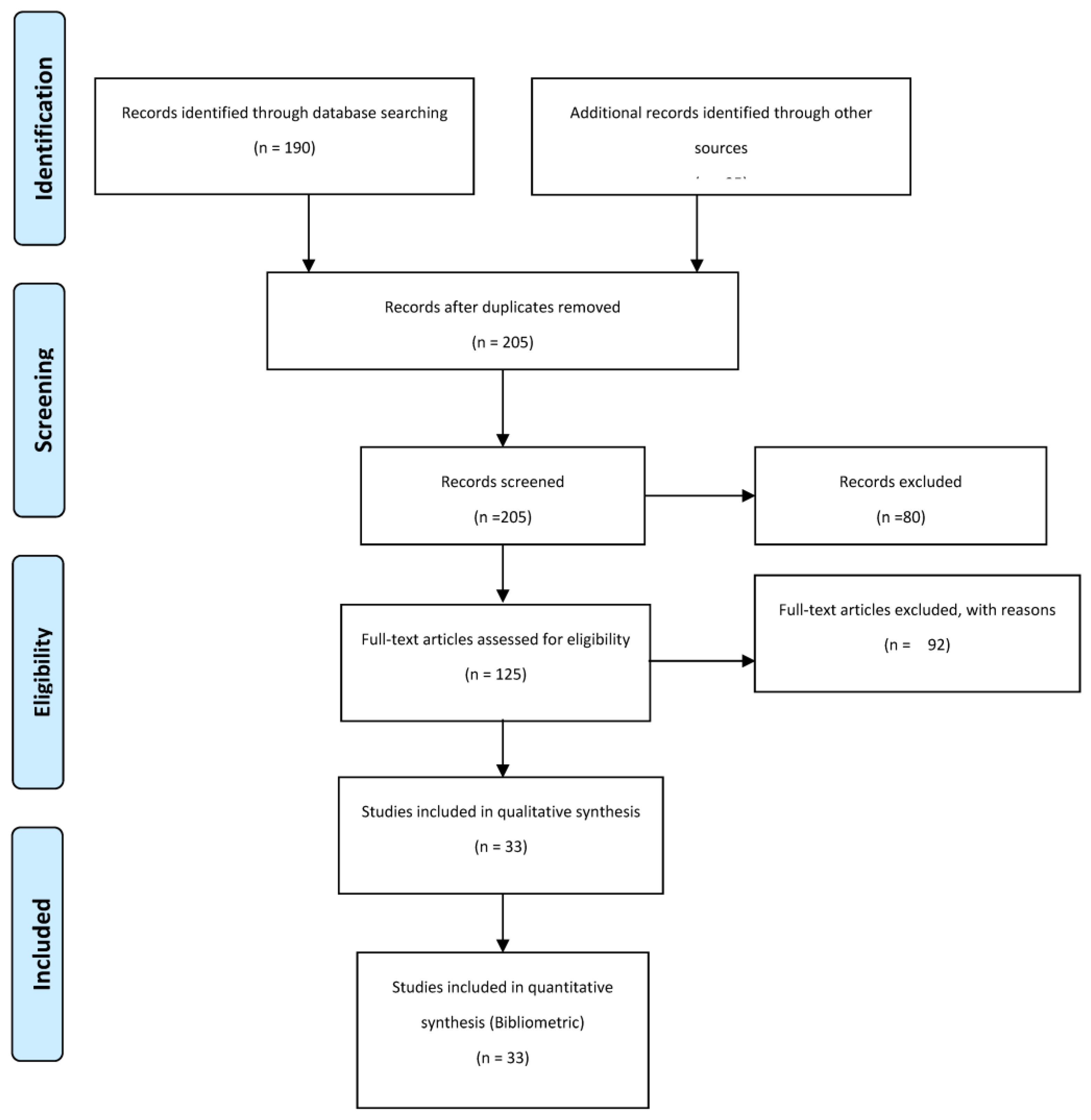
Figure 2.
Network Map of key thematic area.
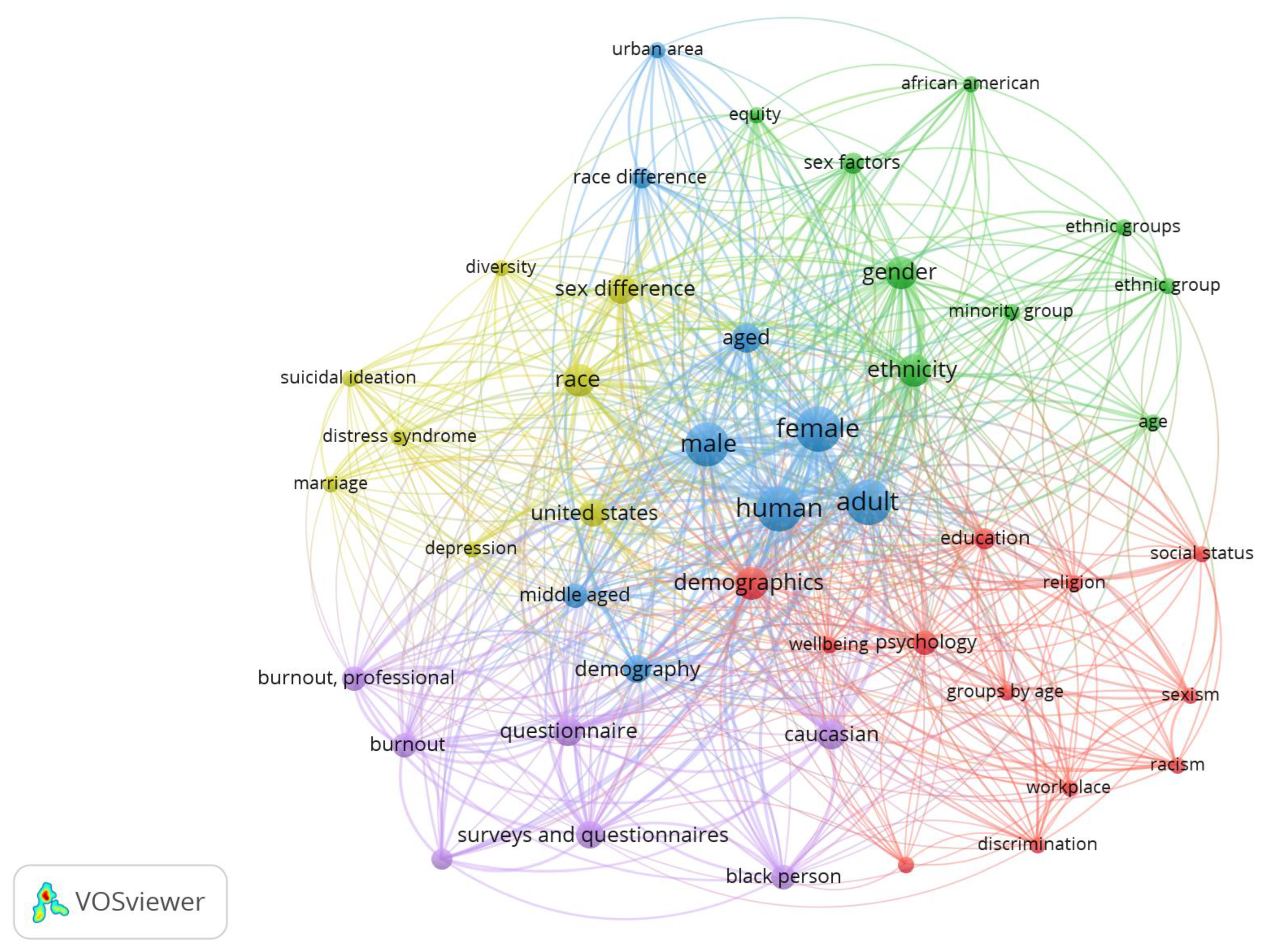
Figure 3.
Author Citation Network Map.
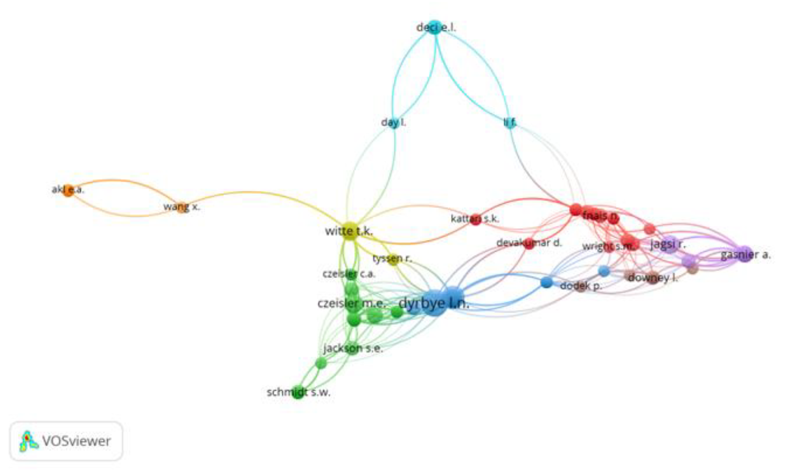
Figure 4.
Distribution by Race.
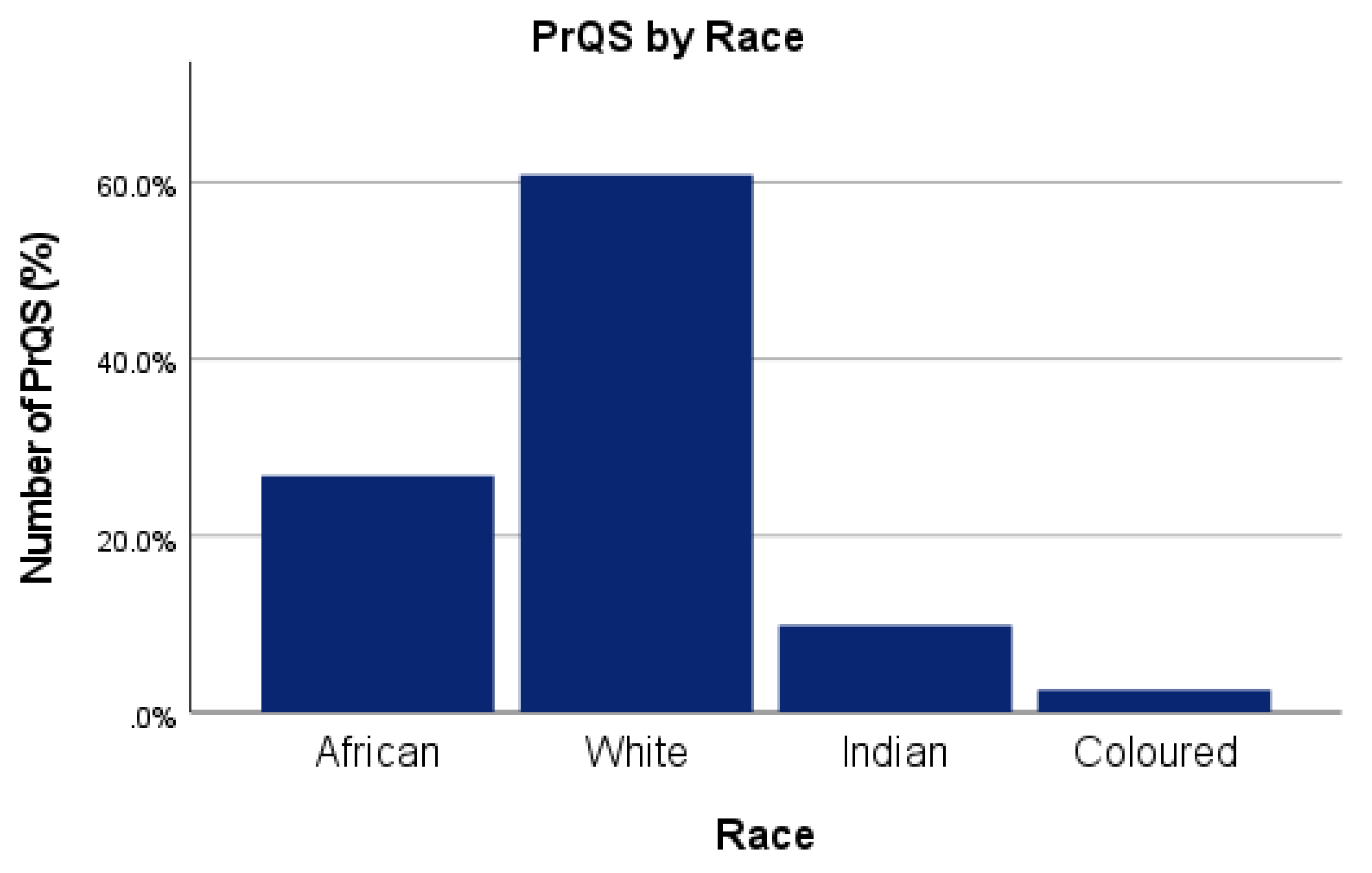
Figure 5.
Distribution of professionally registered quantity surveyors (PrQs) in South Africa based on race and gender.
Figure 5.
Distribution of professionally registered quantity surveyors (PrQs) in South Africa based on race and gender.
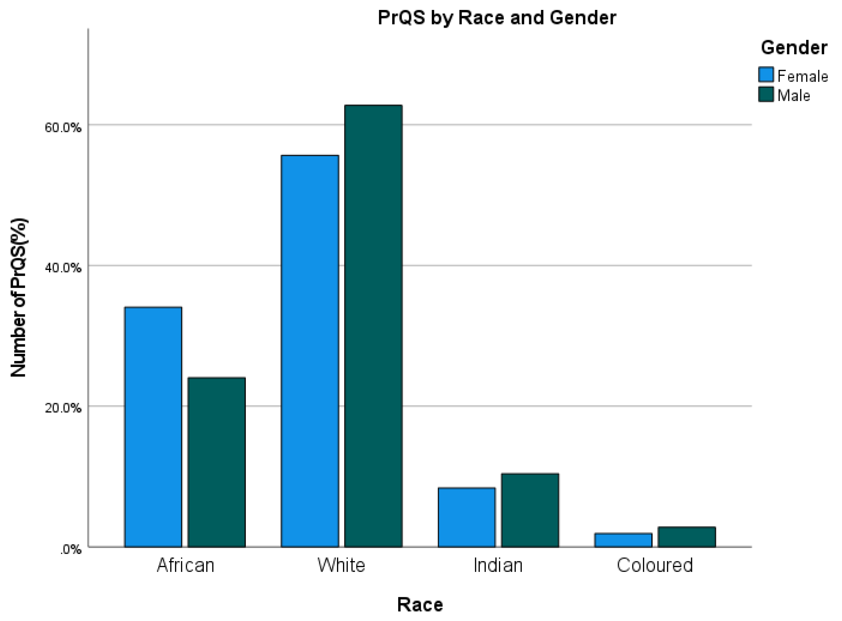
Figure 6.
Distribution of professionally registered quantity surveyors (PrQs) in South Africa based on Race and Age Group.
Figure 6.
Distribution of professionally registered quantity surveyors (PrQs) in South Africa based on Race and Age Group.
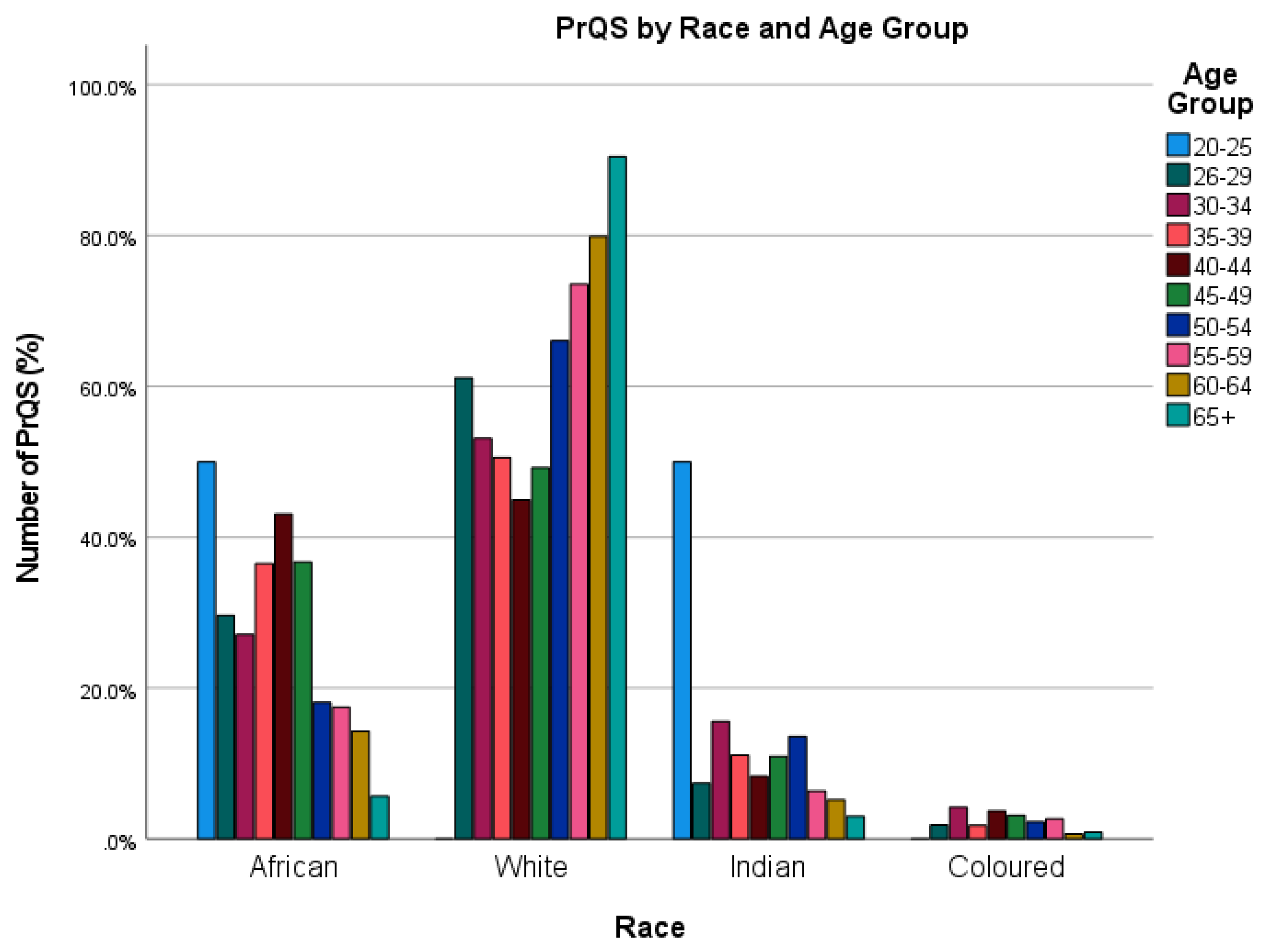
Figure 7.
Distribution of professionally registered quantity surveyors (PrQs) in South Africa based on Gender and Age Group.
Figure 7.
Distribution of professionally registered quantity surveyors (PrQs) in South Africa based on Gender and Age Group.
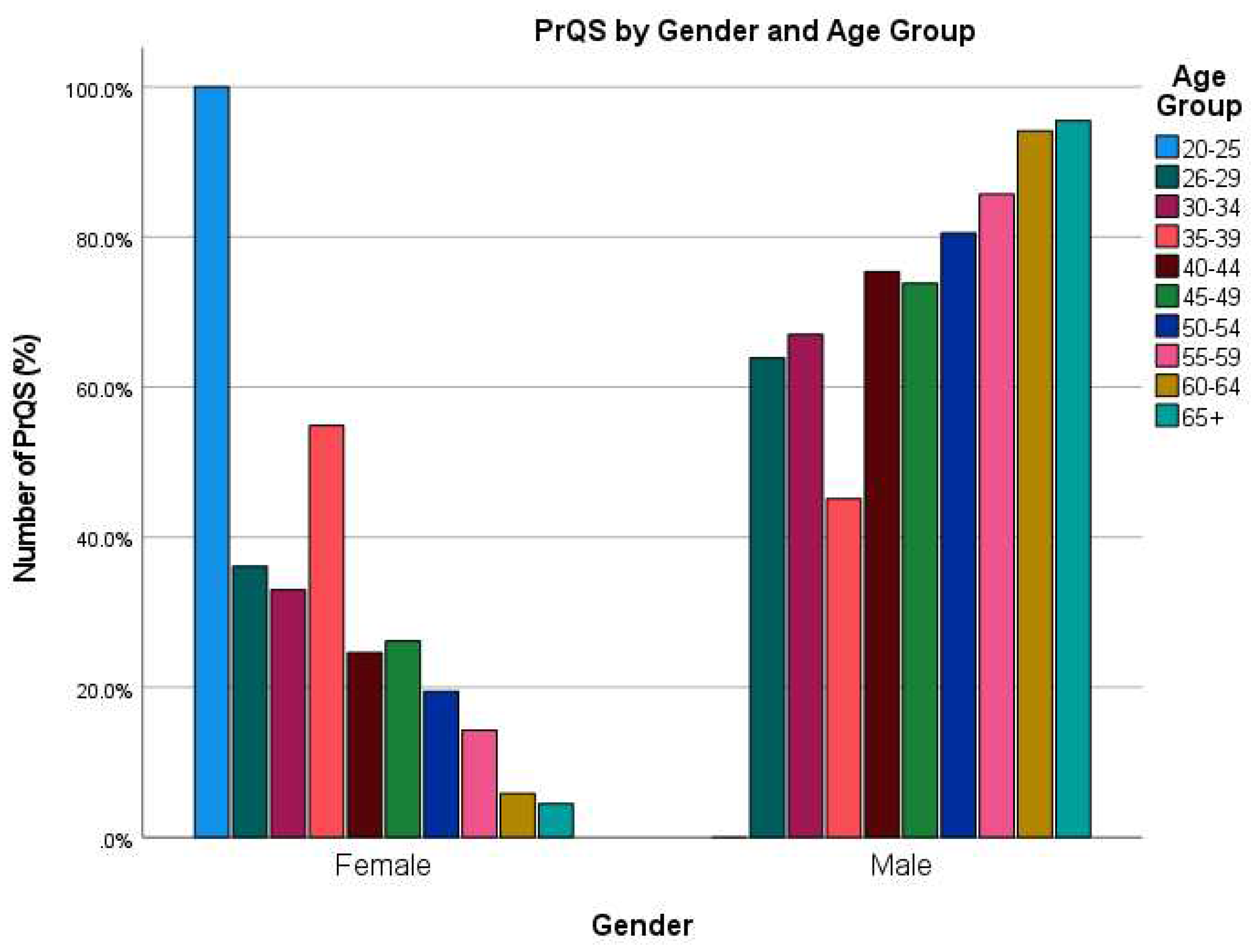
Table 1.
Document quality assessment checklist.
| N | Quality Assessment Questions | Answer |
|---|---|---|
| QA1 | Does the paper describe the interplay between professionalization and quality of project delivery? | (+1) Yes/ (+0) No |
| QA2 | Does the study specify how demographics influence professional capacity and development? | (+1) Yes/ (+0) No |
| QA3 | Does the paper describe the issues and dynamics underlying professionalization? | (+1) Yes/ (+0) No |
| QA4 | Are the limitations of demographics-based impediments to professionalization described in the paper? | (+1) Yes/ (+0) No |
| QA5 | Is the journal or conference in which the paper was published indexed in SCImago Journal Rank (SJR)? | (+1) if it is ranked Q1, (+0.75) if it is ranked Q2, (+0.50) if it is ranked Q3, (+0.25) if it is ranked Q4, (+0.0) if it is not ranked. |
| Age Group * Sex Crosstabulation | |||||
|---|---|---|---|---|---|
| Sex | Total | ||||
| Female | Male | ||||
| Age Group | 20-25 | Count | 104 | 107 | 211 |
| % within Sex | 12.2% | 7.9% | 9.5% | ||
| 26 -29 | Count | 221 | 324 | 545 | |
| % within Sex | 25.9% | 23.8% | 24.6% | ||
| 30-34 | Count | 275 | 401 | 676 | |
| % within Sex | 32.3% | 29.5% | 30.6% | ||
| 35-39 | Count | 148 | 260 | 408 | |
| % within Sex | 17.4% | 19.1% | 18.4% | ||
| 40-44 | Count | 67 | 141 | 208 | |
| % within Sex | 7.9% | 10.4% | 9.4% | ||
| 45-49 | Count | 25 | 58 | 83 | |
| % within Sex | 2.9% | 4.3% | 3.8% | ||
| 50-54 | Count | 10 | 31 | 41 | |
| % within Sex | 1.2% | 2.3% | 1.9% | ||
| 55-59 | Count | 2 | 29 | 31 | |
| % within Sex | 0.2% | 2.1% | 1.4% | ||
| 60-64 | Count | 0 | 6 | 6 | |
| % within Sex | 0.0% | 0.4% | 0.3% | ||
| 65+ | Count | 0 | 3 | 3 | |
| % within Sex | 0.0% | 0.2% | 0.1% | ||
| Total | Count | 852 | 1360 | 2212 | |
| % within Sex | 100.0% | 100.0% | 100.0% | ||
Disclaimer/Publisher’s Note: The statements, opinions and data contained in all publications are solely those of the individual author(s) and contributor(s) and not of MDPI and/or the editor(s). MDPI and/or the editor(s) disclaim responsibility for any injury to people or property resulting from any ideas, methods, instructions or products referred to in the content. |
© 2023 by the authors. Licensee MDPI, Basel, Switzerland. This article is an open access article distributed under the terms and conditions of the Creative Commons Attribution (CC BY) license (http://creativecommons.org/licenses/by/4.0/).
Copyright: This open access article is published under a Creative Commons CC BY 4.0 license, which permit the free download, distribution, and reuse, provided that the author and preprint are cited in any reuse.


