Submitted:
22 January 2026
Posted:
26 January 2026
You are already at the latest version
Abstract
Understanding population-level variation in body mass and obesity is a persistent challenge in public health, particularly when demographic and socioeconomic factors interact in non-linear and overlapping ways. Although large-scale health surveys provide rich information, conventional tabular summaries often limit the ability to investigate distributional structure and subgroup heterogeneity.This study investigates anthropometric patterns using data from the National Health and Nutrition Examination Survey (NHANES) 2021–2023, a nationally representative survey conducted by the U.S. Centers for Disease Control and Prevention. Focuses on Body Mass Index (BMI) and obesity-related measures across age, sex, and socioeconomic dimensions.A visualization-centered analytical framework supports systematic exploration of these patterns. The study integrates static visual representations with an interactive dashboard, enabling flexible examination of distributions, relationships, and stratified prevalence across demographic subgroups. Emphasizes transparency, interpretability, and exploration rather than inferential modeling.By incorporating interactive visualization alongside conventional static figures, this work positions visualization as an investigative instrument for population health research. The approach illustrates how interactive dashboards can complement established reporting practices by supporting deeper engagement with complex survey data and facilitating evidence-informed understanding in public health contexts.
Keywords:
NHANES
; body mass index
; obesity
; data visualization
; interactive dashboard
; population health
; public health surveillance
1. Introduction
Large-scale health surveys are essential to modern public health because they provide standardized measurements that can be compared across subgroups and over time. Among these resources, the National Health and Nutrition Examination Survey (NHANES) occupies a distinctive role: it combines interviews with physical examinations and laboratory testing, enabling population-level assessment of risk factors that are not reliably captured through self-report alone. NHANES has therefore become a core evidence base for estimating the prevalence of chronic conditions, monitoring inequities, and informing policy-relevant surveillance [1,2].
Yet population health datasets introduce interpretive challenges. Their size can obscure meaningful structure, and aggregation can hide subgroup overlap, dispersion, and nonlinear relationships. These difficulties are amplified in recent NHANES releases, where cycle-specific changes and analytic considerations require careful documentation-aware use to avoid misinterpretation [3] When findings are communicated primarily through tables or single-number summaries, audiences may miss the distributional features that matter for public health planning, such as heterogeneity within age bands or the extent of overlap across socioeconomic strata [5]
Data visualization provides a practical bridge between raw survey data and interpretable evidence. In epidemiology and population studies, visual methods support exploratory assessment of trends, gradients, and subgroup variation [22] while improving transparency about what the data do—and do not—show [23] Recent work at the intersection of visualization and epidemiological practice emphasizes both the value and the responsibility of visual communication, including the need for designs that preserve interpretability and avoid perceptual distortions [21] In parallel, systematic and scoping reviews of public health dashboards highlight how interactive, multi-view systems can enhance engagement and understanding when the interface remains coherent and the outputs remain analytically accountable [9,10]
Motivated by these considerations, this study adopts a visualization-centered approach that integrates static plots with an interactive dashboard to support structured exploration of anthropometric patterns. This study demonstrates how data visualization techniques can be used to explore demographic and anthropometric patterns in the U.S. population using NHANES 2021–2023 data [6].
2. Related Work
The National Health and Nutrition Examination Survey (NHANES) has long served as a foundational data source for population health research in the United States due to its standardized measurement protocols, nationally representative sampling design, and repeated cross-sectional structure [1,2]. Recent methodological literature emphasizes the continued relevance of NHANES for contemporary public health analysis, while also highlighting cycle-specific considerations introduced during the COVID-19 period that affect interpretation of recent releases [3]. As a result, NHANES remains central to research on obesity, chronic disease risk, and health disparities [16].
Alongside advances in data availability, visualization has gained increasing prominence in epidemiology and population health research [6]. Systematic and scoping reviews of public health dashboards demonstrate that interactive, multi-view visual systems can enhance comprehension, particularly when users must interpret multidimensional surveillance data across demographic strata [12,25]. Rather than replacing statistical analysis, visualization is increasingly positioned as a complementary analytical layer that supports exploration, hypothesis generation, and communication to diverse stakeholders [6,25].
Body Mass Index and obesity have been extensively examined through socioeconomic and demographic frameworks, with numerous studies documenting associations between income, education, and obesity prevalence [13,16]. However, recent research underscores that these relationships are often nonlinear and context-dependent, with substantial overlap across socioeconomic groups when examined at the population level [14]. This evidence suggests that reliance on single summary measures can obscure within-group heterogeneity and limit interpretive clarity [5,7].
Despite the breadth of existing research, a persistent gap remains in how population health findings are communicated. Many studies continue to prioritize tabular summaries or isolated statistics, which may conceal distributional structure and subgroup overlap [5]. The visualization literature increasingly calls for intuitive, transparent visual frameworks, including interactive dashboards, that enable users to explore patterns directly without extensive statistical training [6,25]. This gap motivates the present study’s integration of static and interactive visual methods for examining anthropometric patterns in NHANES data [6].
3. Dataset Description
3.1. Data Source
This study used data from the National Health and Nutrition Examination Survey (NHANES), administered by the U.S. Centers for Disease Control and Prevention (CDC) through the National Center for Health Statistics. NHANES is designed to produce a nationally representative sample of the non-institutionalized civilian population of the United States through a complex, multistage probability sampling framework [1,2].
This analysis draws specifically on the 2021–2023 NHANES cycle, which provides contemporary demographic and examination-based health information collected using standardized protocols [3] The inclusion of physical measurements distinguishes NHANES from survey-only datasets and supports reliable population-level assessment of anthropometric indicators [1,2].
3.2. Selected Data Files
Two publicly available NHANES examination files were selected for their relevance to anthropometric and demographic analysis. The Demographics file (DEMO_L.XPT) contains participant-level information on age, sex, race/ethnicity, and socioeconomic indicators, including the Poverty–Income Ratio. The Body Measures file (BMX_L.XPT) includes objectively measured height, weight, and Body Mass Index values collected during physical examinations conducted in mobile examination centers [4]. These files were chosen because they provide complementary information necessary for examining demographic patterns in body mass while minimizing redundancy and complexity in data handling [17].
3.3. Variables Used
The analysis focused on a subset of variables selected for their relevance to population health visualization. Age was used as a continuous measure and, where appropriate, grouped into discrete intervals to support stratified analysis. Sex was included as a categorical variable to examine distributional differences. Body Mass Index (BMI) served as the primary anthropometric indicator, supplemented by measured height and weight to maintain consistency with NHANES examination protocols [1,4].
Socioeconomic status was represented using the Poverty–Income Ratio (PIR), a standardized indicator reflecting household income relative to federal poverty thresholds [12,14]. PIR was used to explore broad socioeconomic patterns while acknowledging that it captures only one dimension of social context [13].
3.4. Data Preprocessing
Data preprocessing was conducted entirely in Python, ensuring reproducibility and transparency. Raw NHANES files in SAS XPT format were loaded directly into the analysis environment using Pandas. The demographic and body measures datasets were merged using the unique participant identifier (SEQN), producing a unified analytical dataset [2,17] Records with missing values for key variables such as age, sex, or BMI were excluded to maintain consistency across visualizations. No imputation was applied. Variable names were systematically renamed to improve clarity and interpretability within the visualization workflow, particularly for dashboard development and figure annotation. These preprocessing steps align directly with the computational pipeline used to generate both static figures and the interactive dashboard presented in later sections.
4. Visualization Methodology
4.1. Tools and Libraries
All analyses were conducted using the Python programming language to ensure transparency and reproducibility [12]. Pandas was employed for importing NHANES examination and demographic files in XPT format, merging datasets by the participant identifier (SEQN), and generating derived variables required for stratified visual analysis [2,12]. Data handling decisions were guided by official NHANES documentation and analytic guidance for the August 2021–August 2023 cycle [2,4].
Static visualizations were produced using Matplotlib and Seaborn, which provide precise control over graphical elements such as axes, tick placement, annotations, and layout. These libraries were selected to generate publication-quality figures intended for static dissemination [5,7]. For interactive analysis, Plotly was used to construct browser-based visualizations, and Dash was adopted to integrate multiple coordinated views within a single dashboard interface. Prior research has shown that interactive, multi-view dashboards enhance accessibility and interpretability of complex public health data when implemented with coherent design and explicit controls [9,10].
4.2. Design Principles
Visualization design prioritized interpretability, perceptual accuracy, and consistency across views [5,7]. Categorical variables such as sex and age group were encoded using stable color mappings, ensuring that identical categories retained the same visual representation throughout the analysis. This consistency reduces cognitive load when comparing multiple figures [7,8].
Graphical encodings were selected to align with established findings from graphical perception research, which demonstrate that viewers most accurately interpret quantitative differences when values are represented by position along a common scale [5]. Consequently, bar charts, scatter plots, and aligned heatmaps were preferred over encodings that rely on area or color intensity alone [5,7].
Axis limits and scales were selected conservatively to reflect observed data ranges. Nonlinear transformations were avoided unless necessary, and visual compression was minimized to prevent exaggeration of apparent differences [7,8]. Aggregation was applied selectively and only where it served a specific analytical purpose, such as estimating prevalence across demographic strata [6].
4.3. Justification of Visual Choices
Use of distributions for BMI.
Body Mass Index exhibits substantial variability within demographic subgroups. Distribution-based graphics were therefore prioritized to preserve information about spread, skewness, and overlap [5,7]. This approach allows inspection of heterogeneity that would be obscured by reliance on central tendency alone, particularly when subgroup separation is weak or gradual [13,14] of heatmaps for obesity prevalence.
Obesity prevalence varies simultaneously across age and sex, producing a natural two-dimensional structure. Heatmaps provide a compact representation of this relationship, enabling systematic comparison across strata within a single figure [6]. Prevalence estimates were derived using the standard adult obesity definition (BMI ≥ 30 kg/m²), consistent with NHANES reporting for the same cycle [15,17] of interactivity.
Static figures convey fixed summaries, but they limit exploration of alternative subgroup definitions. The interactive dashboard enables dynamic filtering by sex, age range, and socioeconomic status (Poverty–Income Ratio groupings), with synchronized updates across all visual components [9,10]. This design supports exploratory reasoning, facilitates transparency, and allows users to assess how observed patterns depend on analytic constraints [6]. Evidence from recent public health visualization research indicates that such coordinated interactive systems improve user engagement and comprehension when compared with static displays alone [9,10].
5. Results and Visual Analysis
Figure 1 illustrates the distribution of Body Mass Index (BMI) across sex in the NHANES 2021–2023 sample. Both male and female distributions are distinctly right-skewed, with the majority of observations concentrated within the overweight and obese BMI ranges. This distributional pattern aligns with national surveillance reports indicating persistently high BMI levels among U.S. adults in recent NHANES cycles [1,2].
Although the overall shapes of the distributions are similar, subtle differences in central tendency and dispersion are observed between sexes. These differences suggest sex-related variation in anthropometric characteristics; however, the extensive overlap indicates that sex alone provides limited discriminatory power for BMI at the population level. From a public health perspective, this reinforces evidence that elevated BMI is a widespread issue affecting both men and women rather than a sex-specific condition.
Figure 2 presents the relationship between age and BMI, with individual data points representing participants and a smoothed curve summarizing the overall trend. The association between age and BMI is nonlinear, reflecting gradual changes across the lifespan rather than a monotonic increase.
Substantial variability is evident at all ages, indicating that individuals with a wide range of BMI values are present throughout adulthood. While sex-based differences can be visually detected, these differences overlap considerably, consistent with prior NHANES-based analyses showing heterogeneous BMI trajectories within age strata [4]. The observed pattern supports the interpretation that age contributes to BMI variation at the population level but does not determine individual outcomes. These findings are relevant for public health planning, as they highlight mid-adulthood as a period of elevated average risk while underscoring the need for individualized prevention strategies.
Figure 3 displays a heatmap of obesity prevalence, defined as BMI ≥ 30 kg/m², across age groups and sex categories. Color intensity represents the proportion of individuals classified as obese within each subgroup, enabling efficient comparison across demographic strata.
A clear age-related gradient is observed for both males and females. Obesity prevalence is lower in younger age groups and increases progressively through early and middle adulthood. This pattern mirrors official NHANES estimates for the August 2021–August 2023 cycle, which report the highest prevalence of obesity among middle-aged adults [1,2].
Sex-specific differences appear in certain age categories, with one sex exhibiting slightly higher prevalence in specific strata. Nevertheless, the overall age-associated increase remains consistent across sexes, suggesting that age exerts a broadly similar influence on obesity risk for both groups.
Figure 4 compares BMI distributions across Poverty–Income Ratio (PIR) quartiles. The figure reveals substantial overlap between socioeconomic groups, with obesity present across all income levels. Although minor differences in central tendency are visible, these differences are small relative to the overall within-group variability.
This result suggests that socioeconomic status, as measured by PIR alone, does not fully explain BMI variation in the analyzed sample. Prior NHANES-based research has shown that income gradients in obesity can be attenuated when examined without adjustment for behavioral, environmental, and demographic covariates [7,8]. The observed overlap underscores the multifactorial nature of anthropometric outcomes and cautions against attributing obesity risk to income level in isolation. From a public health standpoint, the findings support multi-level intervention strategies rather than narrowly income-targeted approaches.
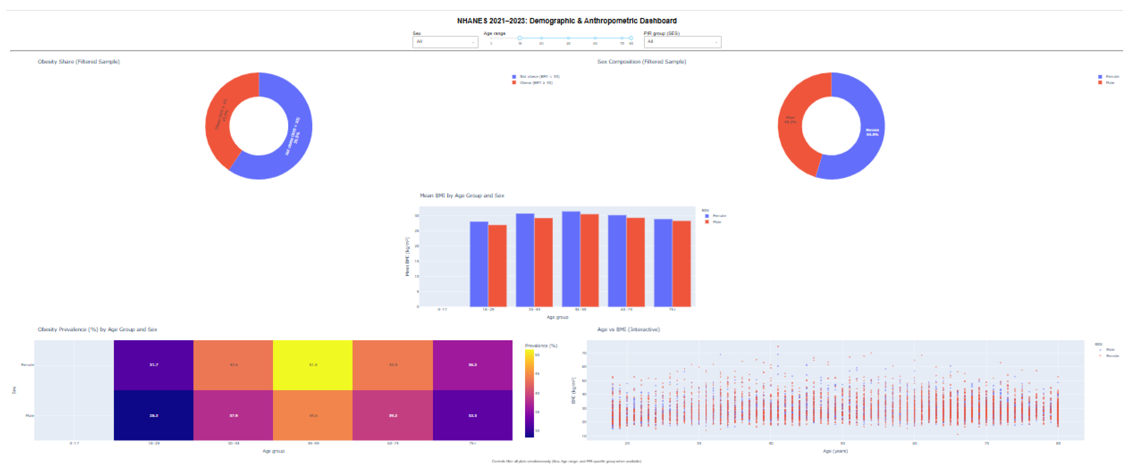
Figure 5 presents an interactive dashboard developed using Plotly and Dash to facilitate exploratory analysis of the NHANES 2021–2023 dataset. The dashboard integrates multiple coordinated visualizations, including obesity prevalence summaries, BMI distributions, age–sex stratified mean BMI comparisons, a prevalence heatmap, and an age–BMI scatter plot.
Interactive controls allow users to dynamically filter the data by sex, age range, and socioeconomic status (PIR quartiles), with all visual components updating simultaneously. This coordinated design enables users to examine how observed patterns change under different demographic constraints while preserving individual-level variability.
6. Discussion
This section interprets the observed findings, situates them within existing public health knowledge, and clarifies the added value of the visualization-centered approach adopted in this study. The discussion focuses on meaning rather than repetition of numerical results.
6.1. Summary of Observed Patterns
Across all figures, BMI and obesity outcomes exhibit substantial variability within demographic groups, with no single factor fully explaining observed patterns [6,13]. Sex-based differences in BMI distributions are present but modest, and extensive overlap indicates that elevated BMI is a population-wide concern rather than a sex-specific phenomenon [15] Age-related trends are more pronounced: BMI and obesity prevalence increase from early adulthood into midlife before stabilizing, reflecting cumulative exposure to behavioral, metabolic, and environmental influences over time [15]. Socioeconomic comparisons show widespread overlap across income strata, reinforcing the multifactorial nature of anthropometric outcomes [12,16] and Socioeconomic gradients.
Age emerges as the most consistent gradient in this analysis, aligning with long-standing evidence that obesity risk increases through adulthood before plateauing at older ages [15]. Sex differences vary by age group, suggesting interaction effects rather than uniform divergence [13]. In contrast, socioeconomic gradients measured through Poverty–Income Ratio (PIR) appear attenuated in the visual analysis. While prior research has documented income-related disparities in obesity, especially when adjusting for race/ethnicity, environment, and education, the substantial within-group variability observed here highlights the limitations of interpreting PIR as a standalone explanatory variable [16].
6.2. Comparison with Established Public Health Trends
The patterns identified in this study closely mirror recent NHANES-based surveillance reports, which document persistently high obesity prevalence among U.S. adults and emphasize mid-adulthood as a period of elevated risk [15,20]. The right-skewed BMI distributions and age-related prevalence gradients observed in the visualizations are consistent with national trends reported by the Centers for Disease Control and Prevention and the World Health Organization [15,17]. Importantly, the absence of sharp subgroup boundaries reinforces conclusions from epidemiological studies that obesity risk is broadly distributed across the population rather than confined to narrowly defined demographic categories [6].
6.3. Strength of Visualization Compared with Tabular Reporting
A central contribution of this work demonstrates how visualization can reveal structure that is difficult to detect in tables alone. Distribution plots expose overlap and dispersion that summary statistics obscure [5,7]. Heatmaps condense multidimensional prevalence information into interpretable patterns. Scatter plots retain individual-level detail while still supporting trend assessment [5]. Together, these approaches allow readers to assess heterogeneity, uncertainty, and gradient strength visually, rather than inferring them indirectly from aggregated values. Prior research in statistical graphics and public health communication emphasizes that visual encodings based on position and distribution enhance accurate interpretation compared with purely numeric summaries [5,7].
6.4. Implications for Health Communication
The interactive dashboard further extends the communication value of the analysis. By enabling user-controlled filtering and synchronized updates across views, the dashboard supports exploring data for understanding and transparency. Users can test how patterns change across ages, sexes, or socioeconomic groups without relying on preset analysis options [6]. Recent systematic and scoping reviews of public health dashboards report that such interactivity improves engagement and comprehension when applied thoughtfully and avoids oversimplifying complex health data [9,10]. In real-world settings, this approach can promote discussion between researchers, practitioners, and policymakers, enabling stakeholders to directly explore evidence [11].
6.5. Contribution of This Study
This study contributes to the public health literature in two main ways. First, it provides a contemporary visual analysis of NHANES 2021–2023 body measurement data that is fully aligned with current monitoring results while emphasizing how data are distributed and vary among groups [15,20]. Second, it demonstrates an organized combination of static and interactive visualizations as a framework for analysis and communication [6]. Instead of replacing traditional statistical reporting, the approach complements it by clearly showing differences within the population, shared characteristics, and uncertainty [5,7]. This contribution is particularly relevant for health communication contexts where understanding patterns is as important as calculating specific values.
7. Conclusions
This study applied an approach focused on visualization to examine body measurement patterns in the NHANES 2021–2023 dataset, focusing on Body Mass Index and obesity prevalence across demographic and socioeconomic groups. The analysis revealed consistent BMI distributions leaning towards higher values for both sexes, clear age-related trends in obesity prevalence, and significant differences within groups across socioeconomic groups. Together, these findings reinforce the view that elevated BMI is a population-wide concern shaped by multiple interacting factors rather than a single dominant determinant.
A central contribution of this work demonstrates the value of data visualization for analysis and communication in population health research. Distribution plots, heatmaps, and scatter-based trends enabled direct inspection of differences, shared characteristics, and gradual changes that are difficult to infer from data tables alone. The integration of an interactive dashboard further extended this capability, enabling user-controlled exploration across age, sex, and socioeconomic groups, promoting transparency and supporting exploratory reasoning. In this sense, visualization functioned not only as a presentation tool but as a key analytical component.
Several limitations exist. First, the NHANES data used in this study are collected at one point in time, which restricts interpretation to associations rather than causal relationships. Second, the analysis relied on a limited set of variables, primarily demographic and body measurements. Consequently, potentially important contributors such as dietary intake, physical activity, and biological indicators were not incorporated into the current visual framework.
Future work can extend this study further. Incorporating additional NHANES cycles would enable comparison and trend assessment over time. The dashboard framework could also be expanded into predictive or scenario-based tools integrating statistical or machine learning models. Finally, including a broader range of health indicators—such as metabolism indicators, cardiovascular risk factors, or behavioral variables—would provide a more comprehensive view of population health and further demonstrate visualization-driven analysis's potential for public health research.
In summary, this study illustrates how thoughtfully designed visual and interactive methods can enhance understanding of complex health survey data, complement traditional statistical reporting, and support more effective communication of population-level health patterns.
References
- Centers for Disease Control and Prevention (CDC), National Center for Health Statistics (NCHS). National Health and Nutrition Examination Survey (NHANES). Available: https://www.cdc.gov/nchs/nhanes/index.htm.
- CDC/NCHS. NHANES Survey Methods and Analytic Guidelines. Available: https://wwwn.cdc.gov/nchs/nhanes/analyticguidelines.aspx.
- R. Paulose-Ram, J. E. Graber, D. Woodwell, and N. Ahluwalia, “The National Health and Nutrition Examination Survey (NHANES), 2021–2022: Adapting Data Collection in a COVID-19 Environment,” American Journal of Public Health, 2021. Available: https://doi.org/10.2105/AJPH.2021.306517. [CrossRef]
- CDC/NCHS. NHANES August 2021–August 2023: Analytic Overview (Continuous NHANES). Available: https://wwwn.cdc.gov/nchs/nhanes/continuousnhanes/overview.aspx.
- W. S. Cleveland and R. McGill, “Graphical Perception: Theory, Experimentation, and Application to the Development of Graphical Methods,” Journal of the American Statistical Association, 1984. Available: https://doi.org/10.1080/01621459.1984.10478080. [CrossRef]
- J. Dykes et al., “Visualisation for epidemiological modelling: challenges, solutions, and future directions,” Philosophical Transactions of the Royal Society A, 2022. Available: https://royalsocietypublishing.org/doi/10.1098/rsta.2021.0191. [CrossRef]
- M. Correll et al., “Designing visualizations to communicate uncertainty,” IEEE VIS (Visualization) conference proceedings, 2018. Available: https://ieeexplore.ieee.org/document/8355342.
- M. Sedlmair, M. Meyer, and T. Munzner, “Design Study Methodology: Reflections from the Trenches and the Stacks,” IEEE Transactions on Visualization and Computer Graphics, 2012. Available: https://ieeexplore.ieee.org/document/6327286. [CrossRef]
- A. Schulze et al., “Digital dashboards visualizing public health data: a literature review,” Frontiers in Public Health, 2023. Available: https://www.frontiersin.org/articles/10.3389/fpubh.2023.999958. [CrossRef]
- G. Stahlman et al., “Design, application, and actionability of public health dashboards: a systematic review,” Journal of Medical Internet Research, 2025. Available: https://www.jmir.org/2025/1/e65283.
- B. A. Stierman et al., “National Health and Nutrition Examination Survey (NHANES),” in Big Data for Epidemiology (NCBI Bookshelf), 2022. Available: https://www.ncbi.nlm.nih.gov/books/NBK606854/.
- A. Ale et al., “nhanesA: An R package to access NHANES data,” Database (Oxford), 2024. Available: https://doi.org/10.1093/database/baae028. [CrossRef]
- A. Drewnowski, “Obesity, diets, and social inequalities,” Nutrition Reviews, 2009. Available: https://doi.org/10.1111/j.1753-4887.2009.00157.x. [CrossRef]
- H. Yi et al., “Nonlinear associations between the ratio of family income to poverty and all-cause mortality among adults in NHANES study,” Scientific Reports, 2024. Available: https://doi.org/10.1038/s41598-024-63058-z. [CrossRef]
- S. D. Emmerich et al., “Obesity and Severe Obesity Prevalence in Adults: United States, August 2021–August 2023,” NCHS Data Brief No. 508, 2024. Available: https://www.cdc.gov/nchs/products/databriefs/db508.htm.
- O. J. Agboola et al., “Sociodemographic Disparities in Obesity Prevalence Among Adults Aged 20–59 Years Between 2017 and 2023,” JACC Advances, 2025. Available: https://doi.org/10.1016/j.jacadv.2025.101798. [CrossRef]
- CDC/NCHS. NHANES 2021–2023 Examination Data Documentation: Body Measures (BMX_L). Available: https://wwwn.cdc.gov/Nchs/Nhanes/2021-2023/BMX_L.htm.
- Plotly Technologies Inc. Plotly Python Open Source Graphing Library Documentation. Available: https://plotly.com/python/.
- Dash by Plotly. Dash User Guide and Documentation. Available: https://dash.plotly.com/.
- National Center for Health Statistics. Health, United States: Summary Health Statistics and Measures. Available: https://www.cdc.gov/nchs/hus/index.htm.
- S. L. Franconeri et al., “The Science of Visual Data Communication: What Works,” Psychological Science in the Public Interest, 2021. Available: https://doi.org/10.1177/15291006211051956. [CrossRef]
- S. Thorve et al., “EpiViewer: an epidemiological application for exploring time series data,” BMC Bioinformatics, 2018. Available: https://doi.org/10.1186/s12859-018-2439-0. [CrossRef]
- C. Yang et al., “EpiMob: Interactive Visual Analytics of Citywide Human Mobility Restrictions for Epidemic Control,” IEEE Transactions on Visualization and Computer Graphics, 2023. Available: https://doi.org/10.1109/TVCG.2022.3165385. [CrossRef]
- World Health Organization (WHO). Obesity and overweight (Fact sheet). Available: https://www.who.int/news-room/fact-sheets/detail/obesity-and-overweight.
- M. S. Gaso, R. R. Mekuria, H. A. Deybasso, S. Cankurt, and B. Shambetova, “The Power of Data Visualization in Understanding Esophageal Cancer Based on Risk Factors: A Case from Arsi Zone, Ethiopia,” in Proc. 2025 Int. Conf. on Computer Systems and Technologies (CompSysTech), Jun. 2025, doi: 10.1109/CompSysTech65493.2025.11137110. [Online]. Available: https://ieeexplore.ieee.org/stamp/stamp.jsp?tp=&arnumber=11137110&isnumber=11136172.
Figure 1.
BMI Distribution by Sex.
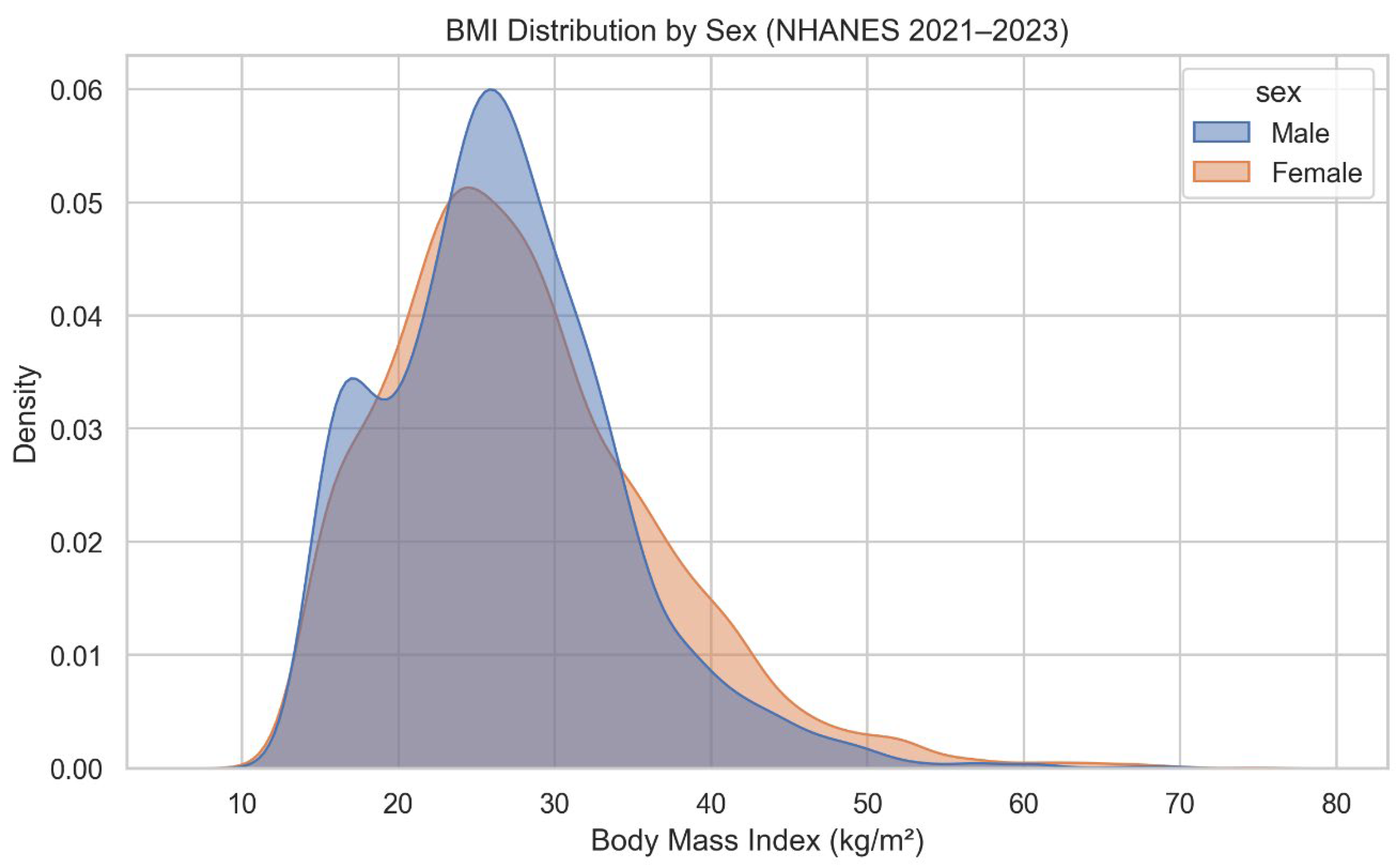
Figure 2.
Age vs BMI Trend.
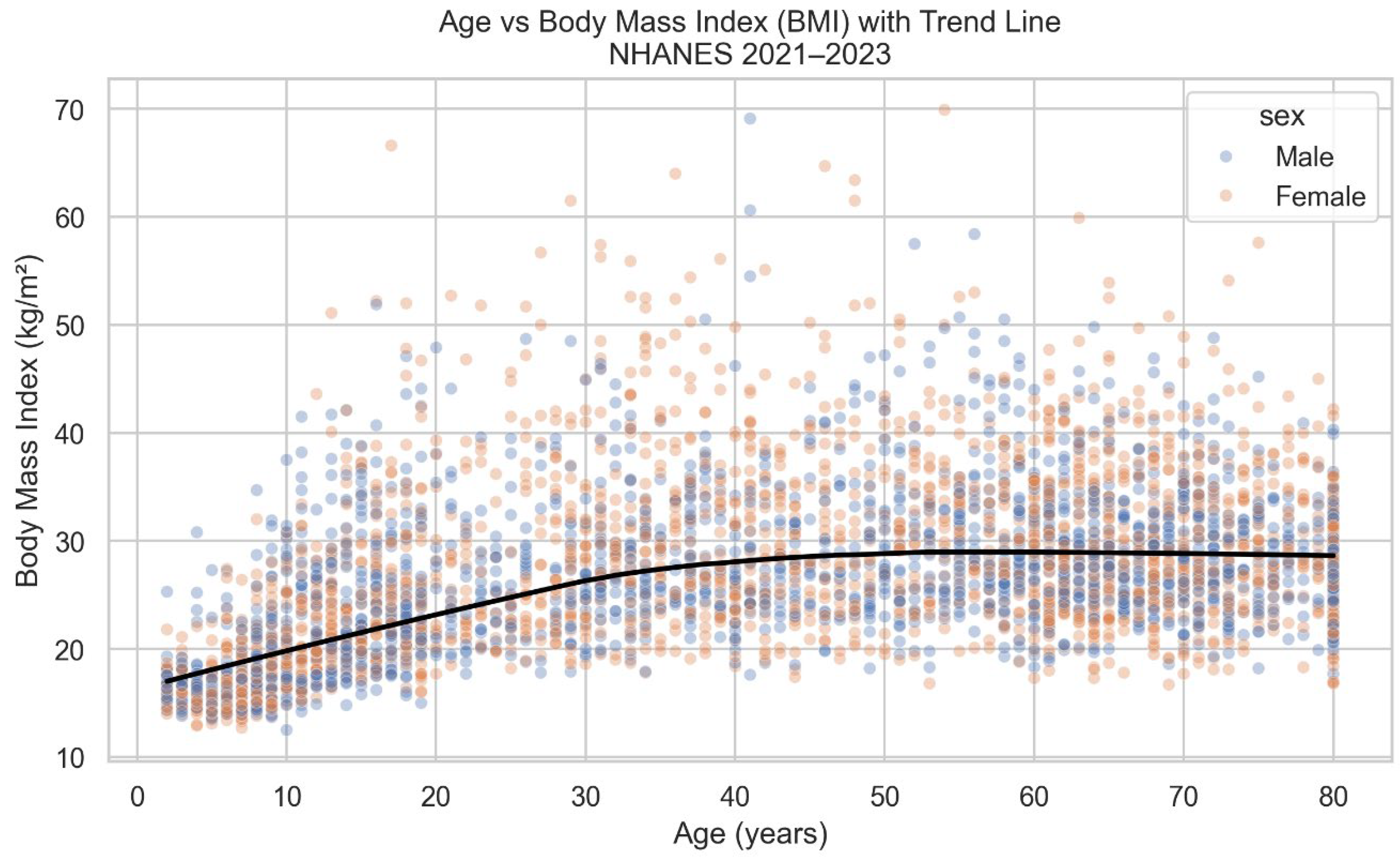
Figure 3.
Obesity Prevalence Heatmap (Age Group × Sex).
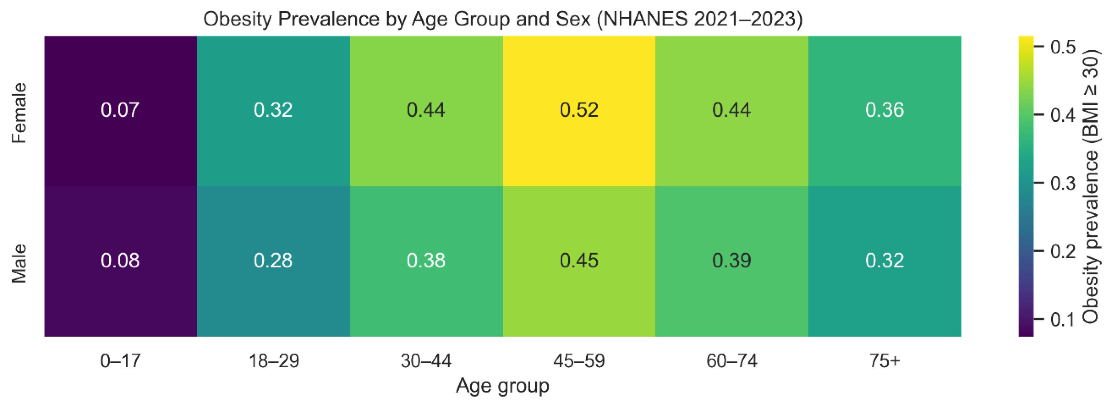
Figure 4.
BMI vs Socioeconomic Status (PIR).
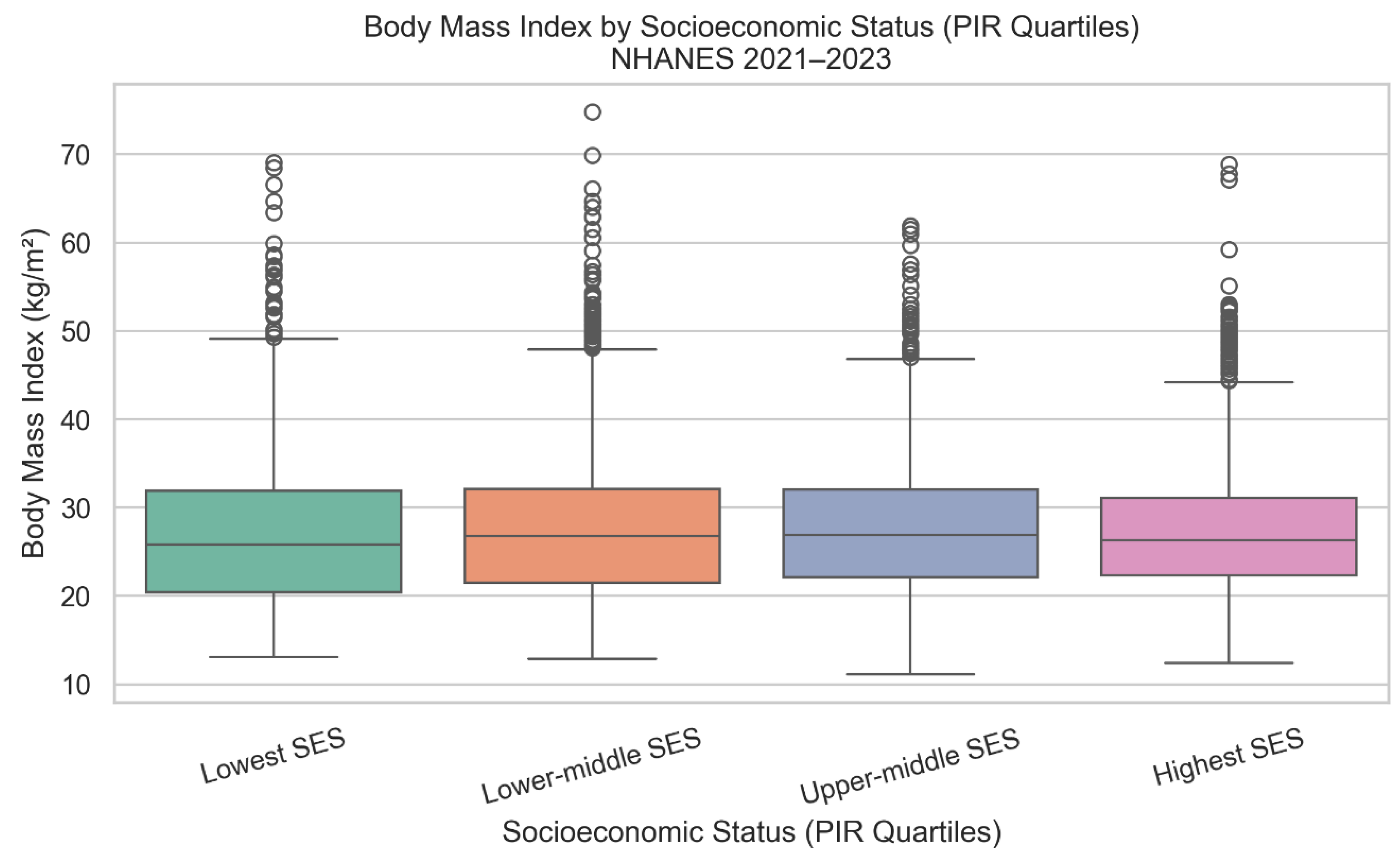
Figure 5.
Interactive Dashboard.
Disclaimer/Publisher’s Note: The statements, opinions and data contained in all publications are solely those of the individual author(s) and contributor(s) and not of MDPI and/or the editor(s). MDPI and/or the editor(s) disclaim responsibility for any injury to people or property resulting from any ideas, methods, instructions or products referred to in the content. |
© 2026 by the authors. Licensee MDPI, Basel, Switzerland. This article is an open access article distributed under the terms and conditions of the Creative Commons Attribution (CC BY) license (http://creativecommons.org/licenses/by/4.0/).
Copyright: This open access article is published under a Creative Commons CC BY 4.0 license, which permit the free download, distribution, and reuse, provided that the author and preprint are cited in any reuse.


