
Submitted:
09 February 2026
Posted:
09 February 2026
You are already at the latest version
Abstract
In the field of geophysics, several erroneous theories were long accepted as fundamental laws and formulas. Recent corrections to these misconceptions have been made possible through the application of Exploratory Data Analysis (EDA). This article outlines how EDA contributed to these breakthroughs and provides a brief guide for those interested in adopting this approach. In addition, while introducing new data analysis methods based on EDA, I will also discuss the remaining challenges that warrant further clarification.
Keywords:
EDA
; statistical computing platform
; statistics
; data-driven analysis
1. Introduction
We gaze into black holes, debate the origins of the universe, and track interstellar objects from deep space—yet we remain startlingly unaware of what unfolds beneath our very feet. Subtle signals preceding earthquakes and the slow dance of tectonic plates often go unnoticed, despite the mountains of data available. This situation presents a striking paradox.
Science advances incrementally by making mistakes and correcting them. For instance, the theory of continental drift was proposed by Wegener in 1912 [1], though many predecessors had suggested it [2] – mapmakers had noticed certain patterns. Wegener supported his theory by discovering identical fossils across continents, yet his work was largely ignored. This persisted despite the complete absence of any evidence that continents did not move. Only after various pieces of evidence accumulated did the theory of plate tectonics finally take shape in the late 1960s [3]. Yet acceptance of this theory also took time. For instance, in Japan, science fiction incorporating it gained popularity as early as 1973 (the author had been writing it since 1964) [4], and the general public became familiar with the concept. Nevertheless, it wasn’t widely accepted within academic circles until the 1990s [5]. Yet, following the theory’s completion, this field appears to have fallen silent once more, with key anomalies and unexplained precursors still left in the shadows. This connects to the aforementioned paradox.
I suspect that this stagnation may stem from a deeply ingrained hierarchical culture within the field—one that discourages dissent and innovation. Working independently, I have authored six papers this past year: revising a law believed for nearly a century [6], correcting a formula held for over a century [7], updating plate location data near Japan, refuting the likelihood of a feared major earthquake, and enabling earthquake prediction once deemed impossible [8,9,10]. At the very least, I have clarified the precursors of earthquakes that should have been predicted. This may sound revolutionary, but I have no desire to send anyone to the guillotine. Rather, I hope many researchers will join this revolution—for it is one that advances science. Here, I introduce the method: the simple yet powerful principle of analysing one’s own data, independently.
2. Materials and Methods
The analysis followed an exploratory data analysis (EDA) framework, which is well suited for identifying structural patterns in scientific datasets [11,12]. Earthquake data were obtained from the catalogues published by the Japan Meteorological Agency (JMA) [11,12]., and the most recent entries were downloaded daily from the same source [13]. All computations were conducted using the R statistical environment [14]. The full R code used in this study is available from Zenodo [15].
3. Results and Discussion
3.1. Magnitude Distribution
The long-standing belief in the validity of the Gutenberg–Richter (GR) law [16] is fundamentally misguided. In reality, earthquake magnitudes follow a normal distribution [6]. When the logarithm of frequency is plotted in a histogram, a linear segment appears—this is the essence of the GR law. However, it is merely a graphical artefact, devoid of mathematical or physical meaning. As a result, all attempts to derive insights into earthquake mechanisms based on the GR law rest on a flawed foundation. The following sections will elaborate on this point.
3.2. About R
Effective data analysis requires a basic understanding of statistics and access to appropriate computational tools. While Excel is widely used, it is not well-suited for statistical analysis. Fortunately, many statistical packages are available. I recommend R, a free and open-source environment supported by a vibrant and helpful community. The latest version can always be downloaded from the CRAN website [14].
Using R does require some programming, but I encourage learning it in parallel with statistics—this is how I teach my students. Statistical study often involves tedious calculations, which R can handle efficiently, allowing learners to focus on interpretation rather than arithmetic. And if you get stuck, just ask online—someone will almost certainly help. That’s the power of a supportive community.
That said, Excel remains convenient for data handling. You can prepare your dataset in Excel, then export it as a text-based file and import it into R using:
data <- read.table(file = “xxx.txt”, sep = “\t”, header = TRUE)
This command stores the file contents in an object called data. In R, although the equals sign (=) is also accepted, assignment is typically indicated with <- or ->. To treat the data as a matrix, simply apply:
data <- as.matrix(data)
All necessary R code is available at zendo [15].
3.3. On Exploratory Data Analysis (EDA)
Here, I advocate for exploratory data analysis (EDA) as a statistical approach [11,12]. EDA seeks to understand the nature of data by examining its properties without preconceptions, making it a branch of statistics that aligns closely with the scientific method [11,12]. The process begins by acknowledging a lack of prior knowledge about the data’s structure. Analytical methods are selected based on the data itself, with a healthy scepticism toward any predefined mathematical model. As a result, the first focus becomes the data’s distribution. Since all distribution types are mathematically defined, one can generate idealised data accordingly. By directly comparing the quantiles of this ideal data with those of the observed data, it becomes possible to assess whether the empirical data conforms to the assumed distribution. This forms the basis of the quantile–quantile (Q–Q) plot technique. If the relationship is linear, then the data will be distributed according to that model.
There exists a mathematical theorem known as the Central Limit Theorem. This states that the sum of multiple random numbers follows a normal distribution. Such phenomena are extremely common. Therefore, those employing EDA first investigate whether the data is normally distributed. R provides a remarkably straightforward solution for this purpose.
qqnorm(data)
Just this one line. If you set this data to magnitude data, the result will surely be a straight line (Figure 1A). This is the simplest way to realise a QQplot [10,11]. To do this a little more carefully,
ideal <- qnorm(ppoints(length(data)))
This means: prepare probability points (ppoints) equal to the length of the data, find the corresponding quantiles from the normal distribution (qnorm), and store them in an object called ideal. By comparing this with the sorted data and plotting it, we can compare the quantiles of the data with those of the normal distribution.
plot(ideal, sort(data))
Adding
z<- line(sort(data)~ideal)
abline(coef(z))
draws a line of best fit (abline). Using coef(z) to extract the coefficients gives the slope as an estimate of the data’s scale σ, and the intercept as an estimate of the location μ. If you forget R functions, execute `?line`. A tutorial will appear immediately.
By leveraging the normally distributed nature of the data, one can construct a grid with one-degree intervals in both latitude and longitude, and estimate the scale of magnitude within each cell to identify regions exhibiting anomalous behavior (Figure 1B) [9]. As expected, magnitudes tend to increase in larger scale or locations [6]. This approach alone reveals how seismic magnitude is spatially distributed—try it yourself. Sometimes, magnitudes tend to increase in several regions. Such patterns serve as important indicators of potential seismic hazards [9].
As a general principle, plotting a histogram of normally distributed random numbers produces the characteristic bell-shaped curve, rising and falling symmetrically (Figure 1C). This familiar form is widely recognised. When the same data are displayed on a semi-logarithmic scale, the curve assumes a cannonball-like shape (Figure 1D). In this representation, the right-hand tail appears linear; however, this is an illusion. In reality, the slope increases with larger values, and the apparent linearity lacks mathematical significance—it is merely an artefact of the scaling. This phenomenon reflects the true nature of the GR law. Notably, the GR law holds only by disregarding the smaller data points; it does not even encompass the median, which is likewise excluded.
Which do you believe: GR law or the normal distribution? My resolve to undertake research in this field crystallised precisely when I executed `qqnorm(data)`.
Magnitude is a logarithmic representation of earthquake energy. A normal distribution of magnitude therefore implies that energy follows a log-normal distribution—a form that naturally arises when multiple factors interact synergistically to determine an outcome. This, I propose, is the true essence of earthquakes.
3.4. Data Manipulation
Whenever I submit a paper, reviewers almost invariably raise the same concern: “You haven’t described how the data were filtered—how was this actually done?” In response, I now explicitly state in the Methods section that not a single data point was excluded.
I believe this necessity reveals a deeply problematic norm. In rigorous scientific practice, data should not be selectively filtered for the analyst’s convenience; doing so constitutes cherry-picking—a form of data falsification. In most scientific disciplines, such practices are unacceptable, which is why similar questions rarely arise. Yet in seismology, this form of data filtering appears to persist, perhaps because the GR law cannot be upheld without systematically discarding lower-magnitude events. No scientific law should require such extreme measures to be upheld. I urge those who continue this practice to reflect on its implications and to abandon it. Science advances not by defending dogma, but by confronting data—all of it.
3.5. Number of Aftershocks
The decay of aftershock frequency over time has long been described by Omori’s formula, later modified by Utsu [19,20]. These models propose an inverse proportionality to time. However, this assumption does not hold up under scrutiny. You can verify this yourself. Simply plot the number of aftershocks at each time point t using:
plot(t, number, log = “y”)
This procedure yields a semi-logarithmic plot. If the data follow a true linear relationship, the result should appear as a straight line. Given that earthquake frequency is often approximated by a log-normal distribution, I initially plotted the data on a semi-log scale and observed a clear linear decline (Figure 2A). However, introducing an inverse proportionality term—as in the Omori–Utsu law—causes the plot to deviate from linearity (Figure 2B) [7]. Although the Omori–Utsu formula includes three high-degree-of-freedom parameters, adjusting any one of them fails to restore linearity. This is because the underlying assumption of inverse proportionality is itself fundamentally flawed.
A linear decrease on a semi-log plot suggests a first-order reaction with a characteristic half-life. This is typical of systems where the rate of change is proportional to the remaining quantity—such as radioactive decay or spring oscillation. Earthquakes, too, appear to settle in this manner. When statistical properties are clarified, the underlying mechanism begins to emerge. This, in turn, allows for the construction of a parsimonious model—the very goal of analysis in Exploratory Data Analysis (EDA) [11].
Immediately after an earthquake, the location parameter of the Q–Q plot shown in Figure 1A increases (Figure 2B). This increase subsequently decays over time, following a half-life pattern. Notably, the duration of this half-life is considerably shorter than that observed for the decay in earthquake frequency. Since both the magnitude and frequency of earthquakes follow a log-normal distribution, it is likely that the timing and size of earthquakes are governed by the synergistic effects of multiple factors. However, the discrepancy in half-lives suggests that the final determining factor—the proverbial last card—differs between the two. If we could identify and quantify these last cards, we might be able to predict with considerable accuracy not only the scale of earthquakes, but also when and where they will occur.
3.6. Position of the Boundary
Although focal depths are routinely measured, the Japan Meteorological Agency (JMA) has continued to rely on outdated models of the tectonic plates surrounding Japan, based on submissions from years past [21,22]. This persistence highlights a lack of understanding of the current three-dimensional tectonic configuration.
Fortunately, this issue can be addressed with relative ease using R. While R’s core functionality supports many types of analysis, it also offers a rich ecosystem of specialized packages—known as libraries—for more advanced tasks. One particularly useful package for 3D visualization is rgl [23]. To install it, simply run:
install.packages(“rgl”)
This downloads the package from a CRAN mirror and integrates it into your R environment—a testament to the community’s generosity, as maintaining such packages requires significant effort. Once installed, load the library with:
library(rgl)
To visualize three-dimensional data (e.g., a matrix with three column vectors representing x, y, and z coordinates), use:
plot3d(data)
This displays a 3D plot in the R console (Figure 3A). To export it as an interactive HTML widget:
rglwidget()
This allows you to save and share the visualization with others [7].
Using this approach, I was able to visualise the distribution of earthquake hyposentres, revealing the actual position of the plate boundary—a structure that had long been misrepresented [7].
3.7. A Single Boundary as a Tilted Plane
The plate boundary can be represented as a single tilted plane in three-dimensional space—naturally described by the standard equation of a plane. Earthquake hyposentres located on this surface can also be visualized (Figure 3B).
To achieve this, I employed Principal Component Analysis (PCA) [24,25]. PCA is a multivariate analysis technique commonly used for dimensionality reduction. Its strength lies in its objectivity—it yields consistent results regardless of the analyst—making it particularly well-suited for scientific applications. A detailed introduction to this method is provided in the appendix of [7], which I encourage you to read. It may prove useful in many other contexts as well. The implementation in R is remarkably concise, requiring only a few lines of code [15].
When applied to earthquake hyposentre data—typically described by latitude, longitude, and depth—PCA can reveal the dominant spatial patterns of seismicity. Each hyposentre occupies a unique position in this three-dimensional space. PCA identifies these directions of variation using orthogonal vectors. PC1 captures the greatest variance, passing through the centroid of the data. PC2 captures the second greatest variance, orthogonal to PC1. PC3, orthogonal to both PC1 and PC2, represents finer variations and the curvature of the data distribution. PC1 and PC2 function as independent, orthogonal axes, defining a single plane. The plane defined by PC1 and PC2—referred to here as the boundary plane—captures the dominant spatial structure of the hyposentre distribution. PC3 is the normal vector to this plane, along which the finer variations in the data and the curvature of the plane are expressed. Furthermore, using this normal vector, an equation representing the boundary plane can be readily found. This allows the position of the boundary to be clearly and objectively mapped. Furthermore, by projecting the hyposentres onto the PC1–PC2 plane, their spatial clustering along the boundary can be visualised objectively (Figure 3B, 3C). In this case, PC1 primarily represents depth, while PC2 represents direction on a map.
Thus, as the position of the boundary became clearer, it was found that parallel to the line where it meets the ground lies a shallow, belt-shaped region prone to frequent earthquakes, referred to as the shallow seismic zones (Figure 3CD). This area is likely where crustal material from each plate is compressed, accumulating stress within the plates. For instance, the Seto boundary may represent such a zone; here too, there is no plate subduction, and earthquake hyposentres are concentrated at shallow depths.
From the precise positions of the boundaries obtained in this manner, the locations of the plates can be estimated (Figure 3D).
Using mesh and 3D viewing provides two complementary perspectives for observing earthquakes, though some practice is needed to use these tools effectively. Regional variability is an important consideration: for example, the Noto Peninsula is a high-hazard area located near the convergence of the Eurasian, Pacific, and Philippine Sea plates, a setting that favors the development of shallow seismic zones [26].
The M7.6 earthquake on the Noto Peninsula in 1st January 2024 [27] was preceded by a precursor swarm at 5 May 2023 (M6.5), during which both magnitude parameters μ and σ increased. However, the observed increases largely reflect its influence. After this swarm, seismicity declined; from October to December 2023, when event counts had fallen sufficiently, a magnitude anomaly was detectable only in the locator (Figure 4 AB). How should risk be assessed under these conditions?
First, proximity to a plate boundary makes the region inherently seismically active, so even an anomaly confined to the locator warrants concern. Second, the locator increase during the 2023 swarm was very small: although event counts decreased along two linear trends, magnitudes did not clearly follow that pattern (Figure 4C). Typical mainshock locator rises span several days and amount to roughly 2–3 units; here the rise was under 1 unit and largely returned to baseline within a day [7]. This implies that the conditions for accumulating the energy needed to trigger a large mainshock were not fully met, and the swarm may not have released energy as a conventional mainshock. By October, however, magnitudes began a gradual increase, culminating in values that exceeded those recorded during the 5 May event (Figure 4C).
Volcanic activity likely affects the adjacent offshore region. This sector of the Sea of Japan is anomalous, with elevated locators [9].. During volcanic episodes at Mount Aso and the Tokara Islands, σ has been observed to decrease [8,10], a similar σ reduction was detected west of the Noto Peninsula (Figure 4D). Other regional signatures—such as a fine-silt bank and low Bouguer anomalies—are consistent with volcanic-type processes [28]. Immediately after the M7.6 quake on 1 January 2024, seismicity initiated in this offshore area and, unlike the 2023 pattern (Figure 4E), expanded broadly around the peninsula (Figure 4F).
A plausible interpretation is that 2024 seismicity was modulated by residual energy accumulated during 2023, which interacted with volcanic-type processes offshore. This interaction may have contributed to the generation of the large, damaging January 2024 earthquake. Thus, the region functions both as a tectonic convergence zone and as an area with volcanic features, both of which are linked to plate dynamics.
Moreover, even when an abnormality is detected, its interpretation may remain unclear. For instance, recent data reveal clusters of large, lump-like hyposentres along the Seto boundary (Figure 5A, green), scattered across Wakayama Prefecture at depths of approximately 10–15 km and around 30 km (Figure 5B). This region has long exhibited high seismic activity, with consistently elevated earthquake counts recorded since the 1990s. Yet no anomalies are apparent in the magnitude parameters, as large earthquakes are rare. How, then, should this swarm be understood? Although the local meteorological observatory is aware of the phenomenon, no satisfactory explanation for its underlying cause has been provided to date [29]. Clarifying how such patterns should be interpreted remains an open challenge for future research.
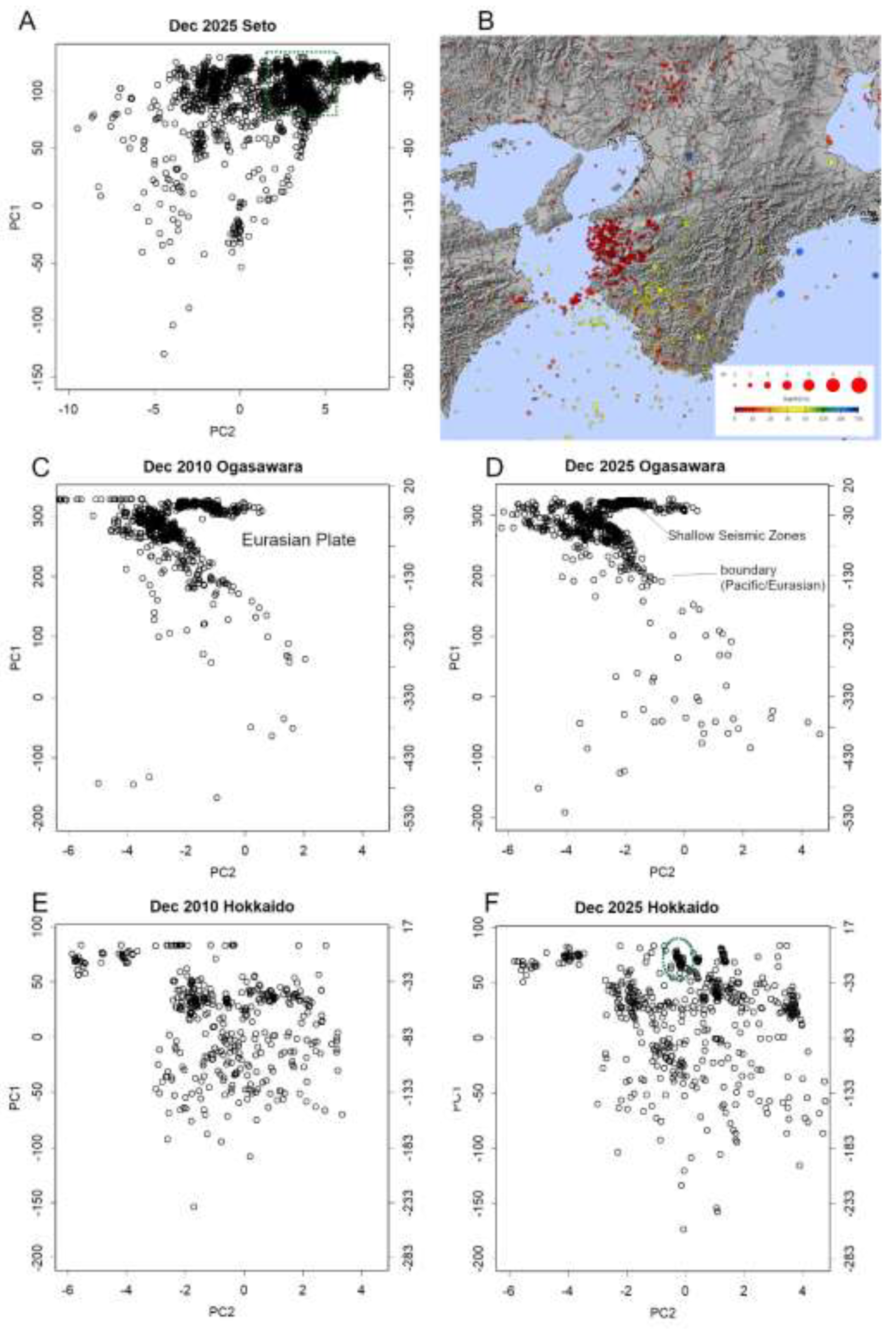
Furthermore, in December 2025, a noticeable increase in very deep earthquakes was observed along the boundaries in Ogasawara (Figure 5CD) and Hokkaido (Figure 5EF). For comparison, data from 2010 are presented; however, this phenomenon was particularly prominent in December 2025. The activity was dispersed across the entire region, with no clear concentration in any specific area. Due to the considerable depth of these events, no significant surface damage was reported. Could this signal, for instance, heightened activity within the Pacific Plate? Is this a phenomenon that merits closer attention? These questions remain open, underscoring the need for continued monitoring and investigation.
Incidentally, the concentration of seismic activity observed at shallow depths on the Hokkaido boundary (Figure 5F, green) may represent precursors to a larger earthquake. This cluster is located at E147.7, N44.4, in the offshore waters near Iturup (Etorofu) Island—a shallow region situated some distance from the Kuril (Chishima) –Kamchatka Trench. This region is seismically active, with a history of frequent earthquakes, including a notable event in 2020 [30]. Should a major earthquake occur in this area, its proximity to major cities such as Nemuro, Kushiro, and Abashiri means that any resulting tsunami could arrive rapidly. Moreover, the geographic features of the Nemuro and Shiretoko peninsulas, which form prominent capes, may enhance the risk of wave refraction, potentially amplifying tsunami impacts. At present, the magnitude anomaly indicates a notably elevated location parameter, although the scale remains unchanged. Even so, continued vigilance is essential.
4. Conclusions
This paper demonstrated that employing modern statistical methods, such as those provided by EDA, enhances the accuracy and interpretability of seismic data analysis. It also introduced practical approaches for implementing these methods in R, a freely available computational environment. Furthermore, I clarified how earthquake magnitude should be treated statistically: while magnitude itself follows a normal distribution, the corresponding energy—being the exponential of magnitude—follows a log-normal distribution. This behavior reflects the synergistic contribution of multiple underlying physical factors.
I also showed that both the magnitude locator and aftershock frequency decrease linearly when represented on a logarithmic scale, revealing decay processes that can be characterized by distinct half-lives. The difference in these half-lives suggests that different physical mechanisms govern each phenomenon. In addition, I introduced methods for visualizing seismic data in three dimensions, enabling unprecedented precision in identifying structural boundaries and observing earthquakes occurring along those surfaces.
Such improvements in data accuracy and visualization will gradually deepen our fundamental understanding of earthquake processes. At the same time, our findings indicate that several long-standing empirical laws and formulas are inconsistent with observed data; consequently, any inferences based on those assumptions warrant careful re-evaluation. The ability to obtain more reliable information should also contribute meaningfully to future efforts in earthquake prediction.
Nevertheless, many aspects of seismic behavior remain unresolved. In this review, I have highlighted several such phenomena. I hope that this paper serves as a reference point for clarifying these outstanding issues and for guiding future research in this field.
I am a chemist before I am an informatician—a somewhat old-fashioned type of scientist. As such, I find myself aligned with Popper’s philosophy of science [31], and I am deeply grateful to Tukey for introducing EDA [11]. Are these not authorities themselves? Perhaps. But if so, then let us prepare a new framework. At the very least, I hope the field of geophysics will recognise that it suffers from chronic issues—akin to a lingering illness—and take steps to move beyond them. Blind faith in authority is the graveyard of intellect. It is the antithesis of scientific thinking. Do not most scientists, deep down, resist authority? They respect the second law of thermodynamics, yet would amend it if necessary—and likely wish to be the ones to do so. Scientists are, by nature, ambivalent beings. I know I am.
What I have described above is routine practice for data analysts in other fields—bioinformatics, for instance. For reasons unclear, such perspectives have long been absent from this domain. Hence, this revolution. Why not try it yourself? Leaving a theory unchallenged for a hundred years suggests not only blind reverence, but also a failure to examine the data seriously. In such a state, predicting earthquakes or understanding their mechanisms is simply impossible. From now on, examine your own data. That is where science begins.
Funding
This research received no external funding.
Data Availability Statement
All the data can be downloaded from JMA: https://www.data.jma.go.jp/eqev/data/gaikyo/. R code can be downloaded from Znodo at https://zenodo.org/records/17983156.
Conflicts of Interest
The authors declare no conflicts of interest.
Abbreviations
The following abbreviations are used in this manuscript:
| EDA | Exploratory Data Analysis |
| JMA | Japan Meteorological Agency |
| GR | Gutenberg–Richter |
| PCA | Principal Component Analysis |
References
- Wegener, A. Die Entstehung der Kontinente. Geologische Rundschau 1912, 3, 276-292. [CrossRef]
- Romm, J. A new forerunner for continental drift. Nature 1994, 367, 407-408. [CrossRef]
- Frankel, H. Plate Tectonics. In The Cambridge History of Science: Volume 6: The Modern Biological and Earth Sciences, Bowler, P.J., Pickstone, J.V., Eds.; The Cambridge History of Science; Cambridge University Press: Cambridge, 2009; Volume 6, pp. 383-394.
- Komatsu, S. Japan sinks; Kobunsha: 1973.
- Tomari, J. Rejection and acceptance of plate tectonics; University of Tokyo: 2017.
- Konishi, T. Seismic pattern changes before the 2011 Tohoku earthquake revealed by exploratory data analysis. Interpretation 2025, T725-T735. [CrossRef]
- Konishi, T. Visualising Earthquakes: Plate Interfaces and Seismic Decay. Preprints 2025, 189197, . [CrossRef]
- Konishi, T. Earthquake Swarm Activity in the Tokara Islands (2025): Statistical Analysis Indicates Low Probability of Major Seismic Event. GeoHazards 2025, 6, 52.
- Konishi, T. Identifying Seismic Anomalies through Latitude-Longitude Mesh Analysis. Preprints 2025. [CrossRef]
- Konishi, T. Exploratory Statistical Analysis of Precursors to Moderate Earthquakes in Japan. GeoHazards 2025, 6, 82.
- Tukey, J.W. Exploratory data analysis; Reading, Mass. : Addison-Wesley Pub. Co.: London, 1977.
- NIST/SEMATECH. e-Handbook of Statistical Methods. Available online: http://www.itl.nist.gov/div898/handbook (accessed on.
- JMA. List of epicenter location. Available online: https://www.data.jma.go.jp/eqev/data/daily_map/index.html (accessed on.
- R Core Team. R: A language and environment for statistical computing; R Foundation for Statistical Computing: Vienna, 2025.
- Konishi, T. R-codes used in Earthquake-studies. Zendo, Available online: https://zenodo.org/records/17983156 (accessed on 25 December ).
- Gutenberg, B.; Richter, C.F. Frequency of Earthquakes in California. Bulletin of the Seismological Society of America 1944, 34, 185-188.
- JMA. Summary of seismic activity for each month. Available online: https://www.data.jma.go.jp/eqev/data/gaikyo/ (accessed on 25 January 2026).
- JMA. Earthquake Monthly Report (Catalog Edition). Available online: https://www.data.jma.go.jp/eqev/data/bulletin/hypo.html (accessed on 25 January 2026).
- Omori, F. On the After-shocks of Earthquakes. Available online: https://repository.dl.itc.u-tokyo.ac.jp/records/37571 (accessed on 25 January 2026).
- Utsu, T. Magnitude of earthquakes and occurance of their aftershocks. Journal of the Seismological Society of Japan. 2nd ser. 1957, 10, 35-45. [CrossRef]
- Barnes, G.L. Origins of the Japanese Islands: The New “Big Picture”. Japan Review 2003, 3-50.
- JMA. Nankai Trough Earthquake. Available online: https://www.jma.go.jp/jma/kishou/know/jishin/nteq/index.html (accessed on 25 January 2026).
- Murdoch, D.; Adler, D.; Nenadic, O.; Urbanek, S.; Chen, M.; Gebhardt, A.; Bolker, B.; Csardi, G.; Strzelecki, A.; Senger, A.; et al. rgl: 3D Visualization Using OpenGL. Available online: https://cran.r-project.org/web/packages/rgl/index.html (accessed on 25 January 2026).
- Jolliffe, I.T. Principal Component Analysis; Springer: 2002.
- Konishi, T. Principal component analysis for designed experiments. BMC Bioinformatics 2015, 16, S7. [CrossRef]
- Konishi, T. Seismicity of the Noto Peninsula: Spatial Patterns, Shallow Zones, and Possible Volcano-Related Signals. Preprints 2026. [CrossRef]
- JMA. Related information on the 2024 Noto Peninsula Earthquake. Available online: https://www.jma.go.jp/jma/menu/20240101_noto_jishin.html (accessed on 25 January 2026).
- Japan, G.S.o. Seamless geoinformation of coastal zone “Northern coastal zone of Noto Peninsula” Available online: https://www.gsj.jp/researches/project/coastal-geology/results/s-1.html (accessed on 25 January 2026).
- Wakayama local meteorological office. Characteristic earthquakes in Wakayama Prefecture and surrounding areas. Available online: https://www.data.jma.go.jp/wakayama/bousai/phenomenon/tokuchoutekinajishin.html (accessed on 25 Dec. 2025).
- Headquarters for Earthquake Research Promotion. Long-term assessment of seismic activity along the Kuril Trench. Available online: https://www.jishin.go.jp/main/chousa/kaikou_pdf/chishima3.pdf (accessed on 25 Dec. 2025).
- (Winter 2012 Edition).
Figure 1.
A. Example of a normal Q–Q plot using data from January 2023 [17]. The linear relationship bends around the time of any major earthquake. B. A Q–Q plot, similar to panel A, was generated for each 1° latitude–longitude grid point to examine variations in scale. This approach highlights the locations of seismic anomalies [9]. Data were obtained from the Japan Meteorological Agency (JMA) [18]. C. Histogram of normally distributed random numbers. D. The same histogram plotted on a semi-logarithmic scale. A straight line is fitted to the rightmost portion of the distribution, representing the slope corresponding to the b-value in the Gutenberg–Richter (GR) law. However, since the underlying distribution cannot be linear in principle, this estimation entails substantial error. Above all, this relationship applies only to the relatively large magnitudes at the far right, meaning the bulk of the data, including the median, is disregarded.
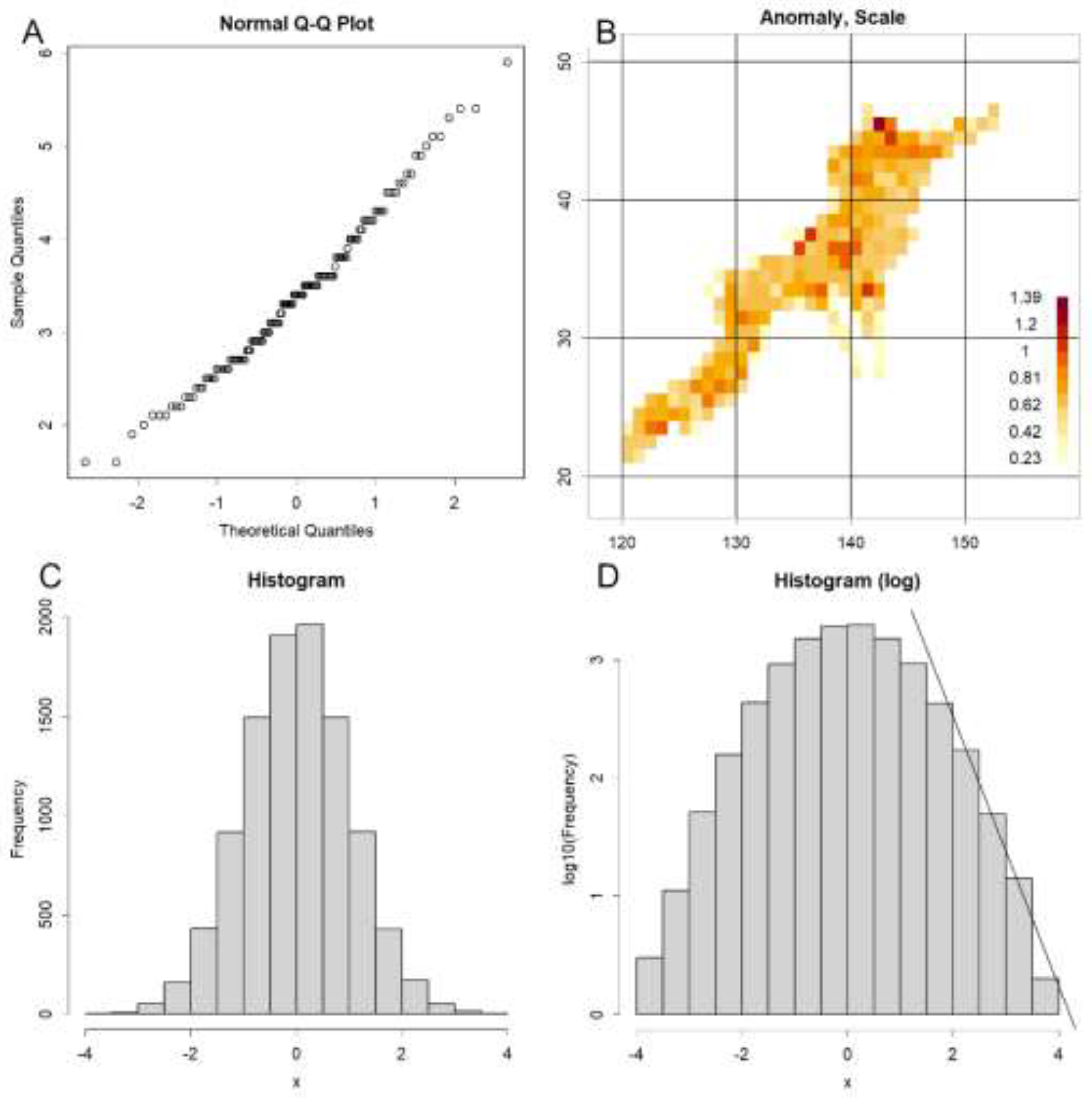
Figure 2.
Decay patterns exhibiting half-life dynamics, based on data from the 2021 Tohoku earthquake, analyzed at 1° latitude × longitude grid resolution. A. Temporal variation in earthquake frequency, plotted on a semi-logarithmic scale. B. The Omori–Utsu law with varieties of parameter settings. Due to its inverse proportionality structure, it distorts the curve, leading to deviations from the observed data. C. Temporal change in the parameters of the normal distribution of magnitudes. The y-axes are logarithmic in both panels; thus, the linear trends indicate first-order decay processes with distinct half-lives. D. Map of Japan showing the spatial distribution of seismic hazard and the locations used in this analysis.
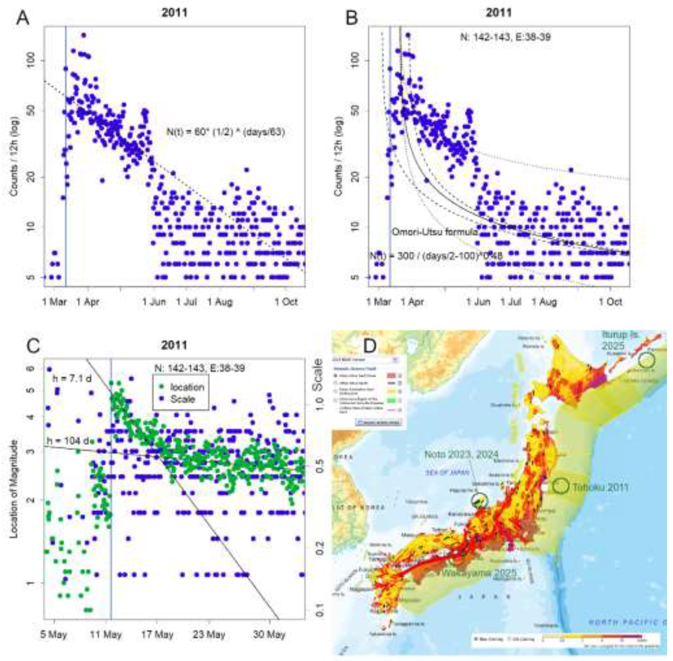
Figure 3.
Visualization of earthquake hyposentres with depth information. A. Plate boundary configuration. Japan is bounded by major plate boundaries to the east and southwest, connected by shallow Seto boundaries. These appear as a single, continuous structure in the 3D visualization (plot3D). The figure can be interactively rotated and zoomed using the mouse. The R code used to generate this plot is available in the corresponding publications for reproducibility [15]. B. Sanriku boundary, forming the central portion of the eastern boundary, extracted using principal component analysis (PC1 and PC2). Approximate latitude is shown along the top axis, and depth is indicated on the left. Prior to major seismic events, an increase in deeper hyposentres is observed. C. Boundaries mapped from equations confirmed by PCA. The solid line represents depth = 0 km, and the dashed line represents depth = –400 km. As the Southwest boundary is relatively shallow, it is plotted at –50 km for Seto boundary and –200 km elsewhere. The steep dip angle of these boundaries results in a narrower apparent width [7]. Blue indicates the Eastern boundary, green denotes the Seto and Southwestern boundaries, and brown represents the shallow seismic zones. D. Conceptual diagram illustrating the positions of plates around Japan.
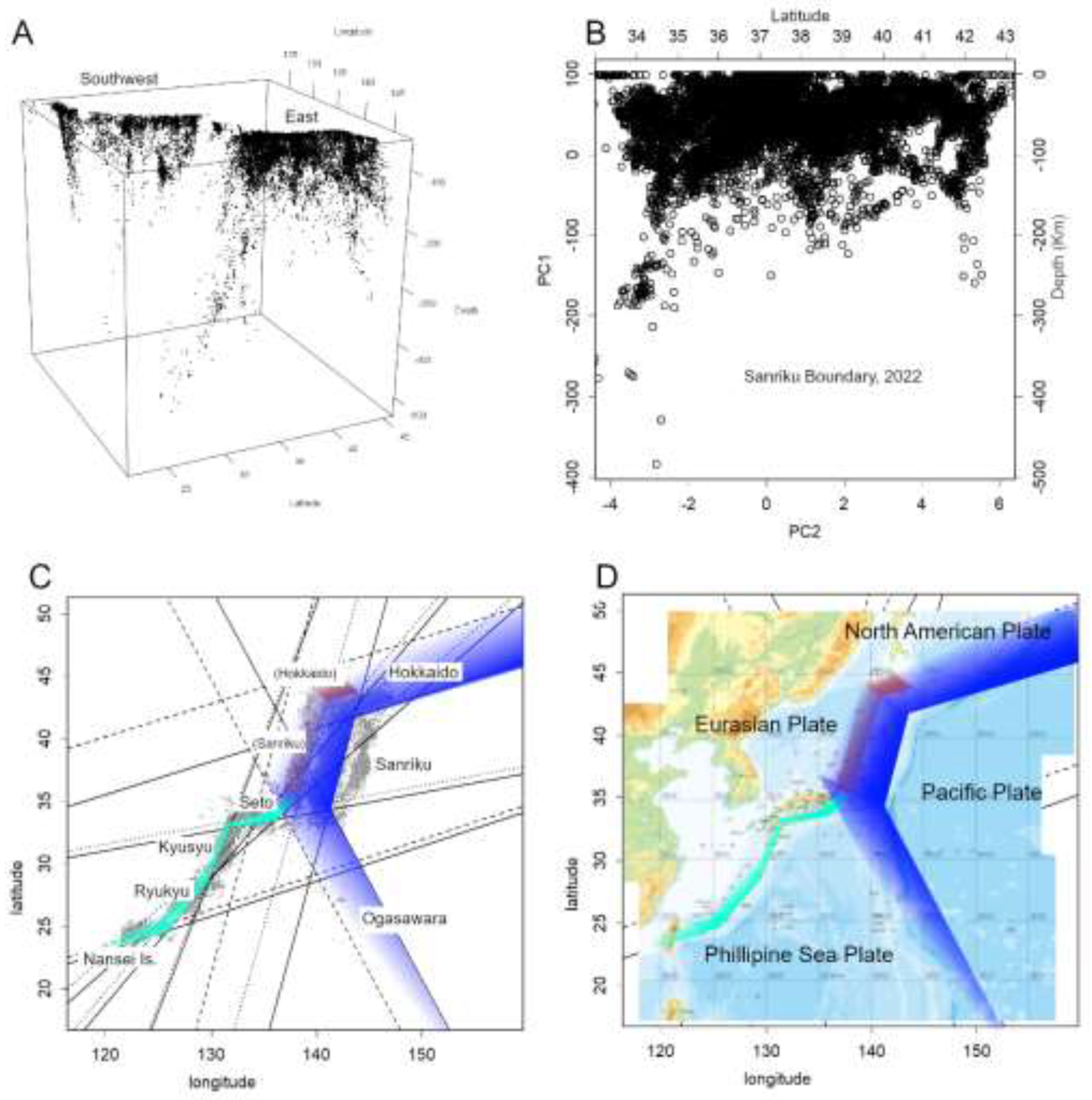
Figure 4.
A–B: Distribution of two magnitude parameters—location (μ) and scale (σ)—on a 1° latitude grid (October–December 2023). A: μ, showing a pronounced peak in the Noto region. C: Time series of μ and σ; μ began rising in October rather than immediately after the 5 May event. D: σ anomalies (colouring inverted from B to emphasize lower values). E–F: Hyposentre maps for the Noto area (E: 2023; F: April 2024). Most foci were shallow (≤20 km). Green: hyposentres with M > 4.0.
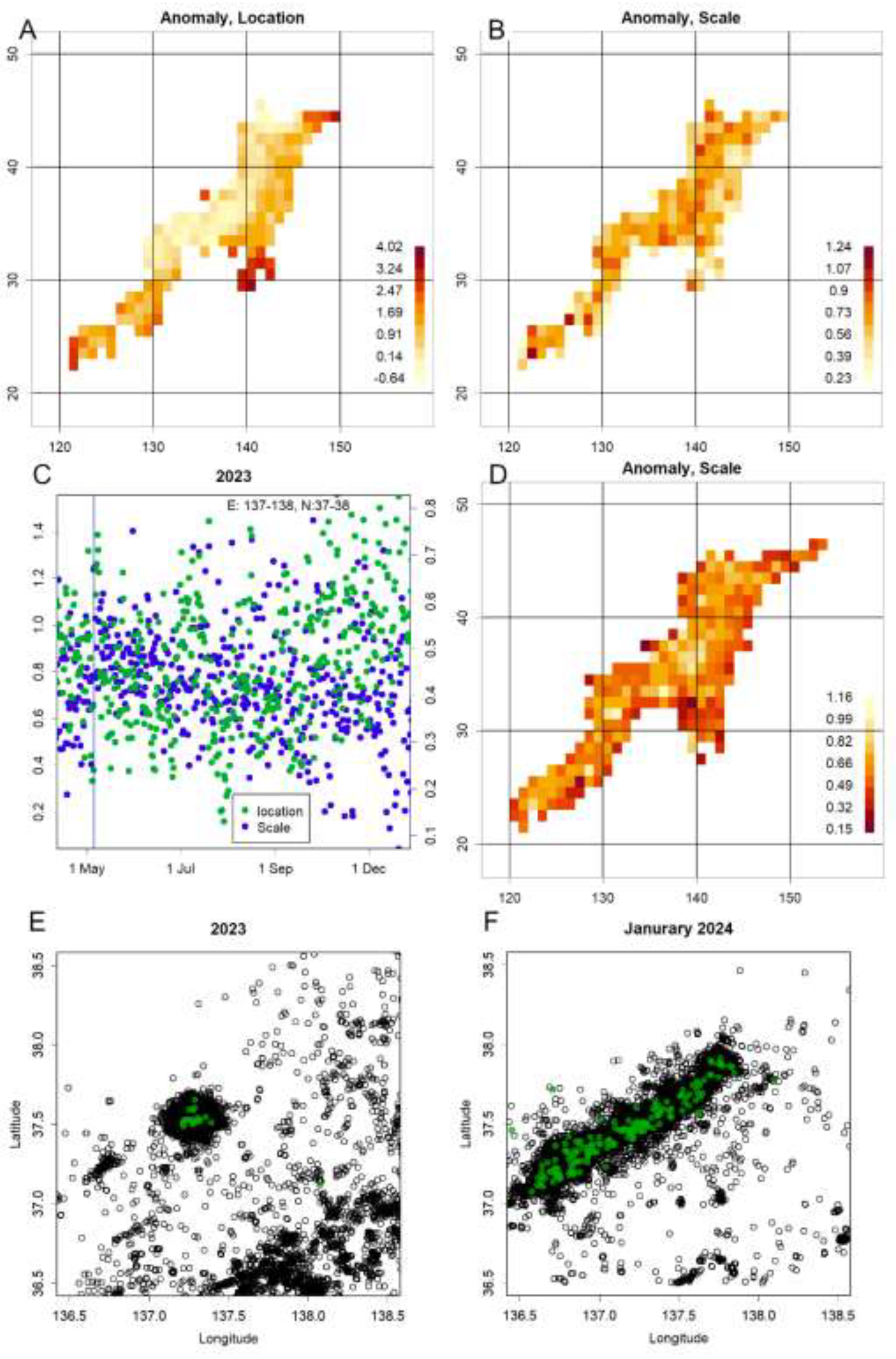
Figure 5.
Recent data (December 2025). A. Seto boundary: The Philippine Sea Plate is being impeded from subducting beneath the Eurasian Plate due to compressive forces acting from below. This boundary is characterised purely by compressive stress. The green-outlined cluster in Wakayama Prefecture includes both very shallow hypocentres (less than 10 km deep) and moderately shallow ones (around 30 km deep). B. Hyposentre locations (JMA data): Japan Meteorological Agency Map [27]. Red indicates depths shallower than 10 km; yellow indicates depths of approximately 30–50 km. C–D. Ogasawara boundary: When this diagram is inverted, it aligns with the orientation shown in Figure 3D. To the right lies the Eurasian Plate, with the Philippine Sea Plate in front and the Pacific Plate beyond the hyposentre. The shallow seismic zone visible in the upper section connects to the Sanriku shallow seismic zone and extends beyond the diagram. Panel C shows data from 2010, while Panel D presents data from 2025. By 2025, the number of very deep earthquakes has increased markedly, with seismic activity extending across the Japanese archipelago. E–F. Hokkaido boundary: This region is shaped by the subduction of the Pacific Plate beneath the North American Plate. By 2025, overall seismic activity has increased, particularly at greater depths. A concentration of shallow earthquakes (green) is also evident, accompanied by elevated magnitude-location values, indicating a potential seismic hazard.
Disclaimer/Publisher’s Note: The statements, opinions and data contained in all publications are solely those of the individual author(s) and contributor(s) and not of MDPI and/or the editor(s). MDPI and/or the editor(s) disclaim responsibility for any injury to people or property resulting from any ideas, methods, instructions or products referred to in the content. |
© 2026 by the authors. Licensee MDPI, Basel, Switzerland. This article is an open access article distributed under the terms and conditions of the Creative Commons Attribution (CC BY) license (http://creativecommons.org/licenses/by/4.0/).
Copyright: This open access article is published under a Creative Commons CC BY 4.0 license, which permit the free download, distribution, and reuse, provided that the author and preprint are cited in any reuse.


