
Submitted:
06 February 2026
Posted:
06 February 2026
You are already at the latest version
Abstract
By visualising seismic data in three dimensions, it becomes evident that hypocentres cluster along boundaries formed by colliding plates. These boundaries appear to be solid structures, established years before the mainshock, and remain largely stationary even after the event concludes. Major earthquakes tend to occur along such surfaces, and because seismic activity increases in these regions prior to a mainshock, their observation may provide a basis for earthquake prediction. With plate positions near Japan now more clearly defined, existing models require revision. Furthermore, analysis reveals that both the number of aftershocks and the seismic energy released during a mainshock decay with distinct half-lives. This represents a fundamentally different decay pattern from the formula long regarded as correct. Employing modern statistical methods therefore yields more accurate insights, essential both for advancing our understanding of earthquake mechanisms and for improving predictive capability.
Keywords:
earthquake prediction
; calculation method
; exploratory data analysis
; programming
; contact surface
; attenuation
; Omori equation
1. Introduction
Although geophysics has accumulated a vast body of observational knowledge, modern statistical methodologies—particularly exploratory data analysis (EDA)—have not been widely applied to seismic datasets. As a result, several long-standing interpretations may have been shaped by analytical limitations rather than by the underlying physical processes. Re-examining seismic behaviour with contemporary statistical tools therefore offers an opportunity to clarify patterns that have remained ambiguous.
The present study addresses three specific issues that have not been rigorously evaluated using modern statistical approaches:
(1) the temporal decay of aftershocks following a mainshock,
(2) the transient increase in magnitude locator during a mainshock, and
(3) the three-dimensional structure of seismically active zones.
Each of these can be analysed objectively using standard statistical software such as R, allowing the full dataset to be examined without selective exclusion. By applying these methods, this study aims to identify previously unrecognised regularities in seismic activity and to reassess empirical relationships that have guided earthquake research for decades. The overarching hypothesis is that a more rigorous statistical treatment will yield a clearer and more coherent understanding of earthquake behaviour.
Through the application of modern statistical methods, seismic data can be effectively organised, revealing parameters that support probabilistic forecasting of earthquakes above a certain magnitude (Konishi, 2025b, c, d, a). However, the intrinsic characteristics of seismic data have long been fundamentally misunderstood. One consequence of the lack of rigorous statistical treatment in earlier studies is the long-standing reliance on the Gutenberg–Richter (GR) law for earthquake magnitude (Gutenberg and Richter, 1944). Although this empirical relationship has been widely accepted, its confirmation has depended heavily on analytical procedures that exclude a substantial portion of the available data (Appendix A). Such selective omission is not permissible in standard scientific practice, as it biases the inferred distribution.
Recent analyses (Konishi, 2025a) show that when all data are retained, the magnitude distribution is consistent with a normal distribution (Appendix A). Because magnitude represents the logarithm of seismic energy, this implies that earthquake energy follows a log-normal distribution, suggesting that it arises from the multiplicative interaction of multiple contributing factors. Under this corrected statistical interpretation, the physical nature of earthquakes becomes more coherent. Consequently, interpretations of earthquake occurrence that rely on the GR law may require re-evaluation, as their statistical foundation depends on assumptions that do not hold when the full dataset is analysed.
What occurs between the onset of an earthquake and its resolution also appears to be a field where modern statistical approaches have not been applied. In this study, I aim to clarify what objective statistical analysis reveals about the behaviour of earthquakes from onset to termination. By applying modern statistical methods to the complete dataset, I re-examine empirical relationships that have been accepted for many decades. The results suggest that some long-standing interpretations may have arisen from methodological limitations rather than from the underlying physical processes themselves. A more rigorous statistical approach therefore provides an opportunity to refine our understanding of earthquake behaviour.
Three-dimensional visualisation of hypocentres has greatly improved the representation of fault geometries, subduction interfaces, and seismically active zones. Although plate boundaries are delineated through a combination of geological, geodetic, tectonic, and bathymetric evidence, 3D seismicity patterns nonetheless provide valuable structural insight. However, communicating such three-dimensional features remains challenging, not only because of practical limitations in visualisation and printing, but also due to the lack of established terminology for describing complex spatial structures.
In this study, I examine whether modern statistical methods can reveal systematic changes in seismicity within these regions, including the possibility of temporal variations preceding major earthquakes. This question has not been rigorously evaluated using contemporary statistical approaches, and addressing it may help clarify the dynamic behaviour of active zones.
Visualising hypocentres in three dimensions has enabled clearer representation of plate arrangements. Earthquakes could increase in frequency in these regions prior to a major event, yet communicating such 3D phenomena remains challenging. Beyond the practical difficulties of printing, the absence of suitable vocabulary to describe three-dimensional structures contributes to this limitation. It is therefore necessary to translate these three-dimensional observations into two-dimensional representations in order to analyse them quantitatively and to compare temporal changes in a consistent manner. Because the hypocentral distribution delineates a coherent seismically active surface—albeit one with curvature and local irregularities—it is possible to project this structure onto a two-dimensional plane for quantitative analysis. Such a projection does not imply that the underlying geometry is strictly planar; rather, it provides a practical representation that preserves the essential spatial relationships while enabling consistent statistical evaluation.
To this end, I experimented with a method based on principal component analysis (PCA), which enabled plate boundaries to be expressed using simple equations. Although plate boundaries are typically inferred from a combination of geological, geodetic, tectonic, and bathymetric observations, integrating these heterogeneous measurements into a unified representation remains challenging. This difficulty is reflected, for example, in the long-standing lack of consensus regarding the location of the so-called Fossa Magna (Yamashita, 1976; Kinugasa, 1990) and in the uncertainties surrounding the precise configuration of the plates around Japan (Barnes, 2003). In contrast, hypocentre locations can be estimated with a high degree of objectivity and consistency. By analysing these data statistically, it becomes possible to derive a coherent representation of the underlying seismically active structures. The results are presented below.
Whether seismic activity will subside is a major concern for affected regions. Research by Omori in the 19th century examined how aftershocks diminish following an earthquake (Omori, 1895), later refined by Utsu and widely adopted (Utsu, 1957; Utsu et al., 1995). Yet these approaches may warrant reconsideration, as they were developed under the statistical and observational constraints of their time and rely on assumptions that may not hold when the full dataset is analysed using modern statistical techniques. In this study, I re-examine the temporal decay of seismicity with the aim of determining whether a more accurate or generalizable formulation can be obtained.
2. Materials and Methods
2.1. Data
Earthquake data, comprising extensive catalogue data, was obtained from the Japan Meteorological Agency (JMA) and utilized (JMA, 2025c). Earthquakes were measured within a grid of one degree latitude and longitude, with the number of occurrences and magnitude examined (Konishi, 2025d). For the grid with the highest count in the year of interest, its properties were investigated. The sole exception was 2011, where examined the grid containing the hypocentre of the Tohoku earthquake. All calculations were performed using R (R Core Team, 2025). The necessary code is provided in the supplement. Counts of earthquake occurrences, etc., utilised content from the preceding paper (Konishi, 2025d). The data utilises all available information and has not been filtered by any criteria whatsoever. The spatial relationships of earthquakes were plotted whilst verifying JMA materials (JMA, 2025d), employing Leaflet (Agafonkin, 2025) Latitude and longitude verification utilised the Latitude and longitude map (Fukuno, 2025). Maps employed were sourced from the Geospatial Information Authority of Japan (GSI, 2025). As these are rendered in Mercator projection, they were appropriately transformed to align with the square-based latitude-longitude diagram (Konishi, 2025d) used herein.
2.2. Three-Dimensional Presentation
For the 3D display, the rgl package for R (Murdoch et al., 2025) was employed. Furthermore, the rglwidget function from this package was used to generate the HTML file. Previous studies often relied on oversimplified assumptions regarding plate boundaries. Here, we apply modern statistical methods to re-examine hypocentre distributions and correct these inaccuracies.
The plate boundary is estimated from the hypocentre location. In this process, principal component analysis (PCA) (Jolliffe, 2002; Konishi, 2015) is applied in two distinct phases (Appendix B). PCA is a technique that shifts and rotates data along recognisable axes. Centring is performed at the desired rotation centre, here the centre of mass was used, followed by singular value decomposition (SVD). The resulting unitary matrix is then used to rotate the data. The first application here was during 3D-to-2D dimensionality reduction. In this case, each dimension of the 3D data (latitude, longitude, depth) was centred per item, then scaled before application of SVD. The second instance occurs when observing hypocentres concentrated on a specific boundary, projecting the hypocentre position data onto that surface. Here, data unrelated to the boundary was removed as much as possible (the trick is to be generous in discarding it, as discarded data can be recovered later; furthermore, as PCA is vulnerable to noise, it is preferable to remove unnecessary data where possible). After centring this data, SDV was applied; the data was not scaled. This approach allows PC1 to be fixed at the largest scale, depth data, and ensures the scale of the PCA results matches that of the actual data. Since the plate position does not change significantly from year to year, the obtained centre of gravity and unitary matrix were also applied to data from other years. All R code and the parametrs for the plate boundaries is presented in the supplement.
2.3. A Simplified Process Diagram
3. Results
3.1. Three-Dimensional Visualisation Considering the Hypocentre Depth
Japan is a country prone to frequent earthquakes, many of which are caused by plate tectonics (Bird, 2003; JMA, 2023; Stern, 2002). When two plates rub against each other, friction or locking at their boundary creates conflict, which becomes the energy for earthquakes. The Japanese archipelago is situated within a complex interaction zone involving several tectonic plates and microplates, including the Amur (Eurasian) and Okhotsk (often regarded as part of the North American Plate), beneath which the Pacific and Philippine Sea Plates are subducting, resulting in a highly intricate tectonic configuration and elevated seismicity in the region.
Measurement and recording of deep earthquakes in Japan likely became feasible around 1985 (JMA, 2025c). (data from 1983 did not yield depths greater than 100 km). Earthquake depths roughly follow a log-normal distribution (Figure 1AB, with a normal qqplot superimposed), and are generally shallower. Observing deep hypocentres reveals they lie on a single solid surface (Figure 1CD; these 3D visualisations are available as interactive HTML files in Figure S1 of the Supporting Information). This likely indicates a plate boundary, the boundary between plates. Energy required to generate earthquakes should readily accumulate there. Consequently, hypocentre locations are likely observed at this boundary.
3.2. Convert to Two-Dimensional Data for more Convenient Visualisation
Observing in 3D reveals that, in some cases, the number of hypocentres on these boundaries increases prior to major earthquakes, making it easier to detect periods of elevated seismic activity. As the supplementary material contains complex interactive visualizations, please rotate it with your mouse or move it forwards and backwards to view it from various angles. While these movements become clear in 3D, translating such results into 2D requires some ingenuity. Figure 2A-C shows the entire projection. First, we attempted Principal Component Analysis (PCA) as a dimensionality reduction method (Figure 2A). Applying PCA to scaled 3D latitude-longitude-intensity data revealed Japan’s width along PC1 and depth along PC2. However, this method suffers from poor reproducibility, making comparisons between different years difficult (indeed, the baseline in this figure is slightly tilted upwards, likely to straighten the vertical line representing the central contact surface). Therefore, we plotted the Euclidean distance between latitude and longitude from a reference point at longitude 0 and latitude 0 on the first dimension, and depth on the second dimension (Figure 2B). This point was chosen simply as a formal reference for the projection. This yielded a plot nearly identical to PCA, with good reproducibility. However, even after this two-dimensional representation, the differences between years do not appear particularly large (Figure 2C). This comparison covers the years of the Eastern Iburi Earthquake and the Kumamoto Earthquake, where numerous hypocentres cluster near the main shocks’ locations, yet distinctions remain elusive. This occurs because the plates themselves existed before the earthquakes and persist afterwards, and the positions of their boundaries show little movement.
Incidentally, deeper earthquakes are more likely to include events with larger magnitudes (Figure 2D). While greater depth may reduce seismic intensity, the impact area becomes more extensive. Furthermore, compared to the period before 2000, deep earthquakes have increased significantly recently (Figure 1). This would be primarily due to the results of deploying the latest equipment (The Headquarters for Earthquake Research Promotion, 2009).
3.3. Isolation of Plate Boundaries
Because no clear differences emerge when examining the entire dataset, it is more informative to narrow the scope and isolate specific plate boundaries. Analysis of hypocentre locations at depths greater than 50 km reveals two major boundaries in Japan: one beneath eastern Japan and another beneath the southwest (Figure 3A; an interactive 3D display is provided in Supplement 2A). Rather than forming a single, continuous, flat slab—as often depicted in simplified explanatory models (JMA, 2023)—these boundaries consist of multiple segments and exhibit curvature. Notably, the segments bend without overlapping, indicating that they are interconnected and likely represent different portions of the same subducting plate.
To extract a representative plane from this tilted structure, principal component analysis (PCA; Appendix B) was applied (Jolliffe, 2002). PCA is a multivariate technique that translates and rotates data while preserving its geometric relationships. When the direction of greatest variance through the centroid is defined as PC1, and the orthogonal direction of second-greatest variance as PC2, these two axes together define a plane corresponding to the plate surface. The third component (PC3), orthogonal to both PC1 and PC2, captures variations associated with plate thickness and undulation. Because depth (in kilometres) dominates the scale of the data, the direction of increasing depth aligns with PC1, whereas PC2 corresponds to horizontal spatial variation (latitude and longitude).
The procedure involves first estimating the approximate plane (Figure 3B), then computing the centroid to serve as the rotation centre. Singular value decomposition (SVD) is used to identify the axes that best represent the data’s variance (PC1 and PC2). PCA then provides the unitary matrix required to rotate the data around the centroid (Appendix B). Figure 3C and 3D show the rotated versions of Figure 3A. Hypocentres beneath the Sanriku region cluster near PC3 = 0, whereas those from other regions deviate substantially along PC3. By selecting data with PC3 values close to zero—allowing for minor deviations due to estimation noise and slight plate curvature—the plate of interest can be isolated in two dimensions.
3.4. Structural Configuration of Japan’s Plate Boundaries
The Southwest boundary consists of three segments—Kyushu, the Ryukyu Islands, and the Nansei Islands. These surfaces converge at slight angles, forming a broad, gently curved structure.
The East boundary is similarly divided into three principal sections. The southernmost segment extends from the vicinity of the Ogasawara Islands, with the Fossa Magna aligned along this continuation (Yamashita, 1976). Although the precise location of the Fossa Magna has been the subject of considerable debate (Kinugasa, 1990), this boundary itself is notably planar and structurally stable. When viewed from the side (Figure 3A), it appears as a straight, diagonally oriented feature, reaching depths of approximately 600 km. The northernmost segment of the East boundary lies along Hokkaido. The 2017 Eastern Iburi Earthquake may have occurred along this structure, which is also characterised by a relatively flat geometry. Connecting the southern and northern segments is the Sanriku boundary, which spans nearly 1000 km and exhibits a gentle curvature. Together, these three boundaries form a coherent large-scale structure with a folded configuration (Figure S2).
The arcs of the East and Southwest boundaries are convex in opposite directions, producing a substantial gap between them. The Nankai Trough—an area of significant seismic concern (JMA, 2024a, 2025b)—is situated within this gap. In this gap, the hypocentres are concentrated at comparatively shallow depths.
3.5. Hypocentres on the Sanriku Plate
Figure 4 presents the hypocentres located on the Sanriku plate after projecting PC3 onto PC1 and PC2. The number of hypocentres shows a gradual increase toward 2010, the year preceding the 2011 earthquake, with a more pronounced rise at greater depths. The counts reach their maximum in 2011, coinciding with the occurrence of the mainshock, and elevated activity is also observed in the offshore region where the Moho discontinuity is shallow.
3.6. The Seto Boundary
The Southwest and East boundaries, which are convex in opposite directions, are connected by a shallow transitional structure (Figure 5A). Because this structure spans the Hanshin, Chugoku, and Shikoku regions, it is hereafter referred to as the Seto boundary. The junction between the Kyushu and Seto boundaries forms a distinct curvature, which links tangentially to both the Sanriku and Ogasawara boundaries (Figure 5A, S3A). In this region, the boundary curves slightly northward and remains shallow, exhibiting a comparatively broad width rather than subducting steeply.
The Southwest boundary differs markedly from the East boundary. Its dip angle is substantially steeper: whereas the East boundary subducts at approximately 30–50°, the Southwest boundary descends at 60–80° (Appendix B). It is also considerably thicker, reaching up to ~50 km in some areas, and displays multiple internal layers (Figure 5B, Figure S4A). This contrasts with the sharp, fault-like geometry of the East boundary and suggests that the Southwest boundary undergoes subduction accompanied by fracturing and delamination. The Seto boundary, by contrast, is shallow, extending to a maximum depth of ~70 km. Hypocentres at greater depths in this region originate from the Ogasawara or Sanriku boundaries (Figure 5C, S3C–F). The position of the Seto boundary between the deeper Chugoku and Ogasawara boundaries is clearly visible in Figure S3F.
PCA applied to the entire Southwest boundary reveals fine-scale structural features (Figure 5D). Such features were not observed, for example, in the Sanriku region (Figure 4). All of these structures share a consistent dip direction. In the deeper portions of the Kyushu region, the boundary is elevated along its northeastern margin, shallowing rapidly toward the northeast where it connects with the Seto boundary (Figure 5D). In three-dimensional view, this configuration appears as an uplifted structure aligned with the Ogasawara boundary (Figure S4B). These observations highlight the complex, multilayered nature of the Southwest boundary and illustrate the limitations of simplified slab models in representing Japan’s tectonic configuration.
A consistently shallow region characterised by frequent seismicity lies both above and below these boundaries. This shallow seismic zone is most prominent along the Sanriku boundary but is also present along the Hokkaido boundary. Although it is unlikely to represent a plate boundary in the strict sense, it may be considered analogous to one in its seismic behaviour.
Part of the Seto boundary coincides with the 1995 Hanshin-Awaji Earthquake (JMA, 2025a). We compared the hypocentres on this boundary for 1994 and 2022 (Figure 6). As time progressed (The Headquarters for Earthquake Research Promotion, 2009), the number of recorded hypocentres increased by an order, making direct comparison difficult (Figure 6AB). By 2022, measurements are available in sufficient detail to reveal the fine structure of the region (Figure 6B). However, overlaying these shows that the 1994 hypocentres were more deeply inclined (Figure 6C), particularly within the Hanshin area. With current measurement technology, one might expect to see even finer details. Furthermore, at this location in the Hanshin area, the magnitude scale observed via the mesh was exceptionally high in 1994 (Figure 6D). This, of course, constitutes a precursor to a major earthquake (Konishi, 2025d, a).
3.7. Estimation of Plate Positions in Japan
The sample position is represented by PCsample, with PCserving as the complementary output. These values indicate the rotation angles or axes obtained through PCA (Appendix B). PC1 corresponds to the vertical orientation of the boundary, whereas PC2 represents its horizontal angular position on the map. Together, these two components define the plane of the boundary. PC3, which is orthogonal to both PC1 and PC2 and passes through the centroid, functions as the normal vector to this plane. Using this normal vector and the centroid, the equation describing the surface can be derived (Appendix B).
Figure 7A presents this surface projected onto a map, and the conceptual diagram in Figure 7B is based on this representation. The correspondence between each surface and its associated plate boundary is evident. The three segments of the East boundary align broadly with the Kuril–Kamchatka Trench, the Japan Trench, and the Izu–Ogasawara Trench, from north to south. The deeper portions of the Sanriku boundary extend across the Japanese archipelago into the Sea of Japan, indicating that the Pacific Plate reaches this far west. The Southwest boundary extends from Kyushu and the Pacific-facing sides of the Ryukyu and Nansei Islands toward the interior of the Japanese archipelago. The shallow Seto boundary extends considerably farther east than the Seto Inland Sea and connects with both the Ogasawara and Sanriku boundaries. In this configuration, the Eurasian Plate appears to be in contact with multiple adjacent plates, forming a unified boundary system.
Previous subduction models proposed that the North American Plate extended much farther south, reaching the Tohoku region (Barnes, 2003). More recent evidence, however, indicates that its southern limit is restricted to the northern half of Hokkaido. The interaction between the Philippine Sea Plate and the Pacific Plate was also previously unclear. The present analysis shows that the Pacific Plate subducts beneath the Philippine Sea Plate. Consequently, a shallow boundary—here termed the Seto boundary—has developed between the Philippine Sea Plate, which no longer subducts in this region, and the overriding Eurasian Plate. This boundary likely corresponds to the Nankai Trough, which the Japan Meteorological Agency has long sought to delineate, although it has traditionally been assumed to lie farther offshore in the Pacific (JMA, 2025b). To date, no definitive boundary has been identified at that presumed offshore location.
These boundaries exhibit minimal year-to-year variation. Estimates derived from 2022 data show almost no difference when compared with those obtained for 2011. Minor discrepancies arise from the use of PCA to accommodate scatter in hypocentre locations and from the choice of dataset, but these differences are too small to be visually discernible. Any substantial shifts in boundary geometry are likely to occur only over much longer geological timescales.
3.8. Decline of Aftershocks
Understanding how aftershock activity decays following a major earthquake is of considerable practical importance. Figure 8A evaluates the classical Omori formula for aftershock decay using data from the 2011 Tohoku earthquake (JMA, 2011). The original formulation expresses the number of aftershocks per unit time, N(t), as inversely proportional to elapsed time (Omori, 1895). Utsu later introduced a modified version incorporating an additional parameter p, which is now widely adopted (Utsu, 1957; Utsu et al., 1995): The question of when earthquakes subside and how dangerous aftershocks diminish is a major concern for affected populations. Figure 8A examines the long-established Omori formula for the decline of aftershocks, using data from the 2011 Tohoku earthquake (JMA, 2011). The original Omori formula expressed the number of aftershocks per unit time, N(t), as inversely proportional to elapsed time (Omori, 1895). Utsu later modified this by introducing an additional parameter p, and this improved version is now widely used (Utsu, 1957; Utsu et al., 1995): N(t) = K/(t+c)^p
In Figure 8A, the time unit is set to 12 hours, consistent with the original formulation. The equation contains three free parameters, each adjusted to obtain the best fit. Varying shifts the curve vertically; the dotted lines from top to bottom correspond to and . Adjusting shifts the curve horizontally; the dashed lines from left to right represent and . Modifying results in a vertical shift of the entire curve. No further improvement in the fit was achieved by adjusting any parameter.
A simpler linear relationship (green line) provides a closer approximation to the observed data. Because the plot uses a semi-logarithmic scale, this linearity implies a decay characterised by a half-life. Consequently, the Omori formula is not used in subsequent analyses.
Figure 8B presents the aftershock decay of the 2018 Eastern Iburi Earthquake (M6.7) (JMA, 2018). Within the relevant grid, little precursory swarming was observed prior to the event (Konishi, 2025c, d). The decay follows two linear trends: an initial rapid decline with a half-life of 3.6 days, followed by a slower decline over 23 days. A similar two-stage decay is observed in Figure 8C for the 2016 Kumamoto earthquakes (M6.5 and M7) (JMA, 2016). Prior to this event, a swarm of shallow, small-magnitude earthquakes—possibly associated with volcanic activity—had been occurring in the region (Konishi, 2025b, c, d). A precursor earthquake of M6.4 occurred shortly before the M7 mainshock; its aftershocks decayed with a short half-life, followed by a longer, slower decline after the mainshock. Seismicity eventually stabilised but did not return to pre-event levels for several years (Konishi, 2025c).
Figure 8D shows the recent Sanriku-oki earthquake (M6.7), which was preceded by a swarm the day before. This swarm decayed rapidly, with a half-life of approximately two days. Across these cases, aftershock decay consistently exhibits half-life behaviour, with smaller earthquakes tending to show shorter half-lives.
3.9. Aftershock magnitude Parameters
During earthquakes, the two parameters of magnitude—location and scale—also follow an approximately normal distribution (Konishi, 2025c, a), but their values change markedly immediately after a major event. In particular, the location parameter increases by approximately 2–3 units and subsequently declines in a linear manner (Figure 9). This increase was especially pronounced during the 2011 Tohoku earthquake (M9.0), and the upward trend had already begun the day before the mainshock (Figure 9A) (Konishi, 2025a).
Although these parameters exhibit linear decay, magnitude itself is a logarithmic measure with base , representing seismic energy (Fujii and Kazuki, 2008). A linear decline in magnitude therefore implies that seismic energy decays according to a half-life process. A decrease of approximately corresponds to a halving of energy. The parameter in the figure denotes this half-life. The decay in energy occurs with a much shorter half-life than the decay in aftershock frequency, and smaller earthquakes tend to exhibit even shorter half-lives.
The scale parameter remains largely stable. However, in the two earthquakes shown in panels C and D, a temporary increase in scale is observed only within the two hours surrounding the mainshock. This transient increase likely contributed to the rise in the location parameter during that interval.
3.10. Abrupt Onset of Earthquakes and Spatial Distribution of Energy Release
Some earthquakes begin abruptly, characterised by a
rapid increase in magnitude accompanied by a sharp rise in event counts. Panels
C and D in Figures 8 and 9 illustrate
such behaviour. During the 2011 Tohoku earthquake (JMA, 2011), the increase in
magnitude began several days prior to the mainshock, whereas in the recent
Sanriku earthquake (Figure 8D), the rise
in event counts occurred first. The occurrence of numerous earthquakes may
increase the probability of a high-magnitude event, after which the release of
accumulated energy is concentrated near the epicentral region.
The spatial distribution of scale values supports
this interpretation. Elevated scale values occur only in areas with high event
counts (Figures 10A and 10B). However,
during the Tohoku earthquake, regions exhibiting large scale values (Figure 10C) did not coincide with areas of high
hypocentre density (Figure 10D). The
highest event counts were recorded in Akita Prefecture, across the Japanese
archipelago, where seismic damage was relatively limited. This indicates that
the number of earthquakes and the amount of energy released are not necessarily
correlated.
An alternative explanation is that the earthquakes
in Akita originated from hypocentres located deep within the Sanriku plate (Figure 7B). Although deeper plate-related
hypocentres tend to produce larger magnitudes (Figure
2D), the resulting surface intensities are not expected to be
particularly high.
4. Discussion
4.1. Three-Dimentional Visualisation and the Boundarys
Although most earthquakes occur within the very shallow crust, incorporating depth information provides clear insight into the planes likely associated with plate slip within the mantle (Figure 1C–D, Supplement). Japan contains two large contiguous boundaries, each exhibiting a curved structure composed of multiple planar segments (Figure 3A, Supplement S2A). Determining their orientations using PCA clarified the positions of the plates surrounding Japan (Figure 3D). Although the resulting configuration differs slightly from previously accepted models, the estimation based on hypocentre locations is likely more robust. The boundaries are represented unambiguously by equations derived from PCA (Appendix B).
Many deep hypocentres lie directly on these boundaries. These structures existed long before the earthquakes and persist after the mainshock. However, presenting three-dimensional results poses technical challenges (Figure 2C). Interactive 3D visualisations, such as those provided in the Supplement, require computer-based manipulation of viewing angles and cannot be reproduced effectively in print. Moreover, cognitive limitations influence the ability to interpret such displays; dynamic visual acuity strongly affects task performance (NRC, 1985). The capacity to detect anomalies differs substantially between situations in which users can manipulate the data directly and those in which they cannot. Describing three-dimensional structures in written language is also difficult due to the limited availability of appropriate terminology. To address this, we attempted to convert the 3D data into 2D using PCA (Figure 2A) and also evaluated an alternative method with higher reproducibility (Figure 2B). Nonetheless, verification remains challenging unless anomalies are further localised (Figure 2C), because the boundaries persist independently of the mainshock. The method illustrated in Figure 3—selecting a single surface and plotting it in two dimensions—proved effective (Figure 4 and Figure 6). This approach uses PCA to identify two orthogonal axes defining the plane, with the third automatically determined axis serving as the normal vector (Appendix B).
Because plate positions appear relatively stable, the identified axes can be reused in subsequent years. Specifically, the centroid and the unitary rotation matrix can be applied repeatedly, ensuring consistency across temporal analyses. This reproducible PCA-based framework demonstrates that plate boundaries remain stable over short timescales and provides a more reliable basis for interpreting seismicity in Japan than earlier models.
4.2. Subduction Zones and Plate Interactions
Near subduction zones (Bird, 2003; Stern, 2002)—represented here by the identified boundaries—large earthquakes are generally understood to occur because these regions are most susceptible to the accumulation of tectonic stress. As seismic activity increases along a boundary prior to a mainshock, monitoring such changes may provide useful information for anticipating major events (Figure 4 and Figure 6). Given the limited number of boundaries, continuous observation is feasible, and the apparent stability of boundary locations suggests that such monitoring does not require substantial additional effort.
The Pacific Plate appears to subduct beneath the other three plates, with boundary surfaces inclined at approximately 30–50° relative to the horizontal (Appendix B). This configuration is clearly visible in three-dimensional representations (Figure 3A, Supplement S1). As the Pacific Plate interacts with the surrounding plates, the boundaries remain aligned without protrusion, forming a coherent, folded structure.
Beneath the Philippine Sea Plate, the Pacific Plate is subducting with considerable force. Despite this underlying support, the Philippine Sea Plate itself subducts beneath the Eurasian Plate (Figure 7A; Supplementary Figures S3C–D). This configuration presents a notable geodynamic inconsistency, as it implies simultaneous downward motion of the Philippine Sea Plate and upward pressure from the Pacific Plate beneath it.
4.3. Subduction Dynamics of the Philippine Plate and Seismicity in Seto
As the Philippine Sea Plate is uplifted from below by the underlying Pacific Plate (Figure 5C), its boundary does not subduct vertically; instead, it descends with a degree of lateral displacement (Figure 5D). In particular, the northeastern end of the Kyushu boundary appears to be elevated by the Ogasawara boundary. Owing to the motion of the Pacific Plate, subduction of the Philippine Sea Plate beneath the Eurasian Plate seems to be impeded in this region. This likely accounts for the absence of very deep earthquakes beneath the Seto boundary (Figure 5B). Because the boundary controlled by the Pacific Plate is clearly identifiable in Figure 5B, the lack of deep hypocentres is unlikely to reflect insufficient monitoring and instead indicates their genuine absence.
At the Seto boundary, the Philippine Sea Plate does not subduct. Nevertheless, this region exhibits persistent seismic activity (Konishi, 2025d). Seismicity here is likely generated through a mechanism distinct from typical plate-interface earthquakes. Ordinarily, stress accumulates along the frictional boundary between plates, which then serves as the energy source for earthquakes. However, such a frictional interface is absent at the Seto boundary. Instead, the force exerted by the motion of the Philippine Sea Plate is likely transmitted as a weaker but continuous compressive stress onto the overlying plate. The elastic properties of the plate may allow this stress to accumulate over relatively short timescales. Shallow seismic zones in this region may therefore represent areas where tectonic stress accumulates readily due to plate interactions. Because there is no direct plate contact at greater depths, the likelihood of deeper seismic activity is reduced. Direct measurement of these processes would be ideal, but at present, observations such as those shown in Figure 6 are essential. The anomaly observed in the Hanshin region may reflect the stronger forces acting on this westernmost portion of the boundary system.
4.4. Plate Positions and Implications for Seismic Interpretation
With the boundary now defined, the positions of the plates become clearer than in previous models (Figure 7B) (Barnes, 2003). Although the Eurasian Plate is generally treated as a single unit, the segmentation of the Seto boundary suggests the possible presence of microplates, such as the Amur Plate (Malyshev et al., 2007). The widely used diagram by Barnes (2003), which synthesised earlier research, remains influential in discussions of plate configurations near Japan. However, several aspects of plate positioning warrant re-evaluation in light of the present findings. This is particularly relevant for assessing seismic hazards around Japan. For example, current estimates for the Nankai Trough (JMA, 2024a, 2025b) rely on the older framework (Barnes, 2003) and should be reconsidered.
Regarding the boundary between the Eurasian Plate and the Philippine Sea Plate, the present results support a configuration that includes both the Southwest boundary and the shallow Seto boundary. If this interpretation is correct, the event traditionally regarded as the Nankai Trough earthquake—long believed not to have occurred—may in fact correspond to the 1995 event (JMA, 2024b). It is likely that the Nankai Trough, as currently defined by the JMA, corresponds to the Seto boundary. Notably, even in the more southerly regions where the JMA has historically placed the Nankai Trough, no corresponding boundary has been identified.
The boundary between the North American Plate and the Eurasian Plate remains uncertain. This ambiguity may reflect the fact that relative motion between these plates has diminished, thereby suppressing seismic activity. It is plausible that this boundary extends northward from the tangent line connecting the Hokkaido and Sanriku boundaries (Figure 3D).
Finally, the fragmentation of the Philippine Sea Plate along the Southwest boundary (Figure 5B) and the increasing dip angle of subduction (Appendix B) may indicate that this plate is undergoing progressive deformation and may eventually become attached to the Eurasian Plate, although such a process would occur over geological timescales. These findings highlight the need to revise conventional plate diagrams and to re-evaluate historical seismic events using updated boundary definitions.
4.5. Seismic Hotspots and Implications for Nuclear Power Plants
With the locations of the plate boundaries now more clearly defined, an important implication emerges: several nuclear power plants in Japan are situated directly above or in close proximity to active faults, and some facilities continue to operate beyond their originally intended service lifetimes. One such facility experienced severe damage during the 2011 earthquake, resulting in the displacement of approximately 200,000 residents and leaving extensive areas uninhabitable (Citizens’ Commission on Nuclear Energy, 2025). A comprehensive long-term management strategy for the affected site has yet to be established.
In light of the updated tectonic framework, seismic hazard and risk assessments for nuclear facilities should be re-examined using revised boundary models. The presence of seismic hotspots, such as the Daiichi–Kashima Seamount, underscores the need for a precautionary approach (Konishi, 2025d; Nakajima, 2025). While decisions regarding the operation or decommissioning of nuclear power plants involve broader societal and policy considerations, the scientific evidence presented here indicates that facilities located directly on active plate boundaries warrant careful re-evaluation. Incorporating updated seismic models into national energy and disaster-resilience planning may help inform long-term strategies for managing aging infrastructure.
4.6. Limitations of the Omori Formula and Alternative Modelling
Although the Omori formula (Omori, 1895; Utsu, 1957; Utsu et al., 1995) has been widely used for more than a century, the present analysis indicates that it is not suitable for the characteristics of the data examined here (Figure 8A). Selecting an inappropriate mathematical model can lead to erroneous interpretations. More generally, models that rely on multiple adjustable parameters complicate verification of their validity (Tukey, 1977). A model that fails to fit the data despite the use of three parameters, as in Figure 8A, is inadequate for analytical purposes. Moreover, the original formulation was derived from a very limited dataset, and its inverse-proportional structure may have been inappropriate from the outset (Omori, 1895).
In contrast, the linear model requires only two parameters: the maximum number of events and the half-life. The former is directly determined from the data, leaving only the half-life as an adjustable parameter, which is readily inferred from the observed decay.
The observation that the number of earthquakes, including aftershocks, follows a log-normal distribution (Konishi, 2025c, d, a) suggests that seismicity is influenced by the synergy effects of multiple factors. A sudden increase in activity is likely triggered by one such factor rising abruptly. The subsequent decay with a half-life (Figure 8) indicates that this factor diminishes according to first-order kinetics, a behaviour characteristic of processes in which the rate of decay is proportional to the magnitude of the underlying quantity.
This behaviour is consistent with a damped-oscillation model, in which a large earthquake generates new stress at its hypocentre that subsequently decays at a rate proportional to the magnitude of that stress, analogous to the behaviour of a damped mechanical oscillator.
4.7. Energy Distribution, Frequency, and Predictive Potential
Because magnitude is a logarithmic measure of seismic energy, its normal distribution implies that the underlying energy also follows a log-normal distribution, suggesting that it is influenced by the synergy effects of multiple factors (Figure 9). The location parameter becomes exceptionally large during a mainshock, likely reflecting the amplification of these factors. Although increases in magnitude and event frequency may occur concurrently, the factors governing these two quantities are likely distinct. Their temporal evolution differs, and their half-lives are markedly dissimilar. While dependent on earthquake size, the decline in magnitude appears to occur with a substantially shorter half-life.
It is plausible that the factors responsible for these increases are singular and transient, intensifying abruptly and then dissipating. In the case of the Tohoku earthquake, the increase in energy appears to have preceded the rise in event frequency (Figure 9). Consequently, despite the large number of earthquakes, the resulting surface damage was not necessarily severe (Figure 10). Conversely, in the recent event off the coast of Iwate, the increase in frequency occurred first, suggesting that repeated earthquakes may have released energy that had accumulated nearby.
In both scenarios, the underlying factor—whether expressed through frequency or magnitude—appears to be consumed during the process. As a result, seismic activity rarely returns immediately to pre-event levels and may require several years to stabilise. If this factor could be identified and measured directly, it may become possible to improve predictions regarding the timing, location, and scale of future earthquakes.
4.8. Re-Examining Earthquake Mechanisms Through Modern Statistics
A deeper understanding of statistical properties can also enhance our knowledge of earthquake mechanisms. Uncovering the processes embedded within observational data is a central aim of exploratory data analysis (EDA) (Tukey, 1977). Although earthquake mechanisms have been studied for many decades, some interpretations have relied on misapplied or oversimplified statistical models, such as the Gutenberg–Richter law (Gutenberg and Richter, 1944). The Omori formula, proposed more than a century ago and refined several decades later (Omori, 1895; Utsu, 1957; Utsu et al., 1995), was derived from only five days of observations, raising concerns about its general applicability.
The continued reliance on such models, together with the uncritical perpetuation of outdated plate-tectonic frameworks, suggests that modern statistical approaches have not been fully integrated into seismological research. This warrants careful reconsideration. A re-evaluation of inferred mechanisms, using contemporary analytical methods and ensuring that data are interpreted appropriately, is essential for advancing the field (Ben-Zion, 2008; Hayakawa, 2012; JMA, 2023; The Headquarters for Earthquake Research Promotion, 2009; Scholz, 1998).
5. Conclusions
By applying modern statistical approaches, this study visualised plate boundaries and analysed the decay of aftershocks, challenging long-standing assumptions and proposing new conceptual frameworks. These findings demonstrate that contemporary analytical methods can extract more accurate information from seismic data, thereby contributing to a deeper understanding of earthquake mechanisms and offering potential improvements in predictive capability.
A key outcome is the revision of previously misunderstood plate configurations, particularly concerning the relative positions of the Pacific and Philippine Sea Plates. This has important implications for reassessing the seismic hazard associated with the Nankai Trough. In addition, the conventional model of aftershock decay has been updated to reflect that magnitude itself exhibits temporal decay—an insight that may be critical for evaluating post-seismic processes and estimating the scale of aftershock sequences.
Nevertheless, this study is based on a limited number of examples, and its conclusions should be interpreted with caution. Earthquakes do not occur exclusively along plate boundaries. For instance, the M6.4 earthquake that struck eastern Shimane Prefecture on 6 January 2026 occurred north of the Seto boundary. No anomalies in magnitude parameters were detected in the preceding two months, nor had any precursory swarm been observed in the past year. This event likely represents a false negative. The frequency and characteristics of such false negatives—as well as false positives—remain uncertain and will require long-term observation to evaluate reliably.
Supplementary Materials
The following supporting information can be downloaded at the website of this paper posted on Preprints.org, index.htm in 3Dfigures folder will present Figure S1: 3D view of the hypocentres; Figure S2: PCA; Figure S3. Seto Boundary; Figure S4. Southwest boundary. R materials: the R-codes and the boundary parameters.
Funding
This research received no external funding.
Data Availability Statement
All the data used can be downloaded from JMA homepage [10]. R source code is available in the Supplementary Materials.
Conflicts of Interest
The authors declare no conflicts of interest.
Abbreviations
The following aBreviations are used in this manuscript:
| JMA | Japan Meteorological Agency |
| PCA | Principal Component Analysis |
| SVD | Singular Value Decomposition |
Appendix A. Distribution of Magnitude and the GR Law
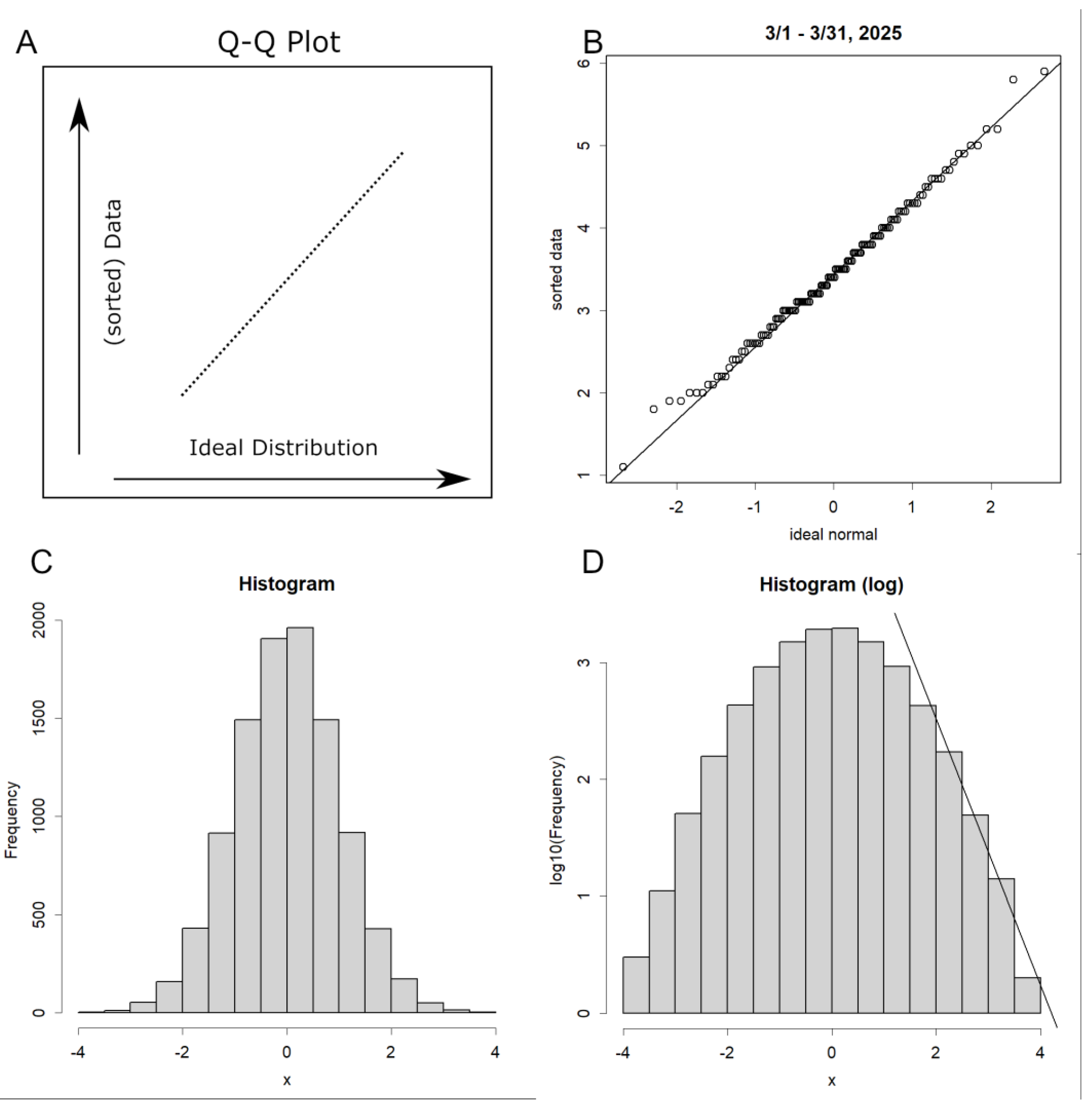
Histograms are frequently employed for preliminary inspection of empirical distributions. For a more stringent evaluation, however, contemporary statistical methodology within exploratory data analysis (EDA) utilizes the quantile–quantile (Q–Q) plot. This technique compares the empirical quantiles—data values at specified percentile positions when ordered in descending magnitude—with the corresponding quantiles of a theoretical reference distribution. In principle, one constructs a reference distribution containing an identical number of data points and directly contrasts the ordered empirical values with this idealized counterpart. Conformity to the assumed distribution is indicated when the plotted points align along a straight line (Figure 11A).
When the monthly aggregated magnitude data are sorted and compared with an ideal normal distribution, the resulting Q–Q plot exhibits a clear linear alignment (Figure 11B). Notably, this assessment incorporates all available observations without any exclusion. This outcome demonstrates that the magnitude data conform to a normal distribution.
A histogram of normally distributed random numbers yields the well-known bell-shaped curve (Figure 11C). When the same data are displayed on a semi-logarithmic scale, however, the distribution assumes a cannonball-like profile (Figure 11D). The right-hand tail appears to exhibit a linear trend, yet this is merely an artefactual pseudo-linearity: as the values increase, the slope becomes progressively steeper. This behavior arises solely from the graphical transformation and lacks mathematical or physical significance. This is the actuality of the GR law.
Given these properties, applying the GR law to the normally distributed data in Figure 11B inevitably produces a straight line. Crucially, such an application requires discarding the majority of observations with smaller magnitudes. Within rigorous scientific practice, the selective removal of data to support a preferred interpretation constitutes cherry-picking, a form of data manipulation that is subject to criticism and must be avoided.
Figure 11.
A. Conceptual illustration of a Q–Q plot. The y-axis represents the empirical quantiles of the data, and the x-axis represents the corresponding quantiles of an ideal reference distribution. If the empirical data follow the assumed distribution, the plotted points align along a straight line. B. Normal Q–Q plot for the magnitude data in March 2025. The x-axis corresponds to an ideal normal distribution. Data were obtained from the Japan Meteorological Agency (JMA) [17], which reports the magnitudes of all perceptible earthquakes. C. Histogram of normally distributed random numbers. D. The same histogram displayed on a semi-logarithmic scale. A straight line is fitted to the rightmost portion of the distribution, representing the slope associated with the b-value in the Gutenberg–Richter (GR) law. Because the underlying distribution cannot be linear in principle, this estimation involves substantial error. Moreover, the apparent linearity pertains only to the extreme right tail, meaning that the majority of the data—including the median—is effectively disregarded.
Appendix B Fundamentals of Principal Component Analysis (Jolliffe, 2002; Konishi, 2015)
Principal Component Analysis (PCA) is a commonly employed technique for compressing multidimensional data. Its simplicity and clarity make it particularly suitable for scientific applications. Due to the minimal assumptions required for its computation, it consistently yields the same results regardless of the analyst, ensuring high reproducibility and objectivity.
Here, the data is presented in five dimensions. It is often structured as Sample x Item.
| Sample | Time | Latitude | Longitude | Depth | Magnitude |
| Sample1 | 2025111400:0041.3 | 34°11.7’N | 135°14.1’E | 5 | 0.4 |
| Sample2 | 2025111400:045.2 | 36°36.4’N | 141°1.5’E | 16 | 1.3 |
| Sample3 | 2025111400:0424.1 | 39°45.2’N | 143°26.3’E | 14 | 2.7 |
| Sample4 | 2025111400:0438.1 | 37°56.9’N | 138°9.7’E | 13 | 0.6 |
Only the three dimensions Longitude, Depth, and Magnitude are used, so these are extracted.
Taking the mean value for each item gives the centre of gravity for the data. Here, we decide to rotate around this centre of gravity. Subtracting this value from all data achieves centring. This is equivalent to translating the data parallel to the rotation origin. The shape of the data remains unchanged; it remains a matrix of the same form.
Now, any matrix can be singular value decomposed. This is the act of decomposing the matrix into two complementary directions and their magnitudes.
Here, U and V are unitary matrices, and V* denotes the adjoint matrix of V. Since centred is a rational number here, the adjoint matrix may be considered as the transpose matrix. The U∙D denotes the matrix inner product. A unitary matrix is one that records the angle of rotation; each row and column is orthogonal, and all elements have magnitude 1. Consequently, it possesses the following property:
U∙U* = U*∙U = I
Here, I is the identity matrix. This holds because the sum of its own multiplications, i.e., its square, is 1, and its inner product with any other vector is zero. The inner product being zero with any other vector indicates that each angle is a right angle. Consequently, each vector is independent.
The magnitudes are recorded in D, which is a diagonal matrix with mostly zeros, containing the magnitudes in descending order along the diagonal. PCA involves calculating the principal components (PC) for both the sample and the item from these matrices (Konishi, 2015).
PCsample =U∙D∙V*∙V=U∙D=centered∙V
PCitem =V∙D∙U*∙U=V∙D=centered*∙U
U·D signifies assigning magnitude to a unitary matrix. Since the unitary matrix U represents orthogonal axes, it indicates the values a sample takes along those axes. This explains why PCA is described as a method for finding orthogonal axes representing the data. Alternatively, it can be viewed as rotating centred data using the unitary matrix V. This explains why PCA is described as a method for rotating data. Mathematically, both interpretations are equivalent. The PCsample represented by centred V is the rotated value of the item for each sample, while the PCitem represented by the transpose of centred V * U is the rotated value from the sample for each item. The former represents the sample’s value under the new axes, while the latter represents how the item has been rotated; here, it becomes a 3x3 matrix.
Each is the result of a single inner product. Using R, this can be computed almost instantaneously with just a few lines of code. By now, it should be clear that there are scarcely any alternatives. If pressed, one might mention that data may sometimes be scaled as well as centred, or that the centre might be placed somewhere other than the centre of gravity (Konishi, 2015). Figure 2A shows the result of a PCsample that was also scaled; all others are results from centring alone.
PCsample represents the principal component for each sample. PCs appear as vertical vectors. PC1 is the leftmost vertical vector, with subsequent ones progressively smaller in scale as they move further to the right.
PCitem [,3]
This is R notation. [,3] denotes the third vertical vector from the left within the matrix, i.e., PC3. Incidentally, [1,] represents the first sample.
One point requires attention. In this calculation, the sign is determined randomly (the rotation direction may change by 180 degrees; it is indeterminate which direction the rotation terminates in). When displaying PC results, if inversion is preferable, multiply the corresponding PC values in both PCsample and PCitem by -1 simultaneously. Here, signs are adjusted as appropriate to avoid unnatural appearances when mapped.
PCsample [,1] <- -1*PCsample [,1]
PCitem [,1] <- -1*PCitem [,1]
PCsample represents the principal components of the sample. For instance, the values displayed in Figure 3C are these. Here, due to rotation via PCA, the Sanriku data unfolds onto the plane where PC3 = 0. Other data points move away from this plane.
The corresponding PCitem records the rotation angle. PC1 records the depth axis. For instance, at the Sanriku boundary, PCitem was:
| PC1 | PC2 | PC3 | |
| Longitude | 44 | 51 | -27 |
| Latitude | -27 | 150 | 9.1 |
| Depth | 3093 | 0.59 | 0.46 |
PC1 is the depth axis. Since 1 unit of Longitude and Latitude roughly equals 100 km, and Depth is measured in km, the distance on the map is (44² + (-27²))⁰.⁵ * 100 = 3470. Thus, when moving this distance on the map, it appears to be diving 3093 km. Therefore, the angle from sea level would be approximately atan(3093/3470)/π*180 = 30°. Similarly, PC2 indicates the azimuth on the map.
Furthermore, PC3 is perpendicular to the plane specified by PC1 and PC2. This is the norm vector of the plane. Here, the centre of gravity was
| Longitude | Latitude | Depth |
| 140.6 | 37.8 | 98.7 |
Therefore, the equation of this tangent plane is specified by the norm vector and a point on the plane, giving:
-27(x-140.6) + 9.1(y-37.8) + 0.46(z-98.7) = 0
Simplifying this yields:
y = 3.1x - 0.054*z - 402
Plotting this graph at z=0 and z=-400 yields Figure 5D. Specifically, after plotting each epiocentre, draw a straight line with an intercept of -402 and a slope of 3.1. The intercept at -400 km is 380. The position of the interfacde in Figure 3D was constructed in this manner. In reality, the length of a meridian varies with latitude, so there is some error; however, at latitudes like those in Japan, this error is likely negligible.
The distance d between two parallel lines, ax + by + c = 0 and ax + by + d = 0, can be calculated as d = |c - d| / (a² + b²)⁰.⁵. Assuming a unit of latitude is 100 km, a depth of 400 km corresponds to 100*d km, yielding a slope of 31°. This is almost identical to the value observed from PC1 (though PC1 may be affected when the surface does not submerge straight, as in Southwest boundary. Hence, this estimation is likely more accurate). The equations for each boundary were as follows:
| Location | equation | angle |
| Hokkaido boundary: | y= 0.26*x -0.012 *z +3.8 | 42 |
| Sanriku boundary: | y= 3.1x -0.054* z -402 | 31 |
| Ogasawara boundary: | y= -1.6x+0.018z +255 | 46 |
| Seto boundary: | y=0.16x-0.011z+12 | - |
| Southwest boundary total: | y= 1.5x -0.0090z - 171 | 69 |
| Kyushu boundary: | y=2.2x -0.010z- 257 | 80 |
| Ryukyu Is. boundary: | y= 1.0x-+0.010z-102 | 64 |
| Southwestern Is. boundary: | y= 0.28x-0.0054z - 11 | 63 |
However, the Seto boundary is shallow and the data sparse, so the angle is likely not very accurate.
References
- Agafonkin, V. Leaflet, an open-source JavaSCript library for mobile-fienendly interactive maps. 2025. Available online: https://leafletjs.com/.
- Barnes, G. L. Origins of the Japanese Islands: The New “Big Picture”. Japan Review 2003, no. 15, 3–50. Available online: http://www.jstor.org/stable/25791268.
- Ben-Zion, Y. Collective behavior of earthquakes and faults: Continuum-discrete transitions, progressive evolutionary changes, and different dynamic regimes: Reviews of Geophysics. 2008, 46(no. 4). [Google Scholar] [CrossRef]
- Bird, P. An updated digital model of plate boundaries: Geochemistry. Geophysics, Geosystems 2003, 4(no. 3). [Google Scholar] [CrossRef]
- Citizens’ Commission on Nuclear Energy, 2025, Fukushima disaster. Available online: https://www.ccnejapan.com/fukushima-disaster/.
- Fujii, T.; Kazuki, K. Encyclopedia of Earthquakes, Tsunamis and Volcanoes (Japanese); U. o., T., Ed.; Earthquake Research Institute: Maruzen, 2008. [Google Scholar]
- Fukuno, T. Latitude and longitude map. 2025. Available online: https://fukuno.jig.jp/app/map/latlng/ (accessed on 27 November 2025).
- Geospatial Information Authority of Japan (GSI). Standard map. 2025. Available online: https://maps.gsi.go.jp/.
- Gutenberg, B.; Richter, C. F. Frequency of Earthquakes in California. Bulletin of the Seismological Society of America 1944, 34(no. 4), 185–188. [Google Scholar] [CrossRef]
- Hayakawa, M. The frontier of earchquake prediction studies; M., Ed.; Hayakawa: Kinokuniya, 2012. [Google Scholar]
- JMA. Great East Japan Earthquake. 2011. Available online: https://www.jma.go.jp/jma/menu/jishin-portal.html (accessed on 11/3 2025).
- JMA. The 2016 Kumamoto Earthquake. 2016. Available online: https://www.data.jma.go.jp/eqev/data/2016_04_14_kumamoto/index.html (accessed on 11/4 2025).
- JMA. 2018 Hokkaido Eastern Iburi Earthquake. 2018. Available online: https://www.jma-net.go.jp/sapporo/jishin/iburi_tobu.html.
- JMA. How Earthquakes Occur. 2023. Available online: https://www.data.jma.go.jp/svd/eqev/data/jishin/about_eq.html.
- JMA. Types of information related to the Nankai Trough earthquake and conditions for its release. 2024a. Available online: https://www.data.jma.go.jp/eqev/data/nteq/info_criterion.html.
- JMA. Nankai Trough Earthquake Emergency Information (Massive Earthquake Caution). 2024b. Available online: https://www.jma.go.jp/jma/press/2408/08e/202408081945.html.
- JMA. Hanshin-Awaji (Hyogoken-Nanbu) Earthquake Special Site. 2025a. Available online: https://www.data.jma.go.jp/eqev/data/1995_01_17_hyogonanbu/index.html.
- JMA. Nankai Trough Earthquake. 2025b. Available online: https://www.jma.go.jp/jma/kishou/know/jishin/nteq/index.html.
- JMA. Earthquake Monthly Report (Catalog Edition). 2025c. Available online: https://www.data.jma.go.jp/eqev/data/bulletin/hypo.html (accessed on 11/2 2025).
- JMA. Hypocentre location names used in earthquake information (Japan map). 2025d. Available online: https://www.data.jma.go.jp/eqev/data/joho/region/.
- Jolliffe, I. T. Principal Component Analysis; Springer Series in Statistics (SSS): Springer, 2002. [Google Scholar]
- Kinugasa, Y. Reconsidering the North American Plate Theory of Northeastern Japan. From a Topographical and Geological Perspective: Journal of Geography (Chigaku Zasshi) 1990, 99(no. 1), 13–17. [Google Scholar] [CrossRef]
- Konishi, T. Principal component analysis for designed experiments. BMC Bioinformatics 2015, 16(no. 18), S7. [Google Scholar] [CrossRef] [PubMed]
- Konishi, T. Seismic pattern changes before the 2011 Tohoku earthquake revealed by exploratory data analysis: Interpretation. 2025a, T725–T735. [Google Scholar] [CrossRef]
- Konishi, T. Earthquake Swarm Activity in the Tokara Islands (2025): Statistical Analysis Indicates Low Probability of Major Seismic Event. GeoHazards 2025b, 6(no. 3), 52. Available online: https://www.mdpi.com/2624-795X/6/3/52. [CrossRef]
- Konishi, T. Exploratory Statistical Analysis of Precursors to Moderate Earthquakes in Japan; Preprints: Preprints, 2025c. [Google Scholar]
- Konishi, T. Identifying Seismic Anomalies through Latitude-Longitude Mesh Analysis; Preprints: Preprints, 2025d. [Google Scholar]
- Malyshev, Y. F.; Podgornyi, V. Y.; Shevchenko, B. F.; Romanovskii, N. P.; Kaplun, V. B.; Gornov, P. Y. Deep structure of the Amur lithospheric Plate border zone. Russian Journal of Pacific Geology 2007, 1(no. 2), 107–119. [Google Scholar] [CrossRef]
- Murdoch, D.; Adler, D.; Nenadic, O.; Urbanek, S.; Chen, M.; Gebhardt, A.; Bolker, B.; Csardi, G.; Strzelecki, A.; Senger, A.; Tea, T. R. C.; D. rgl: 3D Visualization Using OpenGL. 2025. Available online: https://cran.r-project.org/web/packages/rgl/index.html.
- Nakajima, J. The Tokyo Bay earthquake nest, Japan: Implications for a subducted seamount. Tectonophysics 2025, 906, 230728. [Google Scholar] [CrossRef]
- NRC; National Research Council (US) Committee on Vision. Emergent Techniques for Assessment of Visual Performance. 1985. Available online: https://www.ncbi.nlm.nih.gov/books/NBK219048/.
- Omori, F. On the After-shocks of Earthquakes. 1895. Available online: https://repository.dl.itc.u-tokyo.ac.jp/records/37571 (accessed on 2 7).
- National Research Institute for Earth Science and Disaster Resilience. J-SHIS Japan Seismic Hazard Information. 2025. Available online: https://www.j-shis.bosai.go.jp/map/?lang=en.
- R Core Team. R: A language and environment for statistical computing: R Foundation for Statistical Computing. 2025. [Google Scholar]
- Scholz, C. H. Earthquakes and friction laws: Nature 1998, 391(no. 6662), 37–42. [CrossRef]
- Stern, R. J. Subduction zones: Reviews of Geophysics 2002, 40(no. 4), 3-1-3-38. [CrossRef]
- The Headquarters for Earthquake Research Promotion, 2009, Promoting new earthquake research. Available online: https://www.jishin.go.jp/main/suihon/honbu09b/suishin090421.pdf (accessed on 11/2 2025).
- Tukey, J. W. Exploratory data analysis. In Behavioral Sciences: Quantitative Methods; Addison-Wesley Pub. Co: Reading, Mass., 1977. [Google Scholar]
- Utsu, T. Magnitude of earthquakes and occurance of their aftershocks: Journal of the Seismological Society of Japan, 2nd ser. ed; 1957; Volume 10, no. 1, pp. 35–45. [Google Scholar] [CrossRef]
- Utsu, T.; Ogata, Y.; Matsu’ura, R. S. The Centenary of the Omori Formula for a Decay Law of Aftershock Activity. Journal of Physics of the Earth 1995, 43(no. 1), 1–33. [Google Scholar] [CrossRef]
- Ymashita, N. Structural Geology Perspectives on Issues Concerning the Fossa Magna: Its History and Current Status. Journal of the Geological Society of Japan 1976, 82(no. 7), 489–492. [Google Scholar] [CrossRef]
Figure 1.
Earthquake locations by depth. (A–B) Depth distribution. Histogram of hypocentre data, showing that most earthquakes occur within the crust and near the crust–upper mantle boundariesuperimposed is a log-normal Q–Q plot, indicating that the depth distribution follows a logarithmic scale. (A) 2022; (B) 1985. (C–D) Three-dimensional representation of earthquake locations. An interactive, mouse-navigable version is available in Supplementary Material S1. (C) 2011; (D) 1985.
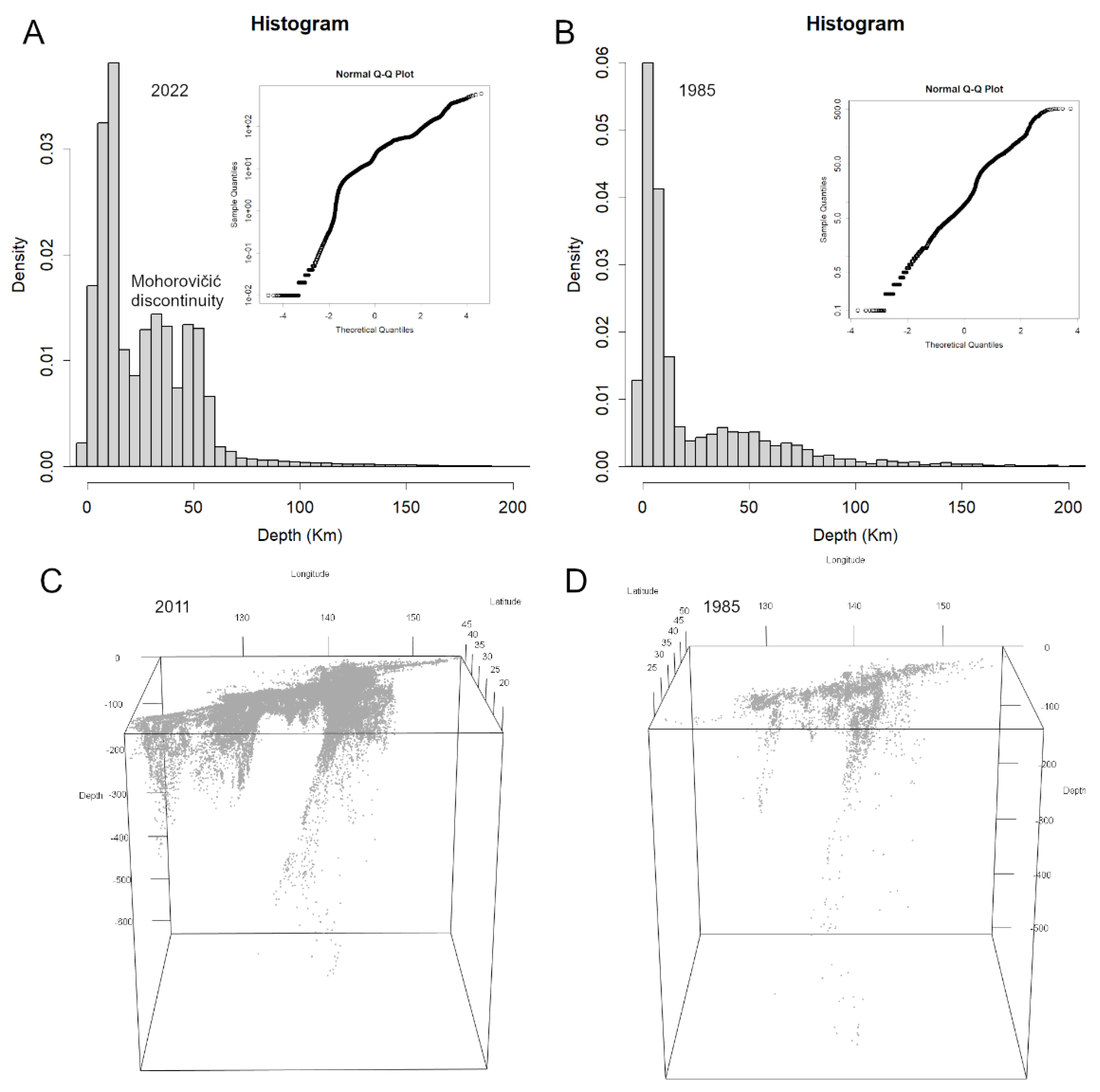
Figure 2.
Conversion of 3D display to 2D. (A) PCA results. Japan’s width is represented on PC1, and depth on PC2. Positive values on PC2 correspond to the north, negative values to the south. The slight overall tilt is likely due to aligning the central boundary vertically. (B) Alternative presentation method, similar to PCA but with higher reproducibility. The x-axis shows the Euclidean distance from the point at latitude/longitude 0, while the y-axis shows depth. The Ogasawara boundary, which lies diagonally, is displayed at an angle. As this is observed from directly beside the surface, the display appears narrow. (C) Comparison of data from the 2016 Kumamoto earthquake and the 2018 Eastern Iburi earthquake using this method. Although the number of sources near the hypocentres increased significantly in both cases, no marked differences are apparent. (D) Relationship between depth and magnitude. Vertical lines indicate average magnitudes. Higher magnitudes tend to be observed at greater depths.
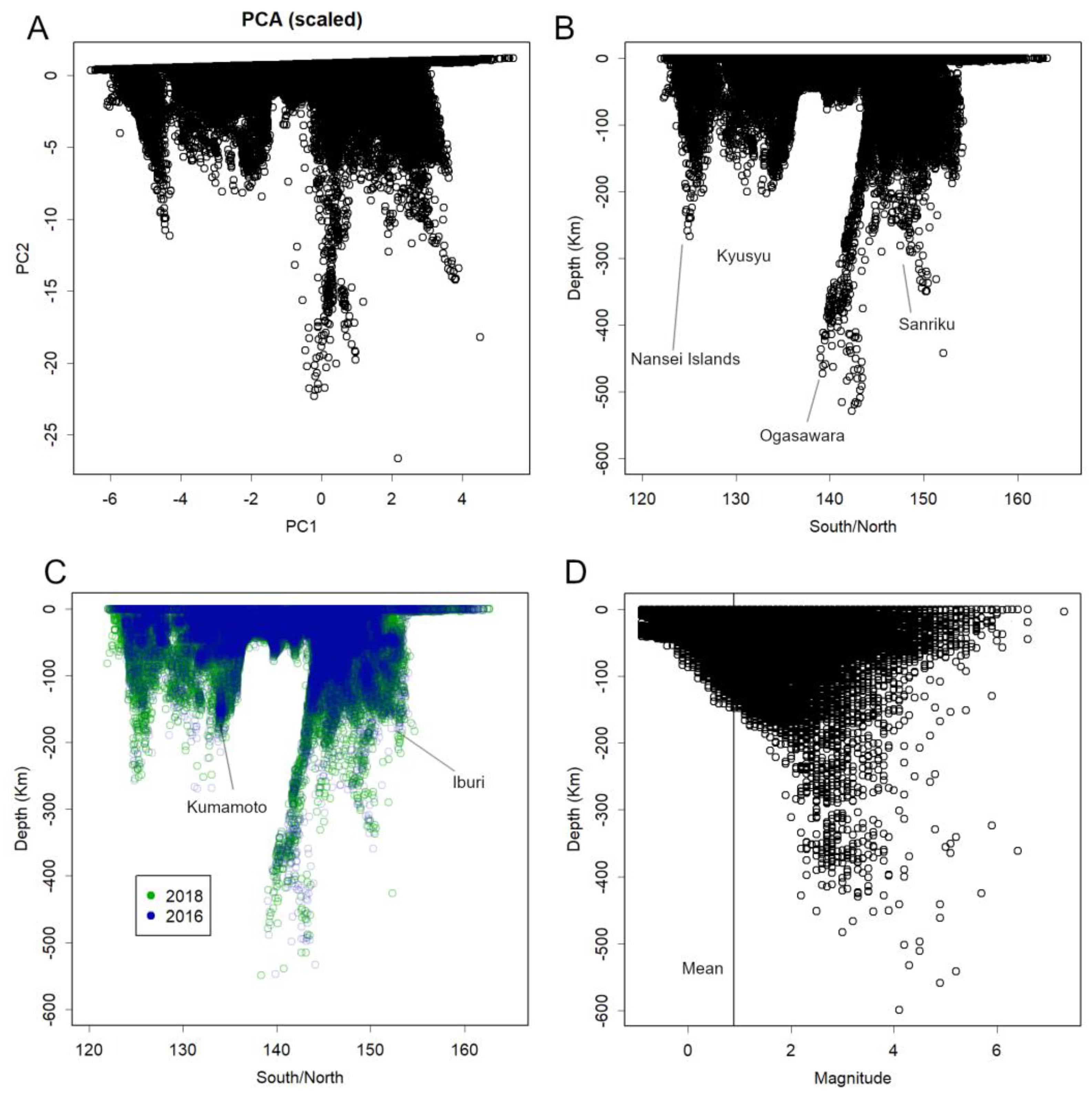
Figure 3.
Plate boundaries. (A) Hypocentres deeper than 50 km. A movable 3D model is available in Supplement S2A. Japan primarily exhibits two contiguous plate boundaries: the Southwest and the East. Each consists of multiple straight segments, forming an overall bent configuration. (B) Focus on the Sanriku Plate. This boundary is fundamentally planar. The centre was located and PCA applied. PC1 represents depth, while PC2 represents latitude and longitude. (C) PCA results. Panel A appears as if rotated around the centre. The Sanriku Plate lies on the plane near PC3, whereas data from other regions show large values on PC3. As scaling has not been applied, the scale of PC1 corresponds to depth (km), while the scale of PC2 corresponds to latitude/longitude, where 1 ≈ 100 km. Positive values on PC2 indicate north, negative values indicate south. (D) Panel C viewed from the front. The hypocentre distribution in the Sanriku region appears flattened, whereas hypocentres in other regions exhibit large positive or negative values on PC3.
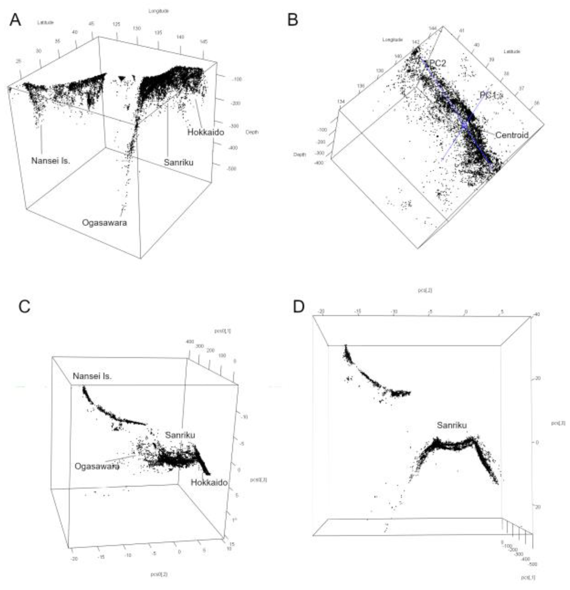
Figure 4.
Hypocentres on the Sanriku boundary by year. Hypocentres are plotted using PC1 and PC2 from Figure 3C. PC1 corresponds to depth, and PC2 corresponds to latitude (positive values = north, negative values = south). Approximate depth (km) and latitude are indicated. Toward 2011, an increase in hypocentres is observed, particularly at greater depths, accompanied by an overall rise in seismicity. An interactive 3D representation is provided in Supplement S1. Given that large earthquakes frequently occur along plate boundaries, continued monitoring of this region may be of particular importance.
Figure 5.
The Southwest boundary. (A) Hypocentres deeper than 35 km. Examination of shallow areas reveals that the East and Southwest boundaries are connected by the shallow Seto boundary. The Seto boundary is bent and extends towards the Ogasawara and Sanriku boundaries. (B) The Southwest boundary has exfoliated into several layers, resulting in a thickness of approximately 50 km in some locations (Figure S4A). This corresponds to the Kyushu boundary. (C) The Seto boundary contains almost no deep hypocentres. Beneath it lie the Ogasawara boundary and the edge of the Sanriku boundary. (D) The entire Southwest boundary flattened using PCA. All structures within each boundary exhibit a consistent inclination, suggesting that during subduction the plate did not descend vertically but at an angle. At its north-eastern end, the Kyushu boundary appears to have been heave-deformed at its deepest point (blue line), remaining shallow where it contacts the Seto boundary (Figures S3, S4B).
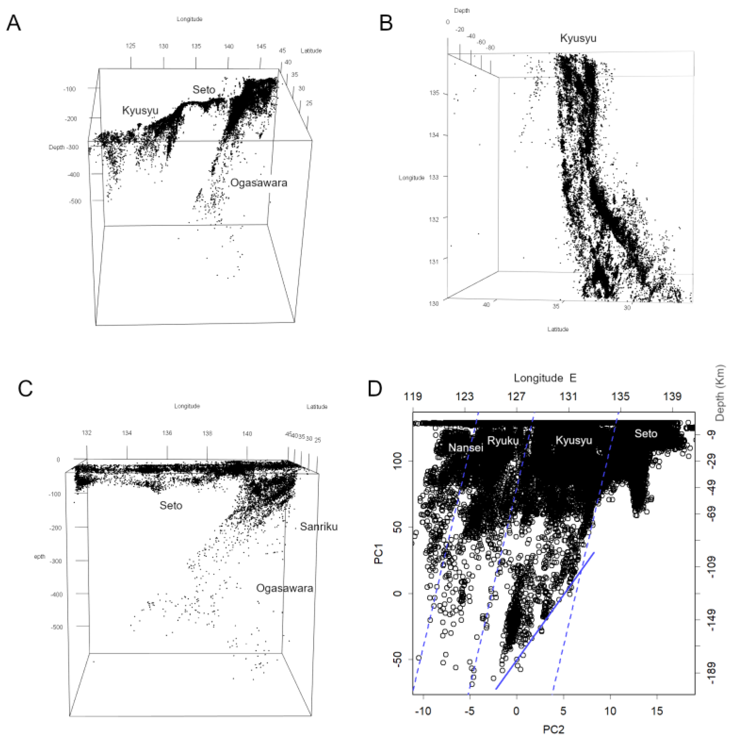
Figure 6.
Hypocentres along the Seto Boundary. (A) 1994, the year preceding the Hanshin–Awaji earthquake. The left axis and bottom show PC values; the top shows depth (km), and the right axis shows approximate PC values converted to east longitude. (B) 2022. Presumably due to advances in measurement methods, the number of recorded hypocentres has increased significantly (The Headquarters for Earthquake Research Promotion, 2009). (C) Overlay of panels A and B. This reveals a tendency for hypocentres in 1994 to occur at greater depths, particularly pronounced in the Hanshin region. (D) Magnitude scale confirmed within each grid for 1994. This shows areas in the Hanshin region exhibiting considerably larger scales, which is recognised as one precursor to major earthquakes [4].
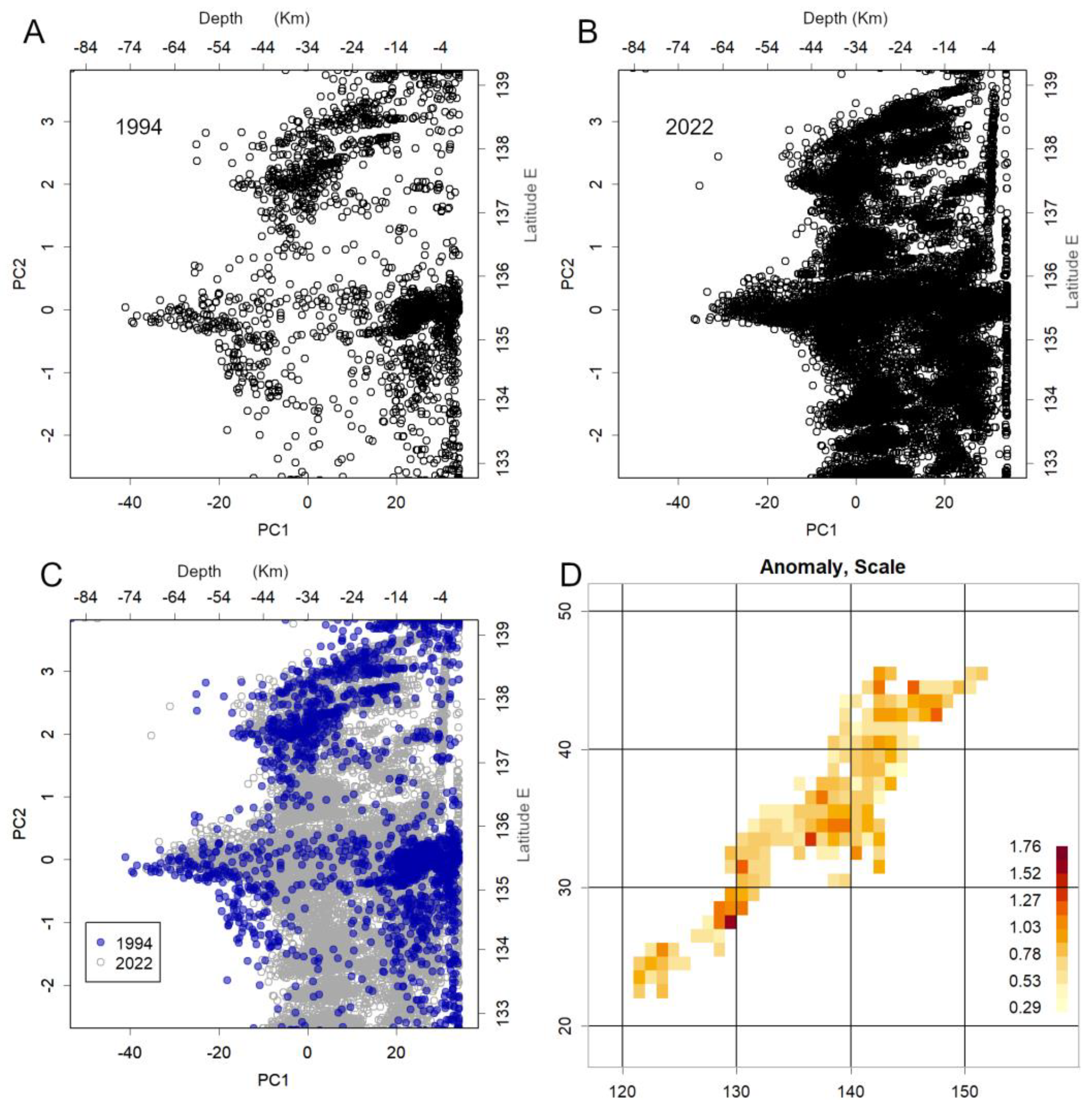
Figure 7.
Tectonic boundaries and plate positions. (A) Boundaries mapped from equations confirmed by PCA. The solid line represents depth = 0 km, and the dashed line represents depth = –400 km. As the Southwest boundary is relatively shallow, it is plotted at –50 km for Seto boundary and –200 km elsewhere. The steep dip angle of these boundaries (Appendix B) results in a narrower apparent width. (B) Conceptual diagram illustrating the positions of plates around Japan. Blue indicates the Eastern boundary, green denotes the Seto and Southwestern boundaries, and brown represents the shallow seismic zones.
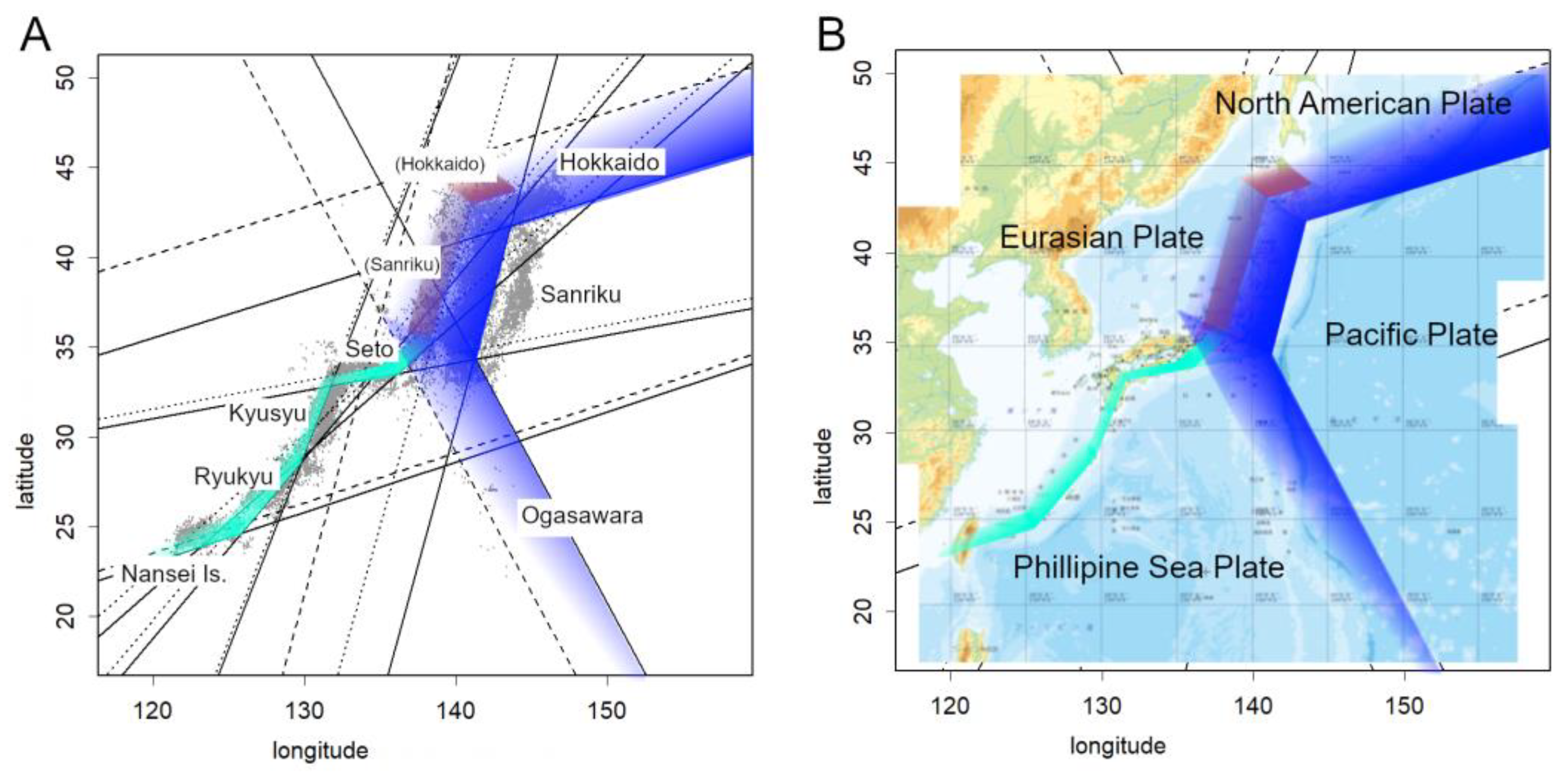
Figure 8.
Time course of earthquake counts. All datasets are characterised by a linear decrease on a semi-logarithmic plot. (A) Data from the 2011 Tohoku earthquake. Counts are shown within a 1° latitude–longitude grid including the hypocentre. The black concave-down curve represents a fit using the Omori–Utsu formula . The black continuous line shows the fit using the displayed parameters. Dotted lines shift vertically when is altered (from top to bottom: ). Changing shifts the initial position horizontally (dashed lines from left to right: ). Changing shifts the entire curve vertically. The green straight line represents a fit assuming a decay with a 63-day half-life. (B) Data from the 2018 Eastern Iburi earthquake. Within the grid including the hypocentre, almost no precursory swarm was observed. The count decreases following two straight-line segments. (C) Data from the 2016 Kumamoto earthquakes. The two vertical solid lines mark the M6.5 foreshock on 14 April and the M7.3 mainshock on 16 April. Counts decreased rapidly after the foreshock, and then with a 33-day half-life following the mainshock. The vertical dashed line indicates the Aso volcano eruption on 16 April, followed by another eruption on 8 October. (D) Data from the earthquake off the Sanriku coast in November 2025. The swarm increased several days before the mainshock, reaching a level comparable to the mainshock itself the day before. It is currently decreasing rapidly. (E) Locations of the earthquakes presented. Map provided by J-SHIS Japan Seismic Hazard Information (National Research Institute for Earth Science and Disaster Resilience, 2025). (F) List of earthquakes, dates and magnitudes.
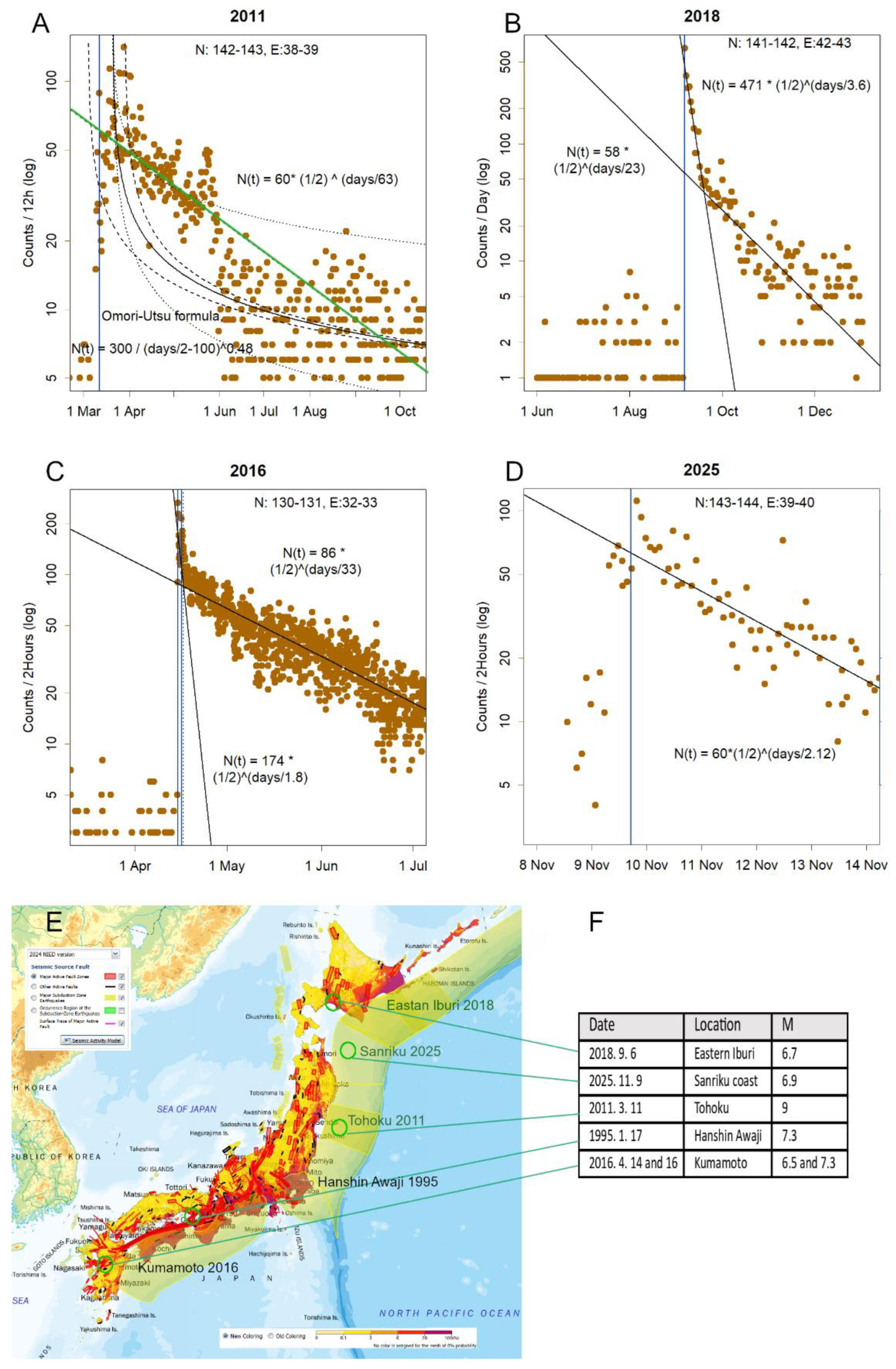
Figure 9.
Changes in magnitude location (green) and scale (blue). Prior to the mainshock, the number of earthquakes was low; therefore, the mean and standard deviation were calculated from daily data. After the mainshock, values are shown at two-hour intervals. (A) Data from the 2011 Tōhoku earthquake. Both scale and location increased before the mainshock, but location rose sharply afterwards, taking several years to recover fully. It initially decreased linearly at a very rapid rate, before slowing to a more gradual decline. Since magnitude is inherently the logarithm of energy, this indicates that energy decays with a half-life. A 0.2 decrease in location corresponds to a halving of energy. (B) Data from the 2018 Eastern Iburi earthquake. Location increased immediately after the mainshock but declined rapidly, returning to levels similar to those before the event. (C) Data from the 2016 Kumamoto earthquake. The two straight lines represent the foreshocks and the mainshock, while the dotted line marks the Aso volcano eruption. Here, the scale also increased during the two hours before and after the mainshock. (D) Data from the 2025 Sanriku offshore earthquake. Location slightly increased alongside the mainshock and then decreased immediately. The scale also increased at this time.
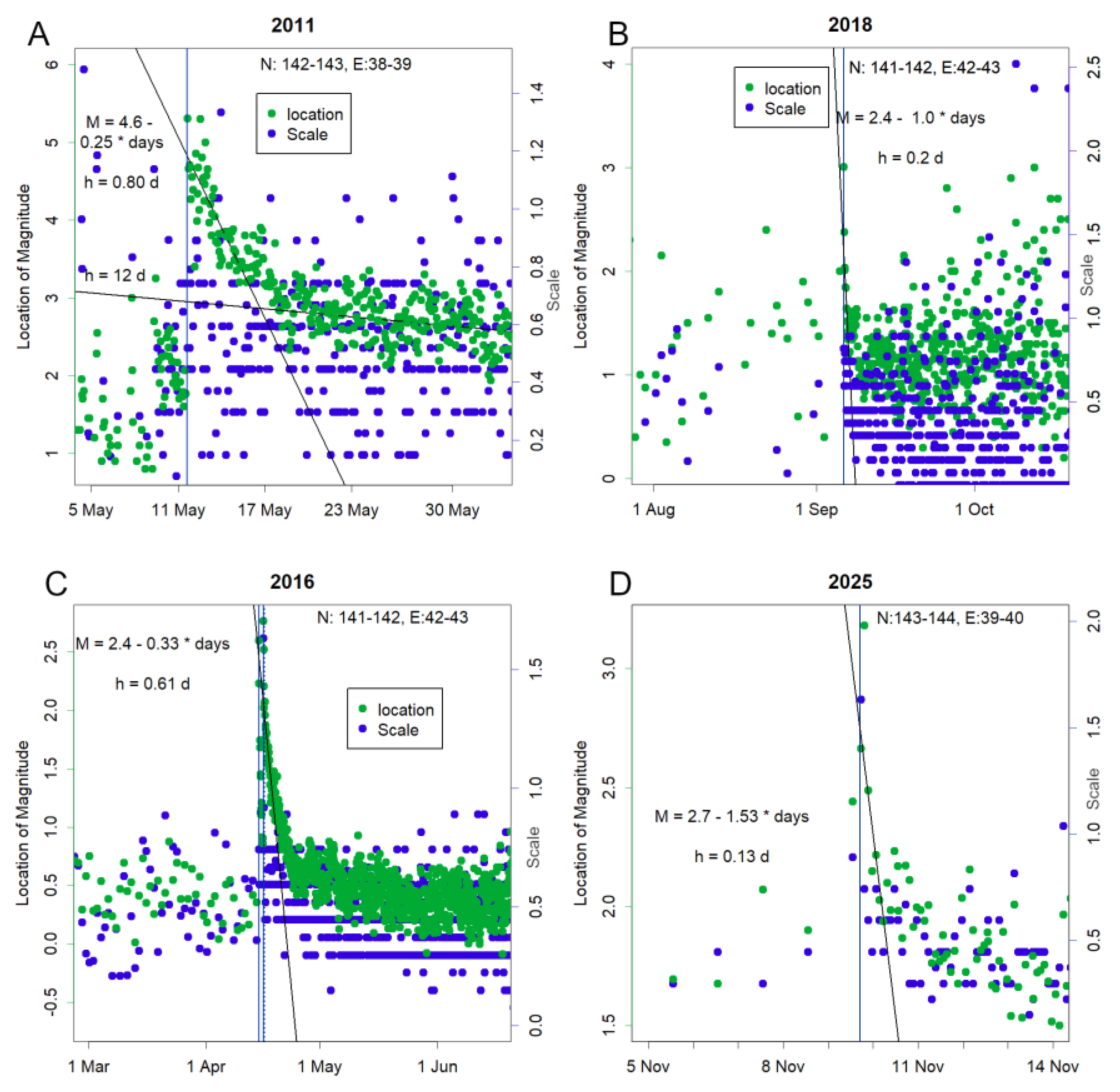
Figure 10.
Magnitude scale of earthquakes and count values (Konishi, 2025d). (A) Scale for the 2025 Sanriku offshore earthquake, shown on a grid with 1° latitude–longitude intervals. Counts below 100 are omitted. The grid with the highest count corresponds to the hypocentre of the mainshock. (B) Count values. As these follow a log-normal distribution, z-scores of the logarithm are displayed. The hypocentre of the mainshock exhibits a high count. (C) Scale of the 2011 Tohoku earthquake. Elevated values are observed off the Sanriku coast. (D) Count values for 2011. The highest counts are located further east. As each grid side is approximately 100 km, the maximum count is observed in Akita Prefecture on the Sea of Japan side, across the Japanese archipelago. The scale here was small, and the damage correspondingly minor.
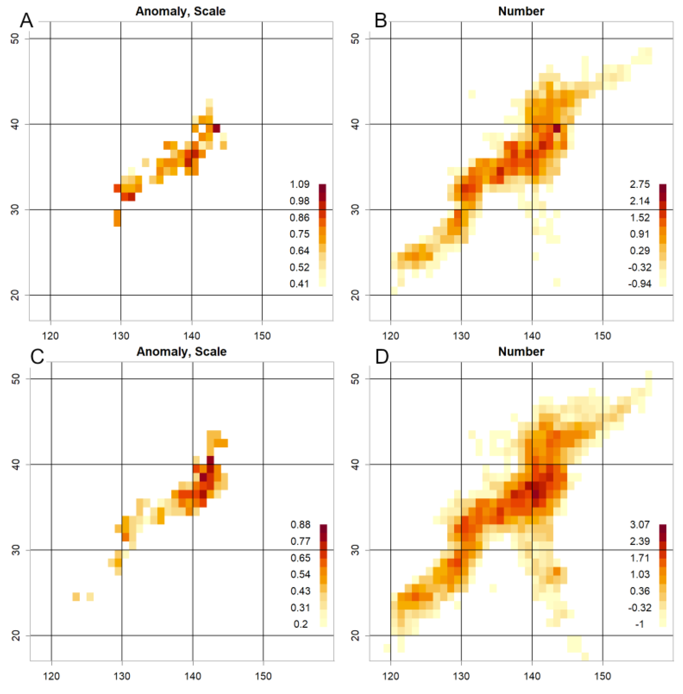
Disclaimer/Publisher’s Note: The statements, opinions and data contained in all publications are solely those of the individual author(s) and contributor(s) and not of MDPI and/or the editor(s). MDPI and/or the editor(s) disclaim responsibility for any injury to people or property resulting from any ideas, methods, instructions or products referred to in the content. |
© 2026 by the authors. Licensee MDPI, Basel, Switzerland. This article is an open access article distributed under the terms and conditions of the Creative Commons Attribution (CC BY) license (http://creativecommons.org/licenses/by/4.0/).
Copyright: This open access article is published under a Creative Commons CC BY 4.0 license, which permit the free download, distribution, and reuse, provided that the author and preprint are cited in any reuse.


