
Submitted:
02 October 2025
Posted:
03 October 2025
You are already at the latest version
Abstract
This article describes biplots based on factor analysis on correlation matrices for continuous and ordinal data. This paper describes biplots specifically developed for factor analysis and the geometry for each type of data together with an algorithm to obtain biplot coordinates from the factorization of the correlation matrices.
The main theoretical results are applied to a real data set about the relation between volunteering and political ideology and compromise in Spain.
Keywords:
factor analysis
; biplot
; multivariate ordinal data
; multivariate continuous data
; gradient descent
1. Introduction
Let be a multivariate data matrix containing measures of J variables at I units. We suppose that all the variables are of the same type, either continuous, binary or ordinal, although as we will see later, binary and ordinal can be deal with in the same way.
To analyze each matrix separately, principal component analysis (PCA) or factor analysis (FA) are normally used. That allows for detecting the underlying structure of the data. PCA first obtain a dimension reduction searching for the directions that explain most of the variance or correlation if each column is standardized. Then, for continuous data, the complete set of points (individuals) are projected onto the principal directions. Results can be visually represented by means of a biplot (a joint representation of rows and columns of the data matrix) ([6]). We focus here in standardized data matrices the results in analysis on correlations. Traditionally use principal components as a factorization method but any other factor analysis could also be used as we describe in the article.
Factor analysis (FA) is a technique used to discover hidden dimensions, or factors, that explain why certain variables are correlated. Instead of treating each variable separately, it groups them by their shared patterns, reducing complexity and revealing the underlying structure that drives the data. Whereas PCA primarily aims to reduce dimensionality by identifying directions that explain the largest share of variance, FA is oriented toward uncovering the latent factors that account for the observed correlations between variables. Unlike PCA, which provides a unique solution apart from the arbitrary orientation of its components, FA admits multiple equivalent solutions. These can be further rotated to achieve a representation that is often more interpretable.
When data is ordinal (for example, likert scales) or binary, the previous methods are not optimal although many authors would use them for the analysis. Dimension reduction for analyzing ordinal matrices can be performed using polychoric correlations or tetrachoric for the binary case.
In this paper we study biplot representations for Factor Analysis and its properties, specially for ordinal and binary data although se start with continuous data. Biplots provide a simple and intuitive way to visualize complex multivariate data and they help in understanding both the structure of the observations and the inter-relationships between variables.
Section 2 describes the methods for dimension reduction of the individual matrices for continuous data and Section 3 for ordinal data.
Finally in Section 4 we describe an application to real data.
2. Principal Components, Factor Analysis and Biplots for Continuous Data
Given a data matrix , the I individuals can be understood as a cloud of points in a hyperspace. The inertia (variance) of the cloud around the center is
The total inertia (variance) is a global measure of the variability of the data. Is also the sum of squares of the distances of each point to the origin. from another point of view, total inertia or variance can be expressed as the sum of the variances for each variable, that is,
Observe that, because the variables are centered and standardized, the matrix in Equation (2) is closely related to the correlations among the X-variables, , as
2.1. Principal Components and Classical Biplots
Principal Component Analysis (PCA) is a statistical technique that transforms a set of possibly correlated variables into a smaller set of uncorrelated variables called principal components, which are linear combinations of the original variables and are ordered to capture the maximum possible variance in the data.
2.1.1. Principal Components
It is well known that principal components are obtained from the eigen-decomposition of the correlation matrix as
where are the eigenvectors and the eigenvalues in decreasing order.
Each column of defines a principal component. Individuals in can be projected onto the principal components (PC) to obtain the scores on the PCs
The total inertia (variance) is then decomposed into J components of decreasing order of importance.
Selecting the first S components we obtain the best approximation in dimension S. The amount of variance accounted for the S selected components is
2.1.2. Classical Biplots for PCA
From the previous decomposition we can reconstruct the original data as
Equation (8) define an exact biplot for the matrix in the complete dimension, as in [6]. Using just the first components we obtain an approximate biplot in reduced dimension. This called a JK-Biplot or a RMP-Biplot in the literature. The row markers are the coordinates of individuals on the principal components and the column markers are the eigenvectors of . The eigenvectors define the direction of the principal components on the multidimensional space.
Reorganizing terms, the expression
with
and
defines also a biplot called GH-Biplot or CMP-Biplot in the literature. This is more related to factor analysis because the column markers are the factor loadings.
The advantage of a biplots is that allows for the graphical representation of the matrix with makers for its rows (or ) and its columns (or ) in sch a way that the inner product between a row and a column marker approximates the corresponding element of the data matrix, i. e.,
We will use the adequate expression for each case. Here we will focus on the factor version.
The same biplot could also be obtained from the singular value decomposition (SVD) of as
where are the left singular vectors, the right singular vectors, also the eigenvectors in 4, and are the singular values closely related to the eigenvalues of the correlation matrix.
Then
and is given in 11.
Based on the singular value decomposition, there are other possible biplots. In general, a biplot for is a decomposition of the data matrix in the product of other two of lower range.
Using the SVD guarantees that we have obtained the best possible decomposition according to [4]. Other factorizations of the correlation matrix will produce also a biplot that may not be optimal in the same way but still helpful for data interpretation as we shall see later.
2.2. Factor Analysis and Biplots
Factor Analysis (FA) is a statistical method used to explain the correlations among observed variables in terms of a smaller number of unobserved variables called factors. It assumes that each observed variable is a linear combination of common factors and a unique factor, allowing researchers to identify underlying latent structures that account for patterns in the data. FA is closely related to PCA, the later is a particular solution of the factor problem.
2.2.1. The Linear Factor Model
The linear factor model for I observations can be expressed as:
where:
As we have a centered data matrix, the means are zero and can be eliminated from the equation.
If both, observed variables and factors are normalized, matrix contains the correlations among observed and latent variables. The squared correlations are called contributions and measure the amount of variance of each variable explained by each factors. The sum of contributions for a variable and all the common factors, , is called communality that is the variance of the variable explained by all the common factors. The quantity is called unicity and is the amount of unique variance not explained by the common factors. The total variance explained by all factors is obtained by summing the communalities across variables, while the variance explained by a combination of factors is given by the sum of its contributions to the variables.
In general we can express the factor model as a decomposition of the correlation matrix
The main diagonal contains the communalities and is a diagonal matrix containing the unicities.
The factor matrix containing the loadings or correlations among observed and latent variables can be obtained as
from the SVD in equation 13. That is the principal components solution to the factor problem. That is taking the first S eigenvectors of to calculate loadings.
Apart from PCA there are other methods to extract factors
- Principal Factor Method (Principal Axis Factoring): Replace diagonal elements of with estimated communalities to obtain and perform eigen decomposition and proceed as before..
- Maximum Likelihood Method: Solve for that maximize the likelihood under multivariate normality.
- Other methods: Image Factoring, Alpha Factoring ...
Once the factor matrix is obtained, we can calculate the scores using several methods (Regression, Bartllet, Anderson Rubin, ....). For instance, the regression method is
For the PCA solution this is the same as the scores in Equation (15).
2.2.2. Rotations
In factor analysis, rotation is performed on the factor loading matrix to enhance the interpretability of the factors. The initial extracted solution often contains complex loadings, where variables exhibit moderate associations with multiple factors. Rotation helps to clarify and simplify this pattern without changing the inherent factor model.
The purposes of rotation are.
- Simplifies the factor structure for interpretability.
- Maximizes high and minimizes low loadings on each factor.
- Helps identify which variables are strongly associated with each factor.
Let be the initial factor loading matrix. A rotation matrix is applied:
Rotations matrices have the property that . Then the scores are also rotated accordingly .
Rotations can be either orthogonal or oblique, depending on whether the resulting factors are intended to remain uncorrelated or are allowed to be correlated.
Rotations clearly do not affect the initial model
2.3. Biplot for Factor Analysis
Equation 17 defines a biplot
for taking and as row and column markers respectively. Normally row markers are represented as points and column markers as vectors or direction in the reduced dimension space.That is a GH or CMP-Biplot associated to factor analysis, extending the classical PCA biplots. Biplots are typically displayed in two dimensions, using two of the retained factors to provide a partial representation of the data.
As in any biplot, the inner product approximates the element of in the same way as in classical biplots. The inner product is illustrated in figure 1 (a), observe that the interpretation is based on the projections of the row markers onto the column markers, i. e. all the markers predicting the same value project onto the same point, and then are all in the same line perpendicular to the variable vector, figure 1 (b). Several equally spaced values of the variable project onto equally spaced values on the direction of a variable, see 1 (c). Then we can add some scales on the variable direction to read approximate predictions of each value, 1 (d).
The construction of scales does not depend on the particular biplot used and is as follows. To find the point on the biplot direction, that predicts a fixed value of the observed variable when an individual point is projected, we look for the point lies on the biplot axis, i. e. that verifies
and
Solving for x and y, we obtain
and
or
Therefore, the unit marker for the j-th variable is computed by dividing the coordinates of its corresponding marker by its squared length, several points for specific values of can be labeled to obtain a reference scale. If data are normalized then the marks are multiplied by the standard deviation and the mean is added and labels can be calculated by adding the average to the value of (). The resulting representation will be like the one shown in Figure 5.
The markers of variables are the loadings, which represent the correlations between observed variables and latent factors. In the full multidimensional space, the length of these vectors is 1; however, when projected onto a lower-dimensional space, their length decreases, reflecting the extent to which the variable’s information is preserved in the reduced representation. To improve interpretation, a unit circle (radius 1) or several concentric circles with radii between 0 and 1, can be added to the plot. This approach is similar to the correlation circle often used in PCA by various authors, for instance, [1]. In a two-dimensional factor biplot, the coordinates of each vector represent its correlations with the corresponding factors, while the vector length reflects the multiple correlation with both factors. The concentric circles serve as a reference scale, helping to assess which variables convey interpretable information within the biplot.
Contributions described before are also useful to know which variables are interpretable on a particular biplot. Contributions are equivalents to the squared cosines used for example in [1] or [10]. Those are also measures of predictiveness as described in [8] and discrimination measures in the context of Multiple Correspondence Analysis and HOMALS as in [2] or [13]. In the next section we propose a correlation plot to see the magnitude of contributions rather tan correlations with a simple modification of the scale of the axis.
2.4. Illustration of a FA Biplot for Continuous Data
For illustration wi use the protein data set that is a multivariate collection of real-valued measurements representing the average protein consumption across 25 European countries. Each country is characterized by nine columns indicating different types of protein sources. It is an old dataset (contains old European countries) but good for our illustration purposes. The data set appears in [7]. Table 1 contains the complete data set.
First we normalize the data matrix, subtracting the mean and dividing by the standard deviation for each column. This means that our analysis is based on correlations. Then we apply any method of Factor Analysis. Here we have used the maximum likelihood solution with a varimax rotation and obtained the individual scores by regression. The variance explained by each factor is shown in Table 2.
The factor matrix (Table 3) containing correlations among observed variables and factors. We have highlighted the highest loadings for each variable in order to know what variables are most related to each factor.
When dealing with PCA, many packages construct what is called the Correlation Plot that is the representation inside a circle of radius 1 of the coordinates in . Rather than ticks on the axes we place concentric circles for different values between 0 and 1. The correlation plot can also be used with any factorization of the matrix. A circle of correlations is shown in Figure 2 for factors 1 nd 2.
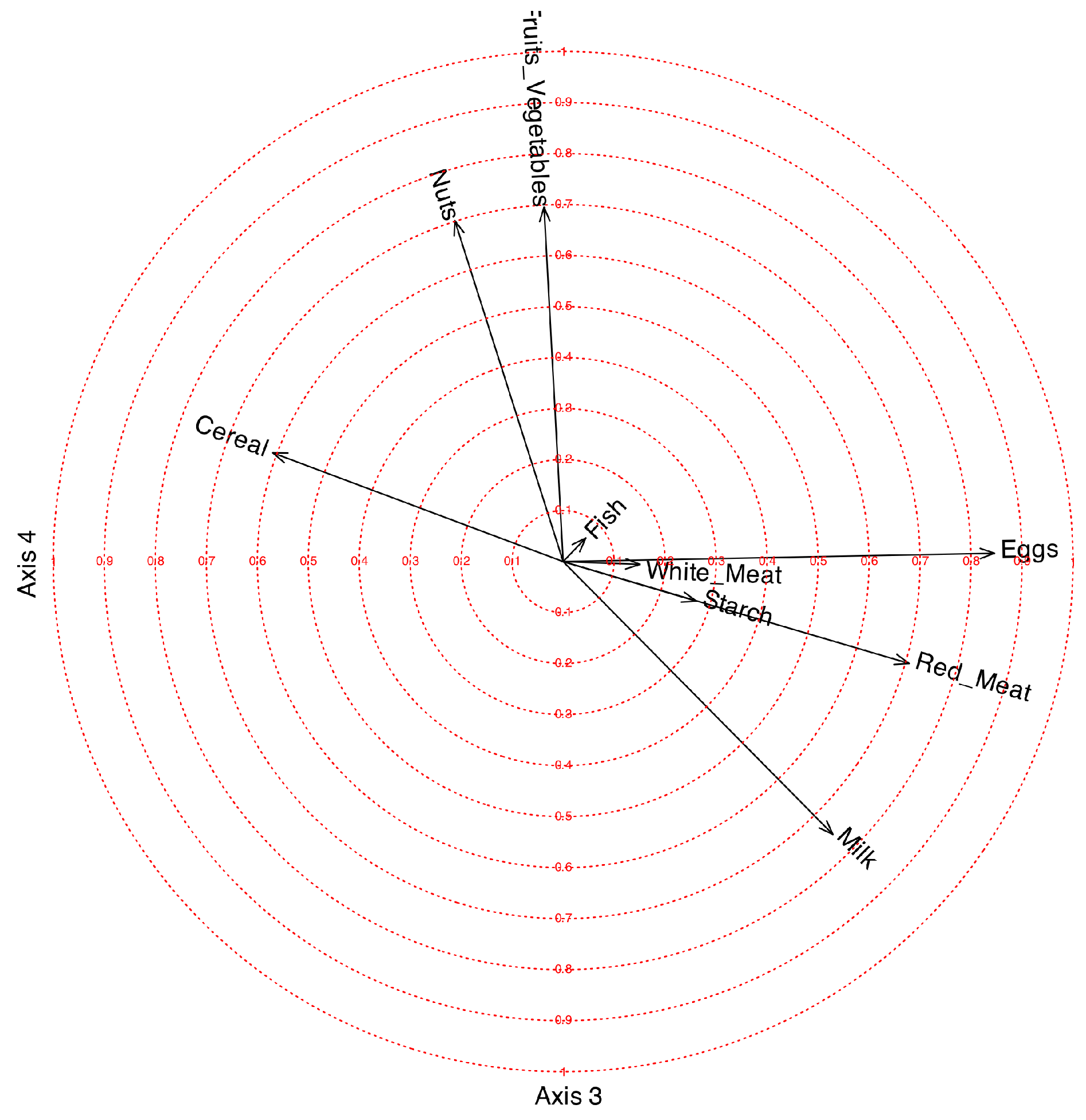
The first factor is mainly related to White_Meat with a positive correlation and Nuts with a smaller negative correlation. The second factor is positively related to Fish and negatively with cereal Cereal. The third factor is positively related to Eggs, Red_Meat and Milk and negatively with Cereal. The fourth is positively related Nuts and Fruits_Vegetables. The variable Starch is not clearly related to any of the factors.
Figure 3.
Correlation circle for factors 3 and 4.
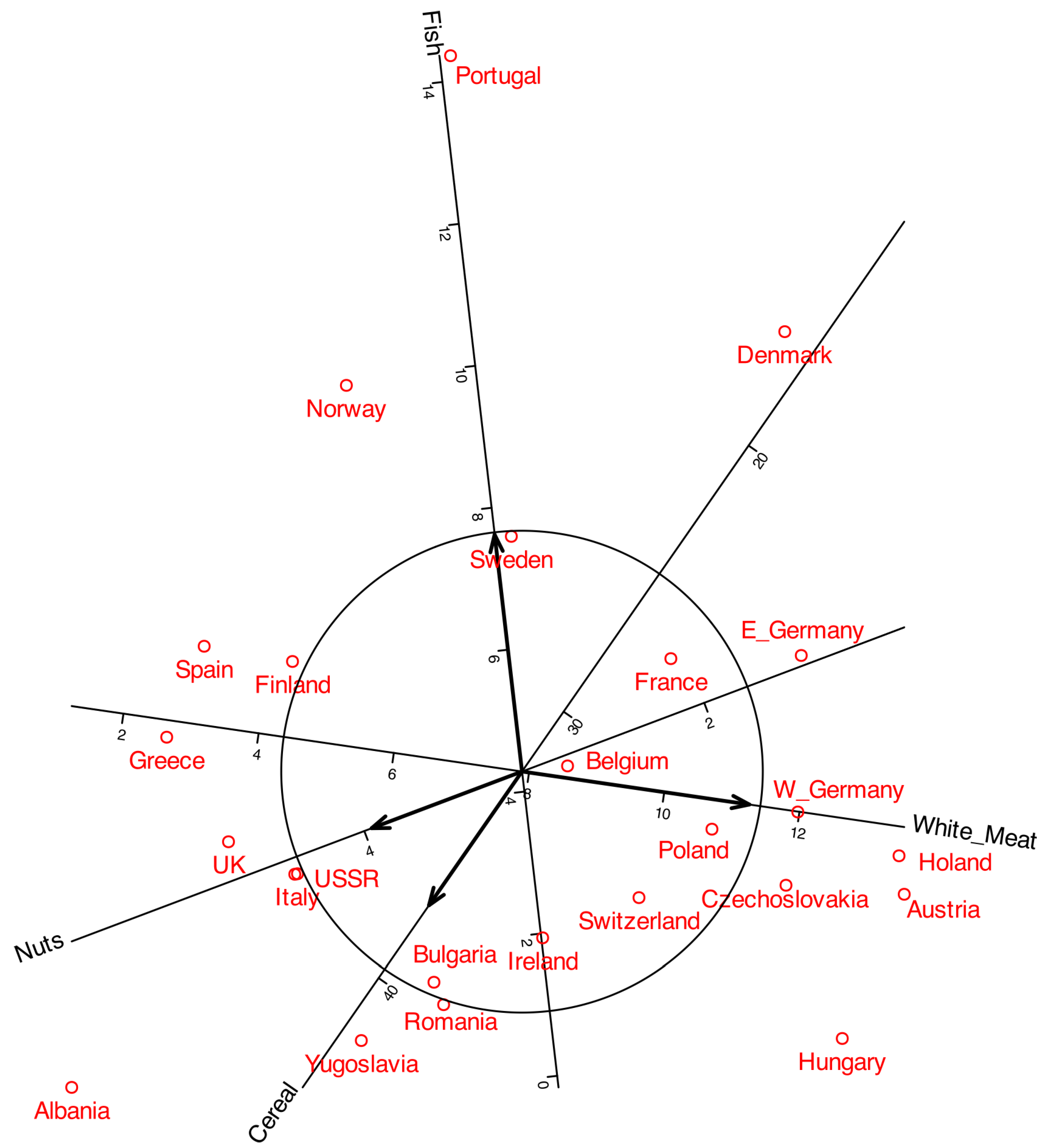
The coordinates in can e added to the plot to obtain a biplot. Figure 4 shows a typical biplot together with the correlation circle. To make the plot easier to read, some labels were moved outside the main area. The arrows correspond to the variables, and by projecting them onto the principal component axes, we can see how strongly each variable is correlated with the components. For instance, White meat shows a strong correlation with the first component, whereas Fish is more closely associated with the second. The length of the arrows represents the multiple correlation with both components. The circles shown in the plot serve as a reference for interpreting both the arrow length and its projection onto the axes.
As in standard PCA, only variables represented by longer arrows can be reliably interpreted in the plot, whereas shorter arrows should be treated with caution. For example, White Meat and Fish can be meaningfully interpreted, while variables such as Milk or Fruits and Vegetables provide little reliable information in this representation. The latter may instead be better explained by other components. A good strategy is eliminating from the plot variables with low correlation. For instance we can eliminate variables with correlation smaller than 0.6 to obtain representation in Figure 5 .
Figure 5.
Biplot on the correlation circle.
3. Factor Analysis and Biplots for Ordinal Data
3.1. Factor Analysis on Polychoric Correlation Matrices
When data is ordinal we use polychoric rather than Pearson correlations.
The matrix contains J ordinal variables . We assume that the observed categorical responses are discretized versions of a continuous process.
Consider an ordinal variable with categories. This variable is assumed to arise from an underlying continuous variable that follows a standard normal distribution. There are thresholds, , which divide the continuous variable into ordinal categories.
The relationship between and can be expressed as:
Note that the actual numbers (1, 2, 3, ...) themselves don’t carry any inherent meaning; it’s the order that is interpretable.
The polychoric correlations are the correlations among the . Let a matrix containing the polychoric correlations among the J ordinal variables and let the thresholds.
We can factorize the matrix as
where contains the loadings of a linear factor model for the underlying variables.
The loadings are obtained from the eigen-decomposition of the correlation matrix as in 4, taking
In the same way as before, there are many other ways of factorizing the correlation matrix.
3.2. Biplot for Ordinal Data
Constructing a biplot from the factorization is more challenging because the relationships between latent factors and manifest variables are nonlinear. A biplot with a logistic is possible as described in [17] and more recently [3] have developed an estimation procedure based on cumulative probabilities.
Let be the indicator matrix with columns. The indicator matrix of size for each categorical variable contains binary indicators for each category and . Each row of sums 1 and each row of sums J. Then is the matrix of observed probabilities for each category of each variable. We can also define the cumulative observed probabilities as if and otherwise, , that is, the indicators of the cumulative categories. Observe that , so we can eliminate the last category for each variable. We organize the observed cumulative probabilities for each variable into a matrix . Then is the matrix of observed cumulative probabilities.
Let be the (expected) cumulative probability that individual i has a value lower than c on the ordinal variable, and let the (expected) probability that individual i takes the value on the ordinal variable. Then and (with ). A multidimensional (S-dimensional) logistic latent trait model for the cumulative probabilities can be written for () as
In logit scale, the model is
That defines a binary logistic biplot for the cumulative categories.
In matrix form:
where is the matrix of expected cumulative probabilities, is a vector of ones and , with , is the vector containing thresholds, with is the matrix containing the individual scores matrix and with and , is the matrix containing the slopes for all the variables. This expression defines a biplot for the odds that will be called ordinal logistic biplot. Each equation of the cumulative biplot shares the geometry described for the binary case [15], moreover, all curves share the same direction when projected on the biplot. The set of parameters provide a different threshold for each cumulative category, the second part of (26) does not depend on the particular category, meaning that all the curves share the same slopes.
It can be shown the there is a close relation between the factor model in 23 and the model in 25. You can find the details in [11].
If the factor model loadings and he thresholds are known, the parameters for the variables in our model (25) can be calculated as:
This means that the parameters and are obtained from the factorization of the polychoric correlation matrix. The remaining parameters for te individuals can hen be estimated using the gradient descent method with the cost function
where the expected cumulative probabilities are
The updates are then
Were is a constant (the learning rate) chosen by the user.
Let and the vectors containing the row and column parameters for dimension s. Let an indicator matrix in which, the column, takes the value 1 for the rows corresponding to categories of the variable, and 0 elsewhere.
The updates are written in matrix form
We can organize the calculations in an algorithm as follows:
| Algorithm 1 Algorithm to calculate the Scores for Ordinal Data |
In practice, the choice of can be avoided by using a pre-programmed optimization routine. The algorithm should converge at least to a local minima because it produces decreasing sequences of the cost function.
This algorithm will be implemented in the package MultBiplotR ([16]) developed in the R language ([14]).
Finally we have a biplot for he ordinal data closely related to the factorization of the polychoric correlation matrix.
The geometry of both biplots is detailed in [17].
From a practical point of view we are interested mainly in the regions that predict each category, that is, the set of points whose expected probabilities are higher in each category. Those regions are separated by parallel straight lines, all perpendicular to the direction of (See Figure 6).
So, if we denote one of those points of intersection between the direction of the variable and the line separating the predictions of two categories, it must be on the biplot direction, that is,
We can develop a simple numeric procedure to calculate those intersection points. First we calculate the probabilities for
- Calculate the predicted category for a set of values for z along the direction of the variable. For example a sequence from -6 to 6 with small steps (0,01 or 0,01 for example). (The precision of the procedure can be changed with the step)
- Search for the z values in which the prediction changes from one category to another.
- Then calculate the values as: and
- Hidden categories are the ones with zero frequencies in the predictions obtained by the algorithm.
3.3. Biplot for Binary Data
We have not described Biplots for Binary Data because are just a particular case of Ordinal Data with only two categories. Rather tan polychoric we use tetrachoric correlations but, conceptually are similar. Biplots for binary data were proposed by [15]. Details and algorithms for calculation can be found in [18]. Al the calculations presented before are valid for binary data.
4. Application to Real Data: Volunteering and Ideology
The present study examines volunteering within formal organizations. Distinctions in types of volunteering arise according to the domains in which voluntary activities are undertaken. The following types of volunteering have been analysed:
- Social volunteering (SOCIAL)
- Community volunteering/international development cooperation (COMMUN)
- Sports/leisure and free time volunteering (LEISURE)
- Social and health volunteering (HEALTH)
- Educational/cultural volunteering (CULTURAL)
- Environmental volunteering (ENVIRONM)
Beyond the typologies of volunteering, this study also examines its nature, distinguishing between transformative and welfare-oriented forms, and explores whether these two approaches differ in their perspectives on the state’s role within the third sector. Transformative volunteering aims to address social, environmental, or other causes by fostering sustainable, long-term change through altering the structural conditions that generate problems. In contrast, welfare-oriented volunteering focuses on mitigating the immediate consequences of social issues without necessarily challenging their root causes or advocating for policy reforms. While transformative volunteering is closely connected to political demands and the expectation of state involvement in problem-solving, the state itself adopts varying approaches to social assistance, which are shaped by different welfare state models. Thus, four models of the welfare state can be identified:
- Conservative welfare state: Responsibility for social assistance does not primarily rest with the state but with traditional institutions such as the family, friends, community, and religious organizations. As a result, the provision of social support largely depends on volunteers.
- Social democratic welfare state: The state assumes full responsibility for welfare provision, which leaves volunteering with only a marginal role, as social assistance is conceived as an exclusively public service.
- Liberal welfare state: State involvement in welfare provision is minimal, and private social protection schemes are encouraged. Within this framework, neoliberalism increasingly relies on volunteers and civil society organizations as service providers, subjecting them to market principles and managerial criteria. Volunteering becomes instrumental to the liberalization of welfare, transforming the third sector into a quasi-market of social enterprises.
- Welfare state and the new left: Welfare provision is based on collaboration between the state and third-sector organizations. Since the state cannot fully meet social needs on its own, it relies on coordination with volunteers and social organizations to maximize outreach and effectiveness.
Considering the variations among welfare state models and their differing interpretations of responsibility for social assistance, we examine whether volunteers’ perceptions of the state’s role in welfare provision vary according to the nature of their volunteering. Specifically, it explores whether engagement in transformative, as opposed to welfare-oriented, volunteering aligns with particular conceptions of the welfare state and social assistance. The relationship between the state, the market, and the third sector is inherently political, shaping, enabling, or constraining the expansion and development of third-sector organizations. One of the central aims of this study is to investigate the ideology of volunteering, offering both a descriptive account of its ideological dimensions and a multivariate analysis to illuminate the links between forms of volunteering and political orientations.
4.1. Data
We conducted an anonymous online survey with volunteers from different organizations. Data are available from the authors on request. There is no way to identify any of the original respondents, as no personal data has been stored. 201 respondents have answered the survey.
Finally we have 9 variables (inside the parenthesis is the name on tables and plots):
- Type of Volunteering (Type): The 6 categories are described before. This is a nominal variable with 6 categories that is finally converted into 6 binary variables
- Interest in Politics (IntPolit): None, Some, A lot. (Ordinal).
- Political Ideology (Ideology): Left, Center, Right. (Ordinal).
- Should the state finance the organizations? (FinancState): No, Neutral, Yes. (Ordinal).
- Should the organization be autonomous? (Autonomy): Financed and Autonomous, Indifferent, Autonomous and not Financed. (Ordinal).
- Ideological orientation of the organization (Orientation): No, Some, Yes. (Ordinal).
- Nature of the organization (Orientation): Welfare, Transformation. (Binary).
- The organization has clear political demands (Demands): No, Yes. (Binary).
- The organization has volunteers with different profiles (Orientation): No, Yes. (Binary).
So we have 14 variables that are either binary or ordinal and can be combined into the analysis described in the previous sections. First we analyze all the variables except Type.
4.2. Results
All variables, with the exception of Type, were included in the analysis. The variable Type was subsequently projected onto the plot to explore potential associations with the other variables. Factor extraction was conducted using the principal components method, and the resulting factors were subjected to Varimax rotation. The first two factors have been selected. Table 4 contains the variance explained by each factor.
Both factors together explain a of the variability. The factor matrix is shown in table 5.
The first factor loaded positively on Interest in Politics, Organizational Orientation, Organizational Nature, and Political Demands, indicating that these variables are strongly interrelated. The second factor showed positive loadings for Ideology and Autonomy, and a negative loading for State Support of the Organization. This pattern suggests that Ideology and Autonomy are positively associated with each other, and both are negatively associated with State Support.
All communalities were relatively high, except for Different Profiles, which exhibited little association with the first two factors.
The factor biplot with correlation circles is presented in Figure 7. As noted earlier, Interest in Politics, Organizational Orientation, Organizational Nature, and Political Demands are strongly and positively correlated. This cluster of variables shows little association with Ideology, Autonomy, or State Support of the Organization. Thus, the choice of an organization with political demands or a transformative nature appears to be more closely linked to political interest than to ideological orientation.
On the other hand, Ideology and Autonomy are positively associated, while both are negatively related to State Support. This indicates that individuals on the left of the political spectrum tend to believe that organizations should be both autonomous and supported by the state, whereas those on the right favor autonomy but oppose state financing.
In the biplot, each point represents an individual. By projecting an individual onto the direction of a variable, one could, in principle, estimate the probabilities for each category. However, this is complex, as it would require separate probability scales along the same direction for each category. Our goal is not to predict exact probabilities, but to predict ordinal categories. For this purpose, it is sufficient to identify the points that separate the different category values.
Together with the correlation biplot we can define a prediction biplot showing the the points that separate each prediction region as in Figure 6. The prediction biplot is shown in Figure 8.
As previously discussed, the projection of individual points onto the variable axes allows for the prediction of the original categories by identifying the prediction region in which the projection falls. Figure 9 presents the projections onto the variable *Interest in Politics*, serving as an example of how to interpret the biplot. Along the axis, cut-off points separating the prediction regions are indicated. For this variable, which comprises three categories (1 = None, 2 = Some, 3 = A lot), two separation points would be expected: one between categories 1 and 2 ("1-2") and another between categories 2 and 3 ("2-3"). However, only a single point labeled "1-3" is observed. This indicates that the separation occurs exclusively between categories 1 and 3, with the intermediate category (2) remaining unrepresented and, therefore, never predicted. A similar pattern emerges for all variables with three categories, whereby the intermediate level is consistently absent from the predictions. Furthermore, the separation points across variables are located near the center of the plot and tend to overlap, leading to a mixed configuration.
Figure 9 also displays the individuals together with their projections onto the selected variable. Points in red correspond to predictions of category 1 (None), whereas points in blue correspond to predictions of category 3 (A lot). The intermediate category 2 (Some) is not represented and is therefore never predicted. When considering all variables jointly, the resulting biplot provides a comprehensive view that facilitates the interpretation of the main structural features of the data.
Along with the correlations, we can also display the contributions or qualities of representation, which indicate how much of the variance of each observed variable is explained by the factors. These contributions are usually computed as squared correlations, and they can also be understood geometrically as the squared cosines of the angles between the original variables and the latent factors. In addition, they may be interpreted as measures of the discriminant power of each variable. The sum of the contributions across two factors corresponds to the contribution of the plane defined by those factors.
Although the information may be redundant, given the previous representations, we can include it to compare with other techniques as, for example, Multiple Correspondence Analysis.
Figure 10 displays the contributions associated with the first two factors, where each variable is represented by a vector. The plot is scaled so that the projection of a vector onto an axis corresponds to its contribution to the respective factor, while the concentric circles indicate the contribution of the plane formed by the two factors.
Beyond correlations and contributions, additional measures associated with the prediction biplot may be employed. Given that equations 25 and 26 define an Ordinal Logistic Regression model, any conventional measure of model fit for this framework can be utilized as an indicator of goodness of fit for each variable. In particular, pseudo- indices (such as those proposed by Cox-Snell, McFadden, or Nagelkerke), the proportion of correct classifications , and the Kappa coefficient assessing the agreement between observed and predicted values may be considered. Table 6 shows those measures.
We observe that the pseudo measures are reasonably high except for the variable DifProf. A review of the interpretation of the coefficients can be found in [12].
The percentages of correct classification are reasonably high.
Ordinarily, the points representing individual subjects are not directly examined, except perhaps when the focus is on specific characteristics of a given subject and their corresponding behavior. More commonly, the analysis is directed toward understanding how groups of individuals perform in relation to the variables.
An effective strategy is to distinguish individuals from different groups or clusters by using color coding, enclosing them within convex hulls, or representing them through their group centroids. For instance, Figure 11 illustrates convex hulls and centroids corresponding to various types of volunteering.
It can be observed that the different types are distributed along a gradient associated, on the one hand, with Ideology, and on the other, with Interest in Politics, Political Demands, Orientation of the Volunteering, and Nature of the Organization. In particular, the types Leisure, Health, and Cultural are linked to lower levels of political interest among volunteers, weaker political demands and orientations within organizations, and a stronger emphasis on welfare-oriented activities, and are also somewhat associated with a Right Ideology.
The other types?Social, Community, and Environmental?are associated with individuals who have a stronger interest in volunteer-related politics and with organizations that exhibit higher political demands, greater political orientation, and a transformative nature. Volunteers in these organizations, particularly in the environmental category, tend to align with left-leaning ideologies.
To check the performance of the method, we can add also cluters with the observed variables. For instance, Figure 12 shows the clusters formed by ideology.
We observe that the ideological direction closely reflects the original data. The Left and Right positions are well distinguished, whereas the Center is not, likely because individuals identifying as Center sometimes hold opinions aligned with the Left and at other times with the Right. A similar pattern occurs with the middle categories in the other items.
In the prediction, category 2 is never identified; only categories 1 and 3 are predicted, as shown by the "1-3" mark. Individuals with Right or Left ideologies are mostly classified correctly, while those in the Center are split between the two extremes. Consequently, the overall classification accuracy is slightly lower. Overall, the respondents’ ideologies are well represented in the plot.
Figure 13 shows the clusters with all the variables.
We can see that all the variables, except profiles, are quite well represented in the plot. For all the cases with three categories the middle value is not well represented. For the variable profiles, we can see that both groups are mixed together, meaning that the factors do not discriminate among profiles.
5. Software Note
Author Contributions
All authors have read and agreed to the published version of the manuscript and contributed equally to the paper.
Funding
This research received no external funding.
Informed Consent Statement
Not applicable.
Data Availability Statement
Data is available on request.
Conflicts of Interest
The authors declare no conflicts of interest.
References
- Hervé Abdi and Lynne J. Williams. Principal component analysis. Wiley Interdisciplinary Reviews: Computational Statistics, 2(4):433–459, 2010.
- Jan de Leeuw and Patrick Mair. Gifi methods for optimal scaling in r: The package homals. Journal of Statistical Software, 31(4):1–21, 2009.
- Mark de Rooij, Ligaya Breemer, Dion Woestenburg, and Frank Busing. Logistic multidimensional data analysis for ordinal response variables using a cumulative link function. Psychometrika, pages 1–37, 2025. [CrossRef]
- Carl Eckart and Gale Young. The approximation of one matrix by another of lower rank. Psychometrika, 1(3):211–218, 1936.
- Leandre R. Fabrigar and Duane T. Wegener. Exploratory Factor Analysis. Oxford University Press, 2019.
- K.R. Gabriel. The biplot graphic display of matrices with application to principal component analysis. Biometrika, 58(3):453–467, 1971.
- K.R. Gabriel. Jnterpreting Multivariate Data., chapter Biplot display of multivariate matricesfor inspection of data and diagnosis., pages 147–173. John Wiley & Sons, 1981.
- Sugnet Gardner-Lubbe, Niël J Le Roux, and John C Gowers. Measures of fit in principal component and canonical variate analyses. Journal of Applied Statistics, 35(9):947–965, 2008.
- Harry H. Harman. Modern Factor Analysis. University of Chicago Press, 1967.
- François Husson, Sébastien Lê, and Jérôme Pagès. Exploratory Multivariate Analysis by Example Using R. Chapman and Hall/CRC, 2011.
- Karl G Jöreskog and Irini Moustaki. Factor analysis of ordinal variables: A comparison of three approaches. Multivariate Behavioral Research,, 36(3):347–387, 2001.
- Scott Menard. Coefficients of determination for multiple logistic regression analysis. The American Statistician, 54(1):17–24, 2000.
- Jacqueline J Meulman. Fitting a distance model to homogeneous subsets of variables: Points of view analysis of categorical data. Journal of Classification, 13(2):249–266, 1996.
- R Core Team. R: A Language and Environment for Statistical Computing. R Foundation for Statistical Computing, Vienna, Austria, 2021.
- J.L. Vicente-Villardon, M.P. Galindo, and A. Blazquez-Zaballos. chapter Logistic Biplots., pages 503–521. Chapman and Hall., 2006.
- Jose Luis Vicente-Villardon. MultBiplotR: Multivariate Analysis Using Biplots in R, 2021. R package version 1.6.14.
- Jose Luis Vicente-Villardon and Julio Cesar Hernandez Sanchez. Logistic biplots for ordinal data with an application to job satisfaction of doctorate degree holders in spain. 2014.
- Vicente-Gonzalez, L. and Vicente-Villardon, J. L. (2022). Partial least squares regression for binary responses and its associated biplot representation. Mathematics, 10(15):2580.
Figure 1.
Biplot approximation: (a) Inner product of the row and column markers. (b) The set of points predicting the same value are all on a straight line perpendicular to the direction defined by the column marker . (c) Points predicting different values are on parallel lines. (d) The variable direction can be supplemented with scales to visually obtain the prediction.
Figure 2.
Correlation circle for factors 1 and 2.
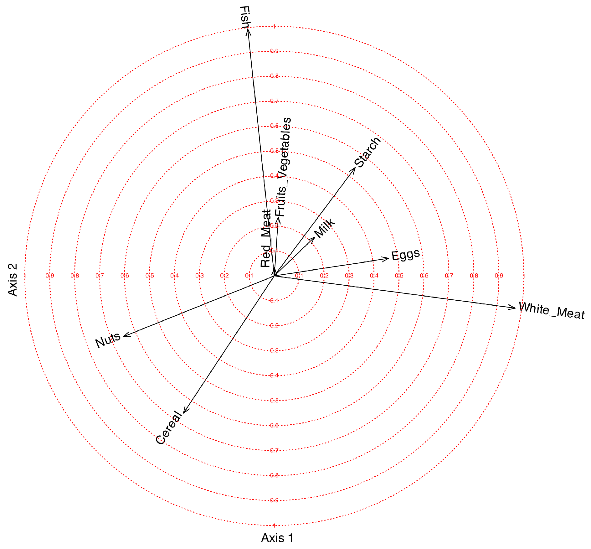
Figure 4.
Biplot on the correlation circle for factor 1 and 2.
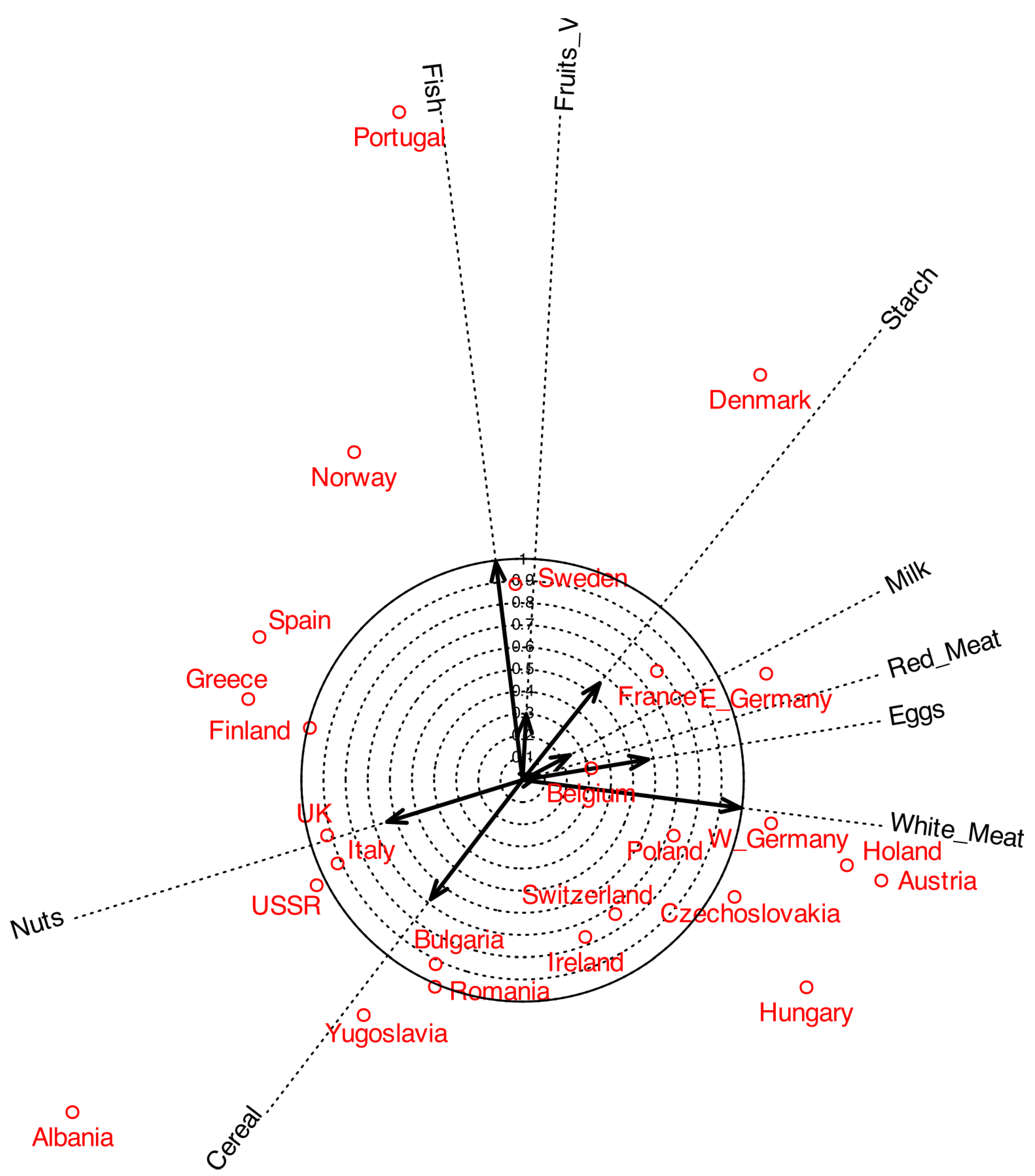
Figure 6.
Ordinal Logistic Biplot: (a) Response surfaces of an ordinal logistic regression. (b) Prediction regions and direction to represent on the biplot
Figure 6.
Ordinal Logistic Biplot: (a) Response surfaces of an ordinal logistic regression. (b) Prediction regions and direction to represent on the biplot

Figure 7.
Ordinal logistic biplot with correlation circle. The vectors for variables are the correlations with each factor.
Figure 7.
Ordinal logistic biplot with correlation circle. The vectors for variables are the correlations with each factor.
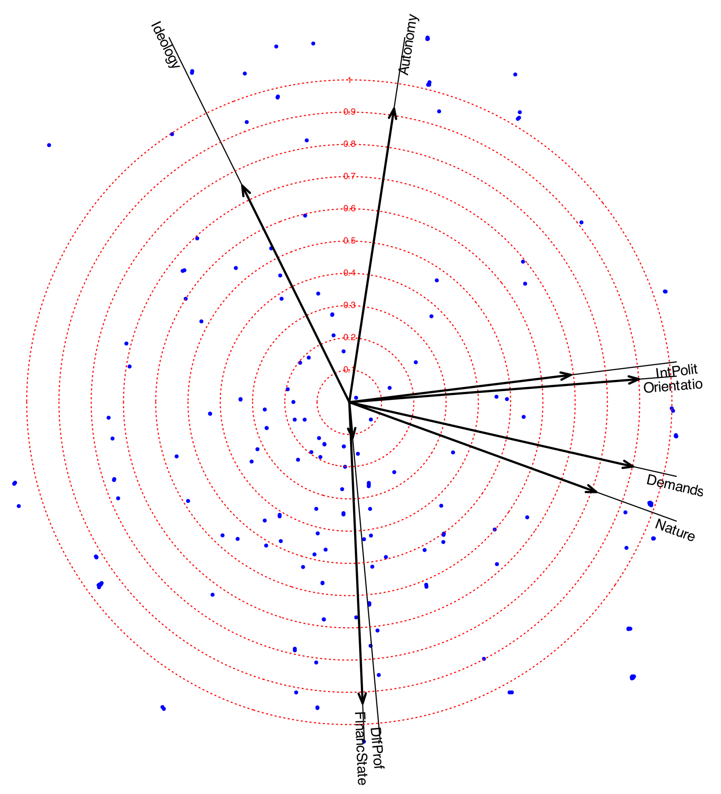
Figure 8.
Ordinal logistic prediction biplot. Projecting each individual onto a variable we obtain a prediction of the category.
Figure 8.
Ordinal logistic prediction biplot. Projecting each individual onto a variable we obtain a prediction of the category.
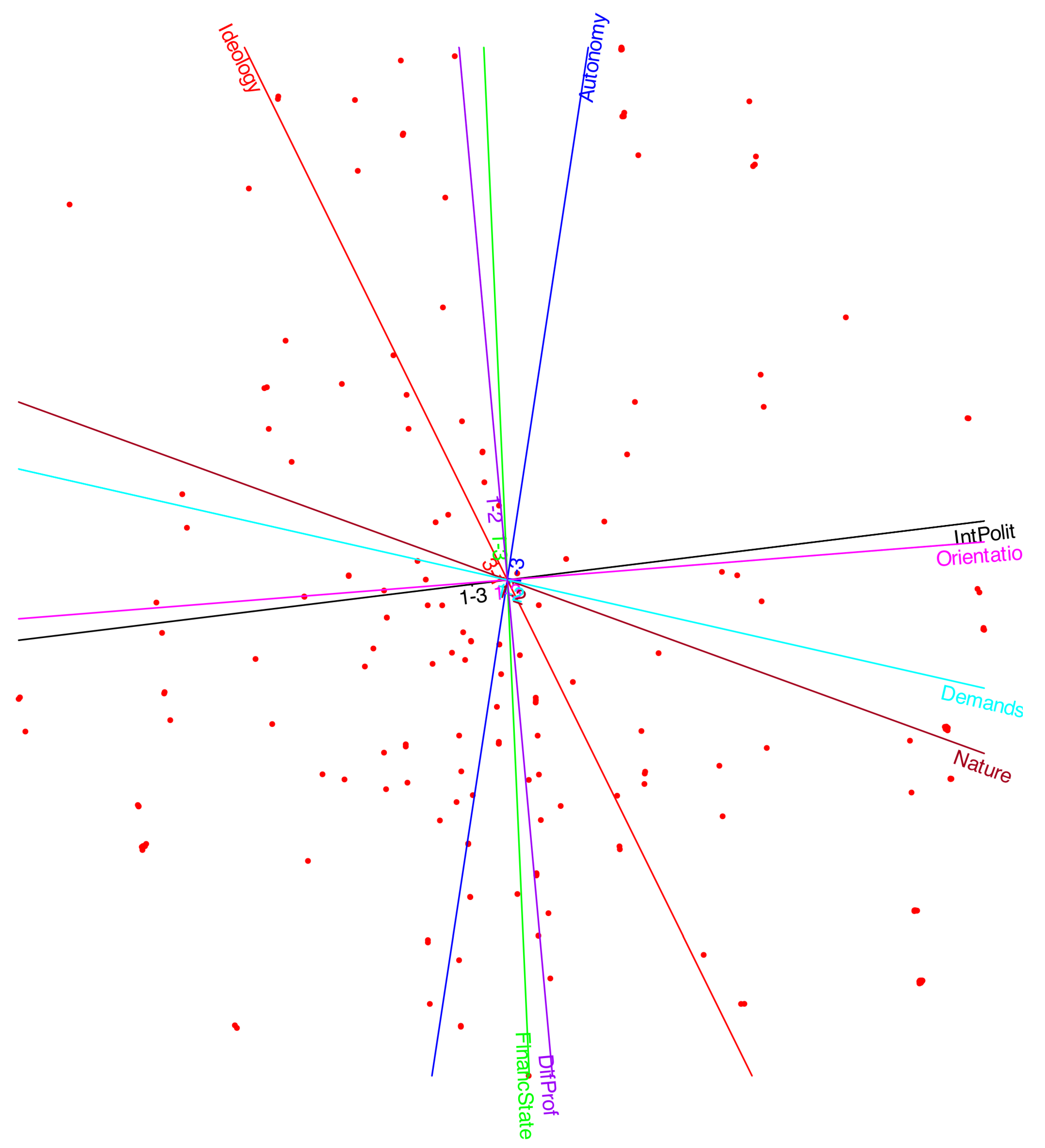
Figure 9.
Projections of the individuals onto the variable Interest in Politics.
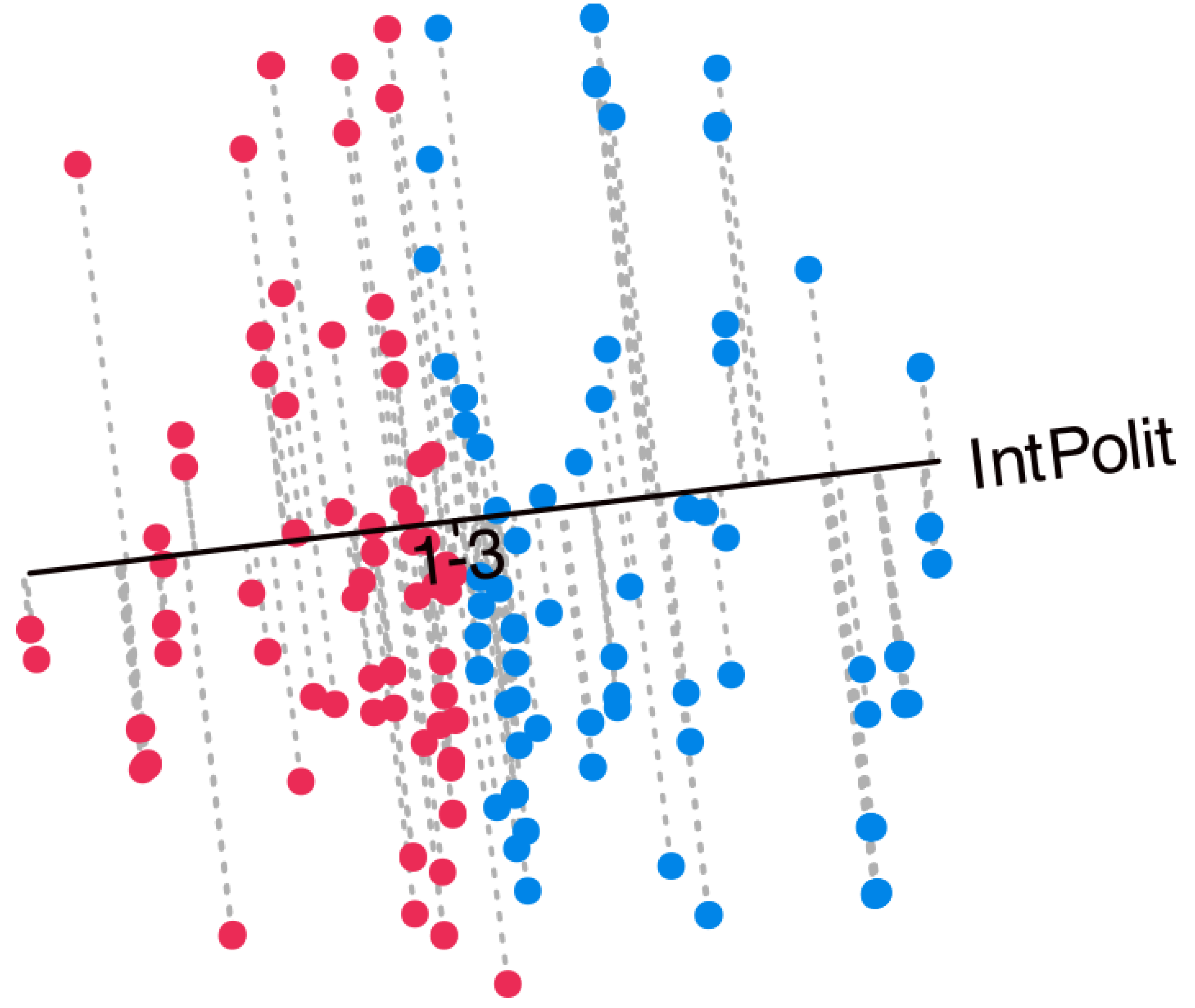
Figure 10.
Contribution plot: Discriminatory power.
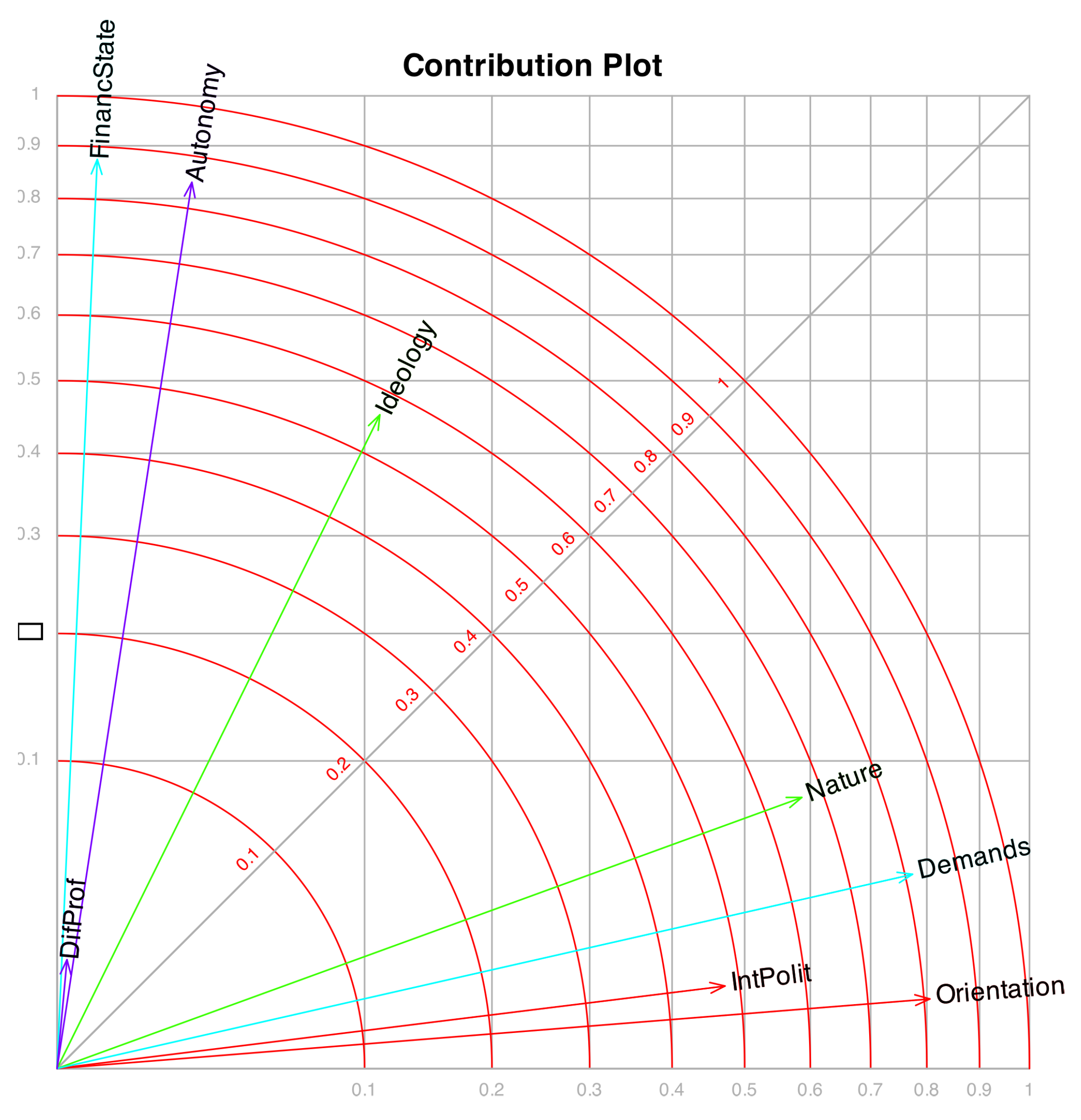
Figure 11.
Orinal logistic biplot with clusters defined by the type of volunteering.
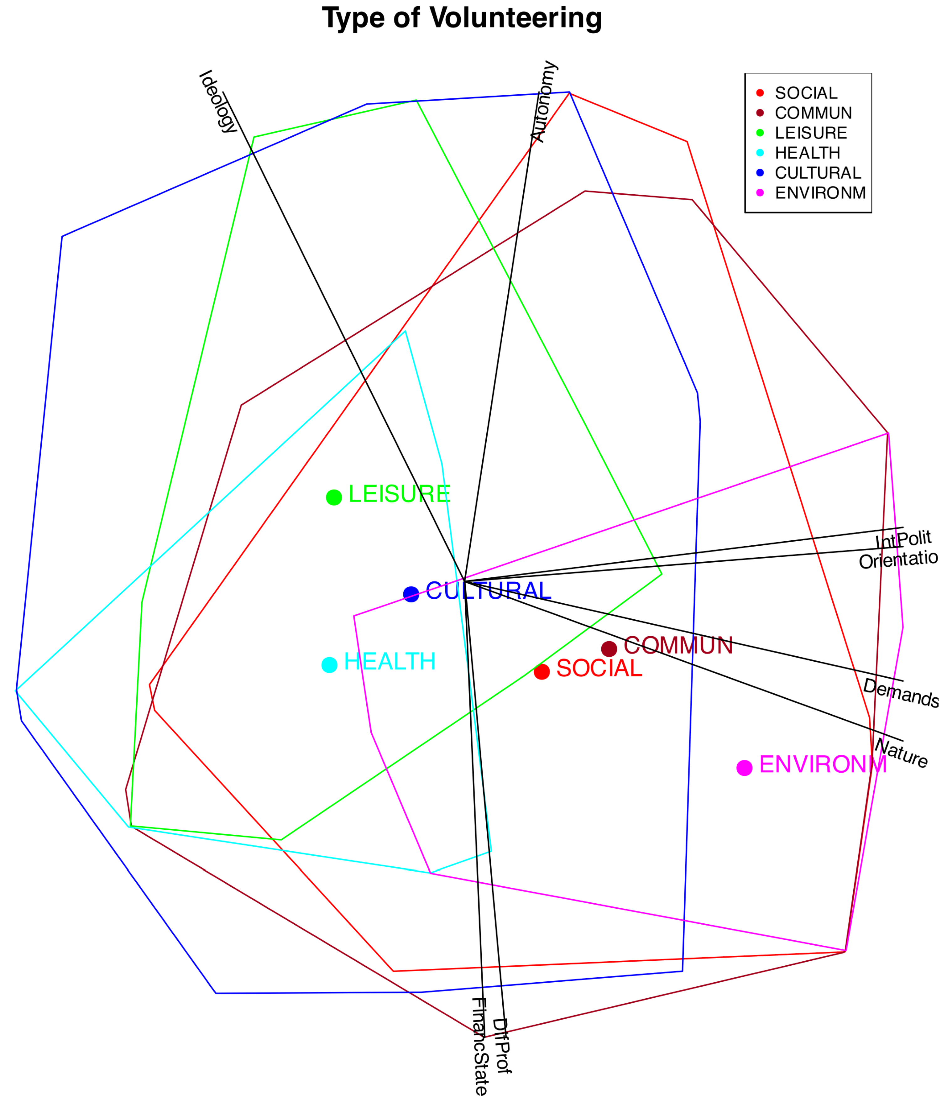
Figure 12.
Orinal logistic biplot with clusters defined by ideology.
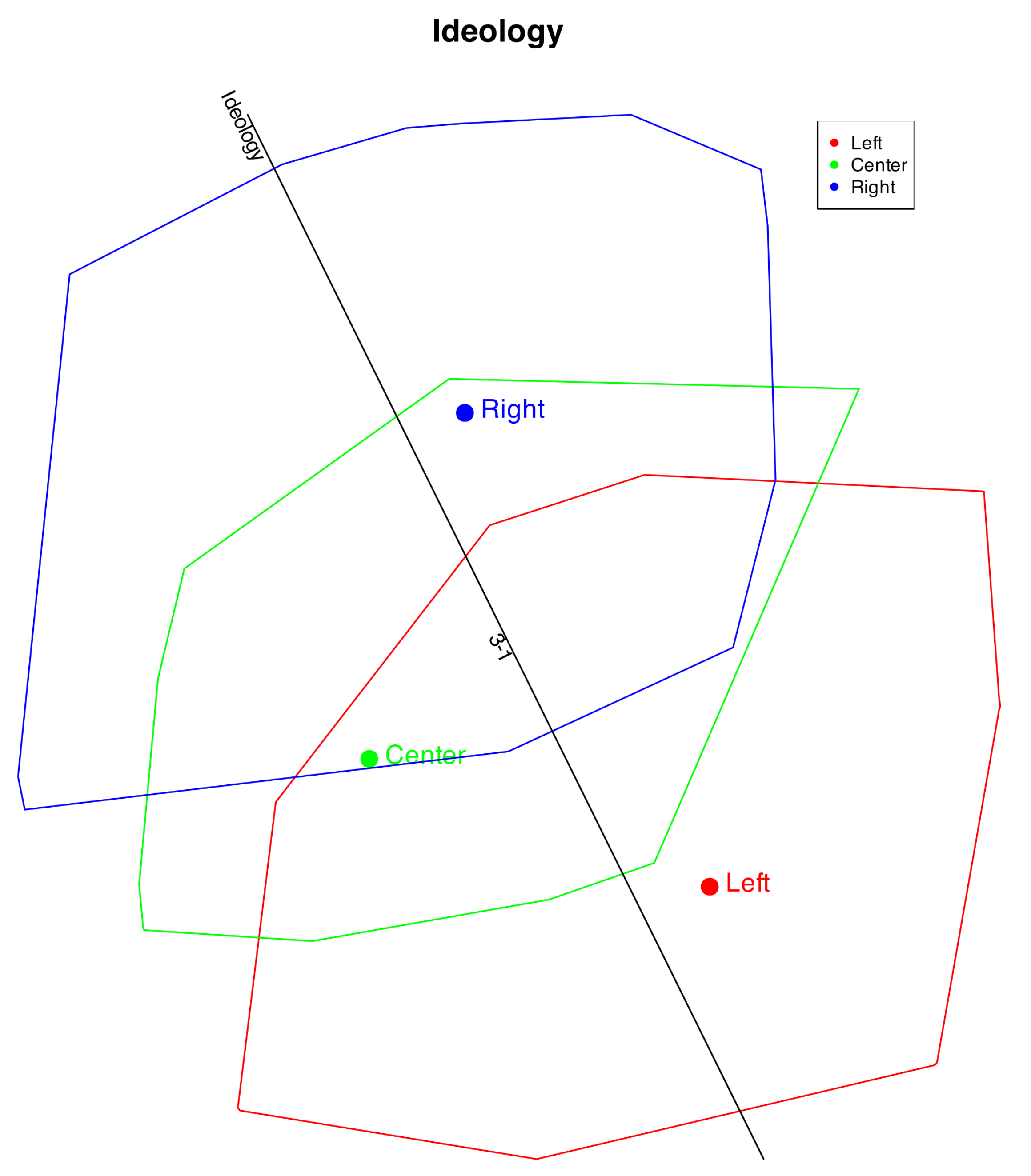
Figure 13.
Orinal logistic biplot with clusters defined by all the variables.
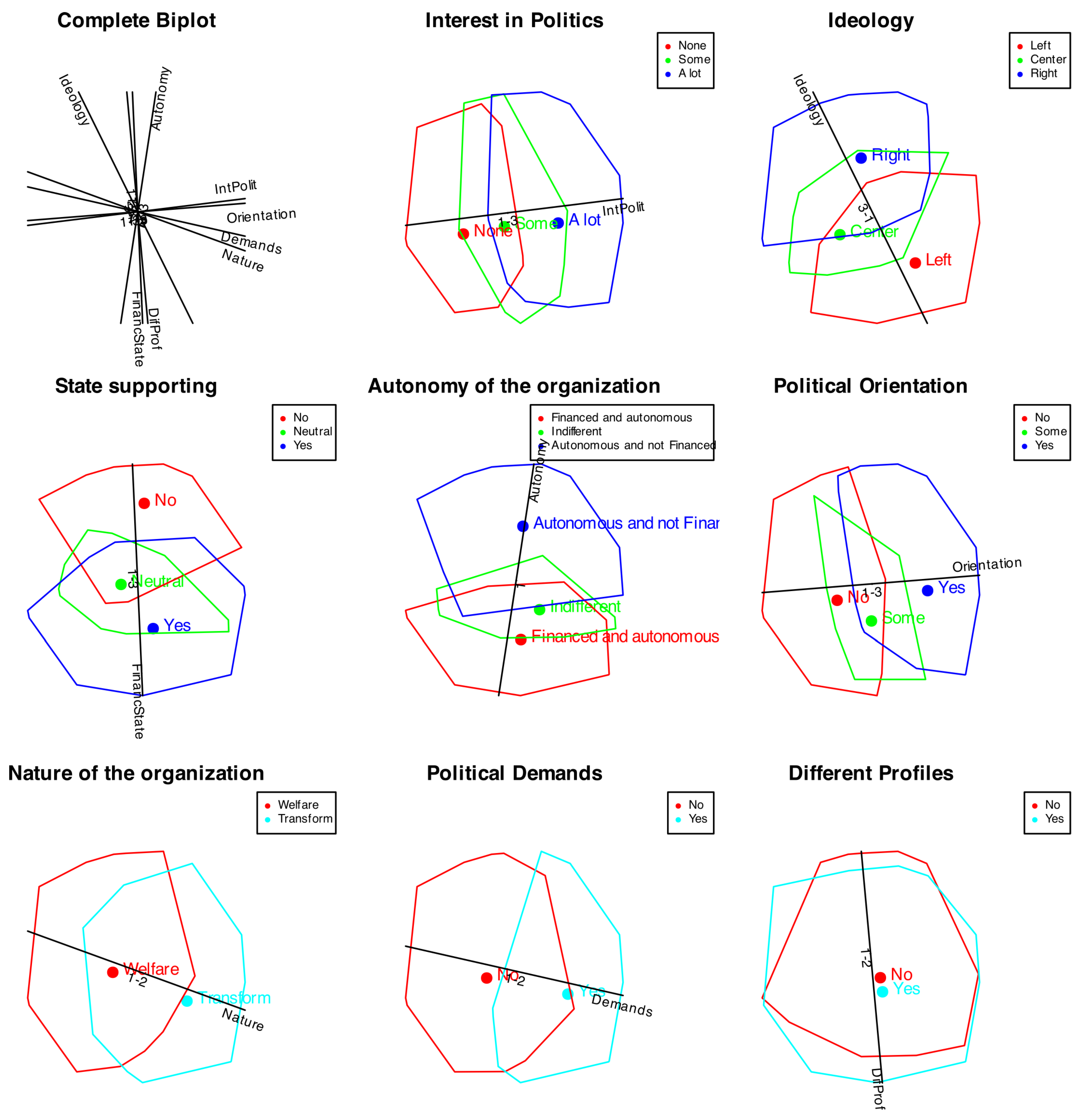

Table 1.
Protein consumption of 25 European countries
| Red_Meat | White_Meat | Eggs | Milk | Fish | Cereal | Starch | Nuts | Fruits_Veg. | |
|---|---|---|---|---|---|---|---|---|---|
| Albania | 10.10 | 1.40 | 0.50 | 8.90 | 0.20 | 42.30 | 0.60 | 5.50 | 1.70 |
| Austria | 8.90 | 14.00 | 4.30 | 19.90 | 2.10 | 28.00 | 3.60 | 1.30 | 4.30 |
| Belgium | 13.50 | 9.30 | 4.10 | 17.50 | 4.50 | 26.60 | 5.70 | 2.10 | 4.00 |
| Bulgaria | 7.80 | 6.00 | 1.60 | 8.30 | 1.20 | 56.70 | 1.10 | 3.70 | 4.20 |
| Czechoslovakia | 9.70 | 11.40 | 2.80 | 12.50 | 2.00 | 34.30 | 5.00 | 1.10 | 4.00 |
| Denmark | 10.60 | 10.80 | 3.70 | 25.00 | 9.90 | 21.90 | 4.80 | 0.70 | 2.40 |
| E_Germany | 8.40 | 11.60 | 3.70 | 11.10 | 5.40 | 24.60 | 6.50 | 0.80 | 3.60 |
| Finland | 9.50 | 4.90 | 2.70 | 33.70 | 5.80 | 26.30 | 5.10 | 1.00 | 1.40 |
| France | 18.00 | 9.90 | 3.30 | 19.50 | 5.70 | 28.10 | 4.80 | 2.40 | 6.50 |
| Greece | 10.20 | 3.00 | 2.80 | 17.60 | 5.90 | 41.70 | 2.20 | 7.80 | 6.50 |
| Hungary | 5.30 | 12.40 | 2.90 | 9.70 | 0.30 | 40.10 | 4.00 | 5.40 | 4.20 |
| Ireland | 13.90 | 10.00 | 4.70 | 25.80 | 2.20 | 24.00 | 6.20 | 1.60 | 2.90 |
| Italy | 9.00 | 5.10 | 2.90 | 13.70 | 3.40 | 36.80 | 2.10 | 4.30 | 6.70 |
| Holand | 9.50 | 13.60 | 3.60 | 23.40 | 2.50 | 22.40 | 4.20 | 1.80 | 3.70 |
| Norway | 9.40 | 4.70 | 2.70 | 23.30 | 9.70 | 23.00 | 4.60 | 1.60 | 2.70 |
| Poland | 6.90 | 10.20 | 2.70 | 19.30 | 3.00 | 36.10 | 5.90 | 2.00 | 6.60 |
| Portugal | 6.20 | 3.70 | 1.10 | 4.90 | 14.20 | 27.00 | 5.90 | 4.70 | 7.90 |
| Romania | 6.20 | 6.30 | 1.50 | 11.10 | 1.00 | 49.60 | 3.10 | 5.30 | 2.80 |
| Spain | 7.10 | 3.40 | 3.10 | 8.60 | 7.00 | 29.20 | 5.70 | 5.90 | 7.20 |
| Sweden | 9.90 | 7.80 | 3.50 | 24.70 | 7.50 | 19.50 | 3.70 | 1.40 | 2.00 |
| Switzerland | 13.10 | 10.10 | 3.10 | 23.80 | 2.30 | 25.60 | 2.80 | 2.40 | 4.90 |
| UK | 17.40 | 5.70 | 4.70 | 20.60 | 4.30 | 24.30 | 4.70 | 3.40 | 3.30 |
| USSR | 9.30 | 4.60 | 2.10 | 16.60 | 3.00 | 43.60 | 6.40 | 3.40 | 2.90 |
| W_Germany | 11.40 | 12.50 | 4.10 | 18.80 | 3.40 | 18.60 | 5.20 | 1.50 | 3.80 |
| Yugoslavia | 4.40 | 5.00 | 1.20 | 9.50 | 0.60 | 55.90 | 3.00 | 5.70 | 3.20 |
Table 2.
variance explained by 4 factors.
| Eigenvalue | Exp. Var | Cummulative | |
|---|---|---|---|
| Factor_1 | 3.34 | 37.07 | 37.07 |
| Factor_2 | 1.63 | 18.12 | 55.19 |
| Factor_3 | 1.05 | 11.67 | 66.85 |
| Factor_4 | 0.73 | 8.10 | 74.95 |
Explained Variance.
Table 3.
Factor matrix. Correlations among factors and observed variables. In bold numbers we have highlighted the highest correlations.
Table 3.
Factor matrix. Correlations among factors and observed variables. In bold numbers we have highlighted the highest correlations.
| Factor_1 | Factor_2 | Factor_3 | Factor_4 | |
|---|---|---|---|---|
| Red_Meat | 0.00 | 0.03 | 0.68 | -0.20 |
| White_Meat | 0.97 | -0.13 | 0.15 | -0.01 |
| Eggs | 0.46 | 0.07 | 0.85 | 0.02 |
| Milk | 0.16 | 0.16 | 0.53 | -0.53 |
| Fish | -0.11 | 0.99 | 0.04 | 0.05 |
| Cereal | -0.36 | -0.55 | -0.57 | 0.21 |
| Starch | 0.32 | 0.43 | 0.26 | -0.08 |
| Nuts | -0.60 | -0.24 | -0.21 | 0.67 |
| Fruits_Vegetables | 0.02 | 0.24 | -0.04 | 0.69 |
Table 4.
Factor Structure (Loadings and Communalities).
| Dim 1 | Dim 2 | |
|---|---|---|
| Variance | 2.77 | 2.30 |
| Cummulative | 2.77 | 5.07 |
| Percentage | 34.61 | 28.72 |
| Cum. Percentage | 34.61 | 63.33 |
Table 5.
Factor Structure (Loadings and Communalities).
| Dim 1 | Dim 2 | Communalities | |
|---|---|---|---|
| IntPolit | 0.69 | 0.08 | 0.48 |
| Ideology | -0.33 | 0.67 | 0.56 |
| FinancState | 0.04 | -0.93 | 0.88 |
| Autonomy | 0.14 | 0.91 | 0.85 |
| Orientation | 0.90 | 0.07 | 0.81 |
| Nature | 0.77 | -0.28 | 0.66 |
| Demands | 0.88 | -0.20 | 0.81 |
| DifProf | 0.01 | -0.11 | 0.01 |
Table 6.
Measures of fit (Global and for each separate variable).
| CoxSnell | Macfaden | Nagelkerke | PCC | Kappa | |
|---|---|---|---|---|---|
| IntPolit | 0.64 | 0.60 | 0.69 | 66.67 | |
| Ideology | 0.71 | 0.53 | 0.77 | 67.66 | |
| FinancState | 0.70 | 0.52 | 0.76 | 80.60 | |
| Autonomy | 0.73 | 0.51 | 0.79 | 78.11 | |
| Orientation | 0.72 | 0.54 | 0.77 | 77.11 | |
| Nature | 0.40 | 0.63 | 0.53 | 77.11 | 0.55 |
| Demands | 0.44 | 0.58 | 0.59 | 78.61 | 0.57 |
| DifProf | -0.01 | 1.00 | -0.01 | 54.23 | 0.02 |
| Global | 72.51 |
Disclaimer/Publisher’s Note: The statements, opinions and data contained in all publications are solely those of the individual author(s) and contributor(s) and not of MDPI and/or the editor(s). MDPI and/or the editor(s) disclaim responsibility for any injury to people or property resulting from any ideas, methods, instructions or products referred to in the content. |
© 2025 by the authors. Licensee MDPI, Basel, Switzerland. This article is an open access article distributed under the terms and conditions of the Creative Commons Attribution (CC BY) license (http://creativecommons.org/licenses/by/4.0/).
Copyright: This open access article is published under a Creative Commons CC BY 4.0 license, which permit the free download, distribution, and reuse, provided that the author and preprint are cited in any reuse.


