
Submitted:
22 June 2025
Posted:
23 June 2025
You are already at the latest version
Abstract
Model selection in machine learning applications for biomedical predictions is often constrained by reliance on conventional global performance metrics such as area under the ROC curve (AUC), sensitivity, and specificity. When these metrics are closely clustered across multiple candidate models, distinguishing the most suitable model for real-world application becomes challenging. We propose a novel composite evaluation framework that combines a visual analysis of prediction score distributions with a new performance metric, the MSDscore, tailored for classifiers producing continuous prediction scores. This approach enables detailed inspection of true positive, false positive, true negative, and false negative distributions across the scoring space, capturing local performance patterns often overlooked by standard metrics. Implemented within the Digital Phenomics platform as the MSDanalyser tool, our methodology was applied to 27 predictive models developed for breast, lung, and renal cancer prognosis. Although conventional metrics showed minimal variation between models, the MSDA methodology revealed critical differences in score-region behaviour, allowing the identification of models with greater real-world suitability. While our study focuses on oncology, the methodology is generalisable to other domains involving threshold-based classification. We conclude that integrating this composite framework alongside traditional performance metrics offers a complementary, more nuanced approach to model selection in clinical and biomedical settings.
Keywords:
Modelling
; Biomedical
; Machine-Learning
; Cancer
; Prognostics
1. Introduction
The integration of machine learning (ML) into biomedical research has revolutionised the development of predictive models, particularly in areas such as disease prognosis, patient stratification, and prediction of treatment response [1,2,3,4,5]. These models often rely on high-dimensional data, including genomic, transcriptomic, and other omics datasets, to generate risk scores or probabilities that inform clinical decision-making. A critical step in deploying such models is the selection of the most appropriate one from a set of candidates [1,6]. Traditionally, this selection is guided by performance metrics like the area under the receiver operating characteristic curve (AUC), accuracy, sensitivity, and specificity [7,8,9,10]. While these metrics provide valuable insights into model performance, they can sometimes be insufficient for distinguishing between models, especially when multiple models exhibit similar values across these metrics.
In practical scenarios, particularly in clinical settings, the consequences of misclassification can be significant. For instance, in oncology, selecting a suboptimal prognostic model could lead to inappropriate treatment decisions, adversely affecting patient outcomes [8,11,12]. Therefore, there is a pressing need for more nuanced evaluation methods that can capture subtle differences in model performance, beyond what traditional metrics offer.
Several approaches have been proposed to address this challenge. Visual analytics tools like Manifold and HypoML facilitate model interpretation and comparison through interactive visualisations [13,14]. Statistical methods such as Decision Curve Analysis (DCA) assess the clinical utility of predictive models by considering the net benefit across different threshold probabilities [15]. While these methods contribute to a more comprehensive understanding of model performance, they lack an integrated scoring system that encapsulates the complete configuration of true positives, false positives, true negatives, and false negatives, elements central to real-world performance. Moreover, many existing tools are not specifically designed to support threshold-based classifiers that output prediction scores, which are prevalent in biomedical ML applications.
To bridge this gap, we propose a novel visual and scoring-based evaluation framework tailored for models that generate score-based outputs. This methodology enhances model selection by providing a graphical representation of the distribution of true positives, false positives, true negatives, and false negatives, coupled with a composite score that captures performance nuances not reflected in standard metrics. The visual component aids in intuitively understanding the trade-offs between different types of classification errors, while the composite score offers a quantitative measure that integrates these aspects.
Previously, we developed an AI-driven platform that enables the generation and evaluation of predictive models using an autoML approach, the Digital Phenomics Platform [16]. On this modelling platform, we have made available curated datasets of publicly available tumour biopsies transcriptomics for predictive model development. Standard metrics of performance were previously implemented in this tool for model evaluation. In the present work, we have implemented our novel methodology into and new tool, the MSDanalyser and integrated it into the Digital Phenomics Platform. To demonstrate its utility, we applied the framework to evaluate models developed for predicting survival prognosis outcomes in breast, lung, and renal cancer datasets. Here, we will determine both standard performance metrics for cancer prognostic models and use the novel method. Comparison of visual and scoring-based evaluation with standard performance metrics was explored in this work in an attempt to provide additional insights that were not apparent through traditional metrics alone.
While our work focuses on oncology applications due to the critical need for precise prognostic tools in this field, the methodology is broadly applicable to various biomedical domains where model selection among threshold-based classifiers is required. By integrating this visual framework with conventional performance metrics, researchers and clinicians can make more informed decisions when selecting predictive models, ultimately enhancing the reliability and effectiveness of ML applications in biomedical research.
2. Materials and Methods
2.1. Cancer Transcriptomics Datasets
The datasets used for model development were constructed using publicly available data from The Cancer Genome Atlas (TCGA), focusing on tumour biopsy samples from patients diagnosed with breast, lung, and renal cancers. Gene expression data were sourced from the 2021 update of the Human Protein Atlas, comprising mRNA expression profiles for 200 genes across 1,075 anonymised patient samples [17,18]. These datasets were pre-normalised and expressed as fragments per kilobase of transcript per million mapped reads (FPKM). To maintain comparability with previous model development efforts using the Digital Phenomics platform [16], we applied the same curation strategy. Specifically, we selected a subset of 58 genes associated with key signalling cascades implicated in the regulation of epithelial-to-mesenchymal transition (EMT), a process central to cancer invasion and metastasis [19]. Survival outcomes were binarised to define prognostic classes: patients who survived more than five years post-diagnosis were classified as having a good prognosis, while those who died within two years were assigned to the poor prognosis group.
The final datasets consisted of curated transcriptomic samples for three cancer types. For breast cancer (BRCA), 239 samples were selected, including 40 with poor prognosis and 199 with a good prognosis. For lung cancers (LUSC and LUAD), 325 samples were used, comprising 231 cases of poor prognosis and 94 cases of good prognosis. Finally, the renal cancer dataset, encompassing KICH, KIRC, and KIRP subtypes, included 318 samples—108 from patients with poor prognostic outcomes and 210 with favourable outcomes. For each cancer type, gene expression data were formatted into CSV files, with gene identifiers in the first column and corresponding FPKM values per patient across the remaining columns. Metadata files were also generated to associate each sample with its prognostic class. The resulting datasets are available via the Digital Phenomics platform (https://digitalphenomics.com, last accessed on 10 May 2025).
2.2. Generation of Predictive Models
Predictive models were developed using the Digital Phenomics platform (https://digitalphenomics.com, accessed on 10 April 2025), user Interface version 0.22. Under this platform, we use the O2Pmgen version 1.1, a proprietary AutoML tool developed by Bioenhancer Systems LTD to automate the end-to-end process of data selection, model training, optimisation, and validation. The tool employs a supervised machine learning strategy based on a genetic/evolutionary algorithm programmed to identify bespoke biomarker combinations that maximise model performance (sensitivity, specificity, and AUC) [16]. For each model, a subset of the data (always under 50%) was randomly selected for training, with the remainder held out for independent testing to simulate a realistic model validation workflow. The model generation process includes biomarker pattern learning functionality that mimics the identification of gene expression up-regulation, down-regulation, and binary activation/inhibition patterns, using non-parametric statistical thresholds to ensure significance[16]. Models were evolved to reach optimal performance under a user-defined maximum false positive rate constraint. The resulting models were defined by the following generic scoring equation applied for phenotype classification (equation 1)[16].
where:
- Pi is the absolute distance between the estimated median of biomarker i of the group with the phenotype and the value of the biomarker in the unknown sample;
- Ni is the absolute distance between the estimated median of biomarker i of the control group (negative for phenotype) and the value of the biomarker in the unknown sample;
- Wi is the enrichment score of biomarker i on the group with the phenotype, and n is the total number of biomarkers in the model.
The implemented AI under the O2Pmgen tool estimates the optimal cut-off value for applying the resulting CS equation to the classification of the phenotype (yes/no)[16]. Therefore, a model generated by this approach enables a phenotype classification as yes (positive) if the score is superior then the estimated cutoff and no (negative) otherwise.
2.3. Classical Model Performance Metrics
Metrics for evaluating the performance of the generated models were assessed using software tools available in the Digital Phenomics Platform version 0.22. The Receiver Operating Characteristic (ROC) curves were generated using the ROCplot tool version 1.1. This tool enables the visualisation of the trade-off between sensitivity and 1-specificity across threshold values of a given model using user-defined datasets [9]. The tool was implemented with an exhaustive scanning over threshold values with a 10,000 division resolution over the scoring space. ROCs from ROCplot are computed using a non-parametric estimation method to reflect the model’s ability to distinguish between the phenotype classification using all possible classification thresholds [10,16]. We also use the O2Pmgen tool functionalities on the Digital Phenomics platform to compute the following performance metrics: optimal Sensitivity (equation 2); optimal Specificity (equation 3), optimal Accuracy (equation 4) and the ROC Area-Under-the-Curve (AUC).
The AUC was computed by ROCplot considering a 5% performance interval window for ensuing higher precision of the computed areas using the Riemann sum approximation [16]. The AUC and remaining performance metrics were computed based on the accepted guidelines for diagnostic modelling in biomedical research, following the principles outlined by Dankers et al. implemented in ROCplot and O2Pmgen [10]. All performance metrics, including the generated ROCs were directly exported into csv format from the Digital Phenomics interface functionalities and utilised for further comparative analysis. ROC curves generated were exported in PNG format using the tool's export functionality.
2.4. Model Scoring Distribution Analysis (MSDA)
The MSDA methodology consists of the analysis of the distribution of true positives (TP), true negatives (TN), false positives (FP), and false negatives (FN) across the scoring space generated by a predictive model for a given phenotype classification. The analysis is performed using the prediction scores obtained from the entire dataset used for validation of the model. The model's score range is discretised into 10 equal-width intervals (bins), ordered from the lowest to the highest score values. For each bin, the number of TP, TN, FP, and FN is computed. This approach enables the examination of how prediction outcomes are distributed along the score space and allows testing of the hypothesis that increasing prediction scores correspond to a higher likelihood of a phenotype classification. Ten bins were selected to achieve a suitable balance between granularity and interpretability. This binning allows for the identification of local regions within the score space that demonstrate distinct degrees of predictive performance. Each bin can therefore be interpreted as a local performance unit, revealing zones of confident or uncertain model behaviour. A graphical representation of the score-bin distribution (MSDA plot) was generated to allow intuitive comparison between models, especially in cases where global metrics such as AUC, sensitivity, specificity, and accuracy show little variation. The visualisation consists of a stacked bar chart displaying the TP, TN, FP, and FN counts across the 10 bins, alongside a line plot showing the total number of cases per bin (see Figure 1).
To complement the visual inspection, a scoring function — referred to as the MSDscore — was developed to quantify the distributional quality of TP, TN, FP, and FN across the score bins (Equation x). The score is calculated as follows:
where:
- fTNB1 is the fraction of true negatives at the first model score bin (B1), measuring the model’s reliability in correctly identifying negative cases at low scores.
- fTPB1 is the fraction of true positives in the last score bin (B10), measuring the reliability of high scores in correctly identifying positive cases.
- Ki is the number of observations (samples) of bin i that belongs within a peripheral region of n bins and contains no false positives and no false negatives; this represents model scoring regions with high local performance.
- FPj and FNj are the false positives and false negatives, respectively in bin j from m bins where m = 9 (bins excluding the bin that contains the model’s classification cut-off threshold). This represents a way to introduce a scoring penalty for failing a prediction across the scoring space outside the cutoff-point region.
- Totalj is the total number of observations in bin j.
Equation 5 was derived to account for both reliable score extremities and penalises error-prone regions within the score range, offering a complementary assessment to traditional global performance metrics. The MSDA method was implemented in the MSDanalyser tool, developed in Python 3.10 and integrated into the Digital Phenomics Platform. The visualisation module was developed in JavaScript and also embedded within the platform toolkit.
2.4. Data Manipulations and Analysis
To further explore the relationship between classical performance metrics and the MSDscore, additional analyses and visual comparisons were conducted outside the Digital Phenomics platform. These were conducted under the Jupyter Notebook environment using Python 3.10 programming language. The Python library matplotlib were employed to generate plots, which allowed for visual inspection of the distribution and correlation between metrics such as AUC, sensitivity, specificity, and MSDscore. For data handling, we used the Python library pandas and numpy, which enabled efficient array manipulation, model filtering and performance ranking. Pearson correlation coefficients were calculated using the numpy.corrcoef method and the linear trend line were fitted using numpy.polyfit to visualise the relationship.
3. Results
We developed a new performance metric (MSDscore) and a new visualisation technique (MSDA plot) to support model evaluation based on the distribution of type I/II errors across the model’s predictive score space—an approach we refer to as the MSDA methodology. This methodology was applied to the selection of three cancer prognostic predictive models (breast, lung, and renal), alongside standard performance metrics.
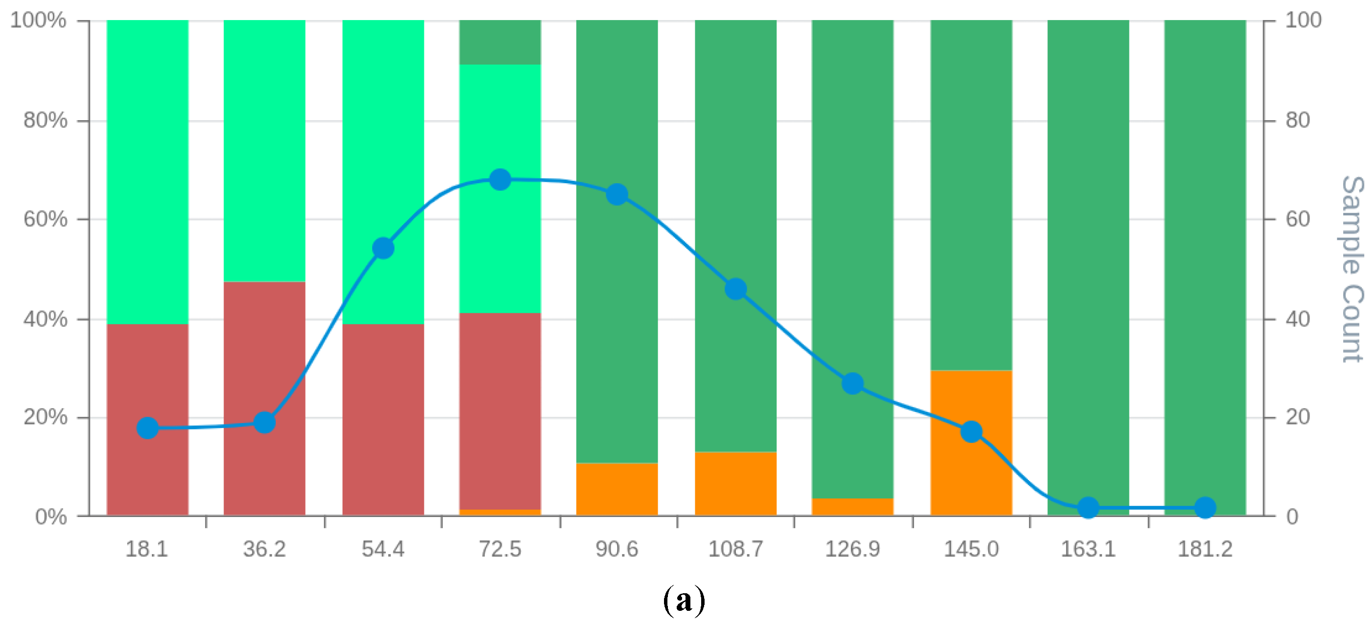
Using an AI-driven modelling approach applied to tumour transcriptomic datasets, we generated nine predictive models per cancer type (breast, lung, and renal), resulting in a total of 27 predictive models. The Receiver Operating Characteristic (ROC) curves of these models demonstrated that all achieved acceptable predictive performance (Figure 2). A high degree of overlap was observed between the ROC curves within each cancer type, indicating that no model clearly outperformed the others based on visual inspection of predictive power alone.
To assess the utility of the MSDscore as a model evaluation metric, we calculated standard performance metrics and MSDscores for all 27 models (see Supplementary File S1). The observed AUCs ranged from 75–83% (breast cancer), 63–78% (lung cancer), and 64–75% (renal cancer). For accuracy, model performance ranged from 73–89% (breast), 65–73% (lung), and 70–74% (renal). In contrast, MSDscores spanned a broader range: 51.9 to 507.7 (breast), 1.5 to 15.4 (lung), and 3.0 to 65.1 (renal), indicating strong discriminatory power between models both within and across cancer types.
MSDscores exhibited moderate Pearson correlations with AUC and Accuracy (Figure 3b), suggesting they can serve as proxies for predictive performance. However, MSDscores were only weakly positively correlated (r < 0.2) with sensitivity and specificity (data not shown), highlighting their complementary nature.
3.1. Breast Cancer Models (BCM) Evaluation
The analysis of breast cancer prognostic models' performance showed that the BCM9 model ranked as the best-performing model, considering standard performance metrics for model selection (AUC and Accuracy). The BCM9 model was also the best-performing model according to the MSDA methodology with an MSDscore of 507.5. This value was up to 10-fold superior to that of alternative models. BCM9 sensitivity was both the highest (94.5%) and the lowest specificity (62.5%) among the generated breast cancer models. The MSD plot of the BCM9 model showed a region of 4 bin scores at the high end of the scoring space, with true positives absent from false positives and a substantial amount of supporting observations (Figure 4). This indicates that classification scores of BCM9 model above 118.9 do not tend to have false positives. On the other hand, false negatives were concentrated among the first 2 bin scores, showing a tendency of the model to have around 30% false negatives for scores up to 36.4. The MSD plot showed a balanced distribution of false positives with low proportions between the 2nd and the 6th bins. In addition, the MSD plot further showed that the observations on each bin score are enough to support true/false positive/negative bin proportions.
Visual inspections and comparisons of all MSD plots (Figures S1-S9 in supplementary data S2) showed that all models were inferior to the BCM9 in either: 1) The number of bin scores within regions with no false positives; 2) The number of supporting observations in bins belonging to no false positives regions; 3) Having the highest proportion of true negatives at low-end model scoring; 4) Unbalanced distribution of false positives/negatives around the cut-off threshold.
3.2. Lung Cancer Model (LCM) Evaluation
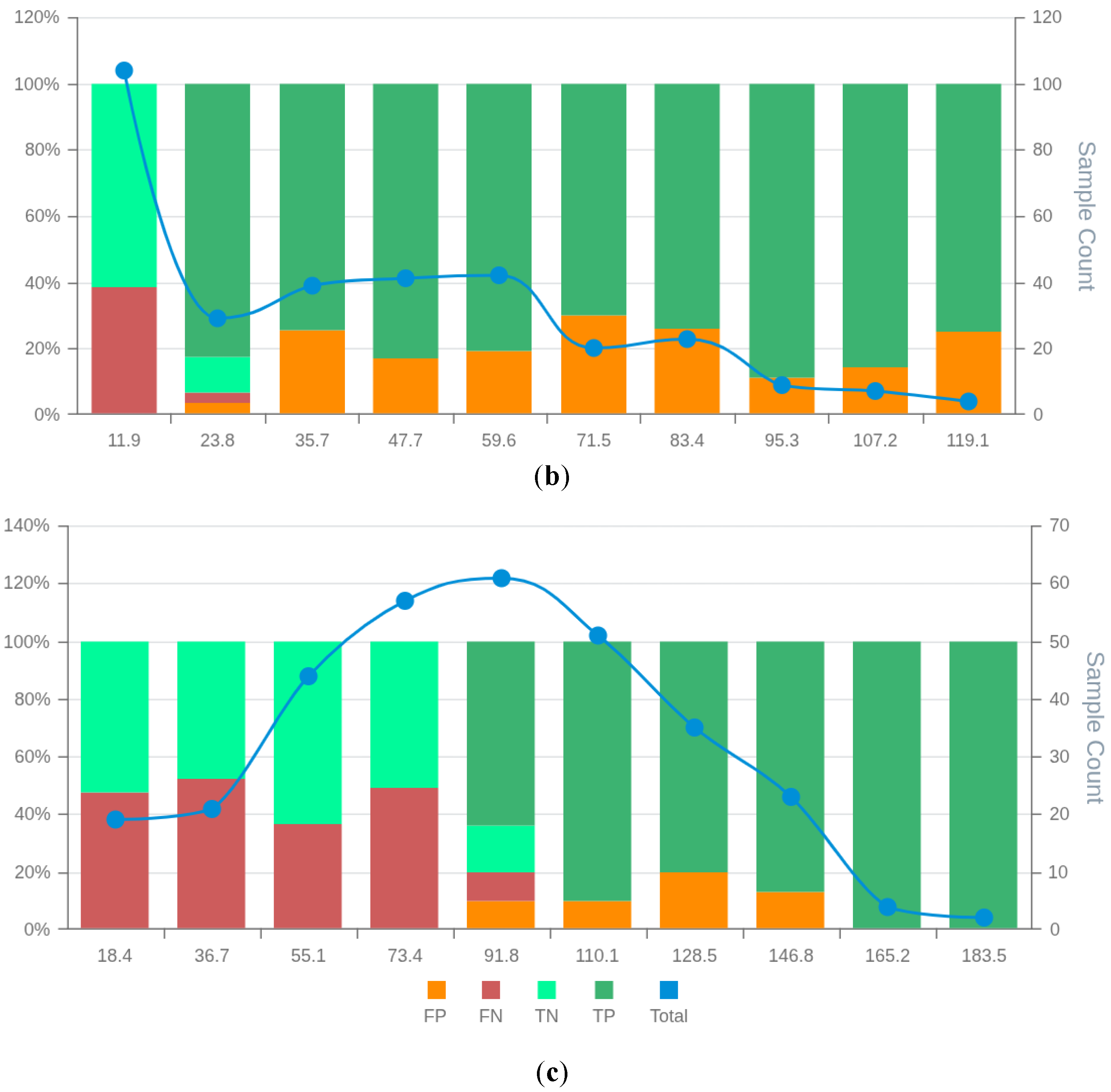
Analysis of lung cancer models (Supplementary File S1) indicated that LCM5 achieved the highest AUC (75.3%), while LCM9 had the highest accuracy (73.3%). According to MSDscore, however, LCM9 was the top model (15.4), closely followed by LCM3 (15.1). These values were three to tenfold higher than the remaining models, including LCM5 (MSDscore 4.5 and 3rd in the ranking). Sensitivities were 56%, 67%, and 80% for LCM9, LCM3, and LCM5 respectively; specificities were 80%, 71%, and 61%.
The MSD visualisation plots (Figures S10–S18 in Supplementary Data S2) revealed major differences in the distribution of false positives and negatives across model score ranges. Only LCM9 and LCM3 showed no false positives in bins located at the upper end of the scoring range (Figures 5a and 5c). Specifically, LCM3 and LCM9 were free of false positives for scores over 118.8 and 163.4, respectively. In contrast, LCM5 exhibited a false positive tail extending into high scores, albeit with decreasing proportions—an issue absent in LCM3 and LCM9 (Figure 5b). Similar proportions of true negatives and false negatives at the first 3 bin scores for models LCM3, LCM5 and LCM9 makes the observed variations in remaining bins relevant for model selection. However, low case counts in the last two bins of all models limit the statistical confidence of these patterns.
3.3. Renal Cancer Models
In the renal cancer set (Supplementary File S1), RCM3 had the highest AUC (77.9%), and RCM6 had the highest accuracy (74.3%). However, these models ranked second and sixth, respectively, by MSDscore, with values of 45.8 and 5.2. The highest MSDscore was achieved by RCM7 (65.2), which had a sensitivity of 67% and specificity of 81%. In contrast, RCM3 and RCM6 had sensitivities of 70% and 81%, and specificities of 82% and 62%, respectively.
MSD visualisation plots (Figures S20–S29 in Supplementary Data S2) supported the selection of RCM3 and RCM7 over RCM6, despite the latter having the highest accuracy. Both RCM3 and RCM7 had no observed false positives in the final two score bins, suggesting that scores above 145.0 and 146.8, respectively, may safely exclude false positives. RCM6, however, showed a wider distribution of false positives throughout the scoring space with increasing false positive rates at high scores. The false positive distribution of RCM7 was more consistent and lower overall than RCM3, contributing to its higher MSDscore. Conversely, RCM3 showed slightly fewer false negatives, supporting its selection in contexts where this balance is preferable. The case counts in most bins were sufficient to support interpretation, except for the final two bins.
4. Discussion
The MSDA methodology presented in this study offers a novel framework for model evaluation and selection, addressing key limitations of existing standard performance metrics. By incorporating a new metric (MSDscore) alongside a visualisation approach, our method complements traditional evaluation frameworks and provides more granular insights into model performance.
Standard performance metrics such as AUC, accuracy, sensitivity, and specificity are widely used in biomedical machine learning to compare models [10]. However, when these global metrics cluster closely across models—common in high-dimensional omics datasets—they fail to provide actionable insight into real-world performance [4,20]. This is particularly problematic in clinical scenarios like cancer prognosis, where the balance between false positives and false negatives must be carefully weighed. Our findings show that models with the highest AUC or accuracy may still behave suboptimally in specific score regions, such as exhibiting high error densities at critical thresholds.
AutoML frameworks such as TPOT (Tree-based Pipeline Optimisation Tool) exemplify this limitation [21,22]. While powerful in navigating large model search spaces, these systems typically optimise for a single metric like AUC. This approach can lead to the selection of models that achieve statistical superiority through artefacts, such as exploiting data imbalances or overfitting, without necessarily being robust or clinically interpretable [6,21,22]. Our study demonstrates that incorporating the MSDscore and score-wise visual inspection adds an important second layer of evaluation. These tools reveal local behaviours such as error sparsity, high-confidence decision zones, or threshold-specific asymmetries that may better align with clinical priorities.
Rather than replacing global metrics, the MSDA methodology supports a two-step process: first filtering models by traditional performance thresholds, then applying MSDA to characterise error behaviour within score distributions. This strategy enables the selection of models that meet both statistical and practical criteria for deployment.
Our application of the MSDA method to breast, lung, and renal cancer prognosis from transcriptomic data revealed important distinctions among models with otherwise similar AUCs. For example, in breast cancer, BCM9 not only had strong global performance but also showed a high-confidence zone with no false positives. Conversely, in lung cancer, the top-ranked model by AUC (LCM5) exhibited error tails in high-score regions, whereas other models like LCM3 or LCM9 may offer more favourable behaviour in high-specificity applications. In renal cancer, RCM7 had the highest MSDscore despite a lower AUC, reflecting its more even and clinically desirable error distribution. These examples highlight how the MSDA framework identifies subtle but critical differences that can inform better clinical choices.
These findings are especially relevant given the inherent challenges of transcriptomics-based modelling. Transcriptomics datasets are high-dimensional, noisy, and heterogeneous, with limited sample sizes relative to feature counts [17,23]. These issues lead to moderate model performances in many published cancer prognosis studies, where AUCs typically range from 0.60 to 0.80 [11,12]. Our results are consistent with this trend, with models achieving AUCs between 62% and 83%, even after AI-enhanced optimisation. However, the MSDA method revealed that some models within this range had highly consistent decision regions, with clusters of confident predictions and predictable error patterns. This demonstrates that even when global performance is modest, valuable diagnostic information can still be recovered from local score regions. MSDA thus adds interpretability and robustness to the evaluation process, making it possible to identify models that may have limited average performance but strong behaviour in clinically relevant scenarios.
The MSDA methodology offers several advantages. First, by visualising prediction errors across score bins, it allows for intuitive inspection of local model behaviour. This is particularly important in clinical applications where the cost of false positives or negatives may differ greatly. A model with average overall performance may still be highly deployable if it contains reliable sub-regions, such as thresholds above which false positives are negligible. Moreover, the MSDscore captures the distribution of classification errors, providing a single summarising metric that reflects not just how many errors occur, but where they occur. This can be critical for triaging systems or clinical decision support, where confidence calibration and interpretability matter.
These features also make MSDA suitable for integration into AutoML frameworks. Currently, such pipelines often select artefactual models due to narrow objective functions. Including MSDA as a secondary evaluation step could improve the robustness of model selection by flagging models with unbalanced or erratic error behaviours, even when global metrics appear optimal.
However, limitations exist. MSDA requires score-based classifiers, so it does not apply to models that output binary decisions without continuous probability scores. Its reliance on binning introduces a degree of arbitrariness, as bin size can influence the apparent structure of score distributions. Further, interpreting the MSD plots requires some domain knowledge, which may pose a barrier for non-expert users. Finally, the current version of MSDA has only been applied to transcriptomic datasets; its generalisability to other modalities such as proteomics, metabolomics, clinical, or imaging data remains to be validated. Despite these limitations, MSDA’s key strength lies in its ability to illuminate local performance regions and provide a deeper understanding of a model’s practical utility—capabilities not available through global metrics alone.
While developed in the context of cancer prognosis, the MSDA methodology is broadly applicable to any classification task involving probabilistic score outputs and threshold-based decisions. These include domains such as cardiovascular risk prediction, infectious disease triaging, fraud detection, and industrial fault prediction. In each of these, the asymmetric cost of misclassification and the need for interpretable confidence regions make MSDA a valuable addition to the model evaluation toolkit.
Crucially, MSDA supports a shift in perspective from "best-of" model selection to "fit-for-purpose" evaluation. It enables practitioners to choose models that may not be globally optimal but are contextually appropriate and more trustworthy for deployment. By combining visual transparency with quantitative error distribution analysis, MSDA empowers more nuanced, robust, and clinically relevant decision-making.
5. Conclusions
In this work, we proposed a novel methodology for evaluating and selecting score-based predictive models, combining a new composite metric—MSDscore—with detailed visualisation (MSDA plot) of prediction score distributions. Applied to 27 models across three cancer types, our approach revealed performance differences not captured by standard global metrics such as AUC or accuracy. By enabling inspection of local score-space behaviour, the method offers valuable insights into the practical reliability of models, including the distribution and context of misclassifications.
Importantly, the proposed framework does not replace traditional evaluation metrics but offers a complementary additional step. Rather than identifying a single 'best' model based solely on peak global performance metrics, it supports the idea of a final visual inspection of error type I/II distribution across classification scores from a set of candidate models. Here, we have demonstrated its applicability with a biomedical challenge, the cancer prognostic from transcriptomics data. In this work, we further demonstrated with real-world cancer data that our composite evaluation methodology captures local model behaviours that offer advantages for specific clinical or operational needs.
Although tested in the context of cancer prognosis, the methodology is generalisable to any classification task involving score-based outputs. Integrating this composite evaluation approach into existing model selection pipelines may enhance the robustness and real-world applicability of predictive models in biomedical and other domains.
Supplementary Materials
The following supporting information can be downloaded at the website of this paper posted on Preprints.org, data S1: Computed performances of cancer prognostic predictive models; Figures S1-S27: MSDA plots of cancer prognostic models.
Author Contributions
Conceptualisation, R.J.P. and U.L.F.; methodology, R.J.P. and U.L.F.; software, R.J.P. and U.F; validation, T.A.P.; formal analysis, T.A.P.; data curation, T.A.P.; writing—original draft preparation, U.L.F.; writing—review and editing, R.J.P.; supervision, R.J.P. All authors have read and agreed to the published version of the manuscript.
Funding
This research was supported by the UK Government through the Innovation Navigator – Flexible Fund grant, which was awarded for the development of the Digital Phenomics platform.
Institutional Review Board Statement
Not applicable.
Informed Consent Statement
Not applicable.
Data Availability Statement
All data in this research is available at https://digitalphenomics.com, accessed on 10 May 2025.
Acknowledgments
We acknowledge Bioenhancer Systems LTD for supporting the resources necessary to conduct the analysis and maintain the tools online. We also acknowledge the Manchester Growth Business Innovation Hub for helping with grant acquisition and management, which gave rise to this work.
Conflicts of Interest
R. Pais declares a potential conflict of interest as he is the director of Bioenhancer Systems. U. Filho and T. Pais declare no conflict of interest.
Abbreviations
The following abbreviations are used in this manuscript:
| MDPI | Multidisciplinary Digital Publishing Institute |
| MSDA | Model Scoring Distribution Analysis |
| ROC | Receiver Operating Characteristic |
| AUC | Area Under the Receiver Operating Characteristic Curve |
| MSD | Model Scoring Distribution |
| ML | Machine Learning |
| AI | Artificial Intelligence |
| BRCA | Breast Cancer Cell Type |
| LUSC | Lung Squamous Cell Carcinoma subtype |
| LUAD | Lind Adenocarcinoma Cell subtype |
| KICH | Chromophobe Renal Cell carcinoma subtype |
| KIRP | Kidney Renal Papillary cell carcinoma subtype |
| KIRC | Kidney Renal Clear cell carcinoma subtype |
| FPKM | Fragments Per Kilobase of transcript per Million mapped reads |
References
- Strzelecki, M.; Badura, P. Machine Learning for Biomedical Application. Appl. Sci. 2022, Vol. 12, Page 2022 2022, 12, 2022. [Google Scholar] [CrossRef]
- Kourou, K.; Exarchos, K.P.; Papaloukas, C.; Sakaloglou, P.; Exarchos, T.; Fotiadis, D.I. Applied Machine Learning in Cancer Research: A Systematic Review for Patient Diagnosis, Classification and Prognosis. Comput. Struct. Biotechnol. J. 2021, 19, 5546–5555. [Google Scholar] [CrossRef] [PubMed]
- Pais, R.J. Predictive Modelling in Clinical Bioinformatics: Key Concepts for Startups. BioTech 2022, 11, 35. [Google Scholar] [CrossRef] [PubMed]
- Mann, M.; Kumar, C.; Zeng, W.F.; Strauss, M.T. Artificial Intelligence for Proteomics and Biomarker Discovery. Cell Syst. 2021, 12, 759–770. [Google Scholar] [CrossRef] [PubMed]
- Battineni, G.; Sagaro, G.G.; Chinatalapudi, N.; Amenta, F. Applications of Machine Learning Predictive Models in the Chronic Disease Diagnosis. J. Pers. Med. 2020, 10, 21. [Google Scholar] [CrossRef] [PubMed]
- Telikani, A.; Gandomi, A.H.; Tahmassebi, A.; Banzhaf, W. Evolutionary Machine Learning: A Survey. ACM Comput. Surv 2021, 54, 1–35. [Google Scholar] [CrossRef]
- Kim, H.; Kwon, H.J.; Kim, E.S.; Kwon, S.; Suh, K.J.; Kim, S.H.; Kim, Y.J.; Lee, J.S.; Chung, J.-H. Comparison of the Predictive Power of a Combination versus Individual Biomarker Testing in Non–Small Cell Lung Cancer Patients Treated with Immune Checkpoint Inhibitors. Cancer Res. Treat. 2022, 54, 424–433. [Google Scholar] [CrossRef] [PubMed]
- Boeri, C.; Chiappa, C.; Galli, F.; De Berardinis, V.; Bardelli, L.; Carcano, G.; Rovera, F. Machine Learning Techniques in Breast Cancer Prognosis Prediction: A Primary Evaluation. Cancer Med. 2020, 9, 3234–3243. [Google Scholar] [CrossRef] [PubMed]
- Mandrekar, J.N. Receiver Operating Characteristic Curve in Diagnostic Test Assessment. J. Thorac. Oncol. 2010, 5, 1315–1316. [Google Scholar] [CrossRef] [PubMed]
- Dankers, F.J.W.M.; Traverso, A.; Wee, L.; van Kuijk, S.M.J. Prediction Modeling Methodology. In Fundamentals of Clinical Data Science; Springer International Publishing: Cham, 2019; pp. 101–120. [Google Scholar]
- Pais, R.J.; Lopes, F.; Parreira, I.; Silva, M.; Silva, M.; Moutinho, M.G. Predicting Cancer Prognostics from Tumour Transcriptomics Using an Auto Machine Learning Approach. In Proceedings of the Med. Sci Forum; MDPI: Basel Switzerland, August 8, 2023; p. 6. [Google Scholar]
- Yang, D.; Ma, X.; Song, P. A Prognostic Model of Non Small Cell Lung Cancer Based on TCGA and ImmPort Databases. Sci. Rep. 2022, 12, 437. [Google Scholar] [CrossRef] [PubMed]
- Zhang, J.; Wang, Y.; Molino, P.; Li, L.; Ebert, D.S. Manifold: A Model-Agnostic Framework for Interpretation and Diagnosis of Machine Learning Models. IEEE Trans. Vis. Comput. Graph. 2018, 25, 364–373. [Google Scholar] [CrossRef] [PubMed]
- Wang, Q.; Alexander, W.; Pegg, J.; Qu, H.; Chen, M. HypoML: Visual Analysis for Hypothesis-Based Evaluation of Machine Learning Models. IEEE Trans. Vis. Comput. Graph. 2020, 27, 1417–1426. [Google Scholar] [CrossRef] [PubMed]
- Vickers, A.J.; Elkin, E.B. Decision Curve Analysis: A Novel Method for Evaluating Prediction Models. Med. Decis. Making 2006, 26, 565. [Google Scholar] [CrossRef] [PubMed]
- Filho, U.L.; Pais, T.A.; Pais, R.J. Facilitating “Omics” for Phenotype Classification Using a User-Friendly AI-Driven Platform: Application in Cancer Prognostics. BioMedInformatics 2023, Vol. 3, Pages 1071-1082 2023, 3, 1071–1082. [Google Scholar] [CrossRef]
- Edwards, N.J.; Oberti, M.; Thangudu, R.R.; Cai, S.; McGarvey, P.B.; Jacob, S.; Madhavan, S.; Ketchum, K.A. The CPTAC Data Portal: A Resource for Cancer Proteomics Research. J. Proteome Res. 2015, 14, 2707–2713. [Google Scholar] [CrossRef] [PubMed]
- Uhlen, M.; Zhang, C.; Lee, S.; Sjöstedt, E.; Fagerberg, L.; Bidkhori, G.; Benfeitas, R.; Arif, M.; Liu, Z.; Edfors, F.; et al. A Pathology Atlas of the Human Cancer Transcriptome. Science (80-. ). 2017, 357. [Google Scholar] [CrossRef] [PubMed]
- Pais, R.J. Simulation of Multiple Microenvironments Shows a Putative Role of RPTPs on the Control of Epithelial-to-Mesenchymal Transition. biorxiv 2018. [Google Scholar] [CrossRef]
- Swan, A.L.; Mobasheri, A.; Allaway, D.; Liddell, S.; Bacardit, J. Application of Machine Learning to Proteomics Data: Classification and Biomarker Identification in Postgenomics Biology. Omi. A J. Integr. Biol. 2013, 17, 595–610. [Google Scholar] [CrossRef] [PubMed]
- Le, T.T.; Fu, W.; Moore, J.H. Scaling Tree-Based Automated Machine Learning to Biomedical Big Data with a Feature Set Selector. Bioinformatics 2020, 36, 250–256. [Google Scholar] [CrossRef] [PubMed]
- Olson, R.S.; Urbanowicz, R.J.; Andrews, P.C.; Lavender, N.A.; Kidd, L.C.; Moore, J.H. Automating Biomedical Data Science Through Tree-Based Pipeline Optimization. In Lecture Notes in Computer Science (including subseries Lecture Notes in Artificial Intelligence and Lecture Notes in Bioinformatics); Springer, Cham, 2016; Vol. 9597, pp. 123–137 ISBN 9783319312033.
- Uhlen, M.; Fagerberg, L.; Hallstrom, B.M.; Lindskog, C.; Oksvold, P.; Mardinoglu, A.; Sivertsson, A.; Kampf, C.; Sjostedt, E.; Asplund, A.; et al. Tissue-Based Map of the Human Proteome. Science (80-. ). 2015, 347, 1260419–1260419. [Google Scholar] [CrossRef] [PubMed]
Figure 1.
An illustrative example of an MSDA plot. False positives (FP), false negatives (FN), true positives (TP), true negatives (TN) and total observations (Total) per each score bin are highlighted by different colours, depicted below in the figure legend. The left vertical axis represents the percentages of TP, TN, FP, and FN in each bin score, whereas the right axis represents the total observation counts of each bin. Components of the MSDscore (equation 2) are depicted at the top. The arrows depict the 5fTN and 5fTP members of equation 2, whereas the grey brackets indicate the bin score regions associated with the remaining members of equation 2.
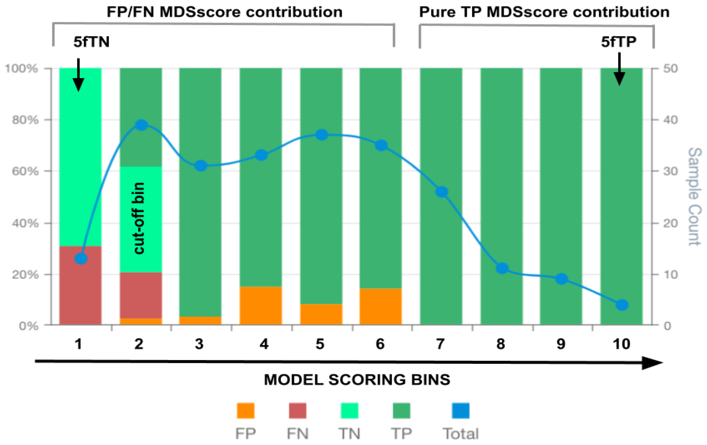
Figure 2.
ROC curves of the generated 9 models for predicting cancer prognostics for each cancer type analysed. (a) Breast cancer prognostic models. (a) Lung cancer prognostic models. (a) Renal cancer prognostic models. Model names are depicted in the figure legends. The dashed red line indicates the ROC threshold of prediction outcome generated by chance, whereas the continuous lines indicate the model ROC behaviour.
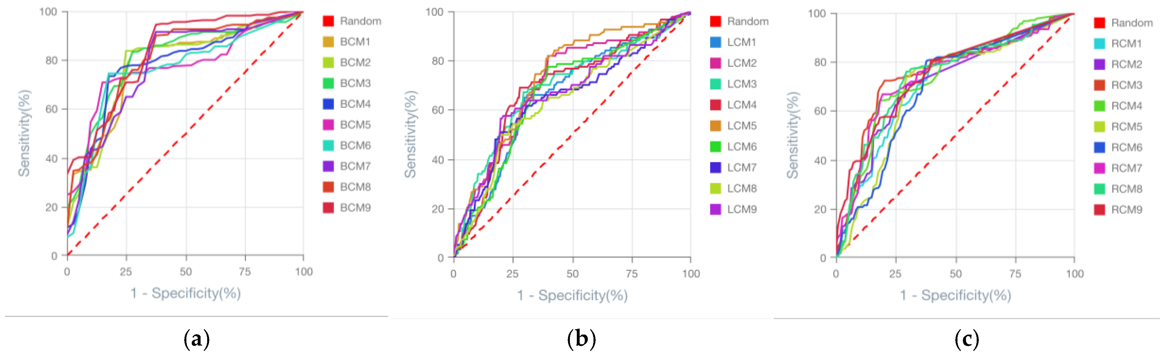
Figure 3.
MSDscores relation with standard performance metrics for model selection. (a) MSDscores as a function of ROC Area-Under-the-Curve (AUC). (b) MSDscores as a function of accuracy. Dots represent the computed performance metrics for all 27 models generated for breast, lung and renal cancer prognostics. Different-coloured dots indicate the data from distinct cancer types, as depicted in the figure legends. The linear regression trendline is shown in dashed lines, and the computed Pearson's correlation coefficients (r) are highlighted in the centre of the figure (a and b) near the trendline.
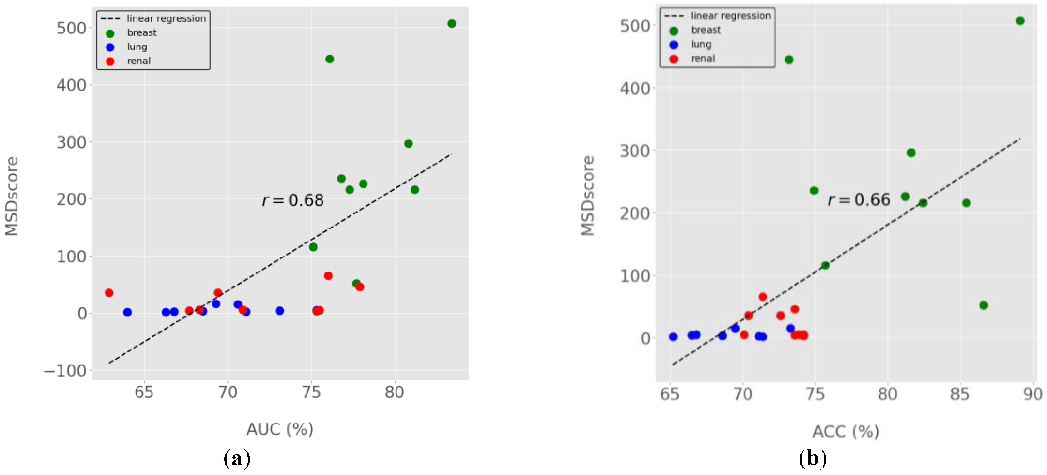
Figure 4.
MSD plot of the bespoke breast cancer prognostic model (BCM9). False positives (FP), false negatives (FN), true positives (TP), true negatives (TN) and total observations (Total) per each score bin are highlighted by different colours, depicted below in the figure legend. The left vertical axis represents the percentages of TP, TN, FP, and FN in each bin score, whereas the right axis represents the total observation counts of each bin. Numerical values shown for each bin represent the end interval of the bin (e.g. 0-19.8, 0.19-39.6, 39.7-59.4, … ).
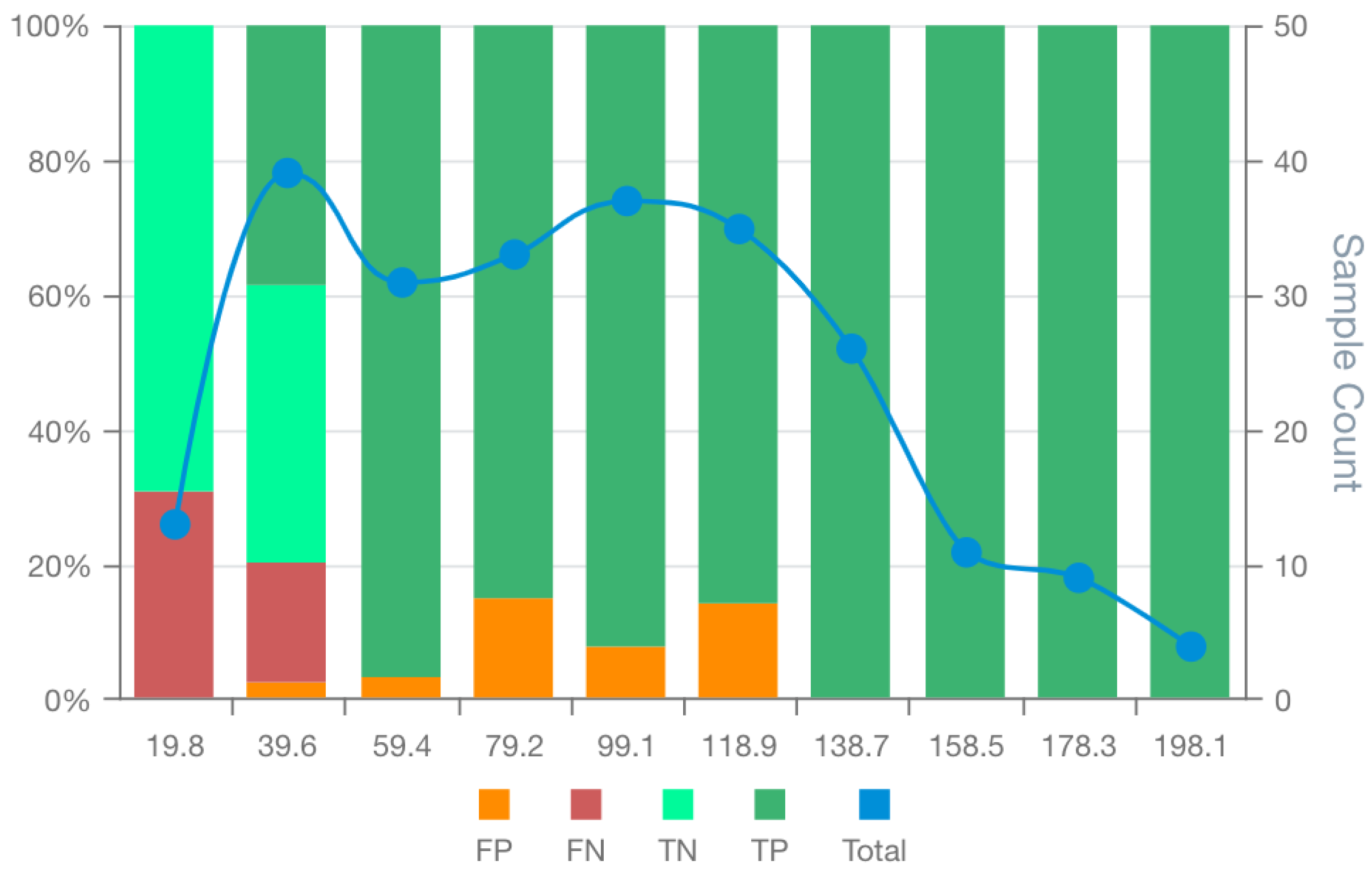
Figure 5.
MSDA plots of the bespoke candidate model for lung cancer prognostics: BCM3 (a) BCM5 (b), and BCM9 (c). False positives (FP), false negatives (FN), true positives (TP), true negatives (TN) and total observations (Total) per each score bin are highlighted by different colours, depicted below in the figure legend. The left vertical axis represents the percentages of TP, TN, FP, and FN in each bin score, whereas the right axis represents the total observation counts of each bin. Numerical values shown for each bin represent the end interval of the bin.
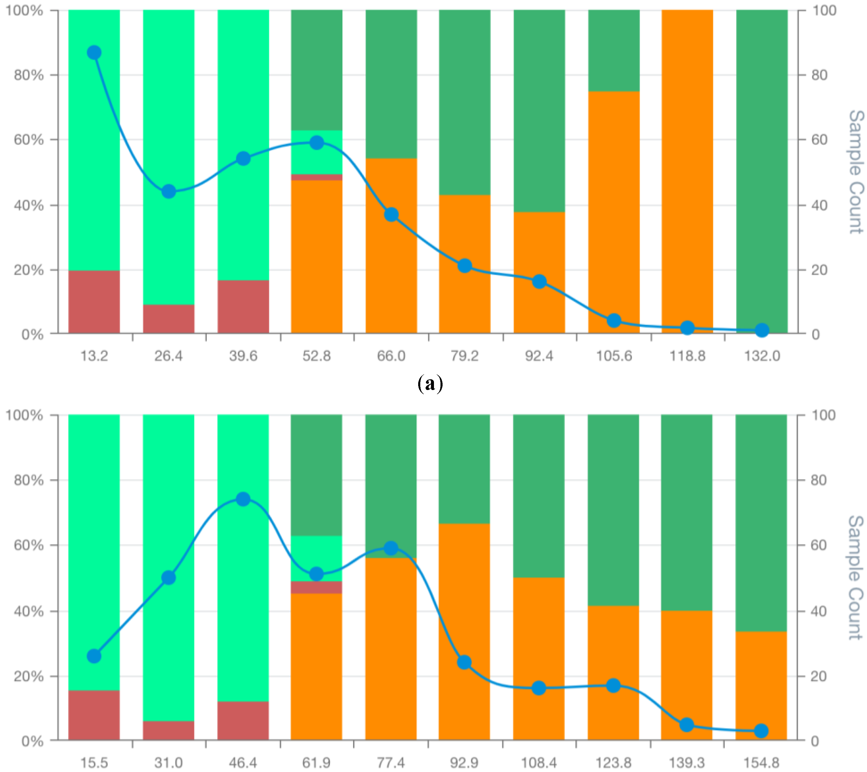
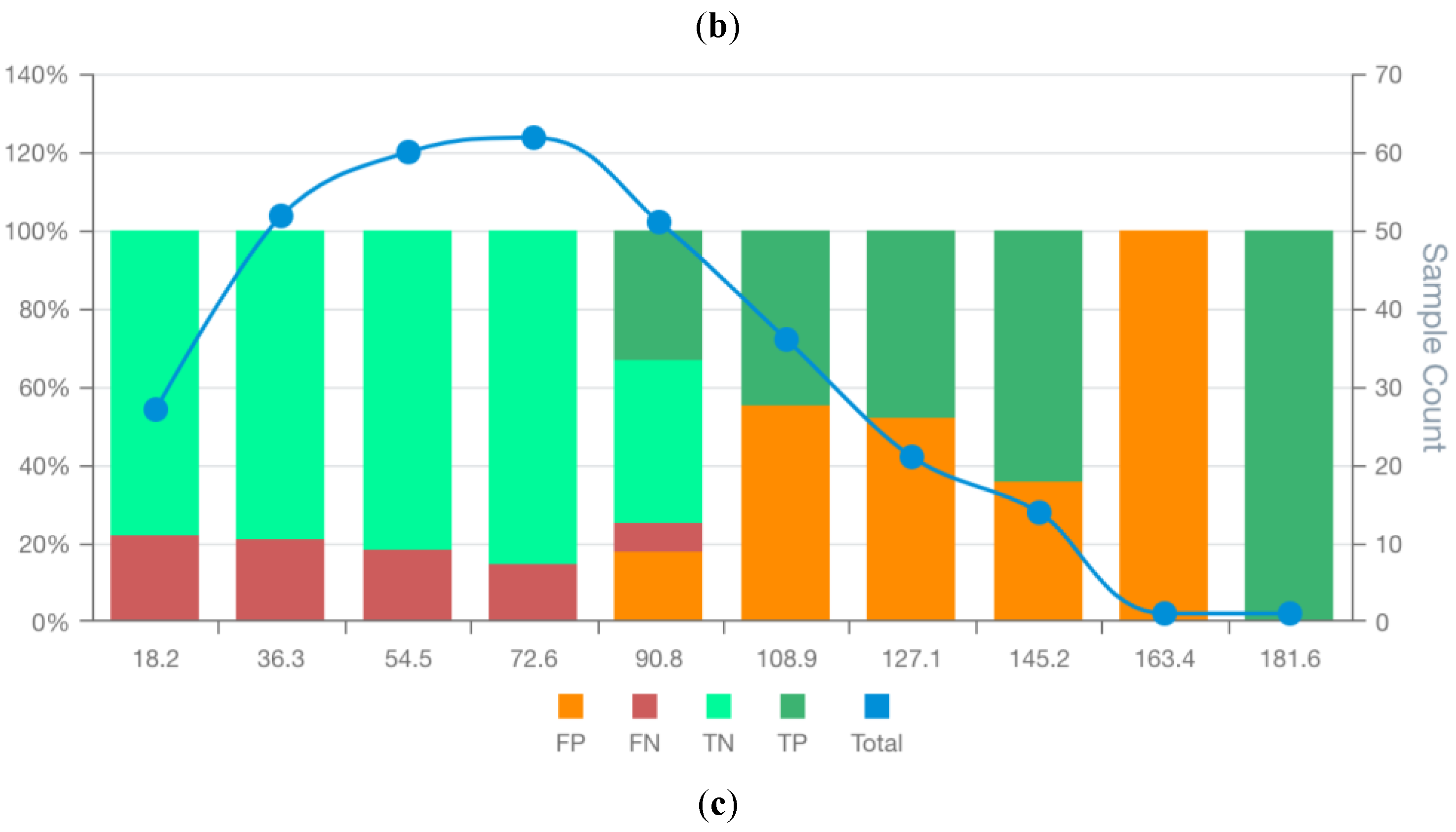
Figure 6.
MSD plots of the bespoke candidate models for lung cancer prognostics: RCM3 (a) BCM6 (b), and BCM7 (c). False positives (FP), false negatives (FN), true positives (TP), true negatives (TN) and total observations (Total) per each score bin are highlighted by different colours, depicted below in the figure legend. The left vertical axis represents the percentages of TP, TN, FP, and FN in each bin score, whereas the right axis represents the total observation counts of each bin. Numerical values shown for each bin represent the end interval of the bin. .
Disclaimer/Publisher’s Note: The statements, opinions and data contained in all publications are solely those of the individual author(s) and contributor(s) and not of MDPI and/or the editor(s). MDPI and/or the editor(s) disclaim responsibility for any injury to people or property resulting from any ideas, methods, instructions or products referred to in the content. |
© 2025 by the authors. Licensee MDPI, Basel, Switzerland. This article is an open access article distributed under the terms and conditions of the Creative Commons Attribution (CC BY) license (http://creativecommons.org/licenses/by/4.0/).
Copyright: This open access article is published under a Creative Commons CC BY 4.0 license, which permit the free download, distribution, and reuse, provided that the author and preprint are cited in any reuse.


