
Submitted:
27 April 2025
Posted:
28 April 2025
You are already at the latest version
Abstract
This study aims to investigate the impact of light color on emotional well-being in snowy landscapes. Through a simulated experiment, 95 participants were tested to compare the effects of six different light colors (yellow, orange, red, green, blue, and purple) on emotional well-being in snow-covered environments, using a snow scene without artificial lighting as the baseline condition. Emotional well-being was assessed using a modified version of the Positive and Blue Affect Schedule (PANAS), focusing on six key emotional dimensions. The results indicate that warm-colored lighting (orange and yellow) significantly enhanced positive emotions, such as pleasure and enjoyment, while cool-colored lighting (green and blue) significantly increased blue emotions, such as anxiety and tension. Notably, purple lighting exhibited a dual effect, simultaneously enhancing positive emotions while also amplifying blue emotions. These findings suggest that the influence of light color on emotional well-being in snowy landscapes is complex and context-dependent. This study provides valuable insights into optimizing urban winter lighting strategies to enhance public emotional well-being through appropriate light color selection.
Keywords:
Snowy landscapes
; Emotional well-being
; Lighting color
1. Introduction
1.1. Two Aspects of Emotional Well-being: Positive and Blue Affect
Emotional Well-being, also referred to as Hedonic Well-being or Experiential Happiness, is a crucial concept for measuring the quality of an individual's daily emotional experiences. It focuses on the frequency and intensity of emotional states encountered in everyday life [1]. This concept is essential for gaining a deeper understanding of people's emotional experiences and overall quality of life, as it encompasses a broad spectrum of emotions, ranging from joy and contentment to anxiety and sadness.
Professor Daniel Kahneman from Princeton University's Center for Health and Well-being, in his pioneering research, categorized Emotional Well-being into two core dimensions: Positive Affect and Blue Affect [2]. Pilar Sanjuán et al. explored managing Emotional Well-being in cardiac patients by regulating both Positive and Blue affect [3]. Positive Affect refers to the pleasure, satisfaction, and happiness an individual experiences while engaging in various activities. It includes expressions such as enjoyment of life, smiling, and laughter. These positive emotional experiences not only enhance immediate happiness but also improve life satisfaction and engagement [2,3]. For instance, studies have shown that smartphone photography can improve Positive Affect as a way to enhance Emotional Well-being [4]. In contrast, Blue Affect includes emotions such as worry, sadness, stress, and anger, which are associated with unpleasant states. These emotions are often linked to challenges, stressors, or adverse situations, potentially leading to a significant decline in an individual's overall quality of life.
To provide a more comprehensive assessment of Emotional Well-being, the Gallup Organization incorporated a detailed evaluation of Positive and Blue Affect in its Gallup-Healthways Well-Being Index (GHWBI). This index quantifies Emotional Well-being by asking respondents about their experiences of various emotional states on the previous day, including joy, enjoyment, happiness, anger, sadness, and stress. This approach not only examines the types of emotions but also considers their frequency and intensity, allowing for a more accurate reflection of short-term emotional fluctuations [5].
The measurement approaches used by Professor Daniel Kahneman and the GHWBI, which assess emotions based on experiences from the previous day, suggest that Emotional Well-being is not evaluated over a period of several months but rather through a shorter time frame. For example, an individual may feel generally satisfied with life in the long term, yet still experience various fluctuations in positive and blue emotions within a single day. These measurement methods indicate that Emotional Well-being is more reflective of short-term emotional changes rather than long-term emotional evaluations [2,5]. Therefore, the assessment of Emotional Well-being provides researchers and practitioners with a more nuanced perspective to understand an individual's emotional state at specific time points. This, in turn, allows for the better design of interventions aimed at enhancing psychological health and improving overall quality of life.
1.2. Natural Landscape: The Impact of Snowy Landscapes on Emotional Well-Being
Compared to human-made cultural artifacts, people tend to exhibit greater emotional and psychological identification with natural landscapes [6]. Studies have explored the therapeutic potential of forest landscapes in treating mental health issues, such as depression, post-traumatic stress disorder (PTSD), and schizophrenia [7,8]. Certain distinctive landscapes have demonstrated significant effects on the physiological and psychological well-being of adolescents, contributing to their recovery and emotional regulation [9]. Natural landscapes have been proven to exert a positive impact on human emotional and psychological well-being [10].
The impact of natural landscapes on Emotional Well-being can also be observed in winter snowy landscapes. Such winter conditions have been shown to positively influence psychological relaxation, similar to the effects of natural landscapes during the growing season, maintaining a beneficial impact on Emotional Well-being [11]. In regions where winter lasts for more than five months, with persistent snow cover, people are exposed to snowy landscapes for extended periods. For example, in Harbin, China, winter extends from mid-October to late April, making outdoor activities during this season particularly important [12]. Evidently, snowy outdoor landscapes play a crucial role in the psychological health of people living in cold regions [13]. Although research in this area remains limited, strong evidence suggests that winter snow-covered landscapes have a positive impact on participants [14]. In some studies, participants expressed a preference for images of snow-covered trees and landscapes [15]. Ernest Bielinis found that viewing winter forest landscapes with snow-covered ground and trees had notable effects on psychological relaxation and recovery among young people in Finland [16].
1.3. The Influence of Surface Color on Emotion
A substantial body of research has demonstrated that color significantly influences human emotions [17]. Many studies have found that, compared to warm colors such as red, orange, and yellow, cool colors like blue, green, and purple are more effective in eliciting positive emotions [18,19,20]. Among these, blue has been identified as the most emotionally uplifting color compared to others [18,20]. Similarly, green has been shown to evoke more positive emotions than warm colors [21]. Some studies have suggested that purple-colored interior surfaces generate more positive feelings than yellow-colored indoor spaces [19]. Furthermore, physiological experiments have indicated that cool-colored surfaces tend to have a calming effect, whereas warm colors (such as red and yellow) exhibit a higher arousal effect.
Although many studies suggest that cool colors have a stronger impact on positive emotions, some research presents contrasting findings. One study indicates that warm-colored background environments can influence positive emotion judgments [22]. Additionally, some studies suggest that warm colors evoke stronger associations with food deliciousness, thereby inducing more positive emotions compared to cool colors [23]. Tantanatewin, W. found that restaurant environments with warm-toned colors are more effective in enhancing consumers' positive emotions [24].
These contradictory findings in color research suggest that the emotional impact of colors is not solely determined by the color itself, but is also influenced by contextual factors, such as application conditions, environmental settings, and cultural backgrounds. Under certain specific conditions, color effects may deviate from previously established trends, leading to opposite outcomes.
1.4. The Influence of Light Color on Positive and Blue Emotions
Previous studies have primarily examined the effects of lighting on emotional responses based on correlated color temperature (CCT) [25]. Low CCT lighting (2700 K to 3000 K) provides warm white illumination with a reddish-yellow appearance, while high CCT lighting (4000 K to 6500 K) produces cool white illumination with a bluish-white appearance. Contrary to studies on surface colors, which generally suggest that cool colors induce greater pleasure and warm colors evoke higher arousal, low-CCT warm white lighting elicits higher pleasure levels than high-CCT cool white lighting. Additionally, cool white lighting is perceived as more stimulating than warm white lighting [26].
In terms of light color, previous research findings have been inconsistent. Minguillón, J. found that blue light can accelerate relaxation after stress through biosignals and standardized procedures [27]. H. Lee [28]conducted an experiment with 82 participants using color-changing LED lighting to examine the effect of lighting color on emotional states and the influence of ethnicity on emotional responses to lighting color. The results indicated that blue was the most pleasant lighting color, eliciting higher pleasure levels than red and purple. Red was the least pleasant lighting color, showing significantly lower pleasure ratings compared to all other lighting colors. Furthermore, Asian participants found red and purple lighting significantly less pleasant than all other colors and reported greater discomfort when exposed to red, orange, and purple lighting compared to Caucasian participants.
However, contrary to these findings, some studies suggest that warm-colored lighting can induce more positive emotions than cool-colored lighting under certain conditions. A study on the effects of lighting color on customer satisfaction perception found that warm-colored lighting, such as yellow and red, produced significantly higher satisfaction levels compared to cool-colored lighting, such as blue and green [29]. Laufer et al. discovered that people felt more active under blue lighting, while red lighting induced greater relaxation [30]. Additionally, Warakul Tantanatewin’s study indicated that warm-colored ambient lighting significantly influenced spatial impressions and retail identity perception [31].
In summary, our findings suggest that snowy landscapes and light color each influence both the positive and blue aspects of Emotional Well-being. The impact of surface color and light color on emotional responses can vary significantly depending on application contexts and cultural differences. However, there is limited research on how different light colors projected onto snowy landscapes affect Emotional Well-being. For individuals living in regions where winter lasts for more than five months, prolonged exposure to snowy environments is an essential part of their daily lives. Understanding these effects is therefore an important area of study that warrants further exploration.
1.5. Research Questions and Hypotheses
This study investigates the impact of different light colors on Emotional Well-being in snowy landscapes by simulating natural winter evening lighting conditions. The research examines two aspects of Emotional Well-being: Positive and Blue Affect. The baseline for Emotional Well-being is established using a snowy landscape without artificial lighting (S0), against which the effects of six different light colors—red (S3), orange (S2), yellow (S1), green (S4), blue (S5), and purple (S6)—are analyzed. Based on H. Lee’s [28] findings on the influence of light color on emotions and a review of previous literature, we propose the following hypotheses:
H1:
Compared to the baseline condition (S0) without artificial lighting, different light color conditions will have a significant effect on positive emotions, with blue lighting (S5) having the most pronounced positive effect.
H2:
Compared to the baseline condition (S0) without artificial lighting, different light color conditions will have a significant effect on blue emotions, with red lighting (S3) having the most pronounced negative effect.
H3:
Certain light color conditions will exhibit a dual effect on Emotional Well-being, meaning that some lighting sceness may simultaneously enhance or suppress positive emotions while also increasing or reducing blue emotions.
2. Materials and Methods
2.1. Experimental Procedures
The primary objective of this study is to explore the impact of light color in snowy landscape settings on Emotional Well-being. This is achieved through a simulated experiment, where a projector is used in a completely dark laboratory with no ambient lighting to display the same snowy landscape image under different light colors to 95 participants. One advantage of the simulation method is its ability to rapidly switch between different warm and cool lighting conditions within the same snowy scene. Additionally, the controlled indoor environment ensures a comfortable temperature, free from the influence of cold outdoor weather or other external variables, facilitating the accurate collection of experimental data for the study.
The experiment included seven different scenes, consisting of one without artificial lighting (S0) and six color lighting conditions, namely yellow light (S1), orange light (S2), red light (S3), green light (S4), blue light (S5), and purple light (S6). The S0 scene, which lacked artificial lighting, served as the baseline to assess the impact of light color on the positive and blue aspects of Emotional Well-being in a snowy landscape (Figure 1). The experiment was conducted in a completely dark room without ambient light, where stimuli were displayed on a screen via a projector at a resolution of 2560×2048 pixels. Participants (n=95) were seated approximately 200 cm from the projector in a temperature-controlled room (21°C). Before the experiment, they underwent a 2-minute dark adaptation period. Participants first viewed the S0 natural light condition, which served as the baseline without lighting intervention, for 3 minutes. During this exposure, they were instructed to imagine themselves within the scene. After exposure, they were required to complete an emotional questionnaire, after which the projector was dimmed for a 1-minute break. Following Daniel Kahneman’s dimensions for measuring Emotional Well-being, we adapted the Positive and Negative Affect Schedule (PANAS) to assess two aspects of Emotional Well-being: Positive and Blue Affect. Participants were asked to rate their emotional response to each scene immediately after viewing it. The rating scale ranged from 0 ("Not at all") to 5 ("Very much") on a five-point Likert scale [32]. The experimental setup is depicted in Figure 2 and Figure 3.
Next, participants were exposed to the light scenes (S1-S6). To eliminate order effects, each scene was presented in a random sequence. Each scene was displayed for 3 minutes, during which participants were instructed to imagine themselves within the depicted environment. After the exposure to each scene, participants completed the PANAS questionnaire to assess their emotional response. They were then given a 1-minute break before proceeding to the next scene. Once all scenes had been displayed and all PANAS questionnaires had been completed, participants were given another 1-minute break. Following this, all previously displayed scenes (S0-S6), including the baseline non-artificial light scene (S0), were randomly replayed. Participants were informed that they could revise their previous ratings for each scene if they wished.
2.2. Experiment Settings
To provide participants with a realistic experience of snowy landscapes and the illumination effects of different light colors, while minimizing external experimental interferences, this study employed a composite approach that combined real photographs with computer-generated lighting effects to create the experimental stimuli. The real, non-artificially illuminated snowy landscape image was used as the original scene (S0). Based on this image, a 3D model of the scene and lighting effects was created to simulate the interaction between light color and the snowy environment. Six illuminated images were then rendered to represent the six different light color conditions. Finally, these six artificially illuminated images were composited with the original S0 image, resulting in the final six lighted snowy landscape scenes (S1-S6). This approach ensured a more accurate simulation of lighting conditions while providing participants with a more immersive and realistic experimental environment.
2.2.1. Creation of the Non-Artificial Light Scene (S0) and Lighted Scenes (S1-S6)
Due to the absence of natural snow in Harbin during the research period (October 2024), this study selected a public domain snowy landscape image from the StockCake (https://stockcake.com/i/winter-evening-glow_182779_31561) website as the base material for constructing the non-artificial lighting scene (S0). The selected image exhibited visual characteristics highly similar to the typical winter landscapes of Harbin. Its spatial composition resembled that of ice and snow-themed city parks, and the lamp post design, featuring a columnar structure with geometric-patterned shades, reflected the common stylistic elements of Harbin's public landscape lighting fixtures. The main visual focus of the image was on naturally snow-covered areas, effectively avoiding artificial elements, such as buildings and non-neutral colors. A visual assessment by ten local residents confirmed that the selected image aligned well with Harbin's winter visual perception patterns. Since daylight has minimal impact on outdoor lighting conditions, and to enhance experimental effectiveness, the image’s original lighting effects were removed using Adobe Photoshop 2020, and the brightness was adjusted to simulate a non-artificial lighting condition at dusk. The adjusted image was then evaluated by professional photographers, who verified that its brightness corresponded to the visual conditions of 5:00 PM during a Harbin winter evening (Figure 4), resulting in the finalized non-artificial lighting scene (S0).
The non-artificial lighting scene S0 was imported into the camera view of Autodesk Maya 2020 to align the original image with the 3D model, and to build the scene’s 3D geometry and lighting setup (Figure 5). Lighting models were created to simulate light sources, and scene models were constructed to receive the illumination of different lighting colors. While fine modeling details were not required, the position and scale of the models needed to strictly match the original image as viewed through the Maya camera, in order to ensure that the rendered lighting images could be accurately and seamlessly composited with the original image.
2.2.2. Color and Brightness Selection
The light colors were selected according to the International Commission on Illumination (CIE) sRGB color standards [33]. The CIE Standard Colorimetric Observers mathematical model defines the relationship between the sRGB color space and the CIE 1931 XYZ color space (Figure 6). The Arnold renderer in Autodesk Maya was set to sRGB color space mode, and the RGB values for the lights were assigned based on CIE’s sRGB color standards as follows: Yellow light (RGB: 255, 255, 0), Orange light (RGB: 255, 128, 0), Red light (RGB: 255, 0, 0), Green light (RGB: 0, 255, 0), Blue light (RGB: 0, 0, 255), Purple light(RGB: 128, 0, 128).
According to the International Commission on Illumination (CIE) 150:2017 standards for maximum luminous flux in different environmental zones (E0-E4) [34] and the recommended luminous flux range for decorative lighting [35] , the final luminous flux was set to 700 lm after software-based adjustments. Based on the color and brightness of each light, six illuminated scenes were rendered. The output resolution of these scenes was kept identical to that of the original non-artificially illuminated snowy landscape, ensuring that all positional information remained consistent when compositing the images (Figure 7).
2.2.3. Composite Scenes
The six light-colored illumination images rendered in 3D software were used as lighting layers and composited with the non-artificial lighting scene (S0) in Adobe Photoshop 2020. This process generated the snowy landscape scenes with lighting effects (S1-S6). During the composition process, final adjustments and refinements were made to ensure seamless integration of lighting effects (Figure 8). The final output consisted of seven scenes (S0-S6), as illustrated in Figure 1.
2.3. Participant Demographic Information
This study was a voluntary experimental study, and all participants provided written informed consent. A total of 95 participants were recruited in Harbin, Heilongjiang Province, China, with demographic information presented in Table 1. According to the MEQ questionnaire, all participants had normal or corrected-to-normal vision and passed the color blindness test, ensuring no visual impairments. The entire survey was conducted over a two-week period. Additionally, participants completed a pre-GHO questionnaire, which indicated that they were in good health, with no neurological, cardiovascular, autoimmune, or pulmonary diseases. None of the participants had a history of alcohol or substance abuse, and they had not consumed alcohol or taken sleep-affecting medications in the week prior to testing. Furthermore, they had obtained adequate and high-quality sleep in the days leading up to the experiment.
2.4. Emotional Well-being Measurements Questionnaire
According to Daniel Kahneman [2], who measured the two aspects of Emotional Well-being, Positive Affect and Blue Affect (NA), this study used the Positive and Negative Affect Schedule (PANAS) as the fundamental measurement tool for positive and blue emotions [36]. The PANAS scale is widely used to measure positive and blue emotions, with 10 dimensions for Positive Affect and 10 dimensions for Blue Affect, covering almost all dimensions of Emotional Well-being measurement [37]. The only dimension missing from PANAS is laughter, which can be substituted using an equivalent replacement method [38]. By comparing the Positive and Blue Affect dimensions of the PANAS scale with the Emotional Well-being dimensions, the dimensions that were less relevant to Emotional Well-being were removed, leaving six dimensions. Given the characteristics of this experiment, participants viewing snowy landscapes were unlikely to experience certain specific emotions such as frequent smiling, laughter, and sadness. Therefore, the dimensions of frequent smiling and laughter and sadness were removed and replaced with Pleasant and Nervous. The final Positive Affect dimensions were Relaxed, Pleasant, and Enjoyment, while the Blue Affect dimensions were Worry, Nervous, and Stress, resulting in a total of six dimensions, as shown in Table 2. To avoid potential language bias, a glossary page was provided to explain key terms in the questionnaire (e.g., "Enjoyment"). Participants were informed about the entire experiment, setup, and questionnaire. The questionnaire was divided into several sections, including demographic information, informed consent, and the main experimental task. Cronbach's Alpha was used to test the consistency and reliability of the questionnaire.
2.5. Analysis of Experimental Data
2.5.1. Preliminary Testing
Data analysis was conducted using IBM SPSS Statistics 27 in the macOS 15.0.1 environment. First, a reliability test was performed to assess the stability and consistency of the emotional measurement tool, using Cronbach’s Alpha coefficient to evaluate the internal consistency of each scale. When the Cronbach’s Alpha coefficient reaches a certain threshold, it indicates that the scale has good reliability and can be used for further analysis. If the reliability result falls below this standard, the questionnaire or scale must be reassessed for its applicability.
Therefore, a descriptive statistical analysis was conducted to calculate the mean and standard deviation (SD) for each emotional dimension under different lighting conditions (S0-S6) to preliminarily understand the distribution characteristics of the data. To ensure that the data met the assumptions required for inferential statistical analysis, the Shapiro-Wilk test was used to assess normality. If the data followed a normal distribution, a paired-sample t-test was conducted. If the assumption of normality was not met, the Wilcoxon signed-rank test was used instead.
2.5.2. Two-Way Analysis of Variance (Two-Way ANOVA)
To investigate the impact of different light colors (S1-S6) on emotional dimensions and the interaction effect between light color and emotional dimensions, a Two-Way ANOVA was conducted. The dependent variable was emotional score, and the independent variables included lighting conditions (S0-S6) and emotional dimensions.
2.5.3. Effect Size Calculation
To quantify the actual impact of main effects and interaction effects, effect size was calculated, using partial eta-squared () as the measurement index. The classification criteria for effect size are as follows: 0.01 indicates a small effect, 0.06 indicates a medium effect, 0.14 or higher indicates a large effect [39].
The calculation formula for is as follows:
: The source of variation for a specific main effect or interaction effect.
: The total source of variation, including the specific main effect or interaction effect and the error variance.
The effect size results are used to further interpret the interaction strength between lighting conditions and emotional dimensions and serve as a reference for subsequent paired-sample t-tests.
2.5.4. Paired-Sample t-Test
Based on Two-Way ANOVA, a Paired Sample t-test was performed to further examine the differences in emotional scores between the baseline scene (S0) and the other lighting conditions (S1-S6). The prerequisite for conducting the paired-sample t-test is that the data meet the assumption of normality. If this assumption is violated, the non-parametric Wilcoxon signed-rank test is used instead. The results of the paired-sample t-test were used to determine the statistical significance of emotional score differences between the baseline scene (S0) and different lighting scenes, providing precise statistical support for hypothesis verification (Figure 9).
3. Results
3.1. Warm-Colored Lighting Significantly Enhances Pleasant and Enjoyment
This study first conducted a descriptive statistical analysis on the emotional scores for each scene (S0-S6) and emotional dimension (Pleasant, Enjoyment, Relaxed, Worry, Nervous, Stress), presented using Mean and SD. The descriptive statistical results for emotional scores under different lighting conditions (S0-S6) are shown in Table 2. In the baseline scene (S0) without artificial lighting, Relaxed had the highest mean score (3.38±1.21), while Pleasant and Enjoyment had relatively lower mean scores (1.80±0.71 and 1.34±0.48, respectively). This indicates that even in low-light evening conditions, natural landscapes still contribute to positive emotions. Among the lighting conditions, the orange light scene (S2) had the highest scores in Pleasant and Enjoyment, whereas green light (S4) and blue light (S5) had higher scores in Worry and Nervousness.
3.2. Lighting Conditions and Emotional Dimensions Both Significantly Influence Emotional Scores and Exhibit Strong Interaction Effects
The results of the Two-Way ANOVA showed that both lighting conditions (S1-S6) (F=54.478, p<0.001) and emotional dimensions (F=165.348, p<0.001) had significant main effects on emotional scores. Additionally, a significant interaction effect was found between lighting conditions (S1-S6) and emotional dimensions (F=141.411, p<0.001), indicating that the effects of different lighting conditions varied across emotional dimensions. The R-squared value of the model was 0.579, and the adjusted R-squared value was 0.574, suggesting that the model explained 57.4% of the variance in emotional scores. The results showed that orange lighting (S2) exhibited the highest mean scores in the positive emotion dimensions of pleasantness and enjoyment, while green (S4), blue (S5), and purple (S6) lighting received relatively higher scores in the blue emotion dimensions of worry and nervousness. Red lighting (S3) significantly outperformed the baseline scene (S0) in terms of pleasantness, but showed slightly lower performance in relaxation and certain aspects of blue emotions (Figure 10).
Figure 11 further illustrates the specific variation trends of each lighting condition across positive and blue emotional dimensions. In the positive emotional dimensions (pleasantness, enjoyment, relaxation), orange lighting (S2) significantly enhanced pleasantness and enjoyment, while red lighting (S3) also showed a notable increase in pleasantness, though its effect on relaxation was relatively lower. In contrast, green (S4), blue (S5), and purple (S6) lighting generally received lower scores in positive emotions compared to the baseline scene (S0). In the blue emotional dimensions (worry, nervousness, stress), green (S4), blue (S5), and purple (S6) lighting significantly increased worry and nervousness, whereas the baseline scene (S0) showed relatively lower scores in blue emotions.
3.3. Both Emotional Dimensions and the Scene-Emotion Interaction Effect Reached a Large Effect Size
To evaluate the actual impact of the main effects and interaction effects in the Two-Way ANOVA, this study calculated Partial Eta Squared () as a measure of effect size. The effect sizes for lighting conditions (Scenes S0-S6), emotional dimensions, and their interaction effects were determined using the following formula:
Scene:
Emotional Dimensions:
Scene Emotional Dimensions:
The main and interaction effects analysis results are presented in Table 3:
Main Effect of Lighting Conditions: The overall impact of lighting scenes (S1-S6) on emotional scores reached a moderate effect size (F=54.478, p<0.001,=0.077), indicating that different lighting colors exert a statistically significant influence on emotional responses. Specifically, orange light (S2) showed outstanding performance in positive emotions (pleasantness, enjoyment), whereas green light (S4) and blue light (S5) significantly amplified blue emotions (worry, nervousness) (see Table 2).
Main Effect of Emotional Dimensions: The contribution of emotional dimensions to score differences reached a large effect size (F=165.348, p<0.001,=0.173), suggesting a clear differentiation between types of emotions (e.g., pleasantness vs. worry). Scores for positive emotions (pleasantness, enjoyment, relaxation) were generally higher than those for blue emotions (worry, nervousness, stress).
Scene-Emotion Interaction Effect: Scene×Emotional Dimension was statistically significant (F=141.411, p<0.001,=0.518), indicating that different lighting conditions exert differential effects across emotional dimensions. For instance, orange light (S2) significantly enhanced pleasantness, but showed no notable improvement in relaxation. In contrast, green light (S4) exhibited a strong negative impact on worry (Figure 10).
3.4. Comparison of Emotional Responses Between Baseline Scene (S0) and Each Lighting Condition
Based on the Two-Way ANOVA results, the lighting conditions (S1-S6) and emotional dimensions exhibited significant main effects and interaction effects (p<0.05). To further explore the specific differences between the baseline scene (S0) without artificial lighting and the other lighting conditions (S1-S6), a paired-sample t-test was conducted for detailed comparisons.
3.4.1. Comparison of Positive Emotions Between Baseline Scene (S0) and Each Lighting Condition
- Pleasant:
Compared to S0, yellow light (S1: t=32.962, p<0.001, d=3.382), orange light (S2: t=23.912, p<0.001, d=2.453), and red light (S3: t=7.879, p<0.001, d=0.808) significantly enhanced pleasant. In contrast, green light (S4: t=-6.389, p<0.001, d=-0.656) and purple light (S6: t=-3.668, p<0.001, d=-0.376) were significantly lower than the baseline scene (S0), blue light (S5: t=0.815, p=0.417, d=0.084) did not have a significant effect on pleasantness (Figure 12).
- 2.
- Enjoyment:
Orange lighting (S2: t=43.129, p<0.001, d=4.425) produced the largest effect size and the most significant enhancement in enjoyment. It was followed by yellow lighting (S1: t=25.898, p<0.001, d=2.657), red lighting (S3: t=20.448, p<0.001, d=2.098), and purple lighting (S6: t=15.105, p<0.001, d=1.550). Blue lighting (S5: t=7.019, p<0.001, d=0.720) also significantly enhanced enjoyment, though the effect size was moderate. In contrast, green lighting (S4: t=3.019, p=0.003, d=0.310) had the smallest effect size (Figure 13).
- 3.
- Relaxed:
Orange lighting (S2: t=5.473, p<0.001, d=0.562) significantly increased relaxation compared to the baseline scene (S0). In contrast, red lighting (S3: t=-15.063, p<0.001, d=-1.545), blue lighting (S5: t=-7.666, p<0.001, d=-0.786), and purple lighting (S6: t=-17.834, p<0.001, d=-1.830) significantly reduced relaxation. Yellow lighting (S1: t=-1.736, p=0.086, d=-1.205) did not reach statistical significance in its effect on relaxation (Figure 14).
3.4.2. Comparison of Blue Emotions Between Baseline Scene (S0) and Each Lighting Condition
- Worry:
Compared to S0, green lighting (S4: t=6.749, p<0.001, d=0.692), blue lighting (S5: t=11.663, p<0.001, d=1.197), and purple lighting (S6: t=13.775, p<0.001, d=1.413) significantly increased worry (Figure 15). In contrast, orange lighting (S2: t=-10.079, p<0.001, d=-1.034) significantly reduced worry. Yellow lighting (S1) and red lighting (S3) did not show statistically significant effects on worry (p > 0.005).
- 2.
- Nervous:
Green lighting (S4: t=11.098, p<0.001, d=1.139), blue lighting (S5: t=2.401, p=0.018, d=0.246), and purple lighting (S6: t=8.456, p<0.001, d=0.868) all significantly increased nervousness. In contrast, orange lighting (S2: t=-6.969, p<0.001, d=-0.715) and red lighting (S3: t=-4.443, p<0.001, d=-0.456) significantly reduced nervousness. Yellow lighting (S1: t=-1.843, p=0.068, d=-0.189) showed no statistically significant effect on nervousness (Figure 16).
- 3.
- Stress:
Green lighting (S4: t=14.906, p<0.001, d=1.529) and purple lighting (S6: t=10.346, p<0.001, d=1.061) significantly increased stress. In contrast, yellow lighting (S1: t=0.000, p=1.000, d=0.000), orange lighting (S2: t=-0.791, p=0.431, d=-0.081), red lighting (S3: t=0.112, p=0.911, d=0.011), and blue lighting (S5: t=1.282, p=0.203, d=0.132) all showed no statistically significant effect on stress (Figure 17).
3.4.3. Summary
The results of the paired-sample t-test indicate that, compared to the no-lighting scene (S0), orange light (S2) showed the most significant enhancement in positive emotions, including pleasantness, enjoyment, and relaxation. In contrast, green (S4), blue (S5), and purple (S6) lighting produced significantly higher levels of blue emotions, such as worry, nervousness, and stress, relative to the baseline condition. Notably, purple lighting (S6) exhibited a clear dual effect: it significantly increased enjoyment (d=1.550), while simultaneously intensifying worry (d=1.413), nervousness (d=0.868), and stress (d=1.061). These findings provide statistical support for Hypotheses H1, H2, and H3, and further reveal the complex and differentiated emotional effects of various lighting colors.
4. Discussion
4.1. The Impact of Surface Color in the No Artificial Lighting Scene (S0) on Emotional Well-Being
The no artificial lighting scene (S0) had a significant effect on enhancing relaxation, indicating that even under dim evening light conditions, the natural color tones of the snowy landscape still contributed positively to Emotional Well-being. Numerous studies suggest that natural landscapes possess a "restorative" quality, promoting psychological relaxation and attentional recovery [6,7,8,9,10,11]. In winter environments, particularly in snow-covered landscapes, the diffuse reflection of light from snow-covered vegetation and ground surfaces creates a sense of tranquility and purity. This is often associated with reduced noise interference and minimal visual distractions, which can have a positive impact on specific dimensions of positive emotions, such as relaxation and comfort. Even in low-illuminance evening or nighttime conditions, the "brightness" and "purity" of snow-covered landscapes may still visually construct a unique atmospheric environment, allowing participants to experience a "beauty of silence" and achieve partial physiological and psychological relief. The minimalist visual environment helps reduce excess visual information, creating an effect similar to "subtractive design", which facilitates relaxation and contemplation. The snow-covered surface in S0, influenced by reflected light from the deep blue evening sky, appeared deep blue in color. The enhanced relaxation effect observed in S0 aligns with prior research findings that blue tones tend to increase relaxation in Emotional Well-being studies [18,20]. This suggests that blue may be one of the key factors contributing to the positive impact of snowy landscapes on Emotional Well-being.
However, this "deep blue" or "dim" natural snowy landscape scene also has its limitations. Due to the low solar altitude during the evening period, the sky appears more blue or grayish-blue, casting large shadow areas on the snow-covered surface. This results in an overall visual environment that may be perceived as "slightly dim and cold". On the one hand, for individuals with rich winter life experience, such a snowy landscape might evoke a "familiar and slightly relaxing" state. On the other hand, for those unfamiliar with cold climates or lacking outdoor winter experience, the dim environment could trigger a certain degree of safety concerns or feelings of loneliness. As a result, in this study, blue emotions such as worry and nervous in S0 were not entirely absent, but instead remained at a relatively mild level compared to other lighting conditions. This indicates that the "deep blue" atmosphere of the natural environment alone cannot completely eliminate the psychological unease that humans may experience during winter nights.
At the design and planning level, this finding suggests that urban winter outdoor spaces do not necessarily require large-scale artificial lighting coverage for snowy landscapes. Instead, it may be beneficial to retain some of the original shadows or dim environments, allowing people to experience the pure natural beauty of snow and thereby achieve a certain level of relaxation and enjoyment. However, to balance safety and comfort, moderate lighting supplementation should be considered for high-footfall areas or key transportation nodes, ensuring that pedestrians can appreciate the beauty of snow without artificial lighting while avoiding the fear or anxiety that deep darkness might induce at night. In other words, combining a naturally dim environment with a few warm-colored point light sources or using localized artistic light projections could enhance positive emotions while effectively mitigating blue emotions.
4.2. The Impact of Light Color on Positive Emotions in Emotional Well-being
Compared to S0, yellow (S1) and orange (S2) lighting conditions significantly enhanced positive emotions, particularly in terms of pleasantness and enjoyment. This finding aligns with the first part of Hypothesis H1, but contradicts the hypothesis that blue lighting (S5) would have the most significant positive impact on emotions (Figure 18). Among all lighting conditions, orange light (S2) exhibited the most prominent effect in enhancing pleasantness and enjoyment, emphasizing the role of warm-colored lighting in promoting positive emotions in snowy landscapes [29]. However, this result differs from H. Lee’s study [28], which found blue light to be the most pleasant. This difference may stem from two factors: H. Lee’s experiment involved a pure light color environment, whereas in this study, S0 (the snow surface reflecting the sky color) combined with the lighting colors to form the experimental scenes. In this case, the snow surface in S0 reflected the blue sky, making the S0 scene appear deep blue, while S1-S6 were created by overlaying the lighting colors onto the blue-tinted snow surface of S0, making them different from H. Lee’s single-color experimental conditions.The snowy landscape itself has a naturally blue undertone, so when blue light is added, the cool color tones are further intensified, which in turn reduces positive emotions. Additionally, cultural differences and long-term environmental adaptation may also contribute to this difference. In northeastern regions, winters are harsh and prolonged, and blue lighting may have a stronger psychological association with "coldness" and "gloominess". As a result, it fails to induce the same relaxation or enjoyment effects as it might in purely indoor environments.
Additionally, to make the light colors more pronounced, this experiment selected an evening outdoor snowy landscape as the baseline scene (S0). The purpose of this was to enhance the visibility of the light colors, but it also resulted in a darker background, which induced certain blue emotions in participants. For example, a dimly lit environment can evoke feelings of worry, as reflected in Figure 11, where S0 showed a notable level of "Worry" emotion. When warm-colored lighting was added to the cool and dim evening snow scene, it created a strong contrast and visual impact, leading to a psychological perception of warmth and comfort. Among warm colors, orange is widely recognized in color psychology as the warmest color [40], often associated with high-arousal imagery such as sunlight and fire. Additionally, as the complementary color of blue, orange may have helped reduce the fear-inducing effects of the dark blue background in S0, making it the most effective color in enhancing positive emotions in this study. This finding aligns with previous research indicating that warm colors, compared to cool colors, significantly enhance positive emotions in certain environmental contexts [29,31]. Similarly, yellow (S1), as the second warmest color after orange, significantly enhanced positive emotions compared to S0 (no artificial lighting), but its effect was slightly lower than that of S2 (orange light), reinforcing this possibility. It is important to note that cultural differences influence the interpretation of yellow. For instance, in East Asian cultures, yellow is often associated with "nobility" and "warmth", whereas in some Western contexts, it can symbolize "caution" or "danger". However, based on the quantitative results of this study, yellow lighting in a winter snow landscape still tended to evoke positive emotions.
This finding has important implications for urban lighting design practices, highlighting the significance of the interaction between background color and lighting color. In winter urban environments, well-planned lighting design can play a crucial role in enhancing citizens' Emotional Well-being. For example, if the goal is to enhance positive emotions in cold outdoor environments, warm-colored lighting is generally more effective than cool-colored lighting. However, this does not mean that cool-colored lighting is ineffective in all contexts. For instance, blue or green lighting in summer nights or water landscapes may evoke positive perceptions of coolness and tranquility. Therefore, lighting design should take into account spatial environments, seasonal characteristics, and the psychological expectations of the target audience, allowing for flexible selection and combination of lighting colors to create an optimal emotional impact.
4.3. The Impact of Light Color on Blue Emotions in Emotional Well-being
Compared to the baseline scene (S0), green light (S4) and blue light (S5) significantly increased worry, nervousness, and stress, which aligns with H2 but contradicts the hypothesis that red light (S3) would have the most significant impact on blue emotions (Figure 19). Among them, green light (S4) had the most pronounced effect on worry (Worry) and nervousness (Nervous). This finding contradicts H. Lee's study [28], which suggested that cool-colored lighting, such as green and blue, has a lesser impact on blue emotions. While previous research has indicated that green light in indoor settings or natural vegetation backgrounds can induce relaxation and a sense of security, in the deep blue snowy landscape simulated in this study, the overlay of green light onto the background color may have resulted in an overall perception of "gloominess," "coldness," or "dullness," thereby amplifying blue emotions. This phenomenon also suggests that the emotional impact of color is highly context-dependent, influenced by background, brightness, cultural expectations, and personal experiences. Therefore, it is inappropriate to make absolute statements about a particular color being inherently positive or blue.
S4 and S5 were created by combining the deep blue surface color of S0 (which reflects the evening sky) with green and blue lighting, respectively, as shown in Figures 1, 7, and 8. As explained earlier in Section 4.2, S0, representing an evening scene, had a dark background (deep blue), which induced some level of worry in participants due to its dim atmosphere. When S4 (green light) and S5 (blue light) were applied to S0, the cold color tones became even more pronounced, potentially amplifying blue emotions. When blue light is used in outdoor nighttime environments, especially against a deep blue winter snow background, it may further trigger associations with "coldness," "emptiness," and "distance." This association could have an exacerbating effect for individuals at risk of seasonal affective disorder or those under high psychological stress. Research by Warakul Tantanatewin et al. [31] on retail spaces also suggests that cool-colored lighting enhances negative environmental perceptions, creating a sense of "alienation", which aligns with the findings of this study. However, for specific events aiming to highlight the "coolness" or "technological aesthetics" of ice and snow, such as ice sculpture exhibitions or festive celebrations, this effect may not be problematic and could even be seen as a stimulating and creative expression.
This finding offers important implications for urban lighting design practice, particularly in winter urban environments, where appropriate lighting strategies can help prevent the deterioration of citizens' Emotional Well-being. In spaces that require a sense of comfort and safety—such as residential neighborhoods, primary pedestrian commuting routes, and elderly communities—the extensive use of cool-colored lighting should be approached with caution. Such lighting may inadvertently heighten residents’ feelings of tension and worry, even if not immediately apparent. For nighttime economic activities or cultural events, blue-green tones are sometimes viewed as symbols of elegance or calmness, and are often applied in museums or artistic corridors using low-intensity lighting to create a mysterious atmosphere. However, in the absence of clear safety indicators or adequate visual supplementation from the surrounding environment, such lighting conditions may induce excessive blue emotional responses. When cool-colored lighting is necessary for specific design goals (e.g., emphasizing an artistic ambiance or brand identity), it is advisable to incorporate supportive elements such as localized warm-colored fill lighting, moderate increases in ambient brightness, or the addition of vegetation and decorative objects. These strategies can help alleviate perceptions of excessive coldness or darkness, and thereby reduce the risk of inducing blue emotions in public users.
4.4. The Dual Emotional Effect of Lighting
The purple lighting condition (S6) in this study exhibited a dual effect: on the one hand, it significantly increased enjoyment, while on the other, it notably heightened worry, nervousness, and stress, demonstrating a clear "simultaneous enhancement of both positive and blue emotions" effect, as shown in Figure 12, Figure 13, Figure 14, Figure 15, Figure 16 and Figure 17. This finding supports Hypothesis H3, which suggests that certain lighting colors may enhance positive emotions while also amplifying blue emotions. In color psychology, purple is often considered a color of duality, associated with "romance, mystery, and nobility" as well as "gloominess and nervousness." Its wavelength spectrum lies between the red and blue ends of the visible light spectrum, potentially combining the arousing qualities of red with the cool, detached qualities of blue, leading to differentiated emotional arousal responses. In an evening snow landscape with a bluish background, purple light overlays onto the deep blue environment, creating a "hazy and profound" visual effect. This combination may draw attention while also making the environment more difficult to perceive, increasing the sense of ambiguity and spatial uncertainty. If an individual experiences reduced control over their surroundings, they may be more prone to feelings of nervousness and worry.
Some lighting colors, such as orange (S2), significantly enhanced positive emotions while having little impact on blue emotions, whereas others, like purple (S6), exhibited a dual effect—increasing both positive and blue emotions. This dual effect suggests that lighting color is not merely a catalyst for emotions, but that its impact is influenced by multiple factors, including individual psychological associations with colors and the environmental background. From a neurophysiological perspective, purple is considered a high-arousal color in certain cultural contexts, potentially triggering physiological responses such as increased heart rate or greater changes in skin conductance. Some researchers classify purple as a color that easily induces emotional fluctuations. Regarding its effect on amplifying blue emotions, the participants in this study were all Chinese, aligning with H. Lee's study [28], which found that Asians tend to have a lower acceptance of purple for positive emotions compared to Caucasians. In contrast, European populations are more likely to associate purple with "mystery" or "romance."
For lighting design, this suggests that purple light has high "stylization" potential in winter outdoor environments, but also carries a greater risk of emotional fluctuation. In contexts such as festivals, artistic installations, or commercial performances, purple light can create a "dazzling" and "distinctive" experience, evoking positive emotions and enhancing the attraction of an event. However, in urban public spaces, residential areas, or transportation hubs that require a sense of security, widespread use of purple lighting may make some individuals feel uneasy or uncomfortable. Balancing "artistic atmosphere" and "universal comfort" in design requires precise spatial planning and strategic light distribution. For example: Purple lighting can be concentrated in stage areas, art exhibition zones, or interactive installations, allowing people to choose whether to enter the immersive space. However, in main pedestrian routes or public relaxation areas, warm or neutral lighting should be used to maintain a baseline environment of safety and relaxation.
4.5. Research Limitations and Future Directions
This study provides insights into the effects of lighting colors in snowy landscapes on Emotional Well-being, yet certain limitations should be considered. The sample for this study was drawn from a single cultural background, which may limit the generalizability of the findings. Cultural differences influence color perception and emotional responses, as prior studies have suggested that certain populations associate specific colors with distinct emotional meanings. Future research should incorporate participants from a wider range of cultural and regional backgrounds to examine the cross-cultural characteristics of lighting color effects on Emotional Well-being. The assessment of Emotional Well-being relied on self-report questionnaires, which, while widely used, may be influenced by individual biases and subjective interpretations. Incorporating physiological measures, such as heart rate variability (HRV) and skin conductance response (SCR), could enhance the reliability of emotional assessments by providing objective indicators of affective states. A multimodal approach integrating both self-reports and physiological data would contribute to a more comprehensive understanding of how lighting colors impact emotions. The study focused exclusively on six lighting colors, without considering brightness (luminance) and saturation (purity) as independent variables. In real-world environments, lighting perception is shaped by complex interactions between hue, luminance, and saturation, which could lead to varying emotional effects. Further investigations should examine the combined influence of multiple lighting attributes to establish a more ecologically valid framework for assessing emotional responses to artificial lighting. Additionally, temporal variations in natural light were not accounted for in this study. Given that light conditions fluctuate throughout the day, changes in natural illumination may interact with artificial lighting to shape emotional responses. Future research should explore the time-dependent effects of lighting on emotions, particularly in dynamic outdoor environments, to capture the interplay between circadian rhythms, environmental lighting, and psychological well-being. Despite these limitations, the findings contribute to the growing body of research on the psychological impact of lighting in outdoor winter settings. Addressing these limitations in future studies would facilitate a more comprehensive understanding of how lighting design can be optimized to enhance Emotional Well-being in urban environments.
4.6. Research Limitations and Future Directions
This study reveals the differentiated emotional effects of various lighting colors in winter outdoor environments and snowy landscapes, offering valuable references for urban lighting planning and design. Warm-colored light sources (such as orange and yellow) effectively enhance pleasantness and enjoyment in cold and dim environments, demonstrating a strong positive impact on Emotional Well-being. These light sources not only provide "visual warmth" at the physiological level but may also evoke positive psychological associations with sunlight and fire, thereby increasing the attractiveness and comfort of public spaces. This characteristic makes warm lighting particularly suitable for high-traffic nighttime areas, commercial districts, and social outdoor spaces, such as city plazas, shopping streets, and public gathering spots, where creating a welcoming and inviting atmosphere is essential. In contrast, cool-colored lighting (such as green and blue) in dark or bluish-toned snowy landscapes may intensify blue emotions, leading to increased worry, nervousness, and stress. Since cold-toned lighting can be further amplified in low-temperature environments, it is more appropriate for artistic or festive events that seek to create a specific aesthetic or experiential atmosphere. However, in public transit pathways, low-traffic nighttime areas, or spaces with high security demands, excessive use of cold lighting should be carefully considered, as it may heighten psychological discomfort and unease among nighttime pedestrians.
The "dual effect" of purple lighting was particularly evident in this study. On one hand, it elicited high levels of enjoyment and novelty, while on the other, it intensified feelings of worry and nervousness. This emotionally complex stimulation may enhance the attractiveness of ice and snow-themed tourism and cultural events, as it can create a distinctive visual experience and a sense of "mystery" for visitors. However, in residential areas or public spaces where psychological stability is a priority, the extensive use of purple lighting may pose potential psychological risks. To mitigate these concerns, lighting design should consider localized and artistic applications, aligning with pedestrian flow characteristics and functional contexts. This approach ensures that individuals encounter high-arousal visual stimuli, such as purple lighting, voluntarily and consciously, rather than being passively immersed in large-scale purple-lit environments.
The adaptability of lighting colors across different times of the day and weather conditions also warrants further attention. During evening and late-night hours, when temperatures drop further and individuals' alertness levels decrease, there is a greater preference and need for warm-colored lighting to counteract the psychological effects of coldness and spatial emptiness. In contrast, during daytime or periods with ample natural light, cool-colored lighting can be more flexibly integrated into urban landscapes to create a refreshing or high-tech ambiance. Intelligent lighting systems offer a viable technological solution by enabling automatic sensing and pre-programmed adjustments of light color, brightness, and projection direction. This allows different urban areas and time periods to dynamically adapt lighting configurations based on factors such as temperature, pedestrian flow, and activity type. Such a user-centered dynamic lighting system has the potential to balance energy efficiency and aesthetic appeal, while simultaneously protecting and enhancing Emotional Well-being.
Considering cultural and environmental differences, interdisciplinary and cross-regional field studies could further improve the rationality and feasibility of lighting strategies. By integrating methodologies from environmental psychology, architecture, urban planning, and public health, a deeper understanding of the comprehensive impact of lighting and snowy landscapes on emotions and well-being could be achieved. If such an approach is adopted, it may lead to the development of refined urban lighting guidelines, providing scientifically grounded and human-centered solutions for improving nighttime spaces in cold-climate cities or regions with long winters. This would help achieve the goal of "human-centered" winter lighting and urban health management, offering a more people-oriented and scientifically informed approach to enhancing urban environments.
5. Conclusions
This study reveals the emotional effects of lighting colors in snowy landscapes, demonstrating the complex and significant influence of different lighting colors on both positive and blue emotions. The findings not only provide theoretical support for urban lighting design but also offer practical recommendations for creating emotionally supportive and aesthetically appealing public spaces in winter urban environments. These results emphasize the necessity of considering the emotional impact of lighting colors when designing lighting systems and contribute to the further exploration of environmental psychology and lighting design.
Author Contributions
Conceptualization, P.L. and H.Z.; methodology, H.Z.; software, H.Z. and N.L.; validation, H.Z., N.L. and Z.F.; formal analysis, H.Z. and N.L.; investigation, H.Z. and N.L.; resources, P.L.; data curation, H.Z.; writing---original draft preparation, H.Z. and G.L.; writing---review and editing, H.Z.; visualization, H.Z. and P.L.; supervision, H.Z.; project administration, P.L.; funding acquisition, P.L. All authors have read and agreed to the published version of the manuscript.
Funding
This research was supported by the Guangdong Provincial Department of Science and Technology through the Art and Technology Technical Support Platform at Guangzhou Academy of Fine Arts,the 2023 General Project of Guangdong Provincial Philosophy and Social Science Planning Research on Guangdong External Image Design in the New Era (GD23CYS09), the 2024 Heilongjiang Province Philosophy and Social Science Research Planning Project (24YSB012), the 2023 Guangdong Provincial Education Science Planning Project (Higher Education Special Project) Research on the Strategy of Chinese path to modernization Construction of University Art Design Practice Teaching Service Bay Area (2023GXJK111), and the 2021 General Project of Heilongjiang Provincial Philosophy and Social Science Planning Research on Heilongjiang External Image Design in the New Era (21YSB135).
Data Availability Statement
The raw data supporting the conclusions of this article will be made availableby the authors on request.
Acknowledgments
We would like to express our gratitude to the Guangdong Provincial Department of Science and Technology for its support of the Art and Technology Support Platform at the Guangzhou Academy of Fine Arts. We are also thankful to the Guangzhou Academy of Fine Arts and the Digital Media Laboratory of the School of Art at Heilongjiang University for their support of this research. Additionally, we appreciate the valuable feedback provided by the editors and reviewers.
Conflicts of Interest
The authors declare no conflicts of interest.
References
- Ömer ¸Sim¸sek. An Intentional Model of Emotional Well-Being: The Development and Initial Validation of a Measure of Subjective Well-Being. Journal of Happiness Studies 2011, 12, 421-442.
- Kahneman, D.; Deaton, A. High income improves evaluation of life but not emotional well-being. Proceedings of the National Academy of Sciences 2010, 107, 16489 - 16493. [CrossRef]
- Sanjuan, P.M.; Magallares, A.; Arranz, H.; Castro, A. A longitudinal study on coping and emotional well-being in cardiac patients. Psychology, Health & Medicine 2023, 28, 1916 - 1923. [CrossRef]
- Lee, J.A.; Efstratiou, C.; Siriaraya, P.; Sharma, D.; Ang, C.S. SnapAppy: A positive psychology intervention using smartphone photography to improve emotional well-being. Pervasive Mob. Comput. 2021, 73, 101369. [CrossRef]
- Skopec, L.; Musco, T.; Sommers, B.D. A potential new data source for assessing the impacts of health reform: Evaluating the Gallup-Healthways Well-Being Index. Healthcare 2014, 2 2, 113-20. [CrossRef]
- Weinberger, A.B.; Christensen, A.P.; Coburn, A.; Chatterjee, A. Psychological responses to buildings and natural landscapes. Journal of Environmental Psychology 2021, 77, 101676. [CrossRef]
- Ghalehnoei, M.P.; Massoud, M.; Yarmohammadian, M. Presenting a conceptual model for designing hospital architecture with a patient-centered approach based on the patient’s lived experience of sense of place in the therapeutic space. Journal of Education and Health Promotion 2022, 11. [CrossRef]
- Suess, C.; Mody, M. Hotel-like hospital rooms’ impact on patient well-being and willingness to pay. International Journal of Contemporary Hospitality Management 2018. [CrossRef]
- Hao, S.; Zhang, L.; Hou, R.; Lau, S.S.Y.; Lau, S.S.Y. Research on the physiological and psychological impacts of extraordinary nature on emotions and restorative effects for young adults. Journal of Environmental Psychology 2024. [CrossRef]
- Jiang, Y.; Li, N.; Yongga, A.; Yan, W. Short-term effects of natural view and daylight from windows on thermal perception, health, and energy-saving potential. Building and Environment 2021. [CrossRef]
- Rheinberger, D.; Baffsky, R.; McGillivray, L.; Zbukvic, I.; Dadich, A.; Larsen, M.E.; Lin, P.I.; Gan, D.Z.Q.; Kaplun, C.; Wilcox, H.C.; et al. Examining the Feasibility of Implementing Digital Mental Health Innovations Into Hospitals to Support Youth in Suicide Crisis: Interview Study With Young People and Health Professionals. JMIR Formative Research 2023, 7. [CrossRef]
- He, X.; Shao, L.; Tang, Y.; Hao, L. Understanding Outdoor Cold Stress and Thermal Perception of the Elderly in Severely Cold Climates: A Case Study in Harbin. Land 2024. [CrossRef]
- Mullins, J.T.; White, C. Temperature and Mental Health: Evidence from the Spectrum of Mental Health Outcomes. Political Economy - Development: Environment eJournal 2019. [CrossRef]
- Wang, W.; Lu, C. Visualization analysis of big data research based on Citespace. Soft Computing 2019, 24, 8173 - 8186. [CrossRef]
- Kugo, A.; Terada, S.; Ishizu, H.; Takeda, T.; Sato, S.; Habara, T.; Fujimoto, Y.; Namba, T.; Horii, S.; Kuroda, S. Quality of life for patients with schizophrenia in a Japanese psychiatric hospital. Psychiatry Research 2006, 144, 49-56. [CrossRef]
- Bielinis, E.; Janeczko, E.; Takayama, N.; Zawadzka, A.M.; Słupska, A.; Pi˛etka, S.; Lipponen, M.; Bielinis, L. The effects of viewing a winter forest landscape with the ground and trees covered in snow on the psychological relaxation of young Finnish adults: A pilot study. PLoS ONE 2021, 16.
- Jonauskait ˙e, D.; Mohr, C. Do we feel colours? A systematic review of 128 years of psychological research linking colours and emotions. Psychonomic bulletin & review 2025.
- Al-Ayash, A.; Kane, R.; Smith, D.; Green-Armytage, P. The influence of color on student emotion, heart rate, and performance in learning environments. Color Research and Application 2016, 41, 196-205. [CrossRef]
- Yıldırım, K.; Akalin-Baskaya, A.; Hidayeto ˘glu, M.L. Effects of indoor color on mood and cognitive performance. Building and Environment 2007, 42, 3233-3240.
- Yıldırım, K.; Ça ˘gatay, K.; Ayalp, N. Effect of wall colour on the perception of classrooms. Indoor and Built Environment 2015, 24, 607 - 616.
- Li, H.; Peng, J.; Jiao, Y.; Ai, S. Experiencing Urban Green and Blue Spaces in Urban Wetlands as a Nature-Based Solution to Promote Positive Emotions. Forests 2022. [CrossRef]
- Choi, J.; Chang, Y.K.; Lee, K.K.; Chang, J.D. Effect of perceived warmth on positive judgment. Journal of Consumer Marketing 2016, 33, 235-244. [CrossRef]
- Azetsu, T.; Suetake, N.; Kohashi, K.; Handa, C. Color Image Enhancement Focused on Limited Hues. Journal of Imaging 2022, 8. [CrossRef]
- Tantanatewin, W.; Inkarojrit, V. The influence of emotional response to interior color on restaurant entry decision. International Journal of Hospitality Management 2018, 69, 124-131. [CrossRef]
- Quartier, K.; Vanrie, J.; van Cleempoel, K. As real as it gets: What role does lighting have on consumer’s perception of atmosphere, emotions and behaviour? Journal of Environmental Psychology 2014, 39, 32-39.
- Xiao, H.; Cai, H.; Li, X. Non-visual effects of indoor light environment on humans: A review. Physiology & Behavior 2020, 228. [CrossRef]
- Minguillon, J.; Lopez-Gordo, M.A.; Renedo-Criado, D.A.; Sanchez-Carrion, M.J.; Pelayo, F. Blue lighting accelerates post-stress relaxation: Results of a preliminary study. PLoS ONE 2017, 12. [CrossRef]
- Lee, H.K.; Lee, E. Effects of coloured lighting on pleasure and arousal in relation to cultural differences. Lighting Research & Technology 2021, 54, 145-162. [CrossRef]
- Özkul, E.; Bilgili, B.; Koç, E. The Influence of the color of light on the customers’ perception of service quality and satisfaction in the restaurant. Color Research and Application 2020, 45, 1217-1240. [CrossRef]
- Laufer, L.; Láng, E.; Izsó, L.; Nemeth, E.S. Psychophysiological effects of coloured lighting on older adults. Lighting Research & Technology 2009, 41, 371 - 378. [CrossRef]
- Tantanatewin, W.; Inkarojrit, V. Effects of color and lighting on retail impression and identity. Journal of Environmental Psychology 2016, 46, 197-205. [CrossRef]
- Watson, D.B.; Clark, L.A.; Tellegen, A. Development and validation of brief measures of positive and negative affect: the PANAS scales. Journal of personality and social psychology 1988, 54 6, 1063-70. 778.
- ISO/CIE 11664-1: 2019. Colorimetry — Part 1: CIE standard colorimetric observers. Technical report, International Organization for Standardization and Commission Internationale de l’Éclairage: Geneva, Switzerland, 2019.
- CIE 150: 2017. Guide on the Limitation of the Effects of Obtrusive Light from Outdoor Lighting Installations2nd Edition. Technical report, Commission Internationale de l’Éclairage: Vienna, Austria, 2017; chapter 4.2, pp.12-15.
- CIE 150: 2017. Guide on the Limitation of the Effects of Obtrusive Light from Outdoor Lighting Installations2nd Edition. Technical report, Commission Internationale de l’Éclairage: Vienna, Austria, 2017; chapter 4.3, pp.16-18.
- Lane, R.D.; Hsu, C.H.; Locke, D.; Ritenbaugh, C.; Stonnington, C.M. Role of theory of mind in emotional awareness and alexithymia: Implications for conceptualization and measurement. Consciousness and Cognition 2015, 33, 398-405. [CrossRef]
- Lee, J.; Shon, E. Measurement Equivalence of the Positive and Negative Affect Schedule between Young-Middle-Aged and Older Adults. Innovative Aging 2019, 3, S705. [CrossRef]
- van Whitlock, R.; Lubin, B.; Patren, S. The alternate forms of the Positive and Negative Mood Scales: reliability, validity, and equivalence in referred samples. Journal of clinical psychology 1997, 53 5, 507-15.
- Hedges, L.V.; Pigott, T.D. The power of statistical tests in meta-analysis. Psychological methods 2001, 6 3, 203-17.
- Warner, R. Orange is the warmest color: mood and chromatic temperature in Robert Altman’s McCabe & Mrs. Miller. New Review of Film and Television Studies 2017, 15, 24-39.
Figure 1.
No artificial lighting scene (S0) and lighting color scenes (S1-S6).
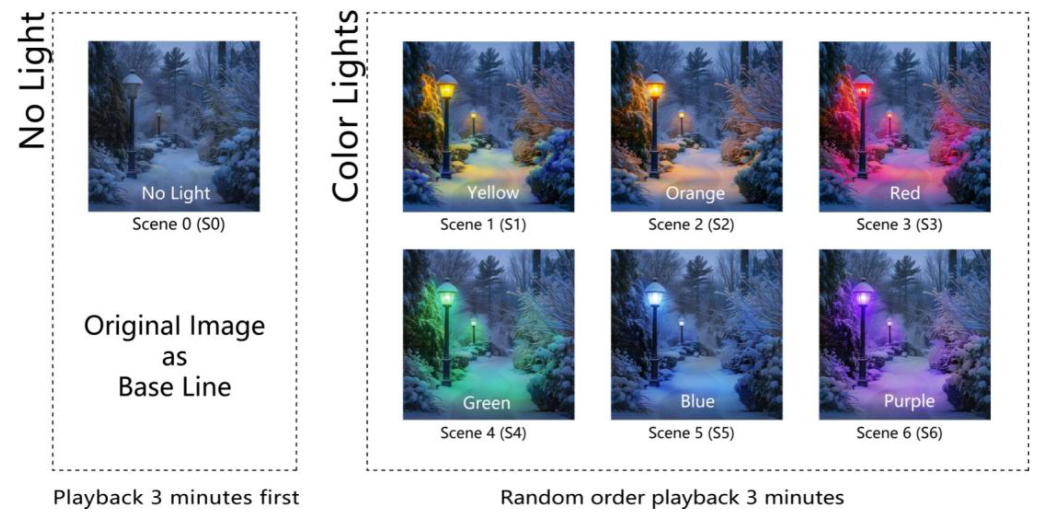
Figure 2.
Experimental environment plan.
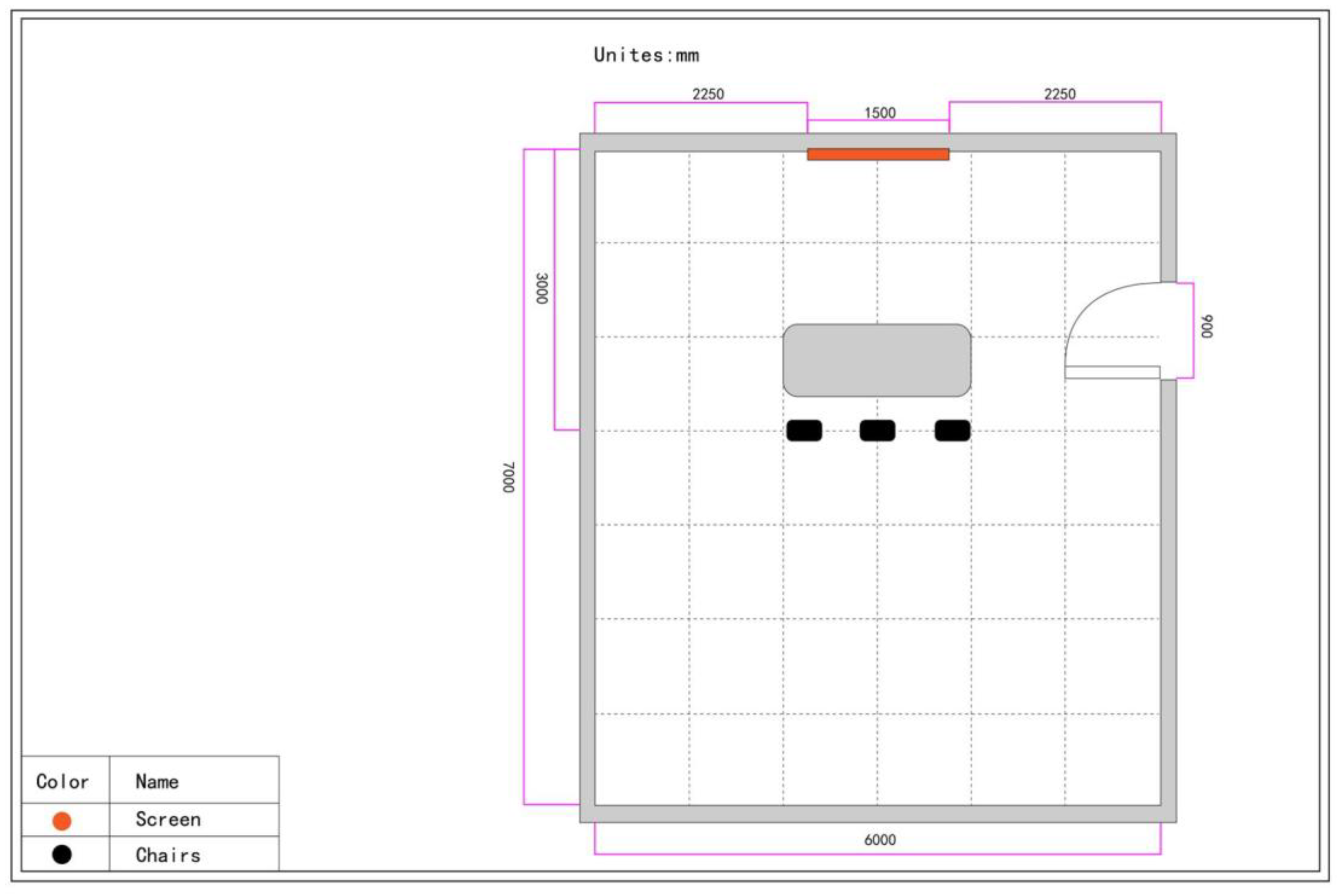
Figure 3.
Experimental site photos.
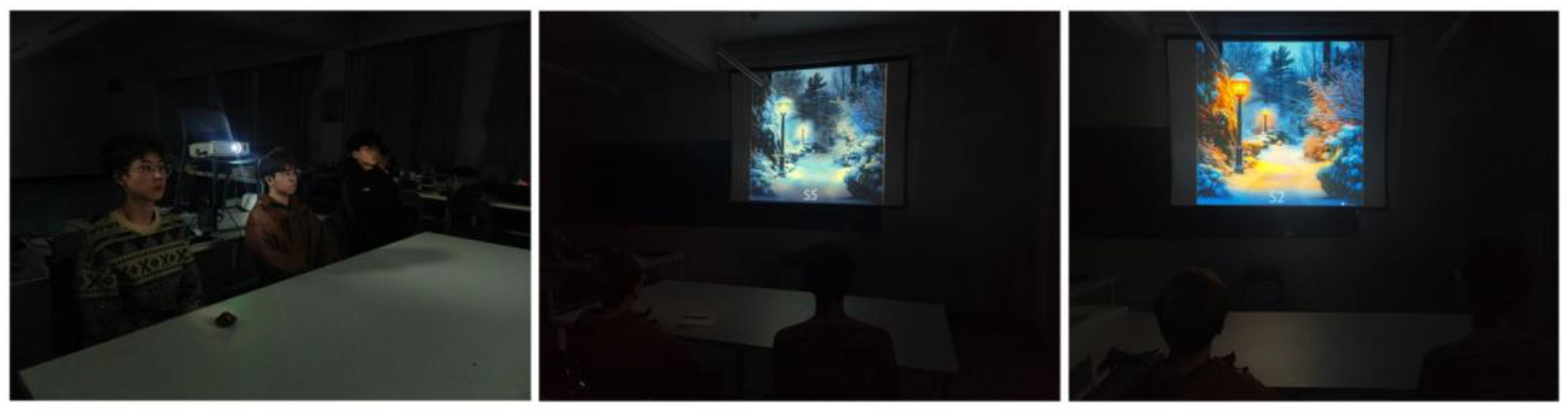
Figure 4.
Creation of the non-artificial light scene (S0). (a) shows the original snowy landscape image, source: StockCake (Public Domain); (b) shows the S0 scene, which was adjusted using Photoshop to simulate a no lighting condition with reduced brightness.
Figure 4.
Creation of the non-artificial light scene (S0). (a) shows the original snowy landscape image, source: StockCake (Public Domain); (b) shows the S0 scene, which was adjusted using Photoshop to simulate a no lighting condition with reduced brightness.
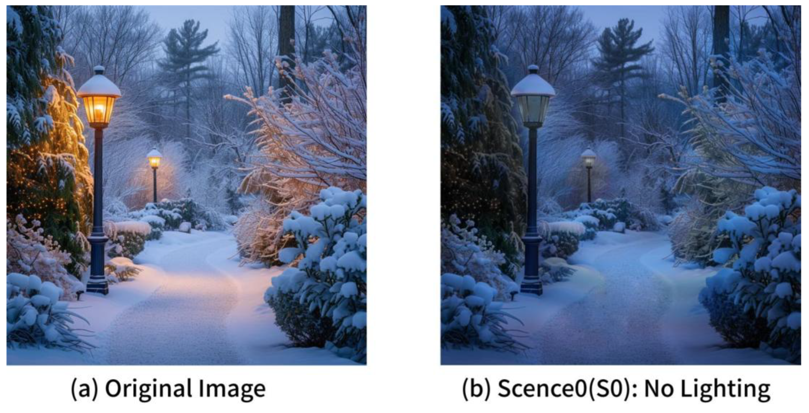
Figure 5.
Import scene 0 (S0) into the 3D software Maya for modeling.
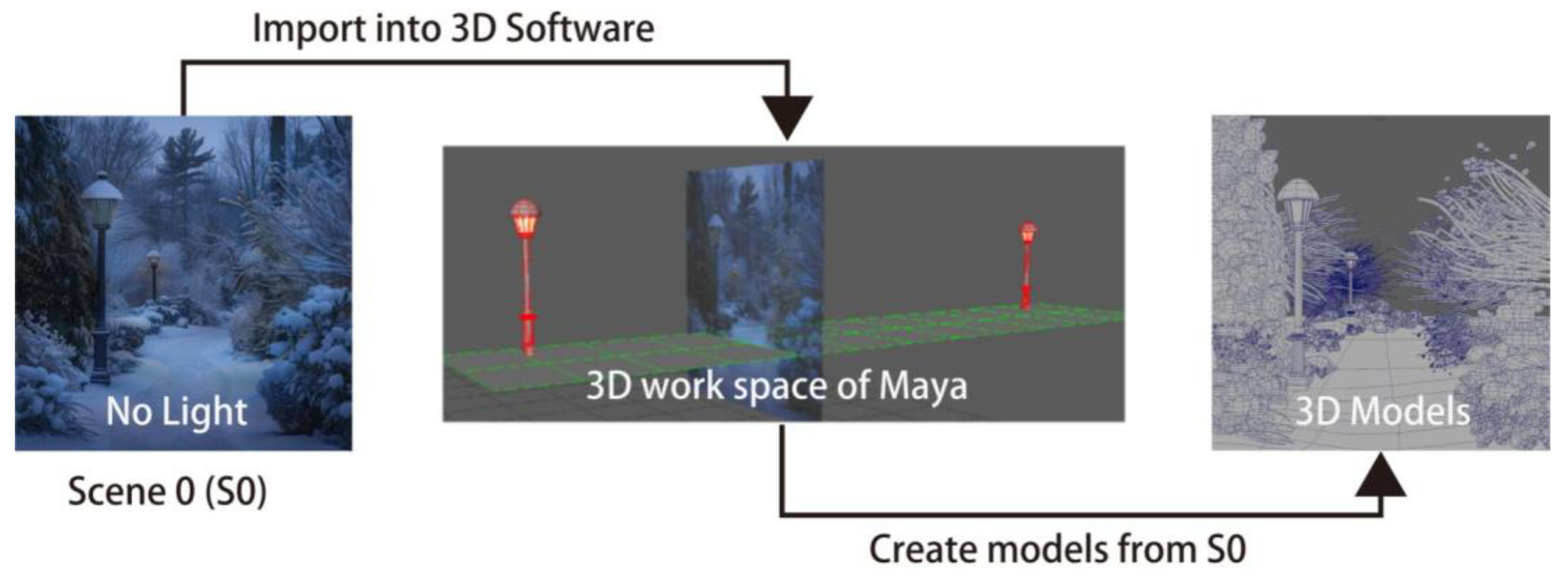
Figure 6.
CIE Standard Colorimetric Observers. (a) color space of different color modes. (b) sRGB color space.
Figure 6.
CIE Standard Colorimetric Observers. (a) color space of different color modes. (b) sRGB color space.
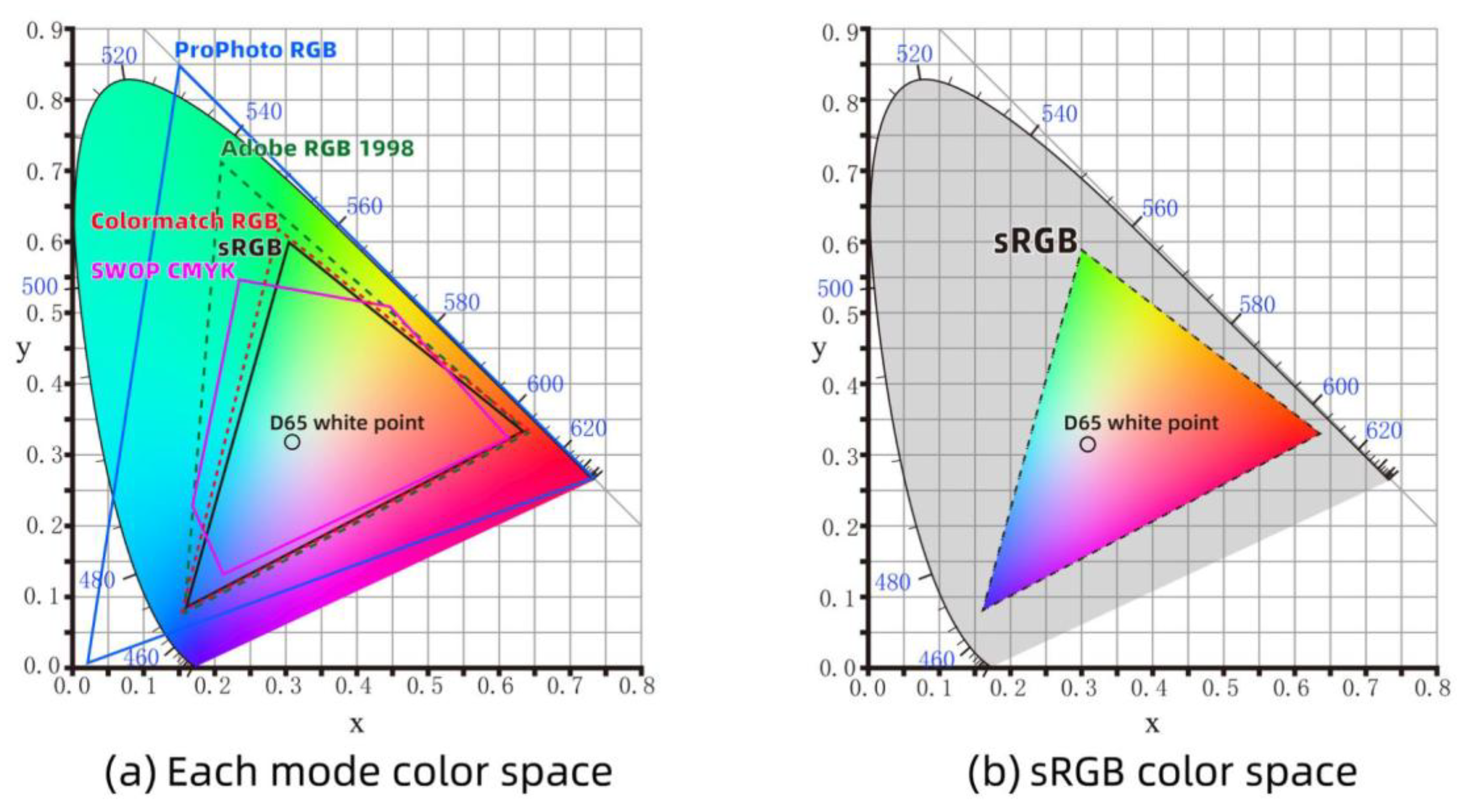
Figure 7.
Six lighting color layers rendered through 3D software.
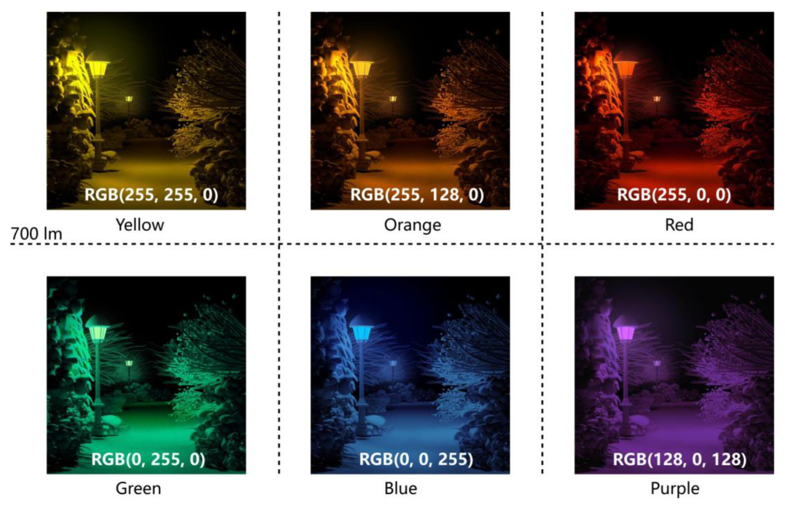
Figure 8.
The 3D-rendered lighting color layers are composited with the scene S0 that has no artificial lighting, resulting in snowscape scenes (S1-S6) with lighting colors.
Figure 8.
The 3D-rendered lighting color layers are composited with the scene S0 that has no artificial lighting, resulting in snowscape scenes (S1-S6) with lighting colors.
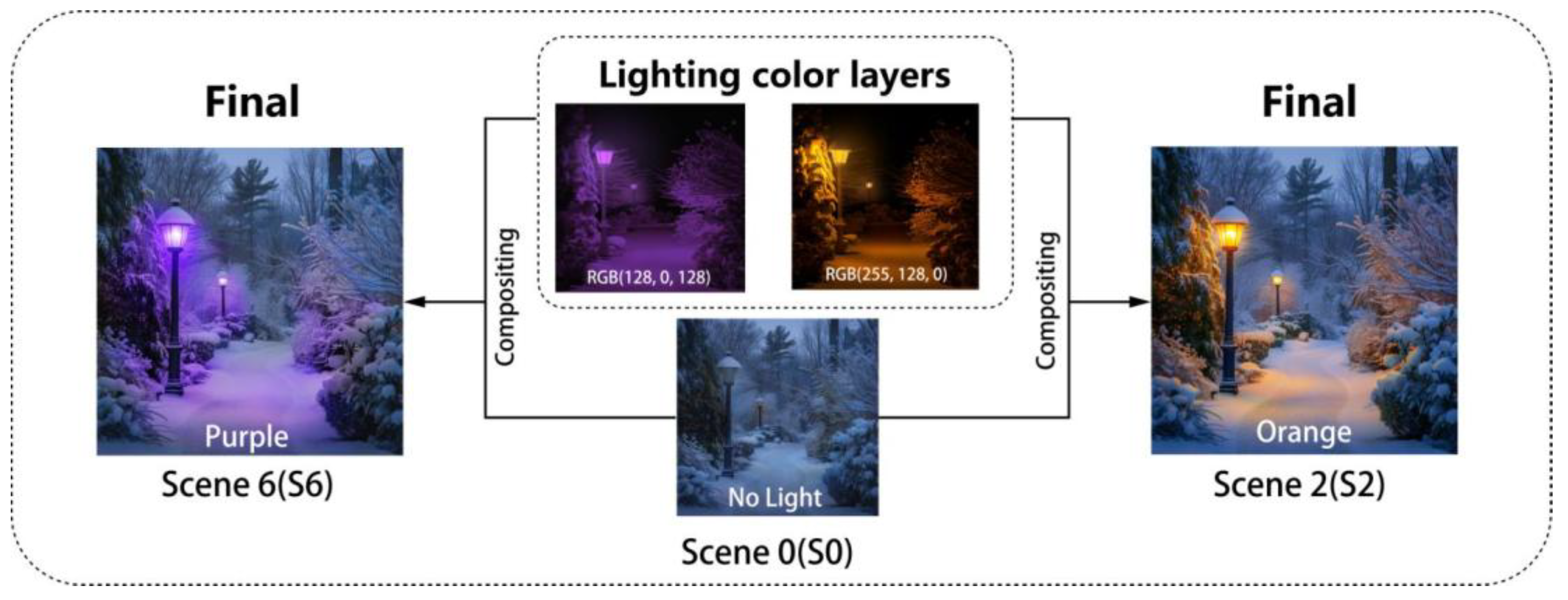
Figure 9.
Flowchart of SAM scale analysis.
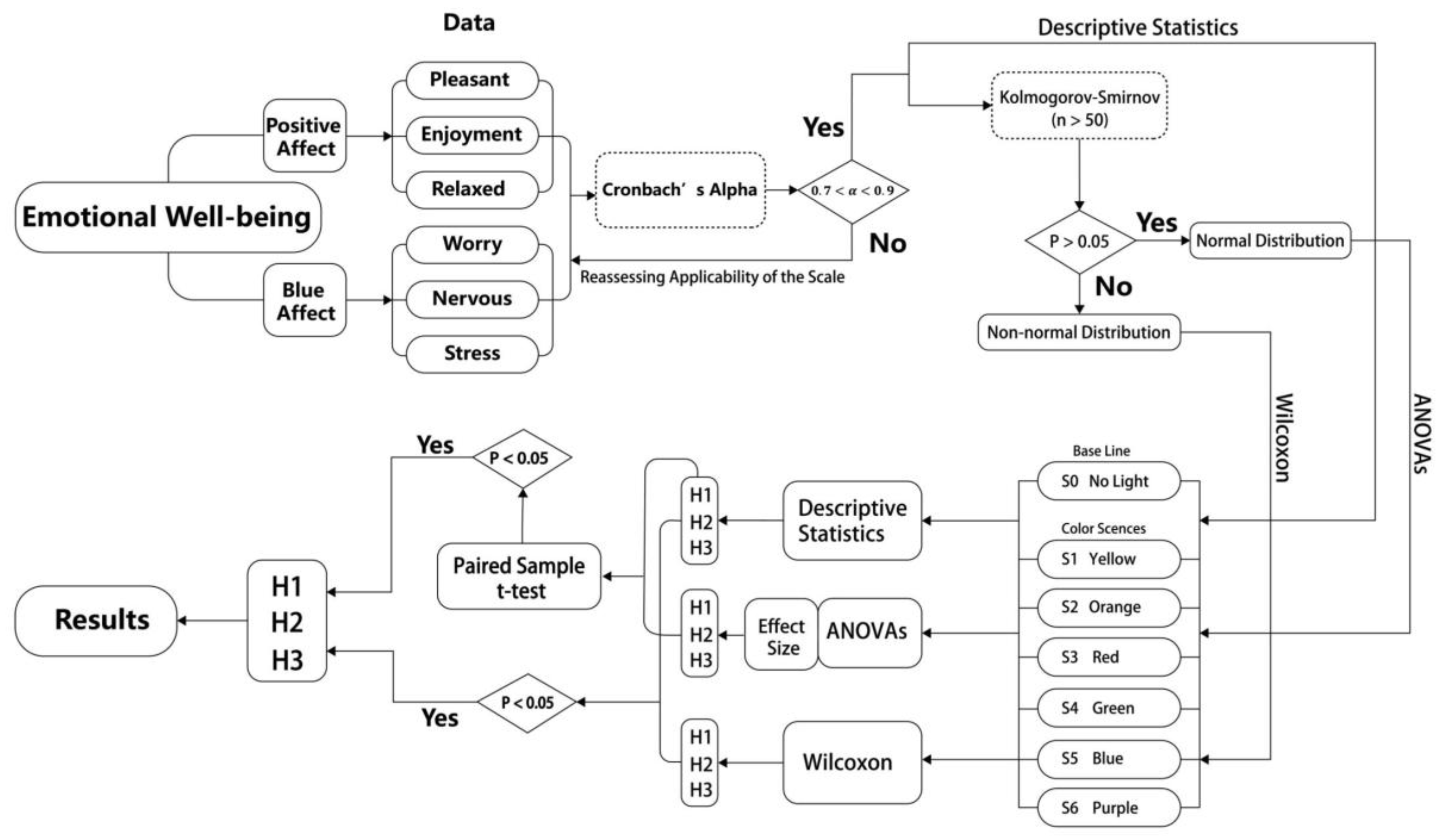
Figure 10.
Heatmap of interaction effects between lighting conditions and emotional scores.
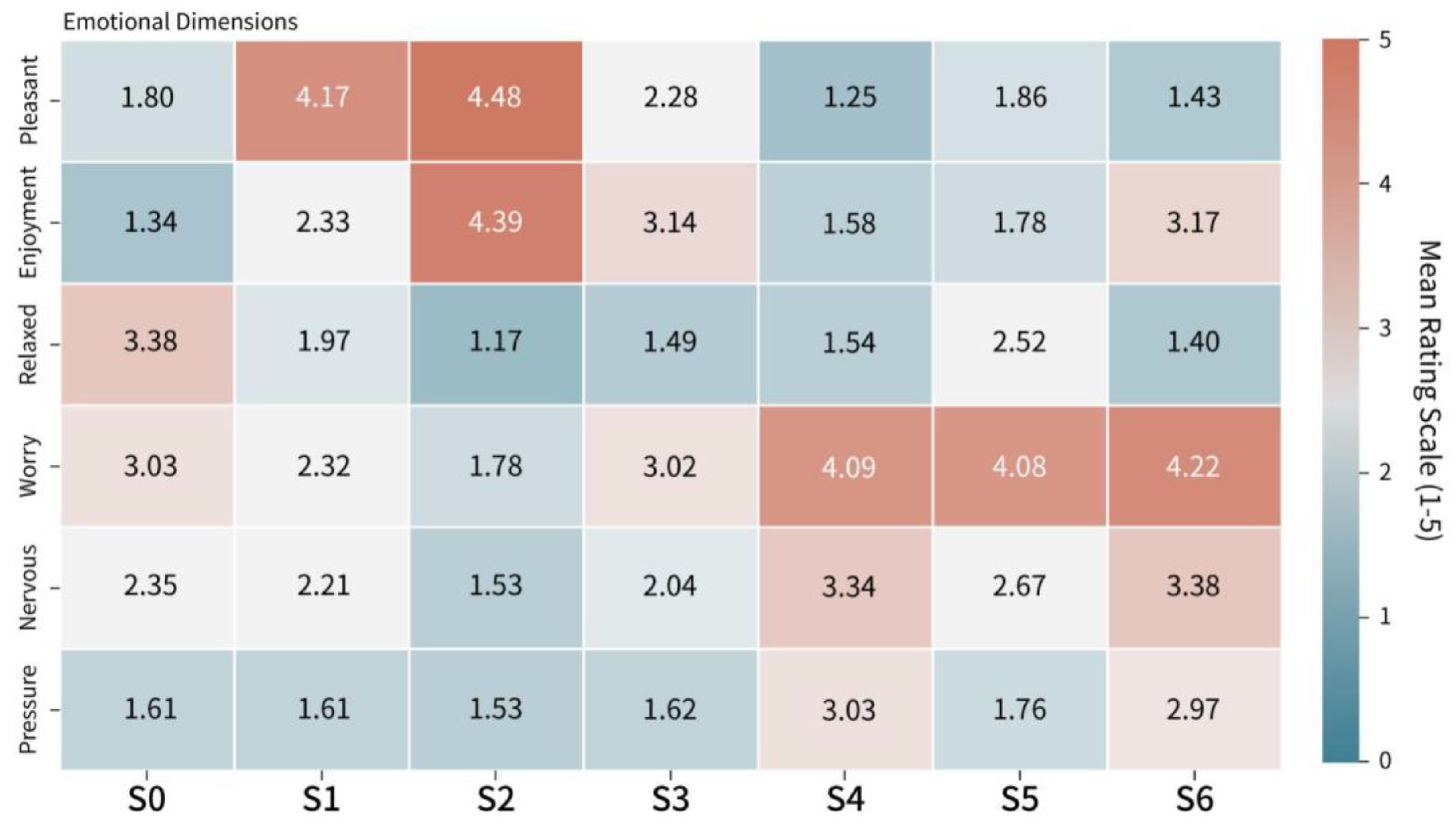
Figure 11.
Interaction trend chart of emotional scores across different lighting conditions.
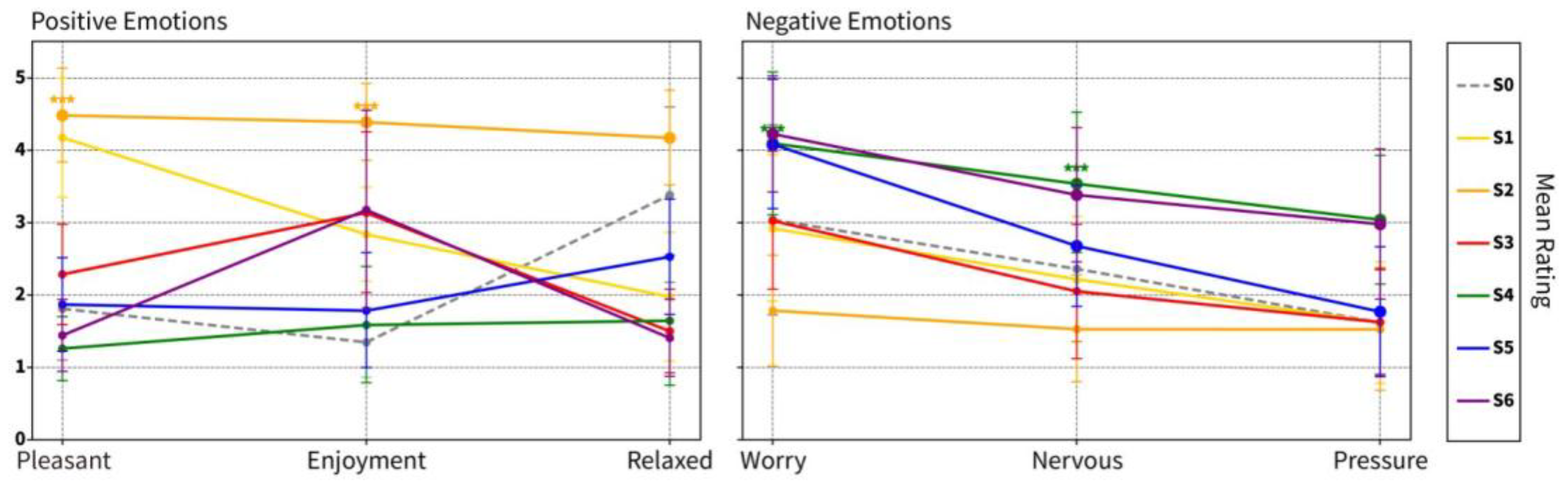
Figure 12.
Compare the positive (Pleasant Scores) affects of t-test (S1-S6) between S0 and paired samples in front of each lighting scene.
Figure 12.
Compare the positive (Pleasant Scores) affects of t-test (S1-S6) between S0 and paired samples in front of each lighting scene.
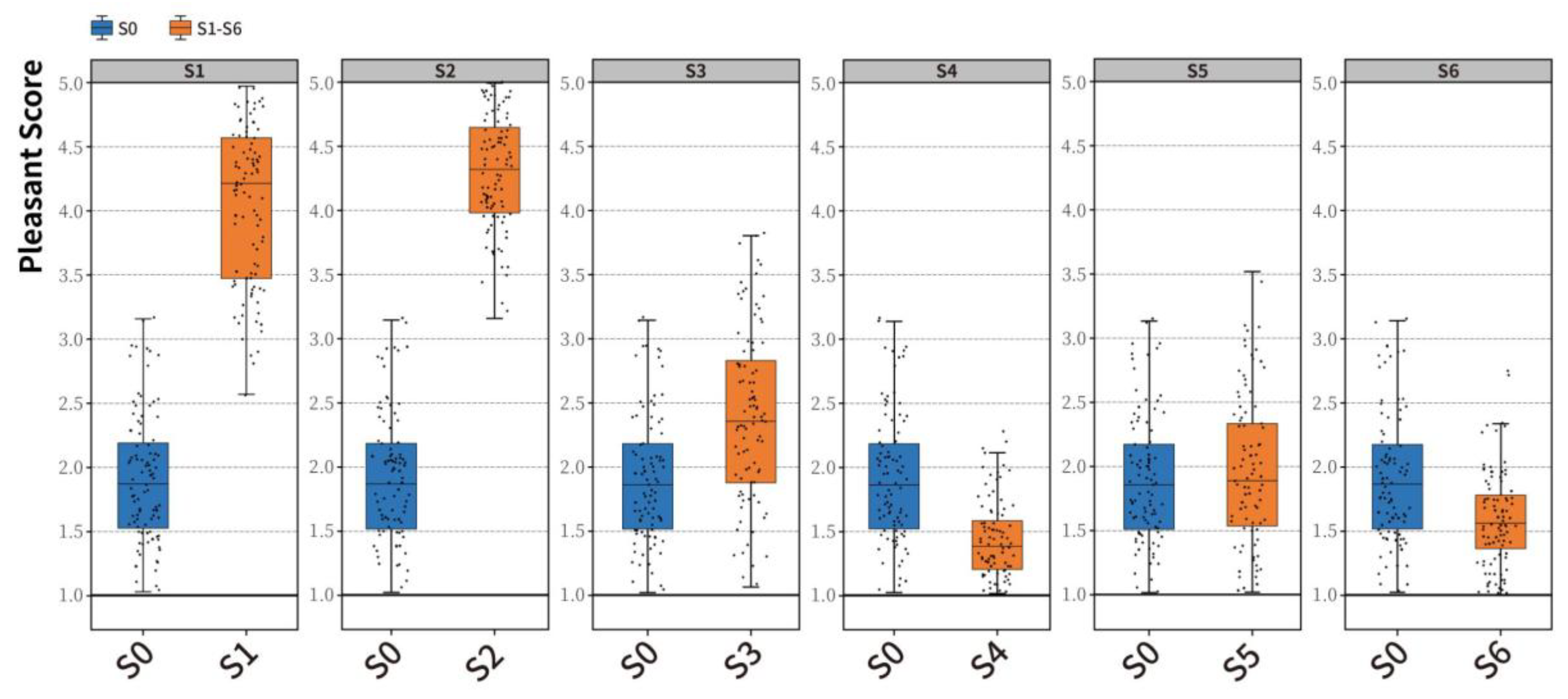
Figure 13.
Compare the positive (Enjoyment Scores) affects of t-test (S1-S6) between S0 and paired samples in front of each lighting scene.
Figure 13.
Compare the positive (Enjoyment Scores) affects of t-test (S1-S6) between S0 and paired samples in front of each lighting scene.
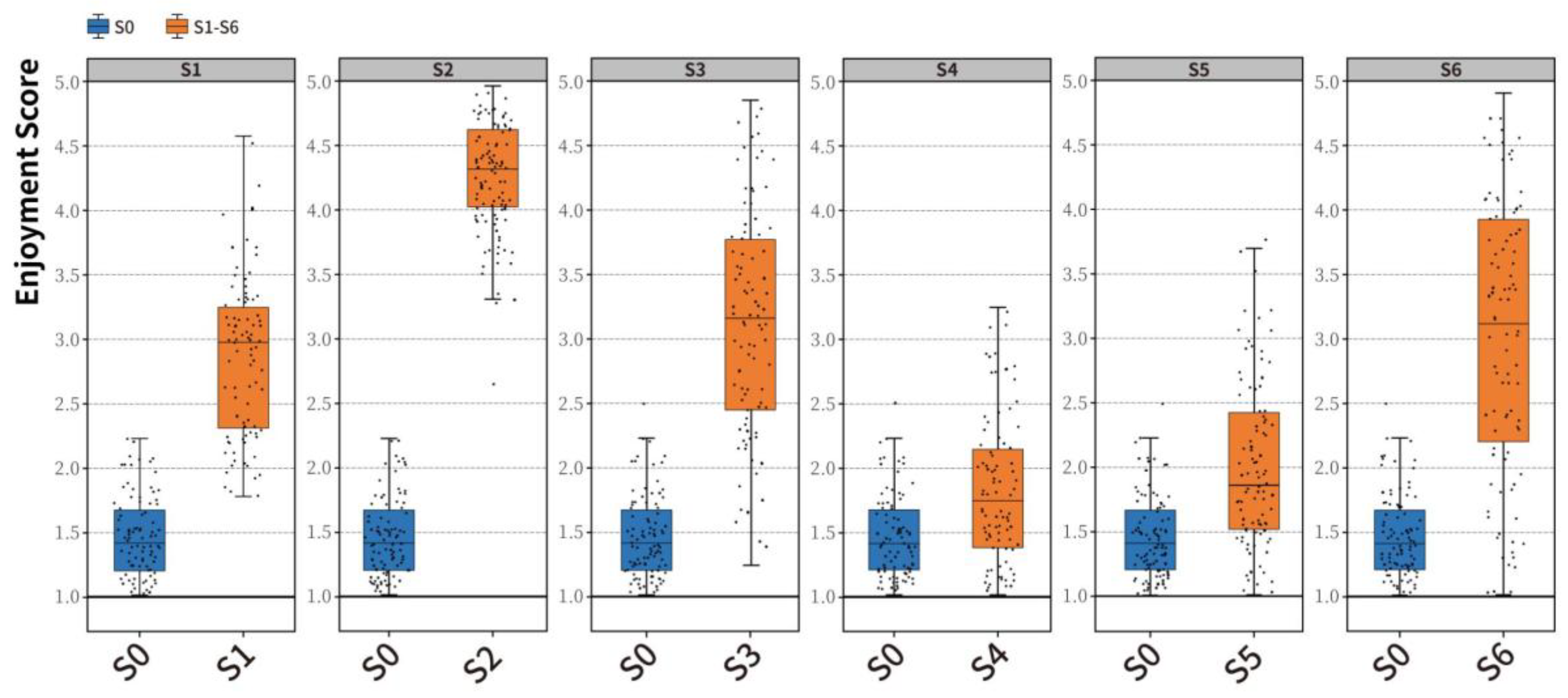
Figure 14.
Compare the positive (Relaxed Scores) affects of t-test (S1-S6) between S0 and paired samples in front of each lighting scene.
Figure 14.
Compare the positive (Relaxed Scores) affects of t-test (S1-S6) between S0 and paired samples in front of each lighting scene.
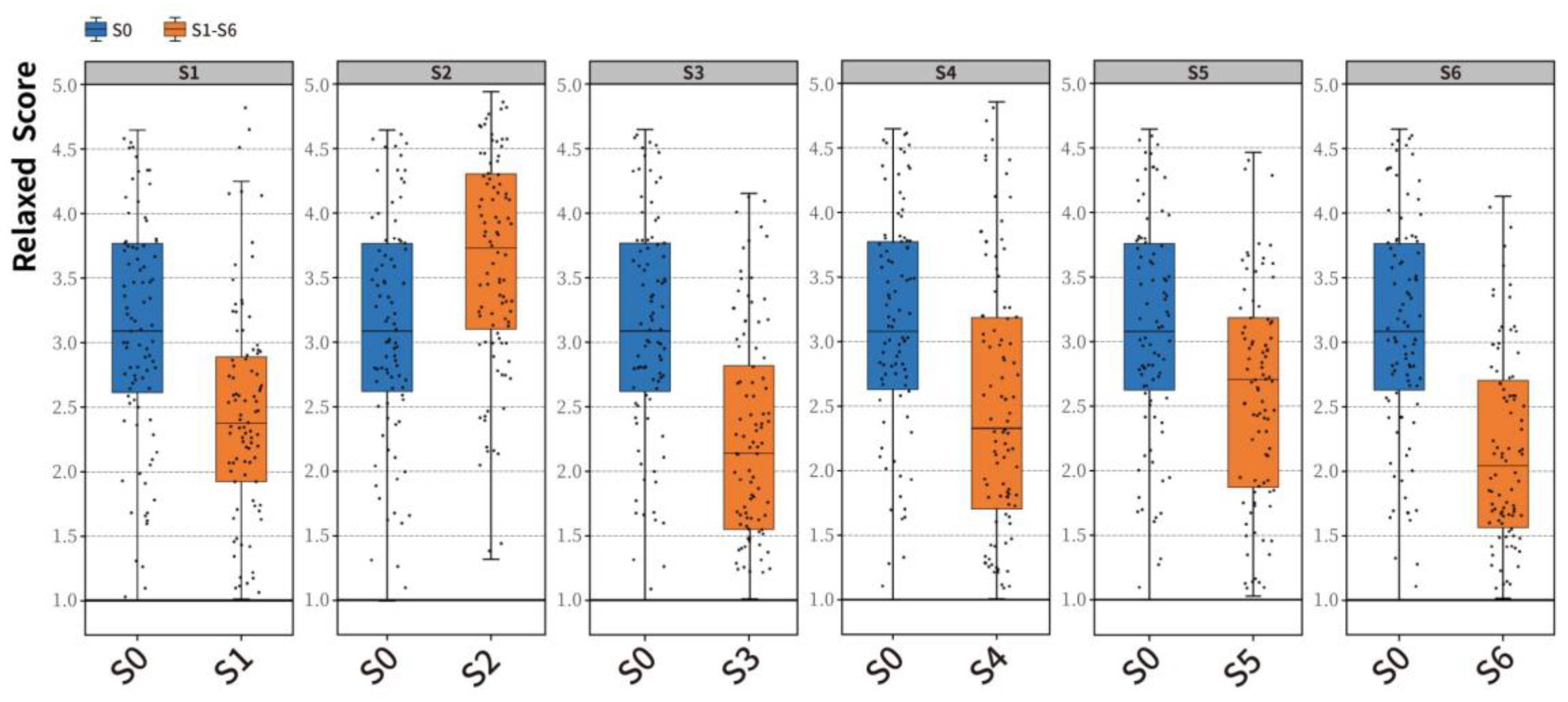
Figure 15.
Paired sample t-test control of blue affects (Worry Scores) between S0 and various lighting scenes (S1-S6).
Figure 15.
Paired sample t-test control of blue affects (Worry Scores) between S0 and various lighting scenes (S1-S6).
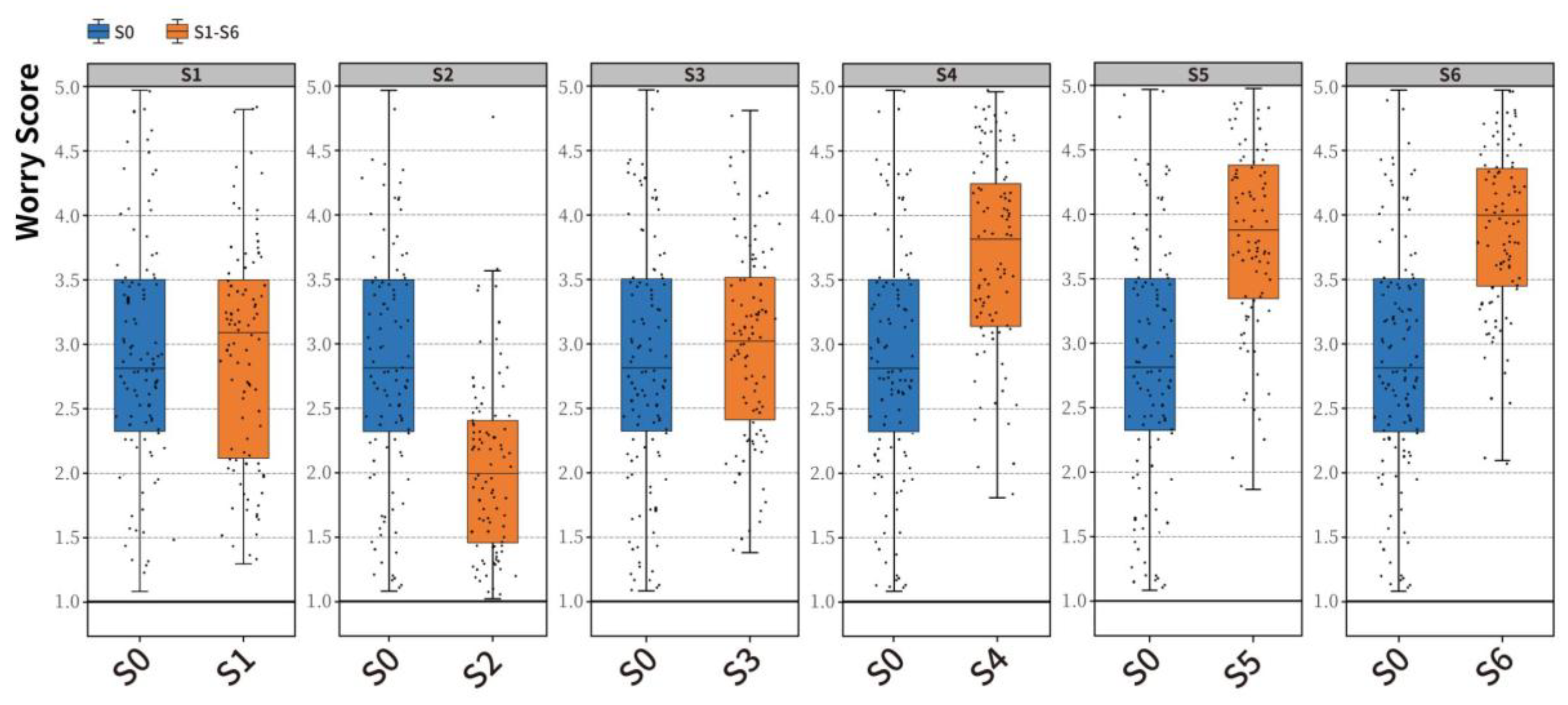
Figure 16.
Paired sample t-test control of blue affects (Nervous Scores) between S0 and various lighting scenes (S1-S6).
Figure 16.
Paired sample t-test control of blue affects (Nervous Scores) between S0 and various lighting scenes (S1-S6).
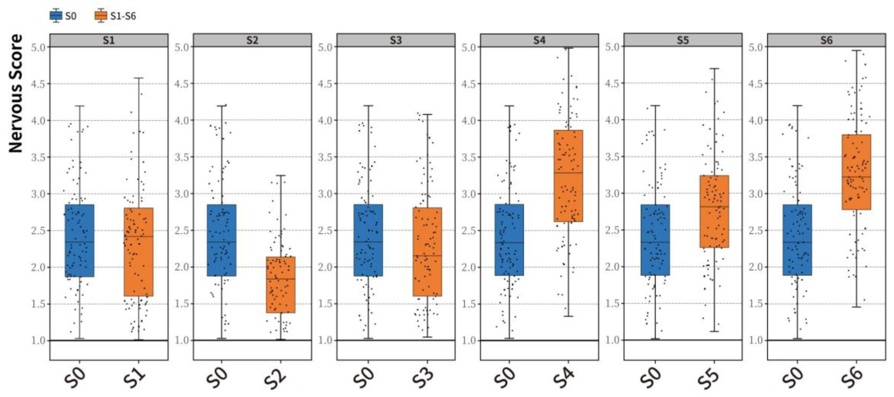
Figure 17.
Paired sample t-test control of blue affects (Stress Scores) between S0 and various lighting scenes (S1-S6).
Figure 17.
Paired sample t-test control of blue affects (Stress Scores) between S0 and various lighting scenes (S1-S6).
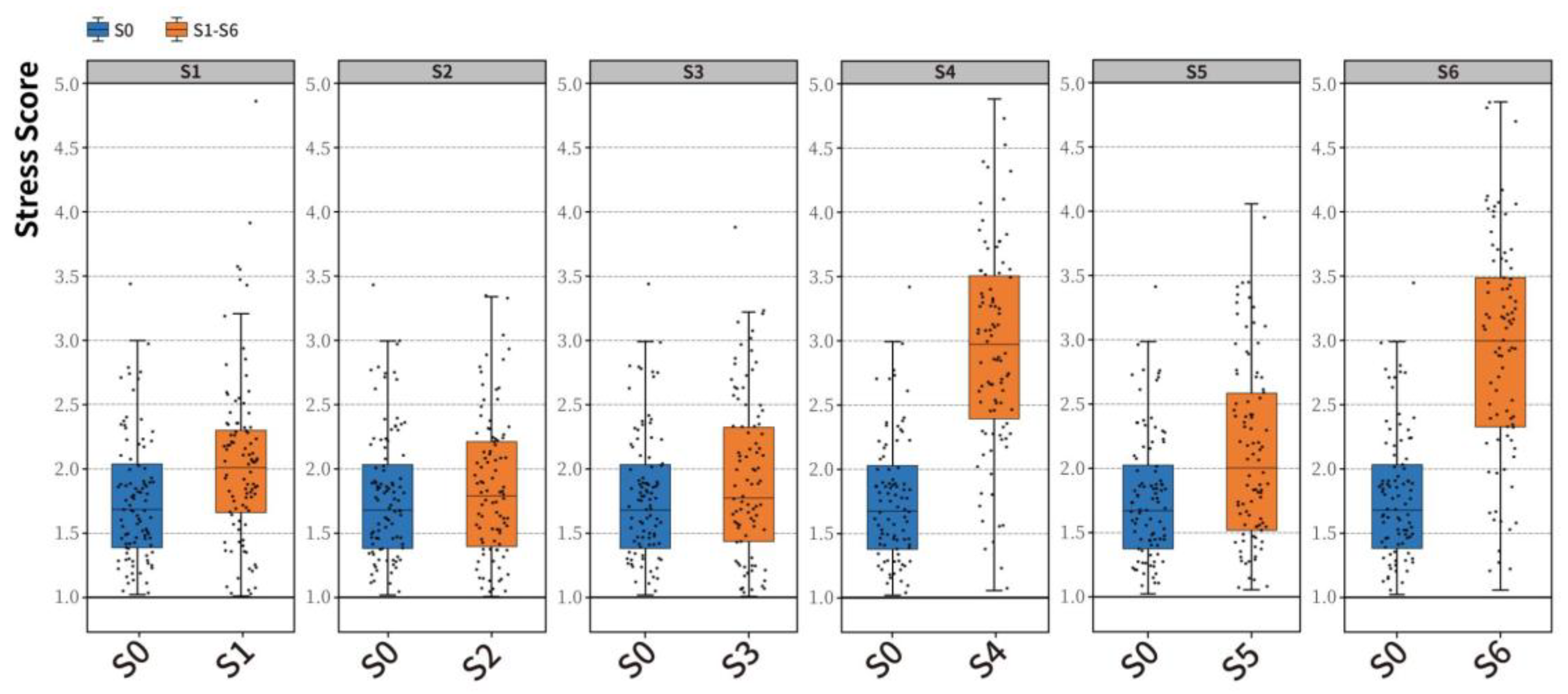
Figure 18.
The impact of light color on positive emotions in Emotional Well-being.
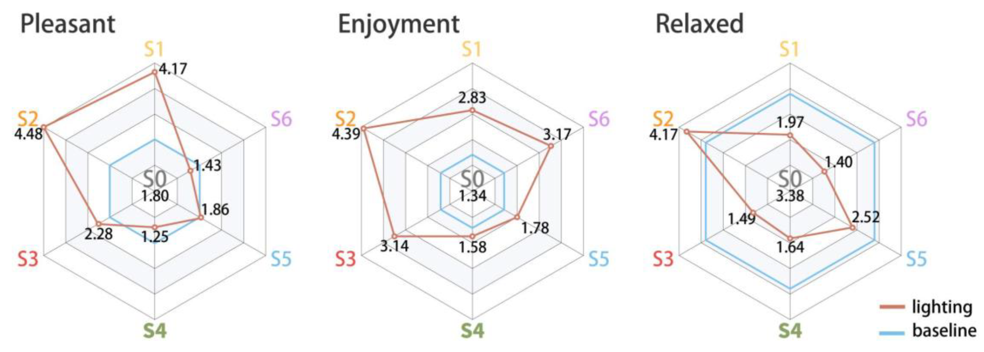
Figure 19.
The impact of light color on blue emotions in Emotional Well-being.
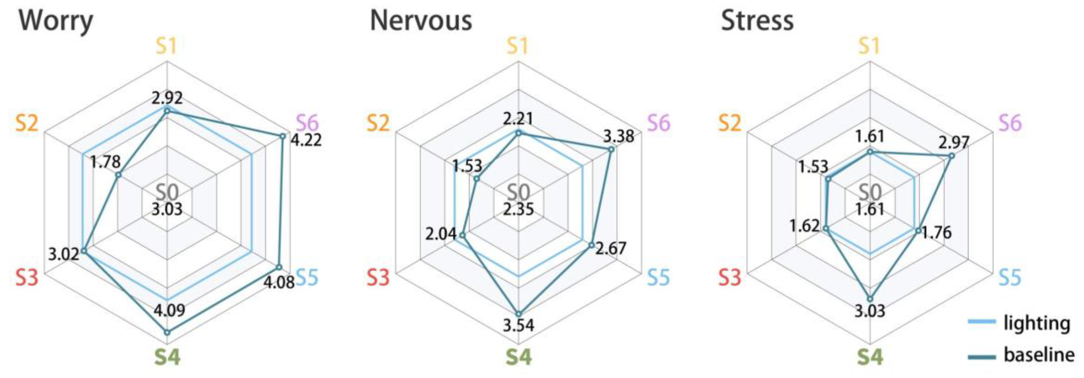

Table 1.
Demographic Information of Participants.
| Age | Province | Count | Characteristi | Category | Count |
|---|---|---|---|---|---|
| 18-55 | Guangdong | 3 | Gender | Male | 41 |
| Hebei | 8 | Female | 54 | ||
| Heilongjiang | 39 | Marriage | Married | 69 | |
| Hubei | 3 | Unmarried | 26 | ||
| Hunan | 2 | Education | Below high school | 19 | |
| Jilin | 15 | junior college | 31 | ||
| Jiangxi | 2 | undergraduate | 34 | ||
| Liaoning | 15 | Master's degree or above | 11 | ||
| Shandong | 8 |
Table 2.
Demographic information of participants.
| Emotion | S0 | S1 | S2 | S3 | S4 | S5 | S6 |
|---|---|---|---|---|---|---|---|
| Pleasant | 1.80 ± 0.71 | 4.17 ± 0.83 | 4.48 ± 0.65 | 2.28 ± 0.69 | 1.25 ± 0.44 | 1.86 ± 0.65 | 1.43 ± 0.50 |
| Enjoyment | 1.34 ± 0.48 | 2.83 ± 0.65 | 4.39 ± 0.53 | 3.14 ± 1.11 | 1.58 ± 0.81 | 1.78 ± 0.79 | 3.17 ± 1.38 |
| Relaxed | 3.38 ± 1.21 | 1.97 ± 0.89 | 4.17 ± 0.66 | 1.49 ± 0.58 | 1.64 ± 0.90 | 2.52 ± 0.80 | 1.40 ± 0.53 |
| Worry | 3.03 ± 1.32 | 2.92 ± 1.01 | 1.78 ± 0.77 | 3.02 ± 0.96 | 4.09 ± 0.99 | 4.08 ± 0.90 | 4.22 ± 0.80 |
| Nervous | 2.35 ± 1.00 | 2.21 ± 0.87 | 1.53 ± 0.74 | 2.04 ± 0.93 | 3.54 ± 0.97 | 2.67 ± 0.83 | 3.38 ± 0.93 |
| Pressure | 1.61 ± 0.73 | 1.61 ± 0.84 | 1.53 ± 0.85 | 1.62 ± 0.73 | 3.03 ± 0.89 | 1.76 ± 0.90 | 2.97 ± 1.04 |
* The first three items in emotion are positive effects, the last three items are blue effects, S0 is a scene without artificial lighting, S1-S6 are lighting color scenes.
Table 3.
Main effects and interaction effects (Scene × Emotional Dimension) analysis results.
| Effect Source | F-value | p-value | ) | Effect Size Interpretation |
|---|---|---|---|---|
| Main Effect: Scene (S1-S6) | 54.478 | <0.001 | 0.077 | Moderate Effect |
| Main Effect: Emotional Dimension | 165.348 | <0.001 | 0.173 | Large Effect |
| Interaction: Scene × Emotional Dimension | 141.411 | <0.001 | 0.518 | Large Effect |
* Effect size interpretation follows Cohen (1988): ηₚ²≥0.14 (Large), 0.06 ≤ηₚ²< 0.14 (Moderate), ηₚ²< 0.06 (Small).
Disclaimer/Publisher’s Note: The statements, opinions and data contained in all publications are solely those of the individual author(s) and contributor(s) and not of MDPI and/or the editor(s). MDPI and/or the editor(s) disclaim responsibility for any injury to people or property resulting from any ideas, methods, instructions or products referred to in the content. |
© 2025 by the authors. Licensee MDPI, Basel, Switzerland. This article is an open access article distributed under the terms and conditions of the Creative Commons Attribution (CC BY) license (https://creativecommons.org/licenses/by/4.0/).
Copyright: This open access article is published under a Creative Commons CC BY 4.0 license, which permit the free download, distribution, and reuse, provided that the author and preprint are cited in any reuse.


