
Submitted:
15 October 2024
Posted:
16 October 2024
You are already at the latest version
Abstract
Background: Front-of-package labelling (FoPL) is shown to be effective in assisting consumers make healthier food choices. Several countries are implementing various types of FoPL systems.
Objective: This study explored consumers’ perceptions and understanding of three different FoPLs and their insights into features that could influence the effectiveness of the symbols in Kenya
Methods: A qualitative study was conducted in four Counties in Kenya; Nairobi, Mombasa, Garissa, and Kisumu. Data was collected through twelve focus group discussions with 137 adults drawn from diverse socio-demographic and socio-economic backgrounds. Three FoPLs were assessed: Red and Green (RG) Octagon, Red and Green Octagon with icons and text (RGI), and the Black Octagon Warning label (WL). The FGDs explored participants’ perceptions of the symbols’ visibility and memorability, their understanding, potential effectiveness, and cultural appropriateness. Printed images displaying four different commonly consumed products bearing specific FoPLs were used during data collection. Data was analyzed thematically and organized using NVivo version 14.0.
Results: Results showed that Kenyan consumers had varied perceptions about the proposed FoPL symbols. Majority of the participants found the black Octagon WL to be most visible and memorable due to its good blend of black and white colours. Although the RG octagon symbol and RGI octagon symbols were also found to be eye-catching due to their bright colours, it emerged that the different colours often confused some participants on their meaning. Most participants understood the WL compared to the RG and RGI because they found the additional text more educative. Generally, the WL was preferred as the symbol most likely to influence consumer purchase behaviours and food consumption. All the three FoPLs tested were found to be culturally appropriate.
Conclusions: The Black Octagon Warning Label is the most easily visible and understood among the three FoPLs tested and has the potential to influence purchase and consumption behaviours among Kenyan consumers. Although the RG and RGI symbols are visually appealing to many, confusion related to different colours could affect their effectiveness. Consumers need to be educated on the use of FoPLs to ensure they discourage the purchase and consumption of unhealthy foods.
Keywords:
Front-of-pack labels
; consumers
; perceptions
; understanding
; non-communicable diseases
; Kenya
1. Introduction
Non-communicable diseases (NCDs), including heart disease, stroke, diabetes, cancer, and chronic lung disease, are among the leading causes of mortality worldwide as well as in Kenya (1). Recent statistics indicate that over three-quarters of all NCD deaths occur in low- and middle-income countries (2). A significant number of NCDs are attributed to unhealthy diets, which are one of the modifiable risk factors for these diseases (2). The global increase in overweight/obesity and other nutrition-related non-communicable diseases (NR-NCDs) is associated with the increased availability and overconsumption of unhealthy foods such as ultra-processed foods (3).
To address the global nutrition-related non-communicable disease (NR-NCD) epidemic, the World Health Organization (WHO) has recommended the implementation of effective front-of-pack labelling (FoPL) systems that present clear nutrition information on the front of packaged foods and beverages (4). These labels guide consumers toward informed food purchases and healthier consumption decisions (5).
There are various types of front-of-pack labels (FoPLs), including traffic light labels, health star ratings, warning labels, and nutrient-specific information. Traffic light labels use color-coding to indicate the healthiness of a product, while health star ratings provide an overall health rating (6). According to the United Nations Children Fund (7), warning labels highlight specific health risks, and nutrient-specific labels provide detailed information on individual nutrients like sugar, fat, and salt. The effectiveness and comprehension of these labels can vary significantly depending on consumers’ literacy levels and socio-economic status (SES). For example, individuals with lower literacy levels or from lower SES backgrounds may find simple, color-coded and interpretive systems easier to understand compared to detailed reductive systems (8).
Understanding how different demographic groups perceive and interpret these labels is important before implementing FoPL systems. Studies have shown that perceptions of nutrition labels found on the side, back or front of food packages vary considerably across different population subgroups (9). By understanding how various groups interpret FoPLs, decision-makers can design labels that are more effective and equitable.
In response to the rising burden of diet-related NR-NCDs, the Kenyan Ministry of Health (MoH) is considering a FoPL system for packaged foods and drinks. To support the development of effective and equitable FoPL policies in Kenya and generate context-relevant scientific evidence, we aimed to explore consumers’ perceptions of three different FOPL formats.
2. Materials and Methods
2.1. Study Design and Setting
We conducted a qualitative study using focus group discussions (FGDs). Table 1 presents the distribution of FGD participants by region, socio-economic status and by residence. This study was carried out in four counties in Kenya: Nairobi, Kisumu, Mombasa, and Garissa. The four Counties were selected to represent different ethnolinguistic groups, socio-economic contexts, varying access to supermarkets, and diverse consumer behaviours related to packaged food consumption. The recruitment sites were supermarkets located in designated sub-Counties, within both low and mid-high-socioeconomic-status (SES) neighborhoods, as determined by the Kenya National Bureau of Statistics. The sub-Counties included in the study were Langata and Embakasi in Nairobi, Kisumu central and Nyando in Kisumu, Mvita and Kisauni in Mombasa and Garissa township and Fafi in Garissa. Data collection took place in October 2023. The methods used in this study adhere to the Consolidated Criteria for Reporting Qualitative Research (COREQ) (10).
2.2. Participants and Eligibility Criteria
Twelve (12) FGDs involving a total of 137 adult participants from four counties with a fairly equal representation from both low and middle-to-high socio-economic statuses were conducted (Table 1). Trained research assistants recruited shoppers as they exited supermarkets. Eligible participants were individuals who frequently purchased packaged foods or drinks and held a primary role in household food purchasing decisions or shared this responsibility within their households. Participants were excluded if they identified as healthcare professionals, employees of the tobacco industry, workers in the sugary drinks and food industry, professionals in advertising, or employees of market research companies.
To capture diverse perceptions across varying socio-demographic groups we ensured that each quota was adequately represented within each discussion group. This included considerations for gender (male or female), age (18–29, or 30–50 years), education level (no primary school, secondary school, university, and post-graduate school.), income bracket (low or mid-high), and residence (urban and rural) (11). After receiving sufficient interest from potential participants, we organized convenient venues and times for the FGDs, which were communicated to the participants in advance. Each focus group was homogenous, comprising participants with similar sociodemographic characteristics to facilitate open and relatable discussions. A range of 8-12 participants per group were invited to participate in the focus group discussions.
2.3. Study Tools
We used a comprehensive FGD guide (Appendix 1) to collect data from the participants. The FGD guide had two sections. The first section of questions explored participants’ perceptions of the symbol’s visibility, memorability, their understanding of Front-of-Pack Labels (FOPLs), the perceived impact on purchasing habits, and their cultural appropriateness. In the second section, participants were asked to identify the FOPL format that was most memorable and impactful to them. The FGD guide was adapted from a similar study conducted in South Africa, ensuring relevance and consistency in data collection methods (11). To accommodate participants’ language preferences, the research team translated the FGD into Swahili and Somali. Moderators facilitated discussions in the preferred language of the participants.
2.4. Piloting
We conducted two pilot face-to-face FGDs to assess the feasibility of the FGD guide and the overall procedures for the group discussion. Based on feedback from participants and moderators during the pilot discussions, we adjusted the wording and sequencing of questions in the FGD guide.
2.5. FoPL Prototypes Tested
FoPL prototypes for testing among Kenyan consumers were carefully selected based on a literature review and recommendations from the Ministry of Health Technical Committee on Front-of-pack labelling. The committee identified three symbols (Figure 1) for pre-testing: Red and Green (RG) Octagon, Red and Green Octagon with icons (RGI), and a Black Octagon Warning Label (WL). These symbols were designed to effectively identify nutrients of concern in food products and to promote healthier food choices using color, shapes, text, and icons. A designer was briefed to create visually impactful symbols that would resonate with Kenyan consumers across diverse sociodemographic groups. The goal was to ensure that these FoPLs would be easily understood and effective among diverse groups of the Kenyan population.
2.6. FoPL’s Tested
Figure 1 shows the three FoPLs tested. The selected FoPL prototypes share common design elements aimed at improving consumer understanding of nutritional information on packaged foods. Each prototype has a distinctive octagon-shaped symbol format. Two of the prototypes, RG and RGI employ a color-coded system using red to indicate nutrient levels above a specified threshold and green for lower levels as proposed by the Kenya Nutrient Profile Model (KNPM). The RG symbol has text for key nutrients (e.g., “SALT,” “SUGAR,” “FAT,” “SATURATED FAT”) while the RGI symbol had the same text and accompanying icons to visually represent each nutrient: a saltshaker for salt, a teaspoon with sugar for sugar, a large letter “F” for fat, and “SF” for saturated fat. The WL prototype also uses octagonal symbols but in black with white text, highlighting nutrients exceeding threshold levels with the addition of “HIGH IN” preceding the nutrient name (e.g., “HIGH IN SUGAR”). The WL would only appear on food products with the exceeding nutrients of concern.
2.7. FoPL Testing Procedures
Images of three FoPL symbols were superimposed onto images of real packages of crisps, juices, breakfast cereals and breads commonly available in the Kenyan market. The symbols were placed on each package according to their nutrient levels. Four food categories (e.g., breakfast cereals, sugar-sweetened beverages (SSBs), baked goods, and snacks) were selected for testing. In each food category, a set of products with distinct nutrient profiles were developed with varying nutritional quality. Each set of the four products (Figure 2) bearing the respective symbols was printed on a laminated A3 cardboard with a clear white background.
2.8. Study Procedures
2.8.1. Focus Group Discussions
The FGDs were facilitated by two trained research assistants in designated public facilities such as schools, church buildings or mosques that were free of noise and interruptions. Each discussion session lasted between one and a half to two hours. To ensure methodological rigor and credibility, the research team conducted sit-ins during all the FGDs and held debriefing sessions with the moderators and research assistants after each session. Participants were reimbursed for their transport costs to and from the venue at the end of the discussion. Written consent was obtained for the FGDs. One research assistant moderated the discussions, while another took brief notes during the sessions. Subsequently, the audio recordings were transcribed verbatim and translated into English for analysis.
2.8.2. Data Collection
Trained moderators facilitated the focus group discussions using an FGD guide prepared by the research team. Each discussion was conducted by one moderator accompanied by a note-taker. At the beginning of each discussion, the moderator handed the first set of images featuring the first FoPL to participants, allowing them to view the images for 10 to 15 seconds before retrieving them. The moderator then prompted the participants to share what they observed and whether they had noticed any symbols on the products. After gathering their responses, the same images were returned to the participants, who were asked to examine the symbols more closely for another 10 to 15 seconds. Following this, the images were collected, and the moderator initiated a discussion focused on topics such as symbol visibility, memorability, understanding and perceived impact on purchasing habits. Each aspect was thoroughly discussed until no new insights emerged before moving to the next FOPL. This procedure was repeated for the three FOPLs. Finally, participants were asked to identify the FOPL that stood out the most among the three and provide reasons for their preference.
2.8.3. Ethical Considerations
Ethical approval for the study was obtained from AMREF Ethics and Scientific Review Committee (Approval number ESRC P1323/2022). Study participants were provided with a disclosure page that outlined the study’s purpose and the intent for its subsequent publication. Informed consent was obtained from all participants before conducting the discussions. No direct identifiers were collected, and strict confidentiality measures were maintained throughout the study to ensure participant privacy and confidentiality.
2.9. Data Analysis
The data collected were analysed thematically and organized using NVivo version 14.0 following a three-stage process. Initially, transcripts were read multiple times to identify relevant code terms that aligned with the research question. Parent themes were identified, and subsequent readings of the transcripts allowed for the identification of emerging child codes associated with each parent code. Two coders compared their codes and agreed on the codes that best reflected participants’ perceptions. Similar codes were then organized into broader categories and connections between categories were explored. Categories were considered important based on length, depth of discussion, order of emergence and recurrence across multiple focus groups. The coders harmonized the codebook used to analyse all 12 transcripts from the study. Additionally, a qualitative data analysis expert reviewed the data both before and during analysis. Thematic analysis was used to identify recurrent themes and patterns within the qualitative data.
3. Results
3.1. Participant Socio-Demographics
Table 2 shows the socio-demographic characteristics and purchasing responsibilities participants by County. A total of 137 adult participants took part in the study, across 12 focus group discussions. Among the respondents, 71 (51.8%) were male, a slight majority (54.0%) were aged 18-29, and most (75.2%) had education levels above secondary. Over half (58.4%) were parents of children under age 18 years, and 68.6% were the main decision-makers in their households. Nearly half (47.4%) bought their food items from shops and kiosks, 29.9% from supermarkets and 43.8% purchased packaged foods daily.3.1. Subsection
3.2. Themes
Table 3 provides the themes and sub-themes. Four themes and eleven sub-themes describing participants’ perspectives on front-of-pack symbols were extracted deductively from the data collected. These included 1) Visibility and Memorability, which assessed how easily participants could see and remember the labels ; 2) Comprehensibility, which evaluated participants’ understanding of the information conveyed by the symbols 3) Potential Effectiveness, which examined participants’ perceptions of the labels’ influence on their purchasing decisions, and 4) Cultural Appropriateness, which explored the cultural relevance and acceptability of the symbols. Each theme provided a structured approach to gather valuable insights into the potential impact and effectiveness of the three FoPLs tested.
3.3. Visibility and Memorability
Participants’ visibility and memorability were explored through the labels’ colour, shape, and text. The RG Octagon symbol was considered attractive and visible, while some participants found it memorable due to its simplicity. This was mainly attributed to the use of bright colours which grabbed the participant’s attention quickly. The RGI Octagon symbol was also found to be quite visible and generally deemed memorable. However, for both the RG Octagon and RGI Octagon symbols, it emerged that the text used was found to be unclear to many participants.
“The label is attractive because of the eye-catching color.” [Label RG, female…R10, FGD3, Langata, Nairobi County]
“It was visible, and I think they added pictures on top of the writings, I took note of that”. [Label RGI, male…R8, FGD3, Mvita, Mombasa County]
The WL Octagon symbol was viewed as the most visually appealing and memorable. While study participant preferences differed, the WL Octagon symbol, with its black and white colours and informative text, emerged as the most consistently memorable among most study participants.
“Okay, I can say the most attractive thing in that last label [WL], ummm, it’s that color, it matches, black and white” [Label WL, male…R2, FGD2, Kisauni, Mombasa County]
“The label’s colour caught my attention, and its black colour was highly visible”. [Label WL, male…R1, FGD1, Garissa Township, Garissa County]
“The text information in the label [WL]’High sugar and High salt’ enhances its memorability…” [Label WL, male…R2, FGD1, Garissa Township, Garissa County]
3.4. Comprehensibility
Participants provided diverse perspectives on how easily the three front-of-pack symbols were understood. While some found RG and RGI symbols easy to understand, associating red with danger, others expressed challenges in interpreting the labels due to a lack of clear indications of salt and sugar quantities. Other participants expressed that the purpose of the colour-coded symbols was to indicate the content of the items in the packaged product. Some of the participants were able to understand that the use of red colour was in a way associated with danger.
“I know red means danger, so I was able to distinguish that this stuff is not good, because of the color, because it is in red” [Label RG, male…R5, FGD1, Kisauni, Mombasa County]
“It does not indicate the ratio of salt and sugar. Thus, it’s not easy for one to tell whether it has too much sugar or salt” [Label RG, female…R3, FGD1, Embakasi, Nairobi County]
“It was easy to understand because the ingredients have been quantified” [Label WL, female…R10, FGD1, Nyando, Kisumu County]
However, concerns were raised about potential confusion when the same colours (red and green) were used to represent different contents. For both the RG Octagon and RGI Octagon symbols, it emerged that the text used was found to be unclear to many participants.
“The labels [RG]are memorable if they are few. For example, there was a brand which had few labels namely sugar and salt alone. … if there are more than four contents, I would not remember” [Label RG, female…R8, FGD2, Embakasi, Nairobi County]
We also found that there was barely any mention of the green label in the colour coded labels, however, some participants thought it represented sugar while a few thought it was indicating that the product is good for consumption. Despite varying opinions, the WL was frequently mentioned as the most understood, as it provided additional informative text.
“For example, if a product has that, green package for sugar it tells us that there is sugar content in it, the only thing is it doesn’t tell us what level it is.” [Label RG, male…R6, FGD2, Langata, Nairobi County]
“The label shows that the product is good for consumption because it contains fat and sugar which are green in colour.” [Label RG, female…R2, FGD1, Embakasi, Nairobi County]
Many participants felt that the warning labels aimed to deter them from consuming these products in excess. When asked who they thought the labels were designed to communicate with, participants felt that the warning labels were meant for people who were obese and wanted to lose weight, those with high blood pressure who were advised to reduce salt intake, and those with diabetes who needed to avoid sugar.
“It warns the consumers, if you don’t use high level sugar, it warns you not to consume”
[Label WL, female…R10, FGD2, Kisumu Central, Kisumu County]
“…it is warning me about the content that is high…” [Label WL, male…R7, FGD3, Langata, Nairobi County]
Participants generally believed that Kenya’s nutrition-related non-communicable diseases (NR-NCDs) could be effectively addressed by using the three labels. However, many felt that the WL symbol might have the most significant impact due to its comprehensive information. Most participants preferred the WL symbol over the other two colour-coded labels, highlighting the WL’s potential to influence healthier dietary choices.
Certain aspects of the coloured labels were difficult for participants to understand. The use of different colours, such as RG and RGI labels, in relation to various contents like sugar and salt, was particularly confusing. Participants expressed difficulty in grasping the rationale behind the varying colours for different contents, leading to uncertainty about what each colour specifically indicated. This confusion was compounded when multiple colours were used on a single package, making it harder for participants to quickly and accurately interpret the labels’ messages.
“Why do they use red color on both salt and sugar labels?” [Label RGI, female…10, FGD3, Langata, Nairobi County]
“The colours of the label are so confusing thus leading to a lack of understanding of product labels” [Label RG, male…R1, FGD2, Garissa Township, Garissa County]
Participants highlighted several key points regarding the symbol message. They noted that the primary concept of the colour-coded labels was generally understood; for instance, the colour red was commonly associated with danger. However, most participants found the messages in the warning labels to be clearer and more direct, particularly when text was included.
“I know red means danger, so I was able to distinguish that this stuff is not good, because of the color, because it is in red.” [Label RG, female…R5, FGD2, Kisauni, Mombasa County]
“Because in this label, there is an indication telling us that this product has high sugar, high fat, high salt, while in the other labels, it was just saying salt, sugar or fat. It was not telling us whether it is high or low…” [Label WL, male…R6, FGD1, Nyando, Kisumu County]
3.5. Potential Effectiveness
Participants generally reported that their purchase decisions would change if they saw these labels on packaged products. Many indicated they would be more likely to choose healthier options, especially if a warning label was present. Some participants described intentions to reduce consumption of products high in sugar and salt. Overall, the majority felt that warning labels would guide them towards healthier food choices.
“I think that when I go to buy, I will be 50-50, because this label, you know, its red, so it is danger”. [Label RG, male…R3, FGD2, Embakasi, Nairobi County]
“Yes, the label [WL] has the potential to change my attitude towards the products …” [Label WL, female…R1, FGD3, Fafi, Garissa County]
“… If the products will be well labelled, it will make the consumer to make a very informed decision of what not to eat. So, it will enable us to stay healthy. So, it will help avoid some of the lifestyle diseases. Things like obesity…” [Label RG, female…R2, FGD1, Kisauni, Mombasa County]
3.6. Cultural Appropriateness
While some participants considered the labels essential for identifying daily sustenance in their culture, others pointed out that the colour red might be a turn-off, while the black colour is thought to have significance in funeral attire. Overall, opinions were mixed but most respondents perceived the symbols as culturally appropriate, though a few others advocated for adjustments to better resonate with cultural perceptions.
“We believe that anything red means danger. But it doesn’t affect culture, it only promotes it”. [Label RGI, male…R8, FGD3, Nyando, Kisumu County]
“We always believe black is funeral attires” [Label WL, female…R6, FGD2, Kisumu Central, Kisumu County]
“This label has nothing to do with our culture… it is okay” [Label RG, female…R4, FGD1, Mvita, Mombasa County]
4. Discussion
This study explored Kenyan consumers’ perceptions on three front-of-pack labels (FoPLs): RG, RGI and WL, focusing on their visibility, memorability, comprehensibility, potential effectiveness, and cultural appropriateness. The findings revealed diverse perceptions among the study participants, with a notable preference for the WL due to its clarity and comprehensive information.
Participants found the RG label visually appealing due to the bright colours and that red is associated with danger. Participants were generally silent about the green colour in the labels where it was present. Additionally, there was confusion when the same colours were used to represent different nutrients such as salt, sugar or fat. Their varied views of the three labels suggests that visual appeal, colour contrast, and simplicity and clarity of text significantly impact how well these labels are noticed and remembered. The coloured labels, with their distinct red and green colours, were generally regarded as attractive and easily visible. However, the potential for confusion when the same colours were used for different nutrients, points to the complexity of how participants balance visibility with clarity. These findings are supported by Temple & Fraser (12) who stressed the importance of consistent and insightful labelling to avoid consumer misinterpretation. The warning label (WL) was perceived as the most visually appealing and memorable. This pattern was also noted in findings from a previous study in South Africa, where participants appreciated that warning labels were readily visible on the pack with many observing that the black colour makes it easily noticeable (11).
The observed preference for the WL among most of the study participants can therefore be attributed its simplicity associated with a monochromatic colour, informative text “High in…” and the simple pictorials. Similar findings were reported in a previous study which found that the number of nutrients that consumers prefer on the front-of-pack was often four or less (13). These results offer insightful information for creating memorable and visually appealing front-of-pack symbols that can support consumers in making well-informed product selection decisions. They also highlight the significance of visual elements like contrast and colour selection in improving both the visibility and recall of front-of-pack symbols. The development and application of front-of-pack symbols to efficiently convey nutritional information to consumers while enhancing their visibility and memorability can therefore be informed by these observations.
The varying levels of comprehensibility among the three front-of-pack labels (FoPL) labelsused in the study highlight the importance of clear and accessible nutrition labelling, particularly in the context of low- and middle-income countries like Kenya. The preference for the WL observed among participants underscores the effectiveness of explicit and straightforward messaging in nutrition communication. These findings align with existing literature, which suggests that warning labels with clear text can significantly enhance consumer understanding, particularly when compared to more complex labelling systems that rely solely on colour coding (8). As seen from the results, it was clear that when you have foods with varied nutrients, consumers would seriously confuse the colours. They tended to think colours stand for the various nutrients. Besides this, there is no clear interpretation of the green colour among the participants. This was evident when some participants associated red colour with one nutrient and green with another e.g red as representing sugar and green representing fat. The challenges in comprehension that participants faced with the colour-coded labels, particularly the confusion around the use of multiple colours for different nutrients, point to potential limitations of such a system when not carefully designed or contextualized. (14,15).
South Africa’s ongoing endeavors to implement WLs highlight an emerging interest among African countries to promote public health policies that prioritize consumer well-being (11). Our findings also reflect recent research evidence which has shown that interpretive FoPL systems are preferred in LMICs owing to low consumer nutrition literacy (16). The simplicity and clarity of the WLs, as preferred by the participants, align with evidence suggesting that consumers are more likely to accept warnings that are straightforward and easily understood (17). One of the key factors contributing enhancing participants’ understanding was the inclusion of additional informative text. In a study conducted in China, most participants preferred the black warning label shield which showed in text the high content of the nutrients of concern. This preference demonstrated that such WLs were much easier to understand and offered a simpler method of choosing healthier food options (17). A review of FoPLs noted the need for clear colour and message congruence. The review suggested that if a colour-based system is to be used, it should be set against a black and white background to ensure it stands out from the packaging (18). The results therefore highlight the importance of including colour and text as interpretation aids in new FoPLs as reported by (19).
The potential for the WL to discourage purchase and consumption of unhealthy foods was evident from our findings. Participants indicated a strong likelihood of modifying their purchase decisions in favour of healthier options when they saw clear and direct labelling, particularly the warning labels (WLs). This finding is consistent with previous studies, such as those by Temple and Fraser (12) which showed that warning labels significantly influence consumer behaviour by providing immediate cues about the health risks associated with certain food products. Additionally, the participants’ belief that FOPLs could help prevent lifestyle-related diseases highlights the broader public health implications of effective labelling strategies. Research by Jones et al. (20) supports this view, indicating that well-designed FoPLs can lead to sustained changes in consumer behaviour, thereby contributing to the prevention of NCDs at a population level. Similarly, a recent study in South Africa found that most participants anticipated WLs would reduce their purchase of unhealthy foods (11). In Brazil, de Morais Sato et al. (REF) found that most women believed that WLs would reduce their consumption of unhealthy foods for both themselves and their children, while men were divided between stopping consumption entirely or continuing without altering their intake (21). These findings therefore highlight the potential for the WLs to influence purchase and consumption behaviours of unhealthy foods.
Cultural appropriateness is an important consideration in the design and implementation of front-of-pack labels (FoPLs), particularly in diverse societies like Kenya, which has at least three ethnic groups (Bantu, Nilotes and Cushites) and more than 40 languages (22). Although all participants did not find the labels explicitly culturally inappropriate, some raised concerns about the use of the colour red, which they associated with danger. This suggests that cultural perceptions of colour can influence consumer reactions to food labels. These findings align with findings from a study by Becker et al. (23) who noted that cultural symbols and colour associations can significantly impact how nutritional information is interpreted. To ensure broader acceptance and effectiveness, neutral colours may be more appropriate for FoPLs to better align with cultural norms and values. Finally, when developing FoPL policies, governments should follow the available evidence. A substantial evidence base exists on the most effective FoPLs (18), and the WHO offers guidance to help identify and implement the most appropriate and effective labeling system for national contexts (24).
Strengths and Limitations
One of the primary strengths of this study is its focus on exploring consumer perceptions of front-of-pack labels (FoPLs) in Kenya, where context-specific evidence on nutrition labelling is limited. This makes it the first of its kind in East Africa to explore perceptions on FoPLs, contributing to its novelty. The qualitative nature of the study allowed for in-depth discussions, capturing diverse and nuanced perspectives that are often missed in quantitative methods. Additionally, the inclusion of participants from four counties with varying socio-economic statuses enhances to the generalizability of the findings within the Kenyan context. By focusing on three different FoPL formats, the study offers a comprehensive understanding of how different labelling system are perceived, allowing for a comparison of their potential effectiveness. Despite these strengths, the study did not explore long-term changes in behaviour, which means the potential impact of these labels on actual purchase decisions and health outcomes remains uncertain.
5. Conclusions
This study provides valuable insights into consumer perceptions of front-of-pack labels in Kenya, highlighting both the potential and challenges of using these labels to influence healthier food choices. The findings show that warning labels (WL) were generally the most preferred and easily understood among Kenyan consumers. The study underscores the importance of considering local contexts and cultural factors into account when designing and implementation FoPL systems. As Kenya moves toward adopting such labelling policies, the Ministry of Health should consider using the Black Octagon warning label to effectively guide purchase and consumption behaviours while contributing to the reduction of diet-related non-communicable diseases.
Author Contributions
GA and SM designed the study, CK, SM, CHK and VO conducted the focus groups, CK and CHK analysed the data, CK and SM drafted the manuscript, SM, GA, VO and CHK provided critical review and revision of the manuscript. All authors read and approved the final manuscript.
Institutional Review Board Statement
This study was reviewed and approved by an independent ethics committee. The participants provided their written informed consent to participate in the study. High levels of confidentiality were adhered to throughout the study.
Data Availability Statement
The data that support the findings of this study are available from the corresponding author upon reasonable request.
Acknowledgments
We acknowledge the Ministry of Health Technical Committee on KNPM/FoPL and the Ministry of Health (Division of Nutrition and Dietetics) who led the development of the FoPL prototypes, and the crucial technical guidance for the development of the FoPLs from the World Health Organization (WHO) and the Kenya Bureau of Standards (KEBS). Technical support for the development and implementation of the project was received from the County Governments of Garissa, Kisumu, Nairobi and Mombasa, and from the African Population and Health Research Center (APHRC). Funding was received from the International Development Research Center (IDRC). We extend our gratitude to all research assistants and participants in the study.
Conflicts of Interest
The authors declare that there are no conflicts of interests or competing interests.
Appendix 1: Focus Group Discussion Guide
References
- Ministry of Health, K. National Strategic Plan for the Prevention and Control of Non-communicable Diseases [Internet]. 2021. Available online: www.health.go.ke.
- Institute for Health Metrics and Evaluation. Global Burden of Disease 2021 Findings from the GBD 2021 Study. 2021;
- Elizabeth L, Machado P, Zinöcker M, Baker P, Lawrence M. Ultra-Processed Foods and Health Outcomes: A Narrative Review. Nutrients. 2020 Jun 30;12(7):1955. [CrossRef]
- Crosbie E, Gomes FS, Olvera J, Rincón-Gallardo Patiño S, Hoeper S, Carriedo A. A policy study on front–of–pack nutrition labeling in the Americas: emerging developments and outcomes. The Lancet Regional Health - Americas. 2023 Feb;18:100400. [CrossRef]
- World Health Organization (WHO). Implementing Nutrition Labelling Policies; A review of contextual factors. 2021.
- Muller L, Ruffieux B. What Makes a Front-of-Pack Nutritional Labelling System Effective: The Impact of Key Design Components on Food Purchases. Nutrients. 2020 Sep 19;12(9):2870. [CrossRef]
- United Nations Children Fund. Front-of-Pack Nutrition Labelling: A “How-to” Guide for Countries. 2021.
- Vargas-Meza J, Jáuregui A, Pacheco-Miranda S, Contreras-Manzano A, Barquera S. Front-of-pack nutritional labels: Understanding by low- And middle-income Mexican consumers. PLoS One. 2019 Nov 1;14(11). [CrossRef]
- Méjean C, Macouillard P, Péneau S, Hercberg S, Castetbon K. Perception of front-of-pack labels according to social characteristics, nutritional knowledge and food purchasing habits. Public Health Nutr. 2013 Mar 27;16(3):392–402. [CrossRef]
- Tong A, Sainsbury P, Craig J. Consolidated criteria for reporting qualitative research (COREQ): a 32-item checklist for interviews and focus groups. International Journal for Quality in Health Care. 2007 Sep 16;19(6):349–57. [CrossRef]
- Bopape M, Taillie LS, Frank T, Murukutla N, Cotter T, Majija L, et al. South African consumers’ perceptions of front-of-package warning labels on unhealthy foods and drinks. PLoS One. 2021 Sep 27;16(9):e0257626. [CrossRef]
- Temple NJ, Fraser J. Food labels: A critical assessment. Nutrition. 2014 Mar;30(3):257–60. [CrossRef]
- Dana LM, Chapman K, Talati Z, Kelly B, Dixon H, Miller C, et al. Consumers’ Views on the Importance of Specific Front-of-Pack Nutrition Information: A Latent Profile Analysis. Nutrients. 2019 May 23;11(5):1158. [CrossRef]
- Grunert KG, Wills JM, Fernández-Celemín L. Nutrition knowledge, and use and understanding of nutrition information on food labels among consumers in the UK. Appetite. 2010 Oct;55(2):177–89. [CrossRef]
- Machín L, Aschemann-Witzel J, Curutchet MR, Giménez A, Ares G. Does front-of-pack nutrition information improve consumer ability to make healthful choices? Performance of warnings and the traffic light system in a simulated shopping experiment. Appetite. 2018 Feb;121:55–62. [CrossRef]
- Shrestha A, Cullerton K, White KM, Mays J, Sendall M. Impact of front-of-pack nutrition labelling in consumer understanding and use across socio-economic status: A systematic review. Appetite. 2023 Aug;187:106587. [CrossRef]
- Zhang X, Ouyang Y, Yin X, Bai J, Zhang R, Zhang J, et al. Consumers’ Perceptions of the Design of Front-of-Package Warning Labels—A Qualitative Study in China. Nutrients. 2023 Jan 13;15(2):415. [CrossRef]
- Roberto CA, Ng SW, Ganderats-Fuentes M, Hammond D, Barquera S, Jauregui A, et al. The Influence of Front-of-Package Nutrition Labeling on Consumer Behavior and Product Reformulation. Annu Rev Nutr. 2021 Oct 11;41(1):529–50. [CrossRef]
- Pettigrew S, Jongenelis MI, Lakshmi JK, Johnson C, Mahajan P, Praveen D, et al. Developing and testing front-of-pack nutrition labels in India: An experimental study. Food Qual Prefer. 2023 Dec;112:105025. [CrossRef]
- Jones A, Neal B, Reeve B, Ni Mhurchu C, Thow AM. Front-of-pack nutrition labelling to promote healthier diets: current practice and opportunities to strengthen regulation worldwide. BMJ Glob Health. 2019 Dec;4(6):e001882. [CrossRef]
- de Morais Sato P, Mais LA, Khandpur N, Ulian MD, Bortoletto Martins AP, Garcia MT, et al. Consumers’ opinions on warning labels on food packages: A qualitative study in Brazil. PLoS One. 2019 Jun 26;14(6):e0218813. [CrossRef]
- Kreuter MW, Lukwago SN, Bucholtz DC, Clark EM, Sanders-Thompson V. Achieving Cultural Appropriateness in Health Promotion Programs: Targeted and Tailored Approaches. Health Education & Behavior. 2003 Apr 1;30(2):133–46. [CrossRef]
- Becker MW, Bello NM, Sundar RP, Peltier C, Bix L. Front of pack labels enhance attention to nutrition information in novel and commercial brands. Food Policy. 2015 Oct;56:76–86. [CrossRef]
- World Health Organization. State of play of WHO guidance on Front-of-the-Pack labelling. 2021.
Figure 1.
Three front-of-pack labels tested.
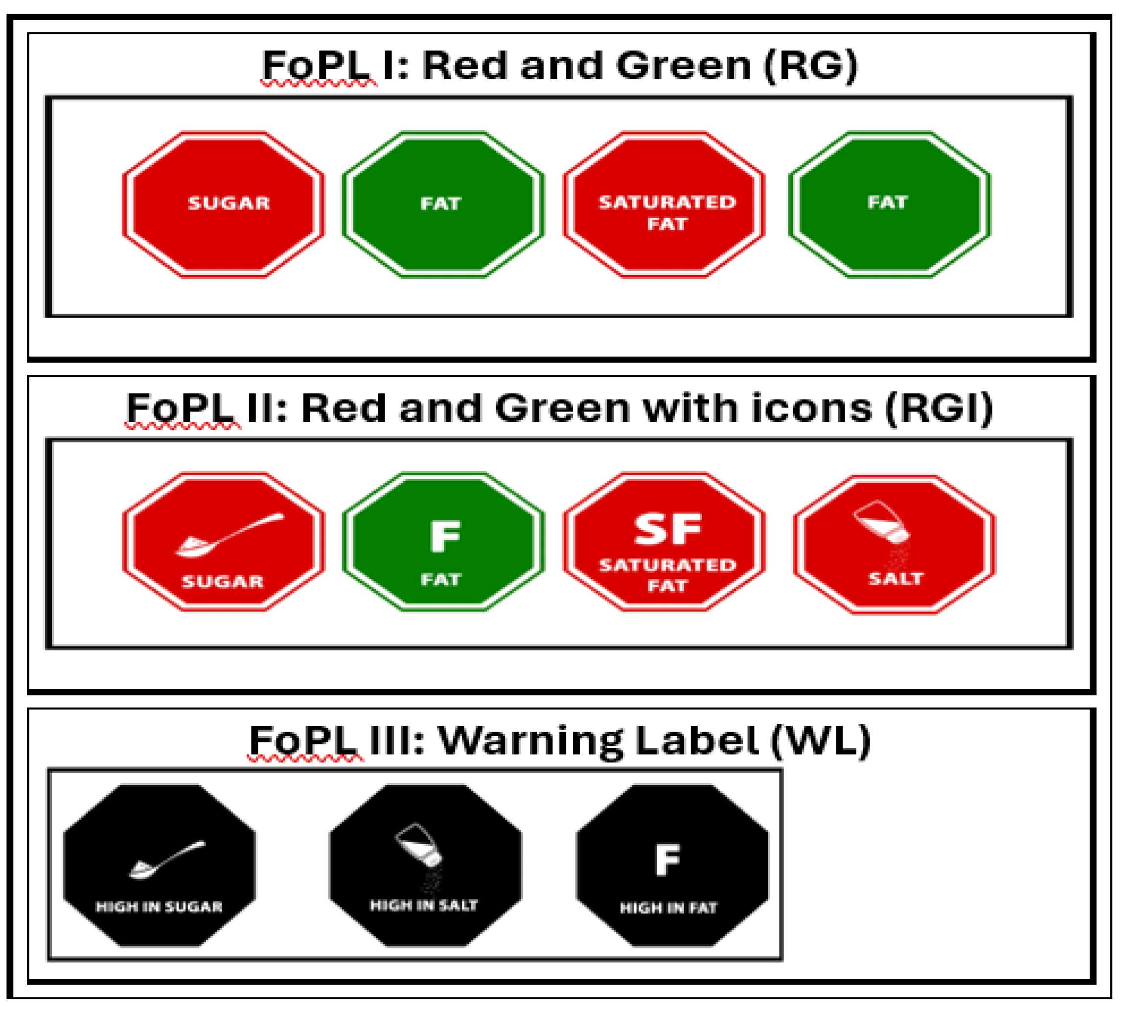
Figure 2.
Images used during FGDs.
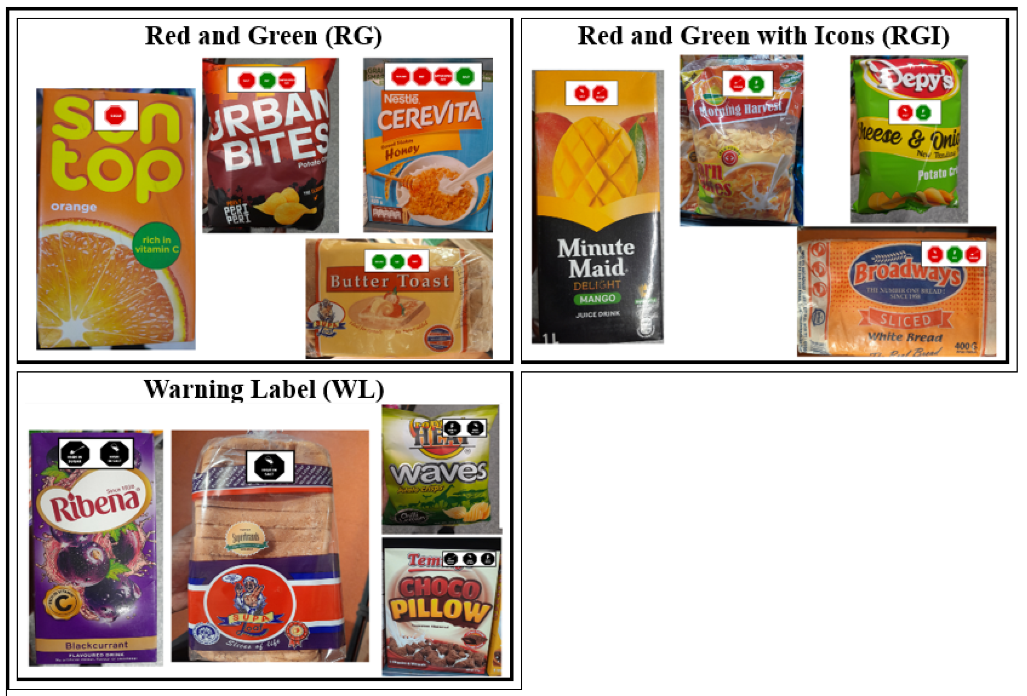

Table 1.
Distribution of FGD participants by region, socio-economic status (SES) and urban-rural location.
Table 1.
Distribution of FGD participants by region, socio-economic status (SES) and urban-rural location.
| County | Region | Number of participants | SES | Urban-rural location |
|---|---|---|---|---|
| Nairobi | Langata | 11 | Mid-high | Urban |
| Embakasi | 23 | Low | Urban | |
| Mombasa | Mvita | 10 | Mid-high | Urban |
| Kisauni | 22 | Low | Rural | |
| Kisumu | Kisumu Central | 24 | Mid-high | Urban |
| Nyando | 12 | Low | Rural | |
| Garissa | Garissa Township | 20 | Mid-high | Urban |
| Fafi | 15 | Low | Rural |
Table 2.
Socio-demographic characteristics and purchasing responsibilitiesby County.
| Variables | Nairobi (N=34) | Kisumu (N=36) | Mombasa (N=32) | Garissa (N=35) | Total (N=137) |
|---|---|---|---|---|---|
| Sex | |||||
| Male | 17 (50.0%) | 18 (50.0%) | 16 (50.0%) | 20 (57.1%) | 71 (51.8%) |
| Female | 17 (50.0%) | 18 (50.0%) | 16 (50.0%) | 15 (42.9%) | 66 (48.2%) |
| Age category | |||||
| 18 - 29 years | 17 (50.0%) | 16 (44.4%) | 19 (59.4%) | 22 (62.9%) | 74 (54.0%) |
| 30 - 50 years | 17 (50.0%) | 20 (55.6%) | 13 (40.6%) | 13 (37.1%) | 63 (46.0%) |
| Education level | |||||
| No Primary school | 0 (0.0%) | 0 (0.0%) | 0 (0.0%) | 5 (14.3%) | 5 (3.6%) |
| Primary school | 8 (23.5%) | 12 (33.3%) | 2 (6.2%) | 4 (11.4%) | 26 (19.0%) |
| Secondary | 12 (35.3%) | 10 (27.8%) | 6 (18.8%) | 18 (51.4%) | 46 (33.6%) |
| College/University | 14 (41.2%) | 13 (36.1%) | 23 (71.9%) | 7 (20.0%) | 57 (41.6%) |
| Postgraduate school | 0 (0.0%) | 1 (2.8%) | 1 (3.1%) | 1 (2.9%) | 3 (2.2%) |
| Parent or caregiver for children aged below 18? | |||||
| No | 6 (17.6%) | 4 (11.1%) | 18 (56.2%) | 29 (82.9%) | 57 (41.6%) |
| Yes | 28 (82.4%) | 32 (88.9%) | 14 (43.8%) | 6 (17.1%) | 80 (58.4%) |
| Main decision-maker for food purchases | |||||
| No | 9 (26.5%) | 3 (8.3%) | 9 (28.1%) | 22 (62.9%) | 43 (31.4%) |
| Yes | 25 (73.5%) | 33 (91.7%) | 23 (71.9%) | 13 (37.1%) | 94 (68.6%) |
| Main buyer of food | |||||
| Yes | 21 (61.8%) | 29 (80.6%) | 23 (71.9%) | 13 (37.1%) | 86 (62.8%) |
| Shared responsibility | 13 (38.2%) | 7 (19.4%) | 6 (18.8%) | 12 (34.3%) | 38 (27.7%) |
| Not the main buyer | 0 (0.0%) | 0 (0.0%) | 3 (9.4%) | 10 (28.6%) | 13 (9.5%) |
Table 3.
Key themes and sub-themes.
| Themes | Sub-themes |
|
Colour |
| Shape | |
| Text | |
| Memorability | |
|
Ease of understanding |
| Purpose and audience of symbol | |
| Clarity and confusion | |
| Label message | |
|
Shift on purchase intention |
| Effect of symbol on diet related NCDs | |
|
Cultural appropriateness |
Disclaimer/Publisher’s Note: The statements, opinions and data contained in all publications are solely those of the individual author(s) and contributor(s) and not of MDPI and/or the editor(s). MDPI and/or the editor(s) disclaim responsibility for any injury to people or property resulting from any ideas, methods, instructions or products referred to in the content. |
© 2024 by the authors. Licensee MDPI, Basel, Switzerland. This article is an open access article distributed under the terms and conditions of the Creative Commons Attribution (CC BY) license (http://creativecommons.org/licenses/by/4.0/).
Copyright: This open access article is published under a Creative Commons CC BY 4.0 license, which permit the free download, distribution, and reuse, provided that the author and preprint are cited in any reuse.


