
Submitted:
15 September 2023
Posted:
19 September 2023
You are already at the latest version
Abstract
Immersive Unit Visualization is an emergent form of visualization that arose from Immersive Analytics where, unlike traditional visualizations, each data point is represented by an individual visual mark in an immersive virtual environment. This practice has focused almost exclusively on virtual reality, excluding augmented reality (AR). This article develops and tests a prototype of an immersive Unit Visualization (Floating Companies II) with two AR devices: head-mounted display (HMD) and hand-held display (HHD). Results from the testing sessions with 20 users were analyzed through qualitative research analysis and thematic coding indicating that, while the HHD enabled a first contact with AR visualization on a familiar device, HMD improved the perception of hybrid space by supporting greater stability of virtual content; wider field of view; improved spatial perception; increased sense of immersion; and more realistic simulation, which impacted on information reading and sense-making. The materialization of abstract quantitative values into concrete reality through its simulation in the real environment and the ludic dimension stand out as important opportunities of this type of visualization. This paper investigates the aspects distinguishing two experiences regarding data visualization in hybrid space; and characterizes ways of seeing information with AR, identifying opportunities to advance information design research.
Keywords:
immersive unit visualization
; augmented reality
; hybrid space
; immersive analytics
; information design
; data visualization
1. Introduction
The following study falls under the scope of Immersive Analytics, more specifically Immersive Unit Visualization - a recent approach to data visualization where each database unit is individually represented in an immersive environment. The importance of linking Immersive Unit Visualization and AR has to do with two main issues: firstly, this area is usually associated with virtual reality to achieve the highest possible level of immersion, which is why there is a great lack of literature on mixed realities, including AR. Although AR is not as immersive as VR, it presents other opportunities for IUV, particularly the chance to simulate virtual content in the real environment. From a design perspective, we need to investigate what semantic possibilities are introduced by this feature. Secondly, IUV represents a new approach to data representation that is not based on a traditional paradigm, but instead capitalizes on the potential of immersiveness and the spatial dimension, central qualities of AR as a medium. Exploiting AR's inherent qualities from a data visualization perspective is a fundamental issue regarding information design, especially its communicational dimension, which involves finding visual metaphors capable of taking full advantage of the medium's qualities while searching for its own language.
Given the scarcity of studies on IUV with AR, specifically studies comparing different types of AR devices, this study aims to identify the aspects that differentiate visualization with a hand-held display (HHD) and a head-mounted display (HMD), from the user's point of view. Understanding the impact of different AR devices on interaction and information comprehension can improve the development of innovative approaches to information design, since the visual language in this type of visualization is not yet established but is constantly evolving.
This research emerged after a study entitled "Data Visualization in Hybrid Space" [1] on the potential and limitations of hybrid space - the space resulting from the combination of virtual and real environments - for data visualization. In this context, the prototype of an AR application for mobile devices entitled Floating Companies (FLOC) was developed, implemented, and tested (see the prototype description in '1.1. Floating Companies') - an AR Immersive Unit Visualization representing data on design companies in Portugal.
The conclusions of this study frame hybrid space within the concept of emotional space as defined by Marie-Laure Ryan [2] - a space that favors a horizontal and immersive perspective and places the user in the same space as the virtual content, simulating the "lived experience". In general terms, the potential of representing data in hybrid space includes (1) the immersiveness that promotes engagement and encourages free exploration; and (2) the unprecedented ability introduced by AR to make numerical abstractions concrete by simulating and integrating them into the real environment. We'll refer to this AR feature in data representation as 'concretization' - a term borrowed from Bach [3] (p.7) [4], who points out concretization as a strategy of narrative visualization, in which abstract concepts are illustrated using concrete objects, usually implying that each unit is individually represented by a visual mark. A classic example of concretization is the ISOTYPE language, which associates pictograms with quantities.
However, although it has advantages from an engagement point of view, the perspective of closeness promoted by the hybrid space naturally hampers the existence of a vertical, ie. strategic, view of the data. Considering this difficulty, we identified the need to complement emotional space with strategic information and the need to improve the credibility of hybrid space. As a working hypothesis, we anticipated that the use of an HMD would provide the experience with a more natural interaction and immersion, but also a better integration between the real and virtual environments, resulting in a more credible hybrid space.
FLOC II represents a new cycle of development and user testing of the Floating Companies prototype to integrate the modifications and adaptations recognized as relevant in the previous phase [1], including stabilizing the virtual content; incorporating the narrative; introducing pictorial cues; and adjusting the app to a head-mounted display (HMD) - the Oculus Quest 2. The modifications introduced are detailed in "Floating Companies II". In this study, the aim is to verify, through new user tests, the hypothesis about whether the use of an HMD can bring greater credibility to the hybrid space, while extracting new guidelines for the design of data visualizations with AR.
Some of the main conclusions of this study point to an optimization of visualization with the use of HMD compared to the use of HHD in various aspects, including the stabilization of virtual content in space, the wider field of view and greater immersiveness. These improvements are co-responsible for a better spatial perception and a more credible hybrid space, with an impact on information reading and sensemaking with data. Regardless of the device used, concretization once again stood out as a semantic and communication possibility in Immersive Unit Visualization with AR. With this study we hope to find opportunities and guidelines according to which research and practice in information design may progress, in a continuous adjustment of the content to the medium.
1.1. Floating Companies
FLOC - Floating Companies (FLOC) is the prototype of an AR application for Android mobile devices, which visualizes data on design companies in Portugal, collected and curated as part of the Design OBS Project. "Design OBS - Towards a Design Observatory in Portugal" [5] was a project aimed at collecting, analyzing and interpreting data on the various sectors of the Portuguese design ecosystem. FLOC was designed, developed and tested as part of a study on the use of AR in data visualization, where there is no semantic relationship between the virtual content and the real environment [1]. In the first version of FLOC, each company corresponds to a sphere, whose color and diameter reflect its size (number of employees). Their position in space gives an approximate idea of the sample's distribution across Portugal, but also their relative performance (the vertical position of each company is an indicator of its profit per employee) (see Figure 1). Each virtual object portrays a unit, and its visual characteristics reflect its real attributes - color and size are determined according to the company's class, which is determined by the number of employees.
1.2. Floating Companies II
In Floating Companies II (FLOC II) some changes considered relevant in the previous phase were implemented, including:
1) Stabilization of the register: In the tablet version, the aim was to better stabilize the register of the virtual content by using the 'Extended Tracking' option, but also by replacing the 'area target' with plane detection - a feature supported by Vuforia SDK. During plane detection, the application recognizes horizontal planes, and the user is prompted to tap on one of the recognized surfaces to place the virtual content.
2) Narrative sequence integration (see Table 1):
FLOC's main scene showing the spheres distributed across the map in their respective districts was extended over five views in a narrative sequence, accompanied by audio.
Navigation between views is done using the 'next' button, which only allows you to move forward in the scenes, and supported by a small graphic at the top of the menu - identifying the current view. Interaction with the spheres takes place only in the fourth view, being similar to the interaction with the previous version of FLOC - by clicking on the sphere the user learns the name of the company, the district and the profit per employee. The narrative takes place over a sequence of views, and there is no animation of the spheres but rather a sequence of different arrangements. All the views are accompanied by an audio description of the visual content.
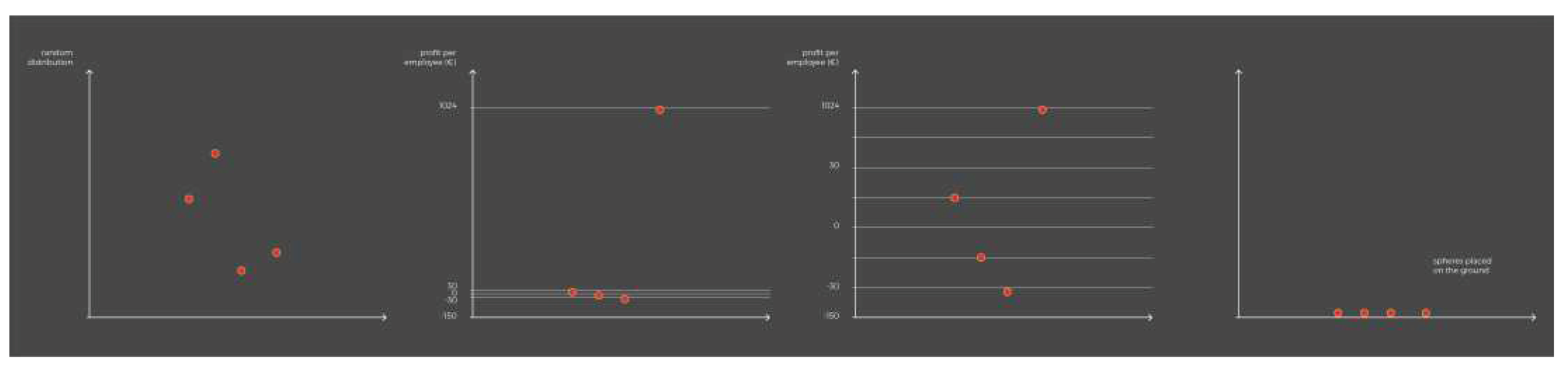
Figure 2.
Warping of the vertical axis along views 2, 3, 4 and 5. In the second view (chart 1) the spheres are distributed randomly in space; in the third view (chart 2) the spheres are arranged vertically according to the average profit per employee (€) on a uniform axis; in the third view (chart 3) there is a deformation of this axis, influencing the arrangement of the spheres as illustrated in the figure. In the last view (chart 4), all the spheres are arranged at ground level.
3) Pictorial clues were introduced into the hybrid space, namely shadows projected by the spheres floating on the floor and map.
4) The application was adapted to a Head Mounted Device (HMD) (see Figure 3) - the Oculus Quest 2. The AR experience was adapted for Oculus using the 'Passthrough' feature (Unity with Oculus integration) - an option that only recently ceased to be considered experimental - and which allows users to see the real environment, enabling the creation of mixed reality experiences. One of the peculiarities of the Passthrough mode is the black and white appearance of the real environment, which gives the real environment a virtual appearance and makes the virtual content look real. Interaction is done using controllers - the right controller acts as a laser pointer, while the left controller has the main menu.
In the HMD version, there is no need to associate the virtual content with a target or plane, as this content automatically appears in the user's real environment using the ground plane as a reference, scanned when the display is initialized. The automatic positioning of virtual content in the real environment can lead to cases where the virtual object intersects objects in the physical environment, causing poor integration between the real and virtual environments. In such cases it is possible to reposition the virtual content using the joystick which, by definition, is used to navigate the virtual environment for which the Oculus was originally designed.
1.3. Literature Review
Park et al. [6] define a Unit Visualization as a family of visualizations where every data item is represented by a unique visual mark - a visual unit, in contrast to aggregated visualizations that seek to merge multiple data items into inseparable graphic entities. This definition includes several popular visualization techniques, such as pictograms, scatter plots and dot plots [7], as well as other less conventional examples, as illustrates the interactive visualization "The terrible numbers that grow with each mass shooting" [8]. More recently, Immersive Unit Visualization (IUA) has emerged in the context of Immersive Analytics (IA) [9] as a form of visualization where each data point is represented by a separate visual mark in an immersive virtual environment [10]. According to Ivanov et al. (2018) [10], who first proposed the term IUA, visualizing units in an immersive environment offers several unique opportunities, including an increased sense of presence that fosters exploratory experiences. For Ivanov, virtual reality can considerably increase the user's sense of presence (feeling of being in an environment), as well as the perception of their embodiment in a scene. This allows immersive visualization systems to emulate the physical exploration intrinsic to many physical unit visualizations.
Although, the practice of using physical objects and visual marks to represent, count, and reason about referents in the world has a rich history that far predates contemporary data visualization, this practice combined with immersive environments is recent and has focused mainly on virtual reality. This is the case of the visualization designed by Ivanov and colleagues (see Figure 4) on the victims of 130 mass shootings in the United States from 1966 to 2017 [10] [11]; or the DeathTolls Experience visualization (see Figure 5) by Ali Eslami (2016) [12] which aims to raise awareness about the victims of three events - the terrorist attacks in Europe, the deaths of refugees in the Mediterranean Sea and the Syrian civil war.
The subject of IUV with AR is far less frequent - both in the literature and in practical applications - compared to the use of virtual reality. Bucking this trend, Dragicevic [13] approaches AR as a form of 'humanitarian' visualization in which, by relocating a particular event in the user's environment, an emotional and humanitarian connection is fostered with the people behind the numbers. Outside of this specific context, no other examples of the use of AR as a means of visualizing quantitative data have been found within IUV so far. Aside from the IUV, other projects explore the simulation of quantitative data in the real environment with AR, such as Sarri et al. (2022) [14] (see Figure 6) who simulate the sea level rising in the real environment, based on a study with predictions for the coastal zone of Chania, Greece.
Within Immersive Analytics (IA), several authors have compared data visualization using different types of devices along the reality-virtuality continuum [15]. Whitlock et al. (2020) compare how users interpret a data visualization in three different modalities - desktop, AR, and virtual reality (with head-mounted display), assessing how quickly and accurately people perform a set of analysis tasks across different visual channels (color, size, height, orientation, and depth) [16]. Within data science, Cavallo et al. (2019) evaluate the performance of individual tasks in exploratory data analysis (EDA) [17], across four different modalities that follow the virtuality continuum - physical environment; hybrid reality; standalone AR (AR that is not integrated into the real environment); and virtual reality. In a research paper on IA, Kraus et al. (2022) [18] analyze and characterize the body of theoretical work in this area between 1990 and 2020. Under 'comparing media' the authors present a set of studies comparing the conventional computer screen with immersive AR and VR media, including [19]; [20]; [21] and [22]. Despite studies comparing different types of devices in Immersive Analytics, this comparison is not made specifically in the field of Immersive Unit Visualization, which is based on the premise of representing each unit individually rather than synthesizing information.
2. Materials and Methods
2.1. Research Question
Considering the lack of theory on Immersive Unit Visualization with AR and specifically the absence of studies comparing the use of HMD and HHD, the following question arises: 'What are the differences in immersive data visualization using an HHD and an HMD in the context of Immersive Unit Visualization?'. Our aim is to verify whether the use of an HMD translates into a more credible hybrid space. This study also aims to deepen and confirm the limitations and advantages of Immersive Unit Visualization for communicating information in hybrid space, deepening the previous reflection in "Data Visualization in Hybrid Space" [1], identifying opportunities for future development in information design.
2.2. Methodology
The development of FLOC II was triggered in the context of the travelling exhibition "Towards a Design Observatory in Portugal - Situation" (www.designobs.pt) in Porto, at the Faculty of Fine Arts (FBAUP) between 27 May 2022 and 3 June 2022, which integrated multiple information design artefacts [23]. Like the first testing phase with the FLOC prototype, the Design OBS exhibition in Porto was an opportunity to test the prototypes developed for Android tablet and Oculus Quest 2 with interested audiences. Besides the tests collected as part of the exhibition, tests were carried out with students from the master's and bachelor’s programmes in Design at the University of Aveiro, as well as some convenience tests carried out with people from the personal sphere.
2.3. Collecting and Analyzing Data
Data was collected from 20 participants between 30 May and 3 June 2022 and came from three different contexts: 1) random visitors to the exhibition "Towards a Design Observatory in Portugal - Situation" at the Faculty of Fine Arts of the University of Porto; 2) students from the master's and bachelor’s degree in design at the University of Aveiro; and 3) people from the private sphere. Initially, their feedback on the tablet application was collected using the Thinking Aloud method, a user experience test in which participants are asked to interact with the system while verbalizing their thoughts aloud in a continuous monologue [24]. In a second phase, participants were asked to fill in the System Usability Scale [25] about their experience with tablet - a questionnaire that uses a Likert-type usability scale and allows an overall assessment of the usability of a system by scoring it from 1 to 5 out of 10 items relating to its usability. Although usability does not exist in absolute terms and can only be defined according to particular contexts, in this case the SUS questionnaire enabled to establish a comparison between the handheld-display and the head-mounted display in terms of usability. Subsequently, the same tests were replicated, but this time to evaluate the experience with Oculus Quest 2.
Each test was preceded by a brief presentation of the research as part of the Design OBS project, and a request to fill in the informed consent form for the audio recording and sociodemographic characterization. These tests allowed three types of data to be collected on the use of the application on tablet and Oculus: audio recording of people's comments during their experience, participant observation fixed in the form of field notes and usability evaluation using the SUS questionnaire.
Data analysis was inspired by a combination of the guidelines proposed by Fallman (2008) [26] and Forlizzi et al. (2009) [27] for the design, development and testing of artefacts, which involves (i) building new artefact(s) and (ii) reflecting on the artefact(s). Audio recordings were transcribed using ExpressScribe software and analyzed with Atlas.ti, following the guidelines proposed by Charmaz (2014) [28]. This process involved analyzing qualitative data through thematic coding (see Figure 7). The initial codes emerged from the data and were then shared and discussed among the co-authors during joint online sessions using the Atlas.ti collaborative web platform, created to enable more efficient iterations of the emerging codes and thematic descriptions.
2.4. Sample Characterization - Demographics and Usability Questionnaire
Among the 20 participants (11 female and 9 male), the most represented age group is between 21 and 30 years old (85%). The most frequent academic level is bachelor's degree (55 %), with most participants studying areas related to art and design (60%). Most participants are Portuguese (90%) with only 10% of participants of foreign nationality. Although most participants reported being completely comfortable using a smartphone (70% indicated a score of 5 points and 20% indicated a score of 4 out of 5), they are not completely familiar with AR technologies (with 35% indicating a score of 2 points and another 35% indicating a score of 3 points out of 5). Regarding the use of the Oculus Quest 2, participants said they were not at all familiar with its use (with 35% indicating a score of 1 point and 40% indicating a score of 2 points out of a maximum of 5), which could potentially point to an increased difficulty interacting with this device. The results of the usability questionnaires filled in by the 20 participants on the use of tablet and Oculus point towards greater usability using the Oculus version (with a score of 76.5 / 100) compared to the tablet version (with a score of 72.5 / 100). The difference was numerically insignificant, but still significant considering the participants' lack of familiarity using the Oculus in contrast to their total familiarity using tablet.
3. Results
3.1. Thinking Aloud and Field Notes
3.1.1. Visualization in Hybrid Space – Comparing HHD and HMD
The aspects in which the use of an HMD improves visualization in hybrid space compared to the use of an HHD are grouped under seven categories (see Table 2): (1) field of view; (2) immersion; (3) spatial perception; (4) quality of the simulation; (5) ease of use; (6) focus on information; and (7) playful component. These categories provide specific clues on how data visualization in hybrid space differs when using the different devices, specifically in the case of an Immersive Unit Visualization, but especially how the use of HMDs improves visualization.
Field of view and immersion - Although they didn't use the technical term 'field of view' (FOV), which designates the angular extent of the observable world that is seen at any given moment, several participants talked about the difference between viewing virtual content through a 'window' with the tablet and having an actual field of view with Oculus. Participants reported that while the tablet cuts off the field of view, the Oculus acts as an extension of the eyes, allowing for greater sense of immersion.
Spatial perception - The use of Oculus provided a better spatial perception: "Spatial perception is much better here. In spatial terms it wins over a tablet or a mobile phone, I think." (P16). There is a better understanding of three-dimensionality (x, y, z), with participants reporting that it is easier to perceive the height, location on the horizontal plane and depth of virtual objects. A better perception of three-dimensionality leads to a better notion of the quantity of spheres, and a perception of greater visual organization compared to the tablet, even though the configuration of the virtual elements in space is the same on both devices. In addition to a better spatial perception of the virtual objects, participants became more situationally aware and were better able to situate themselves in the hybrid space. A better sense of the quantity and organization is particularly useful when it comes to an IUV as it involves the representation of large sets of objects in which it is necessary to simultaneously convey an overview (set) and a detail view (unit). Situational awareness is also desirable in this context, as immersive exploration greatly depends on the user navigating through space.
Quality of the simulation - The quality of the simulation, ie. the extent to which the simulation manages to create a realistic and convincing experience, has been improved using HMD, with several participants reporting the experience becoming more concrete and defined. In this context, the term concrete translates the material, almost tactile appearance that virtual objects acquire with HMD, resulting in a more realistic simulation.
Ease of use - Several participants reported greater ease of use and comfort when using Oculus, explaining that since they had to hold the tablet with their hands, they were afraid of falling or damaging the device, which is not the case with HMD. The comparison between the use of the two devices revealed a multitasking problem when using the tablet, with participants being required to perform several tasks simultaneously: being aware of the real environment, framing information on the screen, interacting with virtual objects and interpreting data. In the same direction, several comments point out that it's easier to interact with the spheres using Oculus. Despite that, several participants reported difficulty hitting the smaller spheres with the pointer: "It's really hard to aim at the blue ones [smaller spheres] because then it looks like the beam goes on and on. And then your hands shake a bit, and it gets difficult." (P19).
Focus on information - The increased comfort supported by the HMD resulted in a better focus on information - both audio and visual. During the tablet tests, one of the most repeated comments was about the inadequacy of audio as a way of explaining information about the data: "It's very dense information and difficult to memorize for it to be just audio. That's my impression." (P7). When using Oculus, this comment appeared much less (during the tablet experience, eight participants mentioned the lack of audio, with Oculus only one participant mentioned this limitation). One of the participants (P6) even said that she no longer felt the need for text to accompany audio information as she was better able to follow the speech while paying attention to the visual part: "You're much more at ease and that comfort makes it easier to listen to the voice [audio] and follow the information with your eyes." (P6). The greater focus on information was also due to a greater sense of immersion, as well as the black and white background, with the virtual content appearing highlighted in color.
Playful component - In general, the ludic component was stronger when using HMD. Participants who addressed the ludic dimension related greater enjoyment to different factors, including increased freedom of movement, a sense of proximity to the virtual content (sense of presence), and a stronger sense of immersion supported by the display. Despite the Oculus' advantages over the tablet, two participants said that (prolonged) use of Oculus caused eye discomfort and headaches, and one of the participants asked to end the experiment because she was getting unwell.
3.1.2. The Potential of Immersive Unit Visualization in Hybrid Space
Analyzing the data collected provided clues to the potential, but also to the limitations of Immersive Unit Visualization in hybrid space (see Table 3). In line with the results of the first version of FLOC [1], concretization once again emerged as one of the main strengths of Immersive Unit Visualization with AR. A sense of freedom associated with the way of seeing and the playful component of the experience also stand out.
AR Concretization - Concretization is a central dimension in this type of experience because it makes it possible to simulate the physical presence of each unit in the user's real environment, allowing them to easily relate to the virtual content. This possibility is unique to AR medium. Some participants express what we call concretization as "a way of understanding quantity" (P13), ie. understanding what an abstract numerical value means in concrete terms. One of the participants elaborated on this idea in greater depth, with practical examples that point to concretization in terms of volumetry (example of the tiger), in quantitative terms (example of the million people) and in terms of proportion (example of learning fractions with chocolate squares). In all these cases we are dealing with a spatial coding exercise, ie. an exercise in which an abstract numerical value - which can be expressed in terms of volume, quantity, ratio, etc. - is represented in three-dimensional space in a concrete way, returning the numerical abstraction to the physical world through its simulation in the real environment. In this exercise, modelling virtual objects according to the numerical value they represent is just as important as introducing them into the real environment through AR - "seeing the space the tiger occupies" in the previous example implies seeing the space the tiger occupies in the real world and not in the virtual or digital world. The value of the real referent in this type of visualization does not have to do with a semantic link between the virtual content and the place where it will be placed, but rather with the simulation of that content in the space that the user inhabits, on a human scale.
Way of Seeing - The way of seeing, in this context, relates to a particular feature of AR as a medium: the user's inherent control of the point of view, which gives them total freedom to move around the space and frame the virtual content over time from their own moving body. Freedom of seeing therefore does not involve selecting or filtering data, but rather the freedom to select what to see and when to see it, based on one's own movement in an exercise of wandering, exploration, and discovery. Some participants pointed to movement in space and discovery as the advantages of this type of experience, and one of the participants contrasted immersive viewing with watching a film, saying that when the information is in space you don't have to watch a sequence of images until what you're interested in appears, you just have to physically go to the information you want to see. Although user-controlled viewing encourages exploration and discovery, it sometimes leads to situations in which users miss out on relevant content - by positioning themselves either too close to or too far away from the information, as we observed with some participants while using HHD: "This shouldn't happen, I get something I can't read because it's too big, because I'm too close." (P7).
Ludic experience - There is a playful dimension that emerges from observing participants interacting with FLOC II, which is much more noticeable during interaction with HMD. Expressions of enjoyment and interventions about this playful dimension are the most repeated category of comments. One of the participants attributes greater enjoyment to the views where the spheres float in the air, in contrast to the view where the spheres are placed on the ground, supporting a strategic reading of the information. Despite this apparent opposition between usefulness and fun, another participant (P5) talks about entertainment as an incentive to explore and discover information, commenting that he would like to see other databases on other subjects presented this way because it's more entertaining.
3.1.3. Limitations of Immersive Unit Visualization in Hybrid Space
Data analysis also confirmed some of the limitations previously mentioned in the reflection on FLOC I [1] regarding data visualization in hybrid space, namely the difficulty reading strategic information from a horizontal perspective, but also on the FLOC II version. A major limitation (but simultaneously a strength in terms of engagement) continues to be the dominance of a horizontal, immersive perspective, which places the user in the same space as the virtual content, hampering the existence of a strategic perspective. The strategic perspective is what supports the overview of the database, essential to its comprehension. This limitation was mainly pointed out when using the HHD and was less mentioned while using the HMD. One of the participants described the lack of a strategic view of the data when using the tablet. At the same time, a large proportion of users associate the last view in which the spheres are on the ground with greater ease of reading.
Another constraint observed in FLOC II was the difficulty understanding the distortion suffered by the vertical axis referring to company profits per employee throughout the narrative sequence (see views 3 and 4 of Table 1 and Figure 2). This information was presented as a sequence of different configurations of the axis and spheres, accompanied by audio explanation, rather than as a continuous action or animation. Although participants paid more attention to the axis during the Oculus experiment, in general they didn't understand the deformation it underwent during the sequence.
4. Discussion
The use of HMD has optimized visualization in hybrid space compared to HHD in several aspects: stability of the virtual content; field of view coverage and sense of immersion (feeling of closeness to the virtual content); spatial perception and situational awareness; quality of the simulation (increased realism); ease of use (mitigation of the multitasking problem observed on tablet, resulting in improved freedom of movement); focus on information; and ludic component.
4.1. More Credible Hybrid Space and Impact on Information Reading
The hypothesis raised in the reflection on FLOC I [1] is confirmed, which pointed to the use of HMDs as a means of giving the experience a more natural interaction and immersiveness, but also a better integration between the real and virtual environments, resulting in a more credible hybrid space, essential for data communication with AR. Several factors contributed to a more credible hybrid space, including improved tracking and registration stability; a broader field of view, a more immersive perspective over space; and enhanced simulation quality. During the use of HHD, although tracking was working significantly better compared to FLOC's first version, there were circumstances in which, due to the very homogeneous real environment devoid of identifiable objects, the application failed to recognize the horizontal plane, leading to visualization failure. Registration of the virtual content in space was much more stable with Oculus without any loss of recognition. The hybrid space was never interrupted by tracking failures, regardless of the characteristics of the real setting chosen for the experiment. The wider field of view and greater immersiveness, as well as the improved quality of the simulation, have also contributed to a more believable hybrid space, with users moving more freely among the virtual objects and being able to move away without losing information.
Although the detail view prevails over the general view of the data, with several participants pointing out the difficulty in obtaining a strategic view (for example, the difficulty in separating positive values from negative values), it is easier to obtain a distanced view with HMD, without any tracking failures. In addition, the transition between a detail view and an overview has become easier and more immediate. The improved spatial perception and three-dimensionality provide a greater sense of organization of the content in space, which is useful for communicating an overview of the data.
The combination of the improvements has impacted the reading of information and the ability to make sense of data. The increased focus on the visual and audio part of the experience, as well as a better spatial perception, resulted in the discovery of visual elements and information, with some participants mentioning that they were seeing some items for the first time on Oculus, which were already present in the tablet experience. In the same direction, the use of Oculus enabled the discovery of deeper layers of information that were not mentioned when using the tablet. In fact, the HMD made it possible to better integrate visual stimuli, audio content and body movement, which impacted the information reading. The creation of multisensory experiences, as is the case with the use of AR, which largely depends on the movement of the body in space, is central [29] to fostering ‘aesthetic knowledge’: the way we understand and interpret a given situation through the experience provided by our senses - sight, hearing, taste, touch, and smell [29] [30]. In the field of information visualization, Roberts [31] noted in 2014 that visualization was expanding beyond the traditional computer screen to another range of devices, particularly AR devices, and to non-expert audiences, requiring us to look to the future of visualization as an integrated multisensory environment. It is now observable that HMD confers better sensory integration compared to HHD.
4.2. Opportunities for Information Design
By bringing the real environment into visualization, AR presents semantic opportunities for Unit Visualization that cannot be obtained by other means. Currently, there is a great lack of theoretical research and projects concerning immersive unit visualization with AR and this is a research topic that deserves attention.
The use of HMDs in this type of visualization presents several opportunities for development and exploration from the perspective of information design, especially in the context of information communication. Although the use of an HMD intensifies the feeling of immersion, this device better supports a distanced view of virtual objects compared to an HHD. Thus, the use of HMD addresses the need to complement emotional space with strategic information identified earlier [1], and presents opportunities to reconcile a detailed view with an overview of the data, which according to Ben Shneiderman (1996), in his "Visual Information-Seeking Mantra" - "Overview first, zoom and filter, then de tails on demand" - is essential for understanding the data set as a whole [32]. Although this organizational principle was created for the visualization of interactive information, Alberto Cairo highlights its universality, arguing that it can be applied to any type of graphic presentation of facts and phenomena [33].
The greater engagement and enjoyment supported by HMD, combined with a greater focus on visual and audio information, can be used as a way of encouraging the exploration of a database for longer and in a more active and attentive way, facilitating sensemaking, which is an important stage in the process of transforming information into knowledge. From a user experience point of view, and according to Desmet and Hekkert (2007) [34], the experience of a product can be affected by three levels of experience: aesthetic pleasure (the degree to which all our senses are gratified) which Donald Norman [35] calls visceral level; attribution of meaning (the meanings we attach to the product), and emotional response (the feelings and emotions that are elicited). An aesthetic experience can give rise to an emotional experience since it involves pleasure and displeasure, which in turn may imply a behavioral response on the part of the user. All emotions imply a certain tendency towards action (for example, fascination comes with a tendency to explore). Therefore, the emotional response elicited by the experience of the product - in this case the visualization - can be decisive in inciting or discouraging the exploration of data in a visualization with AR. Thus, the search for greater engagement, which is necessary to create meaning in data, implies recognizing the main factors involved in the three levels of experience in data visualization with AR - especially aesthetic pleasure.
Regardless of the device used, the sense of concretization stands out as a communication possibility in Immersive Unit Visualization with AR, especially when abstract numerical values need to be communicated. What AR uniquely allows is simulating the physical presence of virtual objects in the user's environment, who can then relate to them more closely, interpreting them in relation to their environment and their own body. Several participants tried to compare the height of the spheres with their own height, but this was only partially possible as the map image obscured the users' bodies. Better integration of virtual content into the real environment, including the occlusion of virtual models by real environment objects, would have made it easier to relate virtuality and reality.
Opportunities for exploring the medium through design include experimenting new visual metaphors capable of exploring the sense of concretization, and adapting the visual language to AR. Despite the audio description describing the deformation of the vertical axis, most participants were unable to mentally visualize and understand this transformation. In the case of the vertical axis, one way to solve the issue of its interpretation would be by using animation instead of a sequence of views, which forces the user to imagine the movement of the spheres and the axis between views, rather than immediately seeing it. Faced with this problem, there is a need to continually adapt visual resources to the AR medium, which is characterized by its quest for graphic realism, essential for the convincing and realistic integration of virtual objects into real space. Given this relationship of proximity and replication of reality, 3D modelling, and animation assume great relevance as multimedia resources.
4.3. Limitations and Future Work
The results could have been more robust if the data collected had been cross-referenced with data from quantitative tests, such as task time measurement tests and Eye Tracking tests. Also, a greater number of tests would have increased the statistical interest of the tests. As part of communicative visualization [36], unit visualization, and especially immersive unit visualization, is aimed at a detailed view of the data that mainly favors the goal of promoting empathy and raising public awareness of a topic, rather than providing a detailed analysis of the data. Being no exception, FLOC II emphasizes an aesthetic experience rather than the generation of knowledge. As future work, it would be interesting to investigate, from a design point of view, the possibility of combining the strong aesthetic experience with a more analytical component that meets visualization as a cognitive tool or as a support for generating knowledge. As a prototype, the FLOC II application could be improved in several ways. As future work, it would be useful to replace the sequence of views with an animation of the narrative sequence and assess the impact of this change on users' understanding of axis deformation.
Funding
This research was funded by XXX, under the XXX grant.
Institutional Review Board Statement
All subjects gave their informed consent for inclusion before they participated in the study.
Informed Consent Statement
Informed consent was obtained from all subjects involved in the study.
Data Availability Statement
The data presented in this study are available on request from the corresponding author. The data are not publicly available due to privacy restrictions.
Conflicts of Interest
The authors declare no conflict of interest.
References
- Data Visualization in Hybrid Space—Constraints and Opportunities for Design. Advances in Design and Digital Communication III. DIGICOM 2022. Springer Series in Design and Innovation; Martins, N., Brandão, D., Eds.; Springer: Cham, Switzerland, 2022. [Google Scholar]
- Ryan, M.-L. Emotional and Strategic Conceptions of Space in Digital Narratives. In Interactive Digital Narrative - History, Theory and Practice; Koenitz, H., Ferri, G., Haahr, M., Sezen, D., Sezen, T. İ., Eds.; Taylor & Francis: New York, NY, USA; London, UL, 2015. [Google Scholar]
- Bach, B.; Stefaner, M.; Boy, J.; Drucker, S.; Bartram, L.; Wood, J.; Ciuccarelli, P.; Engelhardt, Y.; Köppen, U.; Tversky, B. Narrative Design Patterns for Data-Driven Storytelling. In Data-Driven Storytelling; A K Peters/CRC Press: Boca Raton, FL, USA, 2018. [Google Scholar] [CrossRef]
- Bartram, L.; Boy, J.; Ciuccarelli, P.; Drucker, S.; Engelhardt, Y.; Koeppen, U.; Stefaner, M.; Tversky, B.; Wood, J. NAPA Cards _ Narrative Patterns for Data Stories. Available online: https://napa-cards.net/ (accessed on 4 April 2023).
- Branco, V.; Costa, R.; Costa, N.; Borges, A.; Cunca, R.; Modesto, A. Available online:. Available online: https://designobs.pt/ (accessed on 21 March 2023).
- Park, D.; Drucker, S. M.; Fernandez, R.; Elmqvist, N. Atom: A Grammar for Unit Visualizations. IEEE Trans Vis Comput Graph 2018, 24, 3032–3043. [Google Scholar] [CrossRef] [PubMed]
- Major, T.; Basole, R.C. Graphicle: Exploring Units, Networks, and Context in a Blended Visualization Approach. IEEE Trans Vis Comput Graph 2019, 25, 576–585. [Google Scholar] [CrossRef] [PubMed]
- Washington Post. The terrible numbers that grow with each mass shooting. Available online: https://www.washingtonpost.com/graphics/2018/national/mass-shootings-in-america/ (accessed on 7 April 2023).
- Lee, B.; Bach, B.; Dwyer, T.; Marriott, K. Immersive Analytics. IEEE Comput Graph Appl. 2019, 39, 16–18. [Google Scholar] [CrossRef]
- Ivanov, A.; Danyluk, K.T.; Willett, W. Exploration and Anthropomorphism in Immersive Unit Visualizations. In Extended Abstracts of the 2018 CHI Conference on Human Factors in Computing Systems; ACM: New York, NY, USA, 2018. [Google Scholar] [CrossRef]
- Ivanov, A.; Danyluk, K.; Jacob, C.; Willett, W. A Walk Among the Data. IEEE Comput Graph Appl. 2019, 39, 19–28. [Google Scholar] [CrossRef] [PubMed]
- Ali Eslami. DeathTolls Experience. Available online: https://alllesss.com/DeathTolls-Experience (accessed on 13 June 2023).
- Dragicevic, P. Towards Immersive Humanitarian Visualizations. arXiv 2022, arXiv:2204.01313. [Google Scholar]
- Sarri, F.; Ragia, L.; Panagiotopoulou, A.; Mania, K. Location-Aware Augmented-Reality for Predicting Sea Level Rise in Situ. In 2022 International Conference on Interactive Media, Smart Systems and Emerging Technologies (IMET); IEEE: Piscataway, NJ, USA, 2022; pp. 1–8. [Google Scholar] [CrossRef]
- Milgram, P.; Kishino, F. A Taxonomy of Mixed Reality Visual Displays. IEICE Trans. Inf. Syst. 1994, E77–D. [Google Scholar]
- Whitlock, M.; Smart, S.; Szafir, D.A. Graphical Perception for Immersive Analytics. Proceedings - 2020 IEEE Conference on Virtual Reality and 3D User Interfaces, VR 2020, 2020, 616–625. [Google Scholar] [CrossRef]
- Cavallo, M.; Dolakia, M.; Havlena, M.; Ocheltree, K.; Podlaseck, M. Immersive Insights: A Hybrid Analytics System ForCollaborative Exploratory Data Analysis. In 25th ACM Symposium on Virtual Reality Software and Technology; ACM: New York, NY, USA, 2019. [Google Scholar] [CrossRef]
- Kraus, M.; Fuchs, J.; Sommer, B.; Klein, K.; Engelke, U.; Keim, D.; Schreiber, F. Immersive Analytics with Abstract 3D Visualizations: A Survey. Comput. Graph. Forum 2022, 41, 201–229. [Google Scholar] [CrossRef]
- Arms, L.; Cook, D.; Cruz-Neira, C. The Benefits of Statistical Visualization in an Immersive Environment. In Proceedings IEEE Virtual Reality (Cat. No. 99CB36316); IEEE: Piscataway, NJ, USA, 1999; pp. 88–95. [Google Scholar] [CrossRef]
- Etemadpour, R.; Monson, E.; Linsen, L. The Effect of Stereoscopic Immersive Environments on Projection-Based Multi-Dimensional Data Visualization. In 2013 17th International Conference on Information Visualisation; IEEE: Piscataway, NJ, USA, 2013. [Google Scholar] [CrossRef]
- Donalek, C.; Djorgovski, S. G.; Cioc, A.; Wang, A.; Zhang, J.; Lawler, E.; Yeh, S.; Mahabal, A.; Graham, M.; Drake, A.; Davidoff, S.; Norris, J. S.; Longo, G. Immersive and Collaborative Data Visualization Using Virtual Reality Platforms. In 2014 IEEE International Conference on Big Data (Big Data); IEEE: Piscataway, NJ, USA, 2014; pp. 609–614. [Google Scholar] [CrossRef]
- Belcher, D.; Billinghurst, M.; Hayes, S. E.; Stiles, R. Using Augmented Reality for Visualizing Complex Graphs in Three Dimensions. In The Second IEEE and ACM International Symposium on Mixed and Augmented Reality, 2003. Proceedings; IEEE: Piscataway, NJ, USA, 2003. [Google Scholar] [CrossRef]
- Borges, A.; Silva, A.C.; Modesto, A.; Ribeiro, M.; Fernandes, M.; Costa, N.; Cunca, R.; Costa, R.C.; Branco, V. Observatório Do Design Em Portugal: Representações; 2022.
- Nielsen, J. Thinking Aloud: The #1 Usability Tool. NN/g Nielsen Norman Group. https://www.nngroup.com/articles/thinking-aloud-the-1-usability-tool/. (accessed on 12 January 2022).
- Brooke, J. SUS - A Quick and Dirty Usability Scale. In Usability Evaluation in Industry; Jordan, P.W., Thomas, B., Weerdmeester, B.A., McClelland, I.L., Eds.; CRC Press: London, UK, 1996. [Google Scholar]
- Fallman, D. The Interaction Design Research Triangle of Design Practice, Design Studies, and Design Exploration. Design Issues 2008, 24, 4–18. [Google Scholar] [CrossRef]
- Forlizzi, J.; Stolterman, E.; Zimmerman, J. From Design Research to Theory: Evidence of a Maturing Field; 2009.
- Charmaz, K. Constructing Grounded Theory, 2nd ed.; Sage Publications: London, UK, 2014. [Google Scholar]
- Tonkinwise, C. A Taste for Practices: Unrepressing Style in Design Thinking. Des Stud 2011, 32, 533–545. [Google Scholar] [CrossRef]
- Stigliani, I.; Ravasi, D. The Shaping of Form: Exploring Designers’ Use of Aesthetic Knowledge. Organ. Stud. 2018, 39, 747–784. [Google Scholar] [CrossRef]
- Roberts, J.C.; Ritsos, P.D.; Badam, S.K.; Brodbeck, D.; Kennedy, J.; Elmqvist, N. Visualization beyond the Desktop - The Next Big Thing. IEEE Comput Graph Appl 2014, 34, 26–34. [Google Scholar] [CrossRef] [PubMed]
- Shneiderman, B. The Eyes Have It: A Task by Data Type Taxonomy for Information Visualizations. Proc. 1996 IEEE Symp. Vis. Lang. 1996, 336–343. [Google Scholar] [CrossRef]
- Cairo, A. The Functional Art: An Introduction to Information Graphics and Visualization, 1st ed.; New Riders: Berkeley, CA, USA, 2013. [Google Scholar]
- Desmet, P.; Hekkert, P. Framework of Product Experience. Int. J. Des. 2007, 1, 57–66. [Google Scholar]
- Norman, D. Emotional Design: Why We Love (or Hate) Everyday Things; Basic Books: New York, NY, USA, 2004. [Google Scholar]
- Masud, L.; Valsecchi, F.; Ciuccarelli, P.; Ricci, D.; Caviglia, G. From Data to Knowledge - Visualizations as Transformation Processes within the Data-Information-Knowledge Continuum. In 2010 14th International Conference Information Visualisation; IEEE: Piscataway, NJ, USA, 2010; pp. 445–449. [Google Scholar] [CrossRef]
Figure 1.
Floating Companies (FLOC) visual coding.
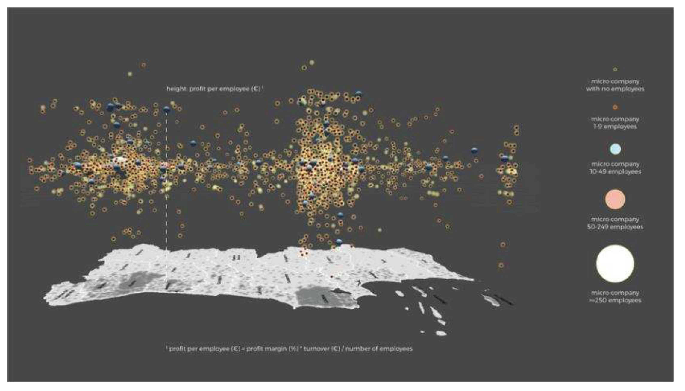
Figure 3.
Photo montage reproducing the black and white background (passthrough mode), as seen while using the FLOC II application with Oculus Quest 2.
Figure 3.
Photo montage reproducing the black and white background (passthrough mode), as seen while using the FLOC II application with Oculus Quest 2.
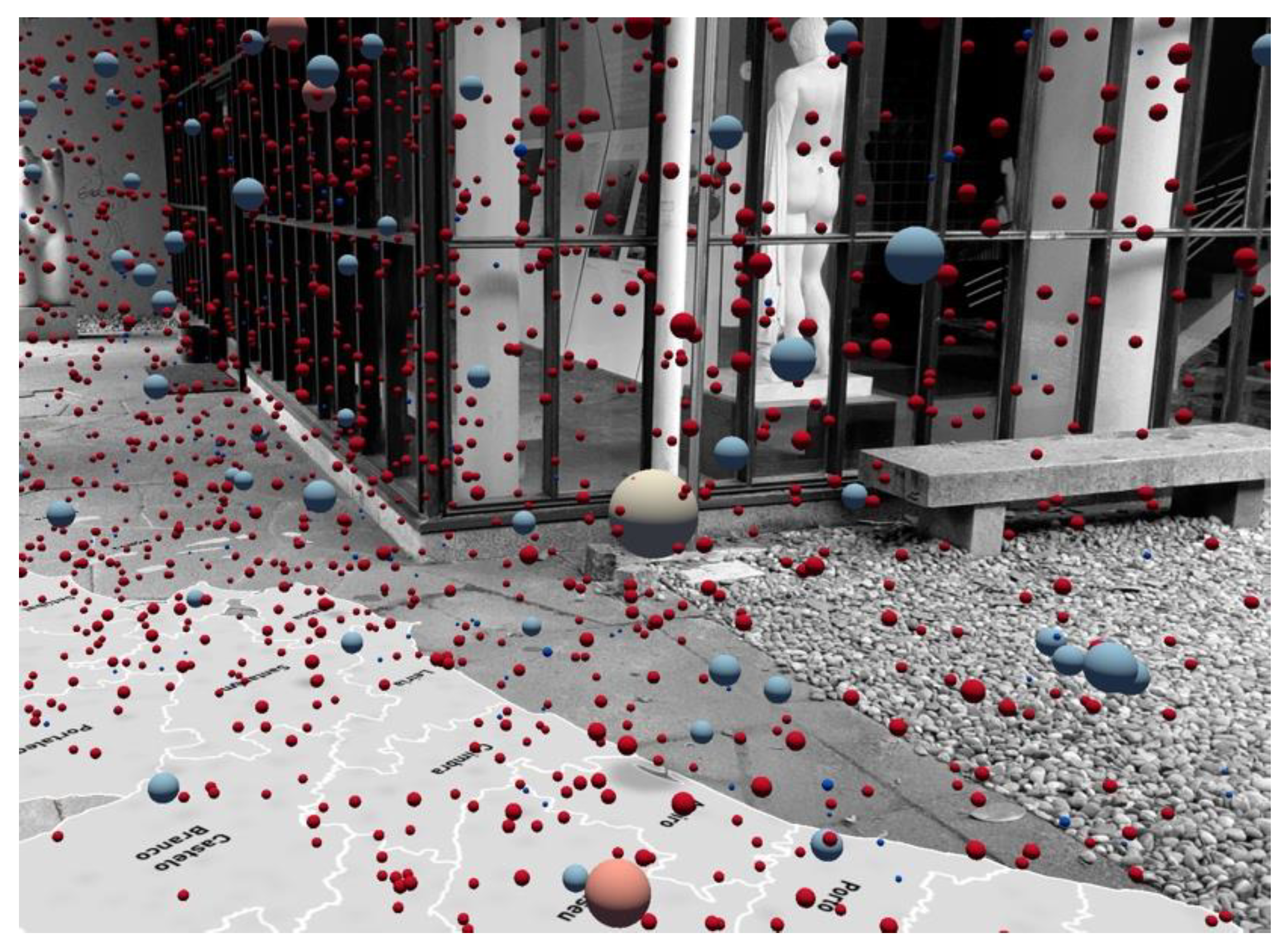
Figure 4.
Immersive unit visualization showing mass shooting victims in virtual reality, by Ivanov, Danyluk and Willett (2018) [10]. Reproduced with permission from Ivanov, A., CHI'18 Extended Abstracts; published by ACM, 2018.
Figure 4.
Immersive unit visualization showing mass shooting victims in virtual reality, by Ivanov, Danyluk and Willett (2018) [10]. Reproduced with permission from Ivanov, A., CHI'18 Extended Abstracts; published by ACM, 2018.
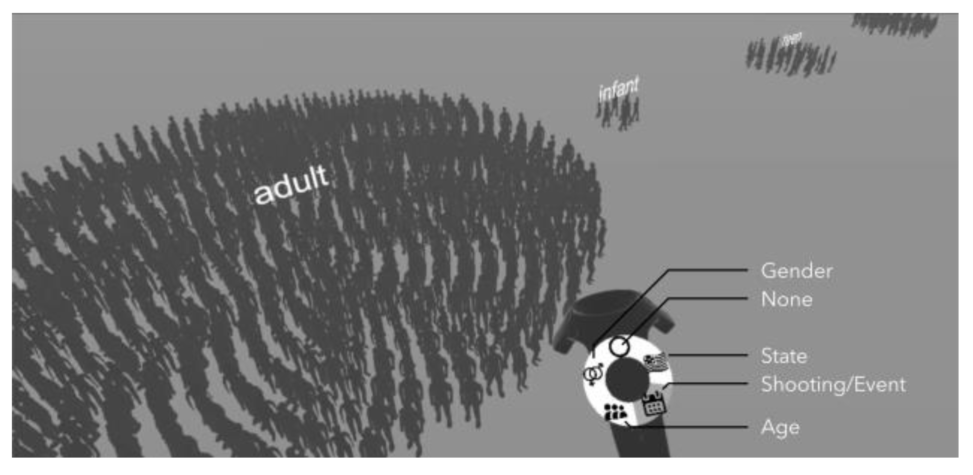
Figure 5.
“DeathTolls Experience”, by Ali Eslami (2016) [12]. Reproduced with permission from Ali Eslami, https://alllesss.com/DeathTolls-Experience; 2016.
Figure 5.
“DeathTolls Experience”, by Ali Eslami (2016) [12]. Reproduced with permission from Ali Eslami, https://alllesss.com/DeathTolls-Experience; 2016.

Figure 6.
AR visualization with location recognition for predicting sea level rise, proposed by Sarri et al. (2022) [14]. Reproduced with permission from Froso Sarri, 2022 International Conference on Interactive Media, Smart Systems and Emerging Technologies; published by IEEE, 2022.
Figure 6.
AR visualization with location recognition for predicting sea level rise, proposed by Sarri et al. (2022) [14]. Reproduced with permission from Froso Sarri, 2022 International Conference on Interactive Media, Smart Systems and Emerging Technologies; published by IEEE, 2022.
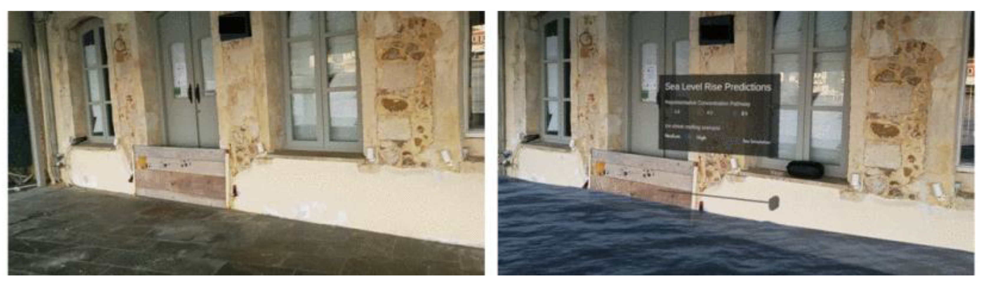
Figure 7.
Screenshot of transcript analysis using thematic coding in Atlas.ti.
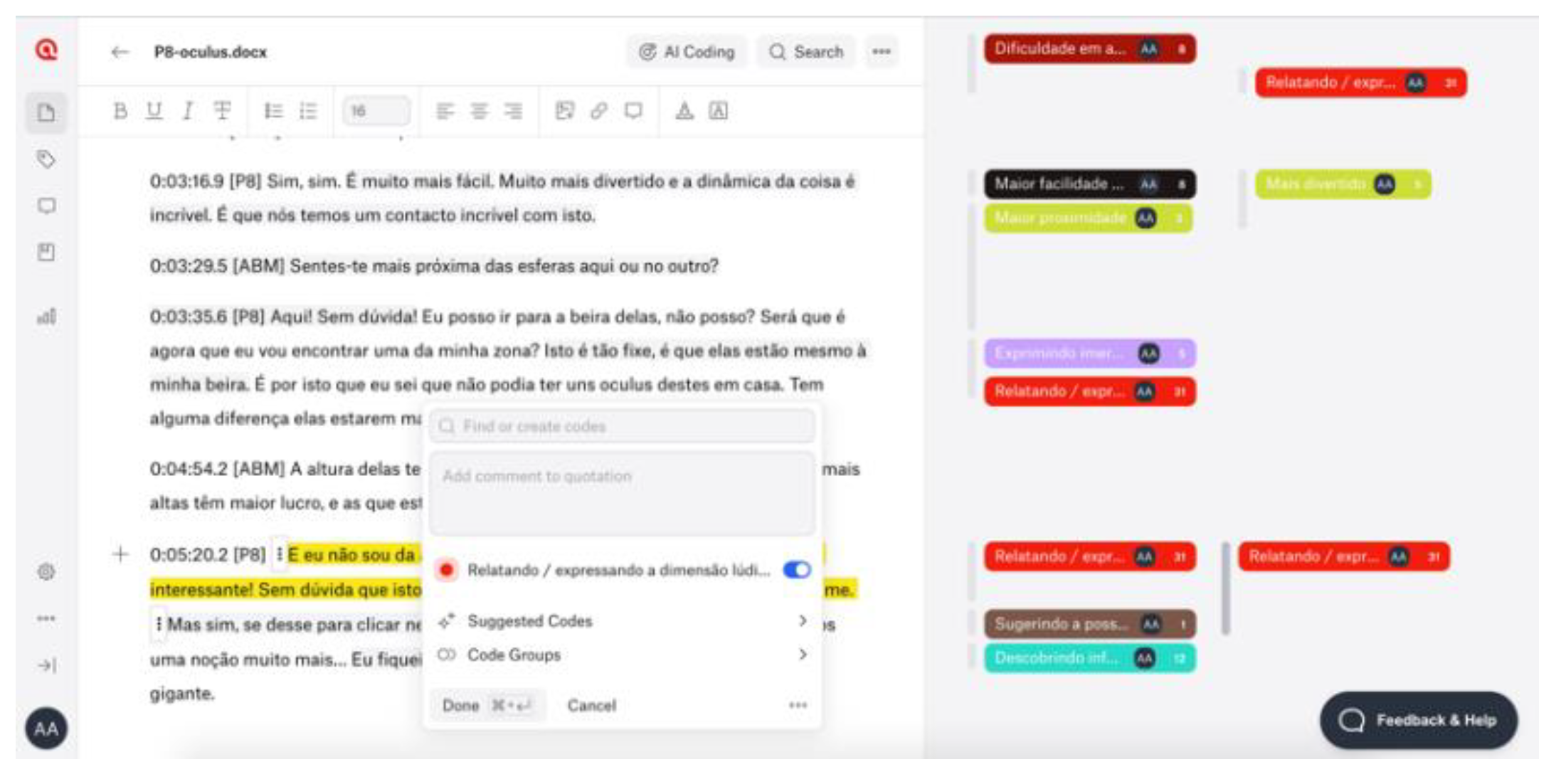

Table 1.
Description of the five views that compose FLOC II narrative sequence. The images are screenshots of the application, using an Android tablet, at the Design OBS exhibition (Faculty of Fine Arts of the University of Porto).
Table 1.
Description of the five views that compose FLOC II narrative sequence. The images are screenshots of the application, using an Android tablet, at the Design OBS exhibition (Faculty of Fine Arts of the University of Porto).
| View | Screenshot | Description |
|---|---|---|
| 1 | 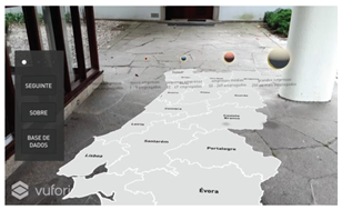 |
The view shows a map of Portugal and a caption of the spheres according to their size and color, introducing the experience through audio. |
| 2 | 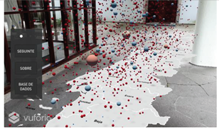 |
The spheres representing the companies are placed randomly throughout the country, at random heights. |
| 3 | 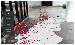 |
Spheres are placed above their corresponding districts with heights determined by the profit per employee. The vertical axis determining the heights is uniform, ie. all units correspond to equal spaces along the axis (see Figure 2). |
| 4 | 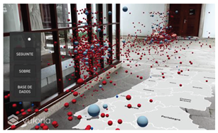 |
The vertical axis is distorted, ie. the axis is expanded in the ranges with more companies. In this way, the spheres with the most frequent profit values take up more space in the visualization. |
| 5 | 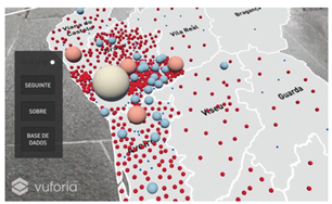 |
The spheres are now arranged on the floor, so that the user has a vertical perspective over the map, albeit within the hybrid space. |
Table 2.
Observed experience and supporting quotes for each category of the thematic analysis comparing HHD and HMD.
Table 2.
Observed experience and supporting quotes for each category of the thematic analysis comparing HHD and HMD.
| Improvements | Observed experience | Supporting quote |
|---|---|---|
| field of view | field of view | "It's like someone who sees very badly and can only see out of a window in front of them." (P17); "There's a noticeable difference here. I felt like the tablet was cropping my frames. It limited what I could see." (P6); "I feel like this [Oculus] is an extension of our eyes. And this movement comes quite naturally to us." (P6); "I think the tablet seems to restrict space a lot. So here you can... I can see everything around me, and I can perceive everything." (P18). |
| immersion | sense of immersion | "This [Oculus] is more immersive. Yes, definitely. It's more immersive." (P20); "Sorry, I'm too immersed. I can hardly speak because I'm actually listening, which is really nice. (...) Far more immersive! And it definitely grabs our attention a lot more." (P14); "I don't know if you can see what I'm seeing..." (P13). |
| sense of proximity | "It's funny, you walk against the spheres, and it seems like you touch them and they PLOC! disappear." (P19). | |
| spatial perception | perception of three-dimensionality: height, width, and depth | "I can distinguish those that are more or less close in terms of profit. I can tell which ones they are. (...) I have a much better perception compared to the tablet." (P16); "Here [Oculus] it's much easier to understand the distance. This region of Castelo Branco, probably all of them up here are Castelo Branco." (P6); "I think it's even easier than with the tablet, because here we can get a better sense of depth and on the tablet it's difficult to get that sense (...)" (P4). |
| notion of quantity and visual organization | "We have a different view, and we can even see the number of spheres better than on tablet." (P1); "Here I can get a better sense of the number of spheres, how many companies there are." (P18); "On the tablet it looked like the spheres were further apart. There was a spatial confusion, there was no order. (...) I feel a greater sense of organization compared to the tablet." (P16). | |
| Situational awareness | "I'm not so scared because I can see the furniture and I know where I am" (P6). About the tablet: "In real life you're walking, but you know where your feet are. Not so much here because it's just a window in front." (P17). | |
| quality of the simulation | a more concrete experience | "With Oculus it's a more concrete reality." (P9); "I think you can get a much more concrete perception of the spheres on the map." (P9). |
| greater definition | "It's much more defined. You can understand it better." (P10). | |
| ease of use | ease of use | "With tablet, it's in your hands and you're afraid of falling, you're afraid of breaking it. In that sense, I think it's a significant improvement." (P6); "Once again, I feel more comfortable walking on the map. I move with more confidence." (P20); "Outside [with a tablet] I was much more concerned about the ground levelling, the slope. Here you can analyze in a much more focused way." (P3). |
| ease of interaction | "I can click on this one. It's easier here." (P7); "I think it's much easier than on the tablet, to hit it and so on." (P13); "Here I can click on each one much more easily." (P18). | |
| focus on information | focus on information | "You feel much more at ease, you can hear the voice and follow the information with your eyes." (P6); "I think that with Oculus I'm so immersed that I'm more aware of the information, whereas on the tablet that doesn't happen. Here the focus is different." (P20); "The Oculus allows you to focus much more on the information because it doesn't have so much background noise. (...) The monochrome image ends up abstracting the background, allowing you to focus more on the information." (P3); "I see you and I see the room. But it's like ghosts, you’re in grey tones (...) it's as if the main thing is the map and the spheres." (P19). |
| playful component | enjoyment | "It's much more fun and the dynamics are incredible!" (P8); "It's much cooler here (...) the experience here has a different feel to it." (P18); "It's much cooler this way! (P18); "It's much cooler this way than with a tablet!" (P19); "You can point at the little balls and move around in space, get as close as you want" (P18); "You're right in the middle, you feel more involved (...) this way it's cooler, it feels like you're right in the middle of the spheres. You can grab them!" (P19). |
Table 3.
Main strengths and limitations of Immersive Unit Visualization in hybrid space.
| Supporting quotes | ||
|---|---|---|
| Potential | Data concretization | "It's more useful to be able to see the number. What's a million people? It's one thing to see the number, it's another thing to see its representation. Seeing a picture of a million people. (...) I learnt fractions with chocolate squares. It's the same here."; "You know what a tiger is, but it's another thing to see it. To see the space it occupies." (P17); "It's nice as a way of realizing quantity and understanding districts." (P13); "In terms of information, when a person is confronted with numbers, it's always an abstract concept. Whereas when you visualize it like this, it's much more real. (...) It's no longer abstract. I really think there's value in this exercise in this way." (P3). |
| Way of seeing | "It's interesting to move around in space because it's as if we're travelling in space, in a more conceptual way, to be able to verify the information." (P4); "When information is in space, we don't have to watch an entire video until what we want to see appears. You just have to move to the place you're interested in. I wanted to see Braga, I just had to walk to Braga." (P17); "[ABM] Does the fact that this information is in real space bring any additional value? [P8] It does, it's interesting because we have to move around and discover." (P8). | |
| Ludic experience | "This is really cool! (...) How cool! How interesting!" (P17); "I think it's funny. The first contact I had with the spheres was interesting because it was a very graphic way of realizing that there are lots of companies and seeing it distributed." (P13); "Walking in the middle is really funny. It really feels like they're coming at you or that you can grab them." (P19); "The other view is cooler with the raised spheres. Here you can understand the information better [view of the spheres on the ground] but the other one is funnier, more entertaining!" (P19). | |
| Limitations | Difficulty reading strategic information from a horizontal perspective | "Since I'm in a perspective where I'm not completely frontal, you can't really see what's above and what's below. (...) Being in the middle, you can't really see the differentiation [of heights]." (P3); "In Porto it looks like everything is more or less at the same height, but they're not. When you lie down on the floor you realize they're not there. Maybe it's the same in Lisbon." (P19); "I see all these little balls, but I don't know if they belong to Porto or if they're above Braga or Aveiro, because then it's difficult." (P11); "It's easier for me to understand. When everything is in the air you can't get a sense of location." (P18). |
| Trouble understanding the axis warping | "And the audio voice used the word 'stretch' the axis. But isn't it shrinking the axis? (...) I associate that word with getting bigger. That word could also... I don't know." (...) I don't understand." (P13); "What is this axis? I don't know what this axis is. What does it represent?" (P7); "Maybe the axis isn't very clear there" (P20). | |
Disclaimer/Publisher’s Note: The statements, opinions and data contained in all publications are solely those of the individual author(s) and contributor(s) and not of MDPI and/or the editor(s). MDPI and/or the editor(s) disclaim responsibility for any injury to people or property resulting from any ideas, methods, instructions or products referred to in the content. |
© 2023 by the authors. Licensee MDPI, Basel, Switzerland. This article is an open access article distributed under the terms and conditions of the Creative Commons Attribution (CC BY) license (http://creativecommons.org/licenses/by/4.0/).
Copyright: This open access article is published under a Creative Commons CC BY 4.0 license, which permit the free download, distribution, and reuse, provided that the author and preprint are cited in any reuse.


