Submitted:
22 November 2025
Posted:
24 November 2025
Read the latest preprint version here
Abstract
Analysing seismic data with modern statistical methods has opened up the possibility of predicting major earthquakes and those of specific magnitudes. However, comprehensive analysis for each location is particularly labour-intensive, while such data necessitates continuous observation. It is therefore desirable to detect anomalies with ease. We demonstrate that this objective can be achieved not by examining complex regional ge-ometries, but simply by dividing the study area into a mesh. Moreover, unexpected properties emerged from the data collected in this manner, which we also present.
Keywords:
earthquake prediction
; calculation method
; programming
; latitude–longitude grid
1. Introduction
Modern statistical methods enable the detection of anomalies that precede major earthquakes. Such anomalies can be identified even from simple records, including time and magnitude [1]. For earthquakes of magnitude 6–7, some degree of prediction appears feasible, provided that such records are available [2]. Precursor swarms frequently occur before major earthquakes, and their identification, together with the observation of anomalous magnitude distributions, may indicate potential hazards.
The principal difficulty is that the recorded data are often extremely voluminous, making regional examination laborious [3,4]. In addition, the administrative areas defined by local authorities are typically irregular in shape [5]. As earthquakes can occur at any time, continuous monitoring is essential, yet maintaining such monitoring across an entire country, such as Japan, is particularly demanding.
To address these challenges, this study investigates a grid-based approach in which the whole of Japan is divided into simple units for analysis. Comprehensive CSV data were employed to evaluate this method. The approach appears promising, and unexpected properties emerged from the collected data, which are also reported. The code for the calculations, which run in R [6], is publicly available [1,2]. This methodology should be applicable to other regions, and modification of the R code is expected to be straightforward.
2. Materials and Methods
2.1. Data
Comprehensive seismic source data were employed. These consist of CSV-formatted records of earthquake date and time, epicentre location, and magnitude, organised annually [4,7]. As compilation requires several years, the most recent dataset available as of November 2025 is from 2022 [4]. More recent data are available [7], but these are organised daily, making download cumbersome; therefore, sampling at intervals of several days was applied. Monthly reports are also published, but these are provided as PDF files, rendering extraction laborious [3,4]. The comprehensive catalogue includes lower magnitudes than the monthly reports.
2.2. Grid Construction
Date, location, and magnitude were extracted from the data. A grid covering the whole of Japan was created, divided into 1° latitude and longitude segments. Magnitude records corresponding to each grid were analysed. The grid was displayed as a mosaic, with each 1° segment represented as a rectangle. Although longitude length decreases with latitude, the adoption of this division was coincidental. It corresponded well with earthquake frequency in Japan, matched the latitude–longitude format of epicentre records, and was convenient for plotting with R functions. No deeper significance was intended.
2.3. Statistical Analysis
The number of epicentres in each grid was recorded. For each grid, a quantile–quantile (QQ) plot was generated, comparing magnitudes within the grid against magnitudes across multiple grids as background [8]. This yielded a linear relationship, from which the intercept (location) and slope (scale) were recorded.
Magnitudes in monthly reports follow a normal distribution [1], whereas the comprehensive catalogue differs slightly [2]. The lower frequency of very small magnitudes introduces curvature in the relationship, leading to deviations in mean or standard deviation estimates. To standardise the data, QQ plots were employed to determine parameters, thereby assessing whether the distribution in a given grid deviated significantly from the majority.
2.4. Error Estimation
Parameter estimation with small sample sizes introduces substantial error. For example, when estimating location from sample data, the error is known to be [9]. To investigate error in QQ plots, simulations were conducted. Random samples were drawn, QQ plots generated, and values calculated. Sample size was increased from 2 to 400 to examine estimation behaviour.
2.5. Normalisation
In the actual data, smaller counts tended to correspond to larger mean magnitudes. To account for this, grids were divided into five categories based on count, and measurements were performed accordingly. The QQ plot used to determine parameters employed the full dataset for the category to which the grid belonged as background. QQ plots were also conducted for counts, location, and scale against well-known distribution forms to investigate distribution patterns.
2.6. Case Studies
To evaluate whether the method could detect earthquakes in advance, anomalies in the investigated parameters were examined for the Mid Niigata Prefecture Earthquake (October 2004, M6.8) [10], the 2011 Tohoku Earthquake (M9) [11], the Kumamoto Earthquake (April 2016, M7.3) [12], and the Noto Peninsula Earthquake (January 2024, M7.6) [13].
2.7. Implementation
All calculations were performed using R [6]. The code is provided in the Supplement. As two types of data with different formats were used, two versions of the code are supplied. Some figures utilise data provided by the Japan Meteorological Agency (JMA) [7], realised using the open-source technology Leaflet [14].
3. Results
3.1. Data Caracteristics
Figure 1A illustrates the geographical relationship between Japan and neighbouring countries [5]. The area enclosed by the red line represents the regional boundaries defined by the Japan Meteorological Agency (JMA). Figure 1B onwards are presented at essentially the same scale. Subsequent figures display data from a grid dividing Japan into one-degree latitude and longitude squares, arranged in a mosaic pattern. The grid size is smaller than that used for oceans but slightly larger than the JMA’s land divisions. Panel B shows the number of recorded epicentres within these grids. Observations extend over a considerable oceanic area, with the entire Japanese archipelago fully covered. As the count numbers follow a log-normal distribution (Figure 1C) [2], z-scores were derived from the logarithms of the counts. Since magnitudes follow a normal distribution [1], their parameters—scale and location—were estimated using the mean and standard deviation here, respectively. Panel D represents the location estimated from the mean, appearing higher in areas with low counts in Panel B and lower in inland areas with high counts.
To confirm this trend, Figure 2A shows the relationship between count numbers and grid mean, revealing a clear correlation. To investigate anomalies, it was necessary to examine whether distributions differed from the majority. As low-count data predominate, indicating higher location values, normalisation with respect to count was required. Magnitudes were therefore divided into five categories. Figure 2B presents a QQ plot comparing magnitude data for each category against the overall background. Category 4, with the highest counts, broadly aligned with the overall quantile, whereas Category 0, with the lowest counts, exhibited a significantly higher location. Scale, however, remained approximately constant.
For each category, magnitudes and QQ plots [8] were generated for each grid, using all magnitudes belonging to that category as background. An example is shown in Figure 2C, with another in Figure S1. Approximately 1,500 such plots were produced per time point. Overall, a linear relationship was obtained, and slope and intercept were estimated using a robust method. Categorisation substantially mitigated the influence of count on location, although some residual effect persisted (Figure 2D). With fewer counts, greater noise was introduced (Figure S2A,B), resulting in smaller scale values (S2A) and higher location values (S2B). This tendency was particularly pronounced when counts were ≤12. Consequently, grids with counts below this threshold were excluded. As precursory swarms typically involve very large counts, such errors are unlikely to affect prediction.
Figure 3A shows a normal QQ plot compiling the slope (scale) from QQ plots introduced in Figure 2C and Figure S1. While broadly following a normal distribution, the highest points tended to be elevated, reflecting strong earthquakes associated with higher σ values. Figure 3B shows the normal QQ plot for intercepts (location), which also roughly followed a normal distribution. If grid data were randomly selected, QQ plots would yield μ = 1 for scale and μ = 0 for location (Figure S2A,B). In practice, μ was smaller for scale and much higher for location, illustrating that grid data are not randomly selected. At low counts, scale tended to be estimated as large and location as small (Figure S2B), elevating μ in Figure 3B. Both σ values were relatively large; if selection were random, σ would be at least an order of magnitude smaller. This indicates considerable variation in data characteristics between grids.
If grid data were randomly selected, QQ plots would yield μ = 1 for scale and μ = 0 for location (Figure S2A,B). In practice, μ was smaller for scale and much higher for location, confirming that grid data are not randomly selected. At low counts, scale tended to be estimated as large and location as small (Figure S2B), elevating μ in Figure 3B. Both σ values were relatively large; if selection were random, σ would be at least an order of magnitude smaller. This indicates considerable variation in data characteristics between grids.
Categorisation ensured that scale no longer depended on count, though it remained consistently below the expected value of 1 (S2C). Standardisation allowed data to be treated independently of count (S2D). Slightly elevated average seismicity was observed in oceanic regions extending from Etorofu Island along the Pacific subduction zone, through the Sanriku coast and Izu Islands, to the Ryukyu Islands and Taiwan [15,16,17,18]. This phenomenon is commonly observed, though not invariably present.
3.2. Case Studies
3.2.1. 2021 Tohoku Earthquake
Figure 4 shows data from 1 January to 10 March 2011, preceding the 11 March 2011 Tohoku earthquake. Epicentre locations (Figure 4A) reveal numerous large precursory swarms off Sanriku. Event counts (Figure 4B) were high along the Sanriku coast. Location values (Figure 4C) were elevated, and scale values (Figure 4D) exceptionally high. Regions with high counts coupled with high scale and location values are prone to large earthquakes [1]. Supporting QQ plots are shown in Figure S1: Sanriku data (S1A) exhibited markedly elevated μ and σ values, while Akita offshore data (S1B) showed more moderate During the same period, earthquake activity increased in northern Nagano Prefecture (Figure 4B), with a corresponding rise in scale. This may have been a precursor to the 12 March 2011 earthquake (M6.7), although no strong precursory swarm was observed (Figure 4A) [1].
3.2.2. 2024 Noto Earthquake
3.2.3. 2004 Niigata Earthquake and 2016 Kumamoto Earthquake
Figure 6A,B show results prior to the 2004 Niigata Chuetsu earthquake (M6.8). Counts were elevated near the mainshock epicentre (Figure 6A), and surrounding scale was heightened (Figure 6B). Data from 2015 (Figure 6C,D) show reduced scale and location in the Kumamoto region. Such anomalies were also confirmed during the Tokara eruption [19]. The reduction in σ at volcanic sites likely indicates increased volcanic activity [2], particularly where counts are high.
The Pacific side frequently exhibited higher location values (Figure 4C, Figure 5D, Figure 6D, Figures S2D, S3A, S4B). The Sea of Japan side was generally lower, though one consistently high location offshore in the central Sea of Japan (S3A) suggests susceptibility to strong earthquakes.
Particularly low σ values indicate magnitude concentration, often associated with frequent small earthquakes linked to volcanic activity, as observed in Tokara in 2025 [19] and around Mount Aso in 2015 (Figure 6D). Similar reductions were noted prior to the 2000 Miyakejima eruption (Figure S3C) and during the 2017 volcanic activity from Myojin Reef to Iwo Jima (Figure S3D).
3.2.4. Recent Examples
Short observation periods complicate calculations, as at least 12 data points per grid cell are required. Figure 5 covers approximately two weeks, while Figure S4 shows the most recent three-week period. Measurement ranges were narrow, and areas where measurement was impossible increased, particularly in marine regions. Restricting analysis to grids with >100 counts further reduced coverage (Figure S5). Nevertheless, anomalies were confirmed. In May 2023, a swarm in Noto increased σ (Figure 5C and Figure S5C). In recent three-week data, elevated location values were observed along the Sanriku coast (Figure S4A,B). The Tokara Islands swarm continues [20], with increasing activity near Suwanose Island, likely elevating location values [7]. Given the low σ, volcanic activity may still be ongoing. No volcanoes under alert were identified in Honshu where σ was low (Figure S5D). Elevated counts and locations were observed from the Sakishima Islands to Taiwan, though σ remained unchanged. When restricted to counts >100, this location increase disappeared, suggesting it may be an artefact of low counts (Figure S5D).
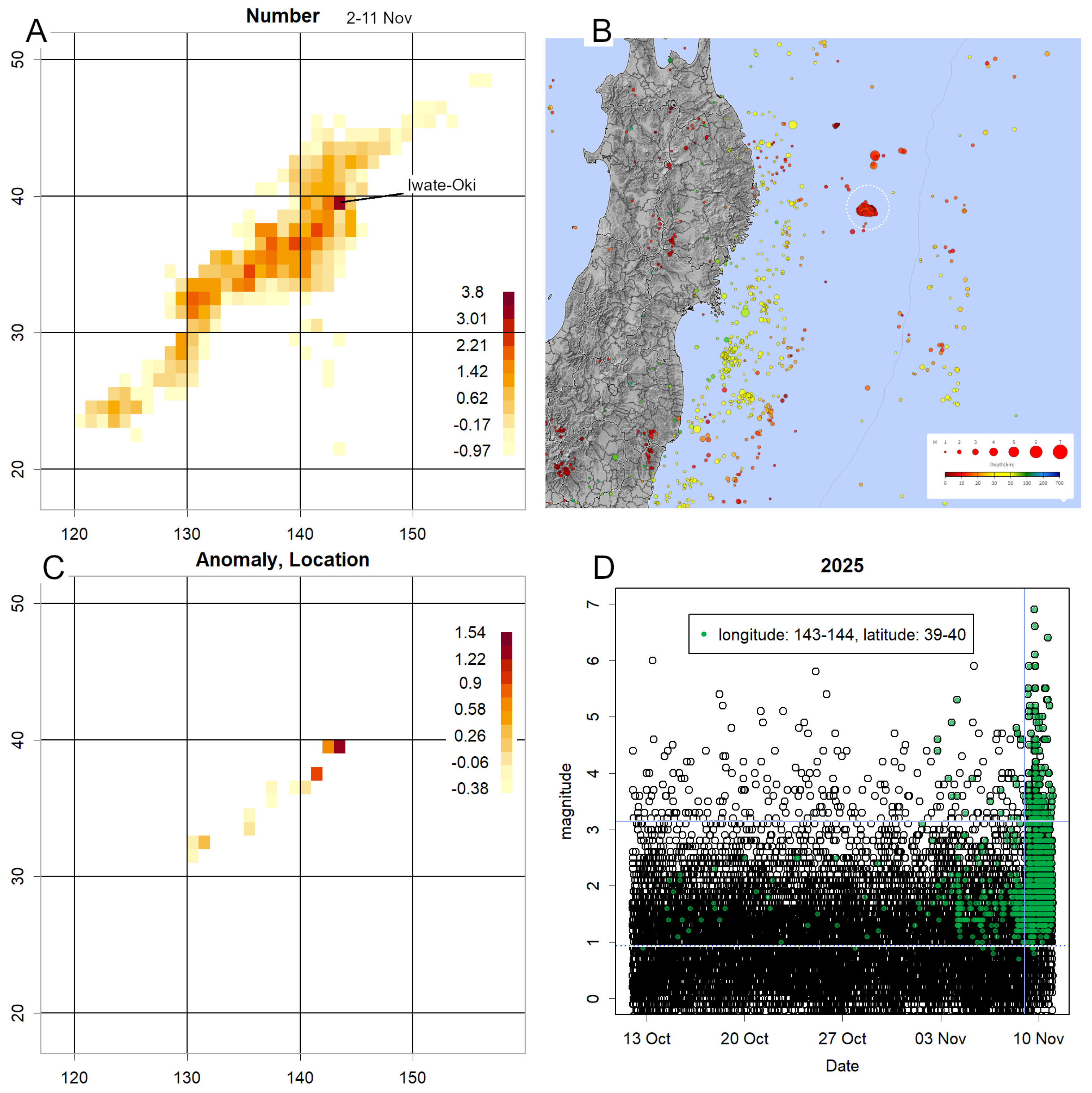
3.2.5. 2025 Iwate-Oki Earthquake
During manuscript preparation, a magnitude 6.7 earthquake occurred along the Sanriku coast on 9 November, where location values had been rising (Figure S4A). A 10-day extension was therefore added (Figure 7). Subsequent activity shifted from offshore Fukushima to offshore Iwate (Figure 7A). Epicentres from 3–8 November revealed concentrated location values (Figure 7B). Elevated location values were confirmed (Figure 7C and Figure S6A), though scale did not increase significantly. Daily magnitudes (Figure 7D) showed sharply rising counts in November, with consistently high location values above average. This state persisted prior to the major earthquake. A t-test of magnitudes from 1–8 November, before the main quake, yielded a p-value < 2.2 × 10⁻¹⁶, too small for R to compute, confirming statistical significance.
4. Discussion
Regarding grid magnitudes exhibiting considerably low σ (Figure 3A): theoretically, σ should equal 1 if selection were random (Figure S2A), yet in practice it is approximately 0.6. This is unlikely to be an artefact of estimation. Although such results are common when estimating with very few data points (Figure S2A), here at least 12 data points were available. Each grid can be considered as the interior of squares with sides of approximately 100 km, corresponding to a radius of 1°. The properties of nearby epicentres are likely similar, whether related to fault presence or plate slip. Most data are collected over a year and are not necessarily continuous, yet earthquakes occurring within a grid likely share similar mechanisms. Consequently, σ becomes smaller, indicating that significant differences in magnitude are unlikely.
Underestimation of scale suggests clustering of magnitude values within a grid. This may occur if volcanic activity increases the number of earthquakes caused by magma movement [19]. Such phenomena have been observed during several volcanic episodes (Figure 6C and Figure S3C,D). Near the First Kashima Seamount, σ is low but consistently exceeds the measurement range (Figure 4D, Figure 5C, Figure 6C, Figures S3C, S4D), and has only been measured once (Figure S3D). Volcanic activity may therefore be occurring in this vicinity, which is also a fault-rich area at the northern end of the Japan Trench [21]. Intensified observation may be warranted. Similarly, the offshore area in the central Japan Sea, where location readings are consistently high (Figure S3A,B), also shows low σ values, suggesting possible volcanic activity (Figure S3C,D) [22].
Other explanations for low σ are also plausible. For example, Sanriku and Chiba Prefecture exhibited low σ values similar to those observed for Myojin Reef and Iwo Jima (Figure S3D), despite lacking notable volcanoes. Low σ values therefore indicate potential hazards but require careful scrutiny. For volcanic activity estimation, this method should be combined with others, as eruptions can occur without accompanying low σ values, as observed at Sakurajima. Such eruptions likely involve minimal magma movement.
Regarding grid magnitudes indicating significantly high locations (Figure 3B): most grids contain limited data, with locations having fewer than 12 data points constituting approximately 80% of the total—a characteristic of the log-normal distribution (Figure 1C). These locations are predominantly marine (Figure 1B and Figure 6A), where measurement is difficult. Observations in such areas are feasible only for events exceeding a certain magnitude threshold. Consequently, the overall mean value tends to be elevated, even after categorisation.
To normalise, QQ plots were presented by category. Alternatively, one could average the data and apply a correction, such as a spline function aligning the M4 position with that in Figure 2B. This would avoid biased estimation errors arising from low counts (Figure 2A,B). However, such an approach was not employed, as it would inevitably yield the desired data shape, undermining analytical falsifiability [23]. Rigorous methodology entails certain inconveniences, and exclusion of low-count data is likely more appropriate, as such data are probably unnecessary.
Regarding the cause of count numbers following a log-normal distribution (Figure 1C): earthquake intervals fundamentally follow an exponential distribution [1], and it was initially considered whether the inverse of count numbers might correspond to this. In practice, however, this was not the case [2], likely because each grid possesses a different λ. Log-normal distributions typically emerge from the synergy of multiple random factors [9]. Magnitude represents the energy released by an earthquake in logarithmic terms, so its normal distribution (Figure 3B) indicates that energy itself follows a log-normal distribution [1]. Similarly, earthquake frequency may be determined by the synergistic effect of such factors. The recent high frequency and elevated location of earthquakes off the Sanriku coast suggest that several of these factors have been consistently active. The addition of new factors would likely increase both event frequency and magnitude synergistically. This is probably what triggered the most recent earthquake (M6.7) and caused their rapid increase within a short period.
Whilst a consolidated earthquake catalogue simplifies calculations, even the most recent data are available only on a daily basis [7]. Calculations are feasible with two weeks’ (Figure 5) or three weeks’ worth of data (Figure S4). However, the requirement for at least 12 counts narrows the observation range, leaving marine areas underrepresented (Figure 5B, Figures S4A, S5). Nevertheless, meaningful insights can still be obtained, warranting continued investigation. Particular caution is required when anomalies appear in locations with high counts, as location and scale values typically converge with those of other grids (Figure 2B) [2]. Significant deviations in such cases likely indicate meaningful phenomena.
Elevated location and scale values at high-count sites are particularly hazardous, as they increase the expected probability of a large earthquake [1]. This phenomenon was observed prior to the 2011 Tohoku earthquake (Figure 4) and the 2024 Noto earthquake (Figure 5). When anomalies are detected, verification using the classification system employed by the Japan Meteorological Agency is advisable. The simplest method is to compare magnitude data from these locations with others using QQ plots [2] (Figure 2C, Figure S1A,B, Figure 7C). Such verification is crucial, as anomalies may provide the basis for earthquake prediction. Many JMA classifications cover smaller areas than the grid used here, so anomalies are expected to appear more sharply defined; surrounding areas should also be examined, as responsibility for issuing instructions to residents lies with local authorities.
Immediately prior to the M9 Tohoku earthquake, a precursor swarm with an extremely high location was observed [1,11]. The recent earthquake off Iwate Prefecture may correspond to this (Figure 7D). Between 1 and 8 November, counts in this grid increased sharply, with large magnitudes and extremely low P-values. Thus, when a sudden increase in counts is accompanied by elevated location or scale values, the situation should be judged hazardous. For example, the geometric mean of daily counts from 3–8 November was 35, with a z-score exceeding 3 (compared with ~0.5 prior to 1 November). The sudden emergence of such values in a grid of this size warrants vigilance.
At present, the Iwate earthquake appears to be decaying, accompanied by numerous aftershocks (Figure 7D and Figure S6B) [24]. Whether convergence will occur remains unclear until further data are available. Due to these aftershocks, both magnitude and counts remain high, and the anomaly persists. Should scale increase, the hazard would be considerable.
To date, only large earthquakes accompanied by swarm activity have been investigated, resulting in high counts [2]. Focusing on such events may be advisable. The R code includes a presentation option limiting plots to grids with counts >100 (Figure S5 and Figure 7C). Scale can pose problems both when high and when low, and different colour charts are used to enhance readability (Figure S4C,D).
This method can be implemented automatically. Provided conditions are set appropriately for the region, R performs calculations efficiently, requiring little computation time. For Japan, this approach is sufficient. However, results are not always conclusive. For example, the 2018 Eastern Iburi earthquake (M6.7) was not predicted. An anomaly [2] that might have been detected by combining several regions into a single QQ plot was obscured. Using a 4° interval instead of 1° revealed the anomaly, but the grid became too coarse, covering most of Hokkaido and hindering site identification. Similarly, the 2021 Fukushima earthquake could not have been predicted without monthly rather than annual data. Anomalies are likely easier to detect during swarm activity [2]. Attempts to shorten the period in Iburi resulted in insufficient data, highlighting a trade-off between simplicity and sensitivity.
Apart from the recent Iwate event, no evidence has been found of the high-magnitude precursor swarms observed immediately before the Thoku mainshock [1,11]. In most cases, the period preceding the mainshock was quiet [2]. Consequently, even if anomalies are detected, the timing of the mainshock cannot generally be determined. Several methods have been proposed to predict the timing of major earthquakes [25,26,27,28]. However, given Japan’s high frequency of large earthquakes, it is difficult to distinguish whether such findings are coincidental or represent underlying phenomena. Their validity does not yet appear established [29]. Nevertheless, should reliable timing determination become possible, it would greatly enhance practical utility.
5. Conclusions
This study demonstrates that setting a grid across an area approximately the size of Japan enables straightforward visualisation and analysis of seismic data. Anomalies detected through such automated methods should be investigated in greater detail. As earthquakes occur unpredictably, continuous monitoring remains essential. Evidence suggests that anomalies may precede major earthquakes by several months to a year; however, sudden spikes in counts may indicate imminent activity, though exceptions exist. Consequently, even when alerts are issued, sustained vigilance over extended periods is required. In this context, raising public awareness alongside the dissemination of warnings is of critical importance.
Supplementary Materials
The following supporting information can be downloaded at the website of this paper posted on Preprints.org, Figure S1: Examples of QQ plots per grid; Figure S2: Simulation of the effect of count size on parameter estimation; Figure S3. Examples of location and scale; Figure S4. Example created using data from the most recent three weeks; Figure S5. Example with display restricted by count numbers; Figure S6. QQ plots before and after the mainshock in Iwate Oki earthquake; Scripts for the catalog.txt and Scripts for each day.txt: the R-codes.
Funding
This research received no external funding.
Data Availability Statement
All the data used can be downloaded from JMA homepage [4,7]. R source code is available in the Supplementary Materials.
Conflicts of Interest
The authors declare no conflicts of interest.
Abbreviations
The following abbreviations are used in this manuscript:
| JMA | Japan Meteorological Agency |
References
- Konishi, T. Seismic pattern changes before the 2011 Tohoku earthquake revealed by exploratory data analysis. Interpretation 2025, T725-T735. [CrossRef]
- Konishi, T. Exploratory Statistical Analysis of Precursors to Moderate Earthquakes in Japan. Preprints 2025, submitted to GeoHazards. [CrossRef]
- JMA. Summary of seismic activity for each month. Available online: https://www.data.jma.go.jp/eqev/data/gaikyo/ (accessed on 22 November 2025).
- JMA. Earthquake Monthly Report (Catalog Edition). Available online: https://www.data.jma.go.jp/eqev/data/bulletin/hypo.html (accessed on 22 November 2025).
- JMA. Epicenter location names used in earthquake information (Japan map). Available online: https://www.data.jma.go.jp/eqev/data/joho/region/ (accessed 22 November 2025).
- R Core Team. R: A language and environment for statistical computing; R Foundation for Statistical Computing: Vienna, 2025.
- JMA. List of epicenter location. Available online: https://www.data.jma.go.jp/eqev/data/daily_map/index.html (accessed on 22 November 2025).
- Tukey, J.W. Exploratory data analysis; Reading, Mass. : Addison-Wesley Pub. Co.: London, 1977.
- Stuart, A.; Ord, J.K. Distribution theory; Hodder Arnold: 1994.
- JMA. 2004 Niigata Tyuetsu Jisin. Available online: https://www.data.jma.go.jp/niigata/menu/2024project/chuetsu_main.html (accessed on 22 November 2025).
- JMA. Great East Japan Earthquake. Available online: https://www.jma.go.jp/jma/menu/jishin-portal.html (accessed on 11/3).
- JMA. 2016 Kumamoto Earthquake Investigation Report. Available online: https://www.jma.go.jp/jma/kishou/books/gizyutu/135/gizyutu_135.html (accessed 22 November 2025).
- JMA. Related information on the 2024 Noto Peninsula Earthquake. Available online: https://www.jma.go.jp/jma/menu/20240101_noto_jishin.html (accessed 22 November 2025).
- Agafonkin, V. Leaflet, an open-source JavaSCript library for mobile-fienendly interactive maps. Available online: https://leafletjs.com/ (accessed 22 November 2025).
- Bird, P. An updated digital model of plate boundaries. Geochemistry, Geophysics, Geosystems 2003, 4. [CrossRef]
- Maruyama, S. Plume tectonics. Journal - Geological Survey of Japan 1994, 100, 24-49. [CrossRef]
- Matsukawa, H. Macro system friction. Hyomen Kagaku 2009, 30, 548-553. [CrossRef]
- Nishimura, T. Volcanic eruptions are triggered in static dilatational strain fields generated by large earthquakes. Scientific Reports 2021, 11, 17235. [CrossRef]
- Konishi, T. Earthquake Swarm Activity in the Tokara Islands (2025): Statistical Analysis Indicates Low Probability of Major Seismic Event. GeoHazards 2025, 6, 52. [CrossRef]
- JMA. Assessment of seismic activity off the coast of the Tokara Islands. Available online: https://www.static.jishin.go.jp/resource/monthly/2025/20250703_tokara_2.pdf (accessed 22 November 2025).
- Nakajima, J. The Tokyo Bay earthquake nest, Japan: Implications for a subducted seamount. Tectonophysics 2025, 906, 230728. [CrossRef]
- Japan Coast Guard. The submarine volcano in TOKARA Islands Volcanic Eruption Prediction Liaison Committee Bulletin (JMA) 2013, 115, 235-236.
- Thornton, S., Karl Popper. Metaphysics Research Lab, Stanford University: 2023. Available online: https://plato.stanford.edu/entries/popper/ (accessed 22 November 2025).
- Utsu, T. Magnitude of earthquakes and occurance of their aftershocks. Journal of the Seismological Society of Japan. 2nd ser. 1957, 10, 35-45. [CrossRef]
- Varotsos, P.A.; Skordas, E.S.; Sarlis, N.V.; Christopoulos, S.-R.G. Review of the Natural Time Analysis Method and Its Applications. Mathematics 2024, 12, 3582. [CrossRef]
- Varotsos, P.A.; Sarlis, N.V.; Nagao, T. Complexity measure in natural time analysis identifying the accumulation of stresses before major earthquakes. Scientific Reports 2024, 14, 30828. [CrossRef]
- Tanaka, H.; Varotsos, P.A.; Sarlis, N.V.; Skordas, E.S. A plausible universal behaviour of earthquakes in the natural time-domain. Proceedings of the Japan Academy, Series B 2004, 80, 283-289. [CrossRef]
- Nagao, T.; Orihara, Y.; Kamogawa, M. Precursory Phenomena Possibly Related to the 2011<i>M</i>9.0 Off the Pacific Coast of Tohoku Earthquake. Journal of Disaster Research 2014, 9, 303-310. [CrossRef]
- JMA. About earthquake prediction. Available online: https://www.jma.go.jp/jma/kishou/know/faq/faq24.html (accessed 22 November 2025).
Figure 1.
Description of figures. A. Japan and its neighbouring countries. The red lines indicate the divisions defined by the Japan Meteorological Agency [5]. As the original map was likely based on a Mercator projection, distances were adjusted at 10-degree intervals of longitude to ensure a consistent scale. B. Grid-based count data (hereafter referred to as the 2004 data; z-scores calculated on a logarithmic scale) shown at the same scale as in A, and consistently thereafter. C. Normal QQ plot of count data and log-transformed z-scores. Superimposed is a histogram without logarithmic transformation, illustrating that very small counts occur most frequently. D. Average magnitude per grid. Areas with fewer counts tend to exhibit higher average magnitudes.
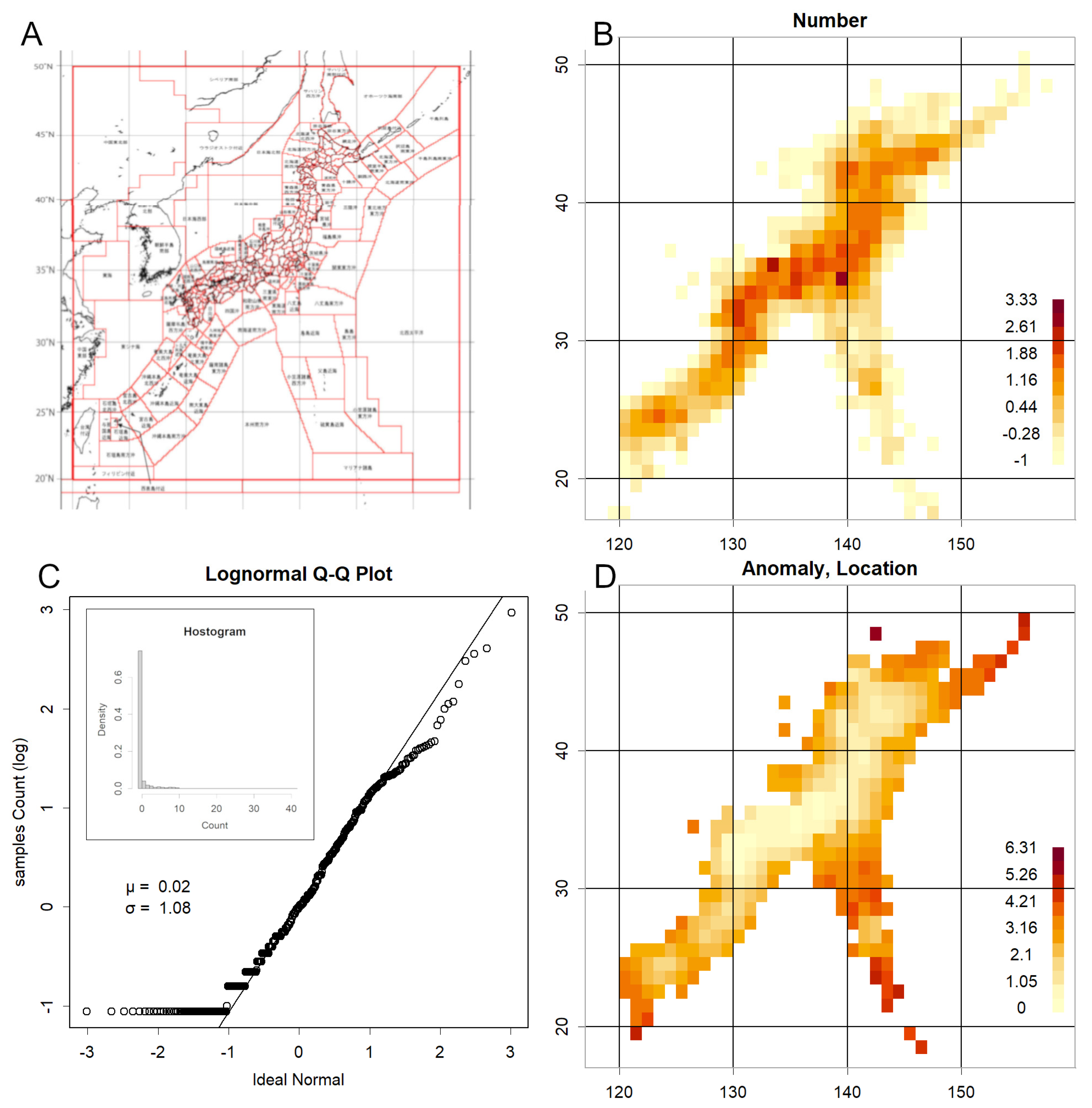
Figure 2.
Effect of count size. A. Relationship between grid count (z-score) and grid mean value. Smaller counts are associated with higher means. Accordingly, the data were divided into five categories (0–4, shown at the top of the graph). Counts below 12 (zero counts) were excluded (Category 0), and the remaining data were partitioned at counts of 30, 125, and 1900. The data used here, and up to Figure 3, are from 2004. B. QQ plots were generated for each category, using the entire dataset as the background. The intercept decreases from Category 1 to Category 4, while the slope remains approximately constant. C. Example of a QQ plot created for each grid count, using the data for that category as the background. Approximately 1500 such plots were produced for each dataset. As linear relationships were obtained, robust methods were applied to estimate the intercept (“location”) and slope (“scale”) for each category, which were then recorded. D. Relationship between recorded location and count. Categorisation reduces the slope tendency observed in Panel A, though a residual trend remains, particularly for very small counts.
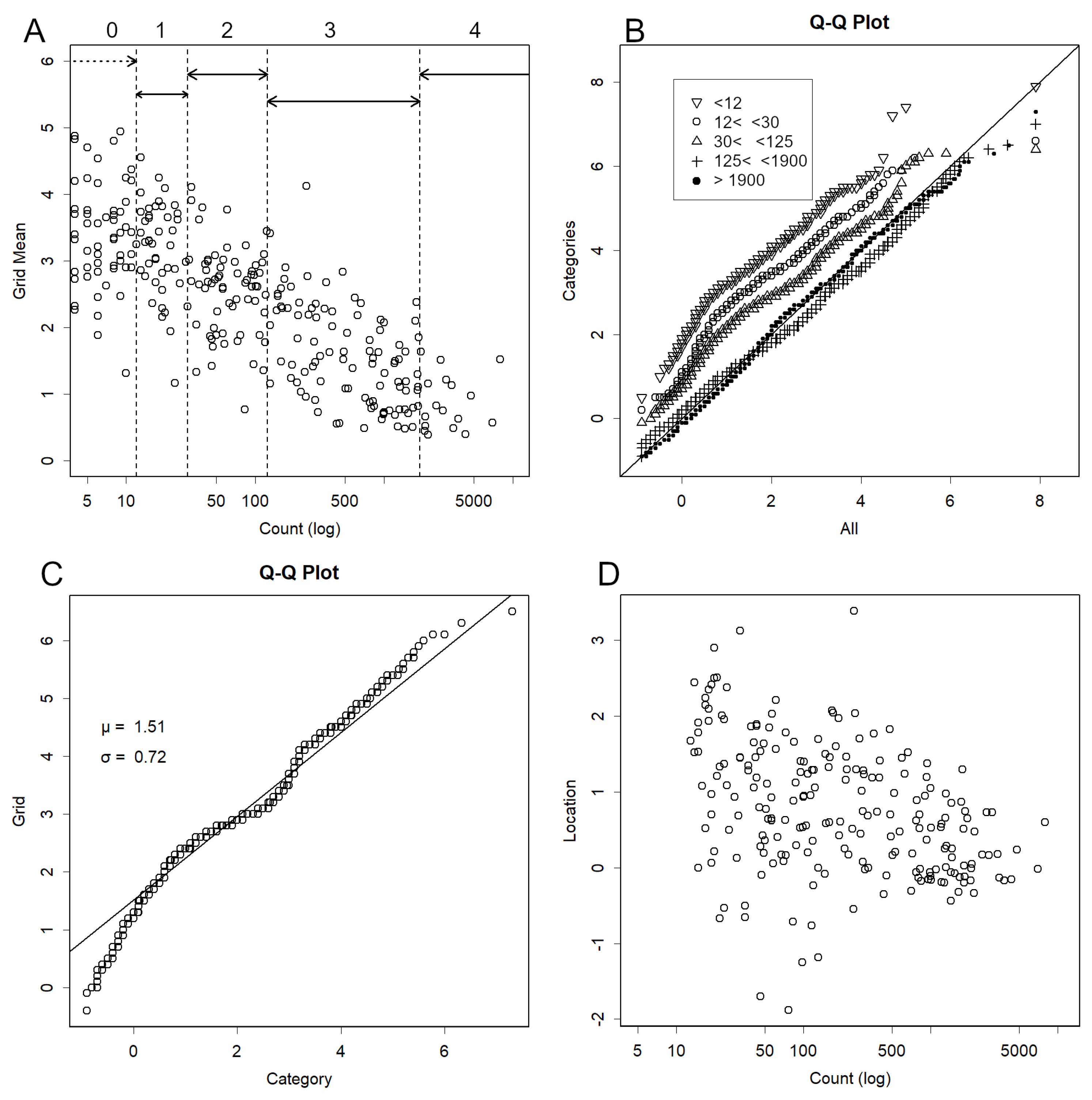
Figure 3.
QQ plots for parameters. A. Example of a Normal QQ plot for recorded scale. B. Example of a Normal QQ plot for recorded location. Both are compared with an ideal normal distribution and appear normally distributed.
Figure 3.
QQ plots for parameters. A. Example of a Normal QQ plot for recorded scale. B. Example of a Normal QQ plot for recorded location. Both are compared with an ideal normal distribution and appear normally distributed.
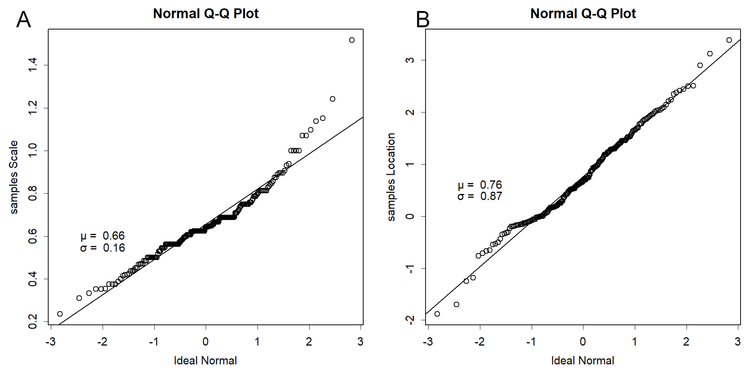
Figure 4.
Data from January to 10 March 2011, prior to the 2011 Tohoku earthquake (M9). A. Epicentre. Numerous earthquakes of M > 5 occurred in the Sanriku region. B. Count. Highest along the Sanriku coast, with elevated values also in Nagano. C. Location. High in Sanriku, with counts exceeding 12. D. Scale. Extremely high in Sanriku. The combination of high frequency with large location and scale values indicates a strong likelihood of a major earthquake. Elevated regions are also observed around Nagano.
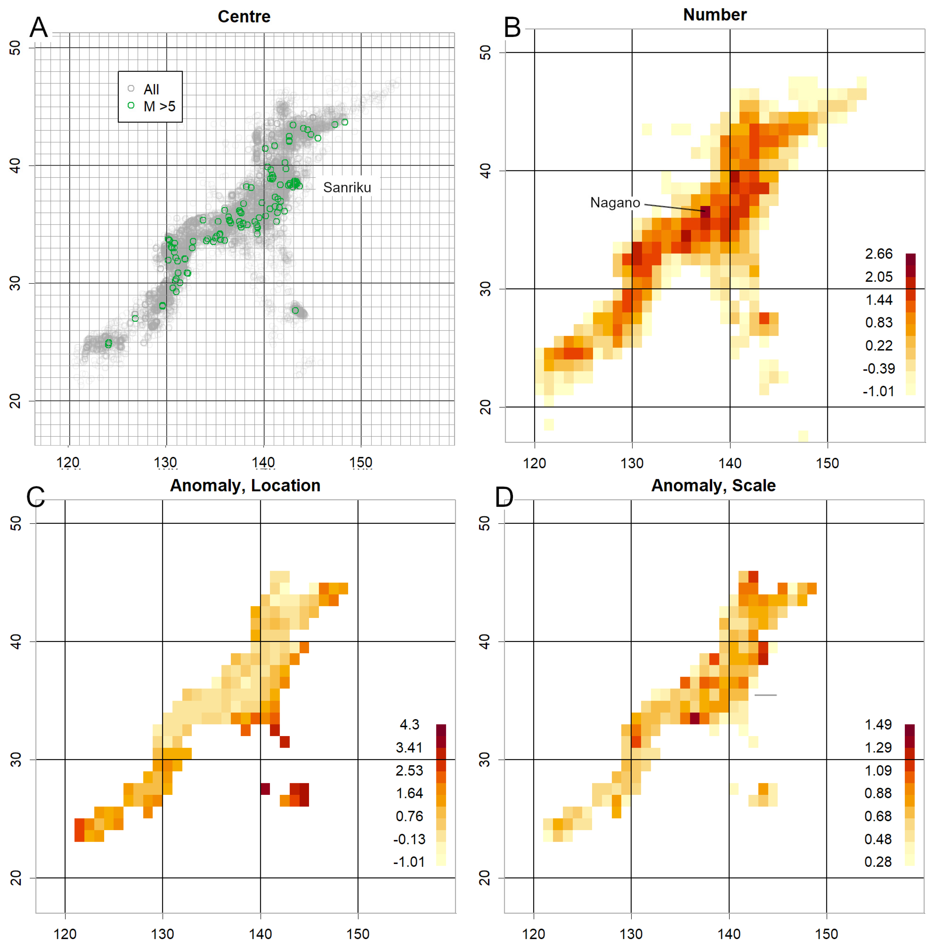
Figure 5.
Data sampled over a two-week period in May 2023, prior to the 2024 Noto earthquake (M7.6). A. Large earthquakes occurred frequently around Noto. B. Counts were particularly high in Noto. C. Counts exceeded 100. Although the dataset is limited, the scale is clearly much larger in Noto. D. Location was not particularly large.
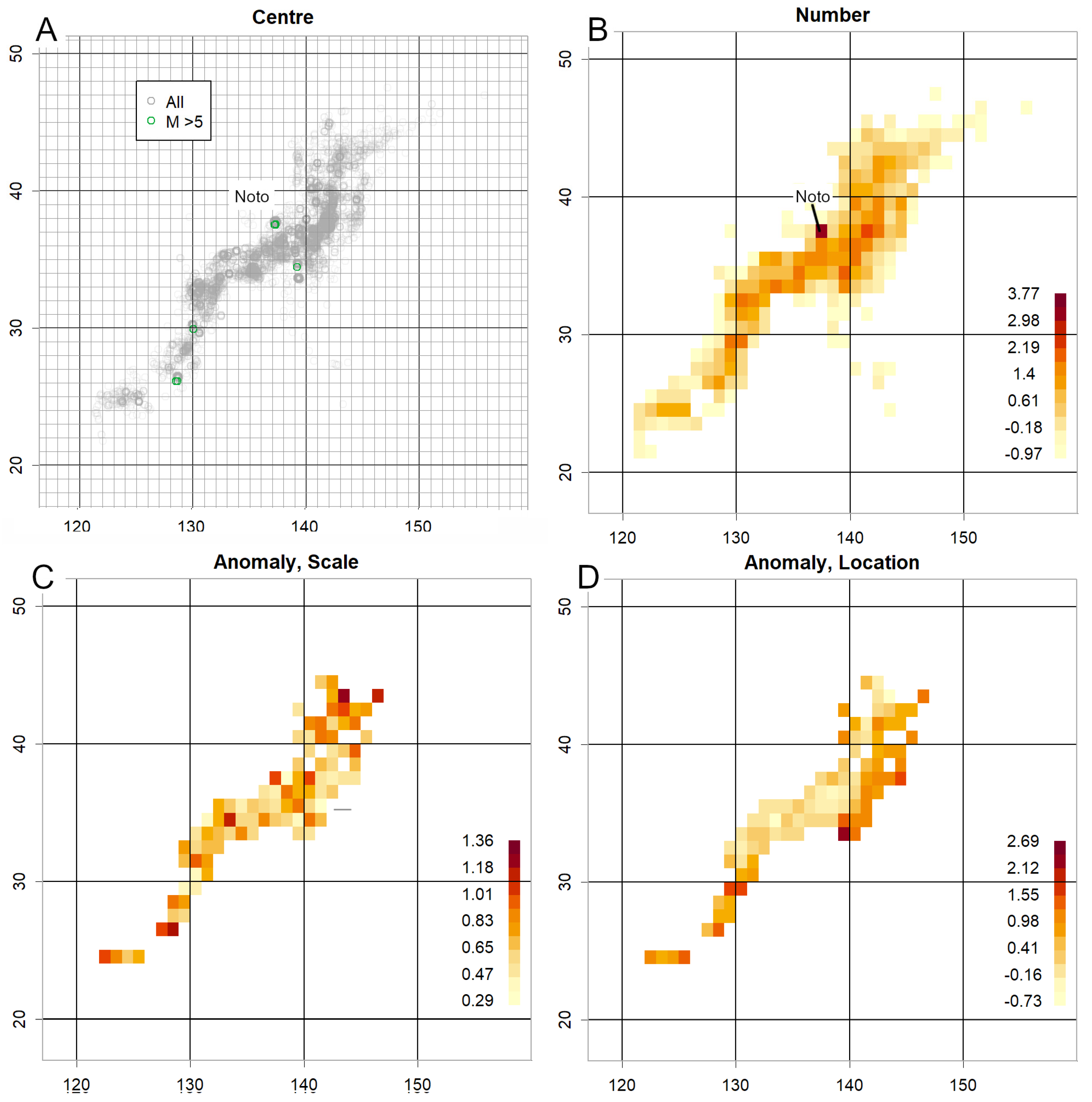
Figure 6.
Data from the ten months immediately preceding the 2004 Mid Niigata Prefecture Earthquake (M6.8). A. Counts are elevated near the epicentre. B. Scale. Elevated in this vicinity. C–D. Data from 2015, prior to the 2016 Kumamoto Earthquake (M7). In the region surrounding Mount Aso, both scale and location are low, suggesting increased volcanic activity.
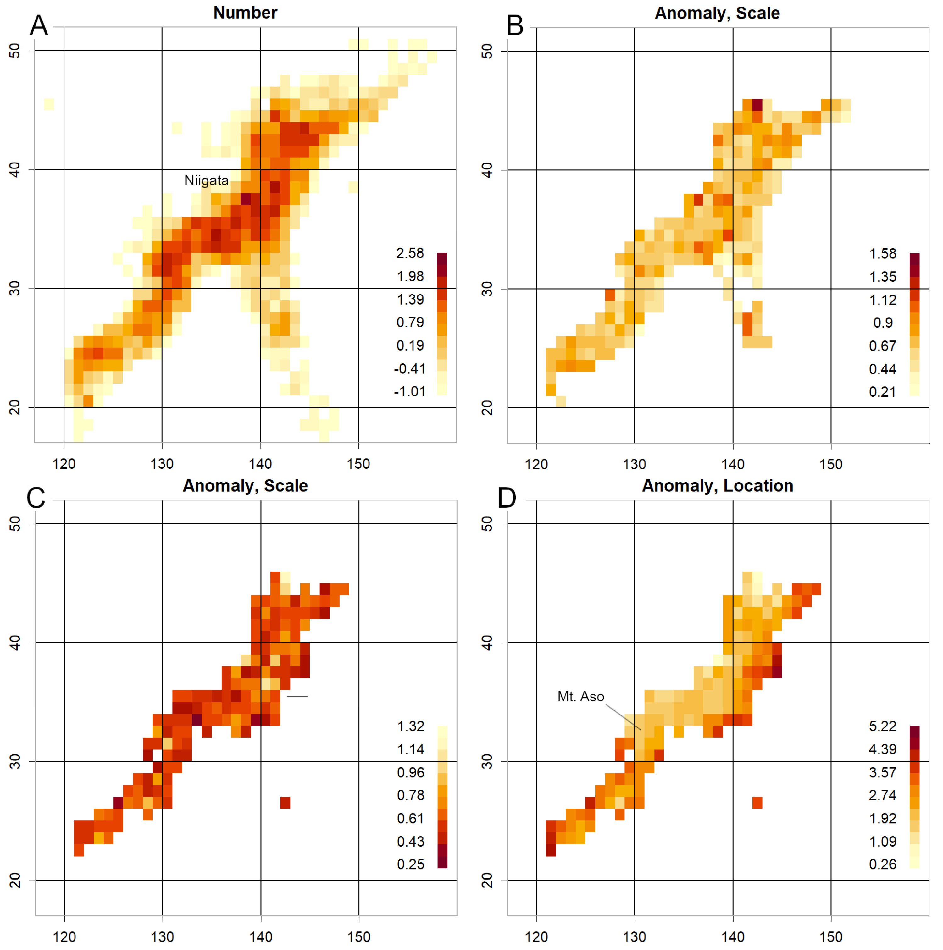
Figure 7.
Data for the ten days following Figure S4. A. The centre of counts shifted offshore Iwate Prefecture. B. Epicentre locations for 3–8 November, concentrated within the white dotted circles. Individual magnitudes are high (depicted by larger circles; legend at bottom right). C. Location. Owing to the short period, only data with more than 100 counts are displayed. The superimposed figure does not obscure the original data. D. Time record of magnitude throughout the period. Only this grid’s data are displayed in green. The horizontal blue dotted line represents the mean, while the solid line indicates a position 3σ above the mean. The vertical line marks 0:00 on 9 November, just before the mainshock occurred (the mainshock itself was at 17:03). This illustrates that magnitudes in this grid were elevated even before the mainshock, though the overall distribution changed from the morning of 9 November.
Disclaimer/Publisher’s Note: The statements, opinions and data contained in all publications are solely those of the individual author(s) and contributor(s) and not of MDPI and/or the editor(s). MDPI and/or the editor(s) disclaim responsibility for any injury to people or property resulting from any ideas, methods, instructions or products referred to in the content. |
© 2025 by the authors. Licensee MDPI, Basel, Switzerland. This article is an open access article distributed under the terms and conditions of the Creative Commons Attribution (CC BY) license (http://creativecommons.org/licenses/by/4.0/).
Copyright: This open access article is published under a Creative Commons CC BY 4.0 license, which permit the free download, distribution, and reuse, provided that the author and preprint are cited in any reuse.


