Submitted:
07 July 2025
Posted:
08 July 2025
You are already at the latest version
Abstract
Machine learning (ML) models are being used as powerful methods to predict path loss (PL) values for efficient radio network planning in complex communication environments. While ML models generate precise predictions, their black-box logic can be seen as a major obstacle to trust the logic behind ML-based predictions. Recently, the application of explanation techniques (XAI) to the applied AI models is utilized to fill the gap between the interpretability and accuracy within the ML-based PL modelling literature. Yet, most of the published research elaborates on explaining the underlying AI models only from a global perspective i.e. they shed light on how the ML-based PL models overall decision rationale works. This is while a small subset of the works has briefly addressed the issue of local explanations i.e. they shed light on how the ML-based PL models decision rationale to explain distinct sub-areas in a terrain works. Local explanations are of great interest as they comprehend the reasons for abrupt changes in PL behavior at specific locations or signal behavior in sub-areas in the underlying propagation environment. In this paper, we introduce a generalizable framework to explain local signal discrepancies using two XAI methods namely explainable boosting machines (EBM) and SHapley Additive exPlanations (SHAP) together with the PL data measured for a university campus environment. Moreover, we boost the task of explanation through elaborating on probabilistic ML-based PL modelling and comparing our results with a Bayesian Log-Normal shadowing model as a physical baseline model in the context of wireless communication literature. Finally, we introduce a novel hybrid ML model i.e. EBM2NGB model, which exploits the probabilistic nature of the NGB (natural gradient boosting model) in combination with accuracy of the EBM model and exhibits the highest performance among the applied baseline models.
Keywords:
path loss
; radio planning
; wireless channel
; explainable artificial intelligence
; SHapley Additive exPlanations
; explainable boosting machine
; natural gradient boosting
Introduction
While the application of ML methods to PL modelling has received considerable attention in the recent signal propagation literature [16], extending interpretability (XAI) to ML-based PL prediction models remains a research gap in the wireless literature [17]. ML-based PL prediction models remain black-box tools that do not well represent the reasons for their predictions in the underlying propagation environment. Through a systematic literature review, [17] shows that only a subset of ML-based PL studies (XAI-based PL prediction models) apply XAI to clarify the logic behind the corresponding ML models for PL prediction.
XAI explanations can be divided into two categories: global and local explanations. Global explanations provide overall patterns of the effect of the input features X across an entire dataset. Local explanations focus on the effect of the input features X to generate a specific prediction within the dataset. Existing XAI-based PL prediction models often use global explanation techniques to uncover the overall logic behind their decisions, e.g., [18,19,20]. Local explanations to explain specific local PL prediction patterns within the dataset are partially addressed in [17] and [21], using LIME (Local Interpretable Model-agnostic Explanations) (to explain the feature importance of two randomly selected points) and EBM (to explain the marginal feature contributions at randomly selected points), respectively.
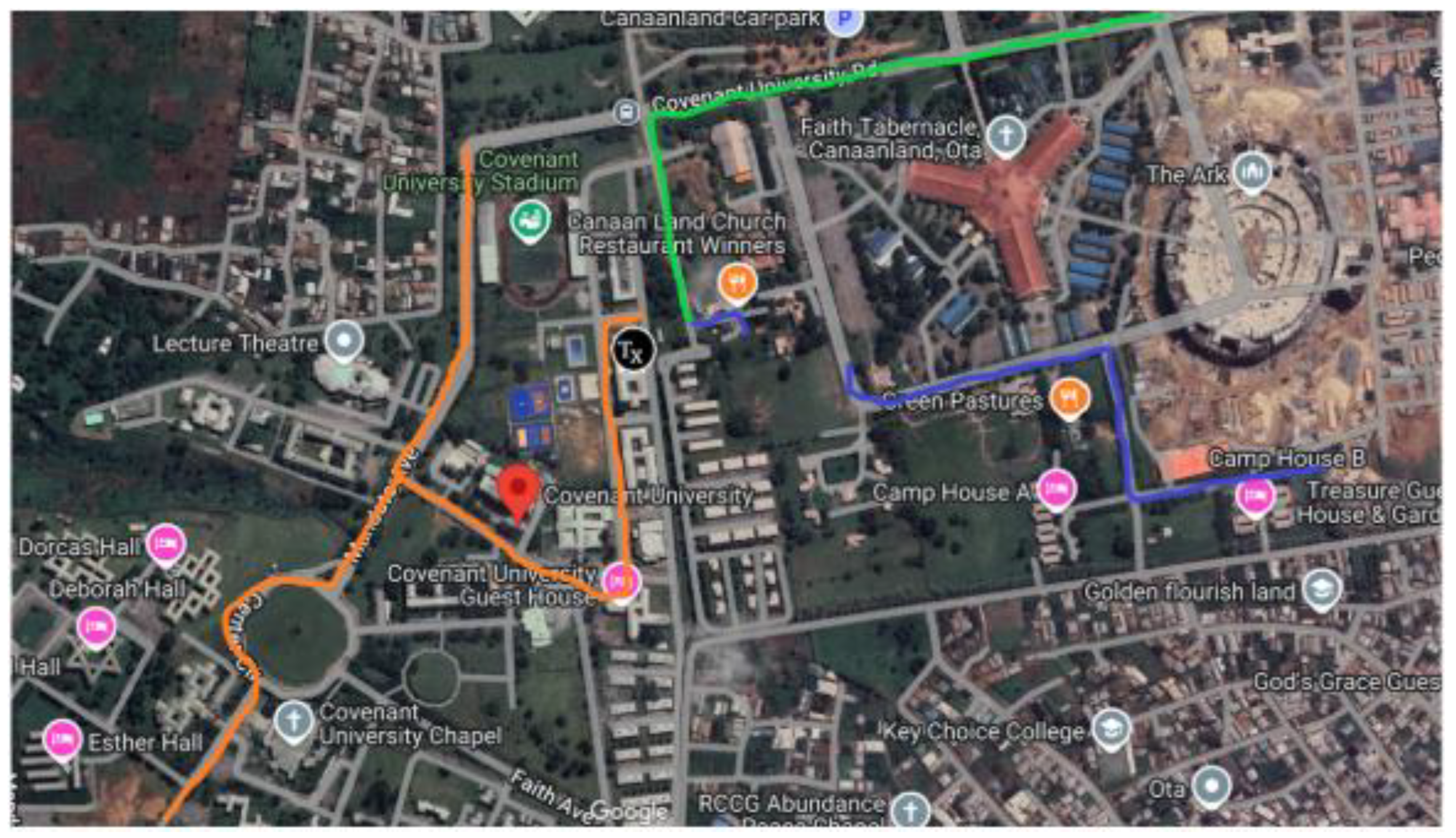
Focusing on local XAI is crucial because the global XAI approach can only explain the average PL behavior across the entire terrain. The reasons for abrupt changes in PL behavior at specific locations or signal behavior in sub-areas that deviates from global expectations are of great interest for efficient radio network planning. These can only be achieved by applying local explanations across the entire communication environment. To our knowledge, our work is the first to adequately apply local XAI to PL predictive modelling in rural environments. In this paper, we use the published measured data from Covenant University, Ota, Ogun State, Nigeria [9,10]. This dataset represents a smart campus environment, which can approximately replicate urban micro environments consisting of distributed buildings, roads, trees, parking lots, etc. Measurement campaigns are implemented through drive tests with an average speed of 40 km/h along three survey routes A, B and C within the above mentioned university campus, in which a mobile receiver moves away from three collocated directional 1800 MHz base station transmitters shown in Figure 4 distinguished by green, blue, and orange colors, respectively.
Figure 1.
Study terrain comprising routes A, B and C distinguished by green, blue, and orange colors, respectively.
Figure 1.
Study terrain comprising routes A, B and C distinguished by green, blue, and orange colors, respectively.
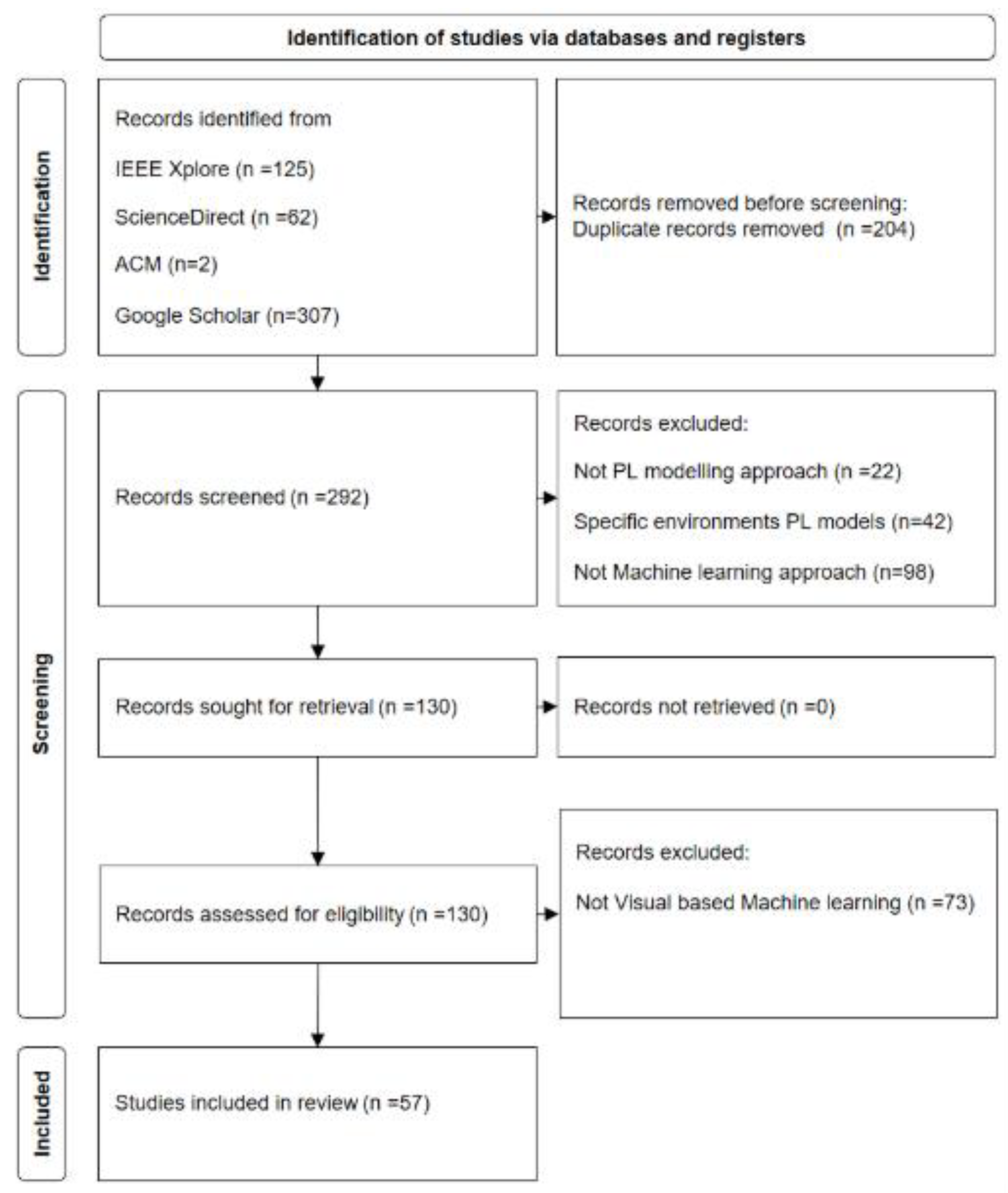
Our study applies the Preferred Reporting Items for Systematic Reviews and Meta Analyses (PRISMA) approach for literature identification [6]. The process employs four sequential phases: Identification, screening, eligibility, and inclusion. The identification phase is carried out by filtering titles and content in the IEEE Xplore, ScienceDirect, ACM and Google Scholar databases in the time between 01.01.2020 and 31.10.2024 (Table 1). Thereby, we opted for broad coverage by using the search term “path loss” in the title as well as the search terms “image” in the full body of the papers’ text (accessed on 31 October 2024).

Table 1.
Data bases and search terms used in the identification phase of the literature review.
| Data Base | Search Term | # Found Results |
|---|---|---|
| IEEE Xplore | ("Document Title":"path loss") AND ("Full Text Only":image) Filters Applied: 2020 - 2024 | 125 |
| ScienceDirect | Find articles with these terms Image Year: 2020-2024 Title, abstract, keywords: "path loss" | 62 |
| ACM | [Title: path loss] AND [Full Text: image] AND [Title: "path loss"] AND [E-Publication Date: (01/01/2020 TO 10/31/2024)] | 2 |
| Google Scholar | intitle:"path loss" intext:image since 2020 | 307 |
The search of the aforementioned four databases resulted in a total of 496 studies. As among the collected papers, 204 studies were duplicates (due to coexistence in more than one of the four aforementioned data bases), the duplicated papers were filtered, and we moved on with 292 papers. In the screening phase, an Excel sheet was used to mark each paper with regard to the specific research area (with focusing on the methods and results) it belongs to. We particularly scanned the studies for the main methods of data processing and ML processing pipelines with the question if the study incorporates ML methods. Thereby 98 papers were excluded. In addition, we excluded a subset of identified papers including 42 papers, which related to PL models in specific propagation environment contexts e.g. in human body, under water, underground, atmospheric etc. Next, we further screened the eligibility of the remaining 130 studies as the main investigation target based on the criterion whether the paper applies visual information as the input in its ML model. We finally came up with 57 papers, which jointly include spatial input images, ML, and PL modelling. The selected papers are analyzed in detail in the subsequent sections. Figure 2 presents the flowchart for selecting the papers.
Figure 2.
Identification, screening, eligibility, and inclusion terms of the literature analysis based on PRISMA.
Figure 2.
Identification, screening, eligibility, and inclusion terms of the literature analysis based on PRISMA.
Evaluation Models
Bayesian Log-distance path loss model
Log-distance path loss model (Reference) is formally expressed as:
Where is the path loss (in decibels) at an arbitrary distance meters, is the path loss at a reference distance meters from the transmitter, is the environment specific path loss exponent that depends on the nature of the terrain, and is a normal (Gaussian) random variable with zero mean, reflecting the shadow fading with a mean of 0 and standard deviation.
To apply the Bayesian approach, we replace the in equation 1 with a Normal likelihood for the output with the expected value and , which is expressed in the equation 2:
Where:
Thus, we can rewrite the equation 2 as:
Equation 4 specifies the set of model parameters to be estimated comprising . Hereby, we presume a normal distribution as the prior distribution for and . Thus:
The preferred choice for a prior on is a half-Cauchy distribution [22]:
In addition, we prefer the exponential distribution as a prior on is, as its concept is optimally defined for the first moment occurrences. Hereby, it describes the required the initial distance span from the transmitter until the signal weakening begins to occur:
is the mean distribution value and is computed through replacing the term in equation 1.
To extract the prior distribution values of the model parameters , we used the fitter package 1 in python on the training data set.
The objective of the Bayesian approach is to determine the posterior probability distribution for the model parameters based on the above mentioned Normal likelihood of the output , the determined priors for the model parameters and the probability of observing i.e. .
As computing the exact posterior distribution is computationally intractable for continuous values, obtaining posterior distributions is accomplished via Markov Chain Monte Carlo (MCMC) algorithm to draw samples from the posterior. The sampling in our paper is done via PyMC3, which is an open source framework of probability distribution sampling [23] using MCMC methods to infer the model parameters .
Natural Gradient Boosting (NGBoost)
In standard ML regression models, the prediction object is an estimate of a scalar function e.g. , where is comprising a vector of observed explanatory features influencing the as the prediction target. The NGBoost [24] is proposed to estimate the parameters of a probability distribution , where is a parameter vector describing the distribution. In our study, is containing the mean and the logarithm of the standard deviation of the distribution:
NGBoost incorporates three modules in a sequential way. First, it initiates two base learners in iteration , e.g. and to represent the mean and the standard deviation of the outcome, respectively. The majority of implementations use shallow decision trees as the base learners. Second, it uses Gradient boosting to sequentially train the base learners, in which each learner is optimized to minimize the current residual of the previous learners. Third, a scoring rule , which takes as input a forecasted probability distribution and one observation y (), and assigns a score to the forecast such that it minimizes the sum of the scores over the response variable from all training dataset. The distance between different distributions is typically evaluated using maximum likelihood estimator (MLE), which induces the Kullback–Leibler (KL) divergence between the true distribution and the predicted one. NGBoost’s main component comprises the leveraging of the natural gradient , which elaborates on the geometric structure of the parameter space [25]. In each iteration , and for each data , the algorithm computes the natural gradient of the with respect to the predicted parameters up to that iteration . The predicted outputs are scaled with stage-specific scaling factor , and a constant learning rate :
After iteration, the final prediction will be achieved through accumulation of the predictions resulted from all decision trees throughout the entire iteration steps.
The analysis of the data in our study based on the NGBoost python library 2, which is built upon the Scikit-Learn package, and is designed to be flexible in terms of selecting proper scoring rules, distributions, and base learners.
Tree-SHAP (SHapley Additive exPlanation)
SHAP (SHapley Additive exPlanations) [26] is a framework for explaining the ML models predictions. The SHAP basic principle is casting the original ML model by means of a surrogate model g, comprising the linear combination of the contributions of the model input features to generate f outcomes:
where, is the base value (intercept) of the model comprising the initial expectation about the mean model value without considering the contribution of the features, is the number of input features, is the contribution of each input feature , and is a binary value within the binary vector with regard to considering (1) or not considering (0) the contribution of the feature in the model output.
The contribution of each input feature is computed based on analyzing its impact on the model outcome by systematically modifying that input feature and observing the changes in the output. The basic formula to compute the SHAP value of the feature is:
where is the set of input features, is a subset of input features, is the expected values of the model when the feature is present, is the expected value of the model when the feature is not present, and is the weighted average of all possible subsets of in . The formula gets all possible subsets of features , which do not contain the feature, computes the contribution of adding the feature on the generated predictions in the all aforementioned subsets, and aggregate all resulted contributions to come up with the marginal contribution of that feature.
The notion of SHAP can be also extended to understand the interactive effect of multiple features beyond their isolated effects. Capturing pairwise interaction effects is introduced in [27]:
, where the represents the difference between SHAP values of feature in the presence of feature and the SHAP values of feature in the absence of feature .
Taking the interactive effects into account can be crucial in term of interpretation, as interaction between features can imply physical properties of the underlying environment. For example, the interaction effect of points distance from the transmitter in the terrain together with the transmission angle can include the Line of Sight or Non Line of Sight knowledge of the terrain, which for learning the PL behavior is of importance.
Since SHAP computation time increases exponentially with the number of features and the corresponding subsets , it is typically approximated from a number of subsets by regression models [28] or Monte Carlo methods [29] in practice. Though, based on the work in [30], Tree-based SHAP (by leveraging decision trees structures to disaggregate the contribution of each input in a decision tree) can achieve exact computation of SHAP values in polynomial instead of exponential time.
Computation of the SHAP values in our paper has been carried out based on the python SHAP package3.
Explainable Boosting Machine
The basic idea behind EBM is analogous to generalized additive models (GAMs). GAM adopts a sum of arbitrary functions of variables (possibly nonlinear) that represent different features via splines, which altogether describe the magnitude and variability of the response variables [Reference]. For a set of multiple features e.g., and a univariate response variable e.g., , GAM is expressed by:
where, is intercept parameter, is representing independent variables in , is the dependent variable, and h() is the link function that relates the independent variables to the expected value of the dependent variable and represents a random variable. By using gradient-boosted ensembles of bagged trees for each feature function , EBM expands upon GAMs to preserve explainability while improving the predictive performance. Shallow decision tree generation, learning, and gradient updates in EBM are performed using a single predictor variable at a time in a round-robin fashion. The algorithm first builds a small tree with the input feature and computes the residuals (). It then fits the second tree with a different input feature to the residuals and goes on through all input features to complete the ongoing iteration. To mitigate the effect of each input feature’s order in the sequence, EBM incorporates a small learning rate. This renders the model to iterate through the training data over thousands of boosting iterations in which each tree only uses one predictor variable . Once the training of the ensemble of decision trees is completed, all trees associated with the single predictor variable will be summarized in a single function . Accordingly, all functions associated with each predictor variable will be derived from the corresponding large set of shallow trees. In addition, EBMs take the combined impacts of two or more independent variables known as the interaction effect (GA2Ms). To compute the interactive effects, two-dimensional functions are learned to relate the response variable to pairs of predictor variables [31]. Hence, The EBM can be expressed by:
EBMs are highly interpretable, because the contribution of each independent variable or combination of independent variables to a final prediction can be visualized and understood by plotting and , respectively. The analysis of the data in our study based on EBM is done by the toolkit called InterpretML from Microsoft [32].
Stacked EBM2NGB Model
Ensemble generalization ML Models [33] incorporate a number of standalone models (Base-learners) together to build a second-order model (Meta-learner), which exploits each individual Base-learner strengths to generate predictions with higher degrees of accuracy. In this paper, we propose a novel Ensemble generalization model EBM2NGB. EBM2NGB consists of two Base-learners: The first Base-learner is NGB, which delivers and as the mean prediction value and the standard deviation of the corresponding prediction, respectively. The second Base-learner is an EBM, which delivers as the expected prediction value given the set of input features . The Meta-learner is a second-order EBM model, which elaborates on the input feature vector comprising the outputs generated from the base EBM and the base NGB model, respectively:
K-Means Clustering
In this paper we use K-Means clustering [34] to figure out intrinsic grouping of data points based on their spatial location (comprising longitude, latitude) linked to the corresponding Path Loss values. Our goal is to identify distinct groups of spatially dispersed points in the dataset. Given a dataset, comprising the set of features , data points, and denoting the data point representing the values of the features in , which fits to one of clusters, the objective function of the K-means is to find:
, where is the sum of the squared error of all objects in the database. and describe the clustering center matrix and the center of the cluster. describes the membership relations between the original dataset and the clusters, and is indicating the degree to which the data point fits in the cluster. The is the distance from point to cluster center . To optimize the number of clusters on K-Mean clustering method, the elbow method can be used [35]. The elbow technique plots the variation of through increasing the number of clusters . The optimal is figured out at the point, where adding more clusters doesn't significantly reduce the .
Experimental Results
Model Inputs, Model Parametrization and Model Accuracy Results
The input feature of the Bayesian LD model only comprises the distance of separation between the corresponding transmitter and the receiver points. The input feature of the ML models include longitude, latitude, elevation, altitude, clutter height, and distance of separation between the corresponding transmitter and the receiver points. The output feature throughout our study is comprising the path loss values corresponding to each input data point. There are a total of 6244 data points along the measurement route. Though, based on decaying characteristics of the signal strength when it propagates from the base station towards different angles, we applied polar coordinate transformation to transform the geographical data into a polar coordinate system before training the model. Thereby, image axis-independent variables (longitude and latitude) are converted into polar coordination consisting of distance and the transmitting signal direction, i.e., Tx-Rx Angle. The Tx-Rx angle is computed by us through translating the longitude and latitude of the points to X-Y geographic points and setting the (X, Y) coordinate values of the transmitter location equal to the reference point (0, 0). The prediction accuracies of the models are evaluated based on splitting the data by a 1:4 training: testing ratio and by means of MAE (mean absolute error), MAPE (mean absolute percentage error), RMSE (root mean square error), and R squared. The overall performances of the 4 Models are presented in Table 3.
Table 1.
Evaluation of prediction models along route A.
| Bayesian Log Distance | Natural Gradient Boosting | Explainable Boosting | Hybrid EBM2NGB | |
| MAE | 5.525 | 3.028 | 2.272 | 2.032 |
| MAPE | 0.040 | 0.021 | 0.016 | 0.014 |
| RMSE | 7.214 | 3.855 | 2.928 | 2.671 |
| R Squared | 0.423 | 0.835 | 0.905 | 0.921 |
Table 2.
Evaluation of prediction models along route B.
| Bayesian Log Distance | Natural Gradient Boosting | Explainable Boosting | Hybrid EBM2NGB | |
| MAE | 5.839 | 2.974 | 2.431 | 2.245 |
| MAPE | 0.045 | 0.021 | 0.017 | 0.016 |
| RMSE | 8.820 | 3.728 | 3.04 | 2.842 |
| R Squared | 0.131 | 0.844 | 0.896 | 0.909 |
Table 3.
Evaluation of prediction models along route C.
| Bayesian Log Distance | Natural Gradient Boosting | Explainable Boosting | Hybrid EBM2NGB | |
| MAE | 6.673 | 3.532 | 2.623 | 2.070 |
| MAPE | 0.046 | 0.024 | 0.018 | 0.014 |
| RMSE | 8.029 | 4.833 | 3.662 | 2.746 |
| R Squared | -0.219 | 0.559 | 0.747 | 0.857 |
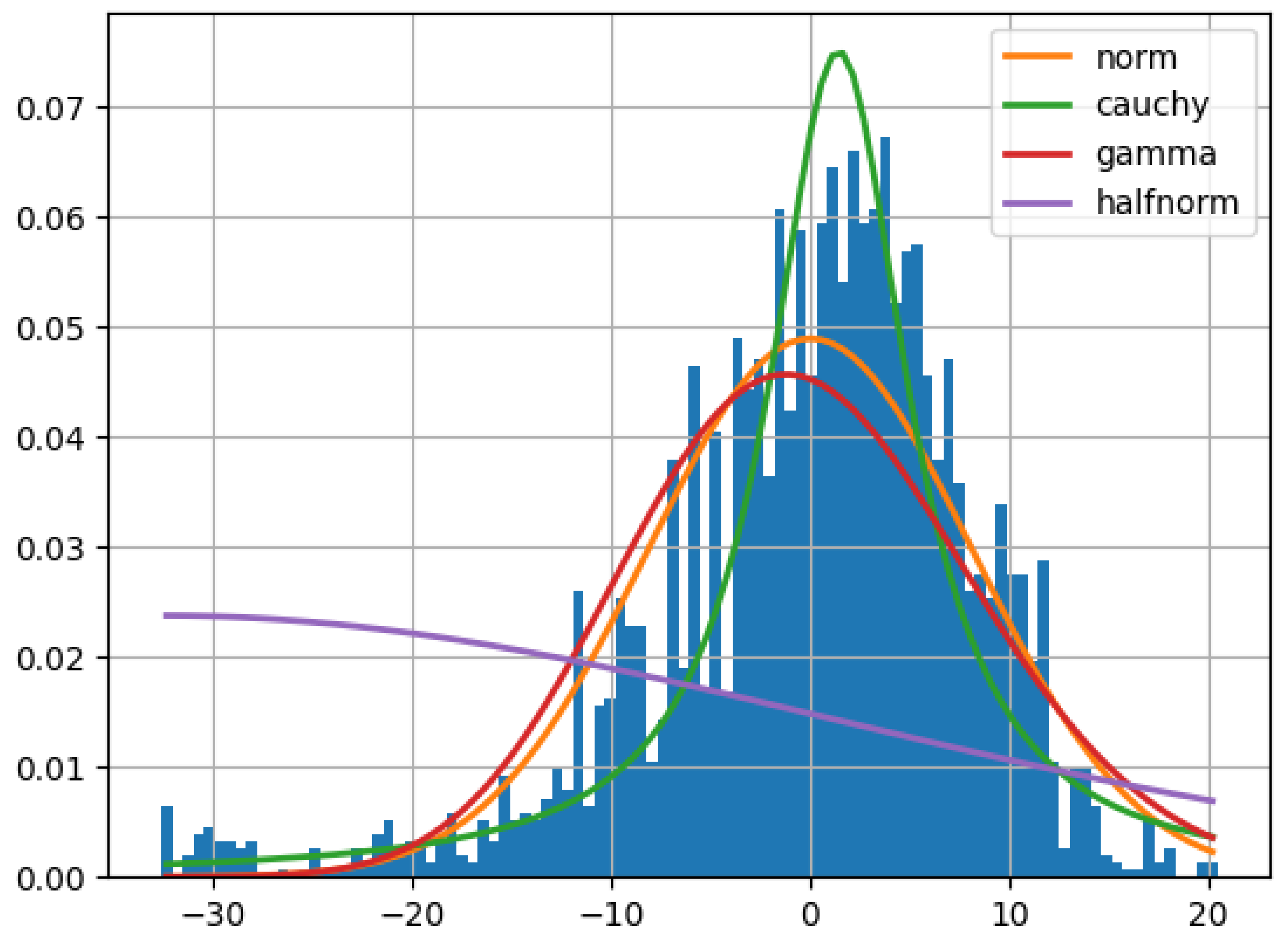
In order to inference the posterior distribution of the Bayesian LD model, we obtained the (mean, standard deviation) pair values (100.1589, 0.472) and (2.14013, 0.0268) via OLS regression to set as the prior distribution of the parameters and , respectively. Obtaining the residuals is done via subtracting the observed values in the dataset from the term as described in the equation (1). We then use the histogram of the overall s values (depicted in Figure 1) to describe the s prior distribution. This results in choosing the normal distribution with (mean, standard deviation) values equal to (0.035, 5.659) as the best fit to s.
Figure 2.
distribution of best fit to s.
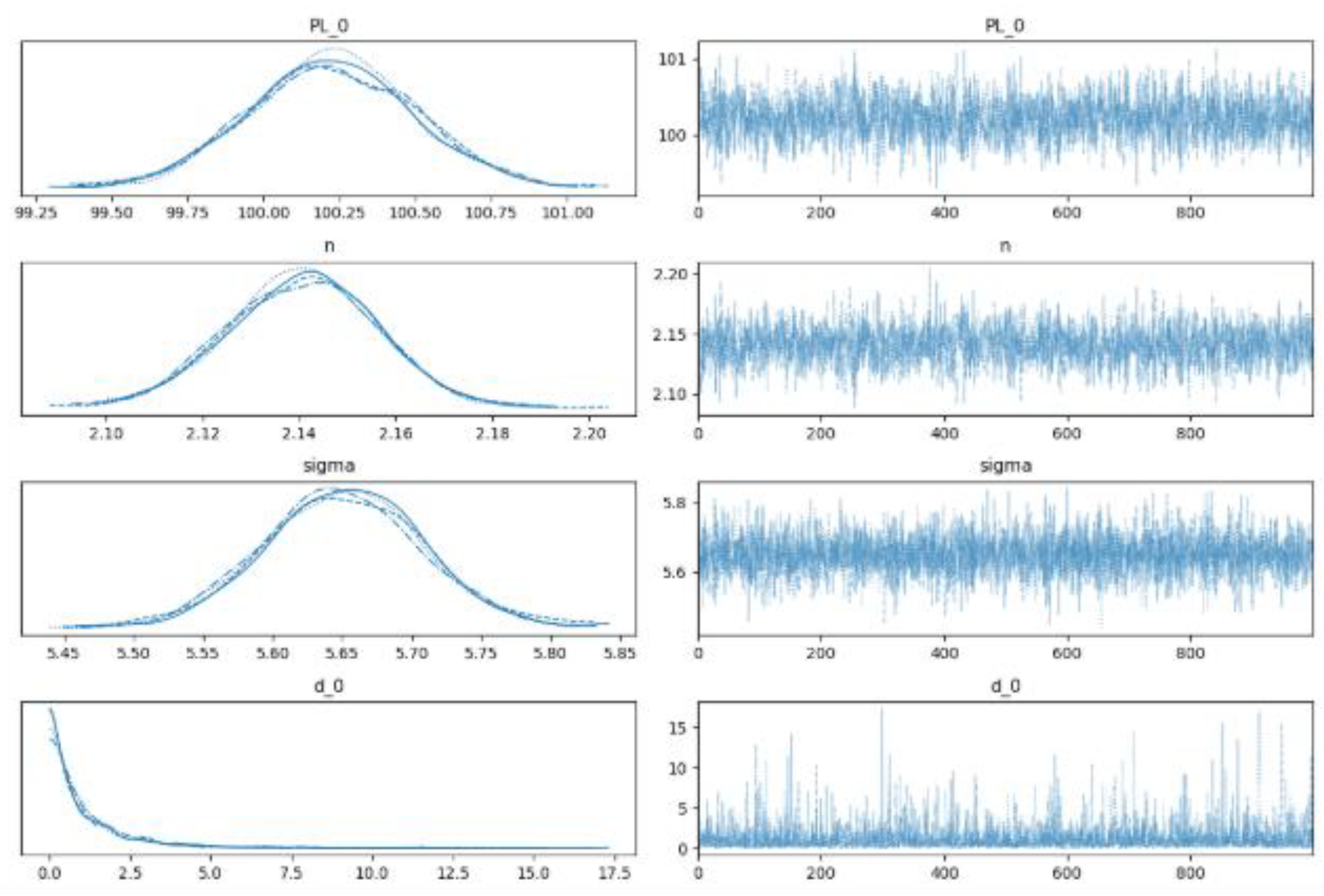
The resulting trace plots with regard to the posterior probability of the parameters via using No-U-turn sampler (NUTS) implemented in the probabilistic programming package for python PyMC3 are derived in accordance with the equations 1-9 and are depicted in Figure 2. Each subplot in the left hand side panel comprises 4 different chains, each of them comprising 1000 draws (solid line: chain 1, dotted line: chain 2, dashed line: chain 3, and dot-dashed line: chain 4) from the posterior probability, which are depicted in the right hand side panels of the Figure 2.
Figure 3.
Trace Plot values for the Bayesian Log Distance Model Parameters.
The fitted Bayesian LD model is tested by us on the 20 percent hold-out data set. As prompting the model to predict individual predictions given a specific distance, generates samples of 1000 posterior values, the results presented in Figure 4 are comprising the expected mean of the predicted values together with the lower and the upper 95% confidence interval.
Figure 4.
predicted values together with the lower and the upper 95% confidence interval in Bayesian Log distance Model.
Figure 4.
predicted values together with the lower and the upper 95% confidence interval in Bayesian Log distance Model.
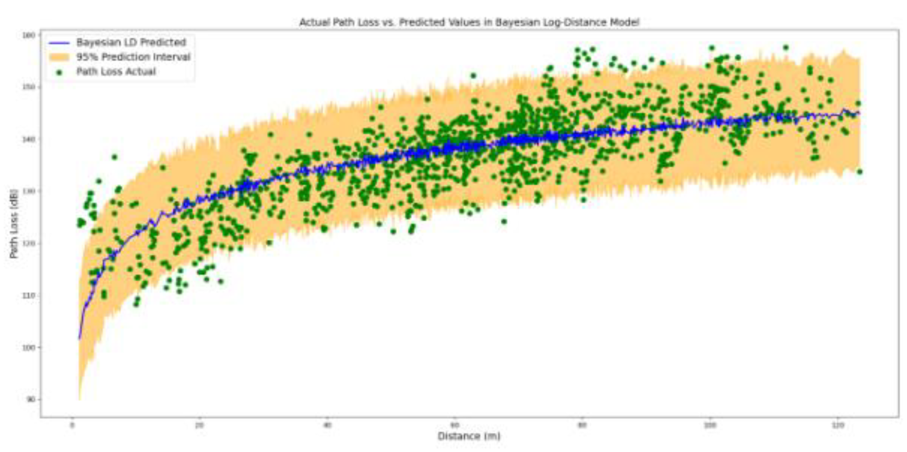
The Bayesian LD model performs well in terms of covering the most points in the 95% of the confidence interval. Though, the suitability of the model to explain the expected predicted points in comparison with a horizontal line drawn at the mean PL value of the training dataset is not optimal. This is reflected in the R-squared value of the model, that represents the proportion of variance in the dependent variable (PL) that is explained by the independent variable (d), which is equal to 0.569. Indeed, only 56.9 percent of the variation in PL values is being explained by the factor distance via the Bayesian DL model. To elaborate more on the issue of un-explain-ability we apply ML models to the data.
The EBM model trained in this paper is hyper-parametrized by using a grid search through the parameter space: 0.01<“learning_rate” (with 0.01 increments)<0.05, 1<“max_leaves” (integer with 1 increments)<4, 2<“min_samples_leaf ” (integer with 1 increments)<6, “early_stopping_rounds”[100, 200], and “early_stopping_tolerance”[1e-6, 1e-5]. It results in utilizing 0.003 as the “learning_rate”, incorporating the “max_leaves” of the trees to be 2, setting the “min_samples_leaf ” equal to 4,“early_stopping_rounds” equal to 100, and the parameter “early_stopping_tolerance” equal to 1e-6 . The results of applying the EBM model on the 20 percent hold-out data based on the distance of separation between the corresponding transmitter and the receiver points as input and the predicted path loss as output are shown in Figure 5.
Figure 5.
predicted values together with the lower and the upper 95% confidence interval in Explainable Boosting Model.
Figure 5.
predicted values together with the lower and the upper 95% confidence interval in Explainable Boosting Model.

In comparison with the Bayesian LD model, the EBM model performs well in terms of decreasing the MAE, MAPE, and the RMSE metrics to the lower corresponding error values. Especially, the R-squared metrics value is increased up to 0.844. However, the EBM point predictions might be exposed to the over-fitting. To elaborate more on the issue of uncertainty we apply the probabilistic NGB model to the data.
The NGB model trained in this paper is hyper-parametrized by using a grid search through the parameter space: 0.01<“learning_rate” (with 0.01 increments)<0.05, 1<“max_depth” (integer with 1 increments)<4, “minibatch frac“[0.5, 1.0], 1<“early_stopping_rounds“(integer with 1 increments)<11, and “distribution“[Normal]. It results in utilizing 0.001 as the “learning_rate”, incorporating the “max_depth” of the trees to be 2, setting the “minibatch frac“ equal to 0.5,“early_stopping_rounds” equal to 10, and the “distribution“ to be Normal. The results of applying the NGB model on the 20 percent hold-out data based on the distance of separation between the corresponding transmitter and the receiver points as input and the predicted path loss as output are shown in Figure 6.
Figure 6.
predicted values together with the lower and the upper 95% confidence interval in Natural Boosting Model.
Figure 6.
predicted values together with the lower and the upper 95% confidence interval in Natural Boosting Model.
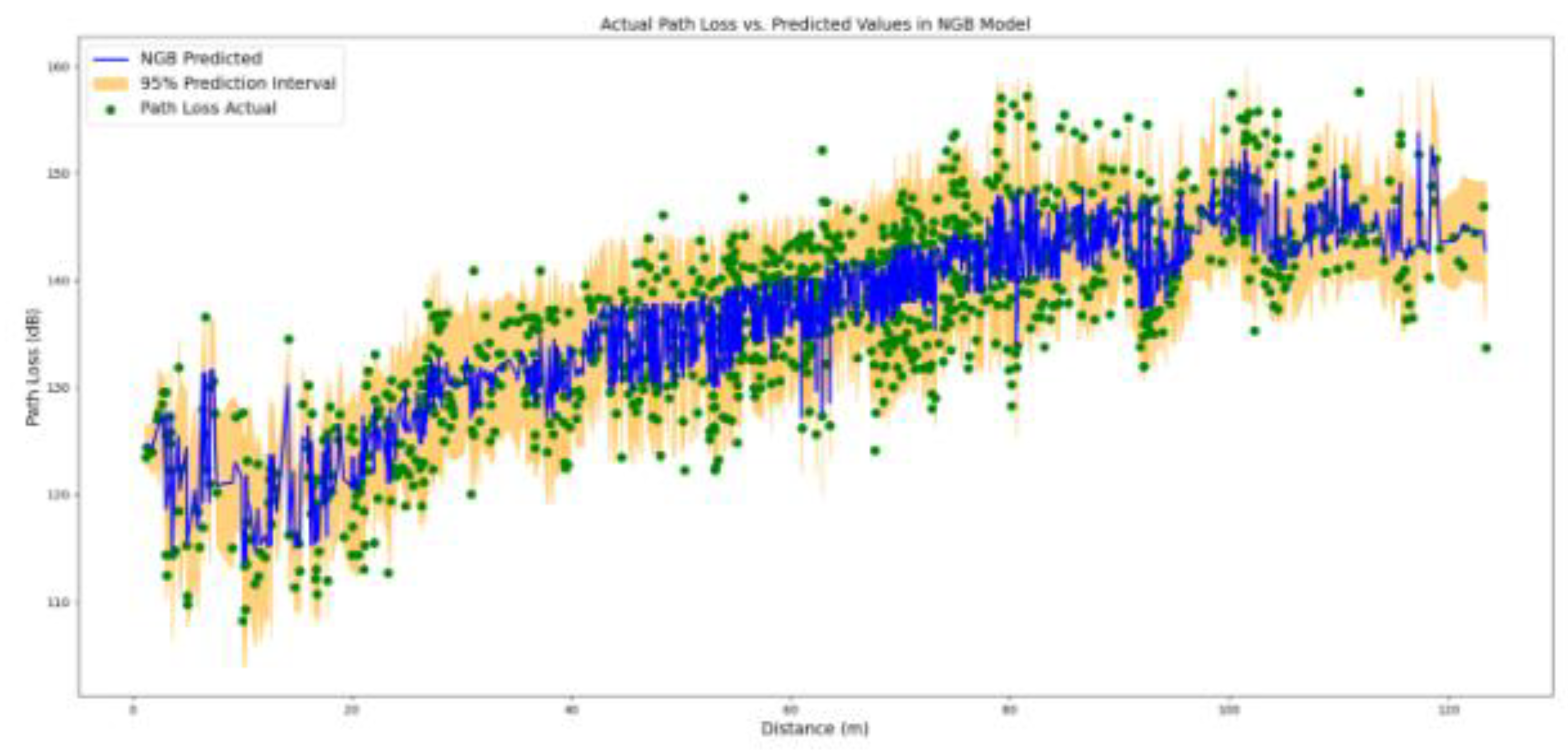
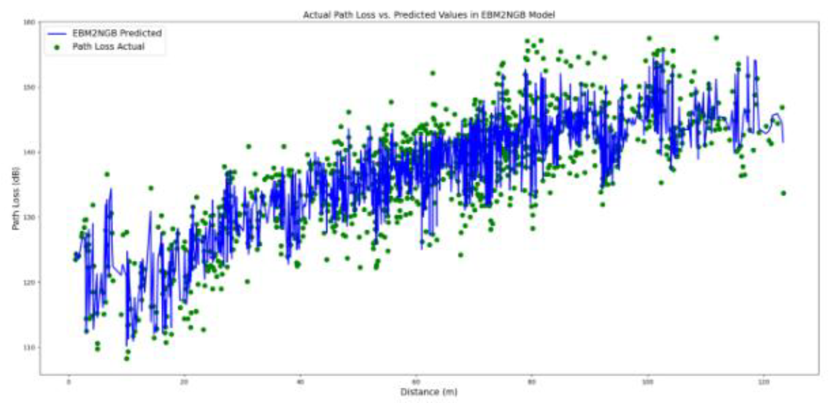
In comparison with the Bayesian LD model, the NGB model generate more accurate predictions while preserving the probabilistic nature of the predictions. However, as presented in Table 4, the delivered MAE, MAPE, and the RMSE metrics are slightly deteriorated. To integrate the probabilistic outcome of the NGB model with the more accurate EBM model, we further evaluate the probabilistic-informed ensemble EBM2NGB model on the hold-out dataset. As presented in Table 4 and illustrated in Figure 8, the EBM2NGB model metrics are slightly improved in comparison to the EBM model.
Figure 7.
predicted values together with the lower and the upper 95% confidence interval in EBM2NGB Model.
Figure 7.
predicted values together with the lower and the upper 95% confidence interval in EBM2NGB Model.
Model Global Explanations
This section elaborates on the rationale behind the EBM and NGB models to generate their predictions. From a global explanation point of view, we explain how both ML models decide to generate predictions over the entire dataset. The EBM model is a self-explainable, which does not require a surrogate explanation due to its glass box nature. In contrast, the explanations for the decisions behind the NGB model are drawn via the SHAP analysis.
As the result of training, the intercept of the EBM model (the parameter in equation 15 and equation 16) in our study amounts 137.329 dB. Likewise, the intercept of the NGB-SHAP model (the parameter in equation 12), which is the PL mean values in the training dataset is equal to 137.340 dB. The intercept for the parameter (equation 10), which is an indicator for measuring the mean uncertainty of the model is equal to 1.218, which is associated with 3.380 dB.
Figure 9 illustrates the average absolute additive (main and interactive) effect, which each feature in equation 16 can induce to change the outcome of the EBM model beyond the EBM model intercept. Hence, the values in Figure 9 can be perceived as the Global expression of the features importance in the model predictions. Among all the features, the transmitter to receiver distance plays the most significant role in generating prediction. The interaction of the transmitter to receiver angle with distance, as well as the main individual effect of the transmitter to receiver angle, are the second and the third most important features globally contributing in PL predictions, respectively.
Figure 8.
Global Feature Importance in EBM Model.
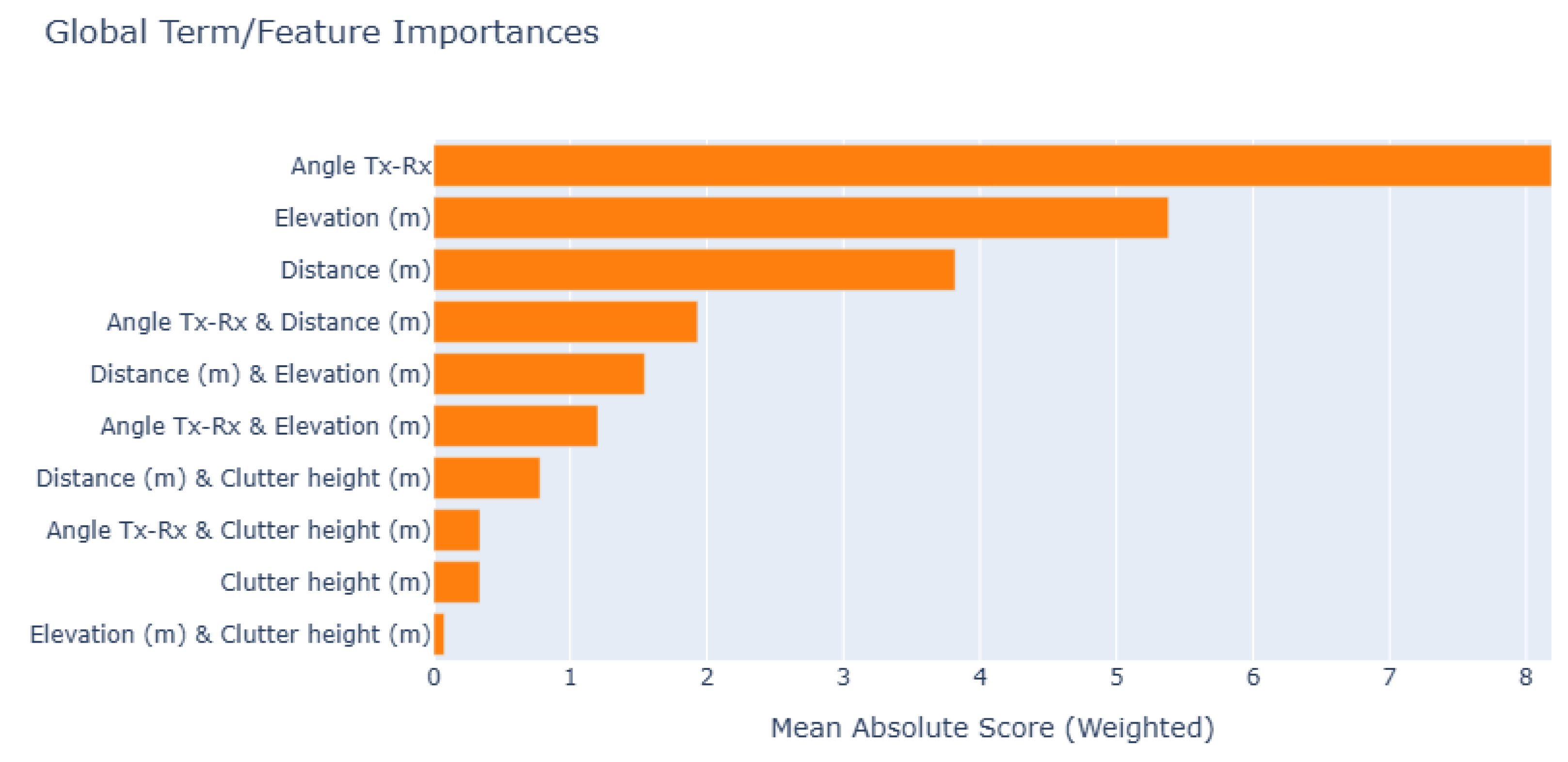
Figure 10 illustrates the average absolute additive (main and interactive) effect, that each feature in equation 16 can contribute to change the outcome of the NGB-SHAP model beyond the model’s intercept. In this figure, the values on the diagonal show the main features effect, and the other values show the SHAP interaction for pairs of features. Thereby, the main effect of the transmitter to receiver distance, the transmitter to receiver angle, and the elevation play the most important roles by contributing 5.87 dB, 1.1 dB, and 0.87 dB to the overall predictions, respectively. The interaction of the transmitter to receiver angle with distance is the next significant factor.
Figure 9.
Global Feature importance in NGB-SHAP Model.
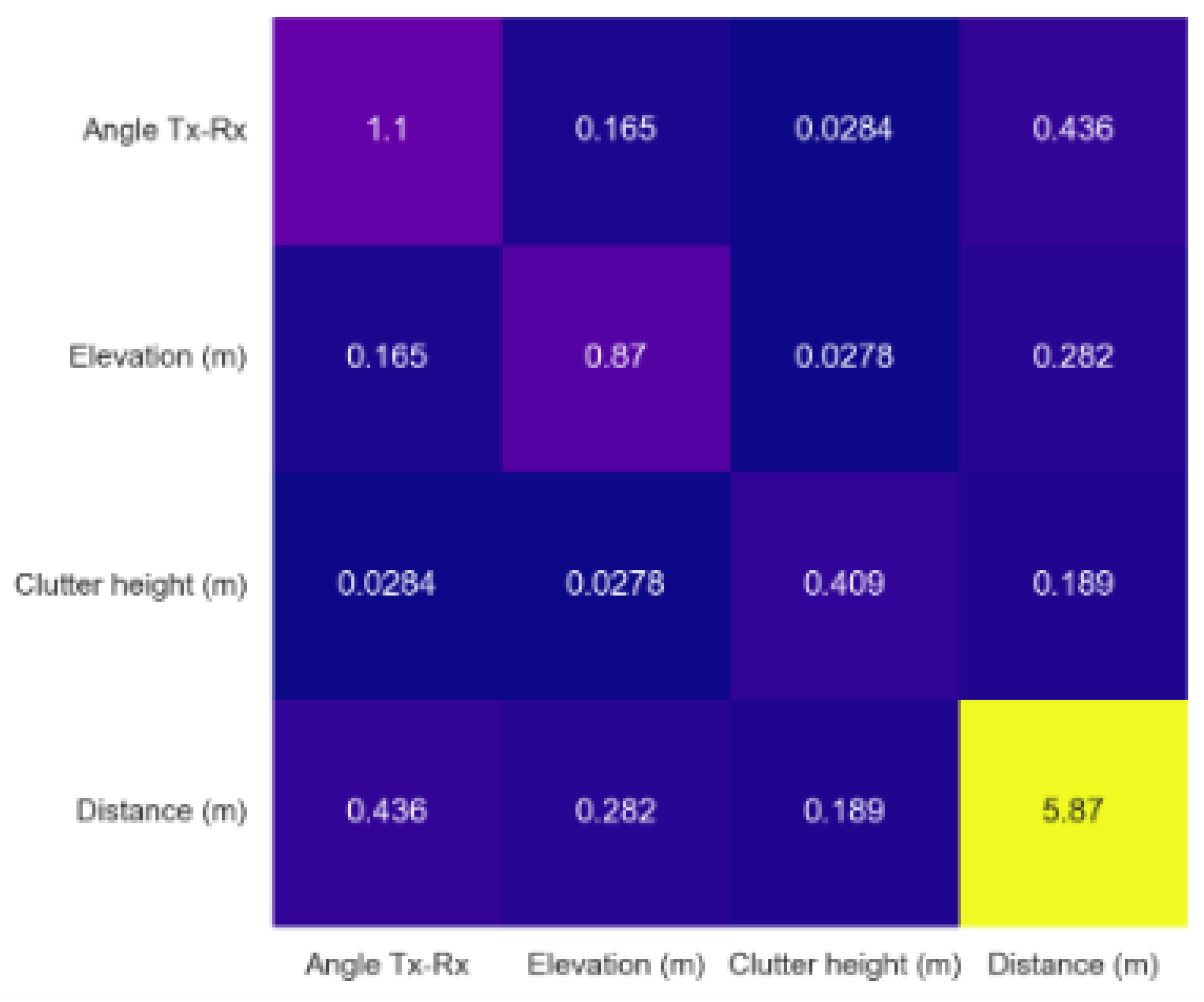
Figure 11 illustrates the average absolute additive (main and interactive) NGB-SHAP effects, with respect to the generated standard deviation in the NGB model. As shown in figure, the transmitter to receiver angle emerges as the main source of the uncertainty in NGB predictions. This phenomenon can be attributed to the directional antenna pattern in the study terrain, which likely divide the receiving points into separate signal coverage regimes within the vineyard.
Figure 10.
Global Feature importance for Uncertainty in NGB-SHAP Model.
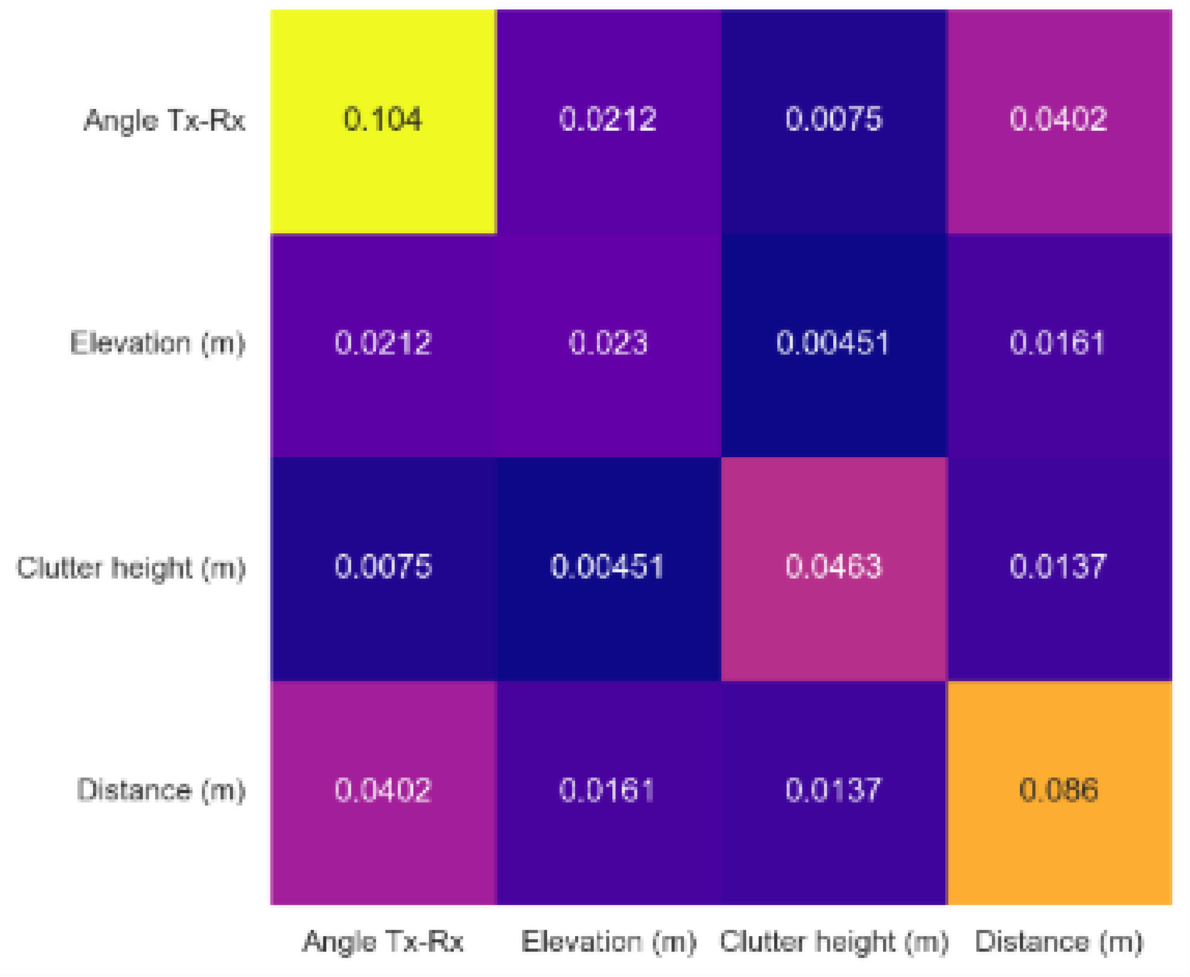
Figure 11 describes the features marginal contributions in the EBM model. Feature marginal contribution maps each possible value of an input feature to a corresponding contribution (in a look-up table manner) to generate PL predictions. The overall effect of the feature distance from the transmitter is shown in the upper left-hand panel in Figure 11. The effect of the feature distance in the vineyard reveals a linear characteristic, with a 45-degree rise from the minimum distance up to around 100 m and then with some near to zero but fluctuating overall slope from that point onward.
The upper right-hand panel shows the overall effect of the feature transmitter to receiver angle. The center point in the upper right-hand panel of Figure 11 represents the location of the transmitter. The ring around the center point represents the PL strengthening or weakening when it transmits from the base station towards a specific direction. The effect of the Tx-Rx angle on the path loss in our study terrain can be understood based on the directional antenna pattern. Especially, the receiver points located between 270o and 315o have the best chance of establishing a line of sight (LoS) link to the transmitter. In contrast, the receiver points located between 45o and 225o fall outside the antenna’s main coverage area.
The overall elevation’s effect is shown in the lower left-hand panel in Figure 11. In general, higher elevations are associated with higher losses in received signal. However, this pattern becomes less consistent between elevations of approximately 245 meters and 260 m.
The overall effect of the feature clutter height (lower right-hand panel in Figure 11) can be easily divided into two parts. For clutter heights up to 3 m, path loss tends to increase, for clutter higher than 3 m, path loss begins to decrease.
Figure 11.
Feature marginal contribution in EBM Model.
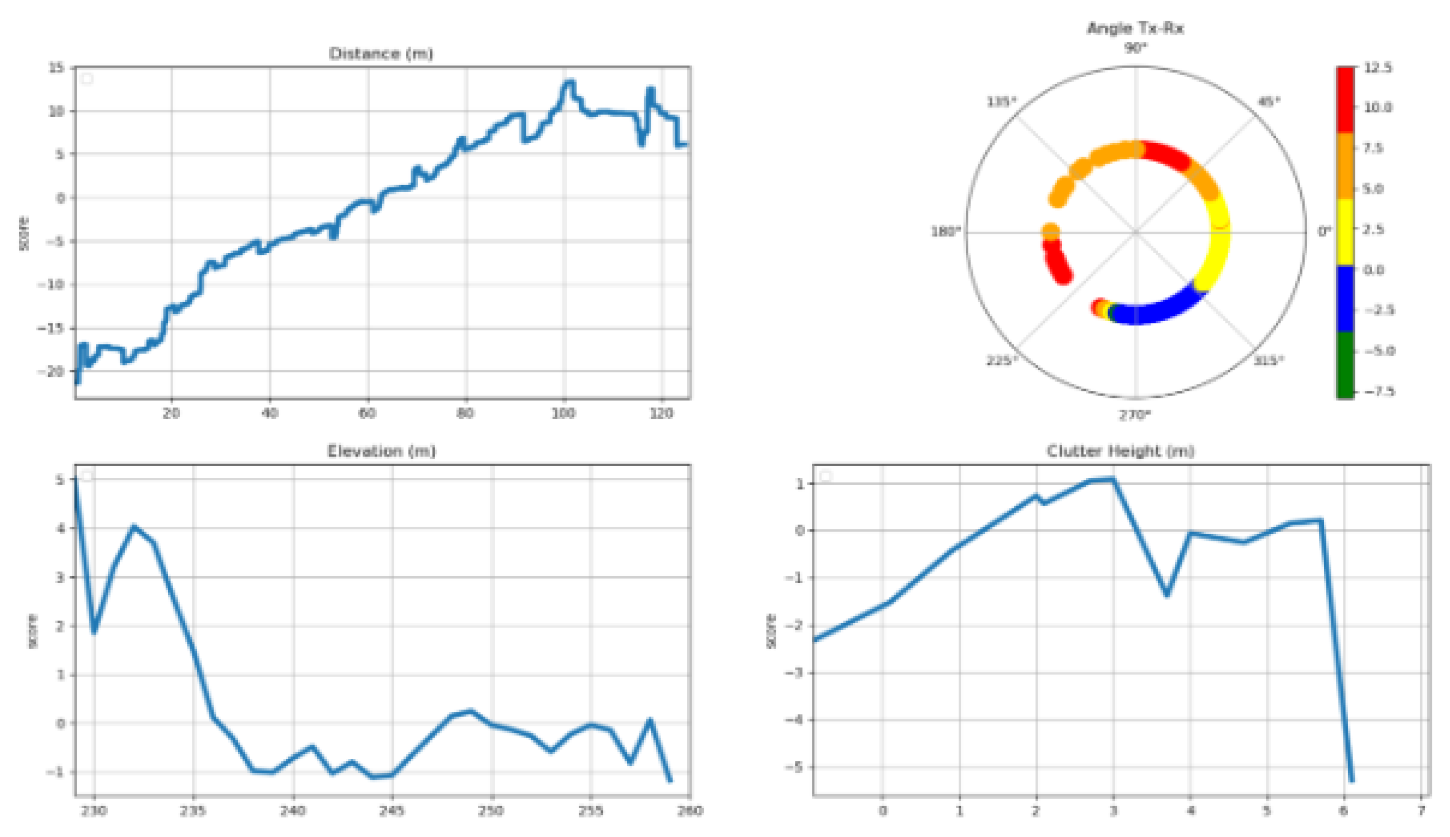
Figure 12 describes the features marginal contributions in the NGB-SHAP model. The sub-panels can be understood analogous to the sub-panels described in Figure 11. Indeed, the overall patterns generated through the NGB-SHAP model comply to a large extent with those from the EBM. SHAP local explanations can generate different features marginal contributions values for the same feature value in each data point. This stochastic effect is reflected in the features marginal contributions in Figure 12. In addition, while there are partial disagreements between the XAI generated based on the NGB-SHAP and the XAI generated based on the EBM mode. For example, the upper right-hand side of the Figure 12 (based on the NGB-SHAP model) explains most of the receiver points located between 0o and 45o as the points having a chance to receive negative PL contributions from the transmitter to the receiver angle point of view. In contrast, the EBM based contribution (cf. Figure 11) associate the same points with higher PL contributions. Additional trivial inconsistencies between the model explanation patterns can be seen by comparing each sub-panel in Figure 11 with its corresponding counterpart in Figure 12.
Figure 12.
Feature marginal contribution in NGB-SHAP Model.
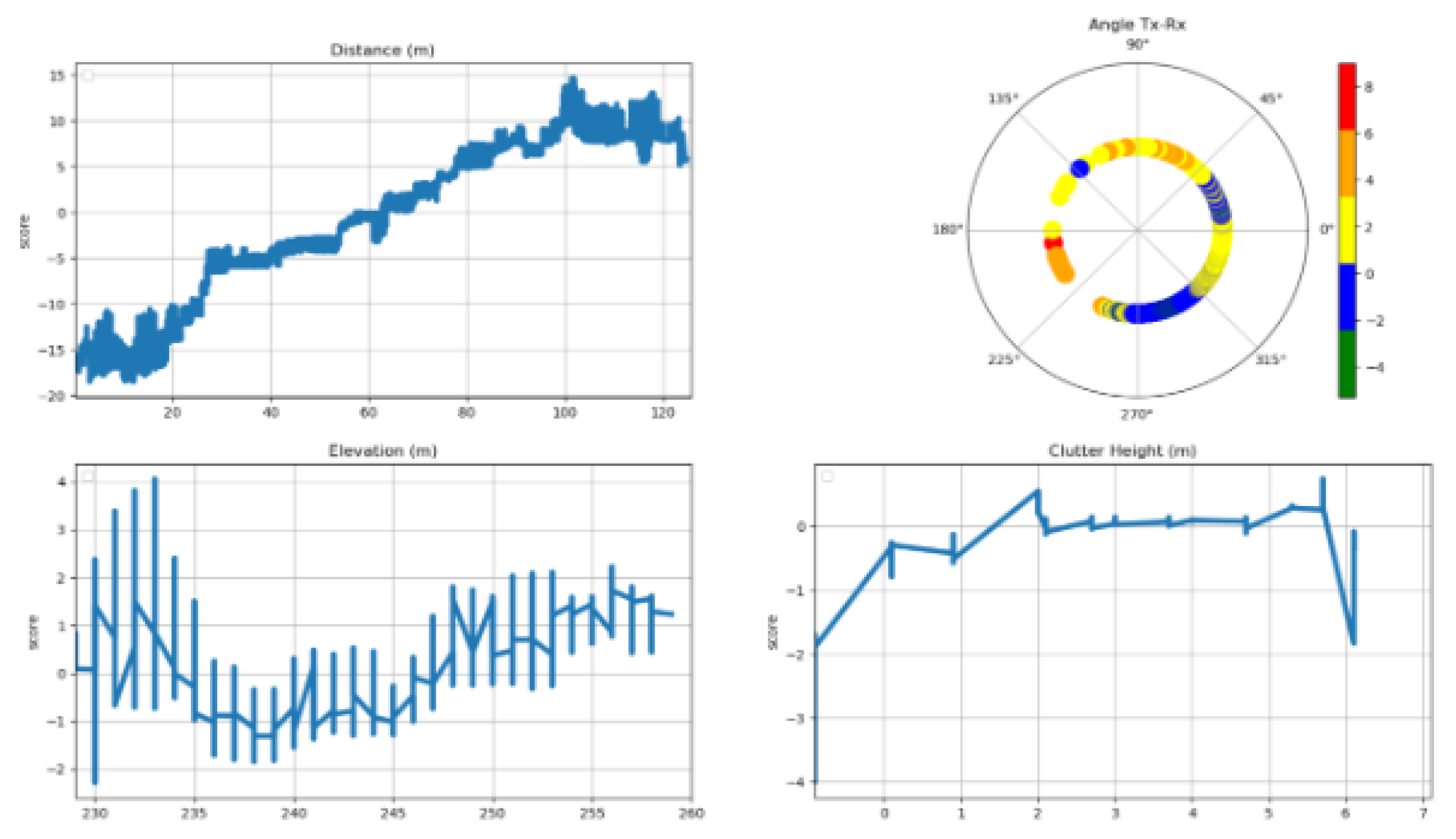
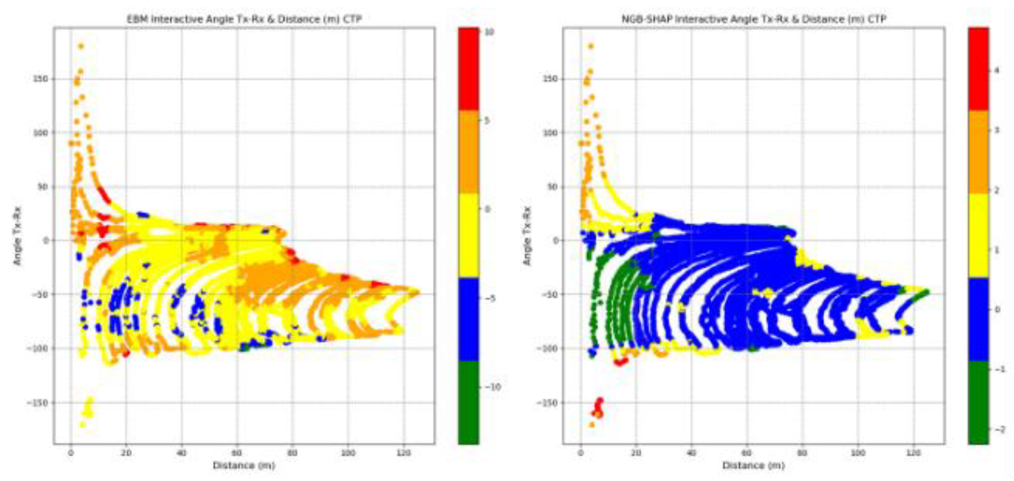
Figure 13 demonstrates the contribution of the interaction effects in the NGB-SHAP model (right-hand panel) and the EBM model (left-hand panel) explained by the equations 14 and 16, respectively. A thorough interpretation of bilateral feature interaction (as well as possible higher orders of interactions) would require a detailed spatial analysis of the area between the transmitter and the receiver, along with specific characteristics of the receiver location. Here, we focus on the interaction of distance and the Tx-Rx angle, which emerges as the most significant interaction in both models.
The mean absolute interaction effect between distance and Tx-Rx angle is approximately 2.5 dB in the EBM model and 0.5 dB in the NGB-SHAP model. In the right-hand side of the Figure 13, the blue colored points are indicating on average near to zero contribution of the combination of the corresponding feature values in dB units to the NGB-SHAP model’s PL predictions. Green colored points, located within 0 to 20 meters from the transmitter and between transmitting angles 0o to -100o , exhibit negative contributions (i.e., reduced path loss) of up to -2 dB. The points outside the aforementioned angle are suffering from up to +4dB path loss.
In contrast, the trained EBM model identifies a subset of the receiver points located within 0 to 80 meter and transmission angle between -50o and -100o as benefitting from significant reductions in path loss, ranging from -5 dB to -10 dB. However, increasing the values of the distance within the transmitting angles higher than the -50o can cause high path loss effects ranging from +5dB to +10 dB. Analogous to the NGB-SHAP explanation, the EBM model reveals a distinct spatial zone comprising of points between 0 to 20 meters distance and outside the transmitting angle in-between the 0o to -100o suffering from up to 10dB path losses can be detected.
Figure 13.
Interactive Distance-Angle Feature marginal contribution in EBM and NGB-SHAP Models.
Model Local Explanations
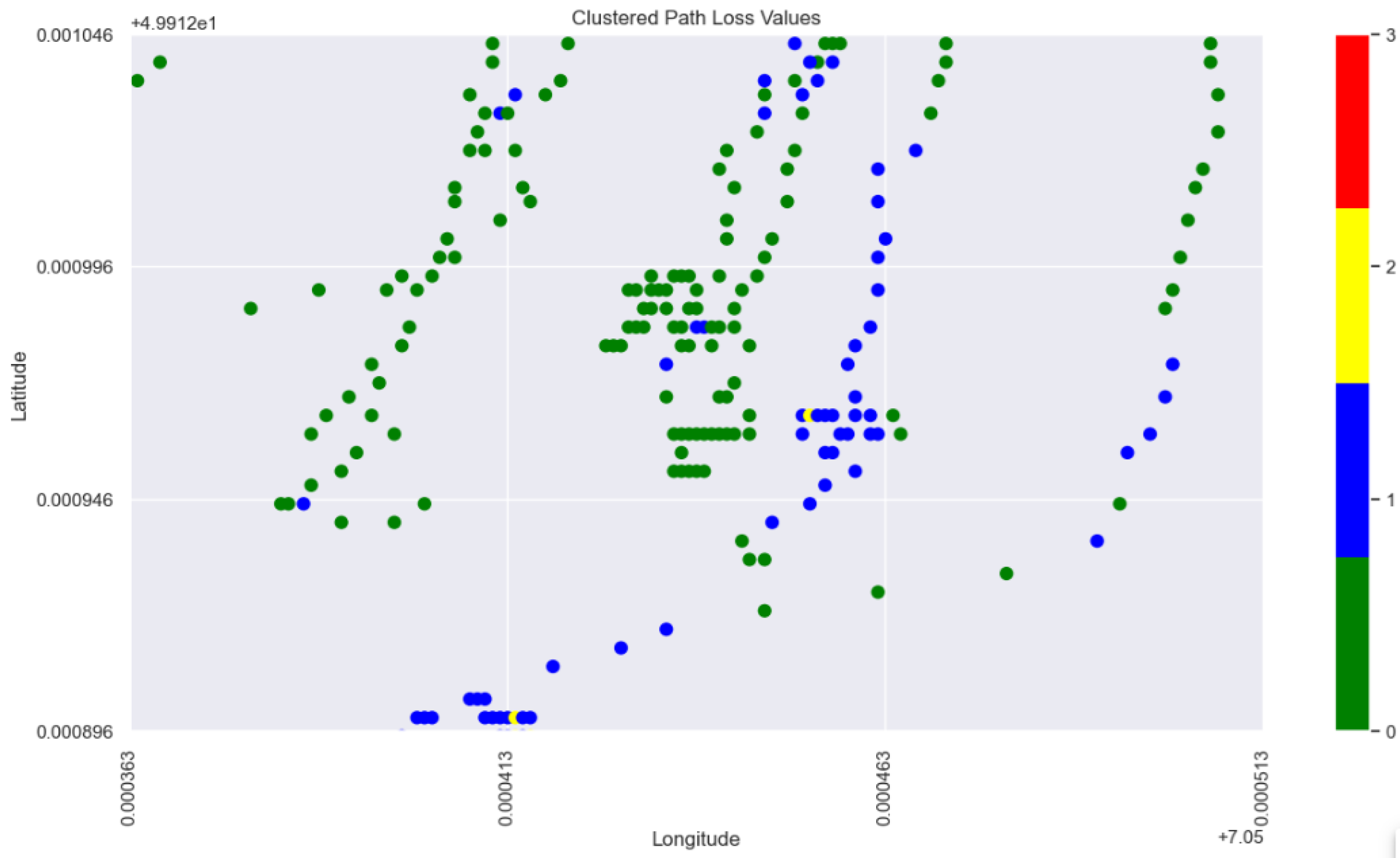
Global XAI in the previous subsection sheds light on the overall importance of input features and the corresponding marginal contributions in the signal attenuation within our study terrain. However, there are questionable observations with regard to the behavior of path losses in specific locations of the terrain. These include, for example, abrupt changes in PL patterns at some points in the underlying study area or PL behavior deviating from the global XAI view within specific sub-area of the terrain. This necessitates more in-depth look at the reasons behind the ML model predictions at the local level. To support our local XAI analysis based on a consistent view of the terrain, we first apply K-Means clustering based on the spatial locations of data points (comprising longitude, latitude) linked to their corresponding Path Loss values. This serves to figure out intrinsic grouping of data points across the entire vineyard map. The optimal resulted number of clusters through applying the elbow method is 4. The resulting four clusters are visualized on the vineyard map in Figure 14, with distinct colors distinct colors used to represent each cluster on the right hand panel. The left hand side panel in Figure 14 is plotting the observed path loss values sorted by means of distinct colors. The observed path loss values map and the clustered path loss values map comply with each other. Inspecting the PL values corresponding to the points belonging to each of the 4 clusters detected by the K-Means clustering, shows a distinctive partitioning of the data points across the vineyard based on the PL values, in which the green, blue, yellow, and red cluster points Pl values in dB units are lying in the (min, max) ranges equal to (106.65, 125.95), (126.0 , 135.25), (135.3, 143.1), and (143.15, 159.9).
Figure 14.
Clustered PL values versus Measured PL values in the study terrain.
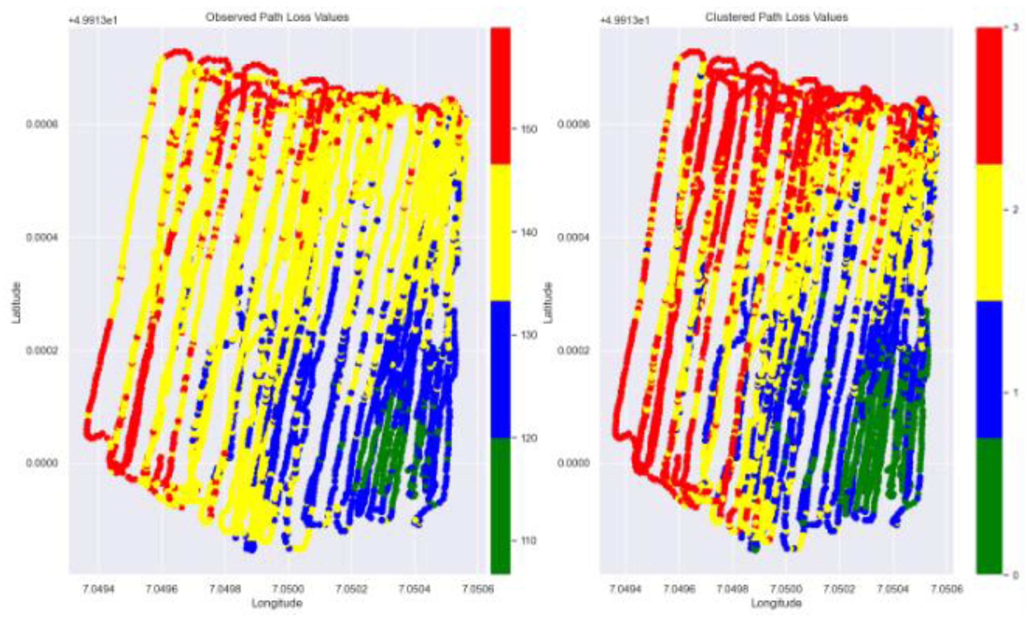
Two local sub areas of the terrain, presented in Figure 18 and Figure 21, have been identified as regions showing deviating path loss behavior from the global XAI view and demonstrating abrupt changes in the path loss pattern, respectively. The square in the center of the Figure 18 is encircling measured points with latitude and longitude in the (min, max) ranges equal to (49.913046, 49.913096) and (7.049713, 7.049763) , respectively. The points in this sub area are seemingly of similar geospatial profile in terms of distance and transmitting angle relative the base station. Though, the blue points are comprising less signal attenuation values even when the red points are slightly less distanced from the base station.
Figure 15.
Selected sub-area in the terrain with abruptive PL behavior (1).
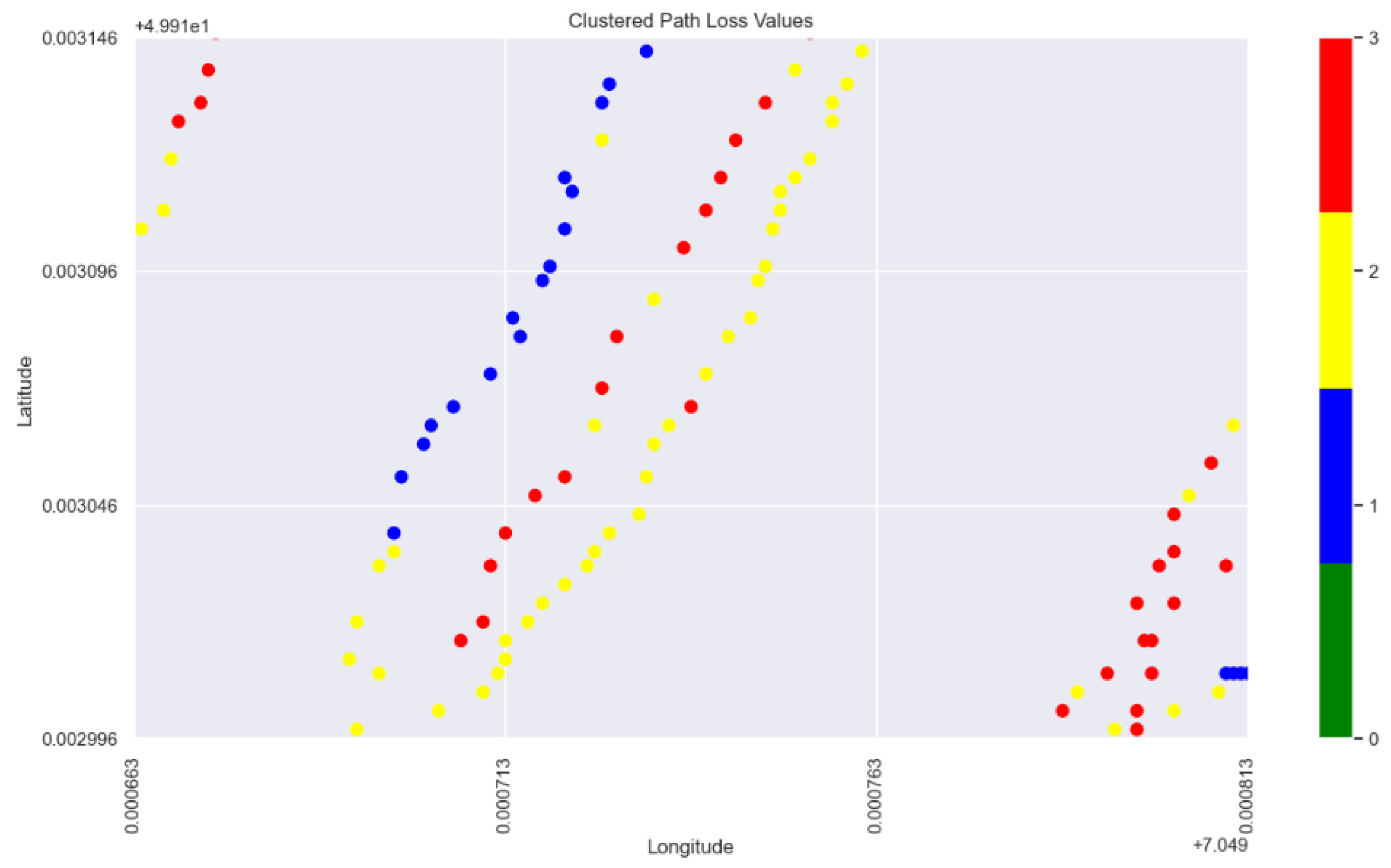
The difference between the red points data and the blue points data can be shown from an overview of the points profile, mean observed values as well as mean predicted values by ML models conveyed through the Table 5.
Table 4.
overview of the red points data and the blue points profile.
| Count | Mean Angle Tx-Rx |
Mean Elevation (m) |
Mean Clutter height (m) |
Mean Distance (m) | Mean Observed PL | Mean EBM Predicted | Mean NGB Predicted (mean, std) | |
| Blue points | 3 | -79.47 | 236.0 | -0.89 | 80.82 | 133.55 | 133.78 | (136.44, 4.96) |
| Red points | 5 | -81.14 | 235.40 | 1.30 | 79.26 | 144.79 | 140.88 | (140.13, 4.20) |
The difference between the interpretation of the blue points in contrast to the interpretation of the red points from the ML models can be seen in Figure 19 and Figure 20, respectively. Figure 19 presents the the interpretation of the red points, featuring NGB-SHAP explanation on the left-hand side panel and the EBM explanation on the right-hand side panel. Similarly, Figure 20 provides the interpretation of the blue points, again NGB-SHAP explanation on the left-hand side panel and the EBM explanation on the right-hand side panel.
In both figures, presented bars are describing the amount of change in the model output beyond the model intercepts (for NGB-SHAP) and (for EBM ), as defined in equations 12 and equation 16, respectively. Teal coloured bars denote features that contribute to a decrease in the PL values. The decreasing effects are sorted based on their importance from left to the right. In contrast, the maroon colored bars denote features that contribute to an increase in predicted PL values. The increasing effects are sorted based on their importance from right to the left.
Comparing the explanation of the red points and the explanation of the blue points via the EBM and NGB-SHAP explanations in Figure 19 and Figure 20, shows how the decreasing impact of the factor clutter height as the foremost decreasing factor and the third most decreasing factor in the NGB-SHAP model and the EBM model, respectively, changes the balance of the influencing forces to come up with lower path loss values by the blue points. The decreasing effect of the factor clutter height on decreasing the PL values can be checked with reference to the lower right-hand side panels in Figure 11 and Figure 12.
Figure 16.
Explanation of the blue points Selected sub-area in the terrain with abruptive PL behavior (1) via SHAP and EBM models.
Figure 16.
Explanation of the blue points Selected sub-area in the terrain with abruptive PL behavior (1) via SHAP and EBM models.
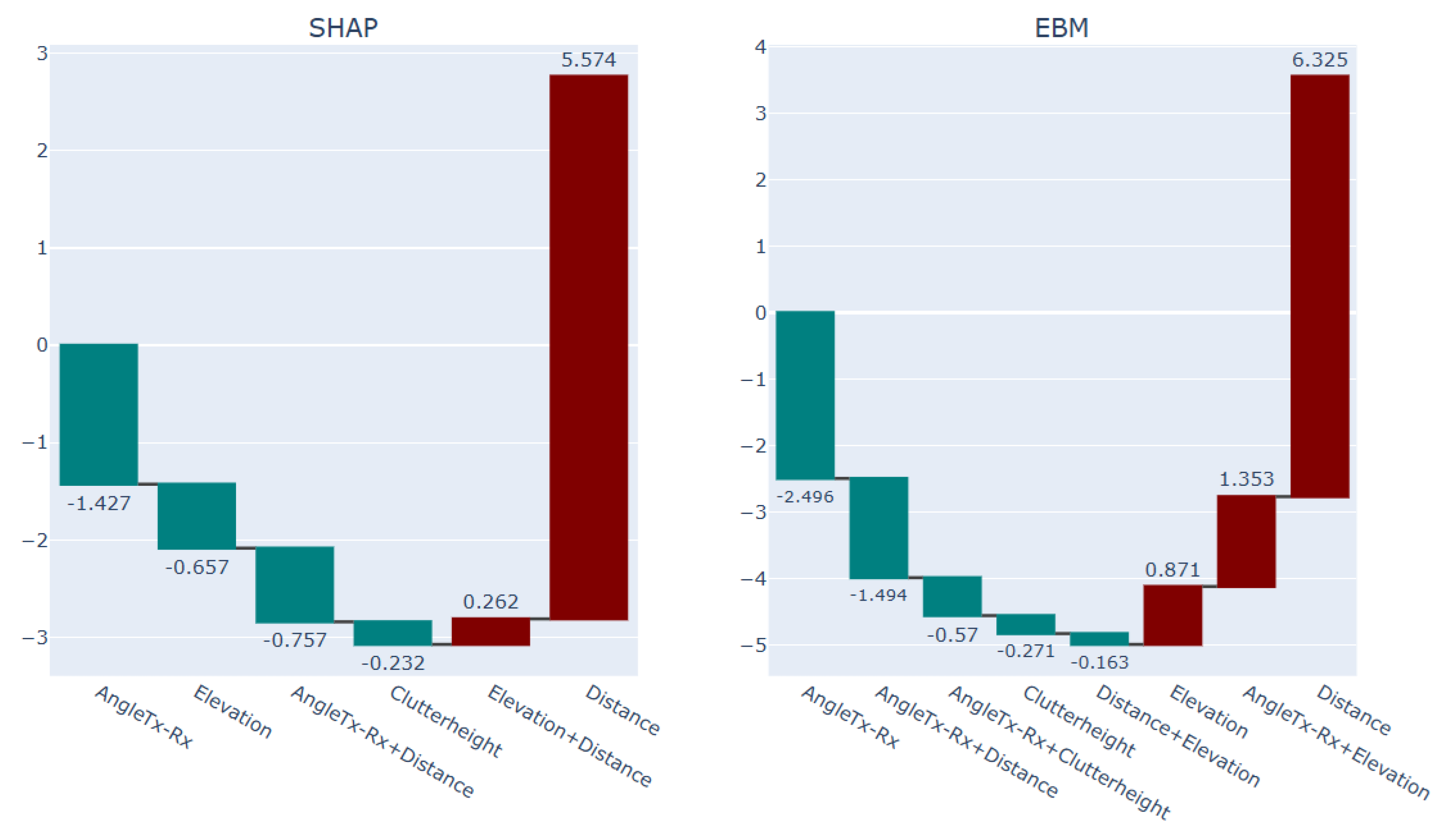
Figure 17.
Explanation of the red points Selected sub-area in the terrain with abruptive PL behavior (1) via SHAP and EBM models.
Figure 17.
Explanation of the red points Selected sub-area in the terrain with abruptive PL behavior (1) via SHAP and EBM models.
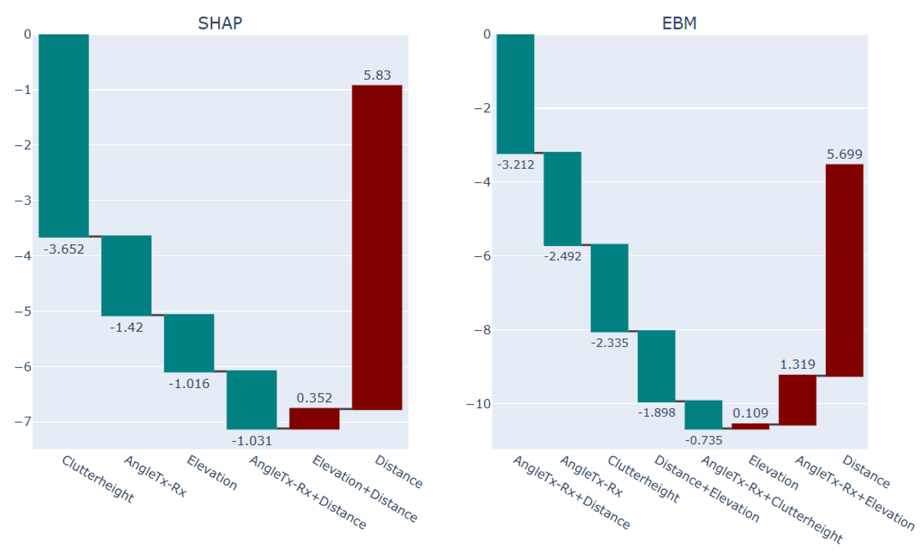
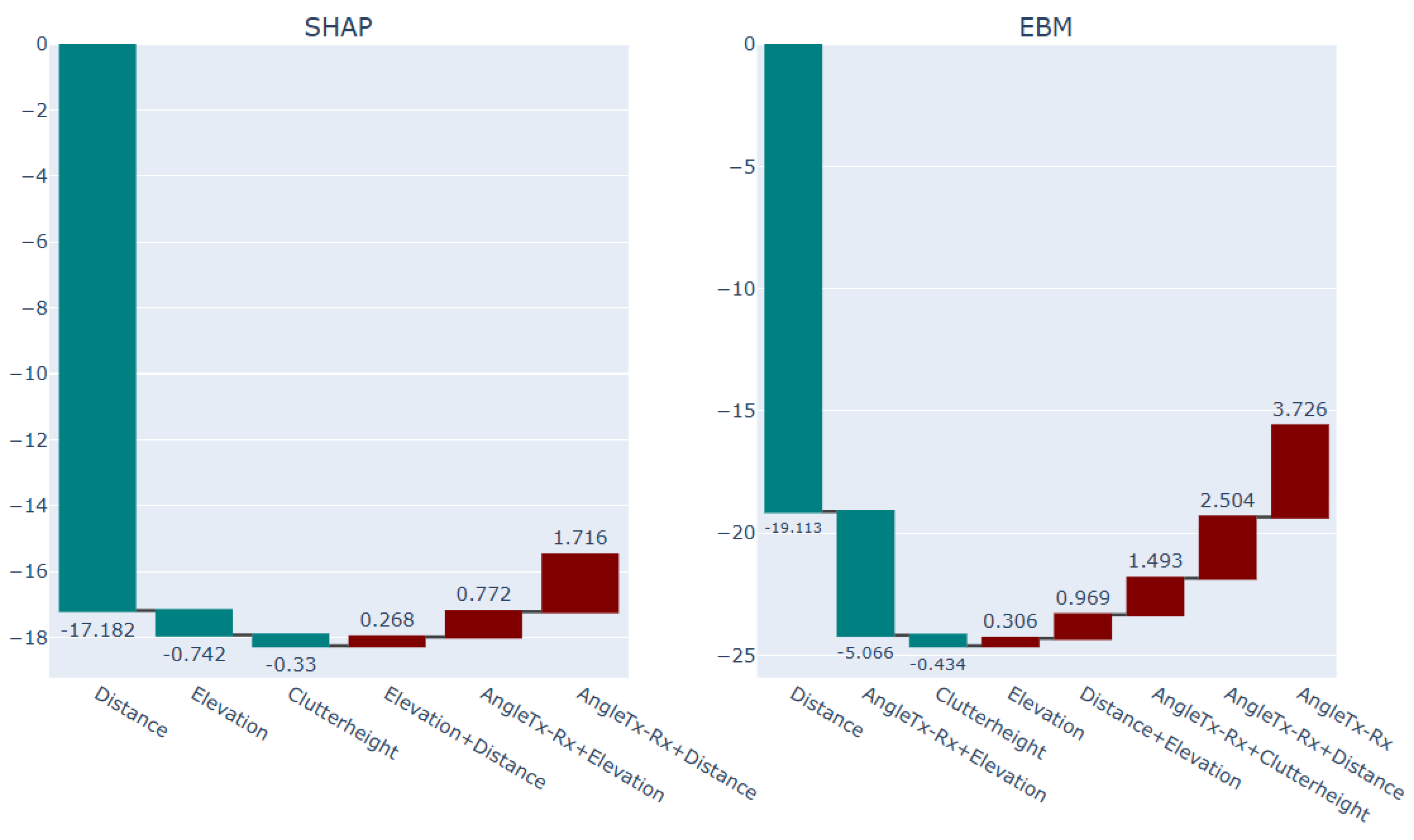
Figure 21 is comprising the next investigated sub-region in our study in terms of application of local XAI. The square in the center of the Figure 21 is entailing measured points with latitude and longitude in the (min, max) ranges equal to (49.912496, 49.912996) and (7.050413, 7.050463) , respectively. The points in this sub area are seemingly of similar geospatial profile with regard to their proximity to the base station. Though, the blue points are comprising higher signal attenuation values even when they are lying next to the base station (with 3.08 meter distance on average from Tx).
Figure 18.
Selected sub-area in the terrain with abruptive PL behavior (2).
The difference between the green points data and the blue points data can be shown from an overview of the points profile, mean observed values as well as the mean predicted values by ML models conveyed through the Table 6.
Table 5.
overview of the green points data and the blue points profile.
| Count | Mean Angle Tx-Rx |
Mean Elevation (m) |
Mean Clutter height (m) |
Mean Distance (m) | Mean Observed PL | Mean EBM Predicted | Mean NGB Predicted (mean, std) | |
| Green points | 55 | 17.99 | 236.12 | 0.89 | 2.80 | 121.00 | 121.71 | (121.98, 2.82) |
| Blue points | 23 | 56.84 | 235.56 | 0.89 |
3.08 | 128.13 | 127.03 | (126.27, 2.81) |
Comparing the explanation of the blue points and the explanation of the green points via the EBM and NGB-SHAP explanations in Figure 22 and Figure 23, shows how the increasing impact of the factor transmitting angle as the foremost increasing factor both in the NGB-SHAP model and the EBM model, respectively, changes the balance of the influencing forces to come up with higher path loss values by the blue points. The difference between effect of the transmitting angle being 56.84 degree and 17.99 degree on increasing and decreasing the PL values, respectively, can be checked with reference to the upper right-hand side panels in Figure 11 and Figure 12.
Figure 19.
Explanation of the blue points Selected sub-area in the terrain with abruptive PL behavior (2) via SHAP and EBM models.
Figure 19.
Explanation of the blue points Selected sub-area in the terrain with abruptive PL behavior (2) via SHAP and EBM models.
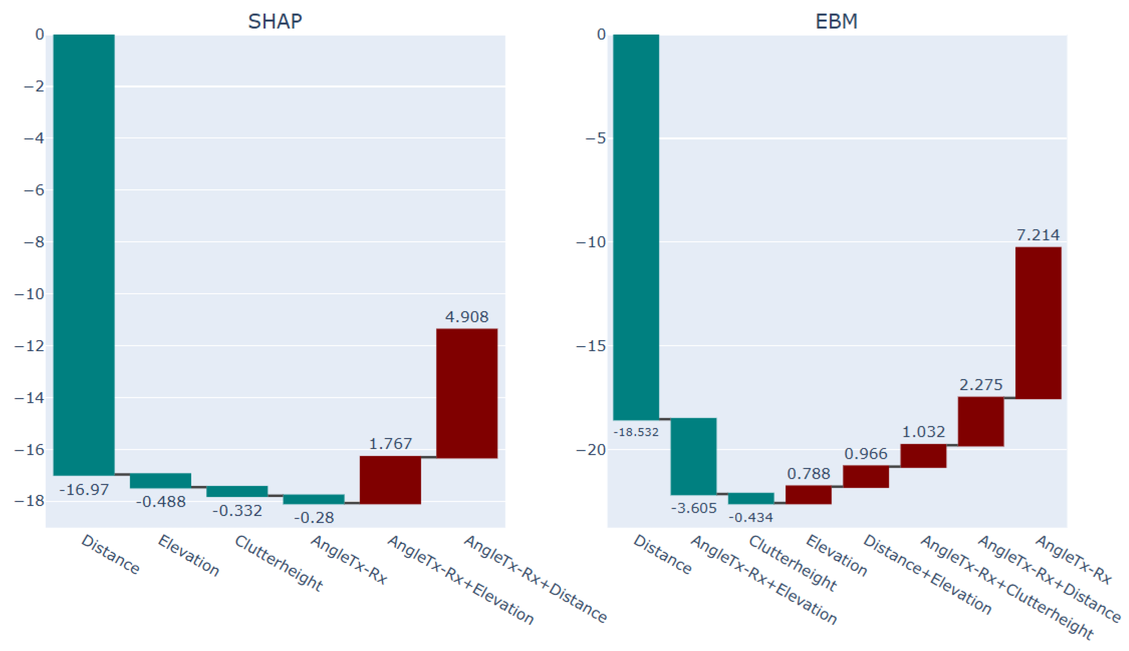
Figure 20.
Explanation of the green points Selected sub-area in the terrain with abruptive PL behavior (2) via SHAP and EBM models.
Figure 20.
Explanation of the green points Selected sub-area in the terrain with abruptive PL behavior (2) via SHAP and EBM models.
Conclusions
While applications of explanation techniques (XAI) to the AI-based PL models in the literature of communication systems are increasing, a framework for the usage of local XAI is not yet applied. Our paper takes a first step to exemplify the application of local EBM and local SHAP explanation models in the context of PL modeling in the studied microenvironment urban area. We furthermore contribute to the existing literature by elaborating the interpretation of uncertainty in the signal attenuation literature context on the basis of the probabilistic NGB model. In addition, we introduce the novel stack ensemble EBM2NGB model, which outperforms the Bayesian Log-distance Model, as well as EBM and NGB models in terms of accuracy.
| 1 | (https://github.com/cokelaer/fitter, accessed on 18 June 2025) |
| 2 | GitHub - stanford mlgroup/xgboost: Natural Gradient Boosting for Probabilistic Prediction |
| 3 | Welcome to the SHAP documentation — SHAP latest documentation |
References
- Khanh, Q.V.; Hoai, N.V.; Manh, L.D.; Le, A.N.; Jeon, G. Wireless Communication Technologies for IoT in 5G: Vision, Applications, and Challenges. Wirel. Commun. Mob. Comput. 2022, 2022, 3229294. [Google Scholar] [CrossRef]
- Phillips, C.; Sicker, D.; Grunwald, D. A survey of wireless path loss prediction and coverage mapping methods. IEEE Commun. Surv. Tutor. 2013, 15, 255–270. [Google Scholar] [CrossRef]
- Shaibu, F.E.; Onwuka, E.N.; Salawu, N.; Oyewobi, S.S.; Djouani, K.; Abu-Mahfouz, A.M. Performance of Path Loss Models over Mid-Band and High-Band Channels for 5G Communication Networks: A Review. Future Internet 2023, 15, 362. [Google Scholar] [CrossRef]
- Miller, T. Explanation in artificial intelligence: Insights from the social sciences. Artif. Intell. 2019, 267, 1–38. [Google Scholar] [CrossRef]
- Allgaier, J.; Mulansky, L.; Draelos, R.L.; Pryss, R. How does the model make predictions? A systematic literature review on the explainability power of machine learning in healthcare. Artif. Intell. Med. 2023, 143, 102616. [Google Scholar]
- Confalonieri, R.; Coba, L.; Wagner, B.; Besold, T.R. A historical perspective of explainable Artificial Intelligence. WIREs Data Min. Knowl. Discov. 2021, 11, e1391. [Google Scholar] [CrossRef]
- Angelov, P.P.; Soares, E.A.; Jiang, R.; Arnold, N.I.; Atkinson, P.M. Explainable artificial intelligence: An analytical review. WIREs Data Min. Knowl. Discov. 2021, 11, e1424. [Google Scholar] [CrossRef]
- Vollert, S.; Atzmueller, M.; Theissler, A. Interpretable Machine Learning: A brief survey from the predictive maintenance perspective. In Proceedings of the 2021 26th IEEE International Conference on Emerging Technologies and Factory Automation (ETFA), Vasteras, Sweden, 7–10 September 2021; pp. 1–8. [Google Scholar]
- Popoola, S.I.; Atayero, A.A.; Arausi, Q.D.; Matthews, V.O. Path loss dataset for modeling radio wave propagation in smart campus environment. Data Brief 2018, 17, 1062–1073. [Google Scholar] [CrossRef]
- Popoola, S.I.; Atayero, A.A.; Popoola, O.A. Comparative assessment of data obtained using empirical models for path loss predictions in a university campus environment. Data Brief 2018, 18, 380–393. [Google Scholar] [CrossRef]
- Juang, R.T. Explainable Deep-Learning-Based Path Loss Prediction from Path Profiles in Urban Environments. Appl. Sci. 2021, 11, 6690. [Google Scholar] [CrossRef]
- Yazici, I.; Özkan, E.; Gures, E. Enhancing Path Loss Prediction Through Explainable Machine Learning Approach. In Proceedings of the 2024 11th International Conference on Wireless Networks and Mobile Communications (WINCOM), Leeds, UK, 23–25 July 2024; pp. 1–5. [Google Scholar]
- Sani, U.S.; Malik, O.A.; Lai, D.T.C. Improving Path Loss Prediction Using Environmental Feature Extraction from Satellite Images: Hand-Crafted vs. Convolutional Neural Network. Appl. Sci. 2022, 12, 7685. [Google Scholar]
- Nuñez, Y.; Lisandro, L.; da Silva Mello, L.; Orihuela, C. On the interpretability of machine learning regression for path-loss prediction of millimeter-wave links. Expert Syst. Appl. 2023, 215, 119324. [Google Scholar] [CrossRef]
- Sun, Y.; Zhang, Y.; Yu, L.; Yuan, Z.; Liu, G.; Wang, Q. Environment Features-Based Model for Path Loss Prediction. IEEE Wirel. Commun. Lett. 2022, 11, 2010–2014. [Google Scholar] [CrossRef]
- Liao, X.; Zhou, P.; Wang, Y.; Zhang, J. Path Loss Modeling and Environment Features Powered Prediction for Sub-THz Communication. IEEE Open J. Antennas Propag. 2024, 5, 1734–1746. [Google Scholar] [CrossRef]
- Elshennawy, W. Large Intelligent Surface-Assisted Wireless Communication and Path Loss Prediction Model Based on Electromagnetics and Machine Learning Algorithms. Prog. Electromagn. Res. C 2022, 119, 65–79. [Google Scholar] [CrossRef]
- Nuñez, Y.; Lisandro, L.; da Silva Mello, L.; Ramos, G.; Leonor, N.R.; Faria, S.; Caldeirinha, F.S. Path Loss Prediction for Vehicular-to-Infrastructure Communication Using Machine Learning Techniques. In Proceedings of the 2023 IEEE Virtual Conference on Communications (VCC), Virtual, 28–30 November 2023; pp. 270–275. [Google Scholar]
- Hussain, S.; Bacha, S.F.N.; Cheema, A.A.; Canberk, B.; Duong, T.Q. Geometrical Features Based-mmWave UAV Path Loss Prediction Using Machine Learning for 5G and Beyond. IEEE Open J. Commun. Soc. 2024, 5, 5667–5679. [Google Scholar] [CrossRef]
- Turan, B.; Uyrus, A.; Koc, O.N.; Kar, E.; Coleri, S. Machine Learning Aided Path Loss Estimator and Jammer Detector for Heterogeneous Vehicular Networks. In Proceedings of the 2021 IEEE Global Communications Conference (GLOBECOM), Madrid, Spain, 7–11 December 2021; pp. 1–6. [Google Scholar]
- Wieland, F.; Drescher, Z.; Houser, J. Comparing Path Loss Prediction Methods for Low Altitude UAS Flights. In Proceedings of the 2021 IEEE/AIAA 40th Digital Avionics Systems Conference (DASC), San Antonio, TX, USA, 3–7 October 2021; pp. 1–7. [Google Scholar]
- Khalili, H.; Wimmer, M.A. Towards Improved XAI-Based Epidemiological Research into the Next Potential Pandemic. Life 2024, 14, 783. [Google Scholar] [CrossRef]
- Perrier, A. Feature Importance in Random Forests. Cit. on p. 6. 2015. Available online: https://scholar.google.com/scholar?q=Perrier,%20A.%20Feature%20Importance%20in%20Random%20Forests.%20Cit.%20on%20p.%206.%202015 (accessed on 28 February 2025).
- Ahmed, N.S.; Sadiq, M.H. Clarify of the Random Forest Algorithm in an Educational Field. In Proceedings of the 2018 International Conference on Advanced Science and Engineering (ICOASE), Duhok, Iraq, 9–11 October 2018; pp. 179–184. [Google Scholar]
- Rostami, M.; Oussalah, M.A. Novel explainable COVID-19 diagnosis method by integration of feature selection with random forest. Inform. Med. Unlocked 2022, 30, 100941. [Google Scholar] [CrossRef]
- Sharma, P.; Singh, R.K. Comparative Analysis of Propagation Path loss Models with Field Measured Data. Int. J. Eng. Sci. Technol. 2010, 2, 2008–2013. [Google Scholar]
- Singh, H.; Gupta, S.; Dhawan, C.; Mishra, A. Path Loss Prediction in Smart Campus Environment: Machine Learning-based Approaches. In Proceedings of the 2020 IEEE 91st Vehicular Technology Conference (VTC2020-Spring), Antwerp, Belgium, 25–28 May 2020; pp. 1–5. [Google Scholar]
- Chen, T.; Guestrin, C. XGBoost: A scalable tree boosting system. In Proceedings of the 22nd ACM SIGKDD International Conference on Knowledge Discovery and Data Mining, San Francisco, CA, USA, 13–17 August 2016; pp. 785–794. [Google Scholar]
- Breiman, L. Random Forests. Mach. Learn. 2001, 45, 5–32. [Google Scholar] [CrossRef]
- Molnar, C. Interpretable Machine Learning. A Guide for Making Black Box Models Explainable. 2022. Available online: https://christophmolnar.com/books/ (accessed on 9 January 2025).
- Hastie, T.J.; Tibshirani, R.J. Generalized Additive Models, 1st ed.; Routledge: London, UK, 2017. [Google Scholar]
- Agarwal, R.; Melnick, L.; Frosst, N.; Zhang, X.; Lengerich, B.; Caruana, R.; Hinton, G. Neural Additive Models: Interpretable Machine Learning with Neural Nets. arXiv 2021, arXiv:2004.13912. [Google Scholar]
- Nori, H.; Jenkins, S.; Koch, P.; Caruana, R. InterpretML: A Unified Framework for Machine Learning Interpretability; Microsoft Corporation: Redmond, WA, USA, 2019; Available online: https://arxiv.org/pdf/1909.09223 (accessed on 9 January 2025).
- Greenwell, B.M.; Dahlmann, A.; Dhoble, S. Explainable Boosting Machines with Sparsity: Maintaining Explainability in High-Dimensional Settings. arXiv 2023, arXiv:2311.07452. [Google Scholar]
- Lou, Y.; Caruana, R.; Gehrke, J.; Hooker, G. Accurate intelligible models with pairwise interactions. In Proceedings of the 19th ACMSIGKDD International Conference on Knowledge Discovery and Data Mining, Chicago, IL, USA, 11–14 August 2013; pp. 623–631. [Google Scholar]
Disclaimer/Publisher’s Note: The statements, opinions and data contained in all publications are solely those of the individual author(s) and contributor(s) and not of MDPI and/or the editor(s). MDPI and/or the editor(s) disclaim responsibility for any injury to people or property resulting from any ideas, methods, instructions or products referred to in the content. |
© 2025 by the authors. Licensee MDPI, Basel, Switzerland. This article is an open access article distributed under the terms and conditions of the Creative Commons Attribution (CC BY) license (http://creativecommons.org/licenses/by/4.0/).
Copyright: This open access article is published under a Creative Commons CC BY 4.0 license, which permit the free download, distribution, and reuse, provided that the author and preprint are cited in any reuse.


