Submitted:
10 February 2025
Posted:
10 February 2025
You are already at the latest version
Abstract
Health Technology Assessment (HTA) plays a critical role in guiding decision-making within the Brazilian Unified Health System (Sistema Único de Saúde, SUS) and the supplementary (private) health sector. This article explores how the assessment of health technologies—ranging from innovative pharmaceuticals to digital health solutions—impacts political strategies, economic considerations, and public health outcomes in Brazil. We present a theoretical model that estimates whether investments in three areas—artificial intelligence (AI), improved communications, and another selected health area—lead to enhanced population health outweighing financial costs, without focusing on profit generation. By integrating data from the Brazilian DataSUS databases, we offer a real-world contextual grounding. We then propose a set of equations to illustrate a cost-effectiveness framework and subsequently generate Python-based data visualisations to demonstrate the interplay among costs, outcomes, and resource allocation. The findings contribute to ongoing debates about how best to utilise finite resources in both the public and private spheres, ensuring that technology adoption maximises societal benefit. We conclude with a discussion on implications for policy, regulation, and long-term sustainability, emphasising the need for robust evidence-based processes.
Keywords:
Section 1. Introduction
2. Methodology
Data Sources and Assumptions
- DataSUS: We rely on existing statistical indicators from the Brazilian public database (DataSUS, 2022) for disease prevalence rates, mortality rates, and healthcare utilisation.
- Cost Assumptions: For each technology, we assume an initial investment cost (fixed) plus recurring operational costs.
- Health Benefits: Health benefits are measured in Quality-Adjusted Life Years (QALYs) gained (Drummond et al., 2015), enabling the comparison of different interventions.
Section 3. Results
Section 5.1. Detailed Explanation of Each Graph
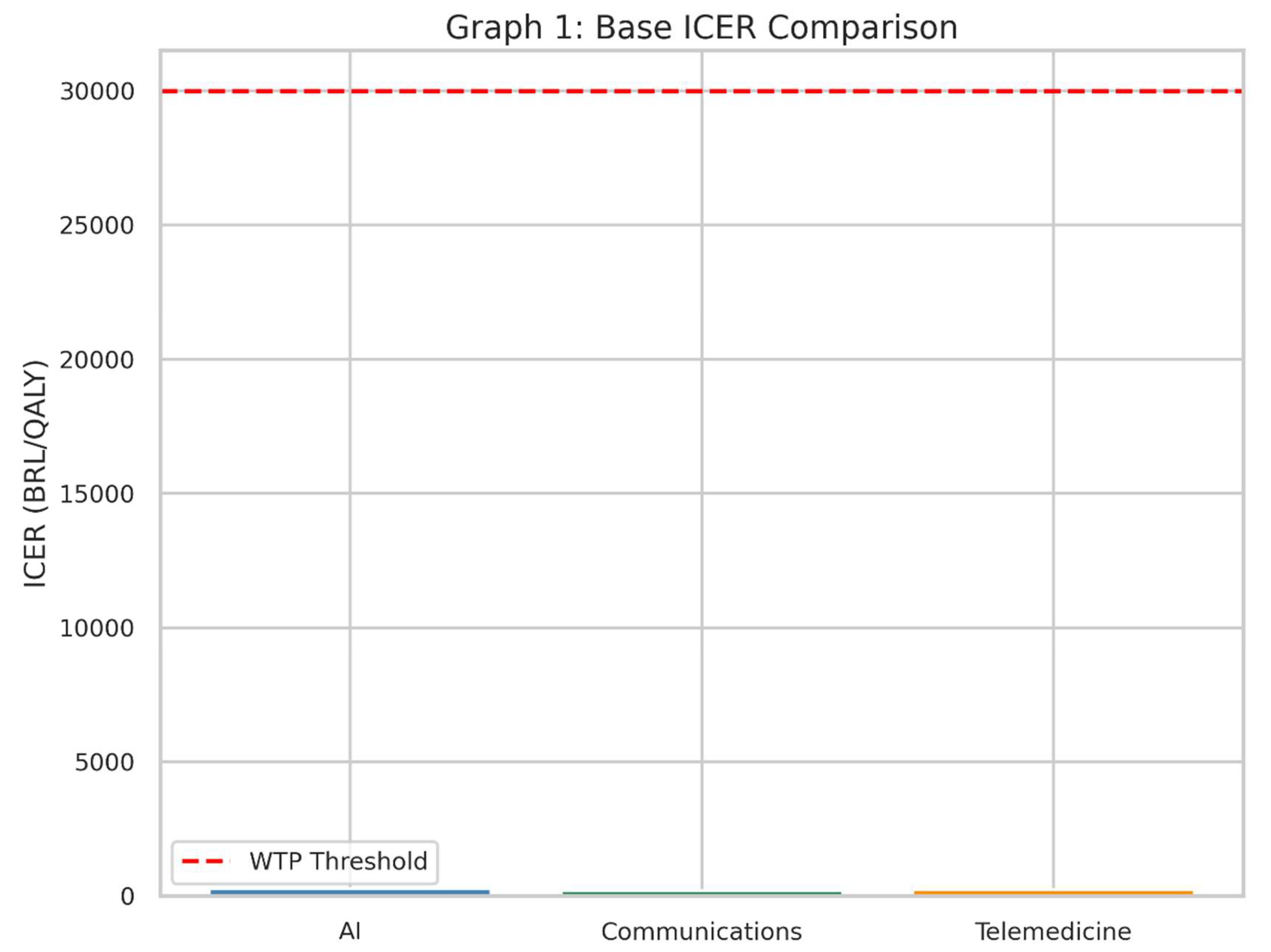
- This bar chart illustrates the Incremental Cost-Effectiveness Ratio (ICER) for each of the three health interventions in the base, or “starting,” scenario.
- The red dashed line represents the Willingness-to-Pay (WTP) threshold: the maximum amount society (or the health system) is prepared to pay for one extra unit of health benefit (in this case, one Quality-Adjusted Life Year, QALY).
- The ICER tells us how much money must be spent to gain one additional QALY compared to the current standard of care (“no intervention” scenario).
- If the bar for an intervention’s ICER is below the red line, it suggests that the intervention is considered “cost-effective” under these assumptions, because we are not paying more than our maximum “willingness to pay.”
- Each bar represents one of the three interventions—AI, Communications, and Telemedicine.
- A shorter bar means the intervention is more cost-effective, because less money is spent for each QALY gained.
- If a bar is well below the red line, it is likely a good candidate for adoption in a health system that follows this threshold principle.
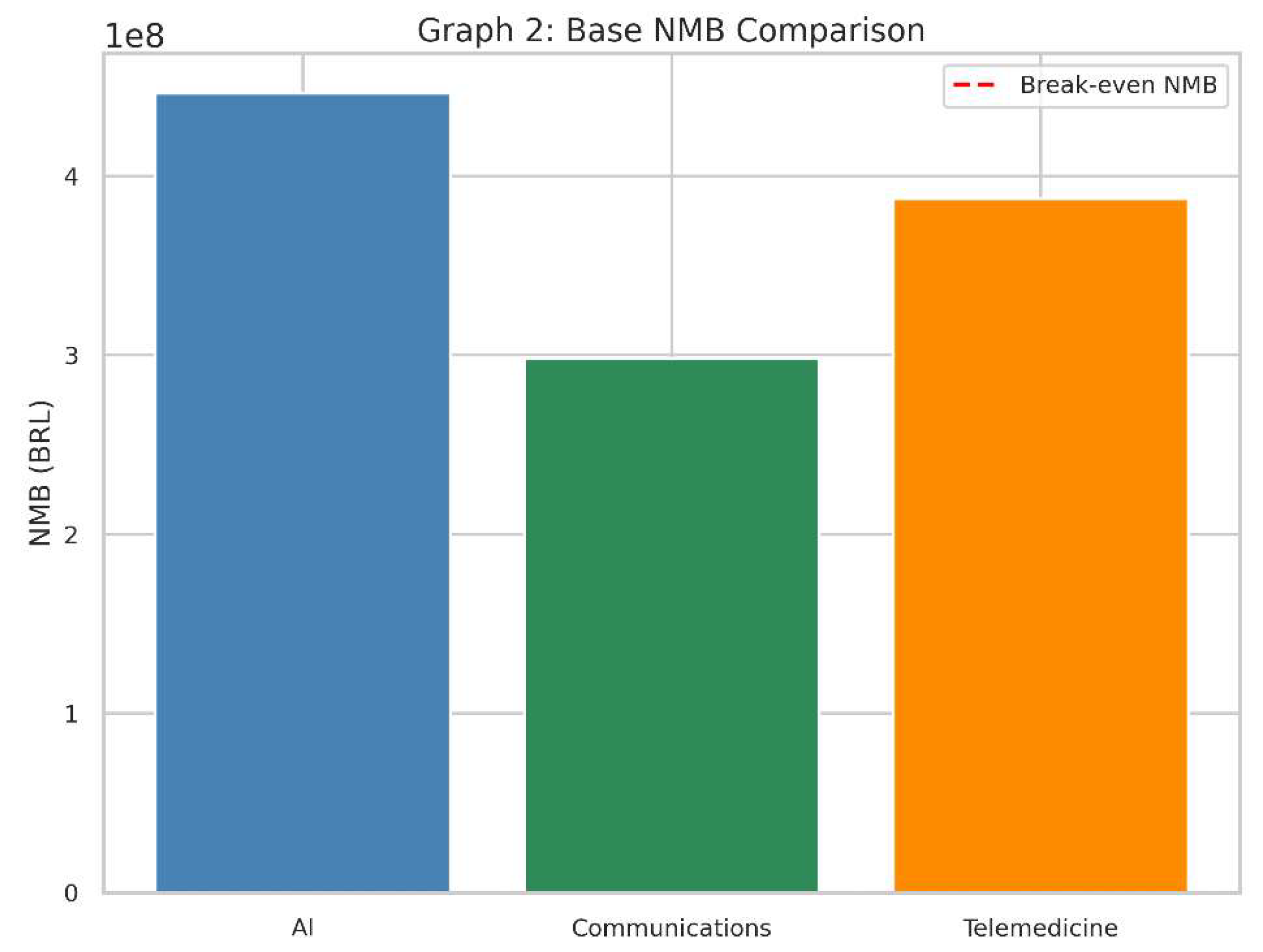
- This bar chart represents the Net Monetary Benefit (NMB) of each intervention in the same baseline scenario.
- The red dashed line at zero on the vertical axis indicates a “break-even” point: an NMB of exactly 0.
- NMB converts health gains (QALYs) into a monetary value by multiplying them by the willingness-to-pay threshold.
- It then subtracts the cost of the intervention to see if, financially speaking, the technology provides more value than it costs.
- A positive NMB (bar above zero) means that, given our threshold, the intervention’s benefits in QALYs exceed its costs.
- A negative NMB (bar below zero) implies the intervention costs more than the value of the health it provides, so it is not considered cost-effective in this context.
- The higher the bar above zero, the more economically attractive it is, assuming our willingness-to-pay threshold remains the same.
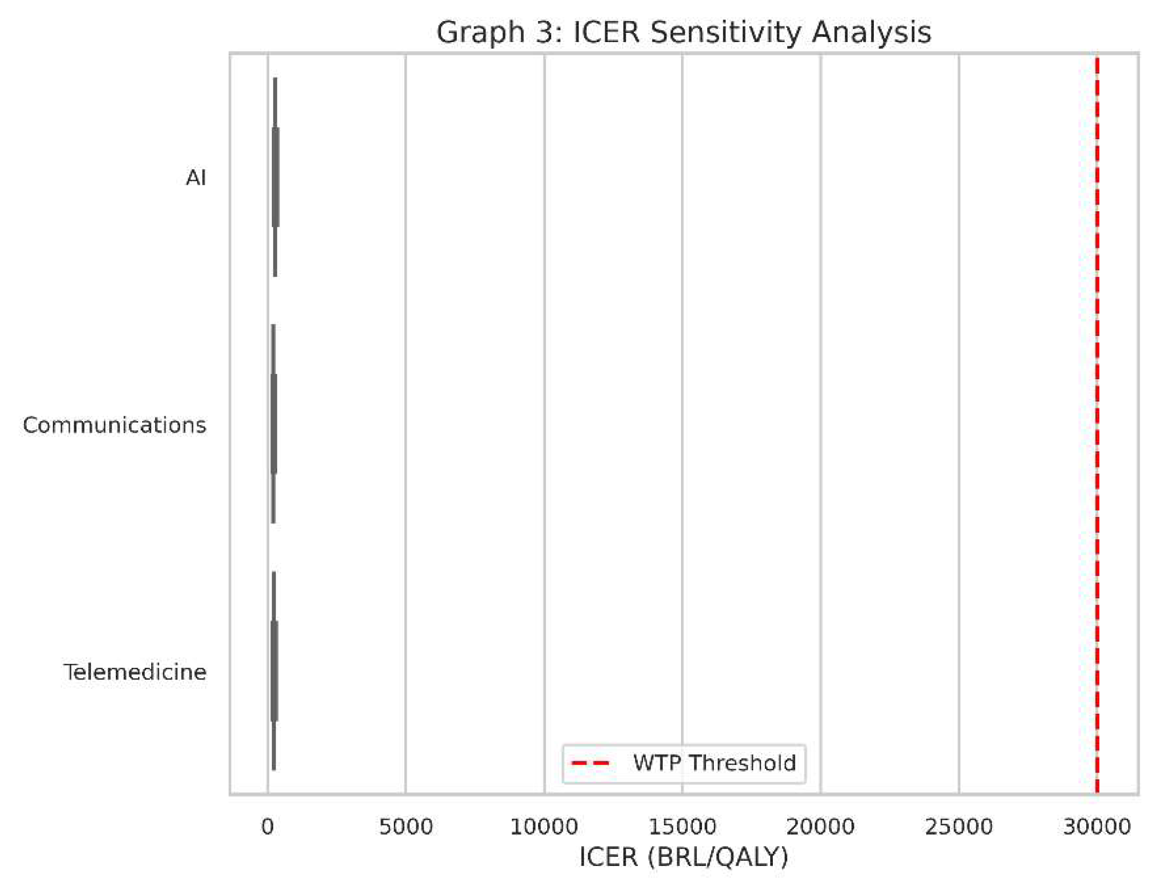
- This is a boxplot for the ICER values of all three interventions when we account for variations in cost and health outcomes.
- Instead of one ICER value for each intervention, we have a range of possible ICERs, reflecting uncertainty or changes in real-world conditions (e.g., if the intervention is more expensive than we initially thought or slightly less effective).
- Real-world conditions always vary from the assumptions made in a single “base” scenario. Costs might be 20% higher, or QALYs might be 10% lower, and so on.
- Sensitivity analysis tells us how robust our findings are. If an intervention consistently stays under the red dashed line (the WTP threshold) despite cost or outcome changes, it’s said to be “robustly cost-effective.”
- Each box in the boxplot represents the spread of ICER values under different combinations of costs and QALY assumptions.
- A box that lies entirely below the red line indicates that, for almost all tested scenarios, the intervention remains below the willingness-to-pay threshold.
- A box that crosses above and below the line suggests the technology could be cost-effective in some scenarios but not in others.
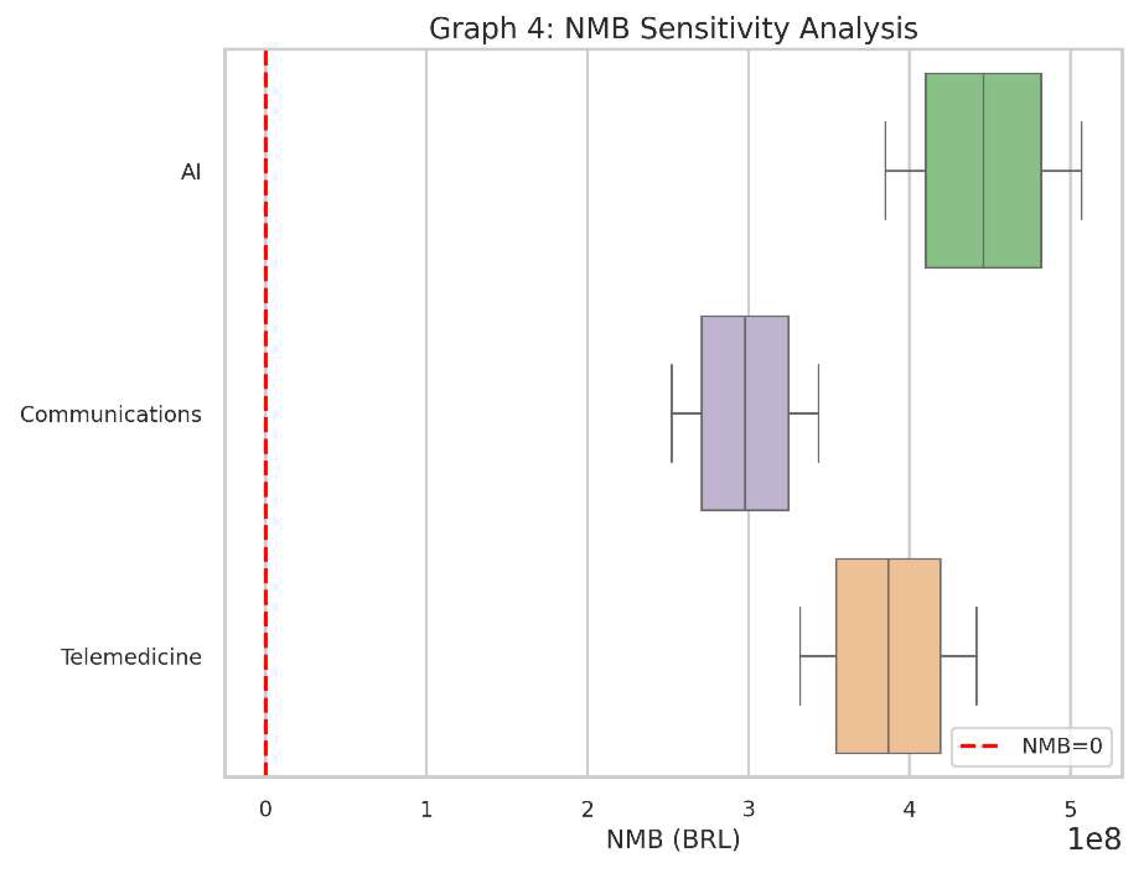
- This boxplot captures the Net Monetary Benefit (NMB) outcomes for each of the three interventions under the same range of assumptions (costs and QALYs).
- The red dashed line at zero shows the “break-even” point for NMB.
- Like the ICER boxplot, this helps us see if the interventions remain financially attractive across various “real-world” conditions.
- If a particular intervention’s NMB stays consistently above zero, it suggests it provides net positive value in almost all tested circumstances.
- Each box represents the distribution of NMB results after simulating cost and QALY variations.
- If the box is mostly above zero, the intervention is often (or nearly always) cost-effective.
- If the box hovers around zero or dives below it, there’s more risk or uncertainty about whether it will deliver sufficient value.
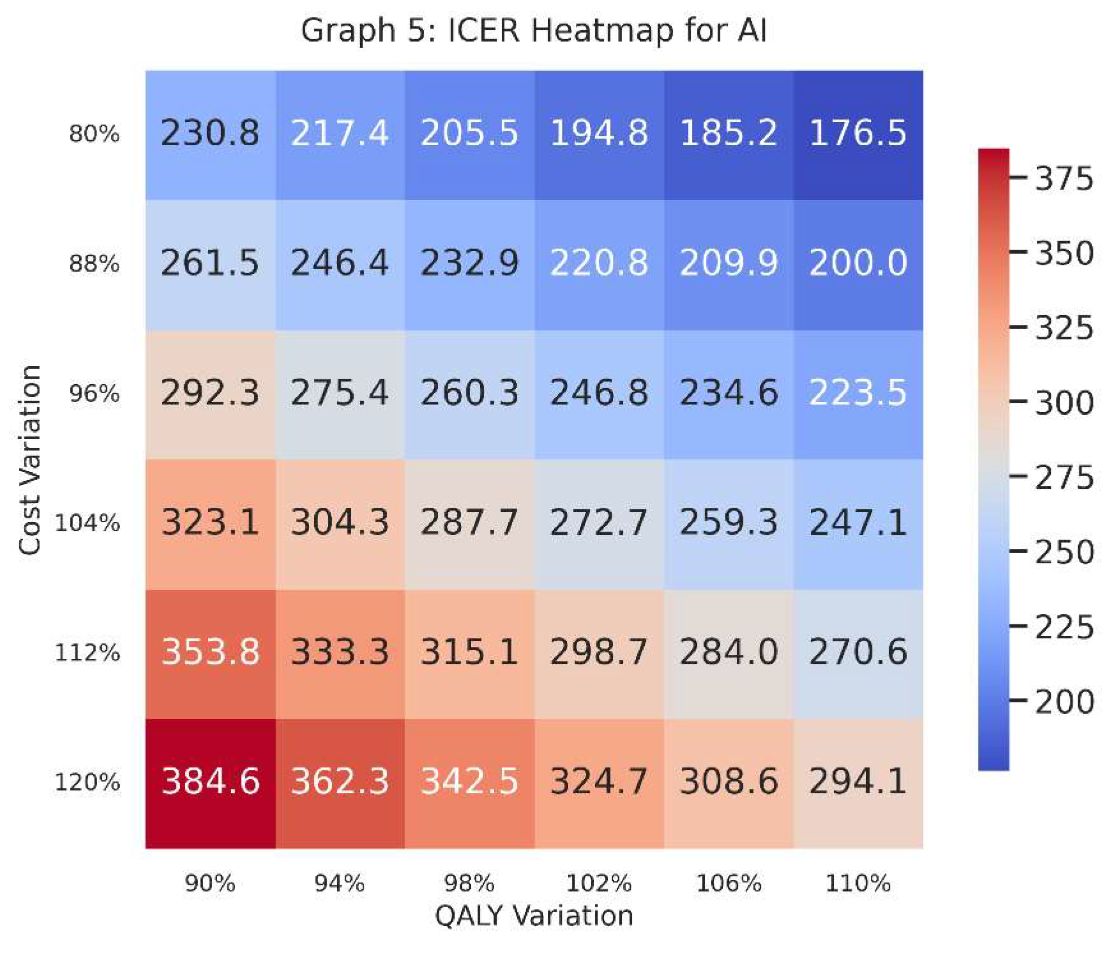
- This heatmap focuses specifically on one intervention—in this case, AI—and plots ICER values across a grid of cost variations (vertical axis) and QALY variations (horizontal axis).
- Each cell in the heatmap shows the ICER given a specific combination of increased/decreased costs and increased/decreased QALYs.
- A heatmap provides a visual map of where AI stands in terms of cost-effectiveness if costs go up or down by a certain percentage and effectiveness (QALYs) also goes up or down by a certain percentage.
- Decision-makers can see at a glance the “danger zones” where the ICER might exceed the willingness-to-pay threshold, or the “safe zones” where it remains comfortably below.
-
Colours indicate how large or small the ICER is. Generally, we compare the numerical value in each cell to our threshold (e.g., 30,000 BRL/QALY).
- o A lower ICER is typically better, implying cost-effectiveness.
- o A higher ICER might surpass the threshold, signifying a risk of being too expensive for the health gains provided.
- The row labels (“Cost Variation”) indicate whether we are looking at 80%, 90%, 100%, 110%, or 120% of the original estimated cost; the column labels (“QALY Variation”) show whether the QALYs are slightly lower or higher than the baseline guess.
- Graphs 1 & 2 show baseline (or “base-case”) cost-effectiveness values: a snapshot without variations.
- Graphs 3 & 4 explore how each intervention’s results shift when costs and QALYs fluctuate, indicating stability or volatility.
- Graph 5 dives deeper into the AI intervention, visualising where it remains cost-effective (or not) across multiple hypothetical scenarios of cost and QALY performance.
Section 4. Discussion
Section 4.1. The Political Dimension of HTA
Section 4.2. Economic Considerations in the Brazilian Context
Section 4.3. Equity and Social Justice Considerations
Section 4.4. The Role of DataSUS and Real-World Implementation
Section 4.5. Strengths and Limitations of Our Theoretical Approach
Section 4.6. Policy Implications for SUS and the Private Sector
Section 4.7. International Comparisons
Section 4.8. Future Research Directions
Section 4.9. Balancing Innovation with Social Responsibility
Section 5. Conclusion
Section 6. Attachment
Conflicts of Interest
References
- Agência Nacional de Saúde Suplementar (ANS). (2022). Reports and Analytics on the Supplementary Health Sector. Rio de Janeiro: ANS.
- DataSUS. (2022). Department of Informatics of the Brazilian Unified Health System. Available at: http://www.datasus.gov.br.
- Drummond, M., Sculpher, M., Claxton, K., Stoddart, G., & Torrance, G. (2015). Methods for the Economic Evaluation of Health Care Programmes (4th ed.). Oxford University Press.
- Ministério da Saúde. (2023). Orientações para Avaliação de Tecnologias em Saúde no SUS. Brasília: Ministério da Saúde.
- Novaes, H. “Health Technology Assessment in Brazil: Challenges for Sustainability. ” Cadernos de Saúde Pública, 2019, 35, e00046918. [Google Scholar]
- Rezende, L. F. M., et al. “Artificial Intelligence for Public Health in Brazil: Opportunities and Challenges.”. Revista de Saúde Pública, 2022, 56, 122.
- Sachs, J. D., et al. “Aligning Technology and Financing for Sustainable Universal Health Coverage.”. The Lancet, 2021, 398, 1997–2000.
- Sanders, G. D., & Haines, S. T. “Challenges to Integrating Health Economic Evaluation in Health Policy.”. Medical Decision Making, 2019, 39, 759–761.
- Souza, C., & Mendes, E. V.“Decentralisation and Health Care in Brazil: Searching for Equity amidst Diversity.”. Social Science & Medicine, 2021, 278, 113905.
- Trujillo, A. J., et al. “Challenges to Telemedicine Implementation in Latin America.”. 2020, 35, 576–581.
Disclaimer/Publisher’s Note: The statements, opinions and data contained in all publications are solely those of the individual author(s) and contributor(s) and not of MDPI and/or the editor(s). MDPI and/or the editor(s) disclaim responsibility for any injury to people or property resulting from any ideas, methods, instructions or products referred to in the content. |
© 2025 by the authors. Licensee MDPI, Basel, Switzerland. This article is an open access article distributed under the terms and conditions of the Creative Commons Attribution (CC BY) license (http://creativecommons.org/licenses/by/4.0/).


