Submitted:
04 January 2024
Posted:
09 January 2024
You are already at the latest version
Abstract
Keywords:
1. Introduction
2. Materials and methods
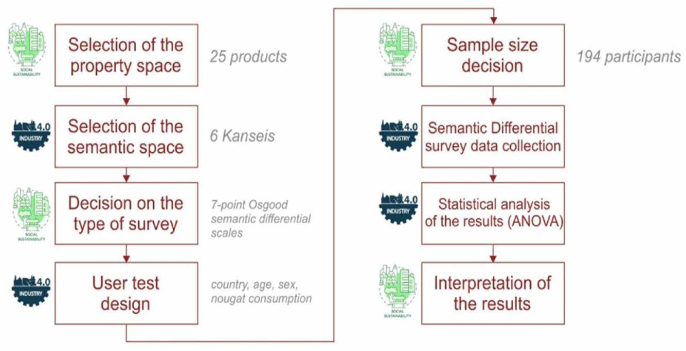
2.1. Procedure
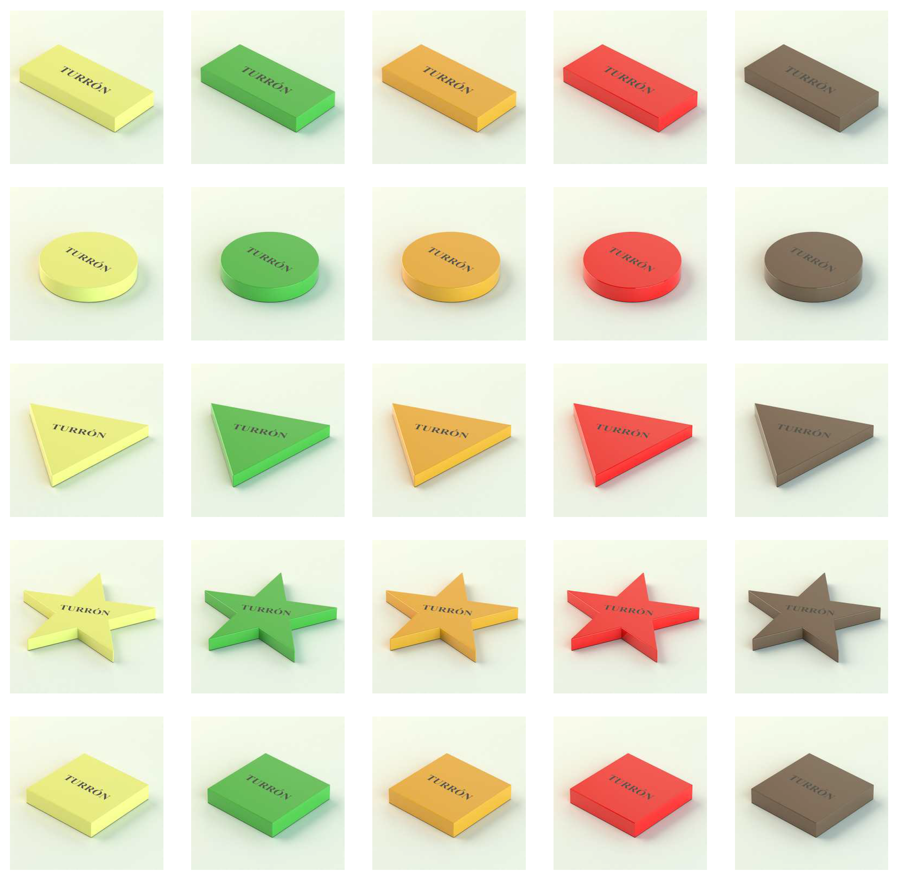
2.2. Materials
2.3. Participants and Sample
3. Experimental Results
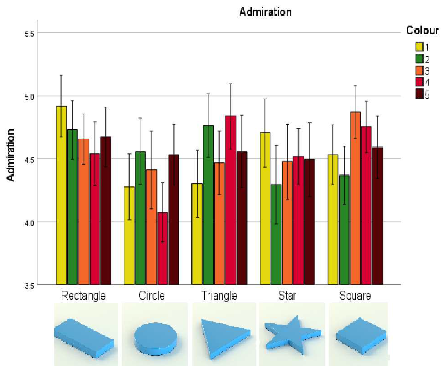
3.1. Admiration-Contempt (E1)
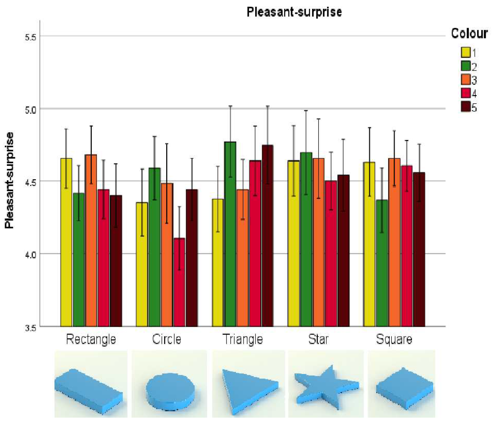
3.2. Pleasant surprise-Unpleasant surprise (E2)
3.3. Attraction-Aversion (E3)
3.4. Fascination-Boredom (E4)
3.5. Joy-Sadness (E5)
3.6. Satisfaction-Dissatisfaction (E6)
4. Discussion, conclusions, limitations and future work
4.1. Managerial and theoretical implications
4.2. Limitations and Future Work
Acknowledgments
References
- Strange, R.; Zucchella, A. Industry 4.0, Global Value Chains and International Business. Multinational Business Review 2017, 25, 00–00. [Google Scholar] [CrossRef]
- Berman, S.J. Digital transformation: opportunities to create new business models. Strategy & Leadership 2012, 40, 16–24. [Google Scholar]
- Remané, G.; Schneider, S.; Hanelt, A. Digital business model types: Understanding their mechanisms as recipes to commercialise digital technologies. International Journal of Innovation Management 2022, 26, 2240019. [Google Scholar] [CrossRef]
- De Las Heras, A.; Luque-Sendra, A.; Zamora-Polo, F. Machine Learning Technologies for Sustainability in Smart Cities in the Post-COVID Era. Sustainability 2020, 12. [Google Scholar] [CrossRef]
- Luque, A.; Carrasco, A.; Martín, A.; de las Heras, A. The impact of class imbalance in classification performance metrics based on the binary confusion matrix. Pattern Recognition 2019, 91, 216–231. [Google Scholar] [CrossRef]
- Luque, A.; De Las Heras, A.; Ávila Gutiérrez, M.J.; Zamora-Polo, F. ADAPTS: An Intelligent Sustainable Conceptual Framework for Engineering Projects. Sensors 2020, 20. [Google Scholar] [CrossRef]
- Vázquez, T.V.; Sendra, A.L.; Abril, L.G. Proyecto de industria turística conectada 4.0. a velocidad de crucero. DYNA 2018, 93, 470–470. [Google Scholar]
- Broccardo, L.; Zicari, A.; Jabeen, F.; Bhatti, Z.A. How digitalization supports a sustainable business model: A literature review. Technological Forecasting and Social Change 2023, 187, 122146. [Google Scholar] [CrossRef]
- Peng, Y.; Ahmad, S.F.; Irshad, M.; Al-Razgan, M.; Ali, Y.A.; Awwad, E.M. Impact of Digitalization on Process Optimization and Decision-Making towards Sustainability: The Moderating Role of Environmental Regulation. Sustainability 2023, 15. [Google Scholar] [CrossRef]
- Cabot, M.I.; Luque, A.; de Las Heras, A.; Aguayo, F. Aspects of sustainability and design engineering for the production of interconnected smart food packaging. PLoS ONE 2019, 14. [Google Scholar]
- Duan, L.; Xu, L. Data Analytics in Industry 4.0: A Survey. Information Systems Frontiers 2021. [Google Scholar] [CrossRef]
- Diday, E.; Simon, J.C. Clustering Analysis. In Digital Pattern Recognition; Fu, K.S., Ed.; Springer Berlin Heidelberg: Berlin, Heidelberg, 1976; pp. 47–94. [Google Scholar] [CrossRef]
- Gan, H.; Sang, N.; Huang, R.; Tong, X.; Dan, Z. Using clustering analysis to improve semi-supervised classification. Neurocomputing 2013, 101, 290–298. [Google Scholar] [CrossRef]
- Produlce. Informe 2019, Asociación Española del Dulce; Bolleria y Panificación; Cacao y Chocolate; Caramelos y chicles; Turrones y Mazapanes. Technical report, Asociación Española del Dulce; Bolleria y Panificación; Cacao y Chocolate; Caramelos y chicles; Turrones y Mazapanes, 2020.
- Produlce. Informe 2020, Asociación Española del Dulce; Bolleria y Panificación; Cacao y Chocolate; Caramelos y chicles; Turrones y Mazapanes. Technical report, Asociación Española del Dulce; Bolleria y Panificación; Cacao y Chocolate; Caramelos y chicles; Turrones y Mazapanes, 2021.
- Köster, E. Diversity in the determinants of food choice: A psychological perspective. Food Quality and Preference 2009, 20, 70–82, European Conference on Sensory Science of Food and Beverages 2006. [Google Scholar] [CrossRef]
- Sobal, J.; Bisogni, C.A. Constructing Food Choice Decisions. Annals of Behavioral Medicine 2009, 38, s37–s46. [Google Scholar] [CrossRef] [PubMed]
- Mak, A.H.; Lumbers, M.; Eves, A.; Chang, R.C. Factors influencing tourist food consumption. International Journal of Hospitality Management 2012, 31, 928–936. [Google Scholar] [CrossRef]
- Becker, L.; van Rompay, T.J.; Schifferstein, H.N.; Galetzka, M. Tough package, strong taste: The influence of packaging design on taste impressions and product evaluations. Food Quality and Preference 2011, 22, 17–23. [Google Scholar] [CrossRef]
- Casales-Garcia, V.; Gonzalez-Abril, L.; Veflen, N.; Velasco, C. Assessing the influence of colour and glass type on beer expectations. Food Quality and Preference 2023, 103, 104701. [Google Scholar] [CrossRef]
- Candi, M.; Jae, H.; Makarem, S.; Mohan, M. Consumer responses to functional, aesthetic and symbolic product design in online reviews. Journal of Business Research 2017, 81, 31–39. [Google Scholar] [CrossRef]
- Kuhlman, T.; Farrington, J. What is Sustainability? Sustainability 2010, 2, 3436–3448. [Google Scholar] [CrossRef]
- Mebratu, D. Sustainability and sustainable development: historical and conceptual review. Environmental impact assessment review 1998, 18, 493–520. [Google Scholar] [CrossRef]
- Lélé, S.M. Sustainable development: A critical review. World Development 1991, 19, 607–621. [Google Scholar] [CrossRef]
- Baker, S. The politics of sustainable development: theory, policy and practice within the European Union; Psychology Press: London, United Kingdom, 1997. [Google Scholar]
- Reike, D.; Vermeulen, W.J.; Witjes, S. The circular economy: New or Refurbished as CE 3.0? — Exploring Controversies in the Conceptualization of the Circular Economy through a Focus on History and Resource Value Retention Options. Resources, Conservation and Recycling 2018, 135, 246–264, Sustainable Resource Management and the Circular Economy. [Google Scholar] [CrossRef]
- Elkington, J.B. ACCOUNTING FOR THE TRIPLE BOTTOM LINE. Measuring Business Excellence 1998, 2, 18–22. [Google Scholar] [CrossRef]
- de Las Heras, A.; González, F.; Cordoba, A. PROPUESTA DE MARCO DE TRABAJO PARA LA EVALUACIÓN DE LA SOSTENIBILIDAD DE PRODUCTOS DESDE EL PARADIGMA DE LA ECONOMÍA CIRCULAR BASADA EN INDUSTRIA 4.0 (PARTE 1). DYNA INGENIERIA E INDUSTRIA 2018, 93, 360–364. [Google Scholar] [CrossRef]
- Ares, G.; Deliza, R. Studying the influence of package shape and colour on consumer expectations of milk desserts using word association and conjoint analysis. Food Quality and Preference 2010, 21, 930–937, Eighth Pangborn Sensory Science Symposium. [Google Scholar] [CrossRef]
- Spence, C.; Velasco, C. On the multiple effects of packaging colour on consumer behaviour and product experience in the ‘food and beverage’ and ‘home and personal care’ categories. Food Quality and Preference 2018, 68, 226–237. [Google Scholar] [CrossRef]
- Singh, S. Impact of color on marketing. Management decision 2006, 44, 783–789. [Google Scholar] [CrossRef]
- Kauppinen-Räisänen, H.; Gummerus, J.; Lehtola, K. Remembered eating experiences described by the self, place, food, context and time. British Food Journal 2013, 115, 666–685. [Google Scholar] [CrossRef]
- Schifferstein, H.N. The perceived importance of sensory modalities in product usage: A study of self-reports. Acta Psychologica 2006, 121, 41–64. [Google Scholar] [CrossRef]
- Spence, C. Background colour & its impact on food perception & behaviour. Food Quality and Preference 2018, 68, 156–166. [Google Scholar] [CrossRef]
- Velasco, C.; Wan, X.; Salgado-Montejo, A.; Woods, A.; Oñate, G.A.; Mu, B.; Spence, C. The context of colour–flavour associations in crisps packaging: A cross-cultural study comparing Chinese, Colombian, and British consumers. Food Quality and Preference 2014, 38, 49–57. [Google Scholar] [CrossRef]
- Lee, S.M.; Lee, K.T.; Lee, S.H.; Song, J.K. Origin of human colour preference for food. Journal of Food Engineering 2013, 119, 508–515. [Google Scholar] [CrossRef]
- Schloss, K.B.; Strauss, E.D.; Palmer, S.E. Object color preferences. Color Research & Application 2012, 38, 393–411. Available online: https://onlinelibrary.wiley.com/doi/pdf/10.1002/col.21756. [CrossRef]
- Arnheim, R. Art and visual perception: A psychology of the creative eye; Univ of California Press, 1954. [Google Scholar]
- Berlyne, D. Similarity and preference judgments of Indian and Canadian subjects exposed to Western paintings(1). International Journal of Psychology 1976, 11, 43–55. Available online: https://onlinelibrary.wiley.com/doi/pdf/10.1080/00207597608247346. [CrossRef]
- Chitturi, R.; Londoño, J.C.; Henriquez, M.C. Visual design elements of product packaging: Implications for consumers’ emotions, perceptions of quality, and price. Color Research & Application 2022, 47, 729–744. Available online: https://onlinelibrary.wiley.com/doi/pdf/10.1002/col.22761. [CrossRef]
- Bar, M.; Neta, M. Visual elements of subjective preference modulate amygdala activation. Neuropsychologia 2007, 45, 2191–2200. [Google Scholar] [CrossRef]
- Leder, H.; Carbon, C.C. Dimensions in appreciation of car interior design. Applied Cognitive Psychology: The Official Journal of the Society for Applied Research in Memory and Cognition 2005, 19, 603–618. [Google Scholar] [CrossRef]
- Raghubir, P.; Greenleaf, E.A. Ratios in proportion: what should the shape of the package be? Journal of Marketing 2006, 70, 95–107. [Google Scholar] [CrossRef]
- Ngo, M.K.; Misra, R.; Spence, C. Assessing the shapes and speech sounds that people associate with chocolate samples varying in cocoa content. Food Quality and Preference 2011, 22, 567–572. [Google Scholar] [CrossRef]
- Ares, G.; Deliza, R. Studying the influence of package shape and colour on consumer expectations of milk desserts using word association and conjoint analysis. Food quality and preference 2010, 21, 930–937. [Google Scholar] [CrossRef]
- Fenko, A.; Lotterman, H.; Galetzka, M. What’s in a name? The effects of sound symbolism and package shape on consumer responses to food products. Food quality and preference 2016, 51, 100–108. [Google Scholar] [CrossRef]
- Hirschman, E.C.; Holbrook, M.B. Hedonic Consumption: Emerging Concepts, Methods and Propositions. Journal of Marketing 1982, 46, 92–101. Available online: https://doi.org/10.1177/002224298204600314. [CrossRef]
- Desmet, P.M.; Schifferstein, H.N. Sources of positive and negative emotions in food experience. Appetite 2008, 50, 290–301. [Google Scholar] [CrossRef]
- Desmet, P. Measuring Emotion: Development and Application of an Instrument to Measure Emotional Responses to Products. In Funology: From Usability to Enjoyment; Blythe, M.A., Overbeeke, K., Monk, A.F., Wright, P.C., Eds.; Springer Netherlands: Dordrecht, 2004; pp. 111–123. [Google Scholar] [CrossRef]
- Schifferstein, H.N.; Fenko, A.; Desmet, P.M.; Labbe, D.; Martin, N. Influence of package design on the dynamics of multisensory and emotional food experience. Food Quality and Preference 2013, 27, 18–25. [Google Scholar] [CrossRef]
- Falomir, Z.; Museros, L.; Gonzalez-Abril, L. A model for colour naming and comparing based on conceptual neighbourhood. An application for comparing art compositions. Knowledge-Based Systems 2015, 81, 1–21. [Google Scholar] [CrossRef]
- SPIEGEL, M.; Stephens, L.J. Estadística, Editorial Mc. In Graw-Hill, Mexico DF; 2009. [Google Scholar]
- INE. INEbase / Demografía y población /Cifras de población y Censos demográficos /Estadística continua de población / Últimos datos, accessed. 10 January 2023.
- México - Piramide de población 2021 | Datosmacro.com, accessed. 10 January 2023.
- Deng, L.; Zhou, F.; Zhang, Z. Interactive genetic color matching design of cultural and creative products considering color image and visual aesthetics. Heliyon 2022, 8, e10768. [Google Scholar] [CrossRef]
- Elliot, A.J.; Maier, M.A. Chapter two - Color-in-Context Theory. In Advances in Experimental Social Psychology; Devine, P., Plant, A., Eds.; Academic Press, 2012; Vol. 45, pp. 61–125. [Google Scholar] [CrossRef]
- Velasco, C.; Wan, X.; Knoeferle, K.; Zhou, X.; Salgado-Montejo, A.; Spence, C. Searching for flavor labels in food products: the influence of color-flavor congruence and association strength. Frontiers in Psychology 2015, 6. [Google Scholar] [CrossRef] [PubMed]
- Schütte, S. Evaluation of the affective coherence of the exterior and interior of chocolate snacks. Food Quality and Preference 2013, 29, 16–24. [Google Scholar] [CrossRef]
- Spence, C. Unraveling the mystery of the rounder, sweeter chocolate bar. Flavour 2013, 2, 1–3. [Google Scholar] [CrossRef]
- Velasco, C.; Michel, C.; Youssef, J.; Gamez, X.; Cheok, A.D.; Spence, C. Colour–taste correspondences: Designing food experiences to meet expectations or to surprise. International Journal of Food Design 2016, 1, 83–102. [Google Scholar] [CrossRef]
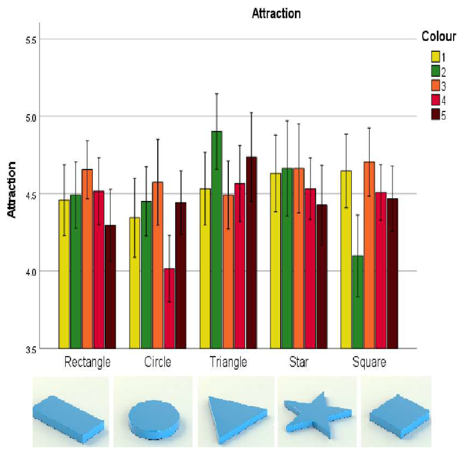
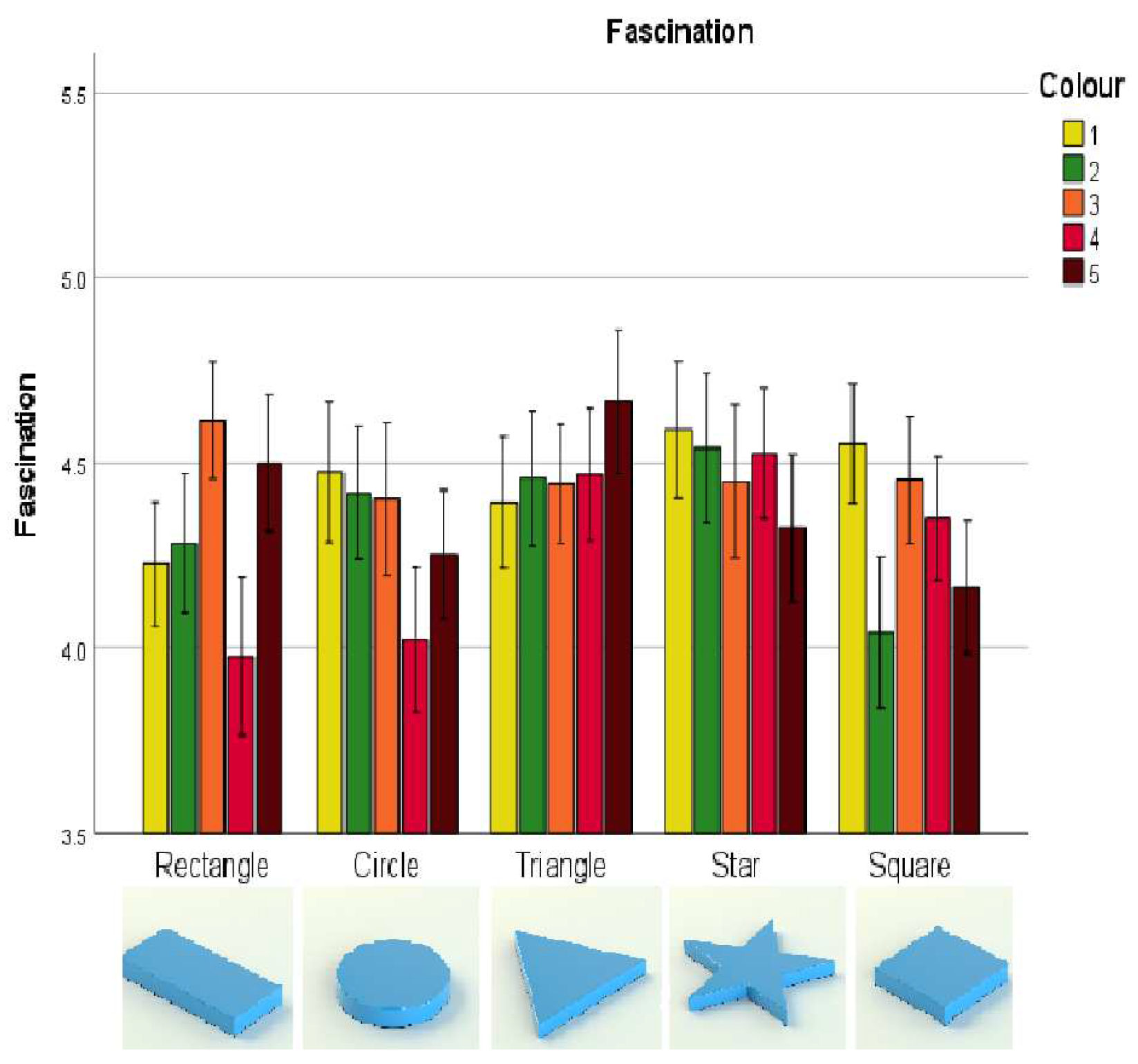
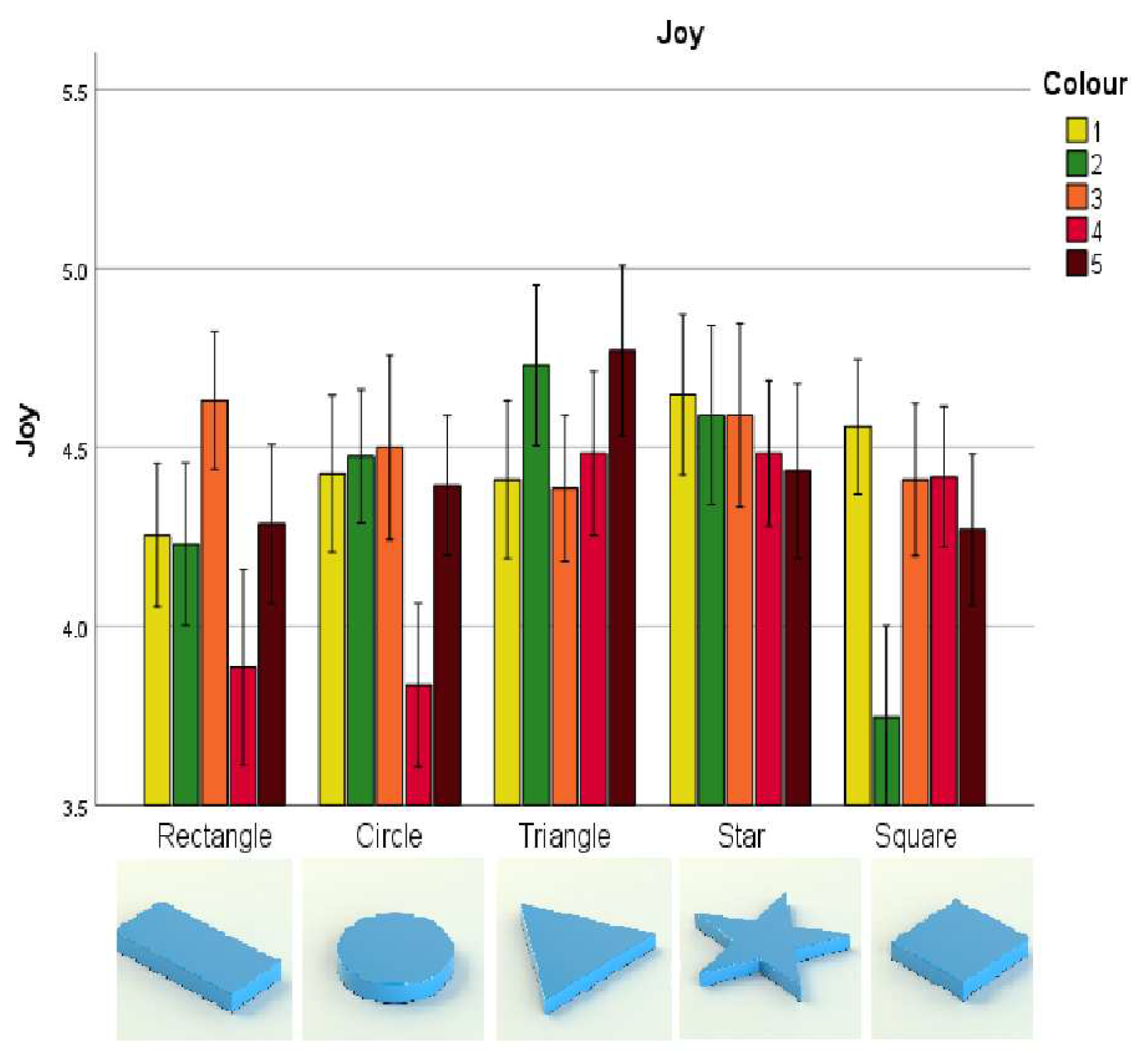
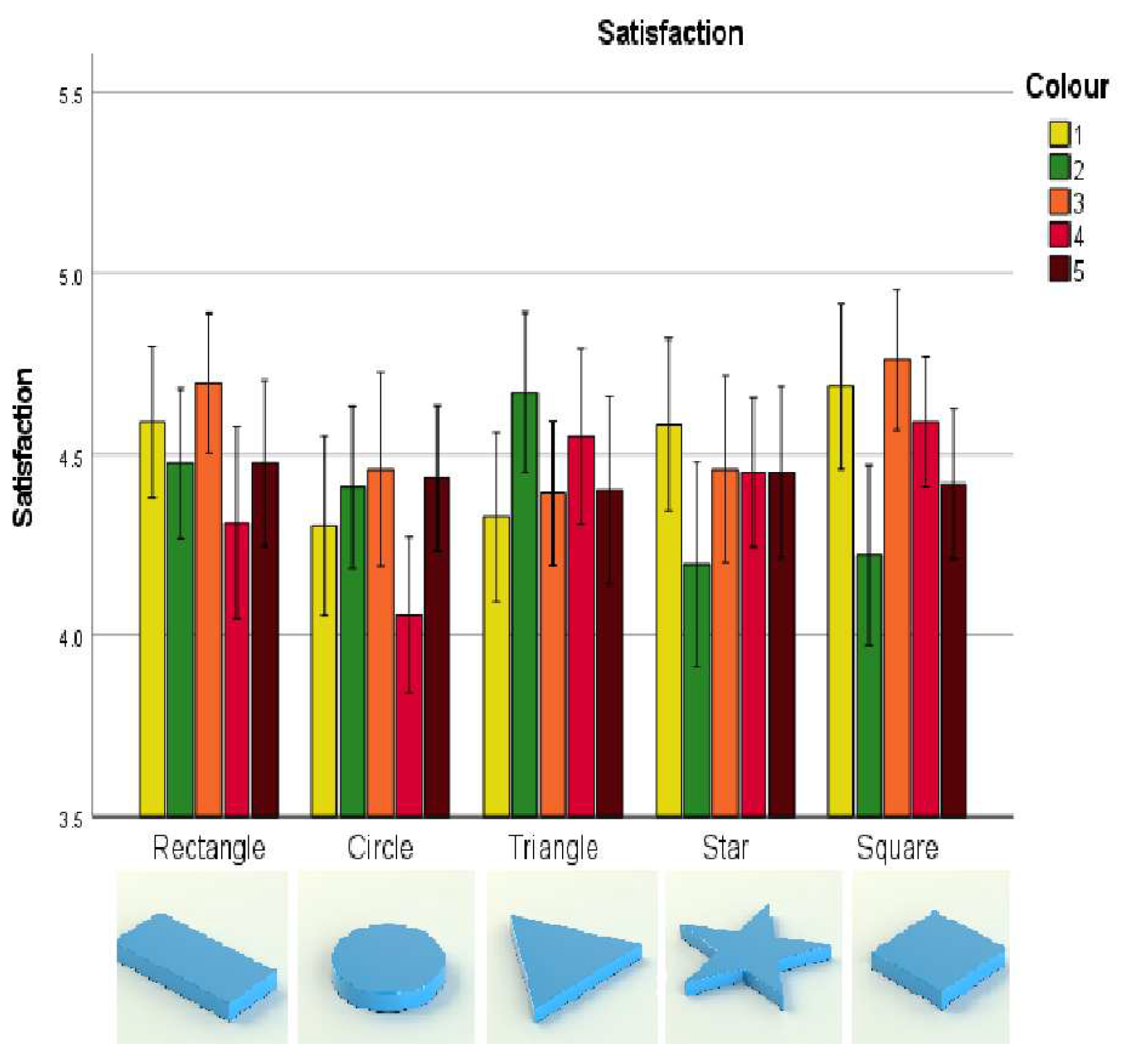
| Positive emotion | Stage of purchase | Negative emotion | Stage of purchase |
|---|---|---|---|
| Admiration | Curious about taste and smell. | Contempt | Negative taste anticipation; too artificial. |
| Satisfaction | Looks good; fits my taste; product is distinct. | Dissatisfaction | Ugly packaging; not the best product. |
| Pleasant Surprise | Packaging looks fresh and distinctive. | Unpleasant Surprise | Does not look special. |
| Attraction | Curious about new product and about taste of instant product; lively picture. | Aversion | Packaging does not fit content; unattractive picture . |
| Fascination | Packaging feels different. | Boredom | Nothing special; not surprising; product looks boring. |
| Joy | Cheerful picture and graphics | Sadness | Makes me think of eating alone. |
| Country | Age | Gender | ||||
|---|---|---|---|---|---|---|
| 18 to 35 | 36 to 50 | 51 to 65 | Male | Female | Total | |
| Mexico | 11 | 03 | 09 | 07 | 16 | 23 |
| Spain | 87 | 10 | 02 | 32 | 67 | 99 |
| Total | 98 | 13 | 11 | 39 | 83 | 122 |
| Question | Answer | ||||
|---|---|---|---|---|---|
| How often do | Never | Once year | Once month | Once week | Few days |
| you eat nougat? | 14 | 78 | 28 | 2 | 0 |
| Where do you | Supermarket | Souvenir | Pastry | Local | |
| buy nougat? | 104 | 3 | 9 | 6 | |
| Why do you | Consumption | Gift | Souvenir | Share | |
| buy nougat for? | 34 | 8 | 4 | 75 | |
| What time of year do | Spring | Summer | Autumn | Winter | Never |
| you consume nougat? | 1 | 2 | 2 | 109 | 8 |
| Emotion | Shape | Colour | Shape * colour | ||||||
|---|---|---|---|---|---|---|---|---|---|
| F | p | F | p | F | p | ||||
| E1 | 5.143 | 0.002 | 0.041 | 0.110 | 0.968 | 0.001 | 2.777 | 0.012 | 0.022 |
| E2 | 2.956 | 0.033 | 0.024 | 1.413 | 0.235 | 0.012 | 1.988 | 0.071 | 0.016 |
| E3 | 3.904 | 0.009 | 0.031 | 2.446 | 0.054 | 0.020 | 2.639 | 0.010 | 0.021 |
| E4 | 8.477 | ≤.001 | 0.065 | 6.308 | ≤.001 | 0.050 | 5.004 | ≤.001 | 0.040 |
| E5 | 5.597 | 0.002 | 0.044 | 13.825 | ≤.001 | 0.103 | 7.294 | ≤.001 | 0.057 |
| E6 | 2.479 | 0.058 | 0.020 | 2.573 | 0.044 | 0.021 | 2.276 | 0.032 | 0.018 |
| Emo- | Yellow | Green | Orange | Red | Brown | ||||||||||
|---|---|---|---|---|---|---|---|---|---|---|---|---|---|---|---|
| tion | F | p | F | p | F | p | F | p | F | p | |||||
| E1 | 4.645 | 0.003 | 0.037 | 2.905 | 0.024 | 0.023 | 2.445 | 0.070 | 0.020 | 6.807 | ≤.001 | 0.053 | 0.279 | 0.867 | 0.002 |
| E2 | 1.899 | 0.128 | 0.015 | 2.46 | 0.053 | 0.020 | 1.091 | 0.352 | 0.009 | 4.482 | 0.003 | 0.036 | 1.397 | 0.242 | 0.011 |
| E3 | 1.131 | 0.339 | 0.009 | 6.061 | ≤.001 | 0.048 | 0.596 | 0.623 | 0.005 | 5.189 | 0.001 | 0.041 | 2.66 | 0.041 | 0.014 |
| E4 | 2.167 | 0.086 | 0.018 | 11.951 | ≤.001 | 0.090 | 1.014 | 0.390 | 0.008 | 8.931 | ≤.001 | 0.069 | 3.654 | 0.008 | 0.029 |
| E5 | 1.521 | 0.208 | 0.012 | 16.488 | ≤.001 | 0.120 | 1.929 | 0.124 | 0.016 | 10.091 | ≤.001 | 0.077 | 3.316 | 0.016 | 0.027 |
| E6 | 2.349 | 0.068 | 0.019 | 2.929 | 0.024 | 0.024 | 2.416 | 0.065 | 0.020 | 3.862 | 0.009 | 0.031 | 0.066 | 0.980 | 0.001 |
| Emo- | Rectangle | Circle | Triangle | Star | Square | ||||||||||
|---|---|---|---|---|---|---|---|---|---|---|---|---|---|---|---|
| tion | F | p | F | p | F | p | F | p | F | p | |||||
| E1 | 1.437 | 0.221 | 0.021 | 2.65 | 0.052 | 0.021 | 3.422 | 0.099 | 0.028 | 1.363 | 0.246 | 0.011 | 3.165 | 0.023 | 0.025 |
| E2 | 2.114 | 0.092 | 0.017 | 2.705 | 0.049 | 0.022 | 2.842 | 0.051 | 0.023 | 513 | 0.598 | 0.004 | 1.479 | 0.216 | 0.012 |
| E3 | 1.52 | 0.204 | 0.012 | 3.414 | 0.015 | 0.027 | 2.533 | 0.061 | 0.021 | 0.751 | 0.493 | 0.006 | 5.281 | 0.001 | 0.042 |
| E4 | 5.78 | ≤0,001 | 0.046 | 6.989 | ≤0,001 | 0.055 | 3.348 | 0.021 | 0.027 | 0.658 | 0.544 | 0.005 | 9.684 | ≤.001 | 0.074 |
| E5 | 2.469 | 0.056 | 0.020 | 15.353 | ≤0,001 | 0.113 | 5.687 | 0.001 | 0.045 | 2.497 | 0.074 | 0.02 | 17.312 | ≤.001 | 0.125 |
| E6 | 1.839 | 0.138 | 0.015 | 2.159 | 0.090 | 0.018 | 1.77 | 0.163 | 0.014 | 1.504 | 0.224 | 0.012 | 4.789 | 0.002 | 0.038 |
Disclaimer/Publisher’s Note: The statements, opinions and data contained in all publications are solely those of the individual author(s) and contributor(s) and not of MDPI and/or the editor(s). MDPI and/or the editor(s) disclaim responsibility for any injury to people or property resulting from any ideas, methods, instructions or products referred to in the content. |
© 2024 by the authors. Licensee MDPI, Basel, Switzerland. This article is an open access article distributed under the terms and conditions of the Creative Commons Attribution (CC BY) license (http://creativecommons.org/licenses/by/4.0/).


