Submitted:
30 September 2023
Posted:
01 October 2023
Read the latest preprint version here
Abstract
Keywords:
1. Introduction
1.1. Background
1.2. Research Problem
1.3. Aim and Research Question
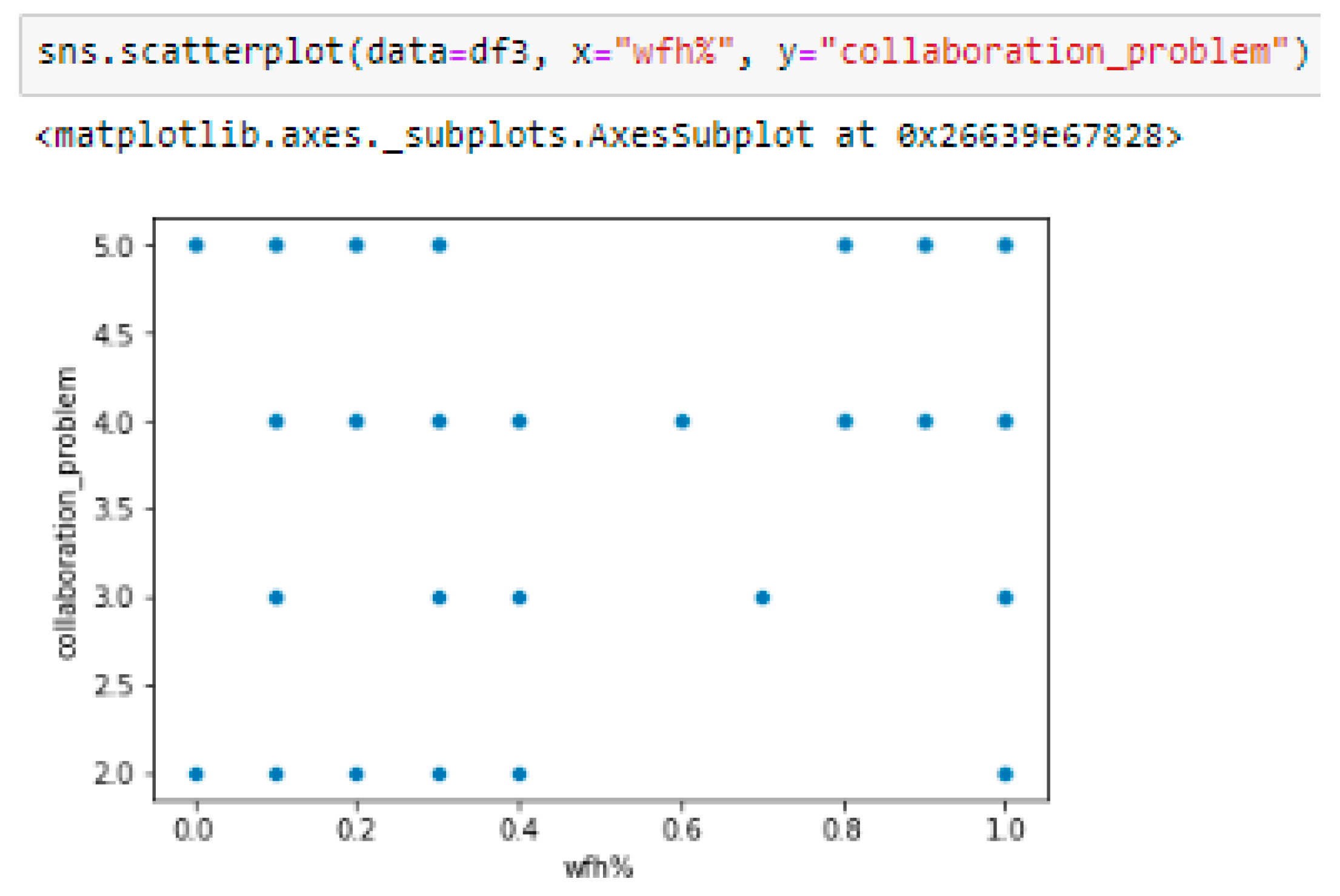
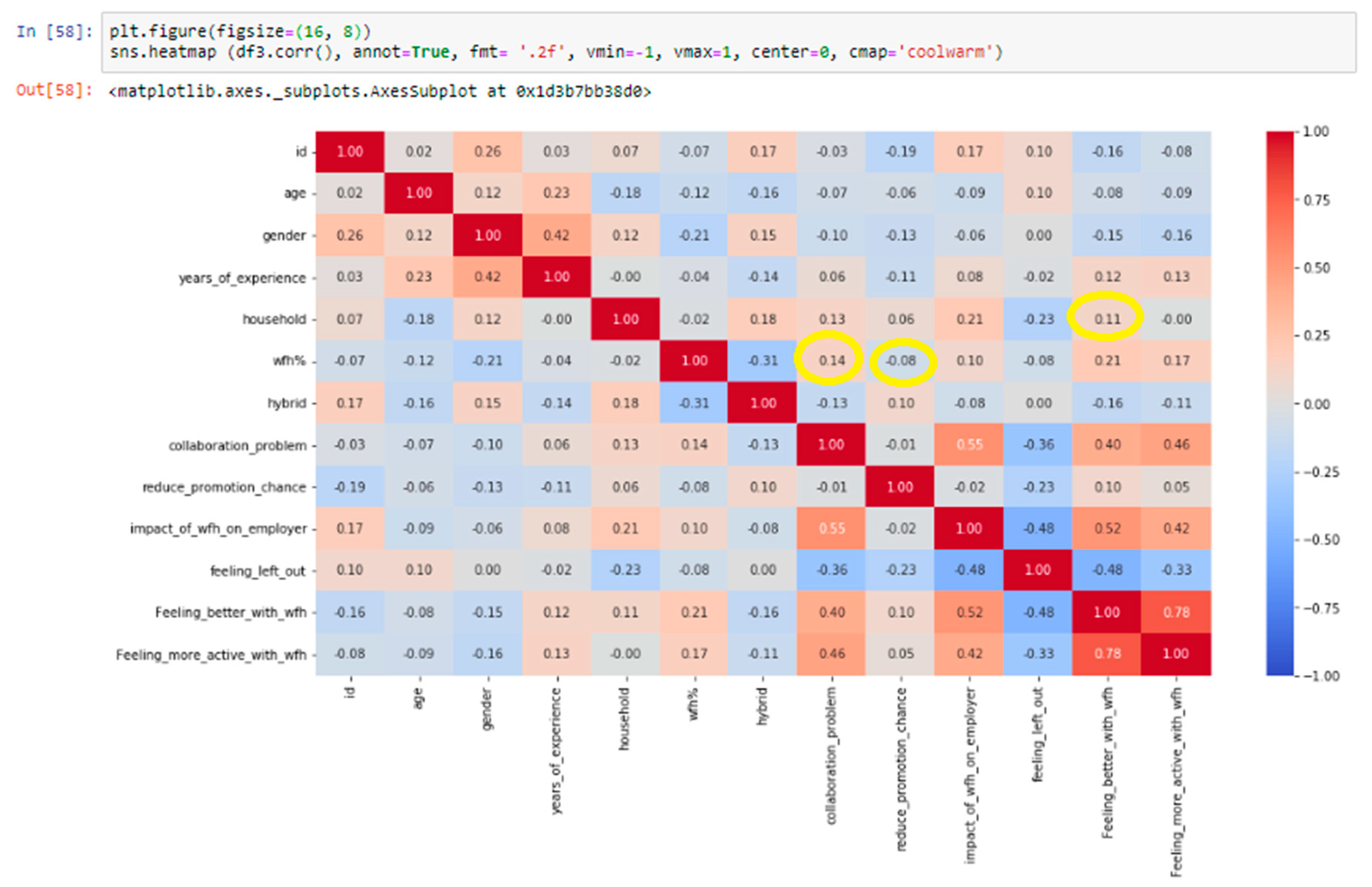
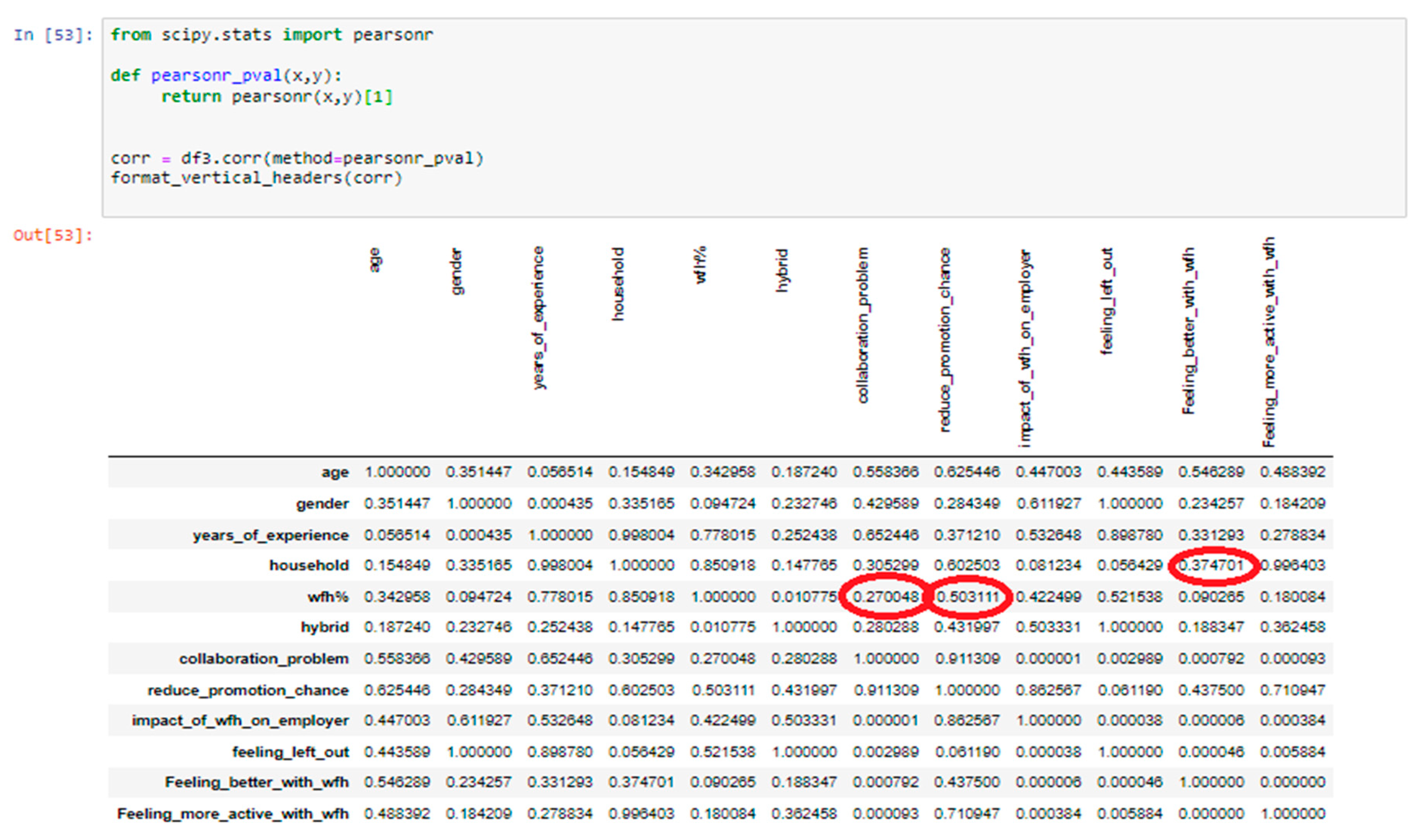
- Is there any correlation between working from home and employees’ collaboration?
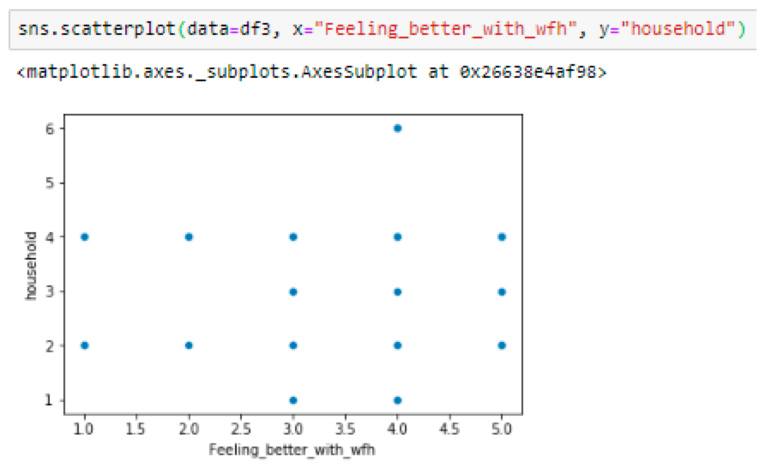
- Is there any correlation between the number of households of employees and employees’ happiness while working from home?
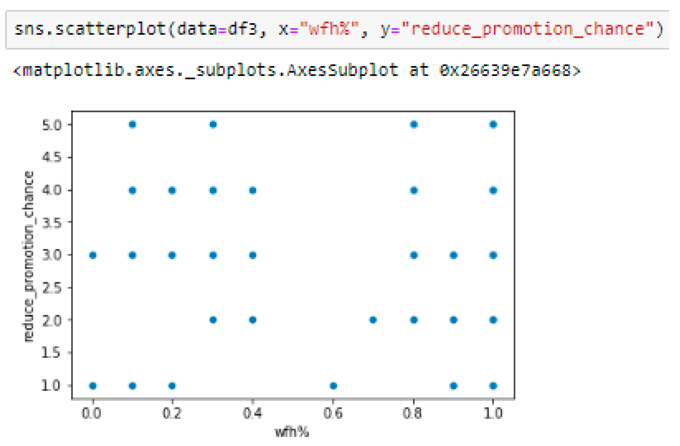
- Is there any correlation between working from home and employees’ promotion chances while working from home?
1.4. Delimitations of the Study
1.5. Hypothesis
2. Method
2.1. Research Strategy
2.2. Data Collection Method
2.3. Sampling
2.4. Data Analysis Method
2.4.1. Pearson Correlation
2.4.2. P-values
2.5. Research Ethics
3. Results
3.1. Data Collection and Analysis
|
#function for removing outliers def remove_outliers(train,labels): for label in labels: q1 = train[label].quantile(0.25) q3 = train[label].quantile(0.75) iqr = q3 - q1 upper_bound = q3 + 1.5 * iqr lower_bound = q1 - 1.5 * iqr train[label] = train[label].mask(train[label]< lower_bound, train[label].median(),axis=0) train[label] = train[label].mask(train[label]> upper_bound, train[label].median(),axis=0) return train |
3.2. Findings
3.3. Hypotheses Analysis:
4. Discussion
4.1. Analysis of the Results
4.2. Future Research
4.3. Conclusion
Appendix. Informed Consent Form
Appendix B. Questionnaire
- Male
- Female
- Other
- Less than 1 year
- 1-3 years
- 4-6 years
- 7-10 years
- More than 10 years
- Single
- Single parent with 1 children
- Single parent with 2 children
- Single parent with 3+ children
- Married/Partnered with no children
- Married/Partnered with 1 children
- Married/Partnered with 2 children
- Married/Partnered with 3+ children
- Yes
- No
- Strongly agree (1)
- Agree (2)
- Neither agree nor disagree (3)
- Disagree (4)
- Strongly disagree (5)
- Strongly agree (1)
- Agree (2)
- Neither agree nor disagree (3)
- Disagree (4)
- Strongly disagree (5)
- Strongly Positive (1)
- Positive (2)
- Neither Positive nor Negative (3)
- Negative (4)
- Strongly Negative (5)
- Improved
- Stayed the same
- Worsened
- Strongly agree (1)
- Agree (2)
- Neither agree nor disagree (3)
- Disagree (4)
- Strongly disagree (5)
- Strongly agree (1)
- Agree (2)
- Neither agree nor disagree (3)
- Disagree (4)
- Strongly disagree (5)
References
- Al Jassmi, H.; Ahmed, S.; Philip, B.; Al Mughairbi, F.; Al Ahmad, M. E-happiness physiological indicators of construction workers’ productivity: A machine learning approach. J. Asian Archit. Build. Eng. 2019, 18, 517–526. [Google Scholar] [CrossRef]
- American Psychological Association. Ethical Principles of Psychologists and Code of Conduct. 2017. https://www.apa.org/ethics/code/.
- Anderson, D.; Kelliher, C. Enforced remote working and the work-life interface during lockdown. Gend. Manag. 2020, 35, 677–683. [Google Scholar] [CrossRef]
- Babbie, E. (2016). The Practice of Social Research. Cengage Learning.
- Baker, E.; Avery, G.C.; Crawford, J. Satisfaction and perceived productivity when professionals work from home. Res. Pract. Hum. Resour. Manag. 2007. [Google Scholar]
- Bernarto, I.; Bachtiar, D.; Sudibjo, N.; Suryawan, I.N.; Purwanto, A.; Asbari, M. Effect of transformational leadership, perceived organizational support, job satisfaction toward life satisfaction: Evidences from indonesian teachers. Int. J. Adv. Sci. Technol. 2020, 29, 5495–5503. [Google Scholar]
- Brenan, M. (2020, October 13). COVID-19 and remote work: An update. Gallup. https://news.gallup.com/poll/321800/covid-remote-work-update.aspx.
- Bryman, A. (2016). Social research methods. Oxford University Press.
- Campbell, N.; Eley, D.S.; McAllister, L. How do allied health professionals construe the role of the remote workforce? New insight into their recruitment and retention. PLoS ONE 2016, 11, e0167256. [Google Scholar] [CrossRef] [PubMed]
- Cerda, P.; Varoquaux, G.; Kégl, B. Similarity encoding for learning with dirty categorical variables. Mach. Learn. 2018, 107, 1477–1494. [Google Scholar] [CrossRef]
- Creswell, J.W. (2013). Research design: Qualitative, quantitative, and mixed methods approaches. Sage publications.
- Dimitrova, D. Controlling teleworkers: Supervision and flexibility revisited. New Technol. Work. Employ. 2003, 18, 181–195. [Google Scholar] [CrossRef]
- Duff, A.J.; Rankin, S.B. Exploring flexible home arrangements – an interview study of workers who live in vans. Career Dev. Int. 2020, 25, 747–761. [Google Scholar] [CrossRef]
- Evans, J.A.; Kunda, G.; Barley, S.R. Beach time, bridge time, and billable hours: The temporal structure of technical contracting. Adm. Sci. Q. 2004, 49, 1–38. [Google Scholar] [CrossRef]
- Field, A. (2013). Discovering statistics using IBM SPSS Statistics (4th ed.). Sage Publications.
- Fisher, C. B., Fried, A. L., & Goodman, S. J. (2017). Ethical issues in dissemination and implementation research. In R. C. Brownson, G. A. Colditz, & E. K. Proctor (Eds.), Dissemination and implementation research in health: Translating science to practice (2nd ed., pp. 571–588). Oxford University Press.
- Golden, T.D.; Veiga, J.F.; Dino, R. N. The impact of professional isolation on teleworker job performance and turnover intentions: Does time spent teleworking, interacting face-to-face, or having access to communication-enhancing technology matter? J. Appl. Psychol. 2008, 93, 1412–1421. [Google Scholar] [CrossRef]
- Grant, C.A.; Wallace, L.M.; Spurgeon, P.C. An exploration of the psychological factors affecting remote e-worker’s job effectiveness, well-being and work-life balance. Empl. Relat. 2013, 35, 527–546. [Google Scholar] [CrossRef]
- Hashim, R.; Bakar, A.; Noh, I.; Mahyudin, H.A. Employees’ Job Satisfaction and Performance through working from Home during the Pandemic Lockdown. Environ. -Behav. Proc. J. 2020, 5, 461–467. [Google Scholar] [CrossRef]
- Hering, B. Remote Work Statistics: Shifting Norms and Expectations. 2020. https://www.flexjobs.com/blog/post/remote-work-statistics/.
- International Labour Organization. (2020). An employers’ Guide on Working from Home in Response to the Outbreak of COVID-19. In International Labour Organization. https://www.ilo.org/actemp/publications/WCMS_745024/lang--en/index.htm.
- Imani, M., & Arabnia, H.R. (2023). Hyperparameter Optimization and Combined Data Sampling Techniques in Machine Learning for Customer Churn Prediction: A Comparative Analysis. Preprints. [CrossRef]
- Jamal, M.T.; Anwar, I.; Khan, N.A.; Saleem, I. Work during COVID-19: assessing the influence of job demands and resources on practical and psychological outcomes for employees. Asia-Pac. J. Bus. Adm. 2021. [Google Scholar] [CrossRef]
- Kelliher, C.; Anderson, D. Doing more with less? Flexible working practices and the intensification of work. Hum. Relat. 2010, 63, 83–106. [Google Scholar] [CrossRef]
- Kwon, M.; Jeon, S.H. Do Leadership Commitment and Performance-Oriented Culture Matter for Federal Teleworker Satisfaction With Telework Programs? Rev. Public Pers. Adm. 2020, 40, 36–55. [Google Scholar] [CrossRef]
- Lautsch, B.A.; Kossek, E.E.; Eaton, S.C. Supervisory approaches and paradoxes in managing telecommuting implementation. Hum. Relat. 2009, 62, 795–827. [Google Scholar] [CrossRef]
- Neuman, W. L. (2013). Social research methods: Qualitative and quantitative approaches. Pearson Education.
- Oakman, J.; Kinsman, N.; Stuckey, R.; Graham, M.; Weale, V. A rapid review of mental and physical health effects of working at home: how do we optimise health? BMC Public Health 2020, 20, 1–13. [Google Scholar] [CrossRef]
- Raišiene, A.G.; Rapuano, V.; Varkulevičiute, K.; Stachová, K. Working from homeWho is happy? A survey of Lithuania’s employees during the COVID-19 quarantine period. Sustainability 2020, 12. [Google Scholar] [CrossRef]
- Sahni, D.J. Impact of COVID-19 on Employee Behavior: Stress and Coping Mechanism During WFH (Work From Home) Among Service Industry Employees. Int. J. Oper. Manag. 2020, 1, 35–48. [Google Scholar] [CrossRef]
- Sahoo, K.; Samal, A.K.; Pramanik, J.; Pani, S.K. Exploratory data analysis using Python. Int. J. Innov. Technol. Explor. Eng. (IJITEE) 2019, 8, 2019. [Google Scholar] [CrossRef]
- Schooreel, T.; Shockley, K.M.; Verbruggen, M. What if people’s private life constrained their career decisions? Examining the relationship between home-tocareer interference and career satisfaction. Career Dev. Int. 2017, 22, 124–141. [Google Scholar] [CrossRef]
- Song, Y.; Gao, J. Does telework stress employees out? A study on working at home and subjective well-being for wage/salary workers. J. Happiness Stud. 2019, 21, 2649–2668. [Google Scholar] [CrossRef]
- Song, Y.; Gao, J. Does telework stress employees out? A study on working at home and subjective well-being for wage/salary workers. J. Happiness Stud. 2020, 21, 2649–2668. [Google Scholar] [CrossRef]
- Sridhar, V.; Bhattacharya, S. Significant household factors that influence an IT employees’ job effectiveness while on work from home. Int. J. Innov. Sci. 2021, 13, 105–117. [Google Scholar] [CrossRef]
- Steward, B. Changing Times: The Meaning, Measurement and use of Time in Teleworking. Time Soc. 2000, 9, 57–74. [Google Scholar] [CrossRef]
- Sullivan, G.M.; Artino, A.R. Analyzing and interpreting data from Likert-type scales. J. Grad. Med. Educ. 2013, 5, 541–542. [Google Scholar] [CrossRef]
- Suresh, K. An overview of randomization techniques: An unbiased assessment of outcome in clinical research. J. Hum. Reprod. Sci. 2011, 4, 8–11. [Google Scholar] [CrossRef]
- Timsal, A.; Awais, M. Flexibility or ethical dilemma: an overview of the work from home policies in modern organizations around the world. Human Resour. Manag. Int. Dig. 2016, 24, 12–15. [Google Scholar] [CrossRef]
- Van Der Lippe, T.; Lippényi, Z. Co-workers working from home and individual and team performance. New Technol. Work. Employ. 2020, 35, 60–79. [Google Scholar] [CrossRef]
- Vyas, L.; Butakhieo, N. The impact of working from home during COVID-19 on work and life domains: an exploratory study on Hong Kong. Policy Des. Pract. 2020, 4, 1–18. [Google Scholar] [CrossRef]
Disclaimer/Publisher’s Note: The statements, opinions and data contained in all publications are solely those of the individual author(s) and contributor(s) and not of MDPI and/or the editor(s). MDPI and/or the editor(s) disclaim responsibility for any injury to people or property resulting from any ideas, methods, instructions or products referred to in the content. |
© 2023 by the authors. Licensee MDPI, Basel, Switzerland. This article is an open access article distributed under the terms and conditions of the Creative Commons Attribution (CC BY) license (http://creativecommons.org/licenses/by/4.0/).


