
Submitted:
17 July 2023
Posted:
17 July 2023
You are already at the latest version
Abstract
Abstract:
Objective: We aimed to look for the mortality of Black and White Neonates and compare the Black and White neonates' mortalities after stratifying the population by many significant epidemiologic and hospital factors. We utilized the National Inpatient Sample (NIS) dataset over seven years from 2012 through 2018 for all neonates ≤ 28 days of age in all hospitals in the USA.
Design/Method: We utilized the National Inpatient Sample (NIS) dataset over seven years from 2012 through 2018 for all neonates ≤ 28 days of age in all hospitals in the USA. Neonatal characteristics used in the analysis included ethnicity, sex, household income, and type of healthcare insurance. Hospital characteristics were urban teaching, urban non-teaching, and rural. Hospital location was classified according to the 9 U.S. Census Division regions.
Results: Neonatal mortality continues to be higher in Black: 21,975 (0.63%) and in White was: 35495 (0.28%), Government-supported health insurance was significantly more among Black populations when compared to White (68.8% vs. 35.3% p<0.001). Household income differed significantly; almost half (49.8%) of the Black population has income ≤ 25th percentile vs. 22.1% in White. There was a significant variation in mortality in different U.S. locations. In the Black population, the highest mortality was in the West North Central division (0.72%), and the lower mortality was in the New England division (0.51%), whereas in the White population, the highest mortality was in the East South-Central division (0.36%), and the lowest mortality was in the New England division (0.21%).
Trend analysis showed a significant decrease in mortality in Black and White populations over the years, but when stratifying the population by sex, types of insurance, the household income, the type of hospitals, the mortality was consistently higher in Black groups throughout the study years,
Conclusions: Disparities in neonatal mortality continue to be higher in Black; There was a significant variation in mortality in different U.S. locations. In the Black population, the highest mortality was in the West North Central division, and the lower mortality was in the New England division, whereas in the White population, the highest mortality was in the East South-Central division, and the lowest mortality was in the New England division.
There has been a significant decrease in mortality in Black and White populations over the years, but when stratifying the population by many significant epidemiologic and hospital factors, the mortality was consistently higher in Black groups throughout the study years.
Keywords:
NICU
; neonatal mortalities
; survival
; racial disparities
; perinatal epidemiology
Short title: Disparities in neonatal mortalities.
1. Introduction
Racial and ethnic disparities in neonatal mortality are an ongoing healthcare concern.1,2,3 Ethnic disparities are not specific to the United States; other countries demonstrated a similar pattern for increased mortality in minority groups. For example, neonatal mortality in the United Kingdom is significantly higher in infants born to non-U.K. mothers when compared to infants in U.K.-born mothers.1,2
The annual reports by the Centers for Disease Control and Prevention (CDC) demonstrated ethnic disparity in mortality of infants <1 year of age. The findings of several studies were consistent with CDC reports.1,4,5 These reports are informative in monitoring the extent and the progress of ethnic disparities in infant mortality in the United States. However, multiple unmet needs require studying. To advise a plan that mitigates contributing factors to ethnic disparity, it would be beneficial to stratify infant mortality into neonatal mortality in the first 28 days of life and post-neonatal infant mortality for infants dying after 28 days of life. Identifying epidemiologic and clinical characteristics of hospitalized neonates associated with mortality is critical to decreasing disparities. Establishing trend analysis for mortality can provide factual information on the progress of ethnic disparity. Although the variations in neonatal mortalities across ethnic groups are known,6 the relationship of neonatal mortality with household income, type of healthcare insurance, type of birthing hospital, and other demographic and clinical characteristics are unknown.
In this study, we aimed to compare the mortality of Black and White neonates after stratifying the population by significant epidemiologic and hospital factors. We utilized the National Inpatient Sample (NIS) dataset from January 1, 2012, through December 31, 2018. We hypothesized that ethnic disparity similarly exists for neonatal mortality to that reported on infant mortality by CDC. Moreover, the ethnic disparity in neonatal mortality continues after controlling for significant epidemiologic and hospital factors.
2. Methods
2.1. Data Sources and Management
This study utilized the de-identified National Inpatient Sample (NIS) dataset from the Healthcare Cost and Utilization Project (HCUP) from the Agency for Healthcare Research and Quality (AHRQ) during the period January 1, 2012 through December 31, 2018. HCUP contains the largest collection of hospital discharge data in the United States. The NIS dataset includes 20% of the HCUP samples weighted to represent 100% of all inpatients in the U.S. Each year more than seven million cases are drawn from thousands of hospitals across the United States with various care levels (primary-tertiary), types of insurance (public or private), size of the hospital (small, medium, or large), and many other demographic and clinical characteristics. The data has a variable for neonatal status, whether alive or dead. Data elements in the NIS are constructed in a uniform format with quality checks in place. The de-identified data doesn’t need Ethics Committee or Institutional Review Board approval as no any information or identification about the patients, and therefore the study was waived from IRB. The NIS data are available online by HCUP from 1988 to 2018, thereby allowing analysis of trends over time. The weighted data contains more than 35 million hospitalizations nationally.7,8
2.2. Study Design and Population
All inpatients with age ≤28 days were identified during the study period. Records of neonates that were transferred from one facility to another were counted only at the referral center and not at sending hospital to avoid duplication of records. Mortality rates were calculated and compared at different neonatal characteristics, hospital settings, and U.S. regions. In addition to ethnicity, neonatal characteristics used in the analysis included sex, household income, and type of healthcare insurance. Hospital characteristics were urban teaching, urban non-teaching, and rural. Hospital location was classified according to the 9 U.S. Census Division regions: New England, Middle Atlantic, East North Central, East South Central, West North Central, South Atlantic, West South Central, Mountain, and Pacific.
Binary analyses were conducted using the chi-square test. Regression analyses were conducted to control for confounding variables. Cochran-Armitage trend test was used to assess trends during study years. Significance was considered when the p-value was <0.05. All analyses were performed on weighted data to represent the entire U.S. admissions.
3. Results
A total of 27,408,250 inpatient neonates were identified during the study period. Duplicate records were identified in 471,820 neonates due to transfer among healthcare facilities; that were excluded. Among the 26,936,430 included neonates, there were 3,511,960 Black and 12,662,000 White. Other ethnicities that were not included in the analysis were Hispanic (n=4,853,303) and Asian (n=5,909,168).
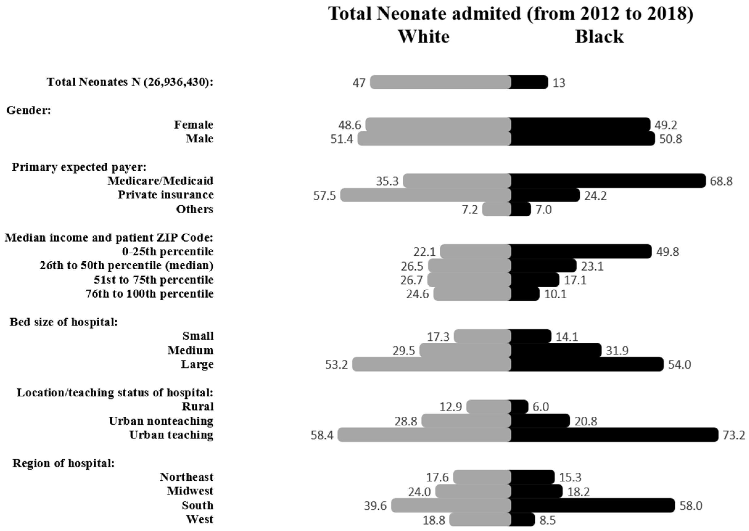
Black neonates had 21,975 (0.63%) mortalities whereas White neonates had 35,495 (0.28%) deaths, Figure 1. Sex distribution among Black neonates was 50.8% male and 49.2% females and in White was (51.4% males and 48.6% females. Government-supported health insurance was significantly more among Black when compared to White (68.8% vs. 35.3% p<0.001). Household income differed significantly; almost half (49.8%) of the Black population has income ≤ 25th percentile for ZIP code compared to 22.1% in the White population, p<0.001. Although the majority of deliveries occurred in the South region for both Black and White populations, it was disproportionately higher in Black than White (58% vs. 39.6%, p<0.001), Figure 2.
Figure 1.
Study population algorithm.
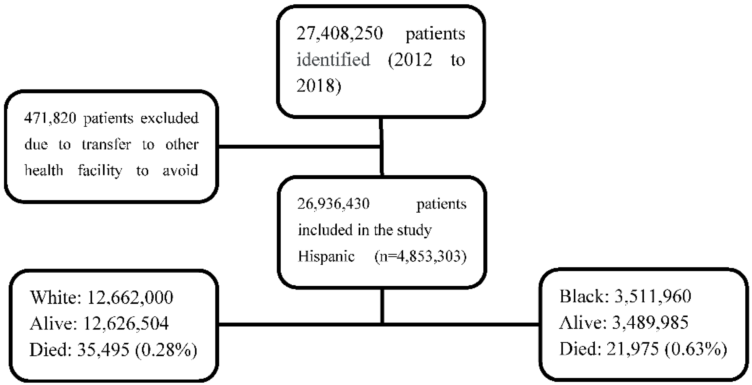
Figure 2.
Characteristics of inpatient newborn admissions in Black and White populations. Data are expressed in percentages.
Figure 2.
Characteristics of inpatient newborn admissions in Black and White populations. Data are expressed in percentages.
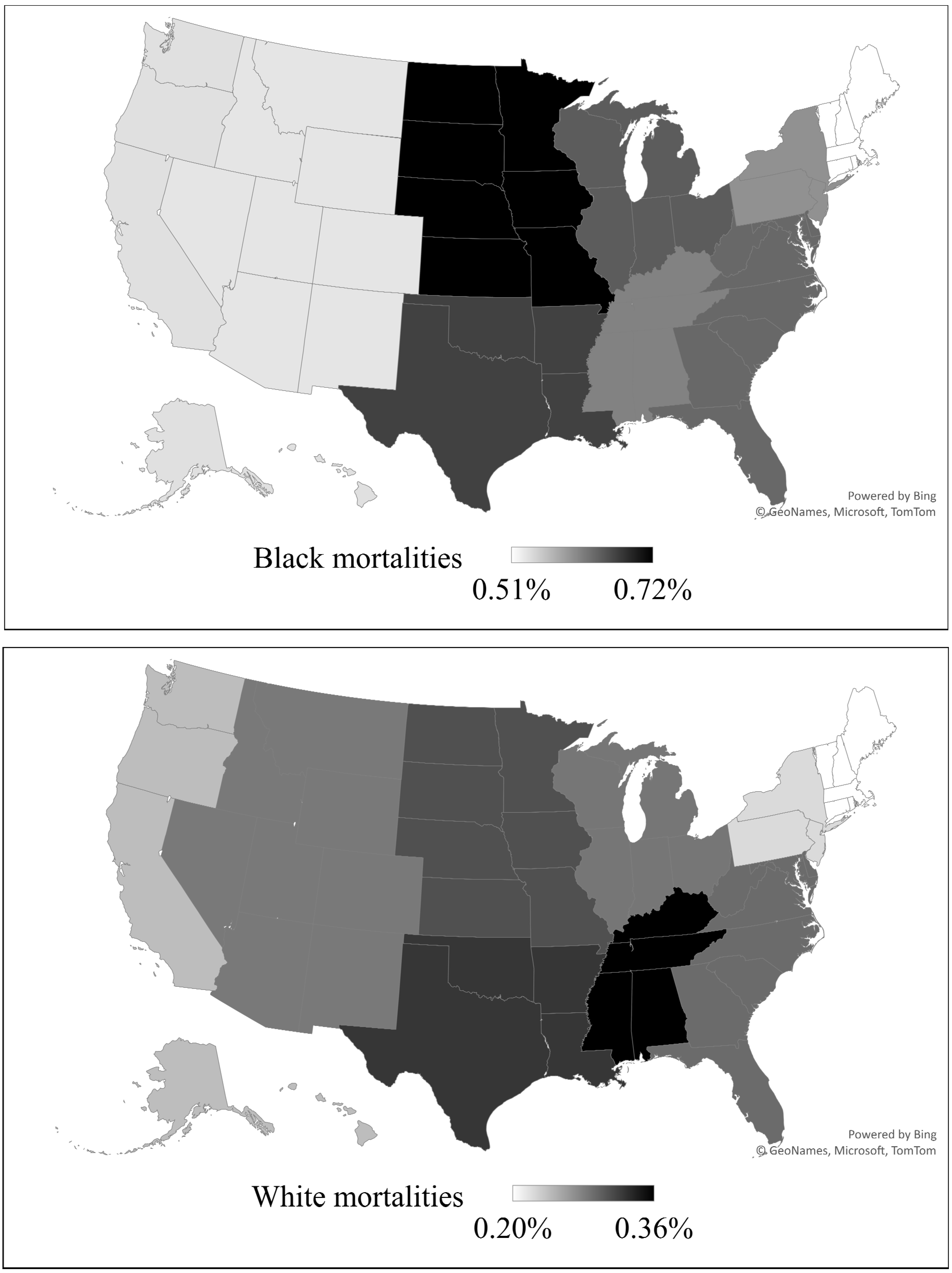
There was a significant variation in mortality in different U.S. locations. Maps for percentages of neonatal mortalities in different delivery locations are presented in Figure 3. These locations are categorized according to Census Division for Hospitals. In the overall population, the highest mortality was in the East South Central division (0.49%), and the lowest percentage of mortality was in the Pacific division (0.35%), p<0.001. Black population had the highest mortality in the West North Central division (0.72%), and their lowest mortality was in the New England division (0.51%), p<0.001, whereas in the White population, the highest mortality was in the East South Central division (0.36%), and the lowest mortality was in the New England division (0.21%) p<0.001.
Figure 3.
Delivery locations and neonatal mortalities percentages (Regional percentages distribution of neonatal mortalities according to Census Division of Hospitals) Darker color represents higher mortality according to range in each map. -The upper map demonstrates Neonatal mortalities in Black neonates.-The lower map demonstrates Neonatal mortalities in White neonates.
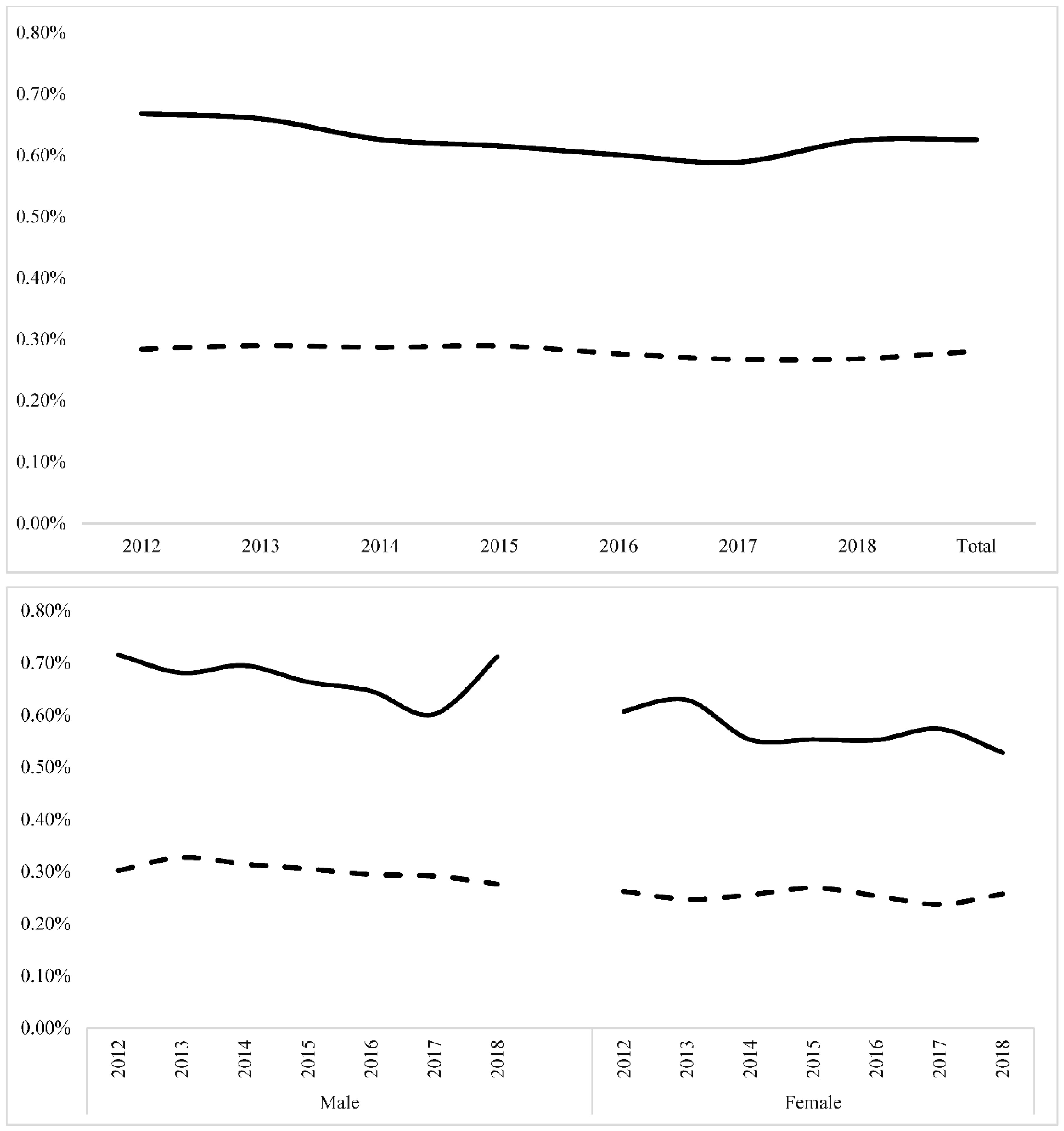
Trend analysis showed a significant decrease in mortality in Black and White populations over the years (Z=-3.26, P <0.001) and (Z=-5.42, P <0.001), respectively. When stratifying the population by sex, mortality was consistently higher in Black in both sex groups throughout the study years (Figure 4).
Figure 4.
Trends for neonatal mortalities during the study period. The solid line represents mortality in Black population. The dashed line represents mortality in White population. The upper panel represents postnatal mortality trends; mortality decreased significantly in Black and White neonates (Z=-3.26, P <0.001) and (Z=-5.42, P <0.001), respectively. The lower panel represents neonatal mortalities according to sex. Black neonates had higher mortality than White in both sex groups (P <0.001).
After stratifying the population by type of insurance, mortality was higher in Black compared to White who had government-supported insurance (0.58% vs 0.33%, p=<0.001), private insurance (0.57 % vs 0.22%, p=<0.001), and uninsured/self-paid (1.22 % vs 0.50%, p=<0.001). Trends for utilization of government-supported insurance in Black and White did not significantly change. Trends for uninsured/self-paid in Black and White did not significantly change. Trends for mortality according to insurance type in government-supported population was not significant for decreased mortality in Black (Z=-4.66. P < 0.2) and in White neonates (Z=-2.1, P 0.6). For the privately insured population, there was no significant decrease in the Black (Z=-2.6. P < 0.1) and White neonates (Z=-3.4, P 0.13). For uninsured/self-paid, there was significant in the Black (Z=-4.66. P < 0.0001) and White neonates (Z=-1.2, P 0.03).
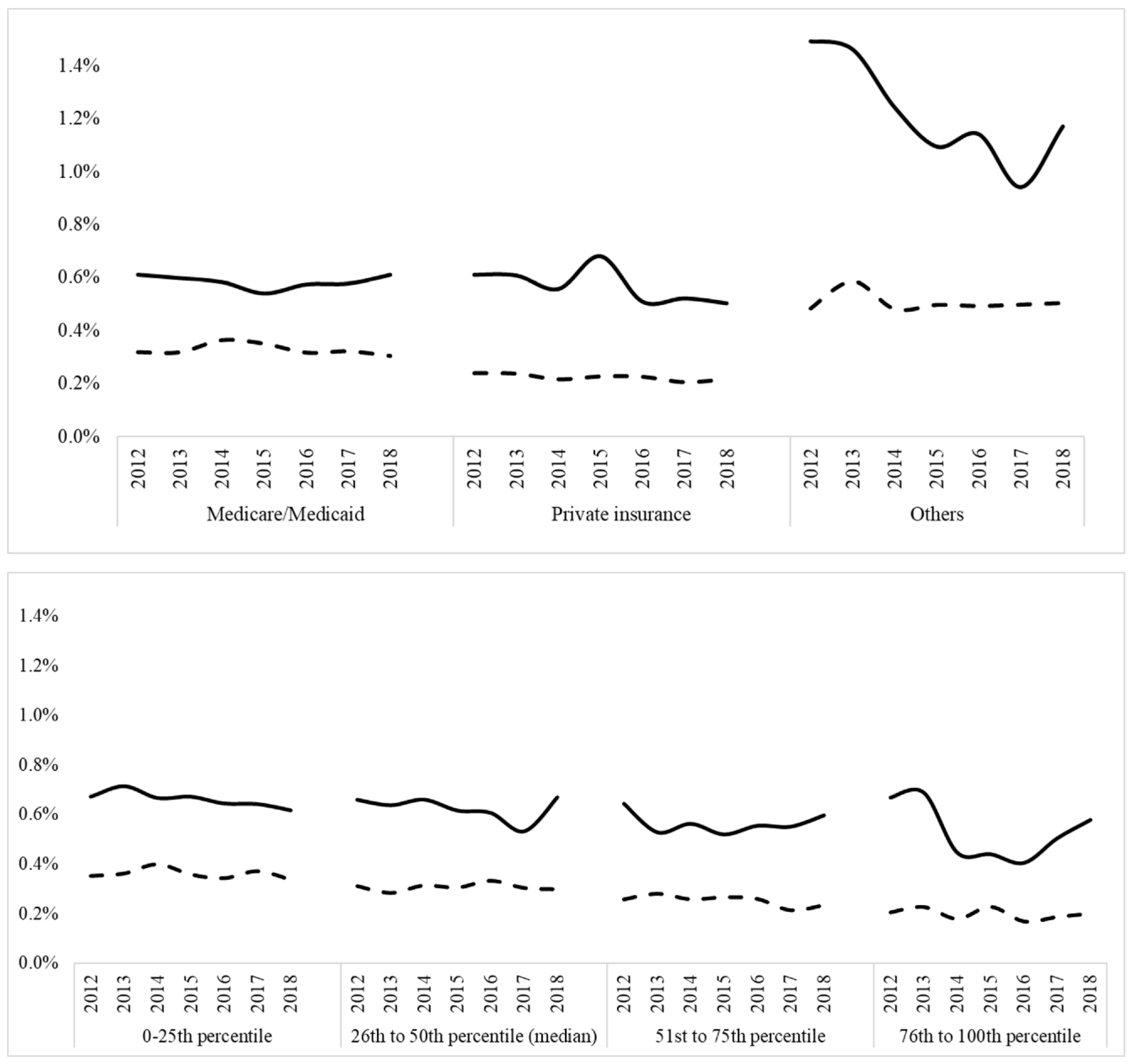
Trends for mortality among different household incomes according to zip code There was a significantly higher in Black mortalities when compared with Whites in all levels of income, P <0.001. (Figure 5)
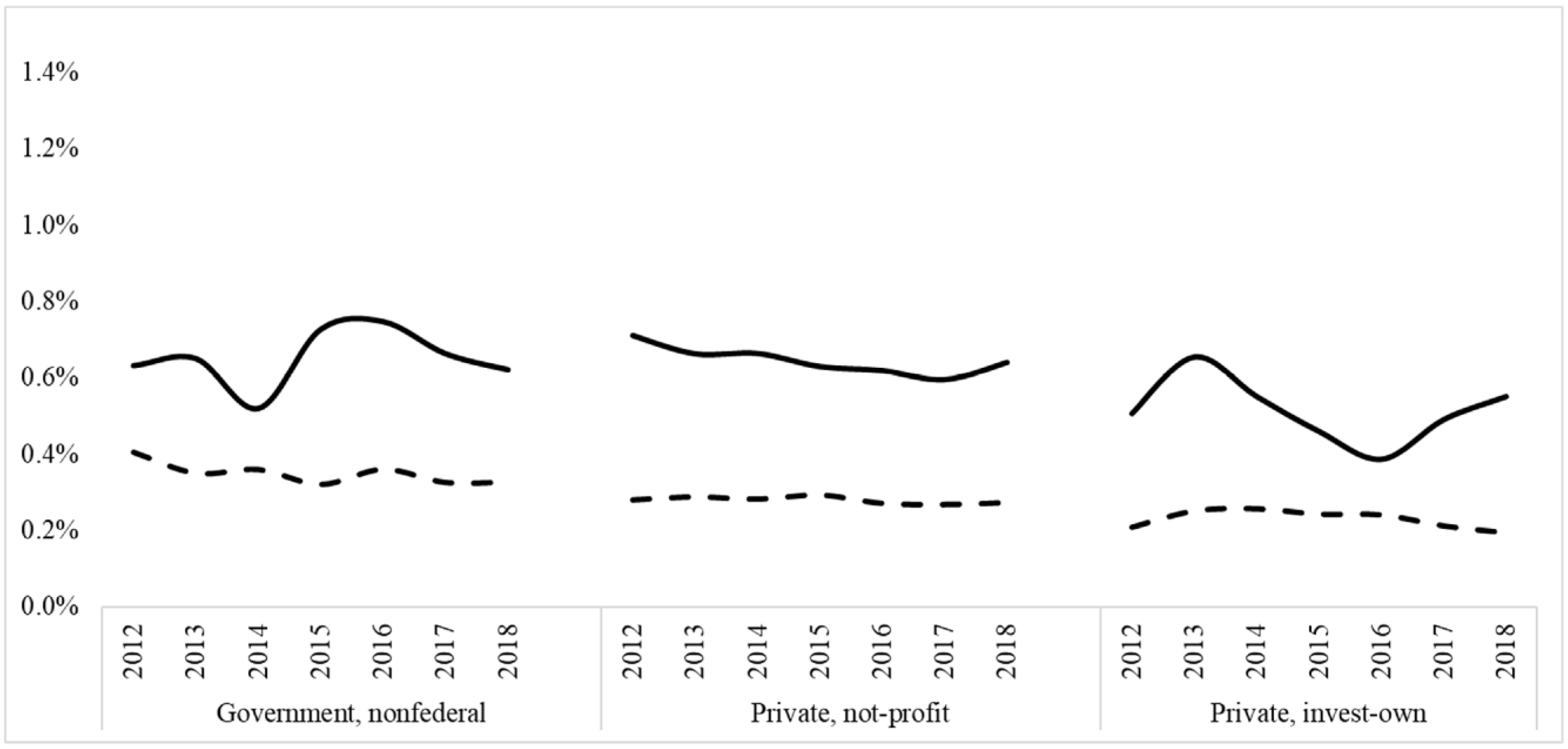
Trends in mortalities according to hospital type differed in Black vs. White. The solid line represents the mortality trend (%) for the Black neonates. The dashed line represents the mortality trend (%) for the White neonates. As previously mentioned, there was significantly higher mortality in the Black when compared to Whites Neonates in all types of hospitals, P <0.001.
Figure 5.
Trends for Neonatal mortalities percentages according to financial situations of patients and hospitals Black vs White neonates.The upper panel represents Neonatal mortalities percentages trends in Black vs. White neonates according to the types of insurance. The solid line represents the mortality trend (%) at the Black neonates. The dashed line represents the mortality trend (%) at the White neonates. There was a significantly higher in Black mortalities when compared with Whites in all types of insurances, P <0.001.The middle panel represents Neonatal mortalities percentages trends in Black vs. White neonates according to the household income according to the ZIP code. The solid line represents the mortality trend (%) at the Black neonates. The dashed line represents the mortality trend (%) at the White neonates. There was a significantly higher in Black mortalities when compared with Whites in all levels of income, P <0.001. The lower panel represents Neonatal mortalities percentages trends in Black vs. White neonates according to the type of hospital. The solid line represents the mortality trend (%) at the Black neonates. The dashed line represents the mortality trend (%) at the White neonates. As previously mentioned, there was significantly higher mortality in the Black when compared to Whites Neonates in all types of hospitals, P <0.001.
4. Discussion
Disparities in neonatal mortality continue to be higher in Black; mortality in Black was: 21,975 (0.63%) and in White was: 35495 (0.28%), Government-supported health insurance was significantly more among Black populations when compared to White (68.8% vs. 35.3% p<0.001). Household income differed significantly; almost half (49.8%) of the Black population has income ≤ 25th percentile vs. 22.1% in White. There was a significant variation in mortality in different U.S. locations. In the Black population, the highest mortality was in the West North Central division (0.72%), and the lower mortality was in the New England division (0.51%), whereas in the White population, the highest mortality was in East South Central division (0.36%), and the lowest mortality was in the New England division (0.21%).
Trend analysis showed a significant decrease in mortality in Black and White populations over the years, but when stratifying the population by sex, types of insurance, the household income, the type of hospitals, the mortality was consistently higher in Black groups throughout the study years,
Trend analysis showed a significant decrease in mortality in the Black and White population over the years, and many studies demonstrated this finding even in the adult Black.9 Also, the Black Neonates always show the highest mortality in the U.S according to many studies even some studies mentioned that the Black neonatal mortality rate is double the White mortality rate in the U.S.10 The novelty of our study is when stratifying the population by many significant epidemiologic and hospital factors. The Black Neonates always shows the highest mortality and this study look for many essential factors can affect the contributing for the high Black mortality.
Disparities in Maternal Morbidity and Mortality for black women in the U.S. are the essential factor that impacts neonatal mortality and still exist in spit implementation of many systems for the equity,11 for example, The Racism may impact maternal health, mainly through discrimination among Black women as compared with White will significantly affect the perinatal care and the neonatal outcome will be compromised at the end.12
Neonatal mortality disparities may result from the many social, economic, and environmental exposures for Pregnant Black women and Neonates.13 other studies rely on many maternal factors the, such as residential segregation, crime, inequality in income, suboptimal education, and institutional racism, built environment, contribute for the poor outcomes of Black infants in this U.S.3,14 Other factors for example abuses of Black American women by the medical system, inconsistent societal pressures on Black pregnant and historical stereotypes about Black women related to sexuality and pregnancy.15 Finally, Variations in neonatal mortality in the United States based on geographic location and the service available in the location of the Black community may contribute to variations in access to risk-appropriate delivery care.16
This study has the strength of being the largest reported in the literature with a sample that exceeds 26 million infants that represent the entire United States, thereby eliminating the significant variation in practice and experiences that are observed in currently available studies. In addition, the study could provide the national trend over the years for mortalities. The study inherited some limitations; However, This dataset is limited to the inpatient setting; therefore, long-term follow-up and mortality after hospital discharge are unavailable. We did not use (ICD-9 and ICD-10) as the mortality is available in the dataset as a variable that makes the result more accurate.
Contributors’ Statement Page
Ibrahim Qattea and Maria Burdjalov conceptualized and designed the study, conducted the analysis, drafted the initial manuscript, and reviewed the manuscript. Amani Quatei and Khalil Tamr Agha, drafted the initial manuscript and reviewed the manuscript. Hany Aly and Mohamed A. Mohamed conceptualized and designed the study, interpreted the analysis, drafted the initial manuscript, and reviewed and revised the manuscript.
Funding/Support
None.
Conflicts of Interest Disclosures
All authors claim no financial interest or Conflict of Interest related to this research.
Abbreviations
Neonatal Mortalities; Survival; Racial Disparities; Perinatal epidemiology, NICU.
References
- Chen HY, Chauhan SP, Rankins NC, Ananth CV, Siddiqui DS, Vintzileos AM. Racial and ethnic disparities in infant mortality in the United States: the role of gestational age. Am J Perinatol. 2013;30(6):469-475. [CrossRef]
- Opondo C, Jayaweera H, Hollowell J, Li Y, Kurinczuk JJ, Quigley MA. Variations in neonatal mortality, infant mortality, preterm birth and birth weight in England and Wales according to ethnicity and maternal country or region of birth: an analysis of linked national data from 2006 to 2012. J Epidemiol Community Health. 2020;74(4):336-345. [CrossRef]
- Matoba N, Collins JW. Racial disparity in infant mortality. Semin Perinatol. 2017;41(6):354-359. [CrossRef]
- Infant Mortality | Maternal and Infant Health | Reproductive Health | CDC. Published September 8, 2021. Accessed January 28, 2022. https://www.cdc.gov/reproductivehealth/maternalinfanthealth/infantmortality.htm.
- Alexander GR, Kogan M, Bader D, Carlo W, Allen M, Mor J. U.S. birth weight/gestational age-specific neonatal mortality: 1995-1997 rates for whites, hispanics, and blacks. Pediatrics. 2003;111(1):e61-66. [CrossRef]
- Opondo C, Gray R, Hollowell J, Li Y, Kurinczuk JJ, Quigley MA. Joint contribution of socioeconomic circumstances and ethnic group to variations in preterm birth, neonatal mortality and infant mortality in England and Wales: a population-based retrospective cohort study using routine data from 2006 to 2012. BMJ Open. 2019;9(7):e028227. [CrossRef]
- HCUP Sample Design: National Databases - Accessible Version. Accessed November 29, 2021. https://www.hcup-us.ahrq.gov/tech_assist/sampledesign/508_compliance/index508_2018.jsp#nisprior.
- HCUP-US NIS Overview. Accessed April 15, 2022. https://www.hcup-us.ahrq.gov/nisoverview.jsp.
- Buchanich JM, Doerfler SM, Lann MF, Marsh GM, Burke DS. Improvement in racial disparities in years of life lost in the USA since 1990. PLoS One. 2018;13(4):e0194308. [CrossRef]
- Sosnaud B. Cross-State Differences in the Processes Generating Black-White Disparities in Neonatal Mortality. Demography. 2021;58(6):2089-2115. [CrossRef]
- Noursi S, Saluja B, Richey L. Using the Ecological Systems Theory to Understand Black/White Disparities in Maternal Morbidity and Mortality in the United States. J Racial Ethn Health Disparities. 2021;8(3):661-669. [CrossRef]
- Minehart RD, Bryant AS, Jackson J, Daly JL. Racial/Ethnic Inequities in Pregnancy-Related Morbidity and Mortality. Obstet Gynecol Clin North Am. 2021;48(1):31-51. [CrossRef]
- Willis E, McManus P, Magallanes N, Johnson S, Majnik A. Conquering racial disparities in perinatal outcomes. Clin Perinatol. 2014;41(4):847-875. [CrossRef]
- Burris HH, Hacker MR. Birth outcome racial disparities: A result of intersecting social and environmental factors. Semin Perinatol. 2017;41(6):360-366. [CrossRef]
- Rosenthal L, Lobel M. Explaining racial disparities in adverse birth outcomes: unique sources of stress for Black American women. Soc Sci Med. 2011;72(6):977-983. [CrossRef]
- Lorch SA, Rogowski J, Profit J, Phibbs CS. Access to risk-appropriate hospital care and disparities in neonatal outcomes in racial/ethnic groups and rural-urban populations. Semin Perinatol. 2021;45(4):151409. [CrossRef]
Disclaimer/Publisher’s Note: The statements, opinions and data contained in all publications are solely those of the individual author(s) and contributor(s) and not of MDPI and/or the editor(s). MDPI and/or the editor(s) disclaim responsibility for any injury to people or property resulting from any ideas, methods, instructions or products referred to in the content. |
© 2023 by the authors. Licensee MDPI, Basel, Switzerland. This article is an open access article distributed under the terms and conditions of the Creative Commons Attribution (CC BY) license (http://creativecommons.org/licenses/by/4.0/).
Copyright: This open access article is published under a Creative Commons CC BY 4.0 license, which permit the free download, distribution, and reuse, provided that the author and preprint are cited in any reuse.


