

Submitted:
21 September 2026
Posted:
22 September 2026
You are already at the latest version
Abstract
Shared micromobility can contribute to more sustainable urban mobility by improving access to urban opportunities without relying exclusively on private motorized transport, but the opportunities that can potentially be reached through the transport network may not coincide spatially with the availability of shared vehicles. This study proposes a data-driven microscopic accessibility framework to assess this relationship at the building level. Origin–destination Global Navigation Satellite System (GNSS) data from free-floating shared micromobility services are map-matched and routed over detailed urban networks to reconstruct plausible trips and derive mode-specific travel speeds. Potential Accessibility is then calculated for each building as the opportunities reachable within a 15-min travel-time threshold. A complementary Vehicle Supply indicator is derived from observed trip-end locations reachable within a 3-min walking-time threshold, and the two components are combined into Effective Accessibility. Their spatial correspondence is further assessed using Spearman rank correlation, high-value coverage, and a normalized dissimilarity index. The framework is applied to Bologna and Florence, Italy, considering bicycles, e-bikes, and e-scooters where available. The results demonstrate that network-based accessibility and shared-vehicle supply provide complementary information and should not be interpreted independently. The proposed framework enables localized identification of areas where high accessibility potential is insufficiently supported by the observed shared-mobility service and can support the planning of more sustainable shared-micromobility systems, while providing a basis for future dynamic accessibility analyses incorporating temporal dependency and fleet availability.
Keywords:
accessibility
; shared micromobility
; bike sharing
; microscopic accessibility
; active mobility
; vehicle availability
; spatial analysis
; GNSS data
; mobility data
1. Introduction
Transportation planning has progressively shifted from a traffic-oriented perspective, primarily concerned with transport-system performance, towards an accessibility-oriented perspective focused on the ability to reach activities and opportunities [1]. Accessibility was originally defined by Hansen as the “potential of opportunities for interaction” [2] and has subsequently developed into a broad framework linking the spatial distribution of opportunities, transport performance, temporal constraints, and individual characteristics. This perspective is particularly relevant for sustainable urban mobility because improvements in speed or infrastructure do not necessarily translate into improved access if useful destinations cannot be reached under the conditions experienced by users. Accessibility is also increasingly used to support assessments of urban quality and transport equity [3,4].
Cycling has received less attention in accessibility research than private cars and public transport [5], although the number of applications has increased in recent years. Existing studies have adopted cumulative-opportunity [6,7], gravity-based [8,9], and competition-based approaches [10,11]. Travel time remains the most common impedance variable, but more detailed approaches modify network costs or restrict the available network using low-stress routing, slope, surface characteristics, infrastructure quality, and intersection conditions [8,12,13,14]. Temporal and individual dimensions have also been considered through peak/off-peak conditions [15], dynamic networks [16,17], population-specific travel characteristics [10], and perceived accessibility [18,19], but remain less represented overall [20]. This limitation is especially important for shared micromobility because accessibility also depends on whether a suitable vehicle is available at the required location and time. Recent work on dockless bicycles and e-bikes has shown that hourly fleet redistribution can substantially affect accessibility outcomes [21].
Shared micromobility can extend short- and medium-distance access and support first-/last-mile connections with public transport [22,23,24,25]. Unlike a privately owned bicycle, however, service availability varies with previous trips, fleet size, operator strategies, service boundaries, and vehicle type [26,27,28,29,30,31,32,33]. Consequently, accessibility measures based only on network travel times and opportunities may overestimate the accessibility actually supported by a free-floating service.
A related issue concerns aggregate service-supported accessibility. A mode operating with a larger fleet or generating more trips can produce a greater amount of observed vehicle supply even if its spatial relationship with the underlying accessibility potential is similar. Aggregate measures combining accessibility potential and observed supply therefore reflect both service scale and spatial allocation. Distinguishing these effects requires complementary normalizations for fleet size and trip activity while retaining the raw aggregate measure.
Spatial resolution represents a second methodological issue. Cycling and walking trips are sensitive to local network conditions, yet accessibility is often calculated using administrative zones or regular grids [20]. Such aggregation can conceal within-zone variation and introduces sensitivity to the size and configuration of spatial units. Staves et al. [34] developed a micro-scale active-travel framework in which accessibility is computed separately for each dwelling using a detailed network enriched with street-level characteristics. Their application demonstrated that accessibility can differ between nearby dwellings, providing an important precedent for moving from zonal representations towards individual buildings.
A complementary meaning of microscopic modelling concerns the explicit simulation of individual agents and vehicles. Dynamic accessibility research has emphasized that transport conditions, population locations, and opportunities vary throughout the day [35]. Agent-based models can represent individual users and shared vehicles explicitly: Balać and Hörl [36] and Diallo et al. [37] model shared fleets and their interaction with demand, while Diepolder et al. [38] derive spatiotemporal accessibility from simulated shared-mobility operations. These approaches provide a basis for representing time-dependent availability and competition for finite shared resources.
Large-scale Global Navigation Satellite System (GNSS) data create new possibilities for detailed transport analysis [39,40]. Passive GNSS data can provide high-resolution information on origins, destinations, travel times, and, when complete trajectories are available, route choices [41]. Even when complete trajectories are unavailable, shared-mobility origin–destination positions and timestamps can be map-matched and routed over a detailed network to reconstruct plausible trips and estimate travel speeds [42].
Based on these considerations, this study proposes a data-driven building-level framework for free-floating shared micromobility. Potential Accessibility () measures the opportunities reachable through the network, Vehicle Supply (S) represents observed service support around each origin, and Effective Accessibility () combines the two. Four aggregate scores complement the building-level analysis: the Potential Accessibility Score (), Effective Accessibility Score (), fleet-normalized score (), and trip-normalized score (). Spatial correspondence between and S is assessed through the Spearman Rank Correlation Coefficient (), High-Value Coverage (), and Normalized Dissimilarity Index (D).
The framework is applied to Bologna and Florence using free-floating bicycles, e-bikes, and, where available, e-scooters. The objectives are to demonstrate building-level accessibility assessment; integrate empirical travel conditions and shared-vehicle presence; distinguish aggregate potential and total service-supported accessibility from fleet- and trip-normalized performance; and evaluate whether S spatially supports areas of high . Section 2 presents the framework, Section 3 the data preparation, Section 4 the results, Section 5 the discussion and limitations, and Section 6 the conclusions.
2. Methodology
2.1. From Macro to Micro
While the accessibility literature has developed a broad range of indicators, many studies still implement these measures on zonal or raster representations of the urban environment. This study proposes a method to transfer accessibility analysis to a microscopic level by assessing accessibility building by building. At this scale, each building can be treated as both a potential origin and a potential destination, allowing accessibility to be estimated directly on a detailed transport network rather than through aggregated spatial units.
The implementation of a microscopic accessibility assessment requires three main components. The first is a microscopic representation of the transport network. The second component is a land-use model describing building geometries and associated activities. Geo-referenced building footprints can also be retrieved from OpenStreetMap with generally acceptable quality. The third component is a travel-time model for the transport mode under analysis. In the case of shared micromobility, the objective is to estimate how many opportunities can be reached from each individual building. Building-level accessibility can be measured by summing the opportunities reachable from the origin building and weighting their value through a decay function based on travel time. This accessibility measure will be referred to as Potential Accessibility and defined later in this section.
Since travel time is computed directly on the microscopic network, this requires an estimate of the speed of the studied mode on each edge, or, where possible, on each lane.
2.2. Speed Estimation
Instrumental speed measurements can be accurate, but they are costly and difficult to scale over large urban networks. A viable alternative is to infer speeds from large trip datasets based on GNSS positions. Full movement traces are preferable because they provide direct information on the path followed by each user. However, such data are rarely available, since service providers often do not share full traces for privacy and commercial reasons. Origin and destination GNSS records, together with timestamps and vehicle information, are more commonly accessible and can still be used to reconstruct plausible routes and estimate trip average speeds. The proposed method therefore adopts a data-driven approach to speed estimation using simple origin, destination, and timestamp information. First, trip origins and destinations are map-matched to the network, assigning each trip to an origin and destination edge. Then, routing is performed to reconstruct the likely sequence of edges used by the trip. The routing criterion should reflect the nature of the mode considered. Since this study focuses on bicycle, e-bike, and e-scooter trips, a shortest-path criterion with a lower cost assigned to edges with reserved bicycle lanes can be adopted, following the approach proposed in [43].
After route reconstruction, anomalous records must be filtered. This step is necessary because routing based only on origin and destination points cannot reliably reproduce trips with substantial detours and round trips. Filtering can be applied to trip distance, trip duration, space-average speed, time of day at trip start, and the ratio between routed distance and Euclidean distance. Distance and duration filters remove trips that are too short or too long to represent typical systematic mobility. Speed filters must be selected carefully, since they can bias the results; therefore, only trips with average speeds below walking pace or above the technological speed limit of the vehicle should be excluded. Filtering by time of day can be used to focus the analysis on rush-hour trips, when systematic travel is more common and speeds may better represent the conditions experienced by users accessing relevant opportunities such as work and study places. Finally, the routed-distance to Euclidean-distance ratio can help identify and remove indirect trips.
Once each trip has been assigned to a sequence of network edges, its reconstructed length is known. The average speed of the trip can then be computed as the ratio between reconstructed trip length and trip duration derived from the timestamps. For each edge, the average speed is estimated as the mean of the average speeds of all reconstructed trips traversing that edge:
where is the estimated average speed on edge E, is the number of reconstructed trips traversing that edge, and is the average speed of trip i. For example, if two reconstructed trips, and , traverse edge , the estimated average speed on is obtained as the average of their trip speeds, as illustrated in Fig. Figure 1. Repeating this procedure over the whole dataset makes it possible to estimate average travel speeds for all edges.
For edges with insufficient or missing observations, a fallback speed must be assigned. A simple solution is to impute a representative value from the empirical speed distribution of the dataset, such as the mean or median speed. Although this estimation of edge speed reduces local precision, it allows the method to produce a complete travel-time model for the entire network that is coherent with the observed conditions and can capture differences in travel speed across the study area. Travel time on each edge is then computed by dividing edge length by the estimated or imputed trip average speed.
2.3. Potential and Effective Accessibility
Once edge travel times are available, accessibility can be computed through forward routing from each origin building. The origin building is first associated with its nearest network edge, then a minimum-cost forward tree is constructed using the Dijkstra algorithm. Because the analysis is performed on a microscopic network, the routing can account for detailed lane-to-lane connections and permitted maneuvers. By repeating the procedure for every building, the travel time from each origin building to all reachable destination buildings can be estimated. The accessible opportunities for each origin building are then computed by summing the value of the destination opportunities reachable within the travel-time threshold. A possible proxy for the opportunity value of each building is its surface area, weighted as a function of the travel time required to reach it. This produces a microscopic accessibility measure referred to as Potential Accessibility:
where represents the Potential Accessibility of origin building i, is the set of destination buildings considered in the accessibility calculation, is the opportunity value associated with destination building j, and is the minimum network travel time between origin i and destination j. The function in Eq. 3 represents the travel-time weighting function. In the present application, a binary threshold function is adopted: destinations reachable within the travel-time threshold T receive a weight equal to one, whereas destinations located beyond the threshold receive a weight equal to zero. The opportunities included in the analysis are buildings classified as leisure, commercial, industrial, or education, with building surface area used as the corresponding opportunity value . Consequently, corresponds to the sum of the selected opportunity values reachable from building i within the adopted travel-time threshold.
A limitation of a network-based accessibility measure alone is that it does not account for the actual availability of shared vehicles near each origin. This is especially relevant for vehicle-sharing systems, where Potential Accessibility becomes effective only if a vehicle is available within walking distance. Vehicle Supply S can be approximated using the same GNSS dataset by counting trip-end points located near each building. Given the microscopic network representation, this proximity can be defined through a walking-based forward routing procedure: for each building, Dijkstra’s algorithm can be used to identify the edges reachable within a given walking-time threshold, and the number of trip-end points located on those edges can be used as a proxy for available vehicles:
where represents the Vehicle Supply proxy associated with origin building i, is the minimum-cost walking tree starting from the network edge associated with building i and truncated at the walking-time threshold , and is the number of observed shared-mobility trip-end points associated with edge e. Consequently, corresponds to the total number of observed trip-end points located on network edges reachable on foot from building i within 3 min.
Finally, Potential Accessibility and Vehicle Supply can be combined into Effective Accessibility , see Eq. 5. By multiplying the Potential Accessibility associated with each building by the corresponding Vehicle Supply proxy, Effective Accessibility accounts not only for the spatial distribution of opportunities but also for the observed spatial distribution of the shared-micromobility service:
where is the Effective Accessibility associated with origin building i, is its Potential Accessibility, and is the corresponding Vehicle Supply indicator.
Effective Accessibility therefore identifies the locations where Potential Accessibility is supported by the observed spatial distribution of the shared-mobility service. Because it remains a building-level quantity, however, an additional set of aggregate measures is introduced to summarize the accessibility associated with each city–mode analysis.
2.4. Accessibility Scores
Four complementary Accessibility Scores are defined to distinguish the accessibility potential offered by the transport mode from the magnitude and spatial efficiency of the observed shared-mobility service.
First, the Potential Accessibility Score is obtained by summing Potential Accessibility over all buildings included in the corresponding city–mode analysis:
where is the set of buildings included in the analysis. represents the aggregate accessibility potential provided by the network, mode-specific travel characteristics, and spatial distribution of opportunities. It is independent of the observed Vehicle Supply and therefore describes what the considered mode could potentially provide within the study area.
Second, the Effective Accessibility Score is defined as the sum of Effective Accessibility over the same set of buildings:
This is the aggregate form of Effective Accessibility and, unlike , it depends on the observed Vehicle Supply and is therefore sensitive both to the spatial allocation of trip-end observations and to the overall scale of service activity. In particular, since is constructed from observed trip-end points, a larger number of trips generally increases the magnitude of . The score consequently combines two effects: the intensity of the observed service and the degree to which this activity is spatially located around buildings with high Potential Accessibility.
To reduce the direct influence of fleet size, a fleet-normalized Effective Accessibility Score is defined as:
where F is an observed fleet-size index estimated directly from the vehicle identifiers contained in the trip dataset. For each calendar month m, the monthly observed fleet size is defined as the number of unique vehicles of the considered mode appearing in at least one trip record:
where is the corresponding set of unique vehicle identifiers. The fleet-size index is then calculated as the arithmetic mean over the M calendar months represented in the city dataset:
can therefore be interpreted as the aggregate Effective Accessibility supported per observed fleet unit. This normalization removes the direct advantage associated with operating a larger fleet while retaining differences in vehicle utilization and spatial allocation. Since the measure is inferred from vehicles observed in the trip records rather than from an operator inventory, F is interpreted as an observed fleet-size index rather than the exact number of vehicles available at every point in time.
Finally, a trip-normalized Effective Accessibility Score is obtained by dividing the raw Effective Accessibility Score by the number of trips used to construct the corresponding Vehicle Supply distribution:
where is the number of observed trips, and consequently trip-end observations, associated with the considered mode over the same observation period. By normalizing for the amount of observed activity, removes the direct effect of both fleet scale and trip volume and is therefore more closely related to the spatial efficiency of the observed trip-end distribution. Higher values indicate that, per trip, Vehicle Supply tends to be located around buildings characterized by greater Potential Accessibility. Because a single trip-end point may contribute to the Vehicle Supply of multiple nearby buildings, this quantity should be interpreted as a normalization per observed trip rather than as the accessibility generated causally by one individual trip.
The four Accessibility Scores therefore describe complementary dimensions of the analysis. represents the aggregate accessibility potential of the mode independently of shared-vehicle supply; represents the total Effective Accessibility associated with the observed service; normalizes this quantity by fleet size while retaining the effect of vehicle utilization; and further normalizes for observed activity and provides a measure more directly related to the spatial allocation of the service.
2.5. Aggregated Spatial Alignment Indexes
The building-level representation makes it possible to compare directly the spatial distribution of Potential Accessibility and Vehicle Supply. Although this comparison can be visually assessed from the corresponding maps, a quantitative evaluation is useful to determine whether areas characterized by high Potential Accessibility are also adequately supported by the spatial distribution of the service. The Accessibility Scores introduced above quantify aggregate accessibility magnitudes but do not describe directly the spatial correspondence between Potential Accessibility and Vehicle Supply. For this reason, three additional and complementary indicators are adopted.
Let denote the Potential Accessibility associated with building i, expressed through the accessible opportunities, and let denote the corresponding Vehicle Supply proxy. The first measure is the Spearman Rank Correlation Coefficient , computed between the building-level values of and :
where denotes the rank of the corresponding variable. was selected instead of a linear correlation measure because the purpose of the analysis is to evaluate whether locations characterized by relatively high Potential Accessibility also tend to present relatively high Vehicle Supply, without assuming a linear relationship between the two quantities. Moreover, the rank-based formulation is less sensitive to strongly skewed distributions and extreme values, which can characterize building-level accessibility and Vehicle Supply data. Values of close to 1 indicate a strong positive correspondence between the two rankings, values close to 0 indicate the absence of a monotonic association, and negative values indicate that higher Potential Accessibility tends to be associated with lower Vehicle Supply.
A second assessment focuses specifically on the spatial correspondence of the highest-value locations. For a given fraction q, let denote the set of buildings belonging to the highest q fraction of the Potential Accessibility distribution and the corresponding set for Vehicle Supply. The High-Value Coverage is defined as:
therefore represents the proportion of buildings with high Potential Accessibility that are also classified among the buildings with the highest Vehicle Supply. Three thresholds are considered in this study, namely , , and . The threshold isolates the strongest spatial concentrations, while the and thresholds progressively broaden the comparison to larger high-value areas. The use of multiple thresholds reduces the dependence of the analysis on a single arbitrary cutoff and makes it possible to distinguish between correspondence of the strongest peaks and broader spatial alignment. When several buildings share the value corresponding to the percentile boundary, all tied buildings are retained in the corresponding high-value set.
Finally, the overall proportional difference between the two spatial distributions is quantified through the Normalized Dissimilarity Index D [44]. Potential Accessibility and Vehicle Supply are first converted into shares of their respective city-wide totals:
D is then computed as:
The index ranges between 0 and 1. A value of indicates identical proportional distributions of Potential Accessibility and Vehicle Supply across buildings, whereas increasing values indicate progressively greater mismatch. In distributional terms, D can be interpreted as the share of the normalized distribution that would need to be reallocated among buildings for the two spatial patterns to coincide. It should be noted that D compares the distributions across spatial units but does not explicitly account for the geographical distance between mismatched buildings; for this reason, its interpretation is complemented by the microscopic spatial maps.
These three indicators provide complementary information. evaluates the overall ordinal correspondence between Potential Accessibility and Vehicle Supply, assesses whether the most favourable locations coincide, and D measures differences in the relative concentration of the two complete distributions.
3. Dataset Description and Preparation
The methodology was applied to Bologna and Florence, two medium-sized Italian cities with free-floating shared-micromobility services. Bologna includes bicycles and e-bikes, while Florence additionally includes e-scooters. RideMovi and Società Reti e Mobilità provided 2023 GNSS data containing trip-origin and trip-destination coordinates and timestamps, vehicle type, and vehicle ID; complete trajectories were unavailable. The observations were map-matched in HybridPY [45,46] to networks derived from OpenStreetMap. The Bologna network had previously been refined through several projects, while the Florence network was cleaned for reliable routing, including intersection clustering and bikeway-continuity corrections. Routes were reconstructed on the Simulation of Urban MObility (SUMO) networks following Schweizer et al. [43].
For the accessibility analysis, the travel-time threshold was set to s (15 min), while S was evaluated using a walking-time threshold of s (3 min). Opportunities were represented by the surface area of buildings classified as leisure, commercial, industrial, or education.
Trips used for route reconstruction and speed estimation were restricted to reconstructed lengths of 800–4000 m, durations of 300–1800 s, average speeds of 1.25–6.94 m/s, and routed-to-Euclidean-distance ratios below 1.5. Only trips starting during the morning and afternoon rush-hour periods, 07:00–09:00 and 16:00–18:00 in local Italian time, were retained. The lower speed threshold excludes values below representative walking speed, while the upper threshold corresponds to the 25 km/h assistance limit of conventional e-bikes. The routed-to-Euclidean-distance criterion excludes strongly indirect trips that cannot be reliably reconstructed from origin and destination alone. Together, these criteria remove very short, long, slow, fast, or indirect observations and focus the speed estimation on systematic rush-hour travel. Table 1 reports the filtering criteria and corresponding retained observations.
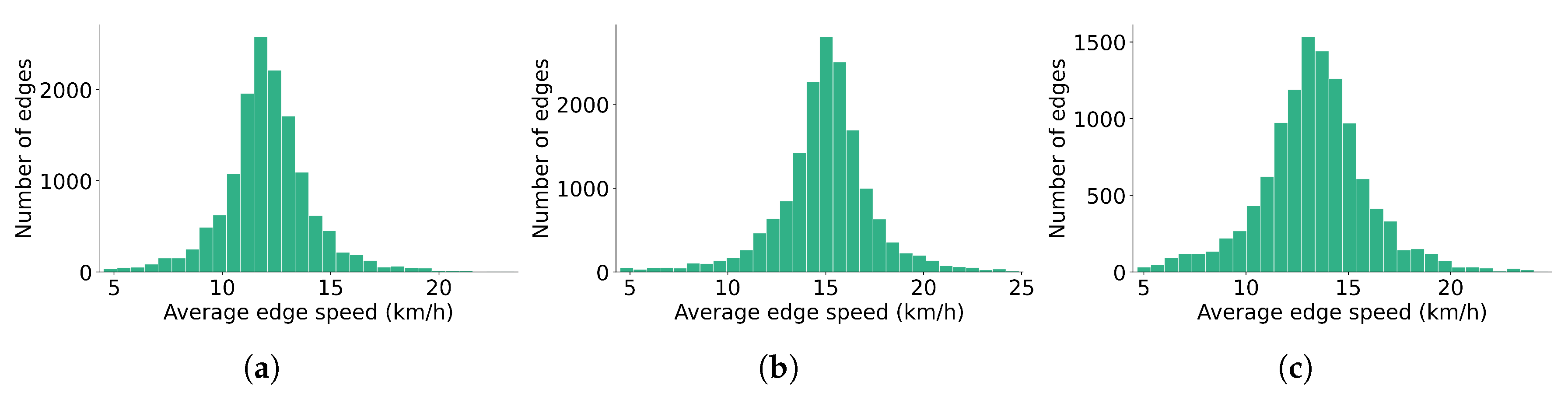
The trip-reconstruction procedure was validated against complete GNSS traces from a previous Bologna study [47], with detailed validation using the same datasets and network models reported in Bernieri et al. [42]. Figure 2 shows speed-assignment coverage. Edges traversed by at least eight accepted trips receive an empirical edge-specific average speed and are shown in red. Edges with one to seven accepted trips are considered insufficiently observed and receive the fallback speed, shown in yellow; edges with no accepted observations also receive the fallback speed and are shown in grey. In Figure A1 and Figure A2 is shown the distribution of the computed speeds.
4. Results
The results are organized around the three building-level measures introduced in Section 2: Potential Accessibility (), Vehicle Supply (S), and Effective Accessibility (). They are complemented by the Potential Accessibility Score (), Effective Accessibility Score (), fleet-normalized score (), and trip-normalized score (), together with the Spearman Rank Correlation Coefficient (), High-Value Coverage (), and Normalized Dissimilarity Index (D). The symbols are used throughout this section. Since the map colour scales are mode-specific, comparisons focus on the location, extent, and continuity of high- and low-value areas rather than on absolute colour intensity.
4.1. Bologna
Figure 3 shows broadly similar patterns for bicycles and e-bikes. Both modes present extensive and relatively continuous high-value areas, while local differences reflect network configuration, travel times, and the distribution of opportunities. The e-bike pattern is slightly more spatially continuous, but the overall structure remains comparable.
The distribution of S differs more clearly from (Figure 4). For both modes, the highest values are concentrated in the central urban area and decline more rapidly towards the periphery. Consequently, the high-S footprint is substantially smaller than the high- area, indicating that the service is more spatially concentrated than the underlying accessibility potential.
This difference is reflected in (Figure 5), whose highest values occur where and S coincide. High is therefore more spatially restricted than high . Bicycles and e-bikes retain similar overall patterns, although local differences remain in the position and intensity of the main concentrations. Overall, S supports a substantial part of the high- area but constrains its effective spatial extent.
The aggregate results in Table 2 show higher values for e-bikes for all four scores. is for e-bikes and for bicycles, whereas the difference is much larger for ( versus ). E-bikes remain higher after normalization by fleet size ( versus ) and by trips ( versus ). Thus, normalization reduces but does not eliminate the e-bike advantage.
The spatial indicators in Table 3 confirm the relatively strong correspondence visible in the maps. is 0.658 for bicycles and 0.605 for e-bikes, indicating a moderately strong positive ordinal association. increases as broader high-value areas are considered, reaching and 0.570, respectively. At the same time, D remains close to 0.44 for both modes, showing that the proportional distributions do not fully coincide despite their similar ranking patterns. Differences between bicycles and e-bikes are therefore limited in terms of spatial alignment.
4.2. Florence
Figure 6 shows broadly similar patterns across bicycles, e-bikes, and e-scooters. The principal high-value area is located outside the historical centre for all modes. Mode-specific differences mainly concern the extent and continuity of these areas rather than their general location.
In contrast, S is concentrated closer to the historical centre and is spatially displaced relative to the main area (Figure 7). S is most extensive for bicycles, more restricted for e-bikes, and most concentrated for e-scooters. The contrast between the two distributions is therefore stronger than in Bologna.
The resulting patterns are shifted towards areas of greater S (Figure 8). is comparatively widespread for bicycles, more concentrated for e-bikes, and most spatially restricted for e-scooters. These maps show that differences in S substantially modify the pattern derived from network accessibility and opportunities alone.
Table 4 shows that e-bikes have the highest values for all four scores. The comparison between bicycles and e-scooters is more nuanced: bicycles have a higher ( versus ), whereas the ranking reverses after normalization. E-scooters reach versus for and versus for . This reversal indicates that the raw aggregate score and the normalized scores capture different aspects of service performance.
The indicators in Table 5 confirm weak spatial correspondence. ranges from 0.116 to 0.163, while is nearly zero for all modes, indicating that the strongest and S concentrations rarely coincide. Some overlap appears only for broader high-value sets. D increases from 0.436 for bicycles to 0.465 for e-bikes and 0.567 for e-scooters, identifying e-scooters as the mode with the greatest proportional mismatch.
5. Discussion
5.1. Interpretation and Comparison of the Case Studies
Potential Accessibility (), Vehicle Supply (S), and Effective Accessibility () should be interpreted jointly with the four aggregate scores—Potential Accessibility Score (), Effective Accessibility Score (), fleet-normalized score (), and trip-normalized score ()—and the spatial-alignment indicators , , and D. The scores quantify aggregate magnitude and the effect of service-scale normalization, whereas the alignment indicators describe how and S are distributed relative to one another across buildings. These measures are therefore complementary rather than interchangeable.
In Bologna, and S exhibit a relatively consistent spatial correspondence. is positive for both modes, while increases when broader high-value areas are considered, indicating that S supports a substantial part of the broader high- area. Nevertheless, D remains close to 0.44 for both modes, showing that the proportional distributions do not fully coincide. This is consistent with the maps, where is relatively widespread while S is concentrated around fewer central nodes. The high values around Bologna Centrale are compatible with an intermodal and first-/last-mile role for the service, although this interpretation remains a hypothesis because trip purpose and railway connections are not directly observed.
Differences between bicycles and e-bikes in Bologna are limited in terms of spatial alignment. Bicycles show slightly stronger correspondence according to and , while D is almost identical. Some local differences may nevertheless reflect the characteristics and uses of the two vehicle types. The greater bicycle concentration around Bologna Centrale could be compatible with more systematic or intermodal trips, whereas the relatively stronger e-bike presence in the central area could reflect a broader mixture of trip purposes. Similarly, the higher e-bike in some southern areas may partly reflect reduced physical effort on hilly terrain. These interpretations remain hypotheses because the available data do not allow the effects of topography, fleet distribution, user preferences, trip purposes, and operational practices to be separated.
The aggregate scores provide a different perspective. E-bike is approximately 1.5 times the bicycle value, whereas is approximately 15.9 times larger. This much larger difference coincides with a substantially larger e-bike fleet-size index and trip volume. After normalization, the gap decreases to approximately 2.43 for and 1.49 for . The reduction shows that service scale contributes substantially to the raw aggregate difference, while the remaining e-bike advantage indicates greater per observed fleet unit and per trip.
Florence presents a markedly different configuration. is concentrated predominantly outside the historical centre, whereas S is more centrally concentrated. Low and near-zero indicate that the strongest concentrations rarely coincide. Some correspondence appears when the comparison is extended to the upper third of both distributions, but the observed overlap remains below the 0.33 value expected under independent selection of two exactly one-third-sized sets. This is only a descriptive benchmark and should not be interpreted as a formal spatial null because spatial dependence and ties are not represented.
Among the Florence modes, bicycles exhibit the broadest S distribution and the lowest D, whereas e-scooters show the greatest proportional mismatch. These differences may reflect fleet size, user demand, trip purposes, tourism-related use, or operator deployment strategies, although the present data do not allow these mechanisms to be distinguished. Nonetheless, the differences between the three modes in Florence remain marginal.
The aggregate scores reveal clearer modal differences. E-bikes rank highest for all four scores. Bicycles have a higher than e-scooters despite the latter having a higher ; after normalization, however, e-scooters exceed bicycles in both and . The bicycle advantage in the raw score is therefore associated with its larger observed service scale, whereas the normalized scores indicate greater per fleet unit and per trip for e-scooters. This does not imply better spatial alignment: e-scooters simultaneously present the highest D and very low . The Florence results therefore show that aggregate accessibility per service unit and spatial correspondence with high- areas represent distinct dimensions of performance.
Florence also illustrates an interpretative limitation of . Similar values can result from high with low S, as in parts of the northwestern area, or lower with high S, as closer to the historical centre. The product can therefore generate a relatively continuous pattern even when its components differ substantially and should be interpreted together with the and S maps.
The cross-city comparison further illustrates why , , and D must be considered jointly. Bologna and Florence bicycles have almost identical D values, 0.438 and 0.436, despite very different and . The two cases therefore have comparable overall proportional mismatch but substantially different rankings and hotspot locations. In Bologna, and S tend to rank buildings similarly even though S is more concentrated; in Florence, their strongest concentrations are spatially displaced. No individual indicator fully captures this distinction.
The Accessibility Scores should likewise not be interpreted as standardized cross-city rankings. and depend on the building set, opportunity distribution, and study-area definition. Normalization by fleet size or trips removes specific service-scale effects, but and still retain the underlying city-specific and building configuration. Their clearest interpretation is therefore for comparisons between modes within the same city, together with the building-level maps and spatial-alignment indicators.
Finally, stronger alignment should not automatically be interpreted as evidence of a more efficient or equitable service. S also reflects demand, revenue, operating costs, parking constraints, fleet-management strategies, and service boundaries. A high- area with low S may indicate an underserved opportunity or simply low current demand. The indicators and scores are also sensitive to study-area definition: changing the boundary alters the buildings included in the rankings, the normalized distributions entering D, and the sums defining the scores [48]. This is particularly relevant in Florence, where the northwestern part of the study area combines high with comparatively low S.
5.2. Advantages and Limitations of the Microscopic Approach
The main advantage of the proposed approach is its ability to preserve spatial heterogeneity at the scale at which access to a free-floating vehicle is actually experienced. Buildings on opposite sides of the same street, or within the same conventional traffic zone, may be connected to different directed edges and may consequently have different reachable opportunities and Vehicle Supply. A zonal representation would average these differences and could conceal localized barriers, discontinuities, or areas of insufficient service. The building-level results can therefore support more spatially targeted interventions, such as identifying specific street corridors or groups of buildings where Potential Accessibility is not supported by the service distribution and vice-versa. The use of a detailed network also allows the analysis to represent permitted movements, network directionality, cycling infrastructure, and edge-specific or lane-specific travel times. The explicit representation of cycling infrastructure is particularly relevant, as infrastructure type and degree of separation from motorized traffic can substantially affect cycling attractiveness and observed use [49]. The method also avoids imposing accessibility values uniformly over large spatial units and permits aggregation to alternative geographical scales after the building-level calculation has been completed.
However, greater spatial resolution does not necessarily imply greater accuracy. A microscopic model can reproduce errors and uncertainties at a finer scale. Building footprints, land-use classifications, network connections, lane permissions, and building-to-edge assignments must all be sufficiently reliable. Small errors in these inputs can produce abrupt local differences that appear meaningful on a detailed map but are partly generated by data or modelling artefacts. The representation of opportunities is another important limitation. Building footprint area provides a consistent and scalable proxy, but it does not directly represent the number, capacity, quality, attractiveness, and opening hours of the activities located within a building. A large industrial or commercial footprint may therefore receive a greater opportunity weight than a smaller but more intensely used multi-storey building. Differences in OpenStreetMap completeness and land-use classification may also affect the results. While OpenStreetMap building shapes and networks are generally of good quality, the activity information is often less reliable, especially in dense urban areas where buildings may host mixed uses. To reduce this limitation, the land-use model couls be enriched with Point of Interest (POI) data. Adequate POI coverage and sufficient detail are important to distinguish activities within mixed-use buildings; otherwise, the benefits of a microscopic assessment may be reduced by an inaccurate representation of the spatial distribution of opportunities.
Moreover, the present model identifies spatial differences among origins, but it does not account for the number or socioeconomic characteristics of people living or working in each building. This expansion is possible to apply as extension of this framework and would bring this model toward an assessment of individual level accessibility.
Finally, microscopic computation also requires substantially greater processing time and memory than zonal analysis. Routing from every building or associated edge is computationally demanding, especially when repeated for several modes, temporal periods, walking thresholds, and other sensitivity analyses. Parallel computation can reduce this burden, but the computational requirements may limit transferability to substantially larger study areas or repeated high-frequency analyses.
5.3. Critical Assessment of the Speed and Vehicle Supply Estimation
The speed-estimation method offers a practical compromise between a uniform-speed assumption and the use of complete GNSS trajectories. Origin and destination positions and timestamps are more commonly available than full traces, and their use makes it possible to derive mode-specific trip average speeds over a large network. The resulting speeds include the combined effects of user behaviour, intersections, route conditions, and operational delays, and may therefore represent experienced travel conditions more realistically than free-flow or regulatory speeds.
Nevertheless, the method does not directly observe speed on individual edges. Each accepted trip is assigned a reconstructed route, and its whole-trip average speed is attributed to every edge of that route. Local variations caused by gradients, traffic signals, congestion, pavement conditions, or cycling infrastructure are only indirectly represented through differences in the composition of trips traversing each edge.
Route reconstruction introduces an additional source of uncertainty. The selected route is plausible under the adopted routing criterion, but it is not necessarily the path actually followed by the user. Trips involving detours, intermediate activities, circular movements, or route preferences not represented by the cost function may be incorrectly reconstructed. The directness, length, duration, and speed filters reduce this problem but also create sample-selection effects. Only 5.5% of the Bologna observations and 4.0% of the Florence observations satisfy all filters jointly. The resulting speeds only represent direct, medium-distance, rush-hour trips.
The fallback speed ensures network completeness but reduces local differentiation in sparsely observed areas. This limitation is most relevant in peripheral and hilly areas, where gradients and network conditions may differ systematically from the well-observed central network.
A further methodological issue is that both the speed estimation and the Vehicle Supply proxy originate from the same dataset. Intensively used areas are more likely to have enough observations for edge-specific speeds and also to contain a large number of trip-end points. This could bias the correspondence between Potential Accessibility and Vehicle Supply.
The Vehicle Supply component also requires careful interpretation. Aggregated trip-end points indicate locations at which vehicles were observed to become available after trips and provide a reasonable proxy for the spatial presence of the service. They are not, however, direct observations of the number of idle vehicles available at a particular time. Some effects like very short subsequent trips, operator relocation, and periods during which vehicles remain unused are not controlled for.
5.4. Interpretation and Limitations of the Spatial-Alignment Indicators
The three selected indicators are deliberately simple and transparent. has previously been used in bike-sharing spatial-fairness analysis to compare the distribution of bike-sharing infrastructure and availability with demand and socioeconomic characteristics [50]. -type top-set overlap has been used to compare ranked mobility hotspots and dominant spatial flows at several percentile thresholds [51,52]. Dissimilarity-based measures have a longer history in segregation, jobs–housing balance, and accessibility-based spatial-mismatch research [48,53,54].
assesses whether Potential Accessibility and Vehicle Supply order buildings similarly without requiring a linear relationship or common measurement unit. It is also less strongly influenced by a small number of extreme values than Pearson correlation. However, it does not evaluate the magnitude of differences between the two distributions. A building ranked first in Vehicle Supply may contain only slightly more Vehicle Supply than the second-ranked building or many times more, without affecting their relative ordering. No inferential significance test is reported for because building-level observations are spatially dependent, whereas conventional tests assume independent observations. The coefficients are therefore interpreted as descriptive measures of ordinal spatial correspondence; formal inference would require a spatial permutation or block-resampling procedure preserving the spatial dependence structure.
, , and provide an intuitive assessment of whether the buildings with the highest Potential Accessibility are supported by high Vehicle Supply.
D complements the rank and hotspot measures because it considers the full normalized magnitudes of both distributions. D is also insensitive to geographical distance. A mismatch between two adjacent buildings contributes in the same way as an equivalent mismatch between opposite sides of the city. The building-level maps therefore remain essential for identifying whether mismatched locations are spatially close and potentially addressable through minor redistribution or are separated by a substantial distance.
The multiplication used to generate Effective Accessibility has a related interpretative limitation. Similar Effective Accessibility values may result from high Potential Accessibility with low Vehicle Supply or from low Potential Accessibility with high Vehicle Supply. The product can therefore conceal compensating relationships between its two components. This is particularly evident in Florence, where a relatively continuous Effective Accessibility surface can emerge from different combinations of Potential Accessibility and Vehicle Supply in the northwestern and central areas. The Effective Accessibility map should consequently never be interpreted without the two component maps and the alignment indicators.
5.5. Future Development towards Dynamic Microscopic Accessibility
A major future development of the proposed framework would be its integration with a 24-hour activity-based demand model and a microscopic traffic simulation such as SUMO, a topic explored for the case of Bologna by Nguyen et al. [55]. The reviewed studies provide complementary components of such an extension, although these components have largely been investigated through separate modelling layers. Staves et al. [56] demonstrated the value of computing active-travel accessibility at dwelling level and incorporating micro-scale street-environment characteristics, but do not delve into the concept of microscopic traffic simulation. Järv et al. [35] provided the conceptual basis for time-dependent accessibility, while Balać and Hörl [36] and Diallo et al. [37] showed how individual users and finite shared-mobility fleets can be represented in agent-based simulations. Diepolder et al. [38] subsequently derived spatiotemporal accessibility indicators from shared-mobility trips generated in Multi-Agent Transport Simulation (MATSim). These contributions demonstrate the relevance of dynamic demand and explicit fleet representation, but their network loading does not generally reproduce traffic operations at the level of car-following, lane-changing, detailed signal interactions, and continuous lateral positioning within lanes.
A SUMO-based or comparable microscopic implementation could add this operational detail by representing each road user individually and allowing travel times to emerge from interactions among vehicles, cyclists, traffic signals, queues, and network bottlenecks. With a sublane representation, the model could also reproduce lateral positioning, bicycle overtaking within a shared lane, and interactions between users that do not follow a strictly lane-centred trajectory [57]. This would be particularly relevant for shared micromobility, since experienced speeds may depend on whether users travel on protected bicycle infrastructure, in mixed traffic, along congested corridors, or through constrained intersections. Instead of assigning one representative edge speed, the simulation could produce time-dependent edge travel times. Building-level accessibility could consequently be evaluated throughout the day, capturing peak congestion, queue spillback, signal delay, and temporary reductions in network performance. The principal benefit would therefore not be a more detailed daily average speed, but an endogenous and temporally varying travel-time surface. Collapsing the simulated day into a single average would remove much of the added value of the microscopic model.
The simulation could additionally make competition for limited resources explicit. Competition for road space would emerge through vehicle interactions and capacity constraints, while competition for shared vehicles could be represented by treating each bicycle, e-bike, or e-scooter as an individual resource. Once selected by one agent, the same vehicle could not be simultaneously used by another. The model could therefore reproduce walking searches, unavailable vehicles, waiting, mode replanning, and the effects of previous users’ destinations on subsequent availability. This would allow Potential Accessibility to be distinguished from accessibility supported by an available vehicle and from accessibility actually realized by travellers. Competition-adjusted accessibility has already been addressed analytically for finite opportunities, particularly employment, by Shen [58] and van Wee et al. [59].
More generally, an advanced dynamic microscopic accessibility framework could also support the assessment of accessibility improvements arising from the integration of different and innovative transport modes like Personal Rapid Transit systems [60]. Coupling such systems with shared micromobility, public transport, and other modes within a common simulation framework would make it possible to assess not only their individual accessibility contribution, but also the potential synergistic effects resulting from their integration.
This development would also introduce substantial limitations. SUMO provides detailed traffic operations but does not by itself generate realistic daily activity schedules, mode choices, shared-vehicle reservations, or operator relocation strategies; these elements would require coupling with an activity-based model and an explicit fleet-management layer. Moreover, greater behavioural detail does not automatically imply greater accuracy. Car-following, lane-changing, cyclist behaviour, lateral movement, and signal-response parameters would require extensive calibration, and current bicycle models still present important simplifications and data requirements [57,61]. A whole-city, whole-population simulation using sublane detail would also be computationally demanding, particularly if accessibility were recalculated for multiple departure intervals, fleet scenarios, and stochastic replications, although recent work has explored substantially faster approaches to microscopic traffic simulation [62].
6. Conclusions
This study proposed a data-driven microscopic accessibility framework for assessing shared micromobility at the building level. The approach combines a detailed transport network, building-level opportunities, and origin–destination GNSS data to derive Potential Accessibility and Vehicle Supply S, which are subsequently combined into Effective Accessibility . Four aggregate Accessibility Scores distinguish the accessibility potential of each mode (), the total Effective Accessibility supported by the observed service (), and the corresponding values normalized by observed fleet size () and trip activity (). Spatial correspondence is assessed separately through the Spearman Rank Correlation Coefficient , High-Value Coverage , and Normalized Dissimilarity Index D.
The applications to Bologna and Florence show that aggregate accessibility magnitude, service scale, and spatial alignment provide different information. E-bikes obtain the highest values for all four Accessibility Scores in both cities. In Bologna, the very large difference between the raw Effective Accessibility Scores of e-bikes and bicycles becomes considerably smaller after normalization by fleet size and trips, although e-bikes remain higher under both normalizations. In Florence, bicycles have a higher raw Effective Accessibility Score than e-scooters, whereas e-scooters become higher on both the fleet- and trip-normalized scores. This reversal demonstrates the importance of separating total service magnitude from Effective Accessibility supported per service unit. At the same time, Bologna presents substantially stronger rank and high-value correspondence between Potential Accessibility and Vehicle Supply than Florence, where e-scooters show the greatest proportional mismatch. The score family and the spatial-alignment indicators therefore capture complementary dimensions that cannot be inferred from a single aggregate measure.
The framework remains subject to several limitations. Edge speeds are inferred from reconstructed origin–destination trips rather than continuous trajectories, while assigning whole-trip average speeds to individual edges reduces local differentiation. Trip-end locations provide a proxy for Vehicle Supply rather than a direct observation of contemporaneous idle-vehicle availability, and the fleet-size normalization relies on an observed monthly fleet-size index rather than an operator inventory. Moreover, the Accessibility Scores remain dependent on the study-area definition, building set, opportunity representation, and Vehicle Supply construction; fleet- and trip-normalized scores should therefore not be interpreted as fully standardized indicators for direct comparison between different cities.
Future research should extend the framework towards explicit temporal variability, demand, and finite fleet availability. Coupling the building-level approach with activity-based demand modelling and microscopic traffic simulation could provide time-dependent travel times and represent shared vehicles as individual resources, allowing accessibility to vary according to both network conditions and vehicle availability throughout the day. Such developments would support a progression from Potential Accessibility towards temporally available and ultimately realized accessibility. Overall, the proposed framework shows how building-level maps, aggregate Accessibility Scores, and spatial-alignment indicators can be combined to distinguish accessibility potential, service-supported accessibility, service scale, and spatial correspondence within shared-micromobility systems.
Author Contributions
Conceptualization, G.B. and J.S.; methodology, G.B; software, A.M., J.S., and G.B.; validation, G.B. and F.R.; formal analysis, G.B.; resources, F.R.; data curation, G.B.; writing—original draft preparation, G.B.; writing—review and editing, G.B., J.S., F.R., and M.T.; visualization, G.B.; supervision, F.R., and M.T.; project administration, G.B.. All authors have read and agreed to the published version of the manuscript.
Funding
Not Applicable
Institutional Review Board Statement
Not applicable.
Informed Consent Statement
Not applicable.
Data Availability Statement
Restrictions apply to the availability of these data. Data were obtained from Reti e Mobilità srl (SRM) and Florence RideMovi and are available from the authors with the permission of SRM and RideMovi.
Acknowledgments
We are grateful to Reti e Mobilità srl (SRM) and Florence RideMovi for providing the GNSS data for this study.
Conflicts of Interest
The authors declare no conflicts of interest.
Abbreviations
The following abbreviations are used in this manuscript:
| GNSS | Global Navigation Satellite System |
| MATSim | Multi-Agent Transport Simulation |
| POI | Point of Interest |
| SUMO | Simulation of Urban MObility |
Appendix A
Figure A1.
Distribution of edge speed calculated by the speed averaging method in Bologna for (b) bikes and (c) e-bikes.
Figure A1.
Distribution of edge speed calculated by the speed averaging method in Bologna for (b) bikes and (c) e-bikes.
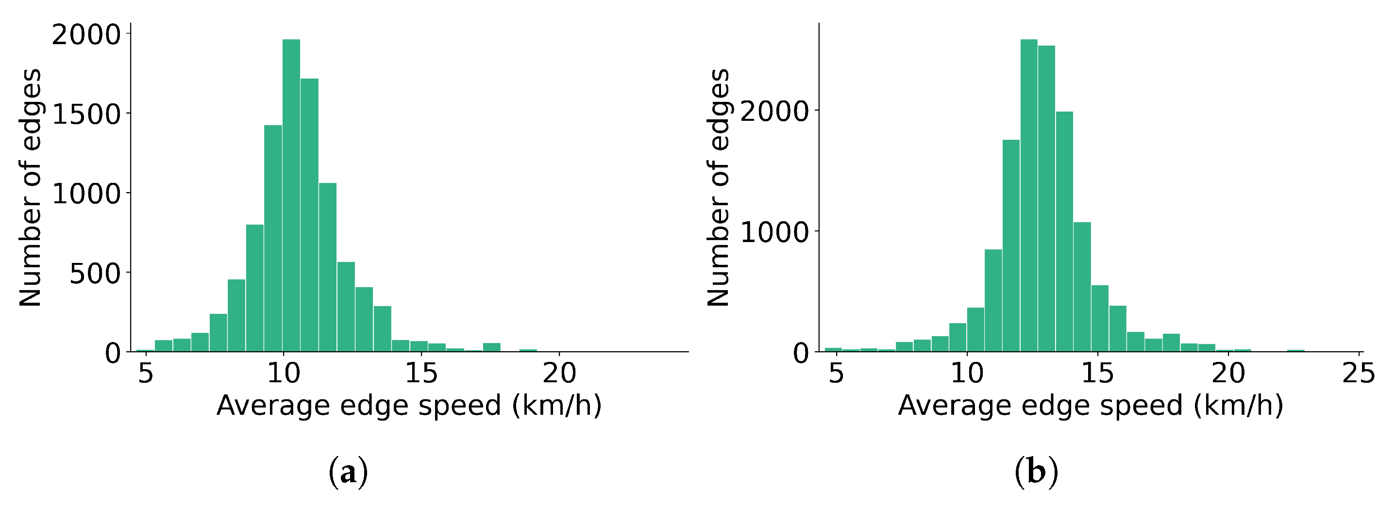
Figure A2.
Distribution of edge speed calculated by the speed averaging method in Florence for (b) bikes, (c) e-bikes, and (a) e-scooters.
Figure A2.
Distribution of edge speed calculated by the speed averaging method in Florence for (b) bikes, (c) e-bikes, and (a) e-scooters.
References
- Ahuja, R.; Tiwari, G. Evolving term “accessibility” in spatial systems: Contextual evaluation of indicators. Transp. Policy 2021, 113, 4–11. [Google Scholar] [CrossRef]
- Hansen, W.G. How accessibility shapes land use. J. Am. Inst. Plan. 1959, 25, 73–76. [Google Scholar] [CrossRef]
- Boisjoly, G.; El-Geneidy, A. Daily fluctuations in transit and job availability: A comparative assessment of time-sensitive accessibility measures. J. Transp. Geogr. 2016, 52, 73–81. [Google Scholar] [CrossRef]
- Wang, Y.; Chen, B.Y.; Yuan, H.; Wang, D.; Lam, W.H.; Li, Q. Measuring temporal variation of location-based accessibility using space-time utility perspective. J. Transp. Geogr. 2018, 73, 13–24. [Google Scholar] [CrossRef]
- Lee, R.J.; Sener, I.N.; Jones, S.N. Understanding the role of equity in active transportation planning in the United States. Transp. Rev. 2017, 37, 211–226. [Google Scholar] [CrossRef]
- Chen, S.Q.; Zhang, J.; Luan, W.L.; Luo, X. A GIS-based study on spatial pattern, accessibility and equity of urban cultural resources: A case study of red culture resources in Shanghai. Buildings 2025, 15, 2268. [Google Scholar] [CrossRef]
- Lopes, A.; Moura, F.; Vale, D. The effects of bike-sharing-transit integration on accessibility equity. J. Transp. Geogr. 2025, 128, 104344. [Google Scholar] [CrossRef]
- Pritchard, J.P.; Tomasiello, D.B.; Giannotti, M.; Geurs, K. Potential impacts of bike-and-ride on job accessibility and spatial equity in São Paulo, Brazil. Transp. Res. Part A Policy Pract. 2019, 121, 386–400. [Google Scholar] [CrossRef]
- Arranz-López, A.; Soria-Lara, J.A.; Witlox, F.; Páez, A. Measuring relative non-motorized accessibility to retail activities. Int. J. Sustain. Transp. 2019, 13, 639–651. [Google Scholar] [CrossRef]
- Knap, E.; Ulak, M.B.; Geurs, K.T.; Mulders, A.; Van Der Drift, S. A composite X-minute city cycling accessibility metric and its role in assessing spatial and socioeconomic inequalities–A case study in Utrecht, the Netherlands. J. Urban Mobil. 2023, 3, 100043. [Google Scholar] [CrossRef]
- Xiao, T.; Ding, T.; Zhang, X.; Tao, Z.; Liu, Y. Spatial Accessibility to Sports Facilities in Dongguan, China: a Multi-Preference Gaussian Two-Step Floating Catchment Area Method: T. Xiao et al. Appl. Spat. Anal. Policy 2022, 15, 1093–1114. [Google Scholar]
- Kent, M.; Karner, A. Prioritizing low-stress and equitable bicycle networks using neighborhood-based accessibility measures. Int. J. Sustain. Transp. 2019, 13, 100–110. [Google Scholar] [CrossRef]
- Gehrke, S.R.; Allam, M.K.; Martinez, A.E.; Holliday, T.M.; Russo, B.J.; Smaglik, E.J. Cycling accessibility to employment, schools, and grocery stores in Arizona metropolitan regions. Int. J. Sustain. Transp. 2025, 19, 180–193. [Google Scholar] [CrossRef]
- Oviedo, D.; Sabogal-Cardona, O. Arguments for cycling as a mechanism for sustainable modal shifts in Bogotá. J. Transp. Geogr. 2022, 99, 103291. [Google Scholar] [CrossRef]
- Boarnet, M.G.; Giuliano, G.; Hou, Y.; Shin, E.J. First/last mile transit access as an equity planning issue. Transp. Res. Part A Policy Pract. 2017, 103, 296–310. [Google Scholar] [CrossRef]
- Cheng, J.; Hu, L.; Lei, D.; Bi, H. How bike-sharing affects the accessibility equity of public transit systems—Evidence from Nanjing. Land 2024, 13, 2200. [Google Scholar] [CrossRef]
- Zhou, R.; Yu, Y.; Wang, Z.; Ke, L.; Zhao, J. How does shared mobility impact metro-based urban commercial travel accessibility and Equity? Transp. Res. Part D. Transp. Environ. 2025, 138, 104523. [Google Scholar] [CrossRef]
- Chaloux, N.; Boisjoly, G.; Grisé, E.; El-Geneidy, A.; Levinson, D. I only get some satisfaction: Introducing satisfaction into measures of accessibility. Transp. Res. Part F Traffic Psychol. Behav. 2019, 62, 833–843. [Google Scholar] [CrossRef]
- Pot, F.J.; Koster, S.; Tillema, T. Perceived accessibility in Dutch rural areas: Bridging the gap with accessibility based on spatial data. Transp. Policy 2023, 138, 170–184. [Google Scholar] [CrossRef]
- Louro, T.; Geurs, K.T.; Grigolon, A.; Cunha, A.L. Cycling accessibility and equity: a systematic literature review. Transp. Rev. 2026, 0, 1–24. [Google Scholar] [CrossRef]
- Zhang, Y.; Shi, Z.; Cao, M.; Xiao, W.; Kong, H. Examining spatial equity of dockless shared bikes and e-bikes for residential and working populations. Transp. Res. Part D. Transp. Environ. 2025, 147, 104922. [Google Scholar] [CrossRef]
- Li, W.; Kamargianni, M. Providing quantified evidence to policy makers for promoting bike-sharing in heavily air-polluted cities: A mode choice model and policy simulation for Taiyuan-China. Transp. Res. Part A Policy Pract. 2018, 111, 277–291. [Google Scholar] [CrossRef]
- Kabak, M.; Erbaş, M.; Çetinkaya, C.; Özceylan, E. A GIS-based MCDM approach for the evaluation of bike-share stations. J. Clean. Prod. 2018, 201, 49–60. [Google Scholar] [CrossRef]
- Kaltenbrunner, A.; Meza, R.; Grivolla, J.; Codina, J.; Banchs, R. Urban cycles and mobility patterns: Exploring and predicting trends in a bicycle-based public transport system. Pervasive Mob. Comput. 2010, 6, 455–466. [Google Scholar] [CrossRef]
- Wang, K.; Akar, G.; Chen, Y.J. Bike sharing differences among millennials, Gen Xers, and baby boomers: Lessons learnt from New York City’s bike share. Transp. Res. Part A Policy Pract. 2018, 116, 1–14. [Google Scholar] [CrossRef]
- Eren, E.; Uz, V.E. A review on bike-sharing: The factors affecting bike-sharing demand. Sustain. Cities Soc. 2020, 54, 101882. [Google Scholar] [CrossRef]
- Hyland, M.; Hong, Z.; de Farias Pinto, H.K.R.; Chen, Y. Hybrid cluster-regression approach to model bikeshare station usage. Transp. Res. Part A Policy Pract. 2018, 115, 71–89. [Google Scholar] [CrossRef]
- Kim, K. Investigation on the effects of weather and calendar events on bike-sharing according to the trip patterns of bike rentals of stations. J. Transp. Geogr. 2018, 66, 309–320. [Google Scholar] [CrossRef]
- Lu, W.; Scott, D.M.; Dalumpines, R. Understanding bike share cyclist route choice using GPS data: Comparing dominant routes and shortest paths. J. Transp. Geogr. 2018, 71, 172–181. [Google Scholar] [CrossRef]
- Mafi, S.; McIntyre, E.; Prior, J.; Mohammadi, A.; Choobchian, P. Riding together: A scoping review of factors influencing user behaviour in bike-sharing systems. Transp. Res. Part F Traffic Psychol. Behav. 2026, 116, 103413. [Google Scholar] [CrossRef]
- Teixeira, J.F.; Silva, C.; Moura e Sá, F. Empirical evidence on the impacts of bikesharing: a literature review. Transp. Rev. 2021, 41, 329–351. [Google Scholar] [CrossRef]
- Li, Q.; Luca, D.; Fuerst, F.; Wei, Z. Success in tandem? The impact of the introduction of e-bike sharing on bike sharing usage. Res. Transp. Econ. 2024, 107, 101476. [Google Scholar] [CrossRef]
- Campbell, A.A.; Cherry, C.R.; Ryerson, M.S.; Yang, X. Factors influencing the choice of shared bicycles and shared electric bikes in Beijing. Transp. Res. Part C Emerg. Technol. 2016, 67, 399–414. [Google Scholar] [CrossRef]
- Staves, C.; Itova, I.; Zapata-Diomedi, B.; De Nazelle, A.; Panter, J.; Gunn, L.; Both, A.; Li, Y.; Saadi, I.; Woodcock, J.; et al. Modelling active travel accessibility at the micro-scale using multi-source built environment data. Comput. Environ. Urban Syst. 2025, 119, 102270. [Google Scholar] [CrossRef]
- Järv, O.; Tenkanen, H.; Salonen, M.; Ahas, R.; Toivonen, T. Dynamic cities: Location-based accessibility modelling as a function of time. Appl. Geogr. 2018, 95, 101–110. [Google Scholar] [CrossRef]
- Balac, M.; Hörl, S. Simulation of intermodal shared mobility in the San Francisco Bay Area using MATSim. In Proceedings of the 2021 IEEE international intelligent transportation systems conference (ITSC). IEEE; 2021; pp. 3278–3283. [Google Scholar]
- Diallo, A.O.; Gloriot, T.; Manout, O. Agent-based simulation of shared bikes and e-scooters: the case of Lyon. Procedia Comput. Sci. 2023, 220, 364–371. [Google Scholar] [CrossRef]
- Diepolder, S.; Araldo, A.; Chouaki, T.; Maiti, S.; Hörl, S.; Antoniou, C. On the computation of accessibility provided by shared mobility. arXiv 2023, arXiv:2307.03148. [Google Scholar]
- Rupi, F.; Freo, M.; Poliziani, C.; Postorino, M.N.; Schweizer, J. Analysis of gender-specific bicycle route choices using revealed preference surveys based on GPS traces. Transp. Policy 2023, 133, 1–14. [Google Scholar] [CrossRef]
- Poliziani, C.; Schweizer, J.; Rupi, F.; et al. Supply and demand analysis of a free floating bike sharing system. Komunikácie 2022, 24, A53–A65. [Google Scholar] [CrossRef]
- Semanjski, I. Passive data for active policy: Evidence-based insights from GNSS and CDR applications in transport planning. J. Transp. Geogr. 2026, 133, 104634. [Google Scholar] [CrossRef]
- Bernieri, G.; Schweizer, J.; Rupi, F. Electric Bikes and Scooters Versus Muscular Bikes in Free-Floating Shared Services: Reconstructing Trips with GPS Data from Florence and Bologna, Italy. Sustainability 2025, 17, 11153. [Google Scholar] [CrossRef]
- Schweizer, J.; Rupi, F.; Poliziani, C. Estimation of link-cost function for cyclists based on stochastic optimisation and GPS traces. IET Intell. Transp. Syst. 2020, 14, 1810–1814. [Google Scholar] [CrossRef]
- Massey, D.S.; Denton, N.A. The dimensions of residential segregation. Soc. Forces 1988, 67, 281–315. [Google Scholar] [CrossRef]
- Schweizer, J. Sumopy: an advanced simulation suite for sumo. In Proceedings of the Simulation of Urban MObility User Conference, 2013; Springer; pp. 71–82. [Google Scholar]
- Schweizer, J.; Schuhmann, F.; Poliziani, C. hybridPy: The Simulation Suite for Mesoscopic and Microscopic Traffic Simulations. In Proceedings of the SUMO Conference Proceedings, 2024; Vol. 5, pp. 39–55. [Google Scholar] [CrossRef]
- Rupi, F.; Poliziani, C.; Schweizer, J. Analysing the dynamic performances of a bicycle network with a temporal analysis of GPS traces. Case Stud. Transp. Policy 2020, 8, 770–777. [Google Scholar] [CrossRef]
- Eom, H. Recent intra-metropolitan patterns of spatial mismatch: Implications for black suburbanization and the changing geography of mismatch. Growth Change 2023, 54, 421–445. [Google Scholar] [CrossRef]
- Bernieri, G.; Rupi, F.; Schweizer, J. It Is How You Build Them: Attractivity of Separated and Mixed-Use Cycling Infrastructure in Bologna Using Long-Term Time Series. Infrastructures 2026, 11, 18. [Google Scholar] [CrossRef]
- How fair is the allocation of bike-sharing infrastructure? Framework for a qualitative and quantitative spatial fairness assessment. Transp. Res. Part A Policy Pract. 2020, 140, 299–319. [CrossRef]
- Li, G.; Chen, Y.; Wang, Y.; Nie, P.; Yu, Z.; He, Z. City-scale synthetic individual-level vehicle trip data. Sci. Data 2023, 10, 96. [Google Scholar] [CrossRef] [PubMed]
- Casaburi, P.; Dall’Amico, L.; Gozzi, N.; Kalimeri, K.; Sapienza, A.; Schifanella, R.; Matteo, T.D.; Ferres, L.; Mazzoli, M. Resilience of mobility network to dynamic population response across COVID-19 interventions: Evidences from Chile. PLoS Comput. Biol. 2025, 21, e1012802. [Google Scholar] [CrossRef] [PubMed]
- Horner, M.W.; Marion, B.M. A spatial dissimilarity-based index of the jobs—housing balance: conceptual framework and empirical tests. Urban Stud. 2009, 46, 499–517. [Google Scholar] [CrossRef]
- Qi, Y.; Lindsey, G. The persistence of spatial mismatch in metropolitan America: New evidence on disparities facing Black workers and low-wage workers. J. Urban Aff. 2025, 47, 3708–3732. [Google Scholar] [CrossRef]
- Nguyen, N.A.; Poliziani, C.; Schweizer, J.; Rupi, F.; Vivaldo, V. Towards a daily agent-based transport system model for microscopic simulation, based on peak hour OD matrices. In Proceedings of the International Conference on Computational Science and Its Applications, 2024; Springer; pp. 331–345. [Google Scholar]
- Staves, C.; Itova, I.; Zapata-Diomedi, B.; de Nazelle, A.; Panter, J.; Gunn, L.; Both, A.; Li, Y.; Saadi, I.; Woodcock, J.; et al. Modelling active travel accessibility at the micro-scale using multi-source built environment data. Comput. Environ. Urban Syst. 2025, 119, 102270. [Google Scholar] [CrossRef]
- Roosta, A.; Kaths, H.; Barthauer, M.; Erdmann, J.; Flötteröd, Y.P.; Behrisch, M. The state of bicycle modeling in sumo. In Proceedings of the SUMO Conference Proceedings, 2023; Vol. 4, pp. 55–64. [Google Scholar]
- Shen, Q. Location characteristics of inner-city neighborhoods and employment accessibility of low-wage workers. Environ. Plan. B Plan. Des. 1998, 25, 345–365. [Google Scholar] [CrossRef]
- Van Wee, B.; Hagoort, M.; Annema, J.A. Accessibility measures with competition. J. Transp. Geogr. 2001, 9, 199–208. [Google Scholar] [CrossRef]
- Schweizer, J.; Bernieri, G.; Rupi, F. Network Saturation: Key Indicator for Profitability and Sensitivity Analyses of PRT and GRT Systems. Future Transp. 2025, 5, 104. [Google Scholar] [CrossRef]
- Karakaya, A.S.; Stef, I.A.; Köhler, K.; Heinovski, J.; Dressler, F.; Bermbach, D. Achieving realistic cyclist behavior in SUMO using the SimRa dataset. Comput. Commun. 2023, 205, 97–107. [Google Scholar] [CrossRef]
- Heidary, B.; Schweizer, J.; Nguyen, N.A.; Rupi, F.; Poliziani, C. An Efficient Parallelization of Microscopic Traffic Simulation. Appl. Sci. 2025, 15, 6960. [Google Scholar] [CrossRef]
Figure 1.
Example of speed estimation on edge , traversed by trips and .
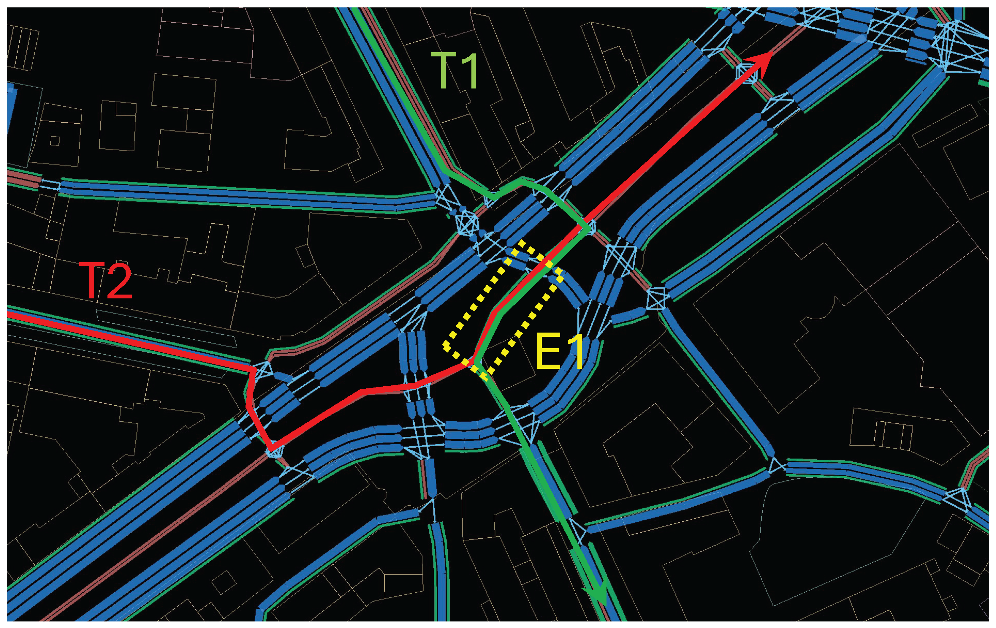
Figure 2.
Spatial coverage of the speed-assignment procedure in (a) Bologna and (b) Florence. Red edges received an empirical edge-specific average speed, yellow edges were traversed by one to seven accepted trips and received the fallback speed, and grey edges had no accepted observations and received the fallback speed. The black rectangle identifies the accessibility study area.
Figure 2.
Spatial coverage of the speed-assignment procedure in (a) Bologna and (b) Florence. Red edges received an empirical edge-specific average speed, yellow edges were traversed by one to seven accepted trips and received the fallback speed, and grey edges had no accepted observations and received the fallback speed. The black rectangle identifies the accessibility study area.
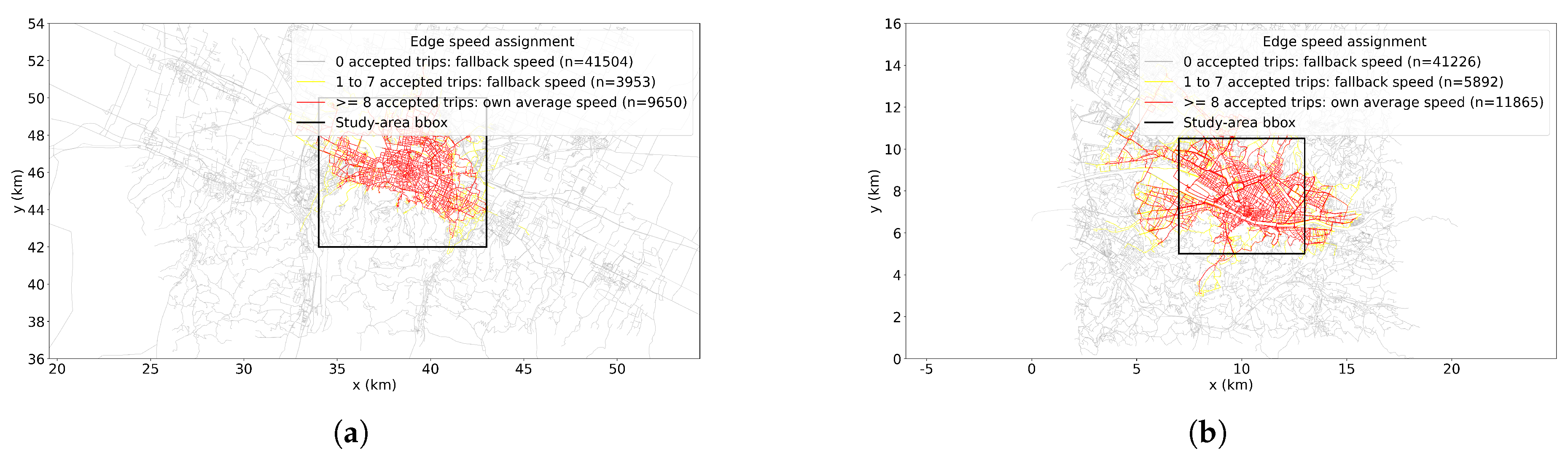
Figure 3.
Potential Accessibility in Bologna by (a) bike and (b) e-bike. Values shown as percentile of the maximum value measured for each mode.
Figure 3.
Potential Accessibility in Bologna by (a) bike and (b) e-bike. Values shown as percentile of the maximum value measured for each mode.
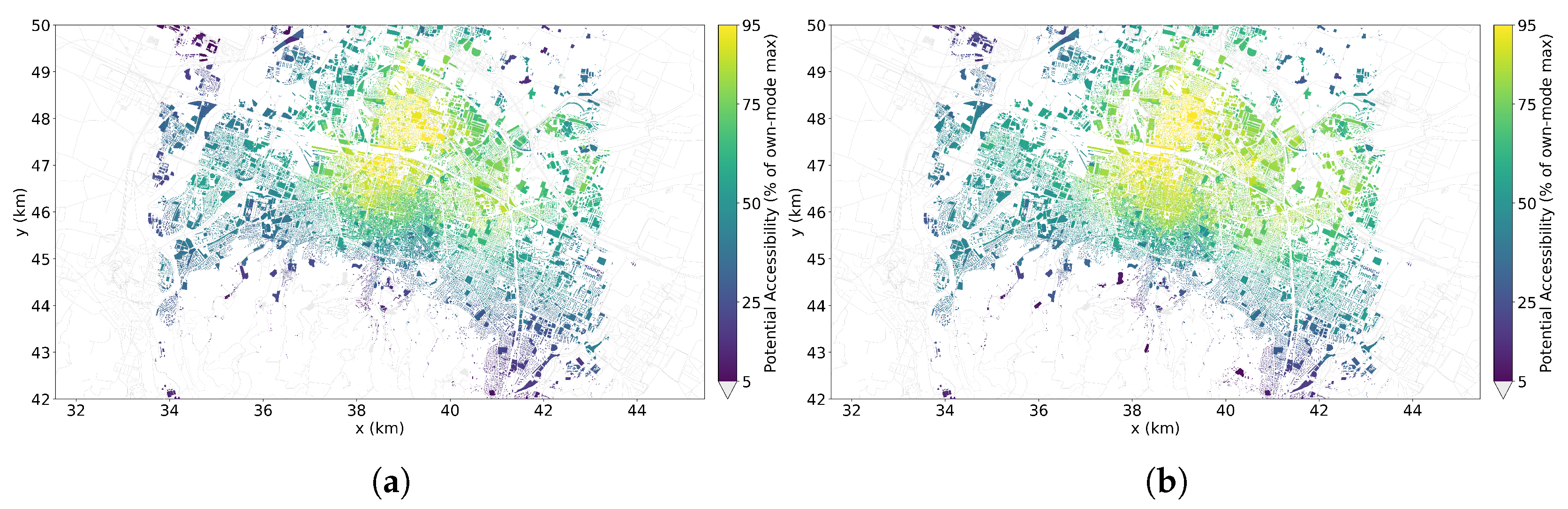
Figure 4.
Vehicle Supply in Bologna based on the trip-end GNSS points of (a) bike and (b) e-bike trips within a 3-min walking-time threshold. Values shown as percentile of the maximum value measured for each mode.
Figure 4.
Vehicle Supply in Bologna based on the trip-end GNSS points of (a) bike and (b) e-bike trips within a 3-min walking-time threshold. Values shown as percentile of the maximum value measured for each mode.
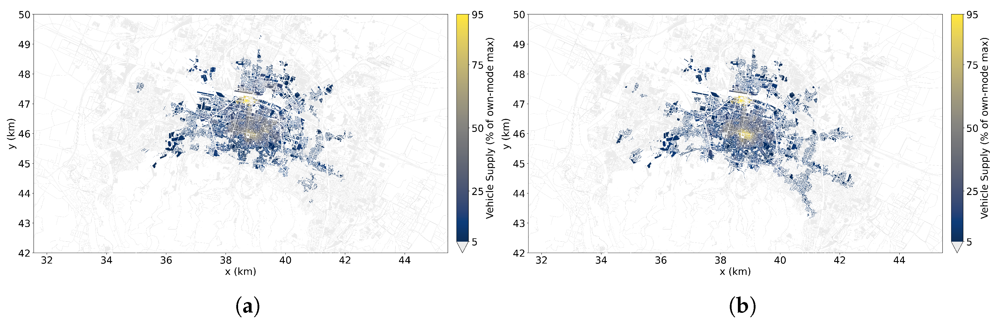
Figure 5.
Effective Accessibility in Bologna of (a) bikes, and (b) e-bikes. Values shown as percentile of the maximum value measured for each mode.
Figure 5.
Effective Accessibility in Bologna of (a) bikes, and (b) e-bikes. Values shown as percentile of the maximum value measured for each mode.
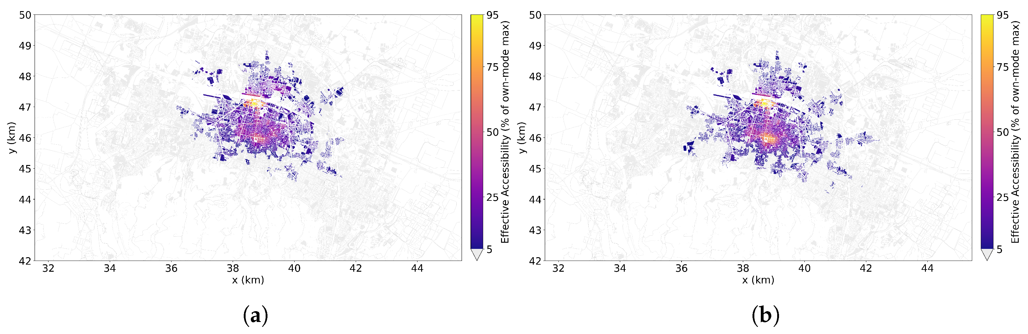
Figure 6.
Potential Accessibility in Florence by (a) bike and (b) e-bike, and (c) e-scooter. Values shown as percentile of the maximum value measured for each mode.
Figure 6.
Potential Accessibility in Florence by (a) bike and (b) e-bike, and (c) e-scooter. Values shown as percentile of the maximum value measured for each mode.
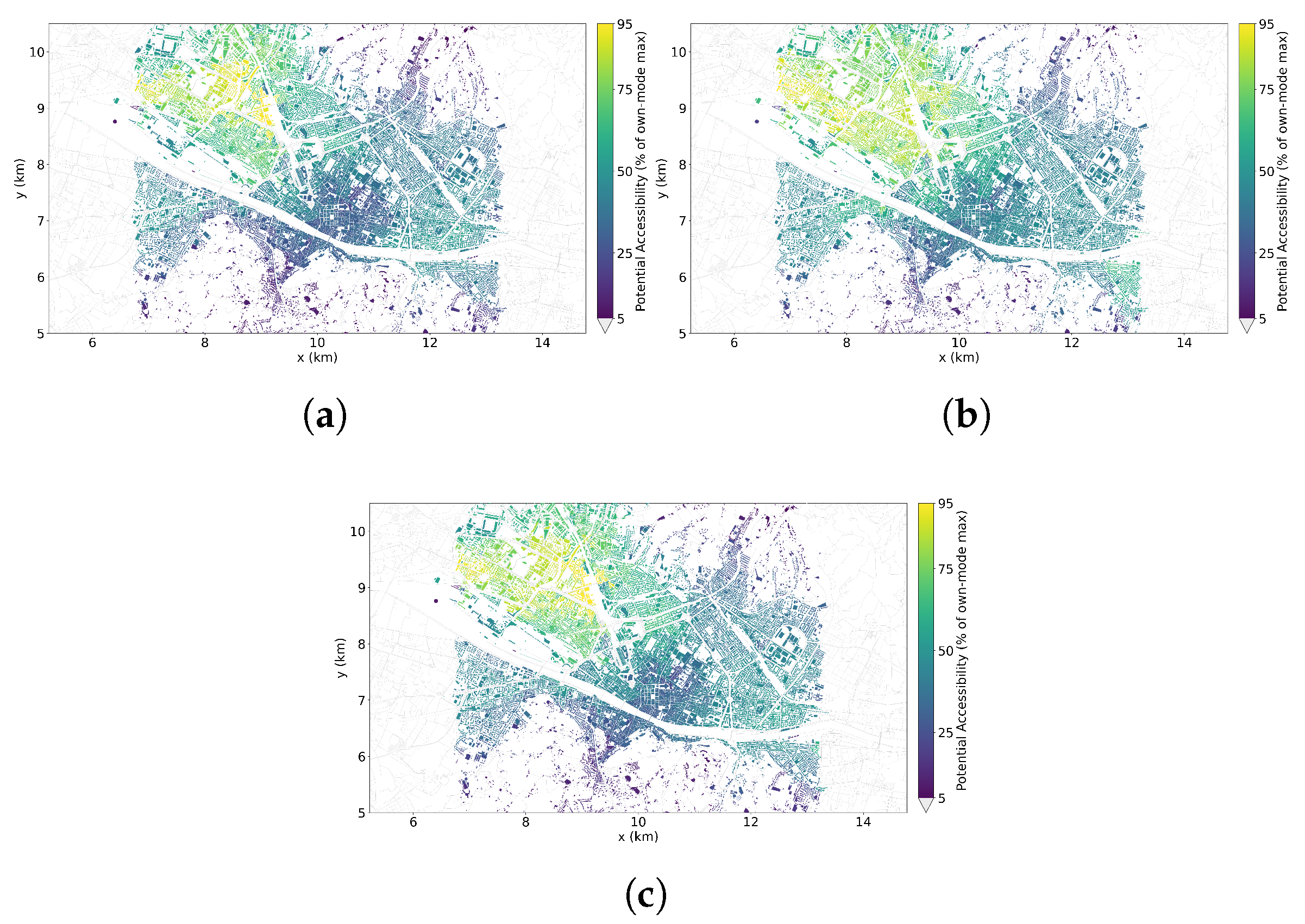
Figure 7.
Vehicle Supply in Florence based on the trip-end GNSS points of (a) bike, (b) e-bike, and (c) e-scooter trips within a 3-min walking-time threshold. Values shown as percentile of the maximum value measured for each mode.
Figure 7.
Vehicle Supply in Florence based on the trip-end GNSS points of (a) bike, (b) e-bike, and (c) e-scooter trips within a 3-min walking-time threshold. Values shown as percentile of the maximum value measured for each mode.
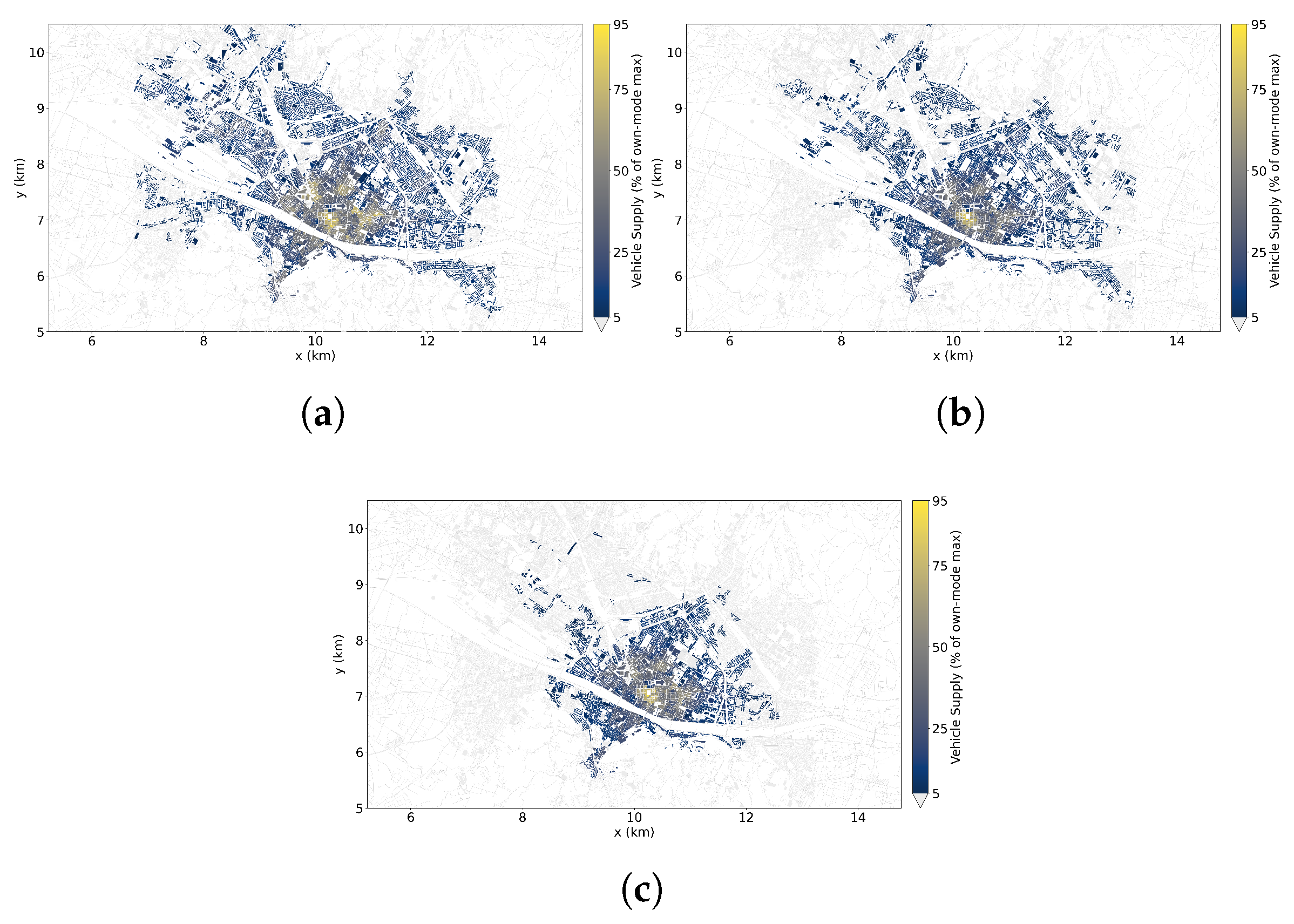
Figure 8.
Effective Accessibility in Florence of (a) bikes, (b) e-bikes, and (c) e-scooters. Values shown as percentile of the maximum value measured for each mode.
Figure 8.
Effective Accessibility in Florence of (a) bikes, (b) e-bikes, and (c) e-scooters. Values shown as percentile of the maximum value measured for each mode.
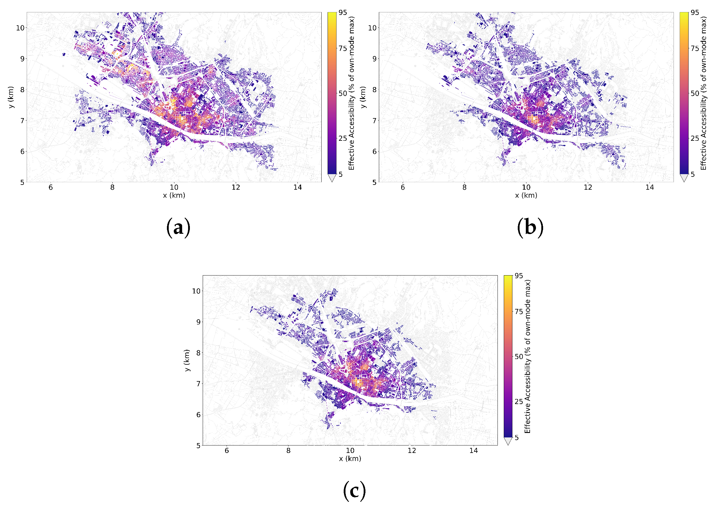

Table 1.
Trip-filtering results.
| Case Study | Filtering Parameter | Retaining Range | Valid Trips | ||
|---|---|---|---|---|---|
| Bologna | Trip Length [m] | x | 77.4% | ||
| x | 93.8% | ||||
| Trip Duration [s] | x | 79.6% | |||
| x | 95.9% | ||||
| Av. Trip Speed [m/s] | x | 86.0% | |||
| x | 97.4% | ||||
| Trip L./Eucl. Distance | x | 55.2% | |||
| Rush Hour | 7–9; | 16–18 | 19.3% | ||
| Total Retained | 106,884 (5.5%) | ||||
| Florence | Trip Length [m] | x | 84.92% | ||
| x | 90.24% | ||||
| Trip Duration [s] | x | 71.39% | |||
| x | 96.39% | ||||
| Av. Trip Speed [m/s] | x | 90.59% | |||
| x | 93.16% | ||||
| Trip L./Eucl. Distance | x | 46.01% | |||
| Rush Hour | 7–9; | 16–18 | 21.02% | ||
| Total Retained | 91,702 (4.0%) | ||||
Table 2.
Aggregate accessibility scores and normalization quantities by shared-micromobility mode for Bologna.
Table 2.
Aggregate accessibility scores and normalization quantities by shared-micromobility mode for Bologna.
| Case Study | Mode | Fleet Size | Total Trips |
||||
|---|---|---|---|---|---|---|---|
| Bologna | Bicycle | 342.8 | 166,824 | ||||
| E-bike | 2240.7 | 1,778,537 |
Table 3.
Spatial alignment indicators between Potential Accessibility and Vehicle Supply for the case of Bologna.
Table 3.
Spatial alignment indicators between Potential Accessibility and Vehicle Supply for the case of Bologna.
| Case Study | Mode | D | ||||
|---|---|---|---|---|---|---|
| Bologna | Bicycle | 0.658 | 0.290 | 0.524 | 0.631 | 0.438 |
| E-bike | 0.605 | 0.287 | 0.501 | 0.570 | 0.441 |
Table 4.
Aggregate accessibility scores and normalization quantities by shared-micromobility mode for Florence.
Table 4.
Aggregate accessibility scores and normalization quantities by shared-micromobility mode for Florence.
| Case Study | Mode | Fleet Size Index |
Total Trips |
||||
|---|---|---|---|---|---|---|---|
| Florence | Bicycle | 1375.9 | 508,580 | ||||
| E-bike | 2047.6 | 1,502,631 | |||||
| E-scooter | 397.8 | 263,887 |
Table 5.
Spatial alignment indicators between Potential Accessibility and Vehicle Supply for the case of Florence.
Table 5.
Spatial alignment indicators between Potential Accessibility and Vehicle Supply for the case of Florence.
| Case Study | Mode | D | ||||
|---|---|---|---|---|---|---|
| Florence | Bicycle | 0.163 | 0.007 | 0.050 | 0.271 | 0.436 |
| E-bike | 0.146 | 0.000 | 0.018 | 0.243 | 0.465 | |
| E-scooter | 0.116 | 0.000 | 0.028 | 0.220 | 0.567 |
Disclaimer/Publisher’s Note: The statements, opinions and data contained in all publications are solely those of the individual author(s) and contributor(s) and not of MDPI and/or the editor(s). MDPI and/or the editor(s) disclaim responsibility for any injury to people or property resulting from any ideas, methods, instructions or products referred to in the content. |
© 2025 by the authors. Licensee MDPI, Basel, Switzerland. This article is an open access article distributed under the terms and conditions of the Creative Commons Attribution (CC BY) license.
Copyright: This open access article is published under a Creative Commons CC BY 4.0 license, which permit the free download, distribution, and reuse, provided that the author and preprint are cited in any reuse.