

Submitted:
07 July 2026
Posted:
08 July 2026
You are already at the latest version
Abstract
Aggregate livability indices consistently rank Fargo, North Dakota among the most livable small-to-mid-sized U.S. cities, yet city-level scores obscure whether favorable average performance reflects equitable neighborhood-level access to essential amenities. This study conducts the first tract-level spatial accessibility analysis in Fargo, examining road network-based access to grocery stores, healthcare facilities, and parks across all 38 census tracts using road network-based nearest-facility assignment, a Composite Accessibility Index (CAI), and Gini coefficients. Results reveal that despite strong aggregate rankings, approximately 9,700 residents (8.0% of the study-area population of 121,219) reside in the bottom composite accessibility quartile. Healthcare exhibits the greatest inequality (Gini = 0.093); the worst-served peripheral tract records a CAI of 0, with network distances ranging from 6.9 to 7.8 miles across all three amenity types simultaneously. A sensitivity analysis confirms robustness across threshold choices. These findings indicate that substantial intra-urban disparities can persist within highly ranked cities, arguing for spatially disaggregated, equity-oriented livability scoring.
Keywords:
spatial accessibility
; urban livability
; Gini coefficient
; census tract
; nearest-facility analysis
; composite accessibility index
; Fargo
; mid-sized cities
; neighborhood inequality
1. Introduction
Cities around the world are increasingly evaluated through the lens of livability, a multidimensional concept that encompasses the quality of the urban environment, the availability of essential services, and the overall wellbeing of residents [1]. Over the past two decades, a proliferation of aggregate livability indices produced by organizations such as the Economist Intelligence Unit, Mercer, and various academic and commercial platforms have made city-level rankings a prominent feature of urban policy discourse, real estate decision-making, and civic identity [1,2]. These rankings provide comparable snapshots of urban performance and have shaped how residents, policymakers, investors, and prospective migrants perceive cities.
Fargo, North Dakota exemplifies the kind of mid-sized American city that performs well on aggregate livability measures. North Dakota consistently ranks among the most livable and affordable states in the United States [3]. Fargo has appeared on multiple small-city livability assessments as a regional hub with strong employment, healthcare infrastructure, and quality of life indicators [4]. The American Association of Retired Persons (AARP) Livability Index (2025) assigns Fargo an overall score in the top half of U.S. communities [5], while Livability.com (2026) assigns the city a LivScore of 716 out of 1000, ranking it highest for housing, education, and transportation [6]. AreaVibes (2025) assigns Fargo an exceptional livability score of 85 out of 100, ranking it first among all North Dakota cities and better than 97% of U.S. communities, substantially above both the North Dakota state average (62) and the national average (63) [7]. As the most populous city in North Dakota and the economic and cultural center of the Fargo-Moorhead metropolitan area, Fargo’s favorable aggregate rankings reflect real strengths: a diversified economy anchored by healthcare and higher education, consistently low unemployment, and a growing population that has nearly tripled since 1980. For a city of its size, Fargo’s aggregate performance on standard livability measures is genuinely impressive. Yet aggregate livability rankings, by design, produce a single summary score for an entire city [8], a statistical artifact that obscures the spatial variation in conditions experienced by residents across different neighborhoods. Notably, the AARP Livability Index (2025) itself reveals zip code scores within Fargo ranging from 23 to 75 out of 100, a within-city range of 52 points, suggesting that even within a high-performing city, meaningful neighborhood-level differences in livability conditions exist [5]. A city’s average accessibility to grocery stores, healthcare, and parks tells us nothing about which neighborhoods are closer to these amenities, and which are farther away, or whether that proximity is evenly distributed across the city's census tracts. The question of livability for whom aggregate indices are structurally incapable of answering has become increasingly central to urban scholarship [9]. As cities grow and their populations diversify, the gap between aggregate performance and neighborhood-level reality may widen in ways that standard ranking systems fail to detect [10,11].
This concern is particularly salient for small and mid-sized American cities like Fargo. The urban livability literature has disproportionately focused on large metropolitan areas and cities in East Asia and Europe, leaving the neighborhood-level dynamics of smaller regional hubs largely unstudied [12]. When Fargo performs well on national livability indices, it is rarely clear whether that performance reflects evenly distributed access across the city's neighborhoods. Strong citywide averages can mask a divide in which well-served central areas drive the aggregate score, while peripheral neighborhoods face systematically longer travel distances to essential services and infrastructure.
This study addresses these gaps by conducting the first tract-level spatial accessibility analysis of urban livability in Fargo, North Dakota. Using road network-based nearest-facility shortest-path analysis applied to three core amenity categories—grocery stores, healthcare facilities, and parks across all 38 census tracts in the city, the study constructs normalized accessibility scores, a Composite Accessibility Index (CAI), and Gini coefficients of accessibility inequality for each amenity type and for the composite measure. Population-weighted Gini coefficients also quantify the share of Fargo’s residents experiencing the lowest levels of amenity access. The resulting neighborhood-level findings are then compared against the city’s favorable aggregate livability rankings, including an AARP Livability Index score in the top half of U.S. communities (AARP, 2025) and a LivScore of 716 out of 1000 on Livability.com (2026) to assess whether those rankings accurately reflect the spatial distribution of urban opportunity within the city.
The study is guided by three research questions. First, how does spatial accessibility to grocery stores, healthcare facilities, and parks vary across Fargo’s 38 census tracts? Second, how unequal is the distribution of accessibility across tracts, as measured by the Gini coefficient, and how many residents live in the least accessible areas of the city? Third, does Fargo’s strong performance on aggregate livability indices hold up at the neighborhood level, or do tract-level findings reveal spatial disparities that aggregate rankings obscure?
The remainder of this paper is structured as follows. Section 2 presents a systematic literature review organized around four themes identified through keyword co-occurrence analysis: livability index construction and measurement, spatial accessibility and urban amenities, urban livability frameworks and planning, and neighborhood inequality and spatial disparities. Section 3 describes the study area and data sources. Section 4 presents the methodology, including road network-based nearest-facility assignment, normalization procedure, composite index construction, and Gini coefficient computation. Section 5 reports the empirical results for each amenity category and for the composite index. Section 6 discusses the findings in the context of the existing literature and their implications for urban planning and livability measurement. Section 7 concludes with a summary of contributions and directions for future research.
2. Literature Review
2.1. Review Methodology
This review was conducted systematically to identify, map, and synthesize the existing scholarship on urban livability measurement, spatial accessibility, and neighborhood-level inequality. Literature was retrieved from four databases: Scopus, Web of Science, Science Direct, and Google Scholar (via Publish or Perish) [13], using the primary search string:
(“livability index” OR “quality of life index” OR “urban livability”) AND (city OR cities OR urban) AND (measurement OR assessment OR indicator OR ranking)
Searches were conducted in May 2026, with results restricted to English-language peer-reviewed journal articles published between 2010 and 2026. The initial search returned 2,174 records across all databases (Scopus = 500, Web of Science = 530, Science Direct = 149, Google Scholar = 995). Following deduplication using DOI and title matching, 670 unique records remained. All 670 records underwent abstract screening against predetermined inclusion criteria: the paper must (1) address urban or city contexts, (2) directly engage with livability measurement, accessibility assessment, or spatial inequality, and (3) employ empirical or methodological approaches. Medical, clinical, and purely ecological studies were excluded. Following screening, 159 records were retained for thematic analysis. The screening and deduplication process is documented in accordance with PRISMA guideline [14].
To identify thematic structures within the retained literature, keyword co-occurrence analysis was performed using VOSviewer (version 1.6.20) [15,16]. Author keywords were extracted from the 159 screened records. Prior to analysis, a thesaurus file was applied to exclude the study's own search terms (e.g., “urban livability,” “livability index,” “quality of life index,” “urban”) as stop-words, preventing these terms from dominating the network and obscuring the underlying thematic signal that emerges organically from the literature.
A sensitivity analysis was conducted across four co-occurrence thresholds to assess the stability and interpretability of the cluster structure (Table 1). At lower thresholds (5 and 10), the network captured a larger number of keywords but fragmented into six or seven clusters that diverged from a clean four-theme structure. At the highest threshold (20), the network became too sparse to capture all four conceptual themes. A minimum co-occurrence threshold of 15 produced the most stable and interpretable structure, yielding 33 items organized into 4 clusters with 465 links and a total link strength of 5,678 (Figure 1). The resulting network revealed four thematic clusters that align directly with the conceptual structure of this review: (1) livability index construction and measurement, anchored by the keywords development, dimension, and life index; (2) spatial accessibility and urban amenities, anchored by accessibility and green space; (3) urban livability frameworks and planning, anchored by framework, district, and urban planning; and (4) neighborhood satisfaction and spatial inequality, anchored by satisfaction, neighborhood, and neighborhood satisfaction. These four clusters serve as the organizing framework for the thematic synthesis presented in Section 2.2
2.2. Thematic Clusters
2.2.1. Theme 1: Livability Measurement and Index Construction
This theme focuses on the technical construction and validation of livability indices, how livability is defined, operationalized, and aggregated into measurable scores at the city or regional level This cluster (red in Figure 1), anchored by the keywords “development,” “dimension,” and “life index,” reflects a substantial body of literature on livability index construction and quality-of-life measurement. Urban livability has emerged as a central concept in urban planning and policy discourse, yet its measurement remains methodologically contested. Early frameworks approached livability as a composite of objective socioeconomic and environmental conditions, producing city-level indices designed to rank and compare urban areas [17,18]. These aggregate indices, exemplified by the Economist Intelligence Unit’s Global Liveability Index, Mercer’s Quality of Living Survey, and the CoworkingCafe small city rankings, have gained significant traction among policymakers and the public, offering accessible benchmarks for comparing urban performance across jurisdictions [19].
However, a growing body of scholarship has questioned the methodological foundations and practical utility of aggregate livability indices. Critics argue that city-level averages conceal substantial intra-urban variation, masking neighborhoods where residents experience conditions far below or above the city mean [20,21]. The question of livability for whom has become increasingly central to this debate, with researchers demonstrating that infrastructural preferences embedded in popular indices systematically favor certain populations while rendering others invisible [20]. This critique is particularly salient for small and mid-sized cities, where aggregate rankings may reflect the performance of a compact urban core while peripheral neighborhoods remain underserved.
Methodologically, the construction of composite livability indices has evolved considerably. Early approaches relied on simple weighted averages of socioeconomic indicators, while more recent frameworks have adopted sophisticated aggregation methods including Principal Component Analysis [22,23], Entropy Weight TOPSIS [24], and Analytic Hierarchy Process [25]. These methodological advances have improved the robustness of composite indices, yet most continue to operate on the city or regional scale, leaving the neighborhood level largely unexamined.
2.2.2. Theme 2: Spatial Accessibility Measurement and Methods
This theme focuses on the methods and tools used to measure spatial accessibility to specific urban amenities, how proximity, distance, and catchment areas are quantified at the neighborhood level This cluster (blue in Figure 1), anchored by the keywords “accessibility” and “green space” captures research on spatial accessibility and access to urban amenities. Spatial accessibility, the ease with which residents can reach essential services and amenities, has emerged as one of the most operationally tractable dimensions of urban livability. A substantial body of research has developed and refined methods for measuring accessibility to specific amenity types, with food access, healthcare facilities, and green spaces receiving particular attention [26,27,28].
Early accessibility research relied on simple distance or travel-time thresholds, classifying areas as served or underserved based on proximity to facilities. More sophisticated approaches subsequently emerged, including the Two-Step Floating Catchment Area (2SFCA) method, which accounts for both service supply and the demand generated by surrounding populations [26,29]. Further refinements have incorporated multimodal transportation networks, real-time navigation data, and distance-decay functions that better reflect how accessibility diminishes with increasing travel time [17]. Point of Interest (POI) data has become a cornerstone of contemporary accessibility research, enabling systematic identification and mapping of amenity locations across urban areas [30,31].
A cross-cutting finding in the spatial accessibility literature holds that amenity availability does not guarantee equitable access. Fei et al. (2025) demonstrated across six global cities that increasing the quantity of green space does not reliably reduce spatial inequality in access [32], a finding with direct implications for policy frameworks that measure livability through amenity counts rather than distributional outcomes. This insight motivates the accessibility-based approach adopted in the present study.
2.2.3. Theme 3: Urban Planning Frameworks and Governance
While Theme 1 addresses measurement, this theme examines the broader planning frameworks and governance structures within which livability is understood, pursued, and translated into urban policy This cluster (green in Figure 1), anchored by the keywords “framework,” “district,” and “urban planning,” captures research on planning frameworks and the broader urban environment. Beyond index construction and accessibility measurement, a third strand of scholarship has developed comprehensive frameworks for understanding how urban form, planning decisions, and governance structures shape livability outcomes. These frameworks situate livability within broader debates about sustainable urban development, human-centered planning, and the relationship between the built environment and residents’ wellbeing [1,33].
A prominent contribution of this literature is the 15-minute city concept, which proposes that urban livability can be operationalized through residents’ ability to access essential services within a 15-minute walk or cycle from home [28,34]. Comparative livability research has demonstrated that frameworks developed in large metropolitan contexts do not transfer seamlessly to smaller urban areas. Small and mid-sized cities face distinct planning challenges, including limited transit infrastructure, lower density amenity provision, and greater automobile dependence, that require adapted analytical approaches [12,35]. Yet the literature on small city livability remains comparatively thin, with most empirical frameworks developed and validated in large metropolitan contexts.
2.2.4. Theme 4: Neighborhood Inequality and Spatial Justice
While Theme 2 addresses measurement methods, this theme examines the distributional outcomes of spatial accessibility, who benefits, who is disadvantaged, and how spatial inequality maps onto broader socioeconomic and racial patterns This cluster (yellow in Figure 1), anchored by the keywords “satisfaction,” “neighborhood,” and “neighborhood satisfaction,” captures research on subjective wellbeing and neighborhood-level disparities. The fourth thematic cluster centers on neighborhood-level inequality and spatial disparities in livability outcomes. This literature directly challenges the aggregate city-level focus of conventional livability indices, demonstrating that the urban experience varies profoundly across neighborhoods within the same city, often in ways that correlate with socioeconomic disadvantages and racial or ethnic composition [36,37].
A consistent finding across this literature is the center-periphery pattern in the distribution of livability. Studies conducted in cities ranging from Warsaw to Ningbo to Mexico City have documented higher livability scores in central urban areas, with declining access to services and amenities as distance from the city center increases [34,38]. Environmental justice perspectives have enriched this literature by connecting spatial inequality in livability to broader patterns of socioeconomic and racial disadvantages. Research has consistently demonstrated that low-income neighborhoods and communities of color experience disproportionately lower access to parks, healthcare, and food retail, compounding other dimensions of disadvantage [39,40].
2.3. Research Gap and Study Motivation
The four thematic clusters identified through this review converge on a clear and consequential gap in the existing literature. First, while livability index methodology has advanced considerably, most assessments remain anchored at the city or regional scale, rendering neighborhood-level variation invisible. Second, spatial accessibility research has developed sophisticated methods for measuring amenity access but has concentrated primarily on large metropolitan areas in East Asia and Europe, leaving small and mid-sized American cities largely unstudied. Third, neighborhood inequality research has demonstrated the importance of fine-grained spatial analysis but has rarely connected these findings to the aggregate city rankings that drive public perception and policy. Fourth, no study has examined whether Fargo, North Dakota, a mid-sized regional hub that performs well on multiple aggregate livability indices, exhibits the spatial accessibility disparities documented in comparable urban contexts elsewhere.
This study addresses these gaps by conducting a tract-level spatial accessibility analysis of three core amenity categories: grocery stores, healthcare facilities, and parks across Fargo’s census tracts, comparing the resulting neighborhood-level accessibility scores with the city’s strong aggregate livability rankings. In doing so, it contributes to a growing body of scholarship that challenges the adequacy of city-level livability measurement and advocates for spatially disaggregated approaches that reveal the unequal distribution of urban opportunity within, rather than merely between, cities.
3. Study Area and Data
3.1. Study Area
Fargo, North Dakota serves as the empirical case study for this research. As the most populous city in North Dakota, Fargo had a population of 125,990 at the 2020 census and an estimated 136,285 residents in 2024 [41], making it a prototypical mid-sized American city. The city covers a total land area of 50.83 square miles (131.66 km2) and sits on the western bank of the Red River of the North, in the flat terrain of the Red River Valley [42].
Fargo serves as the primary cultural, retail, healthcare, educational, and economic hub for southeastern North Dakota and northwestern Minnesota. Its regional significance is reflected in the composition of its largest employers: Sanford Health (9,229 employees) and Essentia Health (1,946 employees) anchor the city’s healthcare sector, while North Dakota State University (2,267 employees) anchors its educational identity [43]. The Fargo-Moorhead metropolitan area had a combined population of 261,600 people and is projected to reach approximately 340,000 by 2045 [44].
The city’s demographic profile has diversified substantially over the past two decades. The proportion of non-Hispanic White residents declined from 93.4% in 2000 to 77.8% in 2020, while the Black or African American population grew from 1.0% to 8.6% over the same period, attributable in part to refugee resettlement programs. As of the 2022 American Community Survey, the median household income in Fargo was $64,432, with approximately 13.3% of the population living at or below the federal poverty line. Fargo’s spatial structure follows a classic grid pattern, with growth historically concentrated in the south and southwest of the city [44].
3.2. Spatial Units of Analysis
Census tract boundaries were obtained from the U.S. Census Bureau’s TIGER/Line 2024 dataset in the NAD83 geographic coordinate system (EPSG:4269) [45]. To isolate the analysis to the Fargo municipal area, the full tract dataset was spatially clipped using the official Fargo city limits shapefile, downloaded from the City of Fargo ArcGIS Hub [46]. The resulting subset comprised 38 census tracts covering the full extent of the city. Each census tract polygon was converted to a centroid point serving as the representative population-demand location in the accessibility analysis.
Population data were obtained from the U.S. Census Bureau's ACS 5-Year Estimates (2019–2023; Table B01003) [47] for all census tracts in Cass County and joined to the 38 tracts comprising the Fargo study area using standardized GEOID identifiers, yielding an initial study-area population total of 167,235. A diagnostic comparison of each tract’s clipped land area against its official Census land area (ALAND) revealed that 9 of the 38 tracts have less than 25% of their land area within Fargo’s city limits, and should not be assigned their full, un-apportioned ACS tract population via GEOID join. This was addressed by applying a first-order areal-interpolation correction that scaled each tract’s population by the fraction of its land area within the city boundary, to all 38 tracts. This simple remediation yielded an adjusted study-area population of 121,219, within normal range of the 2020 Decennial city population (125,990). This adjusted total was used as the population base for all population-weighted analyses reported in this study.
3.3. Amenity Data and Road Network Data
The three amenity categories selected for this study—grocery stores, healthcare facilities, and parks—represent the core dimensions of essential urban service provision most consistently identified in the livability and neighborhood wellbeing literature. Access to grocery stores is a fundamental determinant of food security and daily sustenance, with research consistently linking grocery proximity to diet quality and neighborhood deprivation [48,49,50]. Access to healthcare facilities reflects the availability of preventive and curative medical services that underpin physical health outcomes across the life course, with more disadvantaged neighborhoods consistently experiencing lower geographic access to care [51,52]. Access to parks and green spaces supports physical activity, mental health, and environmental quality, with evidence demonstrating that proximity to parks is associated with reduced depression, lower stress, and improved physical health among urban residents [53,54,55].
Locations for all three amenity categories, grocery stores, healthcare facilities, and parks, were extracted from OSM using the QuickOSM plugin (version 2.5.3) in QGIS (version 3.34.14-Prizren). For each category, a key-value query was run with the search extent restricted to the Fargo city limits. Resulting point and polygon feature layers were merged into a single dataset; polygon features were converted to centroid points to provide a consistent, single representative location for each facility. Each merged dataset was clipped to the Fargo city boundary and subjected to visual inspection and quality control to identify and remove duplicate representations of the same establishment.
To assess the potential influence of boundary effects on the accessibility analysis, amenity data were extracted within a 10-mile buffer surrounding the Fargo city limits. The buffered map indicated that a limited number of amenities are located outside the Fargo boundary, with the majority concentrated east of the city in the neighboring municipality of Moorhead, Minnesota, and a few isolated facilities in surrounding areas. These external amenities lie outside the administrative jurisdiction of Fargo and are separated by municipal and, in the case of Moorhead, state boundaries. Moreover, the number of external facilities is small relative to the amenities located within Fargo and is unlikely to materially alter the observed accessibility patterns, consistent with findings that boundary effects on spatial accessibility measures tend to be minor when cross-boundary facility density is low [56,57]. Consequently, the Fargo city boundary remains an appropriate and defensible spatial extent for evaluating intra-urban accessibility to grocery stores, healthcare facilities, and parks within the study area.
Grocery stores were extracted using the key “shop” with the values “supermarket,” “greengrocer,” and “grocery.” Quality control identified and removed nine duplicate polygon-point pairs (four Walmart, three Cash Wise, and two Family Fare locations), yielding 26 unique stores [58].
Healthcare facilities were extracted using the key “amenity” with the values “hospital,” “clinic,” “doctors,” and “pharmacy” combined with OR logic, capturing a broad range of healthcare service providers. The final dataset comprised 26 unique healthcare facilities, including hospitals, medical clinics, physician offices, and pharmacies [59].
Parks were extracted using the key “leisure” with the value “park.” The resulting dataset consisted primarily of polygon features representing park boundaries, converted to centroids as described above. The final dataset comprised 92 unique park locations, encompassing neighborhood pocket parks, community parks, and larger recreational facilities managed by the Fargo Park District [58].
The road network used for all network distance calculations was derived from the Highway Performance Monitoring System (HPMS) dataset provided by the U.S. Bureau of Transportation Statistics (BTS) [60]. The statewide North Dakota road network was extracted and subsequently clipped to the Fargo city limits to create the study-area transportation network. To ensure accurate network connectivity, all census tract centroids and amenity locations were snapped to the nearest road segment using the Snap Geometries to Layer tool in QGIS. A snapping tolerance of 10 meters was applied to eliminate minor spatial offsets between points and the road network, thereby ensuring that all origins and destinations were properly connected to the transportation network. This preprocessing step enabled the generation of valid shortest-path routes and reliable origin–destination distance calculations for all tract–amenity pairs included in the analysis.
4. Methodology
4.1. Overview
This study employed a four-stage spatial accessibility methodology to assess the distribution of amenity access across Fargo’s 38 census tracts and quantify the degree of inequality in that distribution. The four stages are: (1) origin-destination (OD) matrix construction using road network-based nearest-facility assignment; (2) nearest amenity distance extraction for each census tract; (3) normalization and composite accessibility index construction; and (4) Gini coefficient computation to measure the inequality of accessibility distribution across tracts. Each stage was applied consistently across all three amenity categories (grocery stores, healthcare facilities, and parks), enabling direct comparison of accessibility inequality across service types and the construction of a unified composite measure.
4.2. Origin-Destination Matrix and Nearest-Facility Assignment
To quantify network-based accessibility, an OD matrix was generated between amenity locations and census tract centroids using the OD Matrix from Layers as Lines (m: n) tool in QGIS (version 3.34.14-Prizren). Amenity locations served as origin points, while census tract centroids served as destination points. The shortest-path distance criterion was used to compute the minimum travel distance along the road network between each amenity and every tract centroid. Accessibility was operationalized by assigning each census tract to its nearest amenity based on shortest road-network distance. Since no capacity or demand constraints were imposed, the nearest amenity was identified directly from the origin–destination matrix. These minimum-distance values formed the basis for the normalized accessibility scores, Gini coefficients, and CAI presented in subsequent sections.
Prior to OD matrix generation, all amenity locations and census tract centroids were snapped to the nearest road segment using the Snap Geometries to Layer tool in QGIS (version 3.34.14-Prizren) to ensure that all origins and destinations were connected to the transportation network. A topology tolerance of 0.00007 degrees was applied uniformly across all three amenity categories during OD matrix construction to maintain network connectivity at road intersections and eliminate routing discontinuities.
4.3. Normalization and Composite Accessibility Index
To facilitate comparisons across amenity types and enable their integration into a unified accessibility measure, the nearest-amenity distances were transformed using an inverted min–max normalization procedure. This transformation standardized accessibility scores to a common scale from 0 to 1, where 0 represents the lowest and 1 the highest level of accessibility. The inversion ensures that shorter travel distances correspond to higher accessibility scores.
A CAI was subsequently developed to capture overall access to essential urban amenities. For each census tract i, the index was calculated as the arithmetic mean of the normalized accessibility scores for grocery stores, healthcare facilities, and parks:
where , , and denote the normalized accessibility scores for grocery stores, healthcare facilities, and parks, respectively. Equal weights were assigned because no empirically supported preference weights exist for Fargo, thereby avoiding subjective weighting while maintaining comparability across amenity categories. This approach is consistent with the broader livability literature, which views access to essential services and public amenities as complementary components of residents’ quality of life and neighborhood well-being [1,33,61].
4.4. Gini Coefficient of Accessibility
To evaluate the degree of spatial inequality in accessibility across Fargo’s census tracts, Gini coefficients were calculated for each accessibility measure, including grocery store, healthcare, and park accessibility, as well as the CAI. The Gini coefficient is a widely used measure of inequality that ranges from 0, indicating perfect equality, to 1, indicating maximum inequality. Lower Gini values, therefore, reflect a more equitable distribution of accessibility across geographic areas.
The standard Gini coefficient was computed using the following discrete formula:
where represents the accessibility scores sorted in ascending order and n is the number of census tracts (N = 38). This formula was implemented using custom Python functions in NumPy 1.26.4.
Since census tracts vary substantially in population size, population-weighted Gini coefficients were also computed to assess the equity of accessibility from a resident-centered perspective. This approach assigns greater influence to tracts with larger populations, thereby reflecting the distribution of accessibility experienced by residents rather than by geographic units alone. The population-weighted Gini was computed by sorting tracts by accessibility score, calculating cumulative population shares and cumulative accessibility shares, and computing the area under the resulting Lorenz curve using the trapezoidal integration method (NumPy trapz function). Bootstrap confidence intervals were computed from 5,000 census-tract resamples with replacement to assess whether observed differences across amenity categories exceed sampling variability at N = 38.
To complement the numerical inequality measures, Lorenz curves were constructed for each accessibility indicator. These curves depict the cumulative share of accessibility relative to the cumulative share of census tracts or population, providing a graphical representation of accessibility distribution and allowing direct comparison with the line of perfect equality. Together, the Gini coefficients and Lorenz curves provide a comprehensive assessment of spatial equity in access to essential urban amenities across Fargo.
4.5. Comparison to Aggregate Livability Rankings
To evaluate whether Fargo’s favorable performance on widely recognized livability rankings is reflected at the neighborhood level, tract-level accessibility outcomes were compared with the city’s standing on established livability indices. Since existing livability rankings are typically reported at the city level and do not provide corresponding census tract–level measures, the comparison was conducted qualitatively rather than through formal statistical testing. This approach enables an assessment of whether aggregate perceptions of livability are consistent with the spatial distribution of accessibility within the city. By contrasting citywide rankings with neighborhood-level accessibility patterns, the analysis provided insight into the extent that highly rated urban environments exhibit equitable access to essential amenities across their constituent communities. This comparison also situates the study’s findings within the broader livability literature that motivated the research and highlights potential differences between city-level performance and neighborhood-level experiences.
4.6. Software and Transferability
All spatial data processing, origin-destination matrix construction, shortest-path analysis, and map production were conducted using QGIS version 3.34.14-Prizren. Statistical analysis, accessibility normalization, CAI construction, Gini coefficient calculations, and Lorenz curve generation were performed in Python 3.12.3 using the Spyder 5.5.1 integrated development environment (IDE). Python analyses used pandas 3.0.2, NumPy 1.26.4, and Matplotlib 3.10.9. The nearest-facility assignment was computed directly from the OD matrix as a row-wise minimum-distance selection. This procedure is mathematically equivalent to solving an unconstrained assignment problem because each origin is assigned independently to the minimum-distance destination. All datasets used in this study are publicly available from the U.S. Census Bureau, OpenStreetMap, the Bureau of Transportation Statistics, and the City of Fargo ArcGIS Hub, enabling replication of the analytical workflow.
5. Results
5.1. Overview
This section presents the tract-level spatial accessibility findings for Fargo’s 38 census tracts across the three amenity categories and synthesizes these into a CAI. For each amenity, results are reported as network distance distributions, normalized accessibility scores, and Gini coefficients that measure the inequality of access across tracts. In addition, population-weighted Gini coefficients are reported to account for variation in tract population size.
5.2. Grocery Store Accessibility
The OD matrix analysis yielded 988 OD pairs across 38 census tracts and 26 grocery store locations, using road network-based nearest-facility assignment in which every tract was guaranteed coverage by its nearest store. Network distances to the nearest grocery store ranged from 0.23 miles to 7.77 miles, with a mean of 1.33 miles and a median of 0.94 miles (Figure 2). Figure 3 illustrates the shortest-path road network routes from each tract centroid to its nearest grocery store, confirming the pronounced spatial disparity between centrally located tracts and the peripheral outlier tract in the city's southern sector. The right-skewed distribution indicates that while the majority of tracts are well served, 33 of 38 tracts lie within 2 miles of the nearest store; a small number of peripheral tracts experience substantially longer travel distances. The most isolated tract requires a network distance of 7.77 miles to reach the nearest grocery store, nearly six times the citywide median.
Normalized accessibility scores ranged from 0 to 1 with a mean score of 0.854. The standard Gini coefficient for grocery accessibility was 0.088, and the population-weighted Gini was 0.040, both indicating low overall inequality. The bottom quartile of accessibility scores includes 10 census tracts with a combined population of 15,118 residents representing 12.5% of the study-area population, suggesting that despite low aggregate inequality, a substantial share of residents experience meaningfully lower grocery access than the city average.
Figure 4 presents the standard and population-weighted Lorenz curves for grocery accessibility, plotted separately to avoid conflating cumulative shares of tracts and population on a single axis. The standard Lorenz curve (left panel, Gini = 0.088) lies below the line of perfect equality, confirming that grocery access is not evenly distributed across tracts. The population-weighted Lorenz curve (right panel, Gini = 0.040) shows a marginally smaller deviation from the equality line, consistent with the slightly lower population-weighted Gini and indicating that the most poorly served tracts tend to have somewhat smaller populations than the best-served tracts. Both panels nonetheless confirm the presence of meaningful spatial inequality in grocery accessibility that aggregate city-level rankings fail to capture.
5.3. Healthcare Facility Accessibility
The OD matrix analysis yielded 988 origin-destination pairs across 38 census tracts and 26 healthcare facility locations, using road network-based nearest-facility assignment where every tract was guaranteed coverage by its nearest facility. Network distances to the nearest healthcare facility ranged from 0.15 miles to 7.16 miles, with a mean of 1.33 miles and a median of 1.03 miles (Figure 5). Figure 6 illustrates the shortest-path road network routes from each tract centroid to its nearest healthcare facility, confirming the spatial concentration of healthcare infrastructure in the central and northern portions of the city. The right-skewed distribution indicates that while the majority of tracts are well served, 29 of 38 tracts lie within 2 miles of the nearest facility; a small number of peripheral tracts experience substantially longer travel distances. The most isolated tract requires a network distance of 7.16 miles to reach the nearest healthcare facility, nearly seven times the citywide median.
Normalized accessibility scores ranged from 0 to 1 with a mean score of 0.831, the lowest of the three amenity categories. The standard Gini coefficient for healthcare accessibility was 0.093, and the population-weighted Gini was 0.042, both the highest of the three amenity types. The bottom quartile of accessibility scores included 10 census tracts with a combined population of 13,441 residents, representing 11.1% of the study-area population.
Figure 7 presents the standard and population-weighted Lorenz curves for healthcare accessibility, plotted on separate axes to ensure valid visual comparison. The standard Lorenz curve (left panel, Gini = 0.093) shows the greatest deviation from the line of perfect equality of the three amenity categories, consistent with healthcare exhibiting the highest measured inequality. The population-weighted Lorenz curve (right panel, Gini = 0.042) shows a similarly pronounced deviation, indicating that the concentration of healthcare facilities in central Fargo disadvantages peripheral tracts regardless of their population size.
5.4. Park Accessibility
The OD matrix analysis yielded 3,496 origin-destination pairs across 38 census tracts and 92 park locations, using road network-based nearest-facility assignment in which every tract was guaranteed coverage by its nearest park. Network distances to the nearest park ranged from 0.14 miles to 6.94 miles, with a mean of 0.93 miles and a median of 0.52 miles (Figure 8). Figure 9 illustrates the shortest-path road network routes from each tract centroid to its nearest park, confirming the dense, dispersed coverage of park infrastructure throughout the city. The strongly right-skewed distribution indicates that the majority of tracts are very well served, with 34 of 38 tracts lying within 2 miles of the nearest park; a small number of peripheral tracts experience substantially longer travel distances. The most isolated tract requires a network distance of 6.94 miles to reach the nearest park.
Normalized accessibility scores ranged from 0 to 1 with a mean score of 0.882—the highest of the three amenity categories. The standard Gini coefficient for park accessibility was 0.081, and the population-weighted Gini was 0.029, both the lowest of the three amenity types, confirming that park access is distributed most equitably across Fargo’s census tracts. The bottom quartile of accessibility scores includes 10 census tracts with a combined population of 7,704 residents, representing 6.4% of the study-area population.
Figure 10 presents the standard and population-weighted Lorenz curves for park accessibility, plotted on separate axes to ensure valid visual comparison. Of the three amenity categories, both panels show the smallest deviation from the line of perfect equality, consistent with parks recording the lowest Gini coefficients of the three amenity types. Nonetheless, the persistent gap between each curve and the equality line confirms that meaningful spatial inequality in park accessibility remains even in Fargo's most equitably distributed amenity dimension.
5.5. Composite Accessibility Index
CAI scores ranged from 0 to 0.981, with a mean of 0.856 and a median of 0.908 (Figure 11). The best-served census tract (GEOID: 38017000700) achieved a CAI of 0.981, with consistently high scores across all three amenity dimensions and a resident population of 1,605. The worst-served tract (GEOID: 38017040600) received a CAI of 0.000, reflecting extreme spatial disadvantage across all three amenity categories simultaneously. Only 0.05% of this tract’s land area lies within Fargo’s city limits, so its full ACS population of 3,463 is not reported here (see Section 6.6). The standard Gini coefficient for the CAI was 0.082, and the population-weighted Gini was 0.029. The bottom quartile of composite accessibility encompasses 10 tracts with a combined population of 9,713 residents, 8.0% of the study-area population.
Figure 12 presents the standard and population-weighted Lorenz curves for the CAI, plotted on separate axes. Both panels show a similar pattern of moderate deviation from the line of perfect equality, consistent with a Gini coefficient that falls between the lowest (parks) and highest (healthcare) values observed among the individual amenity categories.
Figure 13 compares accessibility scores across all three amenity categories and the composite index for each census tract, sorted by CAI. The component scores track closely together for most tracts but diverge most visibly in the lowest-scoring tracts, where healthcare consistently registers the lowest scores—consistent with healthcare’s higher Gini coefficient—while parks consistently register the highest scores among the three amenities across the accessibility spectrum.
5.6. Comparative Analysis
Table 2 summarizes the key distributional statistics for all four accessibility measures, including bootstrap 95% confidence intervals for all Gini coefficients. Standard Gini coefficients range from 0.081 (parks) to 0.093 (healthcare), while population-weighted Gini coefficients were substantially lower across all measures, ranging from 0.029 (parks and CAI) to 0.042 (healthcare). In every case, the population-weighted Gini was roughly half or less of the standard Gini, indicating that the least-accessible tracts tend to have smaller in-city populations. Park accessibility recorded the shortest mean (0.93 miles) and median (0.52 miles) distances, reflecting the Fargo Park District’s relatively dispersed distribution of neighborhood park facilities. Bootstrap 95% confidence intervals overlapped across all four measures, indicating that differences in Gini values should be interpreted as descriptive point estimates rather than statistically confirmed rankings given the small number of tracts (N = 38).
This ordering is confirmed in Figure 13, which compares accessibility scores across all three amenity categories alongside the CAI for each census tract, sorted by ascending composite score. Healthcare consistently registered the lowest scores among the three amenities across the bottom half of the distribution, while parks consistently registered the highest scores, visually consistent with the Gini-based point estimates for amenity equity. The CAI tracked closely with the average of the three component scores, falling between healthcare and parks for most tracts, with the gap between component scores widening most noticeably among the lowest-scoring tracts. This result indicated that the most disadvantaged tracts experience disproportionately compounded disadvantage in healthcare access relative to grocery and park access.
Not all facilities within each amenity category were selected as the nearest option for at least one tract. Of the 26 grocery stores, 18 were selected as the nearest store for at least one tract, while 8 were never the closest option for any tract. For healthcare facilities, 22 of 26 were selected and 4 were never selected. For parks, 32 of 92 were selected and 60 were never selected. In each case, unselected facilities were excluded from the final assignment because a closer alternative existed for every tract. This outcome is an inherent property of road network-based nearest-facility assignment and does not indicate data error or network connectivity issues
5.7. Sensitivity Analysis of Underserved Population Thresholds
To assess the robustness of the underserved population estimates to threshold choice, a sensitivity analysis was conducted across seven percentile thresholds ranging from the 10th to the 50th percentile, using the assignment-model results for all four accessibility measures. The selected thresholds span commonly reported definitions of underserved areas while covering conservative through relatively inclusive classifications. Results confirm that the core finding is threshold-independent: regardless of the cutoff applied, a substantial share of Fargo’s population experiences below-average composite accessibility. At the most conservative threshold (10th percentile), 4,141 residents (3.4%) reside in the lowest-scoring tracts; at the 33rd percentile, this rises to 19,897 residents (16.4%) for the CAI. The four accessibility measures exhibit near-identical sensitivity curves at lower thresholds, confirming that the pattern of spatial disadvantage is consistent across amenity types and not an artifact of the threshold selection. At higher thresholds, the curves diverge modestly, reflecting differences in the population distribution across mid-range accessibility tracts (Figure 14).
5.8. Spatial Distribution of Composite Accessibility Disadvantage
The component score comparison reveals that tracts with low CAI scores consistently exhibit low accessibility across all three amenity dimensions simultaneously, suggesting that spatial disadvantage is cumulative rather than specific to amenity type. The worst-served tracts are concentrated in the city’s peripheral areas, particularly the southern and southwestern growth corridors. Across all three amenity categories, approximately 9,700 residents (8.0% of the study-area population) reside in the bottom quartile of accessibility (Table 2).
6. Discussion
6.1. Overview
This study examined whether Fargo's favorable aggregate livability performance accurately reflects the spatial distribution of amenity accessibility at the neighborhood level. The findings reveal a consistent and consequential gap between the city's strong aggregate rankings and the accessibility conditions experienced by residents in peripheral census tracts. This section interprets these findings in the context of existing literature, draws out their planning implications, and acknowledges the study's limitations.
6.2. Aggregate Rankings Versus Neighborhood Reality
The central finding of this study, that approximately 8.0% of Fargo’s study-area population resides in census tracts with the lowest composite accessibility scores, directly supports the growing scholarly critique of aggregate livability indices [8,20]. Fargo’s exceptional livability score of 85 out of 100 on AreaVibes (2025), ranking it first among all North Dakota cities and better than 97% of U.S. communities, and its LivScore of 716 out of 1000 on Livability.com (2026) reflect genuine citywide strengths in employment, healthcare infrastructure, and quality of life. However, these aggregate scores mask a pronounced spatial divide between the well-served central city and the underserved southern periphery. This finding is consistent with the center-periphery pattern of accessibility disadvantage documented across diverse urban contexts by [33,37], suggesting that peripheral disadvantage is not unique to large metropolitan areas but also extends to smaller regional cities. The worst-served census tract (GEOID: 38017040600), located on Fargo’s southern fringe, exemplifies this pattern (see Section 5.5 for full statistics). This tract’s extreme disadvantage reflects its status as a boundary-fringe tract, where only a small, developed pocket lies within city limits, isolated from Fargo’s amenity network by both distance and the tract’s overwhelmingly rural, non-Fargo extent. This cumulative pattern confirms that spatial accessibility disadvantage in Fargo is not a single-sector problem. The accessibility patterns are consistent with more limited amenity provision in peripheral growth areas, consistent with the findings of [23,27].
6.3. Amenity-Specific Inequality Patterns
The comparative analysis across the three amenity categories reveals important differences in the spatial distribution of accessibility inequality. Healthcare accessibility exhibited the highest Gini coefficient (0.093) of the three amenity types, reflecting the more spatially concentrated nature of healthcare provision relative to food retail and parks. This finding is consistent with [27,61], noting that healthcare facilities tend to cluster in accessible, high-traffic locations that maximize institutional catchment areas rather than distributional equity. The concentration of Fargo's healthcare infrastructure along the central corridor, anchored by Sanford Medical Center, Essentia Health-Fargo, and the Fargo Veterans Administration Medical Center, produces strong accessibility for centrally located tracts but leaves peripheral tracts significantly underserved.
Park accessibility exhibited the lowest Gini coefficient (0.081) of the three amenity types, reflecting the Fargo Park District's relatively dispersed distribution of neighborhood park facilities throughout the city. With 92 park locations distributed across the urban area, the park network provides more geographically equitable coverage than either food retail or healthcare provision. This finding supports [31], who argue that the quantity of green space is a meaningful predictor of accessibility equity when facilities are spatially distributed rather than concentrated. However, the persistence of the southern peripheral tract as the worst-served location even in the most equitable amenity category highlights that no single sector of amenity provision has adequately addressed the access needs of Fargo's fastest-growing outlying neighborhoods.
Grocery accessibility occupied an intermediate position, with a Gini of 0.088 and the highest maximum distance (7.77 miles) of the three amenity types. The diversity of Fargo's grocery retail landscape, encompassing national supercenters, regional chains, and specialty ethnic grocers serving the city's growing immigrant and refugee communities, contributes to relatively broad spatial coverage in the central city. The presence of ethnic grocery stores such as Lotus Blossom Ethnic Asian Grocery, Himalayan Grocery, and the African Market reflects Fargo's demographic diversification over the past two decades and suggests that the private food retail market has responded, at least partially, to the needs of the city's growing minority population. However, this response has been geographically concentrated in established neighborhoods, leaving peripheral growth areas without adequate food retail provision.
6.4. Population-Weighted Gini and Distributional Implications
The consistently lower population-weighted Gini coefficients relative to the standard Gini coefficients across all four measures confirm that the least-accessible tracts in Fargo tend to have smaller in-city populations than the best-served tracts. Following areal-interpolation correction, this pattern is particularly pronounced: population-weighted Gini values (0.029 to 0.042) are approximately half the standard values (0.081 to 0.093), reflecting the geographic reality that several of the lowest-scoring peripheral tracts have only a small fraction of their land area, and correspondingly small populations, actually within Fargo’s city limits.
At the 25th percentile threshold, approximately 9,713 residents (8.0% of the study-area population of 121,219) reside in the bottom composite accessibility quartile. The spatial pattern of accessibility disadvantage is concentrated in the same 10 peripheral tracts regardless of population weighting. The planning challenge of providing essential amenities to newly developing fringe areas remains real and documented.
As Fargo’s peripheral areas continue to develop and their in-city populations grow, population-weighted inequality measures will increase substantially if amenity provision does not keep pace with residential expansion. This pattern is consistent with the broader literature on amenity provision in rapidly growing mid-sized cities [12], highlighting the need for proactive, equity-oriented planning approaches that anticipate the amenity needs of emerging neighborhoods rather than responding reactively to documented deficits.
6.5. Contributions and Implications
Unlike most spatial accessibility studies that focus on a single amenity type, this study simultaneously evaluates grocery, healthcare, and park accessibility within a unified framework, combining road network-based nearest-facility assignment, a CAI, and population-weighted Gini coefficients at the census tract level. This multi-amenity approach at fine spatial resolution remains relatively rare in the livability literature, particularly for mid-sized American cities.
The findings carry important implications for both planning practice and livability measurement. Planning agencies that rely on aggregate indices to assess urban livability risk systematically underestimating the extent and spatial concentration of accessibility disadvantage within their jurisdictions [19]. The analytical workflow provides a reproducible approach for evaluating neighborhood-level accessibility in comparable mid-sized cities seeking neighborhood-level evidence to inform equity-oriented investment decisions.
The contribution of this study extends beyond the well-established observation that peripheral neighborhoods often experience lower accessibility to essential amenities. Rather, it advances the literature in three important ways. First, it demonstrates that substantial intra-urban accessibility disparities can persist even within a city consistently recognized as highly livable by national ranking systems, thereby challenging the assumption that favorable city-level livability scores reflect equitable neighborhood-level conditions. Second, it evaluates cumulative accessibility disadvantage across multiple amenity categories, grocery stores, healthcare facilities, and parks, within a mid-sized U.S. city, a context that has received limited attention in the spatial accessibility and livability literature, which has largely focused on major metropolitan areas or single-amenity analyses. Third, the study incorporates population-weighted measures of accessibility inequality, enabling the assessment of how many residents are affected by spatial disparities rather than simply how many census tracts exhibit poor access. By integrating network-based accessibility modeling, composite livability measurement, and population-weighted equity assessment, the study offers a more nuanced understanding of neighborhood-level livability than aggregate city rankings alone can provide. This methodological combination is directly transferable to other mid-sized American cities seeking evidence-based tools for equity-oriented planning.
6.6. Limitations
First, the analysis measured road network distance to the nearest amenity, assuming car-based travel without accounting for facility capacity, quality, service hours, or the demand generated by competing populations. Future research could incorporate multimodal transportation networks and capacity-adjusted accessibility measures such as the 2SFCA method.
Second, the analysis relied on OpenStreetMap data, which may not capture all relevant facilities, particularly recently opened locations or informal food retailers. Additionally, combining facility sub-types within each amenity category (supermarkets with ethnic grocers, and hospitals with pharmacies) assumed interchangeability across sub-types that may not reflect residents’ actual service needs.
Third, the use of fixed census tract boundaries introduced the Modifiable Areal Unit Problem (MAUP), as accessibility patterns may be sensitive to tract size and shape. Geometric rather than population-weighted centroids were used as origin points, which may misstate true travel distances for large peripheral tracts where residents cluster in a subarea.
Fourth, the study does not examine the demographic composition of underserved tracts, which would allow direct assessment of whether accessibility disadvantage disproportionately affects minority or low-income populations, which is an important direction for future research given Fargo’s rapid demographic diversification.
Fifth, the equal weighting of the three amenity categories reflected a methodological assumption rather than an empirically derived preference structure. Future research could explore resident-weighted composite indices based on survey data.
7. Conclusions
This study conducted the first tract-level spatial accessibility analysis of urban livability in Fargo, North Dakota, examining road network-based access to grocery stores, healthcare facilities, and parks across all 38 census tracts using road network-based nearest-facility assignment, a Composite Accessibility Index, and Gini coefficients of distributional inequality. The principal contribution is demonstrating that favorable city-level livability rankings may coexist with meaningful neighborhood-level accessibility disparities. The study demonstrates that intra-urban accessibility disparities persist within a city consistently ranked highly livable nationally, with approximately 9,713 residents (8.0% of the study-area population) residing in the bottom composite accessibility quartile, concentrated in the same 10 peripheral tracts. It evaluates cumulative disadvantage across grocery, healthcare, and park accessibility within a mid-sized U.S. city, a context largely absent from the literature. It also incorporates population-weighted inequality measures, confirming that the least-accessible tracts tend to have smaller in-city populations. As these peripheral areas develop, accessibility inequality would likely increase if residential growth substantially outpaces future amenity provision. This methodological combination, including careful areal apportionment of tract populations to city boundaries, is directly transferable to other mid-sized American cities. The findings suggest that city-level livability rankings should be complemented by neighborhood-scale accessibility assessments to better evaluate the equitable distribution of essential amenities.
Author Contributions
Conceptualization, R.P. and R.B.; methodology, R.P. and R.B.; software, R.P. and R.B.; validation, R.P., R.B. and J.S.; formal analysis, R.P. and R.B.; investigation, R.P. and R.B.; resources, J.S.; data curation, R.P. and R.B.; writing—original draft preparation, R.P. and R.B.; writing—review and editing R.P. and R.B.; visualization, R.P. and R.B.; supervision, R.B. and J.S.; project administration, R.B. and J.S.; funding acquisition, R.B. All authors have read and agreed to the published version of the manuscript.
Funding
This research received no external funding.
Data Availability Statement
The original contributions presented in this study are included in the article material.
Conflicts of Interest
The authors declare no conflicts of interest.
References
- Sheikh, W. T.; van Ameijde, J. Promoting livability through urban planning: A comprehensive framework based on the “theory of human needs”. Cities 2022, vol. 131, 103972. [Google Scholar] [CrossRef]
- Haksevenler, B. H. G.; Senik, B.; Sengul, Z.; Sorhun, E. Developing a framework for a sustainable city index: A comprehensive approach to urban sustainability. Sustain. Cities Soc. 2025, 130, 106669. [Google Scholar] [CrossRef]
- GOBankingRates. Best and Worst States To Retire in 2024, Ranked From Best to Worst | GOBankingRates," 2024. Available online: https://www.gobankingrates.com/retirement/planning/the-best-and-worst-states-to-retire-what-to-know/.
- Fargo, L. i. Living in Fargo, ND - A Ranked Best Place to Live in 2026. 2026. Available online: https://livability.com/nd/fargo/.
- P. P. Institute. "Fargo, North Dakota 58102 – AARP Livability Index™," 2025. Available online: https://livabilityindex.aarp.org/search/58102,%20United%20States (accessed on 6 07 2026).
- Livability.com. Fargo, ND LivScore," 2026. Available online: https://www.prweb.com/releases/livabilitycom-unveils-annual-list-of-americas-best-small-to-mid-sized-cities-302131057.html (accessed on 06 07 2026).
- AreaVibes, "Living In Fargo, ND," 2025. Available online: https://www.areavibes.com/fargo-nd/livability/ (accessed on 06 07 2026).
- Higgs, C.; Badland, H.; Simons, K.; Knibbs, L. D.; Giles-Corti, B. The Urban Liveability Index: developing a policy-relevant urban liveability composite measure and evaluating associations with transport mode choice. 2019, vol. 18(no. 1), 14. [Google Scholar]
- Tolfo, G.; Doucet, B. Livability for whom?: Planning for livability and the gentrification of memory in Vancouver. Cities 2022, vol. 123, 103564. [Google Scholar] [CrossRef]
- Sarkar, S.; Cottineau-Mugadza, C.; Wolf, L. J. Spatial inequalities and cities: A review. Environ. Plan. B Urban Anal. City Sci. 2024, vol. 51(no. 7), 1391–1407. [Google Scholar] [CrossRef]
- Nicoletti, L.; Sirenko, M.; Verma, T. Disadvantaged communities have lower access to urban infrastructure. Environ. Plan. B Urban Anal. City Sci. 2023, vol. 50(no. 3), 831–849. [Google Scholar]
- Jodder, P. K.; Hossain, M. Z.; Thill, J. C. Urban Livability in a Rapidly Urbanizing Mid-Size City: Lessons for Planning in the Global South. Sustainability 2025, 17(no. 4), 1504. [Google Scholar] [CrossRef]
- Harzing. Publish or Perish. 2007. Available online: https://harzing.com/resources/publish-or-perish.
- Page, M. J.; McKenzie, J. E.; Bossuyt, P. M.; Boutron, I.; Hoffmann, T. C.; Mulrow, C. D.; Shamseer, L.; Tetzlaff, J. M.; Akl, E. A.; Brennan, S. E.; Chou, R.; Glanville, J.; Grimshaw, J. M.; Hróbjartsson, A.; Lalu, M. M.; Li, T.; Loder, E. W.; Mayo-Wilson, E.; McDonald, S.; McGuinness, L. A.; Stewart, L. A.; Thomas, J.; Tricco, A. C.; Welch, V. A.; Whiting, P.; Moher, D. The PRISMA 2020 statement: an updated guideline for reporting systematic reviews. BMJ 2021, 372, 3. [Google Scholar] [CrossRef]
- Zupic; Čater, T. Bibliometric Methods in Management and Organization. Organ. Res. Methods 2015, vol. 18(no. 3), 429–472. [Google Scholar]
- van Eck, N. J.; Waltman, L. Software survey: VOSviewer, a computer program for bibliometric mapping. Scientometrics 2010, vol. 84(no. 2), 523–538. [Google Scholar]
- Zanella; Camanho, A. S.; Dias, T. G. The assessment of cities’ livability integrating human wellbeing and environmental impact. Ann. Oper. Res. 2015, vol. 226(no. 1), 695–726. [Google Scholar]
- Kashef, M. Urban livability across disciplinary and professional boundaries. Front. Archit. Res. 2016, vol. 5(no. 2), 239–253. [Google Scholar] [CrossRef]
- Satybaldiyeva, R. Z.; Kalpeyeva, Z. B.; Uskenbayeva, R. K.; Sarkambayeva, S. G.; Razaque, A.; Elle, V. Z. Benchmarking Best Practices of Top-Ranked Cities for High Livability and Citizen Participation. Her. Kazakh-Br. Tech. Univ. 2025, vol. 22(no. 4), 244–253. [Google Scholar] [CrossRef]
- Hamraie. Modeling the Livable City: Urban Ableism Across Borders. Prof. Geogr. 2025, vol. 77(no. 6), 743–749. [Google Scholar]
- Holden, M.; Scerri, A. More than this: Liveable Melbourne meets liveable Vancouver. Cities 2013, vol. 31, 444–453. [Google Scholar] [CrossRef]
- Greyling, T.; Tregenna, F. Construction and Analysis of a Composite Quality of Life Index for a Region of South Africa. Soc. Indic. Res. 2017, vol. 131(no. 3), 887–930. [Google Scholar]
- Yang. Construction of urban livability evaluation index system by principal component analysis combined with entropy value method. Appl. Math. Nonlinear Sci. 2024, vol. 9(no. 1). [Google Scholar]
- Zhang; Wang, X.; Guo, Y. Huizhou Region’s Ecological Livability and Influencing Factors Evaluation Based on Entropy Weight TOPSIS. Pol. J. Environ. Stud. 2025, vol. 34(no. 6), 7485–7500. [Google Scholar] [CrossRef]
- Kim, R.; Park, Y.; Kang, S.; Lee, J.; Cho, S.-Y.; Lee, S.-W. Decision Support for Peri-Urban Sustainability: An AHP–EWM Based Livability Vulnerability Assessment. Land 2025, vol. 14, 2168. [Google Scholar] [CrossRef]
- Hu, S.; Song, W.; Li, C.; Lu, J. A multi-mode Gaussian-based two-step floating catchment area method for measuring accessibility of urban parks. Cities 2020, vol. 105, 102815. [Google Scholar] [CrossRef]
- Wang; Wang, X. Toward equitable green spaces: Spatial patterns and determinants of accessibility and inequality across 314 Chinese cities. Cities 2026, vol. 173, 106933. [Google Scholar] [CrossRef]
- Wan, J.; Sun, H.; Fan, X.; Phillips, A.; Zhao, Y.; Chen, Y.; Wang, Z.; Xiao, H.; Dong, X.; Zhu, W. Refining the 15-minute community living circle: An innovative evaluation method for medical facility allocation in Chengdu. Land Use Policy 2024, vol. 145, 107286. [Google Scholar] [CrossRef]
- Pei, X.; Guo, P.; Chen, Q.; Li, J.; Liu, Z.; Sun, Y.; Zhang, X. An Improved Multi-Mode Two-Step Floating Catchment Area Method for Measuring Accessibility of Urban Park in Tianjin, China. Sustainability 2022, vol. 14(no. 18), 11592. [Google Scholar] [CrossRef]
- Long, Y.; Wu, Y.; Huang, L.; Aleksejeva, J.; Iossifova, D.; Dong, N.; Gasparatos, A. Assessing urban livability in Shanghai through an open source data-driven approach. npj Urban Sustain. 2024, vol. 4(no. 1), 7. [Google Scholar]
- Chaudhary, H.; Mahmood, S.; Su, Y.; Mehmood, M. S.; Ahamad, M. I. Urban walkability assessment: methods and implications for city planning. Environ. Dev. Sustain. 2025, 9. [Google Scholar]
- Fei, J.; Yang, Y.; Jian, Y.; Cheng, W.; Cheng, K.; Wang, Z. International comparison of green equality using a benchmarking framework: Insights from 6 global cities. Urban For. Urban Green. 2025, vol. 113, 129082. [Google Scholar] [CrossRef]
- Mouratidis, K. Urban planning and quality of life: A review of pathways linking the built environment to subjective well-being. Cities 2021, vol. 115, 103229. [Google Scholar] [CrossRef]
- Dobrowolska, E.; Kopczewska, K. Mapping urban well-being with Quality Of Life Index (QOLI) at the fine-scale of grid data. Sci. Rep. 2024, vol. 14(no. 1), 9680. [Google Scholar]
- Way, H. Beyond the Big City: The Question of Size in Planning for Urban Sustainability. Procedia Environ. Sci. 2016, vol. 36, 138–145. [Google Scholar] [CrossRef]
- Chakraborty; Sharma, M.; Abhay, R. K. Colonial imprints in contemporary urban livability: an inter-ward analysis of Kolkata. GeoJournal 2022, vol. 88(no. 1), 543–559. [Google Scholar] [CrossRef]
- Altrock, U. Urban livability in socially disadvantaged neighborhoods: The experience of the German program “socially integrative city”. Front. Archit. Res. 2022, vol. 11(no. 5), 783–794. [Google Scholar] [CrossRef]
- Liang, X.; Liu, Y.; Qiu, T. Livability Assessment of Urban Communities considering the Preferences of Different Age Groups. Complexity 2020, vol. 2020, 1–15. [Google Scholar] [CrossRef]
- Addas, A. Evaluating the impact of urban green spaces on public well-being and environmental sustainability in Saudi Arabian megacities. Discov. Sustain. 2025, vol. 6(no. 1), 277. [Google Scholar]
- De Gupta, B.; Feng, Z. Intra-city disparities in urban green space proximity and its association with infrastructures and demography. Remote Sens. Appl. Soc. Environ. 2025, vol. 39, 101724. [Google Scholar] [CrossRef]
- U. C. Bureau. U.S. Census Bureau QuickFacts: Fargo city, North Dakota. 2024. Available online: https://www.census.gov/quickfacts/fargocitynorthdakota.
- U. C. Bureau. Gazetteer Files. 2023. Available online: https://www.census.gov/geographies/reference-files/time-series/geo/gazetteer-files.html.
- Fargo, C. o. Fargo, "The City of Fargo - Financial Reports. 2020. Available online: https://www.fargond.gov/city-government/departments/finance/financial-reports.
- Moorhead, G. F. Population & Demographic - Greater Fargo Moorhead Economic Development Corp. 2023. Available online: https://gfmedc.com/talent-workforce/population-demographic/.
- Index of /geo/tiger/TIGER2024/TRACT. Available online: https://www2.census.gov/geo/tiger/TIGER2024/TRACT/ (accessed on 1 June 2026).
- Fargo City Limits | ArcGIS Hub. Available online: https://hub.arcgis.com/datasets/cityoffargond::fargo-city-limits/explore?location=46.841278%2C-96.739324%2C11&showTable=true (accessed on 1 June 2026).
- B01003: Total Population - Census Bureau Table. Available online: https://data.census.gov/table/ACSDT5Y2023.B01003?q=B01003&g=050XX00US38017$1400000.
- Sharkey, J. R.; Horel, S.; Han, D.; Huber, J. C. Association between neighborhood need and spatial access to food stores and fast food restaurants in neighborhoods of Colonias. 2 2009. Available online: https://link.springer.com/article/10.1186/1476-072X-8-9.
- Larson, I.; Story, M. T.; Nelson, M. C. Neighborhood Environments: Disparities in Access to Healthy Foods in the U.S. Am. J. Prev. Med. 2009, vol. 36(no. 1), 74–81.e10. [Google Scholar] [CrossRef]
- Odoms-Young; Brown, A. G.; Agurs-Collins, T.; Glanz, K. Food Insecurity, Neighborhood Food Environment, and Health Disparities: State of the Science, Research Gaps and Opportunities. 3 2024.
- Tsui, J.; Hirsch, J. A.; Bayer, F. J.; Quinn, J. W.; Cahill, J.; Siscovick, D.; Lovasi, G. S. Patterns in Geographic Access to Health Care Facilities Across Neighborhoods in the United States Based on Data From the National Establishment Time-Series Between 2000 and 2014. 5 2020. Available online: https://pmc.ncbi.nlm.nih.gov/articles/PMC7229525/.
- Buchalter, R. B.; Gunsalus, P. R.; Blazel, M. M.; Kenyhercz, M. W.; Dalton, J. E. Disparities in multi-modal spatial access to primary and specialty care in U.S. neighborhoods: A cross-sectional and temporal analysis of health services," 9 2025. Available online: https://journals.plos.org/plosone/article?id=10.1371/journal.pone.0330427.
- Braubach; Egorov, A.; Mudu, P.; Wolf, T.; Thompson, C. W.; Martuzzi, M.; Braubach, M.; Mudu, P.; Wolf, •. T.; Martuzzi, •. M.; Egorov, A.; Thompson, C. W. Effects of Urban Green Space on Environmental Health, Equity and Resilience; 2017; pp. 187–205. [Google Scholar]
- White, M. P.; Elliott, L. R.; Grellier, J.; Economou, T.; Bell, S.; Bratman, G. N.; Cirach, M.; Gascon, M.; Lima, M. L.; Lõhmus, M.; Nieuwenhuijsen, M.; Ojala, A.; Roiko, A.; Schultz, P. W.; van den Bosch, M.; Fleming, L. E. Associations between green/blue spaces and mental health across 18 countries. Sci. Rep. 2021, vol. 11(no. 1), 8903. [Google Scholar]
- Orstad, S. L.; Szuhany, K.; Tamura, K.; Thorpe, L. E.; Jay, M. Park Proximity and Use for Physical Activity among Urban Residents: Associations with Mental Health. Int. J. Environ. Res. Public Health 2020, Vol. 17 vol. 17(no. 13), 4885. [Google Scholar] [CrossRef]
- Gao, F.; Kihal, W.; Meur, N.; Souris, M.; Deguen, S. Does the edge effect impact on the measure of spatial accessibility to healthcare providers? Int. J. Health Geogr. 2017, vol. 16(no. 1), 46. [Google Scholar] [CrossRef]
- Jasso Chávez, J. A.; Manaugh, K. How does the spatial scale impact accessibility analysis and equity? The case of accessibility to supermarkets in Montreal. J. Transp. Geogr. 2025, vol. 128, 104332. [Google Scholar] [CrossRef]
- Omwamba, J.; Puntel, S.; Rotaris, L.; Longo, G. Evaluating last-mile access in the 15-minute city. Discov. Cities 2025, 2025 2:1, vol. 2(no. 1), 90. [Google Scholar]
- Mu, L.; Yang, J.; Pérez-Fernández, O.; Michel, G. R. Spatial Accessibility to Healthcare Facilities: GIS-Based Public–Private Comparative Analysis Using Floating Catchment Methods. ISPRS Int. J. Geo-Inf. 2025, Vol. 14(no. 7), 253. [Google Scholar]
- "BETA - Highway Performance Monitoring System (HPMS) 2023 | Geospatial at the Bureau of Transportation Statistics,". Available online: https://geodata.bts.gov/datasets/483bd180fe814872b82a66dbf65e25f0/about (accessed on 20 10 2025).
- Geurs, K. T.; van Wee, B. Accessibility evaluation of land-use and transport strategies: review and research directions. J. Transp. Geogr. 2004, vol. 12(no. 2), 127–140. [Google Scholar] [CrossRef]
- Tao, Z.; Cheng, Y.; Liu, J. Hierarchical two-step floating catchment area (2SFCA) method: Measuring the spatial accessibility to hierarchical healthcare facilities in Shenzhen, China. Int. J. Equity Health 2020, vol. 19(no. 1), 164. [Google Scholar]
Figure 1.
Keyword co-occurrence network of 159 screened records (VOSviewer; minimum threshold = 15; 33 items; 4 clusters; 465 links). Node size reflects keyword frequency; colors represent thematic clusters. Source: Authors' analysis.
Figure 1.
Keyword co-occurrence network of 159 screened records (VOSviewer; minimum threshold = 15; 33 items; 4 clusters; 465 links). Node size reflects keyword frequency; colors represent thematic clusters. Source: Authors' analysis.
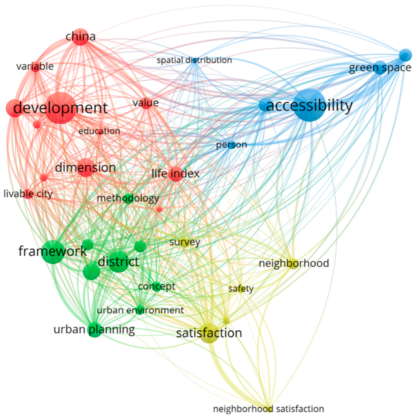
Figure 2.
Distribution of road network distances from Fargo census tract centroids to nearest grocery store (N = 38). The right-skewed distribution indicates that most tracts are within 2 miles of a store, while a small number of peripheral tracts experience substantially greater travel distances. Source: Authors’ calculations.
Figure 2.
Distribution of road network distances from Fargo census tract centroids to nearest grocery store (N = 38). The right-skewed distribution indicates that most tracts are within 2 miles of a store, while a small number of peripheral tracts experience substantially greater travel distances. Source: Authors’ calculations.
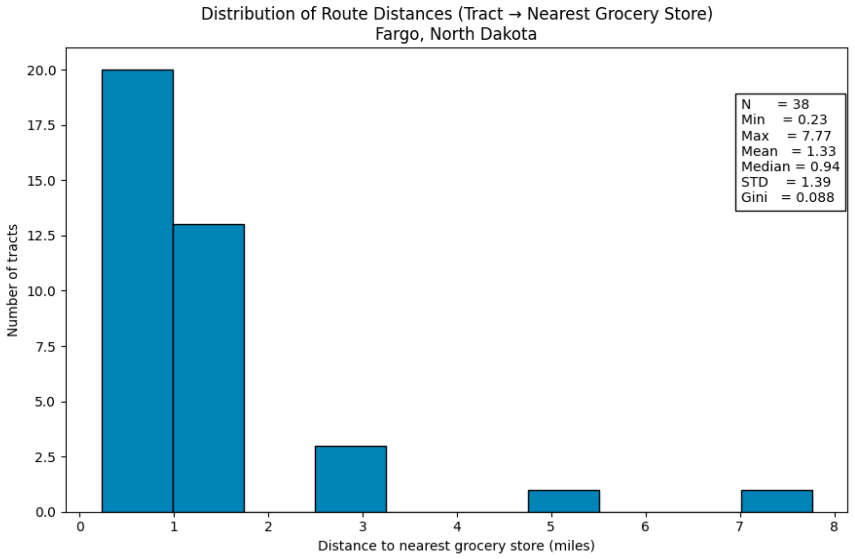
Figure 3.
shortest-path road network routes from Fargo census tract centroids to nearest grocery store locations (orange lines), using road network-based nearest-facility assignment. Diamond symbols indicate grocery store locations (n = 26); dark red dots indicate census tract centroids (n = 38). Longer route segments correspond to greater travel distance and lower accessibility, with the most pronounced disparity visible in the city's southern periphery.
Figure 3.
shortest-path road network routes from Fargo census tract centroids to nearest grocery store locations (orange lines), using road network-based nearest-facility assignment. Diamond symbols indicate grocery store locations (n = 26); dark red dots indicate census tract centroids (n = 38). Longer route segments correspond to greater travel distance and lower accessibility, with the most pronounced disparity visible in the city's southern periphery.
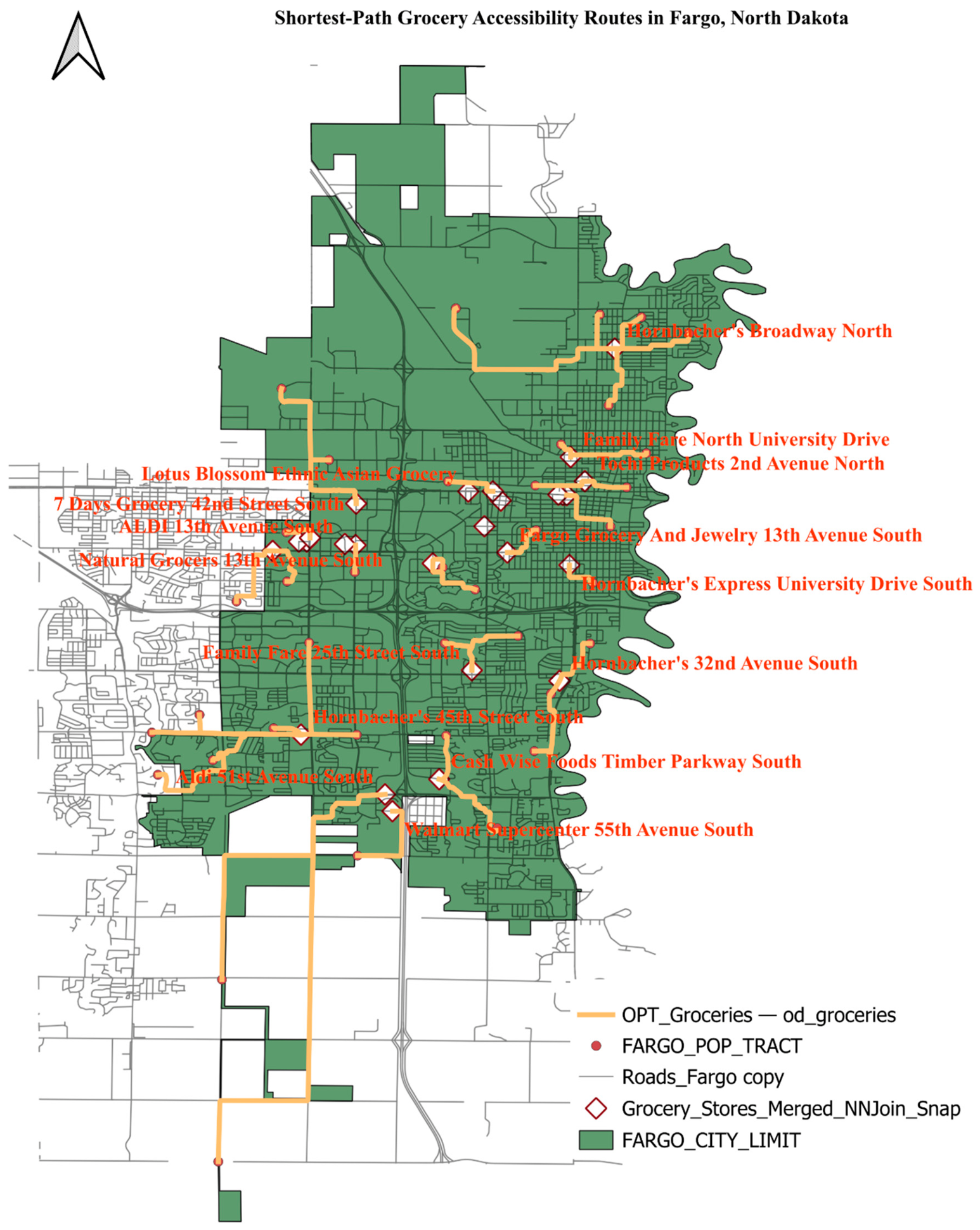
Figure 4.
Lorenz curves for grocery store accessibility across Fargo's 38 census tracts. The standard Lorenz curve (left; Gini = 0.088) and population-weighted Lorenz curve (right; Gini = 0.040) both fall below the line of perfect equality, indicating unequal distribution of grocery accessibility across tracts. The slightly lower population-weighted Gini suggests that tracts with poorer accessibility tend to have somewhat smaller populations.
Figure 4.
Lorenz curves for grocery store accessibility across Fargo's 38 census tracts. The standard Lorenz curve (left; Gini = 0.088) and population-weighted Lorenz curve (right; Gini = 0.040) both fall below the line of perfect equality, indicating unequal distribution of grocery accessibility across tracts. The slightly lower population-weighted Gini suggests that tracts with poorer accessibility tend to have somewhat smaller populations.
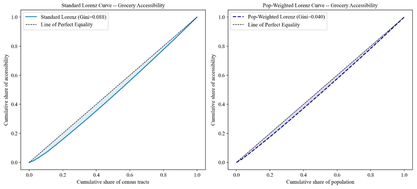
Figure 5.
Distribution of road network distances from Fargo census tract centroids to nearest healthcare facility (N = 38). Source: Authors' calculations.
Figure 5.
Distribution of road network distances from Fargo census tract centroids to nearest healthcare facility (N = 38). Source: Authors' calculations.
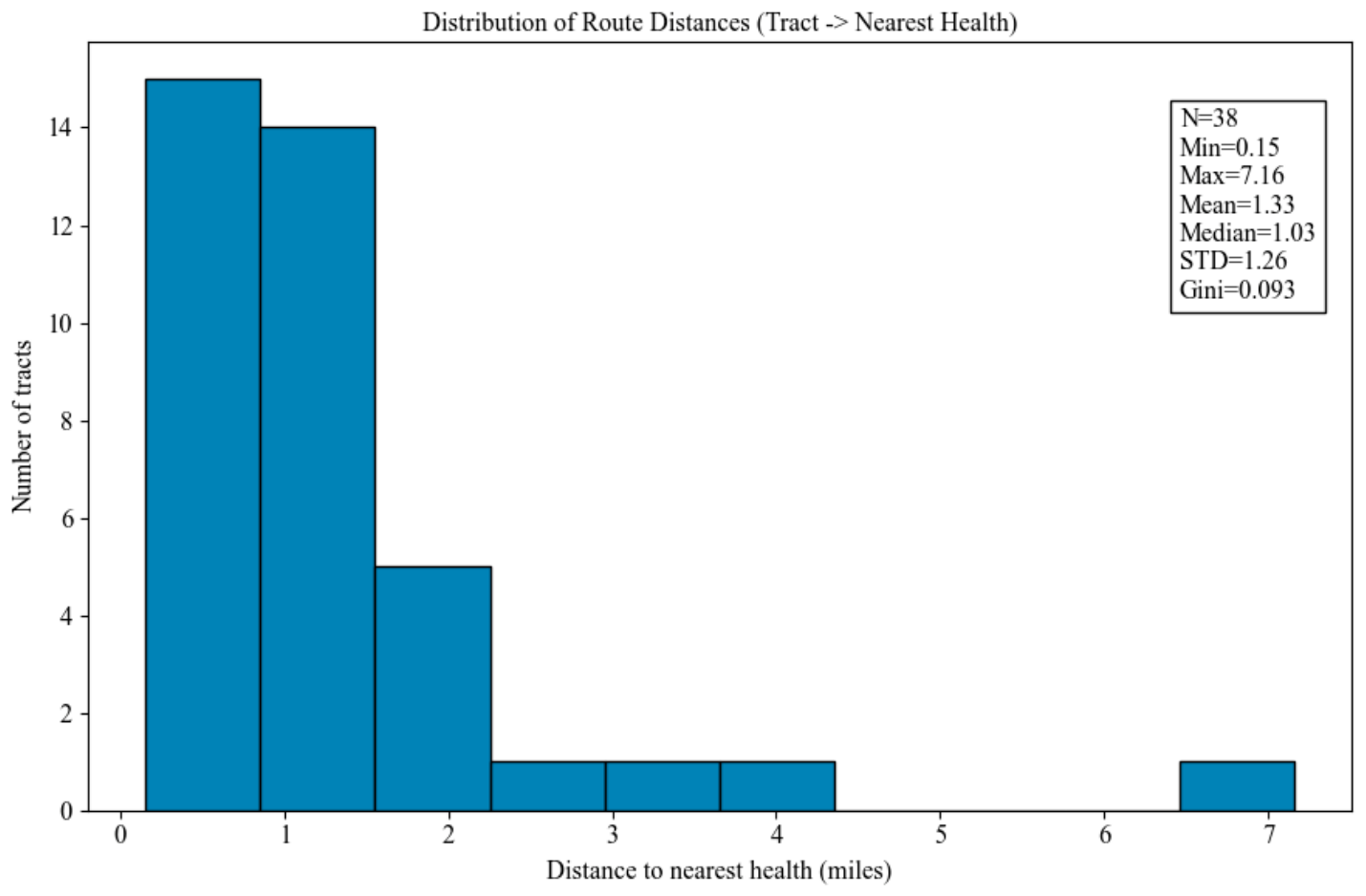
Figure 6.
Shortest-path road network routes from Fargo census tract centroids to nearest healthcare facility locations (orange lines), using road network-based nearest-facility assignment. Cross symbols indicate healthcare facility locations (n = 26), including hospitals, clinics, pharmacies, and physician offices; dark red dots indicate census tract centroids (n = 38). The map confirms the spatial concentration of healthcare infrastructure in the central and northern portions of the city, with the longest route extending to the isolated southern peripheral tract.
Figure 6.
Shortest-path road network routes from Fargo census tract centroids to nearest healthcare facility locations (orange lines), using road network-based nearest-facility assignment. Cross symbols indicate healthcare facility locations (n = 26), including hospitals, clinics, pharmacies, and physician offices; dark red dots indicate census tract centroids (n = 38). The map confirms the spatial concentration of healthcare infrastructure in the central and northern portions of the city, with the longest route extending to the isolated southern peripheral tract.
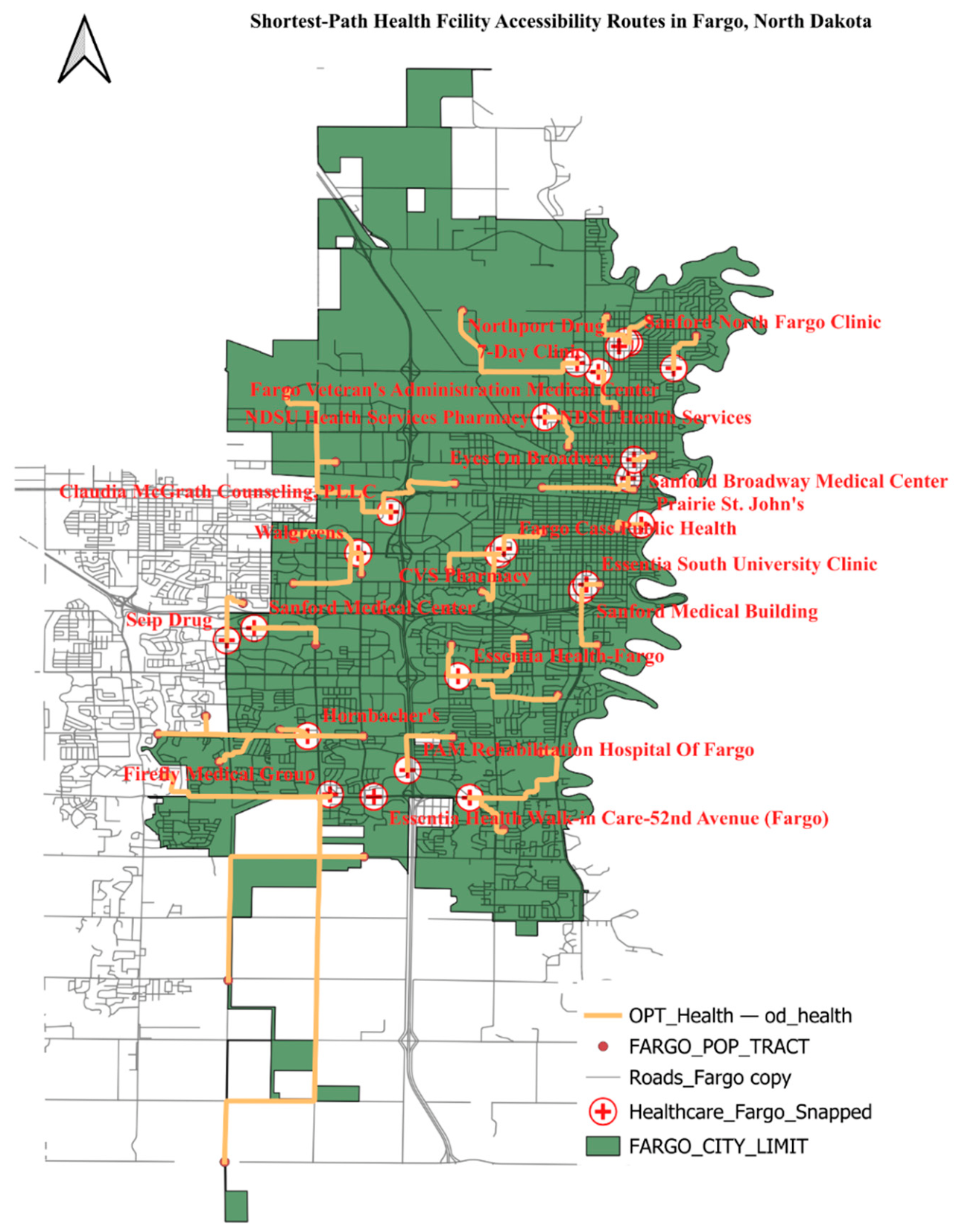
Figure 7.
Lorenz curves for healthcare facility accessibility across Fargo's 38 census tracts. The standard (left; Gini = 0.093) and population-weighted (right; Gini = 0.042) curves both fall below the line of perfect equality, indicating unequal distribution of healthcare accessibility.
Figure 7.
Lorenz curves for healthcare facility accessibility across Fargo's 38 census tracts. The standard (left; Gini = 0.093) and population-weighted (right; Gini = 0.042) curves both fall below the line of perfect equality, indicating unequal distribution of healthcare accessibility.
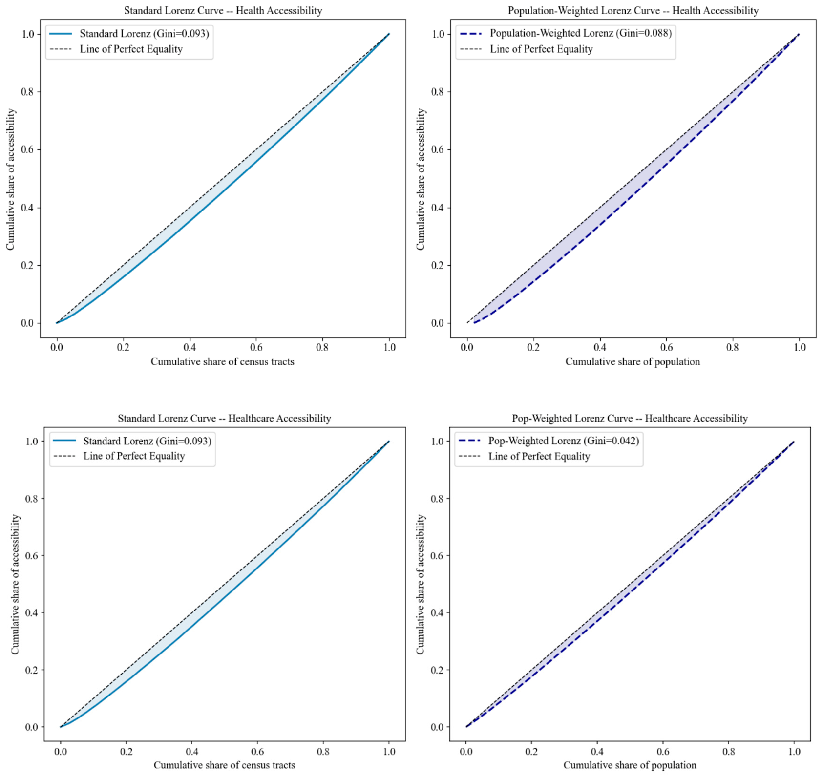
Figure 8.
Distribution of road network distances from Fargo census tract centroids to nearest park (N = 38). The strongly right-skewed distribution indicates that most tracts are within 1 mile of a park, reflecting the dispersed distribution of the Fargo Park District's 92 park locations. Source: Authors' calculations.
Figure 8.
Distribution of road network distances from Fargo census tract centroids to nearest park (N = 38). The strongly right-skewed distribution indicates that most tracts are within 1 mile of a park, reflecting the dispersed distribution of the Fargo Park District's 92 park locations. Source: Authors' calculations.
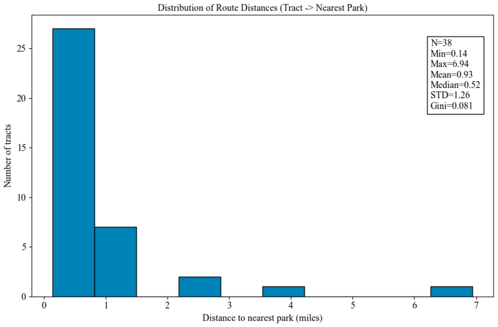
Figure 9.
Shortest-path road network routes from Fargo census tract centroids to nearest park locations (orange lines), using road network-based nearest-facility assignment. Selected parks (n = 32 of 92 total) represent the subset of parks chosen as the nearest option for at least one tract. The map confirms the dense, dispersed coverage of park infrastructure throughout the central city, with the longest route extending to the isolated southern peripheral tract.
Figure 9.
Shortest-path road network routes from Fargo census tract centroids to nearest park locations (orange lines), using road network-based nearest-facility assignment. Selected parks (n = 32 of 92 total) represent the subset of parks chosen as the nearest option for at least one tract. The map confirms the dense, dispersed coverage of park infrastructure throughout the central city, with the longest route extending to the isolated southern peripheral tract.
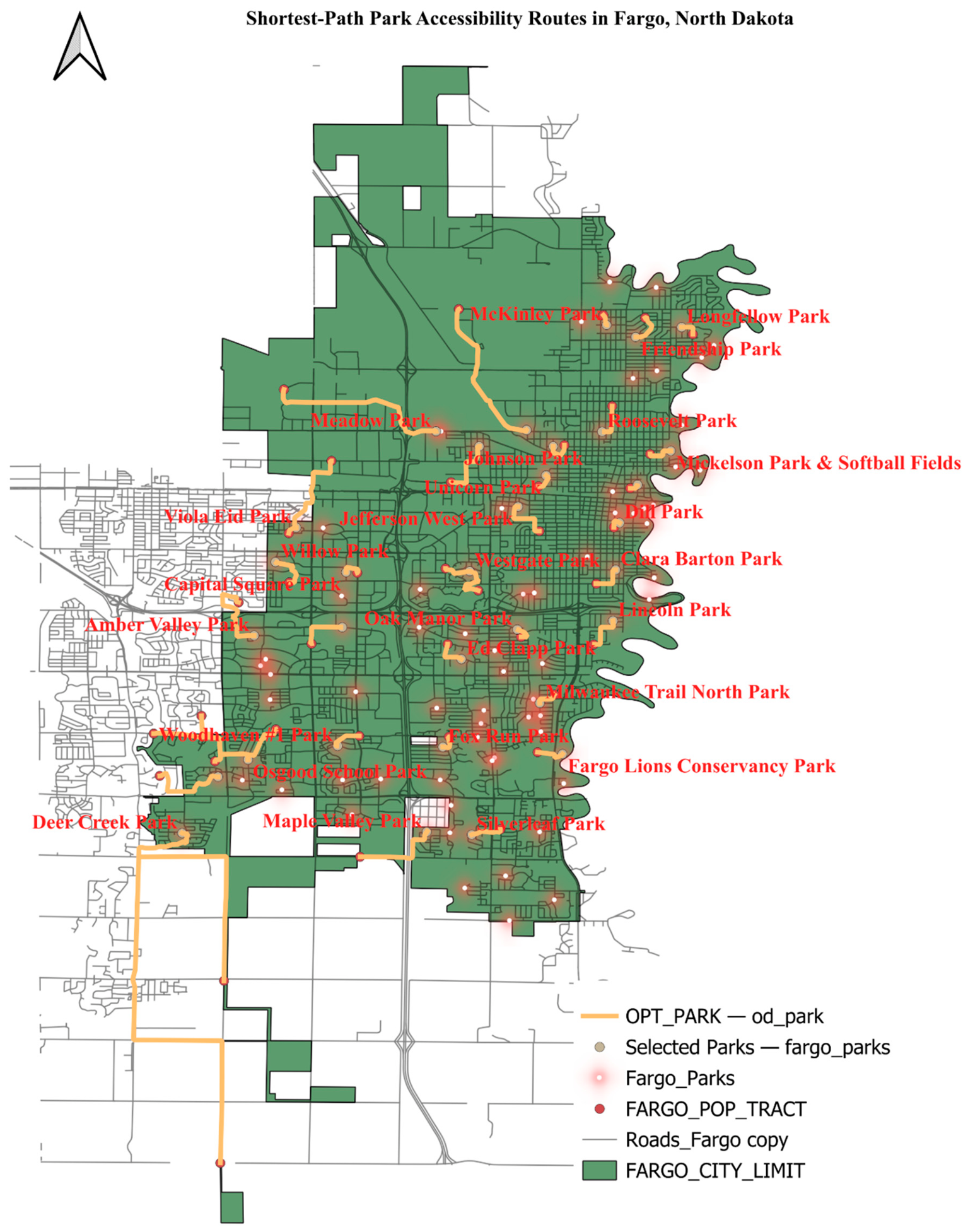
Figure 10.
Lorenz curves for park accessibility across Fargo's 38 census tracts. The standard (left; Gini = 0.081) and population-weighted (right; Gini = 0.029) curves show the smallest deviation from the line of perfect equality among the three amenity categories, indicating the most equitable distribution of accessibility.
Figure 10.
Lorenz curves for park accessibility across Fargo's 38 census tracts. The standard (left; Gini = 0.081) and population-weighted (right; Gini = 0.029) curves show the smallest deviation from the line of perfect equality among the three amenity categories, indicating the most equitable distribution of accessibility.
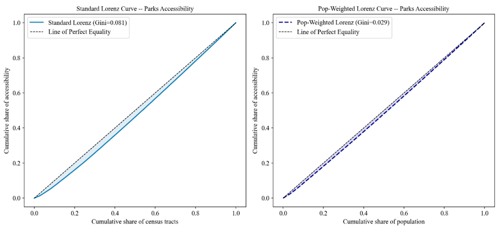
Figure 11.
Distribution of the CAI across Fargo census tracts (N = 38). The left-skewed distribution indicates that most tracts achieve high composite accessibility, while a small number of peripheral tracts including one with a CAI of 0 receive substantially lower scores. Source: Authors' calculations.
Figure 11.
Distribution of the CAI across Fargo census tracts (N = 38). The left-skewed distribution indicates that most tracts achieve high composite accessibility, while a small number of peripheral tracts including one with a CAI of 0 receive substantially lower scores. Source: Authors' calculations.
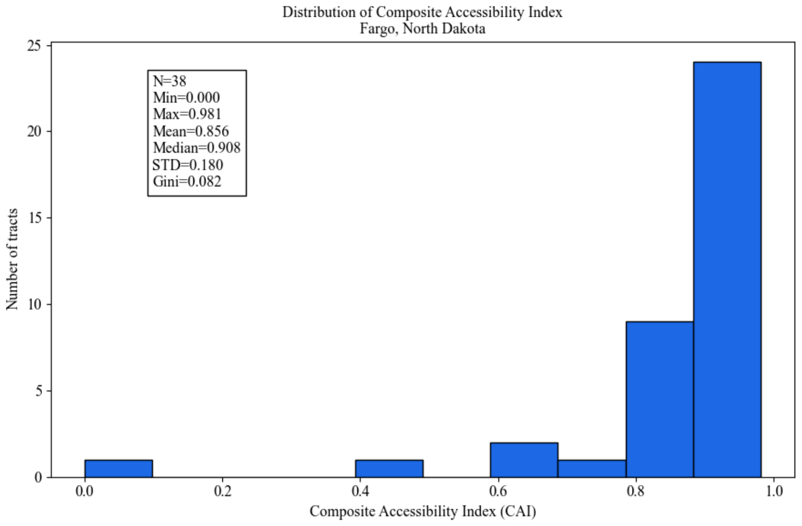
Figure 12.
Standard (left) and population-weighted (right) Lorenz curves for the CAI across Fargo census tracts (N = 38), plotted on separate axes (tract share vs. population share). Gini = 0.082 (standard); 0.029 (population-weighted). Source: Authors' calculations.
Figure 12.
Standard (left) and population-weighted (right) Lorenz curves for the CAI across Fargo census tracts (N = 38), plotted on separate axes (tract share vs. population share). Gini = 0.082 (standard); 0.029 (population-weighted). Source: Authors' calculations.
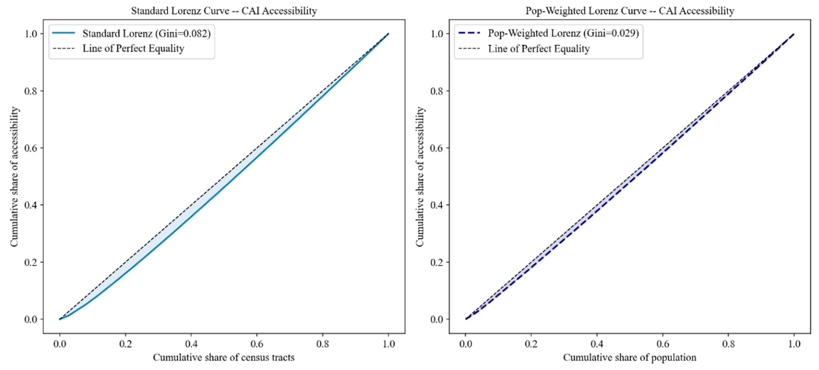
Figure 13.
Accessibility scores for grocery, healthcare, and park amenities, and the CAI, by census tract (N = 38), sorted by ascending CAI. Healthcare consistently registers the lowest scores and parks the highest among the three amenity categories. Source: Authors' calculations.
Figure 13.
Accessibility scores for grocery, healthcare, and park amenities, and the CAI, by census tract (N = 38), sorted by ascending CAI. Healthcare consistently registers the lowest scores and parks the highest among the three amenity categories. Source: Authors' calculations.
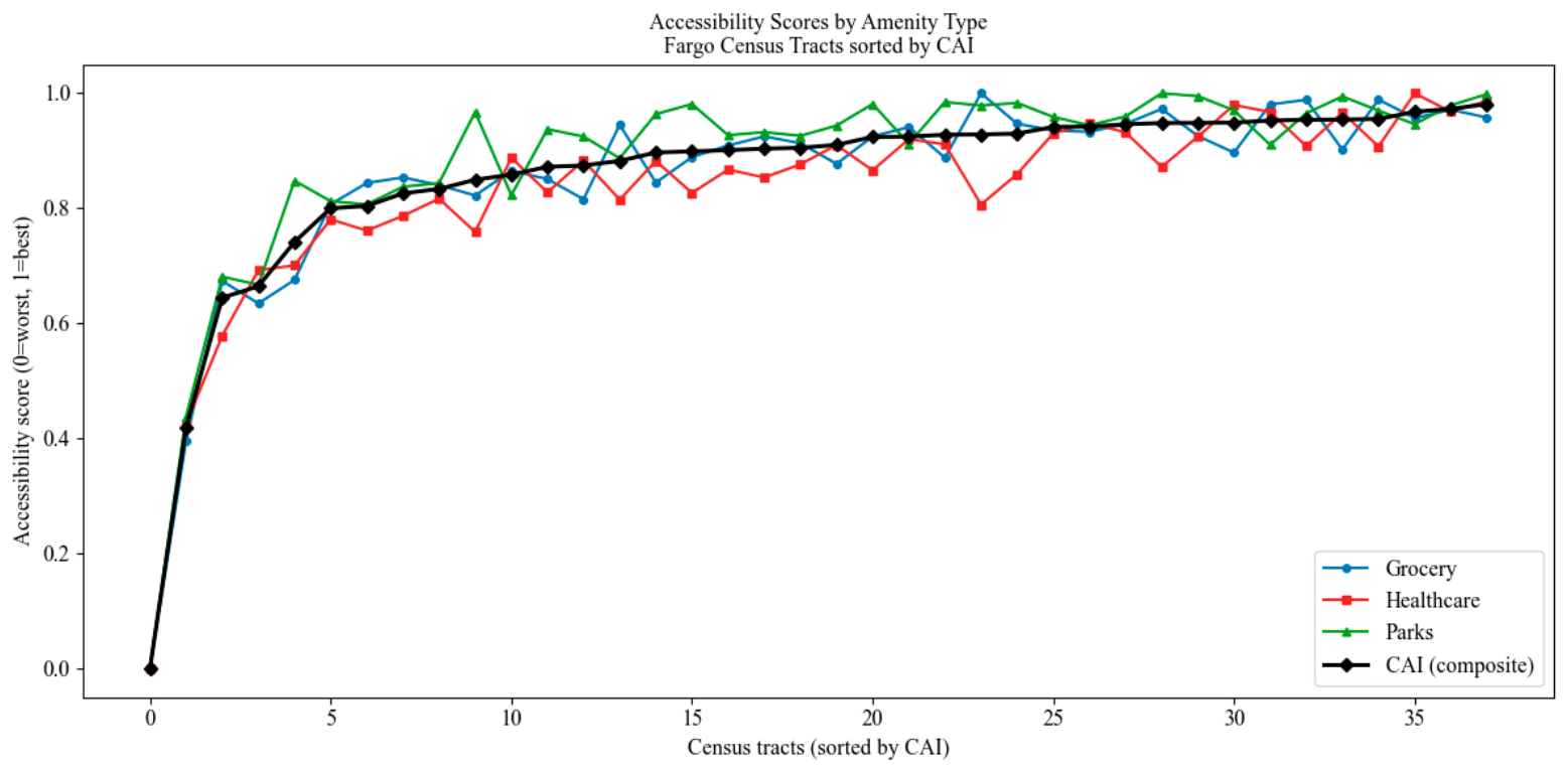
Figure 14.
Sensitivity analysis of underserved population estimates across seven percentile thresholds (10th–50th) for all four accessibility measures. The red dashed line indicates the base threshold (25th percentile) used in the primary analysis. Near-parallel trajectories confirm findings are robust to threshold selection. Source: Authors' calculations.
Figure 14.
Sensitivity analysis of underserved population estimates across seven percentile thresholds (10th–50th) for all four accessibility measures. The red dashed line indicates the base threshold (25th percentile) used in the primary analysis. Near-parallel trajectories confirm findings are robust to threshold selection. Source: Authors' calculations.
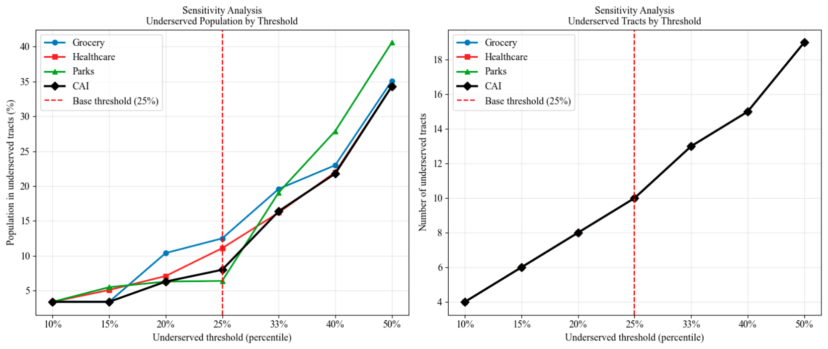

Table 1.
Sensitivity Analysis of VOSviewer Co-occurrence Threshold. TLS = Total Link Strength.
| Threshold | Items | Clusters | Links | TLS | Cluster Interpretability |
|---|---|---|---|---|---|
| 5 | 184 | 7 | 3,904 | 17,342 | Low – fragmented, overlapping clusters |
| 10 | 64 | 6 | 1,402 | 14,709 | Moderate – some cluster overlap |
| 15 (selected) | 35 | 5 | 518 | 9,595 | High – distinct and coherent clusters |
| 20 | 18 | 3 | 142 | 4,210 | Low – overly sparse, themes collapsed |
Table 2.
Spatial accessibility statistics by amenity type, Fargo census tracts (N = 38). Accessibility scores are normalized on a 0–1 scale (0 = lowest, 1 = highest). Gini coefficients measure distributional inequality (0 = perfect equality). Underserved tracts are defined as the bottom 25% of accessibility scores. Source: Authors’ calculations based on using road network-based nearest-facility assignment.
Table 2.
Spatial accessibility statistics by amenity type, Fargo census tracts (N = 38). Accessibility scores are normalized on a 0–1 scale (0 = lowest, 1 = highest). Gini coefficients measure distributional inequality (0 = perfect equality). Underserved tracts are defined as the bottom 25% of accessibility scores. Source: Authors’ calculations based on using road network-based nearest-facility assignment.
| Metric | Grocery | Healthcare | Parks | CAI |
| Min distance (miles) | 0.23 | 0.15 | 0.14 | -- |
| Max distance (miles) | 7.77 | 7.16 | 6.94 | -- |
| Mean distance (miles) | 1.33 | 1.33 | 0.93 | -- |
| Median distance (miles) | 0.94 | 1.03 | 0.52 | -- |
| Mean accessibility score | 0.854 | 0.831 | 0.882 | 0.856 |
| 95% CI (standard) | 0.043, 0.151 | 0.048, 0.154 | 0.036, 0.143 | 0.037, 0.144 |
| 95% CI (pop-weighted) | 0.024,0.057 | 0.029,0.055 | 0.015,0.047 | 0.017,0.046 |
| Standard Gini | 0.088 | 0.093 | 0.081 | 0.082 |
| Population-weighted Gini | 0.040 | 0.042 | 0.029 | 0.029 |
| Underserved population | 15,118 | 13,441 | 7,704 | 9,713 |
| Underserved population (%) | 12.5% | 11.1% | 6.4% | 8.0% |
Disclaimer/Publisher’s Note: The statements, opinions and data contained in all publications are solely those of the individual author(s) and contributor(s) and not of MDPI and/or the editor(s). MDPI and/or the editor(s) disclaim responsibility for any injury to people or property resulting from any ideas, methods, instructions or products referred to in the content. |
© 2026 by the authors. Licensee MDPI, Basel, Switzerland. This article is an open access article distributed under the terms and conditions of the Creative Commons Attribution (CC BY) license (http://creativecommons.org/licenses/by/4.0/).
Copyright: This open access article is published under a Creative Commons CC BY 4.0 license, which permit the free download, distribution, and reuse, provided that the author and preprint are cited in any reuse.