

Submitted:
16 March 2026
Posted:
17 March 2026
You are already at the latest version
Abstract
We are what we repeatedly do. Excellence, then, is not an act, but a habit.”— Aristotle (paraphrased by Will Durant)Quality improvement is not merely a managerial obligation—it is an art of refinement and a disciplined pursuit of excellence that has shaped industries for over a century. From the statistical precision of Six Sigma at Motorola to the philosophy of continuous improvement embodied in Kaizen at Toyota, and from the investigative clarity of Fishbone Diagrams to the predictive foresight of Failure Mode and Effects Analysis (FMEA) used in aerospace systems, each methodology offers a unique pathway toward operational perfection. This article presents a structured exploration of twenty influential quality improvement methodologies. Each method is explained through clear procedural steps, illustrated with block diagrams, and supported by real-world case studies drawn from leading technology organisations such as Toyota, Google, Apple, Microsoft, Samsung, Amazon, Tesla, and Intel. Beyond industrial applications, these methods reveal broader principles of disciplined thinking, systematic learning, and continuous growth. Ultimately, the philosophy of quality improvement extends beyond organisations—it provides a powerful framework for improving personal learning, professional development, and everyday decision-making.
Keywords:
quality improvement
; value
; being good
; getting better
; artful crafting of oneself
; perfection
; completion
; growth
1. Introduction: Why Quality is Irresistibly Attractive
Quality improvement is the ultimate power move in industry. While flashy marketing campaigns come and go, a well-implemented quality system silently compounds value, slashes waste, and builds reputations that outlast generations. The global quality management market exceeds $13 billion and is growing at over 10% annually [38]—proof that the world cannot resist a good quality framework.
| “The secret of getting ahead is getting started. The secret of getting started is breaking your overwhelming tasks into small manageable ones, and starting on the first one.” |
| — Mark Twain |
What makes these methods so seductive? Each offers a different flavour of intellectual elegance. Some dazzle with statistical rigour. Others seduce with philosophical simplicity. A few thrill with their ability to predict disasters before they happen. Together, they form a constellation of approaches that can transform any organisation from mediocre to magnificent.
The world’s most successful technology and automotive companies—Toyota, Google, Apple, Microsoft, Samsung, Vivo, Amazon, Tesla, Hyundai, Maruti Suzuki—do not succeed by accident. Behind their iconic products lies a carefully orchestrated symphony of quality methods. Toyota pioneered Lean and Kaizen [14]. Google embraces data-driven experimentation (DOE) and SPC at scale [34]. Apple obsesses over Taguchi-style robustness in hardware design [26]. Samsung deploys Six Sigma across its semiconductor fabs [35]. Microsoft uses Lean Six Sigma in its cloud operations [33]. Vivo applies rigorous FMEA and Poka-Yoke in smartphone manufacturing. Hyundai transformed itself from a budget automaker into a global quality leader through aggressive Six Sigma and TQM adoption [36]. Maruti Suzuki, India’s largest carmaker, built its dominance on Japanese-inspired Kaizen, 5S, and Lean manufacturing principles learned directly from Suzuki Motor Corporation [37].
This article presents twenty distinct methods, each profiled with the admiration it deserves, complete with process block diagrams, a concrete example case study, and industry adoption highlights.
2. The Statistical Seducers
2.1. Six Sigma — The Perfectionist’s Obsession
| “In God we trust; all others must bring data.” |
| — W. Edwards Deming |
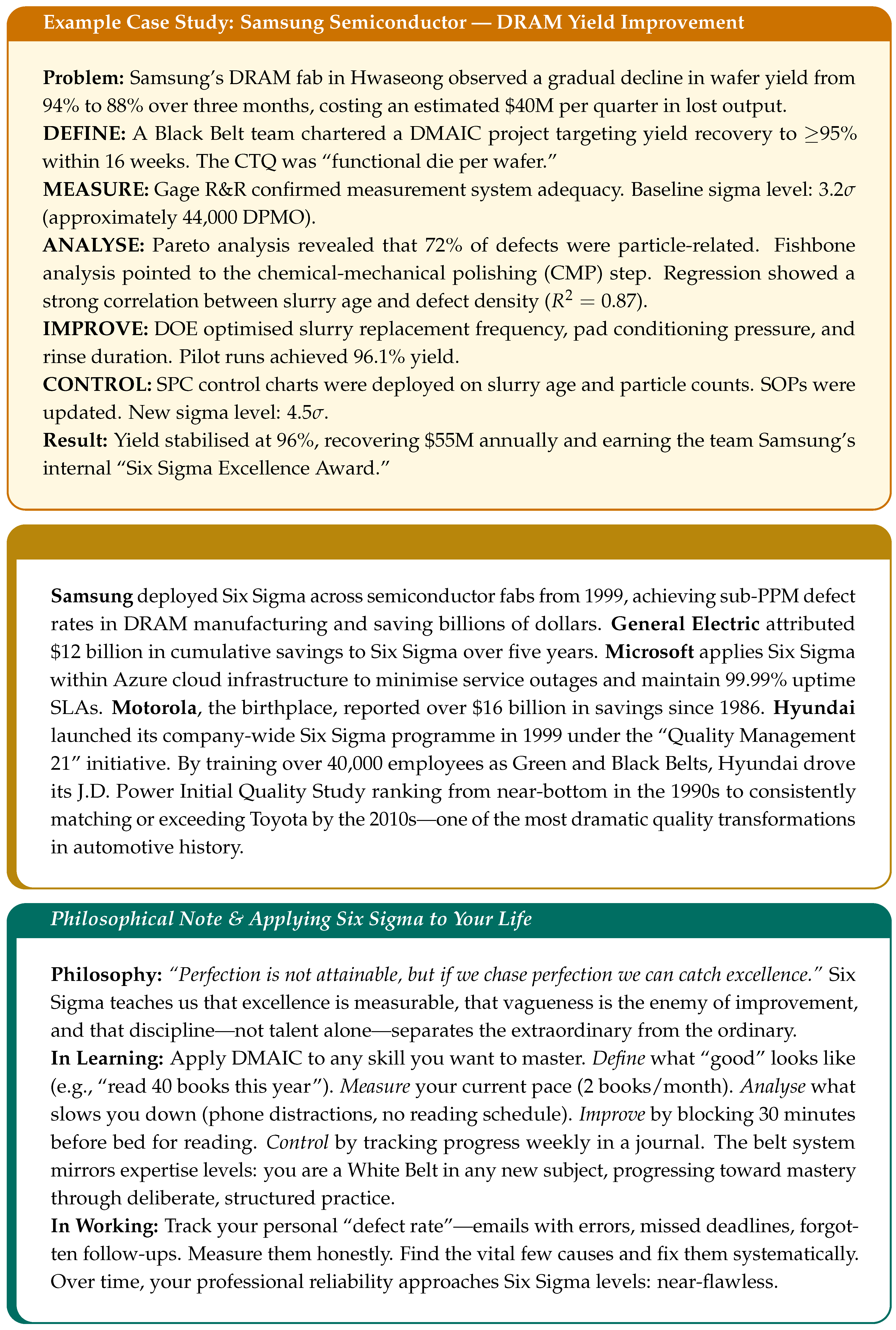
Six Sigma is the supermodel of quality methods—impossibly high standards, an entourage of statistical tools, and a track record that makes rivals jealous. At its heart lies a breathtaking ambition: no more than 3.4 defects per million opportunities. The name itself refers to fitting six standard deviations between the process mean and the nearest specification limit.
Six Sigma’s seductive power lies in its structured methodology called DMAIC: Define, Measure, Analyse, Improve, Control [10]. Each phase builds upon the last in a disciplined cascade. Its belt certification system—Yellow Belt, Green Belt, Black Belt, and Master Black Belt—adds a martial-arts mystique that makes career progression feel like ascending through ranks of mastery.
2.1.1. The Mathematics of Six Sigma
The sigma level (Z) measures how many standard deviations fit between the process mean and the nearest specification limit. The Defects Per Million Opportunities (DPMO) is:
Polished Form: If you produce 1 million items and only 3.4 are defective, you are at Six Sigma. At 3 (the average company), you have 66,807 defects per million—imagine 66,807 lost luggage bags per million flights. At 6, that drops to 3.4. The yield at each sigma level is:
2.1.2. The DMAIC Process
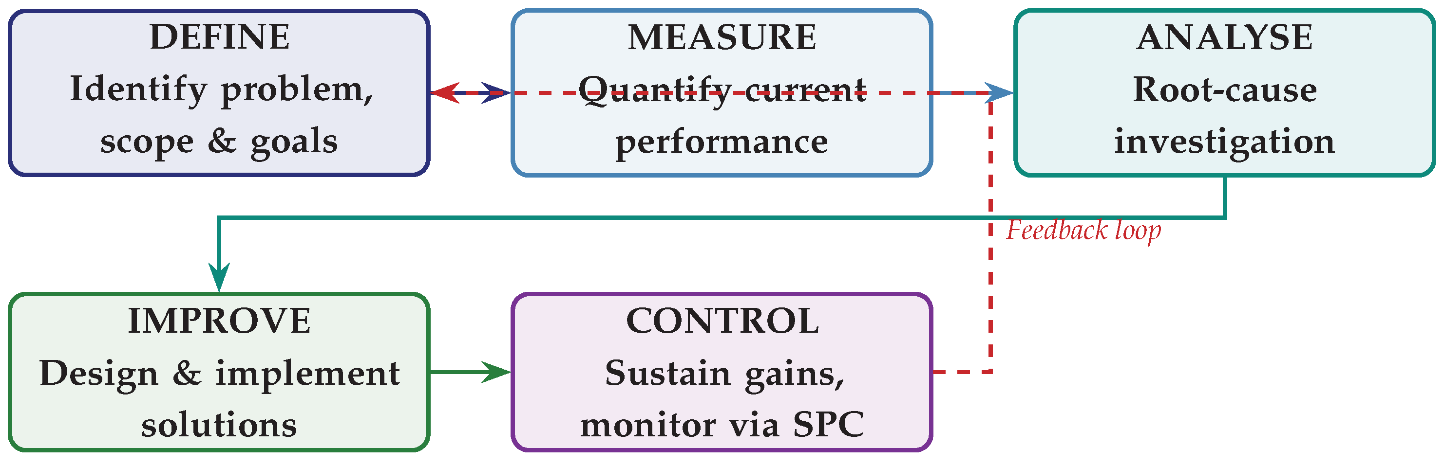
Step-by-step elaboration:
- DEFINE: Charter the project. Identify the customer, critical-to-quality (CTQ) requirements, problem statement, and business case. Tools: SIPOC diagram, Voice of the Customer (VOC), project charter.
- MEASURE: Establish a baseline. Collect data on current process performance using measurement system analysis (MSA). Calculate the process sigma level. Tools: data collection plans, Gage R&R, process capability (, ).
- ANALYSE: Identify root causes using statistical hypothesis testing, regression, ANOVA, and graphical methods. Separate the vital few causes from the trivial many. Tools: Fishbone diagrams, Pareto charts, hypothesis tests.
- IMPROVE: Design solutions using DOE, pilot testing, and simulation. Implement changes and verify improvement with data. Tools: factorial experiments, response surface methodology, pilot runs.
- CONTROL: Lock in gains with control charts, SOPs, training, and monitoring dashboards. Hand over to process owners. Tools: SPC charts, control plans, Poka-Yoke.
2.2. Control Charts — The Heartbeat Monitor
| “Without data, you’re just another person with an opinion.” |
| — W. Edwards Deming |
Born: Walter Shewhart, Bell Labs, 1924 [1].
If a process had a pulse, the control chart would be its electrocardiogram. These deceptively simple plots track a process variable over time against statistically derived upper and lower control limits (UCL and LCL), instantly revealing when something has drifted from its healthy rhythm. Their beauty lies in distinguishing common-cause variation (natural noise) from special-cause variation (assignable disturbances).
2.2.1. Control Chart Process Flow
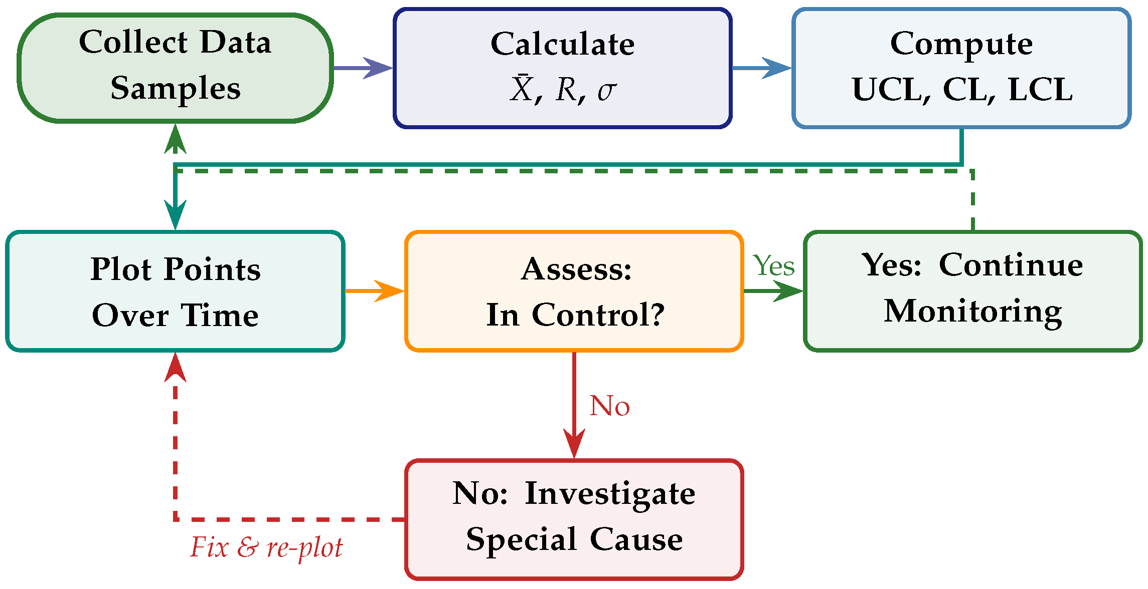
Varieties of charm: –R charts for variable data with small subgroups; –S charts for larger subgroups; p-charts and c-charts for attribute data; CUSUM and EWMA charts for detecting subtle, persistent shifts that standard Shewhart charts might miss.
Western Electric Rules enhance detection by flagging patterns: a single point beyond 3, two of three consecutive points beyond 2 on the same side, four of five beyond 1, or eight consecutive points on the same side of the centreline.
2.2.2. The Mathematics of Control Charts
The control limits for an chart are calculated as:
where is the grand mean (average of subgroup averages), is the average range, and is a constant depending on subgroup size (e.g., for ).
Polished Form: The control limits define the “normal heartbeat” of your process. Any measurement falling within UCL and LCL is expected natural variation—like your heart rate varying between 60 and 80 bpm at rest. A point outside these limits is like a heart rate of 130 while sitting still—something unusual has happened, and you must investigate. The key insight: these limits come from your own process data, not from specifications.
2.3. Histograms — The Shape of Truth
Born: Karl Pearson, 1895 [7].
| “The goal is to turn data into information, and information into insight.” |
| — Carly Fiorina |
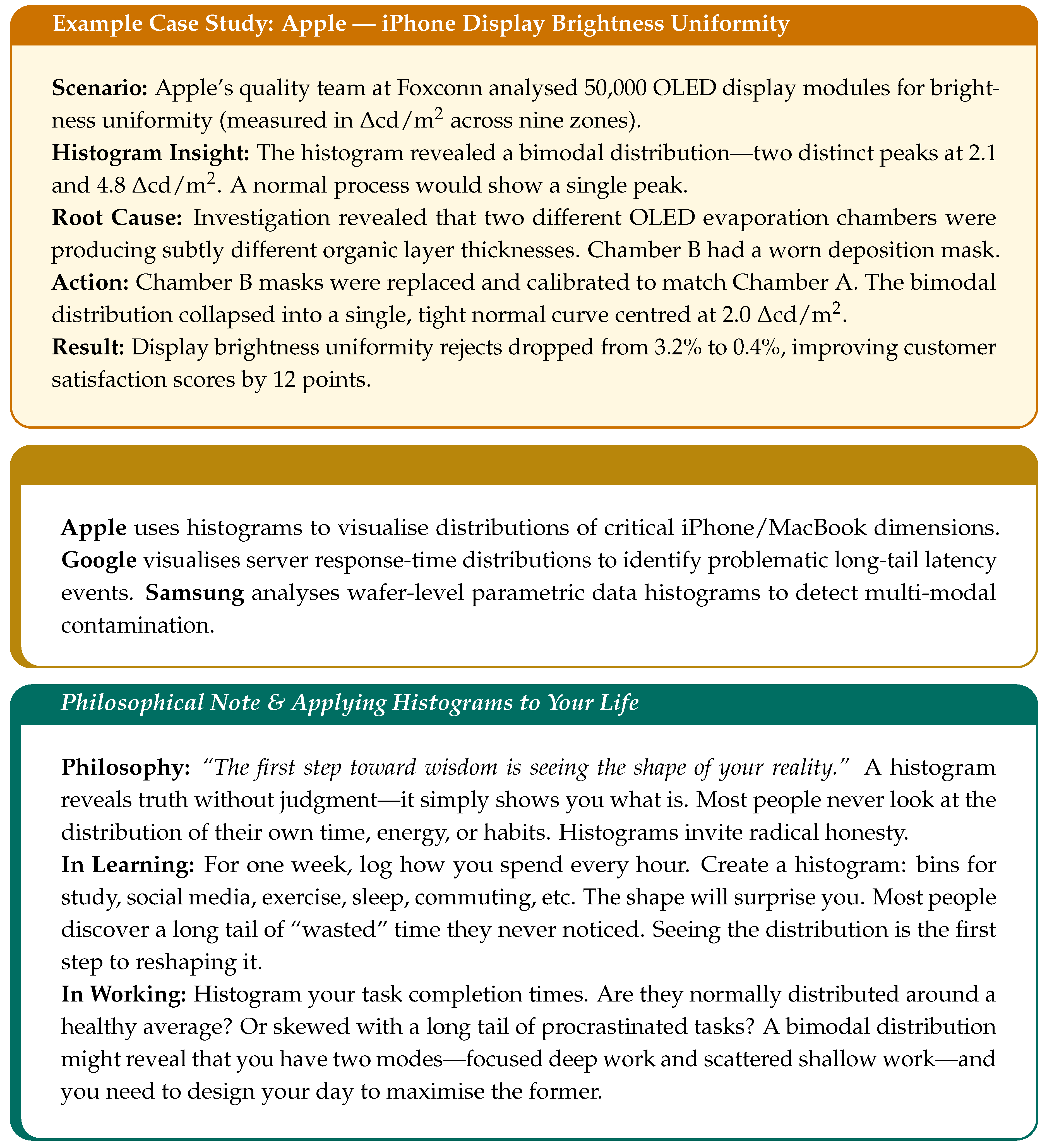
Histograms are the little black dress of statistics—simple, timeless, and devastatingly effective. By grouping data into bins and displaying frequencies as bars, they reveal shape, spread, centre, and outliers of any distribution at a single glance.
2.3.1. Histogram Construction Process
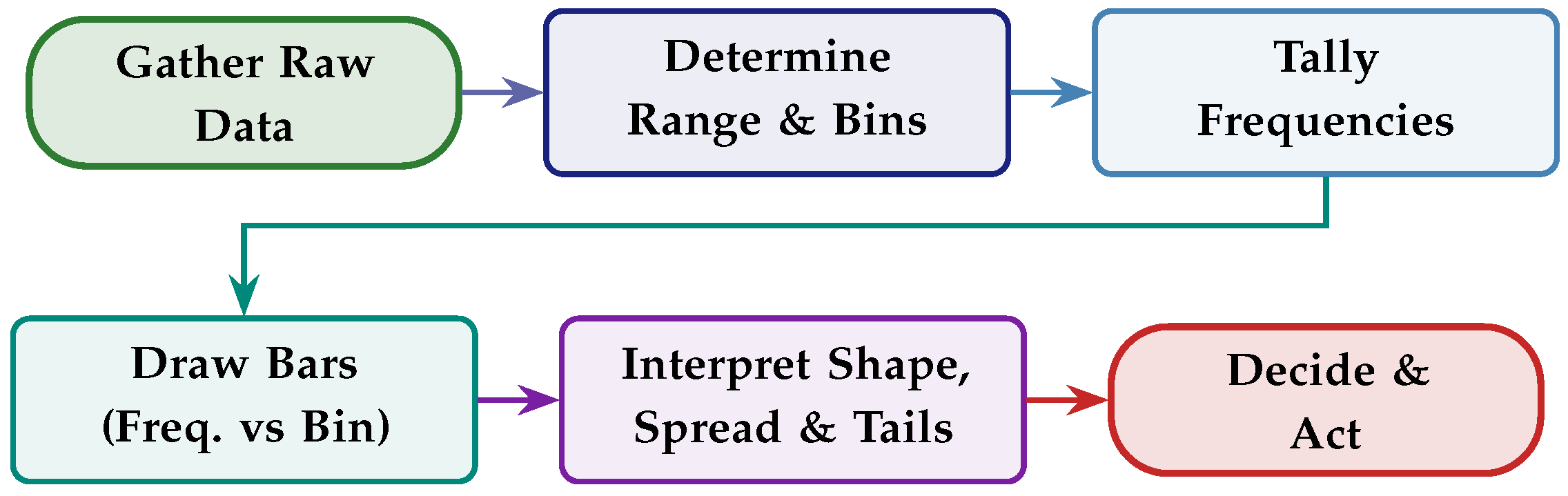
Key shapes and their meanings: A bell curve (normal) suggests a stable, well-centred process. Skewness may indicate a natural physical limit. A bimodal histogram often reveals mixed batches, different operators, or different machines. A truncated distribution may indicate 100% inspection screening out defectives.
2.3.2. The Mathematics of Histograms
The optimal number of bins (k) is often estimated by Sturges’ Rule:
where n is the number of data points. The bin width is then . Key descriptive statistics visible from a histogram include the mean (), standard deviation (s), and skewness ():
Polished Form: Sturges’ Rule tells you how many bars to draw so the histogram is neither too coarse (hiding patterns) nor too fine (showing noise). The mean tells you where the centre is; the standard deviation tells you how spread out the data is. A histogram with a small s is a tight, well-controlled process; a wide one is crying out for improvement.
2.4. Scatter Diagrams — The Matchmaker
Purpose: Reveal relationships between two variables.
| “Correlation is not causation, but it sure is a hint.” |
| — Edward Tufte |
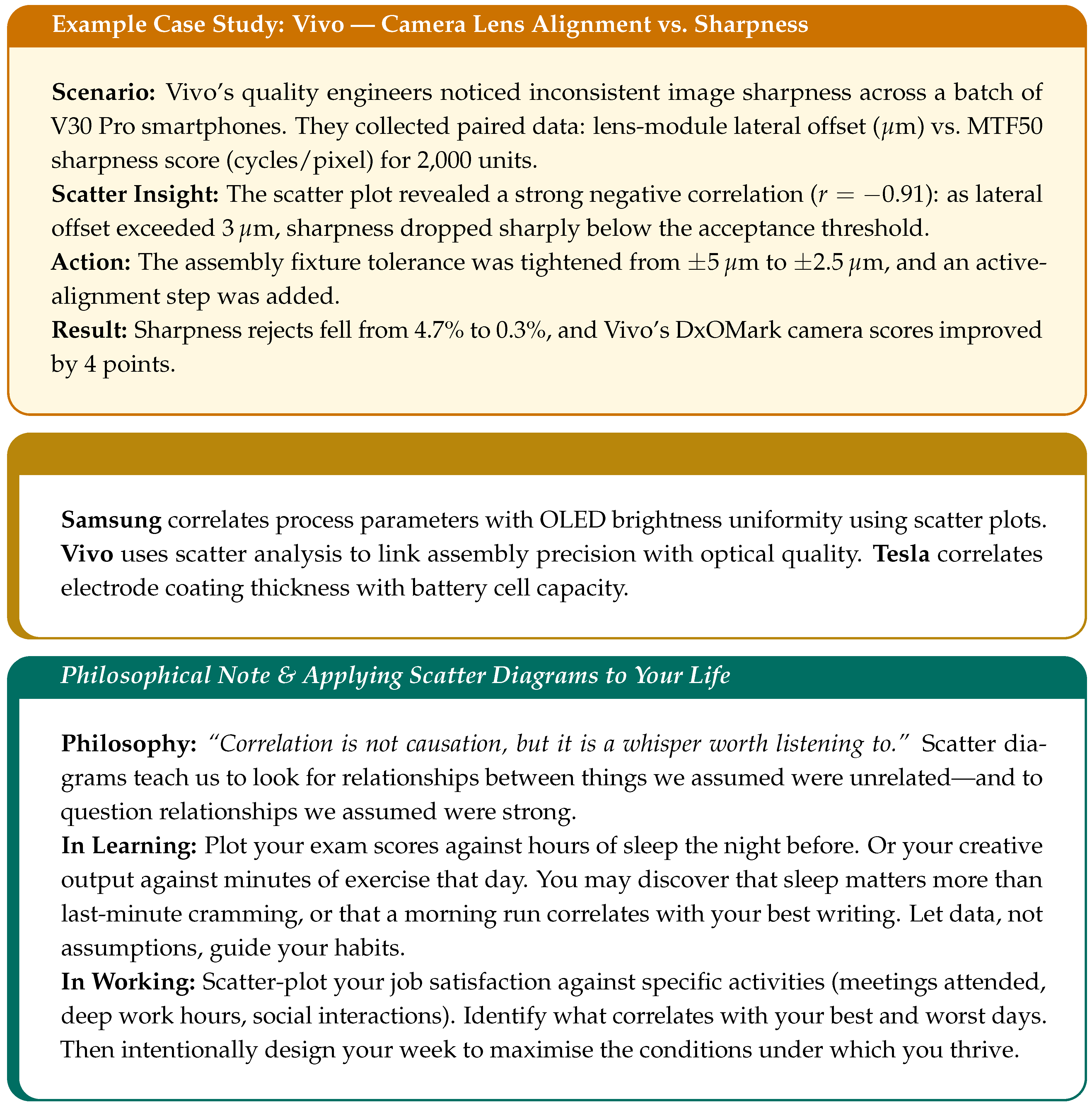
Scatter diagrams are the matchmakers of quality improvement. They plot paired data points on a Cartesian plane and let patterns emerge—positive correlation, negative correlation, nonlinear relationships, or the uncomfortable truth of no relationship at all.
2.4.1. Scatter Diagram Analysis Process
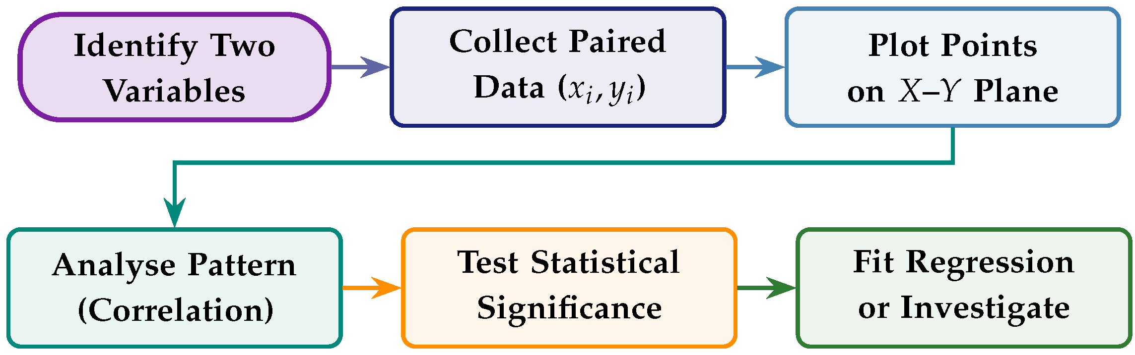
Romance in data: When temperature rises, does defect rate climb? When charging cycles increase, does battery capacity degrade proportionally? Scatter diagrams answer with visual poetry that alone cannot convey.
2.4.2. The Mathematics of Scatter Diagrams
The Pearson correlation coefficient (r) quantifies the strength and direction of a linear relationship:
The coefficient of determination () tells you what fraction of variation in y is explained by x.
Polished Form: If , the two variables move in perfect lockstep (as one rises, so does the other). If , they move in perfect opposition. If , there is no linear relationship—the dots look like a shotgun blast. For example, means 87% of the variation in defect rate is explained by temperature; only 13% remains unexplained. That is a powerful relationship worth acting on.
3. The Root-Cause Detectives
3.1. Pareto Analysis — The 80/20 Aristocrat
Born: Vilfredo Pareto (economics, 1896); Joseph Juran (quality, 1940s) [4].
| “The art of being wise is the art of knowing what to overlook.” |
| — William James |
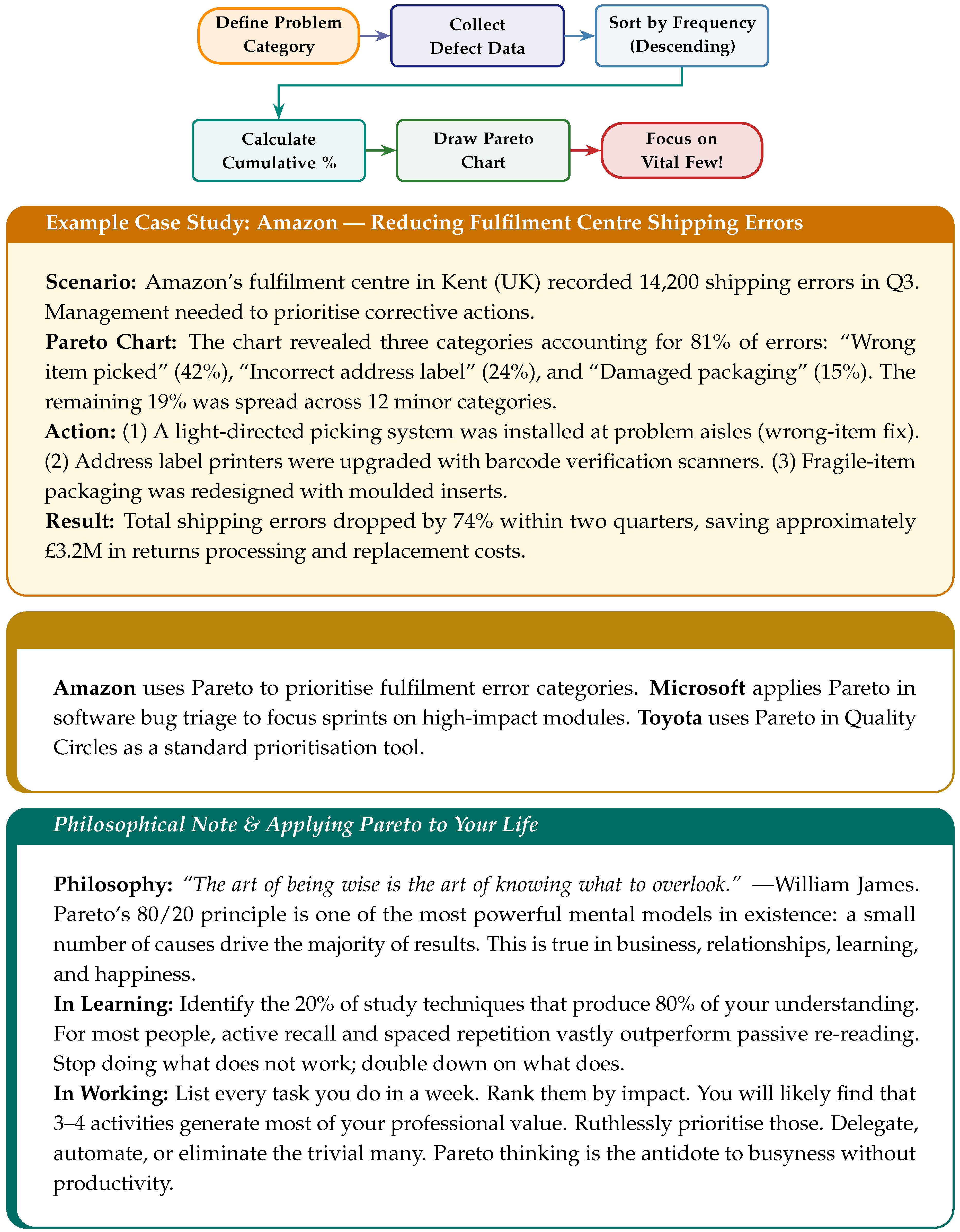
Pareto Analysis embodies a seductive truth: roughly 80% of problems come from 20% of causes. The Pareto chart—bars sorted by descending frequency with a cumulative percentage line—instantly identifies the vital few causes that deserve all your attention.
3.1.1. The Mathematics of Pareto Analysis
The cumulative percentage for the j-th category (sorted by descending frequency) is:
where is the frequency of the i-th category and k is the total number of categories. The “vital few” are those categories where first reaches approximately 80%.
Polished Form: Line up all your problems from biggest to smallest. Add them up cumulatively. The point where the cumulative line crosses 80% marks the boundary between the vital few (fix these first!) and the trivial many (these can wait). If you have 10 types of defects, you will typically find that just 2 or 3 types cause 80% of all failures. Fix those, and you have solved most of the problem with minimal effort.
3.1.2. Pareto Analysis Process
3.2. Fishbone Diagram — The Detective’s Canvas
Born: Kaoru Ishikawa, University of Tokyo, 1943 [19].
| “If I had an hour to solve a problem, I’d spend 55 minutes thinking about the problem and 5 minutes thinking about solutions.” |
| — Albert Einstein |
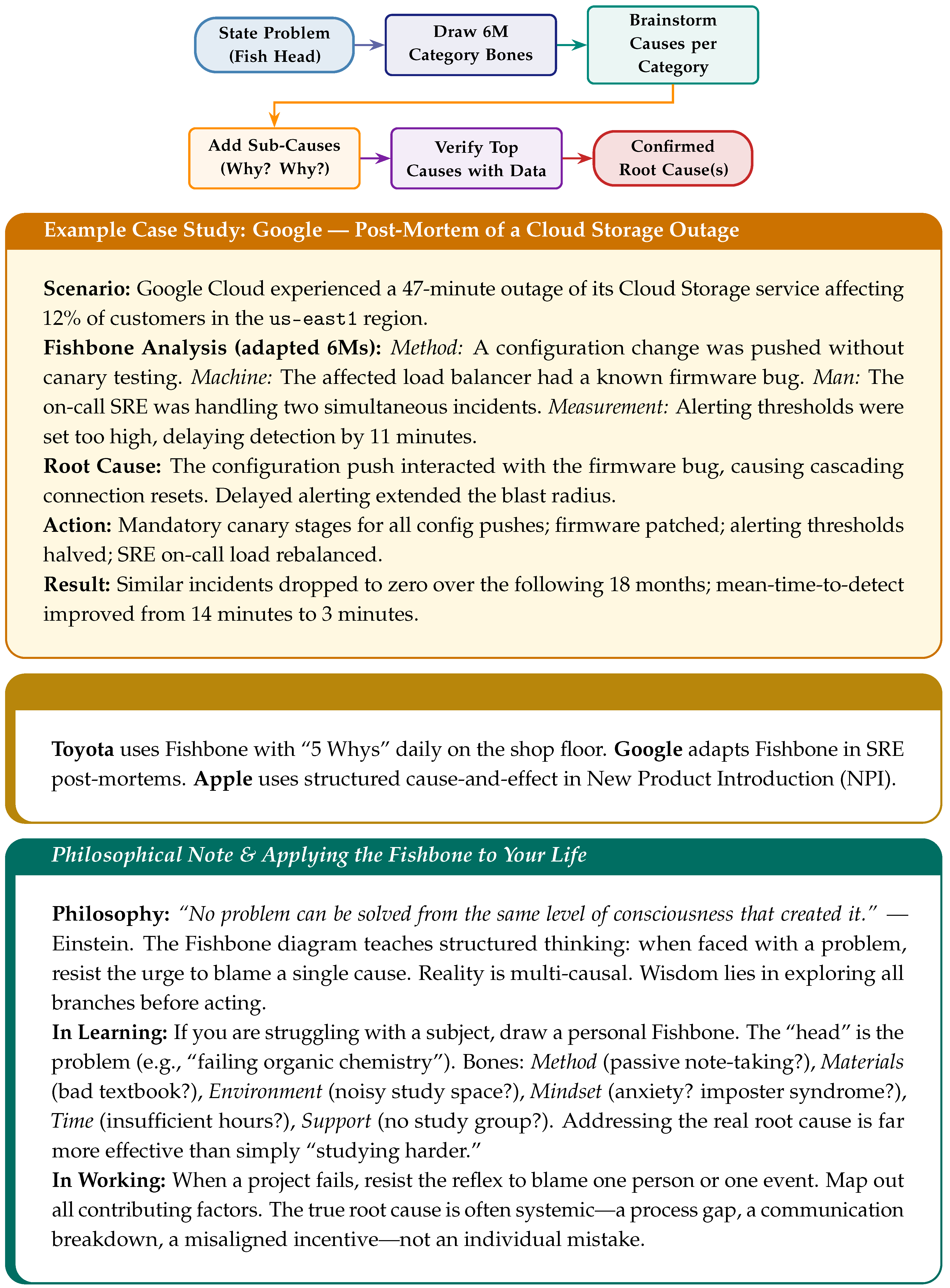
The Ishikawa (cause-and-effect) diagram resembles a fish skeleton—the problem is the head, and potential causes branch into the classic 6M categories: Man, Machine, Method, Material, Measurement, and Mother Nature. It democratises root-cause analysis: everyone from shop floor to boardroom can contribute.
3.2.1. The Mathematics Behind Root-Cause Analysis
While the Fishbone diagram is primarily visual, it is often combined with the “5 Whys” depth score and cause-frequency weighting. A useful quantification is the Cause Significance Index (CSI):
where is the number of times cause j appears across incidents, N is the total number of incidents analysed, and is an expert-assigned severity weight (1–10).
Polished Form: Not all bones on the fishbone are equally important. The CSI helps you rank them by combining “how often does this cause appear?” with “how severe is it when it does?” A cause that appears rarely but is catastrophic (high ) may rank equally with a frequent but minor cause. This quantification turns a brainstorming tool into a data-driven prioritisation engine.
3.2.2. Fishbone Diagram Construction Process
3.3. FMEA — The Fortune Teller
Full name: Failure Mode and Effects Analysis. Born: US Military (MIL-P-1629), 1949 [21].
| “By failing to prepare, you are preparing to fail.” |
| — Benjamin Franklin |
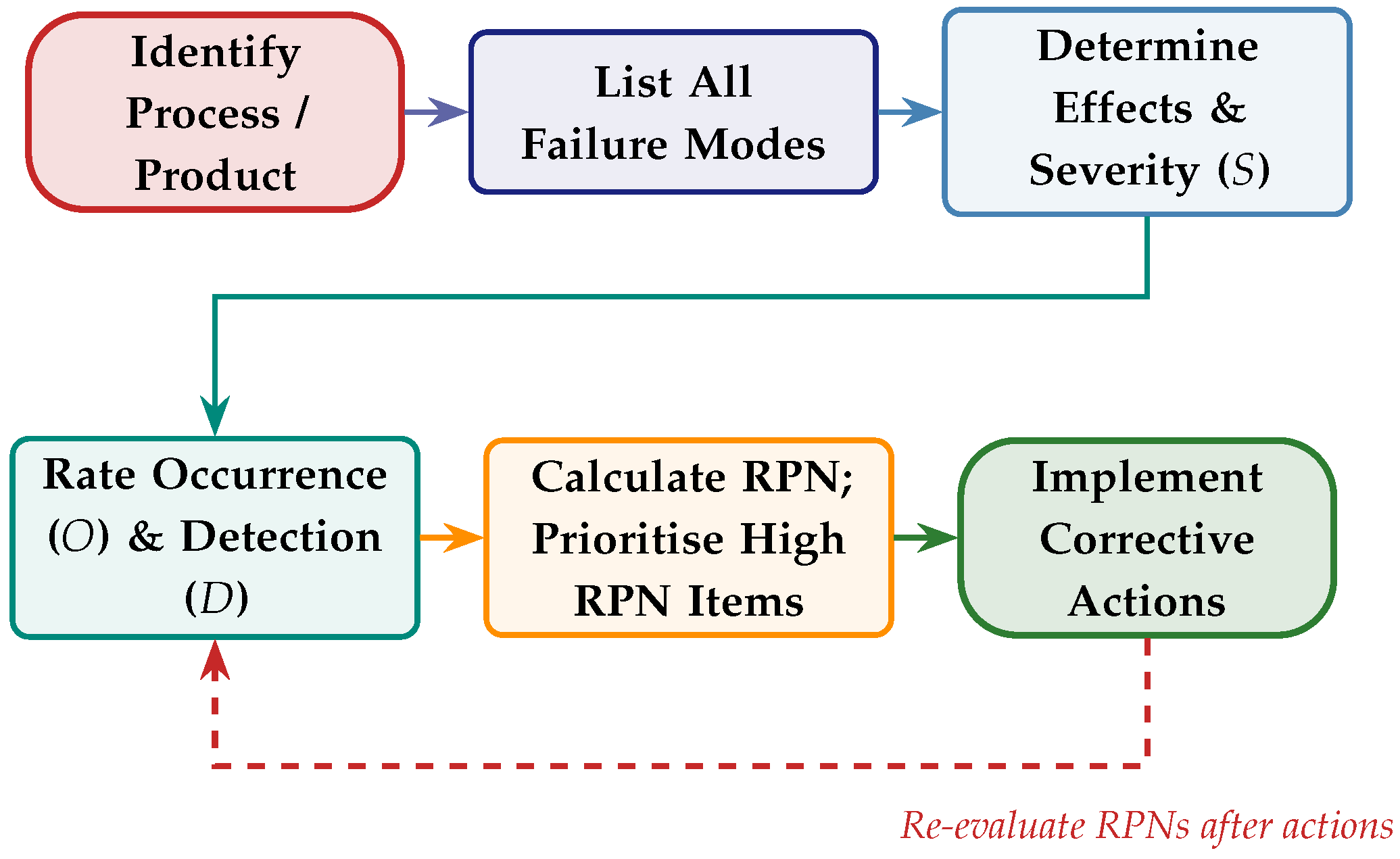
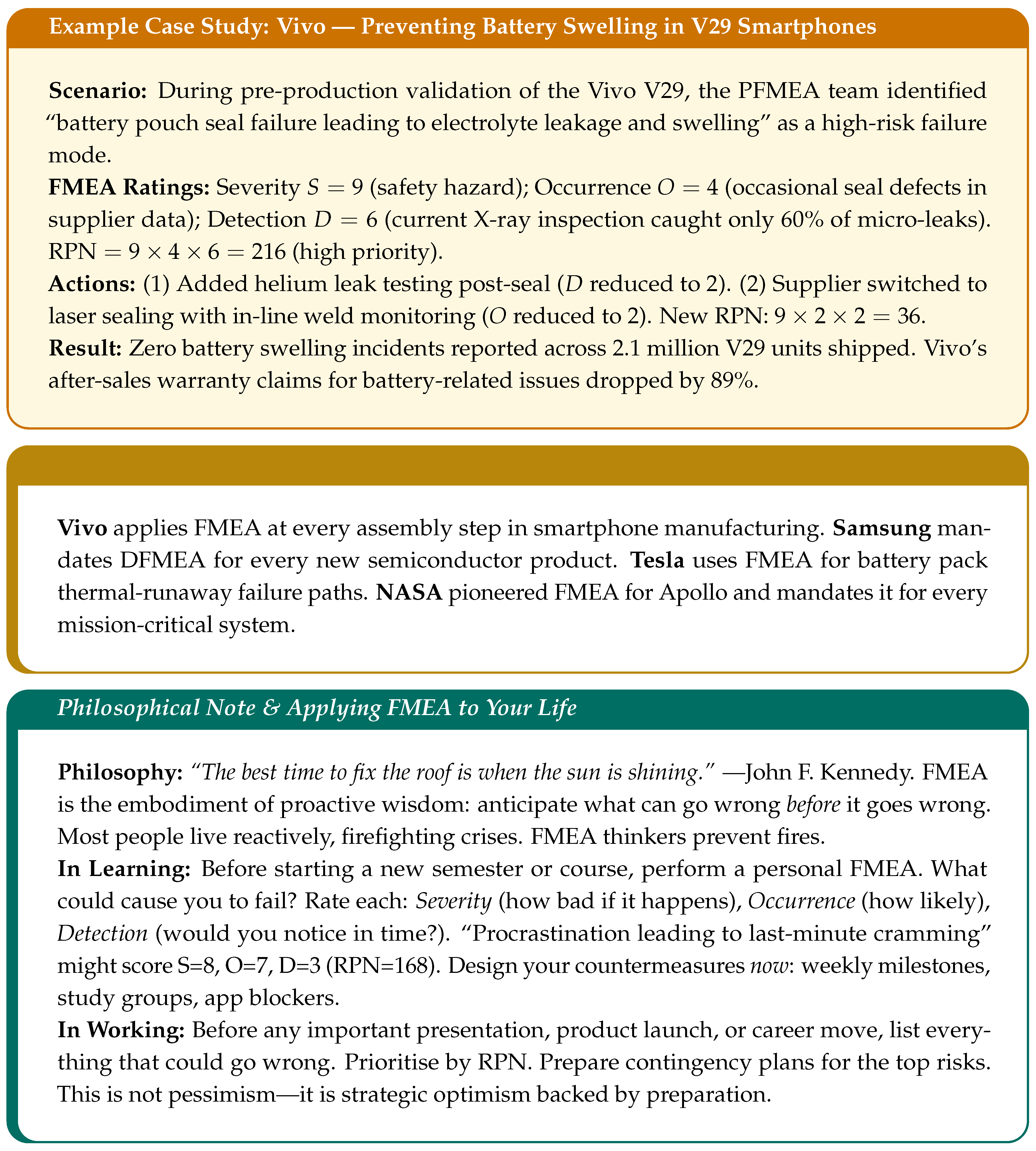
FMEA is quality’s crystal ball. It catalogues every way a product or process could fail, rates each by Severity (S), Occurrence (O), and Detection (D), and computes a Risk Priority Number:
3.3.1. FMEA Process Flow
3.3.2. What the RPN Equation Means
Polished Form: The RPN is a single number that captures three dimensions of risk. Severity (S, 1–10) asks: “How bad is it if this failure happens?” (1 = barely noticeable; 10 = safety hazard). Occurrence (O, 1–10) asks: “How often does this failure happen?” (1 = virtually never; 10 = almost certain). Detection (D, 1–10) asks: “If the failure occurs, will we catch it before the customer does?” (1 = always caught; 10 = undetectable). Multiplying them together means a failure that is severe, frequent, and hard to detect gets the highest priority. An RPN of 1 is paradise; an RPN approaching 1,000 is a crisis demanding immediate action.
Two flavours: Design FMEA (DFMEA) analyses product design failures before manufacturing. Process FMEA (PFMEA) analyses manufacturing/service delivery failures. Both let you fix problems before they happen.
4. The Process Philosophers
4.0.1. Kaizen — The Gentle Revolutionary
Born: Post-war Japan, 1950s. Champion: Masaaki Imai, 1986 [16].
| “A journey of a thousand miles begins with a single step.” |
| — Lao Tzu |
Kaizen (kai = change, zen = good) is intoxicatingly simple: small, continuous improvements, every day, by everyone. No revolution—just relentless, gentle evolution that compounds into extraordinary transformation.
4.0.2. Kaizen Event Process
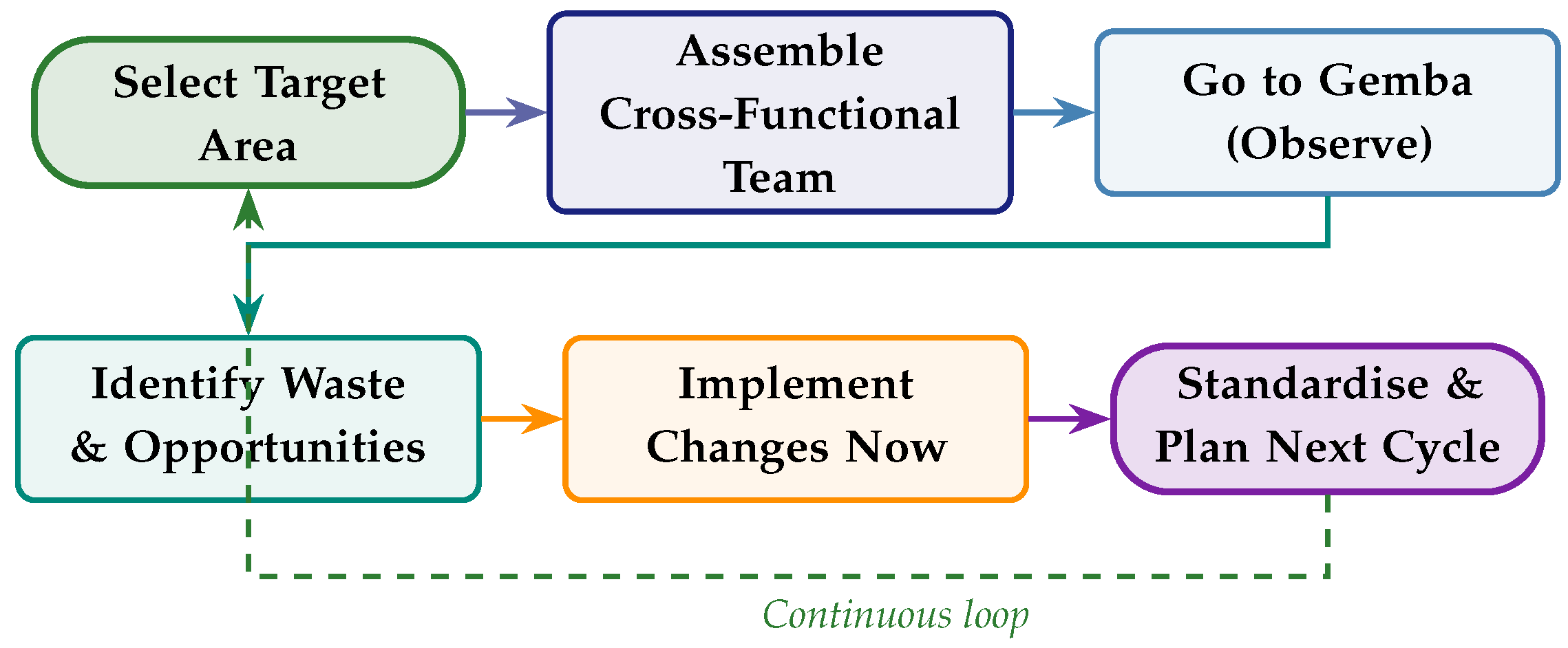
The Kaizen Blitz: A 3–5 day focused event. Observe, identify waste, implement, measure, standardise—all in one week. Beyond formal events, Kaizen thrives in suggestion systems: Toyota receives over 700,000 improvement suggestions annually, implementing ∼99%.
4.0.3. The Mathematics of Kaizen (Compound Improvement)
The power of Kaizen lies in the compound improvement formula:
where is the initial performance, r is the fractional improvement per cycle (e.g., 0.01 = 1%), and n is the number of cycles.
Polished Form: If you improve by just 1% per day for one year: . That means you are nearly 38 times better at the end of the year [16]! Conversely, declining by 1% daily: —you retain only 3% of your original capability. Kaizen’s magic is not in the size of each improvement but in the relentless compounding. Small daily gains, sustained over months and years, produce results that look like miracles to those who only see the endpoint.
4.0.4. PDCA — The Eternal Dance
Born: Shewhart (concept, 1930s) [2]; Deming (evangelism, 1950s) [3].
| “Life can only be understood backwards; but it must be lived forwards.” |
| — Søren Kierkegaard |
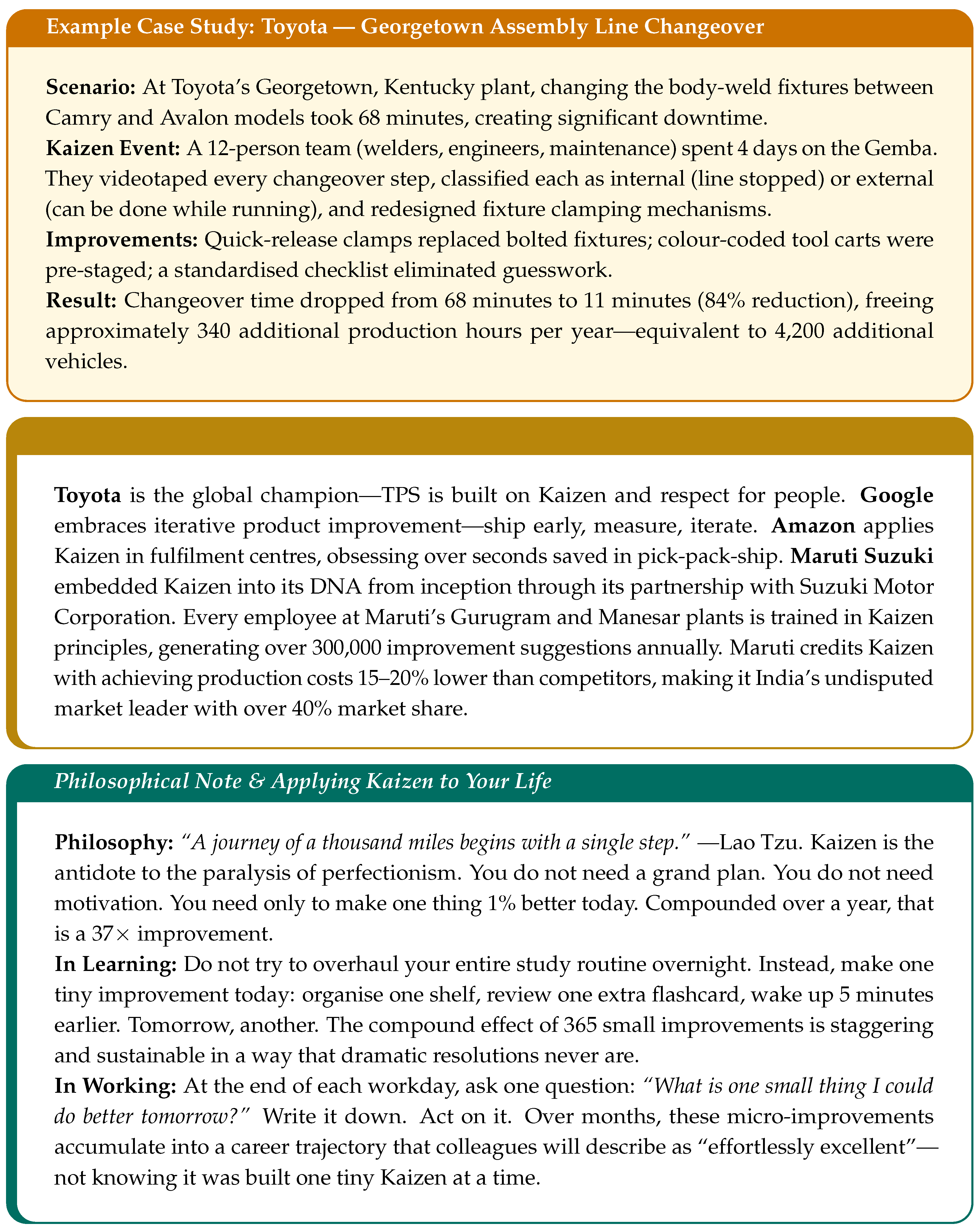
Plan–Do–Check–Act is the waltz of quality improvement—four graceful steps in an endless cycle. It is fractal: it works at every scale.
4.0.5. The Mathematics of PDCA (Iterative Convergence)
PDCA can be modelled as iterative convergence toward a target value T. If each cycle reduces the gap between current performance and target T by a fraction (the “learning rate”):
Polished Form: Each PDCA cycle closes a fraction of the remaining gap. With (a 30% improvement per cycle), after 5 cycles you have closed 83% of the original gap; after 10 cycles, 97%. The formula reveals why PDCA works: you never need to achieve perfection in one leap. Each cycle brings you measurably closer, and the cumulative effect of disciplined repetition is convergence toward excellence.
4.0.6. PDCA Cycle
4.0.7. TQM — The Grand Romance
Full name: Total Quality Management. Champions: Deming [3], Juran [4], Crosby [5], Feigenbaum [6].
| “Quality is everyone’s responsibility.” |
| — W. Edwards Deming |
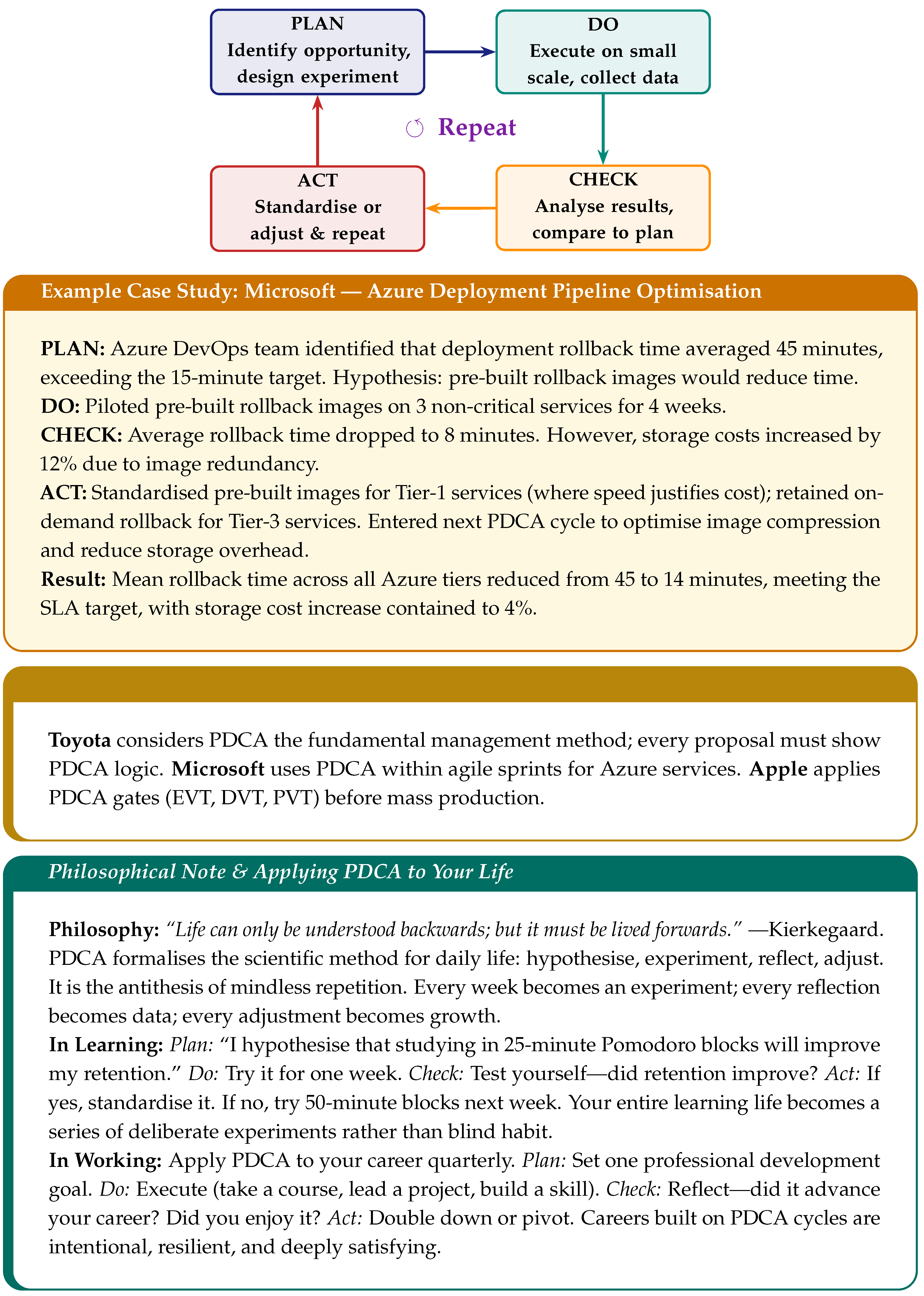
TQM is a love affair between an entire organisation and quality. Every department, employee, supplier, and process is drawn into a holistic embrace where quality permeates everything.
4.0.8. The Mathematics of TQM (Cost of Quality)
TQM relies on the Cost of Quality (COQ) framework:
Polished Form: Quality is never free, but poor quality is always more expensive. Prevention costs (training, planning) and appraisal costs (inspection, testing) are investments. Internal failure costs (scrap, rework) and external failure costs (warranty claims, lost customers, lawsuits) are penalties. TQM’s insight: spending more on prevention dramatically reduces total COQ. A $1 investment in prevention can save $10–$100 in failure costs. Philip Crosby captured this as: “Quality is free—it’s the lack of quality that costs money.”
4.0.9. TQM Implementation Process
5. The Lean & Mean Machines
5.0.1. Lean Manufacturing — The Minimalist Heartthrob
Born: Toyota Production System, 1950s. Popularised: Womack & Jones, 1990 [12].
| “Simplicity is the ultimate sophistication.” |
| — Leonardo da Vinci |
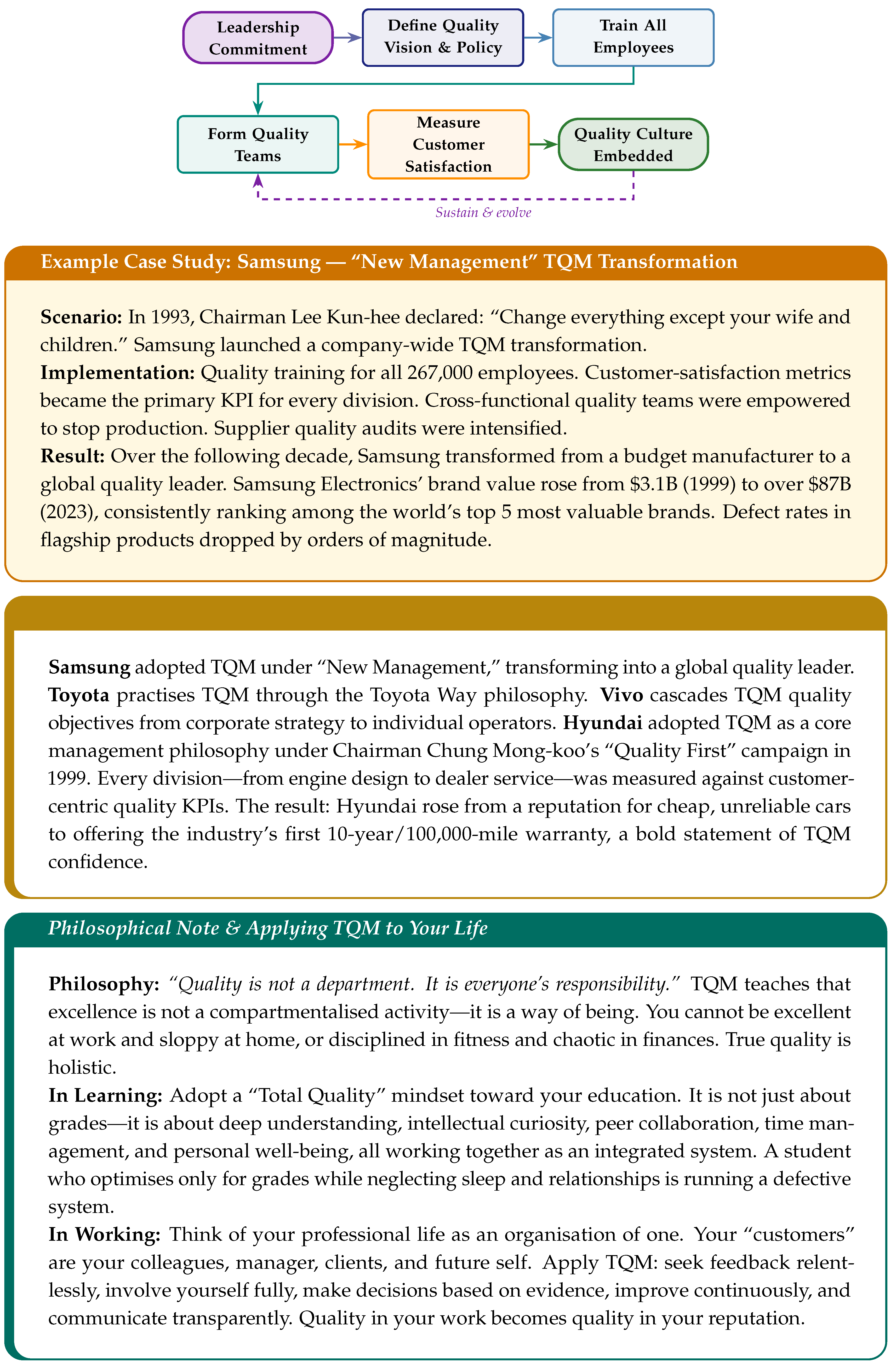
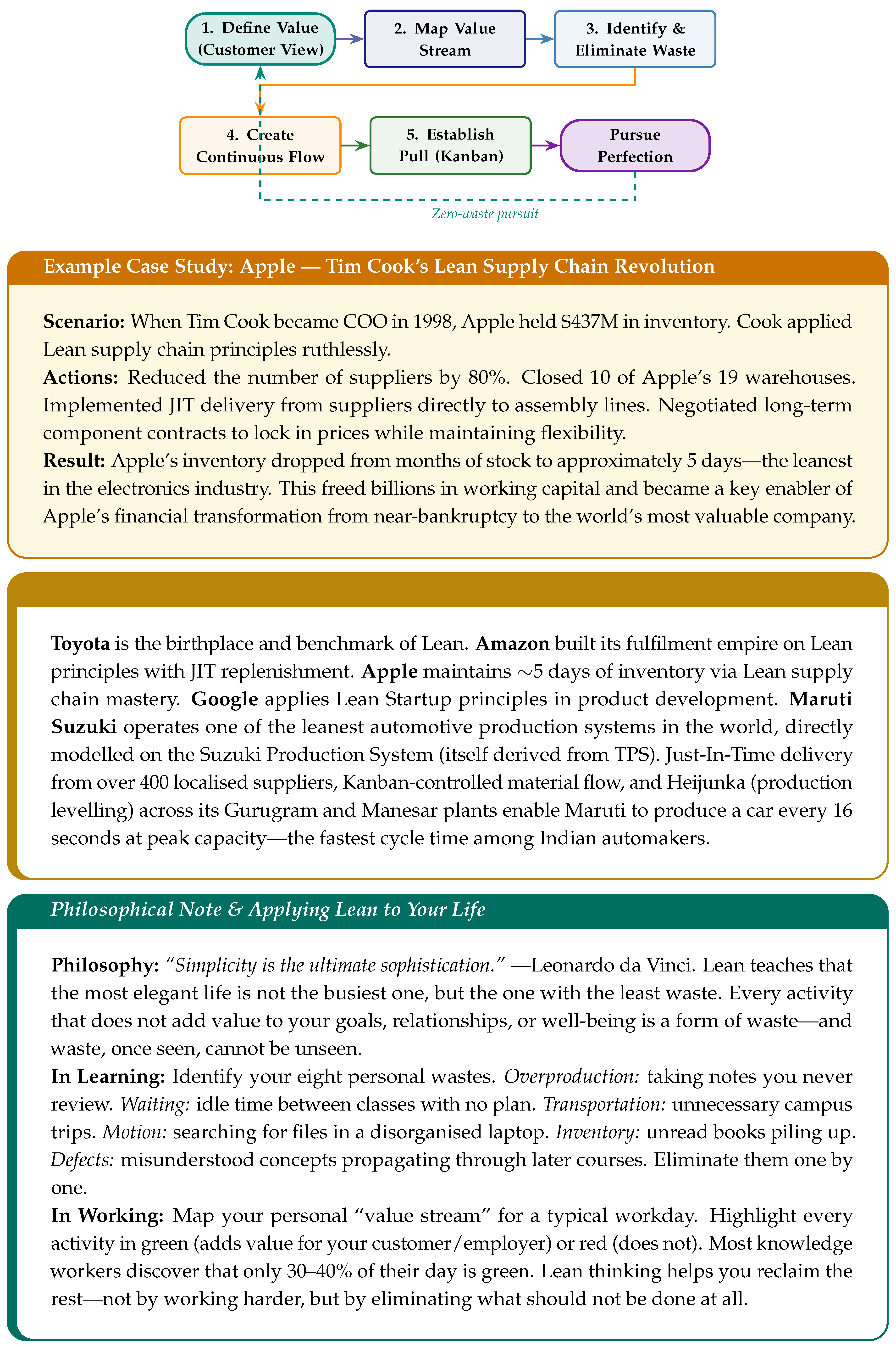
Lean is the Marie Kondo of manufacturing: if a step does not add value, eliminate it. It identifies eight wastes (DOWNTIME: Defects, Overproduction, Waiting, Non-utilised talent, Transportation, Inventory, Motion, Extra-processing) and ruthlessly purges them.
5.0.2. The Mathematics of Lean (Process Efficiency)
The key Lean metric is Process Cycle Efficiency (PCE):
Also central is Little’s Law, which governs the relationship between throughput, inventory, and cycle time:
where L = average inventory (items in process), = average throughput rate, and W = average time an item spends in the system.
Polished Form: In most manufacturing, PCE is shockingly low—often 1–5%. That means for every 100 hours a product spends in the factory, only 1–5 hours involve actual value creation; the rest is waiting, moving, and sitting in queues. Lean aims to push PCE toward 25% or higher. Little’s Law reveals a powerful truth: to reduce lead time (W), you must reduce inventory (L). Less work-in-progress means faster delivery.
5.0.3. Lean Implementation Process (Five Principles)
5.1. Lean Six Sigma — The Power Couple
Born: Late 1990s–early 2000s hybrid [33].
| “Alone we can do so little; together we can do so much.” |
| — Helen Keller |
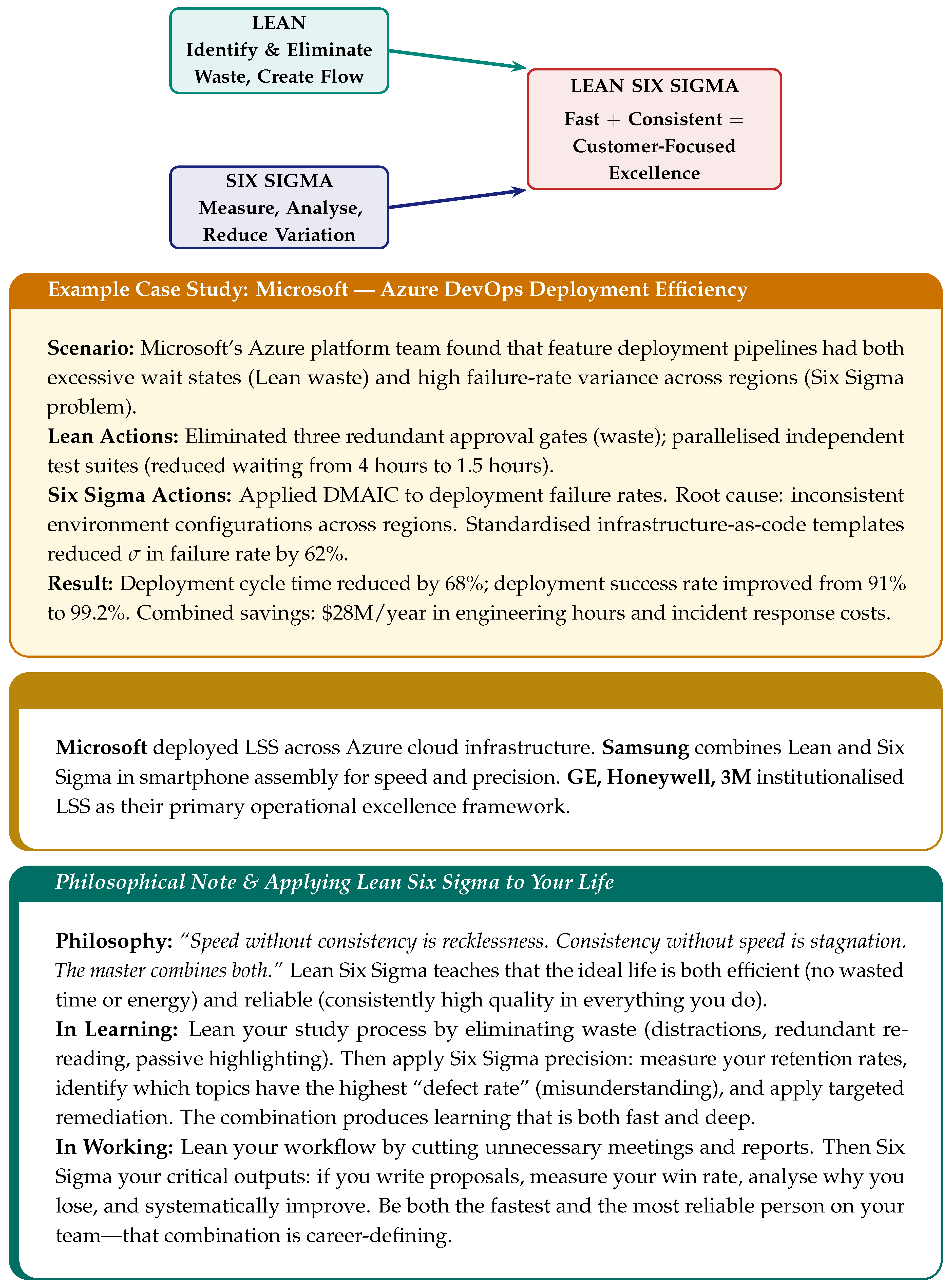
Lean makes processes fast; Six Sigma makes them consistent; together, unbeatable.
5.1.1. The Mathematics of Lean Six Sigma
Lean Six Sigma combines Process Cycle Efficiency (Lean) with Sigma Level (Six Sigma). A practical unified metric:
where is the sigma level and PCE is the process cycle efficiency. A process at but only 5% PCE scores —precise but slow. A process at and 50% PCE scores —fast but error-prone. The goal: maximise both.
Polished Form: There is no point being incredibly precise if your process takes forever, and no point being lightning-fast if you produce defects. The combined metric rewards only processes that are both fast and accurate—the hallmark of world-class operations.
5.1.2. Lean Six Sigma Integration
6. The Design Virtuosos
6.1. DOE — The Experimental Seductress
Full name: Design of Experiments. Born: R.A. Fisher, 1920s [24].
| “The only source of knowledge is experience—but structured experience is worth a thousand random trials.” |
| — Adapted from Albert Einstein |
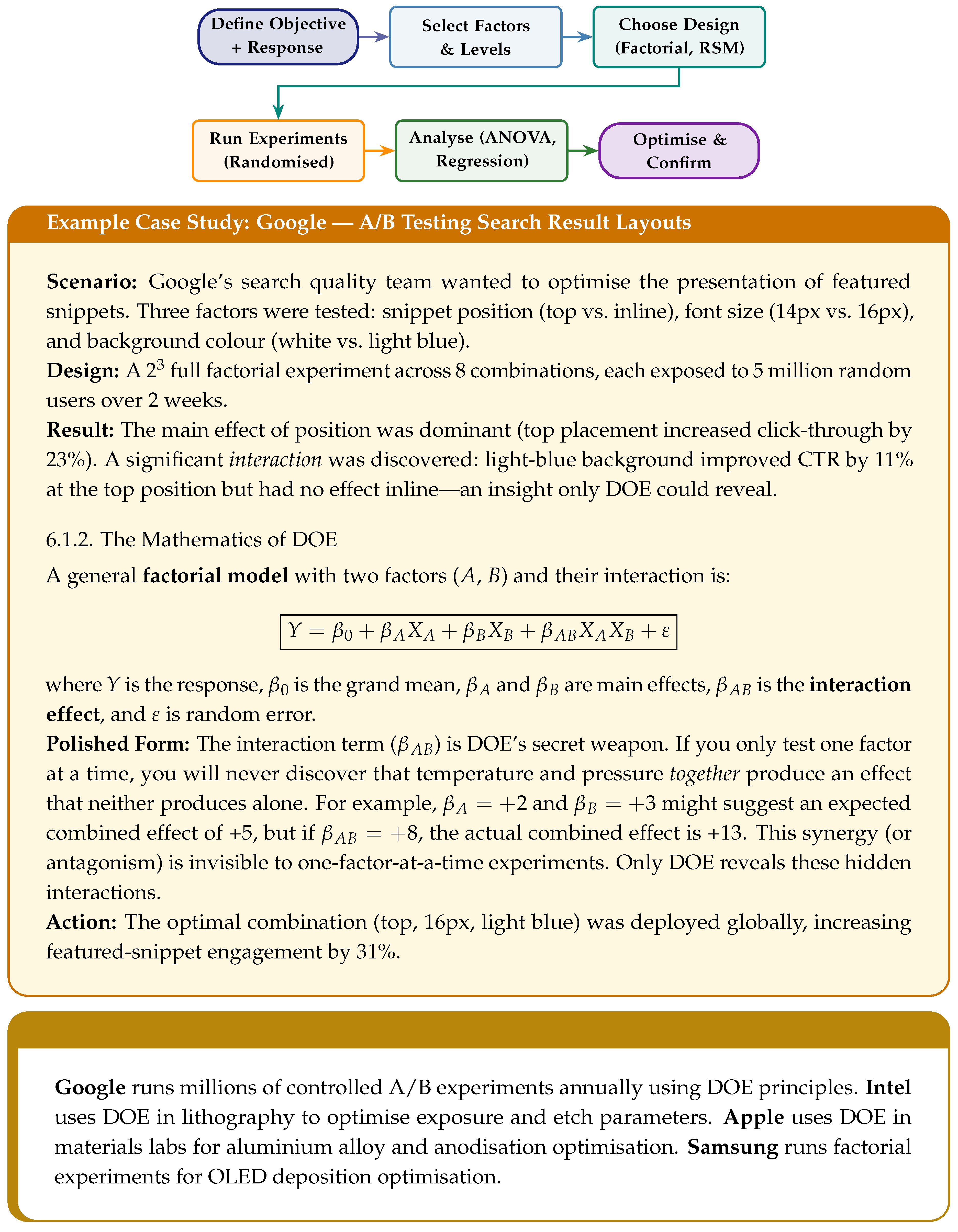
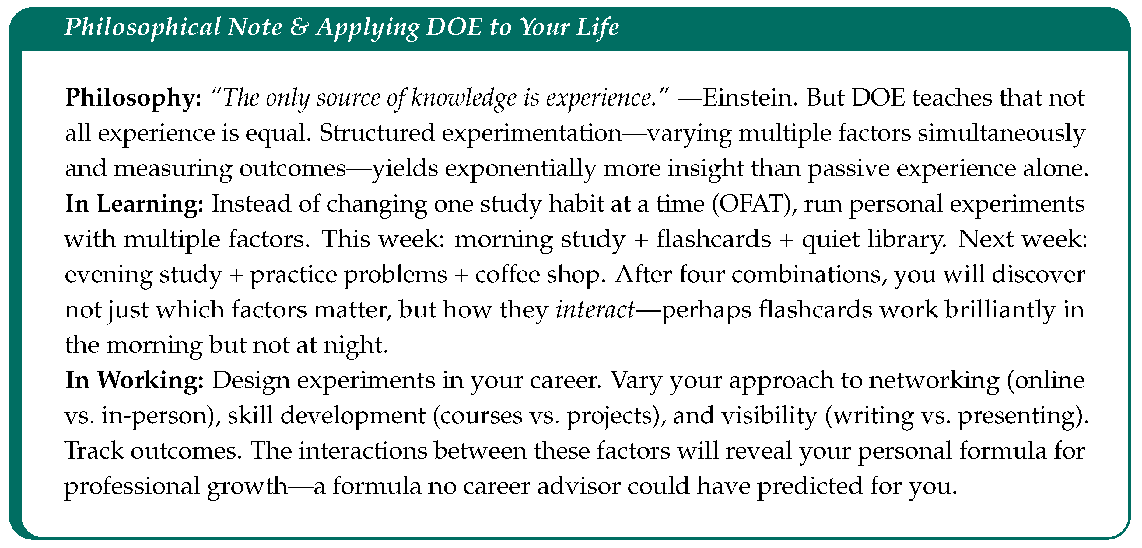
DOE designs structured experiments—full factorial, fractional factorial, RSM—that reveal main effects and interactions between factors simultaneously.
6.1.1. DOE Process Flow
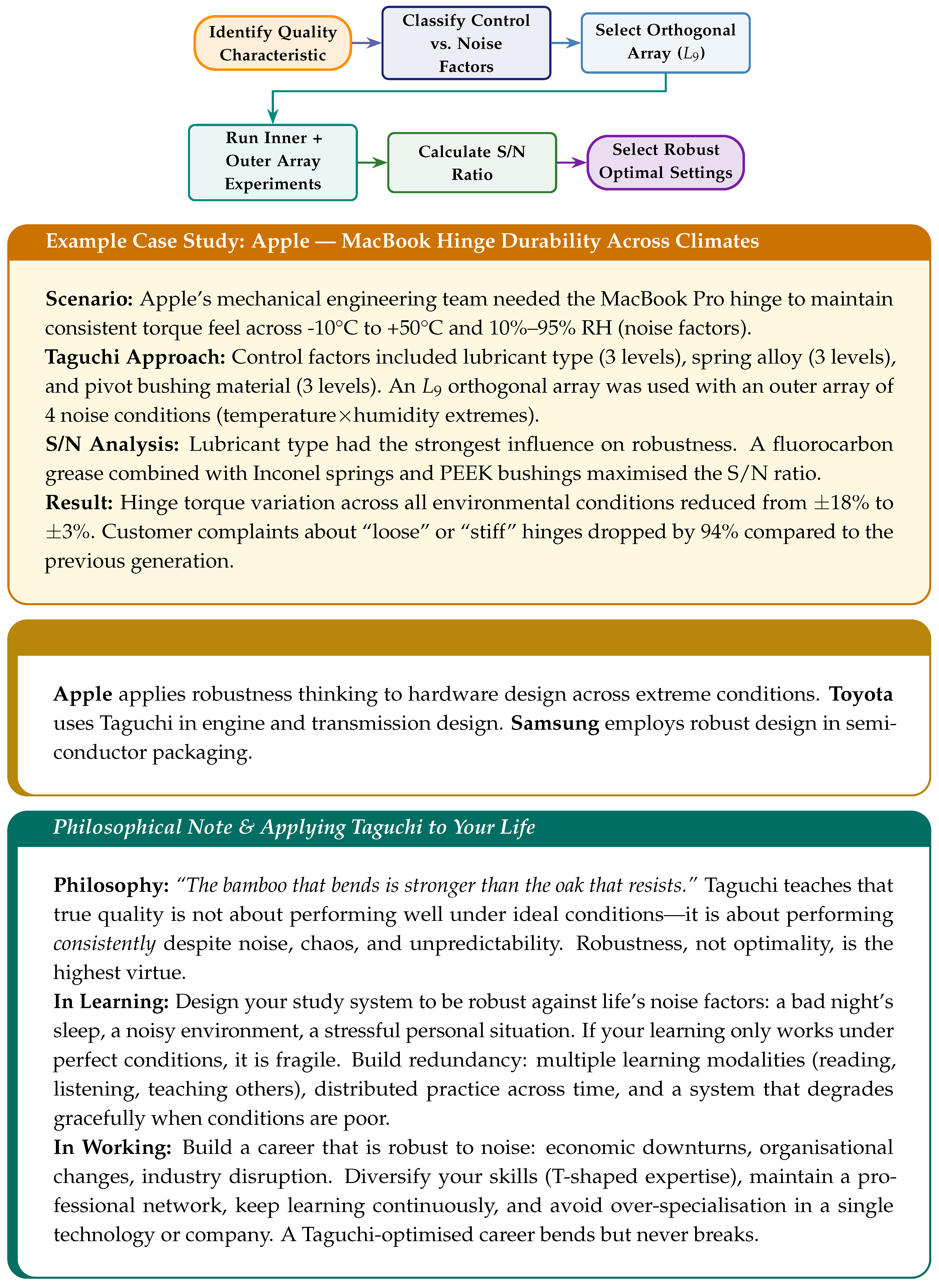
6.2. Taguchi Method — The Robust Romantic
Born: Genichi Taguchi, 1950s–1960s [26].
| “The bamboo that bends is stronger than the oak that resists.” |
| — Japanese proverb |
Taguchi designs products that perform consistently despite noise. His Loss Function quantifies the cost of deviation from the ideal target:
6.2.1. What the Loss Function Means
Polished Form: Traditional quality thinking says: “If the measurement is within specifications, it’s good; if it’s outside, it’s bad.” Taguchi said: “Any deviation from the target causes loss—and the loss increases with the square of the deviation.” A product at exactly the target value T has zero loss. A product 1 mm off-target costs . A product 2 mm off costs —four times the loss, not twice. This quadratic penalty means that being “just inside spec” is not good enough; only hitting the target is truly excellent. The constant k is calculated as , where is the distance from target to specification limit.
6.2.2. Taguchi Method Process
7. The Visual Storytellers
7.1. Flowcharts — The Elegant Narrator
Born: Frank and Lillian Gilbreth, 1921 [28].
| “If you can’t describe what you are doing as a process, you don’t know what you are doing.” |
| — W. Edwards Deming |
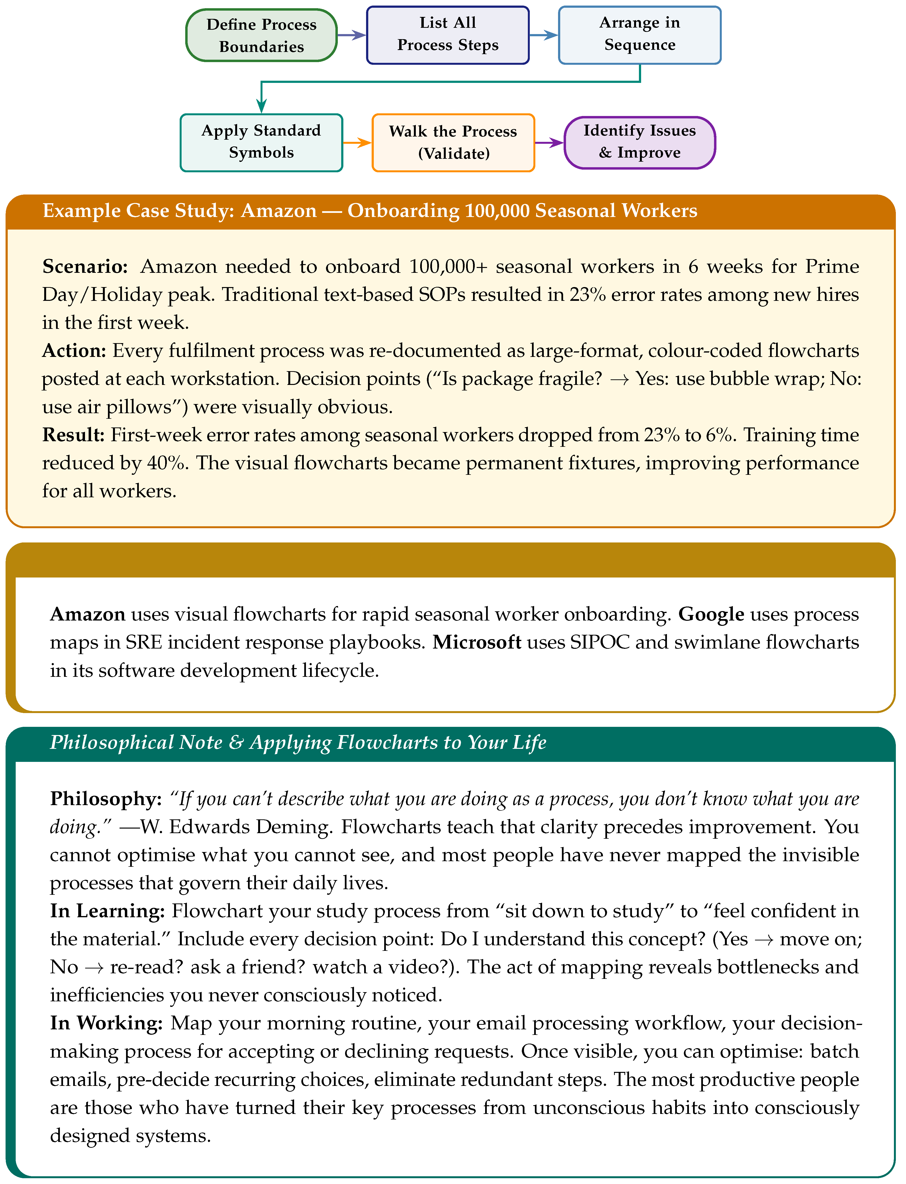
Flowcharts transform invisible processes into visible stories. Every decision diamond, every process rectangle, every arrow contributes to a narrative anyone can follow. They are the foundation upon which every other quality method builds.
7.1.1. The Mathematics of Flowcharts (Process Complexity)
Flowcharts enable the calculation of Cyclomatic Complexity (), a metric for process complexity:
where E = number of edges (arrows), N = number of nodes (boxes/diamonds), and P = number of connected components (usually 1).
Polished Form: Cyclomatic complexity counts the number of independent decision paths through a process. A straight-line process with no decisions has —simple and reliable. A process with 10 decision diamonds might have —meaning 11 different paths a product or case can take, each a potential source of error. Research shows that processes with are significantly more error-prone. Flowcharting reveals this hidden complexity and motivates simplification.
7.1.2. Flowchart Creation Process
7.2. Check Sheets — The Disciplined Collector
| “What gets measured gets managed. What gets managed gets improved.” |
| — Peter Drucker |
Purpose: Structured, real-time data collection at the point of origin.
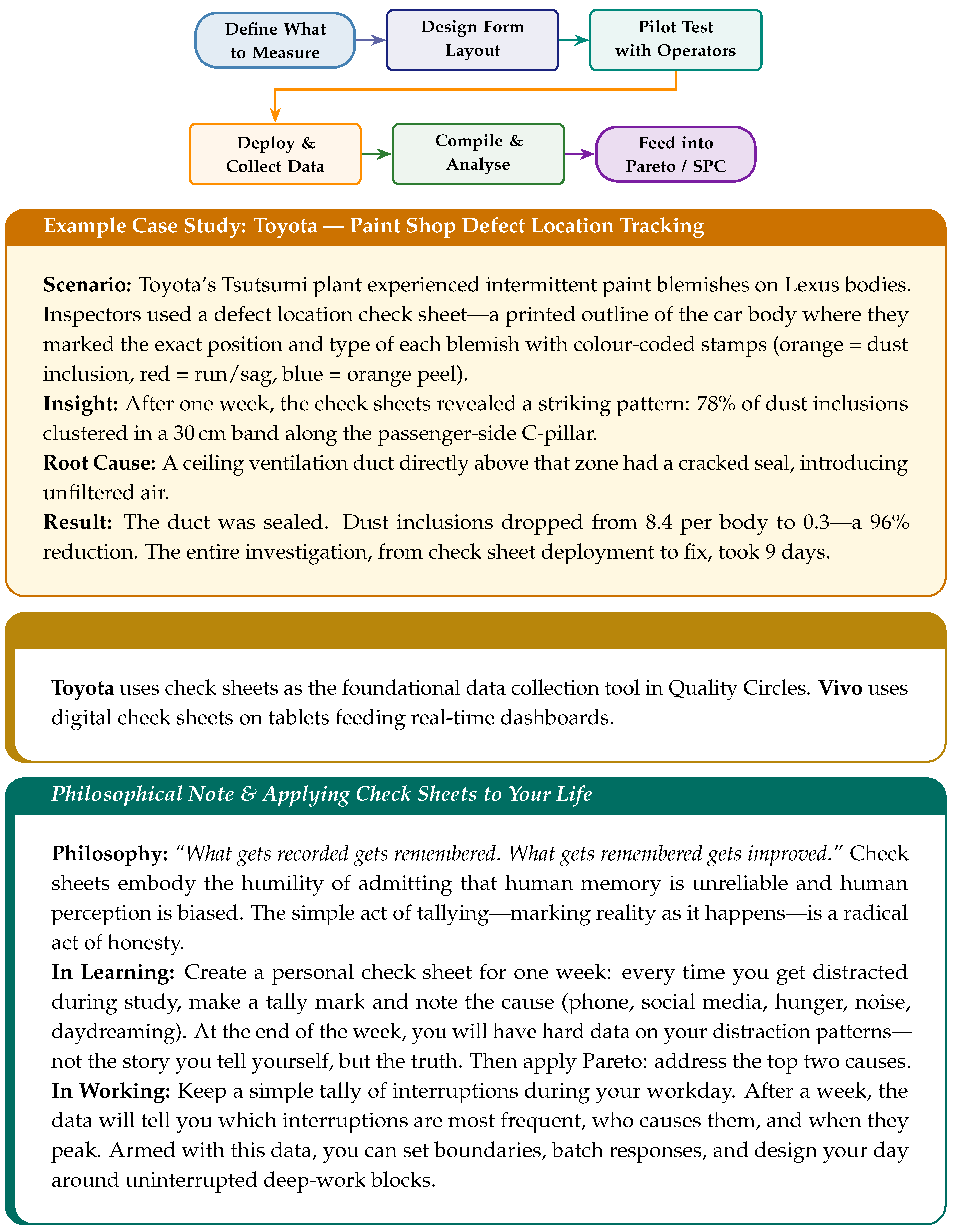
Check sheets are beautifully simple forms designed to capture data with tick marks, tallies, and timestamps. They bridge raw observation and actionable analysis.
7.2.1. The Mathematics of Check Sheets (Sample Size)
A fundamental question: how much data do I need? The minimum sample size for estimating a proportion p with margin of error e at confidence level :
For 95% confidence (), worst-case , margin : .
Polished Form: Check sheets are only as good as the amount of data they collect. This formula tells you exactly how many tallies you need. For most quality investigations, 385 observations give you 95% confidence that your measured defect rate is within ±5% of the true value. That is the scientific backbone behind the humble tally mark.
7.2.2. Check Sheet Development Process
8. The Strategic Heavyweights
8.1. 5S — The Organised Seducer
Born: Toyota, Japan [29].
| “Have nothing in your houses that you do not know to be useful, or believe to be beautiful.” |
| — William Morris |
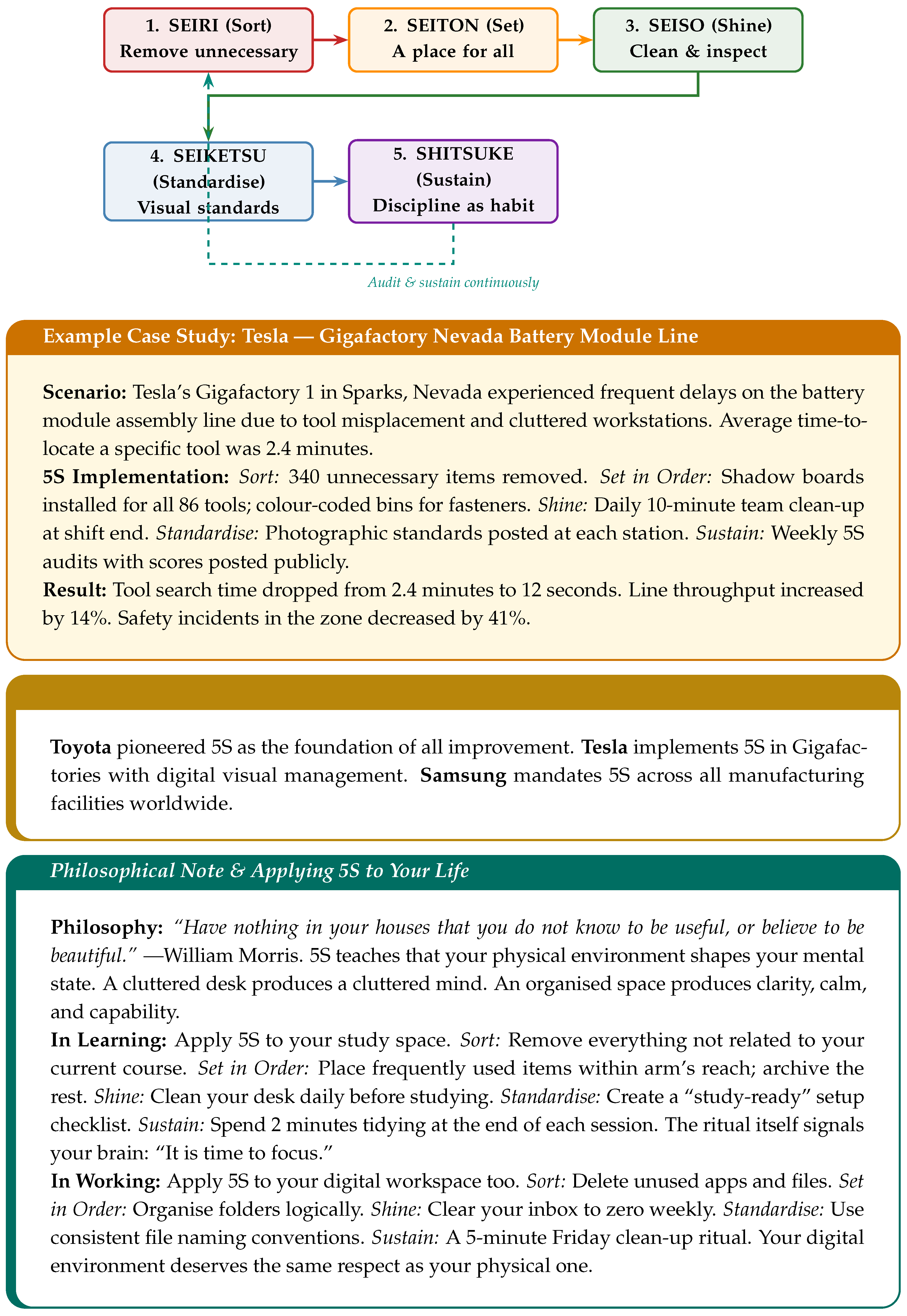
5S transforms chaotic workspaces into temples of efficiency, safety, and beauty through five principles.
8.1.1. The Mathematics of 5S (Search Time Reduction)
Time spent searching follows a logarithmic search model:
where is the number of items in the workspace. After 5S reduces items to only essentials in designated locations, search time approaches the constant a (near-zero).
Polished Form: In a cluttered workspace with 500 items, finding a tool takes far longer than in a 5S workspace with 50 organised items. The logarithmic relationship means removing 90% of clutter reduces search time far more than 90%, because remaining items are labelled, shadow-boarded, and instantly locatable. 5S converts searching (waste) into finding (value).
8.1.2. 5S Implementation Process
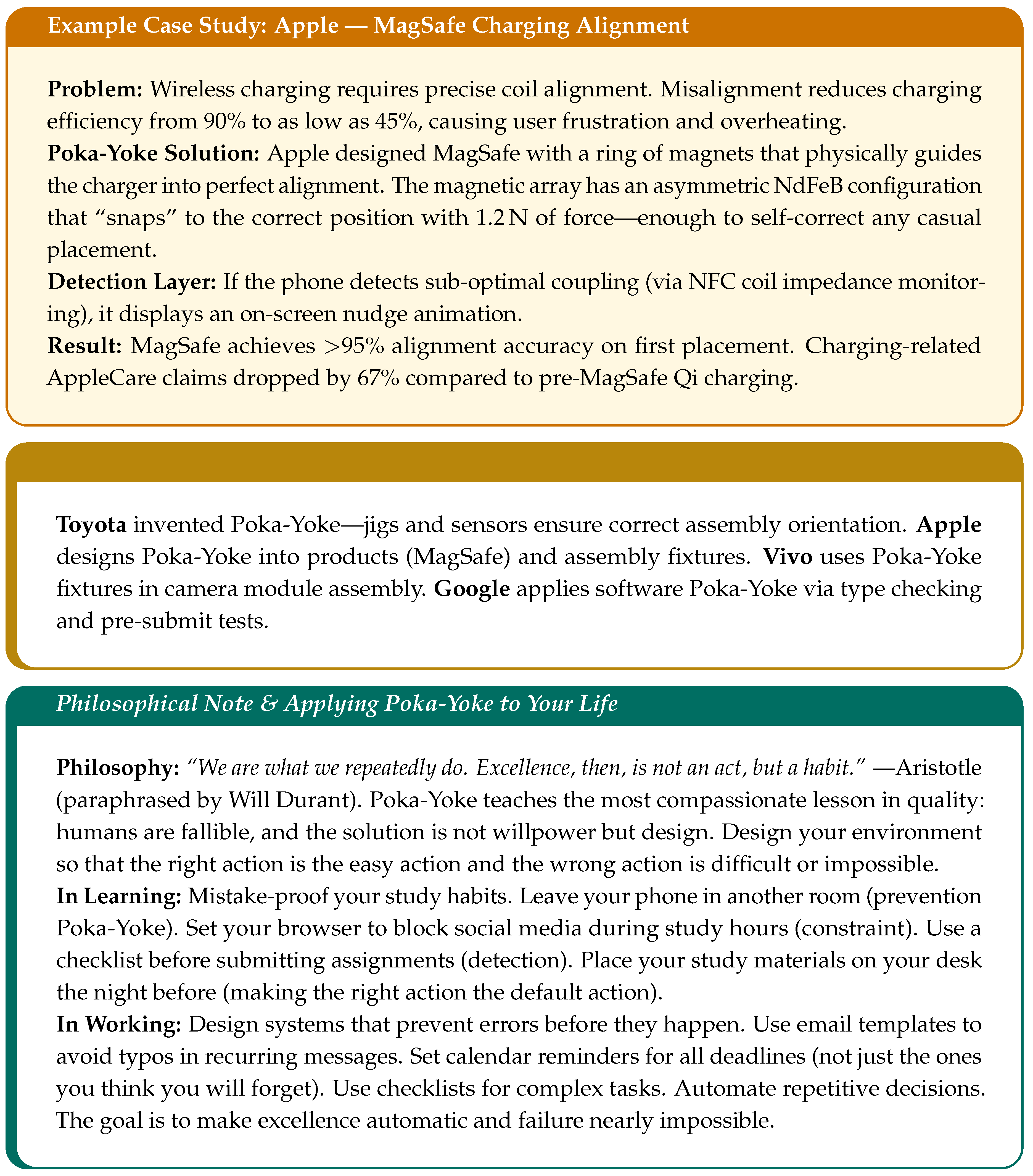
8.2. Poka-Yoke — The Mistake-Proof Charmer
| “Make it easy to do the right thing, and hard to do the wrong thing.” |
| — Shigeo Shingo |
Born: Shigeo Shingo, Toyota, 1960s [30]. Philosophy: blame the process, not the person.
8.2.1. Poka-Yoke Design Process
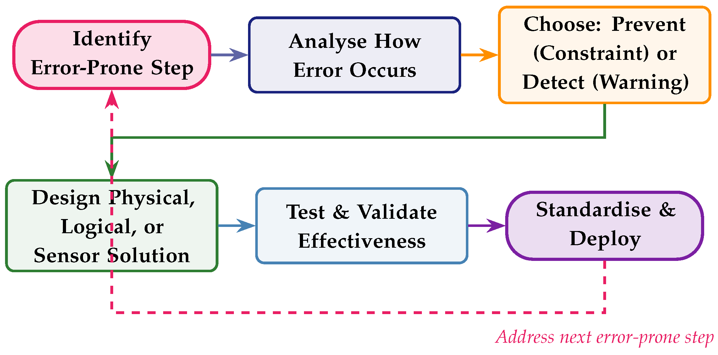
Three levels:Contact/Physical—shape prevents wrong assembly. Fixed-Value—sensor counts operations. Motion-Step—sequence physically enforced.
8.3. Theory of Constraints — The Bottleneck Whisperer
Born: Eliyahu Goldratt, The Goal, 1984 [31].
| “A chain is only as strong as its weakest link.” |
| — Thomas Reid |
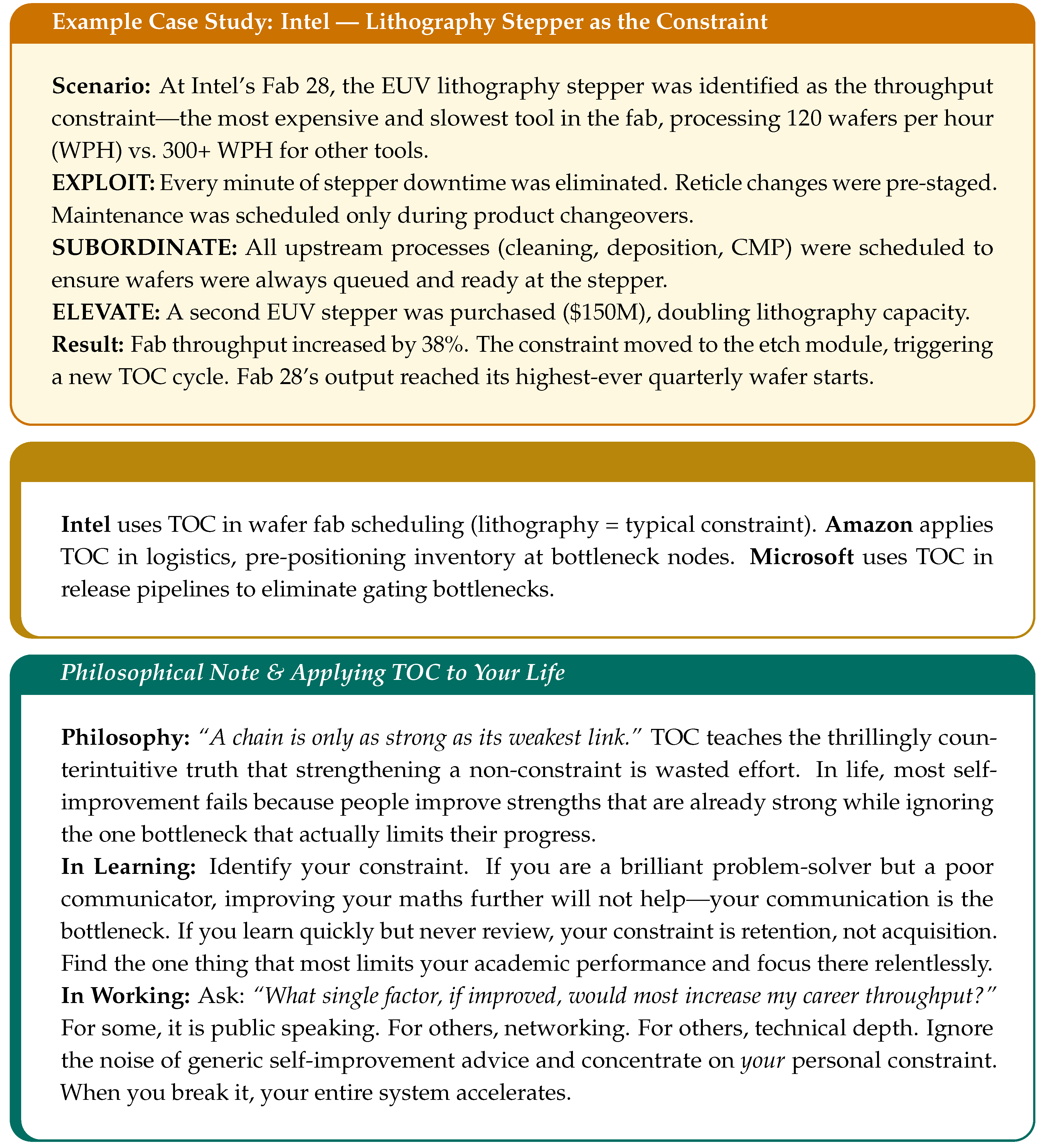
Every system has exactly one constraint. Only that constraint matters. Improving anything else is wasted effort.
8.3.1. TOC Five Focusing Steps
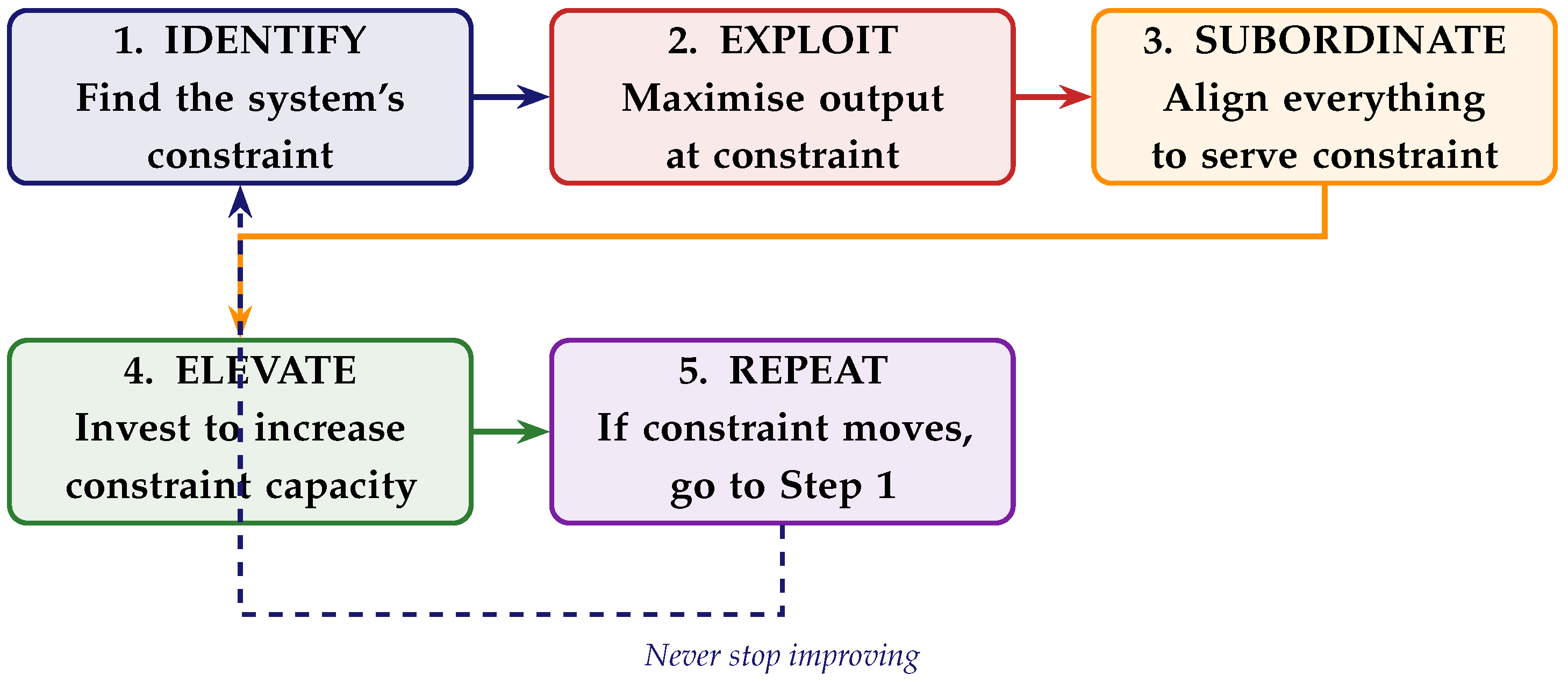
Drum-Buffer-Rope (DBR): The constraint sets the drum (pace). A time buffer protects it from starvation. A rope ties material release to the drum’s pace.
8.4. Statistical Process Control — The Watchful Guardian
Born: Shewhart, 1920s [1]. Evangelised by: Deming [3].
| “Variation is the enemy of quality. Understanding variation is the key to success.” |
| — Walter Shewhart |
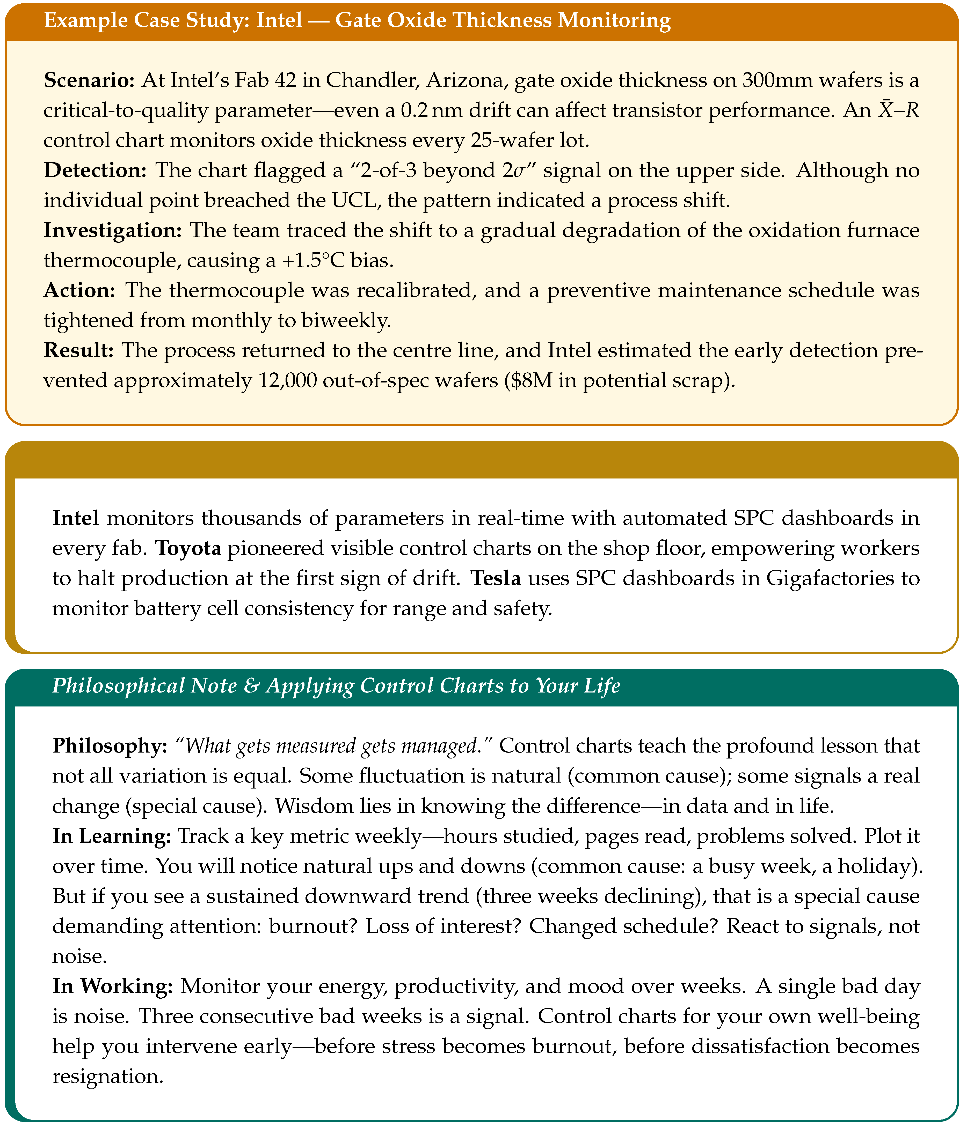
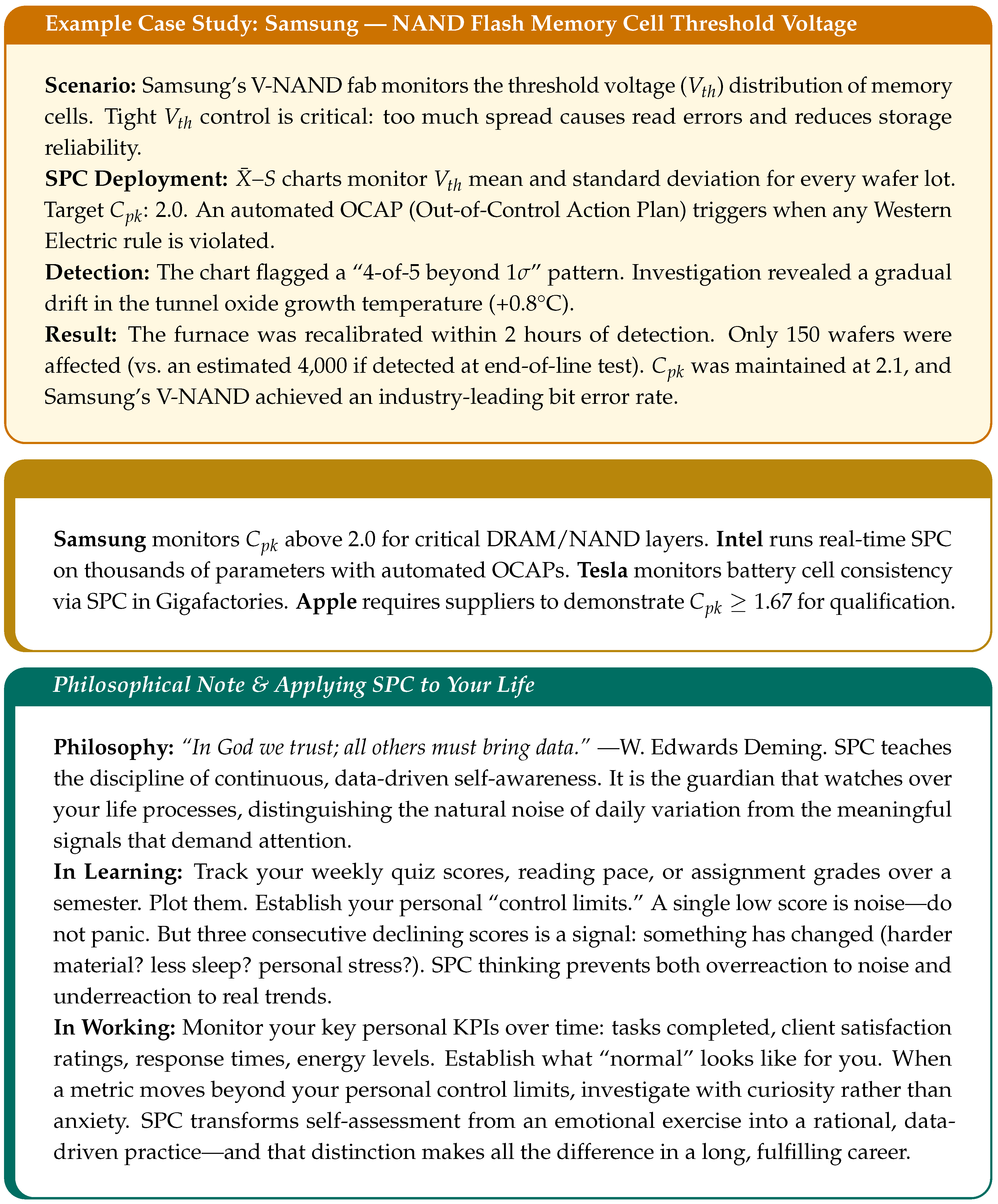
SPC encompasses control charts, process capability analysis (, ), and continuous monitoring. It is the guardian angel that never sleeps.
8.4.1. SPC Implementation Process
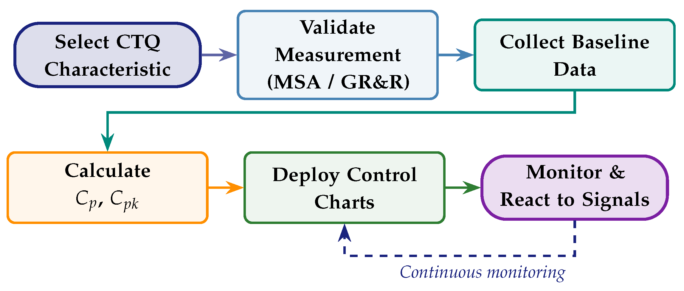
Capability indices:
= capable; = world-class.
Polished Form: measures the potential capability—could this process fit within the specification limits if it were perfectly centred? It compares the specification width () to the process spread (). If , the spec window is twice as wide as the process spread—plenty of room. adds realism: it accounts for the process not being centred. A process with but has the potential for excellence but is badly off-centre—like a skilled archer who consistently aims left of the bullseye. The fix is simple: re-centre the process. means the process is capable and centred enough that fewer than 63 parts per million will fall outside specifications.
9. The Grand Comparison
Table 1 presents all twenty methods at a glance.
10. Who Uses What: Tech Company Matrix
Table 2 maps the twenty methods to their most prominent adopters.
11. How They Work Together: The Dream Stack
No quality method exists in isolation. The most successful organisations weave multiple methods into integrated systems:
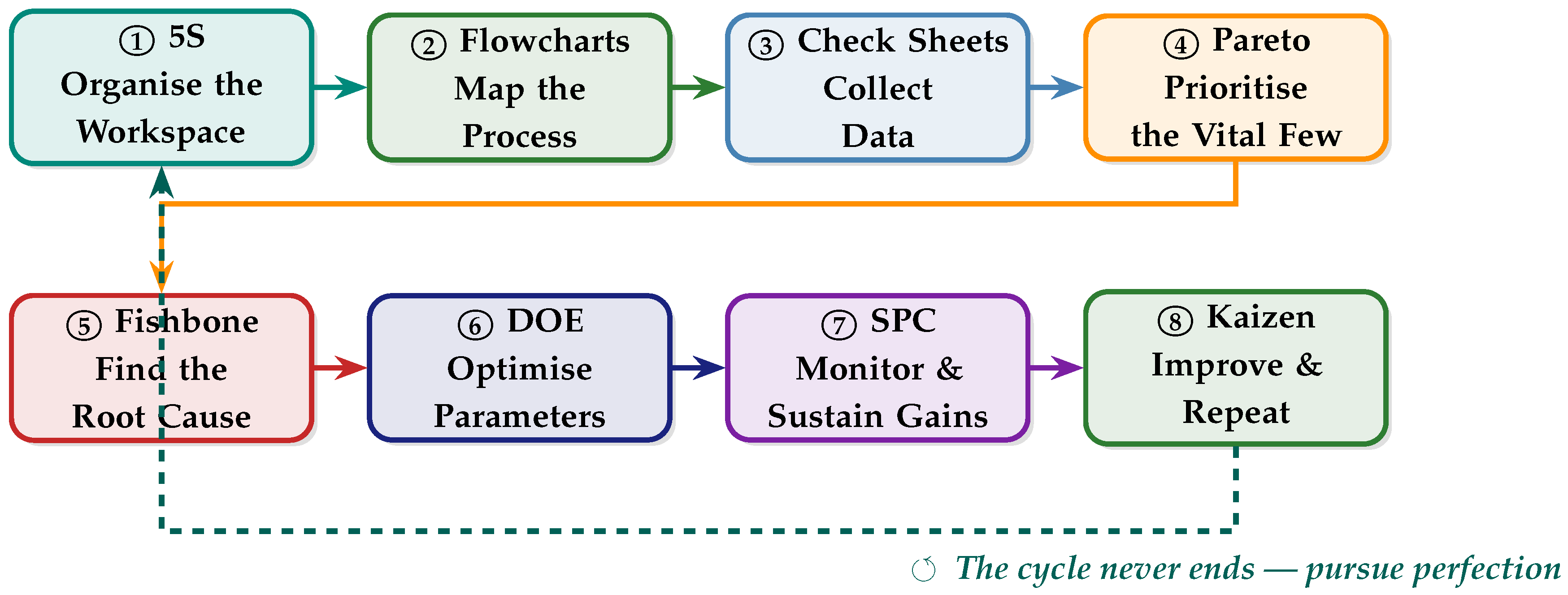
Each method is a note in a symphony. Individually beautiful. Together, breathtaking.
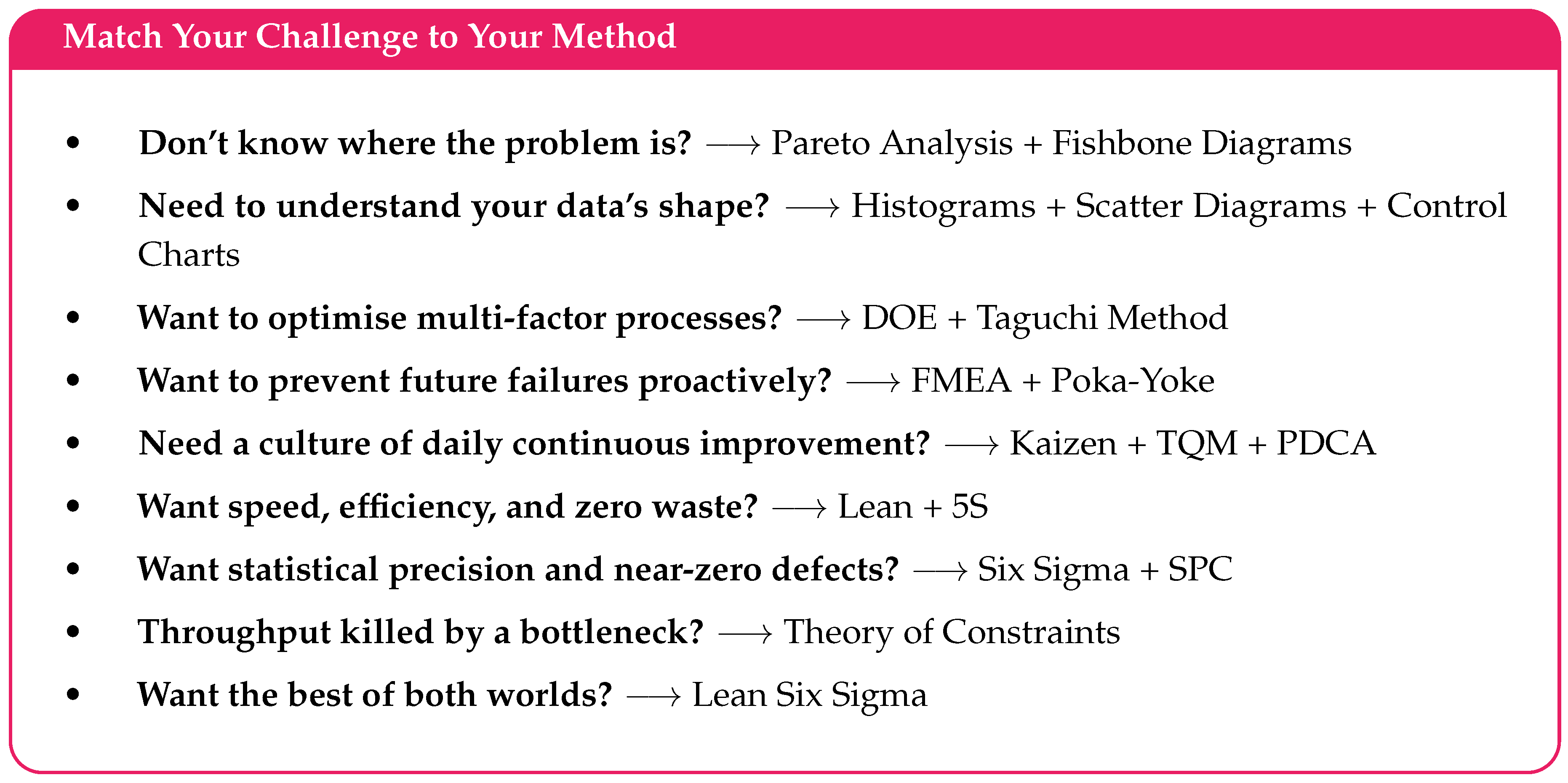
12. Choosing Your Method: A Quick Guide
13. Conclusion: The Eternal Pursuit of Perfection
Quality improvement is a love story that never ends. From Shewhart’s first control chart in 1924 [1] to today’s AI-augmented Six Sigma [10], from Toyota’s Kaizen culture [14] to Google’s millions of A/B tests [34], the quest for perfection has evolved in method but never in spirit. Each of the twenty methods profiled here offers something unique, something elegant, something irresistible.
The organisations that thrive—Toyota, Google, Apple, Microsoft, Samsung, Vivo, Amazon, Tesla, Intel—are those that do not settle for one method but assemble a portfolio, selecting the right tool for the right problem, combining statistical rigour with human insight, blending Eastern philosophy with Western analytics, and never, ever stopping the pursuit.
Quality is not a destination. It is the most seductive journey in business. And the methods described in this article are your twenty most charming companions for the ride.
| “The only way to do great work is to love what you do.” |
| — Steve Jobs |
| “First they ignore you, then they laugh at you, then they fight you, then you win.” |
| — Mahatma Gandhi (attributed) |
| “The best time to plant a tree was twenty years ago. The second best time is now.” |
| — Chinese proverb |
Acknowledgments
This publication has emanated from research supported by a grant from Research Ireland under Grant number 12-RC-2289-P2 which is co-funded under the European Regional Development Fund. For the purpose of Open Access, the author has applied a CC BY public copyright license to any Author Accepted Manuscript version arising from this submission.
References
- Shewhart, W.A. Economic Control of Quality of Manufactured Product; Reprinted by; Van Nostrand, New York; ASQ Quality Press, 1931. [Google Scholar]
- Shewhart, W.A. (1939). Statistical Method from the Viewpoint of Quality Control. Graduate School, Department of Agriculture, Washington, D.C. [Reprinted by Dover Publications, 1986.].
- Deming, W.E. Out of the Crisis; MIT Center for Advanced Engineering Study: Cambridge, MA, 1986. [Google Scholar]
- Juran, J.M.; Gryna, F.M. Juran’s Quality Control Handbook, 4th ed.; McGraw-Hill: New York, 1988. [Google Scholar]
- Crosby, P.B. Quality is Free: The Art of Making Quality Certain; McGraw-Hill, New York, 1979. [Google Scholar]
- Feigenbaum, A.V. Total Quality Control, 3rd ed., 40th anniversary ed.; McGraw-Hill: New York, 1991. [Google Scholar]
- Pearson, K. Contributions to the mathematical theory of evolution, II: Skew variation in homogeneous material. Philosophical Transactions of the Royal Society of London, Series A 1895, 186, 343–414. [Google Scholar] [CrossRef]
- Motorola, Inc. Six Sigma: The Motorola Story; Motorola University Press: Schaumburg, IL, 1992. [Google Scholar]
- Welch, J.; Byrne, J.A. Jack: Straight from the Gut; Warner Books: New York, 2001. [Google Scholar]
- Pyzdek, T. The Six Sigma Handbook: A Complete Guide for Green Belts, Black Belts, and Managers at All Levels; McGraw-Hill: New York, 2003. [Google Scholar]
- Harry, M.; Schroeder, R. Six Sigma: The Breakthrough Management Strategy Revolutionising the World’s Top Corporations; Currency/Doubleday: New York, 2000. [Google Scholar]
- Womack, J.P.; Jones, D.T.; Roos, D. The Machine That Changed the World; Rawson Associates / Macmillan: New York, 1990. [Google Scholar]
- Womack, J.P.; Jones, D.T. Lean Thinking: Banish Waste and Create Wealth in Your Corporation, 2nd ed.; Free Press: New York, 2003. [Google Scholar]
- Liker, J.K. The Toyota Way: 14 Management Principles from the World’s Greatest Manufacturer; McGraw-Hill: New York, 2004. [Google Scholar]
- Ohno, T. Toyota Production System: Beyond Large-Scale Production; Productivity Press: Cambridge, MA, 1988. [Google Scholar]
- Imai, M. Kaizen: The Key to Japan’s Competitive Success; McGraw-Hill/Irwin, New York, 1986. [Google Scholar]
- Imai, M. Gemba Kaizen: A Commonsense, Low-Cost Approach to Management; McGraw-Hill: New York, 1997. [Google Scholar]
- Moen, R.; Norman, C. Circling back: Clearing up myths about the Deming cycle and seeing how it keeps evolving. Quality Progress 2010, 43(11), 22–28. [Google Scholar]
- Ishikawa, K. Introduction to Quality Control; from the 1989 Japanese edition; Loftus, J.H., Translator; Chapman & Hall, London, 1990. [Google Scholar]
- Ishikawa, K. What is Total Quality Control? The Japanese Way; Prentice Hall: Englewood Cliffs, NJ, 1985. [Google Scholar]
- Stamatis, D.H. Failure Mode and Effect Analysis: FMEA from Theory to Execution, 2nd ed.; ASQ Quality Press: Milwaukee, WI, 2003. [Google Scholar]
- US Department of Defense (1949). MIL-P-1629: Procedures for Performing a Failure Mode, Effects and Criticality Analysis. US Department of Defense, Washington, D.C.
- Managing Quality, 5th ed.; Dale, B.G., van der Wiele, T., van Iwaarden, J., Eds.; Blackwell Publishing: Oxford, 2007. [Google Scholar]
- Fisher, R.A. The Design of Experiments; Oliver and Boyd, Edinburgh, 1935. [Google Scholar]
- Montgomery, D.C. Design and Analysis of Experiments, 9th ed.; John Wiley & Sons: Hoboken, NJ, 2017. [Google Scholar]
- Taguchi, G. Introduction to Quality Engineering: Designing Quality into Products and Processes; Asian Productivity Organisation: Tokyo, 1986. [Google Scholar]
- Phadke, M.S. Quality Engineering Using Robust Design; Prentice Hall: Englewood Cliffs, NJ, 1989. [Google Scholar]
- Gilbreth, F.B.; Gilbreth, L.M. Process charts: First steps in finding the one best way to do work. Transactions of the American Society of Mechanical Engineers 1921, 48, 1029–1050. [Google Scholar] [CrossRef]
- Hirano, H. 5 Pillars of the Visual Workplace: The Sourcebook for 5S Implementation; Productivity Press: Cambridge, MA, 1995. [Google Scholar]
- Shingo, S. Zero Quality Control: Source Inspection and the Poka-Yoke System; Productivity Press: Cambridge, MA, 1986. [Google Scholar]
- Goldratt, E.M.; Cox, J. The Goal: A Process of Ongoing Improvement; North River Press: Great Barrington, MA, 1984. [Google Scholar]
- Goldratt, E.M. Theory of Constraints; North River Press: Great Barrington, MA, 1990. [Google Scholar]
- George, M.L. Lean Six Sigma: Combining Six Sigma Quality with Lean Production Speed; McGraw-Hill: New York, 2002. [Google Scholar]
- Site Reliability Engineering: How Google Runs Production Systems; Beyer, B., Jones, C., Petoff, J., Murphy, N.R., Eds.; O’Reilly Media: Sebastopol, CA, 2016; Available online: https://sre.google/sre-book/table-of-contents/.
- Samsung Electronics. Samsung’s Six Sigma Initiative: Quality Management Report; Samsung Electronics Co. Ltd.: Suwon, South Korea, 2003. [Google Scholar]
- Hyundai Motor Company (2023). Hyundai Motor 2023 Integrated Report: Quality and Safety. Hyundai Motor Company, Seoul, South Korea. Available online: https://www.hyundai.com/worldwide/en/company/ir/ir-resources/annual-report.
- Maruti Suzuki India Limited (2023). Annual Report 2022–23: Sustainability and Manufacturing Excellence. Maruti Suzuki India Ltd., New Delhi. Available online: https://www.marutisuzuki.com/corporate/investor-relations/annual-reports.
- Grand View Research (2023). Quality Management Software Market Size, Share & Trends Analysis Report. Grand View Research, Inc., San Francisco, CA. Available online: https://www.grandviewresearch.com/industry-analysis/quality-management-software-market.
- Box, G.E.P.; Hunter, J.S.; Hunter, W.G. Statistics for Experimenters: Design, Innovation, and Discovery, 2nd ed.; John Wiley & Sons: Hoboken, NJ, 2005. [Google Scholar]
- Wheeler, D.J. Understanding Statistical Process Control, 3rd ed.; SPC Press: Knoxville, TN, 2010. [Google Scholar]
- Rother, M. Toyota Kata: Managing People for Improvement, Adaptiveness, and Superior Results; McGraw-Hill: New York, 2010. [Google Scholar]
- Tukey, J.W. Exploratory Data Analysis; Addison-Wesley: Reading, MA, 1977. [Google Scholar]
- Drucker, P.F. Management Challenges for the 21st Century; HarperBusiness, New York, 1999. [Google Scholar]

Table 1.
The Twenty Quality Improvement Methods — At a Glance.
| # | Method | Primary Focus | Allure |
|---|---|---|---|
| 1 | Six Sigma | Defect reduction via DMAIC | Statistical perfection |
| 2 | Control Charts | Real-time process monitoring | Visual vigilance |
| 3 | Histograms | Data distribution analysis | Shape of truth |
| 4 | Scatter Diagrams | Variable relationships | Data matchmaking |
| 5 | Pareto Analysis | Prioritising vital few causes | Strategic focus |
| 6 | Fishbone Diagram | Structured root-cause analysis | Detective’s canvas |
| 7 | FMEA | Proactive failure prediction | Crystal ball |
| 8 | Kaizen | Continuous small improvements | Gentle revolution |
| 9 | PDCA | Iterative improvement cycle | Eternal dance |
| 10 | TQM | Organisation-wide quality culture | Grand romance |
| 11 | Lean | Waste elimination | Minimalist elegance |
| 12 | Lean Six Sigma | Speed + precision hybrid | Power couple |
| 13 | DOE | Multi-factor optimisation | Experimental thrill |
| 14 | Taguchi Method | Robust product design | Noise immunity |
| 15 | Flowcharts | Process visualisation | Elegant narration |
| 16 | Check Sheets | Structured data collection | Disciplined honesty |
| 17 | 5S | Workplace organisation | Physical harmony |
| 18 | Poka-Yoke | Mistake-proofing | Compassionate design |
| 19 | TOC | Bottleneck identification | Laser focus |
| 20 | SPC | Continuous statistical monitoring | Watchful guardian |
Table 2.
Quality Methods Adopted by Top Tech Companies.
| Company | Primary Quality Methods |
|---|---|
| Toyota | Lean, Kaizen, 5S, Poka-Yoke, TQM, PDCA, Fishbone, Taguchi, SPC, Control Charts, Check Sheets |
| DOE (A/B Testing), Kaizen, Flowcharts (SRE), Fishbone (Post-Mortems), Poka-Yoke (Code) | |
| Apple | Taguchi, FMEA, Histograms, PDCA, Poka-Yoke, SPC (Supplier), Lean Supply Chain |
| Microsoft | Lean Six Sigma, PDCA, Pareto, Flowcharts, Six Sigma (Azure), TOC |
| Samsung | Six Sigma, TQM, FMEA, DOE, Taguchi, SPC, 5S, Lean Six Sigma, Scatter Diagrams |
| Vivo | FMEA, Poka-Yoke, TQM, Check Sheets, Scatter Diagrams, Control Charts |
| Amazon | Lean, Kaizen, Pareto, Flowcharts, TOC |
| Tesla | SPC, Control Charts, 5S, FMEA |
| Intel | SPC, Control Charts, DOE, TOC |
| Hyundai | Six Sigma, TQM, Lean, 5S, PDCA, SPC, Kaizen, FMEA, Poka-Yoke, DOE |
| Maruti Suzuki | Kaizen, Lean, TQM, 5S, Poka-Yoke, PDCA, Check Sheets, Control Charts, Pareto, Fishbone |
| NASA | FMEA (Origin), Fishbone, SPC |
Disclaimer/Publisher’s Note: The statements, opinions and data contained in all publications are solely those of the individual author(s) and contributor(s) and not of MDPI and/or the editor(s). MDPI and/or the editor(s) disclaim responsibility for any injury to people or property resulting from any ideas, methods, instructions or products referred to in the content. |
© 2026 by the authors. Licensee MDPI, Basel, Switzerland. This article is an open access article distributed under the terms and conditions of the Creative Commons Attribution (CC BY) license (http://creativecommons.org/licenses/by/4.0/).
Copyright: This open access article is published under a Creative Commons CC BY 4.0 license, which permit the free download, distribution, and reuse, provided that the author and preprint are cited in any reuse.


