Submitted:
06 December 2025
Posted:
09 December 2025
You are already at the latest version
Abstract
Understanding how subway stations affect nearby crime is important for urban planners, transit agencies, and public safety officials who must allocate limited resources. Prior research suggests that transit nodes can increase crime by concentrating potential targets, but findings vary depending on station design, ridership levels, and time of day. This study examines whether within-place changes in subway ridership are associated with changes in recorded crime across New York City from 2020 to 2024. The unit of analysis is the quarter-mile "egohood," a buffer around each Census block centroid. Data come from NYPD complaint records, MTA ridership counts, and American Community Survey demographics. Using two-way fixed-effects models that control for stable neighborhood traits and citywide year shocks, the analysis finds that increases in ridership within the same egohood are associated with modest increases in recorded crime. Station presence alone does not predict crime once time-invariant characteristics are held constant. These findings suggest that managing passenger flows, rather than station footprint, should guide safety planning. Practical steps include improved lighting, visible staffing during peak hours, and coordination between transit agencies and local police.
Keywords:
subway stations
; ridership
; crime
; egohoods
; fixed effects
; New York City
Subway Ridership and Crime in New York City: A Fixed-Effects Analysis of Egohoods, 2020-2024
Every day, millions of people ride the New York City subway. That constant movement affects what goes on in the streets around each station. When a station sits on your block, all those commuters passing through might change how safe the area feels. But does it actually change how much crime happens? That question matters for city planners, transit managers, and police who need to decide where to put their resources.
Other researchers have studied this, though they each focused on different pieces. Li and Kim (2022) looked at New York using something called "egohoods." Think of them as overlapping circles, each about a quarter mile wide, centered on city blocks. They checked whether more stations or more riders meant more crime. The results were not straightforward. Having extra stations nearby seemed to push up certain crimes, but ridership effects varied by offense type. Retail heavy areas showed stronger patterns, so context clearly mattered.
Su, Li, and Qiu (2023) went smaller. They examined the design of the area right outside subway entrances. They used Google Street View photos and machine learning to measure features like benches, lighting quality, and visual clutter. Cleaner, brighter entrances had less crime. Messy or crowded looking spots had more. Even minor design tweaks seemed to make a difference.
Irvin-Erickson and La Vigne (2015) looked at the DC Metro and asked whether stations generate crime or just attract offenders who would commit crimes anyway. Turns out it depends when you look. Rush hour patterns differ from late-night ones. A single station can play different roles depending on the clock.
What do all these studies add up to? The link between stations and crime exists, but it is messy. How many stations are around, how packed they get, what the entrance looks like, what businesses are nearby, what hour it is. All of it factors in.
My study covers all five NYC boroughs from 2020 to 2024. That stretch includes the pandemic crash in ridership and the gradual bounce back. I borrowed the egohood method from Li and Kim, drawing quarter-mile circles around every Census block. The circles overlap deliberately. Actual neighborhoods do not stop at neat lines. People who live near the edge of one block still hang out, grab coffee, and walk their dogs on the next block over.
I pulled together crime counts from NYPD complaint records and subway entries from MTA ridership data for each egohood and year. I also grabbed demographic numbers from the Census, including population and income, and figured out population density for each circle.
Three questions guide the analysis. One: if ridership climbs in a given egohood between years, does crime climb with it? I tackle this with fixed-effects models. Rather than comparing one neighborhood against another, I compare each egohood against its own history. That filters out permanent differences between places that I cannot directly measure. Two: does having a station inside the egohood matter by itself, or is it really about how many people pass through? Three: does crime cluster geographically in ways the models miss?
I run four regressions to dig into this. A basic pooled model comes first. Then one with demographic controls. Third is the core specification, a two-way fixed-effects model that handles both stable egohood traits and citywide year-to-year swings. Fourth adds a lag to test whether last year's ridership predicts this year's crime. I cluster standard errors by egohood since each appears five times in the panel.
Two practical payoffs come from this setup. Egohoods reflect how people actually move through their neighborhoods. A quarter mile is roughly five minutes on foot, which matches standard planning definitions of walkability, so adopting the same yardstick made sense. The fixed-effects design asks a specific question: when ridership goes up in a place, does crime follow? That is different from just noting that busy stations tend to sit in high-crime areas. Stations are fixed infrastructure, but how many people walk through them varies. Pulling apart the station from the traffic lets us speak to things agencies can influence.
The paper follows a familiar structure. Next comes a review of prior research on transit and crime. Then the methods section walks through data sources, how I built the egohoods, variable definitions, and the modeling strategy. After that, results with maps, tables, and diagnostics. Finally, I talk through what the findings mean, where the analysis has gaps, and what still needs studying.
Literature Review
Does public transit increase crime in nearby areas? Or does it put more eyes on the street and make things safer? Researchers have gone back and forth on this for a long time. The honest answer is that it depends. It depends on how many stations are nearby, how busy they get, what the entrance looks like, what time of day you measure, and how you draw your study boundaries. No single answer fits every situation.
Two theories keep showing up when people study this. Routine activities theory says crime needs three things to happen: someone who wants to offend, a suitable target, and nobody around to intervene. Crime pattern theory adds that offenders do not wander randomly looking for victims. They commit crimes in places they already know, along routes they already travel. Subway stations fit both ideas well. They pull in strangers from across the city. People rush through without paying much attention to each other. That creates opportunity for theft, pickpocketing, things like that. But it also puts more potential witnesses on the street. So which effect wins? That is what researchers try to figure out.
Li and Kim (2022) studied this in New York City. They used something called egohoods. Think of them as overlapping quarter-mile circles centered on Census blocks. They wanted to know whether having more stations nearby, or having more riders passing through those stations, correlated with crime. Both did. But the relationship was not straightforward. More stations seemed to push up some crimes. Ridership effects bounced around depending on the offense type. And areas with lots of retail? Those showed stronger patterns. So here context clearly mattered.
Su, Li, and Qiu (2023) did something different. They wanted to know what the area right outside each subway entrance actually looks like. So they grabbed images from Google Street View and built a machine learning model that could score how each entrance looked. How good was the lighting? Were there benches? Did the area look like a mess? Turns out, the cleaner and brighter the entrance, the less crime they saw nearby. The entrances that looked cluttered or felt cramped? More crime (Su et al., 2023). Even small details like where they put a bench or how bright the lights were seemed to matter.
Irvin-Erickson and La Vigne (2015) looked at the DC Metro instead. They asked a slightly different question. Does a station generate crime by creating easy targets, or does it attract offenders who were already planning to do something? Their answer: depends on when you look. Rush hour patterns were different from late-night patterns. A single station could play both roles depending on the time. So, you cannot just say stations cause crime or stations prevent crime. It is more complicated than that.
So how do researchers actually measure station access? There are basically two ways to do it. The first is structural. You count how many stations fall within a certain distance of each location. This tells you about opportunity and how connected a place is. The second way focuses on flow. You measure how many people actually enter and exit those stations. This tells you about exposure. Here is the thing though. The two measures behave very differently over time. Station counts barely budge from year to year. Ridership? That swings around. Service cuts, special events, seasons, big disruptions like a pandemic. All of it shows up in ridership numbers. If what really matters is how many people are walking around, then ridership probably captures that better than station counts. Studies that only look at where people live might be missing the point. Near a busy station, the commuters passing through can easily outnumber the people who actually live there (Kim, Ulfarsson, & Hennessy, 2007; Esfandyari, 2020).
Why does this distinction between structure and flow matter so much? Station counts tell you about fixed opportunity. This station exists here, that station exists there. Ridership tells you about actual people moving through. And crime opportunity depends on who is actually present, not just who lives nearby. Criminologists call this ambient population. A commercial block might have almost nobody living on it but thousands of people during the workday. Ridership picks that up. It records how many potential victims and potential witnesses pass through in a given period. Station counts miss the short-run changes. Ridership catches it. And when your geographic unit is small, like a quarter-mile circle, ridership helps deal with edge problems too. It reflects who is actually hanging around near boundaries, not just who officially lives inside the circle (Li & Kim, 2022; Kim & Hipp, 2020).
How you draw boundaries matters more than most people think. Spatial analysts call this the modifiable areal unit problem. Basically, change how you draw the lines and your results change, even if nothing in the real world changed. Quarter-mile egohoods are a reasonable compromise. Small enough to capture what is happening locally. Large enough to smooth out random noise from crimes that happen right at the edge. Li and Kim (2022) used them for New York and got sensible results. You could go smaller, like street segments, and see finer patterns. But then you fragment context. Move the boundary a little bit and suddenly your estimates shift, not because anything real happened but because your measurement changed (Kim & Hipp, 2020). That is why being transparent about your units matters. Report them clearly. Run checks at different scales. And report results as elasticities so people reading your work can compare it to other studies.
How you measure distance adds another wrinkle. Straight-line buffers are simple. Draw a circle, see what falls inside. Easy to compute, easy to explain. But people do not actually walk through rivers. Or highways. Or fenced-off rail yards. Network distances that follow the actual street grid might capture real movement better, especially in a city like New York where water surrounds you on multiple sides. Which method you pick can change which crimes end up inside your unit and which ones fall outside (Ferreira, João, & Martins, 2012; Setiawan et al., 2019). Most big studies stick with straight-line buffers because they are practical. Then they check whether results hold up when they tweak the radius a bit.
Not all crimes respond the same way to transit activity. Theft probably goes up when crowds grow. More wallets to grab, more anonymity to hide in. Assault might depend more on alcohol, social tensions, or whether police are around. Li and Kim (2022) found that patterns jumped around across offense categories. Su et al. (2023) found that fixing up entrances helped some crimes more than others. And crime clusters for reasons that have nothing to do with subway stations at all. Hot spots tend to stay hot year after year. Near-repeat dynamics mean one crime makes another nearby crime more likely for a while. That creates clustering even after you account for stations being there. Which is why you need to test for spatial autocorrelation. If it shows up in your residuals, spatial lag or error models can help you figure out whether that clustering is affecting your estimates (Anselin, 1988; Elhorst, 2014; Roy & Chowdhury, 2023).
Proving that transit actually causes crime changes is hard. Really hard. Cross-sectional studies compare different places at one moment in time. But some neighborhoods have always had more crime, for reasons that have nothing to do with whether a subway station sits there. Policing intensity varies from block to block. Reporting rates vary. People in some areas call 911 more than people in others. Reverse causality could also be happening. Maybe crime goes up first, and then ridership drops because people avoid that station. Or maybe safety investments follow ridership growth, and that hides whatever effect the crowds were having. Station placement is not random either. Transit agencies put stations where people already want to go. That means station areas are different from non-station areas in ways that also predict crime.
Fixed-effects models help deal with some of this. Instead of comparing different neighborhoods to each other, you compare each place to itself over time. If something about a neighborhood stays constant, like its income level or building density, that gets filtered out even if you never measured it directly (Allison, 2009). But fixed effects do not solve everything. If local trends happen to line up with ridership changes, you still have a problem. And when spatial clustering shows up in the residuals even after controls, you need to dig deeper. Spatial lag or error models can help you figure out if that leftover clustering is biasing what you found (Anselin, 1988; Elhorst, 2014).
The modeling choices researchers make reflect all these headaches. Some studies treat crime as a count. They use Poisson or negative binomial regression because those handle situations where lots of places have zero crimes or just a few (Cameron & Trivedi, 2013). Other studies take the log of crime, usually log(1 + count), which lets you read coefficients as elasticities. Log transforms work nicely with two-way fixed effects. When crime is not mostly zeros, both approaches usually point in the same direction and give you roughly similar magnitudes. A lot of researchers run both and treat one as a sanity check on the other.
What is around a station shapes whether it raises or lowers crime. Lots of retail nearby? Maybe more targets walking around with shopping bags. Poor sight lines from overgrown bushes or unusual architecture? Maybe less informal surveillance. Good lighting? Maybe more people feel comfortable, and that discourages offenders. Li and Kim (2022), Sadeek et al. (2019), and Su et al. (2023) all found that the surrounding environment matters a lot. Stations are not all the same. What happens around them depends on what else is there.
The pandemic makes this particular time period strange. Between 2020 and 2024, ridership fell off a cliff and then slowly climbed back. Work patterns changed dramatically. Policing strategies shifted. Any study covering these years has to deal with the fact that huge shocks hit every neighborhood at once. Year fixed effects soak up a lot of that shared variation. They help you see what changed within specific places versus what changed everywhere. But still. Generalizing from pandemic years to normal years is risky. The patterns might not transfer.
Two gaps in the existing research motivated this study. First, most prior work uses cross-sectional snapshots. Those mix up permanent differences between places with actual changes happening over time. Second, not many studies have combined egohoods with panel data and fixed effects for New York City specifically. Li and Kim (2022) brought the egohood idea to this setting, but they only looked at one point in time. This study follows the same egohoods across five years. It pairs a structural measure, whether a station is present, with a flow measure, how many riders passed through that year. It uses two-way fixed effects to focus on within-place variation while controlling for what changed citywide each year. And it tests whether spatial clustering in the leftover errors might be biasing the estimates. The goal is to get clearer on when subway activity lines up with crime changes, and when it does not.
Methods
Data and Preprocessing
The study covers New York City from 2020 to 2024. The unit of analysis is a quarter-mile "egohood." We created one egohood around the centroid of every 2020 Census block in the five boroughs. Buffers were drawn at 402 meters after projecting to a local planar coordinate system (EPSG 2263) to preserve distance accuracy. The geometries were then stored in WGS84 for mapping. This gave us 37,984 overlapping polygons, each roughly a five-minute walk across. We validated all geometries before use and saved them for reproducibility.
Overlapping buffers address edge effects that arise when incidents or stations fall near arbitrary boundaries. With non-overlapping zones, a theft that happens a few meters across a line would be assigned entirely to one area and not the other. Egohoods allow multi-membership, meaning that points near boundaries contribute to every nearby buffer. This reduces sharp discontinuities and reflects the idea that people experience neighborhoods beyond a single census polygon. Using a local planar projection (EPSG 2263) ensures that the 402-meter distance reflects true ground distances. Straight-line buffers are transparent and reproducible, although barriers such as rivers or highways can limit actual walkability. The egohood approach strikes a balance between realism and feasibility. It smooths boundary artifacts while keeping a consistent unit that supports comparisons over time and across the city (Li & Kim, 2022; Kim & Hipp, 2020).
NYPD complaint records were filtered to the study window and converted to spatial points using the provided latitude and longitude fields. Records without valid coordinates were removed. Each incident was assigned to any egohood polygon that it intersected. We then aggregated incidents by egohood and calendar year to form total annual crime counts. Felony, misdemeanor, and violation subtotals were retained for descriptive context. Because egohoods overlap by design, a single incident can contribute to multiple egohood counts. This follows how other egohood studies handle the issue and reflects nearby environmental exposure rather than exclusive ownership of incidents by a single area.
Subway access was constructed from official Metropolitan Transportation Authority sources. Station complex coordinates identified the location of each complex in space. Hourly tap counts were summed to calendar-year entries at the complex level. For every egohood and year, we built two access measures. The first is annual ridership, defined as the sum of entries from all complexes inside the egohood boundary. The second is a binary indicator for whether at least one complex falls inside the egohood. Missing or negative ridership values were set to zero to avoid problems in log transformations and to reflect the absence of observed entries.
Neighborhood context was transferred from the 2016 to 2020 American Community Survey block-group tables using area-weighted interpolation. For additive totals such as population, values from intersecting block groups were apportioned by the share of block-group area that lies inside the egohood, then summed. For median household income, an area-weighted average was used as a proxy for the local median. One caveat here: medians are not additive, so this is an approximation. Race composition was converted to shares after interpolation. Egohood land area was computed in square kilometers in EPSG 2263, and population density was defined as population divided by area. Buffers along the waterfront can include water surface, which inflates area and deflates density. We retain the true polygon area and note the resulting conservatism in density values. Poverty variables were explored, but the available ACS file did not contain valid estimates for the relevant codes. Poverty is therefore documented but not included in the models.
ACS attributes were transferred from block groups to egohoods using an area-weighted overlay. Area weighting preserves geographic totals and is straightforward to implement across thousands of overlapping polygons. A population-weighted or dasymetric transfer can be preferable when fine-grained population rasters or land-use masks are available. Such methods down-weight uninhabited space such as parks or water. The trade-off is added complexity and additional assumptions about where people are located within each source polygon. At the egohood scale and for the variables used here, area-weighted results are stable and reproducible. They align with best practices for large spatial joins. These demographics are also effectively time-invariant over 2020 to 2024 at this resolution. They serve primarily as cross-section controls and are not estimated within the fixed-effects models (Ferreira et al., 2012; Roy & Chowdhury, 2023; Allison, 2009).
To support analysis and reuse, we wrote three outputs. A GeoPackage preserves geometry for spatial work. A GeoJSON supports quick visualization. A flat Parquet file drops geometry for fast modeling. We created a complete egohood-by-year grid so that each egohood appears in each year from 2020 to 2024. Zeros were filled for genuine absences. Simple summaries were used to verify expected ranges and missingness.
Measures
The outcome is the natural log of one plus total crime for each egohood and year. The key predictors are the natural log of one plus annual ridership and an indicator for whether at least one station complex falls within the egohood. Cross-section controls used only in pooled specifications include the natural log of population density, the natural log of median household income, and race shares. At the egohood scale during 2020 to 2024, these ACS measures vary little over time, so we treat them as time-invariant in the panel models.
Analytic Strategy
We estimated four main models, which mirror the workflow in the analysis code. The pooled ordinary least squares baseline regresses log crime on log ridership, the station indicator, and year indicators. Standard errors are clustered by egohood to account for repeated observations within places. A pooled model with cross-section controls adds log population density, log income, and race shares to the baseline. This second model describes cross-section associations once broad demographic differences are held constant.
The preferred specification is a two-way fixed-effects model with egohood and year effects. Egohood effects absorb all time-invariant traits such as stable density, long-run income differences, or fixed design features near entrances. Year effects absorb citywide shocks that move all locations together. The regressors are log ridership and the station indicator, and standard errors are clustered by egohood. A fourth specification adds a one-year lag of log ridership to the fixed-effects model to examine short-run persistence. We ordered the panel by egohood and year to construct the lag, which removes the first year for each egohood.
Time-invariant covariates, including density, income, and race shares, are not included in the fixed-effects regressions. At this scale, they are collinear with egohood effects. Their role is documented in the pooled models and in descriptive summaries. This is standard practice for panel estimators where the goal is to identify within-place change rather than between-place differences (Allison, 2009).
Robustness and Diagnostic Checks
We assessed spatial structure in two ways. First, we computed global Moran's I for raw crime and for fixed-effects residuals in a 2024 cross-section using queen contiguity neighbors. This tests whether spatial clustering remains after modeling and helps determine whether additional spatial structure is needed (Anselin, 1988; Elhorst, 2014). Second, we estimated an optional spatial lag model for 2024. This model relates log crime to log ridership and the station indicator while including a spatially lagged dependent variable. This cross-section check gives a sense of whether remaining spatial dependence could influence inference in the panel.
Additional diagnostics included inspection of leverage and influence in pooled models, comparison of clustered and heteroskedasticity-robust standard errors, and checks for coefficient stability across reasonable transformations of ridership. We used summary plots and maps to confirm that the distributions and spatial patterns match expectations from prior New York City research and from general spatial crime work (Ferreira, João, & Martins, 2012; Roy & Chowdhury, 2023).
Software
All processing and analysis were conducted in R version 4.4.0 (R Core Team, 2024). Census demographic data at the block group level were retrieved using tidycensus (Walker & Herman, 2025), which provides an interface to the U.S. Census Bureau API. Spatial operations, including buffer creation, spatial joins, and geometry validation, used sf (Pebesma, 2018) for simple features handling and data.table for efficient data manipulation. Egohood construction relied on tigris for downloading Census boundary shapefiles.
Regression modeling used fixest (Bergé, 2018) for pooled OLS and two-way fixed-effects estimators with clustered standard errors. This package supports high-dimensional fixed effects, which reduced run time on the full panel of 189,920 observations. Model summary tables were generated with modelsummary.
Spatial diagnostics used spdep (Bivand & Wong, 2018) for computing Moran's I statistics and constructing spatial weight matrices based on queen contiguity. The spatial lag model was estimated with spatialreg. All spatial data were stored in GeoPackage and GeoJSON formats for reproducibility, while flat panel datasets were stored with arrow in Parquet format for efficient reads and writes.
Figure 1.
Crime counts aggregated to non-overlapping hexagons in New York City, 2024. Values sum incidents from egohood centroids to the containing hex; fill uses a square-root scale so both low and high areas are visible. Darker shading indicates more reported crimes. Basemap: OpenStreetMap contributors.
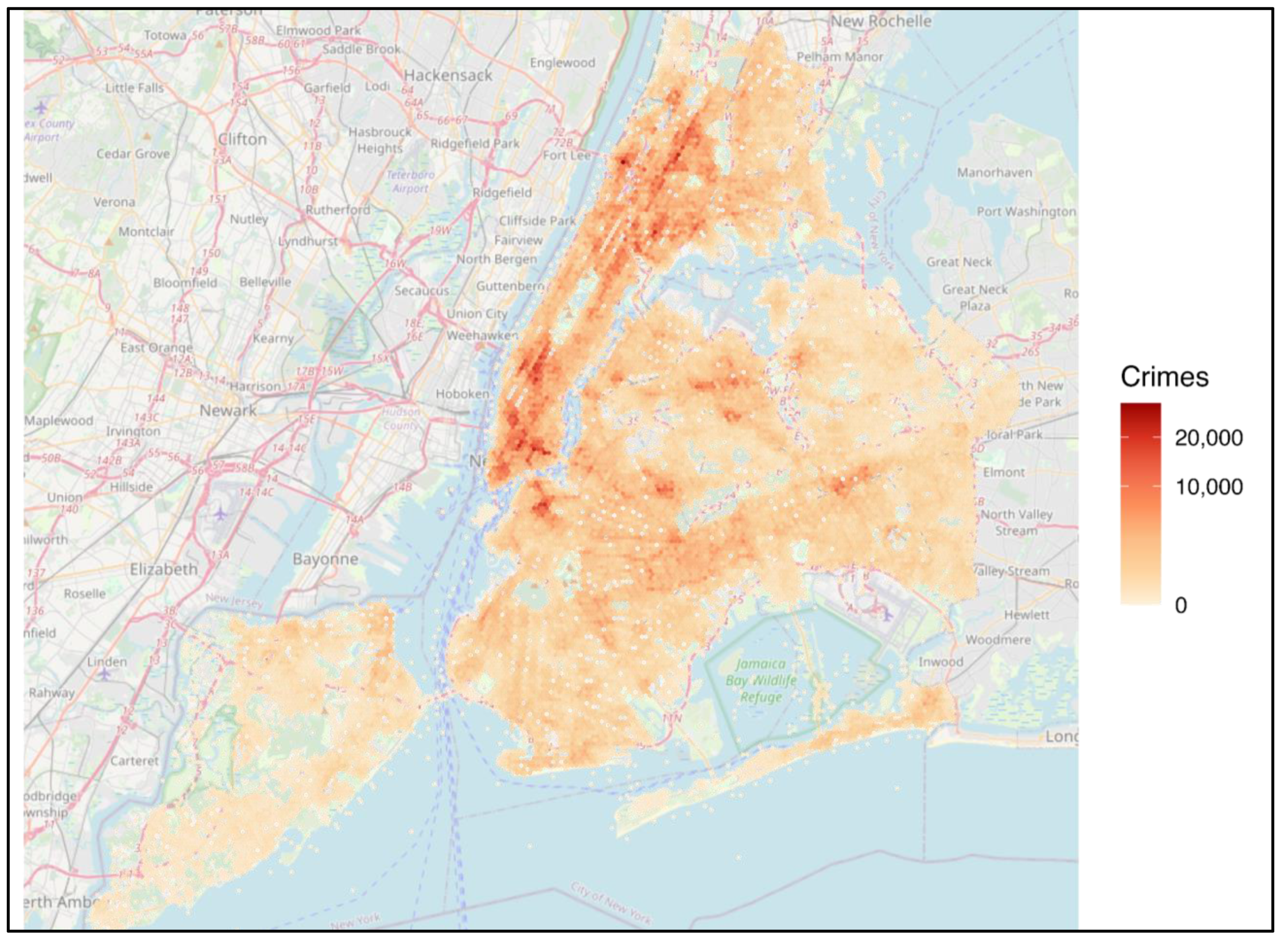
Figure 2.
Annual subway entries in 2024, one representative egohood per station (nearest egohood to each station; polygons deduplicated). Shading shows riders in millions using a square-root scale. Numeric labels 1-5 mark the five busiest stations; the inset lists their names and volumes. Basemap: OpenStreetMap contributors.
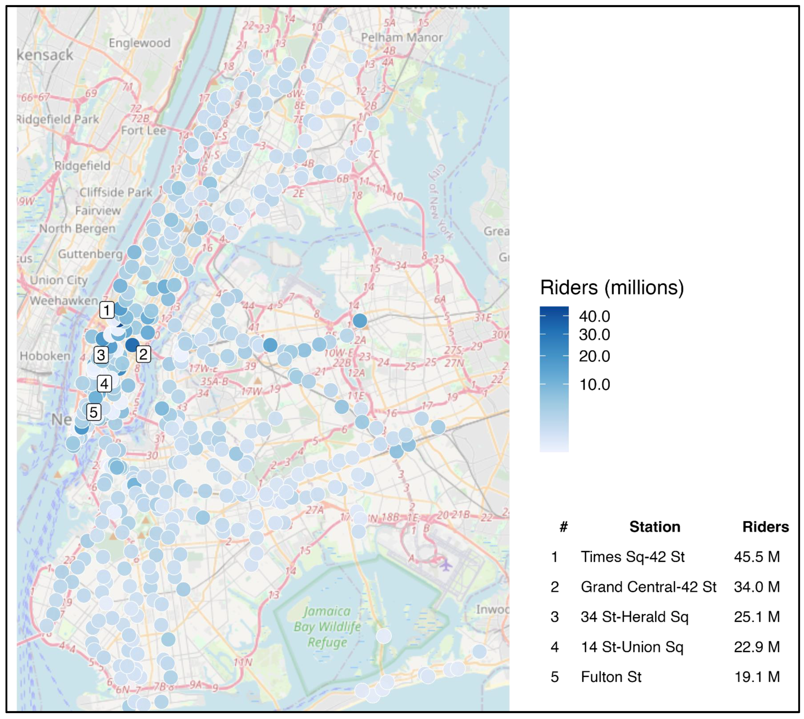
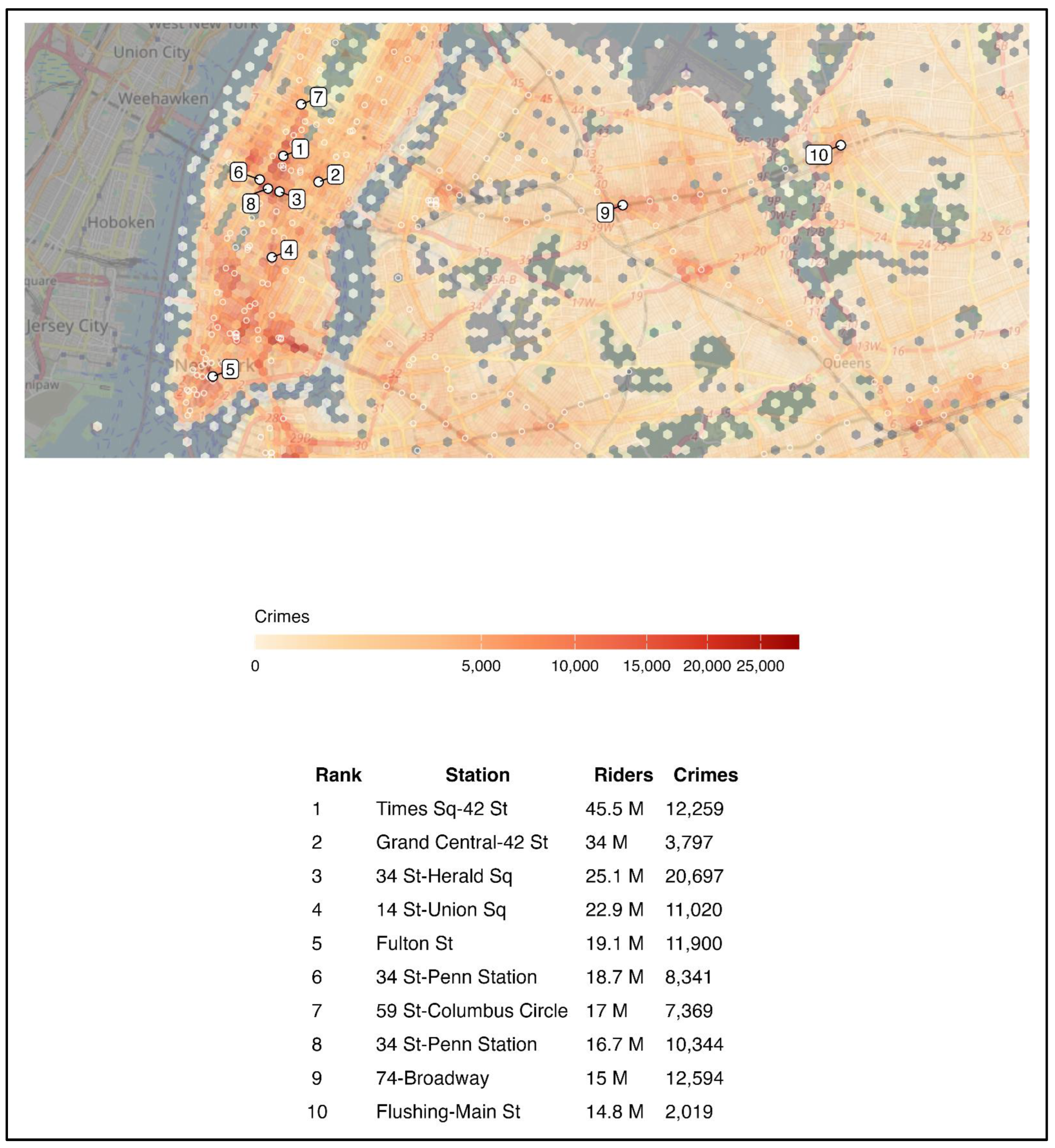
Figure 3.
Hexagon map of egohood crime counts (2024) with all subway stations shown as small rings and the ten busiest stations labeled 1–10. The horizontal legend shows crimes per hexagon (square-root scale). The table lists rank, station name (trimmed), total 2024 entries (millions), and crimes in the station’s hex. Basemap: OpenStreetMap.
Results
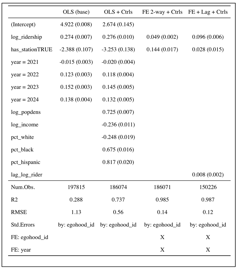
Table 1 compares four specifications: a pooled OLS baseline, a pooled OLS with cross-section controls, a two-way fixed-effects model with egohood and year effects, and a fixed-effects model with a one-year ridership lag. The analysis covers 189,920 egohood-years from 37,984 egohoods during 2020 to 2024.
Crime is strongly clustered in space. A global Moran's I of about 0.92 (p < .001) confirms that incidents concentrate geographically rather than being randomly scattered. Egohoods that contain stations have higher raw crime and higher ridership. They also tend to be denser and differ demographically. Simple comparisons therefore blend compositional differences with genuine relationships.
In the pooled OLS baseline, log ridership has a clear positive association with log crime (β ≈ 0.27, p < .001). The simple "has station" indicator is negative in this setting, which likely reflects stable place differences that correlate with station presence. When we add cross-section controls, including log population density, log median income, and race shares, the model's R² rises from about .29 to about .74. Within that richer specification, density is positively related to crime (β ≈ 0.73), income is negatively related (β ≈ −0.24), and race shares follow familiar cross-section patterns from the urban crime literature. These pooled estimates describe associations across places and should not be read as causal effects.
The fixed-effects models isolate within-place change by absorbing all time-invariant traits of each egohood and common shocks by year. In the two-way fixed-effects specification, the coefficient on log ridership shrinks but remains positive and precise (β ≈ 0.049, p < .001). Interpreted as an elasticity, a 10% increase in ridership within the same egohood is associated with about a 0.5% increase in recorded crime. The calculation is 0.049 × ln(1.10) ≈ 0.0047. Larger changes scale accordingly. A doubling of ridership, for example, corresponds to roughly a 3.4% increase in crime, calculated as 0.049 × ln(2) ≈ 0.034. The station indicator becomes small and sensitive to specification. This pattern fits with the idea that its pooled sign was driven by differences across places rather than changes within them.
Adding a one-year lag of log ridership does not change the central pattern. The contemporaneous ridership effect remains positive and significant (β ≈ 0.096). The lag is small (β ≈ 0.008), and the station dummy remains near zero. The sample shrinks in this column because creating the lag drops the first year for each egohood. Even so, the substantive interpretation holds. Short-run increases in exposure are associated with slightly higher crime in the same year, not primarily through persistence from the prior year.
Time-invariant covariates from ACS 2020, including density, income, and race shares, do not appear in the fixed-effects columns. They barely change at the egohood scale during 2020 to 2024 and are absorbed by egohood effects. Their role is documented instead in the pooled specifications and in descriptive summaries.
Model fit improves sharply with fixed effects. The RMSE falls from about 1.13 in pooled OLS to roughly 0.12 to 0.14 in the fixed-effects models. The R² rises to approximately .99. This tells us that most of the between-place variation is captured by egohood effects. Ridership still explains a meaningful portion of the remaining within-place variation.
These coefficients are small in absolute terms but can matter in busy locations. Because the outcome is log(1 + crime), a one-unit increase in log ridership corresponds to a percentage change in crime equal to the coefficient itself. The fixed-effects estimate of 0.049 implies that if an egohood experiences a substantial surge in entries, perhaps due to service changes or a major event, recorded incidents rise modestly on average. This fits with routine activities theory. More potential targets and bystanders create more opportunities for encounters, even when informal guardianship is present.
Descriptive patterns support this interpretation. Egohoods with stations account for a large share of citywide ridership and raw crime totals. The jump in R² when cross-section controls are added points to strong compositional differences. Denser and higher-traffic places carry more incidents regardless of short-run changes. The fixed-effects models strip out those stable differences and ask whether crime moves when entries move in the same location. The answer is yes, but only a little.
Residual diagnostics line up with these conclusions. Clustered standard errors by egohood account for repeated measures within places. Residual maps and Moran's I on a 2024 cross-section suggest that spatial dependence is much weaker after differencing out place effects, though detectable structure remains at fine scales. A cross-section spatial lag check for 2024 relates log crime to log ridership and the station indicator with a spatially lagged dependent variable. This check preserves the positive sign and significance on ridership. It tells us that the main association is not an artifact of unmodeled spatial clustering in that year.
Sensitivity checks yield similar signs and magnitudes. Results hold up to alternative ridership transformations, such as trimming extreme values or restricting to egohoods with nonzero entries. Removing obviously bad coordinates from the crime file and re-running the joins does not change the pattern. The positive fixed-effects coefficient on ridership is present across years after 2020 is absorbed by the year effects. This matters given the unusual conditions of the early pandemic period.
The models also help clarify what the station indicator is doing. In pooled OLS, the negative sign likely captures where stations tend to be located after other variables are omitted. Once density, income, and race composition are added, the pooled sign becomes less informative. In fixed effects, the indicator contributes little because station presence rarely changes within a five-year window at this spatial scale. This is actually a useful design feature rather than a flaw. The indicator captures the long-run siting of infrastructure. Ridership captures the flow that actually varies year to year. The evidence suggests that flow, rather than footprint, is the quantity linked to short-run changes in recorded crime.
Maps and simple figures reinforce these results. Choropleths of crime counts by egohood show persistent clusters around major business districts and transfer hubs. Choropleths of annual entries show similar concentration along trunk lines and at large complexes. A coefficient plot displaying the four main estimates side by side tells the same story visually: a large pooled association, a smaller but precise within-place association, and a negligible role for the station indicator once fixed effects are included. These visuals help readers connect the model table to the spatial reality that the diagnostics already highlight.
Taken together, the results point to a consistent, modest, and statistically precise within-place link between rider volume and reported crime. Station presence on its own does not carry an independent effect once stable local characteristics are held constant. The practical takeaway is straightforward. When more people pass through an area in a given year, recorded incidents rise a little, even after controlling for permanent features of that place and citywide shocks.
Discussion
The central finding holds across specifications. When ridership grows within the same egohood, recorded crime rises slightly in the same year. The effect is modest in size but precise. This points to exposure as the operative mechanism. Station presence by itself does not carry an independent signal once stable features of place are held constant, which suggests that flows of people matter more than the fixed footprint of infrastructure.
The magnitude is small but meaningful in busy locations. In the two-way fixed-effects model, a 10% rise in ridership is associated with roughly a 0.5% increase in crime. Larger increases scale accordingly. Doubling ridership corresponds to an increase of about 3 to 4 percent. These back-of-the-envelope conversions translate the log model into operational terms for planners and police. They help set expectations for where incremental staffing or design changes might be warranted.
The contrast between pooled and fixed-effects results tells us something important. In pooled OLS, the "has station" indicator looks negative. This is likely because egohoods with stations differ systematically from those without along dimensions that the simple model does not capture. After controlling for time-invariant traits with fixed effects, that indicator shrinks toward zero while ridership retains a positive coefficient. This pattern fits with routine activities logic and with prior work emphasizing encounters between potential offenders and targets in crowded settings. The place may be the same, yet when more people move through it, opportunities for certain offenses increase unless guardianship rises at the same time.
The lag specification supports a contemporaneous interpretation rather than a story driven by last year's ridership. The contemporaneous coefficient remains positive and the lag is small. This does not settle questions of timing or simultaneity, but it does indicate that short-run spikes in entries are linked to short-run changes in incidents more than to carryover from the prior year. This fits with the idea that exposure operates on short windows and that guardianship must adjust quickly to shifts in crowd size.
Spatial structure remains relevant even after fixed effects. Raw crime is highly clustered, which matches expectations from the hot spots literature and from spatial analyses of urban crime. Residual dependence weakens once place effects are included, but it does not vanish entirely. A cross-section spatial lag check for 2024 keeps the positive ridership association, which suggests the main relationship is not an artifact of unmodeled clustering. A fuller spatial panel model could be a useful extension if computational cost allows and if additional years or sub-annual outcomes become available.
Several alternative explanations deserve attention. Police deployment may respond to crowds, which can raise detection and reporting rather than underlying incidence. Reporting behavior itself can vary with foot traffic and with the presence of staff and cameras. Ridership and crime both moved sharply during the pandemic and recovery. The fixed-effects approach removes stable place differences and absorbs common year shocks, but it cannot remove every local dynamic linked to COVID-19 or to policy changes that were uneven across neighborhoods. These factors argue for caution when making causal claims and for designs that use external sources of variation in entries.
Measurement choices also limit what we can claim. Demographic covariates come from ACS 2020 and are effectively time-constant at the egohood scale over this window. That is why they inform the cross-section models but are collinear with fixed effects. Poverty fields were explored but not used because the available ACS file did not contain valid estimates for the relevant codes. Future work can re-pull those variables directly from ACS and apply the same area-weighted overlay used for population and income. Crime counts depend on geocoding accuracy and reporting behavior. Ridership totals pool all entries within the egohood and do not weight by walking distance inside the buffer. Sensitivity checks with distance weights or alternative buffer sizes would help assess how robust the estimates are to these choices. Breaking out offenses by category would also clarify whether the exposure effect concentrates in theft and other opportunity-driven crimes or whether it extends to assaults and robberies.
Policy implications follow the mechanism rather than the footprint. When a location experiences higher flows, the city should expect a small rise in recorded incidents and plan guardianship accordingly. Practical steps include brighter lighting on paths from exits to street corners, visible staff at platform and street level during peaks, camera coverage that follows crowding, and management of retail or kiosks that draw clusters near chokepoints. Because cross-section differences are strong, interventions should be tailored. A dense commercial hub and a dense residential hub may require different mixes of visibility, staffing, and design. Coordination between the transit agency and local precincts is likely to matter, especially during seasonal surges and special events.
Equity and ethics also deserve attention. This study uses public administrative data and focuses on places rather than people, which reduces privacy risks. Interpretation should avoid stigmatizing specific neighborhoods. The estimated elasticities are small and reflect short-run exposure rather than fixed traits of residents. Investments that improve visibility and wayfinding can raise perceived safety without inviting heavy-handed enforcement. Where possible, changes should be paired with outreach and community input so that improvements respond to local concerns.
Two directions can strengthen the evidence base. First, add outcome detail by separating theft, robbery, and assault to test whether the exposure effect concentrates in offenses where target density matters most. Second, use event-style designs around service changes, construction closures, or schedule shocks to isolate variation in ridership that is plausibly exogenous to crime. Either approach would complement the fixed-effects results by bringing stronger identification. If data access allows, sub-annual panels would also help track how quickly crime responds to ridership changes within a year.
In sum, the NYC panel shows a consistent and modest within-place link between rider volume and recorded crime. Station presence alone is not the driver once stable local characteristics are accounted for. Planning for safety should focus on managing flows, especially where entries are rising, and on the specific street environments that translate crowds into risk.
Code Availability Statement
The complete R code used for this analysis is available at: https://github.com/albertmiranda/nyc-subway-crime-fixedeffects.git.
Data Availability Statement
Data used in this study come from the following public sources: NYPD Complaint Data Historic. New York City Open Data: https://data.cityofnewyork.us/Public-Safety/NYPD-Complaint-Data-Historic/qgea-i56i MTA Subway Hourly Ridership: 2020-2024. New York State Open Data: https://data.ny.gov/Transportation/MTA-Subway-Hourly-Ridership-2020-2024/wujg-7c2s American Community Survey 2016-2020 5-Year Estimates. U.S. Census Bureau. Accessed via the tidycensus R package.
Conflicts of Interest
No known conflicts of interest are declared.
References
- Allison, P.D. Fixed effects regression models; SAGE publications, 2009. [Google Scholar]
- Anselin, L. Spatial econometrics: methods and models; Springer, 1988; Vol. 4. [Google Scholar]
- Bergé, L. Efficient estimation of maximum likelihood models with multiple fixed-effects: The R package FENmlm. CREA Discussion Papers 2018, 13. [Google Scholar]
- Bivand, R.; Wong, D.W.S. Comparing implementations of global and local indicators of spatial association. TEST 2018, 27, 716–748. [Google Scholar] [CrossRef]
- Cameron, A.C.; Trivedi, P.K. Regression analysis of count data, 2nd ed.; Cambridge University Press, 2013. [Google Scholar]
- Elhorst, J.P. Spatial econometrics: From cross-sectional data to spatial panels; Springer, 2014. [Google Scholar]
- Esfandyari, S. The effect of crime on ridership: An in-depth analysis of how transit station neighborhood characteristics prevent crime and encourage ridership. Doctoral dissertation;MavMatrix, University of Texas at Arlington, 2020. Available online: https://mavmatrix.uta.edu/publicaffairs_dissertations/202.
- Ferreira, J.; João, P.; Martins, J. GIS for crime analysis: Geography for predictive models. Electronic Journal of Information Systems Evaluation 2012, 15, 36–49. [Google Scholar]
- Irvin-Erickson, Y.; La Vigne, N. A spatio-temporal analysis of crime at Washington, DC Metro Rail: Stations' crime-generating and crime-attracting characteristics as transportation nodes and places. Crime Science 2015, 4, 14. [Google Scholar] [CrossRef]
- Kim, S.; Ulfarsson, G.F.; Hennessy, J.T. Analysis of light rail rider travel behavior: Impacts of individual, built environment, and crime characteristics on transit access. Transportation Research Part A: Policy and Practice 2007, 41, 511–522. [Google Scholar] [CrossRef]
- Kim, Y.A.; Hipp, J.R. Street egohood: An alternative perspective of measuring neighborhood and spatial patterns of crime. Journal of Quantitative Criminology 2020, 36, 29–66. [Google Scholar] [CrossRef]
- Li, N.; Kim, Y.-A. Subway Station and Neighborhood Crime: An Egohood Analysis Using Subway Ridership and Crime Data in New York City. Crime & Delinquency 2022, 69, 2303–2328. [Google Scholar] [CrossRef]
- Metropolitan Transportation Authority. Static GTFS data. 2025. Available online: https://www.mta.info/developers.
- Metropolitan Transportation Authority. MTA subway hourly ridership: 2020–2024. New York State Open Data. 2025. Available online: https://data.ny.gov/Transportation/MTA-Subway-Hourly-Ridership-2020-2024/wujg-7c2s/about_data.
- New York City Police Department. NYPD complaint data historic. NYC Open Data. 2025. Available online: https://data.cityofnewyork.us/Public-Safety/NYPD-Complaint-Data-Historic/qgea-i56i/about_data.
- Pebesma, E. Simple features for R: Standardized support for spatial vector data. The R Journal 2018, 10, 439–446. [Google Scholar] [CrossRef]
- R Core Team. R: A language and environment for statistical computing (Version 4.4.0) [Computer software]. R Foundation for Statistical Computing. 2024. Available online: https://www.R-project.org/.
- Roy, S.; Chowdhury, I.R. Three decades of GIS application in spatial crime analysis: present global status and emerging trends. The Professional Geographer 2023, 75, 882–904. [Google Scholar] [CrossRef]
- Sadeek, S.N.; Ahmed, A.J.M.M.U.; Hossain, M.; Hanaoka, S. Effect of land use on crime considering exposure and accessibility. Habitat International 2019, 89, 102003. [Google Scholar] [CrossRef]
- Setiawan, I.; Dede, M.; Sugandi, D.; Widiawaty, M.A. Investigating urban crime pattern and accessibility using geographic information system in Bandung City. KnE Social Sciences 2019, 535–548. [Google Scholar] [CrossRef]
- Su, N.; Li, W.; Qiu, W. Measuring the associations between eye-level urban design quality and on-street crime density around New York subway entrances. Habitat International 2023, 131, 102728. [Google Scholar] [CrossRef]
- Walker, K.; Herman, M. tidycensus: Load US Census boundary and attribute data as 'tidyverse' and 'sf'-ready data frames (Version 1.7.3) [R package]. CRAN 2025. [Google Scholar] [CrossRef]

Table 1.
Pooled and fixed-effects models of log crime, 2020–2024. Note. Standard errors clustered by egohood. Pooled models include year indicators. Fixed-effects models include egohood and year effects; the lag specification includes one-year lag of log ridership.
Table 1.
Pooled and fixed-effects models of log crime, 2020–2024. Note. Standard errors clustered by egohood. Pooled models include year indicators. Fixed-effects models include egohood and year effects; the lag specification includes one-year lag of log ridership.
 |
Disclaimer/Publisher’s Note: The statements, opinions and data contained in all publications are solely those of the individual author(s) and contributor(s) and not of MDPI and/or the editor(s). MDPI and/or the editor(s) disclaim responsibility for any injury to people or property resulting from any ideas, methods, instructions or products referred to in the content. |
© 2025 by the authors. Licensee MDPI, Basel, Switzerland. This article is an open access article distributed under the terms and conditions of the Creative Commons Attribution (CC BY) license (http://creativecommons.org/licenses/by/4.0/).
Copyright: This open access article is published under a Creative Commons CC BY 4.0 license, which permit the free download, distribution, and reuse, provided that the author and preprint are cited in any reuse.


