Submitted:
05 November 2025
Posted:
10 November 2025
You are already at the latest version
Abstract
Descriptive statistics are a cluster of statistical techniques used to summarise, organise, and communicate general features of data already gathered. JASP (Jeffrey’s Amazing Statistics Program) is an open-source, cross-platform software package designed to make statistical analyses accessible, transparent, and reproducible. JASP integrates both frequentist and Bayesian methods within an intuitive interface that emphasises ease of use and high-quality output in the APA format. Unlike traditional statistical software, JASP reduces the technical burden of analysis through drag-and-drop functionality, automated data handling, and direct export options for results, figures and syntax. Its integrated data library and educational resources render it especially advantageous for students, while its sophisticated features, such as regression, factor analysis, and Bayesian modelling, provide robust tools for researchers. This review offers a comprehensive overview of the JASP environment, encompassing file management, data handling, analysis menus, and visualisation tools. Furthermore, it emphasises fundamental statistical principles, including measures of central tendency, dispersion, and data integrity. Researchers can learn data behaviour and enhance their skills using this tutorial, without needing extensive statistical programming knowledge.
Keywords:
data visualisation
; descriptive statistics
; JASP software
; statistical education
; statistical software
1. Introduction
JASP stands for Jeffrey’s Amazing Statistics Program, in recognition of the pioneer of Bayesian inference, Sir Harold Jeffreys. JASP is a statistical package created and regularly updated (as of November 2025, version 0.95.3) by a group of researchers at the University of Amsterdam, Netherlands. They aimed to create a free, open-source multi-platform program that integrates standard and advanced statistical techniques while providing a simple, intuitive user interface.
Unlike other statistical packages, JASP offers a simple drag-and-drop interface, easy access, and spontaneous analysis. All tables and figures are presented in APA format and can be copied directly and/or saved independently. The user can also export the tables from JASP in HTML or LaTeX format.
JASP can be installed from the official website https://jasp-stats.org/ and is accessible for Windows, macOS, and Linux platforms. Additionally, a pre-installed Windows variant that operates directly from a USB drive or external hard drive, without necessitating local installation, is available for download.
Interestingly, JASP includes a data library with an initial collection of over 50 datasets from Andy Field's book, "Discovering Statistics using IBM SPSS Statistics" 1 and "The Introduction to the Practice of Statistics" 2 by Moore, McCabe, and Craig.
Since May 2018, JASP can also be run directly in the browser via rollApp™ without installing it on our computer (https://www.rollapp.com/app/jasp). Nevertheless, this may not be the latest version of JASP.
This review is a compilation of standalone handouts covering the most common standard (frequentist) statistical analyses used by researchers and students in the field of Biological Sciences.
2. Using the JASP Environment
Upon launching JASP, users are greeted with an intuitive interface to facilitate efficient navigation and analysis.
In JASP, the main menu options are gateways to essential functionalities that streamline the statistical analysis process. The "Open" option allows users to import datasets in various formats, facilitating seamless data integration into the JASP environment for analysis. Conversely, the "Save As" function enables users to preserve their analyses, ensuring data integrity and facilitating reproducibility by storing analysis configurations alongside results. The "Export" feature offers flexibility in sharing findings, allowing users to export results, tables, and plots in formats compatible with other software or publication platforms. Additionally, accessing "Preferences" enables users to customise their JASP experience, tailoring settings related to data handling, analysis options, and output formatting to suit their individual preferences and research needs. These menu options in JASP collectively enhance user productivity, data management, and analytical flexibility, contributing to a cohesive and efficient statistical analysis workflow (Table 1).
Within the JASP environment, users can access a comprehensive array of statistical techniques, ranging from simple descriptive statistics to advanced modelling approaches. The software supports frequentist and Bayesian methodologies, empowering users to choose the approach best suited to their research questions and data characteristics. Furthermore, JASP incorporates informative visualisations alongside statistical outputs, enhancing the clarity and interpretability of results. Users can quickly generate plots, such as histograms, scatterplots, and Bayesian posterior distributions, to complement their analyses and communicate findings effectively.
Moreover, JASP fosters a collaborative and transparent research environment by promoting reproducibility and openness. The software generates readily reproducible analysis scripts, allowing users to save and share their workflows with colleagues or collaborators. This feature facilitates the replication of analyses and ensures transparency in reporting research findings. Additionally, JASP provides access to a rich repository of educational resources, including tutorials, example datasets, and online forums, enabling users to deepen their understanding of statistical concepts and refine their analytical skills. Utilising the JASP environment empowers researchers to conduct rigorous and transparent statistical analyses while fostering a culture of collaboration and knowledge exchange within the scientific community.
The workspace in JASP is divided into sections, including (1) the spreadsheet for data entry and manipulation, (2) the analysis panel for selecting and conducting statistical tests, and (3) the results viewer for interpreting and visualising findings. This streamlined layout ensures seamless progression through the analytical workflow, from data importation to hypothesis testing and interpretation (Figure 1).
We can change the size of the tables and figures using Ctrl+ (increase), Ctrl- (decrease), and Ctrl= (back to default size). Furthermore, the figures can be resized by dragging the bottom right corner of the figure.
All tables and figures conform to the APA standards and can be seamlessly integrated into other documents, as all images are available for copying and saving with either a white or transparent background. This option can be selected in Preferences > Advanced, as previously outlined.
The vertical bars shown in Figure 1 enable the windows to be dragged left or right by clicking and dragging the three vertical dots. The individual windows can be fully collapsed using the right or left arrow icons.
If we hover the cursor over the Results, an icon appears; clicking on this provides a range of options, including:
- Edit Title: instead of the word ‘Results’
- Copy
- Export Results: to the computer
- Add note: This feature allows the results output to be easily annotated and exported to an HTML file by navigating to the Main menu > Export Results.
- Remove all analyses from the output window
- Refresh all
- Show R syntax
3. Data Handling in JASP
All files are required to include a header label in the initial row of the file. Once loaded, the dataset is displayed in the window (Figure 2). For extensive datasets, a hand icon is provided to assist with smooth scrolling through the data. Upon import, JASP intelligently predicts the appropriate assignment of data to various variable types (Table 2).
If JASP has incorrectly identified the data type, we must click on the appropriate variable data icon in the column title to change it to the correct format (Figure 3). If the user has coded the data, they can click on the variable name to open a window where they can label each code (Figure 4). These labels now replace the codes in the spreadsheet view. If the user saves this as a .jasp file, these codes, analyses, and notes will be saved automatically. This ensures that the data analysis is fully reproducible.
All data types can be changed by clicking, except for converting text to other types, which requires accessing the CSV file or Excel.
Handling data in JASP involves tasks such as importing, saving, and exporting data sets (Table 3). By following these steps, we can effectively save and export data in JASP for further analysis or sharing with others.
Additional Tips:
- Keep Original Data: It is a good practice to keep your original data file intact and create a separate file for any modifications or analyses.
- Check Compatibility: When exporting data, the suer needs to select a file format compatible with the software or platform where the user intend to use the data.
- Documentation: Maintain documentation of any changes made to the data or any transformations applied before exporting, as this can help ensure transparency and reproducibility in the analyses.
4. JASP Analysis Menu
The primary analysis options are accessible via the main toolbar, which includes parametric and nonparametric standard statistics, as well as alternative Bayesian tests. Additionally, other advanced tests can be selected by clicking the blue plus sign located in the top-right menu bar, such as Network Analysis, Meta-Analysis, and Bayesian Summary Statistics (Figure 5). Once the desired analysis is chosen, all relevant statistical options are displayed on the left side, with the corresponding output presented on the right. An additional feature allows users to rename and ‘stack’ the results output, thus facilitating the organisation of multiple analyses.
Clicking an analysis in this list takes the user to the corresponding section of the results output window. They can also be rearranged by dragging and dropping each analysis. The blue information icon provides detailed descriptions of each statistical procedure used (Figure 6).
5. Types of Variables
In data analysis, knowing the variables (called features in machine learning) is an essential concept. These fields are used to categorise other data value points sampled in an analysis. Factors include a wide variety of characteristics, such as age and physiological parameters like systolic blood pressure [1,2].
Each variable assumes the role of a group name, organising the data values into distinct categories relevant to the research inquiry. These, in turn, translate into the column headers of a data-spreadsheet, and their rows represent the findings for a single participant in the study. Hence, the variables are crucial mediators between the rich sets of data generated through scientific investigation and the increasing level of complexity [3].
Parallel to the concept of variables, there are data points, which refer to individual instances or values of a variable. For instance, for systolic blood pressure, a variable is made up of values—a single value is the recorded measurement (e.g., 120 mmHg) of a patient. In its most elementary form, data points contain the specific measurements or observations that comprise our dataset, providing details to our broader variable categories [4]. When data points are elucidated and examined within the confines of variables, researchers can gain priceless insights into the subtleties and complexities of their subject matter, adding depth to their understanding of the phenomenon.
One important reason to distinguish between different data types is that we must use different statistical tests for various kinds of data. Without understanding what data type values (data points) reflect, it is easy to make false claims or use incorrect statistical tests.
5.1. Dependent and Independent Variables
An independent variable (I_DV), also known as an experimental or predictor variable, is a factor that is manipulated in an experiment to examine its impact on a dependent variable (DV), which is also referred to as an outcome variable. Therefore, the DV depends on I_DV(s).
In experimental research, the aim is to manipulate an I_DV(s) and then examine the effect that this change has on a DV(s). Since it is possible to manipulate the I_DV(s), experimental research enables a researcher to identify a cause-and-effect relationship between variables [5,6,7,8,9].
Researchers do not modify I_DVs in non-experimental research. Although it is not impossible, such modification would be impractical or unethical. A researcher may be interested in examining how illegal, recreational drug use affects certain behaviours. While conceivable, it would be unethical to instruct participants to consume illicit drugs for research purposes. Therefore, a researcher could request drug users and non-drug users to complete a questionnaire to assess their behaviours. Although causality cannot be established, it is possible to investigate the correlation or relationship between the variables [10,11,12,13,14].
5.2. Categorical and Continuous Variables
Categorical variables are discrete or qualitative. Categorical variables can be nominal, ordinal, or dichotomous. Nominal variables have two or more categories but no fundamental order. Nominal variable categories can also be referred to as groups or levels.
One must exercise caution when dealing with categorical concepts that may appear to possess inherent order, as such perceptions are often subject to interpretation. For instance, the notion that heart disease is inherently more severe than kidney disease, or vice versa, is contingent upon various perspectives and contextual factors. Accordingly, it is prudent to avoid complicating matters unnecessarily. Nominal categorical data types, in contrast, typically exhibit clear and readily discernible attributes. Examples of nominal categorical data can be found in many papers [15].
Dichotomous nominal variables have two levels. This variable is dichotomous and nominal. Two or more categories can be ordered or ranked for ordinal variables [7] (Figure 7).
Ordinal categorical data can be placed in an increasing or decreasing order. One example of ordinal data is pain scores, which range from 1 to 10. Even though these are numbers, no mathematical operation can be performed on these digits. There is no standardised measurement of these rankings and, hence, no indication that the interval between the specific scores is the same value.
Other common examples include survey questions where participants rate their agreement on a scale, such as 1 for full disagreement and 5 for full agreement. Likert-style responses such as "totally disagree," "disagree," "neutral," "agree," and "totally agree" are also converted to numbers from 1 to 5. While these can be ranked, they lack inherent numerical value and are considered ordinal categorical data. This type of data appears in various studies [16,17,18].
In contrast to categorical data types (words, things, concepts, and rating numbers), numerical data types involve actual numerical values. Numerical data is a type of quantitative data - for example, the weights of patients attending a clinic, the doses of medication, or the blood pressure of different patients. They can be compared, and we can calculate the values. From a mathematical point of view, there are fixed differences between values. The difference between a systolic blood pressure value of 110 and 130 mm Hg is the same as between 150 and 170 mm Hg (20 mm Hg).
Continuous variables are quantitative. Continuous variables might be interval or ratio. With interval data, the difference between each value is the same. Temperature is an interval variable since it can be measured along a continuum and has a numerical value. Similar differences exist between 20°C and 30°C and 30°C and 40°C. Temperature in Celsius or Fahrenheit is not a ratio variable [2,19] (Figure 7). However, temperatures expressed in oC (or Fahrenheit) do not have a ‘true zero’ because 0 (zero) oC is not a true zero. This means that with numerical interval data (such as temperature), we can order the data and perform addition and subtraction. Still, we cannot divide and multiply the data (we can not do ratios without a ‘true zero’). 10°C plus 10 degrees is 20 degrees, but 20 degrees is not twice as hot as 10 °C. On the other hand, ratio-type numerical data requires a true zero.
Ratio variables are interval variables, but with the added condition that 0 (zero) of the measurement indicates the absence of that variable (a true zero). Therefore, temperature measured in degrees Celsius or Fahrenheit is not a ratio variable because 0°C does not mean no temperature. However, the temperature measured in Kelvin is a ratio variable as 0 Kelvin (often called absolute zero) indicates no temperature. The name "ratio" reflects the fact that we can use the ratio of measurements. For example, a distance of ten meters is twice the distance of five meters (Figure 7). For ratio variables, we can establish meaningful relationships between data points relative to the zero value, e.g., age from birth (0) or white blood cell count, or the number of clinic visits (0). A systolic blood pressure of 180 mm Hg is twice as high as a pressure of 90 mm Hg.
Furthermore, categorical data relates to words. Though countable, words are categorised. Numbers can sometimes be used categorically. An excellent example is choosing a pain rating system. We could ask patients to rate their post-surgery discomfort on a scale of 0 to 10. These numerals do not represent actual numerical values. For example, a patient who selects a score of 6 cannot be interpreted as experiencing twice the severity of symptoms as a patient who chooses a score of 3. No definitive quantitative differentiation exists between these responses, as they are not directly measurable. Instead, they function as categorical indicators, reflecting relative perceptions or classifications rather than absolute magnitudes. As its name implies, numerical data involves numbers. The difference between numerical and category numbers is fixed. Comparing 3 and 4 is like comparing 101 and 102.
5.3. Discrete and Continuous Variables
Another classification of numerical types distinguishes between discrete and continuous variables (Table 4). Discrete values, as the term suggests, are isolated points that are not interconnected, with no intermediate values in between. Conversely, continuous numerical values encompass an infinite number of values within any given range, being infinitely divisible within practical constraints.
5.4. Ambiguities in Classifying a Type of Variable
Sometimes the data are ordinal, but the variable is treated as continuous. For example, a Likert scale with five values – yoyally agree, agree, neutral, disagree, and totally disagree – is ordinal. However, when a Likert scale includes seven or more values – strongly agree, moderately agree, agree, neutral, disagree, moderately disagree, and strongly disagree – the underlying scale is sometimes regarded as continuous (although opinions vary on whether this is appropriate) [7,20]. However, some researchers would argue that a Likert scale, even with seven values, should never be treated as a continuous variable [21].
5.5. Recoding and Transforming Variables in JASP
Recoding and transforming variables in JASP can be essential for preparing the data for analysis (Table 5). Recoding involves changing the values of existing variables, while transforming consists of creating new variables based on mathematical operations applied to existing ones.
Additional Tips:
- Check Assumptions: When recoding or transforming variables, be mindful of the statistical analysis assumptions we plan to use. Ensure that the transformations we apply do not violate these assumptions.
- Document Changes
- Preview Changes: Before applying recoding or transformations, we can preview the changes to see how they will affect the data. This can help us make informed decisions about the modifications to apply.
6. Descriptive Statistics
Research articles generally provide summarised data values without revealing the actual dataset. Instead, they use key methods to convey the data's core to the reader. This summary also serves as the initial step toward comprehending the research data. As human beings, we are unable to interpret extensive sets of numbers or values directly; consequently, we depend on summaries of these data to facilitate understanding.
There are three conventional techniques for depicting a collection of values using a single number : the mean, median, and mode. These constitute measures of central tendency, also referred to as point estimates. [22,23,24]. Most original research also describes the actual spread of the data points, also known as dispersion. These types of measures include range, quartiles, percentiles, variance, and, more commonly, standard deviation, often abbreviated as SD [25,26].
Descriptive statistics serve as indispensable tools in data analysis, facilitating the succinct summarisation and depiction of data values. In essence, their purpose is to transform lengthy lists of numerical or textual data into concise summaries that are more comprehensible and meaningful to humans [27,28,29,30]. Descriptive statistics make it easier to understand by converting numbers into single values or counting the frequency of variable occurrences. The goal of descriptive statistics is to describe the characteristics of a dataset, not to compare datasets or groups.
On the other hand, inferential statistics are a type of extrapolation that lets researchers make predictions about bigger groups of individuals than the ones they studied. Inferential statistics allow researchers to draw conclusions about the characteristics of larger populations from` specific parts of a sample. This entails the comparative examination of groups of subjects or individuals to elucidate patterns or relationships within the data. It is impractical to incorporate every subject from a population in a research study; therefore, inferential statistics are essential for drawing generalizations about the entire population. Researchers can reliably extrapolate their findings and make informed claims about the traits of populations by using statistical methods. This helps us learn more about a wide range of events [31,32,33].
Presenting raw data is hard to interpret. Descriptive stats and plots summarise but do not test hypotheses. Different statistics describe data, including measures of central tendency, dispersion, and distribution, as well as percentile values and descriptive plots.
6.1. Measures of Central Tendency
Measures of central tendency, including mean, median, and mode, serve to condense datasets into single representative values. These statistics are essential in summarising data, providing researchers and analysts with insights into the central tendencies of a dataset. As the name indicates, central tendency refers to the concept that its measures represent a central value around which the data points cluster [19].
The mean, or average, is calculated by summing all data point values in a dataset and dividing the sum by the total number of values. It is a straightforward representation of the central tendency when dealing with datasets lacking outliers or values significantly deviating from the majority. However, the mean may be skewed by outliers, leading to misrepresentation of the dataset's central tendency [20] (Table 6).
Conversely, the median represents the middle value in a dataset when arranged in ascending or descending order. It is unaffected by extreme values and is particularly useful when outliers are present. Unlike the mean, the median provides a robust measure of central tendency in the presence of outliers [34] (Table 6).
Mode, the most frequently occurring value in a dataset, is employed primarily with categorical data. It offers insights into the most common value or category, allowing analysts to discern prevalent trends. The dataset is called bimodal or multimodal in scenarios where multiple values occur with equal frequency. Notably, the mode is the only measure of central tendency applicable to nominal categorical data [24] (Table 6).
It is inappropriate to utilise mean and median values in the context of categorical data. The mode is the most suitable measure for categorical data types and is the only measure of central tendency applicable to nominal categorical data.
While each measure has its strengths and weaknesses, their combined use offers comprehensive insights into the distribution and characteristics of data, enabling informed decision-making in various fields of research and practice.
When considering the entire population, we use the terms population mean, median, or mode. If analysing a sample or subset of the population, the terms sample mean, median, or mode are used. The measures of central tendency tend to approach a constant value as the sample size becomes sufficiently large to be representative of the population.
6.2. Measures of Dispersion
Measures of dispersion offer critical insights into the variability and spread of data within a dataset, complementing measures of central tendency by providing a comprehensive understanding of the distribution's characteristics. Among these measures, the range, quartiles, percentiles, variance, and standard deviation (SD) are commonly utilised to gauge the extent of spread within a dataset. While measures of central tendency condense the data into single representative values, measures of dispersion elucidate the extent to which data points deviate from this central tendency, thereby enhancing the interpretability and depth of analysis [35].
The range, a fundamental measure of dispersion, quantifies the difference between a dataset's minimum and maximum values. is usually expressed by noting both values. It is used when simply describing data, i.e., when no inference is called for. Although simple in its calculation, the range serves as a basic descriptor of the dataset's spread, providing initial insights into the variability of the data points (Table 7).
Quartiles further partition the dataset into four equal segments, just as the median divides the dataset into two equal parts, thereby delineating the distribution's spread more granularly. Consisting of the first, second (median), and third quartiles, quartiles provide information regarding the distribution's variability, with each quartile representing a distinct subset of the data [36]. Quartiles are a set of order statistics that partition a rank-ordered dataset into four equal parts, each comprising 25% of the observations (Figure 8).
While several methods exist for calculating quartiles (e.g., inclusive, exclusive, or linear interpolation methods for continuous data), their conceptual purpose remains consistent: to describe the distribution of data by identifying key cutoff points.
The primary utility of quartiles in measuring dispersion lies not in the individual values themselves, but in the differences between them. The most critical derived measure is the Interquartile Range (IQR).
Calculated as IQR=Q3 (the third quartile) −Q1 (the first quartile), the IQR represents the range of the middle 50% of the data. It is a robust statistic, meaning it is resistant to the influence of outliers and extreme values in the dataset. This makes it particularly valuable when describing skewed distributions or datasets with anomalous observations, unlike the range and standard deviation, which are sensitive to such values. Extreme or atypical values that fall far outside the range of data points are termed ‘outliers’ and may sometimes be excluded.
Similarly, percentiles provide a detailed examination of data dispersion by calculating values corresponding to specific percentages within the dataset, enabling a more refined analysis of data distribution across varying levels of magnitude. It turns the first quartile into the 25th percentile, the median (or second quartile) into the 50th percentile, and the third quartile into the 75th percentile (and all of these are just different expressions of the same thing). The percentile also encompasses a proportion of values that are below a selected value within our dataset. For example, a value of 90 may be associated with a percentile rank of 14, indicating that 14% of the values in the dataset are less than 90, while 86% exceed it [37].
The IQR, which is the difference between the first and third quartiles, is a robust measure for identifying statistical outliers within a dataset. Outliers, characterised by extreme or atypical values, significantly impact the dataset's distribution and statistical analysis. Detecting outliers involves assessing values that fall beyond the range delineated by the IQR, with such values often excluded from the analysis to mitigate their skewing effect on measures of central tendency, particularly the mean. With a small data set (like 1, 3, 5, 9, 11, 12, 64), we can intuitively see that 64 is an outlier. When datasets are much larger, this might not be easy, and outliers can be detected by multiplying the IQR by 1.5. This value is subtracted from Q2 and added to Q3. Any value in the data set that is lower or higher than these values can be considered a statistical outlier. Outlier values will most affect the mean calculation (rather than the mode or median). Such values can be omitted from analysis if it is reasonable to do so (i.e., incorrect data input or machine error), and the researcher clearly states that this was done and provides justification. If the value(s) is/are rechecked and confirmed as valid, special statistical techniques can help reduce the skewing effect [38].
Quartiles divide the group of values into four equal quarters, just as the median divides the dataset into two equal parts.
Notably, variance and standard deviation (SD) quantify the dispersion of data values relative to the mean, providing insights into the dataset's variability on a standardised scale. While variance captures the average squared deviation from the mean, SD represents the square root of the variance, offering a more intuitive measure of dispersion [39]. The method of describing the extent of dispersion or spread of data values relative to the mean is called the variance (Table 7). Table 8 shows the selection guidelines for dispersion. Selecting a dispersion measure is a critical analytical decision that depends on the data characteristics and research objectives. Understanding the specific advantages and limitations of each measure ensures appropriate application and meaningful interpretation of statistical results.
A low SD indicates that the values are close to the mean, while a high standard deviation indicates that the values are dispersed over a broader range.
The median absolute deviation (MAD) is a robust measure of data spread. It is relatively unaffected by non-normally distributed data. Reporting the median ± MAD for data that is not normally distributed is equivalent to reporting the mean ± SD for normally distributed data. The IQR is similar to the MAD but is less robust [40].
When the median is used as a measure of central tendency, the IQR is generally preferred as the accompanying measure of dispersion, particularly in biomedical, clinical, and social science research. The IQR is the range between the 25th and 75th percentiles (Q1–Q3), describing the middle 50% of the data while remaining robust to outliers. In contrast, theMAD quantifies the median of the absolute deviations from the median and is primarily employed in robust statistical analyses, such as algorithm validation or outlier detection, rather than in descriptive data reporting. Therefore, in most research publications and according to reporting standards such as CONSORT and STROBE, it is more appropriate to present results as median (IQR), for example, “median age 54 years (IQR 46–62).” In contrast, median ± MAD is reserved for technical or methodological contexts that require robust statistical characterization [41,42]
The Standard Error of the Mean (SEM) is a statistical measure that quantifies the precision of a sample mean as an estimate of the population mean. While the SD describes the variability among individual observations, the SEM reflects how much the sample mean would vary if the study were repeated multiple times under the same conditions.
For example, if we measure systolic blood pressure (SBP) in 100 hypertensive patients:
Sample mean (x̄) = 140 mmHg
SD = 20 mmHg
The SEM is calculated as:
SEM = SD / √ n = 20 / √100 = 2 mmHg
The SD of 20 mmHg indicates that individual patient readings vary widely around the mean. The SEM of 2 mmHg, however, shows that if the study were repeated with many samples of 100 patients each, the calculated sample means would typically vary by ±2 mmHg around the actual population mean. Therefore, SEM measures the precision of the mean estimate, not the data's spread.
The SEM measures how far the sample mean is expected to be from the population mean. As the sample size increases, the SEM decreases relative to SD, and the population's true mean is known with greater precision.
Confidence intervals (CI), although not displayed in the general descriptive statistics output, are utilised in many other statistical tests. When sampling from a population to estimate the mean, a CI represents a range of values within which we are n% confident that the true mean resides. A 95% CI, therefore, is a range of values for which one can be 95% certain it encompasses the population's true mean. This differs from a range that contains 95% of all the values . For instance, in a normal distribution, 95% of the data are anticipated to fall within ±1.96 SD of the mean, and 99% within ±2.576 SD [43].
A 95% confidence interval (CI) can be calculated as:
95% CI = Mean ± 1.96 × SEM. In our example:
95% CI = 140 ± 1.96 × 2 = (136.1, 143.9) mmHg
Accordingly, we can be 95% confident that the actual population mean systolic BP lies between 136.1 and 143.9 mmHg.
In conclusion, we use SD to describe data and SEM to construct confidence intervals or compare means.
So, we always have to specify whether we are reporting SD or SEM to avoid misinterpretation.
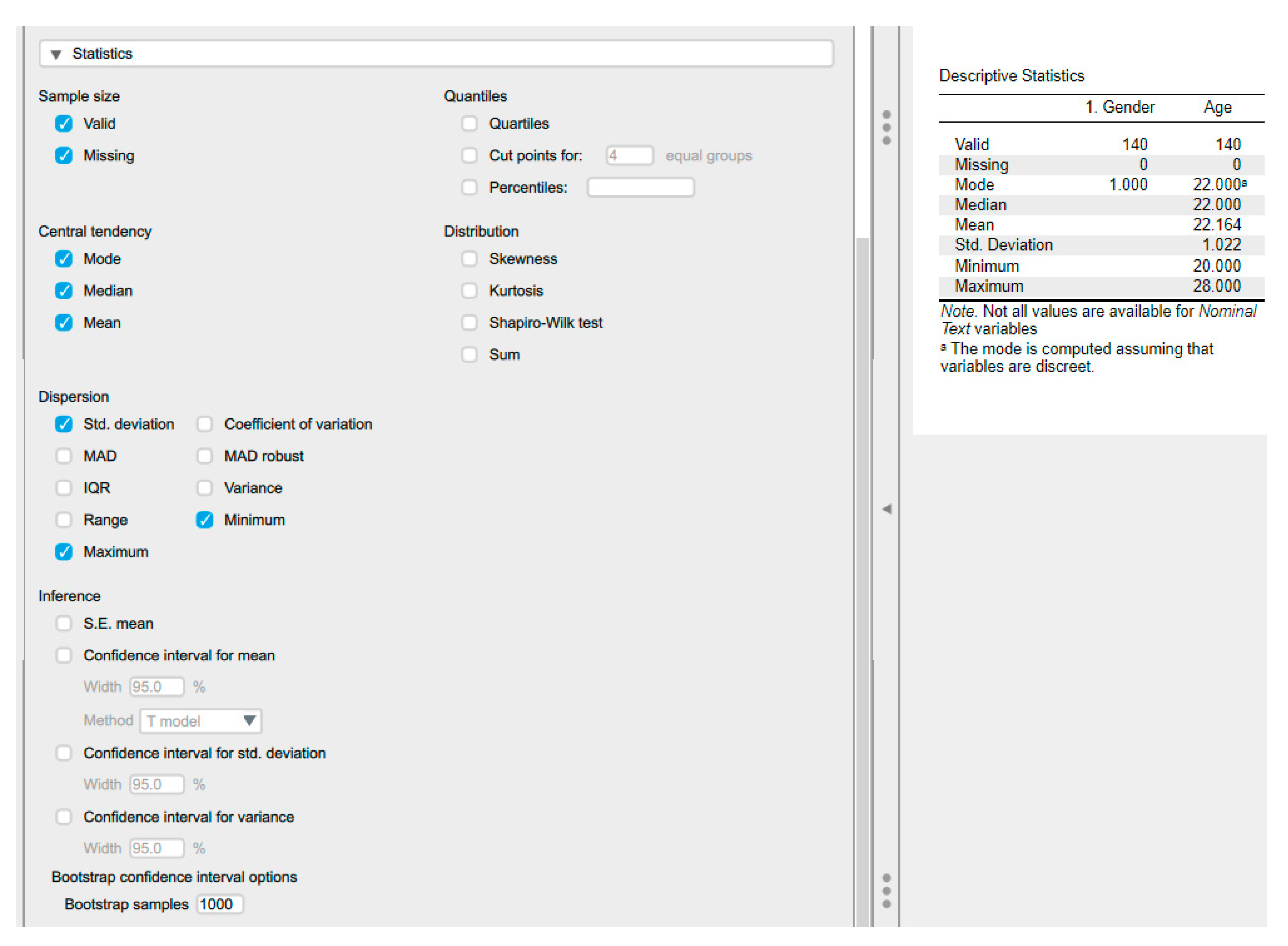
6.3. Descriptive Statistics Using JASP
6.4. Central Tendency
6.5. Plots, Graphs, and Figures
Most published articles, poster presentations, and research presentations utilise graphs, plots, and figures. The graphical depiction of data facilitates concise, visual, and information-dense data interpretation. Visual representations significantly enhance the comprehension of complex categorical and numerical data.
JASP produces many types of descriptive plots, including Distribution, Correlation, and Q-Q plots. The user selects the Basic Plots within the Descriptive Statistics to perform the plots (Figure 9).
6.5.1. Box and Whisker Plots
A box-and-whisker plot provides information on central tendency and measures of spread. It takes the list of numerical data point values for categorical variables and uses quartiles to construct a rectangular block (Figure 10).
Plot A contains four categorical groups (Group A, B, C, and D) on the x-axis and some numerical data type on the y-axis. Plot B: The rectangular block has three lines. The bottom line (bottom of the rectangle) represents the first quartile value for the list of numerical values, and the top line (top of the rectangle) indicates the third quartile value. The middle line represents the median. The whiskers can represent several values. Possible values include minimum and maximum values, values beyond which statistical outliers are found (one-and-a-half times the IQR below and above the first and third quartiles), one standard deviation below and above the mean or a variety of percentiles. Some authors also incorporate the actual data points into these plots. The mean and SD may also be included, as demonstrated in plot C. The whiskers represent the minimum and maximum values, in addition to illustrating the spread of data points and the central tendency across various categories.
6.5.2. Count/ Bar Plots
6.5.3. Histogram
A histogram differs from a count plot in that it utilises numerical values on the x-axis. Based on these values, the so-called bins are constructed. A bin represents a minimum and a maximum cutoff value. (Figure 11).
6.5.4. Distribution Plots
These plots advance the concept of histograms by utilising mathematical equations to provide a visual representation of data distribution. Similar to histograms, the x-axis represents a numerical variable. Notably, the p-value can be derived from these graphs, offering valuable insight into the distribution's shape. When distributions resemble a bell curve, they are called normal distributions [45] (Figure 11).
6.5.5. Violin Plots
Violin plots combine box-and-whisker plots and density plots. They rotate the density plots and mirror them (Figure 12). In this type of graph, we have dotted lines indicating the median and the first and third quartiles, as in box-and-whisker plots, but we get a much clearer picture of the distribution of the numerical values.
6.5.6. Scatter Plots
Scatter plots integrate collections of numerical data. Each point is represented by a dot with coordinates defined by two numerical values, corresponding to the x- and y-axes. It is evident from the scatter plot that both axes contain numerical data. Furthermore, it is possible to generate lines that encompass all these points through the application of mathematical equations. Such lines are instrumental in facilitating predictions. For any given value on the x-axis, a corresponding predicted value on the y-axis can be computed (Figure 13). The scatter plot is a form of linear regression, and we can use it to estimate how well two sets of values are correlated. Figure 12 displayssuch a line and adds density and histogram plots for each of the two sets of numerical variables in JASP.
LOS: Length of Hospital Stay.
6.5.7. Pie Chart
Pie charts are a commonly employed visualisation tool in various academic disciplines (Figure 14). One significant advantage of pie charts is their ability to visually illustrate the proportional distribution of categorical data, making complex data sets more accessible to a broader audience [46]. They help show the relative sizes of different categories within a dataset, enabling easy comparison at a glance. Pie charts are best suited for representing nominal or ordinal data, where the categories have no inherent order or can be logically ordered. However, pie charts have limitations, notably when used with too many categories, which can lead to cluttered, difficult-to-interpret visuals. Additionally, pie charts may not be the most effective choice for displaying precise numerical values or comparing minor differences between categories, as they rely primarily on visual perception rather than exact measurement. Despite these limitations, when used appropriately, pie charts remain a valuable tool for summarising and presenting categorical data in academic research and analysis.
7. Splitting Data Files
Descriptive statistics and plots can be produced for each group when a grouping variable (categorical or ordinal) is present. The output will be as shown in Figure 15.
8. Exploring Data Integrity
Population refers to a group of individuals who share at least one common characteristic, ranging from encompassing all of humanity on a macro level to a more specific focus on individuals with a particular disease or risk factor in clinical research. The size of a population can vary significantly, from vast to relatively minor, such as those with rare conditions. Regardless of size, the findings of a study are often generalised to a larger population, allowing for the application of research outcomes to manage or address issues within that population [47].
A sample, on the other hand, represents a subset of members drawn from the larger population. This selection is crucial in research, as it serves as the basis for conducting studies when it is impractical or impossible to include the entire population. Through statistical analysis, findings from the sample can be extrapolated to infer about the population from which it was drawn. This methodology enables researchers to draw meaningful conclusions and make informed decisions without needing access to every individual within the population [47].
Parameters and statistics are crucial to understanding the differences between populations and samples. A parameter is a statistical value derived from the entire population that summarises its characteristics. For example, if the serum creatinine level of every individual on Earth were known and averaged, that resulting level would be a parameter. In contrast, a statistic is a similar value calculated from a sample and represents a population subset. For instance, the average serum creatinine level of participants in a study would be considered a statistic, reflecting the characteristics of the sampled individuals rather than the entire population [48,49]. These distinctions are fundamental to statistical analysis and crucial for drawing valid conclusions in research settings.
Bias can be defined as the tendency of a measurement to over- or underestimate the value of a population parameter. Many types of bias can appear in research design and data collection, including [50]:
- Participant selection bias – some being more likely to be selected for the study than others.
- Participant exclusion bias - due to the systematic exclusion of specific individuals from the study.
- Analytical bias - due to the way that the results are evaluated.
- Statistical bias can affect parameter estimates, standard errors, confidence intervals, test statistics and p-values.
8.1. Is the Data Correct?
Outliers are data points that are abnormally far from the rest of the data. Outliers can be due to various factors, such as errors in data entry or analytical mistakes at the point of data collection. Boxplots are an easy way to visualise data points with outliers outside the upper (75% + 1.5 * IQR) or lower (25% - 1.5 * IQR) quartiles (Figure).
Dealing with outliers in statistical analysis is a critical aspect that demands careful consideration, as their presence can significantly affect results. The appropriate approach to handling outliers depends on various factors, particularly the underlying cause of their occurrence. One fundamental consideration is the choice between parametric and non-parametric tests, as the sensitivity to outliers differs. Parametric tests are susceptible to outliers, while non-parametric tests are less affected.
Several strategies are commonly employed to address outliers. First and foremost, verifying the integrity of the original data is essential to ensure that outliers are not simply the result of input errors. If errors are detected, they should be corrected and the analysis rerun to obtain accurate results. Moreover, even in datasets assumed to follow a normal distribution, outliers may still arise, especially in large sample sizes [51]. Because of this, it is not recommended to discard any outliers just because they are present in normally distributed data.
The practice of excluding outliers altogether is controversial, particularly in smaller datasets where assumptions of normality may not hold. While outliers resulting from instrumental errors may warrant exclusion, this decision should be thoroughly validated before implementation. Alternatively, winsorising is a method for dealing with outliers by replacing extreme values with the maximum and/or minimum values observed after their exclusion.
Regardless of the approach adopted, it is imperative to justify the chosen method within the statistical methodology employed and throughout subsequent analyses. This ensures the integrity and validity of the results obtained, promoting confidence in the conclusions drawn from the data. Ultimately, appropriately handling outliers is integral to the robustness and reliability of statistical analyses in research and decision-making processes.
9. Data Transformation
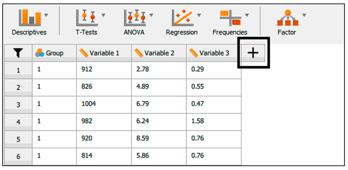
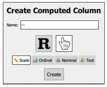
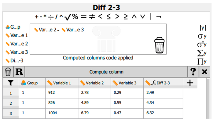
In certain instances, it may be advantageous to calculate differences between repeated measures or to transform a dataset to approximate a normal distribution; for example, implementing a logarithmic transformation can be considered. When a dataset is opened, a plus sign (+) appears at the end of each column (Table 9).
References
- Mansoor, A.R.; Abed, A.; Alqudah, A.; Alsayed, A.R. Assessment of Medical Care Strategies for Primary Hypertension in Iraqi Adults: A Hospital-Based Problem-Oriented Plan. Patient preference and adherence 2025, 1317–1335. [Google Scholar] [CrossRef]
- Alsayed, A.R. Illustrating How to Use the Validated Alsayed_v1 Tools to Improve Medical Care: A Particular Reference to the Global Initiative for Asthma 2022 Recommendations. Patient preference and adherence 2023, 1161–1179. [Google Scholar] [CrossRef]
- Riley, R.D.; Lambert, P.C.; Abo-Zaid, G. Meta-Analysis of Individual Participant Data: Rationale, Conduct, and Reporting. BMJ 2010, 340, c221. [Google Scholar] [CrossRef]
- James, K.; Zerbe, G.; Engelman, C.D.; Norris, J.M.; Weitzel, L.-R.B. Genome Scan Linkage Results for Longitudinal Systolic Blood Pressure Phenotypes in Subjects from the Framingham Heart Study. BMC Genetics 2003, 4, S83. [Google Scholar] [CrossRef]
- Alsayed, A.R.; Abu Ajamieh, M.; Melhem, M.; Samara, A.; Hakooz, N. Pharmacogenetics Education for Pharmacy Students: Measuring Knowledge and Attitude Changes. Advances in Medical Education and Practice 2025, 1761–1779. [Google Scholar] [CrossRef] [PubMed]
- Fino, L.B.; Alsayed, A.R.; Basheti, I.A.; Saini, B.; Moles, R.; Chaar, B.B. Implementing and Evaluating a Course in Professional Ethics for an Undergraduate Pharmacy Curriculum: A Feasibility Study. Currents in Pharmacy Teaching and Learning 2022, 14, 88–105. [Google Scholar] [CrossRef] [PubMed]
- Alsayed, A.R.; Hasoun, L.; Al-Dulaimi, A.; AbuAwad, A.; Basheti, I.; Khader, H.A.; Al Maqbali, M. Evaluation of the Effectiveness of Educational Medical Informatics Tutorial on Improving Pharmacy Students’ Knowledge and Skills about the Clinical Problem-Solving Process. Pharmacy Practice 2022, 20, 2652. [Google Scholar] [CrossRef]
- Alsayed, A.R.; Alsayed, Y. Integrating Telemonitoring in COPD Exacerbations Care: A Multinational Study Using the Alsayed System for Applied Medical-Care Improvement (ASAMI) Database. OBM Transplantation 2025, 9, 1–20. [Google Scholar] [CrossRef]
- Alsayed, A.R.; Alsayed, Y. Evaluating the Role of Telemonitoring in Detecting COPD Ex-Acerbations: Results from a Multinational Study. 2024.
- Shaqfeh, M.I.; Alsayed, A.R.; Hasoun, L.Z.; Khader, H.A.; Zihlif, M.A. The Effects of Trade Names on the Misuse of Some Over-The-Counter Drugs and Assessment of Community Knowledge and Attitudes in Alkarak, Jordan. Patient preference and adherence 2024, 2697–2708. [Google Scholar] [CrossRef]
- Maqbali, M.A.; Alsayed, A.; Hughes, C.; Hacker, E.; Dickens, G.L. Stress, Anxiety, Depression and Sleep Disturbance among Healthcare Professional during the COVID-19 Pandemic: An Umbrella Review of 72 Meta-Analyses. PloS one 2024, 19, 1–35. [Google Scholar] [CrossRef]
- Alrasheeday, A.; Alsaeed, M.A.; Alshammari, B.; Alshammari, F.; Alrashidi, A.S.; Alsaif, T.A.; Mahmoud, S.K.; Cabansag, D.I.; Borja, M.V.; Alsayed, A.R. Sleep Quality among Emergency Nurses and Its Influencing Factors during COVID-19 Pandemic: A Cross-Sectional Study. Frontiers in Psychology 2024, 15, 1363527. [Google Scholar] [CrossRef]
- Al Maqbali, M.; Alsayed, A.; Bashayreh, I. Quality of Life and Psychological Impact among Chronic Disease Patients during the COVID-19 Pandemic. Journal of Integrative Nursing 2022, 4, 217–223. [Google Scholar] [CrossRef]
- Khader, H.; Hasoun, L.Z.; Alsayed, A.; Abu-Samak, M. Potentially Inappropriate Medications Use and Its Associated Factors among Geriatric Patients: A Cross-Sectional Study Based on 2019 Beers Criteria. Pharmacia 2021, 68, 789–795. [Google Scholar] [CrossRef]
- de Moraes, A.G.; Africano, C.J.R.; Hoskote, S.S.; Reddy, D.R.S.; Tedja, R.; Thakur, L.; Pannu, J.K.; Hassebroek, E.C.; Smischney, N.J. Ketamine and Propofol Combination (“Ketofol”) for Endotracheal Intubations in Critically Ill Patients: A Case Series. The American Journal of Case Reports 2015, 16, 81. [Google Scholar]
- Lawrenson, J.G.; Evans, J.R. Advice about Diet and Smoking for People with or at Risk of Age-Related Macular Degeneration: A Cross-Sectional Survey of Eye Care Professionals in the UK. BMC public health 2013, 13, 564. [Google Scholar]
- Alsayed, A.; Halloush, S.; Hasoun, L. Perspectives of the Community in the Developing Countries toward Telemedicine and Pharmaceutical Care during the COVID-19 Pandemic. Pharm Pract (Granada). 2022; 20 (1): 2618.
- Alsayed, A.R.; El Hajji, F.D.; Al-Najjar, M.A.; Abazid, H.; Al-Dulaimi, A. Patterns of Antibiotic Use, Knowledge, and Perceptions among Different Population Categories: A Comprehensive Study Based in Arabic Countries. Saudi Pharmaceutical Journal 2022, 30, 317–328. [Google Scholar] [CrossRef] [PubMed]
- Abu Khadija, L.H.; Alomari, S.M.; Alsayed, A.R.; Khader, H.A.; Permana, A.D.; Hasoun, L.Z.; Zraikat, M.S.; Ashran, W.; Zihlif, M. Beyond Culture: Real-Time PCR Performance in Detecting Causative Pathogens and Key Antibiotic Resistance Genes in Hospital-Acquired Pneumonia. Antibiotics 2025, 14, 937. [Google Scholar] [CrossRef] [PubMed]
- Al-kilkawi, Z.M.; Basheti, I.A.; Obeidat, N.M.; Saleh, M.R.; Hamadi, S.; Abutayeh, R.; Nassar, R.; Alsayed, A.R. Evaluation of the Association between Inhaler Technique and Adherence in Asthma Control: Cross-Sectional Comparative Analysis Study between Amman and Baghdad. Pharmacy Practice 2024, 22, 1–12. [Google Scholar]
- Lubke, G.H.; Muthén, B.O. Applying Multigroup Confirmatory Factor Models for Continuous Outcomes to Likert Scale Data Complicates Meaningful Group Comparisons. Structural equation modeling 2004, 11, 514–534. [Google Scholar] [CrossRef]
- Mahfufah, U.; Sya’ban Mahfud, M.A.; Saputra, M.D.; Abd Azis, S.B.; Salsabila, A.; Asri, R.M.; Habibie, H.; Sari, Y.; Yulianty, R.; Alsayed, A.R. Incorporation of Inclusion Complexes in the Dissolvable Microneedle Ocular Patch System for the Efficiency of Fluconazole in the Therapy of Fungal Keratitis. ACS Applied Materials & Interfaces 2024, 16, 25637–25651. [Google Scholar] [CrossRef]
- Al-Rshaidat, M.M.; Al-Sharif, S.; Tamimi, T.A.; Al-Zeer, M.A.; Samhouri, J.; Alsayed, A.R.; Rayyan, Y.M. First Middle Eastern-Based Gut Microbiota Study: Implications for Inflammatory Bowel Disease Microbiota-Based Therapies. Pharmacy Practice 2025, 23, 1–12. [Google Scholar] [CrossRef]
- Alrabadi, N.; Alsayed, A.R.; Saadeh, R.; Loze, K.J.A.; Aljanabi, M.; Al-Khamaiseh, A.M. Level of Awareness about Air Pollution among Decision-Makers in Jordan: Unveiling Important COPD Etiology. Pharmacy Practice (Granada) 2024, 22, 18. [Google Scholar]
- Al-Rshaidat, M.M.; Al-Sharif, S.; Al Refaei, A.; Shewaikani, N.; Alsayed, A.R.; Rayyan, Y.M. Evaluating the Clinical Application of the Immune Cells’ Ratios and Inflammatory Markers in the Diagnosis of Inflammatory Bowel Disease. Pharmacy Practice 2022, 21, 2755. [Google Scholar] [CrossRef] [PubMed]
- Zihlif, M.; Zakaraya, Z.; Feda’Hamdan, A.S.; Tahboub, F.; Qudsi, S.; Abuarab, S.F.; Daghash, R.; Alsayed, A.R. Hepatocyte Nuclear Factor 4, Alpha (HNF4A): A Potential Biomarker for Chronic Hypoxia in MCF7 Breast Cancer Cell Lines. Pharmacy Practice (1886-3655) 2025, 23. [Google Scholar] [CrossRef]
- Khader, H.; Alsayed, A.; Hasoun, L.Z.; Alnatour, D.; Awajan, D.; Alhosanie, T.N.; Samara, A. Pharmaceutical Care and Telemedicine during COVID-19: A Cross-Sectional Study Based on Pharmacy Students, Pharmacists, and Physicians in Jordan. Pharmacia 2022, 69, 891–901. [Google Scholar] [CrossRef]
- Alsayed, A.R.; Talib, W.; Al-Dulaimi, A.; Daoud, S.; Al Maqbali, M. The First Detection of Pneumocystis Jirovecii in Asthmatic Patients Post-COVID-19 in Jordan. Bosnian journal of basic medical sciences 2022, 22, 784. [Google Scholar] [CrossRef]
- Al-Dulaimi, A.; Alsayed, A.R.; Al Maqbali, M.; Zihlif, M. Investigating the Human Rhinovirus Co-Infection in Patients with Asthma Exacerbations and COVID-19. Pharmacy Practice 2022, 20, 2665. [Google Scholar] [CrossRef] [PubMed]
- Mahfufah, U.; Sya’ban Mahfud, M.A.; Saputra, M.D.; Abd Azis, S.B.; Salsabila, A.; Asri, R.M.; Habibie, H.; Sari, Y.; Yulianty, R.; Alsayed, A.R. Incorporation of Inclusion Complexes in the Dissolvable Microneedle Ocular Patch System for the Efficiency of Fluconazole in the Therapy of Fungal Keratitis. ACS Applied Materials & Interfaces 2024, 16, 25637–25651. [Google Scholar] [CrossRef]
- Mohammad, B.A.; Oriquat, G.A.; Khader, H.A.; ALSAYED, A.R.; FARAH, H.S.; Alhmoud, J.F.; Al-Najjar, M.A.; Hasoun, L.; Abdelhalim, S.M.; Awwad, S.H. A Comparison of the Effect of Omega-3 Alone versus Omega-3/Vitamin D3 Co-Supplementation Therapy on 25-Hydroxyvitamin D Levels in Adults with Vitamin D Deficiency. Pharmacy Practice 2025, 23, 1–9. [Google Scholar] [CrossRef]
- Zihlif, M.; Zakaraya, Z.; Rawan, N.; Al-Shudiefat, A.A.-R.; ALSAYED, A.R. Association between Toll-Like Receptor 4 Gene and Inflammatory Bowel Disease among Jordanian Patients. Pharmacy Practice 2024, 22, 1–7. [Google Scholar] [CrossRef]
- Khaled, R.A.; Alhmoud, J.F.; Issa, R.; Khader, H.A.; Mohammad, B.A.; Alsayed, A.R.; Khadra, K.A.; Habash, M.; Aljaberi, A.; Hasoun, L. The Variations of Selected Serum Cytokines Involved in Cytokine Storm after Omega-3 Daily Supplements: A Randomized Clinical Trial in Jordanians with Vitamin D Deficiency. Pharmacy Practice 2024, 22, 1–10. [Google Scholar] [CrossRef]
- Alsayed, A.; Al-Doori, A.; Al-Dulaimi, A.; Alnaseri, A.; Abuhashish, J.; Aliasin, K.; Alfayoumi, I. Influences of Bovine Colostrum on Nasal Swab Microbiome and Viral Upper Respiratory Tract Infections–A Case Report. Respiratory medicine case reports 2020, 31, 101189. [Google Scholar] [CrossRef] [PubMed]
- Alsayed, A.R.; Al-Dulaimi, A.; Alnatour, D.; Awajan, D.; Alshammari, B. Validation of an Assessment, Medical Problem-Oriented Plan, and Care Plan Tools for Demonstrating the Clinical Pharmacist’s Activities. Saudi Pharmaceutical Journal 2022, 30, 1464–1472. [Google Scholar] [CrossRef] [PubMed]
- Bland, M. Estimating Mean and Standard Deviation from the Sample Size, Three Quartiles, Minimum, and Maximum. International Journal of Statistics in Medical Research 2015, 4, 57. [Google Scholar] [CrossRef]
- Marks, N.B. Estimation of Weibull Parameters from Common Percentiles. Journal of applied Statistics 2005, 32, 17–24. [Google Scholar] [CrossRef]
- Mramba, L.K.; Liu, X.; Lynch, K.F.; Yang, J.; Aronsson, C.A.; Hummel, S.; Norris, J.M.; Virtanen, S.M.; Hakola, L.; Uusitalo, U.M. Detecting Potential Outliers in Longitudinal Data with Time-Dependent Covariates. European journal of clinical nutrition 2024, 78, 344–350. [Google Scholar] [CrossRef]
- Yaska, M.; Nuhu, B.M. Assessment of Measures of Central Tendency and Dispersion Using Likert-Type Scale. African Journal of Advances in Science and Technology Research 2024, 16, 33–45. [Google Scholar] [CrossRef]
- Misra, D.P.; Zimba, O.; Gasparyan, A.Y. Statistical Data Presentation: A Primer for Rheumatology Researchers. Rheumatology International 2021, 41, 43–55. [Google Scholar] [CrossRef]
- Altman, D.G.; Bland, J.M. Statistics Notes: Quartiles, Quintiles, Centiles, and Other Quantiles. Bmj 1994, 309, 996–996. [Google Scholar] [CrossRef]
- Von Elm, E.; Altman, D.G.; Egger, M.; Pocock, S.J.; Gøtzsche, P.C.; Vandenbroucke, J.P. The Strengthening the Reporting of Observational Studies in Epidemiology (STROBE) Statement: Guidelines for Reporting Observational Studies. The lancet 2007, 370, 1453–1457. [Google Scholar] [CrossRef]
- Altman, D.G. Why We Need Confidence Intervals. World journal of surgery 2005, 29, 554–556. [Google Scholar] [CrossRef]
- Alsayed, A.R.; Alzihlif, M.; Al Ramahi, J.A.W. Relevance of Vancomycin Suceptibility on Patients Outcome Infected with Staphylococcus Aureus. The International Arabic Journal of Antimicrobial Agents 2019, 9. [Google Scholar] [CrossRef]
- Pivk, M.; Le Diberder, F.R. Plots: A Statistical Tool to Unfold Data Distributions. Nuclear Instruments and Methods in Physics Research Section A: Accelerators, Spectrometers, Detectors and Associated Equipment 2005, 555, 356–369. [Google Scholar] [CrossRef]
- Al-hamaden, R.; Abed, A.; Khader, H.; Hasoun, L.; Al-Dulaimi, A.; Alsayed, A. Knowledge and Practice of Healthcare Professionals in the Medical Care of Asthma Adult Patients in Jordan with a Particular Reference to Adherence to GINA Recommendations. JMDH 2024, 17, 391–404. [Google Scholar] [CrossRef]
- Rudolph, J.E.; Zhong, Y.; Duggal, P.; Mehta, S.H.; Lau, B. Defining Representativeness of Study Samples in Medical and Population Health Research. BMJ Medicine 2023, 2, e000399. [Google Scholar] [CrossRef] [PubMed]
- Alsayed, A.R.; Ahmed, S.I.; Shweiki, A.O.A.; Al-Shajlawi, M.; Hakooz, N. The Laboratory Parameters in Predicting the Severity and Death of COVID-19 Patients: Future Pandemic Readiness Strategies. Biomolecules and Biomedicine 2024, 24, 238. [Google Scholar] [CrossRef] [PubMed]
- Al-Shajlawi, M.; Alsayed, A.R.; Abazid, H.; Awajan, D.; Al-Imam, A.; Basheti, I. Using Laboratory Parameters as Predictors for the Severity and Mortality of COVID-19 in Hospitalized Patients. Pharmacy Practice 2022, 20, 2721. [Google Scholar] [CrossRef]
- Tincani, M.; Travers, J. Replication Research, Publication Bias, and Applied Behavior Analysis. Perspectives on Behavior Science 2019, 42, 59–75. [Google Scholar] [CrossRef]
- Alsalehy, A.S.; Bailey, M. Improving Time Series Data Quality: Identifying Outliers and Handling Missing Values in a Multilocation Gas and Weather Dataset. Smart Cities 2025, 8, 82. [Google Scholar] [CrossRef]
Figure 1.
Streamlined interface for navigating between spreadsheet, analysis, and results views in JASP.
Figure 1.
Streamlined interface for navigating between spreadsheet, analysis, and results views in JASP.
Figure 2.
Example of Data Organisation in Table Format in JASP.
Figure 3.
Changing the variable type in JASP.
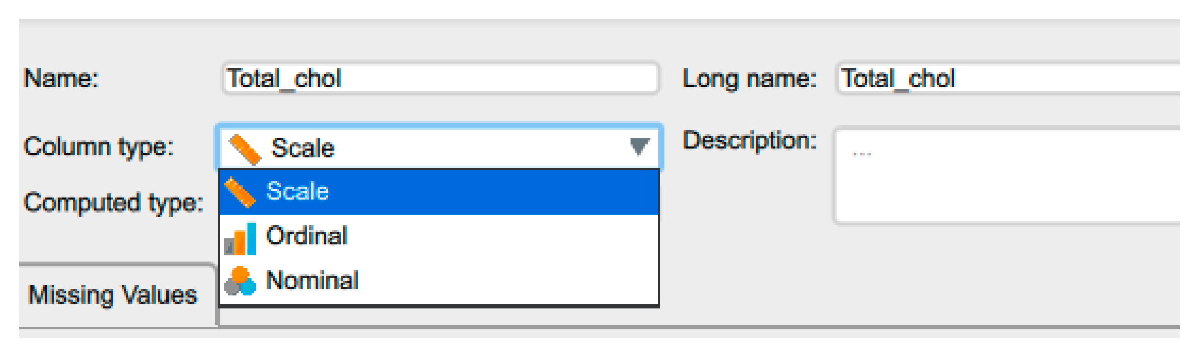
Figure 4.
Labelling the variables in JASP.
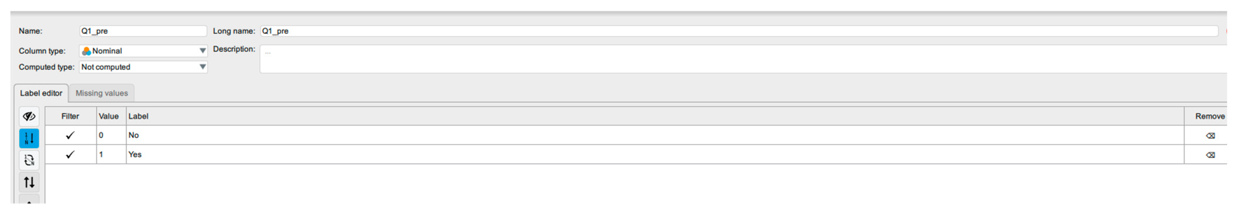
Figure 5.
A list of the JASP Analysis Menu.
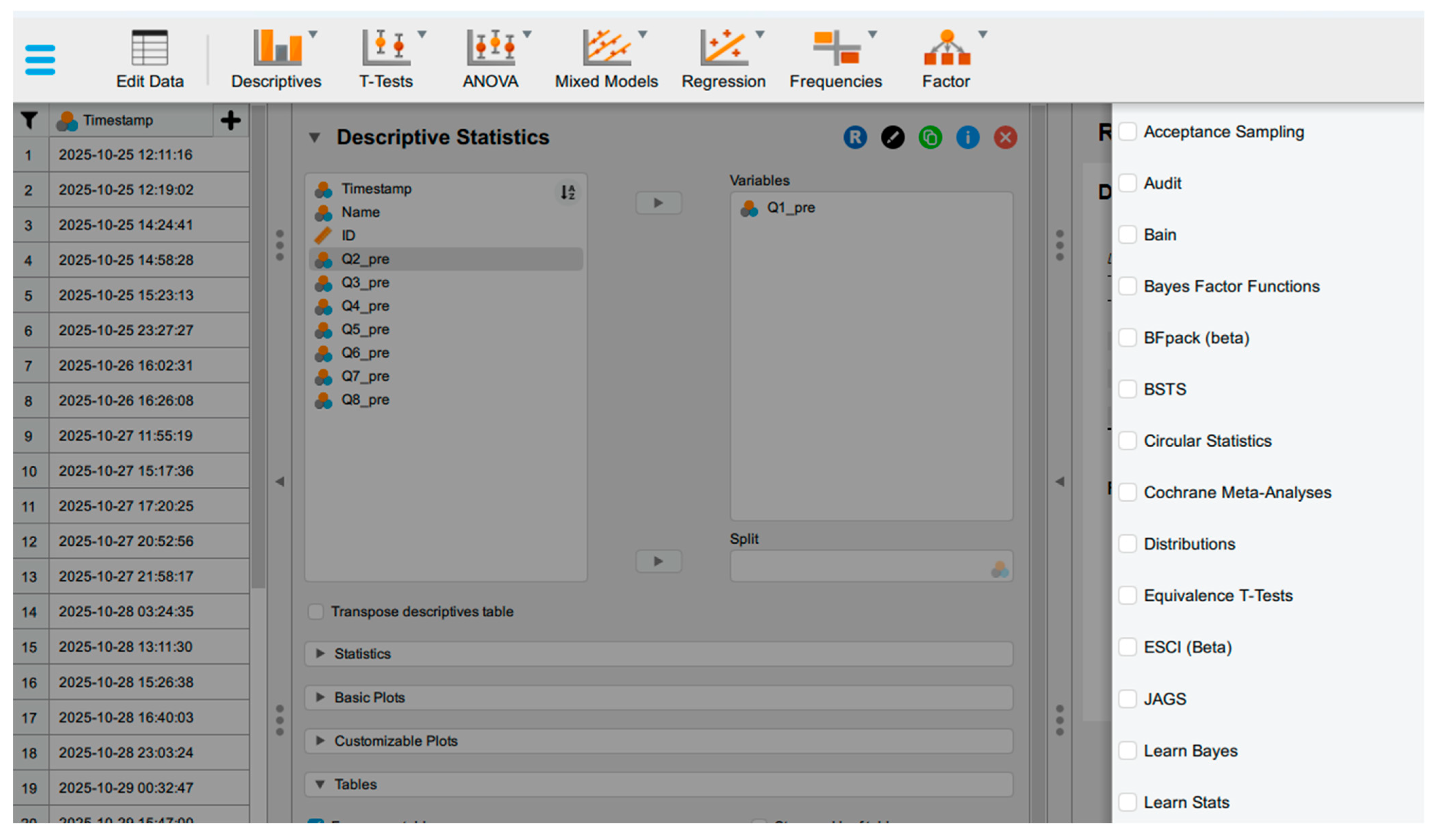
Figure 6.
Example in the results output window.
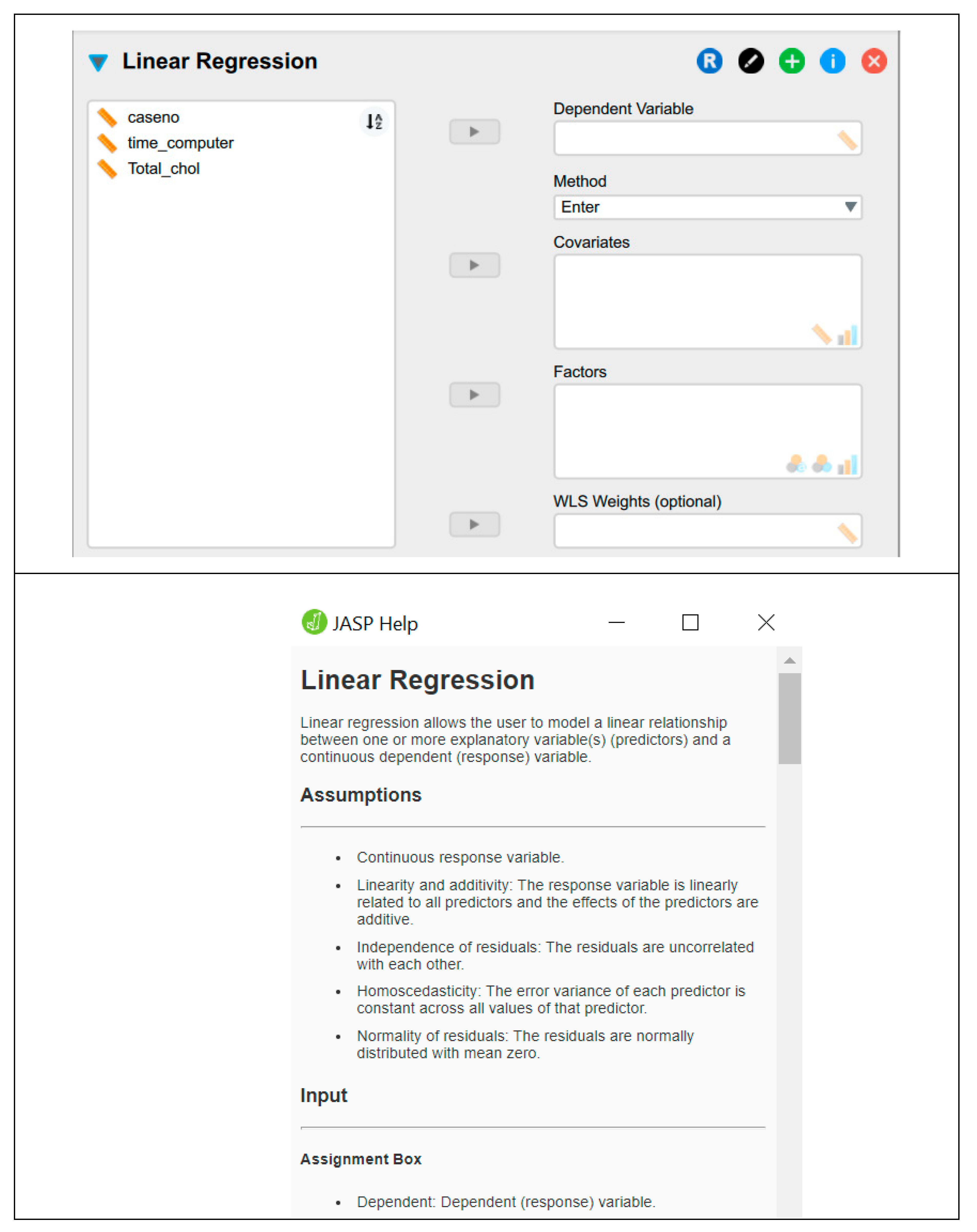
Figure 7.
Types of Data.
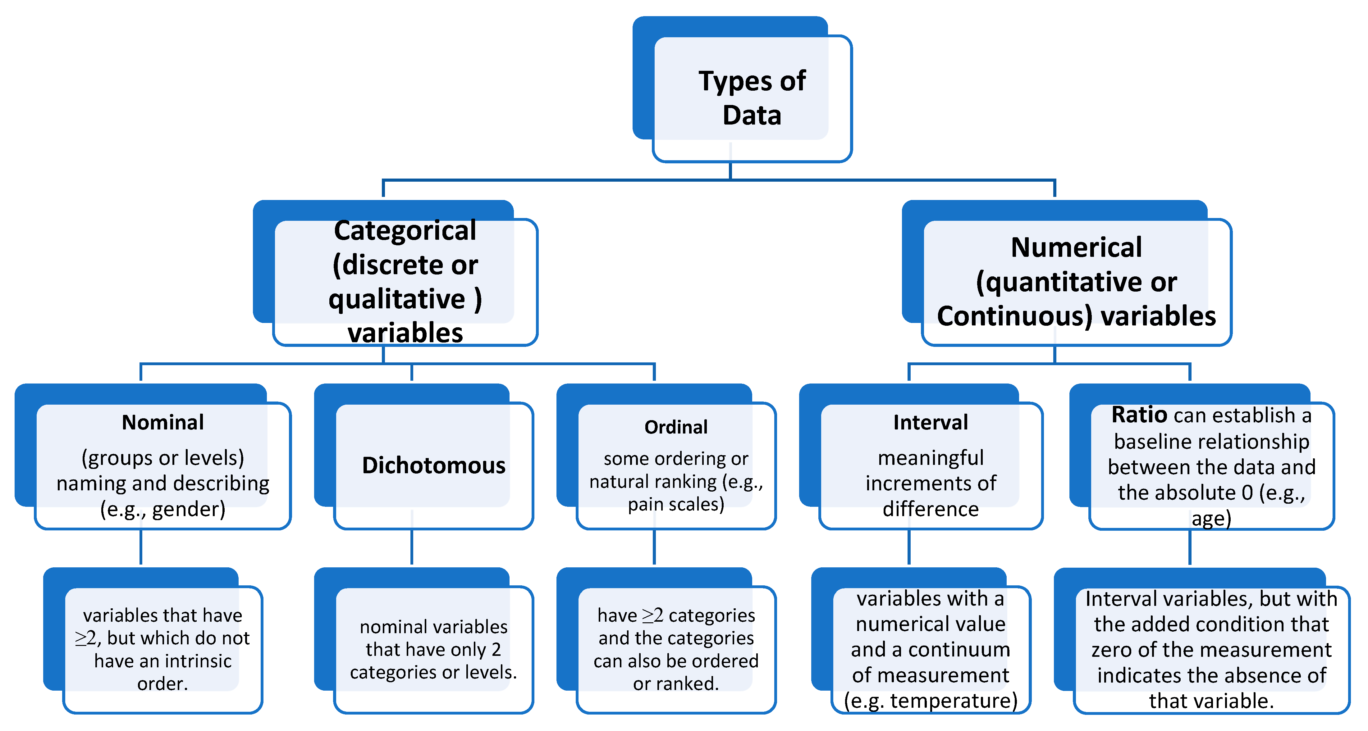
Figure 8.
Quartiles and Data Distribution.
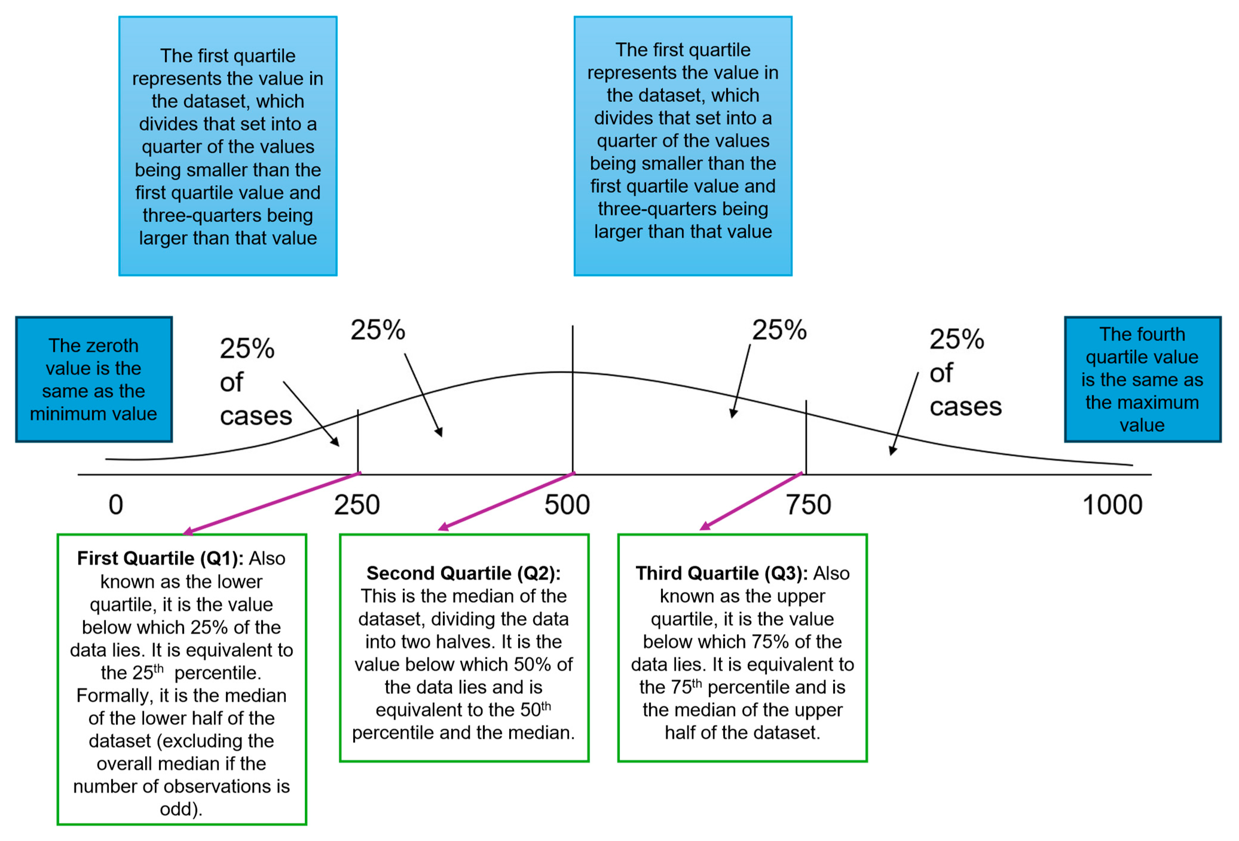
Figure 8.
Descriptive statistics in JASP.
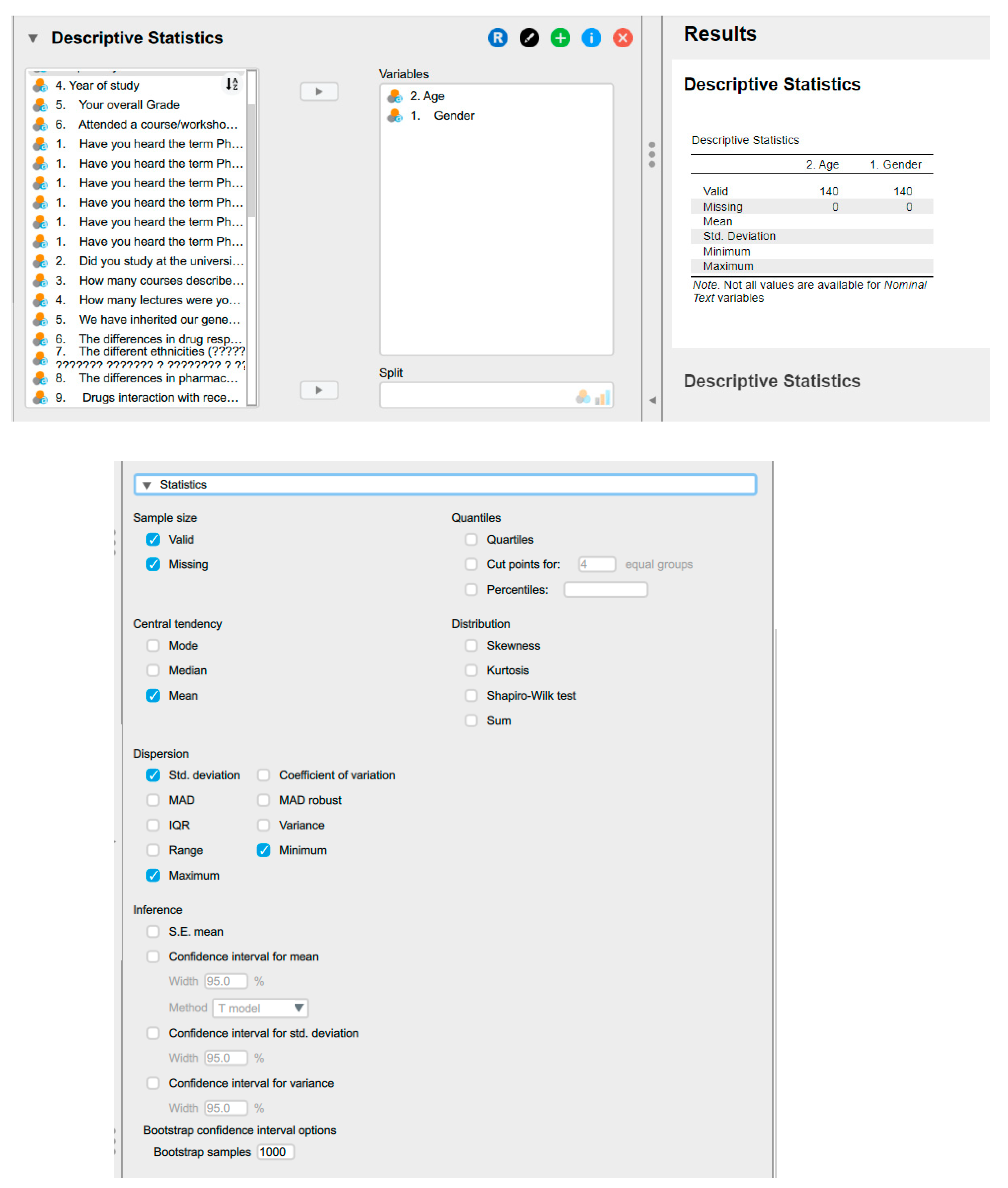
Figure 9.
Graphs options in JASP.
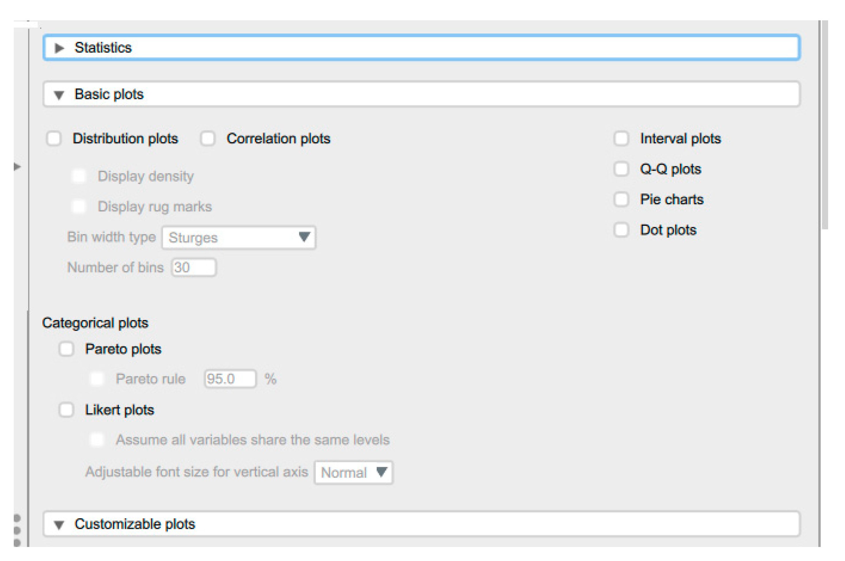
Figure 10.
The box plots.
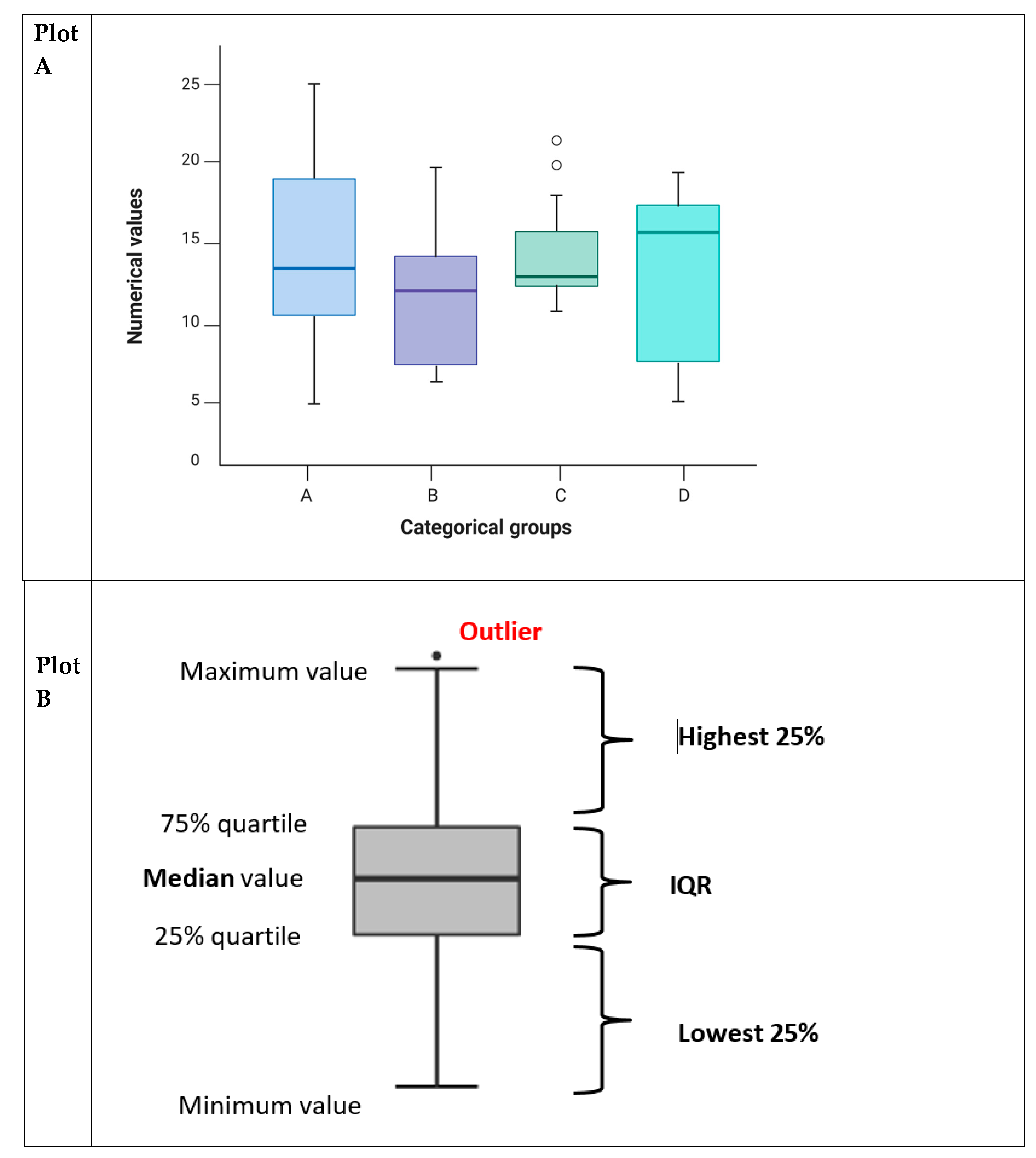
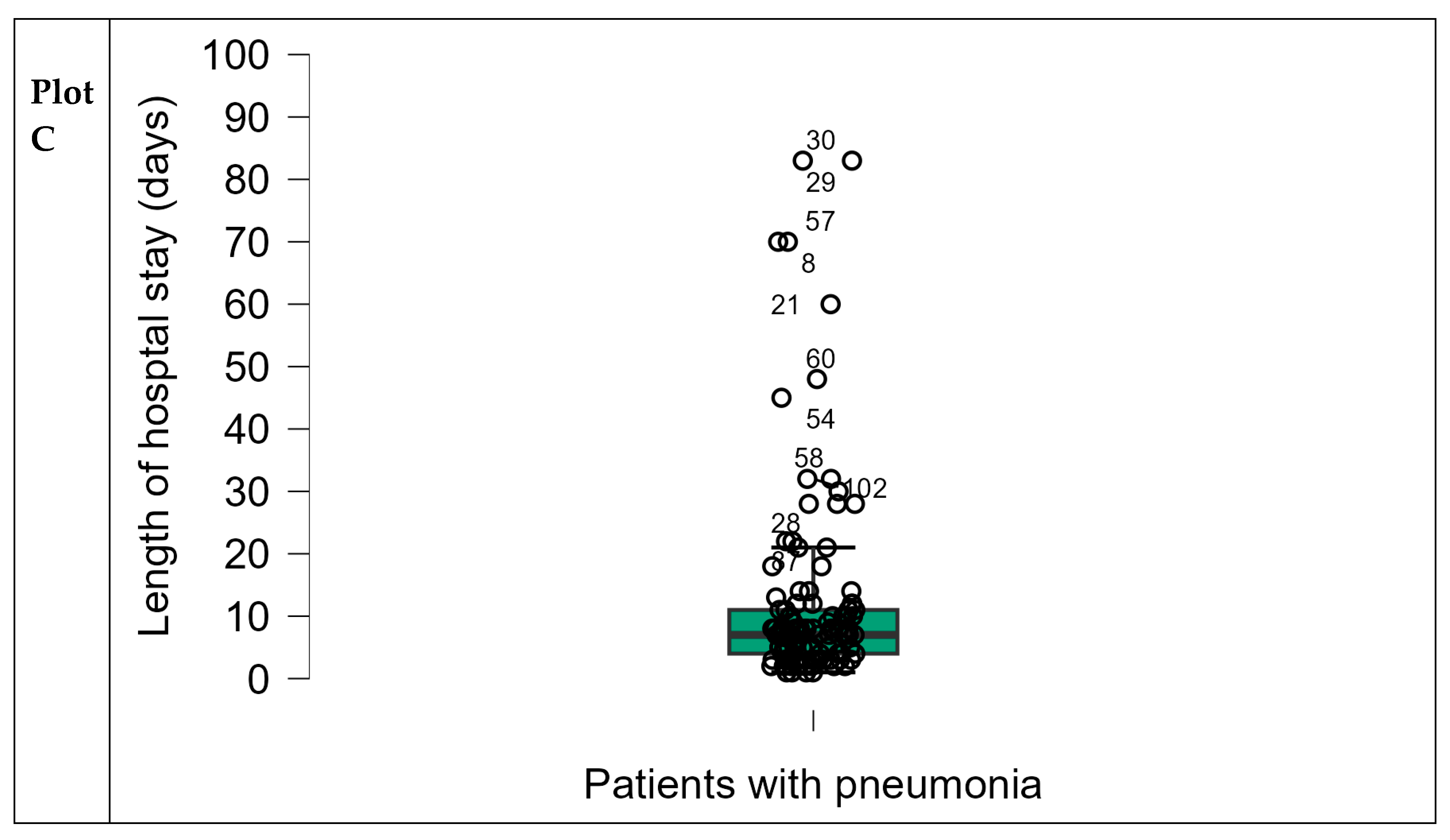
Figure 11.
Comparative Visualisation of Histogram Distributions and Bar Graph Types.
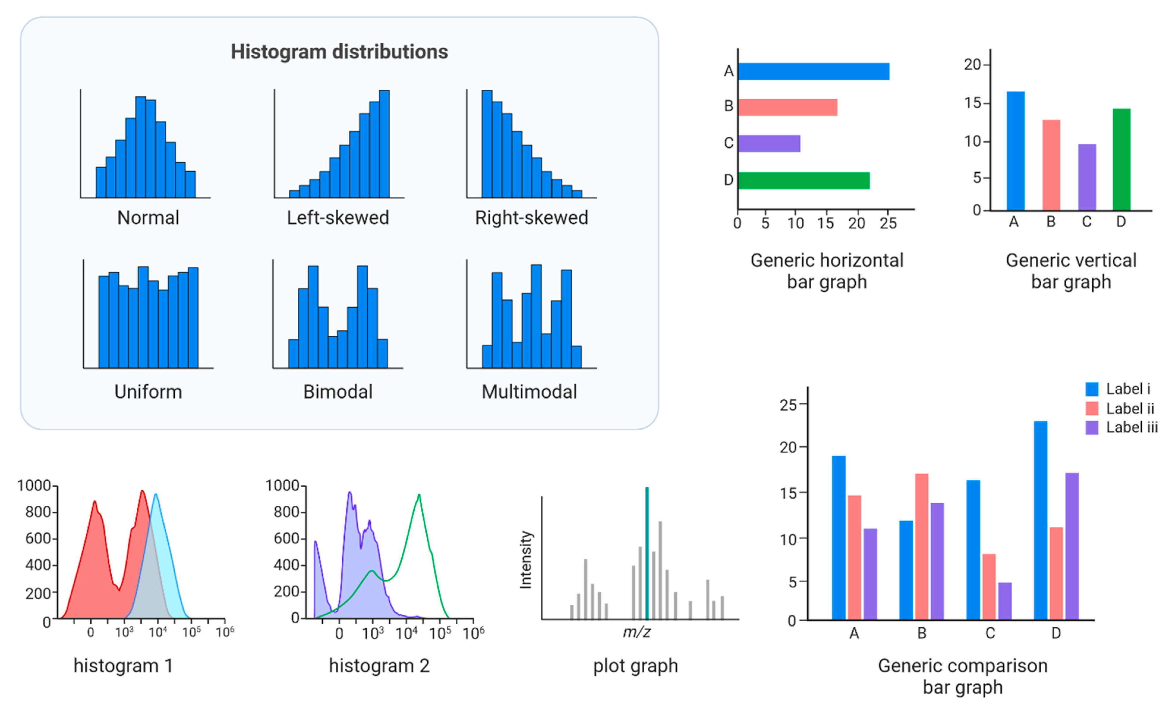
Figure 12.
Example on Violin plots.
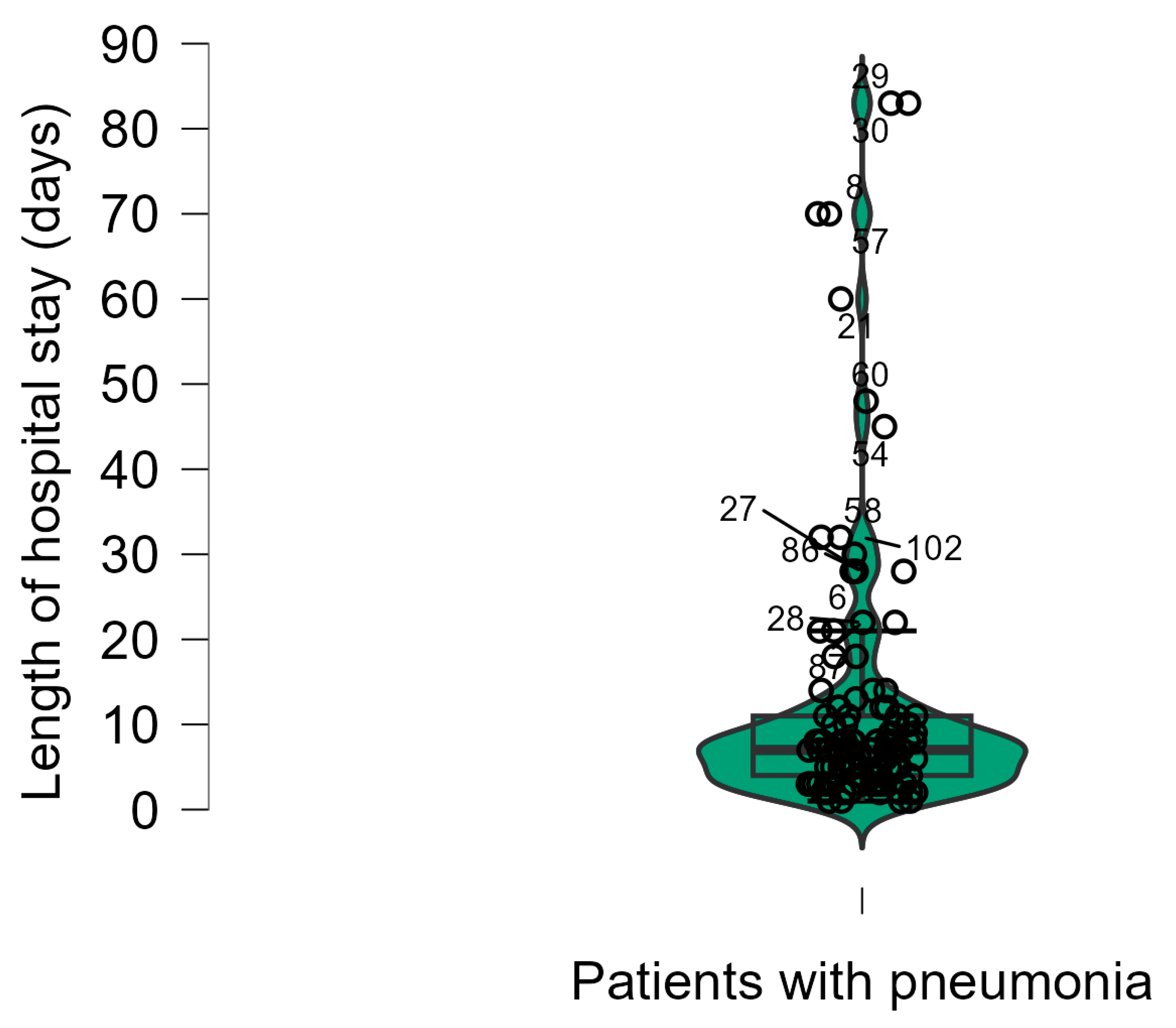
Figure 13.
Scatter plots in JASP.
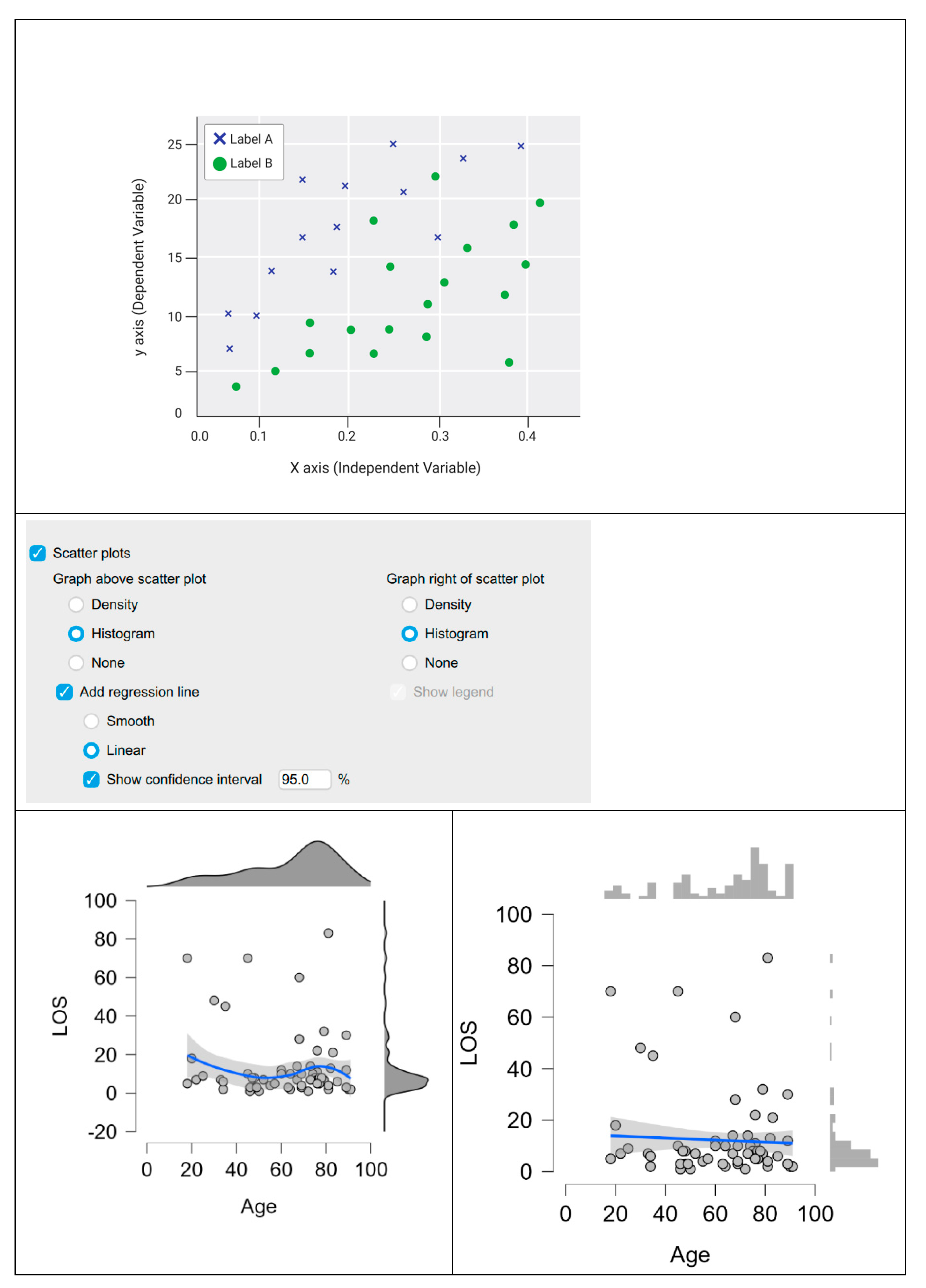
Figure 14.
Pie chart in JASP.
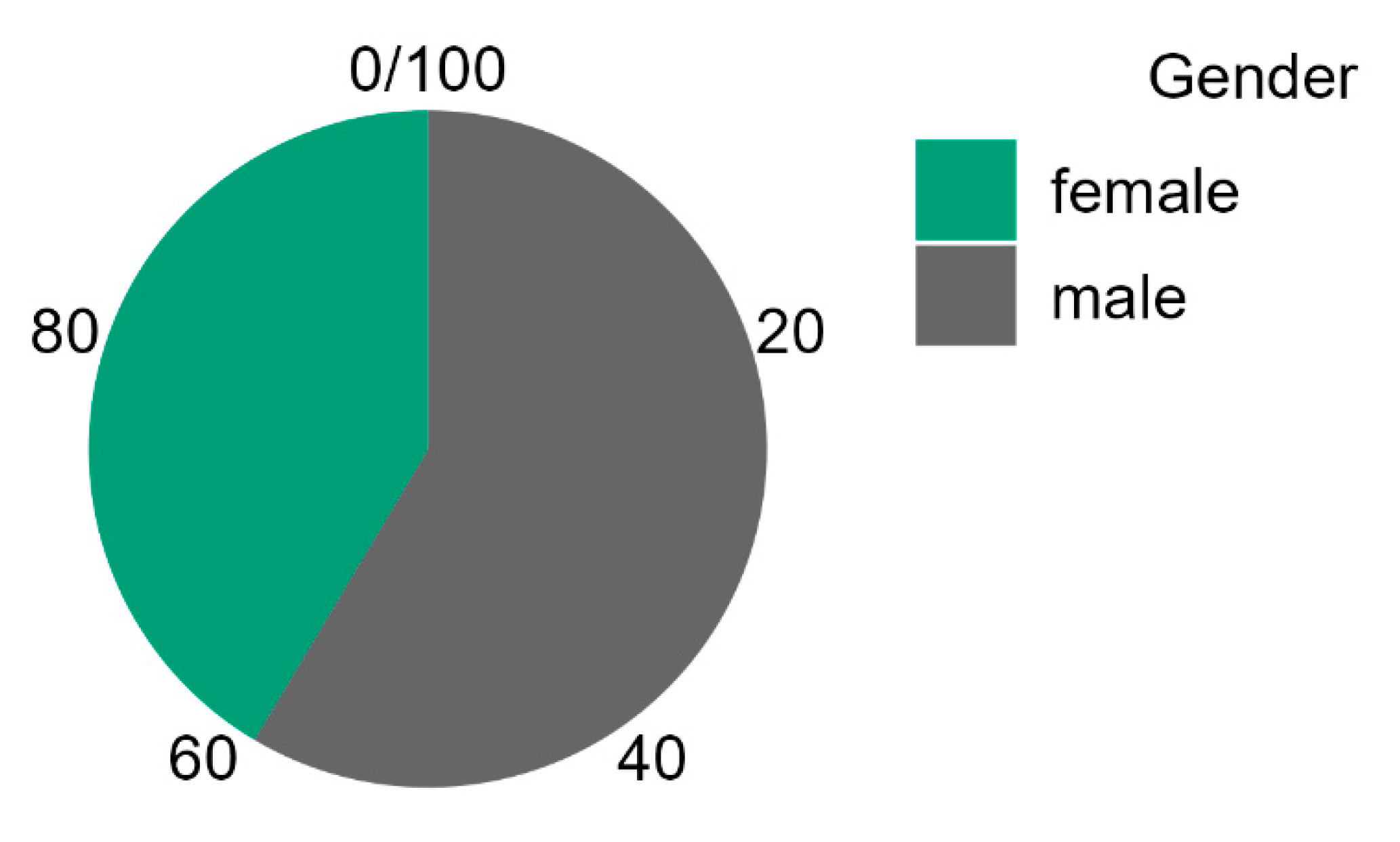
Figure 15.
Splitting the data in JASP.
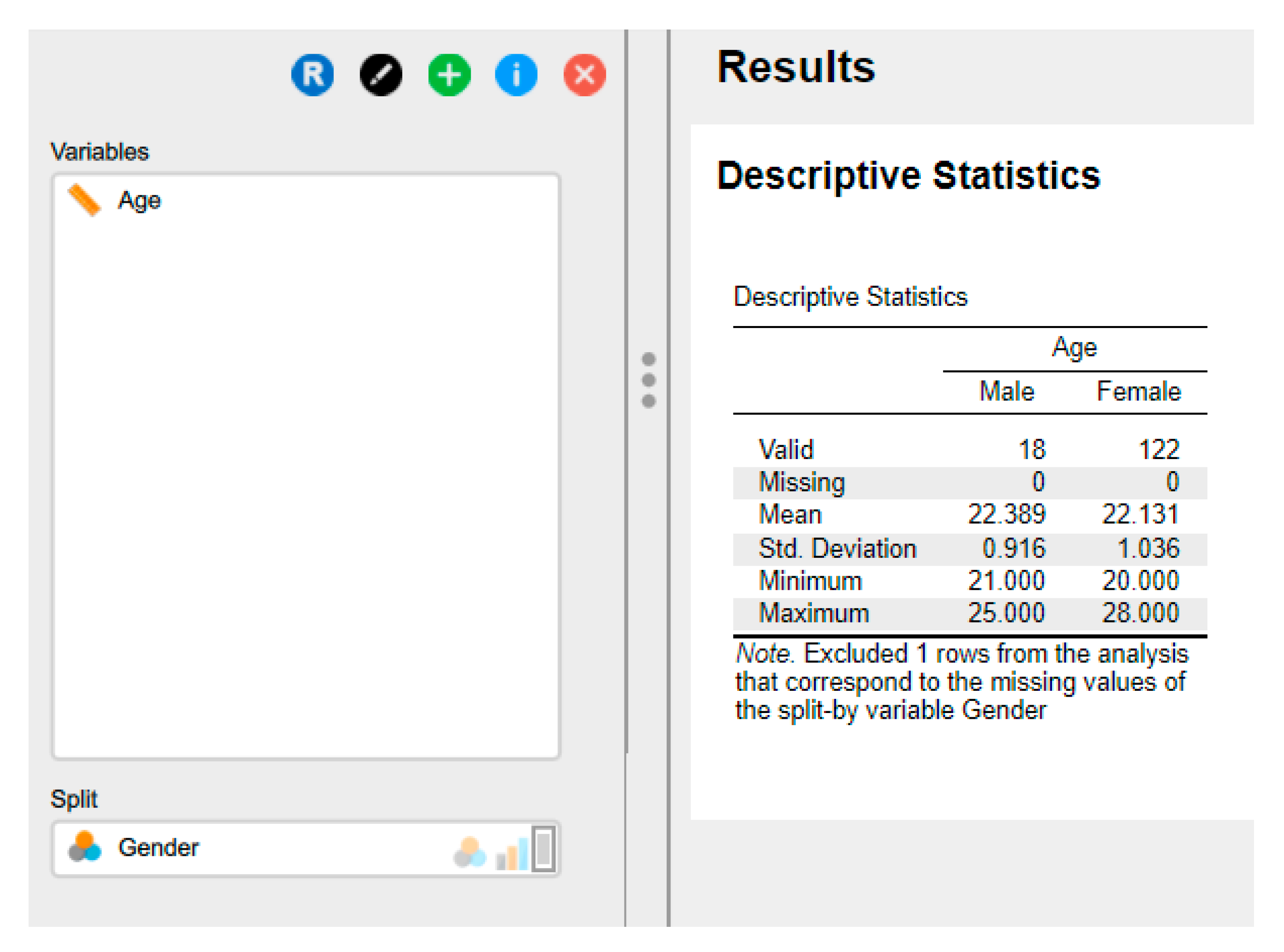

Table 1.
Overview of JASP File Management Options.
| Open JASP | |
 | |
| The main menu can be accessed by clicking on the top-left icon. |  |
| Open | |
| The file formats include .csv (comma-separated values), which is a standard format for data exchange; .txt (plain text), which can also be saved in Excel; .sav (IBM SPSS data file); and .ods (Open Document spreadsheet). Users have the capability to open recent files, browse files stored on their computer, and access the Open Science Framework (OSF). Additionally, they can access a diverse selection of examples provided within the Data Library in JASP. | 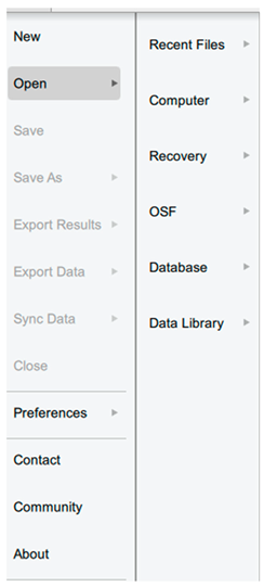 |
| Save/Save as | |
| Annotations and analysis can be saved in the .jasp format. |  |
| Export Results | |
| to an HTML file. | 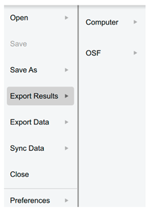 |
| Export Data | |
| to either a .csv or .txt file. | 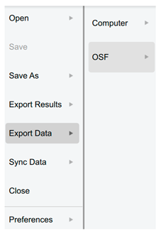 |
| Sync data | |
| Used to synchronise with any updates in the current data file (also can use Ctrl-Y). | 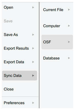 |
| Close | |
| It closes the current file but not JASP. | |
| Preferences | |
| There are three sections available for adjusting JASP to fulfil the requirements. | 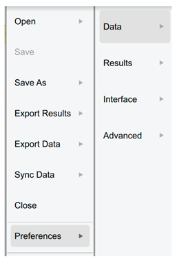 |
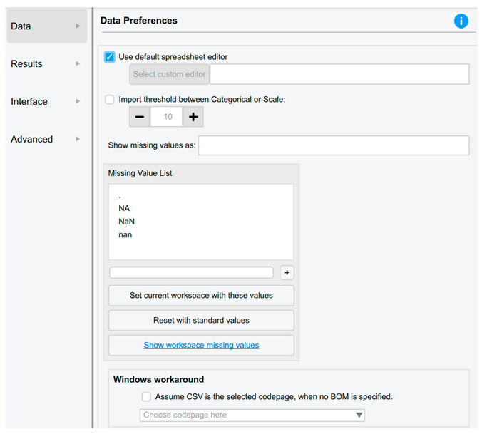
| Data Preferences | |
| The users are able to: • Automatically synchronise or update the data upon saving the data file (default setting). • Select the default spreadsheet editor, such as Excel, SPSS, etc. • Modify the threshold to enhance JASP's ability to differentiate between nominal and scale data. • Incorporate a custom missing value code. |
 |
| Results Preferences | |
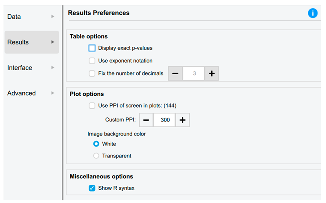
| The users are able to: • Configure JASP to provide precise p values, such as P=0.00056, rather than P<.001. • Specify the number of decimal places for data in tables, thereby enhancing readability and suitability for publication. • Adjust the pixel resolution of graphical plots. • When copying graphs, choose whether they have a white or transparent background. |
 |
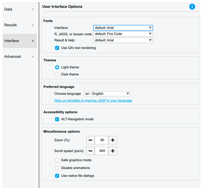
| Interface Preferences | |
| Users can adjust the user interface options to customise the system font size for improved accessibility and scroll speeds. |
 |
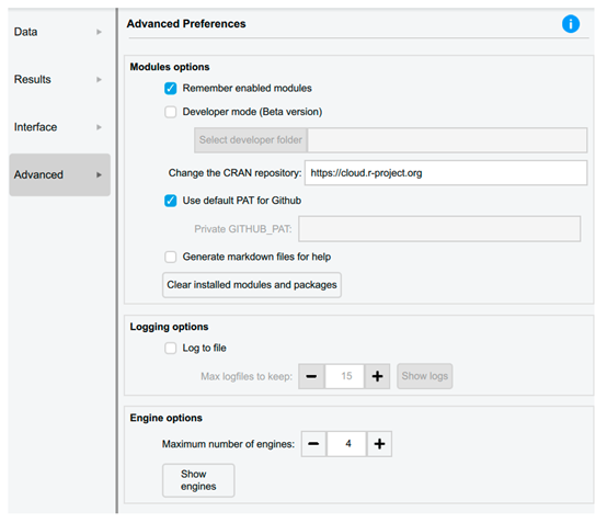
| Advanced Preferences | |
 |
|
Table 2.
Measurement types in Data in JASP.
| Icon | |
| Nominal |  |
| Nominal -Text * |  |
| Ordinal |  |
| Continuous |  |
* This type was available in the old versions.
Table 3.
Handling data in JASP.
| Type of data handling | Steps |
|---|---|
| Saving Data |
Open JASP: Launch the JASP software on the computer. Import Data: Before saving the data, we need to import it into JASP. The users can do this by clicking the "Open Data" button on the main toolbar and selecting the data file they want to analyse. Make Necessary Changes: If needed, the users can make changes to the data within JASP. This might include recoding variables, filtering data, or creating new variables. Save Data: By following these steps: Click on the "File" menu at the top-left corner of the JASP window. Select "Save As" from the drop-down menu. Choose a location on the computer where the user want to save the file. Enter a name for the file and select the file format (JASP saves data in .jasp format). Click "Save" to save the data. |
| Exporting Data |
Open JASP: As mentioned above. Prepare Data (if necessary): Ensure that the data is cleaned and organised appropriately for export. This may involve removing unnecessary variables, recoding data, or filtering rows. Export Data: To export the data from JASP, the user has to follow these steps: Click on the "File" menu at the top-left corner of the JASP window. Select "Export" from the drop-down menu. Choose the desired file format for export (options include CSV, Excel, SPSS, and R). Specify the location on the computer where the user want to save the exported file. Enter a name for the exported file. Click "Save" or "Export" to export the data, making it compatible with other statistical software or for further analysis in different programs. |
Table 4.
Comparison between discrete and continuous variables.
| Discrete data | Continuous data |
|---|---|
| has a finite set of values. | has an infinite number of subdivisions (for example, 1.1, 1.11, 1.111, etc.). |
| Cannot be subdivided (rolling the dice is an example; we can only roll a 5, not a 5.5). | Is mostly seen practically; i.e., although we can keep halving the number of white blood cells per litre of blood and eventually end up with a one cell, the vast numbers we are dealing with make the whiye blood cell count a continuous data value. |
| An example includes binomial values, where only two possible outcomes exist, such as a patient either developing a dosorder or not. | An example is the measurement of body weight, with the possibility of taking increasingly detailed readings depending on the equipment's sensitivity. |
Table 5.
Recoding and transforming variables in JASP.
| Process | |
| Recoding Variables | Identify Variables: Identify the variables in the dataset that we want to recode. These might be categorical variables with different levels or numerical variables that need to be categorised differently. Open the Variable Viewer: Click on the "Variable Viewer" tab at the bottom-left corner of the JASP window. This will display a list of variables in the dataset. Select Variable to Recode: Locate the variable we want to recode in the Variable Viewer. Click on the variable name to select it. Recoding Options: Right-click on the variable name or click on the gear icon next to the variable name to access the recoding options. Choose Recode: From the drop-down menu, select "Recode Variable." This will open a dialog box where we can specify how we want to recode the variable. Specify Recoding Rules: In the Recode Variable dialogue box, we can specify the recoding rules. This might include merging categories, creating new categories, or assigning new values to existing categories. Apply Recoding: Once er have specified the recoding rules, click "OK" to apply the changes. JASP will recode the selected variable according to our specifications. |
| Transforming Variables | Identify Variables: Identify the variables in the dataset that we want to transform. These might be numerical variables that need to be transformed to meet the assumptions of statistical tests. Open the Variable Viewer: Click on the "Variable Viewer" tab at the bottom-left corner of the JASP window to display a list of variables in the dataset. Select Variable to Transform: Locate the variable we want to transform in the Variable Viewer. Click on the variable name to select it. Transformation Options: Right-click on the variable name or click on the gear icon next to the variable name to access the transformation options. Choose Transform: From the drop-down menu, select "Transform Variable." This will open a dialogue box where we can specify the transformation we want to apply. Specify Transformation: In the Transform Variable dialogue box, we can choose from a variety of transformation options, including square root, logarithm, inverse, and others. Apply Transformation: After specifying the transformation, click "OK" to apply the changes. JASP will create a new variable with the transformed values. |
Table 6.
Overview of central tendency measures.
| Mean (Average) | Median |
Mode |
|---|---|---|
| Refers to the process of summing all data point values for a variable within a dataset and dividing that total by the number of values in the set. | It is a computed value positioned exactly at the midpoint of all other data points. This indicates that fifty per cent of the values are greater than this figure, while the remaining fifty per cent are lesser, regardless of their specific magnitudes. | It is the data value that appears most frequently and is used to describe categorical values |
| It represents a meaningful method for illustrating a set of numbers that lack outliers, defined as values significantly diverging from the majority of the data. | These are used when there are values that could distort the data, i.e., a few values significantly differ from the majority of the data points. | Returns the value that occurs most frequently in a dataset, which indicates that some datasets may possess more than one mode, giving rise to the terms bimodal (for two modes) and multimodal (for more than two modes). |
| Example of a dataset consists of: 5, 4, 13, 1, 66, 9, 13 | ||
| Mean = 111 divided by 7 = 15.9 | Arrange from the lowest to the highest or vice versa: 1, 4, 5, 9, 13, 13, 66 Median = 9 When the data set contains an even number of values, the median is the average of the two middle values. |
The mode is 13 |
Table 7.
Comparative Analysis of Measures of Statistical Dispersion.
| Measure of Dispersion | Definition and Formula | Specific Use Cases | Key Advantages | Key Disadvantages |
|---|---|---|---|---|
| Range | The difference between the maximum and minimum values. Formula: R = Xₘₐₓ - Xₘᵢₙ |
• Quick, initial assessment of data spread • Quality control for process limits • Situations where extremes are critical |
• Extreme Simplicity: Easy and quick to compute • Clear boundary of data's full extent |
• Highly Sensitive to Outliers • Ignores Data Distribution |
| Interquartile Range (IQR) | The range of the middle 50% of the data. Formula: IQR = Q₃ - Q₁ |
• Analysing skewed distributions or data with outliers • Non-parametric statistics • Defining (determining) outliers and constructing box plots |
• Statistical Robustness: Resistant to outliers • Focuses on the central data portion • Applicable to ordinal data |
• Does not use all data • Limited Use in Parametric Models |
| Variance (s²) | The average of squared deviations from the mean. Sample Formula: s² = Σ(xᵢ - x̄)²/(n-1) |
• Foundational for inferential statistics • Theoretical probability and modelling • ANOVA and regression analysis |
• Uses All Data points • Mathematically Tractable (can be derived, manipulated, and used for inference using relatively straightforward and well-established mathematical operations) • Cornerstone of statistical theory |
• Squared Units • Highly Sensitive to Outliers • Less intuitive for interpretation |
| Standard Deviation (s) | The square root of the variance. Sample Formula: s = √[Σ(xᵢ - x̄)²/(n-1)] |
• Primary spread measure for normal data • Applying Empirical Rule • Confidence intervals and standard errors |
• Original Units of measurement • Comprehensive and Widely Used • Essential for precision assessment |
• Sensitive to Outliers • Assumes roughly normal distribution |
| Mean Absolute Deviation (MAD) | The average of absolute deviations from mean. Formula: MAD = Σ|xᵢ - x̄|/n |
• Robust alternative to standard deviation • Forecasting error measurement • When outlier resistance is needed |
• Robustness and Simplicity balance • Intuitively clear as average distance • Original data units |
• Mathematical Intractability • Not used in inferential formulas |
| Coefficient of Variation (CV) | The ratio of standard deviation to mean. Formula: CV = s/x̄ |
• Comparing variability across different datasets • Risk assessment in finance • Measurement system comparison |
• Dimensionless: Enables cross-dataset comparison • Scale-invariant relative measure |
• Meaningless for Mean Near Zero • Only for ratio-scale data |
Table 8.
Summary and Selection Guidelines for dispersion.
| Condition | Measure |
|---|---|
| For quick assessment | Range (with caution) |
| For robust analysis (skewed data/outliers) | Interquartile Range |
| For parametric data and inference | Standard Deviation and Variance |
| For comparing different datasets | Coefficient of Variation |
| For a robust all-data measure | Mean Absolute Deviation |
|
Key Considerations: Data Distribution: Normal vs. Skewed Outlier Presence: Robust vs. sensitive measures Measurement Scale: Ordinal, interval, or ratio Analytical Purpose: Descriptive vs. inferential statistics Interpretability: Units and communication needs | |
Table 9.
Data transformation in JASP.
| A. | Running the data transformation. |
 |
|
| B. | Clicking on the + opens up a small dialogue window where we can: Enter the name of a new variable or the transformed variable Select whether we enter the R code directly or use the commands built into JASP Select the suitable data type |
 |
|
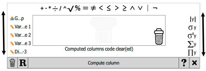
| C. | Once the new variable has been named and the other options have been selected, click 'Create'. If the manual option is chosen, this will open all the built-in creation and transformation options. Users can scroll left or right to view additional variables or operators, respectively. |
 |
|
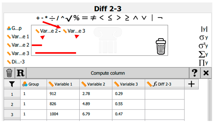
| D. | For example, if the intention is to generate a data column illustrating the difference between variable 2 and variable 3, once the column name has been entered into the Create Computed Column dialogue box, the name will be displayed within the spreadsheet window. The mathematical operation must then be specified. In this instance, variable 2 is dragged into the equation box, followed by the ‘minus’ sign, and subsequently variable 3. |
 |
|
| E. | If we have made a mistake, e.g., used the wrong variable or operator, we remove it by dragging the item into the dustbin in the bottom-right corner. |
| F. | When we are satisfied with the equation/operation, we click Compute Column to enter the data. |
 |
|
| G. | If we decide not to keep the derived data, we can remove the column by clicking the other dustbin icon next to the R. |
Disclaimer/Publisher’s Note: The statements, opinions and data contained in all publications are solely those of the individual author(s) and contributor(s) and not of MDPI and/or the editor(s). MDPI and/or the editor(s) disclaim responsibility for any injury to people or property resulting from any ideas, methods, instructions or products referred to in the content. |
© 2025 by the authors. Licensee MDPI, Basel, Switzerland. This article is an open access article distributed under the terms and conditions of the Creative Commons Attribution (CC BY) license (http://creativecommons.org/licenses/by/4.0/).
Copyright: This open access article is published under a Creative Commons CC BY 4.0 license, which permit the free download, distribution, and reuse, provided that the author and preprint are cited in any reuse.


