Submitted:
04 July 2025
Posted:
07 July 2025
You are already at the latest version
Abstract
Pediatric/neonatal bed demand unsurprisingly depend on the trend in local births. Periods of higher births generate a capacity shock, where length of stay (LOS) is reduced, sometimes by premature discharge or transfer to another hospital, to squeeze arriving patients into existing bed capacity. Similar capacity shocks occur during the autumn/winter/spring period when volatile levels of circulating pathogens, allergens, and air quality exacerbate common pediatric conditions. In England, 30% of 1,285 pediatric ICD-10 (3-digit) diagnoses have very high year-to-year volatility in admissions, while diagnoses with >3-times higher volatility than Poisson variation account for 54% of pediatric admissions. Such enormous volatility implies that the average length of stay (LOS) plays an almost trivial role in capacity planning. It is proposed that the Wuhan and Alpha strains of COVID-19 acted to reduce pediatric demand via pathogen interference – one example of how 3000 species of known human pathogens can interact with overall health in complex ways. Simple methods are presented to: 1. Construct scenarios for future births, 2. Construct a profile of daily (volatile) bed demand across the year, and 3. Calculate the surge capacity required to cope with a worst year. The Erlang equation is used to determine the optimum average bed occupancy rate for unhindered access to a bed, which depends on the size of the unit. For example, a 10-bed unit must function at only 31% average occupancy for unhindered access. Diminishing average occupancy as size reduces explains why smaller Pediatrics units cost more to run, and how this may influence the funding for smaller units in less populated rural and remote areas. The optimum size is above 30 beds, with 10 beds the likely minimum for an effective unit. Despite having a very high number of specialist children’s hospitals, the USA only manages to rank 55th in the world for childhood mortality – higher than Russia and Romania. With 47% of pediatric units in the USA having <10 beds, this could be described as a very expensive form of chaos. It is suggested that the numerous small units in the USA are unable to deal with anything other than the simplest admissions and form a vast hidden queue to (delayed) admission via transfer to a larger unit. Suggestions are given for lowering pediatric costs in the USA by improving the economy of scale. Finally, a list of nine ‘never do this’ catastrophic pitfalls are given for doctors to identify dubious capacity advice from managers and external ‘experts’.
Keywords:
pediatricP
; capacity planning
; bed numbers
; bed occupancy
; forecasting demand
; costs
; economy of scale
; births
; seasonality
; capacity shocks
; Erlang equation
; surge capacity
; international comparison
; USA
; England
; capitation funding
; hospital costs
0. Scope of the study
This study presents general principles for capacity planning of any type of childhood inpatient care. This ranges from neonates, general pediatrics, trauma, oncology, etc. The common theme is that all these depend on past and future trends in births. Multiple real-world examples are provided to illustrate the concepts.
1. Introduction
This is the 4th in a series of studies on international hospital bed number comparison and capacity planning [1,2,3] which is based on the authors’ 30 years of experience in demand forecasting, capacity planning and financial risk for hospitals and purchasers. To avoid self-citation details of over 300 studies are available in the Supplementary materials S1. These studies will be referenced using an alpha numeric system, i.e., see A.1, etc., in Supplementary material S1, where A, B, etc., refers to a section and 1 ,2, etc., is the study number in each section.
The art of capacity planning is to consider all contingent factors to make a realistic forecast of future bed and staff requirements. If the resulting built capacity is too small the unit is not fit for purpose and may require a second business case and additional construction work – all of which take time and unnecessary cost. On the other hand, if it is built too large there may be a relatively small increase in capital costs, which are depreciated over the life of the building, however, the additional space can be put to other productive uses, say, a small laboratory for point of care testing, etc. The aim of this study is to illustrate how best to make such real-world forecasts.
I entered healthcare in the early 1990’s and was informed that the correct way to forecast future demand was to calculate admission rates by age band and extrapolate these forwards using government statistical agency population estimates for the area in which the hospital was located. It was assumed that government statistical agency forecasts were akin to predictions rather than estimates, and it was ignored that such estimates were often extremely unreliable, especially for children [3,4,5,6,7]. Future admissions were then multiplied by future length of stay (LOS) which was assumed to decrease ad infinitum and the resulting occupied bed days were then adjusted for an optimum bed occupancy rate, often assumed to be 85%.
Over the space of 30 years, I have never come across an age-based forecast that worked in the real world [1,2,3]. Gross underestimation is the most usual outcome because admission rates per age band usually increase over time as medical technology increases the range of treatable conditions, increasing public expectations, social disintegration, and disease incidence/exacerbation rates change, i.e., bronchiolitis, asthma, allergies, cancers, etc., in children [8,9,10]. Relatively common conditions such as appendicitis also show unexpected changes over time [2], see also S.6 in S1.
In addition, many health conditions show seasonality [11,12,13,14,15] often exacerbated by meteorological factors which also affect the spread of pathogens [16,17,18]. These imply that the seasonal profile can show high volatility making annual averages an entirely unhelpful planning tool [19,20,21]. For example, it is known that asthma exacerbations in children occur sporadically during the period of autumn, winter and spring [22]. Another study showed that pediatric trauma admissions are higher during the afternoon, evening, and weekends while rain reduced the admission rate. Each degree of increase in temperature increased the rate of trauma admissions by 4% [23]. In Taiwan both seasonality and the associations with air pollutants and climate factors vary by age group with the number of weather and pollutant factors increasing with age [24]. Many common pediatric infectious diseases show a seasonal pattern [14,15,25]. It is worth recalling that staff sickness absence is also seasonal, see E.1-6 in S1, which may conflict with pediatric seasonality.
LOS has been known for many years to be a highly complex variable [26], see K.1-9 in S1, which is not subject to continuous reduction, and in smaller units is subject to sampling error [27].
Next, 85% occupancy as an ‘optimum’ has likewise been repeatedly demonstrated to be a complete fallacy [1,2,3]. However, in the literature, 85% has been applied as a crude measure of busyness, where it is true that at above 85% daily occupancy, hospital acquired infections (HAI), staff stress, adherence to standards, medication errors, never events, etc.; become progressively worse [2,3,28]. This is a very different issue to a bed being available for the next arriving patient and is better understood by daily measurement of staff to patient ratios [3].
The true optimum occupancy in terms of bed availability is dictated by queuing theory which clearly shows that the optimum occupancy is entirely dependent on the size of the unit [2,3]. Smaller units are forced to operate at lower levels of average occupancy, and with consequent higher operating costs [2,3]. Queuing theory also gives insight into the real number of people waiting for admission (the hidden queue of people on trolleys in corridors, in the emergency department, or in ambulances) and the real time this hidden queue waits for admission. This hidden queue also gives insight into the pressure to prematurely discharge patients or unusually high transfers to other hospital. Sadly, misinformation regarding 85% occupancy has been almost impossible to dispel and queuing theory is almost never used in bed capacity planning.
For all these reasons pediatrics is one of the more challenging specialties regarding capacity planning. While it may be obvious that past trends in births will directly affect pediatric demand, i.e., today’s 10-year-old admissions were born 10 years ago, etc., it may not be obvious that trends in pediatric deaths are likewise important. This association arises from the ‘nearness-to-death’ or ‘time-to-death’ effect [29] in which 55% of a person’s lifetime hospital bed occupancy occurs in the last year of life, irrespective of the age at death [29,30,31,32,33,34,35], although this becomes 100% for death in the first year of life. Such deaths tend to have an elongated tail regarding LOS thereby having a disproportionate effect on bed demand [35]. Poisson randomness in the local number of pediatric patients in the last year of life can therefore disproportionately affect occupied bed days, calculated average LOS and costs, see C.16 to C.23 in S1.
Multiple admissions by the same person are reflected in a negative binomial distribution [36] which has implications to sample size when attempting to benchmark average LOS between different sized pediatric units [37]. A similar situation is observed in the emergency department where a small number of troubled individuals/parents account for a disproportionate level of attendance, see B.10-11 in S1, and in the average cost for the same HRG/DRG in different sized hospitals, see O.17 in S1.
In addition to the nearness-to-death effect, other pediatric patients have childhood conditions, i.e., bronchiolitis, cancer, etc., which do not lead to childhood death, but which also generate multiple admissions and a negative binomial effect.
The above statistical issues are further compounded by declining fertility and birth rates [38] which suggest that demand may change with high uncertainty and with location specific trends in births due to internal/external immigration, and local home building [3].
It has also been observed that many admissions in the first year of life are potentially preventable’ with available community care [39] but depend greatly on parental factors [40]. The admission rate per birth in England has been increasing over time and reaches a maximum at 1-3 months after birth, followed closely by 7-28 days, with the minimum admission rate at 0-6 days [39].
Hence pediatric bed demand is subject to very high seasonal volatility, especially among those in the first year of life [39] who are acquiring wider immunity and resistance to the external environment and who may be lacking in parental care by mothers with a history of hospital admissions relating to mental health, violence, self-harm or substance misuse [40,41].
The concept of volatility also implies financial risk given that hospital income will fluctuate, see N.1-N.40 in S1), and peaks in demand lead to medical errors and litigation costs [42].
Indeed, poor advice is often given by external ‘experts’ leading to the construction of hospitals or departments which are often far too small to be fit-for-purpose. This has led to the formulation of the nine ‘never make these fatal errors’ in capacity planning.
- Attempt to obtain the minimum case possible for all variables by assuming that all schemes to reduce demand will simultaneously achieve 100% success. See point #8.
- Use simplistic age-based forecasts for admissions based on a single year. Use more than 8 years of data (preferably 15 years), to follow the trend in each year of age. Then take the trend into the future with multiple probable scenarios along with the observed (past) uncertainty associated with demand.
- Calculate average length of stay (LOS) based on midnight stays, always use real time data. Midnight LOS will consistently underestimate the real LOS [3].
- Assume that LOS is a constant, rather than a variable with confidence intervals, and assume that LOS decreases ad-infinitum. Most trends in LOS decrease toward an asymptote.
- Focus exclusively on those HRG/DRGs which show above average LOS. These will generally be matched by other HRG/DRGs with lower-than-average LOS. These arise due to the ambiguities in the local clinical coding process compared to that applying to the national average. This includes how doctors record diagnoses and the depth of local coding with complications and existing conditions affecting health. Local LOS is subject to sampling error as it is a small subset of national data [27].
- Use annual averages for admissions and LOS. Many conditions show seasonality due to multiple causes and LOS can also show seasonal variation.
- Assume that lower LOS means better care or that lower LOS makes large savings in costs. For pediatrics it is the volatility in admissions which dominates bed demand not the calculated LOS – this directly contradicts the accepted dogma that reduction in LOS is one of the key ingredients to reducing bed demand. Reducing LOS only benefits a steady state system or the baseline bed demand which lies beneath the volatile changes, see I.6,9 in S1.
- Make simplistic models comprising all the variables and proposed schemes to reduce admissions and LOS. An alternative is to use Monte Carlo simulation (including seasonality) which will show the full range of probable outcomes. This is a subset of operational research [19,20,21]. The alternative is to use past data to illustrate the sources of variability – upon which Monte Carlo simulation will be based but without the full nuances of the real world. Hence simultaneous variation in admissions and LOS imply that the actual trend in occupied bed days is a preferred approach.
The nine fatal errors have been regularly observed by the author relating to capacity planning in England [1,2,3]. These were forced on the English NHS in an environment where politicians had an erroneous belief that the NHS had too many beds and a serious policy fiasco where the Private Finance Initiative (PFI) for building hospital capacity necessitated government Treasury rules for the affordability of PFI projects, where the fiscal rules contradicted the real world of how bed demand behaved [1,2,3].
The study is not intended as a comprehensive literature review but gives sufficient wider references to explain why certain approaches are used and will give examples explaining the above fatal errors, propose alternate ways to create capacity scenarios, and demonstrate how the adequacy of current capacity can be quantified.
While data from England is used to illustrate many of the concepts it is recognized that high population density creates a unique situation relative to the USA, see E.6, P.4 in S1, where in 2011 in England some 50% of the population lived within 6 km of the nearest ED and only 9% lived >20 km away. The shortest average distance was only 2.5 km in Camden (London) to the highest average of 34.2 km in Eden (Cumbria) [43]. The situation in the USA involves far greater distances [44]. Hence pediatric units in England tend to be larger than in many countries.
The study therefore goes into considerable detail to illustrate the multidimensional complexity behind real-world pediatric capacity planning. This complexity has necessitated placing supporting analysis and discussion in a series of Supplementary files/documents which are part of the peer review process. The supplementary materials also include a special focus on pediatric capacity in the USA.
2. Materials and Methods
2.1. Sources of Data
International pediatric mortality was from the United Nations [45], while that in US states was from [46]. International hospital bed numbers from [47]. Data relating to England covers financial year inpatient admissions [48], winter daily SITREPS [49], hospital bed numbers and occupied beds [50]. Quarterly bed occupancy in Northern Ireland [51].
2.2. Additional Data from English Hospitals
Additional data covering hospital admissions, bed occupancy and births for children was obtained by Freedom of Information requests to several English hospitals.
2.3. Analysis of Admissions During the First Year of COVID-19
Statistically significant changes in pediatric hospital admissions [47] were detected by averaging admissions in 2018/19, 2019/20, 2022/23 and 2023/24, i.e., the 2 pre-COVID-19 years plus the 2 years after COVID-19 had greatly diminished. This average was compared to admissions during the first year of COVID-19 (2020/21) when the Wuhan and antigenically similar Alpha strains predominated, see G.6, G.7 in S1. Differences which exceeded the 95% CI were flagged as significant.
2.4. Analysis of Daily Occupied beds to Simuate a Worst Year
Daily occupied beds can be calculated in two ways. Firstly, from the admission and discharge dates of each patient and summing the number of patients still admitted at any day/time. This method is used in English hospitals. A second method counts the number of admissions and discharges on each day. The number of occupied beds is calculated as:
Current occupied beds = yesterday’s occupied beds + admissions – discharges
This method commences by counting the occupied beds at the start of the time series. It highlights the fact that occupied beds primarily depend on the disparity between admissions and discharges, which is not primarily driven by length of stay (LOS).
The next step is to line up all the years of data commencing on the same day of the week, i.e., a Sunday. For example, 2019 commences on Tuesday, the nearest Tuesday for 2020 is the 31st December 2019, and the nearest Tuesday for 2021 is the 29th December 2020, through to Tuesday the 2nd January 2024, etc. This step is required to detect any day-of-week changes in bed occupancy and is more important when there is a higher proportion of elective procedures.
Each day in the year is then adjusted to contain the same number of occupied beds as the ‘worst’ year in the time series. For England, the highest recent year occurred in 2023/24 which was 38% higher than 2018/19, and 20% higher than 2019/20, etc. Normally this would involve at least 15 years of data, but this depends on the availability of historic data. This then gives multiple views of the potential bed demand in a worst year for every day of the week throughout the year.
Statistical analysis is then performed for every adjusted day of the year (mean, median, standard deviation, minimum, maximum and upper and lower quartiles). Analysis of standard deviation (STDEV) in one English pediatric unit for each day showed that STDEV was randomly distributed, indicating that the baseline pattern for daily median occupied beds (highest from mid-September to just before Christmas) could be diminished/amplified for periods of time in any year but the duration of amplified periods were longer in a worst year, i.e., worst years probably have a higher frequency of disease outbreaks. This method can be used to estimate the proportion of full-time and on-call staff to minimize staff costs throughout the year, see L.31 in S1.
2.5. Analysis of Periods of Maximum Pediatric Deaths
Monthly data for children’s deaths by gender and single-year-of-age [58] was analyzed using a moving ‘excess winter mortality’ (EWM) calculation. An EWM calculation compares the average deaths in the most recent 4 months with the average over the previous 8 months. In the northern hemisphere for adults aged >60 years this calculation usually has its maximum value in the 4 months ending in March, i.e., winter, see H.7 in S1. The concept can be extended to any period of excess mortality by conducting a moving calculation.
Such a moving calculation reveals that while adults show higher winter mortality due to the presence of common winter pathogens such as influenza, respiratory syncytial virus, parainfluenza, etc., see H.7 in S1, the situation is more complex in children presumably because they are prone to a wider range of pathogens whose various strains/variants have unique year of age profiles, see G.6, G.7 in S1. The 4-month period is sufficient to allow the detection of the spread of multiple types of pathogens across England and Wales. With over 3000 species of known human pathogens the moving EWM calculation is therefore capable of detecting multiple outbreaks.
2.6. Estimating Total Occupied Beds for Children in England
The Hospital Episode Statistics data [48] used in this study is split by the consultant specialty. Hence, the specialty pediatrics is directly available but total bed use by children must be estimated. Over the years 2000/01 to 2023/24 data is available for the total number of all-age admissions and for children aged 0-14. Data covering 15-19 is only available from 2012/13 onward. For the specialty pediatrics admissions for ages 15-19 were estimated from the trend in the ratio of age 15-19 versus 0-14 from 2012/13 onward extrapolated back in time. This then gives an estimate for the total admissions aged 0-19 across all the years.
Total all-age occupied beds are available for all years and so the ratio of admissions for children was calculated for each consultant specialty and this was then applied to the total number of occupied bed days (occupied beds = occupied bed days ÷ 365 days per year). Unsurprisingly this ratio varies from less than 0.1% for palliative care, around 10% for radiology and trauma and orthopedics, around 40% for audiological medicine and clinical genetics through to close to 100% for the dental specialties. This assumes that the average LOS for children in each specialty is close to that for adults. LOS largely depends on the procedure/condition rather than age; however, slight overestimation is possible. Rather than attempt to extrapolate the proportion of children back in time for every specialty, only extrapolation from 2012/13 to 2010/11 was attempted. It was felt that the reduction in LOS in the specialties other than pediatrics between 2000/01 to 2010/11 was likely to lead to greater over estimation in the earlier years.
3. Results
3.1. Defining Pediatric Admissions, Beds and Bed Pool Size
Definitions and Multi-Specialty Pediatric Care
Pediatric care is defined as any care given to children including general and specialist pediatric care. A bed is defined as any bed/cot/trolley/couch used to accommodate pediatric inpatients or those queuing to gain entry to the department. Such beds can be open (staffed) or closed, i.e., undergoing deep cleaning or held in reserve for times of peak demand. Inpatient care covers both overnight and same day care and can include pediatric assessment units and any wards or critical care units which are dedicated to children.
In England, there were around 1.6 million pediatric admissions (emergency + elective + day case, aged 0-14) in 2000/01 rising to 2.1 million in 2016/17 and then falling to 1.9 million in 2023/24 [48]. Children can be under the care of consultants from a variety of specialties. In England over 65 consultant specialties treat pediatric patients and Table 1 shows those where >50% of admissions are for children.
A consultant can have more than 1 registered specialty. Hence the largest number of children’s admissions mainly occur in the specialties Pediatrics (69%), Ear, Nose & Throat (34%), General Surgery (5%) and Trauma & Orthopedics (10%) all making up 82% of the total. Some 1% of admissions occur in the emergency department/assessment units. In England, specialty code 180 is used for admissions into the ‘emergency department’, however, most of these admissions occur in dedicated adult or pediatric assessment units, hence, pediatric assessment units fall within the scope of the study and their size should be determined using the same principles. Some admissions such as cardiothoracic surgery (0.2% of children’s admissions) will occur in specialist hospitals including dedicated children’s hospitals. In England, many dedicated children’s hospitals are located on the site of a larger adult and children’s acute hospital. The specific context will determine how the calculations are applied. The number of required pediatric beds are assumed to include any escalation beds which are open or staffed at peak demand.
When attempting to quantify genuine pediatric bed demand, strictly speaking past data should be adjusted to include any patients queuing to gain entry to the unit such as in ambulances outside the emergency/assessment department, in cubicles/trolleys outside the unit, etc. This implies that peak years may be underestimated.
Finally, regarding specialist children’s hospitals, many of the admissions for the 65 consultant specialties treating children, such as trauma and orthopedics, endocrinology, etc., will occur in dedicated specialty bed pools (as also in adult care). The bed demand in each of these specialty bed pools needs to be forecast separately.
3.1.2. Defining a bed pool
The costs incurred in any health care system are a product of that system. The hospital average bed occupancy is fundamental to understanding those costs [2,3]. When researching pediatric unit size in the USA I quickly discovered that what at first appeared to be large children’s hospitals were the product of many years of mergers and acquisitions, hence, a collection of smaller hospitals which may not exclusively focus on pediatric care. Some could more correctly be described as women’s and children’s, etc. This is not exclusive to the USA and the same has occurred in England, hence, the second article in this series gave average bed occupancy at the individual sites of the larger NHS Trusts [2].
Hence the need to define a bed pool as the fundamental unit of operational efficiency and costs in what may first appear to be ‘large’ hospitals. A bed pool is a collection of beds dedicated to a set purpose such as adult/child, maternity/other care, male/female, etc. Other types of care are not allowed to cross into the defined bed pool and most importantly the bed pool size must be determined at each site.
The bed pool then becomes the fundamental unit for capacity planning. The planner must therefore understand which patients use the different bed pools. For example, a day surgery or endoscopy unit may treat both children and adults. There is some overlap such that a trauma unit will have a separate pediatric bed pool, however single rooms may allow discretion as to where older children are located. In the case of a genuine fluid boundary the total beds may be used to model the bed demand to gain economy of scale (discussed later). Some discretion is also allowed if patients can be quickly transferred between sites to balance demand among the smaller bed pools. These become intra-organization transfers as opposed to officially recognized inter-organization transfers.
3.2. Ranking Countries by Childhood Mortality
One way to rank the success of pediatric care is to compare childhood mortality. United Nations mortality data [45] for neonates, infants, age 1-11 months, 1-4, 5-9, 10-14 and 15-19 in 200 countries was averaged over the 3 years 2020 to 2022 and ranked for each group with 1 for lowest and 200 for highest mortality. The individual ranks were then summed across the 7 age groups, and this is shown in Figure 1. Hence, the minimum score is 7 while the maximum score is 1400.
San Marino had the lowest combined score of 22 rising to 1382 for Somalia. San Marino was generally low across all ages, except age 1-11 months where it ranked 11th. In this study overall comparisons are made between the UK (red square) and USA (red triangle). Wealthy countries other USA all have a low rank score, e.g., Luxembourg (3rd), Singapore (9th), Japan (14th), Switzerland (19th), etc. The nearest countries to the UK are Belgium, Germany, Portugal and Australia, while those nearest to the USA are the Russian Federation, Romania, China and Costa Rica. Across different ages the UK ranked between 9th and 41st while the USA ranked between 51st and 85th. Individual US states are arrayed around this average with Georgia, Mississippi, Indiana, Ohio having about double the rate in New York, Washington, California [46]. We can assume that net childhood care in the UK is considerably improved than even the best states in the USA in terms of mortality outcomes. How pediatric bed planning may contribute to this disparity will be covered later.
Before progressing further, we need to quantify how well the most recent bed supply across pediatric units is matched against the current bed demand.
3.3. Is Our Current Bed Supply Sufficient?
As presented in previous studies [2,3] we commence with an evaluation of current bed capacity using the Erlang-B equation and the lines of turn-away. Turn-away measures the proportion of time that a bed is not immediately available for the next patient and is therefore a measure of delays to treatment, hidden queues, cancelled operations, transfers to other hospitals and operational chaos. The aim of the following charts is to allow individual units to compare themselves with all other units of a similar size, and additionally with units having similar levels of turn-away (as a measure of chaos and hidden queues). As was mentioned previously [2,3] other forms of the Erlang equations can be used to estimate queue length and the time spent waiting for admission. Clearly bed occupancy varies throughout the day and time of year, and hence long-term averages are used for the purpose of comparing relative performance. In addition, due to the delay between diagnosis and admission for surgery or treatment, units with a higher proportion of elective admissions can operate at slightly higher turn-away. However, recall that the fundamental nature of elective demand is itself subject to Poisson and environmental volatility which imply that the slightly higher occupancy is limited, see D.1-3, 8, 9, N.1, N.2 in S1.
In Figure 2, data for English pediatric units was obtained from the NHS England winter SITREPS reporting [49] which documents bed numbers and occupancy at 6 a.m. over the period November to April which approximately covers the period autumn/winter/spring already highlighted to contain seasonal spikes in demand [11,12,13,14,15,16,17,18,19,20,21,22,23,24,25].
The data gives the maximum number of available beds over the period and the average daily occupancy which will include the dip in bed occupancy during the Christmas and New Year holiday period. The four periods 2021/22 to 2024/25 are covered. Each datapoint represents an NHS Trust which will mostly have just one pediatric unit, but occasionally two or more. At the far right (at 1000 beds) is data for the whole of England, which is around 6000 beds with type 1 emergency departments (ED) and a further 200 beds for hospitals without a type 1 ED. See Supplementary material S2 [61,62,63]. In 2024/25 there were 120 pediatric units in England with the largest being Manchester University (335 beds), Great Ormond Street (273) and Alder Hey Children’s (234). The smallest units are at the Queen Victoria Hospital (2) which is a specialist reconstructive surgery center, while Barnsley hospital (10 maximum, 8 normally) also has a separate children’s assessment unit. For Barnsley, children with specialist needs go to Leeds Teaching Hospital (164), a 40-minute journey, or Sheffield Children’s (162), a 47-minute car journey (both times are outside of peak hours). Data for the lines of turn-away is also available in Supplementary material S2 [61,62,63]. Since units with <10 beds are common for critical care and for pediatric units in other countries more detailed turn-away data is provided up to 15 beds.
It is desirable for any pediatric unit to have somewhere less than an average of 0.1% turn away and about 15% of units achieve this target. About 15% of units operate above 10% turn-away as the average for the whole period. These units have such high turn-away that they are likely to have poor patient outcomes and/or practice high levels of premature discharge. These and the other 70% of units in the middle need to evaluate their future bed requirements. The overall conclusion is that very little has changed in four years and that oversight by NHS England (established in 2012 and abolished on 13 March 2025 to once again become part of the Department of Health and Social Care) and the Care Quality Commission (CQC) has been exceedingly lax – possibly because government agencies are loath to admit that 30 years of a policy-induced capacity planning fiasco led to England being stripped of necessary hospital bed capacity [1,2,3].
By way of comparison, pediatric bed numbers and occupancy are available at quarterly intervals for Northern Ireland (which is run independently of the English NHS) for a 10-year period from 2014/15 to 2023/24 [51]. These are given in Figure A1 in the Appendix where we see that pediatric units in Northern Ireland are below the 0.1% turn-away line in around 25% of quarters (mostly during the summer). For units with more than 30 beds, occupancy is generally below the 5% turn-away line in the worst quarters (usually the 3 months ending in December). For units with less than 30 beds the worst quarters lie between 5% and 20% turn-away. The hospitals with up to 100% occupancy deal in child and adolescent psychiatry, where it is well recognized that there are insufficient beds to cope with the volatile demand. It is unknown if the implied wait to admission or implied premature discharge is detrimental to patient care. The smallest pediatric unit with around 11 beds operated at less than 0.1% turn-away in all but 3 quarters but remained under 0.5% turn-away. From the Northern Ireland figures we can tentatively propose that up to 5% turn-away during the worst quarters is a likely limit to an acceptable turn-away and that available (surge) beds can be increased to meet this target.
Figure 3 investigates the situation for pediatric intensive care units (PICU) in England during the winter of 2024/25. Pediatric intensive care is generally restricted to the larger teaching hospitals which operate in a hub and spoke manner with the surrounding general pediatric units. The numbers in Figure 2 are for NHS Trusts and may be spread across more than one site. Were data available for the smaller individual sites the data would be moved to the left and the turn-away would be higher. Up to 10 units look to require additional PICU beds to handle the winter (November to February) peak in demand. The best units look to operate below 5% turn-away.
Figure 4 shows the situation for neonatal intensive care units (NICU) for the autumn/winter/spring period in 2024/25. A surprising number of units operate above 20% turn-away, which once again has never been investigated in terms of outcomes.
PICU all function above 2% to 3% turn-away which is consistent with a higher proportion of elective surgical work. However, those units operating above 20% turn-away probably need more beds. NICU is characterized by higher levels of immediate access with around 20 units correctly functioning near to or below the 0.1% turn-away line. Units above the 20% turn-away line almost certainly need more beds. Occupancy and turn-away for these units in the winter of 2023/24 has been previously reported [3]. For both PICU and NICU several units operate above 85% average occupancy and will therefore experience the combined deleterious effect of high turn-away and high busyness.
From Figures 2 to 4 it is evident that several units chose to operate with sufficient beds to achieve immediate access, i.e., near or below 0.1% turn-away. Regarding the level of safety for pediatric units, note in Figure 2 that around 20 units consistently function above 85% average occupancy, also in Figure 4. Based on the principle of the link between busyness and patient safety [2,3], such units should be on the hospital’s risk register and questions should be raised as to why this situation has not been addressed.
An example of using the lines of turn-away to estimate the required surge capacity at a pediatric unit is given in Supplementary material S3 [49,64,65,66,67,68], which uses data from the Barts NHS Trust in England to illustrate the method [49]. Turn-away offers a suitable method to calculate pediatric surge capacity if around 10-15 years of historic data is available, and adjustment is made for the past and future expected trends in births.
3.4. The Size of Pediatric Units in the USA and England
Since the population density in England is very high, see D.6 and P.4 in S1, pediatric units in other countries are likely to be smaller than 15 beds and a comparison between the USA, Texas and England is provided in Figure 5 where the USA is characterized by nearly half of units having <10 beds [60], while England has over half with >40 beds, and Texas is midway, see Supplementary material S2 (61-63). Bed numbers in Figure 5 need to be understood from Figure 2 and the intermediate situation for Texas implies even lower than the line for the USA in smaller states. As may be expected, US hospitals which have the term ‘children’s hospital’ in their name largely fall into the 40+ group. For this group the number of beds are the total reported by the hospital. However, this sub-group is counterbalanced by the high proportion of beds in the 1-9 group which will occur in general hospitals (community hospitals in US terminology).
Figure 2, Figure 3 and Figure 4 should raise potential red flags regarding the ability of the multitude of small units in the USA to function in the face of volatile demand. The study of Cushing et al [44] further established that 25% of US pediatric units have only 5 beds or fewer. Five beds is a tiny unit with 50% turn-away at 84% average occupancy and 15% average occupancy required for 0.1% turn-away, see Supplementary material S2 [61,62,63].
Regarding the larger US children’s hospitals from Supplementary material S2 we see a median whole hospital bed occupancy around 59% and 65% for size weighted occupancy. Under the assumption that patients can be placed in any bed, i.e., a single specialty hospital, the median occupancy could be 78% and a weighted average of 83%. As explained, [49,50,69–85both are overestimates due to the multi-site nature of many hospitals.
Supplementary document S4 [49,50,69,70,71,72,73,74,75,76,77,78,79,80,81,82,83,84,85] compares hospital and bed numbers in the USA and England using a ratio per birth to give an approximate like-for-like comparison, while S5 [61,62,63,74,75,77,82]. applies English bed numbers to show equivalent beds in US states and counties. Spreadsheet S5 is intended to provide a template for other countries to conduct similar comparison and includes a count of maternity units in US states to act as an additional reference point. In S5 using the English norms some 1.5% of the US population lives in a county which would have fewer than 1.5 pediatric beds, 9.8% for fewer than 5.5 beds and 17.1% for below 10.5 beds. Low population density states like Wyoming and Montanna will struggle to provide access for the rural population, and in theory should be given additional help to do so.
The conclusion is that there are at least 2-times more specialist children’s hospitals per birth than England, 2-times more PICU beds and 3-times more NICU beds. However, as of 2022 fewer general pediatric beds than England. Specialist hospital beds show gross inequality in distribution between states and that the beds in some of the smaller units may be better merged – which may not be a welcome suggestion but is qualified by low population density in many parts of the US [44]. The higher ratios of specialist children’s hospitals, PICU and NICU beds looks to be driven by a higher profit margin rather than genuine patient needs. Alternately, the unlikely situation where children in the USA are 2-times sicker than those in England.
Given this highly skewed distribution of small pediatric units it is unsurprising that pediatric intensive care units (PICU) in the USA are concentrated in cities [81] where all specialist children’s hospitals are located, see Supplementary material S2 [61,62,63]. A similar situation occurs in England with PICUs only located in a select number of hospitals.
3.5. Using Births to Forecast Pediatric and Neonatal Admissions
Given that both maternity and pediatric services are related by births, Supplementary document S6 [49,50] explores the relationship between the respective size of these units in the same hospital or region. In England, a pediatric unit has around 85% of the number of occupied beds as an associated maternity unit, with wider variation in this ratio as the hospital gets smaller or the comparison is made based on quarterly data.
The previous study investigating maternity bed capacity [3], it was suggested that births in England could rise by up to 24% higher than in 2023 over the next 15 years. An expanded birth forecasting tool has been attached to this study in Supplementary material S7 [3]. The data in S7 is specific to the UK but can be adapted to other countries. The dilemmas surrounding forecasting future births are addressed in section 3.7. The main point of the forecasting tool is to force the use of single year of age in the understanding of why pediatric demand is so volatile. The issue of single year of age behavior in pediatric deaths will be explored later.
The sheet ‘Forecast admissions’ in S7 [3] is used to circumvent the key problem that the catchment area of a hospital is not exactly known. However, births, neonatal and pediatric admissions and bed days are known for the unit wishing to forecast future capacity – assuming that the pediatric and maternity units are reasonably close by.
In ‘Forecast admissions’ data has been added for births to the residents of Milton Keynes in England where actual data is available up to 2023. Neonatal and pediatric admissions are merely example data from national ratios. Neonatal admissions assume an approximate ratio of 1 neonatal admission per 7 births (see below). Each unit will substitute their own actual births and admissions data.
Note how the forecast admissions rely on a cascade of ages arising from births. Hence births in 2002 become the population of 1 year-old in 2003, while births in 2011 become the population of 14-year-old in 2025, etc. For the sake of simplicity childhood deaths and inward/outward migration are ignored. The unit will also substitute their best forecast for future births (as alternate scenarios).
The aim of the sheet is to calculate a time series for admissions per birth/population by single year of age over 10 to 15 years to visualize the extent to which the trends in admissions show variation over time. The next step is to attempt to estimate how the admission rate will trend over time. In the example shown in the ‘Forecast admissions’ sheet the maximum admission rate from the past has been chosen to estimate the likely worst-case years in the future. The worst case will not simultaneously happen for all ages. However, the sheet shows that the variable admissions are dominated by the first year of life.
This approach has a major limitation in that its usefulness decreases with the size of the unit and it will therefore give results dominated by Poisson randomness for small units which will include most US pediatric units. In such cases it can be used at State or Area Health Board level to gain insight into the fundamental issues surrounding uncertainty in capacity planning.
A highly recommended alternative is to substitute occupied the larger number of bed days instead of admissions. Since beds numbers are the goal the occupied bed days (average occupied beds = bed days ÷ 365 days per annum) approach is highly recommended. This sheet gives an annual average and an adjustment for seasonality will be required which can be achieved by an analysis of past daily occupied beds which is covered later.
Regarding neonates, Figure 6 shows that the proportion of births resulting in an admission to the neonatal unit shows systematic variation. Note that the actual monthly admissions shown in Figure A2 are the combination of births times proportion progressing to NICU. The data in Figure 6 and A3 comes from the St Bartholomew’s (Barts) group of hospitals in London. While it could be assumed that the first peak is due to COVID-19 it is important to point out that the timing does not exactly coincide, and the data does not reflect the minimum points in the summer for COVID-19 infections. It is not widely appreciated that COVID-19 had a profound effect on the frequencies of pathogens via pathogen interference, see I.3 in S1, and that lockdowns only temporarily altered the transmission of different pathogens. In addition, many neonatal conditions originate during pregnancy, especially during the first trimester, see R.13 in S1. Hence births from April-20 onward will be influenced by events during the preceding 9 months of pregnancy.
Figure 6 also demonstrates that annual averages can be very misleading. Indeed, due to the systematic changes in the ratio of neonatal admissions per birth, a 12-month total will give different answers depending on when the 12-month starts and finishes. This is called the calendar year fallacy, see M.28 in S1.
The previous study [3] highlighted that births show seasonality which will immediately impact on neonatal demand and on pediatric demand in the first year of life. Table A1 in the Appendix demonstrates that all European countries show unique patterns in the seasonality of births and hence each pediatric unit should be aware that the local seasonal pattern will subtly affect bed demand. Figure A3 in the Appendix demonstrates that systematic factors are involved. The key point is that the local pattern of seasonality in births must be established for each neonatal unit and with knock-on effects in the pediatric unit.
Supplementary material S8 [56] shows that the shape of the seasonal profile of births is different for every European country. Countries of large geographic size such as Germany and Ukraine can be expected to show region-specific profiles. Lastly, the previous study [3] demonstrated that the seasonality in births is highly variable around the average value.
Hence the actual admissions to NICU are a complex combination of the (variable) seasonality in births and the (variable) proportion of births progressing to the NICU. This is illustrated later where contrary to the downward trend in births NICU admissions are increasing over time and show periods of high demand. The period of high demand during the first two years of COVID-19 should be investigated to see if the spectrum of diagnoses associated with admission was different to ‘normal’ [86]. However, note that admissions during the winter of 2024/25 were nearly as high as the two peaks during the first 2 years of COVID-19.
Note that the age in weeks for admission of premature neonates is decreasing over time as technology and medications improve [87], and that an increasingly higher proportion of births result in a NICU admission where the mother is aged over 30 years [88]. Also note that very preterm babies have a higher PICU admission rate in the first 2 years of life [87]. This brings us back to the issue of uncertainty about future demand and the need for spare floor space to cope with future uncertainties.
3.6. High Births and Capacity Shocks
Capacity planning in the English NHS has been exceptionally poor over many years [1,2,3] and to this end Figure A4 shows the trend in occupied pediatric beds between 1998/99 and 2023/24. Due to the lack of forward planning, Figure 7 (Based on Figure A4) shows a self-inflicted capacity shock in 2011/12 when births reached their maximum value as a natural consequence of the World War II baby boom [3]. Births had previously gone through a minimum in the 12 months ending June 2002 and reach another minimum in 2023. Figure 7 reflects that there was no expansion in bed capacity after 2002, hence the ratio of total pediatric occupied bed days (all ages) per birth fell as births increased through to 2011/12, i.e., length of stay was squeezed by 15%. As births began to fall after 2011/12 bed days per birth once again expanded. Bed days per birth is not a perfect measure but it illustrates the essential issue.
Since data on pediatric bed numbers has never been regularly collected in England it is not possible to determine the effect on turn-away. Indeed, it would require retrospective analysis to determine the extent to which pediatric outcomes may have declined during this self-inflicted capacity shock. A similar capacity shock occurred in English maternity units [3]. The situation regarding bed occupancy during COVID-19 is investigated later.
3.7. The Dilemma Regarding Forecasting Future Births
While it is true that the fertility rate is decreasing around the world it is not true that the number of births are decreasing in every country or location. The previous study on maternity capacity planning [3] devoted considerable attention to the unreliability of birth forecasts and the local factors affecting these trends. To illustrate these concepts Figure 8 shows the trend in births for the USA between 1950 and 2024 along with a birth forecast through to 2100.
The trend for the USA encompasses the combined effects of past trends in births, immigration, birth control, and fertility rates, and how these have a knock-on effect in the present and future. It was previously noted that England has a similar cyclic pattern to the USA arising from the World War II baby boom [3]. Supplementary material S9 [52] shows that every country has its own unique time series for births from 1990 to 2030. Countries are sorted from increasing (mainly in Africa) to decreasing birth trends. Many countries show undulating behavior as seen in the USA and UK, i.e., never assume simple straight-line trends.
To further illustrate the issue regarding local trends Figure 9 shows the trend in births from 2011 to 2023 relative to 2017 in selected Australian regions.
Australia has around 300,000 births per annum (black dashed line). Most regions have over 1,000 births per annum but the smallest region, namely South East Tasmania, has less than 400 per annum. Figure 9 demonstrates the highly regional nature of birth trends and that even at regional level there is considerable volatility between years. Even at the level of Australia there are occasional minimum years as in 2014, 2020, 2023. The minimum in 2020 (-3.7% compared to 2019) is repeated in other countries, despite an almost total lockdown including international travel. However, even for regions with 1000 births the change ranges from -12% to +6% (1 STDEV of Poisson variation is ± 3%). Changes for the other years will have various contributory factors.
Finally, returning to the USA, Figure A5 [54] shows the trend in births for counties in Arizona. These trends are nothing like the trend for the USA in Figure 8 and look to be dominated by population changes especially in Pinal (5127 births in 2022, 31 persons per km2) and Greenlee (114 births, 2 per km2) counties. The importance of local factors cannot be overstated.
Each maternity and pediatric unit sits within a bigger national, regional and local context which must be understood to construct reasonable scenarios for future demand. National and state statistical agencies will have the relevant data and may be able to assist with local birth forecasts under various assumptions.
3.8. Using Past Daily Bed Occupancy to Quantify Seasonality and Staffing
This approach to bed planning has been discussed in detail in N.2 in S1. The hospital information department will use real time admission and discharge data to calculate daily bed occupancy. Some background analysis will be required to determine the time of day when bed occupancy typically reaches its maximum value, and this time will then be used for the historical analysis. It is important that people who have been admitted but not yet discharged should be counted as occupying a bed.
The analysis should be performed using separate elective and emergency admissions. Multiple years of daily occupancy are then lined up starting on the first Sunday of each year. This is necessary to capture the weekday cycle in both emergency and elective admissions. Times of lower bed demand during the summer, Easter, Christmas and New Year holidays will become immediately apparent. Planned bed closures during these times are possible for deep cleaning and to give space for staff holidays.
Bed occupancy in each year can be adjusted to give likely future years, either as an ‘average’ year or a ‘maximum’ year (from section 2.4). An example of this is given in Figure 10 from the Great Western Hospital in Swindon, England.
The reference year was 2023/24, however, as can be seen, a worst year can be made up from segments containing both low and high admissions. This is illustrated in Table 2 which shows the average beds occupied beds in April and May across all years.
As can be seen 2023/24 (reference ’worst’ year) has the second lowest average occupied beds in April and May, through to 2016/17 which has 45% more than the reference year.
Hence, the timing and magnitude of such small segments are unique to each year. It is of interest to note that each year seems to be divided into 3 larger segments where each segment starts and finishes at the three major school holidays. This is one of the reasons why it is suggested that the transmission of pathogens at school is the major factor regulating pediatric admissions, either by the direct and indirect effects of pathogens via the processes of pathogen interference, see I.3 in S1. This will be covered in the Discussion.
For staffing, perhaps the lower quartile or the median can be chosen to represent the level of full-time staff while variation above the median shows the likely need for ad-hoc staff. This is far easier to achieve in a large city than for a small rural hospital where overtime may be the only recourse. The dilemma is that both the lower quartile and median show considerable volatility, which it is assumed is very difficult to predict. The underlying day of week profile is likewise subject to volatility.
It should be noted that the behavior seen in Figure 10 is equally applicable to adult medical inpatient care, see L.6 in S1, and is highly suggestive of hidden roles for infectious agents – of which 3000 species of human pathogens have currently been identified, see I.3 in S1. This method is highly recommended because it gives a clear view of the highly volatile real-world bed demand, and it works best when as many years data as possible are available to pick up all possible nuances in intermittent demand surges.
Attempts to predict staffing aside, the overwhelming conclusion is one of extreme complexities and the immense difficulty of resourcing pediatric beds, i.e. staff lurch from very quiet to frantically busy on a regular basis.
3.9. Nearness-to-Death in Pediatric Bed Demand
It is well documented that around half of lifetime hospital admissions and occupied beds occurred in the last year of life [29,30,31,32,33,34,35]. Figure 11 therefore becomes relevant in understanding how mortality contributes to pediatric bed demand. Thankfully the rate of childhood death in England and Wales has been declining for many years, especially in the first year of life. The rate of decrease is highest from the 1960’s to the 1990’s, then slows and reaches a possible asymptote around 2012. The decline between 1961 and 2023 ranges from 9-times for males aged 7 down to 2.3-times for females aged 13 and is 5.4- and 5.3-times respectively for males and females in the first year of life [59].
Hence, while deaths made a larger contribution in former years, this has seemingly reached an asymptote, and at local level it is the absolute number of deaths rather than the mortality rate which is the variable of interest.
Despite these numbers being a total for England and Wales note the scatter around the trend lines and periods of consistently higher deaths. One key point is that the wobbles in the trend lines are sex and single year of age specific. This single year of age and gender specificity is illustrated in Table A2 and Figure A6 in the Appendix using a moving excess deaths calculation like that used for calculating excess winter mortality (EWM), see H.1-12 in S1, hence average deaths in the current 4 months versus average deaths in the previous 8 months. Table A2 shows the point in time at which the moving excess mortality calculation reaches its maximum value (1993-20160, namely a different maximum and time of occurrence for each age/sex combination.
Table A2 shows the month at which the moving excess mortality calculation reaches the maximum value over a 24-year period (1993-2016). As can be seen in Table A2 the maximum value for the moving mortality calculation depends on age and sex and reaches its maximum value between age 8-10 in females and 9-11 in males. The number of deaths in females reach a minimum value between age 7-11 and 7-10 in males. Deaths in males are typically 25% to 150% higher than females depending on the age. The minimum difference occurs at age 3. One standard deviation of Poisson variation will contribute ± 30% (males) ± 33% (females)to the moving mortality calculation for ages 7-10, but only ±4% to 5% at age 0. The profile for the maximum values only therefore has a modest Poisson contribution and looks to be a genuine outcome of age per se.
Clearly the highest values in Table A2 are not the only maxima in the 26 years, and this is demonstrated for age 0 in Figure A6 which shows multiple periods of excess mortality over time. Unlike in adults where the moving excess mortality calculation commonly reaches its maximum in winter (4 months ending at March) both Table A2 and Figure A6 show that maximum deaths in children can occur at any time of the year. The net result is profound complexity.
Such complexity is relevant when translated to the level of individual pediatric units. Assuming 200 pediatric units in England and Wales gives an average in 2023 of 13 deaths aged 0 per unit and 18 deaths per unit aged 0-14. At such small numbers Poisson and Negative Binomial randomness adds further statistical scatter to the potential end-of-life burden experienced each year at local level [36]. It is also known that such persons typically experience an extended hospital stay and have multiple admissions whose frequency escalates as death approaches [29,30,31,32,33,34,35]. This represents a significantly overlooked aspect of pediatric and neonatal average LOS and volatile bed demand.
3.10. Pediatric Length of Stay (LOS) and the Benchmarking Fallacy
This section is very important because there are many fallacies surrounding LOS benchmarking and the supposed reduction in costs when LOS is reduced. Detailed analysis of LOS is therefore a very important defensive step, since there is a widespread perception that LOS ‘should/ought’ to reduce ad-infinitum. While LOS did reduce somewhat rapidly during the 1970’s and 1980’s the rate of reduction dramatically reduced from the 1990’s onward, see C.1 in S1. This section also needs to address various fallacies surrounding LOS benchmarking, namely, “your LOS is higher than the national average, and therefore you must be inefficient and could save x% beds by moving to the national average”. This can be called the steady state fallacy, i.e., LOS is only of primary importance in bed demand when admissions and case mix are at steady state. However, it is first important to realize that at least 3 different measures for average LOS can be calculated at each pediatric unit.
3.10.1. Different Calculations for Average LOS Give Different Answers
In many countries the LOS is calculated as a simplistic count of the number of midnight stays in hospital. Patients admitted and discharged on the same day are assigned a zero day LOS. This gives highly misleading calculation of the real average LOS [2,3]. To this end Figure 12 shows three alternative calculations for average LOS using ENT in England between 1998/99 and 2023/24. For simplicity the analysis includes both elective and emergency admissions, and a ‘real time’ estimate is calculated assuming that same day stay admissions are for 12 hours (0.5 days) and that the count of overnight bed days underestimates the real stay by 3.5% [3].
As background, in England, any admission is counted as an overnight (ON) stay except if it is designated as an elective ‘day case’ (DC), i.e., it was intended to admit and discharge the patient for a procedure on the same day.
The apparent overnight (ON) LOS is calculated using the traditional midnight method and excludes any DC admissions. It is the traditional method for comparing average LOS between hospitals. This method is known to underestimate the real LOS [3] and is very sensitive to the number of same day admissions which can include any elective same day stay which was not designated a DC, any same day stay emergency admissions, and any same day stay transfers between hospitals. Next comes a real time estimate of LOS which also includes day case admissions. This is probably a better measure of average LOS since it accounts for the shift to day surgery overtime. It is higher than the apparent LOS because it includes the 0.5 day estimate for any same day admission. Finally, an estimate of the real time LOS for all patients who have at least one midnight stay. It excludes any type of same day admission including day case. This is the genuine overnight average LOS and includes the residual elective patients not treated as a day case. As expected, the real average overnight LOS initially reduces up to 2012/13 and then begins to increase as increasingly more complex elective patients are left in the ON stay cohort and the least complex are treated as a day case.
It is important that all three measures of ‘average’ LOS be made available. This is especially so because the actual bed requirement depends on the number of genuine overnight stay patients (with their high average LOS) and the number of same day admissions (with a real-time LOS) which occupy an additional set of beds during daytime hours. If you take the traditional simplistic apparent ON LOS (midnight), the dashed line in Figure 11, the calculation of the required beds will be considerably underestimated.
3.10.2. Trends in Pediatric LOS in England
Children tend to rapidly recover from illness and large reduction in LOS overtime is unlikely. Figure 13 explores the trend in the real average LOS in England from 1998/99 to 2022/23. As can be seen the trend over 24 years is modest and may have increased in recent years. LOS in pediatric cardiology shows an unexplained cycle and to a lesser extent also pediatric neurology. There was a rapid transition in ENT between 2004/05 and 2007/08, probably due to a shift to day case but there is minimal change through to the arrival of COVID-19, and an increase since then. A similar rapid transition also occurred in pediatric neurology between 2005/06 and 2007/08, also likely to shift to day case. Pediatric neurology reaches a minimum in 2017/18 which is 2 years before COVID-19. Even at national level there is year-to-year volatility in LOS indicating that LOS is more complex than appreciated.
3.10.3. Average LOS from a Single Year is Subject to Sampling Error
Average LOS is not a constant but is subject to sampling error, especially as the size of the unit decreases [27]. This is illustrated in Figure 14 where the LOS distribution at a pediatric unit is shown over 6 consecutive years. There is no evidence that the distribution around the average is anything other than statistical scatter, i.e., the annual distribution in this pediatric unit is merely a subset of the larger 6-year average, which is a subset of a larger national LOS distribution and is therefore subject to sampling error [27]. Sampling error is further magnified by the inability of LOS benchmarking tools to fully adjust for all the factors regulating LOS across all pediatric units, i.e., the diverse social groups surrounding each unit, distance to the hospital, spatiotemporal variation in infectious outbreaks, local levels of air pollution, allergens, and carcinogens, etc.
Table 3 summarizes the statistics for the six years in terms of annual admissions, average occupied beds, average LOS and proportion of same day stay admissions. Also given is the admissions and LOS for the subset of patients staying 13+ days.
Imagine that the pediatric unit has identified a need for more beds and commences the business case in Year 2 when the average LOS is the highest in 6 years at 2.4 days. The national average is 2.1 days, and it is suggested that if the unit were ‘efficient’ it would save 0.3 days or 12.5% of occupied beds. This will be assumed to occur and the supposed need for beds is duly reduced. None of the Managers or hospital Directors recognize the hidden fallacy and inform the pediatric doctors that inefficiency is half the problem behind their supposed need for more beds.
Even at annual level note the randomness in admissions (3207 to 4147), admissions with a stay of 13+ days (35 to 63 at ± 22% STDEV), average occupied beds (18.7 to 24.5), and the proportion of admissions which are admitted and discharged on the same day (19% to 27%). The maximum and minimum values in each column (in red/green bold) are randomly distributed between years, while the standard deviation (STDEV) of the average lies between 6% to 23% of the average depending on the variable. Note that this average sized English district general hospital has more occupied pediatric beds than total available beds in 70% of US pediatric units.
This data was from a moderately large (by international standards) general pediatric unit, now imagine breaking the case mix down to far smaller HRG/DRG level measurements. To illustrate further, a case study on LOS for appendix removal in all Australian hospitals over the years 2011/12 to 2022/23 is given in Supplementary material S10 [60] with the expected dominating effect of unit size on apparent average LOS. It is suggested that such ‘benchmarking’ comparison is largely futile, probably driven by local factors, and that LOS reduction should only be pursued where there is genuine benefit to the patient and parents. In England, all diseases of the appendix (ICD codes K35 to K38) only account for 0.7% of pediatric admissions, hence, targeting this for LOS reduction is a pointless endeavor. Indeed, the diagnosis with the highest admissions, namely B34 (viral infection of unspecified site) only accounts for 4% of pediatric admissions. With 1680 pediatric ICD-10 3-digit diagnoses describing case mix, targeting a specific diagnosis is problematic. It is likely that any pediatric HRG/DRG will be a composite of so many conditions that specific benchmarking is dubious. Recall that HRG/DRGs are composed of conditions with a similar cost which is entirely different to a similar etiology. The fallacy regarding large reductions in costs by reducing LOS is explored in the Discussion and is an extension of similar comments regarding maternity LOS [3].
3.11. Pediatric Demand is Intrinsically Unstable (Volatile)
Figure 10 presented a picture of extreme volatility in bed demand. It is illustrative to determine exactly how volatile pediatric admissions are overtime. Figure 15 shows the year-to-year median volatility for 1285 ICD-10 (3 digit) primary diagnoses associated with pediatric admissions aged 0-14.
In Figure 15 the minimum possible volatility is set by Poisson variation where the standard deviation associated with any average is equal to the square root of the average, hence, the use of a log-log plot to display the data. One standard deviation of Poisson variation is shown as the black line. There will be some uncertainty because there is only 25-years of data, and the year-to-year volatility was deliberately underestimated by dividing by the maximum admissions in each of the paired years rather than the average. However, the key point is that the further a diagnosis lies from the dashed blue line the greater the intrinsic volatility due to the sensitivity of that condition to the external environment. Data lying along the upper edge are up to 8-times higher than could occur due to Poisson randomness.
Some 624 diagnoses (49% of the number of diagnoses) with less than 1.5-times Poisson variation only account for 10% of the total pediatric admissions. Diagnoses with >3-times higher volatility than Poisson variation account for 54% of pediatric admissions. Understandably, many of the highly volatile diagnoses are due to infections or conditions exacerbated by infections.
In addition to pathogens, will be the effect of fluctuating levels of allergens including various types of pollens, ozone levels (including thunderstorms) and air pollution [89,90,91,92,93].
Hence, pediatric demand cannot be treated as a ‘steady state’ process. Recalling that Figure n is the volatility at annual level for the whole of England, and a move to daily volatility at local level leads to greatly amplified volatility due to the spatiotemporal granularity associated with all infectious outbreaks [94], not to mention the interplay with regional weather patterns [95,96]. At the local level a diagnosis with the maximum admissions (in a worst year) only accounts for 300 admissions per annum and the volatility due to simple Poisson variation has escalated around 14-times higher. A diagnosis with around 10 admissions on the x-axis will only occur roughly once every 20 years at local level.
Figure 16 seeks to expand upon the concept of volatility by investigating the year in which each ICD-10 (3 digit) primary diagnosis had its maximum number of children’s admissions. For example, Amoebiosis (A06) had a maximum of 10 admissions in 2007/08. This was the maximum point in a cyclic trend commencing at a minimum of 2 admissions in 2005/06 and ending in another minimum of 1 admission in 2010/11. As can be seen, 2003/04 and 2004/05 had the least number of diagnoses at their maximum for admissions while 2018/19 had the highest number of diagnoses with maximum admissions.
Many infectious diseases are all known to show cyclic patterns, as do weather patterns, etc. One such cycle is illustrated in Figure 17 for the common pediatric condition of croup where the arrival of COVID-19 is seen to interrupt the well-established high/low pattern.
While the long-term cycle in births will have some effect on the underlying pattern there is also a trend to higher pediatric admissions over time as the threshold for parents to take their child to the emergency department seems to be declining. The two COVID-19 years is an interesting case where pathogen interference from COVID-19 limited the range of pathogens in general. This was further reinforced by lockdowns also preventing pathogen spread and significantly reducing air pollution. This is counterbalanced by the fact that developments in point of care diagnostics and in medications mean that some diagnoses can now be treated in primary care or the emergency department. Nevertheless, complexity and hence volatility characterizes the trends in pediatric admissions for many diagnoses.
Finally, Figure A4 in the Appendix shows the net effect of all the underlying volatility in LOS and admissions on the annual occupied pediatric beds in the English NHS from 1998/99 to 2023/24. As can be seen there is a cycle in bed demand which approximately follows the cycle in births. Around this cycle are high and low years. Note that the minimum in 2000/01 is not hugely different from 2020/21. However, bed demand appears to be drifting up over time. Recall that births initiate a cascade of admissions for each single-year-of-age, and that different pathogens have different single-year-of age profiles, see G.6,7 in S1.
The possibility also exists that increasing obesity among mothers is having longer term effects against child health with reported increased risk of asthma, obesity, coronary heart disease, stroke, and possibly infectious disease outcomes [97,98,99].
From Figure A4, note the difficulty in forecasting future demand in the past and almost certainly in the future. The aim is to acquire sufficient floor space to cope with an uncertain future plus the surge capacity to cope with the high years such as 1998/99, 2003/04, 2005/06, 2016/17, 2023/24, etc.
3.12. Effect of COVID-19 on Pediatric Admissions and Occupied Beds
Figure 18 suggested that COVID-19 was associated with a dramatic reduction in occupied pediatric beds. It is not widely recognized that COVID-19 exerted powerful non-specific effect on other human pathogens via the process of pathogen interference, see I.3 in S1, and that each different COVID-19 variant had unique single-year-of-age profiles, see G.6-G.7 in S1. These effects were then amplified by the intermittent lock down measures which acted by limiting pathogen transmission.
To this end Figure 18 shows the effect of the first year of COVID-19 on admissions in children aged 0 to 14 for 730 neonatal and pediatric diagnoses which showed a statistically significant change. As can be seen the effect ranged from a 100% decrease for certain diagnoses such as dengue, neoplasms of the male genital organs and influenza through to >100% increase for diagnoses such as neoplasm of base of tongue, tic disorders, thyroiditis, poisoning by anesthetic gasses, effects of reduced temperature, neoplasms of multiple sites, fetus and newborn affected by complications of labor and delivery, and special examination for infectious/parasitic disease . The effect on influenza is confirmed by the fact that influenza in England and Wales dropped to zero detections just before the introduction of the first lock down, see G.6 in S1. The full list of diagnoses and percent change between 2019/20 and 2020/21 is provided in Supplementary material S11 [48]. Note that the first year of COVID-19 in England was dominated by the Wuhan and Alpha strains. It is suggested that lockdowns alone are unable to explain this vast range in behavior.
There is also considerable age specificity in the change in admissions for various diagnoses seen during the 1st year of COVID-19 (see Supplementary materials S11) which strongly suggest that far more complex changes than would occur simply from lockdowns. In this analysis from 1680 ICD-10 (3-digit) pediatric diagnoses some 820 (49%) were excluded due to very low numbers or no statistically significant change in any age. In the remaining 850 diagnoses there was no statistically significant change in 62% of age 0 diagnoses and around 30% to 40% of the other age bands. This does not support a simple hypothesis that parents were in general afraid to take their children to hospital since statistically significant change is restricted to certain age-diagnosis combinations.
The strongest argument against a simple lockdown-based outcome is the fact that the Table in Supplementary material S11 shows statistically significant increases in admissions for 104 diagnoses for the first year of life (32% of the statistically significant changes), 50 diagnoses for age 1-4 , 46 diagnoses age 5-9, and 47 diagnoses for age 10-14, all around 10% of the statistically significant changes in these age bands. Some of the increases are understandable such as T55 (toxic effects of soaps and detergents) based on government advice for fastidious handwashing which some parents seemingly took to extremes in infants and children. Likewise, the increase in Z11 (screening for infectious disease) is understandable and is likely to have occurred in pediatric assessment units.
Figure 19 explores the concept that the monthly profile of pediatric bed demand during the 1st and 2nd years of COVID-19 has a strong infectious basis either as the direct effect of infection or the secondary exacerbation of existing conditions. In Figure 20 bed occupancy at the Great Western Hospital in Swindon, England is compared in each of the first two pandemic years against the average bed demand in 2018/19, 2019/20, 2022/23, 2023/24., i.e., the two before and after years. A saving in occupied beds is shown as a positive number. Note in Figure 20 that bed occupancy returned to pre-pandemic levels from July to September of 2021 with only a 10% saving in occupied beds in November and December of 2021.
To understand Figure 19 three points need to be understood.
- Different strains of COVID-19 have divergent single-year-of-age profiles in their degree of infectiousness and their deleterious effects, see G.6, G.7in S1.
- COVID-19 strains exert powerful effects on the range of prevailing pathogens via pathogen interference, see G.6 in S1.
- Lockdowns, including school closures, during the pandemic only acted to reduce the transmission of the prevailing pathogens – only when they were in place. Note all lockdown measures were removed toward the end of the 2021/22 financial year [100]
As can be seen in Figure 19 the initial Wuhan strain was associated with a large reduction in pediatric bed occupancy and the transition to the Alpha and Delta strains was associated with a diminished reduction in bed occupancy, i.e., a 60% reduction in April 2020 declining to a 20% reduction in April 2021. July to October of 2021 shows either no effect of a slight increase in bed demand especially in September of 2021.
The mechanisms by which pathogen interference can influence seemingly unrelated conditions will be covered later.
3.13. Benchmarking International Pediatric Bed Demand
It was previously suggested that international demand for adult inpatient care could be benchmarked by plotting the ratio of occupied bed per 1000 deaths versus the ratio of deaths per 1000 population (the crude mortality rate) [1,2]. It was demonstrated that the USA had very low levels of occupied adult beds, placing it among the less developed countries.
Using the same reasoning for pediatric bed demand would lead to a plot of occupied beds per 1000 births versus the births per 1000 population (the crude birth rate). Figure 20 illustrates this using data from England. Both births and population are readily available for all world countries and at regional and local level. Which leaves each country to measure the level of occupied beds each year. The available beds are not a good measure of the expressed bed demand since the occupancy rate is largely determined by the average size, which is extremely low in the USA, i.e., actual occupied beds may be surprisingly low.
Two measures of bed demand are shown with the green line showing that for general pediatric units (2000/01 to 2023/24) while the red line shows total pediatric demand across all possible specialties (2010/11 to 2023/24) where mental health and maternity are excluded. The line for all children will include time spent in critical care which exclusively occurs in specialist children’s hospitals in England. This line will include neonatal bed demand which occurs in maternity units but with specialist care at the larger children’s hospitals. As can be seen the totality of children’s bed demand is around 50% higher than that delivered in general pediatric units.
As noted in the methods section the red line represents the maximum case for pediatric admissions across all specialties. Figure A7 in the Appendix investigates a minimum case scenario which assumes that every child admitted to another specialty is a same day admission. As can be seen the maximum case scenario seems to involve a downward trend over time with 59% higher beds than for specialty pediatrics (green line) in 2913/14 down to 51% in 2023/24), while the minimum possible case seems to vary between 24% in 2023/24 up to 22.5% in 2018/19. The actual will be somewhere between these extremes; however, this reinforces the need for real time LOS data.
In the USA a similar situation occurs where children are mainly treated in licensed pediatric beds but also in other beds. For example, the main site for the Texas children’s hospital has 333 licensed pediatric beds plus an additional 146 ICU/PICU, 6 continuing care, 4 intermediate care and 19 universal care beds [63], which are also likely to be serviced by multiple specialties of care. The problem lies in different nomenclatures.
Figure A8 in the Appendix gives an overview of the expressed bed demand for residents of Scottish Area Health Boards between 2014 and 2023 (excluding the first two COVID-19 years) [101]. From Figure A8 all the AHBs follow a power law relationship. The Highland AHB has the highest expressed bed demand, that for Greater Glasgow and Clyde is at the Scottish average, and Grampian has the lowest bed demand. Data for the Shetland AHB is highlighted with large green circles because it is the smallest AHB and will therefore experience the highest volatility in bed demand.
The data for Scotland looks to be the equivalent of the English data covering just the specialty pediatrics as in Figure 21.
Using the data from Scotland and England the relationship between occupied beds per 1000 births and births per 1000 population has been approximated as a power law function:
Occupied beds per 1000 births = a x (births per 1000)b
Where the power function b is a negative number which is related to the value of ‘a’ by a logarithmic function:
b = 1.007 – 0.435 x ln(a), R-squared = 0.9911
A similar power law function was previously used where deaths are substituted for births in lines of equivalence for adult hospital beds [1,2].
As is to be expected, local issues surrounding pediatric bed demand are important.
3.14. Obtaining a Long-Term Local Overview
Having explored the complexity of pediatric bed planning it is important to stand back and look at a long-term view of the trends. To this end a moving 365-day average occupied beds chart for pediatrics at the Great Western Hospital in Swindon, England is shown in Figure 22. Recall that every data point is an average over 365 days. The daily midnight figures are given to show the detail. A moving 365-day average is needed to smooth out the underlying seasonality.
A change in slope represents a change in the average occupied beds. The value of the slope represents the magnitude of a sudden shift in the average. The full magnitude of the shift is revealed after 365 days. If a shift is interrupted by another shift, then the interrupted line must be extrapolated to 365 days after initiation.
I first came across these sudden shifts in the adult medical bed pool back in 1993 and they have continued at regular intervals since then, see Q.1-18, R.1-17 in S1. Such behaviour is not supposed to exist and has sadly been ignored. Understandably the lines are not perfectly straight as they reflect a myriad of shifts in temperature, humidity, barometric pressure, air pollutants, etc.; all of which affect human health in slightly different ways.
The 365-day average commences at 31 March 2014, however, inspecting the daily occupied beds in 2013 suggests there may have been an average around 13.2 occupied beds in 2013 which ended in August of that year. Hence a possible shift up commencing in August 2013 which led to an average of 14.8 occupied beds for the 12-months ending at 27 September 2014, i.e., a sudden shift up in the average of +12%. After September 2014 there looks to be a shift down in the average by around -4% through to September 2015. Another small shift up ending around November/ December 2016, where there is another shift down from 14.7 to 12.9, i.e., -12%. This lower average bed occupancy continues from 12 August 2017 to 11 November 2017, when another shift up of +9% endures to 9 August 2018, etc.
The shift associated with COVID-19 appears to commence around 9 February 2020 (the point at which COVID-19 arrived) as a shift up of +16% commencing at 16 June 2019 is moderated to a lower slope. This lower slope continues to 17 March 2020 when COVID-19 deaths are beginning to become appreciable and after 17 March 2020 there is a sudden shift down of around -39%. However, this shift down occurs in two parts with the slope decreasing even further after 16 October 2020 through to 18 March 2021. These dates suggest an initial reduction in pediatric bed demand initiated by COVID-19 induced pathogen interference where it was particularly antagonistic to Influenza, but that the later imposed measures including the first lockdown added an extra layer of protection for children against further diminished levels of pathogens.
A period of lower bed demand continues from 31 August 2022 to 20 August 2023 (around 16 +/- 0.2 average occupied beds), and at August 2023 there is another shift up to 19.8 +/- 0.04 occupied beds which remains constant between 23 May 2024 and 3 July 2024, i.e., a shift of +24%. This is then followed by a shift down which was still ongoing at 28 May 2025 when the data collection ended. A shift down greater than -10% is implied.
From a capacity planning perspective these shifts show the fallacy of relying on annual averages. Recall that all this is happening around the time that births reach their minimum before once again rising over the next 10-15 years by an estimated +20% [3]. As yet, it is unknown why bed demand seems to have shifted to a higher level after the first 2 years of COVID-19.
4. Discussion
The hidden complexity behind pediatric capacity planning has been detailed using multiple Figures to illustrate this multi-layered complexity. Several key points will now be discussed.
4.1. The Fundamental Role of the Trends in Births
The previous study discussed the uncertainty surrounding birth forecasts [3] and highlighted that such forecasts, especially those using the total fertility rate (TFR) methodology, were (in hindsight) extremely unreliable. Traditional fertility rate-based forecasts, as for the USA in Figure 8, typically appear to underestimate the future and lead to forecasts which are overly smoothed compared to the more peaked behavior seen previously. Three-parameter models have been shown to give a flexible range of more realistic forecasts [102,103,104,105,106,107,108]. Unfortunately, such models require assistance from government statistical agencies who may be unwilling to assist – perhaps not wanting to challenge their TFR-based forecasts.
Uncertain/unreliable birth forecasts then invalidate subsequent pediatric and neonate population forecasts. The pragmatic and simple methods given in Supplementary material S7 [3] allow any pediatric unit to construct alternative scenarios for future births and pediatric demand. These methods are illustrated using data from the UK. Each pediatric unit will need to assemble national trends in births along with regional/state/provincial data to assist in constructing their own local scenarios. For example, in the Supplementary sheet S7 a range of past trends were examined at national and regional levels in England (the MK versus other regions tab) to see which gave the best fit with the local past trends.
The whole idea is to derive a set of realistic forecasts which tend to focus on the maximum to the above average cases. The forecasts are then prepared, and plans are made (with flexibility) based on the alternatives. The actual births are then compared to the forecasts to derive the best-case scenario just prior to commencing any construction or refurbishment and flexibility is deliberately incorporated into any physical space so constructed.
4.2. Variable Seasonality in Births
It is known that the seasonality of births varies according to the mother’s age, education, social group, parity and geography [109,110]. Supplementary material S8 [56] shows that the profile across the year for births differs by country, while Table A.1 in the Appendix demonstrates that the seasonal maximum in each country shows different timing and magnitude. The USA may realistically be considered as a collection of 52 countries. This suggests that the seasonality profile may be specific to each pediatric unit and this needs to be confirmed.
Seasonality in births, or more correctly seasonality in conception [111], is clearly more important for neonatal demand profiles, but will also impact pediatric demand during the first year of life as a delayed time cascade. There is even evidence that the solar cycle affects the disposition to certain diseases from birth [112].
This form of seasonality will then interact with other factors such as temperature, pollution, weather types, infectious outbreaks, etc. [113], all affecting those of different ages to different degrees [14,15]. Once again this suggests that the actual profile of bed demand will vary by location [15] and needs to be confirmed using actual data.
4.3. Unit Size (Beds), Occupancy and Turn-Away
These issues have been discussed in greater detail previously [2,3]. It is important to note that Figures 2 to 4 represent an average over autumn/winter/spring or over a complete year. Figure 2 gives the occupancy at 6 a.m. while occupancy is often measured at midnight. As pointed out by Riahi et al [67] bed occupancy also varies by day of week and time of day and hourly occupancy becomes a part of genuine capacity planning.
There is little point in arguing as to whether Erlang B is a perfect representation of reality, since bed occupancy is constantly changing 24/7/365 [67]. However, it is good enough to provide clarity and to ask awkward questions such as why does our unit operate at such higher turn-away compared to everyone else? [3].
An excellent example of the effect of turn-away comes from the study of Hillier [114] on waiting time in the pediatric ED. In a 347 pediatric bed tertiary hospital (whole hospital average occupancy of 68% at 0.1% turn-away) when inpatient pediatric occupancy was at or more than 80%, every 5% increase in hospital occupancy was associated with an increase in length of stay of 18 minutes for discharged patients and 34 minutes for admitted patients. With a 5% increase in inpatient occupancy, there was an increase in the odds of either a patient leaving without being seen OR = 1.21 or being treated in a hallway bed ,OR = 1.18. Unfortunately, this author was unaware of the calculation of turn-away.
The key concept in Figures 2 to 4 is to compare your unit with other units using the lines of turn-away to illustrate higher chaos as turn-away increases. An adequately resourced unit will have an annual average occupancy rate consistent with around 0.1% turn-away or lower, while an adequately resourced children’s hospital with a high proportion of elective admissions will operate at average occupancy levels shown in Supplementary materials S2 and Table S4.1 in S4. However, as explained previously [2,3] for those children’s hospitals with a high level of elective surgery it may be possible to operate at 3% turn-away if there is a considerable amount of ‘routine’ surgery which is not overly time critical. The same applies to critical care units, which can become the rate limiting step even for emergency/urgent surgery.
As a final comment, Erlang B assumes a constant average arrival rate, hence, it needs to be applied relative to the arrival rate for the different seasons/periods as in Figure 10. Most units simply cannot have enough beds to achieve 0.1% turn away at the infrequent points of maximum demand which may occur during an infectious outbreak. The huge spread in occupancy and turn-away in English units is symptomatic of a poor planning process [2,3].
The most pragmatic solution is to look at the daily arrival rate (as admissions, not discharges) over many years and attempt to be at a high occupancy level, perhaps close to 100%, during those infrequent high events. This is a risk assessment judgement which balances the capital costs of the floor space and physical equipment against the frequency of such events. This also raises the issue of how do you staff a unit in the face of volatile demand? Before addressing this issue, we need to understand the definition of a small unit.
4.4. Poisson Variation is a Hard Taskmaster Especially to the Small Unit
It has been observed by Cushing et al [44] that in the USA the median size for a pediatric unit is 10 beds with the smallest 25% having 5 or less, and the largest 25% having 19+ beds. So how do we define a small unit? Poisson statistics describe the variation around the average for integer events (patients) relating to their average daily arrival rate. It has been used extensively for over 100 years in epidemiology and capacity planning. At high numbers (generally >100 per unit of time) it can be approximated by a normal distribution but at smaller rates there is an increasingly skewed distribution. While the standard deviation is always equal to the square root of the average arrival rate, there is a minimum of 0, the average and the average minus 1 are the most common arrivals, and to compensate for the minimum of 0 there is a tail of higher arrivals possible per unit of time.
How does this dictate the definition of a small pediatric unit? At an (assumed constant) average of 8 per day, one standard deviation (STDEV) is equal to 8 ± 2.83 arrivals. At an average of 8 per day, 0 or 1 arrival occurs about once a year, as do 16+ arrivals. Both 7 and 8 arrivals occur on around 51 days each per year. If the average LOS is 2 days (calculated at midnight) there will be an annual average of 16 occupied beds, and an average occupancy rate of 80% (as the US national average) ([1] Personal email communication with Dr Kenneth Michelson (19 March 2025). He has estimated 80% average bed occupancy in the USA for 2022 based on around 9.3 million bed-days for non-birth hospitalizations among children < 18 years, compared with a rough estimate of about 32,000 pediatric ward and ICU beds, divided by 365 days. If this figure is true, given the fact that the USA has reached the point of minimum births (Figure 8), then the US is in a perilous position.), hence, the unit has 20 beds. What do you do on that 1 day when 16 patients arrive, and you have 16 occupied beds? You can immediately admit the 4 most acute patients and the 12 must wait in a queue (with triage). You can possibly arrange a hasty discharge for 8 patients, leaving 4 still waiting.
Hence my reasoning is that 8 arrivals per day represent a small unit, which lies at the upper quartile of units in the USA [44], i.e., 75% of US pediatric units are small to very small. This illustrates the importance of size and the lines of immediate turn-away in Figures 2 to 4. The USA has far lower population density than England, see V.2 in S1, and this is a common problem for many countries such as Australia, large parts of Africa and even the rural parts of India and China. The result is that capacity planning in most US pediatric units is dominated by Poisson-based chance variation in admissions, i.e., the daily lottery.
The situation in the USA is further compounded by the operation of a ‘free market’, some may call it a free-for-all, where hospital chains compete for market share resulting in multiple hospitals in each city/town where a system of rational planning would only have one larger hospital with consequent lower costs per patient.
4.5. Benchmarking LOS
Interestingly from 1998/99 onward the number of occupied beds in the NHS stayed approximately constant leading to escalating bed occupancies as the supply of beds declined as the PFI hospitals replaced the previous old hospital buildings [1,2,3]. This then created a somewhat obsessive need to decrease LOS by employing aggressive LOS benchmarking between hospitals. The lowest LOS was always declared to be the best/optimum LOS. The problem is that this type of benchmarking can lose sight of what is best for the patient – within a wider social context for children.
This takes us back to section 3.10 which investigated trends in pediatric LOS in England and the practical issues surrounding LOS as a benchmark. Over the years I have pointed out that LOS benchmarking is based on dubious hidden assumptions, see K.1-9, O.6 in S1.
Figure 13 presented a series of LOS trends among various pediatric specialties in England between 1998/99 and 2022/23. Firstly, the two specialties with a high LOS, namely pediatric Cardiology and Neurology, show somewhat volatile trends. Neurology seems to shift from a higher to lower LOS between 2005/06 and 2007/08 with a downward trend (with volatility) through to 2017/18, after which it has begun to rise. There is a peak in LOS in 2019/20 which is the year before the arrival of COVID-19. Planning based on the trend up to 2017/18 would have incorrectly assumed an ongoing downward trend. Long-term cycles in neurology admissions have been previously observed, see A.13 in S1.
Cardiology follows some form of cyclic trend, with the arrival of COVID-19 possibly triggering the start of a cycle from 2020/21 onward. Presumably other pathogens may have triggered previous cycles. For Cardiology planning seems to require allowance for the cyclic peaks at around an average of 4.5 days stay.
Moving to the lowest LOS specialty, namely ENT, there is a period of transition between 2004/05 and 2008/09 where LOS drops. From 2008/09 onward LOS is apparently reducing by just 0.02 days per year (with volatility). COVID-19 arrives, and the LOS seems to shift from an average of 2.1 days to 2.2 days. Do we assume 2.2 days for the future?
Next is Surgery at 2.5 days up to 2005/06, decreasing at around 0.03 days per year (with volatility) up to COVID-19 and thereafter around 2.2 days. Do we assume 2.2 days for the future?
Finally, (general) Pediatrics, declining at around 0.034 days per year from 1998/99 to 2018/18 and then seemingly rising at around 0.02 days per year through to 2022/23. Do we assume somewhere around 2.24 days for the future? The issue of rising complexity in pediatric case mix will be addressed later.
The point here is that the future is uncertain. I return to the original premise that it is not a crime to have a pediatric unit with more floor space than may be required now, but it is a serious problem to build something which is too small for next year and perhaps thereafter. The analysis of data for LOS associated with removal of appendix in Australia absolutely reinforces the above argument. See Supplementary document S10 [48,60,71,72]
4.6. The Illusionary Effect of LOS on Costs
Having established that the primary driver for pediatric bed occupancy is the volatility in admissions it is apposite to investigate some of the myths surrounding LOS and costs [26,115]. Logically, any disease or procedure dictating an extended stay will have a higher cost, however, this does not automatically mean that reducing LOS will make significant reductions in cost [3].
One study demonstrated that the last full day of hospital stay for 12365 surgical patients accounted for only 2.4% of total costs [116]. For patients without a major operation the last day accounted for 3.4% of costs, while those with a LOS of 4 days the last day accounted for a slightly higher 6.8% of total costs [116]. The authors stated that “physicians and administrators must deemphasize LOS and focus instead on process changes that better use capacity and alter care delivery during the early stages of admission, when resource consumption is most intense”.
Another study relating to CCU costs showed that the first day accounted for 67% of total costs. Daily costs had declined to 40% of the average on the fifth day [117]. It is unsurprising that reducing LOS does not yield the anticipated benefits promised by simplistic cost assumptions.
The Fixed Costs Dilemma
However, the greatest fallacy around LOS lies in ‘the fixed costs dilemma’ [3], where up to 60% of the cost of admission arises from the fixed costs of shared hospital supporting departments such as the hospital board of directors, finance, human resources, press and PR, procurement, IT and information, planning, buildings and grounds, depreciation on capital assets (buildings and equipment), etc. Note that the figure of 60% only applies to the USA where private healthcare imposes high transaction costs on hospitals, i.e., excessive documentation of every cost item, individual invoices for every patient, offering payment plans to those who are uninsured, debt collection, etc. This figure will be lower in other countries. Such fixed costs never go away but can be mitigated by economy of scale for the non-patient facing departments [118]. Hence below 200-300 beds there is diseconomy of scale the total cost per patient shows economy of scale above 200-300 beds and reverts back to diseconomy of scale above 600 beds [119]. The increase above 600 beds probably arises from the fact that larger hospitals can offer increasing specialization and treat the most complex cases. It should be noted that the effect of high turn-away has never been incorporated into such analysis, i.e., misplaced efforts to increase throughput by decreasing the size of the bed pool.
The fallacy lies in how these costs are shared (apportioned) with the patients. The moment that these fixed costs are apportioned based on LOS, then LOS suddenly becomes ‘expensive’. The correct way to apportion the fixed costs is based on admissions rather than LOS. This is a logical basis since the first day of the stay is the most expensive and the administrative costs largely occur at discharge (as the outcome of admission). As a simple example, a hospital has $10 million in fixed costs with 10,000 admissions and 50,000 bed days. Apportionment based on admissions adds $1,000 to each patient while on LOS adds $200 per bed day. If LOS is reduced by 1 day per patient, the fixed cost per day simply rises to $250 per bed day. As soon as the shared overhead costs are allocated by admission it becomes far clearer that the route to reducing costs may have more to do with administrative costs and the cost of capital (buildings, etc.) which becomes excessive in small hospitals, than the direct medical costs. I am unaware that any studies conducted to reveal the hidden costs of the chaos and potential harm created by high turn-away.
A similar logic applies to ED and outpatient attendances, namely, allocate the fixed costs per attendance and not based on the length of the consultation.
It should come as no surprise to find that US hospitals which invest heavily in capital (buildings/equipment) to increase market share end up with inflated costs [120]..
In addition, every pediatric department has largely semi-fixed costs for staffing which stays roughly the same independent of how admissions may fluctuate. Hence, if admissions are 15% lower or higher in one year, frantically seeking to reduce LOS will have virtually zero effect on total staff costs. Indeed, Figure 10 was based on the fact that occupied beds in a non-COVID-19 year could be anywhere between 5% to 38% lower than a ‘high’ year, which on that occasion was 2023/24, i.e.,volatility is the major contributor to the total variable costs – there is no way of predicting when a low demand year will occur. Pediatric departments need to have a serious discussion with their supporting finance department regarding how fixed costs are apportioned.
Economy of scale has a defining impact upon the cost per patient [121,122] which is highly relevant to the US system of pediatric care via a multitude of small hospitals. This does not mean that reducing LOS via new technology/medications or optimum care pathways is not helpful, however these do not make a fundamental contribution to reducing the fixed costs but may reduce total costs by reducing hospital acquired infections, with the risk of acquiring such an infection increasing as time progresses [123]. There are well recognized relationships between procedural volumes and hospital quality and mortality [124] which also mitigate against small hospitals.
4.7. Changes in Pediatric Admissions During the First 12-Months of COVID-19
Up to the present it has been unanimously assumed that pediatric admissions dipped during the first year of COVID-19 due to lockdowns and other non-pharmaceutical measures. However, there are several strands of evidence which suggest otherwise.
Firstly, my own (unpublished) analysis of the trends in pediatric deaths using weekly data does not support identical timing between different age bands. For infants in the first year of life, deaths shift to a higher rate at around 23 August 2019 (well before COVID-19) and then shift back down around 24 July 2020 (well after the first lockdown) and then shift back again to a higher death rate around 12 February 2021. The death rate then accelerates from 22 October 2021 to 21 January 2022, at which point it then shifts back to a lower rate. For ages 1-4 deaths shift down to a lower rate around 24 January 2020 (before lockdown) and shift back to a higher rate around 3 September 2021. For ages 5-9 deaths shift down before COVID-19 commencing 9 August 2019, show a constant rate between 17 July 2020 and 24 September 2021, and then shift back to a higher rate after 24 September. For age 10-14 deaths shift to a lower rate from 25 October 2019 (before COVID-19) and shift back to a higher rate around 17 September 2021. Age 15-19 deaths shift to a lower rate from around January 2019 finally shifting back to a higher rate from around 4 June 2021.
There is simply no consistency around any supposed effect of lockdowns. Indeed, in England influenza activity dropped to zero (no detections whatsoever) before the first lockdown was imposed, see I.3 in S1, which is highly suggestive of a dominant role for pathogen interference which is covered in the next section.
It is very helpful that the NHS financial year commences in April and so the analysis of the differences in admissions for various diagnoses during the 2020/21 financial year covers the period of the Wuhan and antigenically similar Alpha strain, see G.6 in S1. Supplementary material S11 explored these changes at the level of individual diagnoses where it was noted that age-specificity appeared to apply (as noted above for deaths) and that some diagnoses even increased. The majority of diagnoses showing a large reduction were mainly infectious diseases, especially so for influenza, as noted above.
I am not suggesting the lockdowns did not make an additional contribution, but rather this was a secondary mechanism. Indeed, if COVID-19 transmission continued after the imposition of lockdown it is difficult to argue that transmission of other pathogens would suddenly be massively reduced and be the sole cause of the observed changes.
4.8. Hidden Roles for Pathogens in Childhood Illness
Pathogens appear to operate at two levels, namely, overt and covert. Much of the current acute medicine care is directed at the overt level. Alas this leads to considerable diagnostic ambiguity [130,131] which may hide the covert consequences of infection. Waltraud et al [131] call it the ‘black sawn’ paradigm, namely, all swans are white, are they not? Black swans do not exist, at least until Western Australia was discovered.
Two examples of the covert effects of pathogens are the association between Lachnospiraceae sp., in the ileum and onset of multiple sclerosis [132], and symptomatic HSV-1 infection being associated with Alzheimer’s risk [133].
The covert effects of pathogens appear to be largely exerted by the process called pathogen interference, see I.3 in S1, whereby pathogens seek to influence the trajectory of infection by other pathogens to either resist or cooperate. The process is very well documented but largely ignored. The mechanism of pathogen interference is mediated by noncoding RNAs (ncRNAs) which act to regulate gene expression, see I.9 in S1 ([2] This study sought to explore why COVID-19 vaccination had varied mortality outcomes depending on combinations of age, sex and time. Time was three-fold, namely, time after vaccination, the point in time (month, year) at which the vaccine was administered and the variants of COVID-19 (with different antigenic disparity to the administered vaccine). The study is currently in revision but the Discussion is highly relevant and contains a very large overview of the effect of ncRNAs. Revision is necessary to account for several sources of bias uncovered in the Office for National Statistics dataset, These issues have now been resolved necessitating re-analysis – although the data revisions mainly affected that in the first three months of vaccination. Also my own misinterpretation of exactly what was implied by the ONS witholding data for less than 3 deaths, namely, did this include 0 deaths – which in other ONS data is given as an outcome.). ncRNAs, namely, microRNAs (miRNAs), long non-coding RNAs (lncRNAs) and circular RNAs (circRNAs), are involved in the expression of multiple human diseases which all have their own unique ncRNA profile [134,135,136,137].
It should be no surprise that ncRNAs are equally central to the health of children, and the following are examples from the much wider literature. During pregnancy ncRNAs are involved in disorders of fetal development [138], congenital heart disease [139], and in the newborn via transmission in breast milk [140]. In childhood they are involved in asthma [141,142], pneumonia [143], allergic rhinitis [144], neurodevelopmental disorders [145], brain tumors [146], infantile hemangioma [147] and the wider epigenetic regulation of tumors [148], cardiovascular diseases [149], autism [150,151], obesity [152], the effect of vaccination [153], and many other pediatric diseases [154].
The central problem is that ncRNAs have unintended effects because they act in a one ncRNA to many genes fashion. Hence, everyone has an ncRNA profile dependent on their existing suite of persistent pathogens, comorbidities, sex and age, medications, etc., which collide with the effects of the ncRNAs released by the arrival of new pathogens (transient or persistent).
This explains why attention was paid to the effects of COVID-19 upon spectrum of diagnoses/age combinations in pediatric admissions during the first 12 months of the pandemic when the Wuhan and antigenically similar Alpha strain were circulating, see I.8 in S1. The Wuhan and Alpha strains appeared to be totally opposed to influenza. Influenza largely disappeared around the world until the Omicron strain emerged when it suddenly reappeared. My own unpublished research shows that prior influenza vaccination had a nonspecific protective effect against COVID-19 up to the arrival of Omicron, at which point this protective effect disappeared.
As stated previously, I am not suggesting that lockdowns did not make a contribution to the totality of the reduction, but that they acted after COVID-19 had already established profound changes upon pathogen diversity. Hence the difference between the first and second years of COVID-19 when the Delta strain was dominant to be replaced by no appreciable effect of COVID-19 in the third year when Omicron predominated.
Hence, COVID-19 and its variants serve as an example of how pathogen interference is constantly acting in the background to influence the timing, case mix and severity of pediatric admissions. The complexity and local diversity are compounded by the modern-day unprecedented movement of multiple examples of the 3000 known species of human pathogen from around the world via rapid and high-volume air transport. The high proportion of asymptomatic infections further increases the risk of transmission.
4.5. Using Profiles in Bed Demand to Inform Staffing
Adults often show excess mortality and hence increased bed demand in the winter and this makes the seasonal profile regarding staff more straightforward, see, see L.30 in S1. Given the complex nature of infectious outbreaks in children illustrated in Table A2 and Figure A6 in the Appendix it should not be surprising that ‘seasonality’ in children is far more complex as illustrated in Figure 10. Hence, staffing becomes problematic.
It was the author’s experience that back in the 1990’s there was always a large trough in pediatric bed demand during the summer holidays. In recent times this trough has seemingly been truncated. It would be interesting to see how the case mix and severity has changed over time as suggested by Figure A4 in the Appendix which will affect staff workload.
One potential view is to compare the case mix in 2000/01 (last minimum in bed demand) with 2020/21 first year of COVID-19. There is only a 3.4% difference in births between these years. This is given in Supplementary material S12 [48] where COVID-19 was associated with a reduction in age 0-14 admissions for a particular set of diagnoses somewhat comparable to that in Supplementary material S11 [48].
However, compared to 2000/01 admissions in 2020/21 were significantly higher for at least 250 diagnoses, notably, Neonatal jaundice (P59) +125%, Medical observation (Z03) +429%, respiratory distress of newborn (P22) + 226%, bacterial sepsis of newborn (P36) +901%, short gestation/low birth weight (P07) +24%, feeding problems (P92) + 116%, long gestation/high birthweight (P08) +122%, unspecified viral infection (B34) +19%, Crohn’s disease (K50) + 685%, unknown fever (R50) +67%, perinatal respiratory conditions (P28) +62%, other septicemia (A41) +625%, sleep disorders (G47) +275%. It will require further studies to disentangle cause and effect, however, an increase in case mix complexity is strongly implicated as was implied by Figure A4 in the Appendix. Increasing maternal age and obesity [97,98,99] and childhood obesity [152] are among likely causes.
4.9. Factors Contributing to the Recent Pediatric Capacity Crisis in England and the USA
The existence of a capacity crisis among general pediatric units in the USA has already been identified [85]. Figure 2 shows a completely unacknowledged capacity crisis in English pediatric units. The root causes of this are discussed in Supplementary material S13 [155,156,157,158]. The conclusions are that:
- Planners in the USA seemingly ignored or were completely unaware of the long-term cycle in births shown in Figure 8. This was a by-product of the lack of national oversight for a free-market system having conflicting objectives, i.e. market share at the expense of economy of scale and profit ahead of overall patient care thus delivering a postcode lottery.
- The DRG payments relating to the 50% of pediatric patients covered by Medicaid is not weighted to account for higher costs in smaller units thereby precipitating a flood of unit and bed closures as demonstrated in Figure S13.2 in Supplementary material S13. This would have been compounded by falling births in the downward part of the cycle from 2008 onward, as in Figure 8.
- The exceedingly small size of units in the USA implied a catastrophe guaranteed to occur.
Turning to the situation in England:
- The issue of capacity planning has been overly influenced by the opinions of politicians and ensuing policy hubris, namely, England had far too many hospital beds, that length of stay was far too high, and that admissions would be diverted into community care. The latter was repeatedly promised but never properly materialized [2].
- These opinions were reinforced by the imposition of Treasury rules for ‘affordability’ imposed upon largely Private Finance Initiative (PFI) new hospital construction from early 1990 onward [2]. The only way to achieve ‘affordability’ was to fiddle the assumptions in the business case thereby reinforcing the opinions of politicians. No one in the NHS was allowed to question what was being imposed upon the NHS.
- Allocation of capital funding is highly regulated and competes for funds against other national priorities. Hence there were virtually no new NHS capital projects following the 2008 financial crash. Both revenue and capital funding in England, collected from general taxation, is not hypothecated and thereby creates regular periods of financial crisis during which many of the promised community schemes were cut.
- As in the USA, the HRG payments are not adjusted to the size of the unit [3].
- As in the USA, the natural cycle in births was completely ignored [2.3].
Hence there are two very different routes to a common problem, implying that a capacity planning document such as this becomes part of a national planning process. Capacity planning in England serves as a stark reminder of the importance of policy implementation based on reality rather than political hubris. England now has fewer beds than expected in less developed countries [1], a feat achieved by consistently implementing the nine never do these catastrophic mistakes in capacity planning over a 30-year period.
The situation regarding the expressed bed demand for pediatric beds in the USA can be inferred from Figure S13.2 in S13 when it is noted that in 2021 the US had only 6.7 available (not occupied) general pediatric beds per 1000 births [81]. It is assumed that this excludes care in specialist children’s hospitals. Even if we were to assume an unrealistically high average occupancy of 80% this would give only 5.3 occupied beds per 1000 births which is below the scale for Scottish AHBs in Figure A8. A figure of 5.3 may well apply to some of the isolated rural US communities but certainly not for the larger cities.
This very low figure confirms a previous estimate of adult bed occupancy in the US which was very low compared to England and Australia [2]. The implication was that a large proportion of the US population with a medical need had great difficulty accessing hospital inpatient care. It looks as if the same holds for pediatric care and may partly explain the high childhood mortality in the USA. Around 11% of the US population and 14% of children live below the official poverty line and 5.4% of the population live in deep poverty [159]. A study of hospital utilization in this segment of the population would be helpful.
4.10. The Fixed Costs Dilemma, Transparency in Costs and Population-Based Funding
Given the profoundly high cost of healthcare in the USA it is unsurprising that attempts to contain hospital costs are being implemented [160,161]. These indirectly affect pediatric capacity planning and should be discussed.
The fixed cost dilemma was raised in the maternity capacity planning study [3] and has been covered above. The profoundly important issue regarding volatility in admissions was raised in the second paper in this series [2] and is demonstrated in Figure 10.
Fixed costs and volatility are incompatible with the concepts of ‘transparency in hospital costs’ and ‘population-based funding’. The multifactorial nature of these issues has been comprehensively addressed in my own studies on financial risk in healthcare, see N.1-40, O.1-21, and P.1-8 in S1.
In England HRG prices (equivalent to DRGs) are calculated every year based on financial data submitted from every Hospital Trust (ranging from a single site to multi-site organizations). The supposed ‘cost’ in each HRG is then averaged across all hospitals and three years later emerges as the ‘price’ for each HRG. Unsurprisingly the so-called ‘price’ jumps around wildly from one year to the next, see O.17 is S1. Imagine that the huge variation in Figure 10 implies massively volatile case mix and costs within the envelope of each HRG/DRG and you understand the intractable dilemma. This is the inevitable result of largely fixed costs allocated against highly variable admissions. This makes financial planning for even the largest pediatric department based on HRG (or DRG) prices a highly dubious process.
A Monte Carlo simulation of whole hospital income based on the highly limited assumptions of fixed HRG prices and variability in admissions which is only affected by Poisson statistical variation (2- to 3-times less than the real world) gives wildly different figures for income for a medium sized English hospital which is far larger than 90% of US hospitals, see N.2 in S1. Were this simulation to be done at the level of a pediatric department the income variation would be huge in England and vast in the USA. It is impossible to have ‘transparent’ prices because the hospital is constantly guessing what price to charge in order to even achieve break-even little alone a profit.
England probably has the world’s most sophisticated population formula to calculate how funding is shared between the Integrated Health Boards, see P.1-8 in S1. Aside from the fact that the English government is unwilling to properly calculate the true amount of total funding required, see P.8 in S1, this sophisticated population allocation formula does nothing to prevent massive ‘over spends’. This is because fixed funding is incompatible with the fact that uncertain HRG prices times highly variable admissions give highly variable total costs in each Integrated Health Board. Hence, why health insurance companies constantly adjust premiums and imposing all manner of small print exclusions and copayments.
Never fall into the steady state assumption trap when dealing with capacity and cost planning in the real world.
5. Key Recommendations
Several key recommendations arise from this study.
- Although the USA and UK have the most extreme examples of cyclic birth trends this does not imply that all areas within these countries will follow the same patterns [3]. Health departments should insist that statistical agencies prepare a wider range of birth forecasts which can include those based on TFR, three-parameter models, and other pragmatic local approaches detailed in this and the previous study [3]. They must ensure that the potential range of births is communicated to all regional health authorities and hospitals. Hospitals should have contingency plans to deal with anticipated periods of higher births [3] and deal with surges in demand.
- The ideal position is that pregnancy, childbirth, neonatal and pediatric care be free of charge and funded from hypothecated state general taxation. For-profit health insurance with its inherent high transaction costs, and temptation to maximize profits is incompatible with care delivered to those who are unable, by virtue of childhood, to earn money. The USA appears to exemplify this requirement with disturbingly poor childhood mortality across all age bands.
- It must be clearly understood that small maternity/neonatal/pediatric will suffer from unavoidable high capital and staff costs per admission and that these costs will be further distorted by the allocation of shared overhead costs as was discussed previously [3].
- The USA appears to have a gross excess of specialist children’s hospitals and pediatric units driven partly by competition for market share and low population density in particular states. With 45% of pediatric units having 9 or fewer beds, and 25% with fewer than 5 beds [43] the inevitable outcome can only be a very expensive form of chaos. It is recommended that no town or smaller city should have more than 1 maternity/neonatal/pediatric unit – in order to gain the benefits of economy of scale and to ensure that the relevant teams have an appropriate level of experience as reflected in the weighted pediatric readiness score (WPRS) for the associated ED or pediatric assessment unit [126], or in higher procedure volumes per surgeon [Aguilera].
- Given the very high childhood mortality in the USA, it is suggested that State governments intervene to promote rationalization among the 45% of pediatric units with fewer than 9 beds. A minimum size of 10 beds is suggested, and preferably up to 30 beds. State governments may need to operate pediatric units in remote locations where such rationalization is not possible. One possibility is that one hospital focuses on maternity while another focusses on pediatrics. Both will then benefit from higher economy of scale. Dare it be said, please America act for the sake of your children.
- High pediatric inpatient occupancy (and related turn-away) are known to be associated with delays to admission and poor patient outcomes such as hospital acquired infection rates [28,114,162]. Such studies are usually conducted at large units where bed occupancy is used as an (incorrect) proxy for turn-away - although the bed occupancy rate is also a proxy measure for busyness. An upper limit on turn-away should be stipulated for pediatric units. Given the fact that many units operate at an annual or quarterly turn-away less than 0.1%, it is suggested that no unit should operate at >5% turn-away in the worst quarter. An upper limit for turn-away would also partly correct issues associated with high bed occupancy (busyness) – see #7 below.
- Pediatric bed demand is highly seasonal including particularly high years. The bed planning calculation is therefore one regarding available floor space rather than a fixed number of beds. The floor space simply provides the opportunity to flex the number of available beds which will range from sleeping cots for the youngest through to single rooms or separate wards for the oldest children. Such flexibility is profoundly important for staffing, which dictates against small units. A method was presented to estimate the required numbers of full-time and on-call staff to minimize total staff costs. It is recognized that units situated in small towns and remote areas will struggle to implement such flexibility unless on-call staff can be redeployed from elsewhere.
- The inherent volatility in pediatric bed demand implies that the actual trends in occupied beds become the benchmark rather than futile attempts to separately forecast admissions and LOS – which are both part of the inherent volatility.
6. Policy and Funding Implications
The most relevant policy implication regards the funding of maternity and pediatric services via hypothecated taxation and direct payment to providers. This minimizes the futile burden of private health insurance and claim processing. The next is around state supervision of capacity planning to ensure equitable distribution of resources and to ensure that hospitals are operating at acceptable levels of turn-away.
In the USA most states do not extend Medicaid payments to an admission occurring in another state. Given that both children and adults will often fall sick while on holiday or visiting relatives this creates a huge inequality. The spatial geography of US states implies that the equitable distribution of pediatric units is best managed at Federal level which implies cross boarder flows to the nearest unit.
The complexity of pediatric case mix, LOS and bed demand implies that while a tentative budget may be allocated the actual costs are only known in hindsight, see series on financial risk in N.1-39, P.1-8 in S1. Given the intrinsic high volatility in pediatric admissions and bed occupancy seemingly sensible policy initiatives such as HRG/DRG tariffs actually amplify the cost effects of the volatility. This is a profoundly important issue. In England, this is portrayed as never being a government problem, but always a ‘problem’ that the NHS is overspending, with yet another ensuing round of slash and burn, staff redundancies, etc, see P.7,8 in S1.
Efforts to contain costs in the USA [160,161] are likewise doomed to disappoint simply because the size of pediatric units are the intrinsic source of the absence of any economy of scale, and the Medicaid DRG tariff ignores the reality of economy of scale on costs thereby making small units even more uneconomic.
Hence the fundamental role of government policy and how this is enacted. For example, the scheme to limit hospital prices in Rhode Island [160] could create unintended consequences if other states extended the scope of such schemes to cover pediatric care, especially if pediatric units are appreciably smaller than in Rhode Island.
7. Conclusions
This study has demonstrated that profound complexity lies behind pediatric inpatient demand which is entirely incompatible with care in small departments. Small departments are entirely incompatible with low costs. Simplistic approaches are bound to fail. A range of methods are provided to understand the nature of pediatric inpatient demand. Spreadsheets are also provided in the Supplementary materials to facilitate international comparison with England and the USA.
HRG/DRG payment systems only work with large hospitals or hospital chains and have catastrophic financial consequences for small hospitals and/or small departments.
England and the USA are two extremes of capacity planning chaos with lessons to be learned by others. There is considerable misinformation regarding the effect of unit size on the average bed occupancy for optimum efficiency in terms of immediate access to a bed. This relationship explains why smaller units are generally not financially viable. There is also a high degree of ignorance regarding the difficulty in forecasting births and hence the future population of children.
Over the past 30 years forecasts made by the Office for National Statistics (England and Wales) using the total fertility rate (TFR) method have greatly deviated from actual future births [3] leading to gross uncertainty in the future population of children. This implies that pediatric unit size needs to err on the side of caution.
Sporadic periods of high pediatric admissions occur throughout the autumn/winter/spring period, and this implies that the unit must have access to considerable surge capacity. Summer represents a minimum probably because children are away from school for the holidays and classroom transmission of pathogens is halted.
Due to the social circumstances of the surrounding population some pediatric units will operate with higher intrinsic bed demand. A method is provided to benchmark international pediatric bed demand where country-specific factors will modify demand.
Efforts to reduce the pediatric length of stay are misplaced since it is the surges in demand (admissions) which determines the ultimate bed pool size. These surges also dictate that pediatric staffing must have the capacity to flex overtime, which is a difficult feat to achieve in even large units and probably impossible in small units.
Both maternity and pediatric care are so important to childhood mortality that it is advised that this care should be funded via hypothecated general taxation which is free of charge at the point of care. Health insurance for this type of care vastly increases the transaction costs and imposes hidden barriers to care. Additional state intervention is required to ensure that inpatient care is distributed according to need. The USA seems to represent the worst possible combination of unbridled market forces upon pediatric care and hence mortality outcomes.
Finally, the expressed need for acute pediatric beds is the output of the entire system of social and primary health care, and the funding of successful and cost-effective interventions to assist children trapped in dysfunctional parental care.
Targeted interventions to reduce the expressed need for pediatric beds will always have unintended consequences as hospitals are then forced into diseconomy of scale. Never omit to do a real-world cost impact study and never make simplistic cost and staffing assumptions. This point was highlighted in the earlier maternity study [3].
Footnote: Additional material supporting this study can be found in Supplementary file S14.
Supplementary Materials
The following supporting information can be downloaded at the website of this paper posted on Preprints.org, Document S1: List of relevant publications; Spreadsheet S2: Size and turn-away and a list of specialist Children’s hospitals in the USA; Document S3: Using turn-away to calculate surge capacity; Document S4: A comparison between the USA and England; Spreadsheet S5: US county and state population and estimated need for pediatric beds; Spreadsheet S6: Relationship between obstetric and pediatric occupied beds; Spreadsheet S7: A birth and capacity forecasting tool; Spreadsheet S8: Shape of the seasonal profile for births in European countries; Spreadsheet S9: Trend in births for world countries; Document S10: Length of stay for appendix removal in Australian hospitals; Spreadsheet S 11: Pediatric diagnoses showing a significant change during the first year of COVID-19; S12 Casemix difference between 2000/01 and 2020/21; S13: History of the capacity crisis in England and the USA, S14: Additional examples supporting the study.
Author Contributions
RPJ conducted all aspects of the research.
Funding
This research received no external funding.
Institutional Review Board Statement
Not applicable.
Informed Consent Statement
Not applicable.
Data Availability Statement
Most data is publicly available, and the source is given in the study. Any other data or spreadsheet can be obtained from the author on request.
Acknowledgements
The helpful comments from Dr Corrie McDaniel, Seattle Children’s Hospital and Dr Kenneth Michelson, Lurie Children’s Hospital are acknowledged with gratitude.
Conflicts of Interest
The author declares no conflicts of interest.
Acknowledgments
In this section, you can acknowledge any support given which is not covered by the author contribution or funding sections. This may include administrative and technical support, or donations in kind (e.g., materials used for experiments).
Appendix A
As can be seen in Table A1 the month for maximum births in European countries mostly occurs between July to September while the maximum increase in births appears to be driven by country-specific factors, as a power-law function, rather than Poisson variation (see Figure A1). A more heterologous population mix may account for some of the lower percentage increase values in some countries such as Finland, Belgium, France, etc. In Figure A1 the orange dotted line shows the contribution of Poisson uncertainty to the percentage values based on country size.

Table A1.
Seasonality in births for European countries (2006-2015) showing average births per month, maximum births over the annual average, month at which the maximum occurs. Countries are ranked by the month for maximum births and then by the maximum increase. Data from [56].
Table A1.
Seasonality in births for European countries (2006-2015) showing average births per month, maximum births over the annual average, month at which the maximum occurs. Countries are ranked by the month for maximum births and then by the maximum increase. Data from [56].
| Country | Births (monthly) | Maximum | Month |
|---|---|---|---|
| Ukraine | 40,504 | 9.8% | February/July |
| Azerbaijan | 13,390 | 14.4% | February/July |
| Norway | 4,911 | 8.9% | June |
| Andorra | 67 | 14.6% | June |
| Finland | 4,907 | 4.6% | July |
| Denmark | 5,068 | 7.0% | July |
| Sweden | 9,320 | 7.5% | July |
| Montenegro | 630 | 7.9% | July |
| Czechia | 9,335 | 8.0% | July |
| Belarus | 9,017 | 8.1% | July |
| Bulgaria | 6,030 | 8.4% | July |
| Latvia | 1,801 | 8.9% | July |
| Lithuania | 2,554 | 9.4% | July |
| Estonia | 1,233 | 9.8% | July |
| Luxembourg | 484 | 10.5% | July |
| Greece | 8,832 | 10.9% | July |
| Romania | 17,227 | 11.3% | July |
| Liechtenstein | 29 | 15.7% | July |
| Belgium | 10,506 | 4.0% | July/September |
| Slovenia | 1,763 | 7.5% | July/September |
| Poland | 32,469 | 8.6% | July/September |
| France | 68,466 | 4.0% | September |
| United Kingdom | 65,537 | 5.0% | September |
| Spain | 38,856 | 5.4% | September |
| Ireland | 5,908 | 6.3% | September |
| European Free Trade Association | 11,891 | 6.6% | September |
| European Union (28 countries) | 439,105 | 7.0% | September |
| Netherlands | 14,945 | 7.0% | September |
| Russia | 142,609 | 7.2% | September |
| Austria | 6,579 | 8.0% | September |
| Malta | 336 | 8.6% | September |
| Switzerland | 6,576 | 8.6% | September |
| Hungary | 7,806 | 8.7% | September |
| Turkey | 105,223 | 8.7% | September |
| Iceland | 375 | 9.0% | September |
| Macedonia | 1,908 | 9.4% | September |
| Georgia | 4,708 | 9.7% | September |
| Slovakia | 4,743 | 9.9% | September |
| Croatia | 3,459 | 10.0% | September |
| Germany | 57,116 | 10.0% | September |
| Italy | 45,124 | 10.0% | September |
| Serbia | 5,561 | 11.3% | September |
| Portugal | 7,923 | 11.3% | September |
| Bosnia and Herzegovina | 2,841 | 14.8% | September |
| Moldova | 3,204 | 13.5% | September |
| Kosovo | 2,757 | 14.0% | September |
| Albania | 4,187 | 19.6% | September |
| Cyprus | 779 | 18.1% | September |
| Armenia | 3,446 | 23.7% | September |
Table A2.
Month at which the moving excess mortality calculation reaches the maximum value for females and males by single year of age in England and Wales between 1993 and 2016. Data from [58].
Table A2.
Month at which the moving excess mortality calculation reaches the maximum value for females and males by single year of age in England and Wales between 1993 and 2016. Data from [58].
| Age | Female | Male | ||
|---|---|---|---|---|
| Max | When | Max | When | |
| 0 | 25% | Oct-15 | 18% | Mar-99 |
| 1 | 70% | May-16 | 77% | May-07 |
| 2 | 182% | Mar-14 | 129% | Mar-15 |
| 3 | 178% | Apr-03 | 170% | Mar-03 |
| 4 | 200% | Apr-06 | 143% | Dec-13 |
| 5 | 150% | Aug-12 | 143% | Dec-10 |
| 6 | 162% | Jun-06 | 180% | Feb-10 |
| 7 | 200% | Jul-16 | 167% | Jun-08 |
| 8 | 367% | Oct-09 | 150% | Jun-12 |
| 9 | 329% | Jan-08 | 220% | Apr-14 |
| 10 | 340% | Jun-12 | 240% | May-08 |
| 11 | 180% | Mar-15 | 200% | Jul-14 |
| 12 | 256% | Apr-11 | 113% | Jan-11 |
| 13 | 227% | Nov-09 | 220% | Apr-12 |
| 14 | 153% | Mar-11 | 92% | Jun-11 |
| 15 | 122% | Aug-05 | 100% | Jul-06 |
| 16 | 129% | Feb-14 | 82% | Nov-16 |
| 17 | 110% | May-15 | 82% | Apr-99 |
| 18 | 96% | Feb-00 | 46% | Aug-95 |
| 19 | 100% | Dec-97 | 41% | Aug-13 |
Figure A1.
Pediatric bed numbers and occupancy in Northern Ireland at quarterly intervals between 2014/15 and 2023/24. Several units with high turn-away offer child and adolescent mental health inpatient services. At each hospital eight of the lowest average occupancy quarters will occur during the first two years of COVID-19. Data from [51].
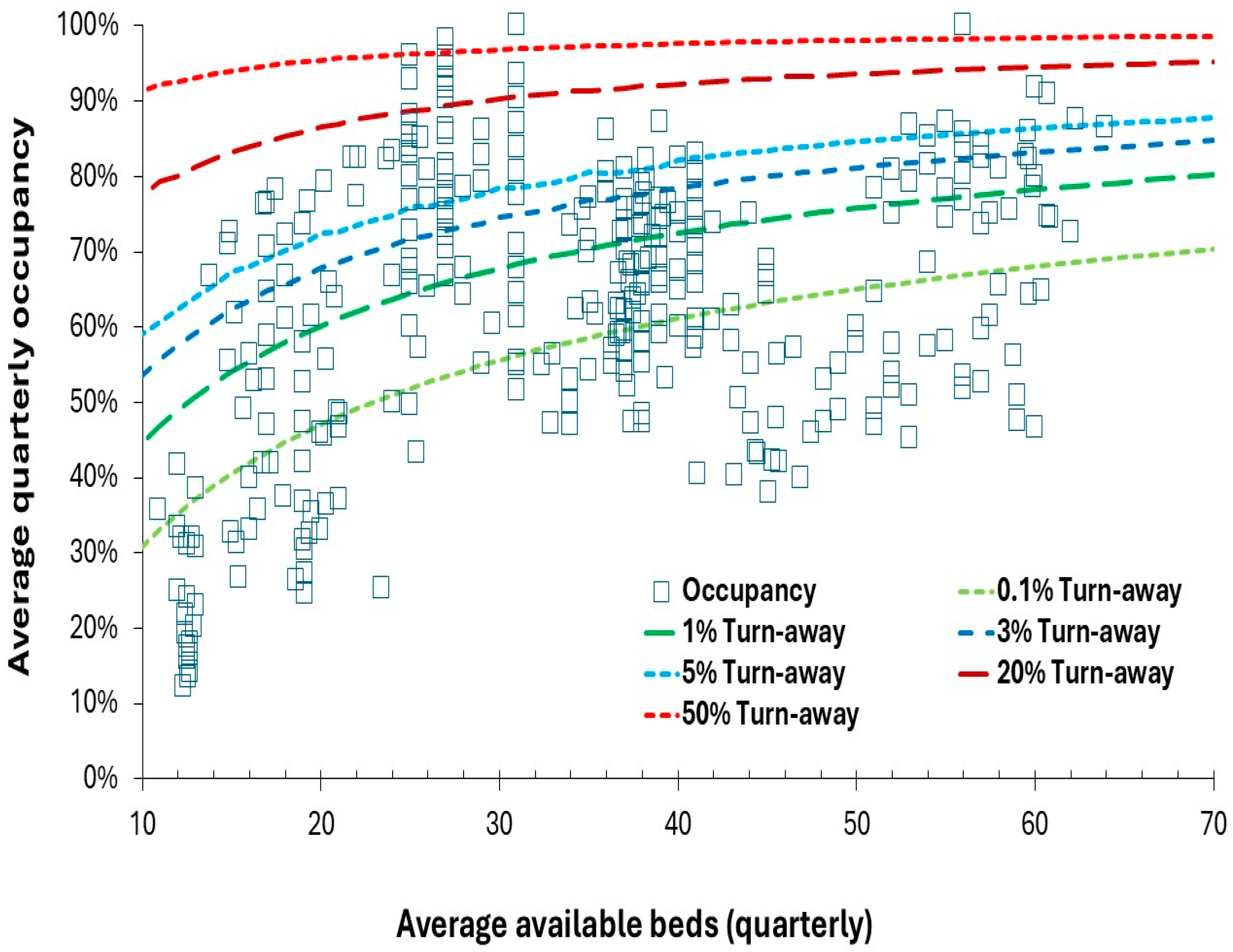
Figure A2.
Monthly admissions to the NICU for the Barts group in London.
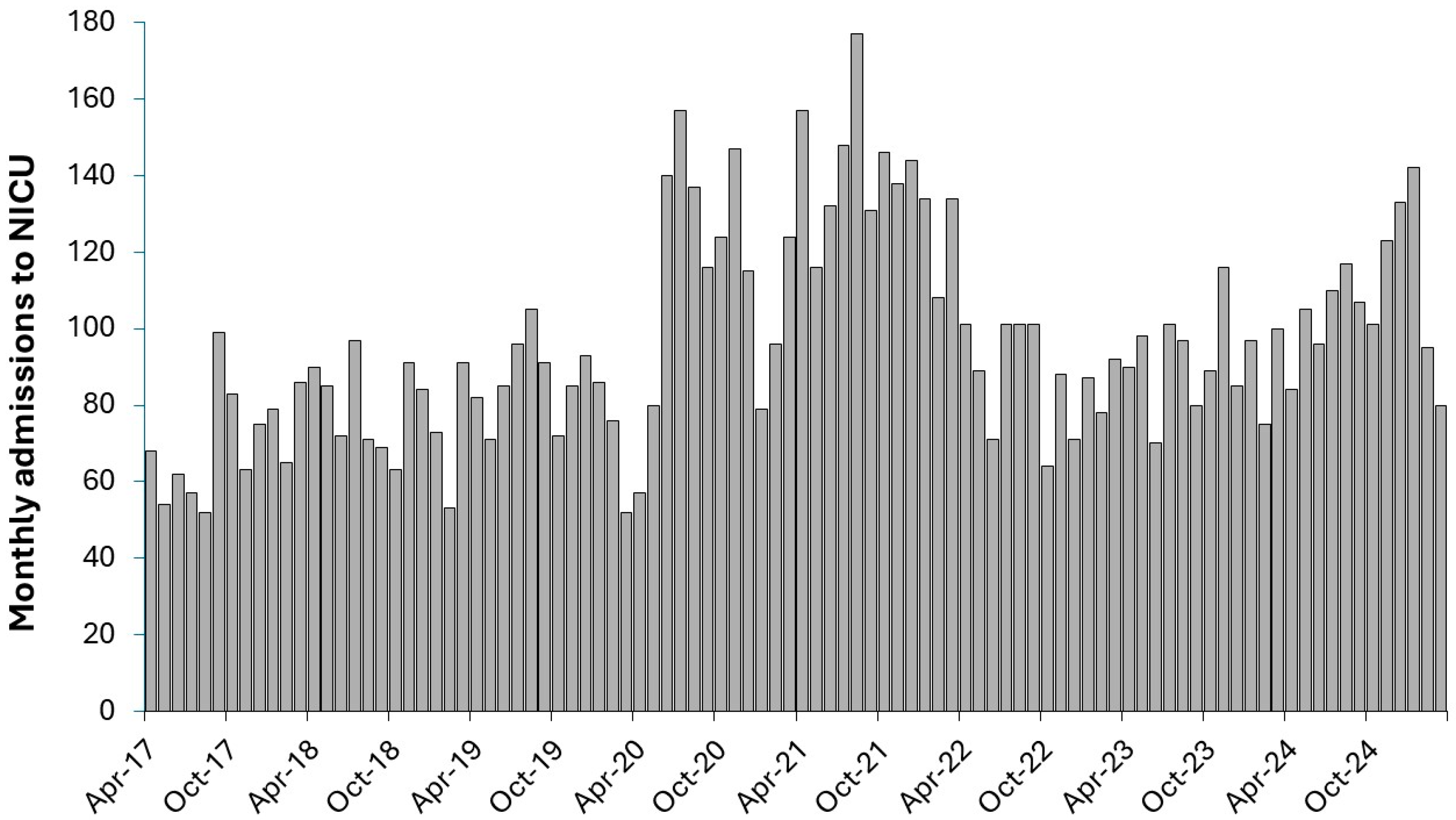
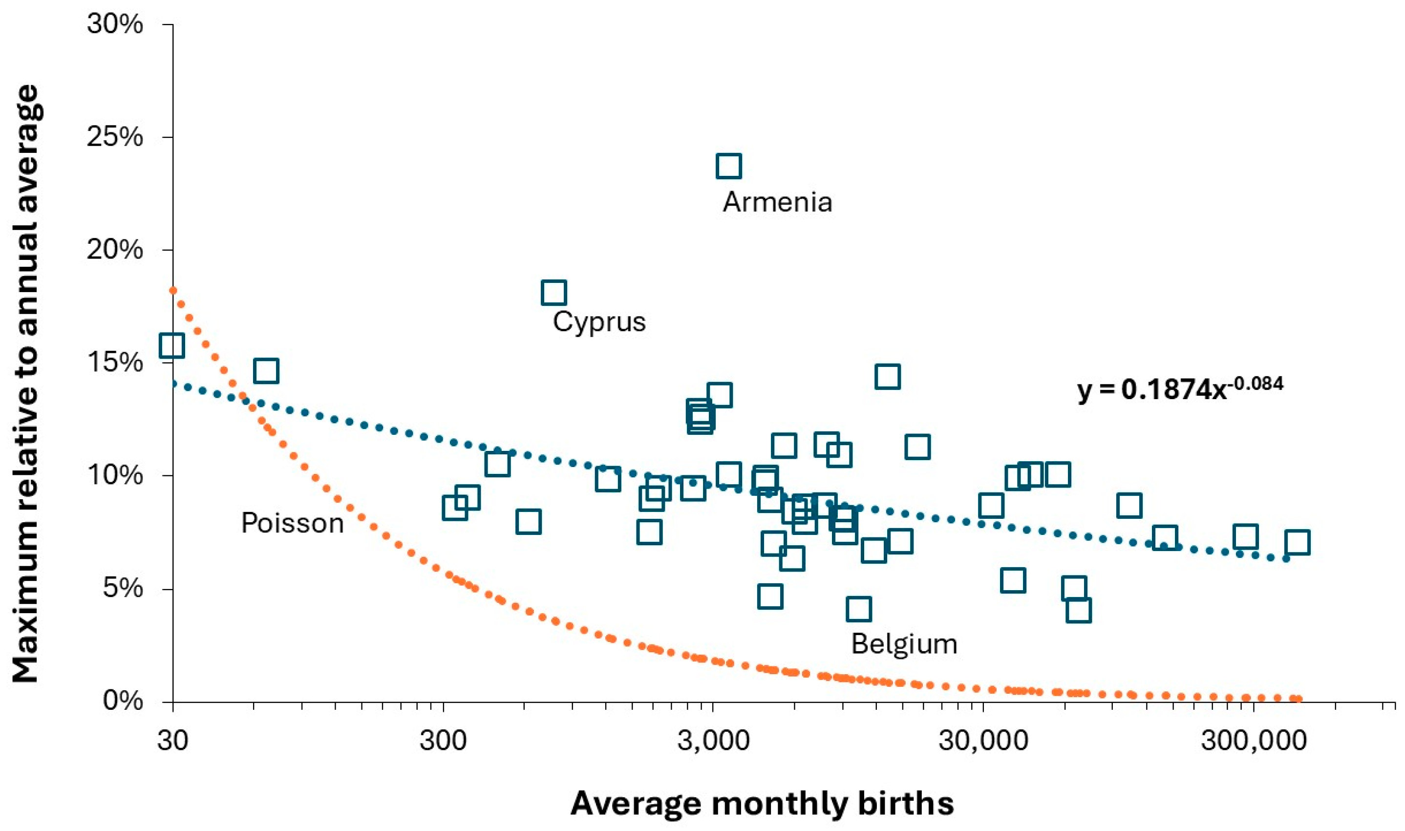
Figure A4.
Occupied pediatric beds in England, 1998/99 to 2023/24 showing the effect of the cycle in births (dashed line) plus underlying growth (dotted line). Occupied beds in 2020/21 were only 6547 [48].
Figure A4.
Occupied pediatric beds in England, 1998/99 to 2023/24 showing the effect of the cycle in births (dashed line) plus underlying growth (dotted line). Occupied beds in 2020/21 were only 6547 [48].
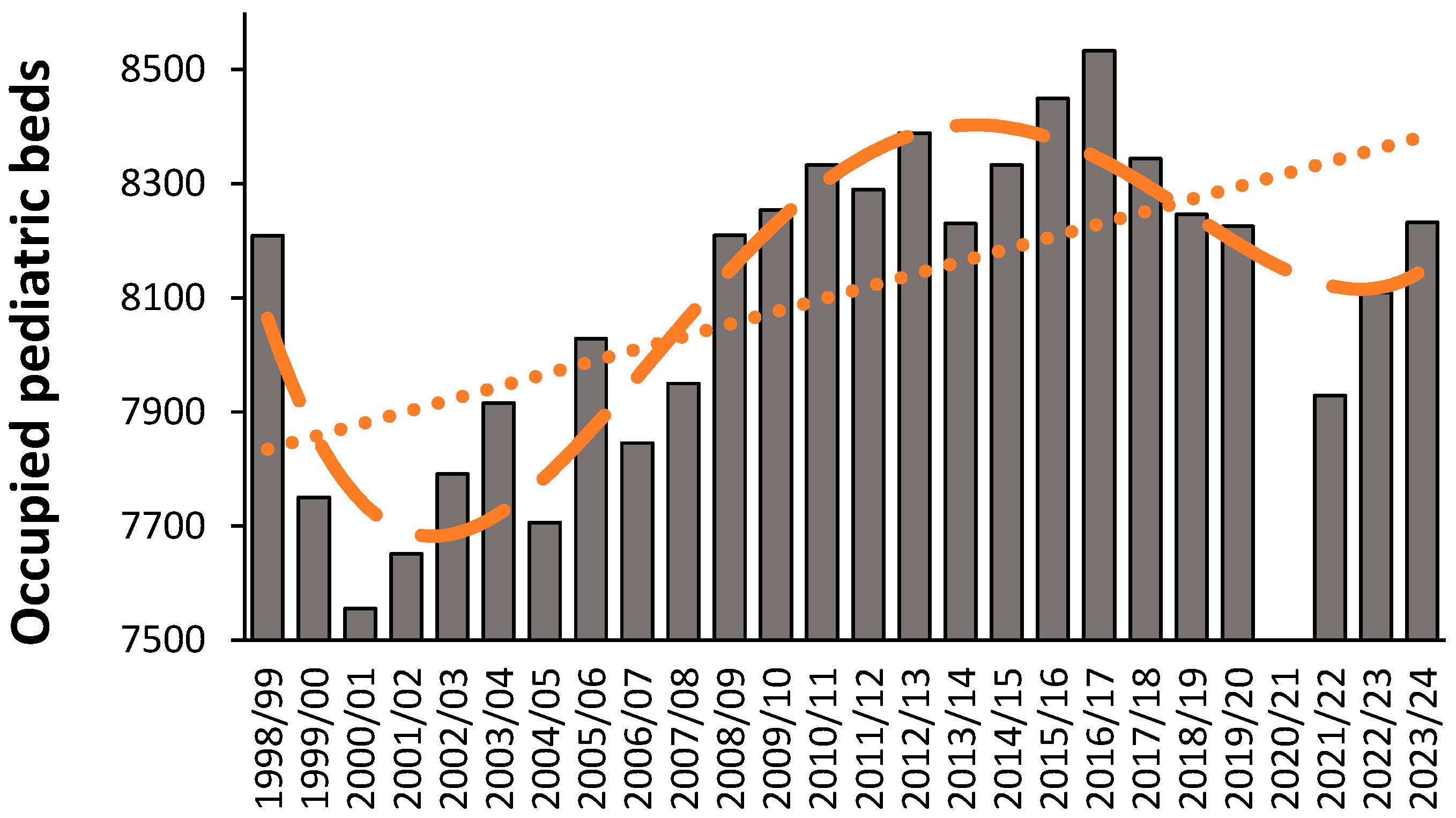
Figure A5.
Trend in births for Arizona counties, 1970 to 2022. Data from [54].
Figure A5.
Trend in births for Arizona counties, 1970 to 2022. Data from [54].
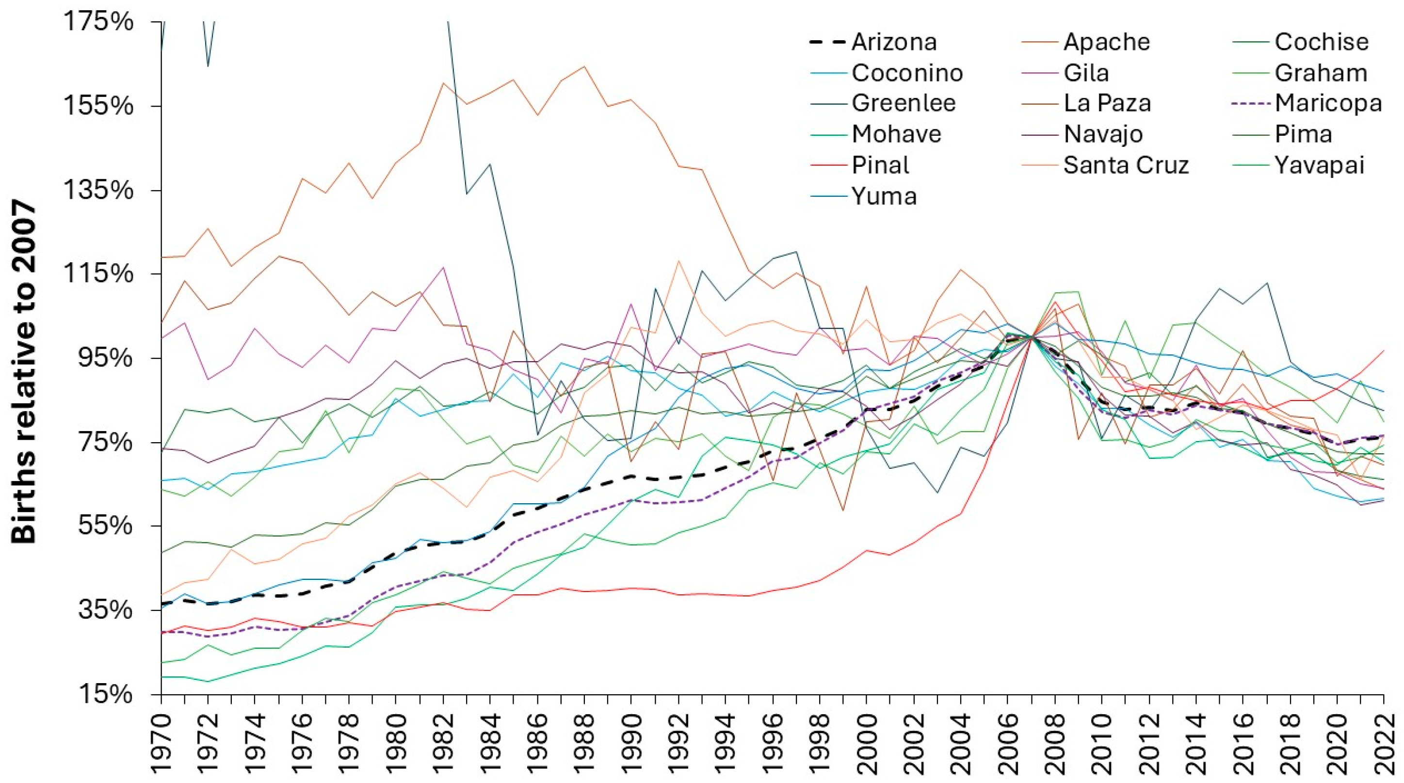
Figure A6.
A moving excess mortality calculation for children in the first year of life in England and Wales. Data from [59].
Figure A6.
A moving excess mortality calculation for children in the first year of life in England and Wales. Data from [59].
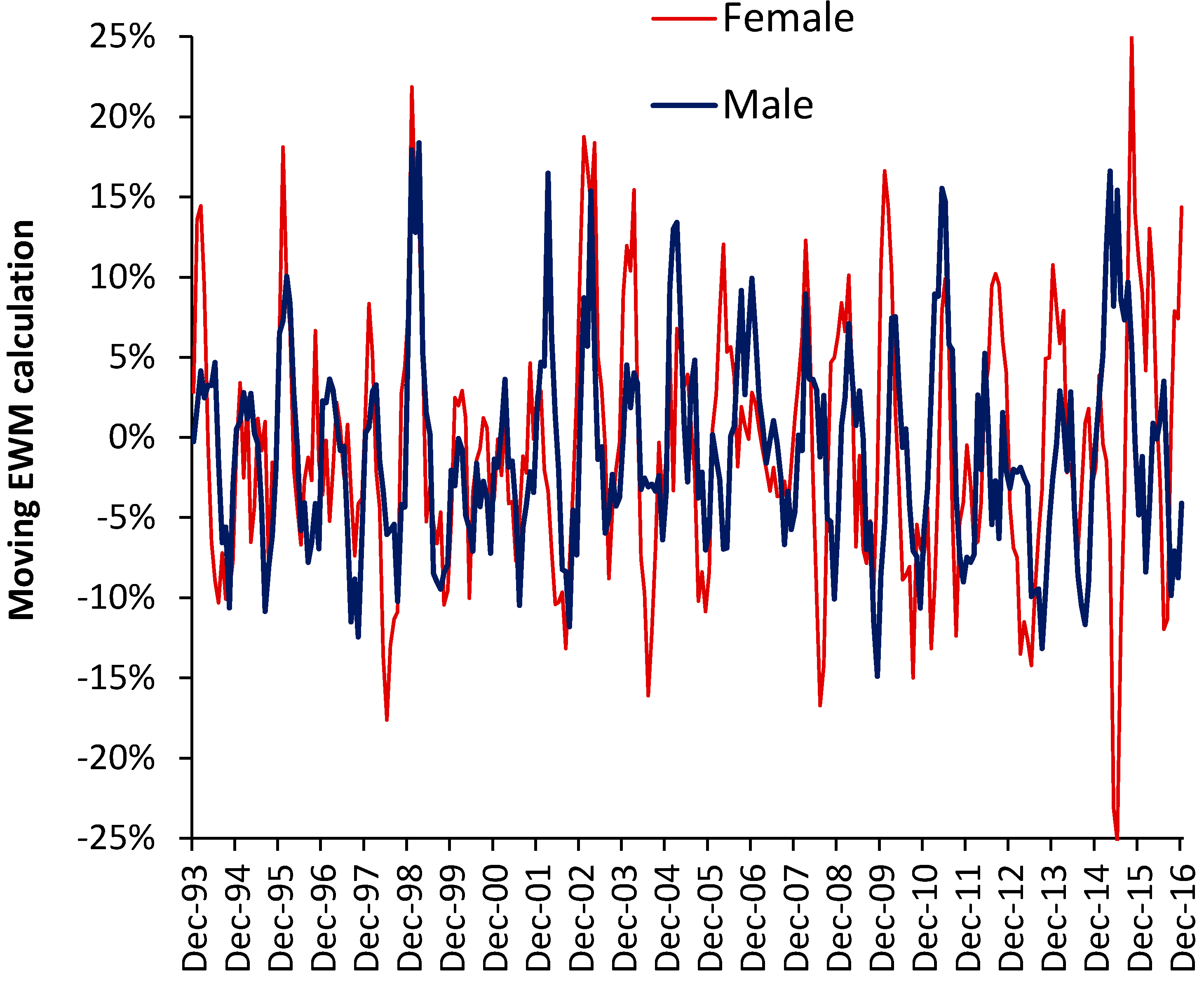
Figure A7.
Maximum and minimum case scenarios for the proportion of pediatric occupied beds occurring in specialties other than Pediatrics (specialty code 420) [48].
Figure A7.
Maximum and minimum case scenarios for the proportion of pediatric occupied beds occurring in specialties other than Pediatrics (specialty code 420) [48].
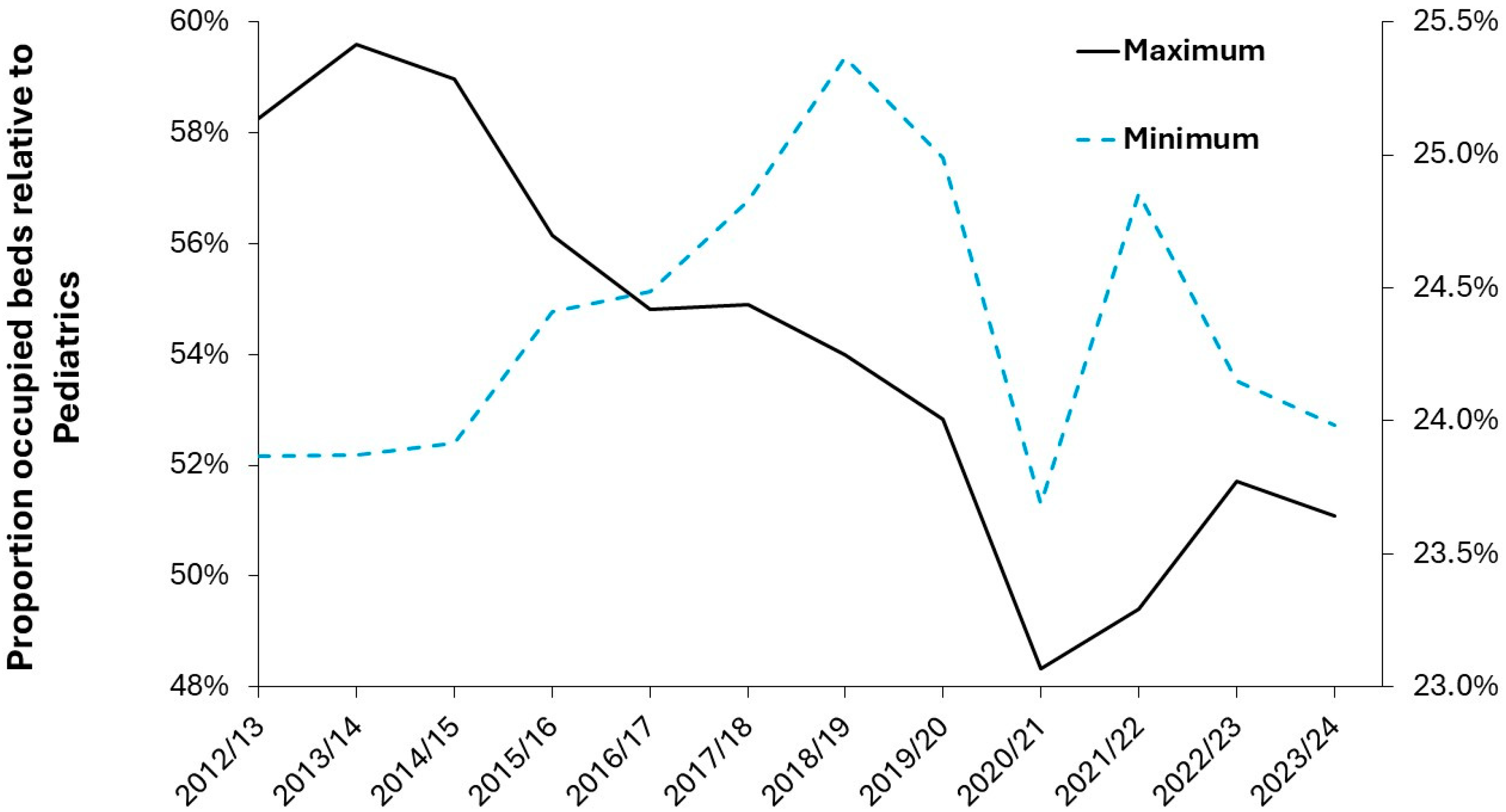
Figure A8.
Expressed pediatric bed demand in Scottish Area Health Boards from 2013/14 to 2023/24, excluding the first two COVID-19 years. Data from [101].
Figure A8.
Expressed pediatric bed demand in Scottish Area Health Boards from 2013/14 to 2023/24, excluding the first two COVID-19 years. Data from [101].
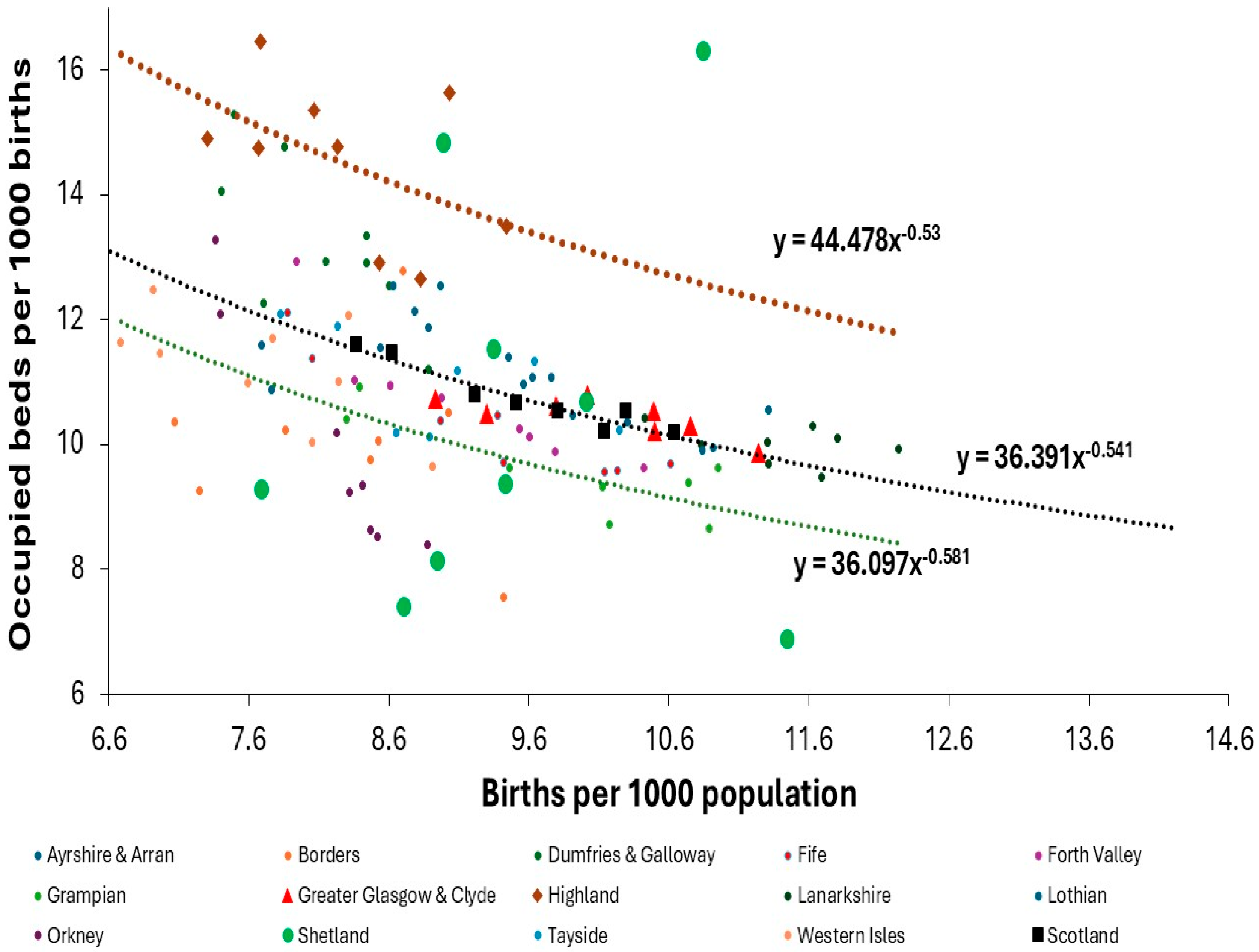
References
- Jones, R.P. Addressing the Knowledge Deficit in Hospital Bed Planning and Defining an Optimum Region for the Number of Different Types of Hospital Beds in an Effective Health Care System. Int. J. Environ. Res. Public Health 2023, 20, 7171. [Google Scholar] [CrossRef] [PubMed]
- Jones, R.P. A New Approach for Understanding International Hospital Bed Numbers and Application to Local Area Bed Demand and Capacity Planning. Int. J. Environ. Res. Public Health 2024, 21, 1035. [Google Scholar] [CrossRef]
- Jones, R.P. Capacity Planning (Capital, Staff and Costs) of Inpatient Maternity Services: Pitfalls for the Unwary. Int. J. Environ. Res. Public Health 2025, 22, 87. [Google Scholar] [CrossRef]
- Raftery, A.; Ševčíková, H. Probabilistic population forecasting: Short to very long-term. Int J Forecasting. 2023, 39(1), 73–97. [Google Scholar] [CrossRef] [PubMed]
- Lee, R. Forecasting Population in an Uncertain World: Approaches, New Uses, and Troubling Limitations. Population and Development Review. 2025. [CrossRef]
- Keilman, N. Uncertain population forecasts. Nature. 2001, 412, 490–491. [Google Scholar] [CrossRef] [PubMed]
- Caro-Barrera, J.; García-Moreno, G.; Pérez-Priego, M. Projecting Spanish fertility at regional level: A hierarchical Bayesian approach. PLoS One. 2022, 17(10), e0275492. [Google Scholar] [CrossRef]
- Kallis, C,; Maslova, E,; Morgan, A. ; Sinha, T.; Roberts,; G.; van der Valk, R.; Quint, J.; Tran, T. Recent trends in asthma diagnosis, preschool wheeze diagnosis and asthma exacerbations in English children and adolescents: a SABINA Jr study. Thorax 2023, 78, 1175–1180.
- Turner, P.; Conrado, A.; Kalis, C.; O’Rourke, E.; Haider, S.; Ullah, A.; et al. Time trends in the epidemiology of food allergy in England: an observational analysis of Clinical Practice Research Datalink data. The Lancet Public Health. 2024, 9(9), e664 - e673.
- Steliarova-Foucher, E.; Fidler, M.; Colombet, M.; Lacour, B.; Kaatsch, P.; Piñeros, M.; et al. Changing geographical patterns and trends in cancer incidence in children and adolescents in Europe, 1991–2010 (Automated Childhood Cancer Information System): a population-based study. The Lancet Oncology. 2018, 19(9), 1159 – 1169.
- Marshak, A.; Venkat, A.; Young, H.; Naumova, E. How Seasonality of Malnutrition Is Measured and Analyzed. Int J Environ Res Public Health. 2021, 18(4), 828. [Google Scholar] [CrossRef]
- Naumova, EN. Mystery of seasonality: getting the rhythm of nature. J Public Health Policy. 2006, 27(1), 2–12. [Google Scholar] [CrossRef]
- Dopico, X.; Evangelou, M.; Ferreira, R.; et al. Widespread seasonal gene expression reveals annual differences in human immunity and physiology. Nat Commun. 2015, 6, 7000. [Google Scholar] [CrossRef] [PubMed]
- Fleming, D.; Norbury, C.; Crombie, D. Annual and seasonal variation in the incidence of common diseases. Royal College of General Practitioners, Occasional paper 53, 91. ISBN 0 85084 161 5. Printed by Arrowsmith Ltd, Bristol. 19 October.
- Damiani, M.; Dixon, J. Managing the pressure. Emergency hospital admissions in London, 1997-2001. King’s Fund, 2001. ISBN 1 85717 461 5. King’s Fund Publishing, London.
- Chen, Z.; Tsui, J.; Cai, J.; Su, S.; Viboud, C.; du Plessis, L.; Lemey, P.; Kraemer, M.; Yu, H. Disruption of seasonal influenza circulation and evolution during the 2009 H1N1 and COVID-19 pandemics in Southeastern Asia. Nat Commun. 2025, 16, 475. [Google Scholar] [CrossRef]
- National Academies of Sciences, Engineering, and Medicine. Pivotal Interfaces of Environmental Health and Infectious Disease Research to Inform Responses to Outbreaks, Epidemics, and Pandemics: Proceedings of a Workshop—in Brief. Washington, DC: The National Academies Press. 2021. [CrossRef]
- Wu, X.; Lu, Y. ; Zhou,S. ; Chen, L.; Xu, B. Impact of climate change on human infectious diseases: Empirical evidence and human adaptation. Environ Internat. 2016, 86, 14–23. [Google Scholar] [CrossRef]
- Green, L. Capacity Planning and Management in Hospitals. In: Brandeau, M.L., Sainfort, F., Pierskalla, W.P. (eds) Operations Research and Health Care. International Series in Operations Research & Management Science. 2005, vol 70. Springer, Boston, MA. [CrossRef]
- Harper, P.; Shahani, A. Modelling for the planning and management of bed capacities in hospitals. Journal of the Operational Research Society. [CrossRef]
- Kuntz, L.; Scholtes, S.; Vera, A. Incorporating efficiency in hospital-capacity planning in Germany. Eur J Health Econ, 2007; 8, 213–223. [Google Scholar] [CrossRef]
- Kimes, D.; Levine, E.; Timmins, S.; Weiss, S.; Bollinger, M.; Blaisdell, C. Temporal dynamics of emergency department and hospital admissions of pediatric asthmatics. Environmental Research. 2004, 94(1), 7–17. [Google Scholar] [CrossRef] [PubMed]
- Ramgopal, S.; Dunnick, J.; Siripong, N.; Conti, K.; Gaines, B.; Zuckerbraun, N. Seasonal, Weather, and Temporal Factors in the Prediction of Admission to a Pediatric Trauma Center. World J. Surg. 2019, 43: 2211-2217 1. [CrossRef]
- Xirasagar, S. , Lin, HC. & Liu, TC. Seasonality in pediatric asthma admissions: the role of climate and environmental factors. Eur J Pediatr. 2006, 165, 747–752. [Google Scholar] [CrossRef]
- Lipsett, S.; Monuteaux, M.; Fine, A. Seasonality of Common Pediatric Infectious Diseases. Pediatric Emergency Care. 2021, 37(2), 82–85. [Google Scholar] [CrossRef] [PubMed]
- Farmer, R.; Emami, J. Models for forecasting hospital bed requirements in the acute sector. J Epidemiol Community Health. 1990, 44, 307–312. [Google Scholar] [CrossRef]
- Altman, D.; Bland, J. ; Uncertainty and sampling error. BMJ. 7064. [Google Scholar] [CrossRef]
- Kaier, K.; Mutters, N.; Frank, U. Bed occupancy rates and hospital-acquired infections—should beds be kept empty? Clinical Microbiology and Infection. 2012, 18(10), 941–945. [Google Scholar] [CrossRef]
- Payne, G.; Laporte, A.; Deber, R.; Coyte, P. Counting backward to health care’s future: Using time-to-death modleing to identify changes in end-of-life morbidity and the impact of aging on health care expenditures. Milbank Q. 2007, 85, 213–257. [Google Scholar] [CrossRef]
- Busse, R.; Krauth, C.; Schwartz, F. Use of acute hospital beds does not increase as the population ages: Results from a seven year cohort study in Germany. J. Epidemiol. Community Health 2002, 56, 289–293. [Google Scholar] [CrossRef]
- Hanlon, P.; Walsh, D.; Whyte, B.; Scott, S.; Lightbody, P.; Gilhooly, M. Hospital use by an ageing cohort: an investigation into the association between biological, behavoural and social risk markers and subsequent hospital utilization. J Public Health Med. 1998, 20(4), 467–476. [Google Scholar] [CrossRef]
- Feudtner, C.; DiGiuseppe, D.; Neff, J. Hospital care for children and young adults in the last year of life: a population-based study. BMC Med. 2003, 1, 3. [Google Scholar] [CrossRef] [PubMed]
- Ananth, P.; Melvin, P.; Feudtner, C.; Wolfe, J.; Berry, J. Hospital Use in the Last Year of Life for Children With Life-Threatening Complex Chronic Conditions. Pediatrics. 2015, 136(5), 938–46. [Google Scholar] [CrossRef] [PubMed]
- PDepartment of Health and Social Care. Palliative and end of life care factsheet: Patterns of care England 2023, Version 4. Published 4 March 2025. Available online: Palliative and end of life care factsheet: Patterns of care, England 2023 (Accessed on 5 March 2025).
- Dixon, T.; Shaw, T.; Frankel, S.; Ebrahim, S. Hospital admissions, age, and death: retrospective cohort study. BMJ. 2004, 328(7451), 1288–1292. [Google Scholar] [CrossRef] [PubMed]
- Lee, K.; Pedroza, C.; Avritscher, E. ; Mosquera,R. ; Tyson, J. Evaluation of negative binomial and zero-inflated negative binomial models for the analysis of zero-inflated count data: application to the telemedicine for children with medical complexity trial. Trials. 2023, 24, 613. [Google Scholar] [CrossRef]
- Zhu, H.; Lakkis, H. Sample size calculation for comparing two negative binomial rates. Statist. Med. 2014, 33, 376–387. [Google Scholar] [CrossRef]
- GBD 2021 Fertility and Forecasting Collaborators. Global fertility in 204 countries and territories, 1950-2021, with forecasts to 2100: a comprehensive demographic analysis for the Global Burden of Disease Study 2021. The Lancet. 2024. [CrossRef]
- Jones, E.; Taylor, B.; Rudge, G.; MacArthur, C.; Jyothish, D.; Simkiss, D.; Cummins, C. Hospitalisation after birth of infants: cross sectional analysis of potentially avoidable admissions across England using hospital episode statistics. BMC Pediatr. 2018, 18, 390. [Google Scholar] [CrossRef]
- Montoro-Pérez, N.; Richart-Martínez, M.; Montejano-Lozoya, R. Factors associated with the inappropriate use of the pediatric emergency department. A systematic review. J Pediatric Nursing. 2023, 69, 38–46. [Google Scholar] [CrossRef]
- Bunting, C.; Clery, A.; McGrath-Lone, L.; Liu, M.; Kendall, S.; Bedford, H.; Cavallaro, F.; Saloniki, E.; Harron, K.; Woodman, J. How does health visiting in the first year of life vary by family characteristics? A longitudinal analysis of administrative data. J Public Health (Oxf). 2025, 47(1), 82–89. [Google Scholar] [CrossRef] [PubMed]
- Greve, P. Pediatrics: A unique and volatile risk. J Healthc Risk Mgmt. 2011, 31, 19–29. [Google Scholar] [CrossRef]
- Roberts, A.; Blunt, I.; Bardsley, M. Distance from home to emergency care. Available online: QualityWatch_FocusOnDistanceFromHomeToEmergencyCare.pdf (Accessed on 25 March 2025).
- Cushing, A.; Bucholz, E.; Chien, A.; Rauch, D.; Michelson, K. Availability of Pediatric Inpatient Services in the United States. Pediatrics. 2021, 148(1), e2020041723. [Google Scholar] [CrossRef] [PubMed]
- UN Inter-agency Group for Child Mortality Estimation (IGME). Available online: CME Info - Child Mortality Estimates (Accessed on 6 May 2025).
- National Centre for Health Statistics. Infant mortality rates by State. Available online: Stats of the States -Infant Mortality (Accessed on 29 April 2025).
- World Bank Group. Hospital beds per 1,000 population. Available online: https://data.worldbank.org/indicator/sh.med.beds.zs (accessed on 11 April 2025).
- NHS England Digital. Hospital admitted patient care activity. Available online: Hospital Admitted Patient Care Activity - NHS England Digital (Accessed on 6 May 2025).
- NHS England. Urgent and emergency care daily situation reports. Available online: Statistics » Urgent and Emergency Care Daily Situation Reports (Accessed on 6 May 2025).
- NHS England. Beds available overnight. Available online: https://www.england.nhs.uk/statistics/statistical-work-areas/bed-availability-and-occupancy-kh03/ (accessed on 5 April 2024).
- Department of Health. Hospital statistics: Inpatient and day case activity. Available online: Hospital statistics: inpatient and day case activity 2023/24 | Department of Health (Accessed on 6 May 2025).
- UNECE. Total live births by sex. Available online: Total Live Births by Sex, Measurement, Country and Year. UNECE Statistical Database (Accessed on 10 May 2025).
- Database earth. Population births in United States of America. Available online: Population Births in United States of America 1950-2025 Future Projections (Accessed on 6 May 2025).
- Arizona Department of Health Services. Population health and vital statistics. Available online: ADHS | Various Health Statistics (Accessed on 9 Mat 2025).
- Hawaii Health. Number of births per year. Available online: Birth Data – Hawai'i Health Data Warehouse(Accessed on 28 April 2025).
- EUROSTAT. Live births (total) by month. Available online: [demo_fmonth] Live births (total) by month (Accessed on 6 May 2025).
- Australian Bureau of Statistics. Births, Australia. Available online: Births, Australia, 2023 | Australian Bureau of Statistics (Accessed on 10 May 2025).
- Office for National Statistics. Deaths occurring by single year of age, by sex, year and month of death, for usual residents of England and Wales: 1993 to 2016. Available online: Deaths occurring by single year of age, by sex, year and month of death, for usual residents of England and Wales: 1993 to 2014 - Office for National Statistics and also Deaths occurring by single year of age, by sex, year and month of death, for usual residents of England and Wales, 2015 to 2016 (Accessed on 6 May 2025).
- Office for National Statistics. Deaths and population estimates by sex and single year of age, England and Wales, 1961 to 2023. Available online: Deaths and population estimates for England and Wales, 1961 to 2023, by single year of age - Office for National Statistics (Accessed on 10 May 2025).
- Australian Institute for Health and Welfare. Average length of stay. Appendix removal. Available online: https://www.aihw.gov.au/hospitals/topics/admitted-patient-care/length-of-stay (accessed on 9 June 2025).
- Wikipedia. List of children’s hospitals in the United States. Available online: List of children's hospitals in the United States - Wikipedia (Accessed on 9 June 2025).
- Personal communication with Dr Kenneth Michelson, Lurie Children’s Hospital, Chicago, USA.
- Texas Health and Human Services. Hospitals: Directory of general and special hospitals. Available online: https://www.hhs.texas.gov/providers/health-care-facilities-regulation/hospitals-general-hospitals (accessed on 12 June 2025).
- Intensive Care Society. Understanding intensive care staffing, occupancy and capacity. Available online: Intensive Care Society | Understanding Intensive Care Staffing, Occupancy and Capacity (Accessed on 29 April 2025).
- DeLia, D. Annual Bed Statistics Give a Misleading Picture of Hospital Surge Capacity. Annals of Emergency Medicine. 2006, 48(4), 384-388.e2. [CrossRef]
- Adams, L. Exploring the Concept of Surge Capacity" OJIN: The Online Journal of Issues in Nursing; 2009, 14(2). T: Exploring the Concept of Surge Capacity | OJIN.
- Riahi, V.; Boyle, J.; Hassanzadeh, H.; Yoon, J.; Diouf, I.; Khanna, S.; Samadbeik, M.; Sullivan, C.; Bosley, E.; Staib, A.; Lind, J. Do Midnight Censuses Accurately Portray Hospital Bed Occupancy? Stud Health Technol Inform. 2024, 24, 318:36–41. [Google Scholar] [CrossRef]
- Hindery, R.; UCSF Epidemiologist Describes Similarities between Swine Flu and 1918 Killer. University of California, 22 September 2009. Available online: https://www.ucsf.edu/news/2009/09/101057/ucsf-epidemiologist-describes-similarities-between-swine-flu-and-1918-killer (accessed on 1 June 2025).
- Wikipedia. List of countries by system of government. Available online: List of countries by system of government - Wikipedia (Accessed on 13 May 2025).
- Brunn, M.; Kratz, T.; Padget, M.; Clément, M.; Smyrl, M. Why are there so many hospital beds in Germany? Health Serv Manage Res. 2023, 36(1), 75–81. [Google Scholar] [CrossRef]
- Tikkanen, R.; Osborn, R.; Mossialos, E.; Djordjevic, A.; Wharton, G.; International health care system profiles; Australia. The Commonwealth Fund, June 5 2020. Available online: Australia | International Health Care System Profiles | Commonwea lth Fund (Accessed on 13 May 2025).
- Australian Institute of Health and Welfare. Health system overview. Available online: https://www.aihw.gov.au/reports/australias-health/health-system-overview (accessed on 5 April 2025).
- Leyenaar, J.; Ralston, S. ; Shieh, M-S. ; Pekow, P.; Mangione-Smith, R.; Lindenauer, P. Epidemiology of pediatric hospitalizations at general hospitals and freestanding children's hospitals in the United States. J. Hosp. Med. 2016, 11, 743–749. [Google Scholar] [CrossRef]
- American Hospital Association. Fast Facts on U.S. hospitals, 2025. Available online: Fast-Facts-on-USHospitals-2025.pdf (Accessed on 26 April 2025).
- National Centre for Health Statistics. State and National Provisional Birth Counts. Available online: https://www.cdc.gov/nchs/nvss/vsrr/provisional-tables.htm (accessed on 26 June 2025).
- United States Census Bureau. County population totals: 2020-2024. Available online: https://www.census.gov/data/datasets/time-series/demo/popest/2020s-counties-total.html.
- Office for National Statistics. Population estimates for the UK, England, Wales, Scotland and Northern Ireland: mid-2023. Available online: https://www.ons.gov.uk/peoplepopulationandcommunity/populationandmigration/populationestimates/bulletins/annualmidyearpopulationestimates/mid2023 (accessed on 26 June 2025).
- The Leapfrog Group. State of maternity care in U.S. hospitals. Available online: https://www.leapfroggroup.org/state-maternity-care-us-hospitals-leapfrog-group-2025-report-trends (accessed on 26 June 2025).
- McDaniel, C.; Ralston, D.; Freyleue, S.; Seryozhenkov, E. ; Peled, A,; Amaravadi, H.; Malla, N.; Leyenaar, J. Identifying Inpatient Pediatric Services Across National Datasets. JAMA Netw Open. 2025 Jun 2;8(6):e2513527. [CrossRef]
- Pineda, R,; Knudsen, K. ; Breault, C.; Rogers, E., Ed.; Mack W.; Fernandez-Fernandez, A. NICUs in the US: levels of acuity, number of beds, and relationships to population factors. J Perinatol. 2023, 43(6), 796-805. [Google Scholar] [CrossRef]
- Michelson, K.; Wells, A.; Bucholz, E. National Trends in Pediatric Inpatient Capacity. JAMA Pediatr. 2025, 179(2), 208–209. [Google Scholar] [CrossRef] [PubMed]
- Horvat, C.; Hamilton, M.; Hall, M.; McGuire, J.; Mink, R. Child Health Needs and the Pediatric Critical Care Medicine Workforce: 2020–2040. Pediatrics. 2024, 153 (Suppl 2), e2023063678G. [Google Scholar] [CrossRef]
- Li, J.; Baker, A.; D’Ambrosi, G.; Monuteaux, M. ; Chung. M. A Statewide Assessment of Pediatric Emergency Care Surge Capabilities. Pediatrics 2023, 151 (4), e2022059459. 10.1542/peds. 2022. [Google Scholar]
- McDaniel, C.; Hall, M.; Berry, J. Hospitalization Patterns for Rural-Residing Children from 2002 to 2017. Acad Pediatr. 2025, 25(1), 102554. [Google Scholar] [CrossRef]
- Bongiorno, D.; Ravicz, M.; Nadeau, N.; Michelson, K.; Alpern, E.; Myers, S.; Samuels-Kalow, M. Pediatric capacity crisis: A framework and strategies to prepare for a pediatric surge. JACEP Open. 2024, 5(1), e13093. [Google Scholar] [CrossRef]
- Greenbury, S.; Longford, N. ; Ougham K,; Angelini, E. ; Battersby, C.; Uthaya, S.; Modi, N. Changes in neonatal admissions, care processes and outcomes in England and Wales during the COVID-19 pandemic: a whole population cohort study. BMJ Open 2021, 11, e054410. [Google Scholar] [CrossRef]
- van Hasselt,T. ; Gale, C.; Battersby, C.; On behalf of the United Kingdom Neonatal Collaborative and the Paediatric Critical Care Society Study Group (PCCS-SG), et al. Paediatric intensive care admissions of preterm children born <32 weeks gestation: a national retrospective cohort study using data linkage. Archives of Disease in Childhood - Fetal and Neonatal Edition 2024, 109, 265–271.
- Gamber, R.; Blonsky, H.; McDowell, M.; Lakshminrusimha, S. Declining birth rates, increasing maternal age and neonatal intensive care unit admissions. J Perinatol. 2024, 44(2), 203–208. [Google Scholar] [CrossRef]
- Schwartz, J.; Spix, C.; Wichmann, H.; Malin, E. Air pollution and acute respiratory illness in five German communities. Environ Res. 1991, 56(1), 1–14. [Google Scholar] [CrossRef]
- D'Amato, G.; Annesi-Maesano, I.; Urrutia-Pereira, M.; Del Giacco, S.; Rosario Filho, N.; Chong-Neto, H.; Solé, D.; Ansotegui, I.; et al. Thunderstorm allergy and asthma: state of the art. Multidiscip Respir Med. 2021, 16(1), 806. [Google Scholar] [CrossRef] [PubMed]
- Provenzano, S.; Roth, S.; Sager, L. Air Pollution and Respiratory Infectious Diseases. Environ Resource Econ. 2024, 87, 1127–1139. [Google Scholar] [CrossRef]
- Tran, H.; Tsai, F.; Lee, Y.; Chang, J.; Chang, L.; Chang, T.; Chung, K.; Kuo, H.; Lee, K.; Chuang, K.; Chuang, H. The impact of air pollution on respiratory diseases in an era of climate change: A review of the current evidence. Sci Total Environ. 2023, 898, 166340. [Google Scholar] [CrossRef]
- Traidl-Hoffmann C, Kasche A, Menzel A, Jakob T, Thiel M, Ring J, Behrendt H. Impact of pollen on human health: more than allergen carriers? Int Arch Allergy Immunol. 2003, 131(1), 1–13. [CrossRef] [PubMed]
- Congdon, P. Spatiotemporal Frameworks for Infectious Disease Diffusion and Epidemiology. Int J Environ Res Public Health. 2016, 13(12), 1261. [Google Scholar] [CrossRef]
- Psistaki, K.; Paschalidou, A.; McGregor, G. Weather patterns and all-cause mortality in England, UK. Int J Biometeorol. 2020, 64, 123–136 (2020). [Google Scholar] [CrossRef]
- Paschalidou, A.; Kassomenos, P.; McGregor, G. Analysis of the synoptic winter mortality climatology in five regions of England: Searching for evidence of weather signals. Science Total Environ. 2017, 598, 432–444. [Google Scholar] [CrossRef]
- Vasilevski, V.; Mekonnen, A.; Peeters, A.; et al. Healthcare related barriers and enablers for weight management among pregnant women with overweight and obesity: a rapid scoping review. BMC Pregnancy Childbirth 2025, 25, 252. [Google Scholar] [CrossRef]
- Leddy, M.; Power, M.; Schulkin, J. The impact of maternal obesity on maternal and fetal health. Rev Obstet Gynecol. 2008, 1(4), 170–8. [Google Scholar]
- Godfrey, K.; Reynolds, R.; Prescott, S.; Nyirenda, M.; Jaddoe, V.; Eriksson, J.; Broekman, B. Influence of maternal obesity on the long-term health of offspring. Lancet Diabetes Endocrinol. 2017, 5(1), 53–64. [Google Scholar] [CrossRef] [PubMed]
- WikipediA. COVID-19 lockdown in the United Kingdom. Available online: COVID-19 lockdown in the United Kingdom - Wikipedia (Accessed on 21 April 2025).
- Public Health Scotland. Acute hospital activity and NHS beds information (annual)Year ending 31 March 2024. Available online: https://publichealthscotland.scot/publications/acute-hospital-activity-and-nhs-beds-information-annual/acute-hospital-activity-and-nhs-beds-information-annual-year-ending-31-march-2024/ (accessed on 12 June 2025).
- Romaniuk, A. A three parameter model for birth projections. Population Studies. 1973, 27(3), 467–478. [Google Scholar] [CrossRef] [PubMed]
- McDonald, P.; Kippen, R. Forecasting births. Feature Article, ABS Catalogue Number 2051.0, Australian Bureau of Statistics, Canberra, 2011. Available online: http://www.abs.gov.au/ausstats/abs@.nsf/mf/2051.0 (accessed on 11 April 2025).
- Hosseini, M.; McDonald, P. Projecting births in Iran using a three-parameter model. Available online: www.humanfertility.org/file/getdocument/docs/symposium2/pmcdonald.pdf (accessed on 20 March 2025).
- Shevchuk,P. Reconstruction of birth structure by parity of birth and age of mother in Ukraine in 1995–1998. Demog Social Econ. 2015, 1, 113–125.
- Hoem, J.; Madsen, D.; Nielsen, J. ; Ohlsen, E-M.; Hansen, H.; Rennermalm, B. Experiments in Modelling Recent Danish Fertility Curves. Demography, 1981, 18(2), 231-244.
- José Rafael Caro-Barrera, María de los Baños García-Moreno García & Manuel Pérez-Priego. Projecting Spanish fertility at regional level: A hierarchical Bayesian approach. PLOS ONE. 2022, 17(10), e0275492.
- Srivastava, U.; Singh, K.; Pandey, A.; Narayan, N. Experiments in modeling recent Indian fertility pattern. Scientific Reports. 2021, 11, 1. [Google Scholar] [CrossRef] [PubMed]
- Bobak, M.; Gjonca, A. The seasonality of live birth is strongly influenced by socio-demographic factors, Human Reproduction 2001, 16(7), 1512–1517. [CrossRef]
- Dahlberg, J.; Andersson, G. Changing seasonal variation in births by sociodemographic factors: a population-based register study, Human Reproduction Open. 2018,2018(4), hoy015. [CrossRef]
- Rojansky, N.; Brzezinski, A.; Schenker, J. Seasonality in human reproduction: an update, Human Reproduction. 1992, 7(6), 735–745. [CrossRef]
- Lowell, W.; Davis, G. The light of life: Evidence that the sun modulates human lifespan. Medical Hypotheses. 208, 70(3), 501-507. [CrossRef]
- Martinez, M. The calendar of epidemics: Seasonal cycles of infectious diseases. PLoS Pathog. 2018; 14(11), e1007327. [CrossRef]
- Hillier, D.; Parry, G.; Shannon, M.; Stack, A. The Effect of Hospital Bed Occupancy on Throughput in the Pediatric Emergency Department. Ann Emerg Med. 2009, 53(6), 767-776 e3. [CrossRef]
- Clarke, A. Why are we trying to reduce length of stay? Evaluation of the costs and benefits of reducing time in hospital must start from the objectives that govern change. Qual Health Care. 1996, 5(3), 172–179. [Google Scholar] [CrossRef]
- Taheri, P.; Butz, D.; Greenfield, L. Length of stay has minimal impact on the cost of hospital admission. J Amer Coll Surgeons 2000, 191(2), 123–130. [Google Scholar] [CrossRef]
- Evans, J.; Kobewka, D.; Thavorn, K.; D'Egidio, G.; Rosenberg, E.; Kyeremanteng, K. The impact of reducing intensive care unit length of stay on hospital costs: evidence from a tertiary care hospital in Canada. Can J Anaesth. 2018, 65(6), 627–635. [Google Scholar] [CrossRef]
- Dranove, D. Economies of scale in non-revenue producing cost centers: Implications for hospital mergers. J Health Econ, 1998, 17(1), 69-83. [CrossRef]
- Giancotti, M.; Guglielmo, A.; Mauro, M. Efficiency and optimal size of hospitals: Results of a systematic search. PLoS One. 2017, 12(3), e0174533. [Google Scholar] [CrossRef]
- Beulieu, N.; Hoicks, A.; Chernew, M. Hospital Capital Expenditures Associated With Prices And Hospital Expansion Or Withering, 2010–19. Health Affairs. 2025; 44. [Google Scholar] [CrossRef]
- McRae, S.; Brunner, J.; Bard, J. Analyzing economies of scale and scope in hospitals by use of case mix planning. Health Care Manag Sci. 2020, 23(1), 80–101. [Google Scholar] [CrossRef]
- Freeman, M.; Savva, M.; Scholtes, S. Economies of Scale and Scope in Hospitals: An Empirical Study of Volume Spillovers. Management Science. 2021, 67(2), 673–697. [Google Scholar] [CrossRef]
- Møller, J.; Sørensen, M.; Hardahl, C. Prediction of risk of acquiring urinary tract infection during hospital stay based on machine-learning: A retrospective cohort study. PLOS ONE 2021, 16(3), e0248636. [Google Scholar] [CrossRef] [PubMed]
- Aguilera, C.; Kalam, K.; Chesney, K.; Donoho, D. The Relationship Between Procedural Volume, Hospital Quality, and Postoperative Mortality in Pediatric Neurosurgery: Review of the literature. World Neurosurgery, 2024, 182, e764–e771. [Google Scholar] [CrossRef]
- Husk, K.; Berry, V.; Tozer, R.; Skipwith, G.; Radmore, R.; Ball, S.; Ukoumunne, O.; Logan, S. Interventions for reducing unplanned paediatric admissions: an observational study in one hospital: BMJ Paediatrics Open 2018;2:e000235.
- Jyotsna, K.; Sharan, S.; Kishore, S.; Prakash, J. The Various Scoring Systems in Pediatric Intensive Care Units: A Prospective Observational Study. Cureus. 2023, 15(5), e39679. [Google Scholar] [CrossRef]
- Gold, D.; Mihalov, L.; Cohen, D. Evaluating the Pediatric Early Warning Score (PEWS) System for Admitted Patients in the Pediatric Emergency Department. Acad Emerg Med. 2014, 21(11), 1249–1256. [Google Scholar] [CrossRef] [PubMed]
- ÓhAiseadha’, C.; Mannix, M.; Saunders, J.; Philip, R. Bed Utilisation in an Irish Regional Paediatric Unit - A Cross-Sectional Study Using the Paediatric Appropriateness Evaluation Protocol (PAEP). Int J Health Policy Manag. 2016, 5(11), 643–652. [Google Scholar] [CrossRef]
- Harper, J.; Coyle, A.; Tam, C.; Skakum, M.; Ragheb, M.; Wilson, L.; Lê, M.; Klassen, T.; Aregbesola, A. Readiness of emergency departments for pediatric patients and pediatric mortality: a systematic review. CMAJ Open. 2023, 11(5), E956–E968. [Google Scholar] [CrossRef]
- Laposata, M. Diagnostic error in the United States: A summary of the report of a national Academy of medicine Committee. Trans Am Clin Climatol Assoc. 2022, 132, 194–201. [Google Scholar]
- Waltraud, F.; Vilen, L.; Konitzer, M. Diagnoses by general practitioners: Accuracy and reliability. International Journal of Forecasting. 209, 25(4), 784-793. [CrossRef]
- Yoon, H.; Gerdes, L.; Beigel, F.; Sun, Y.; Kövilein, J.; Wang, J.; Kuhlmann, T.; Flierl-Hecht, A. ; Haller, D, et al. Multiple sclerosis and gut microbiota: Lachnospiraceae from the ileum of MS twins trigger MS-like disease in germfree transgenic mice-An unbiased functional study. Proc Natl Acad Sci U S A. 2025, 122(18), e2419689122. [CrossRef]
- Liu, Y.; Johnston, C.; Jarousse, N.; Fletcher, S.; Iqbal, S. Association between herpes simplex virus type 1 and the risk of Alzheimer’s disease: a retrospective case–control study. BMJ Open. 2025, 15, e093946. [Google Scholar] [CrossRef]
- Nemeth, K.; Bayraktar, R.; Ferracin, M.; et al. Non-coding RNAs in disease: from mechanisms to therapeutics. Nat Rev Genet. 2024, 25, 211–232. [Google Scholar] [CrossRef]
- Loganathan, T.; Doss, C. Non-coding RNAs in human health and disease: potential function as biomarkers and therapeutic targets. Functional & integrative genomics. 2023, 23(1), 33.
- Li, C.; Ni, Y.; Xu, H.; Xiang, Q.; Zhao, Y.; Zhan, J.; He, J.; Li, S.; Liu, Y. Roles and mechanisms of exosomal non-coding RNAs in human health and diseases. Signal transduction and targeted therapy. 2021, 6(1), 383. [Google Scholar] [CrossRef] [PubMed]
- Bhatti GK, Khullar N, Sidhu IS, Navik US, Reddy AP, Reddy PH, Bhatti JS. Emerging role of non-coding RNA in health and disease. Metabolic brain disease. 2021, 36, 1119–1134.
- Paloviita, P.; Vuoristo, S. The non-coding genome in early human development – Recent advancements. Seminars in Cell & Developmental Biology. 2022, 131, 4–13. [Google Scholar] [CrossRef]
- González-Moyotl, N. , Huesca-Gómez, C. , Torres-Paz, Y.E. et al. Paediatrics congenital heart disease is associated with plasma miRNAs. Pediatr Res. 2024, 96, 1220–1227. [Google Scholar] [CrossRef]
- Tingö, L; Ahlberg, E; Johansson, L; Pedersen, S. ; Chawla, K.; Sætrom, P.; Cione, E.; Simpson, M. Non-coding RNAs in human breast milk: a systematic review. Frontiers in immunology. 2021, 12, 725323.
- Liang, J.; Liu, X.; Chen, X.; Song, X.; Li, W.; Huang, Y. Emerging roles of non-coding RNAs in childhood asthma. Frontiers in Pharmacology. 2022 ;13:856104. 17 May.
- Zhang, X.; Zhang, X.; Feng, S.; Wang, X.; Guo, B.; Liu, J.; Xu, D.; Liu, F. The Specific microRNA Profile and Functional Networks for Children with Allergic Asthma. J Asthma Allergy. 2022, 15, 1179–1194. [Google Scholar] [CrossRef] [PubMed]
- Wang, P.; Zhang, H.; Zhao, W.; Dai, N. Silencing of long non-coding RNA KCNQ1OT1 alleviates LPS-induced lung injury by regulating the miR-370-3p/FOXM1 axis in childhood pneumonia. BMC Pulmonary Medicine. 2021, 21, 1–3. [Google Scholar] [CrossRef]
- Li, S.; Cui, H.; Lu, H.; Zheng, S.; Yuan, C. Advances in noncoding RNA in children allergic rhinitis. International Forum of Allergy & Rhinology 2024, 14(8), 1350-1362.
- Zhang, S.; Gao, J.; Liu, C. The Role of Non-Coding RNAs in Neurodevelopmental Disorders. Front Genet. 2019, 20(10), 1033. [Google Scholar] [CrossRef]
- Chen, S.; Deng, X.; Sheng, H.; Rong, Y.; Zheng, Y.; Zhang, Y.; Lin, J. Noncoding RNAs in pediatric brain tumors: Molecular functions and pathological implications. Mol Ther Nucleic Acids. 2021, 26, 417–431. [Google Scholar] [CrossRef]
- Wang, Q.; Zhao, C.; Du, Q.; et al. Non-coding RNA in infantile hemangioma. Pediatr Res 2024, 96, 1594–1602. [Google Scholar] [CrossRef]
- Pathania, A.; Prathipati, P.; Pandey, M.; Byrareddy, S.; Coulter, D.; Gupta, S.; Challagundla, K. The emerging role of non-coding RNAs in the epigenetic regulation of pediatric cancers. Semin Cancer Biol. 2022, 83, 227–241. [Google Scholar] [CrossRef]
- Pasławska M, Grodzka A, Peczyńska J, Sawicka B, Bossowski AT. Role of miRNA in Cardiovascular Diseases in Children-Systematic Review. Int J Mol Sci. 2024, 25(2), 956. https, //doi.org/10.3390/ijms25020956.
- Wang, H.; Wu, X.; Chen, Y.; Hou, F.; Zhu, K.; Jiang, Q.; Xiao, P.; Zhang, Q. ; Xiang, Z; Fan, Y. ; Xie, X.; Li, L; Song, R. Combining multi-omics approaches to prioritize the variant-regulated functional long non-coding RNAs in autism spectrum disorder. Asian J Psychiatr. 2023, 80, 103357. [Google Scholar] [CrossRef]
- Salloum-Asfar, S.; Elsayed, A.; Elhag, S.; Abdulla, S. Circulating non-coding RNAs as a signature of autism spectrum disorder symptomatology. International Journal of Molecular Sciences. 2021, 22(12), 6549. [Google Scholar] [CrossRef] [PubMed]
- Maligianni, I.; Yapijakis, C.; Bacopoulou, F.; Chrousos, G. The potential role of exosomes in child and adolescent obesity. Children. 2021, 8(3), 196. [Google Scholar] [CrossRef] [PubMed]
- Drury, R.; Pollard, A.; O'Connor, D. The effect of H1N1 vaccination on serum miRNA expression in children: A tale of caution for microRNA microarray studies. PLoS One. 2019, 14(8), e0221143. [Google Scholar] [CrossRef] [PubMed]
- Zhou, R.; Joshi, P.; Katsushima, K.; Liang, W.; Liu, W.; Goldenberg, N.; Dover, G.; Perera, R. The Emerging Field of Noncoding RNAs and Their Importance in Pediatric Diseases. J Pediatr. 2020, 221S, S11–S19. [Google Scholar] [CrossRef]
- McKee, M. What are the lessons learnt by countries that have had dramatic reductions of their hospital bed capacity? World Health Organization Regional Office for Europe, Copenhagen, Denmark (2003) 21 pp.
- Bhattacharjee, N. ; Global fertility in 204 countries and territories, 1950–2021, with forecasts to 2100: a comprehensive demographic analysis for the Global Burden of Disease Study 2021. The Lancet. 2024, 403(10440), 2057 – 2099. [CrossRef]
- Wells, J.; Shah, A.; Gillis, H.; Gustafson, S.; Powell, C.; Krasaelap, A.; Hanna, S.; Hoefert, J.; Bigelow, A.; et al. Tiny patients, huge impact: a call to action. Front Public Health. 2024, 12, 1423736. [Google Scholar] [CrossRef]
- Bai G, Zare H. Hospital Cost Structure and the Implications on Cost Management During COVID-19. J Gen Intern Med. 2020 Sep;35(9):2807-2809. doi: 10.1007/s11606-020-05996-8.Mechanic, R. Implementing Administrative Benchmarks In The Medicare Shared Savings Program: Opportunities and Challenges. Health Affairs: Forefront 2025, 10.1377/forefront.20250522.694566.
- First Focus on Children. U.S. child poverty in 2023. Available online: https://poverty.ucdavis.edu/faq/what-current-poverty-rate-united-states#:~:text=The%20official%20poverty%20rate%20is%2011.1%20percent%2C%20based,rate%20nor%20the%20number%20differed%20significantly%20from%202022. (accessed on 2 July 2025).
- Ryan, A.; Whaley, C.; Brown, E.; Radhakrishnan, E.; Murray, R. Rhode Island’s Affordability Standards Led to Hospital Price Reductions and Lower Insurance Premiums. Health Affairs 2025, 44(5), 597–605. [Google Scholar] [CrossRef]
- Mechanic, R. Implementing administrative benchmarks in the Medicare shared savings program: Opportunities and challenges. Health Affairs. 2025. [CrossRef]
- Ahyow, L.; Lambert, P.; Jenkins, D.; Neal, K.; Tobin, M. Bed Occupancy Rates and Hospital-Acquired Clostridium difficile Infection: A Cohort Study. Infection Control & Hospital Epidemiology. 2013, 34(10), 1062-1069. [CrossRef]
Figure 1.
Ranked score of combined childhood mortality across 7 age bands for 200 world countries. Data from [45].
Figure 1.
Ranked score of combined childhood mortality across 7 age bands for 200 world countries. Data from [45].
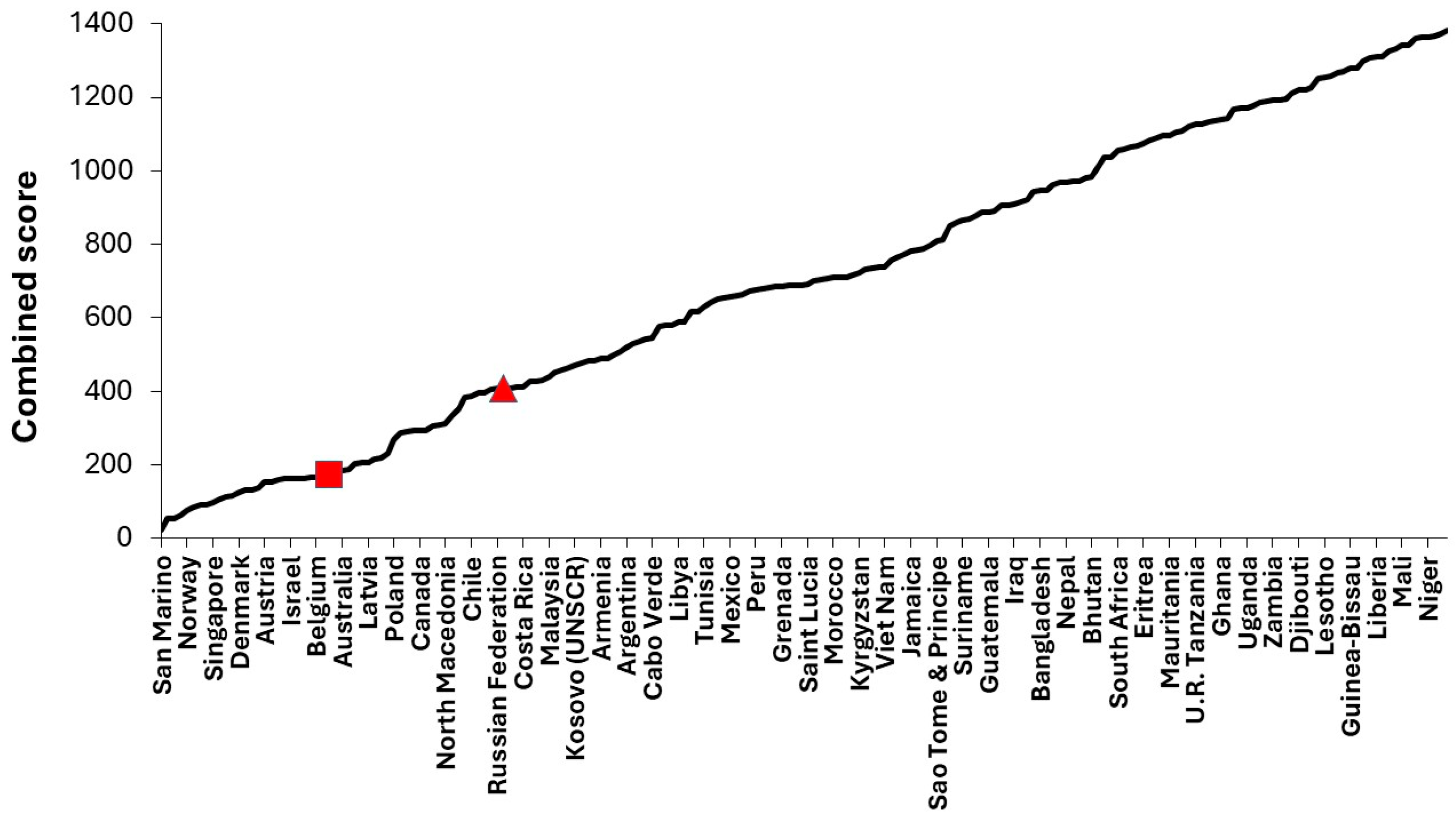
Figure 2.
Average bed occupancy and maximum available beds in 120 English general pediatric units for the autumn/winter/spring period in 2021/22 to 2024/25 [49].
Figure 2.
Average bed occupancy and maximum available beds in 120 English general pediatric units for the autumn/winter/spring period in 2021/22 to 2024/25 [49].
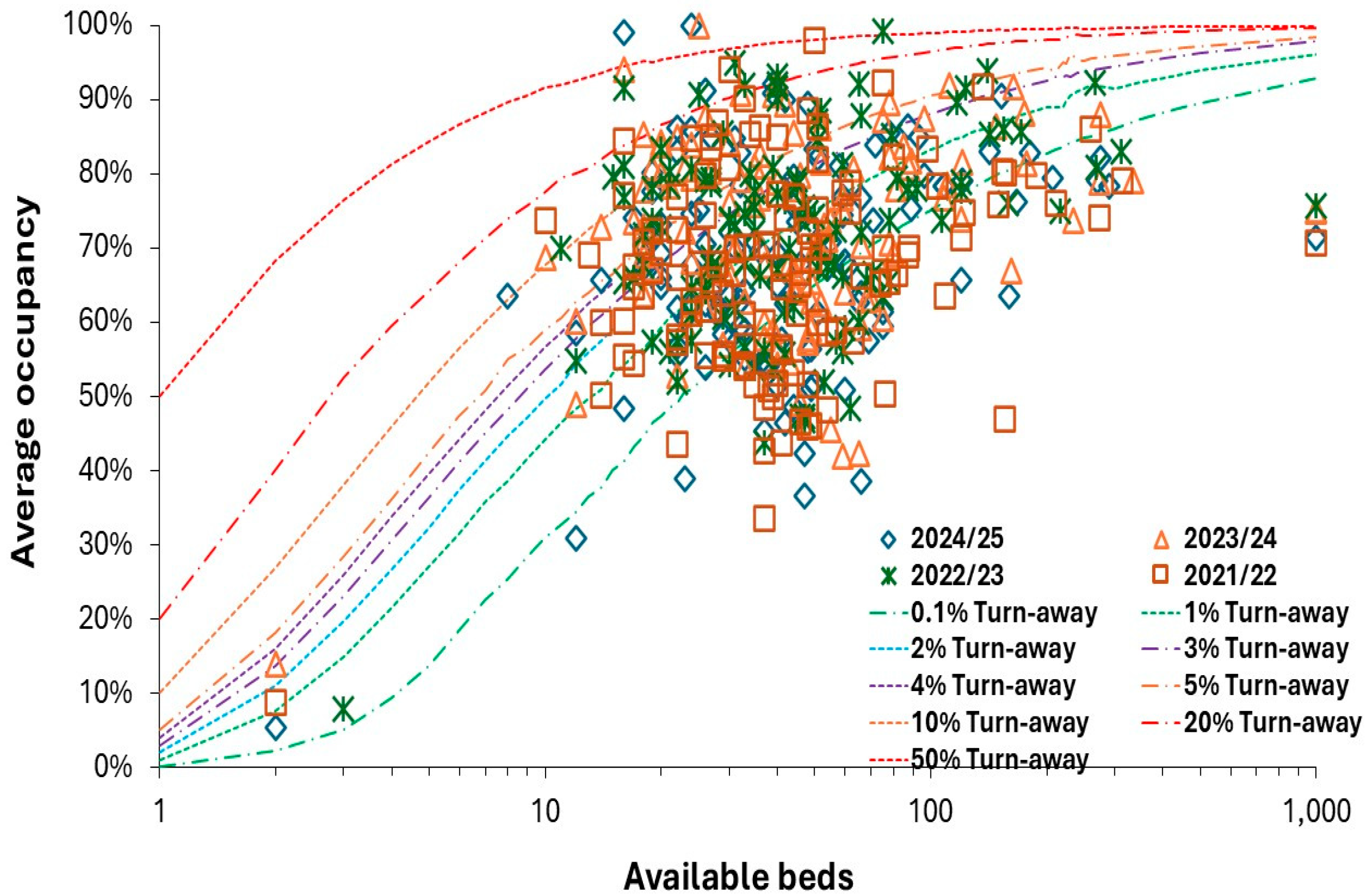
Figure 3.
Average bed occupancy and available beds in English pediatric intensive care units (PICU) for the autumn/winter/spring period in 2024/25. Data from [49].
Figure 3.
Average bed occupancy and available beds in English pediatric intensive care units (PICU) for the autumn/winter/spring period in 2024/25. Data from [49].
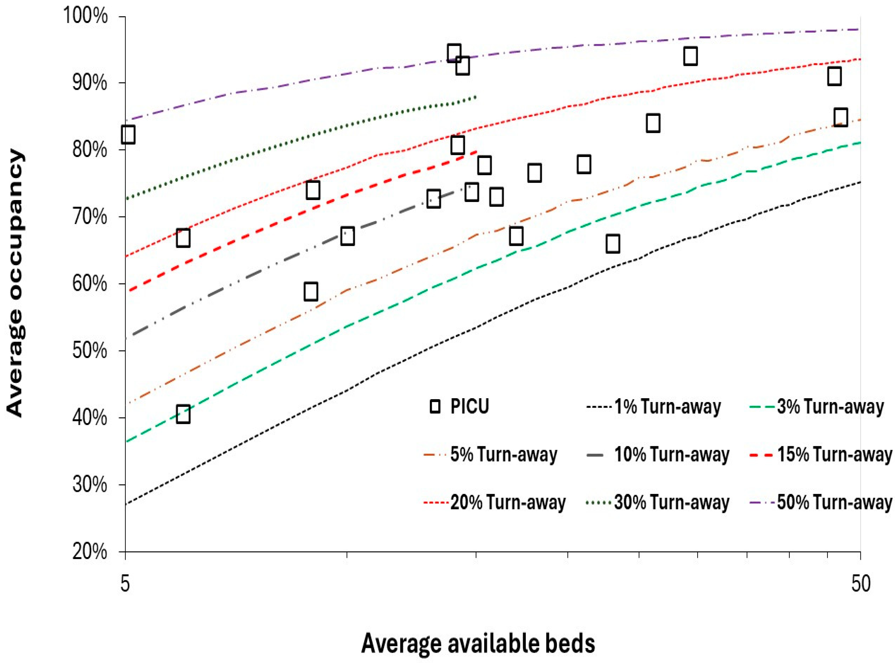
Figure 4.
Average bed occupancy and available beds in English neonatal intensive care units (NICU) for the autumn/winter/spring period in 2024/25. Data from [49].
Figure 4.
Average bed occupancy and available beds in English neonatal intensive care units (NICU) for the autumn/winter/spring period in 2024/25. Data from [49].
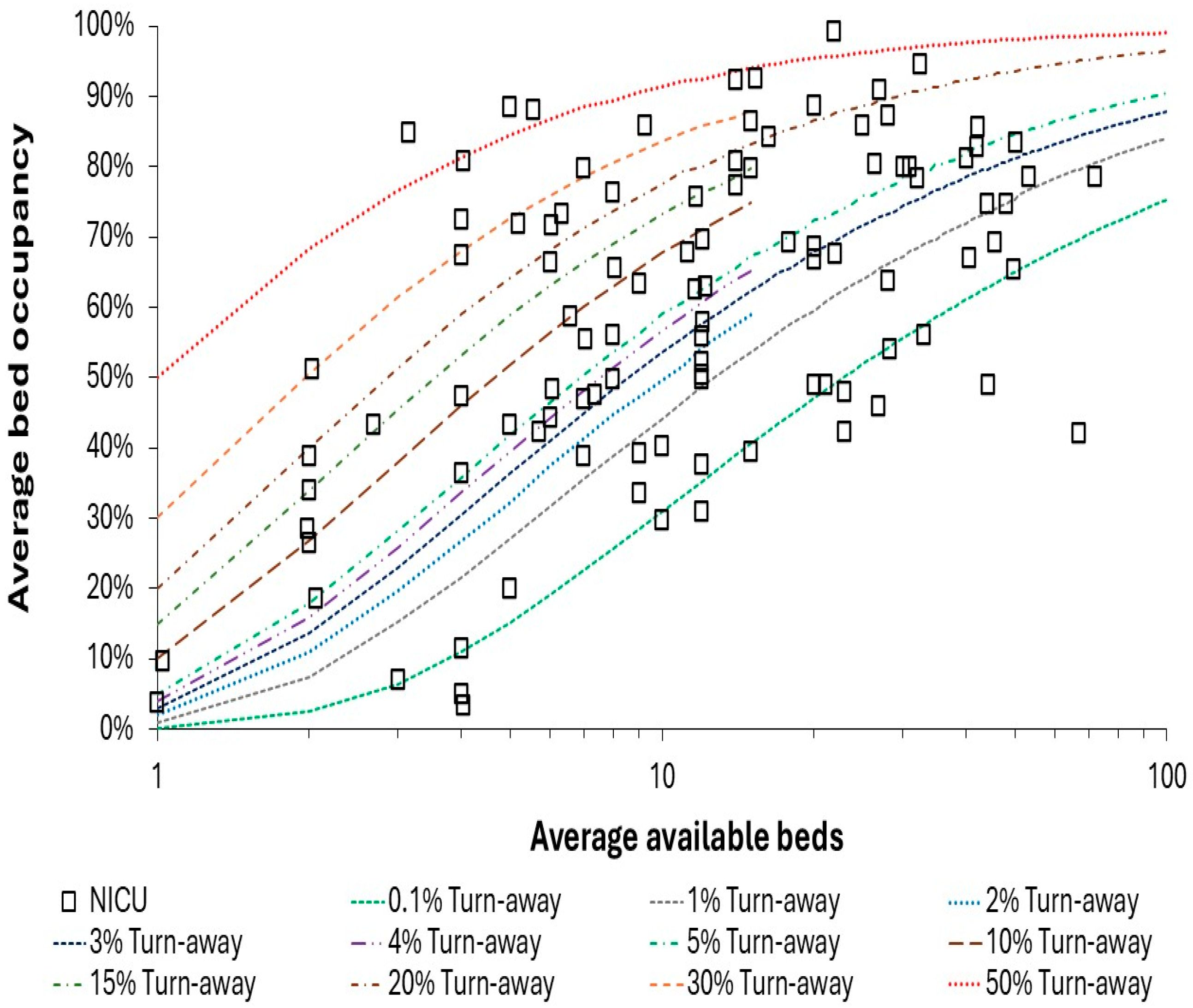
Figure 5.
Size distribution for pediatric units in the USA and Texas compared to England. Data from [50,60,61,62,63].
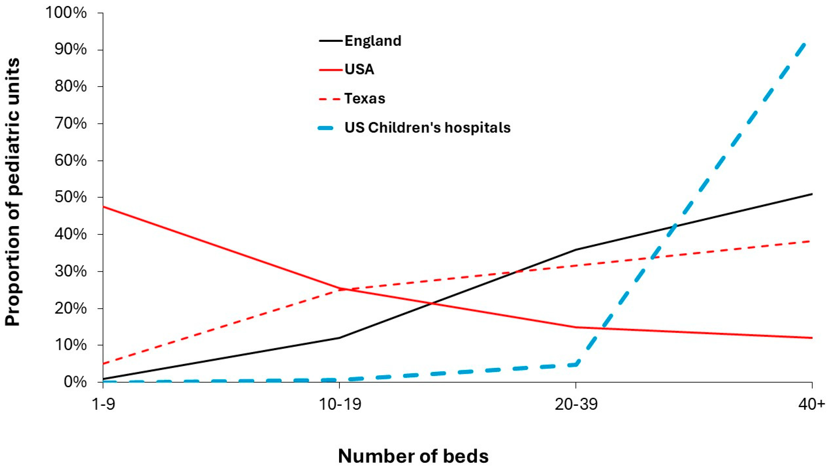
Figure 6.
Proportion of births admitted to the neonatal unit at the Barts group of hospitals in London, England (2019 to 2024). Freedom of Information data provided by Barts Health NHS Trust.
Figure 6.
Proportion of births admitted to the neonatal unit at the Barts group of hospitals in London, England (2019 to 2024). Freedom of Information data provided by Barts Health NHS Trust.
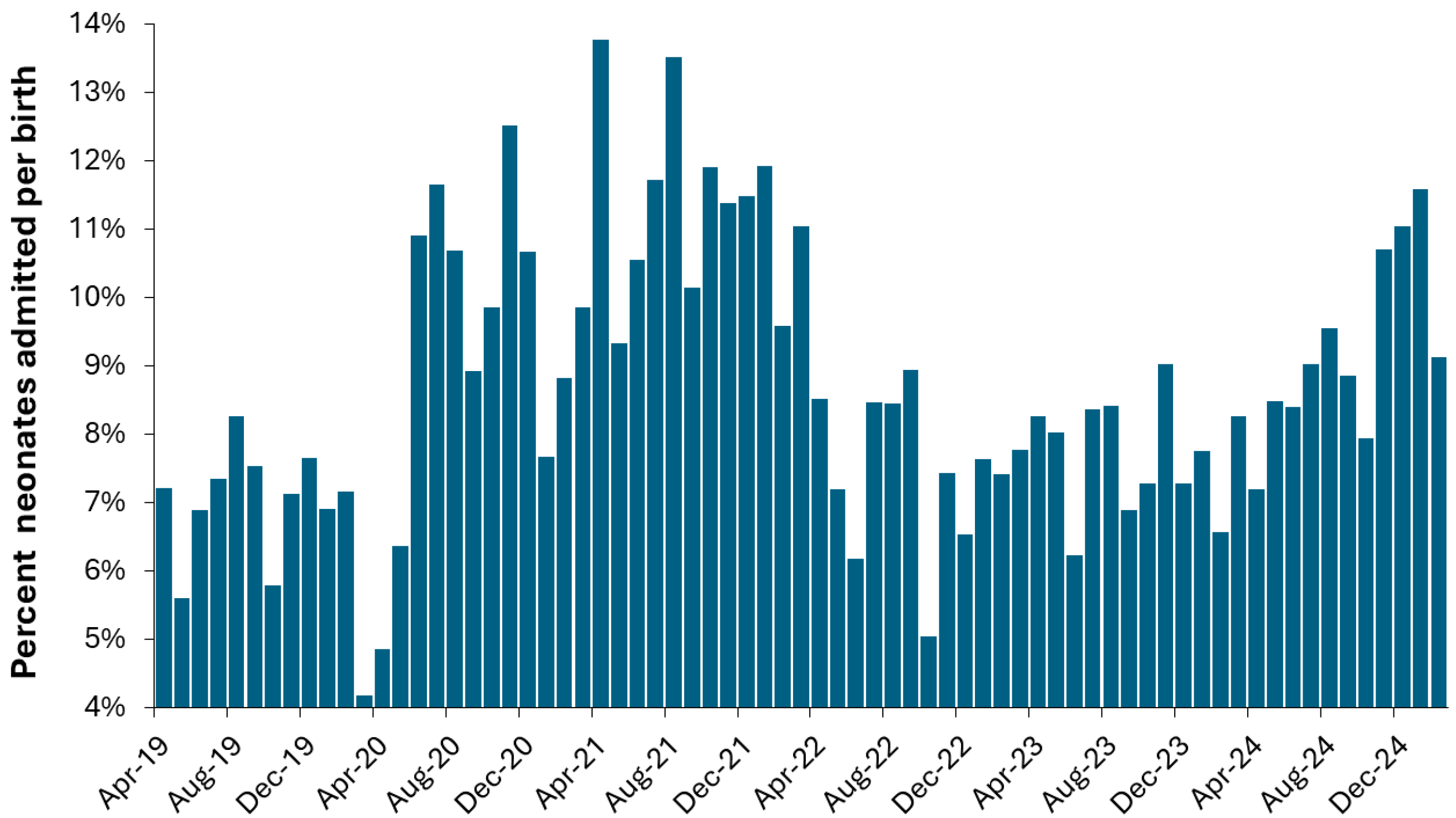
Figure 7.
Trend in occupied bed days per birth in England between 1998/99 and 2023/24. Data from [48].
Figure 7.
Trend in occupied bed days per birth in England between 1998/99 and 2023/24. Data from [48].
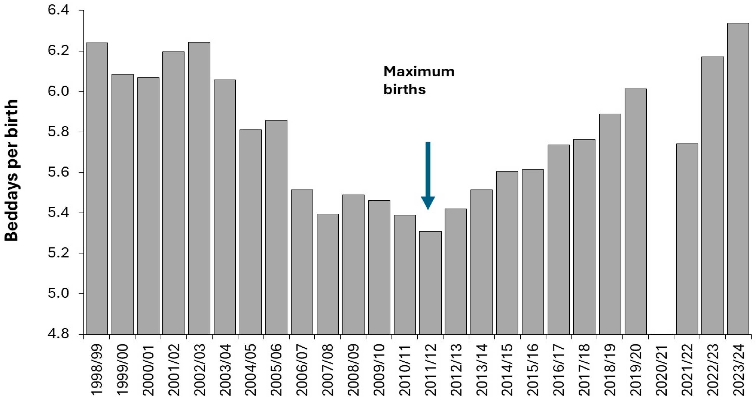
Figure 8.
Trend in past (1950 to 2024) and future births in the USA. Data from [53] under a medium fertility rate scenario.
Figure 8.
Trend in past (1950 to 2024) and future births in the USA. Data from [53] under a medium fertility rate scenario.
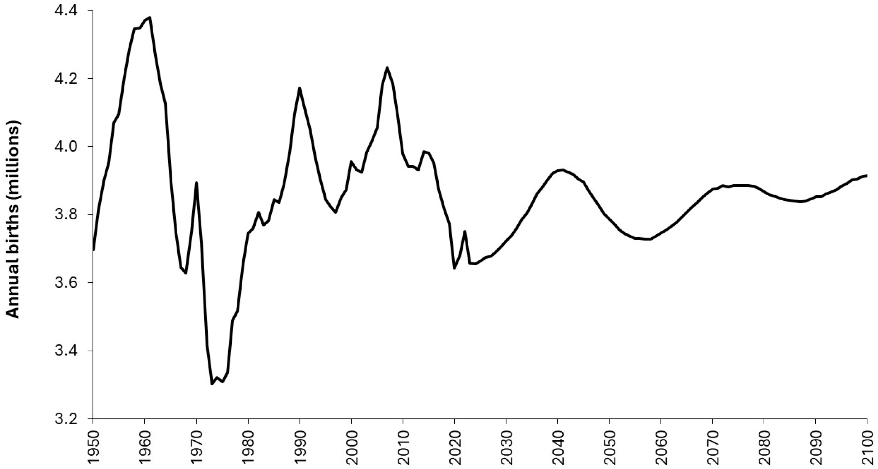
Figure 9.
Trend in births for Australian several regions between 2011 and 2023 relative to 2017. Black dashed line is for Australia. Data from [57].
Figure 9.
Trend in births for Australian several regions between 2011 and 2023 relative to 2017. Black dashed line is for Australia. Data from [57].
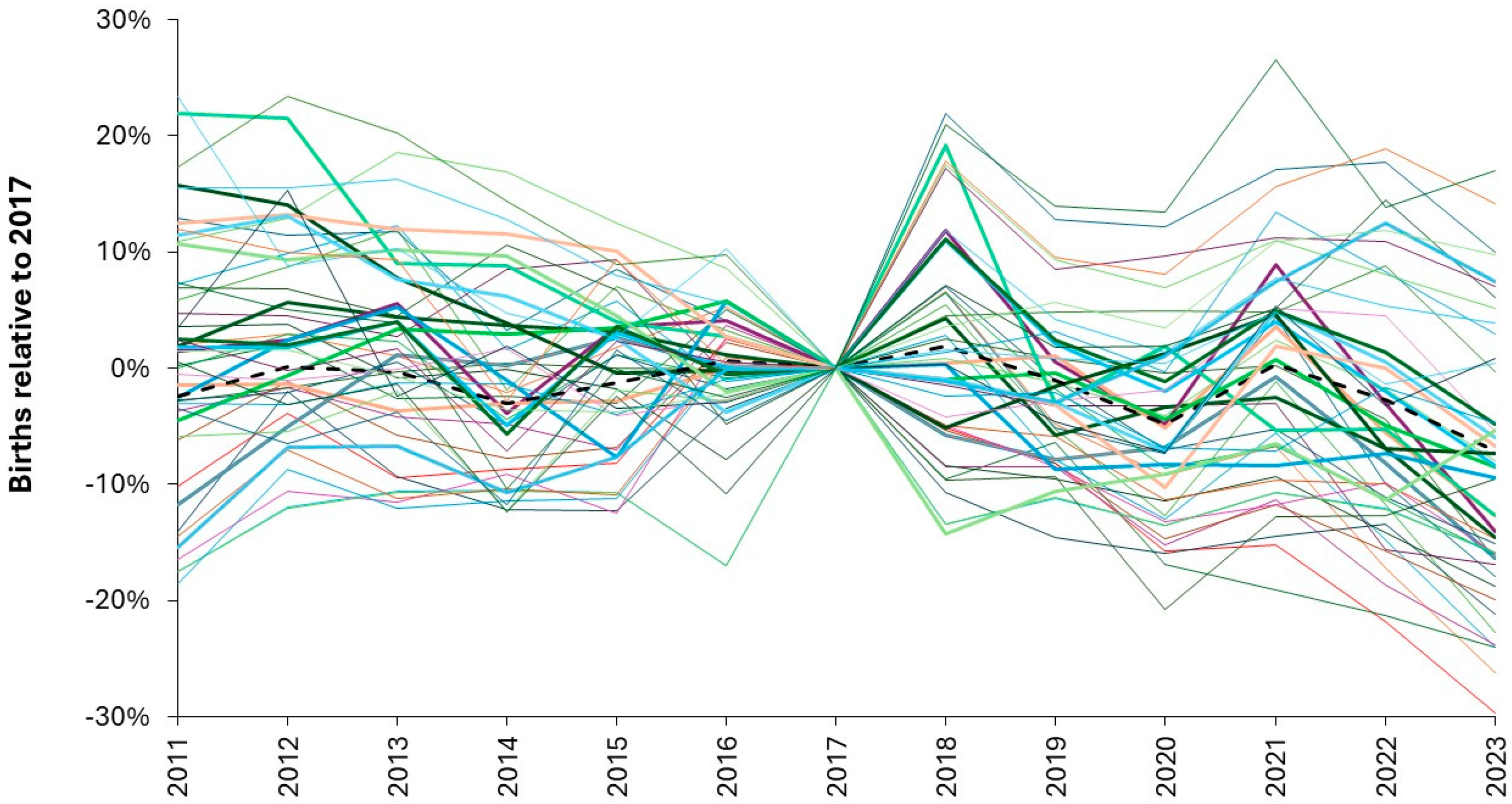
Figure 10.
Daily estimates for the ‘worst’ year using 12 years of data (2013/14 to 2025/26) where total bed occupancy for each year is increased to match an actual worst year, i.e., 2023/24. Data kindly provided by the Great Western Hospital NHS Foundation Trust.
Figure 10.
Daily estimates for the ‘worst’ year using 12 years of data (2013/14 to 2025/26) where total bed occupancy for each year is increased to match an actual worst year, i.e., 2023/24. Data kindly provided by the Great Western Hospital NHS Foundation Trust.
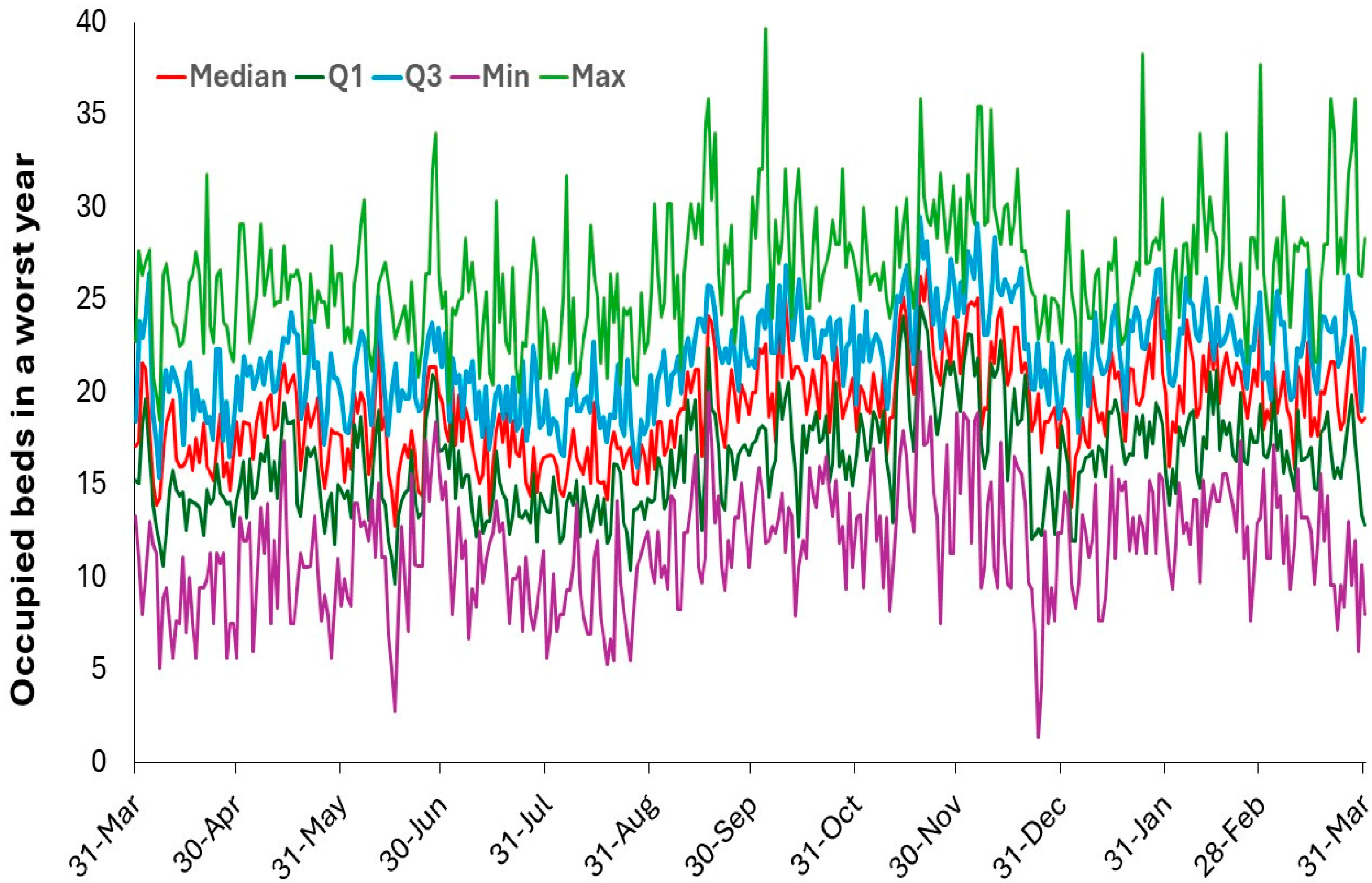
Figure 11.
Childhood mortality rates for males and females for five ages (0, 1, 2, 3, 10) in England and Wales from 1961 to 2023. Data from [59]. Note that the y-axis is a log scale.
Figure 11.
Childhood mortality rates for males and females for five ages (0, 1, 2, 3, 10) in England and Wales from 1961 to 2023. Data from [59]. Note that the y-axis is a log scale.
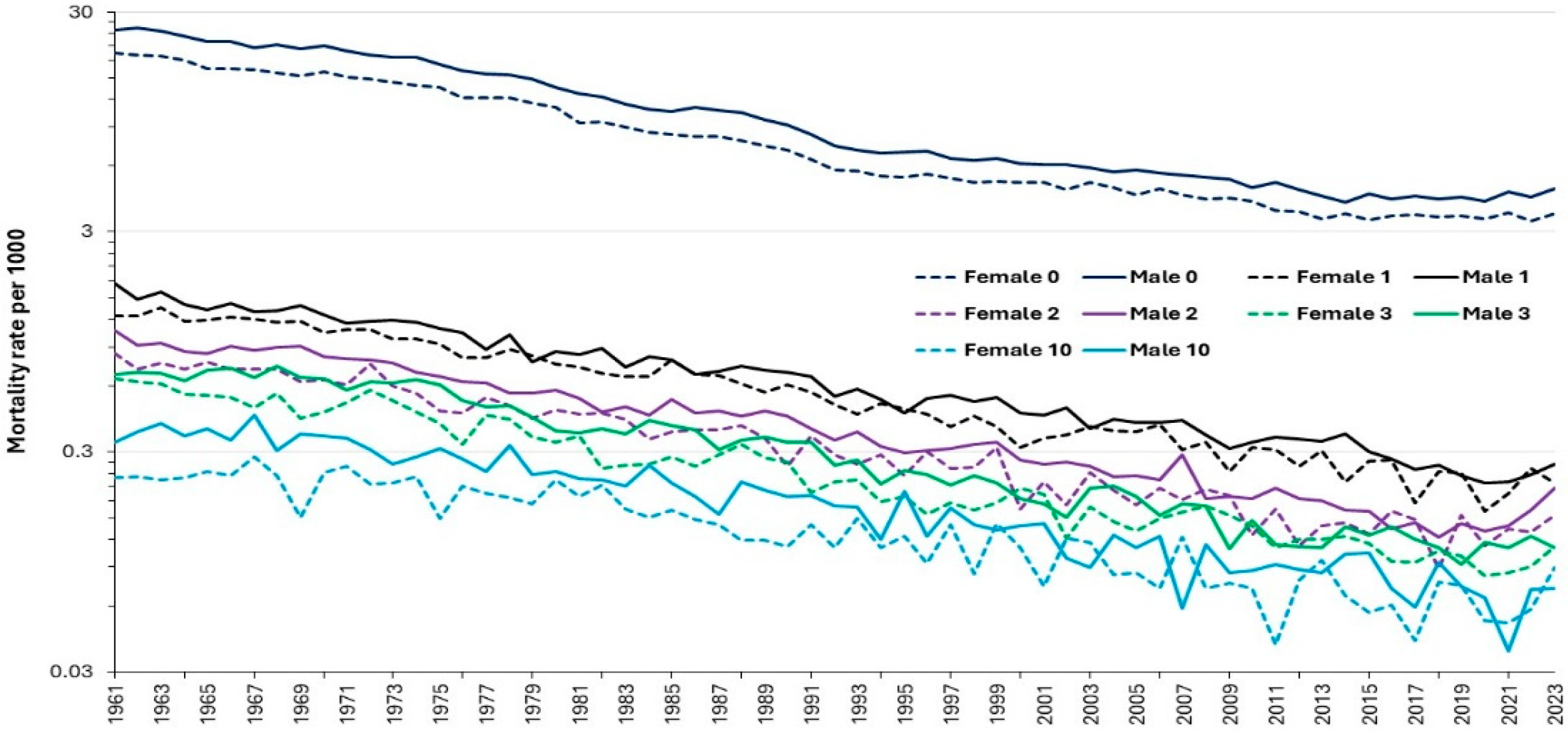
Figure 12.
Trend in different measures for length of stay for the specialty ENT in England, 1998/99 to 2023/24.
Figure 12.
Trend in different measures for length of stay for the specialty ENT in England, 1998/99 to 2023/24.
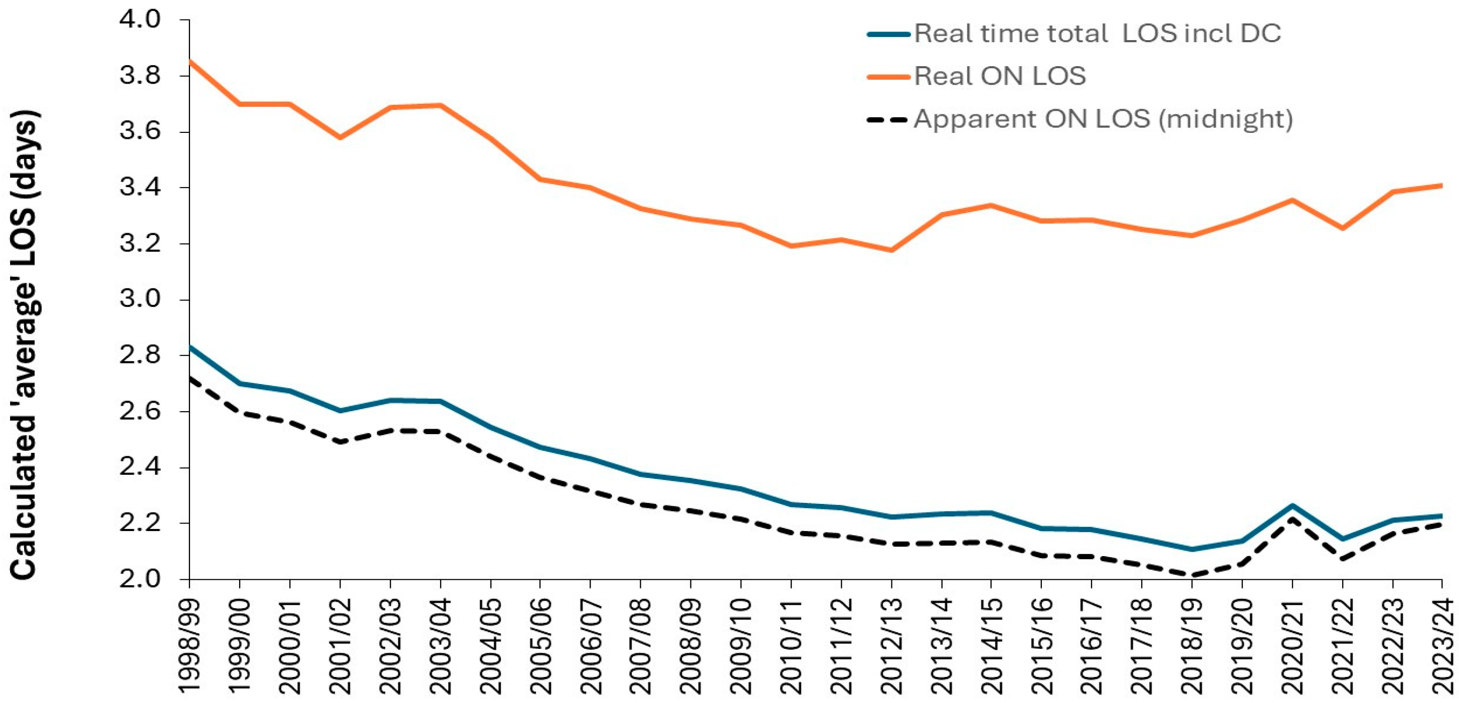
Figure 13.
Trend in real average length of stay (LOS) which includes any same day stays for various pediatric specialties across the NHS in England, 1998/99 to 2022/23 [48].
Figure 13.
Trend in real average length of stay (LOS) which includes any same day stays for various pediatric specialties across the NHS in England, 1998/99 to 2022/23 [48].

Figure 14.
Distribution of length of stays over 6 consecutive years. Data provided by a pediatric unit at a District General Hospital.
Figure 14.
Distribution of length of stays over 6 consecutive years. Data provided by a pediatric unit at a District General Hospital.
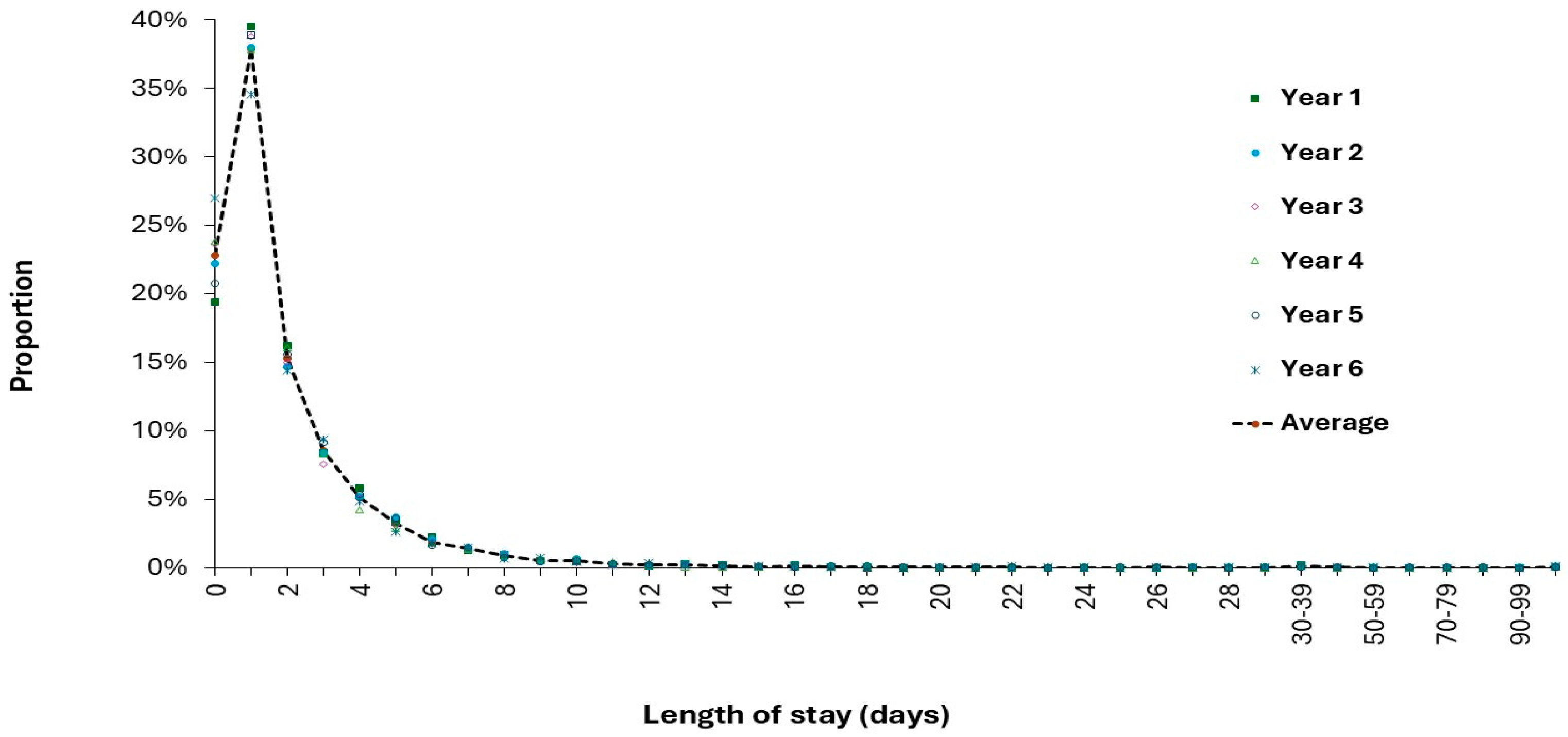
Figure 15.
Median and upper quartile value for the year-to-year volatility in pediatric admissions (age 0-14) across 1285 ICD-10 (3 digit) primary diagnoses in England, 1998/99 to 2022/23. Percent volatility is calculated using the maximum admissions for each diagnosis [48].
Figure 15.
Median and upper quartile value for the year-to-year volatility in pediatric admissions (age 0-14) across 1285 ICD-10 (3 digit) primary diagnoses in England, 1998/99 to 2022/23. Percent volatility is calculated using the maximum admissions for each diagnosis [48].
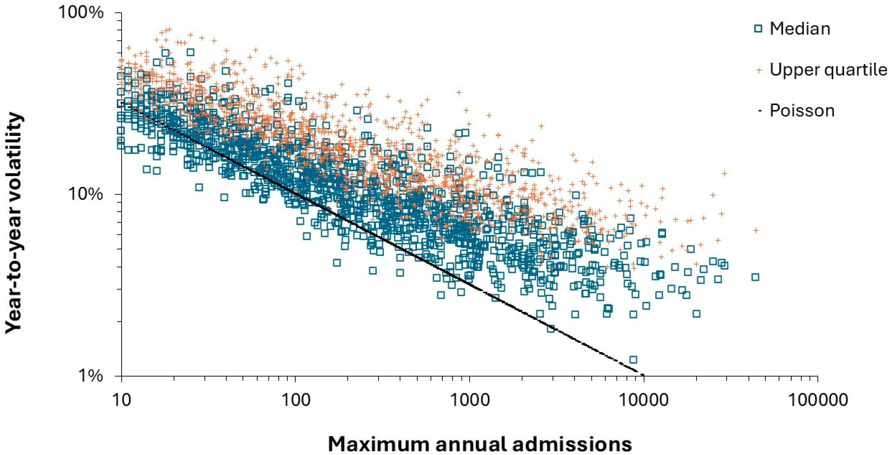
Figure 16.
Proportion of ICD-10 (3 digit) primary diagnoses having the maximum number of pediatric admissions in particular years in England. The two COVID-19 years 2020/21 and 2021/22 are excluded {48].
Figure 16.
Proportion of ICD-10 (3 digit) primary diagnoses having the maximum number of pediatric admissions in particular years in England. The two COVID-19 years 2020/21 and 2021/22 are excluded {48].
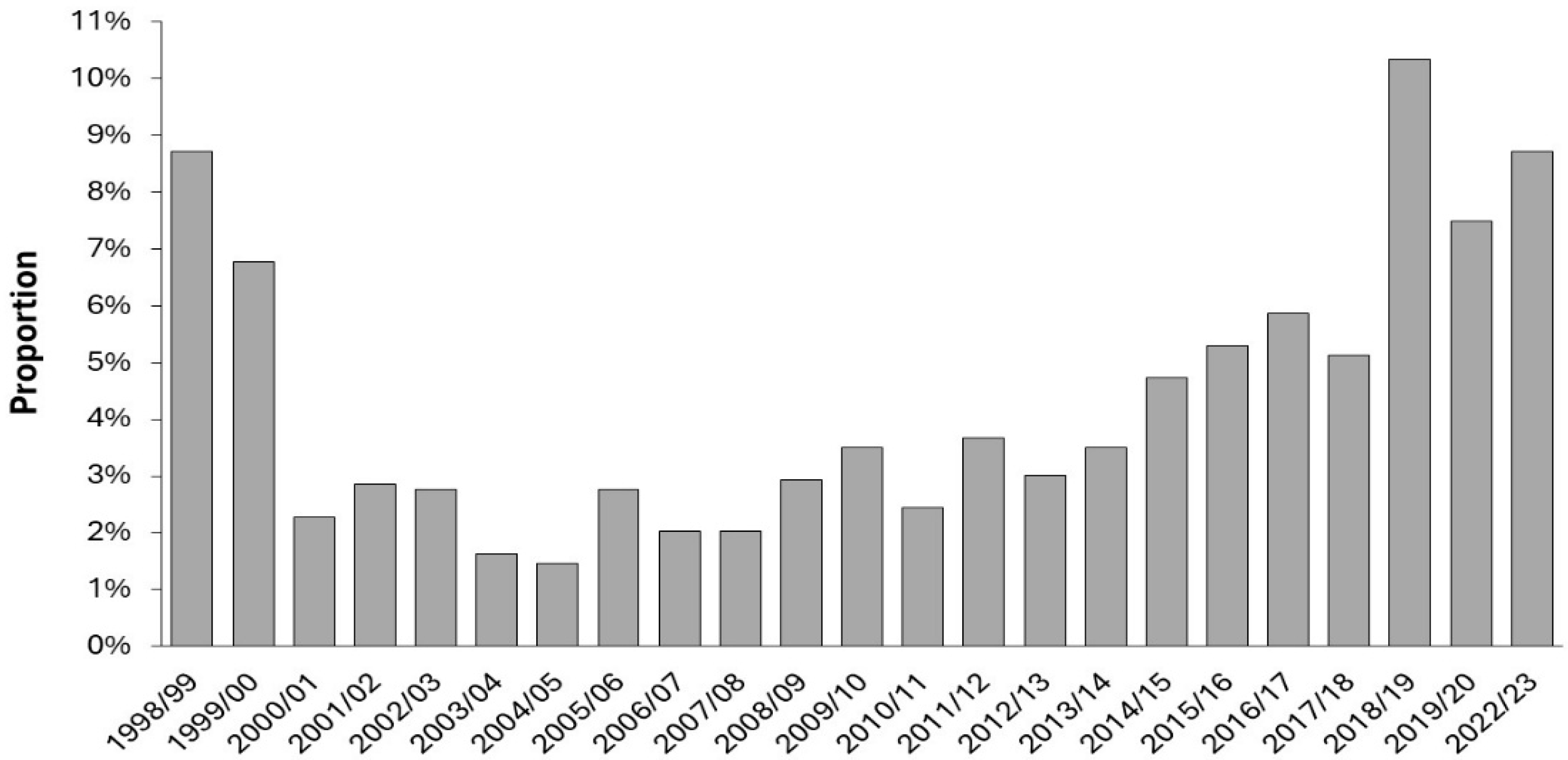
Figure 17.
Admissions for croup in England, 1998/99 to 2023/24. Data from [48].
Figure 17.
Admissions for croup in England, 1998/99 to 2023/24. Data from [48].
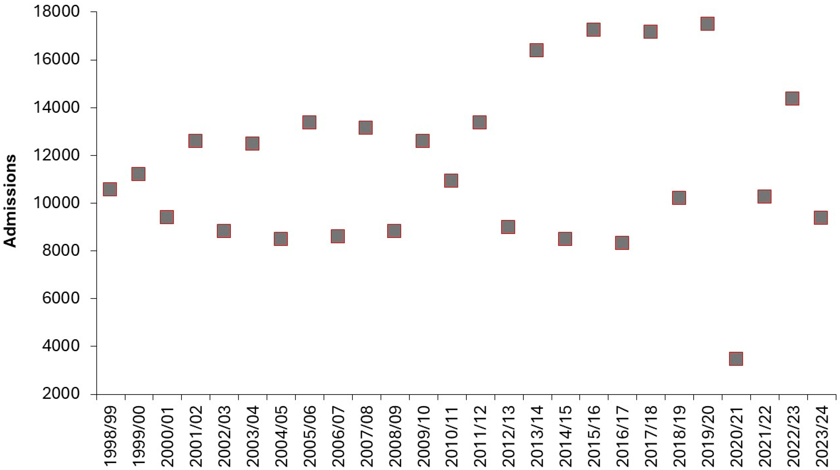
Figure 18.
Change in pediatric admissions in 2020/21 compared to 2019/20 in England after removing diagnoses not showing a statistically significant change. Data from [48].
Figure 18.
Change in pediatric admissions in 2020/21 compared to 2019/20 in England after removing diagnoses not showing a statistically significant change. Data from [48].
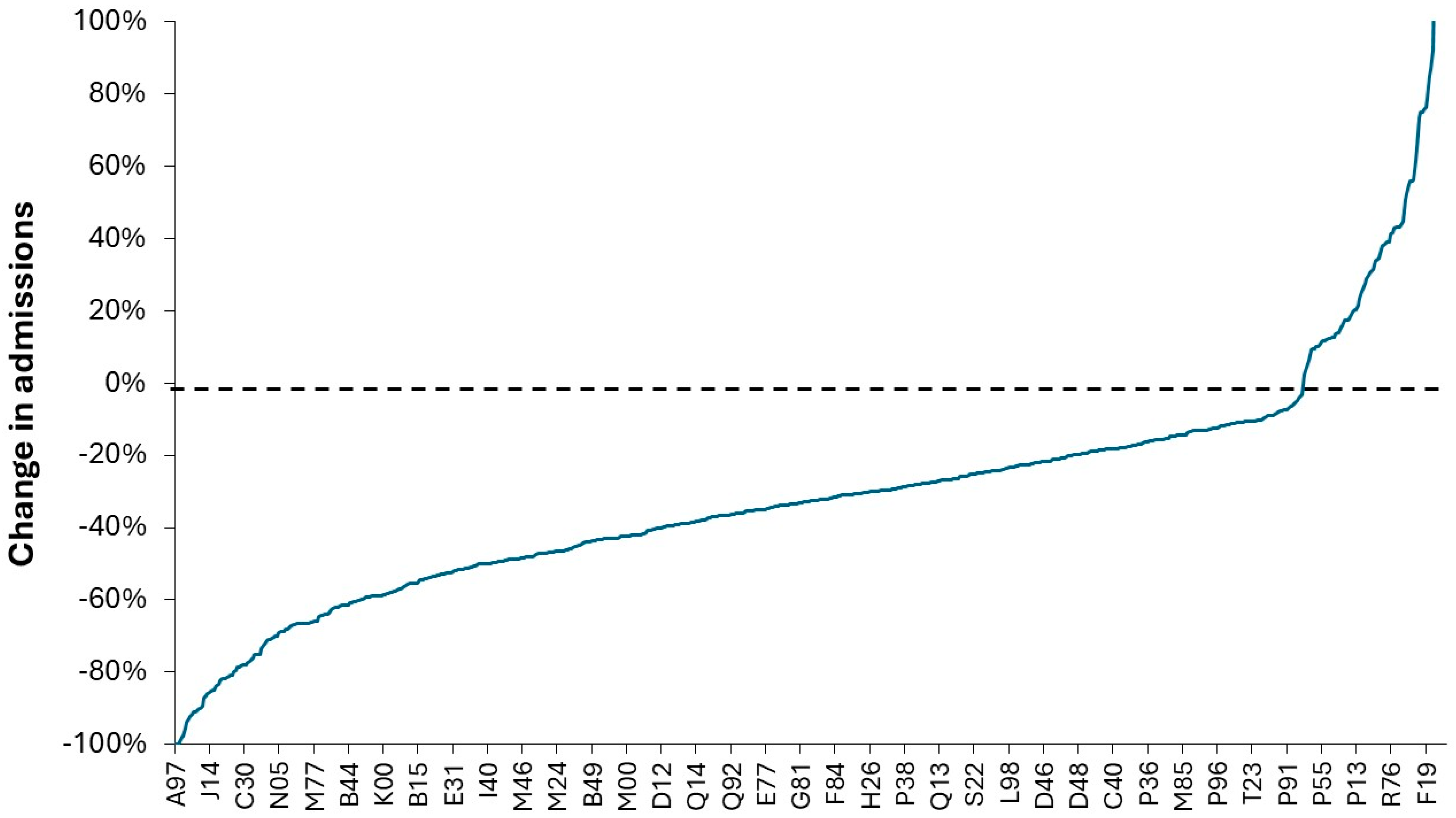
Figure 19.
Trend in monthly occupied pediatric beds during the first two years of COVID-19 observed at the Great Western hospital in Swindon, England.
Figure 19.
Trend in monthly occupied pediatric beds during the first two years of COVID-19 observed at the Great Western hospital in Swindon, England.
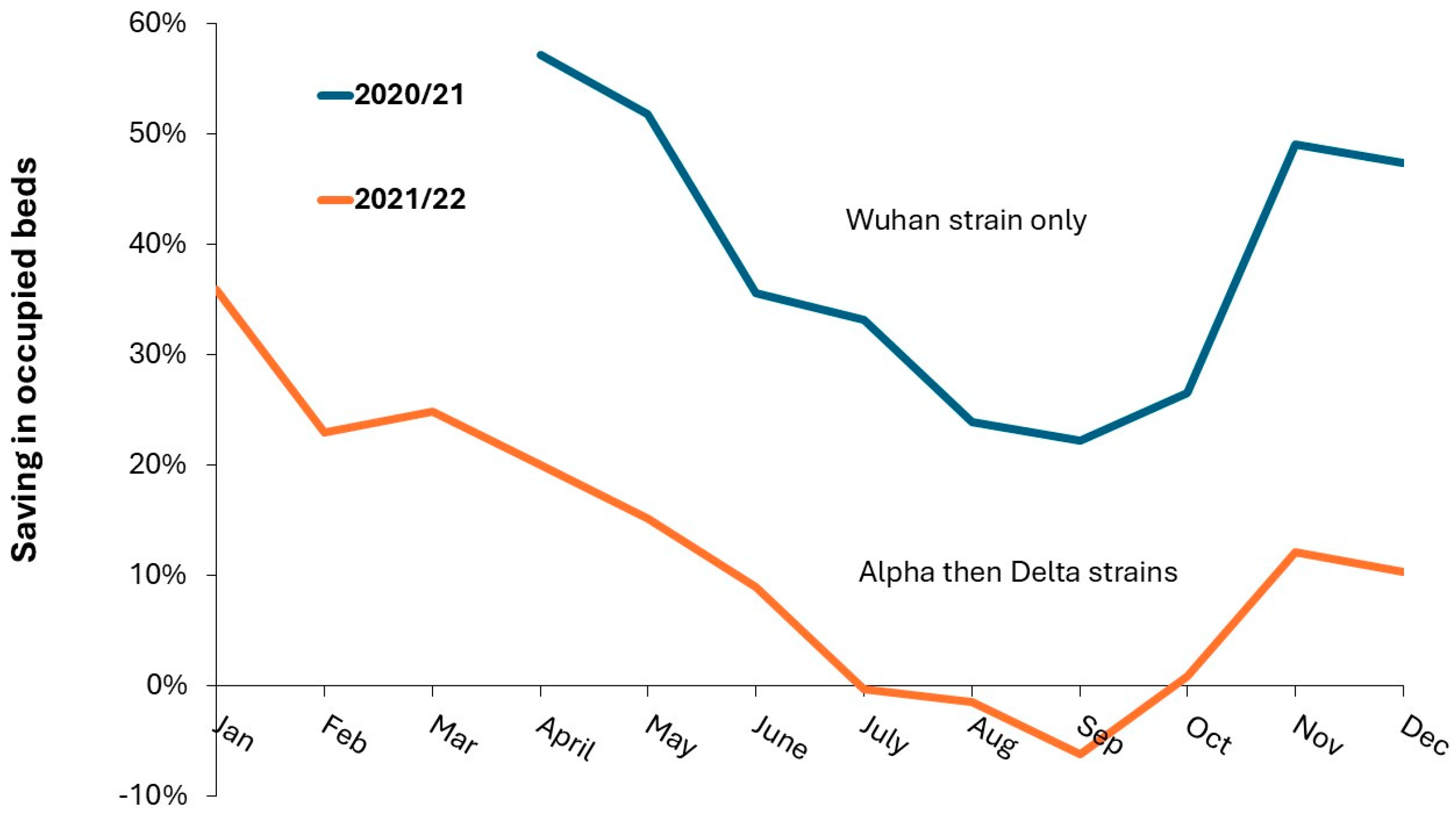
Figure 20.
A plot of occupied pediatric beds per 1000 births versus births per 1000 population in England.
Figure 20.
A plot of occupied pediatric beds per 1000 births versus births per 1000 population in England.
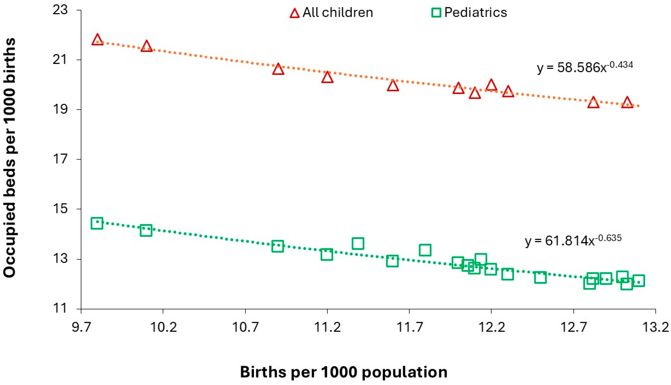
Figure 22.
A moving 365-day average of occupied pediatric beds at the Great Western Hospital (Swindon, England). Data kindly supplied by the hospital.
Figure 22.
A moving 365-day average of occupied pediatric beds at the Great Western Hospital (Swindon, England). Data kindly supplied by the hospital.
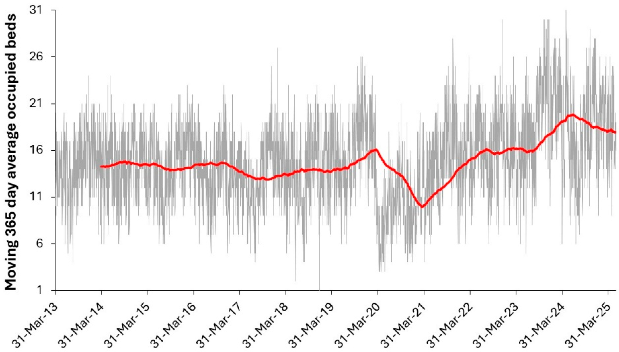
Table 1.
Consultant specialty where >50% of admissions are for children in England. Data is the average of 2021/22 to 2023/24 [48].
Table 1.
Consultant specialty where >50% of admissions are for children in England. Data is the average of 2021/22 to 2023/24 [48].
| Consultant Specialty | Proportion children |
|---|---|
| Dental Medicine Specialties | 50% |
| Sports & Exercise Medicine | 60% |
| Clinical Genetics | 71% |
| Clinical Neurophysiology | 75% |
| Orthodontics | 79% |
| Special Care Dentistry | 82% |
| Audiological Medicine | 92% |
| Paediatric Cardiology | 92% |
| Surgical Dentistry | 95% |
| Paediatric Surgery | 99% |
| Paediatric Neurology | 99% |
| Paediatric Dentistry | 100% |
| Paediatrics | 100% |
Table 2.
Average occupied beds (adjusted) for April and May over the 12 years 2013/14 to 2025/26.
| Year | Average occupied beds |
|---|---|
| 2020/21 | 13.2 |
| 2023/24 | 14.9 |
| 2021/22 | 16.1 |
| 2017/18 | 18.5 |
| 2019/20 | 18.5 |
| 2024/25 | 18.7 |
| 2013/14 | 18.8 |
| 2022/23 | 19.1 |
| 2015/16 | 19.4 |
| 2018/19 | 19.7 |
| 2014/15 | 20.0 |
| 2016/17 | 21.6 |
Table 3.
Length of stay distribution for 6 years at a medium sized pediatric unit in England showing annual admissions, occupied beds, average LOS (midnight) and the proportion of admissions which are same (zero) day stay. Highest year highlighted in red bold and lowest in green bold.
Table 3.
Length of stay distribution for 6 years at a medium sized pediatric unit in England showing annual admissions, occupied beds, average LOS (midnight) and the proportion of admissions which are same (zero) day stay. Highest year highlighted in red bold and lowest in green bold.
| Year | Admissions | Admissions (13+ days) | Occ-upied Beds | Occupied Beds (13+ days) | LOS | LOS (13+ days) | % 0 day |
|---|---|---|---|---|---|---|---|
| Year 1 | 4079 | 61 | 24.5 | 4.8 | 2.2 | 28.6 | 19% |
| Year 2 | 3644 | 63 | 24.1 | 6.8 | 2.4 | 39.2 | 22% |
| Year 3 | 4147 | 44 | 22.7 | 4.0 | 2.0 | 33.0 | 24% |
| Year 4 | 3207 | 35 | 18.7 | 4.2 | 2.1 | 43.5 | 24% |
| Year 5 | 3354 | 44 | 19.7 | 3.9 | 2.1 | 32.3 | 21% |
| Year 6 | 3610 | 56 | 21.0 | 5.0 | 2.1 | 32.7 | 27% |
| Average | 3674 | 50.5 | 21.8 | 4.8 | 2.2 | 34.9 | 23% |
|
STDEV as % |
378 (±10%) | 11.1 (±22%) | 2.4 (±11%) | 1.1 (±23%) | 0.1 (±5%) | 5.5 (±16%) | 3% (±13%) |
Disclaimer/Publisher’s Note: The statements, opinions and data contained in all publications are solely those of the individual author(s) and contributor(s) and not of MDPI and/or the editor(s). MDPI and/or the editor(s) disclaim responsibility for any injury to people or property resulting from any ideas, methods, instructions or products referred to in the content. |
© 2025 by the authors. Licensee MDPI, Basel, Switzerland. This article is an open access article distributed under the terms and conditions of the Creative Commons Attribution (CC BY) license (http://creativecommons.org/licenses/by/4.0/).
Copyright: This open access article is published under a Creative Commons CC BY 4.0 license, which permit the free download, distribution, and reuse, provided that the author and preprint are cited in any reuse.


