Submitted:
14 June 2025
Posted:
16 June 2025
You are already at the latest version
Preprints on COVID-19 and SARS-CoV-2
Abstract
Large peaks of excess all-cause mortality occurred immediately following the World Health Organization (WHO)’s March 11, 2020 COVID-19 pandemic declaration, in March-May 2020, in several jurisdictions in the Northern Hemisphere. The said large excess-mortality peaks are usually assumed to be due to a novel and virulent virus (SARS-CoV-2) that spreads by person-to-person contact, and are often referred to as resulting from the so-called first wave of infections. We tested the presumption of this viral spread paradigm using high-resolution spatial and temporal variations of all-cause mortality in Europe and the USA.We studied excess all-cause mortality for subnational regions in the USA (states and counties) and Europe (NUTS statistical regions at levels 0-3) during March-May 2020, which we call the “first-peak period”, and also during June-September 2020, which we call the “summer-peak period”.The data reveal several definitive features that are incompatible with the viral spread hypothesis (in comparison with qualified predictions of the leading spatiotemporal epidemic models): • Geographic heterogeneity of first-peak period excess mortality: There was a high degree of geographic heterogeneity in excess mortality in the USA and Europe, with a handful of geographic regions having essentially synchronous (within weeks of each other) large peaks of first-peak period excess mortality (“F-peaks”) and all other regions having low or negligible excess mortality in the said first-peak period. This includes vastly different F-peak sizes (up to a factor of 10 or more) for subnational regions on either side of an international border, such as Germany’s NUTS1 regions on its western border (small F-peaks) compared to the NUTS1 regions on the other side of the international border in the Netherlands, Belgium and France (large F-peaks), despite significant documented cross-border traffic volumes between the regions. • Temporal synchrony of first-peak period excess mortality: F-peaks for USA states and European countries were almost all positioned within three or four weeks of one another and never earlier than the week of the WHO’s pandemic declaration. For a given large-F-peak European country, the F-peaks for all subnational regions rose and fell in lockstep synchrony but showed large variation in peak height and total integrated excess mortality. A similar result was seen for the counties of large-F-peak USA states. • Large differences in first-peak period excess mortality for comparable cities with large airports in the same countries: We compare mortality results for Rome vs Milan in Italy, and Los Angeles and San Francisco vs New York City in the USA, and show that there was a dramatic difference in first-peak period excess mortality between the compared cities, despite their having similar demographics, health care systems, and international air travel traffic, including from China and East Asia.We also examined data concerning the location of death (whether in hospital, at home, in a nursing home, etc.) and socioeconomic vulnerability (poverty, minority status, crowded living conditions, etc.) at high geographic resolutions, which support an alternative hypothesis that excess mortality in jurisdictions with large F-peaks was caused by the application of dangerous medical treatments (in particular, invasive mechanical ventilation and pharmaceutical treatments) and pneumonia induced by biological stress due to treatment and lockdown measures.Exceptionally large F-peaks occurred in areas with large publicly-funded hospitals serving poor or socioeconomically frail communities, in regions where poor neighbourhoods are situated in proximity to wealthy neighbourhoods, such as the case of The Bronx in New York City, and the boroughs of Brent and Westminster in London, UK.Taken together, our study represents strong evidence that the patterns of excess mortality observed for the USA and Europe in March-May 2020 could not have been caused by a spreading respiratory virus, and instead were due to the medical and government interventions that were applied and mostly killed elderly and poor individuals.
Keywords:
COVID-19
; all-cause mortality
; excess mortality
; high-resolution geotemporal data
; infectious disease spread
; virus
; respiratory disease spread
; SARS-CoV-2
; viral spread paradigm
; spatial epidemic models
; geographic heterogeneity of excess mortality
; temporal synchrony of excess mortality
; mechanical ventilation
; iatrogenic death
; biological stress
; pneumonia
; sedatives
; long-term care homes
; nursing homes
; ICU
; Intensive Care Unit
; inequality
; poverty
; social vulnerability
; The Bronx
; measures
; lockdowns
; first-wave
; P-score
; socioeconomic variables
; USA
; Europe
; county-level data
; NUTS regions
1. Introduction
All-cause mortality by time and by administrative jurisdiction is arguably the most reliable data for detecting and epidemiologically characterizing events causing death, and for gauging the population-level impact of any surge or collapse in deaths from any cause. Such data can be collected by national or state jurisdiction or subdivision, by age, by sex, by location of death, and so on. It is not susceptible to reporting bias or to any bias in attributing causes of death in the mortality itself (see many references in Rancourt et al., 2023a).
Many researchers have examined all-cause mortality during the Covid period (from the WHO’s March 11, 2020 pandemic declaration (WHO, 2020) to the WHO’s May 5, 2023 declaration of the end of the public health emergency (WHO, 2023)) in countries around the world. Representative references are as follows:
Bilinski & Emanuel, 2020; Bustos Sierra et al., 2020; Félix-Cardoso et al., 2020; Fouillet et al., 2020; Kontis et al., 2020; Mannucci et al., 2020; Mills et al., 2020; Olson et al., 2020; Piccininni et al., 2020; Sinnathamby et al., 2020; Tadbiri et al., 2020; Vestergaard et al., 2020; Villani et al., 2020; Achilleos et al., 2021; Al Wahaibi et al., 2021; Anand et al., 2021; Böttcher et al., 2021; Chan et al., 2021; Dahal et al., 2021; Das-Munshi et al., 2021; Deshmukh et al., 2021; Faust et al., 2021; Gallo et al., 2021; Islam, et al., 2021a, 2021b; Jacobson & Jokela, 2021; Jdanov et al., 2021; Joffe, 2021; Karlinsky & Kobak, 2021; Kobak, 2021; Kontopantelis et al., 2021a, 2021b; Kung et al., 2021a, 2021b; Liu et al., 2021; Locatelli & Rousson, 2021; Miller et al., 2021; Nørgaard et al., 2021; Panagiotou et al., 2021; Pilkington et al., 2021; Polyakova et al., 2021; 2021b; Rossen et al., 2021; Sanmarchi et al., 2021; Sempé et al., 2021; Soneji et al. 2021; Stein et al., 2021; Stokes et al., 2021; Vila-Corcoles et al., 2021; Wilcox et al., 2021; Woolf et al., 2021a, 2021b; Yorifuji et al., 2021; Ackley et al., 2022; Acosta et al., 2022; Engler, 2022; Faust et al., 2022; Ghaznavi et al., 2022; Gobiņa et al., 2022; He et al., 2022; Henry et al., 2022; Jha et al., 2022; Juul et al., 2022; Kontis et al., 2022; Kontopantelis et al., 2022; Lee et al., 2022; Leffler et al., 2022; Lewnard et al., 2022; McGrail, 2022; Neil et al., 2022; Neil & Fenton, 2022; Pálinkás & Sándor, 2022; Ramírez-Soto & Ortega-Cáceres, 2022; Razak et al., 2022; Redert, 2022a, 2022b; Rossen et al., 2022; Safavi-Naini et al., 2022; Schöley et al., 2022; Thoma & Declercq, 2022; Wang et al., 2022; Aarstad & Kvitastein, 2023; Bilinski et al., 2023; de Boer et al., 2023; de Gier et al., 2023; Demetriou et al., 2023; Alessandria et al., 2025; Haugen, 2023; Jones & Ponomarenko, 2023; Kuhbandner & Reitzner, 2023; Masselot et al., 2023; Matveeva & Shabalina, 2023; Neil & Fenton, 2023; Paglino et al., 2023; Redert, 2023; Schellekens, 2023; Scherb & Hayashi, 2023; Šorli et al., 2023; Woolf et al., 2023; Rancourt et al., 2024; Rancourt & Hickey, 2023; Rancourt et al., 2023a; Rancourt et al., 2023b; Rancourt et al., 2022a; Rancourt, 2022; Rancourt et al., 2022b; Rancourt et al., 2022c; Rancourt, 2021; Rancourt et al., 2021a; Rancourt et al., 2021b; Rancourt et al., 2020; Rancourt, 2020; Johnson & Rancourt, 2022; Aune et al., 2023; Bonnet et al., 2024; Faisant et al., 2024; Foster et al., 2024; Korsgaard, 2024; Léger & Rizzi, 2024; Matthes et al., 2024; Mostert et al., 2024; Nørgaard et al., 2024; Paganuzzi et al., 2024; Paglino et al., 2024; Pallari et al., 2024; Pulido et al., 2024; Zawisza et al., 2024; Zou et al., 2024.
Rancourt (2020), in an article dated June 2, 2020, was the first to analyze all-cause mortality for several countries and states for the time period immediately following the WHO’s March 11, 2020 pandemic declaration. He argued that several features of the peaks of all-cause mortality that immediately follow the pandemic declaration were inconsistent with mortality that would result according to the paradigm of a novel spreading respiratory virus, in particular:
- the sharpness of the peaks, with full-width at half-maxima of approximately 4 weeks
- the timing of the peaks, being late in the winter season, surging after week 11 of 2020, which is unprecedented for any large sharp-peak feature in all-cause mortality data
- the synchronicity of the onset of the surge in all-cause mortality, across continents and immediately following the WHO’s pandemic declaration
- the state-to-state (USA) absence or presence of the mortality peaks, being correlated with nursing home events and government public health measures.
Here we extend Rancourt (2020)’s analysis using high-resolution geotemporal all-cause mortality data for the USA and Europe. We use data at the level of states and counties in the USA and at levels 0-3 of the “NUTS” territorial statistics nomenclature (Nomenclature des unités territoriales statistiques) in Europe. We focus primarily on the period March-May 2020, which we call the “first-peak period”.
Our results confirm and expand on the observations of Rancourt (2020), showing high synchronicity of onset of first-peak period excess mortality, and a high degree of geographic heterogeneity in magnitude and in presence or absence of first-peak period excess mortality. There are many locations with low or negligible excess mortality, including in places that neighbour jurisdictions with very large excess mortality. There are also comparable cities with large airports in the same country that have very different excess mortality outcomes, but which are predicted to have similar infection prevalence at the same time shortly prior to the pandemic declaration by epidemic spread models.
We propose that the said observations of geographic heterogeneity and temporal synchronicity of first-peak period excess mortality, which cannot be explained by the paradigm of a spreading respiratory virus, were caused by region-specific application of first-peak period lockdown policies and dangerous medical-system treatments, including invasive mechanical ventilation. We argue, following Rancourt (2024), that pneumonia induced by biological stress of lockdowns and medical-system intervention was ultimately responsible for the very large first-peak period excess mortality that occurred in hotspots such as New York City, Lombardy, Madrid, and London, UK.
Furthermore, researchers have shown strong correlations between Covid-period excess all-cause mortality and socioeconomic variables (Rancourt et al., 2021a; Ioannidis et al., 2023; Rancourt et al., 2024). Here, we do an in-depth examination of how first-peak period P-scores (number of excess deaths for a given time period, divided by expected number of deaths for the same time period, expressed as a percent) at high geographic resolutions correlate with socioeconomic variables and variables indicating the population’s degree of interaction with the medical system.
We discuss how our observations regarding all-cause mortality data compare with the predictions of large-scale spatial epidemic spread models. We find that the empirical results are incompatible with the model predictions. The empirical results place stringent constraints on any application of epidemic spread modeling for the first-peak period (March-May 2020).
Data and Methods
1.1. Data Sources
Our data for European countries and subnational regions are from Eurostat, as follows: all-cause mortality (Eurostat, 2024a), population in 2019 and 2020 (Eurostat, 2024b), population density in 2018 (Eurostat, 2024c), percentage of the population at-risk-of-poverty in 2019 (Eurostat, 2024d), volumes of road cargo transported between pairs of countries for 2017 to 2021 (Eurostat, 2024e, 2024f).
Data sources for the Italian regions examined in Section 3.4.1 are as follows: number of hospital beds in 2020 (Eurostat, 2024g), number of Intensive Care Unit (ICU) beds in 2017 (Pecoraro et al., 2020), air traffic volumes to and from Italian airports (ENAC, 2017, 2018, 2019).
Data on socioeconomic variables for subnational regions of the UK (section 3.6.2) are from the following sources: gross disposable household income per capita in 2019 for the NUTS3 regions of the UK (ONS, 2024), population and population density for the NUTS3 regions of London, UK in 2019 (Greater London Authority, 2023), percent of the population of the NUTS3 regions of London, UK in 2021 that were non-white (ONS, 2022a), that were born outside the UK (ONS, 2022b), and that were living in poverty (pooled data from five years of survey data for the financial years 2017/18 to 2022/23, excluding 2020/21 due to data quality concerns) (Trust for London, 2024).
Mortality data for the United States are from the Centers for Disease Control and Prevention (CDC), as follows: weekly all-cause mortality by state (CDC, 2024a), monthly all-cause mortality by county, by state, and by institutional location of death (CDC, 2024b).
Population data for the United States are from the United States Census Bureau, as follows: population estimates for USA counties for 2019 (US Census Bureau, 2024a), population density estimates for USA counties (from the 5-Year American Community Survey for the years 2017-2021) (US Census Bureau, 2024b), and population of USA urban areas in 2020 (US Census Bureau, 2024c).
Data on number of international air passengers served by major USA airports (Section 3.4.2) are from the United States Department of Transportation (Department of Transportation, 2020) and data on flights arriving from China at major USA airports from Eder et al. (2020).
Data on the following socioeconomic variables for USA counties (section 3.6.1) are from the 2014-2018 five-year American Community Survey, via the Agency for Toxic Substances and Disease Registry (ATSDR)’s socioeconomic vulnerability index website (ATSDR, 2024): per capita income, % living in poverty, % unemployed, Gini coefficient, % households with no vehicle available, % households with more people than rooms, % living in housing structures with 10+ units, % of population that speaks English “less than well”, % minority, % aged 25+ with no high school diploma, % aged 65+, % aged 17 and under, % households that are single-parent households, and % with a disability.
Additional data on socioeconomic variables for USA counties (section 3.6.1) are from the following sources: diabetes rates for 2018 (CDC, 2024c), obesity rates for 2018 (RHIhub, 2024), presidential election voting results in 2016 (MIT Election Data Science Lab, 2018), prescription drug claims in 2017 (HHS, 2024), COVID-19 vaccination doses received up to December 31, 2021 (CDC, 2025), ICU beds (Schulte et al., 2020).
1.1. Technical Points About Mortality Data
All mortality data used in this article is for all causes of death combined (“all-cause mortality”).
We use weekly mortality data for all European countries and subnational regions examined in this article. The data provider (Eurostat) reports mortality data for weeks consisting of the seven days beginning on Monday and ending on Sunday, per the International Organization for Standardization (ISO) week date system. Data points in all graphs in this article showing weekly data for European jurisdictions are placed at the date of the Monday (first day) of the ISO week.
For the USA, the data provider (CDC) reports mortality data for weeks consisting of the seven days beginning on Sunday and ending on Saturday, following the CDC format. Data points in all graphs in this article showing weekly data for USA states are placed on the Sunday (first day) of the CDC week.
For USA counties, data was suppressed by the CDC if the number of recorded deaths for the time interval and the county was less than 10. We use monthly data for USA counties to reduce the number of instances of data suppression, and only use counties in our analyses that had no month with suppressed data within the time period 2015-2020. There are 1806 counties with sufficient data when one does not stratify by institutional location of death (in-hospital, at-home, in nursing home, etc.), whereas more counties are affected by data suppression when one considers only those deaths occurring in particular institutional locations. The county-level maps included in the Results section show which counties had sufficient data for the various analyses in this article.
Method for calculating excess mortality
Excess all-cause mortality by time (week or month) and its one-standard-deviation uncertainty are calculated as follows. We first applied this method in Rancourt & Hickey (2023). We believe that this simple and direct method is itself a significant advance in the methodology of analyzing all-cause mortality data, which does not introduce uncertainty from arbitrary choices or tenuous extrapolation algorithms.
The excess all-cause mortality at a given time (week or month) is the difference (positive or negative) between the reported all-cause mortality for the given time and the expected all-cause mortality for the given time, which is ascertained from the historic all-cause mortality in a reference period immediately preceding the Covid period (prior to the March 11, 2020 World Health Organization declaration of a pandemic).
Our reference period is 2015 through 2019. We least-squares fit a straight line to the same week or month in each of the five reference years as the week or month of interest, where the slope of this fitted line is constrained to always (for every week or month of interest) be equal to the slope of a least-squares fitted line to all of the all-cause mortality data (all weeks or months) in the full 5-year reference period, for each given jurisdiction.
The thus obtained fitted line is used (by extrapolation) to predict the expected all-cause mortality. The one-standard-deviation (1σ) uncertainty in the expected all-cause mortality is estimated as sqrt(π/2) times the average magnitude of the 5 deviations in the 2015-2019 reference period, for each particular week or month of interest. This simple relation is exact in the limit of a large sampling number, for a normally distributed uncertainty.
Finally, the one-standard-deviation uncertainty of the excess mortality is the combined error that includes the 1σ uncertainty in the expected value and the independent statistical (1σ) error in the all-cause mortality (sqrt(N)).
We use the P-score as our measure of excess mortality, throughout this paper. The P-score is the excess mortality scaled by the predicted mortality. We express the P-score as a percentage throughout the paper. The P-score is thus equivalent to the percent increase in mortality above (positive) or below (negative) the predicted mortality for a given time period. The time period of interest can be as short as the highest time-resolution unit of the data, namely the week or month (“weekly P-score” or “monthly P-score”), or can be expressed for a longer integration period, such as over several months. When the latter integration of weekly or monthly data is used, the P-score is equal to the total excess mortality over the integration period, divided by the total predicted mortality for the integration period, expressed as a percent.
Because the P-score measures the relative increase (or decrease) in mortality for a population compared to the predicted mortality for the population, it is inherently “adjusted” for the age structure and health frailty of the population. This makes the P-score a useful measure for comparing the effect or intensity of excess mortality events occurring in different countries or jurisdictions with different age structures or degrees of frailty.
2. Results
2.1. Excess Mortality at the Continental Scale in the USA and Europe in 2020
We begin by examining how excess mortality evolved in the USA and Europe at the lowest (continental-scale) geographic resolution in 2020. We use the P-score (equivalently, “% increase mortality”), which is excess mortality expressed as a percentage of the predicted baseline mortality. The P-score is naturally adjusted for population age-structure and health-status, as described in Section 2.
The top panel of Figure 1 shows the continental USA (blue) and the thirty-five European countries used in this paper (red). The bottom panel of Figure 1 shows the weekly P-score for the USA and Europe as a function of time. The vertical grey line in the bottom panel of Figure 1 indicates March 9, 2020, which is the Monday of the week of the WHO’s declaration of the COVID-19 pandemic (declaration of March 11, 2020).
As can be seen (bottom panel of Figure 1), both Europe and the USA had non-positive (negative or indistinguishable from zero) weekly P-scores in the first two months of 2020. The weekly
P-score for Europe became positive in the week of pandemic declaration, and rapidly increased to a maximum of about 43% three weeks later (week of March 30, 2020) before decreasing throughout April and May to reach a value near zero in mid-June (P-score of 0.8% in the week of June 15, 2020). The weekly P-score for the USA similarly increased shortly after the pandemic declaration, reaching a maximum of about 41% four weeks later (week of April 5, 2020), and then decreased throughout April and May to a minimum of about 10% in mid-June (week of June 7, 2020).
We call the excess mortality peaks beginning at or slightly after the pandemic declaration “first peaks” or, for brevity, “F-peaks”. We use a nominal “first-peak period” spanning from the beginning of March 2020 to the end of May 2020, to avoid interference from subsequent excess mortality increases occurring in the summer of 2020, as can be seen in Figure 1.
To compare the timing of the excess mortality peaks in USA and Europe, we use the date at which the weekly P-score first obtains a value equal to half of its maximum. For Europe, this “rise-side half-maximum date” occurred about one week after the week of the pandemic declaration, and for the USA, the rise-side half-maximum date occurred about two weeks after the week of the declaration. Europe’s first-peak period excess mortality peak (“F-peak”) was thus positioned approximately one week earlier in time than that of the USA.
The bottom panel of Figure 1 also shows that significant excess mortality occurred in the USA and Europe throughout the second half of 2020. Notably, the USA’s weekly P-score never dropped below 10% for the remainder of 2020. Instead, the USA experienced a large summer peak of mortality, before having its weekly P-score dramatically increase to a level slightly above its first-peak period maximum value (above 40%) at the end of 2020. While the weekly P-score in Europe was close to zero in mid-June and July of 2020, Europe experienced a summer peak in August and September, followed by a dramatic increase excess mortality in the autumn of the year.
We stress that these continental-scale excess-mortality behaviours (Figure 1), in the continental USA and in Europe, should not be interpreted as uniform behaviours. In fact, there is large intra-continental heterogeneity on every geographic scale studied, and large east-west and north-south variations, as detailed below.
Maps of excess mortality in March-May 2020 in the USA and Europe at different subnational geographic scales
In this section we examine the F-peaks in Europe and the USA at different national (Europe) and subnational (Europe and USA) geographic scales. We use heatmaps of excess mortality (P-scores) integrated over our nominal first-peak period. When using weekly data (all geographic scales in Europe; USA states) we use a time period of 2020-02-24 to 2020-05-31 for Europe and 2020-03-01 to 2020-05-30 in the USA. When using monthly data (USA counties) we use the months of March-May 2020.
The national and subnational geographic regions that we use in Europe correspond to the Nomenclature of Territorial Units for Statistics (Nomenclature des unités territoriales statistiques, in French), abbreviated as NUTS. The lowest geographic resolution in the NUTS system is the national level (NUTS0), and the highest geographic resolution is NUTS3. We consider the four geographic resolutions NUTS0, NUTS1, NUTS2 and NUTS3 in this section (Eurostat, 2025).
For several of the geographic scales considered below, we include two versions of the same heatmap: one version in which the maximum value of the color scale for the heatmap is equal to the maximum integrated first-peak period P-score value for the regions shown on the map; and a separate version for which the maximum value of the color scale for the heatmap is equal to a value lower than (typically half of) the maximum P-score value for the regions shown on the map. The second version therefore has a saturated color scale, in order to facilitate visualization of hotspots of excess mortality that would otherwise be hidden by the dominance of the hottest (highest P-score) regions.
Europe excess mortality by country (NUTS0 regions)
Figure 2 shows the integrated first-peak period P-scores for European countries. Iceland and Cyprus are omitted from the map for better visualization. The highest P-score (48%) is for Spain, followed by the UK (41%), Italy (34%), Belgium (31%) and Sweden (24%). As can be seen, first-peak period excess mortality was almost entirely confined to western European countries, with many countries in eastern, central and northern Europe having essentially no excess mortality during the first-peak period. Furthermore, there is a high degree of heterogeneity in P-scores among the western European countries, including among bordering countries such as Portugal (P-score of 12%) and Spain, Spain and France (P-score of 16%), France and Belgium, and France, Belgium, and the Netherlands (P-score of 22%) compared to Germany (P-score of 2%). The degree of region-to-region heterogeneity in P-score is amplified as one examines the data using higher geographic resolutions, as we show in the following sections.
The table in Appendix C.1 lists the integrated first-peak period P-scores, with their error values, for the NUTS0 regions shown in Figure 2, by order of decreasing P-score.
Europe excess mortality by NUTS1 region
Figure 3 shows integrated first-peak period P-scores for the NUTS1 regions of Europe. NUTS1 is the lowest geographic resolution for subnational regions in Europe, corresponding to states in Germany and regions in France, for example. For some smaller countries (e.g. Switzerland, Czechia, Slovakia), the NUTS1 region is equivalent to the national-level (NUTS0) region.
In the left panel of Figure 3, the maximum value of the heatmap color scale is set equal to the P-score of the NUTS1 region with the largest integrated first-peak period P-score, which was ES3 (Communidad de Madrid, Spain), with a value of 146%. In the right panel of Figure 3, the heatmap is saturated at a value of 73%. From both panels, it is clear that there was essentially no excess mortality during the first-peak period in eastern, central and northern (except Sweden) Europe when viewed at the NUTS1 geographic resolution.
In western Europe and Sweden, the largest excess mortality occurred in a relatively small set of NUTS1 regions, especially in central and northeastern Spain, northeastern France, northern Italy, the area around Stockholm, Sweden, and most of the UK, Belgium and the Netherlands.
Large areas of southern and western France had essentially no excess mortality, while southern Italy and southern and northwestern Spain had much lower P-scores than the highest P-score regions in those countries.
The table in Appendix C.2 lists the integrated first-peak period P-scores, with their error values, for all the NUTS1 regions shown in Figure 3, by order of decreasing P-score.
Figure 4 shows the population density for the European NUTS2 regions in 2018, useful in examining higher-resolution P-score maps in the following section.
2.1.1. Europe Excess Mortality by NUTS2 Region
Figure 5 shows integrated first-peak period P-scores for the NUTS2 regions of Europe. The region Communidad de Madrid, which had the highest P-score in Figure 3, again occurs as a NUTS2 region, and has the highest P-score (146%) among all NUTS2 regions. The color scale for the right panel is saturated at a value of 73%. The regions with highest integrated first-peak period P-scores at the NUTS2 level were in central Spain (around Madrid); northeastern Spain (around Barcelona); the area around Paris and Alsace, in France; Lombardy in Northern Italy; the area around Stockholm, Sweden; and several areas in Belgium, the Netherlands and the UK, including the area around London, UK.
Mortality data was unavailable at higher geographic resolutions than NUTS1 for Germany, therefore we have used the NUTS1 results from Figure 3 for Germany in Figure 5.
Figure 6 shows a blow-up of the results from Figure 5 for the NUTS2 regions of England and Wales, UK, for better visualization. The color scale in Figure 6 extends to the maximum value for UK NUTS2 regions (P-score = 87.3% for Inner London – East).
The table in Appendix C.3 lists the integrated first-peak period P-scores, with their error values, for all the NUTS2 regions shown in Figure 5, by order of decreasing P-score.
2.1.2. Europe Excess Mortality by NUTS3 Region
Figure 7 shows integrated first-peak period P-scores for the NUTS3 regions of Europe. This is the highest level of geographic resolution in our data, corresponding to the departments of France, for example.
At the NUTS3 level, the region with the largest integrated first-peak period P-score was ITC46 (Bergamo, Italy) with a value of 241%. As can be seen, excess mortality during the first-peak period was concentrated into a small number of hotspots, most intensely in Lombardy, Italy, and the areas around Madrid in Spain.
The table in Appendix C.4 lists the integrated first-peak period P-scores, with their error values, for the NUTS3 regions shown in Figure 7, by order of decreasing P-score. Among the ten NUTS3 regions with highest integrated first-peak period P-scores, nine were in Italy or Spain and the tenth was in the United Kingdom (the London borough of Brent); among the top thirty NUTS3 regions by first-peak period P-score, 8 were in Italy, 10 were in Spain and 12 were in the United Kingdom (all in the London area except for the region with the twenty-ninth highest P-score, East Surrey, which is on the outskirts of London).
2.1.3. USA Excess Mortality by State
Figure 9 shows the integrated first-peak period (March-May 2020) P-scores for the states of the contiguous USA.
As can be seen, the states of New York (P-score = 102%) and New Jersey (P-score = 90%) had the highest integrated first-peak period P-scores, followed by Connecticut (P-score = 54%) and Massachusetts (52%). Many states had near zero first-peak period excess mortality, while many others had moderate excess mortality. There is thus a high degree of heterogeneity in first-peak period excess mortality for the USA states, including among bordering pairs of states such as Louisiana (P-score = 31%) and Texas (P-score = 6.8%), Illinois (P-score = 29%) and Wisconsin (6.7%), and New Jersey (P-score = 90%) and Pennsylvania (P-score = 21%).
Figure 10 shows the logarithm of population density at the county level in the USA (estimates from the 5-Year American Community Survey for the years 2017-2021), which is useful in examining higher-resolution P-score maps in the following section.
The table in Appendix D.1 lists the integrated first-peak period P-scores and their uncertainty values for the USA states, by order of decreasing P-score.
2.1.4. USA Excess Mortality by County
In this section, we examine excess mortality at the county level in the USA. USA mortality data is suppressed by the data provider if the number of deaths in the jurisdiction of interest and in the time period of interest is fewer than 10. We use monthly (rather than weekly) data to minimize the number of counties with suppressed data, and only use counties that had no month with suppressed data within the time period 2015-2020. We thus obtain 1806 counties (out of a total of 3143) with sufficient data for our purposes.
Figure 11 shows the integrated first-peak period (months of March-May 2020) P-scores for the counties of the contiguous USA. Counties with insufficient data are colored grey in the map. In the top panel of Figure 11, the color range extends to the maximum value for all USA counties (Bronx County, NY; P-score = 233%). Here, it can be seen that counties in the New York City urban area dominate, reflecting the very high integrated first-peak period P-scores observed at the state level for New York and New Jersey in Figure 9.
In the bottom panel of Figure 11, the color range is saturated at the maximum P-score among all counties outside of the states of New York and New Jersey, which is Chambers County, Alabama (P-score = 94%). Several hotspots outside of New York City can be seen in the bottom panel of Figure 11, especially in Detroit, Michigan, the Boston area of Massachusetts, and in Louisiana.
The table in Appendix D.2 lists the integrated first-peak period P-scores and their uncertainty values, for all 1806 counties with sufficient data, by order of decreasing P-score.
Figure 12 shows a blow-up of the northeastern USA, including the New York City urban area. In the top panel of Figure 12, the color scale extends to the maximum P-score value (Bronx County, NY). In the bottom panel of Figure 12, the color scale is saturated at the highest P-score value on the map for a county located outside of the states of New York and New Jersey, which is Suffolk County, Massachusetts (containing the city of Boston), with a P-score of 86%.
In addition to the intense hotspot in the New York City urban area, the bottom panel of Figure 12 shows hotspots for Detroit, Michigan (top-left corner of the bottom panel of Figure 12); Washington D.C. and surrounding counties in the state of Maryland; Philadelphia, Pennsylvania; and Boston, Massachusetts.
Outside of the hotspots, there were many counties in the northeastern USA with low or moderate first-peak period P-scores. This includes counties with sizeable urban populations such as Allegheny County, Pennsylvania (containing Pittsburgh), Franklin County, Ohio (containing Columbus), Cuyahoga County, Ohio (containing Cleveland) and Hamilton County, Ohio (containing Cincinnati). Figure 12 thus demonstrates the high degree of heterogeneity in integrated first-peak period P-scores across northeastern USA counties.
Figure 13 shows a blow-up of the mid-western USA. Here, the color scale is saturated at the highest P-score for a county on the map (Wayne County, Michigan; P-score = 67%). In addition to the Detroit, Michigan area (which includes Wayne County), the area around Chicago, Illinois also appears as a hotspot.
Figure 14 shows a blow-up of the southern USA. Here, the color scale is saturated at the highest P-score for a county on the map (Chambers County, Alabama; P-score = 94%). The main hotspots are in Louisiana, around New Orleans and Baton Rouge.
A further blow-up showing Louisiana and parts of Texas and Mississippi is shown in Figure 15, with the color scale saturated at the P-score of the county with the highest value on the map, which is Orleans Parish, Louisiana (containing New Orleans), with a P-score of 79%.
2.2. Timing of F-Peaks at Different Geographic Scales
In this section, we examine how the timing of F-peaks compared between jurisdictions. To do this, we make two types of plots. The first type of plot shows the weekly (or monthly, for USA counties) P-scores for multiple jurisdictions during the first-peak period in the spring of 2020. The second type of plot shows the same data as the first plot type, with the curve for each jurisdiction scaled by its maximum value during the first-peak period. The latter scaling facilitates a comparison of the positioning in time of the F-peak, across jurisdictions with large differences in F-peak height and in total first-peak period excess mortality.
2.2.1. Europe – National Level (NUTS0)
We begin with the national level in Europe. Figure 16 shows (top panel) the weekly P-scores for the seven countries with the largest F-peaks (Spain, the UK, Italy, Belgium, Sweden, the Netherlands and France) plus Germany. Germany is included as a large country with a small but present F-peak. The vertical grey line in Figure 16 indicates the Monday (March 9, 2020) of the week of the WHO’s March 11, 2020 COVID-19 pandemic declaration.
The top panel of Figure 16 shows a large range of peak heights, with Spain topping out at a maximum weekly P-score of 164% in the week beginning on March 30, 2020, and Germany peaking at a maximum weekly P-score of 14% in the following week, for example.
The top panel of Figure 16 also shows that some peaks are located earlier in time (Italy, Spain) and others later in time (UK), and that there was essentially no excess mortality in these countries prior to the WHO’s pandemic declaration. However, attempting to compare the timing of F-peaks using the top panel of Figure 16 can be difficult or misleading. To better ascertain the location in time of each peak, we use the graph in the bottom panel of Figure 16, where each curve has been scaled by its maximum weekly P-score during the first-peak period.
The bottom panel of Figure 16 thus allows for an ascertainment of each curve’s rise-side half-maximum date (the date at which the weekly P-score first obtains a value equal to half of its maximum). For Italy, the rise-side half-maximum date occurred roughly during the week of the pandemic declaration. The rise-side half-maximum date for Spain is roughly one week after the week of the pandemic declaration, and the UK’s rise-side half-maximum date is about three weeks after the week of the declaration. The other countries in Figure 16 with large F-peaks (France, the Netherlands, Belgium and Sweden) have rise-side half-maximum dates between those of Spain and the UK, that is, between one and three weeks after the declaration of the pandemic. Prior to the pandemic declaration, Germany had strongly negative weekly P-scores relative to its F-peak height (lower panel of Figure 16), such that its rise-side half-maximum date has a lower limit of roughly one week after week of the pandemic declaration and an upper limit of roughly three weeks after the week of the pandemic declaration. The bottom panel of Figure 16 thus shows that the national-level F-peaks in Europe, while occurring close to the date of the pandemic declaration, were offset from one another by up to three weeks.
Appendix A.1 contains additional figures showing the time-evolution of national-level weekly P-scores for the other European countries shown in the heatmaps in Figure 2. The figures in Appendix A.1 show that, among European countries that had F-peaks, all peaks occurred with rise-side half-maximum dates later than that of Italy and earlier than that of the UK.
Despite the differences in the timing of national-level F-peaks, when one examines the subnational regions within any particular European country that had an F-peak, it becomes apparent that all of the peaks in the country’s subnational regions occurred in virtually complete synchrony with one another. This is shown in the next section.
2.2.2. Europe – NUTS1 Level Subnational Regions
Figure 17 shows (top panel) the weekly P-scores for the NUTS1 subnational regions of Italy. The bottom panel of Figure 17 shows the same data as the top panel, with each curve scaled by its maximum value.
As can be seen in the top panel of Figure 17, there is a large variation in peak height, ranging from maximum first-peak period weekly P-scores of 20% (ITG = Insular Italy), 24% (ITF = South Italy) and 32% (ITI = Central Italy) to 225% (ITC = Northwest Italy). The Northwest Italy (ITC) NUTS1 region contains the smaller NUTS2 region of Lombardy (ITC4), which was the Italian NUTS2 region with the highest integrated first-peak period P-score. Lombardy is examined in more detail in Section 3.3.3, Section 3.3.4 and Section 3.4.
Despite the large variation in peak heights, the bottom panel of Figure 17 shows that the F-peaks for the Italian NUTS1 regions rose and fell in synchrony within measurement uncertainty, with rise-side half-maximum dates approximately equal to the week of the pandemic declaration, the same as for Italy at the national level (see Section 3.3.1). In particular, the rise-side half-maximum dates for Central Italy (ITI, containing Rome) and Northwest Italy (ITC, containing the Lombardy region and the city of Milan) were both equal to the week of the pandemic declaration, while there was a 7-fold difference in peak heights across the two regions. The integrated first-peak period P-scores (heatmaps in Figure 3) for Northwest Italy (ITC) and Central Italy (ITI) were 81% and 12%, respectively, also a 7-fold difference. These two regions are examined and compared in more detail in Section 3.4.1.
An even more striking result is seen for Spain (Figure 18). Here, the peak heights range by a factor of 13, from 39% (ES6 = Southern Spain and ES1 = Northwestern Spain) to 491% (ES3 = Communidad de Madrid), and the rise-side half-maximum dates for all regions were equal to the week after the week of the pandemic declaration.
The same pattern of large variation in peak heights, with essentially synchronous peak timing and essentially the same peak widths can be seen in France, Belgium, the Netherlands, the UK, Sweden and Germany in Figure 19 to Figure 24.
Figure 19.
Top panel: weekly P-scores during the first-peak period for the NUTS1 regions of France, color coded as per the map in the inset. Bottom panel: same as top panel, with each curve scaled by its maximum. Vertical grey lines indicate the week of the WHO’s pandemic declaration of 2020-03-11.
Figure 19.
Top panel: weekly P-scores during the first-peak period for the NUTS1 regions of France, color coded as per the map in the inset. Bottom panel: same as top panel, with each curve scaled by its maximum. Vertical grey lines indicate the week of the WHO’s pandemic declaration of 2020-03-11.
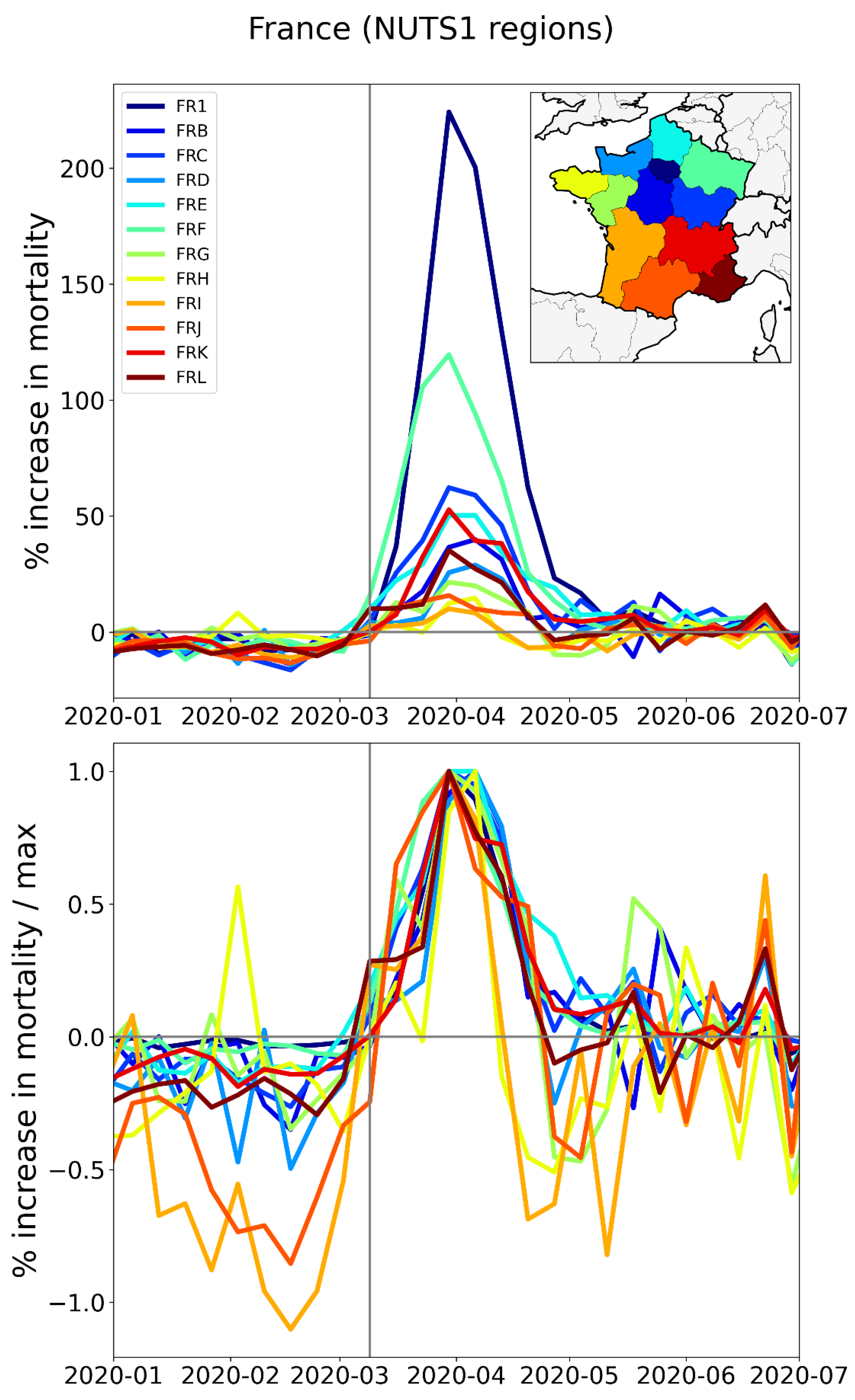
Figure 20.
Top panel: weekly P-scores during the first-peak period for the NUTS1 regions of Belgium, color coded as per the map in the inset. Bottom panel: same as top panel, with each curve scaled by its maximum. Vertical grey lines indicate the week of the WHO’s pandemic declaration of 2020-03-11.
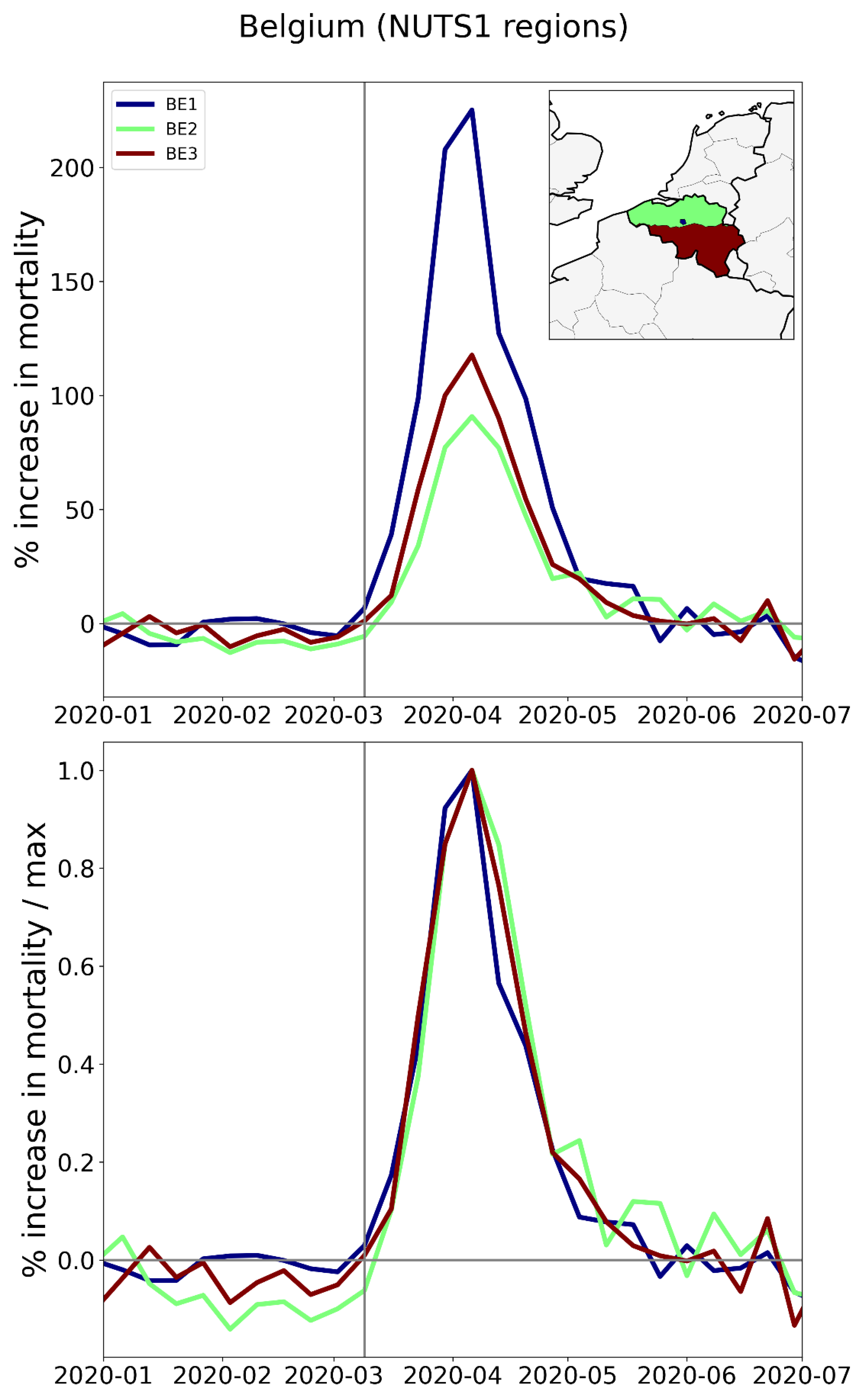
Figure 21.
Top panel: weekly P-scores during the first-peak period for the NUTS1 regions of the Netherlands, color coded as per the map in the inset. Bottom panel: same as top panel, with each curve scaled by its maximum. Vertical grey lines indicate the week of the WHO pandemic declaration.
Figure 21.
Top panel: weekly P-scores during the first-peak period for the NUTS1 regions of the Netherlands, color coded as per the map in the inset. Bottom panel: same as top panel, with each curve scaled by its maximum. Vertical grey lines indicate the week of the WHO pandemic declaration.
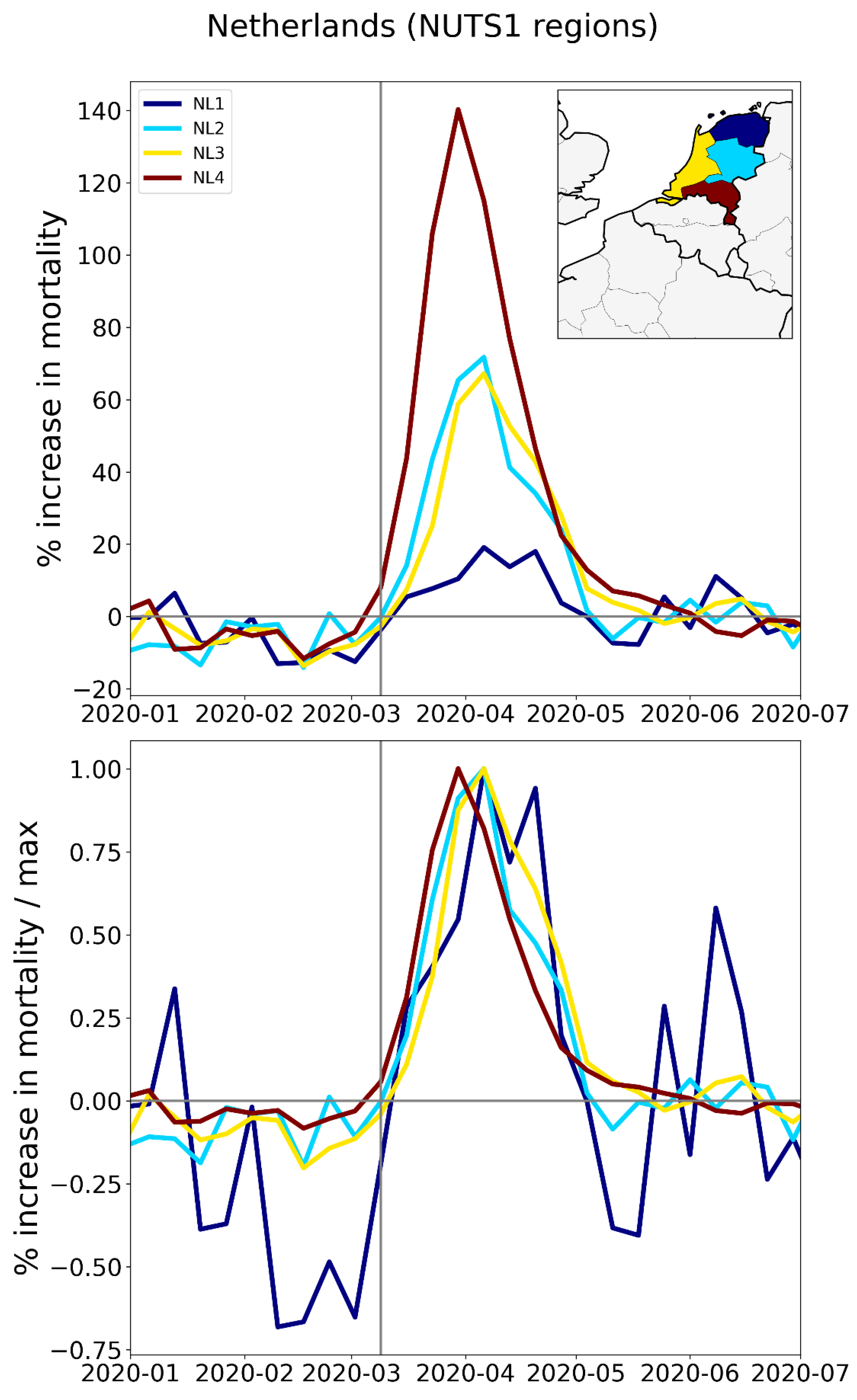
Figure 22.
Top panel: weekly P-scores during the first-peak period for the NUTS1 regions of the UK, color coded as per the map in the inset. Bottom panel: same as top panel, with each curve scaled by its maximum. Vertical grey lines indicate the week of the WHO’s pandemic declaration of 2020-03-11.
Figure 22.
Top panel: weekly P-scores during the first-peak period for the NUTS1 regions of the UK, color coded as per the map in the inset. Bottom panel: same as top panel, with each curve scaled by its maximum. Vertical grey lines indicate the week of the WHO’s pandemic declaration of 2020-03-11.
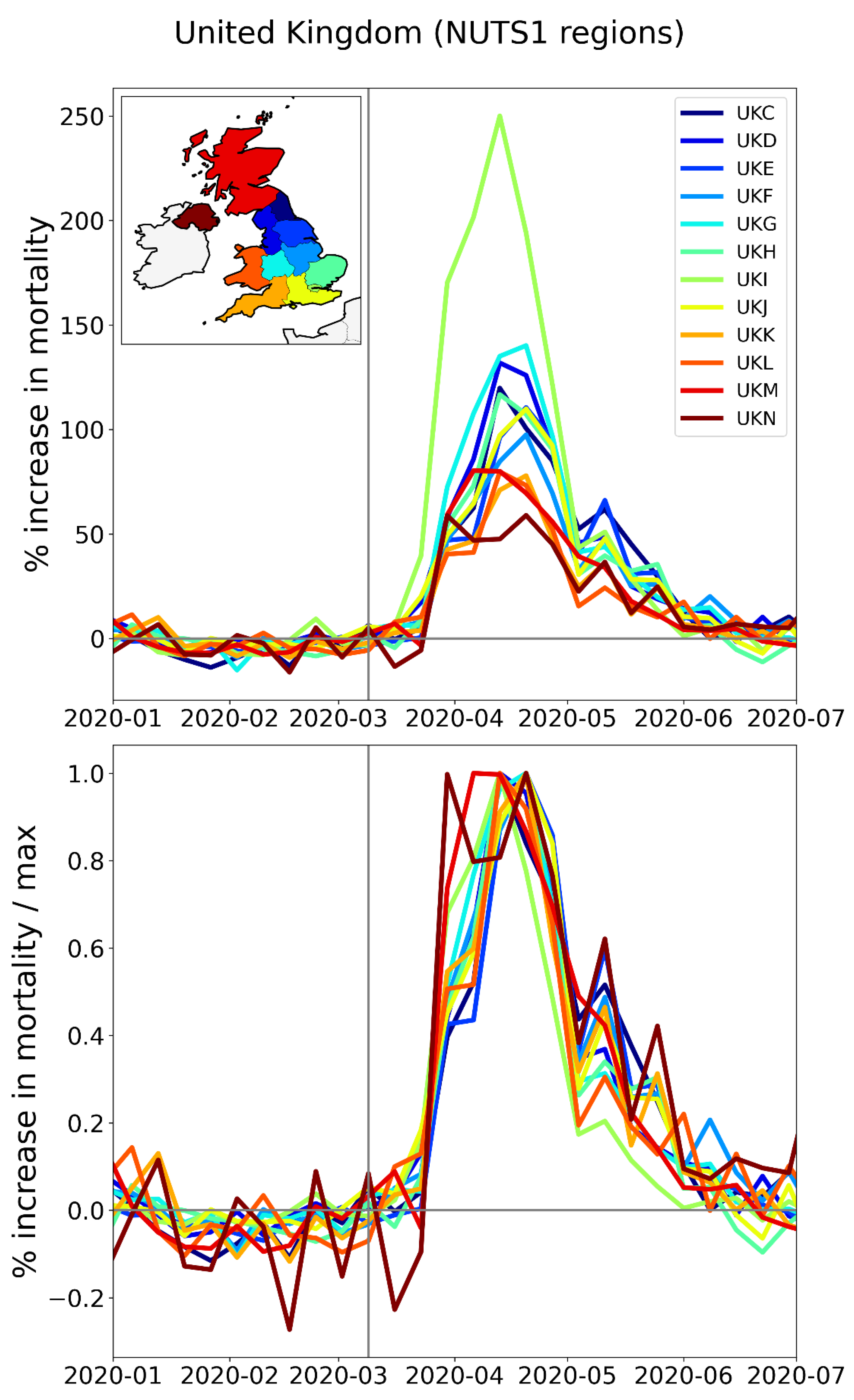
Figure 23.
Top panel: weekly P-scores during the first-peak period for the NUTS1 regions of Sweden, color coded as per the map in the inset. Bottom panel: same as top panel, with each curve scaled by its maximum. Vertical grey lines indicate the week of the WHO’s pandemic declaration of 2020-03-11.
Figure 23.
Top panel: weekly P-scores during the first-peak period for the NUTS1 regions of Sweden, color coded as per the map in the inset. Bottom panel: same as top panel, with each curve scaled by its maximum. Vertical grey lines indicate the week of the WHO’s pandemic declaration of 2020-03-11.
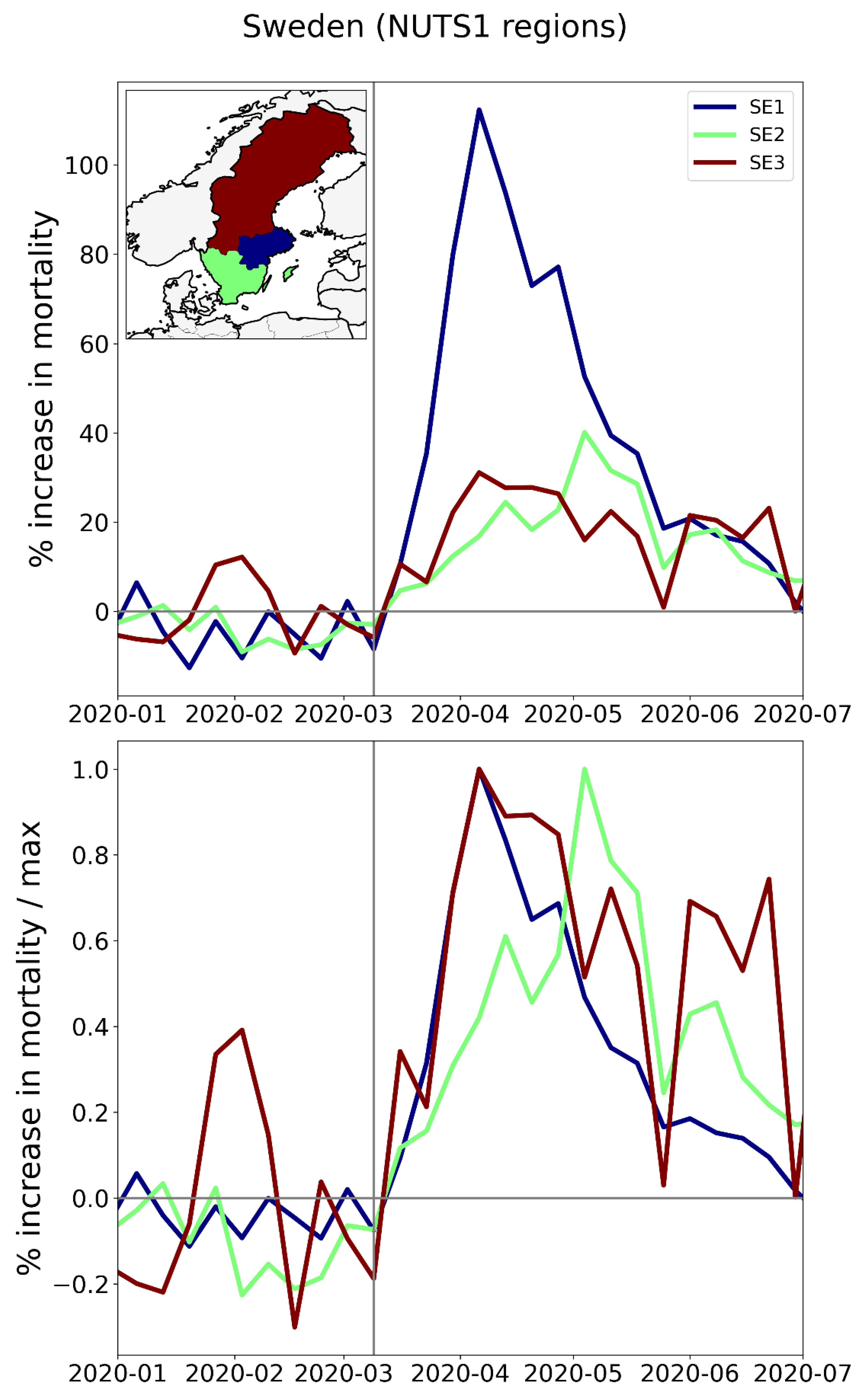
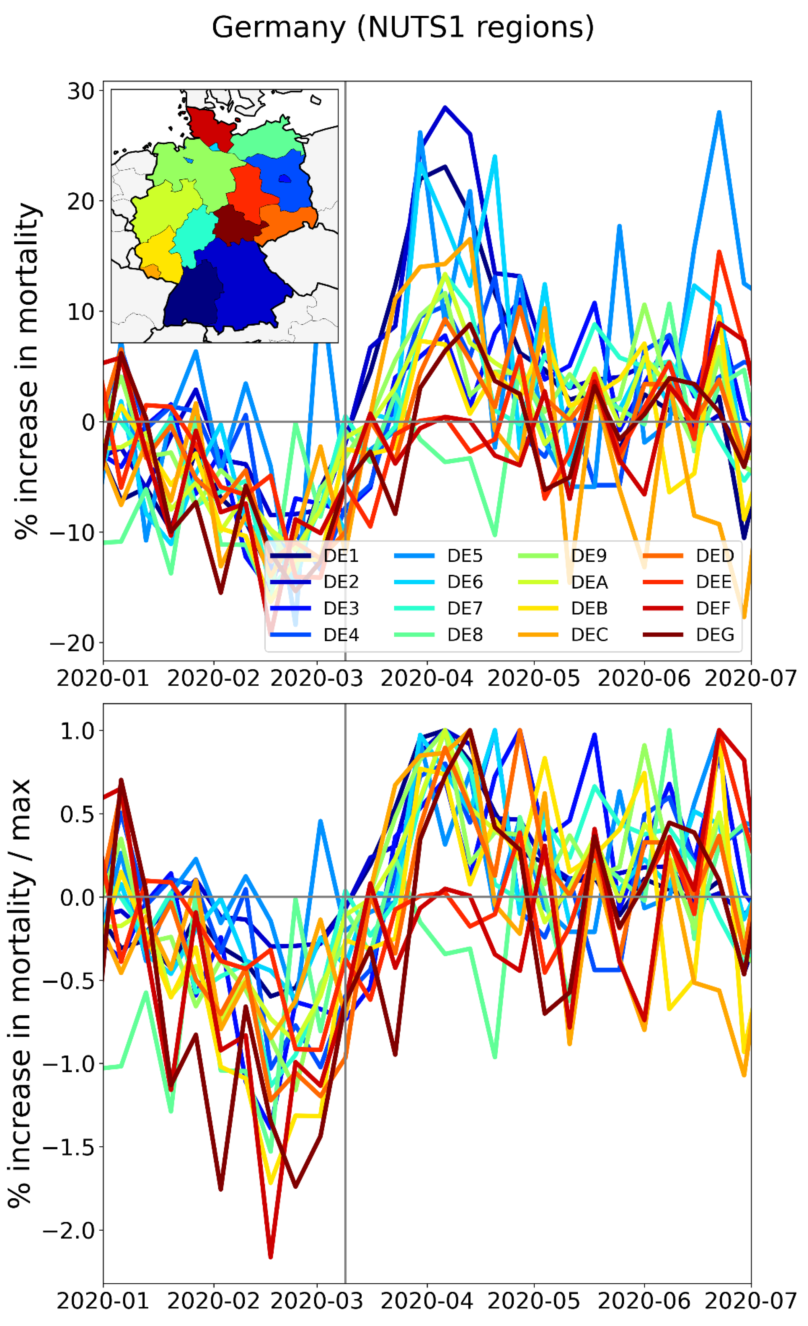
Figure 24.
Top panel: weekly P-scores during the first-peak period for the NUTS1 regions of Germany, color coded as per the map in the inset. Bottom panel: same as top panel, with each curve scaled by its maximum. Vertical grey lines indicate the week of the WHO’s pandemic declaration of 2020-03-11.
2.2.3. Europe – NUTS2 Level Subnational Regions
The features of the F-peaks described in Section 3.3.2 for the NUTS1 regions of particular European countries — large variation in peak height combined with essentially synchronous peak timing and essentially the same peak widths — are also observed at the finer NUTS2 geographic resolution. This is shown in Figure 25 to Figure 32.
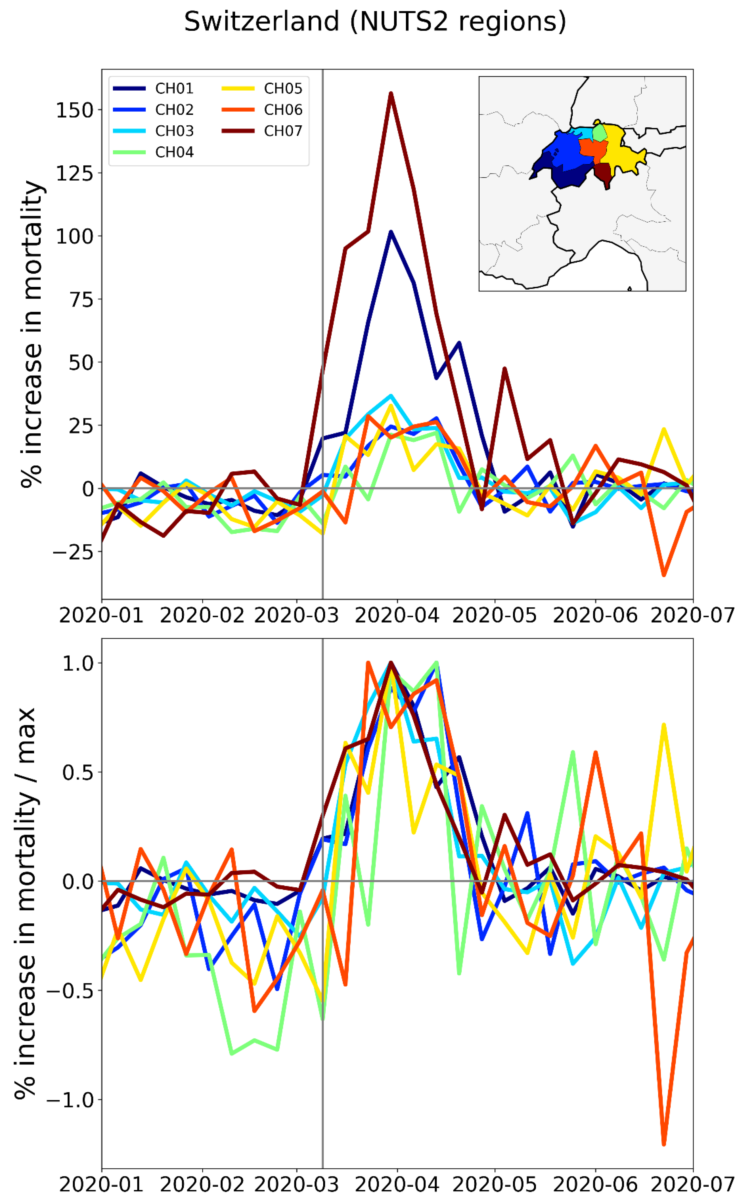
In this section, we include a figure for Switzerland (Figure 32) in place of Germany, since we do not have data for the NUTS2 regions of Germany, and since Switzerland has a prominent F-peak.
Figure 25.
Top panel: weekly P-scores during the first-peak period for the NUTS2 regions of Italy, color coded as per the map in the inset. Bottom panel: same as top panel, with each curve scaled by its maximum. Vertical grey lines indicate the week of the WHO’s pandemic declaration of 2020-03-11.
Figure 25.
Top panel: weekly P-scores during the first-peak period for the NUTS2 regions of Italy, color coded as per the map in the inset. Bottom panel: same as top panel, with each curve scaled by its maximum. Vertical grey lines indicate the week of the WHO’s pandemic declaration of 2020-03-11.
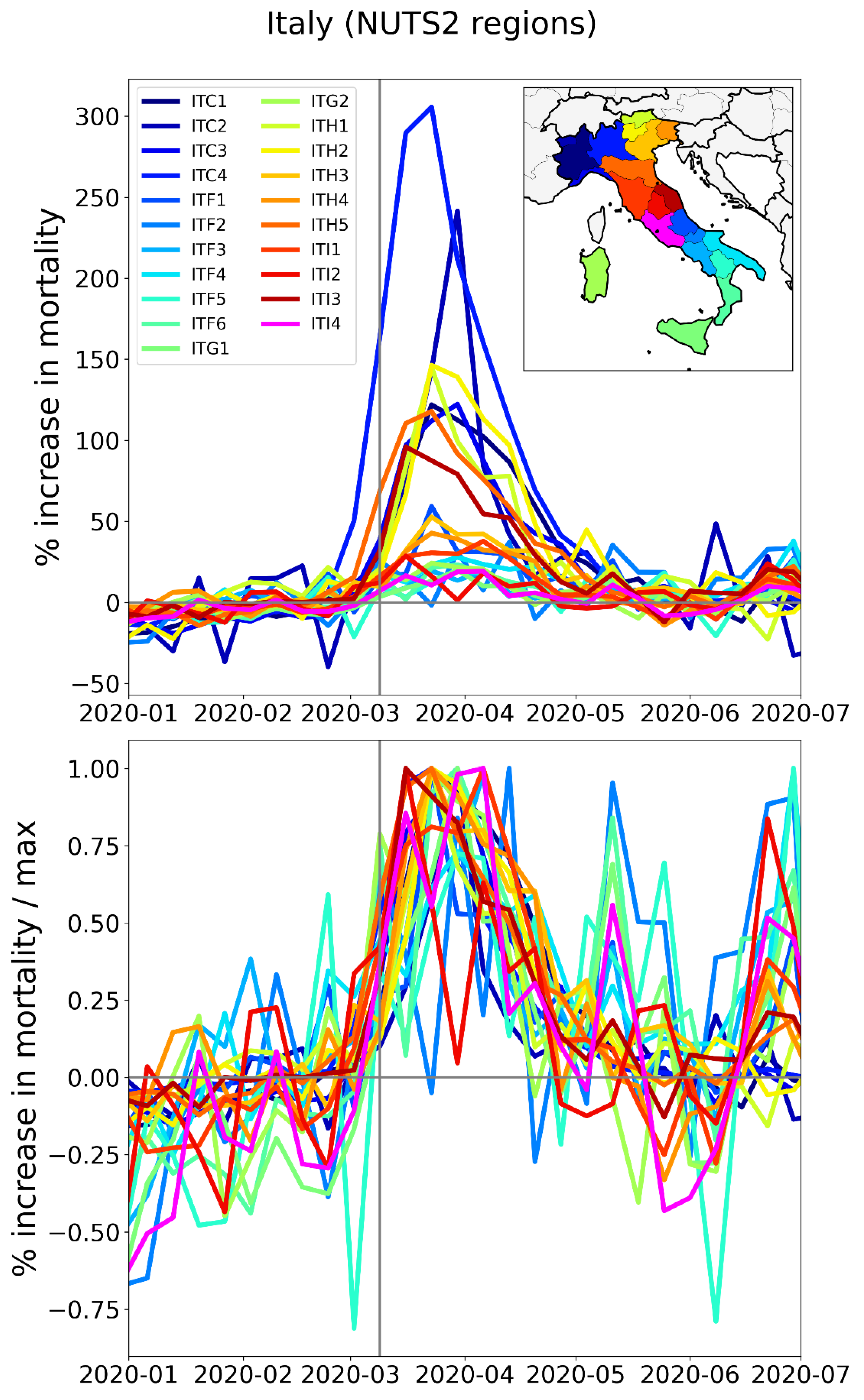
Figure 26.
Top panel: weekly P-scores during the first-peak period for the NUTS2 regions of Spain, color coded as per the map in the inset. Bottom panel: same as top panel, with each curve scaled by its maximum. Vertical grey lines indicate the week of the WHO’s pandemic declaration of 2020-03-11.
Figure 26.
Top panel: weekly P-scores during the first-peak period for the NUTS2 regions of Spain, color coded as per the map in the inset. Bottom panel: same as top panel, with each curve scaled by its maximum. Vertical grey lines indicate the week of the WHO’s pandemic declaration of 2020-03-11.
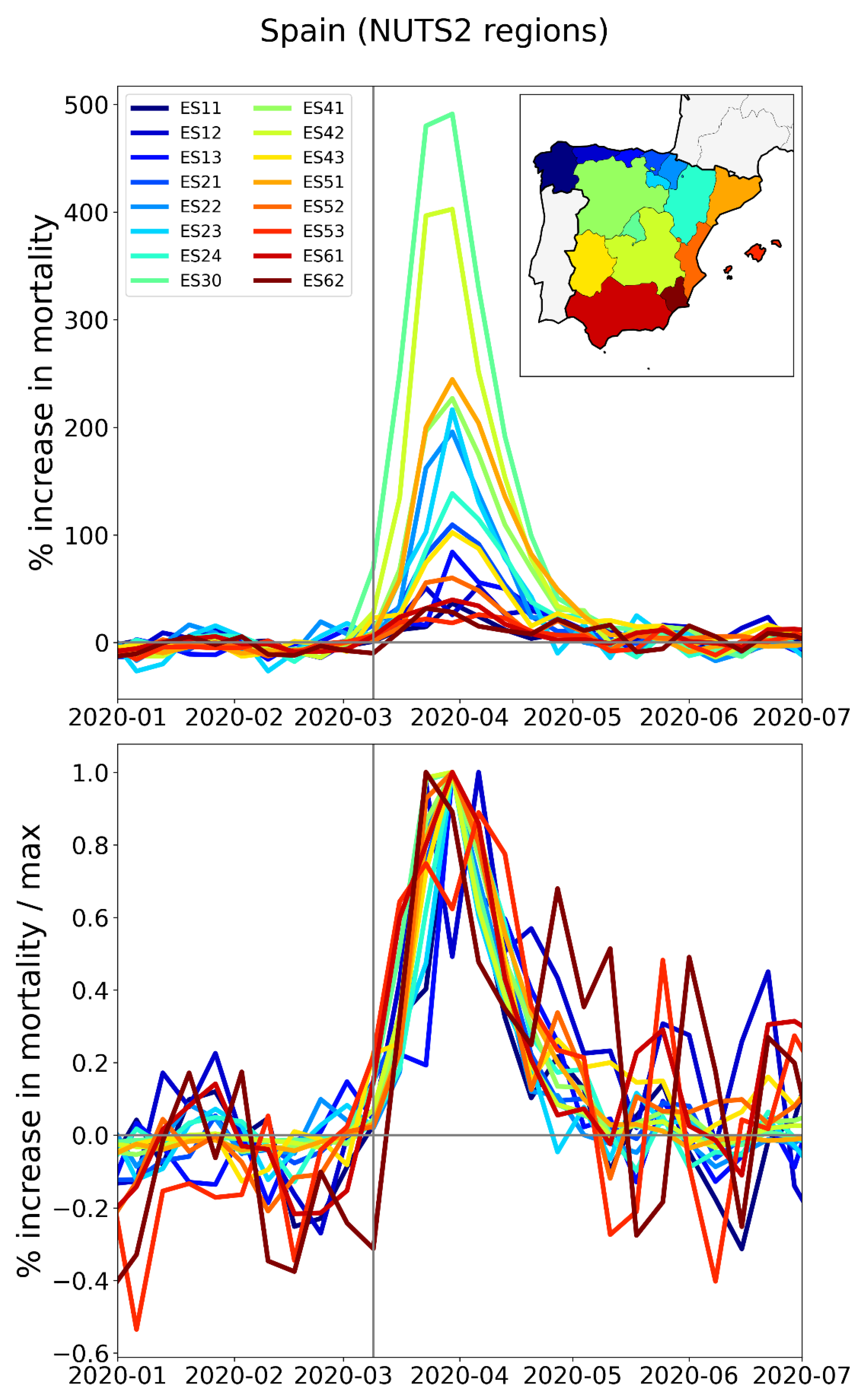
Figure 27.
Top panel: weekly P-scores during the first-peak period for the NUTS2 regions of France, color coded as per the map in the inset. Bottom panel: same as top panel, with each curve scaled by its maximum. Vertical grey lines indicate the week of the WHO’s pandemic declaration of 2020-03-11.
Figure 27.
Top panel: weekly P-scores during the first-peak period for the NUTS2 regions of France, color coded as per the map in the inset. Bottom panel: same as top panel, with each curve scaled by its maximum. Vertical grey lines indicate the week of the WHO’s pandemic declaration of 2020-03-11.
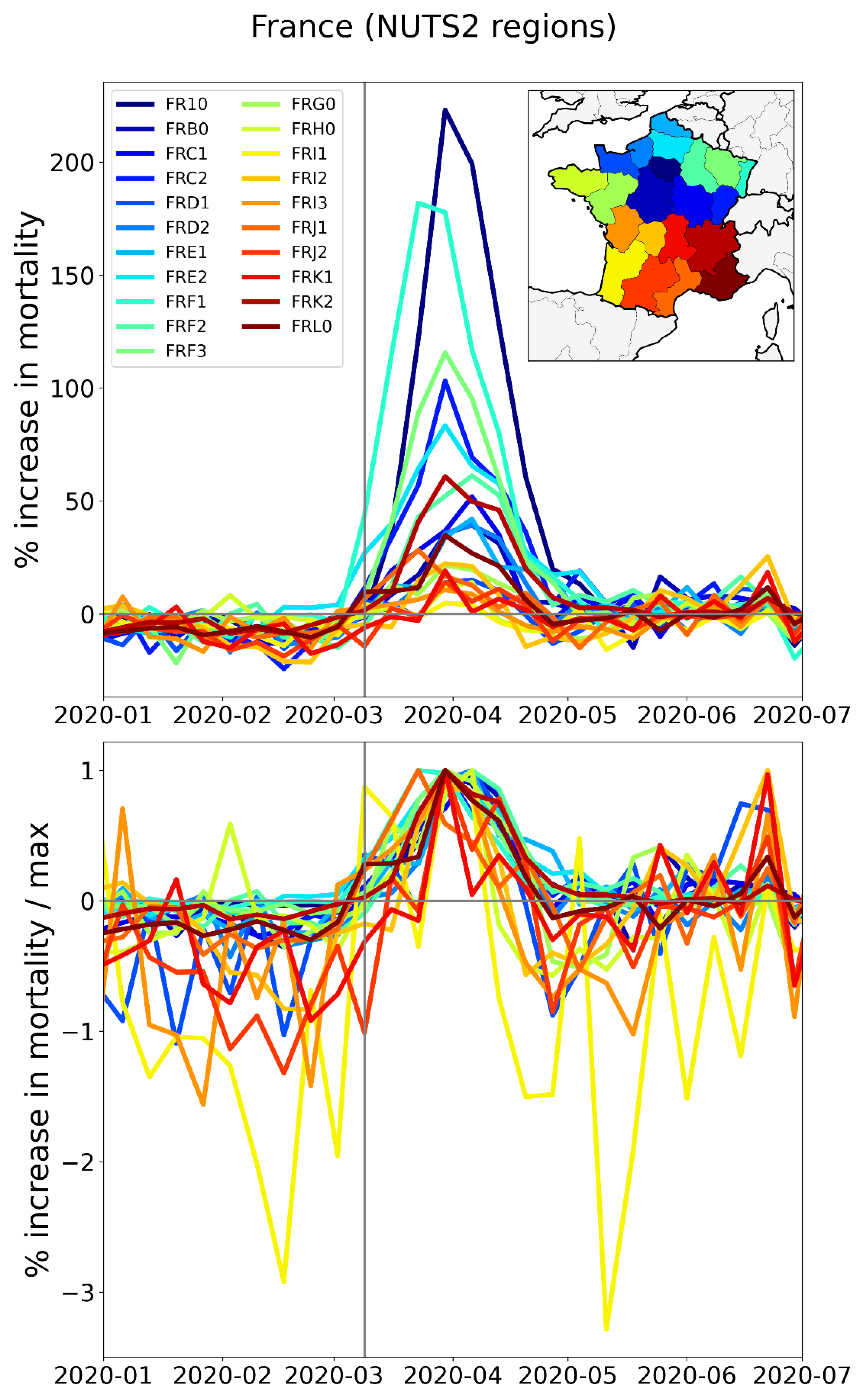
Figure 28.
Top panel: weekly P-scores during the first-peak period for the NUTS2 regions of Belgium, color coded as per the map in the inset. Bottom panel: same as top panel, with each curve scaled by its maximum. Vertical grey lines indicate the week of the WHO’s pandemic declaration of 2020-03-11.
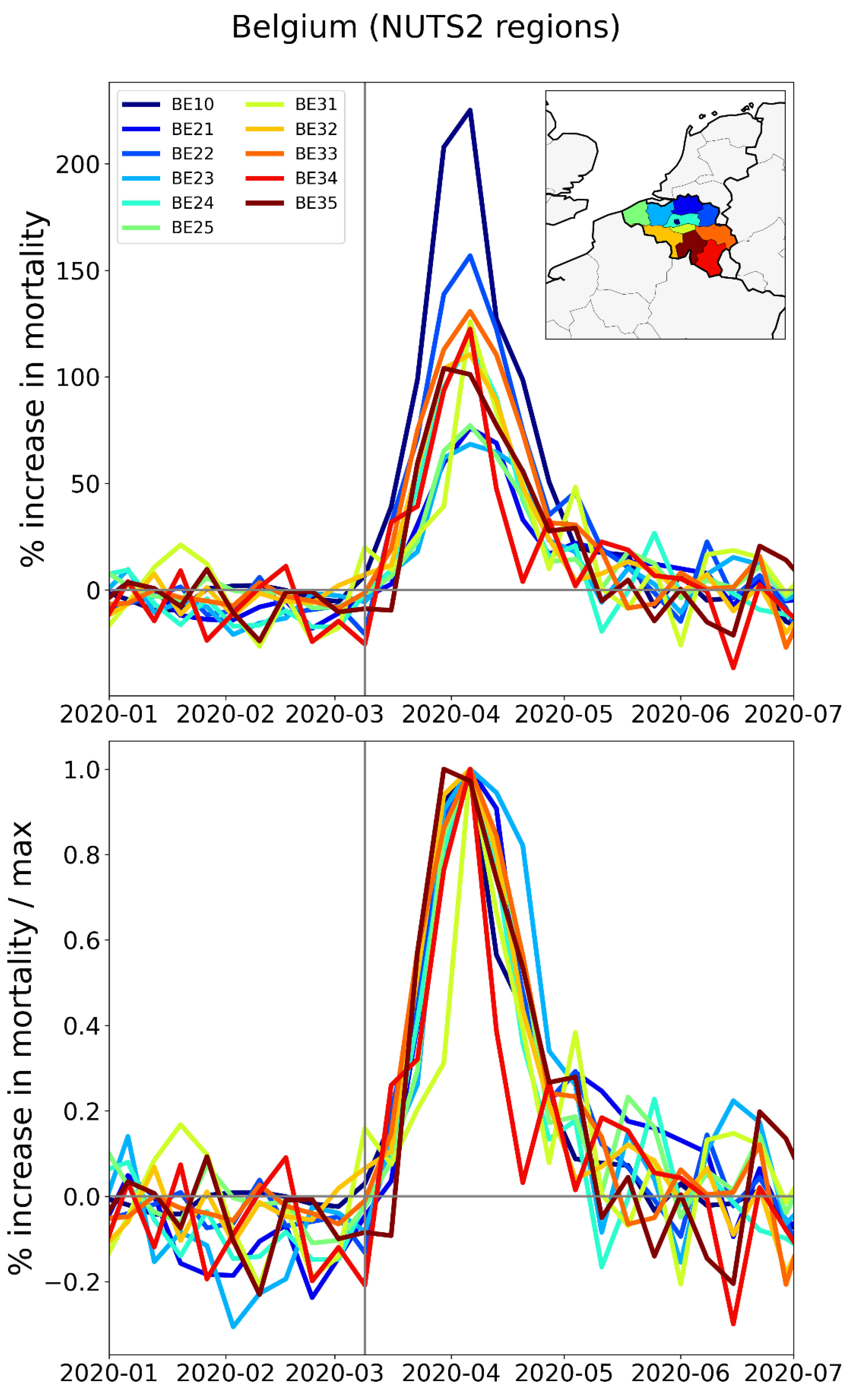
Figure 29.
Top panel: weekly P-scores during the first-peak period for the NUTS2 regions of the Netherlands, color coded as per the map in the inset. Bottom panel: same as top panel, with each curve scaled by its maximum. Vertical grey lines indicate the week of the WHO pandemic declaration.
Figure 29.
Top panel: weekly P-scores during the first-peak period for the NUTS2 regions of the Netherlands, color coded as per the map in the inset. Bottom panel: same as top panel, with each curve scaled by its maximum. Vertical grey lines indicate the week of the WHO pandemic declaration.
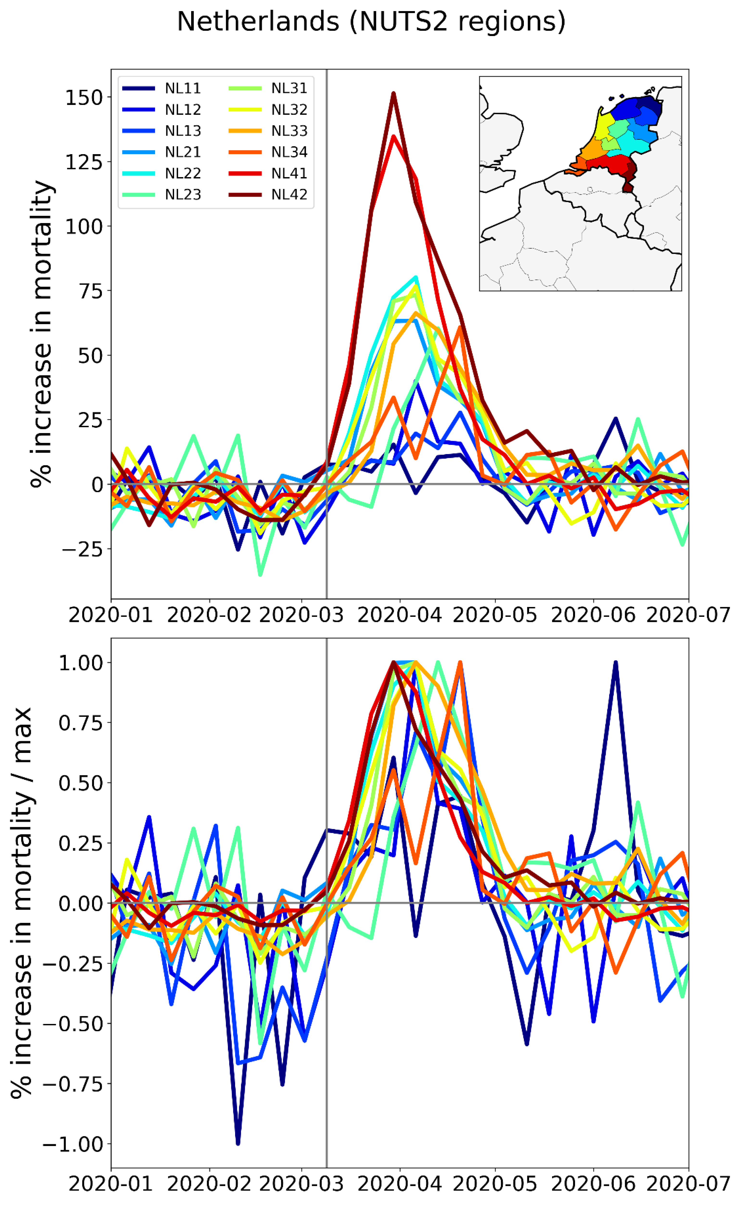
Figure 30.
Top panel: weekly P-scores during the first-peak period for the NUTS2 regions of the UK, color coded as per the map in the inset. Bottom panel: same as top panel, with each curve scaled by its maximum. Vertical grey lines indicate the week of the WHO’s pandemic declaration of 2020-03-11.
Figure 30.
Top panel: weekly P-scores during the first-peak period for the NUTS2 regions of the UK, color coded as per the map in the inset. Bottom panel: same as top panel, with each curve scaled by its maximum. Vertical grey lines indicate the week of the WHO’s pandemic declaration of 2020-03-11.
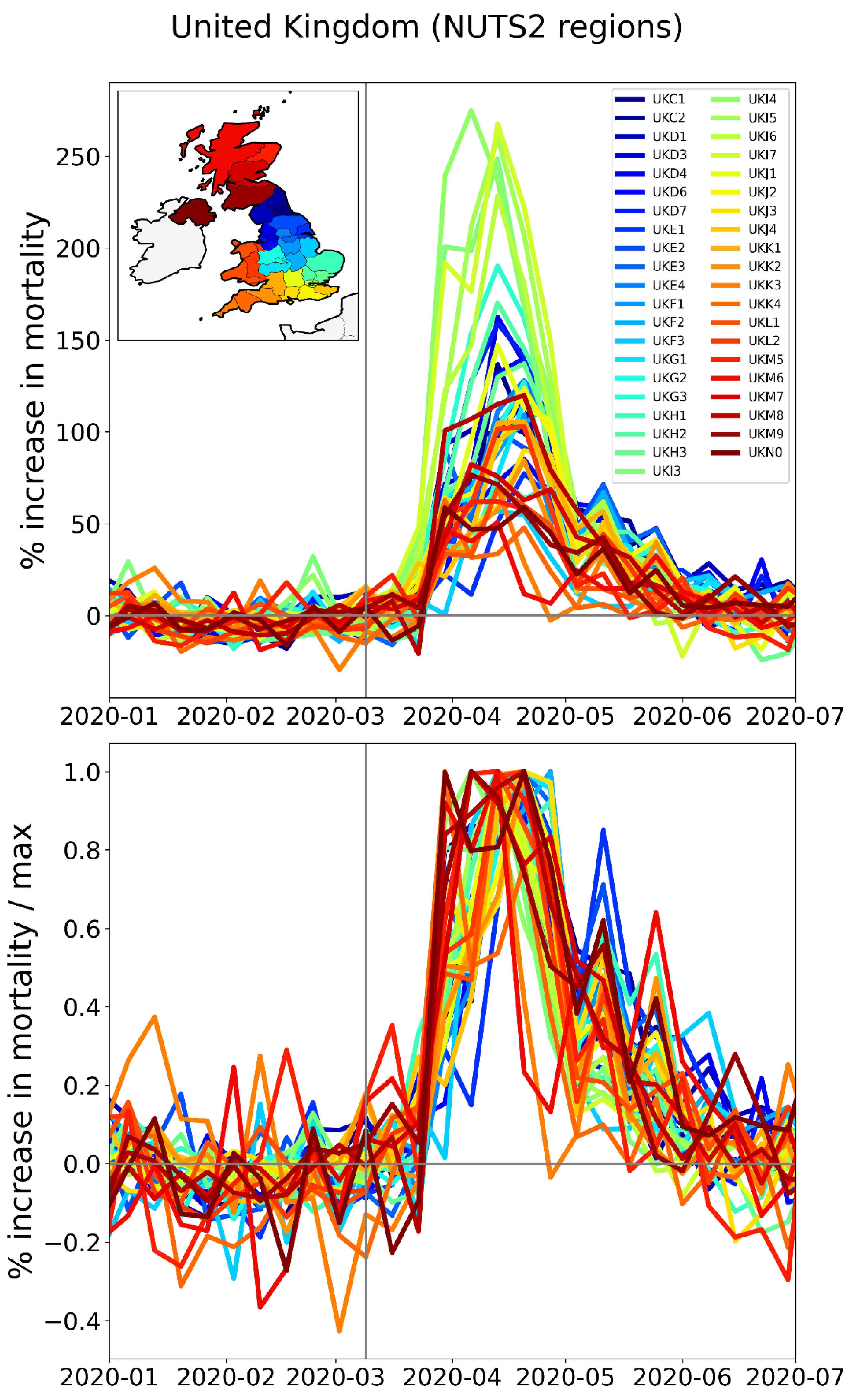
Figure 31.
Top panel: weekly P-scores during the first-peak period for the NUTS2 regions of Sweden, color coded as per the map in the inset. Bottom panel: same as top panel, with each curve scaled by its maximum. Vertical grey lines indicate the week of the WHO’s pandemic declaration of 2020-03-11.
Figure 31.
Top panel: weekly P-scores during the first-peak period for the NUTS2 regions of Sweden, color coded as per the map in the inset. Bottom panel: same as top panel, with each curve scaled by its maximum. Vertical grey lines indicate the week of the WHO’s pandemic declaration of 2020-03-11.
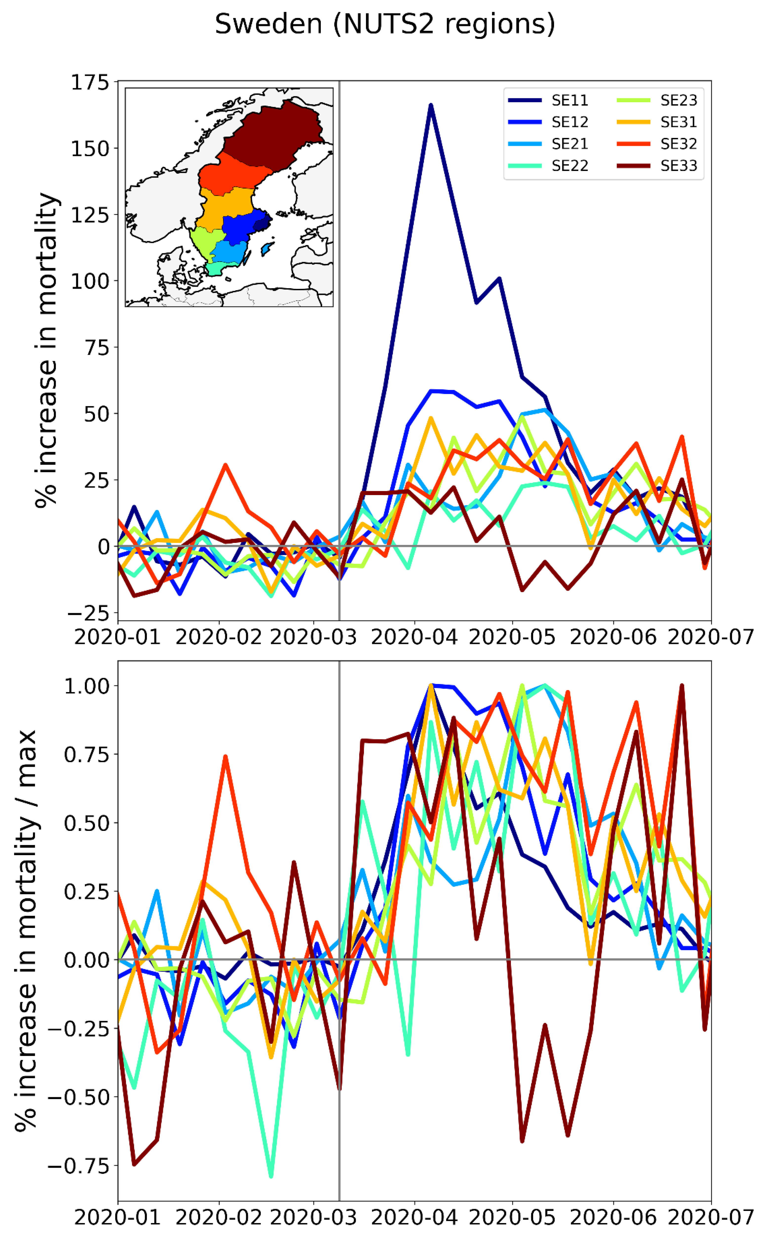
Figure 32.
Top panel: weekly P-scores during the first-peak period for the NUTS2 regions of Switzerland, color coded as per the map in the inset. Bottom panel: same as top panel, with each curve scaled by its maximum. Vertical grey lines indicate the week of the WHO pandemic declaration.
Figure 32.
Top panel: weekly P-scores during the first-peak period for the NUTS2 regions of Switzerland, color coded as per the map in the inset. Bottom panel: same as top panel, with each curve scaled by its maximum. Vertical grey lines indicate the week of the WHO pandemic declaration.
2.2.4. Europe – International Border Regions (NUTS1 Level)
In addition to examining how the size and timing of F-peaks compare for different subnational regions within a particular country, it is also interesting to compare subnational regions that are in different countries but which border one another.
We therefore make plots of the type used in Section 3.3.1, Section 3.3.2, and Section 3.3.3 for the NUTS1 subnational regions on both sides of Germany’s borders with the Netherlands, Belgium, Luxembourg, and France (Figure 33), on Spain’s borders with Portugal (Figure 35) and with France (Figure 36), and on Italy’s borders with France, Switzerland, Austria, and Slovenia (Figure 38).
The top panel of Figure 33 has a map with the NUTS1 regions along Germany’s western border (black and grey), and the NUTS1 regions in France (blue), Luxembourg (light blue), Belgium (yellow), and the Netherlands (red) that share an international border with the western German states.
At the national (NUTS0) level, Germany had low first-peak period excess mortality (see Figure 2). This is also true for Germany’s NUTS1 regions on its western border, as can be seen from the graphs of weekly P-scores in the middle panel of Figure 33 (black and grey curves). In contrast, bordering NUTS1 regions in the Netherlands, Belgium and France had large F-peaks, with peak heights reaching to more than a factor of five times larger (NL4 = South Netherlands) than the peak height of the German western border state with the largest F-peak height (DE1 = Baden-Wurtemburg).
Figure 33.
Top panel: Map of the bordering NUTS1 regions in Germany (black and grey), France (blue), Luxembourg (light blue), Belgium (yellow) and the Netherlands (red). Middle panel: weekly P-scores during the first-peak period for the regions shown in the top panel. Lower panel: same as middle panel, with each curve scaled by its maximum. Vertical grey lines in the lower two panels indicate the week of the WHO’s pandemic declaration of 2020-03-11.
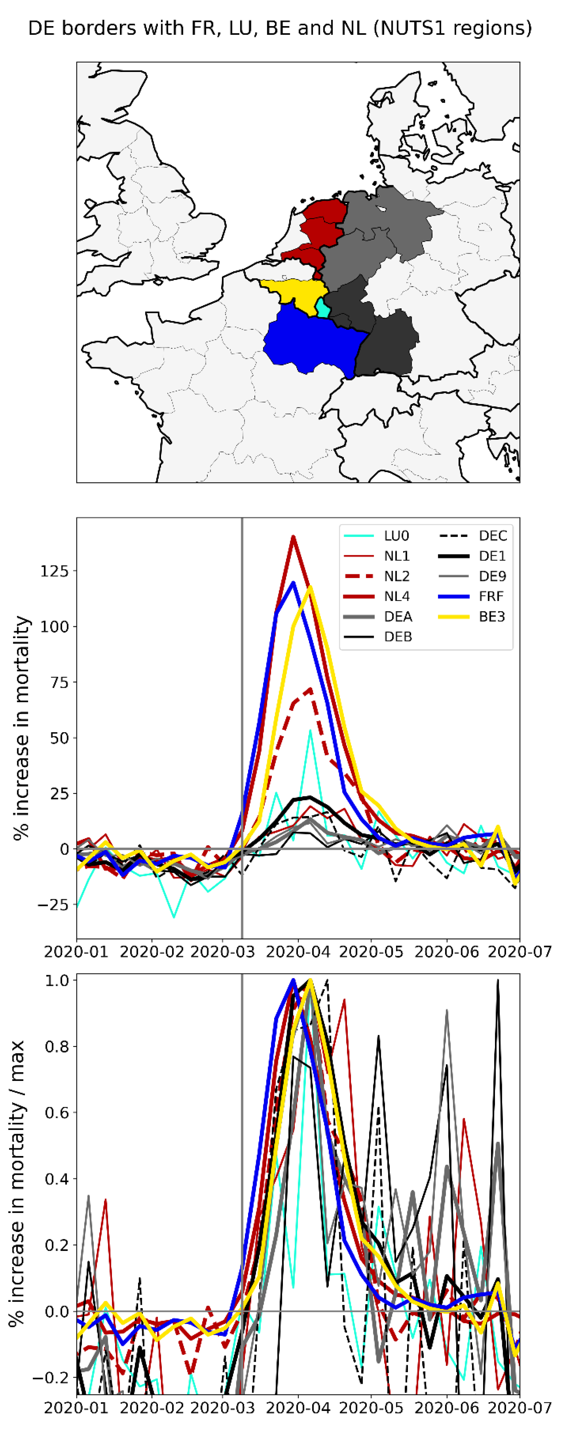
The bottom panel of Figure 33 shows the same data as the middle panel, with each curve scaled by its maximum. As can be seen, the F-peak in the French region FRF (Grand Est) slightly preceded the peaks of the other regions shown in the figure. The rise-side half-maximum date for FRF is equal to one week after the week of the pandemic declaration, while the rise-side half-maximum date for the Belgian NUTS1 border region BE3 (Wallonia) is equal to two weeks after the week of the pandemic declaration. The F-peaks in the German regions DE1 (thick solid black lines in middle and bottom panels, most southwestern black-shaded state in the top panel of Figure 33), DEC (dashed black lines, smallest black-shaded state), and DE9 (thin grey lines, northern grey-shaded state) had rise-side half-maximum dates equal to the rise-side half-maximum dates of the Belgian region BE3. The German NUTS1 region DEB arguably did not have an F-peak (thin solid black line in the middle panel of Figure 33, northernmost black-shaded state), and the rise-side half-maximum date for the German NUTS1 region DEA (thick grey line, southern grey-shaded state) is equal to about three weeks after the week of the pandemic declaration.
The widths (FWHM) of the peaks for FRF, BE3, NL1, NL2, NL4, DE1 and DEC are all equal to about four weeks, while the FWHM for DEA and DE9 are equal to about three weeks. The data for LU0 is too noisy to make a reliable measurement of the FWHM and DEB arguably did not have an F-peak.
Main striking observations from Figure 33 include:
- All the western border regions of Germany had small first-peak period excess mortality. No border regions of Germany had large excess mortality peaks during the first-peak period.
- The German NUTS1 region DEB (Rhineland-Palatinate: thin solid black lines in middle and bottom panels, northern black-shaded region in top panel) essentially did not have an F-peak, whereas bordering NUTS1 regions in France (FRF) and Belgium (BE3) had large F-peaks and large integrated first-peak period P-scores (see Figure 3)
- The other four German NUTS1 regions had F-peaks with the same or nearly the same widths as, but with significantly smaller (up to more than five times smaller) peak heights than, the regions that share borders with them in France, Belgium, and the Netherlands. The Dutch NUTS1 region NL1 (North Netherlands: thin red lines, northernmost red-shaded region) is similar to the German regions in that it had a small F-peak height, whereas the other two Dutch NUTS1 border regions NL2 (East Netherlands: dashed red lines, middle red-shaded region) — which shares an internal border with NL1 — and NL4 (South Netherlands: thick solid red lines, southernmost red-shaded region) had large peak heights.
- The F-peaks in the bordering regions of the four countries France, Belgium, the Netherlands, and Germany all had essentially the same width (FWHM) while having significantly different peak heights.
The area of Europe covered by the shaded NUTS1 regions in the top panel of Figure 33 is the most densely-populated multi-national region on the European mainland, as can be seen from the map of NUTS2-region population densities in Figure 4. There are no mountain ranges or significant geographic barriers separating the countries in this area, all countries are in the Schengen zone (no passport controls when crossing the border) and a high volume of cross-international-border traffic normally occurs on a daily basis including daily commuters across the international borders (Eurostat, 2021).
During the first-peak period (March-May of 2020), border control measures were put in place. For example, Germany limited road travel into and out of the country to only essential travel such as for employment or commercial transportation (Amaro, 2020). The control measures at Germany’s border with the Netherlands were voluntary, due to the critical importance of avoiding delays in goods transport from the Netherlands to Germany, and the volume of cross-border vehicular traffic decreased to about half its pre-COVID (January and February 2020) level in March-May of 2020, according to monitoring of cross-border traffic by the Dutch province of Gelderland, which is located in the NL2 (“East Netherlands”) NUTS2 region (van der Velde et al., 2021).
A study using Facebook data on daily international border crossings in Europe showed that traffic across Luxembourg’s borders with each of Belgium, France and Germany decreased by 75% compared to its pre-COVID level, during the first-peak period of 2020 (Docquier et al., 2022).
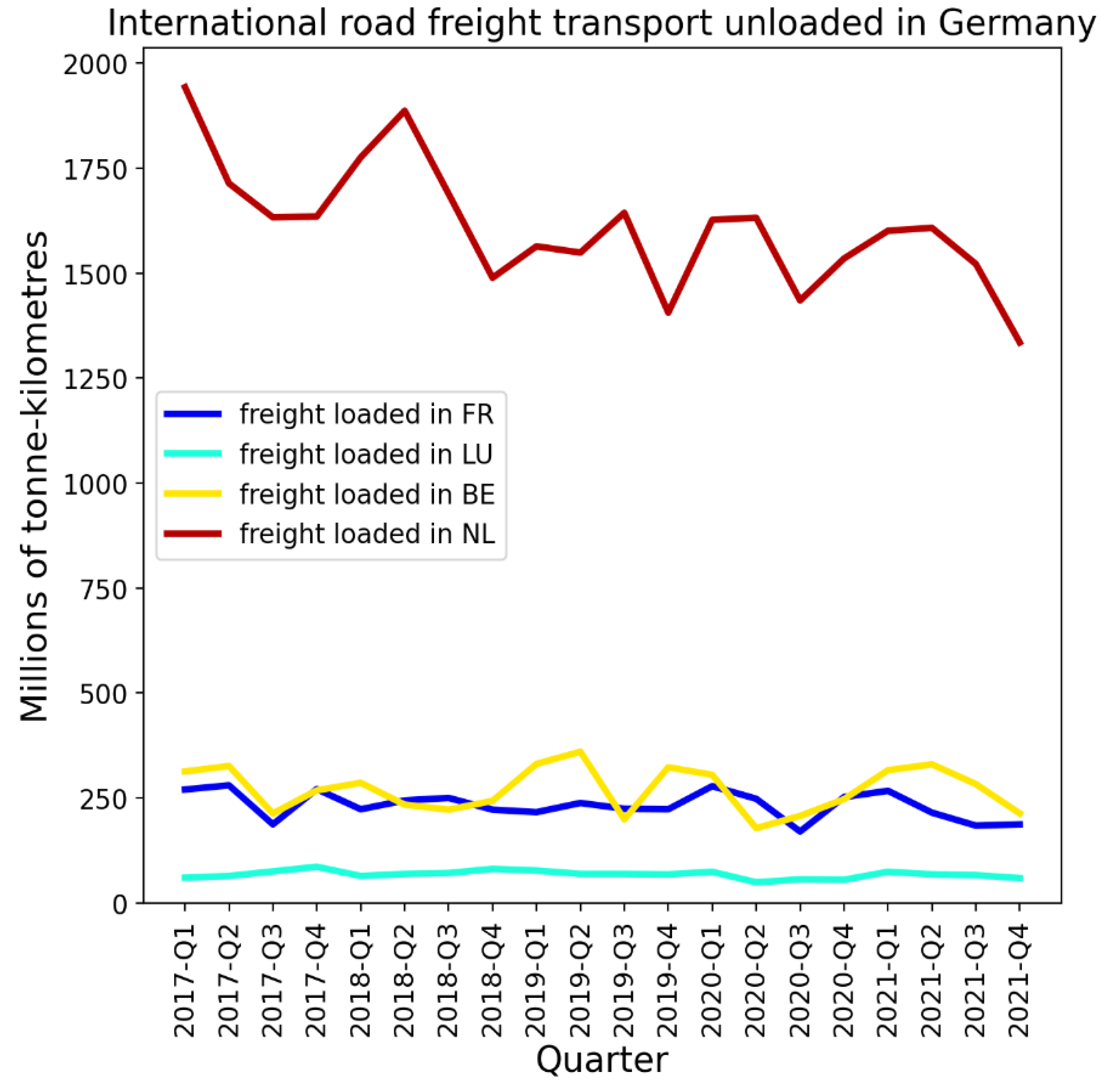
The volume of road freight transport loaded in each of the Netherlands, Belgium, Luxembourg or France and unloaded in Germany was essentially the same in the first two quarters of 2020 as in the first two quarters of 2019, as shown in Figure 34.
Figure 34.
Millions of tonnes-kilometres of international road freight transport loaded in each of the Netherlands, Belgium, France, and Luxembourg and unloaded in Germany, by economic quarter. Data from Eurostat (2024e).
Figure 34.
Millions of tonnes-kilometres of international road freight transport loaded in each of the Netherlands, Belgium, France, and Luxembourg and unloaded in Germany, by economic quarter. Data from Eurostat (2024e).
There was thus a significant volume of traffic that entered Germany via its northwest borders during the first-peak period of 2020.
Figure 35 shows results for the NUTS1 regions on Spain’s border with Portugal.
Figure 35.
Top panel: Map of the bordering NUTS1 regions in Spain (grey) and Portugal (blue). Middle panel: weekly P-scores during the first-peak period for the regions shown in the top panel. Lower panel: same as middle panel, with each curve scaled by its maximum. Vertical grey lines in the lower two panels indicate the week of the WHO’s pandemic declaration of 2020-03-11.
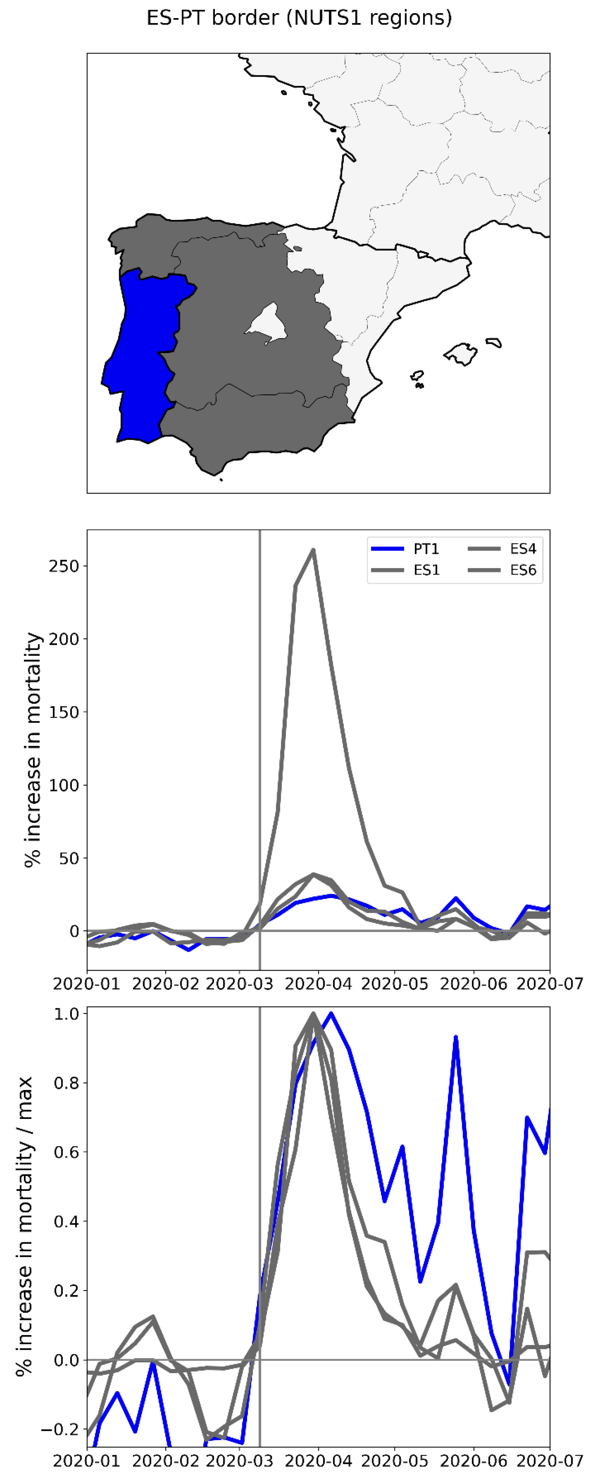
The peak for Spain’s ES4 region (central grey-shaded region in the top panel of Figure 35) towers over the peaks for the other two Spanish regions and continental Portugal (PT1). The rise-side half-maximum dates for all four regions were equal to the week after the week of the pandemic declaration, showing a synchronous emergence of the peaks. While the FWHM was essentially the same for the three Spanish NUTS1 regions (between three and four weeks), the FWHM for the bordering Portuguese NUTS1 region was larger, between six and seven weeks long.
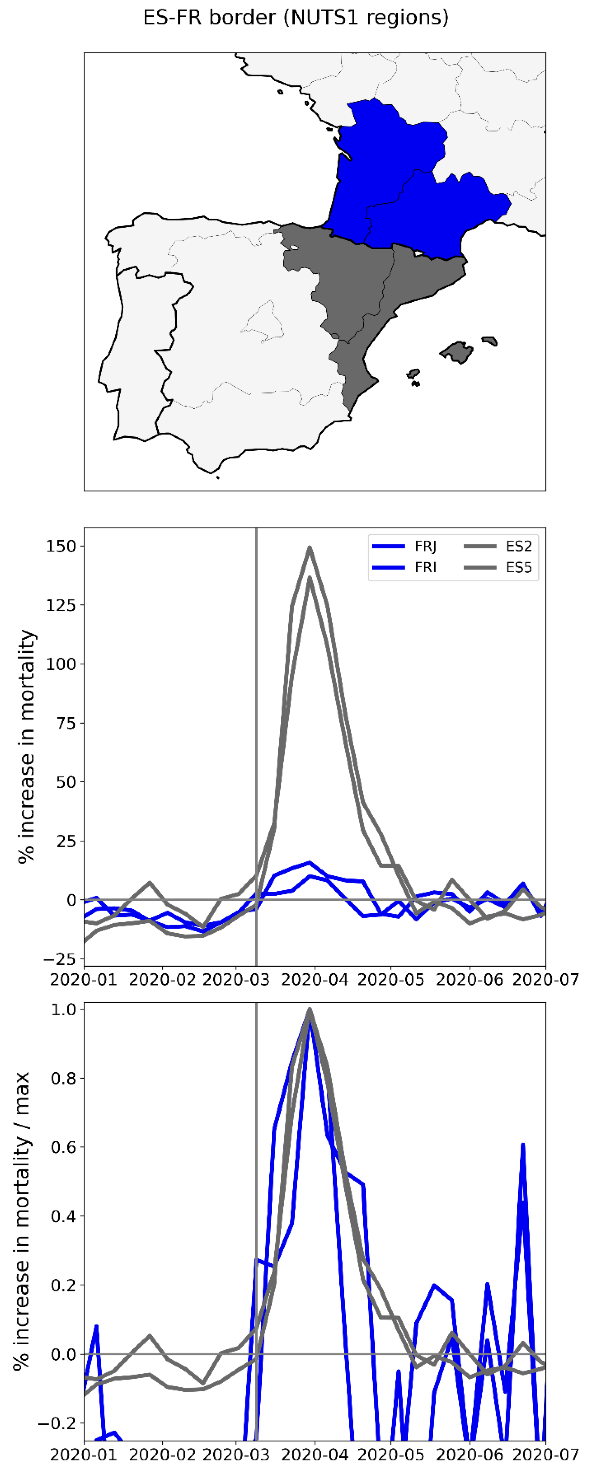
Figure 36 shows results for the NUTS1 regions on Spain’s border with France. Here, the two Spanish NUTS1 regions have large F-peaks, whereas the two bordering regions in southwestern France had relatively very small (almost negligible) peaks.
Figure 36.
Top panel: Map of the bordering NUTS1 regions in Spain (grey) and France (blue). Middle panel: weekly P-scores during the first-peak period for the regions shown in the top panel. Bottom panel: same as middle panel, with each curve scaled by its maximum. Vertical grey lines in the lower two panels indicate the week of the WHO’s pandemic declaration of 2020-03-11.
Despite strict mobility measures applied in Spain, the volume of traffic across Spain’s international borders remained well above zero during March-May of 2020. For example, the volume of road freight transport loaded in Spain and unloaded in France was not substantially decreased in the first and second quarters of 2020 compared to the same time period in 2019 and 2018, whereas the volume of road freight transport loaded in Spain and unloaded in Portugal decreased by about 50% in the first two quarters of 2020 compared to the first two quarters of 2018 and 2019 (see Figure 37).
Figure 37.
Millions of tonnes-kilometres of international road freight transport loaded in Spain and unloaded in each of Portugal and France, by economic quarter. Data from Eurostat (2024f).
Figure 37.
Millions of tonnes-kilometres of international road freight transport loaded in Spain and unloaded in each of Portugal and France, by economic quarter. Data from Eurostat (2024f).
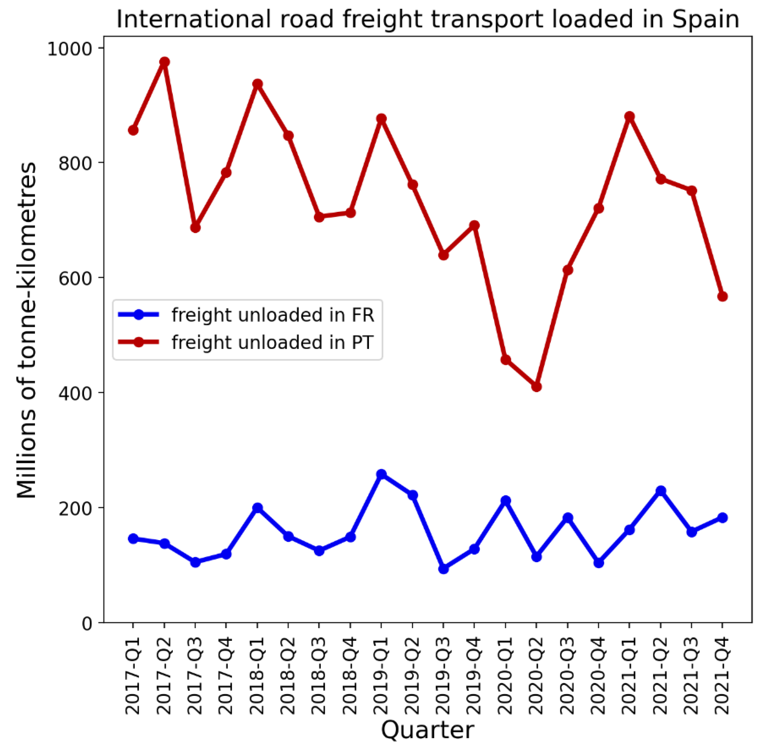
Figure 38 shows the NUTS1 regions along Italy’s northern border with France, Switzerland, Austria, and Slovenia. Here (bottom panel) we can see that the large peaks in Italy’s two northern NUTS1 regions preceded the F-peaks in the bordering regions in France and Switzerland. However, the same cannot be said about the Austrian border regions, which had relatively small F-peaks, with rise-side half-maximum dates occurring less than one week after that of the Italian regions. Slovenia, which borders Italy to the northeast, did not have an F-peak (the NUTS1 region for Slovenia, SI0, covers the entire country).
Figure 38.
Top panel: Map of the bordering NUTS1 regions in Italy (black and grey) and France (blue), Switzerland (red), Austria (light blue), and Slovenia (yellow). Middle panel: weekly P-scores during the first-peak period for the regions shown in the top panel. Lower panel: same as middle panel, with each curve scaled by its maximum. Vertical grey lines in the lower two panels indicate the week of the WHO’s pandemic declaration of 2020-03-11.
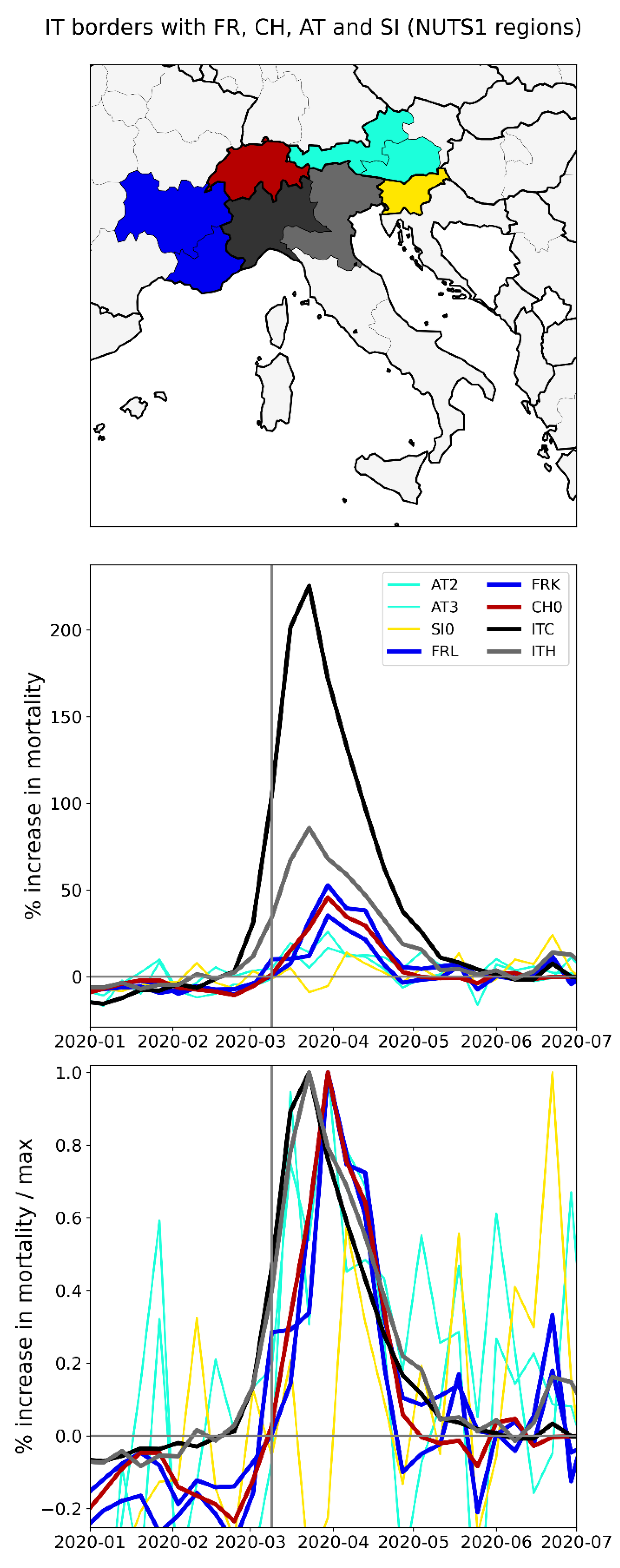
A study using Facebook data on daily border crossings showed that traffic across Italy’s borders with each of France, Switzerland, Austria, and Slovenia decreased by 75% compared to its pre-COVID level, during the first-peak period of 2020 (Docquier et al., 2022).
The volume of road freight traffic loaded in Italy and unloaded in each of France, Switzerland, Austria, and Slovenia was not substantially reduced during the first-peak period of 2020 (see Figure 39).
There were thus large differences in excess mortality between the northern regions of Italy and those they border in France, Switzerland, Austria, and Slovenia, despite significant cross-border traffic during the first-peak period of 2020.
A more detailed examination of differences in excess mortality within large-population subnational regions within Italy, including Lombardy in the north and Lazio in the south, is contained in Section 3.4.1.
Before addressing Italy in more detail, we first examine the timing of F-peaks in the United States, at the state and county level, in Sections 3.3.5 and 3.3.6.
2.2.5. USA States
There is large heterogeneity in integrated first-peak period P-score values across USA states, as is shown in the heatmap in Figure 9. In this section, we compare the timing of the F-peaks in different states using graphs of weekly P-scores during the first-peak period.
Figure 40 shows the weekly P-scores for the four states with the highest integrated first-peak period P-scores: New York, New Jersey, Connecticut, and Massachusetts. The figure additionally includes Pennsylvania, which neighbours New York and New Jersey and had relatively moderate first-peak period excess mortality.
The rise-side half-maximum date for New York and New Jersey is approximately two weeks after the week of the March 11, 2020 pandemic declaration, and the rise-side half-maximum date for Connecticut, Massachusetts, and Pennsylvania is approximately three weeks after the week of the March 11, 2020 pandemic declaration.
The FWHM for New York is about 4 weeks, for New Jersey it is about 5 weeks, and for Connecticut, Massachusetts, and Pennsylvania the FWHM is almost 6 weeks long.
Figure 41 shows the same thing as Figure 40, with Pennsylvania replaced by the District of Columbia (DC) and Rhode Island. Figure 41 thus shows the six states with the largest first-peak period integrated P-scores.
As can be seen in Figure 41, the rise-side half-maximum date for DC is about three weeks after the week of the pandemic declaration (as for Connecticut and Massachusetts) and the rise-side half-maximum date for Rhode Island is about five weeks after the week of the pandemic declaration.
The FWHM for DC is about 7 weeks, and the FWHM for Rhode Island is about 4 weeks.
Figure 40 and Figure 41 therefore show that there were some differences in the timing and width of F-peaks in states with large integrated first-peak period P-scores, similar to the case of the European countries examined in Section 3.3.1.
The timing of F-peaks for USA states is summarized in the map in the top panel of Figure 42, which shows the rise-side half-maximum dates for USA states with discernible F-peaks.
A state’s F-peak was considered discernible if the state’s integrated first-peak period P-score divided by its (1σ) error had a value of 3 or greater. A table of integrated first-peak period P-scores, 1σ error values, P-score / error ratios and rise-side half-maximum dates is included in Appendix D.1, and graphs showing weekly P-scores and weekly scaled P-scores for all USA states are included in Appendix A.2.
As can be seen from Figure 42, the majority of states with discernable F-peaks (28 of 36 = 78%) had rise-side half-maximum dates within one week of that of New York, i.e. within 1-3 weeks of the week of the pandemic declaration.
As can also be seen from Figure 42, the 13 states with identical rise-side half-maximum dates to New York, have a wide range of integrated first-peak period P-score values (bottom panel of Figure 42), extending from barely discernible to very large (New Jersey). Most of these states are far from New York. For example, Figure 43 shows a selection of four USA states that are geographically distant but which had identically-timed F-peaks: New York, Michigan, Louisiana and California.
As can be seen in Figure 43 (middle panel), Michigan and Louisiana had large excess mortality peaks that were nonetheless dwarfed by that of New York, while California had discernible but relatively small first-peak period excess mortality. The rise-side half-maximum date for all four states is the same (slightly more than two weeks after the week of the pandemic declaration). The FWHM for New York and Louisiana is the same, about 4 weeks, while the FWHM for Michigan was about 5 weeks long.
The difference in excess mortality outcomes between New York and California is striking. Both states have large populations and urban areas, and both received significant air traffic volumes from China and East Asia in 2019 and early 2020, which is examined further in Section 3.4.2.
Appendix A.2 contains additional figures showing the time-evolution of weekly P-scores for all USA states, organized in geographic subsets corresponding to USA census divisions. The figures in Appendix A.2 further demonstrate the high degree of heterogeneity in excess mortality patterns during the first-peak period. While several states had well-defined F-peaks, others either had essentially no first-peak period excess mortality, or significant excess mortality that did not exhibit a clearly defined peak, but rather extended beyond the first-peak period, similar to the case of California in Figure 43. Several states had relatively low excess mortality during the first-peak period, followed by higher excess mortality in the summer of 2020 (e.g. Texas, Alabama, Arkansas, Arizona, California, Florida, Georgia, Mississippi, Nevada, and South Carolina). The latter instances of high excess mortality in the summer of 2020 are shown in Appendix A.3, which contains graphs of weekly P-scores for each USA state for January to December of 2020.
2.2.6. USA Counties
In this section we examine F-peaks at the level of USA counties. We focus on the counties within certain particular states that exhibited large F-peaks at the state level.
We find that, for the counties within a particular state, the county-level F-peaks, when they are present, are essentially synchronous.
Figure 44 shows results for the counties of New York State. As can be seen from the top-left and middle-left panels of Figure 44, large F-peaks were confined to the New York City urban area. The said peaks occurred in synchrony, as can be seen from the top-right (scaled) panel of the figure. Among the counties with large F-peaks, integrated first-peak period (March-May 2020) P-scores generally increased with population density (estimates from the 5-Year American Community Survey for 2017-2021) (lower-left panel of Figure 44) and with percent of the county’s population living in poverty (estimates from the 5-Year American Community Survey for 2014-2018) (lower-right panel of Figure 44). These correlations are examined in more detail in Section 3.6.1.
Figure 45 shows results for the counties of New Jersey. As can be seen, counties in the northern part of New Jersey had large F-peaks, especially the counties in the northeast of the state, which are within the New York City urban area. The peaks for the said northern counties rise and fall in synchrony, as can be seen from the top-right panel of the figure. The counties in the southern part of New Jersey had significantly smaller F-peaks, several of which occurred later in time than the peaks of the northern counties.
Similar to the case for New York State, among the New Jersey counties with large excess mortality peaks, integrated first-peak period P-scores generally increased with population density (lower-left panel) and with percent of the county’s population living in poverty (lower-right panel).
Figure 46 shows results for the counties of Connecticut. Similar to the case for New Jersey, the largest peaks occurred in the counties within the New York City urban area, here in the western part of the state. The said western-county peaks rose and fell essentially in synchrony. Two low-population density counties in the eastern part of the state had smaller F-peaks that occurred later than the large peaks in the west.
For Connecticut, integrated first-peak period P-score increased with population density (lower-left panel), and there is a weak association between P-score and poverty (lower-right panel).
Figure 47 shows results for the counties of Massachusetts.
The picture here is similar to the case of New Jersey and Connecticut, in that the largest F-peaks occurred in the higher-population density counties, which in this case are around the urban area of Boston. The said Boston-area peaks rose and fell essentially in synchrony. Three lower-population density counties outside of the Boston area (in the centre of the state and on the Cape Code peninsula in the south-east) had smaller F-peaks that occurred later in time; however, several other low population density counties that were far from Boston (e.g. Hampden County, in bright yellow) had F-peaks that occurred in synchrony with the peaks of the Boston area.
The relationship between county-level P-scores and various socioeconomic variables, including population density and poverty, are explored further in section 3.6.1, along with maps showing the geographic variation of the socioeconomic variables. The figures in section 3.6.1 include scatter plots for the counties of New York, New Jersey, Connecticut and Massachusetts, allowing a closer comparison of the relationship between integrated first-peak period P-score and socioeconomic variables in these four states, three of which contain parts of the New York City urban area. For example, from the figures and maps in section 3.6.1, it can be seen that integrated first-peak period P-score has a non-linear relationship with poverty for these four states, because poverty is highest at the centres of the New York City and Boston urban areas (where first-peak P-scores were high), decreases moving away from the inner-city and into the suburbs (where first-peak P-scores were moderate), and then increases again moving beyond the suburbs and into the rural areas (where first-peak P-scores are low).
Figure 48 to Figure 53 show results for the counties of Pennsylvania, Michigan, and Louisiana. For each state, there is one figure showing results for all counties of the state, and a second figure showing the same results for only the 10 most populous counties in the state, to aid with visualization.
The F-peaks for counties with large excess mortality in these states rose and fell essentially in synchrony.
Integrated first-peak period P-scores generally increased with population density in these states (lower-left panels), although Louisiana had high integrated first-peak period P-scores in some lower population density counties.
The scatter plots for these states do not reveal a simple relationship between excess mortality and poverty, although we do note that the Pennsylvania’s county with the highest integrated first-peak period P-score (Philadelphia County, PA) also has the highest population density and percent living in poverty in the state, which is similar to the results for the New York City urban area, as explored further below in section 3.6.1.
Figure 48.
Top left: weekly P-scores for the counties of Pennsylvania. Top right: same as top left, with each curve scaled by its maximum. Middle left: map with counties colored as per the curves in top row and points in bottom row of panels. Middle right: heatmap showing integrated first-peak period (March-May 2020) P-score for each county. Bottom left: scatter plot of county integrated first-peak period P-score vs county population density. Bottom right: scatter plot of county integrated first-peak period P-score vs. county percent of population living in poverty. In the maps, dark grey (within Pennsylvania) indicates counties for which data was unavailable.
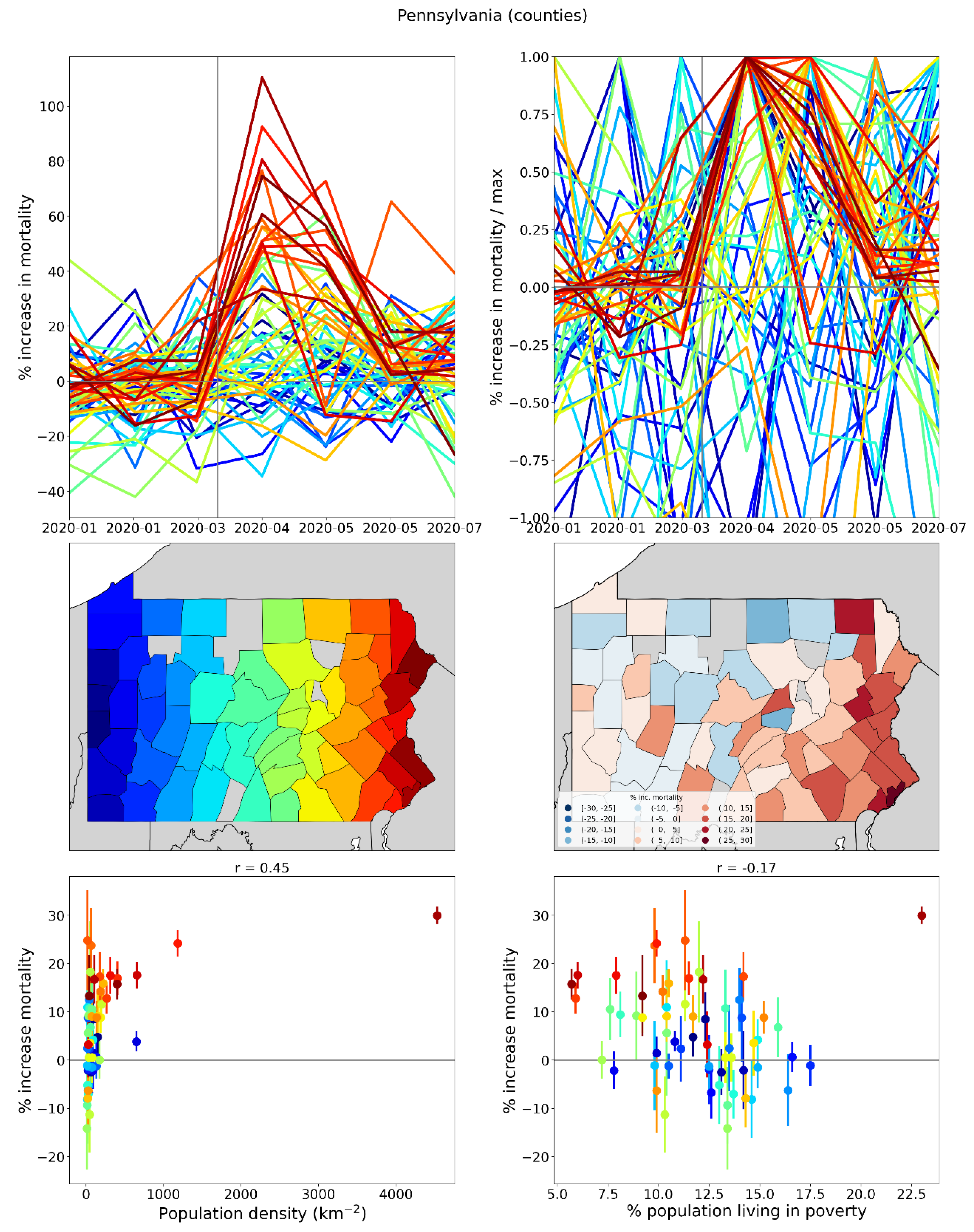
Figure 49.
Same as Figure 48, showing only the 10 most populous counties in Pennsylvania.
Figure 49.
Same as Figure 48, showing only the 10 most populous counties in Pennsylvania.
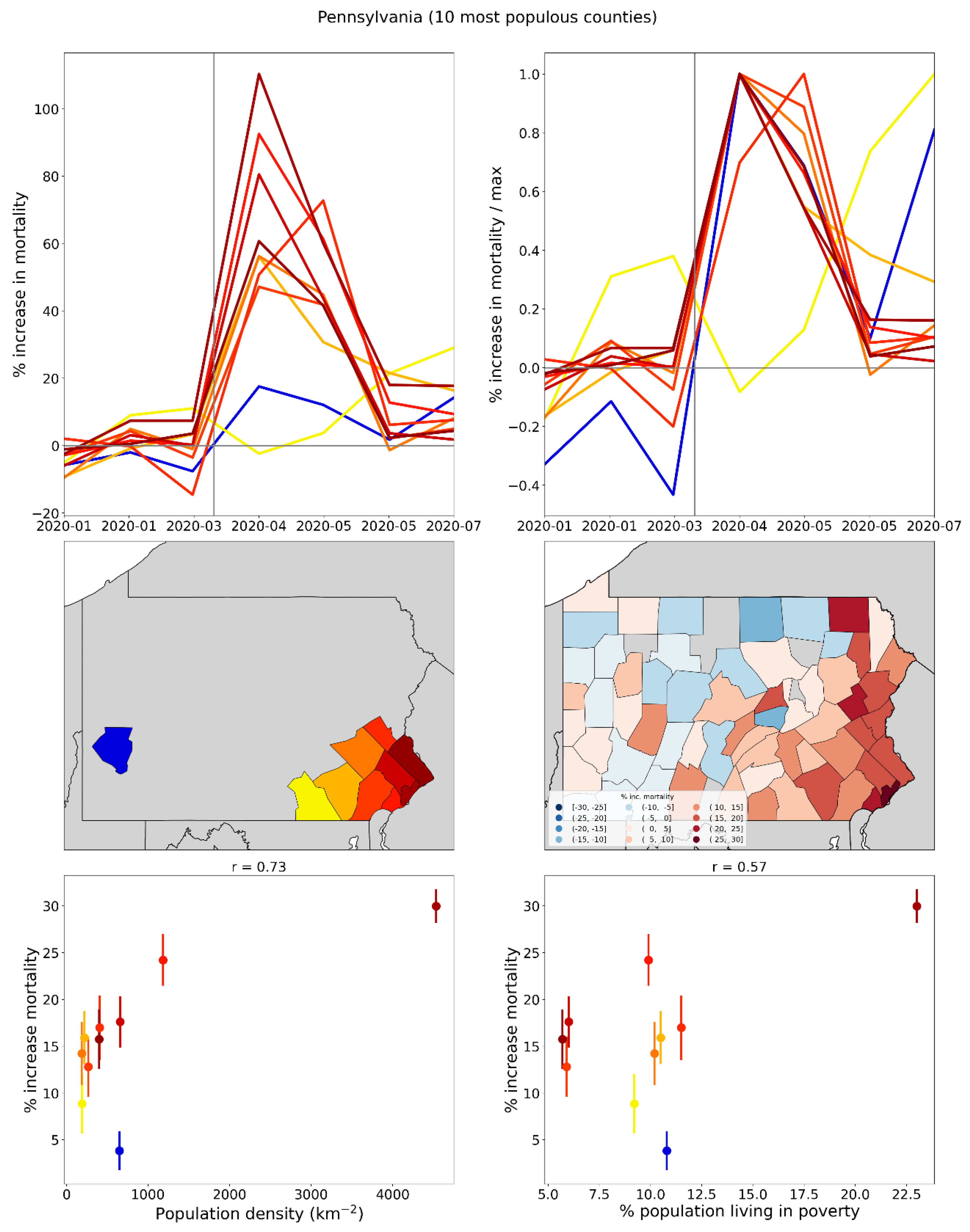
Figure 50.
Top left: weekly P-scores for the counties of Michigan. Top right: same as top left, with each curve scaled by its maximum. Middle left: map with counties colored as per the curves in top row and points in bottom row of panels. Middle right: heatmap showing integrated first-peak period (March-May 2020) P-score for each county. Bottom left: scatter plot of county integrated first-peak period P-score vs county population density. Bottom right: scatter plot of county integrated first-peak period P-score vs. county percent of population living in poverty. In the maps, dark grey (within Michigan) indicates counties for which data was unavailable.
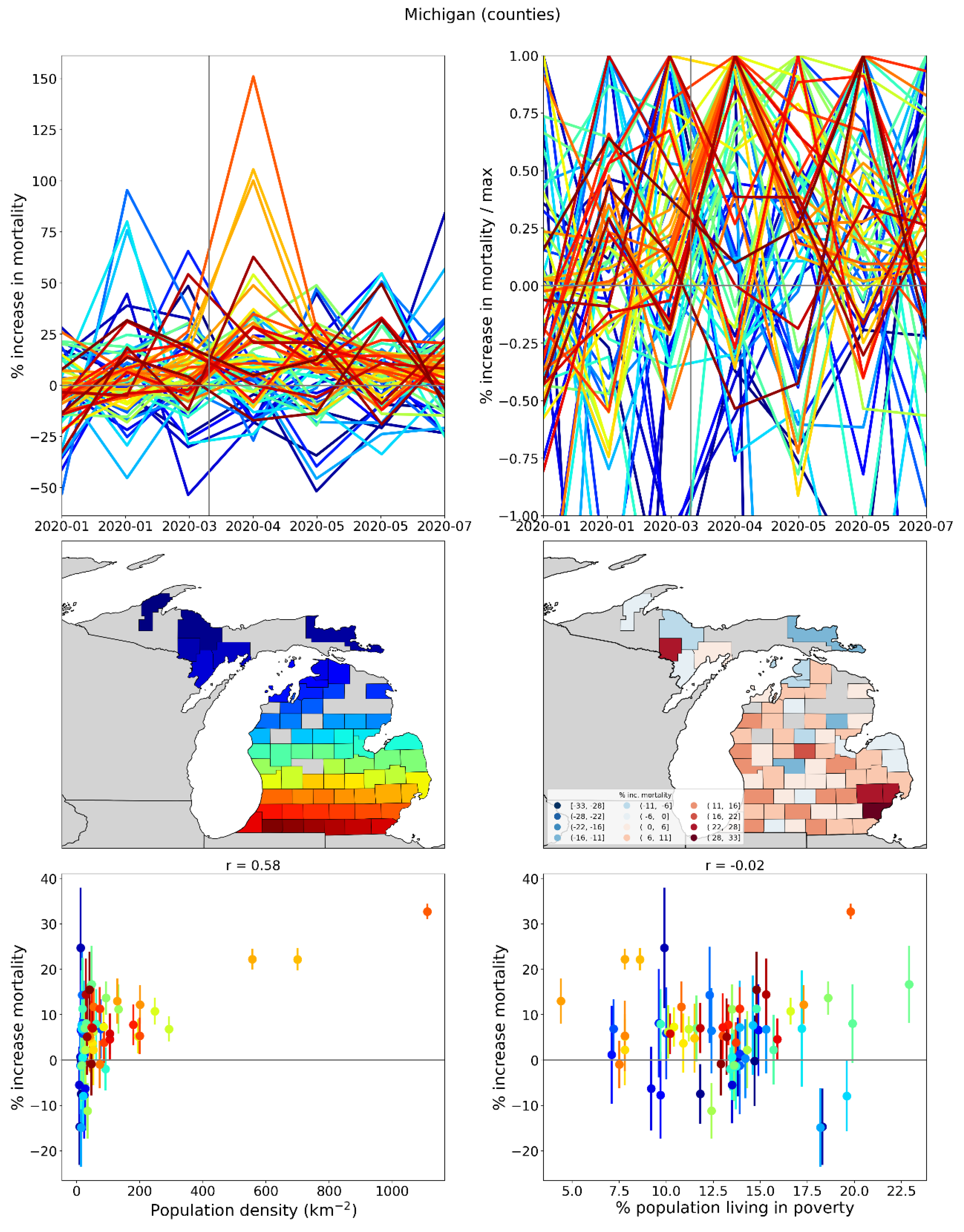
Figure 51.
Same as Figure 50, showing only the 10 most populous counties in Michigan.
Figure 51.
Same as Figure 50, showing only the 10 most populous counties in Michigan.
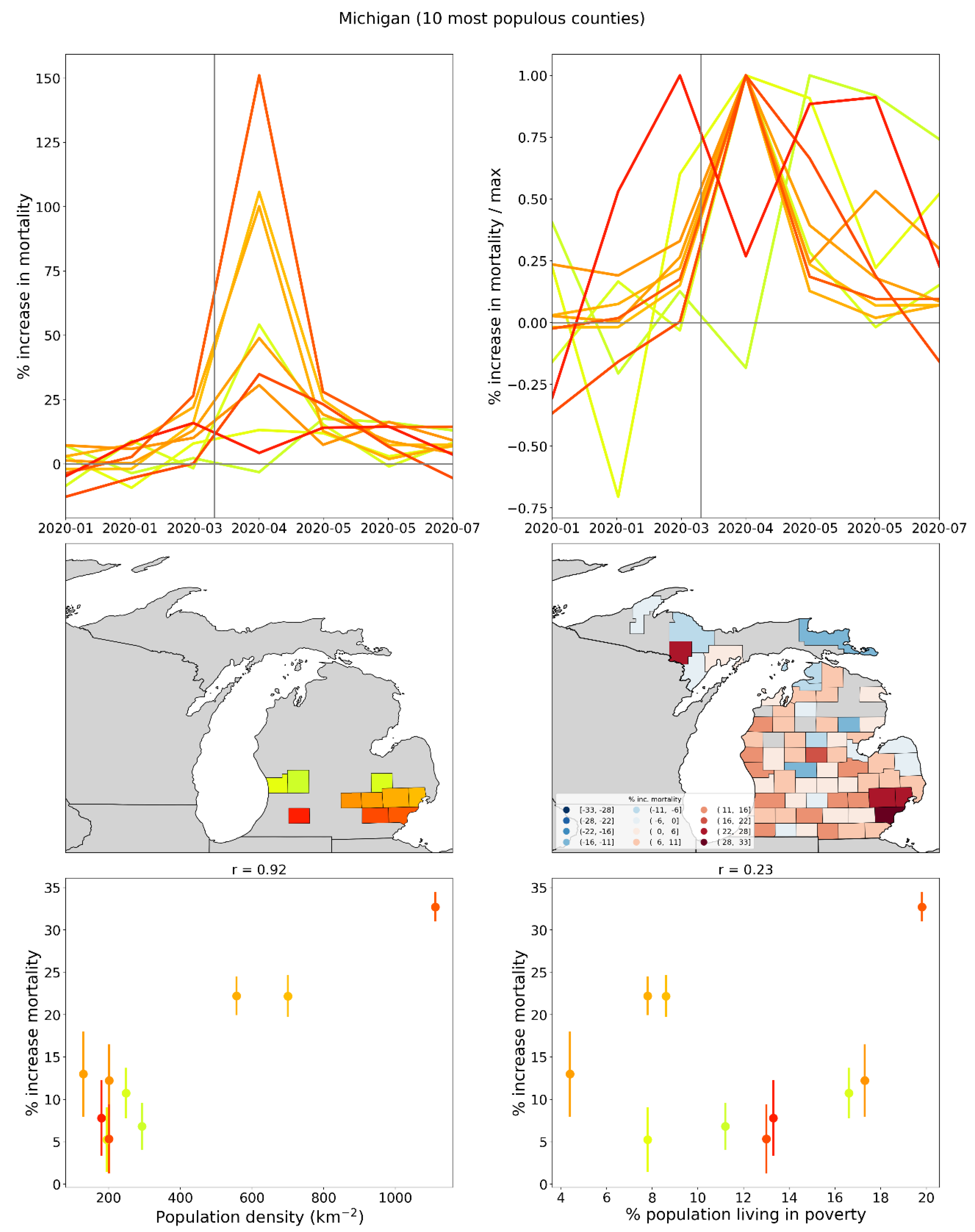
Figure 52.
Top left: weekly P-scores for the counties of Louisiana. Top right: same as top left, with each curve scaled by its maximum. Middle left: map with counties colored as per the curves in top row and points in bottom row of panels. Middle right: heatmap showing integrated first-peak period (March-May 2020) P-score for each county. Bottom left: scatter plot of county integrated first-peak period P-score vs county population density. Bottom right: scatter plot of county integrated first-peak period P-score vs. county percent of population living in poverty. In the maps, dark grey (within Louisiana) indicates counties for which data was unavailable.
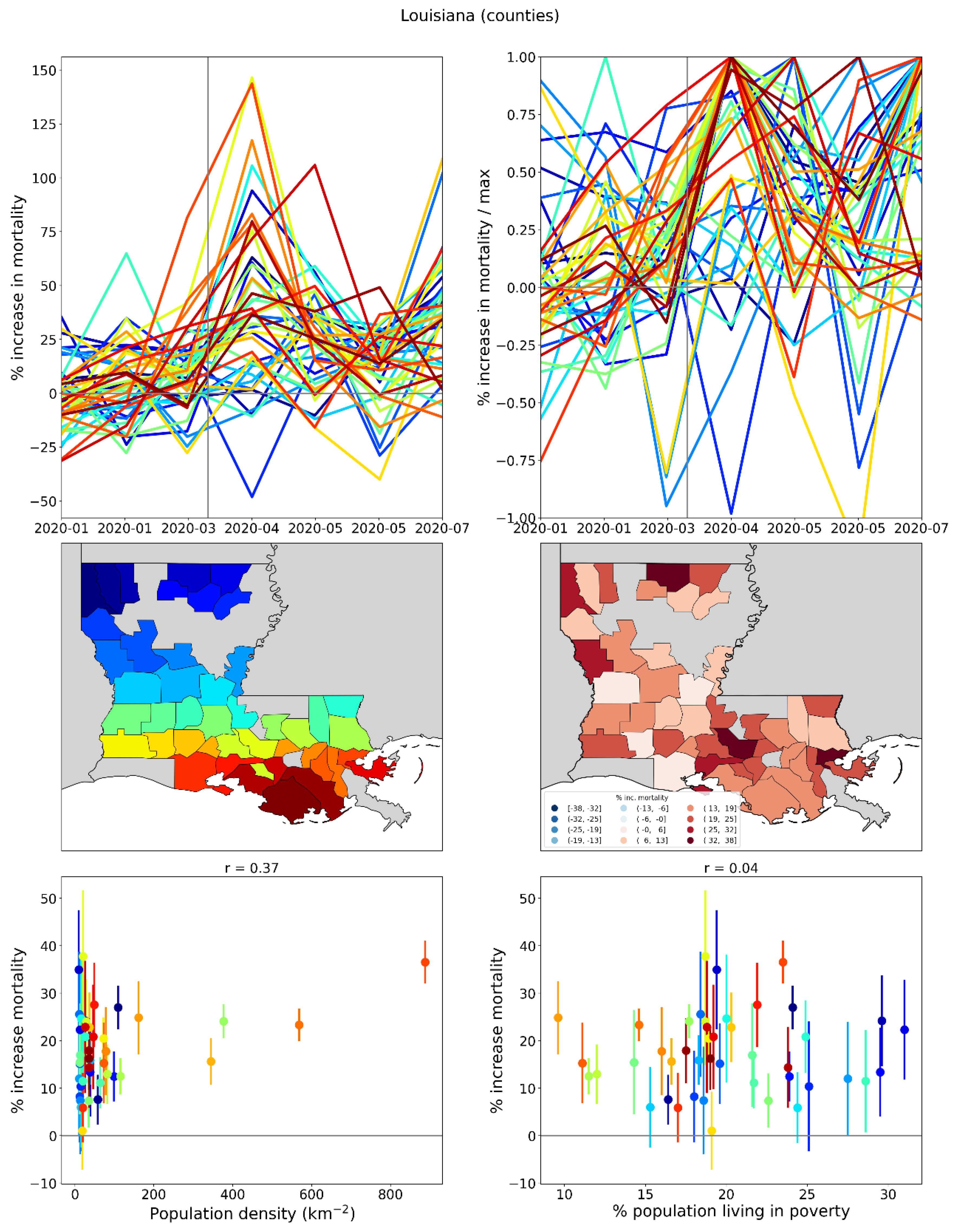
Figure 53.
Same as Figure 52, showing only the 10 most populous counties in Louisiana.
Figure 53.
Same as Figure 52, showing only the 10 most populous counties in Louisiana.
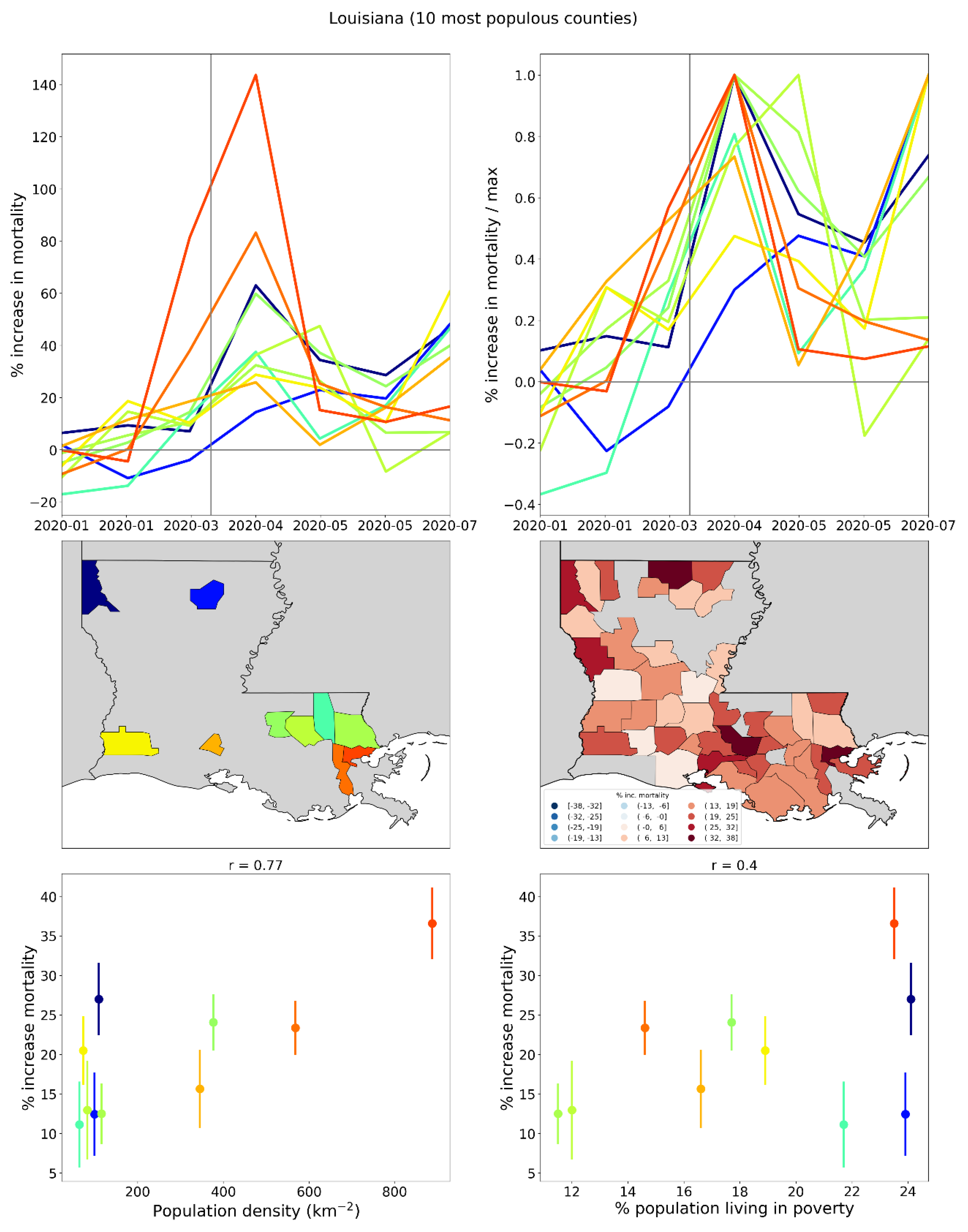
2.3. Differing Excess Mortalities Between Regions with Large International Airports
In this section we compare the first-peak period excess mortalities of urban areas with large international airports in Italy (Rome vs Milan) and the United States (New York City vs Los Angeles and San Francisco). We compare the demographic and health system characteristics for these urban areas, as well as statistics on air passenger travel to and from China and East Asia prior to Covid.
2.3.1. The Case of Rome vs Milan in Italy
Italy was the first European country to experience a rise in excess mortality in March 2020, and its F-peak is positioned earliest in time among European countries, with a rise-side half-maximum date equal to the week of the WHO’s March 11, 2020 pandemic declaration (week of March 9-15, 2020), as shown in Section 3.3.1.
Figure 54 shows results for five Italian NUTS2 regions: Piedmont, Lombardy, Veneto, Lazio and Campania.
The top panel of Figure 54 contains a map indicating the said five regions, and showing the locations (star markers) of the five largest airports in Italy by passenger volume:
- Rome Fiumicino (FCO), in the Lazio NUTS2 region
- Milan Malpensa (MXP) in the Lombardy NUTS2 region, which also serves the Piedmont NUTS2 region
- Milan Bergamo (BGY) in the Lombardy NUTS2 region
- Venice Marco Polo (VCE) in the Veneto NUTS2 region
- Naples International Airport (NAP) in the Campania NUTS2 region
The middle panel of Figure 54 shows the weekly P-score values for each of the five regions. As can be seen, Lombardy region (which contains Milan) had an enormous F-peak, reaching a maximum of more than 300% in the week of March 30, 2020, and neighbouring Piedmont also had a large F-peak. In contrast, Lazio (the region containing Rome) and Campania (containing Naples) had comparatively negligible excess mortality during the first-peak period.
Table 1 shows statistics about passenger volumes at the five largest Italian airports.
As can be seen from Table 1, Rome’s FCO airport had roughly the same number of total passengers in 2019 as the sum of the two large airports in the Lombardy region (MXP and BGY), and FCO had a significantly higher volume of passenger traffic to and from Chinese airports in each of 2017, 2018 and 2019, and more passenger traffic to and from airports in the Asia Pacific region in 2019, than the two Milan-area airports together.
Table 2 has demographic and health care characteristics of the NUTS2 regions in which the airports are located.
As can be seen from Table 2, Rome’s NUTS2 region (Lazio) and Milan’s NUTS2 region (Lombardy) had very similar demographic and health care characteristics in 2020, including similar values for the share of the population aged 65+ (22.2% in Lazio, 22.9% in Lombardy), share of the region’s population aged 80+ (7.0% in Lazio, 7.4% in Lombardy), number of hospital beds in the region per person aged 65+ (1.59% in Lazio, 1.58% in Lombardy) and the number of ICU beds in the region per person aged 65+ (0.038% in Lazio, 0.032% in Lombardy). The two regions also had virtually identical all-ages mortality rates (total number of deaths divided by total population) for 2019. Despite these similarities, Lombardy had an integrated first-peak period P-score of 106%, roughly 18 times greater than that of Lazio (5.8%).
2.3.2. The Case of New York City vs Los Angeles and San Francisco in the USA
Similar results to those for Rome and Milan in Italy are observed for USA urban areas served by major airports.
Figure 55 shows a heatmap of integrated first-peak period P-scores for the counties of the contiguous USA with sufficient data (same as the top panel of Figure 11), overlaid with circles centred on the eight urban areas with the largest airports by passenger traffic. The eight urban areas, by decreasing order of total international air passengers served in 2019 are: New York City (NY), Miami (FL), Los Angeles (CA), San Francisco (CA), Chicago (IL), Atlanta (GA), Houston (TX) and Dallas (TX).
The diameters of the circles are proportional to urban area population (green), total number of international air passengers served in 2019 (blue) and the number of flights arriving from China in January 2020 (red).
The west coast cities of San Francisco and Los Angeles received large shares of their air traffic from China prior to the pandemic declaration of March 11, 2020, yet both cities had low first-peak period excess mortality. In contrast, New York City received fewer direct flights from China but had very high first-peak period excess mortality.
The comparison between New York City and Los Angeles or San Francisco, is similar to the comparison between Milan and Rome. Table 3 shows several demographic, socioeconomic and health care system statistics for the three USA cities.
2.4. Deaths by Institutional Location for USA States and Counties
In this section, we examine data regarding place of death during the first-peak period (March-May 2020), for USA states and counties.
In the following analyses, we focus on shares of deaths per institutional location. Graphs showing the number of deaths per month per institutional location, for each USA state, are included in Appendix B.
Figure 56 shows the shares (as fractions) of all of a given USA state’s first-peak period deaths that occurred in each of nine different locations (indicated in the legend below the figure), versus the integrated first-peak period P-score for the state, whereas in the bottom panel, the x-axis lists the state codes in order of increasing integrated first-peak period P-score.
As can be seen, there are three predominant death locations: “Medical Facility – Inpatient”, “Decedent’s home”, and “Nursing home or long-term care”.
The top panel of Figure 56 shows that the states of the USA can be grouped into five groups based on first-peak period P-score: one group with P-scores less than 22% (40 states), another group with P-scores of approximately 30% (six states: RI, MD, LA, IL, MI, DE), a third group with P-scores of approximately 50% (three states: CT, MA, DC), a fourth group comprising solely the state of New Jersey with P-score = 85%, and a fifth group comprising solely the state of New York with P-score = 96%.
As can be seen from both the top and bottom panels of Figure 56, the third, fourth, and fifth groups (i.e., the five states with the highest integrated first-peak period P-scores: NY, NJ, CT, MA, DC) are not only distinguished from all other states by their large P-scores, but also by the fact that the largest share of deaths in these states during the first-peak period occurred in hospitals (“Medical Facility – Inpatient”), rather than at home (as for most other states) or in long-term care (in Rhode Island (RI), Minnesota (MN), Iowa (IA), North Dakota (ND) and South Dakota (SD)).
Figure 57 has the same x-axes as Figure 56, but for Figure 57 the y-axes show the change in the share of deaths for each location from March-May 2019 to March-May 2020, expressed as a difference of fractions (not percentages). Here it can be seen that the first group of states (the states with the lowest integrated first-peak period P-scores) had an increased share of deaths occurring at home compared to the same time period in 2019 and a decreased share of deaths occurring in hospital. In contrast, the states with the highest integrated first-peak period P-scores had an increased share of deaths occurring in hospital or in nursing homes, and a decreased share of deaths occurring at home.
In the top panel of Figure 57, moving from left to right along the x-axis, there is a crossover from states with increased share of at-home deaths to states with increased share of hospital or nursing home deaths. This crossover occurs approximately at an integrated first-peak period P-score of 22%, which is the value separating the group of states with the lowest first-peak period P-scores (group of points at the left of the x-axis in Figure 57, top panel) from the second group of states, with first-peak period P-scores of approximately 30%. For the third, fourth and fifth groups of states, there was a decrease in the share of at-home deaths. An increase in the share of deaths occurring in hospital or nursing homes is thus a key characteristic of states with high integrated first-peak period P-scores, and for the states with highest P-scores, there was an accompanying decrease in the share of deaths occurring at home. Conversely, an increase in the share of at-home deaths and a decrease in the share of deaths in hospital are features of states with low integrated first-peak period P-scores.
Hospitals were the death-location with the largest change in share of deaths from March-May 2019 to March-May 2020 in New York (NY), New Jersey (NJ), District of Columbia (DC), Maryland (MD), Louisiana (LA), Illinois (IL) and Michigan (MI).
Nursing homes were the death-location with the largest change in share of deaths from March-May 2019 to March-May 2020 in Utah (UT), Connecticut (CT), Massachusetts (MA), Delaware (DE), Rhode Island (RI), Minnesota (MN) and Colorado (CO) (tied with home deaths).
To further probe how states with large integrated first-peak period P-scores may have had disproportionate deaths in hospitals, as opposed to at home or in nursing homes, we make graphs comparing how the share of first-peak period deaths occurring in a specific institutional location (e.g. in hospital) changed compared to the share of deaths occurring in the same location during the same time period (March-May) in 2019.
To do this, we use the ratio of a specific death location’s share in the first-peak period (March-May of 2020) divided by the same death location’s share in March-May of 2019. We make graphs of the said ratio for a particular death location on the y-axis, and a different death-location on the x-axis, using the three predominant death locations (hospital, home, and nursing home).
Figure 58 shows such a graph for deaths at home vs. deaths in hospital. In the top panel, the scatter plot point sizes are proportional to the integrated first-peak period P-score for the state. The lower panel shows the same scatter plot with two-letter state codes in place of points. In either panel, the vertical grey line indicates the x-axis value of 1, and the horizontal grey line indicates the y-axis value of 1. The two grey lines thus divide the plot into four quadrants: in the top-right quadrant, both death locations increased their share during the first-peak period of 2020 compared to the same time period in 2019, whereas in the lower-left quadrant, both death locations decreased their share of all deaths during the first-peak period of 2020 compared to the same time period in 2019, and so on, for the other two quadrants.
As can be seen in Figure 58, the states with the largest integrated first-peak period P-scores (the largest circles in the top panel) are positioned in the lower-right quadrant of the scatter plot. This means that, for the states with the largest integrated first-peak period P-scores, deaths in March-May of 2020 were more likely to occur in hospitals and less likely to occur at home than in the same months in 2019.
Figure 59 shows the same type of plot as in Figure 58, with the same x and y axes, for county-level data. Here, the lower panel shows the two-letter state code of the state to which each county belongs.
Similar to the result in Figure 58, the counties with the largest integrated first-peak period P-scores (the largest circles in the top panel) are positioned in the lower-right quadrant of the scatter plot in Figure 59. This means that, for the counties with the largest integrated first-peak period P-scores, deaths in March-May of 2020 were more likely to occur in hospitals and less likely to occur at home than in the same months in 2019. The said lower-right quadrant counties mainly belonged to states with large integrated first-peak period P-scores, such as New York, New Jersey, Connecticut and Massachusetts, and they are urban counties with large population densities as shown in Figure 44 to Figure 47.
Figure 58 and Figure 59 also show that the states and counties with the lowest integrated first-peak period P-scores are located in the top-left quadrant of the scatter plots. This means that the states and counties with the lowest P-scores for March-May of 2020 had smaller than normal (based on the same months in 2019) shares of deaths in hospital, and larger than normal shares of deaths at home.
Figure 60 shows the same type of scatter plot as in Figure 58, except that the y-axis now shows the ratio of the share of deaths occurring in long-term care facilities (LTC) in March-May of 2020 divided by the share of deaths occurring in LTC in March-May of 2019. In Figure 60, the states with the largest integrated first-peak period P-scores are positioned in the top-right quadrant of the plot, showing that both the share of deaths in hospital and the share of deaths in LTC increased during the first-peak period of 2020 as compared to 2019, for the states with the highest integrated first-peak period P-scores.
Figure 61 has the same x and y axes as Figure 60, for county-level data. Similar to the result in Figure 60, the counties with the largest integrated first-peak period P-scores are located in the top-right quadrant of the figure, such that both the share of deaths in hospital and deaths in LTC increased during the first-peak period of 2020 compared to 2019, for large-integrated-P-score counties.
2.5. Excess Mortality P-Scores vs Socioeconomic Variables
2.5.1. USA Counties
This section contains a series of scatter plots (Figure 64 to Figure 98) showing integrated P-scores for the first-peak period (March-May 2020) and summer-peak period (June-September 2020) vs socioeconomic variables, for the counties of the USA with available data.
Also included are heatmaps (Figure 99 to Figure 133) showing how each socioeconomic variable varies across the USA counties. Here, each figure includes a map of the entire contiguous USA (top panel) and a blow-up around the New York City urban area (bottom panel).
The heatmaps of values of the socioeconomic variables (Figure 99 to Figure 133) are needed to help interpret or understand the many complex relations or structures observed in the scatter plots (Figure 64 to Figure 98) of integrated P-score versus socioeconomic variable, which are not simple scatter plots showing only variable degrees of correlation. Rather, the said scatter plots have intricate structures, suggesting subgroups of counties, which have geographical relations.
Table 4 lists the socioeconomic variables for the scatter plots and heatmaps in this section:
Each of the scatter-plot figures Figure 64 to Figure 97 is for one socioeconomic variable. Each figure has six panels, arranged in three rows and two columns, as follows. The top row of panels shows the integrated first-peak period P-score for the county vs the value of the socioeconomic variable for the county, using data points with error bars (top row, left panel) and using the two-letter code for the state to which the county belongs in place of data points (top row, right panel). The middle row of panels shows the same thing as the top row, for the summer-peak period (June-September 2020). In the bottom row of panels, only counties from the four states with the highest state-level integrated first-peak period P-scores are shown. The four states are New York (NY), New Jersey (NJ), Connecticut (CT) and Massachusetts (MA). The left panel of the bottom row shows results for the NY-NJ-CT-MA states for the first-peak period, and the right panel is for the summer-peak period. For all six panels, the y-axis range is fixed at a value of 250% (slightly higher than the maximum integrated first-peak period P-score of 233% for Bronx County, NY). Pearson correlation coefficients (“r”) stated in the panels are for the data points shown in the panel.
Figure 98 is similar to Figure 64 to Figure 97, except that the y-axes show the number of excess deaths per day rather than P-score, and the x-axes show the number of intensive care unit (ICU) beds per county.
The scatter plots reveal many features about the populations that experienced high and low integrated first-peak period P-scores and allow comparison with the immediately-following summer-peak period, which contrasts with the first-peak period in some important ways.
Regarding the first-peak period, the scatter plots in Figure 64 to Figure 98 often exhibit a two-branch structure, in which many counties are arranged horizontally along the x-axis with low P-scores and a wide range of values of the socioeconomic variable (“lower branch”) whereas a separate branch of counties has positively correlated P-scores that rise up to high values with large values of the socioeconomic variable (“upper branch”). The upper branch is mostly made up of counties from the top-four (P-score) states (NY, NJ, CT and MA), especially the counties within the New York City urban area (in NY, NJ and CT).
Variables for which the said two-branch structure for the first-peak period can be seen include population, log(population), population density, log(population density), per capita income, % living in poverty, Gini coefficient, inter-county disparity, % households with no vehicle available, % households with more people than rooms, % living in structures with 10+ units, % who speak English “less than well”, % minority, % aged 25+ with no high school diploma, % single-parent households, % deaths occurring in hospital in March-May 2019, % deaths occurring in hospital in June-September 2019, and share of votes cast in the 2016 election that were for the Democratic presidential candidate.
For socioeconomic variables with clearly defined upper branches, the correlation coefficients are often large for the counties of the four states with highest integrated first-peak period P-scores (the “NY-NJ-CT-MA counties”), as shown in the lower-left panels of the figures. The variables with the highest correlation coefficients for NY-NJ-CT-MA counties are as follows:
% who speak English “less than well” (Figure 76, r = 0.89);
- log[population density] (Figure 67, r = 0.85);
- % minority (Figure 77, r = 0.85);
- % households with more people than rooms (Figure 74, r = 0.83);
- population (Figure 64, r = 0.77);
- log[population] (Figure 65, r = 0.72);
- % living in housing structures with more than 10 units (Figure 75, r = 0.72); and
- share of votes cast in the 2016 election that were for the Democratic presidential candidate (Figure 85, r = 0.68).
For some variables with scatter plots exhibiting two-branch structures, the behaviour for the NY-NJ-CT-MA counties is not a simple linear correlation but rather a more complex relationship that depends on population geography. For example, the percentage of people living in poverty is relatively high in the rural areas of New York State far from the New York City urban area (see the map in bottom panel of Figure 104). In the said rural areas, integrated first-peak period P-scores were low (see the maps in Figure 12). Moving from the rural areas of New York State toward the New York City urban area, one first crosses suburban areas with low poverty and moderate first-peak period P-scores. Continuing toward the centre of the New York City urban area, poverty increases to its highest values and so do the county-level first-peak period P-scores. This results in a non-linear “<”-shaped pattern of the scatter plot in the lower-left panel of Figure 69, with a near-zero correlation coefficient (r=0.05). However, first-peak period P-score is strongly correlated with % living in poverty for the highest-P-score (e.g. P-score > 100%) counties in Figure 69, which are all close to the centre of the New York City urban area, and which have the highest P-scores in the entire USA.
Similar “<”-shaped rural-to-suburban-to-inner-city patterns for the NY-NJ-CT-MA counties are seen in the scatter plots for
- the percentage of the county’s population aged 25+ with no high school diploma (Figure 78, lower-left panel, and see the map for this variable in Figure 113, bottom panel); and
- the percentage of single-parent households (Figure 81, lower-left panel and map in Figure 116, bottom panel).
A “<”-shaped or C-shaped pattern is also seen for the NY-NJ-CT-MA counties for variables for which a two-branch structure is less distinct in the all-counties scatter plots, such as
- the percentage of the population with a disability (Figure 82, lower-left panel, and map in Figure 117, bottom panel);
- the percentage of the population with diabetes (Figure 83, lower-left panel, and map in Figure 118, bottom panel); and
- the percentage of the population with obesity (Figure 84, lower-left panel, and map in Figure 119, bottom panel).
For per capita income (Figure 68), the upper branch of the scatter plot exhibits a “gamma” (γ) shape, especially visible for the NY-NJ-CT-MA counties in the lower-left panel. The county with the highest per capita income in the USA is Manhattan (New York County, NY), whereas other counties in the inner New York City urban area, such as the Bronx (Bronx County, NY), Queens (Queens County, NY), Brooklyn (Kings County, NY) and Hudson County, NJ have high P-scores but low per capita incomes.
The scatter plot for the Gini coefficient (Figure 71, top row of panels) has a less-well-defined two-branch structure than for other variables, with a larger range of first-peak period P-score values (y-axis) at high values of the Gini coefficient (x-axis) than for high values of other socioeconomic variables with two-branch scatter plots.
The inter-county disparity (Figure 72) is a measure we define and calculate as the maximum per capita income among the neighbours of a county of interest (the “target county”) minus the target county’s per capita income. The scatter plot for the inter-county disparity is shown in Figure 72. The highest values of the inter-county disparity are for the low per capita income counties that neighbour Manhattan (New York County, NY), including the Bronx, Queens, Brooklyn and Hudson County, NJ, which also had the four highest first-peak period P-scores among USA counties. Manhattan is an outlier with a large negative value of the inter-county disparity in Figure 72, due to its much larger per capita income than its neighbours.
Regarding age structure, Figure 79 shows that the counties with large integrated first-peak period P-scores had relatively low shares of people aged 65+. For the NY-NJ-CT-MA counties, P-scores decreased with increasing share of people aged 65+, with a correlation coefficient of r = −0.49. Figure 80 shows that the highest P-score counties had average shares of people aged 17 and under (top panels), and for the NY-NJ-CT-MA counties, P-scores increased with increasing share of people aged 17 and under, with a correlation coefficient of r = 0.38.
The data on number of prescription drug claims pertains to claims made by beneficiaries of the USA federal government-funded Medicare Part D plan, which had approximately 63 million total beneficiaries in 2019 (Tarazi et al., 2022). The counties with the highest P-scores had relatively low values of both number of all kinds of prescriptions per person (Figure 92, map in Figure 127) and number of antibiotic prescriptions per person (Figure 93, map in Figure 128).
The number of excess deaths per day vs the number of ICU beds per county (Figure 98) has a positive correlation, as expected given that both the raw number of excess deaths and the number of ICU beds would generally scale with the county’s population. The three counties with the highest excess mortalities – the Bronx, Queens, and Brooklyn (Kings County, NY) – are outliers on this plot with mid-range numbers of ICU beds and very large excess mortality.
The scatter plots in Figure 64 to Figure 98 also show results for the summer-peak period for all counties with available data (middle row of panels) and for the NY-NJ-CT-MA counties (bottom-right panels).
Summer-peak period P-scores were large in states and counties in the southern USA, as shown in the heatmaps of integrated summer-peak period P-scores in Figure 134 and Figure 135. At the county level, the highest summer-peak period P-scores occurred in counties in Texas, Arizona, and California, along the border with Mexico, as well as in the state of Mississippi, along the Mississippi river.
In contrast to the first-peak period, the counties with the highest summer-peak P-scores had low populations and low population-densities (middle panels of Figure 64 to Figure 67), low per capita incomes (Figure 68), and low values for percent of households with no vehicle available (Figure 73) and percent living in housing structures with 10+ units (Figure 75).
The relationship between P-score and poverty is also different for the summer-peak period than the first-peak period. Whereas in the first-peak period, the scatter plot shows a distinct two-branch structure (top panels of Figure 69), in the summer-peak period the scatter plot shows an overall positive correlation between integrated P-score and poverty (r = 0.39), with four high-poverty Texas counties along the Mexican border rising above the pack with the highest P-scores of around 150%. Variables with similar scatter-plot patterns to poverty for the summer-peak period include Gini coefficient (Figure 71) with r = 0.24, percent single-parent households (Figure 81) with r = 0.36, and percent aged 25+ with no high school diploma (Figure 78) with r = 0.44. Percent with diabetes (Figure 83) with r = 0.18, and percent with a disability (Figure 82) with r = 0.11 arguably follow this pattern as well but with weaker correlation coefficients, and for these two variables, the four Texan counties with large summer-peak period P-scores have mid-to-low values, unlike for poverty, Gini coefficient, percent single-parent households, and percent aged 25+ with no high school diploma.
There is no clear evidence for a correlation between integrated summer-peak period P-score and the rate of obesity when considering all USA counties, as can be seen from the middle panels of Figure 84. In this case, the four Texan counties with the highest summer-peak period P-scores are spread out along the x-axis from low to high values of the obesity rate. However, obesity is a variable with one of the largest correlation coefficients for the NY-NJ-CT-MA counties in the summer-peak period (Figure 84, lower-right panel), with r = 0.41.
Regarding the NY-NJ-CT-MA counties during the summer-peak period, the variables with the largest correlation coefficients were:
A two-branch pattern that is somewhat similar to that seen in the first-peak period is observed for the summer-peak period for the share of votes cast that were for the Democratic presidential candidate in 2016 (Figure 85) and for the percent of households with more people than rooms (Figure 74).
The counties with the highest summer-peak period P-scores were also among the counties with the highest shares of minorities (Figure 77) and people who spoke English “less than well” (Figure 76). The butterfly shape of the scatter plot for the summer-peak period in Figure 76 (% who speak English “less than well”) is due to high P-scores in counties in the Mississippi river area (high rate of speaking English) and high P-scores in counties along the Mexican border (low rate of speaking English), as per the map in the top panel of Figure 111. Both geographic areas have large shares of minorities, as per the map in the top panel of Figure 112.
The scatter plots for P-score vs percent of the population aged 65+ are similar for the first-peak and summer-peak periods (Figure 79). In both cases, the counties with the highest P-scores have low shares of people aged 65+. The scatter plots for the number of prescriptions per person (Figure 92) and number of antibiotic prescriptions per person (Figure 93) are also similar for the first-peak and summer-peak periods.
The share of the population aged 17 and under has a two-branch structure for the summer-peak period (Figure 80, middle panels), whereas this was not clearly the case for the first-peak period when considering all counties (Figure 80, top panels).
Several scatter plots in this section use the data on location of death presented in Section 3.5, on the x-axis. Figure 88 shows the share of deaths occurring in hospital in March-May 2019, and Figure 89 shows the share of deaths occurring in hospital for June-September 2019. As mentioned above, Figure 88 and Figure 89 are scatter plots in which a two-branch structure for the first-peak period can be seen. Counties in the New York City urban area had high pre-COVID-period shares of deaths occurring in hospital, as can be seen from the lower left panels of Figure 88 and Figure 89.
Figure 90 shows the difference in the share of deaths occurring in hospital in March-May 2020 and the share of deaths occurring in hospital in March-May 2019. From this graph, it can be seen that the counties in the New York City urban area had among the largest increases in share of deaths occurring in hospital during the first-peak period compared to one year earlier (top row of panels), and that first-peak period integrated P-score increased with the increase in share of deaths occurring in hospital with a Pearson correlation coefficient of 0.71.
Figure 91 shows the difference in the share of deaths occurring in hospital in June-September 2020 and the share of deaths occurring in hospital in June-September 2019. The counties with the highest summer peak integrated P-scores, which were in the southwest USA including in Texas, also had the largest increases in share of deaths occurring in hospital during the summer peak compared to one year earlier.
Figure 86 has the percent of deaths occurring at home in March-May 2019, and shows that the high integrated first-peak period P-score counties in the New York City urban area had low shares of deaths occurring at home, relative to the other counties with available data. Figure 87 shows the percent of deaths occurring at home in June-September 2019, for completeness.
Figure 94 to Figure 97 use COVID vaccination uptake data as of December 31, 2021 on the x-axes. Although the COVID vaccination campaign began in December 2020, after the first-peak period (March-May 2020) and the summer-peak period (June-September 2020), we include COVID vaccination uptake data as a potential indicator of the degree to which a county’s population interacts with or seeks or receives treatment from the medical system. A caveat: the COVID vaccination uptake data appears to be unreliable for the State of Georgia, which has markedly lower (but non-zero) values of vaccination uptake than neighbouring states, as can be seen from the maps in Figure 129 to Figure 132.
Figure 94 shows the percentage of the population aged 18+ that had received at least one dose of a COVID vaccine by December 31, 2021, and Figure 95 shows the same thing for the population aged 65+. In both Figure 94 and Figure 95, it can be seen that, for the counties with the highest integrated first-peak period P-scores and the counties with the highest integrated summer-peak P-scores, nearly 100% of the population received at least one dose of a COVID vaccine up to the end of 2021.
Similarly, Figure 95 (Figure 96) shows the percentage of the population aged 18+ (aged 65+) with a completed series of a COVID vaccine by December 31, 2021. The counties with the highest integrated first-peak period and summer-peak period P-scores were among the counties with the highest vaccine uptake up to the end of 2021.
Figure 64.
Integrated P-scores for first-peak and summer-peak periods for USA counties vs population in 2019. Bottom two panels: four states with largest integrated first-peak period P-scores.
Figure 64.
Integrated P-scores for first-peak and summer-peak periods for USA counties vs population in 2019. Bottom two panels: four states with largest integrated first-peak period P-scores.
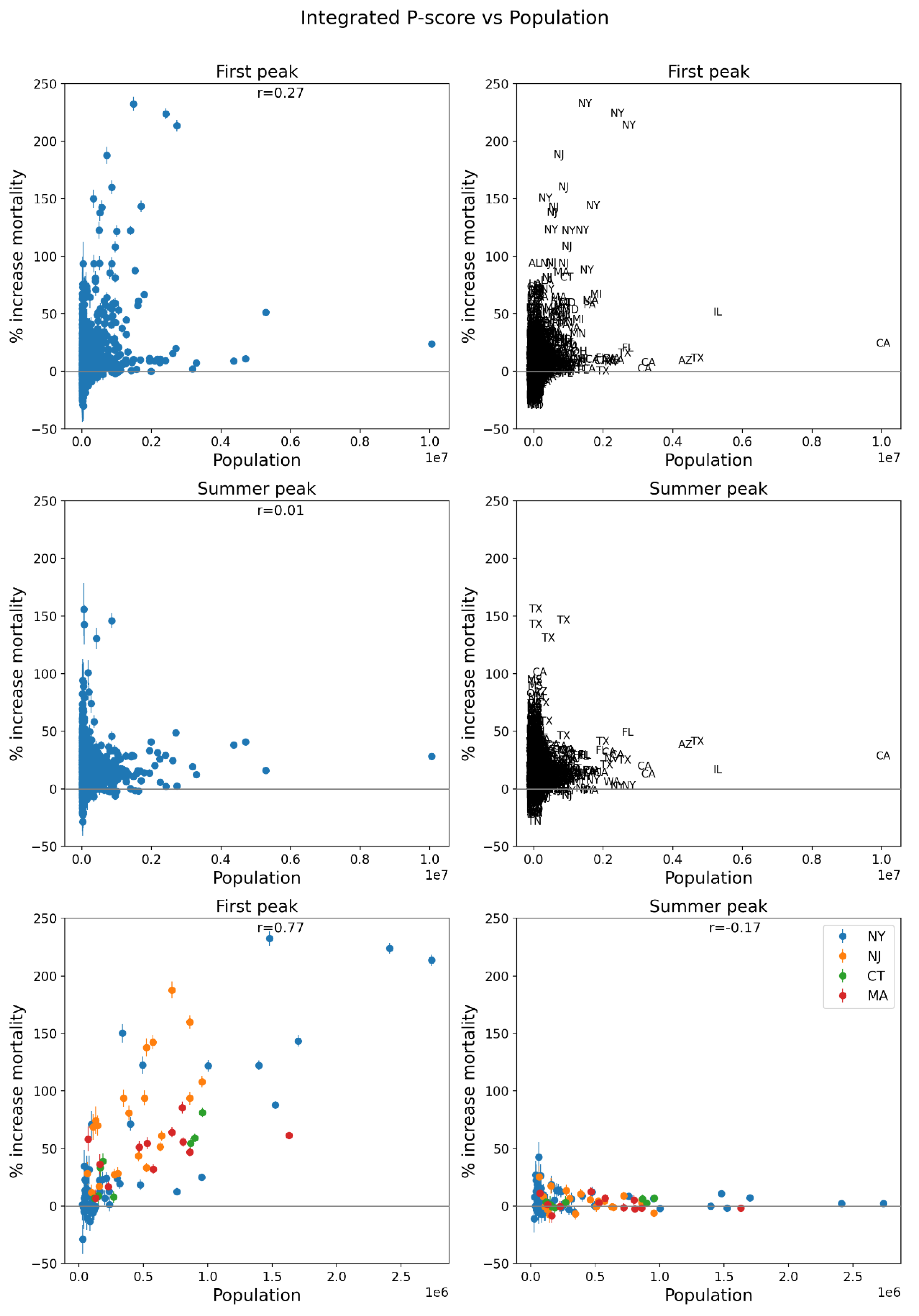
Figure 65.
Same as Figure 64, with x-axis showing the logarithm of 2019 population.
Figure 65.
Same as Figure 64, with x-axis showing the logarithm of 2019 population.
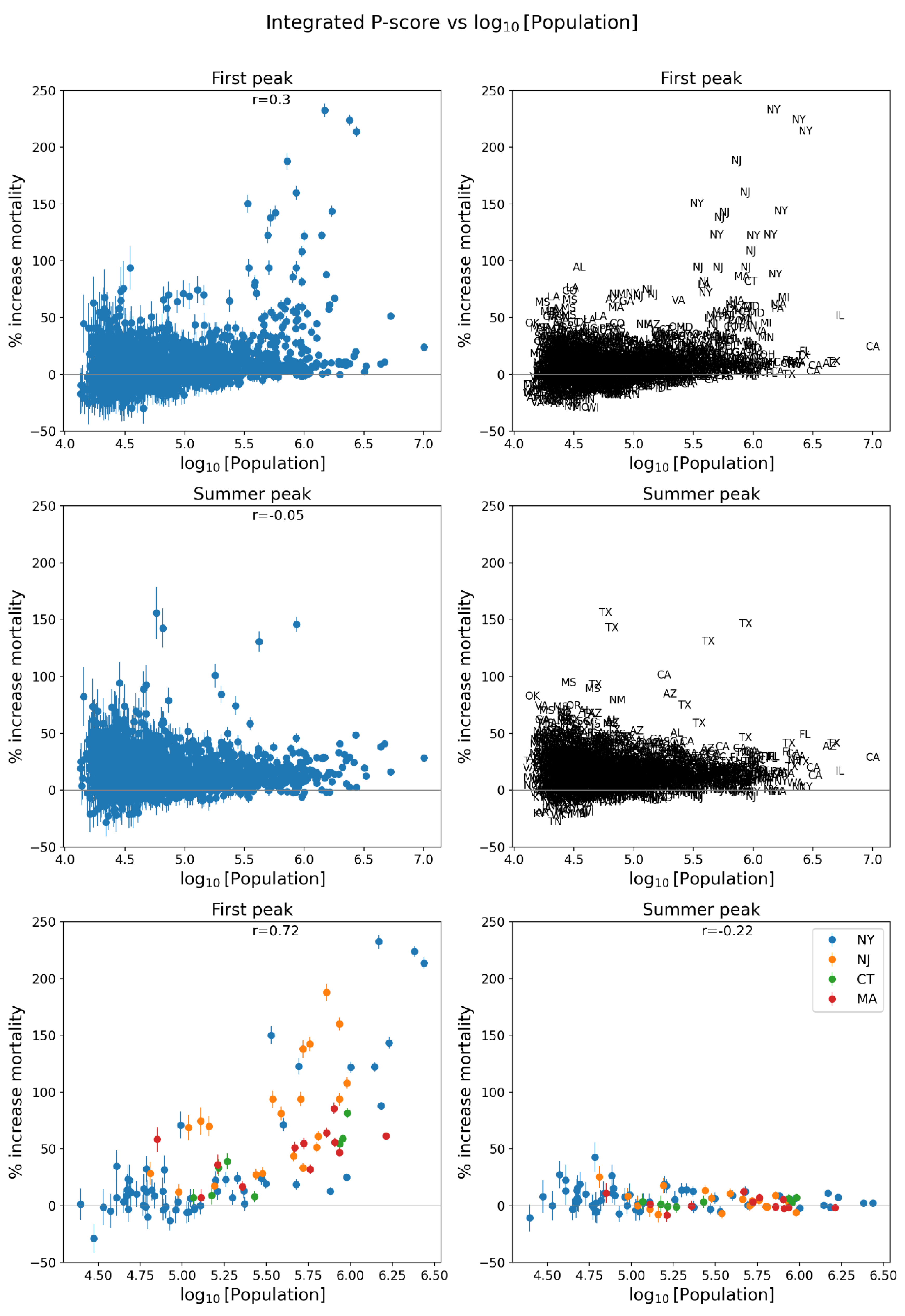
Figure 66.
Same as Figure 64, with x-axis showing the population density (estimates from the 5-Year American Community Survey for the years 2017-2021).
Figure 66.
Same as Figure 64, with x-axis showing the population density (estimates from the 5-Year American Community Survey for the years 2017-2021).
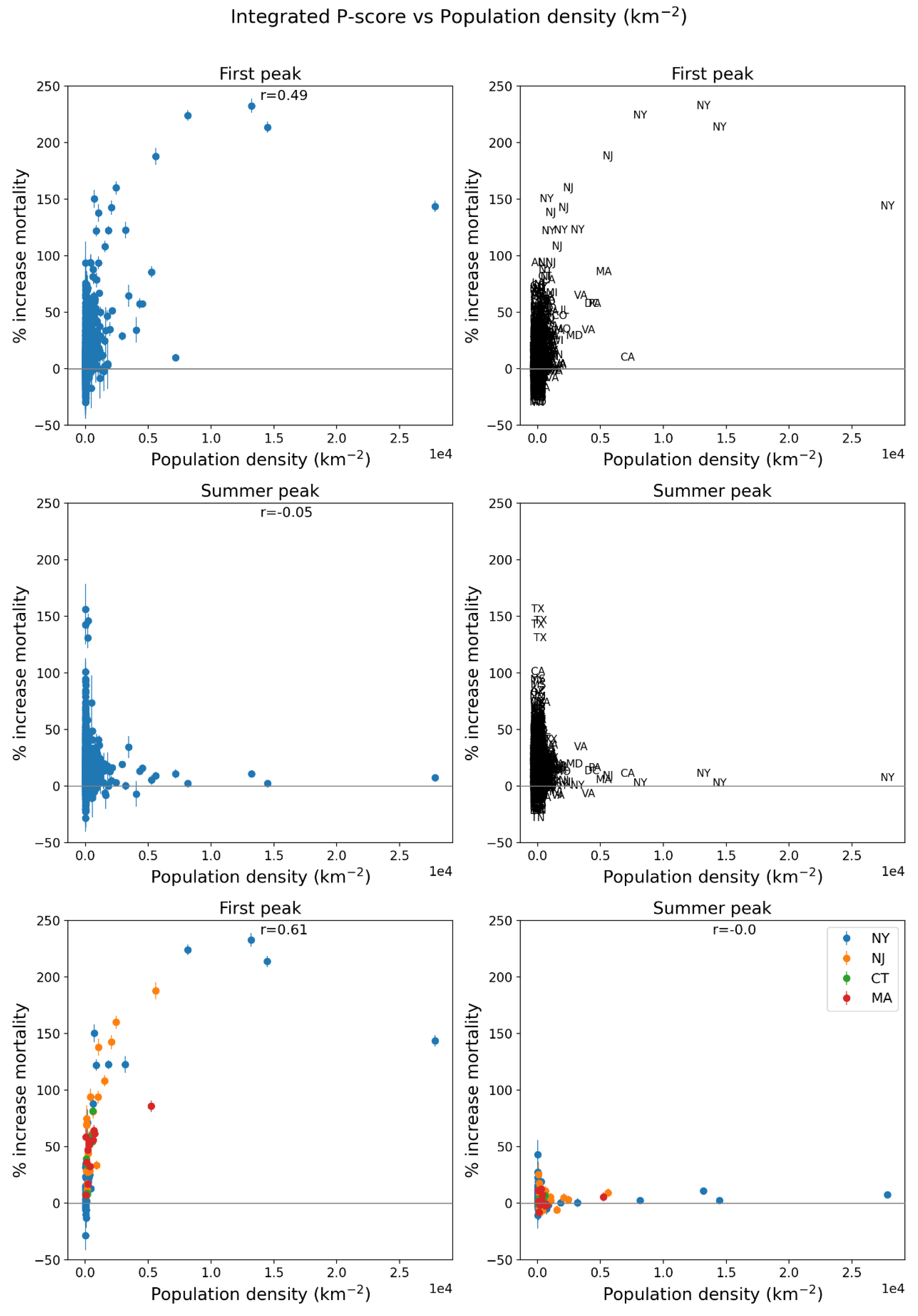
Figure 67.
Same as Figure 64, with x-axis showing the logarithm of population density (estimates from the 5-Year American Community Survey for the years 2017-2021).
Figure 67.
Same as Figure 64, with x-axis showing the logarithm of population density (estimates from the 5-Year American Community Survey for the years 2017-2021).
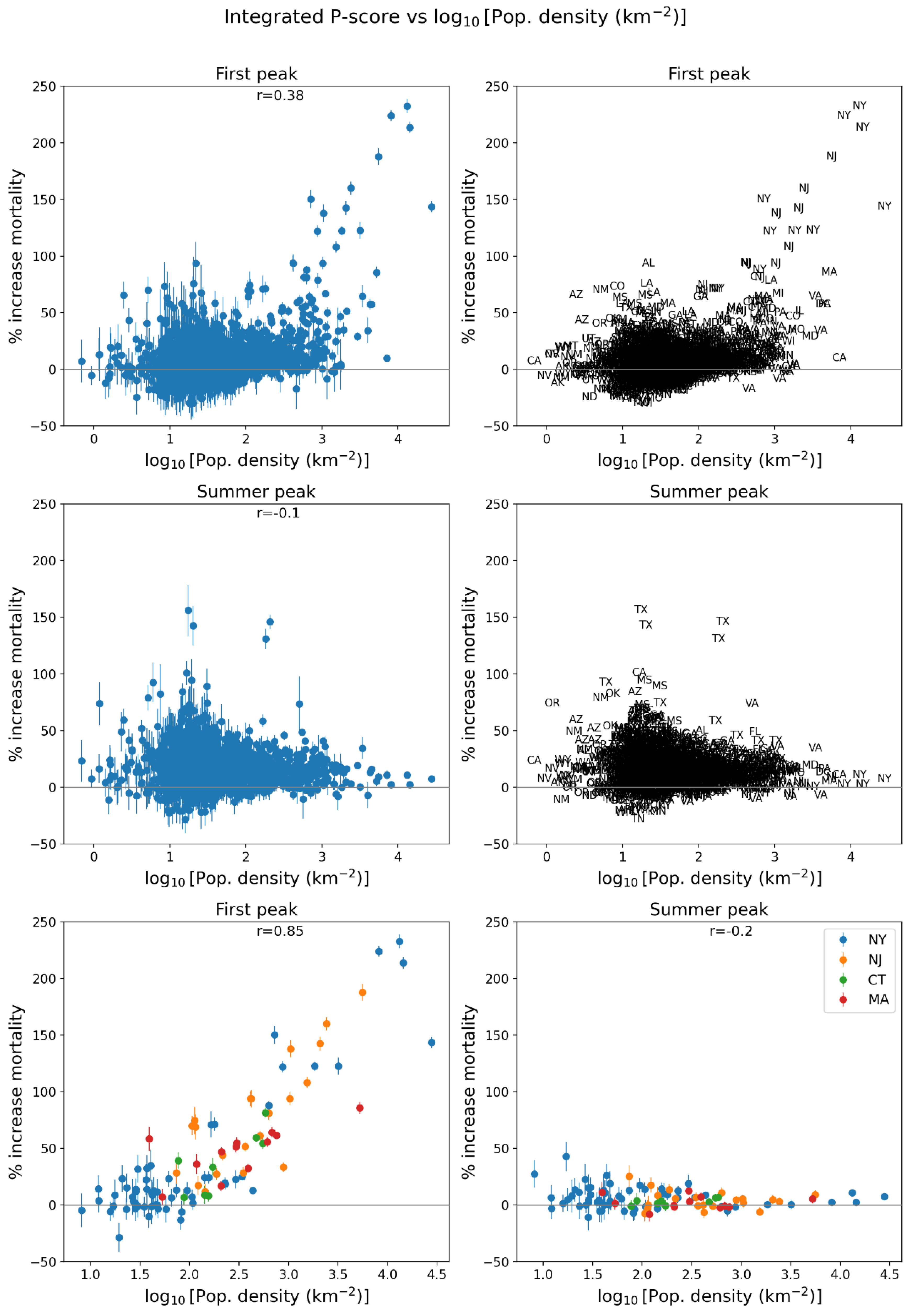
Figure 68.
Same as Figure 64, with x-axis showing per capita income (estimates from the 5-Year American Community Survey for the years 2014-2018).
Figure 68.
Same as Figure 64, with x-axis showing per capita income (estimates from the 5-Year American Community Survey for the years 2014-2018).
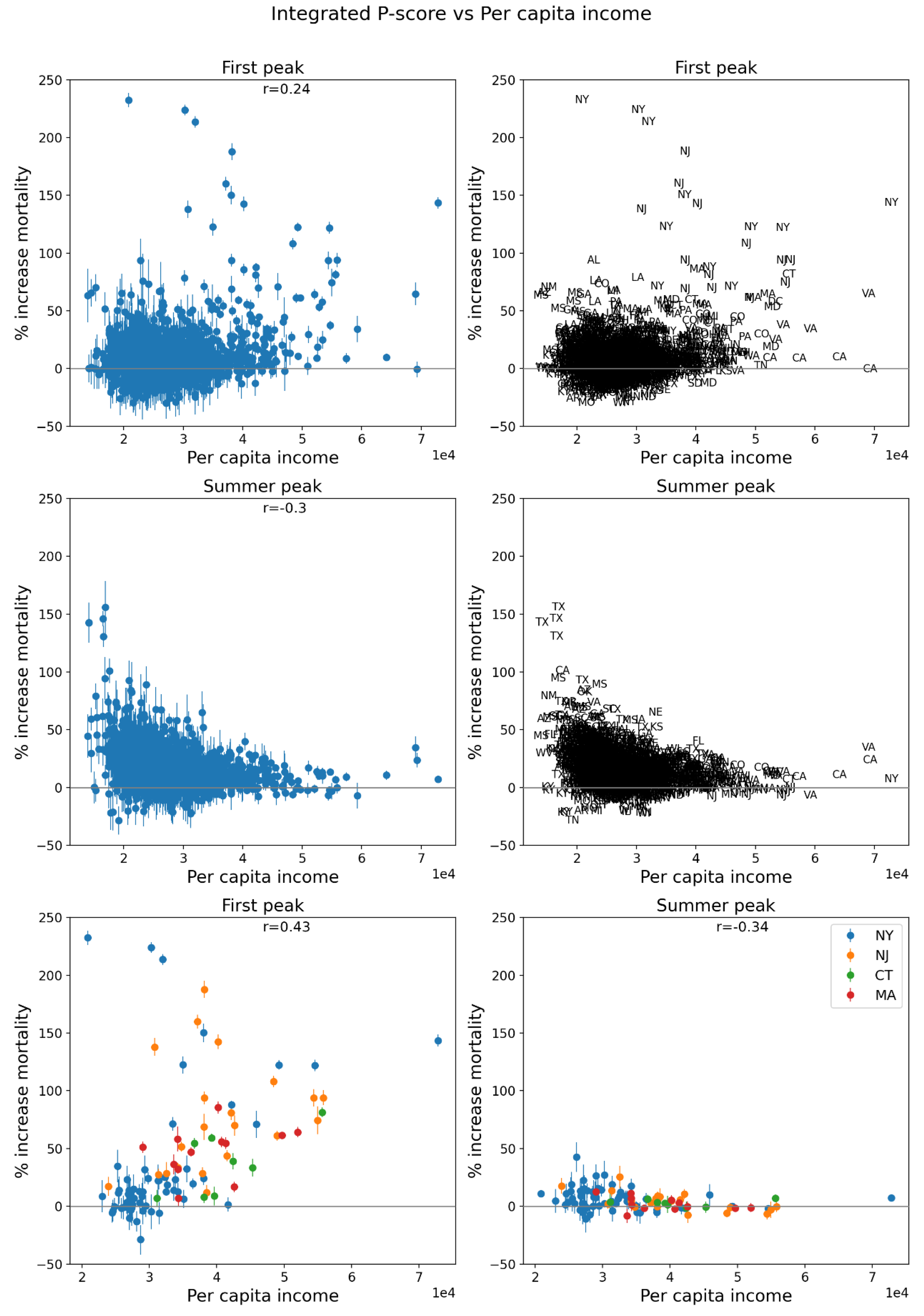
Figure 69.
Same as Figure 64, with x-axis showing % living in poverty (estimates from the 5-Year American Community Survey for the years 2014-2018).
Figure 69.
Same as Figure 64, with x-axis showing % living in poverty (estimates from the 5-Year American Community Survey for the years 2014-2018).
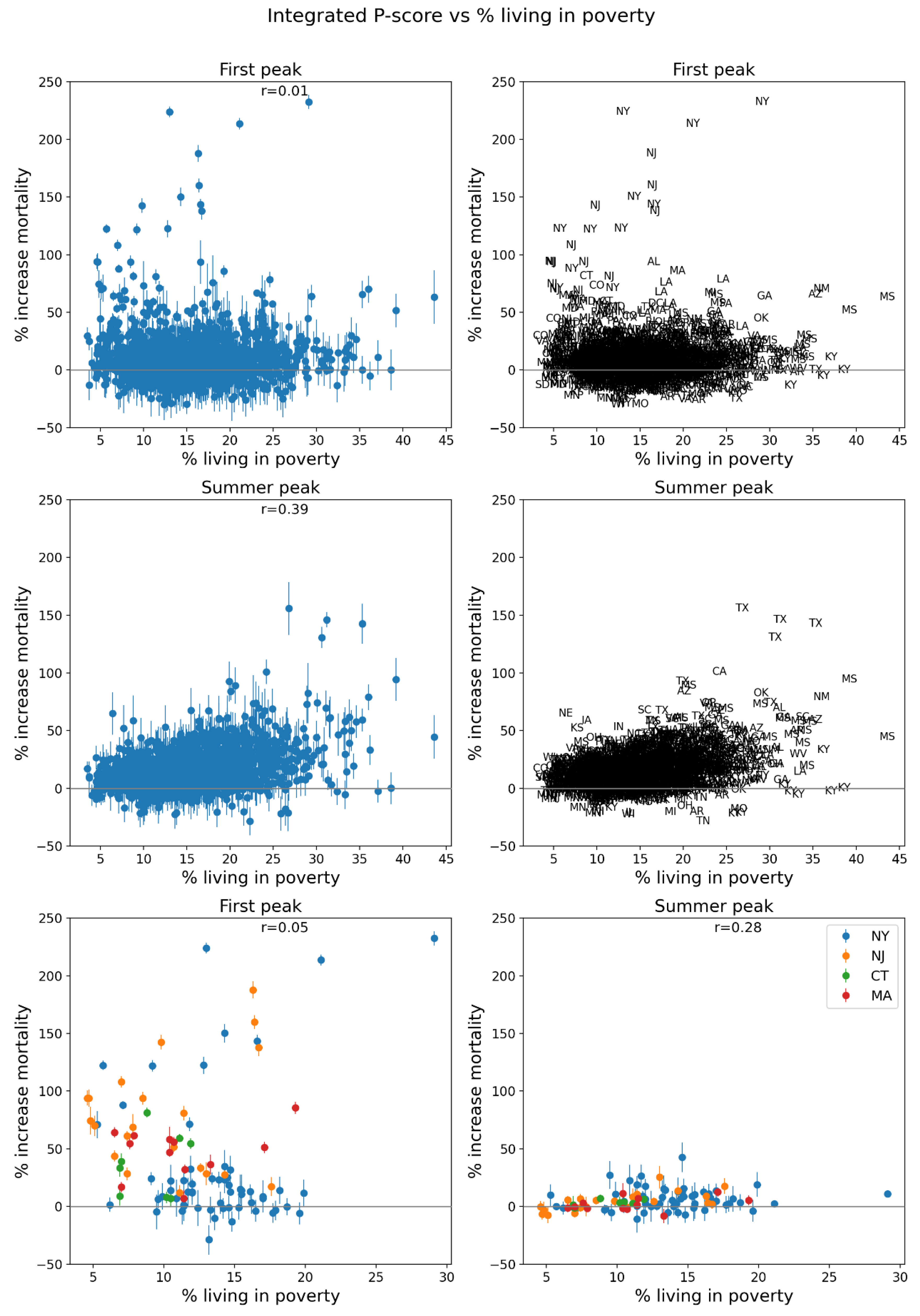
Figure 70.
Same as Figure 64, with x-axis showing % unemployed (estimates from the 5-Year American Community Survey for the years 2014-2018).
Figure 70.
Same as Figure 64, with x-axis showing % unemployed (estimates from the 5-Year American Community Survey for the years 2014-2018).
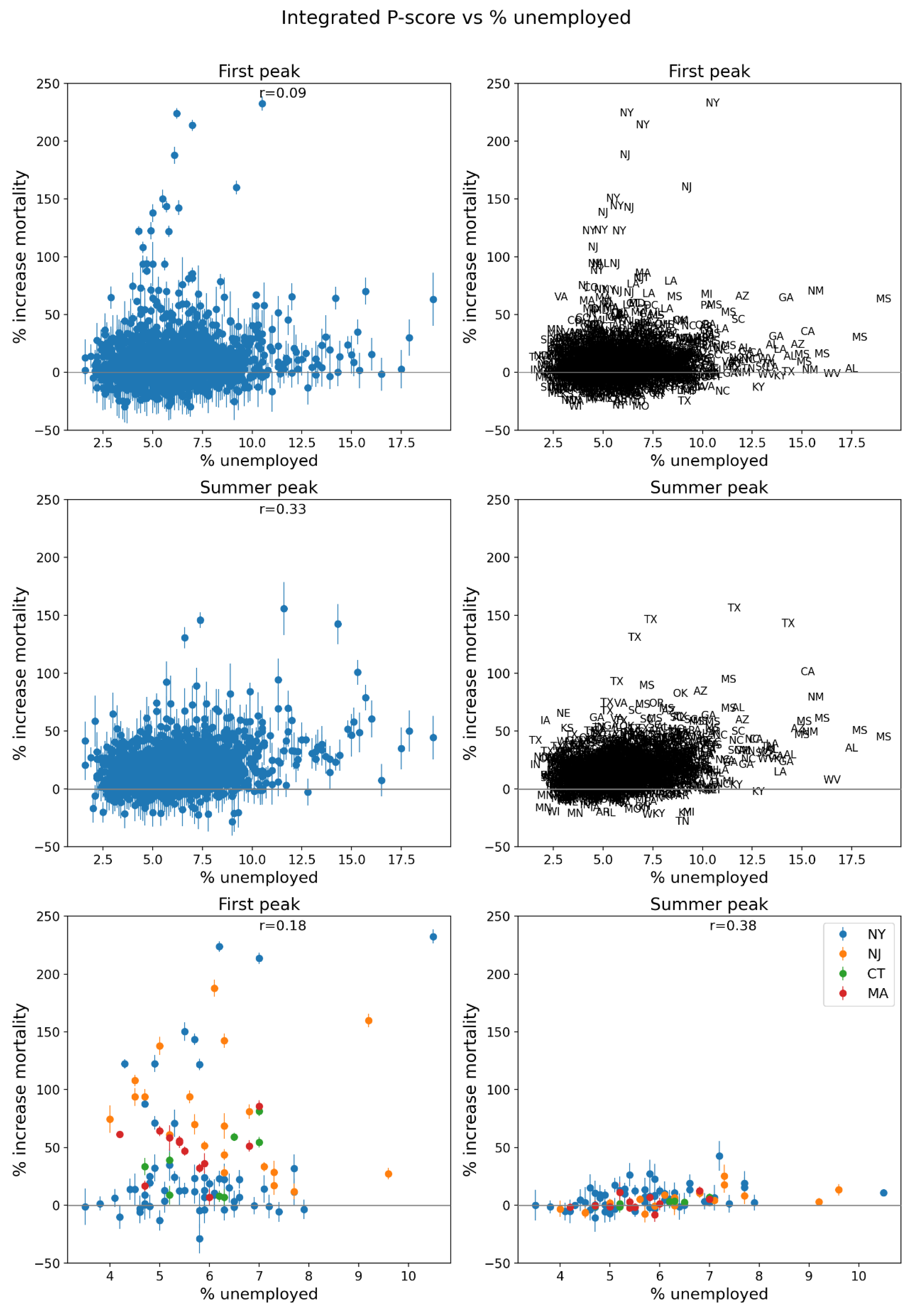
Figure 71.
Same as Figure 64, with x-axis showing the Gini coefficient for the county (estimates from the 5-Year American Community Survey for the years 2014-2018).
Figure 71.
Same as Figure 64, with x-axis showing the Gini coefficient for the county (estimates from the 5-Year American Community Survey for the years 2014-2018).
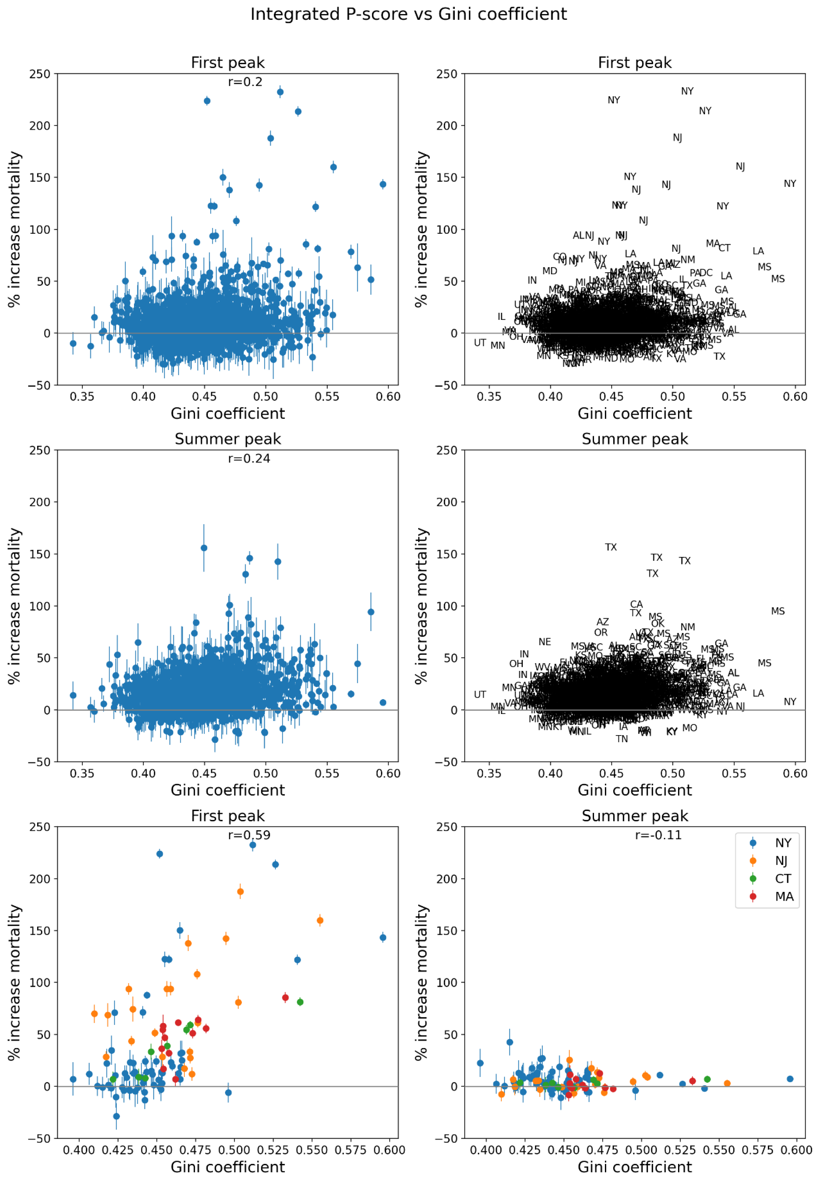
Figure 72.
Same as Figure 64, with x-axis showing inter-county disparity, equal to the maximum of the county of interest’s (target county) neighbors’ per capita incomes (PCI), minus the target county’s PCI (estimates from the 5-Year American Community Survey for the years 2014-2018).
Figure 72.
Same as Figure 64, with x-axis showing inter-county disparity, equal to the maximum of the county of interest’s (target county) neighbors’ per capita incomes (PCI), minus the target county’s PCI (estimates from the 5-Year American Community Survey for the years 2014-2018).
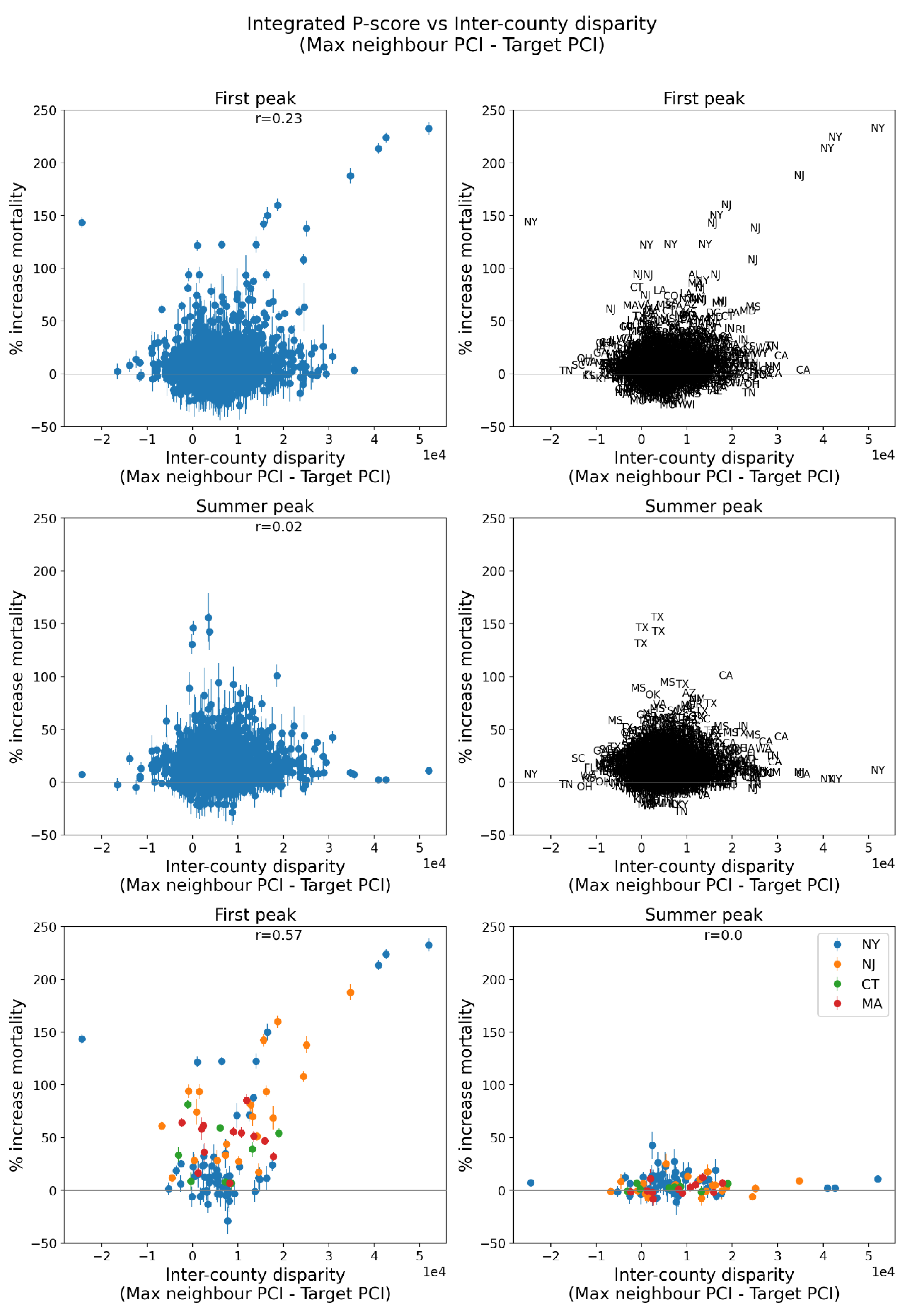
Figure 73.
Same as Figure 64, with x-axis showing the % of households in the county with no vehicle available (estimates from the 5-Year American Community Survey for the years 2014-2018).
Figure 73.
Same as Figure 64, with x-axis showing the % of households in the county with no vehicle available (estimates from the 5-Year American Community Survey for the years 2014-2018).
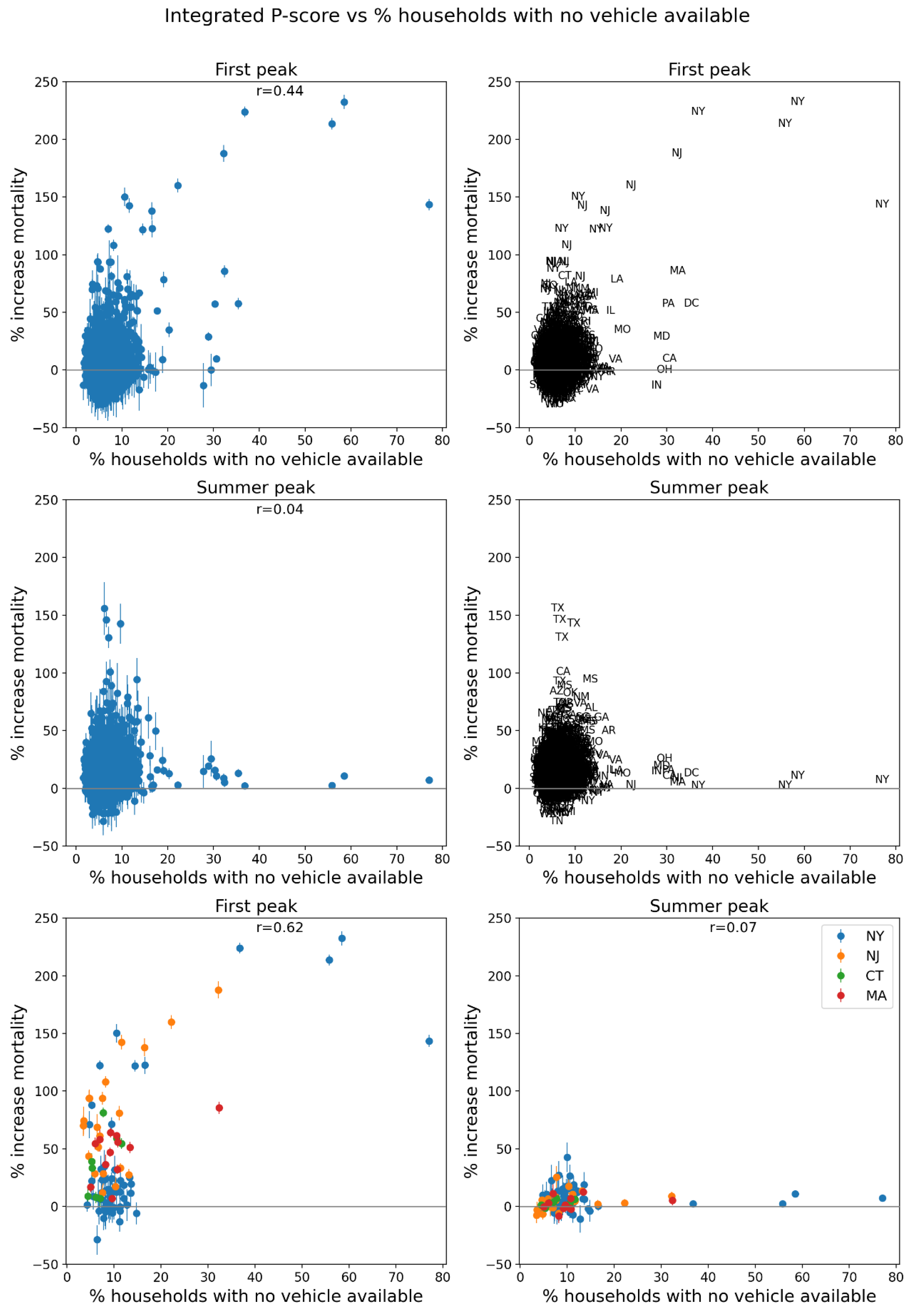
Figure 74.
Same as Figure 64, with x-axis showing the % of households in the county with more people than rooms (estimates from the 5-Year American Community Survey for the years 2014-2018).
Figure 74.
Same as Figure 64, with x-axis showing the % of households in the county with more people than rooms (estimates from the 5-Year American Community Survey for the years 2014-2018).
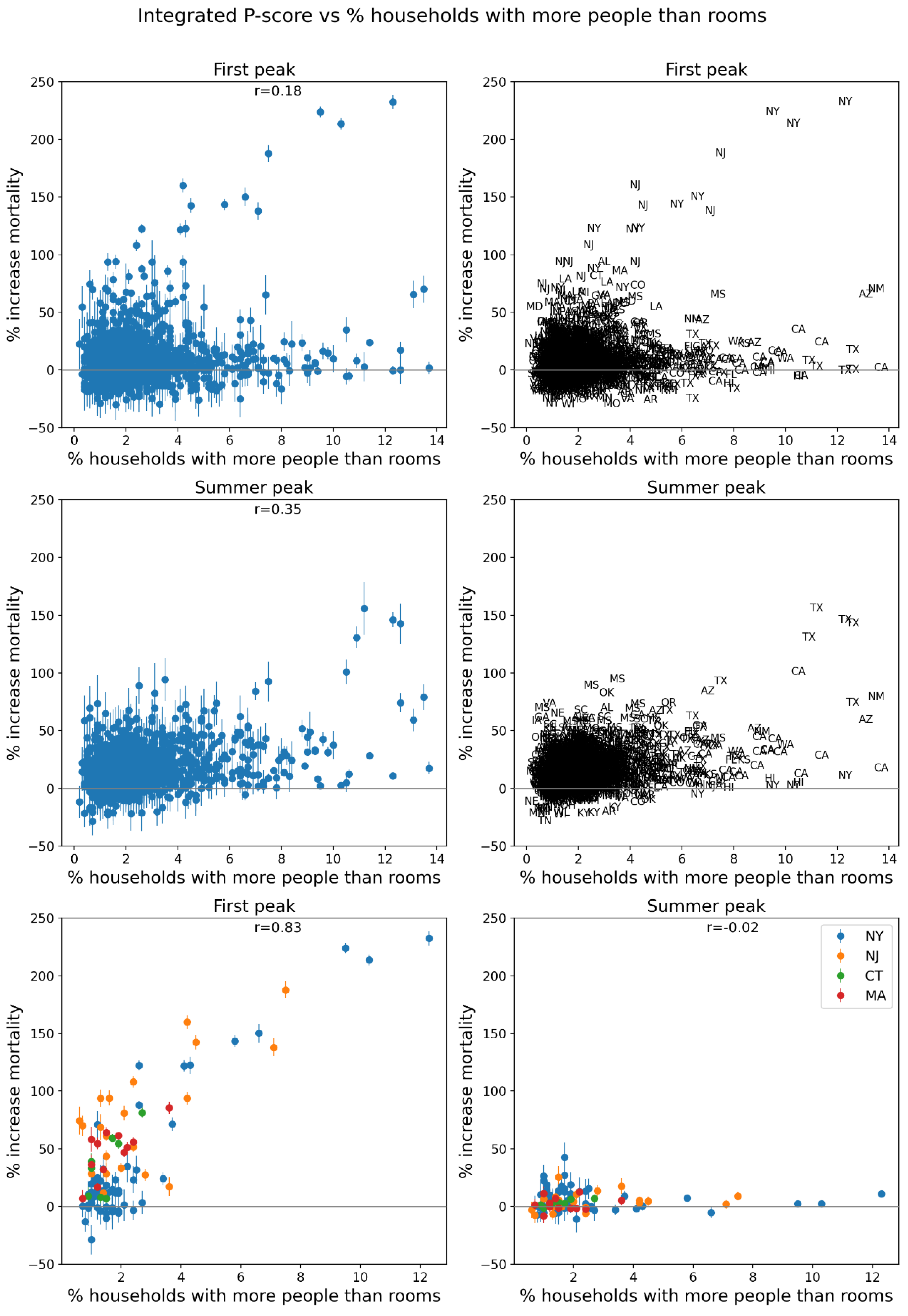
Figure 75.
Same as Figure 64, with x-axis showing the % of the county’s population living in housing structures with more than 10 units (estim. from 5-Year American Community Survey for 2014-2018).
Figure 75.
Same as Figure 64, with x-axis showing the % of the county’s population living in housing structures with more than 10 units (estim. from 5-Year American Community Survey for 2014-2018).
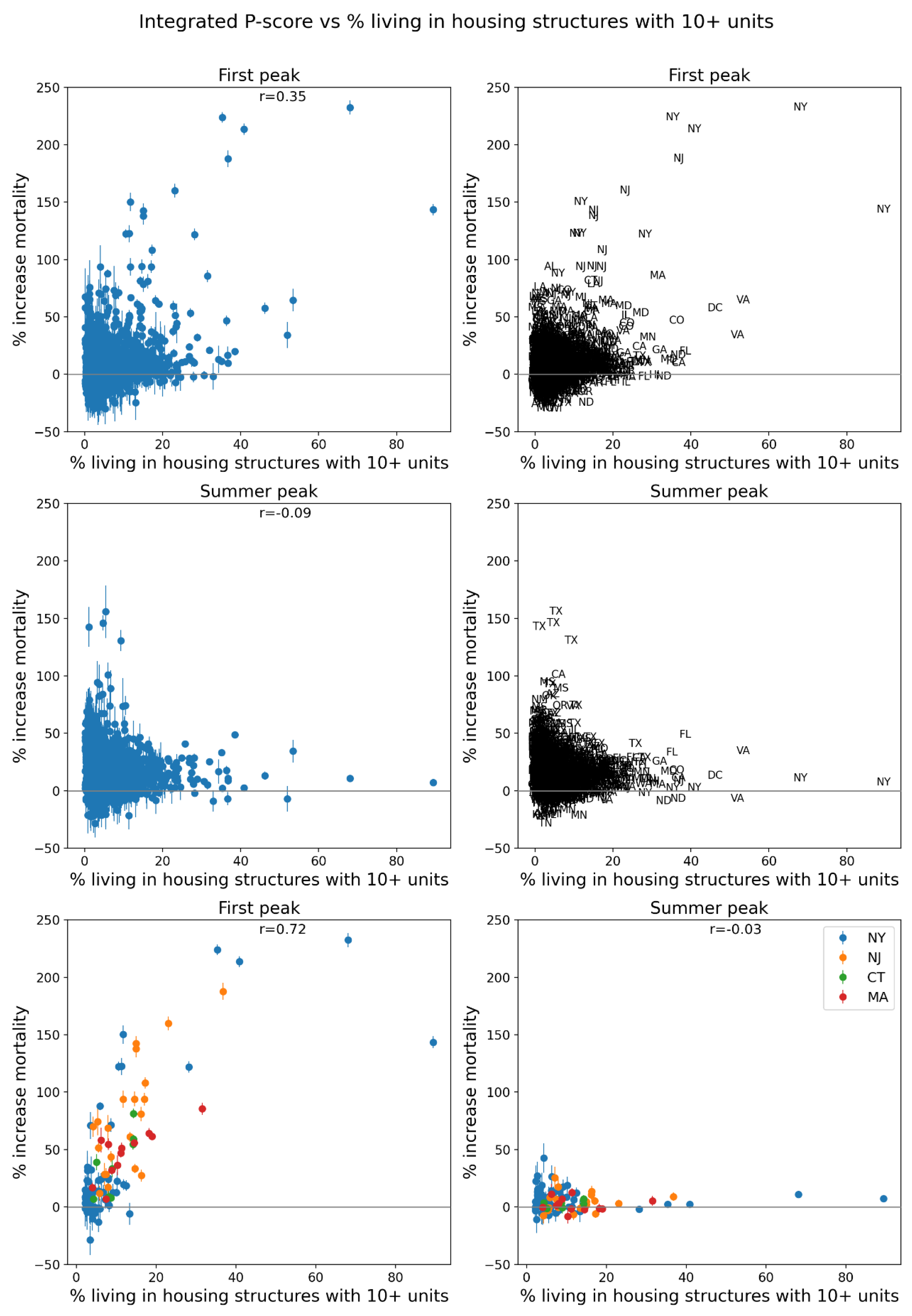
Figure 76.
Same as Figure 64, with x-axis showing the % of the county’s population that speaks English “less than well” (estimates from the 5-Year American Community Survey for the years 2014-2018).
Figure 76.
Same as Figure 64, with x-axis showing the % of the county’s population that speaks English “less than well” (estimates from the 5-Year American Community Survey for the years 2014-2018).
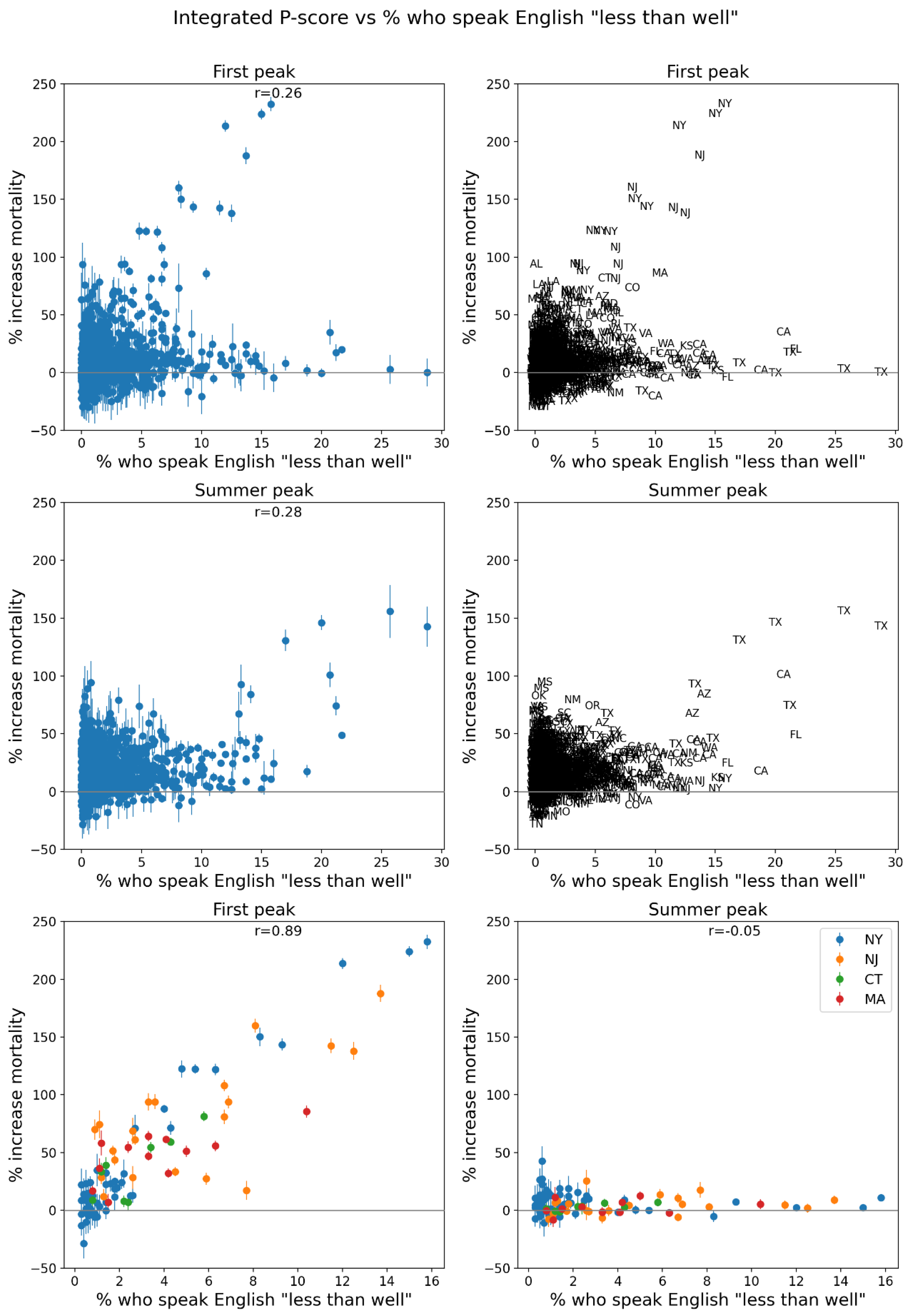
Figure 77.
Same as Figure 64, with x-axis showing the % of the county’s population that is a minority (non-white) (estimates from the 5-Year American Community Survey for the years 2014-2018).
Figure 77.
Same as Figure 64, with x-axis showing the % of the county’s population that is a minority (non-white) (estimates from the 5-Year American Community Survey for the years 2014-2018).
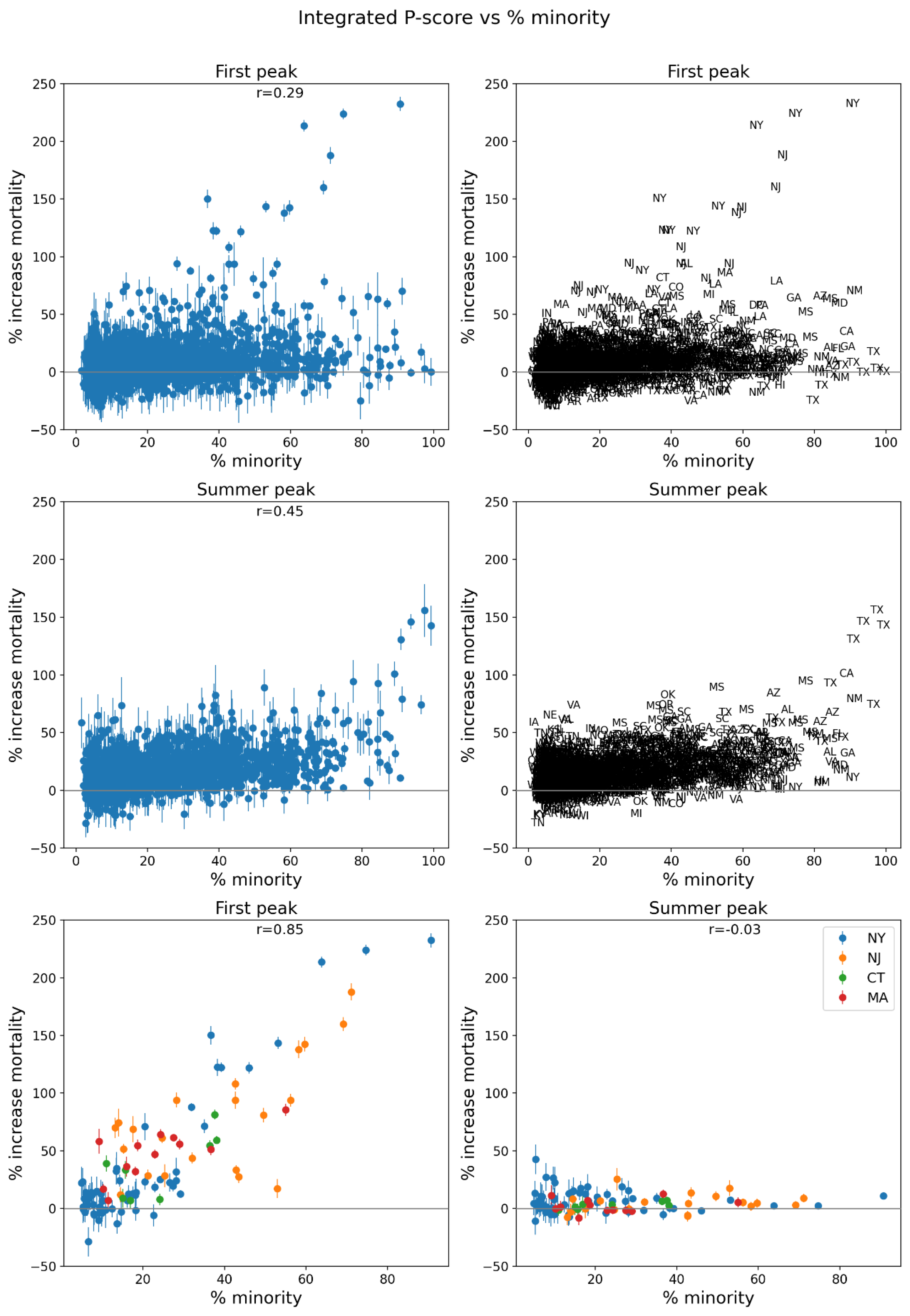
Figure 78.
Same as Figure 64, with x-axis showing the % of the county’s population aged 25+ with no high school diploma (estimates from the 5-Year American Community Survey for 2014-2018).
Figure 78.
Same as Figure 64, with x-axis showing the % of the county’s population aged 25+ with no high school diploma (estimates from the 5-Year American Community Survey for 2014-2018).
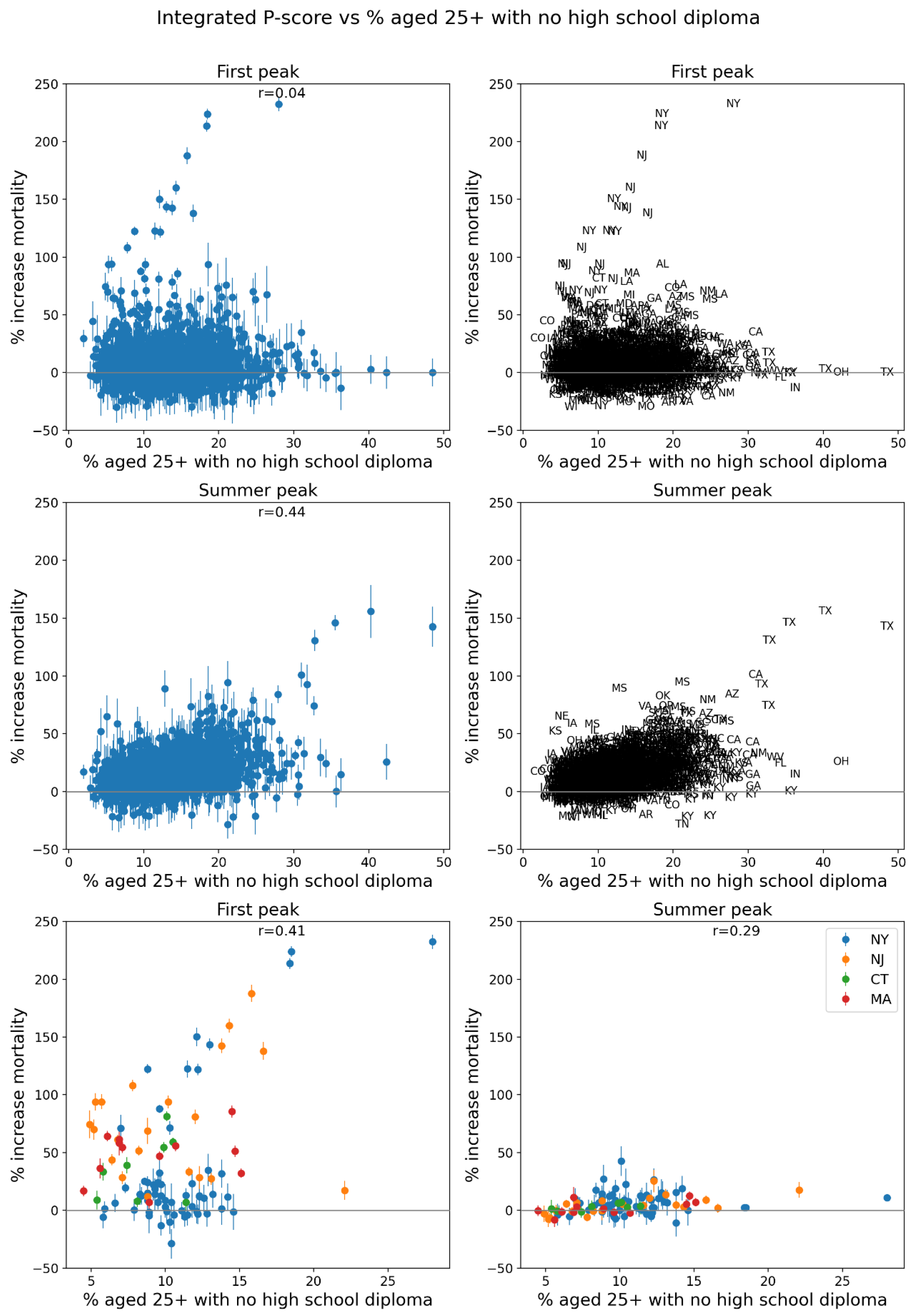
Figure 79.
Same as Figure 64, with x-axis showing the % of the county’s population that is aged 65+ (estimates from the 5-Year American Community Survey for the years 2014-2018).
Figure 79.
Same as Figure 64, with x-axis showing the % of the county’s population that is aged 65+ (estimates from the 5-Year American Community Survey for the years 2014-2018).
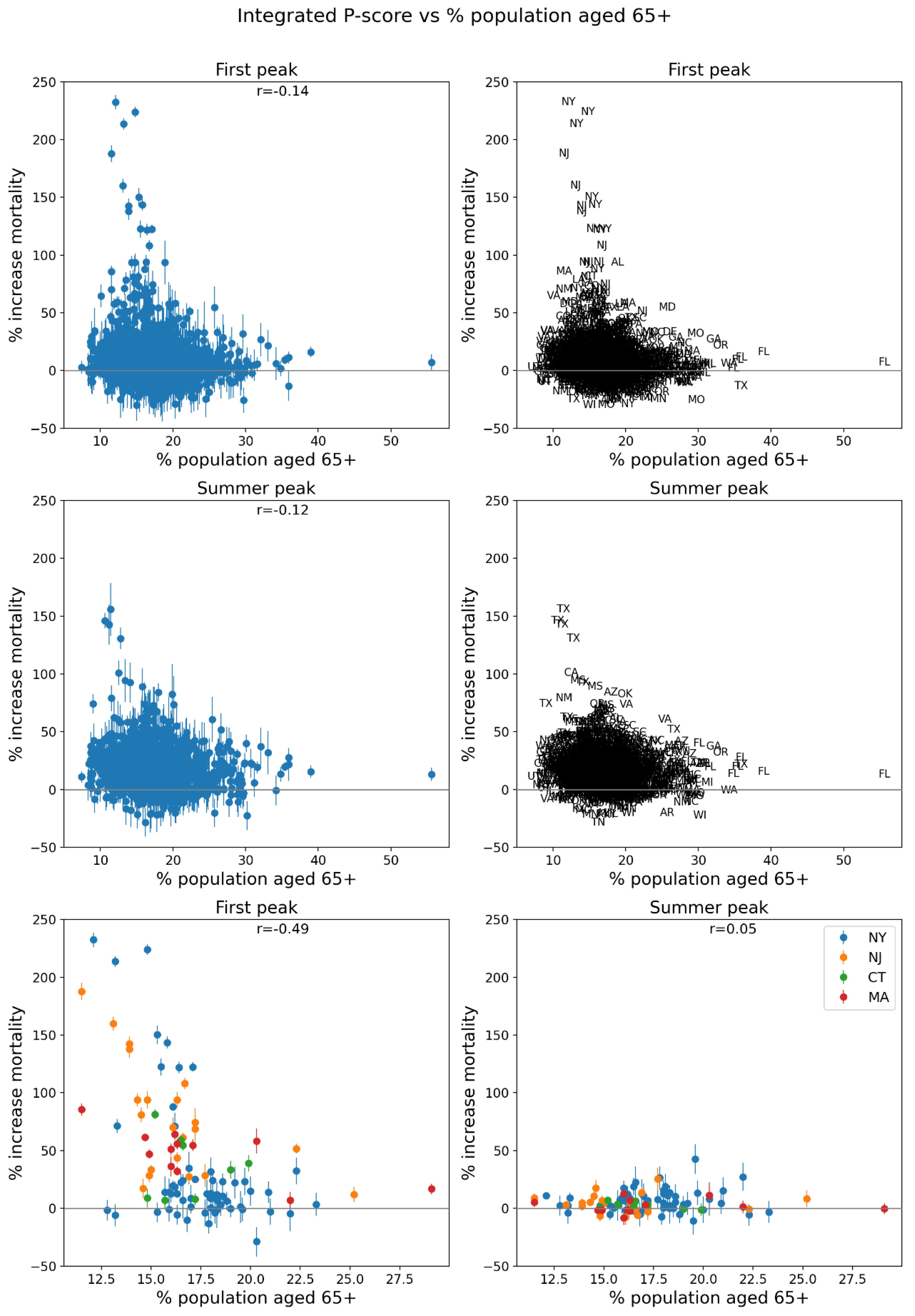
Figure 80.
Same as Figure 64, with x-axis showing the % of the county’s population that is aged 17 and under (estimates from the 5-Year American Community Survey for the years 2014-2018).
Figure 80.
Same as Figure 64, with x-axis showing the % of the county’s population that is aged 17 and under (estimates from the 5-Year American Community Survey for the years 2014-2018).
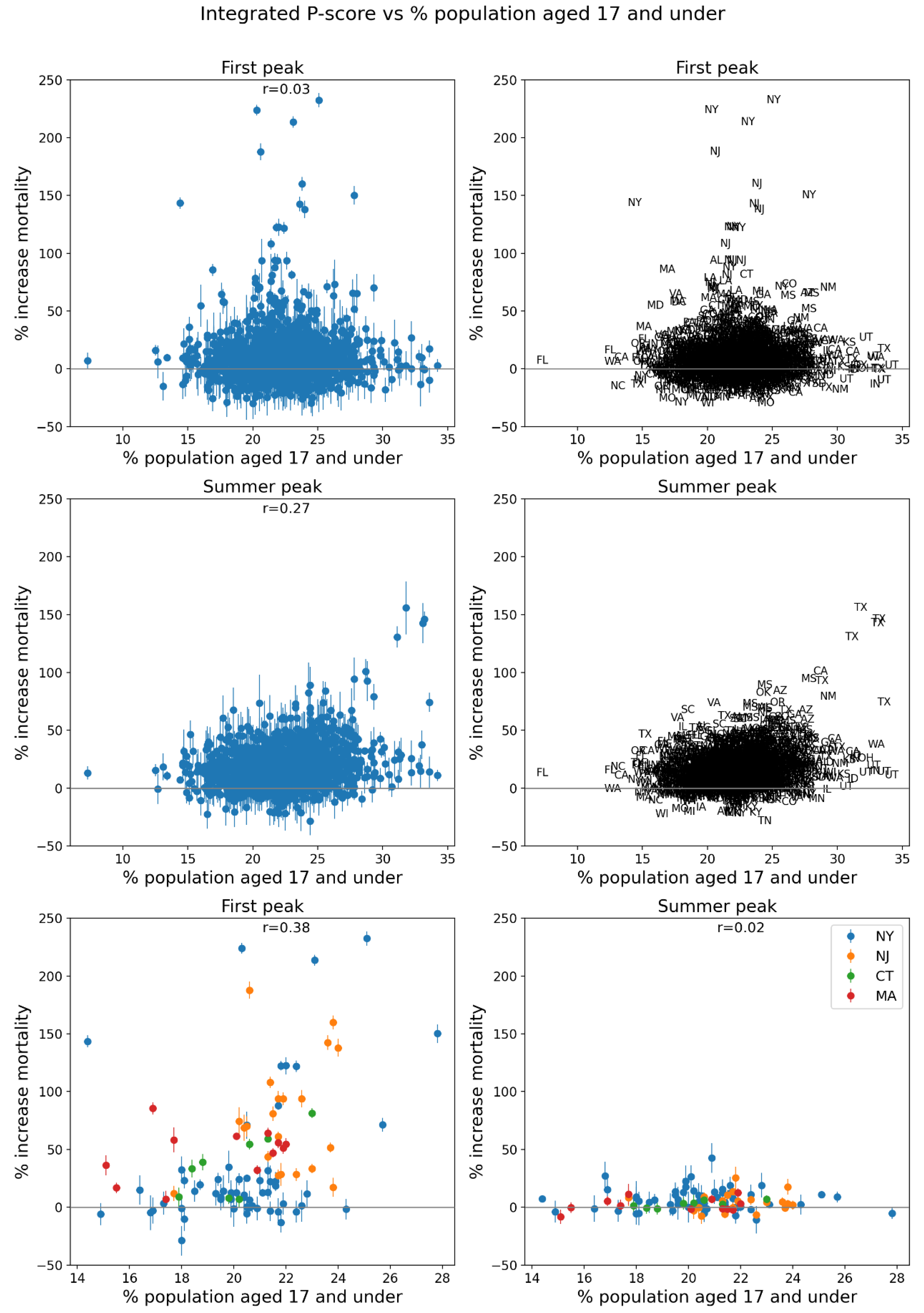
Figure 81.
Same as Figure 64, with x-axis showing the % of the county’s households that are single-parent households (estimates from the 5-Year American Community Survey for the years 2014-2018).
Figure 81.
Same as Figure 64, with x-axis showing the % of the county’s households that are single-parent households (estimates from the 5-Year American Community Survey for the years 2014-2018).
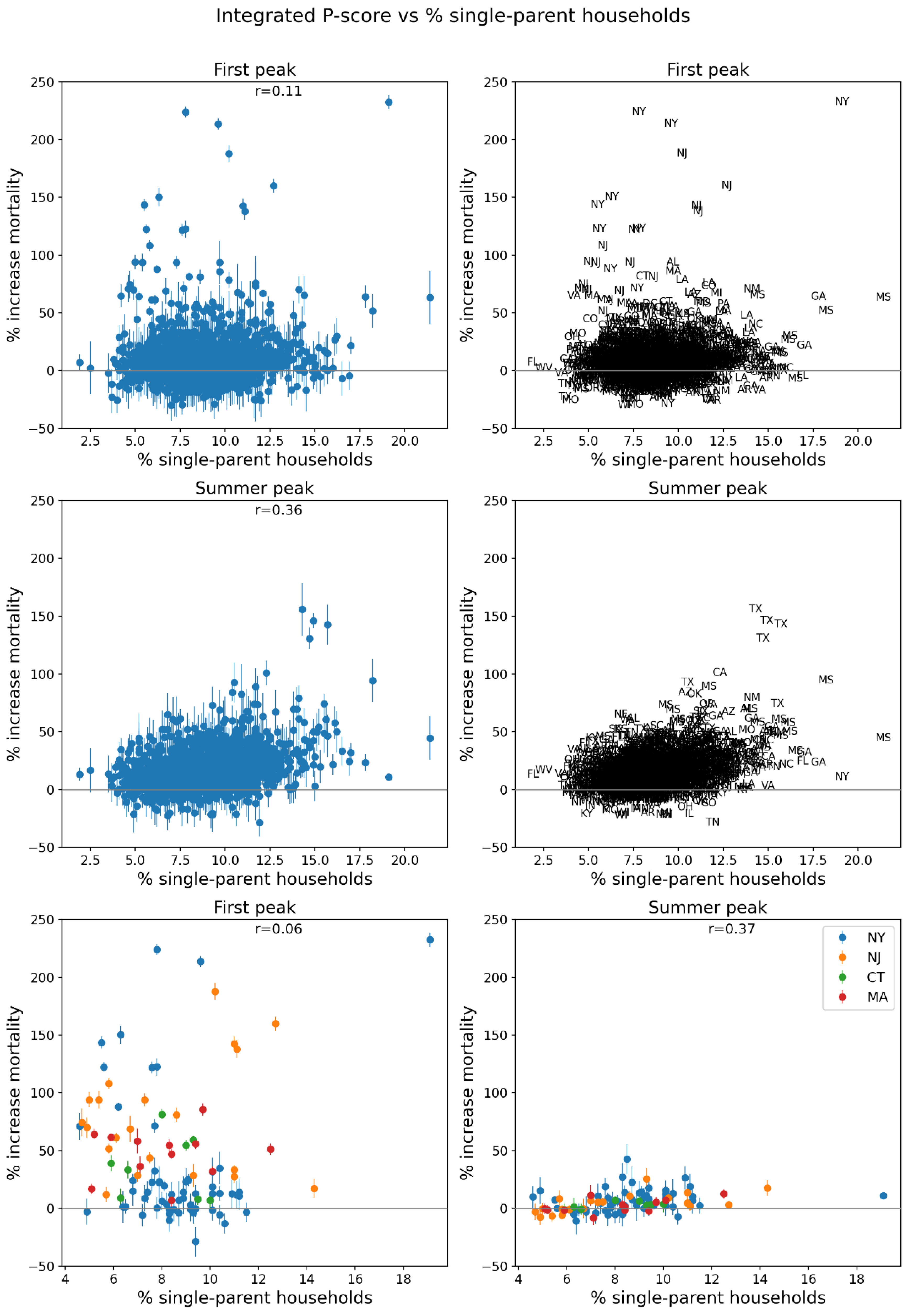
Figure 82.
Same as Figure 64, with x-axis showing the % of the county’s population with a disability (estimates from the 5-Year American Community Survey for the years 2014-2018).
Figure 82.
Same as Figure 64, with x-axis showing the % of the county’s population with a disability (estimates from the 5-Year American Community Survey for the years 2014-2018).
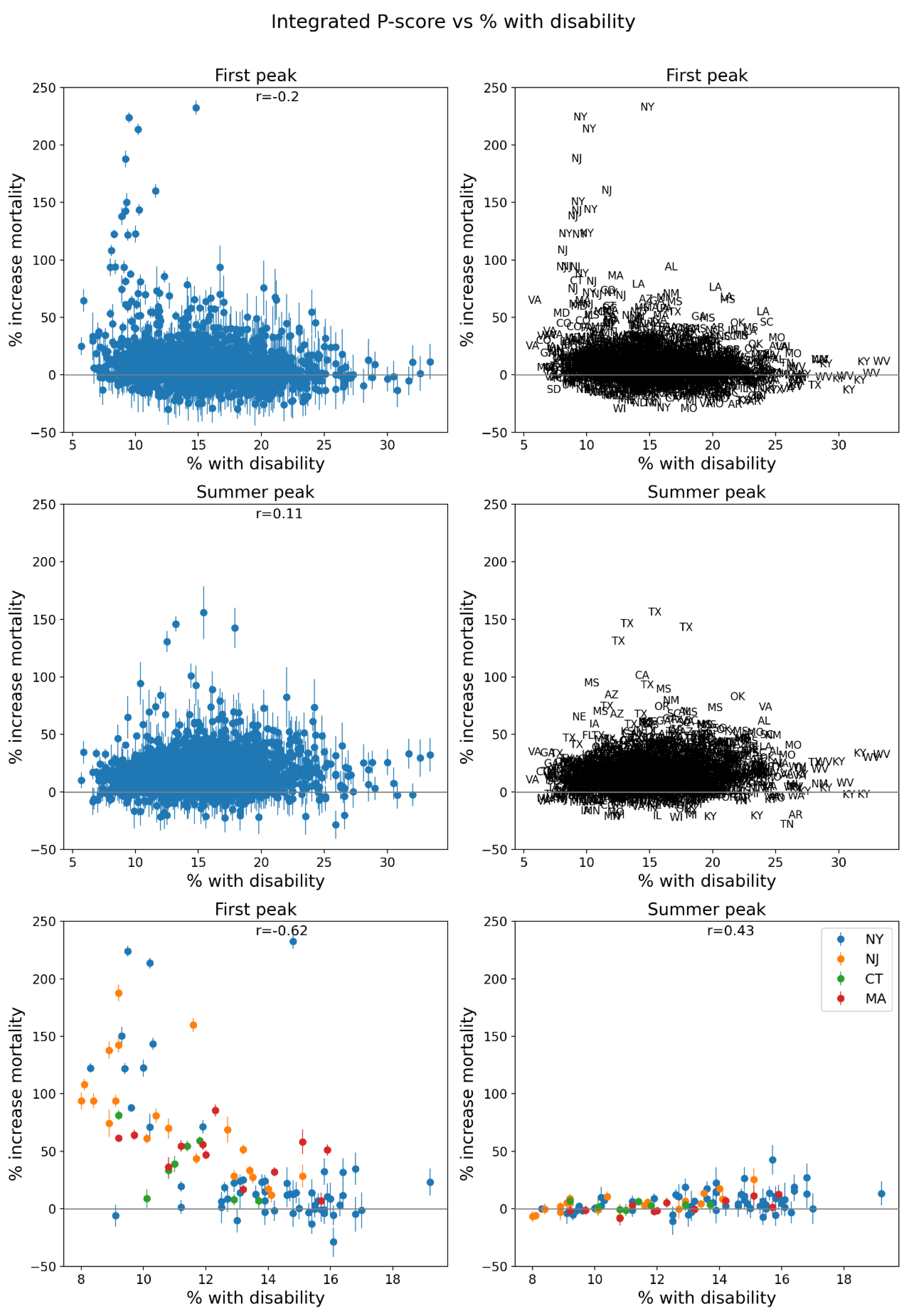
Figure 83.
Same as Figure 64, with x-axis showing the % of the county’s population with diabetes in 2018.
Figure 83.
Same as Figure 64, with x-axis showing the % of the county’s population with diabetes in 2018.
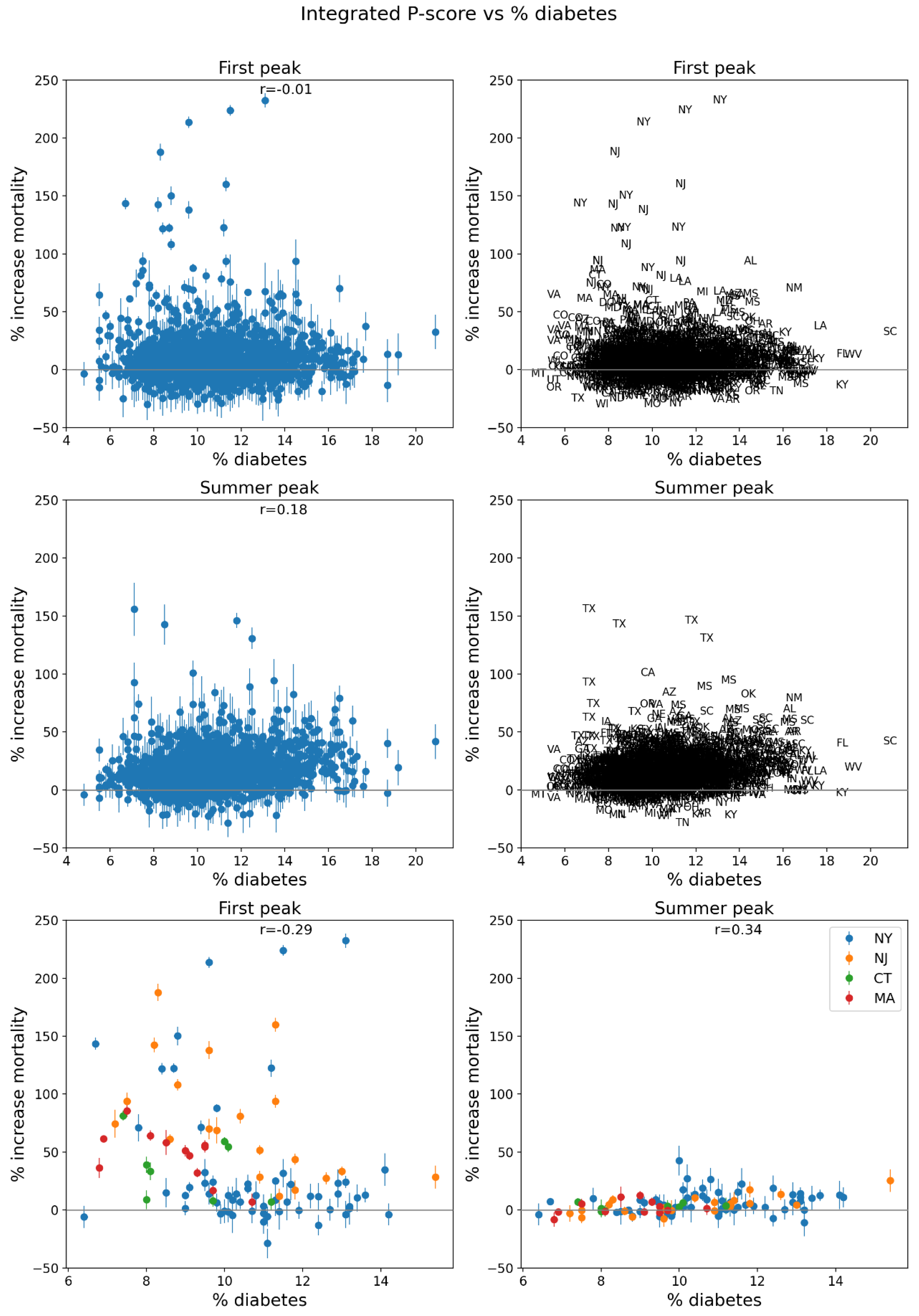
Figure 84.
Same as Figure 64, with x-axis showing the % of the county’s population with obesity in 2018.
Figure 84.
Same as Figure 64, with x-axis showing the % of the county’s population with obesity in 2018.
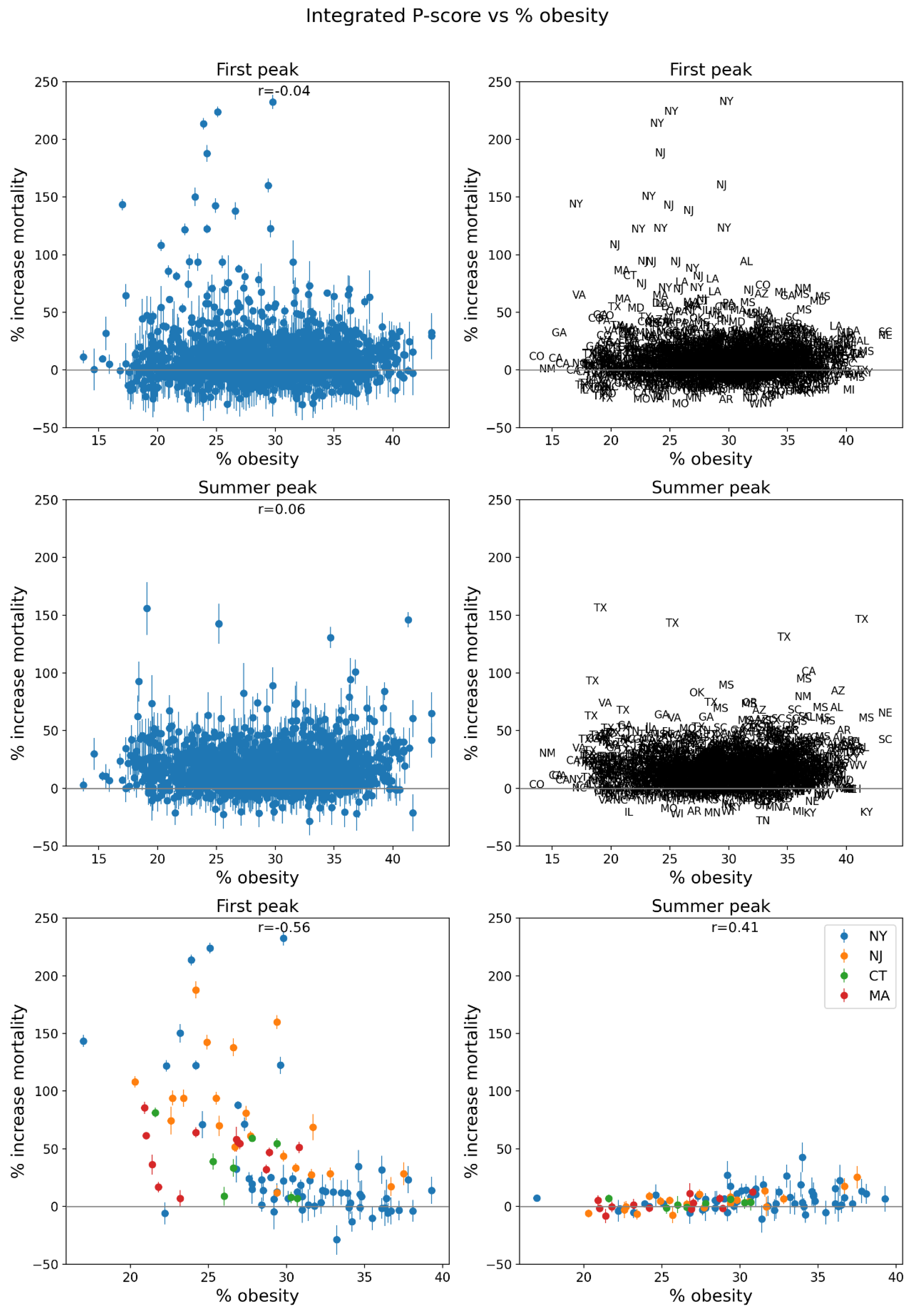
Figure 85.
Same as Figure 64, with x-axis showing the % of the votes cast in the 2016 USA election that were for the Democratic Party’s presidential candidate.
Figure 85.
Same as Figure 64, with x-axis showing the % of the votes cast in the 2016 USA election that were for the Democratic Party’s presidential candidate.
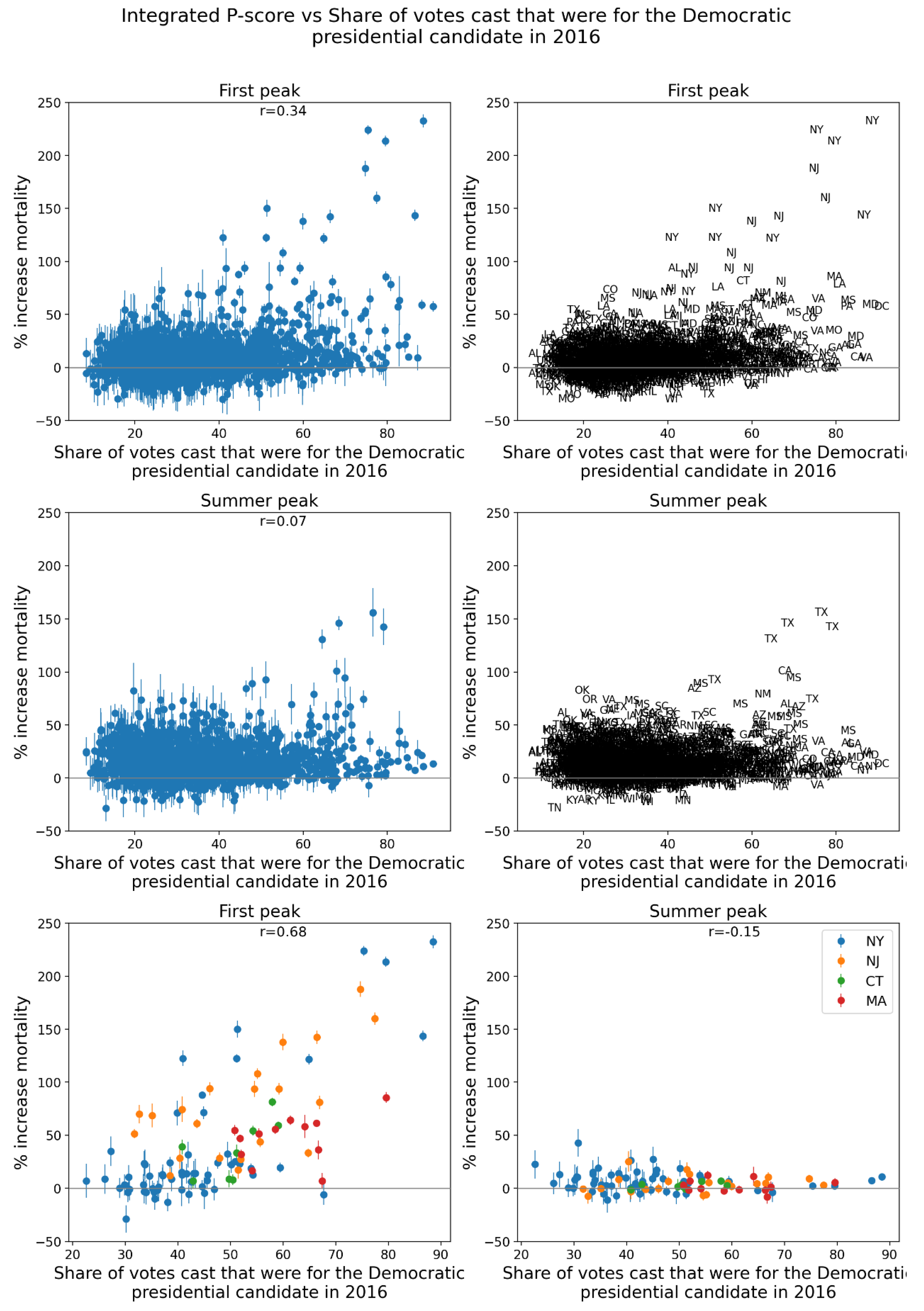
Figure 86.
Same as Figure 64, with x-axis showing the % of all deaths in the county in March-May 2019 that occurred at home.
Figure 86.
Same as Figure 64, with x-axis showing the % of all deaths in the county in March-May 2019 that occurred at home.
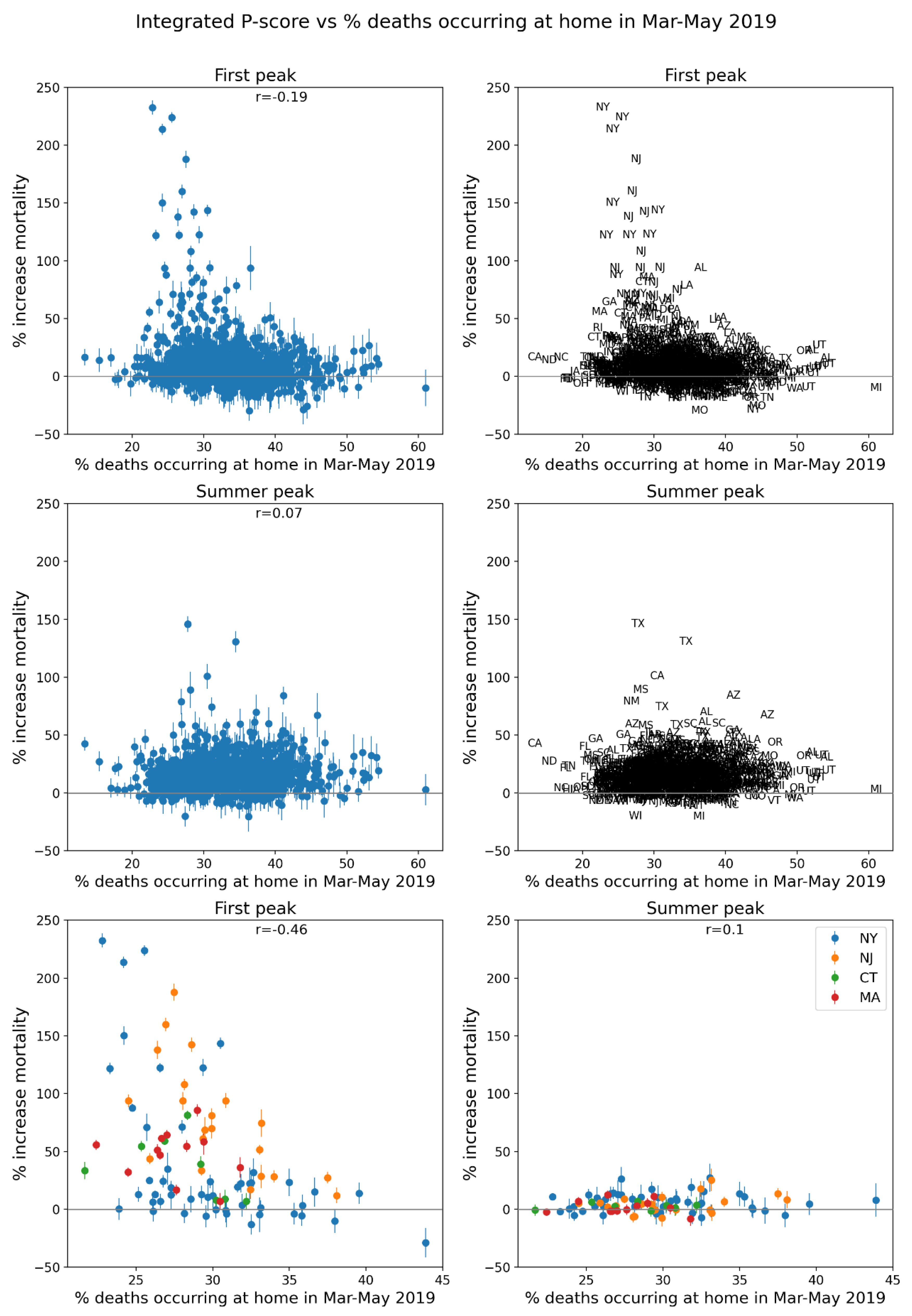
Figure 87.
Same as Figure 64, with x-axis showing the % of all deaths in the county in June-September 2019 that occurred at home.
Figure 87.
Same as Figure 64, with x-axis showing the % of all deaths in the county in June-September 2019 that occurred at home.
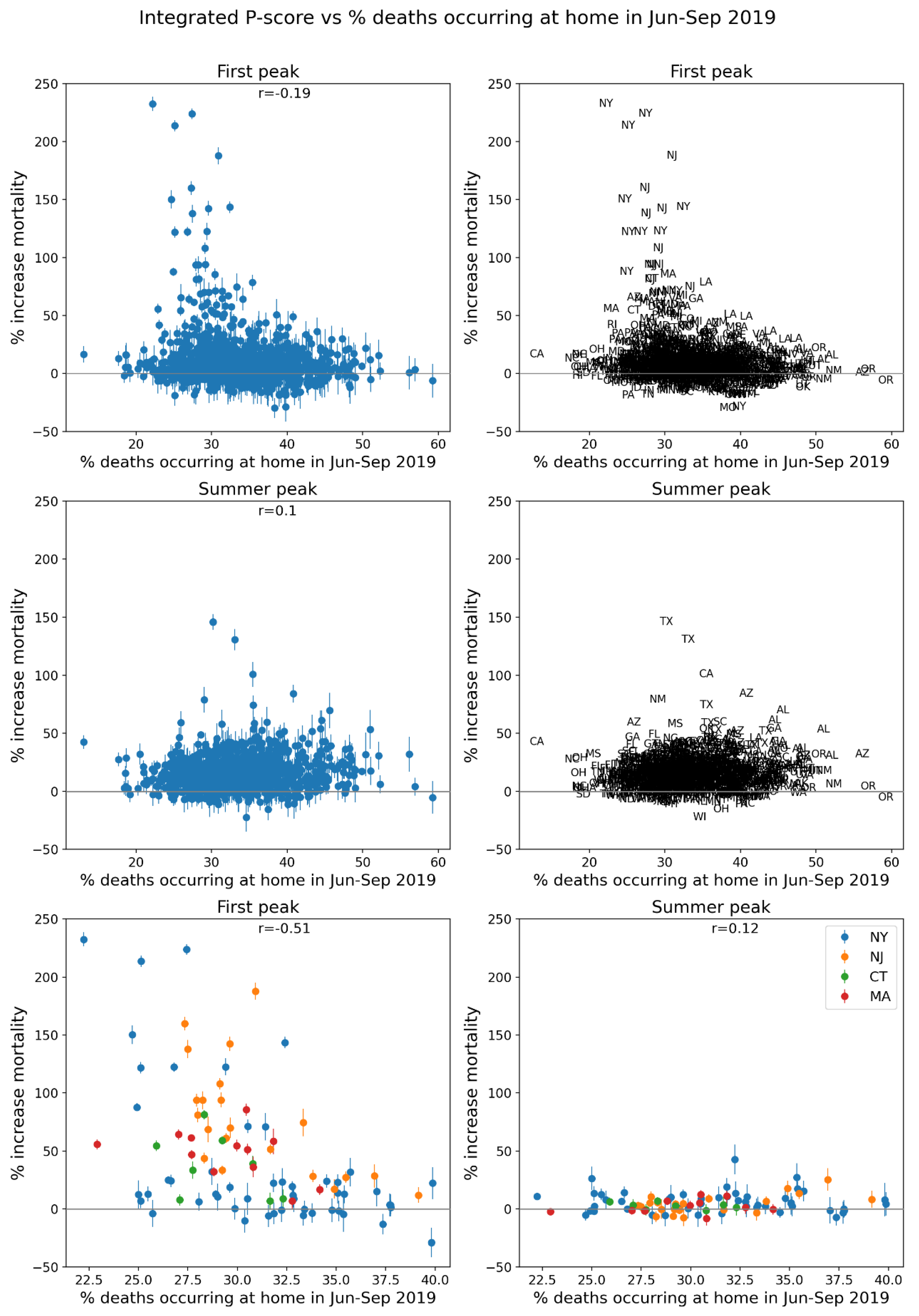
Figure 88.
Same as Figure 64, with x-axis showing the % of all deaths in the county in March-May 2019 that occurred in hospital (“Medical Facility – Inpatient”).
Figure 88.
Same as Figure 64, with x-axis showing the % of all deaths in the county in March-May 2019 that occurred in hospital (“Medical Facility – Inpatient”).
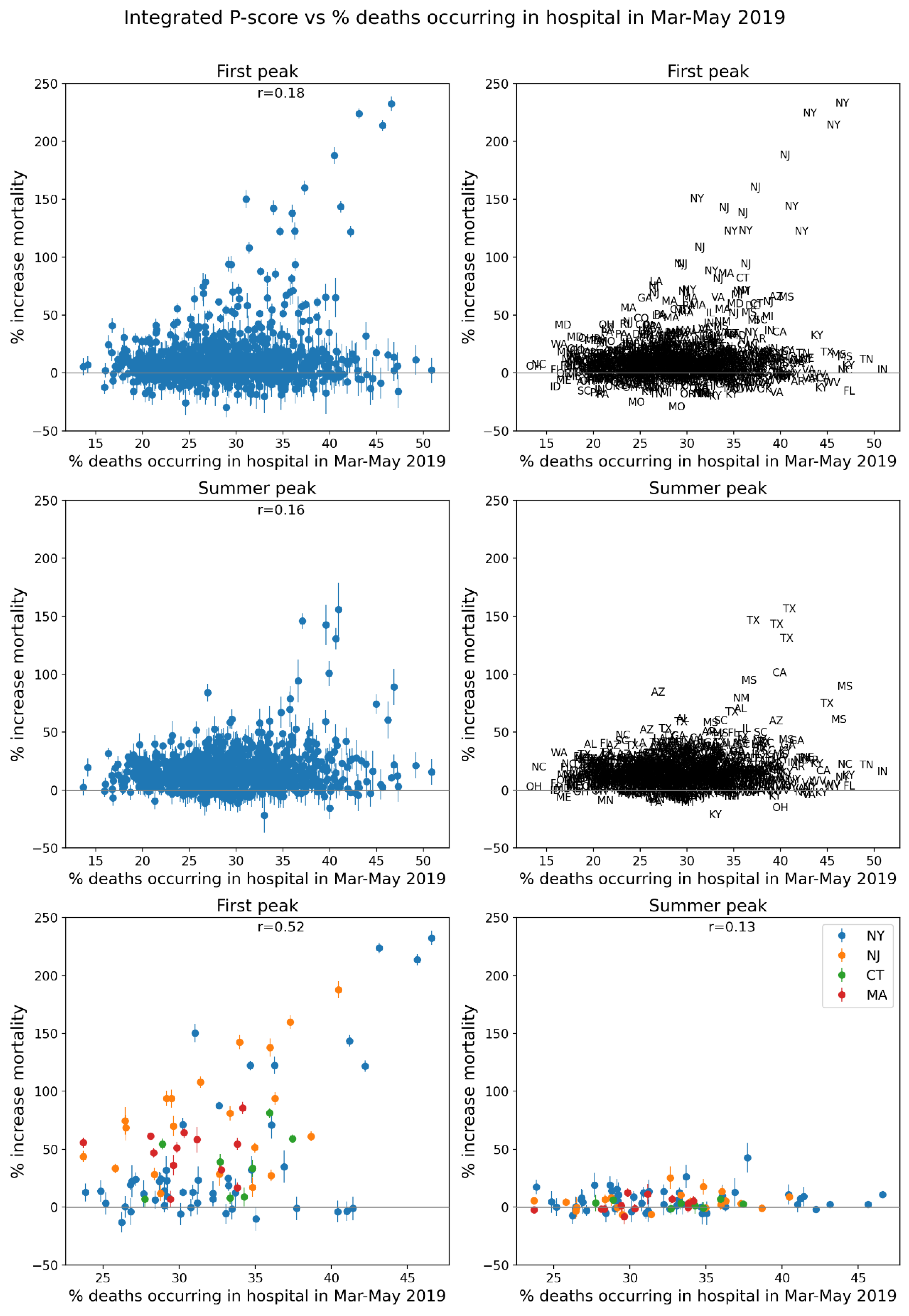
Figure 89.
Same as Figure 64, with x-axis showing the % of all deaths in the county in June-September 2019 that occurred in hospital (“Medical Facility – Inpatient”).
Figure 89.
Same as Figure 64, with x-axis showing the % of all deaths in the county in June-September 2019 that occurred in hospital (“Medical Facility – Inpatient”).
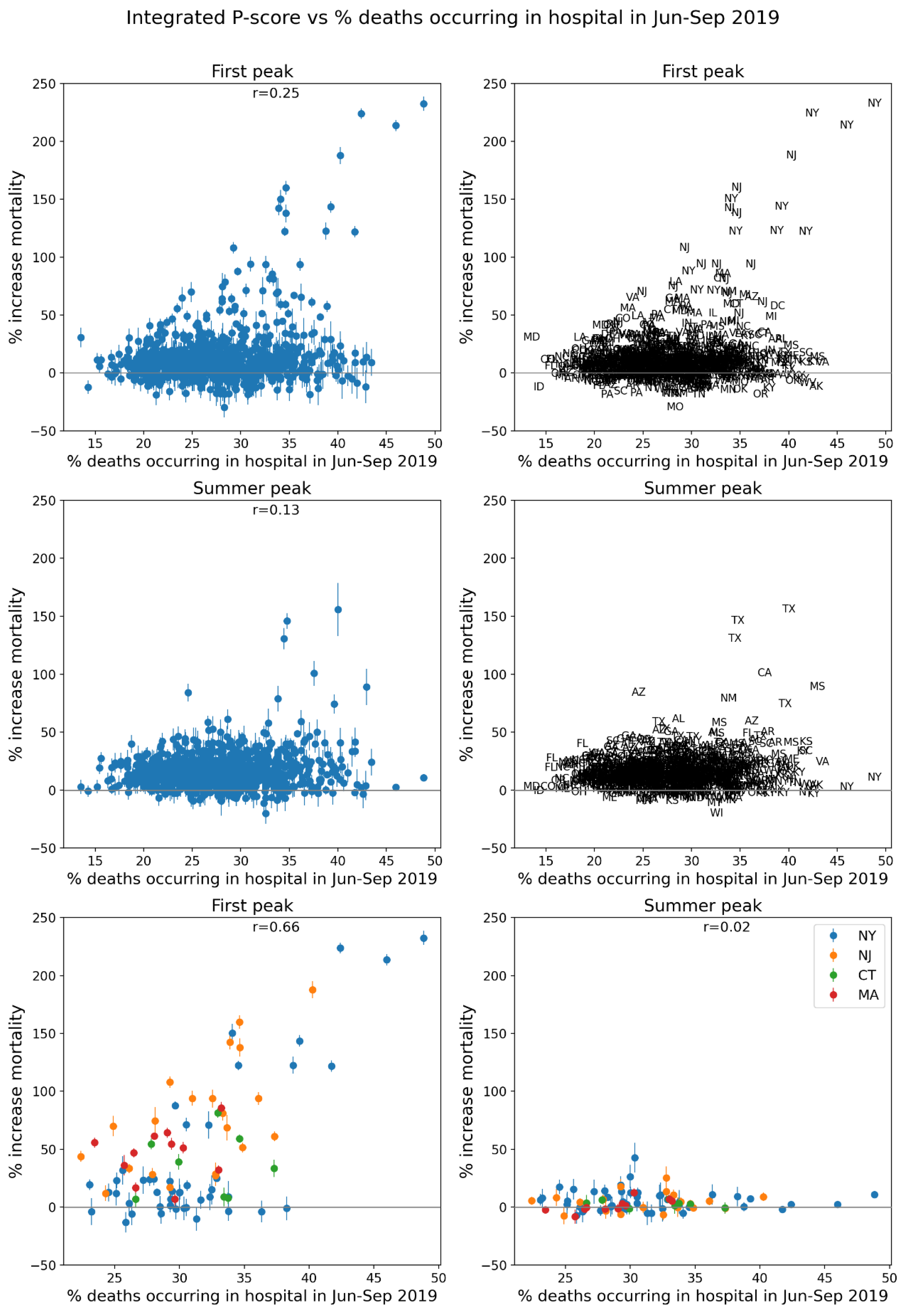
Figure 90.
Same as Figure 64, with x-axis showing the difference in the % of all deaths in the county in March-May 2020 that occurred in hospital (“Medical Facility – Inpatient”) and the % of all deaths in the county in March-May 2019 that occurred in hospital.
Figure 90.
Same as Figure 64, with x-axis showing the difference in the % of all deaths in the county in March-May 2020 that occurred in hospital (“Medical Facility – Inpatient”) and the % of all deaths in the county in March-May 2019 that occurred in hospital.

Figure 91.
Same as Figure 64, with x-axis showing the difference in the % of all deaths in the county in June-September 2020 that occurred in hospital (“Medical Facility – Inpatient”) and the % of all deaths in the county in June-September 2019 that occurred in hospital.
Figure 91.
Same as Figure 64, with x-axis showing the difference in the % of all deaths in the county in June-September 2020 that occurred in hospital (“Medical Facility – Inpatient”) and the % of all deaths in the county in June-September 2019 that occurred in hospital.
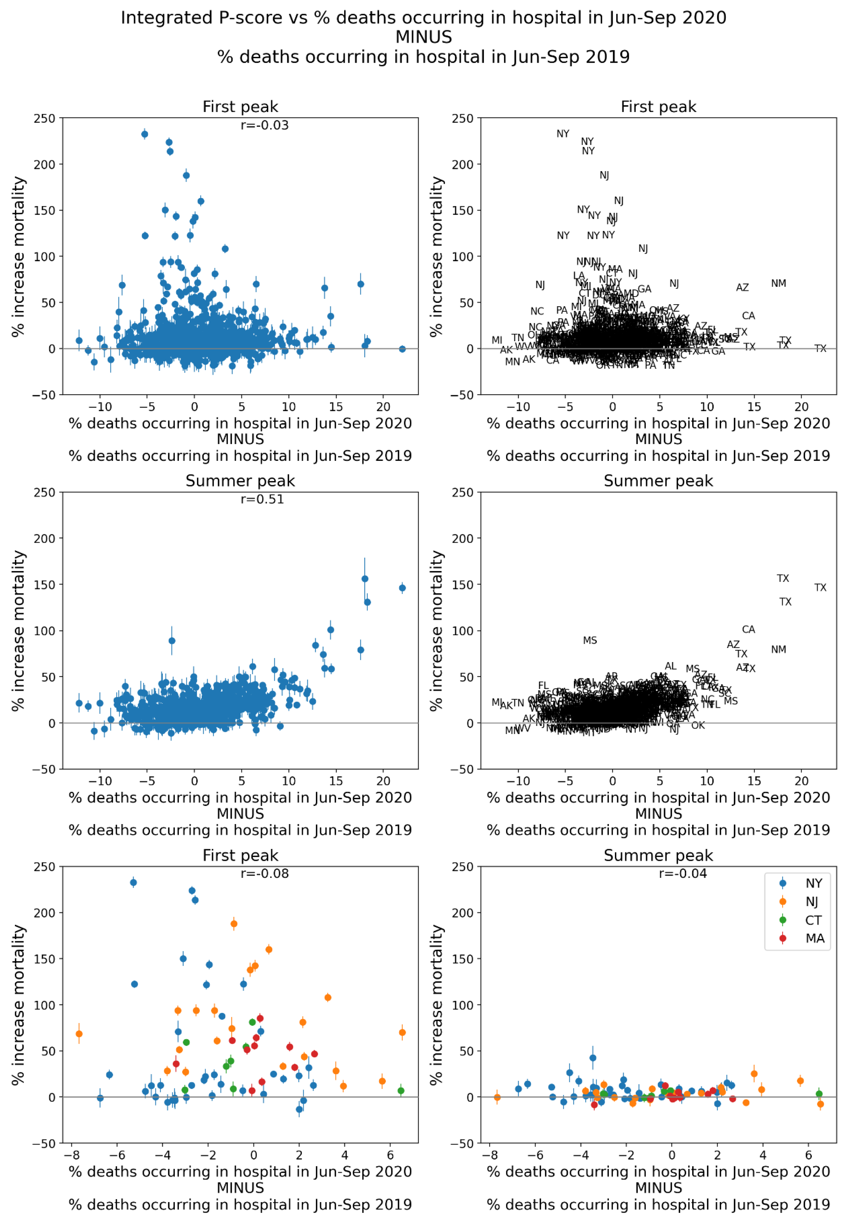
Figure 92.
Same as Figure 64, with x-axis showing the number of prescription drug claims per population in the county in 2017.
Figure 92.
Same as Figure 64, with x-axis showing the number of prescription drug claims per population in the county in 2017.
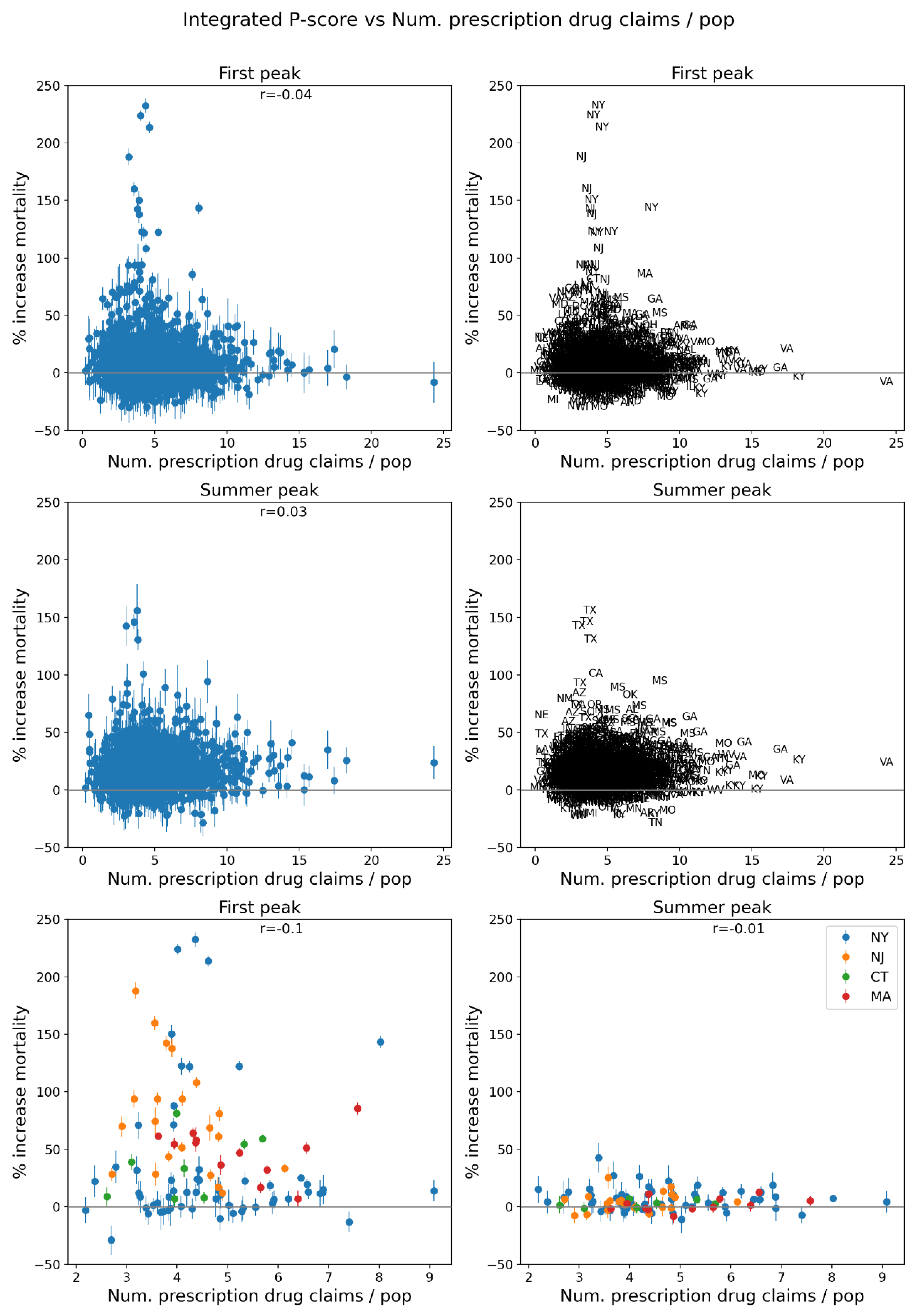
Figure 93.
Same as Figure 64, with x-axis showing the % of the number of antibiotic prescription drug claims per population in the county in 2017.
Figure 93.
Same as Figure 64, with x-axis showing the % of the number of antibiotic prescription drug claims per population in the county in 2017.
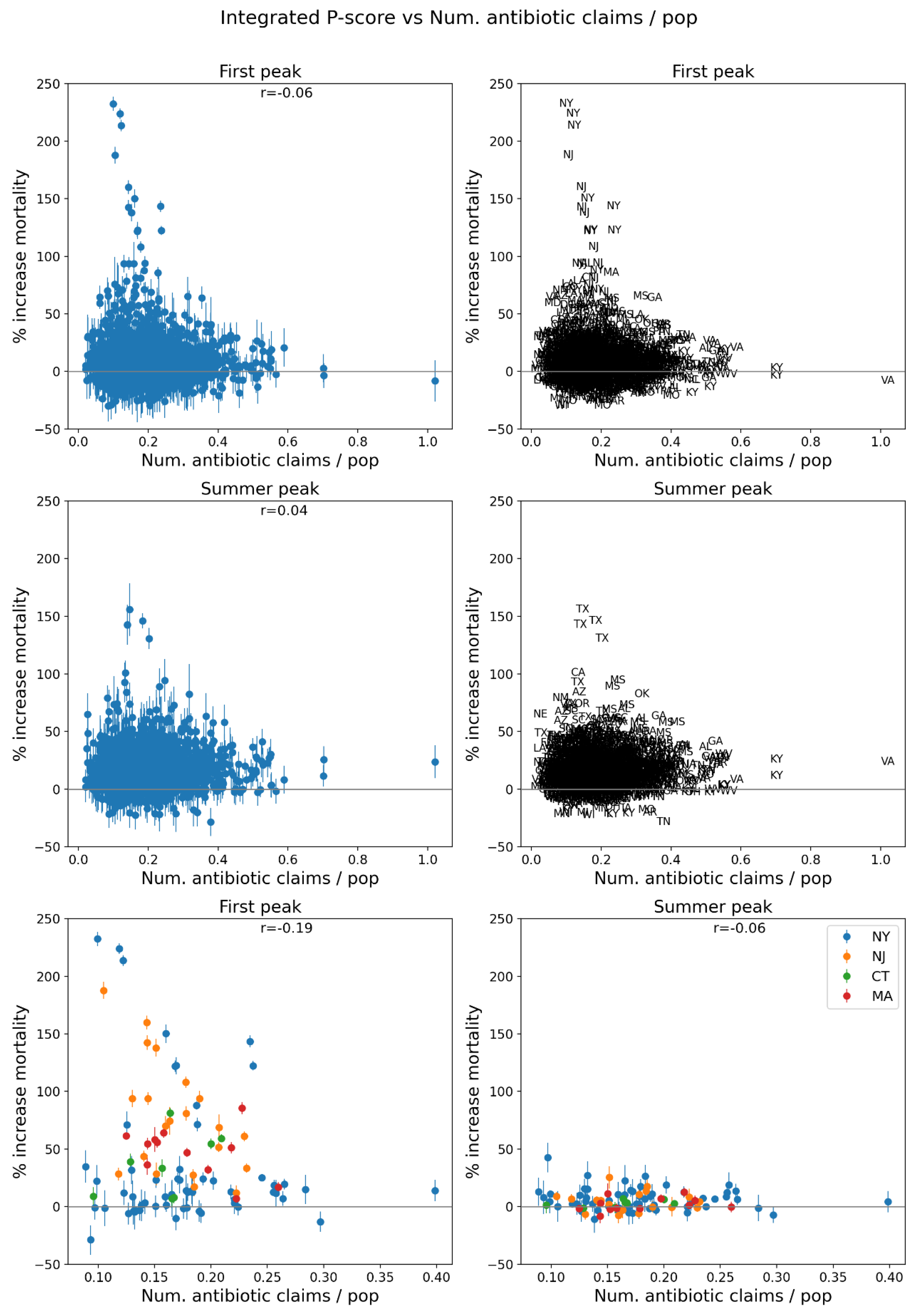
Figure 94.
% of the population aged 18+ having received at least one dose of a COVID vaccine by December 31, 2021.
Figure 94.
% of the population aged 18+ having received at least one dose of a COVID vaccine by December 31, 2021.
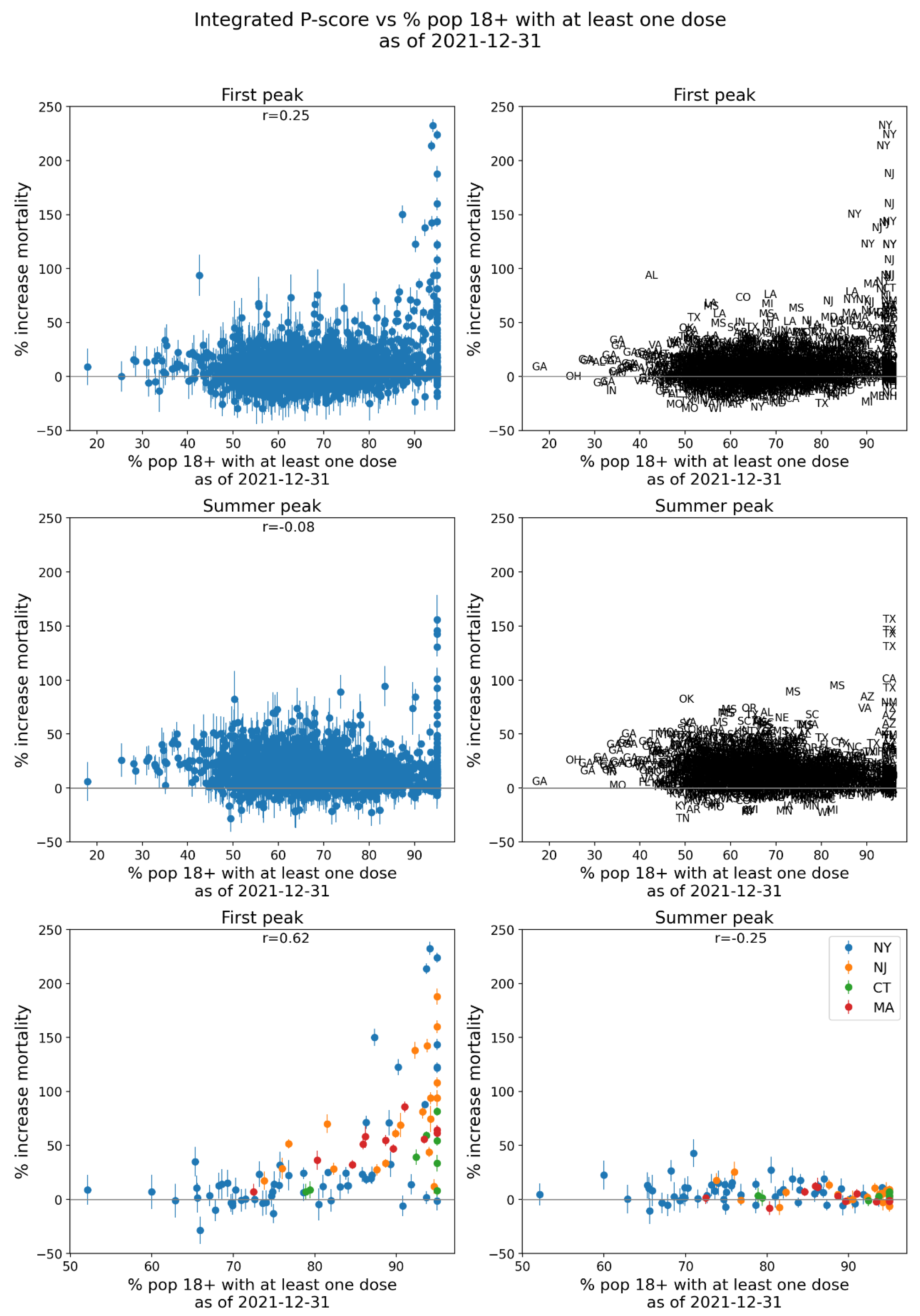
Figure 95.
% of the population aged 65+ having received at least one dose of a COVID vaccine by December 31, 2021.
Figure 95.
% of the population aged 65+ having received at least one dose of a COVID vaccine by December 31, 2021.
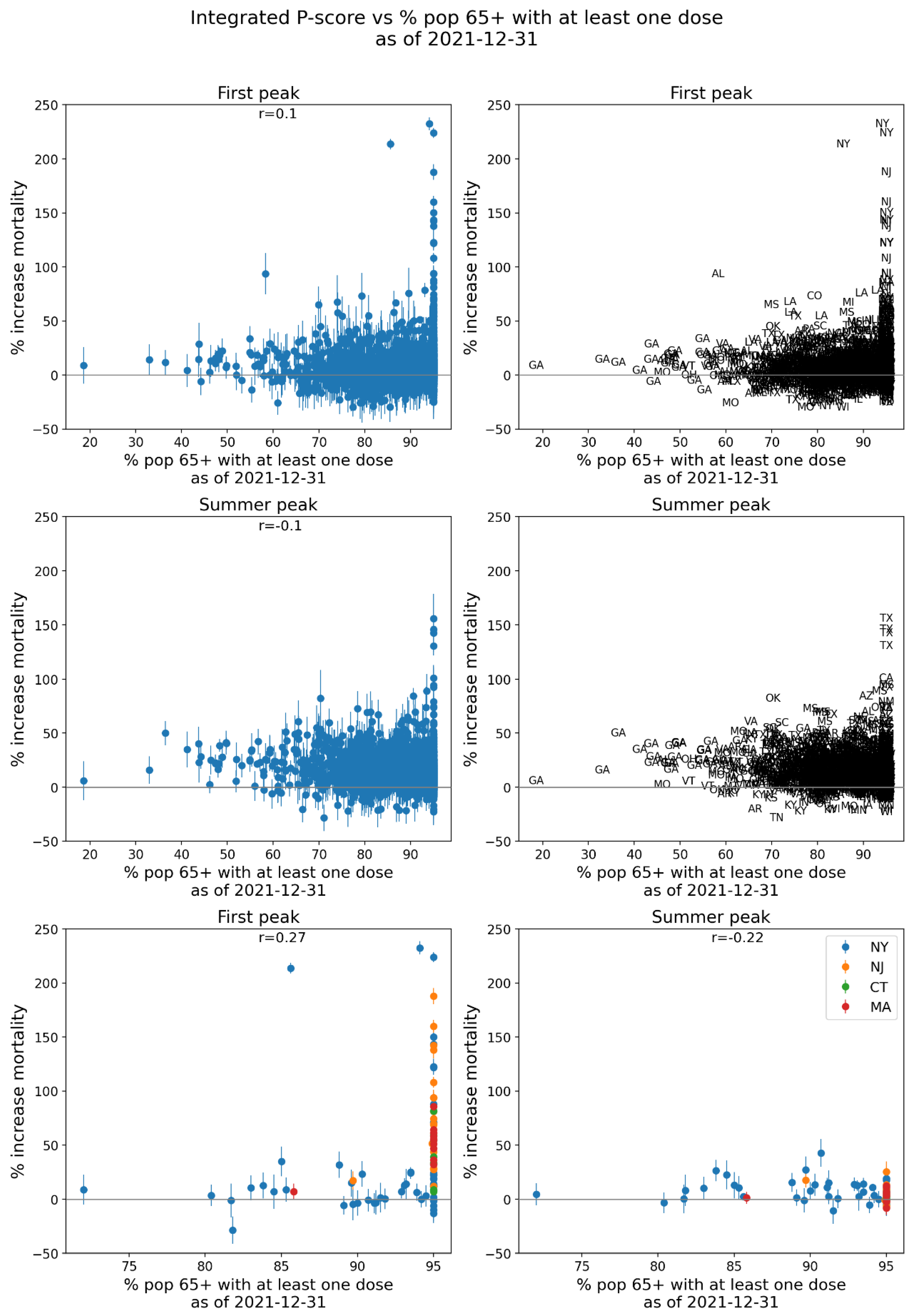
Figure 96.
% of the population aged 18+ with primary series of a COVID vaccine completed by December 31, 2021.
Figure 96.
% of the population aged 18+ with primary series of a COVID vaccine completed by December 31, 2021.
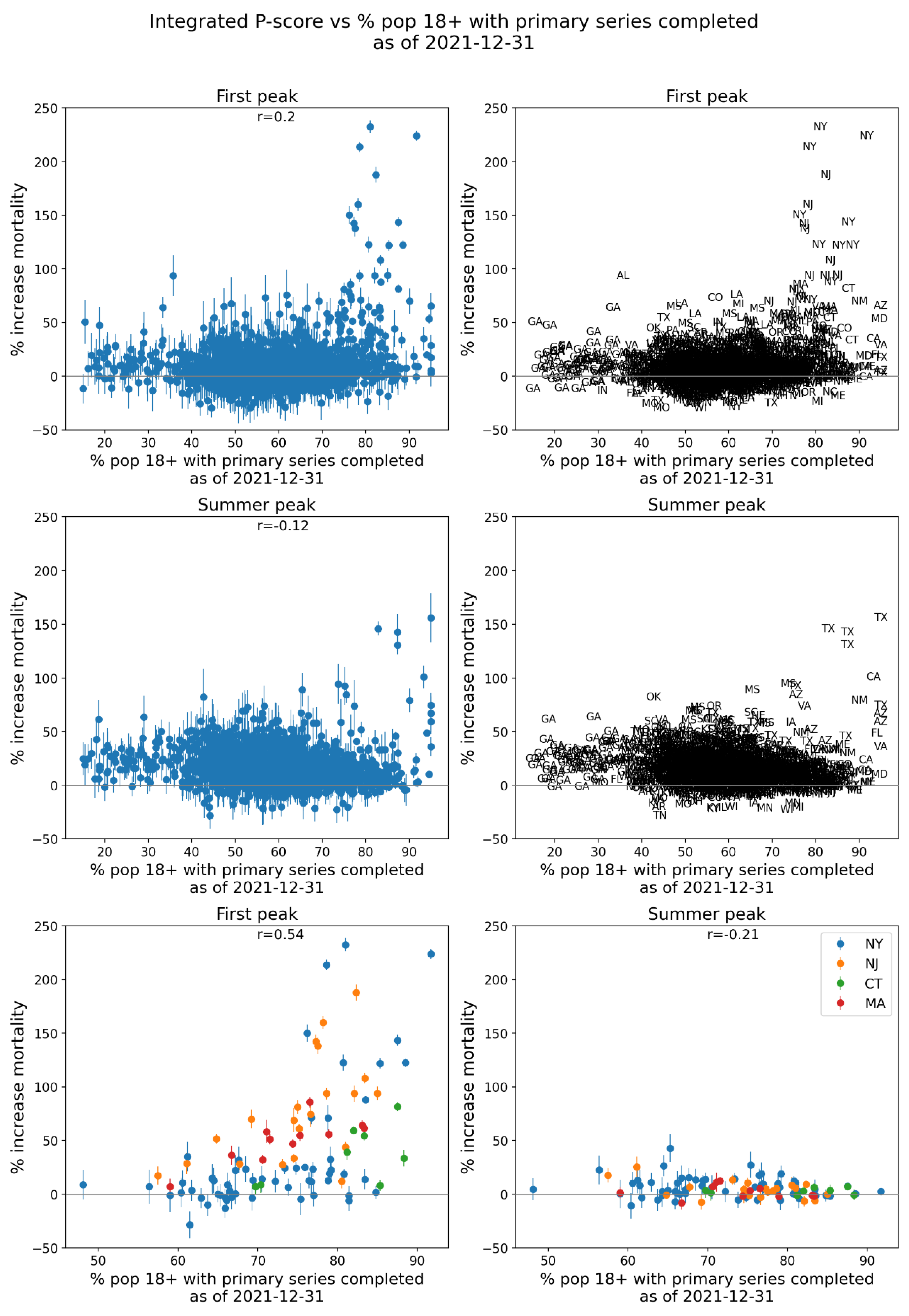
Figure 97.
% of the population aged 65+ with primary series of a COVID vaccine completed by December 31, 2021.
Figure 97.
% of the population aged 65+ with primary series of a COVID vaccine completed by December 31, 2021.
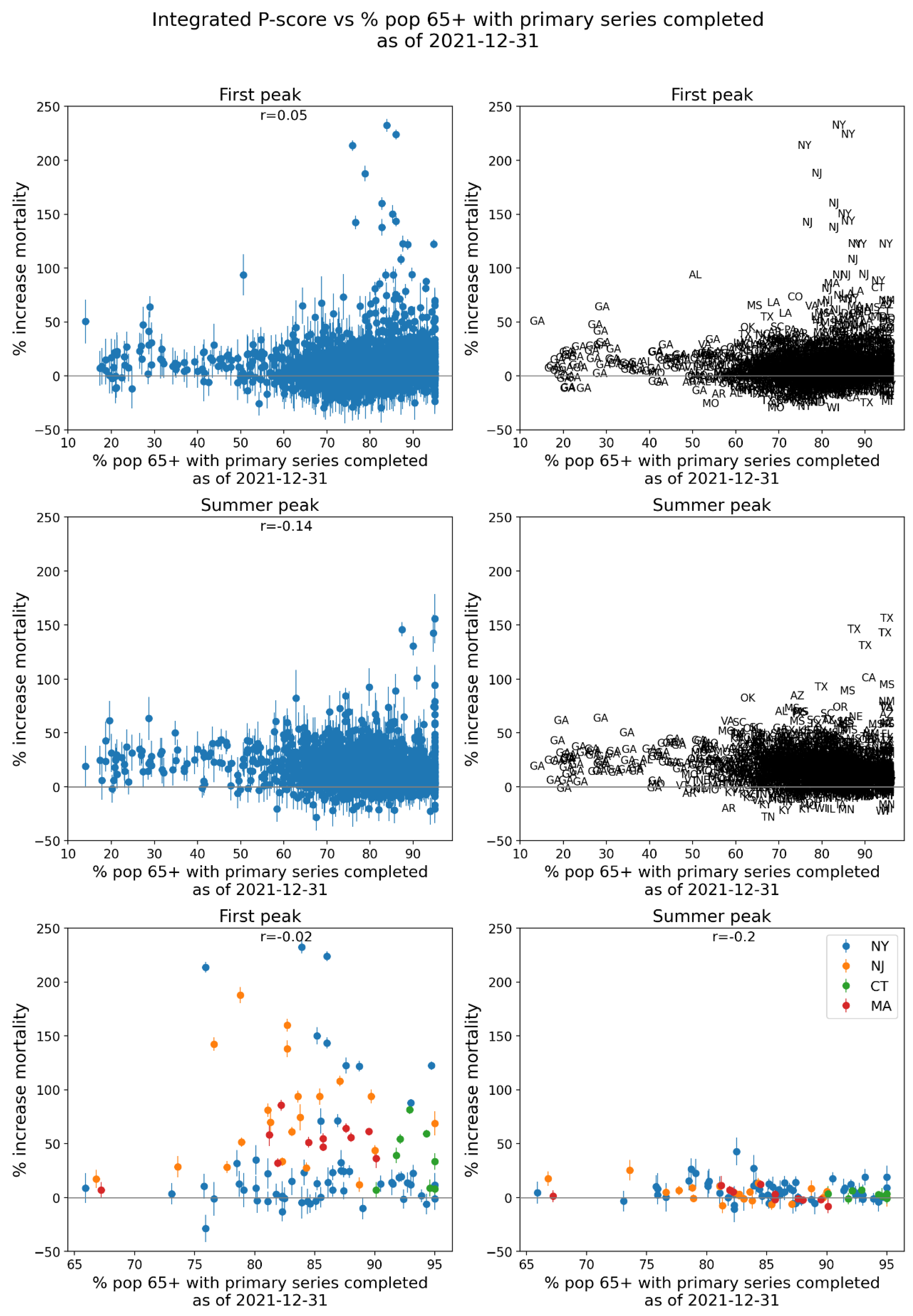
Figure 98.
Number of excess deaths per day for first-peak (top row) and summer-peak (middle row) periods vs number of ICU beds, for USA counties. Bottom two panels: four states with largest integrated first-peak period P-scores. ICU data is for 2018-2019.
Figure 98.
Number of excess deaths per day for first-peak (top row) and summer-peak (middle row) periods vs number of ICU beds, for USA counties. Bottom two panels: four states with largest integrated first-peak period P-scores. ICU data is for 2018-2019.
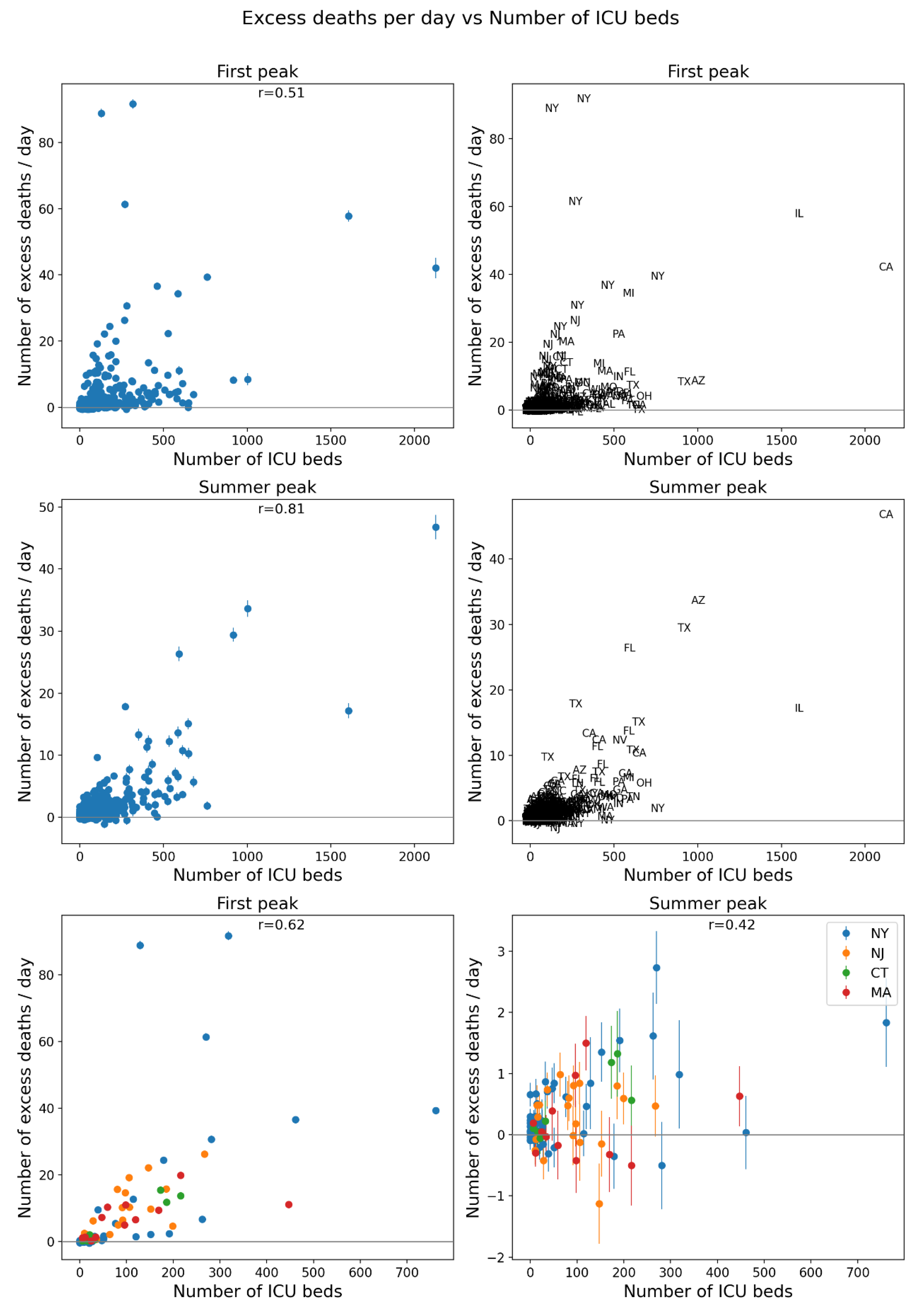
Figure 99.
Map of 2019 population of USA counties for the contiguous USA (top panel) and a blow-up centred on the New York City urban area (bottom panel).
Figure 99.
Map of 2019 population of USA counties for the contiguous USA (top panel) and a blow-up centred on the New York City urban area (bottom panel).
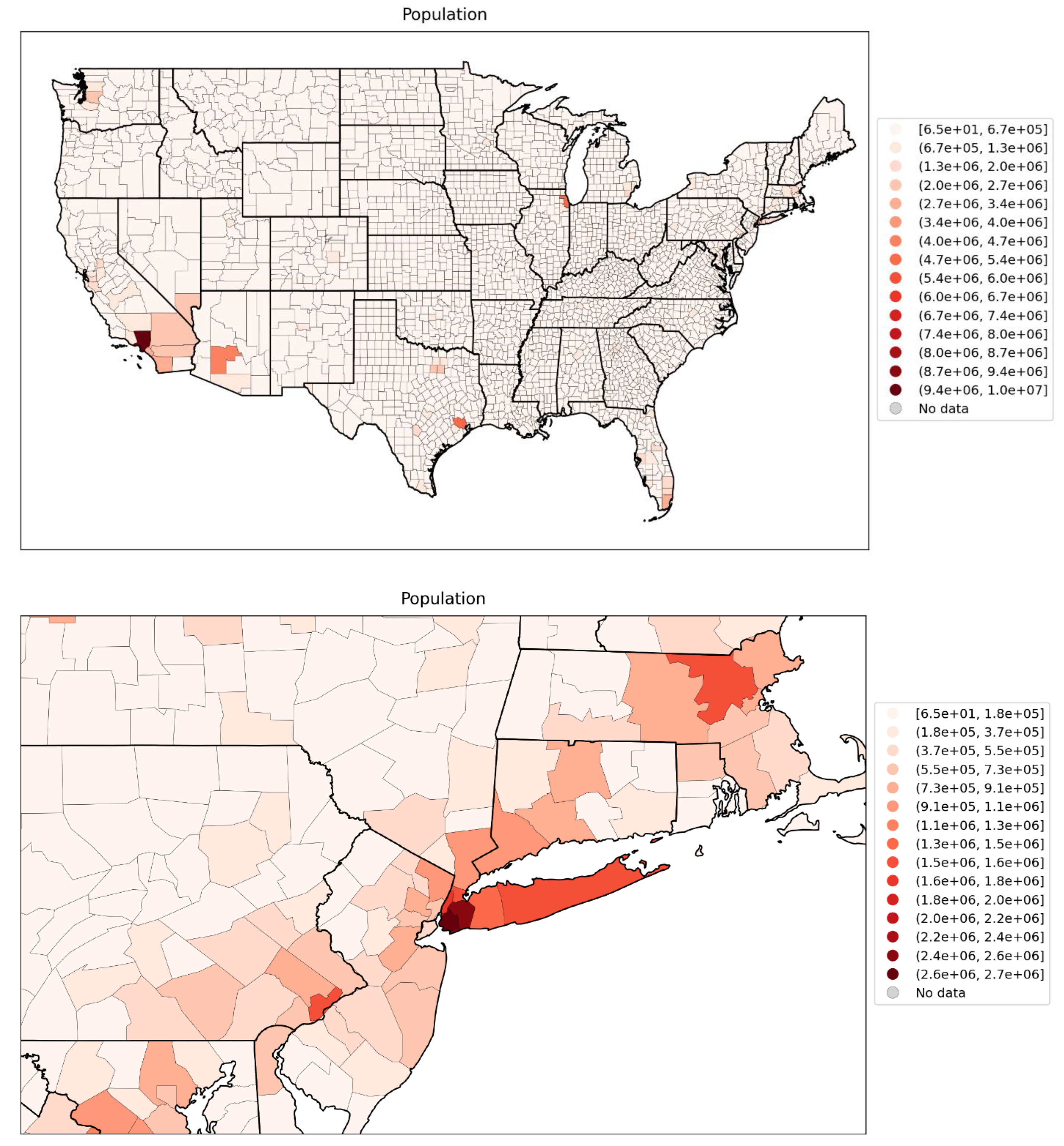
Figure 100.
Map of logarithm of 2019 population per county for the contiguous USA (top panel) and a blow-up centred on the New York City urban area (bottom panel).
Figure 100.
Map of logarithm of 2019 population per county for the contiguous USA (top panel) and a blow-up centred on the New York City urban area (bottom panel).
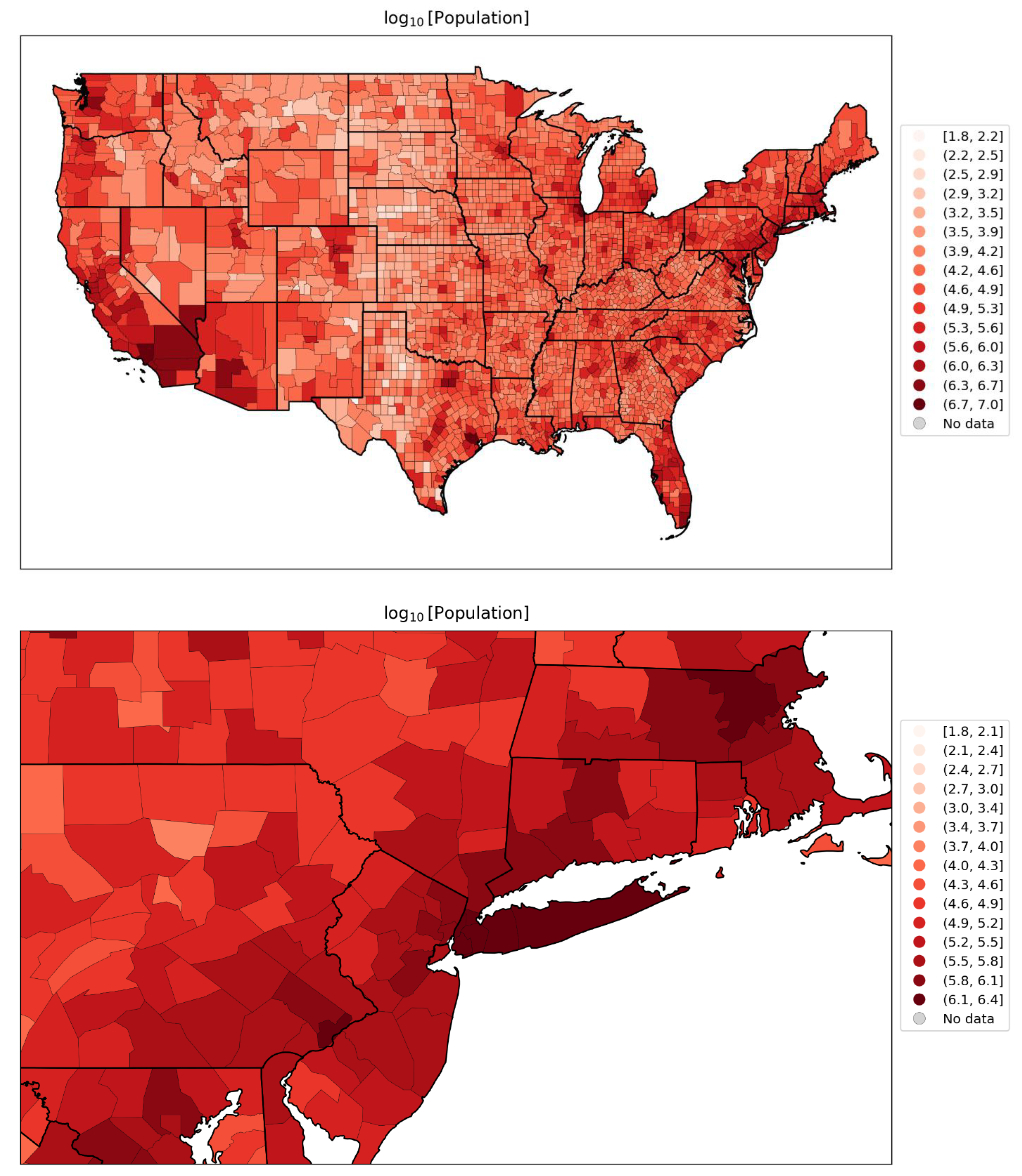
Figure 101.
Map of population density per county for the contiguous USA (top panel) and a blow-up centred on the New York City urban area (bottom panel) (estimates from the 5-Year American Community Survey for the years 2017-2021).
Figure 101.
Map of population density per county for the contiguous USA (top panel) and a blow-up centred on the New York City urban area (bottom panel) (estimates from the 5-Year American Community Survey for the years 2017-2021).
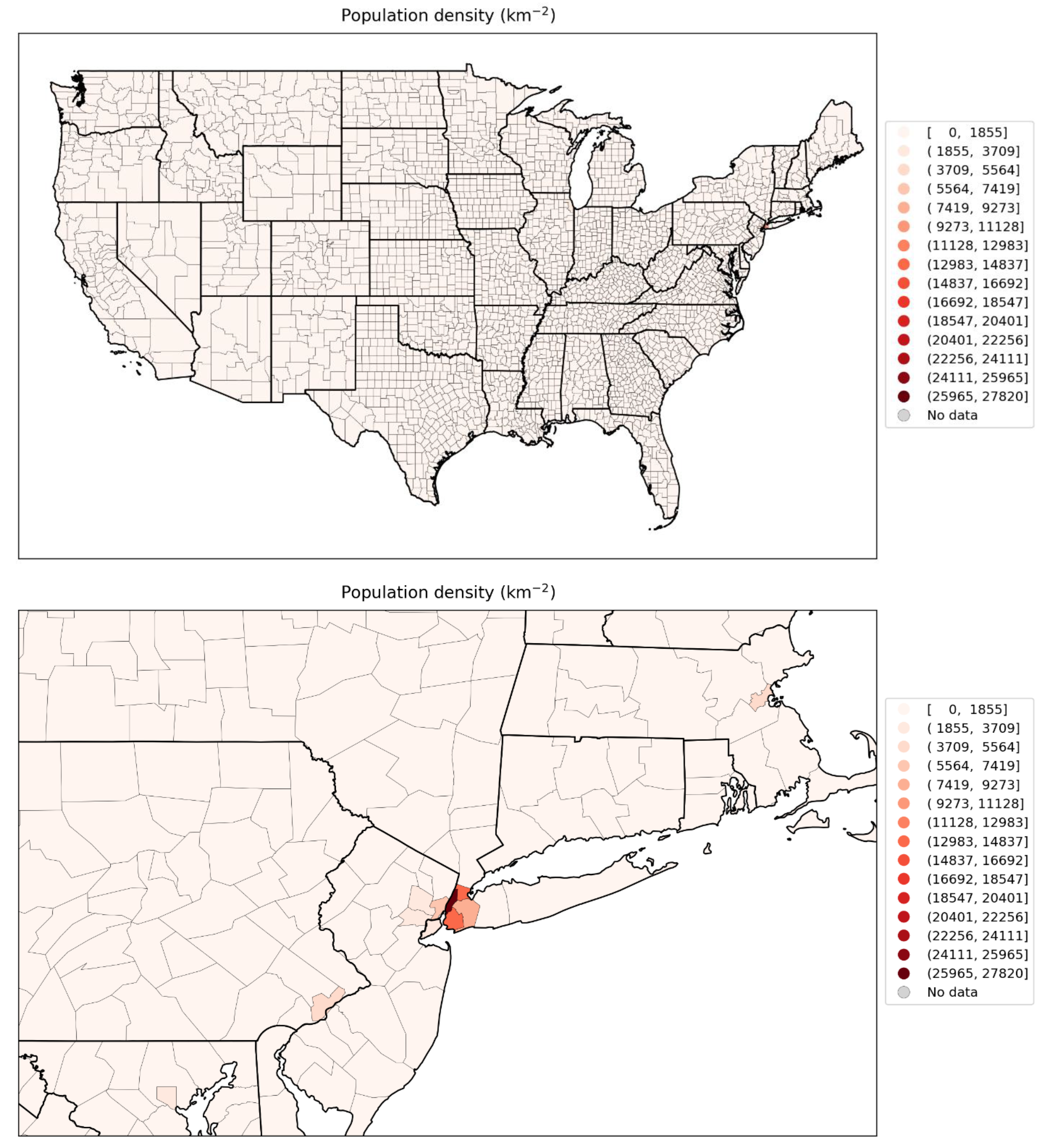
Figure 102.
Map of logarithm of population density per county for the contiguous USA (top panel) and a blow-up centred on the New York City urban area (bottom panel) (estimates from the 5-Year American Community Survey for the years 2017-2021).
Figure 102.
Map of logarithm of population density per county for the contiguous USA (top panel) and a blow-up centred on the New York City urban area (bottom panel) (estimates from the 5-Year American Community Survey for the years 2017-2021).
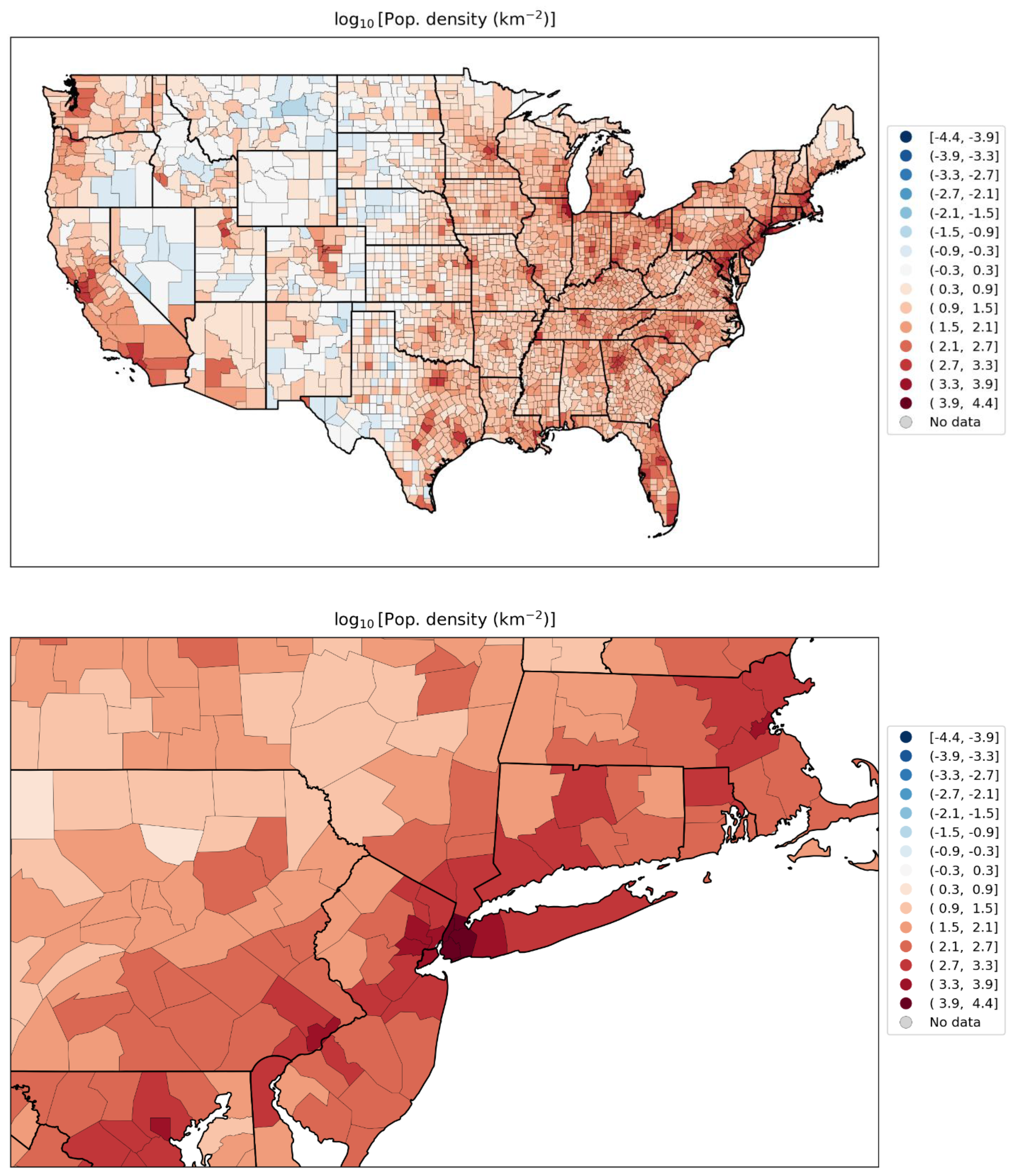
Figure 103.
Map of per capita income per county for the contiguous USA (top panel) and a blow-up centred on the New York City urban area (bottom panel) (estimates from the 5-Year American Community Survey for the years 2014-2018).
Figure 103.
Map of per capita income per county for the contiguous USA (top panel) and a blow-up centred on the New York City urban area (bottom panel) (estimates from the 5-Year American Community Survey for the years 2014-2018).
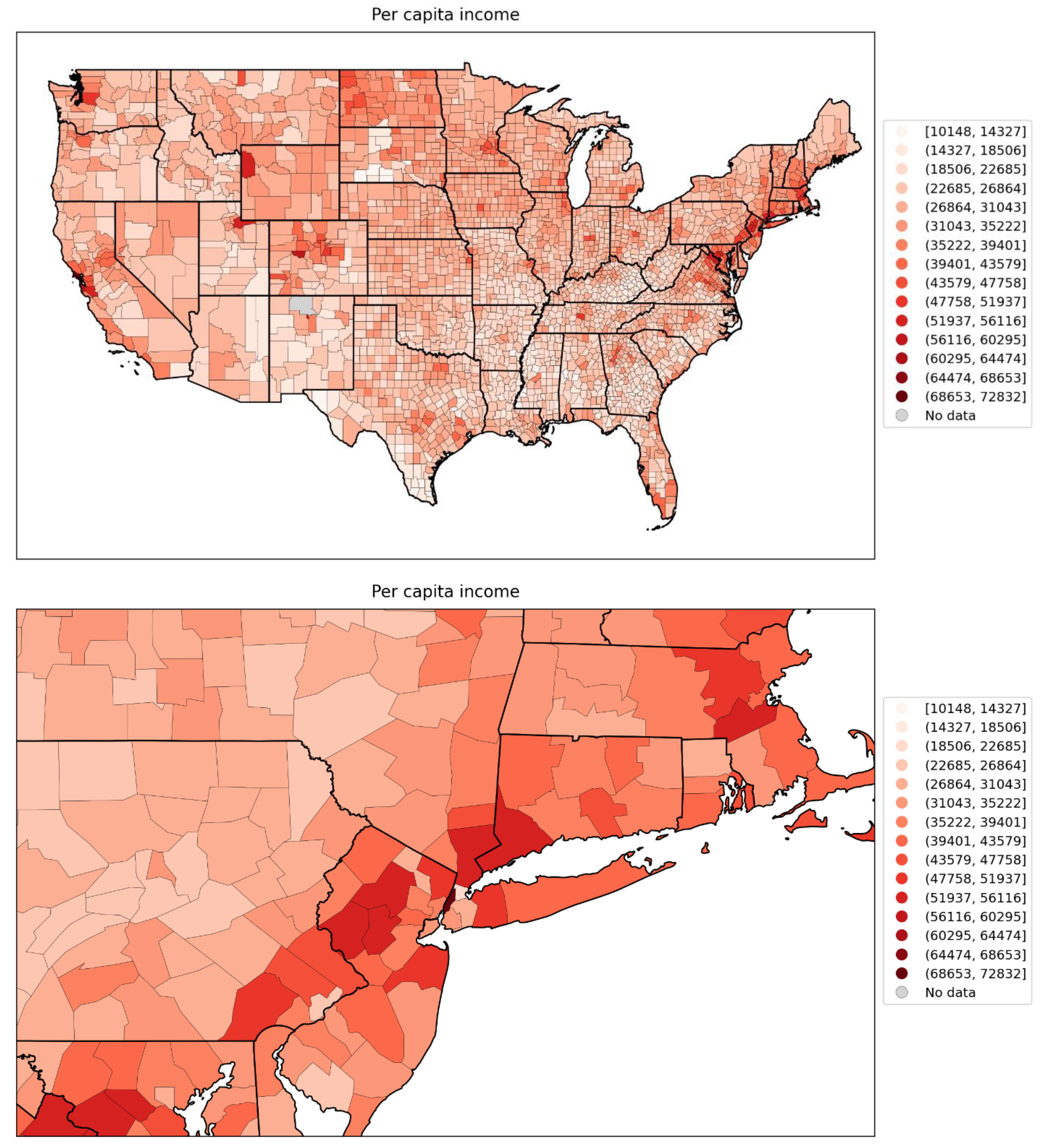
Figure 104.
Map of % living in poverty per county for the contiguous USA (top panel) and a blow-up centred on the New York City urban area (bottom panel) (estimates from the 5-Year American Community Survey for the years 2014-2018).
Figure 104.
Map of % living in poverty per county for the contiguous USA (top panel) and a blow-up centred on the New York City urban area (bottom panel) (estimates from the 5-Year American Community Survey for the years 2014-2018).
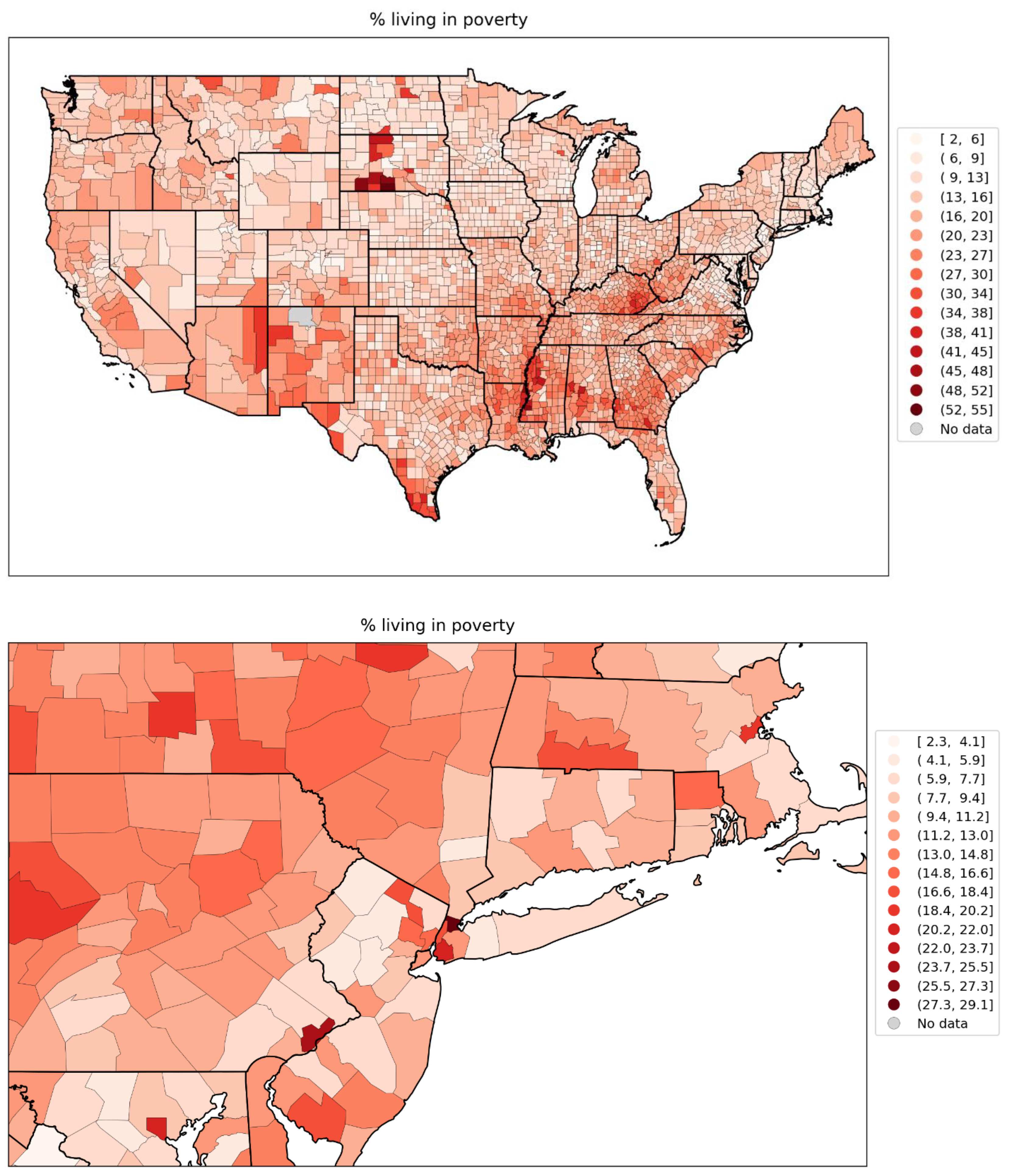
Figure 105.
Map of % unemployed per county for the contiguous USA (top panel) and a blow-up centred on the New York City urban area (bottom panel) (estimates from the 5-Year American Community Survey for the years 2014-2018).
Figure 105.
Map of % unemployed per county for the contiguous USA (top panel) and a blow-up centred on the New York City urban area (bottom panel) (estimates from the 5-Year American Community Survey for the years 2014-2018).
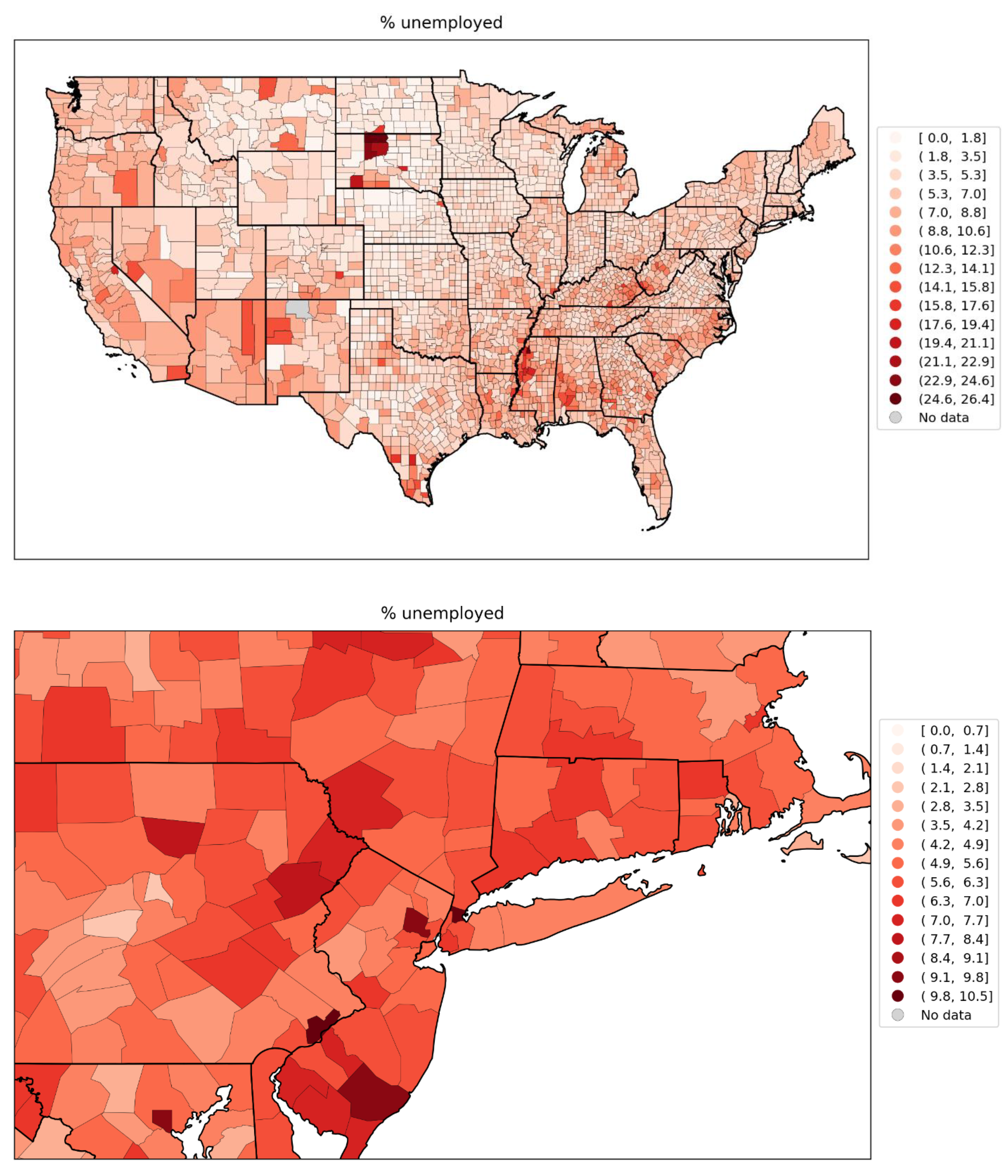
Figure 106.
Map of Gini coefficient of inequality for the counties of the contiguous USA (top panel) and a blow-up centred on the New York City urban area (bottom panel) (estimates from the 5-Year American Community Survey for the years 2014-2018).
Figure 106.
Map of Gini coefficient of inequality for the counties of the contiguous USA (top panel) and a blow-up centred on the New York City urban area (bottom panel) (estimates from the 5-Year American Community Survey for the years 2014-2018).
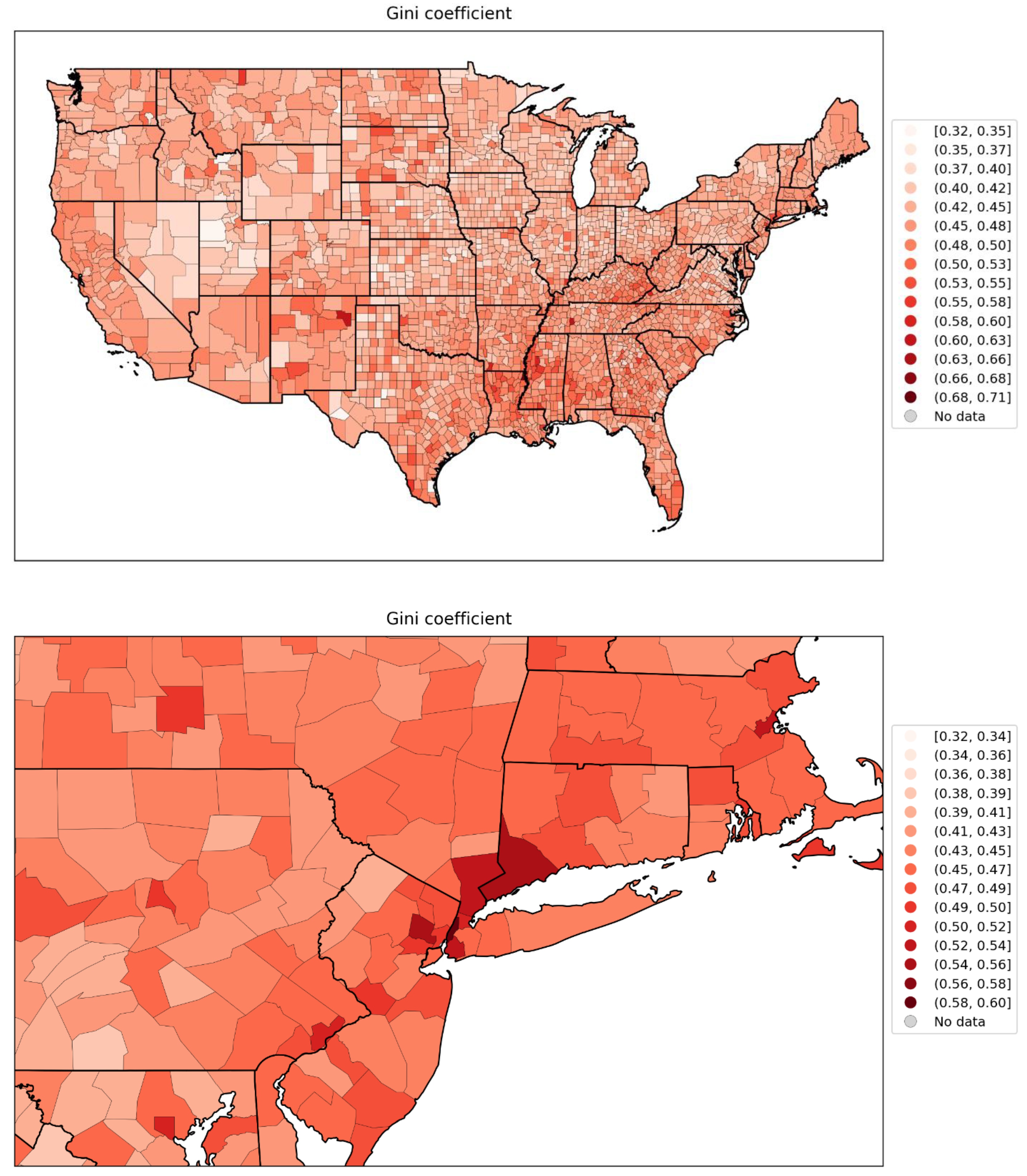
Figure 107.
Map of inter-county disparity for the counties of the contiguous USA (top panel) and a blow-up centred on the New York City urban area (bottom panel) (estimates from the 5-Year American Community Survey for the years 2014-2018).
Figure 107.
Map of inter-county disparity for the counties of the contiguous USA (top panel) and a blow-up centred on the New York City urban area (bottom panel) (estimates from the 5-Year American Community Survey for the years 2014-2018).
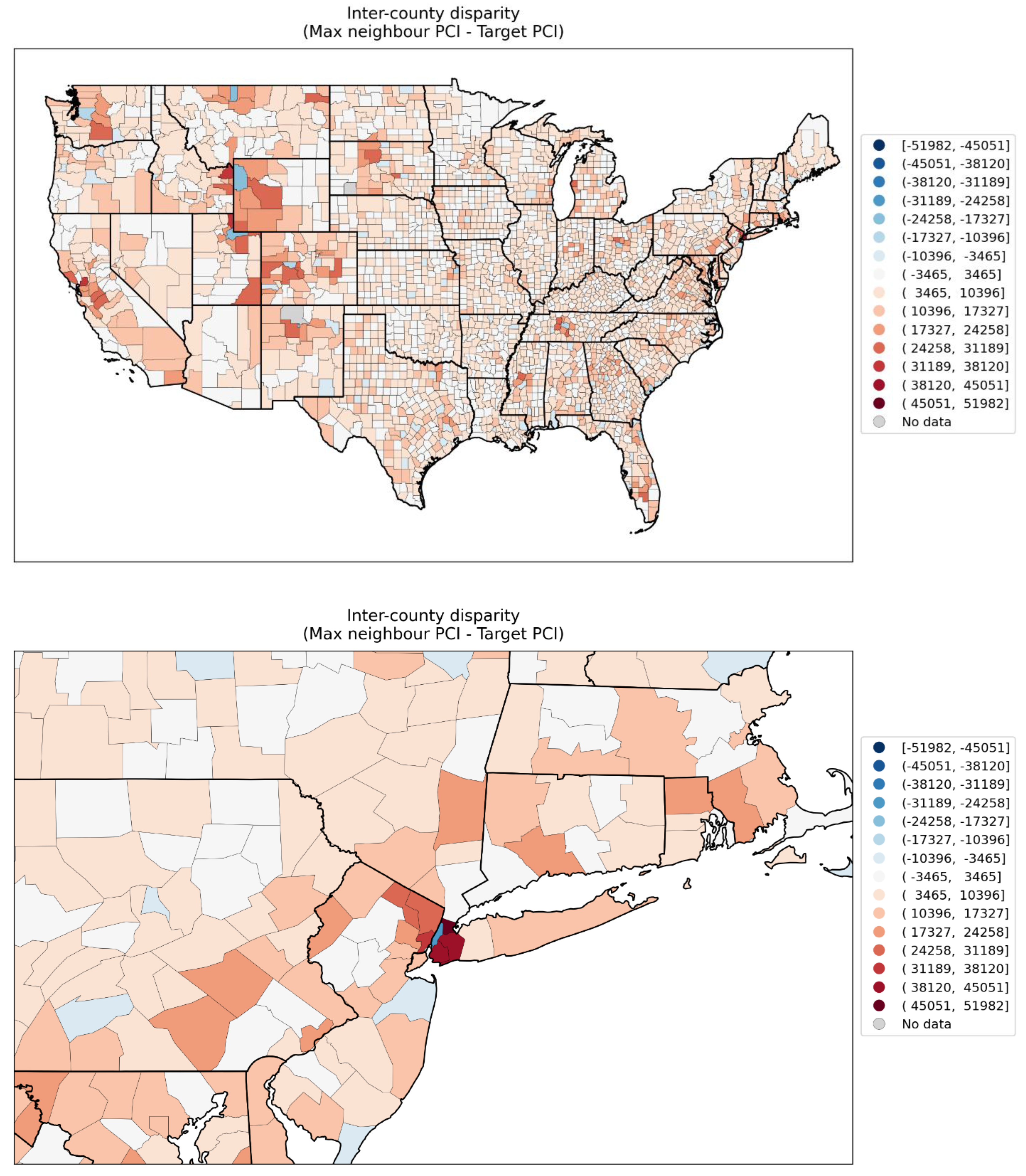
Figure 108.
Map of % households with no vehicle available for the counties of the contiguous USA (top panel) and a blow-up centred on the New York City urban area (bottom panel) (estimates from the 5-Year American Community Survey for the years 2014-2018).
Figure 108.
Map of % households with no vehicle available for the counties of the contiguous USA (top panel) and a blow-up centred on the New York City urban area (bottom panel) (estimates from the 5-Year American Community Survey for the years 2014-2018).
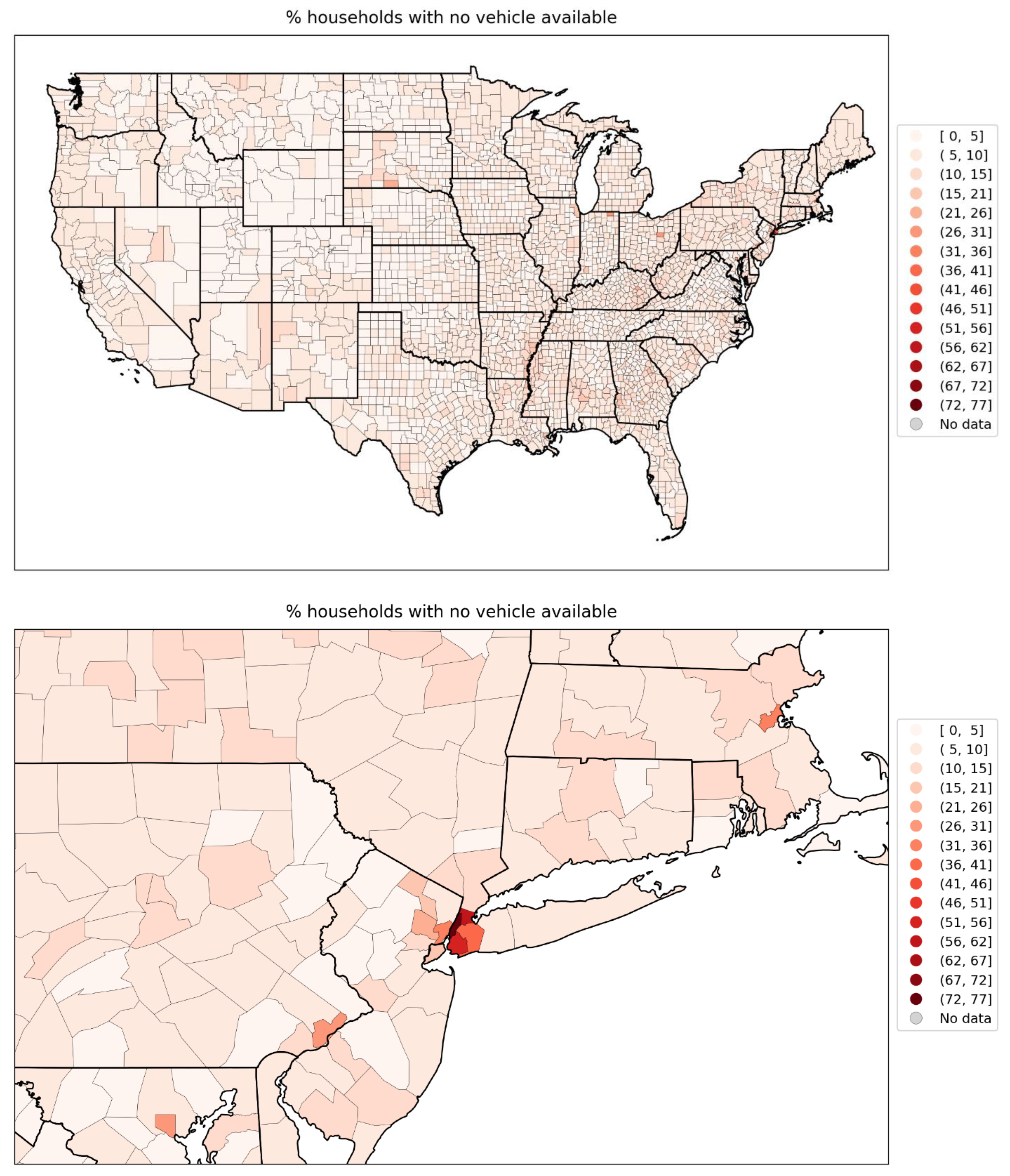
Figure 109.
Map of percent households with more people than rooms per county for the contiguous USA (top panel) and a blow-up centred on the New York City urban area (bottom panel) (estimates from the 5-Year American Community Survey for the years 2014-2018).
Figure 109.
Map of percent households with more people than rooms per county for the contiguous USA (top panel) and a blow-up centred on the New York City urban area (bottom panel) (estimates from the 5-Year American Community Survey for the years 2014-2018).
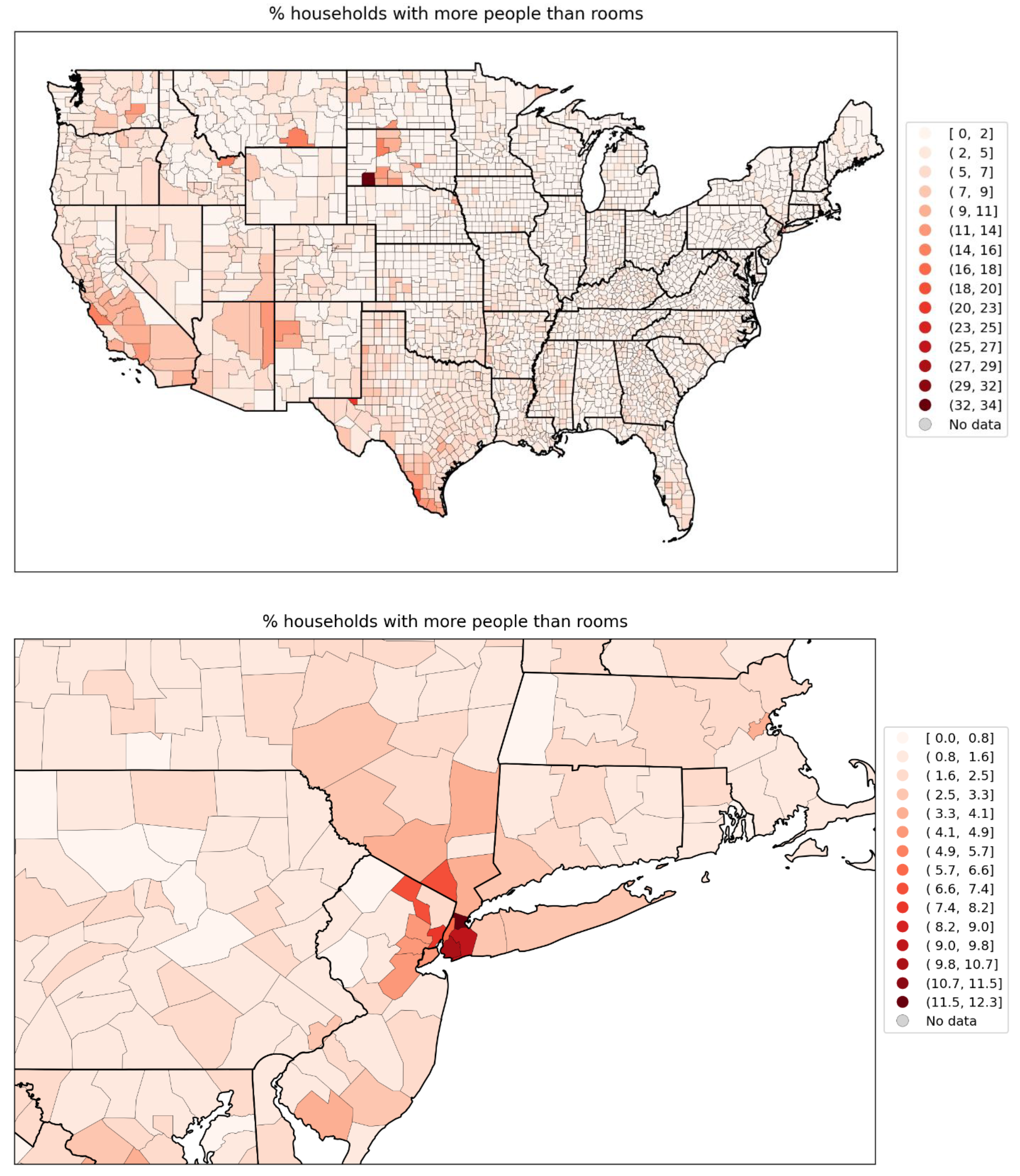
Figure 110.
Map of percent living in housing structures with more than 10 units per county for the contiguous USA (top panel) and a blow-up centred on the New York City urban area (bottom panel) (estimates from the 5-Year American Community Survey for the years 2014-2018).
Figure 110.
Map of percent living in housing structures with more than 10 units per county for the contiguous USA (top panel) and a blow-up centred on the New York City urban area (bottom panel) (estimates from the 5-Year American Community Survey for the years 2014-2018).
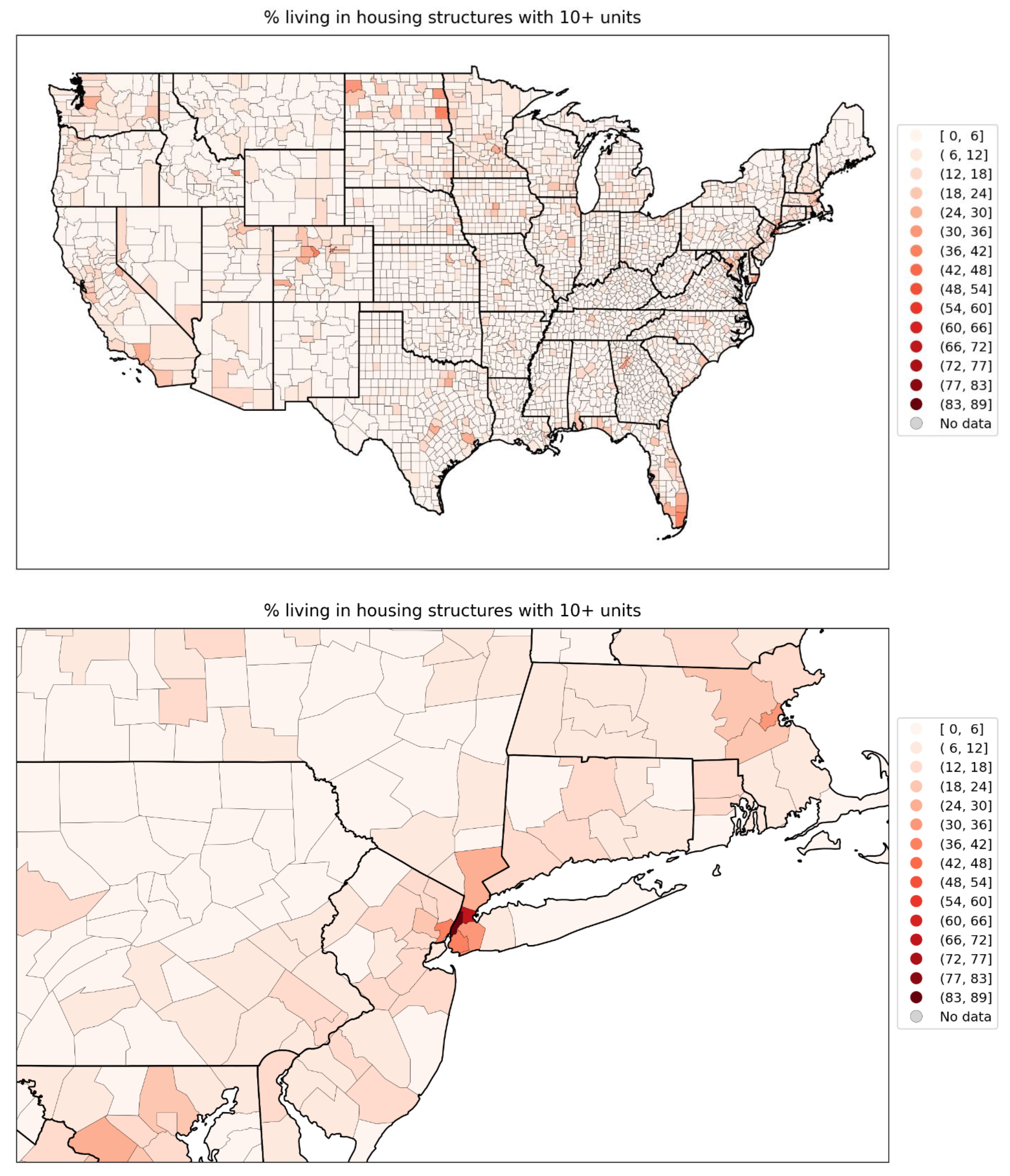
Figure 111.
Map of % who speak English “less than well” for the contiguous USA (top panel) and a blow-up centred on the New York City urban area (bottom panel) (estimates from the 5-Year American Community Survey for the years 2014-2018).
Figure 111.
Map of % who speak English “less than well” for the contiguous USA (top panel) and a blow-up centred on the New York City urban area (bottom panel) (estimates from the 5-Year American Community Survey for the years 2014-2018).
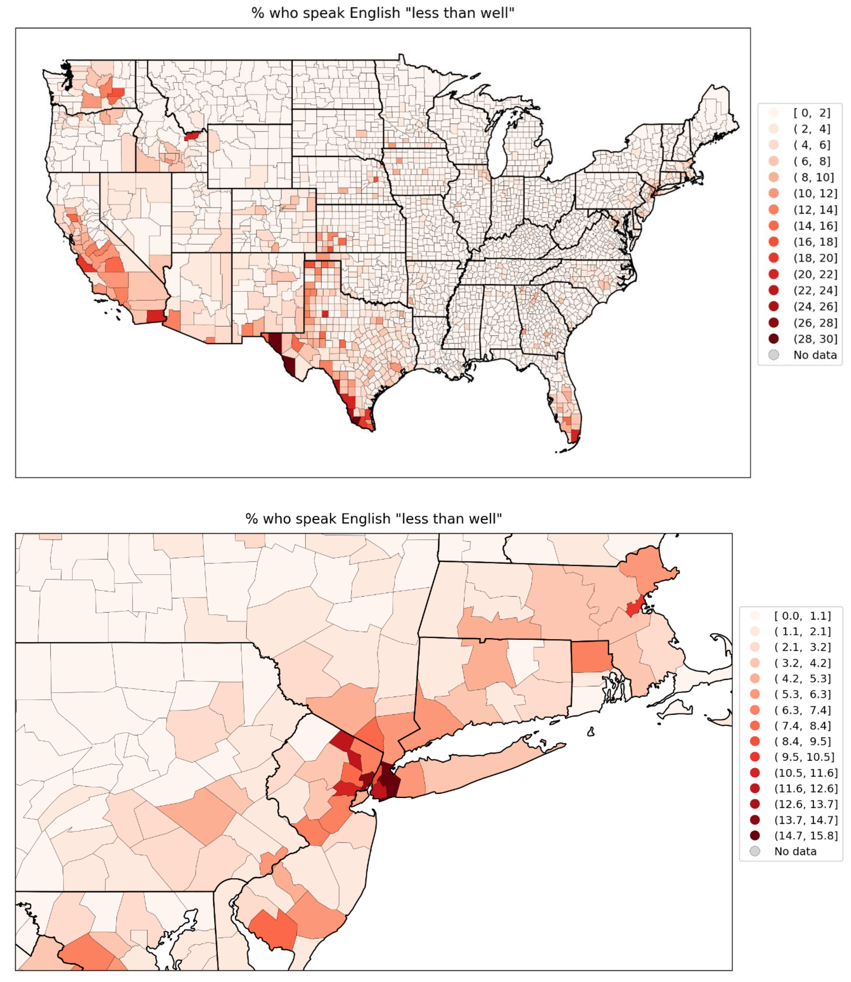
Figure 112.
Map of % minority for the contiguous USA (top panel) and a blow-up centred on the New York City urban area (bottom panel) (estimates from the 5-Year American Community Survey for the years 2014-2018).
Figure 112.
Map of % minority for the contiguous USA (top panel) and a blow-up centred on the New York City urban area (bottom panel) (estimates from the 5-Year American Community Survey for the years 2014-2018).
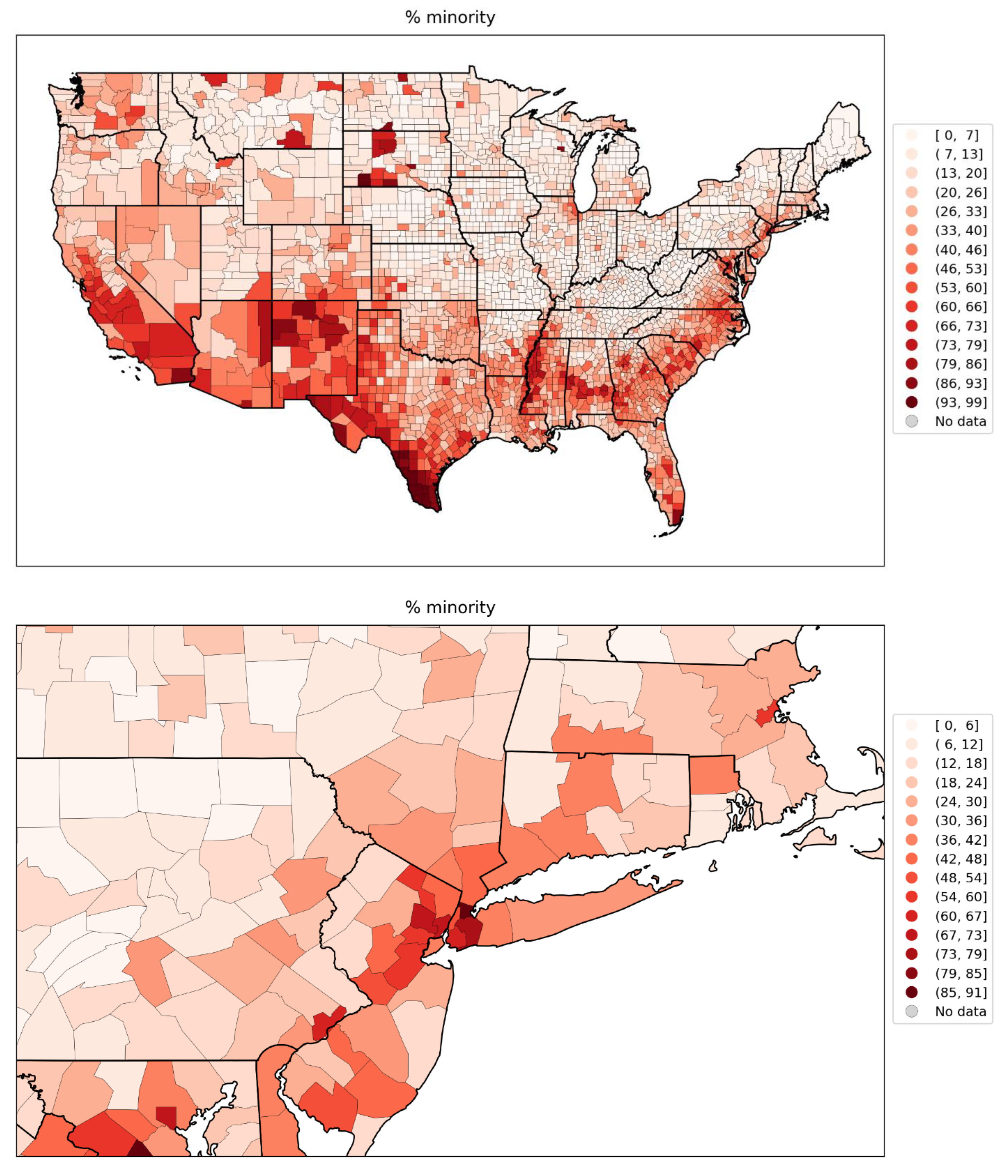
Figure 113.
Map of % aged 25+ with no high school diploma for the contiguous USA (top panel) and a blow-up centred on the New York City urban area (bottom panel) (estimates from the 5-Year American Community Survey for the years 2014-2018).
Figure 113.
Map of % aged 25+ with no high school diploma for the contiguous USA (top panel) and a blow-up centred on the New York City urban area (bottom panel) (estimates from the 5-Year American Community Survey for the years 2014-2018).
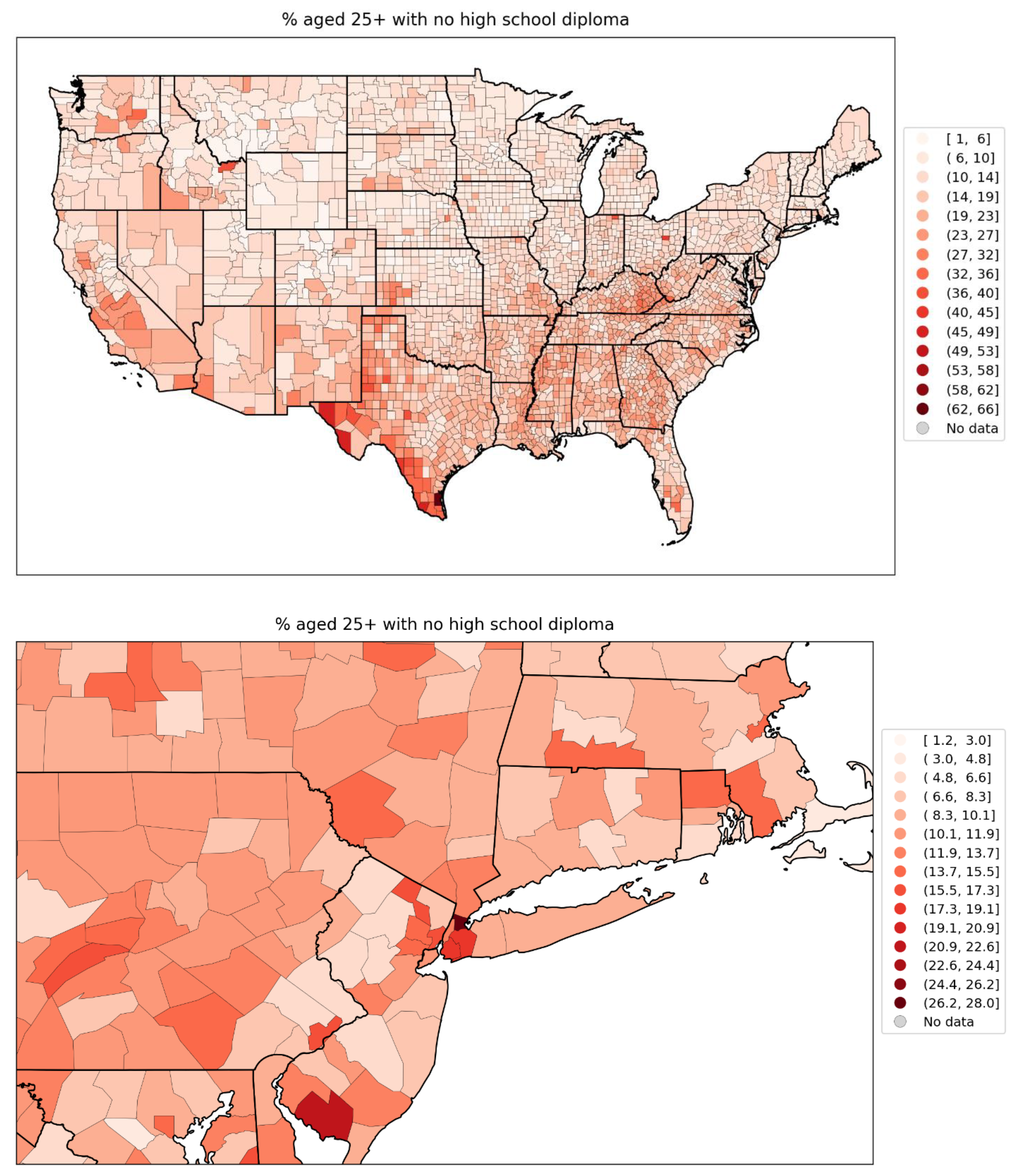
Figure 114.
Map of percent of the population aged 65+ per county for the contiguous USA (top panel) and a blow-up centred on the New York City urban area (bottom panel) (estimates from the 5-Year American Community Survey for the years 2014-2018).
Figure 114.
Map of percent of the population aged 65+ per county for the contiguous USA (top panel) and a blow-up centred on the New York City urban area (bottom panel) (estimates from the 5-Year American Community Survey for the years 2014-2018).
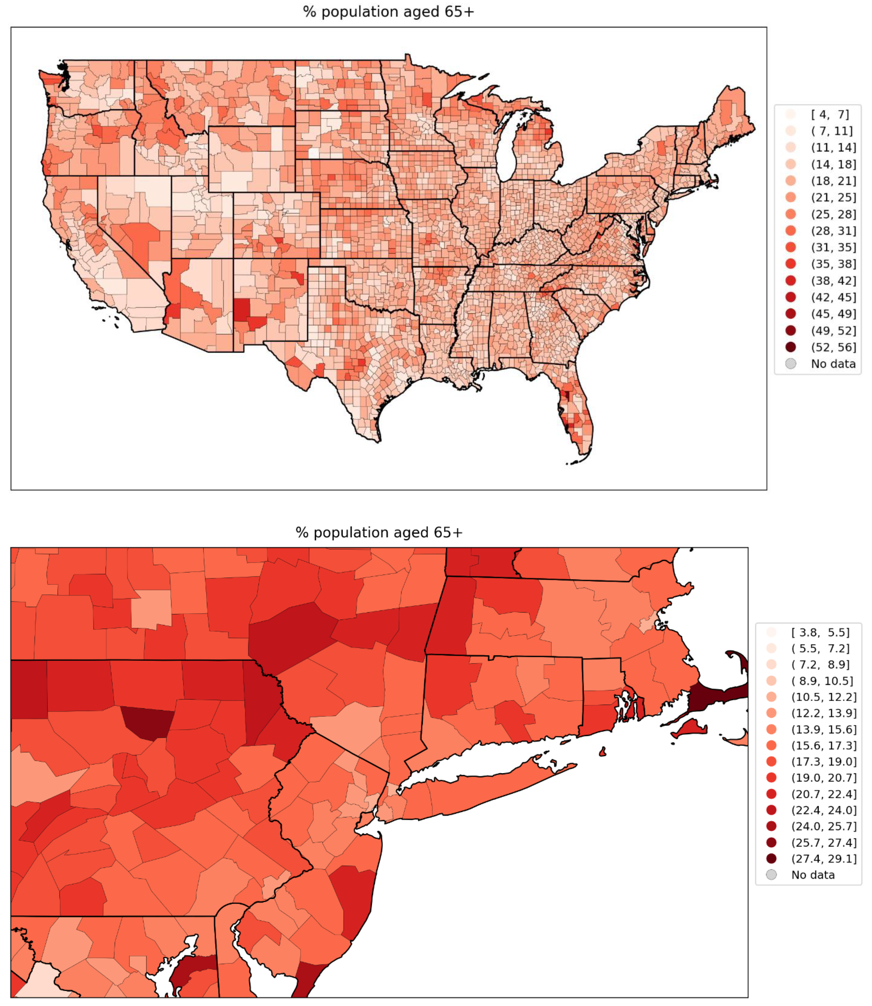
Figure 115.
Map of percent of the population aged 17 and under per county for the contiguous USA (top panel) and a blow-up centred on the New York City urban area (bottom panel) (estimates from the 5-Year American Community Survey for the years 2014-2018).
Figure 115.
Map of percent of the population aged 17 and under per county for the contiguous USA (top panel) and a blow-up centred on the New York City urban area (bottom panel) (estimates from the 5-Year American Community Survey for the years 2014-2018).
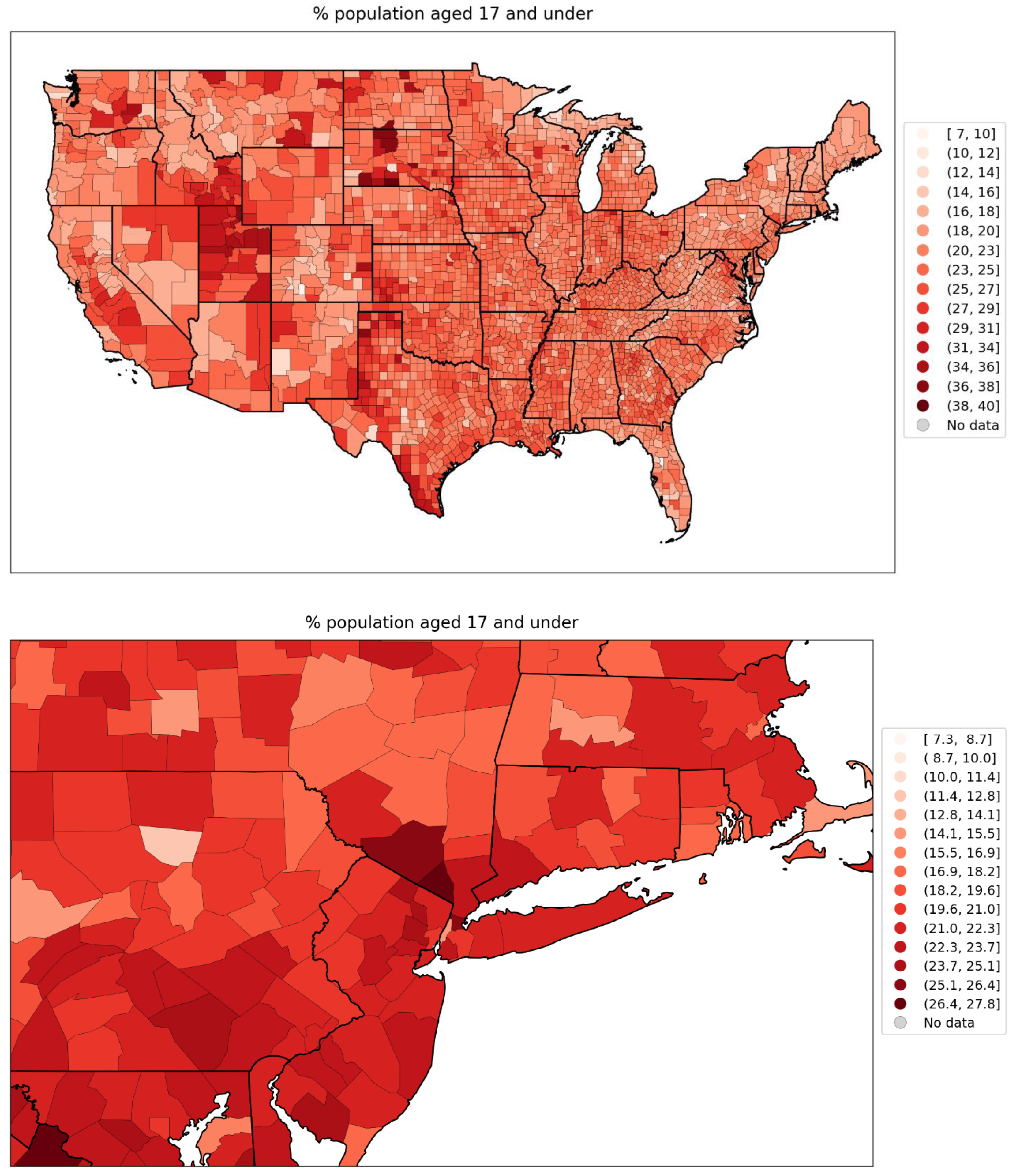
Figure 116.
Map of % of the county’s households that are single-parent households for the counties of the contiguous USA (top panel) and a blow-up centred on the New York City urban area (bottom panel) (estimates from the 5-Year American Community Survey for the years 2014-2018).
Figure 116.
Map of % of the county’s households that are single-parent households for the counties of the contiguous USA (top panel) and a blow-up centred on the New York City urban area (bottom panel) (estimates from the 5-Year American Community Survey for the years 2014-2018).
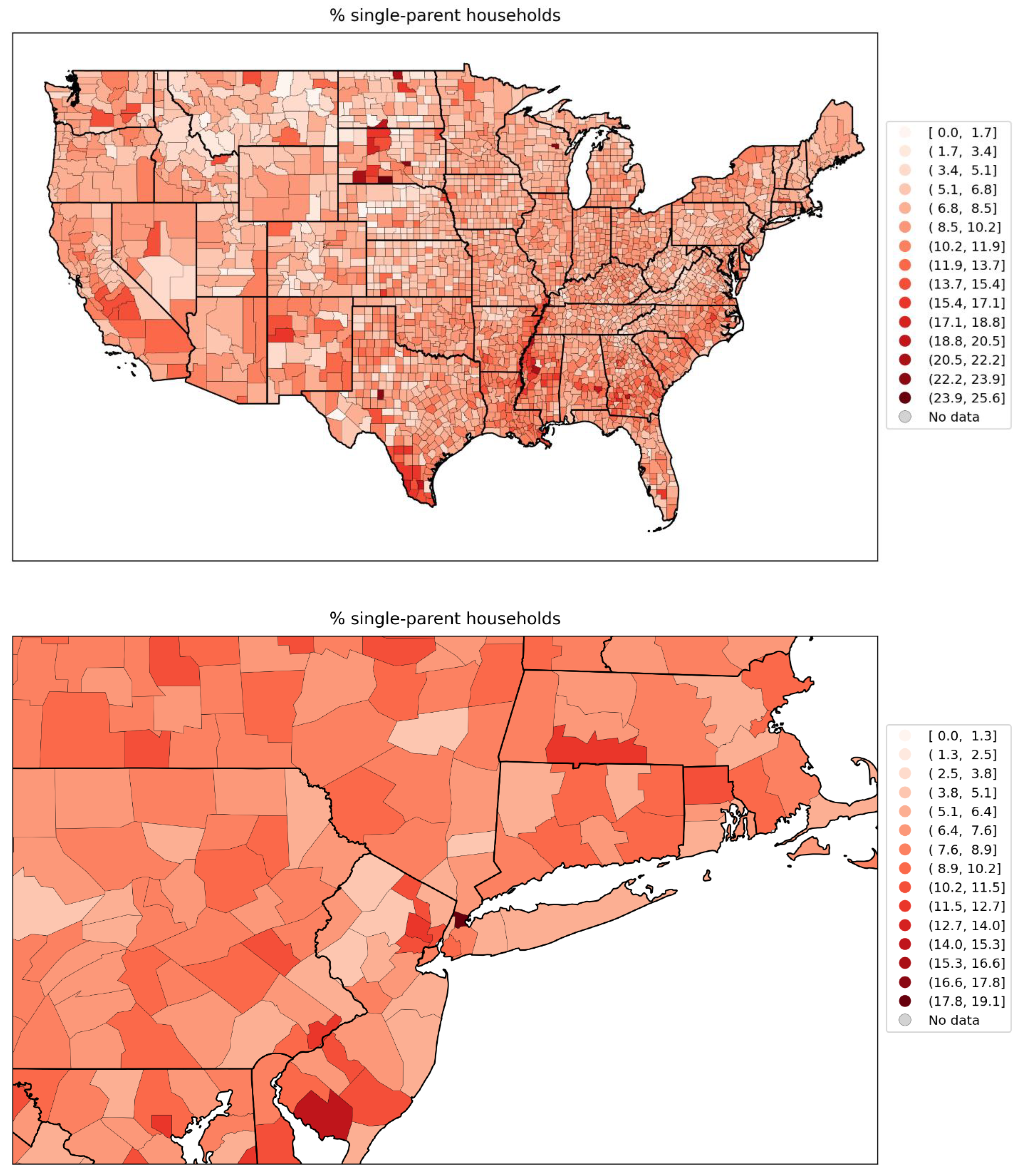
Figure 117.
Map of % of the population with a disability, for the counties of the contiguous USA (top panel) and a blow-up centred on the New York City urban area (bottom panel) (estimates from the 5-Year American Community Survey for the years 2014-2018).
Figure 117.
Map of % of the population with a disability, for the counties of the contiguous USA (top panel) and a blow-up centred on the New York City urban area (bottom panel) (estimates from the 5-Year American Community Survey for the years 2014-2018).
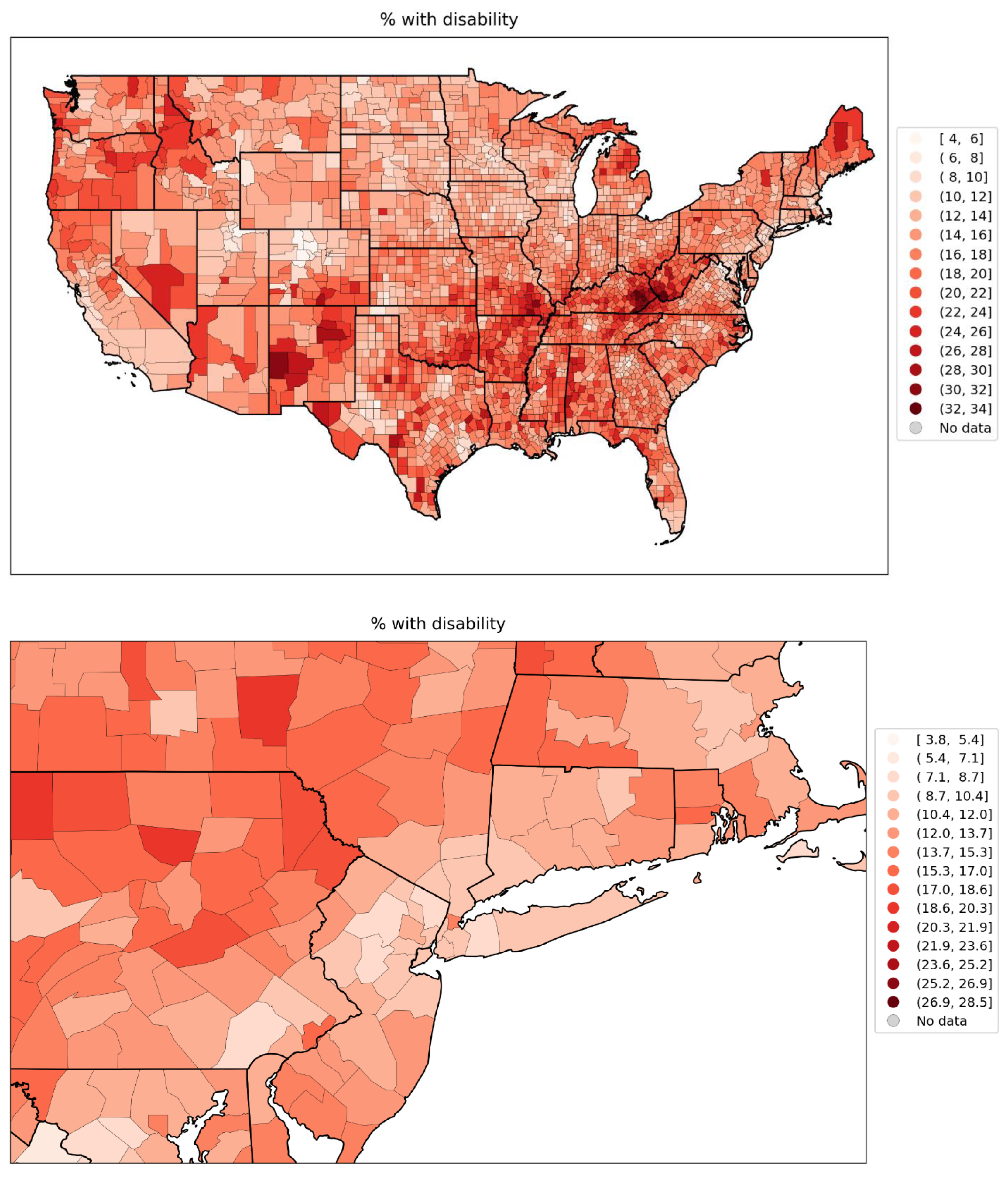
Figure 118.
Map of % of the population with diabetes in 2018, for the counties of the contiguous USA (top panel) and a blow-up centred on the New York City urban area (bottom panel).
Figure 118.
Map of % of the population with diabetes in 2018, for the counties of the contiguous USA (top panel) and a blow-up centred on the New York City urban area (bottom panel).
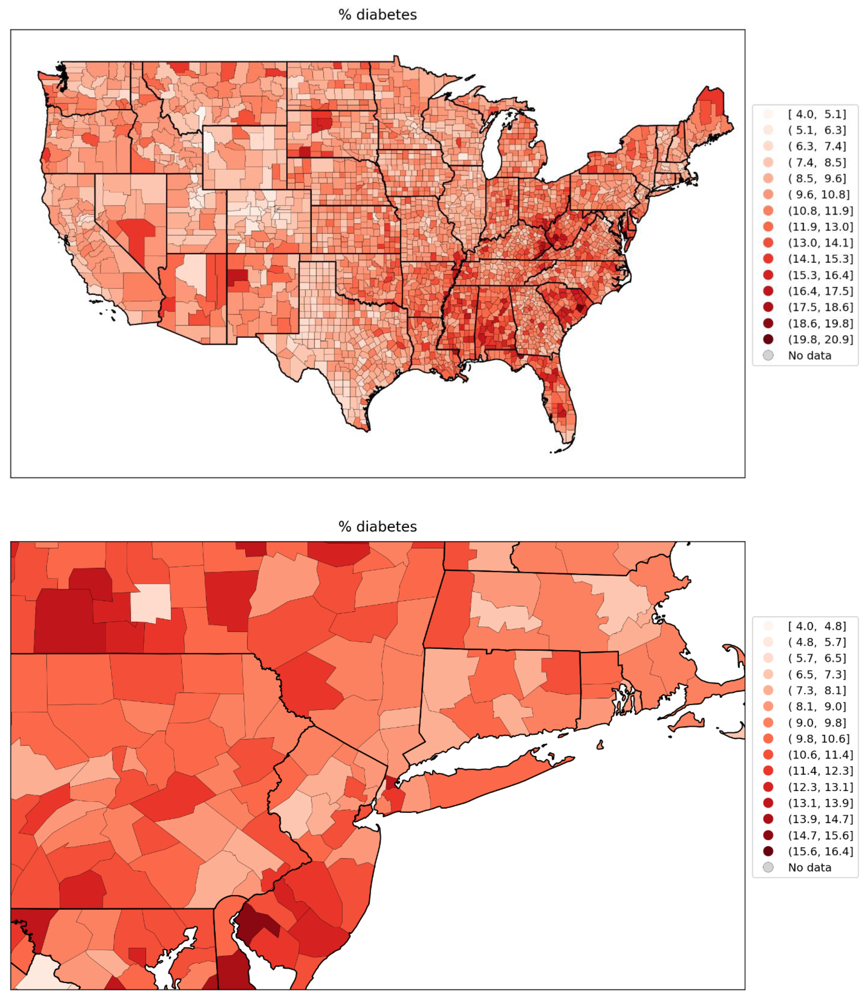
Figure 119.
Map of % of the population with obesity in 2018, for the counties of the contiguous USA (top panel) and a blow-up centred on the New York City urban area (bottom panel).
Figure 119.
Map of % of the population with obesity in 2018, for the counties of the contiguous USA (top panel) and a blow-up centred on the New York City urban area (bottom panel).
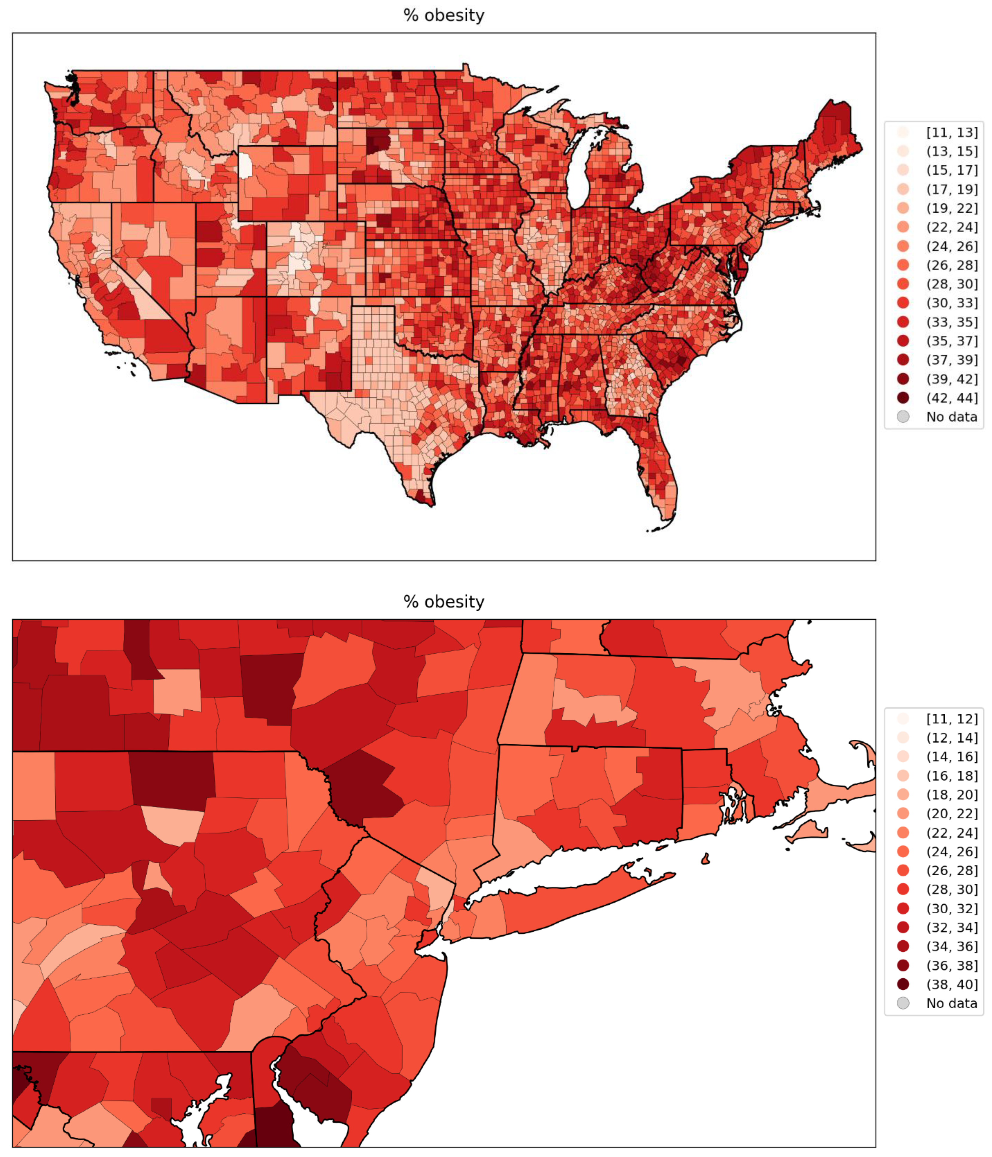
Figure 120.
Map of share of all votes cast that were for the Democratic Party’s presidential candidate in the 2016 election, for the counties of the contiguous USA (top panel) and a blow-up centred on the New York City urban area (bottom panel).
Figure 120.
Map of share of all votes cast that were for the Democratic Party’s presidential candidate in the 2016 election, for the counties of the contiguous USA (top panel) and a blow-up centred on the New York City urban area (bottom panel).
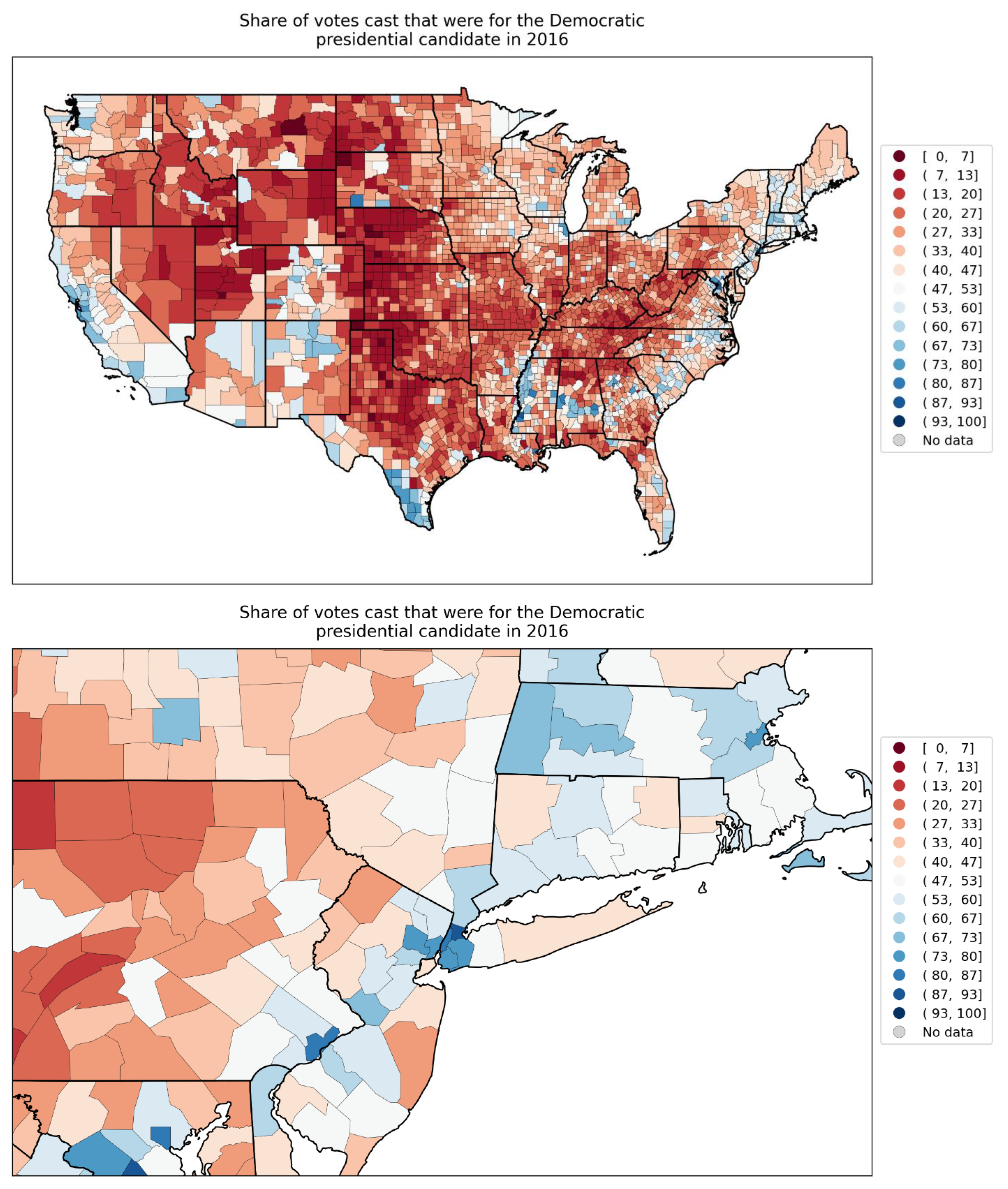
Figure 121.
% of all deaths in the county that occurred at the decedent’s home during March-May 2019, for the counties of the contiguous USA (top panel) and a blow-up centred on the New York City urban area (bottom panel).
Figure 121.
% of all deaths in the county that occurred at the decedent’s home during March-May 2019, for the counties of the contiguous USA (top panel) and a blow-up centred on the New York City urban area (bottom panel).
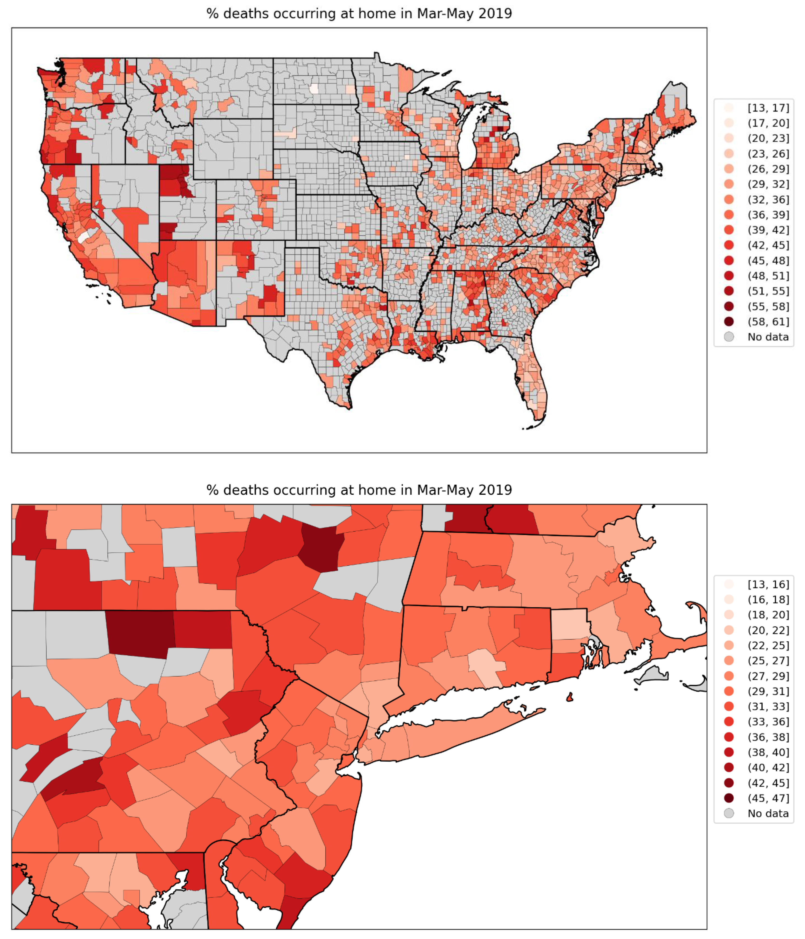
Figure 122.
Map of % of all deaths in the county that occurred at the decedent’s home during June-September 2019, for the counties of the contiguous USA (top panel) and a blow-up centred on the New York City urban area (bottom panel).
Figure 122.
Map of % of all deaths in the county that occurred at the decedent’s home during June-September 2019, for the counties of the contiguous USA (top panel) and a blow-up centred on the New York City urban area (bottom panel).
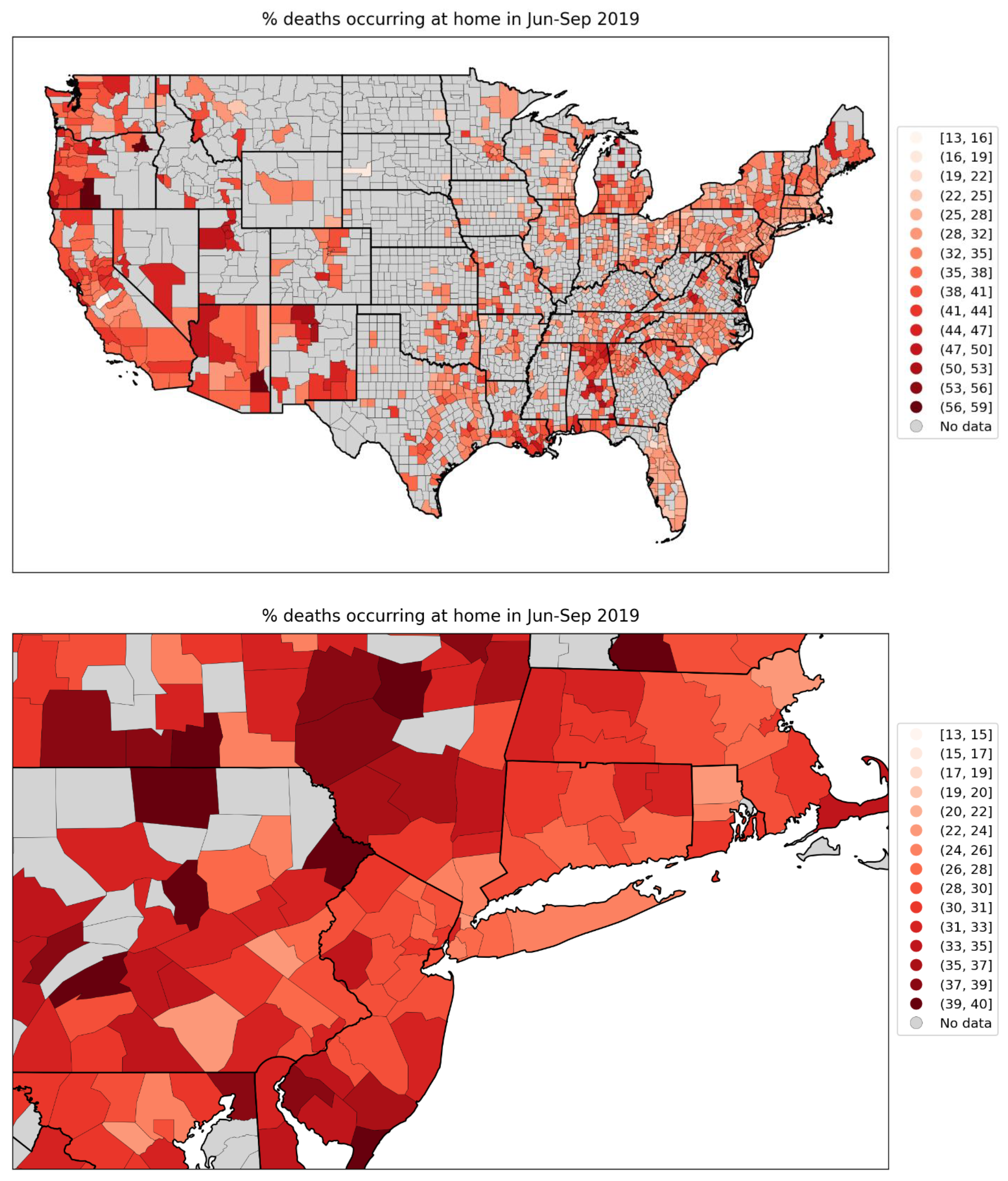
Figure 123.
Map of % of all deaths in the county that occurred in hospital during March-May 2019, for the counties of the contiguous USA (top panel) and a blow-up centred on the New York City urban area (bottom panel).
Figure 123.
Map of % of all deaths in the county that occurred in hospital during March-May 2019, for the counties of the contiguous USA (top panel) and a blow-up centred on the New York City urban area (bottom panel).
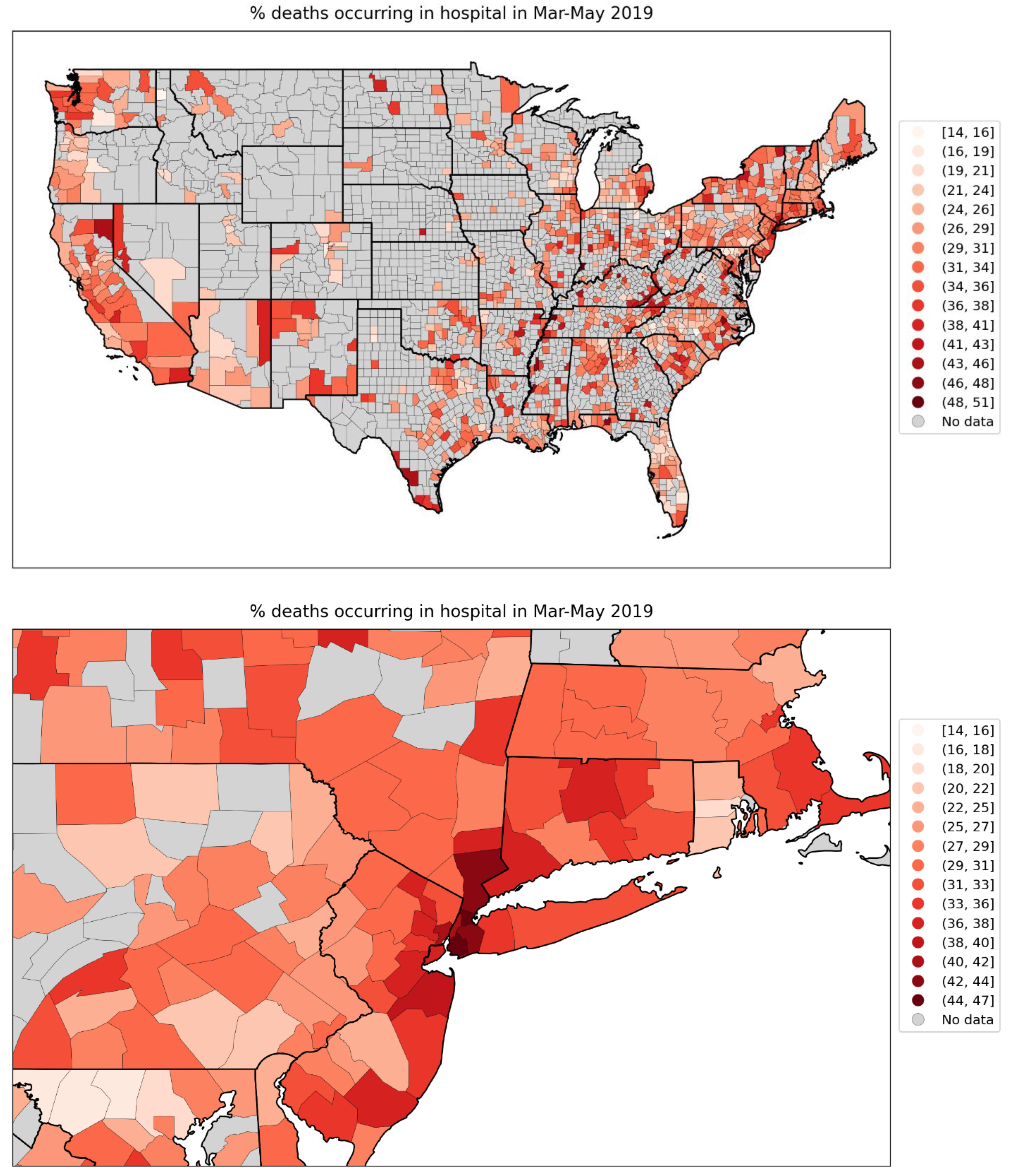
Figure 124.
Map of % of all deaths in the county that occurred in hospital during June-September 2019, for the counties of the contiguous USA (top panel) and a blow-up centred on the New York City urban area (bottom panel).
Figure 124.
Map of % of all deaths in the county that occurred in hospital during June-September 2019, for the counties of the contiguous USA (top panel) and a blow-up centred on the New York City urban area (bottom panel).
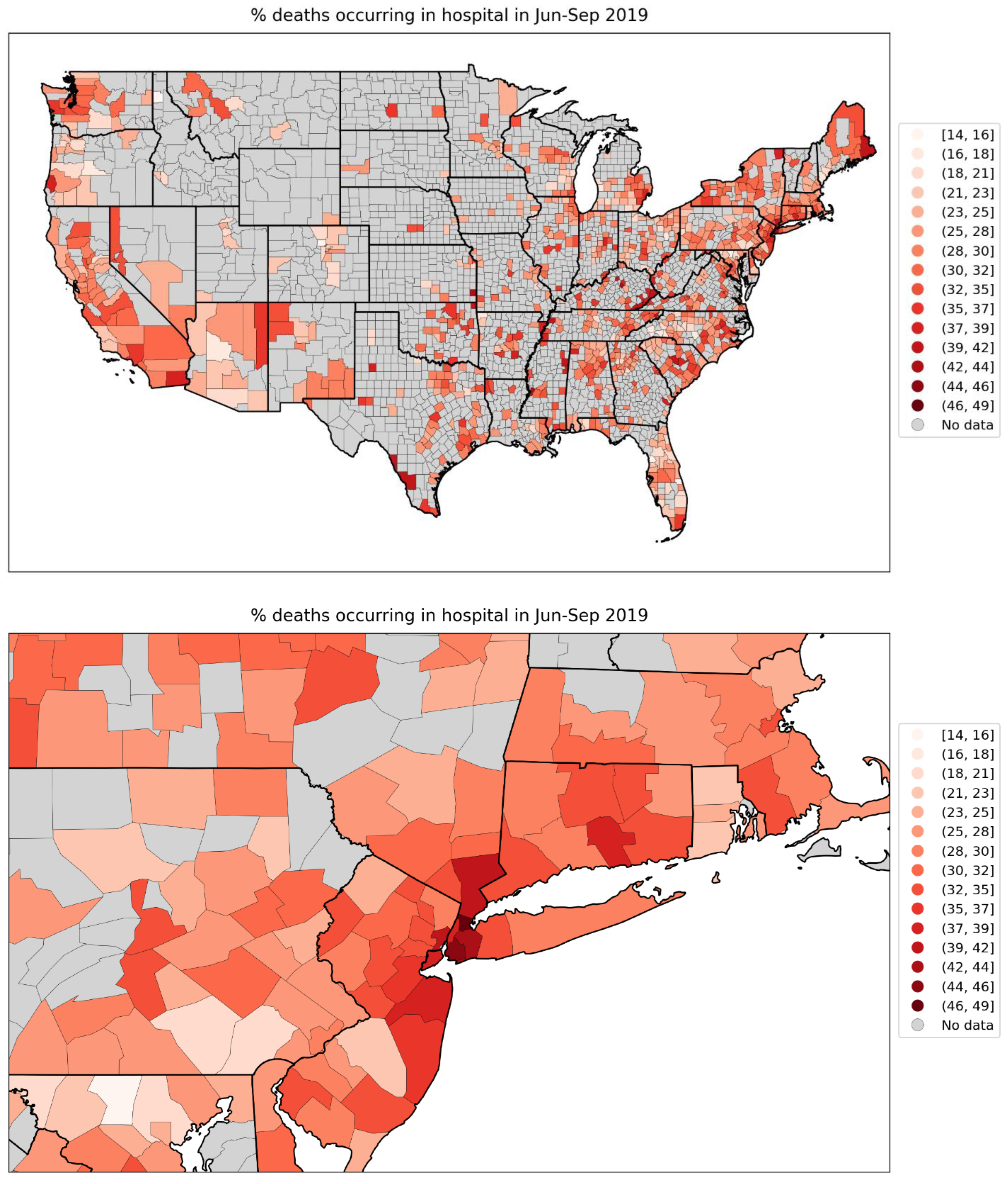
Figure 125.
Map of difference in the % of all deaths in the county that occurred at home during the first-peak period (March-May 2020) and the % of deaths in the county that occurred at home during March-May 2019, for the counties of the contiguous USA (top panel) and a blow-up centred on the New York City urban area (bottom panel).
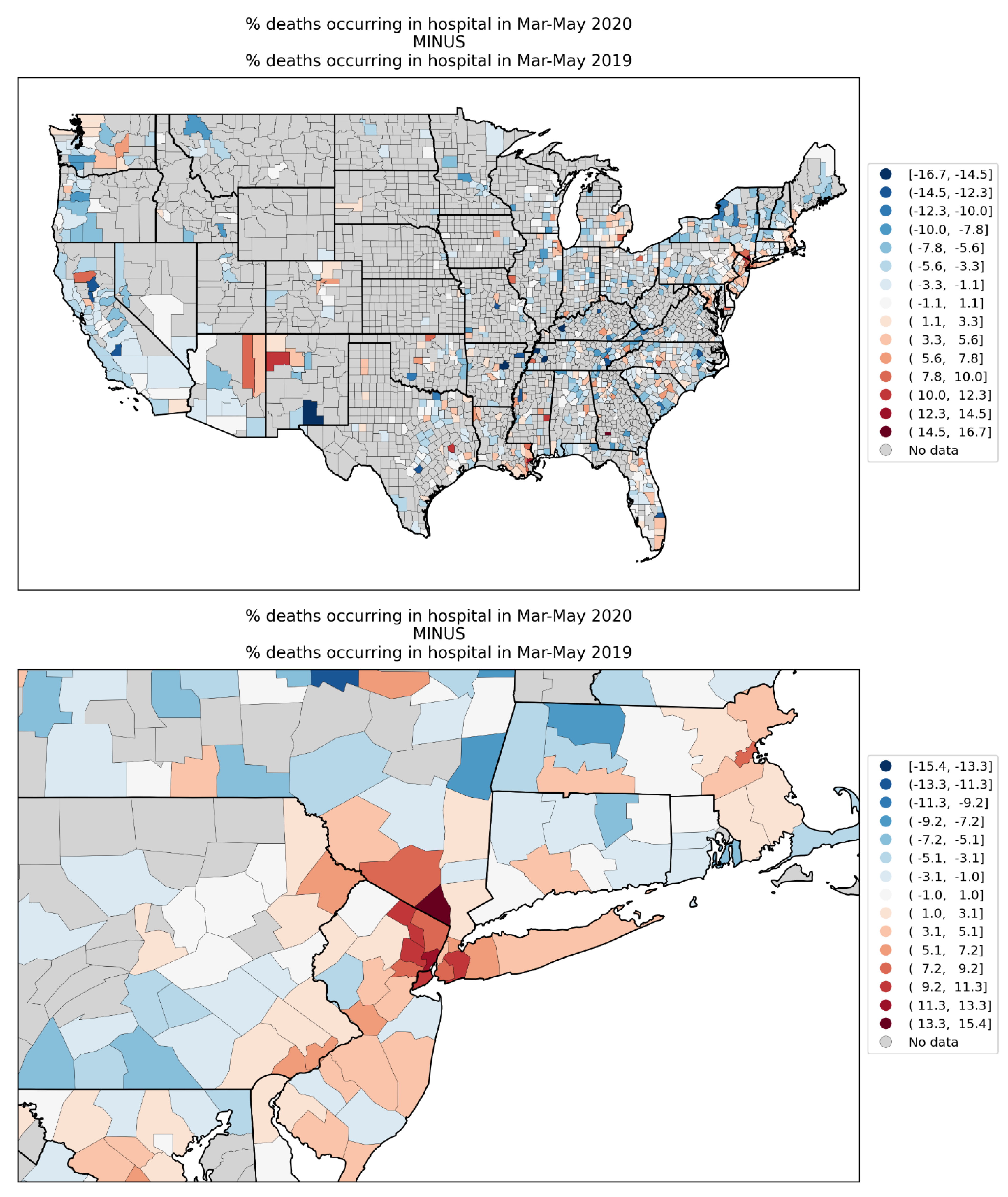
Figure 126.
Map of difference in the % of all deaths in the county that occurred at home during the summer-peak period (June-September 2020) and the % of deaths in the county that occurred at home during June-September 2019, for the counties of the contiguous USA (top panel) and a blow-up centred on the New York City urban area (bottom panel).
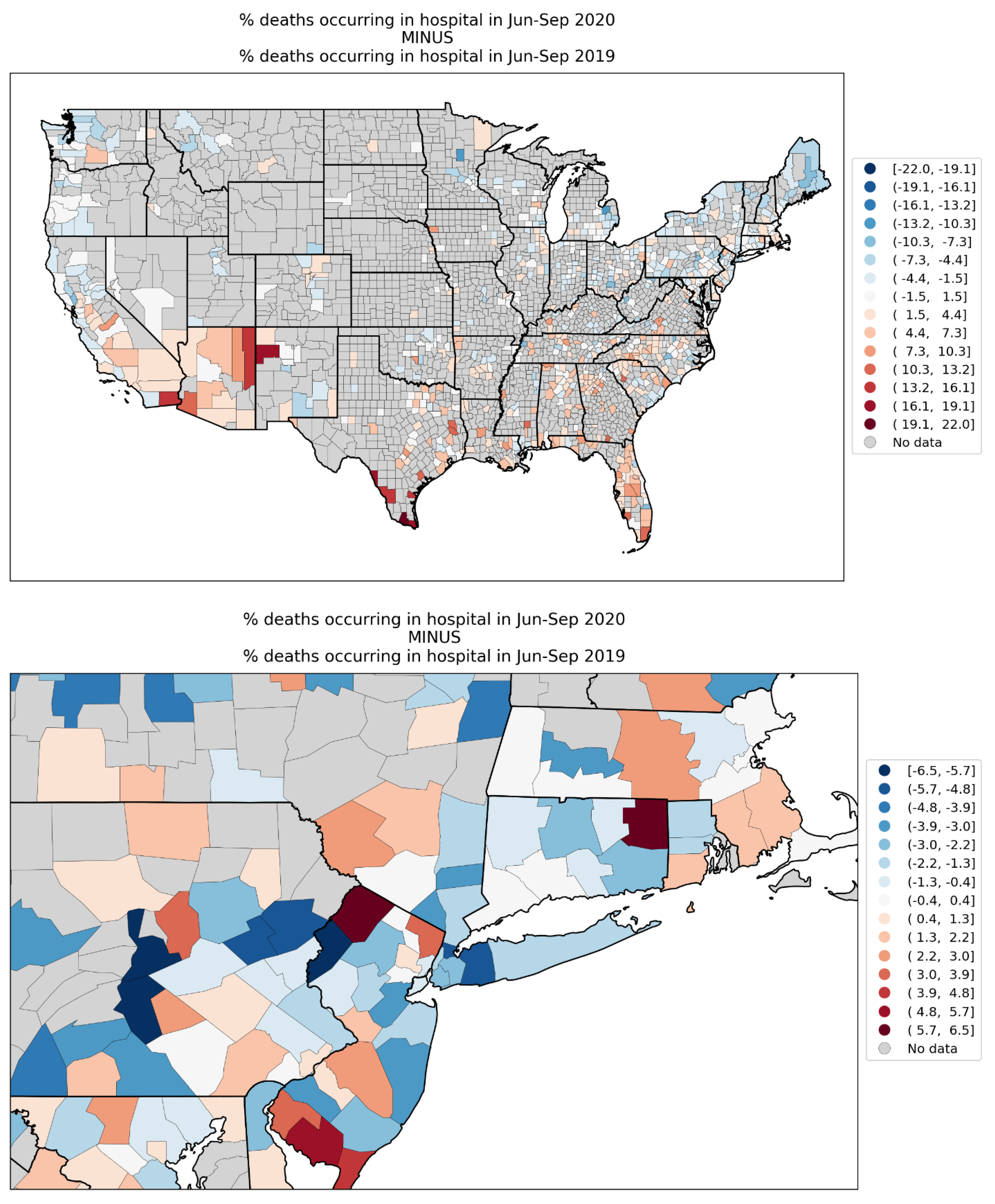
Figure 127.
Map of number of prescription drug claims per person in 2017, for the counties of the contiguous USA (top panel) and a blow-up centred on the New York City urban area (bottom panel).
Figure 127.
Map of number of prescription drug claims per person in 2017, for the counties of the contiguous USA (top panel) and a blow-up centred on the New York City urban area (bottom panel).
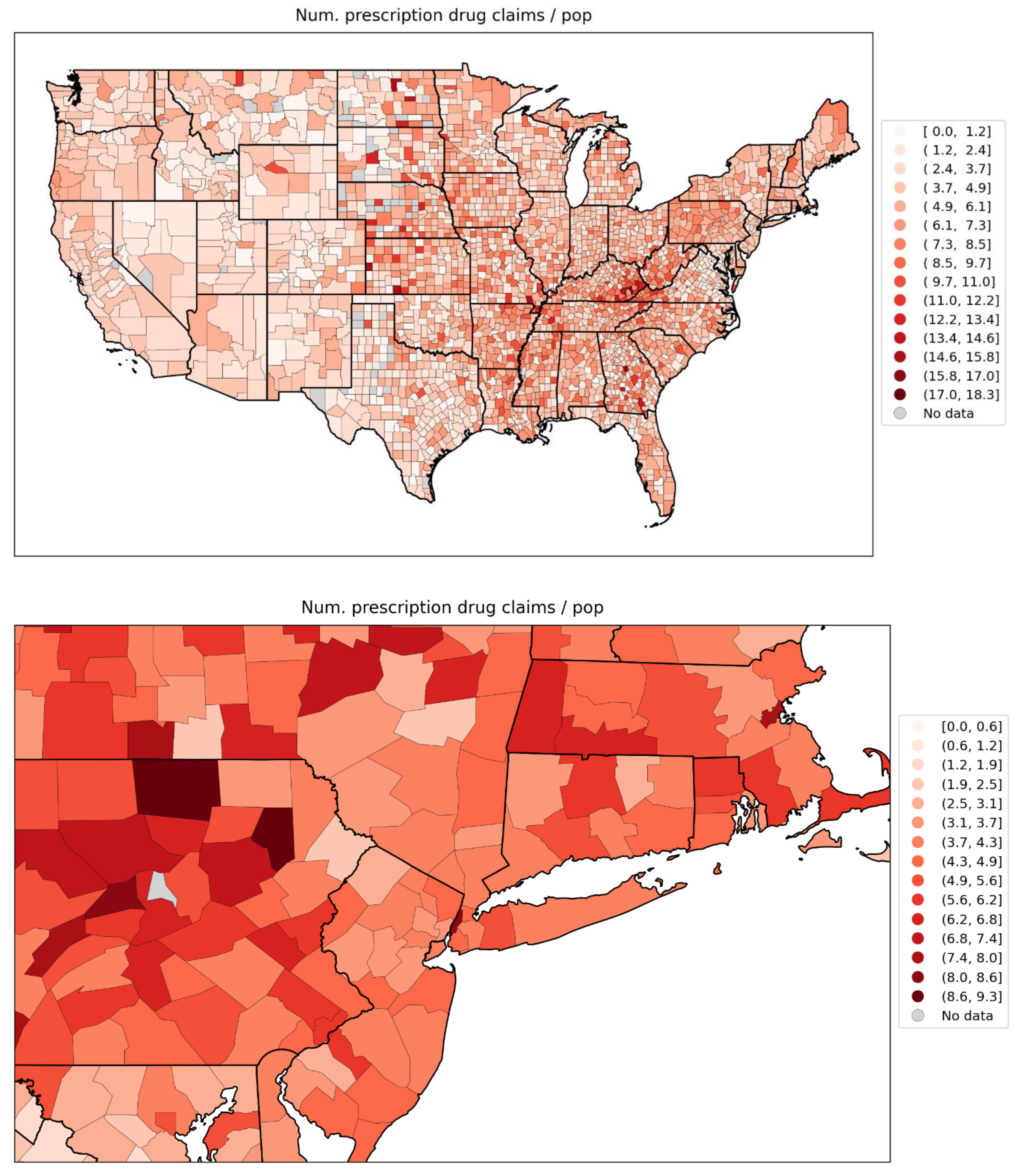
Figure 128.
Map of number of antibiotic prescription drug claims per person in 2017, for the counties of the contiguous USA (top panel) and a blow-up centred on the New York City urban area (bottom panel).
Figure 128.
Map of number of antibiotic prescription drug claims per person in 2017, for the counties of the contiguous USA (top panel) and a blow-up centred on the New York City urban area (bottom panel).
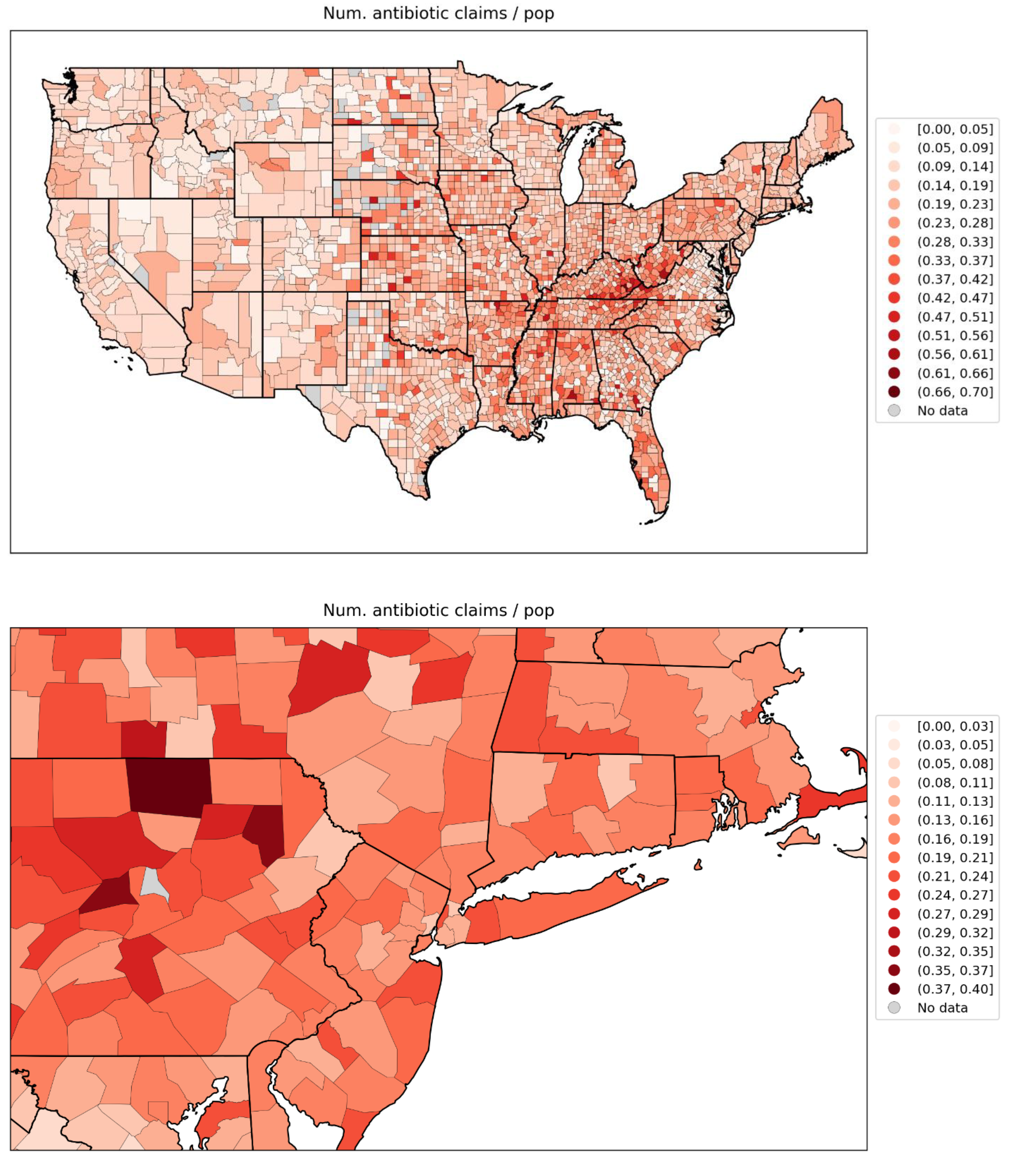
Figure 129.
Map of % of the population aged 18+ having received at least one dose of a COVID vaccine by December 31, 2021, for the contiguous USA (top panel) and a blow-up centred on the New York City urban area (bottom panel).
Figure 129.
Map of % of the population aged 18+ having received at least one dose of a COVID vaccine by December 31, 2021, for the contiguous USA (top panel) and a blow-up centred on the New York City urban area (bottom panel).
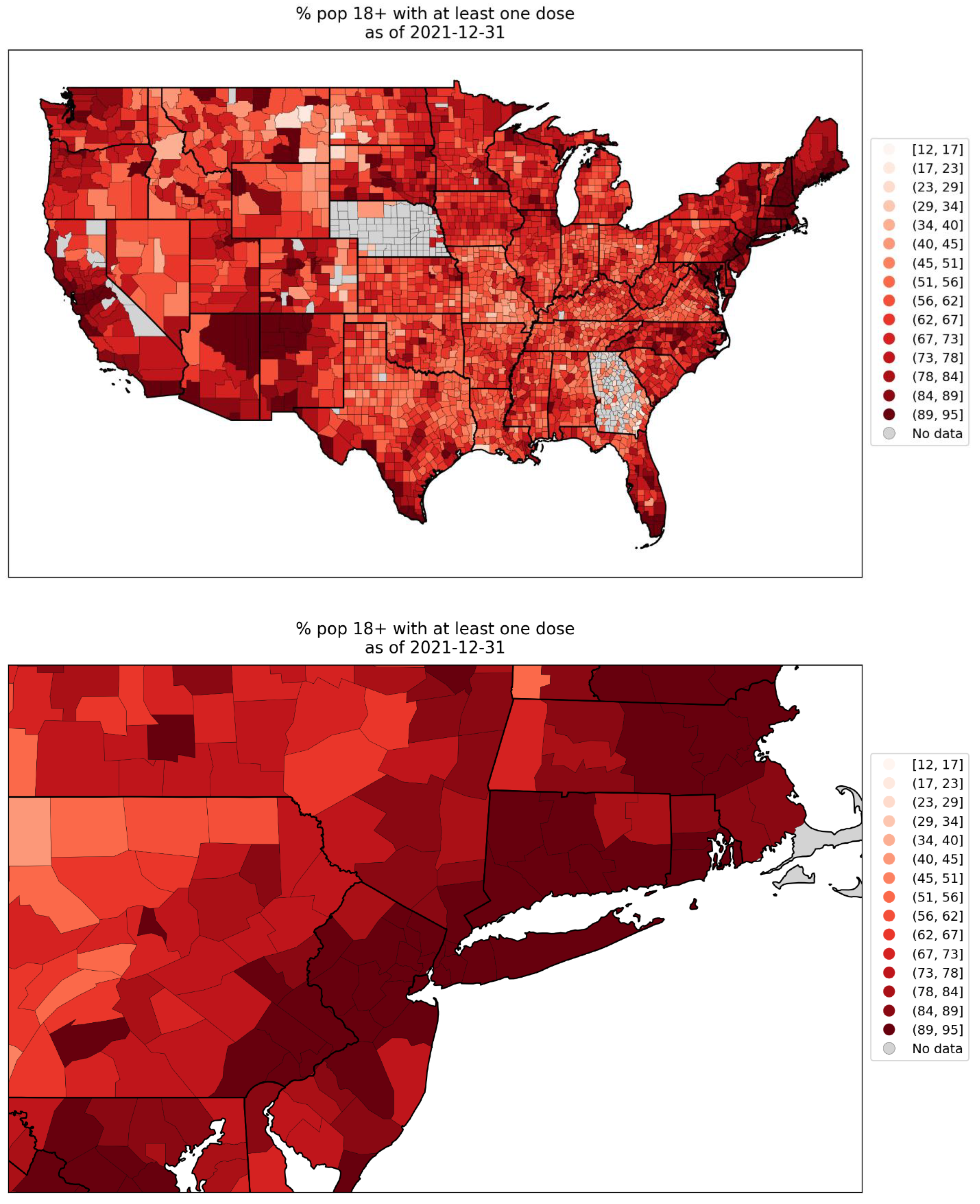
Figure 130.
Map of % of the population aged 65+ having received at least one dose of a COVID vaccine by December 31, 2021, for the contiguous USA (top panel) and a blow-up centred on the New York City urban area (bottom panel).
Figure 130.
Map of % of the population aged 65+ having received at least one dose of a COVID vaccine by December 31, 2021, for the contiguous USA (top panel) and a blow-up centred on the New York City urban area (bottom panel).
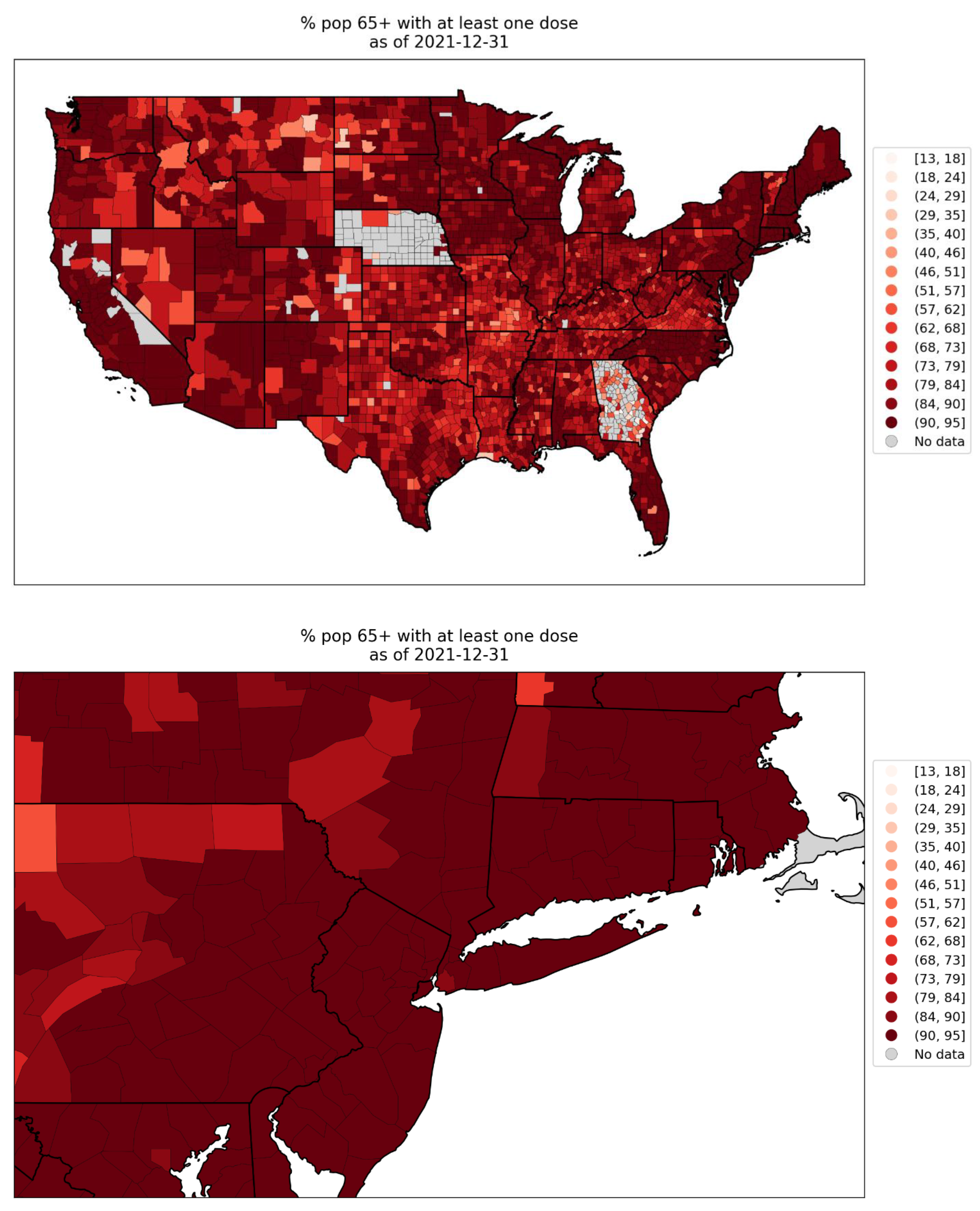
Figure 131.
Map of % of the population aged 18+ with primary series of a COVID vaccine completed by December 31, 2021, for the contiguous USA (top panel) and a blow-up centred on the New York City urban area (bottom panel).
Figure 131.
Map of % of the population aged 18+ with primary series of a COVID vaccine completed by December 31, 2021, for the contiguous USA (top panel) and a blow-up centred on the New York City urban area (bottom panel).
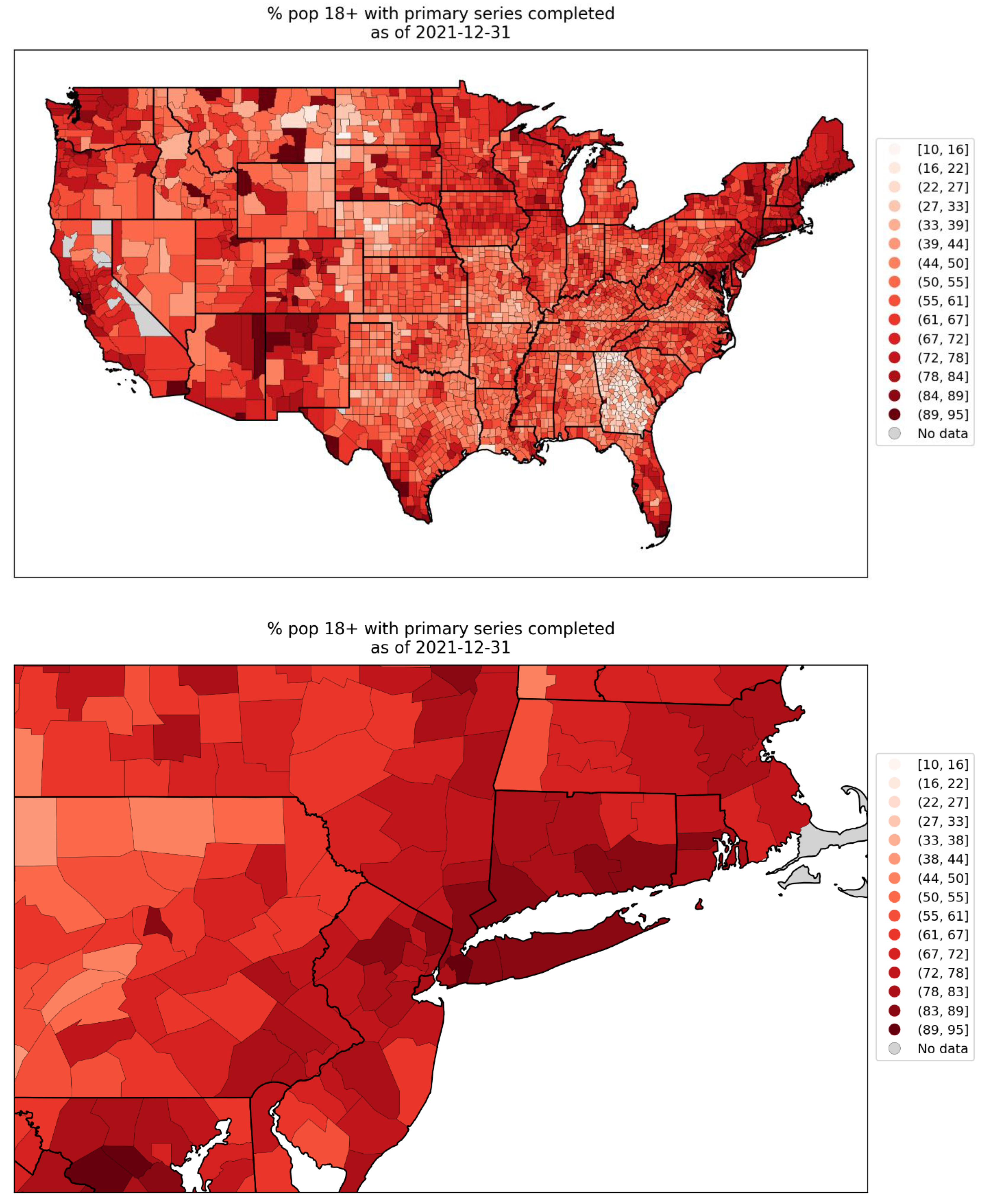
Figure 132.
Map of % of the population aged 65+ with primary series of a COVID vaccine completed by December 31, 2021, for the contiguous USA (top panel) and a blow-up centred on the New York City urban area (bottom panel).
Figure 132.
Map of % of the population aged 65+ with primary series of a COVID vaccine completed by December 31, 2021, for the contiguous USA (top panel) and a blow-up centred on the New York City urban area (bottom panel).
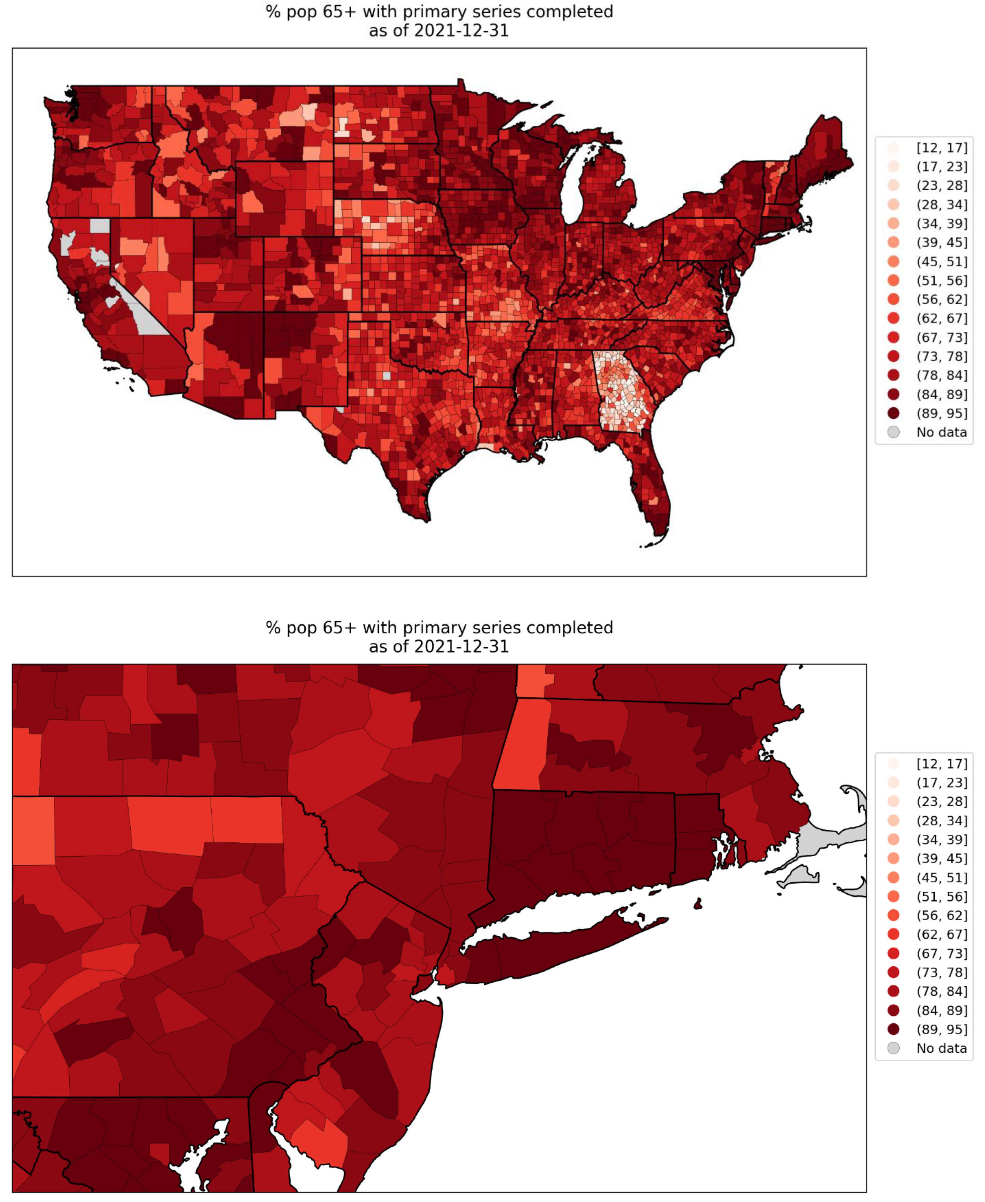
Figure 133.
Map of number of ICU beds per county for the contiguous USA (top panel) and a blow-up centred on the New York City urban area (bottom panel). Data is for 2018-2019.
Figure 133.
Map of number of ICU beds per county for the contiguous USA (top panel) and a blow-up centred on the New York City urban area (bottom panel). Data is for 2018-2019.
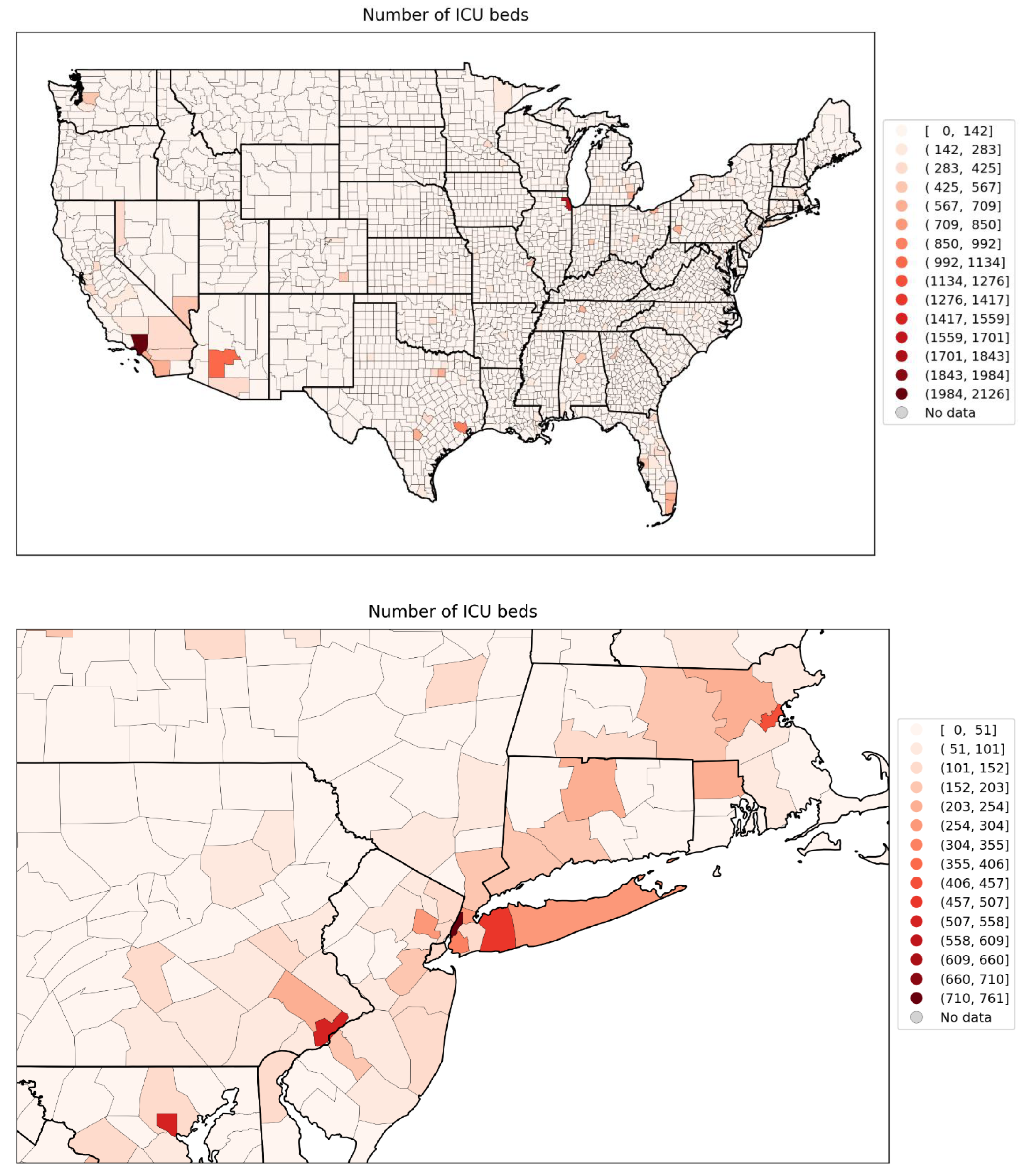
Figure 134.
Map of integrated summer-peak period (June-September 2020) P-scores for USA states.
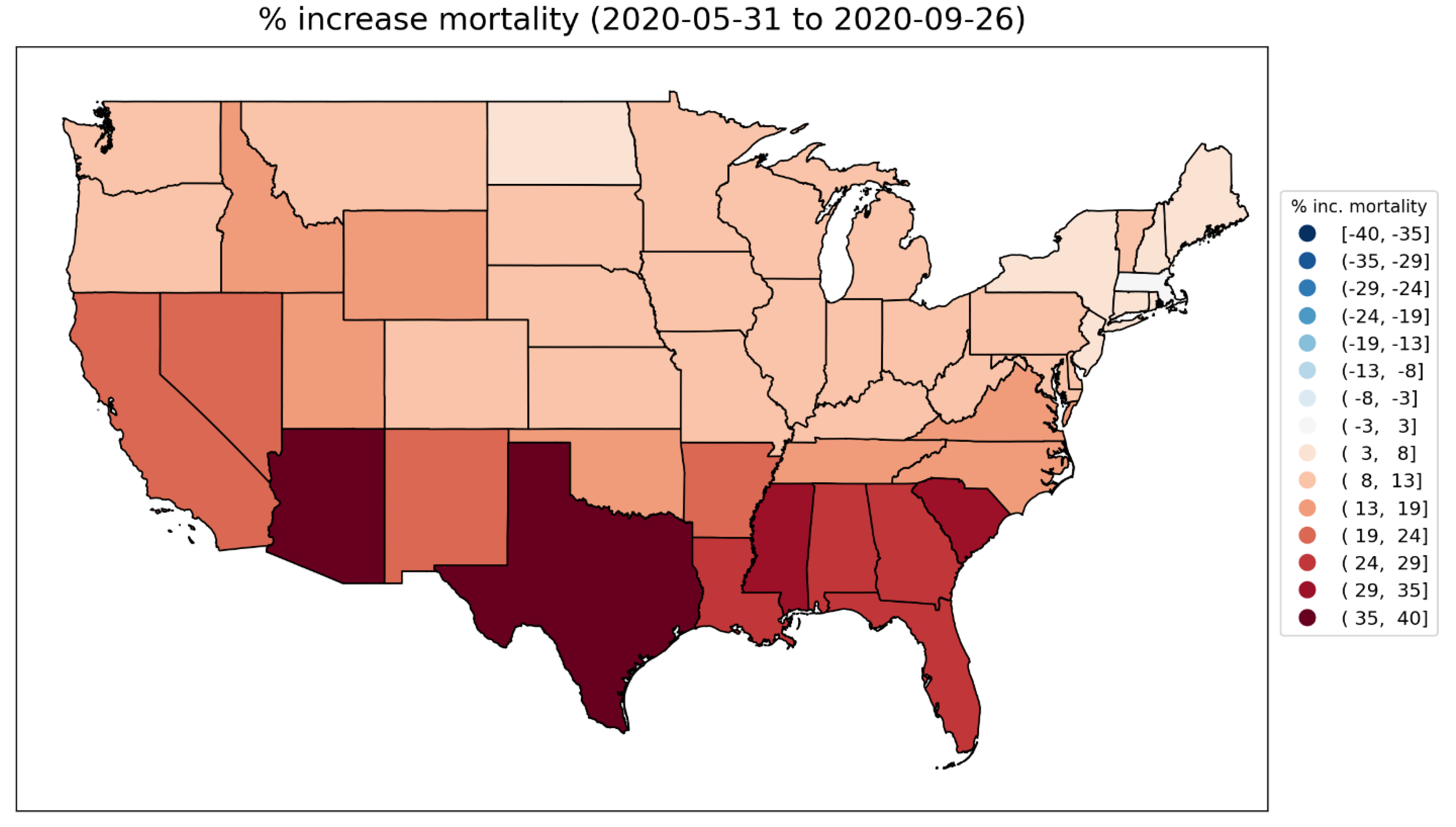
Figure 135.
Map of integrated summer-peak period (June-September 2020) P-scores for the counties of the contiguous USA (top panel) and a blow-up centred on the New York City urban area (bottom panel). The color range for both panels extends to the maximum integrated summer-peak period P-score value in the USA (Maverick County, TX; P-score = 156%). Dark grey indicates counties for which data was unavailable.
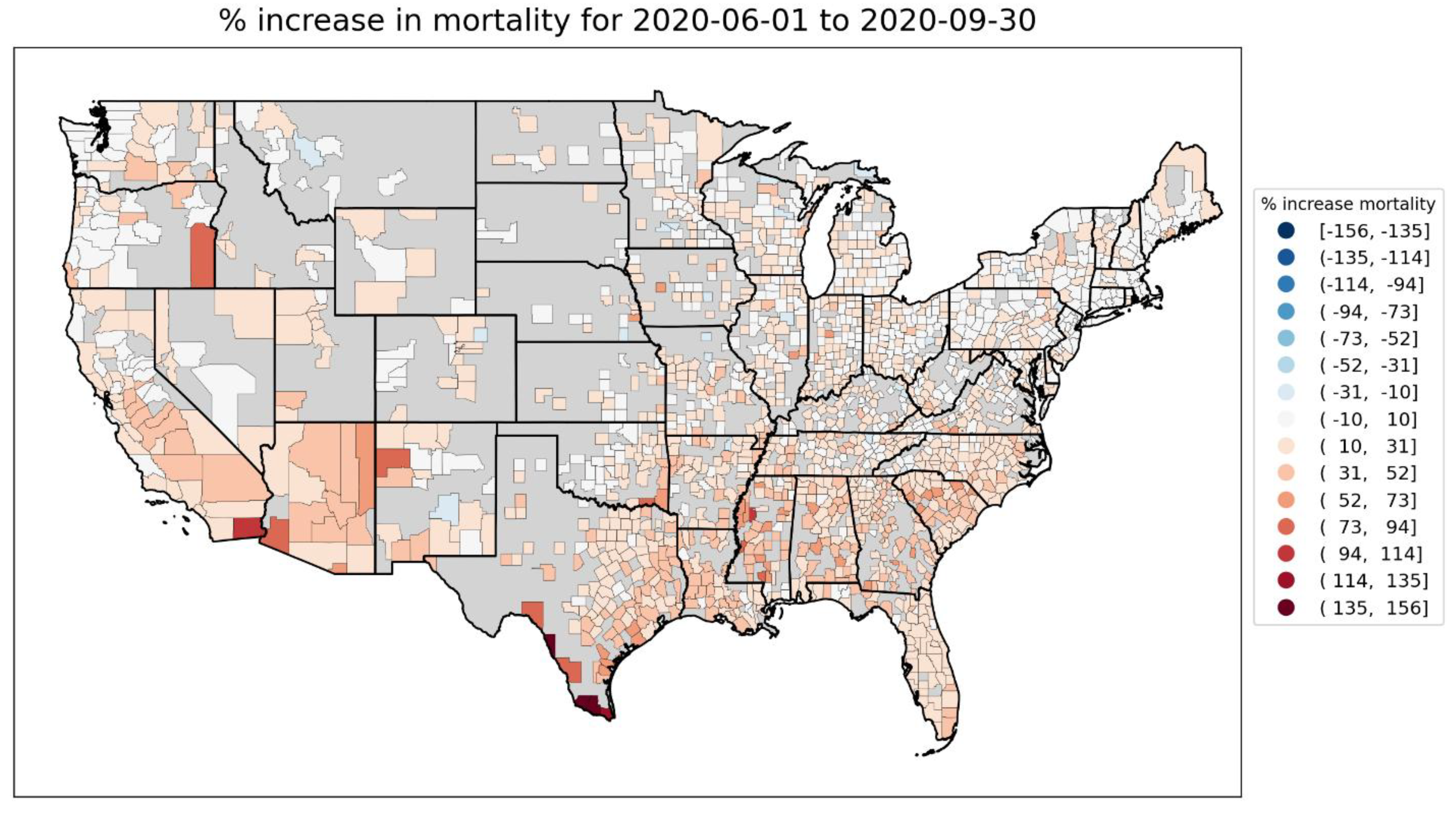
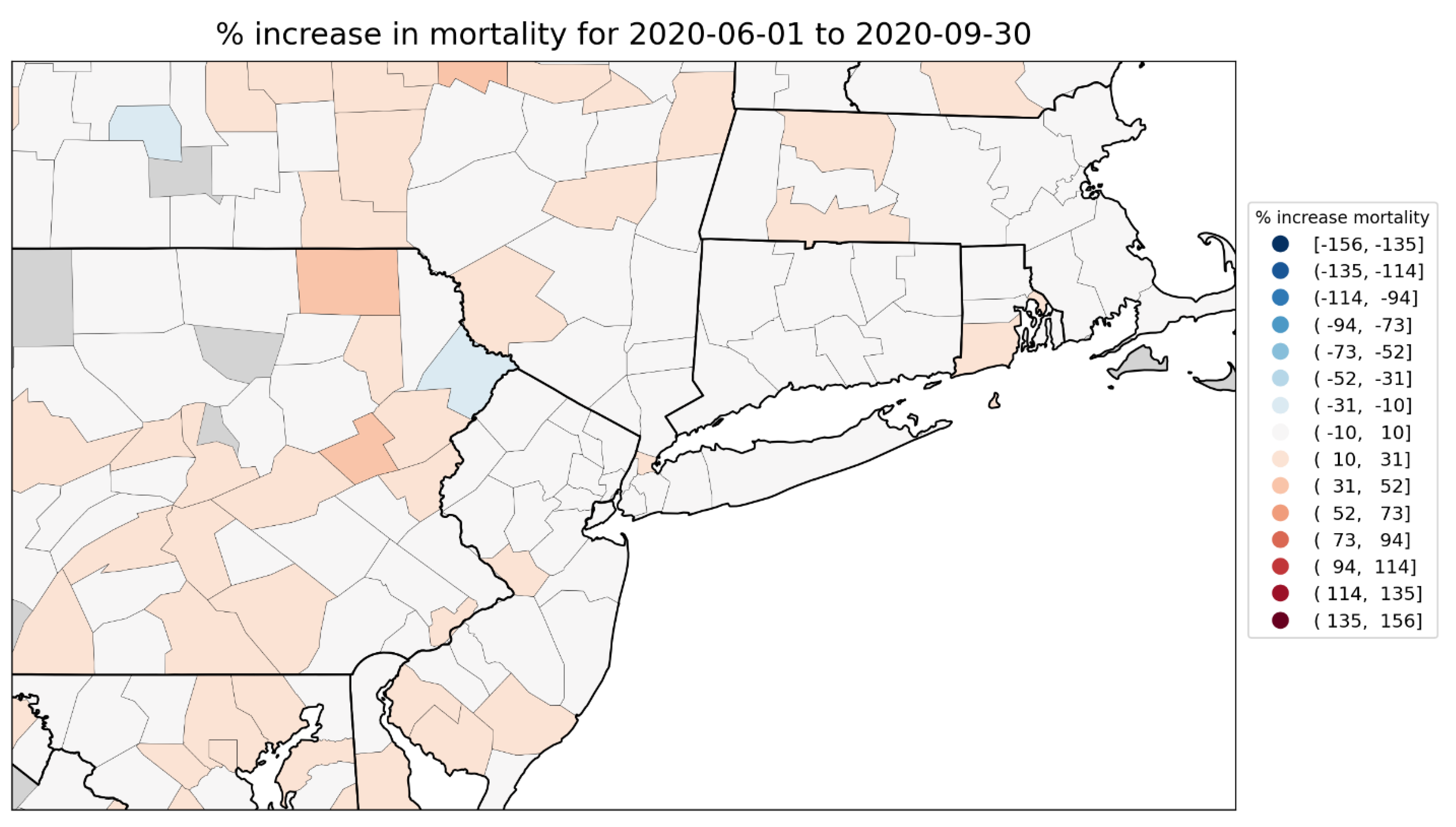
2.5.2. European Subnational Regions
The figures in this section show scatter plots of integrated P-scores for the first-peak and summer-peak periods vs socioeconomic variables, for European subnational regions. For each socioeconomic variable, we also include a heatmap showing how it varies across the geographic regions with available data, as was done above for USA counties.
We first examine scatter plots of integrated first-peak period and summer-peak period P-scores for the NUTS2 regions of Europe vs population in 2019, log(population), population density in 2018, log(population density), and at-risk-of-poverty rate in 2019. This is shown in Figure 136 to Figure 140, with maps in Figure 142 to Figure 146.
Following the figures for the NUTS2 regions of Europe, we also include additional figures with scatter plots and maps examining the gross disposable household income per capita for the NUTS3 regions of the UK (Figure 147 to Figure 149), and for a set of socioeconomic variables for the NUTS3 regions of London, UK (Figure 150 to Figure 157).
European NUTS2 regions
Each of Figure 136 to Figure 140 has six panels, similar to the scatter plots for the USA counties in section 3.6.1: the top row of panels is for the first-peak period, the middle row of panels is for the summer-peak period, and the bottom row shows the first-peak period (lower-left panel) and summer-peak period (lower-right panel) data points for the four European countries with the highest integrated first-peak period P-scores at the national level: Spain (ES), United Kingdom (UK), Italy (IT) and Belgium (BE). The y-axis ranges are the same for all panels, to facilitate comparison.
Figure 141 contains maps of integrated first-peak period P-scores for the NUTS2 regions of Europe (left panel) and for a blow-up of the NUTS2 regions of England and Wales, UK (right panel). Mortality data was unavailable at the NUTS2 level for the dark grey-colored countries in the left panel of Figure 141, including Germany, such that these countries do not contribute to the scatter plots in Figure 136 to Figure 140.
Figure 142 to Figure 146 contain heatmaps showing how the population, log(population), population density, log(population density), and at-risk-of-poverty rate vary across the NUTS2 regions of Europe (left panel) and England and Wales, UK (right panel).
In Figure 136 (integrated P-scores vs population), in the first-peak period, there is an upper branch of the scatter plot for which P-scores increase with increasing population, and a lower branch in which P-scores remain low with increasing population. This is similar to the case for first-peak period P-scores in the USA counties (Figure 64, top row of panels). Unlike in the USA (Figure 64, middle row of panels), there were no European regions with large summer-peak period P-scores. Figure 137 has P-scores vs the logarithm of population, for comparison.
Figure 138 shows integrated P-scores vs population density. The NUTS2 regions with the highest first-peak period P-scores, in Spain and Italy, were not among the highest-density NUTS2 regions due to their relatively large geographic areas. However, the said regions nonetheless contain major cities and densely populated urban areas, specifically: ITC4 (Lombardy, Italy) contains the urban area of Milan; ES30 (Madrid, Spain) is the Spanish capital region; and ES42 (Castile-La Mancha, Spain) contains part of the Madrid metropolitan area as well as densely-populated industrialized zones. Several UK regions stand out for their high population densities and high first-peak period P-scores. These are within the urban areas of London (UKI4, UKI3, UKI7, UKI5, UKI6), Birmingham (UKG3), Liverpool (UKD7) and Greater Manchester (UKD3). The capital region of Belgium (BE10, Brussels) also stands out for having high population density and a high integrated first-peak period P-score. Separately, there is a lower branch of the scatter plot, extending horizontally along the x-axis in the panels in the top row of Figure 138, showing that several high-density regions in central and eastern Europe had low integrated first-peak period P-scores. This is similar to the scatter plot of integrated P-score vs population density for the USA counties, in Figure 66. The Spanish region of Ceuta (ES63), which is an autonomous city on the northern coast of Africa, also has high population density and low first-peak period P-score.
Figure 139 shows P-score vs the logarithm of population density. The lower-left panel shows a strong correlation between integrated first-peak period P-score and log(population density) for the NUTS2 regions of the UK. This can also be seen on the linear scale, in the lower-left panel of Figure 138. This correlation with population density is reminiscent of the result for the counties of the New York City urban area as seen in Figure 67 (section 3.6.1), and motivates further examination of scatter plots for the higher-resolution NUTS3 regions of the UK, further below.
Figure 140 shows integrated P-scores vs the at-risk-of-poverty rate. The at-risk-of-poverty rate is the percentage of the region’s population that live in households with equivalised disposable income of less than 60% of that of the national median (Eurostat, 2024d; ONS, 2021). Poverty data was unavailable for the countries and regions shown in dark grey in Figure 146, including Belgium, France, and Germany.
As can be seen in Figure 140, the largest first-peak period P-scores are generally at mid-range values of the at-risk-of-poverty rate. This is similar to the case for the USA counties (Figure 69, top row of panels), in that, when considering all of Europe or all of the USA, it is not the highest-poverty regions that had the highest integrated first-peak period P-scores.
In the USA, there was a strong positive correlation between P-score and poverty when considering only the counties with the highest P-scores (e.g. the counties with P-scores > 100%), which are mostly located in the high-density inner-city area of the New York City urban area (Figure 69, lower-left panel). While first-peak period P-scores increased with population density in the UK (Figure 138 and Figure 139, lower-left panels), like in the New York City urban area (Figure 66 and Figure 67, lower-left panels), there is no apparent correlation with poverty for the UK NUTS2 regions, in Figure 140 (lower-left panel). However, a positive correlation between first-peak period integrated P-score and poverty and other socioeconomic vulnerability indicators is observed using data for higher geographic-resolution (NUTS3) regions and focusing on the London area, which had the highest P-scores in the UK. This is shown below.
Figure 136.
Integrated excess mortality P-scores for first-peak and summer-peak periods for European NUTS2 regions vs population for 2019. Bottom row: four countries with highest integrated first-peak P-scores.
Figure 136.
Integrated excess mortality P-scores for first-peak and summer-peak periods for European NUTS2 regions vs population for 2019. Bottom row: four countries with highest integrated first-peak P-scores.
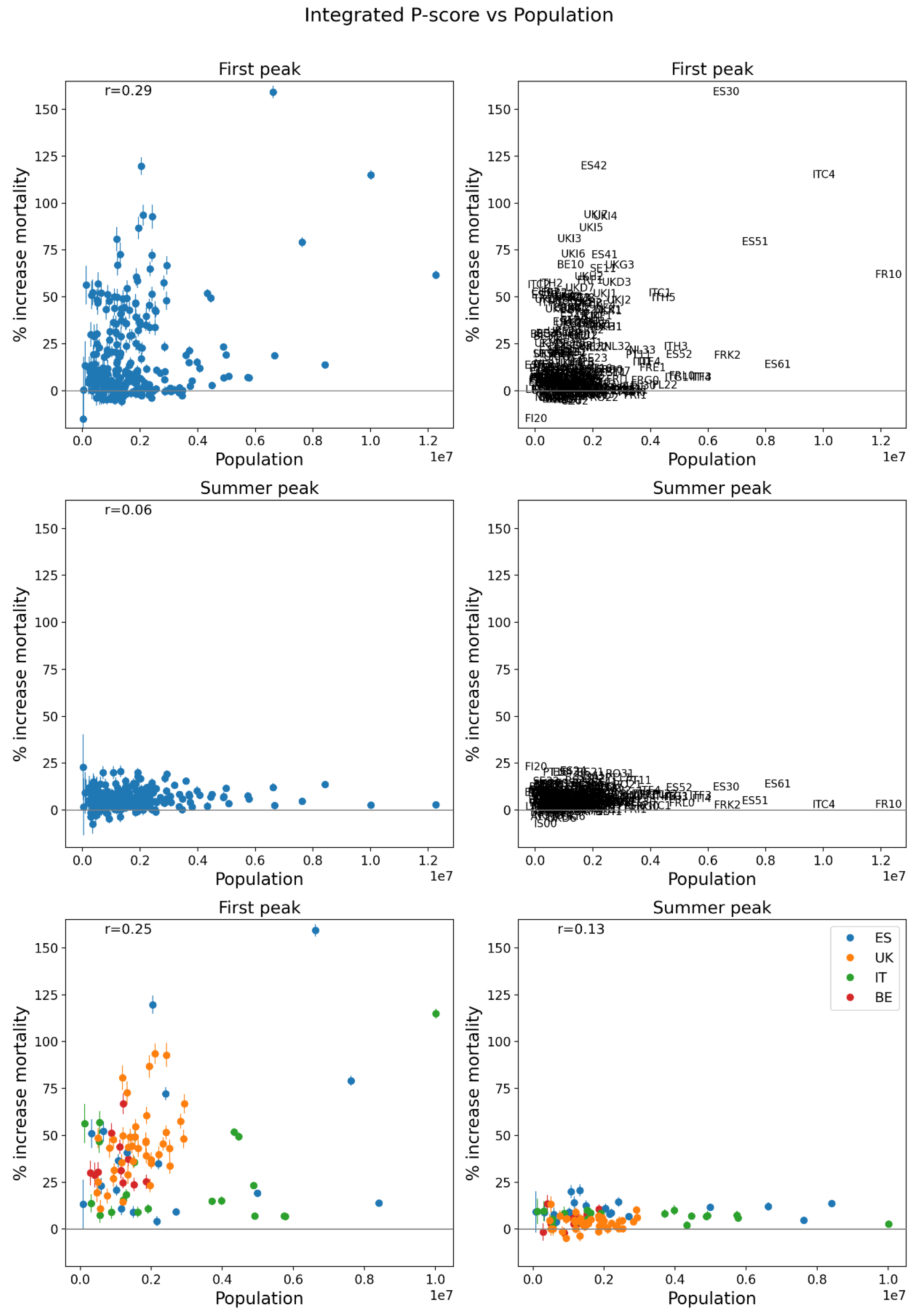
Figure 137.
Same as Figure 136, except that the x-axis shows the logarithm of population for 2019.
Figure 137.
Same as Figure 136, except that the x-axis shows the logarithm of population for 2019.
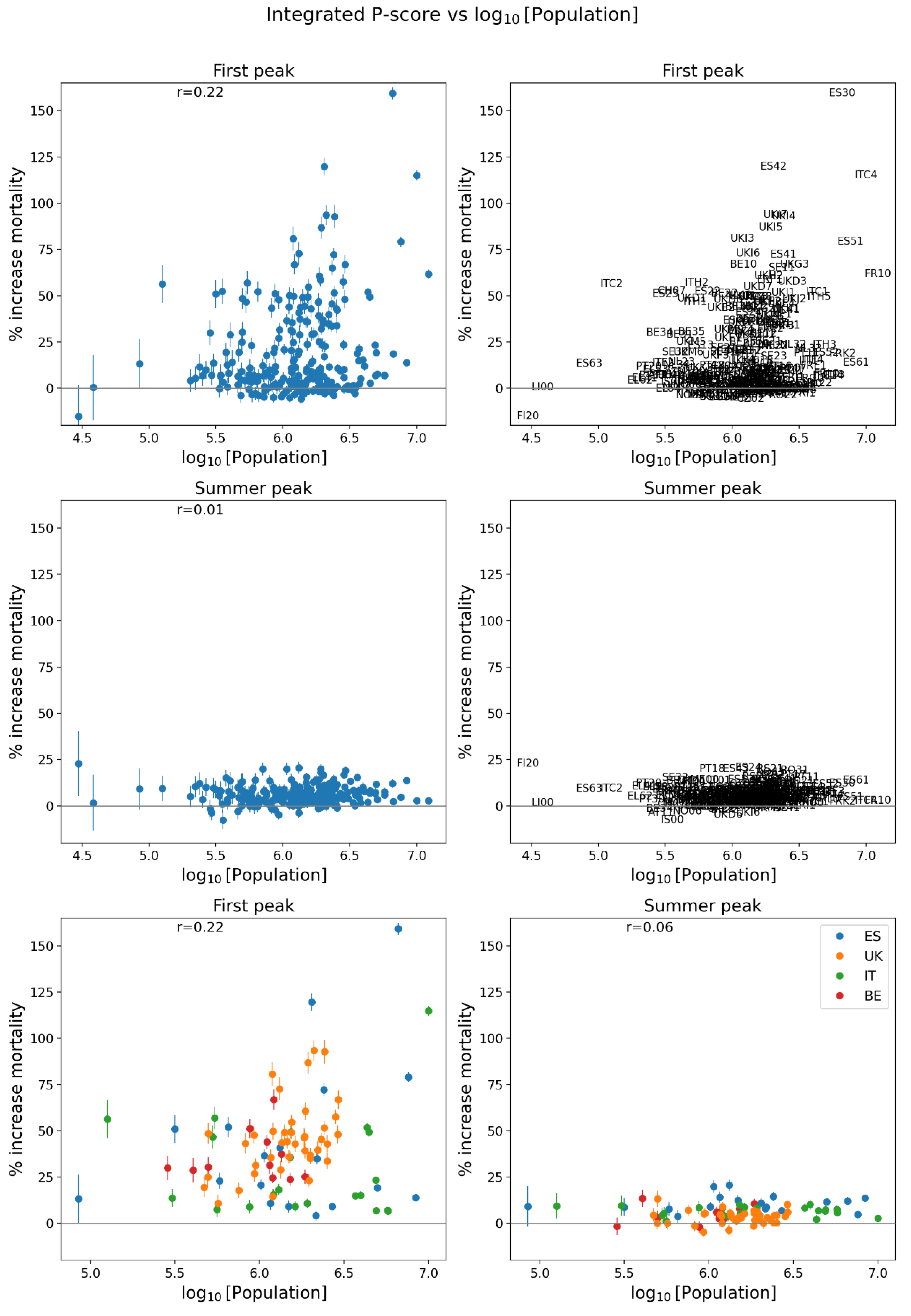
Figure 138.
Same as Figure 136, except that the x-axis shows population density for 2018.
Figure 138.
Same as Figure 136, except that the x-axis shows population density for 2018.
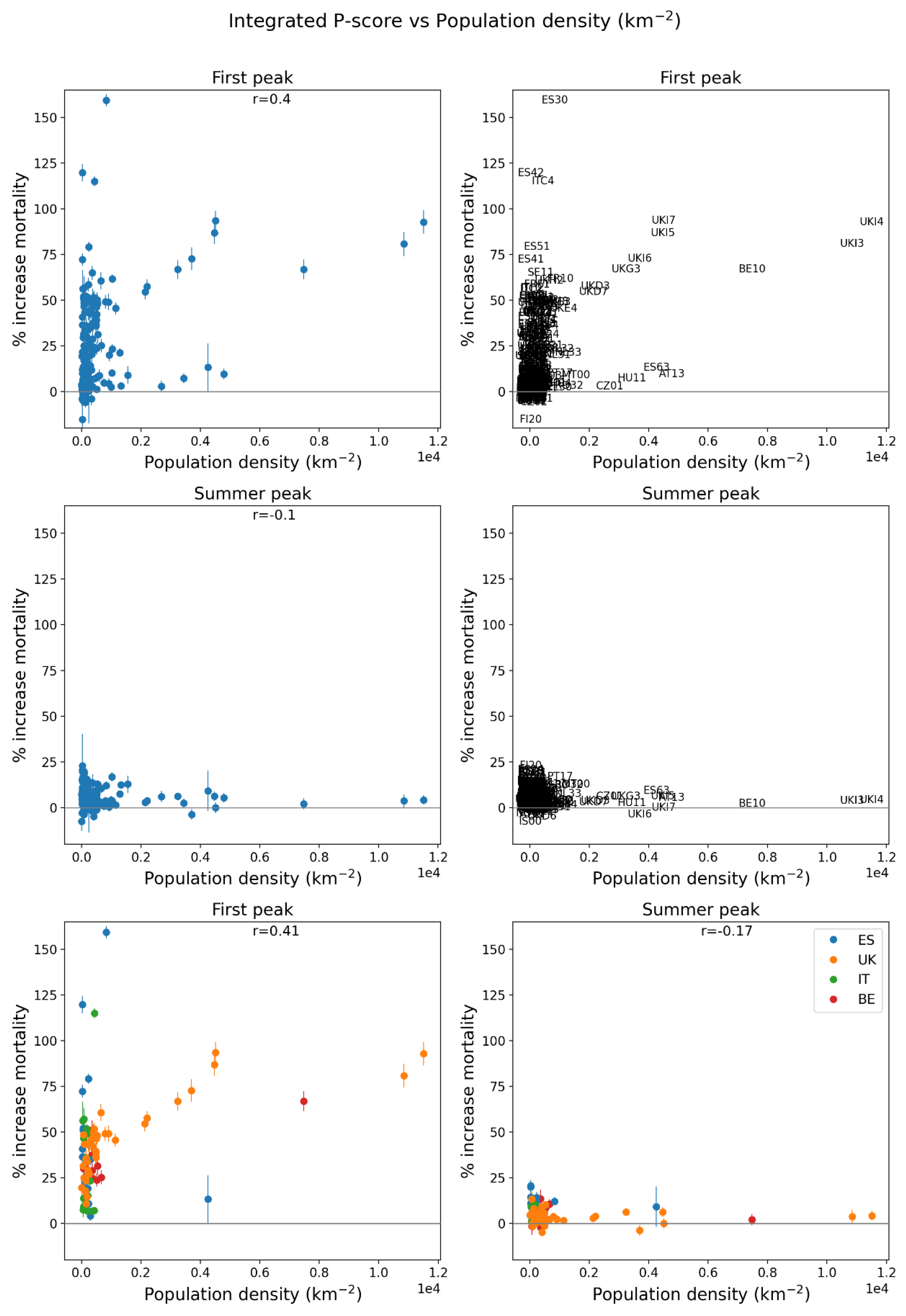
Figure 139.
Same as Figure 136, except that the x-axis shows the logarithm of population density for 2018.
Figure 139.
Same as Figure 136, except that the x-axis shows the logarithm of population density for 2018.
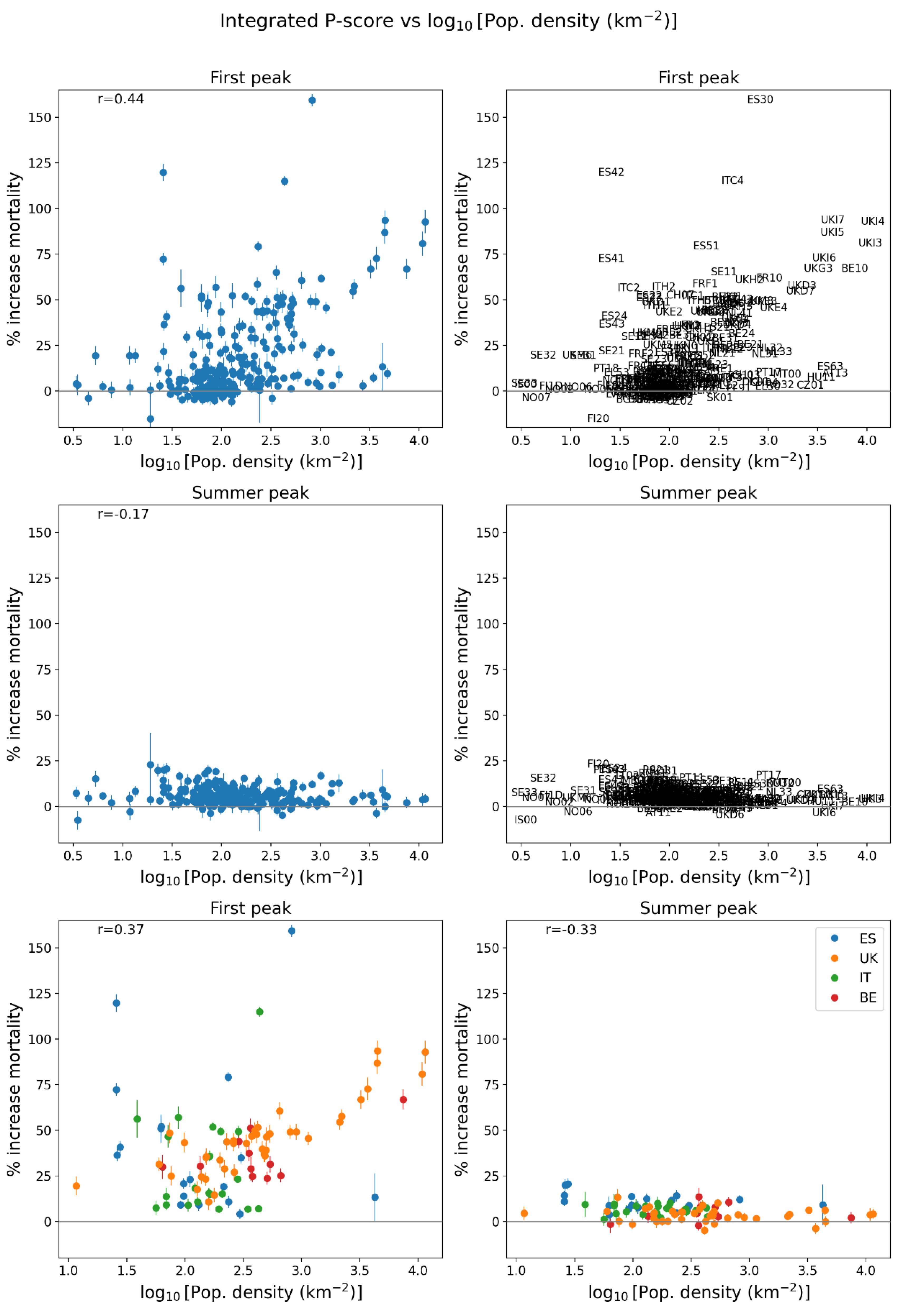
Figure 140.
Same as Figure 136, except that the x-axis shows the percentage of the population at risk of poverty in 2019. Poverty data in Figure 146.
Figure 140.
Same as Figure 136, except that the x-axis shows the percentage of the population at risk of poverty in 2019. Poverty data in Figure 146.
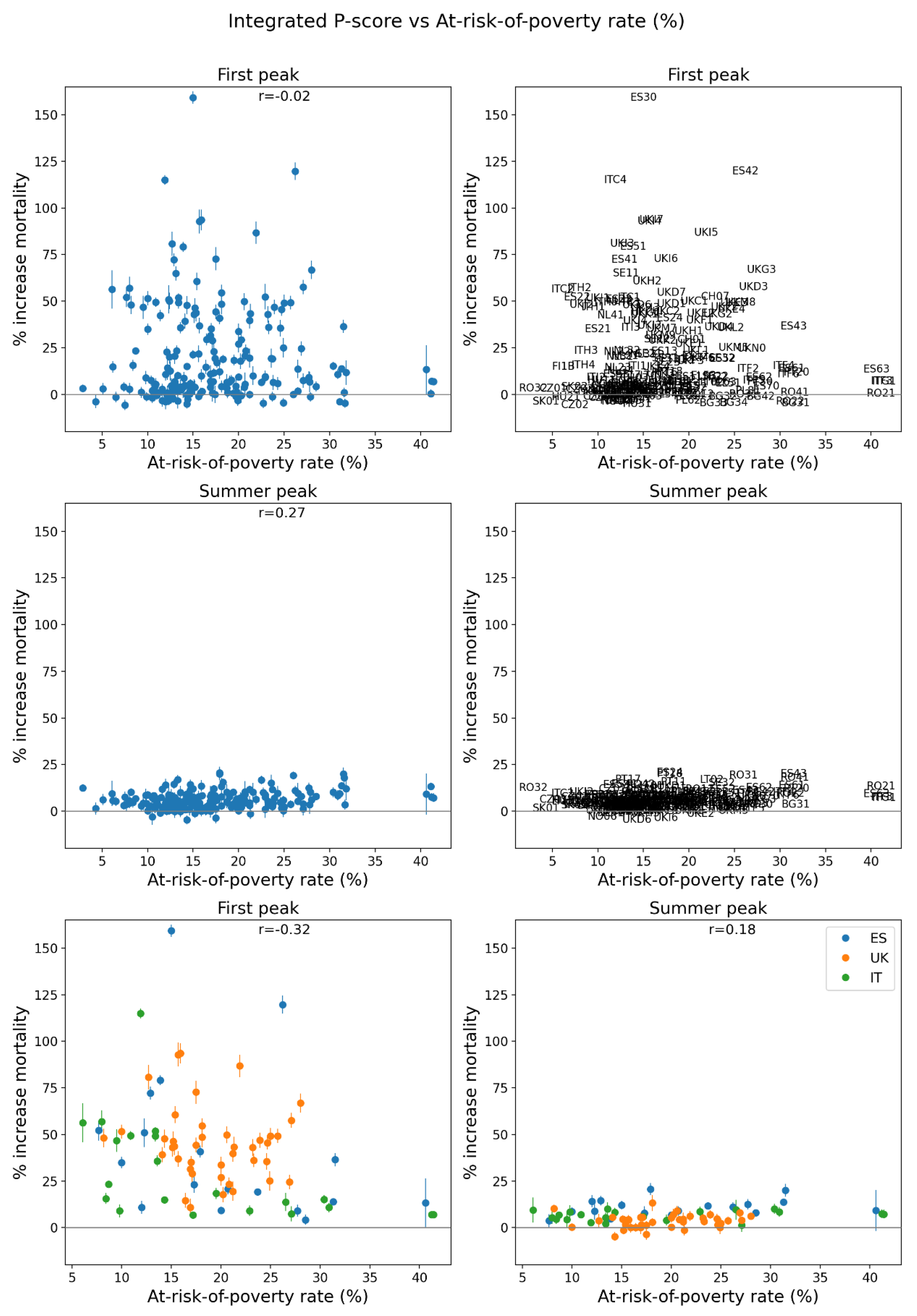
Figure 141.
Integrated first-peak period P-scores for NUTS2 regions of Europe (left panel) and England and Wales, UK (right panel). Color range extends to the maximum value in the regions shown in each panel. Dark grey indicates countries for which data was unavailable.
Figure 141.
Integrated first-peak period P-scores for NUTS2 regions of Europe (left panel) and England and Wales, UK (right panel). Color range extends to the maximum value in the regions shown in each panel. Dark grey indicates countries for which data was unavailable.
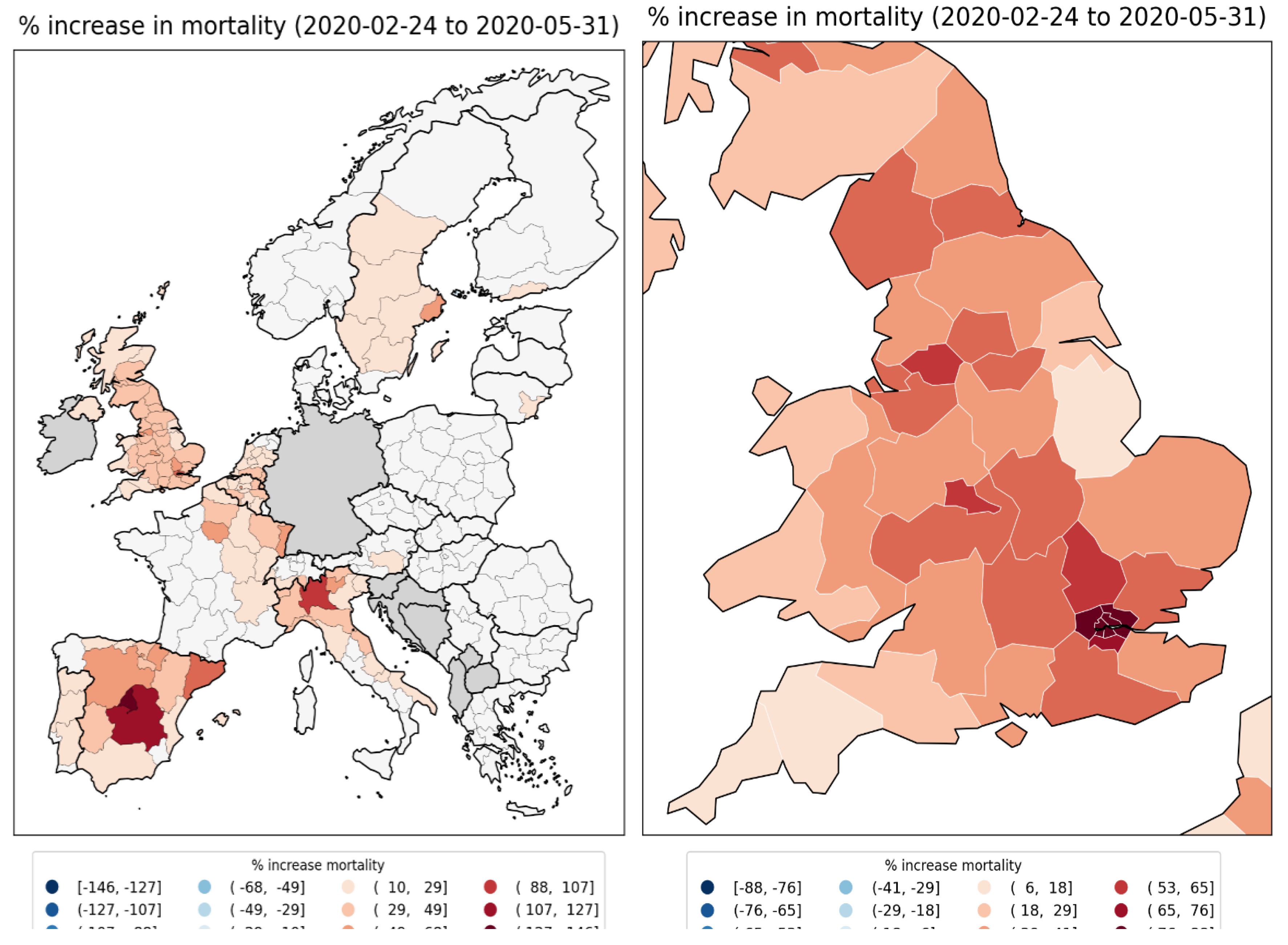
Figure 142.
Population in 2019 for NUTS2 regions of Europe (left panel) and England and Wales, UK (right panel). Dark grey indicates countries for which data was unavailable.
Figure 142.
Population in 2019 for NUTS2 regions of Europe (left panel) and England and Wales, UK (right panel). Dark grey indicates countries for which data was unavailable.
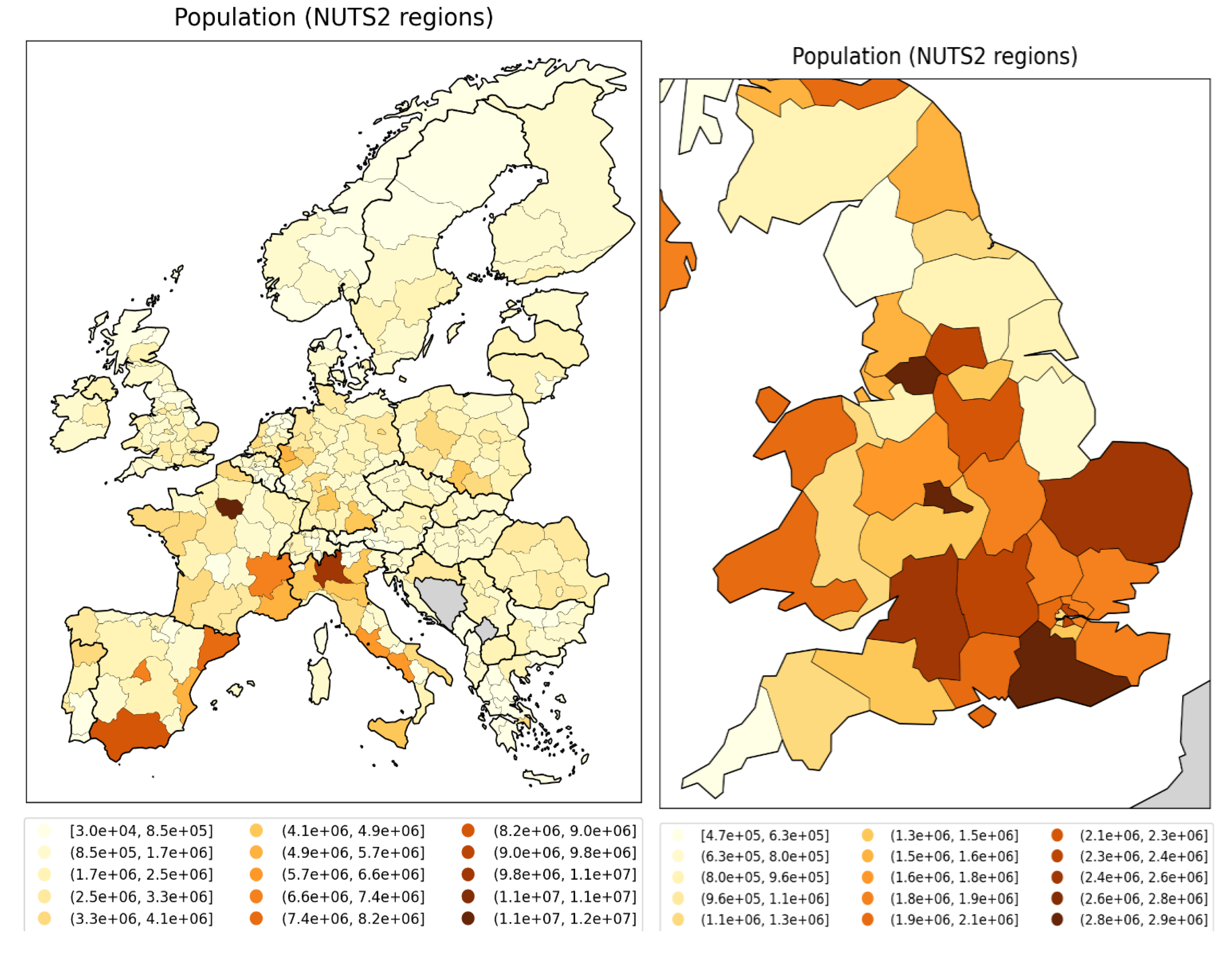
Figure 143.
Logarithm of 2019 population for NUTS2 regions of Europe (left panel) and England and Wales, UK (right panel). Dark grey indicates countries for which data was unavailable.
Figure 143.
Logarithm of 2019 population for NUTS2 regions of Europe (left panel) and England and Wales, UK (right panel). Dark grey indicates countries for which data was unavailable.

Figure 144.
Population density (persons per km2) in 2018 for NUTS2 regions of Europe (left panel) and England and Wales, UK (right panel). Dark grey indicates countries for which data was unavailable.
Figure 144.
Population density (persons per km2) in 2018 for NUTS2 regions of Europe (left panel) and England and Wales, UK (right panel). Dark grey indicates countries for which data was unavailable.

Figure 145.
Logarithm of population density (persons per km2) in 2018 for NUTS2 regions of Europe (left panel) and England and Wales, UK (right panel). Dark grey indicates countries for which data was unavailable.
Figure 145.
Logarithm of population density (persons per km2) in 2018 for NUTS2 regions of Europe (left panel) and England and Wales, UK (right panel). Dark grey indicates countries for which data was unavailable.
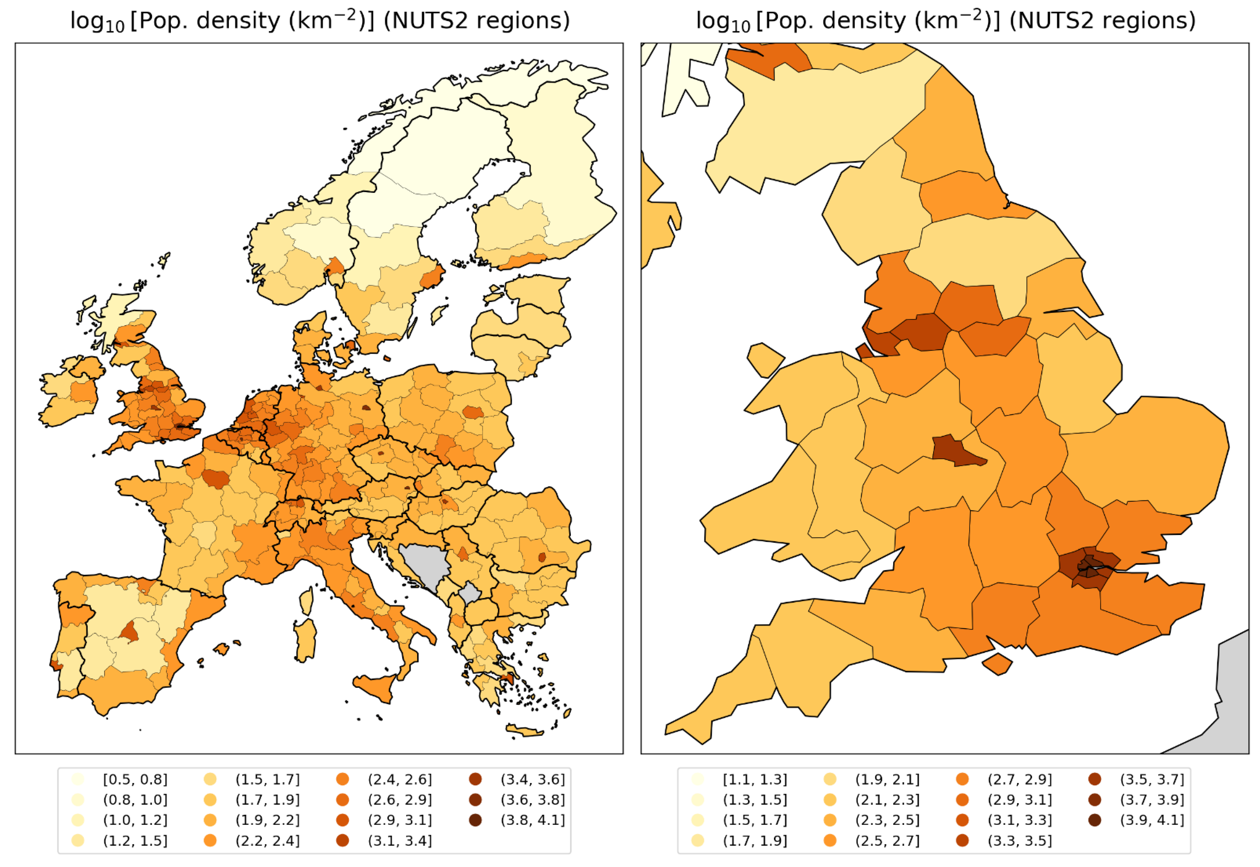
Figure 146.
At-risk-of-poverty rate in 2019 for NUTS2 regions of Europe (left panel) and England and Wales, UK (right panel). The at-risk-of-poverty rate is the percentage of the region’s population that live in households with equivalised disposable income of less than 60% of that of the national median Eurostat, 2024d; ONS, 2021). Dark grey indicates countries for which data was unavailable.
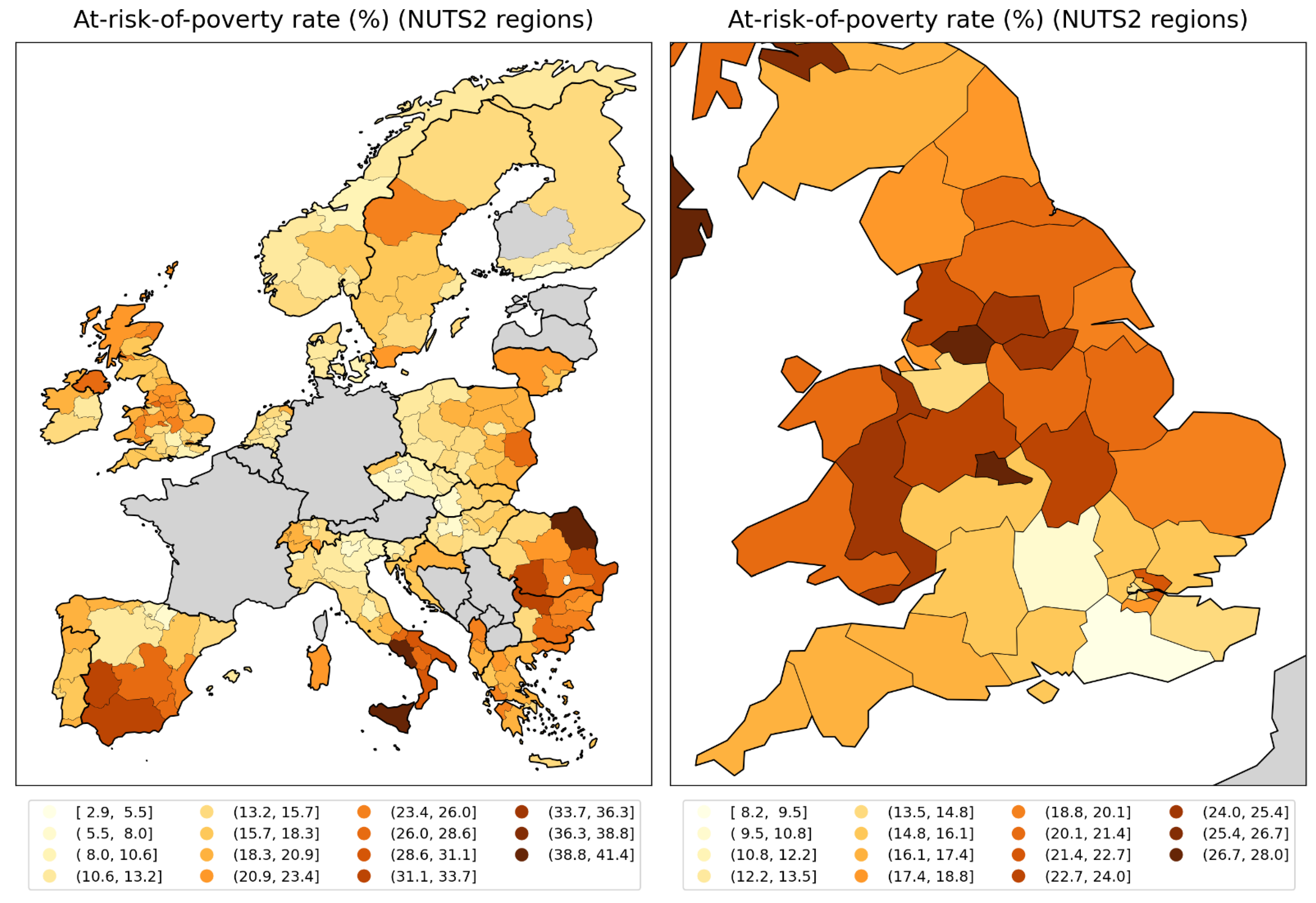
NUTS3 regions of the UK and London
Before focusing on the London area in more detail, we first show graphs of one socioeconomic variable for the NUTS3 regions of the entire UK. This variable is the gross disposable household income (GDHI) per capita, for the year 2019. An individual’s GDHI is their income after distribution measures such as taxation and government benefits have been applied (ONS, 2024).
Figure 147 shows the integrated first-peak period P-score for the NUTS3 regions of the UK vs GDHI per capita (left panel) and the logarithm of GDHI per capita (right panel).
Figure 147.
Integrated first-peak period P-score vs Gross disposable household income per capita in 2019 for NUTS3 regions of the UK.
Figure 147.
Integrated first-peak period P-score vs Gross disposable household income per capita in 2019 for NUTS3 regions of the UK.
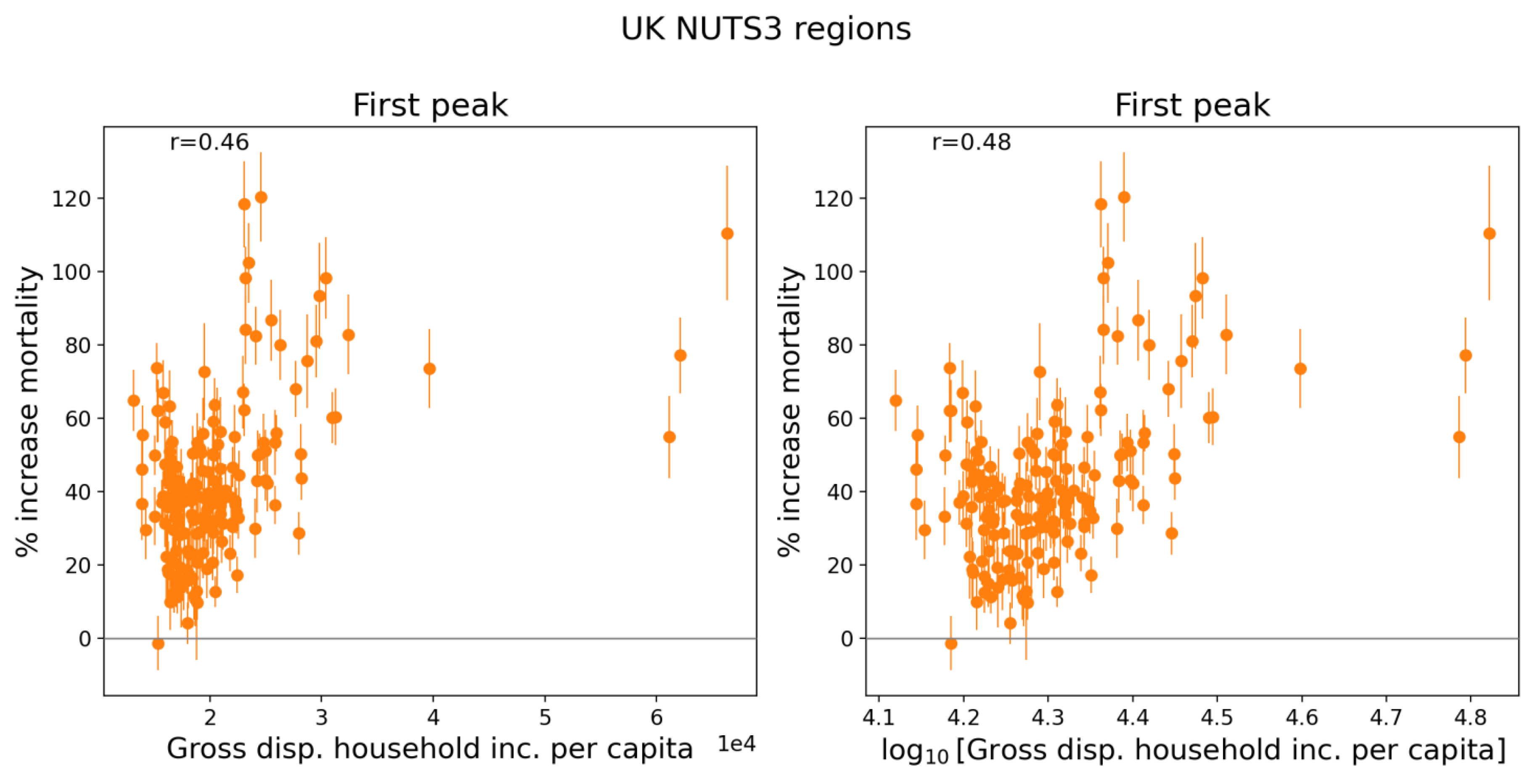
Figure 148 contains maps showing GDHI per capita and log(GDHI per capita) for the UK. Some NUTS3 regions in Northern Ireland and Scotland are omitted from the maps to allow better visualization of the NUTS3 regions in and around London, which have the highest GDHI per capita values in the UK. (For comparison, GDHI per capita for the Northern Ireland NUTS3 regions ranges from 15,317 to 18,875 pounds and for the Scottish NUTS3 regions with available data it ranges from 16,966 to 24,418 pounds.)
A copy of Figure 8, showing the integrated first-peak period P-scores for England and Wales, UK, is included below as Figure 149 to facilitate comparison with the maps in Figure 148.
Figure 148.
Map of gross disposable household income per capita in 2019 for the NUTS3 regions of England and Wales, UK. Left panel: linear scale; right panel: logarithmic scale. Dark grey indicates regions for which data was unavailable.
Figure 148.
Map of gross disposable household income per capita in 2019 for the NUTS3 regions of England and Wales, UK. Left panel: linear scale; right panel: logarithmic scale. Dark grey indicates regions for which data was unavailable.

Figure 149.
Map of integrated first-peak period P-scores for the NUTS3 regions in England and Wales (UK). (Copy of Figure 8.).
Figure 149.
Map of integrated first-peak period P-scores for the NUTS3 regions in England and Wales (UK). (Copy of Figure 8.).
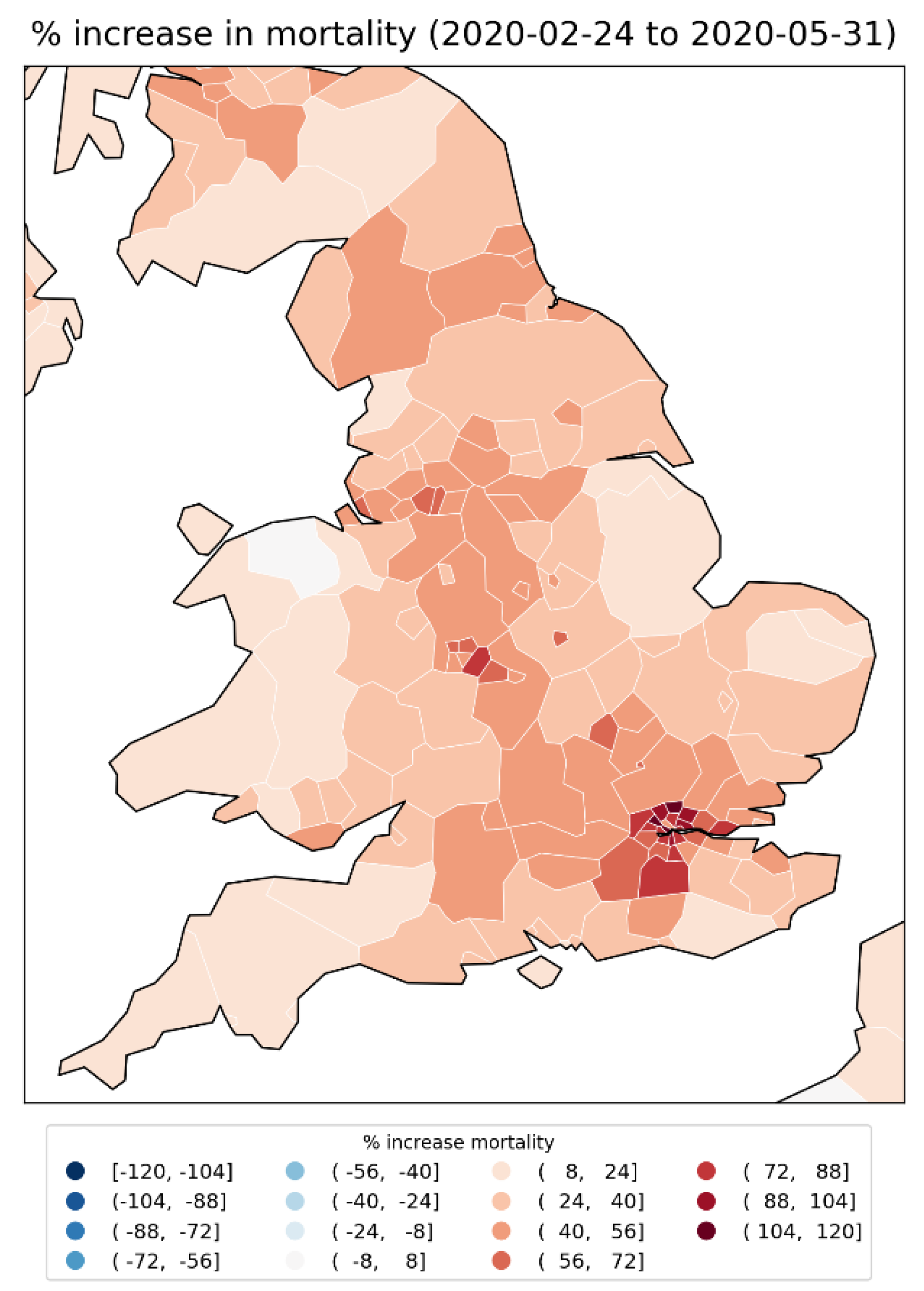
As can be seen from the scatter plots in Figure 147, the UK NUTS3 regions with the highest integrated first-peak P-scores were generally regions with mid to high GDHI per capita values. These higher-GDHI per capita NUTS3 regions are located in the area around London (Figure 148) and had the highest integrated first-peak period P-scores in the UK (Figure 149).
Focusing now on London, Figure 150 shows scatter plots of integrated first-peak period P-scores for the 21 NUTS3 regions of London vs the following socioeconomic variables: population, population density, GDHI per capita, percent living in poverty, percent minority (non-white), and percent born outside of the UK.
Here, population, population density and GDHI per capita are for the year 2019 (Greater London Authority, 2023; ONS, 2024), the values for percent non-white and percent born outside of the UK are from the 2021 UK census (ONS, 2022a, 2022b), and the percent living in poverty is from pooled data for five years of survey data for the financial years 2017/18 to 2022/23, excluding 2020/21 due to data quality concerns (Trust for London, 2024).
Maps of these variables for the London NUTS3 regions are in Figure 152 to Figure 157, and a blow-up map of integrated first-peak period P-scores for the London and immediately surrounding regions is in Figure 151.
Figure 150 (top row of panels) shows that within London, there is no correlation between integrated first-peak period P-score and population or population density, unlike for the NUTS2 regions of the entire UK (Figure 136 to Figure 139). Similarly, and as expected from Figure 147, there is no correlation between integrated first-peak period P-score and GDHI per capita within London, as shown in the left panel of the middle row of panels in Figure 150.
In contrast, Figure 150 (for the NUTS3 regions of London) shows a positive correlation between first-peak period P-score and
- the rate of poverty (Figure 150, middle row, right panel) with r = 0.58;
- the percent of the population that is non-white (Figure 150, bottom row, left panel) with r = 0.64; and
- the percent of the population born outside of the UK (Figure 150, bottom row, right panel) with r = 0.62.
Figure 150.
Integrated first-peak period P-scores for the NUTS3 regions of London, UK, vs population (2019), population density (2019), GDHI per capita (2019), percentage of the population living in poverty (pooled data for 2017/18 to 2022/23 financial years, excluding 2020/21), percentage of the population that is non-white (2021), and percentage of the population born outside of the UK (2021).
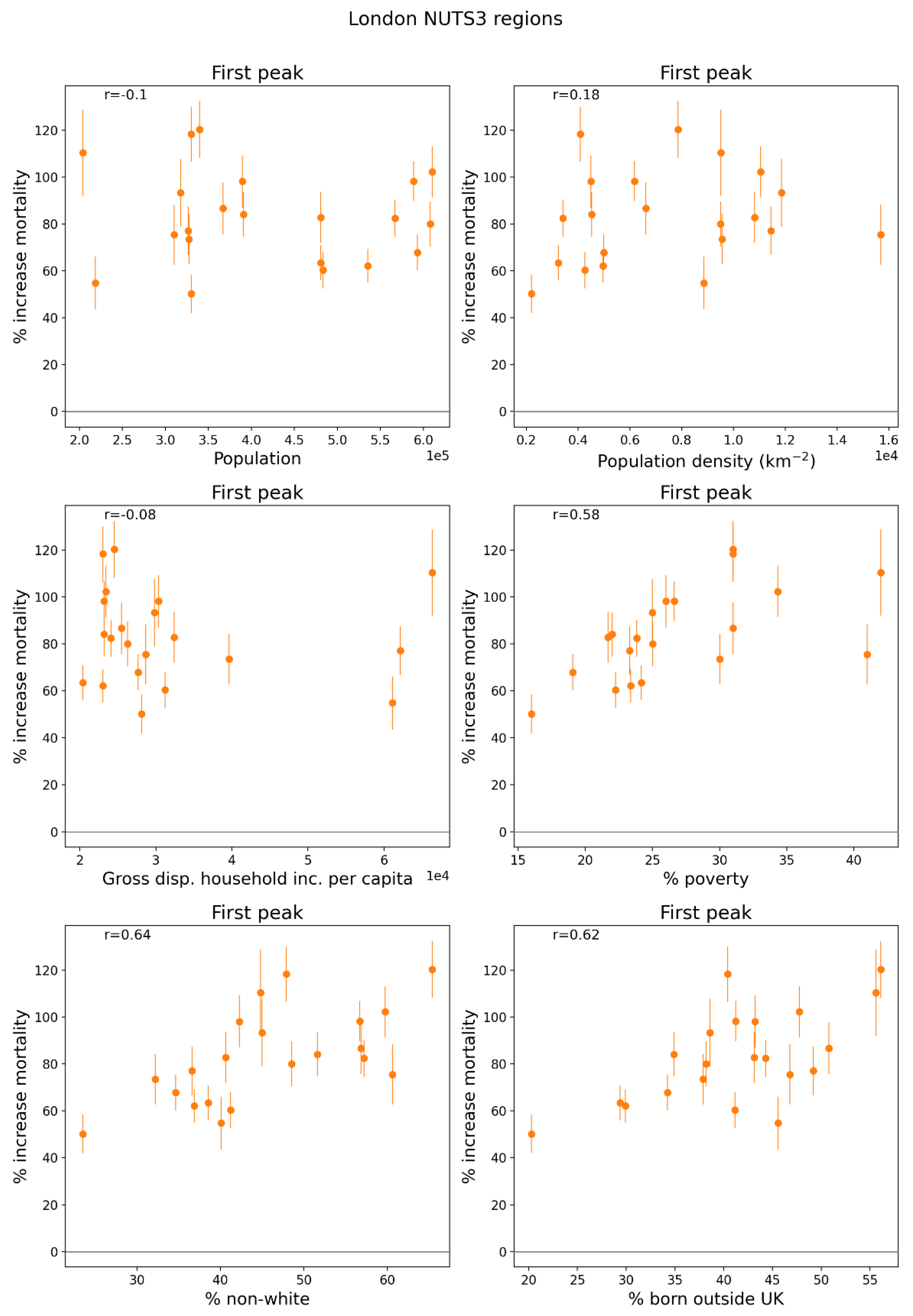
Figure 151.
Map of integrated first-peak period P-scores for the NUTS3 regions of London, UK, plus the immediately surrounding regions.
Figure 151.
Map of integrated first-peak period P-scores for the NUTS3 regions of London, UK, plus the immediately surrounding regions.
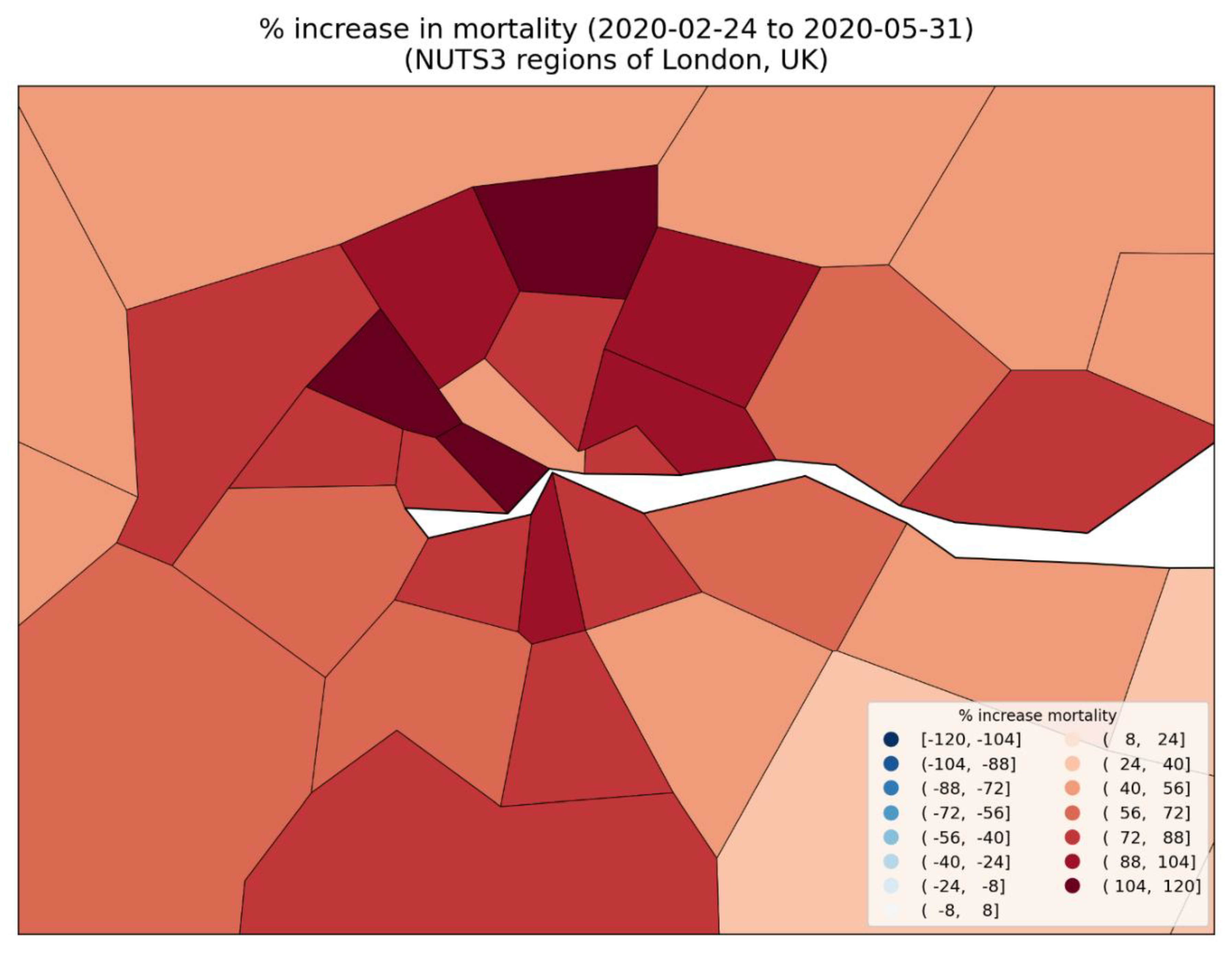
Figure 152.
Map of population in 2019 for the NUTS3 regions of London, UK.
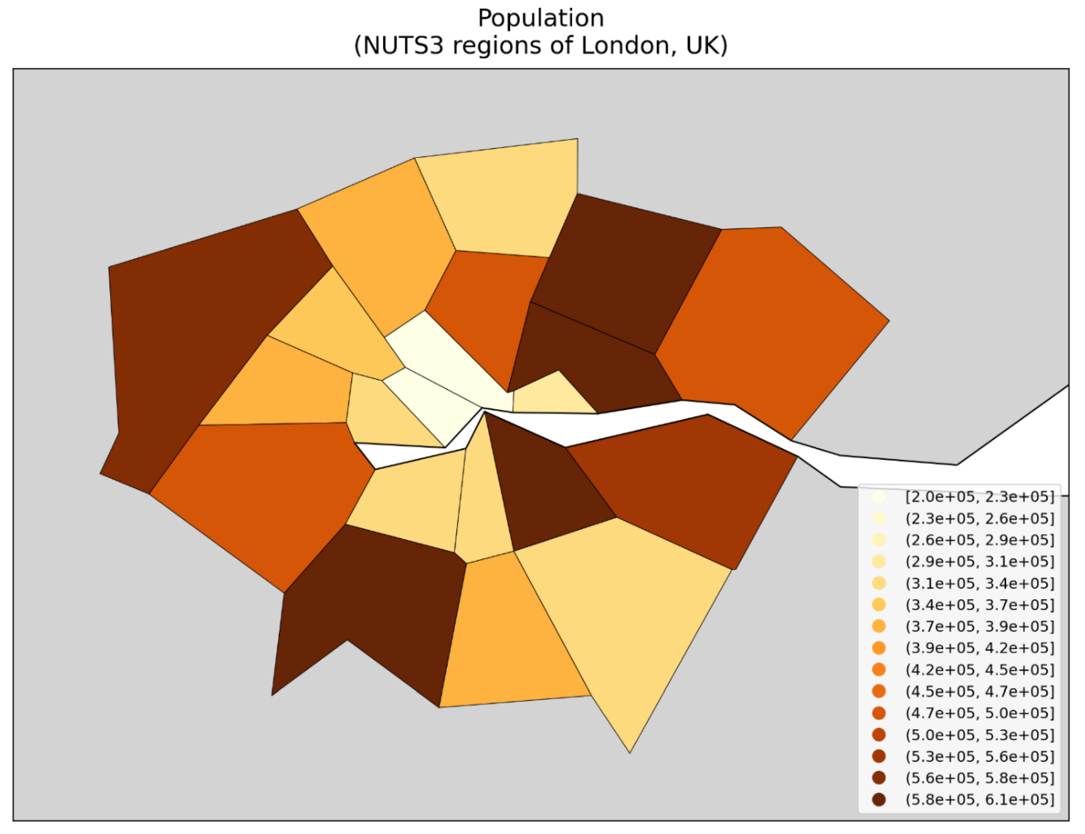
Figure 153.
Map of population density in 2019 for the NUTS3 regions of London, UK.
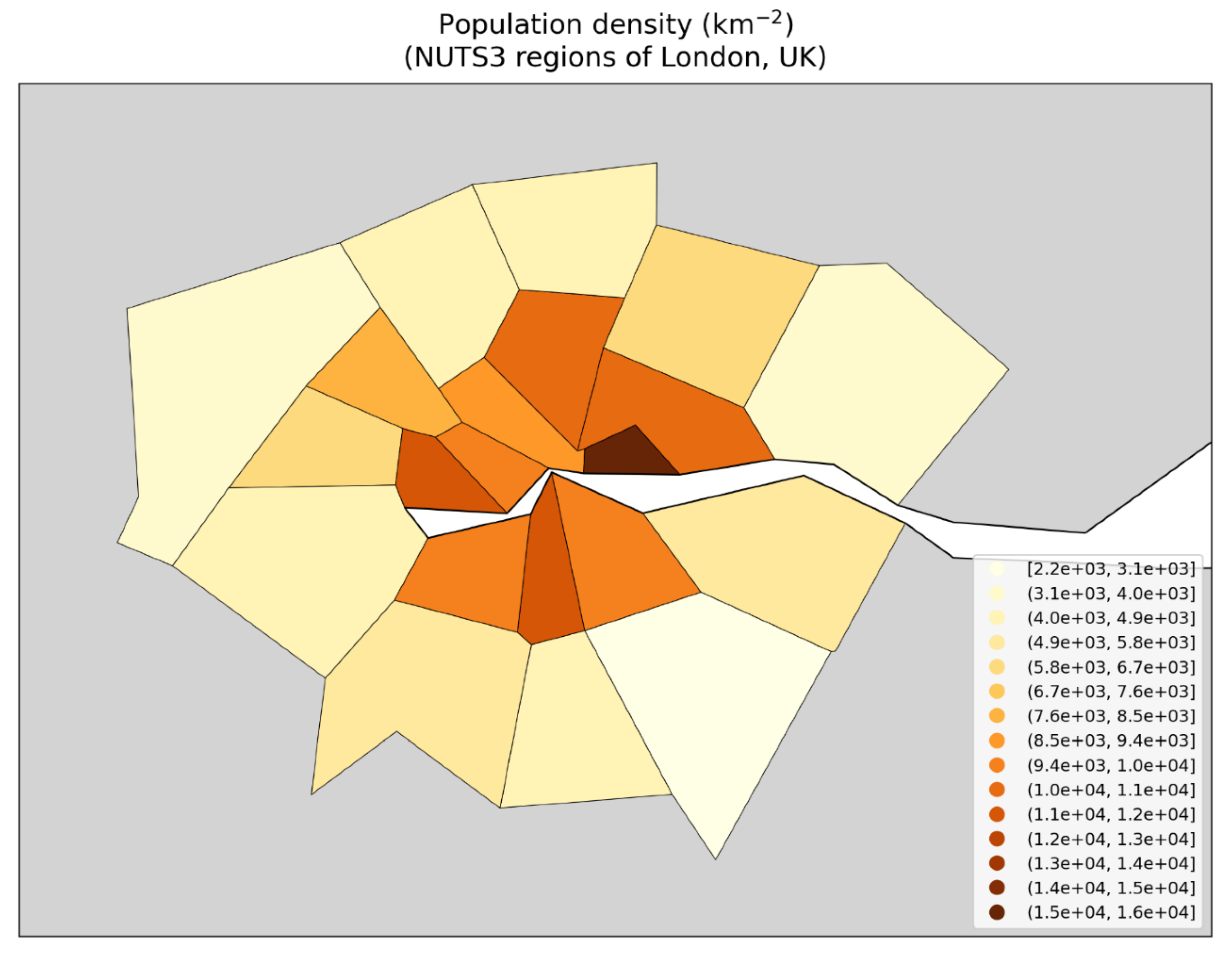
Figure 154.
Map of gross disposable household income per capita in 2019 for the NUTS3 regions of London, UK.
Figure 154.
Map of gross disposable household income per capita in 2019 for the NUTS3 regions of London, UK.
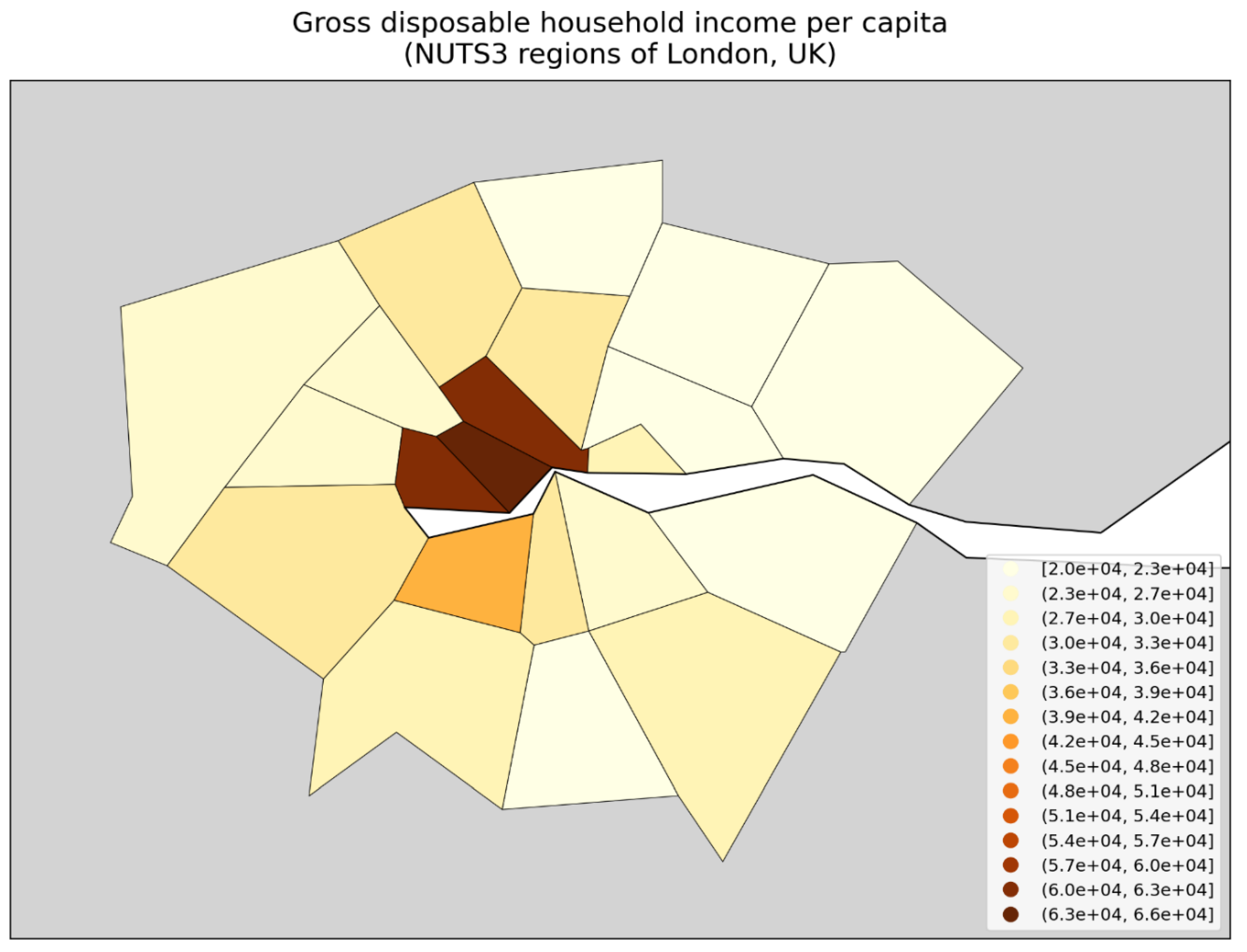
Figure 155.
Map of percentage of the population living in poverty (pooled data for 2017-2022, excluding 2021) for the NUTS3 regions of London, UK. Dark grey (within London) indicates regions for which data was unavailable.
Figure 155.
Map of percentage of the population living in poverty (pooled data for 2017-2022, excluding 2021) for the NUTS3 regions of London, UK. Dark grey (within London) indicates regions for which data was unavailable.
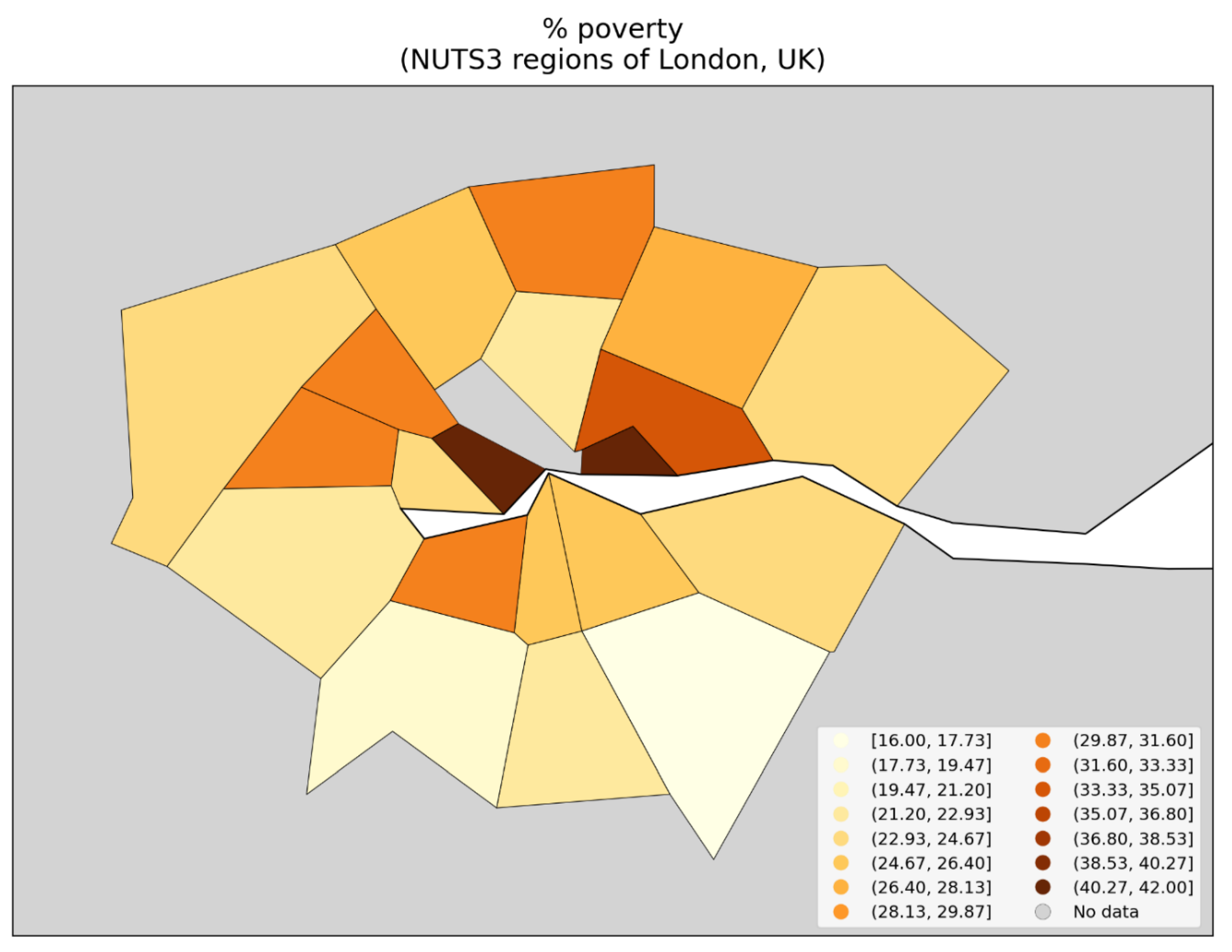
Figure 156.
Map of percentage of the population that is non-white in 2021 for the NUTS3 regions of London, UK.
Figure 156.
Map of percentage of the population that is non-white in 2021 for the NUTS3 regions of London, UK.
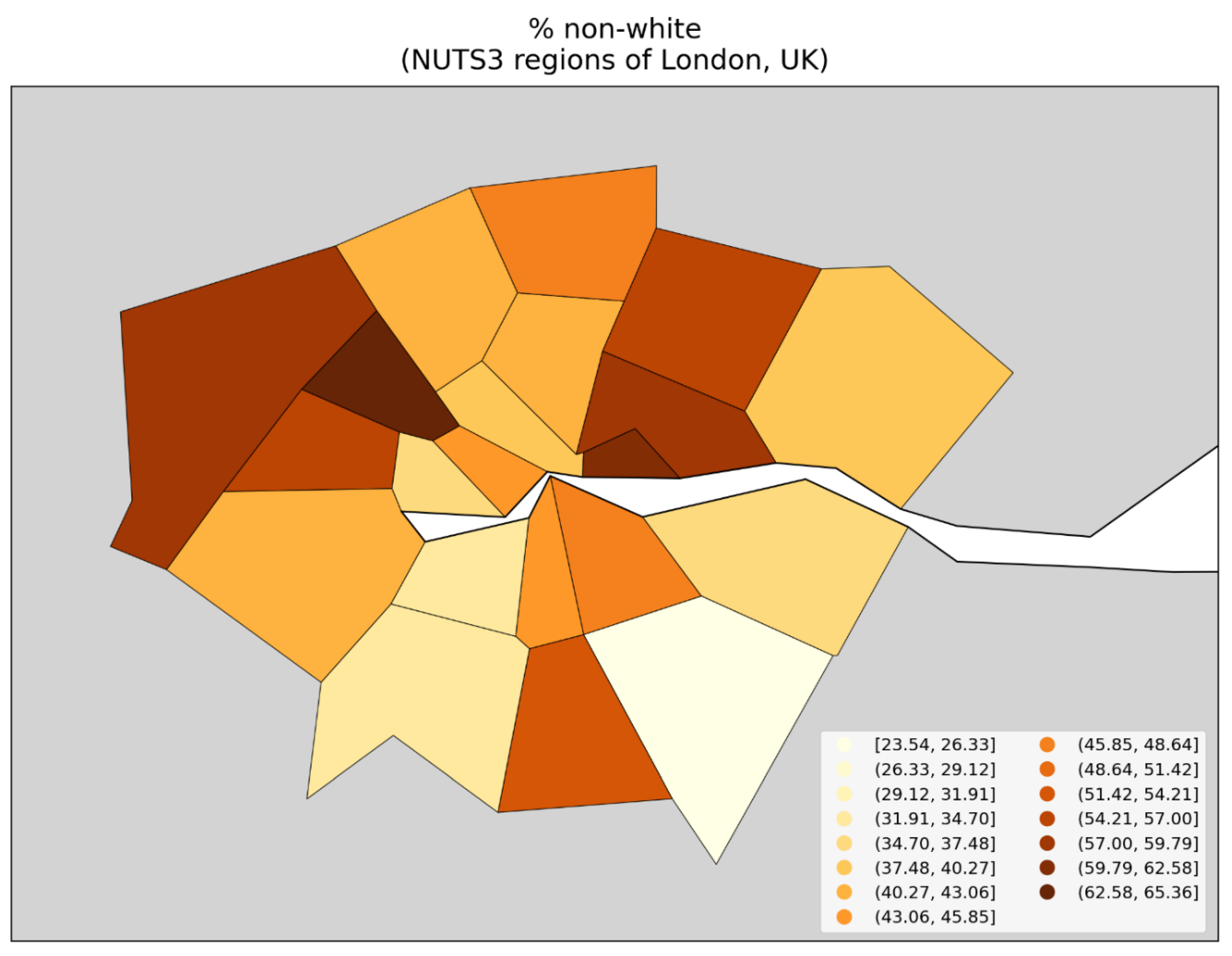
Figure 157.
Map of percentage of the population born outside of the UK (2021 census), for the NUTS3 regions of London, UK.
Figure 157.
Map of percentage of the population born outside of the UK (2021 census), for the NUTS3 regions of London, UK.
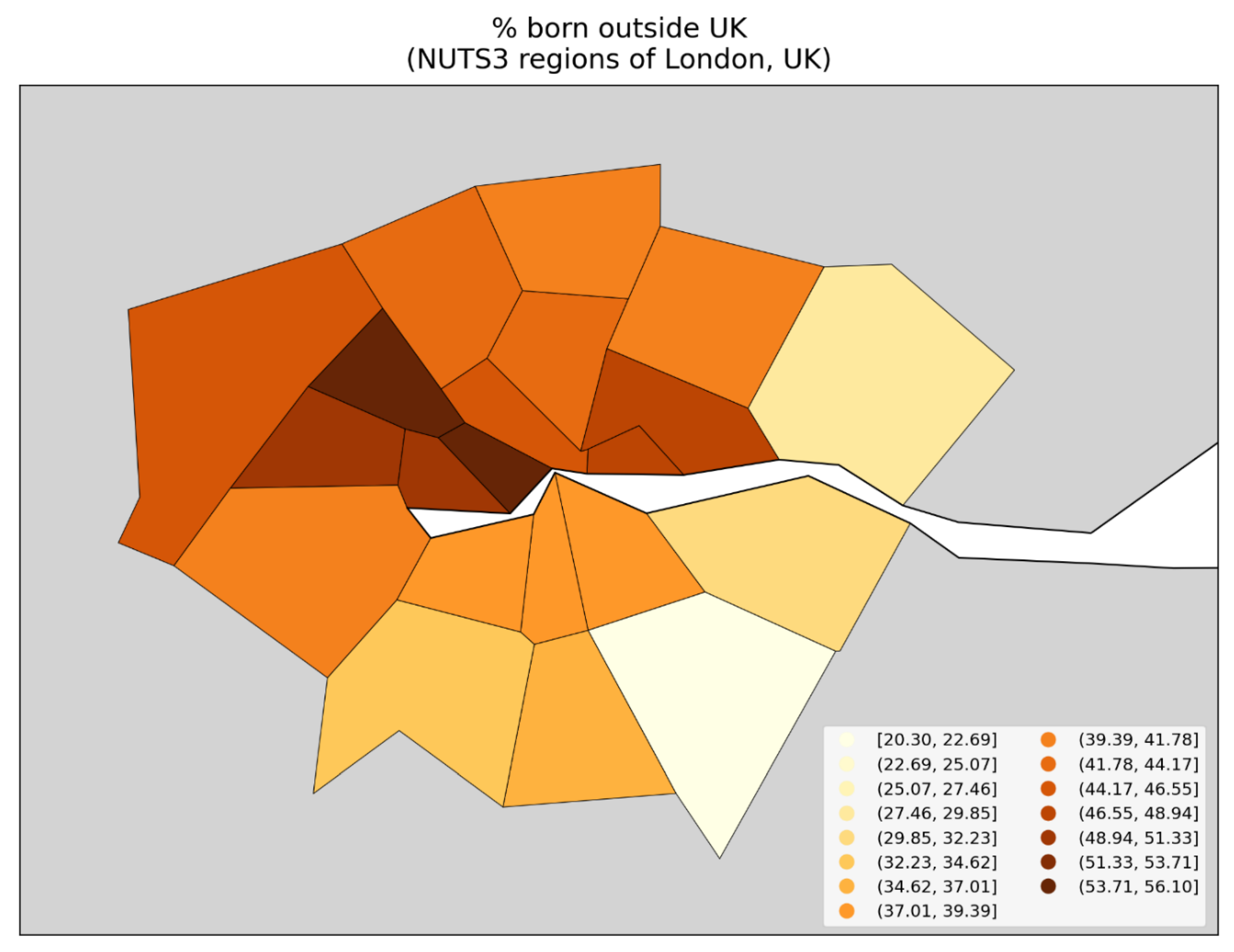
3. Discussion
3.1. Overview of the Discussion
In this paper we have examined excess all-cause mortality in Europe and the USA during the first weeks and months following the World Health Organization’s March 11, 2020 declaration of a COVID-19 pandemic, using data with high geographic and temporal resolution.
The said excess all-cause mortality (by week, month, or longer integration period) is calculated as a P-score. P-score measures the relative excess mortality for a population, compared to the predicted historic, normal or unperturbed mortality for the population (for the given time period), and is thus inherently adjusted for the age structure and health frailty of the specific population in the jurisdiction of consideration at the same time (Section 2.3).
We focused on the period March-May 2020, which we call the “first-peak period”, and also examined the “summer peak period” (June-September 2020).
Our study may be the highest resolution hemispheric-scale geotemporal study to date of excess all-cause mortality and thus offers a robust test of the pandemic viral spread paradigm for so-called COVID-19 during 2020.
3.1.1. Summary of Main Features of the Results
The Results section (Section 3) brings to light several main observations:
- Geographic heterogeneity of first-peak period excess mortality: Section 3.1 and Section 3.2 demonstrate that there was a high degree of geographic heterogeneity in excess mortality in the USA and Europe, with a handful of geographic regions having essentially synchronous (within weeks of each other) large peaks of first-peak period excess mortality (“F-peaks”) and all other regions having low or negligible excess mortality in the said first-peak period.
- Temporal synchrony of first-peak period excess mortality: Section 3.3 shows that F-peaks for USA states and European countries were almost all positioned within three or four weeks of one another and no earlier than the week of the WHO’s pandemic declaration. For a given large-F-peak European country, the F-peaks for all subnational regions rose and fell in lockstep synchrony but showed large variation in peak height and total integrated excess mortality. A similar result was seen for the counties of large-F-peak USA states.
- Dramatic differences in first-peak period excess mortality for comparable cities with large airports in the same countries: Section 3.4 compares cities with large airports in the same country (Rome vs Milan in Italy, and Los Angeles and San Francisco vs New York City in the USA) and shows that there was a dramatic difference in first-peak period excess mortality between the compared cities, despite their having similar demographics, health care systems, and international air travel traffic, including from China and East Asia.
- Increased share of deaths occurring in hospitals for jurisdictions with large F-peaks: Section 3.5 shows that the share of deaths occurring in hospitals and in nursing homes increased during the first-peak period (March-May 2020) compared to March-May 2019, for the USA states or counties with the largest F-peaks, and the share of home deaths increased compared to 2019 in the large majority of studied USA states or counties having small, negligible or undetected F-peaks.
- Correlations with socioeconomic vulnerability in regions with large F-peaks: Section 3.6 shows that integrated first-peak period P-scores were correlated with increasing socioeconomic vulnerability for the counties of the USA states with the largest F-peaks, and for the boroughs of London, UK, while much structure and complexity in the all-jurisdiction scatter plots occurs due to geo-socioeconomic gradients and heterogeneity. Furthermore, there are large qualitative differences between first-peak and summer-peak period scatter plots.
In short, there is essential synchrony (within weeks following the WHO’s announcement of a pandemic) in mortality hotspots (large “F-peaks”) across countries and states on two continents in the Northern Hemisphere, extreme geographical heterogeneity of the magnitude of any excess all-cause mortality in the time period (“first-peak period”, March-May 2020), dramatic differences in the occurrences of hotspots (presence or absence) in entirely comparable large cities in the same countries, systematic increases in shares of institutional (versus home) deaths in mortality hotspot jurisdictions, and strong correlations between hotspot intensity (P-scores) and socioeconomic vulnerability in high-geographical-resolution sectors within hotspot urban regions.
3.1.2. Large-Scale Spatial Epidemic Models and Their Caveats
In sections 4.2 to 4.4 below, we compare our results regarding geographic heterogeneity and temporal synchrony of first-peak period excess mortality with predictions from large-scale spatial epidemic models that have been applied to declared viral respiratory pandemics (including SARS (2002-2004), H1N1 (2009-2010), and COVID-19 (2020-2023)).
In this section, we briefly outline the two main strains of large-scale spatial epidemic models — meta-population models and agent-based models — and explain important caveats (structural features) for each of them that cause their results to be biased toward exaggerated synchrony in epidemic peak timing for different jurisdictions.
The said caveats are not addressed by the authors of the global-spread modeling studies themselves. The authors of the global-spread modeling studies do not explore or quantify the consequences of their problematic simplifications that we have identified. However, extensive fundamental studies of epidemic dynamics on generic connected networks (Pastor-Satorras et al., 2015) suggest that the said simplifications may have large consequences, as do higher resolution studies of urban regions.
Stated (maybe too) succinctly: if person-to-person spread is what explains the large geographical heterogeneity of attack rates, then the same spread will not also produce synchronous attack-rate peaks, which we observe both across the hemisphere and within countries and states (assuming that attack rates must be related to excess all-cause mortality, in sufficiently comparable health contexts).
Meta-population models
One important strain of large-scale spatial model are the so-called meta-population models (Colizza et al., 2007; Balcan et al., 2009, 2010; Pastor-Satorras et al., 2015; Davis et al., 2021). These models consist of a set of populations corresponding to airport catchment areas that are linked to one another by human mobility (travel) on the international air traffic network and via shorter-scale commuting networks. Within each catchment area, an epidemic can be initiated when an infected individual travels to the area. The spread of the epidemic within a particular population is taken to be non-spatial and is modeled as a system of stochastic dynamical equations, where the state variables are the numbers of individuals in the population that belong to each of a set of health compartments (e.g. susceptible, exposed, infected or recovered).
While the health compartments in meta-population models can be divided up to admit a greater degree of (non-spatial) heterogeneity in the transmission dynamics, for example, with respect to age (e.g. using separate compartments for infectious old and infectious young people), social setting (e.g. at work, school, or in the general community) or health status (symptomatic people may interact less than non-symptomatic people), the models use a form of homogeneous mixing in that all individuals within a sub-population corresponding to a health compartment have equal probability of having contacts with individuals belonging to any other sub-population, within a given population.
Therefore, an important caveat of meta-population models is that they do not consider spatial heterogeneity within the individual airport catchment areas where local epidemics take place. Such spatial heterogeneity could be included, for example, by modeling each catchment area as a set of individuals whose contact patterns are determined by their position in a social network structured to mimic the real social network of the area’s population, which live in neighbourhoods with different population densities and demographic characteristics, such as household size and age structure, social class structure, and so on.
Models that consider local spatial heterogeneity of contact patterns at the scale of a large city find large variation in epidemic peak shape, timing and severity across neighbourhoods within a city, and large variation in shape, timing and severity when comparing the aggregate city-wide epidemic peak for a given city with that of another city (Thomas et al., 2020).
By eschewing such local spatial heterogeneity in contact patterns within airport catchment areas and instead using homogeneous mixing for the entire spatial extent of the catchment area, meta-population models produce an exaggerated degree of synchrony in epidemic peak timing for regions around the world.
Basically, in a global transmission chain for a novel pathogen emerging in Asia, one should expect that allowing spatial heterogeneity with its associated increased stochasticity at each of the transport hubs (in each of the airport catchment populations) would produce much greater variation in local epidemic occurrence and timing across Europe and North America and around the world. Using spatially homogeneous airport catchment populations corresponds to a large damping of the said stochasticity at each of the transport hubs in a complex network. This is not addressed by the authors of the meta-population model studies.
Agent-based models
Another strain of large-scale spatial epidemic models are the so-called individual-based or agent-based models. In these models, all individuals in the population of a country or territory of interest are explicitly represented, such that each can have his or her own individual-specific characteristics such as age, place of residence, type of work or school environment, propensity to travel or commute, and so on, which determine contact patterns and therefore transmission dynamics (Ferguson et al., 2006; Merler & Ajelli, 2010, Ajelli et al., 2010, Ferguson et al., 2020).
Agent-based models consider a higher degree of spatial heterogeneity of contact patterns than meta-population models. However, they focus on a particular country or territory, such as the USA (Ferguson et al., 2006, 2020), the UK (Ferguson et al., 2006, 2020), Italy (Ajelli et al., 2010) or all of Europe (Merler & Ajelli, 2010). To model the impact of a global pandemic on the territory of interest, a means of exchanging individuals with the world outside of the territory of interest is required, and this is crucial because the initial (and subsequent) “seed” infected individuals in the model typically arrive from the outside world.
To do this seeding into the territory of interest, the agent-based models use simplifying assumptions, such as representing the rest of the world as a single homogeneously-mixed population in which an epidemic has already been seeded and is evolving. Infected individuals from the outside world are then dropped into the territory of interest at certain locations. For example, in the models of Ferguson et al. (2006), Merler & Ajelli (2010) and Ferguson (2020), infected seed individuals are dropped into geographic cells within the territory of interest with a probability proportional to the population of the cell.
The overly simplistic seeding procedures used in the agent-based models cause these models to have a bias toward exaggerated synchronicity of epidemic peak timing for different locations in the territory of interest, since different locations receive seed infectious individuals in proportion to their populations at the same, externally-determined rate. The agent-based model in Ajelli et al. (2010) uses a meta-population model to seed infectious individuals in the country of interest (Italy), who are imported at international airports, again imposing artificially induced synchrony, from an external meta-population model that itself has artificial synchrony (damped stochasticity).
Both large-scale spatial model strains
One should conclude that it is likely that addressing the said caveats for large-scale spatial meta-population and agent-based epidemic models (along the lines of: Pastor-Satorras et al., 2015) would necessarily produce greater stochastic variation of epidemic curves from one realization of the simulation to the next, as well as a large spread in timing of the epidemic peak from one jurisdiction to another.
As a final although secondary note, none of the models consider heterogeneity of social status or poverty, which have consistently been shown to be factors highly correlated to excess mortality (e.g., Rancourt et al., 2024) and will also correlate to travel mobility. This omission may additionally bias the models towards artificial local-population homogeneity and inter-population synchrony.
3.1.3. Incompatibility of First-Peak Period Excess Mortality Outcomes with the Paradigm of Infectious Disease Spread, and Alternative Hypothesis of Iatrogenic Cause of Excess Mortality
In Section 4.2, we discuss the geographic heterogeneity of excess all-cause mortality during the first-peak period, in comparison with the predictions of large-scale spatial epidemic models.
In Section 4.3, we make the same comparison regarding the temporal synchrony of all-cause mortality peaks.
In Section 4.4, we discuss our results regarding the dramatic difference in first-peak period excess mortality for pairs of cities in Italy and the USA with comparable demographics, health care systems, and volumes of international air traffic from China and East Asia.
We find that our results regarding first-peak period excess mortality are incompatible with the predictions of the leading spatial epidemic models.
This leads us to consider that first-peak period excess mortality could not have been caused by a spreading respiratory virus and may instead have been caused by mistreatment of patients in hospitals and care homes, coupled with increased susceptibility to pneumonia induced by a high level of biological stress due to lockdown measures. We discuss this possible explanation for first-peak period excess mortality in sections 4.4 and 4.5, drawing on our results regarding institutional location of death in the USA and the relationship between first-peak period P-scores and socioeconomic variables at the state and county level in the USA and at subnational geographic resolutions in Europe.
3.2. Geographic Heterogeneity of First-Peak Period Excess Mortality is Incompatible with the Paradigm of Infectious Respiratory Disease Spread
3.2.1. National-Level (Europe) and State-Level (USA) Heterogeneity of Excess Mortality
At the geographic resolution of countries in Europe (Figure 2) and states in the USA (Figure 9), it is evident that first-peak period excess mortality was confined to a few countries or states with high or very high excess mortality, while most other countries or states had low first-peak period excess mortality.
Figure 158 is a copy of Figure 2 with a yellow line added which runs from north to south along international borders, dividing mainland Europe into western and eastern parts. As can be seen, first-peak period excess mortality (integrated first-peak period P-score > 5 %) was confined to the countries in the western part of Europe (plus Sweden, in the north). While the western European countries had large first-peak period excess mortality, the countries in the eastern part of Europe had negligible excess mortality in March-May 2020 (integrated first-peak period P-score ≤ 5 %).
Albania (immediately to the east of the yellow line in Figure 158, in southern Europe) is colored light red in Figure 158 because it has an integrated first-peak period P-score of 7.1% ± 2.6%. However, a large contribution to Albania’s first-peak period excess mortality is due to an unrelated sharp mortality peak caused by a heatwave affecting the eastern Mediterranean region in mid-May 2020 (Financial Mirror, 2020; Korosec, 2020; Mitropoulos et al., 2023), which can be seen in the figures showing weekly P-scores for European countries in Appendix A.1. Therefore we have placed Albania to the east of the yellow line in Figure 158. The mid-May 2020 heatwave also caused elevated weekly P-scores in Cyprus, Greece, and Bulgaria, as can be seen in the figures in Appendix A.1.
The result shown in Figure 158 is incompatible with the paradigm of a respiratory disease pandemic caused by a novel pathogen that spreads by person-to-person contact. Meta-population models of respiratory disease pandemics predict air travel to be the main driver of international infection spread (Colizza et al. 2007; Balcan et al., 2010; Brockmann & Helbing, 2013; Davis et al., 2021), with no countries with major airports being spared. In this regard, we note that flight restriction measures are predicted not to have any significant impact on global pandemic disease spread unless disruptions to air travel are near total (Cooper et al., 2006; Epstein et al., 2007; Bajardi et al., 2011; Chinazzi et al., 2020). There are large airports in Germany, Greece, Denmark, and other countries to the east of the yellow line in Figure 158, yet these countries would have avoided receiving the virus before or during the spring of 2020 whereas the countries to the west of the yellow line in Figure 158 would have received the virus by air travel and experienced large infection rates. Similarly, Merler & Ajelli (2010) found that an agent-based model of viral respiratory pandemic spread in Europe predicts similar cumulative attack rates for all European countries, in the range 31-38% (their Figure 5).
As in Europe, first-peak period excess mortality in the USA (Figure 9) was confined to a few states with high or very high integrated first-peak period P-scores, especially the northeastern states of New York, New Jersey, Connecticut, and Massachusetts, whereas the majority of states had low or negligible first-peak period excess mortality, including large and populous states like California, Texas, and Florida. This has been known and documented since early 2020 (Rancourt, 2020; Rancourt et al., 2021a, 2022b).
Davis et al. (2021) applied the global epidemic and mobility (GLEAM) meta-population model to the initial stage of a pandemic originating in Wuhan, China in November 2019 and which spreads to Europe and the USA during January-March 2020. In the Davis et al. (2021) model, contact frequencies depend on age structure and social setting of interaction (whether at school, work, home or in the general community), and probability of travel depends on age and location-specific travel reductions, using data on actual traffic changes that occurred in the time period being modeled. They predict a high probability of generating 100 infections by February 21, 2020 for essentially all regions with large airports in Europe and the USA, as can be seen in their Figure 1c (copied below as our Figure 159), including many regions in which, on the contrary, we observe low or negligible first-peak period P-scores, such as the countries to the east of the yellow line in the map shown in Figure 158, and California, Texas, and Florida in the USA (Figure 9).
3.2.2. Subnational (Europe) and County-Level (USA) Excess Mortality
At higher geographic resolutions, a similar result is found. We examined the NUTS1, NUTS2, and NUTS3 subnational statistical regions in Europe (Section 3.2.2 to Section 3.2.4) and counties in the USA (section 3.2.6). For each geographic resolution, there are a small number of regions with very large first-peak period excess mortalities, while the large majority of regions have small or negligible excess mortality.
This includes high population-density regions in Europe with small first-peak period excess mortality, especially in Germany, southern Italy, and across eastern Europe (Figure 3 to Figure 7, including the population density map in Figure 4). The same is true for the USA, with high population-density counties in Ohio, western Pennsylvania, Florida, Georgia, Texas, California, and other states having small first-peak period excess mortality (Figure 10 to Figure 15).
The maximum P-score among all regions at a given resolution increases with increasing resolution (e.g. compare Figure 2, Figure 3, Figure 5, and Figure 7 for the NUTS0 to NUTS3 regions of Europe, respectively), which is a consequence of the fact that excess deaths were concentrated in a small number of highly-localized geographic regions, in densely populated urban areas with large hospitals.
The geographic confinement of first-peak period excess mortality to specific localized regions is particularly striking for subnational regions located along international borders in Europe.
At the national geographic resolution (Figure 2), Germany had a near zero integrated first-peak period P-score, yet it is bordered to its west by countries (France, Belgium, and the Netherlands) with large integrated first-peak period P-scores. Our results for the NUTS1 geographic resolution (Figure 3, partially reproduced as Figure 160 below, for convenience) show that the regions of France, Belgium, and the Netherlands that are situated along the international border with Germany are among the subnational regions with the largest integrated first-peak period P-scores in those countries, whereas the western border regions within Germany had small or negligible integrated first-peak period P-scores.
We examined the excess mortality data for the said regions along both sides of Germany’s western border in more detail in Section 3.3.4, using graphs of weekly P-scores for each region (Figure 33). The results show that the western German border regions had either small or non-existent peaks of first-peak period excess mortality (“F-peaks”), whereas regions that they share a border with in France, Belgium, and the Netherlands had F-peaks with much larger peak heights. For example, the height of the F-peak for the western German border region with the largest integrated first-peak period P-score, DE1 (Baden-Württemburg), was about five times smaller than the height of the F-peak for the French eastern border region FRF (Grand Est), which borders DE1. All such F-peaks, both in the western German NUTS1 regions or their bordering French, Dutch, or Belgian NUTS1 regions, rose and fell in synchrony.
We also showed that a significant volume of passenger and commercial traffic continued to cross the international borders between Germany and France, Belgium, Luxembourg, and the Netherlands, despite border control measures during the first-peak period (see Section 3.3.4, including Figure 34).
The four countries France, Belgium, the Netherlands, and Luxembourg have similar demographics and health care systems to Germany, and the geographic area containing the NUTS1 regions on either side of the German border with the said four countries is the most densely-populated multi-national region on the European mainland (see the map of population density in Figure 4).
Not only would the virus have had to fail to arrive at one of the large German airports (such as Frankfurt Airport, one of the largest airports in Europe, located in the German NUTS1 region of Hesse, which touches four of the five western German NUTS1 border regions), but the virus would have had to arrive in the Netherlands, Belgium, and France and fail to be carried eastward across the border into Germany from one of those countries, despite significant cross-border traffic flow. Either that, or the virus would have had to infect people in western Germany at a similar large rate as in eastern France, Belgium, and the Netherlands, while having a much smaller infection fatality ratio in Germany than in its neighbouring countries. Neither scenario is consistent with the paradigm of pandemic respiratory disease spread, which predicts homogenous infection and mortality outcomes for interconnected and neighbouring populations with similar population densities, demographics, and health care systems.
Similar results were found for the NUTS1 subnational regions along Spain’s border with Portugal (Figure 35 and Figure 37), Spain’s border with France (Figure 36 and Figure 37), and Italy’s international borders with France, Switzerland, Austria, and Slovenia (Figure 38 and Figure 39).
The large difference in peak magnitudes (F-peak weekly P-scores) between subnational European regions sharing an international border, where cross-border passenger and commercial traffic was not extinguished but rather continued at a significant volume, constitutes an apparently insurmountable constraint on the hypothesis that first-peak period excess mortality was caused by a novel and highly virulent spreading pathogen.
The same can be said regarding large differences in excess mortality outcomes for different subnational regions within the same country, many examples of which can be seen in the high-resolution maps of integrated first-peak period P-scores in Section 3.2. Of particular interest are subnational regions that are within the same country and that each have similar demographics and health care systems as well as large airports, but which have dramatically different first-peak period excess mortality. We made this comparison for pairs of cities in Italy (Milan vs Rome) and the United States (New York vs Los Angeles and San Francisco) in Section 3.4, and the latter results are discussed below in Section 4.4.
Temporal synchronicity of F-peaks across jurisdictions is incompatible with the paradigm of infectious respiratory disease spread
3.2.3. Near Synchronous Timing of F-peaks across Europe and the USA
As shown in Figure 1, at the continental scale, both Europe and the USA had large whole-region F-peaks, which rose at nearly the same time, almost immediately following the March 11, 2020 pandemic declaration. For Europe, the rise-side half-maximum is positioned one week after the week of the declaration, and for the USA the rise-side half-maximum is positioned two weeks after the week of the declaration. The F-peaks for the two continental-scale regions on opposite sides of the Atlantic Ocean rose within one week of one another.
The European countries with discernible F-peaks all had rise-side half-maximum dates within three weeks after or equal to the week of the March 11, 2020 pandemic declaration (week of March 9-15, 2020). The country with the earliest rise-side half-maximum date was Italy (rise-side half-maximum date equal to the week of the pandemic declaration) and the country with the latest rise-side half-maximum date was the UK (rise-side half-maximum date equal to three weeks after the week of the pandemic declaration). This is shown in Section 3.3.1, in additional figures in Appendix A.1, and in a table listing P-scores, P-score error values, and rise-side half-maximum dates in Appendix C.1. A country’s F-peak was considered to be discernible for the purpose of determining a rise-side half-maximum date if the ratio of its P-score value divided by the 1σ error on its P-score value was at least 3.
Results regarding the timing of F-peaks for USA states are shown in Section 3.3.5. The USA states with discernible F-peaks had rise-side half-maximum dates ranging as follows, expressed as the number of weeks after the week of the pandemic declaration:
- -
- one week (Washington State and Oregon)
- -
- two weeks (14 states, including New York State and New Jersey, which had the largest first-peak period integrated P-scores among USA states)
- -
- three weeks (12 states, including Connecticut, Massachusetts, and District of Columbia, which had the third, fourth, and fifth highest integrated first-peak period P-scores among USA states, respectively)
- -
- four weeks (North Carolina)
- -
- five weeks (Rhode Island, Delaware, Minnesota, Ohio, and New Hampshire)
- -
- six weeks (Iowa)
- -
- seven weeks (New Mexico)
The remaining 15 USA states did not have discernible F-peaks. The rise-side half-maximum dates for USA states are shown on a map in Figure 42 (top panel).
Many states with identical rise-side half-maximum dates to New York State (two weeks after the week of the March 11, 2020 pandemic declaration) are located far from New York, whether on the Pacific coast (California), in the Rocky Mountains (Colorado), on the Gulf coast (Louisiana), in the Southeast (Georgia), or in the Great Lakes region (Michigan). The synchrony of F-peak emergence for New York State, California, Louisiana, and Michigan is illustrated in Figure 43. The synchrony of F-peak emergence of other states with New York State is shown in the graphs in Appendix A.2.
A table listing P-scores, P-score error values, and rise-side half-maximum dates for USA states is in Appendix D.1.
The largest F-peaks among USA states and European countries thus all had rise-side half-maximum dates that were no earlier than the week of the pandemic declaration and that were within three weeks of one another. Large-scale spatial epidemic models predict a spread of approximately one month in epidemic peak timing across countries in Europe and states in the USA (Merler & Ajelli, 2010; Brockman & Helbing, 2013; Davis et al., 2021). However, these models are subject to important caveats that bias their results toward exaggerated synchronicity of the epidemic peaks for different jurisdictions, as we have discussed in Section 4.1. Introducing spatial heterogeneity of contact patterns within the airport catchment areas in meta-population models, or removing the oversimplification of using a homogeneously mixed single-population global pandemic model for the importation of seed infectious individuals in agent-based models, would most likely produce larger spread in peak timing between jurisdictions in these models.
Therefore, the high degree of synchrony (within 3 weeks) of the large F-peaks in the hemisphere, on two distant continents, and the fact that not a single F-peak-like excess mortality event (i.e., rise—peak—fall or rise—plateau) occurs prior to the WHO’s March 11, 2020 declaration of a pandemic, are both incompatible with the paradigm of infectious respiratory disease spread (and see: Rancourt, 2020). A virus would not wait for a political announcement before immediately causing surges in mortality in hotspots dispersed on two continents.
3.2.4 Simultaneous Rise and Fall of F-Peaks for Subnational Regions Within a Given European Country and for Counties of a Given USA State
Europe
Section 3.3.2 shows graphs of weekly P-scores during the first-peak period for all the NUTS1 subnational regions for particular European countries (Italy, Spain, France, Belgium, Netherlands, UK, Sweden, and Germany).
A remarkable result is observed. Within any given country, all of the country’s subnational regions’ weekly P-scores rose and fell essentially in synchrony with one another. The graph for the NUTS1 regions in Spain (Figure 18, reproduced below as Figure 161, for convenience) is a particularly striking example, with regional peaks that differ in height by up to a factor of 13 rising and falling in lock step with one another.
Similar results are shown for the NUTS2 regions within a given large-F-peak European country, in Section 3.3.3, and for the counties within a given large-F-peak USA state, in section 3.3.6.
The same timing of F-peaks across all of a European country’s subnational regions (regardless of peak height) is inconsistent with the paradigm of a novel and virulent pathogen that would have spread through the society via person-to-person contact. Models of spatial spread of epidemics that account for heterogeneous population densities and connection patterns across a geographic territory predict large variation in the timing, shape, and severity of epidemic peaks across regions within the territory (Ferguson et al., 2006; Merler & Ajelli, 2010; Thomas et al., 2020).
Thomas et al. (2020) modeled COVID-19 spread at the level of census tracts within USA cities, and found that “[i]nstead of one common curve, we see that tracts vary wildly in onset time and curve width, with some tracts showing peaks weeks or months after the initial aggregate spike has passed”.
Figure 1 of Thomas et al. (2020) is copied below, as Figure 162. For Seattle (left panel) and Washington D.C. (right panel), the figure shows curves of the number of infections per day for each census tract in the city (grey curves, left y-axes) and the number of infections per day for the entire city (aggregate of all census tracts) (red curves, right y-axes).
As can be seen from Figure 162, not only do different census tracts within a single city have large variation in epidemic peak timing, height, and width, but the aggregate (red) curves for Seattle and Washington D.C. also have very different peak timing, height, and width. Whereas the aggregate curve for Washington D.C. peaks after about 100 days after seeding, the aggregate curve for Seattle peaks after about 400 days after seeding. The Seattle aggregate curve also has a much larger full-width at half-maximum (FWHM) than that of Washington D.C.
Ferguson et al. (2006) used an agent-based model to simulate an influenza pandemic in the USA and Great Britain in which contact frequencies were determined by population density, household size and age structure, workplace or school size, and travel patterns. The simulations for the USA were independent of the simulations for Great Britain. In each case, the epidemic was seeded by infected people arriving in the country of interest from the rest of the world, which is modeled as a single, homogeneously mixed population. They predicted that epidemic curves (i.e., infection prevalence or incidence, prior to recovery and thus acquired immunity) in rural areas would occur weeks later than in urban centres, which contrasts with the synchrony of F-peaks across all subnational regions (whether urban or rural) of a given large-F-peak European country shown in Section 3.3.
Merler & Ajelli (2010) used an agent-based model to simulate an influenza pandemic in Europe. Similar to Ferguson et al. (2006), contact frequencies were determined by population density, household size and age structure, workplace or school size, and travel patterns, and seed infections arrived by international air travel from the outside world, modeled as a single, homogeneously mixed population. Merler & Ajelli considered spatial heterogeneity of the sociodemographic structure and travel patterns within the geographic territory of interest, which was not considered in Ferguson et al. (2006). Like in Ferguson et al. (2006), the Merler & Ajelli (2010) model predicts that epidemic curves in rural areas would occur weeks later than in urban centres.
Therefore, the observed synchrony of F-peaks across all subnational regions (whether urban or rural) of a given large-F-peak European country shown in Section 3.3 is incompatible with models of the spread of the presumed pathogen, and the model simplifications (of suppressed spatial heterogeneity, and of damped seeding stochasticity, see Section 4.1.2) would only make the said incompatibility more so.
Additionally, while larger values of the basic reproduction number (usually denoted “R0”) tend to reduce the variation in peak timing between different regions in the models, larger values of the basic reproduction number also have the predicted consequence that essentially all regions become infected to comparable high degrees, which is contrary to our many observations of geographical heterogeneity of integrated first-peak period P-score magnitudes.
Our repeatedly observed combination of a high degree of heterogeneity in peak size and peak presence versus absence, together with a high degree of synchronicity of peak timing across many distant regions, is inconsistent with the predictions of the pandemic models of a spreading viral respiratory pathogen. Stated simply, person-to-person respiratory contact spread models cannot simultaneously produce both geographical heterogeneity of attack rate and synchronous peaks of attack rate, which are uncontroversially presumed to translate to mortality expressed as P-score.
USA
A similar result to that seen for subnational regions in Europe is found for the counties within a given state in the USA, as shown in the figures in section 3.3.6. For example, for the counties in New York State (Figure 44) that had large integrated first-peak period P-scores, the F-peaks rose and fell in a strikingly synchronous fashion.
Figure 163 shows monthly P-scores for the counties of the New York City Metropolitan Area (“NYC Metro Area”), which has a population of 19.5 million people (US Census Bureau, 2023). As can be seen, all counties within the NYC Metro Area had F-peaks that emerged in synchrony and had peak P-scores in the same month (April 2020). Most F-peaks also fell in synchrony, although some counties on the periphery of the metro area with relatively low population densities and relatively low peak P-scores had fall-side half-maximum dates up to about one month later than for the majority of the metro counties.
Such synchronicity of peak timing is opposite to the predictions of spatial epidemic models in which contact patterns depend on connections in a social network structured to represent a real-world city, such as that of Thomas et al. (2020), which predicts a wide range of peak timing, width, and severity for different neighbourhoods within the urban areas of USA cities (see their Figure 1 and Figure 2; their Figure 1 is partially copied above as our Figure 162).
A similar result can be seen for the counties in the urban areas of Boston (Figure 47), Philadelphia (Figure 49), and Detroit (Figure 51).
When one considers only the counties of New Jersey (even though many of the northern counties of New Jersey belong to the NYC Metro Area) as in Figure 45, it can be seen that the largest F-peaks (blue curves in Figure 45) have synchronous rises and falls, whereas the intermediate F-peaks (yellow curves in Figure 45) have essentially the same rise-side half-maximum dates as the large F-peaks (blue curves) but do not fall as quickly, such that their fall-side half-maximum dates occur later in time than for the large F-peaks (blue curves). Additionally, the counties in the south of the state with the smallest F-peaks (red curves in Figure 45), which are also far from the New York City urban area and have the lowest population densities in the state, have delayed rise-side and fall-side half-maximum dates compared to the large and intermediate F-peaks. A somewhat similar pattern is seen for Connecticut, with the two eastern-most counties of that state having lower peak height, later rise-side half-maximum dates, and low population densities.
The said pattern of staggering or delay in the timing of peaks for different counties within the same state, with lower population-density counties having systematically lower peak heights, larger peak widths, and later rise-side half-maximum dates, which is most clearly seen in New Jersey, is reminiscent of the behaviour of simple deterministic one-population susceptible-infectious-recovered (SIR) epidemic models with homogeneous population mixing, when contact frequency is varied. For example, if one generates an array of independent curves of new cases per time from such an SIR model, where the contact frequency input parameter is varied but the recovery rate input parameter is held constant, one will obtain curves with lower peaks, larger widths, and later rise-side half-maximum dates for lower values of the contact frequency (e.g. see the graphs in the supporting information of Hickey & Rancourt (2023a) or Hickey & Rancourt (2023b)). Here, the lower contact frequency in the model could be considered analogous to lower population density.
However, the said pattern of behaviour of the monthly (weekly for Europe) P-score time-series for the counties of New Jersey and to some extent in Connecticut is not seen in most other jurisdictions studied in this paper (see the figures in Section 3.3, in particular), which necessarily raises the question of whether other explanations, beyond such modeling interpretations, apply to New Jersey and Connecticut.
In this regard, it is possible that large urban hospitals close to the centre of the New York City urban area (in both New Jersey and Connecticut) were more aggressive in applying treatments such as mechanical ventilation in March-May 2020 (further discussed in Section 4.4) than smaller and institutionally different rural and semi-rural hospitals and care facilities in those states. Less aggressive treatments would kill fewer patients overall, and would take longer to kill on average (i.e., affected patients would spend more days in hospital, on average, before succumbing to the negative effects of the treatment). In this way, institutional resistance to or slowness in applying aggressive measures, which would be stronger in rural areas far from the urban centre, would produce F-peaks with later onset, lower peak height and wider peak width.
Europe and USA
Overall, the high degree of synchronicity in F-peaks (if presumed to correspond to epidemic curves) in the subnational regions on several spatial resolutions in Europe and the USA, together with the large concomitant geographical heterogeneity of first-peak period P-scores (if presumed to correspond to attack rates or infection fatality ratios), is contrary to applications of the paradigm of pandemic spread of a contagious disease of the type presumed. All such applications are expected to give large spreads in infection arrival times and epidemic-curve peak or rise times, more so than current large-scale spatial models predict given their simplified structural designs (see above, and “caveats” Section 4.1.2). Within realistically structured models, geotemporal synchrony would only be achieved by significantly increasing contagion and transmission rates, which in turn would produce attack-rate geographical homogeneity, contrary to the observed large geographical heterogeneity, including outright infection deserts (eastern Europe) and inter-city inconsistencies (Milan vs Rome, and New York City vs Los Angeles and San Francisco). Instead, a simpler and more direct model of institutional iatrogenic deaths imposes itself (sections 4.4 and 4.5), within the context of socioeconomic disparity (Section 4.5), combined with large-scale pandemic response measures (Section 4.3.3).
3.2.5. Staggering in Time of F-Peaks of Different Countries in Europe Linked to Date of First National Lockdown
At the NUTS0 (national-level) geographic resolution, the F-peaks for European countries, while occurring within a few weeks of one another, did not all rise and fall in synchrony, as can be seen from Figure 16. Rather, Italy experienced the earliest F-peak, with a rise-side half-maximum date during the week of the WHO’s March 11, 2020 pandemic declaration, whereas the UK had the latest rise-side half-maximum date approximately three weeks later.
Figure 164 shows the weekly P-scores (top panel) and maximum-scaled weekly P-scores (bottom panel) for Italy, Spain, and the UK, with dashed lines indicating the date that each country implemented its first national “lockdown” containment measure (Silverio et al., 2020; Redondo-Bravo et al., 2020; Institute for Government Analysis, 2022). These three countries had the highest integrated first-peak period P-scores among European countries (Appendix C.1).
Figure 165 shows the weekly P-scores (top panel) and maximum-scaled weekly P-scores (bottom panel) for the NUTS1 regions of the UK, with the black dashed line indicating the date that the UK implemented its first national lockdown.
As can be seen from Figure 164, for Italy, Spain, and the UK, each first national lockdown was implemented at a time when the nation’s P-score was relatively low.
In Figure 164 (and in all graphs in this article showing weekly P-scores for European countries), the data point for each weekly P-score is placed at the date of the Monday of the week consisting of the seven days beginning on Monday and ending on Sunday. For Italy, in the week preceding the first national lockdown (week of March 2-8, 2020), the national-level P-score was 11% ± 6%, whereas in the following week (week of March 9-15, 2020), which began with the implementation of the first national lockdown on Monday, March 9, 2015, the national-level P-score was 42% ± 4%.
In Spain, the first national lockdown was implemented on Sunday, March 15, 2020, at the end of the week of March 9-15, 2020, which had a weekly P-score of 14% ± 4%, whereas the P-score for the week of March 16-22, 2020 for Spain was 60% ± 4%.
For the UK, the P-score for the week immediately preceding the implementation of the first national lockdown (the week of March 16-22, 2020) the P-score was 3% ± 6%, which is indistinguishable from 0%, whereas the first significantly positive P-score (11% ± 2%) occurred during the week of March 23-29. Therefore, at the national geographic resolution, the F-peak in the UK began to rise in the week that began with the national lockdown implementation on Monday, March 23, 2020.
At the NUTS1 geographic resolution (Figure 165), it can be seen that the F-peaks for subnational regions in the UK rose rapidly and essentially simultaneously beginning in the week of March 23-29, 2020, the week that began with the national lockdown implementation on Monday, March 23, 2020, with no subnational F-peak beginning to rise prior to the week of March 23-29, 2020.
The onset sequence “Italy then Spain then UK” of the three most impacted countries in Europe is not supported by pandemic-model arrival times of significant infections (Figure 159). Within pandemic modelling efforts, it seems one would need to assume concocted particular conditions to produce the observed said onset (and continuance) sequence, in particular given Heathrow Airport in London.
It appears that a natural explanation is to associate the observed said onset sequence with immediate deleterious consequences accompanying the national lockdowns. It is not unreasonable to postulate that the same socio-political and media context leading to a national lockdown and the lockdown itself would influence institutional behaviour in establishments that house the most vulnerable members of society, and cause significant disruptions in the life-supporting operations of those establishments (Rancourt, 2024).
Basically, the time sequence and proximity in time of F-peaks in the largest F-peak countries in Europe is difficult to reconcile with the paradigm of a spreading pandemic-causing respiratory virus, but is associated with the presumed onsets of institutional response measures and with the dates of first national lockdowns in particular.
3.3. Deadly Medical Treatments Were Prevalent in First-Peak Period Mortality Hotspots
Section 3.4 contains results comparing first-peak period excess mortality (as P-scores) for pairs of regions containing cities with large international airports that had very different first-peak period excess mortality outcomes (P-scores). Recall that P-score measures the relative excess mortality for a population, compared to the predicted historic, normal or unperturbed mortality for the population, and is thus inherently adjusted for the age structure and health frailty of the specific population in the jurisdiction of consideration (Section 2.3).
We studied the region of Milan (Lombardy) vs the region of Rome (Lazio) in Italy in Section 3.4.1, and New York City vs Los Angeles and San Francisco in the USA in Section 3.4.2.
3.3.1. Italy
The dominant explanation for Italy’s F-peak is that it was due to an outbreak of COVID-19 in Northern Italy, a region with an elderly and therefore vulnerable population, wherein the novel pathogen (namely SARS-CoV-2) would have arrived in Europe via air travel from China (Cereda et al., 2021; Riccardo et al., 2020; Spiteri et al., 2020; Boccia et al., 2020).
If the said dominant view were correct, then similar excess mortality outcomes would have occurred in different Italian regions with similar volumes of air passenger traffic and demographic and health care characteristics. We tested this in some detail.
In Section 3.4.1, we showed that air travel into Italy in 2019, including via direct flights from China and from the Asia Pacific region, is not associated with large first-peak period excess mortality (P-scores) in the regions served by Italy’s largest airports. In fact, the opposite occurred: the region containing Rome (Lazio) had significantly higher volumes of passengers traveling to and from Chinese airports in each of 2017, 2018 and 2019 than the region of Milan (Lombardy), yet Lombardy had much greater first-peak period excess mortality than Lazio: Lombardy’s integrated first-peak period P-score was 106.2% ± 2.5%, approximately 18 times greater than Lazio’s integrated first-peak period P-score value of 5.8% ± 1.7%.
This large difference in outcomes is striking given that the two regions have very similar age structures and health care system resources, including similar values for the share of the population aged 65+ (22.2% in Lazio, 22.9% in Lombardy), the share of the population aged 80+ (7.0% in Lazio, 7.4% in Lombardy), number of hospital beds in the region per person aged 65+ (1.59% in Lazio, 1.58% in Lombardy) and number of ICU beds in the region per person aged 65+ (0.038% in Lazio, 0.032% in Lombardy). The two regions also had virtually identical pre-COVID all-ages mortality rates for 2019 (10.1 deaths per 1000 people in both Lazio and Lombardy). We could not find any socioeconomic characteristic that might explain the measured P-score difference.
The said large difference in P-score between Lazio and Lombardy regions is inconsistent with the predictions of spatial epidemic models. Davis et al. (2021), applying the GLEAM meta-population model to the spread of a global pandemic originating in Wuhan, China in November 2019, predict that Rome and Milan would have had an equally high probability of generating 100 infections by February 21, 2020 (their Figure 1c, copied as our Figure 159). Ajelli et al. (2010) compared results of a meta-population model versus an agent-based model for a viral respiratory epidemic affecting Italy, and found that for both types of models, both Rome and Milan have large attack rates (their Figure 6).
Possible explanations that have been advanced by various authors to account for the dramatically different mortality outcomes in different Italian regions during March-May 2020 include:
-
that the onset of outbreaks in Northern Italy occurred before national containment measures were implemented, whereas the onset of outbreaks in other regions of Italy occurred after measures were implemented (La Maestra et al., 2020)
- →
- →
- this would also be contradicted by the dominant view that the SARS-CoV-2 pathogen was circulating in Italy weeks before the first reported case of locally acquired infection dated February 20, 2020 (La Maestra et al., 2020; Zehender et al, 2020; Cereda et al., 2021; Apolone et al., 2021; Alteri et al., 2021; Davis et al., 2021).
-
that poor air quality in Northern Italy, including Lombardy, could have increased infectiousness and severity of infection with COVID-19, causing higher mortality in the northern regions (Coker et al., 2020; Ottaiano et al., 2021)
- →
- this is contradicted by a recent systematic review and meta-analysis of the relationship between particulate matter air pollution and COVID-19 infection severity and mortality, which found no reliable evidence of an increase in mortality risk due to air pollution (Sheppard et al., 2023)
- →
- regardless, the magnitude of the effect would be much smaller than necessary to account for the observed large difference in first-peak period excess mortality between Lombardy and Lazio, Campania and other Italian regions
- →
- also, there are a number of areas in Eastern Europe with comparable annual mean air pollution levels to Northern Italy, including in Central and Southern Poland, Central Serbia, and the area around the Bulgarian capital (see the map in Figure 166, reproduced from European Environment Agency (2018)), but these areas had essentially zero excess mortality during the first-peak period, as shown in the maps in Section 3.2.
- that, within Italy’s decentralized health system, different regions adopted different strategies in response to the perceived threat of COVID-19 (Capano & Lippi, 2021; Bosa et al., 2021), which is addressed as follows.
Regarding the latter explanation (different health care system responses in different regions), the northern regions of Italy, especially Lombardy, stand out from other Italian regions due to their decisions to greatly increase the intensive care unit (ICU) capacity in hospitals and to systematically treat patients diagnosed with COVID-19 using invasive mechanical ventilators.
Lombardy created an emergency task force on February 21, 2020 to increase the surge capacity of ICUs in the region. Whereas Lombardy had 738 ICU beds prior to the crisis, 130 additional ICU beds were created by February 23, 2020, and on April 2, 2020, the region had 1750 ICU beds (Rezoagli et al., 2021). An additional 250 ICU beds were created in Milan, in a temporary hospital constructed in 20 days on a site spanning 25,000 square meters, opened on March 31, 2020 (Rezoagli et al., 2021). Within the first fourteen days after the creation of the task force, 16% of all patients in Lombardy who tested positive for COVID-19 were admitted to an ICU (Grasselli et al., 2020a). In the three Northern Italian regions of Lombardy, Emilia-Romagna, and Veneto, 12.6% of people admitted to a hospital with COVID-19 were admitted to an ICU (Rezoagli et al., 2021).
Mechanical ventilation was intensively used to treat ICU patients diagnosed with COVID-19 in Lombardy. A retrospective case series study of critically ill patients admitted to ICUs in Lombardy from February 20 to March 18, 2020 found that, among 1300 patients with available data, mechanical ventilation was applied to 88% of the patients and non-invasive ventilation was applied to 11% of the patients (Grasselli et al., 2020b). As of March 25, 2020, 26% of all 1581 patients with available ICU disposition data had died in the ICU, 58% were still in the ICU, and 16% had been discharged from the ICU (Grasselli et al., 2020b). A later study covering 3988 patients admitted to ICUs in Lombardy up to April 22, 2020 found similar rates of mechanical ventilation and higher mortality rates; for example, for the first 1715 patients, as of May 30, 2020, 48.7% had died in the ICU and 0.8% were still in the ICU (Grasselli et al., 2020c). In Bergamo province, in Lombardy region, all patients hospitalized in the ICU with COVID-19 were placed on mechanical ventilators, and out of the first 510 patients with COVID-19 who were admitted, 30% died (Fagiuoli et al., 2020). At the national level, the Italian government attributed 845 million Euros to increase the number of ICU beds to be used for invasive mechanical ventilation “up to 14% of the total hospital beds” (Rezoagli et al., 2021).
Treatment with mechanical ventilators has serious and often fatal risks including ventilator-associated pneumonia (VAP) and ventilator-induced lung injury (VILI), not unrelated to the dominant geriatric risk of aspiration pneumonia (Rancourt, 2024).
VAP is the most frequent intensive-care-unit-acquired infection, and a significant cause of morbidity and mortality (American Thoracic Society, 2005; Joseph et al., 2010; Bouadma et al., 2015). The mortality rate of VAP has been found to range from 20% to 76% depending on the circumstances of the study (Chastre & Fagon, 2002; Davis, 2006; Joseph et al., 2010), with an overall estimated attributable mortality of 9-13% (Melsen et al., 2011; Melsen et al., 2013) and subgroup estimated attributable mortalities of 69% for surgical patients and 36% for patients with an intermediate severity of illness score (Melsen et al., 2013). Incidence rates of VAP range from 6 to 52% (Joseph et al., 2010).
VILI refers to a constellation of pulmonary consequences and structural damage caused by exposing the lungs to abnormal transpulmonary pressure from ventilation (Slutsky & Ranieri, 2013; Gattinoni et al., 2017).
Beyond the known high mortality rates associated with adverse effects of standard mechanical ventilator treatment, in the panic of the first-peak period of 2020 in Lombardy, untested ventilation methods were used due to the shortage of standard ventilators. For example, anesthesia machines, which are not designed to support critically ill patients for long times, were used as ventilators in Niguarda Hospital in Milan, Lombardy. Patients who were mechanically ventilated with anesthesia machines had a “remarkably high” mortality rate of 70.6% and a “remarkably reduced” 60-day survival probability compared to those treated with standard mechanical ventilators, who had a mortality rate of 37.5% (Bottiroli et al., 2021).
A recent study of first-peak period excess mortality across the 91 health care districts of Lombardy region found a strong positive relationship between COVID-19 hospitalizations and excess mortality, estimating that each additional hospitalized COVID-19 patient per 1000 inhabitants resulted in a 15.5% increase in excess all-cause mortality for the district (Paganuzzi et al., 2024). In the neighbouring region of Veneto, which had a much smaller excess-mortality peak than Lombardy (see Figure 54) hospital admissions were limited to the most severe cases and the health care response focused more on home care assistance (Gilbertoni et al., 2021).
From a whole-country perspective, a study of regional differences in first-peak period mortality among Italian NUTS2 regions found that the factor with the strongest effect on COVID-19-assigned mortality rate (not all-cause excess mortality P-score) was the prevalence of older individuals living in multigenerational households, which decreased mortality (Basellini & Camarda, 2022).
The picture that emerges for Italy is one of distinct hotspots of first-peak period excess mortality (P-scores) associated with a surge in intensive care unit admissions, where aggressive and dangerous treatments were applied. Regions that did not surge their intensive care unit admissions did not experience large P-scores, while having similar pre-COVID demographic and health care system characteristics and similar volumes of air traffic with China and East Asia, and despite the presumption that the novel pathogen was circulating in Italy for several weeks before the northern Italian regions implemented their emergency responses beginning on February 21, 2020. Scathing reports of “killing fields” in Italian hospitals due to the intensive use of mechanical ventilators do not appear to be an exaggeration (McCrae & Watson, 2023).
Therefore, the large difference in Milan-vs-Rome first-peak period P-score mortality is incompatible with the paradigm of a spreading pandemic-causing respiratory virus, and the large P-scores for the Milan region (Lombardy) appear to have been caused in large part by increased deadly ICU measures, especially widespread and often experimental mechanical ventillation.
3.3.2. USA
In Section 3.4.2, we compared New York City vs Los Angeles and San Francisco, in the USA.
Figure 55 shows that New York City had a much higher integrated first-peak period P-score than Los Angeles or San Francisco, but received less international air traffic in 2019 and fewer flights from China in January 2020 than Los Angeles and San Francisco. New York City had similar demographic and health care system characteristics to Los Angeles and San Francisco (Table 3). The population density of the five New York City counties considered in Table 3 is much higher than the density for the total of the nine San Francisco-area counties used in Table 3 or for Los Angeles County; however, the land area of the counties in Los Angeles and San Francisco are generally much larger than in New York City, and there are sub-county areas with high density in the two west-coast cities. For example, San Francisco County (one of the nine counties used to obtain the statistics for the San Francisco urban area in Table 3) has a population density of 7200 persons per km2.
Similar to the case of Lazio and Lombardy in Italy, the large difference in outcomes between Los Angeles and San Francisco versus New York City is inconsistent with the predictions of spatially heterogeneous stochastic epidemic models. Davis et al. (2021), applying the stochastic, spatially heterogeneous GLEAM model to the spread of a global pandemic originating in Wuhan, China in November 2019, predict that Los Angeles, San Francisco, and New York City would all have had an equally high probability of generating 100 infections by February 21, 2020 (their Figure 1c, copied as our Figure 159).
To further investigate the different first-peak period P-score outcomes for different regions in the USA, we examined data regarding the location in which death occurred, including as an in-patient of a hospital, in a nursing home, or at the decedent’s home. These results are presented in Section 3.5.
The figures in Section 3.5 show that, for the USA states with the highest integrated first-peak period P-scores, the location with the highest share of deaths was the hospital, whereas for the states with lowest integrated first-peak period P-scores, the location with the highest share of deaths was the decedent’s home (Figure 56).
Similarly, states and counties with high integrated first-peak period P-scores had large increases in the share of deaths occurring in hospitals in March-May 2020 as compared to the same time period in 2019. The same states and counties had large decreases in the share of deaths occurring at home in March-May 2020 compared to the same time period in 2019 (Figure 57 to Figure 59). Conversely, states and counties with low integrated first-peak period P-scores had increased shares of deaths occurring at home in March-May 2020 compared to the same time period in 2019, and decreased shares of deaths occurring in hospital in March-May 2020 compared to the same time period in 2019 (Figure 57 to Figure 59).
Most states and counties with high integrated first-peak period P-scores also had an increase in the share of deaths occurring in nursing homes (Figure 57, Figure 60 to Figure 63).
There was thus a disproportionate number of deaths that occurred in hospitals (or in nursing homes in some states or counties, such as Rhode Island) in the hotspots of excess mortality in March-May 2020 in the United States. This echoes the situation for the Italian hotspot regions discussed in Section 4.4.1.
Like in Lombardy, New York City surged its intensive care beds and admissions, and systematically applied mechanical ventilation, with high mortality rates (Nishikimi et al., 2022). An April 2020 study of COVID-19 patients treated by New York City area hospitals found that among the 2634 patients in the study who were discharged or died, 14.2% (373 patients) were treated in an ICU and 12.2% (320 patients) were placed on mechanical ventilation. Of those placed on mechanical ventilation, 88.1% (282 patients) died. Among patients who were put on mechanical ventilators, patients aged 18-65 had a mortality rate of 76.4% and patients aged 65+ had a mortality rate of 97.2% (Richardson et al., 2020). A separate study of 1966 mechanically ventilated COVID-19 patients in New York City hospitals during March and April 2020 found that 61% died within 28 days of intubation (Nishikimi et al., 2022).
Like in Lombardy, untested ventilation methods were used in New York City, including the use of anesthesia machines for ventilation, or treating two patients with a single ventilator ("ventilator sharing") (Beitler et al., 2020). Ventilator sharing for patients with acute respiratory distress syndrome had no precursor in the scientific literature prior to Covid (Hess et al., 2020), and several medical professional societies in the USA issued a joint statement warning against this practice due to its potential hazards in March 2020 (ASA et al., 2020; Cook, 2020).
Also, similar to the case of Italy, USA states that did not make expanding ICU capacity a significant part of their health care system response experienced much lower first-peak period excess mortality (Mathews et al., 2021).
The remarkable difference in first-peak period P-scores in different regions of the USA with similar demographics and health care systems, and which received similar volumes of flights from China and East Asia (here New York City compared to Los Angeles and San Francisco) is most plausibly explained by a significant difference in treatment, rather than a novel and virulent pathogen that spreads from human-to-human contact but which would have arrived by air only in New York City and not in other large cities with similar populations and air traffic.
The large difference in New York City vs Los Angeles and San Francisco first-peak period P-scores is incompatible with the paradigm of a spreading pandemic-causing respiratory virus (Section 3.4), and the large P-scores for New York City appear to have been caused in large part by increased deadly ICU measures, especially widespread and often experimental mechanical ventilation, which is the same circumstances as in the Milan, Italy hotspot.
3.3.3. Other European Countries
Like Lombardy and New York City, the UK made extensive use of mechanical ventilators, with high mortality rates (Mahase, 2020; Wunsch, 2020; Torjesen, 2021; Mcrae & Watson, 2023). The same is true for Belgium (Taccone et al., 2021; de Terwangne et al., 2021), whose capital region (BE10, Brussels) also stands out for having high population density and a high integrated first-peak period P-score in Figure 138. In Spain, mechanical ventilators were also frequently used for COVID-19 patients in ICUs (Redondo-Bravo et al., 2020).
Another significant contributor to first-peak period excess mortality in Spain may have been from treating patients with a combination of the anti-malarial drug hydroxychloroquine (HCQ) and the antibiotic azithromycin (AZM).
The combination of HCQ with AZM was proposed as a treatment for COVID-19 in a paper by Professor Didier Raoult and co-authors published in the International Journal of Microbial Agents on March 20, 2020 (the “Raoult paper”) (Gautret et al., 2020). The Raoult paper was highly publicized and the treatment was used in many countries around the world (Accinelli et al., 2021; Hentschke-Lopes et al., 2022; Rich, 2020). However, the combination of HCQ and AZM was subsequently found to have significant health risks.
For example, the combination of HCQ with AZM was associated with a significant increase in the risk of 30-day cardiovascular mortality or heart failure in a study of almost one million rheumatoid arthritis patients (Lane et al., 2020), and HCQ with AZM was associated with increased mortality in a systematic review and meta-analysis of patients diagnosed with COVID-19 (Fiolet et al., 2021).
The Raoult paper was retracted by the journal on December 26, 2024 (Gautret et al., 2025).
HCQ was widely used as a COVID-19 treatment in Spain during March-May 2020, with clinical studies reporting HCQ exposure ranging from 65% to 92% (Pradelle et al., 2024a; Gutíerrez-Abejón et al., 2020; Martínez-Sanz et al., 2021; Pérez-Belmonte et al., 2020; Gil-Rodrigo et al., 2020; Casas-Rojo et al., 2020; Núñez-Gil et al., 2020; Prats-Uribe et al., 2021).
AZM use also skyrocketed in Spain during March 2020, as the number of AZM tablets consumed in Spanish hospitals in March 2020 was more than four times its level for the month of March in 2017, 2018, or 2019, and more than three times its maximum for any month in the years 2017-2019, as can be seen in Figure 167 (right panel), which is a copy of Figure 1 from Gonzalez-Zorn (2021).
HCQ itself has a narrow therapeutic index (Mackenzie 1983; Doyno et al., 2020; Bailey & Köhnlein, 2020), meaning that a toxic dosage of HCQ is not much larger than the normally recommended therapeutic dosage. HCQ is “extremely toxic in overdose” (Juurlink, 2020), which can cause central nervous system toxicity and lethal heart arrhythmias (Bailey & Köhnlein, 2020; Marquardt & Albertson, 2001; Juurlink, 2020).
Clinical studies conducted in 2020 on the effect of HCQ in patients diagnosed with COVID-19 used doses of HCQ that were considered to be surprisingly high by clinicians (Lacout et al., 2021) and potentially in the fatal range (Bailey & Köhnlein, 2020; Puliyel, 2020). For example, the large Randomised Evaluation of Covid-19 Therapy (RECOVERY) trial in the UK used a dosage of 2400 mg on the first day, followed by 800 mg per day for the next 9 days or until discharge (RECOVERY Collaborative Group, 2020) whereas the normal dose is 200-400 mg per day (NHS, 2022). RECOVERY involved all major UK hospitals, 3500 medical professionals, and at least 11,000 patients assigned to different study arms (Wise & Coombes, 2020). Watson et al. (2020) evaluated dosage toxicity in clinical trials in which either chloroquine (CQ) or HCQ was used as a treatment for COVID-19. One clinical trial using CQ (Borba et al., 2020) and another trial using HCQ (the “PATCH” trial) were found to have a significant risk of dangerous toxicity (Watson et al., 2020). The Borba et al. (2020) trial was stopped early due to cardiac toxicity and higher mortality in the high dose group (Watson et al., 2020). Watson et al. (2020) predicted the dosage used by the RECOVERY trial to be in the safe range.
One might infer that, in the frenzied context of the early stage of the declared COVID-19 pandemic, in which the medical establishment rushed to find treatments for the alleged novel disease, clinicians would have been less restrained than normal in prescribing exceptional high single and cumulative doses of the well-known, widely available, and inexpensive medications HCQ and CQ, which had received high-profile media and governmental attention, potentially causing many fatal overdoses.
A systematic review and meta-analysis by Pradelle et al. estimated approximately 2000 HCQ-related deaths in Spain (median estimate of 1895 with range of 1475-2094) (Pradelle et al., 2024a). The Pradelle et al. article was retracted by the journal Biomedicine and Pharmacotherapy in October 2024, on the journal’s stated basis that there were issues with the reliability and choice of data, in particular the Belgian dataset used in the article, and that an assumption that all patients that entered the clinic were treated the same pharmacologically was incorrect (Pradelle et al., 2024b).
The overuse of sedatives was also, generally, a feature of Covid response.
Covid restrictions on patients and long-term care residents (including: disrupted general care such as hydration, disrupted treatments for pain and comorbidities, COVID-19 treatments, testing, restraints, social isolation and quarantine without family, immobilization, and sleep disruption) are significant risk factors for delirium. A large resulting increase in the incidence of delirium was predicted and was anticipated to potentially lead to a grave problem of over-sedation, especially given the challenges in applying the established clinical practice guidelines for delirium prevention due to pandemic measures (Kotfis et al., 2020; LaHue et al., 2020).
Sedatives such as midazolam or propofol, which are typically administered to mechanically ventilated patients in ICUs (Caballero et al., 2024; Marinella, 1997), have been suggested as possible contributors to excess mortality in France (Marliot et al., 2020; Chaillot, 2024) and the UK (Sy, 2024). Midazolam has been found to be associated with serious adverse effects in critically ill patients including “delayed awakening and extubation, longer mean ICU and hospital lengths of stay, a higher risk of delirium and cognitive dysfunction, and increased mortality.” (Caballero et al., 2024). Prescription of sedatives including midazolam in ICUs increased to much higher levels than normal during the first-peak period (March-May 2020) in several countries (Marliot et al., 2020; Machado-Duque et al., 2022; Sy, 2024).
Prescribing of drugs such as antipsychotics, sedatives, antidepressants, anticonvulsants, and opioids was also significantly increased in long-term care homes in many countries during March-May 2020 (McDermid et al., 2023; Campitelli et al., 2021; Machado-Duque et al., 2022; Maxwell et al., 2024), including in the UK, where the increase in prescriptions was found to be disproportionately concentrated in one third of the sampled nursing homes, among which a median value of 59% of residents per care home were prescribed antipsychotics in 2020-2022 (McDermid et al., 2023).
Overall, the hotspot countries of Spain and the UK, and other countries, had a high probability of overuse of dangerous and experimental pharmaceutical treatments during the first-peak period. This appears not to have been practiced in Germany (Bailey & Köhnlein, 2020), which had small or negligible first-peak period P-scores.
3.4. Socioeconomic Characteristics of First-Peak Period Mortality Hotspots
Section 3.6.1 contains scatter plots for integrated first-peak period (March-May 2020) and integrated summer-peak period (June-September 2020) P-scores vs many different socioeconomic variables, for the counties of the USA having available data. These scatter plots are remarkable because they contain many hundreds of points and show much structure beyond simple unimodal trends.
3.4.1. Integrated First-Peak Period P-Scores vs Socioeconomic Variables for USA Counties
Regarding the first-peak period, the main result that emerges from the scatter plots is a strong correlation between increased integrated first-peak period P-score and increasing socioeconomic vulnerability for the counties in the New York City urban area.
The Pearson correlation coefficient, r, was greater than 0.7 for the counties in the four USA states with the highest state-level integrated first-peak period P-scores (NY, NJ, CT, and MA) for the following socioeconomic variables:
- % who speak English “less than well” (Figure 76, r = 0.89),
- log[population density] (Figure 67, r = 0.85),
- % minority (Figure 77, r = 0.85),
- % households with more people than rooms (Figure 74, r = 0.83),
- population (Figure 64, r = 0.77),
- log[population] (Figure 65, r = 0.72), and
- % living in housing structures with more than 10 units (Figure 75, r = 0.72).
For the counties with the highest integrated first-peak period P-scores (P-score > 100%), which are in the centre of the New York City urban area, including the five boroughs of New York City, there are also strong evident correlations with:
Whereas integrated first-peak period P-score increased with increasing socioeconomic vulnerability for the counties in the New York City urban area, there were also many counties in other areas of the USA with similar or higher levels of socioeconomic vulnerability that had low or negligible integrated first-peak period P-scores. This creates a “two-branch” structure in many of the scatter plots, as described in section 3.6.1. For example, the percentage of people who speak English “less than well” (Figure 76) and the percentage minority (Figure 77) prominently show the said two-branch structure.
The presence of such a two-branch behaviour regarding integrated first-peak period P-score vs increasing socioeconomic vulnerability is a constraint on the hypothesis that a novel and virulent pathogen is responsible for excess mortality during the first-peak period (March-May 2020). That is, the presumed pathogen would be one that kills more with increasing poverty, crowded living conditions and other indicators of socioeconomic frailty of the population, but only in a few specific geographic locations within the same country, and not elsewhere.
3.4.2. Integrated Summer-Peak Period P-Score vs Socioeconomic Variables for USA Counties
For the summer-peak period, the states with the highest P-scores were in the south of the country (Figure 134), particularly in counties on the border with Mexico in Texas (TX), Arizona (AZ), and California (CA), and counties along the southern Mississippi river (Figure 135).
The scatter plots for the summer-peak period (middle row of panels in Figure 64 to Figure 98) show that the counties with the highest integrated summer-peak period P-scores had high measures of socioeconomic vulnerability, including:
- low per capita income (Figure 68),
- high poverty (Figure 69),
- high prevalence of crowded living conditions (Figure 74),
- low rates of speaking English, especially for the counties near the Mexican border (Figure 76, map in Figure 111),
- high percentage minority (Figure 77),
-
high percentage of the population aged 25+ with no high school diploma (Figure 78), andhigh rate of single-parent households (Figure 81).
Remarkably, the slopes of P-score vs socioeconomic parameter are very different, and much smaller, for the summer-peak period, compared to the first-peak period for counties in large-F-peak states. The presumed virus would need to give rise to qualitatively different sensitivities to socioeconomic vulnerability in different states in late winter and nowhere give rise to the higher sensitivities in summer and fall.
3.4.3. Correlation Between P-Scores and Degree of Interaction with the Medical System
Another striking result that emerges from the scatter plots in section 3.6.1 relates to the degree of interaction of the county’s population with hospitals and the medical system.
For the counties in the NY-NJ-CT-MA states, especially the counties in the New York City urban area, there is a strong correlation between integrated first-peak period P-score and the share of deaths that occurred in hospital in March-May 2019 (Figure 88, r = 0.52 for all the NY-NJ-CT-MA counties with available data) or June-September 2019 (Figure 89, r = 0.66 for all the NY-NJ-CT-MA counties with available data).
There is an even stronger correlation (r = 0.71) for the NY-NJ-CT-MA counties when the change in share of deaths occurring in hospital from March-May 2019 to March-May 2020 is plotted on the x-axis (Figure 90).
Interestingly, the counties with high integrated summer-peak period P-scores in the southwestern USA in Texas (TX), New Mexico (NM), Arizona (AZ), and California (CA) had high shares of deaths occurring in hospital in June-September 2019 (Figure 89), and there is a striking correlation for the same said counties with the change in share of deaths occurring in hospital from June-September 2019 to June-September 2020 (Figure 91). In the middle row of panels in Figure 91, the scatter plot of integrated summer-peak period P-score vs the change in share of hospital deaths from 2019 to 2020 has a relatively small positive slope for values of the x-axis less than about 10%, and the slope increases dramatically above a value of around 10% on the x-axis.
As another indicator of the degree of interaction of a county’s population with the medical system, or of the tendency for the county’s population to seek or receive medical treatment, we examined vaccination uptake up to the end of 2021. This is shown in Figure 94 to Figure 97, where it can be seen that all counties with high integrated first-peak period or summer-peak period P-scores had high vaccination uptake in 2021.
Counties with the highest integrated first-peak period or summer-peak period P-scores thus had both high socioeconomic vulnerability and a high degree of interaction with the medical system. The role of hospitals in the first-peak period mortality catastrophe, and in subsequent COVID-era excess mortality events, should be examined further. We briefly consider this in relation to the urban New York City county of the Bronx, as follows.
3.4.5. The Bronx
The Bronx was the county with the highest integrated first-peak period P-score in the entire USA, with a value of 232.5% ± 7.4%. The Bronx is the poorest of the five boroughs of New York City, and it is also the poorest county in the New York City urban area and the NY-NJ-CT-MA states (see Figure 69, lower left panel: the Bronx can be easily identified as it is the county with the highest y-axis value (P-score) in the figure).
The Bronx has a high value of most socioeconomic vulnerability variables, including percentage of minority (non-white) residents (Figure 77), percentage of residents who speak English “less than well” (Figure 76) and percentage of people living in crowded living conditions (Figure 74).
The population of the Bronx has a high rate of underlying health conditions, including much higher rates of asthma than the rest of New York City (Simon & Ebbs, 2020; Maantay, 2007). The Bronx had the highest per capita rate of COVID testing of the five New York City boroughs in the spring of 2020 (Freytas-Tamura et al., 2020). A high per capita rate of COVID testing indicates both a higher resulting rate of dangerous medical inventions and a higher degree of contact with the medical establishment (testing occurs prior to death).
SBH Health System (formerly St. Barnabas Hospital) is a large low-budget safety-net hospital in the Bronx serving indigent residents, including those without medical insurance (Shabsigh, 2022; Clark & Shabsigh, 2022). SBH Health System increased its in-patient capacity by 50% and its critical-care capacity by more than 500% within three weeks in March and April of 2020, receiving many patients diagnosed with COVID-19 (Shabsigh, 2022).
Ventilators were applied to many patients at SBH Health System, as shown in Figure 168, which is a copy of Figure 10.1 from Babaev et al. (2022).
SBH Health System also made a large purchase of Hydroxychloroquine in the first quarter of 2020, and an increased purchase of Azithromycin, as shown in Figure 169, which is a copy of Figure 11.4 from Cassidy (2022).
Treatment with ventilators or with hydroxychloroquine plus azithromycin may have been responsible for a large portion of excess mortality in first-peak period hotspots, as discussed in Section 4.4.3.
SBH also increased its purchases of Midazolam and Propofol in the first quarter of 2020 (Figure 169). As discussed above in Section 4.4.3, both drugs are used for sedation of mechanically ventilated patients, and Midazolam in particular has been suggested as a possible contributor to excess mortality in several countries.
Figure 168.
The number of available ventilators (orange) and patients on ventilators (blue) at SBH Health system in March and April 2020 [Copy of Figure 10.1 from Babaev et al. (2022)].
Figure 168.
The number of available ventilators (orange) and patients on ventilators (blue) at SBH Health system in March and April 2020 [Copy of Figure 10.1 from Babaev et al. (2022)].
Figure 169.
Increase in pharmacy expense during the pandemic in Q1 of 2020 at SBH Health System [Copy of Figure 11.4 from Cassidy (2022)].
Figure 169.
Increase in pharmacy expense during the pandemic in Q1 of 2020 at SBH Health System [Copy of Figure 11.4 from Cassidy (2022)].
Therefore, there is every indication that the exceptionally large age and frailty adusted first-peak period mortality (P-score) for the Bronx, like for Milan, Italy, was from hospital proceedures performed on disadvantaged populations in the catchment areas of large hospitals implementing open-access and patient-recruitment policies.
3.4.6. The Role of Large “Safety Net” Hospital Complexes in Regions with High Inequality
In addition to the high values of the socioeconomic vulnerability variables noted in the preceding section, The Bronx is also the county with the highest value of the inter-county disparity in the entire USA (Figure 72), due to its low per capita income and its adjacency to the high-per capita income borough of Manhattan (New York County, NY).
Large hospitals can exist in poor neighbourhoods that are in close proximity to rich neighbourhoods due, in part, to philanthropic organization and funding. It is possible that the combination of a large medical-system presence within a socioeconomically vulnerable population with a high rate of underlying health conditions, including respiratory conditions, resulted in many frail people being tested, attending hospital with a positive test, and subsequently perishing due to an arguably reckless application of dangerous treatments including invasive mechanical ventilation.
A potentially similar effect of excess mortality caused by large hospitals located in urban areas with high socioeconomic vulnerability and in proximity to wealthy populations may have occurred in London, UK.
The UK NUTS3 region with the highest integrated first-peak period P-score was the London borough of Brent (UKI72, in northwest London) (Figure 151; Figure 8). Similar to the Bronx, Brent has a high percentage of non-white residents (Brent is the darkest colored region on the map in Figure 156), and a high percentage of Brent’s population was born outside the UK (Figure 157).
Bordering Brent to the southeast is the borough of Westminster which had the third-highest integrated first-peak period P-score among UK NUTS3 regions (Figure 151). Despite its high gross dispensable household income per capita (Figure 154), Westminster had the highest rate of poverty among London NUTS3 regions with available data (Figure 155). Westminster also has a high percentage of residents born outside the UK. Westminster and Brent are the two darkest colored regions on the map in Figure 157, Westminster being the one with a waterfront on the River Thames, which runs through London.
Northwick Park Hospital (NPH) is a major hospital located in Brent, serving “an ethnically and socioeconomically diverse population in Northwest London” (Goodall et al., 2020). NPH reportedly has the busiest emergency department among London hospitals (Keane, 2023; Williams, 2024).
The New York City borough of the Bronx and the London boroughs of Brent and Westminster are therefore examples of areas in which it may have been exceptionally dangerous to be poor or have low socioeconomic status while living near well-meaning wealthy people who donate to and support the establishment of large hospital complexes to serve their impoverished neighbours, possibly out of guilt or to avoid accountability given the palpable contrast in neighbouring and overlapping neighbourhoods. We might add medical professional zeal, and a lower barrier to provide experimental treatments, in institutions intended to serve the disadvantaged.
3.5. Pneumonia Induced by Biological Stress of Lockdown Measures
In this subsection, following Rancourt (2024), we propose transmissionless self-infection bacterial pneumonias as a plausible proximal medical cause-of-death mechanism for the excess mortality in the F-peaks (“first peaks”, occurring March-May 2020), which consolidates and is consistent with three overarching observations:
- Many studies find that the excess all-ages all-cause mortality in the first-peak period is closely equal to assigned COVID-19 deaths in this period (e.g., Rancourt et al., 2021a, for the USA). That is, that the first-peak period excess deaths are associated with respiratory conditions.
- The geotemporal evolution of the F-peak excess mortality is inconsistent with the paradigm of a spreading viral respiratory disease, as discussed above in sections 4.2 and 4.3.
- A significant portion of first-peak period excess mortality may have been caused by the application of dangerous medical treatments in excess mortality hotspots such as New York City, Lombardy, Madrid, and London, as discussed above in sections 4.4 and 4.5.
Rancourt (2024) proposed that virtually all excess mortality during the Covid period (2020-2023) was caused by transmissionless self-infection bacterial pneumonias induced by biological stress (in the sense of medical researcher Hans Selye, which includes psychological stress) arising from the coordinated and largescale mandates, measures, so-called responses, and medical assaults including testing, diagnostic bias, isolation, denial of treatment (especially antibiotics for pneumonia), mechanical ventilation, sedation, experimental and improper treatments, and vaccination. This would include iatrogenic deaths of individuals treated for the said pneumonias. Exceptions would include younger individuals that died from accidental drug overdoses (e.g., fentanyl) and alcoholic liver disease.
Public health measures, including lockdowns and “shelter-in-place” policies, were severe during the first-peak period (March-May 2020) in excess mortality hotspots. Such measures ― applied in a context of fear and panic stimulated by mass media and government pronouncements ― subject many individuals to a high level of biological stress. In this state of elevated stress, which results in immune response suppression, many individuals may have developed self-infection pneumonia, either via introduction of microbes into the respiratory system due to aspiration or via changes to the respiratory system microbiome itself without aspiration (Rancourt, 2024).
Socioeconomic vulnerability, including racial minority status and poverty, are important risk factors for bacterial pneumonia in the USA (Burton et al., 2010; Flory et al., 2009), which may explain the strong correlations between excess mortality P-scores and socioeconomic vulnerability in the USA counties with the largest integrated first-peak period P-scores. Poor or otherwise socioeconomically vulnerable individuals bore a disproportionate share of the negative stress burden of first-peak period lockdown measures. One need only compare remote-working middle and upper-middle class people living in spacious homes with private outdoor spaces with people confined to small apartments or isolated in care homes.
Therefore, our demonstration that the geotemporal evolution of first-peak period excess mortality P-scores is inconsistent with (i.e., disproves) the paradigm of a spreading pandemic-causing viral respiratory disease is nonetheless consistent with the majority of the excess deaths being associated with severe respiratory conditions, in a period when antibiotic treatment was often denied (Rancourt et al., 2021a).
4. Conclusion
Using high-resolution all-cause mortality data for Europe and the USA, we have shown that geotemporal mortality patterns during the early months of the declared SARS-CoV-2 pandemic are incompatible with the paradigm of a spreading viral respiratory disease.
It appears that the excess mortality could not have been caused by a viral pandemic. Instead,
- the essential synchrony (within weeks) in mortality hotspots (large “first peaks” or “F-peaks”) immediately following the WHO’s March 11, 2020 announcement of a pandemic, across countries and states on two continents in the Northern Hemisphere,
- the absence of a single F-peak-like excess mortality event (i.e., rise—peak—fall or rise—plateau) prior to the WHO’s March 11, 2020 declaration of a pandemic,
- the extreme geographical heterogeneity of the magnitude of any excess all-cause mortality as P-score in the time period (“first-peak period”) of the said hotspots,
- the striking differences in the occurrences of hotspots (presence or absence) in entirely comparable large cities in the same countries (Milan vs Rome in Italy; New York City vs Los Angeles and California in the USA),
- the systematic increases in shares of institutional (versus home) deaths in mortality hotspot jurisdictions, and
- the strong correlations to socioeconomic vulnerability of hotspot intensity in high-geographical-resolution sectors within hotspot urban regions,
suggest the alternative hypothesis that first-peak period excess mortality, where it occurs, was of institutional and iatrogenic origin, caused by mistreatment of frail and vulnerable people in hospitals and nursing homes.
In our extensive Discussion (Section 4), we compared our results regarding all-cause mortality P-scores (excess number of deaths divided by expected number of deaths for a time-period, expressed as a percent) with the predictions of large-scale spatial epidemic models, and found that the leading models predicted geotemporal infection and mortality patterns that are of a qualitatively different character than the observed P-scores. The observed geotemporally resolved P-scores are incompatible with the predictions of large-scale spatial epidemic models. We argued (sections 4.1.2, 4.2, and 4.3) that the known insuficiencies of the said models can only bolster our conclusion. Basically, spread must produce spread and pandemic contagiousness must produce widespread penetration, whereas we observe synchrony and both largescale and small-scale patchiness.
The empirical results presented herein provide hard constraints on any and all other contagious spread models. Any model or explanation regarding the cause of excess all-cause mortality during March-May 2020 must comply with our empirical results.
Our analysis of correlations between excess mortality P-scores and socioeconomic variables at the resolution of boroughs in New York City and London, UK exposes the striking observation that the most extreme first-peak period excess mortality occurred in neighbourhoods in which very poor or socioeconomically vulnerable people live in close proximity to very wealthy people. This was examined in some detail for New York City borough of The Bronx, and the London boroughs of Brent and Westminster, in sections 4.5.4 and 4.5.5. We propose that this may be due to the existence of large “safety-net” hospital complexes in poor neighbourhoods that are funded in large part by philanthropy of wealthy residents who live in nearby areas of the same city, such as within the same borough (Brent and Westminster) or in a neighbouring borough (Manhattan, which is adjacent to The Bronx). The same kind of circumstances were present in the Milan area of Italy, in which large hospitals recruited into turbo-charged ICU facilities from large catchments of poor and vulnerable clients. If you were poor, it appears it was especially dangerous to live near well-meaning wealthy social classes offering large-hospital facilities.
This means that the paradigm that a spreading viral respiratory disease caused the excess mortality during Covid is false. The said paradigm is disproved by empirical observations of high-resolution (weekly-monthly, county-region) geotemporal variations of age and frailty adusted excess mortality (P-score) on two continents in the Northern Hemisphere.
Instead, the excess mortality appears to be entirely iatrogenic and induced by the imposed so-called pandemic response.
Therefore, if this is correct, any comments about circulating viruses or variants (e.g., based on PCR or antibody tests of bodily fluids), whether true or false, are irrelevant to the excess mortality.
It is time to acknowledge that a paradigm shift may be necessary, and to adjust epidemiological thinking accordingly.
A. Additional Graphs Pertaining to Section 3.3
A.1 Europe, Weekly P-Scores for National-Level (NUTS0) Jurisdictions, All Countries, Geographic Subsets
The figures in this appendix subsection show weekly P-scores (top panels) for groups of European countries organized geographically, from west to east.
The bottom panel in each figure shows the same data as the top panel, with each curve scaled by its maximum weekly P-score.
In all figures, Italy (black) is included as a reference curve.
Figure 170.
Upper panel: weekly P-scores during the first-peak period for European countries Portugal, Spain, France, UK, Ireland (plus Italy, in black). Lower panel: same as upper panel, with each curve scaled by its maximum.
Figure 170.
Upper panel: weekly P-scores during the first-peak period for European countries Portugal, Spain, France, UK, Ireland (plus Italy, in black). Lower panel: same as upper panel, with each curve scaled by its maximum.
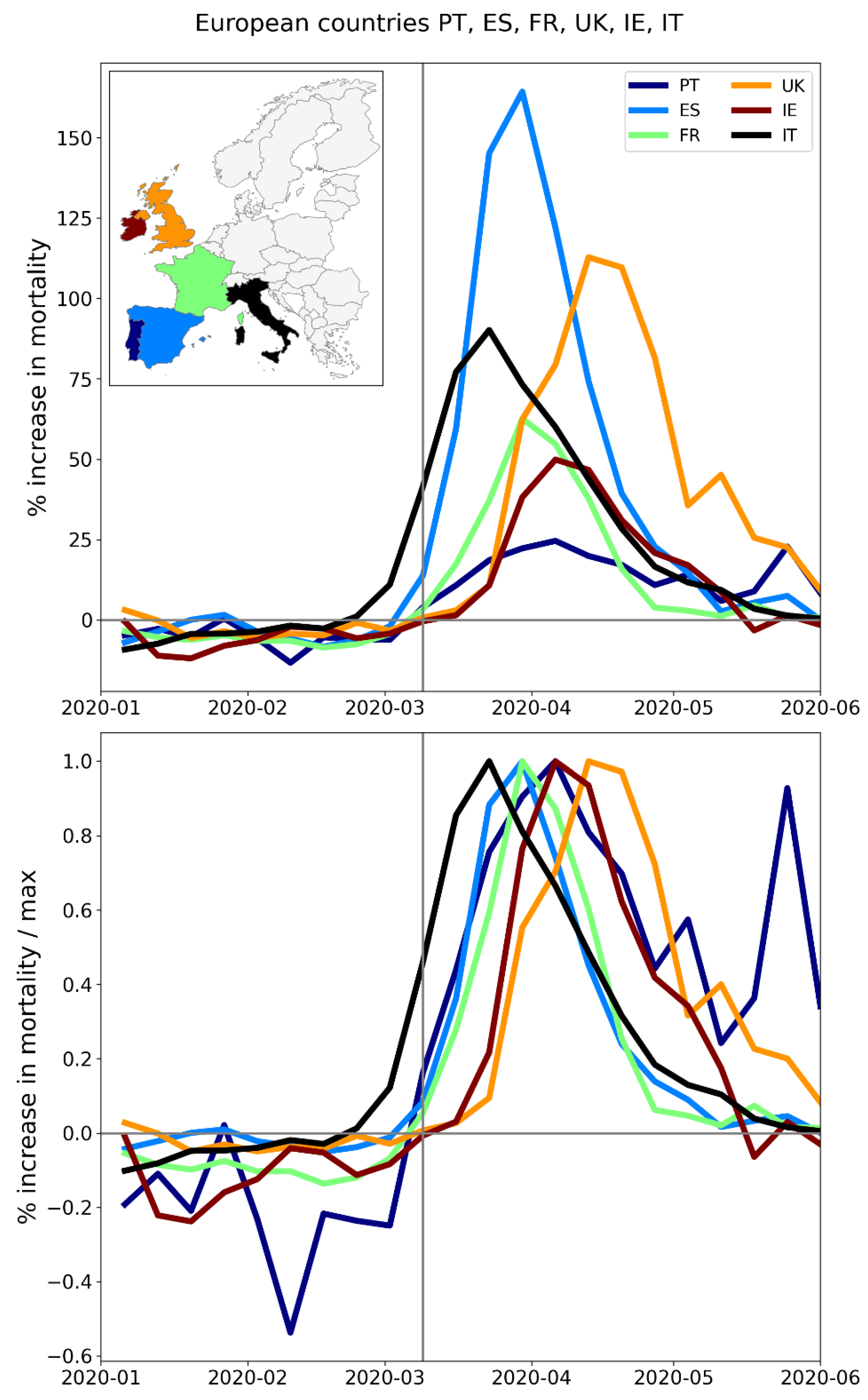
Figure 171.
Upper panel: weekly P-scores during the first-peak period for European countries Belgium, Netherlands, Luxembourg, Germany, Switzerland, Austria (plus Italy, in black). Lower panel: same as upper panel, with each curve scaled by its maximum.
Figure 171.
Upper panel: weekly P-scores during the first-peak period for European countries Belgium, Netherlands, Luxembourg, Germany, Switzerland, Austria (plus Italy, in black). Lower panel: same as upper panel, with each curve scaled by its maximum.
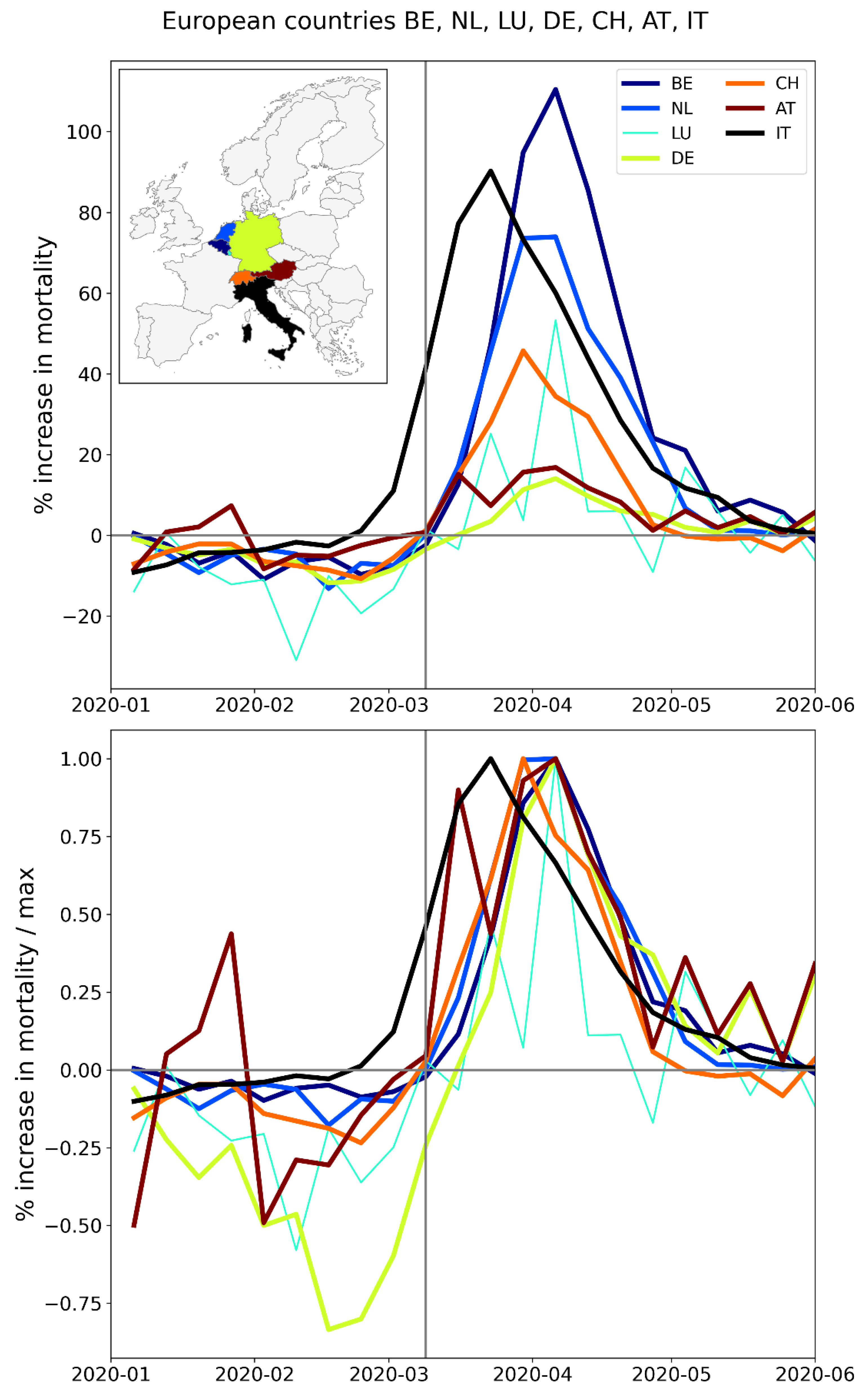
Figure 172.
Upper panel: weekly P-scores during the first-peak period for European countries Denmark, Norway, Sweden, Finland, Iceland (plus Italy, in black). Lower panel: same as upper panel, with each curve scaled by its maximum.
Figure 172.
Upper panel: weekly P-scores during the first-peak period for European countries Denmark, Norway, Sweden, Finland, Iceland (plus Italy, in black). Lower panel: same as upper panel, with each curve scaled by its maximum.
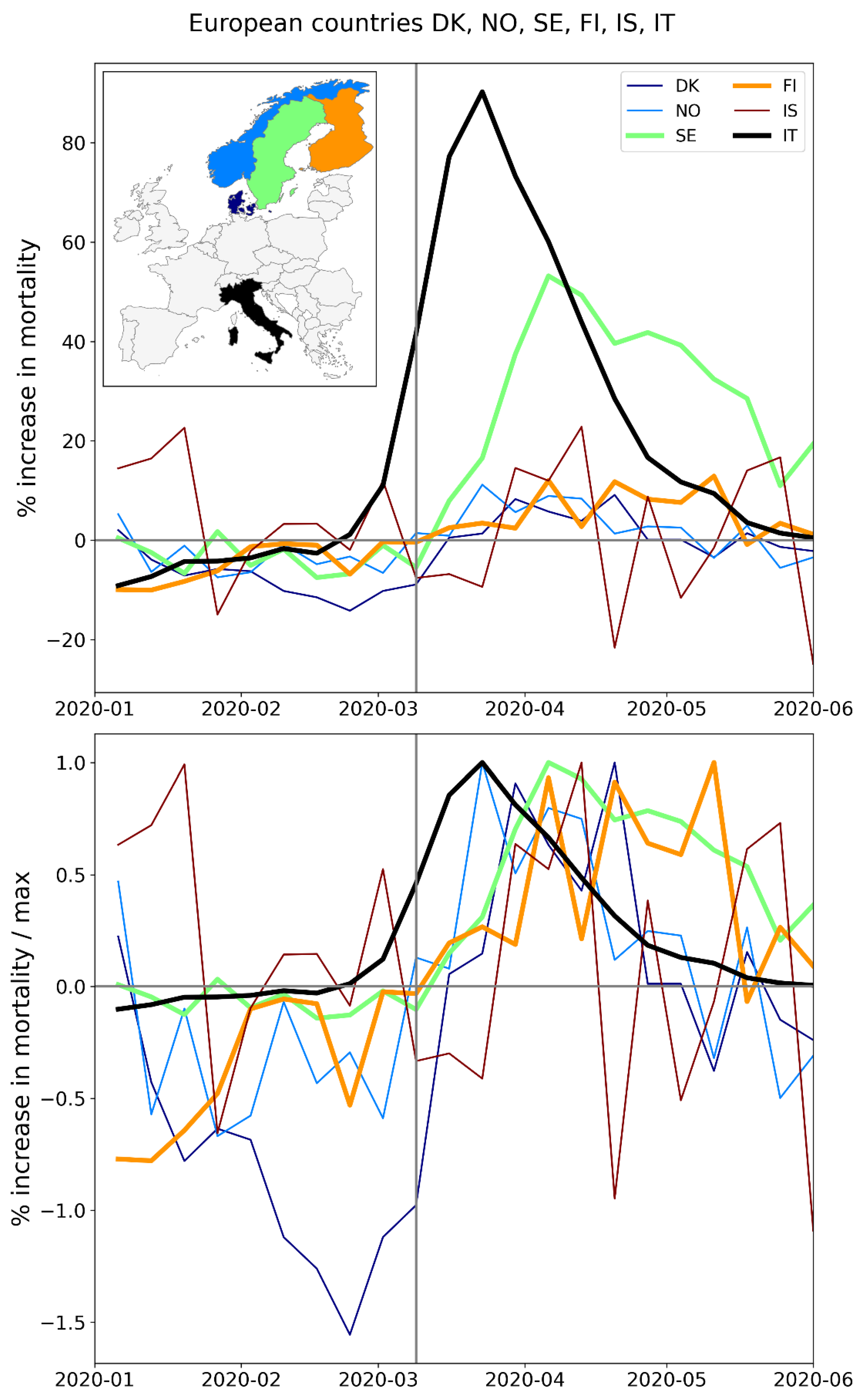
Figure 173.
Upper panel: weekly P-scores during the first-peak period for European countries Estonia, Latvia, Lithuania (plus Italy, in black). Lower panel: same as upper panel, with each curve scaled by its maximum.
Figure 173.
Upper panel: weekly P-scores during the first-peak period for European countries Estonia, Latvia, Lithuania (plus Italy, in black). Lower panel: same as upper panel, with each curve scaled by its maximum.
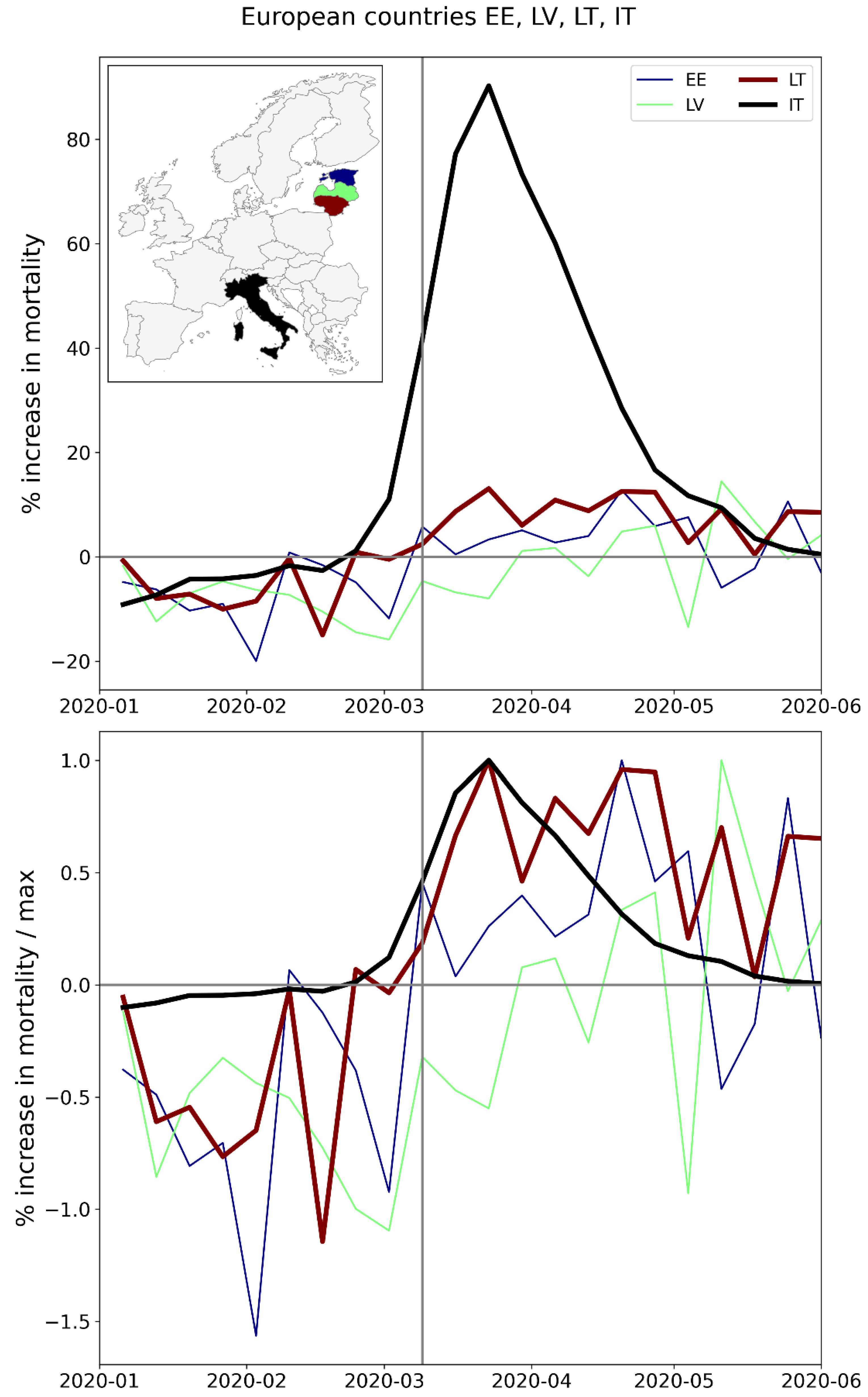
Figure 174.
Upper panel: weekly P-scores during the first-peak period for European countries Poland, Slovakia, Czechia, Hungary (plus Italy, in black). Lower panel: same as upper panel, with each curve scaled by its maximum.
Figure 174.
Upper panel: weekly P-scores during the first-peak period for European countries Poland, Slovakia, Czechia, Hungary (plus Italy, in black). Lower panel: same as upper panel, with each curve scaled by its maximum.
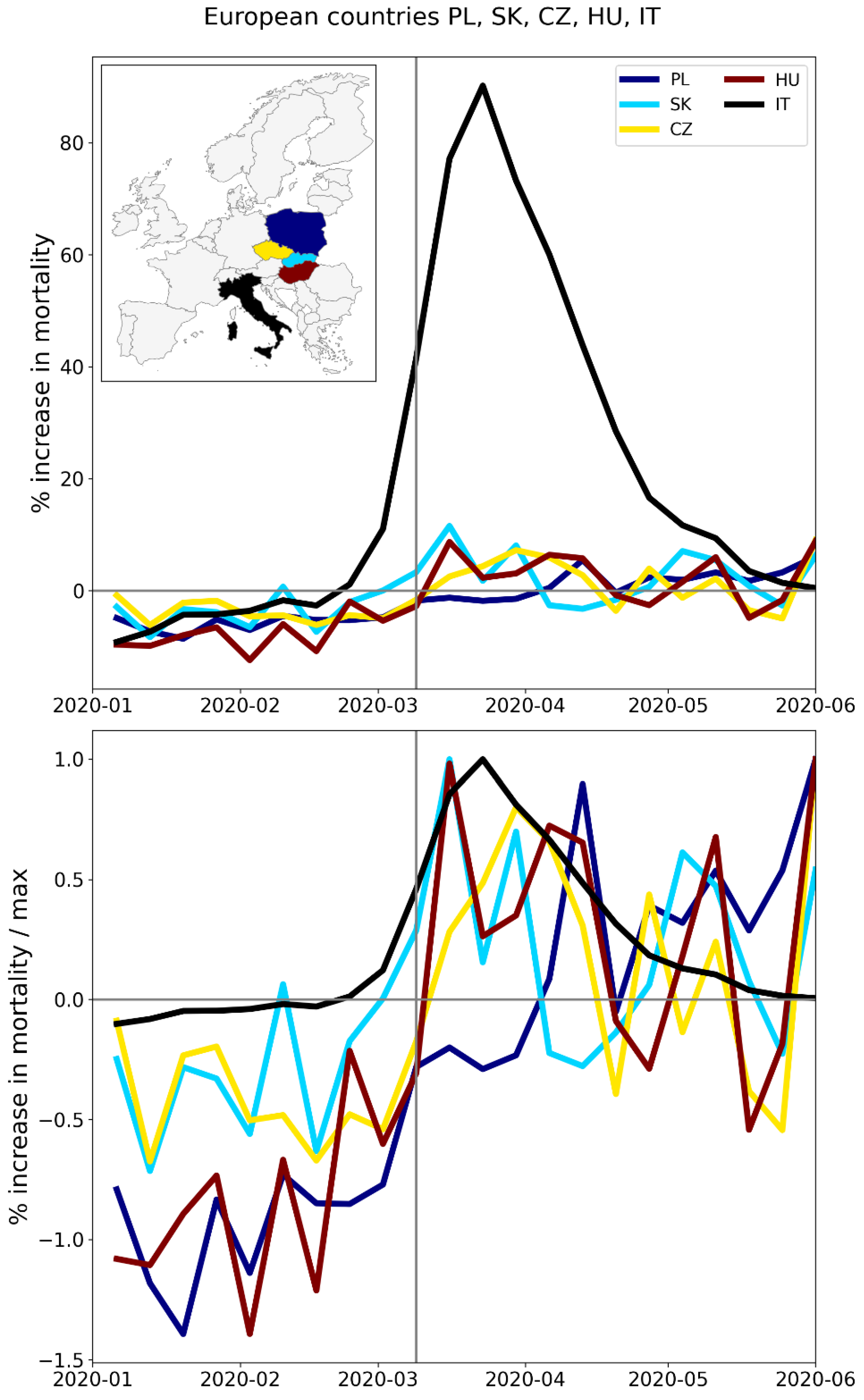
Figure 175.
Upper panel: weekly P-scores during the first-peak period for European countries Slovenia, Croatia, Serbia, Albania, Montenegro (plus Italy, in black). Lower panel: same as upper panel, with each curve scaled by its maximum.
Figure 175.
Upper panel: weekly P-scores during the first-peak period for European countries Slovenia, Croatia, Serbia, Albania, Montenegro (plus Italy, in black). Lower panel: same as upper panel, with each curve scaled by its maximum.
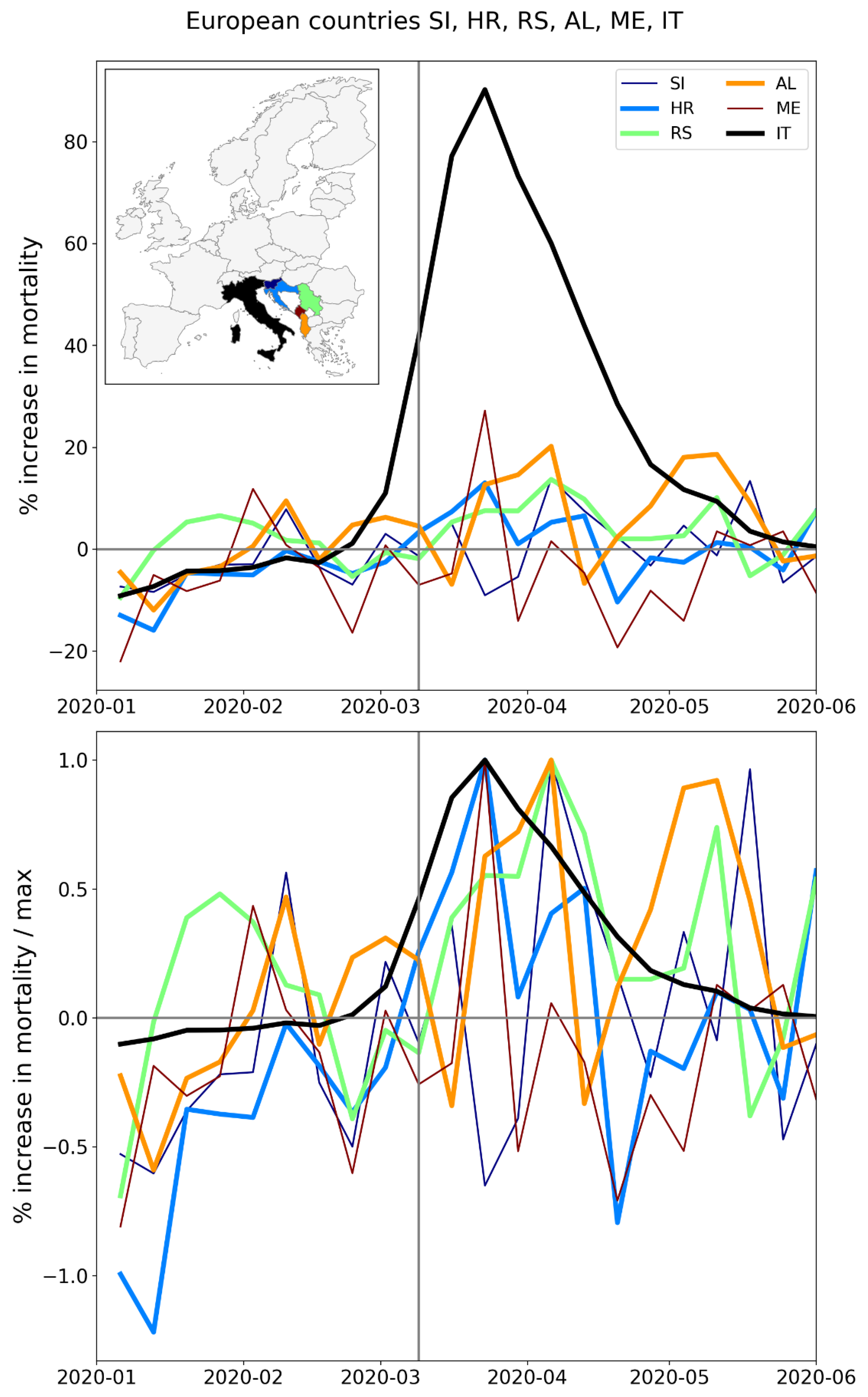
Figure 176.
Upper panel: weekly P-scores during the first-peak period for European countries Greece, Romania, Bulgaria, Cyprus (plus Italy, in black). Lower panel: same as upper panel, with each curve scaled by its maximum. The sharp peak in mid-May for Cyprus (also seen to a lesser extent for Greece and Bulgaria) is due to a heatwave affecting the eastern Mediterranean region (Financial Mirror, 2020; Korosec, 2020; Mitropoulos et al., 2023).
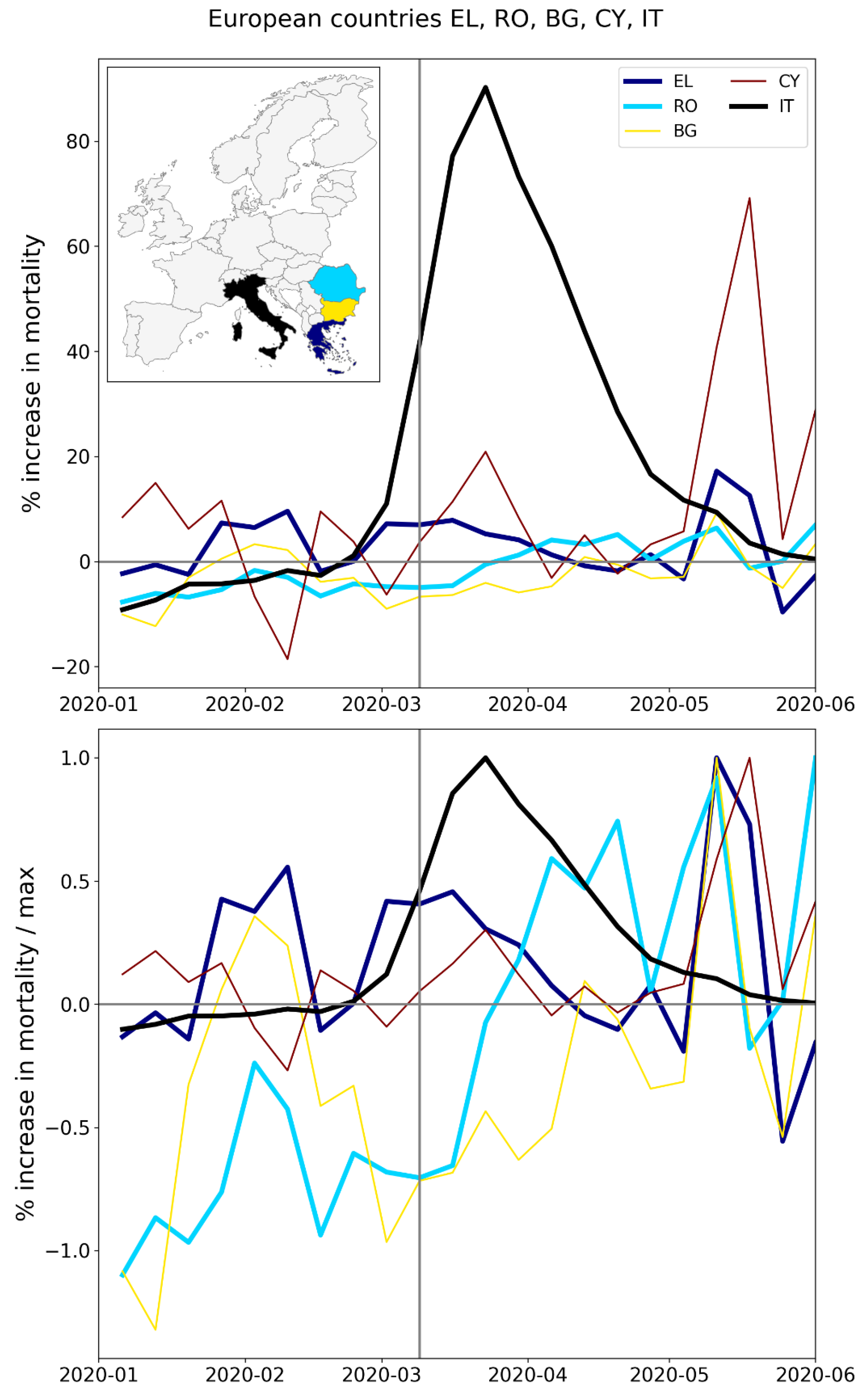
A.2. USA, Weekly P-Scores for All States, Organized Geographically by Census Division
The figures in this appendix subsection show weekly P-scores (top panels) for groups of USA states organized geographically, by census division.
The bottom panel in each figure shows the same data as the top panel, with each curve scaled by its maximum weekly P-score.
In all figures, New York State (black) is included as a reference curve.
Figure 177.
Top panel: states in the New England census division (plus New York State, in black). Middle panel: weekly P-scores during the first-peak period. Lower panel: same as middle panel, with each curve scaled by its maximum.
Figure 177.
Top panel: states in the New England census division (plus New York State, in black). Middle panel: weekly P-scores during the first-peak period. Lower panel: same as middle panel, with each curve scaled by its maximum.
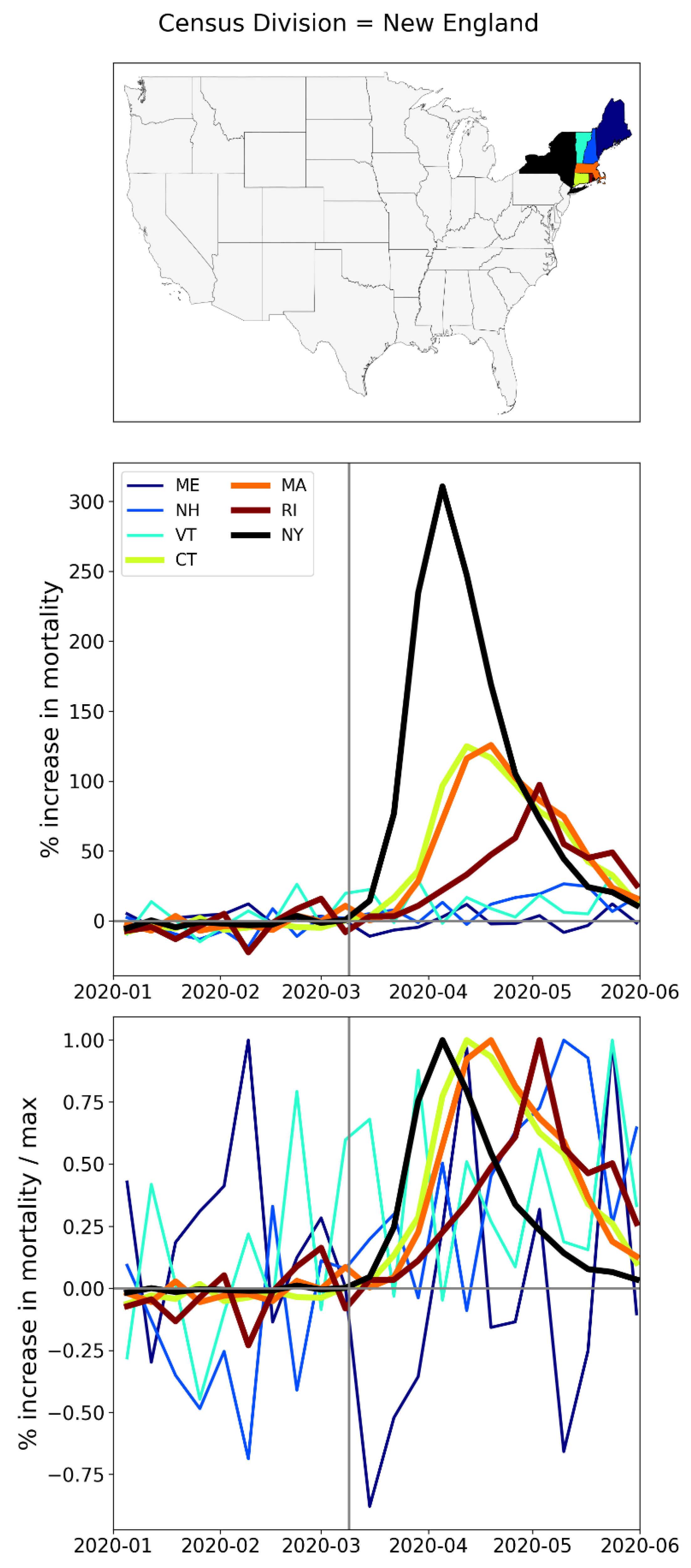
Figure 178.
Top panel: states in the Middle Atlantic census division. Middle panel: weekly P-scores during the first-peak period. Lower panel: same as middle panel, with each curve scaled by its maximum.
Figure 178.
Top panel: states in the Middle Atlantic census division. Middle panel: weekly P-scores during the first-peak period. Lower panel: same as middle panel, with each curve scaled by its maximum.
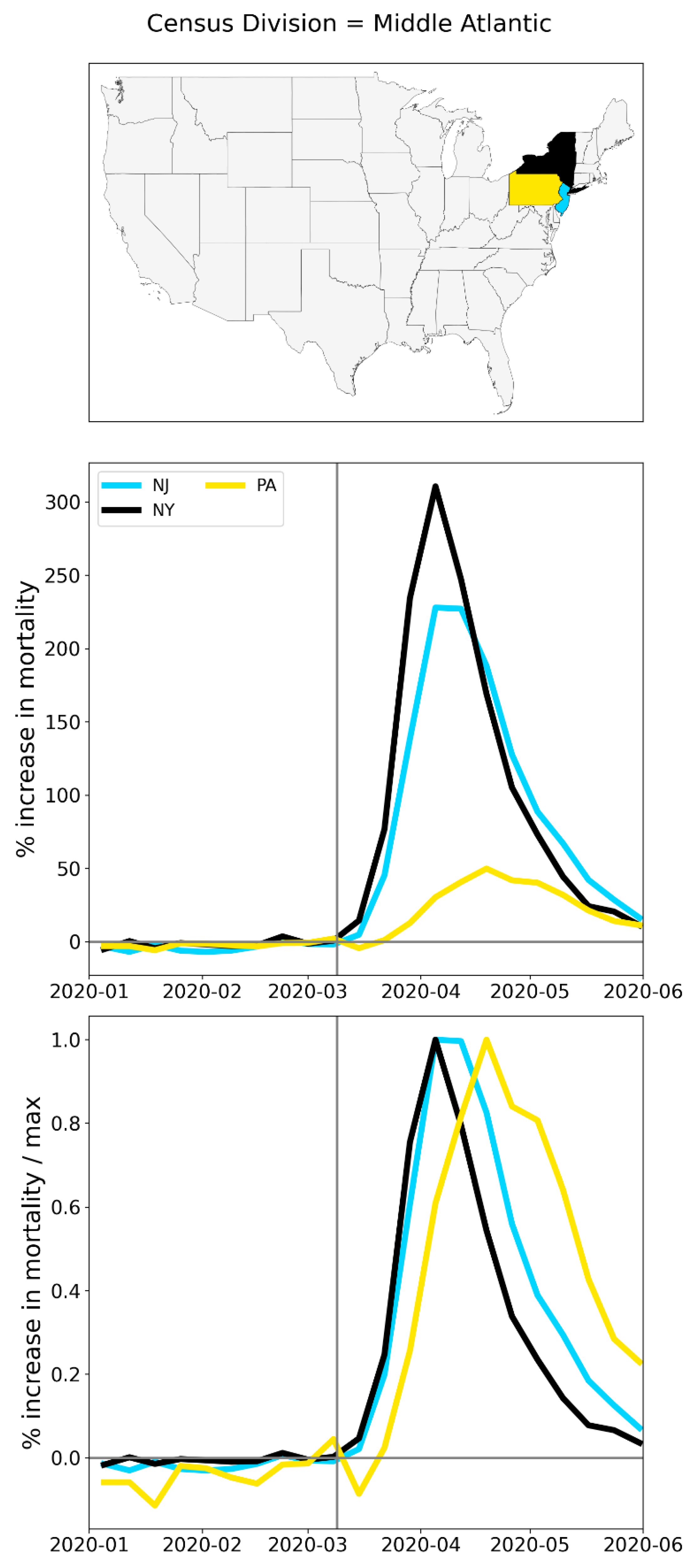
Figure 179.
Top panel: states in the northern half of the South Atlantic census division (plus NY, black). Middle panel: weekly P-scores during the first-peak period. Lower panel: same as middle panel, with each curve scaled by its maximum.
Figure 179.
Top panel: states in the northern half of the South Atlantic census division (plus NY, black). Middle panel: weekly P-scores during the first-peak period. Lower panel: same as middle panel, with each curve scaled by its maximum.
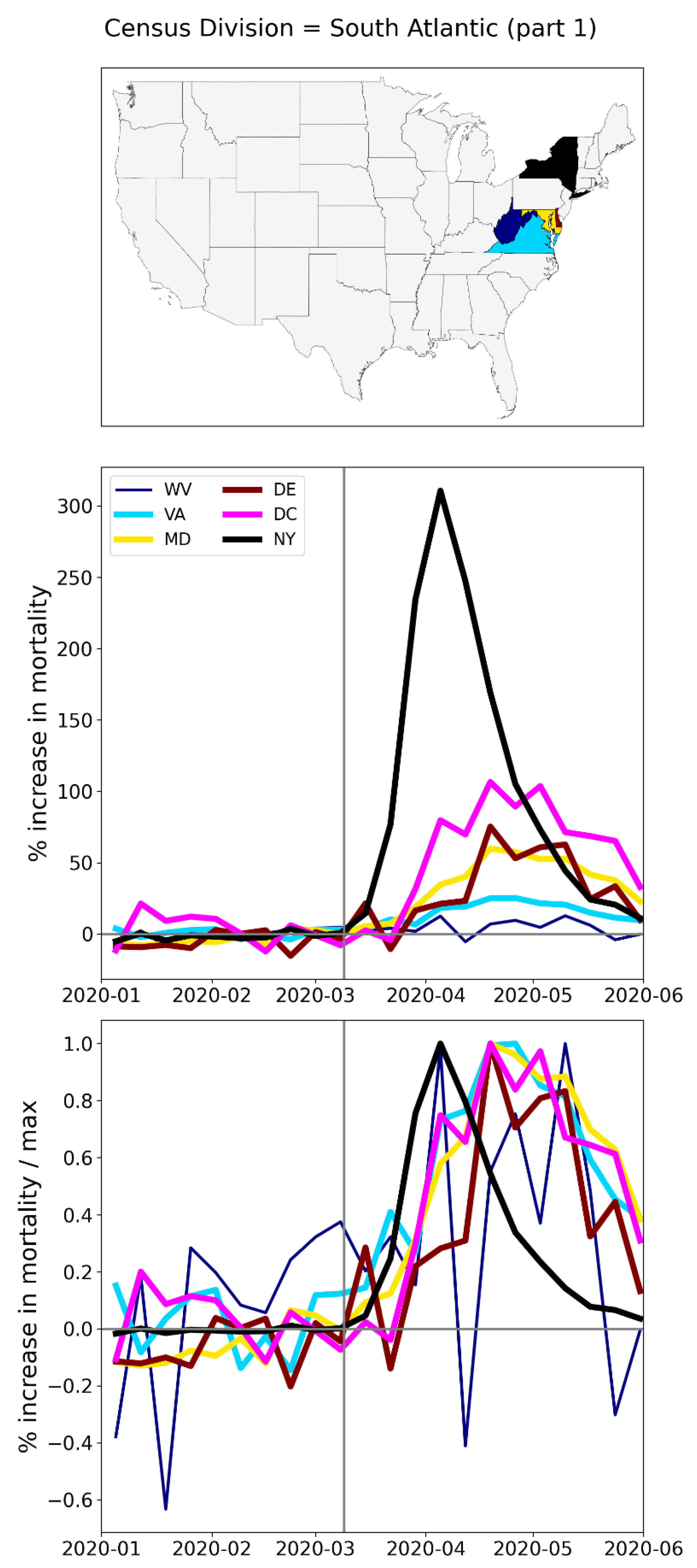
Figure 180.
Top panel: states in the southern half of the South Atlantic census division (plus NY, black). Middle panel: weekly P-scores during the first-peak period. Lower panel: same as middle panel, with each curve scaled by its maximum.
Figure 180.
Top panel: states in the southern half of the South Atlantic census division (plus NY, black). Middle panel: weekly P-scores during the first-peak period. Lower panel: same as middle panel, with each curve scaled by its maximum.
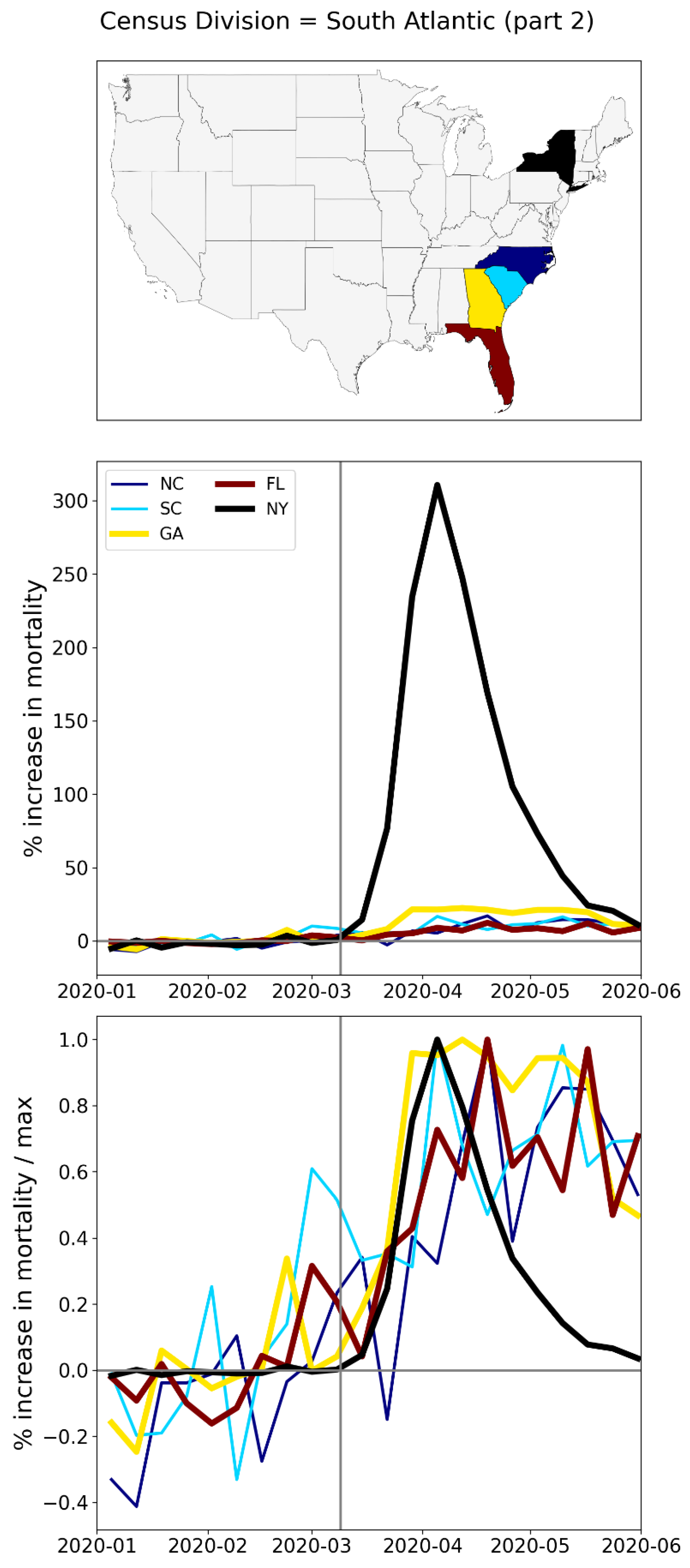
Figure 181.
Top panel: states in the East North Central census division (plus NY, in black). Middle panel: weekly P-scores during the first-peak period. Lower panel: same as middle panel, with each curve scaled by its maximum.
Figure 181.
Top panel: states in the East North Central census division (plus NY, in black). Middle panel: weekly P-scores during the first-peak period. Lower panel: same as middle panel, with each curve scaled by its maximum.
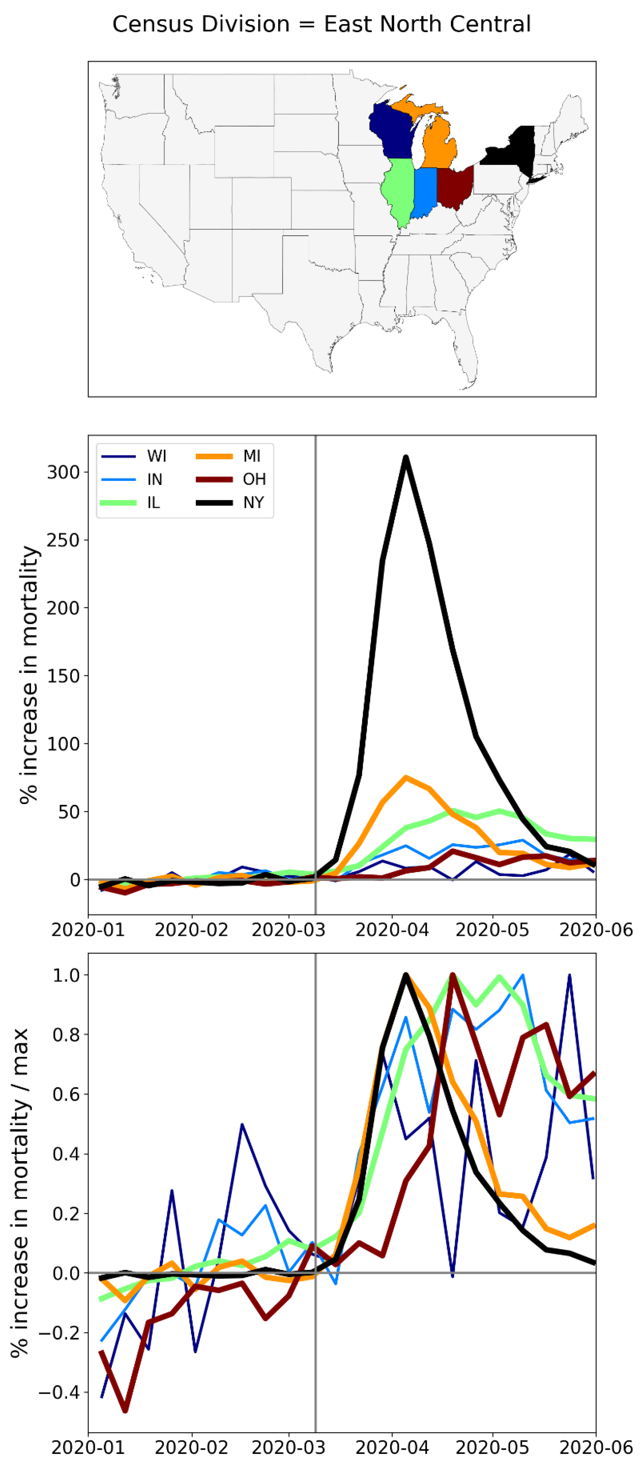
Figure 182.
Top panel: states in the East South Central census division (plus NY, in black). Middle panel: weekly P-scores during the first-peak period. Lower panel: same as middle panel, with each curve scaled by its maximum.
Figure 182.
Top panel: states in the East South Central census division (plus NY, in black). Middle panel: weekly P-scores during the first-peak period. Lower panel: same as middle panel, with each curve scaled by its maximum.
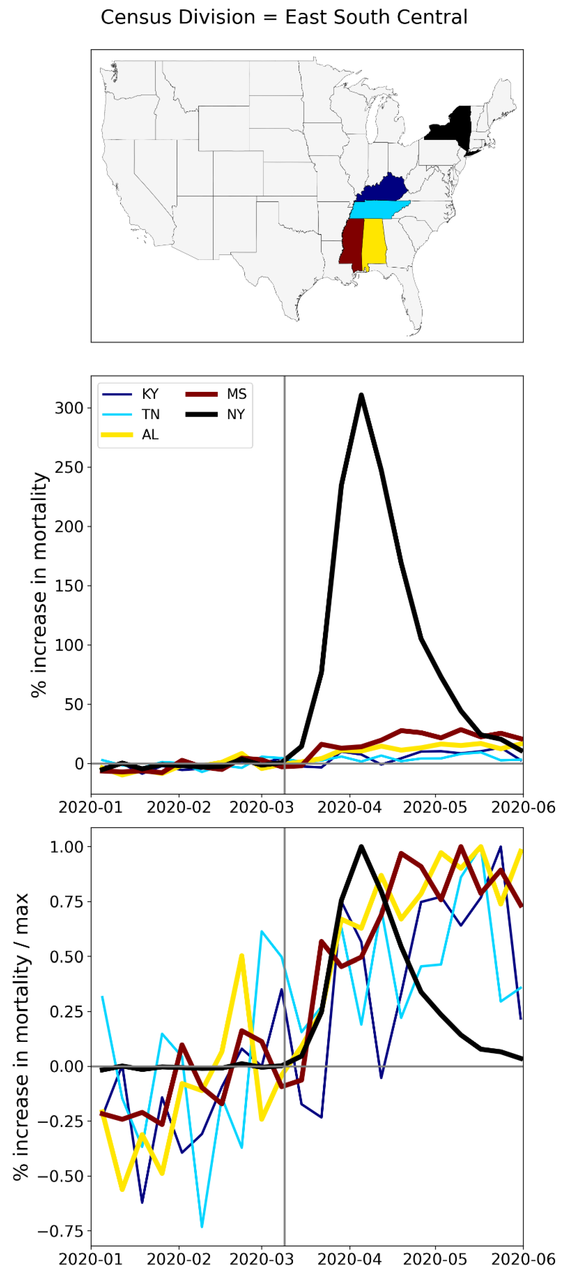
Figure 183.
Top panel: states in the northern half of the West North Central census division (plus New York State, in black). Middle panel: weekly P-scores during the first-peak period. Lower panel: same as middle panel, with each curve scaled by its maximum.
Figure 183.
Top panel: states in the northern half of the West North Central census division (plus New York State, in black). Middle panel: weekly P-scores during the first-peak period. Lower panel: same as middle panel, with each curve scaled by its maximum.
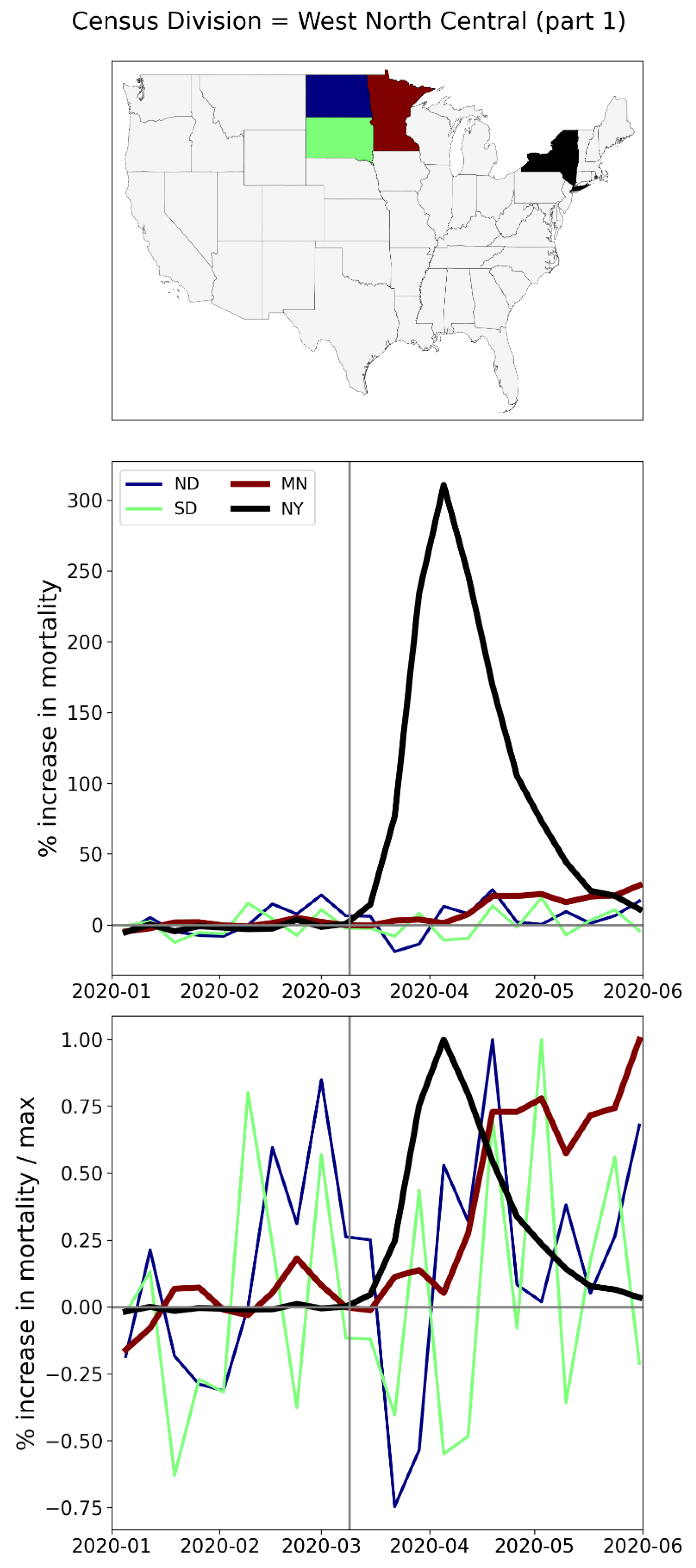
Figure 184.
Top panel: states in the southern half of the West North Central census division (plus New York State, in black). Middle panel: weekly P-scores during the first-peak period. Lower panel: same as middle panel, with each curve scaled by its maximum.
Figure 184.
Top panel: states in the southern half of the West North Central census division (plus New York State, in black). Middle panel: weekly P-scores during the first-peak period. Lower panel: same as middle panel, with each curve scaled by its maximum.
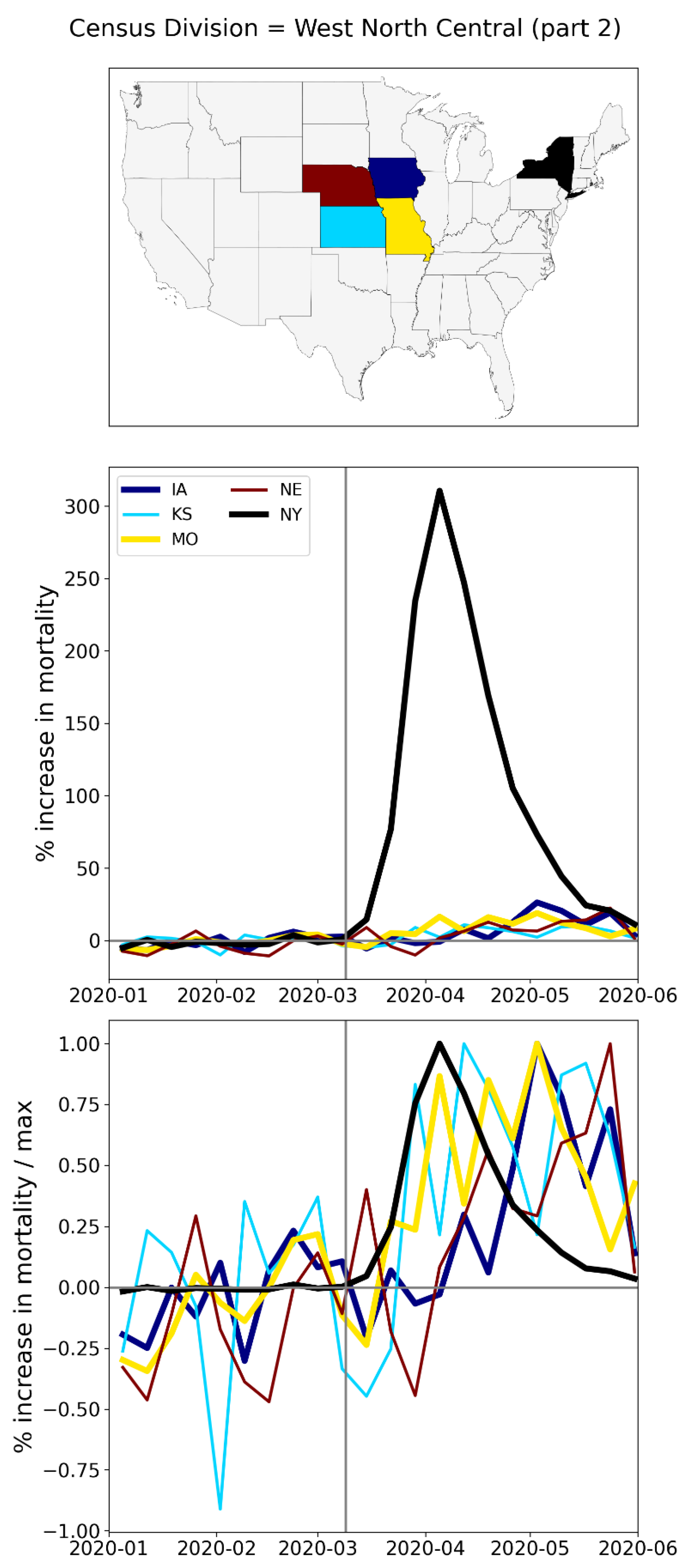
Figure 185.
Top panel: states in the West South Central census division (plus NY, in black). Middle panel: weekly P-scores during the first-peak period. Lower panel: same as middle panel, with each curve scaled by its maximum.
Figure 185.
Top panel: states in the West South Central census division (plus NY, in black). Middle panel: weekly P-scores during the first-peak period. Lower panel: same as middle panel, with each curve scaled by its maximum.
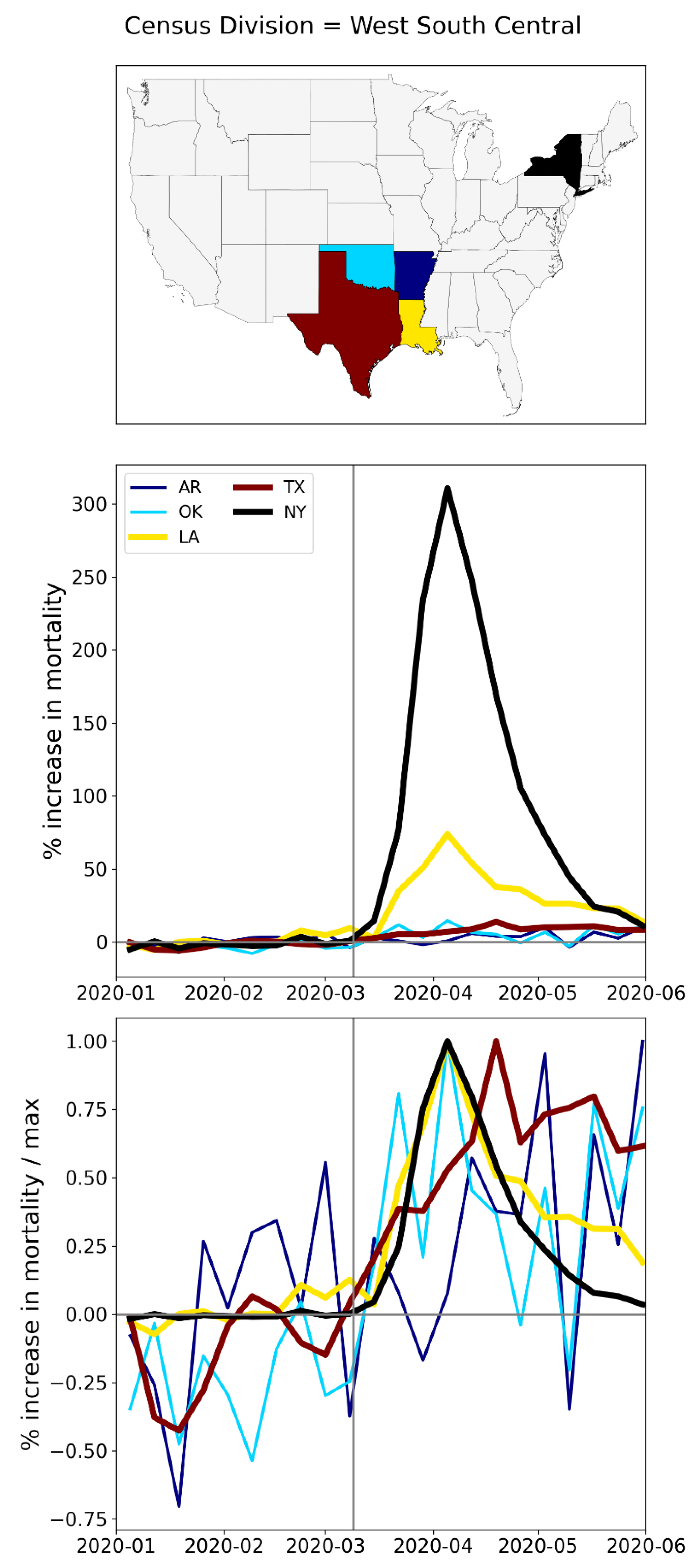
Figure 186.
Top panel: states in the northern part of the Mountain census division (plus NY, in black). Middle panel: weekly P-scores during the first-peak period. Lower panel: same as middle panel, with each curve scaled by its maximum.
Figure 186.
Top panel: states in the northern part of the Mountain census division (plus NY, in black). Middle panel: weekly P-scores during the first-peak period. Lower panel: same as middle panel, with each curve scaled by its maximum.
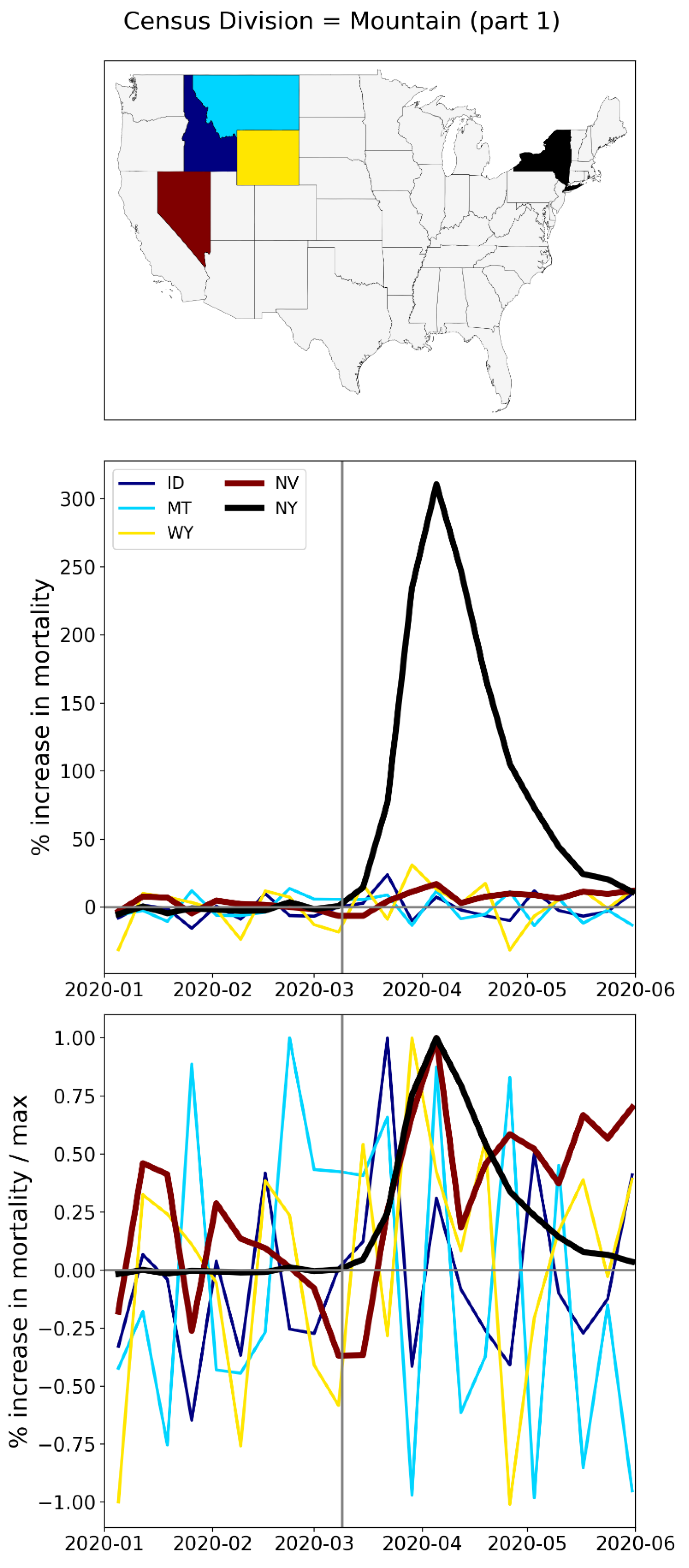
Figure 187.
Top panel: states in the southern part of the Mountain census division (plus NY, in black). Middle panel: weekly P-scores during the first-peak period. Lower panel: same as middle panel, with each curve scaled by its maximum.
Figure 187.
Top panel: states in the southern part of the Mountain census division (plus NY, in black). Middle panel: weekly P-scores during the first-peak period. Lower panel: same as middle panel, with each curve scaled by its maximum.
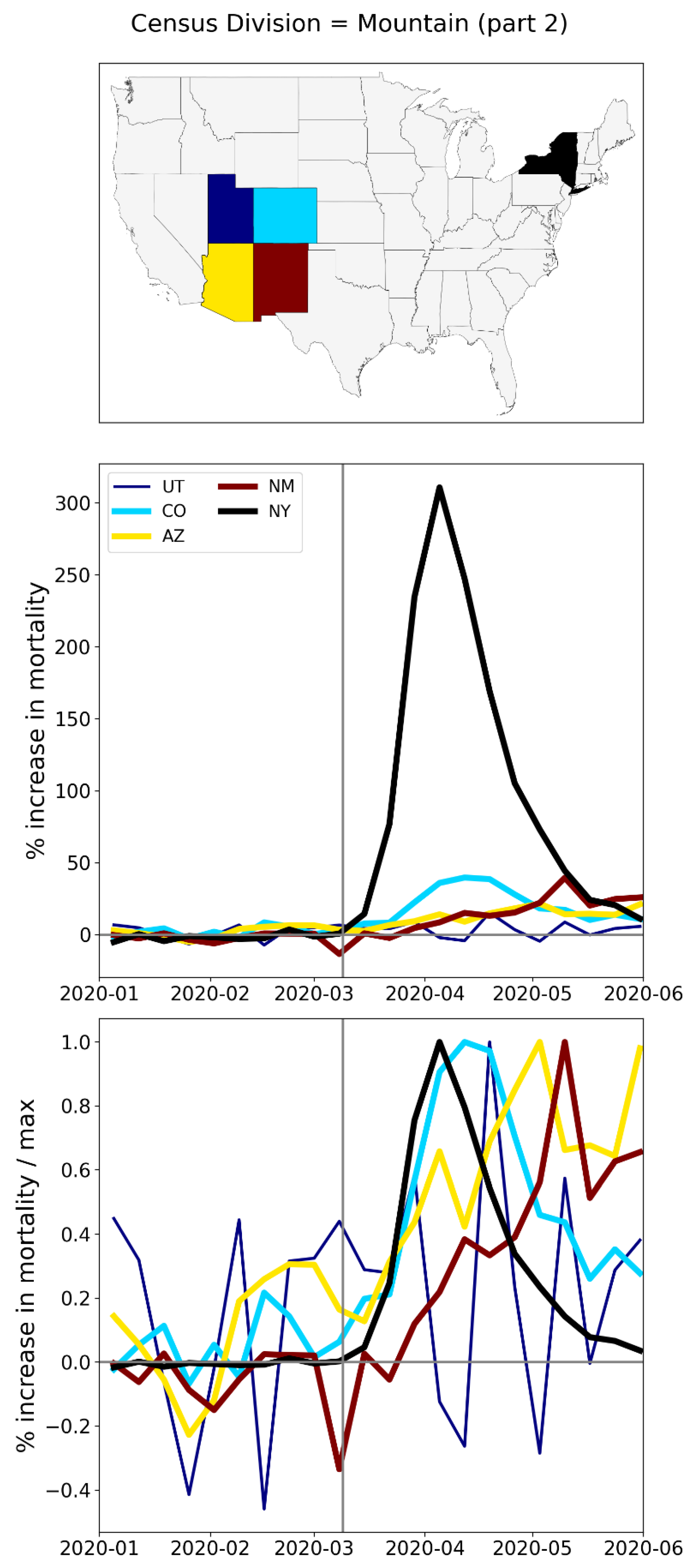
Figure 188.
Top panel: states in the Pacific census division (plus NY, black; Hawaii and Alaska not shown). Middle panel: weekly P-scores during the first-peak period. Lower panel: same as middle panel, with each curve scaled by its maximum.
Figure 188.
Top panel: states in the Pacific census division (plus NY, black; Hawaii and Alaska not shown). Middle panel: weekly P-scores during the first-peak period. Lower panel: same as middle panel, with each curve scaled by its maximum.
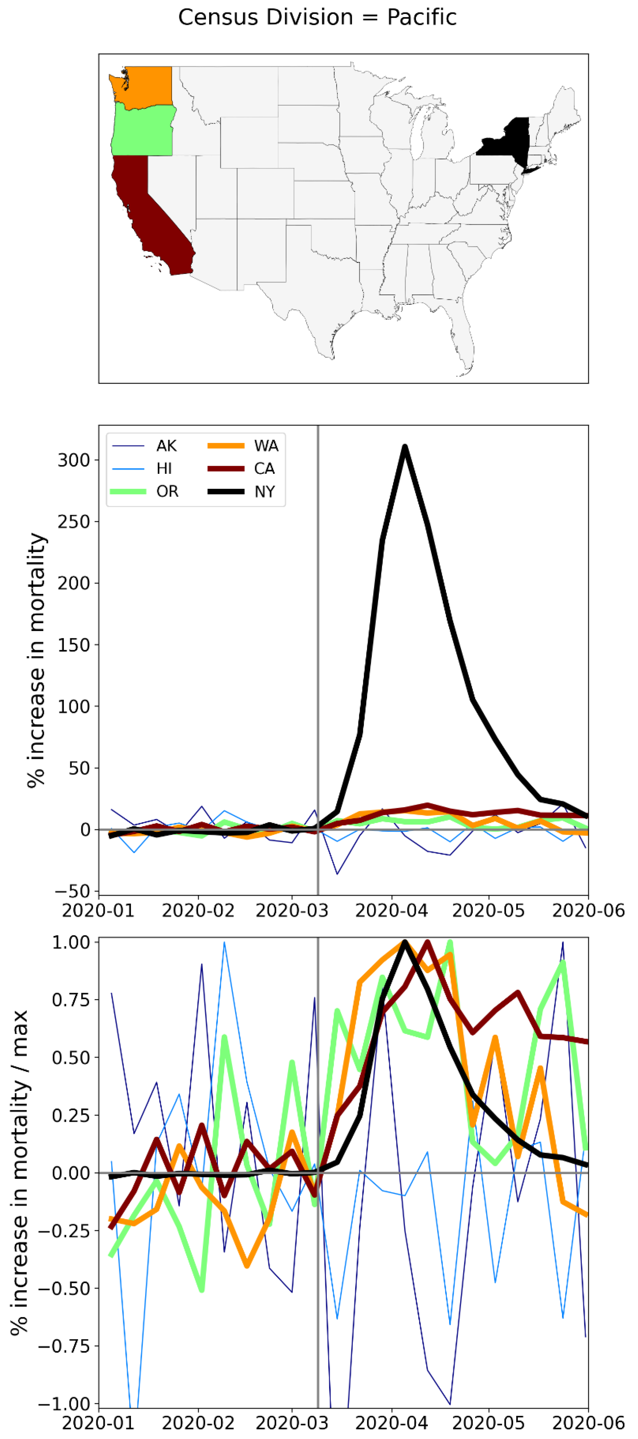
A.3. USA, Weekly P-Scores for Each State, for the Year 2020
The figures in this appendix subsection show weekly P-scores for USA states (solid blue lines) with 1σ error ranges shown as shaded blue areas.
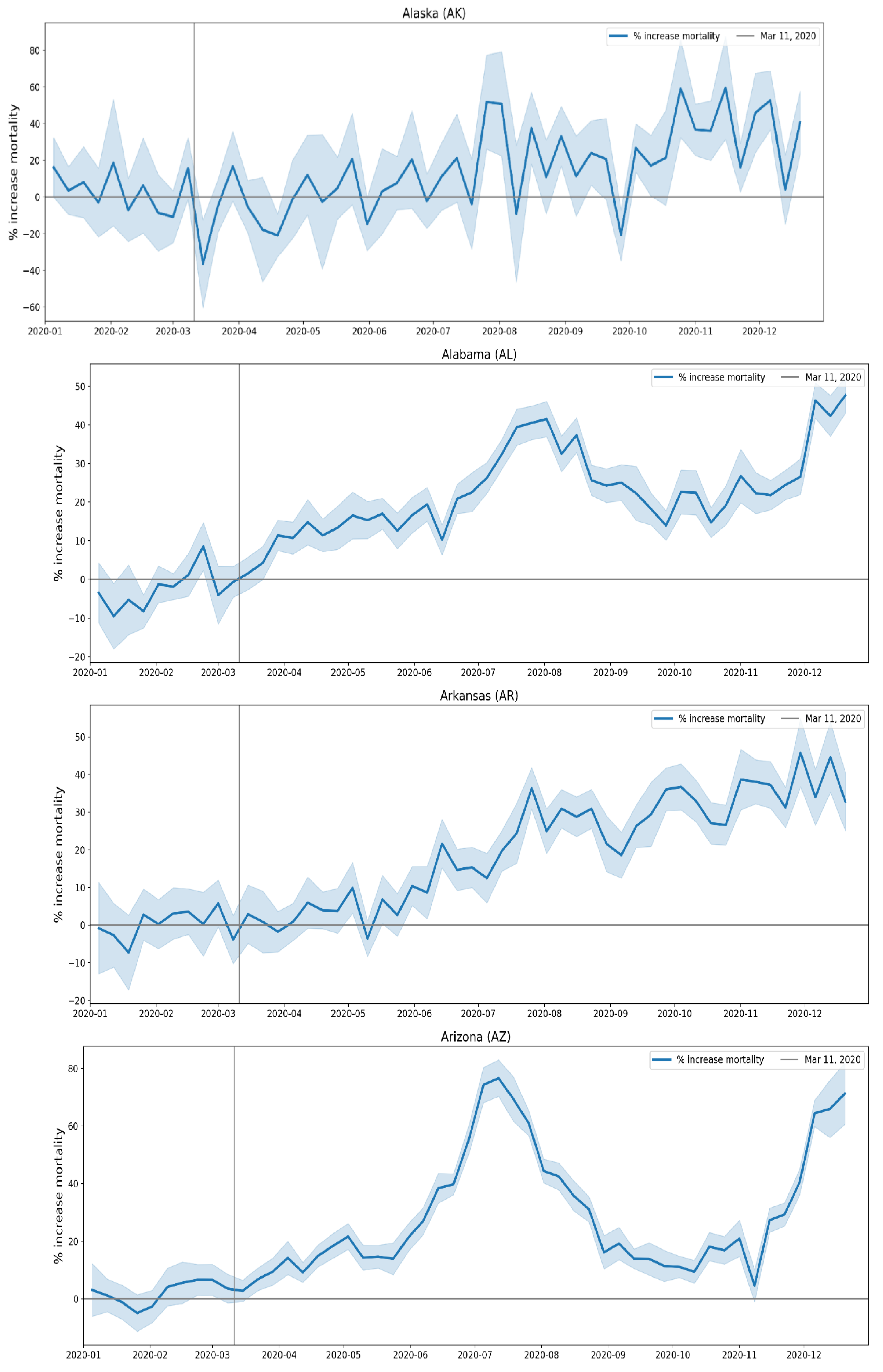
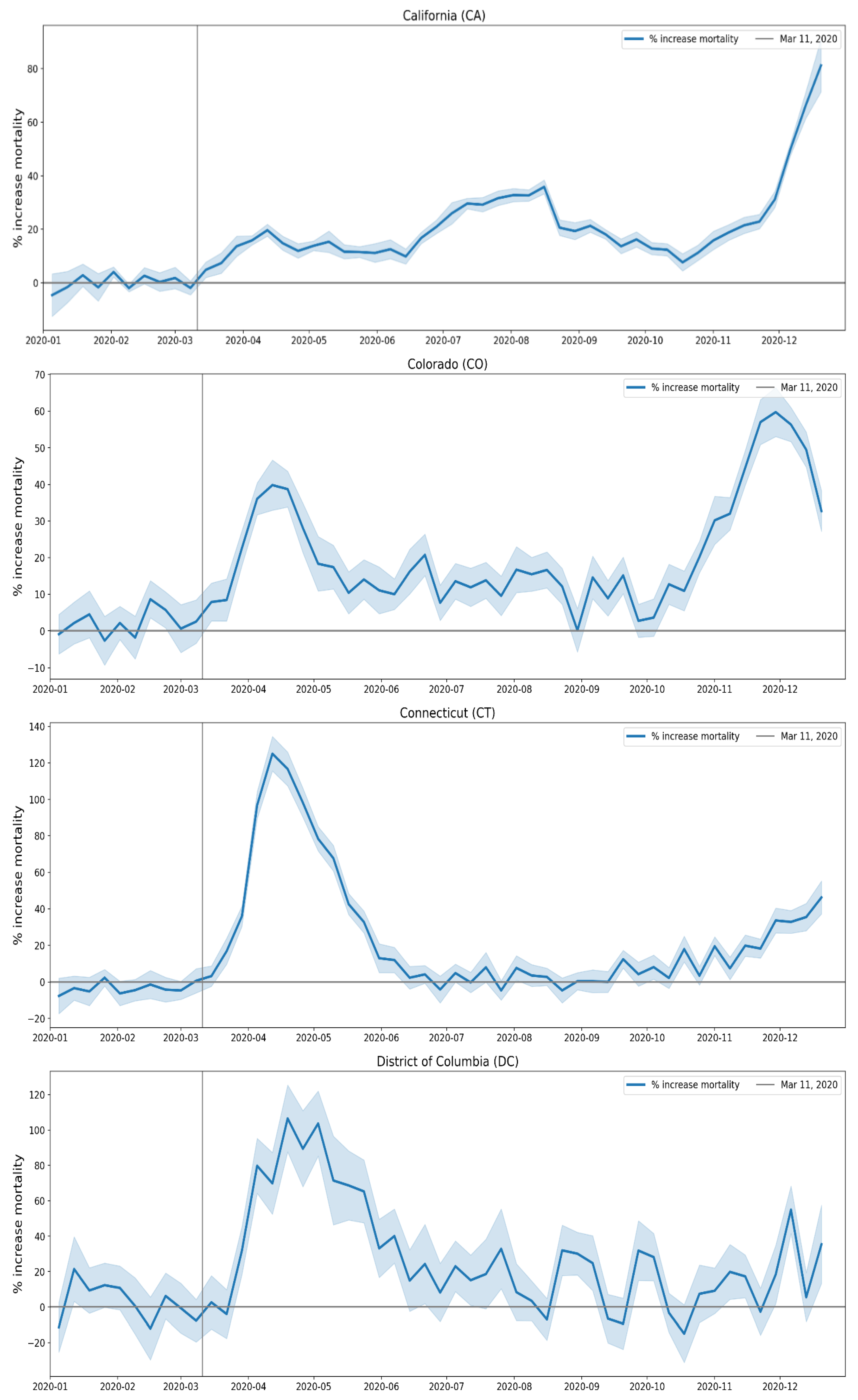
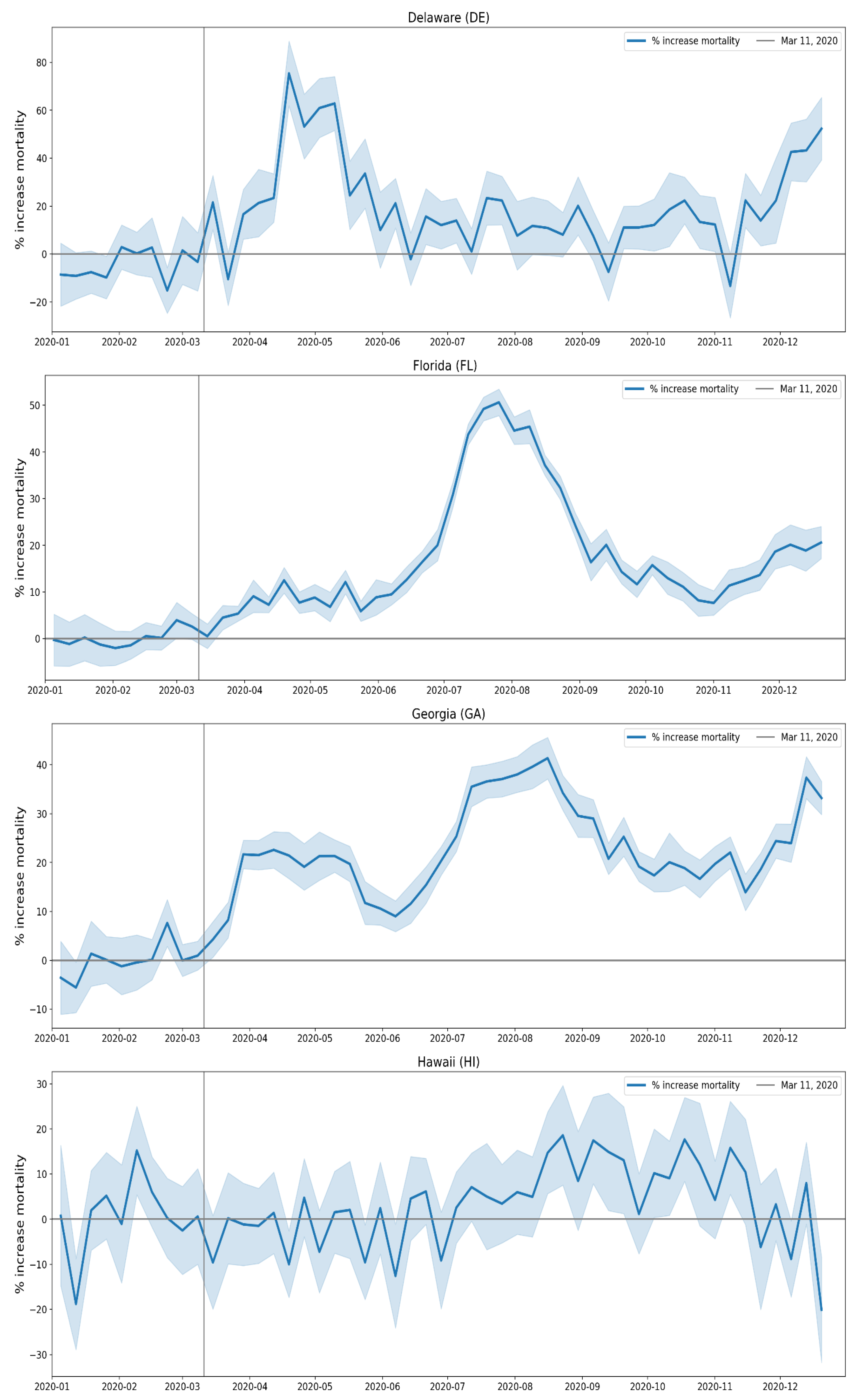
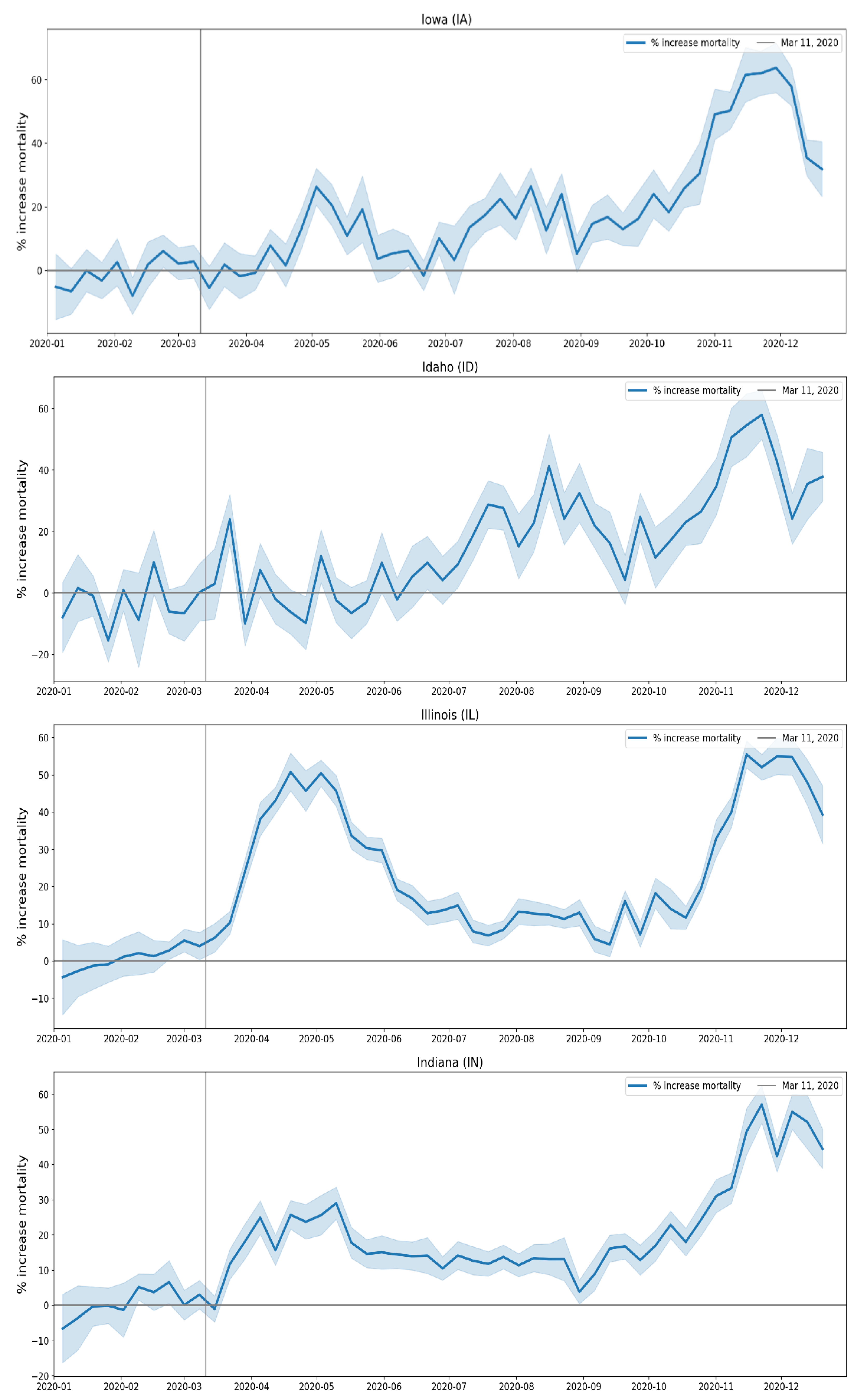
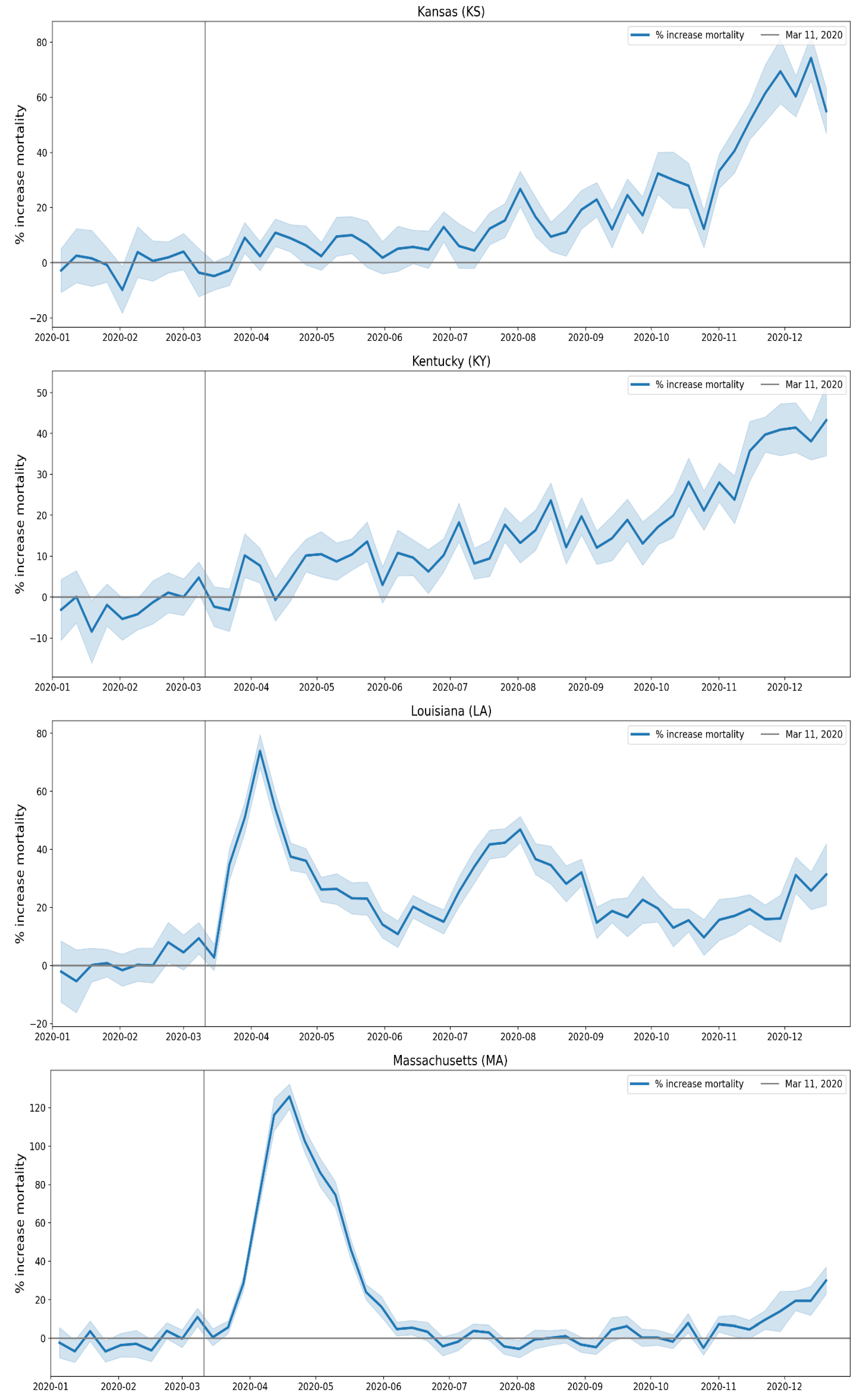
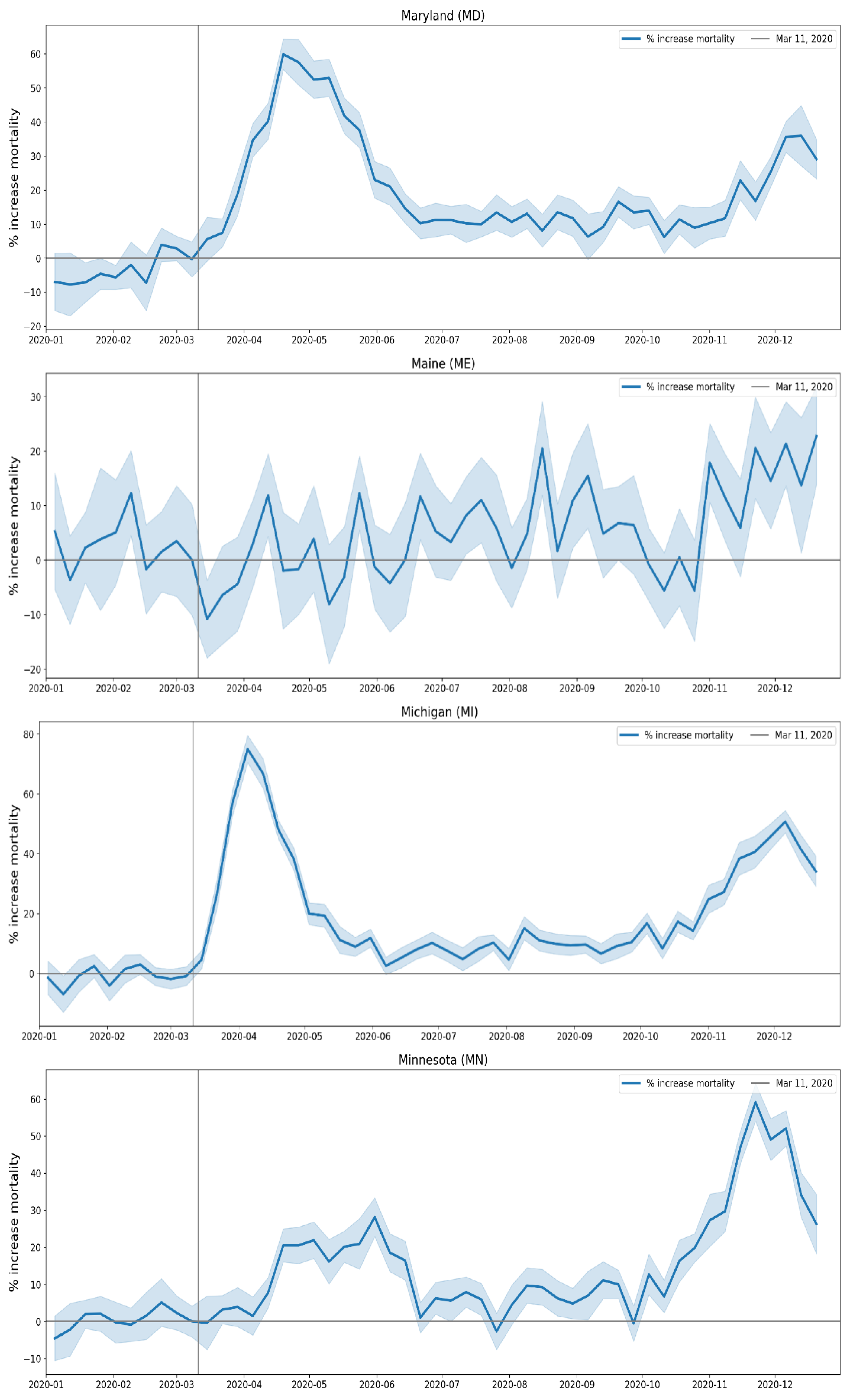
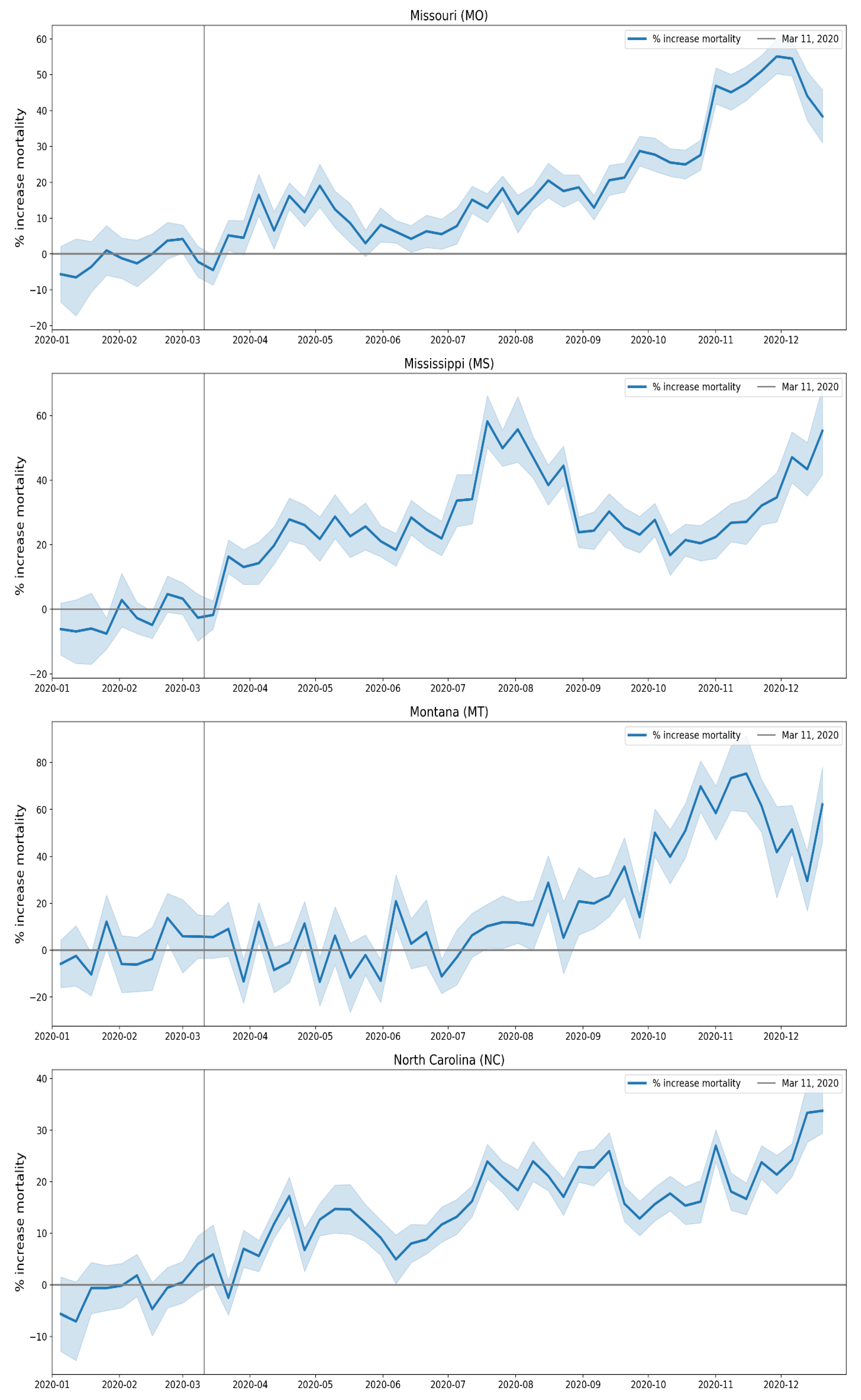
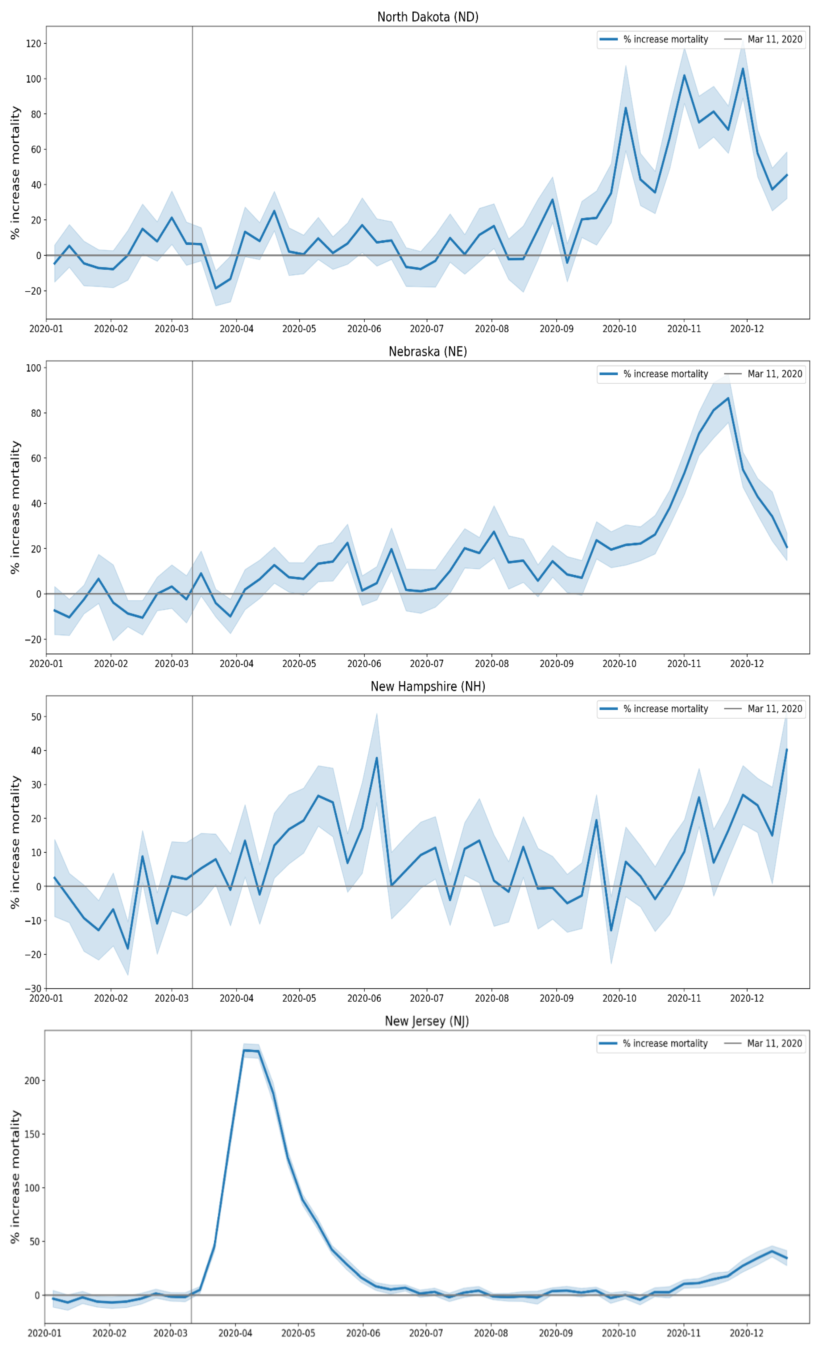
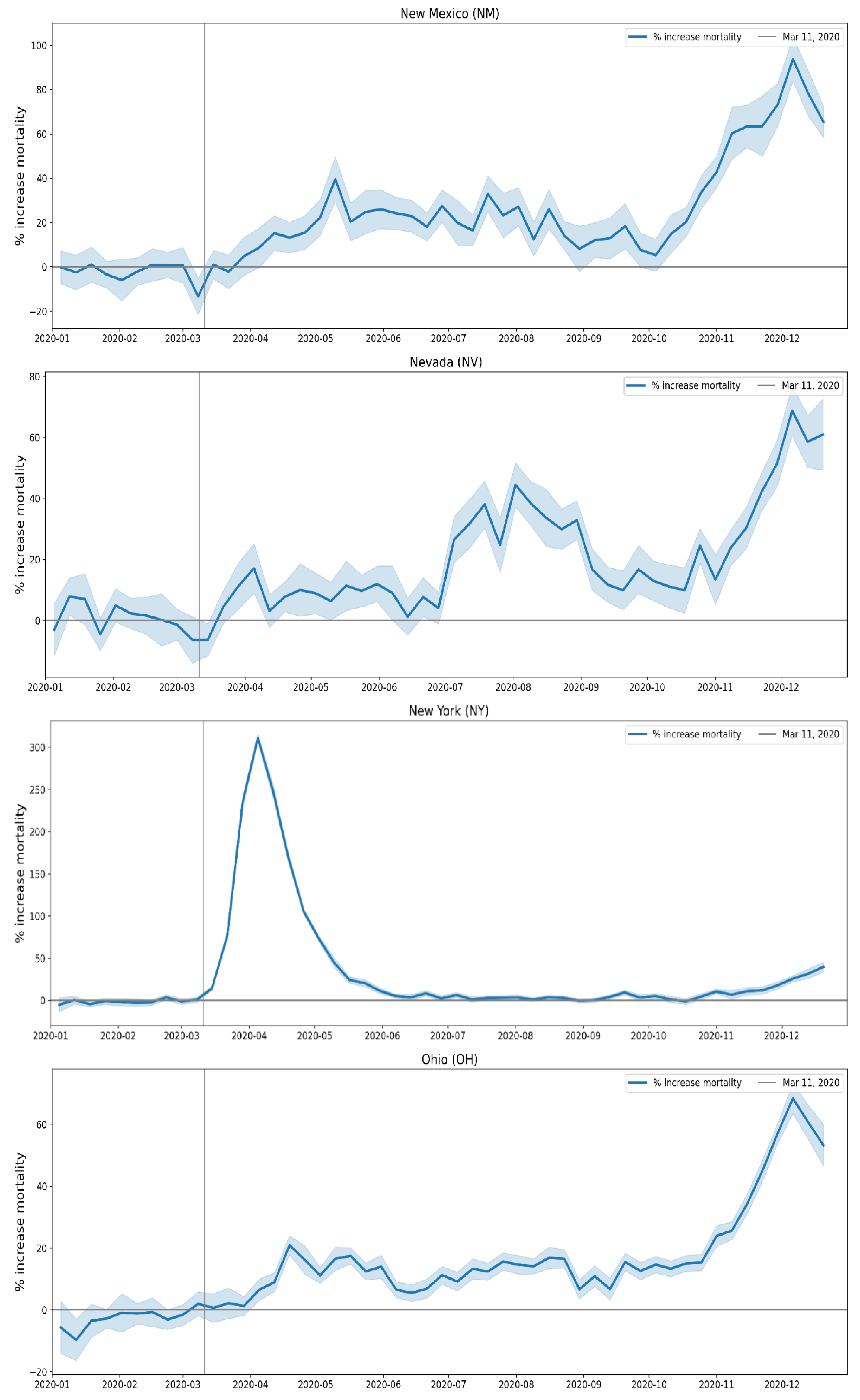
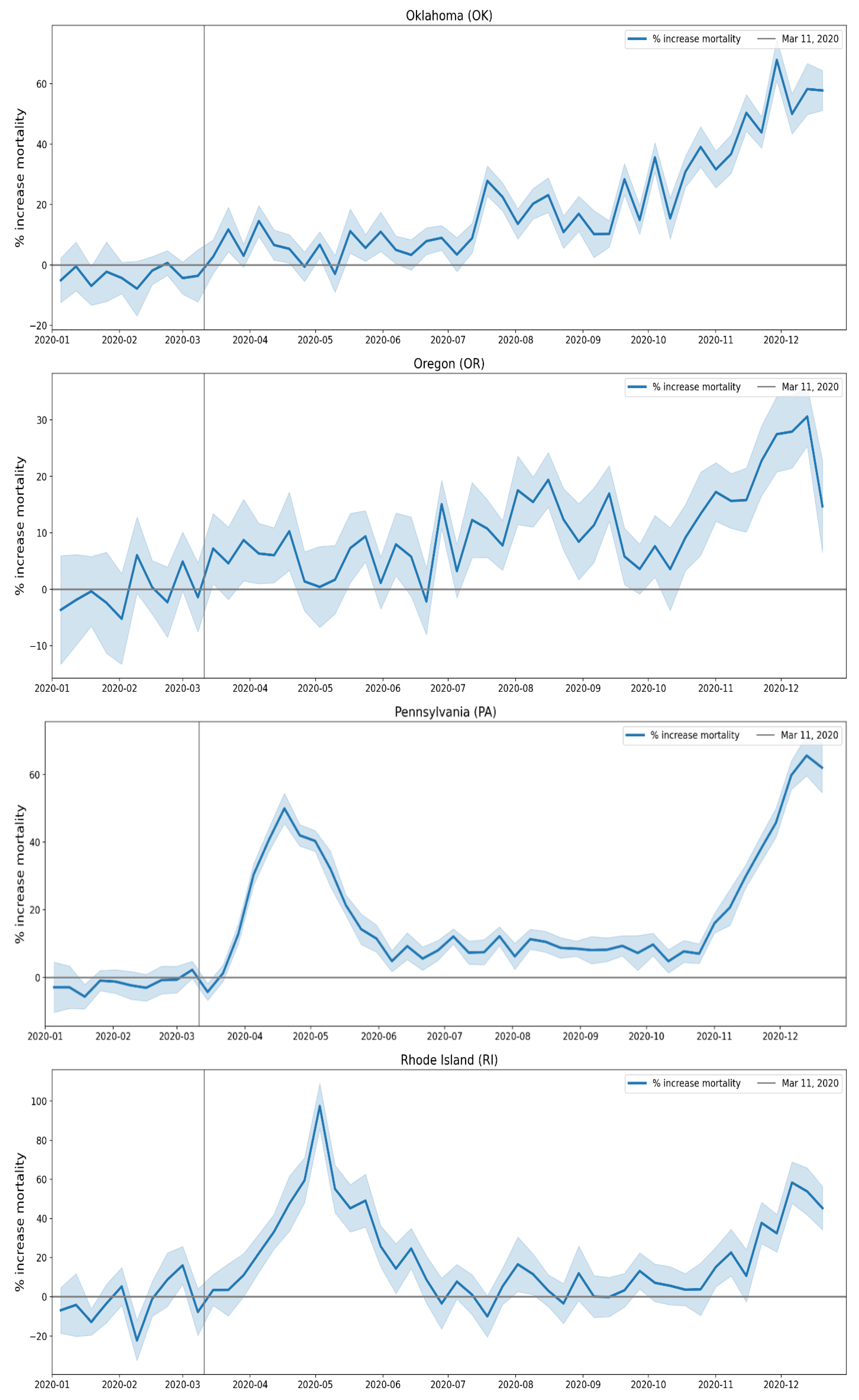
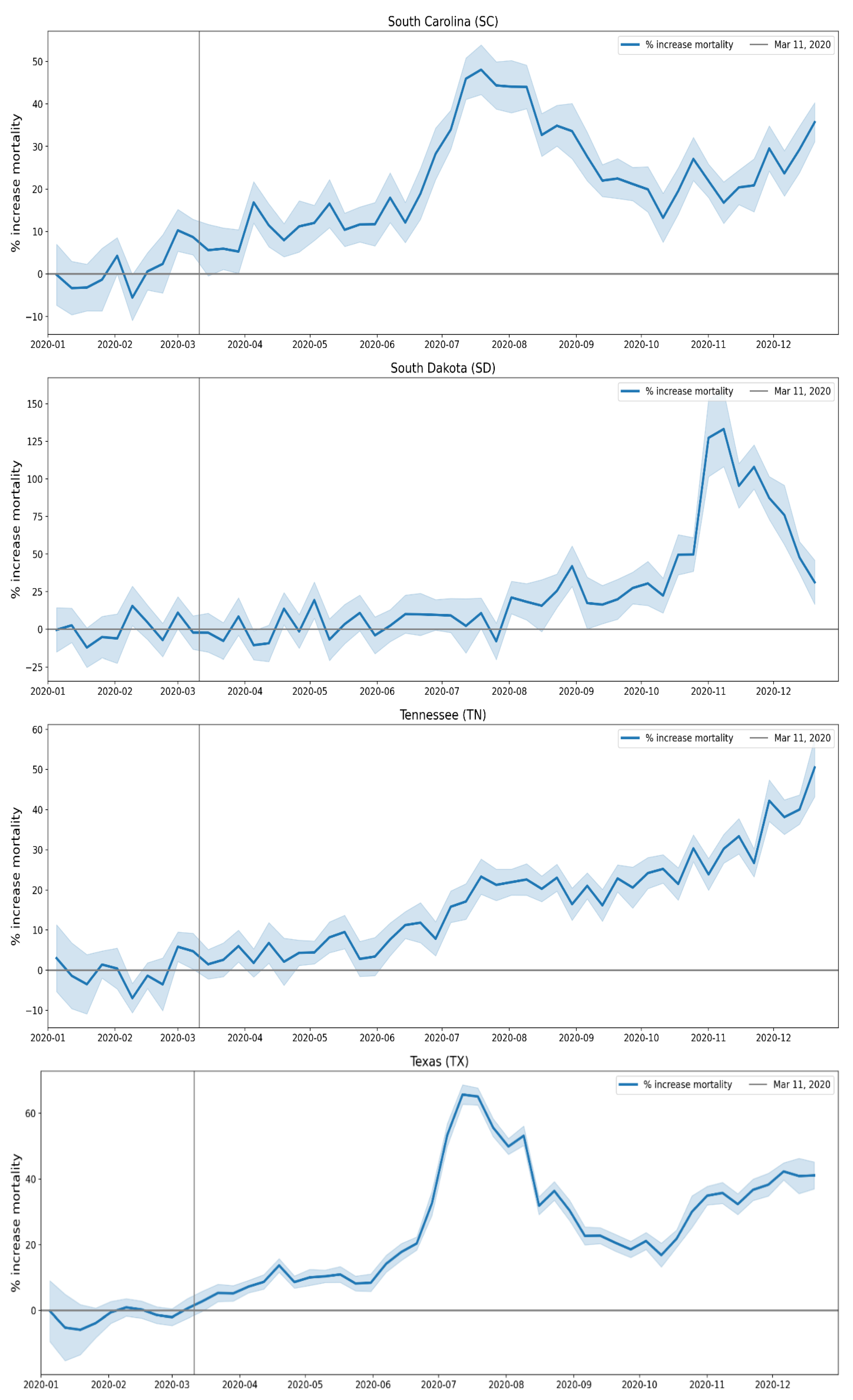
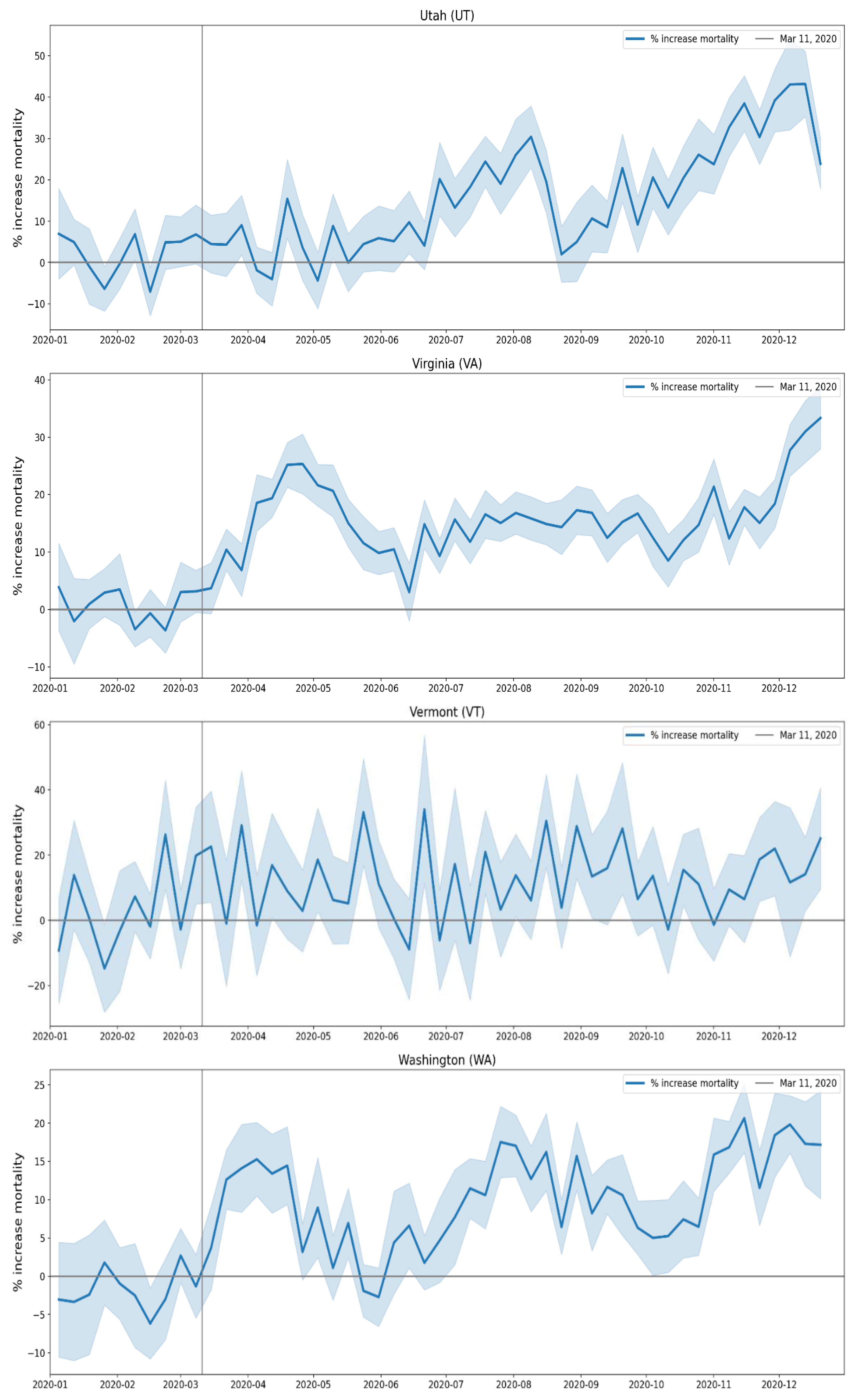
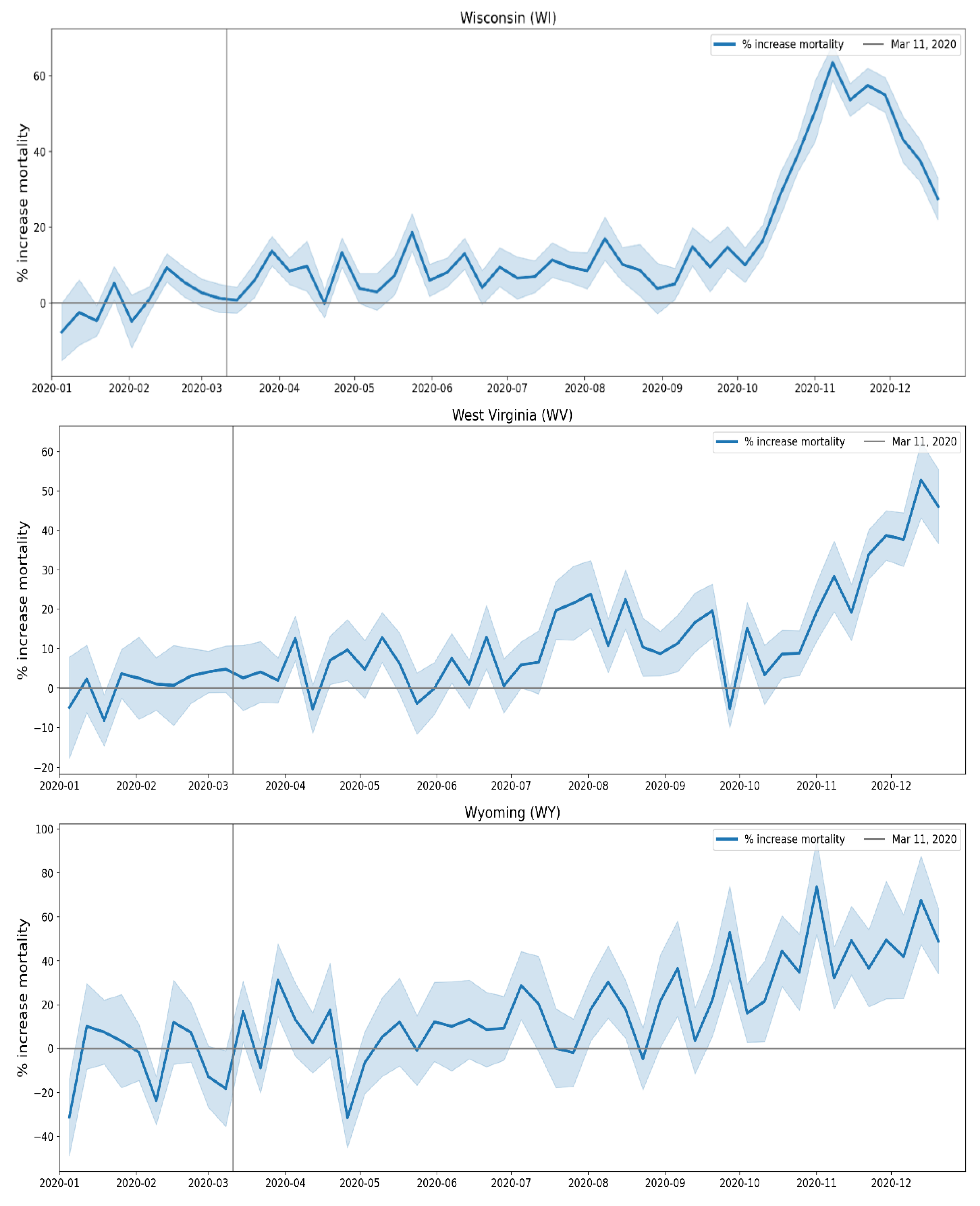
B. Additional Graphs Pertaining to Section 3.5
The graphs in this appendix show the number of deaths per month for different institutional locations of death (left y-axes), for each USA state. The right y-axes show the total number of deaths (sum over all institutional locations of death) per month.
The solid vertical lines are placed at March 1, 2020 and May 1, 2020, and the dashed vertical lines are placed at March 1, 2019 and May 1, 2019.
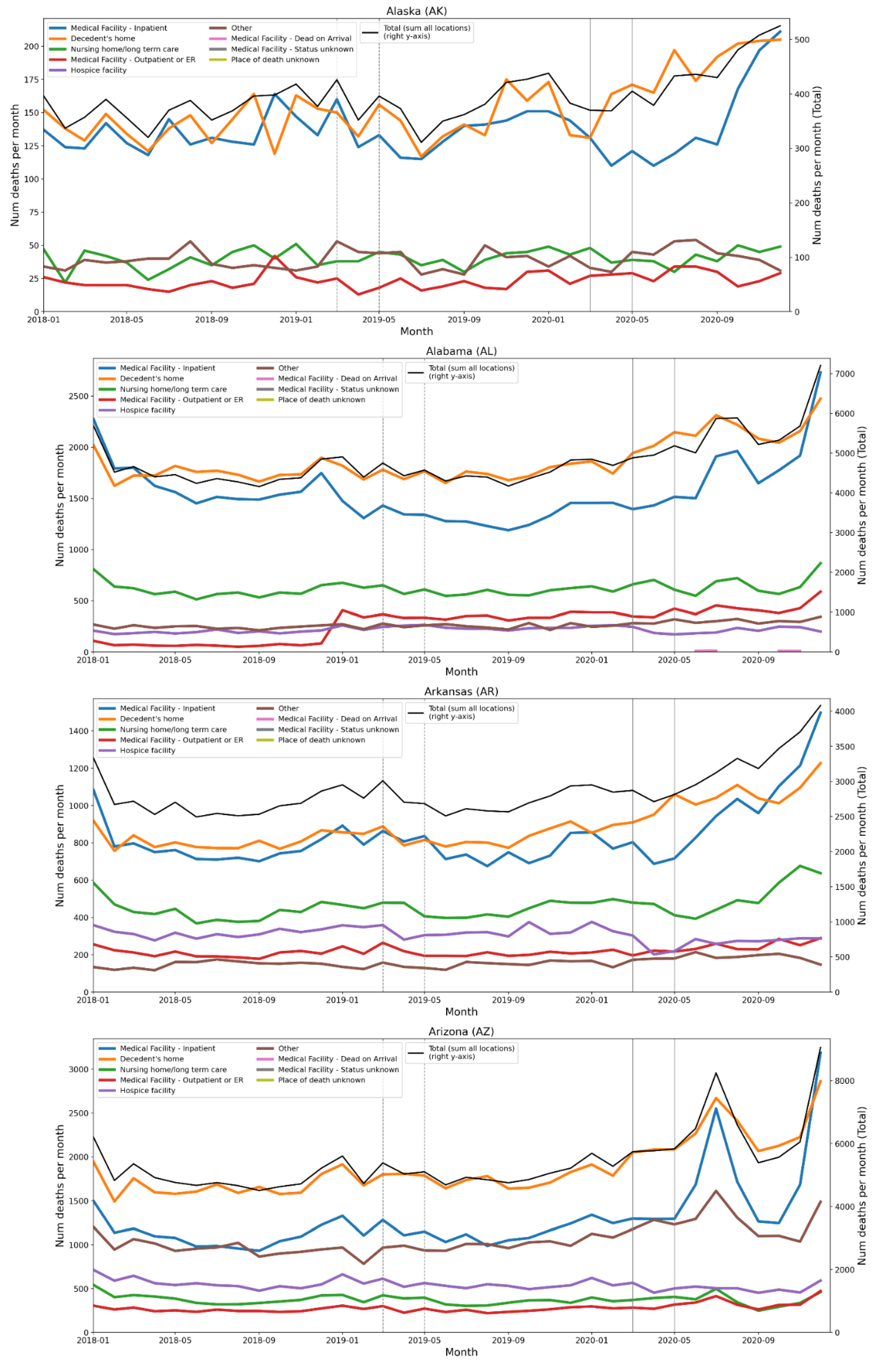
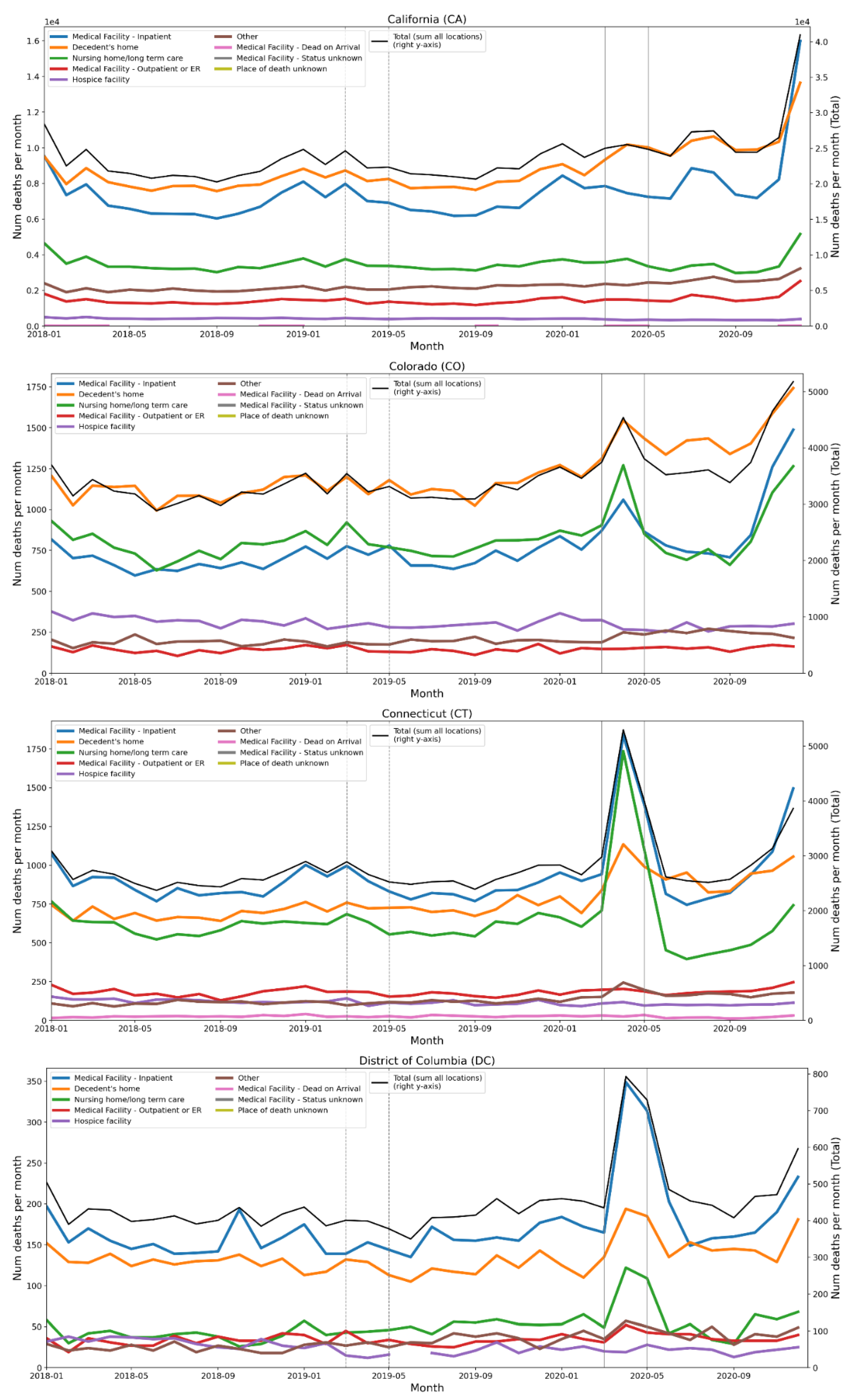
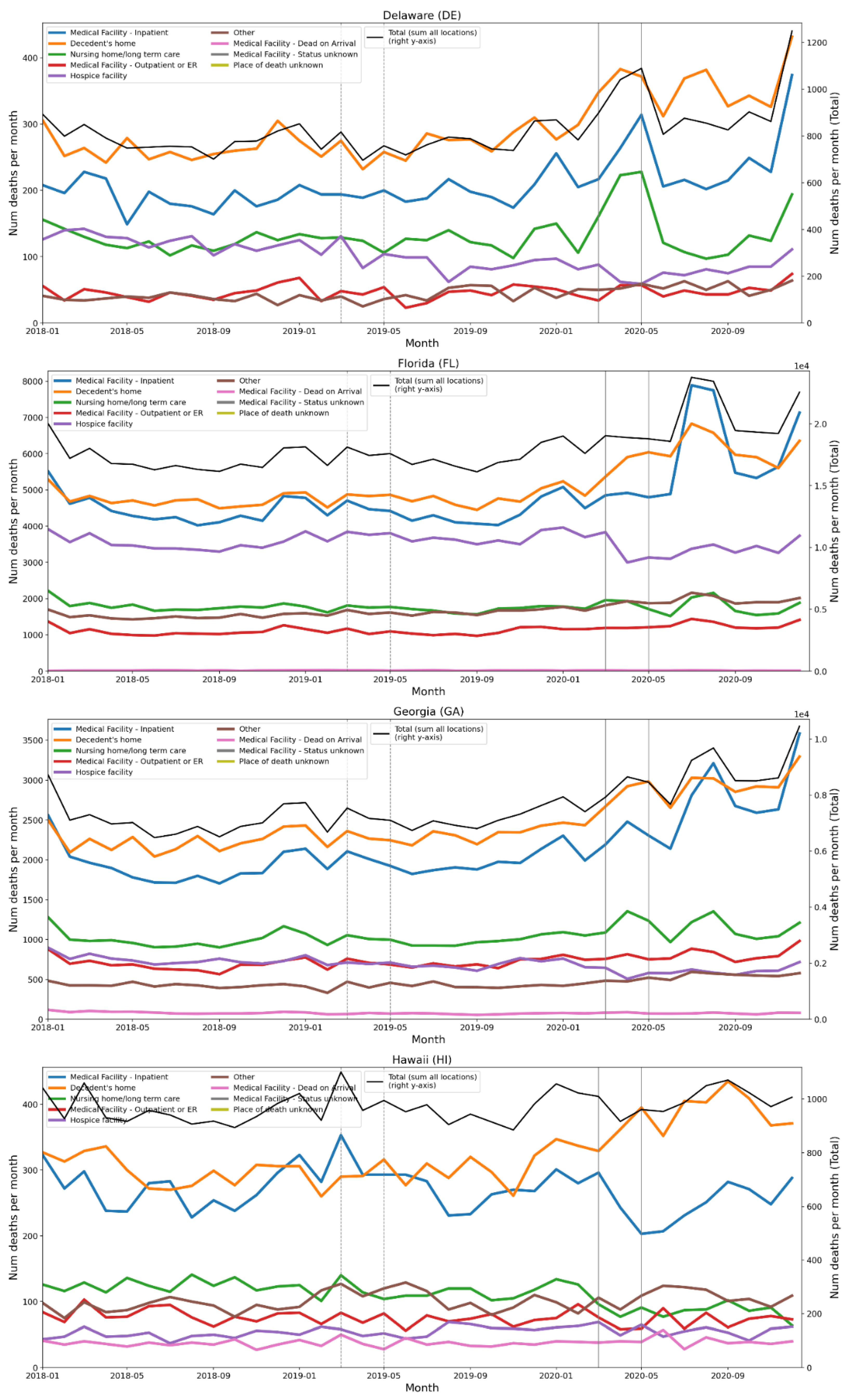
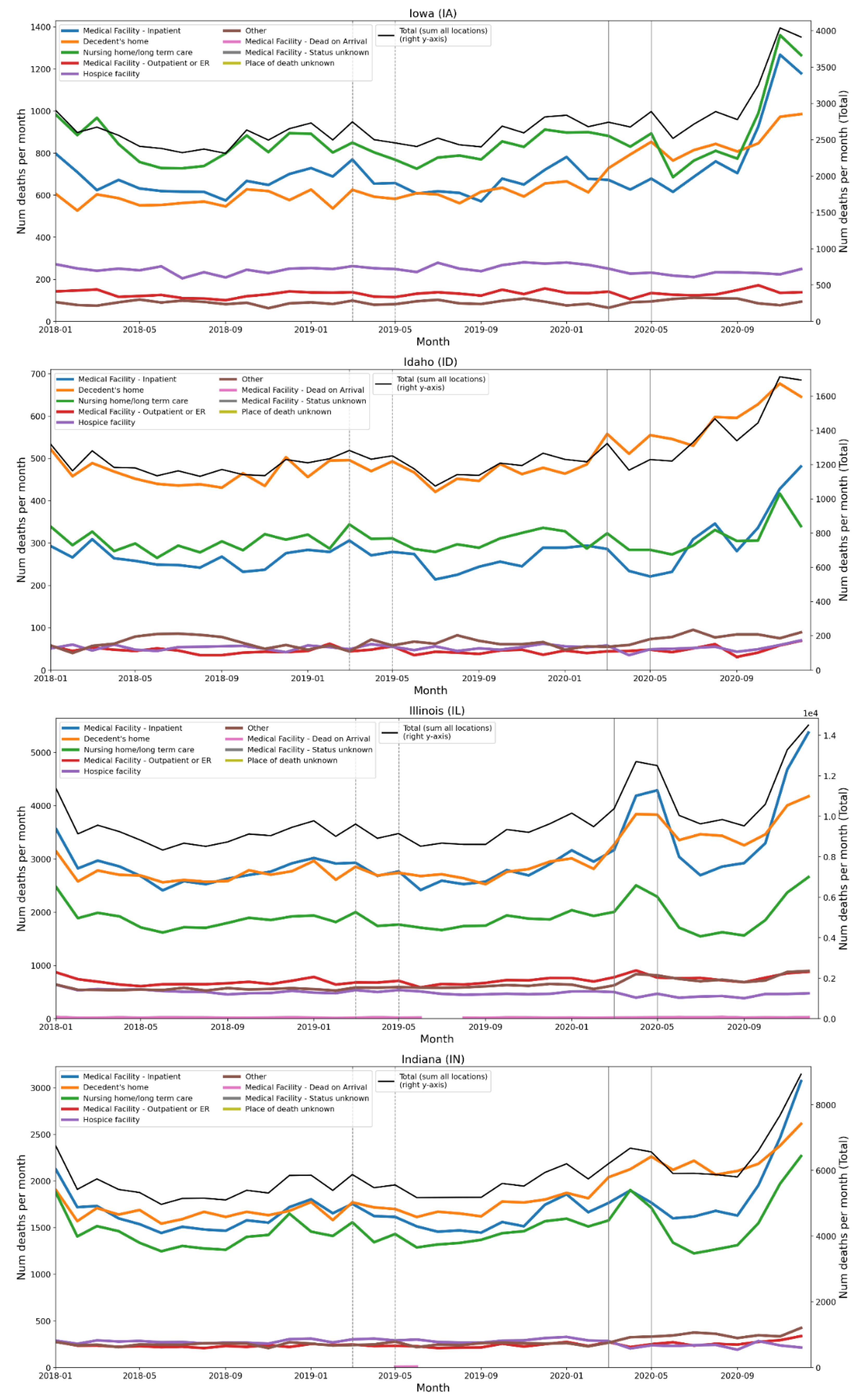
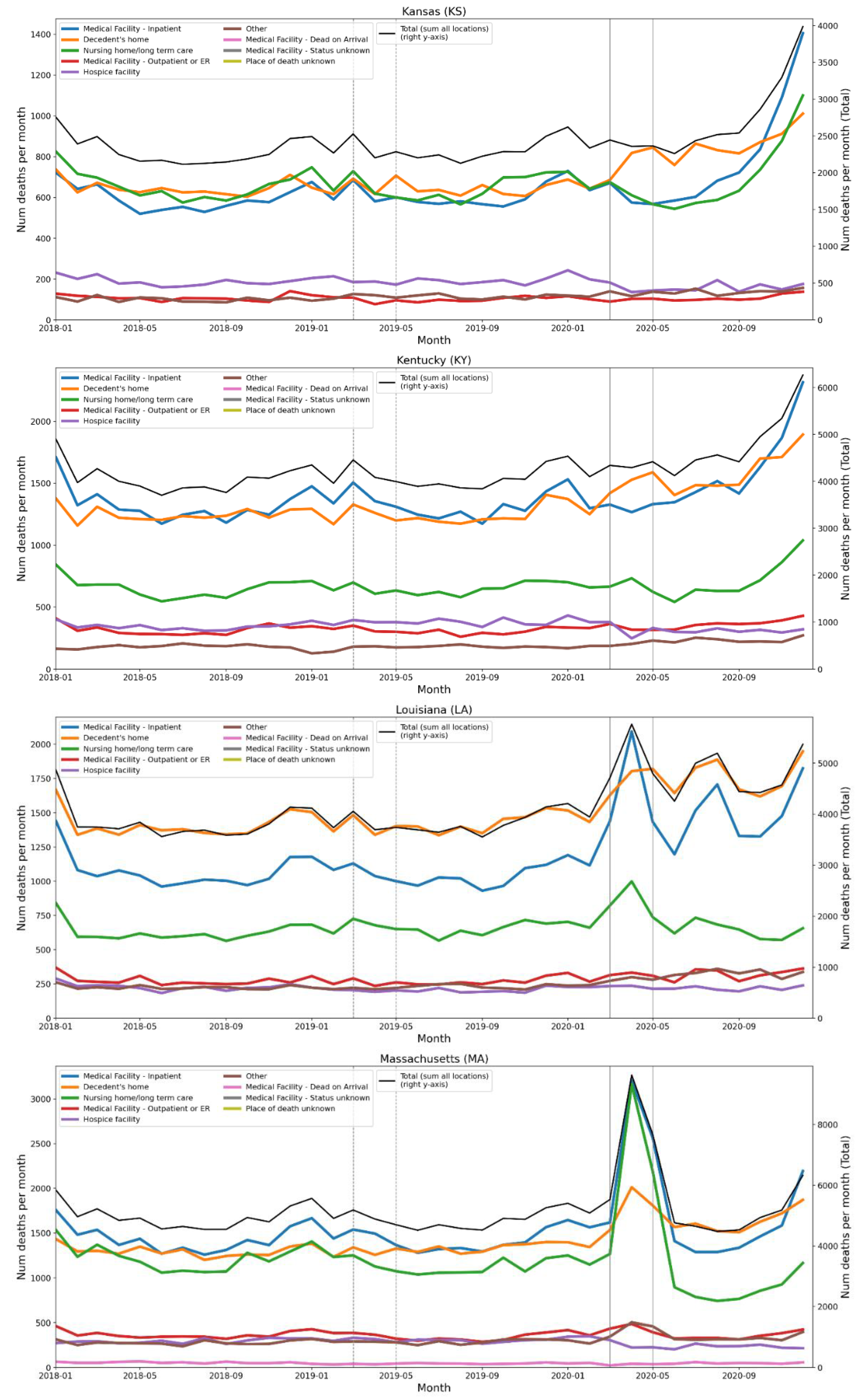
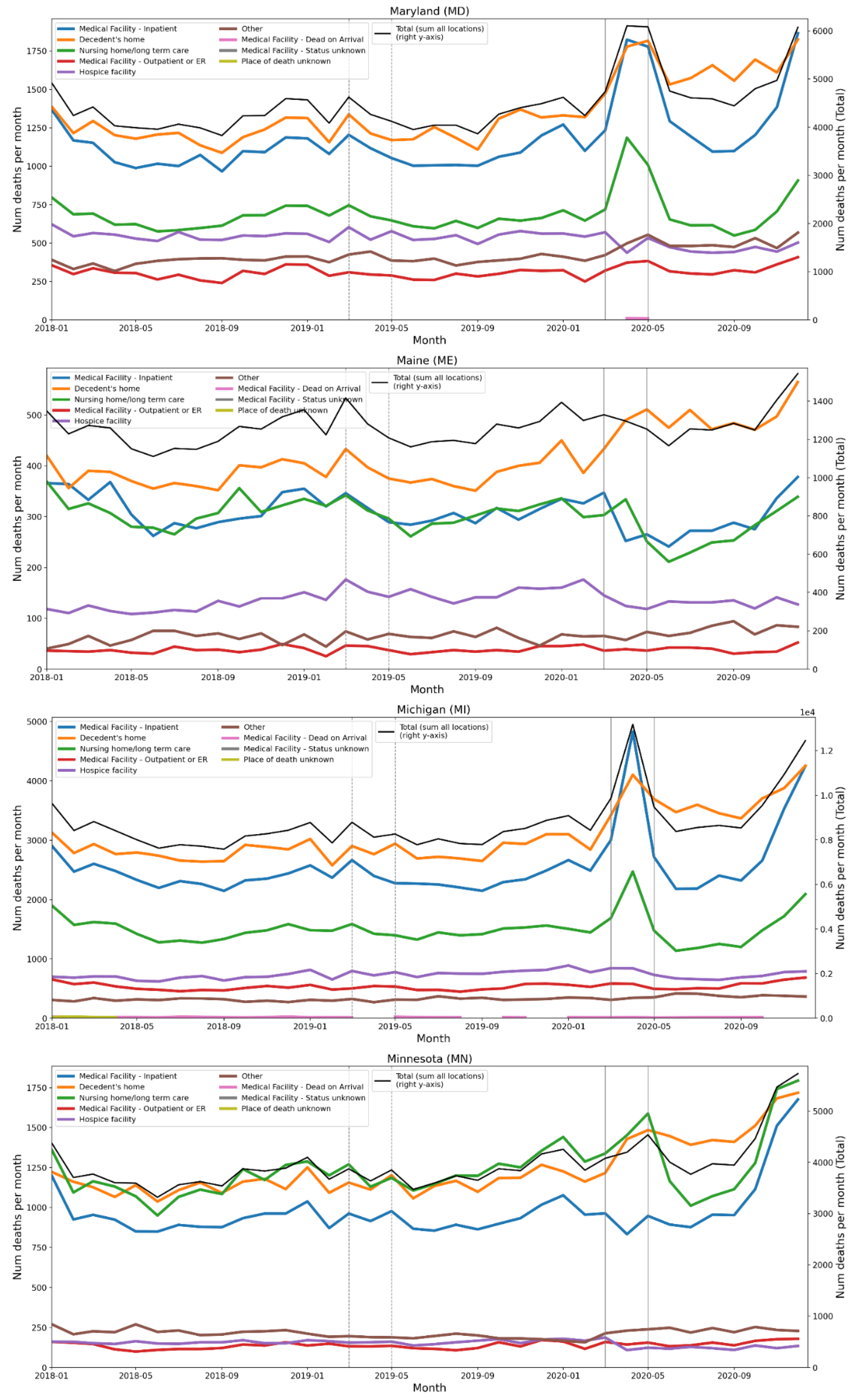
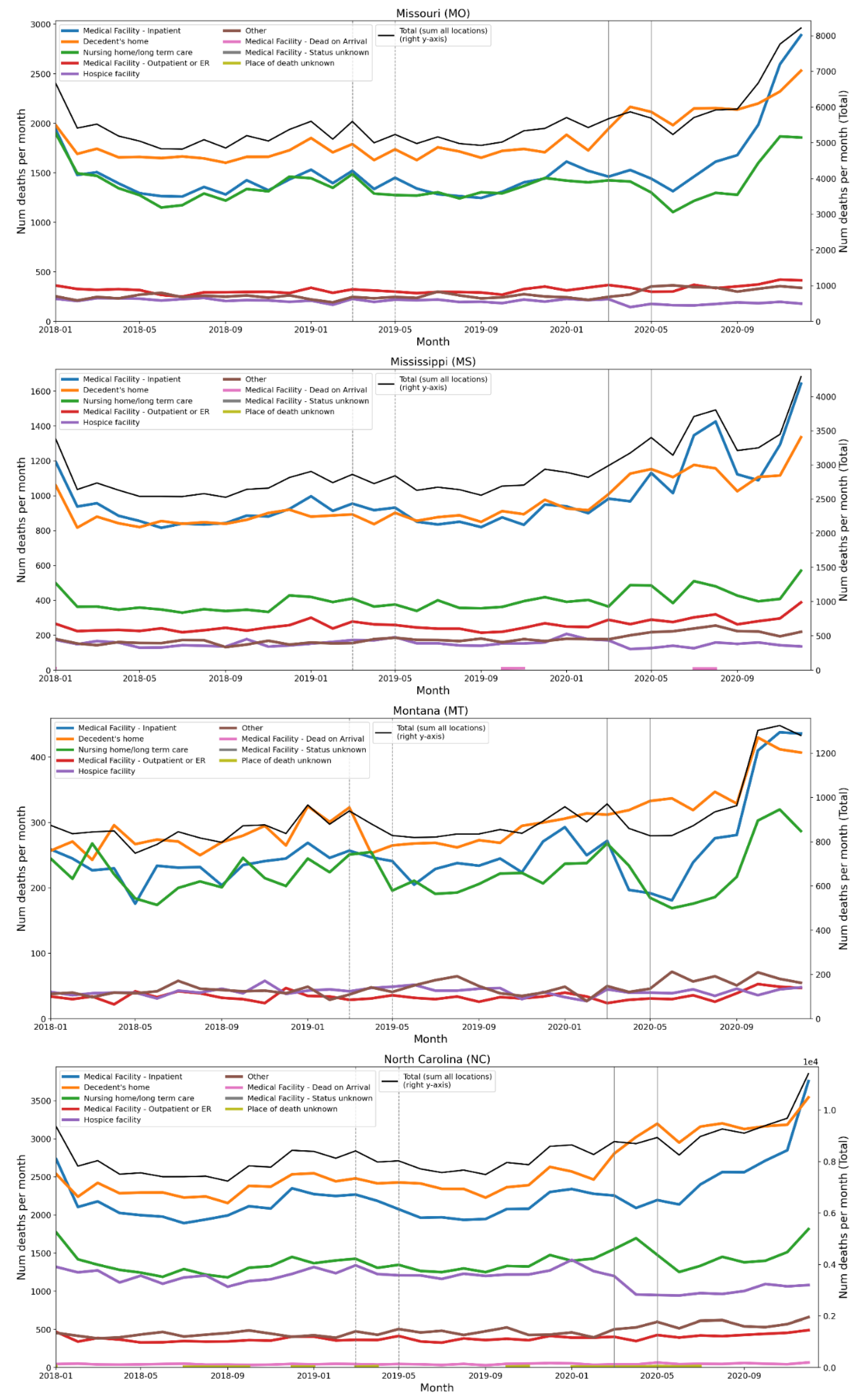
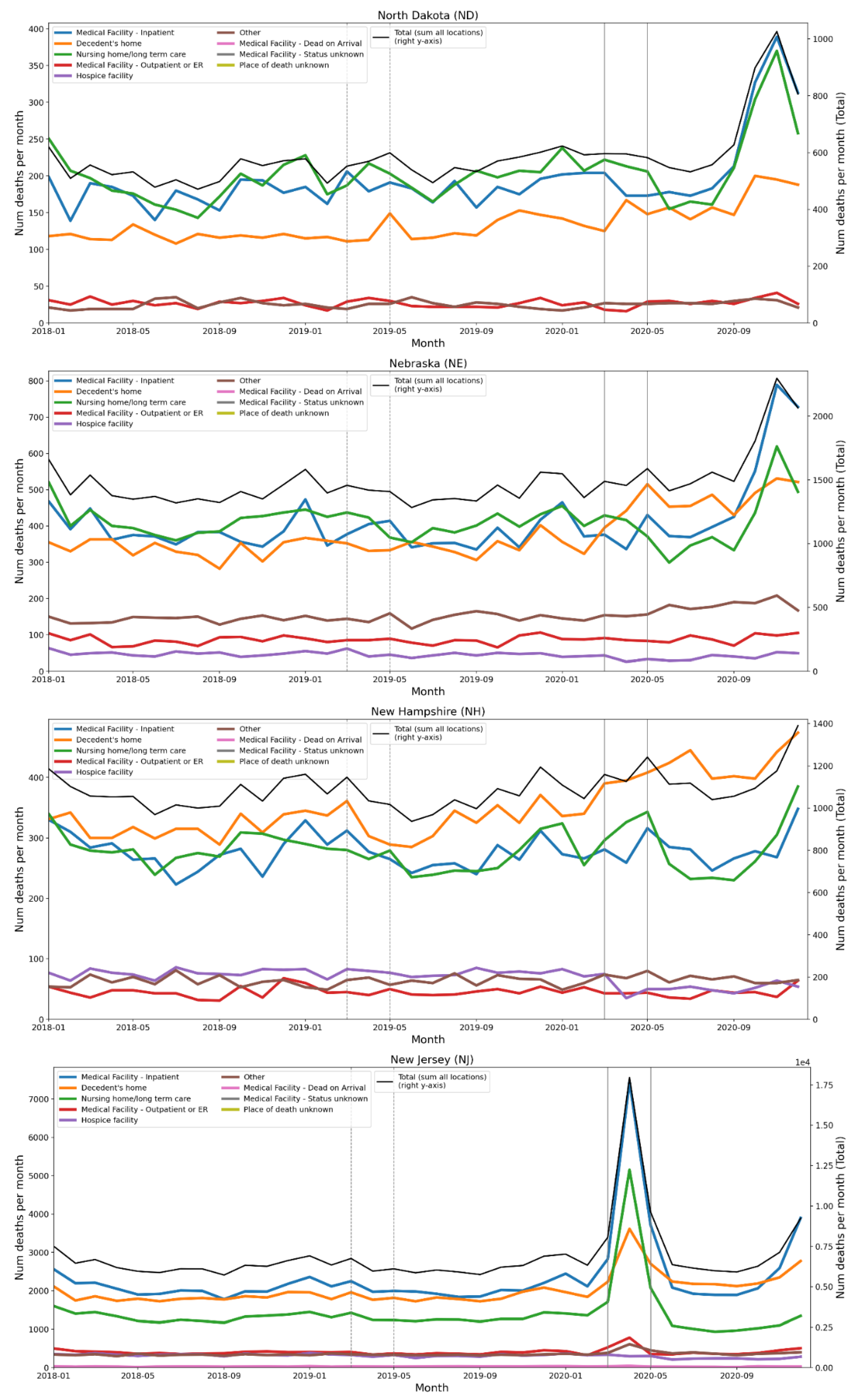
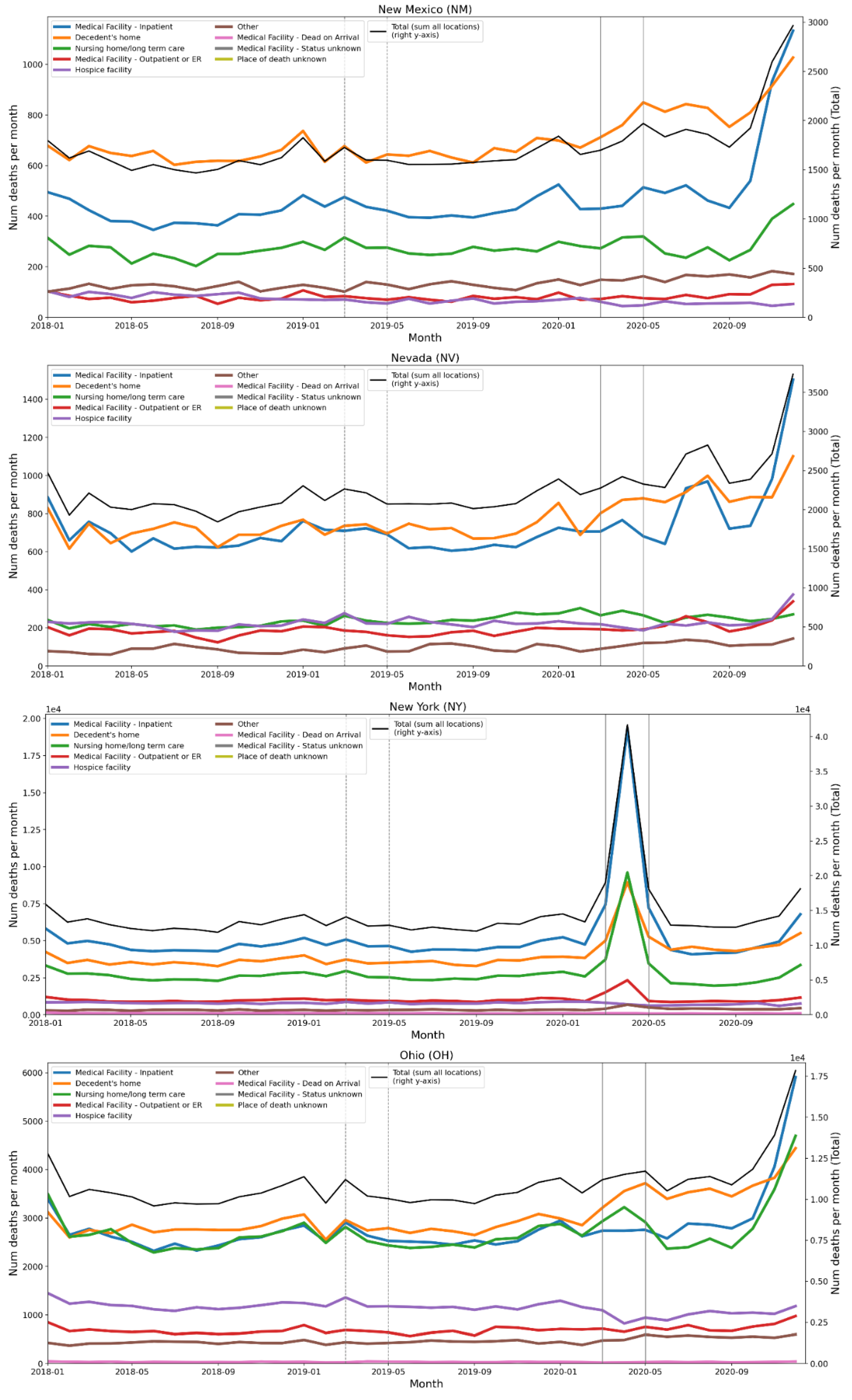
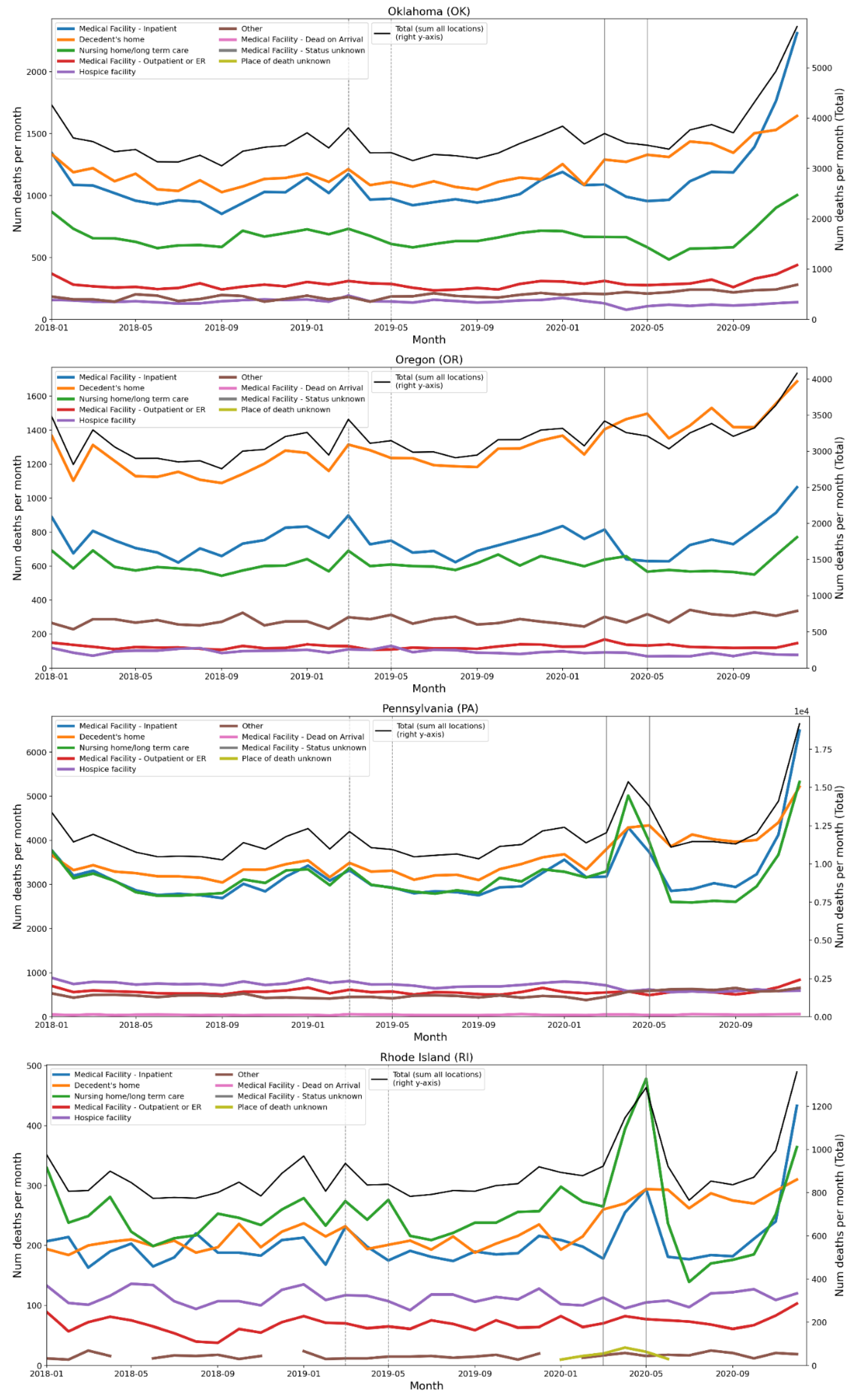
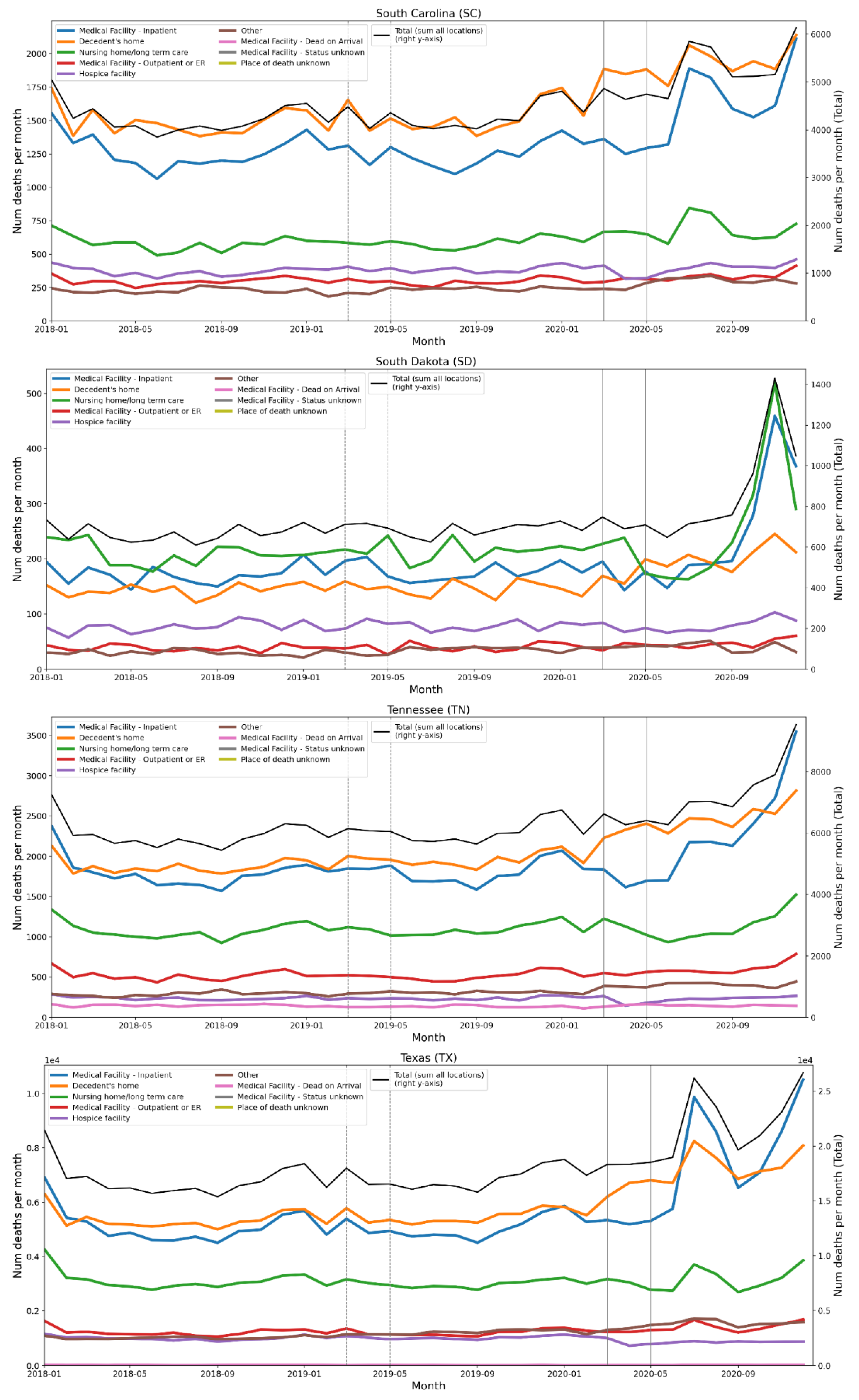
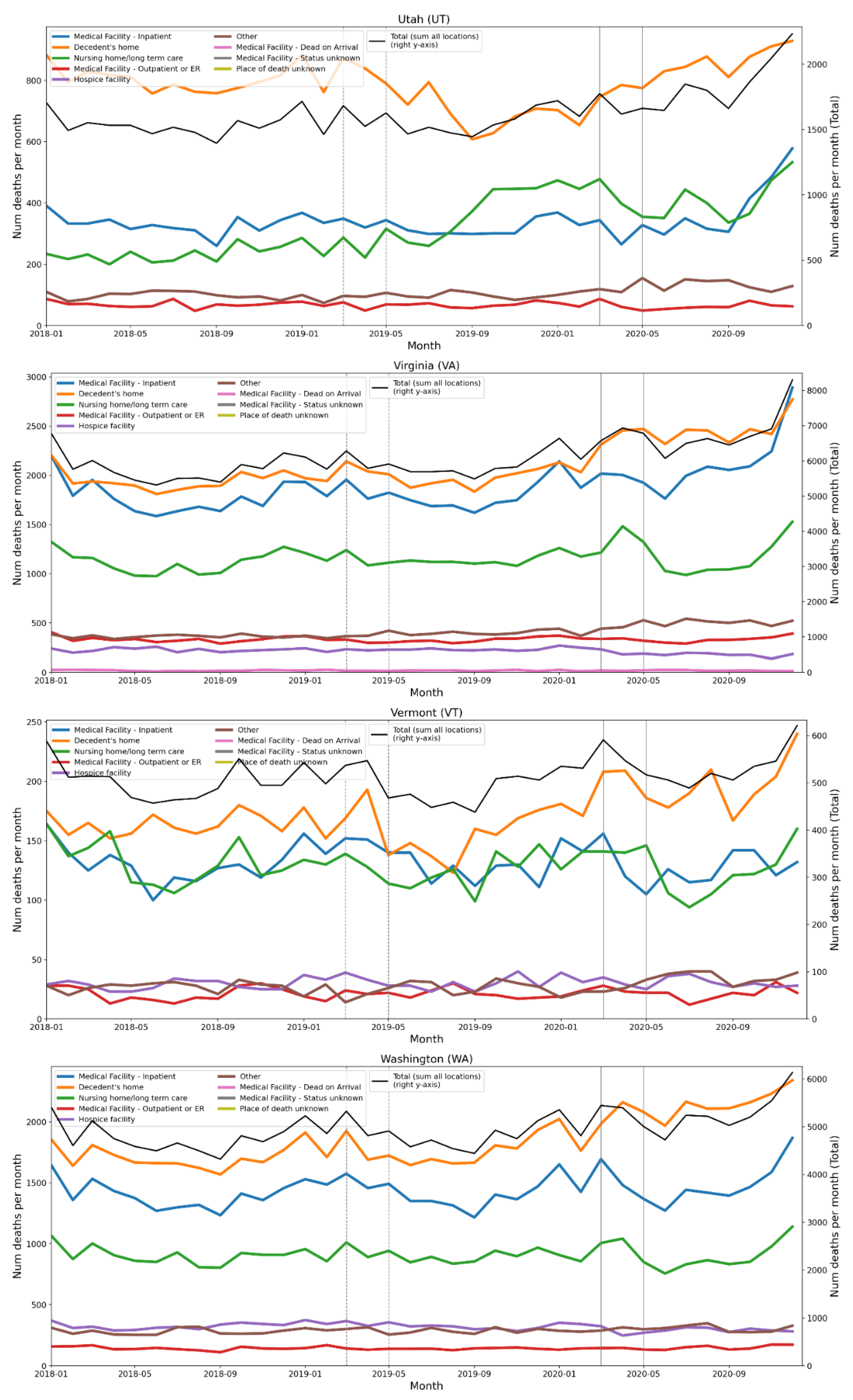
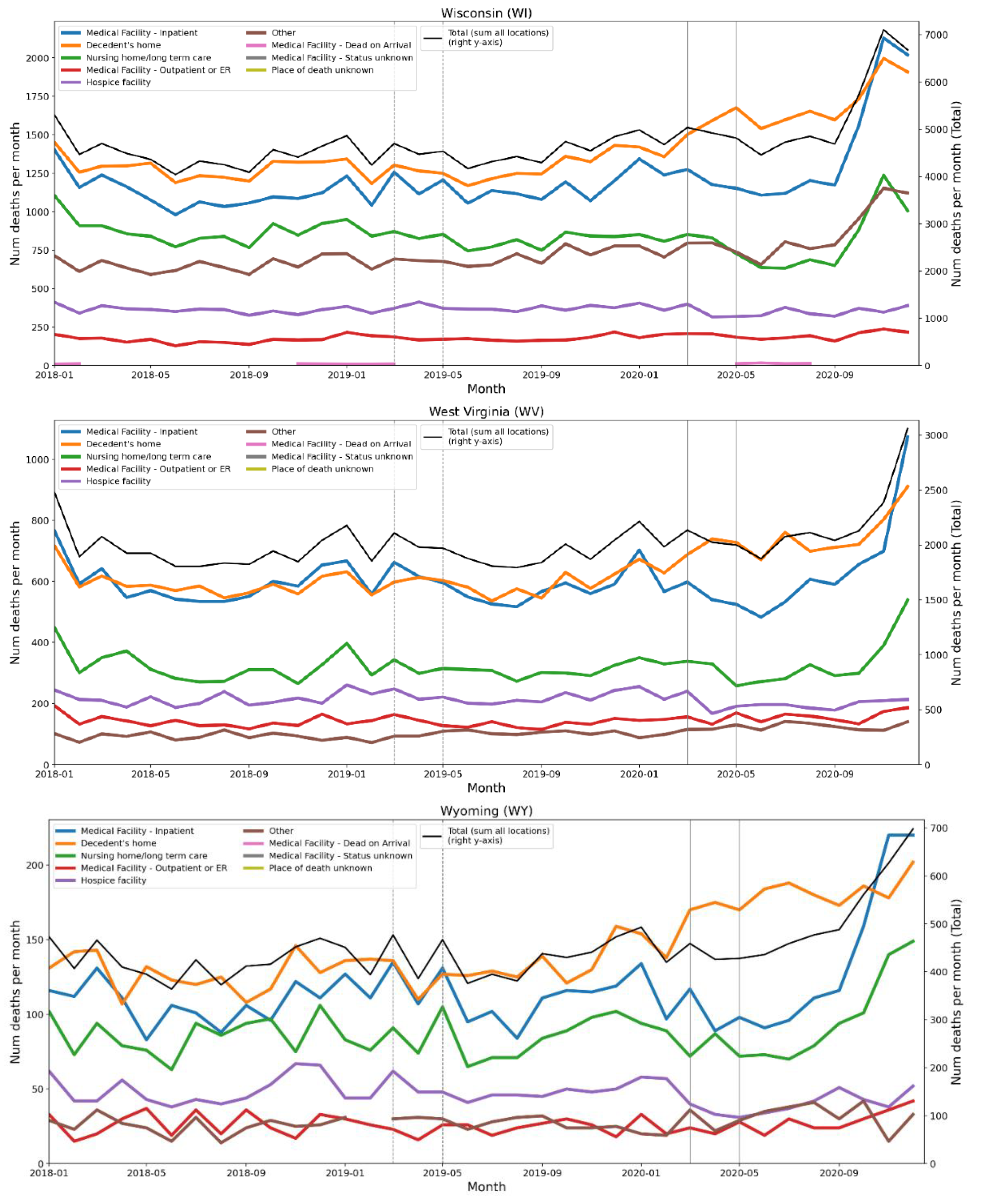
C. Tables of European Regions by NUTS Level, Ordered by Integrated First-Peak Period P-Score
C.1 NUTS0 Level (Countries)
| Rank | NUTS Code | NUTS Level | Country | P-score (%) | (1σ) Err (%) | P-score / Err | Rise-side half-maximum (weeks after Mar 9-15, 2020)* |
| 1 | ES | 0 | Spain | 47.6 | 1.7 | 28 | 1 |
| 2 | UK | 0 | United Kingdom | 41.3 | 2.7 | 15 | 3 |
| 3 | IT | 0 | Italy | 34 | 1.5 | 23 | 0 |
| 4 | BE | 0 | Belgium | 31 | 2.6 | 12 | 2 |
| 5 | SE | 0 | Sweden | 23.7 | 2.1 | 11 | 3 |
| 6 | NL | 0 | Netherlands | 22.2 | 2 | 11 | 2 |
| 7 | FR | 0 | France | 16.4 | 1.5 | 11 | 2 |
| 8 | IE | 0 | Ireland | 14.9 | 2.1 | 7.1 | 3 |
| 9 | PT | 0 | Portugal | 11.6 | 1.7 | 6.8 | 1 |
| 10 | CY | 0 | Cyprus | 11 | 4.2 | 2.6 | - |
| 11 | CH | 0 | Switzerland | 10.5 | 2 | 5.3 | 2 |
| 12 | AL | 0 | Albania | 7.1 | 2.6 | 2.7 | - |
| 13 | MT | 0 | Malta | 6.8 | 5.1 | 1.3 | - |
| 14 | LT | 0 | Lithuania | 6.7 | 1.9 | 3.5 | 1 |
| 15 | AT | 0 | Austria | 6.1 | 1.9 | 3.2 | 1 |
| 16 | LU | 0 | Luxembourg | 4.5 | 4.6 | 0.98 | - |
| 17 | FI | 0 | Finland | 4.1 | 1.8 | 2.3 | - |
| 18 | EL | 0 | Greece | 3.4 | 1.5 | 2.3 | - |
| 19 | RS | 0 | Serbia | 3.3 | 1.8 | 1.8 | - |
| 20 | IS | 0 | Iceland | 3 | 5.4 | 0.56 | - |
| 21 | EE | 0 | Estonia | 2.1 | 2.6 | 0.81 | - |
| 22 | DE | 0 | Germany | 2 | 2 | 1.0 | - |
| 24 | NO | 0 | Norway | 1.9 | 1.7 | 1.0 | - |
| 23 | SK | 0 | Slovakia | 1.9 | 1.9 | 1.0 | - |
| 25 | HU | 0 | Hungary | 1 | 1.8 | 0.56 | - |
| 27 | HR | 0 | Croatia | 0.9 | 2 | 0.45 | - |
| 26 | SI | 0 | Slovenia | 0.9 | 2.2 | 0.41 | - |
| 28 | CZ | 0 | Czechia | 0.3 | 1.8 | 0.17 | - |
| 29 | RO | 0 | Romania | 0.1 | 1.6 | 0.06 | - |
| 30 | PL | 0 | Poland | 0 | 1.7 | 0 | - |
| 31 | LI | 0 | Liechtenstein | 0 | 17 | 0 | - |
| 32 | DK | 0 | Denmark | -0.8 | 1.6 | -0.50 | - |
| 33 | LV | 0 | Latvia | -2.7 | 2.1 | -1.3 | - |
| 34 | BG | 0 | Bulgaria | -3.1 | 1.5 | -2.1 | - |
| 35 | ME | 0 | Montenegro | -4 | 3.4 | -1.2 | - |
* F-peaks were considered to have discernible rise-side half-maximum dates if the ratio of P-score / Err(P-score) ≥ 3.
C.2. NUTS1 Level
| Rank | NUTS Code | NUTS Level | Region Name | Country | P-score (%) | (1σ) Err (%) |
| 1 | ES3 | 1 | COMUNIDAD DE MADRID | Spain | 145.6 | 3.2 |
| 2 | ITC | 1 | NORD-OVEST | Italy | 80.6 | 2 |
| 3 | UKI | 1 | LONDON | United Kingdom | 80.5 | 4 |
| 4 | ES4 | 1 | CENTRO (ES) | Spain | 73.8 | 2.7 |
| 5 | BE1 | 1 | RÉGION DE BRUXELLES-CAPITALE/BRUSSELS HOOFDSTEDELIJK GEWEST | Belgium | 60.9 | 5.2 |
| 6 | FR1 | 1 | ILE-DE-FRANCE | France | 58 | 2.4 |
| 7 | UKG | 1 | WEST MIDLANDS (ENGLAND) | United Kingdom | 49.5 | 3.7 |
| 8 | UKD | 1 | NORTH WEST (ENGLAND) | United Kingdom | 46.4 | 2.8 |
| 9 | UKC | 1 | NORTH EAST (ENGLAND) | United Kingdom | 43.2 | 3.1 |
| 10 | SE1 | 1 | ÖSTRA SVERIGE | Sweden | 42.5 | 2.8 |
| 11 | UKJ | 1 | SOUTH EAST (ENGLAND) | United Kingdom | 40.6 | 3.3 |
| 12 | NL4 | 1 | ZUID-NEDERLAND | Netherlands | 40.6 | 2.9 |
| 13 | UKH | 1 | EAST OF ENGLAND | United Kingdom | 40.3 | 3.5 |
| 14 | ES5 | 1 | ESTE | Spain | 39.4 | 2.1 |
| 15 | UKE | 1 | YORKSHIRE AND THE HUMBER | United Kingdom | 39 | 2.9 |
| 16 | ES2 | 1 | NORESTE | Spain | 37 | 2.5 |
| 17 | FRF | 1 | ALSACE-CHAMPAGNE-ARDENNE-LORRAINE | France | 35.4 | 2.8 |
| 18 | UKF | 1 | EAST MIDLANDS (ENGLAND) | United Kingdom | 35 | 3.2 |
| 19 | BE3 | 1 | RÉGION WALLONNE | Belgium | 33.2 | 3.1 |
| 20 | ITH | 1 | NORD-EST | Italy | 32.6 | 1.5 |
| 21 | UKM | 1 | SCOTLAND | United Kingdom | 31.7 | 2.4 |
| 22 | UKK | 1 | SOUTH WEST (ENGLAND) | United Kingdom | 26.6 | 3.6 |
| 23 | BE2 | 1 | VLAAMS GEWEST | Belgium | 25.6 | 2.7 |
| 24 | UKL | 1 | WALES | United Kingdom | 24.8 | 3.2 |
| 25 | UKN | 1 | NORTHERN IRELAND | United Kingdom | 23 | 3.8 |
| 26 | NL2 | 1 | OOST-NEDERLAND | Netherlands | 19.7 | 2.8 |
| 27 | FRC | 1 | BOURGOGNE-FRANCHE-COMTÉ | France | 18.8 | 2.4 |
| 28 | NL3 | 1 | WEST-NEDERLAND | Netherlands | 18.8 | 2 |
| 29 | FRE | 1 | NORD-PAS DE CALAIS-PICARDIE | France | 17.9 | 2.3 |
| 30 | IE0 | 1 | IRELAND | Ireland | 14.9 | 2.1 |
| 31 | FRK | 1 | AUVERGNE-RHÔNE-ALPES | France | 14 | 1.8 |
| 32 | SE3 | 1 | NORRA SVERIGE | Sweden | 13.7 | 2.7 |
| 33 | SE2 | 1 | SÖDRA SVERIGE | Sweden | 13.7 | 2.3 |
| 34 | ITI | 1 | CENTRO (IT) | Italy | 12.1 | 1.6 |
| 35 | ES1 | 1 | NOROESTE | Spain | 11.9 | 1.7 |
| 36 | PT1 | 1 | CONTINENTE | Portugal | 11.8 | 1.8 |
| 37 | ES6 | 1 | SUR | Spain | 11.5 | 1.6 |
| 38 | CY0 | 1 | Kypros | Cyprus | 11 | 4.2 |
| 39 | ITF | 1 | SUD | Italy | 10.9 | 1.5 |
| 40 | FRB | 1 | CENTRE - VAL DE LOIRE | France | 10.6 | 2.1 |
| 41 | CH0 | 1 | SCHWEIZ/SUISSE/SVIZZERA | Switzerland | 10.5 | 2 |
| 42 | PT2 | 1 | REGIÃO AUTÓNOMA DOS AÇORES | Portugal | 9.9 | 6.4 |
| 43 | AT2 | 1 | SÜDÖSTERREICH | Austria | 8.6 | 2.7 |
| 44 | DE2 | 1 | BAYERN | Germany | 8 | 2.1 |
| 45 | FRM | 1 | CORSE | France | 7.2 | 5.4 |
| 46 | FRL | 1 | PROVENCE-ALPES-CÔTE D’AZUR | France | 6.9 | 1.5 |
| 47 | MT0 | 1 | MALTA | Malta | 6.8 | 5.1 |
| 48 | LT0 | 1 | LIETUVA | Lithuania | 6.7 | 1.9 |
| 49 | AT1 | 1 | OSTÖSTERREICH | Austria | 6.5 | 2.1 |
| 50 | ITG | 1 | ISOLE | Italy | 6.4 | 1.7 |
| 51 | FRD | 1 | NORMANDIE | France | 6.3 | 2.1 |
| 52 | DE1 | 1 | BADEN-WÜRTTEMBERG | Germany | 5.6 | 2.2 |
| 53 | FRG | 1 | PAYS DE LA LOIRE | France | 5 | 1.9 |
| 54 | HU1 | 1 | KÖZÉP-MAGYARORSZÁG | Hungary | 4.9 | 2.1 |
| 55 | EL6 | 1 | KENTRIKI ELLADA | Greece | 4.6 | 2.2 |
| 56 | PT3 | 1 | REGIÃO AUTÓNOMA DA MADEIRA | Portugal | 4.6 | 5.4 |
| 57 | LU0 | 1 | LUXEMBOURG | Luxembourg | 4.5 | 4.6 |
| 58 | EL4 | 1 | NISIA AIGAIOU, KRITI | Greece | 4.2 | 2.7 |
| 59 | FI1 | 1 | MANNER-SUOMI | Finland | 4.1 | 1.8 |
| 60 | RS2 | 1 | Srbija - jug | Serbia | 4.1 | 2 |
| 61 | AT3 | 1 | WESTÖSTERREICH | Austria | 3.9 | 2.4 |
| 62 | DE6 | 1 | HAMBURG | Germany | 3.6 | 2.6 |
| 63 | EL5 | 1 | VOREIA ELLADA | Greece | 3.6 | 2 |
| 64 | DE5 | 1 | BREMEN | Germany | 3.4 | 4.4 |
| 65 | RO4 | 1 | MACROREGIUNEA PATRU | Romania | 3.1 | 2.1 |
| 66 | ES7 | 1 | CANARIAS | Spain | 3.1 | 2.6 |
| 67 | IS0 | 1 | ÍSLAND | Iceland | 3 | 5.4 |
| 68 | NL1 | 1 | NOORD-NEDERLAND | Netherlands | 2.9 | 2.7 |
| 69 | FRJ | 1 | LANGUEDOC-ROUSSILLON-MIDI-PYRÉNÉES | France | 2.7 | 1.5 |
| 70 | RS1 | 1 | Srbija - sever | Serbia | 2.3 | 2 |
| 71 | EL3 | 1 | ATTIKI | Greece | 2.2 | 1.9 |
| 72 | PL2 | 1 | MAKROREGION POŁUDNIOWY | Poland | 2.1 | 1.8 |
| 73 | EE0 | 1 | EESTI | Estonia | 2 | 2.6 |
| 74 | SK0 | 1 | SLOVENSKO | Slovakia | 1.9 | 1.9 |
| 75 | NO0 | 1 | NORGE | Norway | 1.9 | 1.7 |
| 76 | DE7 | 1 | HESSEN | Germany | 1.8 | 2.1 |
| 77 | DE3 | 1 | BERLIN | Germany | 1.6 | 2.2 |
| 78 | DE9 | 1 | NIEDERSACHSEN | Germany | 1.3 | 2.1 |
| 79 | DEA | 1 | NORDRHEIN-WESTFALEN | Germany | 1.2 | 2.2 |
| 80 | HU2 | 1 | DUNÁNTÚL | Hungary | 1.1 | 2.1 |
| 81 | DEC | 1 | SAARLAND | Germany | 1.1 | 3.5 |
| 82 | PL9 | 1 | MAKROREGION WOJEWÓDZTWO MAZOWIECKIE | Poland | 1 | 1.7 |
| 83 | SI0 | 1 | SLOVENIJA | Slovenia | 0.9 | 2.2 |
| 84 | PL8 | 1 | MAKROREGION WSCHODNI | Poland | 0.9 | 1.8 |
| 85 | HR0 | 1 | HRVATSKA | Croatia | 0.9 | 2 |
| 86 | RO3 | 1 | MACROREGIUNEA TREI | Romania | 0.6 | 1.7 |
| 87 | PL7 | 1 | MAKROREGION CENTRALNY | Poland | 0.5 | 2.3 |
| 88 | FRY | 1 | RUP FR - RÉGIONS ULTRAPÉRIPHÉRIQUES FRANÇAISES | France | 0.4 | 2.4 |
| 89 | CZ0 | 1 | ČESKÁ REPUBLIKA | Czechia | 0.3 | 1.8 |
| 90 | RO1 | 1 | MACROREGIUNEA UNU | Romania | 0.3 | 1.8 |
| 91 | DEB | 1 | RHEINLAND-PFALZ | Germany | -0.2 | 2.4 |
| 92 | LI0 | 1 | LIECHTENSTEIN | Liechtenstein | 0 | 17 |
| 93 | FRH | 1 | BRETAGNE | France | -0.3 | 1.9 |
| 94 | PL5 | 1 | MAKROREGION POŁUDNIOWO-ZACHODNI | Poland | -0.8 | 2.5 |
| 95 | FRI | 1 | AQUITAINE-LIMOUSIN-POITOU-CHARENTES | France | -0.8 | 1.7 |
| 96 | DK0 | 1 | DANMARK | Denmark | -0.8 | 1.6 |
| 97 | DED | 1 | SACHSEN | Germany | -0.8 | 2.7 |
| 98 | DE4 | 1 | BRANDENBURG | Germany | -1.1 | 2.5 |
| 99 | HU3 | 1 | ALFÖLD ÉS ÉSZAK | Hungary | -1.6 | 2.1 |
| 100 | DE8 | 1 | MECKLENBURG-VORPOMMERN | Germany | -2.1 | 2.5 |
| 101 | PL6 | 1 | MAKROREGION PÓŁNOCNY | Poland | -2.2 | 1.7 |
| 102 | RO2 | 1 | MACROREGIUNEA DOI | Romania | -2.2 | 1.8 |
| 103 | PL4 | 1 | MAKROREGION PÓŁNOCNO-ZACHODNI | Poland | -2.3 | 2 |
| 104 | BG4 | 1 | YUGOZAPADNA I YUZHNA TSENTRALNA BULGARIA | Bulgaria | -2.4 | 1.9 |
| 105 | DEG | 1 | THÜRINGEN | Germany | -2.7 | 3 |
| 106 | LV0 | 1 | LATVIJA | Latvia | -2.7 | 2.1 |
| 107 | DEF | 1 | SCHLESWIG-HOLSTEIN | Germany | -3 | 2.4 |
| 108 | BG3 | 1 | SEVERNA I YUGOIZTOCHNA BULGARIA | Bulgaria | -3.7 | 1.7 |
| 109 | ME0 | 1 | CRNA GORA | Montenegro | -4 | 3.4 |
| 110 | DEE | 1 | SACHSEN-ANHALT | Germany | -4.1 | 2.6 |
| 111 | FI2 | 1 | ÅLAND | Finland | -15 | 16 |
C.3. NUTS2 Level
| Rank | NUTS Code | NUTS Level | Region Name | Country | P-score (%) | (1σ) Err (%) |
| 1 | ES30 | 2 | Comunidad de Madrid | Spain | 145.6 | 3.2 |
| 2 | ES42 | 2 | Castilla-La Mancha | Spain | 108.7 | 4.4 |
| 3 | ITC4 | 2 | Lombardia | Italy | 106.2 | 2.5 |
| 4 | UKI4 | 2 | Inner London - East | United Kingdom | 87.3 | 6 |
| 5 | UKI7 | 2 | Outer London - West and North West | United Kingdom | 86.4 | 5 |
| 6 | UKI5 | 2 | Outer London - East and North East | United Kingdom | 80.2 | 5.5 |
| 7 | UKI3 | 2 | Inner London - West | United Kingdom | 77.2 | 6.2 |
| 8 | ES51 | 2 | Cataluña | Spain | 72.4 | 2.8 |
| 9 | UKI6 | 2 | Outer London - South | United Kingdom | 67.2 | 5.8 |
| 10 | ES41 | 2 | Castilla y León | Spain | 66.3 | 3.3 |
| 11 | UKG3 | 2 | West Midlands | United Kingdom | 61.3 | 4.6 |
| 12 | BE10 | 2 | Région de Bruxelles-Capitale/ Brussels Hoofdstedelijk Gewest | Belgium | 60.9 | 5.2 |
| 13 | SE11 | 2 | Stockholm | Sweden | 59.4 | 3.6 |
| 14 | FR10 | 2 | Ile-de-France | France | 56.2 | 2.4 |
| 15 | UKH2 | 2 | Bedfordshire and Hertfordshire | United Kingdom | 55.5 | 4.3 |
| 16 | FRF1 | 2 | Alsace | France | 53.7 | 3.6 |
| 17 | ITH2 | 2 | Provincia Autonoma di Trento | Italy | 53.5 | 5.6 |
| 18 | UKD3 | 2 | Greater Manchester | United Kingdom | 53.1 | 3.5 |
| 19 | UKD7 | 2 | Merseyside | United Kingdom | 51.2 | 4 |
| 20 | ES22 | 2 | Comunidad Foral de Navarra | Spain | 49.5 | 5 |
| 21 | ITC2 | 2 | Valle d'Aosta/Vallée d'Aoste | Italy | 48.1 | 9.4 |
| 22 | ITC1 | 2 | Piemonte | Italy | 47.9 | 2.1 |
| 23 | ES23 | 2 | La Rioja | Spain | 47.8 | 7.2 |
| 24 | CH07 | 2 | Ticino | Switzerland | 47.8 | 6.7 |
| 25 | UKJ1 | 2 | Berkshire, Buckinghamshire and Oxfordshire | United Kingdom | 47.3 | 3.4 |
| 26 | BE22 | 2 | Prov. Limburg (BE) | Belgium | 46.2 | 5.2 |
| 27 | UKC1 | 2 | Tees Valley and Durham | United Kingdom | 46.2 | 4.2 |
| 28 | ITH5 | 2 | Emilia-Romagna | Italy | 45.9 | 2.3 |
| 29 | UKD1 | 2 | Cumbria | United Kingdom | 45.4 | 5.2 |
| 30 | UKM8 | 2 | West Central Scotland | United Kingdom | 45.4 | 3.7 |
| 31 | ITH1 | 2 | Provincia Autonoma di Bolzano/Bozen | Italy | 44.7 | 6.2 |
| 32 | ITC3 | 2 | Liguria | Italy | 44.6 | 3.2 |
| 33 | NL42 | 2 | Limburg (NL) | Netherlands | 44.6 | 4.2 |
| 34 | UKE3 | 2 | South Yorkshire | United Kingdom | 44.2 | 4 |
| 35 | UKJ2 | 2 | Surrey, East and West Sussex | United Kingdom | 44 | 4.5 |
| 36 | UKD6 | 2 | Cheshire | United Kingdom | 43.9 | 4.5 |
| 37 | UKF2 | 2 | Leicestershire, Rutland and Northamptonshire | United Kingdom | 43 | 3.8 |
| 38 | UKH3 | 2 | Essex | United Kingdom | 41.9 | 4.8 |
| 39 | UKE4 | 2 | West Yorkshire | United Kingdom | 41.8 | 3.2 |
| 40 | UKG1 | 2 | Herefordshire, Worcestershire and Warwickshire | United Kingdom | 41.3 | 4.2 |
| 41 | UKC2 | 2 | Northumberland and Tyne and Wear | United Kingdom | 40.6 | 3.7 |
| 42 | BE33 | 2 | Prov. Liège | Belgium | 39.8 | 3.6 |
| 43 | UKK1 | 2 | Gloucestershire, Wiltshire and Bristol/Bath area | United Kingdom | 39.6 | 4.4 |
| 44 | UKE2 | 2 | North Yorkshire | United Kingdom | 39.4 | 4.9 |
| 45 | UKG2 | 2 | Shropshire and Staffordshire | United Kingdom | 38.8 | 4.2 |
| 46 | NL41 | 2 | Noord-Brabant | Netherlands | 38.5 | 3 |
| 47 | ES24 | 2 | Aragón | Spain | 37.4 | 3.1 |
| 48 | UKF1 | 2 | Derbyshire and Nottinghamshire | United Kingdom | 36.7 | 4.1 |
| 49 | UKJ4 | 2 | Kent | United Kingdom | 35.7 | 3.8 |
| 50 | UKJ3 | 2 | Hampshire and Isle of Wight | United Kingdom | 33.6 | 3.8 |
| 51 | BE32 | 2 | Prov. Hainaut | Belgium | 33.6 | 4.3 |
| 52 | ES43 | 2 | Extremadura | Spain | 33.4 | 3.3 |
| 53 | UKD4 | 2 | Lancashire | United Kingdom | 33.4 | 3.4 |
| 54 | ITI3 | 2 | Marche | Italy | 33.1 | 2.8 |
| 55 | UKM7 | 2 | Eastern Scotland | United Kingdom | 32.9 | 3.1 |
| 56 | UKL2 | 2 | East Wales | United Kingdom | 32.4 | 4.2 |
| 57 | ES21 | 2 | País Vasco | Spain | 31.8 | 3 |
| 58 | UKH1 | 2 | East Anglia | United Kingdom | 30.3 | 3.9 |
| 59 | FRF3 | 2 | Lorraine | France | 30 | 3.3 |
| 60 | FRE2 | 2 | Picardie | France | 29.9 | 3 |
| 61 | UKM9 | 2 | Southern Scotland | United Kingdom | 29.3 | 3.6 |
| 62 | BE35 | 2 | Prov. Namur | Belgium | 27.8 | 5.1 |
| 63 | FRC2 | 2 | Franche-Comté | France | 27 | 3.9 |
| 64 | BE24 | 2 | Prov. Vlaams-Brabant | Belgium | 27 | 4.1 |
| 65 | UKK2 | 2 | Dorset and Somerset | United Kingdom | 26.5 | 4.4 |
| 66 | UKE1 | 2 | East Yorkshire and Northern Lincolnshire | United Kingdom | 25.8 | 4.2 |
| 67 | CH01 | 2 | Région lémanique | Switzerland | 25.8 | 3.7 |
| 68 | SE12 | 2 | Östra Mellansverige | Sweden | 25.5 | 3.2 |
| 69 | BE34 | 2 | Prov. Luxembourg (BE) | Belgium | 24.9 | 6.3 |
| 70 | BE31 | 2 | Prov. Brabant Wallon | Belgium | 24 | 6.1 |
| 71 | UKM5 | 2 | North Eastern Scotland | United Kingdom | 23.1 | 5 |
| 72 | UKN0 | 2 | Northern Ireland | United Kingdom | 23 | 3.8 |
| 73 | BE25 | 2 | Prov. West-Vlaanderen | Belgium | 21.9 | 3 |
| 74 | BE23 | 2 | Prov. Oost-Vlaanderen | Belgium | 21.7 | 3.4 |
| 75 | BE21 | 2 | Prov. Antwerpen | Belgium | 21.5 | 3.5 |
| 76 | ES13 | 2 | Cantabria | Spain | 21.2 | 4.1 |
| 77 | UKL1 | 2 | West Wales and The Valleys | United Kingdom | 21.1 | 3.4 |
| 78 | NL32 | 2 | Noord-Holland | Netherlands | 21 | 2.6 |
| 79 | ITH3 | 2 | Veneto | Italy | 21 | 1.7 |
| 80 | NL22 | 2 | Gelderland | Netherlands | 20.9 | 3.1 |
| 81 | SE21 | 2 | Småland med öarna | Sweden | 19.5 | 4.3 |
| 82 | NL21 | 2 | Overijssel | Netherlands | 19.1 | 4 |
| 83 | NL33 | 2 | Zuid-Holland | Netherlands | 18.4 | 2.4 |
| 84 | ITF1 | 2 | Abruzzo | Italy | 18.2 | 3 |
| 85 | UKM6 | 2 | Highlands and Islands | United Kingdom | 18.2 | 4.8 |
| 86 | ES12 | 2 | Principado de Asturias | Spain | 18 | 2.8 |
| 87 | NL31 | 2 | Utrecht | Netherlands | 17.9 | 3.4 |
| 88 | SE31 | 2 | Norra Mellansverige | Sweden | 17.8 | 3.8 |
| 89 | FRF2 | 2 | Champagne-Ardenne | France | 17.5 | 3.3 |
| 90 | SE32 | 2 | Mellersta Norrland | Sweden | 17.2 | 5 |
| 91 | ES52 | 2 | Comunidad Valenciana | Spain | 17 | 2.1 |
| 92 | FRK2 | 2 | Rhône-Alpes | France | 16.7 | 1.8 |
| 93 | PT11 | 2 | Norte | Portugal | 16.5 | 2.2 |
| 94 | UKF3 | 2 | Lincolnshire | United Kingdom | 16.5 | 4 |
| 95 | ES63 | 2 | Ciudad Autónoma de Ceuta | Spain | 16 | 13 |
| 96 | ITF4 | 2 | Puglia | Italy | 15.1 | 2.2 |
| 97 | ITH4 | 2 | Friuli-Venezia Giulia | Italy | 14.8 | 3 |
| 98 | SE23 | 2 | Västsverige | Sweden | 14.6 | 2.7 |
| 99 | UKK4 | 2 | Devon | United Kingdom | 13.4 | 3.8 |
| 100 | ITI1 | 2 | Toscana | Italy | 13.4 | 2 |
| 101 | FI1B | 2 | Helsinki-Uusimaa | Finland | 13.2 | 3 |
| 102 | NL23 | 2 | Flevoland | Netherlands | 12.5 | 6.4 |
| 103 | ES61 | 2 | Andalucía | Spain | 12 | 1.7 |
| 104 | FRC1 | 2 | Bourgogne | France | 11.9 | 2.5 |
| 105 | NL34 | 2 | Zeeland | Netherlands | 11.7 | 5 |
| 106 | ITF2 | 2 | Molise | Italy | 11.4 | 4.6 |
| 107 | CY00 | 2 | Kypros | Cyprus | 11 | 4.2 |
| 108 | PT18 | 2 | Alentejo | Portugal | 10.9 | 3.7 |
| 109 | PT16 | 2 | Centro (PT) | Portugal | 10.3 | 2.5 |
| 110 | AT22 | 2 | Steiermark | Austria | 10.2 | 3.2 |
| 111 | FRE1 | 2 | Nord-Pas de Calais | France | 10.2 | 2.4 |
| 112 | LT01 | 2 | Sostinės regionas | Lithuania | 10.1 | 3.4 |
| 113 | PT20 | 2 | Região Autónoma dos Açores | Portugal | 9.9 | 6.4 |
| 114 | ES53 | 2 | Illes Balears | Spain | 9.8 | 3.5 |
| 115 | FRB0 | 2 | Centre - Val de Loire | France | 9.7 | 2.1 |
| 116 | ITF6 | 2 | Calabria | Italy | 9.7 | 2.5 |
| 117 | UKK3 | 2 | Cornwall and Isles of Scilly | United Kingdom | 9.7 | 4.6 |
| 118 | EL53 | 2 | Dytiki Makedonia | Greece | 9.3 | 4.9 |
| 119 | PT17 | 2 | Área Metropolitana de Lisboa | Portugal | 9.2 | 2.2 |
| 120 | ITG2 | 2 | Sardegna | Italy | 8.8 | 3 |
| 121 | RS22 | 2 | Region Južne i Istočne Srbije | Serbia | 8.7 | 2.7 |
| 122 | SE22 | 2 | Sydsverige | Sweden | 8.7 | 3.3 |
| 123 | AT13 | 2 | Wien | Austria | 8.5 | 2.9 |
| 124 | ITF5 | 2 | Basilicata | Italy | 8.1 | 4 |
| 125 | ES62 | 2 | Región de Murcia | Spain | 8 | 3.1 |
| 126 | FRD2 | 2 | Haute-Normandie | France | 7.8 | 2.5 |
| 127 | ES11 | 2 | Galicia | Spain | 7.8 | 1.9 |
| 128 | ITI2 | 2 | Umbria | Italy | 7.6 | 3.5 |
| 129 | CH03 | 2 | Nordwestschweiz | Switzerland | 7.5 | 3.3 |
| 130 | EL61 | 2 | Thessalia | Greece | 7.4 | 3.4 |
| 131 | AT33 | 2 | Tirol | Austria | 7.2 | 4 |
| 132 | RS11 | 2 | Beogradski region | Serbia | 7.1 | 2.4 |
| 133 | EL63 | 2 | Dytiki Ellada | Greece | 7 | 3.9 |
| 134 | HU11 | 2 | Budapest | Hungary | 7 | 2.6 |
| 135 | MT00 | 2 | Malta | Malta | 6.8 | 5.1 |
| 136 | ITF3 | 2 | Campania | Italy | 6.6 | 1.8 |
| 137 | FRL0 | 2 | Provence-Alpes-Côte d’Azur | France | 6.2 | 1.5 |
| 138 | EL42 | 2 | Notio Aigaio | Greece | 6.1 | 5.4 |
| 139 | AT34 | 2 | Vorarlberg | Austria | 6.1 | 6 |
| 140 | CH02 | 2 | Espace Mittelland | Switzerland | 5.9 | 2.7 |
| 141 | RO42 | 2 | Vest | Romania | 5.8 | 2.3 |
| 142 | AT11 | 2 | Burgenland | Austria | 5.8 | 5 |
| 143 | ITI4 | 2 | Lazio | Italy | 5.8 | 1.7 |
| 144 | LT02 | 2 | Vidurio ir vakarų Lietuvos regionas | Lithuania | 5.7 | 2 |
| 145 | ITG1 | 2 | Sicilia | Italy | 5.7 | 1.7 |
| 146 | SK04 | 2 | Východné Slovensko | Slovakia | 5.7 | 3.1 |
| 147 | FRM0 | 2 | Corse | France | 5.5 | 5.3 |
| 148 | EL51 | 2 | Anatoliki Makedonia, Thraki | Greece | 5.4 | 3.4 |
| 149 | NO01 | 2 | Oslo og Akershus | Norway | 5.3 | 3.3 |
| 150 | AT21 | 2 | Kärnten | Austria | 5 | 4 |
| 151 | AT12 | 2 | Niederösterreich | Austria | 5 | 2.5 |
| 152 | NO03 | 2 | Sør-Østlandet | Norway | 4.9 | 3.1 |
| 153 | FRJ1 | 2 | Languedoc-Roussillon | France | 4.6 | 2 |
| 154 | EL41 | 2 | Voreio Aigaio | Greece | 4.6 | 6.2 |
| 155 | PT30 | 2 | Região Autónoma da Madeira | Portugal | 4.6 | 5.4 |
| 156 | LU00 | 2 | Luxembourg | Luxembourg | 4.5 | 4.6 |
| 157 | SE33 | 2 | Övre Norrland | Sweden | 4.4 | 3.9 |
| 158 | CH06 | 2 | Zentralschweiz | Switzerland | 4.4 | 4 |
| 159 | PT15 | 2 | Algarve | Portugal | 4.4 | 4.2 |
| 160 | FRG0 | 2 | Pays de la Loire | France | 4.3 | 1.9 |
| 161 | EL62 | 2 | Ionia Nisia | Greece | 4.3 | 5.8 |
| 162 | AT32 | 2 | Salzburg | Austria | 4 | 4 |
| 163 | PL72 | 2 | Świętokrzyskie | Poland | 3.7 | 3.1 |
| 164 | NL12 | 2 | Friesland (NL) | Netherlands | 3.7 | 3.8 |
| 165 | DK01 | 2 | Hovedstaden | Denmark | 3.6 | 2.4 |
| 166 | NL13 | 2 | Drenthe | Netherlands | 3.4 | 4.1 |
| 167 | EL65 | 2 | Peloponnisos | Greece | 3.4 | 3.5 |
| 168 | CZ01 | 2 | Praha | Czechia | 3.3 | 3 |
| 169 | CZ08 | 2 | Moravskoslezsko | Czechia | 3.2 | 2.9 |
| 170 | SK02 | 2 | Západné Slovensko | Slovakia | 3.2 | 2.7 |
| 171 | EL43 | 2 | Kriti | Greece | 3.2 | 3.6 |
| 172 | ES70 | 2 | Canarias | Spain | 3.1 | 2.6 |
| 173 | CH05 | 2 | Ostschweiz | Switzerland | 3 | 3.1 |
| 174 | IS00 | 2 | Ísland | Iceland | 3 | 5.4 |
| 175 | EL52 | 2 | Kentriki Makedonia | Greece | 2.9 | 2.2 |
| 176 | CZ04 | 2 | Severozápad | Czechia | 2.8 | 2.8 |
| 177 | PL22 | 2 | Śląskie | Poland | 2.8 | 2 |
| 178 | HU22 | 2 | Nyugat-Dunántúl | Hungary | 2.7 | 3.1 |
| 179 | CH04 | 2 | Zürich | Switzerland | 2.6 | 3 |
| 180 | RO32 | 2 | Bucureşti - Ilfov | Romania | 2.5 | 1.9 |
| 181 | CZ03 | 2 | Jihozápad | Czechia | 2.5 | 3.3 |
| 182 | CZ07 | 2 | Střední Morava | Czechia | 2.3 | 2.9 |
| 183 | FI19 | 2 | Länsi-Suomi | Finland | 2.2 | 2.7 |
| 184 | EL30 | 2 | Attiki | Greece | 2.2 | 1.9 |
| 185 | FI1D | 2 | Pohjois- ja Itä-Suomi | Finland | 2.2 | 2.7 |
| 186 | HU12 | 2 | Pest | Hungary | 2 | 2.5 |
| 187 | EE00 | 2 | Eesti | Estonia | 2 | 2.6 |
| 188 | AT31 | 2 | Oberösterreich | Austria | 2 | 3.1 |
| 189 | PL81 | 2 | Lubelskie | Poland | 1.7 | 2.2 |
| 190 | HU23 | 2 | Dél-Dunántúl | Hungary | 1.7 | 2.8 |
| 191 | FRD1 | 2 | Basse-Normandie | France | 1.5 | 2.6 |
| 192 | NL11 | 2 | Groningen | Netherlands | 1.4 | 4.2 |
| 193 | PL21 | 2 | Małopolskie | Poland | 1.1 | 1.9 |
| 194 | PL92 | 2 | Mazowiecki regionalny | Poland | 1 | 2.1 |
| 195 | PL91 | 2 | Warszawski stołeczny | Poland | 1 | 1.9 |
| 196 | RO11 | 2 | Nord-Vest | Romania | 0.9 | 2.2 |
| 197 | NO06 | 2 | Trøndelag | Norway | 0.8 | 4.3 |
| 198 | RO41 | 2 | Sud-Vest Oltenia | Romania | 0.8 | 2.6 |
| 199 | NO02 | 2 | Hedmark og Oppland | Norway | 0.6 | 4.5 |
| 200 | NO05 | 2 | Vestlandet | Norway | 0.6 | 3.6 |
| 201 | HU33 | 2 | Dél-Alföld | Hungary | 0.5 | 2.3 |
| 202 | PL84 | 2 | Podlaskie | Poland | 0.5 | 2.9 |
| 203 | PL82 | 2 | Podkarpackie | Poland | 0.3 | 2.6 |
| 204 | RS21 | 2 | Region Šumadije i Zapadne Srbije | Serbia | 0.2 | 2.2 |
| 205 | EL64 | 2 | Sterea Ellada | Greece | 0 | 3.8 |
| 206 | HU32 | 2 | Észak-Alföld | Hungary | 0 | 2.9 |
| 207 | NO04 | 2 | Agder og Rogaland | Norway | 0 | 3.7 |
| 208 | FI1C | 2 | Etelä-Suomi | Finland | -0.1 | 2.8 |
| 209 | PL52 | 2 | Opolskie | Poland | -0.1 | 3.1 |
| 210 | LI00 | 2 | Liechtenstein | Liechtenstein | 0 | 17 |
| 211 | RO12 | 2 | Centru | Romania | -0.4 | 2.1 |
| 212 | DK02 | 2 | Sjælland | Denmark | -0.4 | 2.9 |
| 213 | RO21 | 2 | Nord-Est | Romania | -0.4 | 2.2 |
| 214 | RO31 | 2 | Sud - Muntenia | Romania | -0.5 | 2 |
| 215 | HU21 | 2 | Közép-Dunántúl | Hungary | -0.9 | 2.8 |
| 216 | PL51 | 2 | Dolnośląskie | Poland | -1 | 2.6 |
| 217 | FRI2 | 2 | Limousin | France | -1 | 3.1 |
| 218 | PL71 | 2 | Łódzkie | Poland | -1 | 2.5 |
| 219 | SK03 | 2 | Stredné Slovensko | Slovakia | -1.2 | 2.2 |
| 220 | EL54 | 2 | Ipeiros | Greece | -1.2 | 4.8 |
| 221 | FRH0 | 2 | Bretagne | France | -1.2 | 1.9 |
| 222 | FRI3 | 2 | Poitou-Charentes | France | -1.3 | 2.4 |
| 223 | PL63 | 2 | Pomorskie | Poland | -1.4 | 2.2 |
| 224 | BG42 | 2 | Yuzhen tsentralen | Bulgaria | -1.4 | 2.5 |
| 225 | BG32 | 2 | Severen tsentralen | Bulgaria | -1.4 | 2.7 |
| 226 | PL61 | 2 | Kujawsko-pomorskie | Poland | -1.4 | 2.2 |
| 227 | FRJ2 | 2 | Midi-Pyrénées | France | -1.4 | 1.7 |
| 228 | DK04 | 2 | Midtjylland | Denmark | -1.5 | 2.8 |
| 229 | RS12 | 2 | Region Vojvodine | Serbia | -1.5 | 2.3 |
| 230 | PL41 | 2 | Wielkopolskie | Poland | -1.5 | 2.3 |
| 231 | CZ06 | 2 | Jihovýchod | Czechia | -2 | 2.5 |
| 232 | FRK1 | 2 | Auvergne | France | -2 | 2.6 |
| 233 | PL42 | 2 | Zachodniopomorskie | Poland | -2.3 | 2.4 |
| 234 | LV00 | 2 | Latvija | Latvia | -2.7 | 2.1 |
| 235 | FRI1 | 2 | Aquitaine | France | -2.8 | 1.9 |
| 236 | CZ05 | 2 | Severovýchod | Czechia | -3 | 2.8 |
| 237 | BG41 | 2 | Yugozapaden | Bulgaria | -3.1 | 2 |
| 238 | NO07 | 2 | Nord-Norge | Norway | -3.1 | 4 |
| 239 | BG34 | 2 | Yugoiztochen | Bulgaria | -3.8 | 2.3 |
| 240 | SK01 | 2 | Bratislavský kraj | Slovakia | -3.9 | 3.4 |
| 241 | ME00 | 2 | Crna Gora | Montenegro | -4 | 3.4 |
| 242 | DK03 | 2 | Syddanmark | Denmark | -4.1 | 2.5 |
| 243 | PL62 | 2 | Warmińsko-mazurskie | Poland | -4.5 | 2.8 |
| 244 | BG31 | 2 | Severozapaden | Bulgaria | -4.5 | 2.4 |
| 245 | RO22 | 2 | Sud-Est | Romania | -4.5 | 1.9 |
| 246 | DK05 | 2 | Nordjylland | Denmark | -4.7 | 4 |
| 247 | PL43 | 2 | Lubuskie | Poland | -4.7 | 3.3 |
| 248 | CZ02 | 2 | Střední Čechy | Czechia | -4.8 | 2.8 |
| 249 | BG33 | 2 | Severoiztochen | Bulgaria | -5.2 | 2.8 |
| 250 | HU31 | 2 | Észak-Magyarország | Hungary | -5.5 | 2.6 |
| 251 | FI20 | 2 | Åland | Finland | -15 | 16 |
C.4. NUTS3 Level
| Rank | NUTS Code | NUTS Level | Region Name | Country | P-score (%) | (1σ) Err (%) |
| 1 | ITC46 | 3 | Bergamo | Italy | 241 | 8.6 |
| 2 | ITC4A | 3 | Cremona | Italy | 210 | 11 |
| 3 | ITC49 | 3 | Lodi | Italy | 170 | 14 |
| 4 | ES416 | 3 | Segovia | Spain | 167 | 15 |
| 5 | ITH51 | 3 | Piacenza | Italy | 146.9 | 9.9 |
| 6 | ES300 | 3 | Madrid | Spain | 145.6 | 3.2 |
| 7 | ITC47 | 3 | Brescia | Italy | 145.5 | 6 |
| 8 | ES424 | 3 | Guadalajara | Spain | 136 | 12 |
| 9 | ES422 | 3 | Ciudad Real | Spain | 135.1 | 8.3 |
| 10 | UKI72 | 3 | Brent | United Kingdom | 120 | 12 |
| 11 | ES417 | 3 | Soria | Spain | 119 | 17 |
| 12 | UKI54 | 3 | Enfield | United Kingdom | 118 | 12 |
| 13 | ITH52 | 3 | Parma | Italy | 113.3 | 7.2 |
| 14 | ITC43 | 3 | Lecco | Italy | 111.6 | 8.8 |
| 15 | UKI32 | 3 | Westminster | United Kingdom | 110 | 18 |
| 16 | ES423 | 3 | Cuenca | Spain | 109.3 | 9.9 |
| 17 | ES421 | 3 | Albacete | Spain | 105.9 | 8.6 |
| 18 | ITC48 | 3 | Pavia | Italy | 104.3 | 6.4 |
| 19 | UKI41 | 3 | Hackney and Newham | United Kingdom | 102 | 11 |
| 20 | UKI53 | 3 | Redbridge and Waltham Forest | United Kingdom | 98.3 | 8.5 |
| 21 | UKI71 | 3 | Barnet | United Kingdom | 98 | 11 |
| 22 | UKI45 | 3 | Lambeth | United Kingdom | 93 | 14 |
| 23 | ES415 | 3 | Salamanca | Spain | 89.5 | 7 |
| 24 | ES511 | 3 | Barcelona | Spain | 87.9 | 2.9 |
| 25 | UKI73 | 3 | Ealing | United Kingdom | 87 | 11 |
| 26 | UKI62 | 3 | Croydon | United Kingdom | 84 | 9.4 |
| 27 | UKI43 | 3 | Haringey and Islington | United Kingdom | 83 | 11 |
| 28 | UKI74 | 3 | Harrow and Hillingdon | United Kingdom | 82.4 | 7.9 |
| 29 | UKJ26 | 3 | East Surrey | United Kingdom | 81 | 9.9 |
| 30 | ES425 | 3 | Toledo | Spain | 80.4 | 6.5 |
| 31 | UKI44 | 3 | Lewisham and Southwark | United Kingdom | 80 | 9.6 |
| 32 | ES411 | 3 | Ávila | Spain | 78.8 | 9.6 |
| 33 | ITC4C | 3 | Milano | Italy | 78.6 | 3.4 |
| 34 | FR106 | 3 | Seine-Saint-Denis | France | 77.7 | 5.1 |
| 35 | UKI33 | 3 | Kensington & Chelsea and Hammersmith & Fulham | United Kingdom | 77 | 10 |
| 36 | UKI42 | 3 | Tower Hamlets | United Kingdom | 76 | 13 |
| 37 | FRF12 | 3 | Haut-Rhin | France | 75.1 | 5.3 |
| 38 | ITC4B | 3 | Mantova | Italy | 75.1 | 6.8 |
| 39 | UKG31 | 3 | Birmingham | United Kingdom | 73.7 | 6.7 |
| 40 | UKI34 | 3 | Wandsworth | United Kingdom | 73 | 11 |
| 41 | ITI31 | 3 | Pesaro e Urbino | Italy | 73.3 | 6.2 |
| 42 | UKH32 | 3 | Thurrock | United Kingdom | 73 | 13 |
| 43 | FR105 | 3 | Hauts-de-Seine | France | 72.4 | 5.1 |
| 44 | ITC13 | 3 | Biella | Italy | 71.6 | 8.7 |
| 45 | UKI63 | 3 | Merton, Kingston upon Thames and Sutton | United Kingdom | 67.9 | 7.7 |
| 46 | UKG32 | 3 | Solihull | United Kingdom | 67.1 | 9.9 |
| 47 | UKD33 | 3 | Manchester | United Kingdom | 66.9 | 8.9 |
| 48 | ITC18 | 3 | Alessandria | Italy | 66.4 | 5.5 |
| 49 | BE323 | 3 | Arr. Mons | Belgium | 66 | 7.9 |
| 50 | ITC4D | 3 | Monza e della Brianza | Italy | 65.8 | 4.5 |
| 51 | FR108 | 3 | Val-d'Oise | France | 65.6 | 4.6 |
| 52 | UKF21 | 3 | Leicester | United Kingdom | 64.8 | 8.4 |
| 53 | UKI52 | 3 | Barking & Dagenham and Havering | United Kingdom | 63.5 | 7.4 |
| 54 | UKH21 | 3 | Luton | United Kingdom | 63.2 | 9.8 |
| 55 | ES432 | 3 | Cáceres | Spain | 63 | 6.2 |
| 56 | FR107 | 3 | Val-de-Marne | France | 62.2 | 4.3 |
| 57 | UKI51 | 3 | Bexley and Greenwich | United Kingdom | 62.1 | 7.1 |
| 58 | UKG38 | 3 | Walsall | United Kingdom | 62 | 8.4 |
| 59 | UKG39 | 3 | Wolverhampton | United Kingdom | 62 | 8.7 |
| 60 | NL413 | 3 | Noordoost-Noord-Brabant | Netherlands | 61.9 | 6 |
| 61 | ES418 | 3 | Valladolid | Spain | 61.9 | 5.9 |
| 62 | BE100 | 3 | Arr. de Bruxelles-Capitale/Arr. van Brussel-Hoofdstad | Belgium | 60.9 | 5.2 |
| 63 | UKI75 | 3 | Hounslow and Richmond upon Thames | United Kingdom | 60.3 | 7.7 |
| 64 | UKJ25 | 3 | West Surrey | United Kingdom | 60.1 | 6.9 |
| 65 | ES211 | 3 | Araba/Álava | Spain | 59.6 | 7.2 |
| 66 | SE110 | 3 | Stockholms län | Sweden | 59.4 | 3.6 |
| 67 | UKD34 | 3 | Greater Manchester South West | United Kingdom | 59.1 | 6.2 |
| 68 | UKD72 | 3 | Liverpool | United Kingdom | 58.9 | 5.9 |
| 69 | ITC12 | 3 | Vercelli | Italy | 57.7 | 8.6 |
| 70 | ITC15 | 3 | Novara | Italy | 57.3 | 5.9 |
| 71 | FR104 | 3 | Essonne | France | 56.3 | 5 |
| 72 | UKJ12 | 3 | Milton Keynes | United Kingdom | 56.2 | 9.5 |
| 73 | UKH23 | 3 | Hertfordshire | United Kingdom | 55.9 | 4.9 |
| 74 | UKK14 | 3 | Swindon | United Kingdom | 55.7 | 9.8 |
| 75 | UKG37 | 3 | Sandwell | United Kingdom | 55.4 | 7.9 |
| 76 | UKH25 | 3 | Central Bedfordshire | United Kingdom | 54.9 | 8.6 |
| 77 | UKI31 | 3 | Camden and City of London | United Kingdom | 55 | 11 |
| 78 | ITC44 | 3 | Sondrio | Italy | 54.2 | 8.6 |
| 79 | UKC14 | 3 | Durham CC | United Kingdom | 53.5 | 6 |
| 80 | ITH20 | 3 | Trento | Italy | 53.5 | 5.6 |
| 81 | UKD74 | 3 | Wirral | United Kingdom | 53.4 | 7.9 |
| 82 | UKJ28 | 3 | West Sussex (North East) | United Kingdom | 53.3 | 7.8 |
| 83 | UKH35 | 3 | West Essex | United Kingdom | 53.2 | 8.9 |
| 84 | ES413 | 3 | León | Spain | 53.2 | 5.1 |
| 85 | UKD12 | 3 | East Cumbria | United Kingdom | 52.7 | 7.2 |
| 86 | ITC42 | 3 | Como | Italy | 52.2 | 5.5 |
| 87 | UKD35 | 3 | Greater Manchester South East | United Kingdom | 51.7 | 6 |
| 88 | UKJ11 | 3 | Berkshire | United Kingdom | 51.1 | 5.6 |
| 89 | ITC33 | 3 | Genova | Italy | 51 | 4 |
| 90 | UKD37 | 3 | Greater Manchester North East | United Kingdom | 50.9 | 5.6 |
| 91 | UKM83 | 3 | Inverclyde, East Renfrewshire and Renfrewshire | United Kingdom | 50.5 | 6.5 |
| 92 | UKD73 | 3 | Sefton | United Kingdom | 50.3 | 7.6 |
| 93 | UKM75 | 3 | Edinburgh, City of | United Kingdom | 50.2 | 5.6 |
| 94 | UKE21 | 3 | York | United Kingdom | 50.2 | 9.7 |
| 95 | UKI61 | 3 | Bromley | United Kingdom | 50.2 | 8.2 |
| 96 | ITH53 | 3 | Reggio nell'Emilia | Italy | 50.1 | 4.9 |
| 97 | BE221 | 3 | Arr. Hasselt | Belgium | 50.1 | 6.6 |
| 98 | FR102 | 3 | Seine-et-Marne | France | 50 | 4.6 |
| 99 | UKJ43 | 3 | Kent Thames Gateway | United Kingdom | 49.9 | 6.9 |
| 100 | UKE41 | 3 | Bradford | United Kingdom | 49.9 | 5.4 |
| 101 | UKD62 | 3 | Cheshire East | United Kingdom | 49.9 | 6.8 |
| 102 | ES220 | 3 | Navarra | Spain | 49.5 | 5 |
| 103 | UKM81 | 3 | East Dunbartonshire, West Dunbartonshire and Helensburgh & Lomond | United Kingdom | 49 | 7.7 |
| 104 | UKE32 | 3 | Sheffield | United Kingdom | 48.7 | 6.5 |
| 105 | ITC20 | 3 | Valle d'Aosta/Vallée d'Aoste | Italy | 48.1 | 9.4 |
| 106 | NL421 | 3 | Noord-Limburg | Netherlands | 48 | 7.1 |
| 107 | ES230 | 3 | La Rioja | Spain | 47.8 | 7.2 |
| 108 | CH070 | 3 | Ticino | Switzerland | 47.8 | 6.7 |
| 109 | UKC23 | 3 | Sunderland | United Kingdom | 47.3 | 6.7 |
| 110 | UKC12 | 3 | South Teesside | United Kingdom | 47.1 | 6.4 |
| 111 | UKM82 | 3 | Glasgow City | United Kingdom | 46.7 | 5.6 |
| 112 | FR103 | 3 | Yvelines | France | 46.7 | 3.9 |
| 113 | UKG13 | 3 | Warwickshire | United Kingdom | 46.6 | 5.5 |
| 114 | UKH24 | 3 | Bedford | United Kingdom | 46 | 10 |
| 115 | UKF14 | 3 | Nottingham | United Kingdom | 45.9 | 9 |
| 116 | FR101 | 3 | Paris | France | 45.6 | 3.1 |
| 117 | UKG24 | 3 | Staffordshire CC | United Kingdom | 45.6 | 5.1 |
| 118 | UKF13 | 3 | South and West Derbyshire | United Kingdom | 45.4 | 6.7 |
| 119 | ITC11 | 3 | Torino | Italy | 45.1 | 2.5 |
| 120 | ITC17 | 3 | Asti | Italy | 45.1 | 6.6 |
| 121 | NL422 | 3 | Midden-Limburg | Netherlands | 45 | 7.4 |
| 122 | BE335 | 3 | Arr. Verviers - communes francophones | Belgium | 44.8 | 8.1 |
| 123 | UKG36 | 3 | Dudley | United Kingdom | 44.8 | 6.4 |
| 124 | ITH10 | 3 | Bolzano-Bozen | Italy | 44.7 | 6.2 |
| 125 | UKD36 | 3 | Greater Manchester North West | United Kingdom | 44.5 | 4.7 |
| 126 | UKK15 | 3 | Wiltshire CC | United Kingdom | 44.4 | 6.6 |
| 127 | ES412 | 3 | Burgos | Spain | 44.3 | 5.6 |
| 128 | UKG33 | 3 | Coventry | United Kingdom | 44.3 | 8 |
| 129 | FRE22 | 3 | Oise | France | 43.9 | 4.8 |
| 130 | UKJ13 | 3 | Buckinghamshire CC | United Kingdom | 43.6 | 6 |
| 131 | BE332 | 3 | Arr. Liège | Belgium | 43.5 | 4.8 |
| 132 | ITC14 | 3 | Verbano-Cusio-Ossola | Italy | 43.3 | 9 |
| 133 | NL423 | 3 | Zuid-Limburg | Netherlands | 43.2 | 4.9 |
| 134 | UKJ14 | 3 | Oxfordshire | United Kingdom | 43 | 5.6 |
| 135 | BE222 | 3 | Arr. Maaseik | Belgium | 42.9 | 9.2 |
| 136 | UKD61 | 3 | Warrington | United Kingdom | 42.9 | 7.5 |
| 137 | UKJ37 | 3 | North Hampshire | United Kingdom | 42.9 | 8.7 |
| 138 | UKD71 | 3 | East Merseyside | United Kingdom | 42.8 | 5.3 |
| 139 | UKC22 | 3 | Tyneside | United Kingdom | 42.7 | 4.7 |
| 140 | UKF11 | 3 | Derby | United Kingdom | 42.7 | 7.9 |
| 141 | ITC31 | 3 | Imperia | Italy | 42.5 | 6.8 |
| 142 | FRF34 | 3 | Vosges | France | 42.3 | 7.5 |
| 143 | UKL22 | 3 | Cardiff and Vale of Glamorgan | United Kingdom | 42.2 | 6.8 |
| 144 | UKH36 | 3 | Heart of Essex | United Kingdom | 42.2 | 7.6 |
| 145 | UKM95 | 3 | South Lanarkshire | United Kingdom | 41.6 | 6.3 |
| 146 | UKE31 | 3 | Barnsley, Doncaster and Rotherham | United Kingdom | 41.5 | 4.5 |
| 147 | UKC13 | 3 | Darlington | United Kingdom | 41 | 10 |
| 148 | BE223 | 3 | Arr. Tongeren | Belgium | 40.7 | 8.8 |
| 149 | ITH59 | 3 | Rimini | Italy | 40.4 | 5.4 |
| 150 | UKM66 | 3 | Shetland Islands | United Kingdom | 40 | 28 |
| 151 | UKH37 | 3 | Essex Thames Gateway | United Kingdom | 40.3 | 7 |
| 152 | ES243 | 3 | Zaragoza | Spain | 40.2 | 3.9 |
| 153 | FRF11 | 3 | Bas-Rhin | France | 40 | 4 |
| 154 | UKE44 | 3 | Calderdale and Kirklees | United Kingdom | 40 | 5.3 |
| 155 | UKE42 | 3 | Leeds | United Kingdom | 40 | 5.2 |
| 156 | ITC41 | 3 | Varese | Italy | 40 | 3.6 |
| 157 | UKF22 | 3 | Leicestershire CC and Rutland | United Kingdom | 39.6 | 5 |
| 158 | UKG12 | 3 | Worcestershire | United Kingdom | 38.9 | 5.3 |
| 159 | NL212 | 3 | Zuidwest-Overijssel | Netherlands | 38.9 | 9.9 |
| 160 | UKF25 | 3 | North Northamptonshire | United Kingdom | 38.7 | 5.6 |
| 161 | NL412 | 3 | Midden-Noord-Brabant | Netherlands | 38.7 | 5.5 |
| 162 | UKL15 | 3 | Central Valleys | United Kingdom | 38.6 | 6.8 |
| 163 | UKN06 | 3 | Belfast | United Kingdom | 38.5 | 6.7 |
| 164 | UKF24 | 3 | West Northamptonshire | United Kingdom | 38.4 | 6.5 |
| 165 | UKJ35 | 3 | South Hampshire | United Kingdom | 38.4 | 5.9 |
| 166 | UKE45 | 3 | Wakefield | United Kingdom | 38.4 | 5.4 |
| 167 | FRC21 | 3 | Doubs | France | 38.4 | 6.3 |
| 168 | UKK13 | 3 | Gloucestershire | United Kingdom | 38.3 | 6.3 |
| 169 | UKD47 | 3 | Chorley and West Lancashire | United Kingdom | 38.2 | 7.3 |
| 170 | BE342 | 3 | Arr. Bastogne | Belgium | 38 | 15 |
| 171 | BE336 | 3 | Bezirk Verviers - Deutschsprachige Gemeinschaft | Belgium | 38 | 13 |
| 172 | UKD63 | 3 | Cheshire West and Chester | United Kingdom | 37.7 | 6 |
| 173 | UKM71 | 3 | Angus and Dundee City | United Kingdom | 37.5 | 6.6 |
| 174 | UKK12 | 3 | Bath and North East Somerset, North Somerset and South Gloucestershire | United Kingdom | 37.5 | 5.5 |
| 175 | UKD11 | 3 | West Cumbria | United Kingdom | 37.5 | 7.5 |
| 176 | UKH14 | 3 | Suffolk | United Kingdom | 37.4 | 4.7 |
| 177 | UKM73 | 3 | East Lothian and Midlothian | United Kingdom | 37.2 | 7.3 |
| 178 | UKJ32 | 3 | Southampton | United Kingdom | 37.1 | 7.8 |
| 179 | UKD46 | 3 | East Lancashire | United Kingdom | 37 | 6.1 |
| 180 | NL414 | 3 | Zuidoost-Noord-Brabant | Netherlands | 36.9 | 5 |
| 181 | UKD41 | 3 | Blackburn with Darwen | United Kingdom | 36.6 | 9.8 |
| 182 | ES242 | 3 | Teruel | Spain | 36.6 | 8.9 |
| 183 | UKE22 | 3 | North Yorkshire CC | United Kingdom | 36.5 | 5.3 |
| 184 | BE334 | 3 | Arr. Waremme | Belgium | 36 | 13 |
| 185 | UKJ36 | 3 | Central Hampshire | United Kingdom | 36.3 | 5.3 |
| 186 | UKH31 | 3 | Southend-on-Sea | United Kingdom | 36.2 | 9.1 |
| 187 | UKE12 | 3 | East Riding of Yorkshire | United Kingdom | 36.1 | 6 |
| 188 | BE343 | 3 | Arr. Marche-en-Famenne | Belgium | 36 | 14 |
| 189 | UKD42 | 3 | Blackpool | United Kingdom | 35.8 | 8.4 |
| 190 | EL532 | 3 | Kastoria | Greece | 36 | 14 |
| 191 | ES414 | 3 | Palencia | Spain | 35.6 | 7.9 |
| 192 | ITC32 | 3 | Savona | Italy | 35.4 | 5.8 |
| 193 | UKJ44 | 3 | East Kent | United Kingdom | 35.1 | 5.5 |
| 194 | BE352 | 3 | Arr. Namur | Belgium | 35 | 6.2 |
| 195 | UKM84 | 3 | North Lanarkshire | United Kingdom | 34.9 | 5.7 |
| 196 | NL224 | 3 | Zuidwest-Gelderland | Netherlands | 34.8 | 8.5 |
| 197 | UKJ27 | 3 | West Sussex (South West) | United Kingdom | 34.7 | 6.2 |
| 198 | FRE21 | 3 | Aisne | France | 34.6 | 5.5 |
| 199 | ITI11 | 3 | Massa-Carrara | Italy | 34.6 | 6.7 |
| 200 | BE321 | 3 | Arr. Ath | Belgium | 35 | 11 |
| 201 | ES512 | 3 | Girona | Spain | 34.1 | 4.9 |
| 202 | FRF33 | 3 | Moselle | France | 34 | 3.6 |
| 203 | CH013 | 3 | Genève | Switzerland | 34 | 5.6 |
| 204 | ITC34 | 3 | La Spezia | Italy | 33.9 | 6.5 |
| 205 | UKG11 | 3 | Herefordshire, County of | United Kingdom | 33.8 | 7.9 |
| 206 | UKM76 | 3 | Falkirk | United Kingdom | 33.7 | 8.9 |
| 207 | UKG21 | 3 | Telford and Wrekin | United Kingdom | 33.4 | 9.2 |
| 208 | UKG23 | 3 | Stoke-on-Trent | United Kingdom | 33.2 | 7.9 |
| 209 | ES419 | 3 | Zamora | Spain | 32.9 | 6.6 |
| 210 | UKJ41 | 3 | Medway | United Kingdom | 32.9 | 8 |
| 211 | UKC11 | 3 | Hartlepool and Stockton-on-Tees | United Kingdom | 32.9 | 7.4 |
| 212 | BE242 | 3 | Arr. Leuven | Belgium | 32.8 | 6.1 |
| 213 | UKH12 | 3 | Cambridgeshire CC | United Kingdom | 32.8 | 5.8 |
| 214 | UKN13 | 3 | Antrim and Newtownabbey | United Kingdom | 32.7 | 9.3 |
| 215 | UKL21 | 3 | Monmouthshire and Newport | United Kingdom | 32.6 | 8.1 |
| 216 | SE214 | 3 | Gotlands län | Sweden | 33 | 15 |
| 217 | ITH31 | 3 | Verona | Italy | 32.5 | 3.8 |
| 218 | UKD45 | 3 | Mid Lancashire | United Kingdom | 32.4 | 6 |
| 219 | UKM78 | 3 | West Lothian | United Kingdom | 32.3 | 9 |
| 220 | SE122 | 3 | Södermanlands län | Sweden | 31.9 | 6.1 |
| 221 | UKH34 | 3 | Essex Haven Gateway | United Kingdom | 31.8 | 6.1 |
| 222 | BE353 | 3 | Arr. Philippeville | Belgium | 32 | 13 |
| 223 | UKK11 | 3 | Bristol, City of | United Kingdom | 31.6 | 6.7 |
| 224 | SE312 | 3 | Dalarnas län | Sweden | 31.5 | 6.7 |
| 225 | UKJ45 | 3 | Mid Kent | United Kingdom | 31.5 | 6.4 |
| 226 | ES213 | 3 | Bizkaia | Spain | 31.5 | 3.5 |
| 227 | UKF12 | 3 | East Derbyshire | United Kingdom | 31.5 | 6.5 |
| 228 | BE324 | 3 | Arr. Mouscron | Belgium | 31 | 12 |
| 229 | UKM93 | 3 | East Ayrshire and North Ayrshire mainland | United Kingdom | 31.4 | 6.1 |
| 230 | NL211 | 3 | Noord-Overijssel | Netherlands | 31.3 | 6.5 |
| 231 | UKK21 | 3 | Bournemouth and Poole | United Kingdom | 31.3 | 7.1 |
| 232 | ITH55 | 3 | Bologna | Italy | 31.3 | 3.3 |
| 233 | ITF13 | 3 | Pescara | Italy | 31.2 | 6.3 |
| 234 | UKL16 | 3 | Gwent Valleys | United Kingdom | 31.2 | 6.3 |
| 235 | BE322 | 3 | Arr. Charleroi | Belgium | 30.9 | 6.4 |
| 236 | BE231 | 3 | Arr. Aalst | Belgium | 30.8 | 6.8 |
| 237 | UKF16 | 3 | South Nottinghamshire | United Kingdom | 30.8 | 6.3 |
| 238 | BE254 | 3 | Arr. Kortrijk | Belgium | 30.7 | 6 |
| 239 | ITH54 | 3 | Modena | Italy | 30.6 | 4.1 |
| 240 | UKC21 | 3 | Northumberland | United Kingdom | 30.3 | 6.6 |
| 241 | UKK22 | 3 | Dorset CC | United Kingdom | 30.3 | 6.2 |
| 242 | RS225 | 3 | Nišavska oblast | Serbia | 30.3 | 5.5 |
| 243 | UKH16 | 3 | North and West Norfolk | United Kingdom | 30.2 | 6.8 |
| 244 | UKJ21 | 3 | Brighton and Hove | United Kingdom | 29.9 | 8.1 |
| 245 | PT16D | 3 | Região de Aveiro | Portugal | 29.8 | 5.6 |
| 246 | SE125 | 3 | Västmanlands län | Sweden | 29.6 | 6.2 |
| 247 | UKL18 | 3 | Swansea | United Kingdom | 29.5 | 7.4 |
| 248 | ES514 | 3 | Tarragona | Spain | 29.5 | 4.3 |
| 249 | UKE11 | 3 | Kingston upon Hull, City of | United Kingdom | 29.5 | 8 |
| 250 | BE344 | 3 | Arr. Neufchâteau | Belgium | 29 | 13 |
| 251 | BE257 | 3 | Arr. Tielt | Belgium | 29 | 11 |
| 252 | UKM65 | 3 | Orkney Islands | United Kingdom | 29 | 19 |
| 253 | NL221 | 3 | Veluwe | Netherlands | 28.9 | 4.8 |
| 254 | UKG22 | 3 | Shropshire CC | United Kingdom | 28.8 | 5.9 |
| 255 | UKF15 | 3 | North Nottinghamshire | United Kingdom | 28.7 | 5.8 |
| 256 | ES513 | 3 | Lleida | Spain | 28.6 | 5.5 |
| 257 | UKJ46 | 3 | West Kent | United Kingdom | 28.6 | 5.9 |
| 258 | BE232 | 3 | Arr. Dendermonde | Belgium | 28.5 | 7.9 |
| 259 | ITI33 | 3 | Macerata | Italy | 28.5 | 5.7 |
| 260 | UKM94 | 3 | South Ayrshire | United Kingdom | 28.4 | 8 |
| 261 | FRF32 | 3 | Meuse | France | 28.4 | 8 |
| 262 | UKM61 | 3 | Caithness & Sutherland and Ross & Cromarty | United Kingdom | 28 | 11 |
| 263 | UKH11 | 3 | Peterborough | United Kingdom | 28.1 | 8.6 |
| 264 | ITC16 | 3 | Cuneo | Italy | 27.6 | 4.7 |
| 265 | ITH44 | 3 | Trieste | Italy | 27.6 | 5.6 |
| 266 | BE325 | 3 | Arr. Soignies | Belgium | 27.4 | 8.6 |
| 267 | FRK26 | 3 | Rhône | France | 27.4 | 3.2 |
| 268 | FRC23 | 3 | Haute-Saône | France | 27.1 | 7.1 |
| 269 | NL329 | 3 | Groot-Amsterdam | Netherlands | 27 | 3.7 |
| 270 | ES241 | 3 | Huesca | Spain | 26.5 | 6.6 |
| 271 | UKM77 | 3 | Perth & Kinross and Stirling | United Kingdom | 26.3 | 5.9 |
| 272 | BE258 | 3 | Arr. Veurne | Belgium | 26 | 11 |
| 273 | NL328 | 3 | Alkmaar en omgeving | Netherlands | 26 | 6.9 |
| 274 | FRB03 | 3 | Indre | France | 25.5 | 5.4 |
| 275 | AT334 | 3 | Tiroler Oberland | Austria | 25 | 12 |
| 276 | BE213 | 3 | Arr. Turnhout | Belgium | 25.1 | 5.3 |
| 277 | FRF24 | 3 | Haute-Marne | France | 25.1 | 8.1 |
| 278 | CH011 | 3 | Vaud | Switzerland | 25 | 4.8 |
| 279 | SE123 | 3 | Östergötlands län | Sweden | 24.7 | 5.1 |
| 280 | PT112 | 3 | Cávado | Portugal | 24.7 | 5.9 |
| 281 | ITH58 | 3 | Forlì-Cesena | Italy | 24.7 | 5.1 |
| 282 | PT11D | 3 | Douro | Portugal | 24.7 | 7.5 |
| 283 | NL323 | 3 | IJmond | Netherlands | 24.4 | 7.5 |
| 284 | SE121 | 3 | Uppsala län | Sweden | 24 | 6.7 |
| 285 | FRK28 | 3 | Haute-Savoie | France | 24 | 4.4 |
| 286 | BE310 | 3 | Arr. Nivelles | Belgium | 24 | 6.1 |
| 287 | ITG16 | 3 | Enna | Italy | 23.9 | 7.5 |
| 288 | BE253 | 3 | Arr. Ieper | Belgium | 23.8 | 9.6 |
| 289 | SE211 | 3 | Jönköpings län | Sweden | 23.8 | 6.4 |
| 290 | UKL23 | 3 | Flintshire and Wrexham | United Kingdom | 23.8 | 5.7 |
| 291 | UKD44 | 3 | Lancaster and Wyre | United Kingdom | 23.7 | 6.1 |
| 292 | BE251 | 3 | Arr. Brugge | Belgium | 23.7 | 6.2 |
| 293 | UKN12 | 3 | Causeway Coast and Glens | United Kingdom | 23.7 | 8.8 |
| 294 | FRB02 | 3 | Eure-et-Loir | France | 23.7 | 4.9 |
| 295 | FRF23 | 3 | Marne | France | 23.5 | 4.9 |
| 296 | ES614 | 3 | Granada | Spain | 23.4 | 4.3 |
| 297 | UKH17 | 3 | Breckland and South Norfolk | United Kingdom | 23.1 | 7 |
| 298 | ES522 | 3 | Castellón / Castelló | Spain | 23.1 | 4.9 |
| 299 | UKM50 | 3 | Aberdeen City and Aberdeenshire | United Kingdom | 23.1 | 5 |
| 300 | UKN09 | 3 | Ards and North Down | United Kingdom | 23 | 7.6 |
| 301 | UKL24 | 3 | Powys | United Kingdom | 22.9 | 8.2 |
| 302 | ITI32 | 3 | Ancona | Italy | 22.6 | 4.1 |
| 303 | NL324 | 3 | Agglomeratie Haarlem | Netherlands | 22.5 | 6.4 |
| 304 | FRC22 | 3 | Jura | France | 22.4 | 7.1 |
| 305 | UKN16 | 3 | Fermanagh and Omagh | United Kingdom | 22 | 11 |
| 306 | NL325 | 3 | Zaanstreek | Netherlands | 22.1 | 8.3 |
| 307 | BE241 | 3 | Arr. Halle-Vilvoorde | Belgium | 22.1 | 4.7 |
| 308 | BE256 | 3 | Arr. Roeselare | Belgium | 21.9 | 8 |
| 309 | ITF46 | 3 | Foggia | Italy | 21.7 | 3.9 |
| 310 | CH063 | 3 | Schwyz | Switzerland | 22 | 10 |
| 311 | CH064 | 3 | Obwalden | Switzerland | 22 | 19 |
| 312 | UKM63 | 3 | Lochaber, Skye & Lochalsh, Arran & Cumbrae and Argyll & Bute | United Kingdom | 21.5 | 9.7 |
| 313 | ITH34 | 3 | Treviso | Italy | 21.5 | 3.8 |
| 314 | ES212 | 3 | Gipuzkoa | Spain | 21.5 | 4 |
| 315 | AL014 | 3 | Lezhë | Albania | 21.5 | 9.5 |
| 316 | ES130 | 3 | Cantabria | Spain | 21.2 | 4.1 |
| 317 | ITH32 | 3 | Vicenza | Italy | 21.2 | 3.5 |
| 318 | BE211 | 3 | Arr. Antwerpen | Belgium | 21.1 | 4.1 |
| 319 | FRF31 | 3 | Meurthe-et-Moselle | France | 21 | 4.2 |
| 320 | ITF12 | 3 | Teramo | Italy | 21 | 5.9 |
| 321 | UKL17 | 3 | Bridgend and Neath Port Talbot | United Kingdom | 21 | 6.6 |
| 322 | UKK23 | 3 | Somerset | United Kingdom | 20.7 | 4.9 |
| 323 | UKN14 | 3 | Lisburn and Castlereagh | United Kingdom | 20.7 | 9.6 |
| 324 | BE236 | 3 | Arr. Sint-Niklaas | Belgium | 20.6 | 6.6 |
| 325 | NL33C | 3 | Groot-Rijnmond | Netherlands | 20.3 | 3.2 |
| 326 | BE233 | 3 | Arr. Eeklo | Belgium | 20 | 11 |
| 327 | NL332 | 3 | Agglomeratie's-Gravenhage | Netherlands | 20.2 | 3.8 |
| 328 | RS229 | 3 | Toplička oblast | Serbia | 20.1 | 8.3 |
| 329 | UKJ31 | 3 | Portsmouth | United Kingdom | 19.2 | 8.6 |
| 330 | ITH35 | 3 | Venezia | Italy | 19.2 | 3.3 |
| 331 | ITI14 | 3 | Firenze | Italy | 19.1 | 3.4 |
| 332 | UKM91 | 3 | Scottish Borders | United Kingdom | 18.9 | 8.1 |
| 333 | UKN07 | 3 | Armagh City, Banbridge and Craigavon | United Kingdom | 18.8 | 8.6 |
| 334 | PT11A | 3 | Área Metropolitana do Porto | Portugal | 18.7 | 2.9 |
| 335 | ITH41 | 3 | Pordenone | Italy | 18.5 | 6.4 |
| 336 | ITF44 | 3 | Brindisi | Italy | 18.5 | 5.6 |
| 337 | UKH15 | 3 | Norwich and East Norfolk | United Kingdom | 18.4 | 6.3 |
| 338 | ITF62 | 3 | Crotone | Italy | 18.4 | 9.4 |
| 339 | BE212 | 3 | Arr. Mechelen | Belgium | 18.3 | 5.5 |
| 340 | ITF34 | 3 | Avellino | Italy | 18.2 | 5.1 |
| 341 | FRC24 | 3 | Territoire de Belfort | France | 18.1 | 6.2 |
| 342 | FRE23 | 3 | Somme | France | 18 | 4.1 |
| 343 | FI1D5 | 3 | Keski-Pohjanmaa | Finland | 18 | 12 |
| 344 | ES120 | 3 | Asturias | Spain | 18 | 2.8 |
| 345 | CH012 | 3 | Valais | Switzerland | 17.9 | 7.2 |
| 346 | NL310 | 3 | Utrecht | Netherlands | 17.9 | 3.4 |
| 347 | UKN08 | 3 | Newry, Mourne and Down | United Kingdom | 17.8 | 8.5 |
| 348 | SE124 | 3 | Örebro län | Sweden | 17.8 | 6 |
| 349 | ITG25 | 3 | Sassari | Italy | 17.7 | 5.4 |
| 350 | PT11E | 3 | Terras de Trás-os-Montes | Portugal | 17.7 | 7.8 |
| 351 | ITI35 | 3 | Fermo | Italy | 17.7 | 6.6 |
| 352 | NL33B | 3 | Oost-Zuid-Holland | Netherlands | 17.5 | 6.2 |
| 353 | SE321 | 3 | Västernorrlands län | Sweden | 17.3 | 6.2 |
| 354 | FRK25 | 3 | Loire | France | 17.3 | 3.6 |
| 355 | FRC11 | 3 | Côte-d’Or | France | 17.3 | 4 |
| 356 | UKJ22 | 3 | East Sussex CC | United Kingdom | 17.2 | 5 |
| 357 | NL411 | 3 | West-Noord-Brabant | Netherlands | 17.2 | 4.2 |
| 358 | SE322 | 3 | Jämtlands län | Sweden | 17 | 8.3 |
| 359 | BE326 | 3 | Arr. Thuin | Belgium | 16.8 | 7.9 |
| 360 | NL226 | 3 | Arnhem/Nijmegen | Netherlands | 16.8 | 4.2 |
| 361 | UKN11 | 3 | Mid Ulster | United Kingdom | 16.8 | 9.9 |
| 362 | CH054 | 3 | Appenzell Innerrhoden | Switzerland | 17 | 25 |
| 363 | ITH33 | 3 | Belluno | Italy | 16.6 | 6.5 |
| 364 | BE235 | 3 | Arr. Oudenaarde | Belgium | 16.5 | 9.5 |
| 365 | UKF30 | 3 | Lincolnshire | United Kingdom | 16.5 | 4 |
| 366 | ITF14 | 3 | Chieti | Italy | 16.5 | 4.7 |
| 367 | SE232 | 3 | Västra Götalands län | Sweden | 16.4 | 3 |
| 368 | RO215 | 3 | Suceava | Romania | 16.4 | 3.8 |
| 369 | ES521 | 3 | Alicante / Alacant | Spain | 16.3 | 2.9 |
| 370 | CH025 | 3 | Jura | Switzerland | 16 | 12 |
| 371 | FRK22 | 3 | Ardèche | France | 16.2 | 5 |
| 372 | ES617 | 3 | Málaga | Spain | 16.2 | 2.8 |
| 373 | ES523 | 3 | Valencia / València | Spain | 16.1 | 2.3 |
| 374 | NL33A | 3 | Zuidoost-Zuid-Holland | Netherlands | 16.1 | 5.4 |
| 375 | UKM72 | 3 | Clackmannanshire and Fife | United Kingdom | 16 | 4.8 |
| 376 | FRD21 | 3 | Eure | France | 16 | 4.4 |
| 377 | UKN15 | 3 | Mid and East Antrim | United Kingdom | 16 | 8.5 |
| 378 | PT16E | 3 | Região de Coimbra | Portugal | 16 | 4.5 |
| 379 | ITI42 | 3 | Rieti | Italy | 15.9 | 7.5 |
| 380 | AT221 | 3 | Graz | Austria | 15.9 | 4.9 |
| 381 | BE234 | 3 | Arr. Gent | Belgium | 15.7 | 4.4 |
| 382 | UKK42 | 3 | Torbay | United Kingdom | 15.7 | 7.6 |
| 383 | ITH37 | 3 | Rovigo | Italy | 15.7 | 5.2 |
| 384 | ES630 | 3 | Ceuta | Spain | 16 | 13 |
| 385 | BE345 | 3 | Arr. Virton | Belgium | 16 | 14 |
| 386 | SE213 | 3 | Kalmar län | Sweden | 15.6 | 6.9 |
| 387 | FRF22 | 3 | Aube | France | 15.4 | 5.9 |
| 388 | ITF45 | 3 | Lecce | Italy | 15.1 | 3.5 |
| 389 | EL624 | 3 | Lefkada | Greece | 15 | 17 |
| 390 | FRC13 | 3 | Saône-et-Loire | France | 14.9 | 3.9 |
| 391 | UKK41 | 3 | Plymouth | United Kingdom | 14.9 | 6.4 |
| 392 | ITI16 | 3 | Livorno | Italy | 14.7 | 5.2 |
| 393 | NL333 | 3 | Delft en Westland | Netherlands | 14.7 | 7.6 |
| 394 | ITF47 | 3 | Bari | Italy | 14.6 | 3.2 |
| 395 | EL621 | 3 | Zakynthos | Greece | 15 | 15 |
| 396 | NL341 | 3 | Zeeuwsch-Vlaanderen | Netherlands | 14.6 | 8.6 |
| 397 | AT113 | 3 | Südburgenland | Austria | 14.6 | 8.6 |
| 398 | CH022 | 3 | Freiburg | Switzerland | 14.5 | 7.2 |
| 399 | PT185 | 3 | Lezíria do Tejo | Portugal | 14.5 | 5.6 |
| 400 | ITH56 | 3 | Ferrara | Italy | 14.4 | 4.6 |
| 401 | PT184 | 3 | Baixo Alentejo | Portugal | 14.2 | 7.4 |
| 402 | FRM01 | 3 | Corse-du-Sud | France | 14 | 8.6 |
| 403 | ES431 | 3 | Badajoz | Spain | 13.9 | 3.6 |
| 404 | AL032 | 3 | Fier | Albania | 13.9 | 6.6 |
| 405 | ITH36 | 3 | Padova | Italy | 13.9 | 3.2 |
| 406 | UKL11 | 3 | Isle of Anglesey | United Kingdom | 14 | 11 |
| 407 | ITG2B | 3 | Medio Campidano | Italy | 13.8 | 9.3 |
| 408 | FI1D8 | 3 | Kainuu | Finland | 13.7 | 9.5 |
| 409 | FRB05 | 3 | Loir-et-Cher | France | 13.7 | 5 |
| 410 | ES616 | 3 | Jaén | Spain | 13.7 | 3.9 |
| 411 | BE331 | 3 | Arr. Huy | Belgium | 13.7 | 8.8 |
| 412 | AT224 | 3 | Oststeiermark | Austria | 13.6 | 6.5 |
| 413 | SE313 | 3 | Gävleborgs län | Sweden | 13.4 | 5.8 |
| 414 | SE212 | 3 | Kronobergs län | Sweden | 13.3 | 7.5 |
| 415 | EL512 | 3 | Xanthi | Greece | 13.3 | 8.5 |
| 416 | ITI13 | 3 | Pistoia | Italy | 13.3 | 4.9 |
| 417 | FRL04 | 3 | Bouches-du-Rhône | France | 13.3 | 2.4 |
| 418 | FI1B1 | 3 | Helsinki-Uusimaa | Finland | 13.2 | 3 |
| 419 | FRE11 | 3 | Nord | France | 13.2 | 2.8 |
| 420 | CH024 | 3 | Neuchâtel | Switzerland | 13.1 | 7.6 |
| 421 | FRK23 | 3 | Drôme | France | 13.1 | 4.1 |
| 422 | CH023 | 3 | Solothurn | Switzerland | 13 | 6.4 |
| 423 | NL337 | 3 | Agglomeratie Leiden en Bollenstreek | Netherlands | 13 | 4.8 |
| 424 | ITF22 | 3 | Campobasso | Italy | 12.9 | 6.2 |
| 425 | AL015 | 3 | Shkodër | Albania | 12.8 | 7.3 |
| 426 | UKM64 | 3 | Na h-Eileanan Siar (Western Isles) | United Kingdom | 13 | 19 |
| 427 | ITI17 | 3 | Pisa | Italy | 12.7 | 4.4 |
| 428 | CH032 | 3 | Basel-Landschaft | Switzerland | 12.6 | 6.4 |
| 429 | UKK43 | 3 | Devon CC | United Kingdom | 12.6 | 4.2 |
| 430 | SE332 | 3 | Norrbottens län | Sweden | 12.6 | 5.6 |
| 431 | NL230 | 3 | Flevoland | Netherlands | 12.5 | 6.4 |
| 432 | ES113 | 3 | Ourense | Spain | 12.5 | 4.5 |
| 433 | EL526 | 3 | Serres | Greece | 12.4 | 6.4 |
| 434 | FRK27 | 3 | Savoie | France | 12.4 | 5 |
| 435 | UKE13 | 3 | North and North East Lincolnshire | United Kingdom | 12.4 | 5.3 |
| 436 | ITF65 | 3 | Reggio di Calabria | Italy | 12.3 | 4.5 |
| 437 | PT181 | 3 | Alentejo Litoral | Portugal | 12.2 | 8.8 |
| 438 | ITF48 | 3 | Barletta-Andria-Trani | Italy | 12.2 | 5.3 |
| 439 | PT11C | 3 | Tâmega e Sousa | Portugal | 12 | 5.5 |
| 440 | EE004 | 3 | Lääne-Eesti | Estonia | 11.9 | 7.4 |
| 441 | ES532 | 3 | Mallorca | Spain | 11.8 | 3.7 |
| 442 | UKM92 | 3 | Dumfries & Galloway | United Kingdom | 11.6 | 6.7 |
| 443 | EL434 | 3 | Chania | Greece | 11.5 | 7.4 |
| 444 | NO032 | 3 | Buskerud | Norway | 11.4 | 6.4 |
| 445 | EL633 | 3 | Ileia | Greece | 11.2 | 7.2 |
| 446 | UKL14 | 3 | South West Wales | United Kingdom | 11.2 | 4.5 |
| 447 | ITI12 | 3 | Lucca | Italy | 11.2 | 4.2 |
| 448 | RO421 | 3 | Arad | Romania | 11.1 | 3.9 |
| 449 | AT126 | 3 | Wiener Umland/Nordteil | Austria | 11 | 5.3 |
| 450 | CY000 | 3 | Kypros | Cyprus | 11 | 4.2 |
| 451 | NO011 | 3 | Oslo | Norway | 11 | 4.6 |
| 452 | ITG2C | 3 | Carbonia-Iglesias | Italy | 10.8 | 7.9 |
| 453 | FRK24 | 3 | Isère | France | 10.7 | 2.9 |
| 454 | UKJ34 | 3 | Isle of Wight | United Kingdom | 10.5 | 7.3 |
| 455 | NL342 | 3 | Overig Zeeland | Netherlands | 10.5 | 5.9 |
| 456 | ITG19 | 3 | Siracusa | Italy | 10.5 | 4.5 |
| 457 | PT16H | 3 | Beira Baixa | Portugal | 10.4 | 8.1 |
| 458 | BE327 | 3 | Arr. Tournai | Belgium | 10.3 | 7 |
| 459 | FRK21 | 3 | Ain | France | 10.2 | 4.4 |
| 460 | AT213 | 3 | Unterkärnten | Austria | 10.2 | 6.6 |
| 461 | LT011 | 3 | Vilniaus apskritis | Lithuania | 10.1 | 3.4 |
| 462 | LT022 | 3 | Kauno apskritis | Lithuania | 10 | 3.7 |
| 463 | RS215 | 3 | Pomoravska oblast | Serbia | 9.9 | 5.5 |
| 464 | AT335 | 3 | Tiroler Unterland | Austria | 9.9 | 6.6 |
| 465 | PT200 | 3 | Região Autónoma dos Açores | Portugal | 9.9 | 6.4 |
| 466 | PT187 | 3 | Alentejo Central | Portugal | 9.9 | 6.5 |
| 467 | UKL12 | 3 | Gwynedd | United Kingdom | 9.9 | 7.6 |
| 468 | EL632 | 3 | Achaia | Greece | 9.8 | 5.8 |
| 469 | CH031 | 3 | Basel-Stadt | Switzerland | 9.7 | 6.2 |
| 470 | EL613 | 3 | Magnisia, Sporades | Greece | 9.7 | 6.1 |
| 471 | UKK30 | 3 | Cornwall and Isles of Scilly | United Kingdom | 9.7 | 4.6 |
| 472 | PT16G | 3 | Viseu Dão Lafões | Portugal | 9.7 | 5.8 |
| 473 | NL225 | 3 | Achterhoek | Netherlands | 9.6 | 4.7 |
| 474 | FRJ12 | 3 | Gard | France | 9.6 | 3.9 |
| 475 | FRC14 | 3 | Yonne | France | 9.5 | 4.6 |
| 476 | BG311 | 3 | Vidin | Bulgaria | 9.5 | 7.3 |
| 477 | PT16I | 3 | Médio Tejo | Portugal | 9.5 | 5.6 |
| 478 | EL305 | 3 | Anatoliki Attiki | Greece | 9.5 | 4.5 |
| 479 | PT119 | 3 | Ave | Portugal | 9.4 | 5 |
| 480 | ITG28 | 3 | Oristano | Italy | 9.3 | 5.8 |
| 481 | FRF21 | 3 | Ardennes | France | 9.3 | 6 |
| 482 | AL022 | 3 | Tiranë | Albania | 9.3 | 4.6 |
| 483 | PT170 | 3 | Área Metropolitana de Lisboa | Portugal | 9.2 | 2.2 |
| 484 | SE224 | 3 | Skåne län | Sweden | 9.1 | 3.4 |
| 485 | ES111 | 3 | A Coruña | Spain | 9 | 2.8 |
| 486 | ITI1A | 3 | Grosseto | Italy | 9 | 5.8 |
| 487 | ITH57 | 3 | Ravenna | Italy | 9 | 4.6 |
| 488 | FRD12 | 3 | Manche | France | 9 | 4 |
| 489 | ITG13 | 3 | Messina | Italy | 9 | 4.1 |
| 490 | ITF52 | 3 | Matera | Italy | 8.9 | 6.8 |
| 491 | NL321 | 3 | Kop van Noord-Holland | Netherlands | 8.9 | 5.3 |
| 492 | ITF61 | 3 | Cosenza | Italy | 8.9 | 3.7 |
| 493 | HU233 | 3 | Tolna | Hungary | 8.8 | 5.2 |
| 494 | ES618 | 3 | Sevilla | Spain | 8.8 | 2.6 |
| 495 | EL515 | 3 | Thasos, Kavala | Greece | 8.8 | 6.8 |
| 496 | ES612 | 3 | Cádiz | Spain | 8.8 | 3.4 |
| 497 | ITI22 | 3 | Terni | Italy | 8.7 | 5.4 |
| 498 | RO423 | 3 | Hunedoara | Romania | 8.7 | 3.8 |
| 499 | FI1C5 | 3 | Etelä-Karjala | Finland | 8.7 | 6.9 |
| 500 | ITI34 | 3 | Ascoli Piceno | Italy | 8.7 | 6.4 |
| 501 | FRG04 | 3 | Sarthe | France | 8.7 | 4.1 |
| 502 | UKM62 | 3 | Inverness & Nairn and Moray, Badenoch & Strathspey | United Kingdom | 8.7 | 6.5 |
| 503 | EL514 | 3 | Drama | Greece | 8.6 | 8 |
| 504 | ITH42 | 3 | Udine | Italy | 8.6 | 3.8 |
| 505 | AT130 | 3 | Wien | Austria | 8.5 | 2.9 |
| 506 | RO415 | 3 | Vâlcea | Romania | 8.4 | 6 |
| 507 | SE311 | 3 | Värmlands län | Sweden | 8.4 | 5.7 |
| 508 | EL612 | 3 | Larisa | Greece | 8.4 | 5.8 |
| 509 | NL213 | 3 | Twente | Netherlands | 8.3 | 4.3 |
| 510 | ES613 | 3 | Córdoba | Spain | 8.3 | 3.7 |
| 511 | RS224 | 3 | Jablanička oblast | Serbia | 8.2 | 5.6 |
| 512 | EL411 | 3 | Lesvos, Limnos | Greece | 8.2 | 8.5 |
| 513 | AL021 | 3 | Elbasan | Albania | 8.1 | 6.3 |
| 514 | AT222 | 3 | Liezen | Austria | 8.1 | 9.1 |
| 515 | LT023 | 3 | Klaipėdos apskritis | Lithuania | 8.1 | 4.4 |
| 516 | AT124 | 3 | Waldviertel | Austria | 8.1 | 5.8 |
| 517 | ES620 | 3 | Murcia | Spain | 8 | 3.1 |
| 518 | FRE12 | 3 | Pas-de-Calais | France | 8 | 3 |
| 519 | ITF43 | 3 | Taranto | Italy | 8 | 4 |
| 520 | NL327 | 3 | Het Gooi en Vechtstreek | Netherlands | 8 | 5.5 |
| 521 | ITF21 | 3 | Isernia | Italy | 7.9 | 8.4 |
| 522 | DK012 | 3 | Københavns omegn | Denmark | 7.9 | 4.1 |
| 523 | ES615 | 3 | Huelva | Spain | 7.8 | 4.8 |
| 524 | BE255 | 3 | Arr. Oostende | Belgium | 7.8 | 6 |
| 525 | EL521 | 3 | Imathia | Greece | 7.8 | 7.1 |
| 526 | BG343 | 3 | Yambol | Bulgaria | 7.8 | 6.1 |
| 527 | AT121 | 3 | Mostviertel-Eisenwurzen | Austria | 7.7 | 5.4 |
| 528 | ITF51 | 3 | Potenza | Italy | 7.7 | 4.9 |
| 529 | FRB01 | 3 | Cher | France | 7.7 | 4.7 |
| 530 | PT111 | 3 | Alto Minho | Portugal | 7.7 | 5.6 |
| 531 | NL126 | 3 | Zuidoost-Friesland | Netherlands | 7.7 | 7.2 |
| 532 | ITF33 | 3 | Napoli | Italy | 7.6 | 2.3 |
| 533 | AT122 | 3 | Niederösterreich-Süd | Austria | 7.6 | 5.6 |
| 534 | EL531 | 3 | Grevena, Kozani | Greece | 7.5 | 5.9 |
| 535 | SK021 | 3 | Trnavský kraj | Slovakia | 7.5 | 4.3 |
| 536 | ITI44 | 3 | Latina | Italy | 7.4 | 4.1 |
| 537 | CH055 | 3 | St. Gallen | Switzerland | 7.4 | 4.7 |
| 538 | ITH43 | 3 | Gorizia | Italy | 7.3 | 7.3 |
| 539 | FRL03 | 3 | Alpes-Maritimes | France | 7.3 | 2.6 |
| 540 | FRG02 | 3 | Maine-et-Loire | France | 7.3 | 3.5 |
| 541 | ITI45 | 3 | Frosinone | Italy | 7.2 | 3.8 |
| 542 | SK042 | 3 | Košický kraj | Slovakia | 7.2 | 3.8 |
| 543 | FRD22 | 3 | Seine-Maritime | France | 7.2 | 2.8 |
| 544 | ITI21 | 3 | Perugia | Italy | 7.1 | 4 |
| 545 | RS110 | 3 | Beogradska oblast | Serbia | 7.1 | 2.4 |
| 546 | HU110 | 3 | Budapest | Hungary | 7 | 2.6 |
| 547 | EL421 | 3 | Kalymnos, Karpathos, Kos, Rodos | Greece | 7 | 7.1 |
| 548 | EL527 | 3 | Chalkidiki | Greece | 6.9 | 8.4 |
| 549 | AT342 | 3 | Rheintal-Bodenseegebiet | Austria | 6.9 | 6.4 |
| 550 | RS216 | 3 | Rasinska oblast | Serbia | 6.8 | 4.8 |
| 551 | FRJ25 | 3 | Lot | France | 6.8 | 6 |
| 552 | BE341 | 3 | Arr. Arlon | Belgium | 7 | 11 |
| 553 | FRI22 | 3 | Creuse | France | 6.7 | 7.6 |
| 554 | ES611 | 3 | Almería | Spain | 6.7 | 4 |
| 555 | LT025 | 3 | Panevėžio apskritis | Lithuania | 6.6 | 5.1 |
| 556 | BE351 | 3 | Arr. Dinant | Belgium | 6.5 | 8.2 |
| 557 | FRC12 | 3 | Nièvre | France | 6.5 | 5.2 |
| 558 | ITG27 | 3 | Cagliari | Italy | 6.5 | 4.4 |
| 559 | PT11B | 3 | Alto Tâmega | Portugal | 6.4 | 8.1 |
| 560 | RS228 | 3 | Pčinjska oblast | Serbia | 6.4 | 6 |
| 561 | SE221 | 3 | Blekinge län | Sweden | 6.4 | 6.8 |
| 562 | FRJ24 | 3 | Gers | France | 6.4 | 6.2 |
| 563 | RO412 | 3 | Gorj | Romania | 6.3 | 4.7 |
| 564 | AT314 | 3 | Steyr-Kirchdorf | Austria | 6.2 | 7.5 |
| 565 | RO125 | 3 | Mureş | Romania | 6.2 | 3.8 |
| 566 | FRI14 | 3 | Lot-et-Garonne | France | 6.2 | 4.6 |
| 567 | AT225 | 3 | West- und Südsteiermark | Austria | 6.2 | 6.5 |
| 568 | PL815 | 3 | Puławski | Poland | 6.1 | 4 |
| 569 | EL644 | 3 | Fthiotida | Greece | 6.1 | 7.2 |
| 570 | PL22A | 3 | Katowicki | Poland | 6.1 | 3.4 |
| 571 | AT322 | 3 | Pinzgau-Pongau | Austria | 6.1 | 7.3 |
| 572 | FRG03 | 3 | Mayenne | France | 6.1 | 5.3 |
| 573 | FRJ26 | 3 | Hautes-Pyrénées | France | 6 | 5.7 |
| 574 | RS122 | 3 | Južnobanatska oblast | Serbia | 6 | 4.6 |
| 575 | FI1D2 | 3 | Pohjois-Savo | Finland | 5.9 | 5.5 |
| 576 | AT111 | 3 | Mittelburgenland | Austria | 6 | 13 |
| 577 | PL721 | 3 | Kielecki | Poland | 5.8 | 3.8 |
| 578 | SE231 | 3 | Hallands län | Sweden | 5.7 | 5.4 |
| 579 | ITF63 | 3 | Catanzaro | Italy | 5.7 | 4.3 |
| 580 | ITI43 | 3 | Roma | Italy | 5.6 | 1.9 |
| 581 | ITG15 | 3 | Caltanissetta | Italy | 5.6 | 4.6 |
| 582 | FRJ11 | 3 | Aude | France | 5.5 | 4.6 |
| 583 | PL415 | 3 | Miasto Poznań | Poland | 5.4 | 3.9 |
| 584 | RO322 | 3 | Ilfov | Romania | 5.4 | 4.5 |
| 585 | PL228 | 3 | Bytomski | Poland | 5.4 | 4.2 |
| 586 | ES114 | 3 | Pontevedra | Spain | 5.4 | 3.1 |
| 587 | ITF11 | 3 | L'Aquila | Italy | 5.4 | 4.7 |
| 588 | BG324 | 3 | Razgrad | Bulgaria | 5.4 | 6.6 |
| 589 | ITI18 | 3 | Arezzo | Italy | 5.3 | 4.5 |
| 590 | PL22B | 3 | Sosnowiecki | Poland | 5.3 | 3.3 |
| 591 | ITI15 | 3 | Prato | Italy | 5.2 | 5.6 |
| 592 | FRJ13 | 3 | Hérault | France | 5.2 | 2.7 |
| 593 | DK041 | 3 | Vestjylland | Denmark | 5.2 | 4.5 |
| 594 | EL301 | 3 | Voreios Tomeas Athinon | Greece | 5.1 | 3.8 |
| 595 | FI197 | 3 | Pirkanmaa | Finland | 5.1 | 4.8 |
| 596 | NO051 | 3 | Hordaland | Norway | 5.1 | 4.9 |
| 597 | LT026 | 3 | Šiaulių apskritis | Lithuania | 5 | 4.6 |
| 598 | ES705 | 3 | Gran Canaria | Spain | 5 | 3.5 |
| 599 | EL611 | 3 | Karditsa, Trikala | Greece | 5 | 5 |
| 600 | NL113 | 3 | Overig Groningen | Netherlands | 4.9 | 5.1 |
| 601 | LT027 | 3 | Tauragės apskritis | Lithuania | 4.9 | 7 |
| 602 | FRI33 | 3 | Deux-Sèvres | France | 4.9 | 5.2 |
| 603 | EL422 | 3 | Andros, Thira, Kea, Milos, Mykonos, Naxos, Paros, Syros, Tinos | Greece | 4.9 | 8 |
| 604 | PL224 | 3 | Częstochowski | Poland | 4.9 | 3.7 |
| 605 | EL651 | 3 | Argolida, Arkadia | Greece | 4.8 | 5.6 |
| 606 | FRG01 | 3 | Loire-Atlantique | France | 4.8 | 2.8 |
| 607 | PL926 | 3 | Żyrardowski | Poland | 4.7 | 4.9 |
| 608 | ITF64 | 3 | Vibo Valentia | Italy | 4.7 | 6.7 |
| 609 | AT211 | 3 | Klagenfurt-Villach | Austria | 4.7 | 5.6 |
| 610 | ES112 | 3 | Lugo | Spain | 4.7 | 4.1 |
| 611 | PL911 | 3 | Miasto Warszawa | Poland | 4.6 | 2.3 |
| 612 | AT332 | 3 | Innsbruck | Austria | 4.6 | 6.1 |
| 613 | AT313 | 3 | Mühlviertel | Austria | 4.6 | 6.9 |
| 614 | PT300 | 3 | Região Autónoma da Madeira | Portugal | 4.6 | 5.4 |
| 615 | DK011 | 3 | Byen København | Denmark | 4.6 | 3.8 |
| 616 | FRB06 | 3 | Loiret | France | 4.6 | 3.9 |
| 617 | NL132 | 3 | Zuidoost-Drenthe | Netherlands | 4.5 | 6.4 |
| 618 | LU000 | 3 | Luxembourg | Luxembourg | 4.5 | 4.6 |
| 619 | ES709 | 3 | Tenerife | Spain | 4.5 | 3.7 |
| 620 | EL413 | 3 | Chios | Greece | 4 | 12 |
| 621 | AL034 | 3 | Korcë | Albania | 4.5 | 6.4 |
| 622 | AT223 | 3 | Östliche Obersteiermark | Austria | 4.5 | 6.8 |
| 623 | ES533 | 3 | Menorca | Spain | 4 | 12 |
| 624 | NL131 | 3 | Noord-Drenthe | Netherlands | 4.4 | 6.6 |
| 625 | PT150 | 3 | Algarve | Portugal | 4.4 | 4.2 |
| 626 | ITG26 | 3 | Nuoro | Italy | 4.3 | 6.3 |
| 627 | FRD13 | 3 | Orne | France | 4.3 | 5.7 |
| 628 | RO113 | 3 | Cluj | Romania | 4.2 | 3.5 |
| 629 | LT024 | 3 | Marijampolės apskritis | Lithuania | 4.1 | 5.8 |
| 630 | RO126 | 3 | Sibiu | Romania | 4.1 | 4.1 |
| 631 | ITG18 | 3 | Ragusa | Italy | 4.1 | 5.2 |
| 632 | UKL13 | 3 | Conwy and Denbighshire | United Kingdom | 4.1 | 5.6 |
| 633 | SK041 | 3 | Prešovský kraj | Slovakia | 4 | 3.7 |
| 634 | HU222 | 3 | Vas | Hungary | 4 | 5.1 |
| 635 | RS212 | 3 | Kolubarska oblast | Serbia | 4 | 5.4 |
| 636 | ITF31 | 3 | Caserta | Italy | 4 | 3.6 |
| 637 | EL653 | 3 | Lakonia, Messinia | Greece | 4 | 5.4 |
| 638 | PL921 | 3 | Radomski | Poland | 4 | 3.8 |
| 639 | FI193 | 3 | Keski-Suomi | Finland | 4 | 5.2 |
| 640 | RO112 | 3 | Bistriţa-Năsăud | Romania | 4 | 4.6 |
| 641 | NL125 | 3 | Zuidwest-Friesland | Netherlands | 3.9 | 7.8 |
| 642 | HU331 | 3 | Bács-Kiskun | Hungary | 3.9 | 3.6 |
| 643 | CZ031 | 3 | Jihočeský kraj | Czechia | 3.9 | 3.8 |
| 644 | CH033 | 3 | Aargau | Switzerland | 3.9 | 4.2 |
| 645 | FI1C2 | 3 | Kanta-Häme | Finland | 3.9 | 6.8 |
| 646 | BG325 | 3 | Silistra | Bulgaria | 3.8 | 6.5 |
| 647 | FI1C3 | 3 | Päijät-Häme | Finland | 3.8 | 6.1 |
| 648 | AT226 | 3 | Westliche Obersteiermark | Austria | 3.8 | 8.2 |
| 649 | ITG12 | 3 | Palermo | Italy | 3.8 | 2.7 |
| 650 | PL924 | 3 | Ostrołęcki | Poland | 3.8 | 4.8 |
| 651 | ITF32 | 3 | Benevento | Italy | 3.7 | 5.1 |
| 652 | ITG17 | 3 | Catania | Italy | 3.6 | 2.8 |
| 653 | ITG11 | 3 | Trapani | Italy | 3.6 | 4.1 |
| 654 | BG415 | 3 | Kyustendil | Bulgaria | 3.6 | 5.4 |
| 655 | AT341 | 3 | Bludenz-Bregenzer Wald | Austria | 3 | 11 |
| 656 | IS002 | 3 | Landsbyggð | Iceland | 3.4 | 9 |
| 657 | PT16J | 3 | Beiras e Serra da Estrela | Portugal | 3.4 | 5.1 |
| 658 | CZ041 | 3 | Karlovarský kraj | Czechia | 3.4 | 5.4 |
| 659 | HU221 | 3 | Győr-Moson-Sopron | Hungary | 3.4 | 4.5 |
| 660 | NO031 | 3 | Østfold | Norway | 3.3 | 5.5 |
| 661 | CZ010 | 3 | Hlavní město Praha | Czechia | 3.3 | 3 |
| 662 | CZ080 | 3 | Moravskoslezský kraj | Czechia | 3.2 | 2.9 |
| 663 | RO424 | 3 | Timiş | Romania | 3.2 | 3.7 |
| 664 | FRJ15 | 3 | Pyrénées-Orientales | France | 3.2 | 3.9 |
| 665 | PL214 | 3 | Krakowski | Poland | 3.2 | 3.7 |
| 666 | RO212 | 3 | Botoşani | Romania | 3.2 | 4 |
| 667 | CZ072 | 3 | Zlínský kraj | Czechia | 3.2 | 3.8 |
| 668 | AT323 | 3 | Salzburg und Umgebung | Austria | 3.1 | 5 |
| 669 | DK021 | 3 | Østsjælland | Denmark | 3.1 | 6 |
| 670 | EE001 | 3 | Põhja-Eesti | Estonia | 3 | 3.9 |
| 671 | FRH04 | 3 | Morbihan | France | 2.9 | 3.1 |
| 672 | BG422 | 3 | Haskovo | Bulgaria | 2.9 | 5 |
| 673 | EL302 | 3 | Dytikos Tomeas Athinon | Greece | 2.9 | 4.4 |
| 674 | FRJ14 | 3 | Lozère | France | 2.7 | 9.4 |
| 675 | NO033 | 3 | Vestfold | Norway | 2.7 | 6.1 |
| 676 | EL306 | 3 | Dytiki Attiki | Greece | 2.7 | 7.6 |
| 677 | IS001 | 3 | Höfuðborgarsvæði | Iceland | 2.7 | 6.9 |
| 678 | PL517 | 3 | Wałbrzyski | Poland | 2.6 | 3.9 |
| 679 | AT125 | 3 | Weinviertel | Austria | 2.6 | 6.6 |
| 680 | CZ042 | 3 | Ústecký kraj | Czechia | 2.6 | 3 |
| 681 | AT312 | 3 | Linz-Wels | Austria | 2.6 | 4.4 |
| 682 | CH040 | 3 | Zürich | Switzerland | 2.6 | 3 |
| 683 | PL518 | 3 | Wrocławski | Poland | 2.6 | 3.7 |
| 684 | EL431 | 3 | Irakleio | Greece | 2.5 | 4.9 |
| 685 | AL011 | 3 | Dibër | Albania | 2.5 | 9.5 |
| 686 | SK022 | 3 | Trenčiansky kraj | Slovakia | 2.5 | 4.2 |
| 687 | HU231 | 3 | Baranya | Hungary | 2.5 | 4.6 |
| 688 | FRK13 | 3 | Haute-Loire | France | 2.5 | 5.8 |
| 689 | BG424 | 3 | Smolyan | Bulgaria | 2.5 | 6.4 |
| 690 | AT321 | 3 | Lungau | Austria | 2 | 20 |
| 691 | FRL05 | 3 | Var | France | 2.4 | 3 |
| 692 | HU323 | 3 | Szabolcs-Szatmár-Bereg | Hungary | 2.4 | 4.2 |
| 693 | ITG14 | 3 | Agrigento | Italy | 2.4 | 3.7 |
| 694 | EL522 | 3 | Thessaloniki | Greece | 2.3 | 2.8 |
| 695 | PL225 | 3 | Bielski | Poland | 2.3 | 3.2 |
| 696 | PT186 | 3 | Alto Alentejo | Portugal | 2.3 | 6.7 |
| 697 | AL031 | 3 | Berat | Albania | 2.3 | 8 |
| 698 | PL841 | 3 | Białostocki | Poland | 2.2 | 4.1 |
| 699 | CH061 | 3 | Luzern | Switzerland | 2.2 | 5.5 |
| 700 | HU213 | 3 | Veszprém | Hungary | 2.1 | 4.3 |
| 701 | EL524 | 3 | Pella | Greece | 2.1 | 6.7 |
| 702 | PL814 | 3 | Lubelski | Poland | 2.1 | 3.4 |
| 703 | HU120 | 3 | Pest | Hungary | 2 | 2.5 |
| 704 | PL218 | 3 | Nowosądecki | Poland | 2 | 4 |
| 705 | RS227 | 3 | Podunavska oblast | Serbia | 2 | 5.7 |
| 706 | ITF35 | 3 | Salerno | Italy | 2 | 2.9 |
| 707 | RO321 | 3 | Bucureşti | Romania | 2 | 2.1 |
| 708 | EL541 | 3 | Arta, Preveza | Greece | 2 | 7 |
| 709 | RS123 | 3 | Južnobačka oblast | Serbia | 1.9 | 3.9 |
| 710 | LT021 | 3 | Alytaus apskritis | Lithuania | 1.8 | 6.1 |
| 711 | EL622 | 3 | Kerkyra | Greece | 1.7 | 7.5 |
| 712 | PL638 | 3 | Starogardzki | Poland | 1.7 | 4.6 |
| 713 | RO311 | 3 | Argeş | Romania | 1.7 | 3.3 |
| 714 | HU212 | 3 | Komárom-Esztergom | Hungary | 1.6 | 4.8 |
| 715 | CZ071 | 3 | Olomoucký kraj | Czechia | 1.5 | 3.9 |
| 716 | NO021 | 3 | Hedmark | Norway | 1.5 | 6.1 |
| 717 | PL416 | 3 | Kaliski | Poland | 1.4 | 4 |
| 718 | RS125 | 3 | Severnobačka oblast | Serbia | 1.4 | 5.6 |
| 719 | PL524 | 3 | Opolski | Poland | 1.3 | 3.7 |
| 720 | PL217 | 3 | Tarnowski | Poland | 1.3 | 4.5 |
| 721 | FRI32 | 3 | Charente-Maritime | France | 1.3 | 3.1 |
| 722 | AL012 | 3 | Durrës | Albania | 1.3 | 6.1 |
| 723 | AL033 | 3 | Gjirokastër | Albania | 1.3 | 9.9 |
| 724 | EL307 | 3 | Peiraias, Nisoi | Greece | 1.3 | 4 |
| 725 | FRB04 | 3 | Indre-et-Loire | France | 1.3 | 3.5 |
| 726 | NL124 | 3 | Noord-Friesland | Netherlands | 1.2 | 5 |
| 727 | PL823 | 3 | Rzeszowski | Poland | 1.1 | 4 |
| 728 | PL812 | 3 | Chełmsko-zamojski | Poland | 1.1 | 3.3 |
| 729 | FRM02 | 3 | Haute-Corse | France | 1.1 | 6.2 |
| 730 | FRH02 | 3 | Finistère | France | 1.1 | 3 |
| 731 | NO042 | 3 | Vest-Agder | Norway | 1.1 | 7.2 |
| 732 | PL824 | 3 | Tarnobrzeski | Poland | 1.1 | 4.1 |
| 733 | FRK11 | 3 | Allier | France | 1 | 4.6 |
| 734 | FI1D9 | 3 | Pohjois-Pohjanmaa | Finland | 1 | 4.4 |
| 735 | CZ032 | 3 | Plzeňský kraj | Czechia | 1 | 4.3 |
| 736 | CH056 | 3 | Graubünden | Switzerland | 1 | 6.5 |
| 737 | NO034 | 3 | Telemark | Norway | 0.9 | 7 |
| 738 | RO114 | 3 | Maramureş | Romania | 0.9 | 3.5 |
| 739 | PT16B | 3 | Oeste | Portugal | 0.9 | 4.2 |
| 740 | LV006 | 3 | Rīga | Latvia | 0.9 | 3.4 |
| 741 | ITI19 | 3 | Siena | Italy | 0.9 | 4.9 |
| 742 | FRJ22 | 3 | Aveyron | France | 0.9 | 4.6 |
| 743 | RS213 | 3 | Mačvanska oblast | Serbia | 0.8 | 4.8 |
| 744 | NO043 | 3 | Rogaland | Norway | 0.8 | 5 |
| 745 | NO060 | 3 | Trøndelag | Norway | 0.8 | 4.3 |
| 746 | RO314 | 3 | Giurgiu | Romania | 0.8 | 4.2 |
| 747 | PL617 | 3 | Inowrocławski | Poland | 0.8 | 4.5 |
| 748 | SK023 | 3 | Nitriansky kraj | Slovakia | 0.7 | 3.6 |
| 749 | PL715 | 3 | Skierniewicki | Poland | 0.7 | 4.4 |
| 750 | NO022 | 3 | Oppland | Norway | 0.7 | 7 |
| 751 | HU223 | 3 | Zala | Hungary | 0.6 | 4.8 |
| 752 | BG322 | 3 | Gabrovo | Bulgaria | 0.6 | 6.4 |
| 753 | PT16F | 3 | Região de Leiria | Portugal | 0.6 | 5.3 |
| 754 | NL133 | 3 | Zuidwest-Drenthe | Netherlands | 0.5 | 7.7 |
| 755 | PL722 | 3 | Sandomiersko-jędrzejowski | Poland | 0.5 | 4.1 |
| 756 | EL652 | 3 | Korinthia | Greece | 0.5 | 6.6 |
| 757 | PL713 | 3 | Piotrkowski | Poland | 0.4 | 3.9 |
| 758 | FI194 | 3 | Etelä-Pohjanmaa | Finland | 0.4 | 6.1 |
| 759 | CH052 | 3 | Schaffhausen | Switzerland | 0.4 | 8.8 |
| 760 | PL21A | 3 | Oświęcimski | Poland | 0.4 | 3.7 |
| 761 | PL843 | 3 | Suwalski | Poland | 0.4 | 5.3 |
| 762 | EL631 | 3 | Aitoloakarnania | Greece | 0.4 | 5.5 |
| 763 | LT028 | 3 | Telšių apskritis | Lithuania | 0.4 | 6.8 |
| 764 | FRK14 | 3 | Puy-de-Dôme | France | 0.4 | 3.5 |
| 765 | CH053 | 3 | Appenzell Ausserrhoden | Switzerland | 0 | 12 |
| 766 | RO315 | 3 | Ialomiţa | Romania | 0.4 | 4.7 |
| 767 | PL619 | 3 | Włocławski | Poland | 0.4 | 4.2 |
| 768 | CH021 | 3 | Bern | Switzerland | 0.3 | 3.2 |
| 769 | PL925 | 3 | Siedlecki | Poland | 0.3 | 4.1 |
| 770 | EL304 | 3 | Notios Tomeas Athinon | Greece | 0.3 | 3.8 |
| 771 | RO121 | 3 | Alba | Romania | 0.3 | 4.2 |
| 772 | RS126 | 3 | Srednjobanatska oblast | Serbia | 0.2 | 5.5 |
| 773 | EL513 | 3 | Rodopi | Greece | 0.1 | 6.9 |
| 774 | NO012 | 3 | Akershus | Norway | 0 | 4.2 |
| 775 | FI195 | 3 | Pohjanmaa | Finland | 0 | 5.9 |
| 776 | RO317 | 3 | Teleorman | Romania | 0 | 3.7 |
| 777 | RO312 | 3 | Călăraşi | Romania | -0.1 | 4.6 |
| 778 | PL213 | 3 | Miasto Kraków | Poland | -0.1 | 3.6 |
| 779 | SK031 | 3 | Žilinský kraj | Slovakia | -0.1 | 3.5 |
| 780 | FI1D1 | 3 | Etelä-Savo | Finland | -0.1 | 6.2 |
| 781 | RO413 | 3 | Mehedinţi | Romania | -0.2 | 5 |
| 782 | RS222 | 3 | Braničevska oblast | Serbia | -0.2 | 5.3 |
| 783 | BG313 | 3 | Vratsa | Bulgaria | -0.2 | 5 |
| 784 | RO111 | 3 | Bihor | Romania | -0.2 | 3.5 |
| 785 | HU321 | 3 | Hajdú-Bihar | Hungary | -0.3 | 4.2 |
| 786 | NL112 | 3 | Delfzijl en omgeving | Netherlands | 0 | 11 |
| 787 | LI000 | 3 | Liechtenstein | Liechtenstein | 0 | 17 |
| 788 | PL822 | 3 | Przemyski | Poland | -0.3 | 4.8 |
| 789 | FRG05 | 3 | Vendée | France | -0.3 | 3.3 |
| 790 | AT112 | 3 | Nordburgenland | Austria | -0.4 | 6.6 |
| 791 | HU332 | 3 | Békés | Hungary | -0.4 | 3.9 |
| 792 | PL227 | 3 | Rybnicki | Poland | -0.4 | 4 |
| 793 | NO071 | 3 | Nordland | Norway | -0.4 | 6.1 |
| 794 | FRL06 | 3 | Vaucluse | France | -0.5 | 3.8 |
| 795 | PL229 | 3 | Gliwicki | Poland | -0.5 | 4.3 |
| 796 | EL511 | 3 | Evros | Greece | -0.5 | 6.1 |
| 797 | PL427 | 3 | Szczecinecko-pyrzycki | Poland | -0.5 | 3.9 |
| 798 | CZ053 | 3 | Pardubický kraj | Czechia | -0.6 | 3.9 |
| 799 | AT212 | 3 | Oberkärnten | Austria | -0.7 | 7.2 |
| 800 | FRI31 | 3 | Charente | France | -0.7 | 4.7 |
| 801 | EL303 | 3 | Kentrikos Tomeas Athinon | Greece | -0.7 | 2.8 |
| 802 | RO316 | 3 | Prahova | Romania | -0.8 | 2.9 |
| 803 | EL645 | 3 | Fokida | Greece | -1 | 12 |
| 804 | CZ063 | 3 | Kraj Vysočina | Czechia | -0.8 | 4 |
| 805 | DK013 | 3 | Nordsjælland | Denmark | -0.9 | 4.1 |
| 806 | PL219 | 3 | Nowotarski | Poland | -0.9 | 5.2 |
| 807 | PL613 | 3 | Bydgosko-toruński | Poland | -0.9 | 3.1 |
| 808 | AT315 | 3 | Traunviertel | Austria | -0.9 | 5.9 |
| 809 | AT127 | 3 | Wiener Umland/Südteil | Austria | -1 | 5.1 |
| 810 | AT311 | 3 | Innviertel | Austria | -1 | 5.2 |
| 811 | RO422 | 3 | Caraş-Severin | Romania | -1 | 4.5 |
| 812 | BE252 | 3 | Arr. Diksmuide | Belgium | -1 | 11 |
| 813 | PL821 | 3 | Krośnieński | Poland | -1.2 | 4.3 |
| 814 | PL711 | 3 | Miasto Łódź | Poland | -1.2 | 3.2 |
| 815 | FRI21 | 3 | Corrèze | France | -1.3 | 4.9 |
| 816 | EE008 | 3 | Lõuna-Eesti | Estonia | -1.3 | 4.6 |
| 817 | FRJ23 | 3 | Haute-Garonne | France | -1.3 | 2.5 |
| 818 | PL842 | 3 | Łomżyński | Poland | -1.3 | 4.1 |
| 819 | UKN10 | 3 | Derry City and Strabane | United Kingdom | -1.4 | 7.4 |
| 820 | FI1C4 | 3 | Kymenlaakso | Finland | -1.4 | 5.8 |
| 821 | DK022 | 3 | Vest- og Sydsjælland | Denmark | -1.5 | 3.3 |
| 822 | FI1D3 | 3 | Pohjois-Karjala | Finland | -1.5 | 6 |
| 823 | AL013 | 3 | Kukës | Albania | -2 | 12 |
| 824 | FRI13 | 3 | Landes | France | -1.6 | 4.6 |
| 825 | FI196 | 3 | Satakunta | Finland | -1.6 | 5.2 |
| 826 | PL424 | 3 | Miasto Szczecin | Poland | -1.6 | 4.2 |
| 827 | PL634 | 3 | Gdański | Poland | -1.6 | 3.8 |
| 828 | RO414 | 3 | Olt | Romania | -1.7 | 3.5 |
| 829 | CH057 | 3 | Thurgau | Switzerland | -1.7 | 6.3 |
| 830 | PL633 | 3 | Trójmiejski | Poland | -1.7 | 3.3 |
| 831 | AL035 | 3 | Vlorë | Albania | -1.8 | 7 |
| 832 | CH051 | 3 | Glarus | Switzerland | -2 | 13 |
| 833 | PL637 | 3 | Chojnicki | Poland | -1.9 | 5.9 |
| 834 | FRD11 | 3 | Calvados | France | -1.9 | 3.1 |
| 835 | RO214 | 3 | Neamţ | Romania | -1.9 | 3.8 |
| 836 | FRL02 | 3 | Hautes-Alpes | France | -1.9 | 6.9 |
| 837 | ES531 | 3 | Eivissa y Formentera | Spain | -2 | 9.9 |
| 838 | RS214 | 3 | Moravička oblast | Serbia | -2 | 5.3 |
| 839 | RO115 | 3 | Satu Mare | Romania | -2 | 4.7 |
| 840 | ITI41 | 3 | Viterbo | Italy | -2 | 4.7 |
| 841 | FRI34 | 3 | Vienne | France | -2.1 | 3.9 |
| 842 | EL543 | 3 | Ioannina | Greece | -2.1 | 6.6 |
| 843 | EL642 | 3 | Evvoia | Greece | -2.2 | 5.2 |
| 844 | PL618 | 3 | Świecki | Poland | -2.2 | 6.8 |
| 845 | SK032 | 3 | Banskobystrický kraj | Slovakia | -2.2 | 3 |
| 846 | RO411 | 3 | Dolj | Romania | -2.2 | 3.8 |
| 847 | RS217 | 3 | Raška oblast | Serbia | -2.2 | 4.5 |
| 848 | PL523 | 3 | Nyski | Poland | -2.3 | 4.7 |
| 849 | BG423 | 3 | Pazardzhik | Bulgaria | -2.3 | 4.6 |
| 850 | RO223 | 3 | Constanţa | Romania | -2.4 | 2.9 |
| 851 | BG342 | 3 | Sliven | Bulgaria | -2.4 | 5.3 |
| 852 | FRI12 | 3 | Gironde | France | -2.4 | 2.4 |
| 853 | FRI23 | 3 | Haute-Vienne | France | -2.4 | 4.3 |
| 854 | PL712 | 3 | Łódzki | Poland | -2.4 | 4.7 |
| 855 | FRH03 | 3 | Ille-et-Vilaine | France | -2.4 | 3.2 |
| 856 | LT029 | 3 | Utenos apskritis | Lithuania | -2.5 | 5.5 |
| 857 | PL418 | 3 | Poznański | Poland | -2.5 | 4 |
| 858 | CZ064 | 3 | Jihomoravský kraj | Czechia | -2.6 | 2.8 |
| 859 | ES708 | 3 | Lanzarote | Spain | -2.6 | 9 |
| 860 | HU322 | 3 | Jász-Nagykun-Szolnok | Hungary | -2.6 | 3.8 |
| 861 | EL641 | 3 | Voiotia | Greece | -2.6 | 6.7 |
| 862 | FRI15 | 3 | Pyrénées-Atlantiques | France | -2.6 | 3.4 |
| 863 | BG331 | 3 | Varna | Bulgaria | -2.7 | 4 |
| 864 | ES707 | 3 | La Palma | Spain | -2.8 | 8.7 |
| 865 | BG421 | 3 | Plovdiv | Bulgaria | -2.8 | 3.1 |
| 866 | DK032 | 3 | Sydjylland | Denmark | -2.9 | 3.1 |
| 867 | HU333 | 3 | Csongrád | Hungary | -2.9 | 3.6 |
| 868 | BG413 | 3 | Blagoevgrad | Bulgaria | -2.9 | 4.3 |
| 869 | BG323 | 3 | Ruse | Bulgaria | -2.9 | 4.6 |
| 870 | PL714 | 3 | Sieradzki | Poland | -2.9 | 4 |
| 871 | BG333 | 3 | Shumen | Bulgaria | -2.9 | 5 |
| 872 | LV003 | 3 | Kurzeme | Latvia | -2.9 | 4.7 |
| 873 | NO073 | 3 | Finnmark | Norway | -3 | 9.4 |
| 874 | EL433 | 3 | Rethymni | Greece | -3 | 8.7 |
| 875 | PL514 | 3 | Miasto Wrocław | Poland | -3 | 4 |
| 876 | RO226 | 3 | Vrancea | Romania | -3 | 3.9 |
| 877 | BG414 | 3 | Pernik | Bulgaria | -3.1 | 5.7 |
| 878 | FRL01 | 3 | Alpes-de-Haute-Provence | France | -3 | 13 |
| 879 | FRH01 | 3 | Côtes-d’Armor | France | -3.2 | 3.3 |
| 880 | EL412 | 3 | Ikaria, Samos | Greece | -3 | 13 |
| 881 | PL922 | 3 | Ciechanowski | Poland | -3.3 | 4.2 |
| 882 | RS124 | 3 | Severnobanatska oblast | Serbia | -3.3 | 6.2 |
| 883 | LV005 | 3 | Latgale | Latvia | -3.3 | 4 |
| 884 | HU311 | 3 | Borsod-Abaúj-Zemplén | Hungary | -3.3 | 3.3 |
| 885 | PL623 | 3 | Ełcki | Poland | -3.4 | 5.4 |
| 886 | BG411 | 3 | Sofia (stolitsa) | Bulgaria | -3.4 | 2.6 |
| 887 | PL426 | 3 | Koszaliński | Poland | -3.4 | 4.5 |
| 888 | RO122 | 3 | Braşov | Romania | -3.4 | 3.4 |
| 889 | RO124 | 3 | Harghita | Romania | -3.4 | 4.8 |
| 890 | LV009 | 3 | Zemgale | Latvia | -3.4 | 4.7 |
| 891 | PL636 | 3 | Słupski | Poland | -3.5 | 4.1 |
| 892 | EL432 | 3 | Lasithi | Greece | -3.5 | 9 |
| 893 | PL411 | 3 | Pilski | Poland | -3.5 | 4.2 |
| 894 | PL912 | 3 | Warszawski wschodni | Poland | -3.5 | 3.4 |
| 895 | RO224 | 3 | Galaţi | Romania | -3.5 | 3.3 |
| 896 | FRJ27 | 3 | Tarn | France | -3.5 | 4 |
| 897 | NO053 | 3 | Møre og Romsdal | Norway | -3.5 | 5.8 |
| 898 | PL621 | 3 | Elbląski | Poland | -3.7 | 4.2 |
| 899 | PL432 | 3 | Zielonogórski | Poland | -3.7 | 3.9 |
| 900 | PL428 | 3 | Szczeciński | Poland | -3.8 | 3.7 |
| 901 | SK010 | 3 | Bratislavský kraj | Slovakia | -3.9 | 3.4 |
| 902 | PL515 | 3 | Jeleniogórski | Poland | -4 | 3.8 |
| 903 | ME000 | 3 | Crna Gora | Montenegro | -4 | 3.4 |
| 904 | BG425 | 3 | Kardzhali | Bulgaria | -4 | 5.9 |
| 905 | CZ052 | 3 | Královéhradecký kraj | Czechia | -4.1 | 3.7 |
| 906 | RS211 | 3 | Zlatiborska oblast | Serbia | -4.1 | 4.2 |
| 907 | NO041 | 3 | Aust-Agder | Norway | -4.2 | 8.7 |
| 908 | CH062 | 3 | Uri | Switzerland | -4 | 15 |
| 909 | HU232 | 3 | Somogy | Hungary | -4.2 | 4.4 |
| 910 | PL414 | 3 | Koniński | Poland | -4.4 | 3.7 |
| 911 | PL516 | 3 | Legnicko-głogowski | Poland | -4.4 | 4.5 |
| 912 | SE331 | 3 | Västerbottens län | Sweden | -4.4 | 5 |
| 913 | PL811 | 3 | Bialski | Poland | -4.4 | 4.7 |
| 914 | CZ051 | 3 | Liberecký kraj | Czechia | -4.4 | 4.4 |
| 915 | FI1D7 | 3 | Lappi | Finland | -4.6 | 5.6 |
| 916 | RO116 | 3 | Sălaj | Romania | -4.6 | 4.8 |
| 917 | FRJ21 | 3 | Ariège | France | -4.6 | 5.7 |
| 918 | RO313 | 3 | Dâmboviţa | Romania | -4.6 | 3.5 |
| 919 | DK050 | 3 | Nordjylland | Denmark | -4.7 | 4 |
| 920 | RS226 | 3 | Pirotska oblast | Serbia | -4.8 | 8 |
| 921 | FRI11 | 3 | Dordogne | France | -4.8 | 3.8 |
| 922 | CZ020 | 3 | Středočeský kraj | Czechia | -4.8 | 2.8 |
| 923 | RO221 | 3 | Brăila | Romania | -4.9 | 4.1 |
| 924 | PL923 | 3 | Płocki | Poland | -4.9 | 4.2 |
| 925 | HU211 | 3 | Fejér | Hungary | -5 | 3.7 |
| 926 | DK042 | 3 | Østjylland | Denmark | -5.1 | 3.2 |
| 927 | ITG2A | 3 | Ogliastra | Italy | -5 | 10 |
| 928 | NL111 | 3 | Oost-Groningen | Netherlands | -5.3 | 6.4 |
| 929 | AT333 | 3 | Osttirol | Austria | -5 | 13 |
| 930 | PL913 | 3 | Warszawski zachodni | Poland | -5.5 | 3.1 |
| 931 | RO211 | 3 | Bacău | Romania | -5.5 | 3.1 |
| 932 | FI1C1 | 3 | Varsinais-Suomi | Finland | -5.7 | 4.3 |
| 933 | PL622 | 3 | Olsztyński | Poland | -5.7 | 3.6 |
| 934 | LV007 | 3 | Pierīga | Latvia | -5.8 | 4 |
| 935 | PL22C | 3 | Tyski | Poland | -5.9 | 3.9 |
| 936 | DK031 | 3 | Fyn | Denmark | -5.9 | 3.4 |
| 937 | RO213 | 3 | Iaşi | Romania | -5.9 | 3.1 |
| 938 | BG341 | 3 | Burgas | Bulgaria | -6 | 3.3 |
| 939 | PL616 | 3 | Grudziądzki | Poland | -6 | 4 |
| 940 | PL431 | 3 | Gorzowski | Poland | -6.2 | 4.2 |
| 941 | DK014 | 3 | Bornholm | Denmark | -6.3 | 9.9 |
| 942 | BG412 | 3 | Sofia | Bulgaria | -6.3 | 3.8 |
| 943 | PL417 | 3 | Leszczyński | Poland | -6.3 | 3.7 |
| 944 | LV008 | 3 | Vidzeme | Latvia | -6.5 | 4.8 |
| 945 | AT123 | 3 | Sankt Pölten | Austria | -6.5 | 6.6 |
| 946 | FRJ28 | 3 | Tarn-et-Garonne | France | -6.6 | 4.6 |
| 947 | BG321 | 3 | Veliko Tarnovo | Bulgaria | -6.6 | 4.2 |
| 948 | CH066 | 3 | Zug | Switzerland | -6.7 | 8.1 |
| 949 | NO052 | 3 | Sogn og Fjordane | Norway | -6.7 | 8.9 |
| 950 | EL623 | 3 | Ithaki, Kefallinia | Greece | -7 | 13 |
| 951 | BG344 | 3 | Stara Zagora | Bulgaria | -6.9 | 4 |
| 952 | RS127 | 3 | Sremska oblast | Serbia | -7.1 | 3.9 |
| 953 | EL525 | 3 | Pieria | Greece | -7.2 | 6 |
| 954 | RO222 | 3 | Buzău | Romania | -7.3 | 3 |
| 955 | NO072 | 3 | Troms | Norway | -7.5 | 7 |
| 956 | EL533 | 3 | Florina | Greece | -8 | 10 |
| 957 | EL523 | 3 | Kilkis | Greece | -7.6 | 8 |
| 958 | BG314 | 3 | Pleven | Bulgaria | -7.8 | 3.8 |
| 959 | BG315 | 3 | Lovech | Bulgaria | -7.9 | 4.9 |
| 960 | HU312 | 3 | Heves | Hungary | -8 | 4 |
| 961 | BG332 | 3 | Dobrich | Bulgaria | -8.2 | 5 |
| 962 | EL542 | 3 | Thesprotia | Greece | -8 | 11 |
| 963 | RO216 | 3 | Vaslui | Romania | -8.5 | 4 |
| 964 | HU313 | 3 | Nógrád | Hungary | -8.5 | 4.5 |
| 965 | FRK12 | 3 | Cantal | France | -8.6 | 5.9 |
| 966 | RS218 | 3 | Šumadijska oblast | Serbia | -8.6 | 4.7 |
| 967 | RO225 | 3 | Tulcea | Romania | -8.6 | 5.1 |
| 968 | ITG29 | 3 | Olbia-Tempio | Italy | -8.8 | 6.7 |
| 969 | EL643 | 3 | Evrytania | Greece | -9 | 16 |
| 970 | CH065 | 3 | Nidwalden | Switzerland | -9 | 14 |
| 971 | BG312 | 3 | Montana | Bulgaria | -10.6 | 4.8 |
| 972 | BG334 | 3 | Targovishte | Bulgaria | -11.9 | 5.5 |
| 973 | ES704 | 3 | Fuerteventura | Spain | -12 | 11 |
| 974 | RS121 | 3 | Zapadnobačka oblast | Serbia | -14.2 | 4.8 |
| 975 | RO123 | 3 | Covasna | Romania | -14.8 | 4.7 |
| 976 | FI200 | 3 | Åland | Finland | -15 | 16 |
| 977 | AT331 | 3 | Außerfern | Austria | -17 | 13 |
D. Tables of USA Regions (States and Counties), Ordered by Integrated First-Peak Period P-Score
D.1 USA States
| Rank (by P-score) | State Name | State Abbrev. | P-score (%) | (1σ) Err (%) | P-score / Err | Rise-side half-maximum (weeks after March 8-14, 2020)* |
| 1 | New York | NY | 101.9 | 1.6 | 63.7 | 2 |
| 2 | New Jersey | NJ | 90.3 | 1.8 | 50.2 | 2 |
| 3 | Connecticut | CT | 54 | 2.2 | 24.6 | 3 |
| 4 | Massachusetts | MA | 52.5 | 1.7 | 30.9 | 3 |
| 5 | District of Columbia | DC | 51.1 | 5.5 | 9.3 | 3 |
| 6 | Rhode Island | RI | 32.9 | 3.5 | 9.4 | 5 |
| 7 | Maryland | MD | 31.1 | 1.7 | 18.3 | 3 |
| 8 | Louisiana | LA | 30.9 | 1.6 | 19.3 | 2 |
| 9 | Illinois | IL | 29.4 | 1.2 | 24.5 | 3 |
| 10 | Michigan | MI | 28.7 | 1.2 | 23.9 | 2 |
| 11 | Delaware | DE | 27.9 | 3.9 | 7.2 | 5 |
| 12 | Pennsylvania | PA | 21.2 | 1.1 | 19.3 | 3 |
| 13 | Colorado | CO | 18.8 | 1.8 | 10.4 | 2 |
| 14 | Mississippi | MS | 16.2 | 1.8 | 9.0 | 2 |
| 15 | Indiana | IN | 15.8 | 1.3 | 12.2 | 2 |
| 16 | Georgia | GA | 14.7 | 1.1 | 13.4 | 2 |
| 17 | Virginia | VA | 14 | 1.3 | 10.8 | 3 |
| 18 | Vermont | VT | 11.9 | 4.5 | 2.6 | - |
| 19 | Arizona | AZ | 11.4 | 1.3 | 8.8 | 3 |
| 20 | New Mexico | NM | 11.1 | 2.4 | 4.6 | 7 |
| 21 | California | CA | 10.63 | 0.88 | 12.1 | 2 |
| 22 | Minnesota | MN | 10.4 | 1.5 | 6.9 | 5 |
| 23 | South Carolina | SC | 10.2 | 1.4 | 7.3 | 3 |
| 24 | New Hampshire | NH | 10.1 | 2.8 | 3.6 | 5 |
| 25 | Alabama | AL | 9.3 | 1.5 | 6.2 | 2 |
| 26 | Ohio | OH | 8.5 | 1.1 | 7.7 | 5 |
| 27 | North Carolina | NC | 8.3 | 1.2 | 6.9 | 4 |
| 28 | Missouri | MO | 7.6 | 1.4 | 5.4 | 3 |
| 29 | Iowa | IA | 7.2 | 1.9 | 3.8 | 6 |
| 30 | Washington | WA | 7.1 | 1.4 | 5.1 | 1 |
| 31 | Texas | TX | 6.77 | 0.69 | 9.8 | 3 |
| 32 | Wisconsin | WI | 6.7 | 1.2 | 5.6 | 2 |
| 33 | Florida | FL | 6.61 | 0.78 | 8.5 | 3 |
| 34 | Nebraska | NE | 5.9 | 2.4 | 2.5 | - |
| 35 | Nevada | NV | 5.7 | 1.9 | 3.0 | 2 |
| 36 | Kentucky | KY | 5.5 | 1.3 | 4.2 | 2 |
| 37 | Oregon | OR | 5.1 | 1.7 | 3.0 | 1 |
| 38 | North Dakota | ND | 5 | 3.4 | 1.5 | - |
| 39 | West Virginia | WV | 4.8 | 1.9 | 2.5 | - |
| 40 | Tennessee | TN | 4.6 | 1.2 | 3.8 | 2 |
| 41 | Kansas | KS | 4.3 | 1.8 | 2.4 | - |
| 42 | Oklahoma | OK | 4.2 | 1.6 | 2.6 | - |
| 43 | Utah | UT | 3.9 | 2 | 2.0 | - |
| 44 | Arkansas | AR | 2.6 | 1.8 | 1.4 | - |
| 45 | South Dakota | SD | 1.8 | 3.3 | 0.6 | - |
| 46 | Wyoming | WY | 1.4 | 4.4 | 0.3 | - |
| 47 | Montana | MT | 0.1 | 3 | 0.03 | - |
| 48 | Idaho | ID | -0.1 | 2.4 | -0.04 | - |
| 49 | Maine | ME | -0.2 | 2.5 | -0.08 | - |
| 50 | Alaska | AK | -2.1 | 5.9 | -0.4 | - |
| 51 | Hawaii | HI | -2.4 | 2.6 | -0.9 | - |
* F-peaks were considered to have discernible rise-side half-maximum dates if the ratio of P-score / Err(P-score) ≥ 3.
D.2 USA Counties
| Rank | County Name | State Abbrev. | P-score (%) | (1σ) Err (%) |
| 1 | Bronx County | NY | 232.5 | 7.4 |
| 2 | Queens County | NY | 223.9 | 5.6 |
| 3 | Kings County | NY | 213.6 | 6 |
| 4 | Hudson County | NJ | 187.8 | 8.6 |
| 5 | Essex County | NJ | 160 | 7.1 |
| 6 | Rockland County | NY | 150.2 | 9.1 |
| 7 | New York County | NY | 143.5 | 6.4 |
| 8 | Union County | NJ | 142.4 | 7.4 |
| 9 | Passaic County | NJ | 137.9 | 9.7 |
| 10 | Richmond County | NY | 122.6 | 9.3 |
| 11 | Nassau County | NY | 122.4 | 5 |
| 12 | Westchester County | NY | 121.8 | 6.2 |
| 13 | Bergen County | NJ | 108.1 | 6.2 |
| 14 | Morris County | NJ | 93.9 | 7.9 |
| 15 | Middlesex County | NJ | 93.7 | 7 |
| 16 | Somerset County | NJ | 93.7 | 9.2 |
| 17 | Chambers County | AL | 94 | 23 |
| 18 | Suffolk County | NY | 87.8 | 4.4 |
| 19 | Suffolk County | MA | 85.6 | 6.2 |
| 20 | Fairfield County | CT | 81.4 | 4.8 |
| 21 | Mercer County | NJ | 81 | 7.2 |
| 22 | Orleans Parish | LA | 78.6 | 8.1 |
| 23 | Iberville Parish | LA | 76 | 30 |
| 24 | Hunterdon County | NJ | 74 | 14 |
| 25 | Morgan County | CO | 73 | 25 |
| 26 | Orange County | NY | 71.3 | 6.7 |
| 27 | Putnam County | NY | 71 | 13 |
| 28 | McKinley County | NM | 70 | 13 |
| 29 | Sussex County | NJ | 70 | 10 |
| 30 | Warren County | NJ | 69 | 13 |
| 31 | Assumption Parish | LA | 68 | 30 |
| 32 | Wayne County | MI | 67 | 2.8 |
| 33 | Apache County | AZ | 66 | 14 |
| 34 | Neshoba County | MS | 65 | 20 |
| 35 | Arlington County | VA | 65 | 11 |
| 36 | Norfolk County | MA | 64.3 | 5.3 |
| 37 | Dougherty County | GA | 64 | 11 |
| 38 | Holmes County | MS | 63 | 28 |
| 39 | Middlesex County | MA | 61.4 | 3.5 |
| 40 | Monmouth County | NJ | 61.1 | 5.1 |
| 41 | Hartford County | CT | 59.3 | 4.1 |
| 42 | Prince George's County | MD | 59.2 | 6.1 |
| 43 | Franklin County | MA | 58 | 12 |
| 44 | Copiah County | MS | 58 | 23 |
| 45 | Union Parish | LA | 58 | 22 |
| 46 | District of Columbia | DC | 57.6 | 6 |
| 47 | Philadelphia County | PA | 57.4 | 2.8 |
| 48 | Essex County | MA | 55.7 | 5.3 |
| 49 | Pointe Coupee Parish | LA | 55 | 22 |
| 50 | Plymouth County | MA | 54.6 | 6.2 |
| 51 | Kent County | MD | 55 | 21 |
| 52 | New Haven County | CT | 54.4 | 5.8 |
| 53 | Panola County | TX | 54 | 21 |
| 54 | Montgomery County | MD | 53.4 | 4.9 |
| 55 | Leflore County | MS | 52 | 16 |
| 56 | Ocean County | NJ | 51.5 | 5.1 |
| 57 | Cook County | IL | 51.3 | 1.9 |
| 58 | Hampden County | MA | 51.3 | 6 |
| 59 | St. Charles Parish | LA | 51 | 15 |
| 60 | Dodge County | GA | 50 | 23 |
| 61 | Decatur County | IN | 50 | 22 |
| 62 | Delaware County | PA | 50.1 | 5.4 |
| 63 | Tippah County | MS | 49 | 22 |
| 64 | Jefferson Parish | LA | 49 | 6 |
| 65 | Macomb County | MI | 48.3 | 3.7 |
| 66 | St. John the Baptist Parish | LA | 48 | 14 |
| 67 | Butts County | GA | 47 | 18 |
| 68 | Worcester County | MA | 46.9 | 4.6 |
| 69 | Denver County | CO | 46.6 | 5.3 |
| 70 | Washington County | TX | 45 | 16 |
| 71 | Clarendon County | SC | 45 | 14 |
| 72 | Choctaw County | OK | 45 | 30 |
| 73 | Oakland County | MI | 44.7 | 2.8 |
| 74 | Broomfield County | CO | 44 | 20 |
| 75 | Burlington County | NJ | 43.8 | 5.4 |
| 76 | San Juan County | NM | 44 | 10 |
| 77 | Coconino County | AZ | 43 | 12 |
| 78 | Juniata County | PA | 42 | 25 |
| 79 | Marion County | IN | 42.3 | 3.4 |
| 80 | Providence County | RI | 41.9 | 5.2 |
| 81 | Arapahoe County | CO | 41.3 | 5.5 |
| 82 | Mahoning County | OH | 41.3 | 6 |
| 83 | Toombs County | GA | 41 | 21 |
| 84 | Carbon County | PA | 41 | 14 |
| 85 | Frederick County | MD | 41 | 7.1 |
| 86 | Poweshiek County | IA | 41 | 26 |
| 87 | Clarke County | MS | 41 | 25 |
| 88 | Drew County | AR | 41 | 28 |
| 89 | Jefferson County | OR | 40 | 21 |
| 90 | Montgomery County | PA | 40.3 | 4 |
| 91 | Vance County | NC | 40 | 19 |
| 92 | Lauderdale County | MS | 40 | 13 |
| 93 | Pike County | PA | 40 | 16 |
| 94 | Litchfield County | CT | 39.1 | 7.9 |
| 95 | Columbia County | AR | 39 | 19 |
| 96 | Columbus County | NC | 38 | 15 |
| 97 | Howard County | TX | 38 | 20 |
| 98 | Orange County | IN | 38 | 18 |
| 99 | Fairfax County | VA | 37.4 | 4.6 |
| 100 | Washington Parish | LA | 37 | 14 |
| 101 | East Baton Rouge Parish | LA | 37.1 | 5.1 |
| 102 | Palo Pinto County | TX | 37 | 21 |
| 103 | McLeod County | MN | 37 | 15 |
| 104 | Iberia Parish | LA | 36 | 14 |
| 105 | Hampshire County | MA | 36 | 10 |
| 106 | Pasquotank County | NC | 36 | 13 |
| 107 | Fayette County | IN | 36 | 19 |
| 108 | Imperial County | CA | 35 | 13 |
| 109 | St. Louis city | MO | 34.9 | 7.3 |
| 110 | Orleans County | NY | 35 | 15 |
| 111 | Lackawanna County | PA | 34.6 | 7.9 |
| 112 | Prince William County | VA | 34.5 | 6.8 |
| 113 | Bucks County | PA | 34.5 | 4.7 |
| 114 | Lyon County | KS | 34 | 21 |
| 115 | Carroll County | TN | 34 | 18 |
| 116 | Alexandria city | VA | 34 | 13 |
| 117 | Union County | SC | 34 | 16 |
| 118 | Lehigh County | PA | 34.1 | 5.2 |
| 119 | Lincoln County | MS | 34 | 20 |
| 120 | Rockingham County | VA | 34 | 13 |
| 121 | Manassas city | VA | 34 | 24 |
| 122 | Jackson County | GA | 34 | 13 |
| 123 | Caddo Parish | LA | 33.6 | 8.8 |
| 124 | Middlesex County | CT | 33.5 | 8.6 |
| 125 | Attala County | MS | 33 | 23 |
| 126 | Camden County | NJ | 33.4 | 4.6 |
| 127 | Morgan County | MO | 33 | 23 |
| 128 | Lee County | SC | 33 | 19 |
| 129 | Sussex County | DE | 33 | 5.9 |
| 130 | Northampton County | PA | 33 | 5.5 |
| 131 | Northampton County | NC | 33 | 32 |
| 132 | Berks County | PA | 32.7 | 5.7 |
| 133 | Page County | VA | 33 | 20 |
| 134 | Williamsburg County | SC | 33 | 17 |
| 135 | Clay County | MN | 33 | 15 |
| 136 | Benton County | WA | 32.5 | 8.6 |
| 137 | De Soto Parish | LA | 32 | 18 |
| 138 | Columbia County | NY | 32 | 13 |
| 139 | Bristol County | MA | 32.2 | 4.5 |
| 140 | Hennepin County | MN | 32.1 | 3.9 |
| 141 | Hopkins County | KY | 32 | 13 |
| 142 | Clinton County | IN | 32 | 15 |
| 143 | Upson County | GA | 32 | 16 |
| 144 | Benton County | MO | 32 | 19 |
| 145 | Sullivan County | NY | 32 | 14 |
| 146 | Charles County | MD | 31.7 | 7.5 |
| 147 | Putnam County | TN | 31 | 12 |
| 148 | Hillsdale County | MI | 31 | 13 |
| 149 | Lake County | IL | 31.3 | 5.3 |
| 150 | Montgomery County | AL | 31.1 | 7.6 |
| 151 | Wapello County | IA | 31 | 13 |
| 152 | Mitchell County | GA | 31 | 21 |
| 153 | Pontotoc County | MS | 31 | 18 |
| 154 | Carroll County | MD | 30.7 | 10 |
| 155 | Burke County | GA | 31 | 25 |
| 156 | Waller County | TX | 31 | 18 |
| 157 | Livingston Parish | LA | 30.4 | 8.3 |
| 158 | Allen Parish | LA | 30 | 17 |
| 159 | Lafourche Parish | LA | 30 | 10 |
| 160 | Coahoma County | MS | 30 | 17 |
| 161 | Sabine Parish | LA | 30 | 19 |
| 162 | Henry County | IN | 30 | 17 |
| 163 | Douglas County | CO | 29.6 | 8.3 |
| 164 | Duplin County | NC | 29 | 13 |
| 165 | Cass County | NE | 29 | 22 |
| 166 | Lucas County | OH | 29.3 | 5.6 |
| 167 | St. Mary Parish | LA | 29 | 13 |
| 168 | Covington County | MS | 29 | 20 |
| 169 | Henderson County | TN | 29 | 18 |
| 170 | Harrisonburg city | VA | 29 | 14 |
| 171 | Lancaster County | PA | 29.1 | 4.5 |
| 172 | Bremer County | IA | 29 | 23 |
| 173 | Carroll County | VA | 29 | 14 |
| 174 | Franklin County | AL | 29 | 17 |
| 175 | Jefferson County | AR | 29 | 11 |
| 176 | Baltimore city | MD | 29 | 4.4 |
| 177 | Geauga County | OH | 29 | 12 |
| 178 | Fairfield County | SC | 29 | 21 |
| 179 | Portsmouth city | VA | 29 | 11 |
| 180 | Bartow County | GA | 28.7 | 9.9 |
| 181 | DuPage County | IL | 28.7 | 4.7 |
| 182 | Washington County | IA | 29 | 19 |
| 183 | Rabun County | GA | 28 | 22 |
| 184 | Salem County | NJ | 28 | 11 |
| 185 | Gloucester County | NJ | 28.3 | 6 |
| 186 | Lincoln County | NC | 28 | 10 |
| 187 | Johnson County | MO | 28 | 15 |
| 188 | Monroe County | PA | 28.1 | 7.5 |
| 189 | Brown County | SD | 28 | 16 |
| 190 | St. Clair County | IL | 27.5 | 7.8 |
| 191 | Spalding County | GA | 27 | 13 |
| 192 | Baltimore County | MD | 27.4 | 4.3 |
| 193 | Atlantic County | NJ | 27.4 | 5.5 |
| 194 | Chester County | PA | 27.3 | 5.1 |
| 195 | Fluvanna County | VA | 27 | 21 |
| 196 | Box Elder County | UT | 27 | 16 |
| 197 | Union County | GA | 27 | 15 |
| 198 | Bolivar County | MS | 27 | 15 |
| 199 | Lamar County | MS | 27 | 16 |
| 200 | Cape Girardeau County | MO | 27 | 12 |
| 201 | Caroline County | MD | 27 | 17 |
| 202 | Susquehanna County | PA | 27 | 19 |
| 203 | Lincoln County | KY | 26 | 24 |
| 204 | Colonial Heights city | VA | 26 | 20 |
| 205 | Fauquier County | VA | 26 | 12 |
| 206 | Ascension Parish | LA | 26 | 11 |
| 207 | Kane County | IL | 26.3 | 7.1 |
| 208 | Delaware County | OK | 26 | 16 |
| 209 | Hickman County | TN | 26 | 23 |
| 210 | Henrico County | VA | 25.9 | 6.6 |
| 211 | Livingston County | MI | 25.8 | 7.2 |
| 212 | Wyandotte County | KS | 25.6 | 7.6 |
| 213 | Monroe County | FL | 26 | 13 |
| 214 | Fillmore County | MN | 26 | 19 |
| 215 | McHenry County | IL | 25.5 | 7.4 |
| 216 | Oktibbeha County | MS | 26 | 20 |
| 217 | Marion County | MS | 26 | 23 |
| 218 | Russell County | AL | 25 | 15 |
| 219 | Berkeley County | WV | 25 | 11 |
| 220 | Staunton city | VA | 25 | 15 |
| 221 | Grant County | KY | 25 | 20 |
| 222 | Miami County | IN | 25 | 18 |
| 223 | Erie County | NY | 25.1 | 3.5 |
| 224 | Will County | IL | 24.9 | 4.7 |
| 225 | Warren County | MO | 25 | 21 |
| 226 | Loudoun County | VA | 24.8 | 8.5 |
| 227 | Milwaukee County | WI | 24.7 | 4.6 |
| 228 | Habersham County | GA | 25 | 16 |
| 229 | Yakima County | WA | 24.6 | 9.1 |
| 230 | Marengo County | AL | 25 | 19 |
| 231 | Dallas County | IA | 24 | 14 |
| 232 | New Castle County | DE | 24.3 | 4.8 |
| 233 | Marion County | AL | 24 | 14 |
| 234 | Robertson County | TN | 24 | 11 |
| 235 | Niagara County | NY | 24.2 | 5.8 |
| 236 | Dutchess County | NY | 24.1 | 6.3 |
| 237 | Sumter County | GA | 24 | 15 |
| 238 | Shenandoah County | VA | 24 | 14 |
| 239 | Suffolk city | VA | 24 | 11 |
| 240 | Los Angeles County | CA | 23.9 | 2.1 |
| 241 | Bryan County | GA | 24 | 17 |
| 242 | Buchanan County | VA | 24 | 21 |
| 243 | Navajo County | AZ | 23.7 | 8 |
| 244 | Van Wert County | OH | 24 | 21 |
| 245 | Macon County | NC | 24 | 15 |
| 246 | Escambia County | AL | 24 | 16 |
| 247 | Dearborn County | IN | 23 | 16 |
| 248 | Johnson County | IN | 23.4 | 8.3 |
| 249 | Monroe County | MS | 23 | 13 |
| 250 | Custer County | OK | 23 | 20 |
| 251 | Chenango County | NY | 23 | 13 |
| 252 | Ulster County | NY | 23.2 | 7.5 |
| 253 | St. Tammany Parish | LA | 23.1 | 5.8 |
| 254 | Haralson County | GA | 23 | 18 |
| 255 | St. Bernard Parish | LA | 23 | 16 |
| 256 | Henry County | AL | 23 | 21 |
| 257 | Clay County | MS | 23 | 23 |
| 258 | Franklin County | GA | 23 | 16 |
| 259 | Gage County | NE | 23 | 24 |
| 260 | Harnett County | NC | 22.7 | 9.2 |
| 261 | Adams County | PA | 23 | 11 |
| 262 | Genesee County | MI | 22.7 | 4 |
| 263 | Clark County | IN | 22.7 | 9.7 |
| 264 | Caldwell County | TX | 23 | 16 |
| 265 | Finney County | KS | 23 | 22 |
| 266 | Allegany County | MD | 22.5 | 8.6 |
| 267 | Rowan County | KY | 23 | 20 |
| 268 | St. Louis County | MO | 22.5 | 4.1 |
| 269 | LaPorte County | IN | 22.5 | 8 |
| 270 | Schenectady County | NY | 22.4 | 8.8 |
| 271 | Jackson County | NC | 22 | 15 |
| 272 | Scott County | MN | 22 | 13 |
| 273 | Douglas County | GA | 22.4 | 9.5 |
| 274 | Fayette County | TN | 22 | 15 |
| 275 | Cherokee County | AL | 22 | 14 |
| 276 | Walker County | GA | 22 | 13 |
| 277 | Tioga County | NY | 22 | 15 |
| 278 | Davie County | NC | 22 | 17 |
| 279 | Sequoyah County | OK | 22 | 13 |
| 280 | Stark County | ND | 22 | 21 |
| 281 | Pike County | MS | 22 | 12 |
| 282 | Lincoln County | WI | 22 | 16 |
| 283 | Clay County | IN | 22 | 17 |
| 284 | Baldwin County | GA | 22 | 12 |
| 285 | Martin County | NC | 22 | 15 |
| 286 | Clayton County | GA | 21.8 | 8.2 |
| 287 | Dinwiddie County | VA | 22 | 17 |
| 288 | St. Martin Parish | LA | 22 | 14 |
| 289 | Saginaw County | MI | 21.7 | 5.7 |
| 290 | Kent County | DE | 21.7 | 6.9 |
| 291 | Curry County | OR | 22 | 14 |
| 292 | Branch County | MI | 22 | 16 |
| 293 | Elmore County | AL | 22 | 11 |
| 294 | Monroe County | IN | 21 | 12 |
| 295 | Williamson County | IL | 21 | 10 |
| 296 | DeKalb County | IL | 21 | 11 |
| 297 | Fulton County | GA | 20.9 | 3.4 |
| 298 | Macon County | AL | 21 | 22 |
| 299 | Jennings County | IN | 21 | 17 |
| 300 | Somerset County | MD | 21 | 18 |
| 301 | Salem city | VA | 21 | 18 |
| 302 | Hancock County | IN | 21 | 16 |
| 303 | Calcasieu Parish | LA | 20.6 | 6.6 |
| 304 | Union County | AR | 21 | 13 |
| 305 | St. Landry Parish | LA | 20.6 | 8.4 |
| 306 | Lavaca County | TX | 21 | 20 |
| 307 | Taylor County | KY | 20 | 17 |
| 308 | Wood County | OH | 20.5 | 7.8 |
| 309 | Lincoln County | NE | 20 | 18 |
| 310 | Lincoln County | MT | 20 | 21 |
| 311 | Marshall County | IA | 20 | 15 |
| 312 | Delaware County | IN | 20.4 | 8.9 |
| 313 | Fayette County | GA | 20 | 13 |
| 314 | Hamilton County | IN | 20.1 | 6.7 |
| 315 | Weld County | CO | 20.1 | 7.6 |
| 316 | Bristol County | RI | 20 | 15 |
| 317 | Houston County | AL | 20 | 8.2 |
| 318 | Decatur County | GA | 20 | 15 |
| 319 | Miami-Dade County | FL | 19.8 | 2.8 |
| 320 | Hart County | GA | 20 | 20 |
| 321 | Pinal County | AZ | 19.8 | 5 |
| 322 | Pearl River County | MS | 20 | 10 |
| 323 | Mercer County | OH | 20 | 16 |
| 324 | Muscatine County | IA | 20 | 13 |
| 325 | Carroll County | GA | 19.5 | 8.8 |
| 326 | Sweetwater County | WY | 20 | 19 |
| 327 | Monroe County | GA | 19 | 23 |
| 328 | Albany County | NY | 19.5 | 4.8 |
| 329 | Coffee County | TN | 19 | 12 |
| 330 | Natchitoches Parish | LA | 19 | 14 |
| 331 | Perry County | OH | 19 | 16 |
| 332 | Indiana County | PA | 19 | 12 |
| 333 | Cobb County | GA | 19.3 | 4 |
| 334 | Jefferson County | CO | 19.3 | 4.3 |
| 335 | Madison County | IN | 19.3 | 7.8 |
| 336 | Gratiot County | MI | 19 | 16 |
| 337 | Fayette County | IA | 19 | 19 |
| 338 | Tillamook County | OR | 19 | 17 |
| 339 | Morehouse Parish | LA | 19 | 15 |
| 340 | Marion County | IL | 19 | 13 |
| 341 | Dauphin County | PA | 19.2 | 5.3 |
| 342 | Kershaw County | SC | 19 | 12 |
| 343 | Webster County | IA | 19 | 13 |
| 344 | Woodbury County | IA | 19 | 12 |
| 345 | Whitley County | KY | 19 | 18 |
| 346 | Owen County | IN | 19 | 22 |
| 347 | Hertford County | NC | 19 | 15 |
| 348 | Montgomery County | NC | 19 | 14 |
| 349 | Fremont County | WY | 19 | 14 |
| 350 | Gwinnett County | GA | 18.7 | 4 |
| 351 | Grundy County | IL | 19 | 15 |
| 352 | Washtenaw County | MI | 18.6 | 6.3 |
| 353 | Lake County | IN | 18.6 | 4.6 |
| 354 | Onondaga County | NY | 18.6 | 5.1 |
| 355 | Tate County | MS | 19 | 15 |
| 356 | Howard County | MD | 18.6 | 10 |
| 357 | Clinton County | IL | 19 | 20 |
| 358 | Olmsted County | MN | 19 | 11 |
| 359 | Washington County | RI | 18.4 | 9 |
| 360 | DeKalb County | GA | 18.4 | 3.5 |
| 361 | Lincoln Parish | LA | 18 | 16 |
| 362 | Hall County | GA | 18.3 | 7.2 |
| 363 | Wayne County | NC | 18.3 | 7.6 |
| 364 | Levy County | FL | 18 | 12 |
| 365 | Otero County | NM | 18 | 14 |
| 366 | Accomack County | VA | 18 | 13 |
| 367 | Jo Daviess County | IL | 18 | 21 |
| 368 | Madison County | OH | 18 | 15 |
| 369 | Pemiscot County | MO | 18 | 24 |
| 370 | Linn County | IA | 17.9 | 7.2 |
| 371 | Auglaize County | OH | 18 | 14 |
| 372 | Dixie County | FL | 18 | 22 |
| 373 | DeSoto County | FL | 18 | 17 |
| 374 | Tangipahoa Parish | LA | 17.9 | 8.8 |
| 375 | Albemarle County | VA | 18 | 11 |
| 376 | Henry County | IL | 18 | 13 |
| 377 | Jackson County | AL | 18 | 10 |
| 378 | Vernon County | MO | 18 | 19 |
| 379 | Dickinson County | MI | 18 | 17 |
| 380 | Summit County | OH | 17.7 | 4.5 |
| 381 | Centre County | PA | 17.7 | 9.6 |
| 382 | Terrebonne Parish | LA | 18 | 10 |
| 383 | Crisp County | GA | 18 | 16 |
| 384 | Wyandot County | OH | 18 | 19 |
| 385 | Muskegon County | MI | 17.6 | 8.2 |
| 386 | Hillsborough County | NH | 17.5 | 4.8 |
| 387 | Lawrence County | SD | 17 | 21 |
| 388 | Fentress County | TN | 17 | 18 |
| 389 | Rockingham County | NH | 17.4 | 5.3 |
| 390 | Webb County | TX | 17.4 | 7.7 |
| 391 | Isabella County | MI | 17 | 14 |
| 392 | Jackson County | WV | 17 | 18 |
| 393 | Bullitt County | KY | 17 | 12 |
| 394 | Richland County | SC | 17.3 | 6.1 |
| 395 | Hendricks County | IN | 17.3 | 7.6 |
| 396 | Wayne County | KY | 17 | 22 |
| 397 | Ogle County | IL | 17 | 12 |
| 398 | Cumberland County | NJ | 17.2 | 9.1 |
| 399 | Pitt County | NC | 17.2 | 6.9 |
| 400 | Hall County | NE | 17 | 15 |
| 401 | Stoddard County | MO | 17 | 16 |
| 402 | Bedford County | VA | 17 | 10 |
| 403 | Linn County | OR | 17 | 6.9 |
| 404 | Porter County | IN | 17 | 7.9 |
| 405 | Peach County | GA | 17 | 19 |
| 406 | Coryell County | TX | 17 | 14 |
| 407 | Franklin County | OH | 16.9 | 3.6 |
| 408 | Victoria County | TX | 17 | 12 |
| 409 | Highland County | OH | 17 | 17 |
| 410 | Brown County | TX | 17 | 15 |
| 411 | Barnstable County | MA | 16.7 | 4.8 |
| 412 | Madison County | TN | 17 | 13 |
| 413 | Wayne County | WV | 17 | 17 |
| 414 | Cass County | ND | 16.5 | 8.2 |
| 415 | Knox County | KY | 16 | 15 |
| 416 | Merced County | CA | 16.5 | 7.8 |
| 417 | Henry County | GA | 16.5 | 7.7 |
| 418 | Henderson County | NC | 16.4 | 8.6 |
| 419 | Manistee County | MI | 16 | 15 |
| 420 | McDonald County | MO | 16 | 18 |
| 421 | Adams County | CO | 16.3 | 5.4 |
| 422 | Wilson County | NC | 16.3 | 9.6 |
| 423 | Greene County | IN | 16 | 16 |
| 424 | Beaver County | PA | 16.3 | 6.7 |
| 425 | Colleton County | SC | 16 | 13 |
| 426 | Charlotte County | FL | 16.1 | 4.8 |
| 427 | Mobile County | AL | 16.1 | 5 |
| 428 | Lyon County | NV | 16 | 10 |
| 429 | Montrose County | CO | 16 | 16 |
| 430 | Union County | PA | 16 | 14 |
| 431 | Okmulgee County | OK | 16 | 17 |
| 432 | Mendocino County | CA | 16 | 11 |
| 433 | Sutter County | CA | 15.9 | 9.9 |
| 434 | Allen County | KY | 16 | 19 |
| 435 | Columbiana County | OH | 15.9 | 8.1 |
| 436 | Dallas County | TX | 15.8 | 2 |
| 437 | Troup County | GA | 16 | 13 |
| 438 | Newberry County | SC | 16 | 15 |
| 439 | Erie County | OH | 16 | 11 |
| 440 | Georgetown County | SC | 15.7 | 9.6 |
| 441 | Ingham County | MI | 15.7 | 6.4 |
| 442 | Whitman County | WA | 16 | 20 |
| 443 | Colquitt County | GA | 16 | 16 |
| 444 | Paulding County | GA | 15.7 | 8.1 |
| 445 | Elbert County | GA | 16 | 20 |
| 446 | Vernon County | WI | 16 | 19 |
| 447 | Sunflower County | MS | 16 | 15 |
| 448 | Dorchester County | MD | 16 | 15 |
| 449 | Beauregard Parish | LA | 15 | 16 |
| 450 | Luzerne County | PA | 15.5 | 5.6 |
| 451 | Goodhue County | MN | 15 | 14 |
| 452 | Chilton County | AL | 15 | 15 |
| 453 | Cleburne County | AR | 15 | 14 |
| 454 | Webster Parish | LA | 15 | 13 |
| 455 | Kendall County | IL | 15 | 11 |
| 456 | Lafayette Parish | LA | 15.3 | 7.2 |
| 457 | Ray County | MO | 15 | 22 |
| 458 | Harrison County | TX | 15 | 13 |
| 459 | Coles County | IL | 15 | 13 |
| 460 | Shiawassee County | MI | 15 | 12 |
| 461 | Steuben County | IN | 15 | 17 |
| 462 | Alamance County | NC | 15.2 | 7 |
| 463 | Jasper County | IA | 15 | 22 |
| 464 | Yazoo County | MS | 15 | 17 |
| 465 | Ellis County | TX | 15.2 | 9.3 |
| 466 | Franklin County | VA | 15 | 13 |
| 467 | Simpson County | MS | 15 | 17 |
| 468 | Tuolumne County | CA | 15 | 12 |
| 469 | Sumter County | SC | 15 | 9.4 |
| 470 | Otsego County | NY | 15 | 14 |
| 471 | Weakley County | TN | 15 | 16 |
| 472 | Douglas County | OR | 14.9 | 7.3 |
| 473 | Kankakee County | IL | 14.9 | 8.3 |
| 474 | Campbell County | VA | 15 | 12 |
| 475 | Wagoner County | OK | 15 | 12 |
| 476 | Craven County | NC | 14.7 | 8.7 |
| 477 | Putnam County | GA | 15 | 21 |
| 478 | Fayette County | KY | 14.7 | 5.7 |
| 479 | Newport News city | VA | 14.7 | 8.1 |
| 480 | Tulare County | CA | 14.6 | 5.5 |
| 481 | Winnebago County | IL | 14.6 | 4.9 |
| 482 | Sarpy County | NE | 14.6 | 8.3 |
| 483 | Mecklenburg County | NC | 14.6 | 4.2 |
| 484 | Lebanon County | PA | 14.6 | 8.3 |
| 485 | Dakota County | MN | 14.6 | 5.6 |
| 486 | Clarke County | GA | 15 | 10 |
| 487 | Rockingham County | NC | 14.5 | 8.1 |
| 488 | Rankin County | MS | 14.5 | 7.5 |
| 489 | Graves County | KY | 15 | 12 |
| 490 | Meriwether County | GA | 15 | 17 |
| 491 | Washington County | ME | 14 | 16 |
| 492 | Brown County | OH | 14 | 14 |
| 493 | Walton County | GA | 14 | 13 |
| 494 | Lafayette County | MS | 14 | 15 |
| 495 | Fannin County | GA | 14 | 15 |
| 496 | Morton County | ND | 14 | 15 |
| 497 | Carson City | NV | 14 | 11 |
| 498 | Giles County | TN | 14 | 18 |
| 499 | Ross County | OH | 14.2 | 9.3 |
| 500 | Washington County | VT | 14 | 13 |
| 501 | Rogers County | OK | 14.2 | 8.4 |
| 502 | Iredell County | NC | 14.1 | 7.5 |
| 503 | Colorado County | TX | 14 | 17 |
| 504 | Anne Arundel County | MD | 14 | 4.7 |
| 505 | Franklin County | NY | 14 | 12 |
| 506 | Calvert County | MD | 14 | 12 |
| 507 | Warren County | NC | 14 | 17 |
| 508 | Delaware County | OH | 14 | 8.8 |
| 509 | Cortland County | NY | 14 | 15 |
| 510 | Macoupin County | IL | 14 | 12 |
| 511 | Burleigh County | ND | 14 | 11 |
| 512 | Talbot County | MD | 14 | 17 |
| 513 | Warren County | NY | 13.8 | 9.7 |
| 514 | Grant County | IN | 14 | 11 |
| 515 | Davidson County | NC | 13.8 | 9.2 |
| 516 | Buncombe County | NC | 13.8 | 6.6 |
| 517 | Clarke County | AL | 14 | 14 |
| 518 | Carlton County | MN | 14 | 18 |
| 519 | Wicomico County | MD | 13.7 | 8.2 |
| 520 | Jackson County | MO | 13.7 | 3.8 |
| 521 | Roanoke city | VA | 13.7 | 7.9 |
| 522 | Green County | WI | 14 | 16 |
| 523 | Allegan County | MI | 13.6 | 8.6 |
| 524 | Monroe County | IL | 14 | 16 |
| 525 | Laurel County | KY | 13.6 | 9.1 |
| 526 | Hardin County | TN | 14 | 15 |
| 527 | Warren County | MS | 14 | 14 |
| 528 | Shawano County | WI | 14 | 13 |
| 529 | Nez Perce County | ID | 14 | 15 |
| 530 | McDowell County | NC | 14 | 11 |
| 531 | Lawrence County | TN | 14 | 13 |
| 532 | Durham County | NC | 13.5 | 7.1 |
| 533 | Mason County | MI | 13 | 16 |
| 534 | Douglas County | WA | 13 | 22 |
| 535 | Hockley County | TX | 13 | 19 |
| 536 | Shelby County | IN | 13 | 12 |
| 537 | Portage County | OH | 13.4 | 8.3 |
| 538 | Jefferson County | TX | 13.4 | 5.9 |
| 539 | DeKalb County | TN | 13 | 18 |
| 540 | Windham County | VT | 13 | 13 |
| 541 | Gadsden County | FL | 13 | 14 |
| 542 | Berrien County | MI | 13.3 | 7.5 |
| 543 | Texas County | MO | 13 | 16 |
| 544 | Ozaukee County | WI | 13 | 11 |
| 545 | Hood County | TX | 13 | 13 |
| 546 | James City County | VA | 13.3 | 9.7 |
| 547 | Pickaway County | OH | 13 | 12 |
| 548 | Pine County | MN | 13 | 17 |
| 549 | Rutherford County | TN | 13.2 | 7.2 |
| 550 | Morgan County | IN | 13 | 12 |
| 551 | Rapides Parish | LA | 13.2 | 6.8 |
| 552 | Cumberland County | NC | 13.2 | 4.8 |
| 553 | Yolo County | CA | 13.2 | 9.4 |
| 554 | Malheur County | OR | 13 | 26 |
| 555 | Winston County | AL | 13 | 15 |
| 556 | White County | IN | 13 | 17 |
| 557 | Pima County | AZ | 13.1 | 4.1 |
| 558 | Boone County | WV | 13 | 19 |
| 559 | Van Buren County | MI | 13 | 13 |
| 560 | Worcester County | MD | 13 | 13 |
| 561 | Franklin County | PA | 13 | 7.2 |
| 562 | Greenville County | SC | 13 | 4.5 |
| 563 | Elko County | NV | 13 | 15 |
| 564 | Oneida County | NY | 12.9 | 6.9 |
| 565 | Montgomery County | KS | 13 | 18 |
| 566 | Lee County | AL | 12.9 | 9.1 |
| 567 | Dillon County | SC | 13 | 13 |
| 568 | Robeson County | NC | 12.9 | 6.8 |
| 569 | Cecil County | MD | 12.8 | 8.1 |
| 570 | Acadia Parish | LA | 12.8 | 9.3 |
| 571 | Marshall County | AL | 12.8 | 8.4 |
| 572 | Ionia County | MI | 13 | 11 |
| 573 | Monroe County | NY | 12.7 | 3.4 |
| 574 | Hunt County | TX | 12.7 | 9.8 |
| 575 | Caroline County | VA | 13 | 16 |
| 576 | Rensselaer County | NY | 12.7 | 8 |
| 577 | Anoka County | MN | 12.7 | 6.3 |
| 578 | Anderson County | SC | 12.7 | 6.4 |
| 579 | Potter County | TX | 12.6 | 8.8 |
| 580 | San Miguel County | NM | 13 | 19 |
| 581 | Guernsey County | OH | 13 | 15 |
| 582 | Kent County | RI | 12.6 | 8.4 |
| 583 | Fayette County | TX | 13 | 17 |
| 584 | Bartholomew County | IN | 13 | 12 |
| 585 | Cayuga County | NY | 13 | 13 |
| 586 | Tipton County | TN | 13 | 13 |
| 587 | Tishomingo County | MS | 12 | 19 |
| 588 | Jefferson County | KY | 12.3 | 3.6 |
| 589 | Thomas County | GA | 12 | 13 |
| 590 | Spotsylvania County | VA | 12.3 | 8.7 |
| 591 | Bertie County | NC | 12 | 16 |
| 592 | Adams County | NE | 12 | 15 |
| 593 | Polk County | TX | 12 | 13 |
| 594 | Cass County | MI | 12 | 12 |
| 595 | Jones County | MS | 12 | 13 |
| 596 | Meigs County | OH | 12 | 16 |
| 597 | Iroquois County | IL | 12 | 15 |
| 598 | Freeborn County | MN | 12 | 14 |
| 599 | Pike County | AL | 12 | 14 |
| 600 | Valencia County | NM | 12 | 11 |
| 601 | Washington County | NY | 12 | 11 |
| 602 | Ramsey County | MN | 11.9 | 5.8 |
| 603 | Pettis County | MO | 12 | 15 |
| 604 | Muscogee County | GA | 11.9 | 8.7 |
| 605 | Cape May County | NJ | 11.9 | 6.9 |
| 606 | Cabarrus County | NC | 11.8 | 7.8 |
| 607 | Lapeer County | MI | 11.8 | 8.5 |
| 608 | Forrest County | MS | 11.8 | 9.3 |
| 609 | Hinds County | MS | 11.8 | 6.4 |
| 610 | Blue Earth County | MN | 12 | 12 |
| 611 | Monroe County | MI | 11.7 | 6.6 |
| 612 | Putnam County | IN | 12 | 14 |
| 613 | Nicollet County | MN | 12 | 17 |
| 614 | Laurens County | GA | 12 | 12 |
| 615 | Cass County | TX | 12 | 15 |
| 616 | Snohomish County | WA | 11.6 | 4.2 |
| 617 | Rock County | WI | 11.6 | 6.4 |
| 618 | Grand Traverse County | MI | 12 | 12 |
| 619 | Montgomery County | NY | 12 | 12 |
| 620 | Montgomery County | VA | 12 | 12 |
| 621 | Pulaski County | AR | 11.5 | 4.5 |
| 622 | Bedford County | PA | 11 | 15 |
| 623 | Wyoming County | WV | 11 | 16 |
| 624 | Fayette County | OH | 11 | 19 |
| 625 | Grant County | WA | 11 | 11 |
| 626 | Jackson County | IL | 11 | 12 |
| 627 | Boone County | KY | 11 | 10 |
| 628 | Pickens County | GA | 11 | 14 |
| 629 | Scotland County | NC | 11 | 15 |
| 630 | Broward County | FL | 11.4 | 2.4 |
| 631 | Warrick County | IN | 11 | 11 |
| 632 | Boulder County | CO | 11.4 | 5.9 |
| 633 | Kalamazoo County | MI | 11.3 | 6.6 |
| 634 | Howard County | IN | 11.3 | 7.6 |
| 635 | Jasper County | IN | 11 | 15 |
| 636 | Citrus County | FL | 11.3 | 5.3 |
| 637 | Bastrop County | TX | 11 | 11 |
| 638 | Lawrence County | PA | 11.2 | 8.1 |
| 639 | Clarion County | PA | 11 | 15 |
| 640 | Dyer County | TN | 11 | 13 |
| 641 | Calhoun County | MI | 11.2 | 7.8 |
| 642 | Antrim County | MI | 11 | 20 |
| 643 | Adams County | MS | 11 | 14 |
| 644 | Wilson County | TN | 11.1 | 9.2 |
| 645 | Sedgwick County | KS | 11.1 | 4.1 |
| 646 | Sawyer County | WI | 11 | 18 |
| 647 | Ohio County | WV | 11 | 12 |
| 648 | Ouachita Parish | LA | 11 | 8.1 |
| 649 | Sanilac County | MI | 11 | 12 |
| 650 | Ottawa County | MI | 11 | 5.3 |
| 651 | Harris County | TX | 11 | 1.5 |
| 652 | Bell County | KY | 11 | 16 |
| 653 | Belmont County | OH | 11 | 10 |
| 654 | Columbia County | GA | 10.8 | 7.9 |
| 655 | Marion County | SC | 11 | 12 |
| 656 | Mecklenburg County | VA | 11 | 12 |
| 657 | Stark County | OH | 10.8 | 3.9 |
| 658 | Covington County | AL | 11 | 12 |
| 659 | Polk County | IA | 10.8 | 4.9 |
| 660 | King County | WA | 10.7 | 2.6 |
| 661 | San Bernardino County | CA | 10.7 | 2.4 |
| 662 | Champaign County | OH | 11 | 15 |
| 663 | St. Lucie County | FL | 10.7 | 4.4 |
| 664 | Sumner County | TN | 10.7 | 6 |
| 665 | Cleveland County | OK | 10.7 | 6.2 |
| 666 | Scott County | IA | 10.7 | 7.7 |
| 667 | Phelps County | MO | 11 | 15 |
| 668 | Racine County | WI | 10.7 | 7.2 |
| 669 | Brazos County | TX | 10.6 | 9 |
| 670 | St. Clair County | MI | 10.6 | 6.3 |
| 671 | Spartanburg County | SC | 10.6 | 4.5 |
| 672 | Davis County | UT | 10.6 | 5.8 |
| 673 | Washington County | OK | 11 | 10 |
| 674 | Comanche County | OK | 11 | 10 |
| 675 | Shelby County | TX | 11 | 17 |
| 676 | Carter County | TN | 10.6 | 9.1 |
| 677 | Peoria County | IL | 10.6 | 6.1 |
| 678 | Lancaster County | SC | 10.5 | 8.8 |
| 679 | Churchill County | NV | 10 | 17 |
| 680 | Shelby County | TN | 10.5 | 3.9 |
| 681 | Lenoir County | NC | 10 | 11 |
| 682 | Fulton County | NY | 10 | 12 |
| 683 | Washington County | OR | 10.5 | 4.9 |
| 684 | Somerset County | ME | 10 | 11 |
| 685 | Montgomery County | KY | 10 | 17 |
| 686 | Seminole County | OK | 10 | 14 |
| 687 | Palm Beach County | FL | 10.3 | 2.8 |
| 688 | Bell County | TX | 10.3 | 7.7 |
| 689 | St. Louis County | MN | 10.3 | 7 |
| 690 | Newton County | GA | 10.2 | 8.8 |
| 691 | Barnwell County | SC | 10 | 18 |
| 692 | Coffee County | GA | 10 | 13 |
| 693 | St. Francis County | AR | 10 | 21 |
| 694 | Catoosa County | GA | 10 | 11 |
| 695 | Dallas County | AL | 10 | 15 |
| 696 | Franklin County | TN | 10 | 11 |
| 697 | Nacogdoches County | TX | 10 | 12 |
| 698 | Alameda County | CA | 10.1 | 2.9 |
| 699 | Cuyahoga County | OH | 10.1 | 2.6 |
| 700 | Howell County | MO | 10 | 13 |
| 701 | Overton County | TN | 10 | 14 |
| 702 | Windsor County | VT | 10 | 15 |
| 703 | Smith County | TX | 10 | 6.6 |
| 704 | Manatee County | FL | 10 | 4.3 |
| 705 | New Madrid County | MO | 10 | 17 |
| 706 | Pontotoc County | OK | 10 | 14 |
| 707 | Knox County | OH | 10 | 14 |
| 708 | Chatham County | NC | 10 | 11 |
| 709 | Ripley County | IN | 10 | 18 |
| 710 | Aransas County | TX | 10 | 24 |
| 711 | Travis County | TX | 9.9 | 3.1 |
| 712 | Cheatham County | TN | 10 | 21 |
| 713 | Worth County | GA | 10 | 17 |
| 714 | Jefferson County | MO | 9.9 | 5.6 |
| 715 | San Francisco County | CA | 9.8 | 3.3 |
| 716 | Marion County | OR | 9.8 | 5.3 |
| 717 | York County | SC | 9.8 | 6.2 |
| 718 | Jefferson County | WV | 10 | 11 |
| 719 | Greenwood County | SC | 9.8 | 8.4 |
| 720 | Franklin County | WA | 10 | 12 |
| 721 | Scott County | TN | 10 | 17 |
| 722 | Madison County | MS | 9.7 | 9.1 |
| 723 | Yuma County | AZ | 9.7 | 6.2 |
| 724 | DeSoto County | MS | 9.6 | 8 |
| 725 | Chittenden County | VT | 9.6 | 7.9 |
| 726 | Belknap County | NH | 10 | 10 |
| 727 | Walworth County | WI | 10 | 11 |
| 728 | Grays Harbor County | WA | 9.5 | 9.6 |
| 729 | Jessamine County | KY | 10 | 13 |
| 730 | Sarasota County | FL | 9.5 | 4.1 |
| 731 | Riverside County | CA | 9.5 | 2.5 |
| 732 | Otsego County | MI | 9 | 16 |
| 733 | Chesterfield County | VA | 9.5 | 5.7 |
| 734 | Waynesboro city | VA | 9 | 18 |
| 735 | Umatilla County | OR | 9.5 | 9.4 |
| 736 | Clackamas County | OR | 9.5 | 5.5 |
| 737 | Gregg County | TX | 9.4 | 7.1 |
| 738 | Lexington County | SC | 9.4 | 5.1 |
| 739 | Independence County | AR | 9 | 14 |
| 740 | Ward County | ND | 9 | 11 |
| 741 | Rowan County | NC | 9.3 | 6.3 |
| 742 | Wayne County | IN | 9.3 | 9.2 |
| 743 | Houston County | TX | 9 | 15 |
| 744 | Jackson County | MI | 9.3 | 8.2 |
| 745 | Brown County | WI | 9.3 | 6.2 |
| 746 | Boone County | IL | 9 | 17 |
| 747 | Floyd County | IN | 9 | 11 |
| 748 | Calloway County | KY | 9 | 13 |
| 749 | Dorchester County | SC | 9.3 | 8.8 |
| 750 | Tazewell County | IL | 9.3 | 9.9 |
| 751 | Sauk County | WI | 9 | 13 |
| 752 | Florence County | SC | 9.2 | 6.5 |
| 753 | Hamilton County | OH | 9.2 | 4.4 |
| 754 | Hamblen County | TN | 9 | 11 |
| 755 | Santa Clara County | CA | 9.2 | 2.7 |
| 756 | Montgomery County | TX | 9.2 | 5.1 |
| 757 | Orange County | TX | 9 | 10 |
| 758 | Petersburg city | VA | 9 | 12 |
| 759 | Lubbock County | TX | 9.2 | 5.9 |
| 760 | Lee County | MS | 9.1 | 9.4 |
| 761 | Chaves County | NM | 9 | 11 |
| 762 | Putnam County | FL | 9.1 | 8.3 |
| 763 | Butler County | KS | 9.1 | 9.7 |
| 764 | Fulton County | OH | 9 | 16 |
| 765 | Maricopa County | AZ | 9.1 | 2.1 |
| 766 | Jefferson County | IL | 9 | 13 |
| 767 | Macon County | TN | 9 | 17 |
| 768 | Crawford County | KS | 9 | 16 |
| 769 | Kanawha County | WV | 9 | 6.8 |
| 770 | Harris County | GA | 9 | 18 |
| 771 | Garrett County | MD | 9 | 15 |
| 772 | Tarrant County | TX | 9 | 2.4 |
| 773 | Bibb County | GA | 9 | 7.9 |
| 774 | Amador County | CA | 9 | 12 |
| 775 | Iron County | UT | 9 | 15 |
| 776 | Coffee County | AL | 9 | 12 |
| 777 | Floyd County | KY | 9 | 12 |
| 778 | Armstrong County | PA | 9 | 10 |
| 779 | Merrimack County | NH | 8.9 | 6.7 |
| 780 | Johnston County | NC | 8.9 | 6.9 |
| 781 | Dawson County | GA | 9 | 17 |
| 782 | Oconee County | GA | 9 | 14 |
| 783 | Starke County | IN | 9 | 18 |
| 784 | Catawba County | NC | 8.9 | 7.3 |
| 785 | Stokes County | NC | 9 | 10 |
| 786 | Cumberland County | ME | 8.9 | 6.4 |
| 787 | Bradley County | TN | 8.8 | 8.2 |
| 788 | Tolland County | CT | 8.8 | 8.3 |
| 789 | Burke County | NC | 8.8 | 8.4 |
| 790 | Chatham County | GA | 8.8 | 7.6 |
| 791 | Minnehaha County | SD | 8.8 | 7.1 |
| 792 | Shelby County | KY | 9 | 14 |
| 793 | Madison County | NY | 9 | 12 |
| 794 | Allegany County | NY | 9 | 15 |
| 795 | Leavenworth County | KS | 9 | 14 |
| 796 | Martin County | FL | 8.7 | 6.3 |
| 797 | Washington County | MS | 9 | 13 |
| 798 | San Joaquin County | CA | 8.7 | 4.7 |
| 799 | Greenup County | KY | 9 | 12 |
| 800 | San Mateo County | CA | 8.7 | 4.9 |
| 801 | Buffalo County | NE | 9 | 14 |
| 802 | Stanly County | NC | 9 | 11 |
| 803 | Tuscola County | MI | 9 | 12 |
| 804 | Butler County | OH | 8.6 | 4.6 |
| 805 | Orange County | NC | 8.6 | 9.4 |
| 806 | Rutland County | VT | 8.6 | 9.4 |
| 807 | Randolph County | NC | 8.6 | 6.4 |
| 808 | LaSalle County | IL | 8.6 | 8.9 |
| 809 | Cheboygan County | MI | 9 | 14 |
| 810 | Grant County | WI | 9 | 13 |
| 811 | Kendall County | TX | 8 | 16 |
| 812 | Itasca County | MN | 8 | 14 |
| 813 | Brooke County | WV | 8 | 15 |
| 814 | Davidson County | TN | 8.4 | 3.9 |
| 815 | Christian County | IL | 8 | 13 |
| 816 | Pope County | AR | 8 | 13 |
| 817 | Jackson County | MS | 8.4 | 6.6 |
| 818 | Aiken County | SC | 8.4 | 5.8 |
| 819 | Lake County | MT | 8 | 17 |
| 820 | Berkeley County | SC | 8.4 | 7.6 |
| 821 | Hanover County | VA | 8.3 | 9.2 |
| 822 | Warren County | KY | 8.2 | 8.8 |
| 823 | Harford County | MD | 8.2 | 6 |
| 824 | Lowndes County | MS | 8 | 12 |
| 825 | Franklin County | VT | 8 | 13 |
| 826 | Prentiss County | MS | 8 | 14 |
| 827 | Beaufort County | SC | 8.2 | 6.8 |
| 828 | Cass County | IN | 8 | 13 |
| 829 | Perry County | PA | 8 | 12 |
| 830 | Doña Ana County | NM | 8.1 | 7.1 |
| 831 | Caledonia County | VT | 8 | 18 |
| 832 | Cameron County | TX | 8.1 | 6.6 |
| 833 | Logan County | KY | 8 | 14 |
| 834 | Granville County | NC | 8 | 12 |
| 835 | Grimes County | TX | 8 | 14 |
| 836 | Greene County | OH | 7.9 | 7.6 |
| 837 | Weber County | UT | 7.9 | 7.9 |
| 838 | Gilmer County | GA | 8 | 14 |
| 839 | Schuylkill County | PA | 7.9 | 5.9 |
| 840 | New London County | CT | 7.9 | 5.2 |
| 841 | Otter Tail County | MN | 8 | 11 |
| 842 | Sullivan County | TN | 7.9 | 6.2 |
| 843 | Bulloch County | GA | 8 | 11 |
| 844 | Jefferson County | AL | 7.8 | 3.3 |
| 845 | Spokane County | WA | 7.8 | 4.7 |
| 846 | Clark County | WA | 7.8 | 4.6 |
| 847 | Rusk County | TX | 8 | 16 |
| 848 | Tulsa County | OK | 7.7 | 3.5 |
| 849 | Barry County | MI | 8 | 13 |
| 850 | Clark County | NV | 7.7 | 2.5 |
| 851 | Hillsborough County | FL | 7.7 | 3.1 |
| 852 | Meade County | KY | 8 | 19 |
| 853 | Washington County | VA | 7.7 | 9.7 |
| 854 | Oneida County | WI | 8 | 14 |
| 855 | Richmond County | NC | 8 | 11 |
| 856 | Coweta County | GA | 7.6 | 9.8 |
| 857 | Columbia County | PA | 7.6 | 9.7 |
| 858 | Gloucester County | VA | 8 | 12 |
| 859 | Leelanau County | MI | 8 | 17 |
| 860 | Franklin County | AR | 8 | 19 |
| 861 | Mille Lacs County | MN | 8 | 16 |
| 862 | Marshall County | MS | 8 | 15 |
| 863 | Ottawa County | OH | 8 | 10 |
| 864 | Casey County | KY | 8 | 19 |
| 865 | Murray County | GA | 8 | 13 |
| 866 | St. Clair County | AL | 7.5 | 8.9 |
| 867 | Austin County | TX | 8 | 16 |
| 868 | Bristol city | VA | 8 | 22 |
| 869 | Darlington County | SC | 7.5 | 8.5 |
| 870 | Knox County | TN | 7.4 | 4.1 |
| 871 | Cleveland County | NC | 7.4 | 7.6 |
| 872 | Fort Bend County | TX | 7.4 | 5.5 |
| 873 | Tuscaloosa County | AL | 7.4 | 8.7 |
| 874 | McLean County | IL | 7 | 11 |
| 875 | Madison County | IL | 7.3 | 4.9 |
| 876 | San Diego County | CA | 7.3 | 1.9 |
| 877 | Edgefield County | SC | 7 | 17 |
| 878 | Dane County | WI | 7.3 | 5 |
| 879 | Contra Costa County | CA | 7.2 | 3.6 |
| 880 | Northumberland County | PA | 7.2 | 8.8 |
| 881 | Hardeman County | TN | 7 | 17 |
| 882 | Sumter County | FL | 7.2 | 7.1 |
| 883 | Oceana County | MI | 7 | 16 |
| 884 | Lycoming County | PA | 7.2 | 7.4 |
| 885 | Bradford County | FL | 7 | 14 |
| 886 | Inyo County | CA | 7 | 19 |
| 887 | Glynn County | GA | 7.1 | 9 |
| 888 | Mifflin County | PA | 7 | 13 |
| 889 | Broome County | NY | 7.1 | 6.8 |
| 890 | Montgomery County | IL | 7 | 18 |
| 891 | Whatcom County | WA | 7.1 | 6.7 |
| 892 | Moore County | NC | 7 | 7.8 |
| 893 | Van Zandt County | TX | 7 | 11 |
| 894 | Wyoming County | NY | 7 | 17 |
| 895 | Limestone County | AL | 7 | 11 |
| 896 | Ware County | GA | 7 | 11 |
| 897 | White County | GA | 7 | 17 |
| 898 | Horry County | SC | 7 | 4.9 |
| 899 | Mohave County | AZ | 6.9 | 4.8 |
| 900 | Berkshire County | MA | 6.9 | 7.6 |
| 901 | Brazoria County | TX | 6.9 | 6 |
| 902 | Sioux County | IA | 7 | 18 |
| 903 | Allegheny County | PA | 6.9 | 2.8 |
| 904 | Mercer County | WV | 6.9 | 9.4 |
| 905 | Windham County | CT | 6.9 | 7.5 |
| 906 | Wilkes County | NC | 7 | 11 |
| 907 | Beaufort County | NC | 7 | 11 |
| 908 | Walla Walla County | WA | 7 | 14 |
| 909 | El Paso County | CO | 6.7 | 3.9 |
| 910 | Sandoval County | NM | 6.7 | 7.8 |
| 911 | Kalkaska County | MI | 7 | 18 |
| 912 | Stevens County | WA | 7 | 13 |
| 913 | Jackson County | OR | 6.7 | 5.4 |
| 914 | Bladen County | NC | 7 | 14 |
| 915 | Scott County | MO | 7 | 13 |
| 916 | Fresno County | CA | 6.6 | 3.3 |
| 917 | Boone County | IA | 7 | 16 |
| 918 | Chesapeake city | VA | 6.5 | 6.4 |
| 919 | Spencer County | IN | 7 | 22 |
| 920 | Upshur County | TX | 7 | 14 |
| 921 | Beltrami County | MN | 7 | 15 |
| 922 | Barrow County | GA | 7 | 11 |
| 923 | Washburn County | WI | 7 | 20 |
| 924 | Vilas County | WI | 7 | 14 |
| 925 | Washington County | MD | 6.5 | 6.7 |
| 926 | Callaway County | MO | 6 | 18 |
| 927 | Hill County | TX | 6 | 14 |
| 928 | Calumet County | WI | 6 | 18 |
| 929 | Henderson County | KY | 6 | 13 |
| 930 | Wayne County | OH | 6.4 | 7.2 |
| 931 | Ontario County | NY | 6.4 | 8.1 |
| 932 | Taney County | MO | 6 | 12 |
| 933 | Angelina County | TX | 6.3 | 8.2 |
| 934 | Johnson County | IA | 6 | 11 |
| 935 | Trumbull County | OH | 6.3 | 5.9 |
| 936 | Yankton County | SD | 6 | 19 |
| 937 | Talladega County | AL | 6.3 | 8.2 |
| 938 | Wayne County | PA | 6 | 11 |
| 939 | Sanpete County | UT | 6 | 19 |
| 940 | Salt Lake County | UT | 6.2 | 3.5 |
| 941 | St. Francois County | MO | 6.2 | 8.8 |
| 942 | Ector County | TX | 6.2 | 7.7 |
| 943 | Franklin County | KY | 6 | 12 |
| 944 | Walker County | AL | 6.2 | 10 |
| 945 | Athens County | OH | 6 | 12 |
| 946 | Lee County | FL | 6.2 | 4.8 |
| 947 | Jefferson County | WA | 6 | 15 |
| 948 | Carroll County | AR | 6 | 18 |
| 949 | Forsyth County | GA | 6.2 | 8.3 |
| 950 | Yamhill County | OR | 6.1 | 8.8 |
| 951 | Stephenson County | IL | 6 | 10 |
| 952 | Suwannee County | FL | 6 | 12 |
| 953 | El Dorado County | CA | 6 | 7.1 |
| 954 | Chesterfield County | SC | 6 | 11 |
| 955 | Carver County | MN | 6 | 14 |
| 956 | Cherokee County | OK | 6 | 11 |
| 957 | Rock Island County | IL | 6 | 6.7 |
| 958 | Forsyth County | NC | 5.9 | 5.1 |
| 959 | El Paso County | TX | 5.9 | 3.9 |
| 960 | Washington County | TN | 5.9 | 6.4 |
| 961 | Allen County | IN | 5.9 | 4.4 |
| 962 | Grenada County | MS | 6 | 16 |
| 963 | Hardin County | KY | 5.9 | 9 |
| 964 | Clinton County | MI | 6 | 14 |
| 965 | Madison County | KY | 5.7 | 9.8 |
| 966 | St. Charles County | MO | 5.7 | 5.4 |
| 967 | Gem County | ID | 6 | 21 |
| 968 | Grainger County | TN | 6 | 16 |
| 969 | Waukesha County | WI | 5.7 | 4.4 |
| 970 | Houston County | GA | 5.7 | 8.3 |
| 971 | Indian River County | FL | 5.6 | 6.3 |
| 972 | Craighead County | AR | 5.6 | 9.1 |
| 973 | Newport County | RI | 6 | 11 |
| 974 | Randolph County | AL | 6 | 17 |
| 975 | Caddo County | OK | 6 | 15 |
| 976 | Sangamon County | IL | 5.6 | 6 |
| 977 | Kern County | CA | 5.6 | 3.6 |
| 978 | Berrien County | GA | 6 | 17 |
| 979 | Scioto County | OH | 5.5 | 8.1 |
| 980 | Bernalillo County | NM | 5.5 | 3.9 |
| 981 | Lee County | NC | 5 | 11 |
| 982 | Baker County | OR | 5 | 19 |
| 983 | Caswell County | NC | 5 | 18 |
| 984 | Scott County | IN | 5 | 16 |
| 985 | Kings County | CA | 5.4 | 9.4 |
| 986 | Halifax County | NC | 5 | 10 |
| 987 | Kent County | MI | 5.4 | 3.9 |
| 988 | Tuscarawas County | OH | 5.3 | 7.5 |
| 989 | Roane County | TN | 5.3 | 9.8 |
| 990 | Orangeburg County | SC | 5.3 | 8 |
| 991 | Twin Falls County | ID | 5 | 11 |
| 992 | Ouachita County | AR | 5 | 17 |
| 993 | Autauga County | AL | 5 | 12 |
| 994 | Bosque County | TX | 5 | 17 |
| 995 | Medina County | OH | 5.2 | 8.1 |
| 996 | Alexander County | NC | 5 | 14 |
| 997 | Santa Cruz County | AZ | 5 | 15 |
| 998 | Cerro Gordo County | IA | 5 | 13 |
| 999 | Frederick County | VA | 5.1 | 9.9 |
| 1000 | McCracken County | KY | 5.1 | 9.8 |
| 1001 | Lancaster County | NE | 5.1 | 5.4 |
| 1002 | Sheboygan County | WI | 5.1 | 7.5 |
| 1003 | Lee County | IA | 5 | 14 |
| 1004 | Gaston County | NC | 5.1 | 5.9 |
| 1005 | Hardin County | OH | 5 | 19 |
| 1006 | Collin County | TX | 5.1 | 3.7 |
| 1007 | Washoe County | NV | 5.1 | 6 |
| 1008 | Nevada County | CA | 5.1 | 8.7 |
| 1009 | Williamson County | TX | 5 | 4.8 |
| 1010 | Ashe County | NC | 5 | 12 |
| 1011 | Washington County | UT | 5 | 6.1 |
| 1012 | McMinn County | TN | 5 | 11 |
| 1013 | Winona County | MN | 5 | 18 |
| 1014 | Blair County | PA | 4.9 | 6.3 |
| 1015 | Hopkins County | TX | 5 | 13 |
| 1016 | Galveston County | TX | 4.9 | 5.7 |
| 1017 | Polk County | GA | 5 | 13 |
| 1018 | Lyon County | MN | 5 | 23 |
| 1019 | Jackson County | OK | 5 | 19 |
| 1020 | Guilford County | NC | 4.7 | 4.6 |
| 1021 | Midland County | MI | 5 | 11 |
| 1022 | Roscommon County | MI | 5 | 14 |
| 1023 | Henderson County | TX | 4.6 | 7.2 |
| 1024 | Virginia Beach city | VA | 4.6 | 4.7 |
| 1025 | Douglas County | NE | 4.6 | 3.7 |
| 1026 | Huntington County | IN | 5 | 16 |
| 1027 | Charlottesville city | VA | 5 | 23 |
| 1028 | St. Joseph County | IN | 4.5 | 5.2 |
| 1029 | Randolph County | IL | 5 | 16 |
| 1030 | Duval County | FL | 4.5 | 3.1 |
| 1031 | Taylor County | FL | 4 | 22 |
| 1032 | Hancock County | MS | 4 | 15 |
| 1033 | Flathead County | MT | 4.4 | 8 |
| 1034 | McCurtain County | OK | 4 | 16 |
| 1035 | Whitfield County | GA | 4 | 10 |
| 1036 | Marlboro County | SC | 4 | 17 |
| 1037 | St. Mary's County | MD | 4.4 | 8.9 |
| 1038 | Volusia County | FL | 4.4 | 3.6 |
| 1039 | Panola County | MS | 4 | 15 |
| 1040 | Lynchburg city | VA | 4 | 11 |
| 1041 | Clark County | OH | 4.3 | 7.3 |
| 1042 | Baxter County | AR | 4.3 | 9.6 |
| 1043 | Vernon Parish | LA | 4 | 13 |
| 1044 | Gillespie County | TX | 4 | 14 |
| 1045 | Etowah County | AL | 4.3 | 7.1 |
| 1046 | York County | PA | 4.2 | 5.1 |
| 1047 | Ventura County | CA | 4.2 | 4.2 |
| 1048 | Jones County | GA | 4 | 16 |
| 1049 | Campbell County | KY | 4.1 | 9.7 |
| 1050 | Cumberland County | PA | 4.1 | 5.3 |
| 1051 | Evangeline Parish | LA | 4 | 17 |
| 1052 | Black Hawk County | IA | 4.1 | 7.9 |
| 1053 | Sebastian County | AR | 4 | 6.5 |
| 1054 | Erath County | TX | 4 | 18 |
| 1055 | Chester County | SC | 4 | 12 |
| 1056 | Fond du Lac County | WI | 3.9 | 8.2 |
| 1057 | Kerr County | TX | 4 | 11 |
| 1058 | Plymouth County | IA | 4 | 17 |
| 1059 | Jasper County | TX | 4 | 14 |
| 1060 | Somerset County | PA | 3.8 | 7.8 |
| 1061 | Pottawattamie County | IA | 3.8 | 9.8 |
| 1062 | Lewis and Clark County | MT | 4 | 12 |
| 1063 | DeKalb County | IN | 4 | 12 |
| 1064 | Island County | WA | 3.8 | 9.8 |
| 1065 | Washington County | OH | 3.8 | 9.6 |
| 1066 | Gila County | AZ | 3.7 | 9.9 |
| 1067 | Raleigh County | WV | 3.7 | 8.2 |
| 1068 | Humphreys County | TN | 4 | 17 |
| 1069 | Lenawee County | MI | 3.7 | 7 |
| 1070 | Hopewell city | VA | 4 | 16 |
| 1071 | Oconto County | WI | 4 | 13 |
| 1072 | Jackson County | FL | 4 | 12 |
| 1073 | Elkhart County | IN | 3.6 | 6.9 |
| 1074 | Vanderburgh County | IN | 3.6 | 6 |
| 1075 | Wayne County | GA | 4 | 14 |
| 1076 | Ada County | ID | 3.5 | 4.8 |
| 1077 | Westmoreland County | VA | 3 | 15 |
| 1078 | Delaware County | NY | 3 | 10 |
| 1079 | Montgomery County | IN | 3 | 16 |
| 1080 | Franklin County | IL | 3 | 14 |
| 1081 | New Hanover County | NC | 3.4 | 7.6 |
| 1082 | Charleston County | SC | 3.4 | 4.9 |
| 1083 | Logan County | OH | 3 | 11 |
| 1084 | Pueblo County | CO | 3.4 | 5.8 |
| 1085 | Huron County | OH | 3 | 10 |
| 1086 | Washington County | MN | 3.4 | 6.1 |
| 1087 | Lincoln County | OK | 3 | 14 |
| 1088 | Kaufman County | TX | 3.3 | 9.3 |
| 1089 | Augusta County | VA | 3.3 | 8.6 |
| 1090 | Montgomery County | TN | 3.3 | 5.7 |
| 1091 | DeKalb County | AL | 3.3 | 9.2 |
| 1092 | Pulaski County | KY | 3.3 | 8.7 |
| 1093 | Gladwin County | MI | 3 | 14 |
| 1094 | Solano County | CA | 3.3 | 4.6 |
| 1095 | Klamath County | OR | 3 | 10 |
| 1096 | Mesa County | CO | 3.3 | 6.4 |
| 1097 | Camden County | MO | 3 | 13 |
| 1098 | Wood County | TX | 3.2 | 9.5 |
| 1099 | Steuben County | NY | 3 | 10 |
| 1100 | Arkansas County | AR | 3 | 19 |
| 1101 | Richmond County | GA | 3.2 | 6.6 |
| 1102 | Columbia County | WI | 3 | 12 |
| 1103 | Miller County | MO | 3 | 18 |
| 1104 | Norfolk city | VA | 3.1 | 5.6 |
| 1105 | Kennebec County | ME | 3 | 6.9 |
| 1106 | Skagit County | WA | 3 | 7.5 |
| 1107 | Vermilion Parish | LA | 3 | 12 |
| 1108 | Noble County | IN | 3 | 12 |
| 1109 | Del Norte County | CA | 3 | 16 |
| 1110 | Johnson County | TX | 3 | 6.6 |
| 1111 | Marathon County | WI | 3 | 9.3 |
| 1112 | Hot Spring County | AR | 3 | 13 |
| 1113 | Multnomah County | OR | 2.9 | 3.9 |
| 1114 | Osceola County | MI | 3 | 16 |
| 1115 | Avoyelles Parish | LA | 3 | 11 |
| 1116 | Maverick County | TX | 3 | 13 |
| 1117 | Douglas County | WI | 3 | 12 |
| 1118 | Utah County | UT | 2.9 | 5.5 |
| 1119 | Bennington County | VT | 3 | 11 |
| 1120 | Shelby County | AL | 2.9 | 8 |
| 1121 | McNairy County | TN | 3 | 13 |
| 1122 | Whiteside County | IL | 3 | 11 |
| 1123 | Crook County | OR | 3 | 16 |
| 1124 | Anderson County | TX | 3 | 12 |
| 1125 | Audrain County | MO | 3 | 18 |
| 1126 | Monroe County | AL | 3 | 17 |
| 1127 | Grayson County | KY | 3 | 15 |
| 1128 | Pasco County | FL | 2.8 | 3.3 |
| 1129 | Boyd County | KY | 3 | 12 |
| 1130 | Stearns County | MN | 2.7 | 7.6 |
| 1131 | Harrison County | MS | 2.7 | 5.2 |
| 1132 | Larimer County | CO | 2.7 | 5.4 |
| 1133 | Polk County | FL | 2.7 | 2.6 |
| 1134 | Marion County | FL | 2.6 | 5.2 |
| 1135 | Escambia County | FL | 2.6 | 4.7 |
| 1136 | Boone County | IN | 3 | 11 |
| 1137 | Bingham County | ID | 3 | 11 |
| 1138 | Cooke County | TX | 3 | 13 |
| 1139 | Calhoun County | AL | 2.6 | 7.9 |
| 1140 | Oklahoma County | OK | 2.6 | 3 |
| 1141 | Matanuska-Susitna Borough | AK | 3 | 10 |
| 1142 | Platte County | MO | 3 | 11 |
| 1143 | Crawford County | MO | 3 | 16 |
| 1144 | Monongalia County | WV | 3 | 10 |
| 1145 | Iosco County | MI | 2 | 15 |
| 1146 | Atascosa County | TX | 2 | 12 |
| 1147 | Danville city | VA | 2 | 10 |
| 1148 | Mason County | WA | 2 | 10 |
| 1149 | Newton County | MO | 2 | 10 |
| 1150 | Jefferson County | WI | 2.4 | 9.8 |
| 1151 | Claiborne County | TN | 2 | 14 |
| 1152 | Burnet County | TX | 2 | 11 |
| 1153 | Pittsburg County | OK | 2 | 10 |
| 1154 | Knox County | IN | 2 | 11 |
| 1155 | York County | VA | 2 | 13 |
| 1156 | McLennan County | TX | 2.3 | 5.2 |
| 1157 | Clinton County | PA | 2 | 14 |
| 1158 | Fairbanks North Star Borough | AK | 2 | 13 |
| 1159 | Orange County | CA | 2.3 | 1.9 |
| 1160 | Clay County | FL | 2.3 | 5.7 |
| 1161 | Tippecanoe County | IN | 2.3 | 7.4 |
| 1162 | Stafford County | VA | 2.3 | 8.9 |
| 1163 | Williamson County | TN | 2.2 | 8 |
| 1164 | Portage County | WI | 2 | 12 |
| 1165 | Napa County | CA | 2.2 | 7.8 |
| 1166 | Morgan County | WV | 2 | 23 |
| 1167 | Matagorda County | TX | 2 | 14 |
| 1168 | Morgan County | IL | 2 | 13 |
| 1169 | Fairfield County | OH | 2.2 | 6 |
| 1170 | Bowie County | TX | 2.1 | 8.4 |
| 1171 | Pottawatomie County | OK | 2.1 | 9.5 |
| 1172 | Baker County | FL | 2 | 17 |
| 1173 | Trempealeau County | WI | 2 | 17 |
| 1174 | Edgecombe County | NC | 2.1 | 9.2 |
| 1175 | Aroostook County | ME | 2.1 | 9.6 |
| 1176 | Walker County | TX | 2 | 13 |
| 1177 | Santa Fe County | NM | 2.1 | 7.7 |
| 1178 | Lawrence County | AL | 2 | 14 |
| 1179 | Carroll County | OH | 2 | 15 |
| 1180 | Flagler County | FL | 2 | 6.2 |
| 1181 | Concordia Parish | LA | 2 | 19 |
| 1182 | Warren County | PA | 2 | 13 |
| 1183 | Union County | OH | 2 | 12 |
| 1184 | La Plata County | CO | 2 | 14 |
| 1185 | Rockdale County | GA | 1.9 | 9.9 |
| 1186 | Outagamie County | WI | 1.9 | 6.9 |
| 1187 | Door County | WI | 2 | 15 |
| 1188 | Roanoke County | VA | 1.8 | 8.7 |
| 1189 | Putnam County | WV | 2 | 12 |
| 1190 | Dubois County | IN | 2 | 12 |
| 1191 | Monterey County | CA | 1.8 | 5.3 |
| 1192 | Highlands County | FL | 1.8 | 6.8 |
| 1193 | Logan County | AR | 2 | 15 |
| 1194 | Siskiyou County | CA | 2 | 11 |
| 1195 | Pierce County | WA | 1.7 | 3.1 |
| 1196 | Sheridan County | WY | 2 | 14 |
| 1197 | Cibola County | NM | 2 | 15 |
| 1198 | Osceola County | FL | 1.7 | 5 |
| 1199 | Sacramento County | CA | 1.7 | 2.7 |
| 1200 | Codington County | SD | 2 | 17 |
| 1201 | Vigo County | IN | 1.7 | 8.1 |
| 1202 | Rice County | MN | 2 | 13 |
| 1203 | Benton County | MN | 2 | 13 |
| 1204 | Macon County | IL | 1.6 | 6.9 |
| 1205 | Henry County | TN | 2 | 12 |
| 1206 | Huntingdon County | PA | 2 | 13 |
| 1207 | Franklin County | MO | 1.6 | 9 |
| 1208 | Daviess County | IN | 2 | 14 |
| 1209 | Jasper County | SC | 2 | 15 |
| 1210 | Baldwin County | AL | 1.6 | 5.1 |
| 1211 | Ford County | KS | 2 | 17 |
| 1212 | Yavapai County | AZ | 1.5 | 5.4 |
| 1213 | Clay County | MO | 1.5 | 7.1 |
| 1214 | Saratoga County | NY | 1.5 | 6 |
| 1215 | Riley County | KS | 1 | 15 |
| 1216 | Hawkins County | TN | 1.5 | 9.6 |
| 1217 | Caldwell County | NC | 1.4 | 8.3 |
| 1218 | Dickson County | TN | 1 | 12 |
| 1219 | Lincoln County | TN | 1 | 15 |
| 1220 | Nueces County | TX | 1.3 | 5.6 |
| 1221 | McDowell County | WV | 1 | 15 |
| 1222 | Yates County | NY | 1 | 14 |
| 1223 | Barbour County | AL | 1 | 14 |
| 1224 | Gallia County | OH | 1 | 12 |
| 1225 | Alpena County | MI | 1 | 14 |
| 1226 | Midland County | TX | 1.2 | 7.7 |
| 1227 | Wakulla County | FL | 1 | 14 |
| 1228 | Parker County | TX | 1.1 | 7.6 |
| 1229 | Pickens County | SC | 1.1 | 7 |
| 1230 | Pike County | OH | 1 | 12 |
| 1231 | Walton County | FL | 1 | 8.5 |
| 1232 | Yellowstone County | MT | 1 | 6.5 |
| 1233 | Wake County | NC | 1 | 4.5 |
| 1234 | Pulaski County | MO | 1 | 14 |
| 1235 | Dunklin County | MO | 1 | 15 |
| 1236 | Langlade County | WI | 1 | 17 |
| 1237 | Waupaca County | WI | 1 | 12 |
| 1238 | Carroll County | IA | 1 | 17 |
| 1239 | Washington County | IN | 1 | 19 |
| 1240 | Geneva County | AL | 1 | 14 |
| 1241 | Patrick County | VA | 1 | 17 |
| 1242 | Montgomery County | OH | 0.8 | 4.4 |
| 1243 | Graham County | AZ | 1 | 14 |
| 1244 | Lorain County | OH | 0.8 | 4.5 |
| 1245 | Morgan County | AL | 0.8 | 7.6 |
| 1246 | Butler County | MO | 1 | 13 |
| 1247 | Marshall County | IN | 1 | 13 |
| 1248 | Jefferson County | TN | 0.7 | 9.6 |
| 1249 | Pittsylvania County | VA | 0.7 | 10 |
| 1250 | Lawrence County | IN | 1 | 11 |
| 1251 | Orange County | FL | 0.7 | 3.2 |
| 1252 | Campbell County | TN | 1 | 12 |
| 1253 | Clearfield County | PA | 0.6 | 7.9 |
| 1254 | Tazewell County | VA | 0.6 | 9.4 |
| 1255 | Lake County | FL | 0.6 | 3.4 |
| 1256 | Woodford County | IL | 1 | 14 |
| 1257 | Pennington County | SD | 0.6 | 7.9 |
| 1258 | Boone County | AR | 1 | 11 |
| 1259 | Grayson County | TX | 0.6 | 7.4 |
| 1260 | Ben Hill County | GA | 1 | 17 |
| 1261 | Clermont County | OH | 0.5 | 7.3 |
| 1262 | Kenosha County | WI | 0.4 | 6.9 |
| 1263 | Shelby County | OH | 0 | 15 |
| 1264 | Carroll County | NH | 0.4 | 9.5 |
| 1265 | Sherburne County | MN | 0 | 11 |
| 1266 | Hampton city | VA | 0.4 | 7.8 |
| 1267 | Taos County | NM | 0 | 18 |
| 1268 | Randolph County | AR | 0 | 14 |
| 1269 | Vermilion County | IL | 0.4 | 7.9 |
| 1270 | Hancock County | ME | 0 | 12 |
| 1271 | Denton County | TX | 0.3 | 4 |
| 1272 | Genesee County | NY | 0.3 | 9.4 |
| 1273 | Marinette County | WI | 0 | 10 |
| 1274 | Muskogee County | OK | 0 | 11 |
| 1275 | Strafford County | NH | 0.2 | 9.9 |
| 1276 | Putnam County | OH | 0 | 13 |
| 1277 | Reno County | KS | 0.1 | 9.7 |
| 1278 | Adams County | IL | 0 | 10 |
| 1279 | Washington County | MO | 0 | 15 |
| 1280 | Clay County | KY | 0 | 18 |
| 1281 | Holmes County | OH | 0 | 14 |
| 1282 | Crawford County | AR | 0 | 12 |
| 1283 | Starr County | TX | 0 | 12 |
| 1284 | Bexar County | TX | 0 | 2 |
| 1285 | Mecosta County | MI | 0 | 11 |
| 1286 | Sonoma County | CA | -0.1 | 4.3 |
| 1287 | Brunswick County | NC | -0.1 | 6.2 |
| 1288 | Coshocton County | OH | 0 | 14 |
| 1289 | Union County | TN | 0 | 15 |
| 1290 | Missoula County | MT | 0 | 10 |
| 1291 | Snyder County | PA | 0 | 12 |
| 1292 | Lauderdale County | AL | -0.2 | 7.3 |
| 1293 | Randolph County | IN | 0 | 14 |
| 1294 | Chautauqua County | NY | -0.2 | 7.5 |
| 1295 | Chelan County | WA | 0 | 11 |
| 1296 | Laurens County | SC | 0 | 11 |
| 1297 | Orleans County | VT | 0 | 16 |
| 1298 | Kenton County | KY | -0.2 | 6.9 |
| 1299 | Becker County | MN | 0 | 14 |
| 1300 | Rutherford County | NC | 0 | 11 |
| 1301 | Wythe County | VA | 0 | 15 |
| 1302 | Adams County | IN | 0 | 15 |
| 1303 | Greene County | MO | -0.3 | 5.4 |
| 1304 | Wise County | VA | 0 | 12 |
| 1305 | Harvey County | KS | 0 | 12 |
| 1306 | Cass County | MN | 0 | 16 |
| 1307 | Buchanan County | MO | -0.4 | 8.7 |
| 1308 | Floyd County | GA | -0.4 | 7.8 |
| 1309 | Hidalgo County | TX | -0.5 | 3.8 |
| 1310 | Marshall County | TN | -1 | 14 |
| 1311 | Gibson County | TN | -0.5 | 9.5 |
| 1312 | Luna County | NM | -1 | 13 |
| 1313 | Randall County | TX | -0.6 | 8.3 |
| 1314 | Erie County | PA | -0.6 | 4.7 |
| 1315 | Marin County | CA | -0.6 | 6.8 |
| 1316 | Okeechobee County | FL | -1 | 12 |
| 1317 | San Benito County | CA | -1 | 13 |
| 1318 | Hamilton County | TN | -0.6 | 4.9 |
| 1319 | Dodge County | WI | -0.7 | 7.9 |
| 1320 | Honolulu County | HI | -0.8 | 3.6 |
| 1321 | Rhea County | TN | -1 | 16 |
| 1322 | Union County | FL | -1 | 17 |
| 1323 | Crittenden County | AR | -0.8 | 9.5 |
| 1324 | Emmet County | MI | -1 | 17 |
| 1325 | Rockbridge County | VA | -1 | 16 |
| 1326 | Jasper County | MO | -0.8 | 6.9 |
| 1327 | Osage County | OK | -1 | 11 |
| 1328 | Deschutes County | OR | -0.9 | 6 |
| 1329 | Lamar County | TX | -0.9 | 9.7 |
| 1330 | Fayette County | WV | -1 | 13 |
| 1331 | Clinton County | IA | -1 | 13 |
| 1332 | Lonoke County | AR | -1 | 11 |
| 1333 | Herkimer County | NY | -1 | 10 |
| 1334 | Hernando County | FL | -1 | 5.2 |
| 1335 | Brevard County | FL | -1 | 2.9 |
| 1336 | Jackson County | AR | -1 | 18 |
| 1337 | Richmond city | VA | -1 | 6 |
| 1338 | Bonneville County | ID | -1 | 7.5 |
| 1339 | Carter County | OK | -1 | 9.5 |
| 1340 | Clinton County | NY | -1 | 10 |
| 1341 | Seminole County | FL | -1 | 5 |
| 1342 | Guadalupe County | TX | -1 | 7.5 |
| 1343 | Harrison County | IN | -1 | 14 |
| 1344 | Le Flore County | OK | -1 | 10 |
| 1345 | St. Johns County | FL | -1.2 | 5.3 |
| 1346 | Halifax County | VA | -1 | 14 |
| 1347 | Liberty County | GA | -1 | 12 |
| 1348 | Gray County | TX | -1 | 18 |
| 1349 | Polk County | NC | -1 | 15 |
| 1350 | Bay County | MI | -1.3 | 7.1 |
| 1351 | Warren County | IA | -1 | 13 |
| 1352 | Seneca County | NY | -1 | 15 |
| 1353 | Marion County | AR | -1 | 17 |
| 1354 | Humboldt County | CA | -1.3 | 7 |
| 1355 | Leon County | FL | -1.3 | 5.5 |
| 1356 | Calaveras County | CA | -1 | 10 |
| 1357 | Dubuque County | IA | -1.3 | 9 |
| 1358 | Mayes County | OK | -1 | 12 |
| 1359 | Upshur County | WV | -1 | 18 |
| 1360 | Stanislaus County | CA | -1.5 | 4.4 |
| 1361 | Mercer County | PA | -1.5 | 6.6 |
| 1362 | Mineral County | WV | -1 | 15 |
| 1363 | Lincoln County | ME | -1 | 14 |
| 1364 | Lee County | IL | -1 | 13 |
| 1365 | Morgan County | TN | -1 | 14 |
| 1366 | Miami County | OH | -1.5 | 7.5 |
| 1367 | Winnebago County | WI | -1.6 | 7.6 |
| 1368 | Transylvania County | NC | -2 | 12 |
| 1369 | Cherokee County | GA | -1.6 | 7.1 |
| 1370 | Union County | NC | -1.6 | 5.7 |
| 1371 | Cabell County | WV | -1.6 | 7.1 |
| 1372 | Jefferson County | NY | -1.6 | 8.8 |
| 1373 | Mingo County | WV | -2 | 14 |
| 1374 | Santa Cruz County | CA | -1.7 | 6.4 |
| 1375 | Phillips County | AR | -2 | 17 |
| 1376 | Tioga County | PA | -2 | 13 |
| 1377 | Nicholas County | WV | -2 | 13 |
| 1378 | Dodge County | NE | -2 | 12 |
| 1379 | Shasta County | CA | -1.8 | 5.9 |
| 1380 | Bedford County | TN | -2 | 14 |
| 1381 | Person County | NC | -2 | 11 |
| 1382 | Garland County | AR | -1.8 | 6.7 |
| 1383 | Clark County | WI | -2 | 12 |
| 1384 | Clare County | MI | -2 | 12 |
| 1385 | Pinellas County | FL | -1.8 | 2.5 |
| 1386 | Chattooga County | GA | -2 | 13 |
| 1387 | Huron County | MI | -2 | 13 |
| 1388 | Shawnee County | KS | -1.9 | 7.1 |
| 1389 | Grand Forks County | ND | -2 | 11 |
| 1390 | Jay County | IN | -2 | 16 |
| 1391 | Fayette County | PA | -1.9 | 6.2 |
| 1392 | Labette County | KS | -2 | 17 |
| 1393 | Ashtabula County | OH | -1.9 | 7.5 |
| 1394 | Tom Green County | TX | -1.9 | 9.6 |
| 1395 | Cumberland County | TN | -2 | 7.9 |
| 1396 | Hawaii County | HI | -2 | 6.1 |
| 1397 | Lawrence County | AR | -2 | 15 |
| 1398 | Holmes County | FL | -2 | 15 |
| 1399 | Lane County | OR | -2 | 3.9 |
| 1400 | McPherson County | KS | -2 | 14 |
| 1401 | McDonough County | IL | -2 | 13 |
| 1402 | Anchorage Muny | AK | -2.1 | 5.6 |
| 1403 | Cowlitz County | WA | -2.1 | 7.3 |
| 1404 | Wood County | WV | -2.1 | 8.5 |
| 1405 | Madison County | AL | -2.1 | 4.6 |
| 1406 | Placer County | CA | -2.1 | 4.3 |
| 1407 | Smyth County | VA | -2 | 11 |
| 1408 | Eau Claire County | WI | -2 | 10 |
| 1409 | Cherokee County | SC | -2.2 | 9.8 |
| 1410 | Monroe County | TN | -2 | 10 |
| 1411 | Lincoln County | OR | -2 | 12 |
| 1412 | Preston County | WV | -2 | 13 |
| 1413 | Lake County | OH | -2.2 | 4.5 |
| 1414 | Haywood County | NC | -2 | 11 |
| 1415 | Fairfax city | VA | -2 | 17 |
| 1416 | Collier County | FL | -2.3 | 4.7 |
| 1417 | Logan County | WV | -2 | 10 |
| 1418 | Greenbrier County | WV | -2 | 12 |
| 1419 | Botetourt County | VA | -2 | 16 |
| 1420 | Grady County | OK | -2 | 11 |
| 1421 | Westmoreland County | PA | -2.4 | 3.7 |
| 1422 | Newaygo County | MI | -2 | 11 |
| 1423 | Madera County | CA | -2.4 | 8.9 |
| 1424 | Cowley County | KS | -2 | 13 |
| 1425 | Houghton County | MI | -2 | 14 |
| 1426 | Val Verde County | TX | -2 | 14 |
| 1427 | Story County | IA | -2 | 12 |
| 1428 | Blount County | TN | -2.4 | 6.1 |
| 1429 | Alachua County | FL | -2.4 | 5.4 |
| 1430 | Randolph County | MO | -2 | 15 |
| 1431 | Johnson County | KS | -2.5 | 4.9 |
| 1432 | Stephens County | GA | -2 | 14 |
| 1433 | Randolph County | WV | -3 | 12 |
| 1434 | Pike County | KY | -2.5 | 8.7 |
| 1435 | Hart County | KY | -3 | 21 |
| 1436 | Alleghany County | VA | -3 | 18 |
| 1437 | Wells County | IN | -3 | 14 |
| 1438 | Butler County | PA | -2.6 | 6.2 |
| 1439 | Young County | TX | -3 | 17 |
| 1440 | Seneca County | OH | -3 | 13 |
| 1441 | Fremont County | CO | -2.7 | 9.4 |
| 1442 | Douglas County | KS | -3 | 11 |
| 1443 | Lawrence County | KY | -3 | 19 |
| 1444 | Allen County | OH | -2.7 | 8.5 |
| 1445 | Hoke County | NC | -3 | 14 |
| 1446 | Sandusky County | OH | -2.9 | 9.1 |
| 1447 | Benton County | TN | -3 | 15 |
| 1448 | Licking County | OH | -2.9 | 6.7 |
| 1449 | Green Lake County | WI | -3 | 14 |
| 1450 | Knox County | ME | -3 | 9.6 |
| 1451 | Greene County | NY | -3 | 11 |
| 1452 | Clatsop County | OR | -3 | 13 |
| 1453 | Monroe County | WI | -3 | 11 |
| 1454 | Tallapoosa County | AL | -3 | 10 |
| 1455 | Hays County | TX | -3.1 | 8.6 |
| 1456 | Lowndes County | GA | -3.1 | 7.6 |
| 1457 | Kitsap County | WA | -3.2 | 5 |
| 1458 | Garfield County | CO | -3 | 13 |
| 1459 | Fannin County | TX | -3 | 14 |
| 1460 | Anderson County | TN | -3.2 | 7.9 |
| 1461 | Washington County | WI | -3.3 | 7.5 |
| 1462 | Grant County | NM | -3 | 12 |
| 1463 | Manitowoc County | WI | -3 | 10 |
| 1464 | Miller County | AR | -3 | 12 |
| 1465 | York County | ME | -3.4 | 6.1 |
| 1466 | Camden County | GA | -3 | 11 |
| 1467 | Steele County | MN | -3 | 16 |
| 1468 | Oswego County | NY | -3.4 | 8.2 |
| 1469 | Christian County | KY | -3 | 11 |
| 1470 | Lewis County | WA | -3.4 | 9 |
| 1471 | Loudon County | TN | -3.4 | 9.5 |
| 1472 | Perry County | KY | -3 | 11 |
| 1473 | Gibson County | IN | -4 | 16 |
| 1474 | Polk County | MN | -4 | 13 |
| 1475 | Hampton County | SC | -4 | 15 |
| 1476 | Wichita County | TX | -3.5 | 7.4 |
| 1477 | Gallatin County | MT | -4 | 10 |
| 1478 | Faulkner County | AR | -3.6 | 8.7 |
| 1479 | Wasco County | OR | -4 | 15 |
| 1480 | Adams County | OH | -4 | 13 |
| 1481 | Waldo County | ME | -4 | 11 |
| 1482 | Darke County | OH | -3.6 | 9.7 |
| 1483 | Daviess County | KY | -3.7 | 6.9 |
| 1484 | Cocke County | TN | -4 | 11 |
| 1485 | Bossier Parish | LA | -3.7 | 7.3 |
| 1486 | Henry County | OH | -4 | 15 |
| 1487 | Cattaraugus County | NY | -3.8 | 9.1 |
| 1488 | Wayne County | NY | -4 | 11 |
| 1489 | Navarro County | TX | -4 | 14 |
| 1490 | Wise County | TX | -4 | 11 |
| 1491 | Boone County | MO | -3.8 | 7.8 |
| 1492 | Garfield County | OK | -3.9 | 9.5 |
| 1493 | Warren County | OH | -3.9 | 6 |
| 1494 | San Patricio County | TX | -3.9 | 9.8 |
| 1495 | Sharp County | AR | -4 | 15 |
| 1496 | Obion County | TN | -4 | 12 |
| 1497 | Park County | WY | -4 | 13 |
| 1498 | Shelby County | IL | -4 | 19 |
| 1499 | Christian County | MO | -4 | 12 |
| 1500 | Posey County | IN | -4 | 17 |
| 1501 | Columbia County | OR | -4 | 11 |
| 1502 | Leon County | TX | -4 | 17 |
| 1503 | Jackson County | OH | -4 | 14 |
| 1504 | Prince Edward County | VA | -4 | 16 |
| 1505 | Cherokee County | TX | -4.2 | 9.8 |
| 1506 | Eaton County | MI | -4.3 | 7.9 |
| 1507 | Kay County | OK | -4.3 | 8.7 |
| 1508 | Kandiyohi County | MN | -4 | 15 |
| 1509 | Ravalli County | MT | -4 | 12 |
| 1510 | Hendry County | FL | -4 | 12 |
| 1511 | Lewis County | WV | -5 | 19 |
| 1512 | Isle of Wight County | VA | -5 | 13 |
| 1513 | Brown County | MN | -5 | 13 |
| 1514 | La Crosse County | WI | -4.7 | 7.1 |
| 1515 | Des Moines County | IA | -5 | 13 |
| 1516 | Essex County | NY | -5 | 14 |
| 1517 | Russell County | VA | -5 | 16 |
| 1518 | Oldham County | KY | -5 | 12 |
| 1519 | Effingham County | GA | -5 | 12 |
| 1520 | Lassen County | CA | -5 | 18 |
| 1521 | Anson County | NC | -5 | 19 |
| 1522 | Juneau County | WI | -5 | 14 |
| 1523 | Rio Arriba County | NM | -5 | 11 |
| 1524 | Santa Barbara County | CA | -5 | 4.6 |
| 1525 | Wood County | WI | -5 | 8 |
| 1526 | Sampson County | NC | -5 | 8.9 |
| 1527 | Delta County | CO | -5 | 11 |
| 1528 | Harlan County | KY | -5 | 12 |
| 1529 | Benton County | AR | -5.2 | 5.8 |
| 1530 | Comal County | TX | -5.2 | 7.1 |
| 1531 | Madison County | NE | -5 | 11 |
| 1532 | Douglas County | MN | -5 | 12 |
| 1533 | Scott County | VA | -5 | 14 |
| 1534 | Lauderdale County | TN | -5 | 15 |
| 1535 | Columbia County | FL | -5.3 | 8.2 |
| 1536 | Madison County | GA | -5 | 18 |
| 1537 | Marion County | MO | -5 | 14 |
| 1538 | Nassau County | FL | -5.4 | 7.9 |
| 1539 | Carteret County | NC | -5.4 | 8 |
| 1540 | Henry County | VA | -5.5 | 9.1 |
| 1541 | Knox County | IL | -5 | 12 |
| 1542 | Bannock County | ID | -5.5 | 9.8 |
| 1543 | Franklin County | KS | -5 | 14 |
| 1544 | Logan County | IL | -6 | 14 |
| 1545 | Blount County | AL | -5.5 | 8.5 |
| 1546 | Nye County | NV | -5.5 | 8.4 |
| 1547 | Canyon County | ID | -5.6 | 5.3 |
| 1548 | Saline County | MO | -6 | 17 |
| 1549 | Bee County | TX | -6 | 15 |
| 1550 | Maui County | HI | -5.6 | 7 |
| 1551 | Medina County | TX | -6 | 13 |
| 1552 | Jackson County | IN | -6 | 12 |
| 1553 | White County | AR | -6 | 11 |
| 1554 | St. Lawrence County | NY | -5.7 | 8.3 |
| 1555 | Nash County | NC | -5.7 | 7.2 |
| 1556 | Preble County | OH | -6 | 13 |
| 1557 | Polk County | OR | -5.8 | 9.4 |
| 1558 | Taylor County | TX | -5.8 | 6.5 |
| 1559 | Nelson County | KY | -6 | 11 |
| 1560 | Tift County | GA | -6 | 12 |
| 1561 | Penobscot County | ME | -6 | 6.2 |
| 1562 | Tompkins County | NY | -6 | 9.3 |
| 1563 | Alcorn County | MS | -6 | 13 |
| 1564 | Barry County | MO | -6 | 13 |
| 1565 | San Jacinto County | TX | -6 | 14 |
| 1566 | Pacific County | WA | -6 | 15 |
| 1567 | Cascade County | MT | -6.1 | 7.8 |
| 1568 | Livingston County | IL | -6 | 14 |
| 1569 | Union County | OR | -6 | 14 |
| 1570 | Polk County | AR | -6 | 16 |
| 1571 | White County | TN | -6 | 13 |
| 1572 | Jefferson County | OH | -6 | 10 |
| 1573 | Culpeper County | VA | -6 | 12 |
| 1574 | Richland Parish | LA | -6 | 16 |
| 1575 | Okaloosa County | FL | -6.5 | 5.4 |
| 1576 | Okanogan County | WA | -6 | 13 |
| 1577 | Lawrence County | OH | -6 | 11 |
| 1578 | St. Croix County | WI | -6.5 | 9.8 |
| 1579 | Grafton County | NH | -6.5 | 7.5 |
| 1580 | Mason County | WV | -7 | 13 |
| 1581 | Mississippi County | AR | -6.5 | 9.5 |
| 1582 | Dale County | AL | -7 | 11 |
| 1583 | Hardin County | TX | -7 | 10 |
| 1584 | Jersey County | IL | -7 | 17 |
| 1585 | Josephine County | OR | -6.7 | 6.6 |
| 1586 | Scott County | MS | -7 | 14 |
| 1587 | Saline County | KS | -6.7 | 9.7 |
| 1588 | Wexford County | MI | -7 | 13 |
| 1589 | Orange County | VA | -7 | 12 |
| 1590 | Ottawa County | OK | -7 | 15 |
| 1591 | Wright County | MN | -6.9 | 8.3 |
| 1592 | Androscoggin County | ME | -6.9 | 6.5 |
| 1593 | Tehama County | CA | -7 | 11 |
| 1594 | Itawamba County | MS | -7 | 16 |
| 1595 | Marshall County | KY | -7 | 14 |
| 1596 | Laramie County | WY | -7 | 8.2 |
| 1597 | Marshall County | WV | -7 | 12 |
| 1598 | Bay County | FL | -7.1 | 6.1 |
| 1599 | Oxford County | ME | -7.2 | 9.8 |
| 1600 | Thurston County | WA | -7.2 | 4.9 |
| 1601 | Unicoi County | TN | -7 | 15 |
| 1602 | Ashley County | AR | -7 | 17 |
| 1603 | Champaign County | IL | -7.3 | 7.1 |
| 1604 | Cass County | MO | -7.3 | 7.5 |
| 1605 | Ohio County | KY | -7 | 13 |
| 1606 | Woodford County | KY | -7 | 15 |
| 1607 | Webster County | MO | -7 | 14 |
| 1608 | Muskingum County | OH | -7.4 | 9.2 |
| 1609 | Venango County | PA | -7 | 11 |
| 1610 | Limestone County | TX | -7 | 14 |
| 1611 | Logan County | OK | -7 | 12 |
| 1612 | Butte County | CA | -7.4 | 6.1 |
| 1613 | Surry County | NC | -7.4 | 8.1 |
| 1614 | Sevier County | TN | -7.5 | 8.1 |
| 1615 | Effingham County | IL | -8 | 16 |
| 1616 | Greene County | AR | -8 | 10 |
| 1617 | Grant Parish | LA | -8 | 16 |
| 1618 | Lincoln County | NM | -8 | 16 |
| 1619 | Elk County | PA | -8 | 14 |
| 1620 | Union County | MS | -8 | 15 |
| 1621 | Cambria County | PA | -7.8 | 7.2 |
| 1622 | Asotin County | WA | -8 | 15 |
| 1623 | Washington County | AR | -7.9 | 6.8 |
| 1624 | Garvin County | OK | -8 | 12 |
| 1625 | Jefferson County | IN | -8 | 13 |
| 1626 | Prince George County | VA | -8 | 15 |
| 1627 | Cole County | MO | -8 | 9.7 |
| 1628 | McKean County | PA | -8 | 11 |
| 1629 | Rockwall County | TX | -8 | 12 |
| 1630 | Payne County | OK | -8.1 | 9.2 |
| 1631 | Onslow County | NC | -8.2 | 7.3 |
| 1632 | Cheshire County | NH | -8 | 10 |
| 1633 | Sullivan County | NH | -8 | 10 |
| 1634 | Winchester city | VA | -8 | 17 |
| 1635 | Cullman County | AL | -8.3 | 7.5 |
| 1636 | Yadkin County | NC | -8 | 13 |
| 1637 | St. Joseph County | MI | -8.5 | 9.8 |
| 1638 | Washington County | PA | -8.5 | 4.7 |
| 1639 | Pender County | NC | -8 | 10 |
| 1640 | Waushara County | WI | -9 | 14 |
| 1641 | McClain County | OK | -9 | 15 |
| 1642 | Curry County | NM | -9 | 12 |
| 1643 | San Luis Obispo County | CA | -8.7 | 5.1 |
| 1644 | Amherst County | VA | -9 | 12 |
| 1645 | Meeker County | MN | -9 | 13 |
| 1646 | Morrow County | OH | -9 | 14 |
| 1647 | Hancock County | WV | -9 | 13 |
| 1648 | Lafayette County | MO | -9 | 11 |
| 1649 | Johnson County | KY | -9 | 13 |
| 1650 | Orange County | VT | -9 | 13 |
| 1651 | Kittitas County | WA | -9 | 16 |
| 1652 | Ashland County | OH | -9 | 11 |
| 1653 | Addison County | VT | -9 | 15 |
| 1654 | Cache County | UT | -9.2 | 9.9 |
| 1655 | Charlevoix County | MI | -9 | 13 |
| 1656 | Fulton County | IL | -9 | 11 |
| 1657 | Polk County | MO | -9 | 12 |
| 1658 | Trinity County | TX | -10 | 14 |
| 1659 | Polk County | WI | -10 | 12 |
| 1660 | Tooele County | UT | -10 | 11 |
| 1661 | Clinton County | OH | -10 | 11 |
| 1662 | Fayette County | IL | -10 | 18 |
| 1663 | Abbeville County | SC | -10 | 14 |
| 1664 | Jefferson Davis Parish | LA | -10 | 10 |
| 1665 | Louisa County | VA | -10 | 13 |
| 1666 | Wadena County | MN | -10 | 17 |
| 1667 | Natrona County | WY | -10 | 10 |
| 1668 | Ogemaw County | MI | -10 | 15 |
| 1669 | Canadian County | OK | -10 | 7.4 |
| 1670 | Warren County | VA | -10 | 12 |
| 1671 | Cherokee County | NC | -10 | 13 |
| 1672 | Livingston County | NY | -10.1 | 9.8 |
| 1673 | Yuba County | CA | -10.1 | 9.9 |
| 1674 | Mower County | MN | -10 | 12 |
| 1675 | Marion County | OH | -10.2 | 7.8 |
| 1676 | Adams County | WI | -10 | 13 |
| 1677 | Jefferson County | PA | -10 | 11 |
| 1678 | Cochise County | AZ | -10.4 | 6.5 |
| 1679 | Lincoln County | WV | -10 | 14 |
| 1680 | Hancock County | OH | -10.5 | 8.5 |
| 1681 | Marion County | TN | -11 | 12 |
| 1682 | Lincoln County | MO | -11 | 12 |
| 1683 | Marion County | WV | -10.6 | 9.2 |
| 1684 | Wyoming County | PA | -11 | 13 |
| 1685 | Clallam County | WA | -10.7 | 7.4 |
| 1686 | Edgar County | IL | -11 | 17 |
| 1687 | Saline County | AR | -11 | 7.4 |
| 1688 | Gordon County | GA | -11 | 9.2 |
| 1689 | Scotts Bluff County | NE | -11 | 12 |
| 1690 | Santa Rosa County | FL | -11.3 | 6.1 |
| 1691 | Greene County | PA | -11 | 11 |
| 1692 | Martin County | MN | -11 | 17 |
| 1693 | Pulaski County | VA | -11.5 | 9.9 |
| 1694 | Harrison County | KY | -11 | 18 |
| 1695 | Muhlenberg County | KY | -12 | 14 |
| 1696 | Richland County | OH | -11.6 | 7.1 |
| 1697 | Lumpkin County | GA | -12 | 13 |
| 1698 | Jim Wells County | TX | -12 | 15 |
| 1699 | Kauai County | HI | -12 | 11 |
| 1700 | Johnson County | TN | -12 | 13 |
| 1701 | Grady County | GA | -12 | 17 |
| 1702 | McIntosh County | OK | -12 | 13 |
| 1703 | Wharton County | TX | -12 | 12 |
| 1704 | Kenai Peninsula Borough | AK | -12 | 13 |
| 1705 | Stephens County | OK | -12 | 11 |
| 1706 | Winston County | MS | -12 | 16 |
| 1707 | Kootenai County | ID | -12.4 | 5.7 |
| 1708 | Saline County | IL | -12 | 13 |
| 1709 | Lee County | VA | -12 | 16 |
| 1710 | Chisago County | MN | -13 | 11 |
| 1711 | Liberty County | TX | -12.6 | 8.5 |
| 1712 | Franklin County | NC | -13 | 12 |
| 1713 | Hale County | TX | -13 | 13 |
| 1714 | Queen Anne's County | MD | -13 | 10 |
| 1715 | Defiance County | OH | -13 | 13 |
| 1716 | Bonner County | ID | -13 | 11 |
| 1717 | Platte County | NE | -13 | 15 |
| 1718 | Crawford County | OH | -13.1 | 9.7 |
| 1719 | Chemung County | NY | -13.1 | 8.1 |
| 1720 | Lincoln County | SD | -13 | 12 |
| 1721 | Scott County | KY | -13 | 11 |
| 1722 | Harrison County | WV | -13.2 | 7.3 |
| 1723 | Lake County | CA | -13.2 | 8.2 |
| 1724 | Arenac County | MI | -13 | 15 |
| 1725 | LaGrange County | IN | -13 | 17 |
| 1726 | Llano County | TX | -13 | 12 |
| 1727 | Barron County | WI | -13.5 | 9.2 |
| 1728 | Letcher County | KY | -13 | 13 |
| 1729 | Rockcastle County | KY | -14 | 16 |
| 1730 | Creek County | OK | -13.7 | 9.1 |
| 1731 | Whitley County | IN | -14 | 16 |
| 1732 | Lawrence County | MO | -14 | 12 |
| 1733 | Emanuel County | GA | -14 | 11 |
| 1734 | Warren County | TN | -14 | 12 |
| 1735 | Clark County | KY | -14 | 12 |
| 1736 | Franklin County | ME | -14 | 13 |
| 1737 | Chippewa County | WI | -14.1 | 9.2 |
| 1738 | Bryan County | OK | -14.2 | 9.5 |
| 1739 | Marquette County | MI | -14 | 10 |
| 1740 | Colbert County | AL | -14.3 | 9.9 |
| 1741 | Dare County | NC | -15 | 12 |
| 1742 | Kosciusko County | IN | -14.8 | 8.7 |
| 1743 | Crow Wing County | MN | -14.8 | 8.5 |
| 1744 | Silver Bow County | MT | -15 | 12 |
| 1745 | Yell County | AR | -15 | 15 |
| 1746 | Mercer County | KY | -15 | 13 |
| 1747 | Marion County | IA | -15 | 11 |
| 1748 | Wabash County | IN | -15 | 11 |
| 1749 | Wilson County | TX | -15 | 11 |
| 1750 | Watauga County | NC | -15 | 12 |
| 1751 | DeWitt County | TX | -15 | 16 |
| 1752 | Benton County | OR | -15 | 10 |
| 1753 | Sumner County | KS | -15 | 14 |
| 1754 | Washington County | FL | -16 | 13 |
| 1755 | Pierce County | WI | -16 | 15 |
| 1756 | Delta County | MI | -16 | 12 |
| 1757 | Oconee County | SC | -15.9 | 7.4 |
| 1758 | Morrison County | MN | -16 | 14 |
| 1759 | Barren County | KY | -16.3 | 9.5 |
| 1760 | George County | MS | -16 | 15 |
| 1761 | Bibb County | AL | -16 | 13 |
| 1762 | Chowan County | NC | -16 | 16 |
| 1763 | Titus County | TX | -16 | 12 |
| 1764 | Chippewa County | MI | -17 | 12 |
| 1765 | Milam County | TX | -17 | 15 |
| 1766 | Burleson County | TX | -17 | 14 |
| 1767 | Hempstead County | AR | -17 | 13 |
| 1768 | Martinsville city | VA | -17 | 16 |
| 1769 | Williams County | OH | -17 | 12 |
| 1770 | Bradford County | PA | -17.5 | 7.7 |
| 1771 | Montcalm County | MI | -17.6 | 9.5 |
| 1772 | Eddy County | NM | -17.8 | 8.8 |
| 1773 | Perry County | IL | -18 | 15 |
| 1774 | Lea County | NM | -18 | 9.6 |
| 1775 | Maury County | TN | -18.3 | 6.9 |
| 1776 | Coos County | NH | -18 | 11 |
| 1777 | Adair County | MO | -18 | 14 |
| 1778 | Sagadahoc County | ME | -19 | 12 |
| 1779 | Greene County | TN | -18.6 | 7.7 |
| 1780 | Coos County | OR | -18.7 | 7.2 |
| 1781 | Beckham County | OK | -19 | 15 |
| 1782 | Crawford County | PA | -18.7 | 7.9 |
| 1783 | Boyle County | KY | -19 | 12 |
| 1784 | Johnson County | AR | -19 | 12 |
| 1785 | Hocking County | OH | -19 | 12 |
| 1786 | Miami County | KS | -19 | 16 |
| 1787 | Cross County | AR | -19 | 13 |
| 1788 | Carter County | KY | -20 | 12 |
| 1789 | Glenn County | CA | -21 | 14 |
| 1790 | Clay County | AR | -21 | 13 |
| 1791 | Henry County | MO | -21 | 14 |
| 1792 | Cherokee County | KS | -22 | 13 |
| 1793 | Isanti County | MN | -22 | 11 |
| 1794 | Bureau County | IL | -23 | 11 |
| 1795 | Eastland County | TX | -23 | 12 |
| 1796 | Conway County | AR | -23 | 12 |
| 1797 | Menominee County | MI | -24 | 11 |
| 1798 | Stutsman County | ND | -25 | 13 |
| 1799 | Hubbard County | MN | -25 | 14 |
| 1800 | Kleberg County | TX | -25 | 14 |
| 1801 | Nottoway County | VA | -25 | 16 |
| 1802 | Stone County | MO | -25.7 | 9.5 |
| 1803 | Poinsett County | AR | -26 | 12 |
| 1804 | Schoharie County | NY | -29 | 11 |
| 1805 | Laclede County | MO | -29.7 | 8.1 |
| 1806 | Dunn County | WI | -30 | 11 |
References
- Aarstad & Kvitastein, 2023: Aarstad J, Kvitastein OA. Is there a Link between the 2021 COVID-19 Vaccination Uptake in Europe and 2022 Excess All-Cause Mortality? Asian Pacific Journal of Health Science. 2023;10:25-31. [CrossRef]
- Accinelli et al., 2021: Accinelli RA, Ynga-Meléndez GJ, León-Abarca JA, López LM, Madrid-Cisneros JC, Mendoza-Saldaña JD. Travel Med Inf Dis. 2021;44:102163. [CrossRef]
- Achilleos, S. et al., 2021: Achilleos S, Quattrocchi A, Gabel J, Heraclides A, Kolokotroni O, Constantinou C, et al. Excess all-cause mortality and COVID-19-related mortality: a temporal analysis in 22 countries, from January until August 2020. Int J Epidemiol. 2022;51:35-53. [CrossRef]
- Ackley et al., 2021: Ackley CA, Lundberg DJ, Ma L, Ela IT, Preston SH, Stokes AC.County-level estimates of excess mortality associated with COVID-19 in the United States. SSM - Population Health. 2022;17:101021. [CrossRef]
- Acosta et al., 2022: Acosta RJ, Patnaik B, Buckee C, Kiang MV, Irizarry RA, Balsari S, et al. All-cause excess mortality across 90 municipalities in Gujarat, India, during the COVID-19 pandemic (March 2020-April 2021). PLOS Glob Public Health. 2022;2:e0000824. [CrossRef]
- Al Wahaibi et al., 2021: Al Wahaibi A, Al-Maani A, Alyaquobi F, Al Harthy K, Al-Jardani A, Al Rawahi B, et al. Effects of COVID-19 on mortality: A 5-year population-based study in Oman. Int J Infect Dis. 2021;104:102-107. [CrossRef]
- Alessandria et al., 2025: Alessandria M, Malatesta G, Di Palmo G, Cosentino M, Donzelli A. All-cause mortality according to COVID-19 vaccination status: An analysis of the UK office for National statistics public data [version 2; peer review: 2 approved]. F1000Research. 2025;13:886. [CrossRef]
- Alteri et al., 2021: Alteri C, Cento V, Piralla A, Costabile V, Tallarita M, Colagrossi L, et al. Genomic epidemiology of SARS-CoV-2 reveals multiple lineages and early spread of SARS-CoV-2 infections in Lombardy, Italy. Nat Commun. 2021;12:434. [CrossRef]
- Amaro, 2020: Amaro S. Germany seals off borders as European countries report record jump in coronavirus deaths. CNBC. 16 March 2020. Accessed on 2024-10-01 from: https://www.cnbc.com/2020/03/16/coronavirus-update-germany-seven-other-eu-countries-close-borders.html [Archived at: https://archive.is/j9RX7].
- American Thoracic Society, 2005: American Thoracic Society. Guidelines for the Management of Adults with Hospital-acquired, Ventilator-associated, and Healthcare-associated Pneumonia. Am J Respir Crit Care Med. 2005;171:388–416. [CrossRef]
- Anand et al., 2021: Anan A, Sandefur J, Subramanian A. Three New Estimates of India’s All-Cause Excess Mortality during the COVID-19 Pandemic. CGD Working Paper 589. Washington, DC: Center for Global Development. Accessed on 2025-03-12 from: https://cgdev.org/publication/three-new-estimates-indias-all-cause-excess-mortality-during-covid-19-pandemic.
- Apolone et al., 2021: Apolone G, Montomoli E, Manenti A, Boeri M, Sabia F, Hyseni I, et al. Unexpected detection of SARS-CoV-2 antibodies in the prepandemic period in Italy. Tumori J. 2021;107:446-451. [CrossRef]
- ASA et al., 2020: Joint Statement on Multiple Patients Per Ventilator. American Society of Anesthesiologists. 25 March 2020. Accessed 2025-05-08 from: https://www.asahq.org/about-asa/newsroom/news-releases/2020/03/joint-statement-on-multiple-patients-per-ventilator.
- ATSDR, 2024: Agency for Toxic Substances and Disease Registry. SVI Data & Documentation Download. Accessed on 2024-10-31 from: https://www.atsdr.cdc.gov/placeandhealth/svi/data_documentation_download.html.
- Aune et al., 2023: Aune KT, Grantz KH, Menezes NP, Robsky KO, Gurley ES, Marx MA, et al. Demographic and Geographic Characterization of Excess Mortality During the COVID-19 Pandemic in Baltimore City, Maryland, March 2020 to March 2021. American Journal of Epidemiology. 2024 Feb 1;193(2):267–76.
- Babaev et al., 2022: Babaev A, Martin-Johnson T, Klion M. Respiratory therapy and proning. In: Shabsigh R, editor. Health crisis management in acute care hospitals: Lessons learned from COVID-19 and beyond. Cham: Springer; 2022. pp. 165-182. [CrossRef]
- Bailey & Köhnlein, 2020: Bailey S, Köhnlein C. PCR Pandemic: Interview with Virus Mania's Dr Claus Köhnlein. 26 October 2020. Accessed 2025-05-07 from: https://odysee.com/@drsambailey:c/pcr-pandemic-interview-with-virus-mania:9.
- Bajardi et al., 2011: Bajardi P, Poletto C, Ramasco JJ, Tizzoni M, Colizza V, Vespignani A. Human Mobility Networks, Travel Restrictions, and the Global Spread of 2009 H1N1 Pandemic. PLOS One. 2011;6:e16591. [CrossRef]
- Balcan et al., 2010: Balcan D, Gonçalves B, Hu H, Ramasco JJ, Colizza V, Vespignani A. Modeling the spatial spread of infectious diseases: The GLobal Epidemic and Mobility computational model. J Comput Sci. 2010;1:132-145. [CrossRef]
- Basellini & Camarda, 2022: Basellini U, Camarda CG. Explaining regional differences in mortality during the first wave of Covid-19 in Italy. Population Studies. 2022;76:99-118. [CrossRef]
- Beitler et al., 2020: Beitler JR, Mittel AM, Kallet R, Kacmarek R, Hess D, Branson R, et al. Ventilator Sharing during an Acute Shortage Caused by the COVID-19 Pandemic. Am J Resp Crit Care Med. 2020;202:600-604. [CrossRef]
- Bilinski & Emanuel, 2020: Bilinski A, Emanuel EJ. COVID-19 and Excess All-Cause Mortality in the US and 18 Comparison Countries. JAMA. 2020;324(20):2100–2102. https://jamanetwork.com/journals/jama/fullarticle/2771841. [CrossRef]
- Bilinski et al., 2023: Bilinski A, Thompson K, Emanuel E. COVID-19 and Excess All-Cause Mortality in the US and 20 Comparison Countries, June 2021-March 2022. JAMA. 2023;329:92–94. [CrossRef]
- Boccia et al., 2020: Boccia S, Ricciardi W, Ioannidis JPA. What Other Countries Can Learn From Italy During the COVID-19 Pandemic. JAMA Intern Med. 2020;180(7):927-928. [CrossRef]
- Bonnet et al., 2024: Bonnet F, Grigoriev P, Sauerberg M, Alliger I, Mühlichen M, Camarda CG. Spatial Variation in Excess Mortality Across Europe: A Cross-Sectional Study of 561 Regions in 21 Countries. Journal of Epidemiology and Global Health. 2024 Jun 1;14(2):470–9.
- Borba et al., 2020: Borba M, Val F, Sampaio V, Alexandre M, Melo G, Brito M, et al. Effect of High vs Low Doses of Chloroquine Diphosphate as Adjunctive Therapy for Patients Hospitalized With Severe Acute Respiratory Syndrome Coronavirus 2 (SARS-CoV-2) Infection: A Randomized Clinical Trial. JAMA Network Open. 2020;3:e208857. [CrossRef]
- Bosa et al., 2021: Bosa I, Castelli A, Castelli M, Ciani O, Compagni A, Galizzi MM, et al. Corona-regionalism? Differences in regional responses to COVID-19 in Italy. Health Policy. 2021;125:1179-1187. [CrossRef]
- Böttcher et al., 2021: Böttcher L, D’Orsogna MR, Chou T. Using excess deaths and testing statistics to determine COVID-19 mortalities. Eur J Epidemiol. 2021;36:545–558. [CrossRef]
- Bottiroli et al., 2021: Bottiroli M, Calini A, Pinciroli R, Mueller A, Siragusa A, Anelli C, et al. The repurposed use of anesthesia machines to ventilate critically ill patients with coronavirus disease 2019 (COVID-19). BMC Anesthesiology. 2021;21:155. [CrossRef]
- Bouadma et al., 2015: Bouadma L, Sonneville R, Garrouste-Orgeas M, Darmon M, Souweine B, Voiriot G, et al. Ventilator-Associated Events: Prevalence, Outcome, and Relationship With Ventilator-Associated Pneumonia. Critical Care Medicine. 2015;43:1798-1806. [CrossRef]
- Brockmann & Helbing, 2013: Brockmann D, Helbing D. The Hidden Geometry of Complex, Network-Driven Contagion Phenomena. Science. 2013;342:1337. [CrossRef]
- Burton et al., 2010: Burton DC, Flannery B, Bennett NM, Farley MM, Gershman K, Harrison LH, et al. Socioeconomic and Racial/Ethnic Disparities in the Incidence of Bacteremic Pneumonia Among US Adults. American Journal of Public Health. 2010;100:1904-1911. [CrossRef]
- Bustos Sierra et al., 2020: Bustos Sierra N, Bossuyt N, Braeye T, Leroy M, Moyersoen I, Peeters I, et al. All-cause mortality supports the COVID-19 mortality in Belgium and comparison with major fatal events of the last century. Arch Public Health. 2020;78:117. [CrossRef]
- Caballero et al., 2024: Caballero J, García-Sánchez M, Vich JG-E. Current role of midazolam in the sedation of the ventilated critically ill patient: against. Medicina Intensiva. 2024;48:177-179. [CrossRef]
- Campitelli et al., 2021: Campitelli MA, Bronskill SE, Maclagan LC. Comparison of Medication Prescribing Before and After the COVID-19 Pandemic Among Nursing Home Residents in Ontario, Canada. JAMA Network Open. 2021;4:e2118441. [CrossRef]
- Capano & Lippi, 2021: Capano G, Lippi A. Decentralization, policy capacities, and varieties of first health response to the COVID-19 outbreak: evidence from three regions in Italy. Journal of European Public Policy. 2021;28:1197-1218. [CrossRef]
- Casas-Rojo et al., 2020: Casas-Rojo JM, Antón-Santos JM, Millán-Núñez-Cortés J, Lumbreras-Bermejo C, Ramos-Rincón JM, Roy-Vallejo E, et al. Clinical characteristics of patients hospitalized with COVID-19 in Spain: results from the SEMI-COVID-19 Registry. Rev Clin Esp. 2020;220:480-494. [CrossRef]
- Cassidy, 2022: Cassidy RE. Pharmacy. In: Shabsigh R, editor. Health crisis management in acute care hospitals: Lessons learned from COVID-19 and beyond. Cham: Springer; 2022. pp. 183-200. [CrossRef]
- CDC, 2024a: Centers for Disease Control and Prevention. Weekly Counts of Deaths by Jurisdiction and Age. Accessed on 2024-02-13 from: https://data.cdc.gov/NCHS/Weekly-Counts-of-Deaths-by-Jurisdiction-and-Age/y5bj-9g5w/about_data.
- CDC, 2024b: Centers for Disease Control and Prevention. National Center for Health Statistics Mortality Data on CDC WONDER. Accessed on 2024-02-15 from: https://wonder.cdc.gov/mcd.html.
- CDC, 2024c: Centers for Disease Control and Prevention. US Diabetes Surveillance System Application. Accessed on 2024-10-29 from: https://gis.cdc.gov/grasp/diabetes/diabetesatlas-surveillance.html.
- CDC, 2025. Centers for Disease Control and Prevention. COVID-19 Vaccinations in the United States,County. Acccessed on 2025-01-05 from: https://data.cdc.gov/Vaccinations/COVID-19-Vaccinations-in-the-United-States-County/8xkx-amqh/about_data.
- Cereda et al., 2021: Cereda D, Manica M, Tirani M, Rovida F, Demicheli V, Ajelli M, et al. The early phase of the COVID-19 epidemic in Lombardy, Italy. Epidemics. 2021;37:100528. [CrossRef]
- Chaillot, 2024: Chaillot P. Covid 19: Decoding Official Data: Mortality, tests, vaccines, hospitals. The truth emerges. Paris: L'Artilleur; 2024. ISBN-10: 2810012393, ISBN-13: 978-2810012398.
- Chan et al., 2021: Chan EYS, Cheng D, Martin J. Impact of COVID-19 on excess mortality, life expectancy, and years of life lost in the United States. PLOS ONE. 2021;16(9:e0256835. [CrossRef]
- Chastre & Fagon, 2002: Chastre J, Fagon J-Y. Ventilator-associated Pneumonia. Am J Respir Crit Care Med. 2002;165:867-903. [CrossRef]
- Chinazzi et al., 2020: Chinazzi M, Davis JT, Ajelli M, Gioannini C, Litvinova M, Merler S, et al. The effect of travel restrictions on the spread of the2019 novel coronavirus (COVID-19) outbreak. Science. 2020;368:395-400. [CrossRef]
- Clark & Shabsigh, 2022: Clark S, Shabsigh R. Background, the hospital system, the patient community, and the Bronx. In: Shabsigh R, editor. Health crisis management in acute care hospitals: Lessons learned from COVID-19 and beyond. Cham: Springer; 2022. pp. 1-7. [CrossRef]
- Coker et al., 2020: Coker ES, Cavalli L, Fabrizi E, Guastella G, Lippo E, Parisi ML, et al. The Effects of Air Pollution on COVID-19 Related Mortality in Northern Italy. Environmental and Resource Economics. 2020;76:611–634. [CrossRef]
- Colizza et al., 2007: Colizza V, Barrat A, Barthelemy M, Valleron A-J, Vespignani A. Modeling the Worldwide Spread of Pandemic Influenza: Baseline Case and Containment Interventions. PLOS Med. 2007;4:e13. [CrossRef]
- Cook, 2020: Cook DC. Implementing shared ventilation must be scientific and ethical, or it risks harm. British Journal of Anesthesiology. 2020;125:E181-E183. [CrossRef]
- Cooper et al., 2006: Cooper BS, Pitman RJ, Edmunds WJ, Gay NJ. Delaying the International Spread of Pandemic Influenza. PLOS Med. 2006;3:e212. [CrossRef]
- Dahal et al., 2021: Dahal S, Banda JM, Bento AI, Mizumoto K, Chowell G. Characterizing all-cause excess mortality patterns during COVID-19 pandemic in Mexico. BMC Infect Dis. 2021;21:432. [CrossRef]
- Das-Munshi et al., 2021: Das-Munshi J, Kuo Chang C, Bakolis I, Broadbent M, Dregan A, Hotopf M, et al. All-cause and cause-specific mortality in people with mental disorders and intellectual disabilities, before and during the COVID-19 pandemic: cohort study. Lancet Reg Health Eur. 2021;11:100228. [CrossRef]
- Davis, 2006: Davis KA. Ventilator-Associated Pneumonia: A Review. J Intensive Care Med. 2006;21:211-226. [CrossRef]
- Davis et al., 2021: Davis JT, Chinazzi M, Perra N, Mu K, Pastore y Piontti A, Ajelli M, et al. Cryptic transmission of SARS-CoV-2 and the first COVID-19 wave. Nature. 2021;600:127-132. [CrossRef]
- de Boer et al., 2023: de Boer PT, van de Kassteele J, Vos ERA, van Asten L, Dongelmans DA, van Gageldonk-Lafeber AB, et al. Age-specific severity of SARS-CoV-2 in February 2020 – June 2021 in the Netherlands. medRxiv. 2023.02.09.23285703. [CrossRef]
- de Freytas-Tamura et al., 2020: de Freytas-Tamura K, Hu W, Cook LR. “It’s the death towers”: How the Bronx became New York’s virus hot spot. New York Times. 26 May 2020. Accessed on 2025-02-04 from: https://www.nytimes.com/2020/05/26/nyregion/bronx-coronavirus-outbreak.html.
- de Gier et al., 2023: de Gier B, van Asten L, Boere TM, van Roon A, van Roekl C, Pijpers J, et al. Effect of COVID-19 vaccination on mortality by COVID-19 and on mortality by other causes, the Netherlands, January 2021–January 2022. Vaccine. 2023;41:4488-4496. [CrossRef]
- de Terwangne et al., 2021: de Terwangne C, Sorgente A, Tortora R, Cheung D, Duprez F, Place S, et al. Mortality Rate and Predictors among Patients with COVID-19 Related Acute Respiratory Failure Requiring Mechanical Ventilation: A Retrospective Single Centre Study. The Journal of Critical Care Medicine. 2021;7:21-27. [CrossRef]
- Demetriou et al., 2023: Demetriou CA, Achilleos S, Qattrocchi A, Gabel J, Critselis E, Constantinou C, et al. Impact of the COVID-19 pandemic on total, sex- and age-specific all-cause mortality in 20 countries worldwide during 2020: results from the C-MOR project. Int J Epidemiol. 2023;52:664–676. [CrossRef]
- Department of Transportation, 2024: Department of Transportation. U.S. International Air Passenger and Freight Statistics. December 2020. Accessed on 2024-11-25 from: https://www.transportation.gov/sites/dot.gov/files/2020-12/US%20International%20Air%20Passenger%20and%20Freight%20Statistics%20for%20December%202019.pdf.
- Deshmukh et al., 2021: Deshmukh Y, Suraweera W, Tumbe C, et al. Excess mortality in India from July 2020 to July 2021 during the COVID pandemic: death registration, health facility deaths, and survey data. medRxiv 2021.07.20.21260872. [CrossRef]
- Docquier et al., 2022: Docquier F, Golenvaux N, Nijssen S, Schaus P, Stips F. Cross-border mobility responses to COVID-19 in Europe: new evidence from facebook data. Globalization and Health. 2022;18:41. [CrossRef]
- Doyno et al., 2020: Doyno C, Sobieraj DM, Baker WL. Toxicity of chloroquine and hydroxychloroquine following therapeutic use or overdose. Clinical Toxicology. 2021;59:12-23. [CrossRef]
- Eder et al., 2020: Eder S, Fountain H, Keller MH, Xiao M, Stevenson A. 430,000 people have traveled from China to U.S. since coronavirus surfaced. New York Times. 4 April 2020. Accessed on 2024-11-25 from: https://www.nytimes.com/2020/04/04/us/coronavirus-china-travel-restrictions.html [Archived at: https://archive.is/8pjIn].
- ENAC, 2017: Ente Nazionale per l’Avazione Civile. Traffic Data 2017. Sapia P, Di Agostino M, editors. Accessed on 2024-10-11 from: https://www.enac.gov.it/app/uploads/2024/04/ENAC_Traffic_data_2017_en.pdf.
- ENAC, 2018: Ente Nazionale per l’Avazione Civile. Traffic Data 2018. Sapia P, Di Agostino M, editors. Accessed on 2024-10-11 from: https://www.enac.gov.it/app/uploads/2019/06/ENAC_Traffic-data_2018.pdf.
- ENAC, 2019: Ente Nazionale per l’Avazione Civile. Dati di Traffico 2019. Dolci S, Sgrelli E, Petrini R, editors. Accessed on 2024-10-11 from: http://web.unibas.it/donatociampa/wp-content/uploads/2020/09/ENAC-Dati-di-traffico-2019.pdf.
- Engler, 2022: Engler J. Were the unprecedented excess deaths curves in Northern Italy in spring 2020 caused by the spread of a novel deadly virus? A reassessment of the available evidence suggests another factor was involved. BizNews. 14 September 2022. Accessed on 2025-03-14 from: https://www.biznews.com/health/2022/09/14/excess-deaths-healthcare-panic. [See also: The Lombardy Analysis: Lombardy deaths in March 2020 reveal a pattern which seems difficult to explain by viral spread. PANDA Uncut, 22 August 2022. Accessed on 2025-03-12 from: https://pandauncut.substack.com/p/the-lombardy-analysis].
- Epstein et al., 2007: Epstein JM, Goedecke DM, Yu F, Morris RJ, Wagener DK, Bobashev GV. Controlling Pandemic Flu: The Value of International Air Travel Restrictions. PLOS One. 2007;2:e401. [CrossRef]
- European Environment Agency, 2018: European Environment Agency. PM2.5 annual mean in 2018. Published 2020-09-09, Modified 2024-09-20. Accessed on 2024-10-11 from: https://www.eea.europa.eu/en/analysis/maps-and-charts/pm2-5-annual-mean-in-2 [Archived at: https://archive.is/O0ucK].
- Eurostat, 2021: Eurostat. Commuting between regions. 10 June 2021. Accessed on 2024-10-01 from: https://ec.europa.eu/eurostat/web/products-eurostat-news/-/ddn-20210610-1.
- Eurostat, 2024a: Eurostat. Deaths by week, sex and NUTS 3 region. Accessed on 2024-02-10 from: https://ec.europa.eu/eurostat/databrowser/view/DEMO_R_MWK3_TS/default/table?lang=en&category=demo.demomwk.
- Eurostat, 2024b: Eurostat. Population on 1 January by NUTS 2 region. Accessed on 2024-10-07 from: https://ec.europa.eu/eurostat/databrowser/view/tgs00096/default/table?lang=en.
- Eurostat, 2024c: Eurostat. Population density by NUTS 2 region. Accessed on 2024-02-26 from: https://ec.europa.eu/eurostat/databrowser/view/tgs00024/default/table?lang=en.
- Eurostat, 2024d: Eurostat. At-risk-of-poverty rate by NUTS 2 region. Accessed on 2024-03-22 from: https://ec.europa.eu/eurostat/databrowser/view/tgs00103/default/table?lang=en.
- Eurostat, 2024e: Eurostat. International road freight transport - loaded goods in reporting country by country of unloading and type of transport (t, tkm) - quarterly data. Accessed on 2024-10-02 from: https://ec.europa.eu/eurostat/databrowser/view/road_go_iq_ltt__custom_13116607/default/table?lang=en.
- Eurostat, 2024f: Eurostat. International road freight transport - unloaded goods in reporting country by country of loading and type of transport (t, tkm) - quarterly data. Accessed on 2024-10-02 from: https://ec.europa.eu/eurostat/databrowser/view/road_go_iq_utt/default/table?lang=en&category=road.road_go.road_go_int.
- Eurostat, 2024g: Eurostat. Available beds in hospitals by NUTS 2 region. Accessed on 2024-10-11 from: https://ec.europa.eu/eurostat/databrowser/view/hlth_rs_bdsrg2/default/table?lang=en&category=hlth.hlth_care.hlth_res.hlth_facil.
- Eurostat, 2025: Eurostat. NUTS – NOMENCLATURE OF TERRITORIAL UNITS FOR STATISTICS. Accessed on 2025-01-17 from: https://ec.europa.eu/eurostat/web/nuts.
- Fagiuoli et al., 2020: Fagiuoli S, Lorini FL, Remuzzi G. Adaptations and Lessons in the Province of Bergamo. New England Journal of Medicine. 2020;382:e71. [CrossRef]
- Faisant et al., 2024: Faisant M, Vincent N, Hubert B, le Tertre A. Regional excess mortality in France during COVID-19 pandemic: the first three epidemic periods (March 2020–June 2021). European Journal of Public Health. 2024 Jun 1;34(3):606–12.
- Faust et al., 2021. Faust JS, Krumholz HM, Du C. All-Cause Excess Mortality and COVID-19–Related Mortality Among US Adults Aged 25-44 Years, March-July 2020. JAMA. 2020;325:785–787. [CrossRef]
- Faust et al., 2022: Faust JS, Renton B, Chen AJ, Du C, Liang C, Li S-X, et al. Uncoupling of all-cause excess mortality from COVID-19 cases in a highly vaccinated state. The Lancet. 2022;22:1419-1420. [CrossRef]
- Félix-Cardoso et al., 2020: Félix-Cardoso F, Vasconcelos H, Pereira Rodrigues P, Cruz-Correia R. Excess mortality during COVID-19 in five European countries and a critique of mortality data analysis. medRxiv 2020.04.28.20083147. [CrossRef]
- Ferguson et al., 2006: Ferguson NM, Cummings DAT, Fraser C, Cajka JC, Cooley PC, Burke DS. Strategies for mitigating an influenza pandemic. Nature. 2006;442:448-452. [CrossRef]
- Ferguson et al., 2020: Ferguson NM, Laydon D, Nedjati-Gilani G, Imai N, Ainslie K, Baguelin M, et al. Report 9: Impact of non-pharmaceutical interventions (NPIs) to reduce COVID-19 mortality and healthcare demand. MRC Centre for Global Infectious Disease Analysis, Imperial College London. 16 March 2020. Accessed 2025-04-30 from: https://www.imperial.ac.uk/mrc-global-infectious-disease-analysis/disease-areas/covid-19/report-9-impact-of-npis-on-covid-19/.
- Fiolet et al., 2021: Fiolet T, Guihur A, Rebeaud ME, Mulot M, Peiffer-Smadja N, Mahamat-Saleh Y. Effect of hydroxychloroquine with or without azithromycin on the mortality of coronavirus disease 2019 (COVID-19) patients: a systematic review and meta-analysis. Clin Microbiol Inf. 2021;27:19-27. [CrossRef]
- Financial Mirror, 2020: Financial Mirror. Cyprus melted under hottest May on record. Financial Mirror. 4 June 2020. Accessed 2025-04-17 from: https://www.financialmirror.com/2020/06/04/cyprus-melted-under-hottest-may-on-record/.
- Flory et al., 2009: Flory JH, Joffe M, Fishman NO, Edelstein PH, Metlay JP. Socioeconomic risk factors for bacteraemic pneumococcal pneumonia in adults. Epidemiol Infect. 2009;137:717-726. [CrossRef]
- Foster et al., 2024: Foster TB, Fernandez L, Porter SR, Pharris-Ciurej N. Racial and Ethnic Disparities in Excess All-Cause Mortality in the First Year of the COVID-19 Pandemic. Demography. 2024 Feb 1;61(1):59–85.
- Fouillet et al., 2020: Fouillet A, Pontais I, Caserio-Schönemann C. Excess all-cause mortality during the first wave of the COVID-19 epidemic in France, March to May 2020. Euro Surveill. 2020;25:2001485. [CrossRef]
- Gallo et al., 2021: Gallo E, Prosepe I, Lorenzoni G, Akar AS, Lanera C, Berchialla P, et al. Excess of all-cause mortality is only partially explained by COVID-19 in Veneto (Italy) during spring outbreak. BMC Public Health. 2021;21:797. [CrossRef]
- Gattinoni et al., 2017: Gattinoni L, Marini JJ, Collino F, Maiolo G, Rapetti F, Tonetti T, et al. The future of mechanical ventilation: lessons from the present and the past. Critical Care. 2017;21:183. [CrossRef]
- Gautret et al., 2020: Gautret P, Lagier J-C, Parola P, Hoang VT, Meddeb L, Mailhe M, et al. Hydroxychloroquine and azithromycin as a treatment of COVID-19: results of an open-label non-randomized clinical trial. Int J Antimicrob Agents. 2020;56:105949. [CrossRef]
- Gautret et al., 2025: Gautret P, Lagier J-C, Parola P, Hoang VT, Meddeb L, Mailhe M, et al. Retraction notice to “Hydroxychloroquine and azithromycin as a treatment of COVID-19: results of an open-label non-randomized clinical trial”[International Journal of Antimicrobial Agents 56 (2020), 105949]. Int J Antimicrob Agents. 2025;65:107416. [CrossRef]
- Ghaznavi et al., 2022: Ghaznavi C, Eguchi A, Tanoue Y, Yoneoka D, Kawashima T, Suzuki M, et al. Pre- and post-COVID-19 all-cause mortality of Japanese citizens versus foreign residents living in Japan, 2015–2021. SSM - Population Health. 2022;18:101114. [CrossRef]
- Gil-Rodrigo et al., 2020: Gil-Rodrigo A, Miró Ò, Piñera P, Burillo-Putze G, Jiménez S, Martín A, et al. Analysis of clinical characteristics and outcomes in patients with COVID-19 based on a series of 1000 patients treated in Spanish emergency departments. Emergencias. 2020;32:233-241.
- Gilbertoni et al., 2021: Gilbertoni D, Adja KYC, Golinelli D, Reno C, Regazzi L, Lenzi J, et al. Patterns of COVID-19 related excess mortality in the municipalities of Northern Italy during the first wave of the pandemic. Health and Place. 2021;67:102508. [CrossRef]
- Gobiņa et al., 2022: Gobiņa I, Avotiņš A, Kojalo U, Strēle I, Pildava S, Villeruša A, et al. Excess mortality associated with the COVID-19 pandemic in Latvia: a population-level analysis of all-cause and noncommunicable disease deaths in 2020. BMC Public Health. 2022;22:1109. [CrossRef]
- Gonzalez-Zorn, 2021: Gonzalez-Zorn B. Antibiotic use in the COVID-19 crisis in Spain. Clin Microbiol Inf. 2021;27:646-647. [CrossRef]
- Goodall et al., 2020: Goodall JW, Reed TAN, Ardissino M, Bassett P, Whittington AM, Cohen DL, et al. Risk factors for severe disease in patients admitted with COVID-19 to a hospital in London, England: a retrospective cohort study. Epidemiol Infect. 2020;148:e251. [CrossRef]
- Grasselli et al., 2020a: Grasselli G, Pesenti A, Cecconi M. Critical Care Utilization for the COVID-19 Outbreak in Lombardy, Italy: Early Experience and Forecast During an Emergency Response. JAMA. 2020;323(16):1545–1546. [CrossRef]
- Grasselli et al., 2020b: Grasselli G, Zangrillo A, Zanella A, Antonelli M, Cabrini L, Castelli A. Baseline Characteristics and Outcomes of 1591 Patients Infected With SARS-CoV-2 Admitted to ICUs of the Lombardy Region, Italy. JAMA. 2020;323(16):1574–1581. [CrossRef]
- Grasselli et al., 2020c: Grasselli G, Greco M, Zanella A, Albano G, Antonelli M, Bellani G, et al. Risk Factors Associated With Mortality Among Patients With COVID-19 in Intensive Care Units in Lombardy, Italy. JAMA Internal Medicine. 2020;180(10):1345–1355. [CrossRef]
- Greater London Authority, 2023: Greater London Authority. Land Area and Population Density, Ward and Borough. 17 August 2023. Accessed on 2024-12-05 from: https://www.data.gov.uk/dataset/a76f46f9-c10b-4fe7-82f6-aa928471fcd1/land-area-and-population-density-ward-and-borough.
- Grenfell et al. 2001: Grenfell BT, Bjørnstad, Kappey J. Travelling waves and spatial hierarchies in measles epidemics. Nature. 2001;414:716-723. [CrossRef]
- Gutíerrez-Abejón et al., 2020: Gutíerrez-Abejón E, Tamayo E, Martín-García D, Álvarez FJ, Herrera-Gómez F. Clinical Profile, Treatment and Predictors during the First COVID-19Wave: A Population-Based Registry Analysis from Castile and Leon Hospitals. Int J Environ Res Public Health. 2020;17:9360. [CrossRef]
- Haugen, 2023: Haugen M. Excess mortality compared to vaccination in the covid era. Substack. 20 January 2023. Accessed on 2025-03-12 from: https://electricgerms.substack.com/p/excess-mortality-compared-to-vaccination.
- He et al., 2022: He G, Xiao J, Lin Z, Ma W. Excess mortality, rather than case fatality rate, is a superior indicator to assess the impact of COVID-19 pandemic. The Innovation. 2022;3:100298. [CrossRef]
- Henry et al., 2022: Henry NJ, Elagali A, Nguyen M, Chipeta MG, Moore CE. Variation in excess all-cause mortality by age, sex, and province during the first wave of the COVID-19 pandemic in Italy. Sci Rep. 2022;12:1077. [CrossRef]
- Hentschke-Lopes et al., 2022: Hentschke-Lopes M, Botton MR, Borges P, Freitas M, Mancuso ACB, Matte U. Cad Saúde Pública. 2022;38:e00001022. [CrossRef]
- Hess et al., 2020: Hess DR, Kallet RH, Beitler JR. Ventilator Sharing: The Good, the Bad, and the Ugly. Resp Care. 2020;65:1059-1062. [CrossRef]
- HHS, 2024: US Department of Health and Human Services. Part D Prescriber Data CY 2017. Accessed on 2024-11-13 from: https://www.hhs.gov/guidance/document/part-d-prescriber-data-cy-2017-0. [Alternative link: https://www.hhs.gov/guidance/document/part-d-prescriber-data-cy-2017].
- Hickey & Rancourt, 2023a: Hickey J, Rancourt DG. Predictions from standard epidemiological models of consequences of segregating and isolating vulnerable people into care facilities. PLOS ONE. 2023;18:e0293556. [CrossRef]
- Hickey & Rancourt, 2023b: Hickey J, Rancourt DG. Viral Respiratory Epidemic Modeling of Societal Segregation Based on Vaccination Status. Cureus. 2023;15:e50520. [CrossRef]
- Institute for Government Analysis, 2022: Institute for Government Analysis. Timeline of UK government coronavirus lockdowns and measures, March 2020 to December 2021. 9 December 2022. Accessed on 2025-01-27 from: https://www.instituteforgovernment.org.uk/sites/default/files/2022-12/timeline-coronavirus-lockdown-december-2021.pdf.
- Ioannidis et al., 2023: Ioannidis JPA, Zonta F, Levitt M. Variability in excess deaths across countries with different vulnerability during 2020–2023. PNAS. 2023;120:e2309557120. [CrossRef]
- Islam, et al., 2021a: Islam N, Jdanov DA, Shkolnikov VM, Khunti K, Kawachi I, White M, et al. Effects of covid-19 pandemic on life expectancy and premature mortality in 2020: time series analysis in 37 countries. BMJ. 2021;375:e066768. [CrossRef]
- Islam, et al., 2021b: Islam N, Shkolnikov VM, Acosta RJ, Klimkin I, Kawachi I, Irizarry RA, et al. Excess deaths associated with covid-19 pandemic in 2020: age and sex disaggregated time series analysis in 29 high income countries. BMJ. 2021;373:n1137. [CrossRef]
- Jacobson & Jokela, 2021: Jacobson SH, Jokela JA. Beyond COVID-19 deaths during the COVID-19 pandemic in the United States. Health Care Management Science. 2021;24:661–665. [CrossRef]
- Jdanov et al., 2021: Jdanov DA, Galarza AA, Shkolnikov VM, Jasilionis D, Németh L, Leon DA, et al. The short-term mortality fluctuation data series, monitoring mortality shocks across time and space. Scientific Data. 2021;8:235. [CrossRef]
- Jha et al., 2022: Jha P, Deshmukh Y, Tumbe C, Suraweera W, Bhowmick A, Sharma S, et al. COVID mortality in India: National survey data and health facility deaths. Science. 2022;375:667–671. [CrossRef]
- Joffe, 2021: Joffe AR. COVID-19: Rethinking the Lockdown Groupthink. Front Public Health. 2021;9: 625778. [CrossRef]
- Johnson & Rancourt, 2022: Johnson JA, Rancourt DG. Evaluating the Effect of Lockdowns On All-Cause Mortality During the COVID Era: Lockdowns Did Not Save Lives. ResearchGate. 9 July 2022. Accessed on 2025-03-12 from. Also available at: https://correlation-canada.org/effect-of-lockdowns-in-usa/. [CrossRef]
- Jones & Ponomarenko, 2023: Jones RP, Ponomarenko A. Effect of Age, Sex, and COVID-19 Vaccination History on All-Cause Mortality: Unexpected Outcomes in a Complex Biological and Social System. Preprints. 2023; 2023040248. https://www.preprints.org/manuscript/202304.0248/v1.
- Joseph et al., 2010: Joseph NM, Sistla S, Dutta TK, Badhar AS, Parija SC. Ventilator-associated pneumonia: A review. European Journal of Internal Medicine. 2010;21:360-388. [CrossRef]
- Juul et al., 2022: Juul FE, Jodal HC, Barua I, Refsum E, Olsvik Ø, Helsingen LM, et al. Mortality in Norway and Sweden during the COVID-19 pandemic. Scandinavian Journal of Public Health. 2022;50:38-45. [CrossRef]
- Juurlink, 2020: Juurlink DN. Safety considerations with chloroquine, hydroxychloroquine and azithromycin in the management of SARS-CoV-2 infection. CMAJ. 2020;192:E450. [CrossRef]
- Karlinsky & Kobak, 2021: Karlinsky A, Kobak D. Tracking excess mortality across countries during the COVID-19 pandemic with the World Mortality Dataset. eLife. 2021;10:e69336. [CrossRef]
- Keane, 2023: Keane D. One of London’s busiest A&Es needs urgent funding for more beds. The Standard. 20 February 2023. Accessed on 2025-02-04 from: https://www.standard.co.uk/news/health/northwick-park-hospital-funding-accident-and-emergency-beds-b1061659.html.
- Kobak, 2021: Kobak D. Excess mortality reveals Covid’s true toll in Russia. Significance. 2021;18:16-19. [CrossRef]
- Kontis et al., 2020: Kontis V, Bennett JE, Rashid T, Parks RM, Pearson-Stuttard J, Guillot M, et al. Magnitude, demographics and dynamics of the effect of the first wave of the COVID-19 pandemic on all-cause mortality in 21 industrialized countries. Nature Med. 2020;26:1919–1928. [CrossRef]
- Kontis et al., 2022: Kontis V, Bennett JE, Parks RM, Rashid T, Pearson-Stuttard J, Asaria P, et al. Lessons learned and lessons missed: impact of the coronavirus disease 2019 (COVID-19) pandemic on all-cause mortality in 40 industrialised countries and US states prior to mass vaccination. [version 2; peer review: 2 approved]. Wellcome Open Res. 2022;6:279. [CrossRef]
- Kontopantelis et al., 2021a. Kontopantelis E, Mamas MA, Webb RI, Castro A, Rutter MK, Gale CP, et al. Excess deaths from COVID-19 and other causes by region, neighbourhood deprivation level and place of death during the first 30 weeks of the pandemic in England and Wales: A retrospective registry study. Lancet Reg Health Eur. 2021;7:100144. [CrossRef]
- Kontopantelis et al., 2021b. Kontopantelis E, Mamas MA, Deanfield J, Asaria M, Doran T. Excess mortality in England and Wales during the first wave of the COVID-19 pandemic. J Epidemiol Community Health. 2021;75:213–223. https://jech.bmj.com/content/75/3/213.
- Kontopantelis et al., 2022. Kontopantelis E, Mamas MA, Webb RT, Castro A, Rutter MK, Gale CP, et al. Excess years of life lost to COVID-19 and other causes of death by sex, neighbourhood deprivation, and region in England and Wales during 2020: A registry-based study. PLOS Medicine. 2022;19:e1003904. [CrossRef]
- Korosec, 2020: Korosec M. Extreme Heatwave with up to +43C in Turkey, 41.5C in Cyprus, +40C in Greece, and South Italy today, May 16th. 16 May 2020. Accessed 2025-04-17 from: https://www.severe-weather.eu/mcd/heatwave-above-40-degrees-turkey-mk/.
- Korsgaard, 2024: Korsgaard SR. All-cause mortality and Japan’s early countermeasures. Health Science Reports. 2024;7:e1905. [CrossRef]
- Kotfis et al., 2020: Kotfis K, Williams Roberson S, Wilson JE, Dabrowski W, Pun BT, Ely EW. COVID-19: ICU delirium management during SARS-CoV-2 pandemic. Critical Care. 2020;24:176. [CrossRef]
- Kuhbandner & Reitzner, 2023: Kuhbandner C, Reitzner M. Excess mortality in Germany 2020-2022. Cureus. 2023;15:e39371. [CrossRef]
- Kung et al., 2021a: Kung S, Doppen M, Black M, Brathwaite I, Kearns C, Weatherall M, et al. Underestimation of COVID-19 mortality during the pandemic. ERJ Open Res. 2021;7:00766-2020. [CrossRef]
- Kung et al., 2021b: Kung S, Doppen M, Black M, Hills T, Kearns N. Reduced mortality in New Zealand during the COVID-19 pandemic. The Lancet. 2020;397:25. [CrossRef]
- Lacout et al., 2021: Lacout A, Perronne C, Lounnas V. Hydroxychloroquine in Hospitalized Patients with Covid-19. New England Journal of Medicine. 2021;389:881-882. [CrossRef]
- LaHue et al., 2020: LaHue SC, James TC, Newman JC, Esmaili AM, Ormseth CH, Ely EW. Collaborative Delirium Prevention in the Age of COVID-19. Journal of the American Geriatrics Society. 2020;68:947-949. [CrossRef]
- La Maestra et al., 2020: La Maestra S, Abbondandolo A, De Flora S. Epidemiological trends of COVID-19 epidemic in Italy over March 2020: From 1000 to 100 000 cases. Journal of Medical Virology. 2020;92:1956-1961. [CrossRef]
- Lane et al., 2020: Lane JCE, Weaver J, Kostka K, Duarte-Salles T, Abrahao MTF, Alghoul H, et al. Risk of hydroxychloroquine alone and in combination with azithromycin in the treatment of rheumatoid arthritis: a multinational, retrospective study. Lancet Rheumatol. 2020;2:e698-711. [CrossRef]
- Lee et al., 2022: Lee W-E, Park SW, Weinberger DM, Olson D, Simonsen L, Grenfell BT, et al. Direct and indirect mortality impacts of the COVID-19 pandemic in the US, March 2020-April 2021. medRxiv. 2022.02.10.22270721. [CrossRef]
- Leffler et al., 2022: Leffler CT, Lykins V JD, Das S, Yang E, Konda S. Preliminary Analysis of Excess Mortality in India During the COVID-19 Pandemic. Am J Trop Med Hyg. 2022;106:1507-1510. [CrossRef]
- Léger & Rizzi, 2024: Léger AE, Rizzi S. Month-to-month all-cause mortality forecasting: a method allowing for changes in seasonal patterns. American Journal of Epidemiology. 2024;193:898–907. [CrossRef]
- Lewnard et al., 2022: Lewnard JA, Mahmud A, Narayan T, Wahl B, Selvavinayagam TS, Mohan C, et al. All-cause mortality during the COVID-19 pandemic in Chennai, India: an observational study. Lancet Infect Dis. 2022;22:463-472. [CrossRef]
- Liu et al., 2021: Liu J, Zhang L, Yan Y, Zhou Y, Yin P, Qi J et al. Excess mortality in Wuhan city and other parts of China during the three months of the covid-19 outbreak: findings from nationwide mortality registries. BMJ. 2021;372:n415. [CrossRef]
- Locatelli & Rousson, 2021: Locatelli I, Rousson V. A first analysis of excess mortality in Switzerland in 2020. PLOS ONE. 2021;16:e0253505. [CrossRef]
- Maantay, 2007: Maantay J. Asthma and air pollution in the Bronx: Methodological and data considerations in using GIS for environmental justice and health research. Health & Place. 2007;13:32-56. [CrossRef]
- Machado-Duque et al., 2022: Machado-Duque ME, Gaviria-Mendoza A, Valladales-Restrepo LF, Albanés-Beltrán JP, Machado-Alba JE. Trends in the Use of Sedative-Hypnotics, Opioids, and Neuromuscular Blockers in Hospitalized Patients During the COVID-19 Pandemic: Observational Retrospective Study. Drugs – Real World Outcomes. 2022;9:629-638. [CrossRef]
- Mackenzie, 1983: Mackenzie AH. Dose Refinements in Long-Term Therapy of Rheumatoid Arthritis with Antimalarials. Am J Med. 1983;75:40-45. [CrossRef]
- Mahase, 2020: Mahase E. Covid-19: most patients require mechanical ventilation in first 24 hours of critical care. BMJ. 2020;368:m1201 . [CrossRef]
- Mannucci et al., 2020: Mannucci E, Besmir N, Monami M. Factors associated with increased all-cause mortality during the COVID-19 pandemic in Italy. Int J Infect Dis. 2020;98:121–124. [CrossRef]
- Marinella, 1997: Marinella MA. Propofol for sedation in the intensive care unit: essentials for the clinician. Respir med. 1997;91:505-510. [CrossRef]
- Marliot et al., 2020: Marliot G, Penel N, Gamblin V. Switch in use of midazolam for cancer patients during the COVID-19 pandemic. J Oncol Pharm Pract. 2020;26:1817-1818. [CrossRef]
- Marquardt & Albertson, 2001: Marquardt K, Albertson TE. Treatment of Hydroxychloroquine Overdose. Therapeutics. 2001;19:420-424. [CrossRef]
- Martínez-Sanz et al., 2021. Martínez-Sanz J, Muriel A, Ron R, Herrera S, Pérez-Molina JA, Moreno S, et al. Clin Microbiol Inf. 2021;27:238-243. [CrossRef]
- Masselot et al., 2023: Masselot P, Mistry M, Vanoli J, Schneider R, Iungman T, Garcia-Leon D, et al. Excess mortality attributed to heat and cold: a health impact assessment study in 854 cities in Europe. Lancet Planet Health. 2023;7:e271-e281. [CrossRef]
- Mathews et al., 2021: Mathews KS, Seitz KP, Vranas KC, Druggal A, Valley TS, Zhao B, et al. Variation in Initial U.S. Hospital Responses to the Coronavirus Disease 2019 Pandemic. Critical Care Medicine. 2021;49:1038-1048. [CrossRef]
- Matthes et al., 2024: Matthes KL, Floris J, Merzouki A, Junker C, Weitkunat R, Rühli F, et al. Spatial pattern of all cause excess mortality in Swiss districts during the pandemic years 1890, 1918 and 2020. Spatial and Spatio-temporal Epidemiology [Internet]. 2024 Nov;51:100697. Available from: https://linkinghub.elsevier.com/retrieve/pii/S1877584524000649.
- Matveeva & Shabalina, 2023: Matveeva O, Shabalina SA. Comparison of vaccination and booster rates and their impact on excess mortality during the COVID-19 pandemic in European countries. Front Immunol. 2023;14:1151311. [CrossRef]
- Maxwell et al., 2024: Maxwell CJ, Dampf H, Alkabbani W, Cotton CA, Gamble J-M, Hogan DB, et al. Psychotropic, Anticonvulsant, and Opioid Use in Assisted Living Residents Before and During the COVID-19 Pandemic. Journal of the American Medical Directors Association. 2024;25:121-129. [CrossRef]
- McCrae & Watson, 2023: McCrae N, Watson R. The mad rush for ventilators in the Covid killing fields, Part 1. The Conservative Woman. 17 April 2023. Accessed on 2024-10-16 from: https://www.conservativewoman.co.uk/the-mad-rush-for-ventilators-in-the-covid-killing-fields-part-1/ [Archived at: https://archive.is/YIIGy].
- McDermid et al., 2023: McDermid J, Ballard C, Khan Z, Aarsland D, Fox C, Fossey J, et al. Impact of the Covid-19 pandemic on neuropsychiatric symptoms and antipsychotic prescribing for people with dementia in nursing home settings. Int J Geriatr Psychiatry. 2023;38:e5878. [CrossRef]
- McGrail, 2022: McGrail K. Excess mortality, COVID-19 and health care systems in Canada. CMAJ. 2022;194:E741-E745. [CrossRef]
- Melsen et al., 2011: Melsen WG, Rovers MM, Koeman M, Bonten MJM. Estimating the attributable mortality of ventilator-associated pneumonia from randomized prevention studies. Crit Care Med. 2011; 39:2736-2742. [CrossRef]
- Merler & Ajelli, 2010: Merler S, Ajelli M. The role of population heterogeneity and human mobility in the spread of pandemic influenza. Proc R Soc B. 2010;277:557-565. [CrossRef]
- Melsen et al., 2013: Melsen WG, Rovers MM, Groenwald RHH, Bergmans DCJJ, Camus C, Bauer TT et al. Attributable mortality of ventilator-associated pneumonia: a meta-analysis of individual patient data from randomised prevention studies. Lancet Infect Dis. 2013;13:665-671. [CrossRef]
- Miller et al., 2021: Miller S, Wherry LR, Mazumder B. Estimated Mortality Increases During The COVID-19 Pandemic By Socioeconomic Status, Race, And Ethnicity. Health Affairs. 2021;40:1252-1260. [CrossRef]
- Mills et al., 2020: Mills EHA., Møller AL, Gnesin F, Zylyftari N, Broccia M, Schou M, et al. National all-cause mortality during the COVID-19 pandemic: a Danish registry-based study. Eur J Epidemiol. 2020;35:1007–1019. [CrossRef]
- MIT Election Data Science Lab, 2018: MIT Election Data and Science Lab. County Presidential Election Returns 2000-2020. Accessed on 2024-11-19 from: . [CrossRef]
- Mitropoulos et al., 2023: Mitropoulos D, Pytharoulis I, Zanis P, Anagnostopoulou C. Subseasonal-to-Seasonal Predictability Assessment of an Early HeatWave in the Eastern Mediterranean in May 2020. Environ Sci Proc. 2023;26:42. [CrossRef]
- Mostert et al., 2024: Mostert S, Hoogland M, Huibers M, Kaspers G. Excess mortality across countries in the Western World since the COVID-19 pandemic: ‘Our World in Data’ estimates of January 2020 to December 2022. BMJ Public Health. 2024 May;2(1):e000282.
- Neil et al., 2022: Neil M, Fenton N, Smalley J, Craig CEH, Guetzkow J, McLachlan S, et al. Official mortality data for England suggest systematic miscategorisation of vaccine status and uncertain effectiveness of Covid-19 vaccination. ResearchGate. 12 January 2022. [CrossRef]
- Neil & Fenton, 2022: Neil M, Fenton N. The Devil's Advocate: An Exploratory Analysis of 2022 Excess Mortality - What is causing excess deaths: Covid, long-covid, lockdowns, healthcare or the vaccines? Where are the numbers? Substack. 14 December 2022. Accessed on 2025-03-12 from: https://wherearethenumbers.substack.com/p/the-devils-advocate-an-exploratory.
- Neil & Fenton, 2023: Neil M, Fenton N. The Very Best of Cheap Trick..... How widespread is the (mal)practice of miscategorising vaccination status? Where are the numbers? Substack. 29 July 2023. Accessed on 2025-03-12 from: https://wherearethenumbers.substack.com/p/the-very-best-of-cheap-trick.
- Nikishimi et al., 2022 : Nikishimi M, Jafari D, Singh N, Shinozaki K, Sison CP, Shoaib M, et al. Mortality of Mechanically Ventilated COVID-19 Patients in Traditional versus Expanded Intensive Care Units in New York. Ann Am Thorac Soc. 2022;19:1346-1354. [CrossRef]
- Nørgaard et al., 2021: Nørgaard SK, Vestergaard LS, Nielsen J, Richter L, Schmid D, Bustos N, et al. Real-time monitoring shows substantial excess all-cause mortality during second wave of COVID-19 in Europe, October to December 2020. Euro Surveill. 2021;26:2002023. [CrossRef]
- Nørgaard et al., 2024: Nørgaard SK, Nielsen J, Nordholm AC, Richter L, Chalupka A, Sierra NB, et al. Excess mortality in Europe coincides with peaks of COVID-19, influenza and respiratory syncytial virus (RSV), November 2023 to February 2024. Eurosurveillance. 2024 Apr 11;29(15).
- Núñez-Gil et al., 2020: Núñez-Gil IJ, Estrada V, Fernández-Pérez C, Fernández-Rozas I, Martín-Sánchez FJ, Macaya C. Curva pandémica COVID-19, sobrecarga sanitaria y mortalidad. Emergencias. 2020;32:290-299.
- Olson et al., 2020: Olson DR, Huynh M, Fine A, Baumgartner J, Castro A, Tai Chan H, et al. Preliminary Estimate of Excess Mortality During the COVID-19 Outbreak — New York City, March 11–May 2, 2020. MMWR Morb Mortal Wkly Rep. 2020;69:603–605. [CrossRef]
- ONS, 2021: Office for National Statistics. Poverty rate by NUTS 2 region, UK, financial year ending 2018 to financial year ending 2020. Accessed on 2024-12-03 from: https://www.ons.gov.uk/peoplepopulationandcommunity/personalandhouseholdfinances/incomeandwealth/adhocs/13572povertyratebynuts2regionukfinancialyearending2018tofinancialyearending2020.
- ONS, 2022a: Office for National Statistics. Regional ethnic diversity. 22 December 2022. Accessed on 2024-12-05 from: https://www.ethnicity-facts-figures.service.gov.uk/uk-population-by-ethnicity/national-and-regional-populations/regional-ethnic-diversity/latest/.
- ONS, 2022b: Office for National Statistics. International migration, England and Wales: Census 2021. 2 November 2022. Accessed on 2024-12-05 from: https://www.ons.gov.uk/peoplepopulationandcommunity/populationandmigration/internationalmigration/bulletins/internationalmigrationenglandandwales/census2021.
- ONS, 2024: Office for National Statistics. Regional gross disposable household income: all International Territorial Level (ITL) regions. Accessed on 2024-12-04 from: https://www.ons.gov.uk/economy/regionalaccounts/grossdisposablehouseholdincome/datasets/regionalgrossdisposablehouseholdincomegdhi.
- Ottaiano et al., 2021: Ottaiano A, Santorsola M, Tamburini M, Corrado F, Scrima M, Bocchetti M, et al. Journal of Epidemiology and Global Health. 2021;11:253-256. [CrossRef]
- Paganuzzi et al., 2024: Paganuzzi M, Nattino G, Ghilardi GI, Costantino G, Rossi C, Cortellaro F, et al. Assessing the heterogeneity of the impact of COVID-19 incidence on all-cause excess mortality among healthcare districts in Lombardy, Italy, to evaluate the local response to the pandemic: an ecological study. BMJ Open. 2024;14:e077476. [CrossRef]
- Paglino et al., 2023: Paglino E, Lundberg DJ, Zhou Z, Wasserman JA, Raquib R, Luck AN, et al. Monthly excess mortality across counties in the United States during the COVID-19 pandemic, March 2020 to February 2022. Sci Adv. 2023;9:eadf9742. [CrossRef]
- Paglino et al., 2024: Paglino E, Lundberg DJ, Wrigley-Field E, Zhou Z, Wasserman JA, Raquib R, et al. Excess natural-cause mortality in US counties and its association with reported COVID-19 deaths. Proceedings of the National Academy of Sciences of the United States of America. 2024;121(6).
- Pálinkás & Sándor, 2022: Pálinkás A; Sándor J. Effectiveness of COVID-19 Vaccination in Preventing All-Cause Mortality among Adults during the Third Wave of the Epidemic in Hungary: Nationwide Retrospective Cohort Study. Vaccines. 2022;10:1009. [CrossRef]
- Pallari et al., 2024: Pallari CT, Achilleos S, Quattrocchi A, Gabel J, Critselis E, Athanasiadou M, et al. Magnitude and determinants of excess total, age-specific and sex-specific all-cause mortality in 24 countries worldwide during 2020 and 2021: results on the impact of the COVID-19 pandemic from the CMOR project. BMJ Global Health. 2024 Apr 18;9(4).
- Panagiotou et al., 2021: Panagiotou OA, Kosar CM, White EM, Bantis LE, Yang X, Santostefano CM, et al. Risk Factors Associated With All-Cause 30-Day Mortality in Nursing Home Residents With COVID-19. JAMA Intern Med. 2021;181(4):439–448. [CrossRef]
- Pastor-Satorras et al., 2015: Pastor-Satorras R, Castellano C, Van Mieghem P, Vespignani A. Epidemic processes in complex networks. Rev Mod Phys. 2015;87:925-979. [CrossRef]
- Pecoraro et al., 2020: Pecoraro F, Clemente F, Luzi D. The efficiency in the ordinary hospital bed management in Italy: An in-depth analysis of intensive care unit in the areas affected by COVID-19 before the outbreak. PLOS One. 2020;15:e0239249. [CrossRef]
- Pérez-Belmonte et al., 2020. Pérez-Belmonte LM, Torres-Peña JD, López-Carmona MD, Ayala-Gutiérrez MM, Fuentes-Jiménez F, et al. Mortality and other adverse outcomes inpatients with type 2 diabetes mellitus admitted for COVID-19 in association with glucose-lowering drugs: a nationwide cohort study. BMC Medicine. 2020;18:359. [CrossRef]
- Piccininni et al., 2020: Piccininni M, Rohmann J L, Foresti L, Lurani C, Kurth T. Use of all cause mortality to quantify the consequences of covid-19 in Nembro, Lombardy: descriptive study. BMJ. 2020; 369:m1835. [CrossRef]
- Pilkington et al., 2021: Pilkington H, Feuillet T, Rican S, Goupil de Bouillé J, Bouchaud O, Caihol J, et al. Spatial determinants of excess all-cause mortality during the first wave of the COVID-19 epidemic in France. BMC Public Health. 2021;21:2157. [CrossRef]
- Polyakova et al., 2021: Polyakova M, Udalova V, Kocks G, Genadek K, Finlay K, Finkelstein AN. Racial Disparities In Excess All-Cause Mortality During The Early COVID-19 Pandemic Varied Substantially Across States. Health Affairs. 2021;40:307-316. [CrossRef]
- Pradelle et al., 2024a: Pradelle A, Mainbourg S, Provencher S, Massy E, Grenet G, Lega J-C. Deaths induced by compassionate use of hydroxychloroquine during the first COVID-19 wave: an estimate. Biomed Pharmacother. 2024;171:116055. [CrossRef]
- Pradelle et al., 2024b. Pradelle A, Mainbourg S, Provencher S, Massy E, Grenet G, Lega J-C. Retraction notice to 'Deaths induced by compassionate use of hydroxychloroquine during the first COVID-19 wave: an estimate' [Biomedicine & Pharmacotherapy, Volume 171 (2024) 116055]. Biomed Pharmacother. 2024;179:117353. [CrossRef]
- Prats-Uribe et al., 2021: Prats-Uribe A, Sena AG, Hui Lai LY, Ahmed W-U-R, Alghoul H, Alser O, et al. Use of repurposed and adjuvant drugs in hospital patients with covid-19: multinational network cohort study. BMJ. 2021;373:n1038. [CrossRef]
- Pulido et al., 2024: Pulido J, Barrio G, Donat M, Politi J, Moreno A, Cea-Soriano L, et al. Excess Mortality During 2020 in Spain: The Most Affected Population, Age, and Educational Group by the COVID-19 Pandemic. Disaster Medicine and Public Health Preparedness. 2024 Feb 19;18.
- Puliyel, 2020: Puliyel J. Rapid Response: Dose Related Toxicity of Hydroxychloroquine. BMJ. 12 July 2020. Accessed 2025-05-07 from: https://www.bmj.com/content/370/bmj.m2670/rr-1.
- Rancourt, 2020: Rancourt DG. All-cause mortality during COVID-19 — No plague and a likely signature of mass homicide by government response. ResearchGate, 2 June 2020. Accessed on 2025-03-12 from: https://correlation-canada.org/no-plague-mass-homicide-2020/. [CrossRef]
- Rancourt, 2021: Rancourt DG. Do Face Masks Reduce COVID-19 Spread in Bangladesh? Are the Abaluck et al. Results Reliable? denisrancourt.ca. 20 September 2021. Accessed on 2025-03-12 from: https://denisrancourt.ca/entries.php?id=106. Also available at: https://correlation-canada.org/do-face-masks-work-in-bangladesh/.
- Rancourt, 2022: Rancourt DG. Probable causal association between India’s extraordinary April-July 2021 excess-mortality event and the vaccine rollout. Correlation Research in the Public Interest. 5 December 2022. Accessed on 2025-03-12 from: https://correlation-canada.org/report-probable-causal-association-between-indias-extraordinary-april-july-2021-excess-mortality-event-and-the-vaccine-rollout/.
- Rancourt, 2024: Rancourt DG. Medical Hypothesis: Respiratory epidemics and pandemics without viral transmission. Correlation Research in the Public Interest. 2 December 2024. Accessed on 2025-03-12 from: https://correlation-canada.org/respiratory-epidemics-without-viral-transmission/. [Also available at: . [CrossRef]
- Rancourt et al., 2020: Rancourt DG, Baudin M, Mercier J. Evaluation of the virulence of SARS-CoV-2 in France, from all-cause mortality 1946-2020. ResearchGate. 20 August 2020. Accessed on 2025-03-12 from. [CrossRef]
- Rancourt et al., 2021a: Rancourt DG, Baudin M, Mercier J. Nature of the COVID-era public health disaster in the USA, from all-cause mortality and socio-geo-economic and climatic data. ResearchGate. 25 Ocbtober 2021. Accessed on 2025-03-12 from. Also available at: https://correlation-canada.org/Mortality-public-health-disaster-USA/. [CrossRef]
- Rancourt et al., 2021b: Rancourt DG, Baudin M, Mercier J. Analysis of all-cause mortality by week in Canada 2010-2021, by province, age and sex: There was no COVID-19 pandemic, and there is strong evidence of response-caused deaths in the most elderly and in young males. ResearchGate. 6 August 2021. Accessed on 2025-03-12 from. Also available at: https://correlation-canada.org/all-cause-mortality-in-canada-2021/. [CrossRef]
- Rancourt et al., 2022a: Rancourt DG, Baudin M, Mercier J. Probable causal association between Australia’s new regime of high all-cause mortality and its COVID-19 vaccine rollout. Correlation Research in the Public Interest. 20 December 2022. Accessed on 2025-03-12 from: https://correlation-canada.org/report-probable-causal-association-between-australias-new-regime-of-high-all-cause-mortality-and-its-covid-19-vaccine-rollout/.
- Rancourt et al., 2022b: Rancourt DG, Baudin M, Mercier J. COVID-Period Mass Vaccination Campaign and Public Health Disaster in the USA: From age/state-resolved all-cause mortality by time, age-resolved vaccine delivery by time, and socio-geo-economic data. ResearchGate. 2 August 2022. Accessed on 2025-03-12 from. Also available at: https://vixra.org/abs/2208.0023 and archived at: https://archive.ph/lFNwK. [CrossRef]
- Rancourt et al., 2022c: Rancourt DG, Baudin M, Mercier J. Proof that Canada’s COVID-19 mortality statistics are incorrect. Correlation Research in the Public Interest. 5 October 2022. Accessed on 2025-03-12 from: https://correlation-canada.org/report-proof-that-canadas-covid-19-mortality-statistics-are-incorrect/.
- Rancourt et al., 2023a: Rancourt DG, Baudin M, Hickey J, Mercier J. COVID-19 vaccine-associated mortality in the Southern Hemisphere. Correlation Research in the Public Interest. 17 September 2023. Accessed on 2025-03-12 from: https://correlation-canada.org/covid-19-vaccine-associated-mortality-in-the-Southern-Hemisphere/.
- Rancourt et al., 2023b: Rancourt DG, Baudin M, Hickey J, Mercier J. Age-stratified COVID-19 vaccine-dose fatality rate for Israel and Australia. Correlation Research in the Public Interest. 9 February 2023. Accessed on 2025-03-12 from: https://correlation-canada.org/report-age-stratified-covid-19-vaccine-dose-fatality-rate-for-israel-and-australia/.
- Rancourt & Hickey, 2023: Rancourt DG, Hickey J. Quantitative evaluation of whether the Nobel-Prize-winning COVID-19 vaccine actually saved millions of lives. Correlation Research in the Public Interest. 08 October 2023. Accessed on 2025-03-12 from: https://correlation-canada.org/nobel-vaccine-and-all-cause-mortality/. Also available at. [CrossRef]
- Rancourt et al., 2024: Rancourt DG, Hickey J, Linard C. Spatiotemporal variation of excess all-cause mortality in the world (125 countries) during the Covid period 2020-2023 regarding socio economic factors and public-health and medical interventions. Correlation Research in the Public Interest. 19 July 2024. Accessed on 2025-03-12 from: https://correlation-canada.org/covid-excess-mortality-125-countries/. Also available at. [CrossRef]
- Rafferty et al., 2018: Rafferty S, Smallman-Raynor MR, Cliff AD. J Hist Geog. 2018;59:2-14. [CrossRef]
- Ramírez-Soto & Ortega-Cáceres, 2022: Ramírez-Soto MC, Ortega-Cáceres G. Analysis of Excess All-Cause Mortality and COVID-19 Mortality in Peru: Observational Study. Trop Med Infect Dis. 2022;7:44. [CrossRef]
- Razak et al., 2022: Razak F, Shin S, Naylor CD, Slutsky AS. Canada’s response to the initial 2 years of the COVID-19 pandemic: a comparison with peer countries. CMAJ. 2022;194:E870-7. [CrossRef]
- RECOVERY Collaborative Group, 2020: The RECOVERY Collaborative Group. Effect of Hydroxychloroquine in Hospitalized Patients with Covid-19. New England Journal of Medicine. 2020;383:2030-2040. [CrossRef]
- Redert, 2022a: Redert A. Short-term Vaccine Fatality Ratio of booster and 4th dose in The Netherlands. ResearchGate. October 2022. Accessed on 2025-03-12 from: . [CrossRef]
- Redert, 2022b. Redert A. Covid-19 vaccinations and all-cause mortality -a long-term differential analysis among municipalities. ResearchGate. July 2022. Accessed on 2025-03-12 from: . [CrossRef]
- Redet, 2023: Redert A. Causal effect of covid vaccination on mortality in Europe. ResearchGate. 24 February 2023. Accessed on 2025-03-12 from: https://www.researchgate.net/publication/368777703_Causal_effect_of_covid_vaccination_on_mortality_in_Europe.
- Redondo-Bravo et al., 2020: Redondo-Bravo L, Sierra Moros MJ, Martínez Sánchez EV, Lorusso N, Carmona Ubago A, Gallardo García V, Sánchez Villanueva P, et al. The first wave of the COVID-19 pandemic in Spain: characterisation of cases and risk factors for severe outcomes, as at 27 April 2020. Euro Surveill. 2020:25;2004131. [CrossRef]
- Rezoagli et al., 2021: Rezoagli E, Magliocca A, Bellani G, Pesenti A, Grasselli G. Development of a Critical Care Response – Experiences from Italy During the Coronavirus Disease 2019 Pandemic. Anesthesiology Clin. 2021;39:265-284. [CrossRef]
- RHIhub, 2024: Rural Health Information Hub. Rural Data Explorer. Accessed on 2024-11-12 from: https://www.ruralhealthinfo.org/data-explorer.
- Riccardo et al., 2020: Riccardo F, Ajelli M, Andrianou XD, Bella A, Del Manso M, Fabiana M, et al. Epidemiological characteristics of COVID-19 cases and estimates of the reproductive numbers 1 month into the epidemic, Italy, 28 January to 31 March 2020. Euro Surveill. 2020;25:2000790. [CrossRef]
- Rich, 2020: Rich D. Covid-19: In Cameroon, chloroquine therapy hailed by French expert becomes state protocol. France 24. 3 May 2020. Accessed on 2025-01-31 from: https://www.france24.com/en/20200503-covid-19-in-cameroon-a-chloroquine-therapy-hailed-by-french-expert-becomes-state-protocol.
- Richardson et al., 2020: Richardson S, Hirsch JS, Narasimhan M, Crawford JM, McGinn T, Davidson KW, et al. Presenting Characteristics, Comorbidities, and Outcomes Among 5700 Patients Hospitalized With COVID-19 in the New York City Area. JAMA. 2020;323(20):2052–2059. [CrossRef]
- Rossen et al., 2021: Rossen LM, Ahmad FB, Anderson RN, Branum AM, Du C, Krumholz HM, et al. Disparities in Excess Mortality Associated with COVID-19 — United States, 2020. MMWR Morb Mortal Wkly Rep. 2021;70:1114–1119. [CrossRef]
- Rossen et al., 2022: Rossen LM, Nørgaard SK, Sutton PD, Krause TG, Ahmad FB, Vestergaard LS, et al. Excess all-cause mortality in the USA and Europe during the COVID-19 pandemic, 2020 and 2021. Sci Rep. 2022;12:18559. [CrossRef]
- Safavi-Naini et al., 2022: Safavi-Naini SAA, Farsi Y, Alali WQ, Sohlpour A, Pourhoseingholi MA. Excess all-cause mortality and COVID-19 reported fatality in Iran (April 2013–September 2021): age and sex disaggregated time series analysis. BMC Res Notes. 2022;15:130. [CrossRef]
- Sanmarchi et al., 2021: Sanmarchi F, Golinelli D, Lenzi J, Capodici A, Reno C, Gibertoni D. Exploring the Gap Between Excess Mortality and COVID-19 Deaths in 67 Countries. JAMA Network Open. 2021;4:e2117359. [CrossRef]
- Sattenspiel & Dietz, 1995: Sattenspiel L, Dietz K. A Structured Epidemic Model Incorporating Geographic Mobility Among Regions. Math Biosci. 1995;128:71-91. [CrossRef]
- Schellekens, 2023: Schellekens P. Excess mortality and vaccination: How front-runners in the vaccination space compare across countries on excess mortality. pandem-ic. Updated 6 April 2024. Accessed on 2025-03-12 from: https://pandem-ic.com/excess-mortality-and-vaccination/.
- Scherb & Hayashi, 2023: Scherb H, Hayashi K. Annual All-Cause Mortality Rate in Germany and Japan (2005 to 2022) With Focus on The Covid-19 Pandemic: Hypotheses And Trend Analyses. Med Clin Sci. 2023;5:1-7. Accessed on 2025-03-12 from: https://www.sciencexcel.com/articles/RZ2ZUhxdYkEj0DhgjZAtR9kZitZyJDfKaVQhO3JP.pdf.
- Schöley et al., 2022: Schöley J, Aburto JM, Kashnitsky I, Kniffka MS, Zhang L, Jaadia H, et al. Life expectancy changes since COVID-19. Nat Hum Behav. 2022;6:1649–1659. [CrossRef]
- Schulte et al., 2020: Schulte F, Lucas E, Rau J, Szabo L, Hancock J. Millions Of Older Americans Live In Counties With No ICU Beds As Pandemic Intensifies. 20 March 2020. Accessed on 2024-10-25 from: https://kffhealthnews.org/news/as-coronavirus-spreads-widely-millions-of-older-americans-live-in-counties-with-no-icu-beds/. [Archived at: https://archive.is/OrUTD].
- Sempé et al., 2021: Sempé L, Lloyd-Sherlock P, Martínez R, Ebrahim S, McKee M, Acosta E. Estimation of all-cause excess mortality by age-specific mortality patterns for countries with incomplete vital statistics: a population-based study of the case of Peru during the first wave of the COVID-19 pandemic. Lancet Reg Health Am. 2021;2:100039. [CrossRef]
- Shabsigh, 2022: Shabsigh R. Prologue. In: Shabsigh R, editor. Health crisis management in acute care hospitals: Lessons learned from COVID-19 and beyond. Cham: Springer; 2022. pp. ix-x. [CrossRef]
- Sheppard et al., 2023. Sheppard N, Carroll M, Gao C, Lane T. Particulate matter air pollution and COVID-19 infection, severity, and mortality: A systematic review and meta-analysis. Science of the Total Environment. 2023;880:163272. [CrossRef]
- Silverio et al., 2020. Silverio A, Di Maio M, Ciccarelli M, Carrizzo A, Vecchione C, Galasso G. Timing of national lockdown and mortality in COVID-19: The Italian experience. Int J Infect Dis. 2020;100:193-195. [CrossRef]
- Simon & Ebbs, 2020: Simon E, Ebbs S. Poverty, pollution and neglect: How the Bronx became a coronavirus “formula for disaster”. ABC News. 11 April 2020. Accessed on 2025-02-04 from: https://abcnews.go.com/Health/poverty-pollution-neglect-bronx-coronavirus-formula-disaster/.
- Sinnathamby et al., 2020: Sinnathamby MA, Whitaker H, Coughlan L, Lopez Bernal J, Ramsay M, Andrews N. All-cause excess mortality observed by age group and regions in the first wave of the COVID-19 pandemic in England. Euro Surveill. 2020;25:2001239. [CrossRef]
- Slutsky & Ranieri, 2013: Slutsky AS, Ranieri VM. Ventilator-Induced Lung Injury. New England Journal of Medicine. 2013;369:2126-2136. [CrossRef]
- Soneji et al., 2021: Soneji S, Beltrán-Sánchez H, Yang JW, Mann C. Population-level mortality burden from novel coronavirus (COVID-19) in Europe and North America. Genus. 2021;77:7. [CrossRef]
- Šorli et al., 2023: Šorli AS, Makovec T, Krevel Z, Gorjup R. Forgotten “Primum Non Nocere” and Increased Mortality after COVID-19 Vaccination. Qual Prim Care. 2023;31:006. Accessed on 2025-03-12 from: https://www.primescholars.com/articles/forgotten-primum-non-nocere-and-increased-mortality-after--covid19-vaccination.pdf.
- Spiteri et al., 2020: Spiteri G, Fielding J, Diercke M, Campese C, Enouf V, Gaymard A, et al. First cases of coronavirus disease 2019 (COVID-19) in the WHO European Region, 24 January to 21 February 2020. Euro Surveill. 2020;25(9):pii=2000178. [CrossRef]
- Stein et al., 2021: Stein RE, Corcoran KE, Colyer CJ, Mackay AM, Guthrie SK. Closed but Not Protected: Excess Deaths Among the Amish and Mennonites During the COVID-19 Pandemic. J Relig Health. 2021;60:3230–3244. [CrossRef]
- Stokes et al., 2021: Stokes AC, Lundberg DJ, Elo IT, Hempstead K, Bor J, Preston SH. COVID-19 and excess mortality in the United States: A county-level analysis. PLoS Med. 2021;18:e1003571. [CrossRef]
- Sy, 2024: Sy W. Excess Deaths in the United Kingdom: Midazolam and Euthanasia in the COVID-19 Pandemic. Med Clin Res. 2024;9:1-21. https://www.medclinrese.org/open-access/excess-deaths-in-the-united-kingdom-midazolam-and-euthanasia-in-the-covid19-pandemic.pdf.
- Tadbiri et al., 2020: Tadbiri H, Moradi-Lakeh M, Naghavi M. All-cause excess mortality and COVID-19-related deaths in Iran. Med J Islam Repub Iran. 2020;34:8. https://www.ncbi.nlm.nih.gov/pmc/articles/PMC7711045/.
- Tarazi et al., 2022: Tarazi W, Welch P, Nguyen N, Bosworth A, Sheingold S, De Lew N, et al. Medicare Beneficiary Enrollment Trends and Demographic Characteristics. Assistant Secretary for Planning and Evaluation, Office of Health Policy. 2 March 2022. Accessed on 2024-12-07 from: https://aspe.hhs.gov/sites/default/files/documents/b9ac26a13b4fdf30c16c24e79df0c99c/medicare-beneficiary-enrollment-ib.pdf.
- Taccone et al., 2021: Taccone FS, Van Goethem N, De Pauw R, Wittebole X, Blot K, Van Oyen H, et al. The role of organizational characteristics on the outcome of COVID-19 patients admitted to the ICU in Belgium. The Lancet Regional Health – Europe. 2021;2:100019. [CrossRef]
- Thoma & Declercq, 2022: Thoma ME, Declercq ER. All-Cause Maternal Mortality in the US Before vs During the COVID-19 Pandemic. JAMA Netw Open. 2022;5:e2219133. [CrossRef]
- Thomas et al., 2020: Thomas LJ, Huang P, Yin F, Lui XI, Almquist ZW, Hipp JR, et al. Spatial heterogeneity can lead to substantial local variations in COVID-19 timing and severity. PNAS. 2020;117:24180-24187. [CrossRef]
- Torjesen, 2021: Torjesen I. Covid-19: When to start invasive ventilation is “the million dollar question”. BMJ. 2021;372:n121. [CrossRef]
- Trust for London, 2024: Trust for London. Poverty rates by London borough. Last updated September 2024. Accessed on 2024-12-04 from: https://trustforlondon.org.uk/data/poverty-borough/.
- US Census Bureau, 2023: United States Census Bureau. American Community Survey 1-year estimates. Accessed on 2025-04-17 from: http://censusreporter.org/profiles/31000US35620-new-york-newark-jersey-city-ny-nj-metro-area/.
- US Census Bureau, 2024a: United States Census Bureau. County Intercensal Population Totals: 2010-2020. Accessed on 2024-11-14 from: https://www.census.gov/data/tables/time-series/demo/popest/intercensal-2010-2020-counties.html.
- US Census Bureau, 2024b: United States Census Bureau. COVID-19 Demographic and Economic Resources (V3). Accessed on 2024-03-13 from: https://covid19.census.gov/datasets/21843f238cbb46b08615fc53e19e0daf/explore?location=3.618777%2C0.315550%2C0.51. Alternative link: https://covid19.census.gov/.
- US Census Bureau, 2024c: United States Census Bureau. 2020 Census Urban Areas Facts. Accessed on 2024-11-25 from: https://www.census.gov/programs-surveys/geography/guidance/geo-areas/urban-rural/2020-ua-facts.html.
- van der Velde et al., 2021: van der Velde M, Sijtsma D, Goossens M, Maartense B. The Dutch–German Border: Open in Times of Coronavirus Lockdowns. Borders in Globalization Review. 2021;2:149-155. [CrossRef]
- Vestergaard et al., 2020: Vestergaard LS, Nielsen J, Richter L, Schmid D, Bustos N, Braeye T, et al. Excess all-cause mortality during the COVID-19 pandemic in Europe – preliminary pooled estimates from the EuroMOMO network, March to April 2020. Euro Surveill. 2020;25:2001214. [CrossRef]
- Vila-Corcoles et al., 2021: Vila-Corcoles A, Satue-Gracia E, Vila-Rovira A, de Diego-Cabanes, C, Forcadell-Peris MJ, Hospital-Guardiola I, et al. COVID19-related and all-cause mortality risk among middle-aged and older adults across the first epidemic wave of SARS-COV-2 infection: a population-based cohort study in Southern Catalonia, Spain, March–June 2020. BMC Public Health. 2021;21:1795. [CrossRef]
- Villani, L. et al., 2020: Villani L, McKee M, Cascini F, Ricciardi W, Boccia S. Comparison of Deaths Rates for COVID-19 across Europe During the First Wave of the COVID-19 Pandemic. Front Public Health. 2020;8:620416. [CrossRef]
- Wang et al., 2022: Wang H, Paulson KR, Pease SA, Watson S, Comfort H, Zheng P, et al. Estimating excess mortality due to the COVID-19 pandemic: a systematic analysis of COVID-19-related mortality, 2020–21. The Lancet. 2022;399:1513–1536. [CrossRef]
- Watson et al., 2020: Watson JA, Tarning J, Hoglund RM, Baud FJ, Megarbane B, Clemessy J-L, et al. Concentration-dependent mortality of chloroquine in overdose. eLife. 2020;9:e58631. [CrossRef]
- WHO, 2020: World Health Organization. WHO Director-General's opening remarks at the media briefing on COVID-19 - 11 March 2020. 11 March 2020. Accessed on 2025-05-13 from: https://www.who.int/director-general/speeches/detail/who-director-general-s-opening-remarks-at-the-media-briefing-on-covid-19---11-march-2020.
- WHO, 2023: World Health Organization. WHO chief declares end to COVID-19 as a global health emergency. 5 May 2023. Accessed on 2025-05-13 from: https://news.un.org/en/story/2023/05/1136367.
- Wilcox et al., 2021: Wilcox CR, Islam N, Dambha-Miller H. Association between influenza vaccination and hospitalisation or all-cause mortality in people with COVID-19: a retrospective cohort study. BMJ Open Resp Res. 2021;8:e000857. [CrossRef]
- Williams, 2024: Williams G. New acute unit to cut A&E waits at Northwick Park Hospital. Brent & Kilburn Times. 2 August 2024. Accessed on 2025-02-04 from: https://www.kilburntimes.co.uk/news/24494062.new-acute-unit-cut-e-waits-northwick-park-hospital/.
- Wise & Coombes, 2020: Wise J, Coombes R. Covid-19: The inside story of the RECOVERY trial. BMJ. 2020;370:m2670. [CrossRef]
- Woolf et al., 2021a. Woolf SH, Chapman DA, Sabo RT, Zimmerman EB. Excess Deaths From COVID-19 and Other Causes in the US, March 1, 2020, to January 2, 2021. JAMA. 2021;325:1786–1789. 1.
- Woolf et al., 2021b: Woolf SH, Masters RK, Aron LY. Effect of the covid-19 pandemic in 2020 on life expectancy across populations in the USA and other high income countries: simulations of provisional mortality data. BMJ. 2021;373n1343. [CrossRef]
- Woolf et al., 2023: Woolf SH, Wolf ER, Rivara FP. The New Crisis of Increasing All-Cause Mortality in US Children and Adolescents. JAMA. 2023;329:975–976. [CrossRef]
- Wunsch, 2020. Wunsch H. Mechanical Ventilation in COVID-19: Interpreting the Current Epidemiology. American Journal of Respiratory and Critical Care Medicine. 2020;202:1-21. [CrossRef]
- Yorifuji et al., 2021: Yorifuji T, Matsumoto N, Takao S. Excess All-Cause Mortality During the COVID-19 Outbreak in Japan. Journal of Epidemiology. 2021;31:90-92. [CrossRef]
- Zawisza et al., 2024: Zawisza K, Sekuła P, Gajdzica M, Tobiasz-Adamczyk B. Social capital and all-cause mortality before and during the COVID-19 pandemic among middle-aged and older people: Prospective cohort study in Poland. Social Science and Medicine. 2024;343:116573. [CrossRef]
- Zehender et al., 2020: Zehender G, Lai A, Bergna A, Meroni L, Riva A, Balotta C, et al. Genomic characterization and phylogenetic analysis of SARS-COV-2 in Italy. Journal of Medical Virology. 2020;92:1637-1640. [CrossRef]
- Zou et al., 2024: Zou F, Xiao J, Jin Y, Jian R, Hu Y, Liang X, et al. Multilayer factors associated with excess all-cause mortality during the omicron and non-omicron waves of the COVID-19 pandemic: time series analysis in 29 countries. BMC Public Health. 2024;24:350. [CrossRef]
Figure 1.
Top: Map showing the continental USA and its states (blue) and the European countries examined in this paper (red). Bottom: Excess all-cause mortality per week, expressed as a percentage of the predicted weekly baseline mortality (weekly P-score) for the USA and the European countries shown in the top panel. The vertical grey line in the bottom panel indicates the week of the WHO’s declaration of the COVID-19 pandemic (declaration of March 11, 2020).
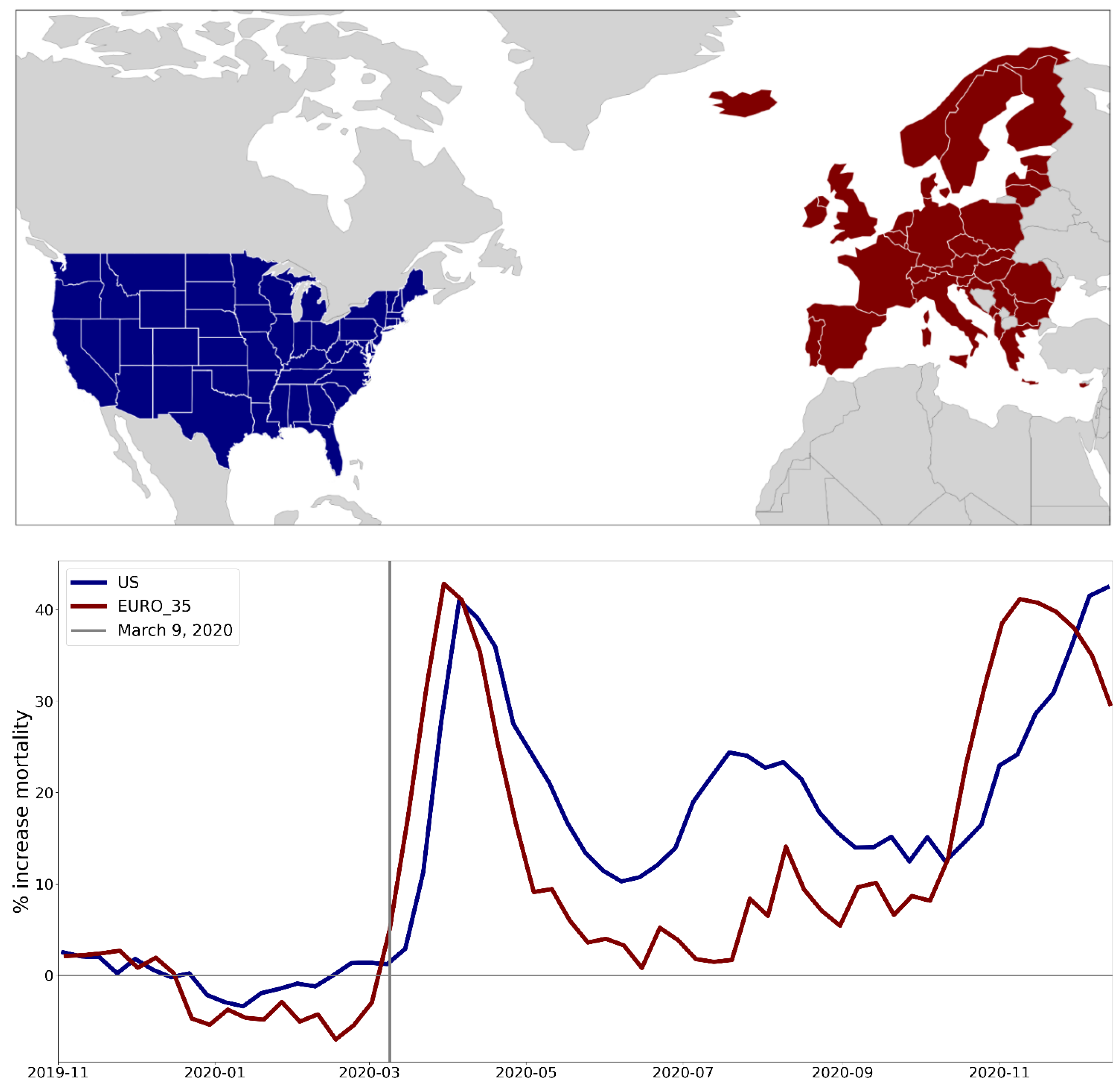
Figure 2.
Integrated first-peak period P-scores in European NUTS0 (national-level) regions. Color range extends to maximum value. Dark grey indicates countries for which data was unavailable.
Figure 2.
Integrated first-peak period P-scores in European NUTS0 (national-level) regions. Color range extends to maximum value. Dark grey indicates countries for which data was unavailable.
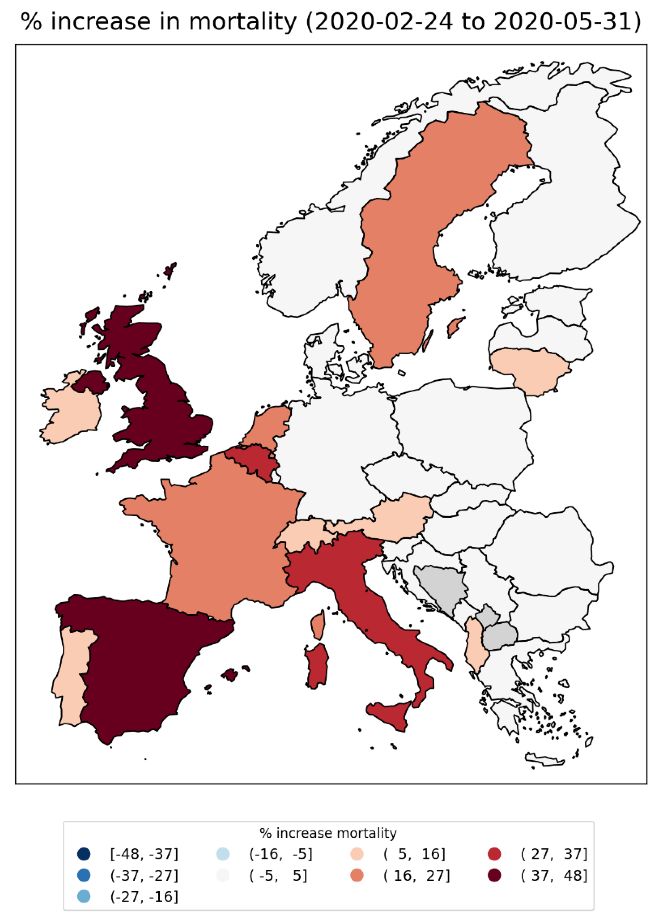
Figure 3.
Integrated first-peak period P-scores for European NUTS1 regions. Left panel: color range extends to maximum value; Right panel: color range capped at half the maximum value. Dark grey indicates countries for which data was unavailable.
Figure 3.
Integrated first-peak period P-scores for European NUTS1 regions. Left panel: color range extends to maximum value; Right panel: color range capped at half the maximum value. Dark grey indicates countries for which data was unavailable.
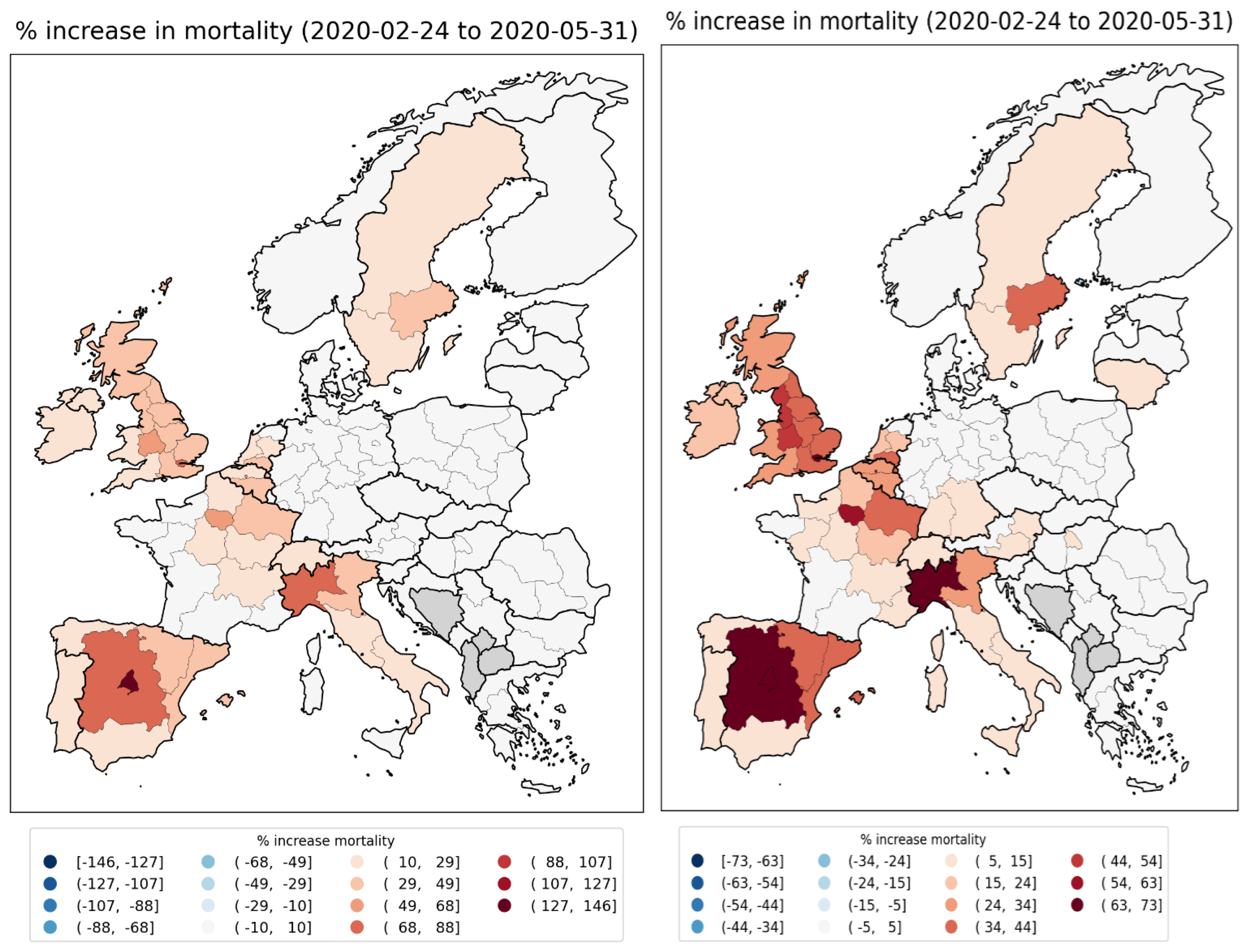
Figure 4.
Number of persons per km2 per European NUTS2 region in 2018 (Eurostat, 2024c). Color range saturated at a value of 600 km-2 to aid visualization. Figure 144 and Figure 145 have, respectively, unsaturated linear and logarithmic scale versions of this figure, for comparison. Dark grey indicates countries for which data was unavailable.
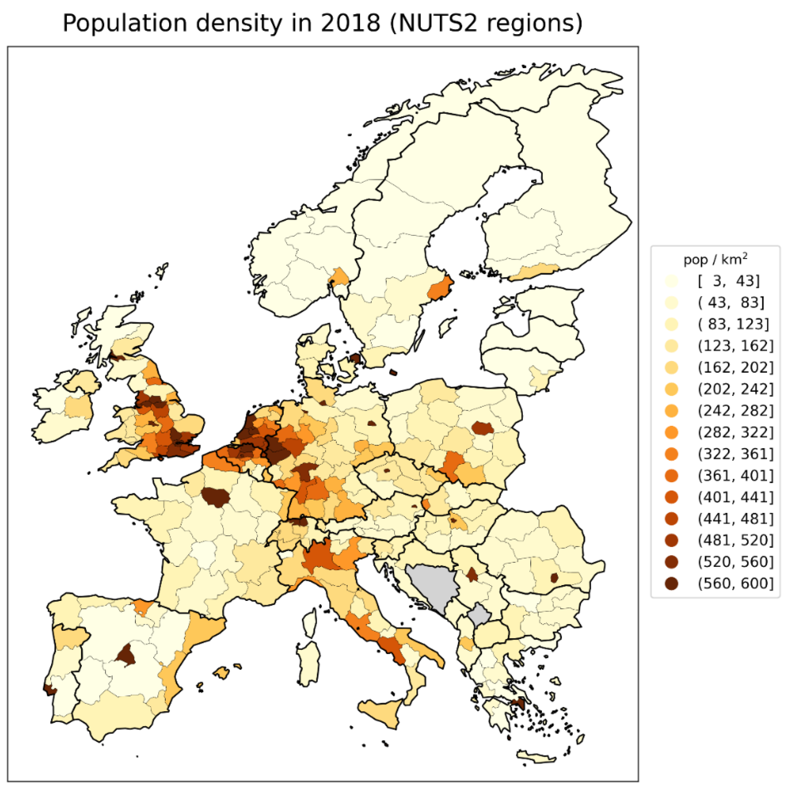
Figure 5.
Integrated first-peak period P-scores for European NUTS2 regions. Left panel: color range extends to maximum value; Right panel: color range capped at half the maximum value. NUTS1 data is shown for Germany in this figure, as NUTS2 data was unavailable. Dark grey indicates countries (other than Germany) for which data was unavailable.
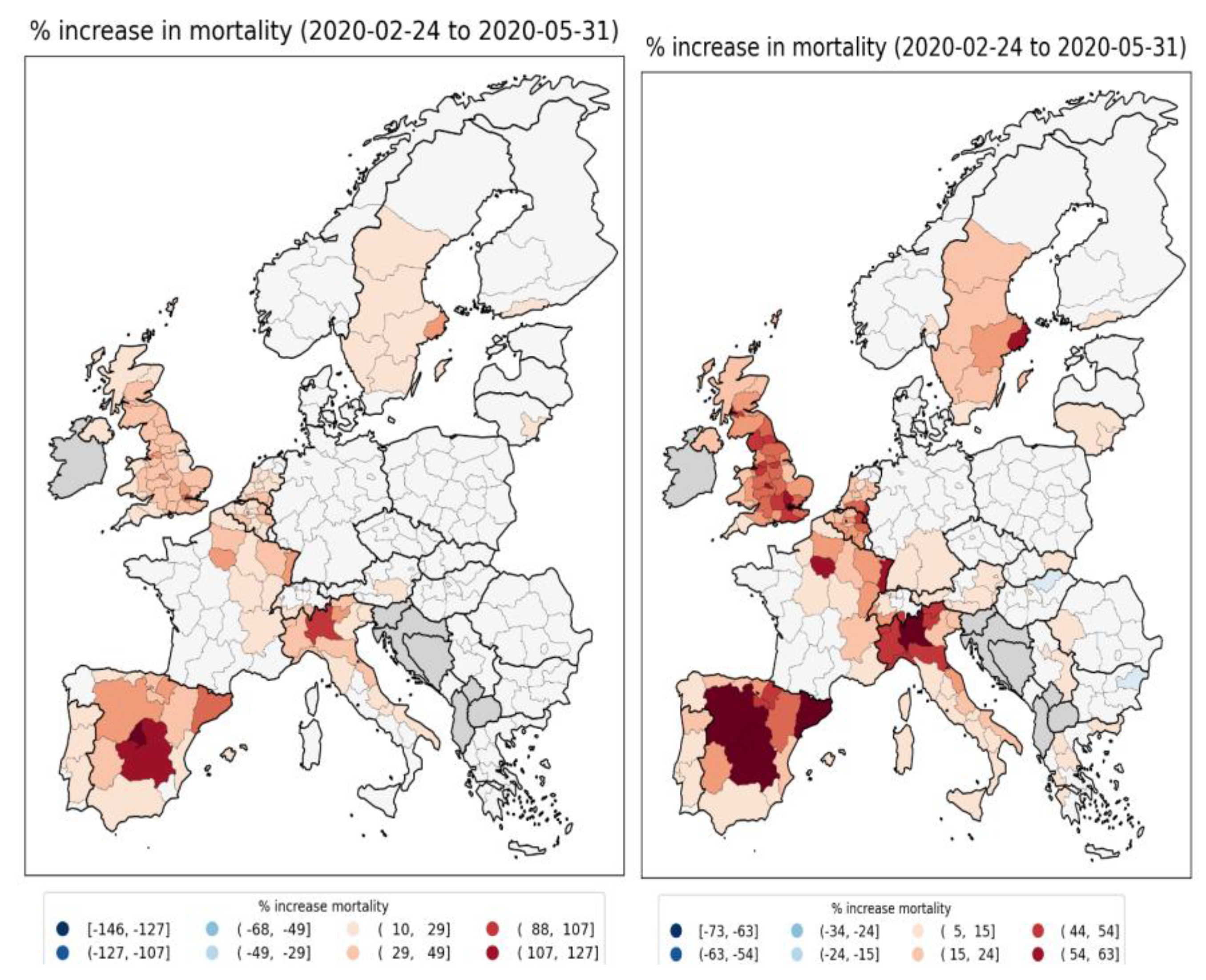
Figure 6.
Integrated first-peak period P-scores for NUTS2 regions in England and Wales (UK). Color range extends to maximum value for UK NUTS2 regions.
Figure 6.
Integrated first-peak period P-scores for NUTS2 regions in England and Wales (UK). Color range extends to maximum value for UK NUTS2 regions.

Figure 7.
Integrated first-peak period P-scores for European NUTS3 regions. Left panel: color range extends to maximum value; Right panel: color range capped at half the maximum value. NUTS1 data is shown for Germany in this figure, as NUTS3 data was unavailable. Dark grey indicates countries (other than Germany) for which data was unavailable.
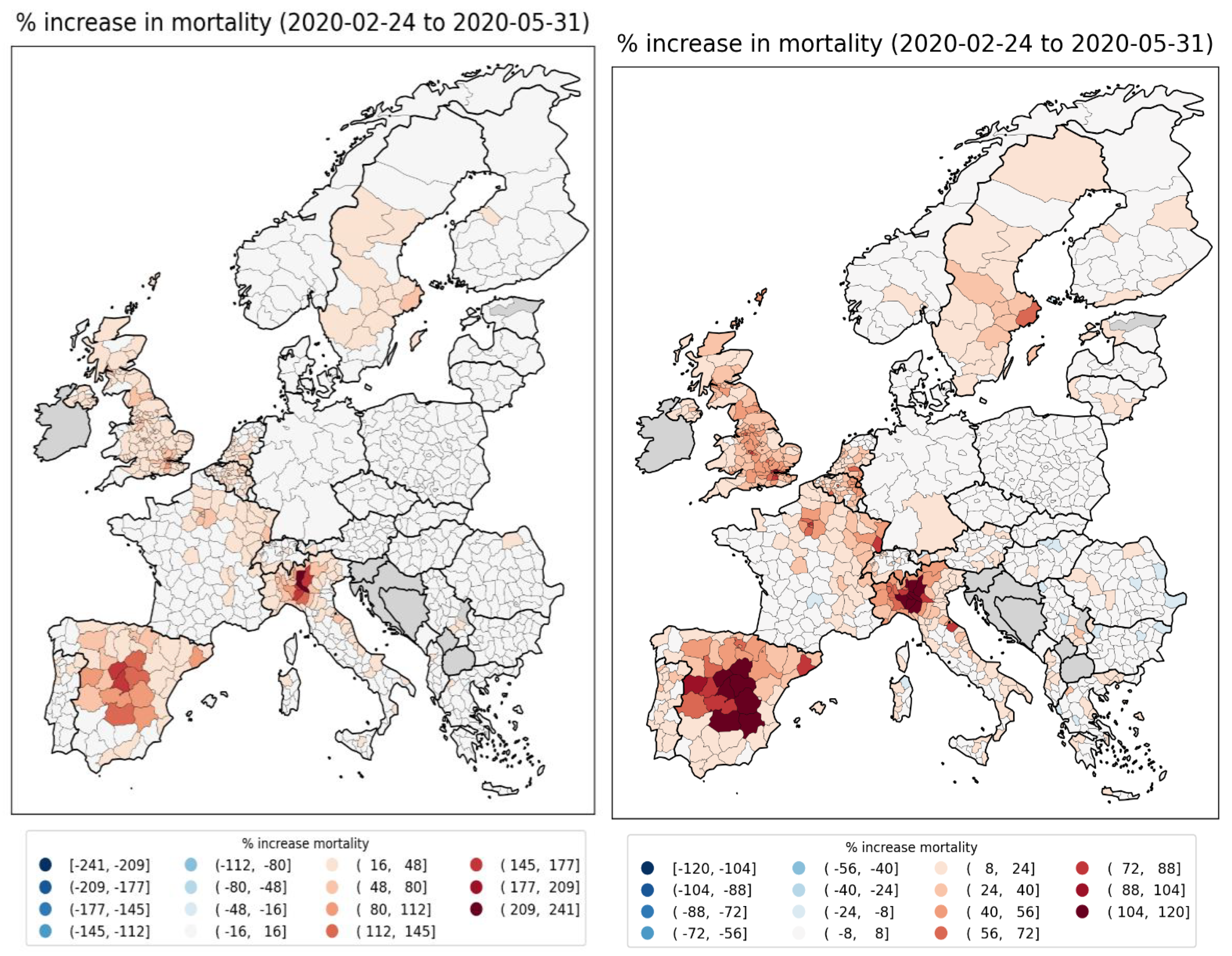
Figure 8.
Integrated first-peak period P-scores for NUTS3 regions in England and Wales (UK). Color range extends to maximum value for UK NUTS3 regions.
Figure 8.
Integrated first-peak period P-scores for NUTS3 regions in England and Wales (UK). Color range extends to maximum value for UK NUTS3 regions.
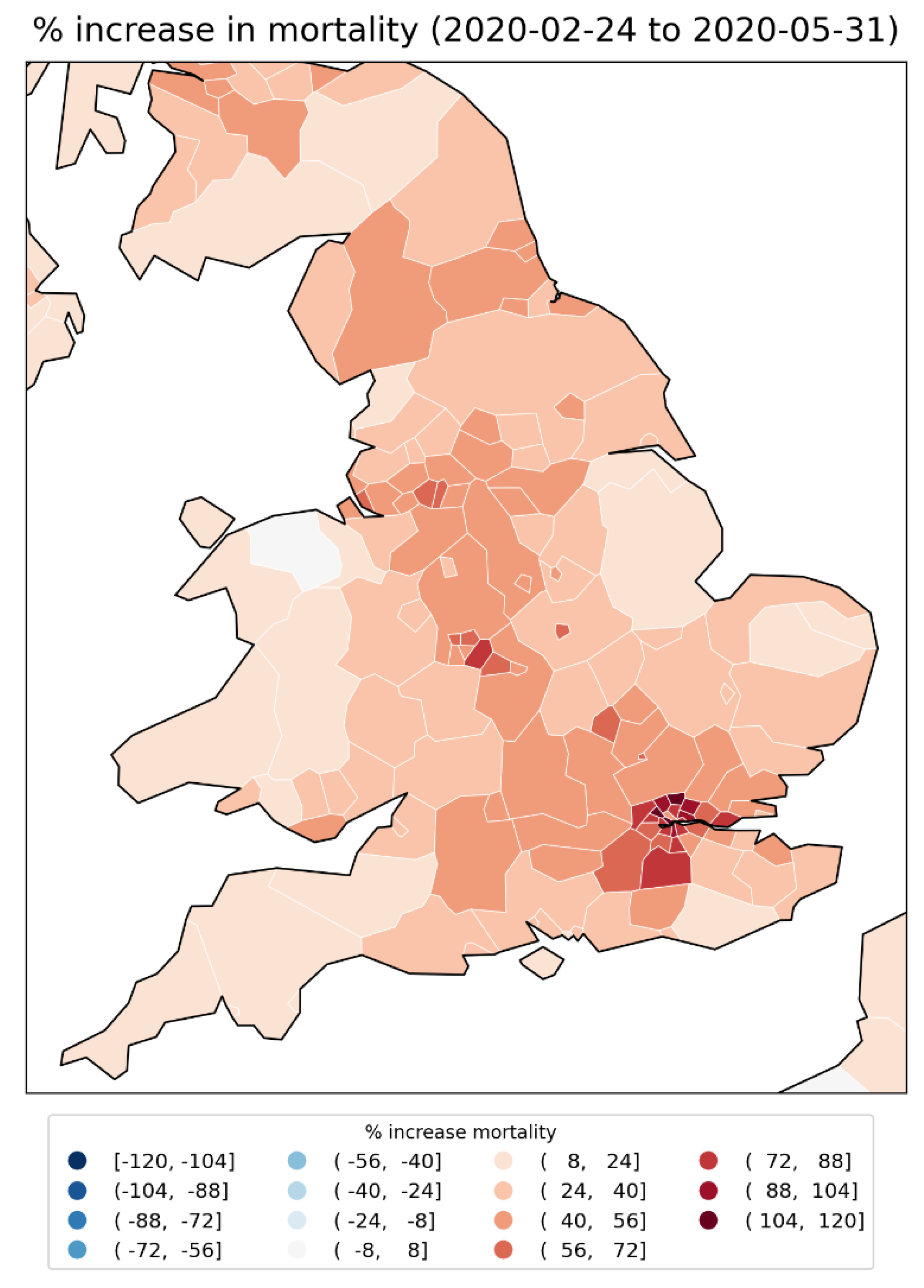
Figure 9.
Integrated first-peak period P-scores in the states of the contiguous USA.
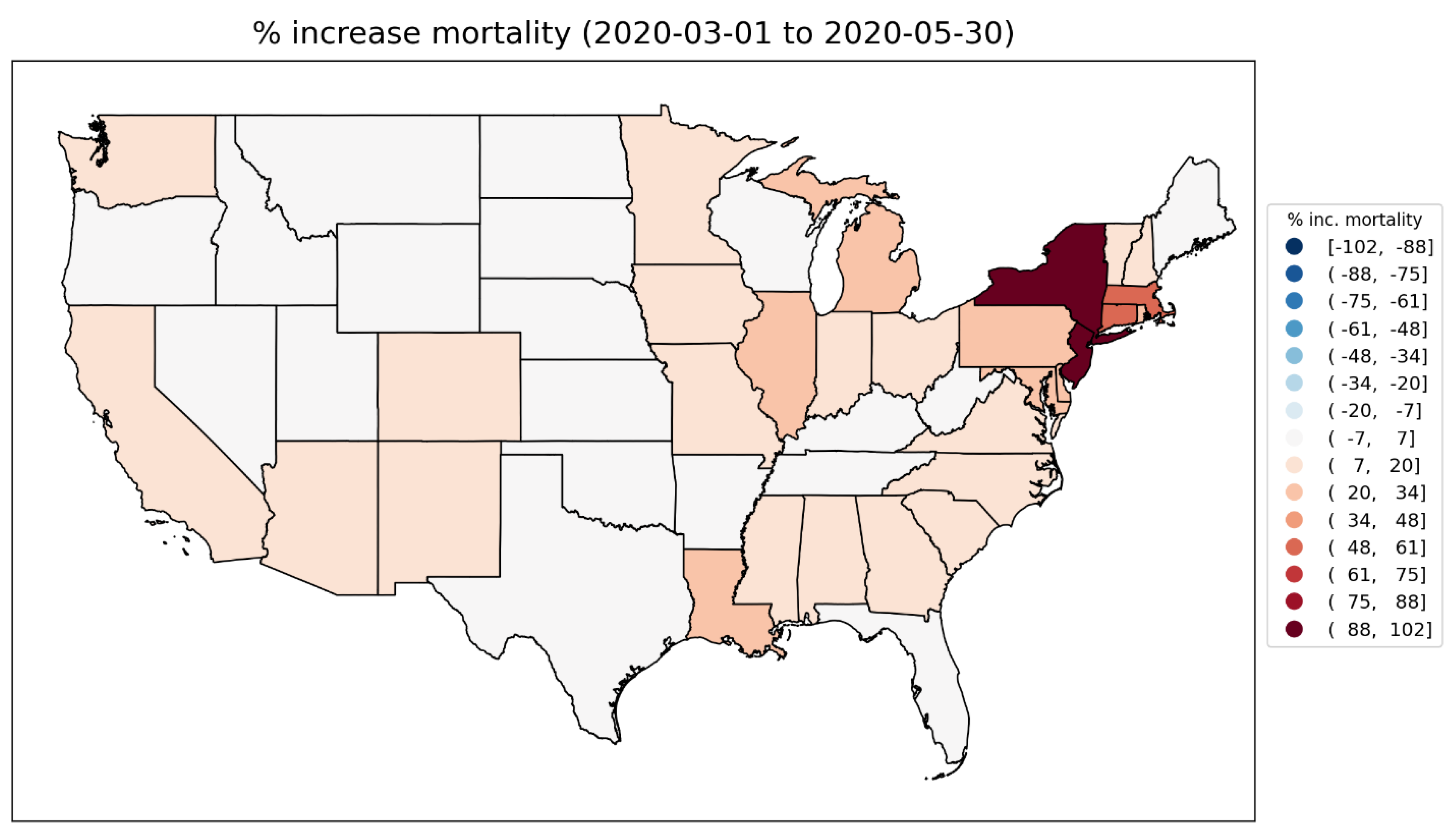
Figure 10.
Logarithm of population density for counties of the contiguous USA (estimates from the 5-Year American Community Survey for the years 2017-2021).
Figure 10.
Logarithm of population density for counties of the contiguous USA (estimates from the 5-Year American Community Survey for the years 2017-2021).
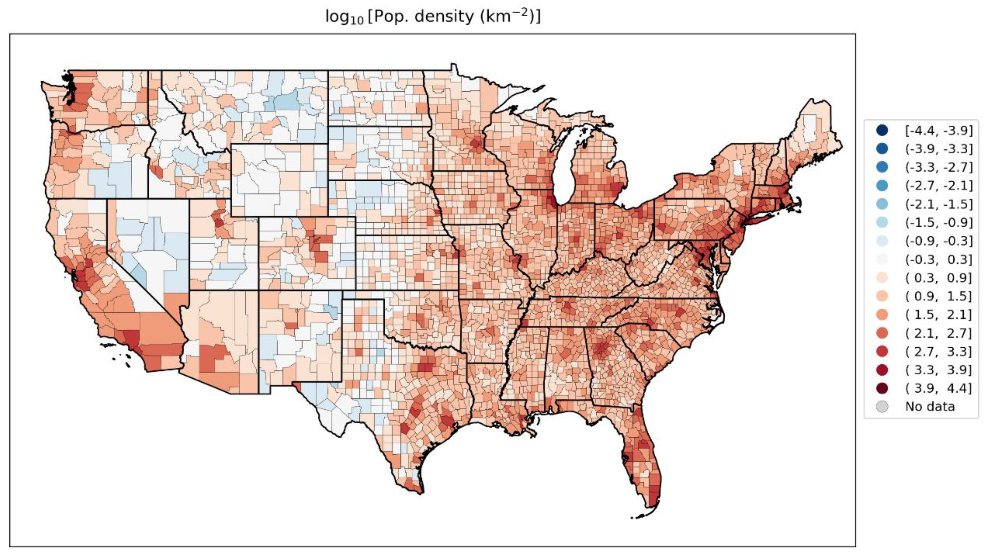
Figure 11.
Integrated first-peak period P-scores in the counties of the contiguous USA. Top panel: color range extends to maximum value for all counties (Bronx County, NY; value = 233%); Bottom panel: color range capped at the maximum value for a county outside of the states of New York and New Jersey (Chambers County, Alabama; value = 94%). Dark grey indicates counties for which data was unavailable.
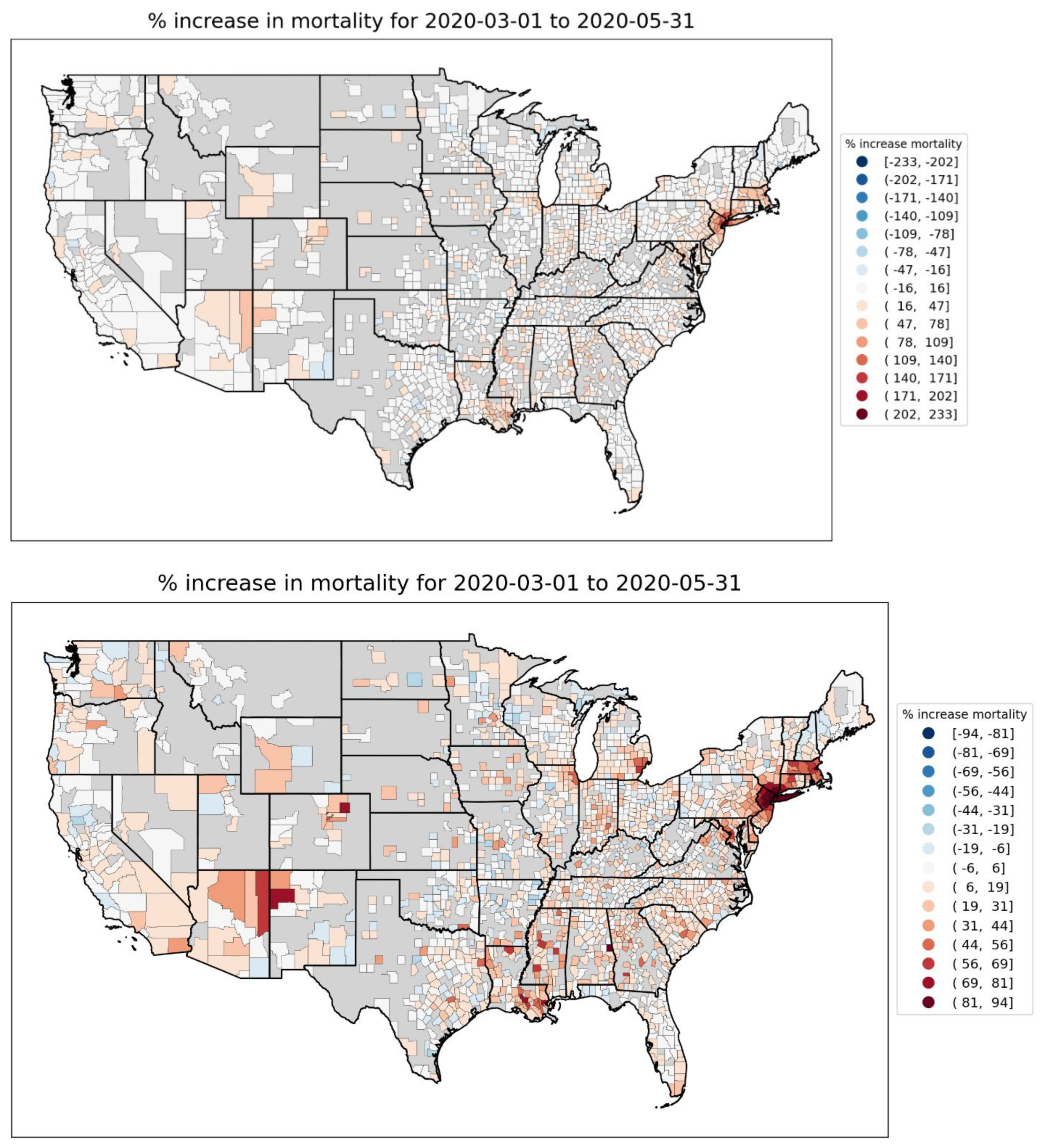
Figure 12.
Top and middle panels: Integrated first-peak period P-scores in northeastern USA counties. Top: color range extends to maximum value (Bronx County, NY; value = 233%); Middle: color range capped at the maximum value for a county on the map in a state other than NY or NJ (Suffolk County, MA; value = 86%). Bottom panel: logarithm of population density by county (estimates from the 5-Year American Community Survey for the years 2017-2021). Dark grey indicates counties for which data was unavailable.
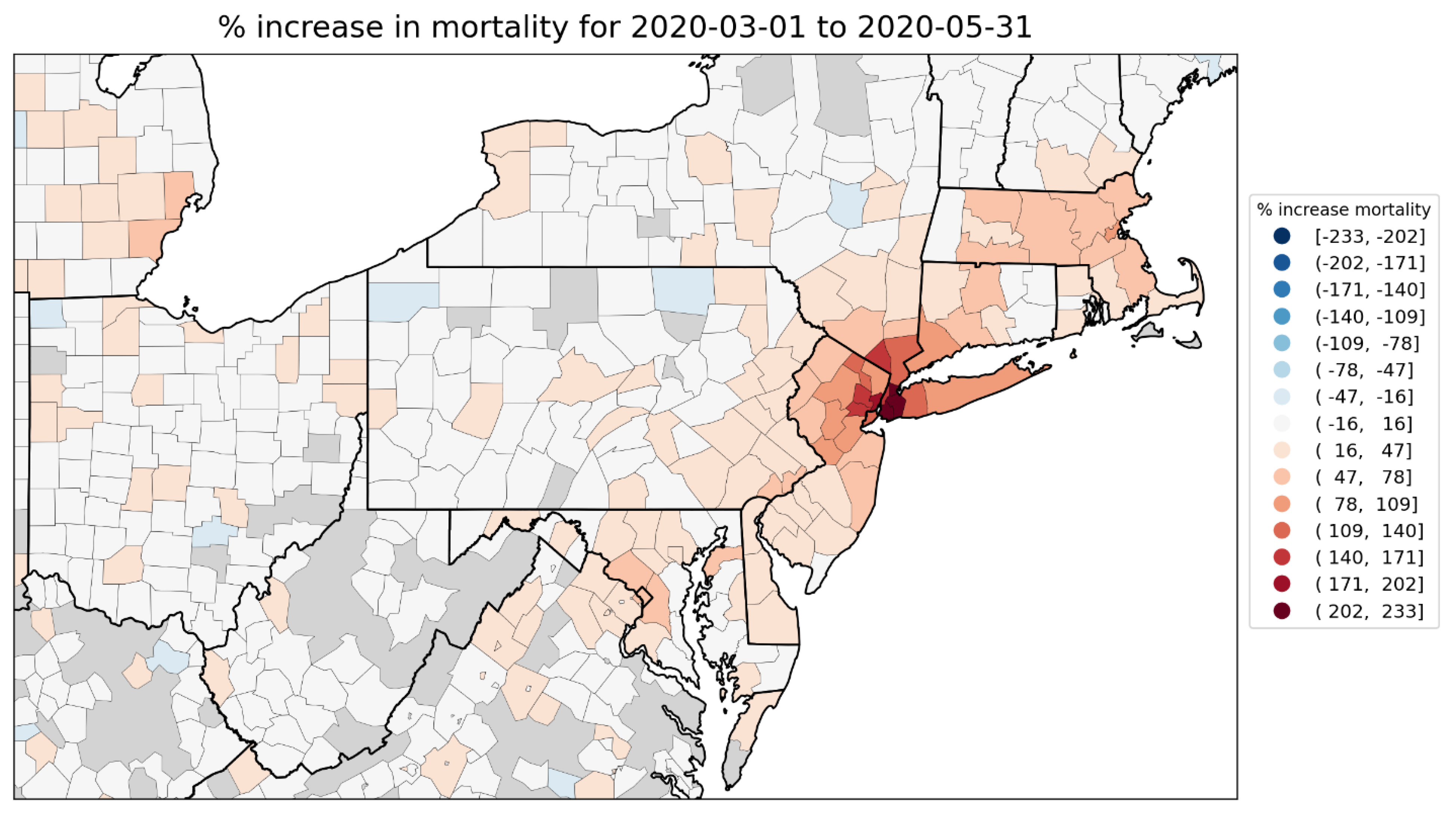
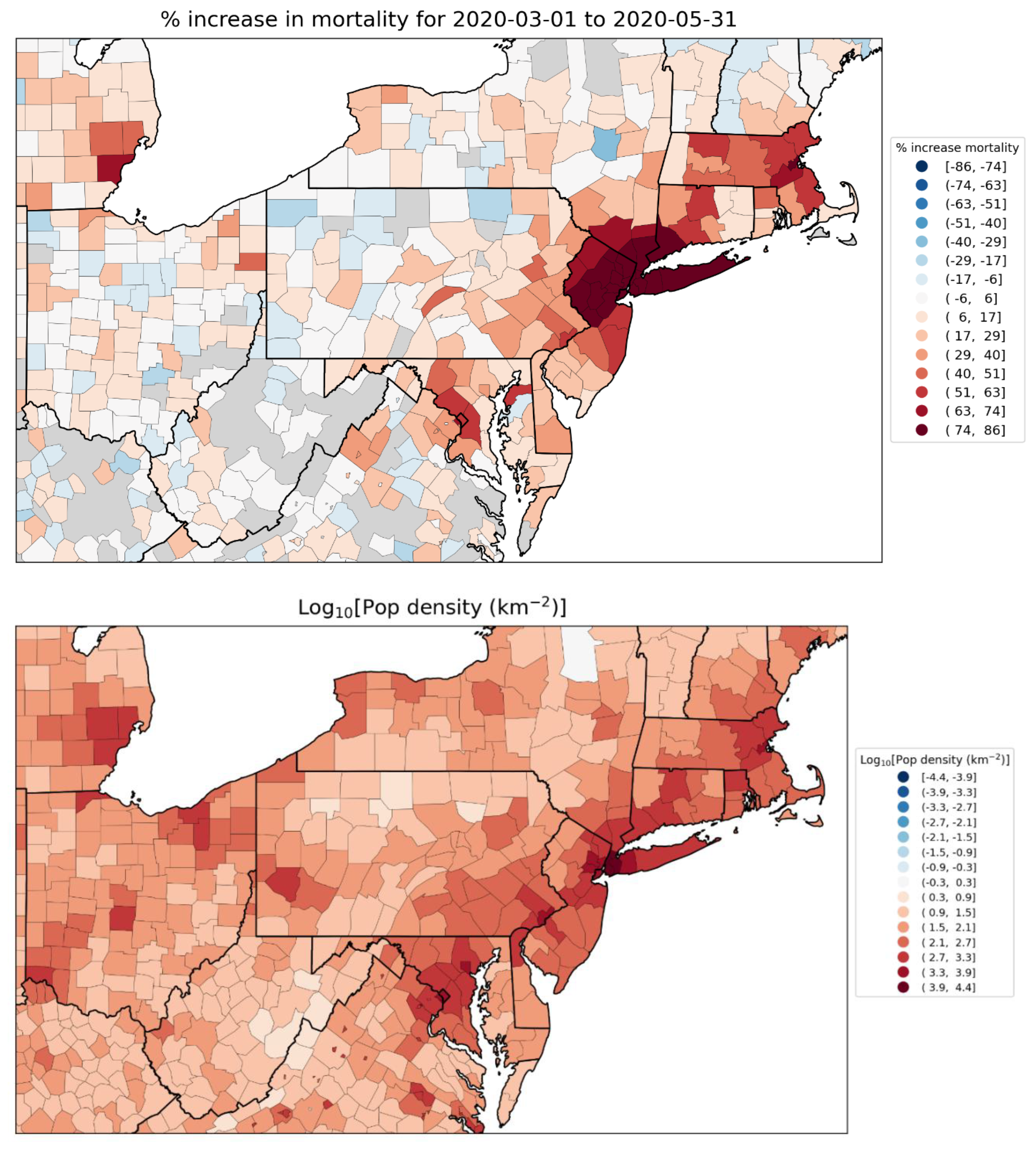
Figure 13.
Top panel: Integrated first-peak period P-scores for Midwestern USA counties. Wayne County, Michigan (containing part of the Detroit metropolitan area) has the largest value (67%). Bottom panel: Logarithm of population density by county (estimates from the 5-Year American Community Survey for the years 2017-2021). Dark grey indicates counties for which data was unavailable.
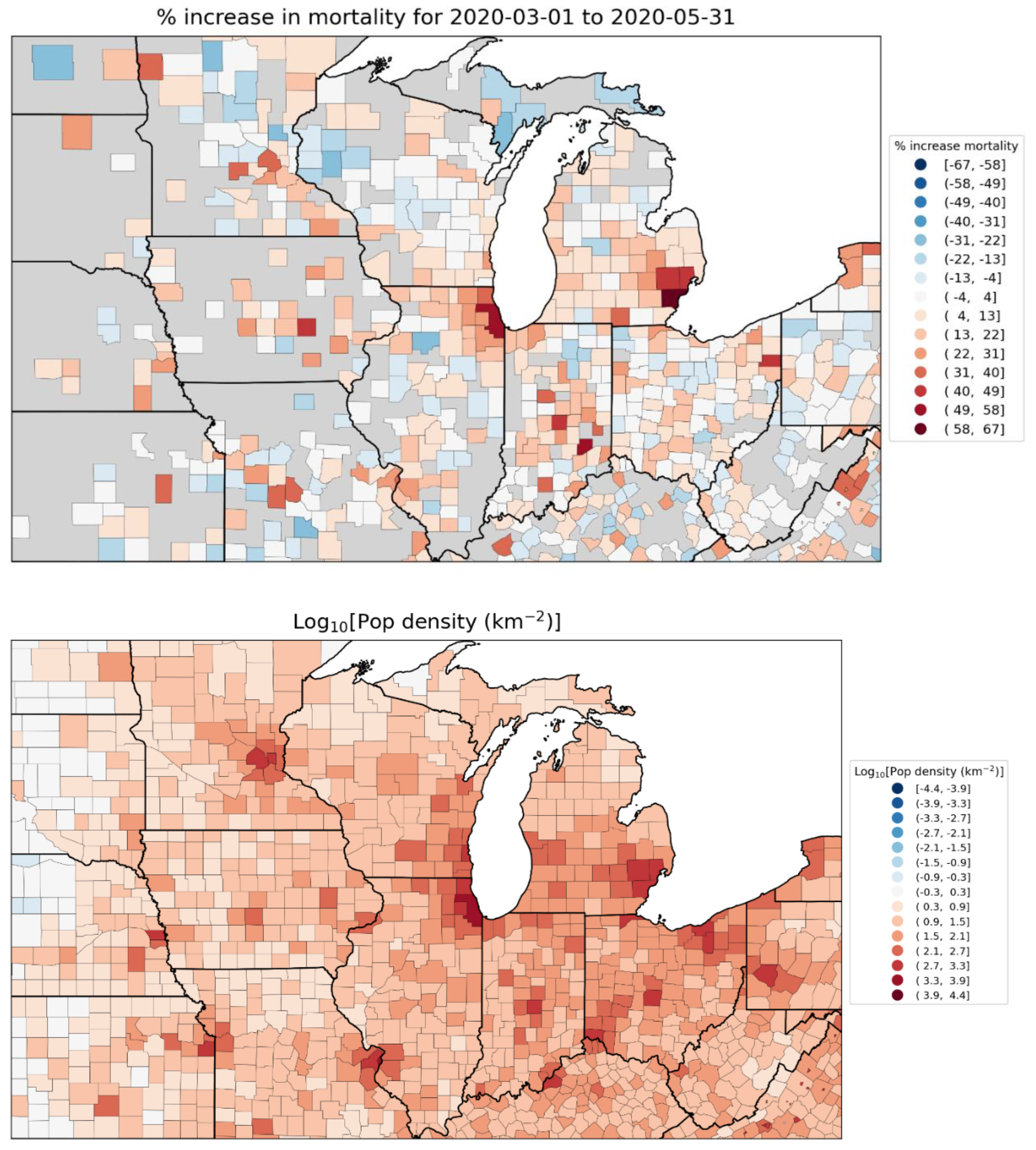
Figure 14.
Top panel: Integrated first-peak period P-scores for southern USA counties. Chambers County, Alabama has the largest value (93.6%). Bottom panel: Logarithm of population density by county (estimates from the 5-Year American Community Survey for the years 2017-2021). Dark grey indicates counties for which data was unavailable.
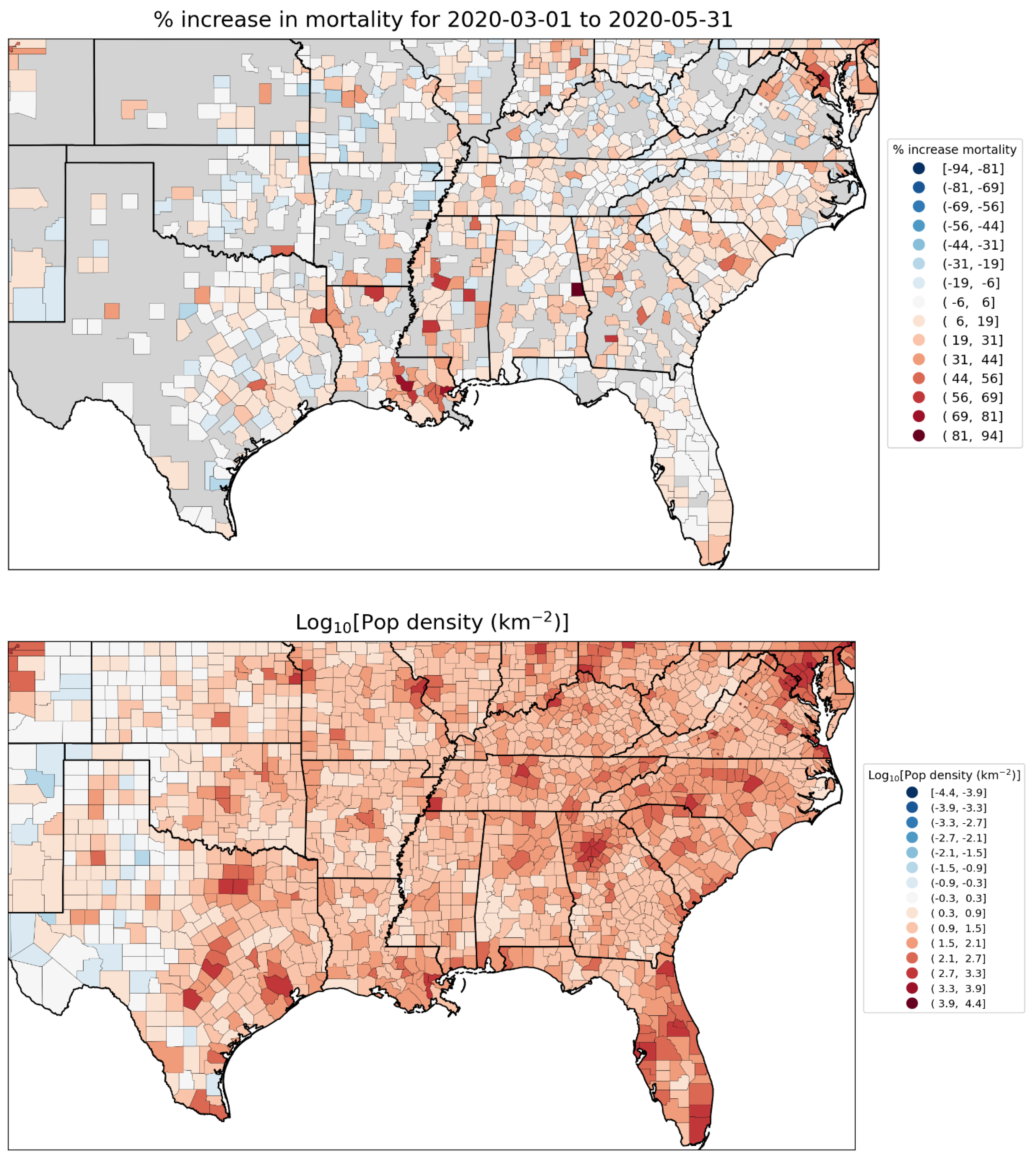
Figure 15.
Top panel: Integrated first-peak period P-scores for counties in Texas and Louisiana. Orleans Parish, Louisiana (containing New Orleans) has the largest value (78.6%). Bottom panel: Logarithm of population density by county (estimates from the 5-Year American Community Survey for the years 2017-2021). Dark grey indicates counties for which data was unavailable.
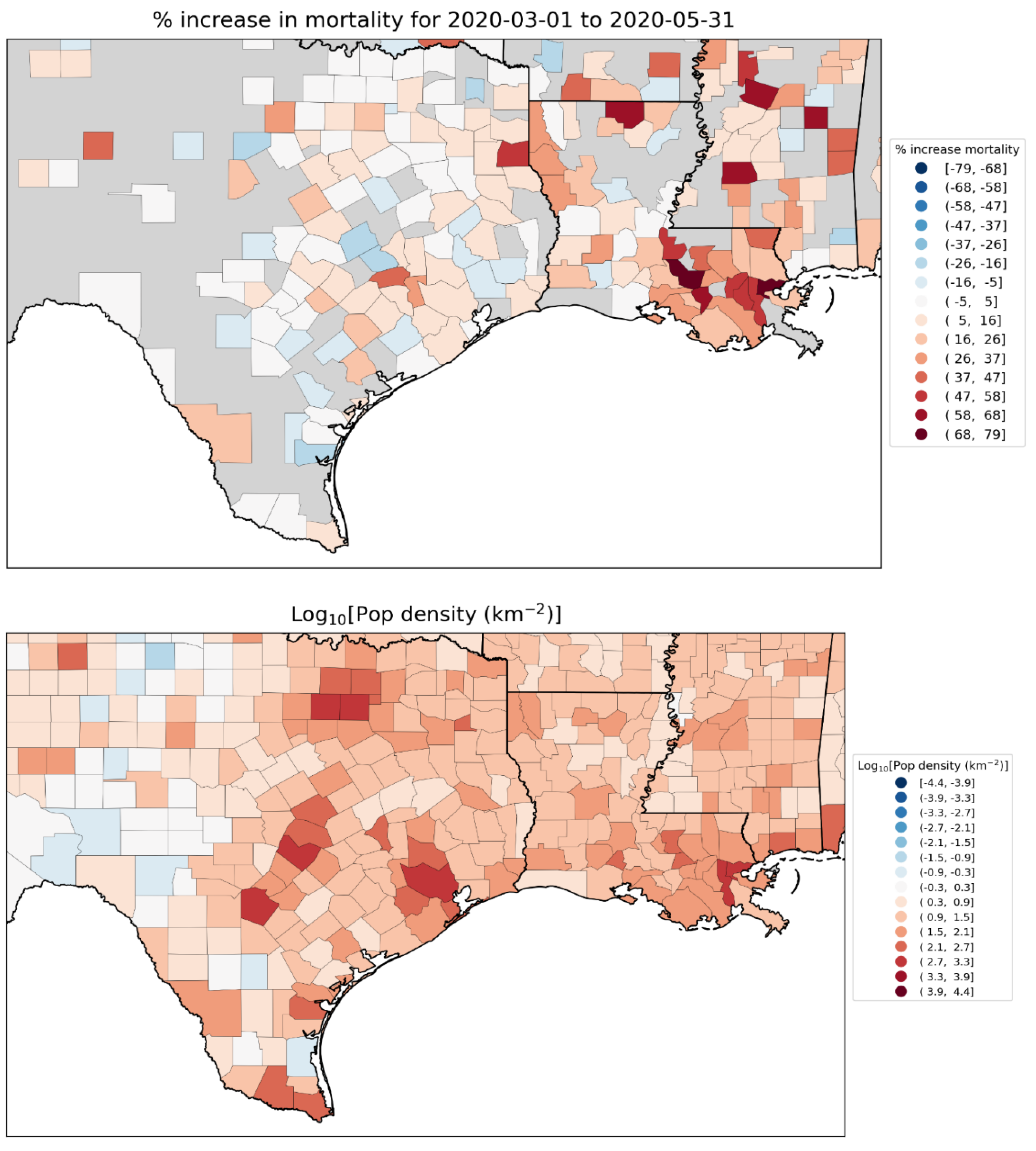
Figure 16.
Top panel: weekly P-scores during the first-peak period for European countries Spain, UK, Belgium, Sweden, the Netherlands, France, Germany and Italy. Bottom panel: same as top panel, with each curve scaled by its maximum. The vertical grey lines indicate the week of the WHO’s declaration of the COVID-19 pandemic (declaration of March 11, 2020).
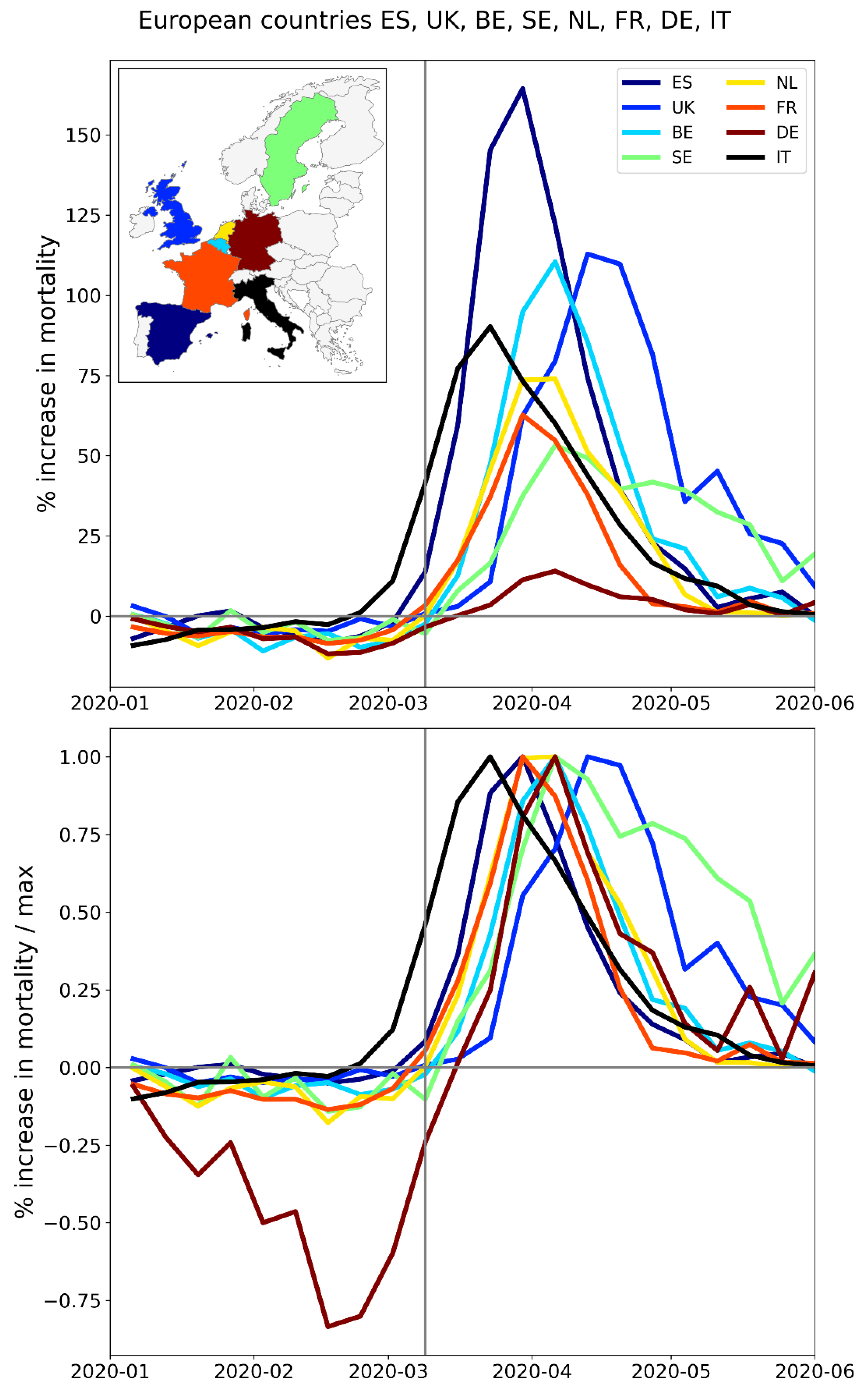
Figure 17.
Top panel: weekly P-scores during the first-peak period for the NUTS1 regions of Italy, color coded as per the map in the inset. Bottom panel: same as top panel, with each curve scaled by its maximum. Vertical grey lines indicate the week of the WHO’s pandemic declaration of 2020-03-11.
Figure 17.
Top panel: weekly P-scores during the first-peak period for the NUTS1 regions of Italy, color coded as per the map in the inset. Bottom panel: same as top panel, with each curve scaled by its maximum. Vertical grey lines indicate the week of the WHO’s pandemic declaration of 2020-03-11.
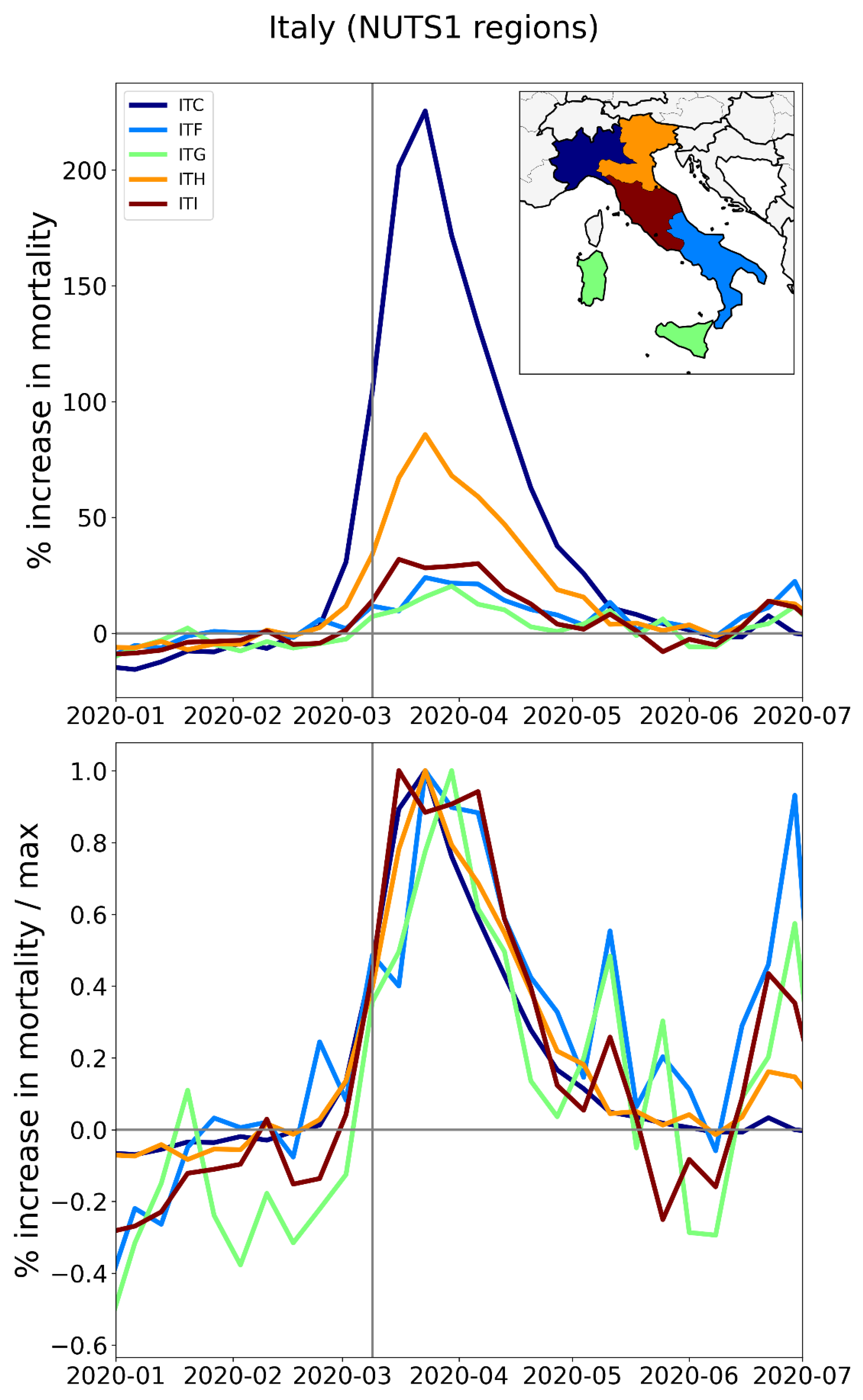
Figure 18.
Top panel: weekly P-scores during the first-peak period for the NUTS1 regions of Spain, color coded as per the map in the inset. Bottom panel: same as top panel, with each curve scaled by its maximum. Vertical grey lines indicate the week of the WHO’s pandemic declaration of 2020-03-11.
Figure 18.
Top panel: weekly P-scores during the first-peak period for the NUTS1 regions of Spain, color coded as per the map in the inset. Bottom panel: same as top panel, with each curve scaled by its maximum. Vertical grey lines indicate the week of the WHO’s pandemic declaration of 2020-03-11.
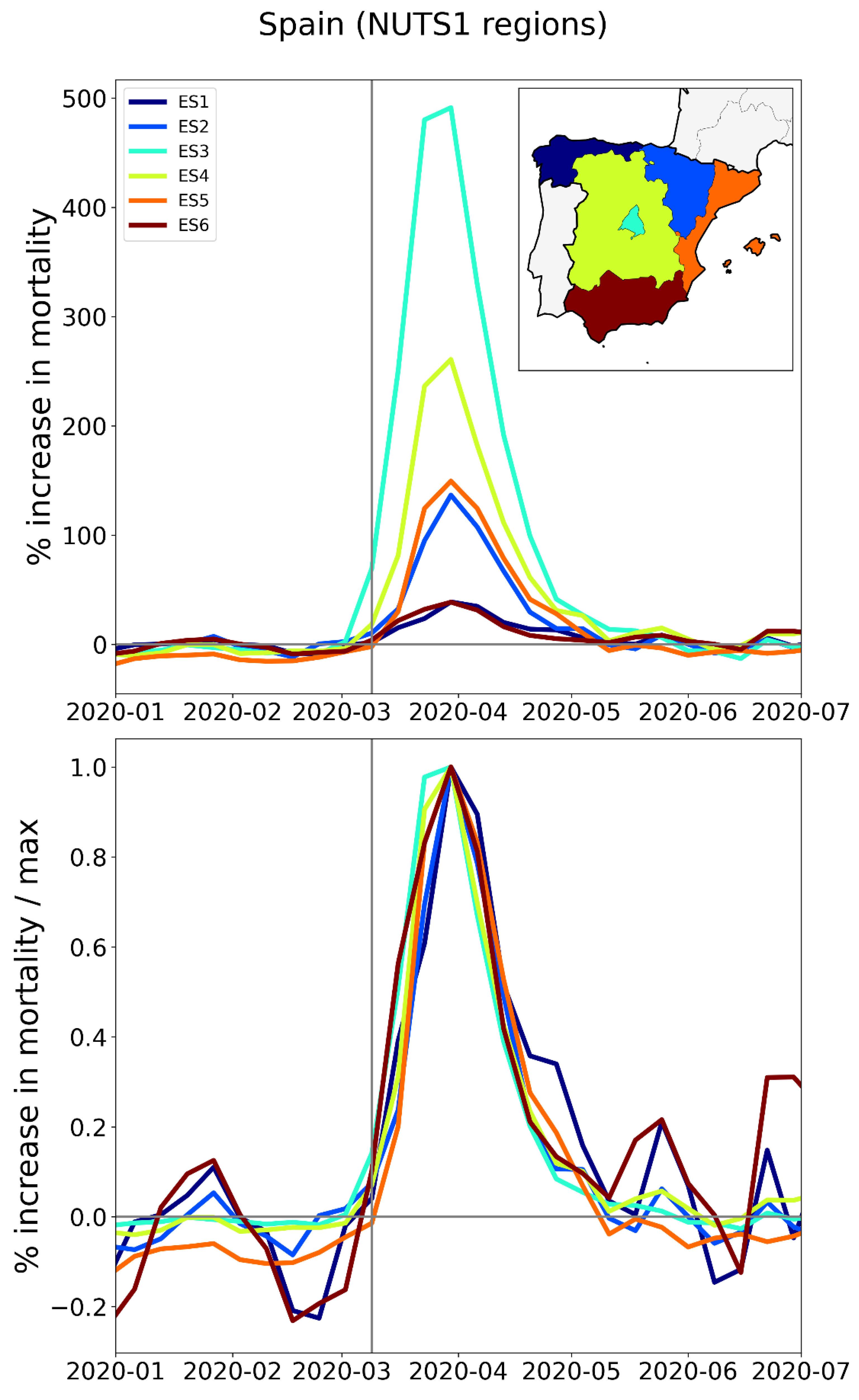
Figure 39.
Millions of tonnes-kilometres of international road freight transport loaded in Italy and unloaded in each of France, Switzerland, Austria, and Slovenia, by economic quarter. Data from Eurostat (2024f).
Figure 39.
Millions of tonnes-kilometres of international road freight transport loaded in Italy and unloaded in each of France, Switzerland, Austria, and Slovenia, by economic quarter. Data from Eurostat (2024f).
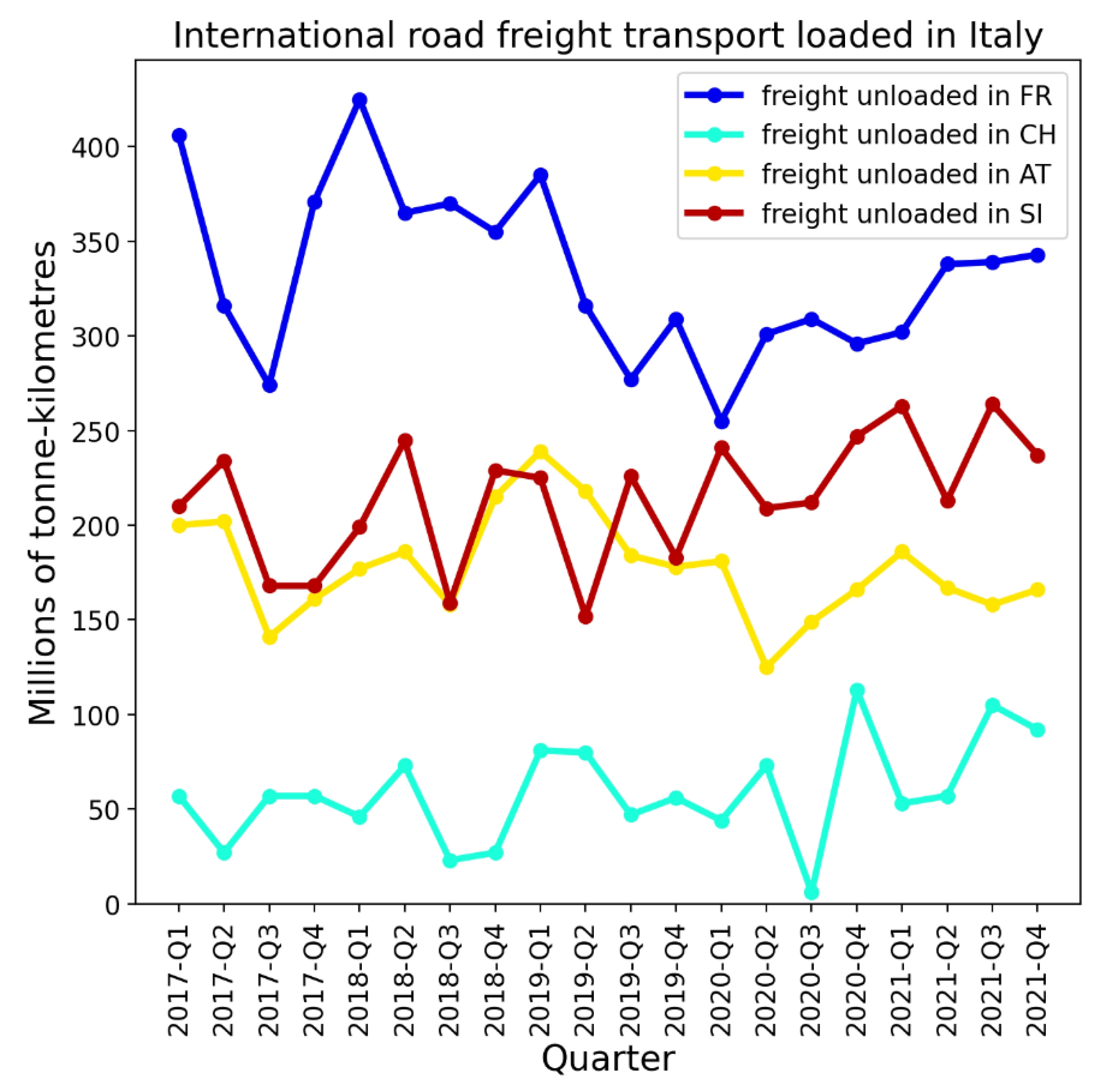
Figure 40.
Top panel: Map of New York and four of its neighbouring states: New Jersey, Massachusetts, Connecticut, and Pennsylvania. Middle panel: weekly P-scores during the first-peak period. Lower panel: same as middle panel, with each curve scaled by its maximum. Vertical grey lines in the lower two panels indicate the week of the WHO’s pandemic declaration of March 11, 2020.
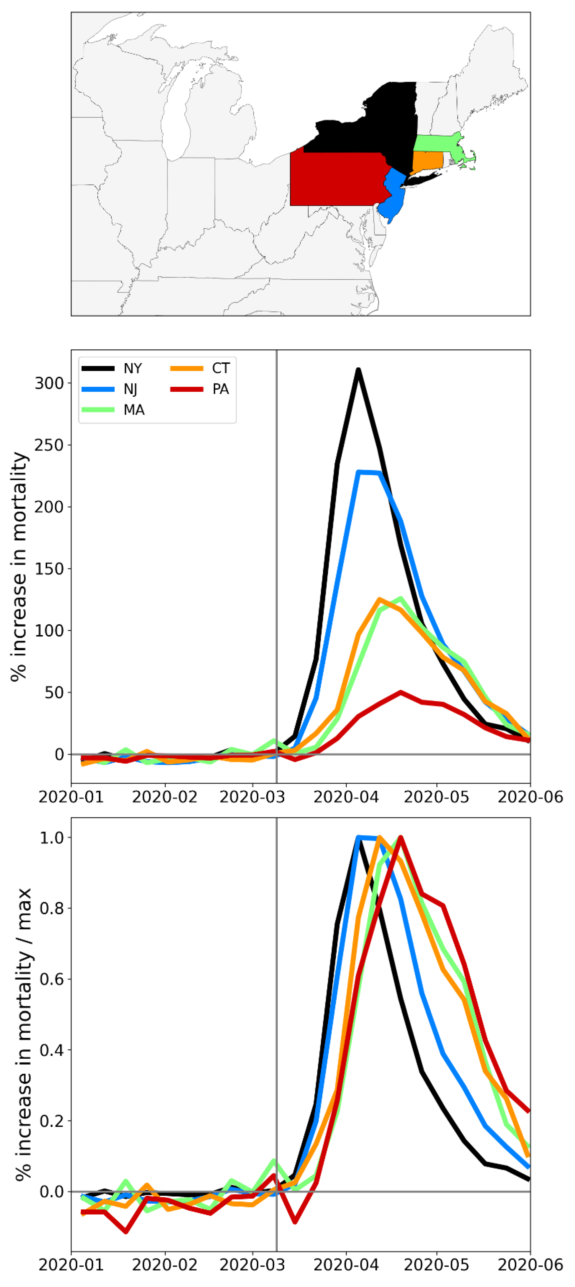
Figure 41.
Top panel: Map of the six USA states with the largest integrated first-peak period P-scores: New York, New Jersey, Connecticut, Massachusetts, District of Columbia (inside the small pink circle), and Rhode Island. Middle panel: weekly P-scores during the first-peak period. Lower panel: same as middle panel, with each curve scaled by its maximum. Vertical grey lines in the lower two panels indicate the week of the WHO’s pandemic declaration of March 11, 2020.
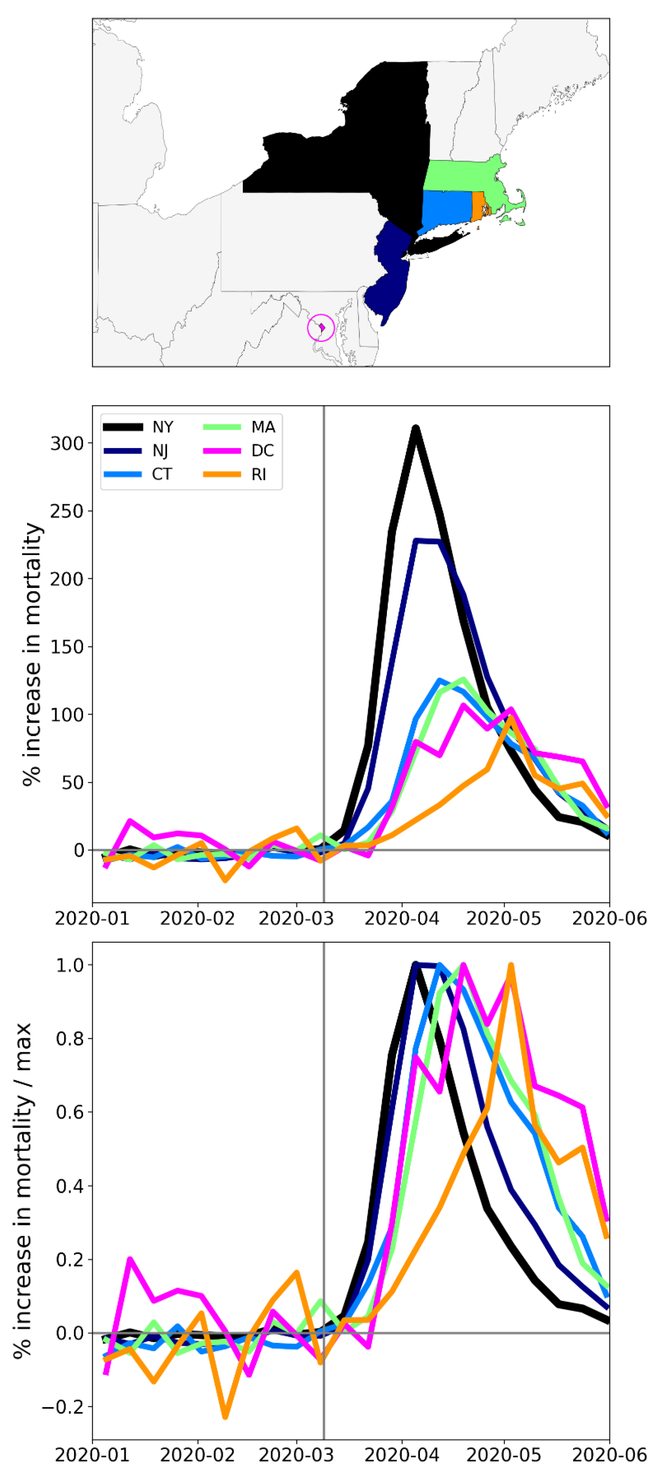
Figure 42.
Top panel: Map of rise-side half-maximum dates for the F-peaks of USA states. Bottom panel: integrated first-peak period P-scores (%) for USA states (copy of Figure 9, for convenience). F-peaks for Hawaii and Alaska were indiscernible.
Figure 42.
Top panel: Map of rise-side half-maximum dates for the F-peaks of USA states. Bottom panel: integrated first-peak period P-scores (%) for USA states (copy of Figure 9, for convenience). F-peaks for Hawaii and Alaska were indiscernible.
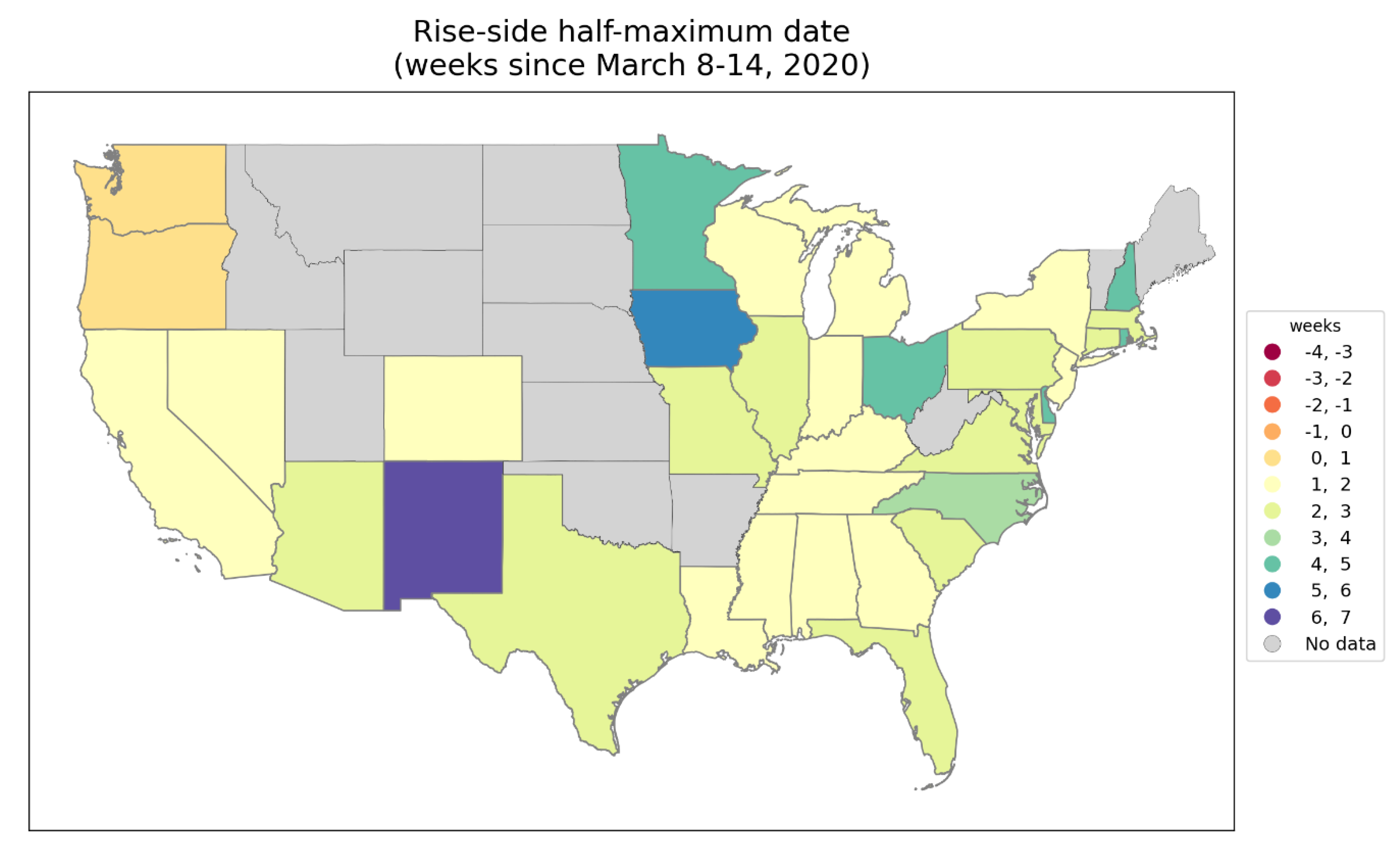
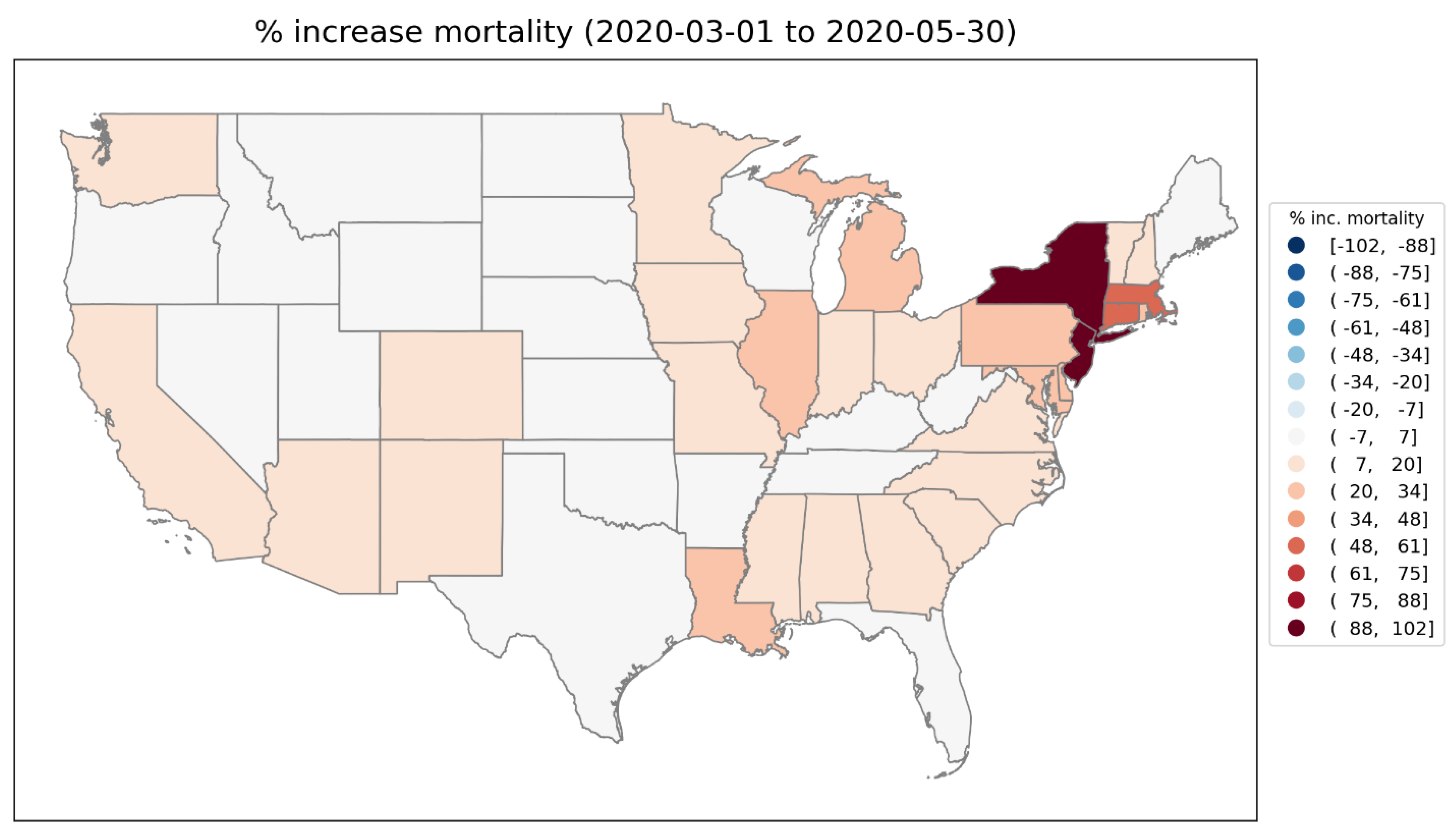
Figure 43.
Top panel: Map of geographically distant states New York, Louisiana, Michigan and California. Middle panel: weekly P-scores for the states shown in the top panel. Lower panel: same as middle panel, with each curve scaled by its maximum. Vertical grey lines in the lower two panels indicate the week of the WHO’s pandemic declaration of March 11, 2020.
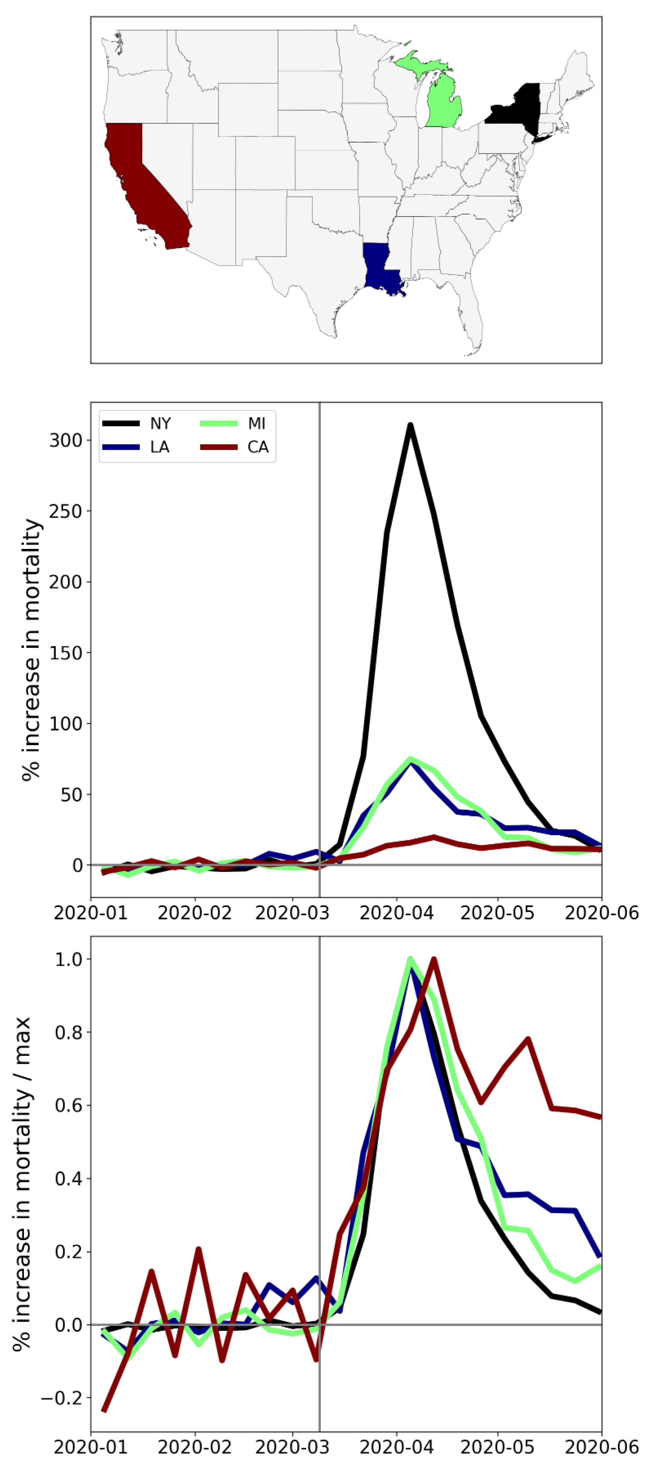
Figure 44.
Top left: weekly P-scores for the counties of New York State. Top right: same as top left, with each curve scaled by its maximum. Middle left: map with counties colored as per the curves in top row and points in bottom row of panels. Middle right: heatmap showing integrated first-peak period (March-May 2020) P-score for each county. Bottom left: scatter plot of county integrated first-peak period P-score vs county population density. Bottom right: scatter plot of county integrated first-peak period P-score vs. county percent of population living in poverty. In the maps, dark grey (within NY State) indicates counties for which data was unavailable.
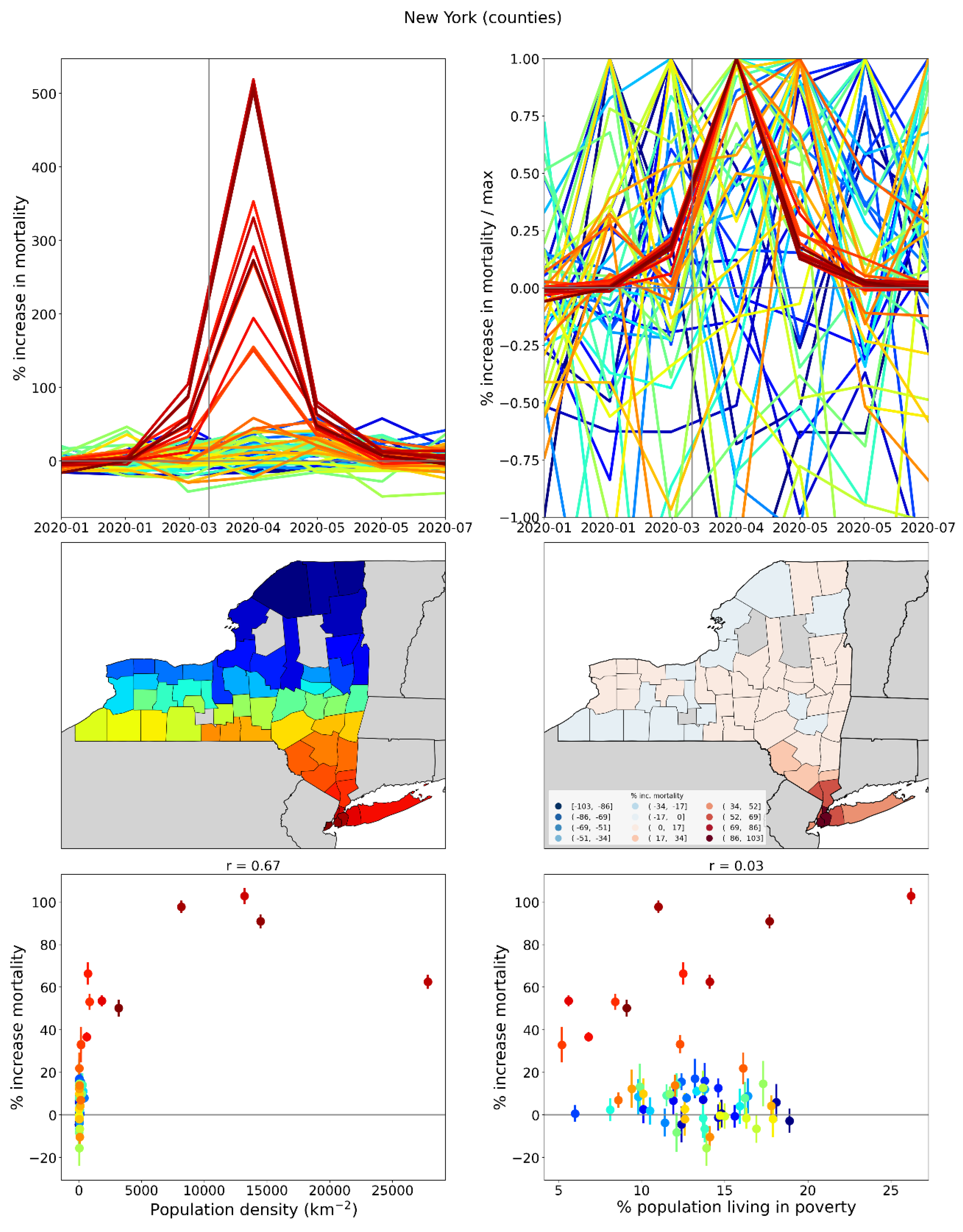
Figure 45.
Top left: weekly P-scores for the counties of New Jersey. Top right: same as top left, with each curve scaled by its maximum. Middle left: map with counties colored as per the curves in top row and points in bottom row of panels. Middle right: heatmap showing integrated first-peak period (March-May 2020) P-score for each county. Bottom left: scatter plot of county integrated first-peak period P-score vs county population density. Bottom right: scatter plot of county integrated first-peak period P-score vs. county percent of population living in poverty.
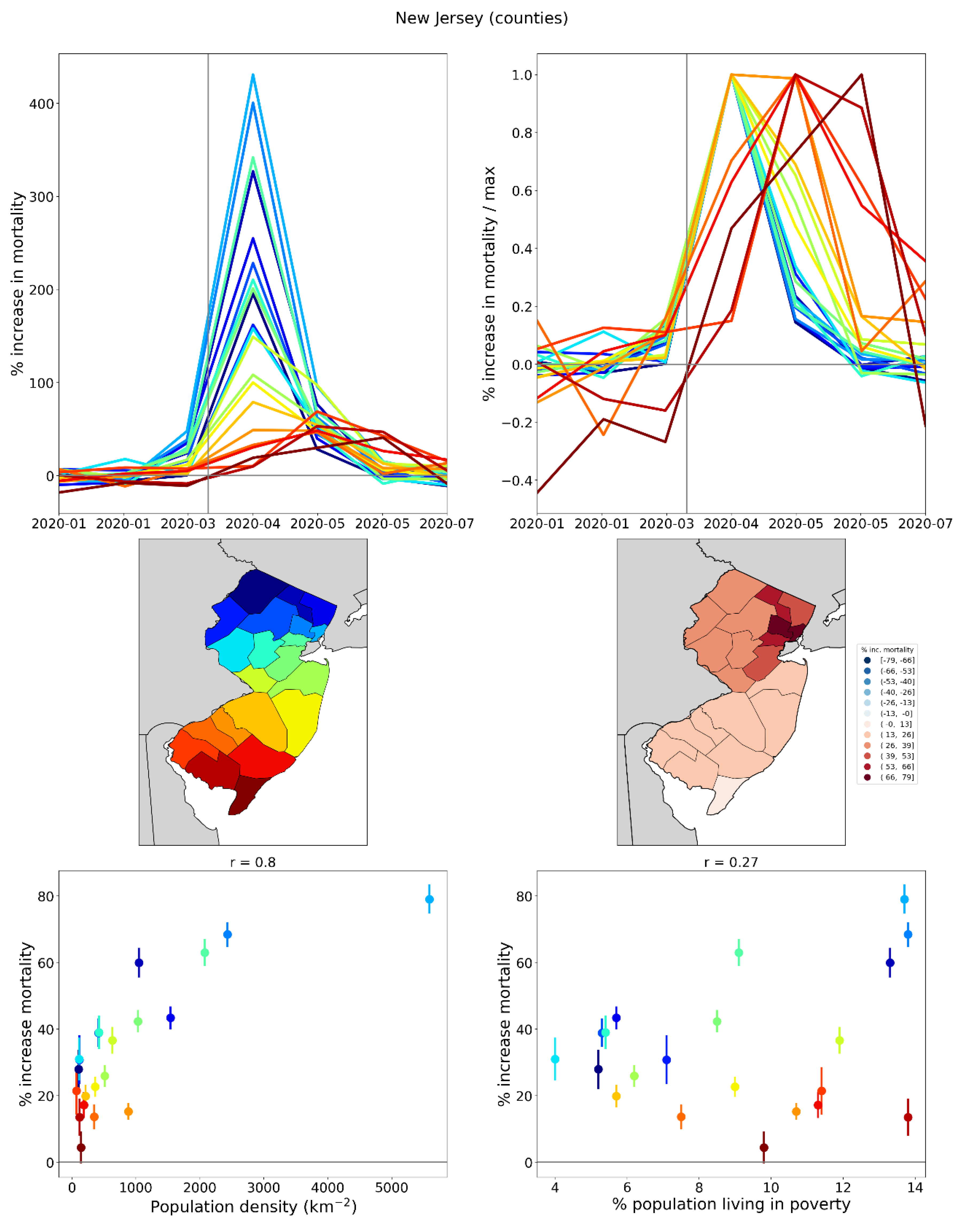
Figure 46.
Top left: weekly P-scores for the counties of Connecticut. Top right: same as top left, with each curve scaled by its maximum. Middle left: map with counties colored as per the curves in top row and points in bottom row of panels. Middle right: heatmap showing integrated first-peak period (March-May 2020) P-score for each county. Bottom left: scatter plot of county integrated first-peak period P-score vs county population density. Bottom right: scatter plot of county integrated first-peak period P-score vs. county percent of population living in poverty.
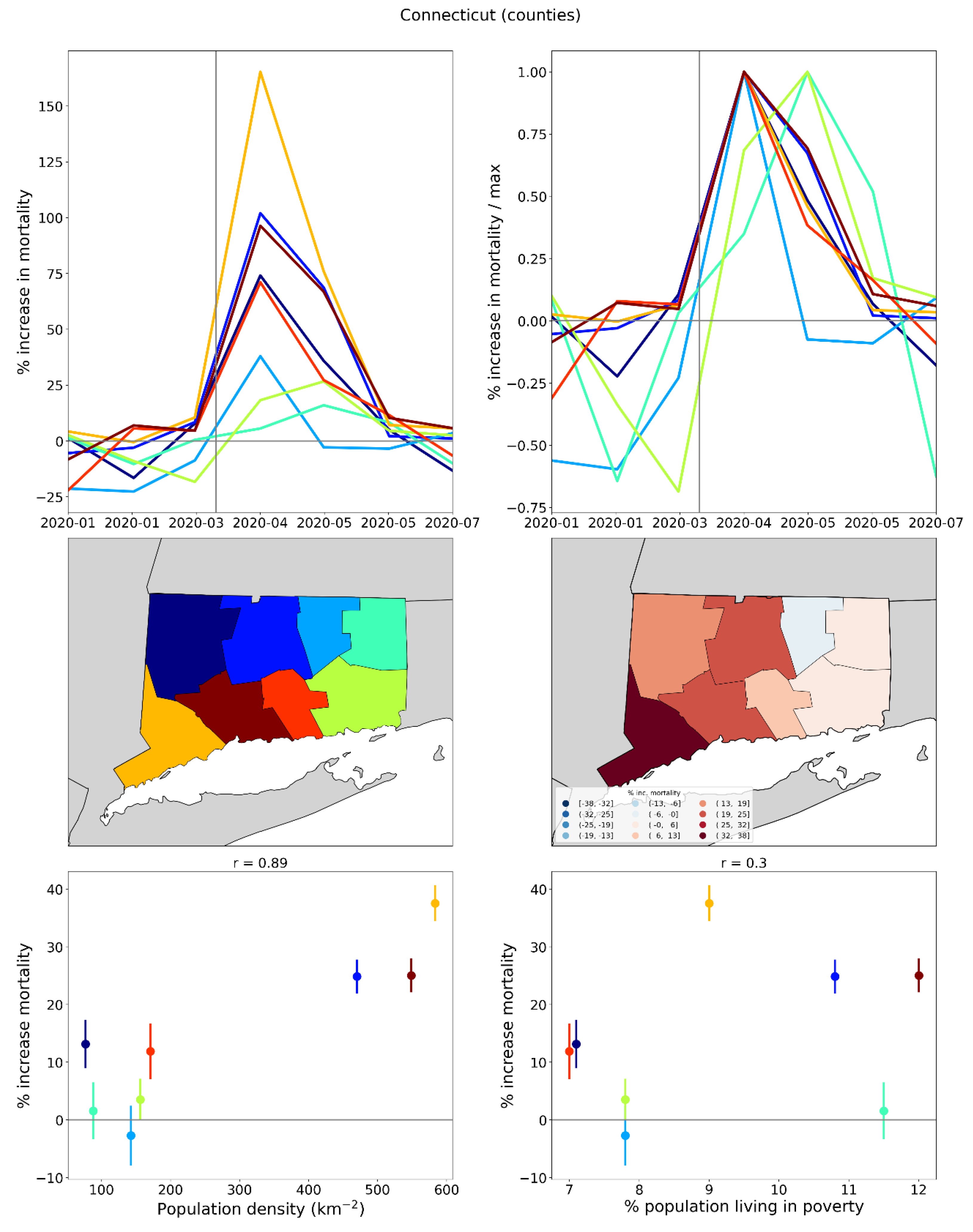
Figure 47.
Top left: weekly P-scores for the counties of Massachusetts. Top right: same as top left, with each curve scaled by its maximum. Middle left: map with counties colored as per the curves in top row and points in bottom row of panels. Middle right: heatmap showing integrated first-peak period (March-May 2020) P-score for each county. Bottom left: scatter plot of county integrated first-peak period P-score vs county population density. Bottom right: scatter plot of county integrated first-peak period P-score vs. county percent of population living in poverty. In the maps, dark grey (within Massachusetts) indicates counties for which data was unavailable.
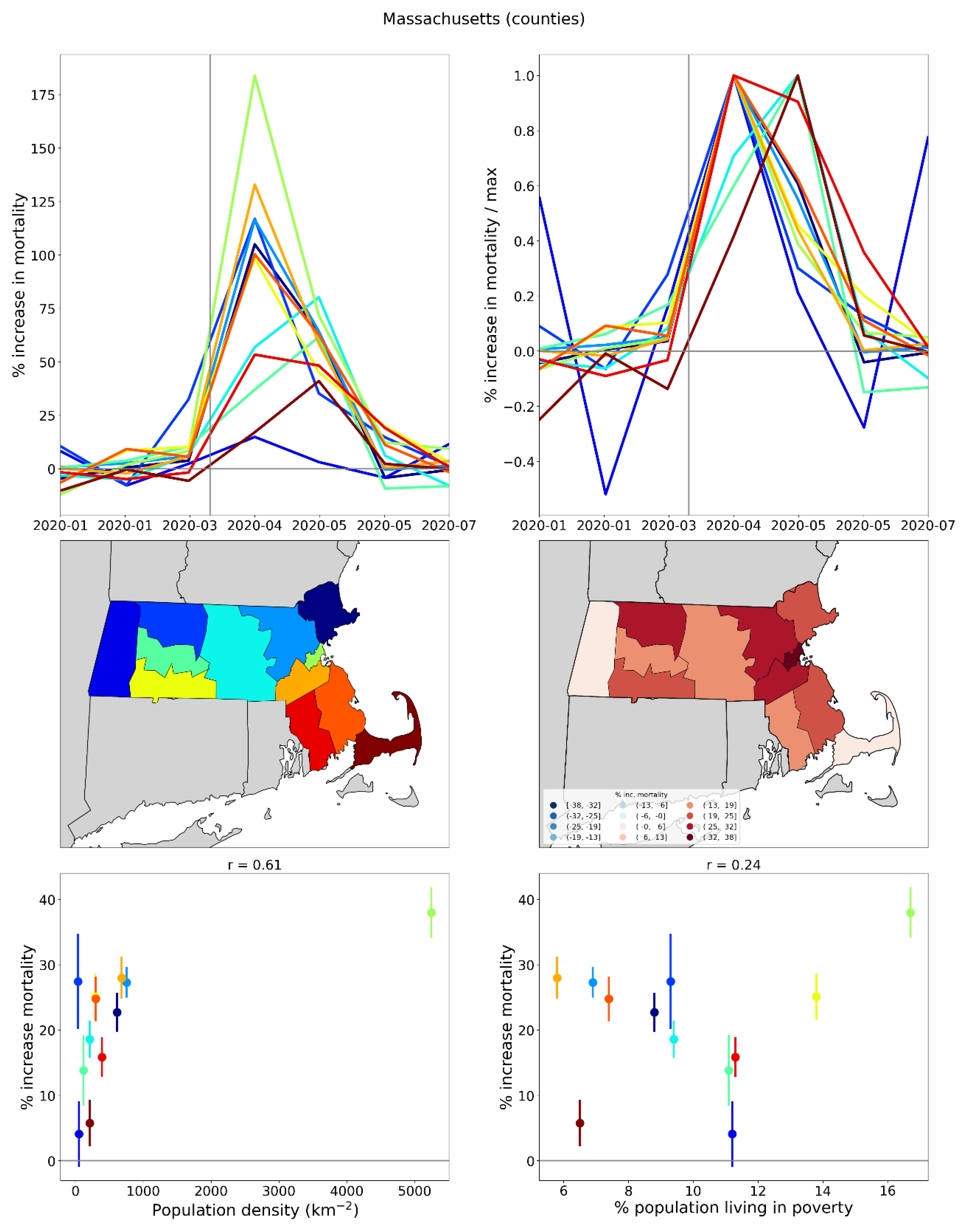
Figure 54.
Top panel: Map of locations of the five busiest airports in Italy (stars) within their respective NUTS2 regions. Middle panel: Weekly P-scores for the five indicated NUTS2 regions. Bottom panel: Same as middle panel, with each curve scaled by its maximum.
Figure 54.
Top panel: Map of locations of the five busiest airports in Italy (stars) within their respective NUTS2 regions. Middle panel: Weekly P-scores for the five indicated NUTS2 regions. Bottom panel: Same as middle panel, with each curve scaled by its maximum.
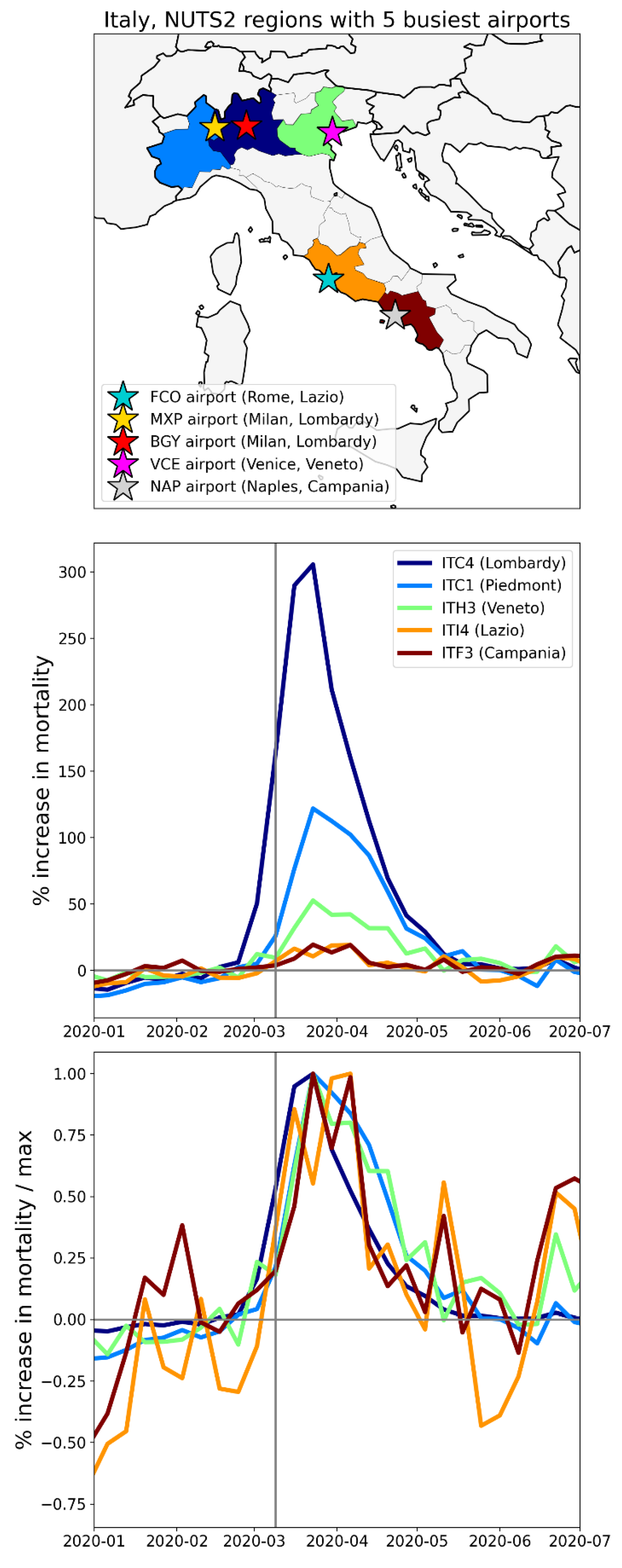
Figure 55.
Integrated first-peak period P-scores for USA counties (heatmap) with circles centred on urban areas with major airports: New York City (NY), Miami (FL), Los Angeles (CA), San Francisco (CA), Chicago (IL), Atlanta (GA), Houston (TX) and Dallas (TX). Circle diameters are proportional to: green: urban-area population in 2020 (US Census Bureau, 2024c); blue: total number of international air passengers served in 2019 (Department of Transportation, 2020); red: number of flights arriving from China in January 2020 (Eder et al., 2020). Dark grey indicates counties for which data was unavailable.
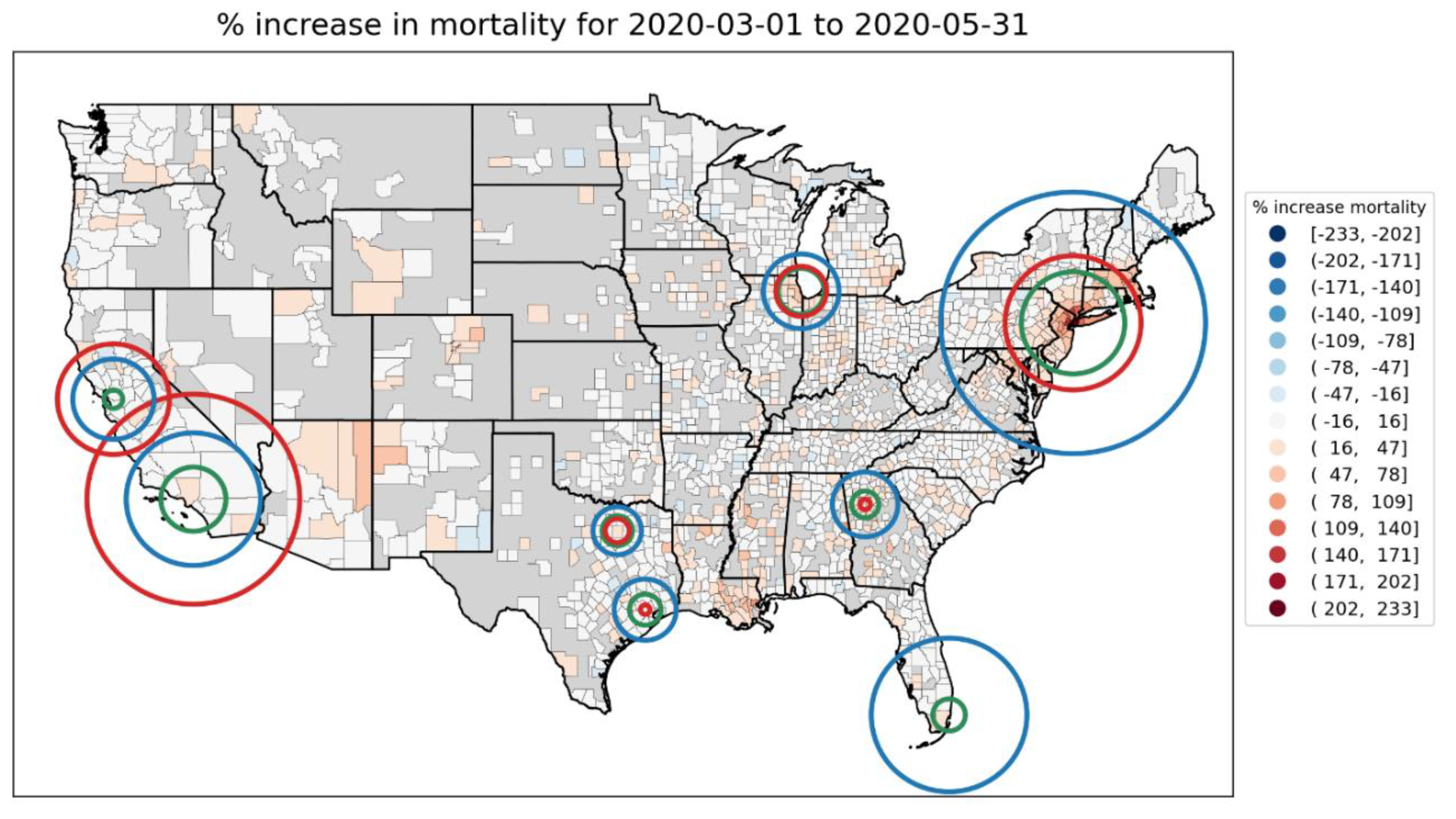
Figure 56.
Top panel: Share (as a fraction) of all of a USA state’s first-peak period deaths that occurred in a given location (location types indicated in the legend below the figure) vs the first-peak period P-score for the state. Bottom panel: Same y-axis as the top panel, but x-axis lists the USA states in order of increasing first-peak period P-score.
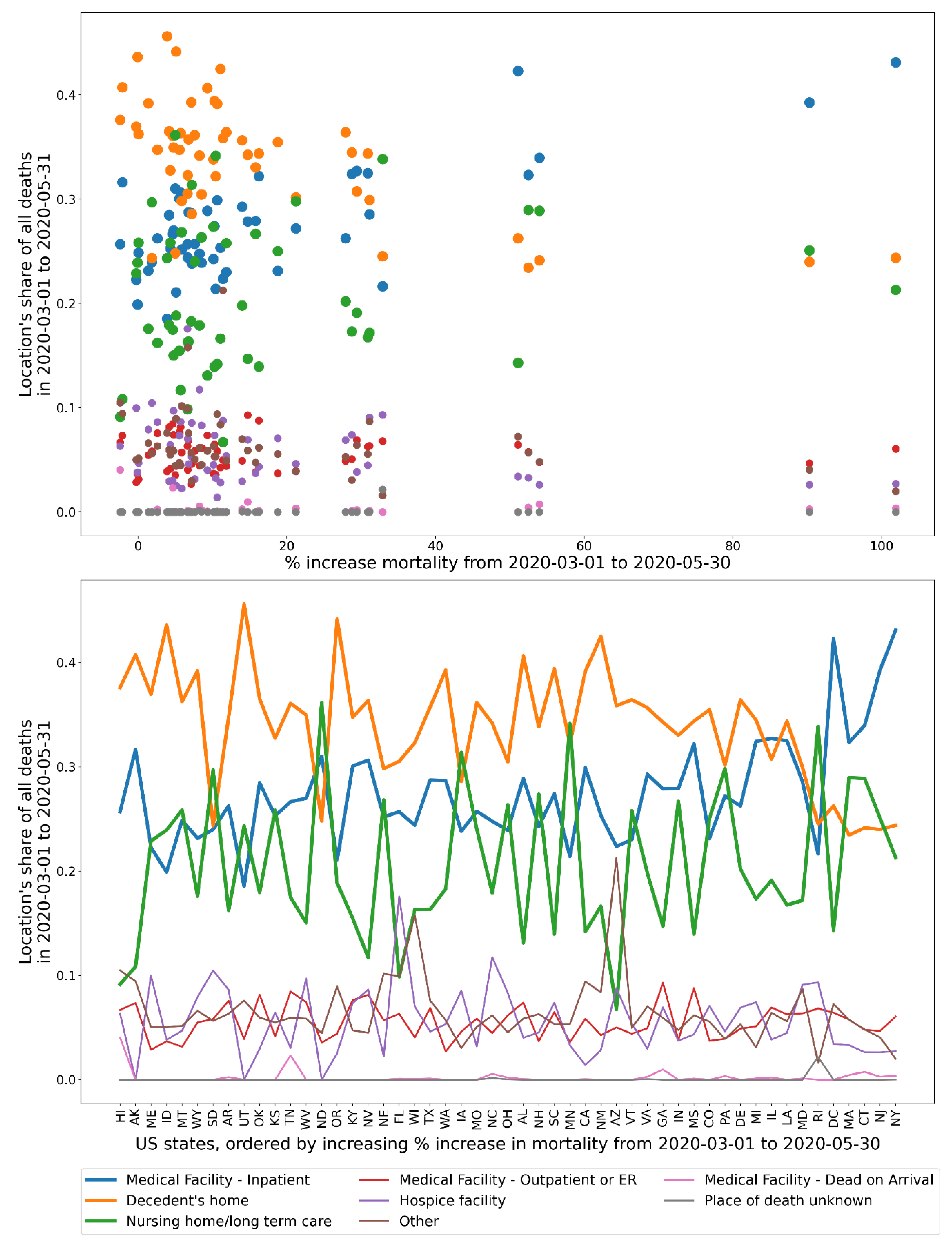
Figure 57.
Top panel: Difference in the March-May 2020 share of all of a USA state’s deaths that occurred in a given location and the March-May 2019 share of all of the state’s deaths that occurred in the same location (as a difference of fractions), vs the first-peak period P-score for the state. Bottom panel: Same y-axis as the top panel, but x-axis lists the USA states in order of increasing first-peak period P-score.
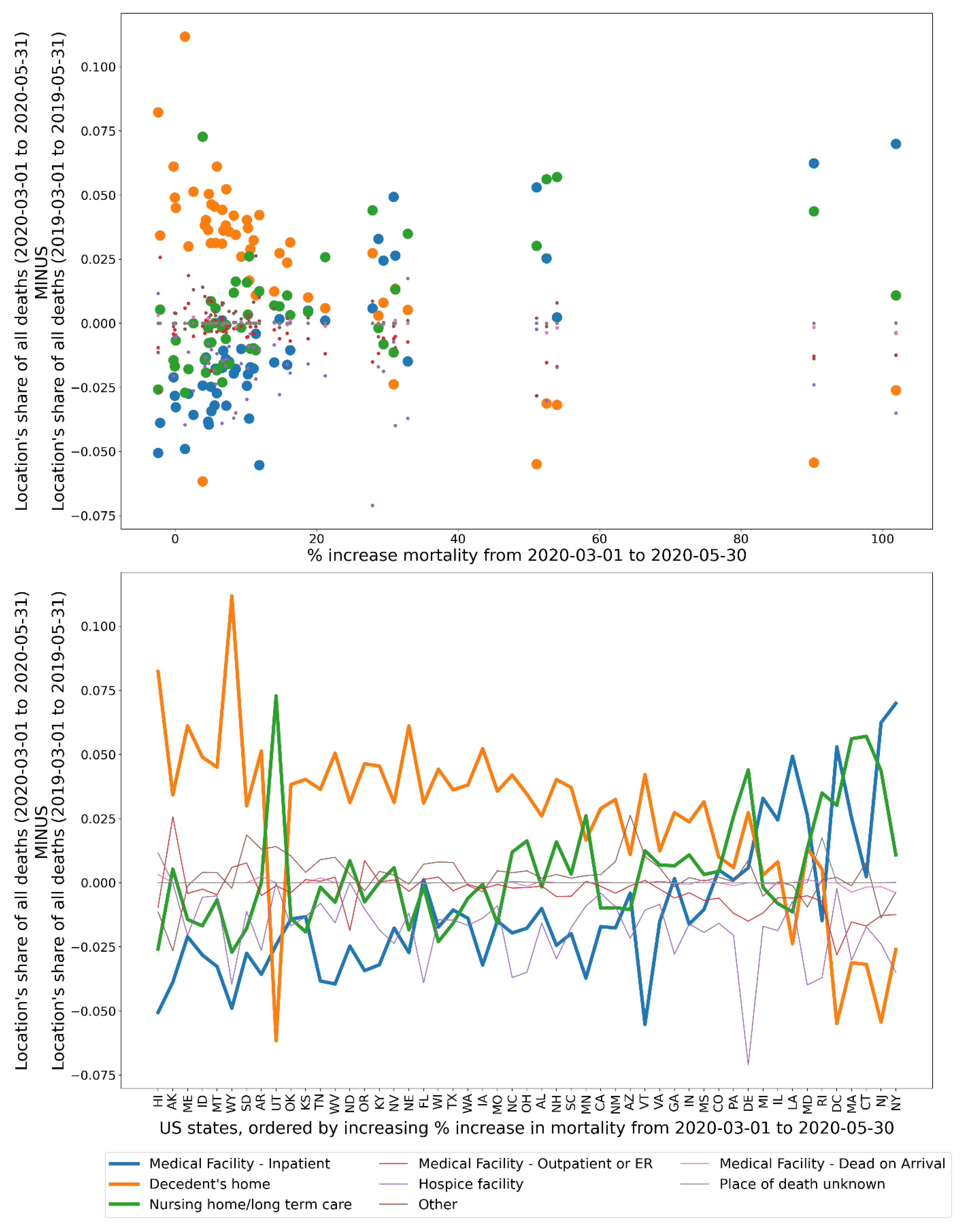
Figure 58.
Top panel: y-axis: Share of all of a state’s deaths that took place at home in March-May of 2020 divided by the share of the same state’s deaths that took place at home in March-May of 2019; x-axis: same as y-axis, for deaths occurring in hospital. The size of each point is proportional to the integrated first-peak period P-score for the state. Bottom panel: Same as the top panel, showing the state codes.
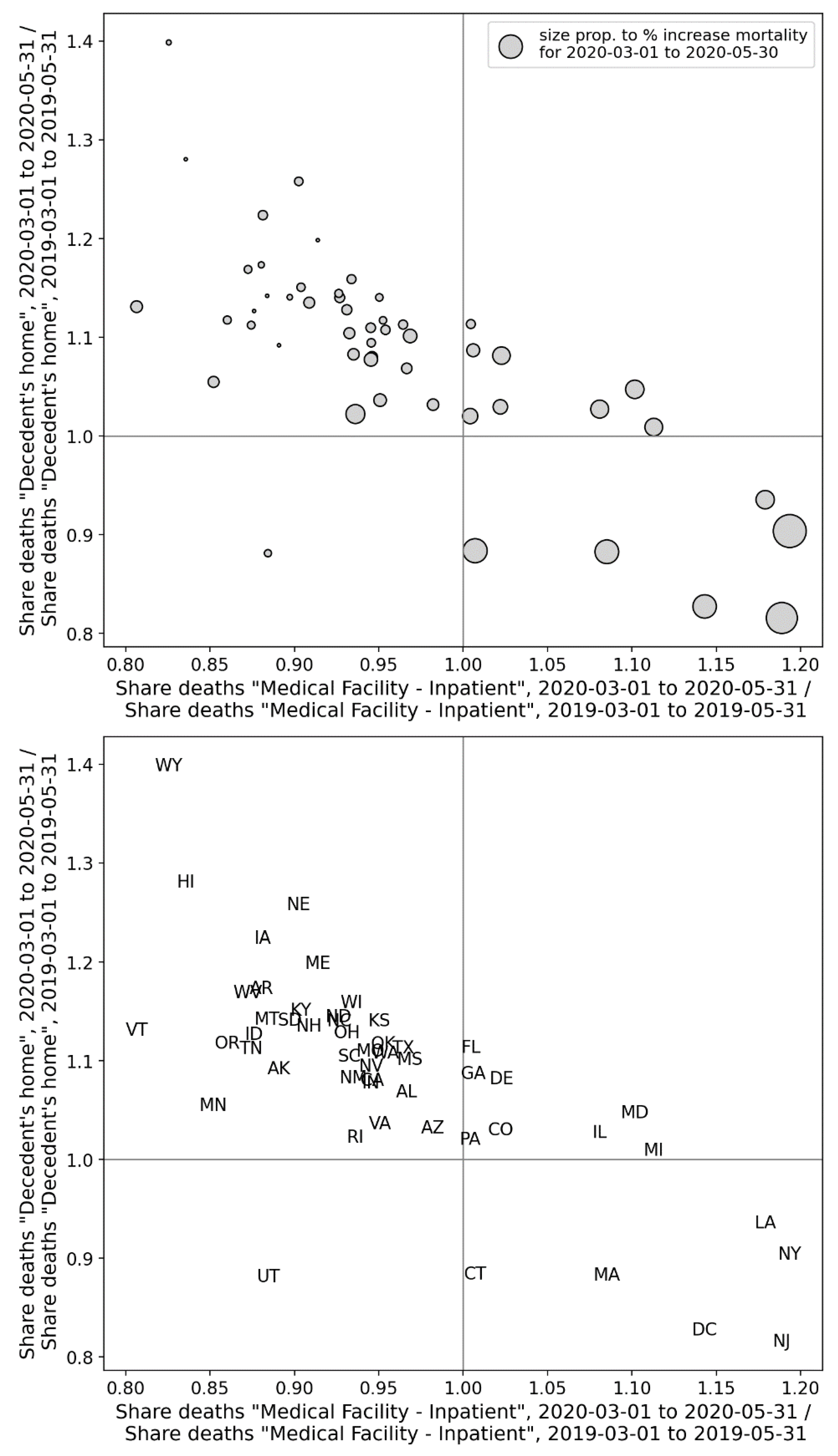
Figure 59.
Top panel: y-axis: Share of all of a county’s deaths that took place at home in March-May of 2020 divided by the share of the same county’s deaths that took place at home in March-May of 2019; x-axis: same as y-axis, for deaths occurring in hospital. The size of each point is proportional to the integrated first-peak period P-score for the county. Bottom panel: Same as the top panel, showing the state codes of the counties.
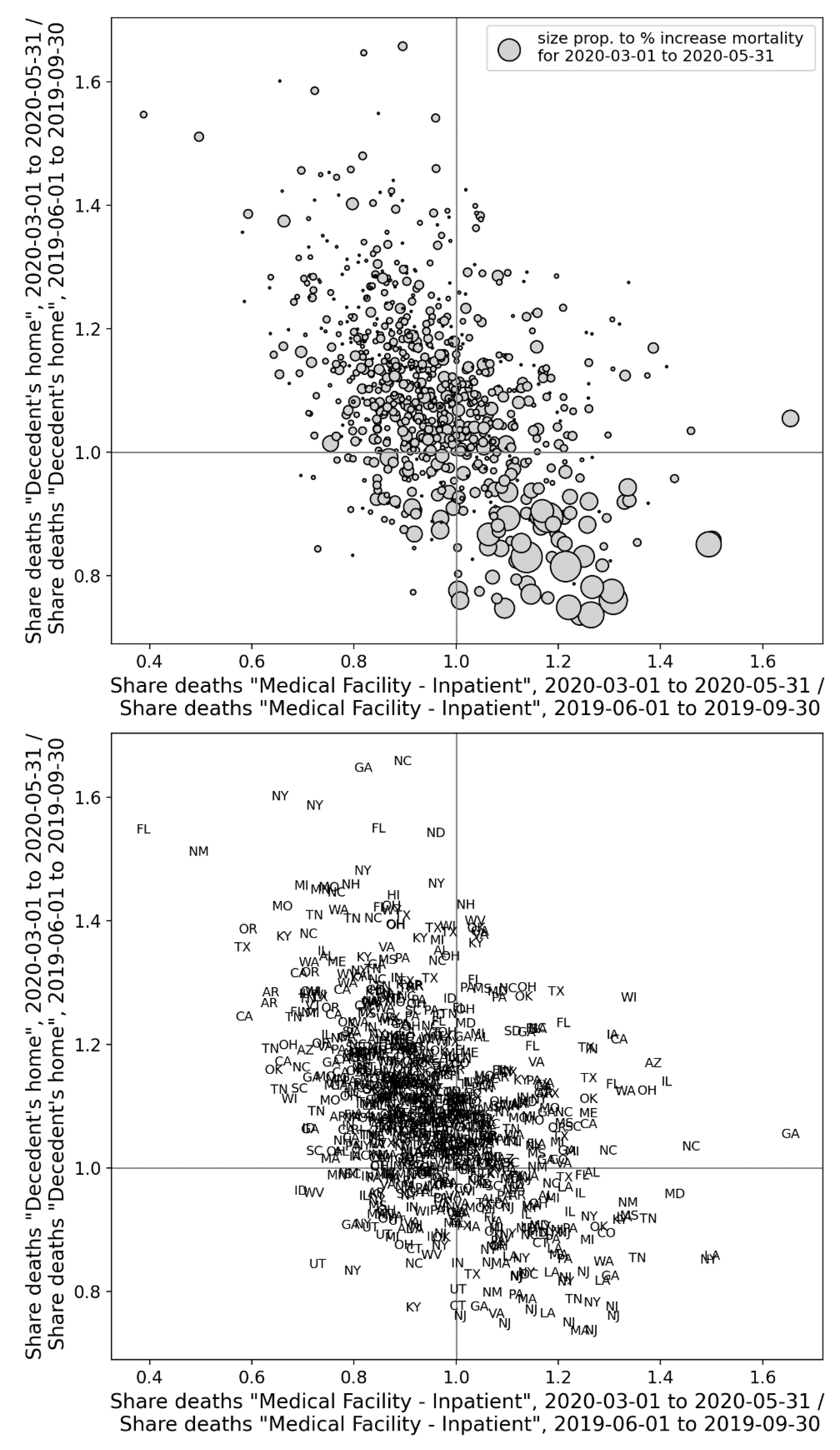
Figure 60.
Top panel: y-axis: Share of all of a state’s deaths that took place in a nursing home or long-term care (LTC) in March-May of 2020 divided by the share of the same state’s deaths that took place in a nursing home or LTC in March-May of 2019; x-axis: same as y-axis, for deaths occurring in hospital. The size of each point is proportional to the integrated first-peak period P-score for the state. Bottom panel: Same as the top panel, showing the state codes.
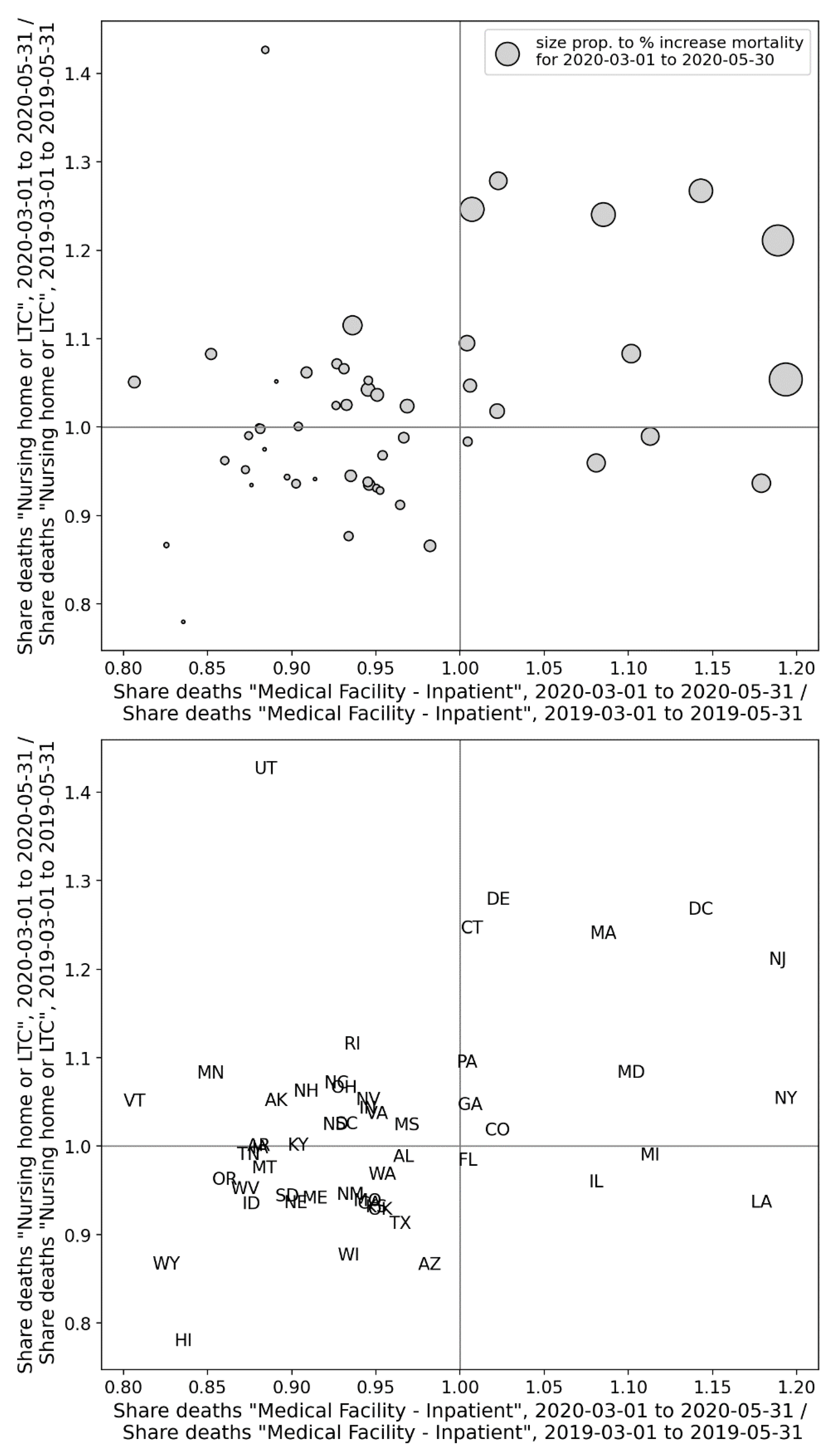
Figure 61.
Top panel: y-axis: Share of all of a county’s deaths that took place in nursing homes or long-term care (LTC) in the first-peak period (2020) divided by the share of the same county’s deaths that took in nursing homes or LTC in March-May of 2019; x-axis: same as y-axis, for deaths occurring in hospital. The size of each point is proportional to the integrated first-peak period P-score for the county. Bottom panel: Same as the top panel, showing the state codes of the counties.
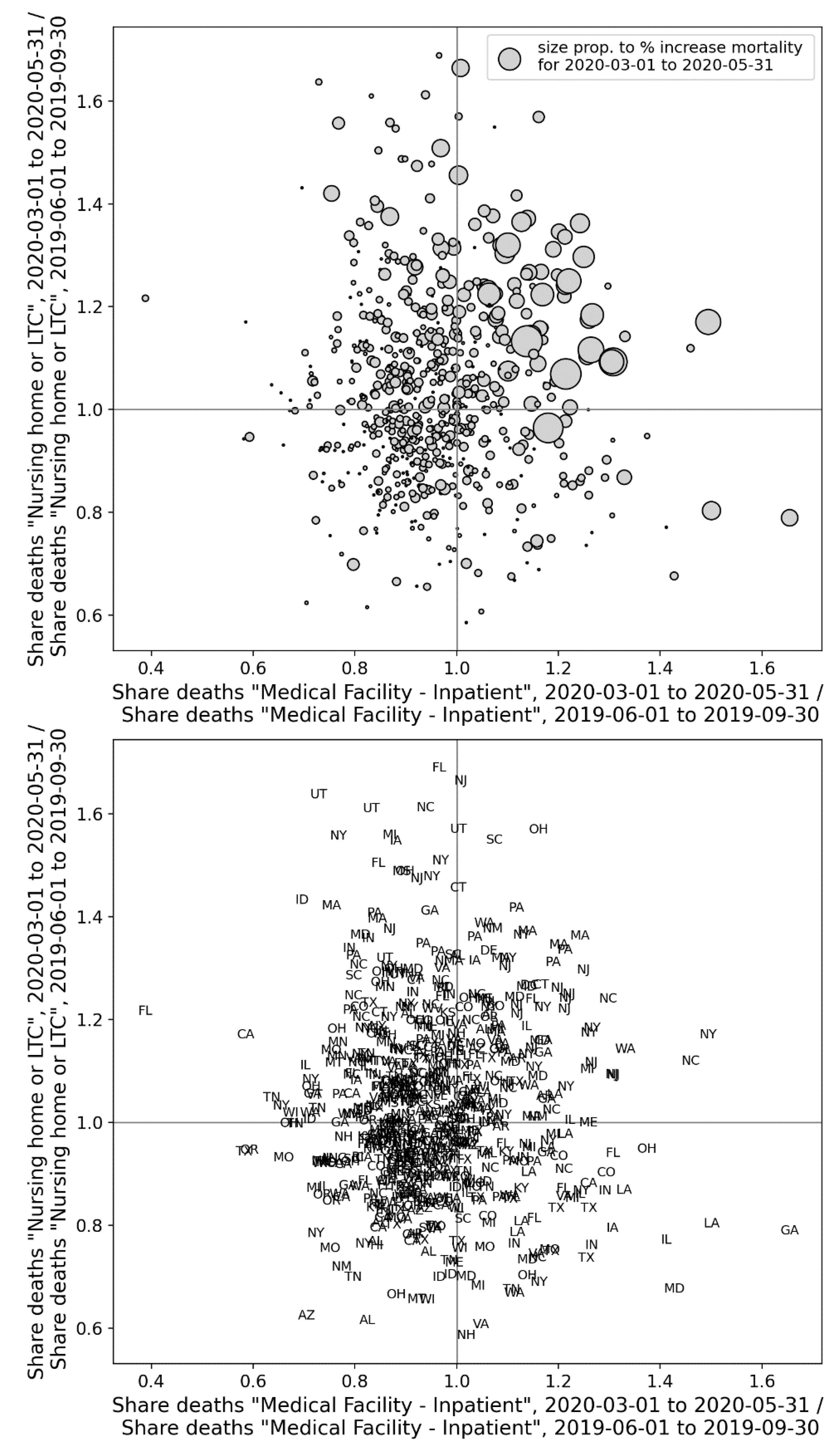
Figure 62.
Top panel: y-axis: Share of all of a state’s deaths that took place at home in March-May of 2020 divided by the share of the same state’s deaths that took place at home in March-May of 2019; x-axis: same as y-axis, for deaths occurring in a nursing home or long-term care (LTC). The size of each point is proportional to the integrated first-peak period P-score for the state. Bottom panel: Same as the top panel, showing the state codes.
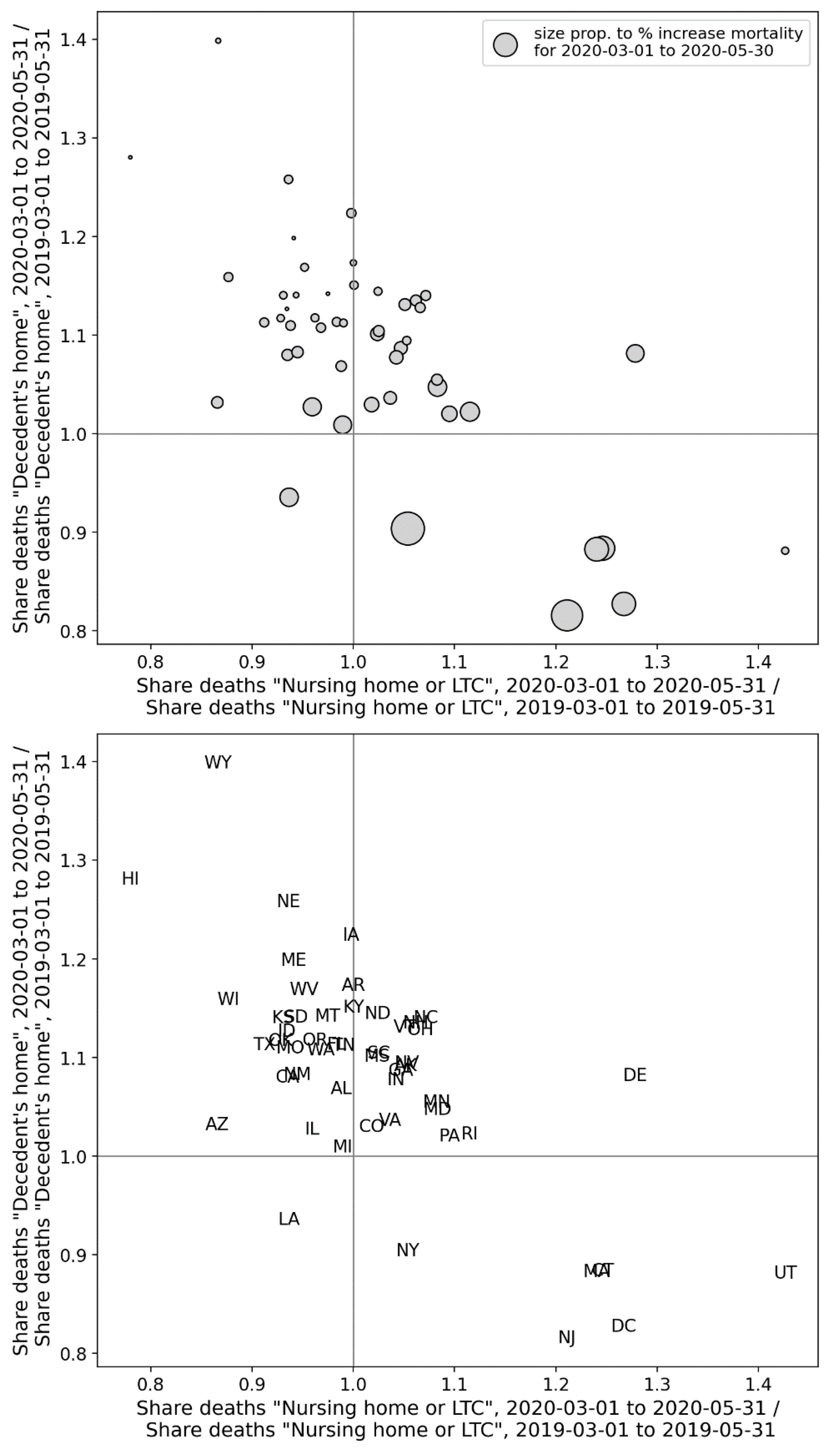
Figure 63.
Top panel: y-axis: Share of all of a county’s deaths that took place at home in the first-peak period (2020) divided by the share of the same county’s deaths that took place at home in March-May of 2019; x-axis: same as y-axis, for deaths occurring in nursing homes or long-term care (LTC). The size of each point is proportional to the integrated first-peak period P-score for the county. Bottom panel: Same as the top panel, showing the state codes of the counties.
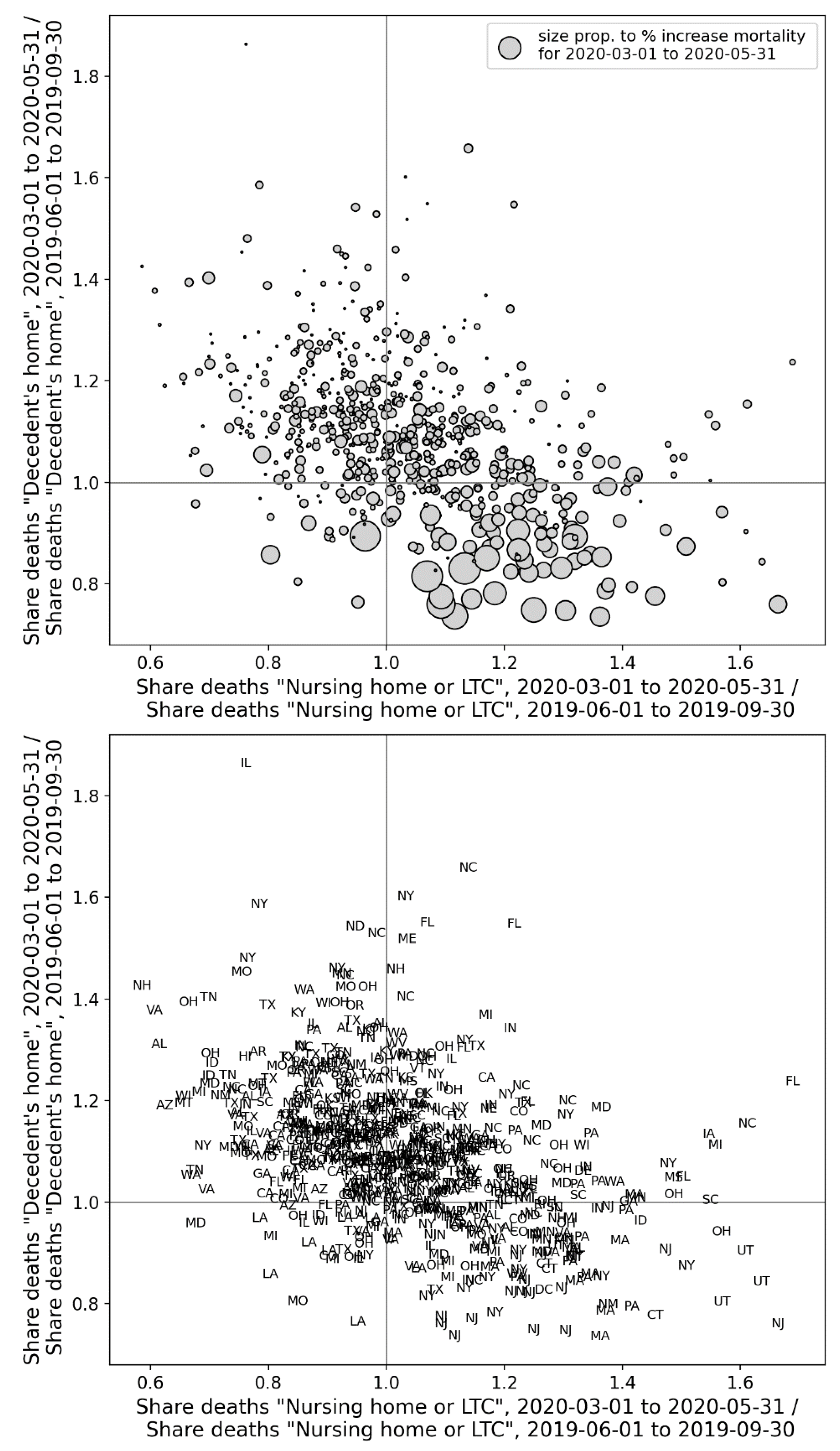
Figure 158.
Copy of Figure 2, with added yellow line dividing Europe into countries with high (P-score > 5 %, western part) and low (P-score ≤ 5 %, eastern part) integrated first-peak period P-scores.
Figure 158.
Copy of Figure 2, with added yellow line dividing Europe into countries with high (P-score > 5 %, western part) and low (P-score ≤ 5 %, eastern part) integrated first-peak period P-scores.
Figure 159.
Copy of Figure 1c from Davis et al. (2021). Their caption reads: “[…] c, The probability that a city in Europe (left) and the USA (right) had generated at least 100 cumulative infections by 21 February 2020. Color and circle size are proportional to the probability.”.
Figure 159.
Copy of Figure 1c from Davis et al. (2021). Their caption reads: “[…] c, The probability that a city in Europe (left) and the USA (right) had generated at least 100 cumulative infections by 21 February 2020. Color and circle size are proportional to the probability.”.
Figure 160.
Copy of the right panel of Figure 3, showing a map of integrated first-peak period P-scores for European NUTS1 regions, with color range capped at a value of 73%. Dark grey indicates countries for which data was not available.
Figure 160.
Copy of the right panel of Figure 3, showing a map of integrated first-peak period P-scores for European NUTS1 regions, with color range capped at a value of 73%. Dark grey indicates countries for which data was not available.
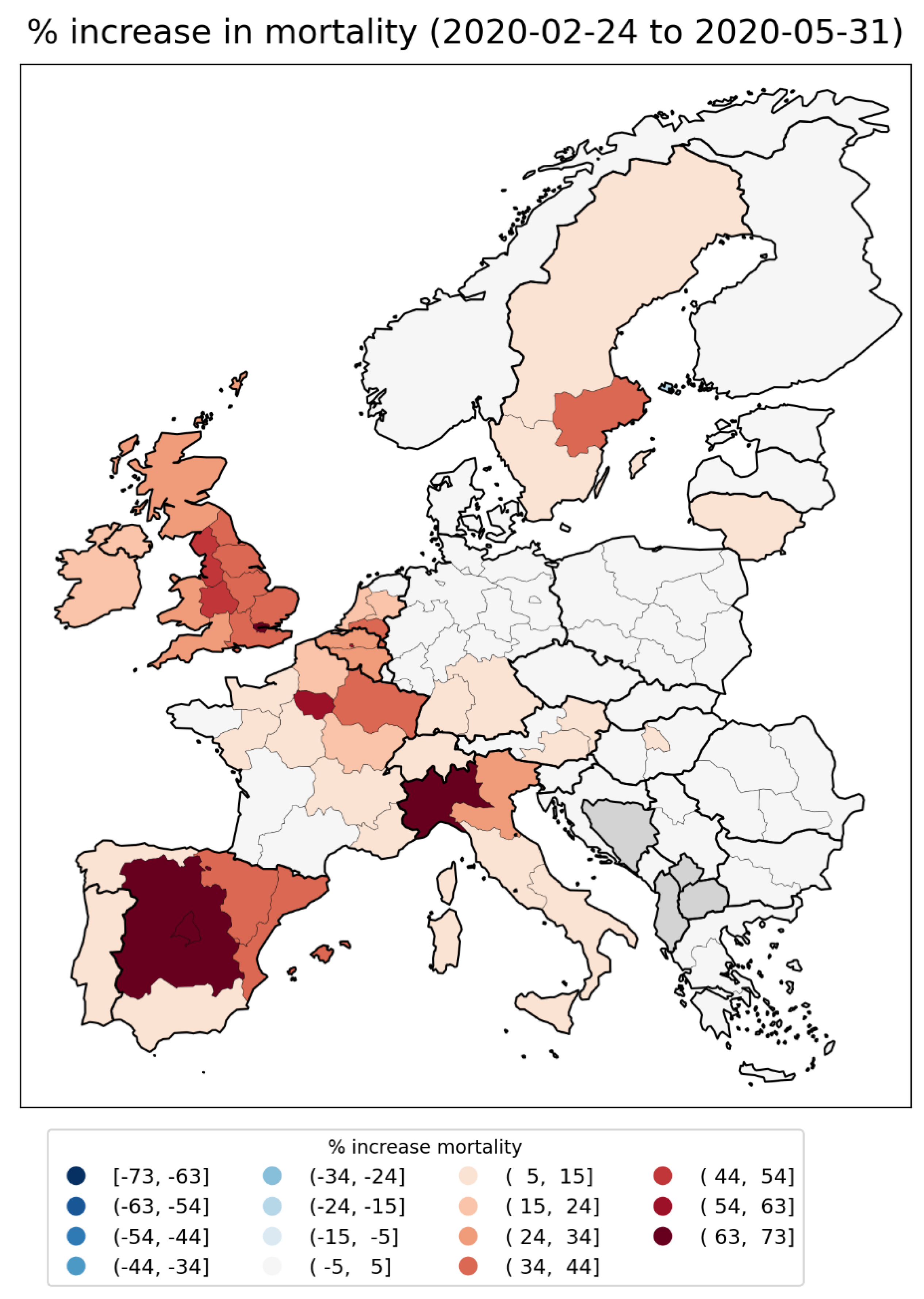
Figure 161.
Copy of Figure 18. Top panel: weekly P-scores during the first-peak period for the NUTS1 regions of Spain. Bottom panel: same as top panel, with each curve scaled by its maximum.
Figure 161.
Copy of Figure 18. Top panel: weekly P-scores during the first-peak period for the NUTS1 regions of Spain. Bottom panel: same as top panel, with each curve scaled by its maximum.
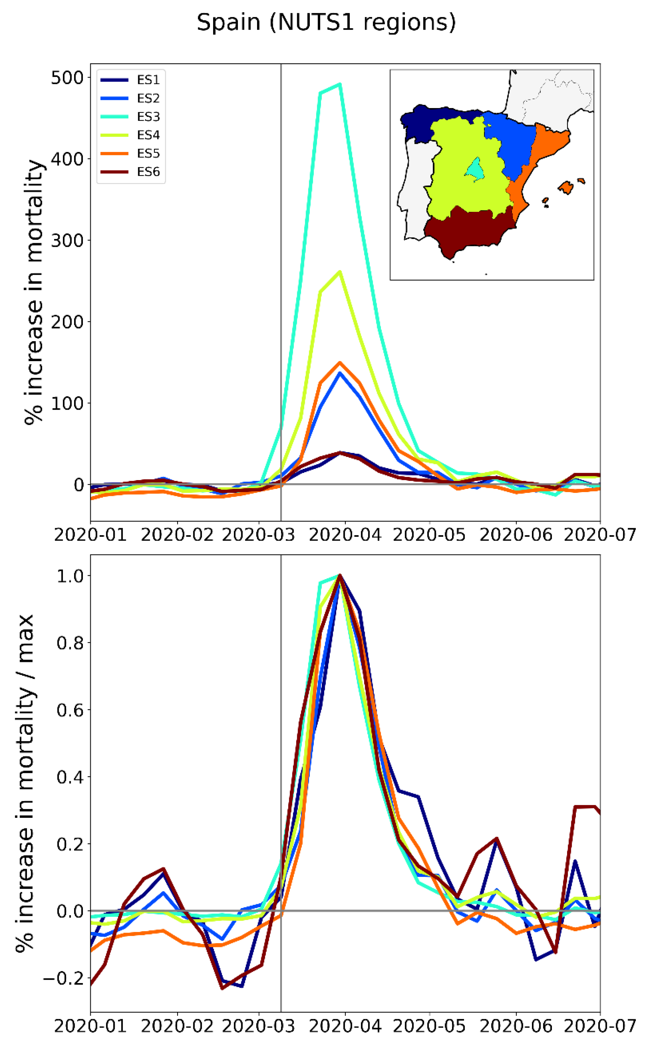
Figure 162.
Copy of the upper two panels of Figure 1 from Thomas et al. (2020). Their figure caption has: “[Left] Infection curves for Seattle, WA. The red line is the curve for the whole city, while the black lines are the infection curves for each tract in the city. While the red curve is relatively smooth, this smoothness hides a significant amount of heterogeneity in the timing of the infection curves for each census tract. [Right] Infection curves for Washington, DC. As with Seattle, the city-level curve conceals considerable spatial variability in the infection’s progress.”.
Figure 163.
Top left: monthly P-scores for the counties of the New York City Metropolitan Area. Top right: same as top left, with each curve scaled by its maximum. Here, the vertical grey solid lines indicate the date at which the WHO declared a pandemic. Middle left: map with counties colored as per the curves in top row and points in bottom row of panels. Middle right: heatmap showing integrated first-peak period (March-May 2020) P-score for each county. Bottom left: scatter plot of county integrated first-peak period P-score vs county population density. Bottom right: scatter plot of county integrated first-peak period P-score vs. county percent of population living in poverty.
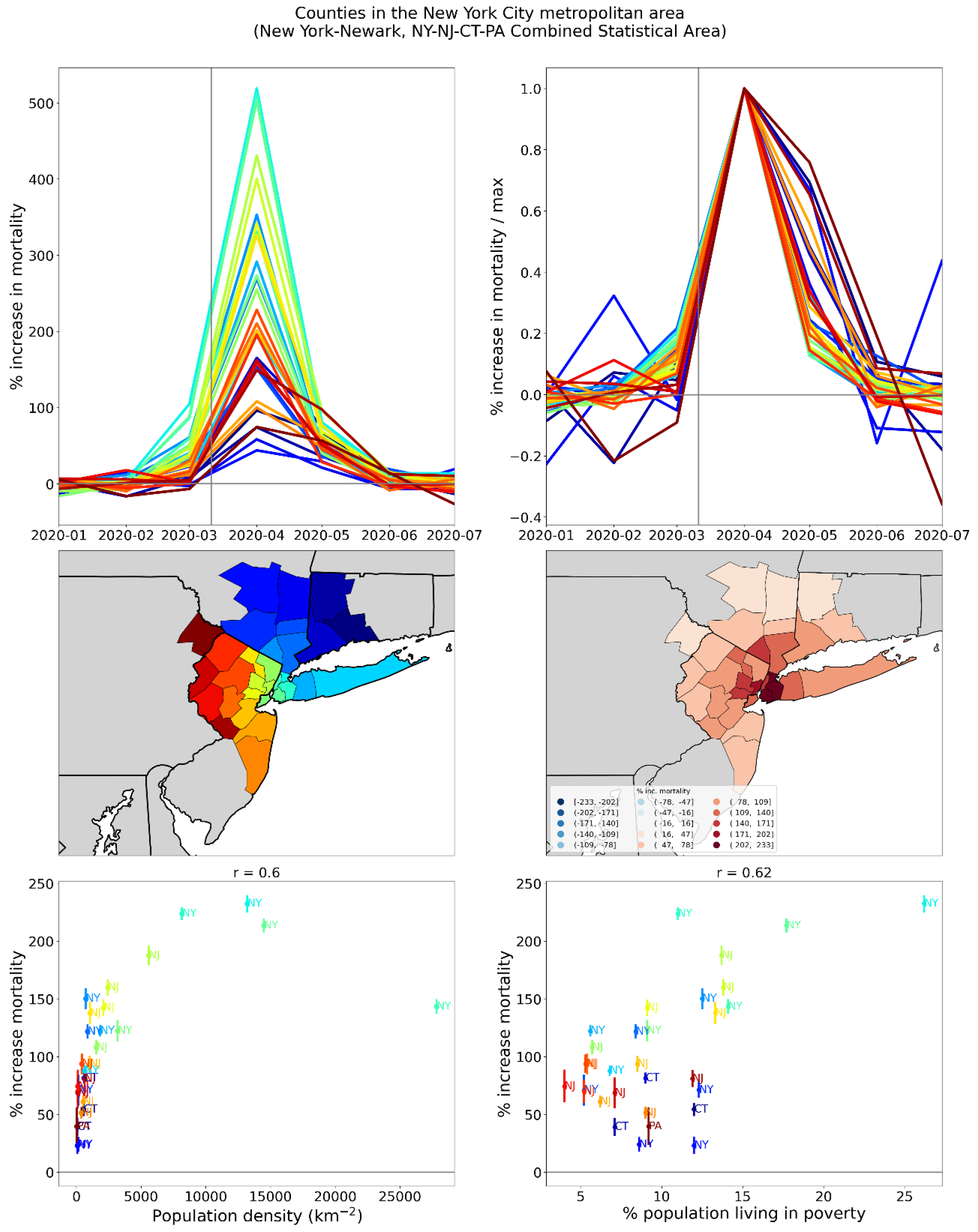
Figure 164.
Top panel: weekly P-scores during the first-peak period for European countries Italy, Spain, and the UK. Bottom panel: same as top panel, with each curve scaled by its maximum. Dashed colored vertical lines indicate the date that each country implemented its first national lockdown. Solid grey vertical line indicates the date of the pandemic declaration (March 11, 2020).
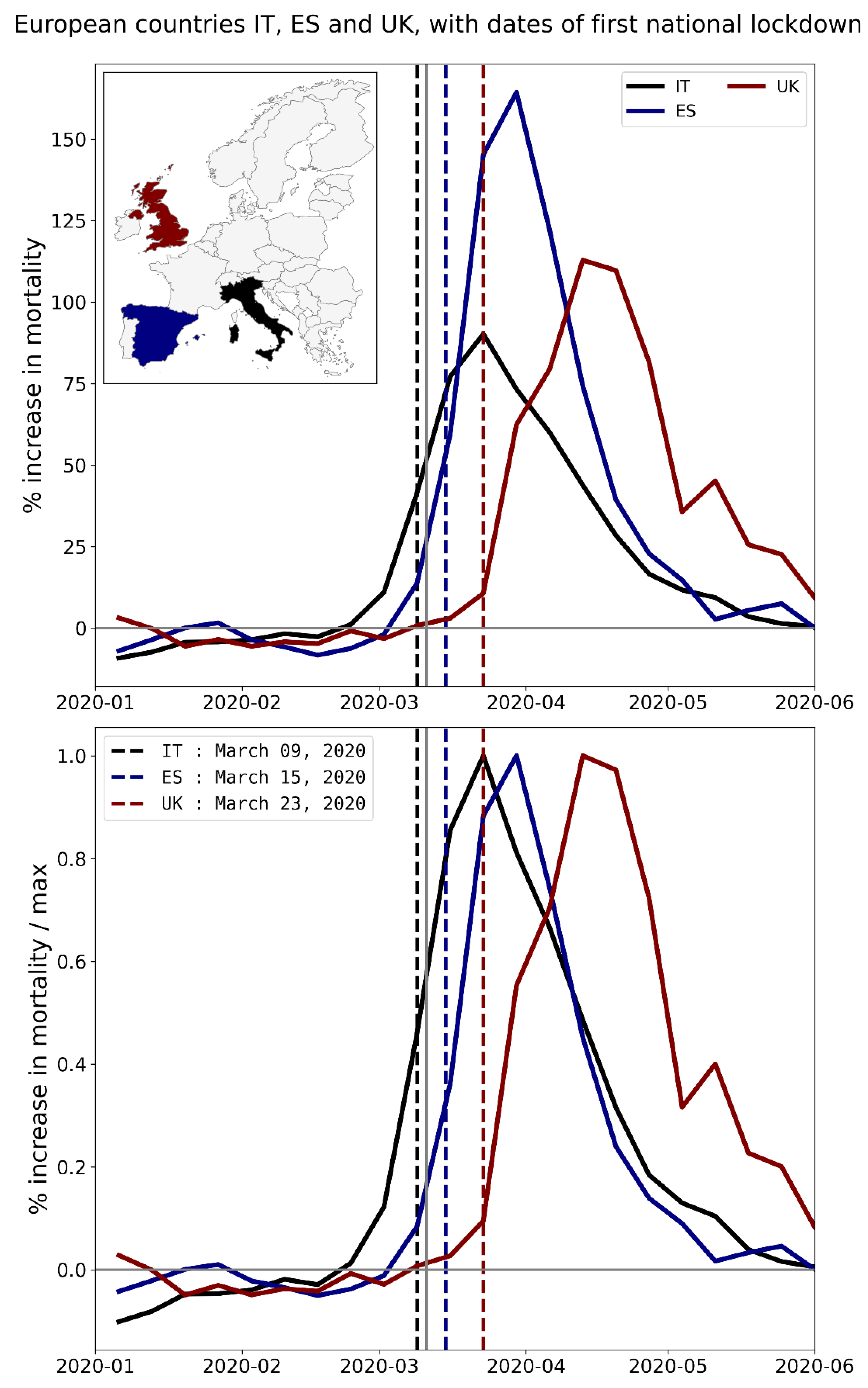
Figure 165.
Top panel: weekly P-scores during the first-peak period for the NUTS1 regions of the UK, color coded as per the map inset. Bottom panel: same as top panel, with each curve scaled by its maximum. Dashed black vertical line indicates the date the UK implemented its first national lockdown. Solid grey vertical line indicates the date of the pandemic declaration (March 11, 2020).
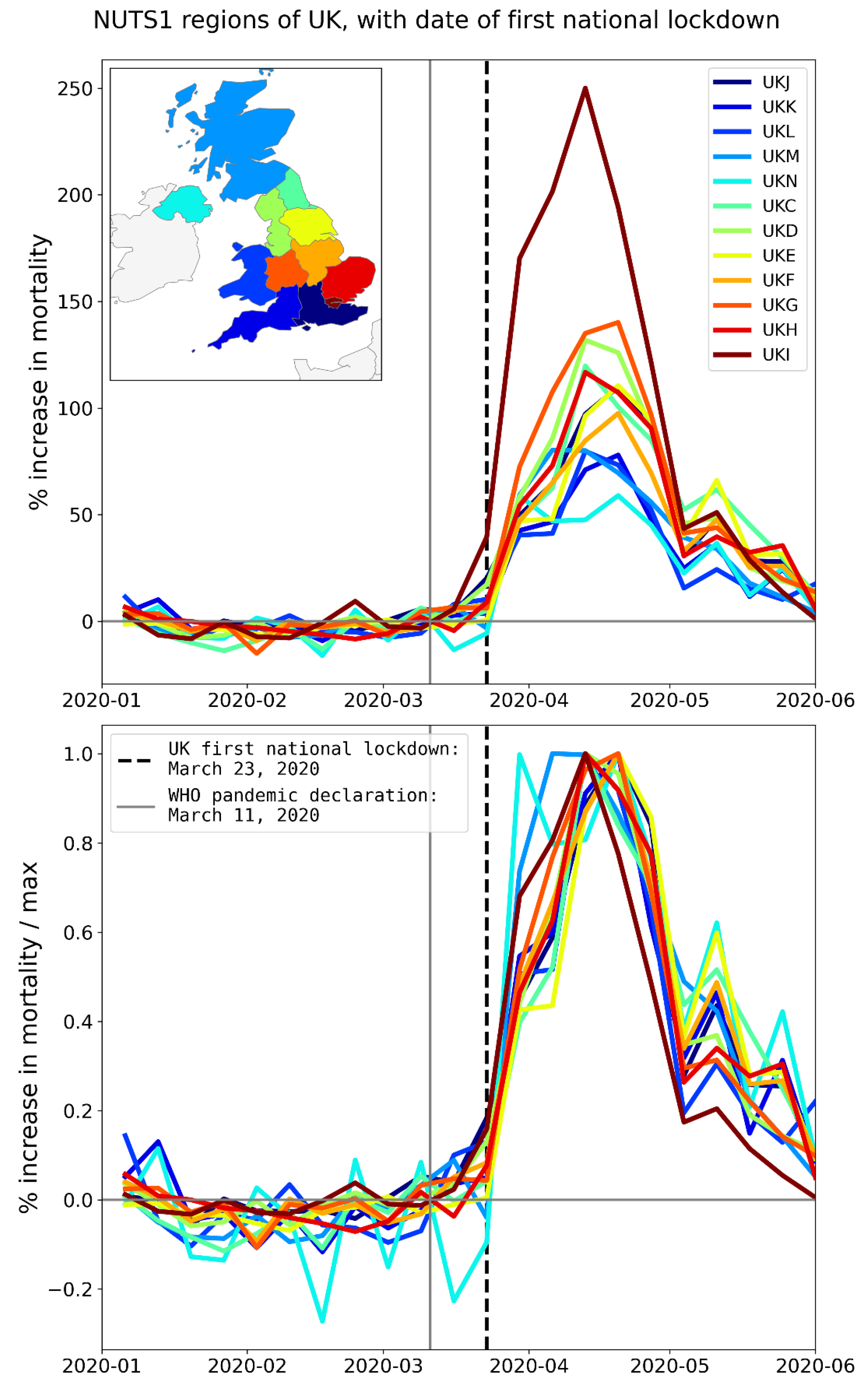
Figure 166.
Calculated concentrations of airborne fine particulate matter (PM2.5) (annual mean) [Copy of the figure in European Environment Agency (2018)].
Figure 166.
Calculated concentrations of airborne fine particulate matter (PM2.5) (annual mean) [Copy of the figure in European Environment Agency (2018)].
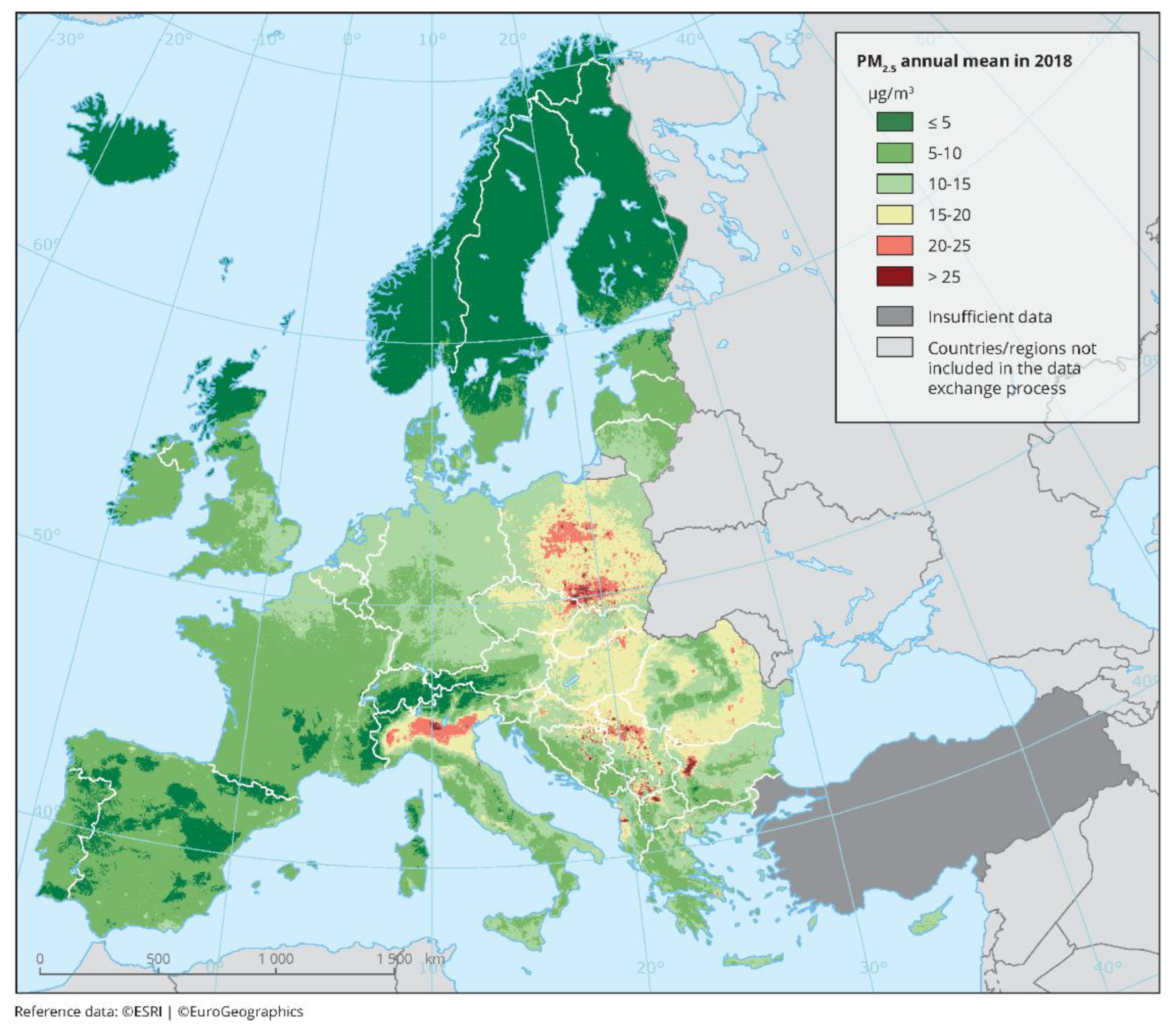
Figure 167.
Copy of Figure 1 from Gonzalez-Zorn (2021). The original caption has: “Fig. 1. Use of antibiotics in Spanish hospitals from January 2017 to 31 March 2020. Total intrahospital antibiotic (left) and azithromycin (right) use show consumption peaks in March 2020 during the coronavirus disease 2019 (COVID-19) pandemic. […]”.

Table 1.
Statistics on passenger volumes at Italy’s five busiest airports.
| Airport Name | Code | NUTS2 region | Total Passengers (2019)* | Num. passengers arriving directly from or traveling directly to a Chinese airport‡ | Num. passengers directly to or from an Asia Pacific airport*** (2019) |
||
|---|---|---|---|---|---|---|---|
| 2017* | 2018** | 2019*** | |||||
| Rome Leonardo da Vinci-Fiumicino | FCO | ITI4 (Lazio) |
43,354,887 | 443,762 | 413,882 | 506,898 | 2,019,300 |
| Milan Malpensa | MXP | ITC4 (Lombardy) ITC1 (Piedmont) |
28,705,638 | 246,437 | 272,783 | 346,887 | 1,269,474 |
| Milan Bergamo | BGY | ITC4 (Lombardy) |
13,792,266 | none reported | none reported | none reported | 0 |
| Venice Marco Polo | VCE | ITH3 (Veneto) | 11,507,301 | none reported | none reported | none reported | 73,247 |
| Naples International Airport | NAP | ITF3 (Campania) | 10,796,590 | none reported | none reported | none reported | 208 |
.Notes:*Source: ENAC (2017); **Source: ENAC (2018); ***Source: ENAC (2019); ‡Only routes with more than 50,000 passengers per year were reported.
Table 2.
Demographic characteristics of the NUTS2 regions in which Italy’s five busiest airports are located.
Table 2.
Demographic characteristics of the NUTS2 regions in which Italy’s five busiest airports are located.
| NUTS2 region | ITI4 (Lazio) | ITC4 (Lombardy) | ITC1 (Piedmont) | ITH3 (Veneto) | ITF3 (Campania) |
|---|---|---|---|---|---|
| Population in 2020 (millions) * | 5.76 | 10.03 | 4.31 | 4.88 | 5.71 |
| All-ages mortality rate in 2019 (per 1000 persons) * | 10.1 | 10.1 | 12.4 | 10.1 | 9.5 |
| Share pop. aged 65+ in 2020 (%) * | 22.2 | 22.9 | 25.9 | 23.3 | 19.3 |
| Share pop. aged 80+ in 2020 (%) * | 7 | 7.4 | 8.6 | 7.3 | 5.3 |
| Num. beds in hospitals in region in 2020 ** | 20,268 | 36,383 | 15,332 | 15,799 | 14,582 |
| Num. beds in hospitals in region in 2020 / Population of region in 2020 | 1.59 | 1.58 | 1.34 | 1.35 | 1.33 |
| Num. ICU beds in region in 2017 ‡ | 486 | 738 | 299 | 468 | 427 |
| Num. ICU beds in region in 2017 / Num. people in region aged 65+ in 2020 (%) | 0.038 | 0.032 | 0.027 | 0.041 | 0.039 |
| Integrated first-peak period P-score and 1σ error (%) | 5.8 ± 1.7 | 106.2 ± 2.5 | 47.9 ± 2.1 | 21.0 ± 1.7 | 6.6 ± 1.8 |
Notes: *Source: Eurostat (2024b); **Source: Eurostat (2024g); ‡Source: Pecoraro et al. (2020).
Table 3.
Demographic, socioeconomic, and health care system statistics for New York City (5 counties constituting the 5 boroughs of NYC), Los Angeles (Los Angeles County), and San Francisco (9 counties of the SF urban area: San Francisco, Marin, Sonoma, Napa, Solana, Contra Costa, Alameda, Santa Clara and San Mateo Counties). Data sources specified in Section 2.
| New York City | Los Angeles | San Francisco | |
|---|---|---|---|
| Total population (millions) | 8.44 | 10.1 | 7.68 |
| Total area (km2) | 778 | 10500 | 17900 |
| Population density (km-2) | 10800 | 962 | 429 |
| % population aged 65+ | 14.1 | 12.9 | 14.6 |
| % living in poverty | 18.6 | 15.7 | 9.1 |
| % minority | 67.9 | 73.7 | 60.3 |
| % pop. that speaks English "less than well" | 11.7 | 12.8 | 7.6 |
| % pop. aged 25+ with no high school diploma | 12.9 | 14.5 | 8.1 |
| % households with more people than rooms | 9.0 | 11.4 | 6.7 |
| % single-parent households | 9.6 | 9.4 | 6.6 |
| Num. ICU beds per total pop. (%) | 0.019 | 0.021 | 0.020 |
| Num. ICU beds per pop. aged 65+ (%) | 0.13 | 0.16 | 0.13 |
| Integrated first-peak period P-score and 1σ error (%) | 200.2 ± 2.5 | 23.9 ± 1.8 | 7.3 ± 1.3 |
Table 4.
Socioeconomic variables shown on x-axes in Figure 64 to Figure 98 and in maps in Figure 99 to Figure 133. Notes: *“2017-2021 ACS” indicates that the data corresponds to an estimate obtained from the 5-Year American Community Survey for 2017-2021; **“2014-2018 ACS” indicates that the data corresponds to an estimate obtained from the 5-Year American Community Survey for 2014-2018.
| Figure (scatter) | Figure (heatmap) | USA county-level socioeconomic variable | Year(s) |
|---|---|---|---|
| Figure 64 | Figure 99 | Population | 2019 |
| Figure 65 | Figure 100 | Log(Population) | 2019 |
| Figure 66 | Figure 101 | Population density | 2017-2021 ACS * |
| Figure 67 | Figure 102 | Log(Population density) | 2017-2021 ACS |
| Figure 68 | Figure 103 | Per capita income | 2014-2018 ACS ** |
| Figure 69 | Figure 104 | % living in poverty | 2014-2018 ACS |
| Figure 70 | Figure 105 | % unemployed | 2014-2018 ACS |
| Figure 71 | Figure 106 | Gini coefficient | 2014-2018 ACS |
| Figure 72 | Figure 107 | Inter-county disparity | 2014-2018 ACS |
| Figure 73 | Figure 108 | % households with no vehicle available | 2014-2018 ACS |
| Figure 74 | Figure 109 | % households with more people than rooms | 2014-2018 ACS |
| Figure 75 | Figure 110 | % living in housing structures with 10+ units | 2014-2018 ACS |
| Figure 76 | Figure 111 | % of population that speaks English “less than well” | 2014-2018 ACS |
| Figure 77 | Figure 112 | % minority | 2014-2018 ACS |
| Figure 78 | Figure 113 | % aged 25+ with no high school diploma | 2014-2018 ACS |
| Figure 79 | Figure 114 | % aged 65+ | 2014-2018 ACS |
| Figure 80 | Figure 115 | % aged 17 and under | 2014-2018 ACS |
| Figure 81 | Figure 116 | % households that are single-parent households | 2014-2018 ACS |
| Figure 82 | Figure 117 | % with a disability | 2014-2018 ACS |
| Figure 83 | Figure 118 | % with diabetes | 2018 |
| Figure 84 | Figure 119 | % with obesity | 2018 |
| Figure 85 | Figure 120 | % of votes cast in the 2016 election that were for the Democratic presidential candidate | 2016 |
| Figure 86 | Figure 121 | % deaths occurring at home in March-May 2019 | 2019 |
| Figure 87 | Figure 122 | % deaths occurring at home in June-September 2019 | 2019 |
| Figure 88 | Figure 123 | % deaths occurring in hospital in March-May 2019 | 2019 |
| Figure 89 | Figure 124 | % deaths occurring in hospital in June-September 2019 | 2019 |
| Figure 90 | Figure 125 | % deaths in hospital in March-May 2020 minus % deaths occurring in hospital in March-May 2019 | 2019, 2020 |
| Figure 91 | Figure 126 | % deaths in hospital in June-September 2020 minus % deaths occurring in hospital in June-September 2019 | 2019, 2020 |
| Figure 92 | Figure 127 | Number of prescription drug claims per person | 2017 |
| Figure 93 | Figure 128 | Number of antibiotic prescription drug claims per person | 2017 |
| Figure 94 | Figure 129 | % aged 18+ with at least one dose of a COVID vaccine by 2021-12-31 | 2020, 2021 |
| Figure 95 | Figure 130 | % aged 65+ with at least one dose of a COVID vaccine by 2021-12-31 | 2020, 2021 |
| Figure 96 | Figure 131 | % aged 18+ with completed primary series of a COVID vaccine by 2021-12-31 | 2020, 2021 |
| Figure 97 | Figure 132 | % aged 65+ with completed primary series of a COVID vaccine by 2021-12-31 | 2020, 2021 |
| Figure 98 | Figure 133 | Number of ICU beds per county | 2018, 2019 |
Disclaimer/Publisher’s Note: The statements, opinions and data contained in all publications are solely those of the individual author(s) and contributor(s) and not of MDPI and/or the editor(s). MDPI and/or the editor(s) disclaim responsibility for any injury to people or property resulting from any ideas, methods, instructions or products referred to in the content. |
© 2025 by the authors. Licensee MDPI, Basel, Switzerland. This article is an open access article distributed under the terms and conditions of the Creative Commons Attribution (CC BY) license (http://creativecommons.org/licenses/by/4.0/).
Copyright: This open access article is published under a Creative Commons CC BY 4.0 license, which permit the free download, distribution, and reuse, provided that the author and preprint are cited in any reuse.


