
Submitted:
19 February 2023
Posted:
01 March 2023
You are already at the latest version
Abstract
Abstract This essay presents a real-world demonstration of the evidence-based science communication process, showing how it can be used to create scientific data visualizations for public audiences. Visualizing research data can be an important science communication tool. Maximizing its effectiveness has the potential to benefit millions of viewers. As with many forms of science communication, creators of such data visualizations typically rely on their own judgments and the views of the scientists providing the data to inform their science communication decision-making. But that leaves out a critical stakeholder in the communications pipeline: the intended audience. Here, we show the practical steps that our team - the Advanced Visualization Lab at the University of Illinois at Urbana-Champaign - has taken to shift towards more evidence-based practice to enhance our science communication impact. We do this using concrete examples from our work on two scientific documentary films, one on the theme of ‘solar superstorms’ and the other focusing on the black hole at the center of the Milky Way galaxy. We used audience research with each of these films to inform our strategies and designs. We describe how such research evidence informed our understanding of ‘what works and why’ with cinematic-style data visualizations for the public. We close the essay with our key ‘take home’ messages from this evidence-based science communication process.
Keywords:
science communication
; informal learning
; public engagement
; science in the media
; entertainment media
; data visualization
; scientific visualization
1. Introduction
It is increasingly recognized that science communication practice should employ an evidence-based approach to deliver impact. Jensen & Gerber (2020) argued for changes in science communication norms and practices, including adapting engagement approaches to audience needs, proactively ensuring the inclusion of marginalized or under-represented groups and continually refining practices using insights from robust evaluations and audience research (also see Jensen & Dawson, 2011; Kennedy et al. 2018). This manifesto for evidence-based science communication has been widely viewed and cited (approx. 40,000 views and 60 citations as of early 2023). Yet, we are lacking concrete examples of what evidence-based science communication looks like as a process. It is important to clarify what kind of evidence can be used to inform practice, and how it can be used (e.g., Bucchi & Trench 2021). This paper presents the experience of a multi-disciplinary team implementing evidence-based science communication in the visualization of scientific data for public audiences. We show how we identified aspects of our work to prioritize for evaluation, then implemented a set of audience research studies to shape our design decision-making to increase our impact.
Taking an evidence-based approach means making visualization design choices not because they are the norm, or because that’s what the designers personally like or prefer to implement. Instead, audience needs are the driving force behind visualization design. However, understanding what audiences need, and using audience insights to inform practice can be challenging. We describe in this paper how we have gone about this process and its implications for our practices.
2. Science Communication through Data Visualization
With rapid advances in science, data processing, and computer graphics technologies, the line between representations of “real science” and “Hollywood science” is blurring. For example, the film “Interstellar” made the news for contributing to the scientific understanding of astrophysics (James et al., 2015). But the blurring of lines goes both ways: science is making visual effects more believable, while visual effects are making science more widely accessible (Borkiewicz et al., 2022). A cinematic presentation of scientific data, or ‘cinematic scientific visualization’, can capture public attention and interest in complex science topics in this current age of rapidly growing media consumption (Jensen et al., 2022). Placing emphasis on aesthetic design, storytelling, and cinematography, these cinematic visualizations reach millions of viewers worldwide through entertainment and informal learning experiences ranging from museums and documentary films to YouTube and Reddit. At the same time, these scientific visualizations are based on research data, and are created in collaboration with scientists. The dataset may be collected from the real world via satellite, telescope, microscope, or some other instrument; or it may be simulated on a computer based on the laws of physics. This distinctive, public-oriented, film-based form of scientific visualization is driven by distinct goals, processes, and outcomes, making it a new and important frontier in science communication.
Cinematic scientific visualizations are situated between the categories of traditional scientific visualization and artistic scientific illustration, integrating a visualization of scientific data and a Hollywood-style artistic impression (see Figure 1). Cinematic scientific visualization is defined by its (1) use of scientific data, (2) aim of achieving intelligibility for a public audience and (3) visual appeal (Borkiewicz et al., 2022) (see Figure 2).
Traditional visualization, cinematic visualization, and scientific illustration are all types of science communication, but with distinct intended audiences. Traditional visualization is most suitable for scientific experts (e.g., via research publications), and scientific illustration is often targeted at non-experts (e.g., via non-fiction and fiction films). Cinematic visualization is most often aimed at the general public, however recently improved computer graphics tools (e.g., Naiman et al. 2017; Borkiewicz et al. 2019) and machine learning (e.g., Aleo et al., 2020; Borkiewicz et al., 2021) are starting to make cinematic-style visualization more accessible to a wider range of scientists.
Borkiewicz et al. (2019, p. 11) argued that science should “make use of visual effects tools [to] allow for the creation of higher-fidelity visualizations that meet the high bar set by modern cinema”. To attain this goal, cinematic scientific visualization designers must balance accuracy and intelligibility. Only when an image is sufficiently understandable and accurate can the focus shift to the final piece of the puzzle, namely, aesthetic appeal. There are many challenges encountered in the process of going from raw data to visuals. Decisions about where to make omissions, simplifications, abstractions, or where to add artistic elements are typically made by data visualizers alone or jointly between visualizers and scientists. Indeed, scientists may drive the process by offering particular narratives they would like the visualization to portray, so that the data visualizers' task is to highlight those stories, possibly at the expense of other aspects. For example, in showing a system of extrasolar planets which were discovered via the dimming caused as each planet passes in front of its star, we as visualizers chose to exaggerate the planets' sizes to make that process clear for viewers (see Figure 3).
As with other types of science communication, there are sometimes negotiations between scientists and visualizers as to how to proceed, or which story to tell (Woodward et al. 2015). Although rarely implemented in practice, at present, an evidence-based, strategic communication process can guide how best to make such design decisions. Later in this article, we will demonstrate this process, using detailed examples from our recent experience.
Developing Effective Visual Science Communication
This paper aims to clarify what ‘evidence-based science communication’ means in practice, using the concrete example of developing scientific data visualizations for public audiences. Here, we present a case study of science communication using research data visualization drawn from our experience as a multi-disciplinary team at the Advanced Visualization Lab (AVL) at the National Center for Supercomputing Applications at the University of Illinois at Urbana-Champaign. The AVL produces cinematic scientific visualizations for films, documentaries, and museums to make complex scientific concepts understandable and exciting for broad public audiences. We are a “Renaissance Team” (Cox 1998) of 4-6 full-time visualization creators whose backgrounds include art & design, programming, and (more recently) science communication, and we work closely with scientists to bring their datasets to life. Our visualization work is funded by a variety of sources including government agencies (e.g., National Science Foundation, NASA), film companies (e.g., IMAX, Disney), philanthropic foundations (e.g., The Brinson Foundation), and through contract work.
We take advantage of recent technological advances to bring a cinematic level of scientific visualization to the data to create more appealing and accessible content. As an example, as of 2021, the documentary “Solar Superstorms” co-produced by AVL was shown on international television in 16 countries, played in 86 planetariums, has 4.6 million views on YouTube alone and is additionally available for streaming on Amazon Prime and MagellanTV.
One of the key barriers to introducing evidence-based practices into science communication work for teams like ours is having the budget or in-house capacity to conduct audience research and impact evaluations.
Science communicators are often left to their own devices to design and conduct empirical evaluations, with limited training and support by their institutions or funders, and often without in-house experts to call upon for advice. (Jensen & Gerber, 2020, p. 3)
Here, we present our recent experiences with audience research, enabled through temporarily adding an in-house audience research/evaluation expert to the team in the form of a Civic Science Fellow role funded by The Brinson Foundation. In what follows, we summarize what we did and what we have learned to date. We highlight three types of evidence that have extended our efforts to maximize visual communication effectiveness and forestall negative outcomes for our audiences: (1) Learning from existing research and theory, (2) quantitative audience research and (3) qualitative audience research.
Informing Practice with Existing Research Evidence
Many important and relevant findings have already been established, and do not require fresh data collection and analysis. Accessing insights from existing evidence of this kind takes only a modest investment of time. Motivated by the aim of fostering evidence-based practice through increasing our use of evidence to inform our practices, AVL has long consumed relevant research literature and theory to encourage reflexivity and refine our thinking about data visualization design via our regular “journal club”. This regular reading/discussion group extends beyond our team, periodically including other teams who do similar types of science communication with data visualization, such as NASA’s Scientific Visualization Studio.
Discussion topics covered at these regular meetings encapsulate a wide variety of domains, ranging from human perception (Healey & Enns 2012; Kong et al 2019) to data ethics (Holland et al 2018; Lee et al 2021) to photorealism and visual aesthetics (Spencer et al 2021; Akbaba et al 2021) to documentary filmmaking (Takahashi 2017; Kouril et al 2021) to science communication (Lee-Robbins et al 2023; Franconeri et al 2021; Jensen & Laurie 2016). In addition to a discussion about each paper and topic, the meetings conclude with a “show and tell” to provide cross-team feedback on work-in-progress visualizations, applying topics learned from the readings. This expert critique aims to keep our community abreast of new techniques, and in line with established best practices.
To go a step further, the social scientist in our team conducted a systematic literature review aimed at investigating existing knowledge on a high-priority design issue, that is, whether and to what extent explanatory labels should be used in our data visualizations for public audiences. To date, our team has avoided using such labels in our cinematic visualizations, based on the anecdotal assumption that these would detract from the immersive nature of the visuals. Our social scientist’s review concluded that informational labels “may come with tradeoffs between broad accessibility and precise understanding for non-technical audiences” (Jensen et al. 2022, p. 4). This article also pointed to key factors that may influence audience reception of cinematic scientific visualizations, namely, intelligibility, film content and immersion. The research literature to date suggests immersion can boost audience impact, especially emotional impact (Jensen et al. 2022). This literature review’s conclusions, therefore, left open the possibility that labels could be helpful but was not definitive. This suggested the need to undertake research directly with audiences to gain more specific and actionable insights about the benefits or limitations of introducing labels in AVL’s visualizations.
Informal audience feedback through public and professional demonstrations is one method we use to get validation on completed visualizations, and a ‘temperature check’ on the effectiveness of our design decisions. Through comments and questions raised by our audiences, we noticed a pattern with our more photorealistic visualizations: people were sometimes unsure whether what they were looking at was (a) real photographic video, (b) an artistic illustration, or (c) a data visualization. Based on this informal feedback, this is now an issue at the forefront of our minds when designing visualizations. We often address this concern by incorporating non-photorealistic elements in our visualizations (Figure 4) and/or making it clear in the documentary’s accompanying narration that we are showing a computational model.
Informing Practice with Quantitative Audience Research
To inform the science communication practices of AVL and the wider data visualization community, an online survey study was conducted to test the intelligibility of informational labels constructed by the AVL team. These labels were designed for cinematic data visualizations featured in the film Solar Superstorms. This film takes viewers into the tangle of magnetic fields and superhot plasma that vent the Sun’s surface energy in dramatic flares, violent solar tornadoes, and the largest eruptions in the Solar System: coronal mass ejections.
The show features one of the most intensive efforts ever made to visualize the Sun’s inner workings, including a series of groundbreaking scientific visualizations computed on the giant supercomputing initiative, Blue Waters, based at the National Center for Supercomputing Applications, University of Illinois.
Methods
A pool of participants for this survey was recruited, primarily from the University of Illinois at Urbana-Champaign student community (n=66, inc. 40 fully completed and 26 partially completed surveys). Prior to commencing the research, formal ethics approval was obtained from the University of Illinois at Urbana-Champaign human subjects review board. This survey was designed to measure different facets of audience response to the labels, using the following structure: (1) Participants completed the consent and demographic sections of the survey, (2) Participants were shown a full approximately 10-minute video containing a truncated version of the Solar Superstorms narrated documentary film that showed only the cinematic data visualizations (and cut out other aspects of the film), (3) Participants were asked to provide feedback about the overall film experience, as well as the labels, using screenshots throughout the survey in order to get focused feedback on each information label. The survey was conducted via the Qualia Analytics platform, using metrics evaluating quality of experience, visual appeal and intelligibility. Survey items included semantic differentials, which evaluate audience responses between two opposing adjectives. In this case, the key adjective pairs for the semantic differentials were confusing / clear, interesting / uninteresting, informative / uninformative.
Results
At the outset, participants were asked to rate the overall quality of the film clip that they viewed on a scale of 0 - 100. Audience assessments skewed positive (Figure 5), with a mean score of 84.95 out of 100 (n=44).
When asked whether they remembered seeing explanatory labels during the film (before showing them screenshots), 87% of respondents said yes and 13% said no. Participants’ overall impression of the informational labels was positive overall, with 27% saying they were very clear, 46% clear, 22% neutral and 5% very unclear (n=37). Participants were asked at the overall level, ‘what, if anything, do you remember about the explanatory labels in the video clip?’. Some had positive responses to this question, such as ‘[The labels] helped explain what was being shown’.
I remember thinking they were very helpful, especially because I do not know a lot about that kind of science. When watching I would say to myself what is that, then a label would pop up explaining it so I was happy with that.
Some noted how the labels interacted with other explanatory aspects of the film such as voiceover narration.
Though the audio was very clear, the explanatory labels give much more context to the video being played. Explanatory labels such as magnetic field and solar space make [the film] more informative and clear.
Others had fairly neutral responses when reporting what they remembered about the labels overall.
Some complementary information about the content, but I don't remember about the details.
Effective Informational Labels
The informational label aimed at showing physical scale using ‘the earth to scale’ (Figure 6) was particularly well-received by audience members.
Responses were overwhelmingly in the direction of viewing this explanatory label as interesting (85%), fascinating (88%), clear (81%), beautiful (75%) and informative (93%).
One respondent commented on this label, ‘I really like the Earth to scale one [because] it puts the Sun in perspective’. Another person highlighted it as the label that was the most memorable from the film.
There had been an illustration of a small Earth at the bottom left-hand corner of the screen that was labelled "Earth (drawn to scale)" in white text, which was placed to show the size of the Sun in relation to Earth.
Indeed, multiple respondents noted this particular label when asked what they remembered from the whole film.
I liked seeing the "to scale" images. Helps give a scope to how massive [the Sun] really is.
The following scene’s labels (Figure 7) received a strongly positive quantitative response with only a few individuals feeling the labels were somewhat confusing. There were also minimal audience concerns registered in the qualitative feedback. We chose to show a simplified color table, describing “cool gas” as blue and “hot gas” as orange. In reality, the specific variables being visualized are “baryon overdensity” in a color palette range that spans teal, blue, and purple; and “temperature” which is visualized in yellows, oranges, and reds. A relatively small fraction of the volume is high-density filaments (of mostly cool gas), and also a relatively small fraction is hot gas (heated by radiation from the new stars which had formed in those dense filaments). Both of those were important to the planned storyline for that scene, while the gas that was both low-density and cool -- occupying most of the volume -- was less important. We chose transfer functions that made the non-dense cool gas completely invisible and transparent, making it much easier for the eye to see detail in the places where it mattered. This level of explanation is often included in informational labels on traditional scientific visualizations, but we determined that “cool gas” and “hot gas” explained enough of the story to be approachable to our non-expert audience.
The only negative qualitative comment worth highlighting was, ‘Sense of scale isn’t conveyed. It doesn’t give that sense of grandeur of just how long 50000 light-years is’. This comment points to how challenging the process of devising appropriate informational labels can be when trying to balance offering an immersive entertainment, and intelligible learning experience at the same time.
Ineffective Informational Labels
The primary focus of this audience research was to uncover problematic labels and gain insights about how to improve them. The next label (Figure 8) was rated as somewhat confusing by a small set of respondents.
However, the qualitative feedback did not provide enough of a basis to make specific changes.
I don’t know what I’m looking at, and the description doesn’t describe the entire picture.
For this reason, no change was made to this informational label.
Next, we present findings regarding a set of information labels that were identified to have aspects to improve based on the audience feedback.
For the ‘21 days’ label (Figure 9), the fact that it appeared as a static image overlaid on the video for a period of a few seconds raised questions for some audience members about its precision.
I found the labels saying time amounts confusing, like what I am watching occurred over 21 days?
This issue was raised by three participants in the qualitative feedback about the labels represented in this screenshot.
My problem is with the “Time Shown” part. When I was watching, there wasn't a scale under the “time shown” like there is in this image. I’m guessing it was supposed to be an animation of a scale moving across but I still don’t understand it and why “21” exactly.
Time shown says 21 days, would help to know 21 days after what phenomenon?
The same kind of shift to a progressive time label was used to address audience concerns about another label, as can be seen in the next example. The following label received negative feedback for being confusing, uninteresting and uninformative from a minority of respondents. This was the most negatively received set of labels, with some respondents questioning whether there was sufficient added value in providing the label, for example, saying the label was ‘not necessary’:
The simulation [scientific visualization] is much more eye grabbing than the label and seems not that important.
A respondent who rated the label in this scene as ‘uninteresting’ explained as follows.
It’s just a simple label stating the length of the time lapse; It’s very cut & dry, to-the-point (which is a good thing), but objectively it’s just not an interesting label lol.
Another simply said they gave the information label this rating ‘because its not interesting’.
Those explaining their rating of this label as confusing provided more specifics about the problem and started to point towards possible solutions.
I just do not get the time labels. Like, maybe if they were counting down while the actions were occurring or if the narrator explained what they meant they would be more clear.
The timescale label’s lack of precision raised concerns for some audience members:
It doesn’t specify what time the clip mentioned here starts and what time it ends. So, it is hard to get an idea of how fast it is.
I just wasn’t sure what it meant by 12 hours, is it like a time lapse over a period of 12 hours?
The qualitative feedback pointed the way forward, suggesting that syncing the timescale label with the unfolding of the scene could provide a more precise and intelligible representation:
Would help to have details of the time for what is being displayed.
To address the concern that ‘It does not show how it progresses over time’, the team decided to introduce a progressive representation of the time passing to give a more precise sense of the time scale involved. The new version of the timescale label shows hours progressively being marked as the scene unfolds with the clock hands animating over the period of a few seconds.
Another label was aiming to depict the physical size being represented in the cinematic data visualization (Figure 11). In addition to the kilometer scale, an outline of Australia was shown to make the label more concrete and easily understood by audiences.
However, a few respondents rated this label as confusing by the pool of US-based respondents:
Why Australia for scale? Does not give a clear idea of scale.
What is equal to the length of Australia?
Why is it showing the length of Australia?
Such comments prompted the team to take a different approach for this label, replacing Australia with an outline of the Earth, aligned with a distant 3-D feature which is the focal point of the scene, to show the physical scale (Figure 12) Use of a 3-dimensional object makes use of important depth-cues - without these perspective cues, 2-D markings can be quite misleading as a guide to scale in a deep 3-D scene.
These examples show how practical decision-making by science communication practitioners can be directly informed by evidence from audience research to improve clarity and intelligibility.
Informing Practice with Qualitative Audience Research
As part of the evidence-based approach for AVL’s work, a participatory qualitative study was undertaken to inform design choices for a new cinematic scientific visualization focusing on the black hole at the center of the Milky Way galaxy. This visualization used a dataset provided by the Galactic Center Group at UCLA, led by Professor and Nobel Prize winner Andrea Ghez.
Methods
These participatory focus groups were conducted in collaboration with an audience researcher at Science News, another science communication organization based in the United States. The Science News researcher recruited participants from STEM (science, technology, engineering, or math) organizations and through direct appeals on social media, aiming for African-American participants aged 11 - 17 who were in middle and high school. Full informed consent procedures were followed, with a separate human subjects review approval for this research. In addition, participants and their legal guardians signed media consent/assent forms so that their images and identities could be presented as contributors to the completed data visualization. The overall focus group was shared between AVL and Science News with separate sections gaining input on science communication decision-making for their distinct projects.
The focus group used an A/B testing structure, first providing an introduction and then presenting at least two previously video-recorded options sequentially and then side-by-side for participants to respond to. The focus group proceeded along the steps indicated in Table 1.
The video explaining the design choices about which the team was seeking feedback was pre-recorded with visual guidance (Figure 13) and narration integrated.
This pre-packaged approach was preferred over a live voiceover by the focus group moderator to keep the moderator in a neutral position, so participants felt comfortable raising problems about the visualizations.
Results
The participants’ perspectives on each of the design decisions presented to them helped to guide AVL’s selection of visualization techniques. The AVL’s development of the visualization was ongoing during the focus group research period, so new decisions could be put in front of focus groups on an unfolding basis. This provided fresh, continuous external input from diverse audiences into the design process, improving its probability of delivering effective communication outcomes.
Here, we provide a flavor of the focus group input that informed AVL’s design decision-making in the preparation of this black hole scientific visualization. A series of design choices were presented to participants, generally with clear preferences and rationale for one option over the other(s).
Camera Path
Respondents were presented with two choices for the camera path, or visual route, taking the viewer from Earth to the galactic center. The direct path went through the thick of the Milky Way, passing stars and gas clouds on the way. The second zoomed out first to show an overview of the Milky Way galaxy (Figure 14), before diving in towards the galactic center. This second version (Camera Test B) was described by a participant as follows:
To me it appears as if the video is being captured outside in space, gradually descending maybe towards a particular planet. (Emmanuel)
There was a clear preference for the option that showed an overview perspective first, before running headlong towards the galactic center.
Emmanuel: The second appears to be the better one for me. Because the first one- it was difficult for me to figure out what was going on. But the second one, I just found it easy for me to figure out what it was [about]. So for me, it was self-explanatory more than the first.
Int: Avis, did you have a view on which one was the better option?
Avis: Yeah, for me, Option B was better for me. Because with Option B, I loved the fact that it started with the galaxy. I could see the Milky Way. […] I loved the way it transitioned from the Milky Way to showing the orbits as they were spiraling around and then also the black hole. I think this was more self-explanatory than the first one.
[…] Bay: I also chose option B because it was self-explanatory.
The preference for Camera Path B was driven by the need to orient the viewer to the scene. The overview perspective in Camera Test B helped to orient the viewer, clarifying what they were looking at and reducing the feeling of being ‘lost’.
In the first one, I really did not get the idea of it being something that has to do with the galaxy. But with the second option, I could get that easily. (Avis)
This reduced viewers’ ability to make sense of what they were seeing (travelling towards the center of the Milky Way galaxy from Earth).
For me, the Camera Test A appears like a cloud. It is just moving with different levels of cloud. (Emmanuel)
There was a pattern in this perception that Camera Test B provided a more intelligible visual journey.
From the beginning, the image on Camera Test A was looking like clouds and little particles of stars, while Camera Test B was quite obvious because it captured the full view of the galaxy. So for me, I would prefer Camera Test B. (Avis)
This camera path (Test B), providing an overview perspective first, was selected based on this kind of audience feedback.
Color Saturation
Another design choice presented to audiences (Figure 15) was the question of whether to represent colors with a more intense color-saturated palette (Color Test A) or a paler color palette (Color Test B).
There was a clear preference for the stronger, more saturated color option (Color Test A).
Bay: Color Test A is more colorful, the colors are more pronounced than Color Test B
Int: […] Which one is the more interesting or beautiful?
Bay: Test A
The strength of color was understood as signifying originality, which was perceived positively.
Emmanuel: Color Test A appears to be the original because of how intense the color is. […] Color Test B seems to be a copy of Color Test A.
King: For me, I would also go for A. Just as Emmanuel said, B looks like a prototype of A.
Indeed, this theme of the less intense color palette being viewed as a copy came up repeatedly (see Figure 16 for side-by-side view of color tests).
Definitely Color Test A is clear, and Color Test B seems like a washed-out version of [A]. …[Color Test B] is like if you have something and it is just so washed out and [it makes you think,] ‘Is your screen is clear, or is supposed to be like that?’ (Martina)
However, the one exception was a participant’s view that the paler color palette seemed more ‘natural’ or realistic.
I prefer color test B because it looks like the video is still in its natural state. If I am looking at a video of the galaxy, I would love to see it in its natural state – not with all the colors added. (Avis)
Other participants agreed that they would support a preference for the more ‘natural’ color scheme to be used.
Based on the audience feedback, AVL decided to use a bold (rather than pale) color palette in the scientific visualizations for this project. These are examples of how qualitative evidence from audiences can influence design decision-making for science communication.
Conclusions: Towards Evidence-Based Practice
Cinematic scientific visualization uses filmmaking techniques to present complex scientific datasets in a visually compelling way while prioritizing audience understanding. It currently occupies a sliver of space along the spectrum between “traditional data visualization” and “scientific illustration”. However, its broad appeal and ever-expanding technical feasibility will see it continue to grow as a field and gain ground in the overlapping domains of education and entertainment. The question now is how this form of science communication can deliver impact more effectively. To do this, we believe in taking an evidence-based communication approach, with audience research in a project to systematically test different design options.
Jensen and Gerber (2020, p. 4) made the case that increasing the ‘systematic use of evidence in science communication practice [could] maximize effectiveness and forestall negative impacts.’ The primary purpose of this article has been to demonstrate how this kind of evidence-based science communication can be implemented in practice. Particularly when breaking new ground in science communication, professional intuition is likely to be insufficient to select the most effective approach from different plausible options (Jensen 2014, 2020). This is where empirical evidence can be used to guide practical decision-making. This article has provided worked examples of how systematic audience research can be used to feed into science communication choices for professionals to boost impact.
Integrating impact evaluation capacity within our team has enabled a virtuous circle of mutual learning between science communication research and practice. The practical challenges that our team faces when making design decisions to produce data visualizations for the general public are not unique. Many science communicators encounter similar decision points, and yet the science communication research literature does not provide clear guidance about which approach is better and why. The collaborative process we have undertaken at the Advanced Visualization Lab has revealed such practical challenges to be addressed using social research methods on a timescale that can feed into our on-going work. As with every social research project, compromises between quality, depth and practical constraints must be made to ensure that data can be used in the real world (Jensen & Laurie, 2016). Working on issues that really matter in practice, and working at the speed of practice, is one of the key challenges that researchers face in making evidence-based science communication a reality.
Jensen (2015, p. 13) argued that ‘using robust social scientific evidence [...] to ensure success should be viewed as a basic necessity across the [science communication] sector’. Moreover, “using evidence in science communication practice, for example, by integrating impact evaluation, requires reflexivity and a willingness to reconsider established practices in light of the best available evidence” (Jensen & Gerber 2020, p. 3). On a practical level, our team’s aspirations to employ evidence-based approaches have long been limited by access to audience research and evaluation expertise to deliver key insights into our design decision-making. As Jensen & Gerber (2020, p. 3) point out, “developing understanding of relevant evidence and producing new evidence through evaluation requires know-how that is often inadequately developed in science communication teaching/training for practitioners.” Our experience reinforces the importance of including social science and evaluation skills within the range of capacities needed to create high-impact science communication. If such capacities are integrated into teams like ours, evidence-based approaches to science communication can become the norm rather than the exception.
Acknowledgments
Would like to thank the research participants. We would like to thank Martina Efeyini and Science News for collaborating on the focus group research. This research was funded by The Brinson Foundation as part of the Civic Science Fellows program. The SciWise initiative (sciwise.org) also provided support via the survey instrument. User experience improvements to the survey instrument were made by Dr. Aaron M. Jensen.
References
- Akbaba, D. , Wilburn, J., Nance, M. T., & Meyer, M. (2021). Manifesto for Putting “Chartjunk” in the Trash 2021! alt.VIS Workshop, 2109. [Google Scholar]
- Aleo, P.D. , Lock, S.J., Cox, D.J., Levy, S.A., Naiman, J.P., Christensen, A.J., Borkiewicz, K., Patterson, R. (2020). Clustering-informed cinematic astrophysical data visualization with application to the Moon-forming terrestrial synestia. Astronomy and Computing. [CrossRef]
- Borkiewicz, K. , Naiman, J.P. & Lai, H. (2019). Cinematic visualization of multiresolution data: Ytini for adaptive mesh refinement in Houdini. The Astronomical Journal, 158, 1–18.
- Borkiewicz, K. , Jensen, E. A., Levy, S., Naiman, J.P. & Carpenter, J. (2022). ‘Introducing cinematic scientific visualization: A new frontier in science communication’. LSE Impact Blog. Available online: https://blogs.lse.ac.uk/impactofsocialsciences/2022/03/16/introducing-cinematic-scientific-visualization-a-new-frontier-in-science-communication2022.
- Borkiewicz, K. , Shah, V., Naiman, J.P., Shen, C., Levy, S., Carpenter, J. (2021). CloudFindr: A Deep Learning Cloud Artifact Masker for Satellite DEM Data. 2021 IEEE Visualization Conference. [CrossRef]
- Bucchi, M. and Trench, B. (2021). ‘Rethinking science communication as the social conversation around science’. JCOM, 20, Y01. [CrossRef]
- Cox, Donna J. (1998). ‘Renaissance Teams and Scientific Visualization: A Convergence of Art and Science’. SIGGRAPH 1988 education course #29, Collaboration in Computer Graphics Education, pp. 83 – 103.
- Dawson, E. and Jensen, E. (2011). Towards a ‘contextual turn’ in visitor research: Evaluating visitor segmentation and identity-related motivations. Visitor Studies, 14, 127–140. [CrossRef]
- Franconeri, S. L. , Padilla, L. M., Shah, P., Zacks, J. M., & Hullman, J. (2021). The Science of Visual Data Communication: What Works. Psychological Science in the Public Interest. [CrossRef]
- Gerber, A. and Jensen, E. (2020). For science communication to be effective it should be evidence based. LSE Impact Blog. Available online: https://blogs.lse.ac.uk/impactofsocialsciences/2020/05/27/for-science-communication-to-be-effective-it-should-be-evidence-based/2020.
- Healey, C. G. , Enns, J. T. (2012). Attention and Visual Memory in Visualization and Computer Graphics. IEEE Transactions on Visualization and Computer Graphics. [CrossRef]
- Holland, S. , Hosny, A., Newman, S., Joseph, J., & Chmielinski, K. (2018). The Dataset Nutrition Label: A Framework to Drive Higher Data Quality Standards. [CrossRef]
- James, O. , von Tunzelmann, E., Franklin, P., Thorne, K. S. (2015). Gravitational lensing by spinning black holes in astrophysics, and in the movie Interstellar. Classical and Quantum Gravity. [CrossRef]
- Jensen, E. (2014). The problems with science communication evaluation. Journal of Science Communication, 2014; 1, C04. Available online: http://jcom.sissa.it/archive/13/01/JCOM_1301_2014_C04/JCOM_1301_2014_C04.pdf1301.
- Jensen, E. (2015). Highlighting the value of impact evaluation: enhancing informal science learning and public engagement theory and practice. Journal of Science Communication (JCOM), 14, Y05. [CrossRef]
- Jensen, E. A. (2020). Why impact evaluation matters in science communication: Or, advancing the science of science communication. In P. Weingart, et al., Science Communication in South Africa: Reflections on Current Issues (African Minds).
- Jensen, E. A. , Borkiewicz, K. M. & Naiman, J. P. (2022). A new frontier in science communication? What we know about how public audiences respond to cinematic scientific visualization. Frontiers in Communication. [CrossRef]
- Jensen, E. , Dawson, E. and Falk, J. (2011). Dialogue and synthesis: Developing consensus in visitor research methodology. Visitor Studies, 14, 158–161. [CrossRef]
- Jensen, E. A. & Gerber, A. (2020). Evidence-based science communication. Frontiers in Communication. [CrossRef]
- Jensen, E. A. & Laurie, C. (2016). Doing Real Research: A Practical Guide to Social Research. SAGE, London.
- Jensen, E. A. , Reed, M., Jensen, A. M. & Gerber, A. (2021). Evidence-based research impact praxis: Integrating scholarship and practice to ensure research benefits society. Open Research Europe. [CrossRef]
- Kennedy, E. B. , Jensen, E. A. & Verbeke, M. (2018). Preaching to the scientifically converted: Evaluating inclusivity in science festival audiences. International Journal of Science Education Part B: Communication & Engagement, 8, 14–21. [CrossRef]
- Kouril, D. , Strnad, O., Mindek, P., Halladjian, S., Isenberg, T., Groeller, E., & Viola, I. (2021). Molecumentary: Adaptable narrated documentaries using molecular visualization. IEEE Transactions of Visualization and Computer Graphics. [CrossRef]
- Kong, H. , Liu, Z., Karahalios, K. (2019). Trust and recall of information across varying degrees of title-visualization misalignment. Proceedings of the 2019 CHI Conference on Human Factors in Computing Systems. [CrossRef]
- Lee, C. , Yang, T., Inchoco, G. D., Jones, G. M., & Satyanarayan, A. (2021). Viral Visualizations: How Coronavirus Skeptics Use Orthodox Data Practices to Promote Unorthodox Science Online. Proceedings of the 2021 CHI Conference on Human Factors in Computing Systems. [CrossRef]
- Lee-Robbins, E. , & Adar, E. (2023). Affective Learning Objectives for Communicative Visualizations. IEEE Transactions on Visualization and Computer Graphics. [CrossRef]
- Naiman, J.P. , Borkiewicz, K., Christensen, A.J. (2017). Houdini for Astrophysical Visualization. Publications of the Astronomical Society of the Pacific. [CrossRef]
- Spencer, G. , Shirley, P., Zimmerman, K., Greenberg, D. P. (1995). Physically-based glare effects for digital images. Proceedings of the 22nd Annual Conference on Computer Graphics and Interactive Techniques. [CrossRef]
- Takahashi, T. (2017). Data Visualization as Documentary Form: The Murmur of Digital Magnitude. Documentary Audibilities. [CrossRef]
- Woodward, K. , Jones, J.P., Vigdor, L., et al. (2015) One Sinister Hurricane: Simondon and Collaborative Visualization. Annals of the Association of American Geographers. [CrossRef]
Figure 1.
Exemplars of traditional and cinematic scientific visualization compared to scientific illustration.
Figure 1.
Exemplars of traditional and cinematic scientific visualization compared to scientific illustration.
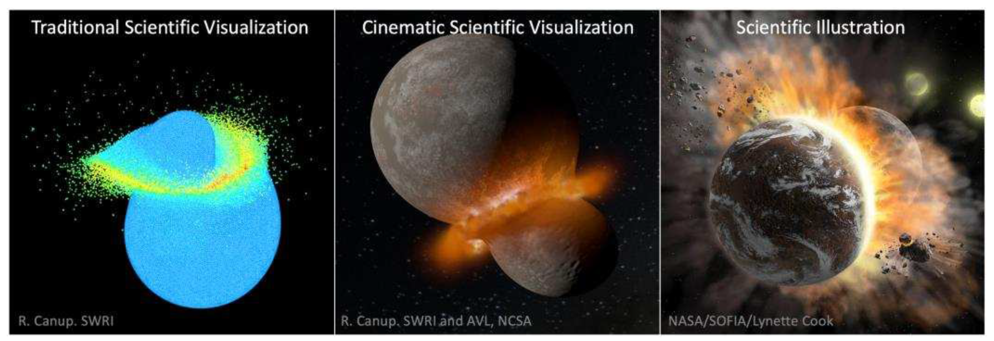
Figure 2.
Hierarchy of cinematic scientific visualization needs.
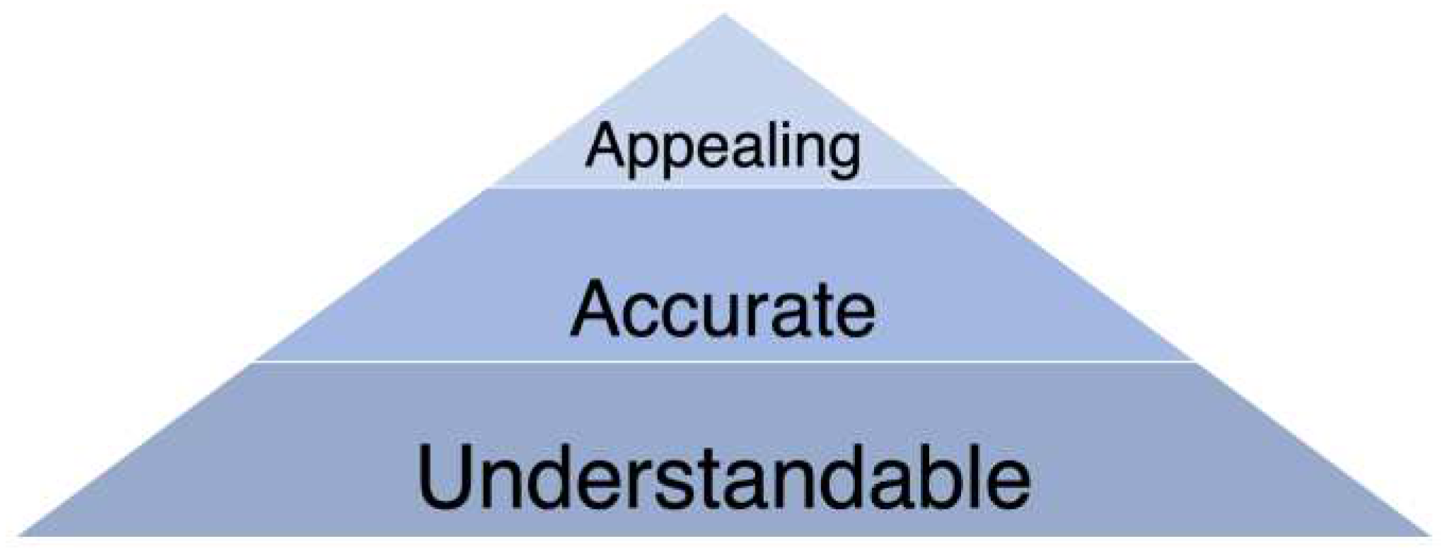
Figure 3.
Example of scale exaggeration, necessary to show the multiple planets in this exoplanetary system.
Figure 3.
Example of scale exaggeration, necessary to show the multiple planets in this exoplanetary system.
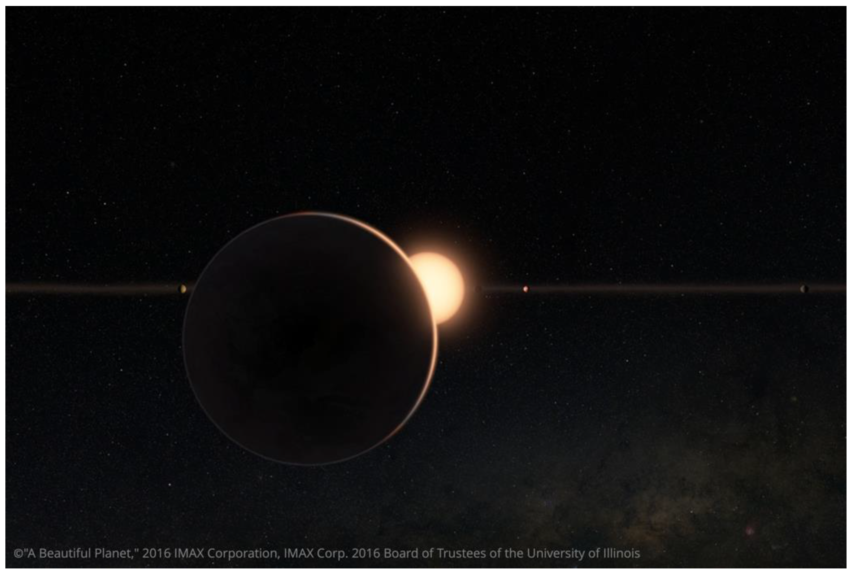
Figure 4.
Example of a visualization showing the data’s underlying grid. NOTE: Left: One frame of the video, showing data grids. Right: 5 seconds into the video, the grids transition into a photorealistic data visualization.
Figure 4.
Example of a visualization showing the data’s underlying grid. NOTE: Left: One frame of the video, showing data grids. Right: 5 seconds into the video, the grids transition into a photorealistic data visualization.
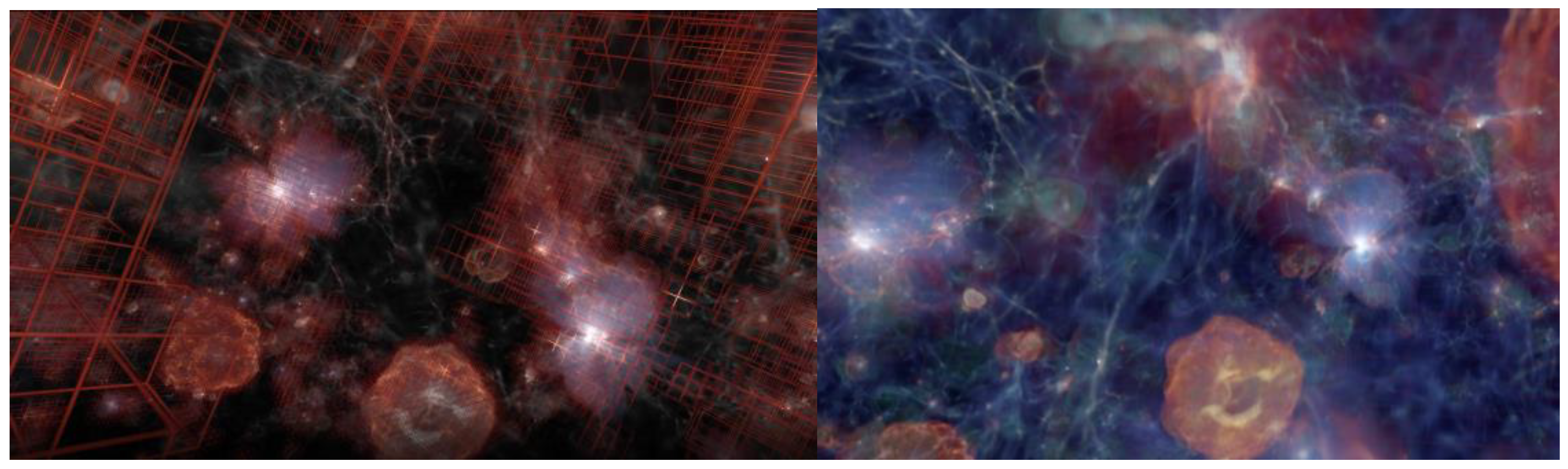
Figure 5.
Audience assessment of video clip quality.
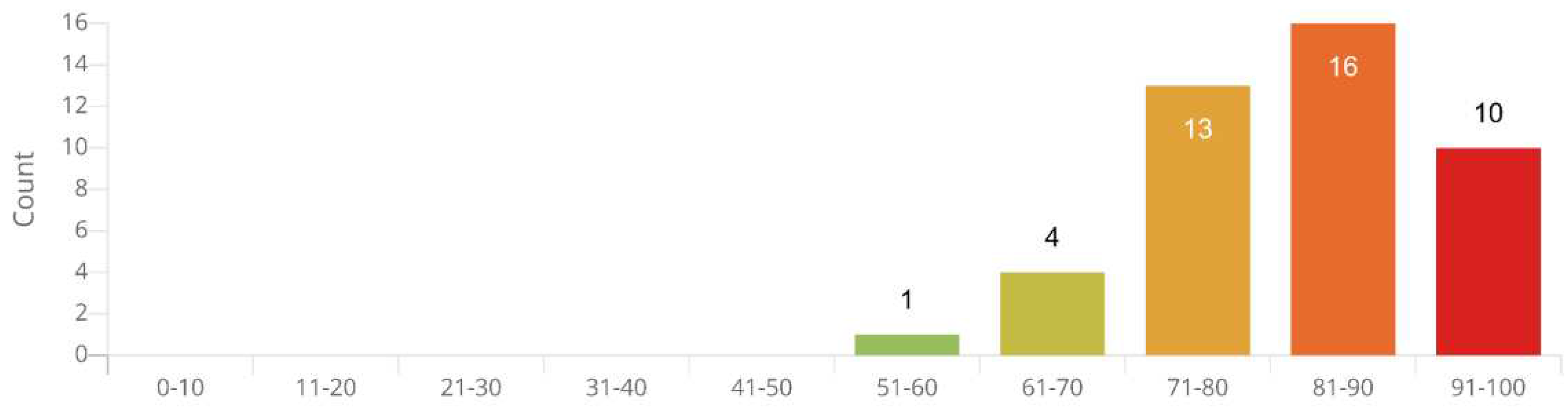
Figure 6.
Cinematic data visualization of a coronal mass ejection, with label 'Earth to scale'.
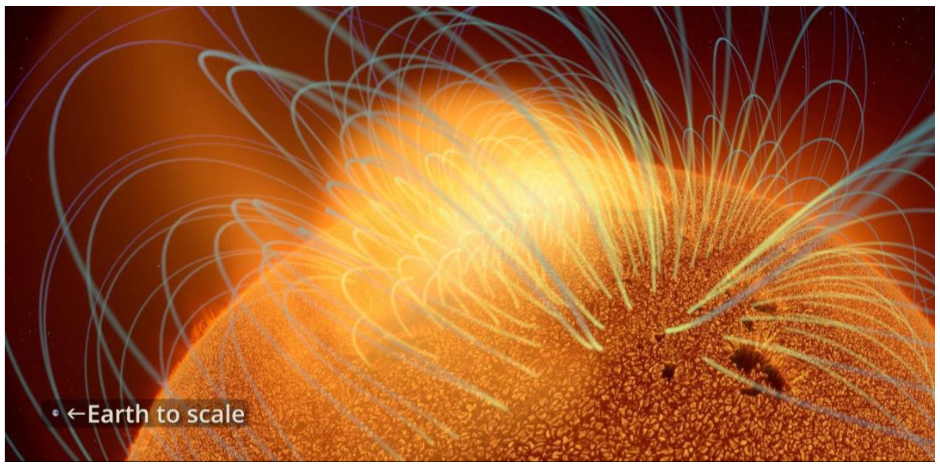
Figure 7.
Cinematic data visualization showing galaxy formation, with label to indicate scale and gas type.
Figure 7.
Cinematic data visualization showing galaxy formation, with label to indicate scale and gas type.
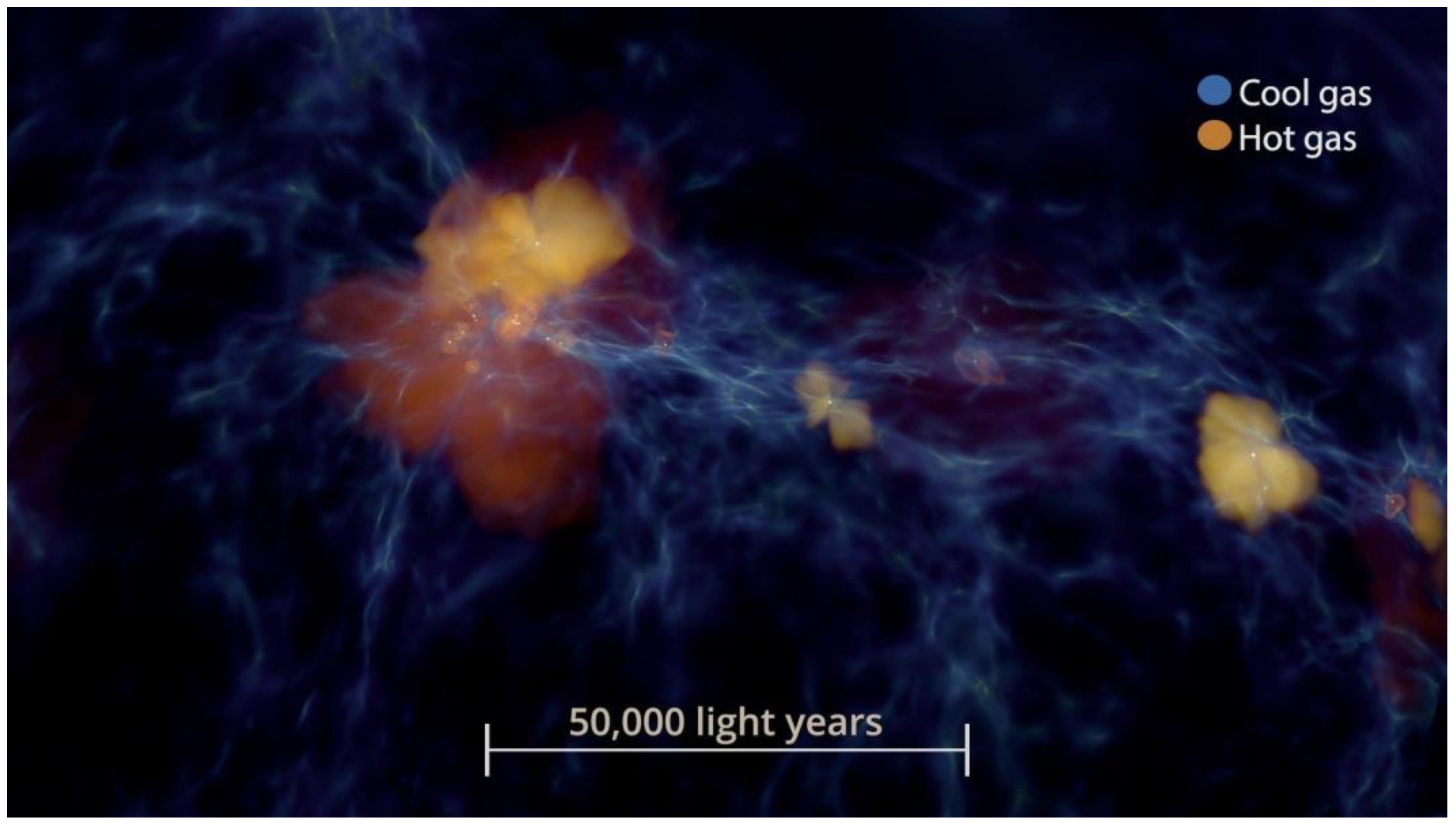
Figure 8.
Cinematic data visualization showing development of a coronal mass ejection.
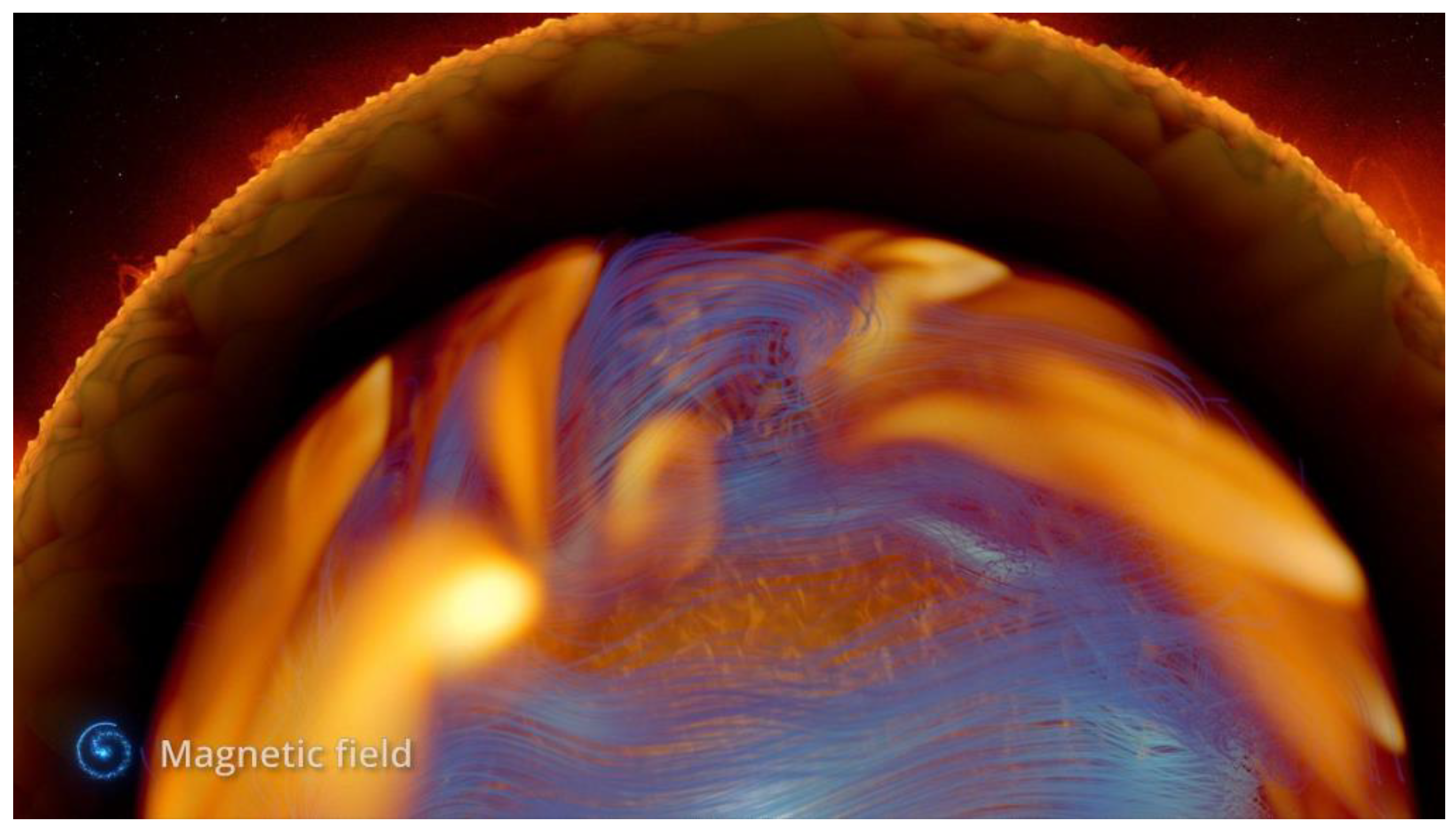
Figure 9.
Cinematic data visualization of The Sun, with label indicating timescale.
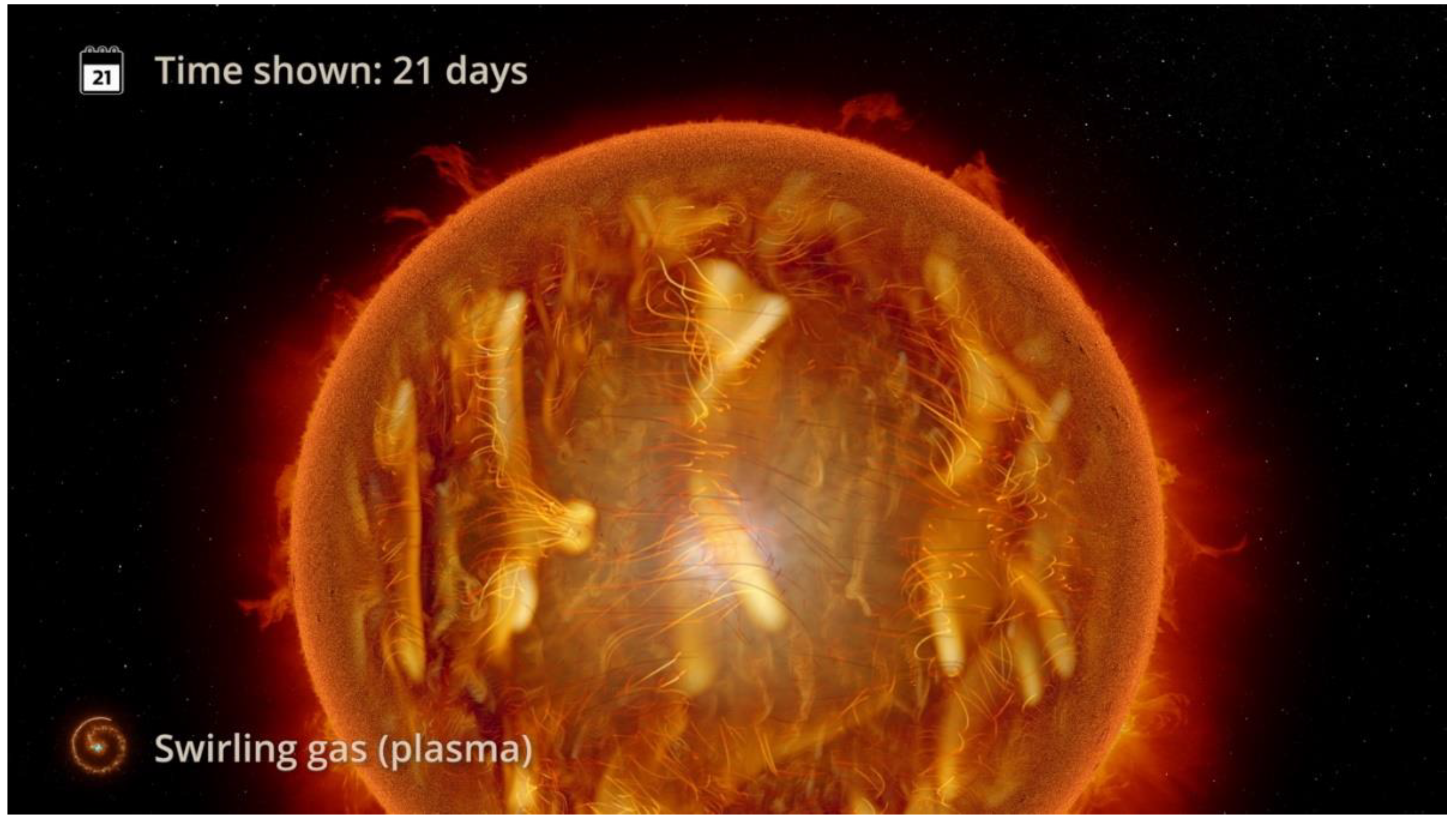
Figure 10.
Cinematic data visualization showing development of a coronal mass ejection.
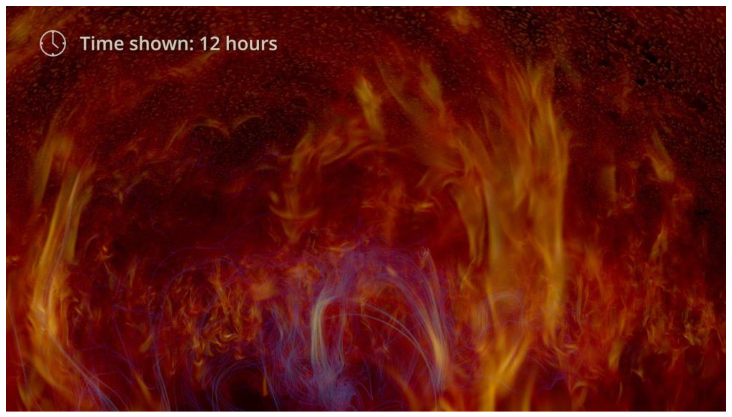
Figure 11.
Cinematic data visualization of internal workings of The Sun, with label showing scale.

Figure 12.
Cinematic data visualization of internal workings of The Sun, with an alternative label showing scale.
Figure 12.
Cinematic data visualization of internal workings of The Sun, with an alternative label showing scale.
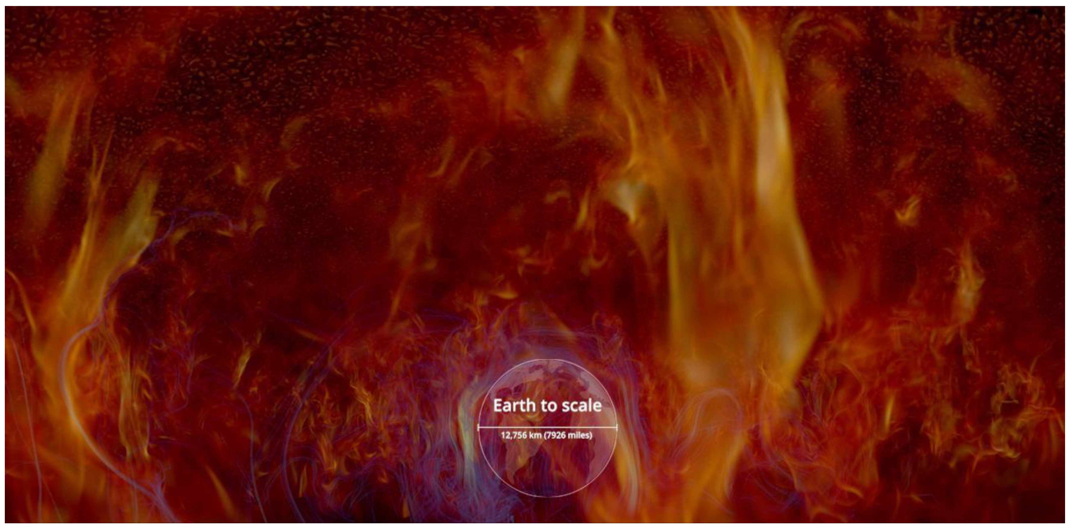
Figure 13.
Instruction for participatory research focus group to inform design choices.
Figure 14.
Example of videos used in focus groups with audiences to get feedback on visualization design options for camera path.
Figure 14.
Example of videos used in focus groups with audiences to get feedback on visualization design options for camera path.
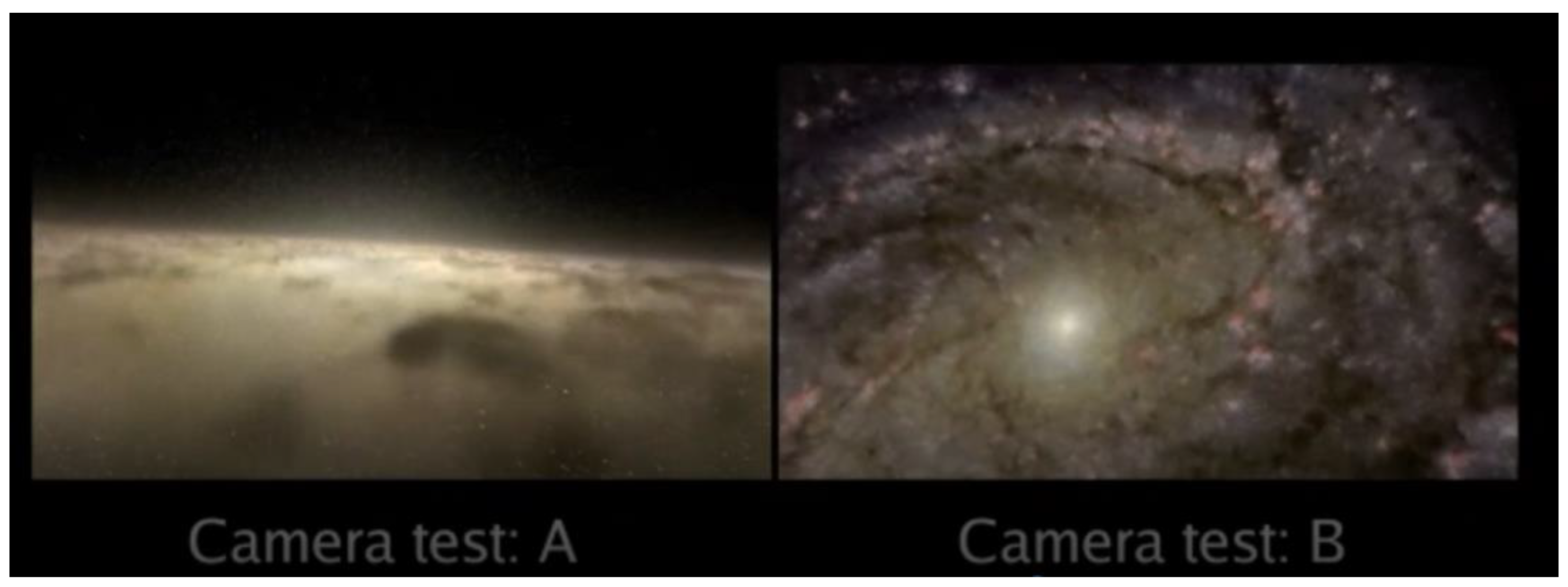
Figure 15.
Example of videos used in focus groups with audiences to get feedback on visualization color palette options.
Figure 15.
Example of videos used in focus groups with audiences to get feedback on visualization color palette options.
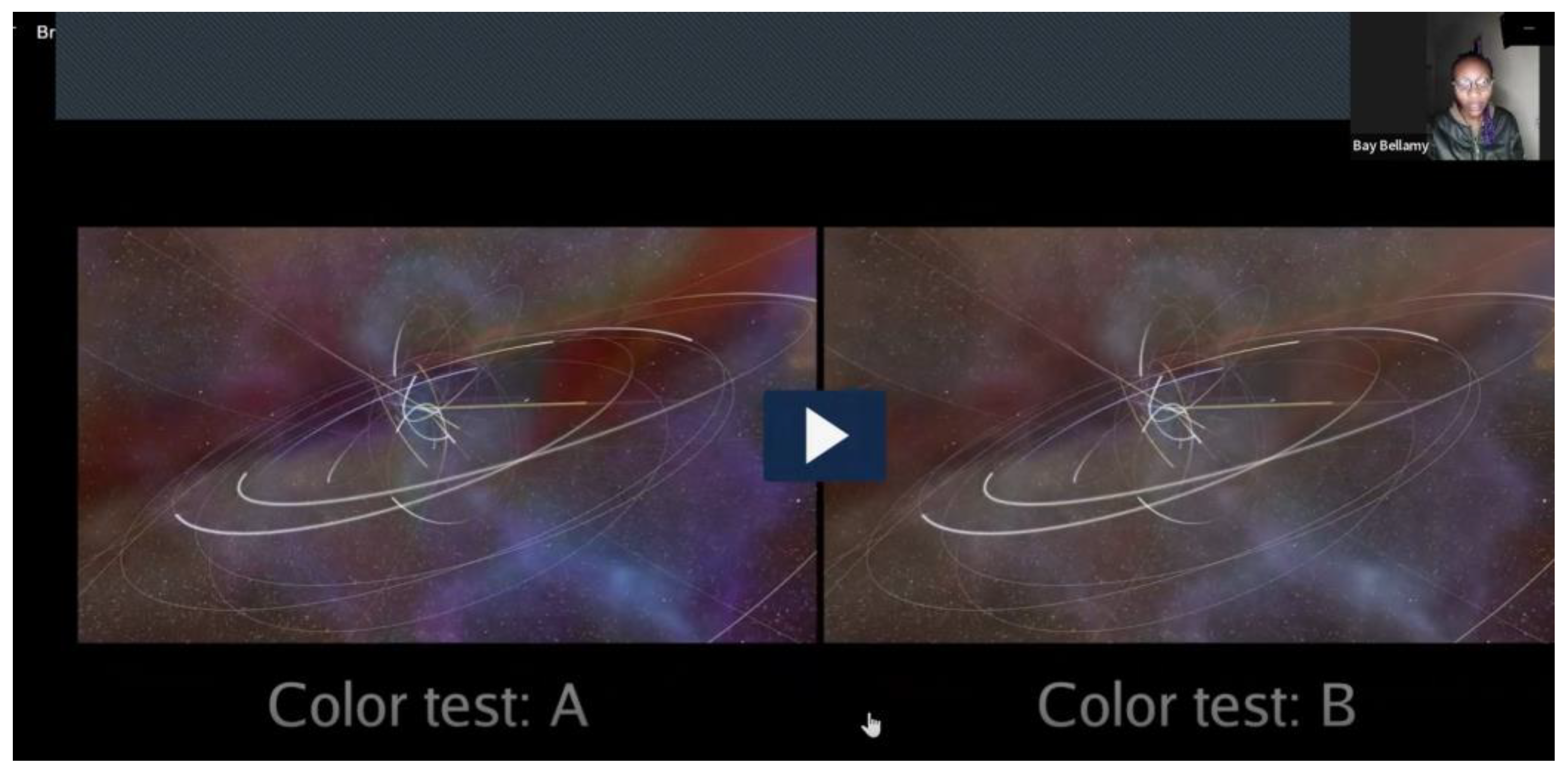
Figure 16.
Example of A/B options shown in focus groups with audiences to get feedback on visualization color palette options.
Figure 16.
Example of A/B options shown in focus groups with audiences to get feedback on visualization color palette options.
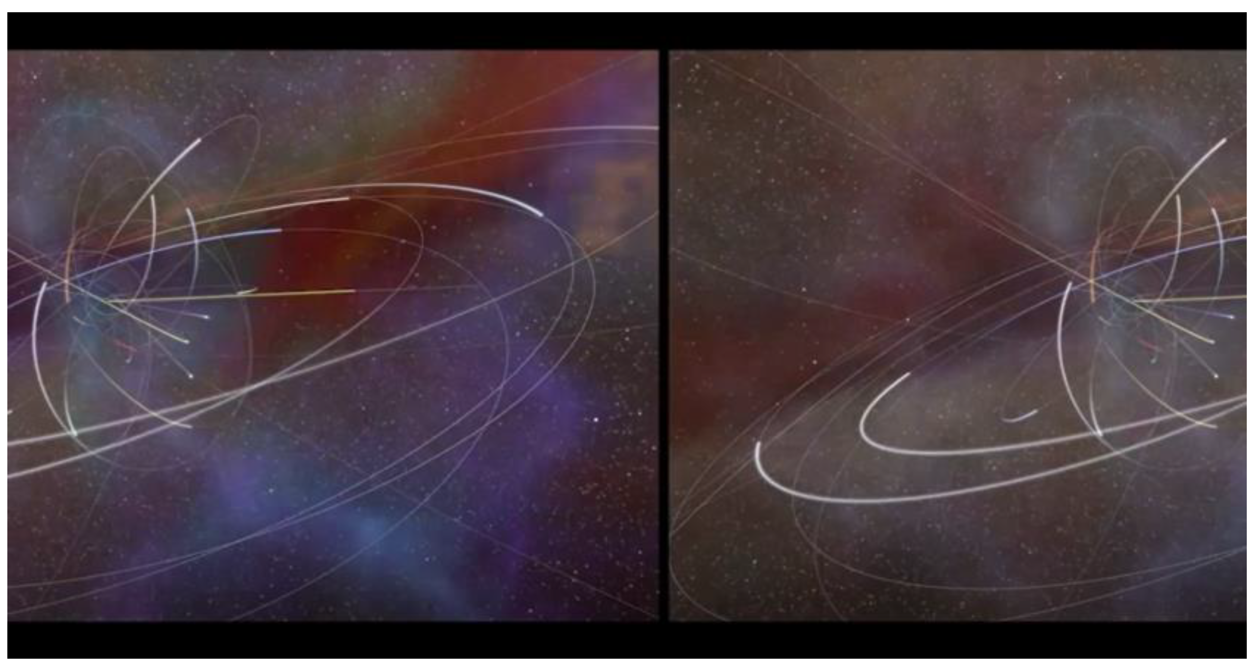

Table 1.
Focus group structure.
| Step | Focus group moderator instruction | Rationale | Follow-up questions |
|---|---|---|---|
| 1 | Play short video of AVL designer describing the cinematic scientific visualization scene about which we are seeking feedback. This includes: (a) lead up to the scene / context; b) scene’s objective; clarify where to focus and explaining the work-in-progress nature of the visualization, and the options on the table. | We avoided having the researcher who was moderating the focus group also present information about the visualizations or what they were aiming to show. This was intended to allow participants to openly criticize any aspect of the visualization without fear of offending the researcher (who adopts a neutral tone/position). | After the introductory content is played, pause to check that everyone is clear on the instructions and encourage people to ask me to pause to comment or replay something as needed. |
| 2 | Sequentially show A / B comparison, asking for comments during and after each video is shown. | The aim is to understand how data visualizations A and B are perceived in turn, before making direct comparisons. This is intended to surface details in audience perceptions that may be lost in the direct comparison. | While test versions A and B are playing, gently request any initial responses to what the audience is seeing so far.‘What are you seeing here? Does anything stand out?’ |
| 2a | After playing test version A, pause to request general associations with the design that has just been shown: “What comes to mind when you think about what you just saw?” | Here, the aim is to understand the salient features of the visualization. We are also aiming to uncover any limitations in intelligibility or other negative aspects for viewers. | Ask:
|
| 2b | Seek further detail on the basis for preferences between A and B. “Let’s discuss your views on the video clip (Test A) you just saw…” | Here, the goal is to gather further feedback based on quality criteria specific to this kind of science communication (see Borkiewicz, et al. 2022). | Probe views on key dimensions:
|
| 2c | After playing test B, pause to ask about the initial perceptions of the design that has just been shown: “What comes to mind when you think about what you just saw?”. | Here, the aim is to understand the salient features of the visualization. We are also aiming to uncover any limitations in intelligibility or other negative aspects for viewers. | Ask:
|
| 3 | Play side-by-side comparison video for Test versions A and B, and seek further comments comparing the design options. | This part of the focus group is designed to draw out further detail about the comparison between A and B. This will help to clarify why one option is superior to the other, given the aims of the visualization. | Ask: ‘Do you have any other thoughts about the comparison between A and B?’ |
| Repeat above process with the next design decision set. If all feedback has already been collected on all design decisions that have been pre-prepared, close the focus group. | |||
Disclaimer/Publisher’s Note: The statements, opinions and data contained in all publications are solely those of the individual author(s) and contributor(s) and not of MDPI and/or the editor(s). MDPI and/or the editor(s) disclaim responsibility for any injury to people or property resulting from any ideas, methods, instructions or products referred to in the content. |
© 2023 by the authors. Licensee MDPI, Basel, Switzerland. This article is an open access article distributed under the terms and conditions of the Creative Commons Attribution (CC BY) license (http://creativecommons.org/licenses/by/4.0/).
Copyright: This open access article is published under a Creative Commons CC BY 4.0 license, which permit the free download, distribution, and reuse, provided that the author and preprint are cited in any reuse.


