Submitted:
12 June 2024
Posted:
13 June 2024
You are already at the latest version
Abstract
Despite their prevalence in almost all publicly orientated conservation settings, sign design receives limited attention in the research literature. We used a remote eye-tracking device to test how visitors read educational signs, maps, and species signage. Three designs, plus a plain-text control sign, were tested for each sign type. Sign content was based on Brackenhurst Botanic Garden, Kenya and included four different information texts (156-256 words long) and a species information text (64 words long). Four presentations of extinction threat-status were also tested as were depictions of trail routes on maps. Data were collected from 51 participants at six cultural venues across Nottingham, UK. Signs positioned centre-left of an exhibit were read first. Information on the left-hand side of signs was read first and dwelled upon the longest. Signs with a single large image and a single block of text were generally preferred, and images were most frequently recalled. Extinction threat-status was most frequently viewed and best recalled from green-red thermometer diagrams and least from the IUCN red-list diagram. Map routes were clearest when presented as coloured solid lines. This study indicates the potential benefit of eye-tracking research for measuring sign use and assisting in sign design.
Keywords:
Museum labels
; Zoo signage
; visitor information
; map design
; sign design
; threat status
; botanic gardens
1. Introduction
Information signs are a common feature of botanic gardens, zoos, and other cultural and conservation venues. They provide valuable information to direct visitors and educate them about the work of an organisation or about a particular species, environment, or exhibit. Information boards are relatively cheap to produce, require little maintenance and provide a constantly available source of information [1,2] Consequently, they remain the main way of presenting information to visitors. Within zoos, animal information signs are estimated to be read by 10-30% of all visitors [3,4,5,6]. When extrapolated to the 700+ million visits to zoos globally each year [7], this equates to a potential 70-210 million sign readers in zoos alone. Therefore, the seemingly humble sign has a potentially enormous reach.
Environmental education is crucial for tackling climate change. Whilst the presence of a docent may increase an individual’s learning [8], most visits are self-led. As such, understanding what information visitors engage with is vital to ensure that the best possible communication is provided. Despite their important role, there is still a lack of information about how to produce impactful signs for conservation and environmental education.
For example, in the UK, government guidelines for licensed zoos and aquariums require them to provide accurate information and include at minimum ‘the species name (both scientific and common), its natural habitat, some of its biological characteristics and details of its conservation status’ [9]. However, there is no information on how this information should be presented, leaving organisations to design their signage themselves. For botanical gardens, there is even less support. Whilst guidance on sign content may be useful, Fraser et al. [10] found that visitors may prefer different aspects of sign content to what is recommended.
A few studies have provided some insight into sign use. Museum studies suggest shorter texts are read for longer and have increased recall than longer texts [11,12]. Recommendations for sign length are between 30 – 100 words [13], made up of short sentences [13,14,15,16]. Bitgood et al. [17] found that whilst 12% of respondents read texts of 100 words (n = 43), only 4.5% read those exceeding 200 words. Yet even where signs are short, they are often not read in full [18]. They refer to this as the General Value Principle, where readers minimise the mental energy cost of reading for maximum information gain [19]. As museums may attract more learning motivated individuals than other venues [20], it is possible that visitors to zoos and botanic gardens may read even less. This is supported by preliminary studies in zoos which suggest that visitors read and recall mainly information from the top line of the sign or when information is presented as separate chunks [21]. Also based on the General Value Principle, is the idea that signs should follow a consistent layout throughout a venue to make information easier to find and should be positioned on the main path and at a height suitable for easy viewing [13,14].
Signs can draw attention to exhibit content and significantly increase holding power [22]. However, estimates of sign dwell times vary. Visitor observations at a zoo exhibit suggest individuals look at interactive interpretation signage for 12 seconds on average and non-interactive interpretation for just one second [22]. Other estimates of average sign holding power are around 5 seconds [23,24] and an average of 71 seconds for total sign viewing within an exhibit area [24]. Factors such as visit motivations and presence of children were reported to affect viewing times [20,23,24]. Additionally, the sign content (its attraction and holding power) can affect dwell time and number of views [6].
Most sign research is based on observing a visitor’s movements and assuming sign reading based on whether a visitor stops in front of a sign for a given period. Until recently this has been the best measure of interaction, despite longstanding criticism that it doesn’t provide an accurate measure of reading [18]. However, using eye-tracking technologies it is now possible to measure an individual’s specific reading behaviours.
Eye Tracking Research
The use of eye tracking research is still relatively novel. The high costs of technology and processing software have previously been prohibitive for many research projects. Whilst devices for measuring eye movements are becoming more affordable, there are still issues relating to interpretation of data and privacy issues if recording conversations and visual recordings in a public place. Gradually, eye-tracking research is appearing in the educational research literature [25] and to test visitor use of exhibits [26,27].
Eye tracking devices work by measuring gaze co-ordinates. They measure fixations (when an individual focuses on a point for between 100-600ms) and saccades (quick eye shifts between points lasting fewer than 100ms)[26]. Measuring these two aspects provides an indication of how long and in what order an individual reads information. Remote eye tracking can also identify how often a particular object or aspect of a text (an Area of Interest (AOI)) is viewed [28].
Mason et al. [25] used eye tracking to examine 49 children’s use of textbooks (text and pictures) and measured reading, comprehension, and recall. They showed a correlation between the duration of eye fixations and the depth of learning, thus demonstrating, that fixation and dwell times are reasonable indicators of learning.
Krogh-Jespersen et al. [27] used eye-tracking glasses within the context of a science museum. This study provides the first detailed analysis of how visitors engage with an exhibit space including how interpretation signage is used. They found that visitors fixed their gaze on posters for between 0.22 seconds and 5.16 seconds. Across 11 information signs in an exhibit the average total fixation time was 1 minute 37 seconds and for individual signs average fixation ranged between 1.44 and 14.12 seconds. This reiterates that information provided by signs must be presented as quickly and clearly as possible.
A 2022 study of biology undergraduates visiting a zoo exhibit used eye-tracking to test sign use and found a high rate of sign observation (91.0 seconds), much longer than the time spent viewing the animals in the exhibit (10.5 seconds)[29]. Whilst this study is useful in adding to the understanding of exhibit and sign use, and does use eye-tracking software, the motivations of the participants (students on a university visit) potentially reflect a different use pattern than the typical zoo visitor.
We are unaware of any study to date that focuses on the topic of Botanic Gardens in eye-tracking studies.
Study Location and Purpose
This study aimed to investigate sign reading preferences and reading patterns amongst visitors to cultural venues. Sign content was based on Brackenhurst botanical garden and eco-resort in Limuru, Kenya (https://www.brackenhurst.com/). This site has undergone major ecological restoration over the past 24 years to remove invasive species such as Eucalyptus (Eucalyptus spp.) and replant native species. As well as attracting locals, the site is aimed at an international audience with a strong connection to the UK. The site has several public trails through the newly restored forest and the interpretation boards were designed to inform visitors about the history and ecology of the site, maps of walking trails, and specific tree species information.
Whilst text content was site specific, the signs were designed to test features common to information signs found more broadly across visitor attractions.
We examined:
- The order in which a sign was read (which sections were read first)
- Duration of reading
- Information recall
- Visitor sign design preferences
- The most effective way of delivering species threat-status information.
- The most effective way of presenting map layouts
Due to coronavirus restrictions at the time of data collection, we were unable to use eye-tracking glasses to test sign use in-situ in Kenya, therefore, remote eye-tracking was used to test sign reading amongst UK visitors to other cultural venues (museums, galleries, historic sites). We acknowledge that sign reading may differ between cultures and venues, however, feel that our findings can still aid general information sign design. This study is one of only a handful to date which test sign reading within a cultural venue using visitors (and not in a laboratory setting).
2. Materials and Methods
Data Collection
Data were collected between 19th and 23rd July 2021 at several cultural venues in the city of Nottingham, U.K. (Nottingham Contemporary Art Gallery, Wollaton Hall Stately Home, Southwell Minster and three campuses of Nottingham Trent University).
The experiment was set up in a main corridor of each venue and visitors were asked to participate in the study as they passed by. Once one individual had completed the experiment the next person to pass-by was asked to participate. The study took place the first week after coronavirus restrictions were lifted in the UK, as such, numbers of participants were lower than expected at other times.
Respondents were asked to view four information signs, a map, and a species sign. Four alternative designs were available for each sign/ map, and these were rotated between participants to ensure that all sign designs were viewed a similar number of times and exclude the impact of viewing order (see Appendix A1 for the combinations of sign presentations and order of viewing). Between viewing each sign design, respondents answered a question about the information or design that they had just seen.
Signs and questions were presented on a large digital screen. Whilst visitors viewed the information their eye movements were recorded by a remote tracking bar (SMI remote eye tracking [30]). This provided information about which areas of each sign participants viewed and the duration of viewing. As the primary aim of the project was to examine viewing behaviour and not test knowledge, we did not use a pre-post design. It was felt that asking individuals a question before viewing each sign could bias respondents to look for that answer in the sign. As the information presented was about a specific site in Kenya and respondents were in Nottingham, U.K. it was felt that the information was sufficiently novel that correctly recalling information was an indication that that information had been acquired from the sign itself.
Signs were presented for 30 seconds (30000ms). This is substantially longer than the typical dwell duration of signage as shown by Krogh-Jespersen et al. [27] and was similar to the average duration for viewing artwork [31]. We selected 30 seconds as we did not want participants to feel rushed when presented with information. However, we acknowledge that in-situ the signs would likely be read for a much shorter time. To combat this, we examined which sign sections were viewed first and time of first fixation.
Creating the Test Signs
Information Signs
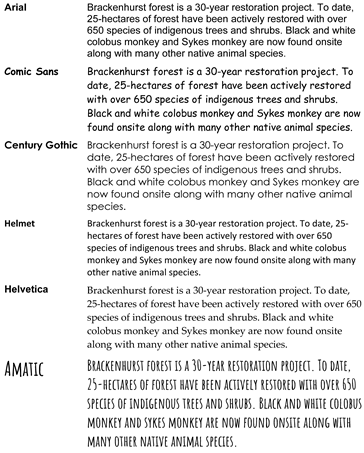
Four information texts, between 156 – 256 words in length (average 210 words), were created covering the topics of: 1. History of the Project, 2. Invasive Species, 3. Restoration Ecology and 4. Habitats (with a focus on birds). Each text was then presented as four different sign designs (Table 1), creating a total of 16 different information signs. The four designs represented three commonly used information board design layouts used in zoos, museums, and galleries (author comms.) These included: D1. large picture plus side text, D2. central picture with text surrounding, D3. boxes with chunked text and pictures, and D0. a black and white plain text used as a control.
For each sign design the size of each text box and image were standardised and only the textual information changed. The fonts and colours used were defined by the study site (Brackenhurst Kenya) based on their existing colour schemes. As part of the questionnaire, we asked attitudes towards this colour scheme and tested colour and font preferences by presenting a choice of fonts (Appendix A2) and coloured texts on different backgrounds (Appendix A3) and asking respondents which they found clearest.
Each of the information signs included a QR code with the message that viewers could scan for more information. The QR code was the same size on all signs but was presented in different locations (D0: lower-centre, D1: upper-left, D2: upper-right, D3: lower-right). This tested whether the information was viewed, and which position received the most attention.
The location of the sign’s title also varied across each sign design (D0: centre part of main text, D1: upper-left directly above main text, D2: upper centre, in own box, D3: lower-centre in own box).
To test the impact of a sign’s location on readability, we created a test image showing the four signs in location (affixed to a gazebo at the end of a forest trail) (Figure 1). The order of signs was rotated between participants. The eye-tracking software then recorded which order the signs were viewed allowing us to test whether it was the sign or the location that impacted viewing preference.
Maps
Four maps of the Brackenhurst forest and trails were created, each with the same general appearance and content but with varying presentations of trails.
Unlike for the other signs, participants were prepped before seeing the map and given a task, to ‘start at the Gazebo (clearly marked on all maps) and look for the easiest trail to walk’. It was not specified as to what was meant by ‘easiest’ as we wanted to test whether respondents looked at the route drawn on the map or whether they focused on the summary information about gradient, elevation, distance, and time. One route (the Meru Oak Trail) was notably easier than the others (shortest route, least elevation and flattest elevation gradient profile). Respondents were asked to state which route they had chosen and explain why.
Species Signs
In addition to information boards and maps, we wanted to test how species information signs are read, in particular how threat status is interpreted. Four species information signs were created, all containing the same text (64 words) and content information but with varying presentations of extinction threat status. These included using the International Union for the Conservation of Nature (IUCN) threat status diagram, presenting threat as a thermometer, as a speed-dial, and as the word ‘Least Concern’ (Table 1). Species information signs were based on the basic requirements for species information according to UK zoo licencing [9] but instead of an animal species we depicted the Muhuti tree (Erythrina abysynica), a key species found in the Brackenhurst botanic garden.
Questionnaire
The 23-item questionnaire was designed to gather information about participants recall of information and attitudes towards each sign’s design.
Recall questions asked a simple factual question which could be answered by recalling the information from the sign. Respondents were given a choice of five possible response options and asked to select one. The questions were based on information found in the top, middle (word 50 – 70), and end sentences of the information signs as well as being asked to recall threat status from species signs and identify the easiest route from maps.
In addition to recall questions, we used 7-point Likert scales with a balance of positive and negative phrased question to test respondents’ attitudes to the different sign designs.
Demographic information was collected regarding participants’ age, gender, education level, frequency of visiting cultural venues (botanic gardens, museums, galleries, or zoos) and their stated likelihood of reading signage when visiting a new venue.
Finally, respondents were given two open ended questions asking, ‘what if any, information can you recall from any of the signs?’ and to provide ‘any additional comments that would help us improve the sign design’.
AOI and Gaze Analysis
Gaze analysis was conducted using SMI BeGaze 3.6 [30] software which allowed Areas of Interest (AOIs) to be identified. We created an AOI around each sign section (for example see Figure 2). Each time a participant looked within that AOI it was counted as a fixation, the total dwell time and average fixation on each AOI was then calculated. Hotspot maps showing the most frequently viewed areas were also created.
Data Analysis
We conducted basic analysis using excel, R (version 4.3.3)) and BeGaze [30] software. Data from eye-track analysis was used to determine duration of viewing, order of viewing and gaze hotspots. Where a respondent’s gaze tracking had failed to record (this sometimes occurred if a respondent was wearing glasses as the glare on their lenses prevented eye tracking) these lines of data were removed from analysis.
Thematic analysis was conducted on longer responses to survey questions. This identified trends in sign design preference. These were then calculated as a percentage of the total number of statements given, to see how prevalent these views were.
Generalised Linear Models (GLMs) were conducted on survey data to test if design preferences and correct response were correlated with demographic factors (respondents age, education, frequency of visiting cultural sites, likelihood of reading signs) (see Appendix B1). Data was checked for skew and heteroskedasticity prior to testing and variables included in models. Variables were only included in the same model if they had a Pearson’s coefficient r = < 0.7 and a Variance Inflation Factor < 2 [32] .
3. Results
Surveys were completed by 51 participants. When non-viable eye-track recordings were removed the total data set included 38 species sign recordings, 167 information sign recordings and 38 map recordings.
3.1. Information Signs
There was no statistically significant difference between the sign designs and the amount of information correctly recalled. However, there was a difference in the amount recalled and the position on the sign. Information found on the middle lines (70th and 50th words) of the sign had the highest recall in three out of the four sign types (Figure 3). For signs where information was chunked (D3), the top line (20 words) and mid-line (50 words) had the highest recall. In contrast information found on the end line (150th word) had a much lower correct recall rate with none of the respondents who viewed the control sign (plain text) able to recall information from the last line of the sign correctly (Figure 3). The pattern of viewing can be examined further in the heat maps (hotspots) (Figure 4). These indicate a tendency to read from left to right, top to bottom (regardless of the content). Text in a single block was read the longest (av. dwell 14,905ms, 95%CI: 12, 858 – 16, 915ms, modal viewing order: 1st): The next longest dwell times were for text in the upper left corner (av. dwell 6,008ms 95%CI: 5,042 – 7,025ms, modal viewing order: 2nd) and text in the lower left corner (av. dwell 5,585ms 95%CI: 4,644 – 6,545ms,modal viewing order: 5th). Text and pictures in the lower right corner were the least dwelled upon (Text: av. dwell time 3,244ms 95%CI: 2,465 – 4,080ms, modal viewing order: 7th; Picture: av. dwell time 840ms 95%CI: 553 – 1146ms, modal viewing order: 8th). The areas with the highest percentage of no views in the given time were pictures in the lower right (75.61%), pictures in the lower left (65.85%), and text in the lower right (52.33%).
3.1.1. Titles and QR Codes
Titles written at the top of the sign (D2) were viewed between 523 – 1198ms (average 833ms) compared to between 344 – 788ms (average 558ms) when written at the bottom of the sign (D3). In 47.9% of cases the title was not viewed at all. Similarly, QR codes were viewed for the longest when positioned in the top left-hand corner, however, 60.48% of respondents did not look at the QR code, and one participant even recommended that we should use QR codes on our signs without realizing that all the signs she had viewed already had QR codes.
3.2. Species Signs
Respondents viewing species signs predominantly focused on the text and picture first (50% of respondents dwelled first on the text and 31.5% of respondents dwelled first on the picture). The sequence of sign viewing (modal frequency) was 1st text, 2nd picture, 3rd common name, 4th key (fun) facts, 5th threat status, 6th species distribution map, and 7th scientific name. The average dwell time on the species sign text (64 words) was 11,910ms (95%CI: 9,902 – 13,773ms), and on species sign picture was 1,698ms (95%CI:1228 – 2236ms).
Species threat status was viewed by most respondents (72.7 – 87.5% of respondents), and recall was generally high (54.5 – 75.0 % respondents could correctly recall the information) regardless of how the information was represented (Table 2). Correct recall was highest and dwell time longest when threat status was presented as a thermometer. The speedometer representation had the second highest correct recall. The number (%) of respondents viewing and correct recall was the lowest for the IUCN threat status representation of extinction risk despite this being the most common presentation of threat status in UK species signs. Stating threat status as a word (control condition) produced the fastest time of first fixation and was felt by respondents to be the clearest to understand.
3.3. Maps
Most respondents quickly focused on the map itself (18.42% viewed map first, 52.63% viewed the map second) and on the word ‘Gazebo’ (10.53% viewed first, 13.16% viewed second) (which was the start location that we had asked respondents to find on the map) with a minority viewing the trail information box (2.63% viewed first, 7.89% viewed second). Almost three quarters of respondents (71.05%) did not look at all at the elevation graphic.
When asked to ‘look for the easiest route’ 50.9% of respondents said they looked for the shortest route (Table 3). Map 1 (solid multi-coloured lines) was identified as the easiest to read and produced the highest number of correctly identified ‘easiest’ routes. Maps with only a single coloured dotted or dashed line were stated as the most difficult to interpret.
3.4. GLM analysis
After Endpoint adjustment, GLM analysis found no significant variables (age, gender, number of cultural visits or education) to predict correct recall or dwell time of any of the sign sections with the exception of identifying the shortest route on the map where there was a negative correlation with gender, but this did not explain any model deviance (Male [-] p= 0.023, %D = 0, AIC = 68.29).
3.5. Order of viewing signs in-situ
The average order of sign viewing when signs were situated on a path was 1. left-centre, 2. right-centre, 3. far left, 4. far right. Sign designs were read in the following order D3: chunked sign, D1: large picture/block text, D2: central picture with text around and lastly D0: control.
3.6. Survey findings and general comments
There was an overall preference for sign title (51%) and main texts (31%) to be in Arial or a similar font. Colour contrast tests revealed preferences for black text on a white background (23.50%) and white text on a blue background (21.60%).
Although not statistically significant, there was a general preference (43.14%) for sign design D1: large image/block text. Of those who preferred Sign 1, the main reasons stated were that ‘it had one big image’ (n=8), that ‘the colour scheme of white writing on a dark green background was very clear ‘(n = 7) and that ‘the text information was all in one place’ (n=6). Of the four participants who self-reported as dyslexic, three selected D1 as their preference with one individual stating that ‘white [writing] on green [background] was recommended to help dyslexics retain information’.
The three most common recommendations were for less text (n=19), chunks of information (n=9), and more images (n= 8).
3.7. Information Recall
Respondents recall of sign information at the end of the study was coded into themes (Table 4). Intra-rater reliability was calculated using Cohen’s kappa at 0.96 (very reliable).
Most respondents (94.12%) were able to recall something from signs. The main themes recalled from the signs were the images (49.02% of respondents) and information about birds (50.98 of respondents). However, this information was very limited (Table 4). Extinction information was only recalled by 5.88% of respondents and conservation information by 21.57%. Respondents recalled information without prompt, and it is possible that if asked specific questions they may have remembered more.
4. Discussion
This study is one of only a few eye-tracking studies to be conducted on visitors’ sign reading behaviours onsite within cultural venues. As such our findings contribute to the understanding of sign use and we hope will aid in future sign design.
The finding that visitors tend to read signs from left to right, top to bottom (regardless of cultural venue, age, gender, education level or frequency of cultural venue visits) suggests that sign reading may follow cultural reading patterns. The study was conducted in the UK where left-right, top-bottom reading is standard reading behaviour. This has important implications as, if we design signage based on western reading patterns, it may not be read in the same way by cultures where text flows right to left. When translating signs for different audiences, the tendency is to translate the text only. Our finding suggests that when translating for different audiences the whole layout of the sign may need to be reordered to ensure that the sign is read in the way it is intended.
Our study found text tends to be observed before pictures, regardless of layout. Eye-tracking studies from advertising campaigns in China found similar results with respondents viewing text before an image no matter the position or orientation [33]. Given that China has a different cultural reading pattern to the UK, this finding is interesting as it suggests the text-first observation may be culturally universal.
This pattern of reading behaviour, focusing first on the top left and reading downwards, with the least likely viewed area being the bottom right, is significant when deciding how to display key information or images to visitors. This is independent of whether text or images are being presented. Key information should be situated towards the top left of the sign. However, for best recall, core information should be presented at around word 50 – 70 within the text. Our findings support other studies which suggest that signs should be short (around 30-100 words)[13,14,15,16,19] and confirms suggestions that individuals often do not read to the end of texts [18].
We also found that respondents looked first at signs when positioned directly left and right of the main footpath before looking at those positioned to the sides. This supports the concept of the General Value Principle [17,19] that individuals will prioritise acquiring information from the easiest to access sources. This also supports findings that visitors most frequently read information in the line of sight [14]. We support suggestions [5,17,19] that signs should be positioned directly along a path in an easy position of viewing.
QR codes may be useful for providing extra information to visitors without overcrowding a sign with information. However, a third of visitors did not look at the QR code. This may be influenced by factors such as culture or nationality, however, this wasnot tested. If QR codes are to be used, the best position for them is in the prime position of top-left when presenting to a left-right reading audience. Similarly, Titles, if used, are best at the top of the page.
Sign preferences were for designs with minimal text in one block and with large images. Font preferences were for simple, clear fonts and high contrast text. These preferences mirror recommendations for presenting signs to those with visual impairments [34,35] and dyslexia (author comms). This suggests that creating inclusive signage is likely to benefit all visitors.
The need for high contrast was also noted in map designs with preference given to different coloured routes rather than those defined by different patterns only. Respondents selected walking routes by focusing on the map itself and not by reading textual information regarding routes and gradient profiles. Whilst providing this additional information may be helpful, it appears that a clear map visual is critical and was the prime focus for respondents.
One of the key aspects tested was how to best present species threat-status information. As more species are becoming vulnerable to extinction, presenting this information clearly to the public is critical. We found that green-red thermometer style presentations were the best way to present extinction threat, generating the longest dwell time, highest number of views and greatest correct recall. Thermometer style presentations were also viewed as one of the easiest to interpret (even when the red-green colouration was reversed), second only to when a threat status was written in word form. In contrast the IUCN threat status diagram performed the worst in terms of recall, had the fewest viewers and had the slowest time of first fixation. This suggests that it may not be the best way to present a species threat as many visitors may miss this information if only glancing at a sign. If sites wish to use (or are required to use) the IUCN red status it may be preferable to apply a traffic light approach (green being Least Concern and red Critically Endangered) to convey the concept to their visitors.
Delayed recall of information was good with most respondents able to recall some information. The quality of information recalled was limited and restricted to single statements such as remembering there were pictures of animals. This is similar to findings from other studies [36]. Despite this, some specific facts were recalled including information about conservation efforts and species threat status. This confirms that signs can effectively convey information to visitors and supports findings from other studies [4,11,12,37].
We acknowledge that this study has limitations. Asking a visitor to view a sign, directly in front of them, for 30 seconds is not the normal way of viewing interpretation boards. We acknowledge that visitors are more likely to view signs for a much shorter time [6,27]. Additionally, due to covid restrictions we needed to present signs on a digital screen using Remote Eye tracking (RED) and presented information about a different cultural venue to the one the respondents were visiting. This may have resulted in a different interaction than would have occurred with an in-context information board. We therefore propose that future eye-tracking research should examine sign use in context, preferably with eye-tracking glasses to allow the respondent to freely engage with an exhibit and its interpretation. This would additionally allow the impact of the exhibit to be tested and whether seeing the exhibit draws attention away from (or potentially towards [29]) the sign information. Getting eye-track glasses users to comment retrospectively on why they gazed at a particular sign at a given point would also improve understanding of sign usage. This would establish whether interpretive signs meet their goal of helping to interpret an exhibit [2].
The other key aspect for future research is to test sign reading in different parts of the world and with different reading patterns to test if cultural reading patterns do indeed impact the order and position of sign reading as our study appears to suggest. There may be other aspects of sign design, such as colour preferences, which are also impacted by culture, especially as we already know that colour can be perceived differently by different people (such as with colour-blindness) and in different contexts (for example when viewed in a sunny environment versus indoors or on a digital screen). In addition, understanding how signs age and weather in different environments is important. These are all areas still to be investigated.
Eye-tracking has great potential for helping us to understand sign use and interaction with exhibits in cultural venues. As this technology becomes more accessible it is hoped that more sites will engage with similar studies and strengthen the available guidance for interpretation sign design.
Author Contributions
Conceptualization, S.L.S.; methodology, S.L.S.; formal analysis, S.L.S.; data collection, S.L.S. and N.H.; writing—original draft preparation, S.L.S.; writing—review and editing, S.L.S., T.D., and N.H; visualization, N.H.; project administration, T.D. and S.L.S. All authors have read and agreed to the published version of the manuscript.
Funding
This research received no external funding
Institutional Review Board Statement
The study was conducted according to the guidelines of the Nottingham Trent University and approved by the Ethics Committee of School of Animal, Rural and Environmental Sciences protocol: ARE202135, 29th June 2021.
Data Availability Statement
Data are available by request to the authors.
Acknowledgments
Particular thanks go to; Jess Johnson, Richard Lilley, and Carol Hall for their advice on SMI eye tracking; Clare Newstead for their logistical assistance and without whom this project would not have gone ahead; Cassie White, Matilda Paar, Ché Sakaria, Reece Ali, Pranav Peshavaria, Lucy Callaway, Emma Hunter, Tomas Hollier, Dolcie Meller, and all the students who researched content information and sign design ideas; Brian Spooner and Jono Jenkins for transport assistance; All the staff at Brackenhurst Botanical Gardens, Kenya, The Nottingham Contemporary art gallery, Southwell Minster, Wollaton Hall, Brackenhurst, Clifton and City Campuses of NTU; The staff at NTU Global and of course all the wonderful visitors who participated in the research.
Conflicts of Interest
The authors declare no conflict of interest.
Appendix A

Table A1.
Question Sets presented to each respondent and the time each sign/question was presented for in milliseconds. Sign text (1: history, 2: invasive species, 3: restoration ecology, 4: habitats), design style (D0: Control, D1: large picture large block text, D2: central image with chunked text, D3: small chunks of text with accompanying images).
| Screen | Content | Test Set A |
Test Set B |
Test Set C |
Test Set D |
Time presented in ms |
|---|---|---|---|---|---|---|
| 1 | Sign 1: History |
D0 control – plain text no pictures | D1 large picture large block text | D2 central image with chunked text | D3 small chunks of text with accompanying images | 30000 |
| 2 | Question 1 | Recall Top line | Recall Top line | Recall Top line | Recall Top line | 10000 |
| 3 | Question 2 | Likert questions relating to sign readability and ease of understanding | Likert questions relating to sign readability and ease of understanding | Likert questions relating to sign readability and ease of understanding | Likert questions relating to sign readability and ease of understanding | 10000 |
| 4 | Sign 2: Invasive Species |
D1 large picture large block text | D2 central image with chunked text | D3 small chunks of text with accompanying images | D0 control – plain text no pictures | 30000 |
| 5 | Question 3 | Recall mid-line (approx. word 70) | Recall mid-line (approx. word 70) | Recall mid-line (approx. word 70) | Recall mid-line (approx. word 70) | 10000 |
| 6 | Sign 3: Restoration Ecology |
D2 central image with chunked text | D3 small chunks of text with accompanying images | D0 control – plain text no pictures | D1 large picture large block text | 30000 |
| 7 | Question 4 | Recall end line | Recall end line | Recall end line | Recall end line | 10000 |
| 8 | Sign 4: Habitats |
D3 small chunks of text with accompanying images | D0 control – plain text no pictures | D1 large picture large block text | D2 central image with chunked text | 30000 |
| 9 | Question 5 | Recall mid-line (approx. word 50) | Recall mid-line (approx. word 50) | Recall mid-line (approx. word 50) | Recall mid-line (approx. word 50) | 10000 |
| 10 | Sign 5: Species Information |
Threat Status: Speedometer | Threat Status Thermometer | Threat Status IUCN | Threat Status word: ‘Least Concern’ | 30000 |
| 11 | Question 6 | Recall species threat status | Recall species threat status | Recall species threat status | Recall species threat status | 10000 |
| 12 | Question 7 | Likert questions relating to sign readability and ease of understanding | Likert questions relating to sign readability and ease of understanding | Likert questions relating to sign readability and ease of understanding | Likert questions relating to sign readability and ease of understanding | 10000 |
| 13 | Sign 6: Map |
M0: Black and white with dotted routes | M1 = colour map with coloured solid lines | M2 = colour map with same-coloured dotted lines |
M3 = colour map with different coloured dotted and solid lines | 30000 |
| 14 | Question 8 | Recall the easiest route |
Recall the easiest route |
Recall the easiest route |
Recall the easiest route |
10000 |
| 15 | Question 9 | Why did you select this route? | Why did you select this route? | Why did you select this route? | Why did you select this route? | 10000 |
| 16 | Photo of 4 signs in location | Order: D0 control, D1 large picture/text, D2 central image, D3 chunked image/text | Order: D1 large picture/text, D2 central image, D3 chunked image/text, D0 control | Order: D2 central image, D3 chunked image/text, D1 large picture/text, D0 control | Order: D3 chunked image/text, D0 control, D1 large picture/text, D2 central image | 5000 |
| 17 | Question 10 | Which of the 4 sign layouts do you prefer? | Which of the 4 sign layouts do you prefer? | Which of the 4 sign layouts do you prefer? | Which of the 4 sign layouts do you prefer? | 10000 |
| 18 | Font card | Font test card | Font test card | Font test card | Font test card | 5000 |
| 19 | Question 11 | Which font do you prefer? | Which font do you prefer? | Which font do you prefer? | Which font do you prefer? | 10000 |
| 20 | Colour test card | Colour test card | Colour test card | Colour test card | Colour test card | 5000 |
| 21 | Question 12 | Which colour scheme do you prefer? | Which colour scheme do you prefer? | Which colour scheme do you prefer? | Which colour scheme do you prefer? | 10000 |
| 22 | Question 13 | What, if any, information can you recall from any of the signs that you have seen? | What, if any, information can you recall from any of the signs that you have seen? | What, if any, information can you recall from any of the signs that you have seen? | What, if any, information can you recall from any of the signs that you have seen? | 10000 |
| 23 | Question 14 | Any other comments? | Any other comments? | Any other comments? | Any other comments? | 10000 |
A2: Font test card
 |
A3: Colour contrast test card

Appendix B
Table B1.
respondent demographics.
| Variable | Description | Number of respondents (as %) | |
|---|---|---|---|
| Age | Respondents age bracket | 18-25 | 8 (15.7) |
| 26-33 | 10 (19.6) | ||
| 34-41 | 9 (17.6) | ||
| 42-49 | 8 (15.7) | ||
| 50-57 | 3 (5.9) | ||
| 58-65 | 6 (11.8) | ||
| 66 or above | 7 (13.7) | ||
| Gender | Respondents gender | Male | 23 (45.1) |
| Female | 28 (54.9) | ||
| Prefer to use own term | - | ||
| Prefer not to say | - | ||
| Education level | Respondent’s highest level of education | No qualifications | 2 (3.9) |
| GCSE/ O-level or equivalent | 8 (15.7) | ||
| A-level or equivalent | 8 (15.7) | ||
| BA/ bachelor’s degree or equivalent | 17 (33.3) | ||
| Master’s degree or equivalent | 10 (19.6) | ||
| Doctorate degree | 6 (11.8) | ||
| No. of cultural visits per year | ‘In a normal (non-Covid-19) year, how often do you visit a museum, gallery, botanical garden, historic property, or zoo?’ | This is my first visit to such a venue | - |
| Once per year | 2 (3.9) | ||
| 2 – 5 times per year | 27 (52.9) | ||
| 6 – 9 times per year | 7 (13.7) | ||
| 10 or more times per year | 15 (29.4) |
References
- T. E. Hall, S. H. Ham, and B. K. Lackey, “Comparative Evaluation of the Attention Capture and Holding Power of Novel Signs Aimed at Park Visitors,” Journal of Interpretation Research, vol. 15, no. 1, pp. 15–36, Apr. 2010. [CrossRef]
- M. Honig, Making your garden come alive! - Environmental Interpretation in Botanical Gardens. Pretoria: Sabonet, 2000.
- S. Clayton, J. Fraser, and C. D. Saunders, “Zoo experiences: Conversations, connections, and concern for animals,” Zoo Biol, vol. 28, no. 5, pp. 377–397, Sep. 2009. [CrossRef]
- Moss, E. Jensen, and M. Gusset, “Evaluating the contribution of zoos and aquariums to Aichi Biodiversity Target 1,” Conservation Biology, vol. 29, no. 2, pp. 537–544, Apr. 2015. [CrossRef]
- R. Martin, “A Study of Public Education in Zoos with Emphasis on Exhibit Labels,” International Zoo Educators Journal, vol. 48, no. 2012, pp. 55–59, 2012.
- G. Edney, T. Smart, F. Howat, Z. E. Batchelor, C. Hughes, and A. Moss, “Assessing the effect of interpretation design traits on zoo visitor engagement,” Zoo Biol, vol. 42, no. 4, pp. 567–576, Jul. 2023. [CrossRef]
- M. Gusset and G. Dick, “The global reach of zoos and aquariums in visitor numbers and conservation expenditures,” Zoo Biol, vol. 30, no. 5, pp. 566–569, Sep. 2011. [CrossRef]
- E. Jensen, “Evaluating Children’s Conservation Biology Learning at the Zoo,” Conservation Biology, vol. 28, no. 4, pp. 1004–1011, Aug. 2014. [CrossRef]
- DEFRA, Secretary of State’s Standards of Modern Zoo Practice. Bristol: Department for Environment Food and Rural Affairs, 2012.
- J. Fraser, J. Bicknell, J. Sickler, and A. Taylor, “What Information Do Zoo & Aquarium Visitors Want on Animal Identification Labels? vol. 14, no. 2, pp. 7-18, Sep. 2009.
- D. Thompson and S. Bitgood, “The effect of sign length, letter size, and proximity on reading,” in Visitor Studies: Theory, research and practice, S. Bitgood, Ed., Jacksonville: Centre for Social Design, 1988, pp. 101–112.
- L. Bourdeau and J. C. Chebat, “The Effects Of Signage And Location Of Works Of Art On Recall Of Titles And Paintings In Art Galleries,”. vol. 35, no. 2, pp. 203-226, Mar. 2003. [CrossRef]
- J. H. Wandersee and R. M. Clary, “Learning on the Trail: A Content Analysis of a University Arboretum’s Exemplary Interpretive, Science Signage System,” Am Biol Teach, vol. 69, no. 1, pp. 16–23, Jan. 2007. [CrossRef]
- S. Bitgood, “Deadly Sins Revisited: A reveiw of the exhibit label literature,” Visitor Behaviour, vol. 4, no. 3, pp. 4–11, 1989.
- S. Bitgood, “The Role of Attention in Designing Effective Interpretive Labels,” Journal of Interpretation Research, vol. 5, no. 2, pp. 31–45, Nov. 2000. [CrossRef]
- C. G. Screven, “Motivating Visitors to read labels,” ILVS Review, vol. 2, no. 2, pp. 183–211, 1992.
- S. Bitgood, S. Dukes, and L. Abbey, “Interest and effort as predictors of reading in a simulated art museum,” in Southern Society for Philosophy and Psychology, Charleston, 2006.
- P. McManus, “Watch your language! People do read labels,” ILVS Review, vol. 1, no. 2, pp. 125–127, 1990.
- S. Bitgood, “An Analysis of Visitor Circulation: Movement Patterns and the General Value Principle,” Curator: The Museum Journal, vol. 49, no. 4, pp. 463–475, Oct. 2006. [CrossRef]
- J. H. Falk, “An Identity-Centered Approach to Understanding Museum Learning,” Curator: The Museum Journal, vol. 49, no. 2, pp. 151–166, Apr. 2006. [CrossRef]
- S. L. Spooner, “Evaluating the Effectiveness of Education in Zoos,” University of York, York, 2017. Accessed: May 29, 2024. [Online]. Available: https://etheses.whiterose.ac.uk/20370/. 29 May 2037.
- G. Counsell, A. Moon, C. Littlehales, H. Brooks, E. Bridges, and A. Moss, “Evaluating an in-school zoo education programme: an analysis of attitudes and learning,” Apr. 2020. [CrossRef]
- S. R. Ross and K. E. Lukas, “Zoo Visitor Behaviour at an African Ape Exhibit,” Visitor Studies Today, vol. 8, pp. 4–12, 2005.
- S. R. Ross and K. L. Gillespie, “Influences on visitor behavior at a modern immersive zoo exhibit,” Zoo Biol, vol. 28, no. 5, pp. 462–472, Sep. 2009. [CrossRef]
- L. Mason, P. Pluchino, M. C. Tornatora, and N. Ariasi, “An Eye-Tracking Study of Learning From Science Text With Concrete and Abstract Illustrations,” The Journal of Experimental Education, vol. 81, no. 3, pp. 356–384, Jul. 2013. [CrossRef]
- P. Dondi, M. Porta, A. Donvito, and G. Volpe, “A gaze-based interactive system to explore artwork imagery,” Journal on Multimodal User Interfaces, vol. 2022, no. 16, pp. 55–67, 2021.
- S. Krogh-Jespersen, K. A. Quinn, W. L. D. Krenzer, C. Nguyen, J. Greenslit, and C. A. Price, “Exploring the awe-some: Mobile eye-tracking insights into awe in a science museum,” PLoS One, vol. 15, no. 9, p. e0239204, Sep. 2020. [CrossRef]
- L. A. de la Fuente Suárez, “Subjective experience and visual attention to a historic building: A real-world eye-tracking study,” Frontiers of Architectural Research, vol. 9, no. 4, pp. 774–804, Dec. 2020. [CrossRef]
- B. Heim and E. A. Holt, “Staring at Signs: Biology Undergraduates Pay Attention to Signs More Often than Animals at the Zoo,” Curator, vol. 65, no. 4, pp. 795–815, Oct. 2022. [CrossRef]
- Gaze Intelligence, “SMI-software.” Accessed: May 29, 2024. [Online]. Available: https://gazeintelligence.com/smi-software-download. 29 May.
- L. F. Smith, J. K. Smith, and P. P. L. Tinio, “Time spent viewing art and reading labels,” Psychol Aesthet Creat Arts, vol. 11, no. 1, pp. 77–85, Feb. 2017. [CrossRef]
- F. Zuur, E. N. Ieno, and C. S. Elphick, “A Protocol for Data Exploration to Avoid Common Statistical Problems,” Methods Ecol Evol, vol. 1, no. 1, pp. 3–14, 2010.
- Yuhao, S. , “EYE-TRACKING: THE INFLUENCE OF PICTURE AND TEXT LAYOUT ON THE EFFECT OF COMMERCIAL ADVERTISING,” SADI International Journal of SocialSciences and Humanities, vol. 9, no. 3, 2022.
- RNIB, “‘See it Right’ Clear Print Guidelines,” 2023.
- L. Murphy, “How to Design for the Blind and Visually Impaired,” National Council on Aging. Accessed: Jun. 03, 2024. [Online]. Available: https://www.ncoa.org/article/helping-people-with-blindness-and-vision-loss-continue-to-participate-in-everyday-activities.
- S. L. Spooner, E. A. Jensen, L. Tracey, and A. R. Marshall, “Evaluating the effectiveness of live animal shows at delivering information to zoo audiences,” Int J Sci Educ B Commun Public Engagem, vol. 11, no. 1, pp. 1–16, 2021. [CrossRef]
- Moss and M. Esson, “The Educational Claims of Zoos: Where Do We Go from Here?,” Zoo Biol, vol. 32, no. 1, pp. 13–18, Jan. 2013. [CrossRef]
Figure 1.
Example of signs in location. Respondents eye-movements were tracked to test the order in which the signs were viewed.
Figure 1.
Example of signs in location. Respondents eye-movements were tracked to test the order in which the signs were viewed.
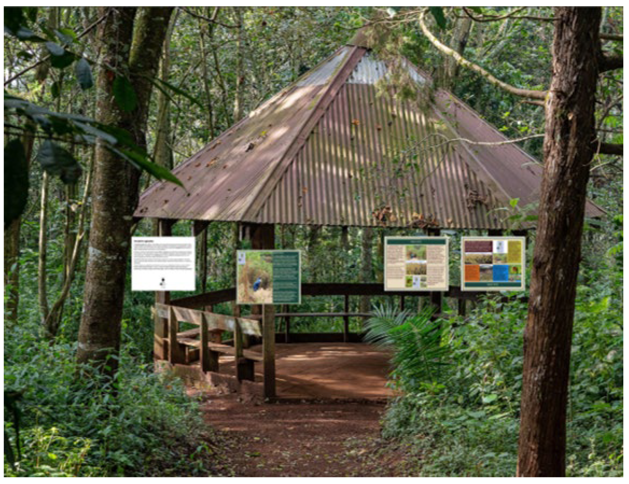
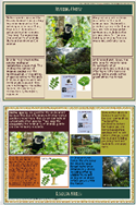
Figure 2.
Examples of Areas of Interest AOIs identified on signs. Green = Title, Yellow = Main Text Red = QR code, Blue = image.
Figure 2.
Examples of Areas of Interest AOIs identified on signs. Green = Title, Yellow = Main Text Red = QR code, Blue = image.
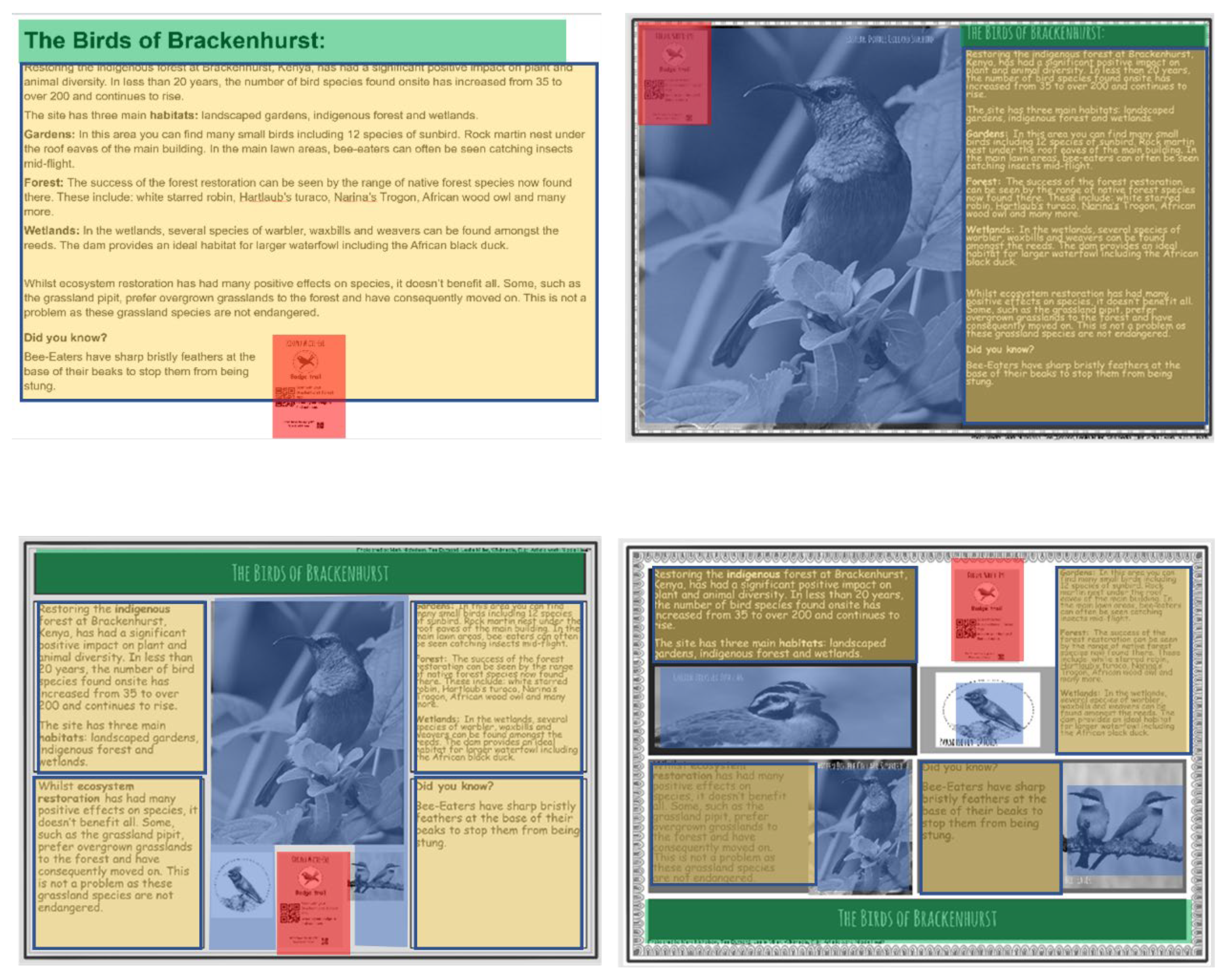
Figure 3.
Percent (%) of information (question responses) correctly recalled according to where the information was found in the sign and the sign design. .
Figure 3.
Percent (%) of information (question responses) correctly recalled according to where the information was found in the sign and the sign design. .
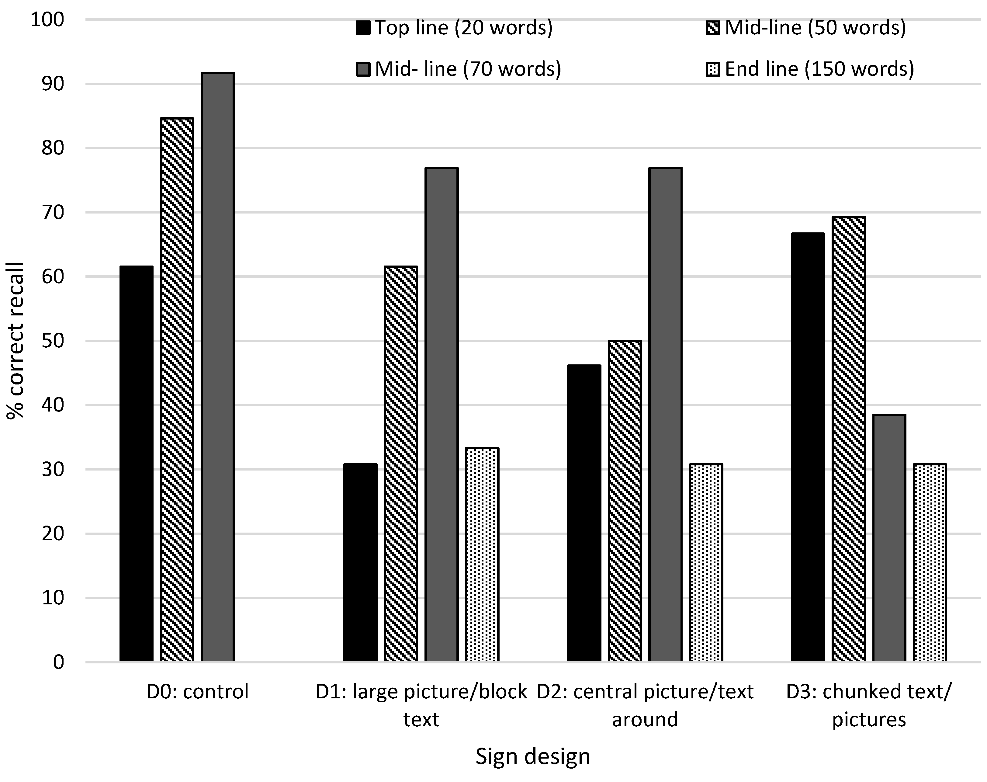
Figure 4.
Average gaze hotspot maps according to sign design. Red, orange, and yellow represent areas of more frequent viewing, green, dark green, and blue represent areas of less frequent viewing.
Figure 4.
Average gaze hotspot maps according to sign design. Red, orange, and yellow represent areas of more frequent viewing, green, dark green, and blue represent areas of less frequent viewing.
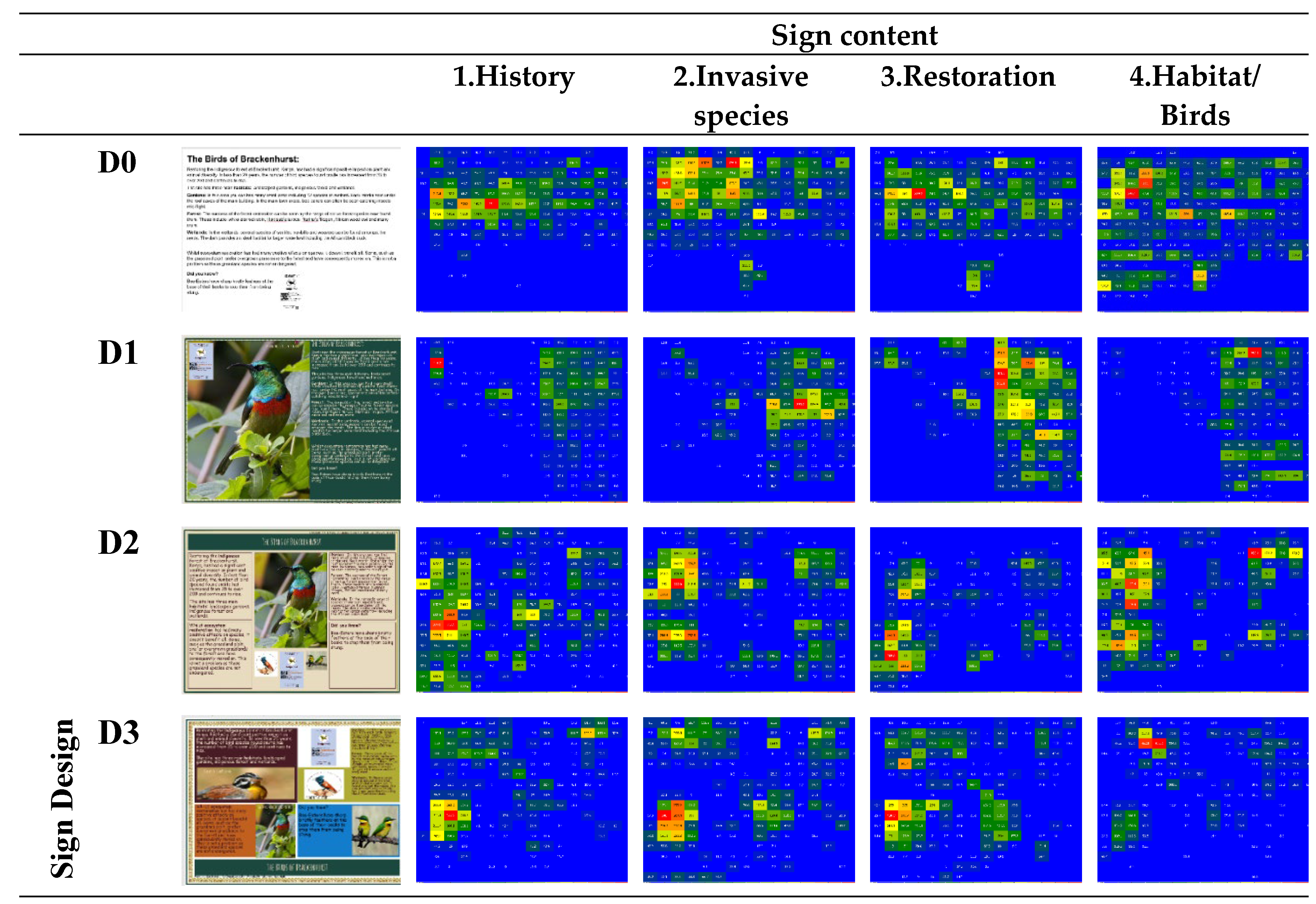
Table 1.
Variants of each sign design tested in the study.
| Sign type | Description | Variants | Example |
| Information board | Four different texts providing information about the Brackenhurst, Kenya, restoration ecology project. 156 - 256 words. 1 = History 2 = Invasive species 3 = Restoration ecology 4 = Habitats |
D0 = Control (Plain text [Arial font] no pictures) Title: top centre QR: bottom centre |
 |
| D1= Large picture with a single block of text Title: top QR: top left |
 |
||
| D2 = Central picture with chunked text around Title: top centre QR: bottom centre |
 |
||
| D3 = Chunked text and pictures Title: bottom centre QR: top centre | |||
| Species sign | A species information sign for a tree species. Included species name (common and scientific), basic description, distribution, and threat status. All signs had the same text content with varying map and threat status. 64 words |
0 = control (Word: Least Concern, outline continent map) |
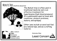 |
| 1 = (IUCN threat bar, continent map with spp. range highlighted) | 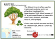 |
||
| 2 = (Thermometer threat status, Globe zoomed to continent, spp. range highlighted) | 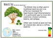 |
||
| 3 = (Speedometer threat, global map with spp. range highlighted) | 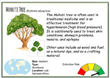 |
||
| Map | A scale drawing map of the Brackenhurst Kenya site with areas of interest and key species shown with illustrations. Three walking routes were plotted on each map and summarised in boxes under map (distance, estimated time, elevation gain and an elevation profile diagram). Respondents were asked to look at the map and select the easiest route. |
M0 = control (black and white with routes marked using various dotted lines) | 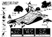 |
| M1 = colour map with routes marked using different coloured solid lines |  |
||
| M2 = colour map with routes marked using various dotted lines all a single colour | 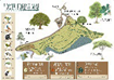 |
||
| M3 = colour map with routes marked with different colour dotted and solid lines |  |
Table 2.
Comparison of representations of species threat status (extinction risk).
| Style | Example | % who viewed | % correct recall |
Av. dwell time (ms) (95%CI) | Av. Time of first fixation (ms) (95%CI) |
Comments | % who agree-strongly agree extinction risk information is clear |
|---|---|---|---|---|---|---|---|
| Control |  |
87.5 | 62.5 | 1208 (431 – 2,129) |
97.8 (86.9 – 112.1) |
‘extinction risk information is clear.’ | 91.7 |
| IUCN threat status | 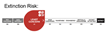 |
72.7 | 54.5 | 1975 (994 - 3084) |
150.1 (98.1 – 227.3) |
‘extinction risk information is clear’ | 69.2 |
| Thermometer |  |
87.5 | 75.0 | 2432 (1617 - 3297) |
147.8 (114.4 – 181.0) |
‘I assume green is of lower concern, but I would put thermometer the other way up.’ | 84.6 |
| Speedometer | 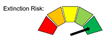 |
81.8 | 72.7 | 1765 (1056 - 2562) |
137.1 (108.4 – 173.2) |
‘green to red speedometer is clear’. ‘colours clear but could do with text to explain meaning.’ |
69.2 |
Table 3.
Number of correct responses to map route questions, reasons for selecting routes and whether map design was easy to interpret. For maps M0, M1, M2 there were 13 respondents and 12 respondents for M3.
Table 3.
Number of correct responses to map route questions, reasons for selecting routes and whether map design was easy to interpret. For maps M0, M1, M2 there were 13 respondents and 12 respondents for M3.
| Map | No. (%) of respondents who correctly identify easiest route | No (%) who slightly – strongly agree route was easy to read | Reason for choosing route | No. of respondent (total) | No. of respondents (correct responses only) |
|---|---|---|---|---|---|
| M0 | 6 (46.2) | 7 (53.8) | Flattest | 3 | 1 |
| Shortest | 4 | 3 | |||
| Easiest to follow | 4 | 2 | |||
| Another reason | 2 | - | |||
| M1 | 10 (76.9) | 10 (76.9) | Flattest | 1 | 1 |
| Shortest | 8 | 8 | |||
| Easiest to follow | 2 | 1 | |||
| Another reason | 2 | - | |||
| M2 | 6 (46.2) | 7 (53.8) | Flattest | - | - |
| Shortest | 7 | 5 | |||
| Easiest to follow | 5 | 1 | |||
| Another reason | 1 | - | |||
| M3 | 7 (58.3) | 7 (58.3) | Flattest | 2 | 1 |
| Shortest | 7 | 6 | |||
| Easiest to follow | - | - | |||
| Another reason | 3 | - |
Table 4.
Content recalled from information signs.
| Theme recalled | Number of respondents (%) | Example statements |
|---|---|---|
| Nothing | 4 (7.84) | ‘not a lot’, ‘nothing’ |
| Pictures | 25 (49.02) | ‘illustrations’, ‘Photos’ ‘really nice images’ |
| Conservation/restoration | 11 (21.57) | ‘Gone from 35 to 200 birds’; ’restoration’; ‘increased species’ |
| Habitat types | 10 (19.61) | ‘Forests, wetland, grassland’; ‘ecosystems’ ‘biodiversity’ |
| Invasive spp. (Eucalyptus) | 17 (33.33) | ‘Eucalyptus is invasive’ ’invasives’ |
| Birds | 26 (50.98) | ‘birds’, ‘bee-eater’ |
| Monkey | 5 (9.80) | ‘monkeys’, ‘colobus images’ |
| Historic information | 8 (15.69) | ‘General info on Brackenhurst history’, ‘founded as a coffee plantation’ |
| Map | 16 (31.37) | ‘map’ |
| elevation | 3 (5.88) | ‘Elevation profiles helpful’ |
| trail | 6 (11.76) | ‘Three trails’ |
| Species Sign (Muhuti Tree) | 11 (21.57) | ‘Muhuti tree’ |
| medicinal use | 6 (11.76) | ‘Muhuti tree, helps blood pressure, used as medicine’ |
| extinction risk | 3 (5.88) | ‘Least concern’, ‘extinction grading’ |
Disclaimer/Publisher’s Note: The statements, opinions and data contained in all publications are solely those of the individual author(s) and contributor(s) and not of MDPI and/or the editor(s). MDPI and/or the editor(s) disclaim responsibility for any injury to people or property resulting from any ideas, methods, instructions or products referred to in the content. |
© 2024 by the authors. Licensee MDPI, Basel, Switzerland. This article is an open access article distributed under the terms and conditions of the Creative Commons Attribution (CC BY) license (https://creativecommons.org/licenses/by/4.0/).
Copyright: This open access article is published under a Creative Commons CC BY 4.0 license, which permit the free download, distribution, and reuse, provided that the author and preprint are cited in any reuse.


