
Submitted:
12 August 2025
Posted:
14 August 2025
You are already at the latest version
Abstract
In today’s fast-paced digital marketplace, understanding consumer behavior is essential for driving success. This study harnesses innovative data visualization techniques to convert intricate e-commerce datasets into clear, actionable insights. By employing interactive charts, heatmaps, and trend analyses, I reveal the underlying patterns that shape user engagement and revenue generation. The approach not only highlights critical touchpoints along the customer journey but also provides strategic guidance for enhancing user experience and optimizing marketing efforts. The findings demonstrate that visual analytics can serve as a transformative tool for decoding complex digital retail dynamics and fostering informed decision-making.
Keywords:
consumer behavior
; data visualization
; e-commerce analytics
; interactive dashboards
; user engagement
; revenue optimization
; digital marketing
; visual analytics
1. Introduction
In the highly saturated realm of digital commerce, comprehending patterns in customer behavior is a fundamental step toward enhancing profitability. This study delves into a comprehensive dataset consisting of 12,330 individual user interactions spanning one calendar year on an e-commerce platform. The analysis centers on critical metrics such as abandonment rates, page departure frequencies, source of inbound traffic, and duration of interaction across varied page categories—administrative, informational, and product-centric.
A striking observation is that only 15.5% of sessions culminate in successful transactions, leaving a significant 84.5% classified as non-converting or non-profitable interactions. These figures highlight the necessity for a deeper evaluation of the variables influencing conversion and monetary outcomes.
The primary aim of this investigation is to pinpoint the driving factors behind successful revenue generation. By leveraging advanced statistical techniques and data visualization tools, the findings aim to inform evidence-based strategies that refine marketing efficiency and elevate user satisfaction—ultimately contributing to improved transactional performance in online retail environments.
2. Rationale Behind Domain Selection
The rapid proliferation of online retail platforms has transformed the dynamics of both purchasing behavior and corporate sales strategies. In an increasingly competitive virtual marketplace, decoding consumer interaction has become a strategic imperative. Identifying behavioral patterns through clickstream and session analytics enables organizations to streamline digital interfaces, craft targeted campaigns, and influence purchasing intentions more effectively.
According to Chaffey and Ellis-Chadwick (2022) [1], interpreting user activity is fundamental in constructing personalized engagement frameworks and sustaining customer loyalty. In light of the post-pandemic paradigm shift—where virtual shopping has surged and buyer expectations have evolved—the relevance of understanding digital behavior has only intensified.
Employing behavioral analytics allows enterprises to foster customized user journeys, enhance conversion pipelines, and develop predictive strategies that align with real-time consumer demands. Thus, the motivation for this research is rooted in the critical role behavioral insight plays in fostering adaptive e-commerce growth models.
3. Visualization Scope and Analytical Focus
The analytical focus of this research is on data visualizations that decode user patterns within the Online Shoppers dataset, aiming to uncover trends and associations that inform strategic e-commerce decisions [3,4]. The analysis interprets behavioral indicators, visit origins, user classifications, and their correlations with transactional outcomes. Behavioral depth is assessed by examining the time spent across administrative, informational, and product-related sections to evaluate their contribution to commercial success [6]. Temporal disengagement patterns are explored through line plots of bounce and exit rates, while comparative bar charts assess the revenue effectiveness of different traffic channels to optimize promotional allocation. Visitor segmentation contrasts first-time and repeat users in terms of browsing duration and purchase likelihood, supporting loyalty program refinement. Time-based shopping behavior is analyzed using seasonal trends and activity plots to inform inventory and promotional timing. Regional revenue performance is mapped through geospatial visualizations [5] to identify high-performing and underperforming territories. The interplay between informational and product content is examined via bubble charts to guide layout improvements, and longitudinal cohort tracking compares newer and returning customers to measure recurring value generation and loyalty over time.
4. Research Aims and Analytical Goals
This study aims to explore user interaction dynamics within an online retail environment through data visualization and statistical analysis, focusing on identifying factors that drive revenue generation and user retention [3,5]. The analysis examines engagement indicators such as ProductRelated_Duration, PageValues, and Time_on_Site to determine their influence on transactions, while also assessing demographic and system-related factors (OperatingSystems, Browser, Region) that shape user behavior. Visitor classification (NewVisitor vs. ReturningVisitor) is studied in relation to seasonal peaks, holidays, and promotional events, alongside regional differences in BounceRates and ExitRates that may signal design or usability issues. The efficiency of various TrafficType sources is evaluated to identify optimal acquisition channels and critical drop-off points within the sales funnel. Interdependencies between key numerical features are analyzed to reveal predictive patterns for conversion, while PageValues distributions are compared for revenue and non-revenue sessions to inform content prioritization. Temporal patterns, such as weekday–weekend differences, are assessed to guide marketing schedules, and regional revenue mapping highlights zones with high or low performance for targeted outreach. Long-term trends in cohort contributions are explored to support retention strategies, seasonal fluctuations in conversion rates are investigated to improve engagement with new and returning users, and the relationship between Informational and ProductRelated page interactions is analyzed to optimize navigation and enhance conversion potential.
5. About the Dataset
The dataset consists of 12,330 unique session-level records from an online retail platform, capturing user actions, engagement patterns, and transactional outcomes [4,6]. Each session is annotated with multiple features reflecting browsing behavior and potential purchase intent. Administrative and Administrative_Duration track the number of site management-related pages visited and the total time spent on them, while Informational and Informational_Duration record visits and time spent on knowledge-based pages, indicating research-oriented activity. ProductRelated and ProductRelated_Duration measure product-focused interactions, often correlating with purchase intent. Engagement quality is further described by BounceRates (likelihood of leaving after one page) and ExitRates (proportion of exits from specific pages), while PageValues estimates the monetary contribution potential of individual pages. The SpecialDay feature (0–1 scale) captures proximity to major events, and Month records the session’s occurrence month for seasonal analysis. Device and access preferences are represented by OperatingSystems, Browser, and Region, while TrafficType identifies the origin of visits (e.g., search engine, referral). VisitorType distinguishes between first-time and repeat users, Weekend flags Saturday/Sunday sessions, and Revenue denotes whether a purchase was made. Finally, Time_on_Site measures the total duration of each session, serving as a key engagement indicator.
6. Data Exploration
6.1. About the Data
The dataset under consideration comprises approximately 12,330 rows and 18 columns. This extensive dataset provides a robust foundation for analysis, encompassing various attributes that can be examined to uncover meaningful patterns and insights related to user behavior and revenue generation.
Figure 1.
Concise summary of the dataset.

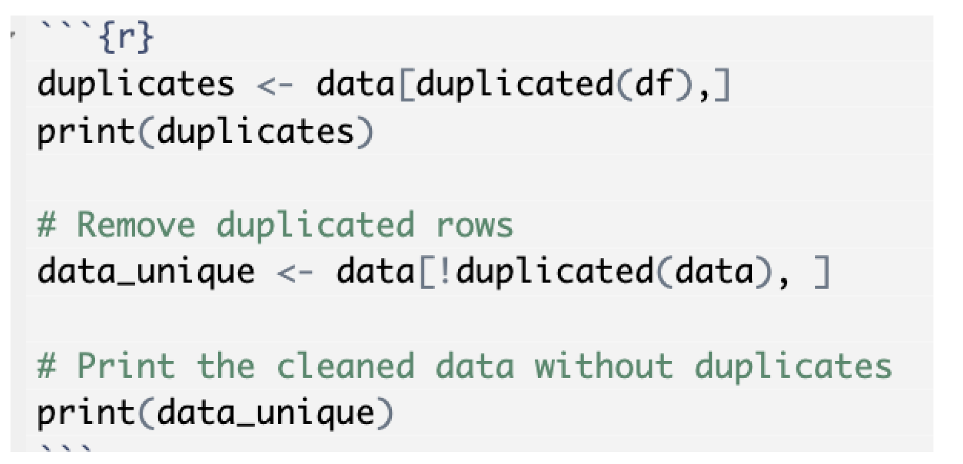
To ensure data accuracy, column data types were thoroughly reviewed and adjusted as necessary during the exploration phase. Additionally, the dataset was checked for duplicate entries. No duplicates were identified, thereby preserving data integrity for subsequent analysis.
Figure 2.
Duplicate row check.
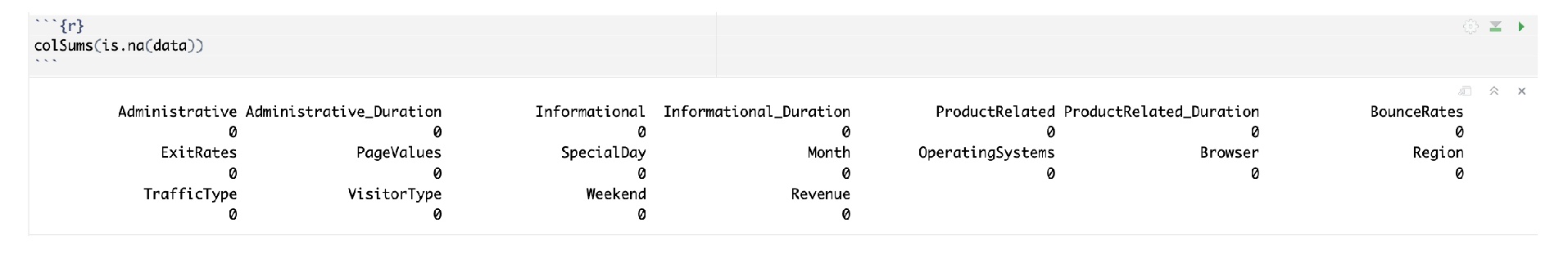
6.2. Missing Values
A comprehensive check for null or missing values revealed that the dataset contained no missing entries, indicating a clean dataset ready for analysis.
Figure 3.
Null value verification.
7. Data Visualization
Data visualization facilitates better understanding by presenting information in a visual format that highlights correlations, trends, and patterns that may not be readily apparent in tabular form. It transforms raw datasets into graphical representations—such as charts and graphs—that are easier for the human brain to process (Islam & Jin, 2019) [7]. In this section, various visualization techniques are employed to uncover patterns and relationships within the online shoppers’ data. The goal is to provide intuitive insights into consumer behavior and the factors that influence purchase decisions.
Utilizing ggplot2: According to Wickham (2016) [8], ggplot2 simplifies the creation of complex, multi-layered plots using expressive grammar, enabling users to generate visually appealing and publication-quality graphics. Built on Wilkinson’s "Grammar of Graphics," it offers a versatile syntax for constructing a wide range of visualizations. Its flexibility, ease of use, and capability to produce insightful plots make it a preferred tool in data analysis. Complementing ggplot2, the shiny and plotly packages enable the development of interactive dashboards that enhance exploratory analysis through user engagement.
7.1. Answering Questions Through Data Visualization
This section leverages the R programming language along with the ggplot2 and plotly packages to effectively visualize data and derive insights.
User Engagement Analysis
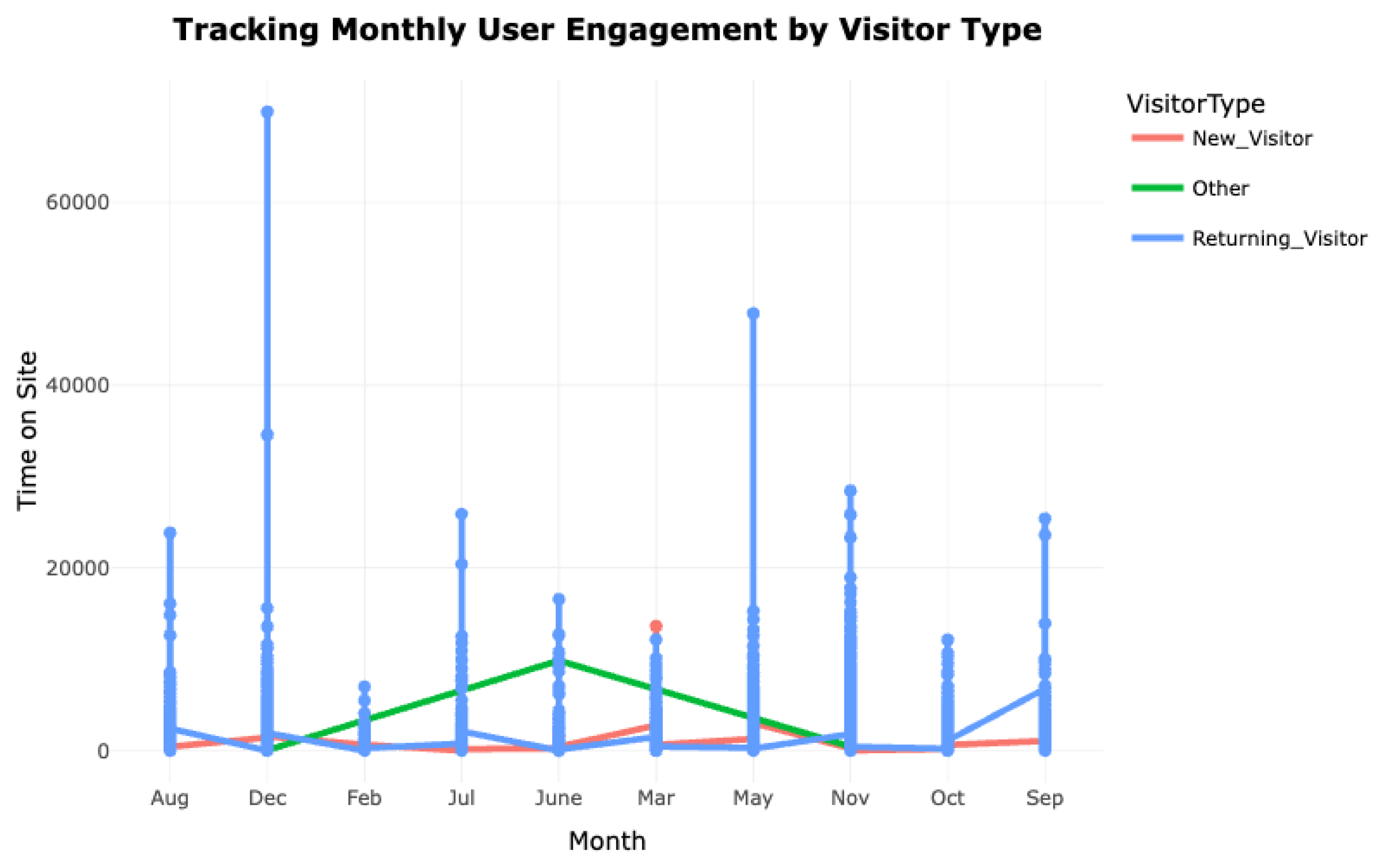
1. How does the time spent on different page categories (Administrative, Informational, ProductRelated) correlate with revenue generation? Which pages are most effective at engaging users?
The line plot indicates that Returning Visitors show the highest levels of engagement, spending more time on the site compared to New Visitors and Others. Engagement peaks in December and March, likely influenced by seasonal promotions or special events. In contrast, New Visitors consistently exhibit lower engagement throughout the year, highlighting the need for strategies to convert them into active users.
Figure 4.
Monthly user engagement by visitor type.
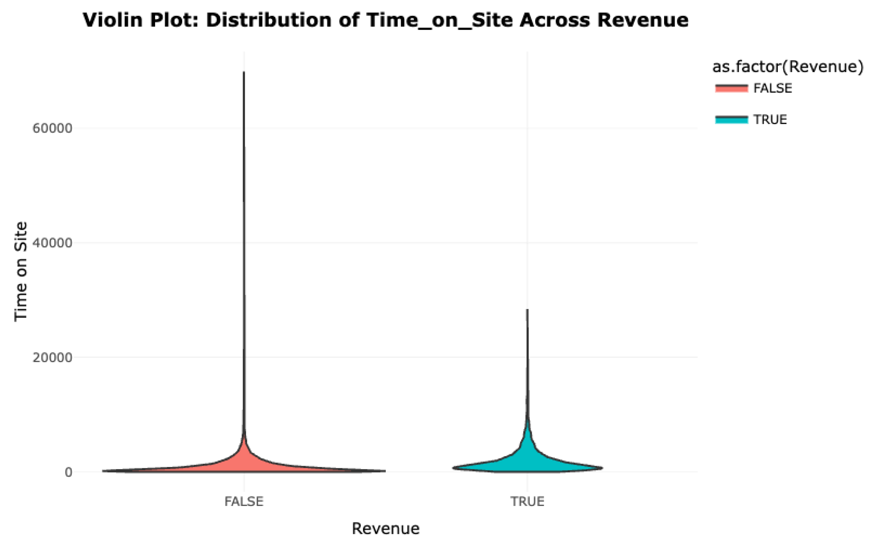
The violin plot illustrates the distribution of Time_on_Site for sessions that resulted in revenue (Revenue = TRUE) and those that did not (Revenue = FALSE). Interestingly, sessions without revenue tend to show longer visit durations, suggesting that extended time on the site does not necessarily lead to purchases. Conversely, revenue-generating sessions are more concentrated around shorter visit durations, implying that efficient navigation—especially on product-related pages—is linked to successful transactions. Excessive time on informational or administrative pages might hinder conversions.
Figure 5.
Violin plot: Time_on_Site distribution across revenue.
Demographic-Based User Behavior Analysis
2. How does user behavior differ across demographics like Region, Operating Systems, and Browser in terms of revenue generation and engagement? Are there significant variations in user interactions based on these features?
A bar plot examining revenue generation by browser reveals that users of Browser 2 contribute significantly more revenue compared to other browsers. Despite Browser 1 having a large user base, Browser 2 achieves a higher conversion rate, suggesting a more engaged or purchase-ready audience. Browsers 3 through 13 exhibit minimal revenue generation, indicating lower interaction or conversion potential.
Figure 6.
Revenue distribution across different web browsers.
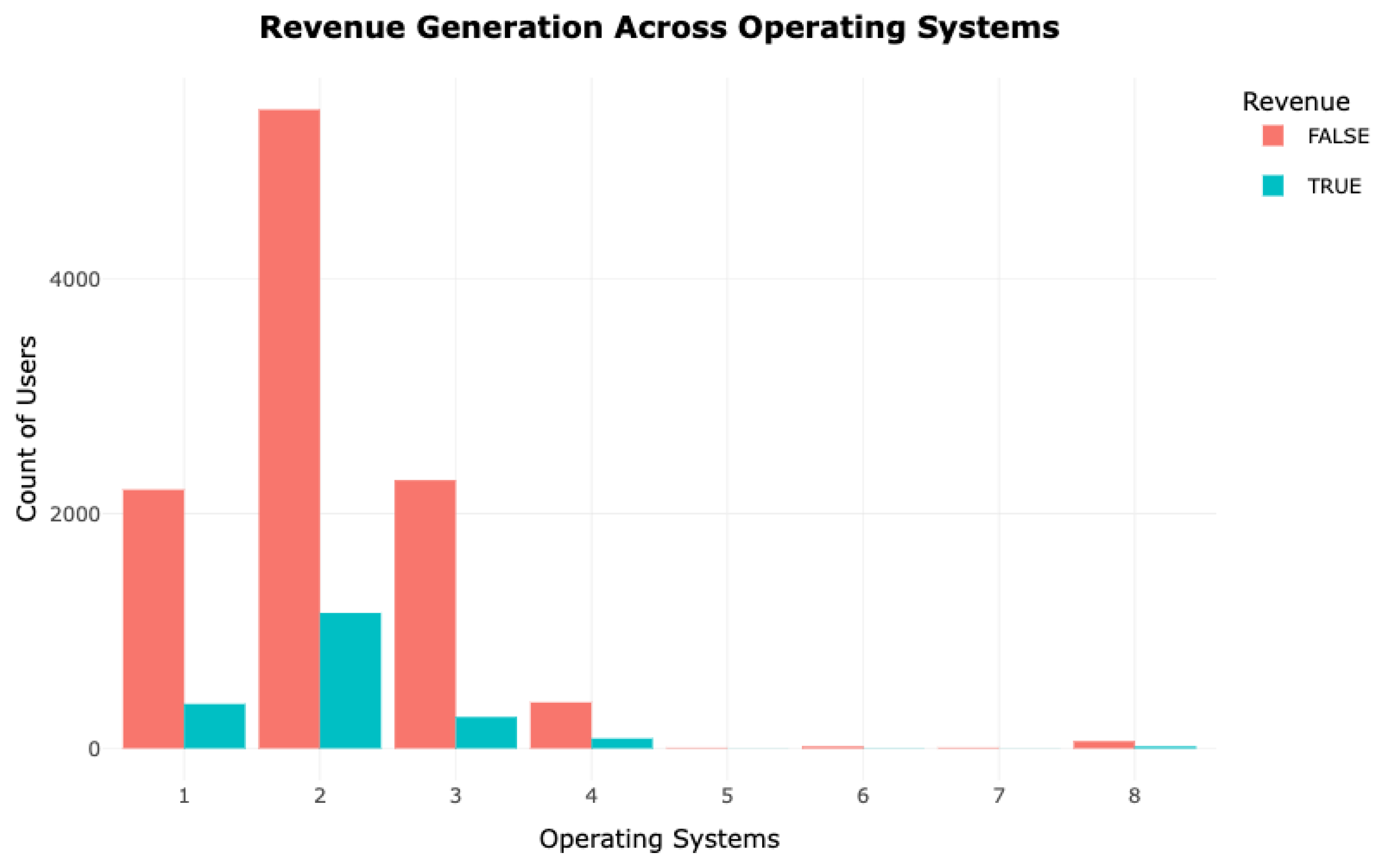
Revenue generation across operating systems reveals that Operating System 2 leads in total revenue, followed by Systems 1 and 3. Although Operating System 1 has a larger user base, its conversion rate is lower, suggesting that high interaction does not always equate to successful purchases. Operating Systems 4 and beyond contribute minimally, indicating platform-specific differences in user engagement and conversion.
Figure 7.
Revenue analysis across operating systems.
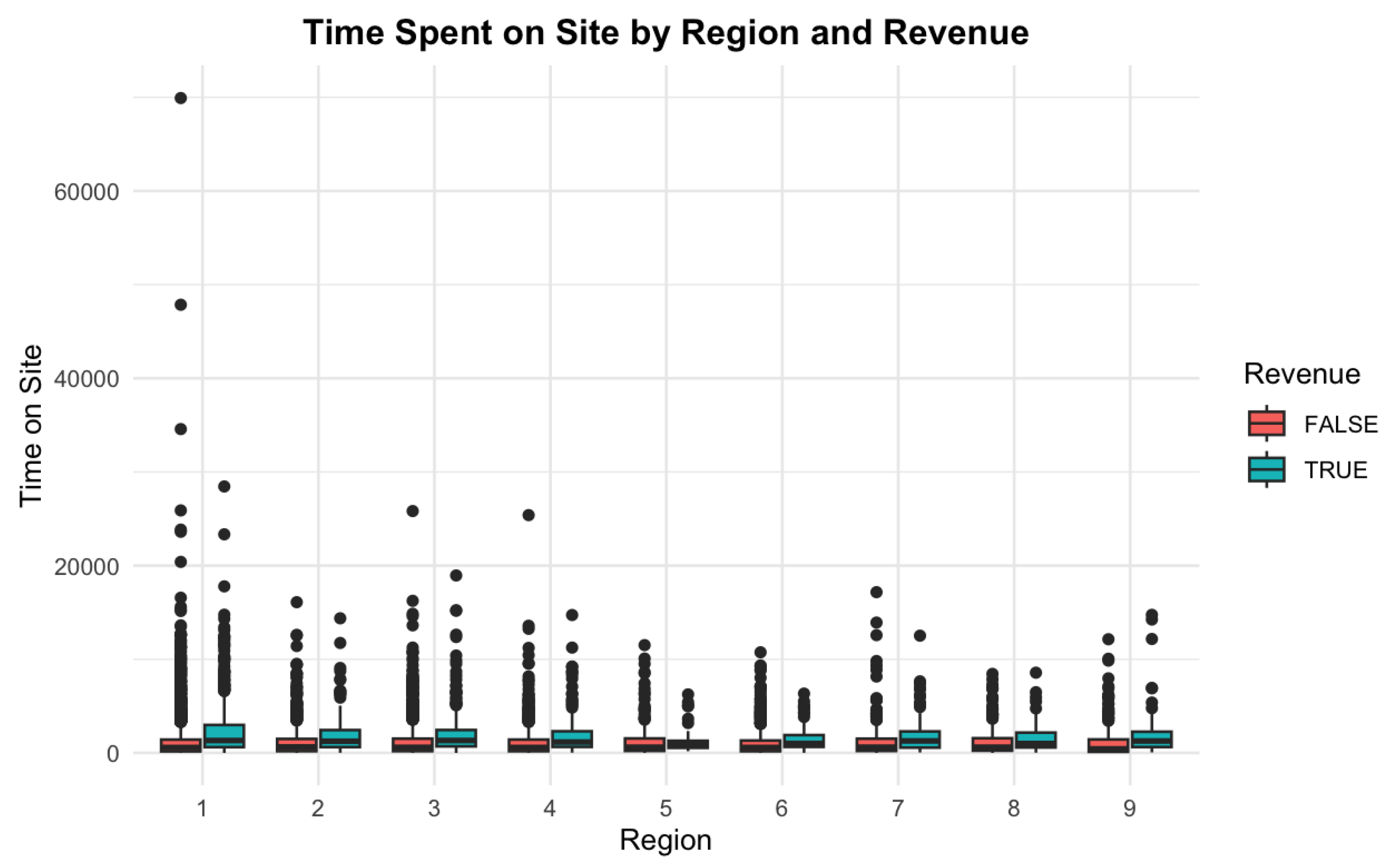
The box plot shows the time spent on the site by region, categorized by revenue generation. Region 1 has wide variability in session durations, with many non-revenue sessions. Regions 2 and 3, though associated with shorter sessions, show higher revenue rates. This suggests that productive sessions—rather than lengthy ones—drive conversions in certain regions.
Figure 8.
Time spent on site by region and revenue.
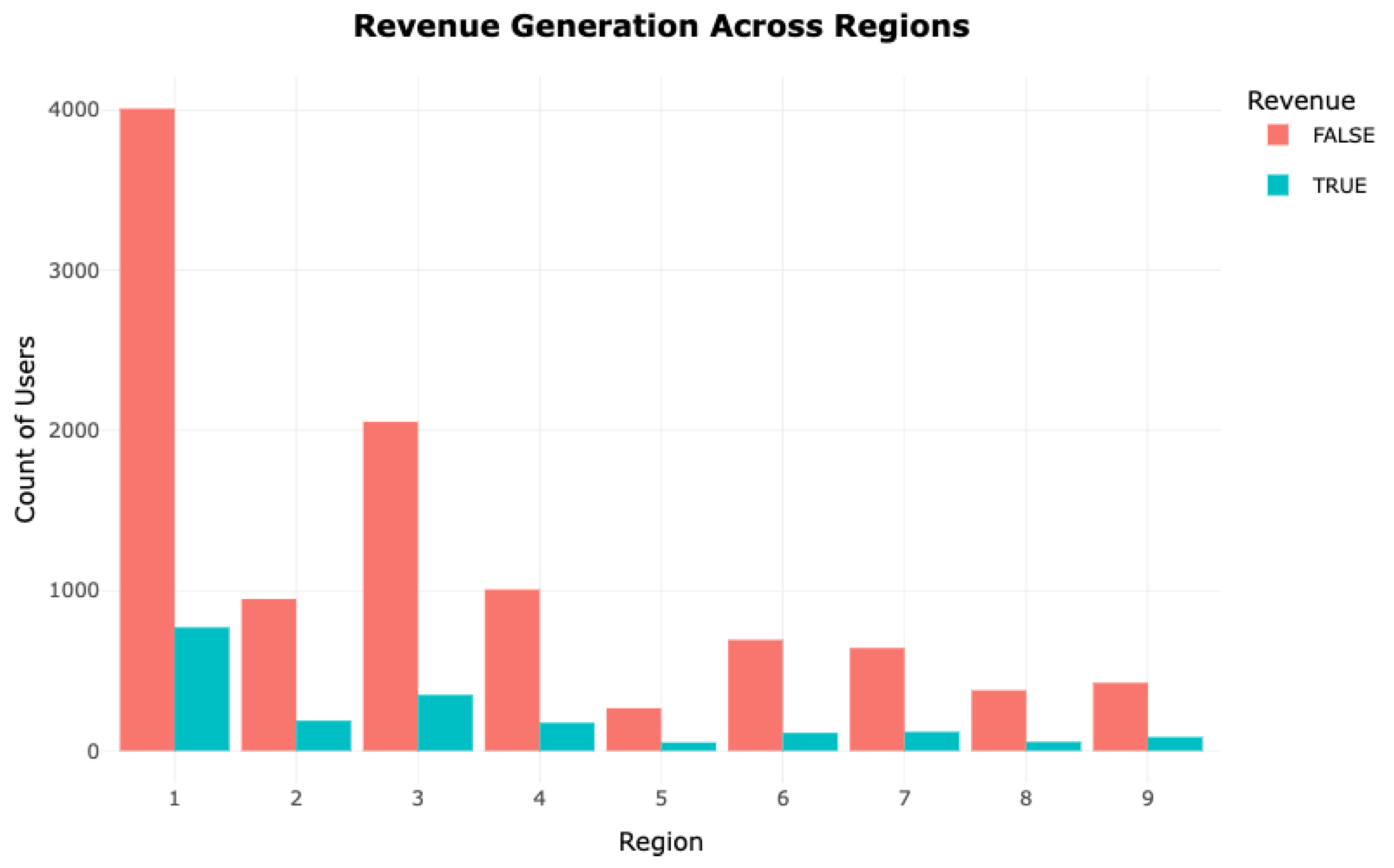
A bar plot of regional revenue distribution shows that Region 1, despite having the highest user count, contributes a lower percentage to overall revenue, possibly due to low conversion efficiency. In contrast, Regions 2 and 3, with smaller user bases, demonstrate higher conversion rates, underscoring regional differences in user engagement and transaction behavior.
Figure 9.
Revenue generation across regions.
Evaluating the Impact of Visitor Type and Special Events on Revenue
3. What is the impact of being a New Visitor versus a Returning Visitor on revenue generation, especially during significant holidays or special days? Are returning visitors more likely to generate revenue during special events?
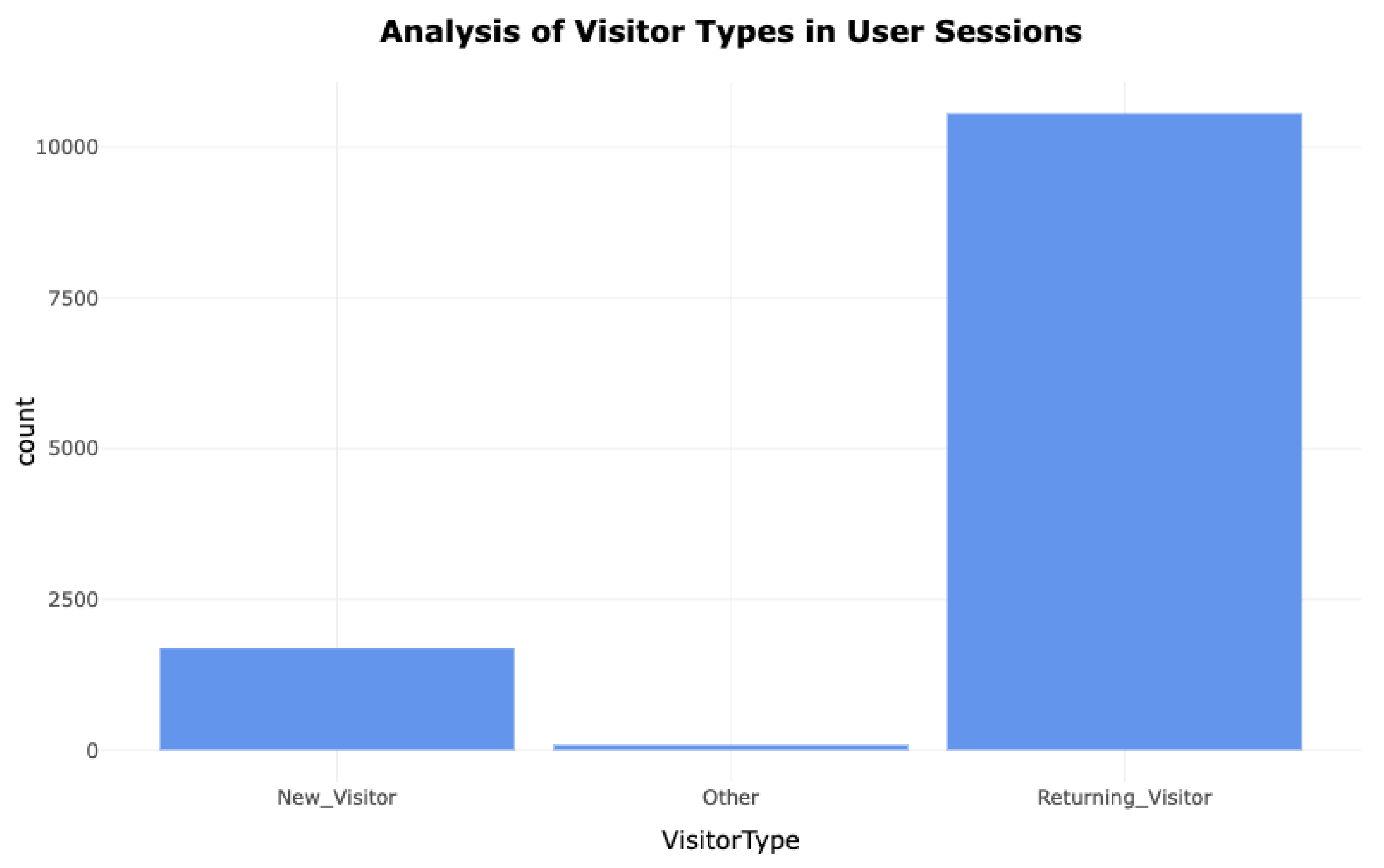
The distribution of visitor types highlights that Returning Visitors account for the majority of sessions. This trend suggests strong customer loyalty and frequent repeat interactions. In contrast, New Visitors constitute a smaller portion and show minimal impact on revenue, indicating lower initial engagement or familiarity with the platform.
Figure 10.
Visitor type distribution across sessions.
The revenue contribution from visitor types further underscores that Returning Visitors are responsible for the vast majority of transactions. While New Visitors are more numerous in some instances, they account for a significantly smaller share of revenue, reinforcing the importance of customer retention and long-term engagement.
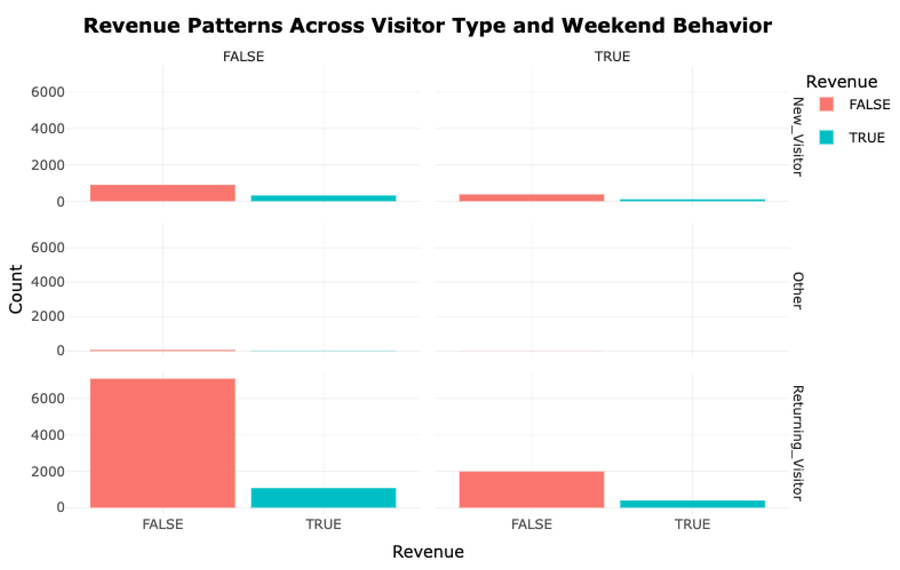
This visual illustrates disparities in revenue generation across New, Returning, and Other Visitor categories, incorporating the influence of weekend sessions. The plotted data reveals that Returning Visitors consistently contribute a significantly higher share of income on all weekdays. Both weekend and weekday interactions reflect enhanced engagement and monetary yield from Returning Visitors. In contrast, New Visitors contribute less financially, and their session behavior remains relatively unaffected by the weekend factor. This indicates that weekend timing does not substantially alter the conduct of New Visitors, while Returning Visitors consistently demonstrate high value in terms of revenue.
Figure 11.
Revenue Patterns Across Visitor Type and Weekend Behavior.
To summarize, regardless of temporal factors such as weekdays, weekends, or proximity to promotional events, the analysis consistently identifies Returning Visitors as primary contributors to earnings. Their greater session volumes and improved conversion efficiency reinforce the necessity of emphasizing user retention strategies. On the contrary, New Visitors exhibit a lower propensity for financial conversion. This suggests that while audience expansion remains relevant, sustained engagement with the existing user base yields superior revenue optimization, particularly during high-traffic periods.
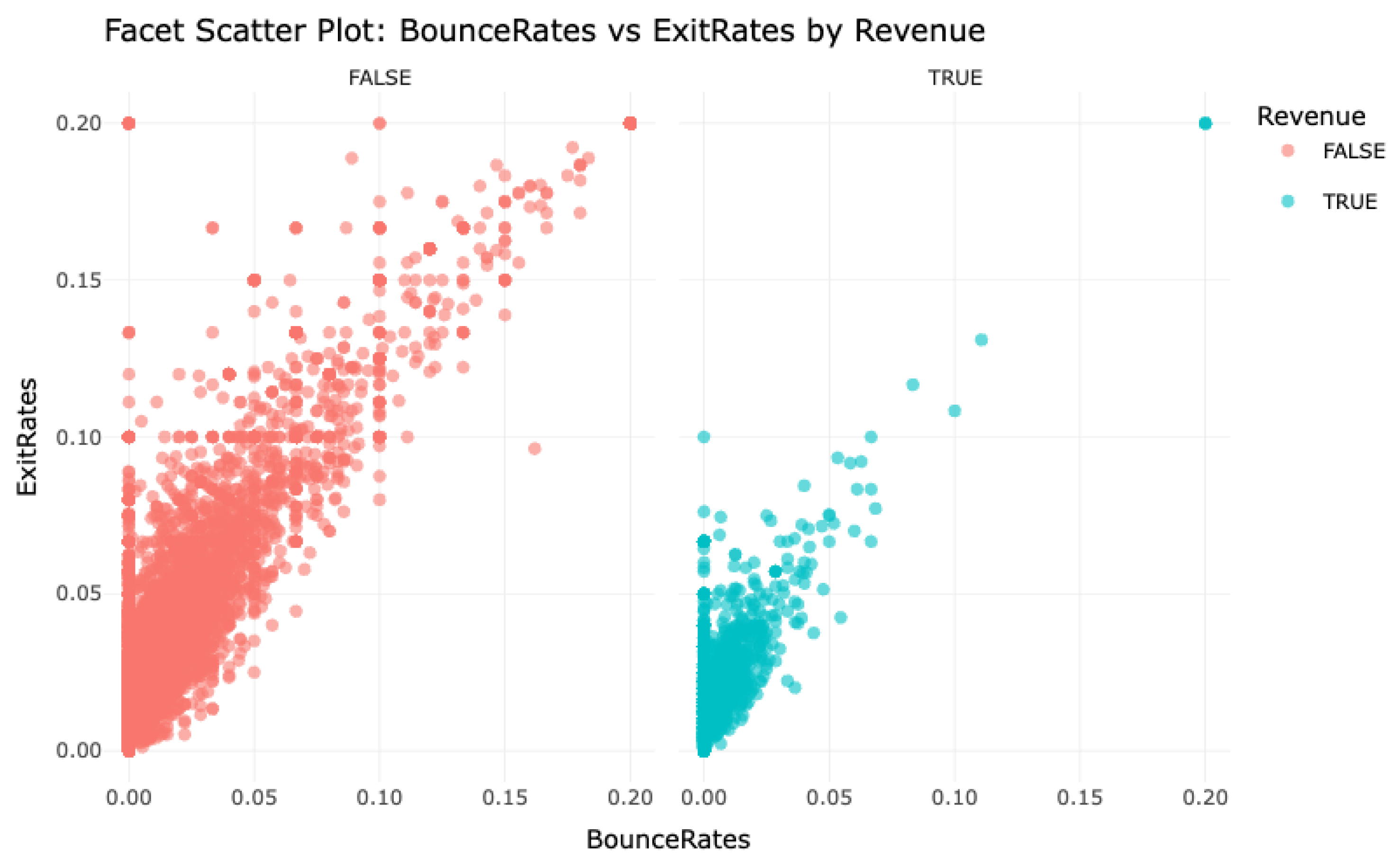
Analyzing the Impact of Bounce and Exit Metrics 1. In what manner do elevated BounceRates and ExitRates influence revenue across different geographic areas? Are there certain regions that display inflated exit or bounce figures that warrant enhancements in layout or content?
This facet scatter visualization conveys the interaction between BounceRates and ExitRates, categorized by whether a session generated revenue. Sessions without financial output exhibit a pronounced correlation between elevated BounceRates and ExitRates, implying that users frequently abandon the platform early, likely due to inadequate engagement. Conversely, sessions linked to revenue display markedly reduced bounce and exit figures, signifying that prolonged interaction is conducive to conversions. These patterns suggest that mitigating bounce and exit tendencies may bolster user persistence and elevate transactional success.
Figure 12.
Analyzing Bounce Rates vs. Exit Rates by Revenue Segments.
This bubble chart presents the association between BounceRates and ExitRates across various territories, where bubble size represents geographic segmentation and color denotes revenue classification. A dense clustering of red bubbles—denoting non-revenue sessions—emerges in the upper BounceRate/ExitRate quadrant, underscoring a negative relationship with revenue production. In contrast, blue bubbles, representative of revenue-positive interactions, predominantly inhabit areas characterized by diminished bounce and exit rates. These trends indicate that high-metric regions merit immediate attention for interface or content refinement to improve conversion likelihood.
Figure 13.
Exploring Regional Bounce and Exit Rates with Revenue Differences.
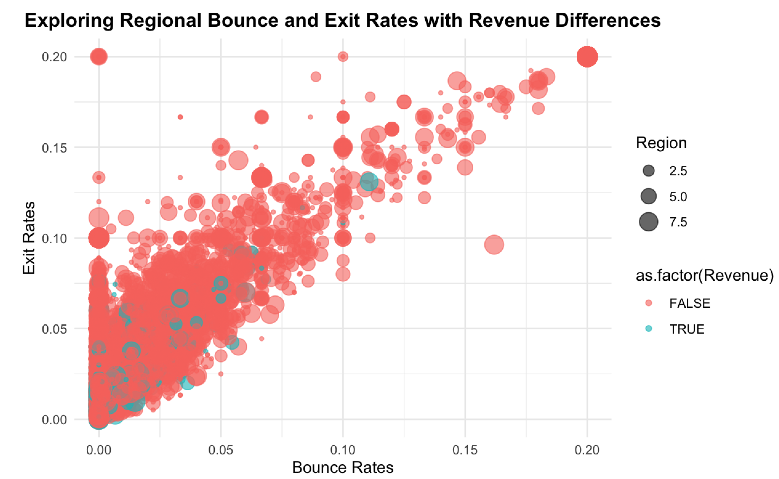
The patterns observed in both visualizations affirm that elevated BounceRates and ExitRates undermine revenue outcomes. Territories exhibiting such characteristics are generally associated with reduced session value. Consequently, refining site experience and enhancing user interaction are essential measures for improving retention and encouraging transactional behavior.
This temporal line graph, mapping BounceRate fluctuations across months, unveils several behavioral insights. There are observable peaks—reaching up to 0.20—in months such as December, February, and November, indicating diminished user retention and higher single-page exit tendencies. This trend may be indicative of seasonal disengagement or misaligned content offerings.
Conversely, months like May and September demonstrate sudden dips in bounce percentages, potentially reflecting the impact of successful marketing initiatives or improved navigational structures that sustained visitor interest.
These findings underscore the necessity of strategic content or interface adjustments during months with heightened bounce statistics. Meanwhile, low-bounce periods may reflect optimized conditions, offering benchmarks for replicable design and outreach practices in future cycles.
Figure 14.
Time Series of BounceRates Over Months.
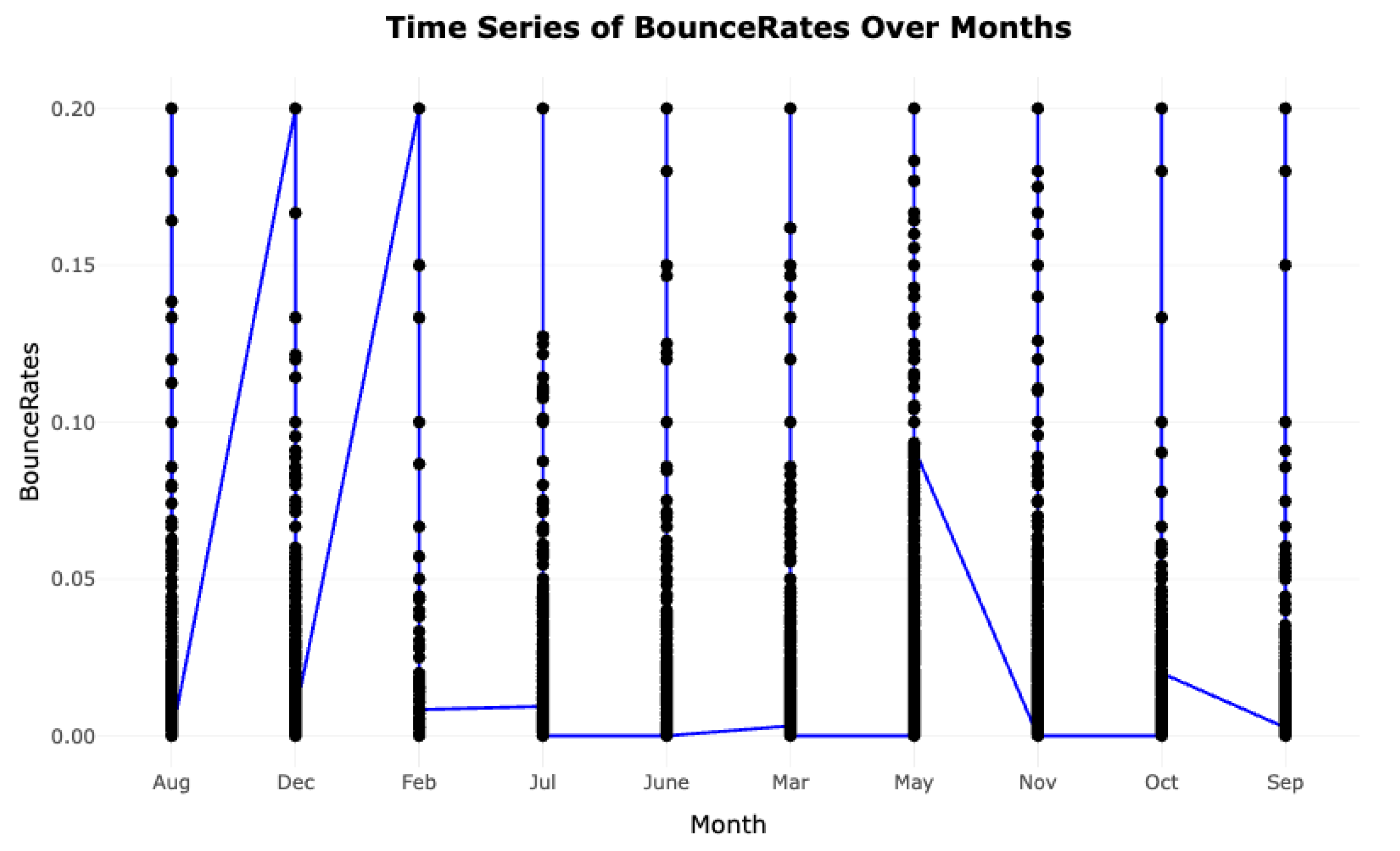
Figure 15.
Visualizing Traffic Source Counts Across Types.
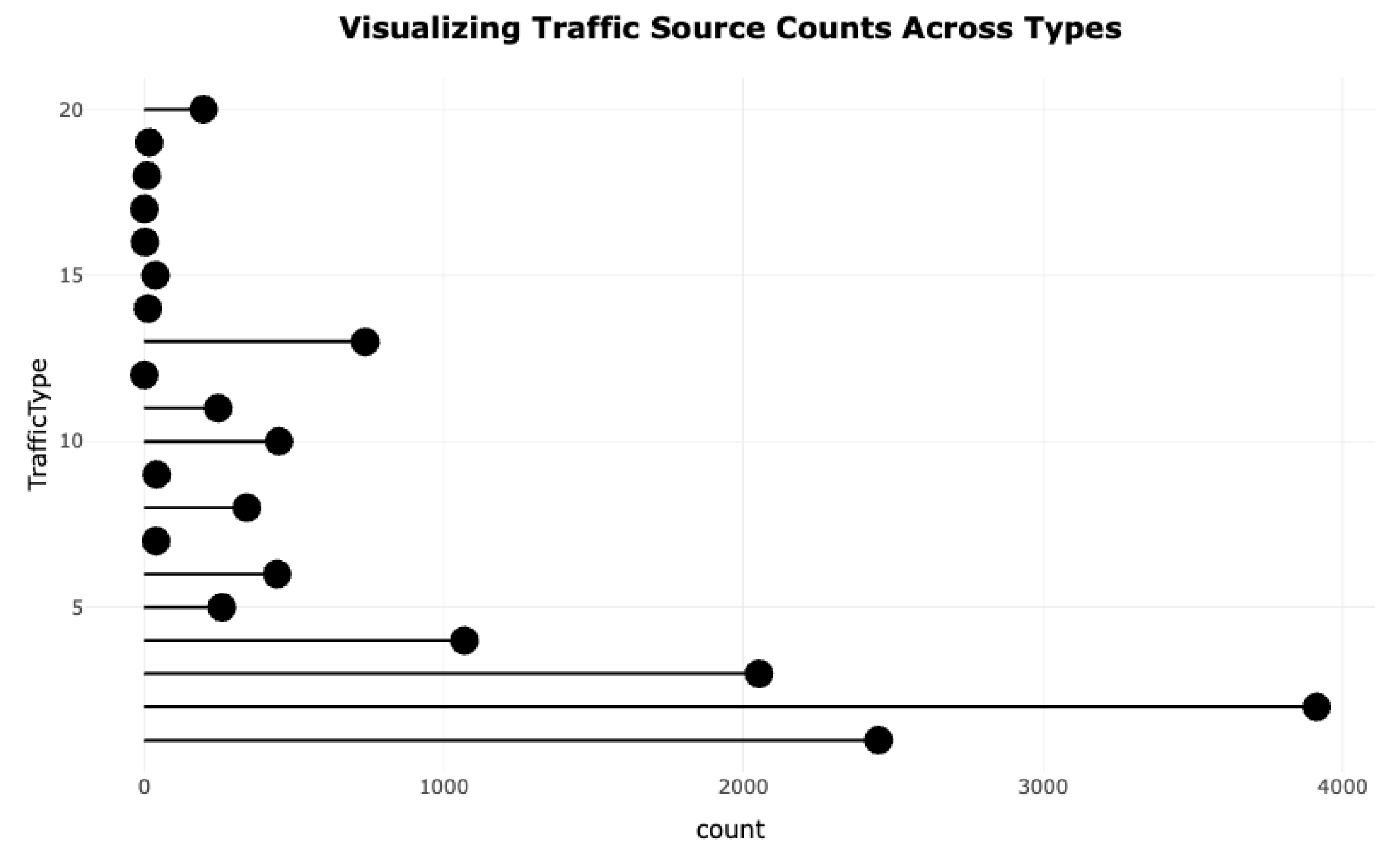
Figure 16.
Monthly Conversion Trends by Traffic Type.
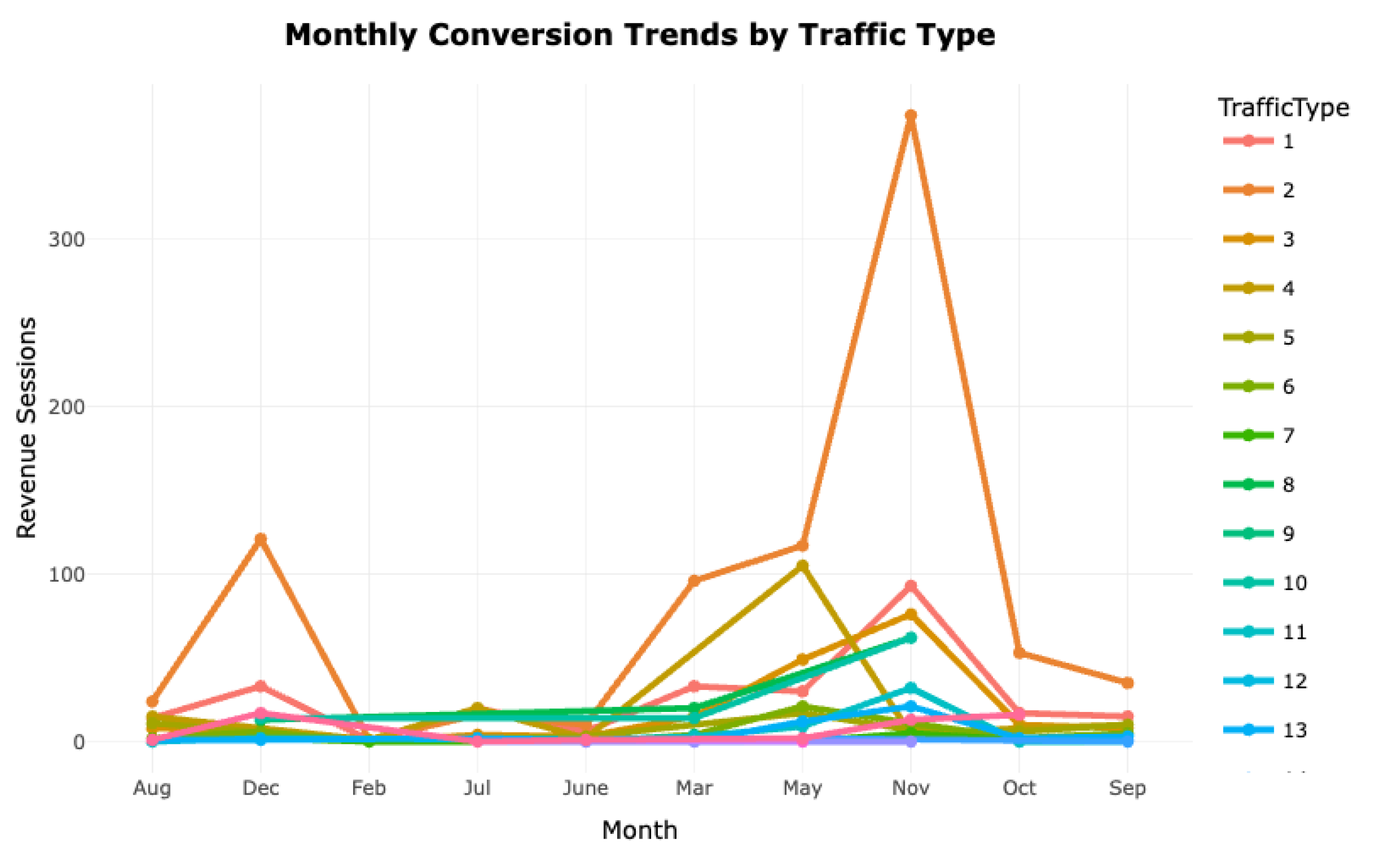
Figure 17.
Proportion of Traffic Sources and Their Revenue Contributions.
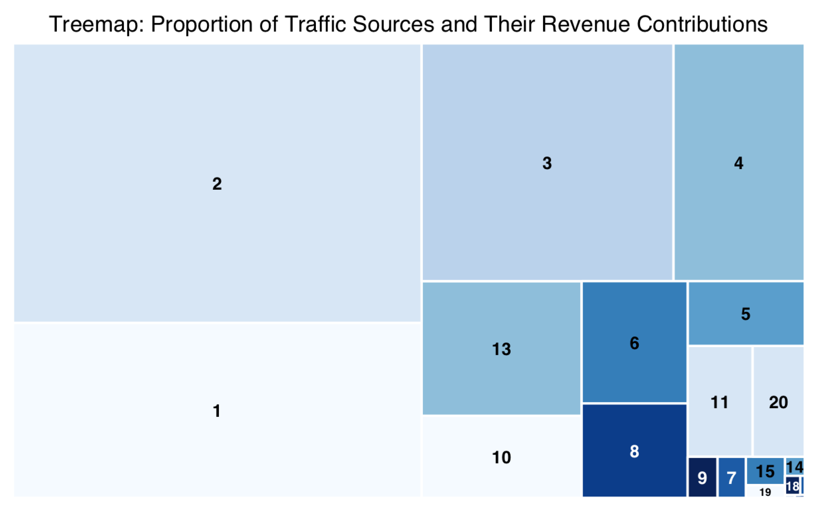
Figure 18.
Conversion from Traffic Type to Revenue Sessions.
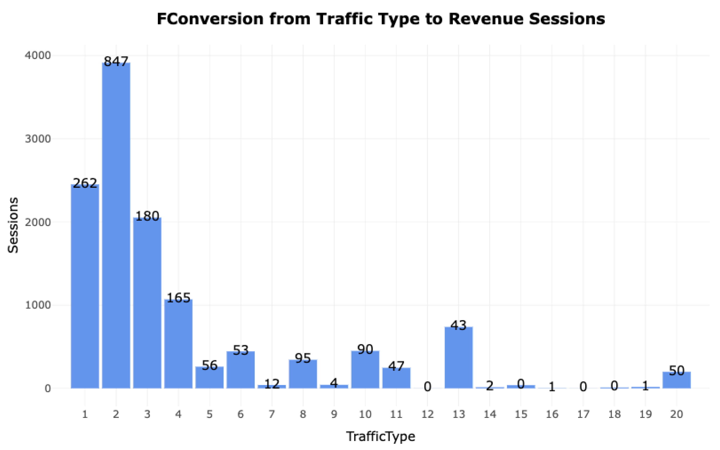
Figure 19.
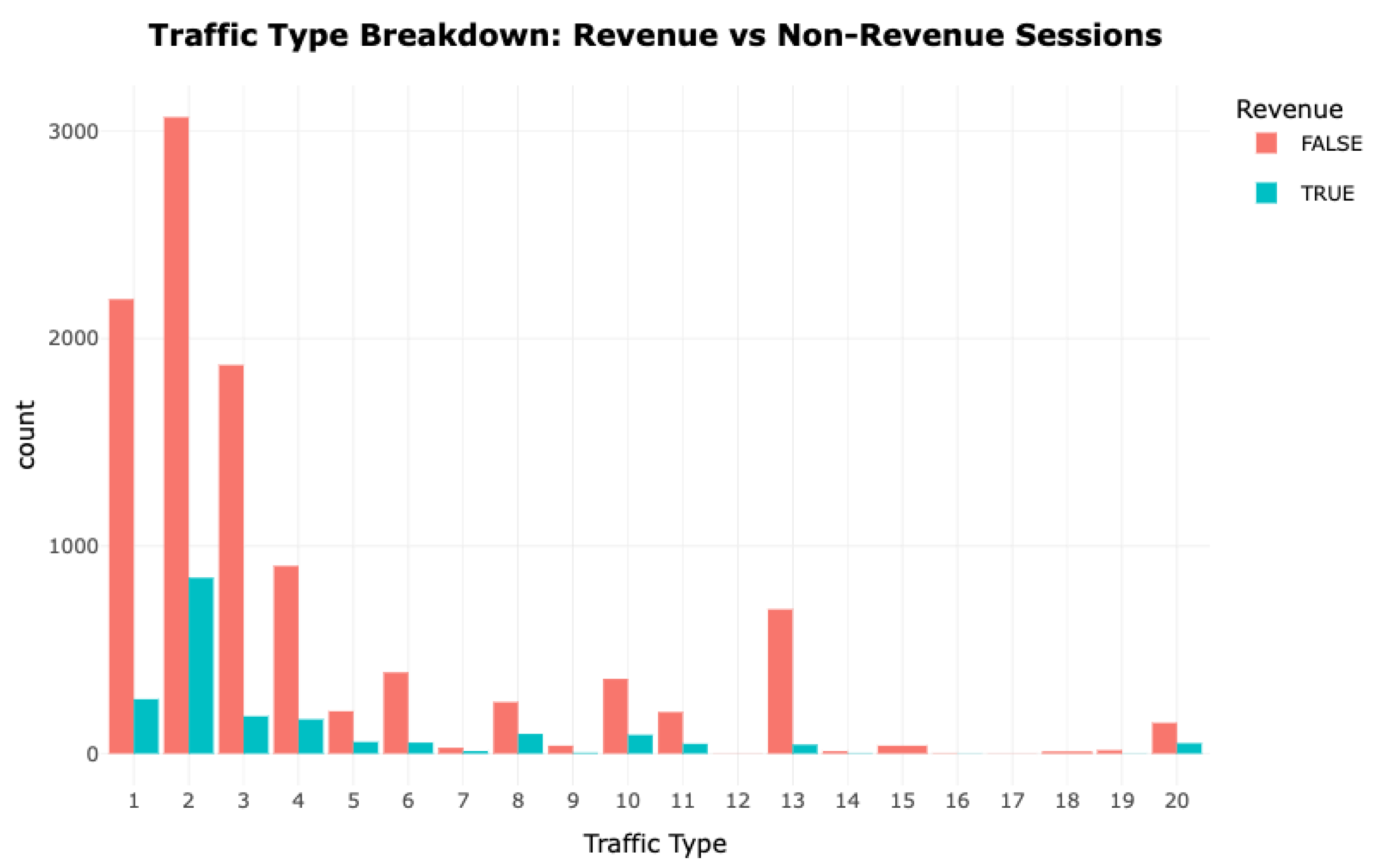
Traffic Type Breakdown- Revenue vs Non-Revenue Sessions.
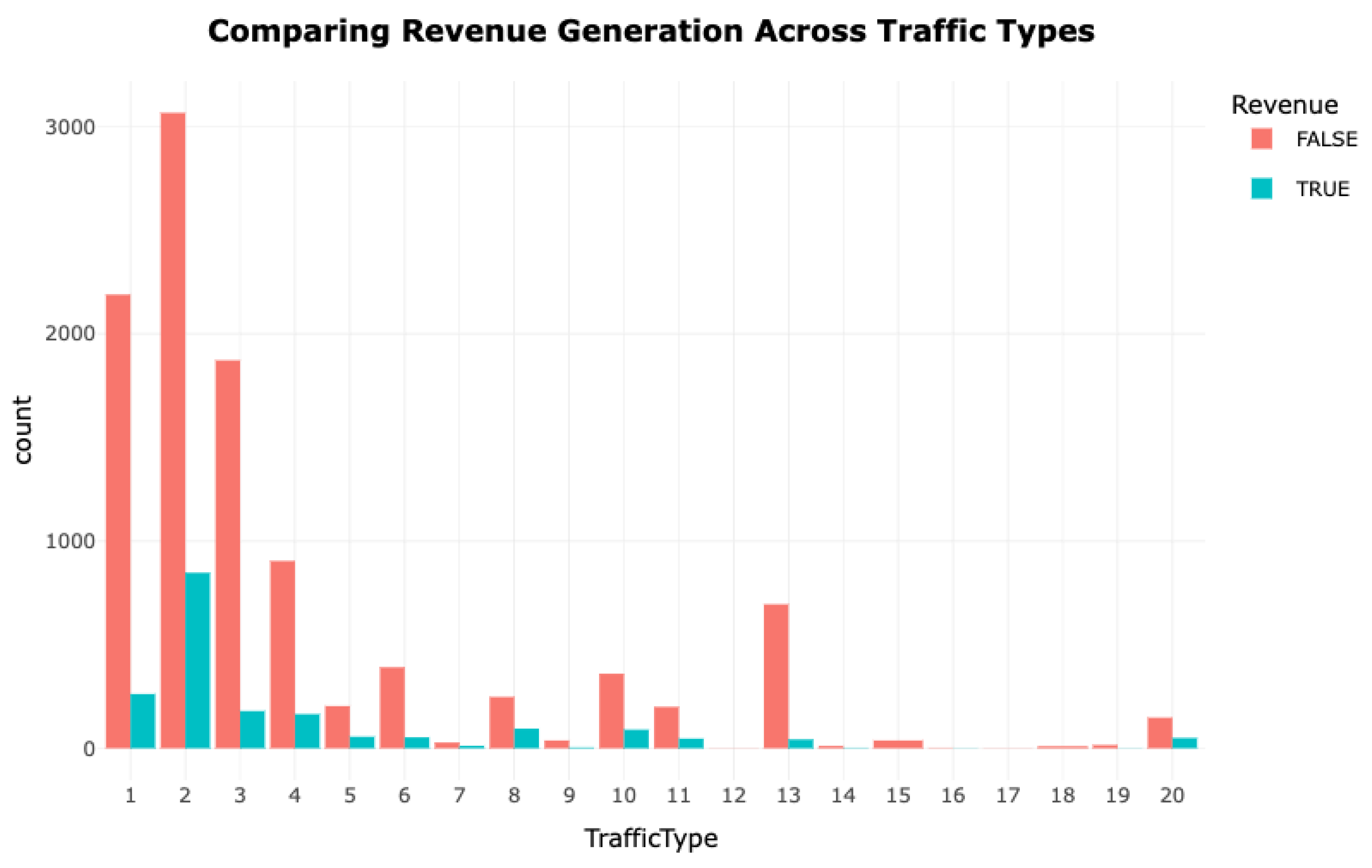
Evaluating Funnel Efficiency via Traffic Source Analysis
Traffic data shows that Types 1, 2, and 5 dominate visits, with Type 1 exceeding 4000 sessions, while many sources contribute marginally. Revenue analysis reveals Types 1, 2, and 3 as the most profitable, though they also experience notable attrition, particularly Type 2, which has high traffic but modest conversion rates. Underperformers such as Types 14, 15, and 19 generate minimal or no revenue, indicating early drop-offs.
Temporal trends highlight promotional spikes for certain channels (e.g., Type 2 in November), while treemap analysis confirms a concentration of revenue in a few high-yield streams. The disparity between monetized and non-monetized sessions within top sources underscores the need to optimize landing experiences and retention strategies for high-traffic but low-conversion channels, while improving targeting for low-performing sources.
Feature Association Analysis
The correlation heatmap shows that ProductRelated_Duration has a slight negative relationship with BounceRates (), suggesting longer product engagement reduces early exits, while its weak positive link with PageValues () indicates minimal direct value contribution. PageValues also inversely relate to BounceRates (), implying valuable content may improve retention. Duration features show small negative correlations with BounceRates, notably for Administrative_Duration () and Informational_Duration ().
Inter-feature correlations among durations (Administrative–ProductRelated, ; Informational–ProductRelated, ) reveal that users often explore multiple sections in one session. While no single metric is a strong predictor, combined duration patterns and low bounce tendencies subtly indicate higher purchase intent.
Revenue Attribution and Page Value Dispersion
The PageValues distribution shows most pages contribute minimally to revenue, while a small subset—high-yield pages—drives a disproportionate share of transactions, reflecting an 80/20 dynamic. Prioritizing and refining these key pages can significantly boost profitability without major structural changes.
Analysis of ProductRelated_Duration versus PageValues reveals that high-value content, even with short engagement times, correlates strongly with conversions. Non-revenue sessions often have low PageValues despite longer product interaction, underscoring that content quality outweighs duration. Strategically placing and optimizing high-value assets can enhance conversions more effectively than prolonging visits.
Figure 20.
Correlation Matrix of Behavioral and Revenue-Linked Features.
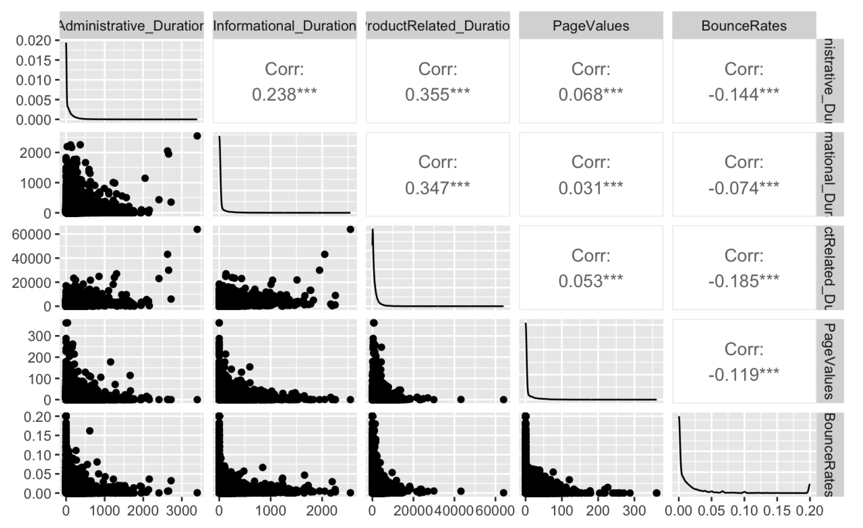
Figure 21.
Distribution of PageValues.
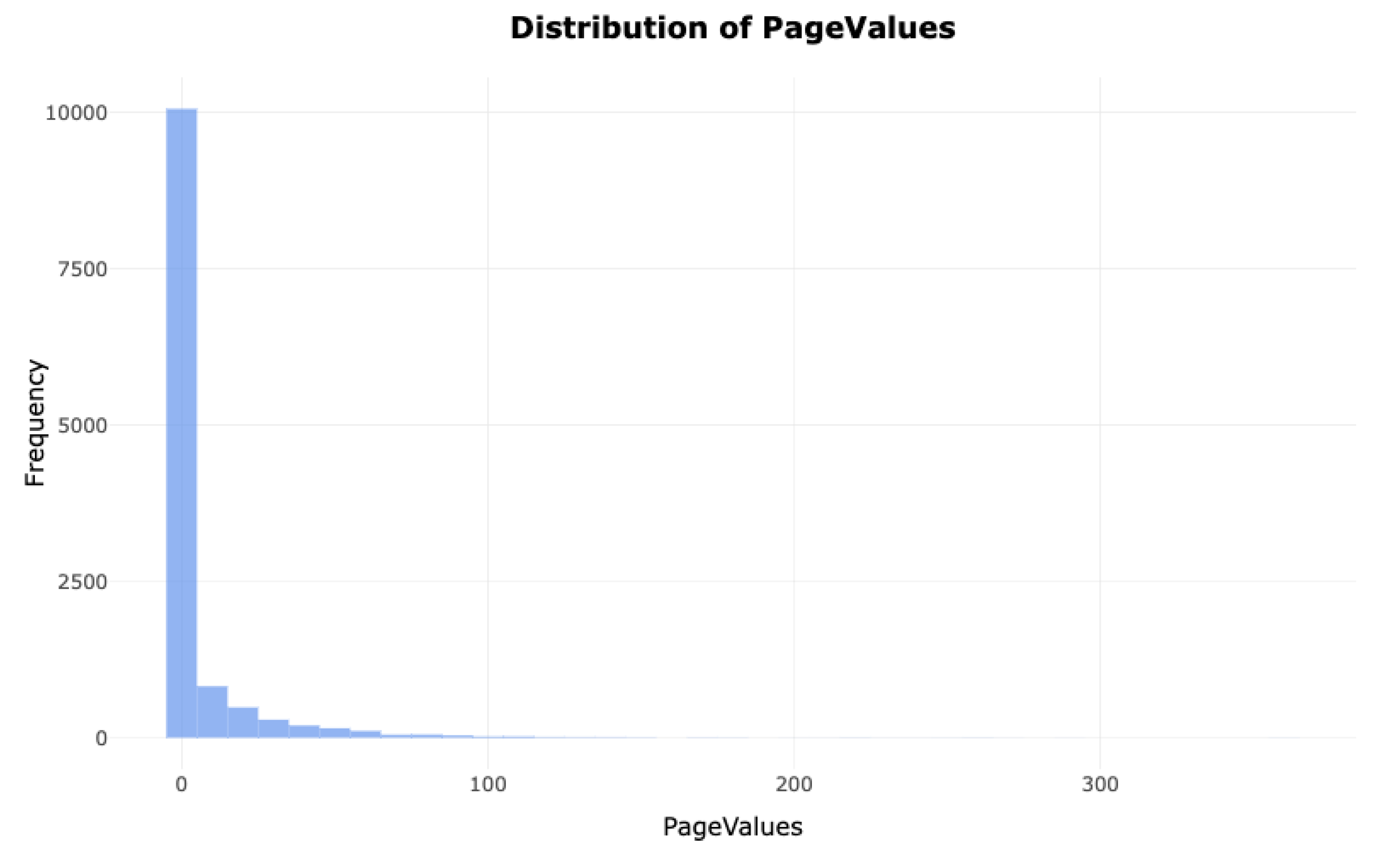
Figure 22.
Effect of Product-Page Interaction Time on Value by Revenue Group.
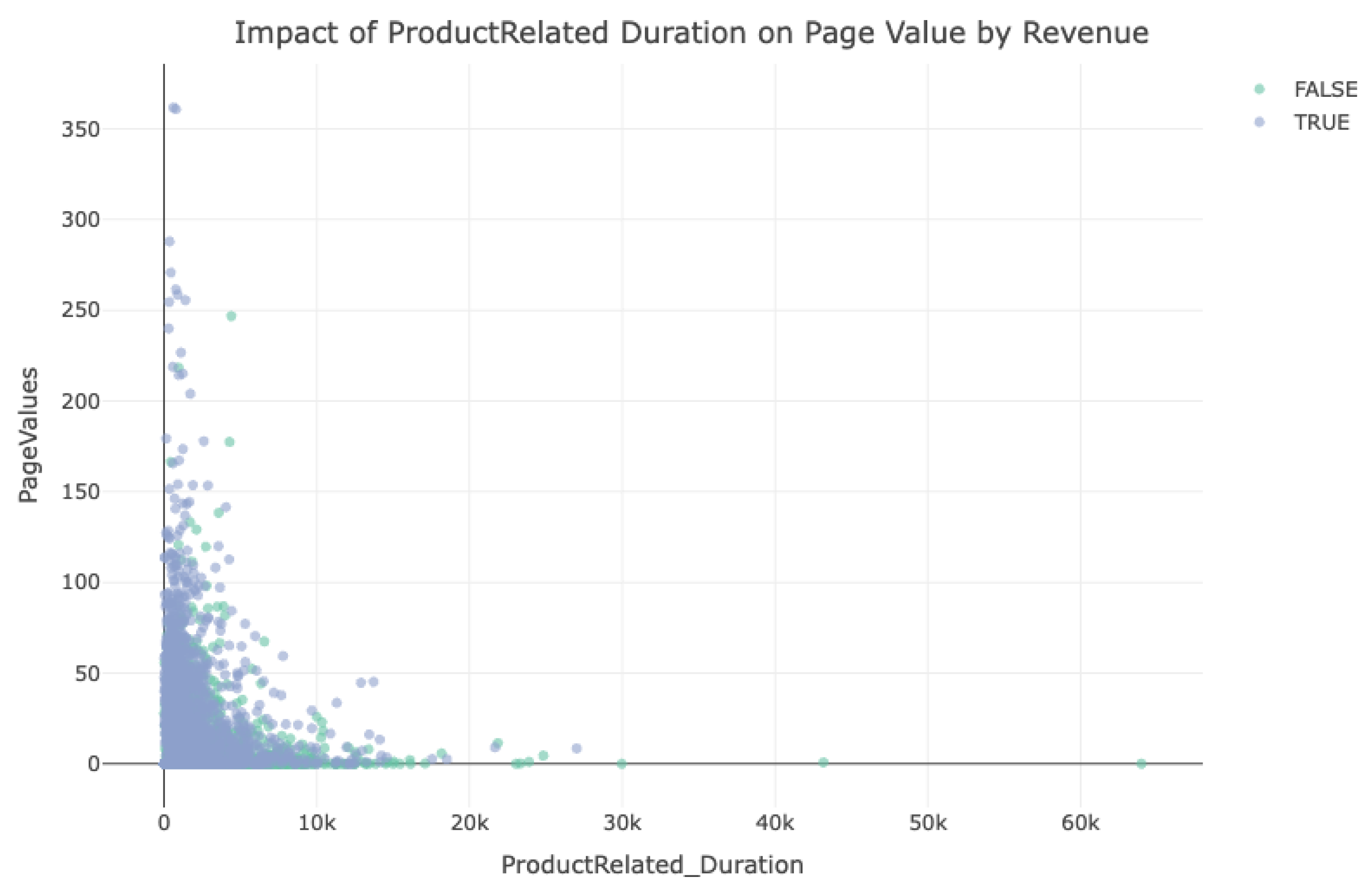
Figure 23.
Pie Chart for VisitorType.
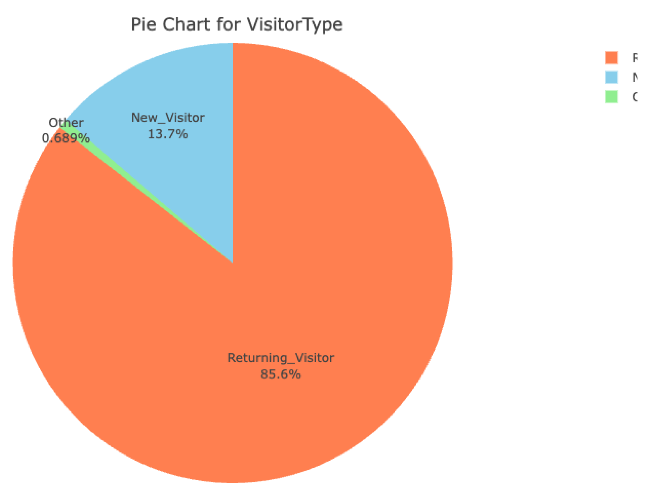
Figure 24.
Tracking Cumulative Revenue by Visitor Type Across Months.
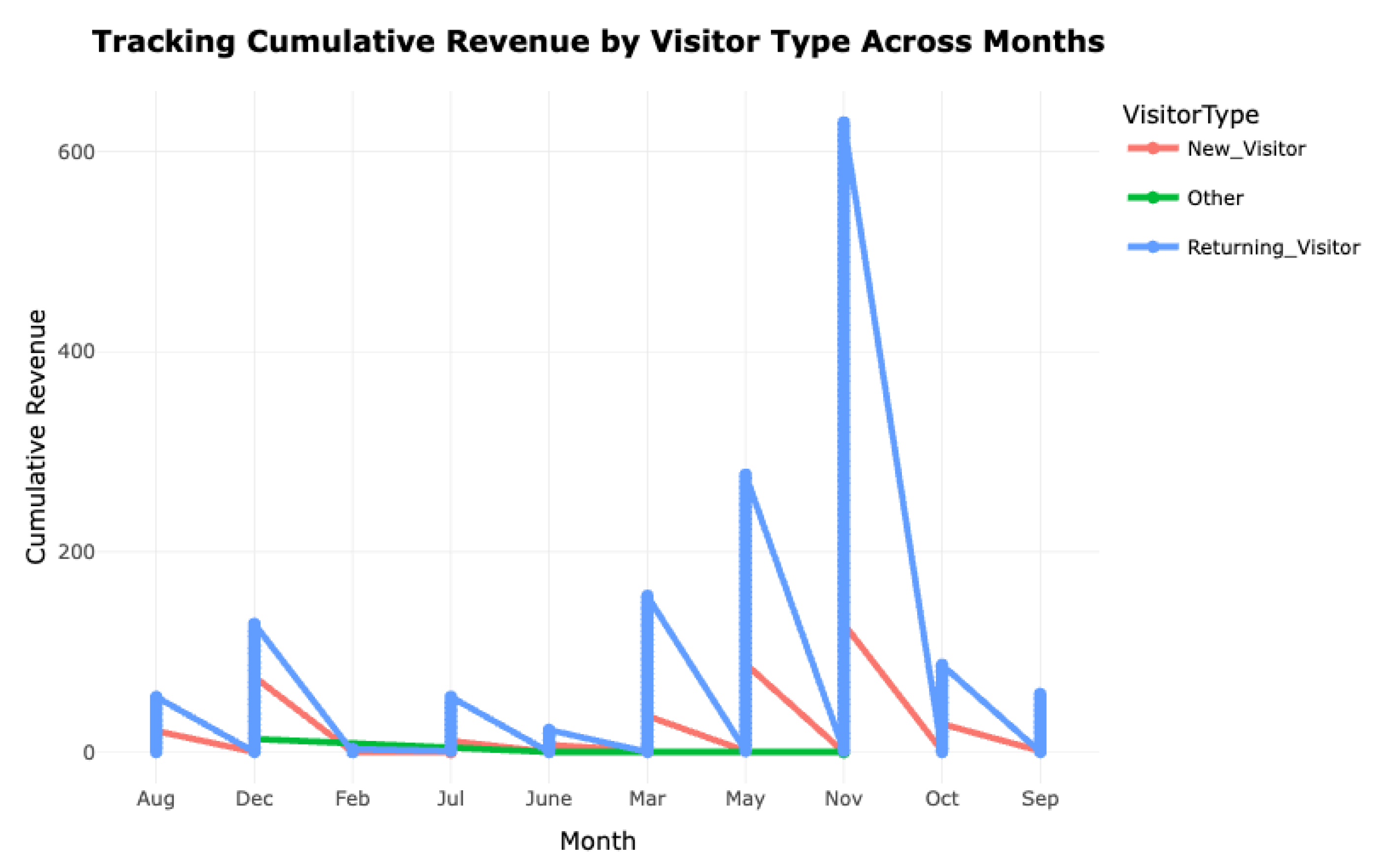
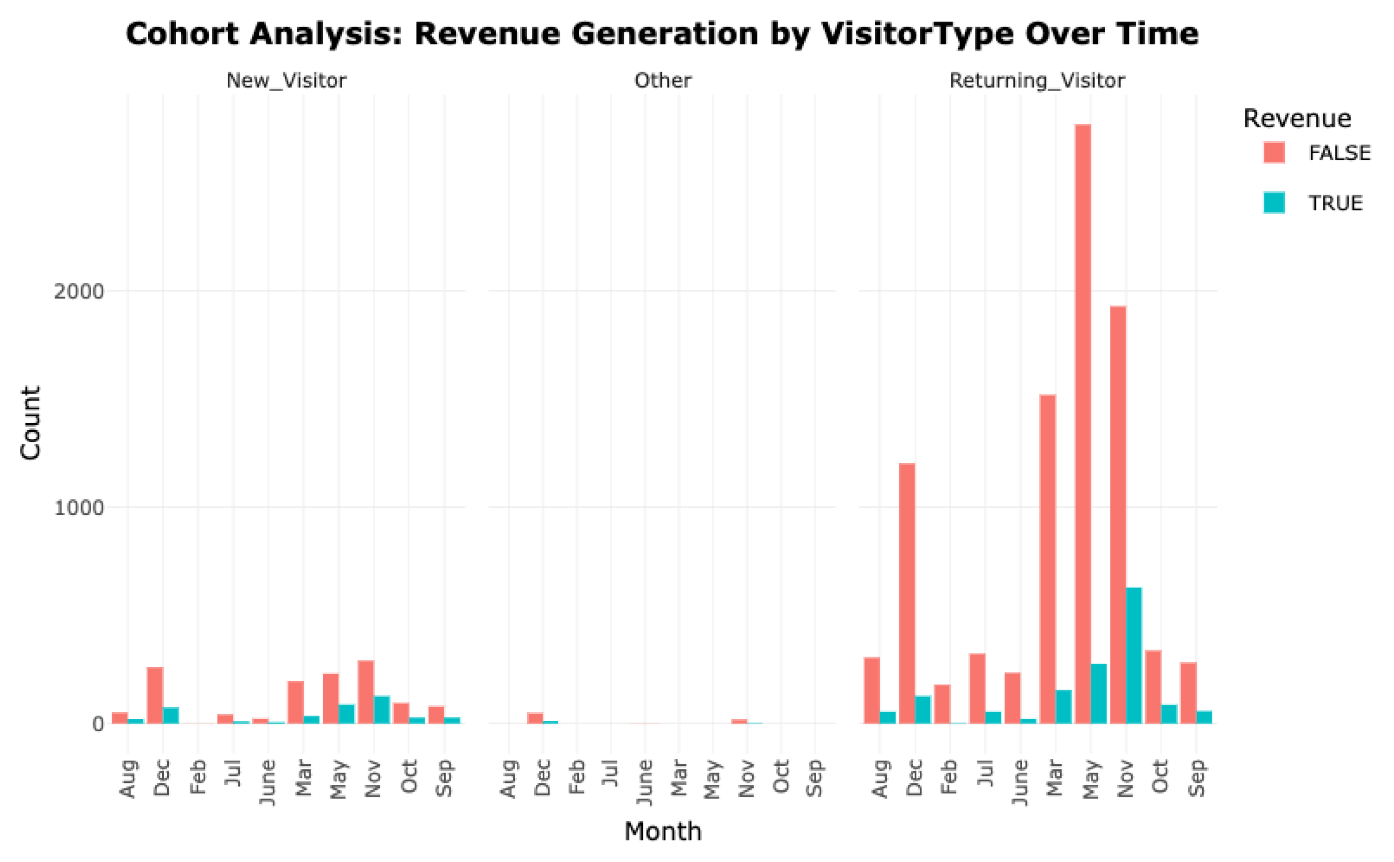
Figure 25.
Cohort Analysis- Revenue Generation by VisitorType Over Time.
Cohort Evaluation:
Analysis shows that 85.6% of sessions come from returning users, 13.7% from newcomers, and 0.68% from others, underscoring the dominance of loyal customers in platform engagement and revenue. Monthly trends confirm that recurring users consistently drive the majority of sales, with peaks in May, July, and November, while new visitors contribute minimally.
These insights highlight the strategic value of loyalty programs, retention incentives, and personalized engagement to sustain and grow this core revenue base. At the same time, targeted onboarding strategies are needed to convert new visitors into repeat customers, expanding the high-value user segment over time.
Geolocation-Based Evaluation:
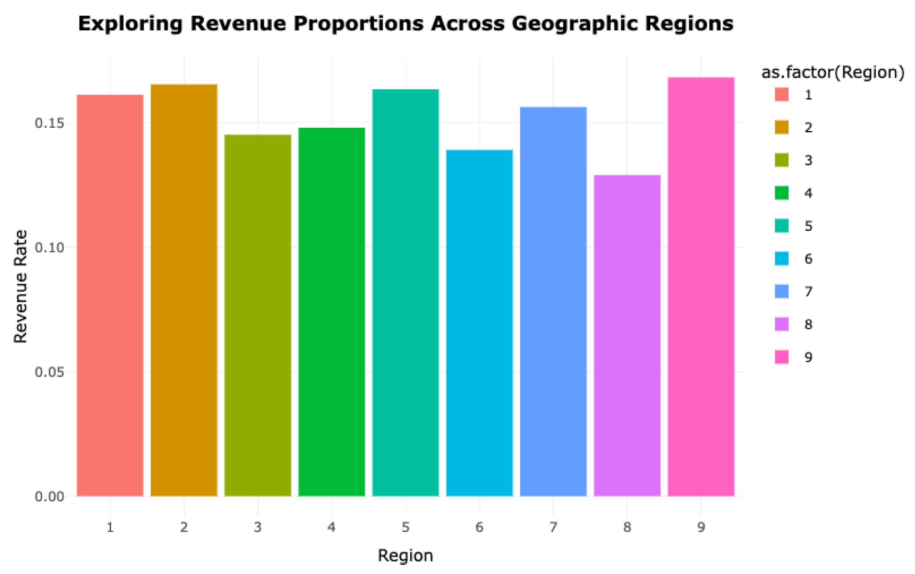
1. What regional disparities exist in revenue production, and which locales demonstrate potential for expansion?
The accompanying diagram reveals region-specific performance by showing the share of sessions that resulted in transactions. Notably, regions 1, 2, 5, and 9 exhibit superior conversion percentages, designating them as key markets with high efficiency in generating revenue. In contrast, locations such as 3, 6, and 8 display comparatively lower conversion ratios, suggesting an opportunity to enhance commercial outcomes. These underutilized areas might benefit from geographically personalized marketing efforts, upgraded user experiences, or region-specific engagement campaigns. Identifying and addressing these gaps could unlock untapped revenue potential and strengthen the brand’s geographic footprint.
Figure 26.
Exploring Revenue Proportions Across Geographic Regions.
Revenue Trends by Visitor Classification:
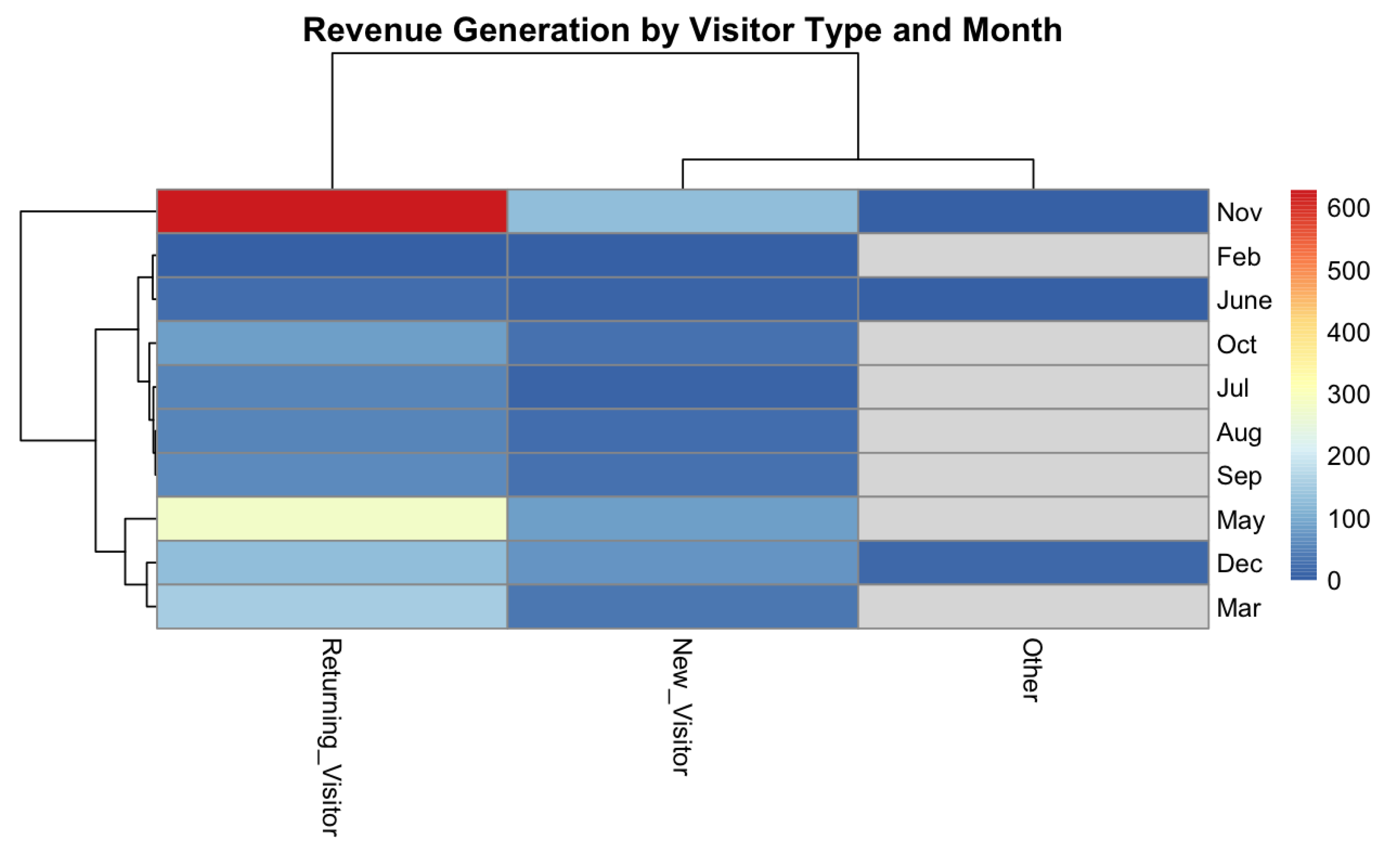
1. How does financial input differ between repeat and initial users month by month? What measures could boost engagement and sales conversion for new users?
A heatmap visualizes monthly revenue distribution across visitor categories, revealing key behavioral insights. Returning users consistently emerge as top contributors, with significant spikes observed during May and November—periods likely influenced by promotional events or seasonal campaigns. This pattern confirms the value of nurturing client loyalty through long-term engagement strategies.
On the other hand, the lighter tones associated with first-time users imply relatively low financial participation. This discrepancy highlights the importance of improving introductory experiences, such as guided navigation, targeted content, or welcome incentives, to elevate conversion potential. Meanwhile, the “Other” user segment generates negligible revenue, indicating minimal influence and the need for further segmentation or analytical attention. Overall, the matrix underscores the combined impact of visitor loyalty, event-driven seasonality, and onboarding efficacy in optimizing revenue flow.
Figure 27.
Revenue Generation by Visitor Type and Month.
User Interaction with Content and Revenue Strategy:
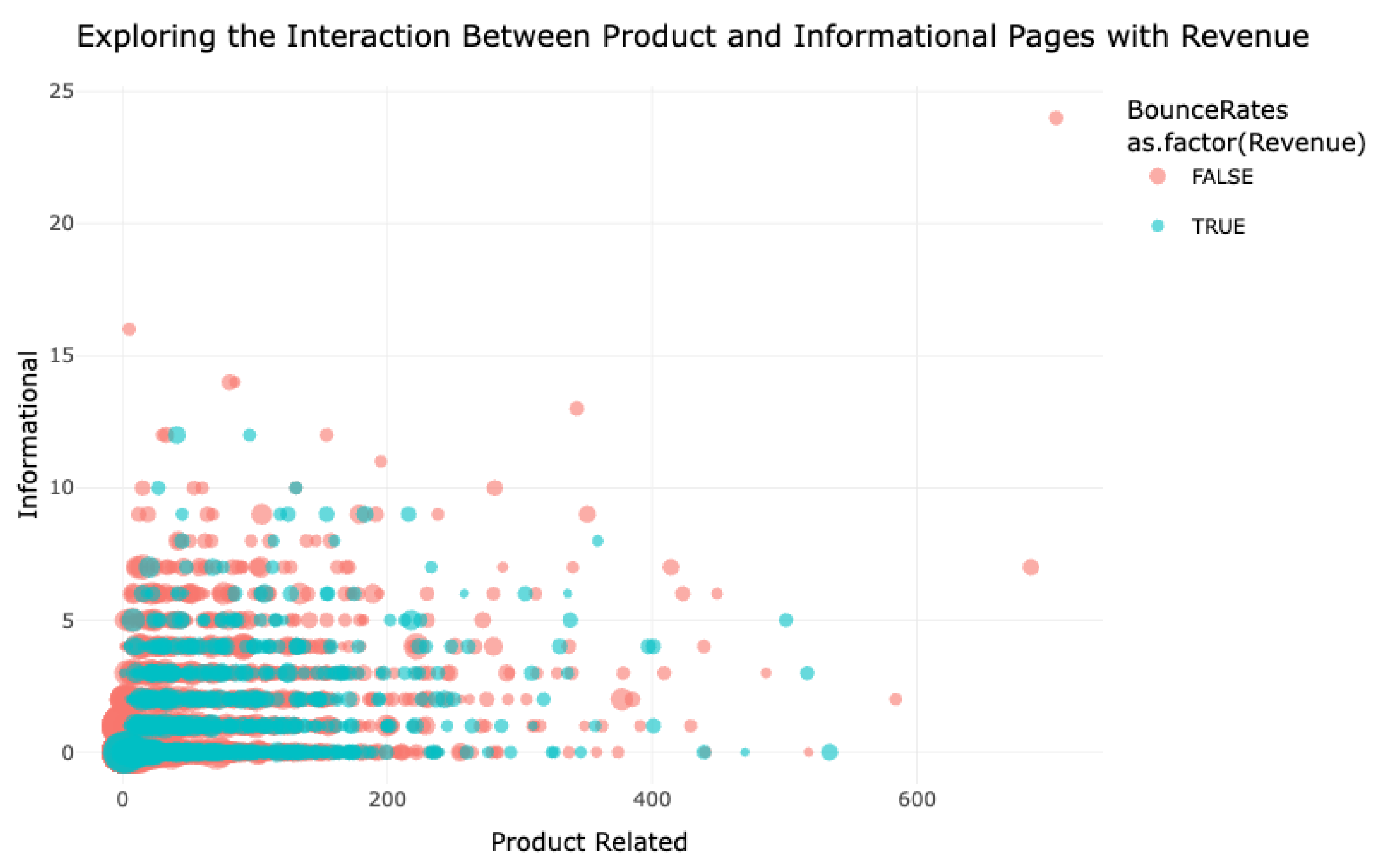
1. In what ways do user engagements with commercial and informative content affect bounce rates and sales metrics? What refinements could be introduced to enhance both experience and financial outcomes?
The scatter plot offers a multi-dimensional representation of page-level user engagement and its relationship with financial performance. Notably, users interacting with a greater volume of product-oriented pages—indicated by teal points—are more inclined to make purchases. However, the presence of users navigating through multiple product pages without converting (red points) suggests that the mere quantity of product exposure does not equate to transaction success. Content quality and contextual relevance play a vital role.
Moreover, moderate engagement with both product and educational content is associated with increased conversion likelihood. Users who explore both page types seem more informed and, thus, more decisive. Consequently, blending informational elements with product showcases may bolster buyer confidence and shorten the decision-making timeline.
The bubble sizes further indicate bounce tendencies; larger circles—denoting higher bounce rates—are frequently associated with non-converting users, while successful transactions often correlate with lower exit frequencies. This dynamic stresses the need for immersive and compelling content to retain attention and steer users toward purchase paths.
In summation, optimizing both content categories and balancing them effectively can improve the overall conversion funnel, lower bounce rates, and amplify revenue.
Figure 28.
Exploring the Interaction Between Product and Informational Pages with Revenue.
8. Future Work
Subsequent investigations could delve into the demographic dimensions of consumer interaction, encompassing attributes such as regional distribution, age groups, and gender-based behavior patterns. Analyzing engagement across different device categories—including desktops, mobile phones, and tablets—could yield insights into optimizing platform-specific user interfaces for improved navigability and performance. Additionally, assessing the influence of social sharing, personalized recommendations, and peer-generated content like customer reviews could offer valuable direction for enhancing trust and persuasive effectiveness in digital commerce.
The integration of predictive modeling techniques, particularly through machine learning algorithms, may assist in identifying segments prone to disengagement or cart abandonment. These tools can uncover latent behavioral patterns, enabling proactive adjustments to the user experience that could amplify overall conversion efficiency. As stated by Fawcett and Provost (2013), the utilization of data mining and machine intelligence facilitates the early detection of anomalies in customer interaction data, thereby refining strategic decisions through enhanced foresight.
9. Conclusions
This analysis has highlighted pivotal trends within consumer interaction data from an online retail environment, aiming to uncover elements that significantly contribute to monetary gains. The observations emphasized the dominant role of repeat users in sustaining revenue flow, suggesting that customer loyalty mechanisms hold strategic value. Meanwhile, the relatively lower purchase activity among first-time users indicates a need for more compelling onboarding and interaction experiences.
High exit and bounce metrics were found to negatively influence overall sales performance, implying that streamlined navigation and compelling content can serve as levers for retaining interest. The evaluation also showed that a limited number of referral channels were responsible for the majority of transactions, pointing to the importance of refining high-yield traffic sources and reevaluating underperforming ones. Furthermore, user interaction with both informational and purchase-oriented content emerged as a critical driver of conversions, underlining the necessity for a content ecosystem that balances persuasive product details with contextual support.
Collectively, the insights obtained offer actionable guidance for optimizing digital engagement, enhancing transaction frequency, and maximizing platform profitability. Looking ahead, future inquiries could benefit from incorporating demographic segmentation and cross-device behavior analysis to further refine marketing interventions and user-centered design principles.
References
- Chaffey, D. and Ellis-Chadwick, F. (2022) Digital Marketing: Strategy, Implementation and Practice, Harlow: Pearson.
- Xia, Y., Sun, J., and Chen, D.-G. (2018) ’Introduction to R, RStudio, and GGPLOT2’, ICSA Book Series in Statistics, pp. 77–127. [CrossRef]
- Chen, H., Chiang, R. H. L., and Storey, V. C. (2012). “Business Intelligence and Analytics: From Big Data to Big Impact.” MIS Quarterly, vol. 36, no. 4, pp. 1165–1188.
- Liu, Y., Huang, X., and Gao, Y. (2018). “Customer Behavior Analytics for E-Commerce Using Time-Series Data Mining.” IEEE Transactions on Industrial Informatics, vol. 14, no. 7, pp. 2977–2986.
- Sun, J., Wang, S., and Jiao, Y. (2019). “Visual Analytics for E-Commerce Data: Techniques and Applications.” Journal of Visualization, vol. 22, pp. 1153–1164.
- Moe, W. W. (2004). “Buying, Searching, or Browsing: Differentiating Between Online Shoppers Using In-Store Navigational Clickstream.” Journal of Consumer Psychology, vol. 13, no. 1–2, pp. 29–39.
- Islam, M. and Jin, S. (2019) ’An Overview of Data Visualization’, 2019 International Conference on Information Science and Communications Technologies (ICISCT) [Preprint]. [CrossRef]
- Wickham, H. (2016) ’GGPLOT2’, Use R! [Preprint]. [CrossRef]
Disclaimer/Publisher’s Note: The statements, opinions and data contained in all publications are solely those of the individual author(s) and contributor(s) and not of MDPI and/or the editor(s). MDPI and/or the editor(s) disclaim responsibility for any injury to people or property resulting from any ideas, methods, instructions or products referred to in the content. |
© 2025 by the authors. Licensee MDPI, Basel, Switzerland. This article is an open access article distributed under the terms and conditions of the Creative Commons Attribution (CC BY) license (http://creativecommons.org/licenses/by/4.0/).
Copyright: This open access article is published under a Creative Commons CC BY 4.0 license, which permit the free download, distribution, and reuse, provided that the author and preprint are cited in any reuse.


